1/9
2025 Colors of the Year, and How to Use Them
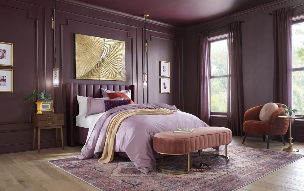
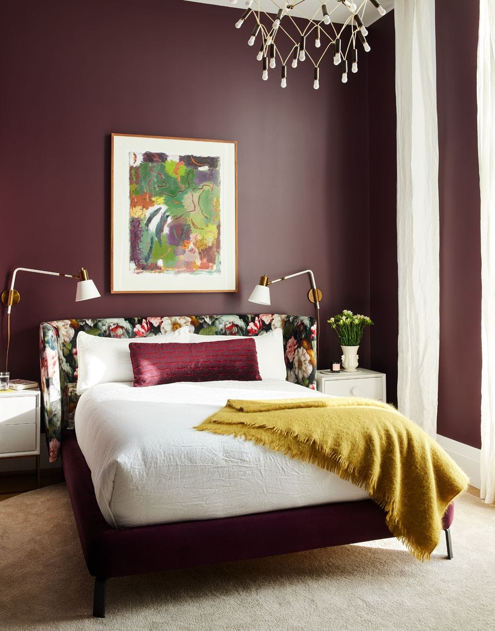
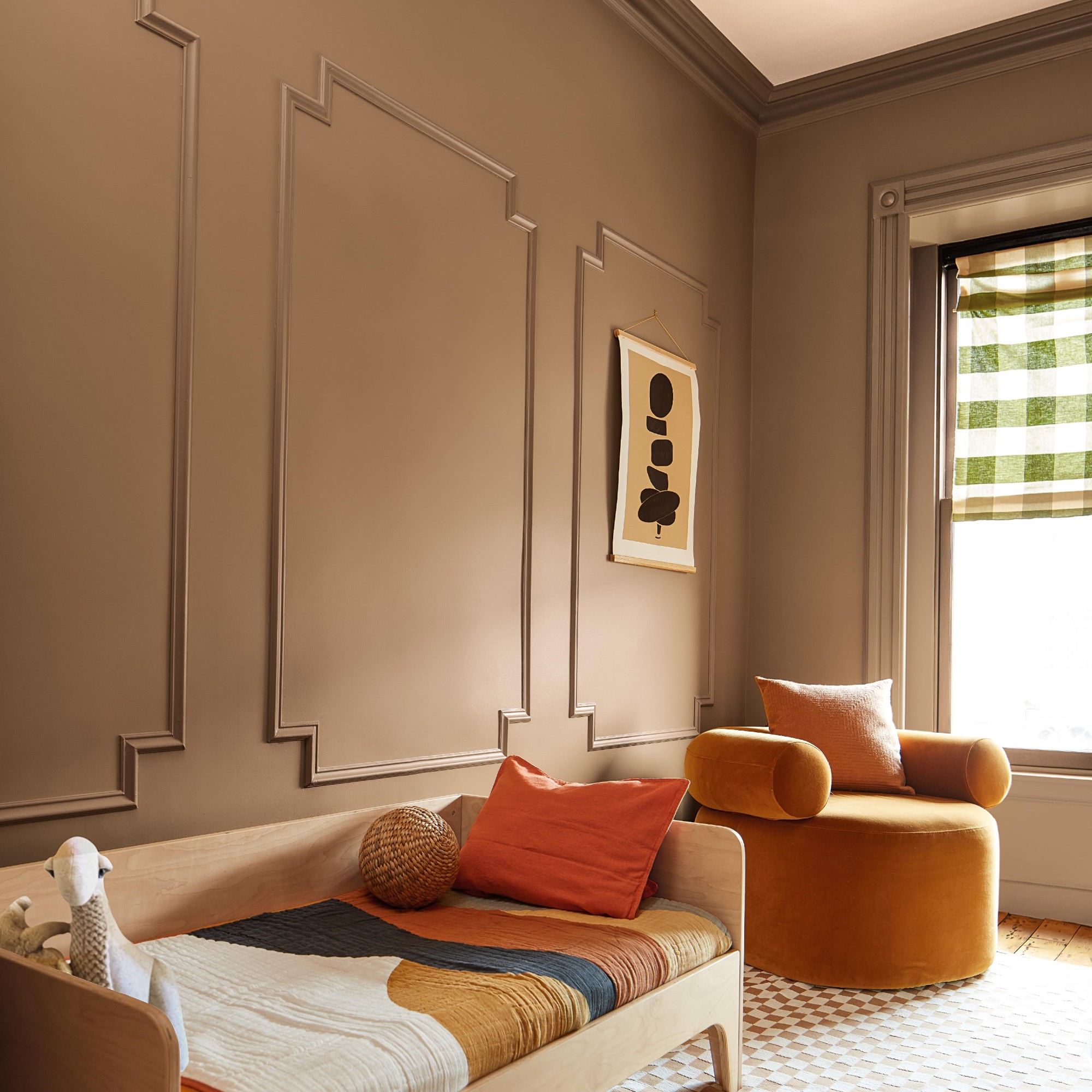
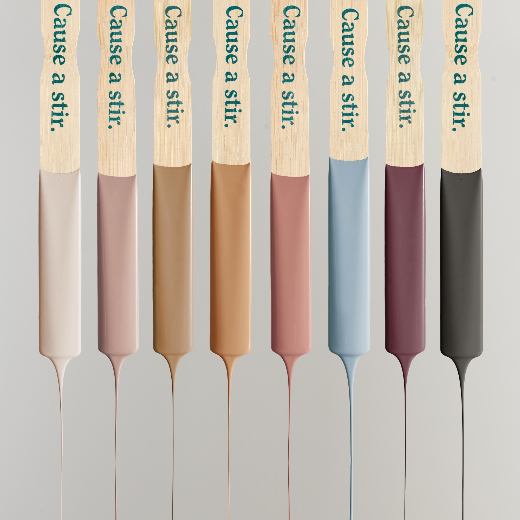
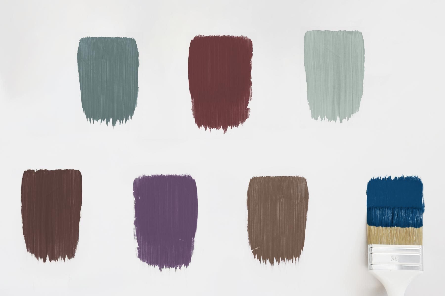
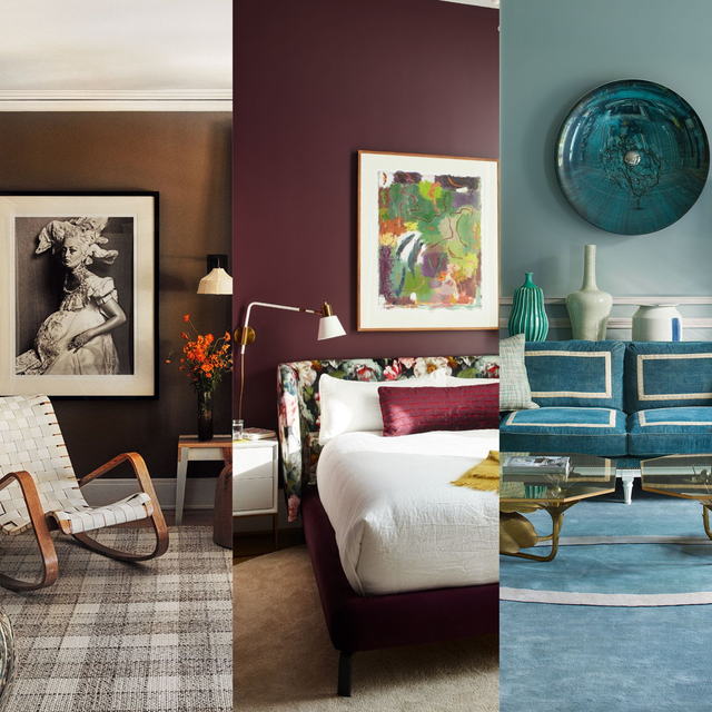
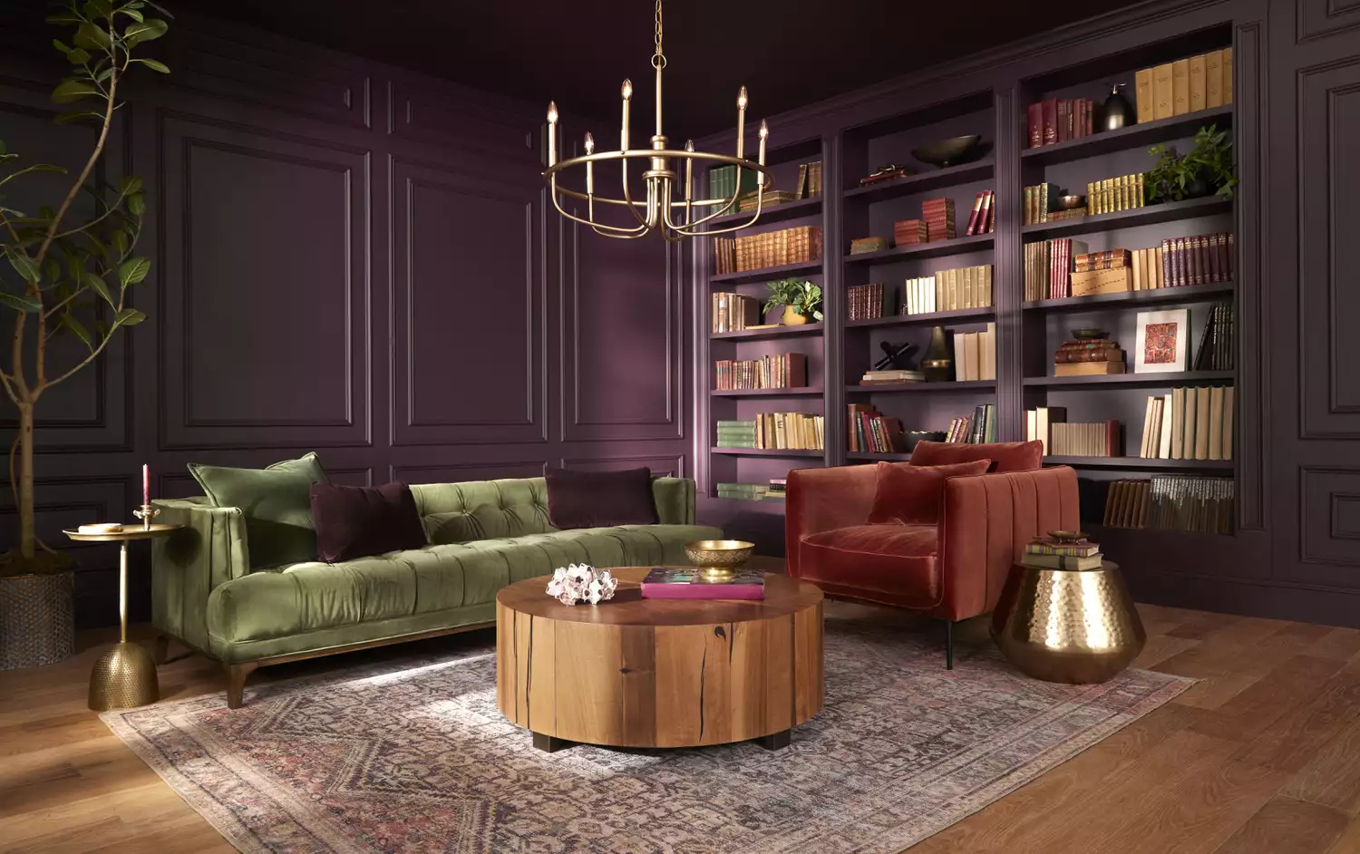
The interior design world is currently shifting towards more moody and character-filled aesthetics, incorporating antique-inspired pieces. This trend is clearly reflected in the 2025 Colors of the Year released by various paint brands, which primarily feature dark, sophisticated hues. These include rich browns, earthy reds, and dramatic blues and purples, all designed to make a significant statement.
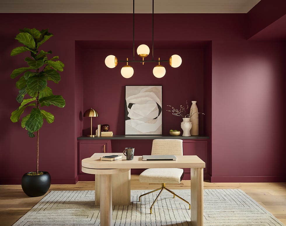
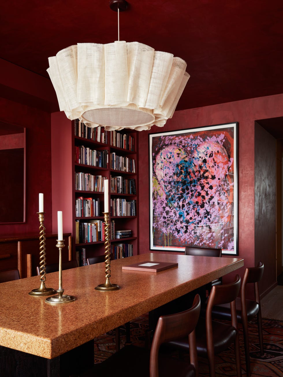
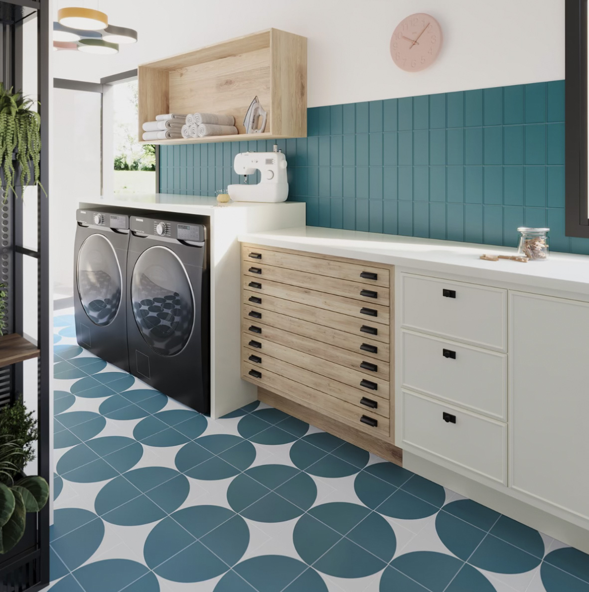
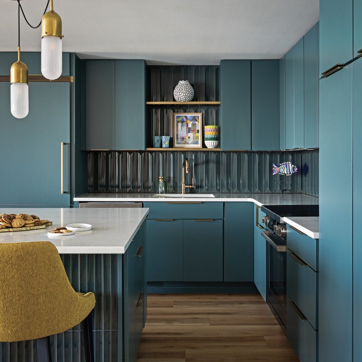
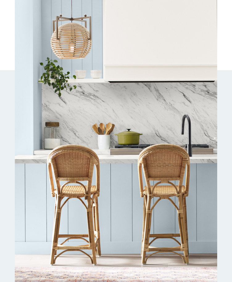
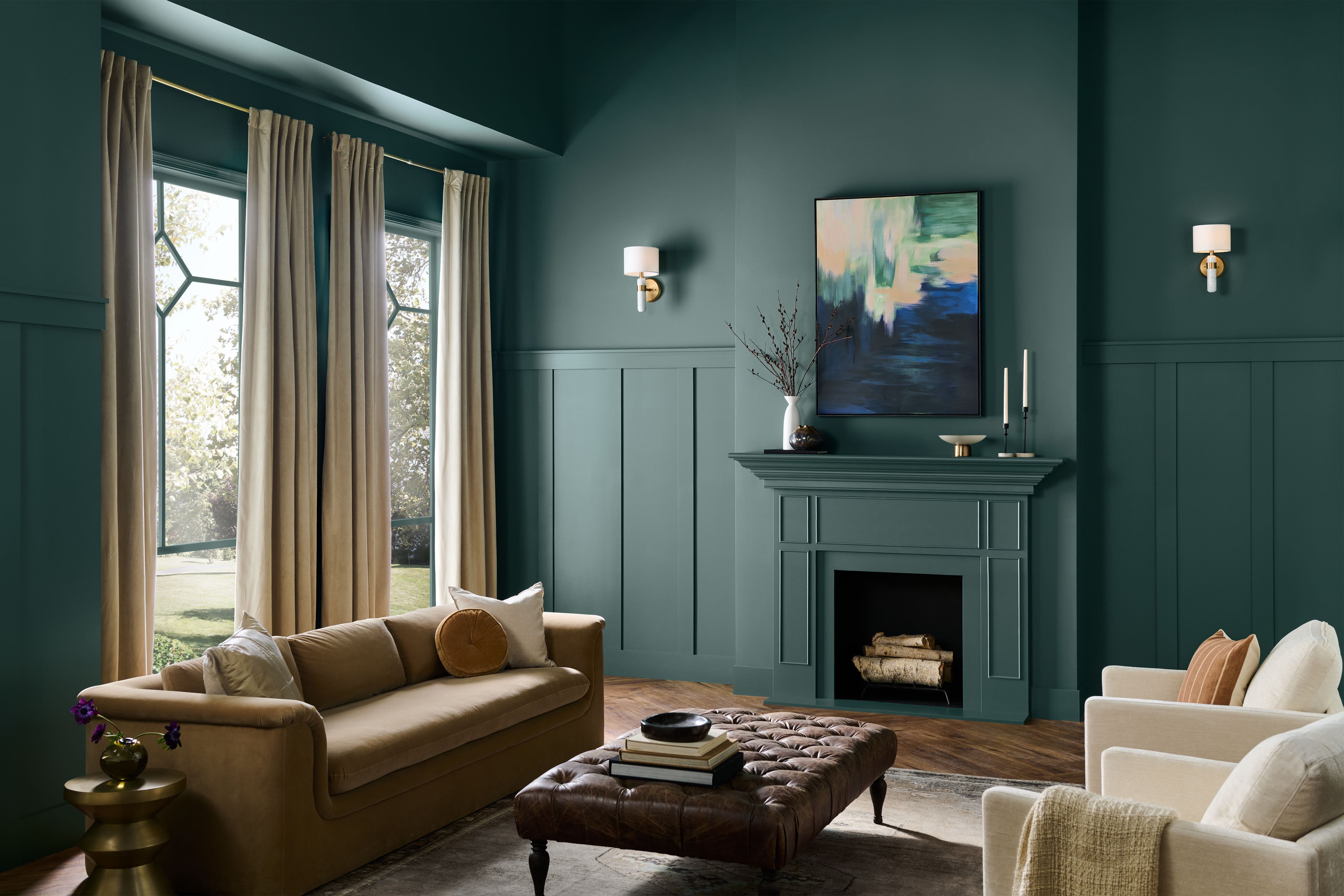
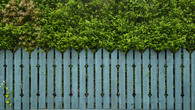
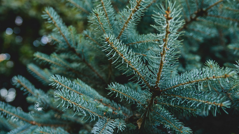
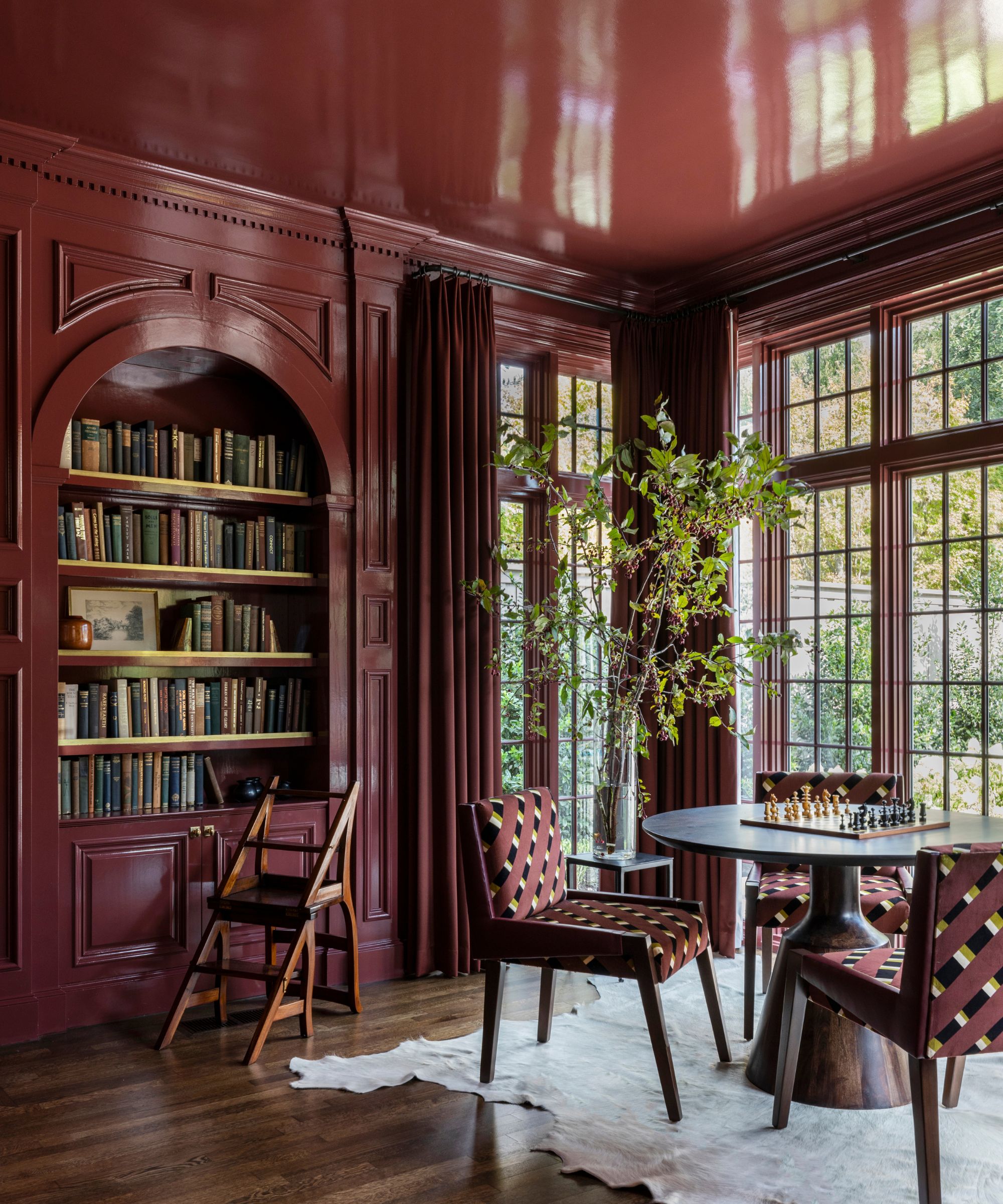
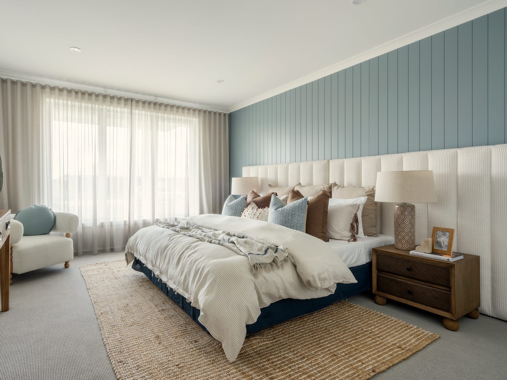
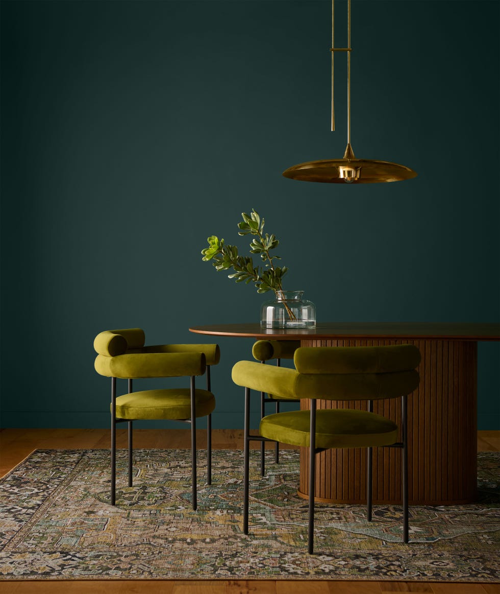
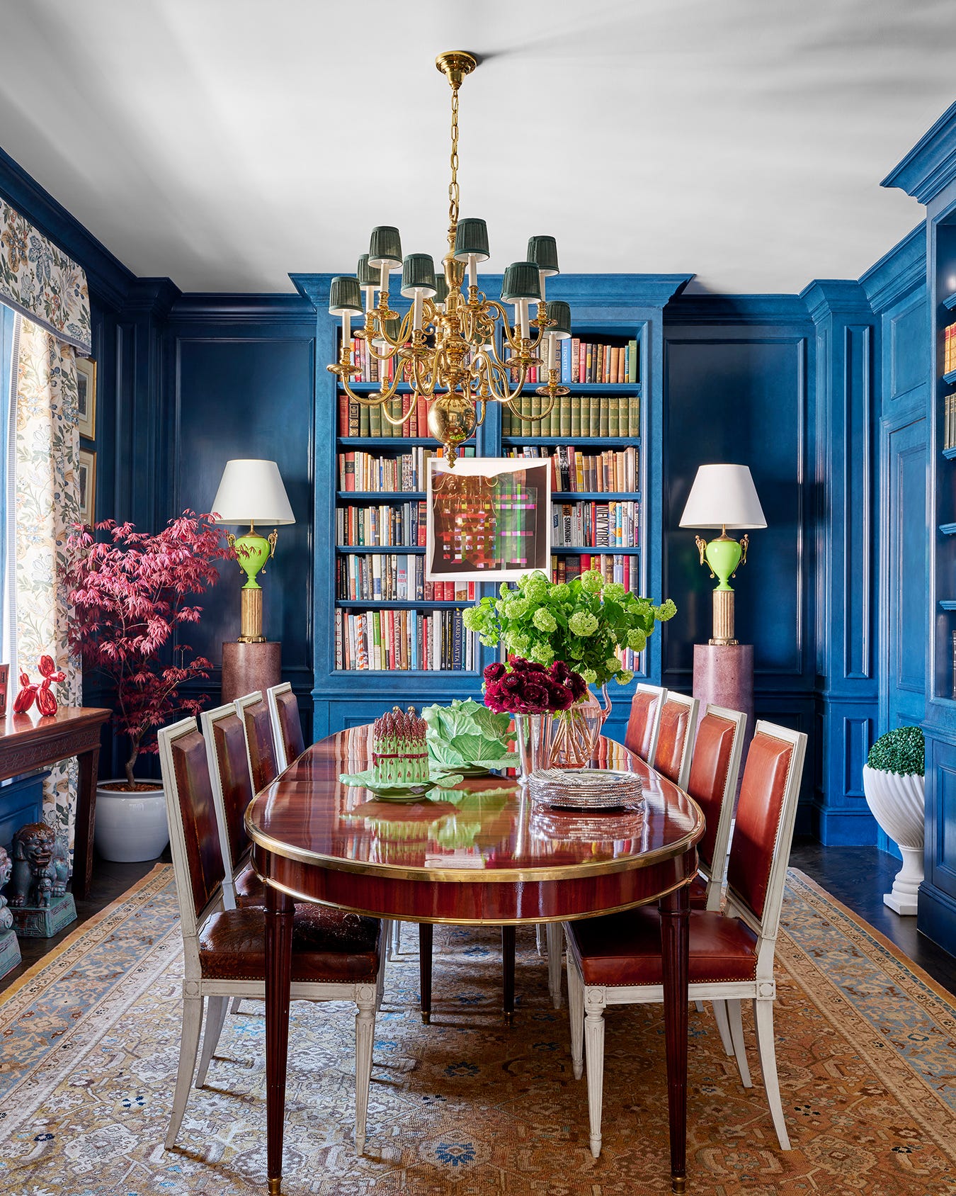
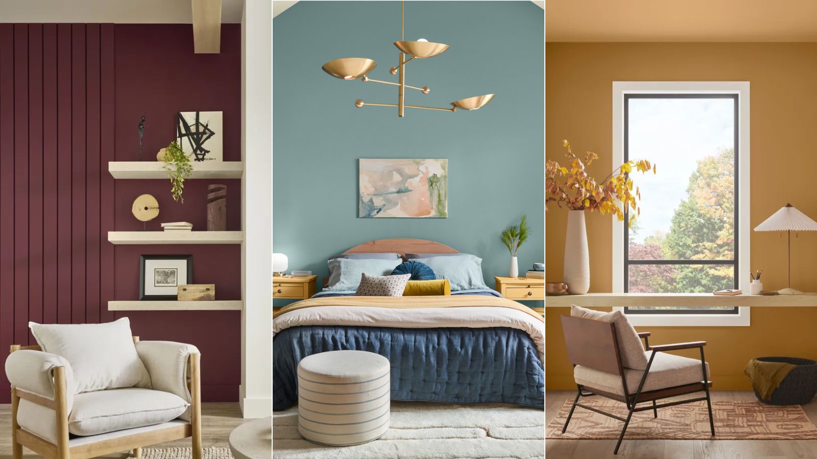
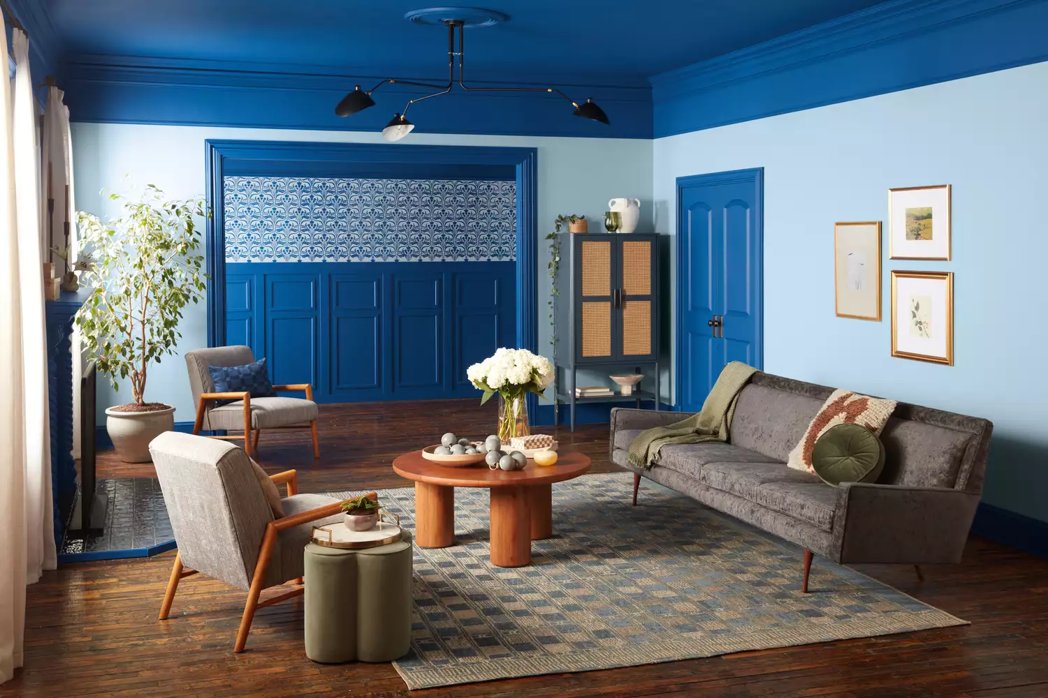
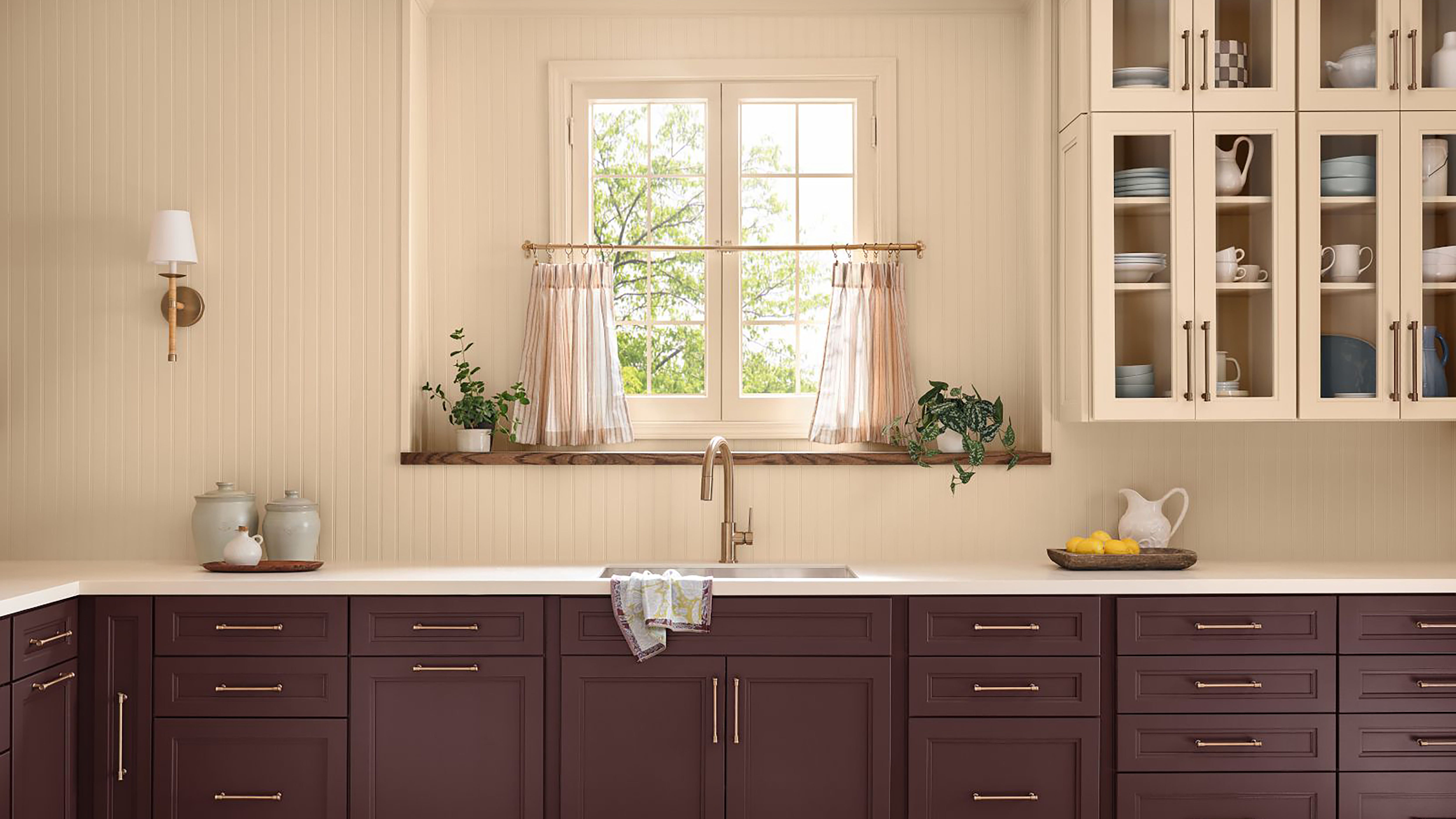
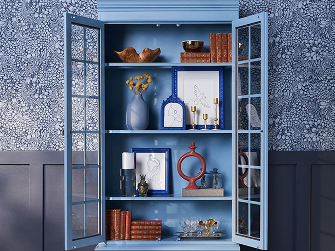
Behr's "Rumors" is a deep ruby red, described as a luxurious and warm color, ideal for spaces like dining rooms, offices, or libraries. It pairs well with gold or brass accents to create a sophisticated atmosphere, even on a budget. Valspar's "Encore" is a saturated blue with violet undertones, embodying confidence and joy. This vibrant shade is perfect for adding a personalized and bold touch, best used in a single room or as an accent in dining rooms or home offices to create a grounded and sharp feel. Dutch Boy's "Mapped Blue" offers a lighter alternative for those who prefer less intense shades. It's a medium-tone blue with yellow undertones, appearing blue or green depending on the light, and evokes an earthy, grounded connection to the outdoors. This color is excellent for modern spaces, especially smaller ones, as it makes a room feel more open and welcoming, making it suitable for kitchens or bathrooms, particularly when combined with white cabinetry.
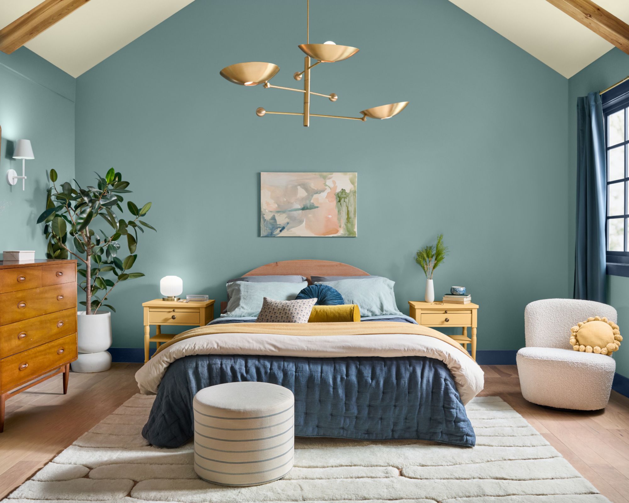
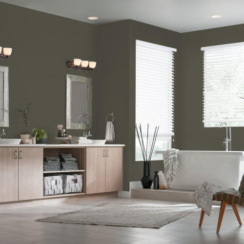
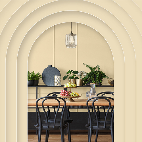
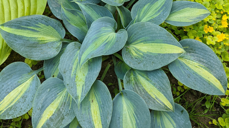
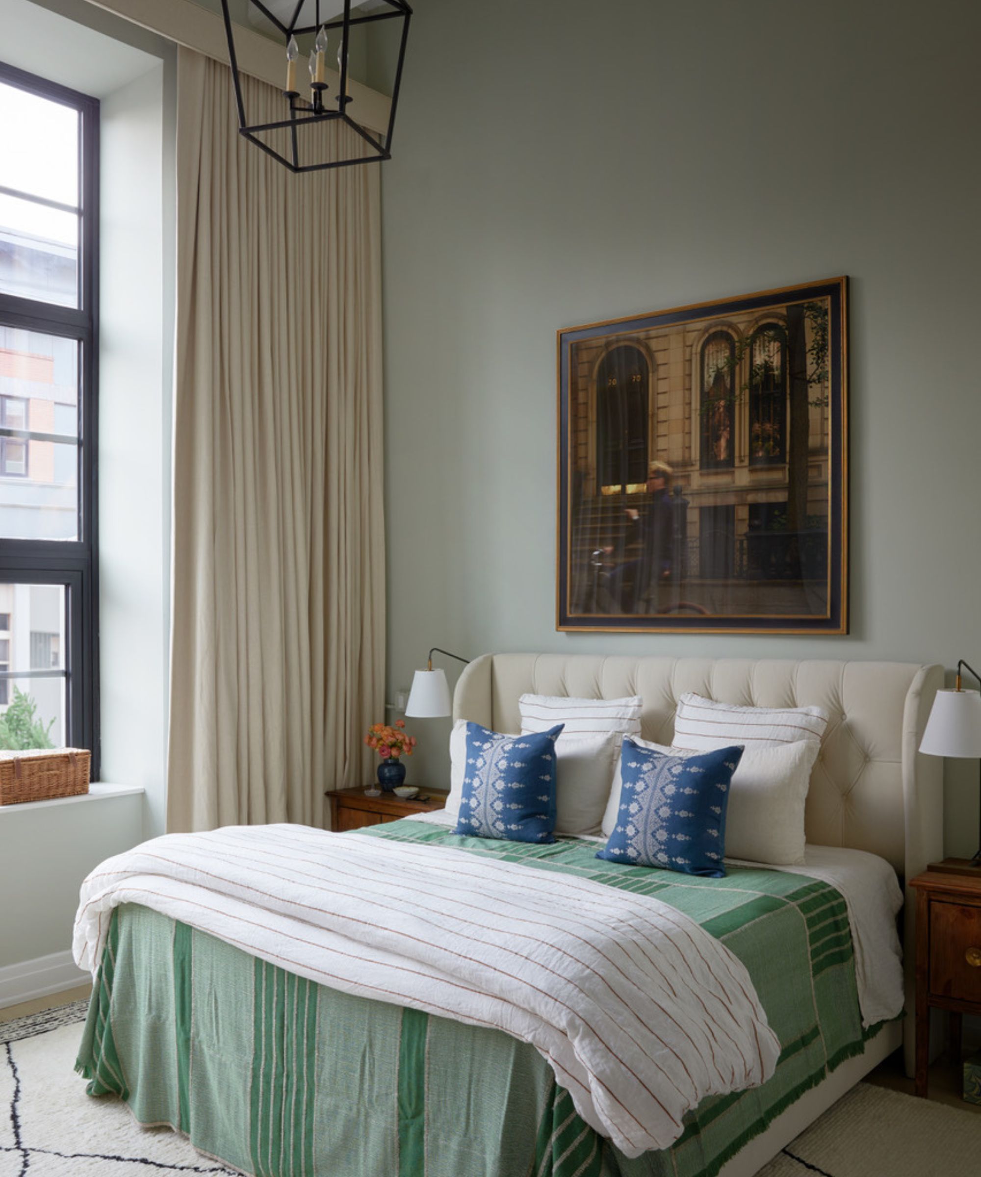
Minwax's "Violet" stands out as a wood stain rather than a paint color, offering a unique approach to incorporating color. Staining furniture with this purple hue can create a whimsical and modern look, providing a sophisticated alternative to traditional neutral tones for elevating a room without painting walls. It's suggested for side tables or bookshelves, allowing for experimentation with saturation levels. HGTV Home by Sherwin Williams presents "Quietude," a muted sage with blue undertones that promotes tranquility. This color is reminiscent of the outdoors and pairs effectively with other nature-inspired shades like sandy browns, creamy whites, and pale yellows, making it perfect for creating a peaceful bedroom or bathroom, especially when combined with light woods and natural greenery.
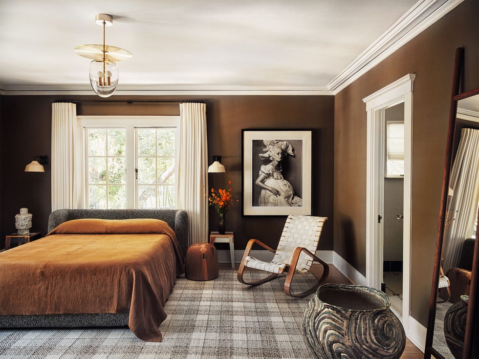
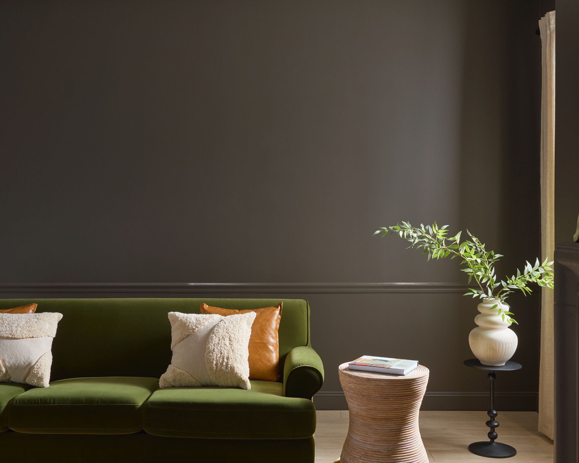
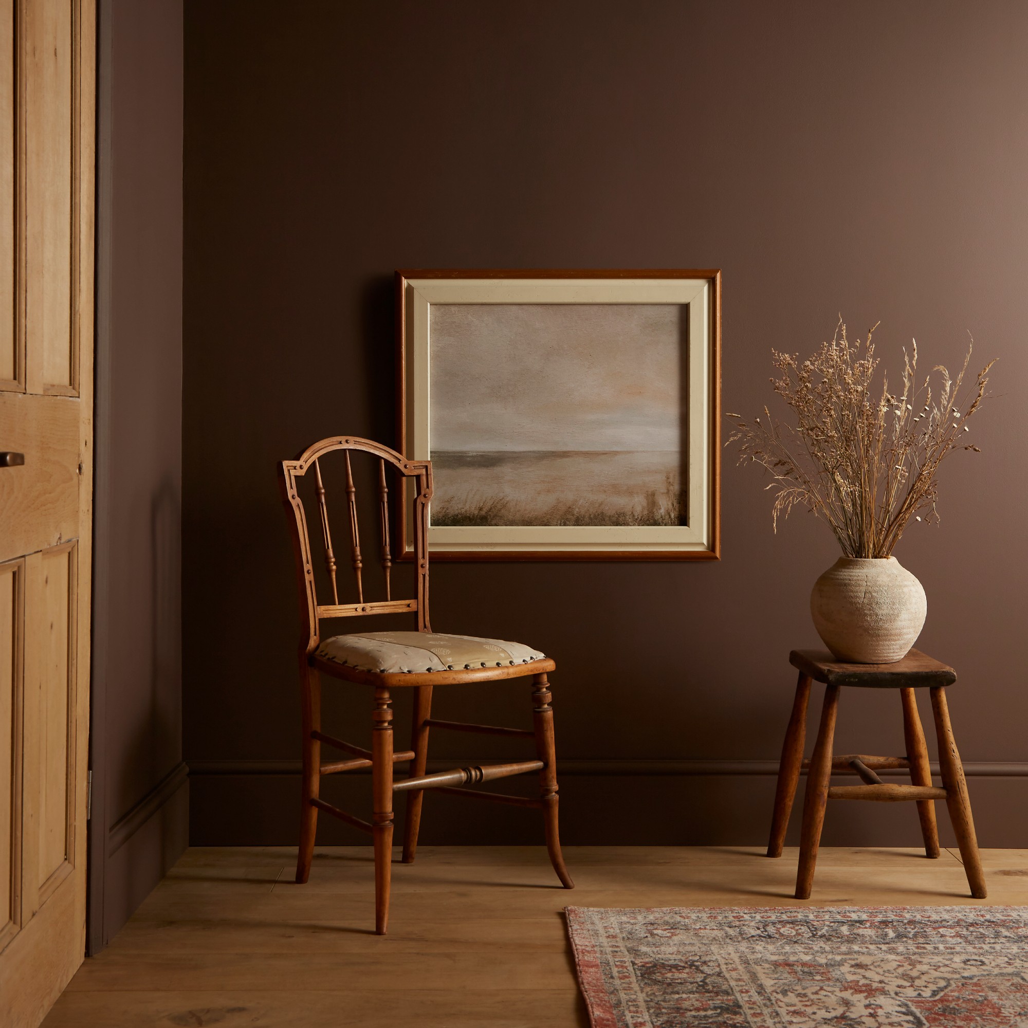
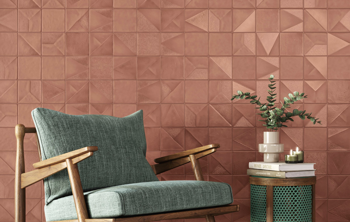
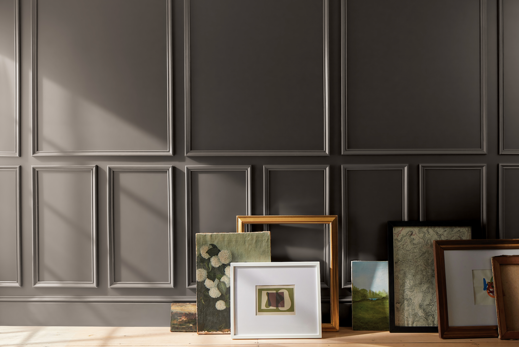
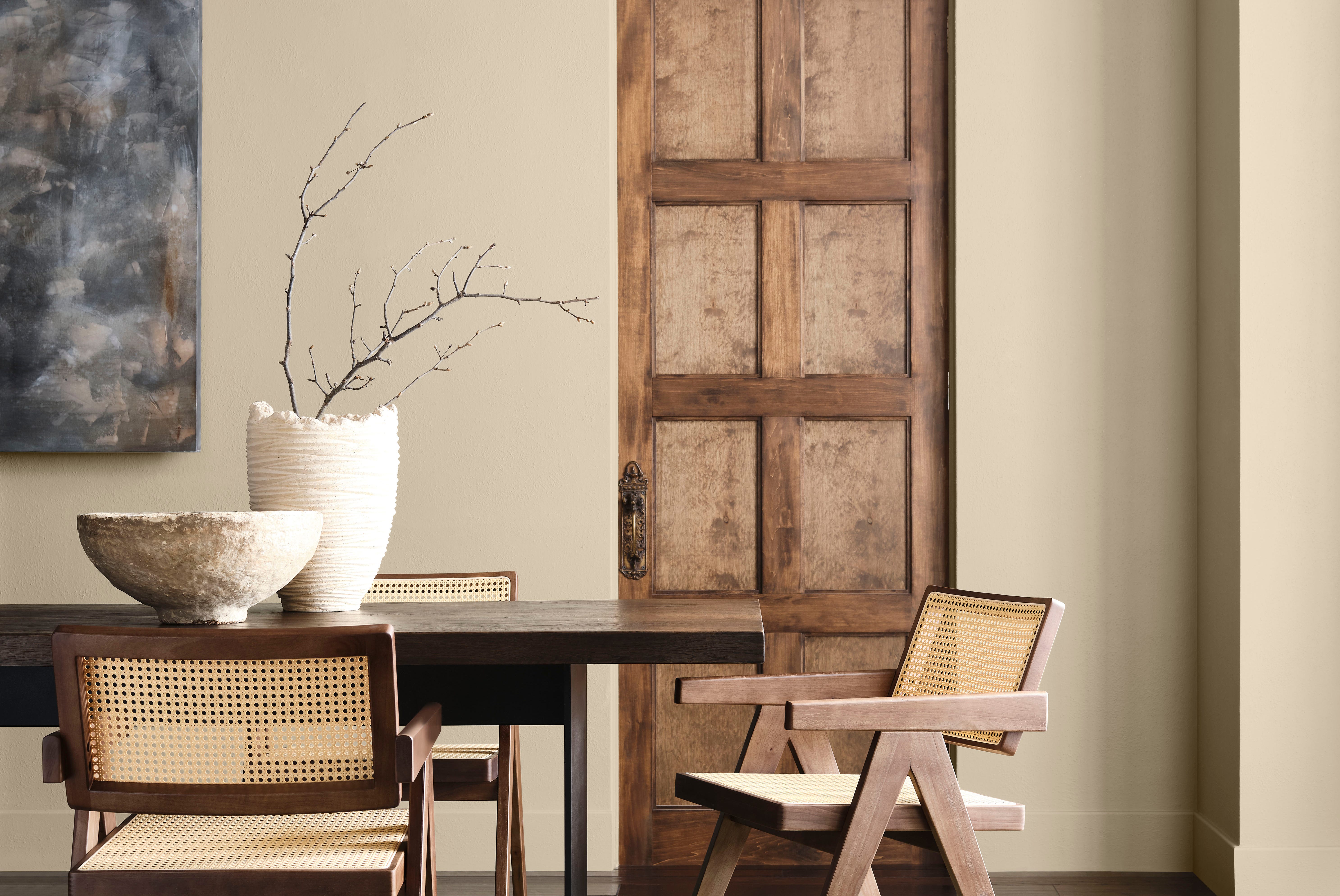
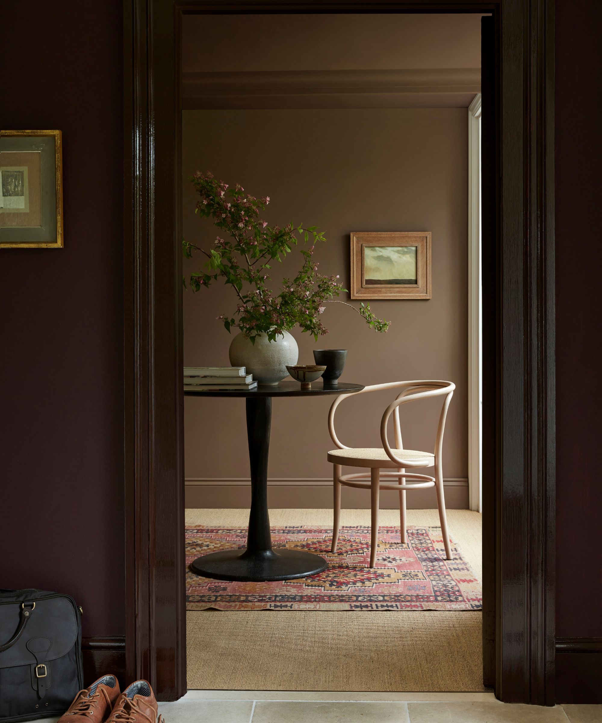
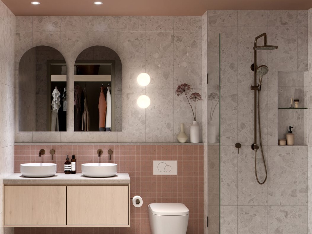
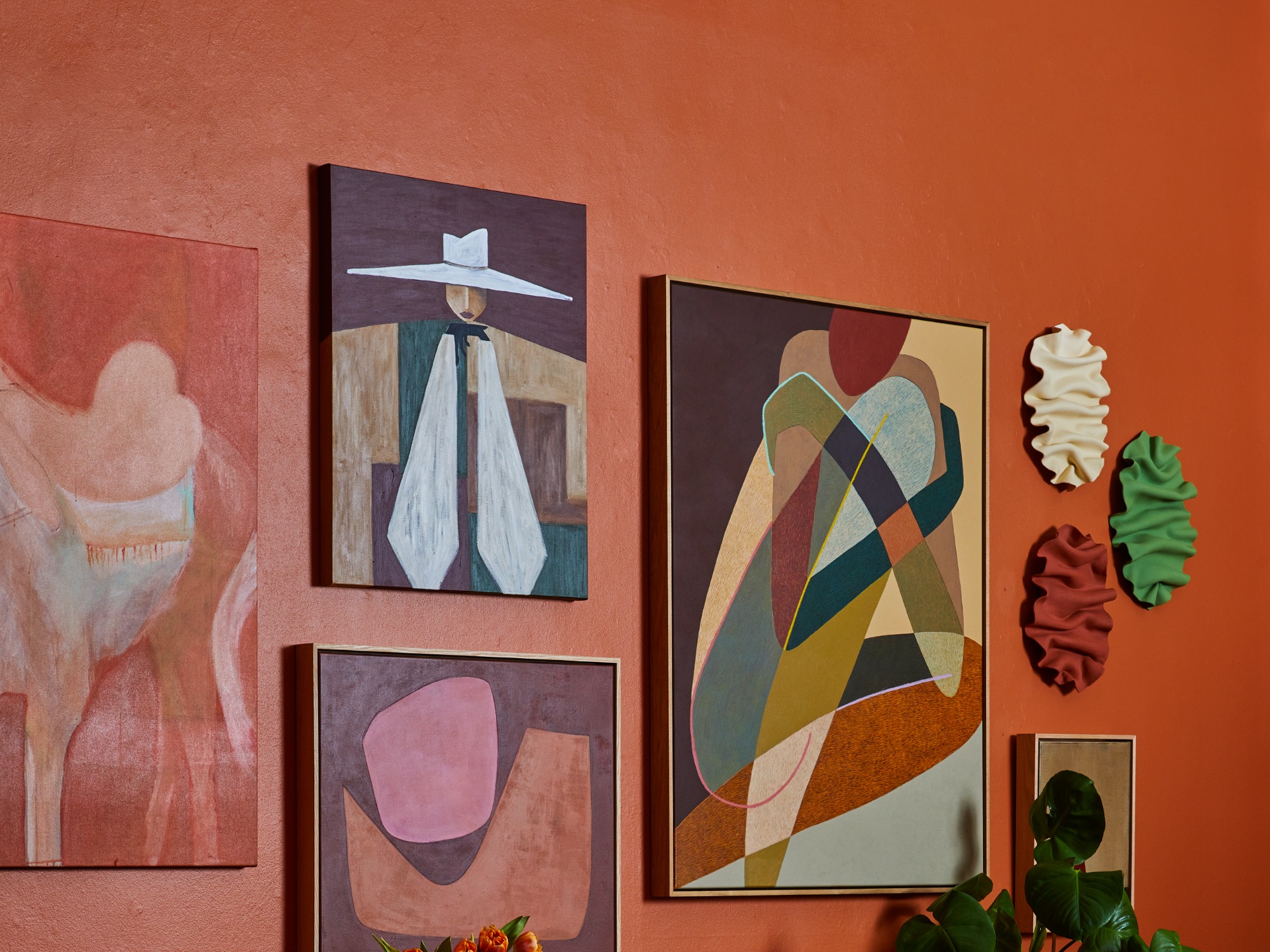
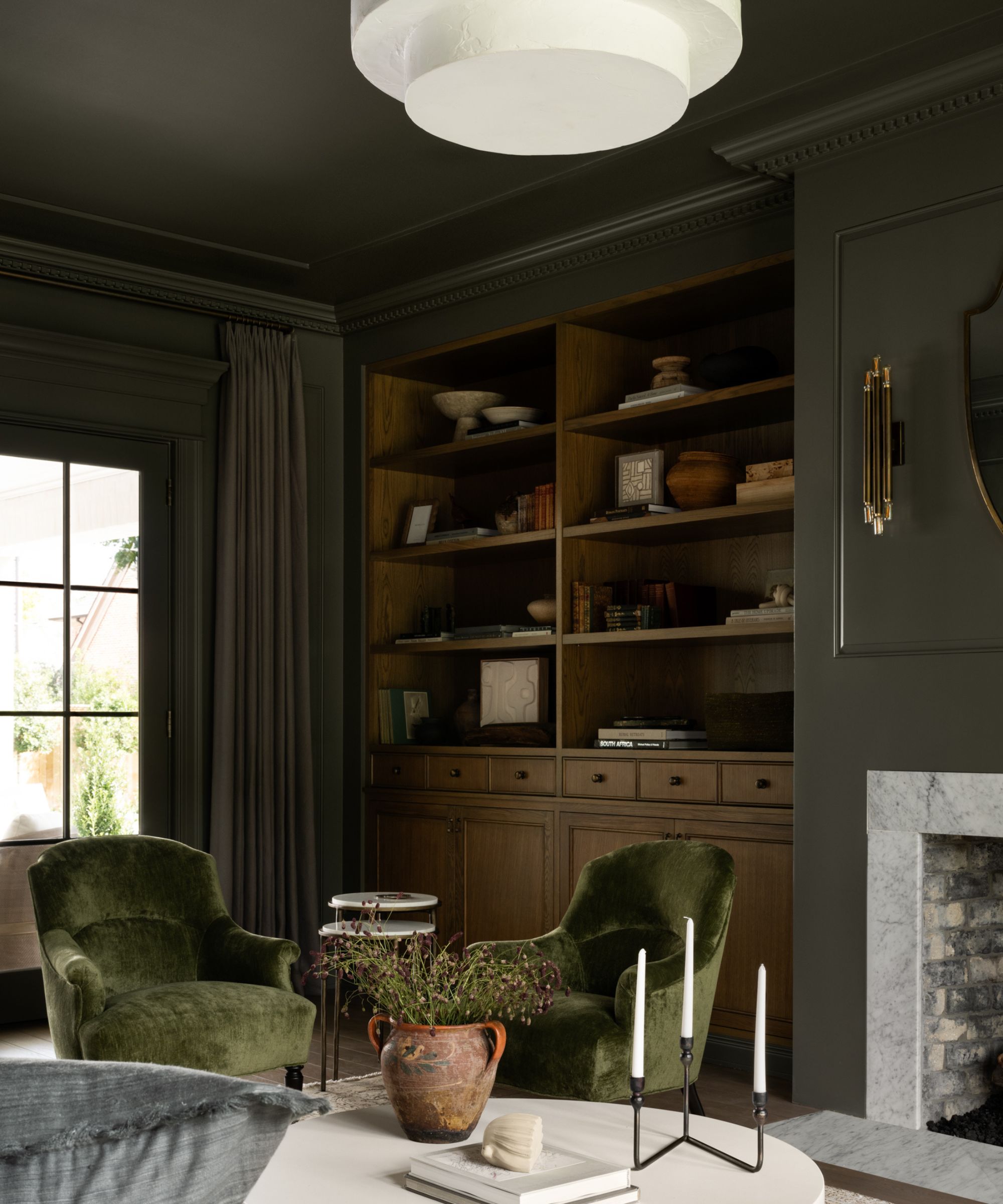
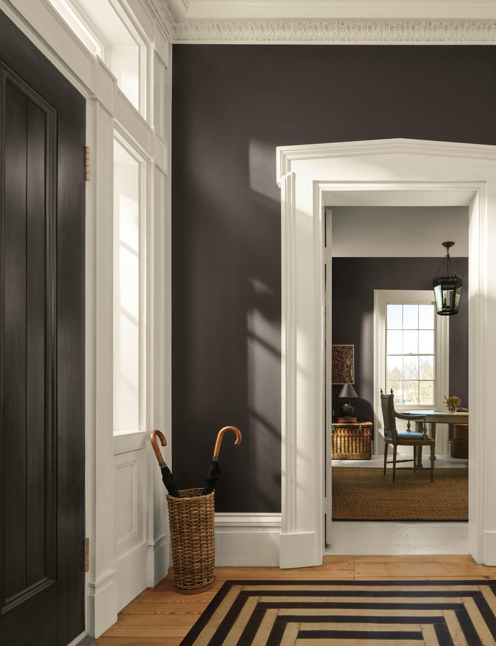
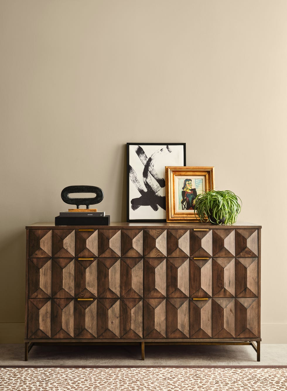
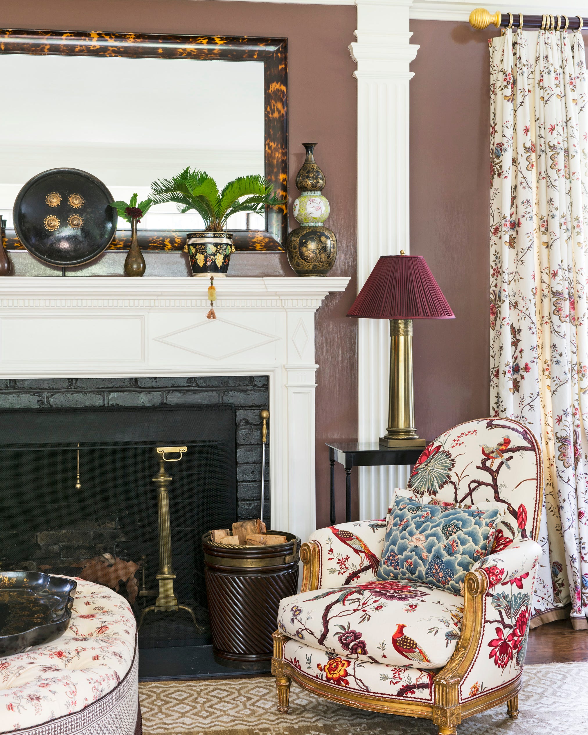
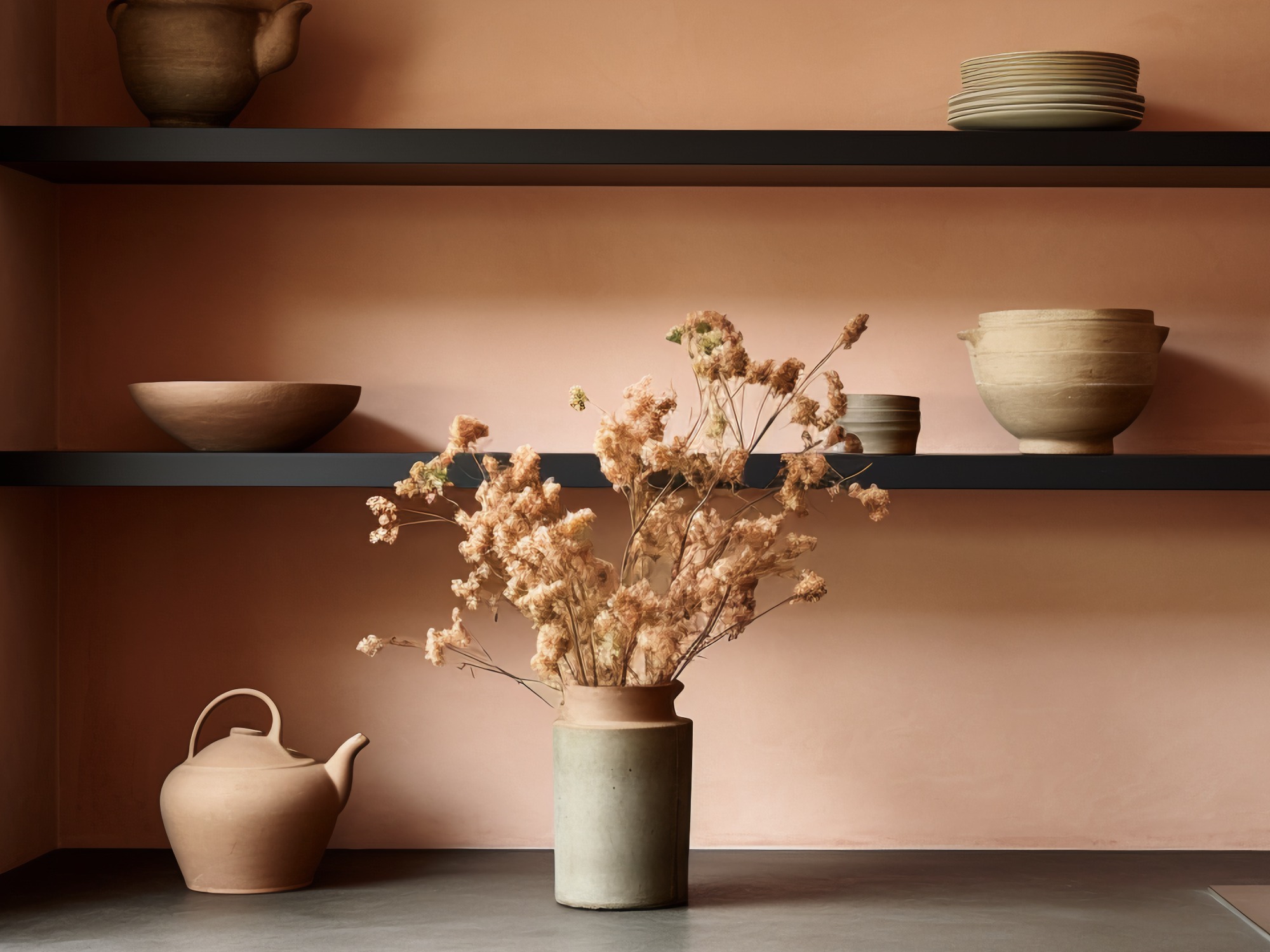
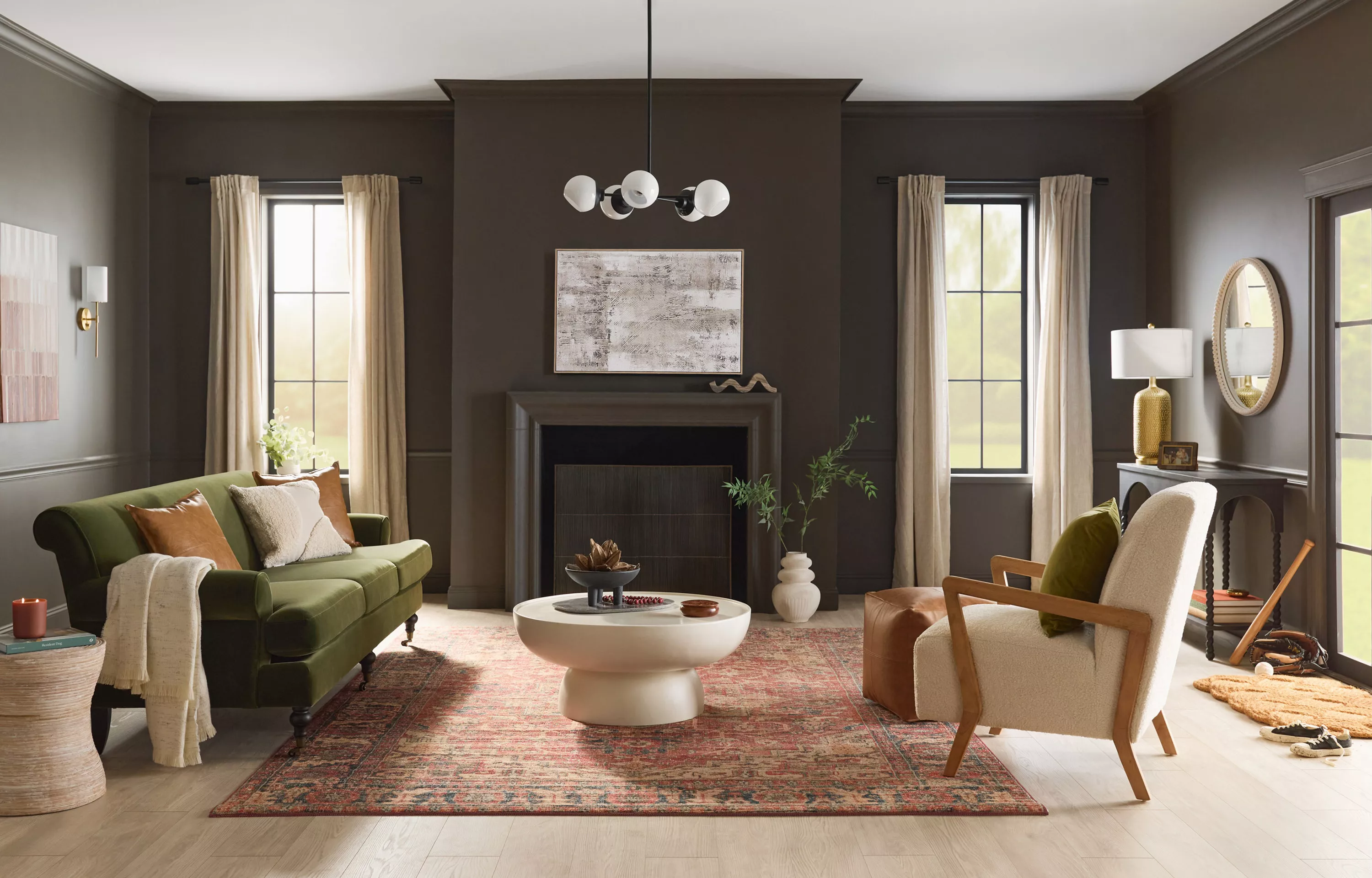
Graham & Brown's "Elderton" is a perfectly balanced, timeless deep brown inspired by elder tree leaves. This woody hue avoids reddish undertones, offering a rich and neutral base. It is particularly effective when applied using the color-drenching technique, covering walls, ceilings, baseboards, and doors for a bold and sophisticated effect in dining rooms, media rooms, or powder rooms. Lastly, C2 Paint's "Raku" is a dramatic, earthy, burnt brownish-red with oxidized undertones. This intense color is for those who dare to make a strong statement, infusing spaces with drama and intimacy. It transforms small rooms like mudrooms and powder rooms into unexpected jewels and lends a luxurious, chic feel to larger spaces like bedrooms or living rooms, especially when complemented by dark leather furniture and walnut wood tones for a monochromatic, textured look.
These selections collectively highlight a trend toward deeper, more impactful colors that evoke a sense of character, sophistication, and connection to nature, allowing homeowners to create distinct moods and personalized environments within their living spaces.
#ColorTrends #InteriorDesign #PaintColors #HomeDecor #DecoratingTips #ColorOfTheYear #Behr #Valspar #SherwinWilliams #ColorTrends #InteriorDesign #PaintColors #HomeDecor #DecoratingTips #ColorOfTheYear #Behr #Valspar #SherwinWilliams
0 comment in total
 No comments yet
You may also like
A Guide to Every Color of the Year for 2025 (So Far)

Color Explosion: 2025 Color Trends

The biggest color trends of 2025 – 10 colors designers say will lead the way next year

Update! From Evening Blue to Cinnamon Slate: See All the 2025 Colors of the Year We Know So Far
We’re Calling It: These Are the Official Color Trends of 2025
Pick Your Favorite 2024 Color of the Year

The 2025 Colors of the Year Are Here—and They All Have One Thing in Common

These 8 Color Trends Will Rule in 2025, According to Color Pros

Colors of The Year – get to know every shade revealed by leading paint brands for 2025
Every 2025 Color of the Year We Know So Far—and Inspiration for How to Use Each in Your Home

The Biggest Colour Trends Taking Off in 2025
Every Single Pantone Colour Of The Year From 2000 – 2026
Every 2025 Color of the Year We Know So Far

Every 2026 Color of the Year That Has Been Announced So Far

As a color editor, I've seen hundreds of color trends come and go this year – these are the ones I think will stick for 2025

6 key colors to decorate with in May 2025, according to interior design and color experts in the know
The colour palette for 2025 – these are the shades paint experts say we’ll see everywhere next year
The 2025 Garden Color Of The Year Is So Bold - Here's 13 Ways To Use It
What 2026's Colors of the Year Say About You—And All Of Us
Here's Every 2024 Color of the Year We Know So Far