Here's Every 2024 Color of the Year We Know So Far
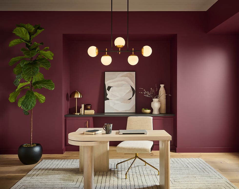
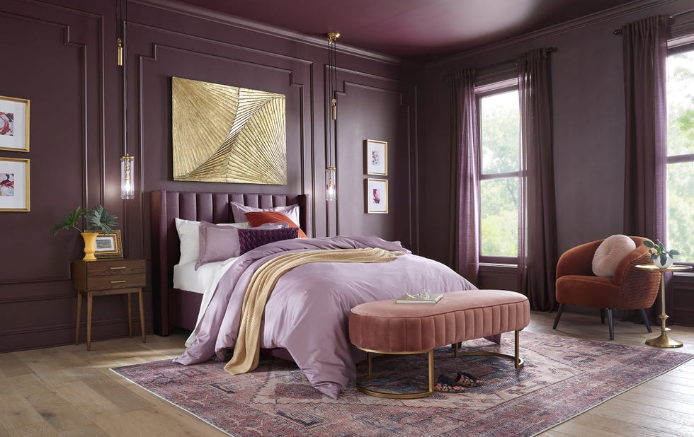
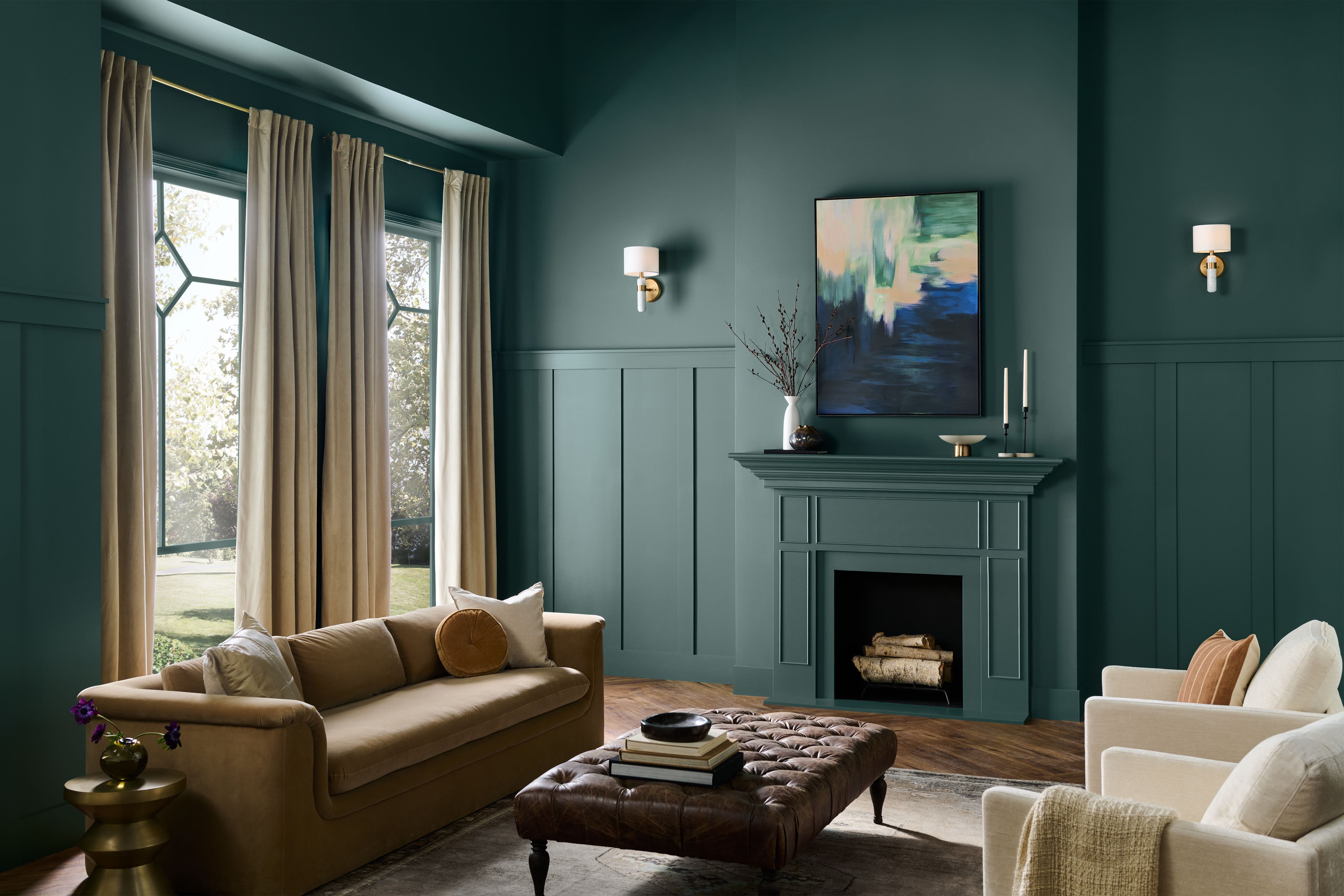
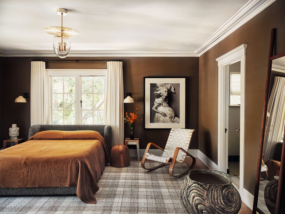
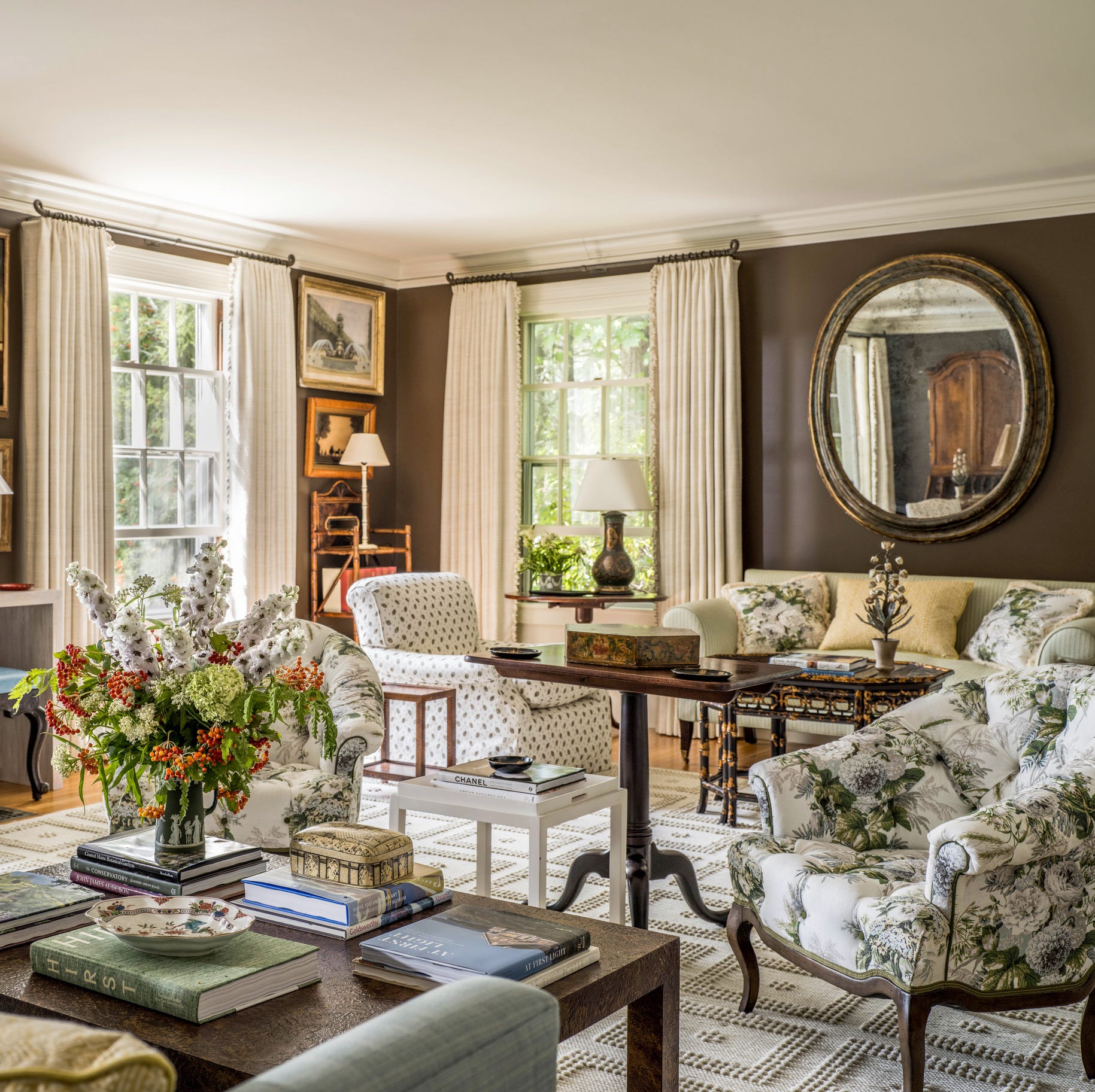
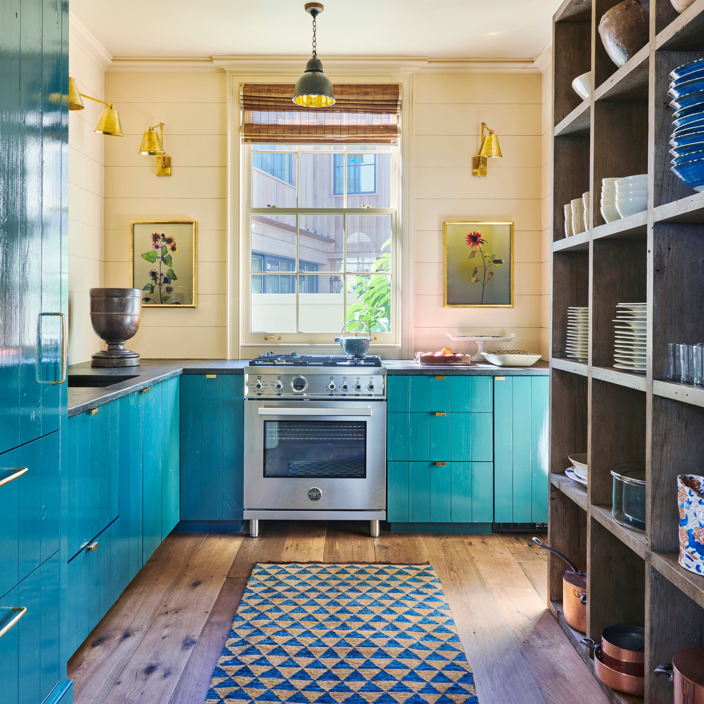
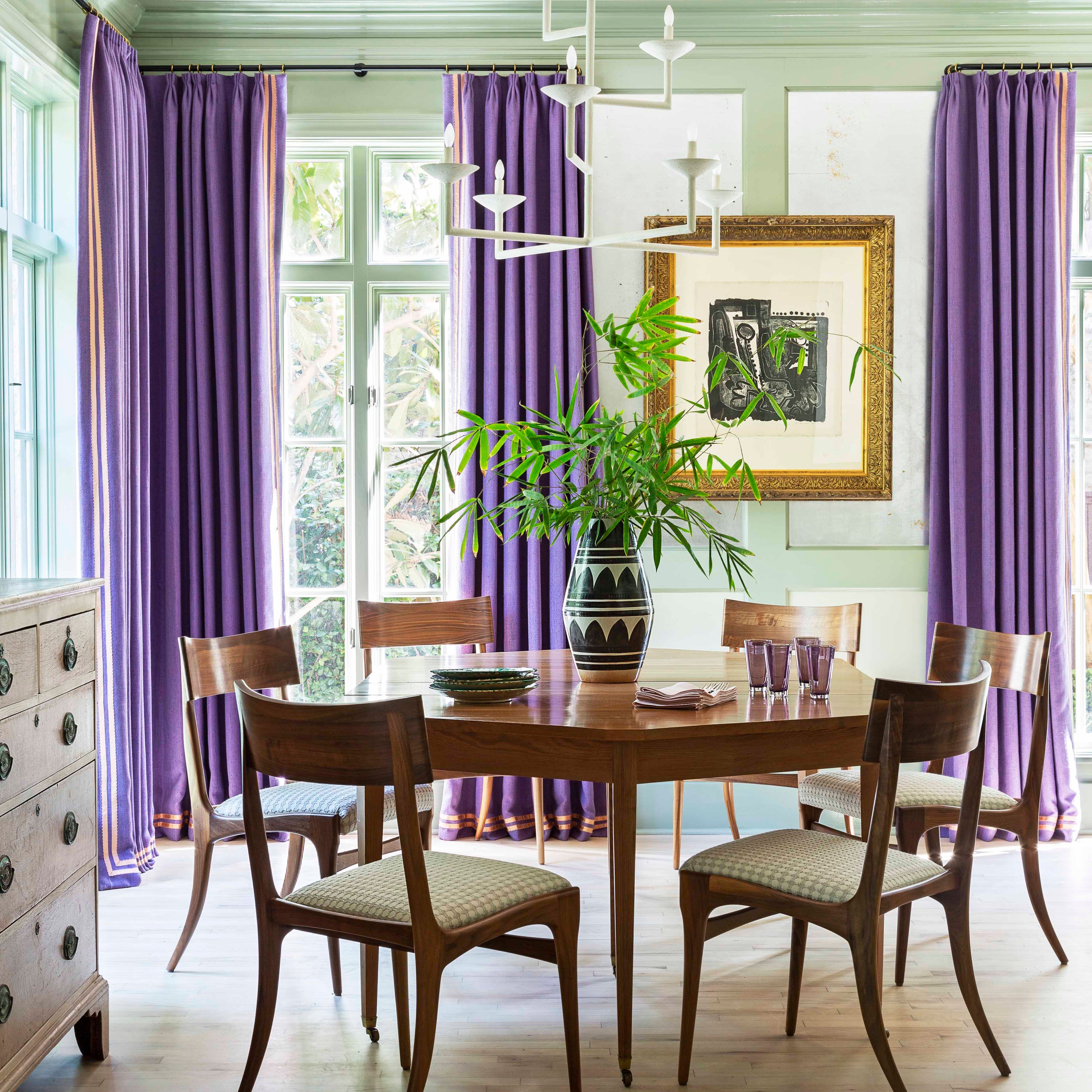
The year 2024 brings forth a captivating array of Colors of the Year, with a predominant focus on soothing earth tones, deep moody hues, and diverse shades of blue. These selections, announced by various paint and design experts, reflect a collective yearning for connection, tranquility, and a blend of modern and traditional aesthetics in home interiors. The overarching trend leans towards nature-inspired palettes, encouraging a sense of calm, warmth, and sophistication in living spaces.
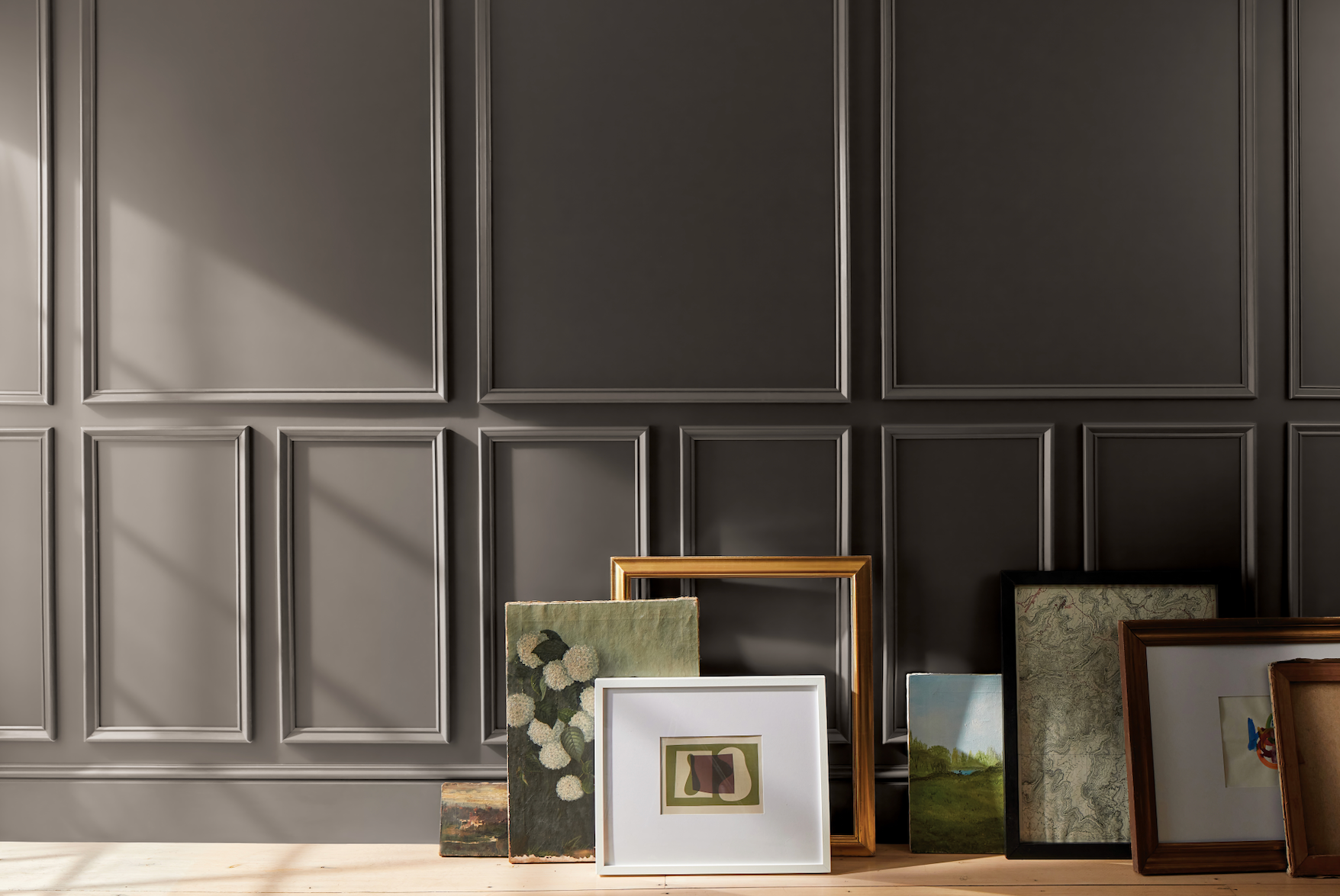
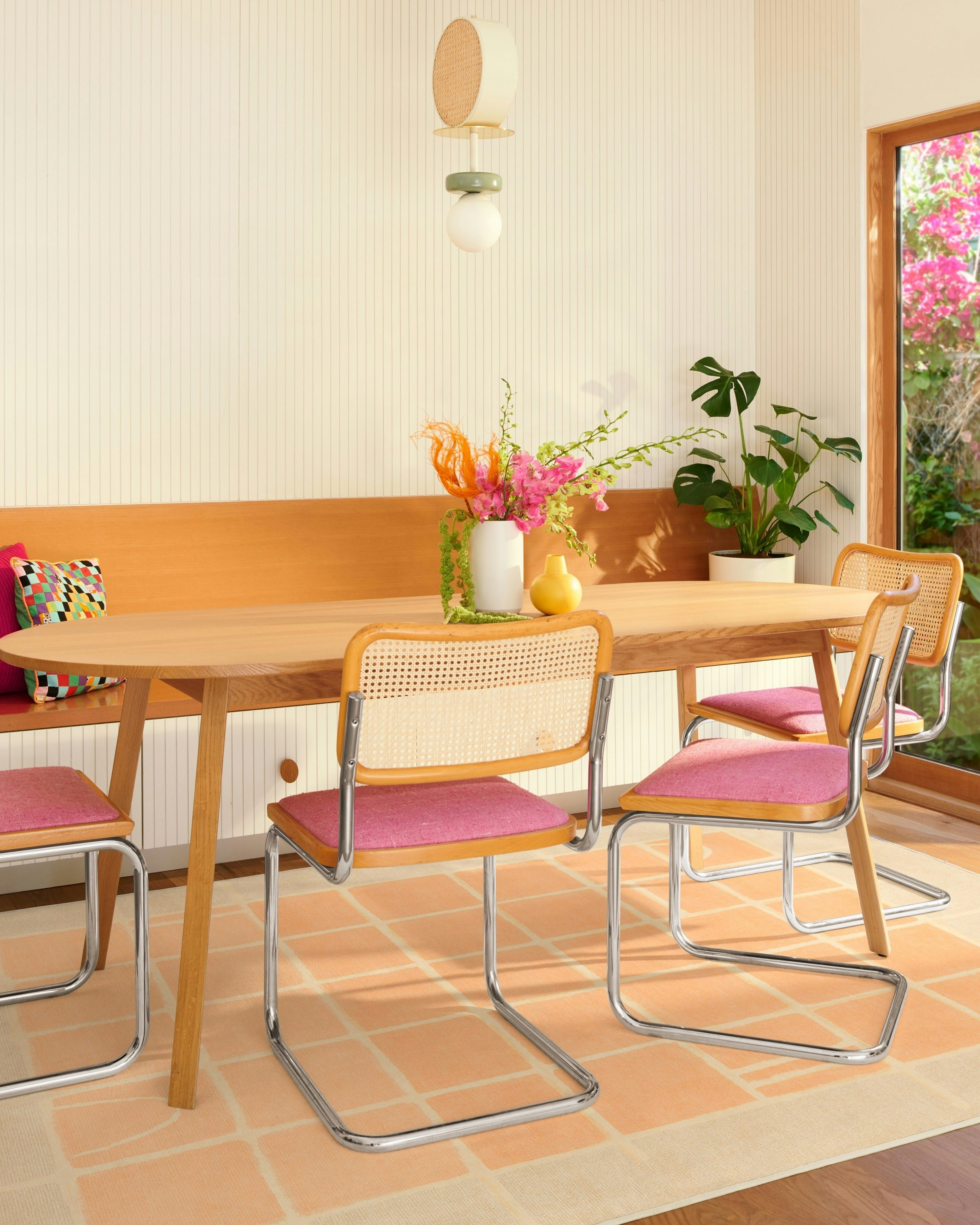
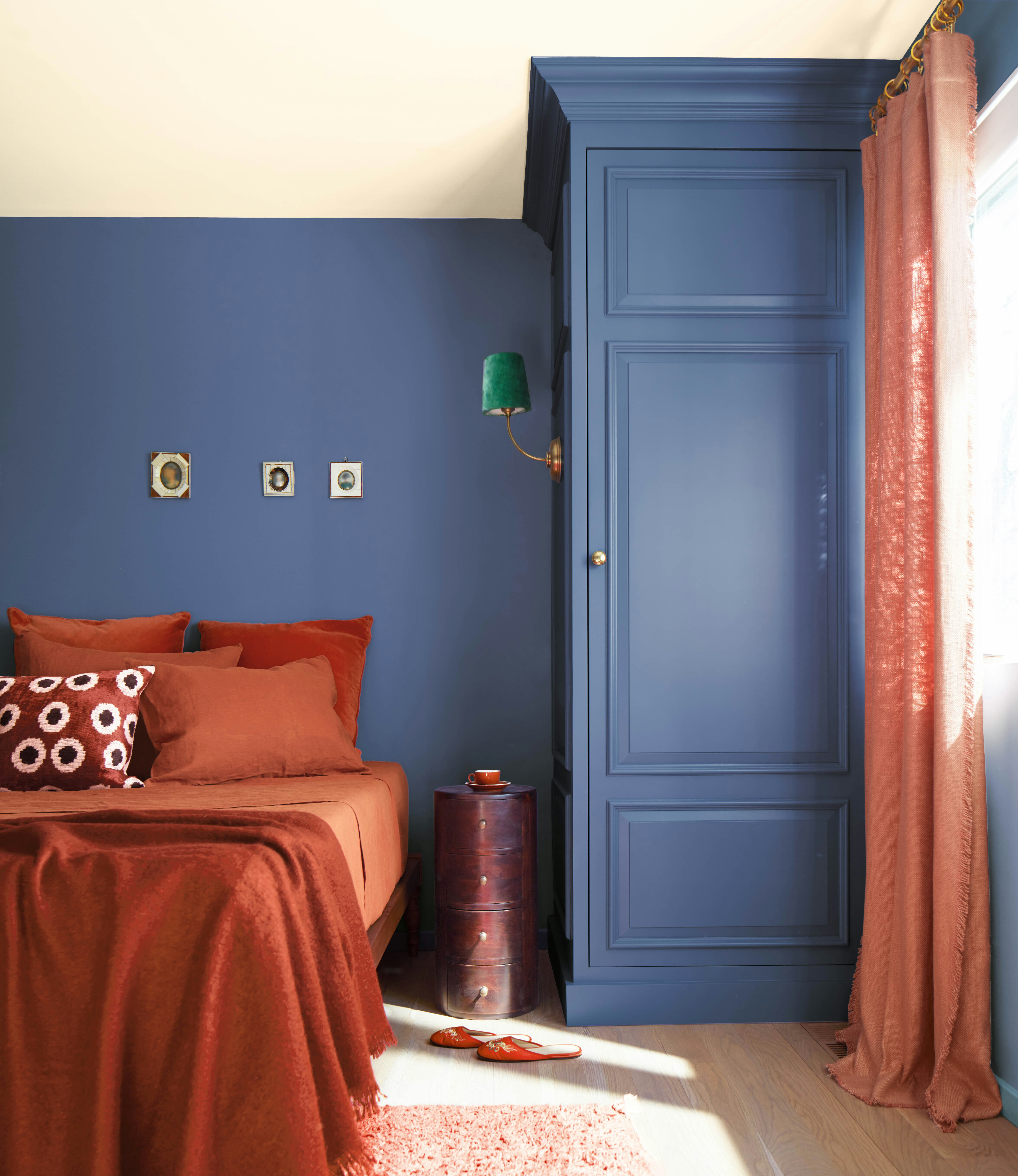
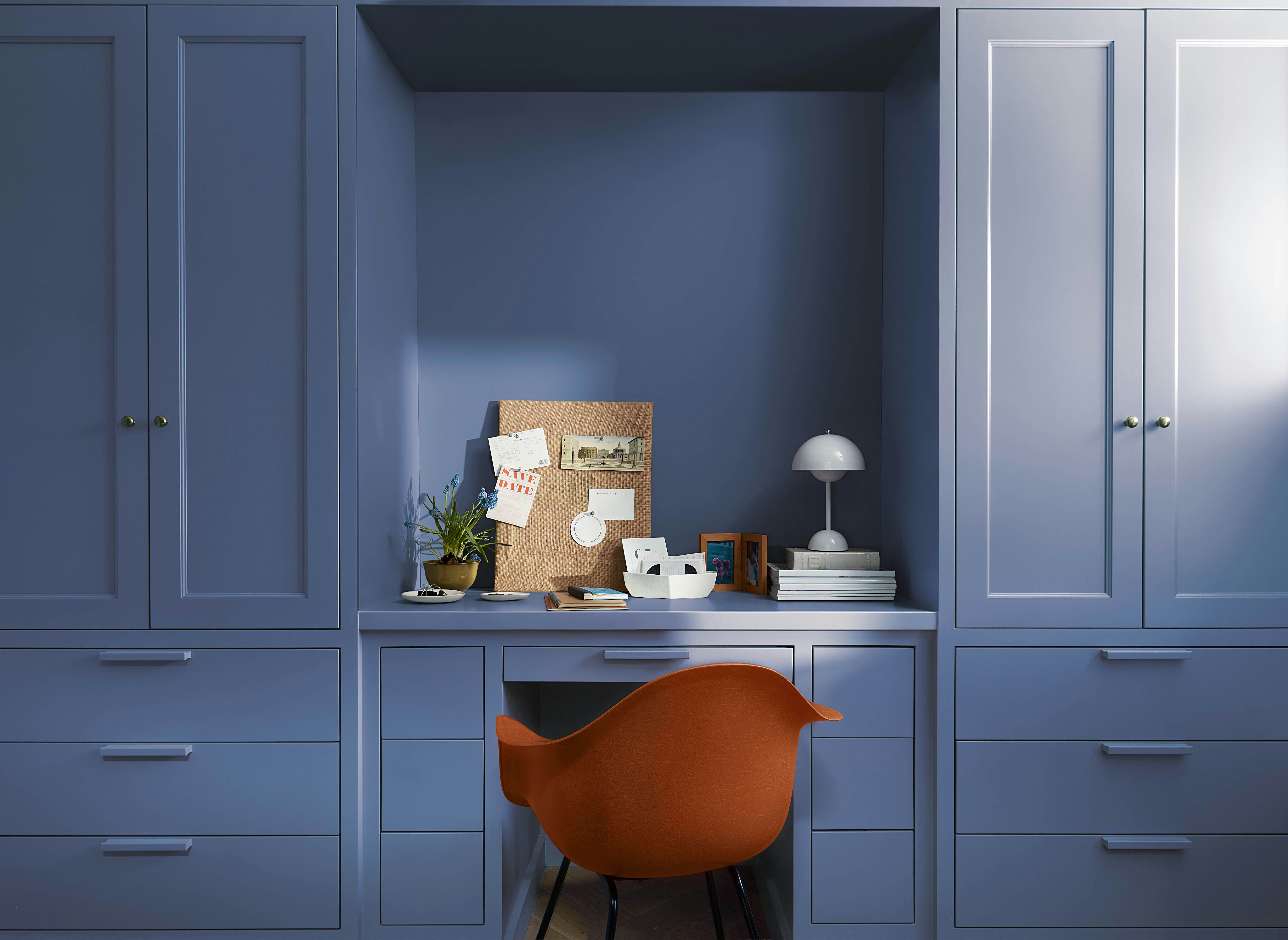
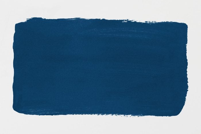
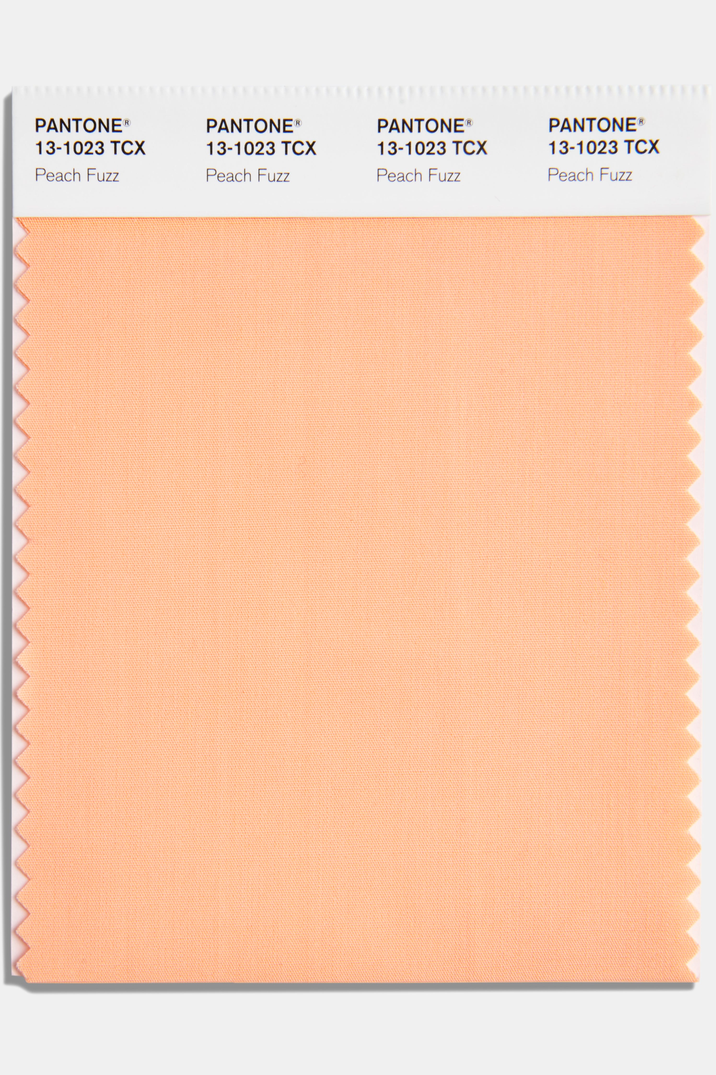
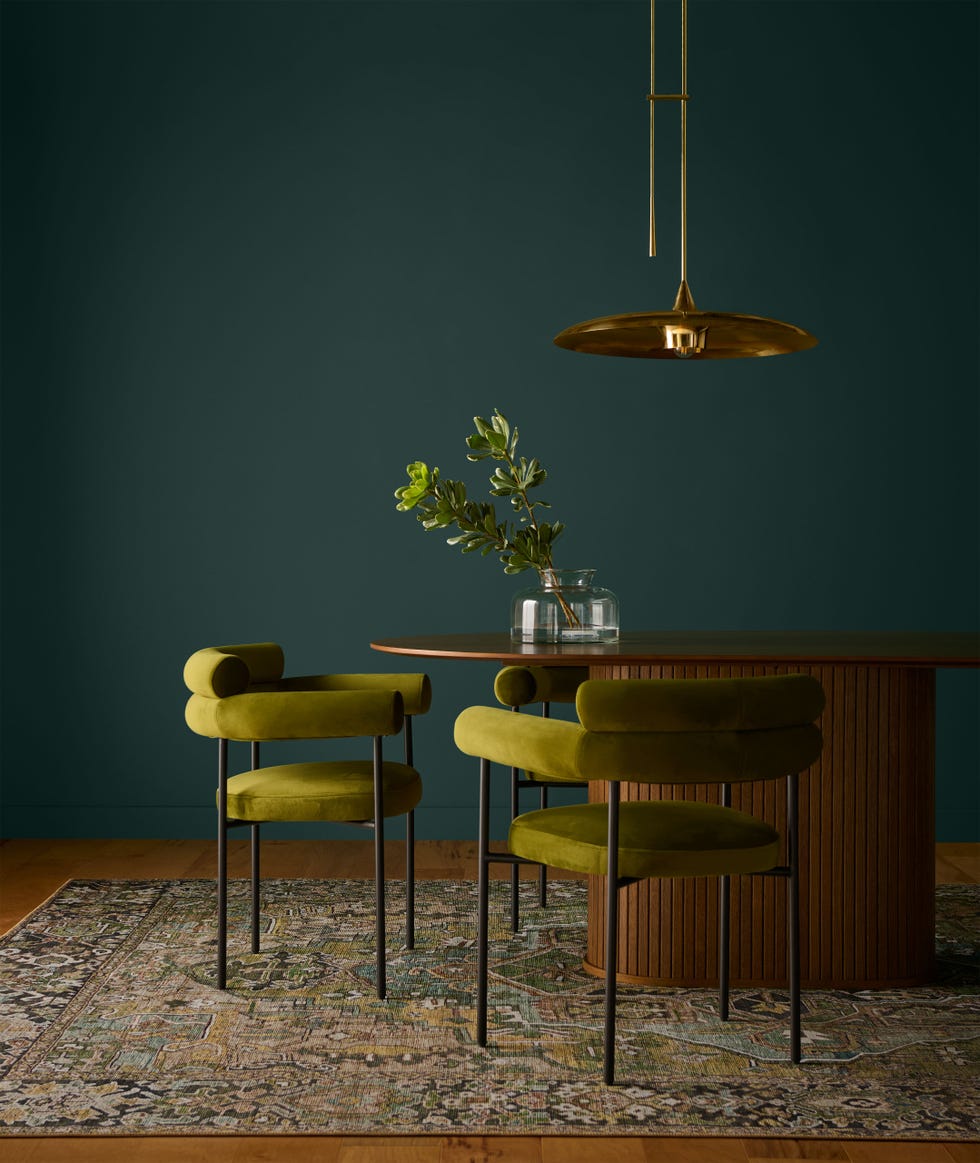
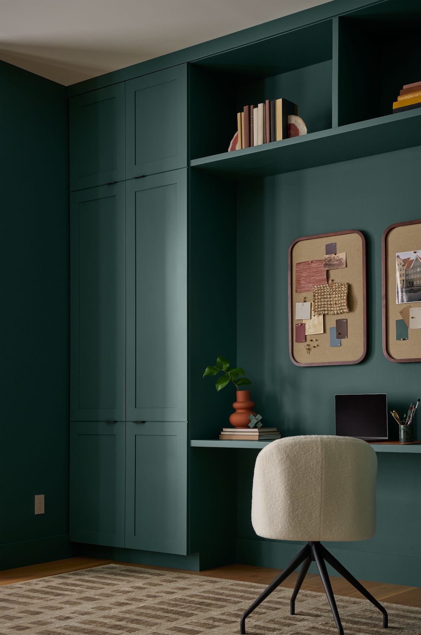
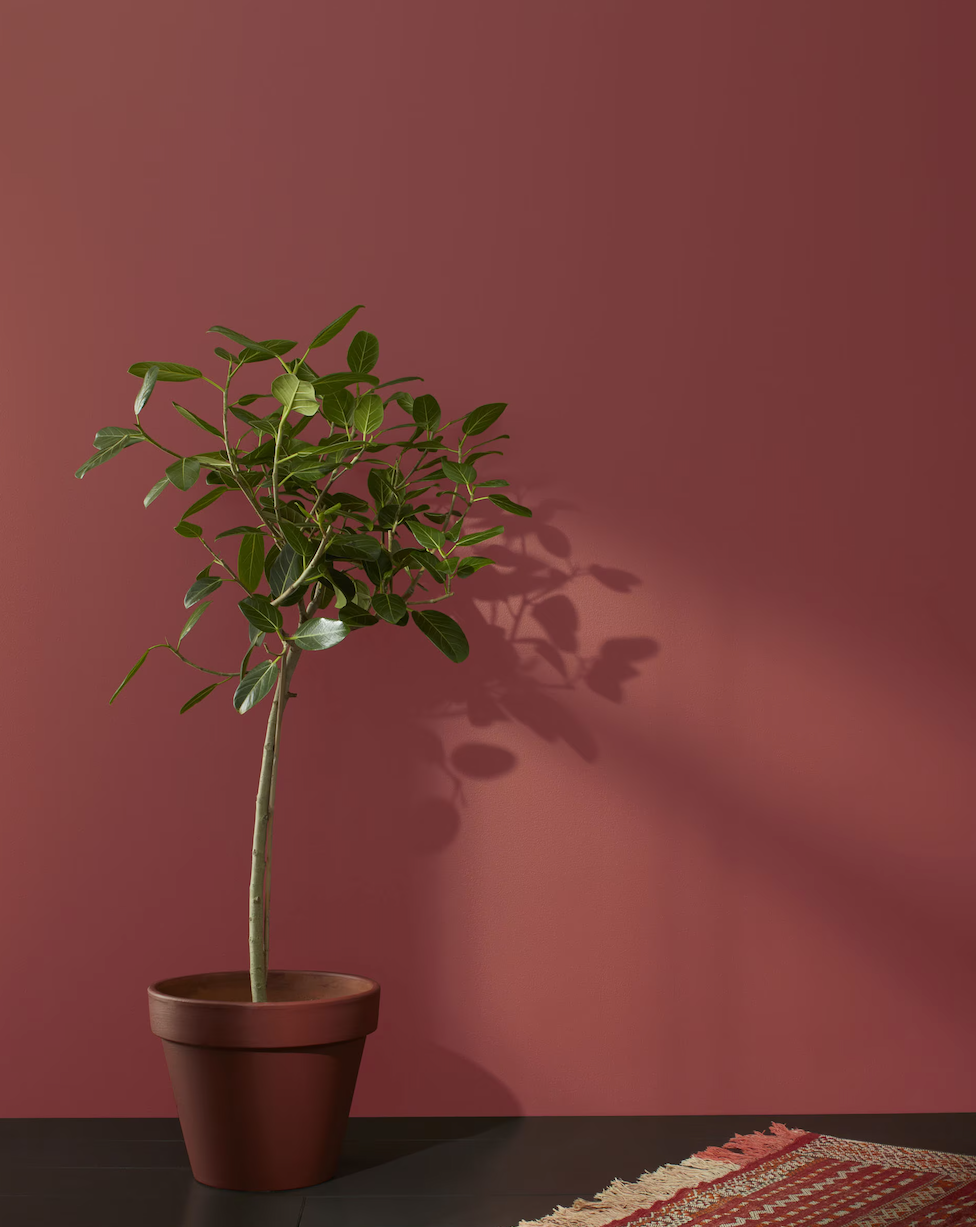
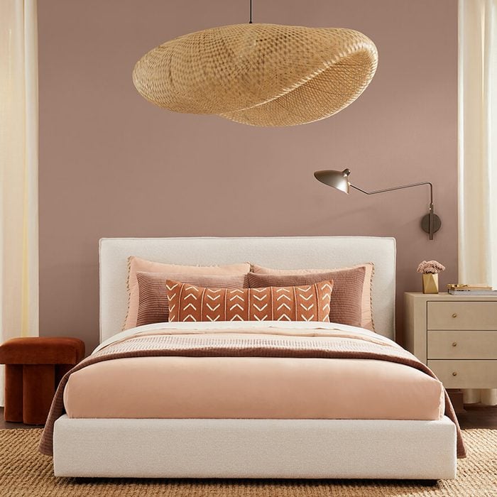

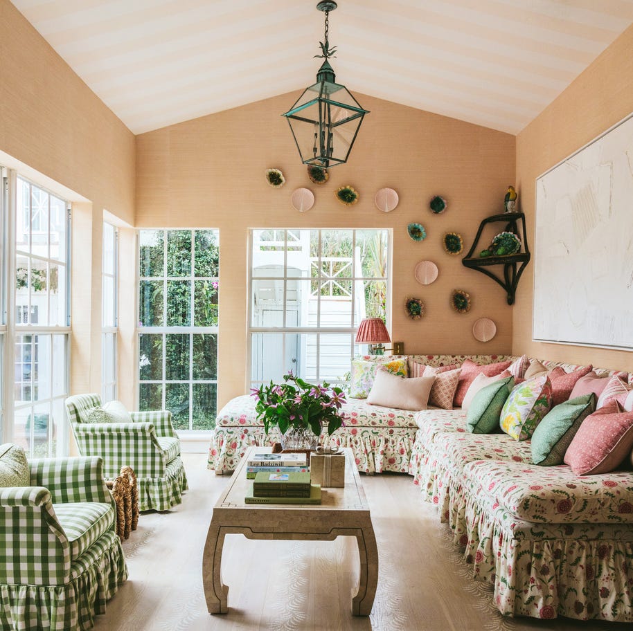
Rust-Oleum introduces Satin French Blue, a versatile mid-tone blue spray paint chosen for its ability to revitalize furniture and objects, infusing spaces with joy. It pairs well with crisp whites for a coastal feel or complements moody jewel tones. Pantone's Peach Fuzz, a warm and welcoming shade, promotes closeness and connection, offering a tactile embrace and a modern elegance suitable for relaxation and contemporary design. Benjamin Moore's Blue Nova, a rich and grounded blue, balances depth with classic appeal, representing the fusion of modern and traditional styles, and is complemented by a 2024 color trends report featuring creamy gray, muted orange, pewter gray, deep green, and hazy purple.
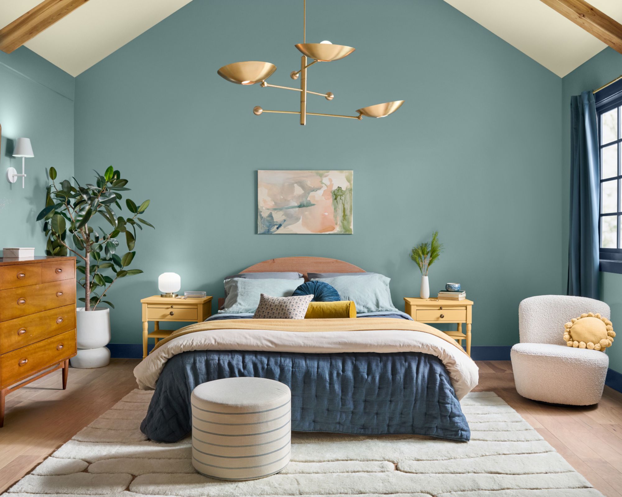
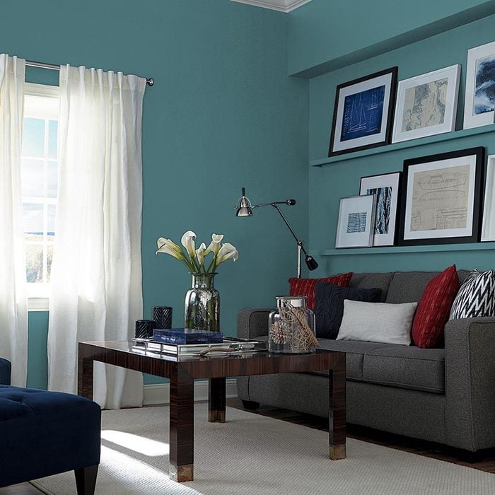
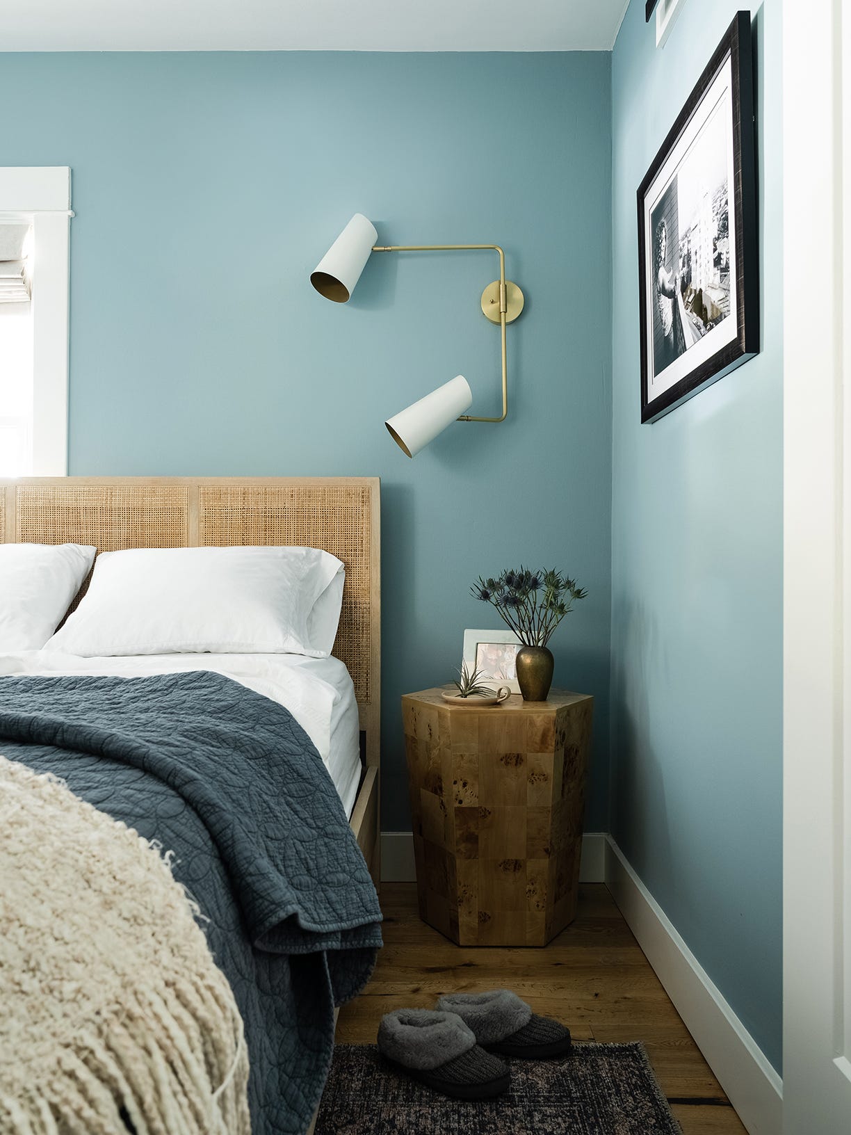
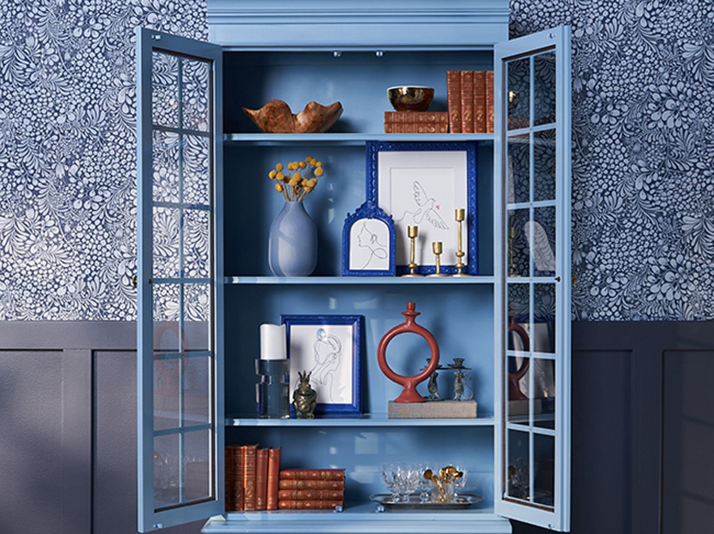
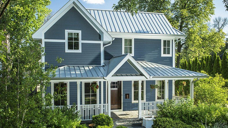
C2 Paint's Thermal, a mid-tone blue reminiscent of fall skies and winter scenes, aims to restore and redefine mood, fostering loyalty, trust, and confidence. It is ideal for creating soothing bedrooms or relaxing kitchen hangouts and is part of a capsule collection including Brulee and Marshland, inspired by natural color pairings. Dunn-Edwards offers Skipping Stones, a cool, breezy blue that adds mystery and thoughtfulness, signifying a shift from bold, warm-toned colors. It's versatile for accent walls or front doors, designed for timeless appeal.
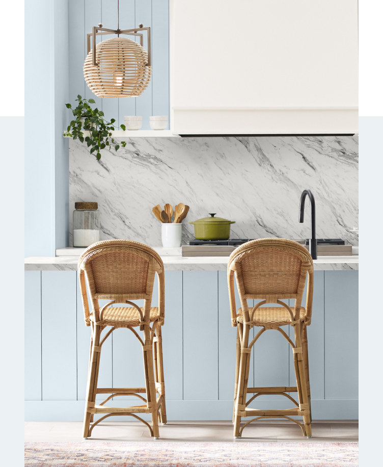
Krylon's Bluebird, a pale pastel with a bold touch, is designed for 'dopamine decor,' sparking joy and contentment. It harmonizes with both warm and cool shades, making it excellent for updating furniture or outdoor accent pieces. Sherwin-Williams presents Upward SW 6239, a bright and breezy blue that promotes peacefulness, encouraging a sense of ease and possibility. It can function as a neutral, accented with earth tones, or used for accent walls and wainscoting.
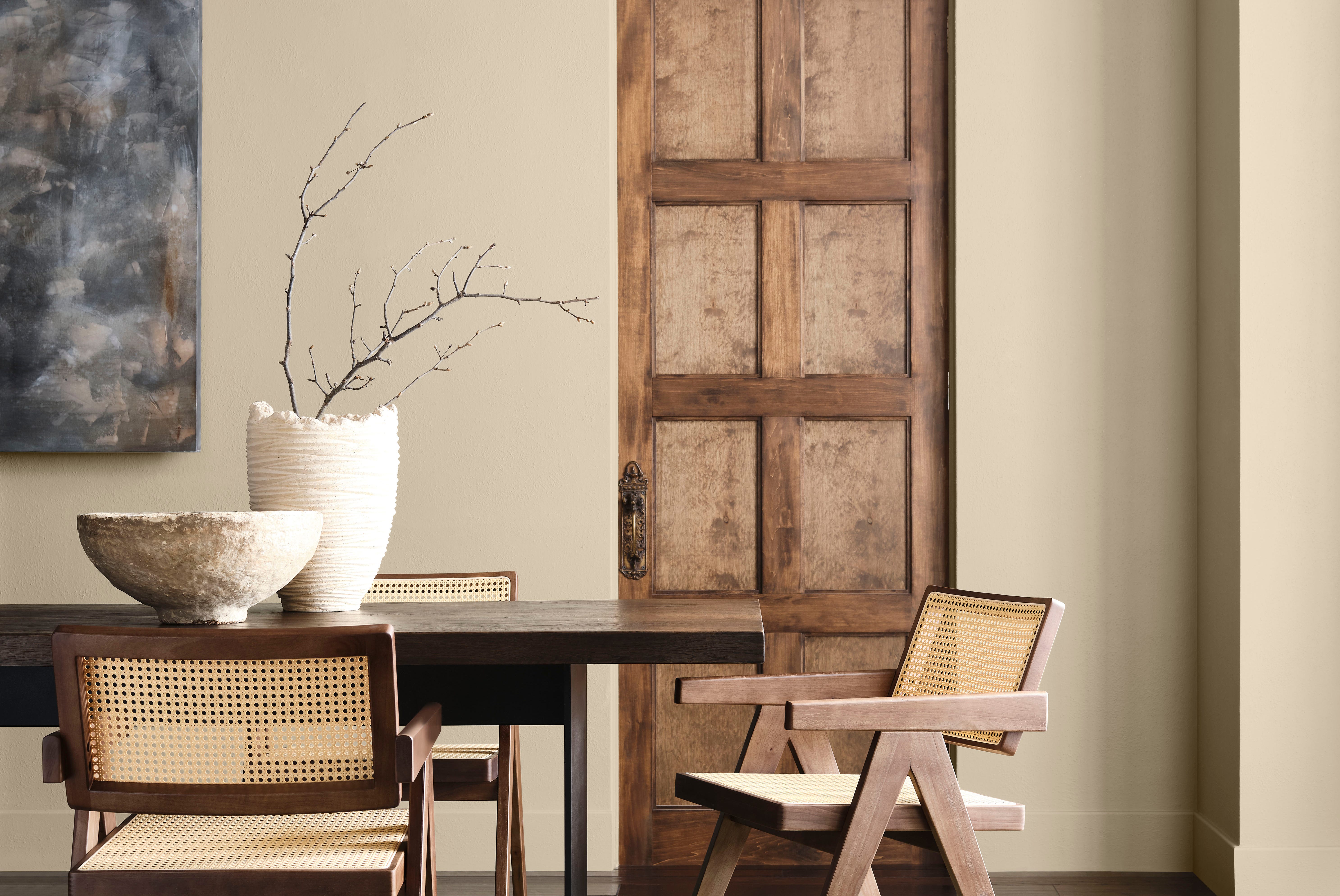
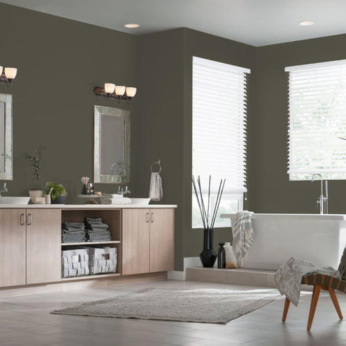
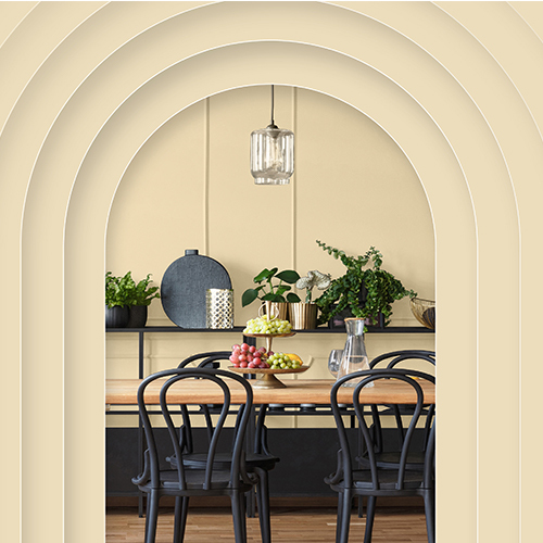
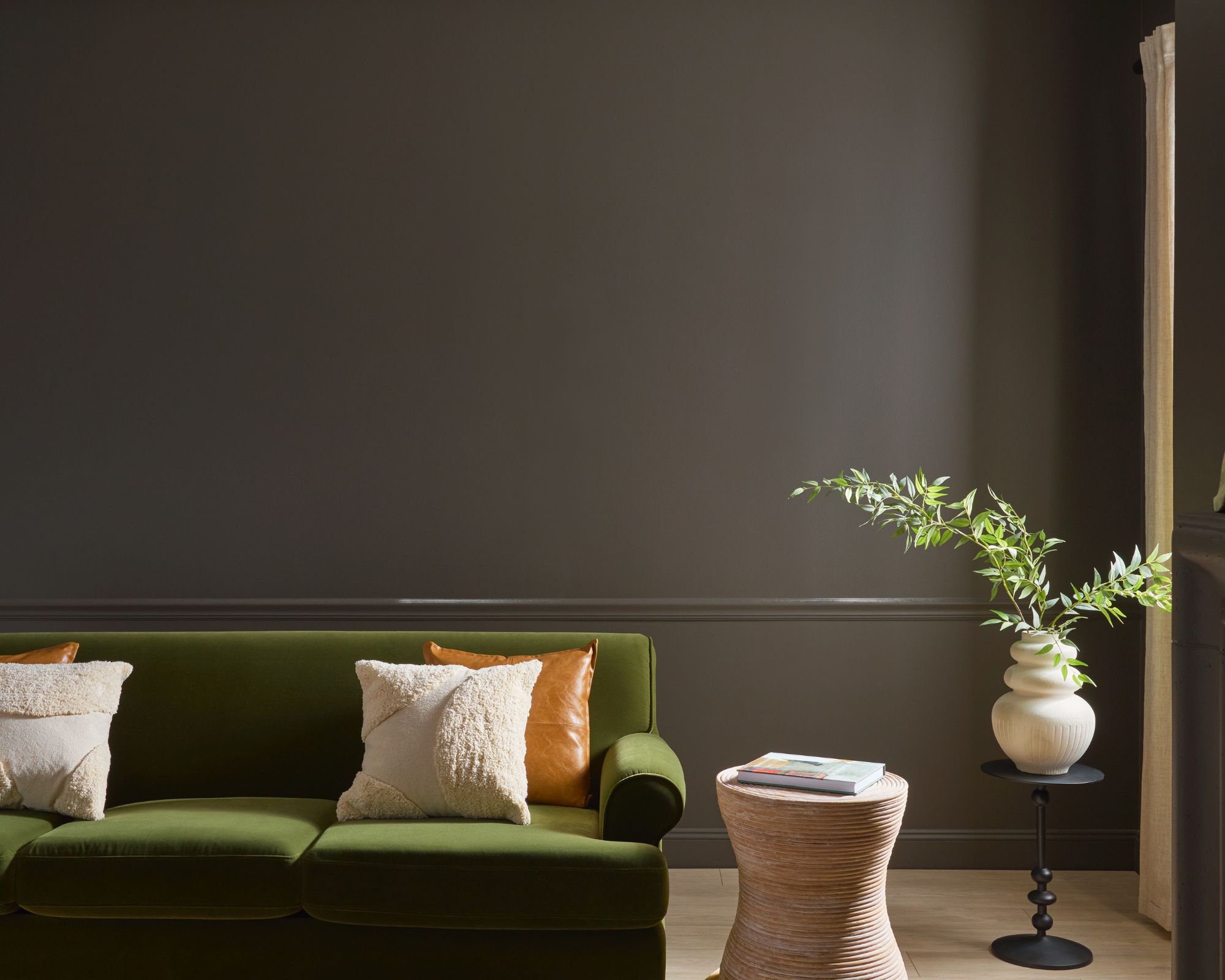
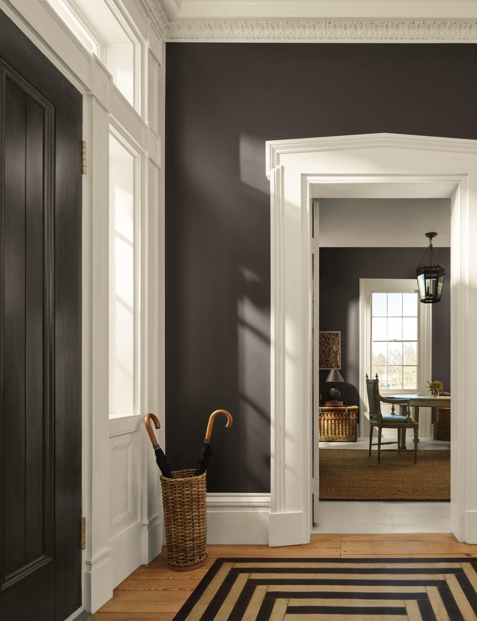
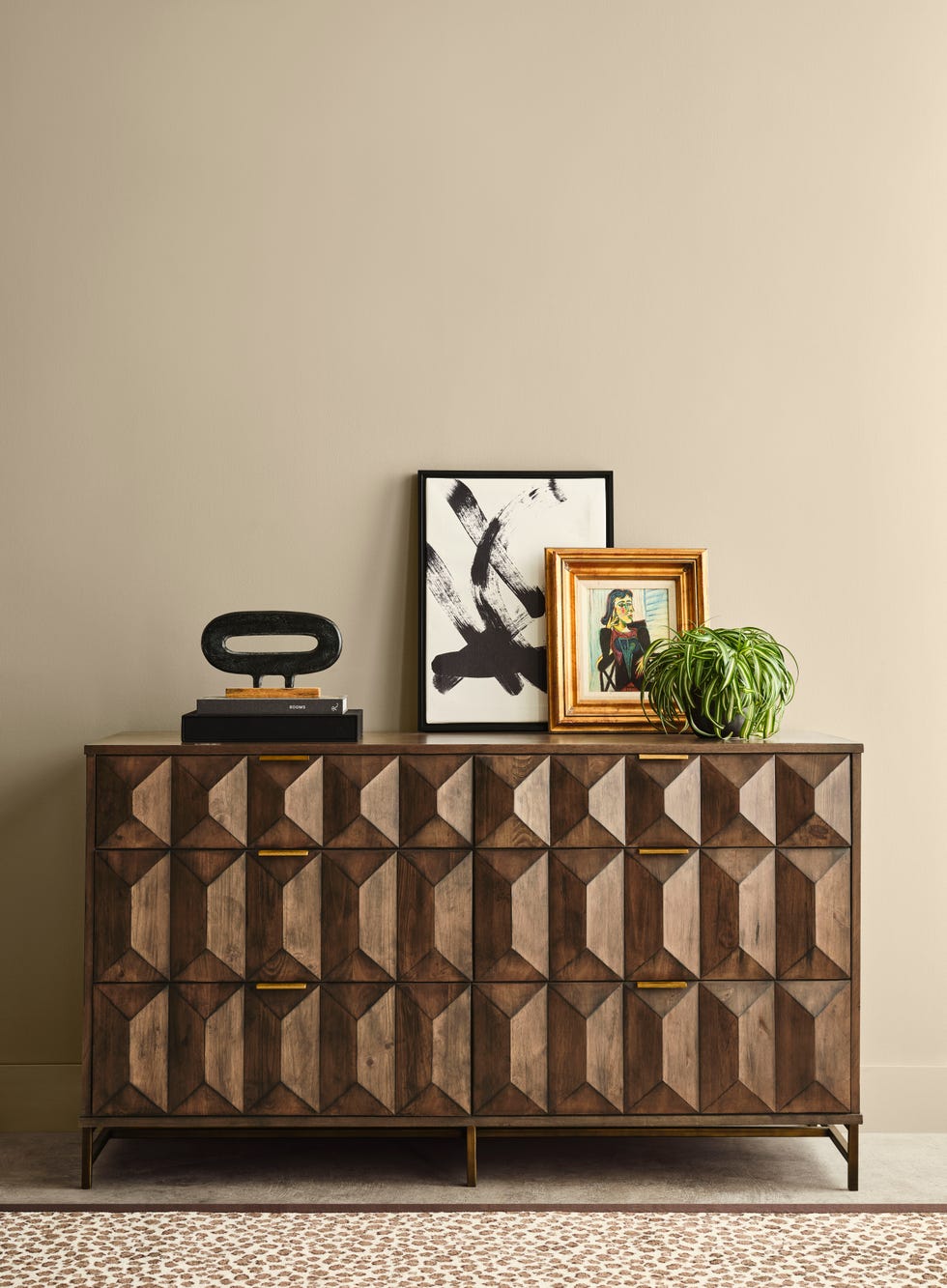
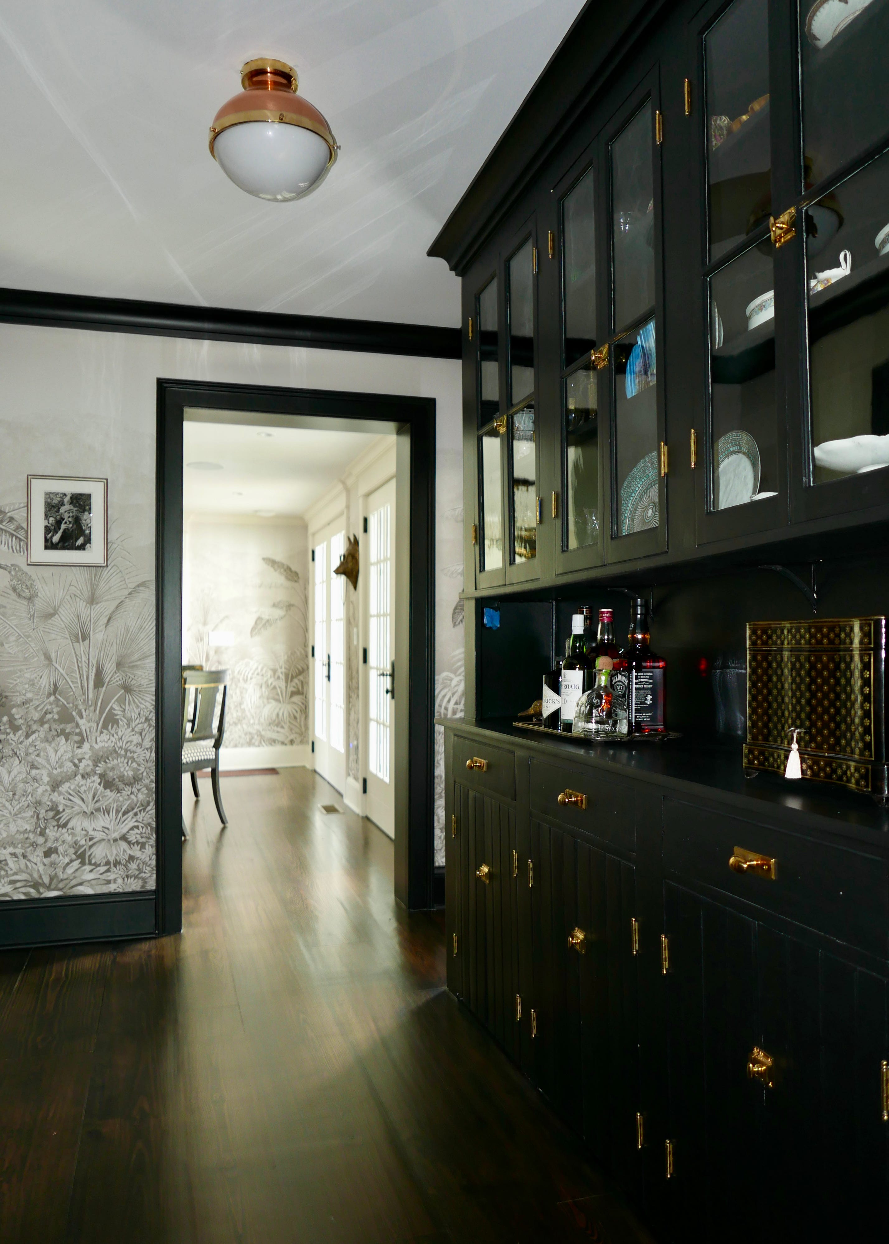
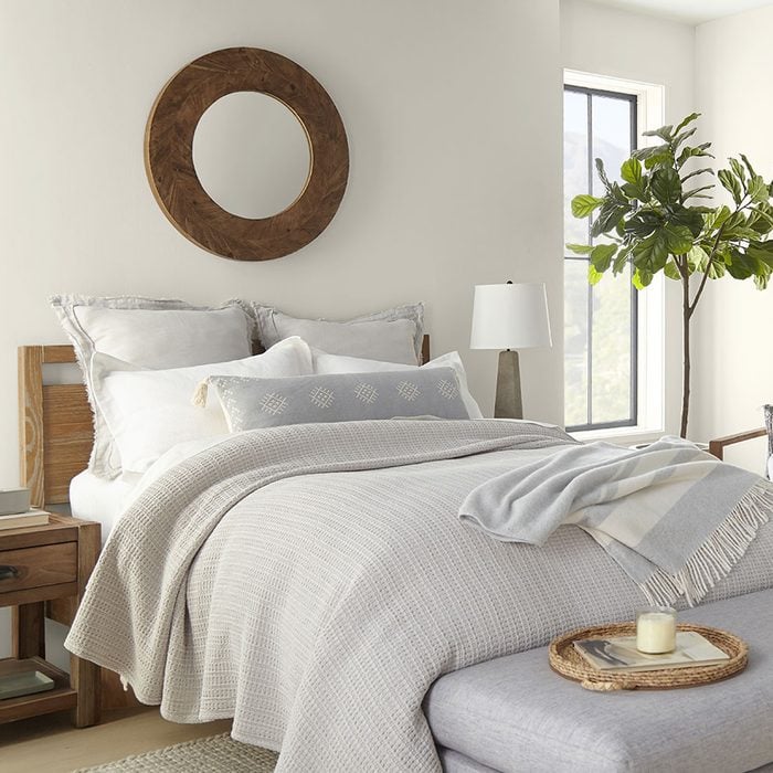
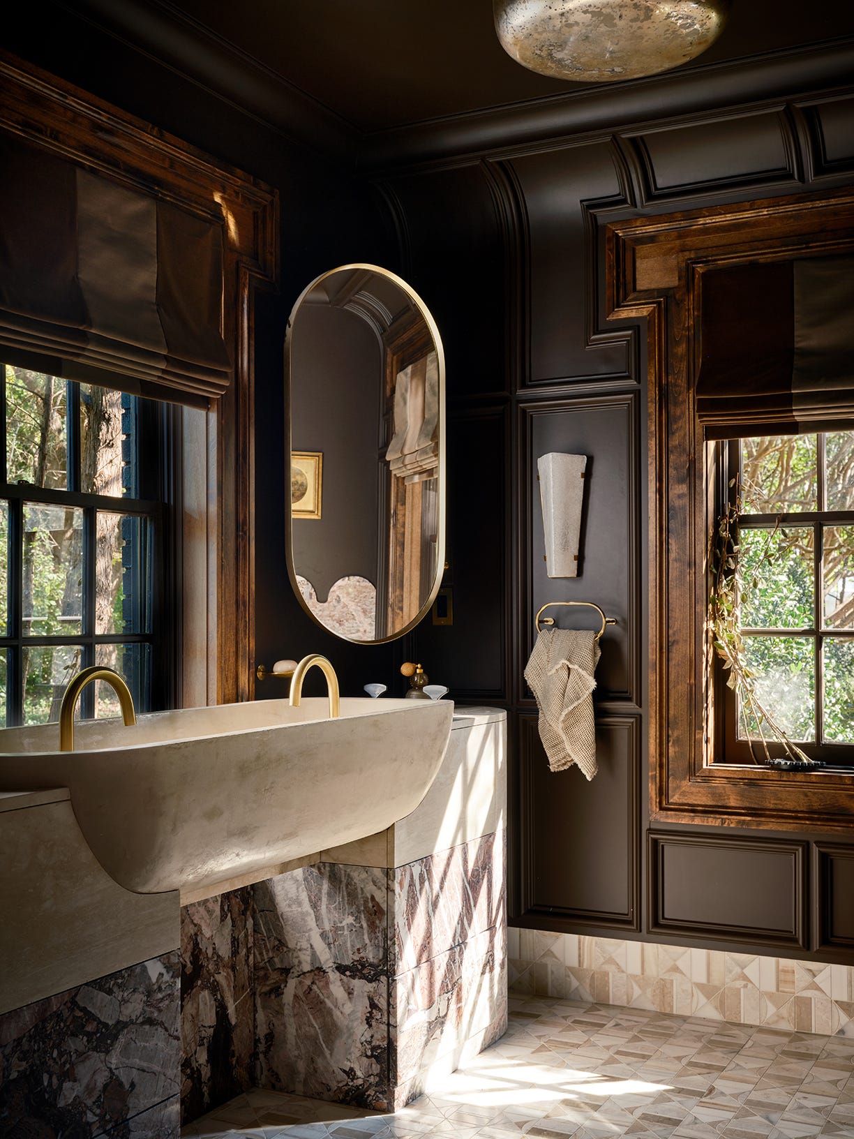
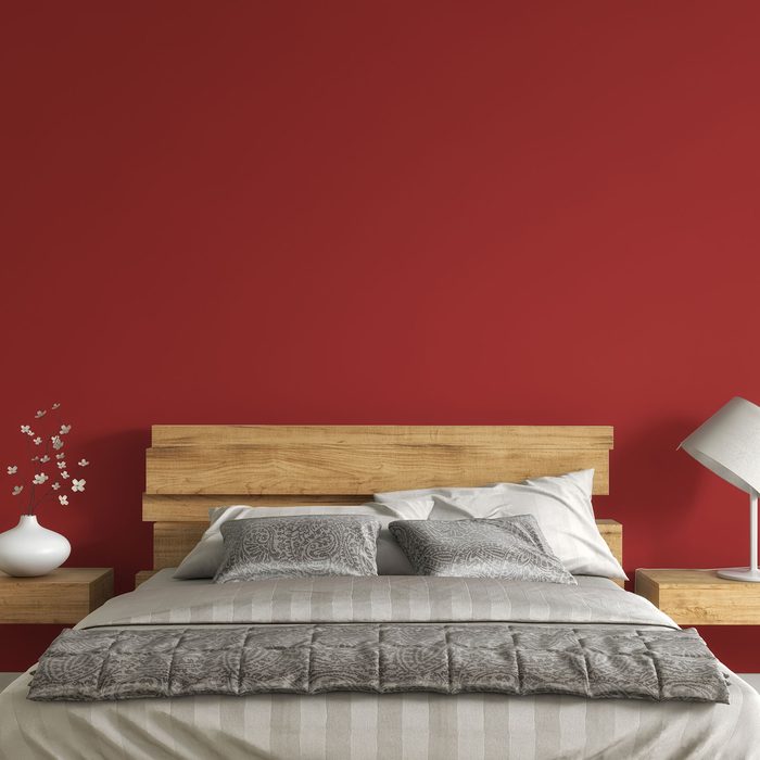
Minwax's Bay Blue wood stain caters to both coastal and sophisticated aesthetics, reflecting the popularity of ocean-inspired shades and the coastal grandmother trend. It empowers DIYers to create custom looks on various wood surfaces. Glidden’s Limitless, a warm, nearly-yellow neutral, is highly adaptable and designed to blend with both warm and cool tones, taking the place of cooler grays. This champagne-inspired shade makes spaces feel larger, brighter, and more welcoming. Finally, Behr’s Cracked Pepper, a deep charcoal hue, adds sophistication and confidence to any space. This versatile, almost-black neutral adapts to diverse design styles from midcentury modern to farmhouse, blending organically with landscapes and plants.
#ColorOfTheYear #HomeDecor #PaintTrends #InteriorDesign #NatureInspiredTones #BlueHues #EarthTones #ColorPsychology #DIYProjects #ColorOfTheYear #HomeDecor #PaintTrends #InteriorDesign #NatureInspiredTones #BlueHues #EarthTones #ColorPsychology #DIYProjects
0 comment in total
 No comments yet
You may also like
A Guide to Every Color of the Year for 2025 (So Far)

We’re Calling It: These Are the Official Color Trends of 2025
Every Single Pantone Colour Of The Year From 2000 – 2026
Update! From Evening Blue to Cinnamon Slate: See All the 2025 Colors of the Year We Know So Far
Every 2026 Color of the Year That Has Been Announced So Far

2025 Colors of the Year, and How to Use Them

The 2025 Colors of the Year Are Here—and They All Have One Thing in Common

Compare All the Paint Colors of the Year for 2023
Pick Your Favorite 2024 Color of the Year

Every 2026 Color of the Year Revealed So Far—and What They Say About the Year Ahead
Colors of The Year – get to know every shade revealed by leading paint brands for 2025

12 Trending Paint Colors for 2024, According to Design Experts

Every 2025 Color of the Year We Know So Far

2026 Color of the Year Announcements Have This In Common
What 2026's Colors of the Year Say About You—And All Of Us
These Are the Top Bedroom Colors of 2024
Ready for a Fresh Coat of Paint? Check Out the Top Colors of 2024

7 Color Trends That Will Be Huge in 2024, According to Color Experts

Designers Say These 12 Paint Colors Will Be Everywhere in 2026
Every 2026 Color of the Year We Know So Far, From Soft Neutrals to Your New Favorite Green