1/17
The 16 Best Accent Wall Colors
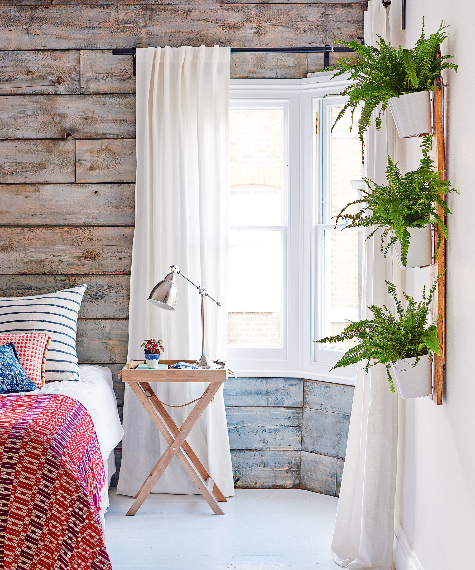
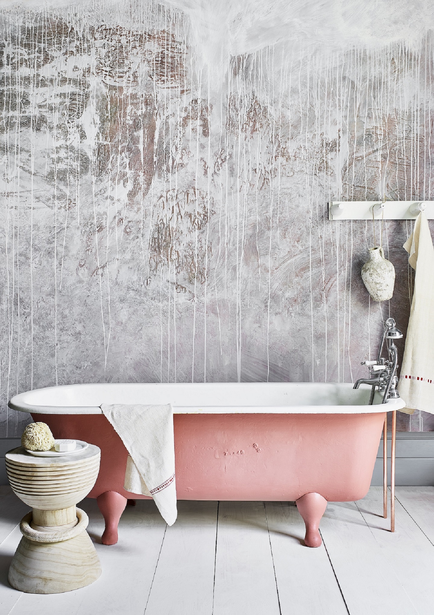
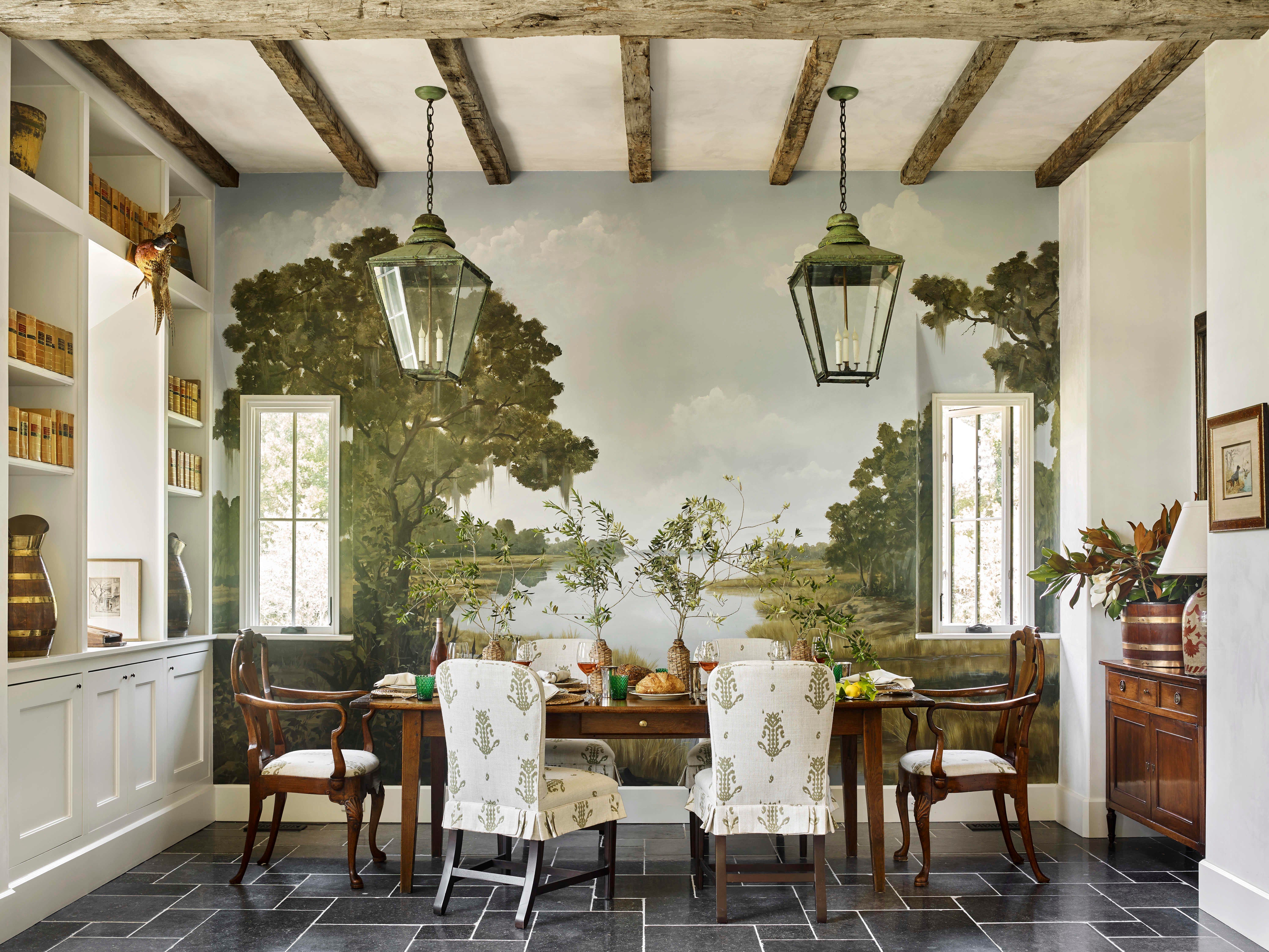
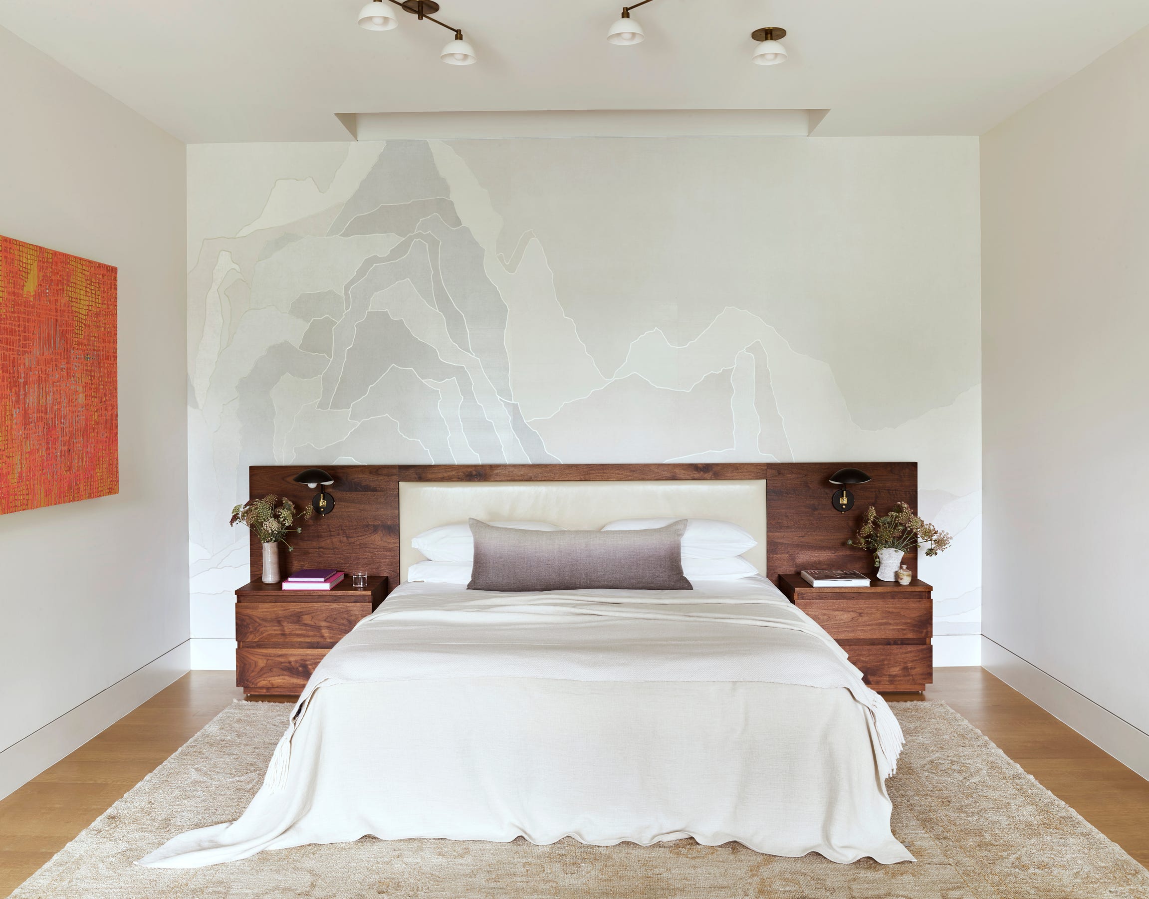
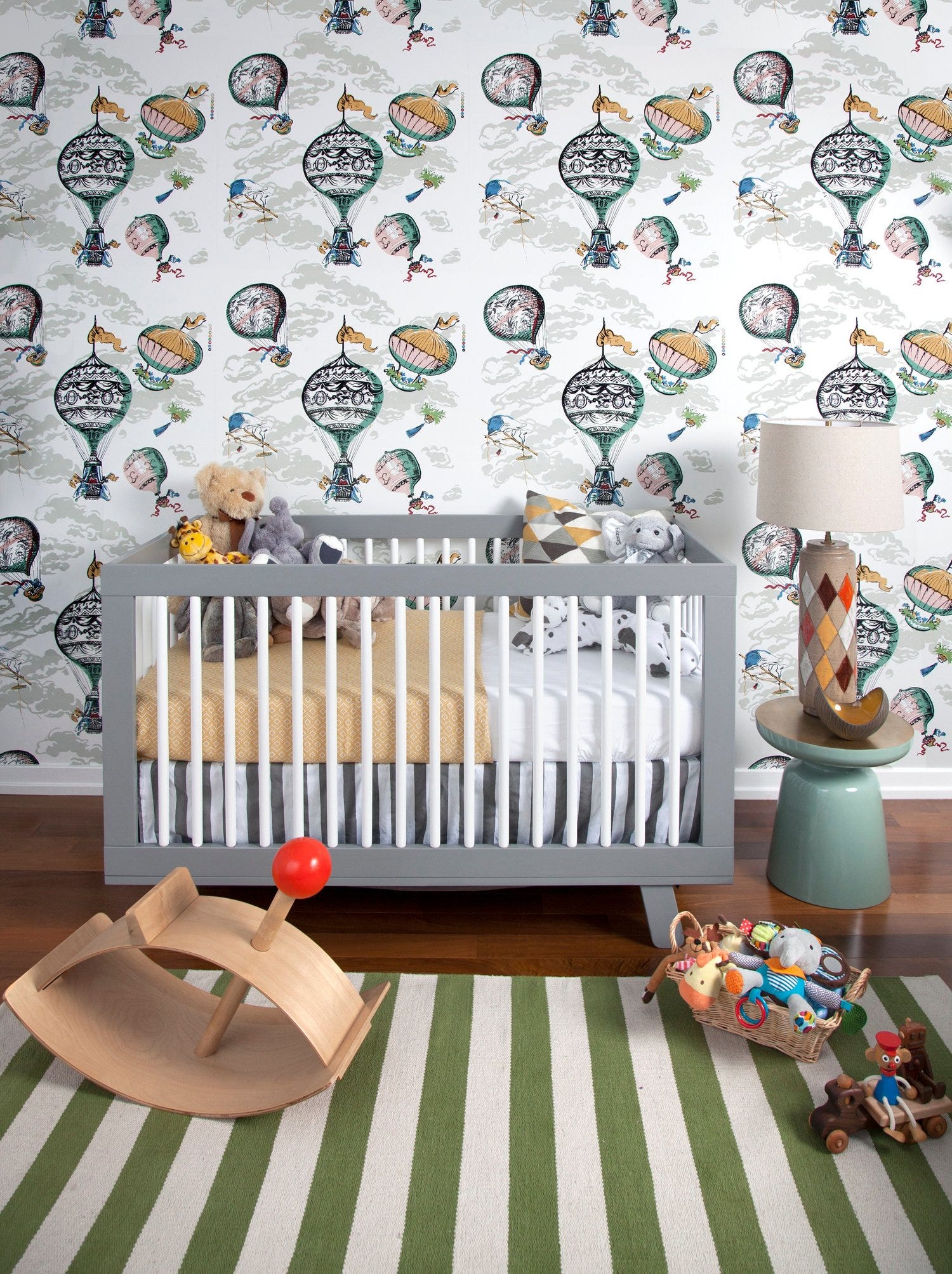
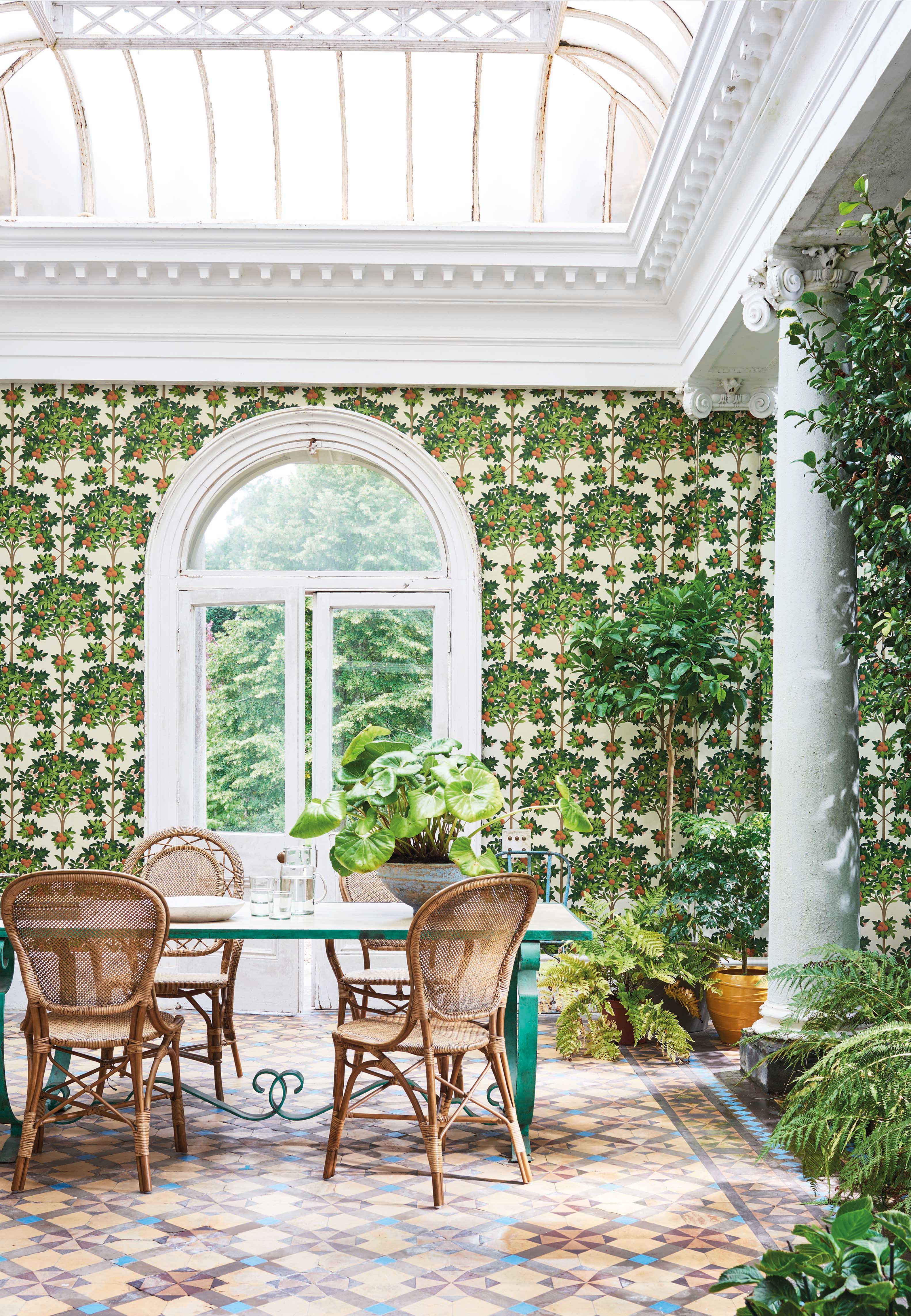
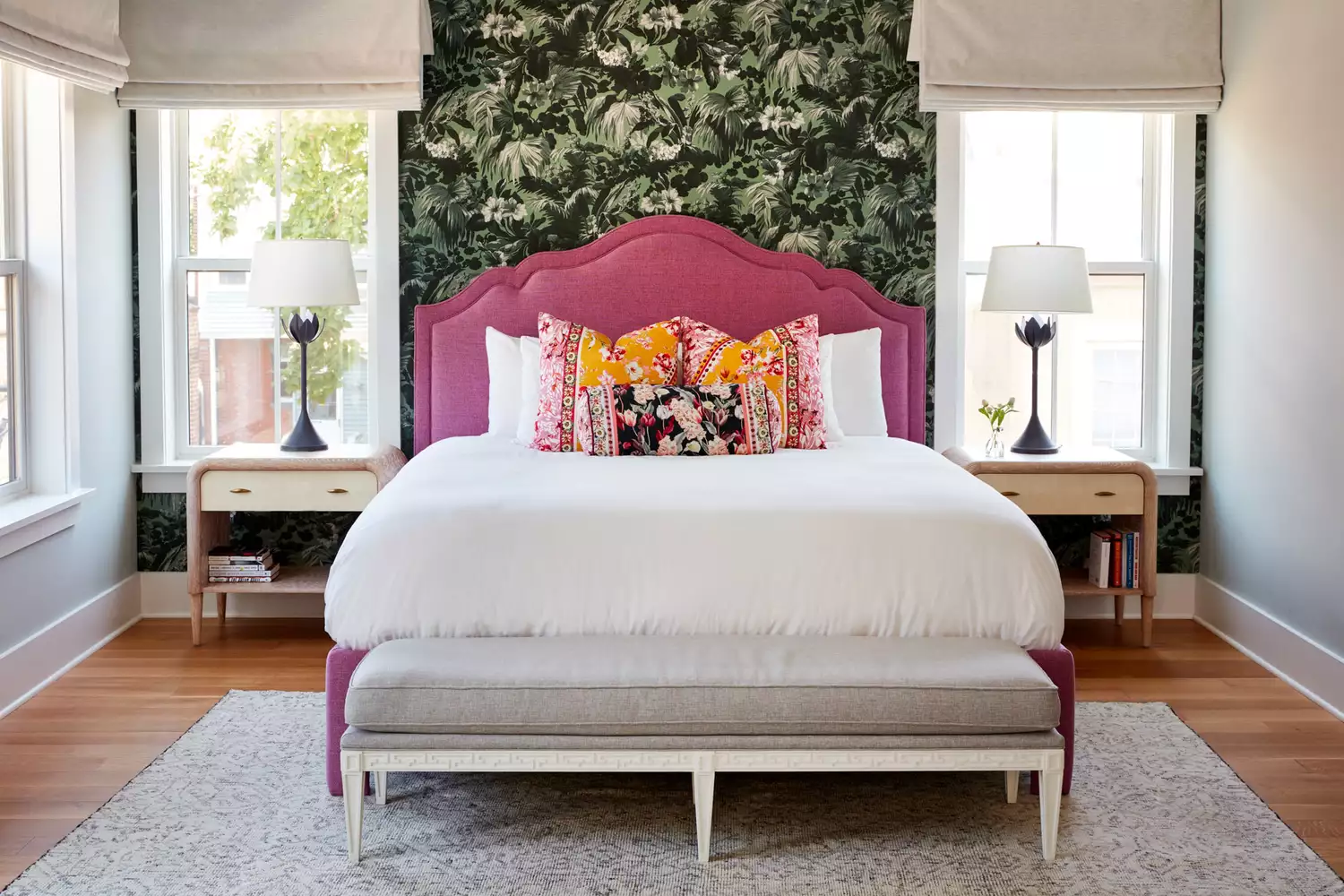
Accent walls offer an economical yet impactful method for transforming a room's aesthetic by introducing color and personal flair. They effectively create a visual focal point, enhancing small spaces by drawing attention to artwork or providing a striking background for decorative elements. The size of an accent wall can vary, with even a small painted section capable of significantly altering a room's atmosphere. This guide explores 16 top paint colors, ranging from vibrant to neutral tones, suitable for accent walls.
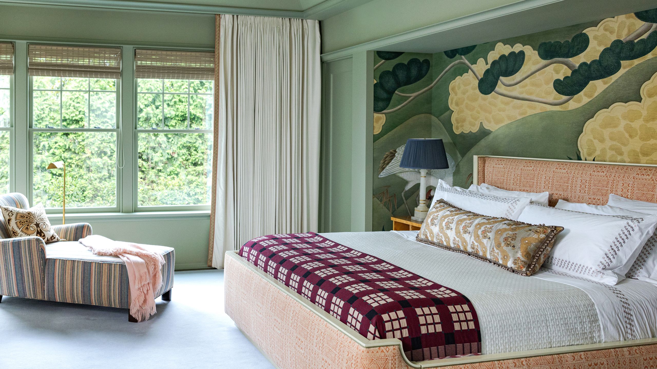
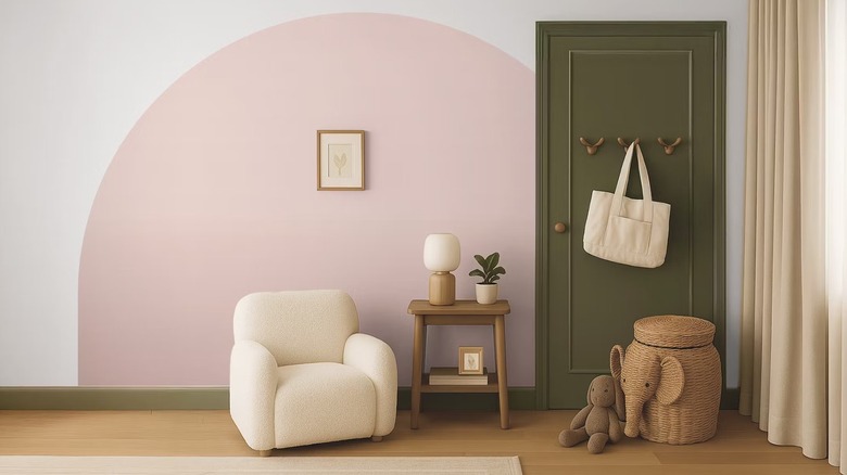
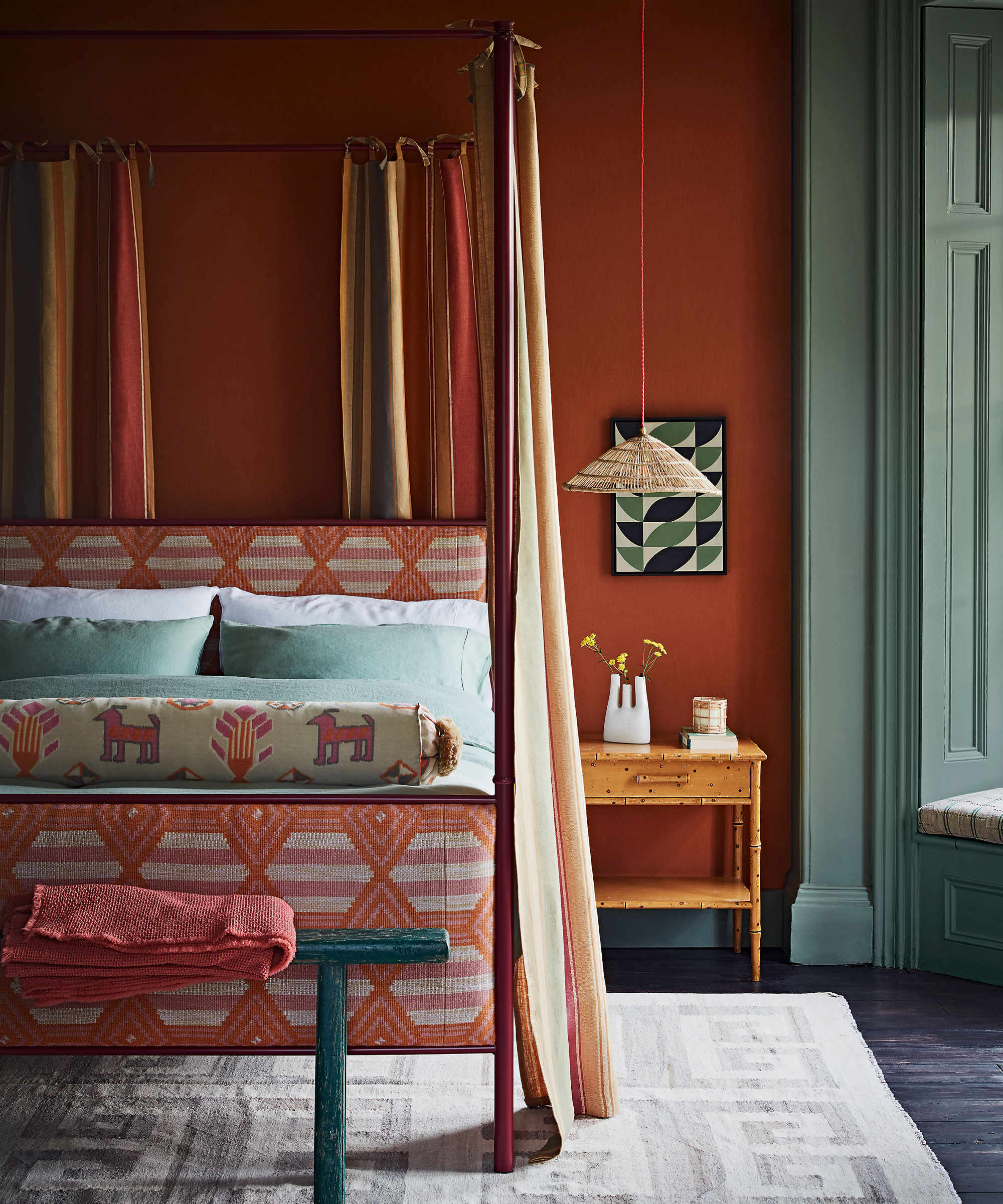
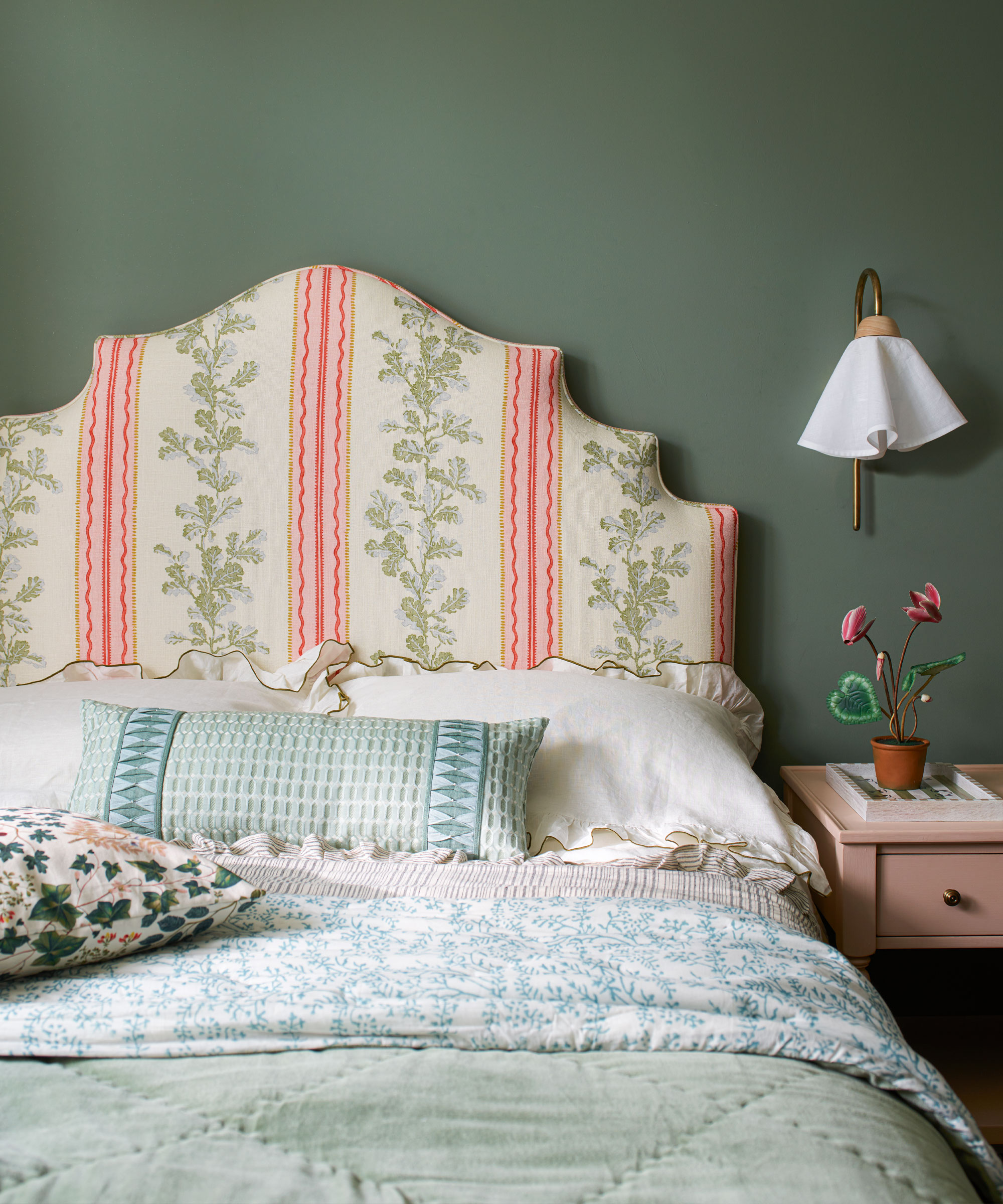
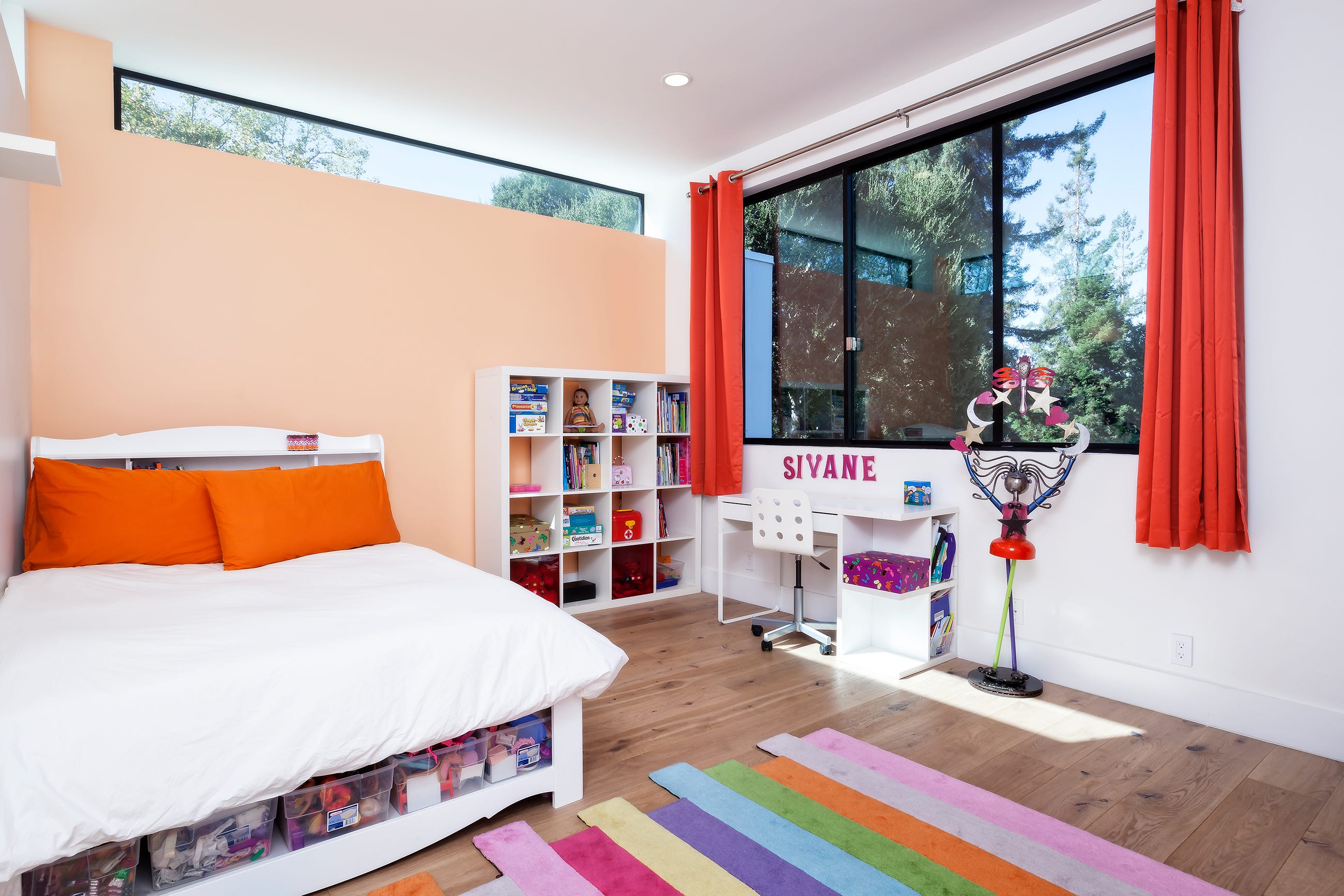
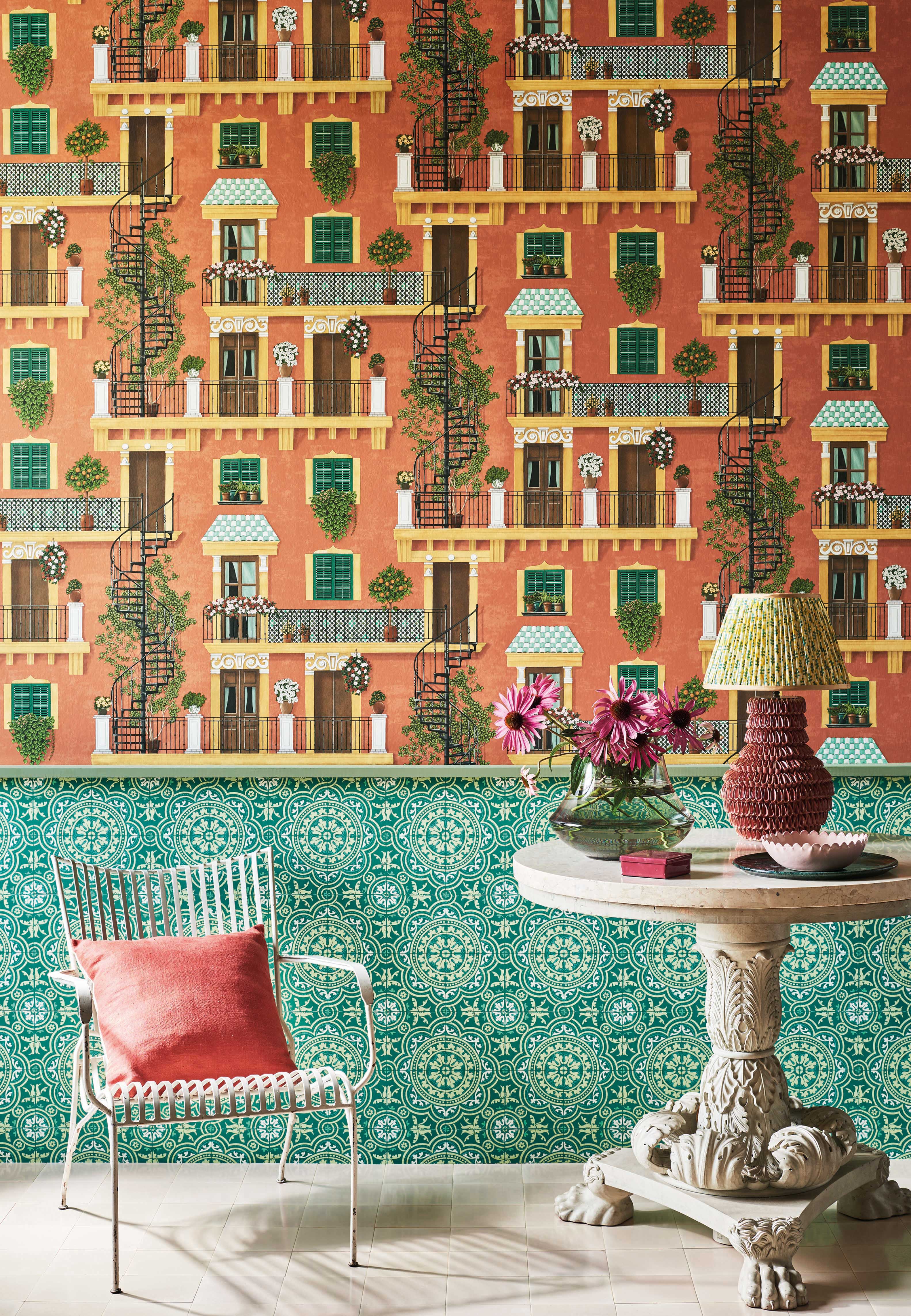
Benjamin Moore's Burnt Sienna, a warm terracotta, imbues rooms with an earthy, grounding effect, complementing dark wood furniture or adding a splash of color to modern, neutral spaces. October Mist, Benjamin Moore's 2022 Color of the Year, is a fresh and calming sage, ideal for spaces needing color without overpowering intensity, particularly suitable for bedrooms or nurseries. Farrow & Ball's Incarnadine, a deep crimson, provides a bold statement, perfect for dining or living rooms with vintage decor, and serves as an excellent backdrop for art.
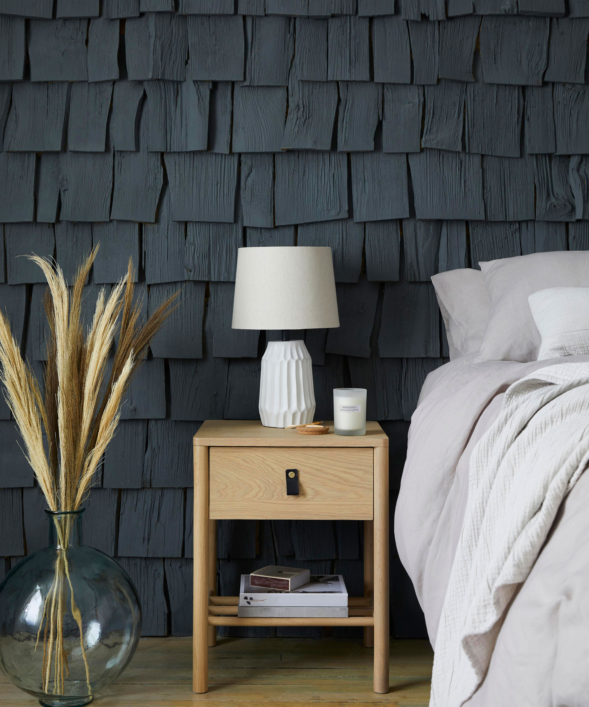
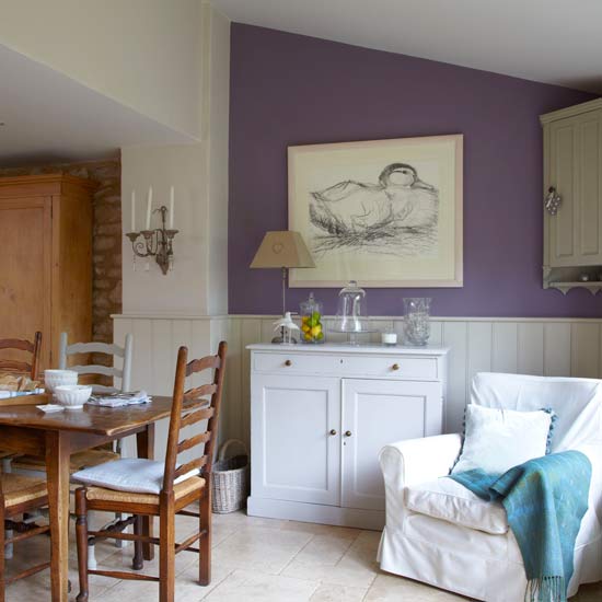
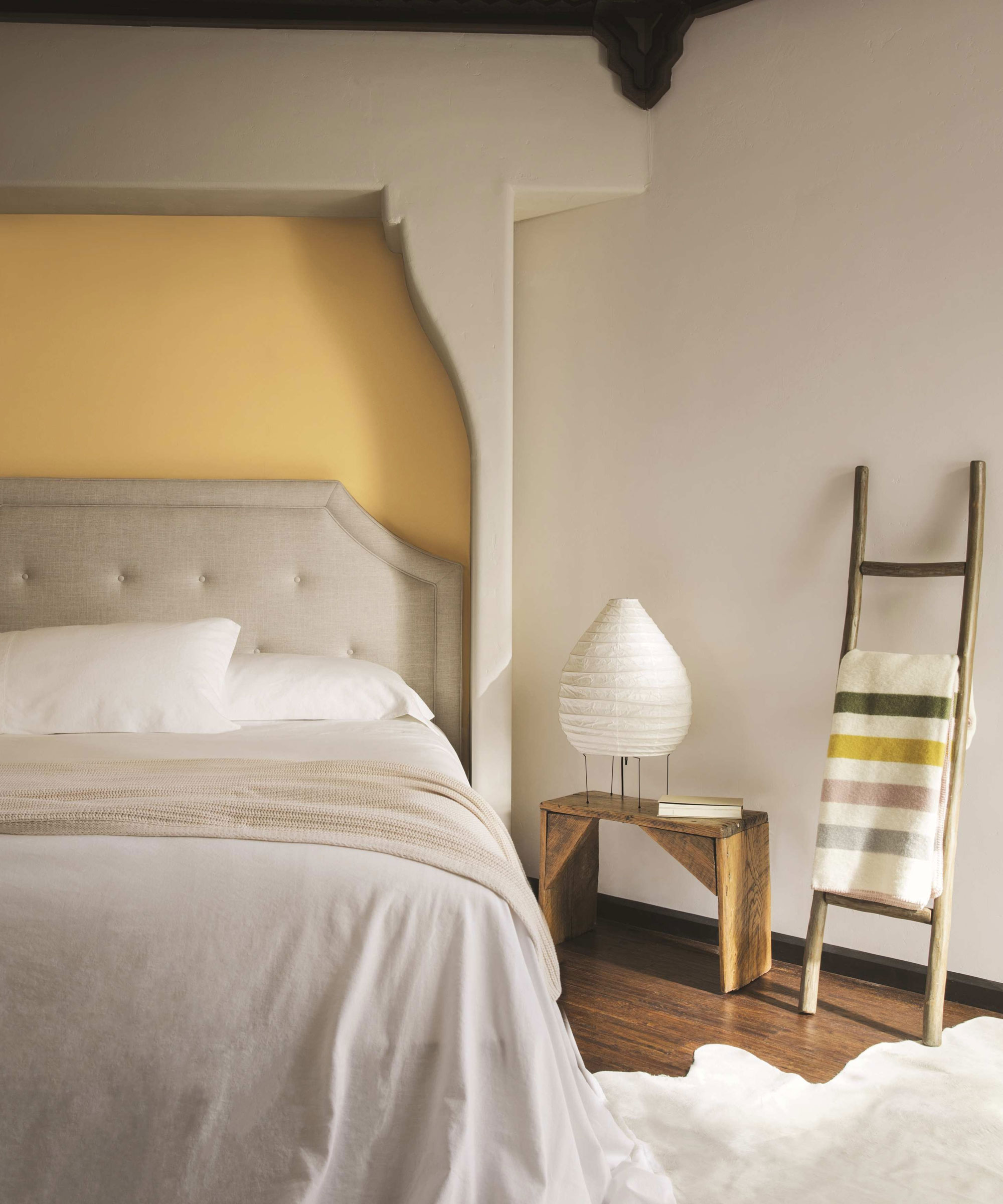
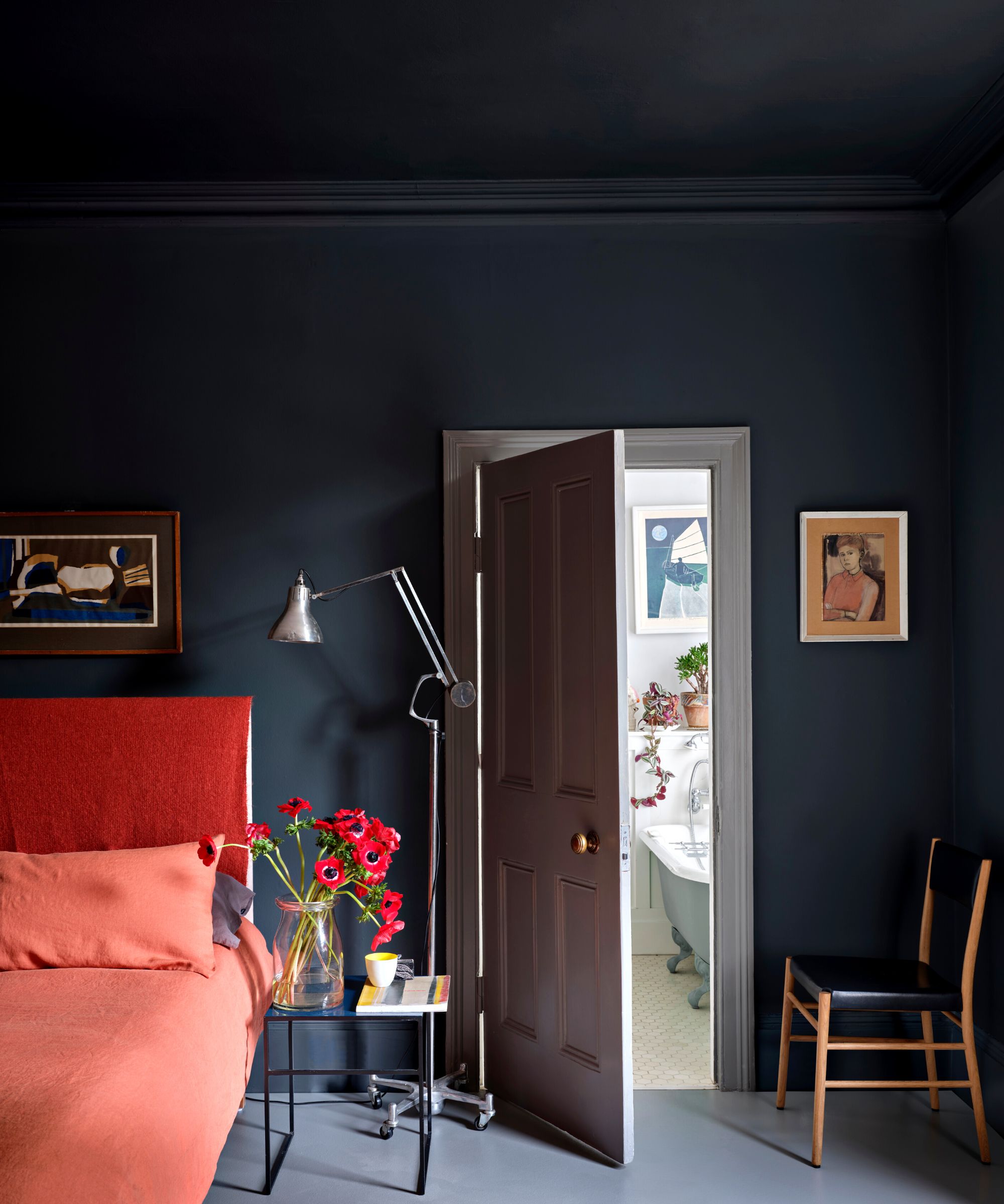
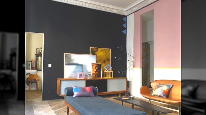
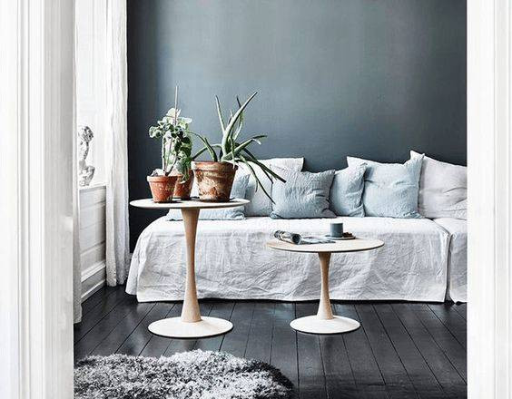
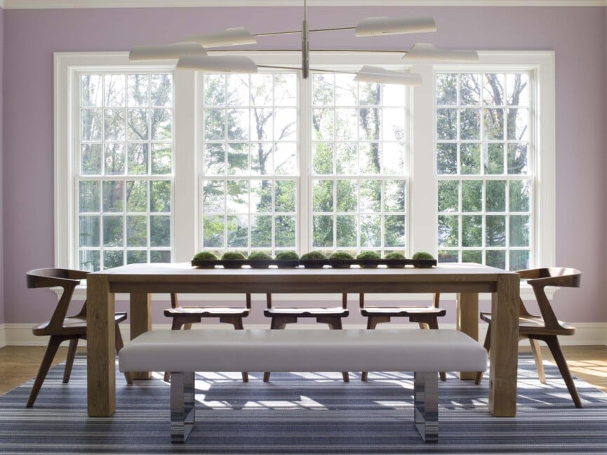
Violet Petal by Benjamin Moore, a pale violet with warm undertones, inspires creativity and relaxation, making it suitable for bedrooms or living rooms. Farrow & Ball's Railings, described as a 'soft black' with blue undertones, offers timeless drama and depth, best utilized in rooms with ample natural light. Behr's Corn Stalk, a buttery yellow, adds subtle warmth and brightness, making it a good choice for kitchens.
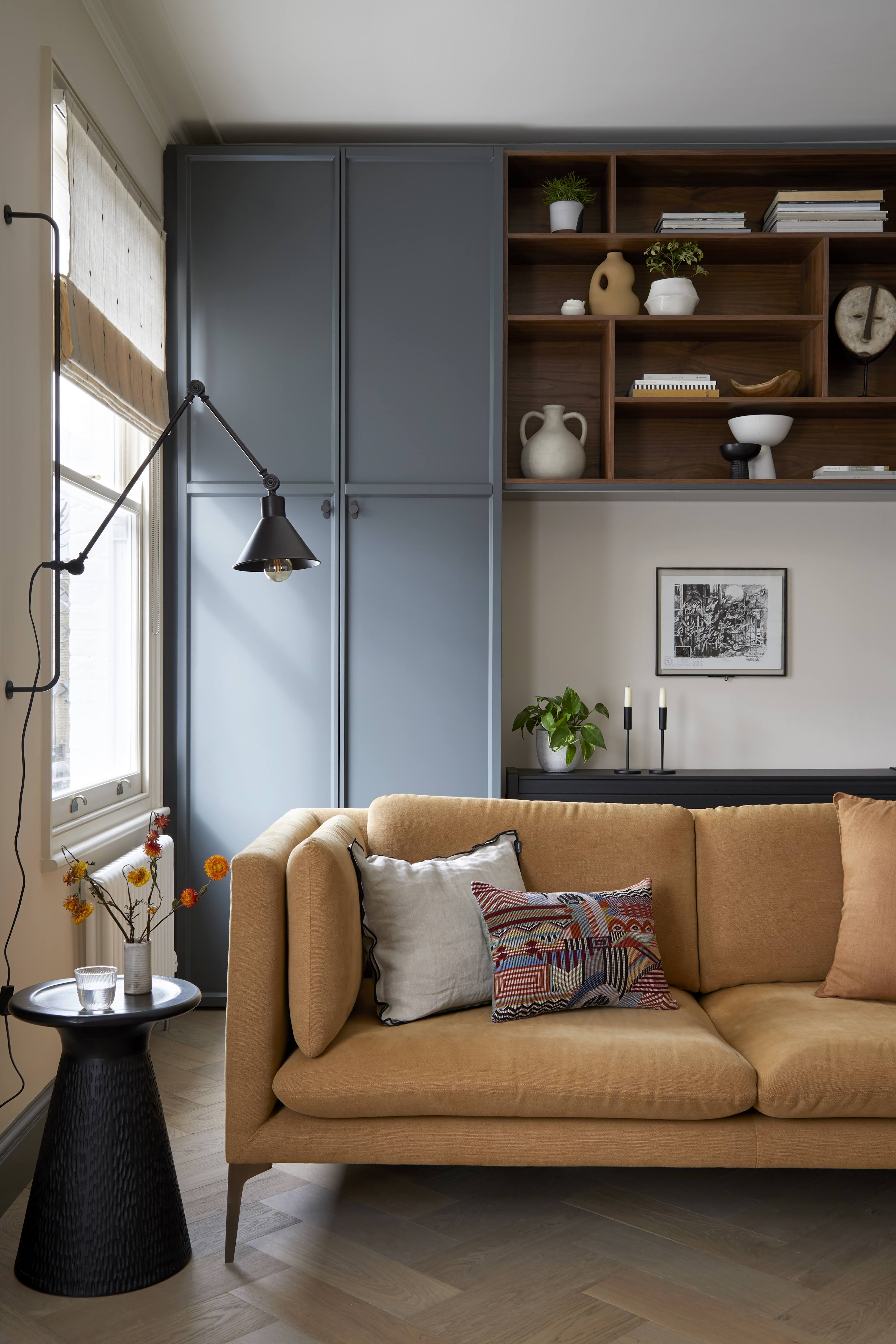
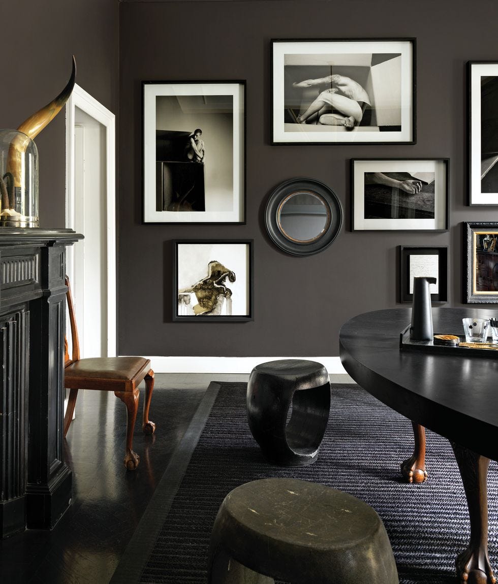
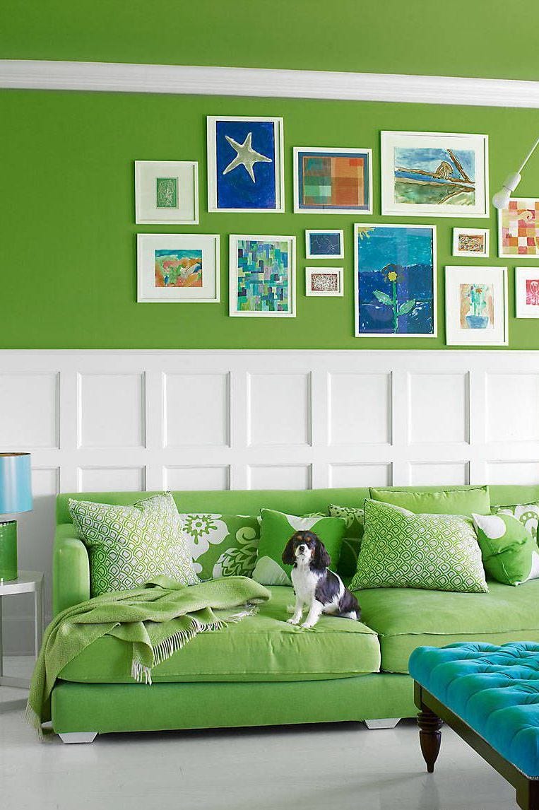
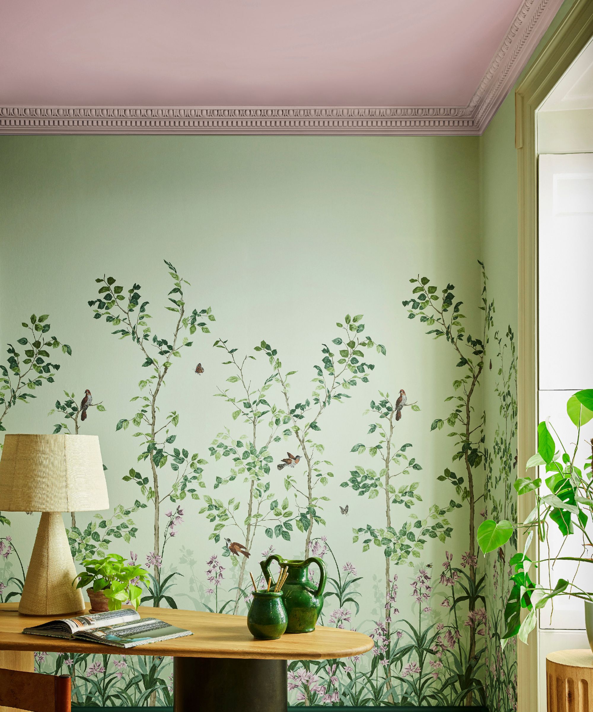
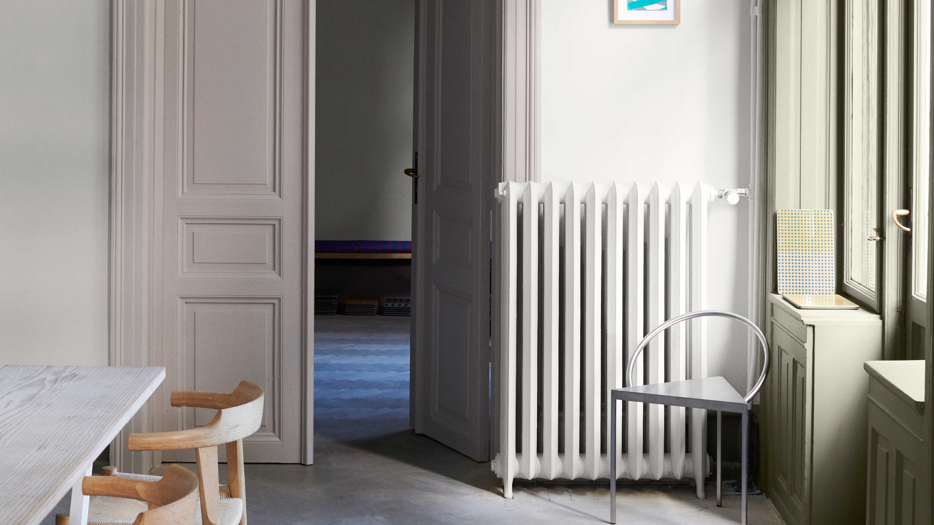
Dunn-Edwards' Art and Craft, a warm brown neutral, creates an inviting atmosphere without bright hues, harmonizing with cream and blush tones. Sherwin-Williams' Frank Blue, a vibrant blue, introduces energy and works with various decorating styles, coordinating well with cool neutrals like gray. Evergreen Fog, Sherwin-Williams' 2022 Color of the Year, is a versatile green-gray with a hint of blue, offering a subtle yet sophisticated organic touch.
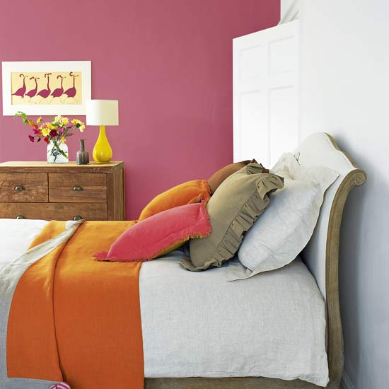
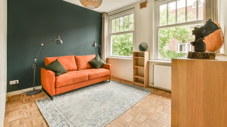
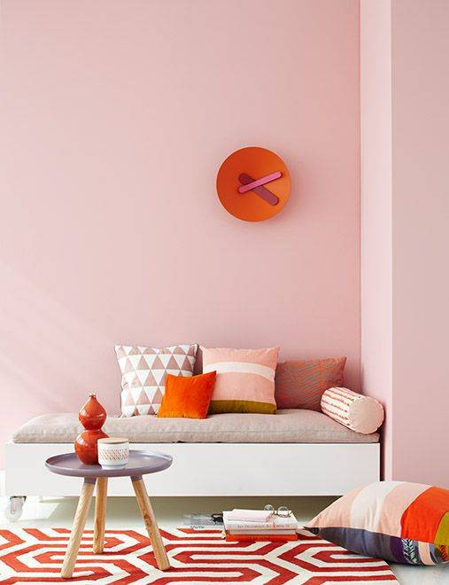
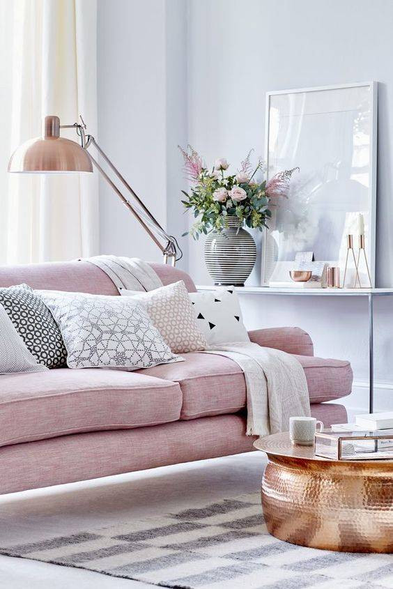
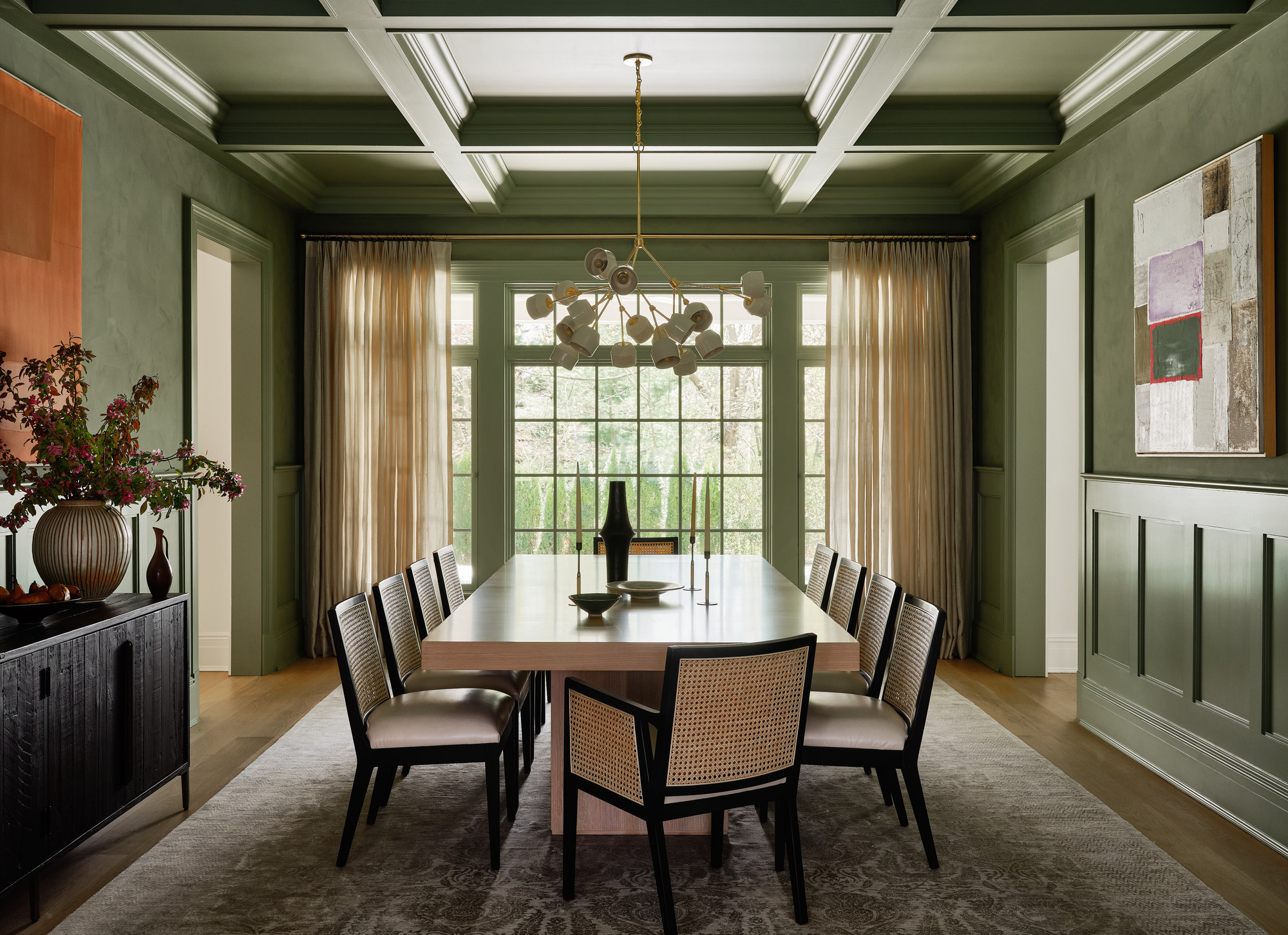
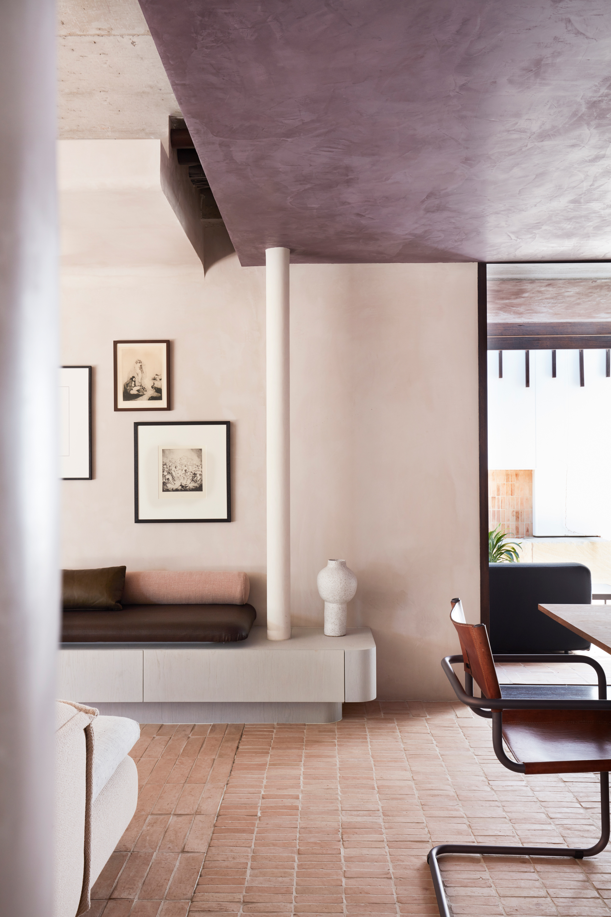
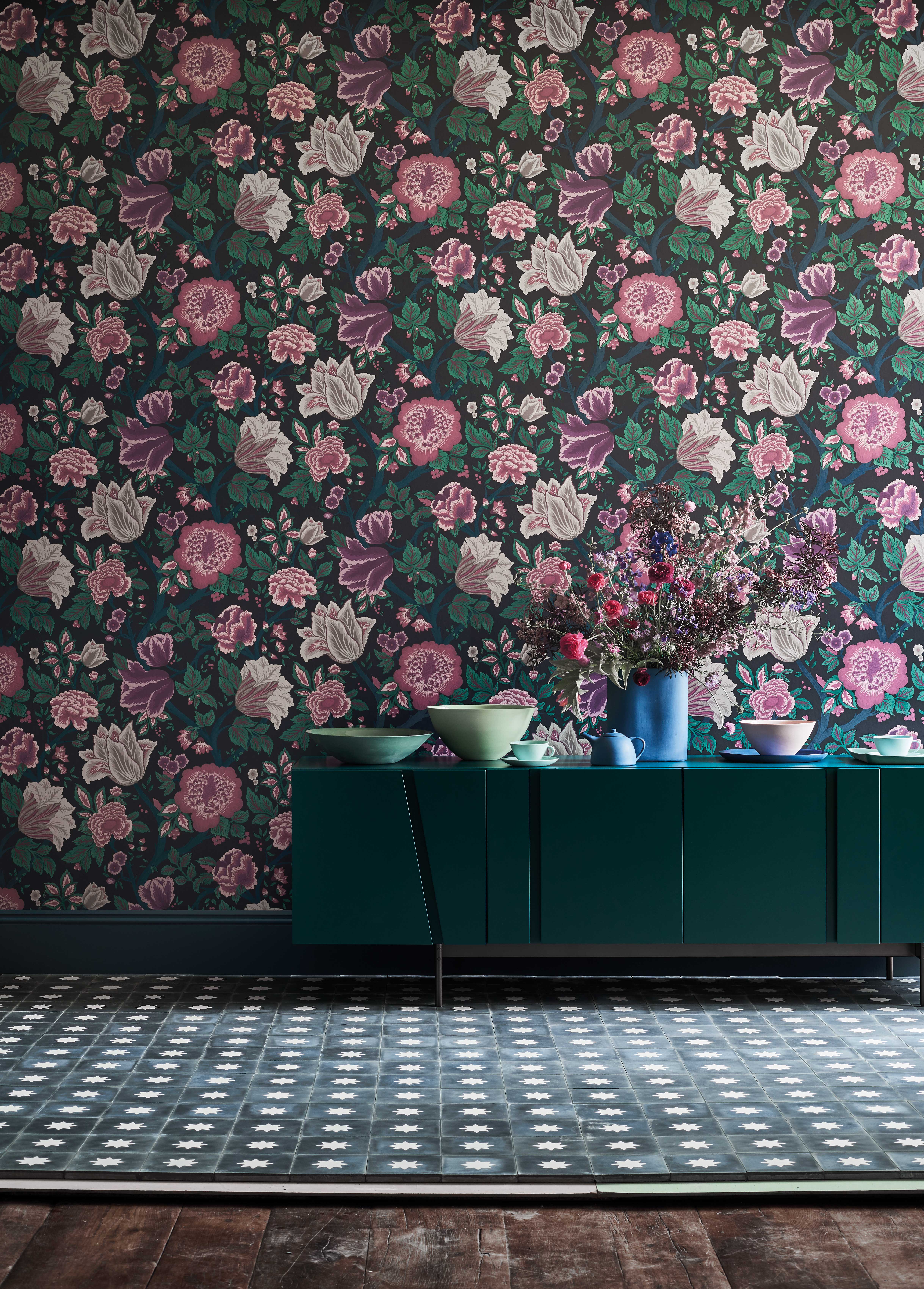
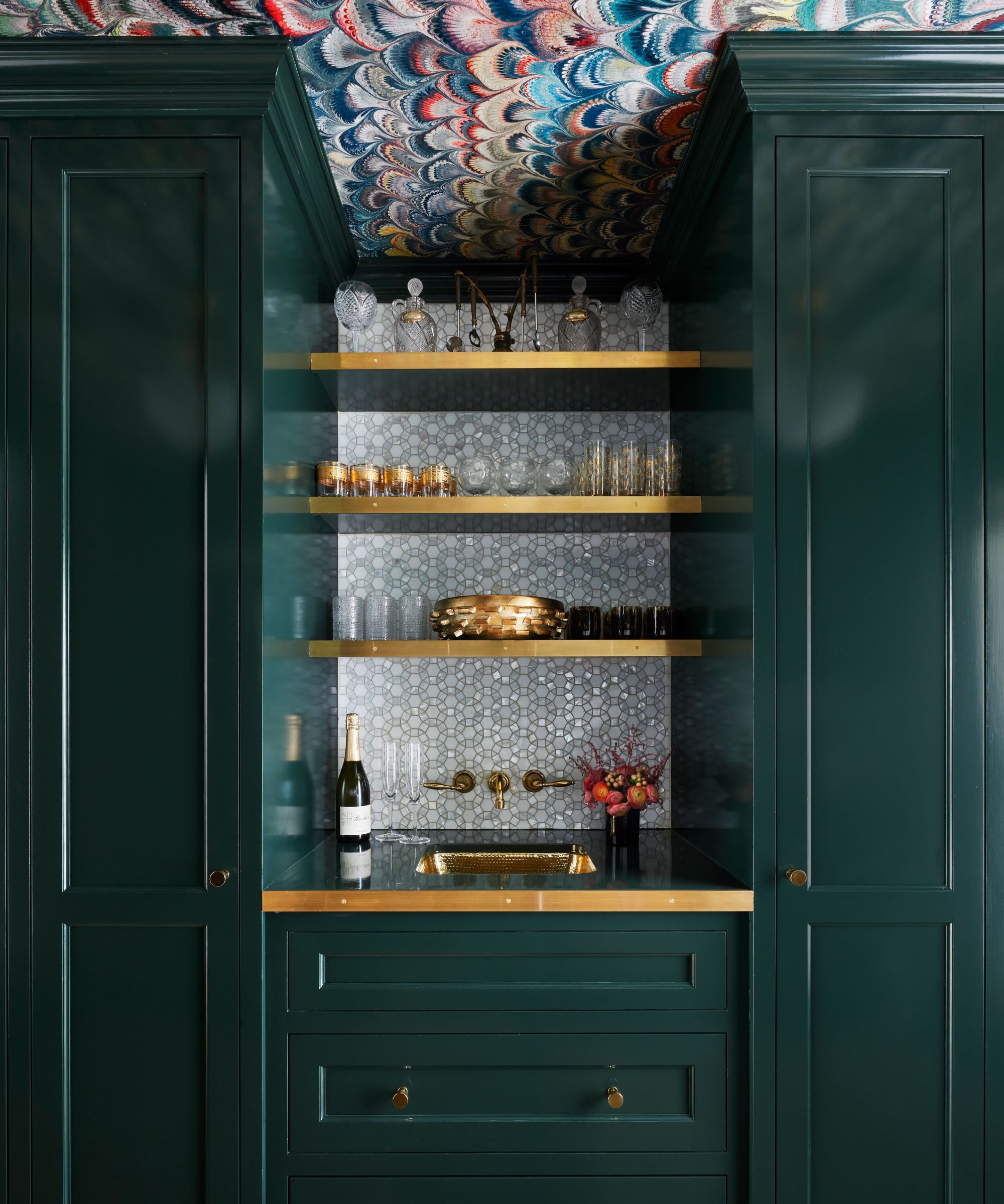
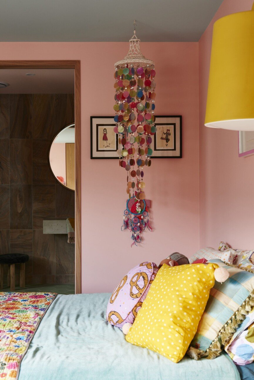
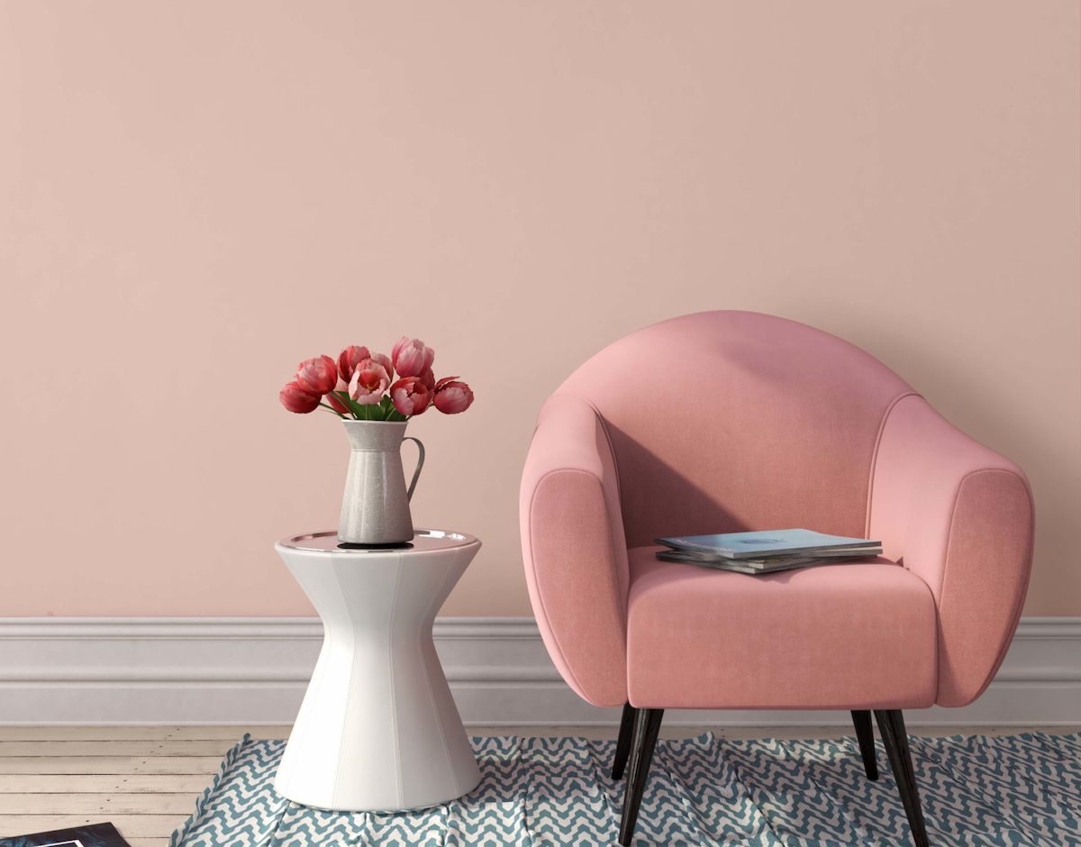
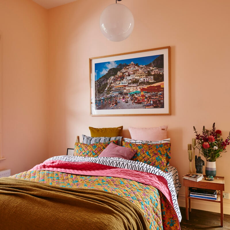
Benjamin Moore's Mink Violet, a neutral-toned purple with red undertones, provides a moody alternative to gray, capable of coordinating with warm or cool colors. Farrow & Ball's Studio Green, a dark green, brings a sophisticated, natural, and historic feel, appearing almost black in dim lighting and brighter in well-lit areas. Behr's Sunwashed Brick, a soft blush, reflects a contemporary trend toward pinks as refined neutrals, suitable for living rooms or bedrooms.
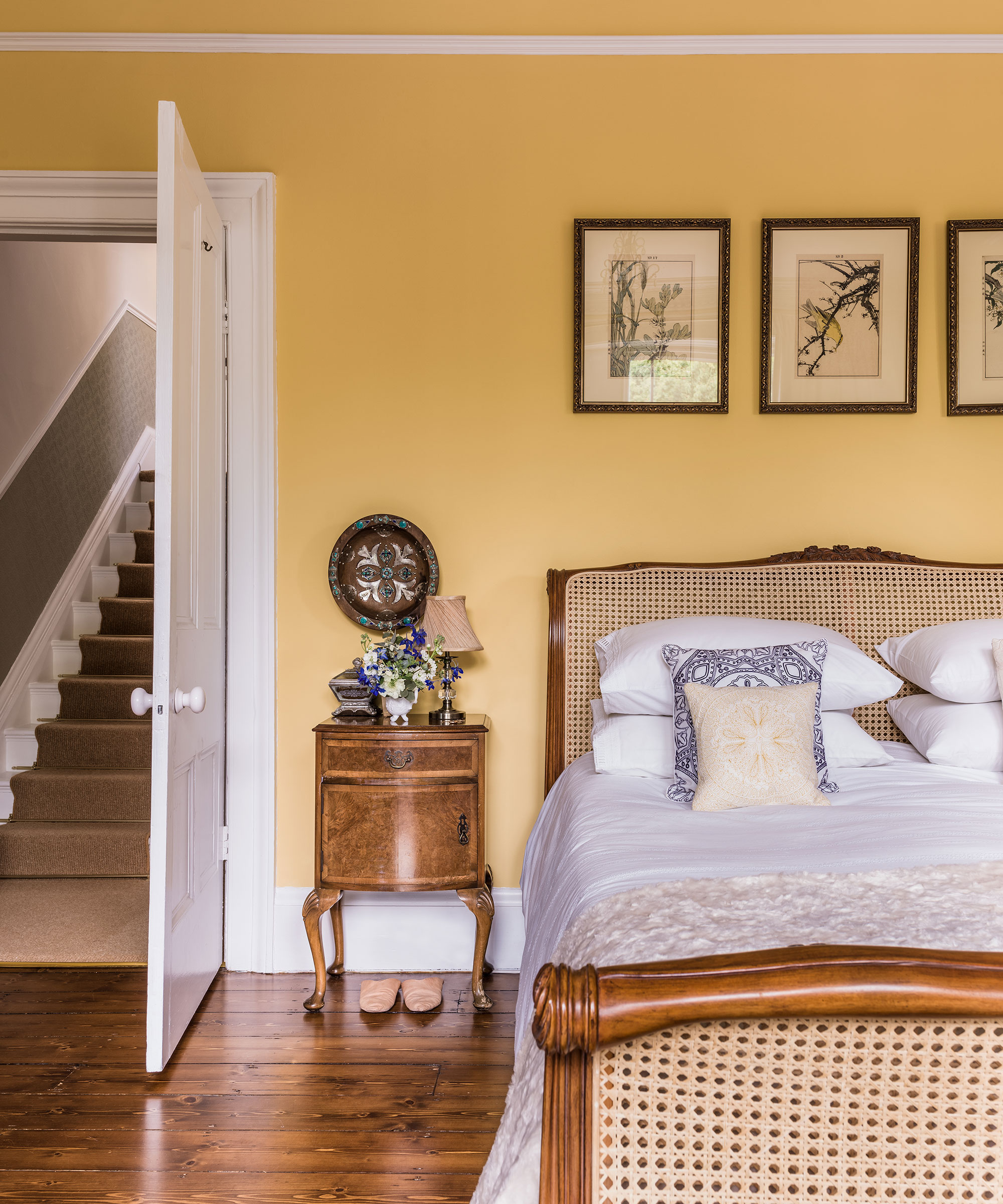
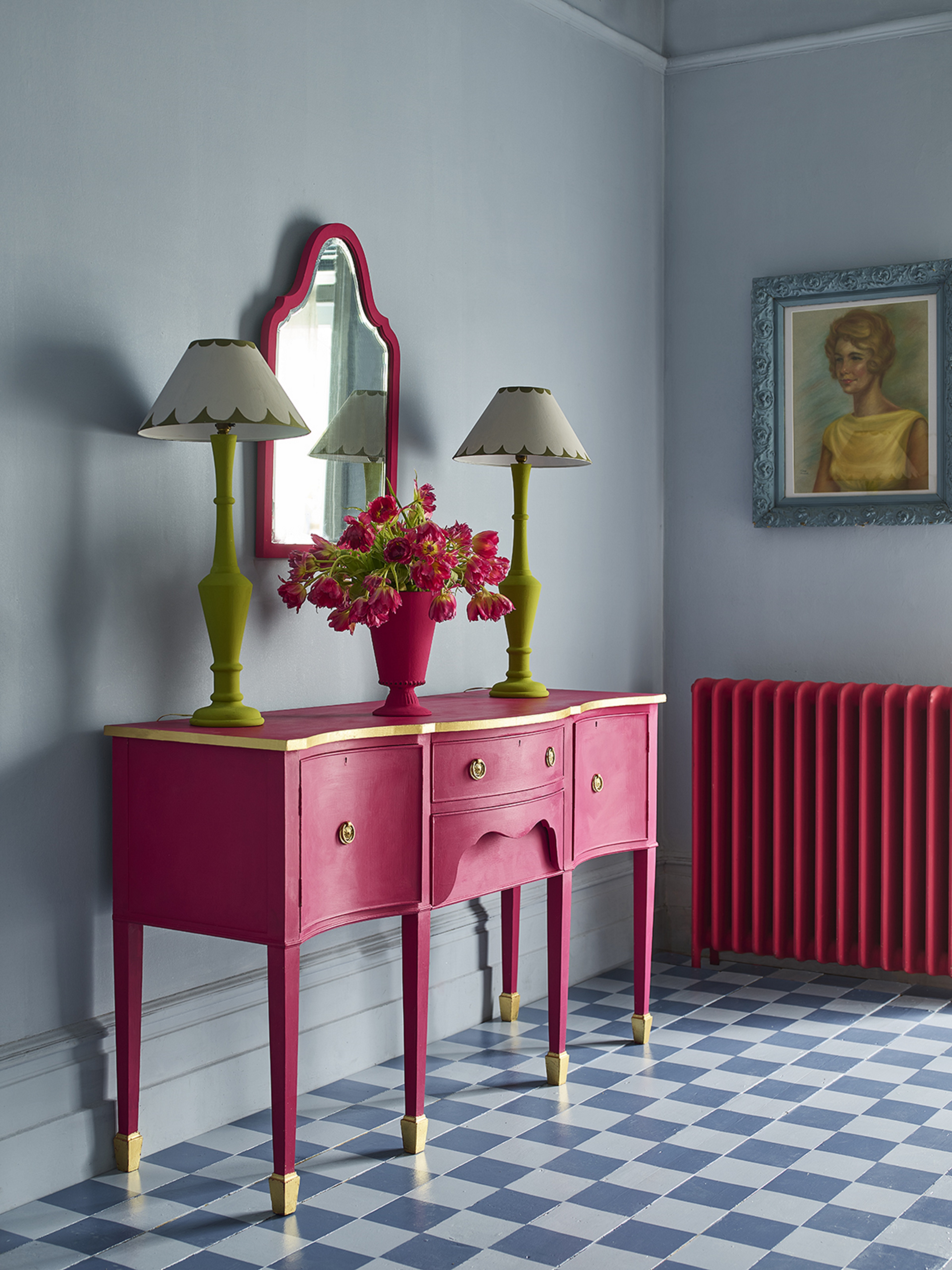
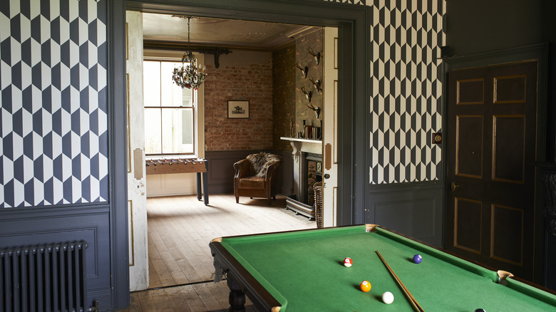
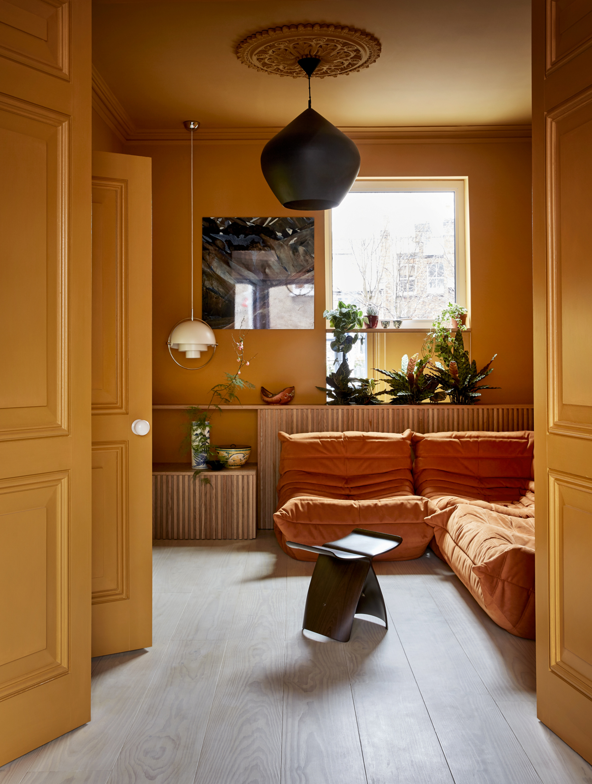
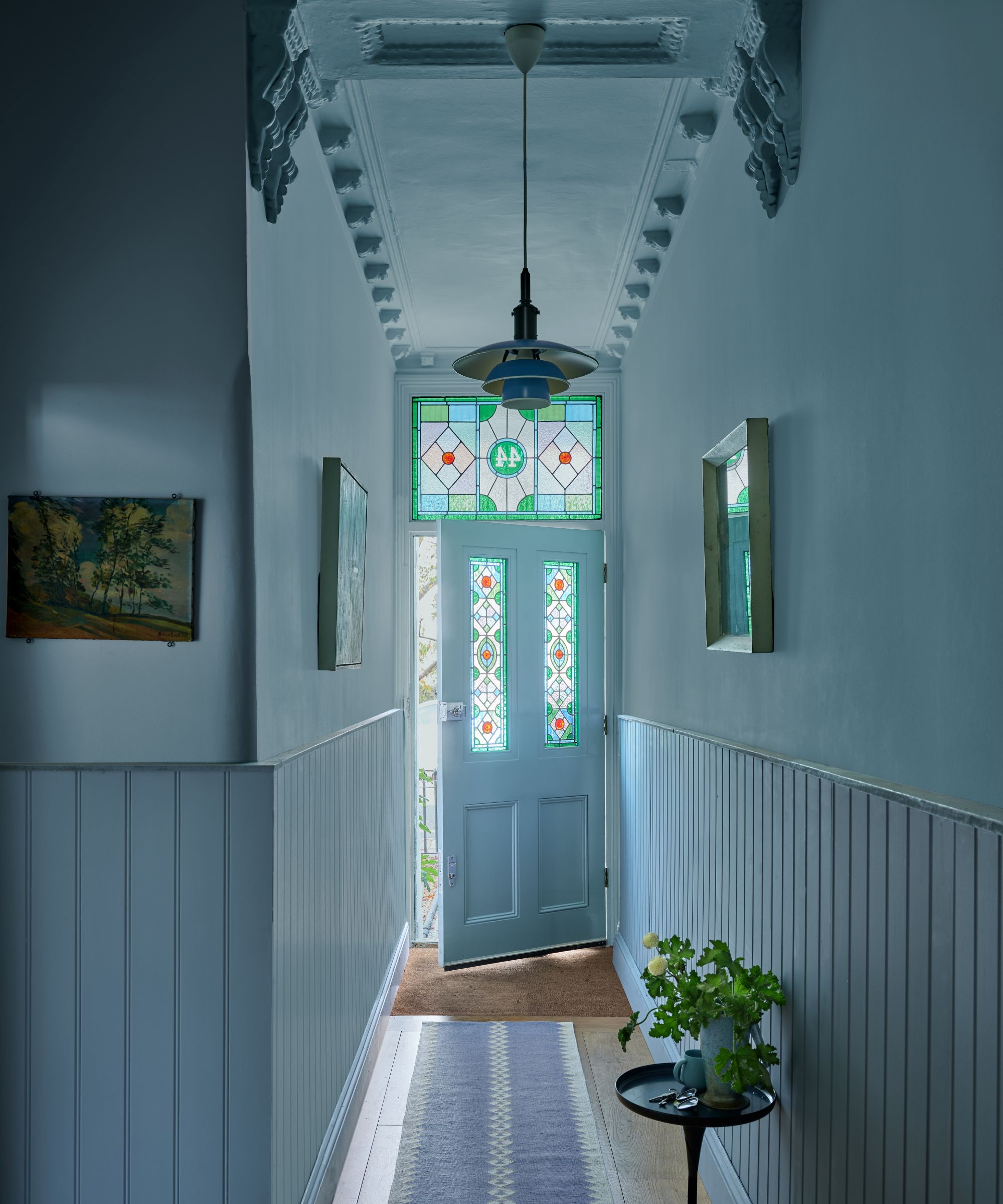
Graham & Brown's Breathe, a pale blue, offers soothing contrast and versatility for any room without dominating the space. Farrow & Ball's Babouche, a bright yellow inspired by Moroccan shoes, makes a strong statement and complements green tones, best in appropriately chosen spaces. Sherwin-Williams' Peppercorn, a crisp, cool dark gray, works well with white trim and crown molding, and can also be used for kitchen cabinets.
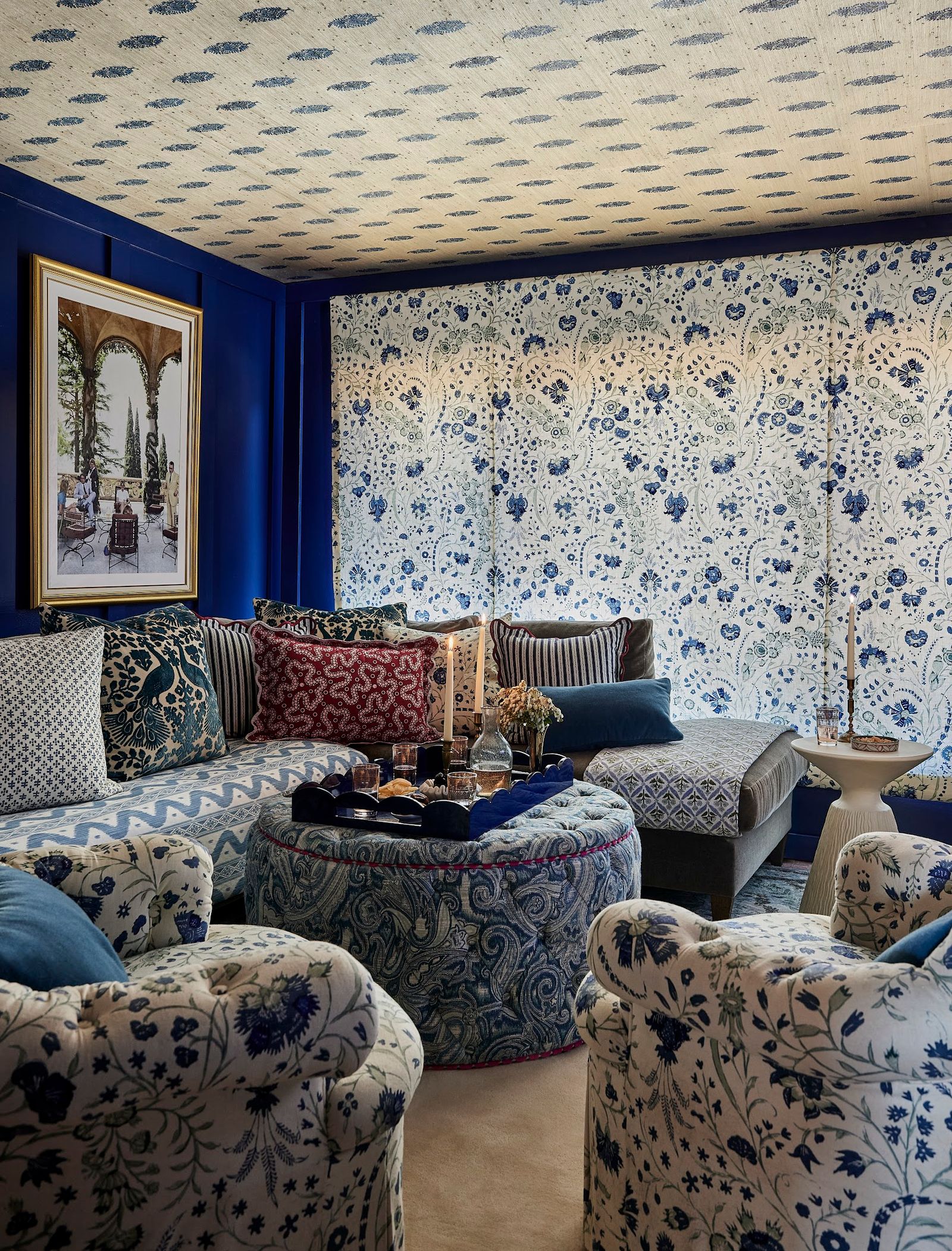
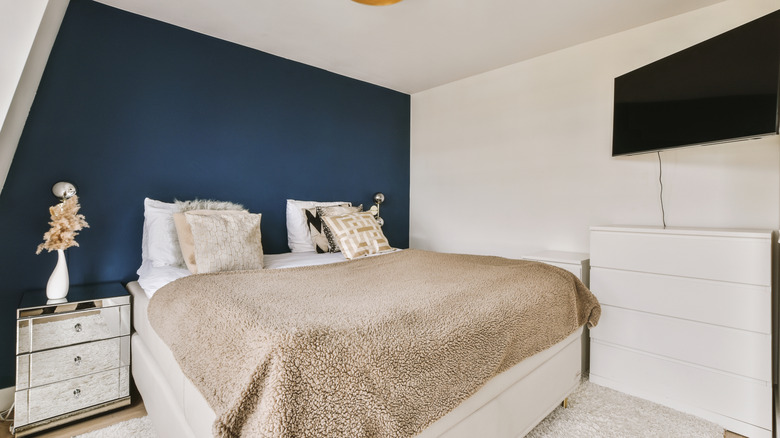
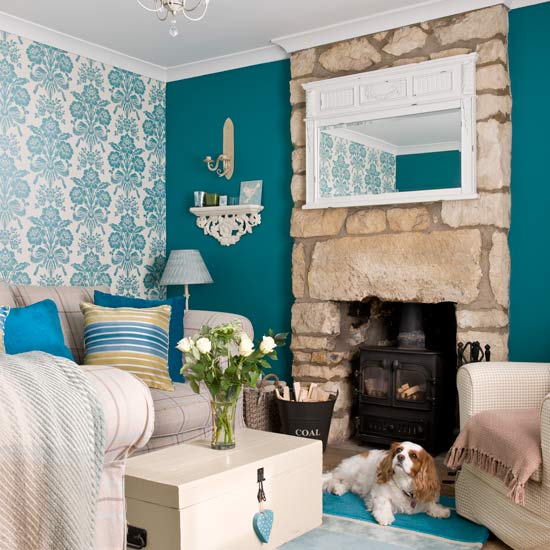
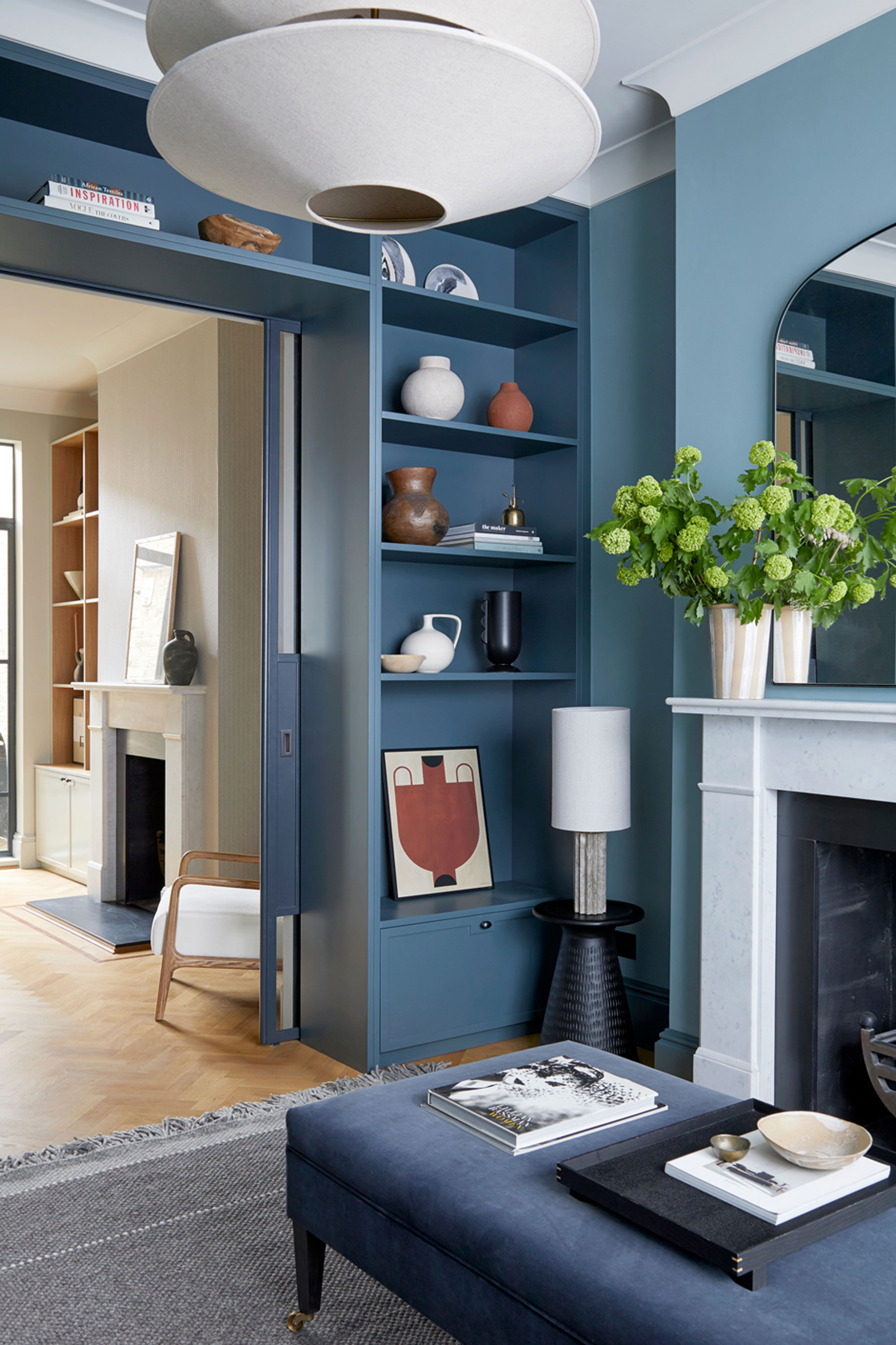
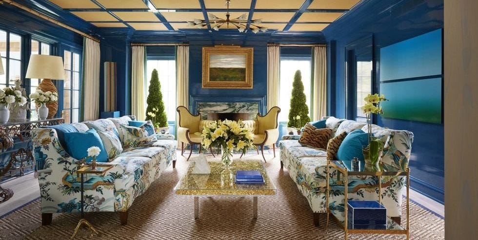
Finally, Farrow & Ball's Hague Blue, a deep blue inspired by Dutch woodwork, conveys power, elegance, and wealth, evoking a classic European ambiance. This dark teal is an excellent choice for living and dining rooms, demonstrating enduring style. Each color selection offers unique benefits, allowing homeowners to personalize their interiors with strategic color application.
#AccentWalls #InteriorDesign #PaintColors #HomeDecor #ColorTrends #BenjaminMoore #SherwinWilliams #FarrowAndBall #BehrPaint #AccentWalls #InteriorDesign #PaintColors #HomeDecor #ColorTrends #BenjaminMoore #SherwinWilliams #FarrowAndBall #BehrPaint
0 comment in total
 No comments yet
You may also like
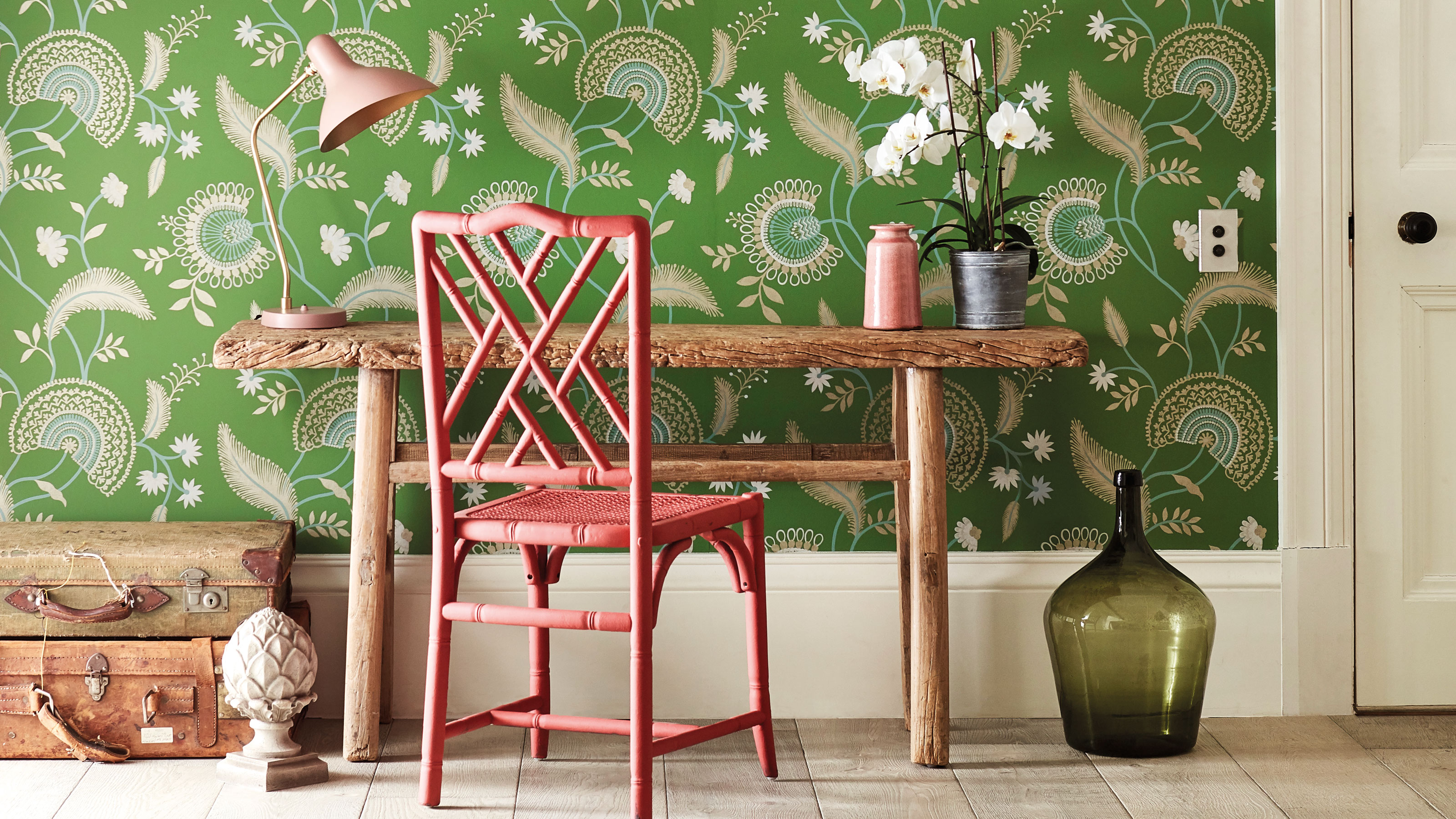
Accent wall ideas – 20 of the latest ways to create a statement feature

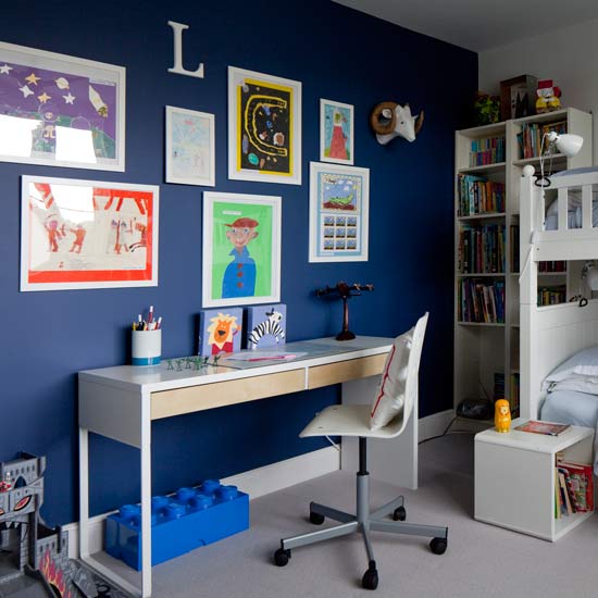
7 amazing colours for a statement wall with wow
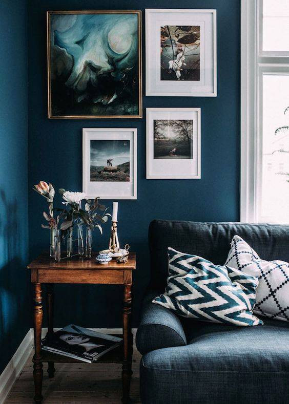
colorful living rooms (no beige allowed)!
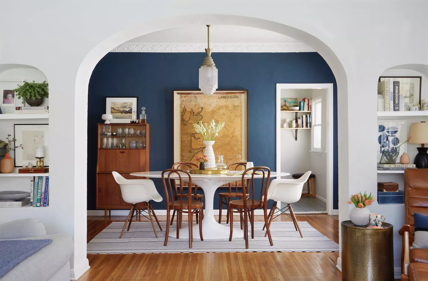
37 Best Accent Wall Colors for an Instant Room Makeover


34 Accent Wall Ideas for Every Room in the House

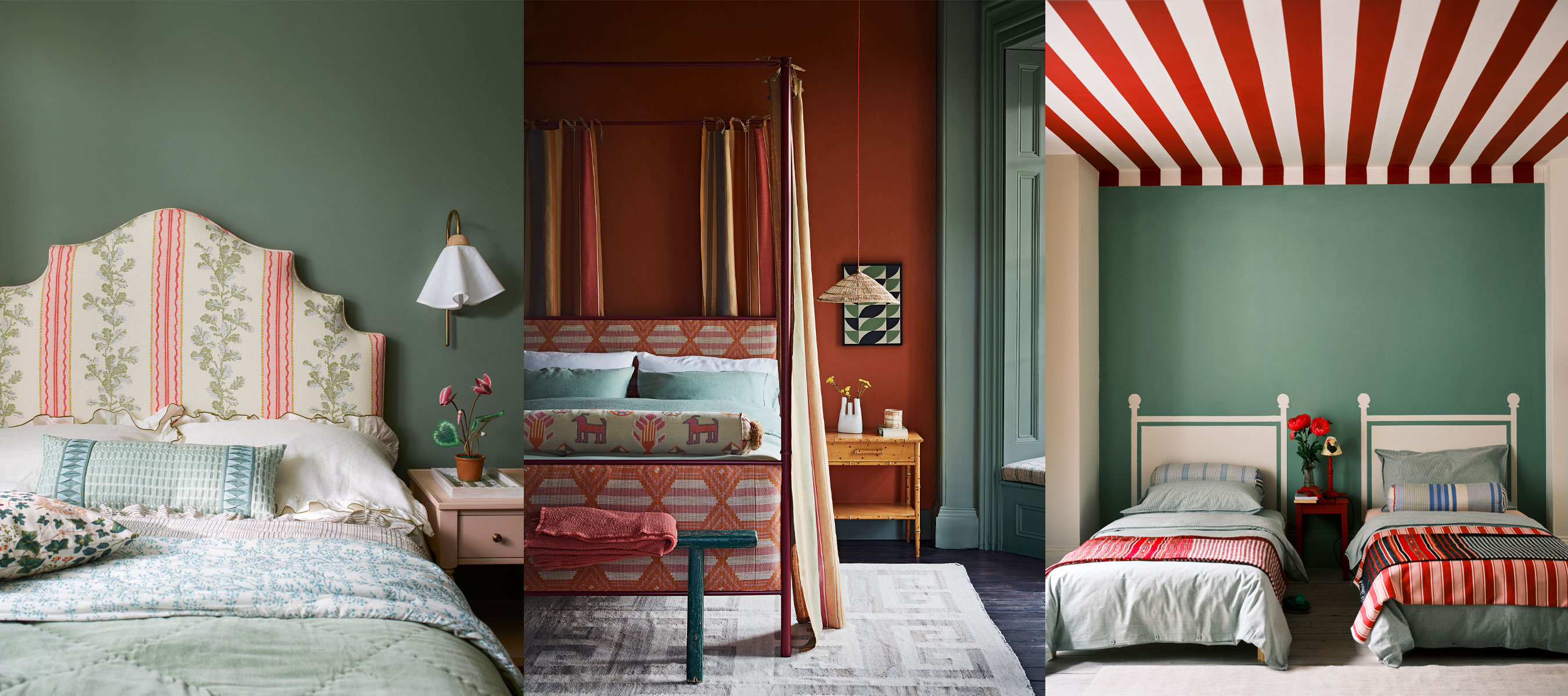
Bedroom accent wall paint ideas – 12 ways to add style and impact
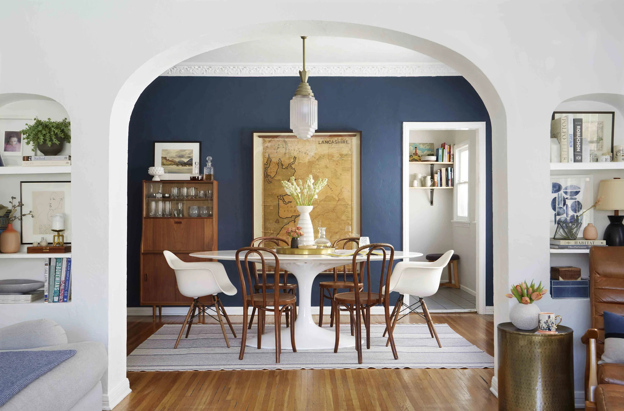
10 Accent Wall Paint Colors That Will Freshen Up Any Space, According to Designers

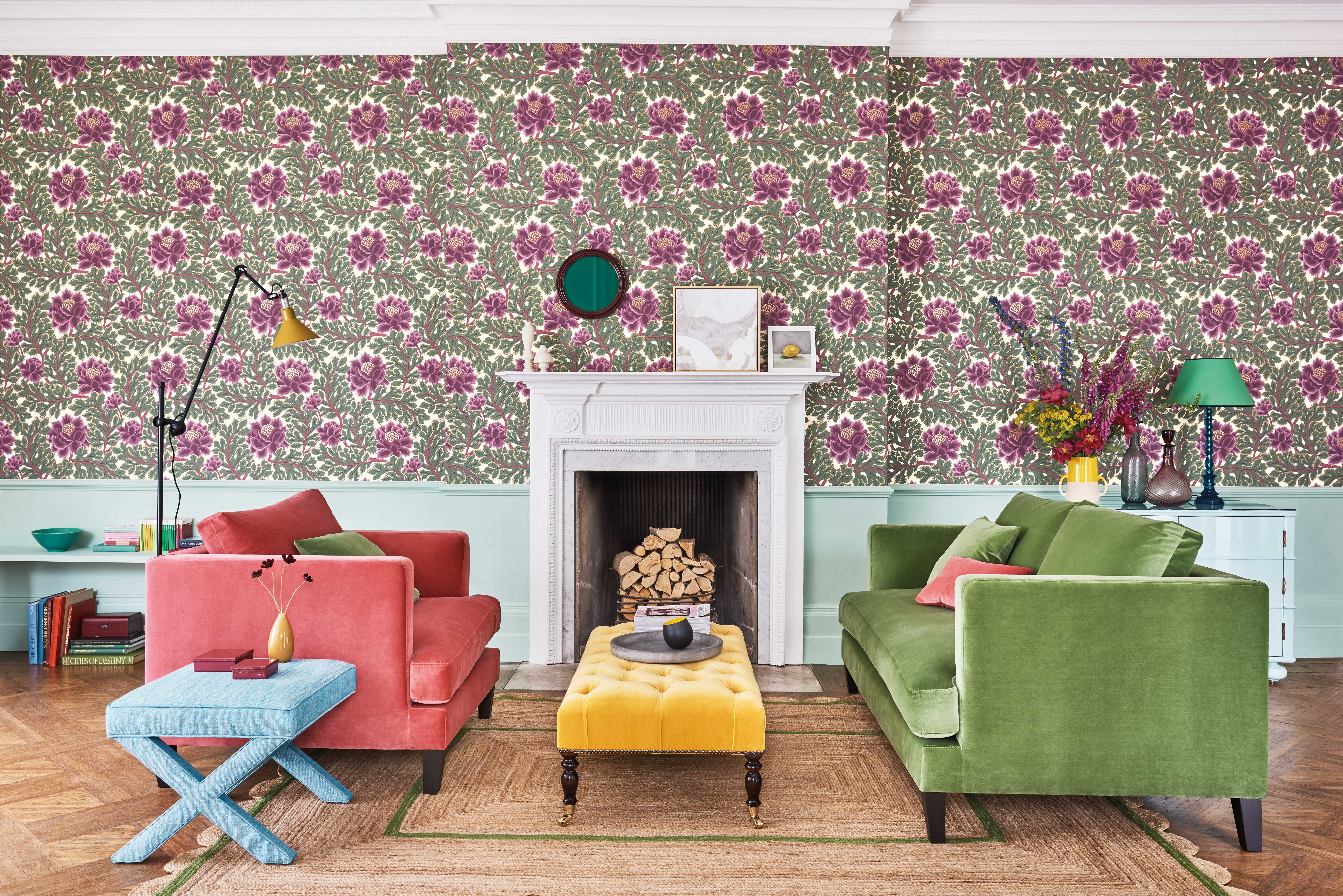
Wall patterns: 12 stunning looks to bring more colour and style to your home


10 Painted Accent Wall Trends That Are On Their Way Out, And What To Do Instead
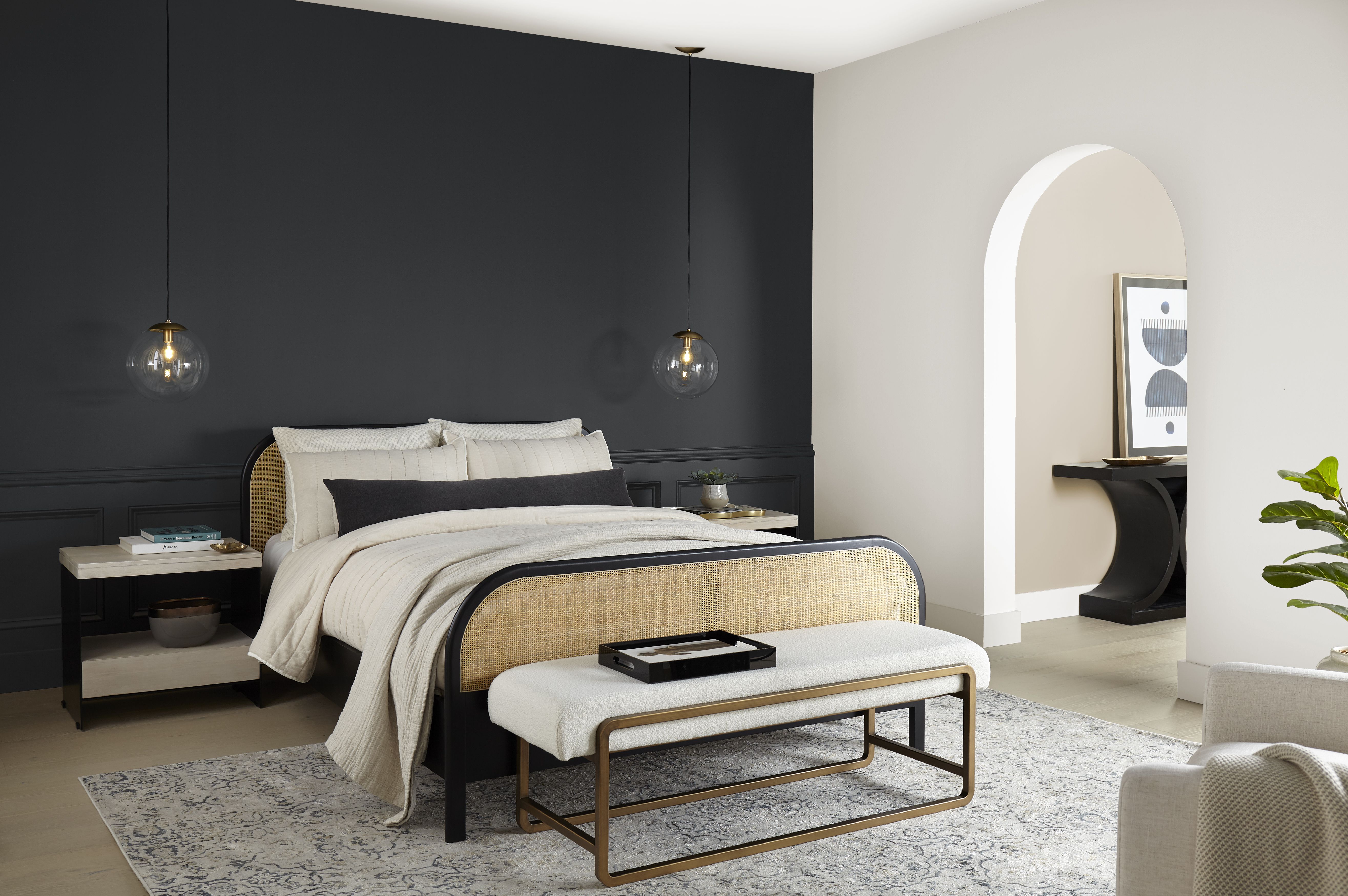
The 10 Best Accent Wall Colors From the Paint Experts

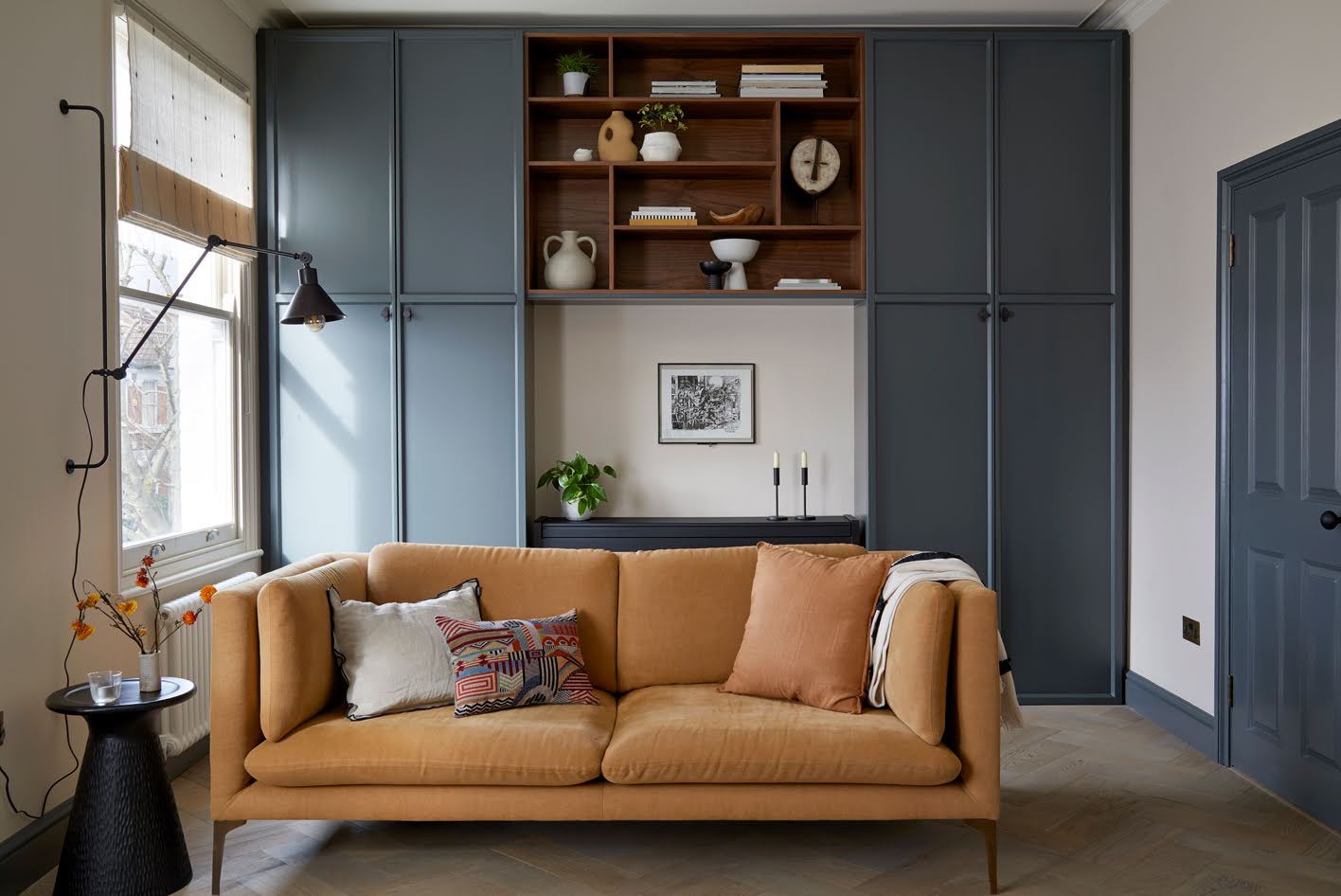
Living room accent wall ideas – 10 new ways designers recommend to style your blank spaces

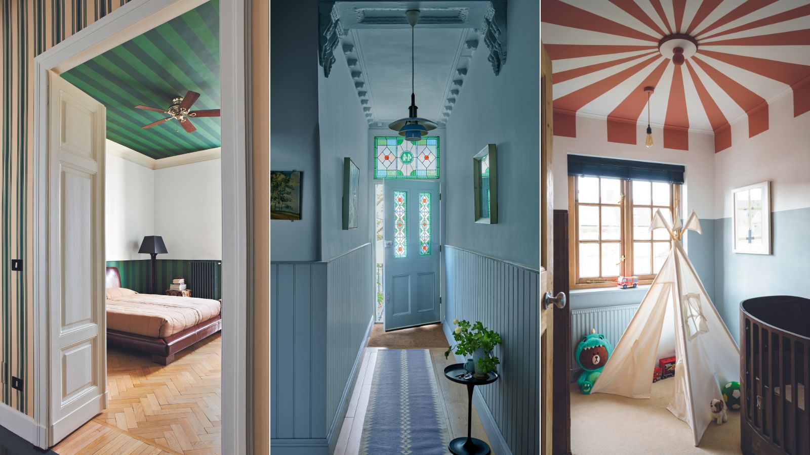
Is the accent ceiling the new accent wall? 7 creative ways to decorate your fifth wall
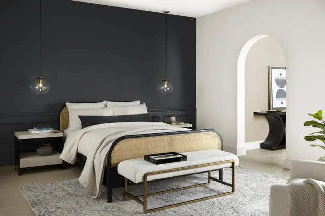
10 Gorgeous Paint Colors for Accent Walls
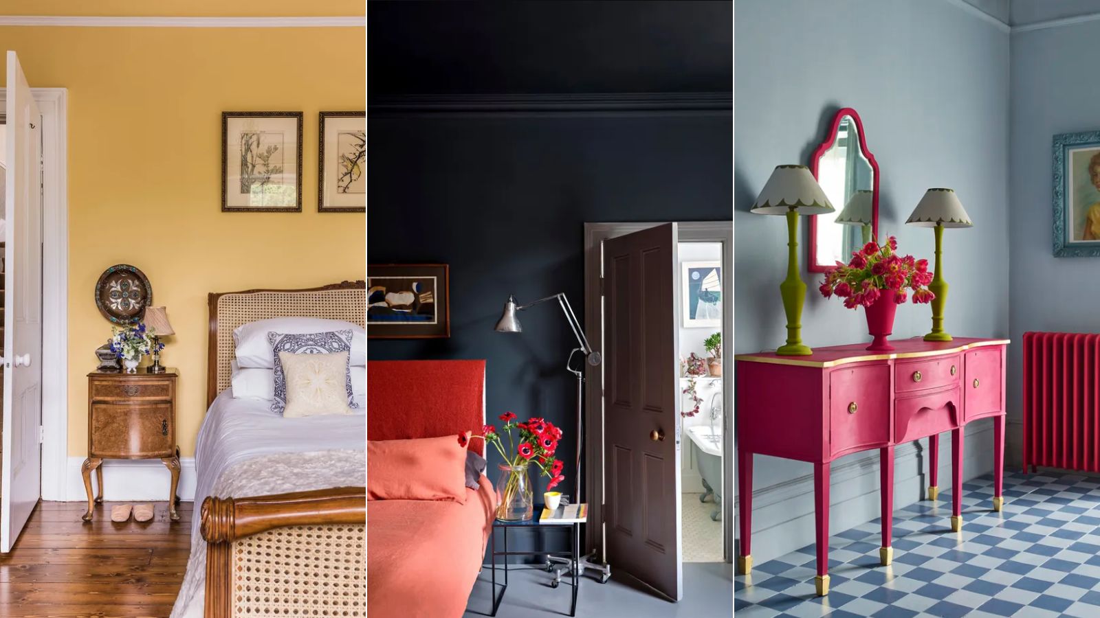
3 'small but impactful' paint updates to try in 2024, according to a color expert
5 outdated paint trends that interior designers are glad to see the back of – and what they're doing instead
The Brighter, the Better—These Vibrant Paints Will Infuse Your Home With Positivity

12 Accent Wall Ideas That Will Never Go Out of Style


16 Accent Wall Ideas That You'll Start Seeing Everywhere In 2025
These Accent Color Ideas Will Transform Any Room

Are Accent Walls Going Out of Style? Here's What Designers Say