7 Paint Colors Designers Totally Regret Using (and What They Wish They’d Used Instead)
Choosing the right paint color can significantly impact a room's atmosphere, and even seasoned interior designers occasionally make choices they later regret. This article compiles insights from three design experts—Cheryl Clendenon, Kanika B. Khurana, and Pam Hutter—who share their personal experiences with paint colors that didn't live up to expectations and what they would opt for instead.
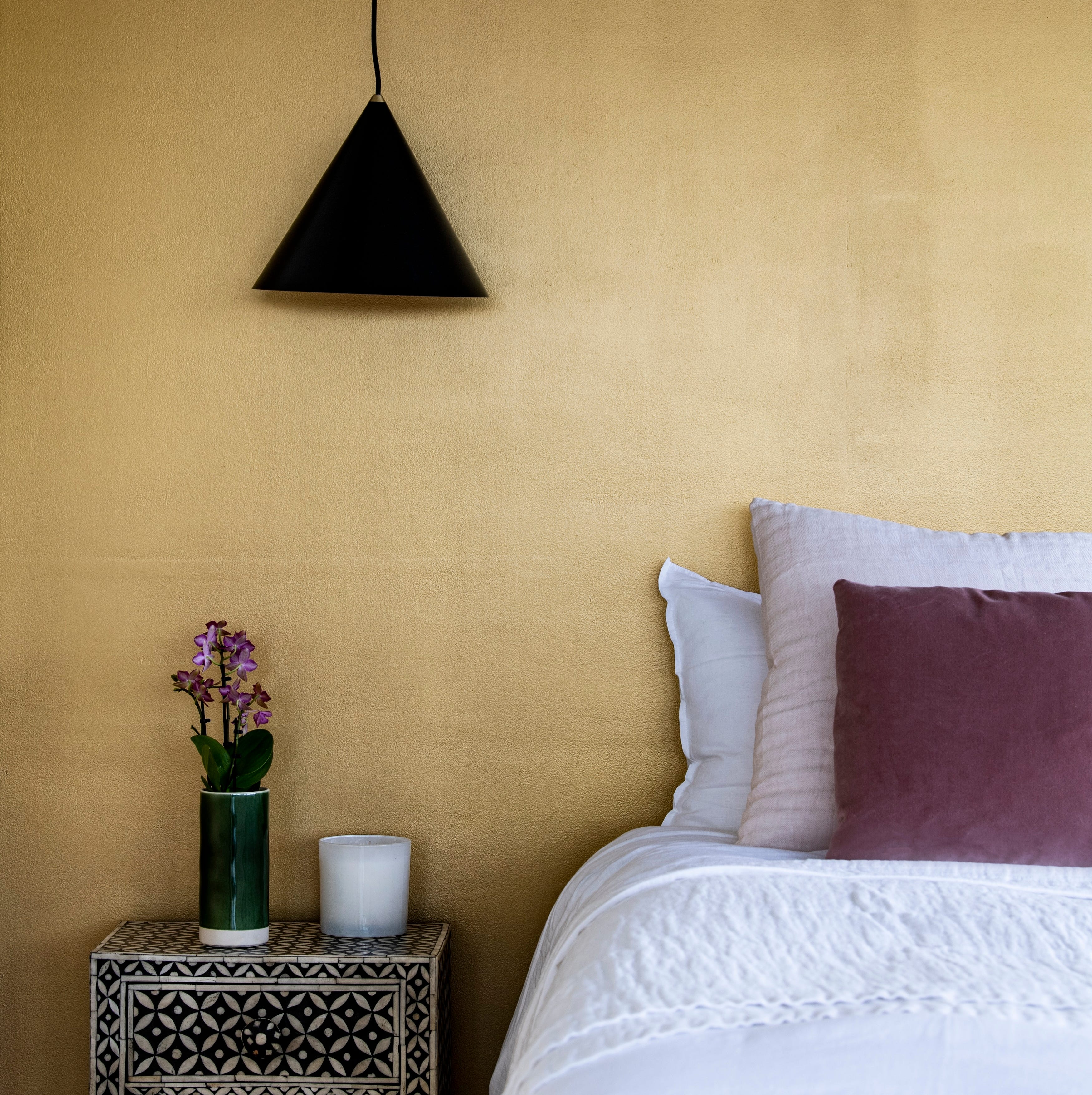
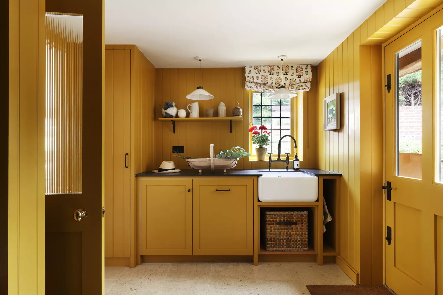
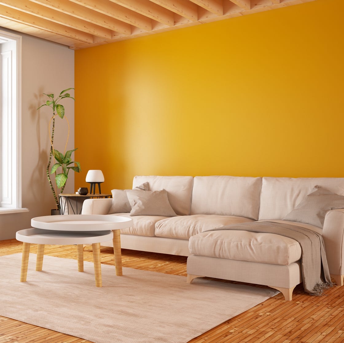
One frequently regretted color is bright yellow. While intended to create a cheerful and sunny ambiance, designers found it could easily overwhelm a space, especially smaller rooms, leading to a harsh and overly saturated environment. A more favorable alternative would be muted mustard or soft gold tones, which provide warmth without the intense saturation.
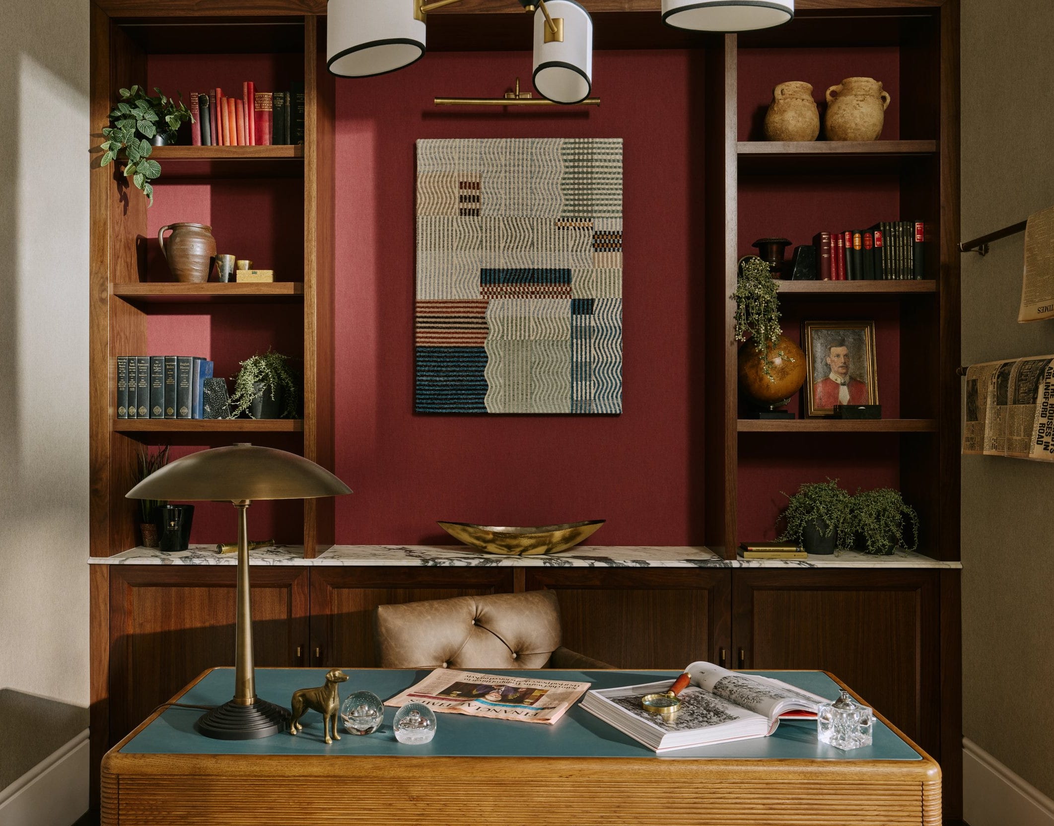
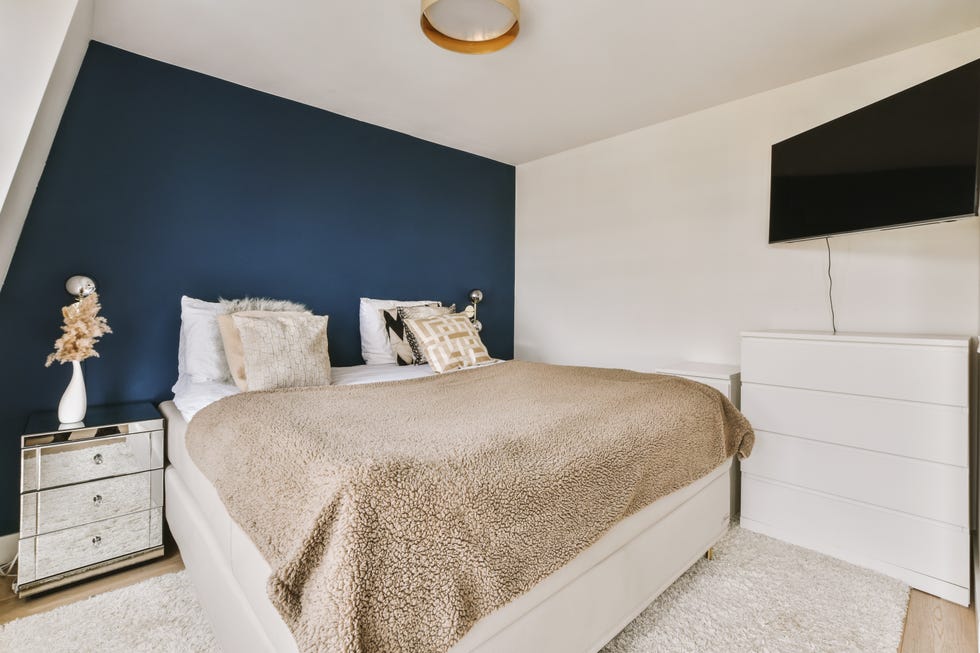
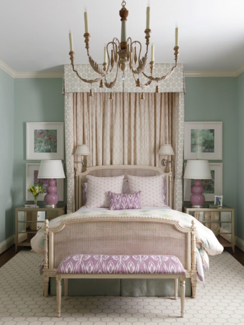
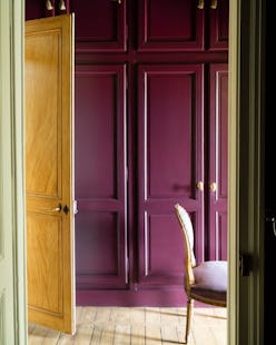
Dark purple, despite being a trendy moody color, was another source of regret. When used in a bedroom with the goal of achieving a sophisticated vibe, it often made the room feel heavy and smaller, particularly in spaces with limited natural light. Instead, a deep, soft mauve can offer similar depth and elegance while maintaining a sense of openness.
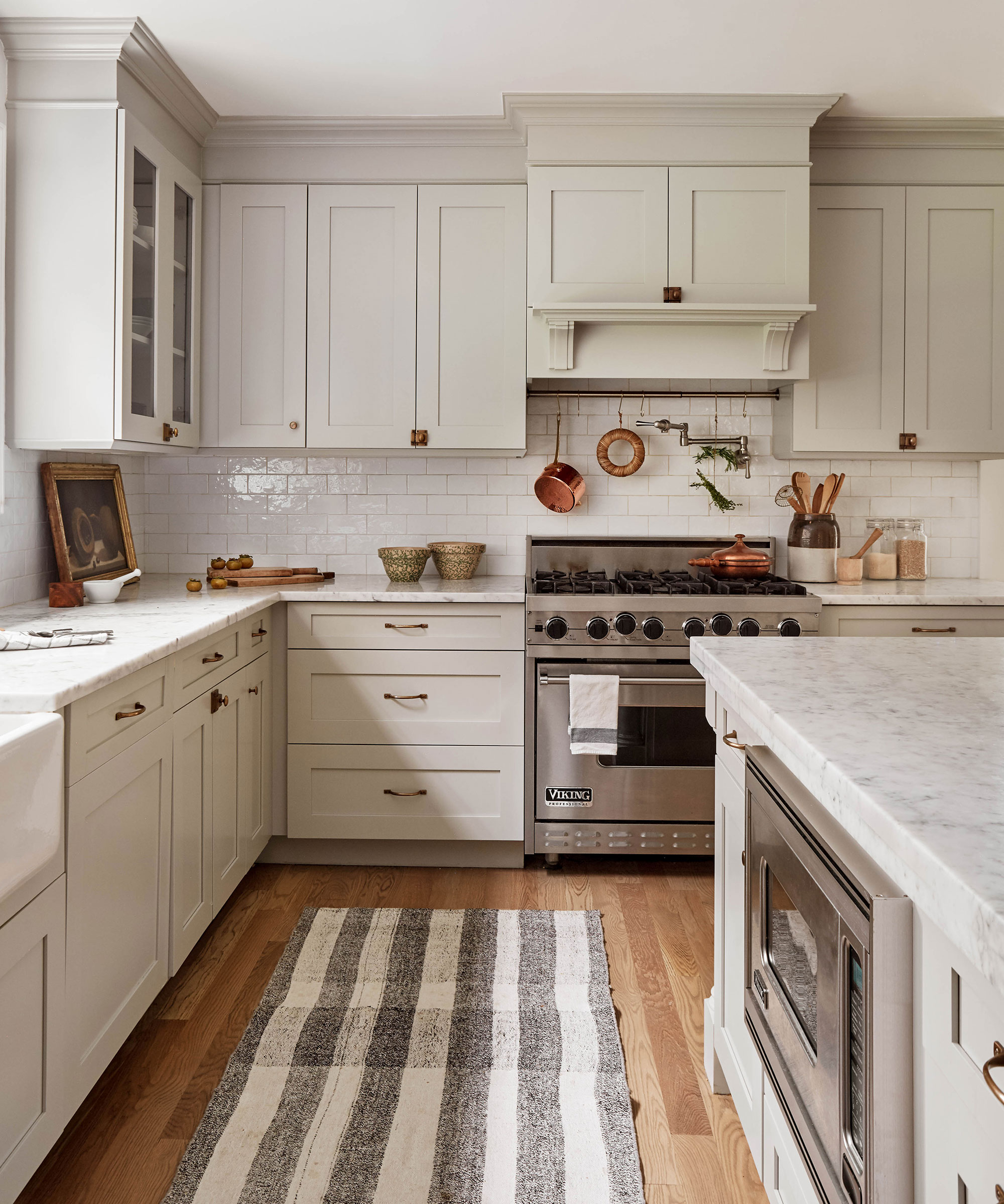
Cool bluish-gray paint, although appearing sophisticated and comforting in theory, frequently resulted in a cold and sterile feel, especially in dimly lit rooms. Designers found warm greige paint to be a better option, providing the desired softness and warmth.
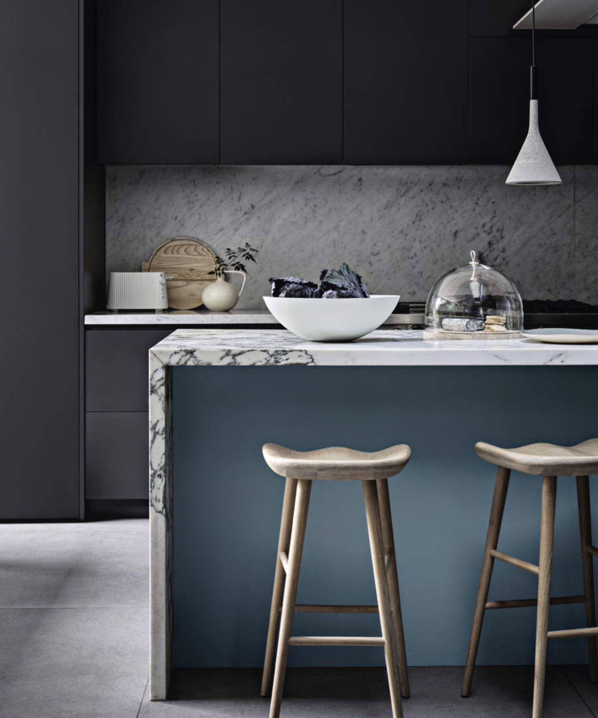
Dark gray, specifically deep charcoal, was regretted for its tendency to make spaces feel oppressive and cave-like, particularly in home offices during morning light or in small rooms where it created a cramped and dreary atmosphere. Lighter, warmer alternatives like muted sage green for a creative workspace or light grays and soft blues were preferred.
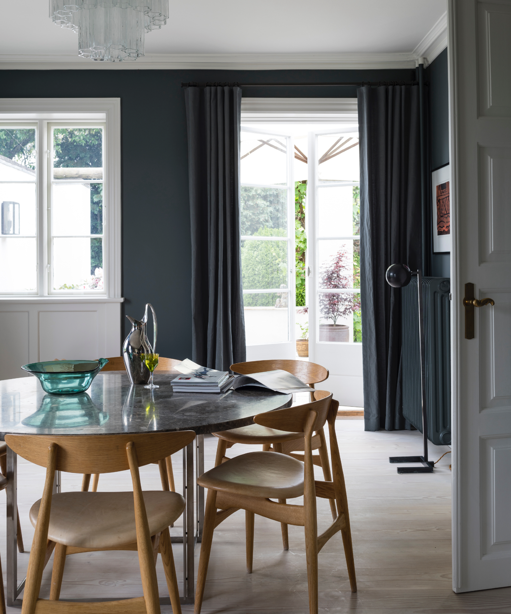
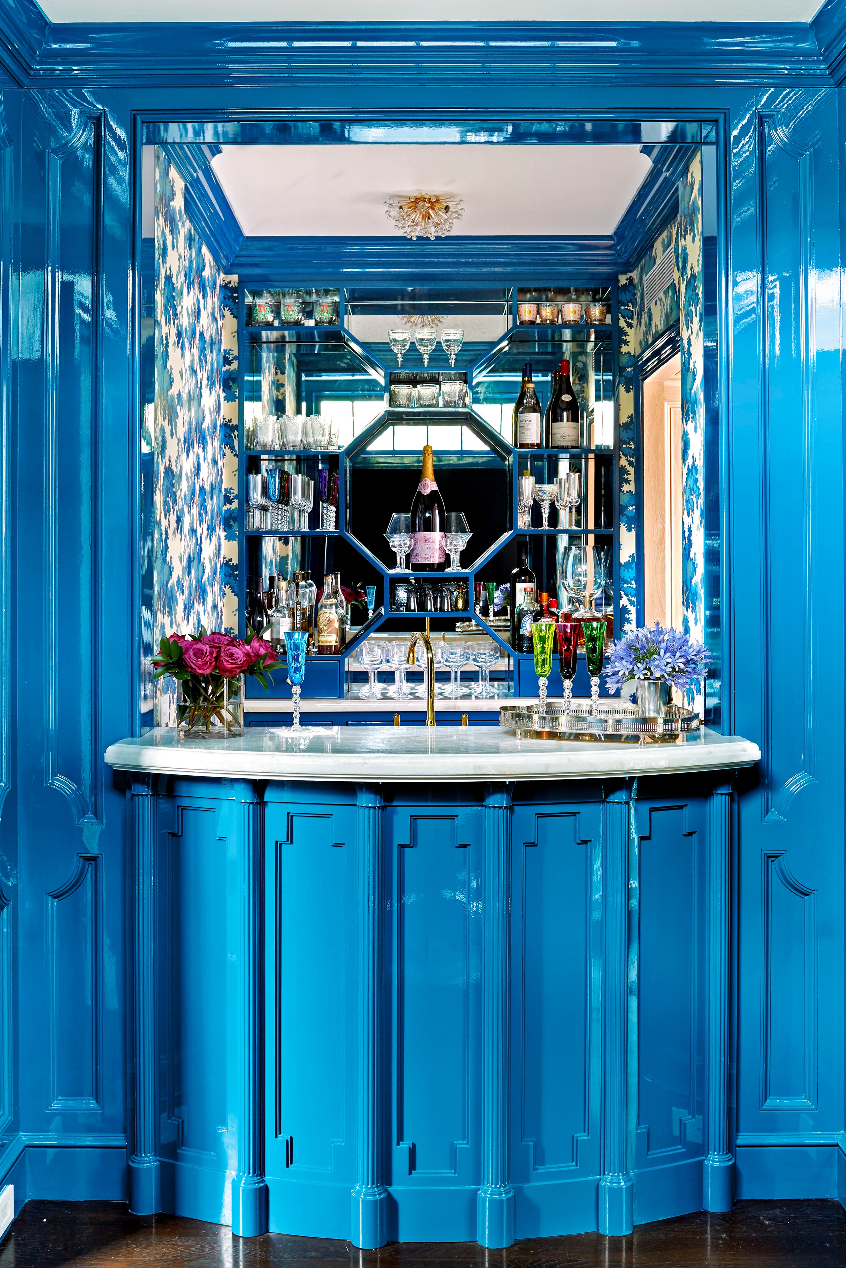
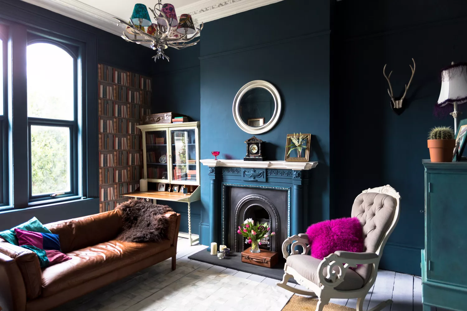
Jewel-toned teal, while intended to add drama and elegance, often proved to be overwhelming and oversaturated, especially under warm lighting in dining rooms. It could also clash with artwork, leading to visual chaos. Designers instead turned to warm greige paint to establish a harmonious backdrop that allows other room elements to stand out.
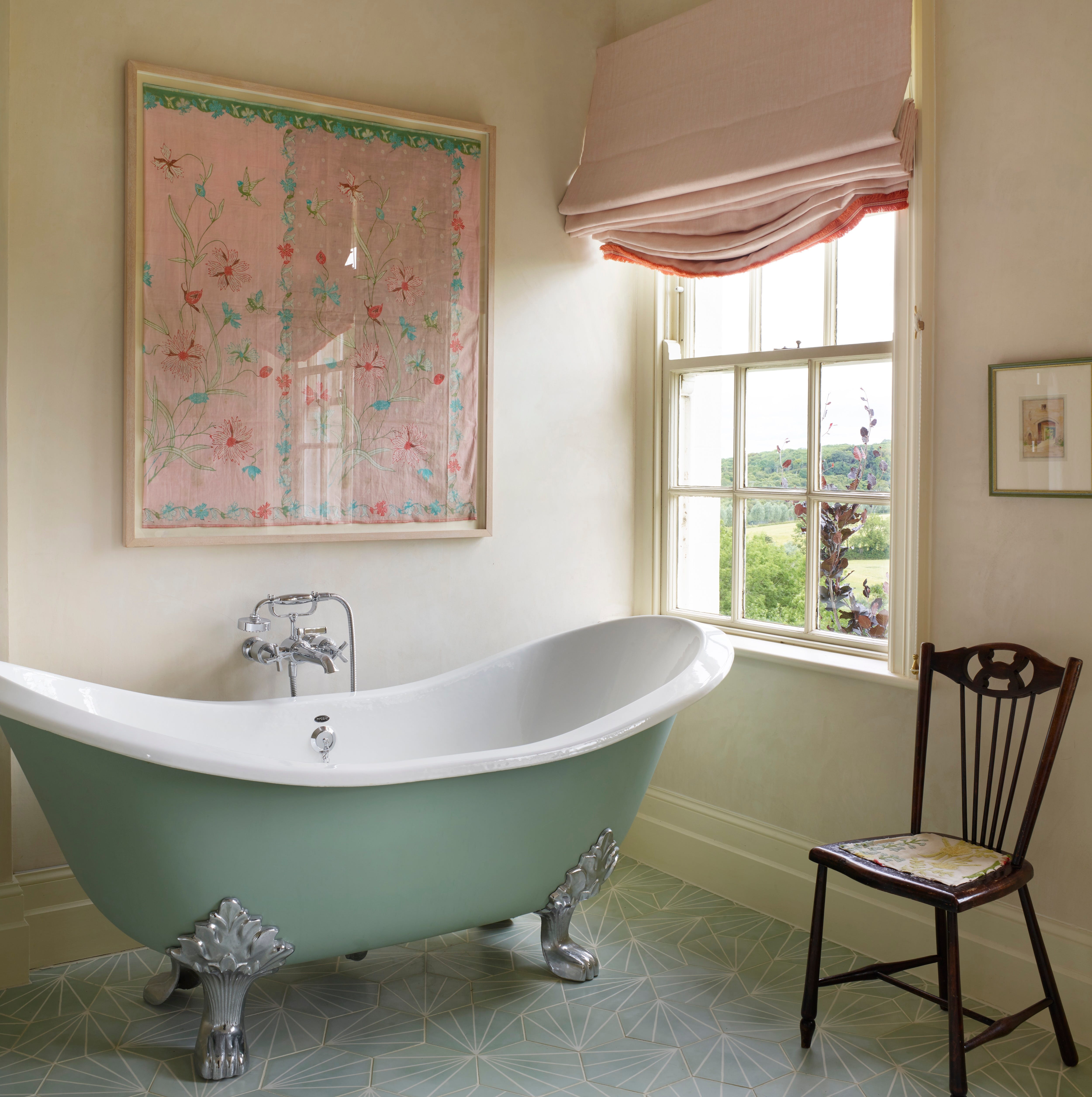
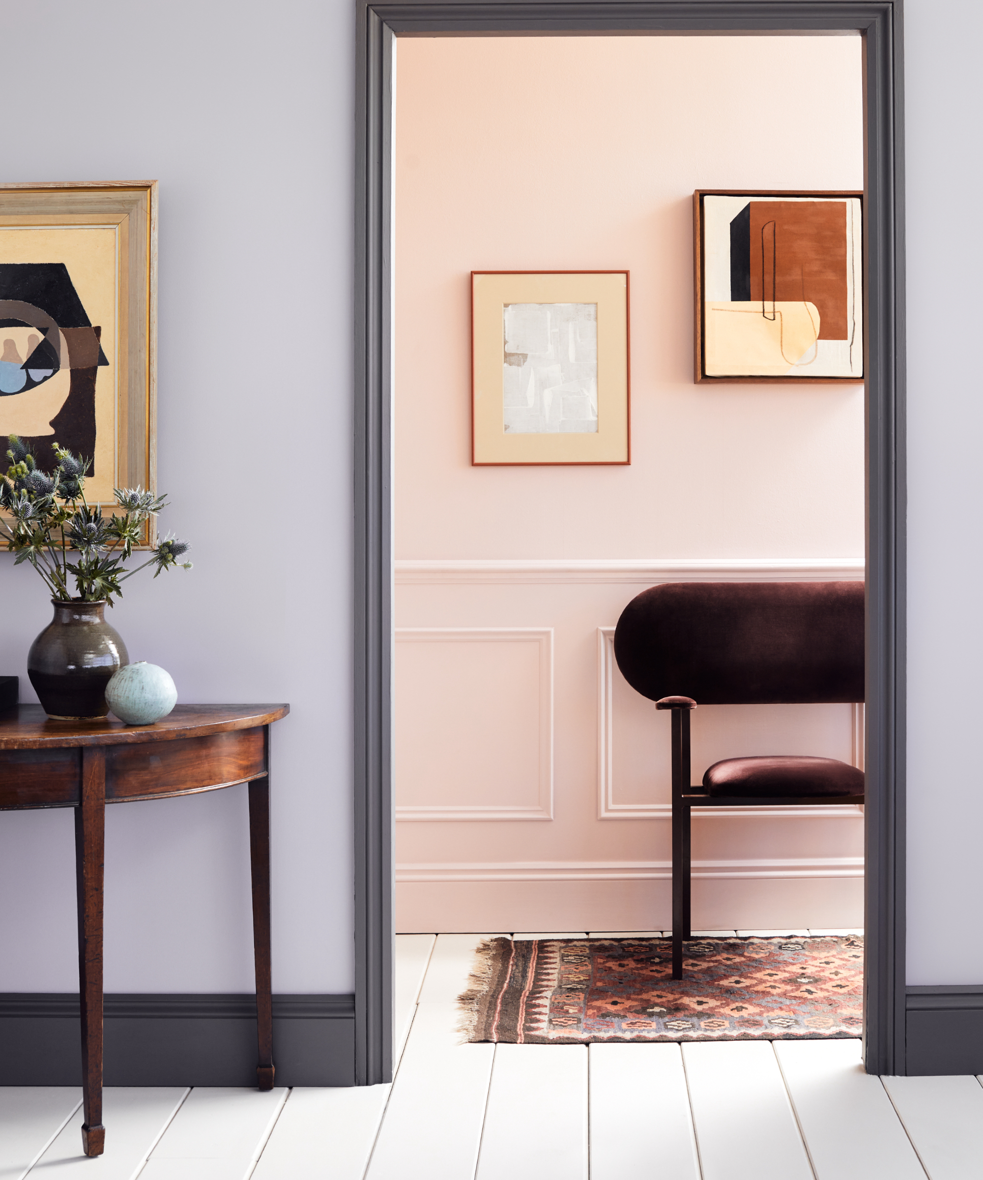
Blush pink was chosen for its soft and sophisticated appeal in bathrooms but was later replaced. In certain lighting conditions, it appeared too warm and peachy, clashing with fixtures like brass. A neutral, barely-there taupe with subtle depth was found to be a more intentional and tranquil choice.
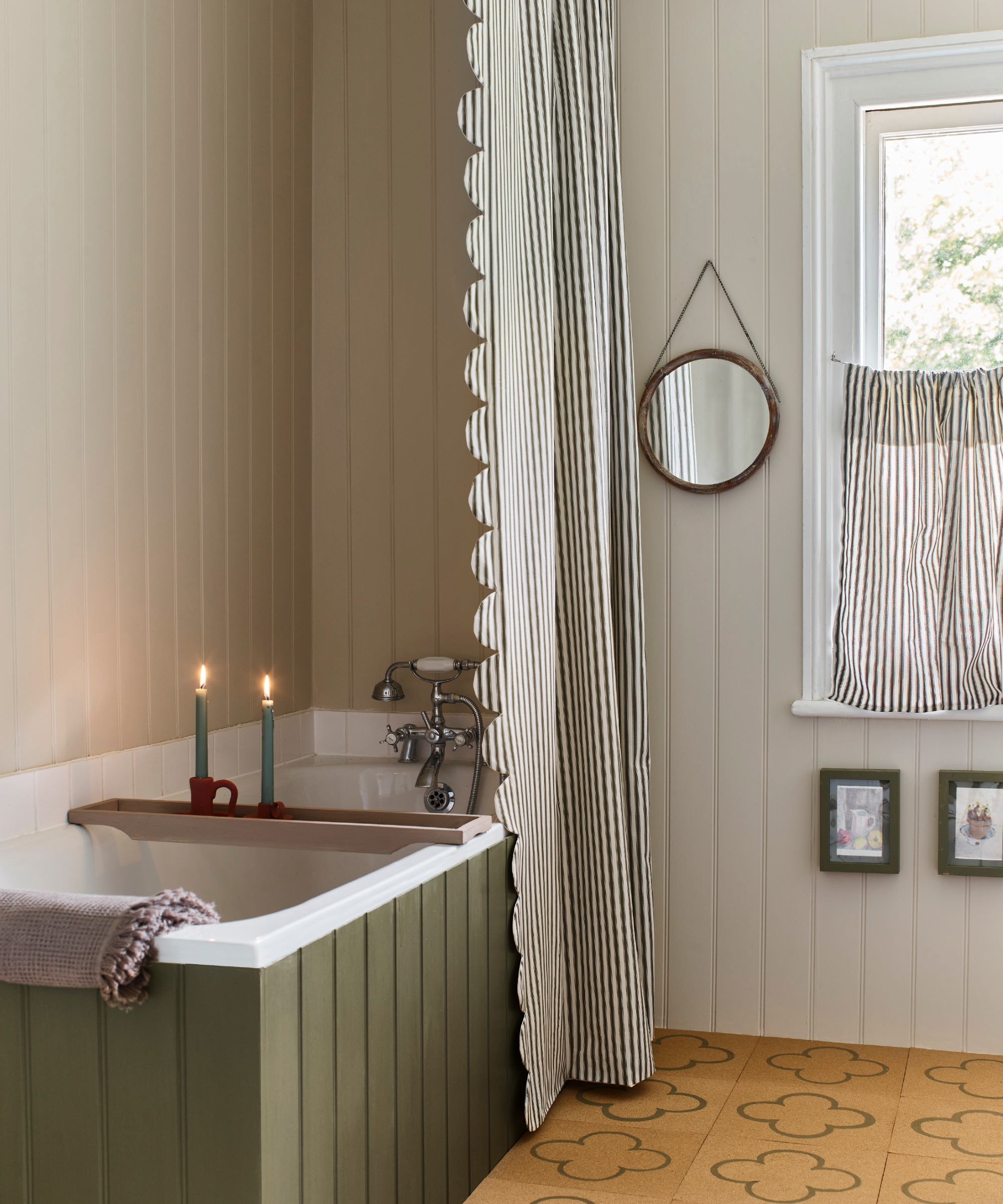
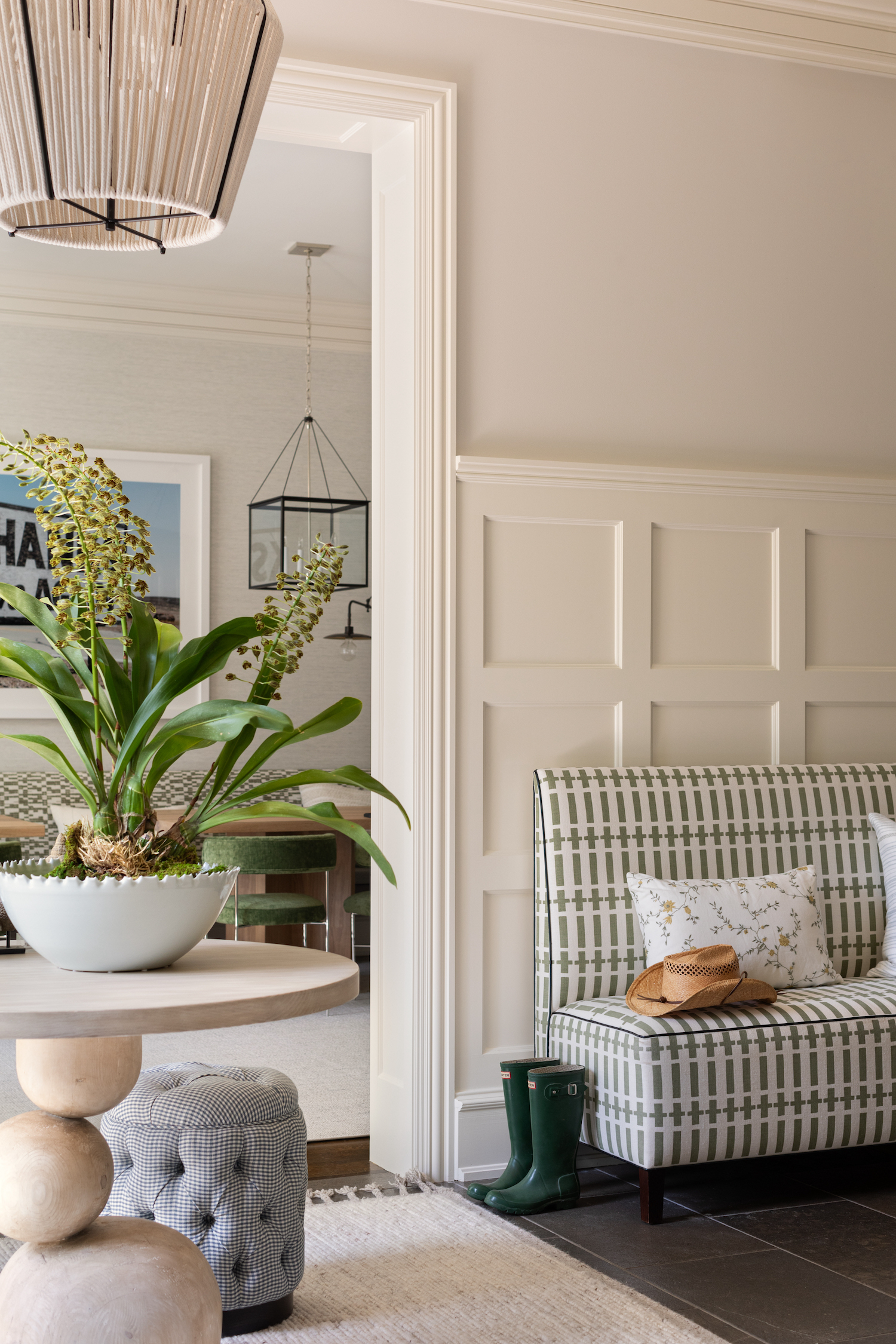
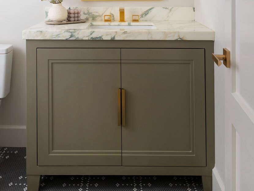
Finally, cool-toned green paint, such as mint green, was often regretted. While intended to be bright and energizing, it frequently resulted in a cold and uninviting space. Designers now favor green paints with warm undertones, such as olive green and sage green, to evoke comfort, serenity, and a connection to nature.
#PaintColors #InteriorDesign #HomeDecor #ColorPsychology #DesignRegrets #WarmNeutrals #RoomAtmosphere #PaintColors #InteriorDesign #HomeDecor #ColorPsychology #DesignRegrets #WarmNeutrals #RoomAtmosphere
Hay 0 comentarios en total
 Aún no hay comentarios
También te puede gustar

7 Most Underrated Paint Colours, According To Colour Experts

These Unusual Paint Colors May Not Be An Obvious Choice, But Designers Can’t Get Enough
7 'Unhappy' Colors That Color Psychology Experts Would Never Paint Their Walls

5 Underrated Paint Colors Designers Always Use in Their Projects (and You Should Too)

7 of the most versatile and easy to use paint colors according to designers

7 Paint Mistakes That Make Designers Instantly Cringe When They Walk Into Someone's Home

6 Paint Color Mistakes To Stop Making, According To Designers
Can You Guess The Most Popular Paint Color The Year You Were Born?

Outdated color trends – 5 overdone colors that designers no longer love, and what to use instead
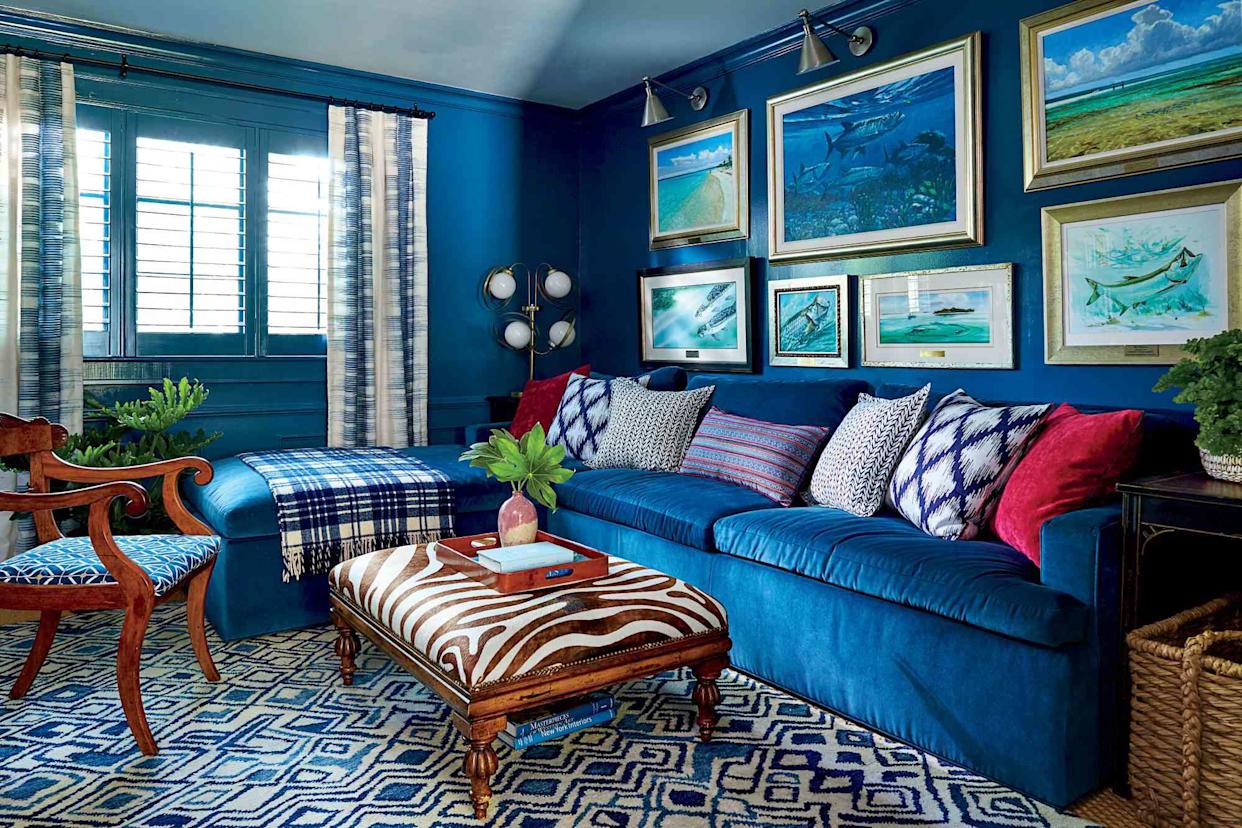
6 Paint Color Mistakes To Stop Making, According To Designers


An A-List Designer’s Secrets To Picking Perfect Paint Colors
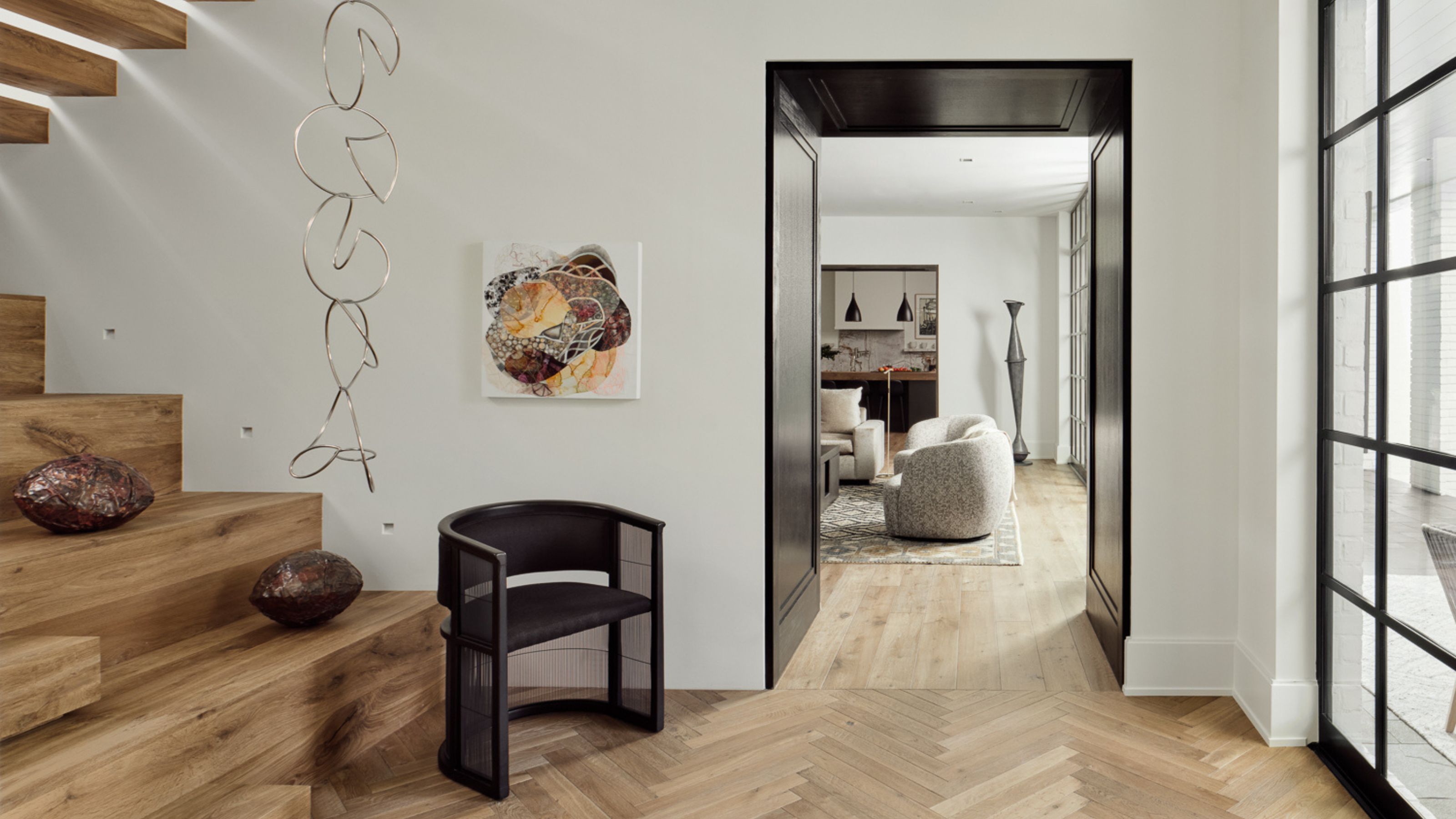
9 Neutral Paint Colors Designers Constantly Reach For — "It's My Tried-and-True"
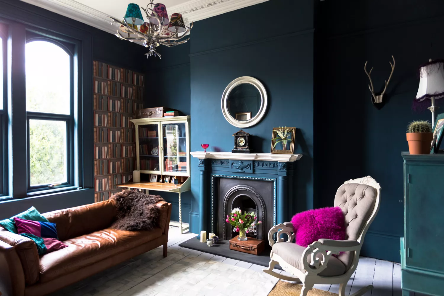
7 Paint Colors Designers Wish They Never Used (and What You Should Use Instead)


The most timeless paint colors according to designers

Interior design experts reveal the colour rules you should be breaking

5 colors you should never paint a small room – designers warn us to steer clear of these hues, and what to pick instead
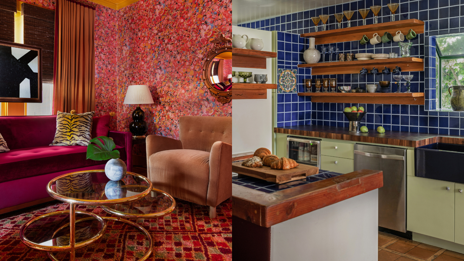
9 'good weird' paint colours approved by designers

The 5 outdated paint colors of 2024 designers loathe — and what they're loving instead

19 go-to paint colors that Dallas designers love
Can't Choose a Paint Color? Here Are 7 Hacks Interior Designers Swear By