1/9
How a Designer Figured Out Different Purposes for the Redundant Rooms in This '90s Home
In a 1990s-built home in Surrey, England, designer Holly Vaughan of Vaughan Design & Development was tasked with transforming a property that, despite its generous size and attractive bay windows, presented challenges due to its overly expansive and often redundant rooms. The owner, having recently acquired the house, sought assistance in effectively zoning these long spaces to enhance their functionality and infuse character. The existing interior featured magnolia walls, beige carpets, and pine woodwork, providing a blank canvas for a complete overhaul.
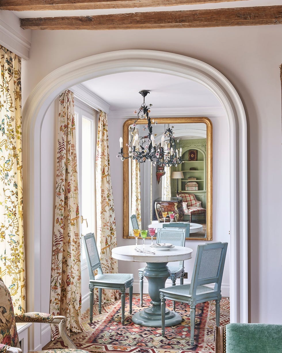
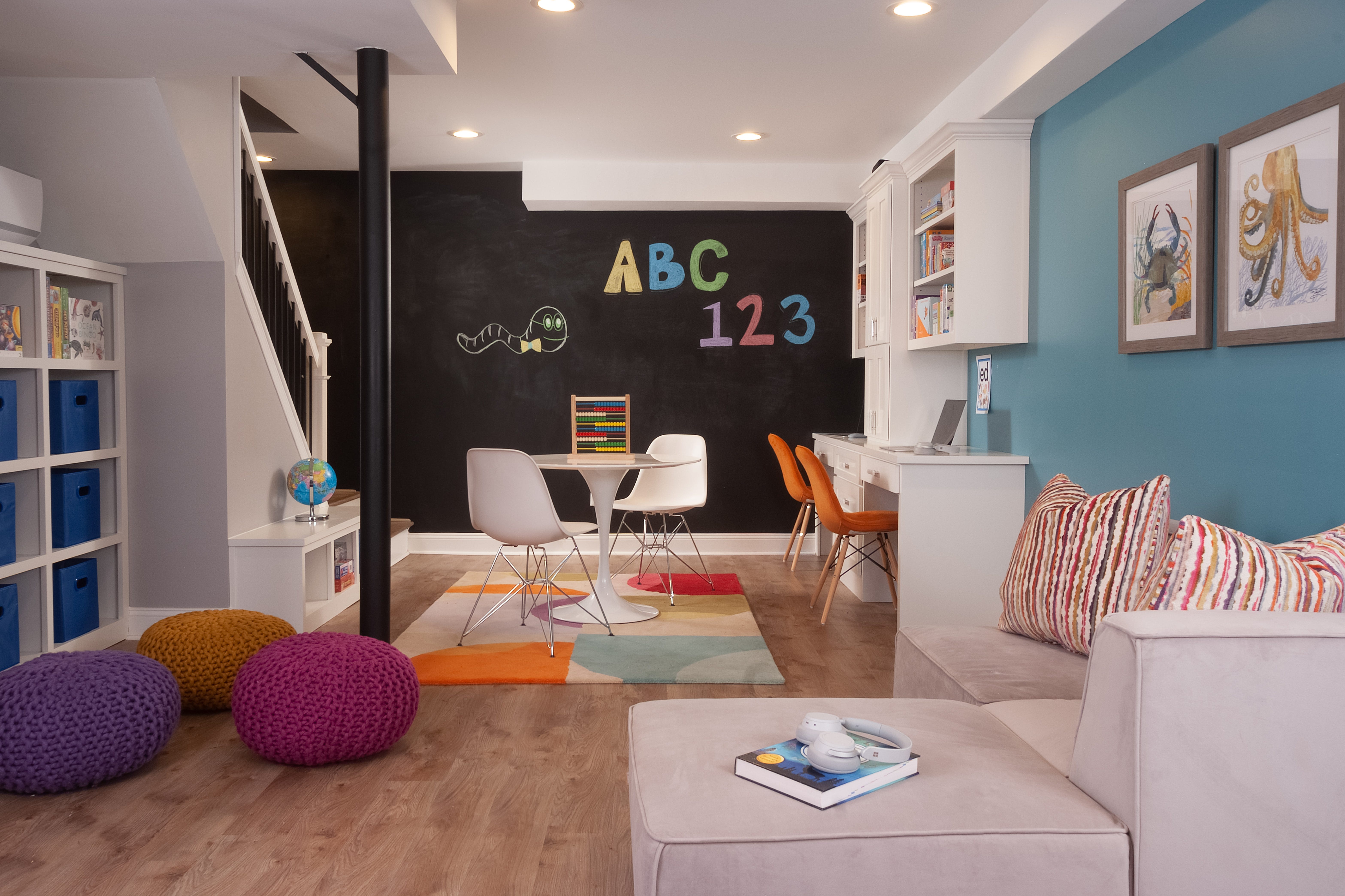
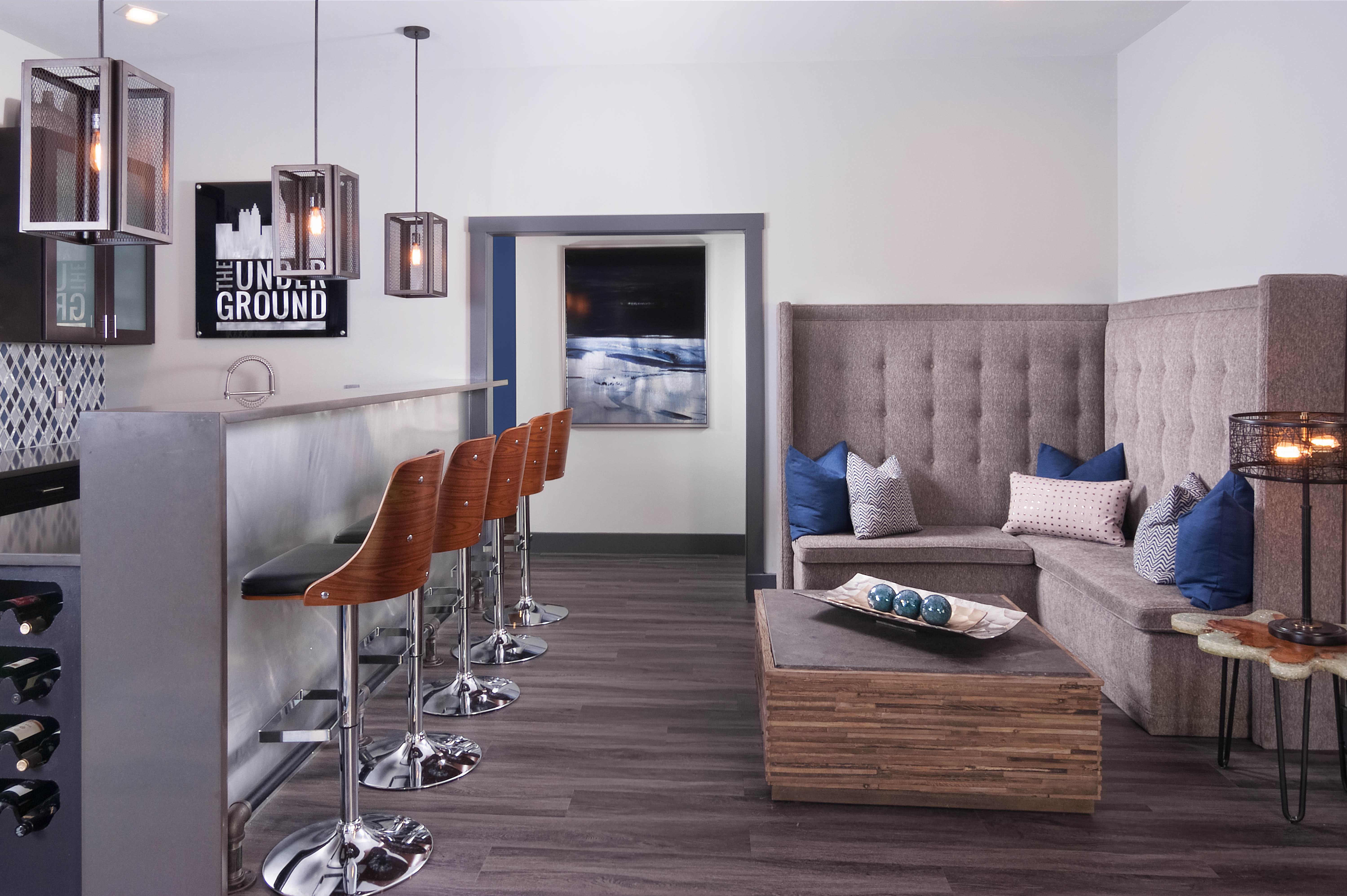
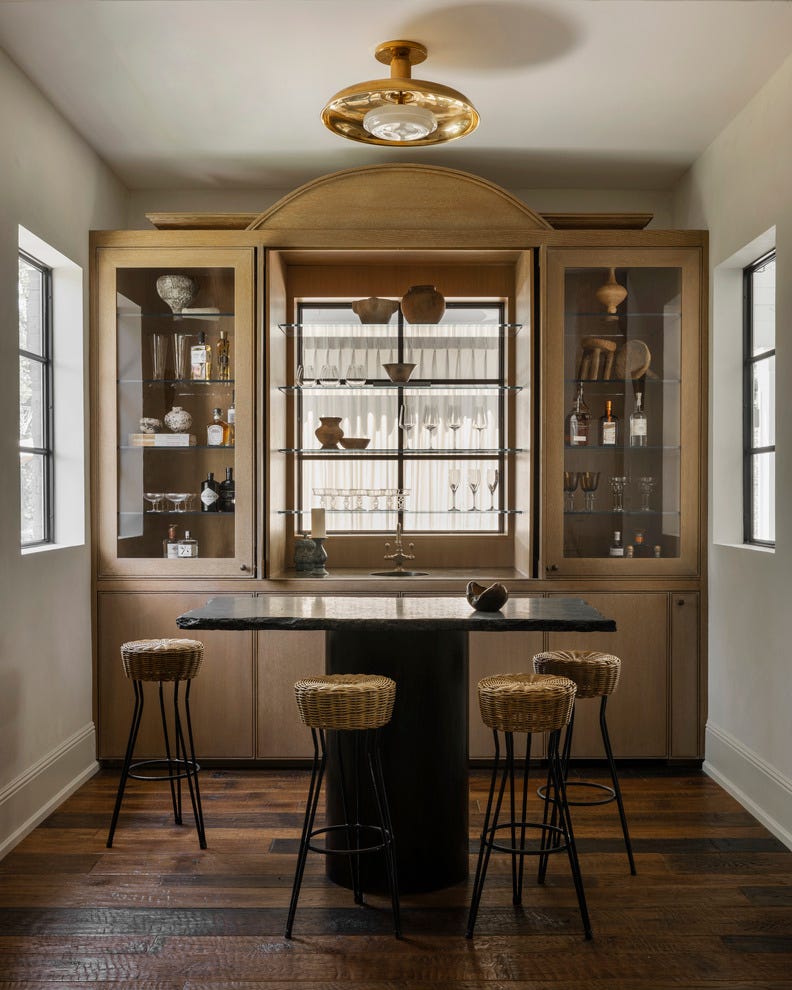
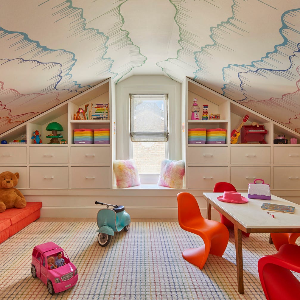
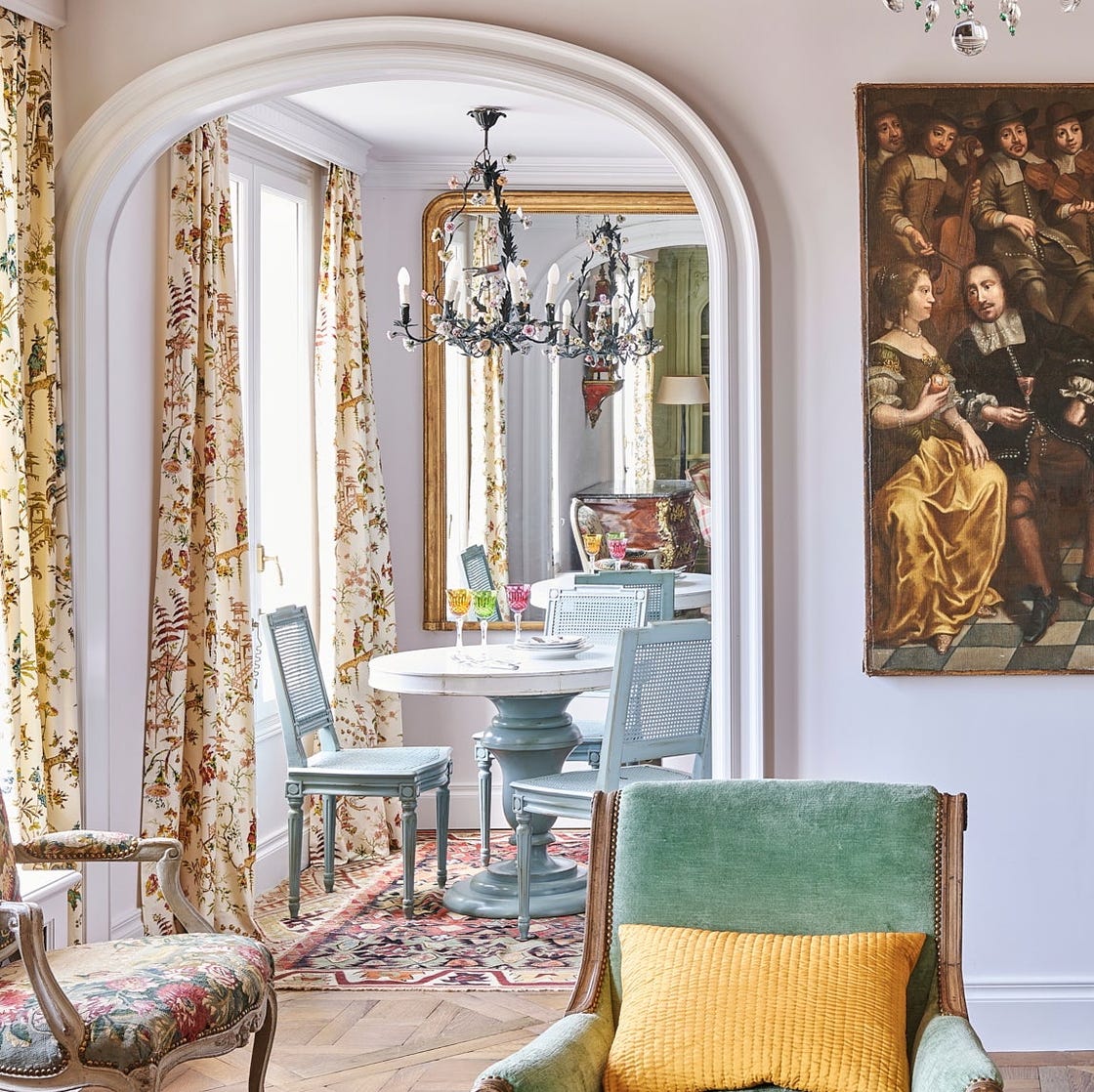
Vaughan’s approach involved segmenting the large areas into distinct zones, starting with the creation of an inviting everyday dining space, complete with comfortable bench seating. This was complemented by a more formal dining area designed for entertaining guests. Recognizing the remaining square footage, the designer innovatively carved out additional spaces, including a dedicated game room and a cozy banquette book nook. This strategy ensured that every part of the home served a specific purpose, addressing the initial issue of underutilized space.
The material selection was carefully considered to accommodate the owner's lifestyle, particularly her four-legged companions. Vaughan opted for durable and easy-to-maintain flooring solutions such as parquet, stone tile, and washable rugs from Weaver Green, balancing practicality with aesthetic appeal. While vintage runners were initially considered for their ability to hide stains, the convenience and cost-effectiveness of washable alternatives proved to be a significant advantage, demonstrating a pragmatic design choice that did not compromise the overall look.
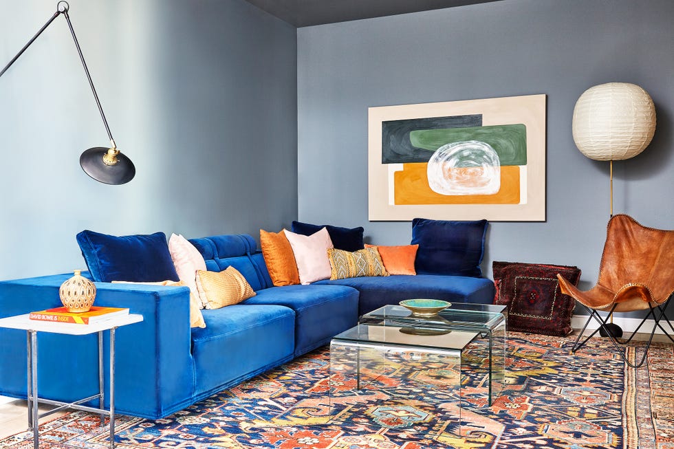
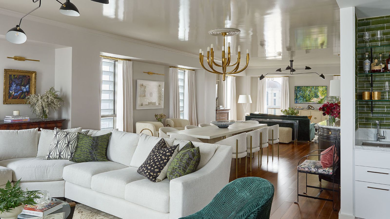
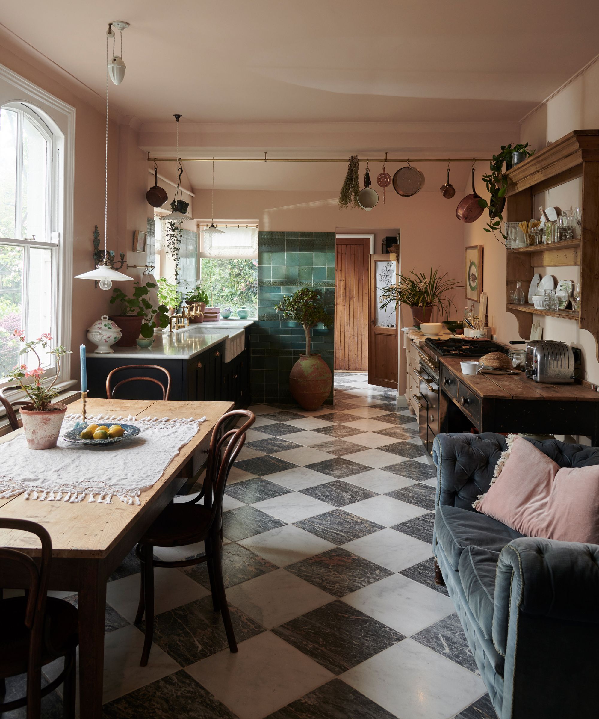
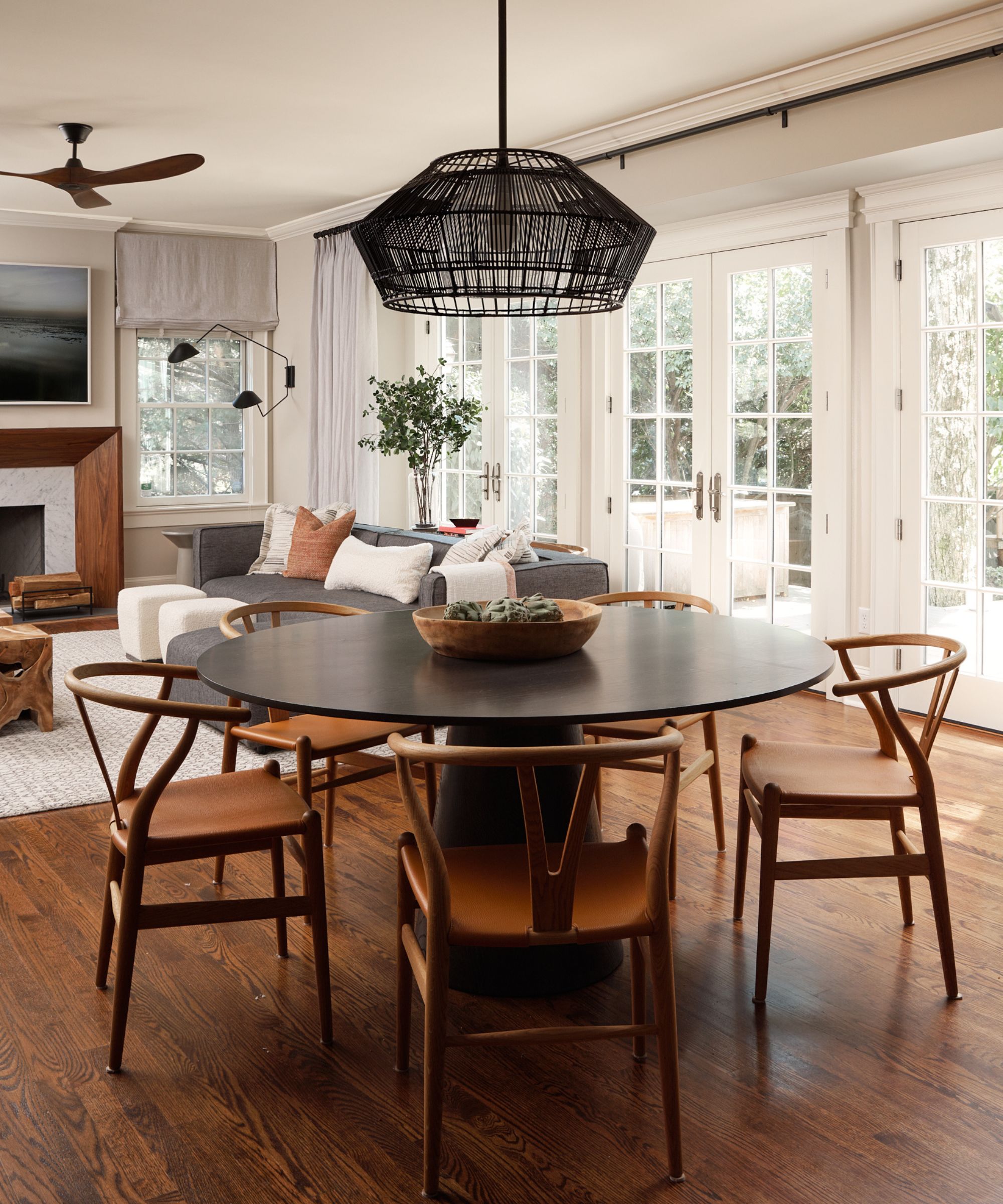
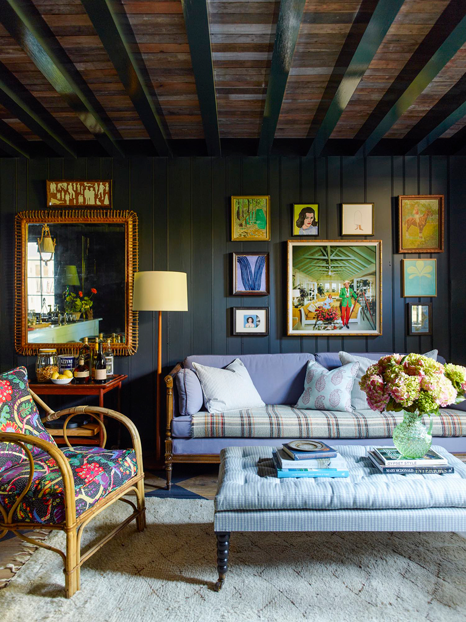
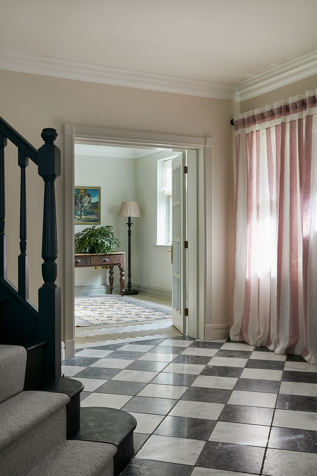
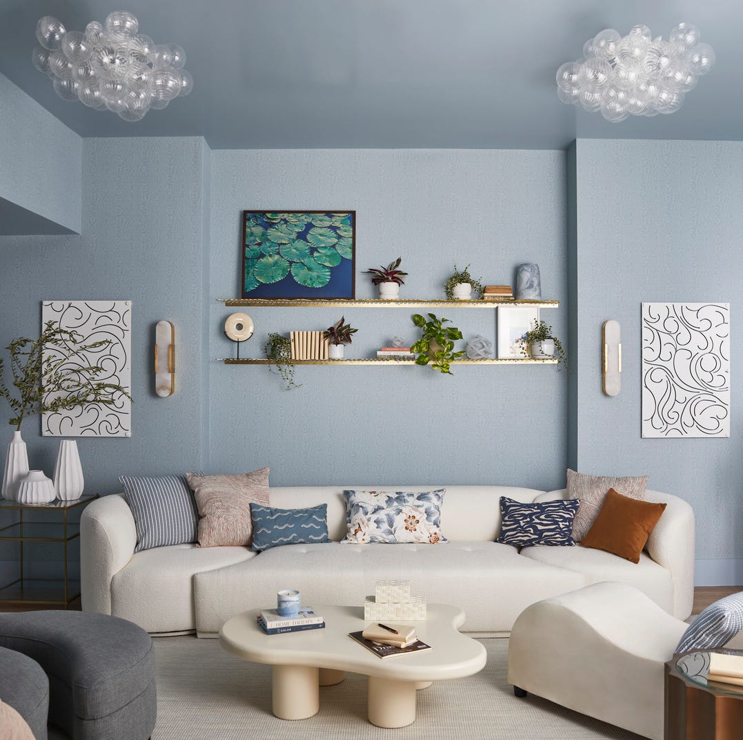
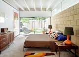
The color scheme embraced the homeowner's preferences for pinks, greens, and yellows, moving away from the bland existing decor. Instead of using overly bold hues, Vaughan implemented pockets of color that harmonized with more muted tones. For instance, in the living room, varying shades of green were used for the millwork and library wall, creating depth and sophistication. In the dining area, Farrow & Ball's 'Hay' paint color was chosen for its inherent warmth, further enhanced by the inclusion of rattan chairs and pendant lights to complete the aesthetic. The design also incorporated elements like a striking black and white checkered floor in one of the main communal areas, providing a classic yet bold statement.
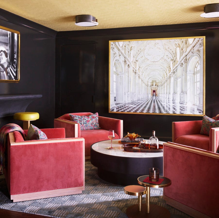
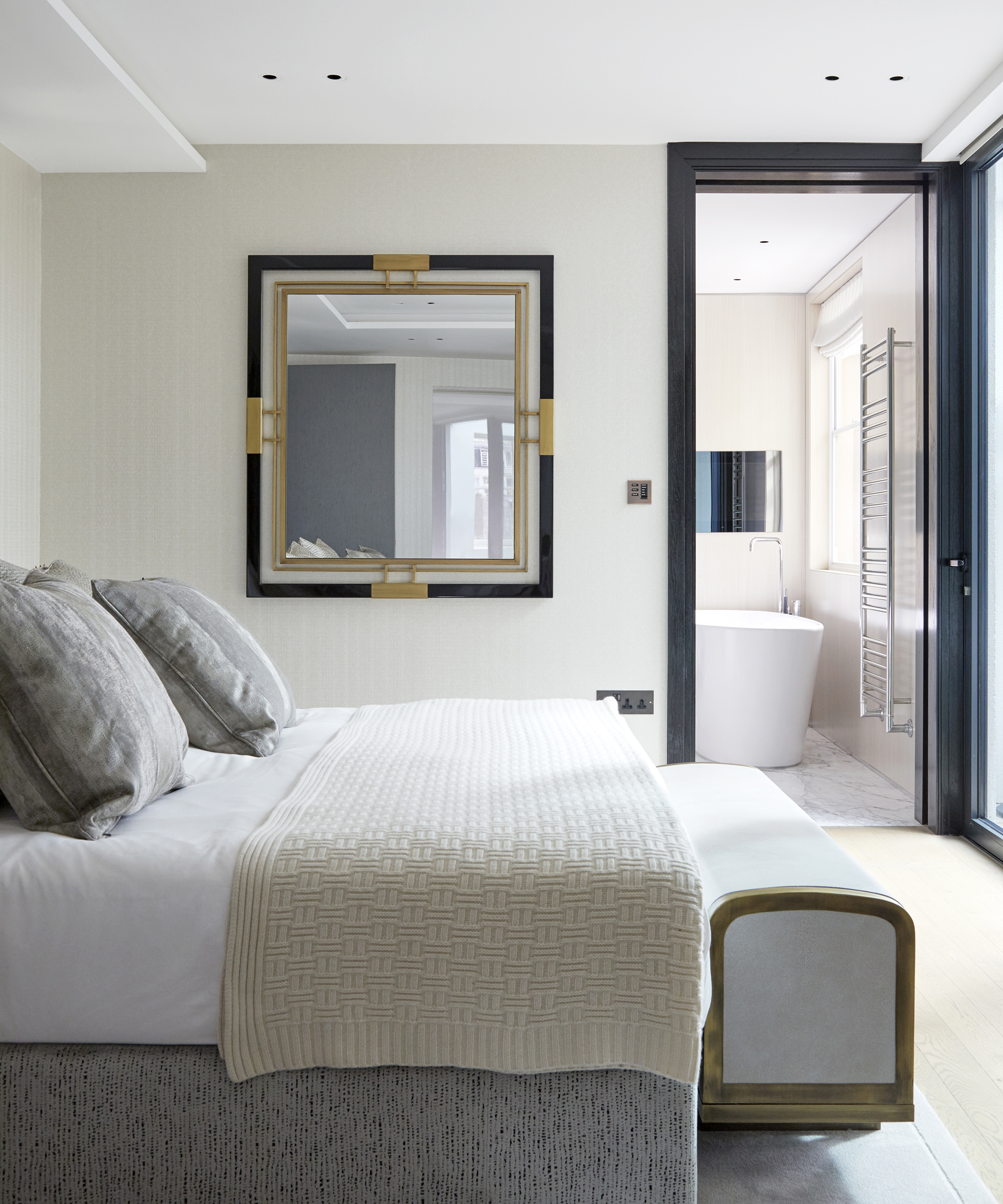
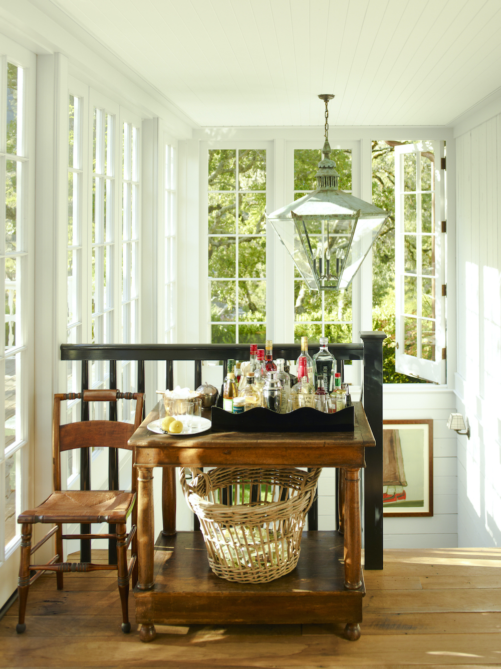
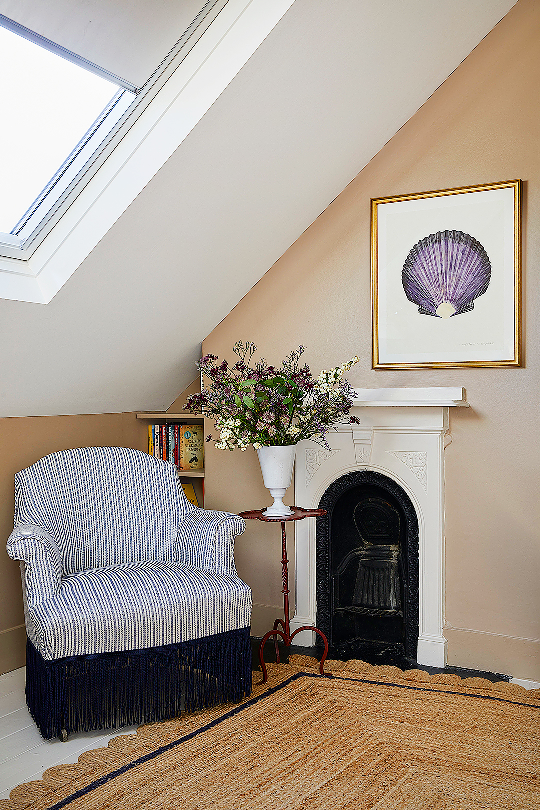
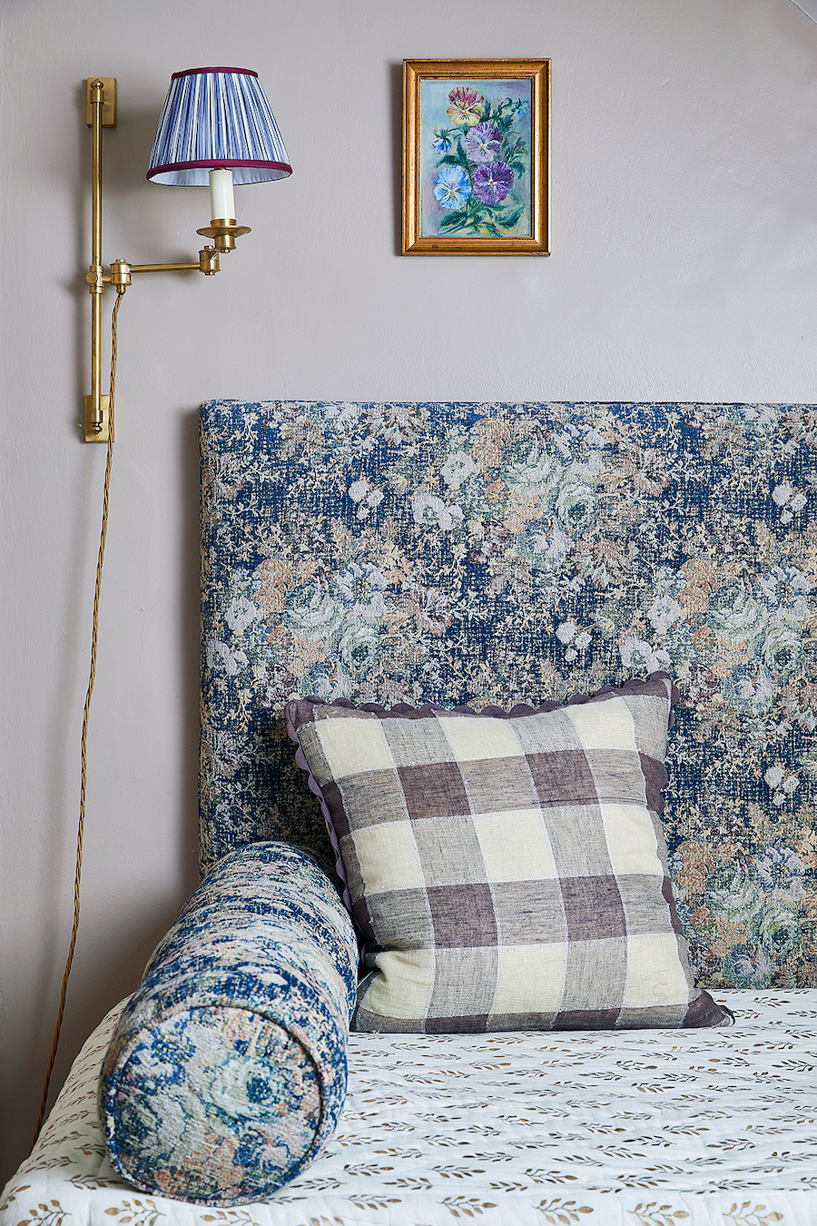
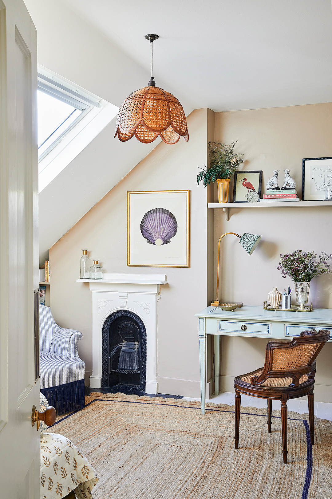
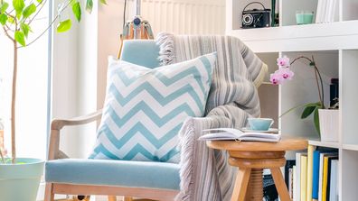
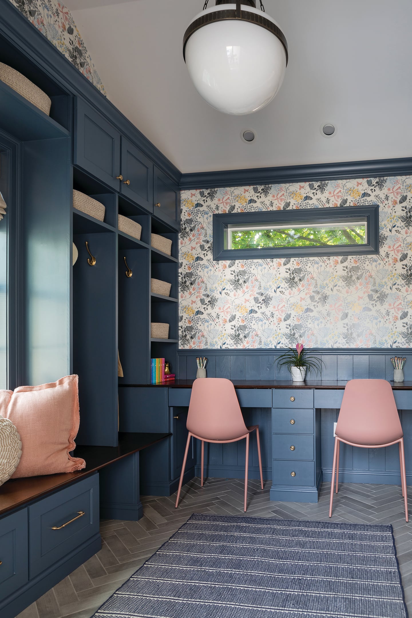
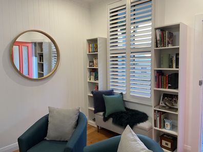
A highlight of the renovation is the powder room, where Vaughan indulged in a more playful design. Here, a combination of a tulip print wallpaper by Ottoline and pink zellige tiles from Mosaic Factory created a dynamic contrast between soft florals and textured squares. Fabric light shades by Alice Palmer were added to evoke a charming cottagecore ambiance. The formerly underutilized bay window was transformed into a snug book nook with a built-in window seat and shelving, offering a comfortable reading spot and enhancing natural light through relaxed Roman blinds. The design culminated in a game area at the end of a long sitting room, furnished with a handsome marble table and frill-edged curtains, providing an alternative space for post-dinner relaxation and activities like cocktails or board games. These thoughtful design decisions collectively imbued the home with character and functionality, effectively addressing the challenges posed by its spacious yet undefined layout.
#HomeRenovation #InteriorDesign #SpacePlanning #ColorSchemes #FunctionalDesign #CustomInteriors #DesignInspiration #RoomZoning #HomeRenovation #InteriorDesign #SpacePlanning #ColorSchemes #FunctionalDesign #CustomInteriors #DesignInspiration #RoomZoning
0 comment in total
You may also like
Here's What to Do With Those Awkward Spaces in Your House, According to Designers

The Secrets to a High-Functioning “Does It All” Room

9 whole house layout mistakes – avoid these common floor plan flaws

A multifunctional mudroom is not just hard-working and inviting, it piques curiosity

Why Designers Are Ditching Traditional Layouts for "Broken Floor Plans"
50 Bonus Room Ideas That Make Use of Your Extra Square Footage
Closed Concept Is Back: Here's How to Breathe New Life Into the Design

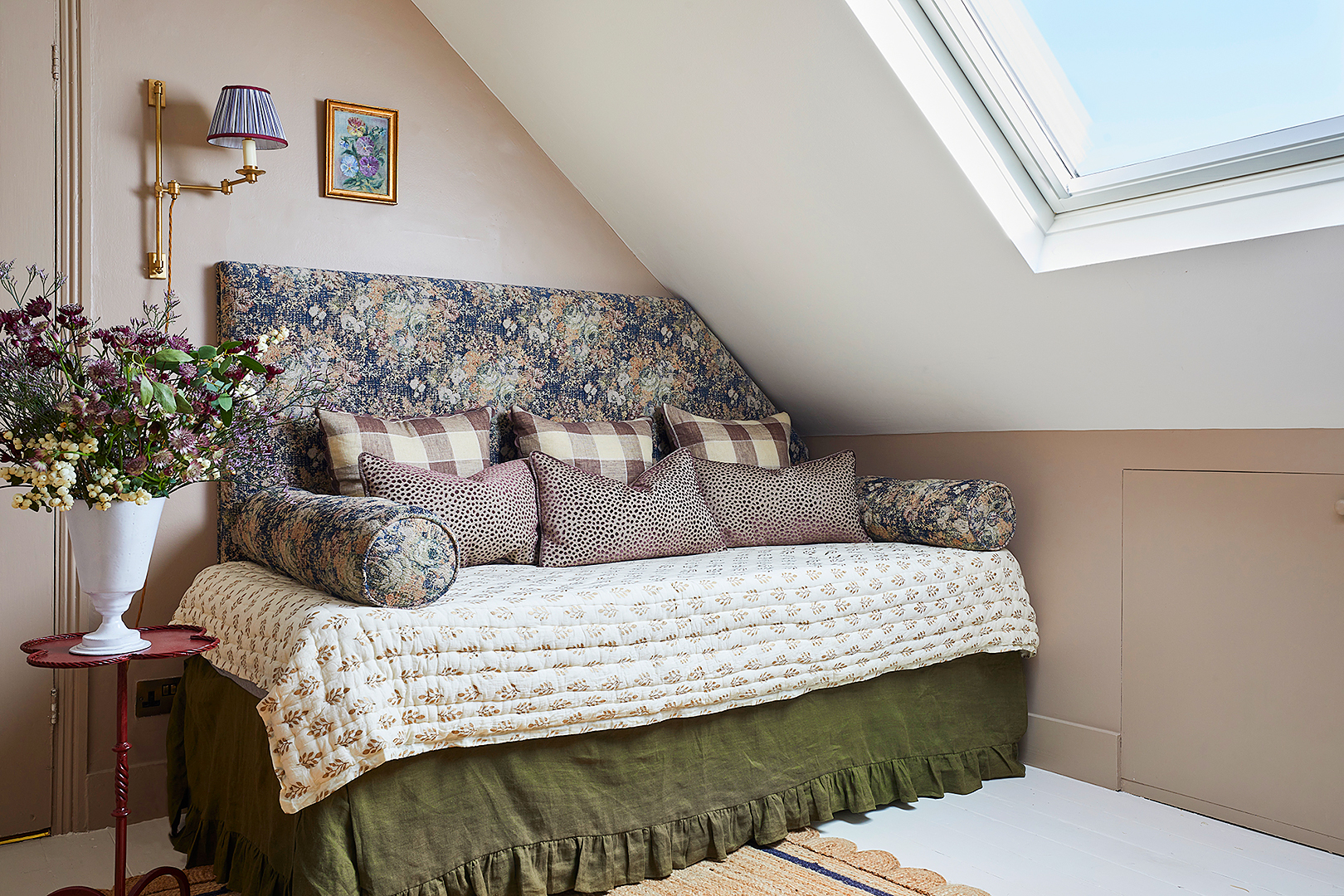
In This London Attic, a Daybed Was Built to Fit the Awkward Sloped Ceiling

How a Designer Reimagined the Wasted Square Footage in This Colonial’s Awkward Foyer


Dirty John's Debra Newell Tells Us How to Tackle a Room Redesign
Create a great place to concentrate

15 Genius Space-Saving Room Ideas
7 Ideas for Transforming Your Formal Dining Room Into a More Functional Space

7 open plan living mistakes – what can go wrong and how to avoid it
An Architect Turned This Old Summer Camp Into a Charming Family Home
Pinterest data shows Aussies are obsessed with nooks: How to add these cute spaces to your home

How a Designer Turned This "Modern White Box" Into a Lively—and Functional—Family Home
How They Pulled It Off: A “Superwall” That Adds Privacy (and Storage) to a 1970s Condo

A Wall of Built-Ins Gives This Kitchen–Living Room Combo Good Flow
How to Work With the Dated Designs You Hate in Your Home