1/5
4 surprising areas in your home that experts say you really shouldn't paint white – and what to do with them instead
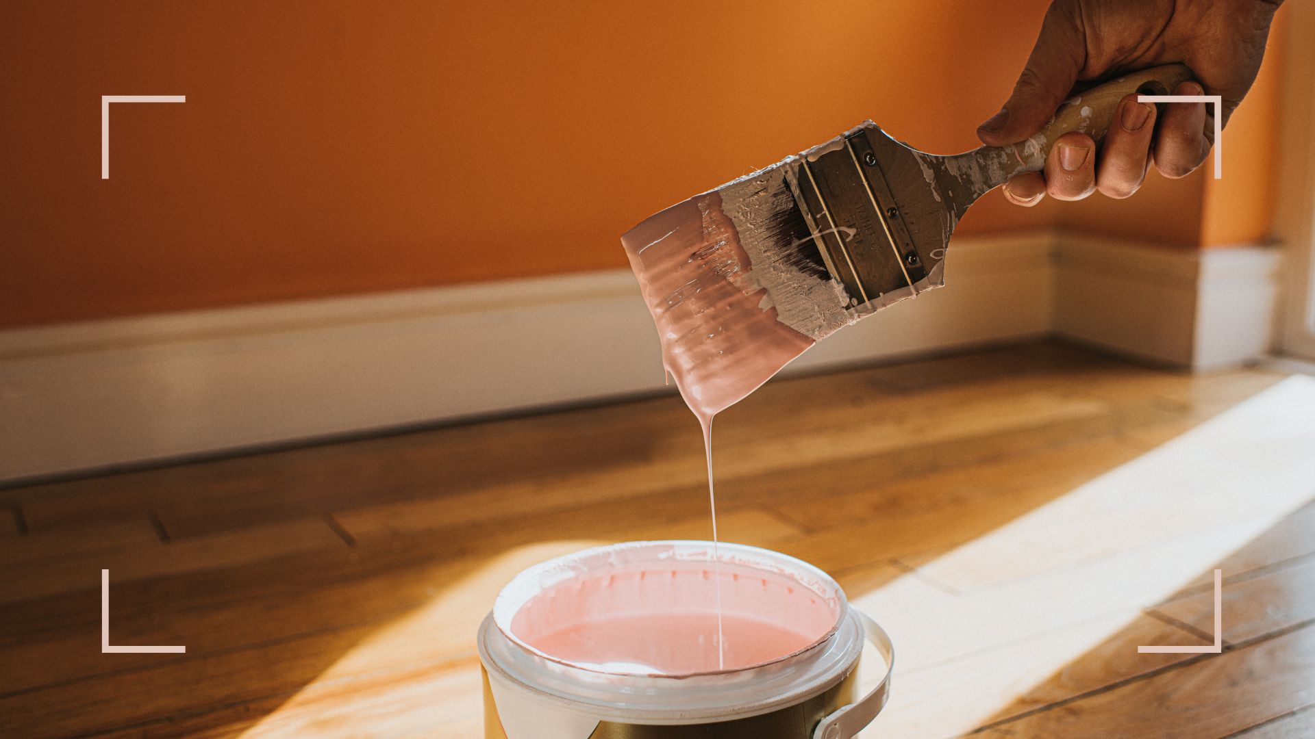
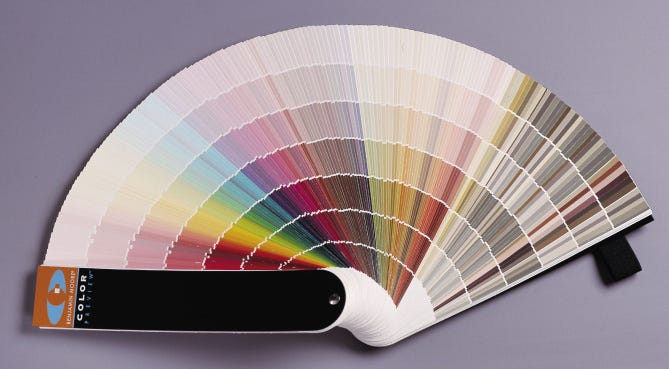
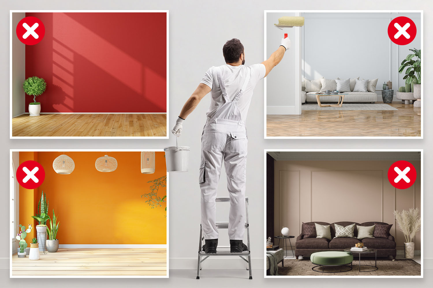
The article explores specific areas within a home that design experts recommend against painting white, offering alternative color strategies to enhance the aesthetic and functional qualities of these spaces. While white paint is often considered a versatile and default choice for interiors, experts argue that its overuse can lead to stark, uninviting, or flat environments, and can also highlight imperfections and require more maintenance due to visible marks and scuffs.
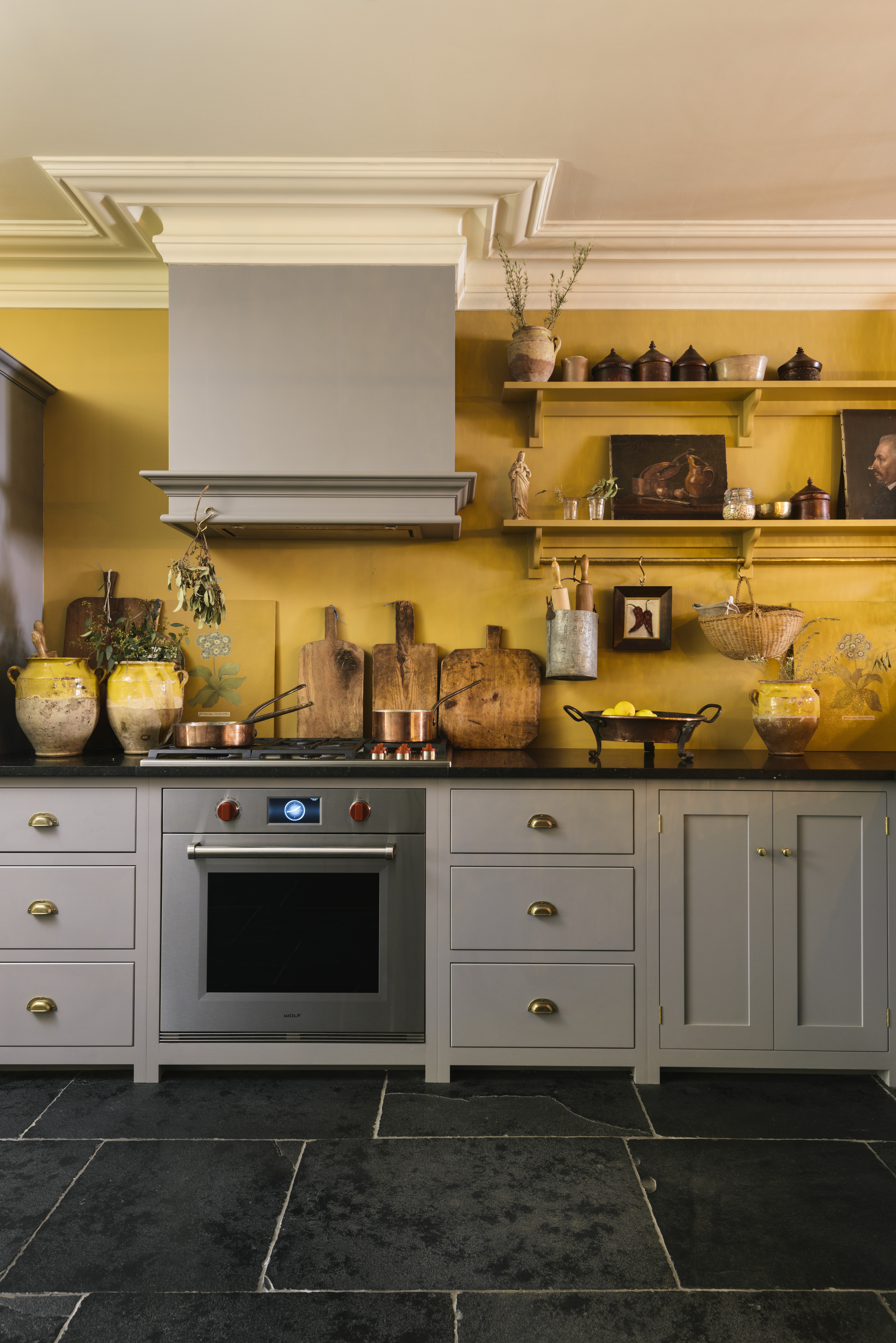
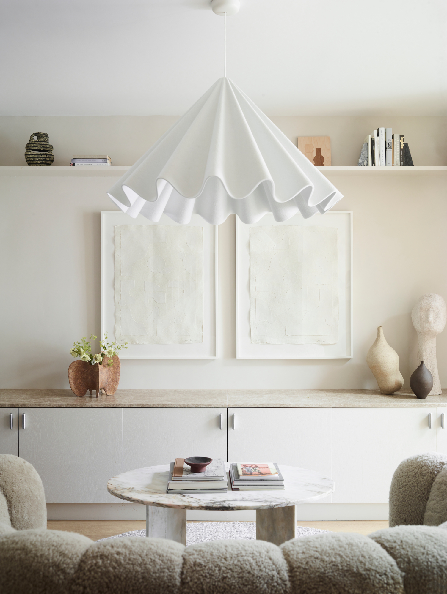
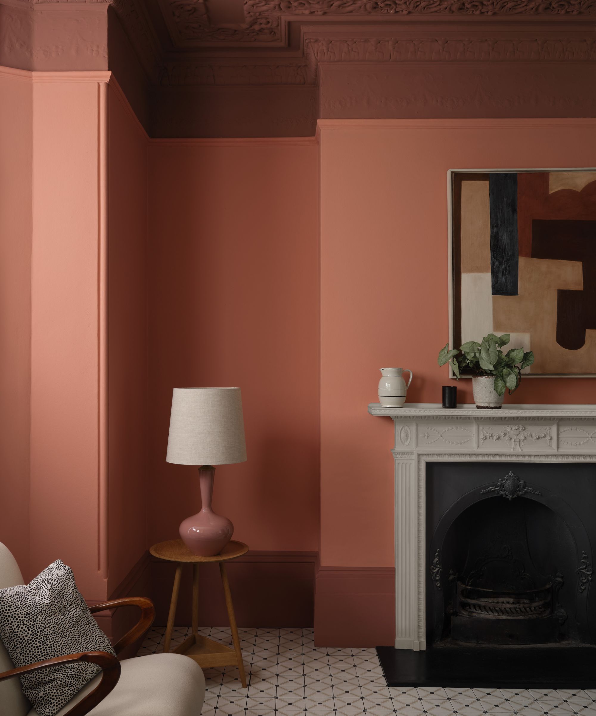
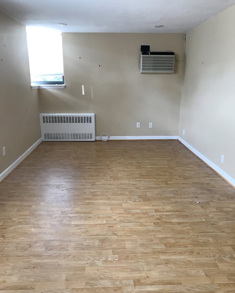
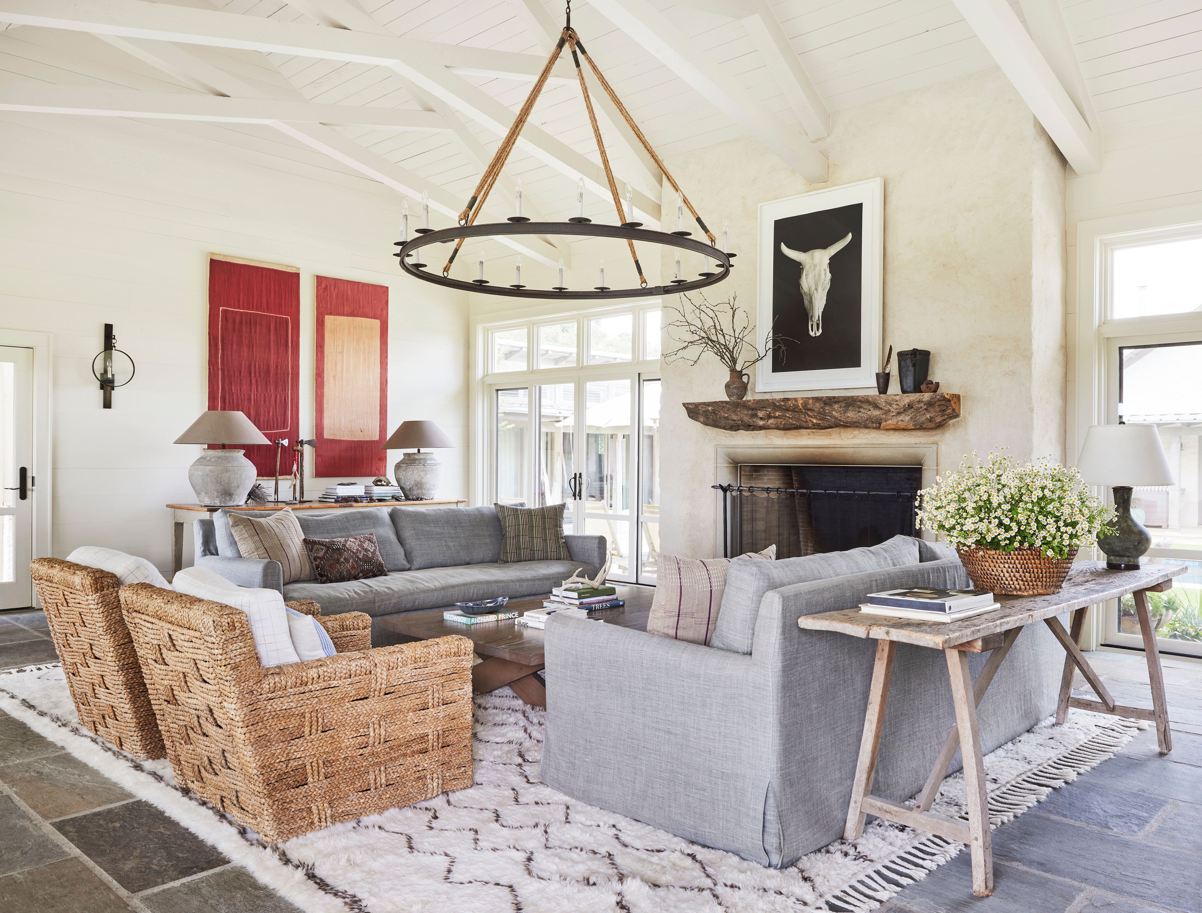
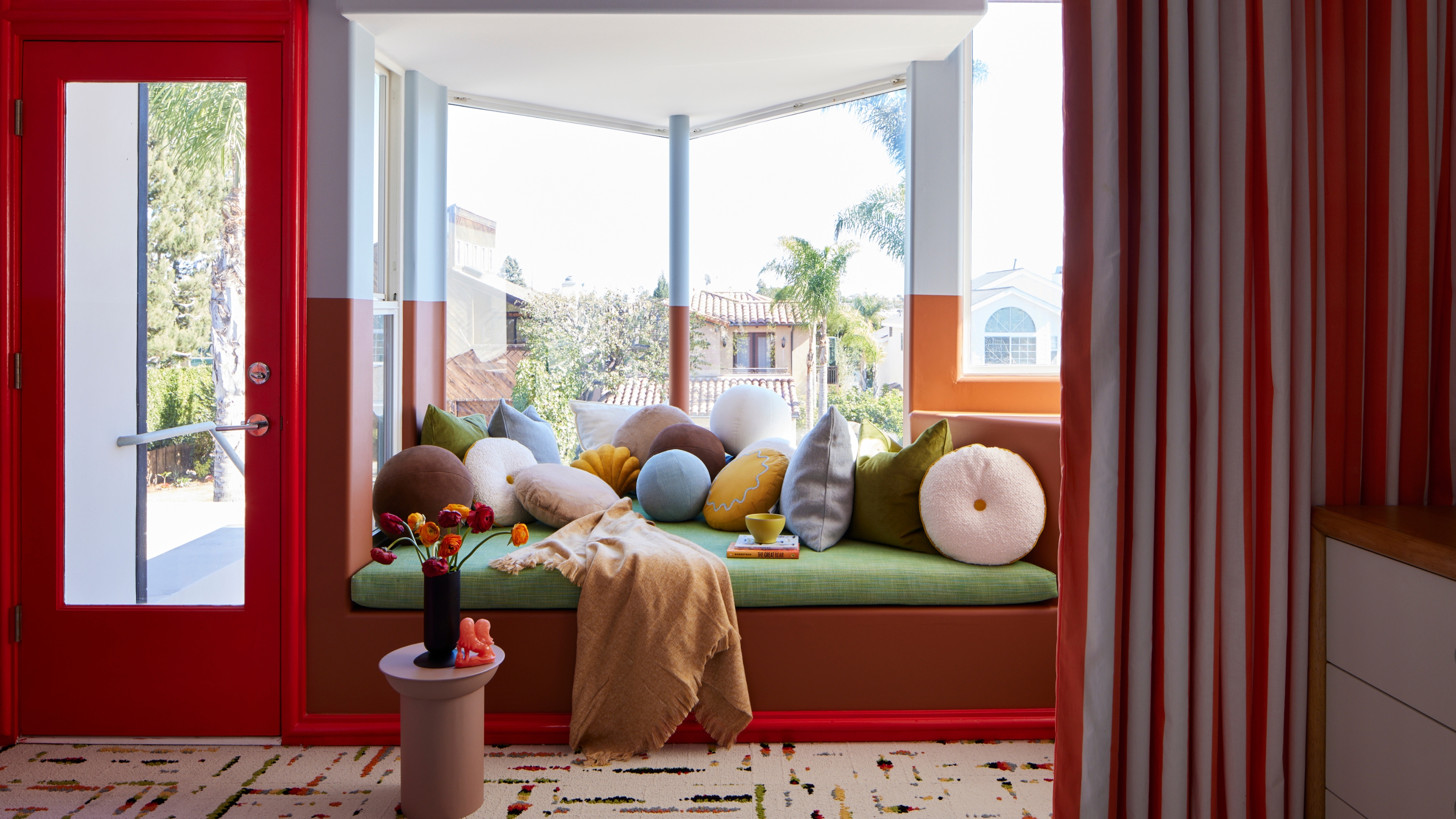
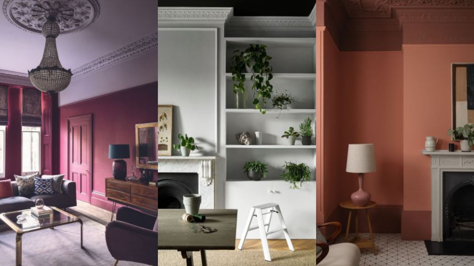
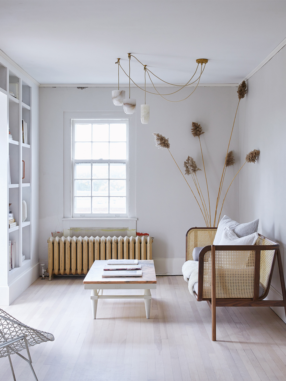
The first area discussed is the ceiling. Despite the traditional belief that white ceilings make a room feel lighter and more spacious, the article suggests this idea originated in the 1940s when lighting technology was less advanced. Modern design trends, such as painting ceilings in bold, contrasting colors or employing 'colour drenching' (where one shade covers all surfaces, including the ceiling), are presented as superior alternatives. A colored ceiling is described as the 'final piece of the jigsaw' in pulling a look together, offering a special and cohesive feel to a room. Dulux's 2025 Color of the Year, True Joy (a bright yellow), is cited as an example that could be effectively used on ceilings, evoking a sunny sky.
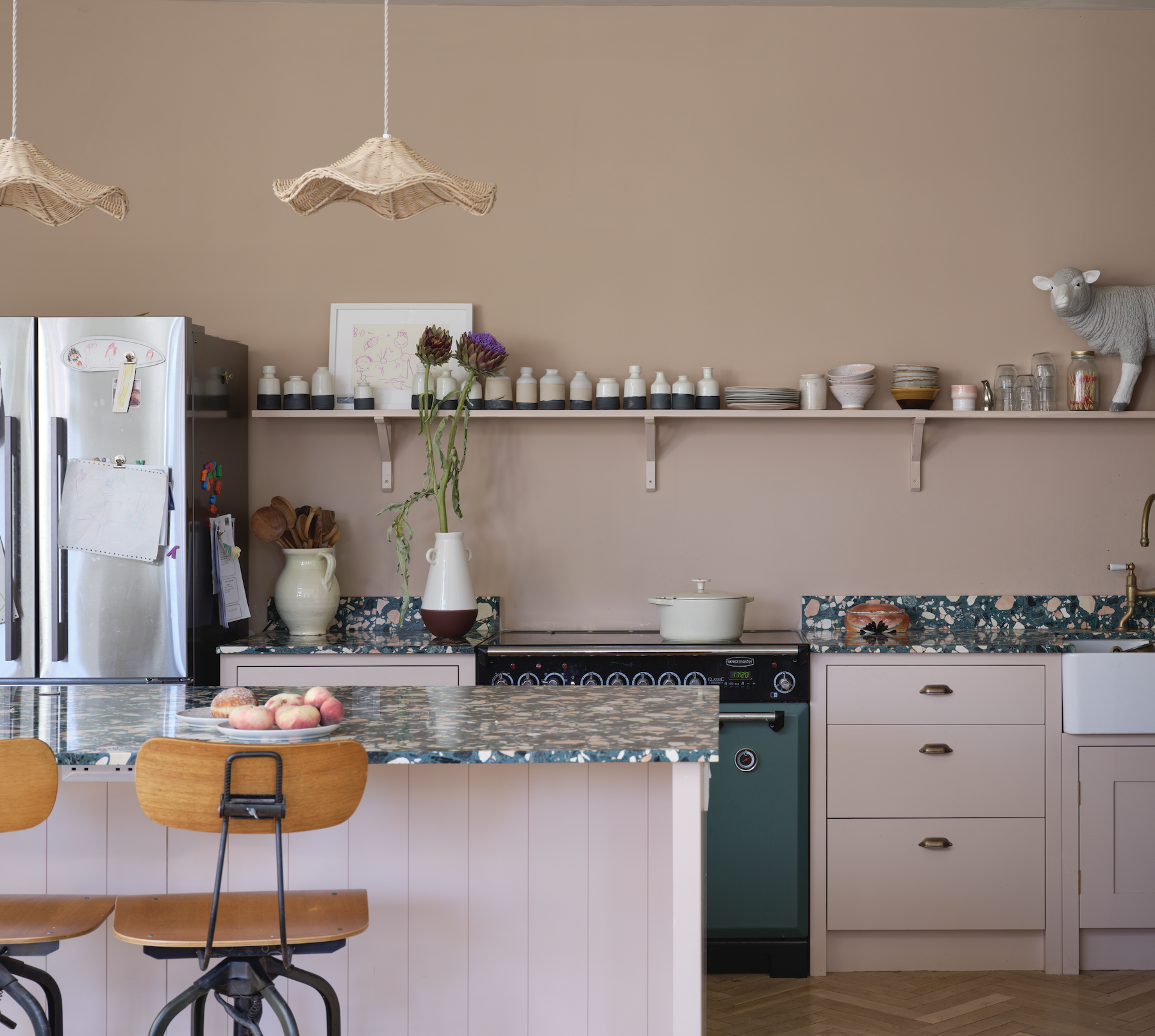
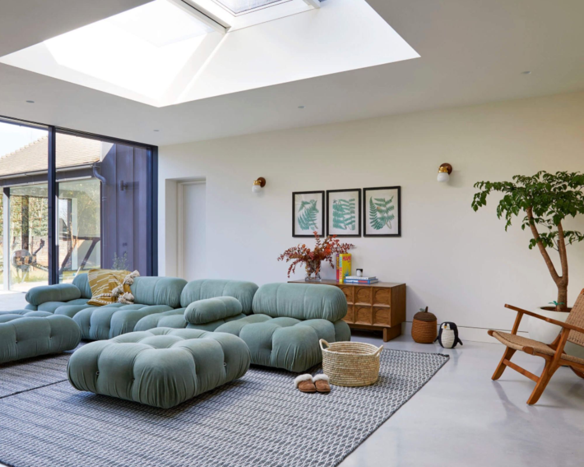
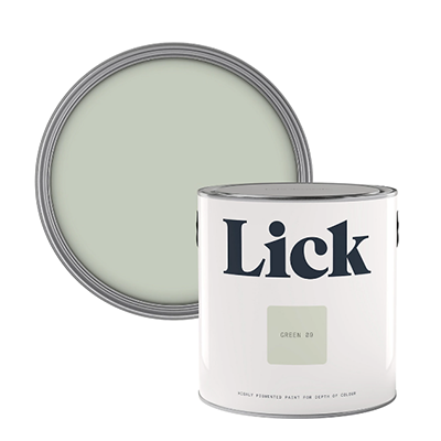
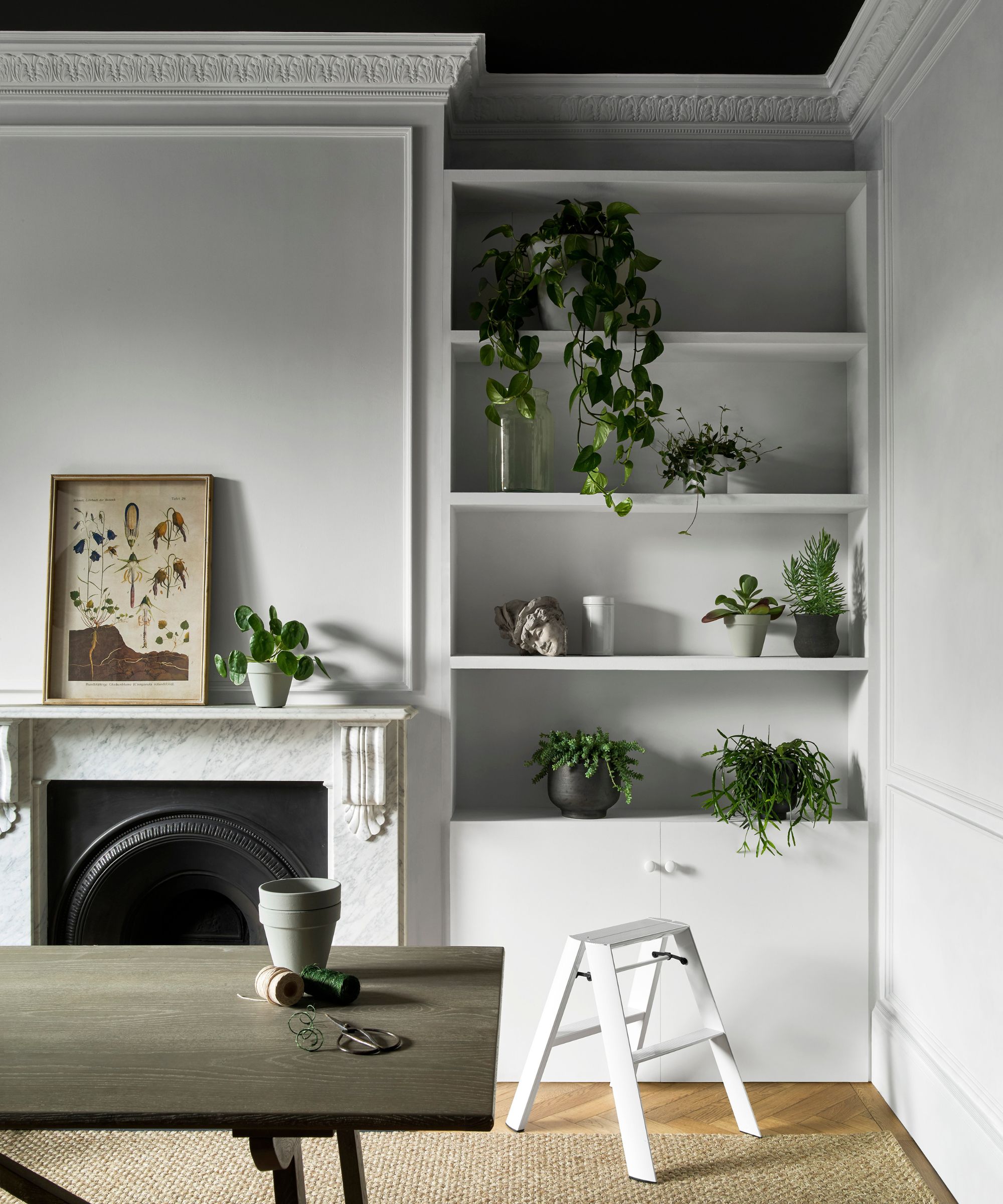
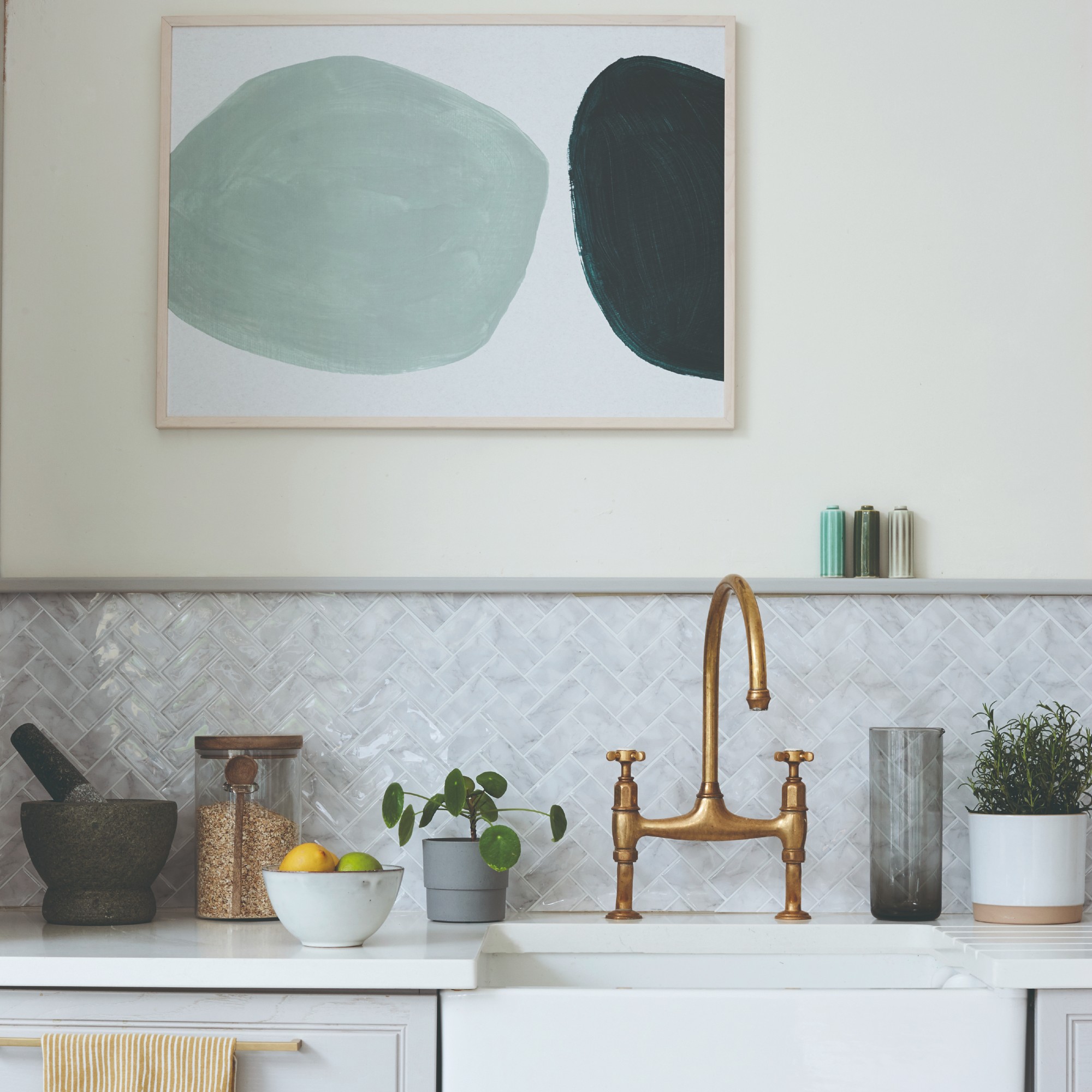
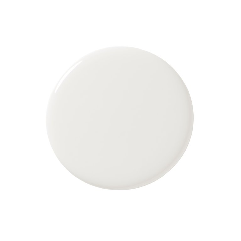
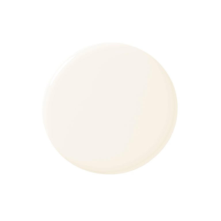
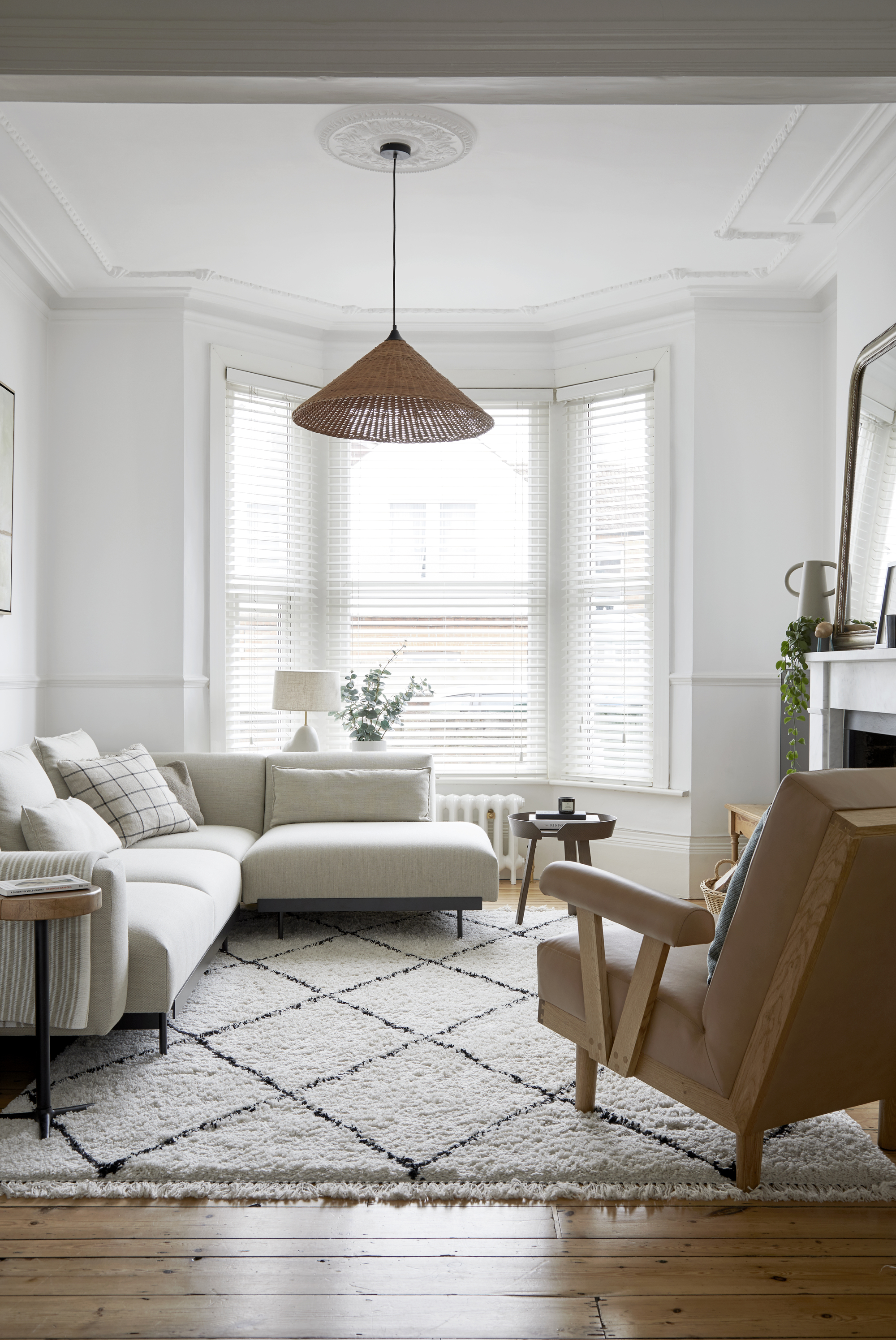
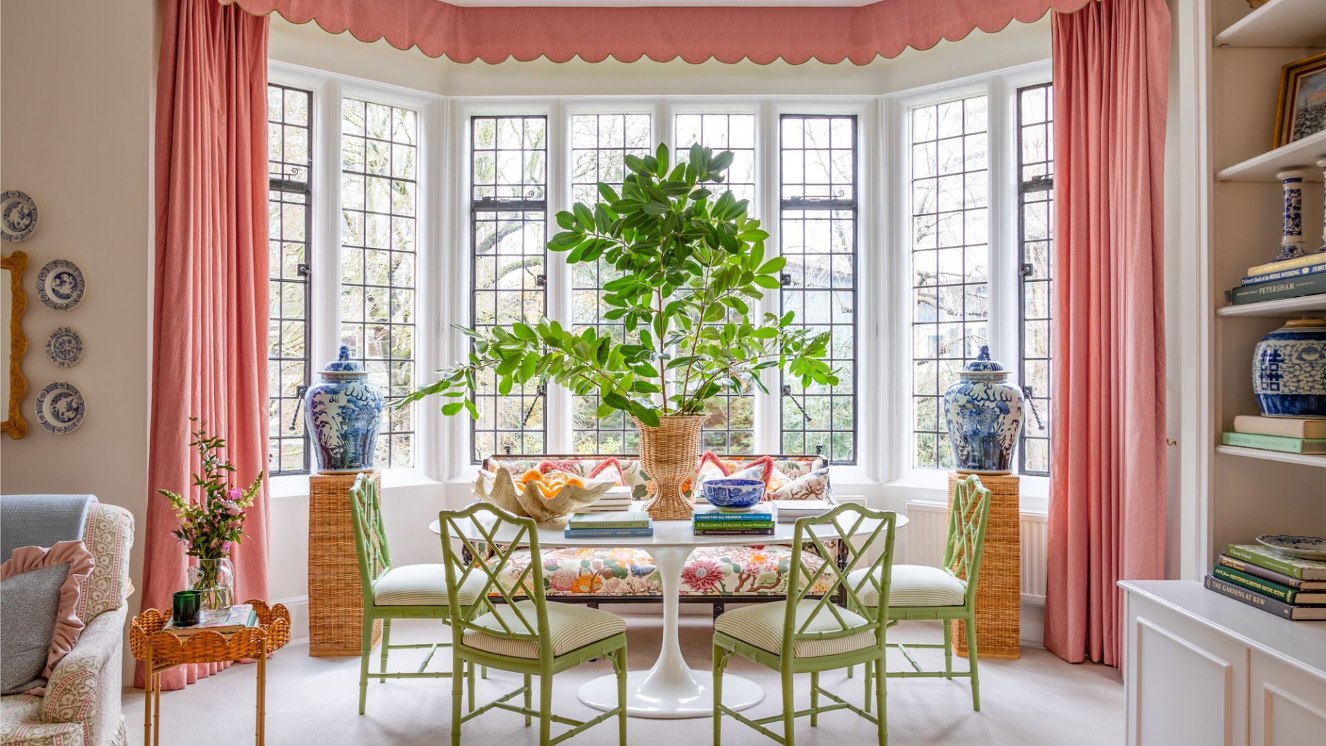
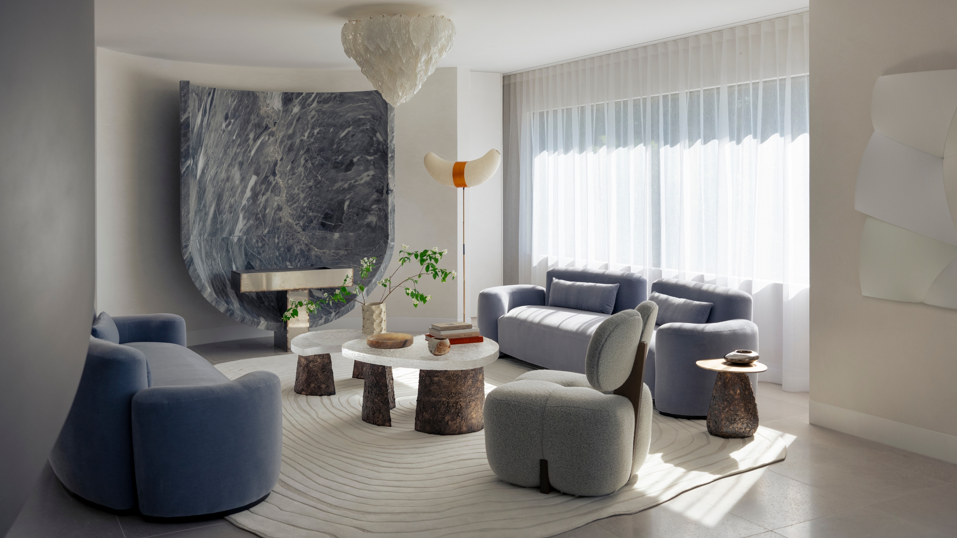
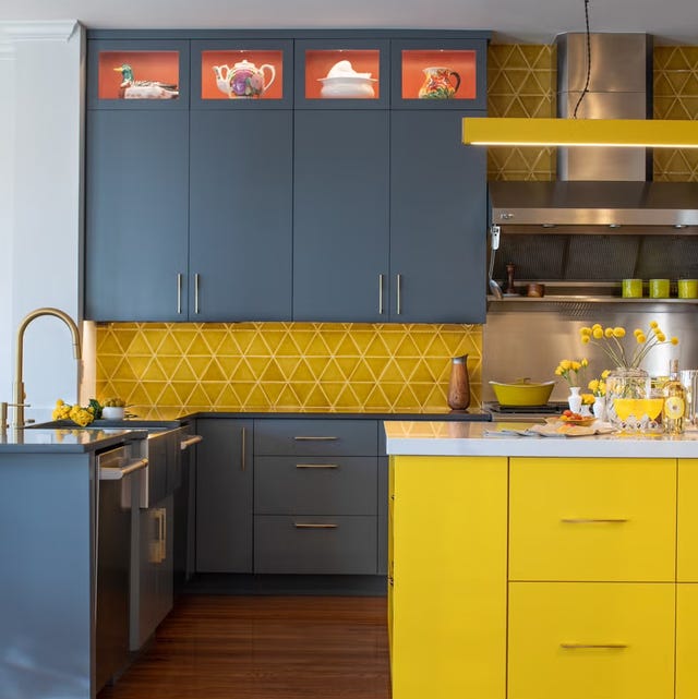
Open-plan spaces constitute the second area where white is often ill-advised. While a white, loft-like aesthetic is appealing to many, painting large open areas entirely white can make them appear flat and lack depth. The article advocates for using color to create visual interest and zone different areas within an open-plan layout. Introducing tonal variations with soft neutrals or deeper shades helps to add warmth and definition. Farrow & Ball's 'Setting Plaster,' a pale, earthy pink, is recommended as a soft neutral alternative that can function similarly to a traditional neutral, adding subtle color without overwhelming the space.
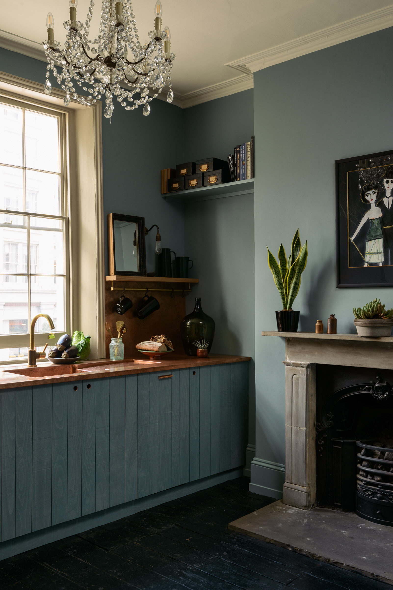
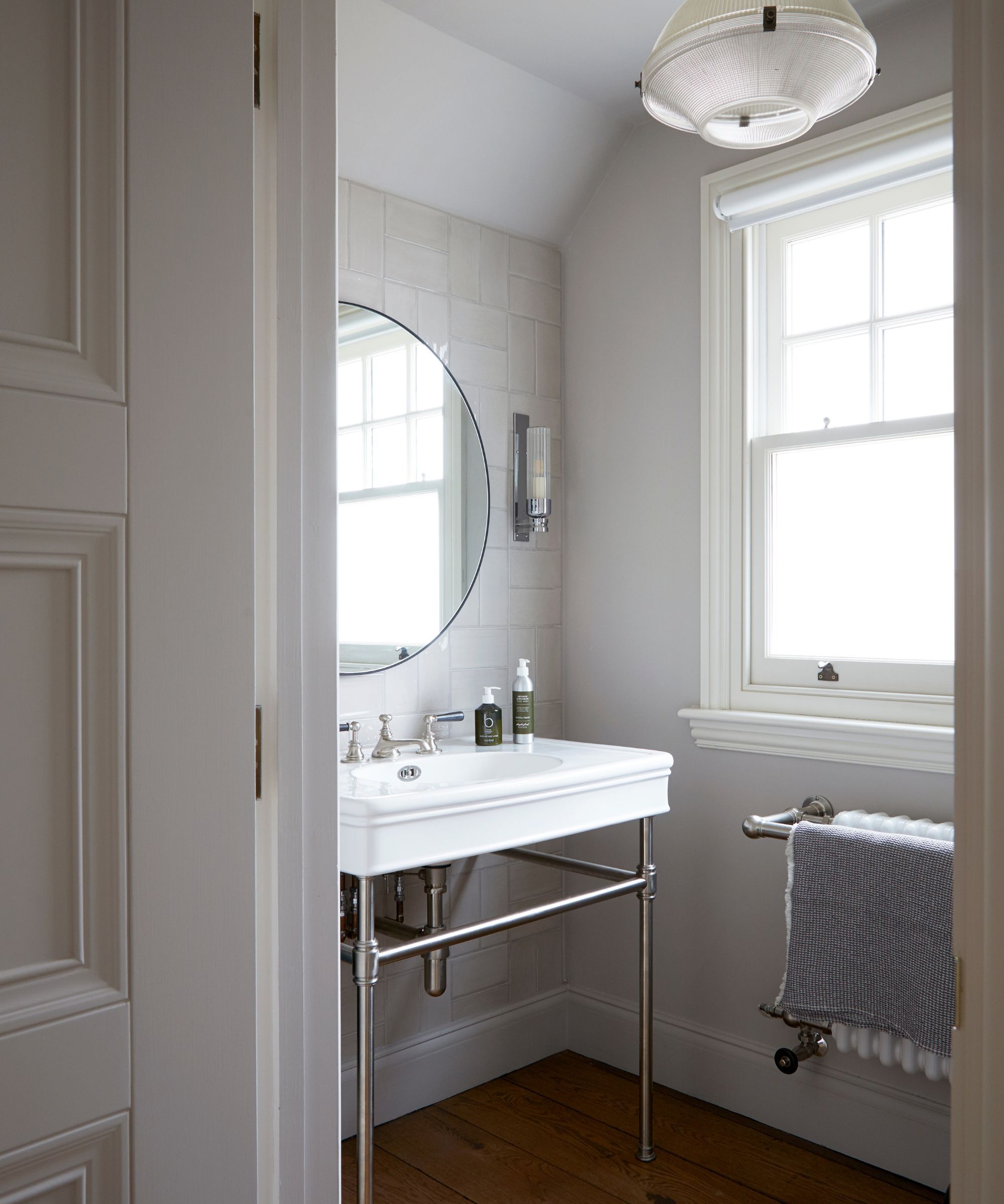
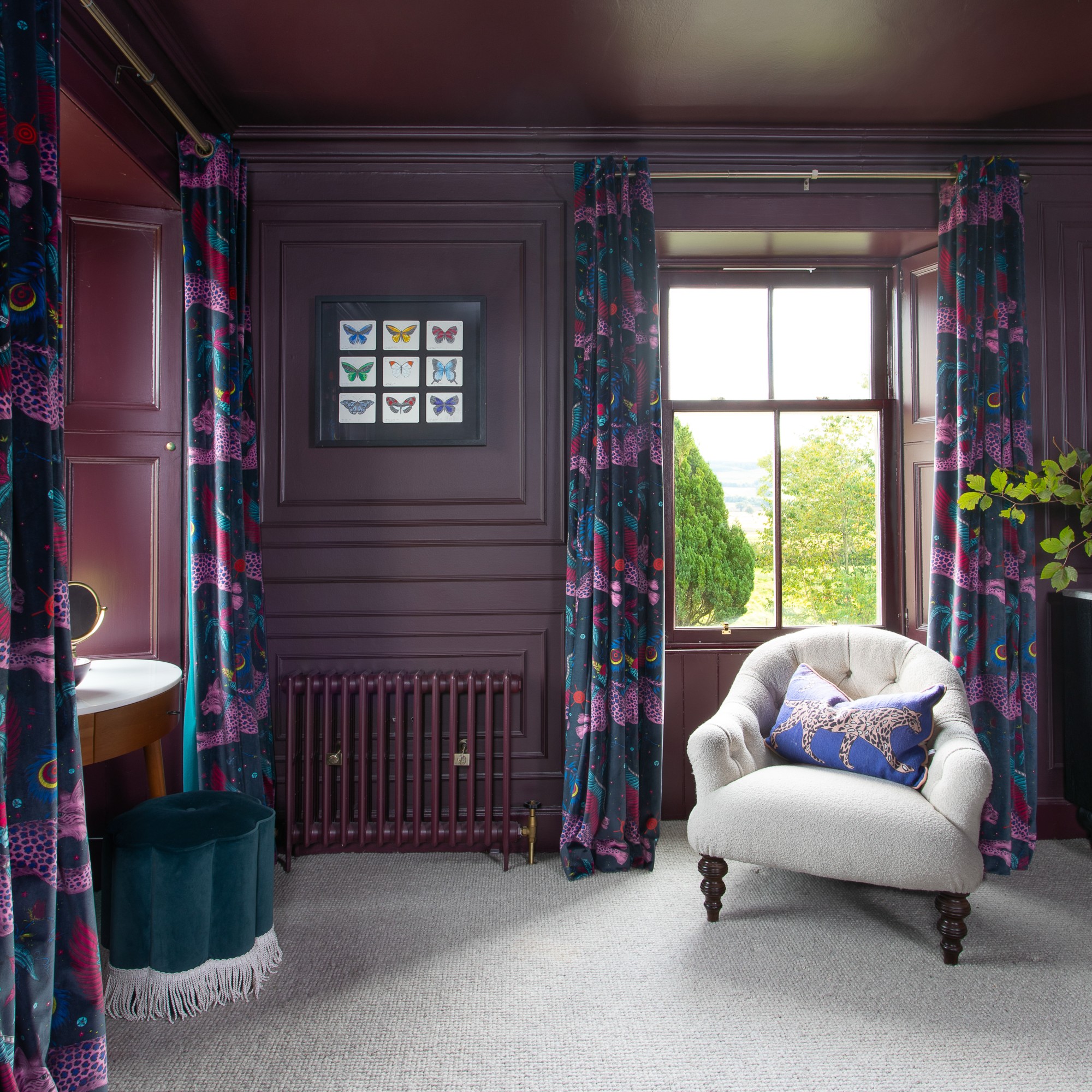
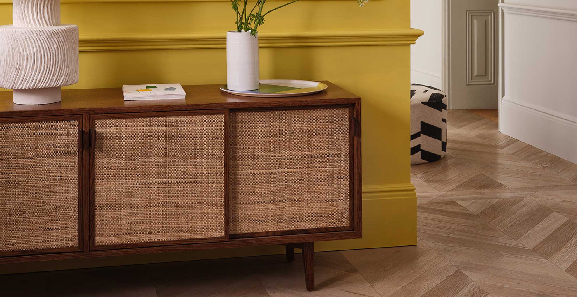
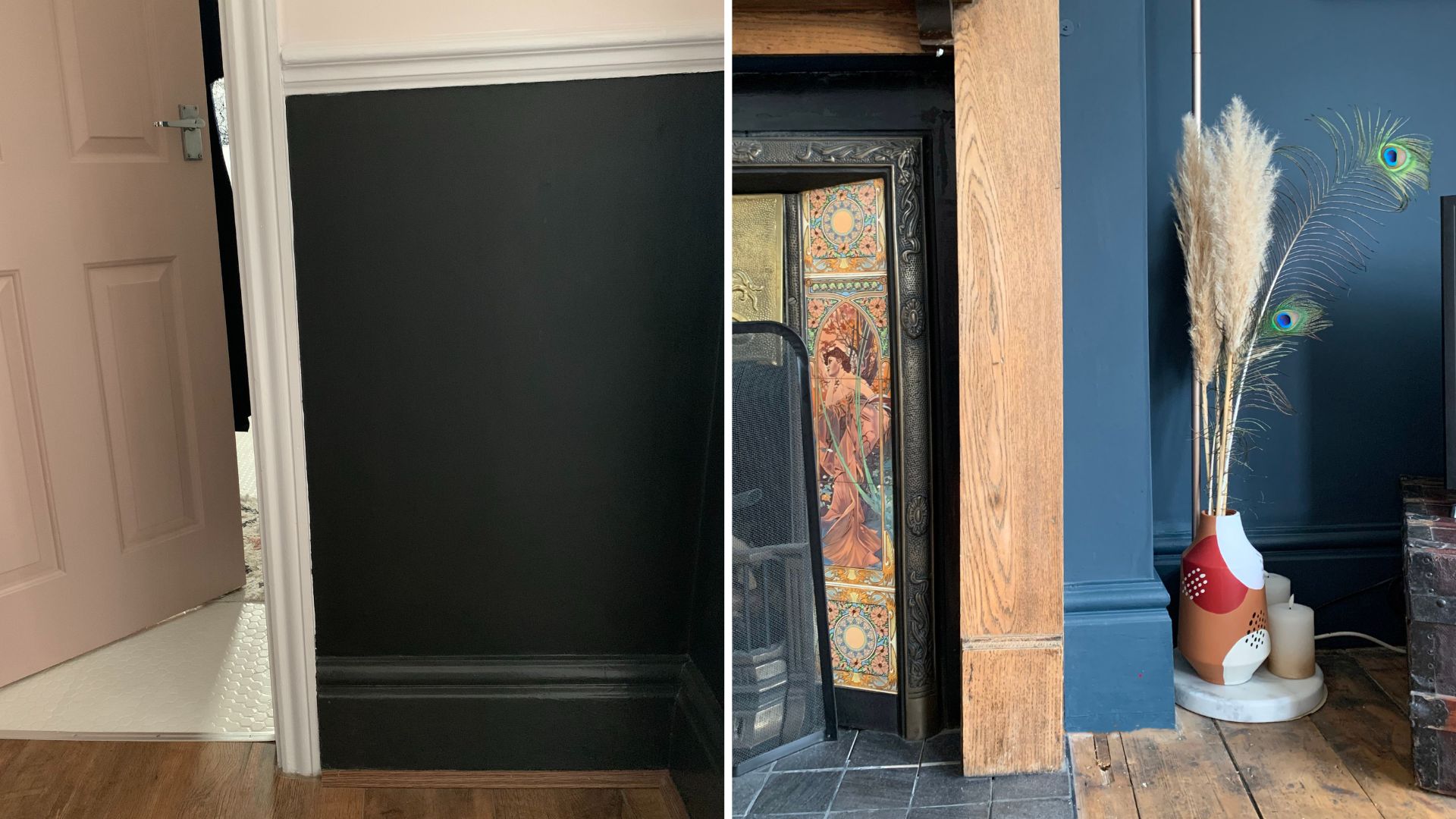
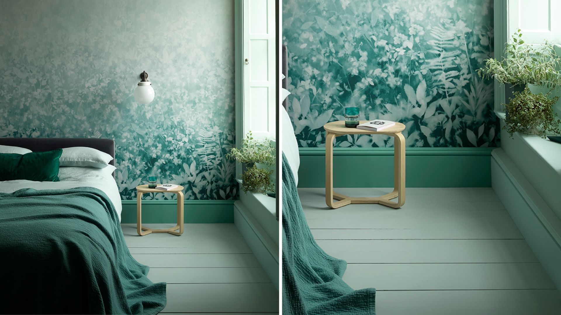
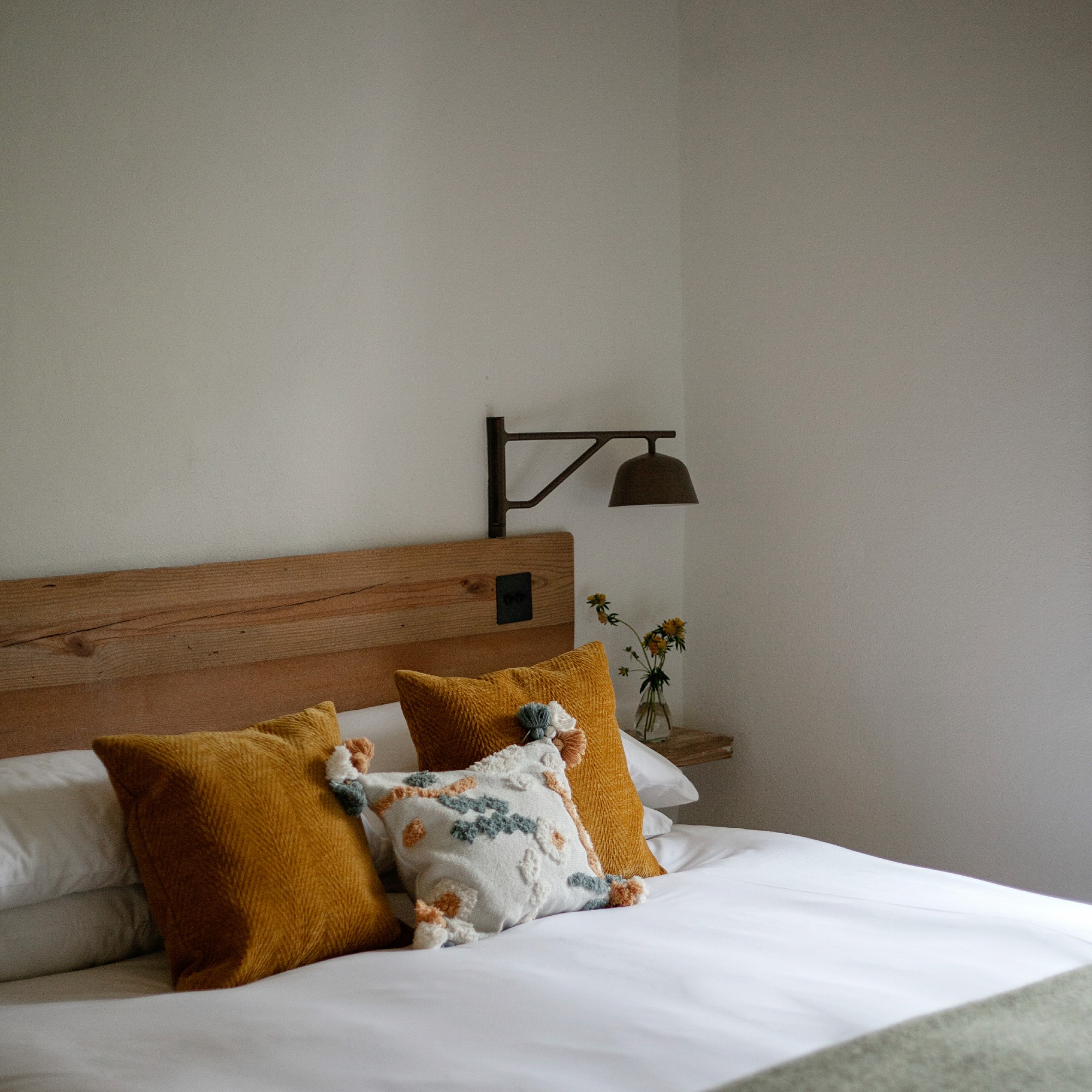
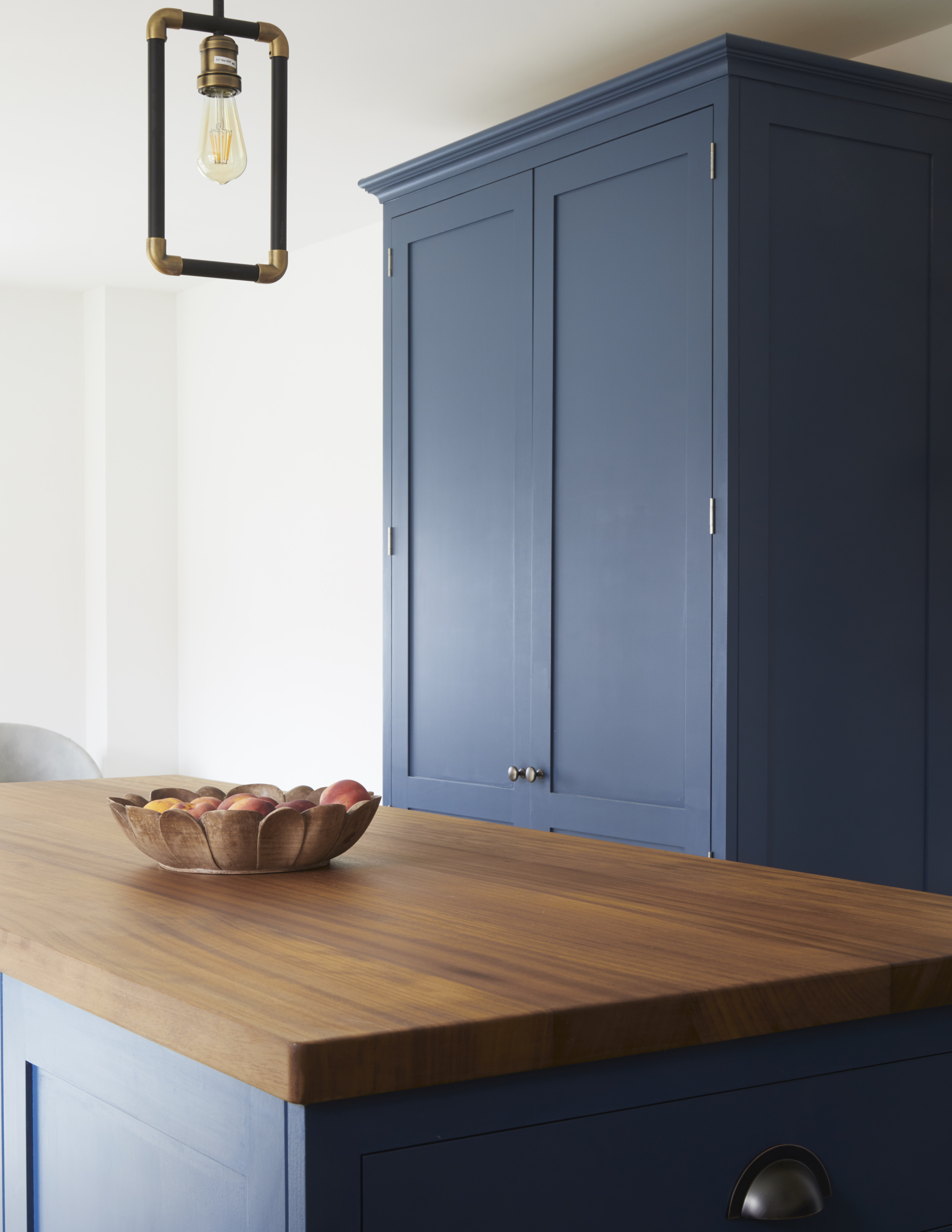
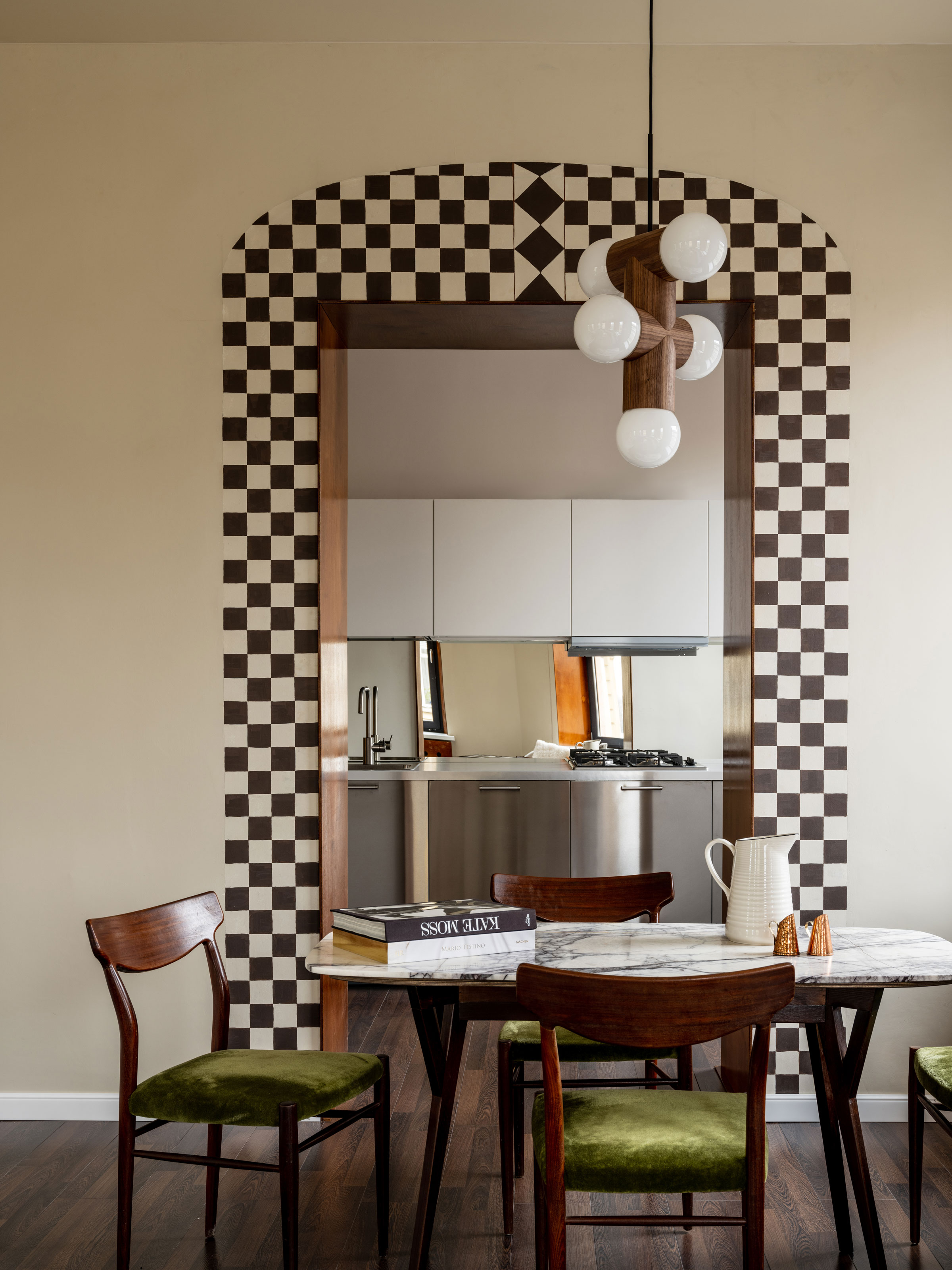
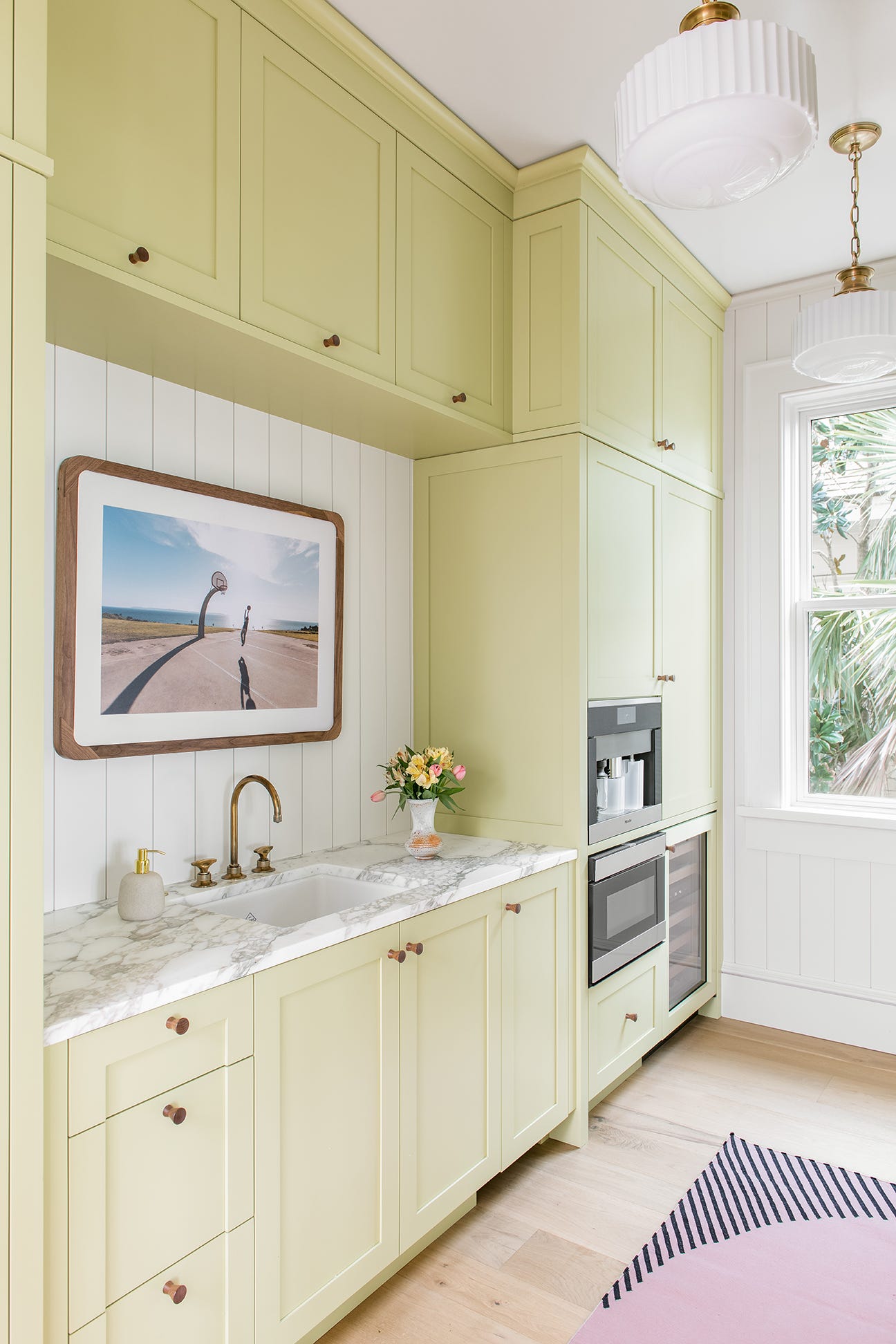
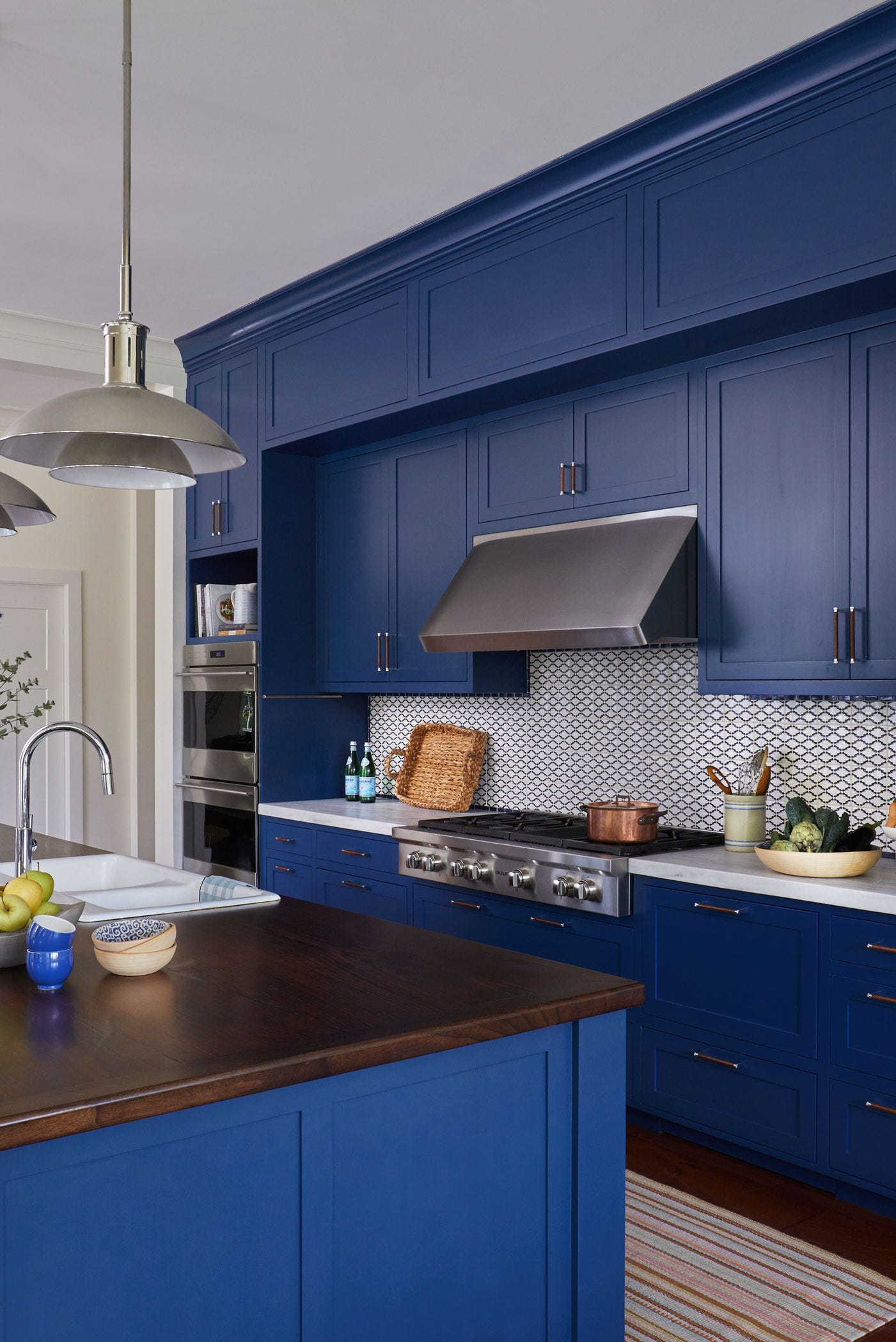
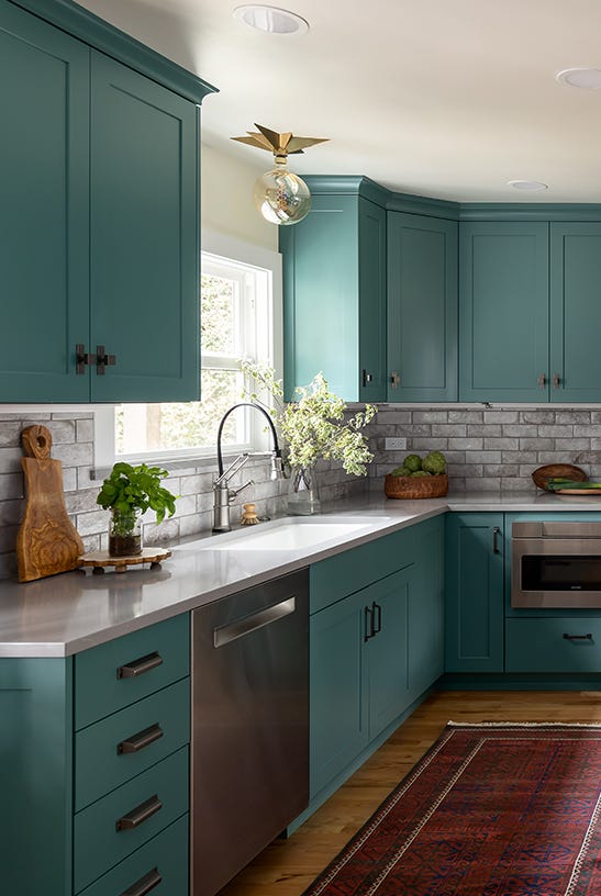
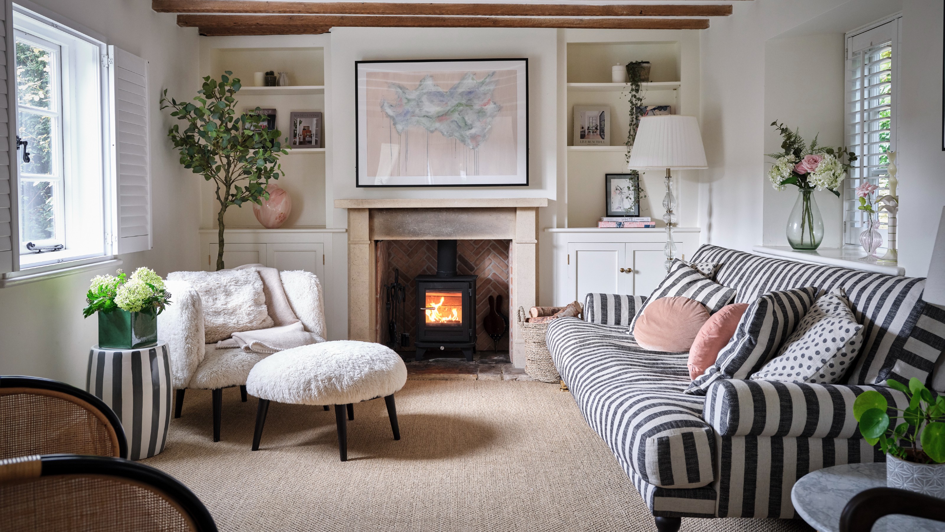
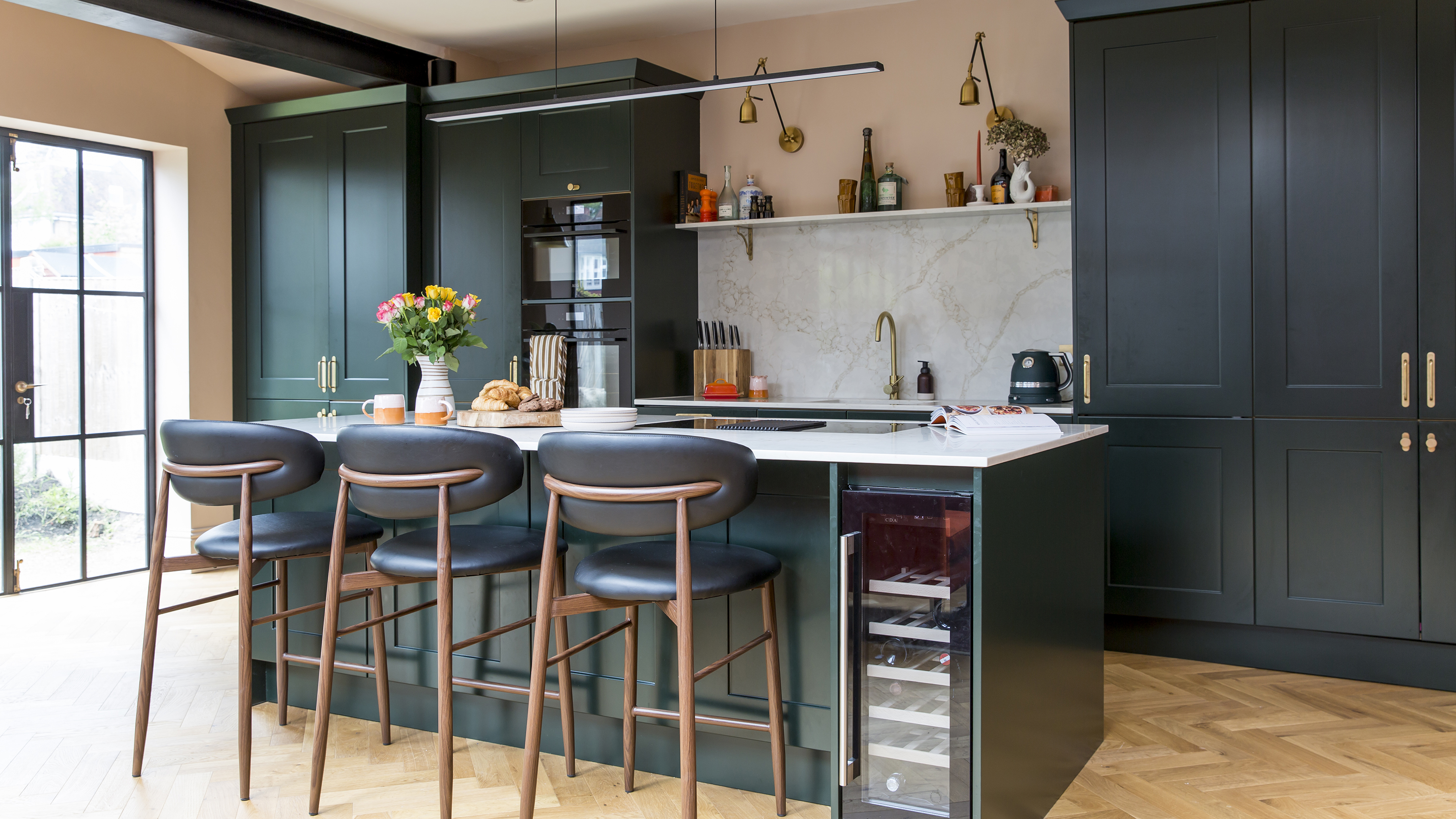
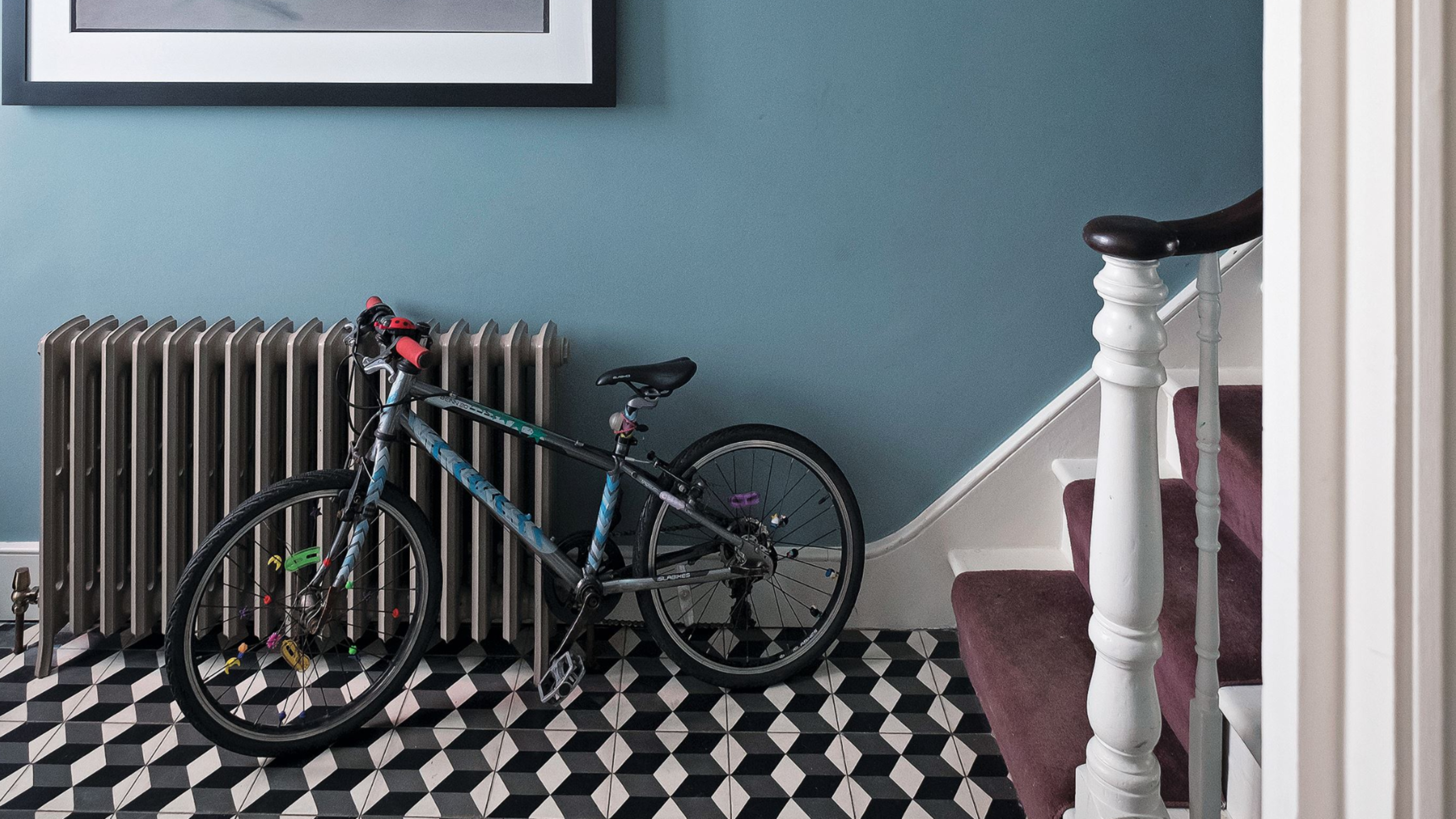
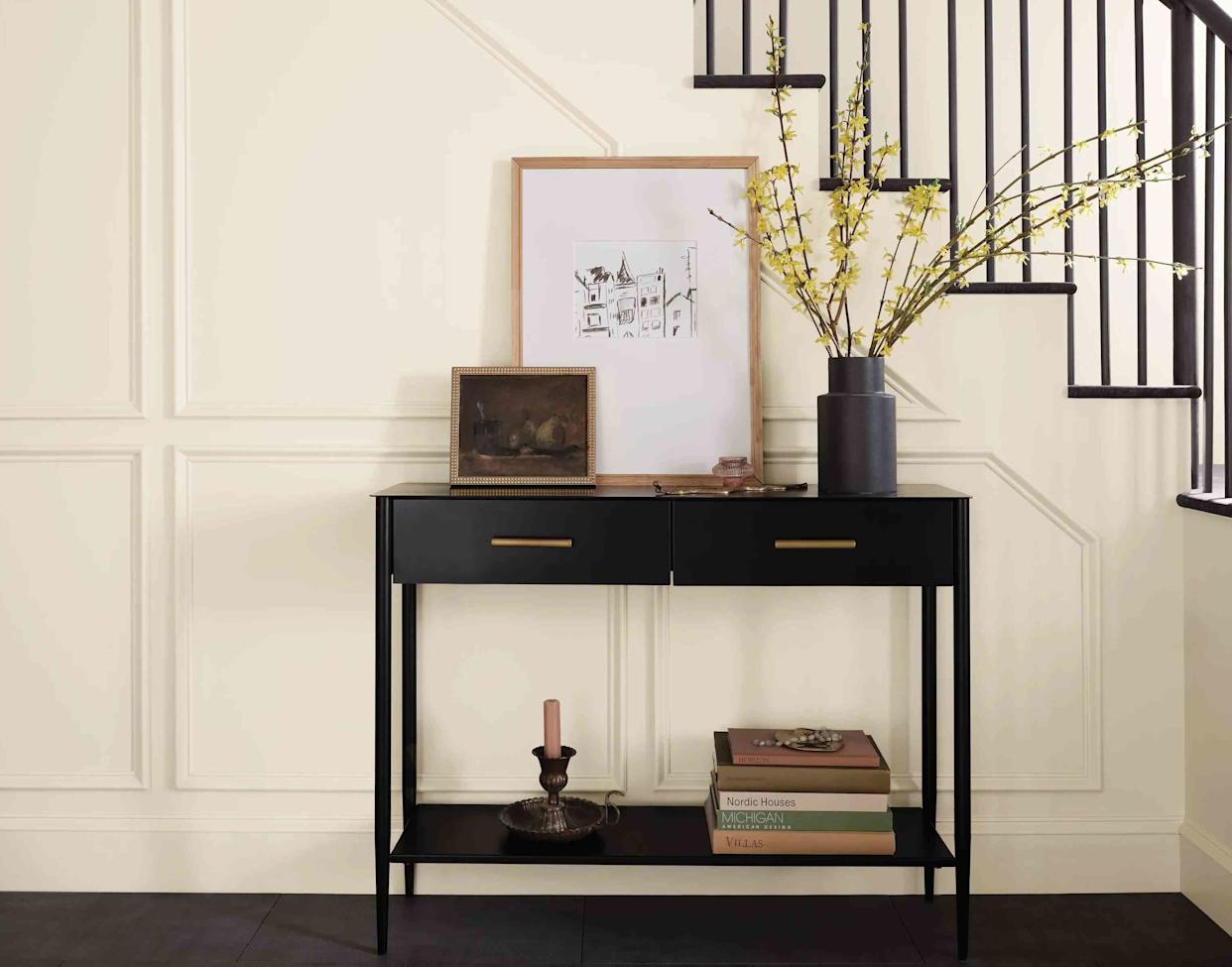
Skirting boards are the third feature addressed. The common practice of painting skirting boards white throughout a home aims to create a seamless and cohesive look, but this also makes dirt and scuffs highly visible. Interior and paint experts, including designer Kelly Hoppen, often recommend colored skirting boards as a more practical, personalized, and stylish option. Colour drenching skirting boards in the same color as the walls can create a seamless, contemporary look, making the space feel larger and more cohesive. Alternatively, using a slightly darker shade or an off-white can highlight period features elegantly. A forest green shade is suggested as a modern and considered choice for skirting boards.
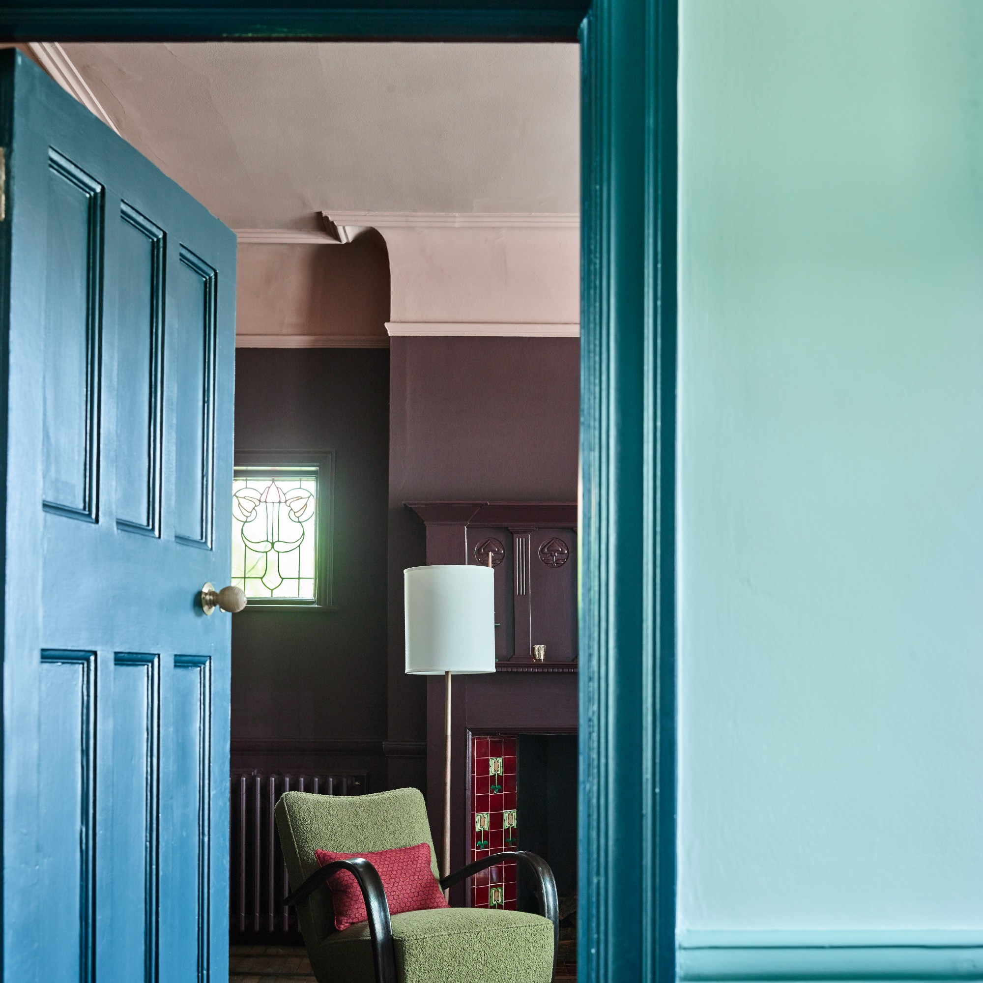
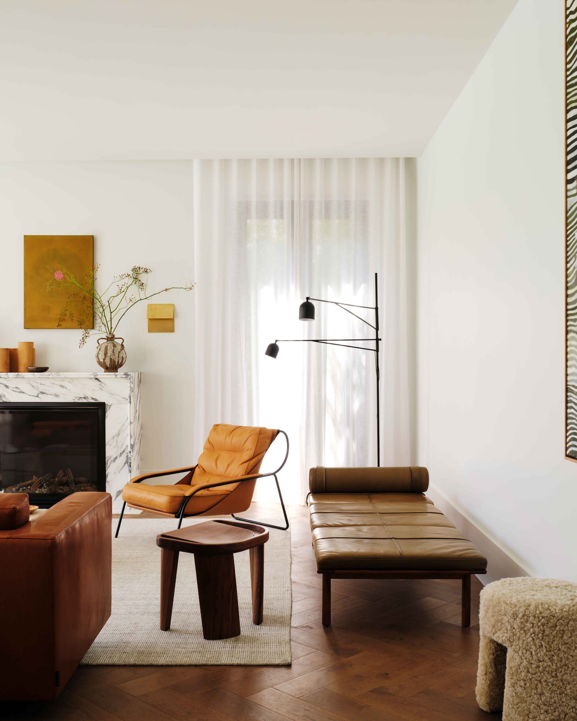
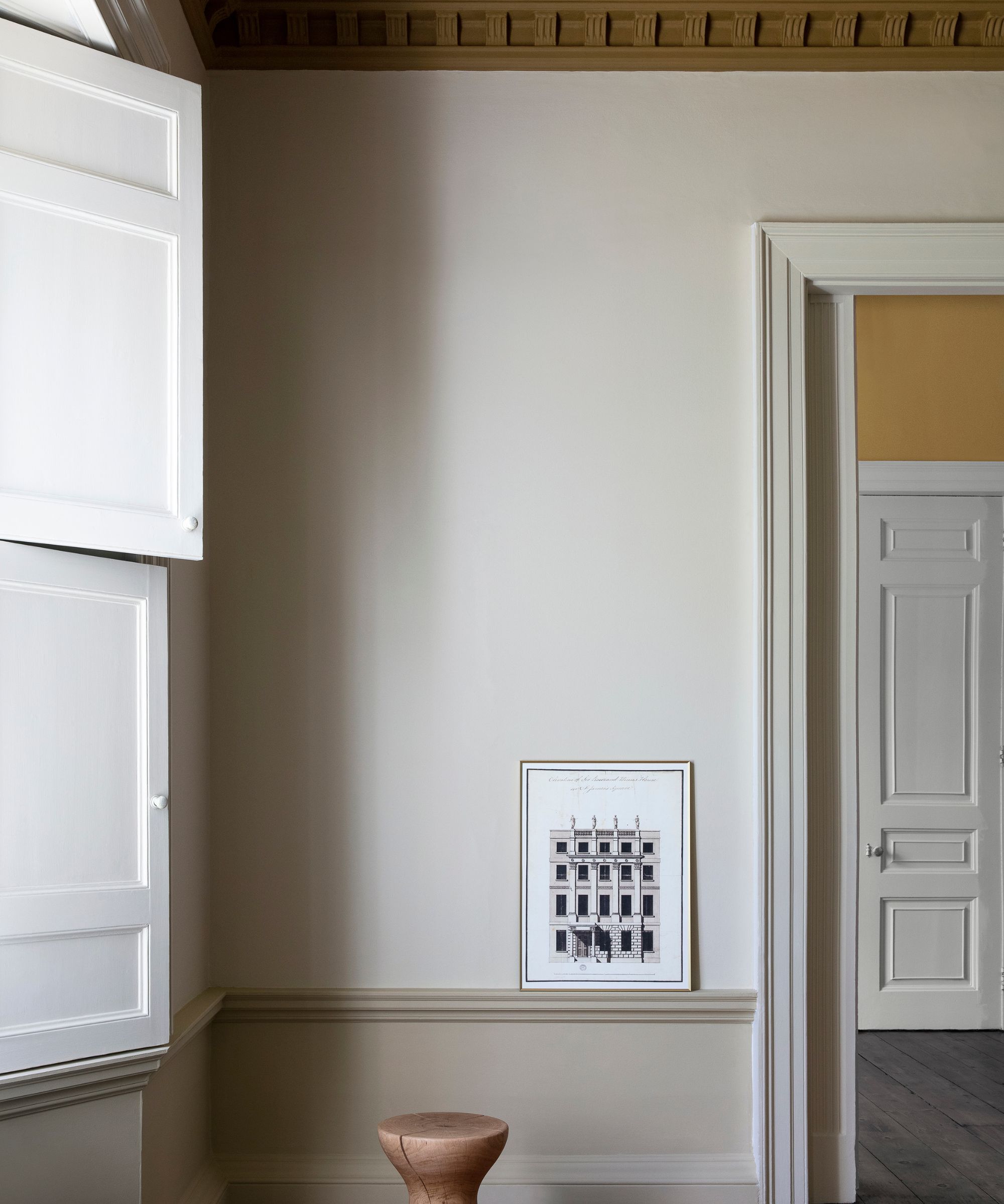
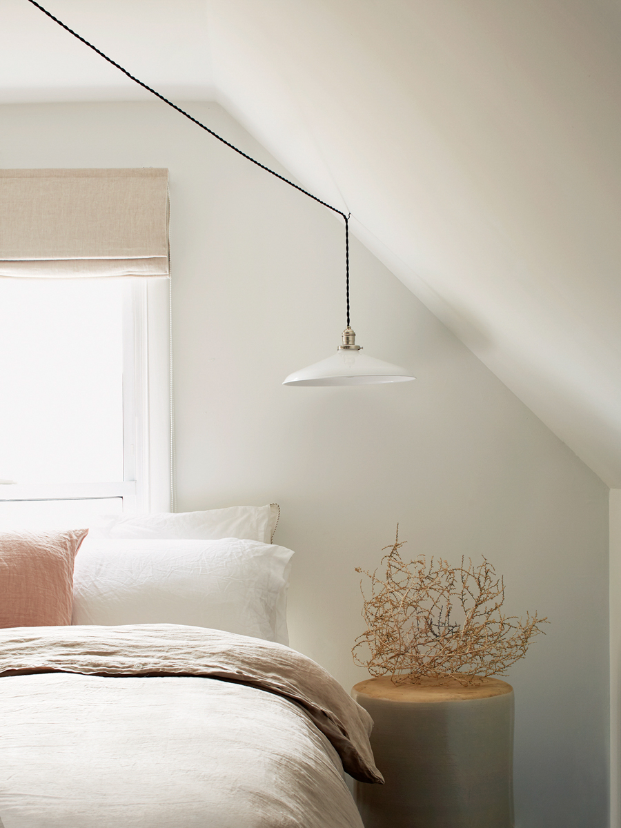
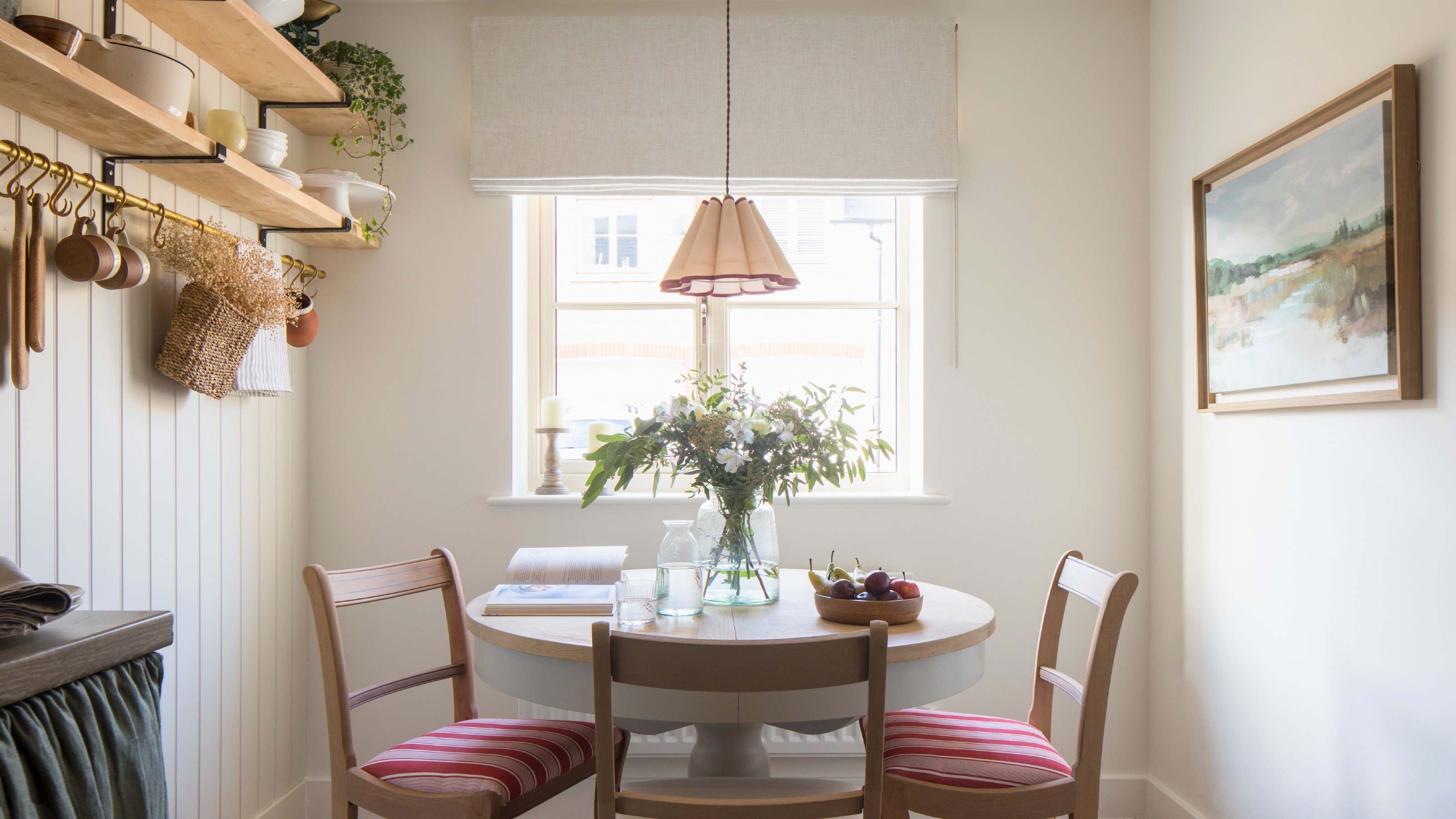
Finally, dark, narrow hallways are highlighted as the fourth area where white paint might be counterproductive. Contrary to the intuitive belief that white would brighten and expand a narrow space, it can make such hallways feel stark, clinical, cold, and flat, especially if natural light is limited. Instead, the article recommends using soft, warm neutrals or even deep, rich colors to create depth and a cozier atmosphere. A baby blue with warm yellow undertones, such as Lick x Calm Blue 08, is provided as an example of a light color with warm undertones that can effectively improve the feel of a dark, narrow hallway.
#InteriorDesign #PaintColors #HomeDecor #DIYHome #CeilingPaint #OpenPlanLiving #SkirtingBoards #HallwayDesign #InteriorDesign #PaintColors #HomeDecor #DIYHome #CeilingPaint #OpenPlanLiving #SkirtingBoards #HallwayDesign
0 comment in total
You may also like
5 Reasons You Shouldn't Paint Your Kitchen Walls White — And the Alternatives You Need to Try

5 Problems With Painting Your Walls White That No-One Ever Talks About (Until Now)
How White Wall Paint Can Transform the Look of Your Home | PS Home
13 Off-White Paint Colors the Experts Recommend for Any Space

7 times you should never paint a room white

This is the colour you should paint skirting boards instead of 'uninspired' white, according to experts

White walls? The trick is choosing the right white

"Help, My White Walls Look Blue" — Here's Why It's Happening, and How to Fix This Common Problem
3 reasons you shouldn't paint your kitchen walls white – plus the new neutrals to try instead, according to kitchen pros
The Best White Paint for Walls That Experts Swear By
I Sampled 24 White Paints—Here’s the One I Chose for Every Room of My Home

Stop! Step Away From the Paintbrush — Here's 4 Things Interior Designers Would Never, Ever Paint Around the Home

Paint Your House Anything But White: Bathroom Edition

I’m an interior designer - the worst paint colours for small rooms, and why bright white walls is not a good idea

Which white paint is the best? Experts reveal the perfect shade of white for every room and feature
Ditch the White! Try One of These Designer-Approved Kitchen Colors

7 places in your home you’re probably forgetting to paint – but design experts say you really shouldn’t
5 reasons why you should never paint a ceiling white, reveals a leading paint and color expert
Designers’ Favorite White Paints Are Always Changing—We Asked 3 for Their Latest Pick
13 Off-White Paint Colors the Experts Recommend for Any Space