13 Off-White Paint Colors the Experts Recommend for Any Space
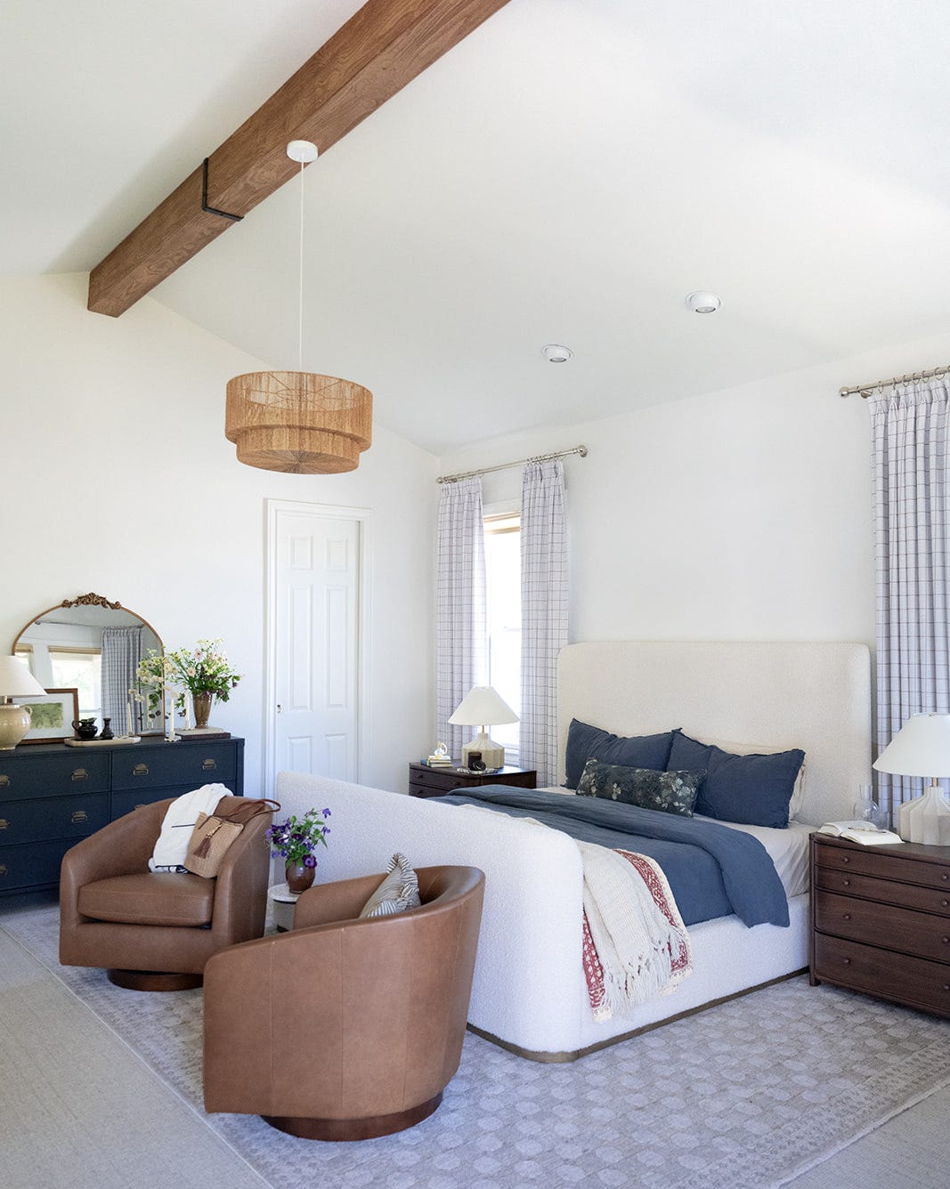
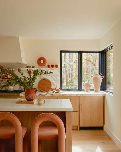
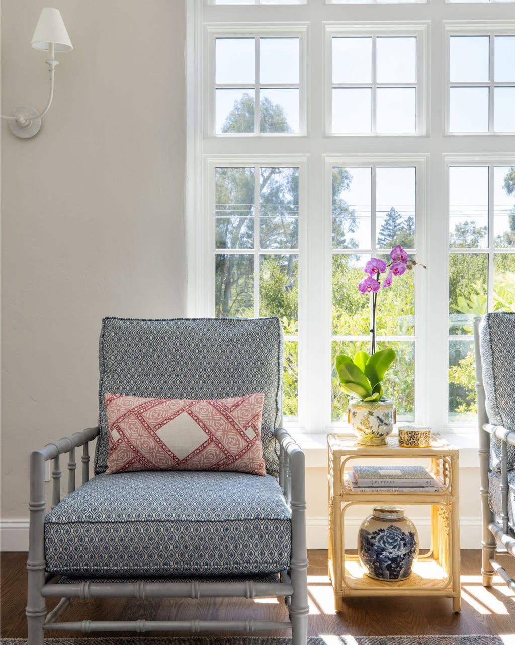
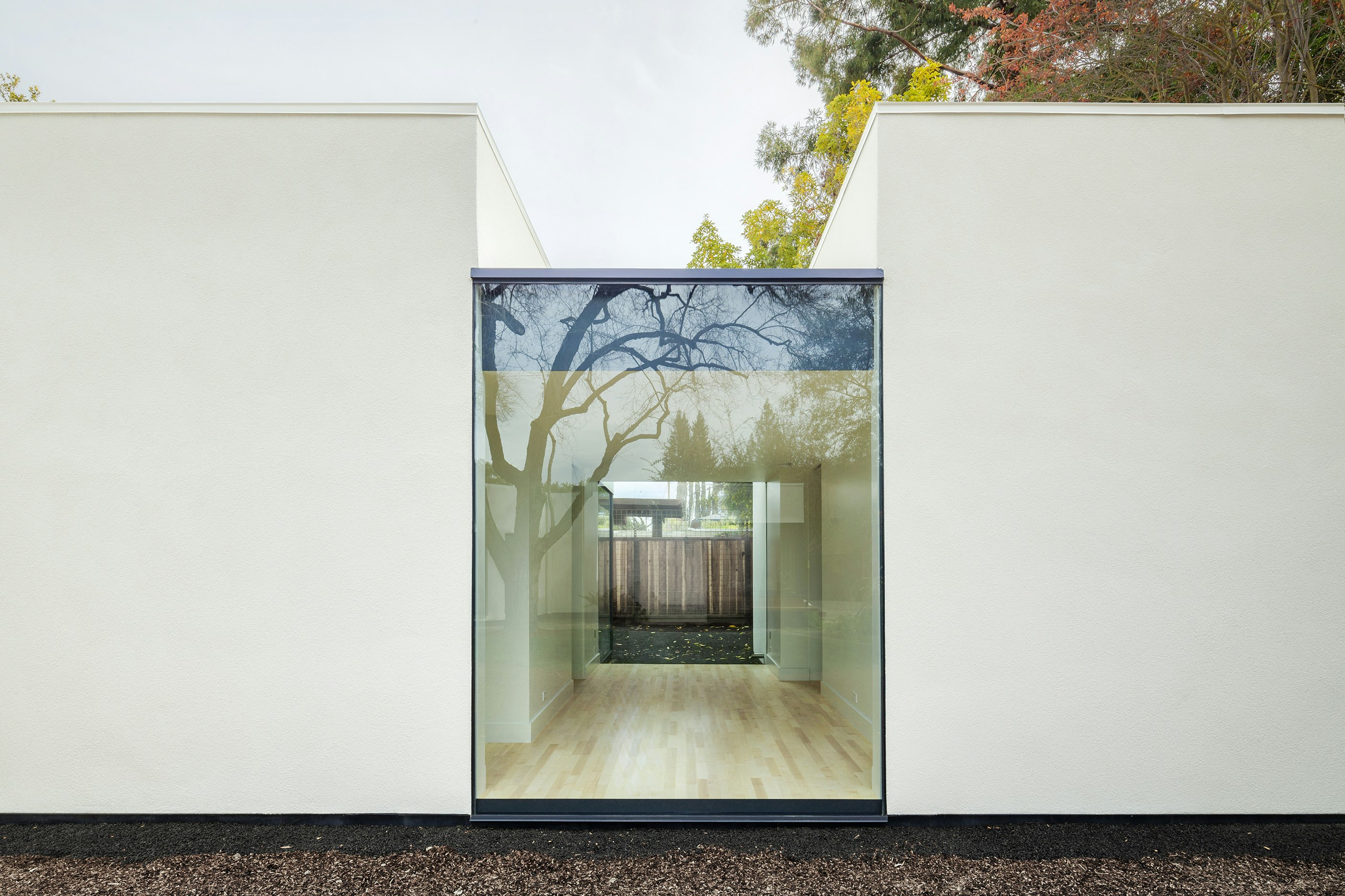
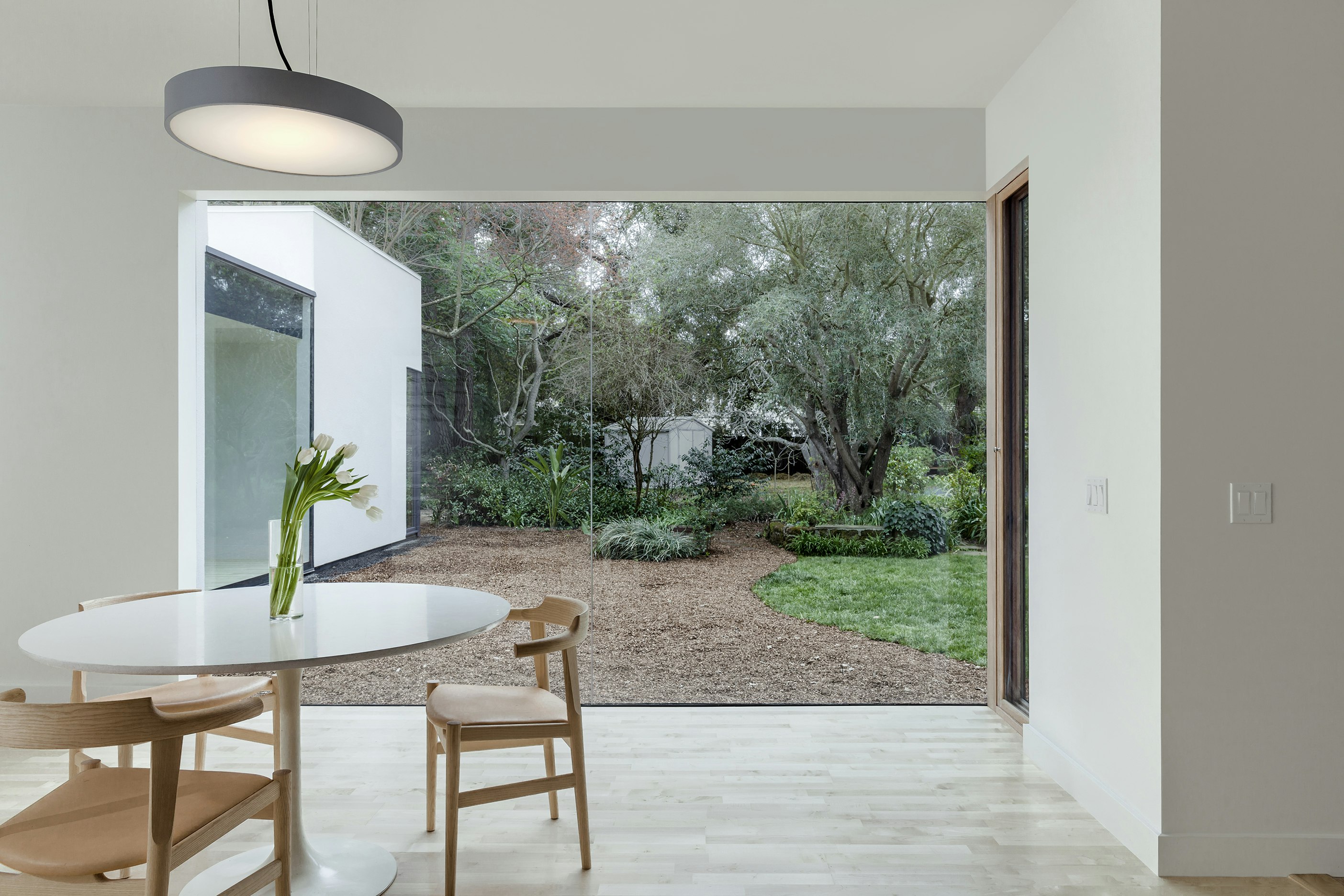
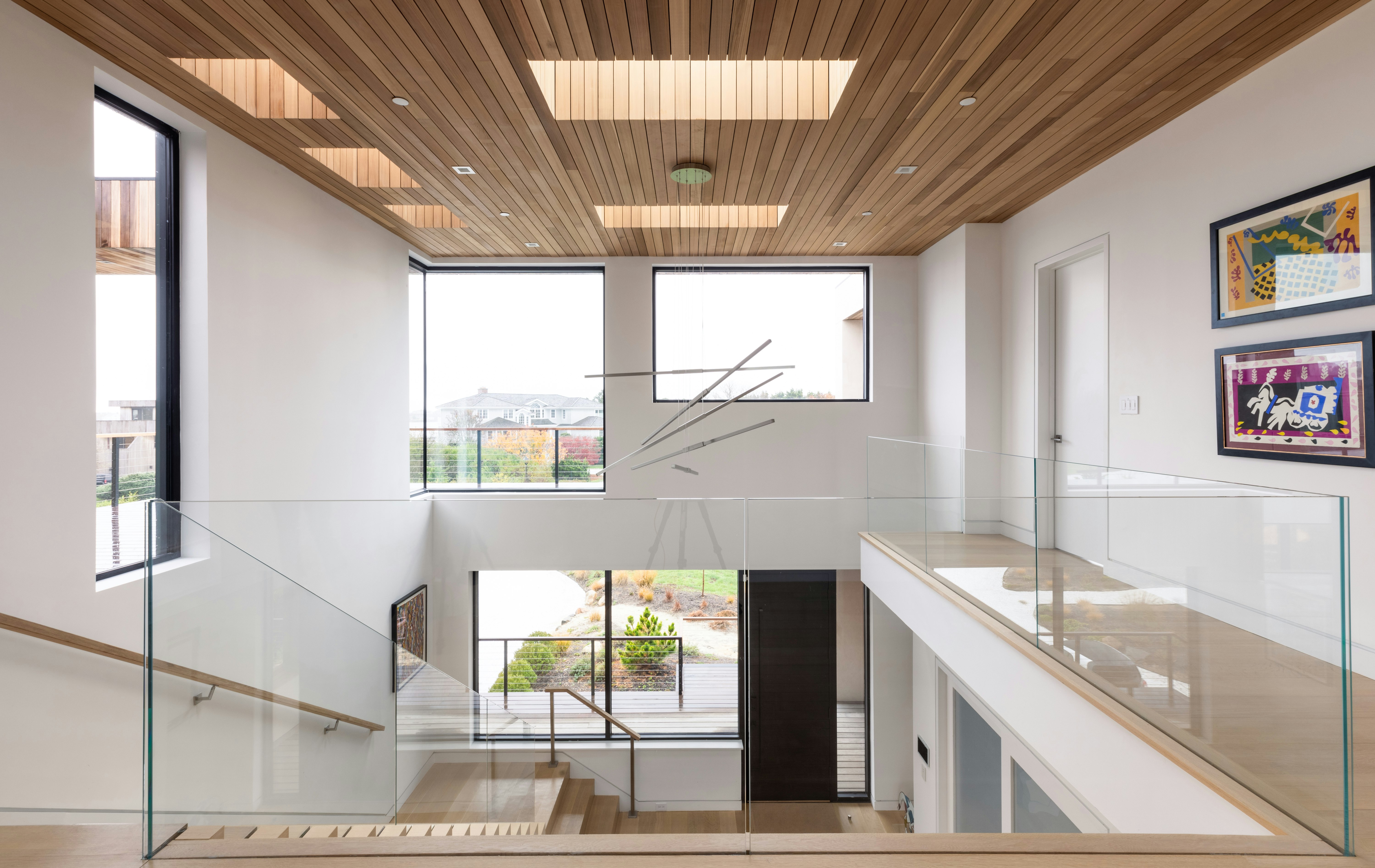
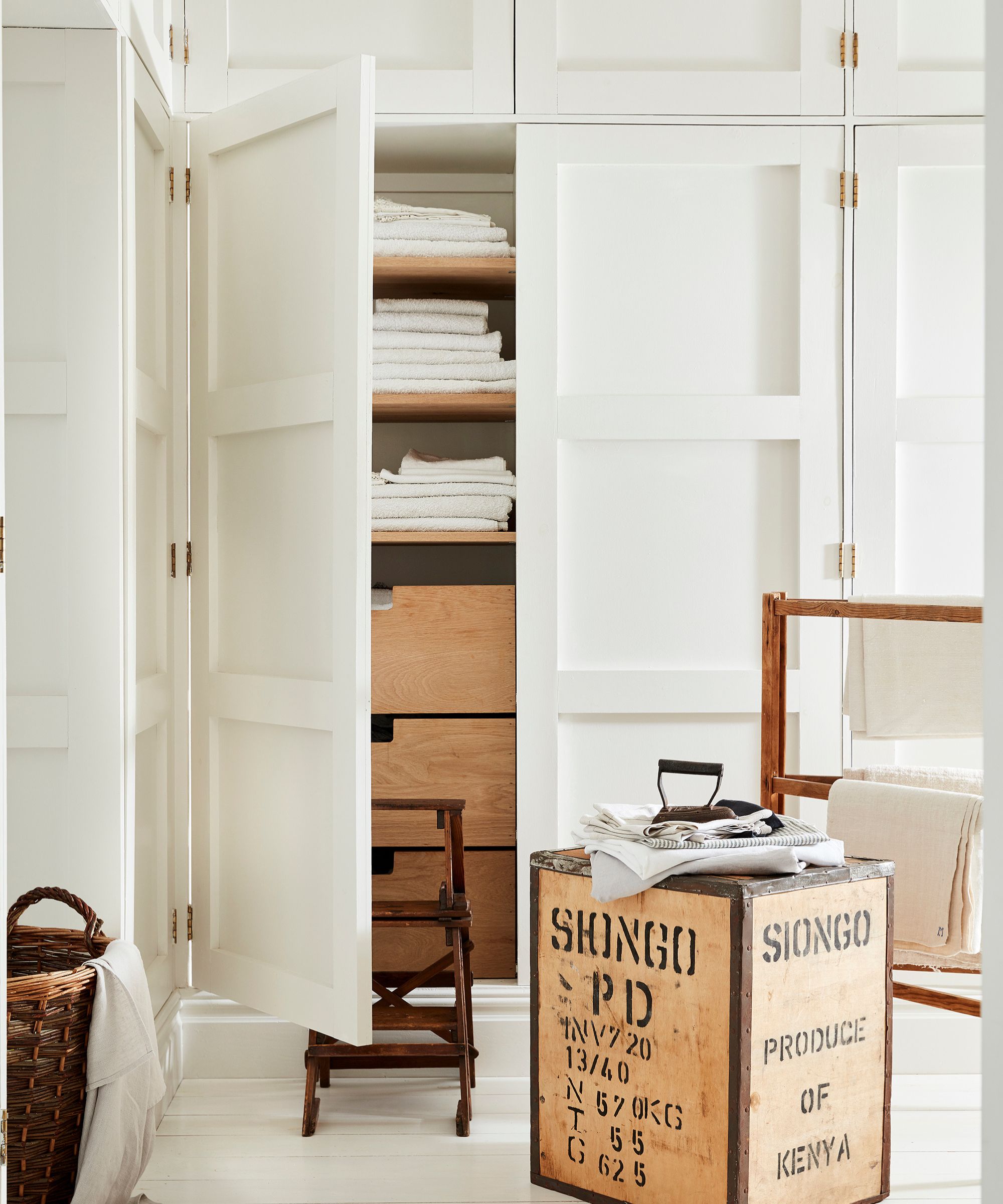
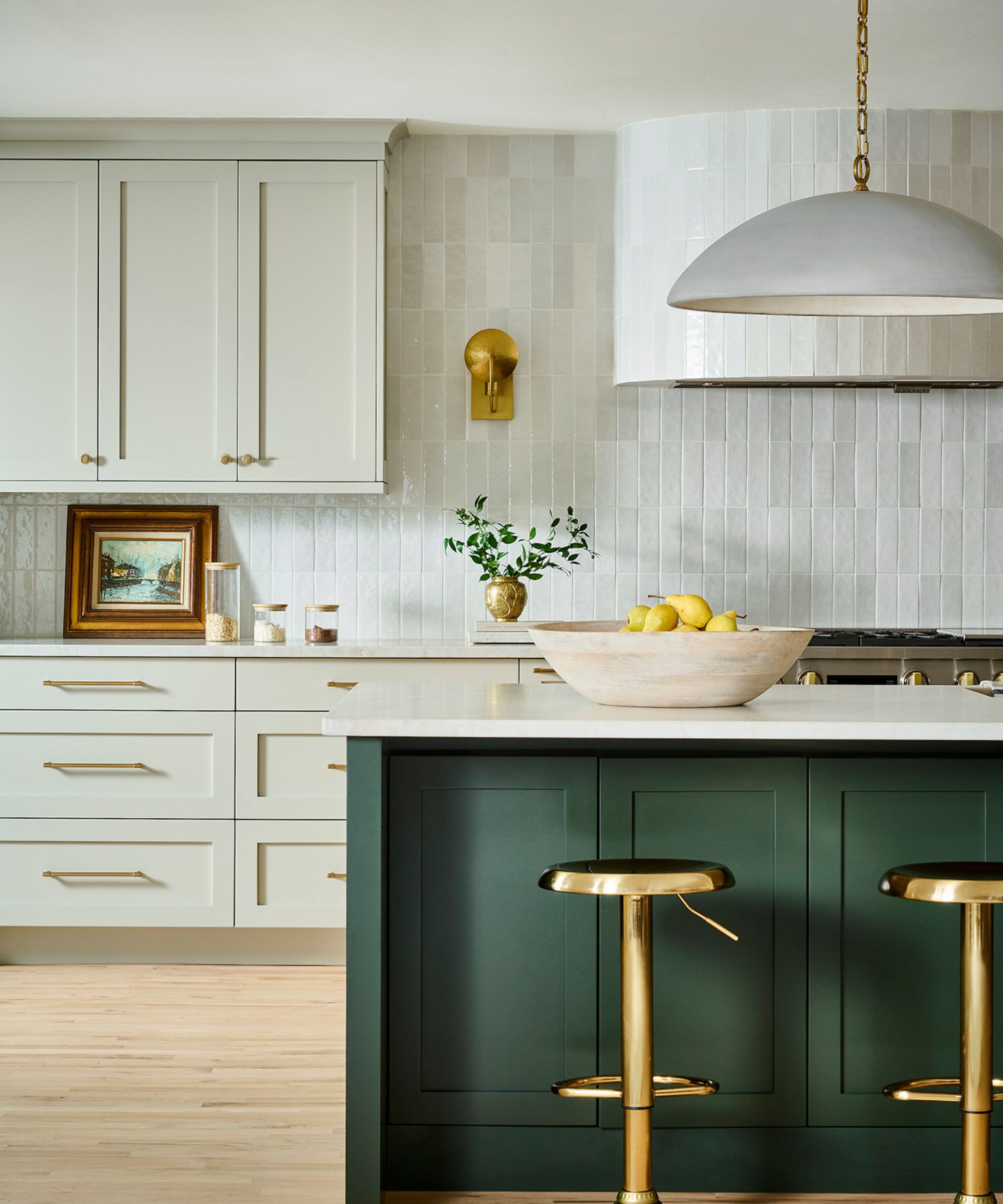
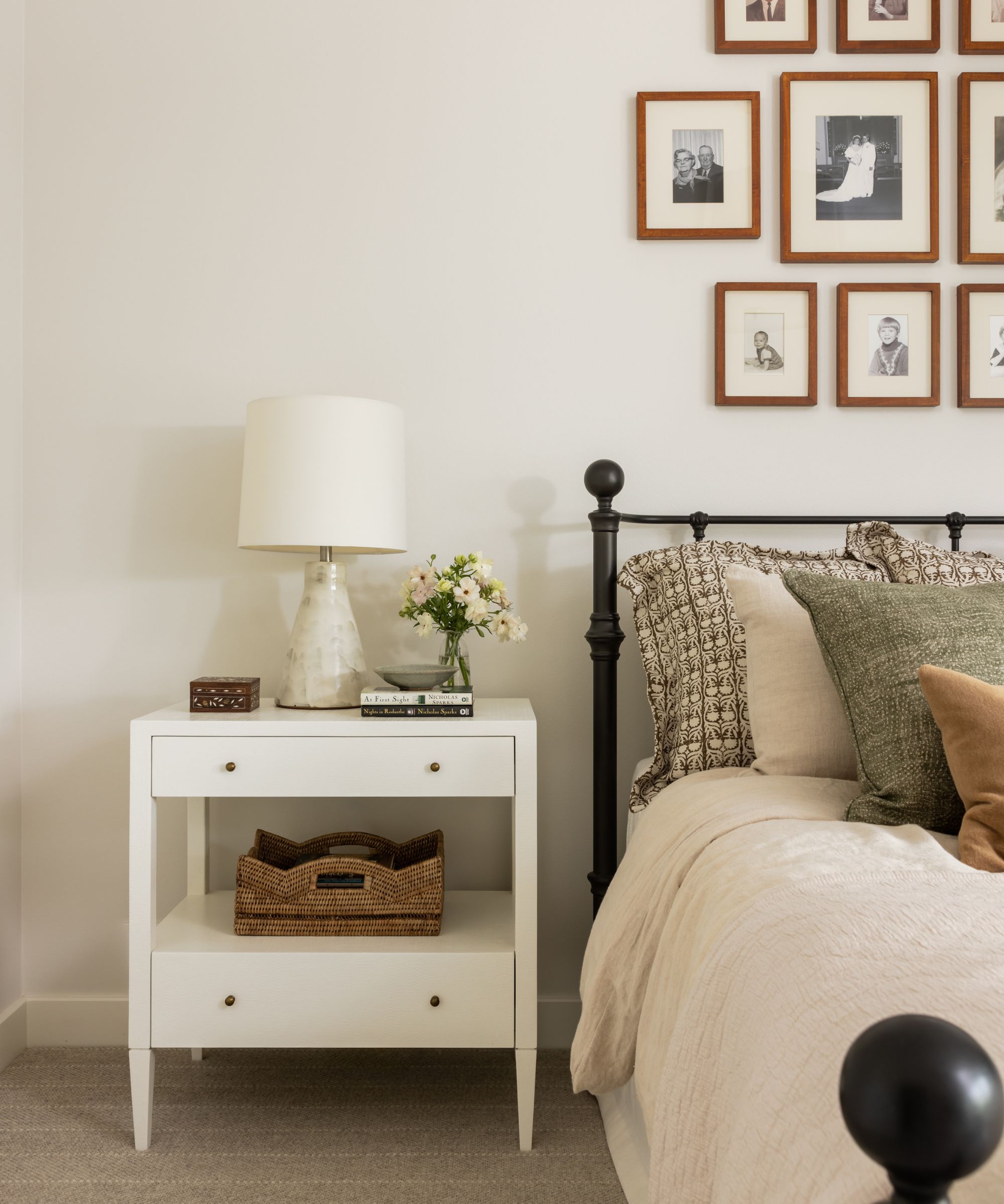
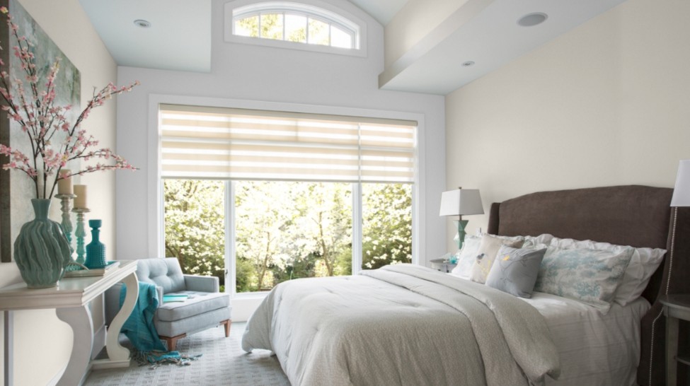
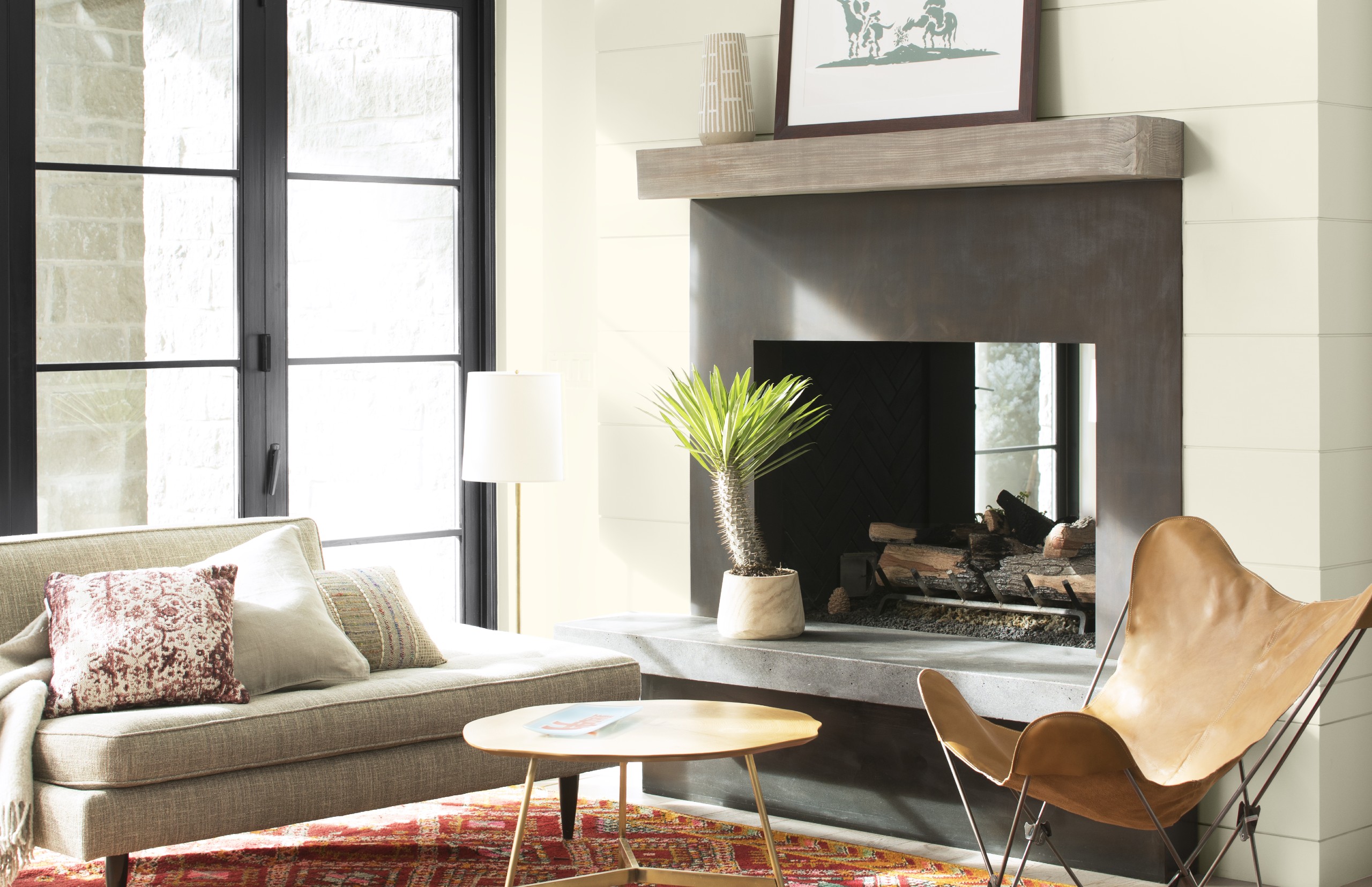
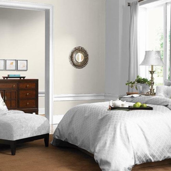
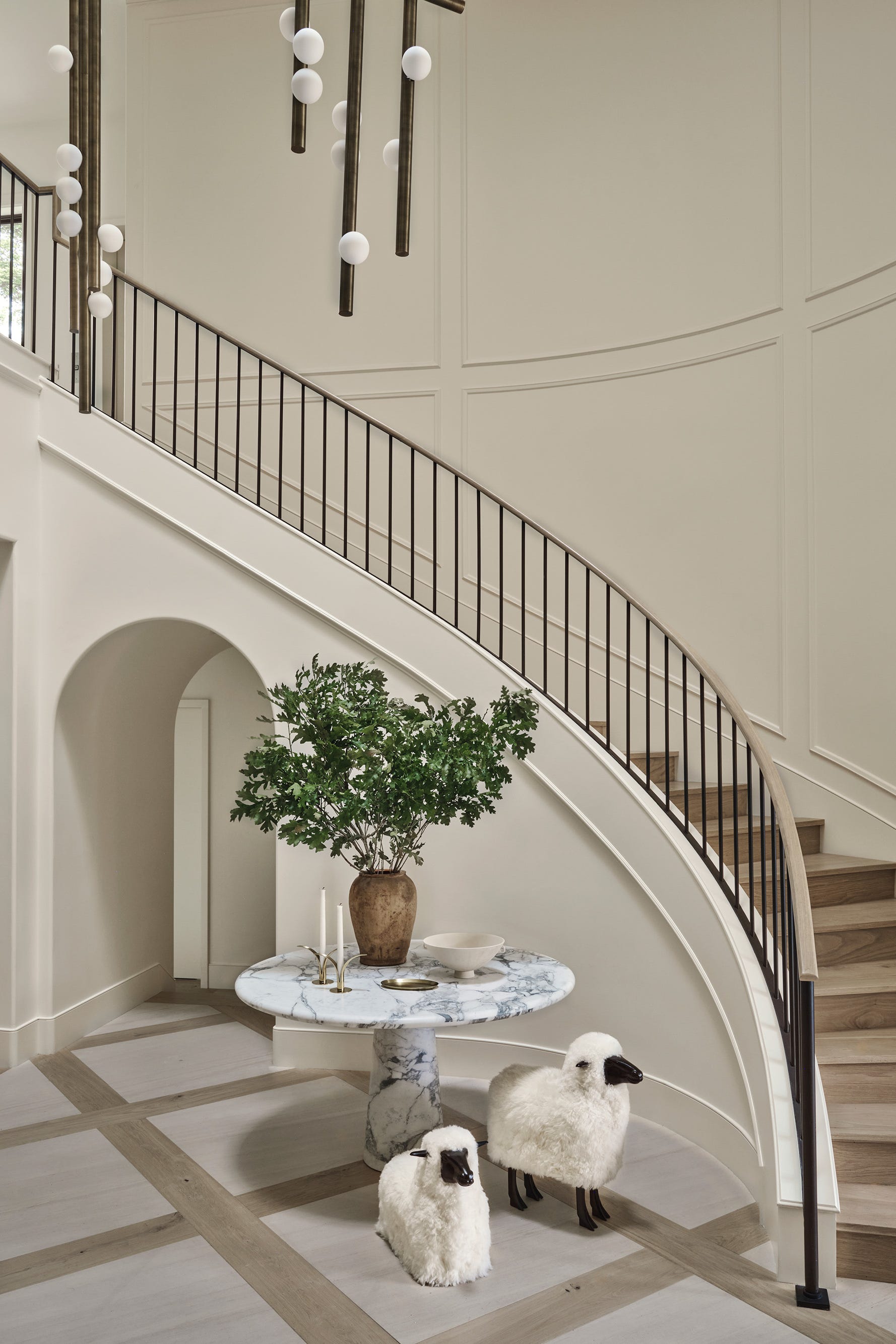
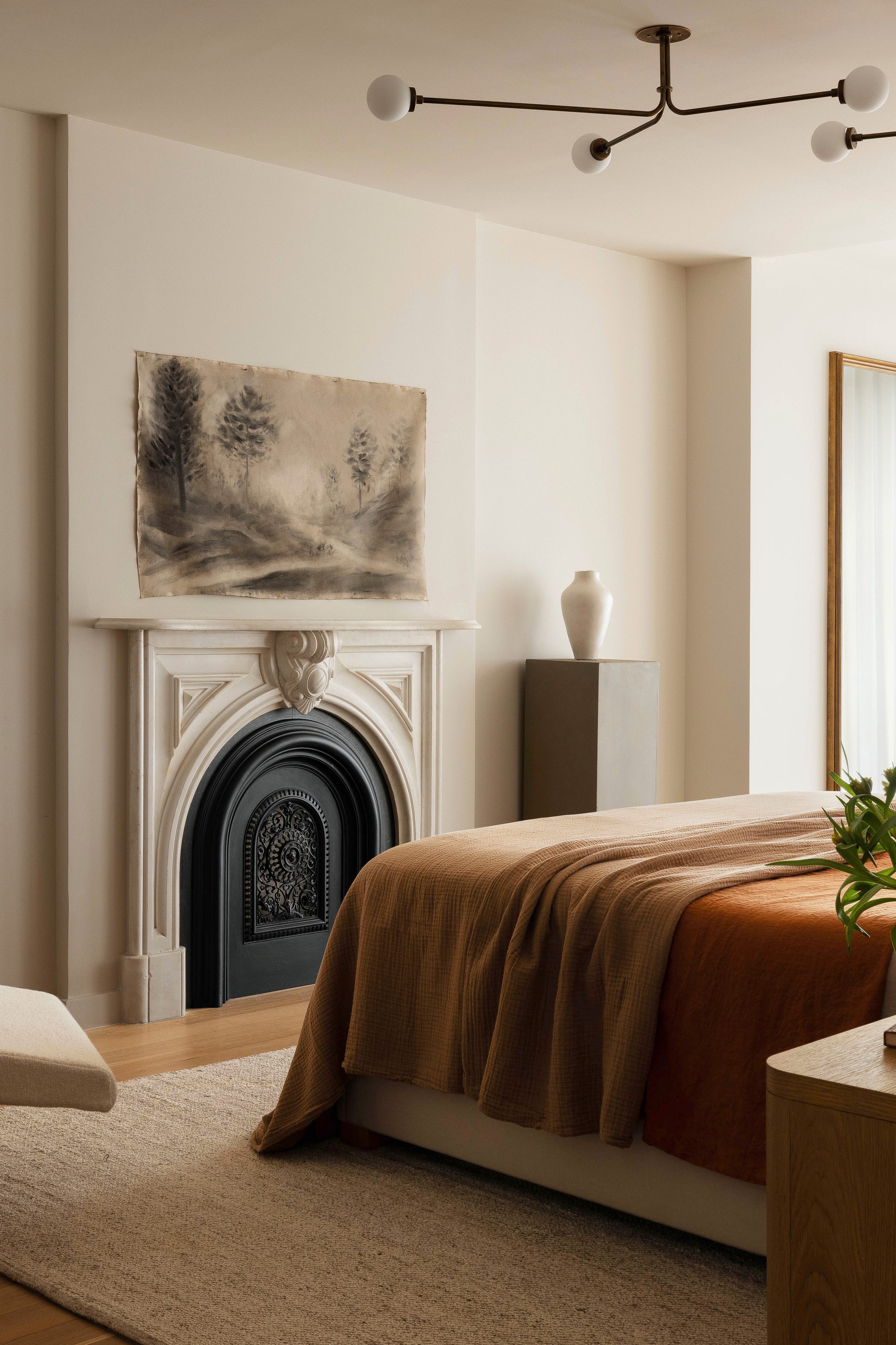
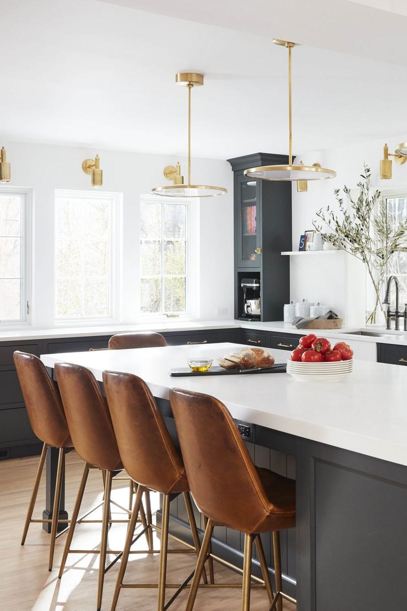
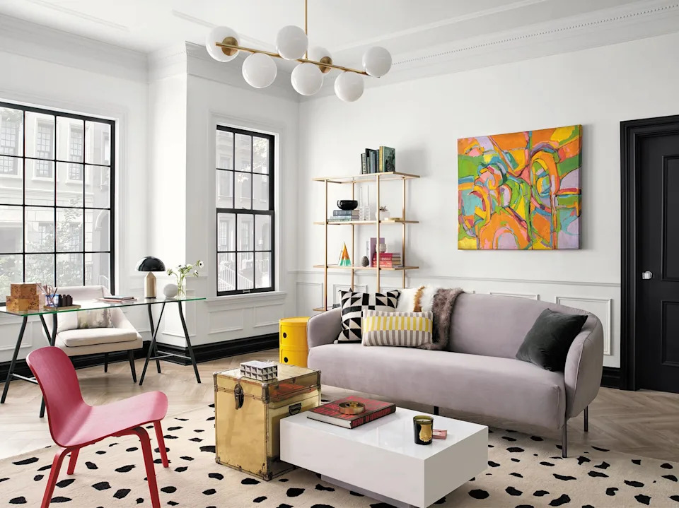
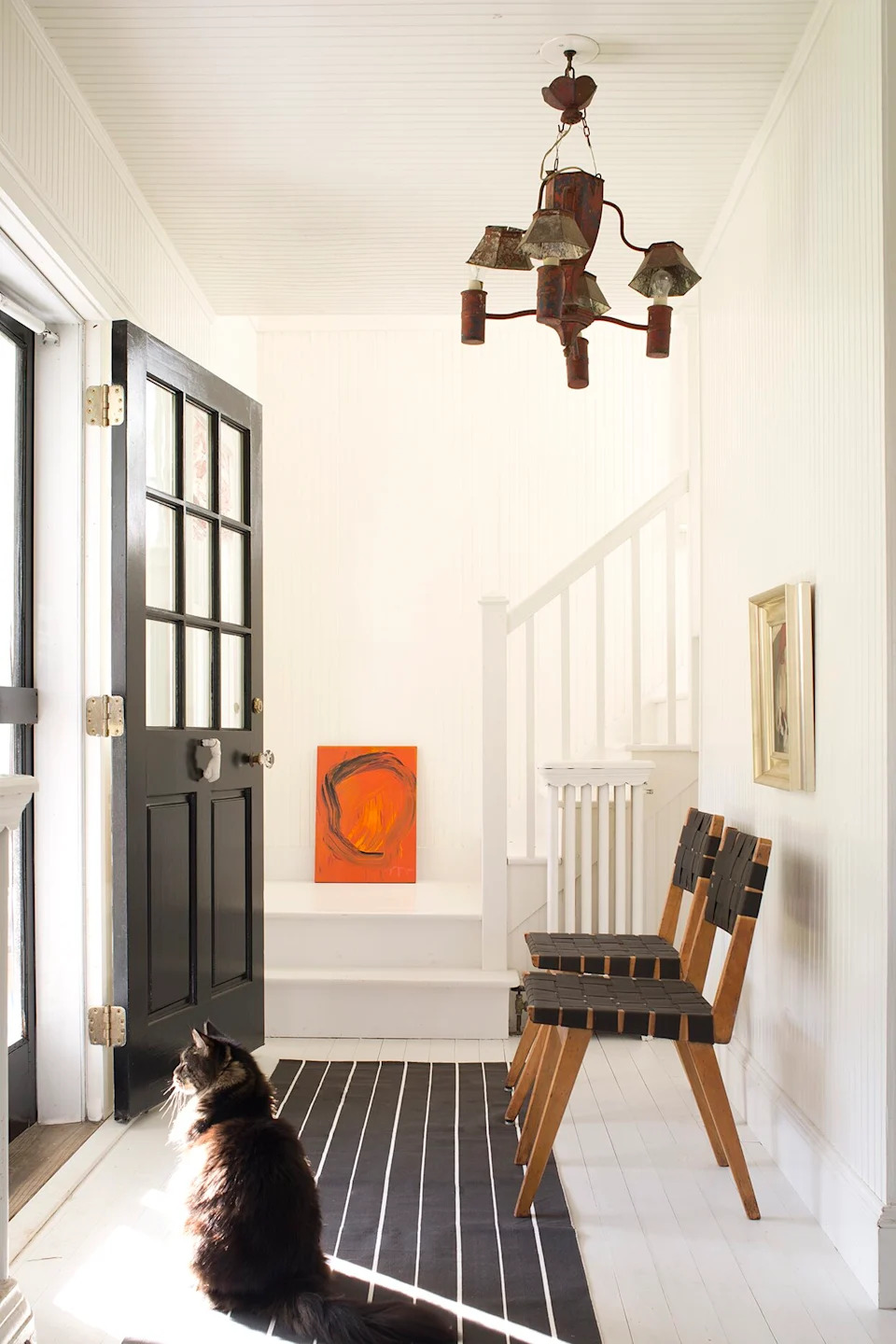
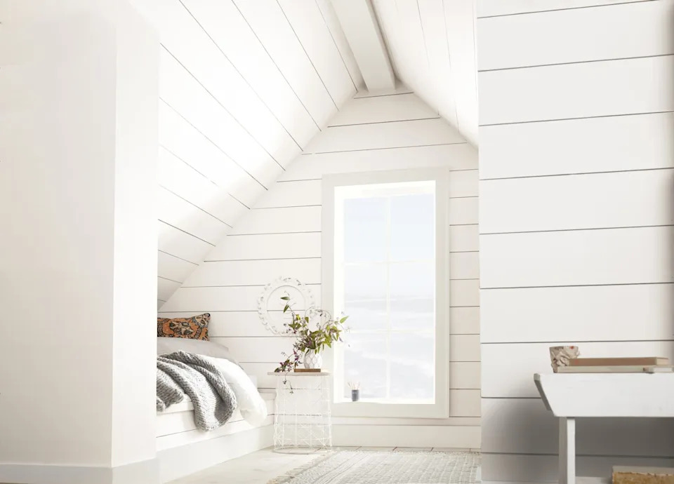
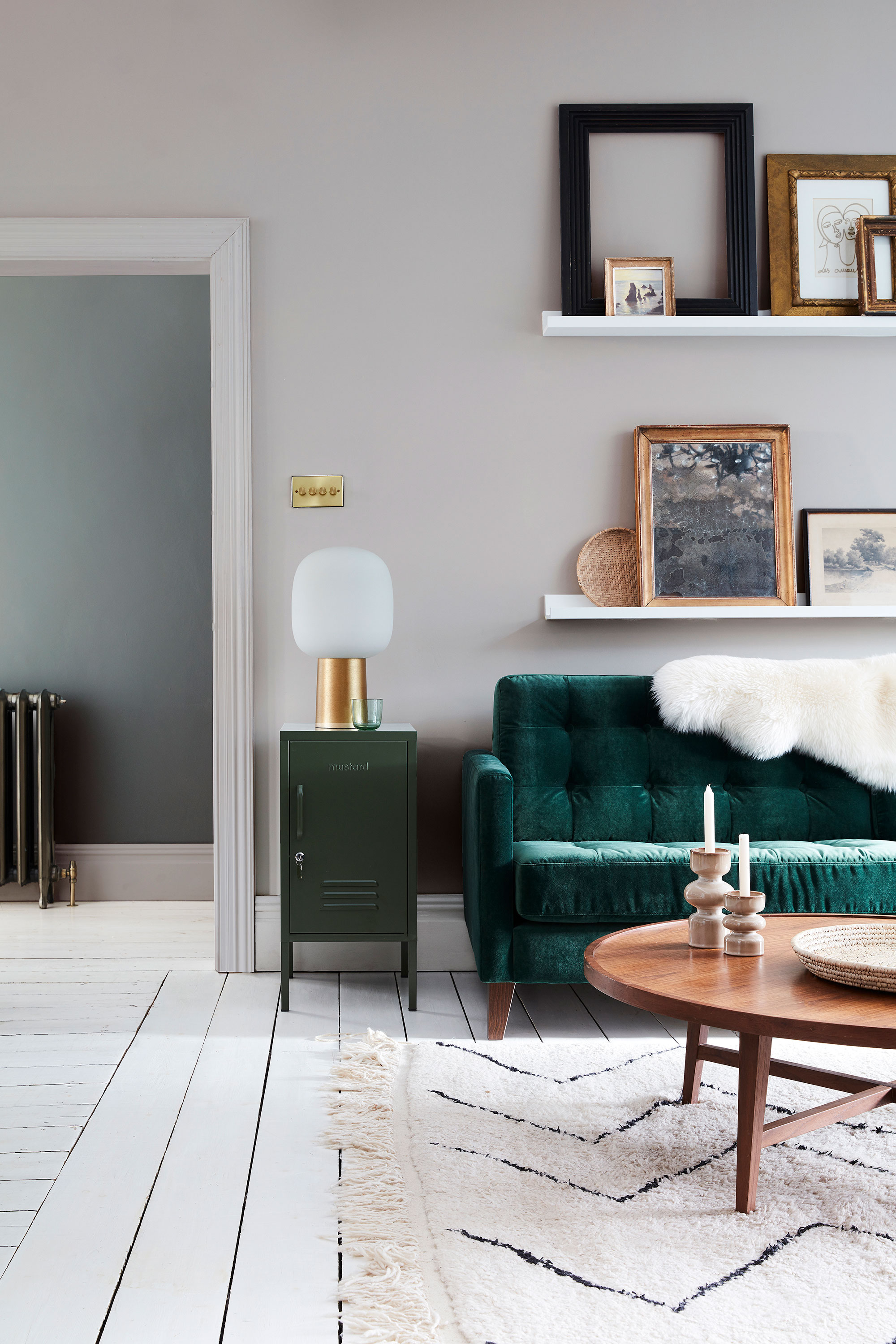
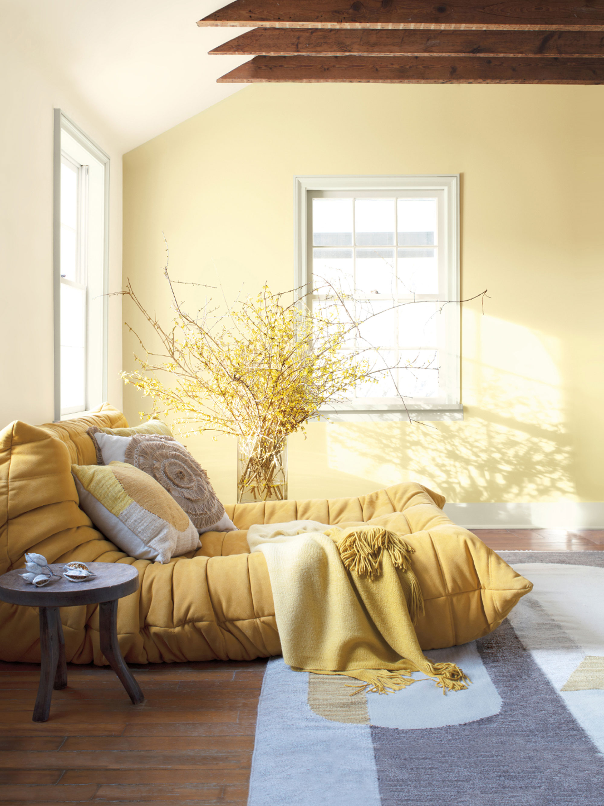
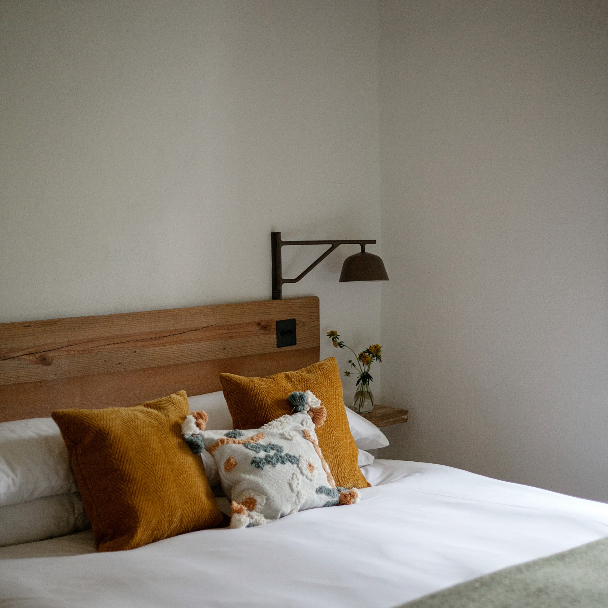
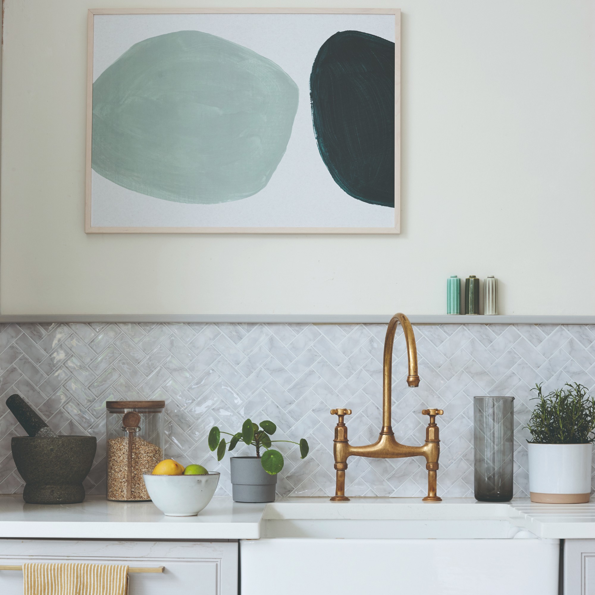
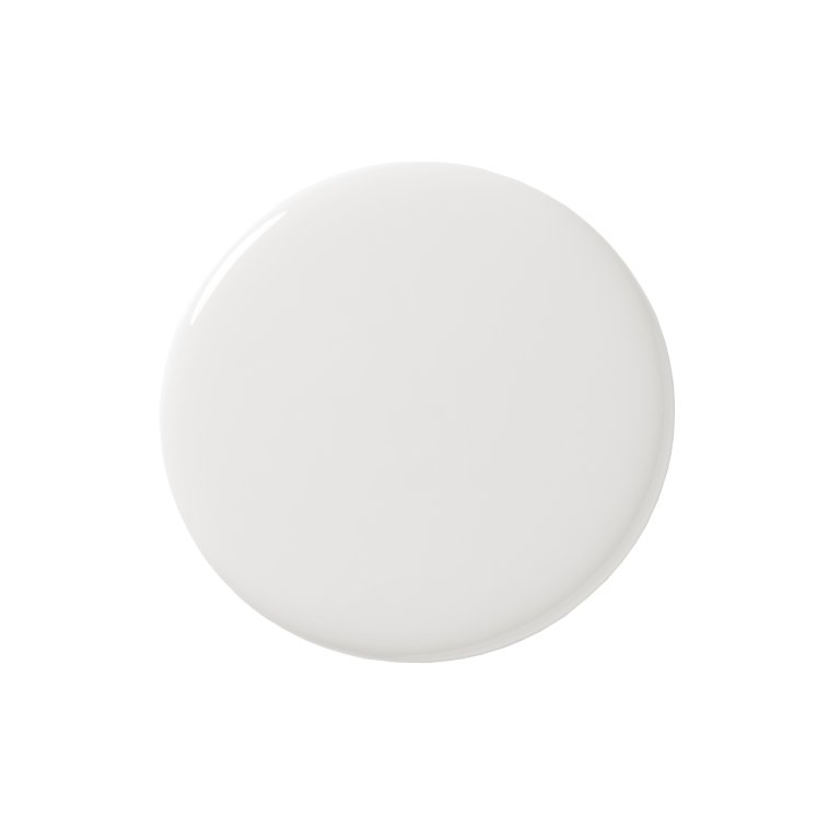
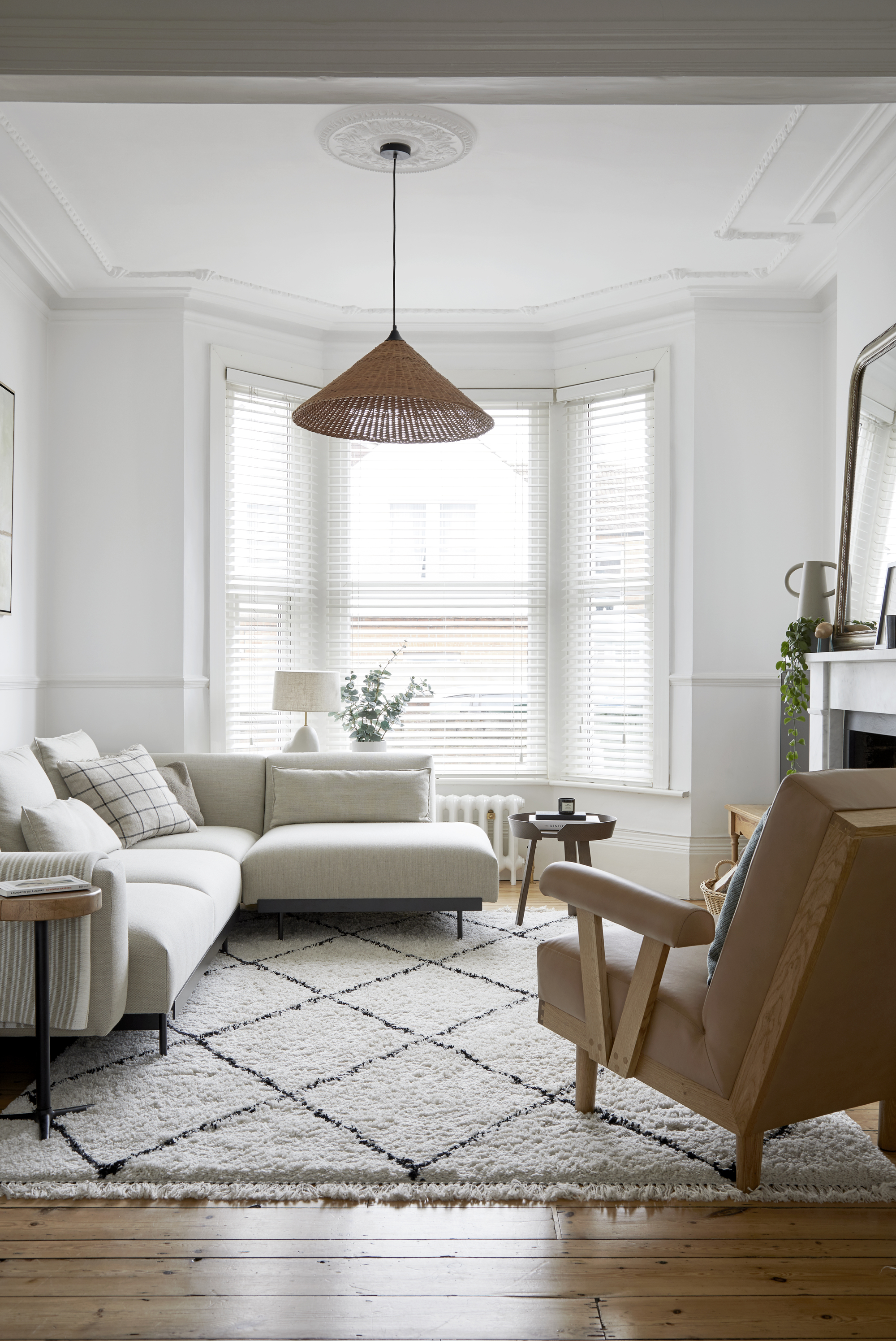
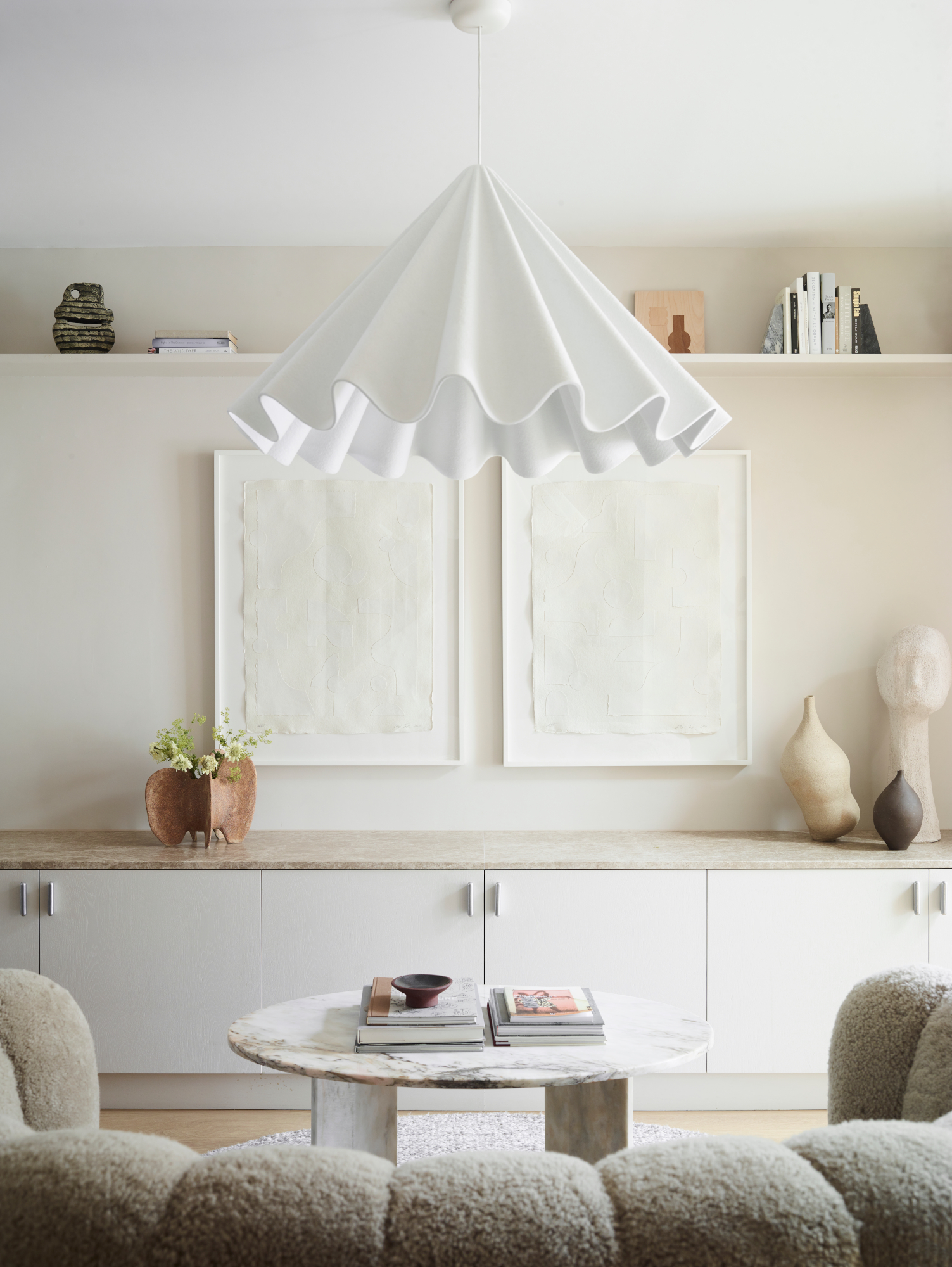
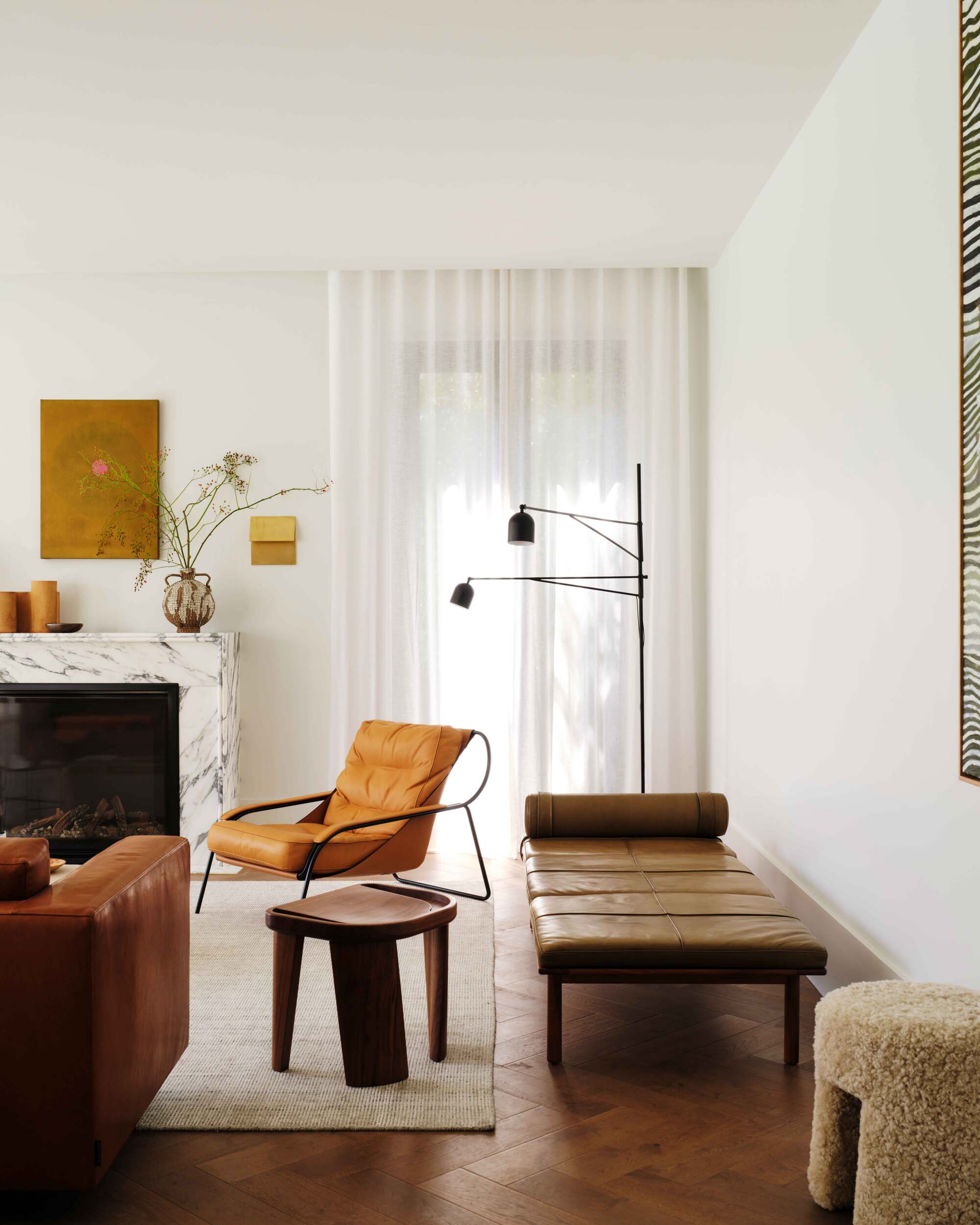
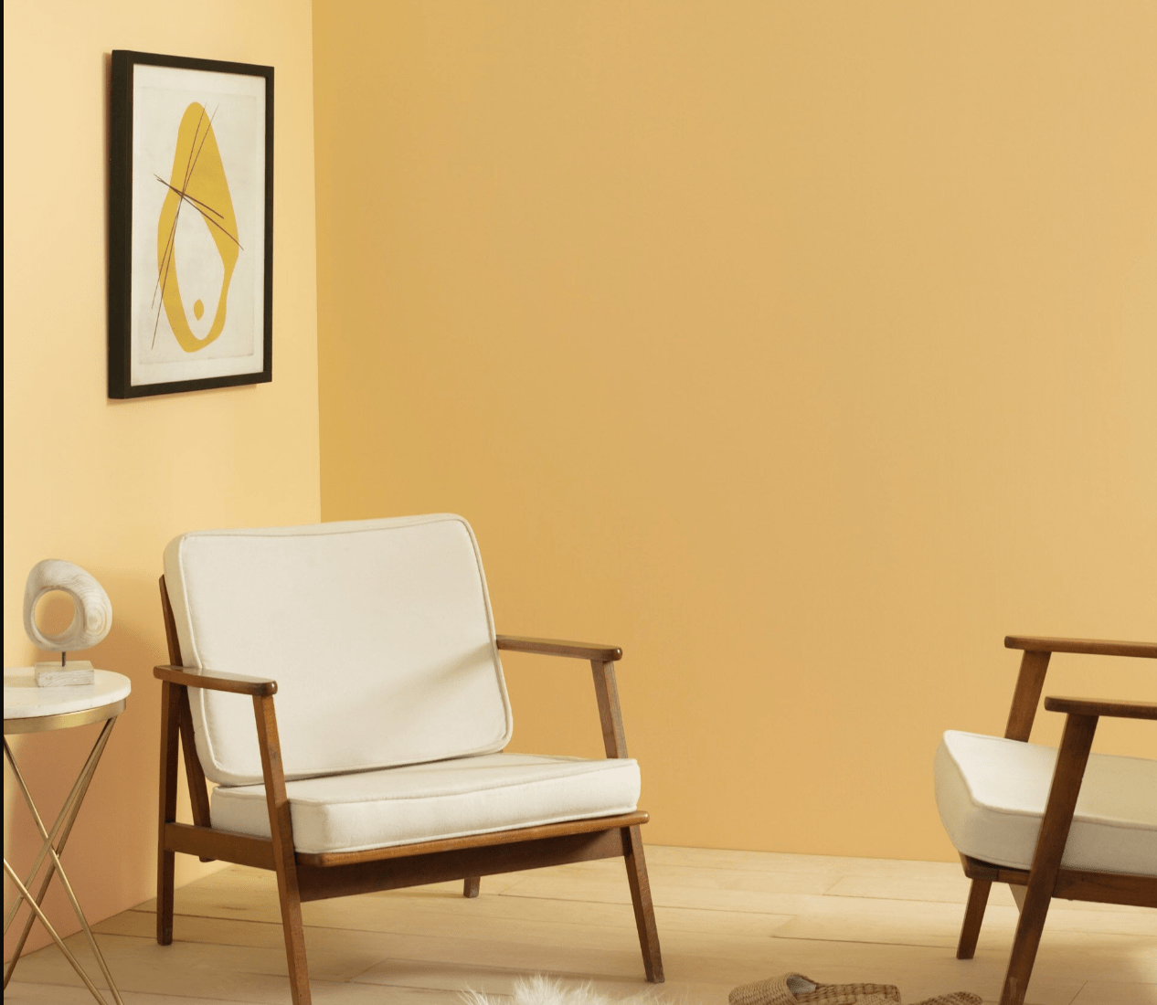
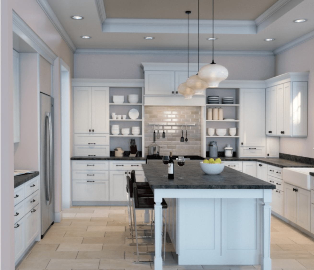
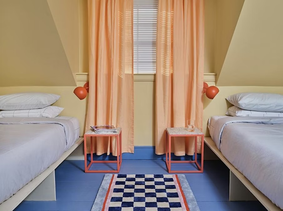
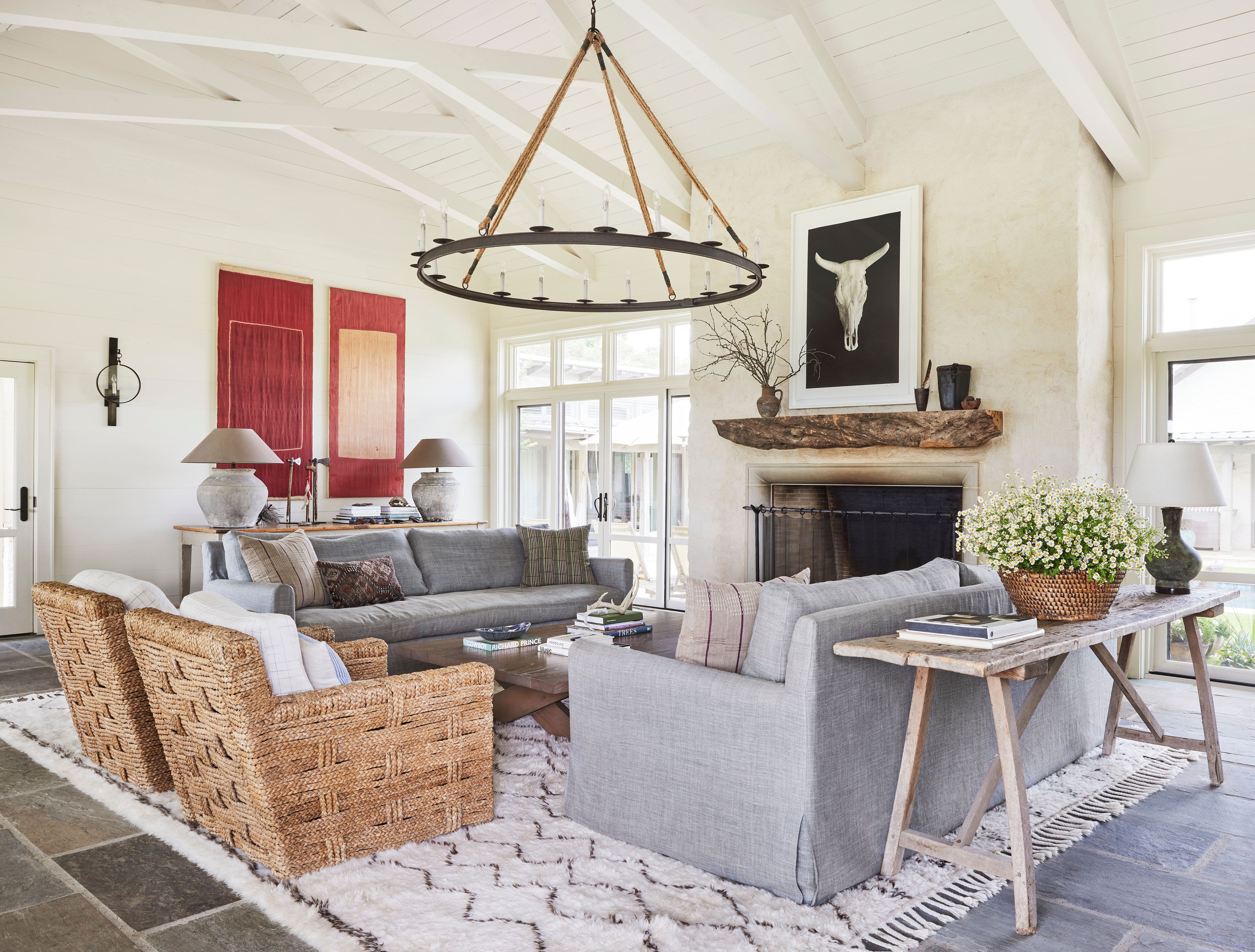

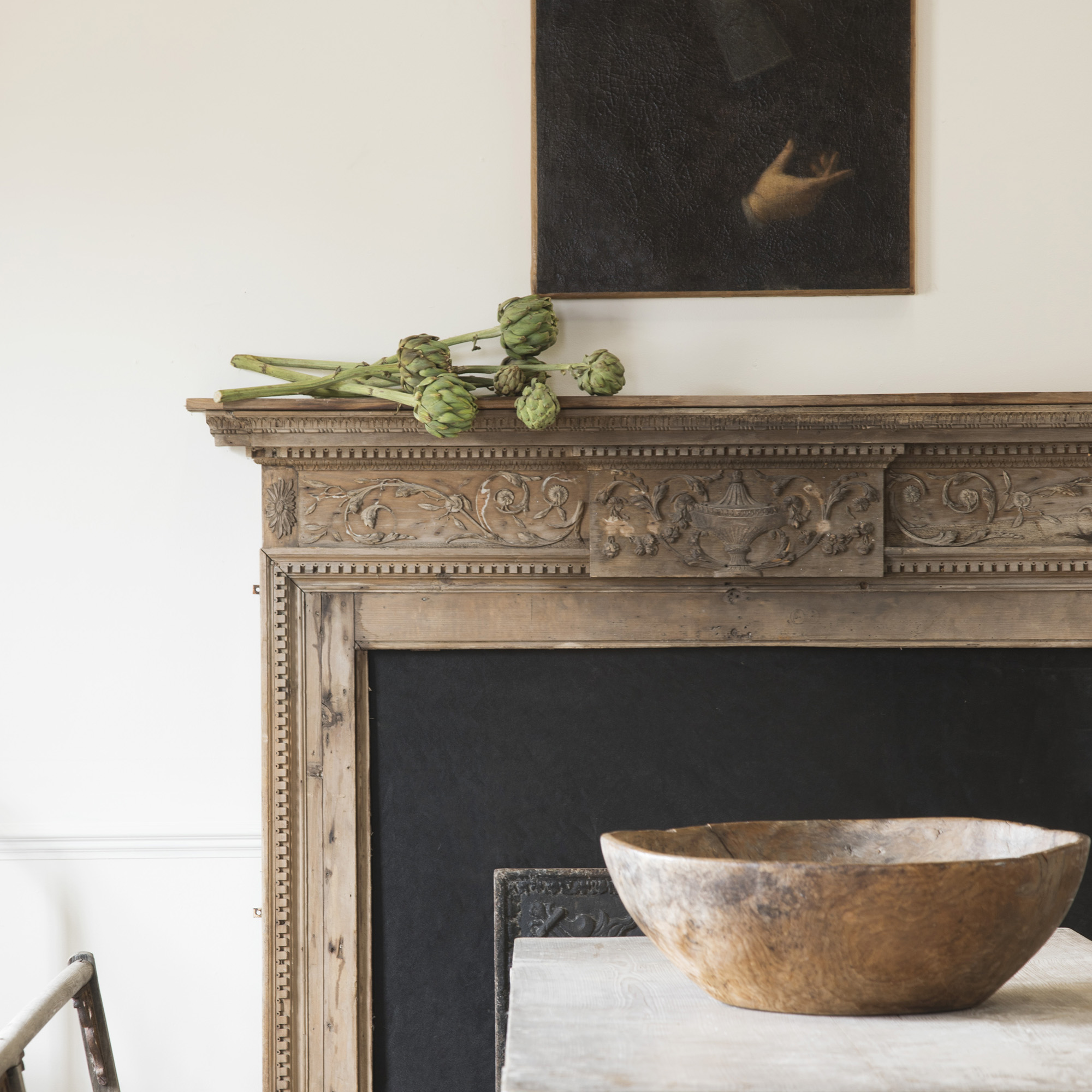
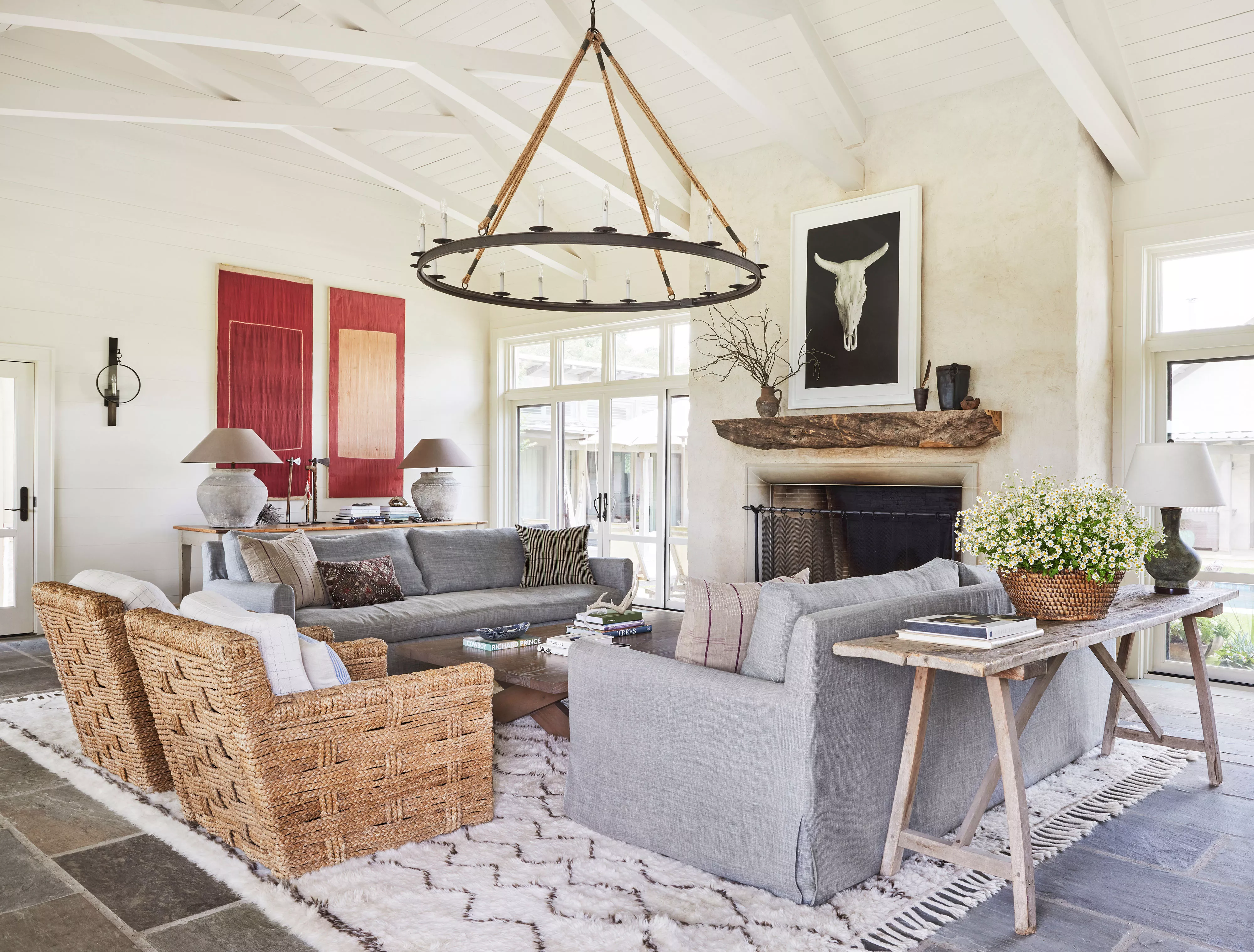
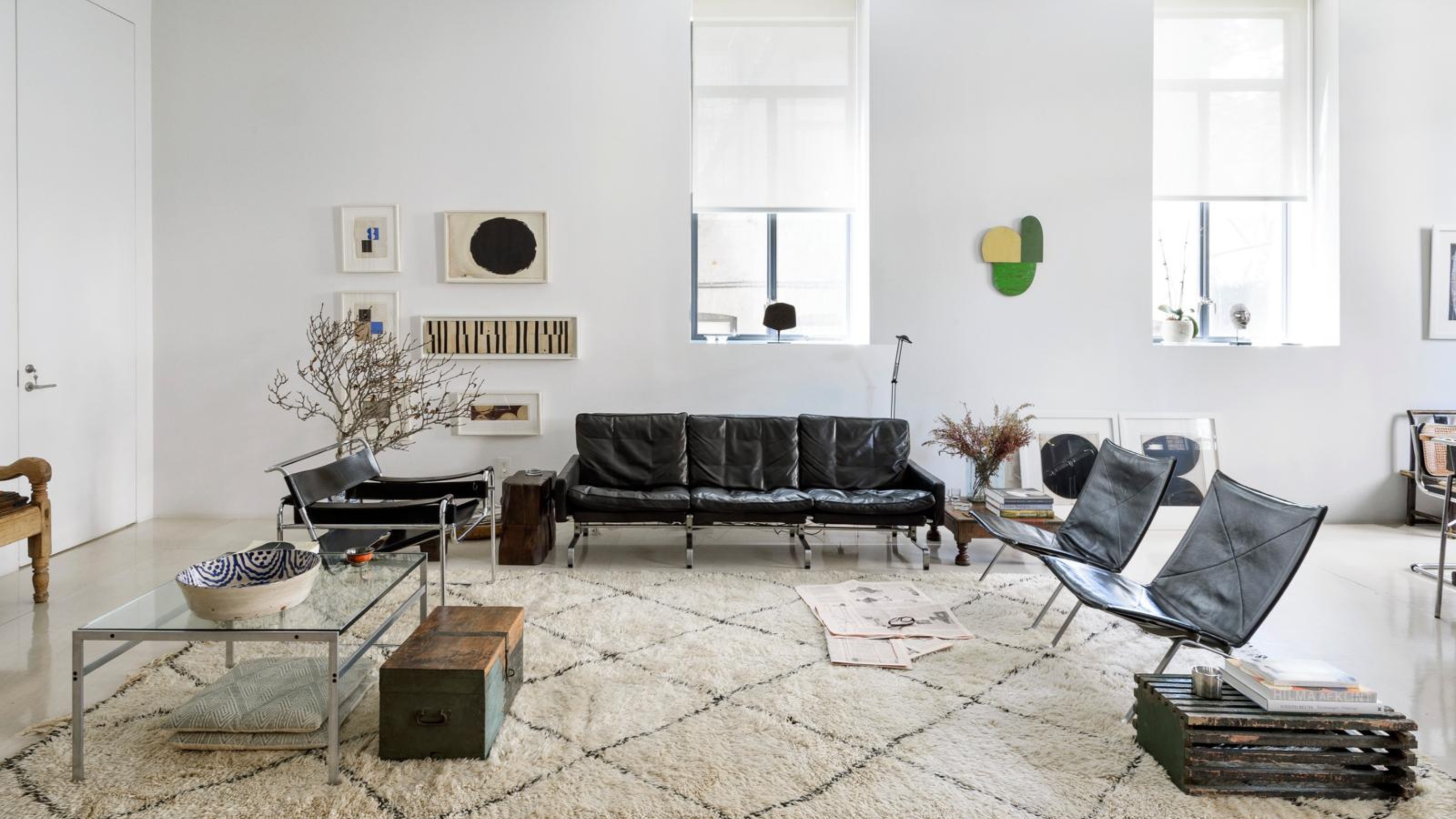
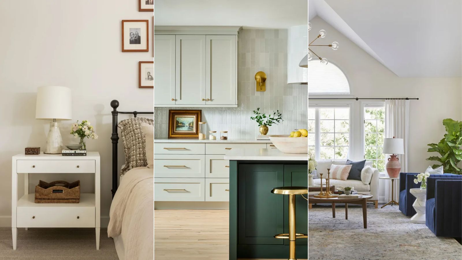
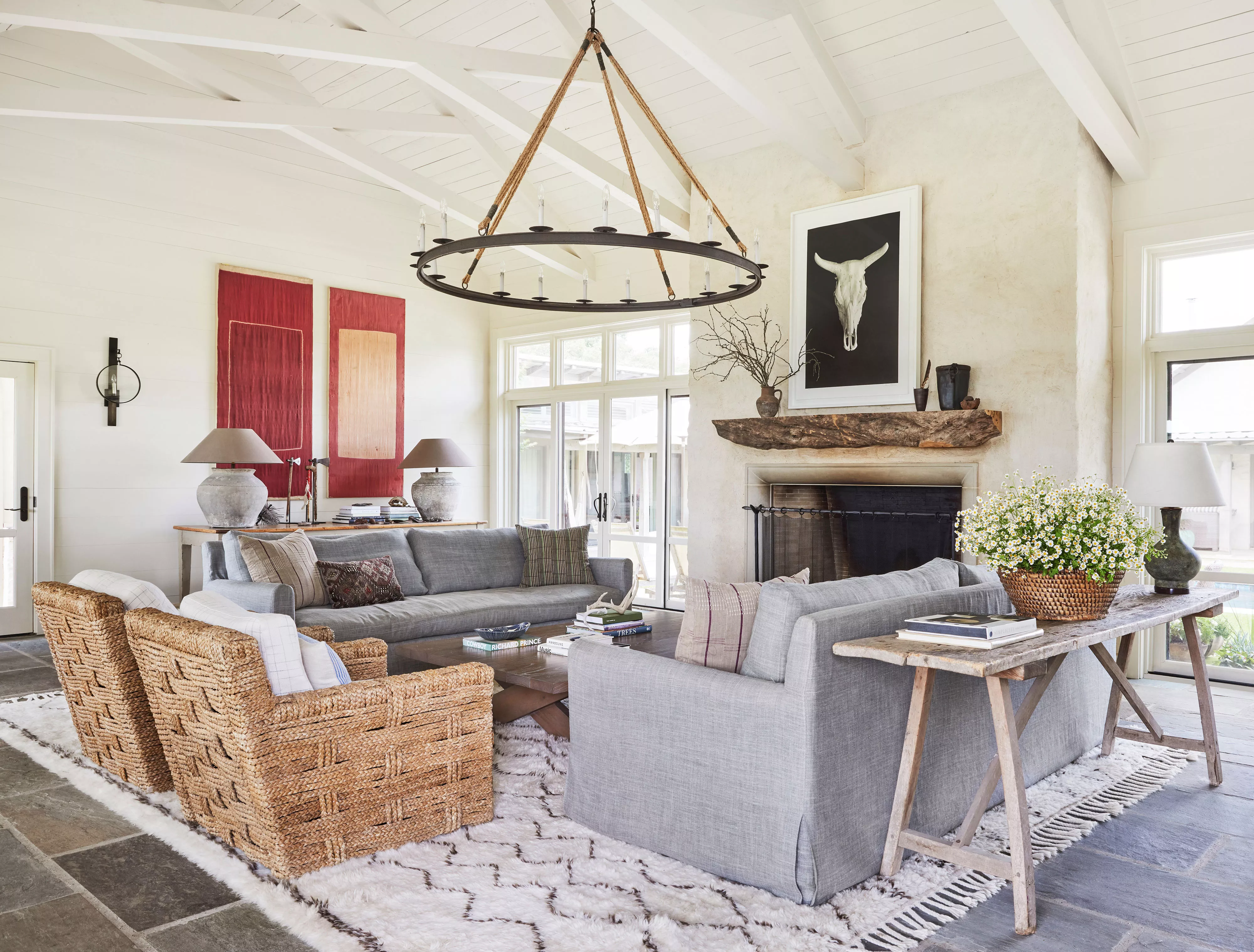
This article explores the versatility and appeal of off-white paint colors, detailing expert recommendations to help homeowners select shades that enhance warmth and brightness in their living spaces. Off-white hues are presented as timeless choices that can adapt to various interior styles, from modern to farmhouse, while also making rooms appear more spacious and inviting. The discussion highlights that these neutral shades possess diverse undertones, including warm options like taupe or pink, and cool variants with green and gray notes, allowing for complementary pairings with existing decor and color palettes.
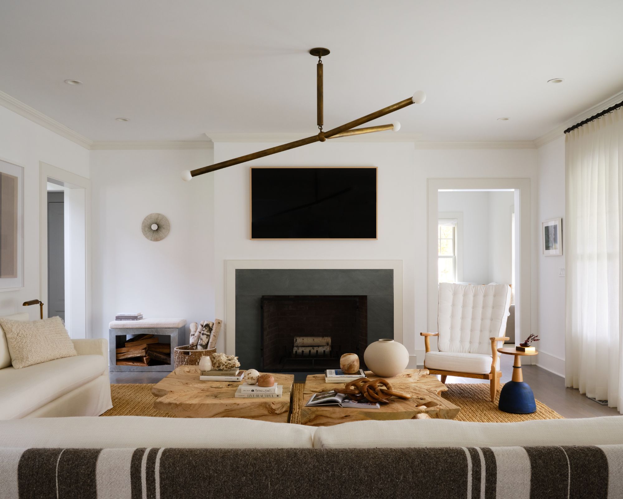
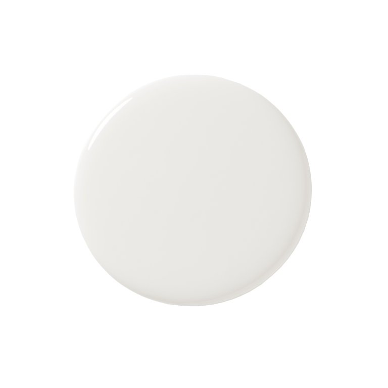
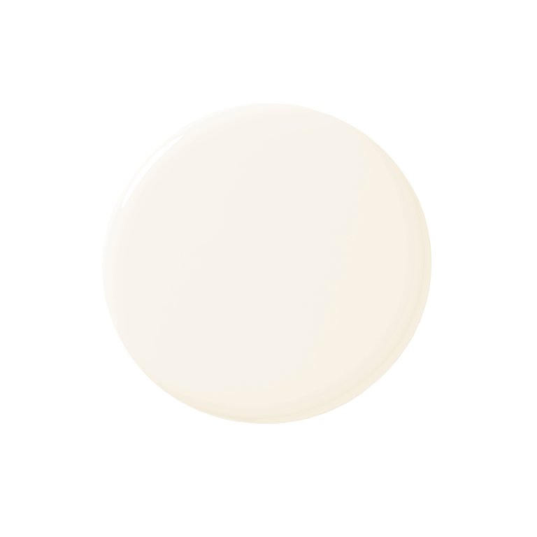
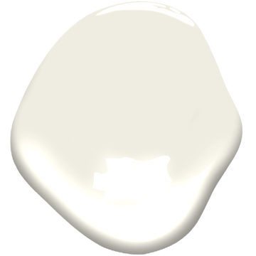
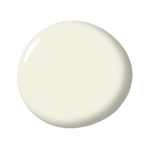
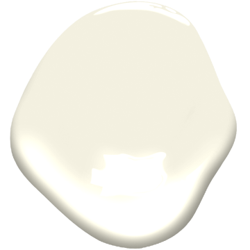
Thirteen specific off-white paint colors are featured, each with insights from paint industry experts. Sherwin-Williams' Alabaster is praised for its balance of brightness and warmth, creating a cozy atmosphere suitable for any room. Benjamin Moore's Linen White offers a creamy, elegant touch, recommended for sophisticated white-on-white schemes or contrasted with shades like Revere Pewter and Wedgewood Gray. Behr's Whipped Cream, with its subtle green undertone, is suggested for natural color schemes and cabinetry, pairing well with blues or golden hues.
Glidden's Focus is presented as a warm, creamy off-white that establishes a relaxed ambiance, ideal for complementing neutrals and accented with deep blues. Dutch Boy Paints' Simplified White is highlighted for its versatility in both contemporary and traditional settings, offering a clean backdrop for cool-toned shades and suitable for open floor plans. HGTV Home by Sherwin-Williams' Natural Linen is noted for its ability to radiate warmth and enhance natural light, making smaller spaces feel larger, especially when combined with architectural details like picture frame molding.
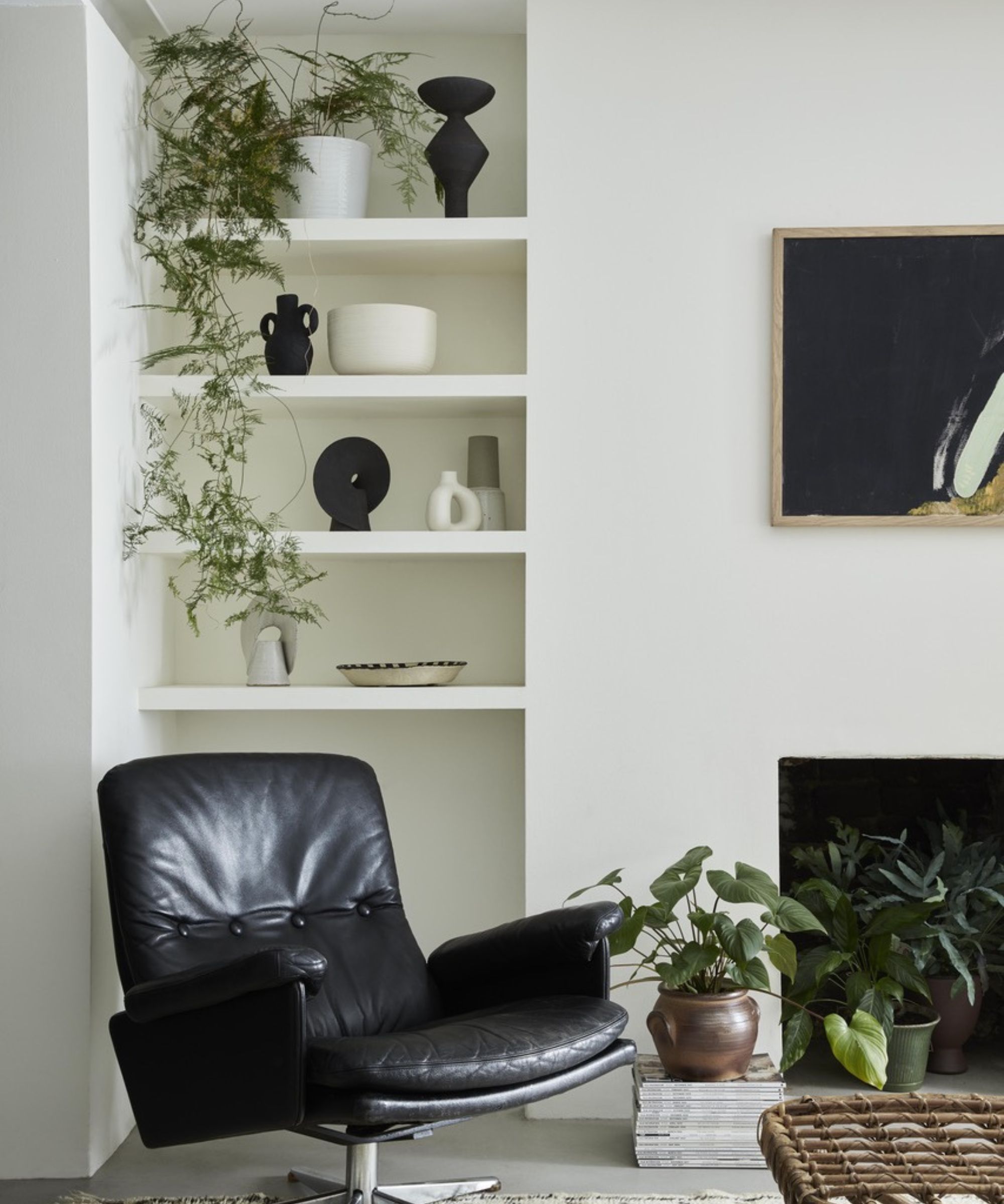
Behr's Blank Canvas is described as a popular and welcoming off-white with a creamy undertone, fitting for any color palette and often used for trim. Benjamin Moore's Horizon provides a serene and refreshing feel with delicate blue and gray undertones, acting as a versatile canvas for artwork and decorative accents. Farrow & Ball's Wevet is characterized as a translucent, barely-there off-white with a hint of gray, offering a clean and modern aesthetic that is easy to pair with other colors.
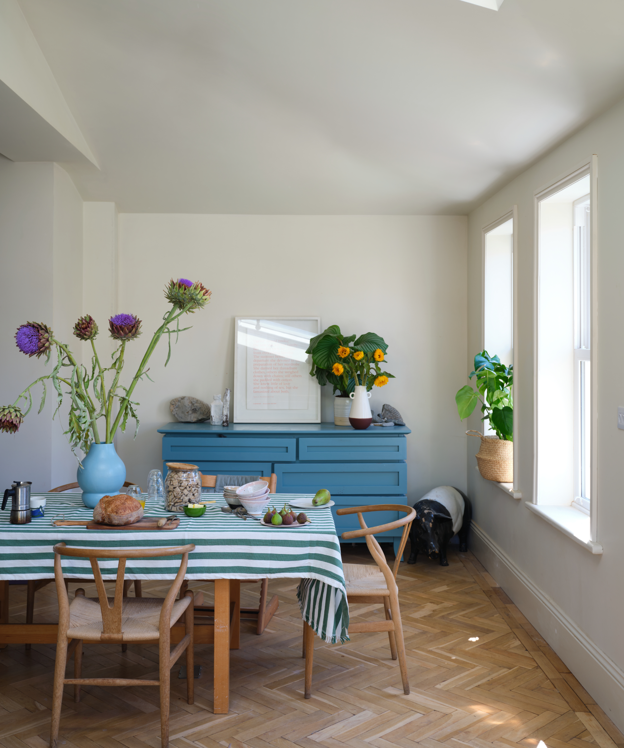
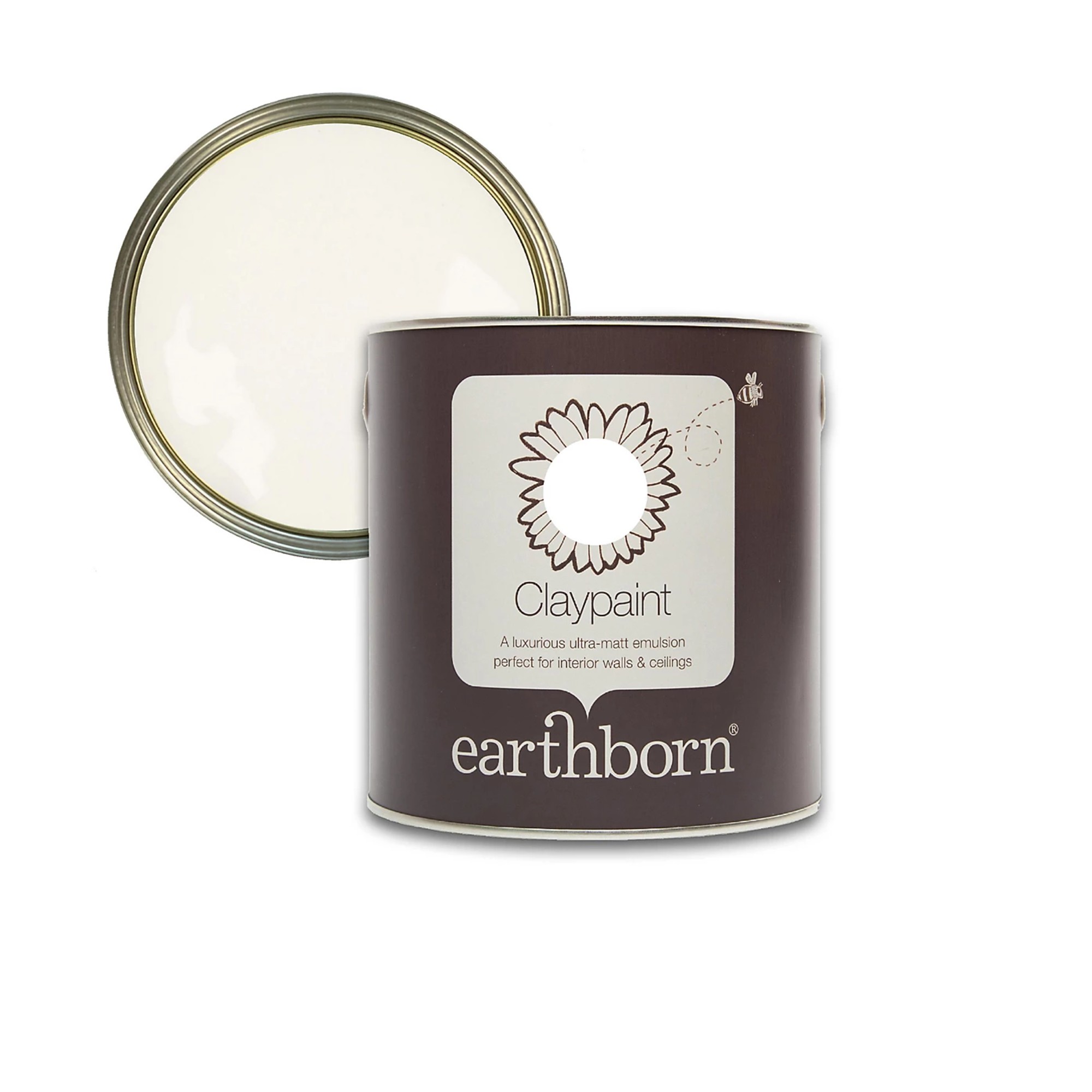
Dutch Boy Paints' Ultra White is recommended for contemporary spaces due to its bright, clean appearance and light-reflecting qualities that make rooms feel more expansive. Sherwin-Williams' Oyster White, with its slight green-beige undertone, offers a stylish and calming backdrop, particularly when layered with natural finishes or bold accent colors. Farrow & Ball's Dimity is noted for its compelling warm undertones, which can appear as pale taupe or pink depending on surrounding elements, making it an excellent complementary white for earthy tones. Finally, Glidden's Blank Canvas, distinct from Behr's version, is recognized for its warmer, beige-leaning undertone, fostering a cozy and welcoming atmosphere, especially when combined with natural woods and crisp white trim.
#OffWhitePaint #InteriorDesign #PaintColors #HomeDecor #RoomTransformation #NeutralPalette #ColorPsychology #PaintExpertRecommendations #OffWhitePaint #InteriorDesign #PaintColors #HomeDecor #RoomTransformation #NeutralPalette #ColorPsychology #PaintExpertRecommendations
0 comment in total
 No comments yet
You may also like
13 Best Off-White Paint Colors, According to Interior Designers

The 13 Best White Paint Colors That Interior Designers Swear By

Is white actually out of style? Interior designers weigh in on this classic color for 2025 decorating

Designers Swear By These 8 Off-White Paint Colors For Every Project

13 Tried-and-True White Paint Colors Recommended by Pros

Six things you need to know before painting a room off-white — and five beautiful tints to consider
13 Off-White Paint Colors That Make Any Room Feel Bigger and Brighter
5 Problems With Painting Your Walls White That No-One Ever Talks About (Until Now)

Best off-white paints according to designers
13 Off-White Paint Colors That Experts Always Recommend to Make Rooms Feel Bigger and Brighter
Which white paint is the best? Experts reveal the perfect shade of white for every room and feature
The 13 Best Paint Colors for Low-Light Rooms

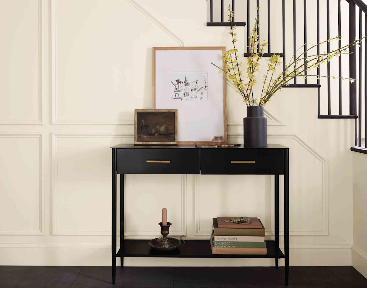
13 Off-White Paint Colors the Experts Recommend for Any Space


The Best White Paint Colors Experts Turn to Again and Again
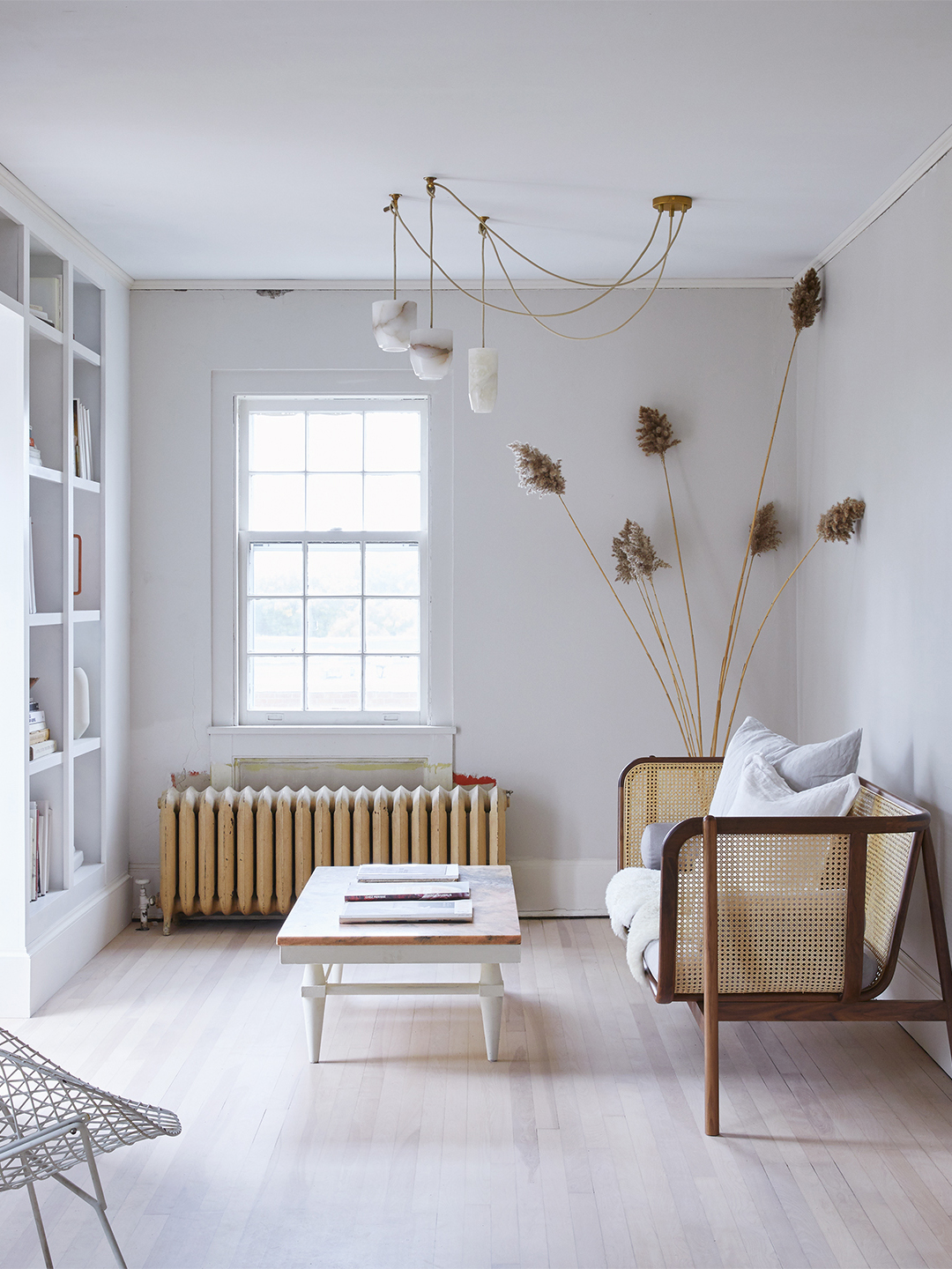
Designers’ Favorite White Paints Are Always Changing—We Asked 3 for Their Latest Pick

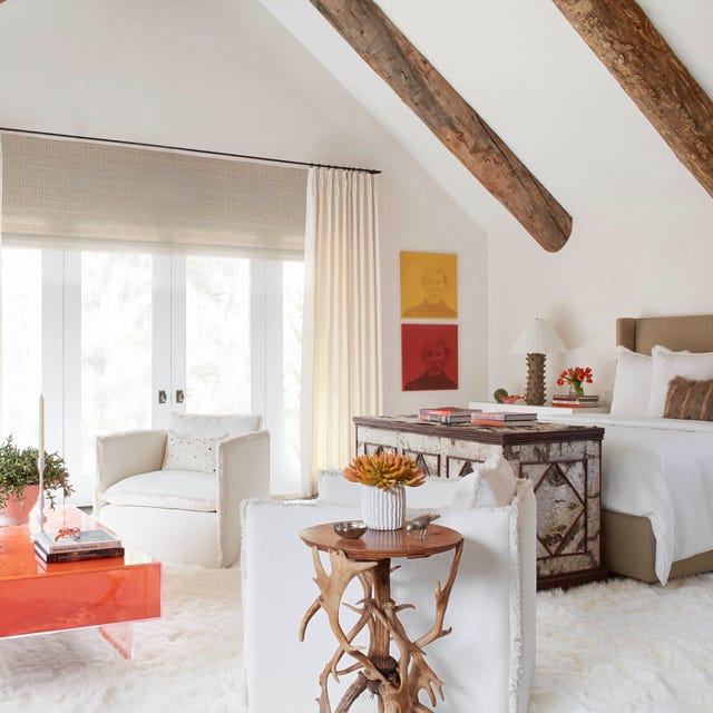
The 40 Best White Paint Colors, According to Designers
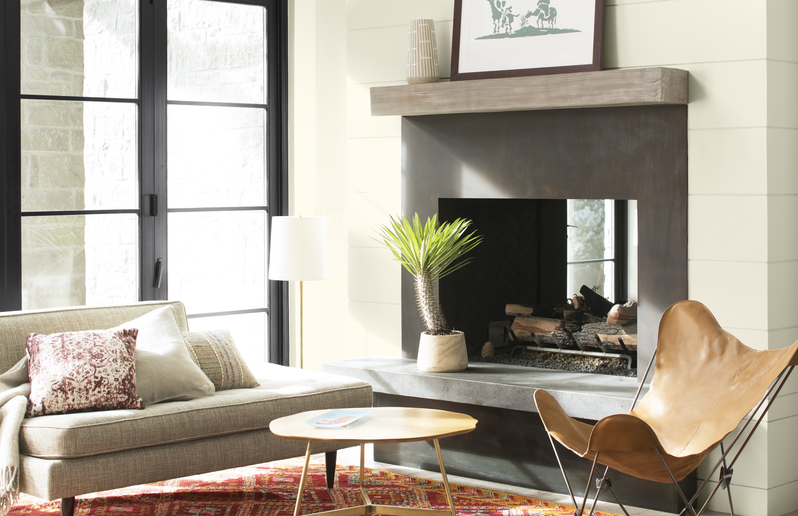
Best white paint colors: Expert share the top options

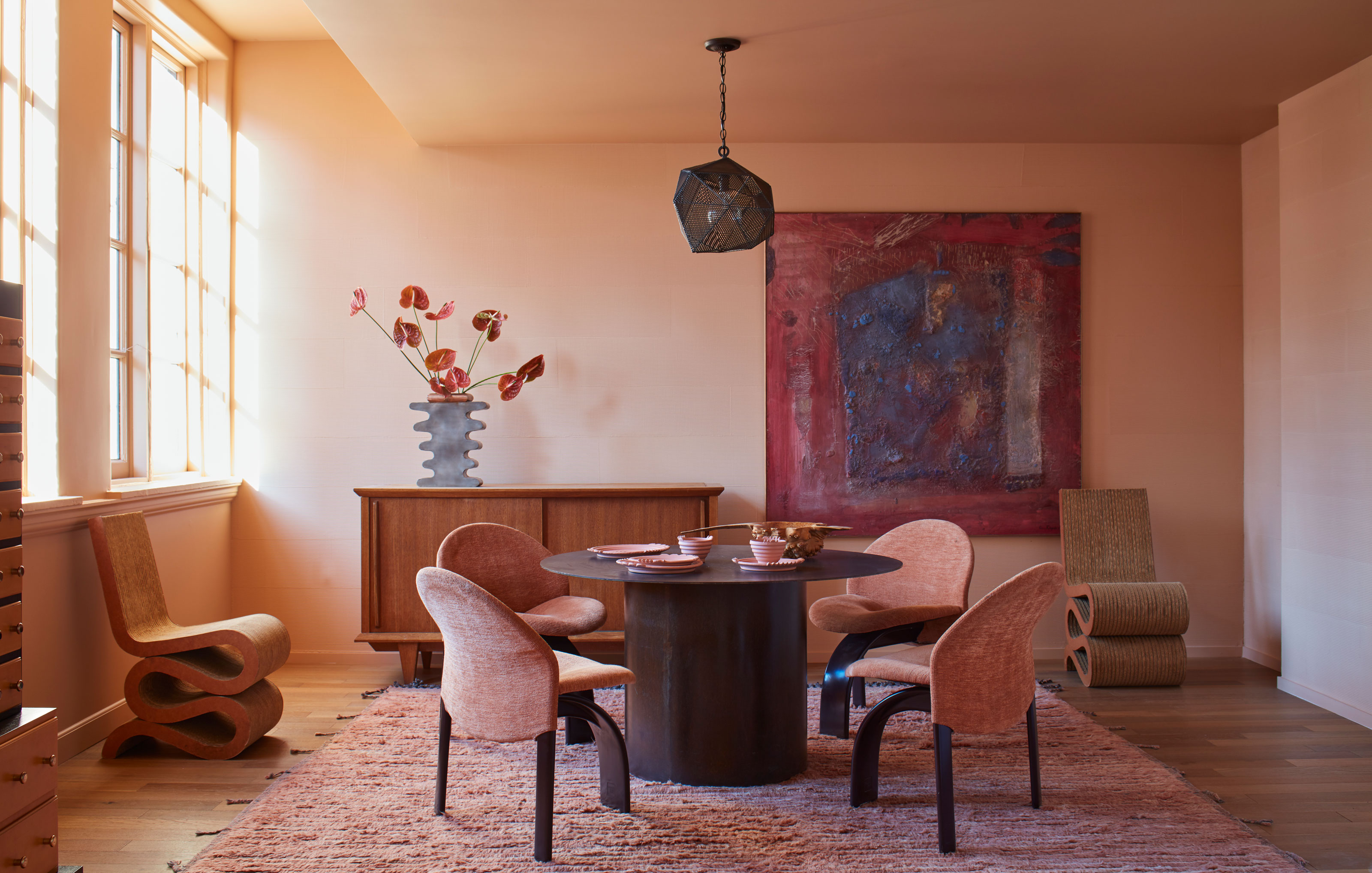
Paint color ideas for every room – experts explain the best choices for different spaces
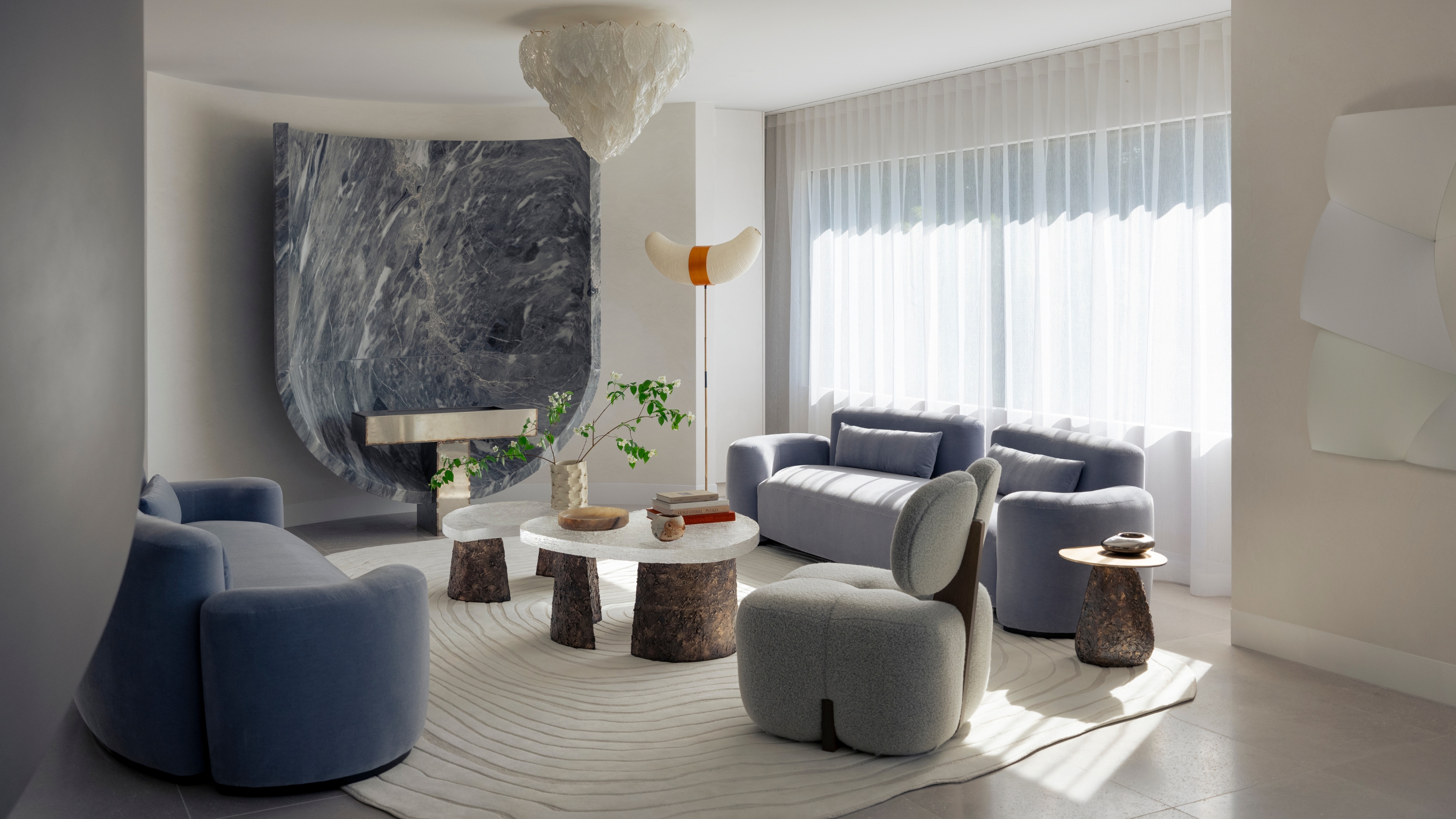
"Help, My White Walls Look Blue" — Here's Why It's Happening, and How to Fix This Common Problem
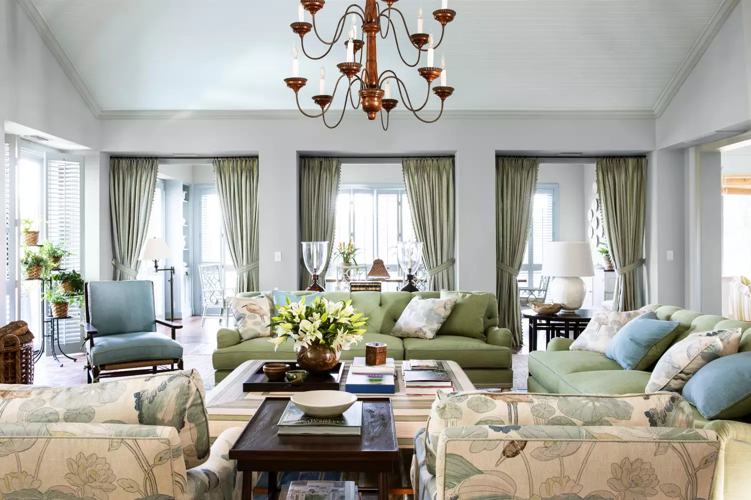
15 Timeless Paint Colors You’ll Never Tire Of, According To Designers