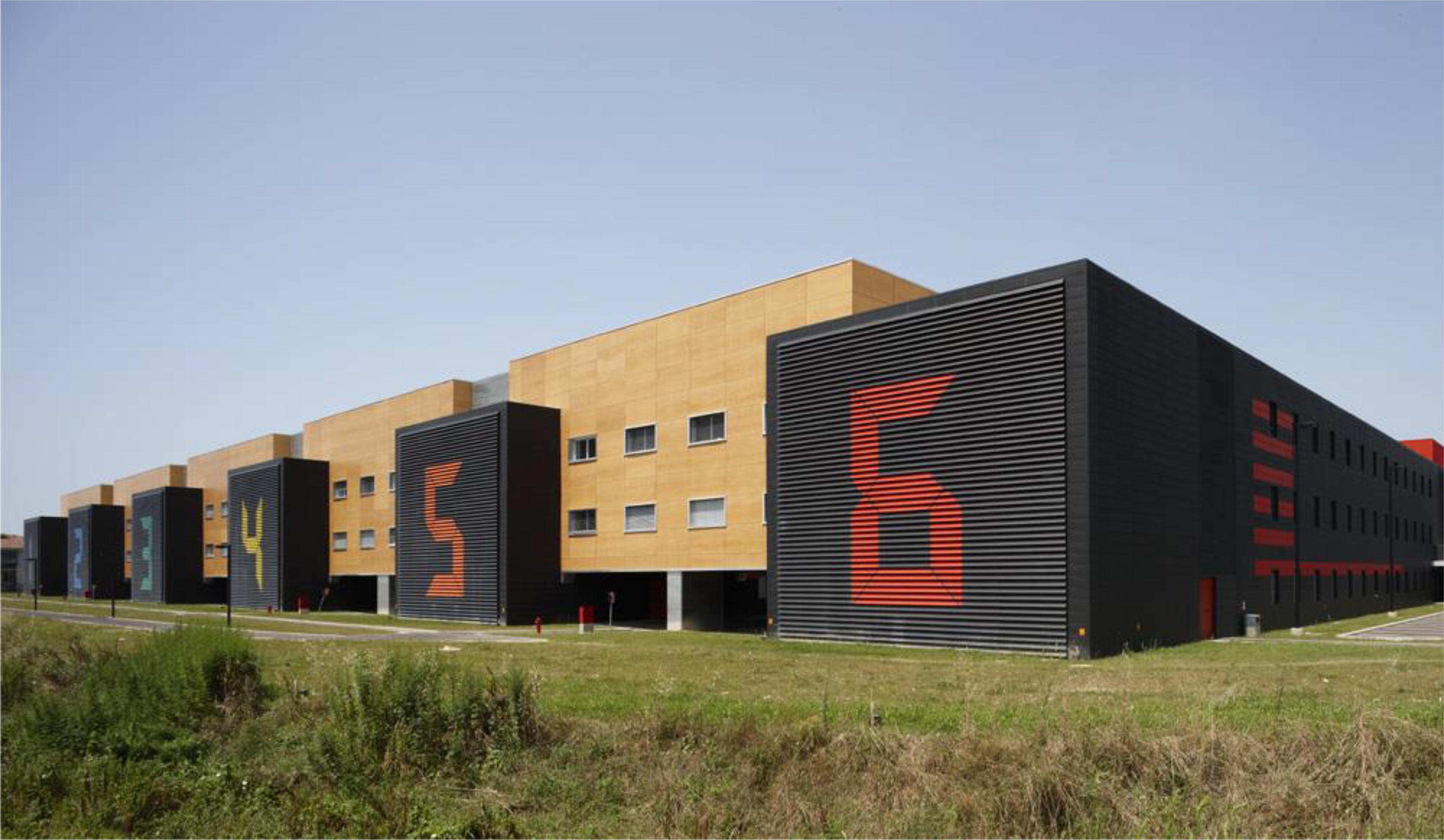
1/11
Interior Color and Psychological Functioning in a University Residence Hall
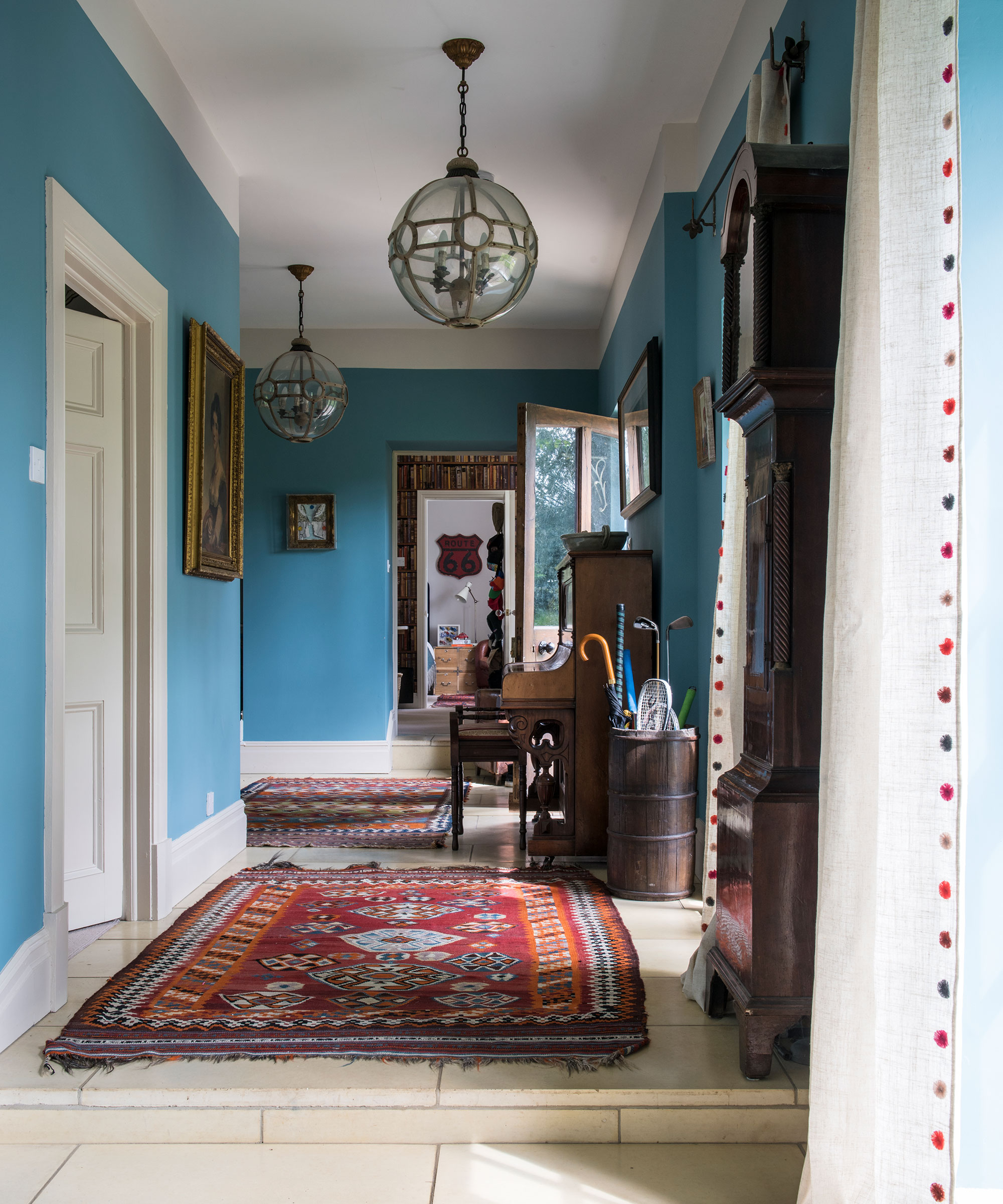
This study investigates the long-term effects of interior color on psychological functioning, residential satisfaction, and academic activities within a unique architectural setting: a university residence hall in Pisa, Italy. The hall comprises six identical buildings, each distinguished solely by a specific interior color scheme (violet, blue, green, yellow, orange, and red) applied to walls, ceilings, and floors in both common areas and student rooms. This design provided an unparalleled opportunity for an in-vivo experiment, allowing researchers to assess color preferences and psychological impacts in a real-world, long-term residential context, unlike most previous studies that focused on short-term exposures or abstract color evaluations.
A total of 443 university students, living in these buildings for an average of 13.33 months, participated in the study. The research gathered data through a questionnaire covering socio-demographic information, color vision deficiency, preferred residence hall color, length of stay, room type, color lightness preferences, hours spent in the room, the perceived facilitating effect of color on studying, and the utility of color for orienting and wayfinding. Additionally, the Brief Mood Introspection Scale was administered to assess general mood. The interior colors were quantified using CIE Yxy coordinates and RAL codes, and artificial lighting conditions were kept uniform across all buildings.
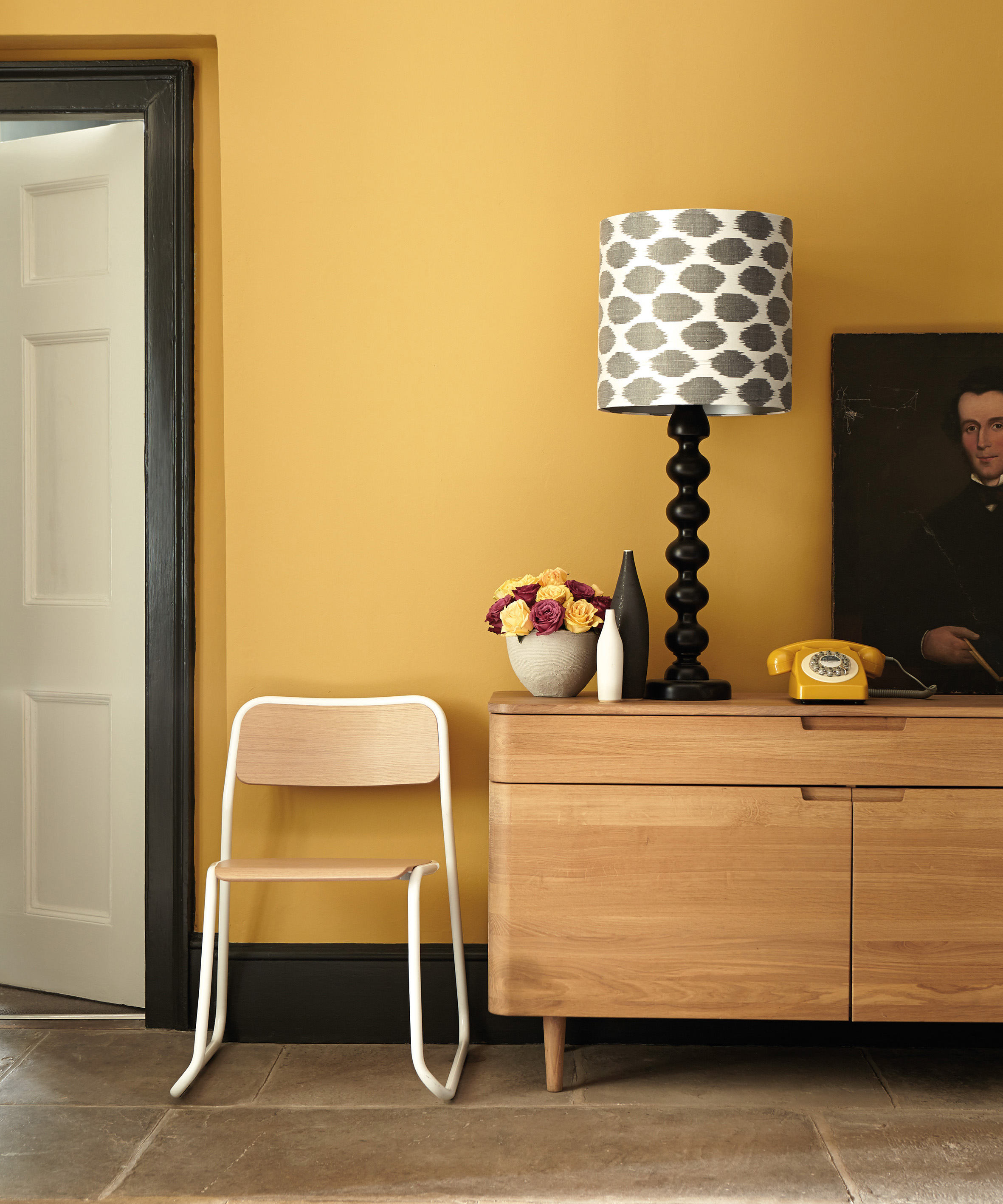
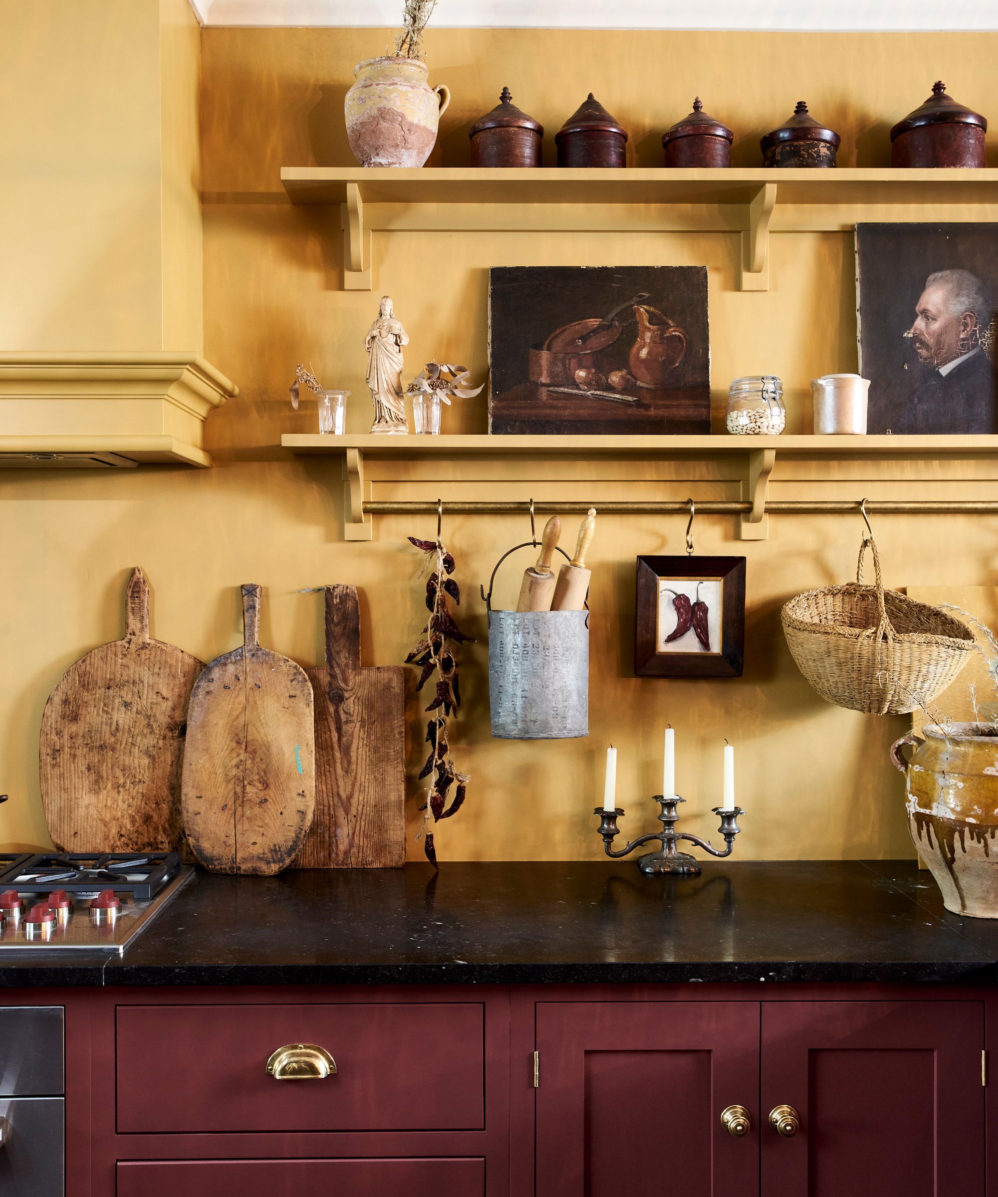
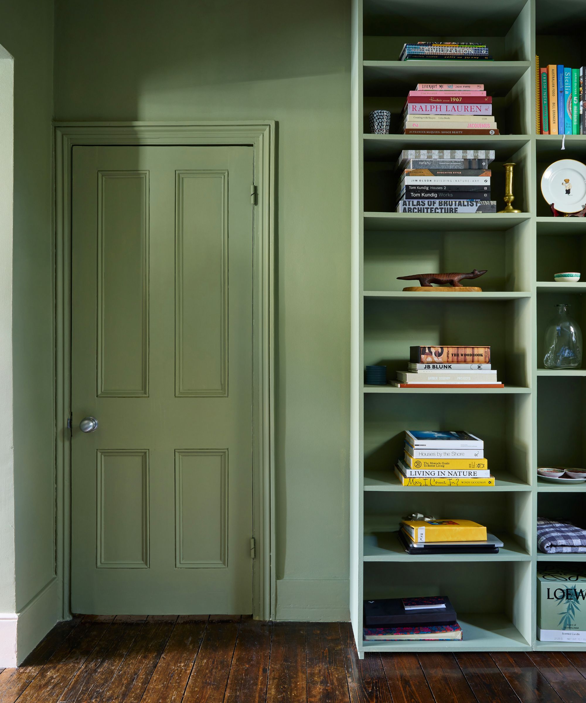
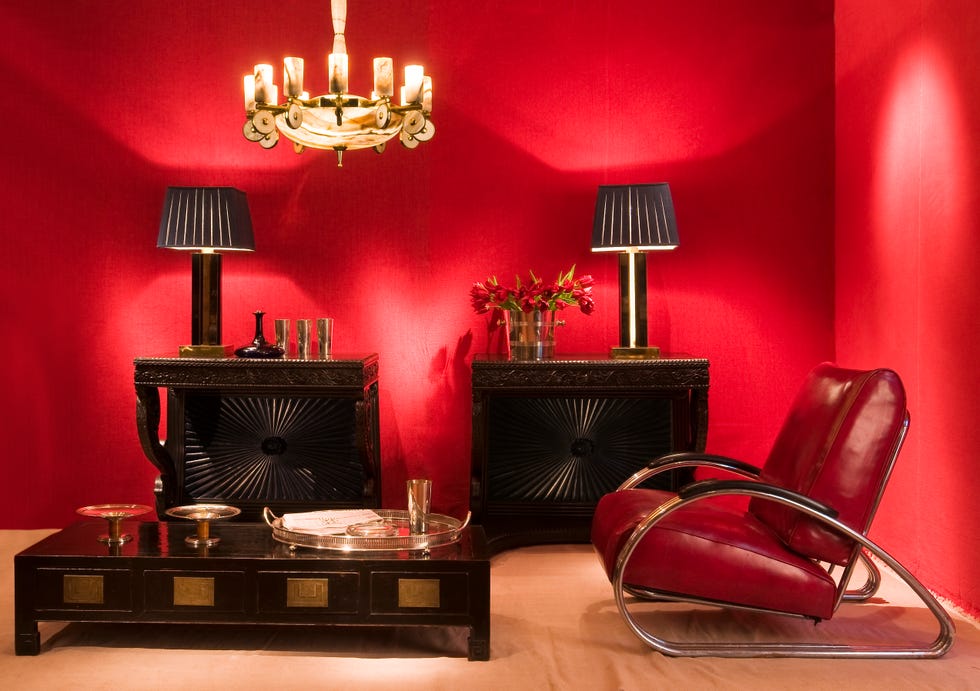
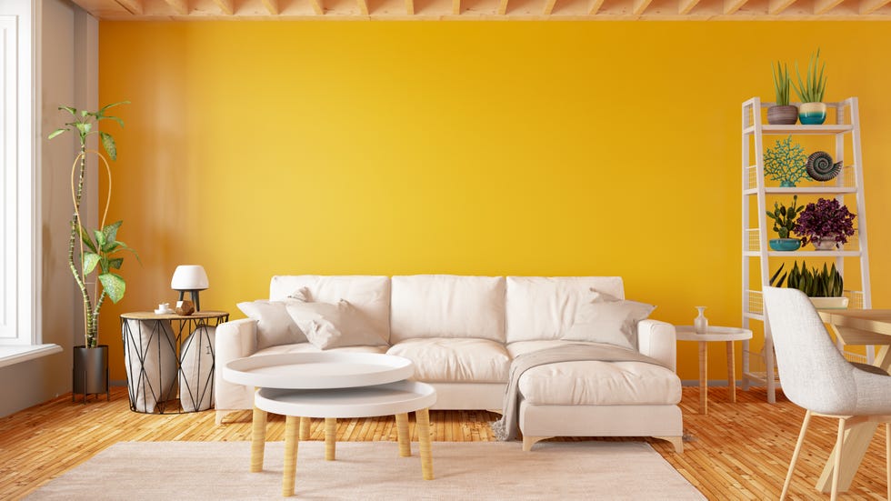
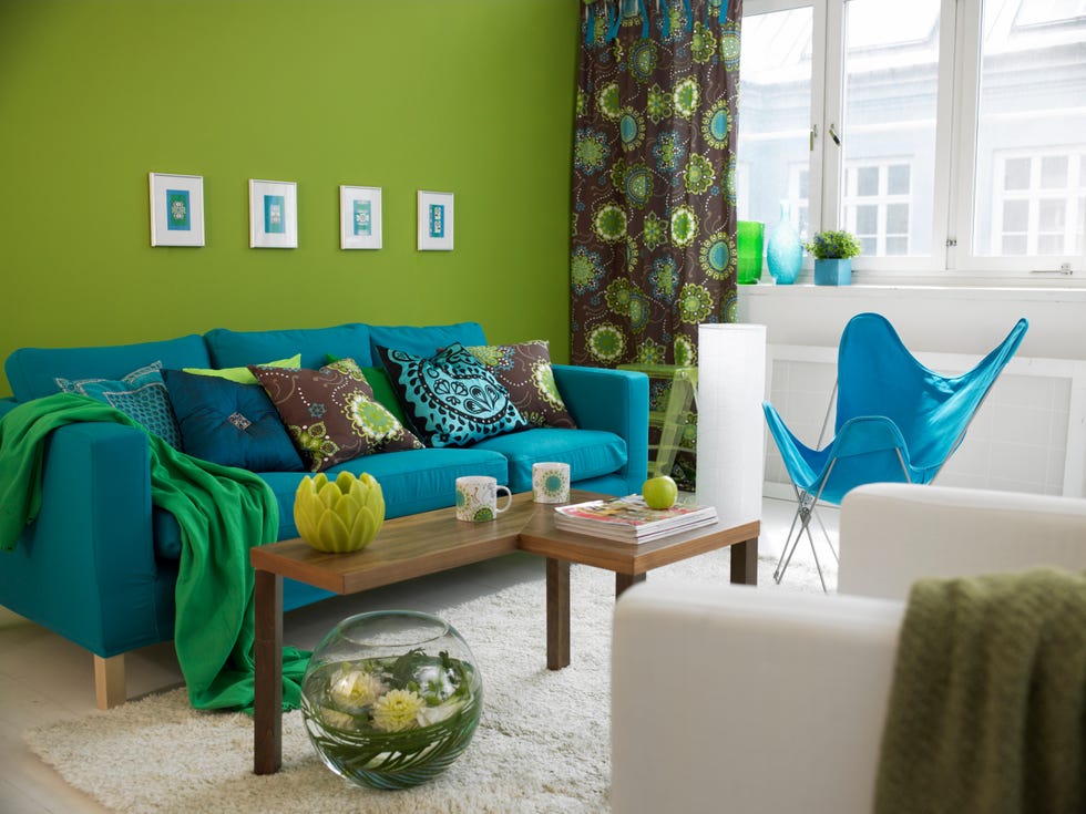
The findings revealed that blue was the most preferred interior color (34.7%), followed by green (23.1%), violet (14.1%), orange (11.9%), yellow (8.7%), and red (7.5%). A significant preference bias emerged, with students tending to favor the color of the building they currently inhabited, suggesting a potential 'color attachment' or mere exposure effect. Gender differences were noted, with females showing a more distributed color preference pattern and a secondary preference for violet, while males displayed a stronger preference for blue. However, blue remained the most preferred color for both genders.
Regarding lightness, participants generally preferred lighter interior colors than their abstract color preferences, and specifically, for each of the six colors used in the residence hall, students expressed a preference for a lighter version. Yellow interiors were perceived as the lightest and received the highest lightness satisfaction, despite being one of the least preferred hues. Conversely, blue interiors, while highly preferred, were associated with lower perceived lightness and satisfaction. A strong preference for white ceilings was also observed, likely due to its association with increased perceived room height.
The study also found that the use of distinct colors for each building significantly aided spatial orientation and wayfinding within the complex, potentially fostering a stronger sense of place attachment among residents. Blue interiors were perceived as most conducive to studying, outperforming lighter and warmer colors like orange and red, which were considered more arousing. A significant correlation between a calm mood and a preference for blue was also identified. These results align with theories suggesting blue is associated with tranquility and peace, while red is linked to higher arousal levels that could negatively impact complex tasks like studying.
Based on these findings, the study offers practical guidelines for interior design in residential and educational settings. It suggests prioritizing blue and green colors and generally avoiding red, yellow, and orange, particularly in study areas. For male-dominant residences, a palette restricted to blue and green is recommended, while female-dominant spaces can incorporate a wider range including red-purple and violet. Emphasizing lighter colors for overall luminosity and maintaining white ceilings are also advised. The research underscores the importance of long-term exposure studies to inform evidence-based design choices that enhance psychological well-being and satisfaction in architectural environments.
#InteriorDesign #ColorPsychology #ResidentialSatisfaction #StudentAccommodation #ColorPreference #PsychologicalFunctioning #EnvironmentalPsychology #ArchitecturalDesign #Wayfinding #InteriorDesign #ColorPsychology #ResidentialSatisfaction #StudentAccommodation #ColorPreference #PsychologicalFunctioning #EnvironmentalPsychology #ArchitecturalDesign #Wayfinding
0 comment in total
 No comments yet
You may also like
7 colour tricks to transform your mood and living room design

How paint colour in your home can affect your mood
Can’t Concentrate? Decorating Your Space With These Colors Can Sharpen Your Focus
What paint colors to use to create a relaxed vibe at home

The colors you should never paint your hallway – and what really works

The Power of Color Psychology in Interior Design — How to Create a Home That Feels as Good as It Looks

6 Paint Colors That Make Your Living Room Look Smaller, According to Interior Designers
15 ways to add color to your home, according to interior designers
My rented apartment follows the key rules of color psychology – here's why I'd never go back to an all-white home
An expert in color psychology shares the 5 shades you should have in your living room
Why This Hue Is Suddenly Dominating Every Designer's Wishlist—Plus, How to Style It

How to choose the best paint color for any room in your house
The colours you paint your walls can impact your mood, and here’s the science to prove it

7 'Unhappy' Colors That Color Psychology Experts Would Never Paint Their Walls

These Paint Colors Bring Hostility to Your Home, According to Experts

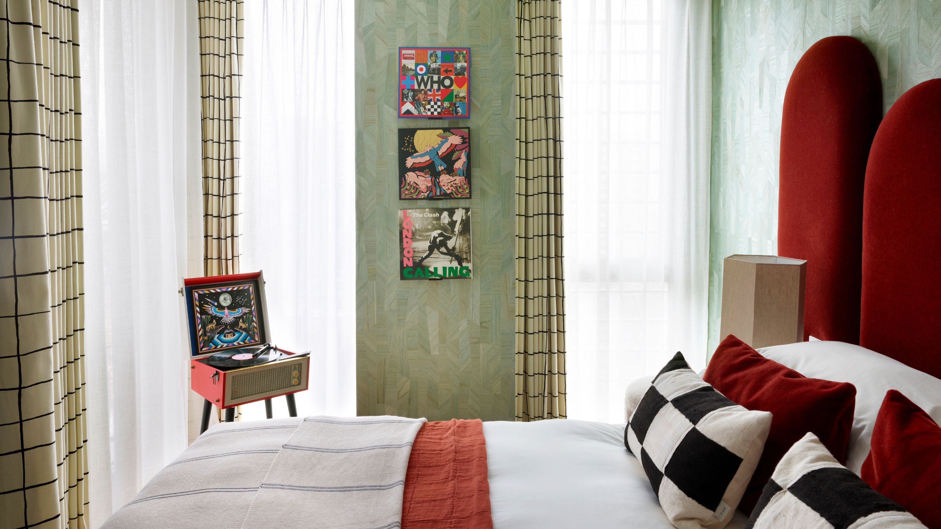
What Colors Go With Light Green — 10 Combinations That Can Calm, Temper, and Even Energize a Space
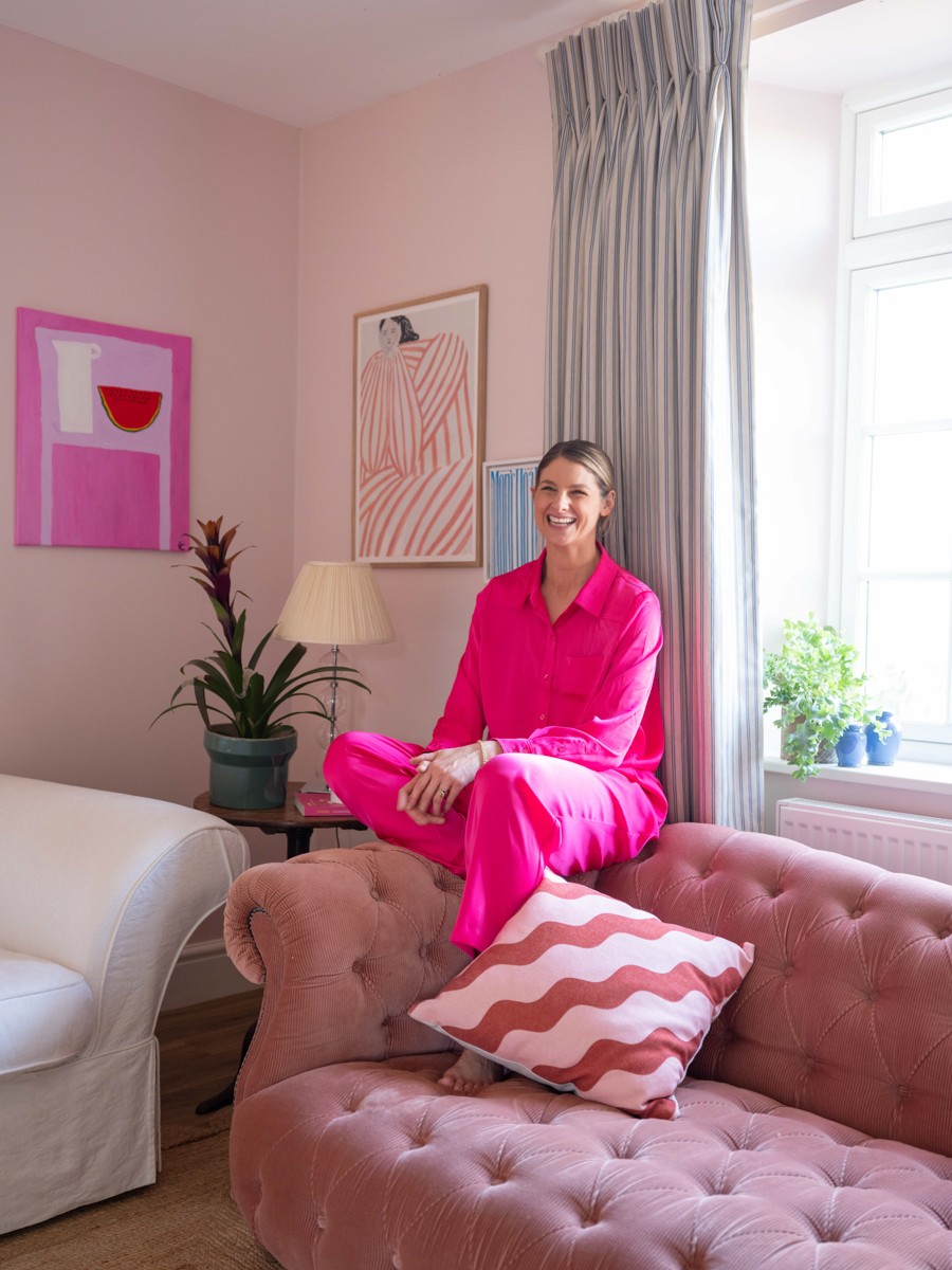
A Color Psychologist Says This Is the Most Relaxing Paint Color

You should never paint your hallway this colour, according to colour psychologists

What are the worst colors to paint a room? The shades experts say you should never use
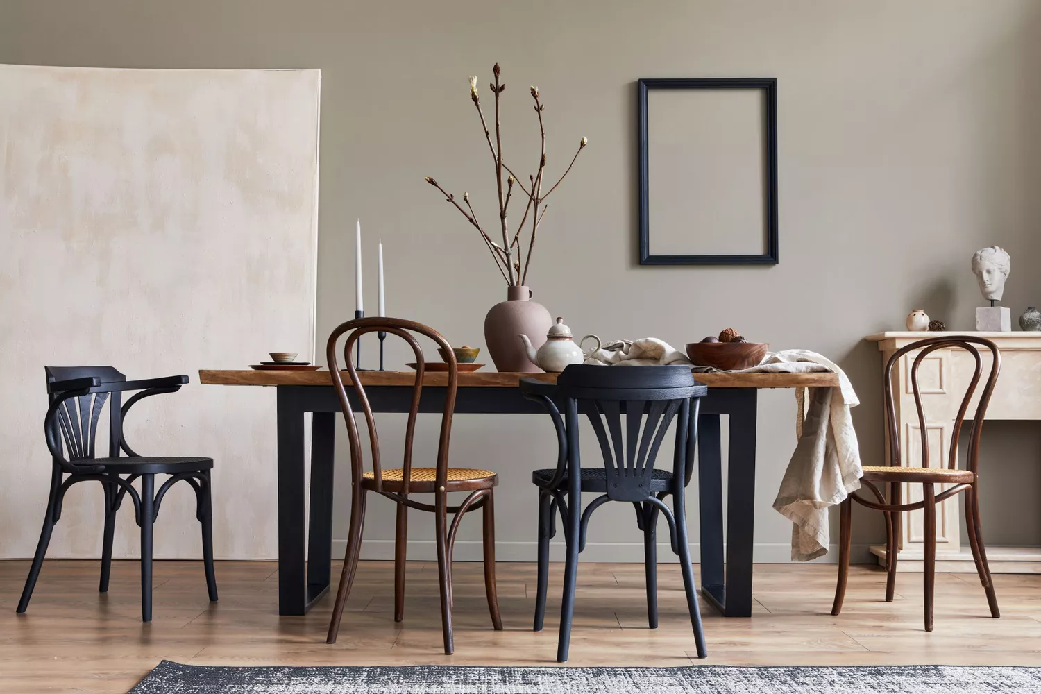
8 Paint Colors That Promote Wellness at Home