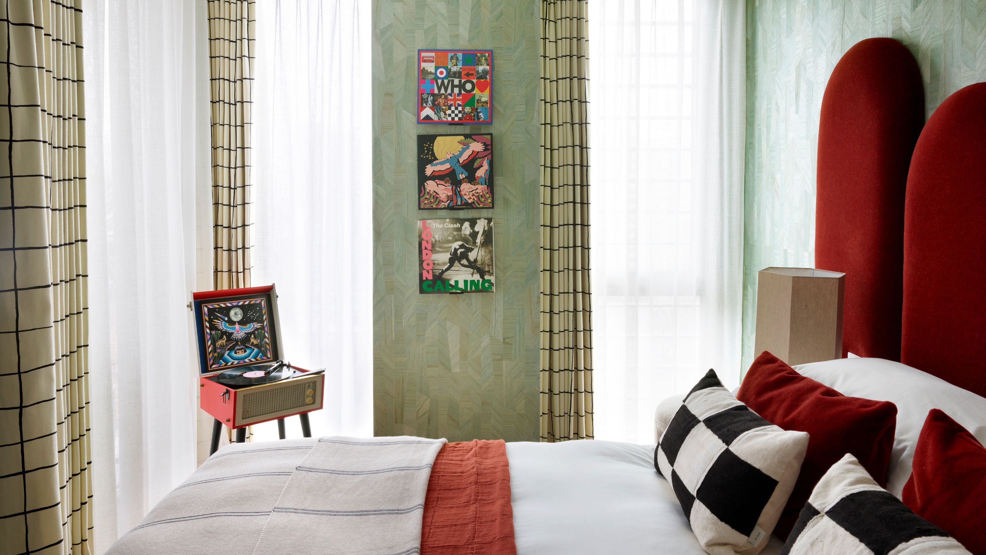
1/10
What Colors Go With Light Green — 10 Combinations That Can Calm, Temper, and Even Energize a Space
This article explores ten color combinations that effectively pair with light green, offering various aesthetic and emotional impacts on interior spaces. Light green, described as more vibrant than sage but softer than seafoam, is presented as a versatile hue capable of blending with a range of colors to create captivating interiors. The discussion moves beyond general green pairings to specifically address how different shades enhance or complement lighter greens.
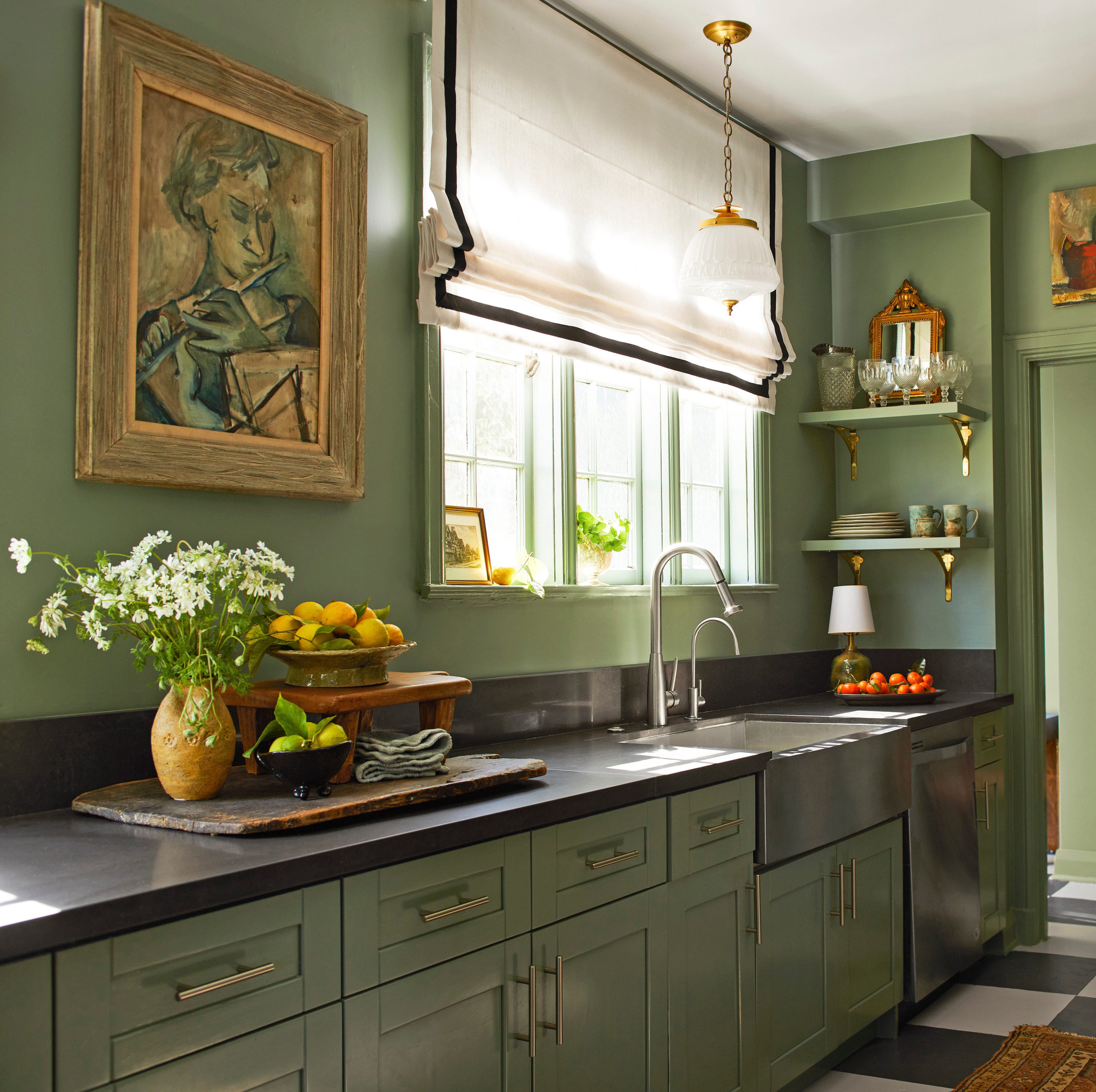
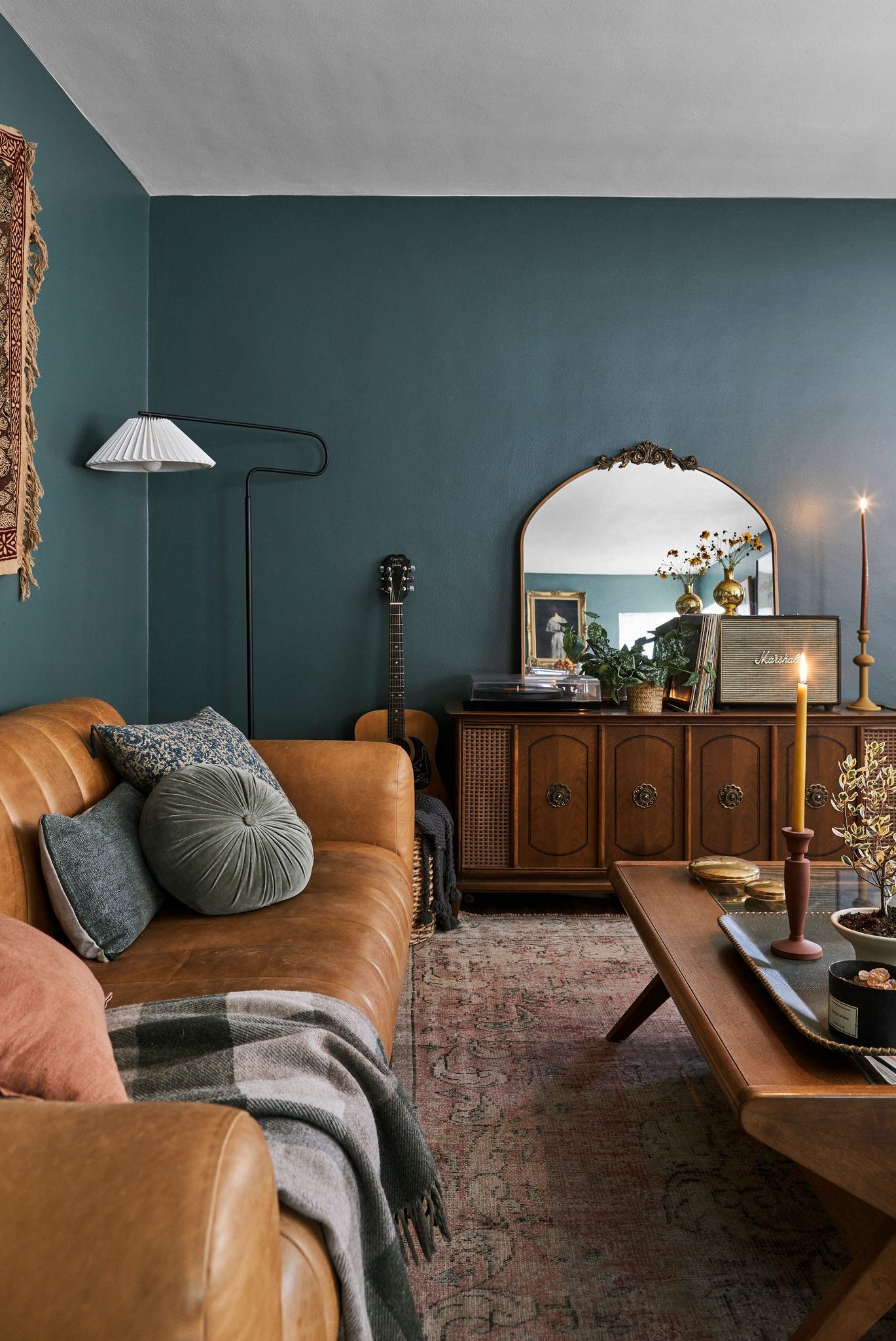
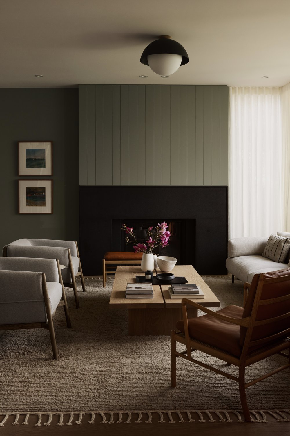
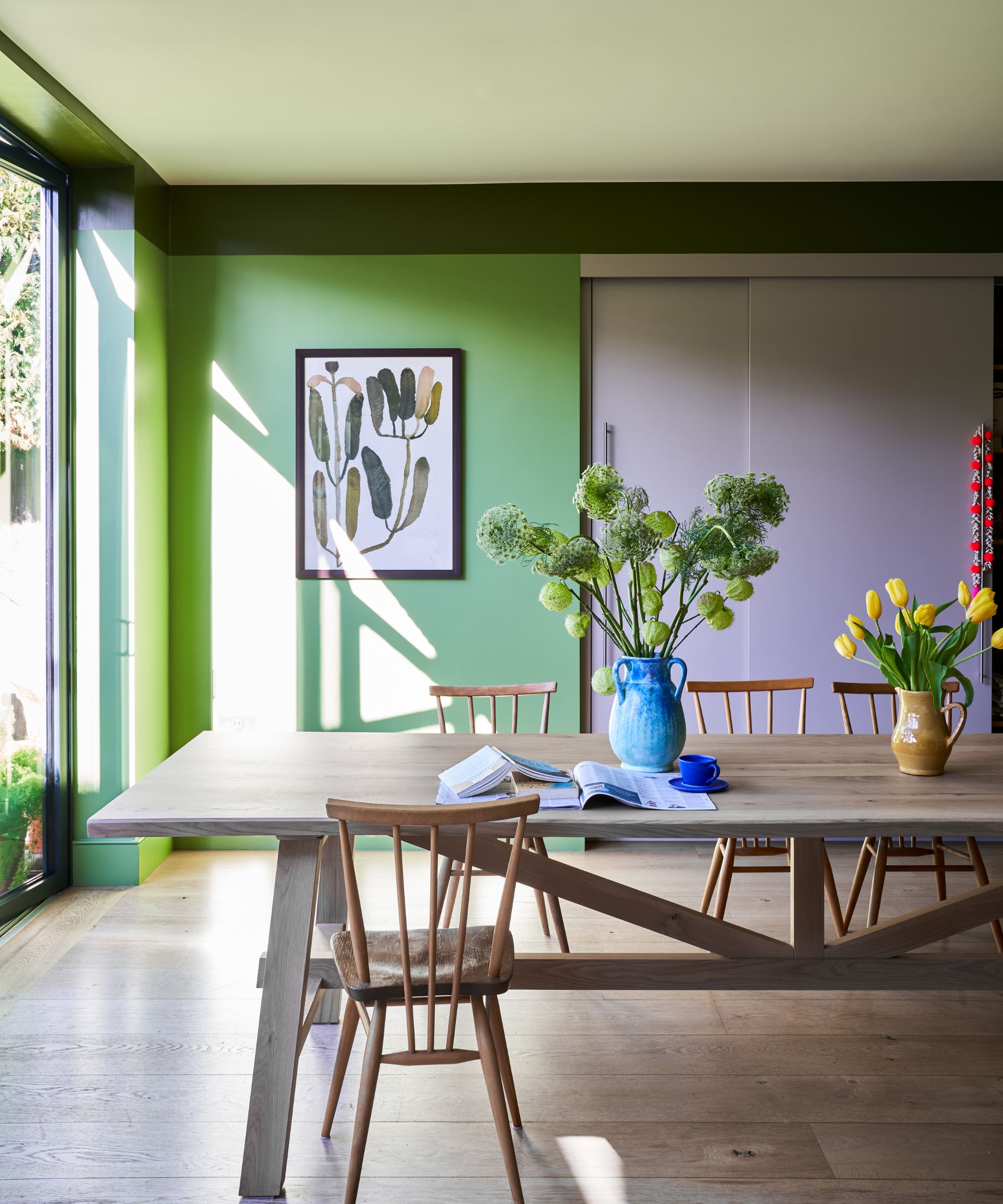
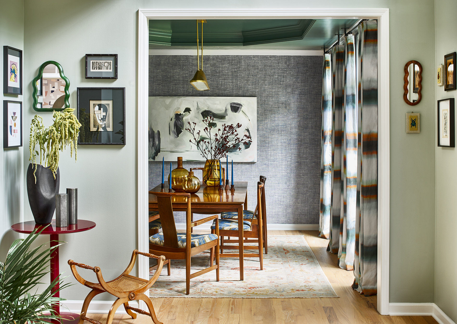
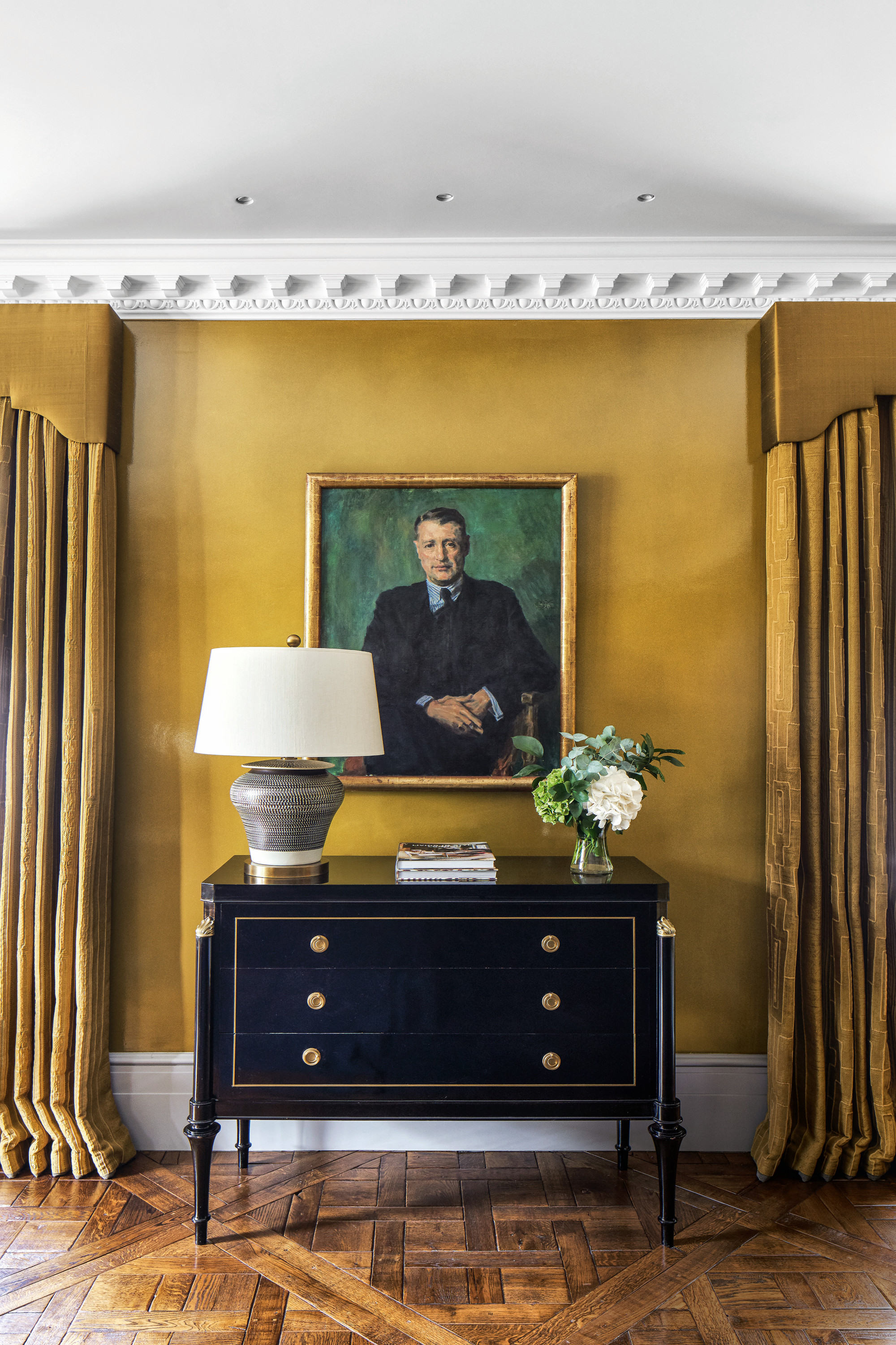
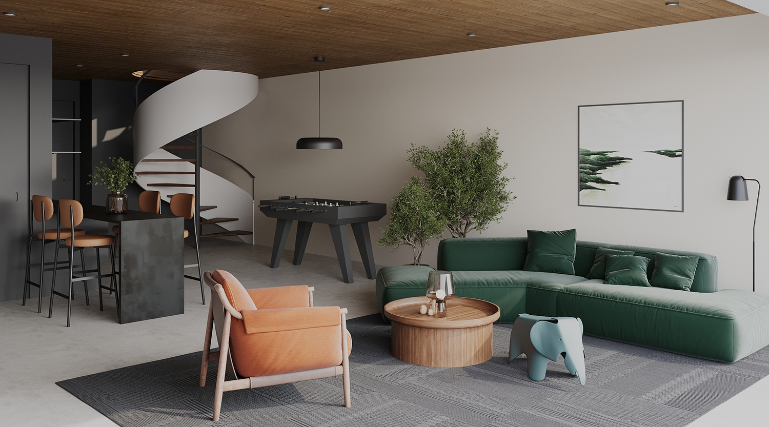
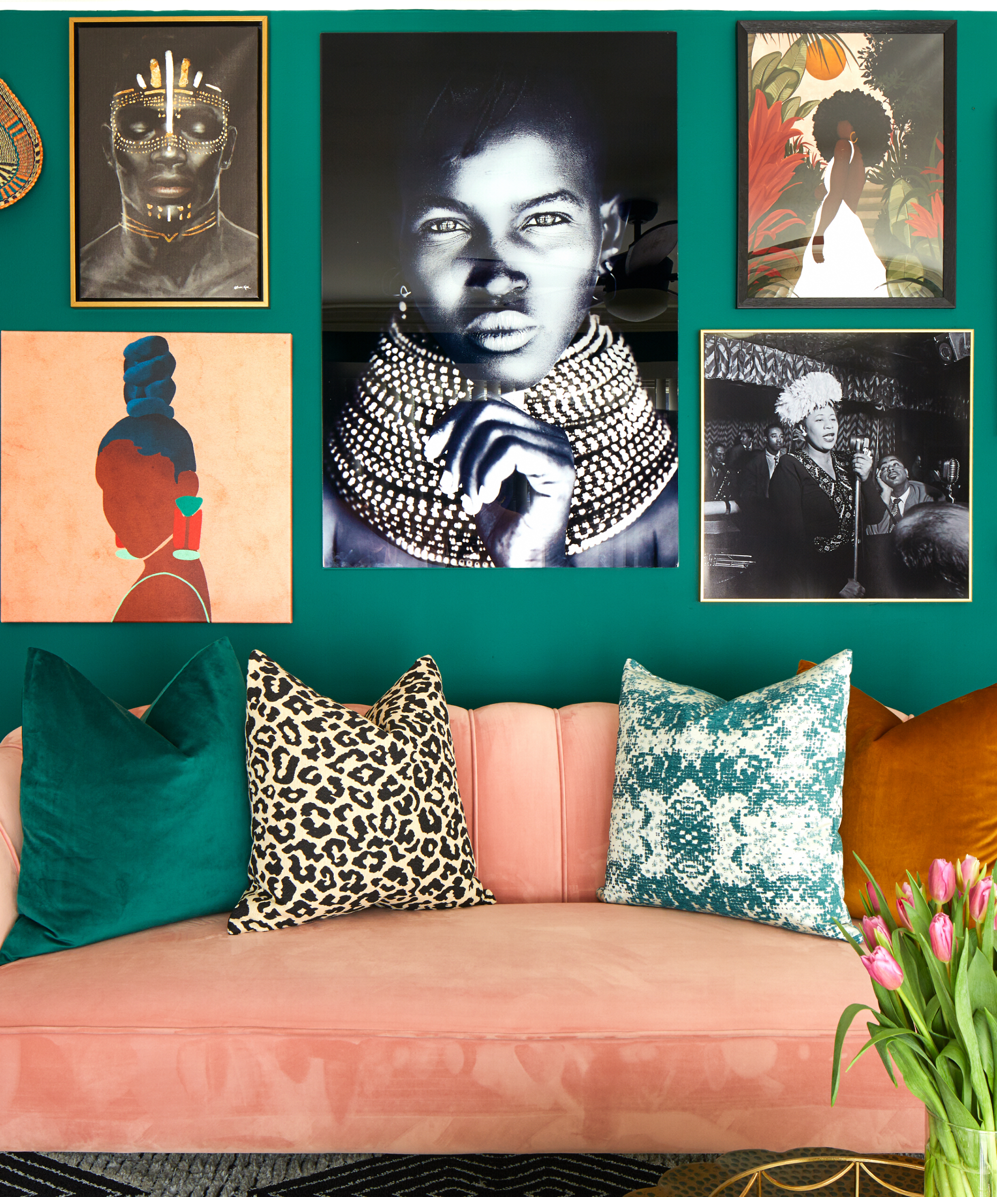
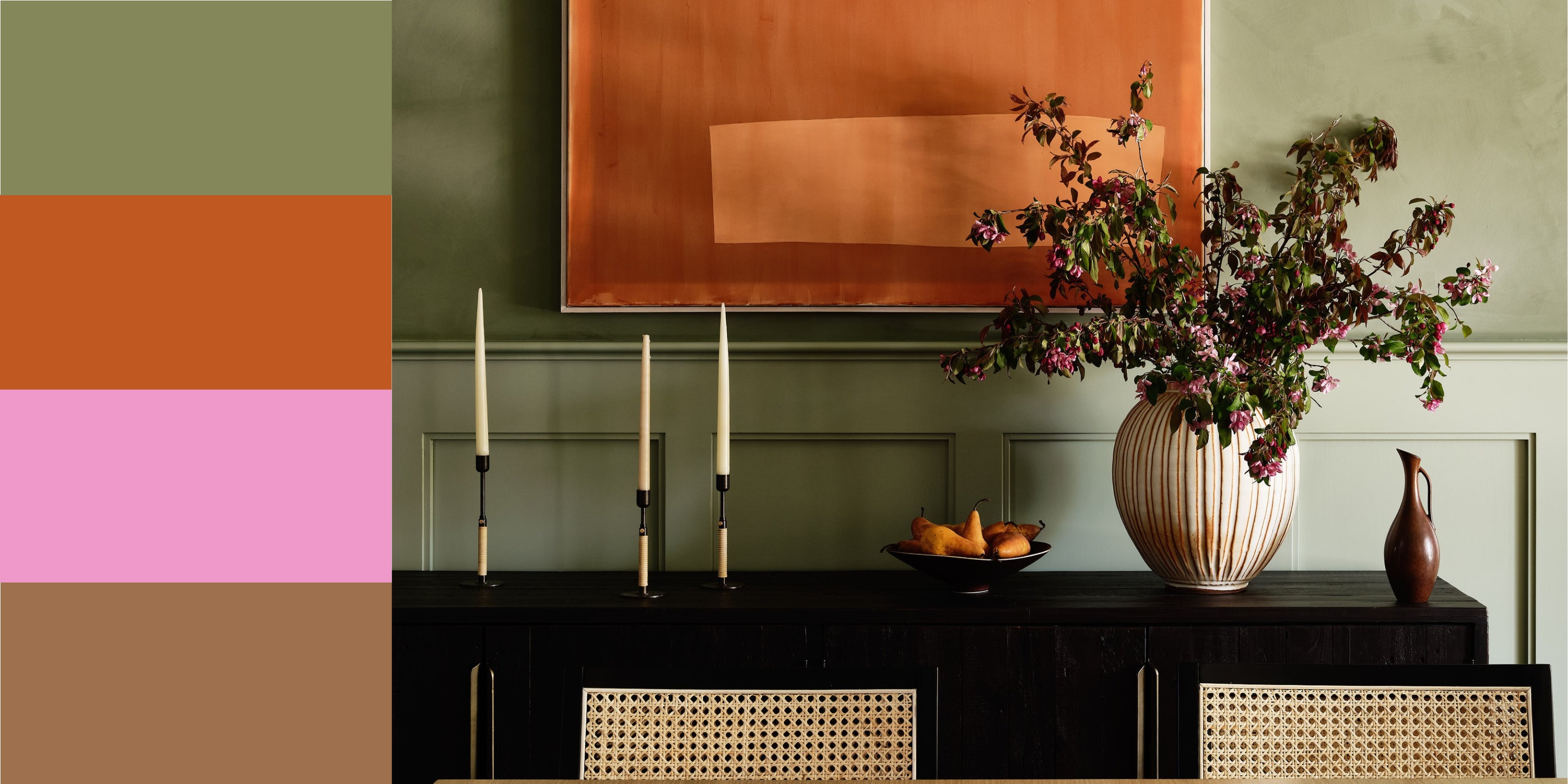
Interior designers and color experts provide insights into the effectiveness of these pairings. The first combination highlighted is light green with ember tones. This approach involves tempering the vibrancy of light green with darker, charcoal-toned elements, often drawing inspiration from artwork. For instance, a light green might be used as an 'electric shock' of color, grounded by neutrals like brown, gray, and black, making a zippy color feel restful.
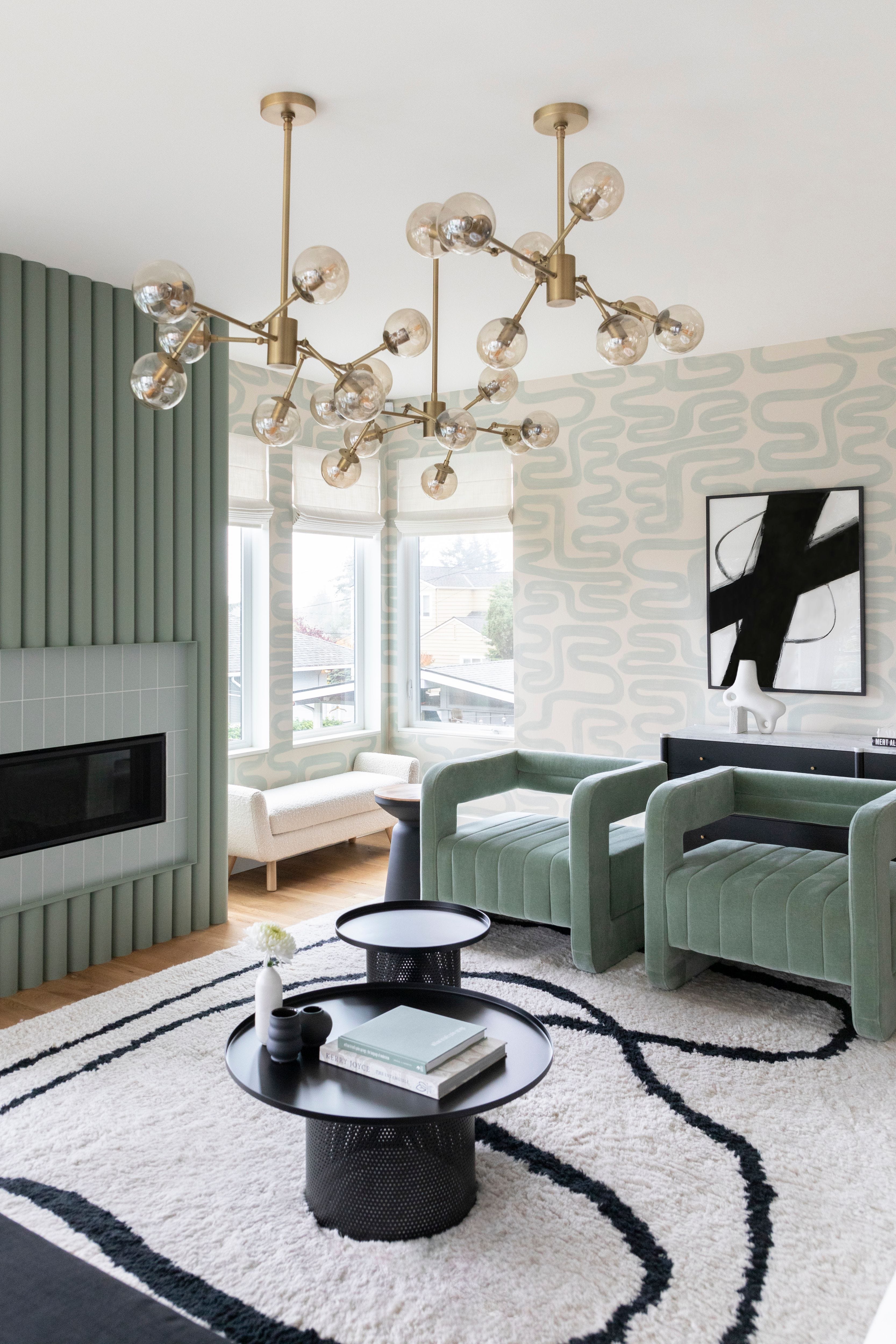
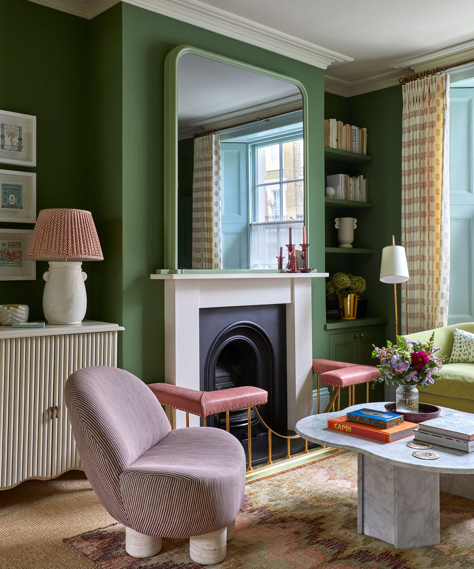
Next, the article discusses seafoam, emphasizing the role of temperature in color harmony. When paired with light green, seafoam creates serene, cool-toned palettes where blues, purples, and greens with similar saturation levels flow cohesively, preventing any single color from overpowering the space. Light green acts as a neutral base, setting the tone for the cool-colored scheme.
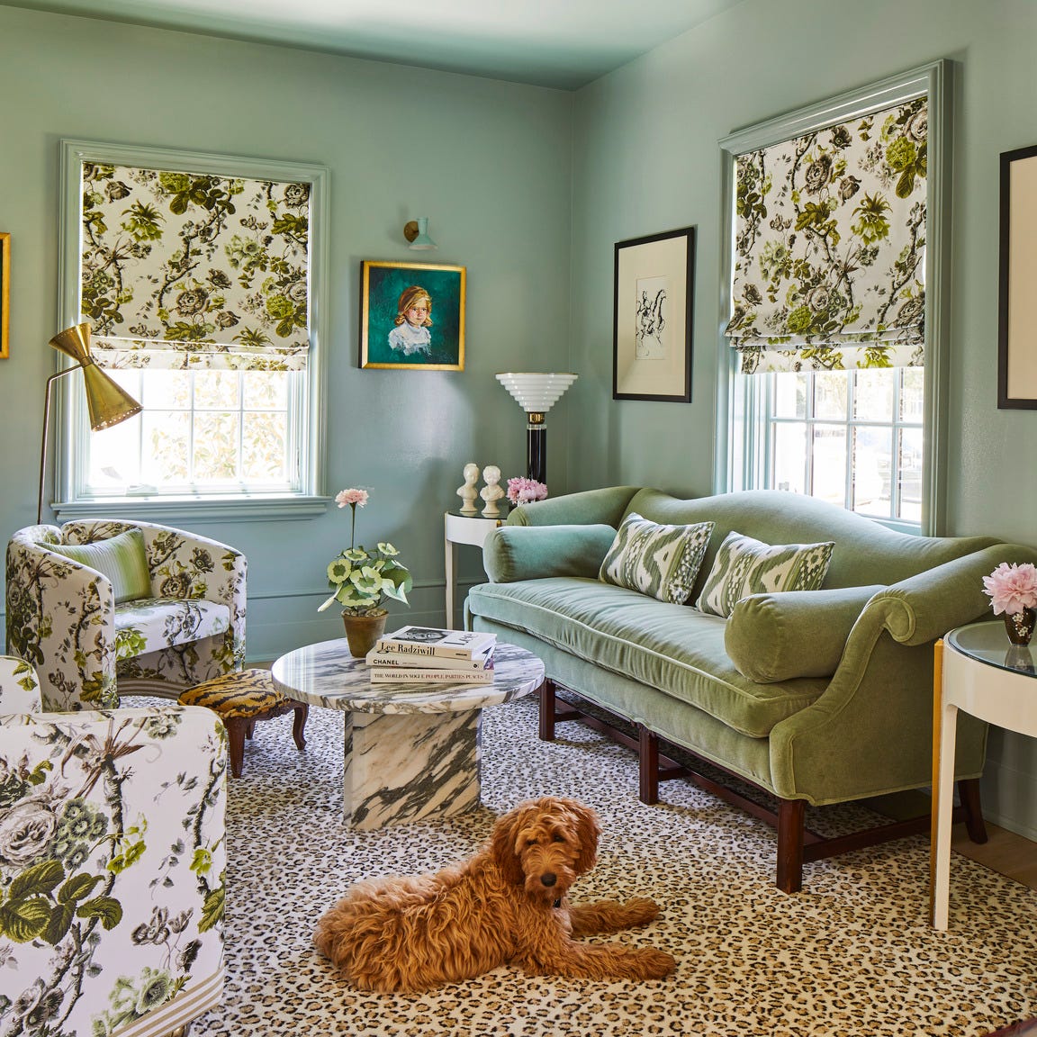
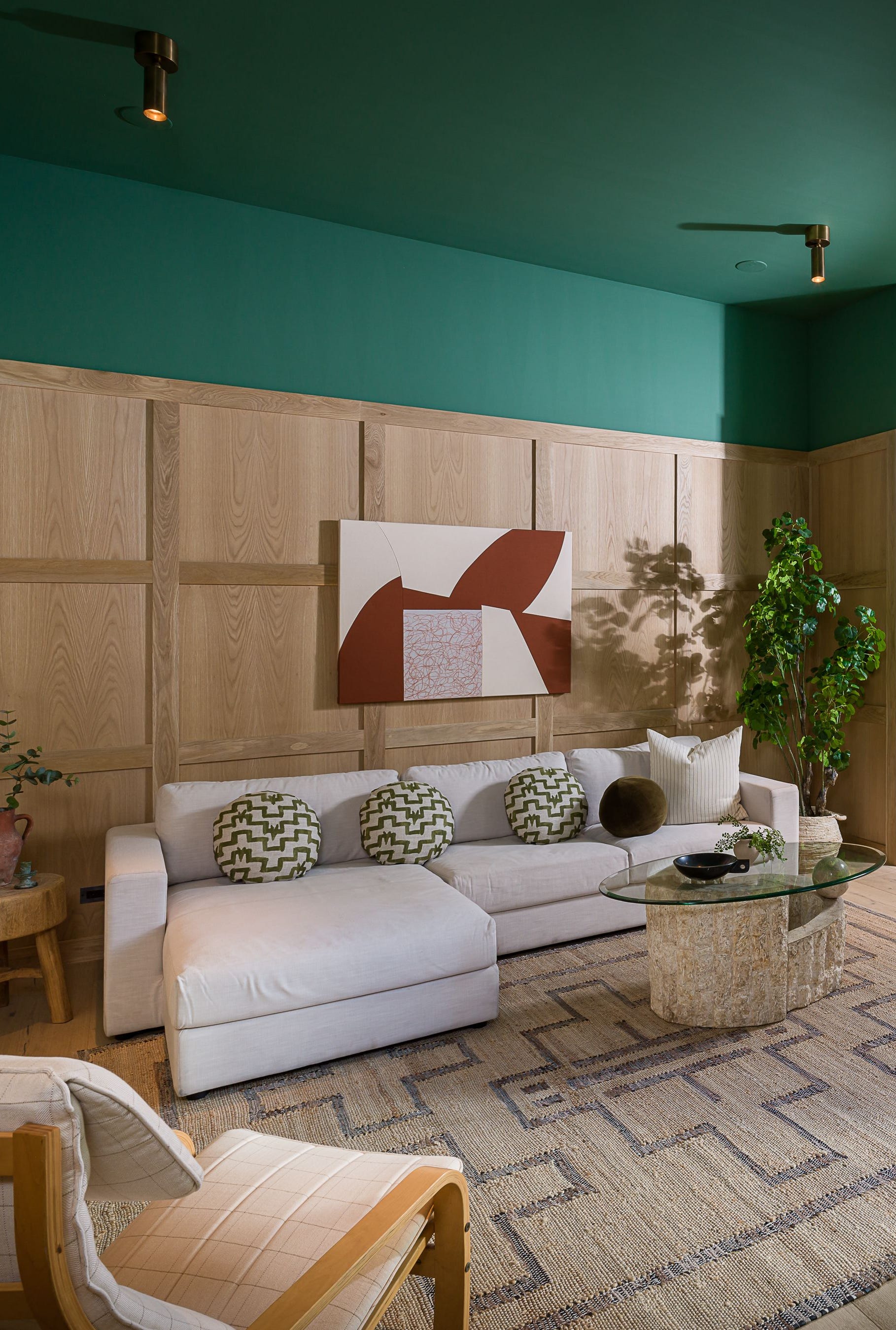
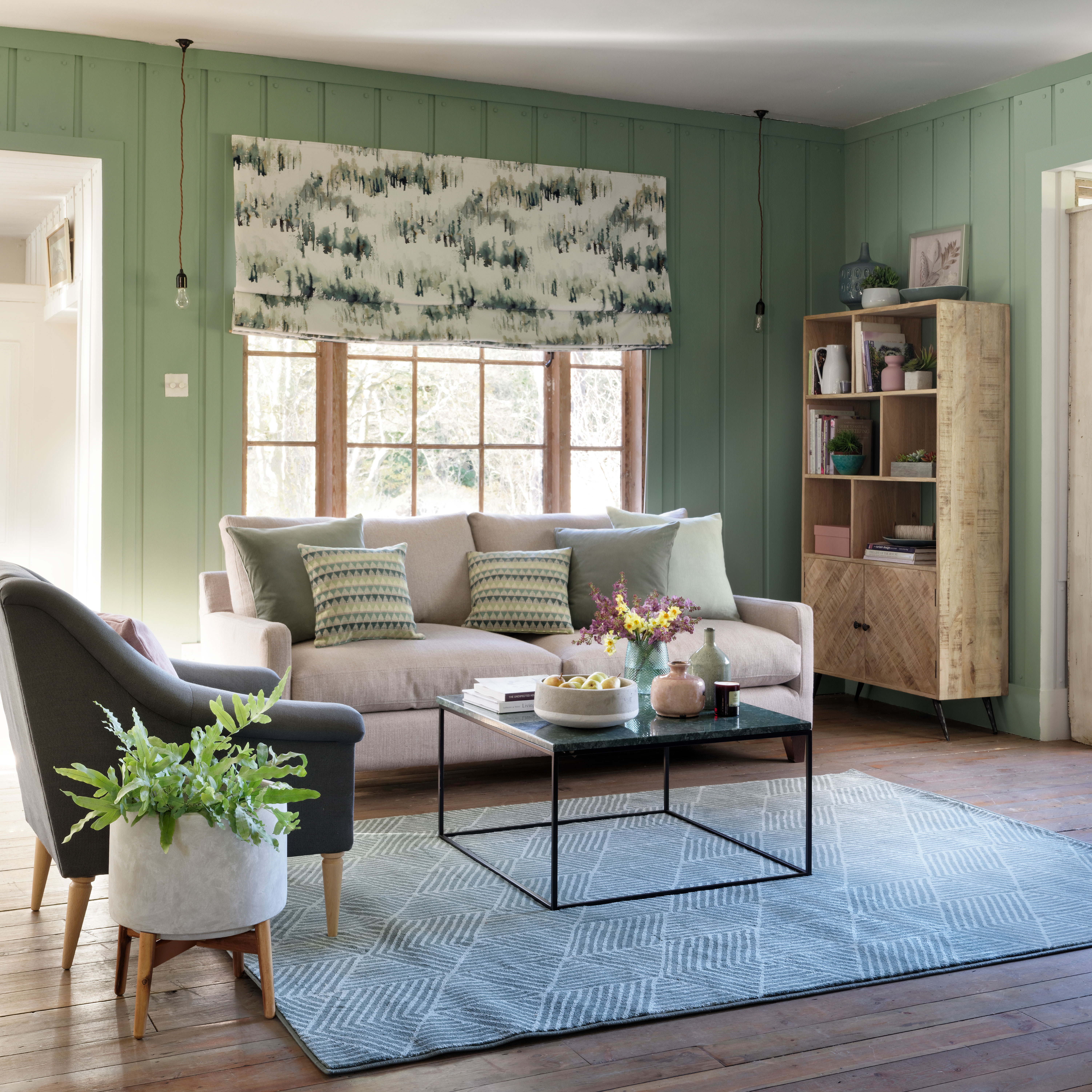
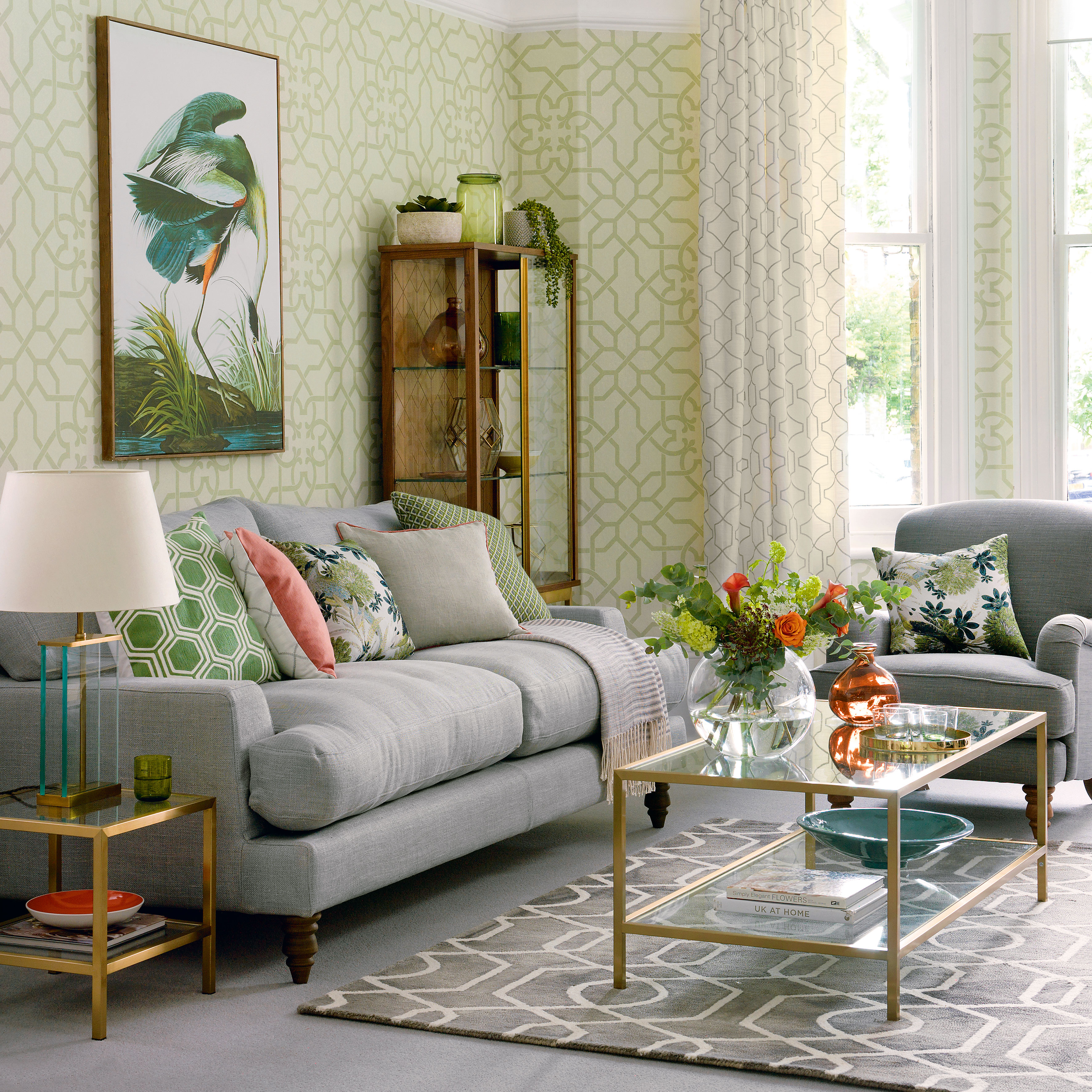
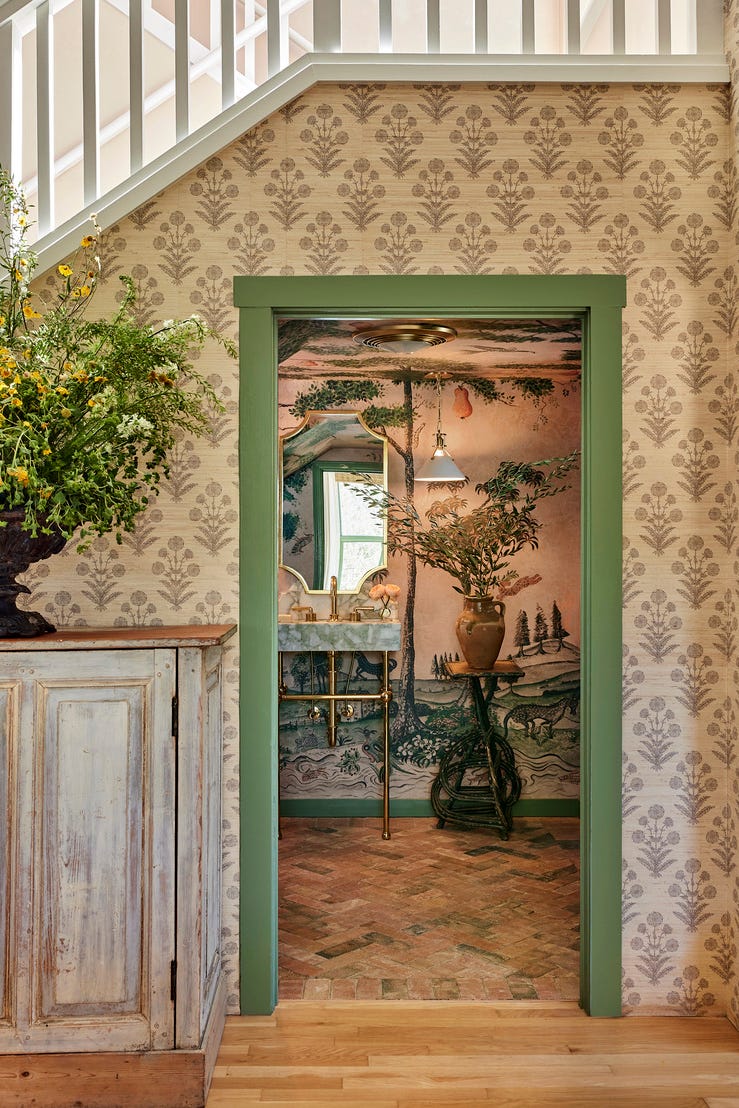
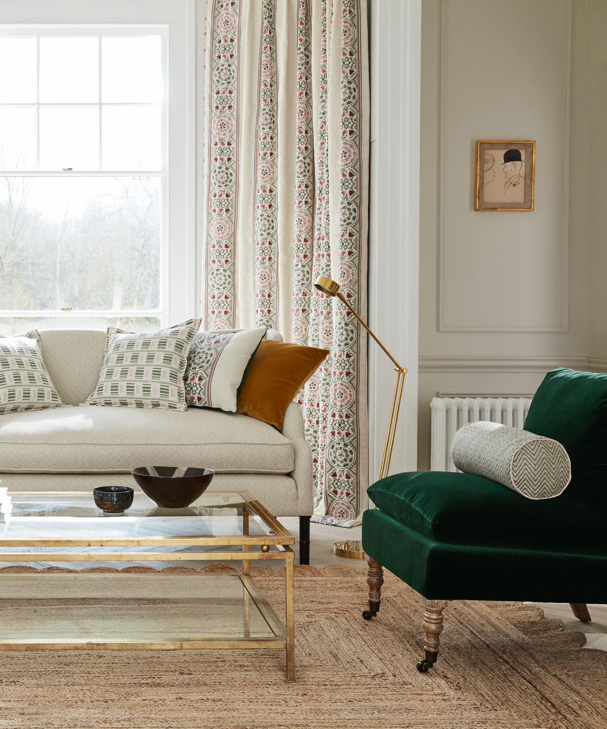
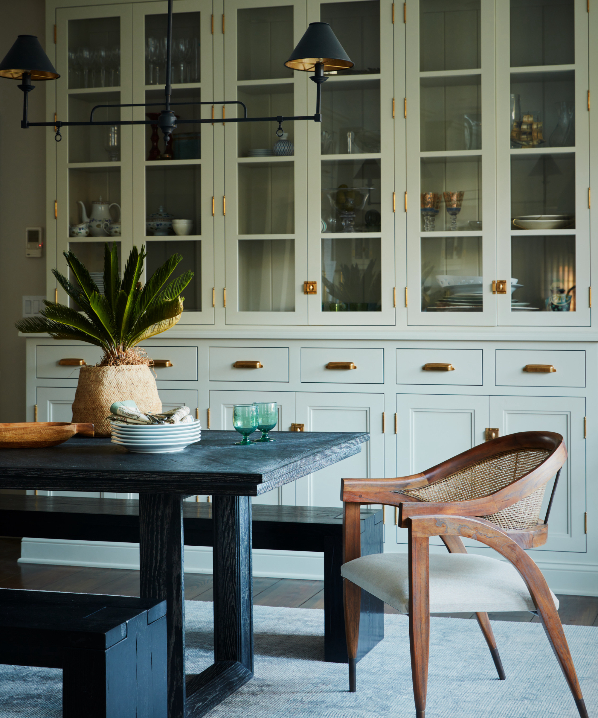
The third combination is cream. This pairing is noted for its ability to anchor expressive light green elements, such as patterned wallpaper, with neutral flooring and cream sofas, adding an air of sophistication. Other suggested complementary colors include aubergine and antique rose, which warm up the scheme without making it feel overly festive.
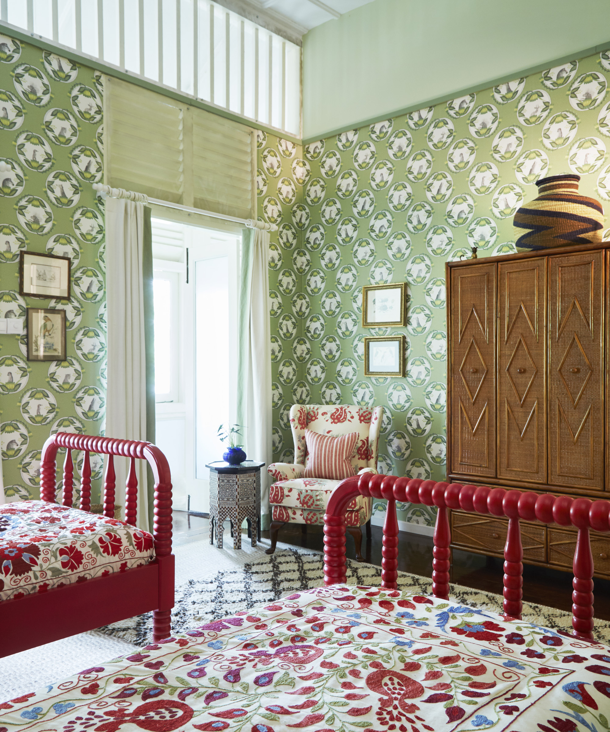
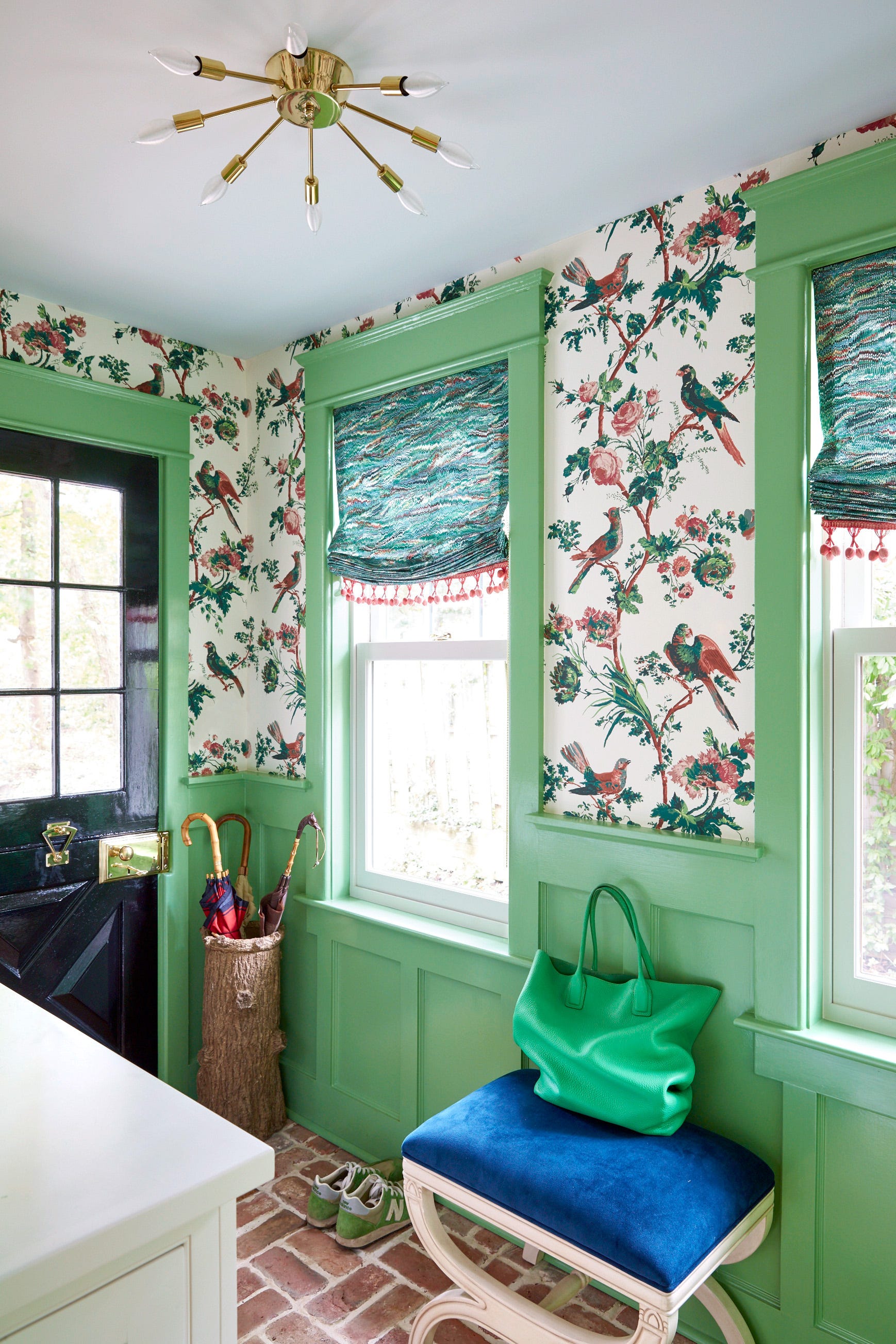
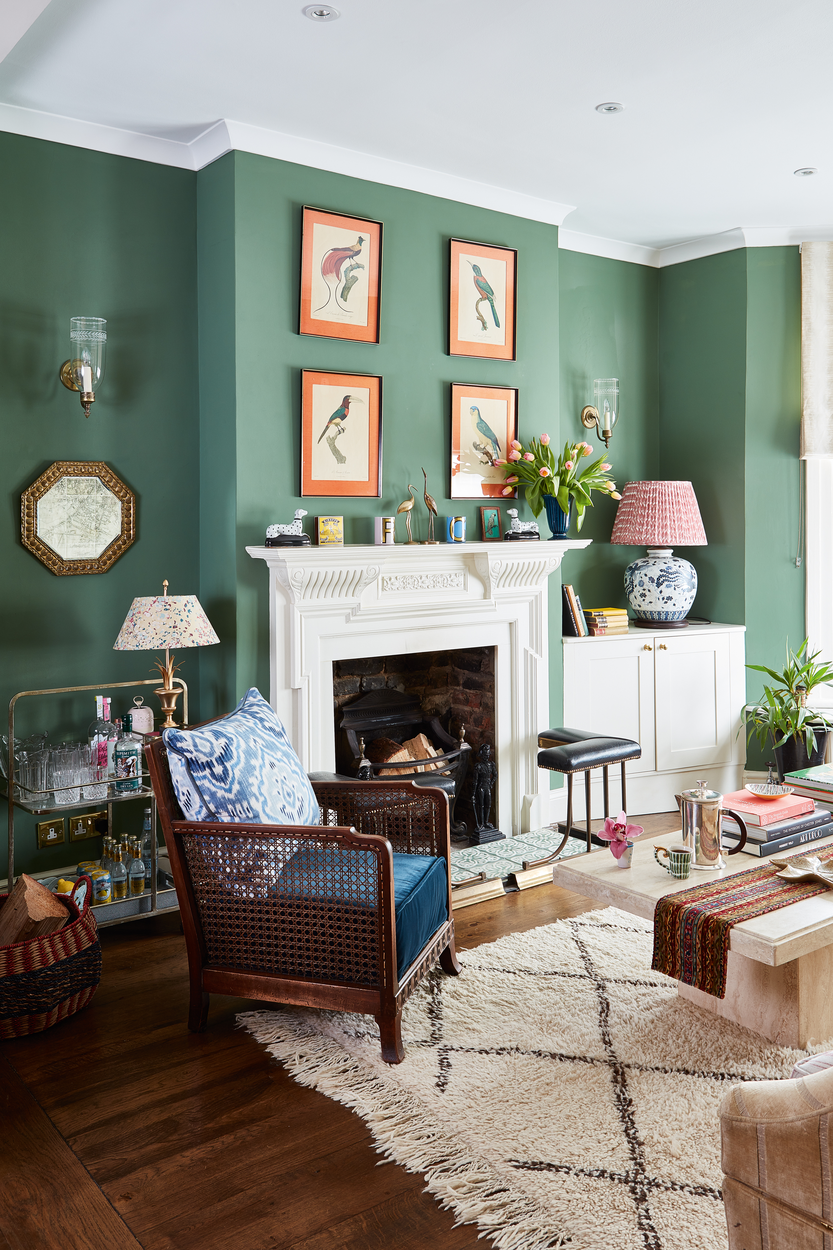
Red is introduced as a dramatic pairing. Despite traditional associations with Christmas, selecting the right tones of red and light green can create a contemporary and fresh look. As complementary colors on the color wheel, they naturally balance each other, with deep red velvet, for example, complementing light green textured walls.
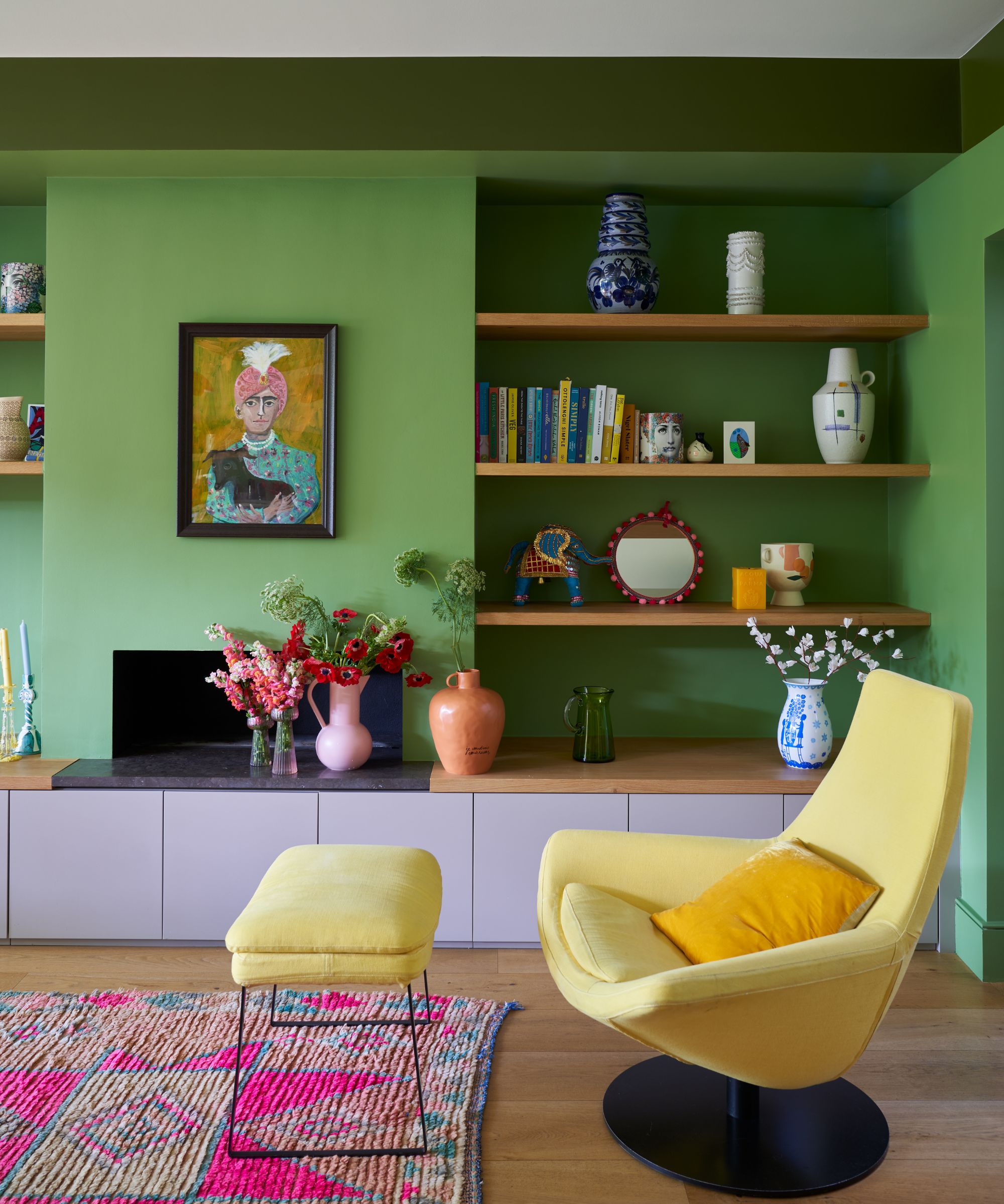
Coral, a blend of orange and pink, is presented as a color that brings warmth and energy. When combined with light green, it enhances an uplifting aura. Light green serves as a neutral base, allowing coral and blue pops in textiles and accessories to stand out without overwhelming the room.
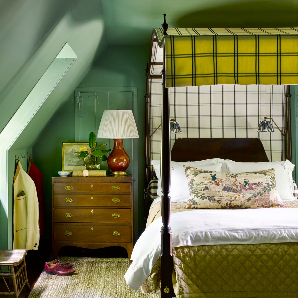
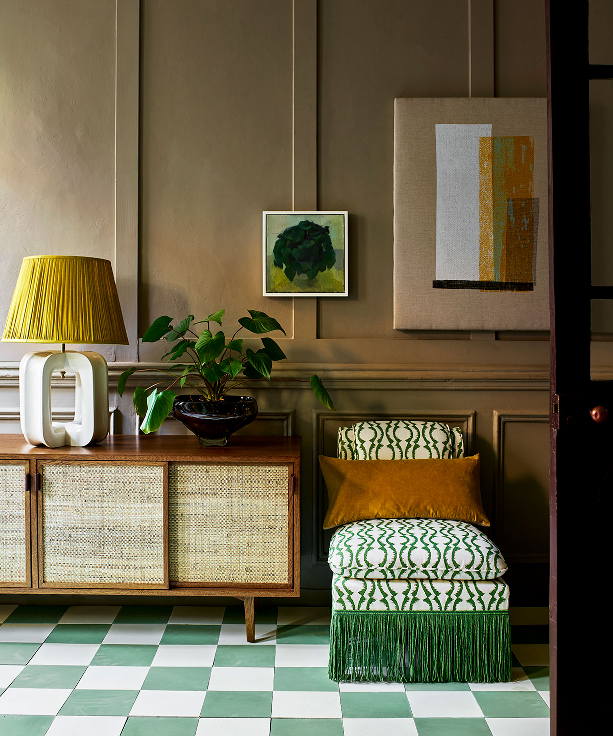
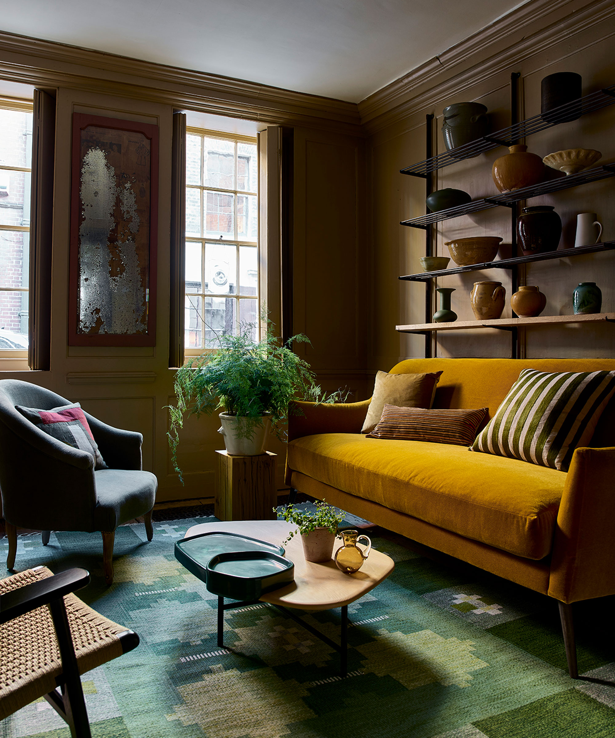
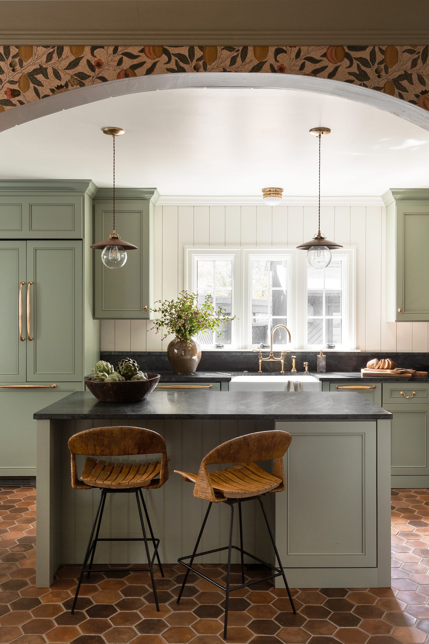
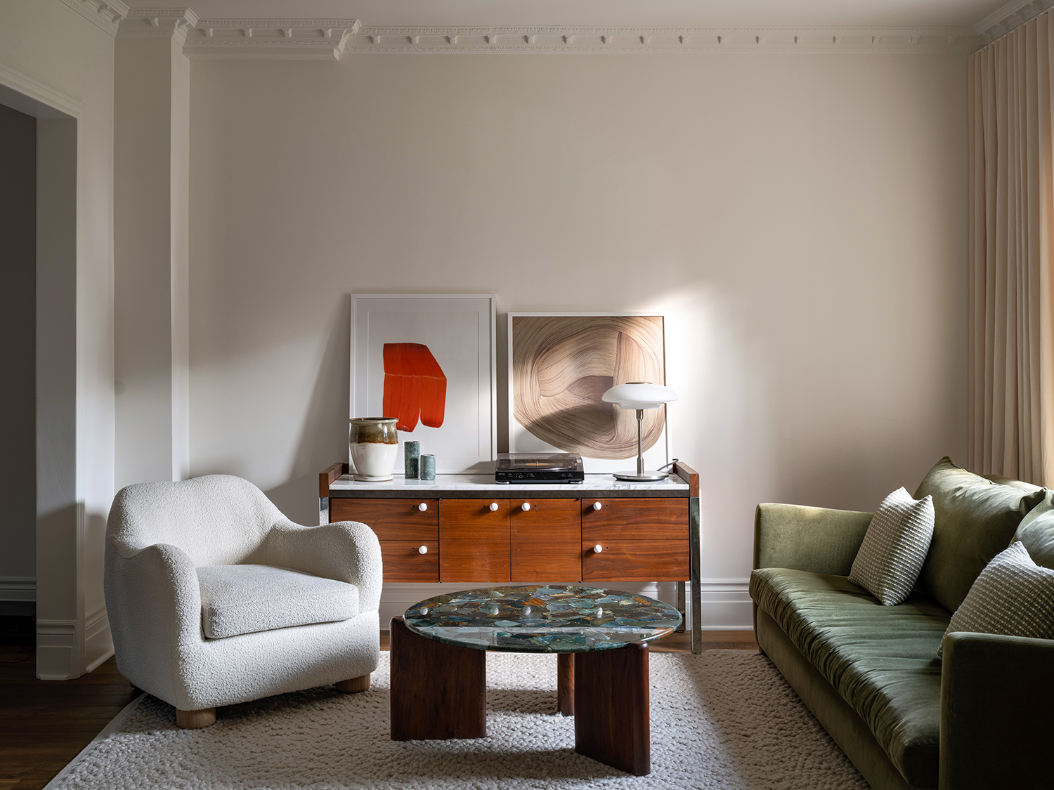
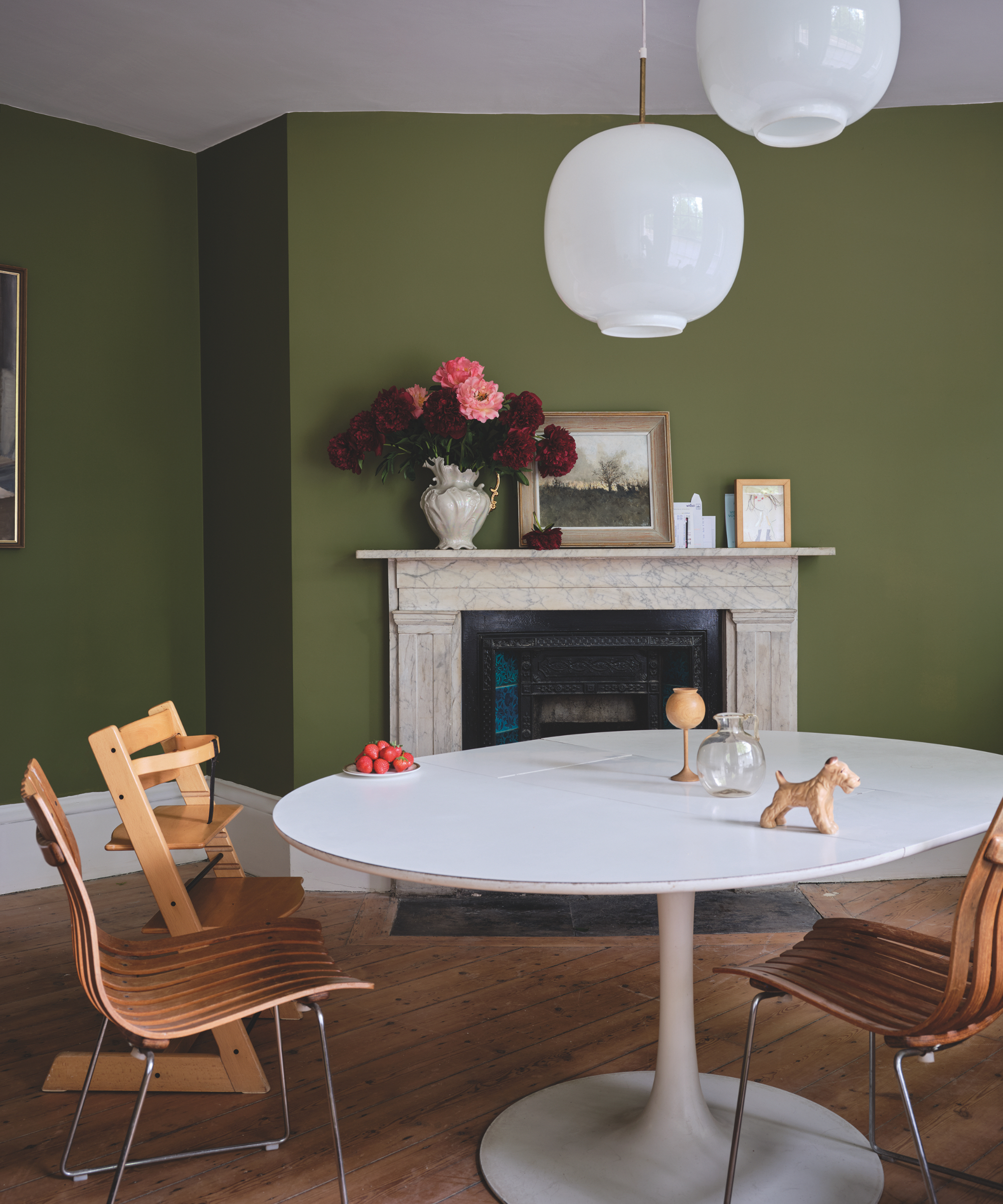
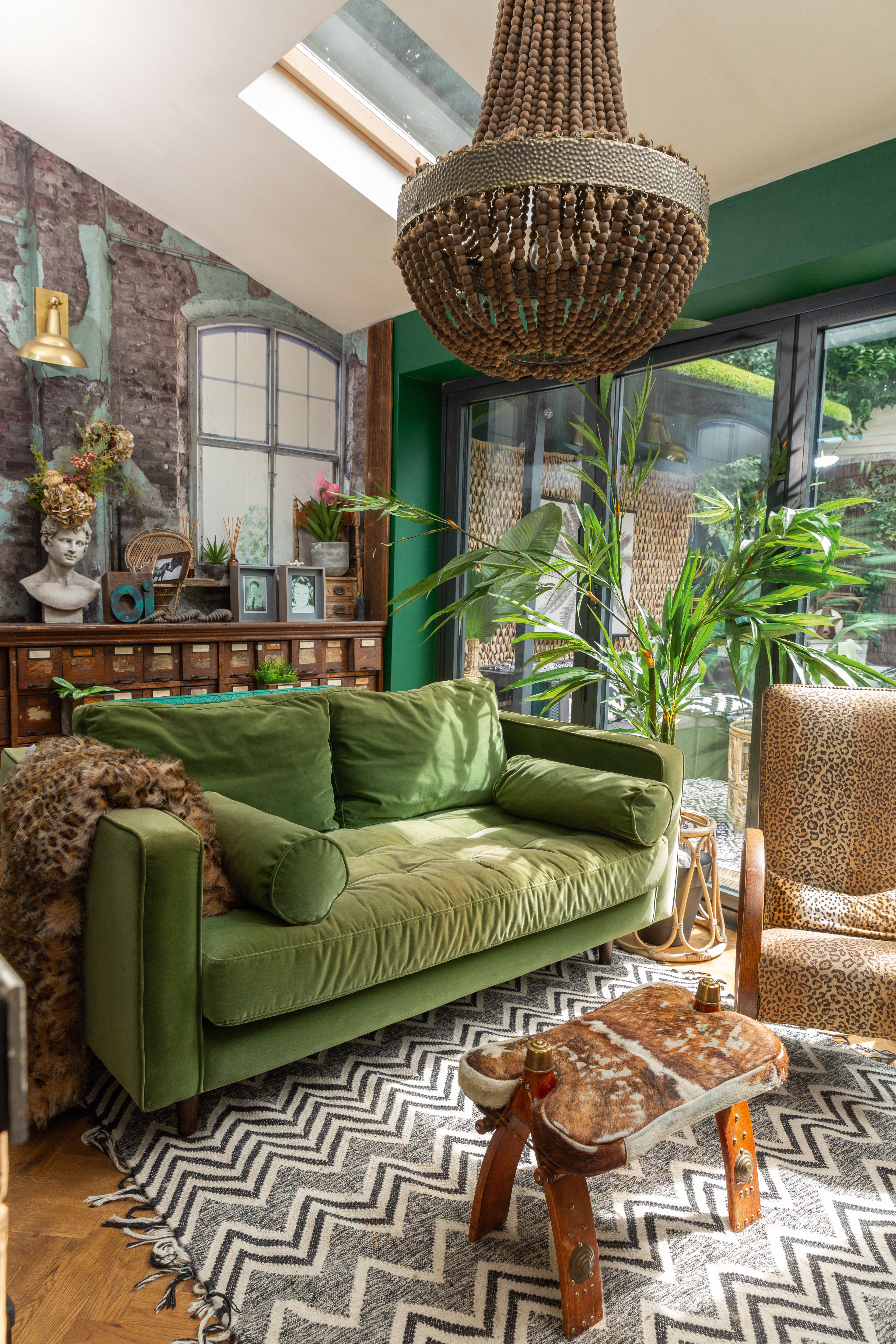
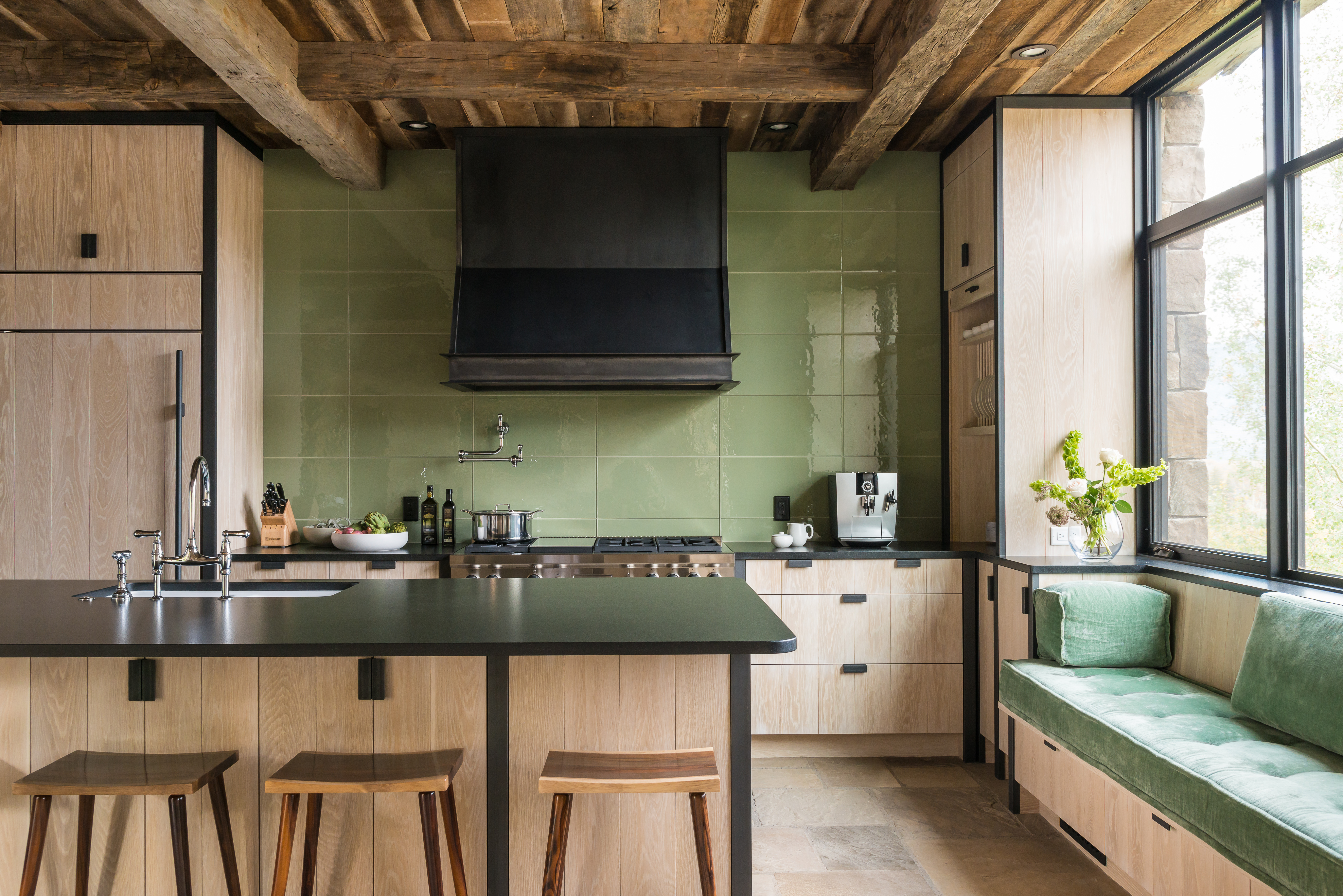
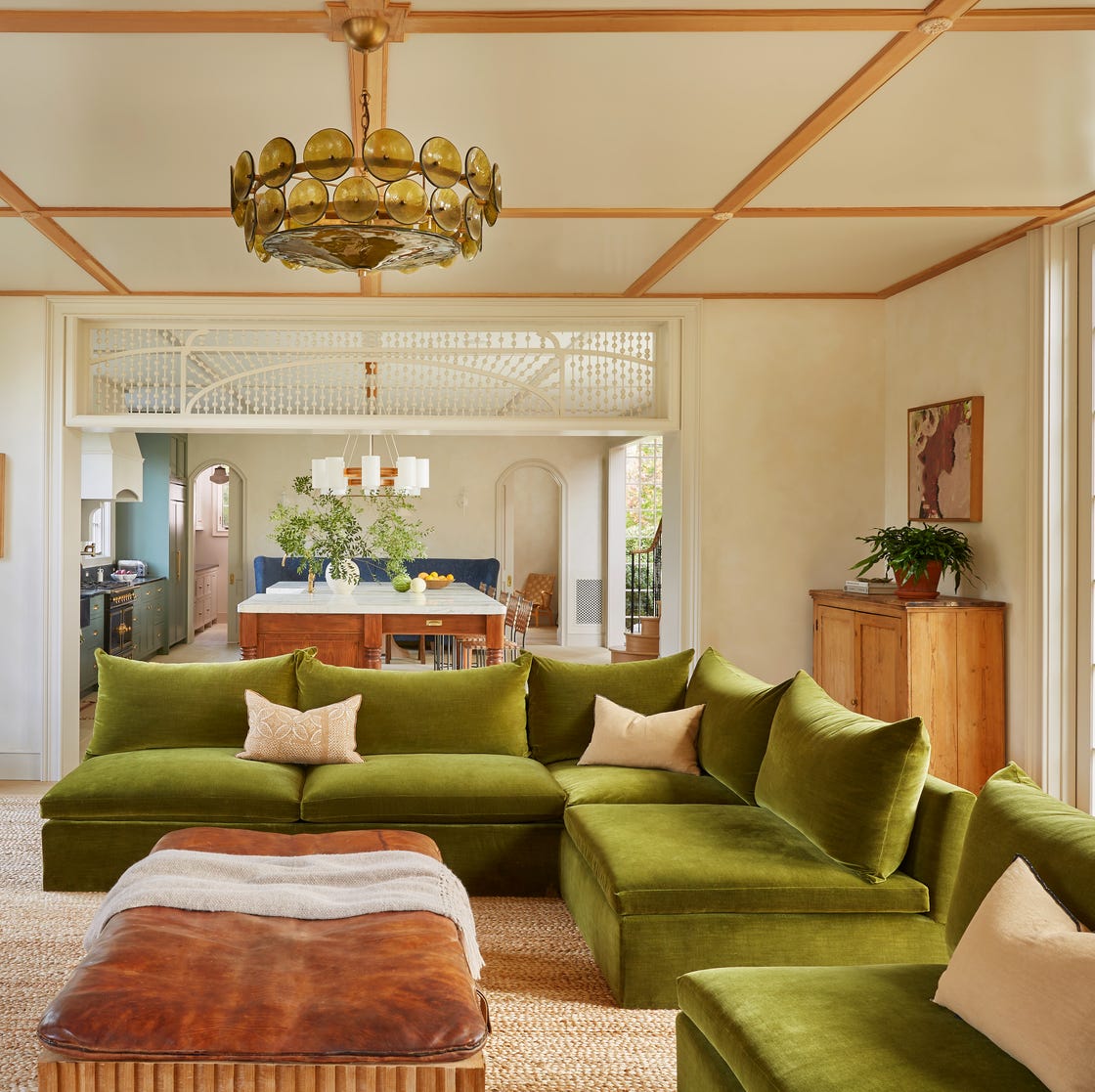
Brown offers the most organic pairing with light green, mirroring natural landscapes where light meets dark. This combination, often featuring elegant taupe walls and upholstery with chartreuse drapes and cushions, creates a sophisticated yet joyful atmosphere. The blend of depth from brown and brightness from light green avoids drabness.
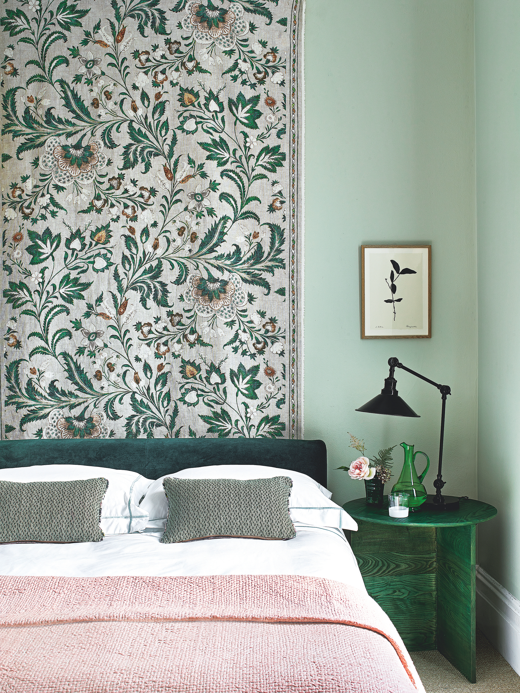
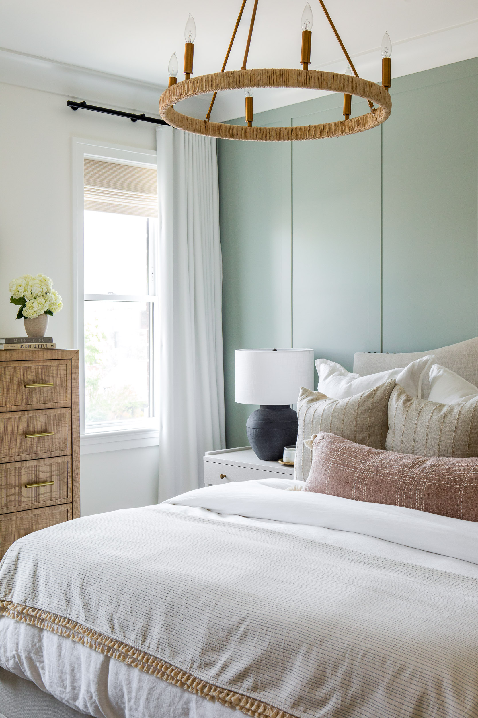
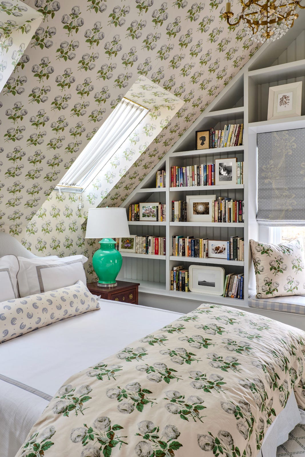
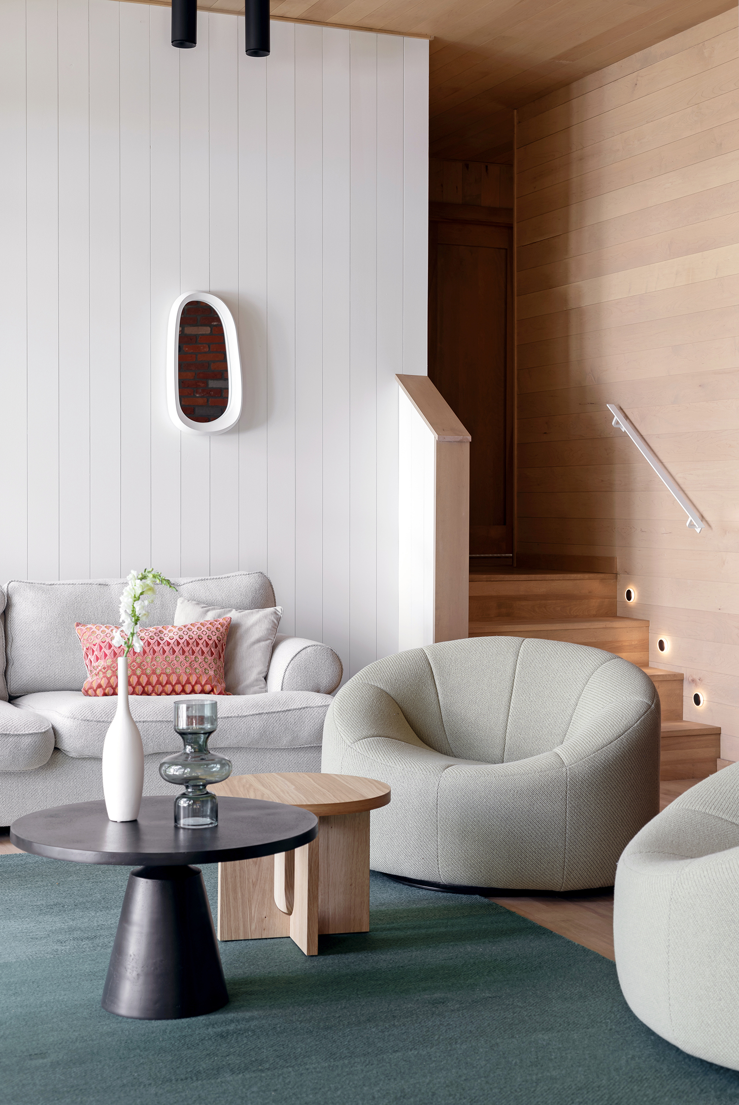
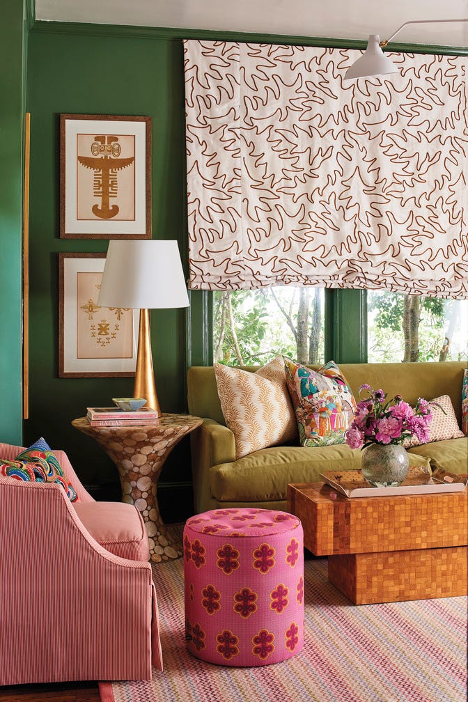
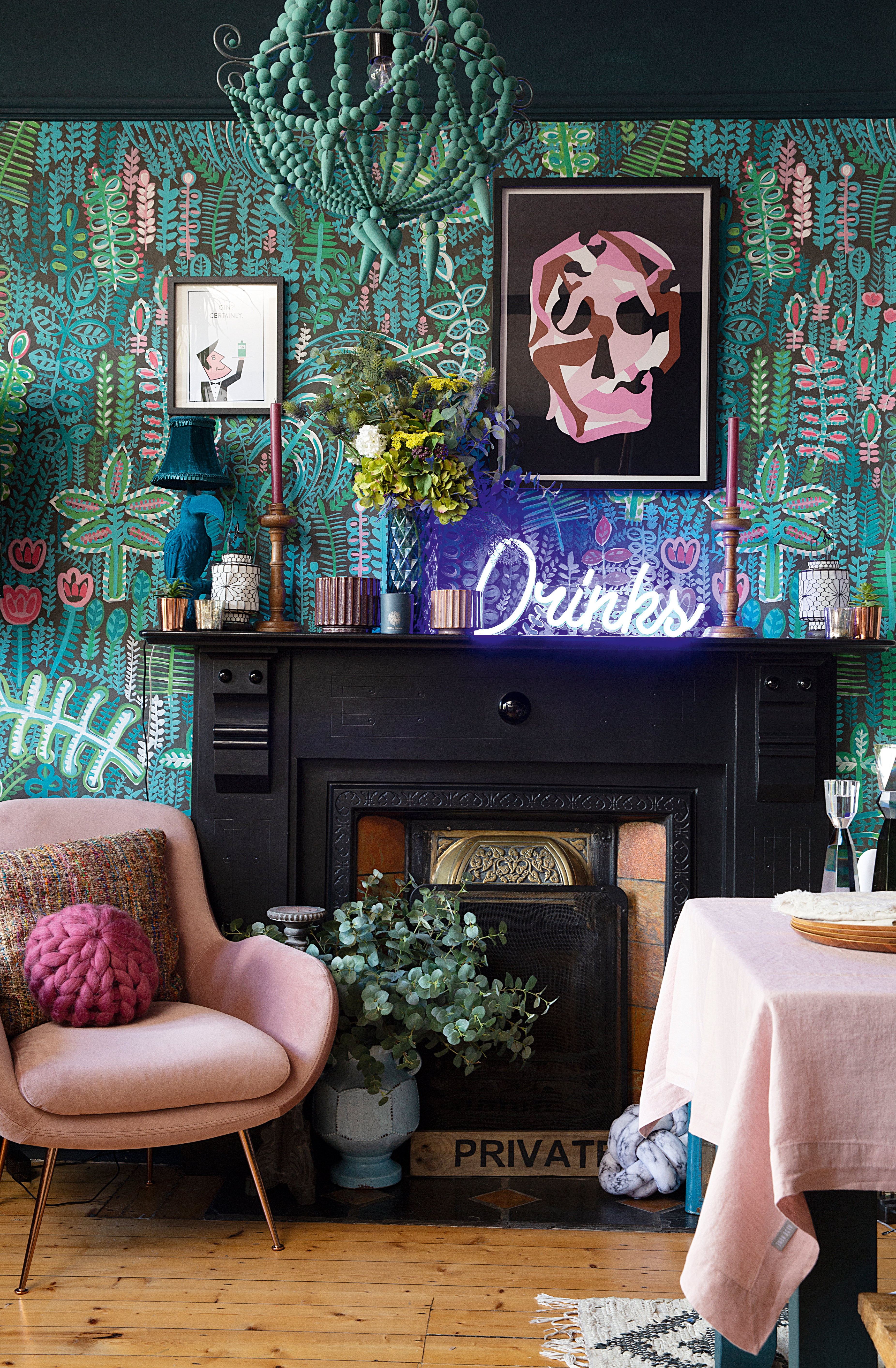
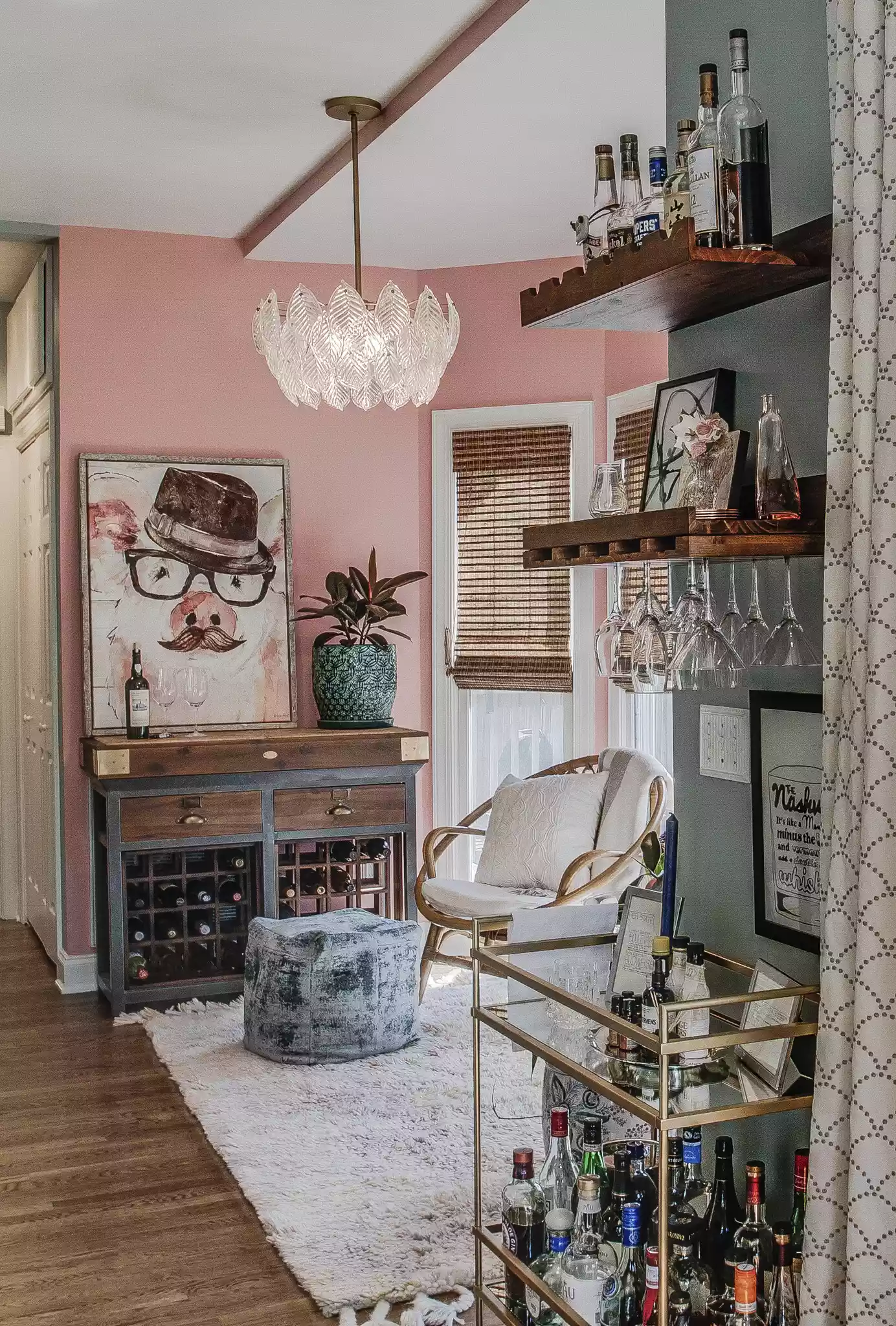
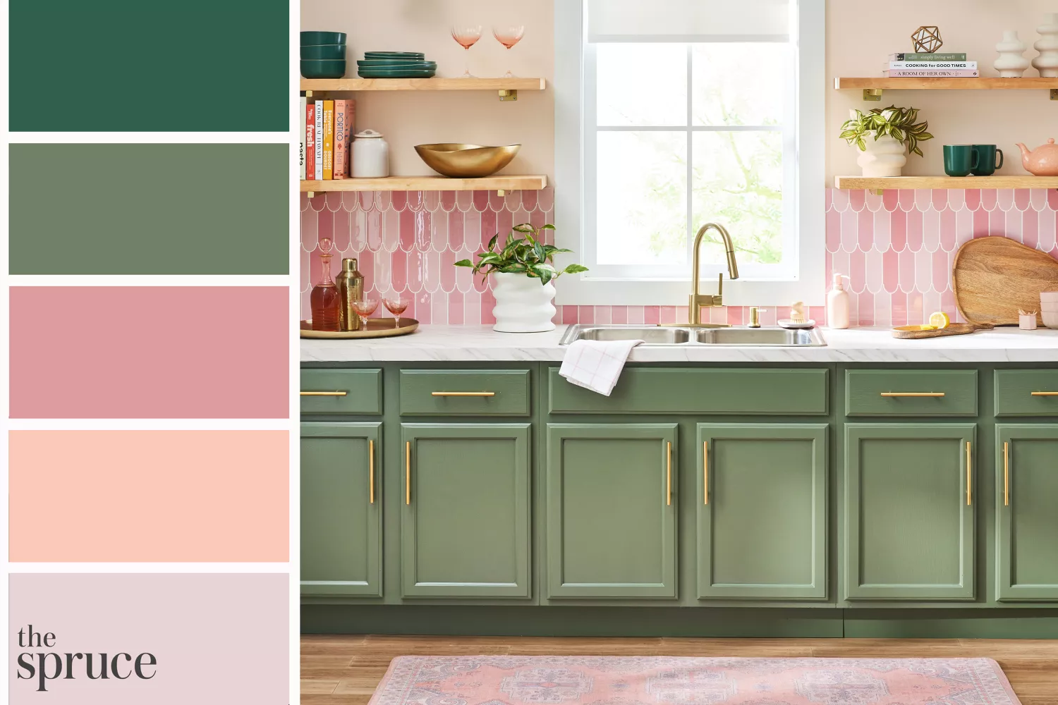
Pink, particularly pastel shades, plays into the levity of light green. In serene bedrooms, darker green tones can bridge a pastel color palette, allowing pink and light green to blend harmoniously. Incorporating other deep cool tones can create a less serene, more sophisticated iteration of this pairing.
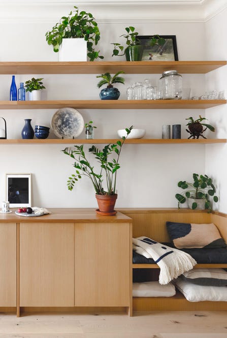
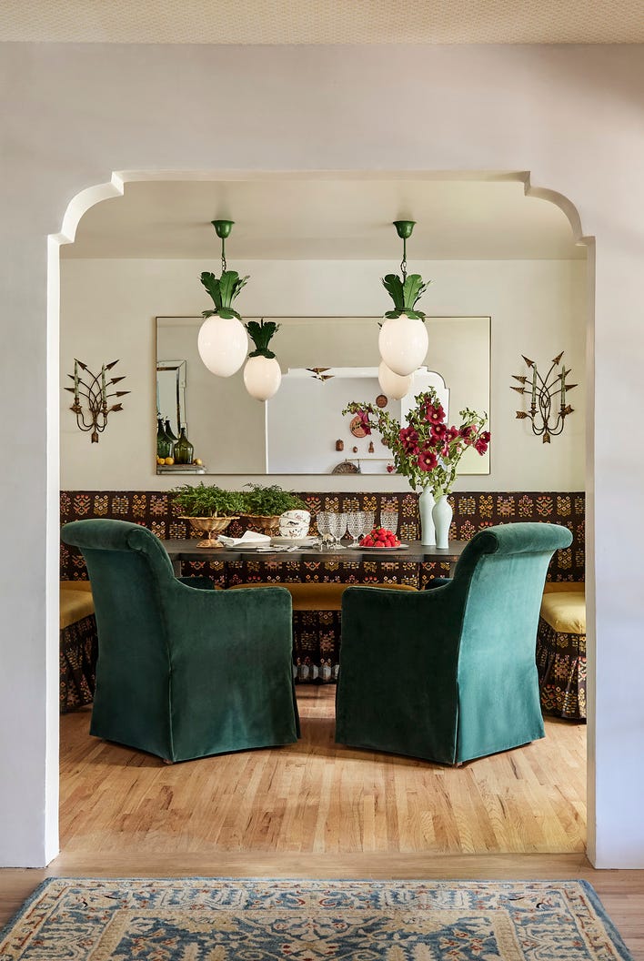
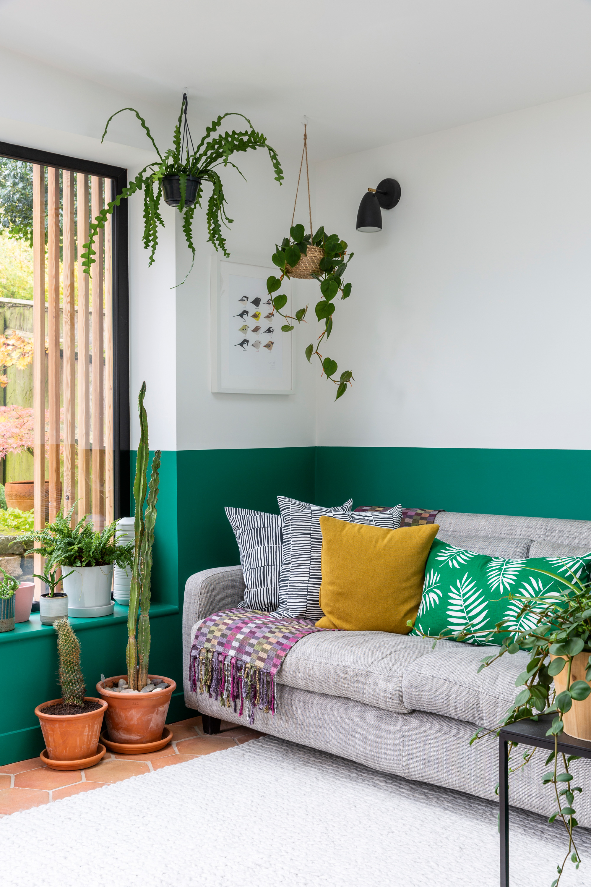
White is a powerful yet often overlooked pairing. While all-white rooms can appear clinical, introducing a light, bright green adds a vibrant touch without overwhelming the calming scene. This combination is effective for creating a fun, eclectic vibe, as seen with yellow-green fabric on chairs in a dining setting.
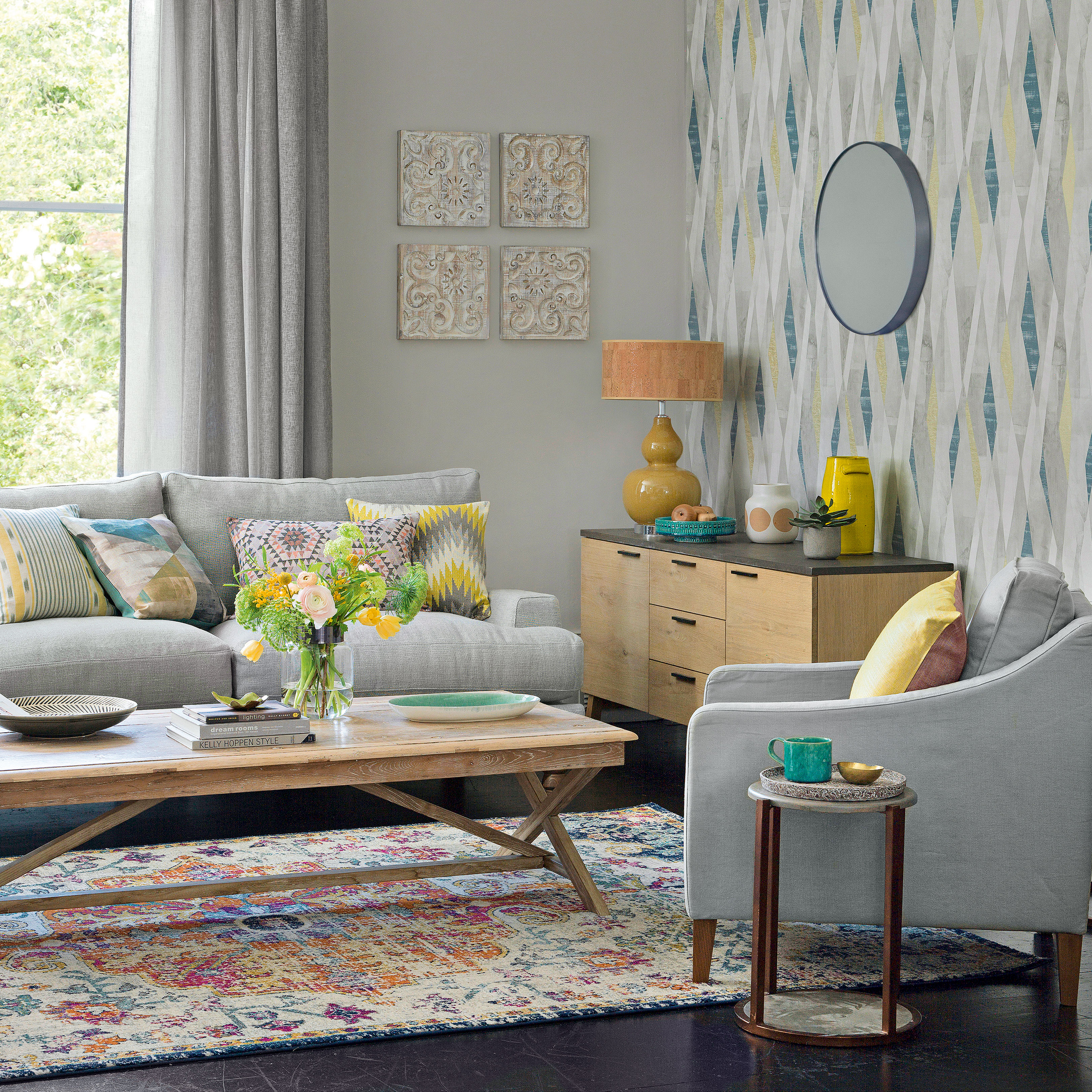
Purple accents, against a foundation of cooling grays, demonstrate how light green can bring vibrancy to more subdued spaces. This combination, referred to as a 'WTF Room' by one designer, showcases colors chosen to soften the room and make it comfortable. The choice of neutral, whether darker grays or navy blues, influences the sophistication or retro feel of the pairing.
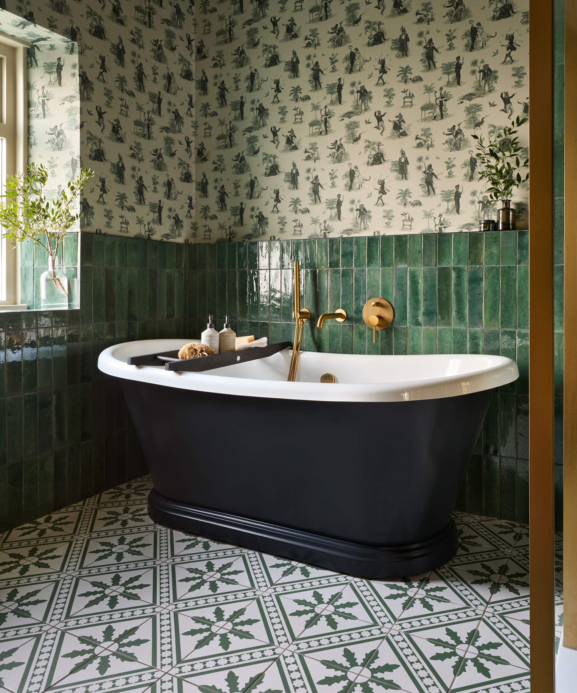
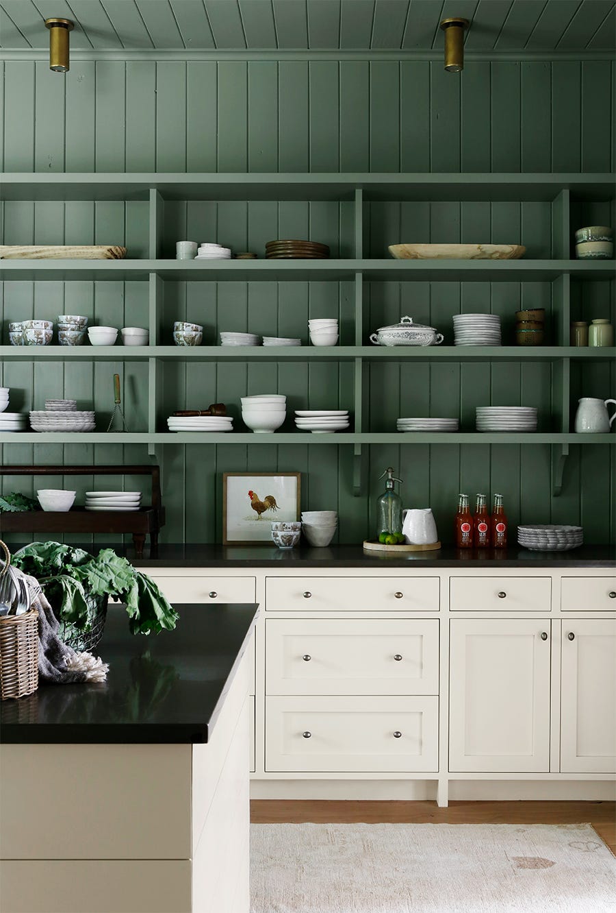
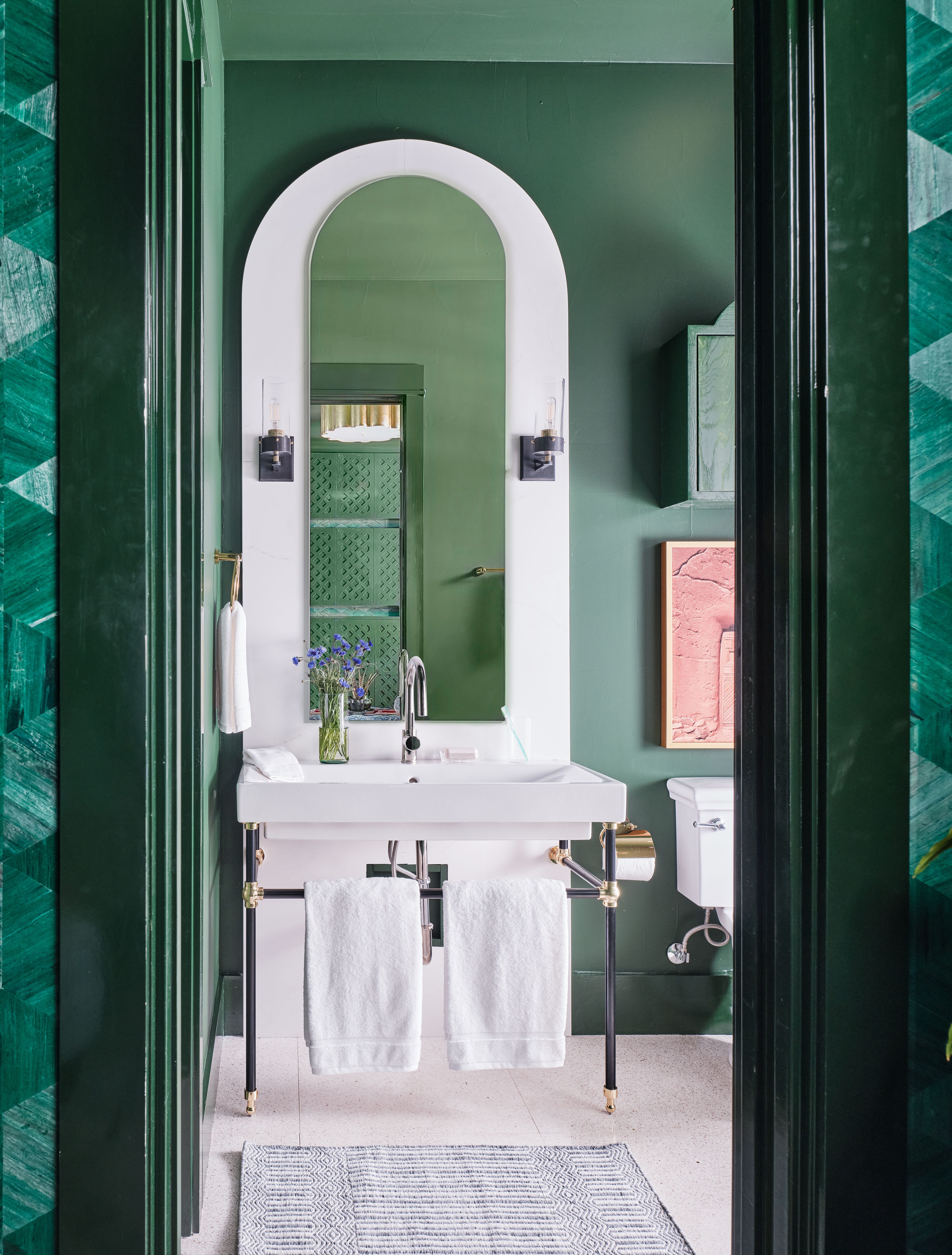
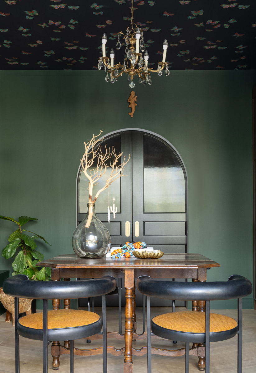
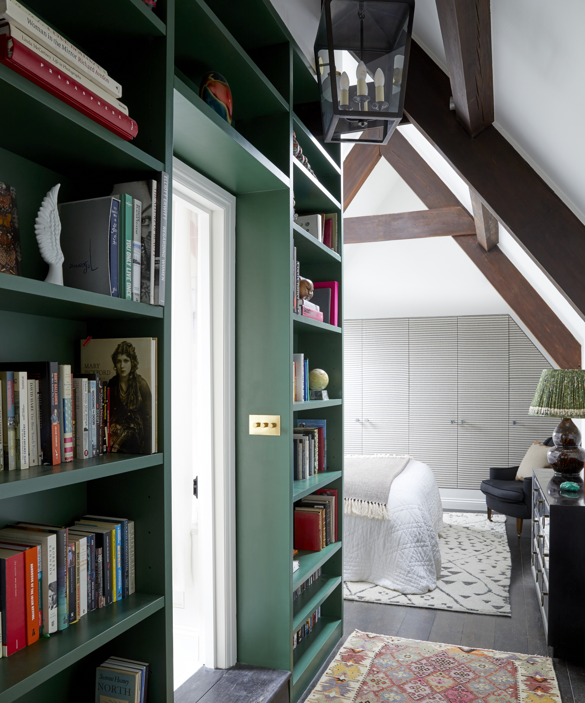
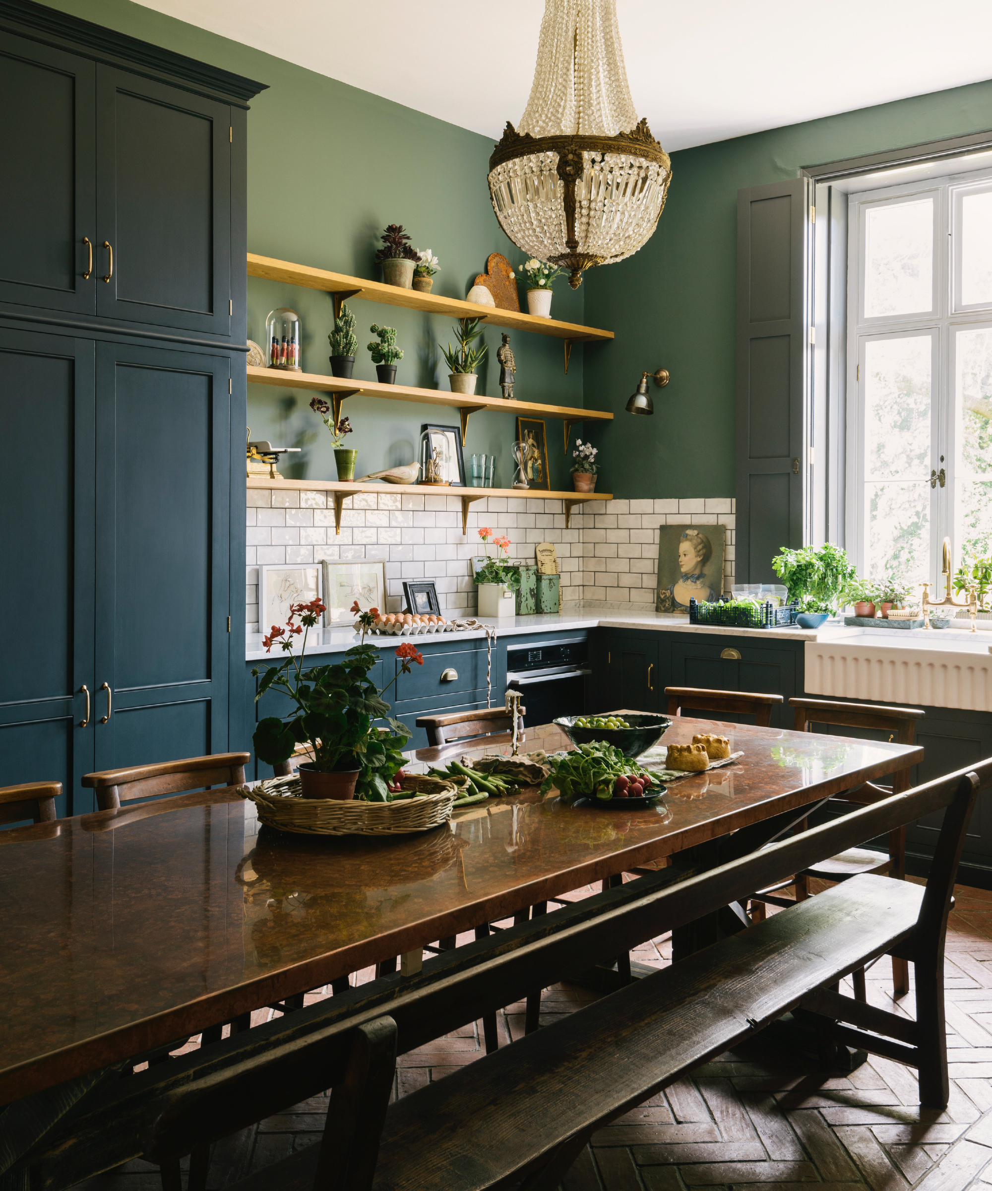
Finally, combining light and dark greens creates a harmonious and delicate palette, using contrast to energize or highlight elements. The key to this pairing is selecting light and dark greens from the same color family, using a paint chart to ensure cohesion. The article concludes by emphasizing that the best color pairings ultimately depend on individual style, encouraging experimentation with tints, shades, and undertones to achieve desired effects.
#ColorPsychology #InteriorDesign #HomeDecor #ColorPalettes #GreenInteriors #DesignTrends #ColorCombinations #DecoratingIdeas #PaintColors #ColorPsychology #InteriorDesign #HomeDecor #ColorPalettes #GreenInteriors #DesignTrends #ColorCombinations #DecoratingIdeas #PaintColors
0 comment in total
 No comments yet
You may also like
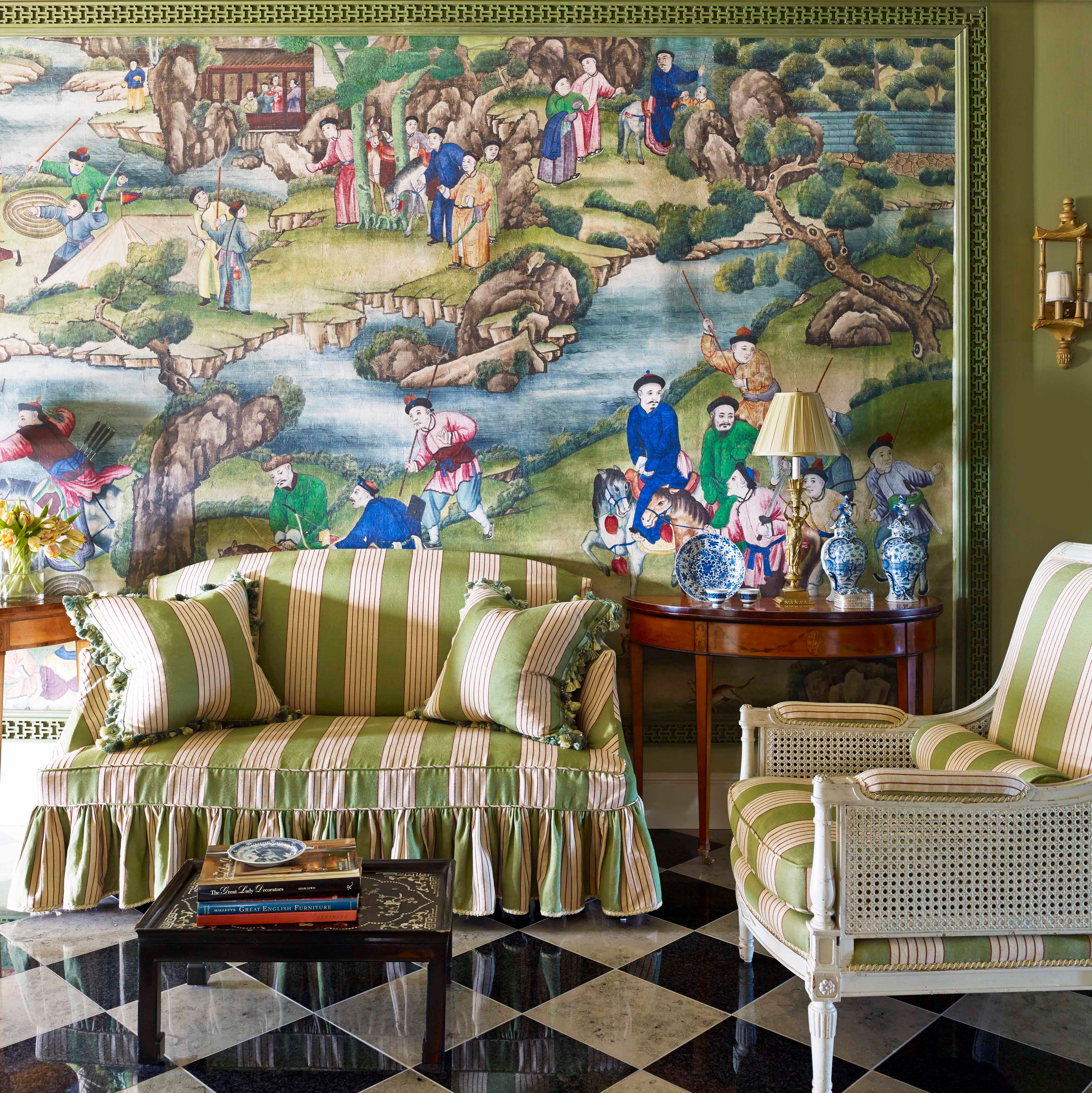
15 Lush Green Paint Colors to Invigorate Any Space

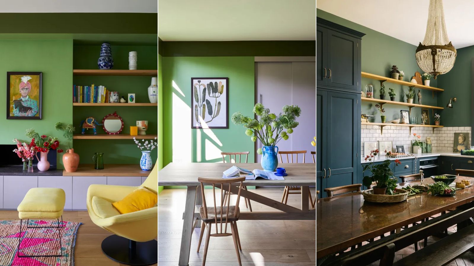
5 colors to never pair with green according to designers – and what to use instead

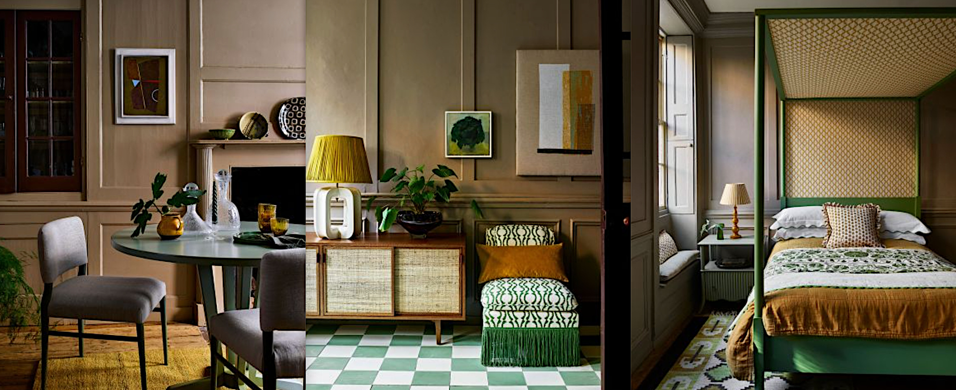
Yellow and green room ideas – 10 ways to decorate with natural tones
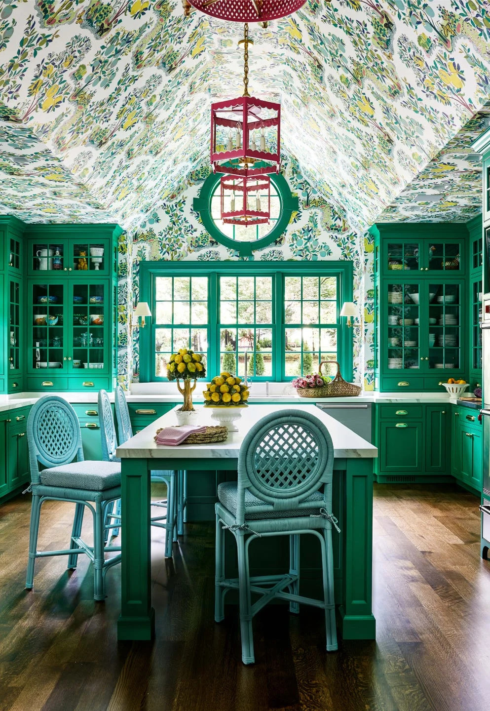
There Are Only Certain Green Paint Colors That Can Bring a Room to Life

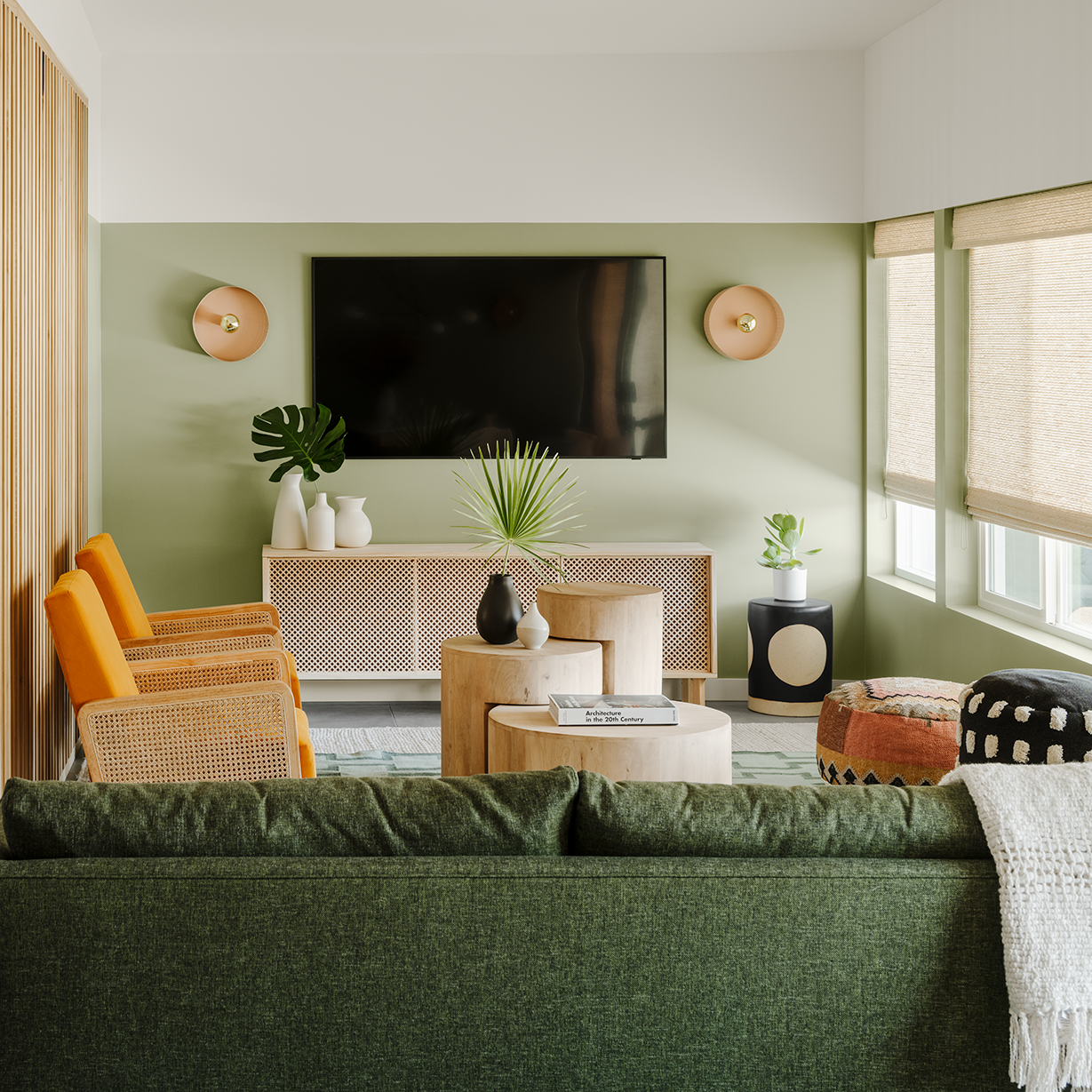
Here's How to Go Green in the Living Room

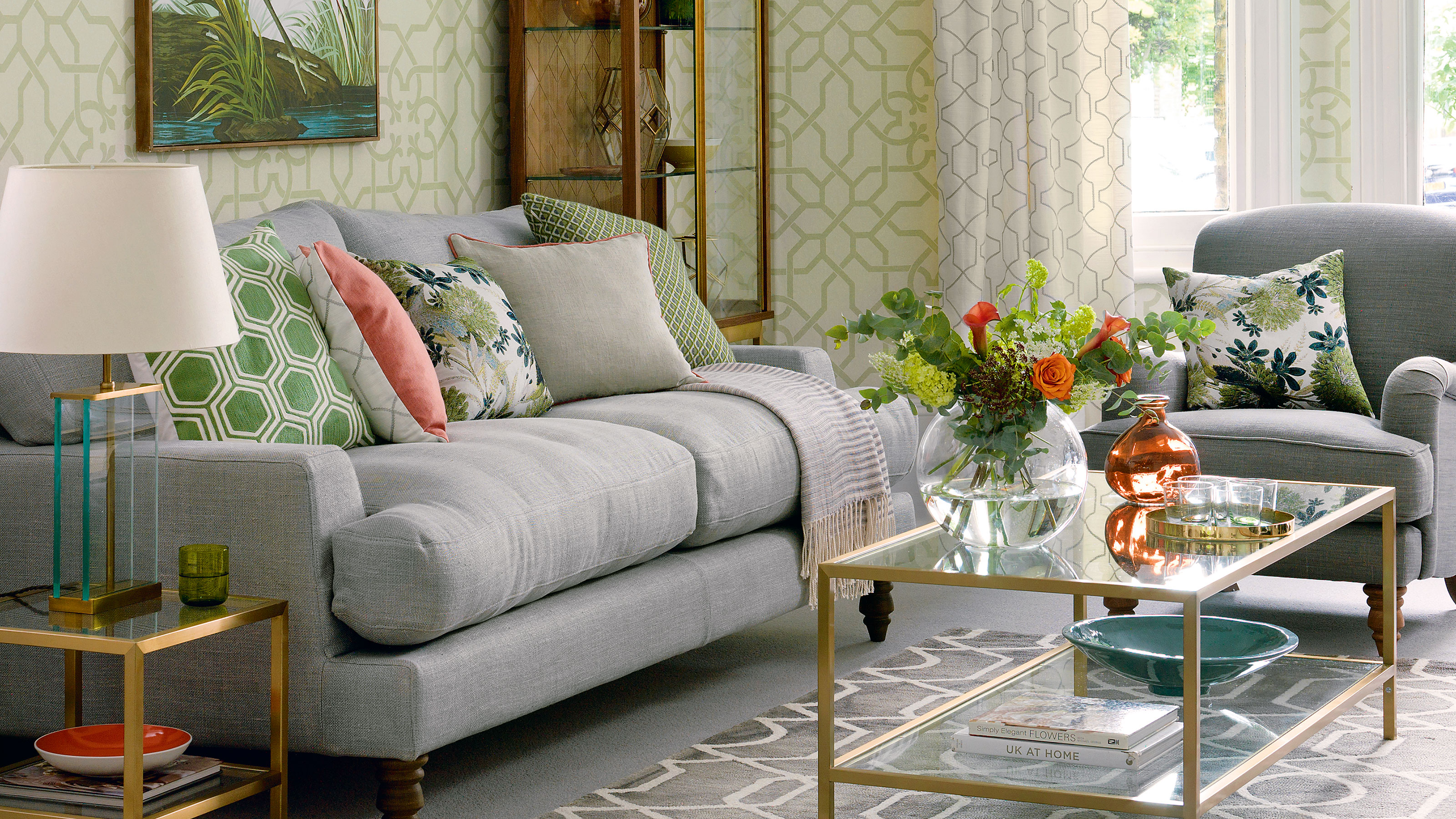
10 green and grey living room ideas for a smart space
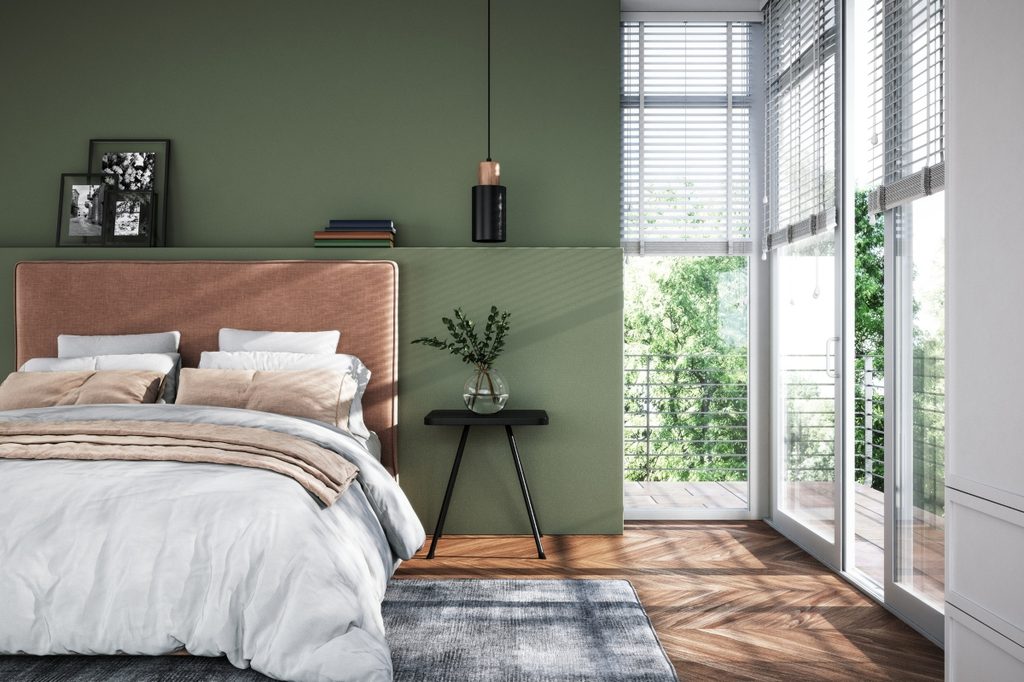
The best green paint colors for a soothing, sophisticated home

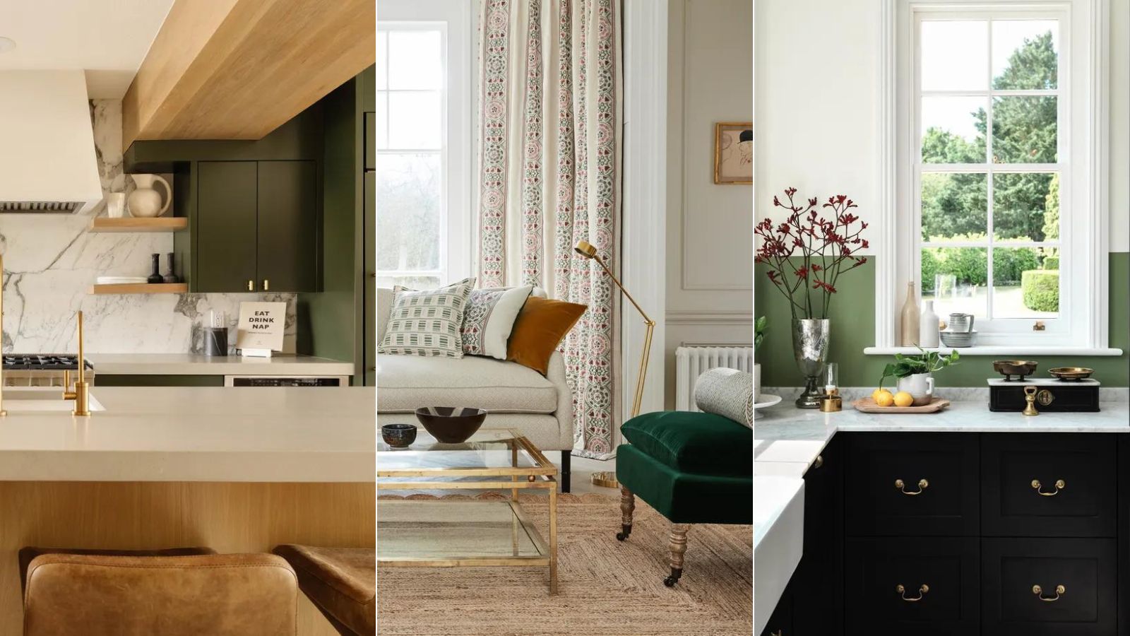
What colors go with dark green? 9 failsafe combinations for this nature-inspired hue
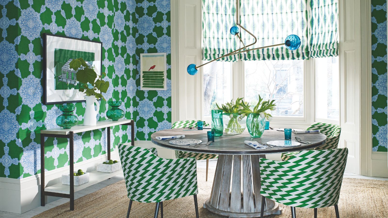
What colors go with green? Professionals propose these harmonious pairings for successful schemes
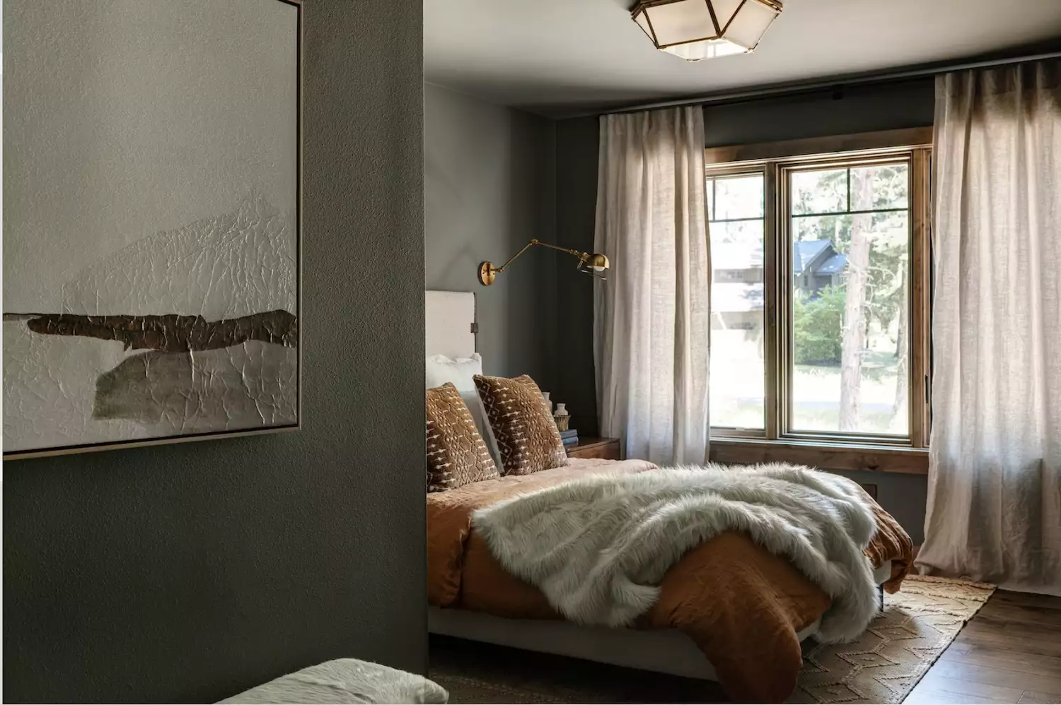
Love the Color Green? 22 Colors That Pair With It Perfectly in Any Room of the House

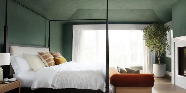
Here's How to Decorate With Green So It Actually Looks Chic

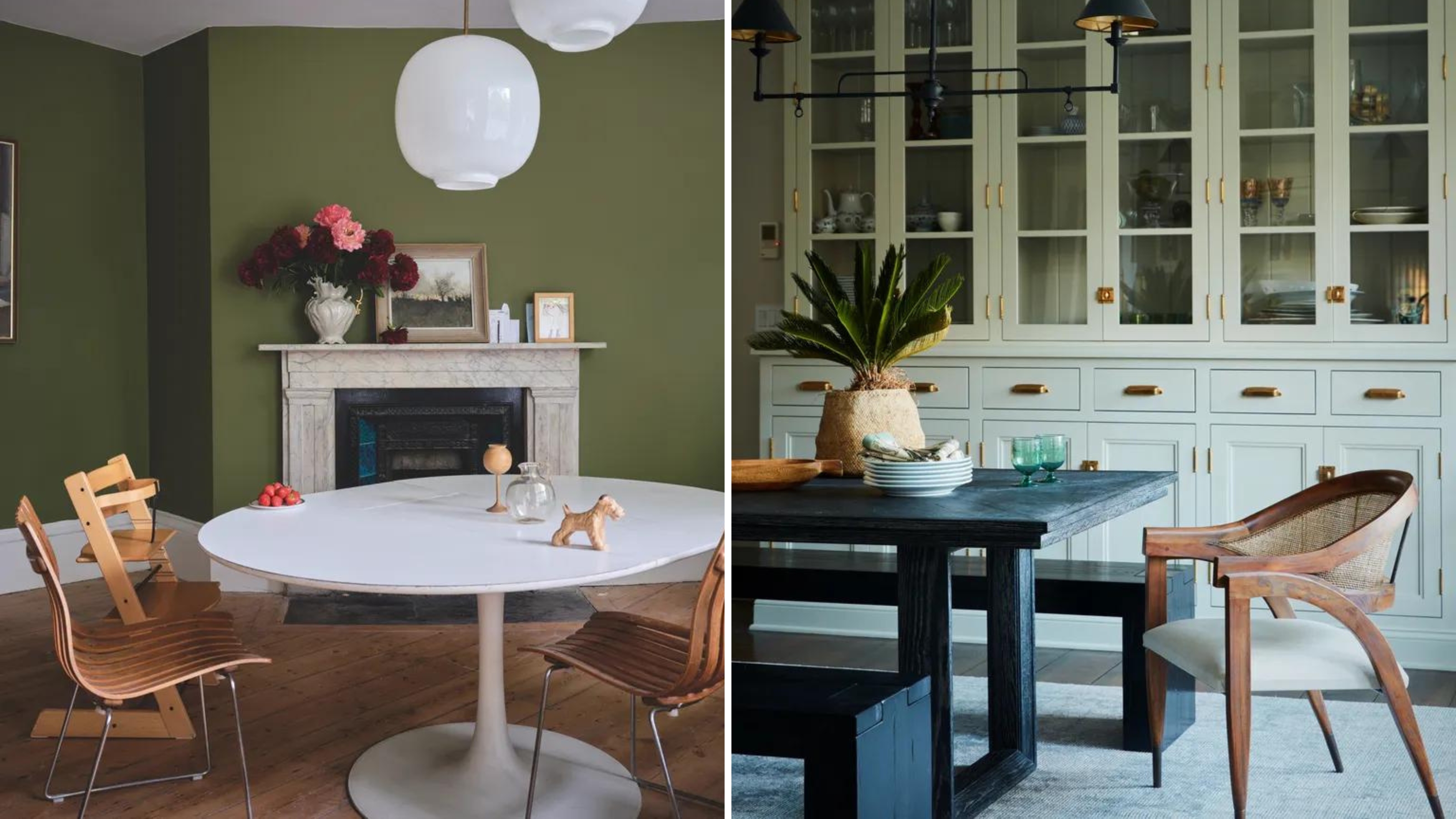
10 green dining room ideas that will lift a tired space

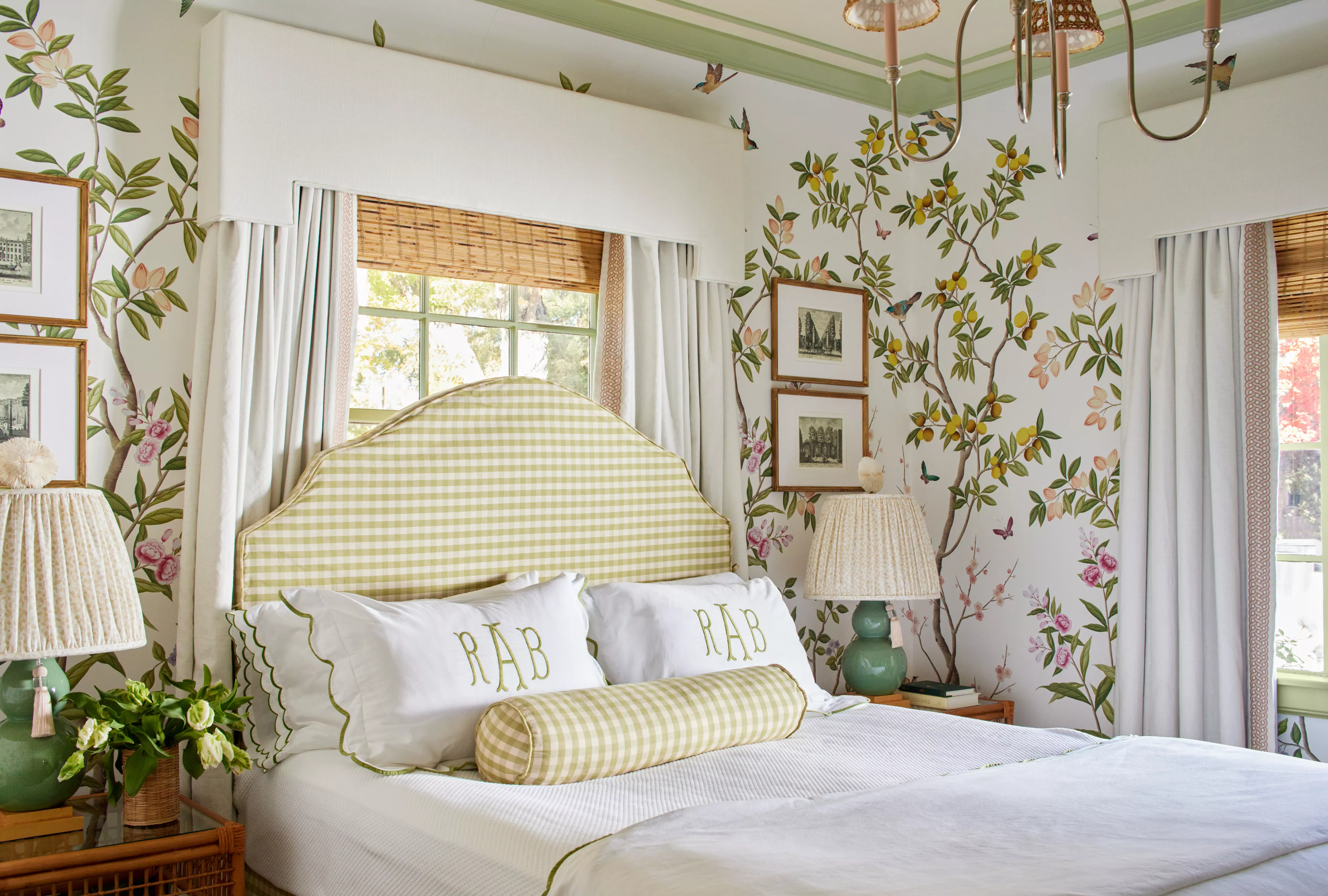
51 Green Color Schemes Perfect for Living Rooms, Bedrooms, and More

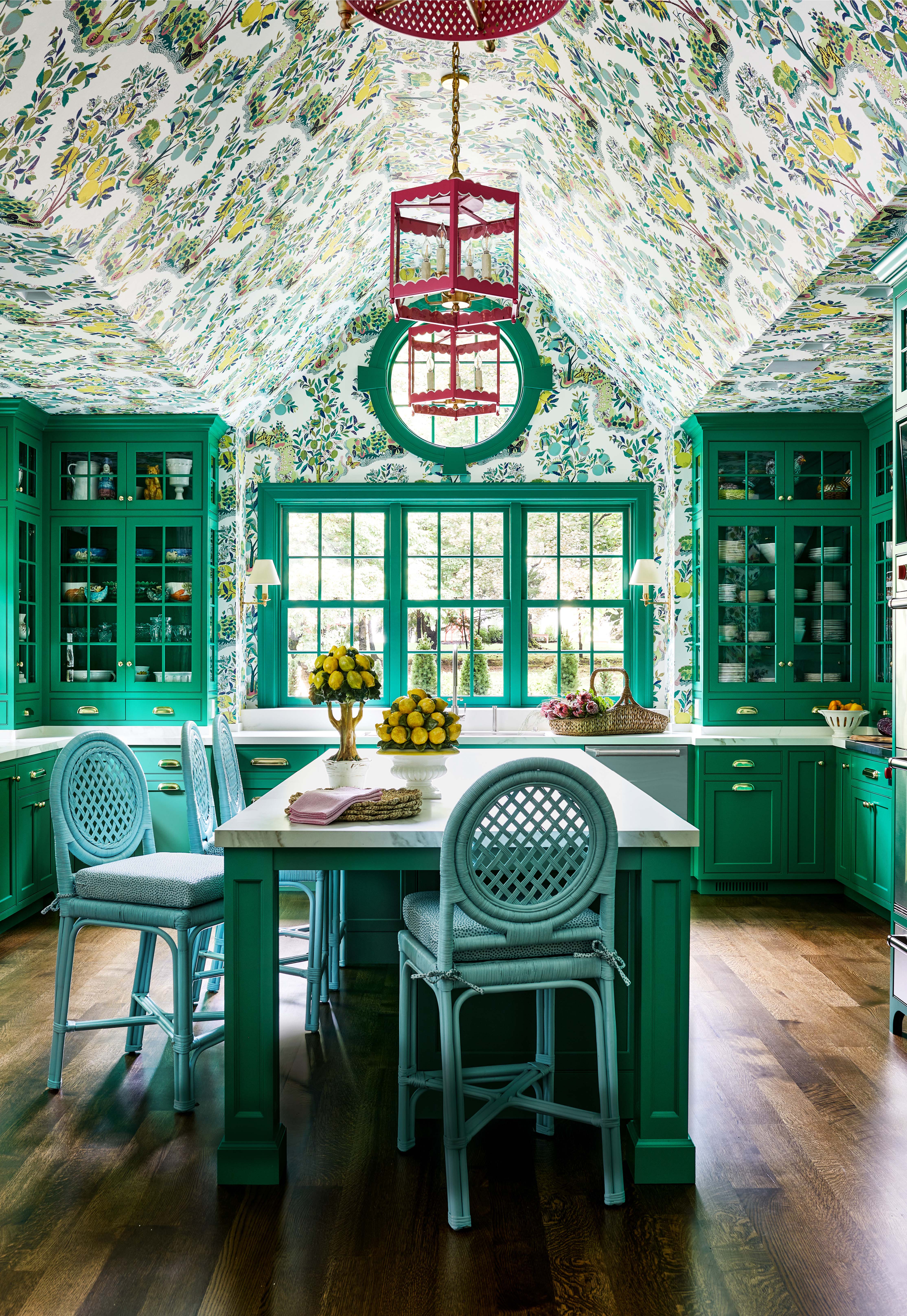
There Are Only Certain Green Paint Colors That Can Bring a Room to Life
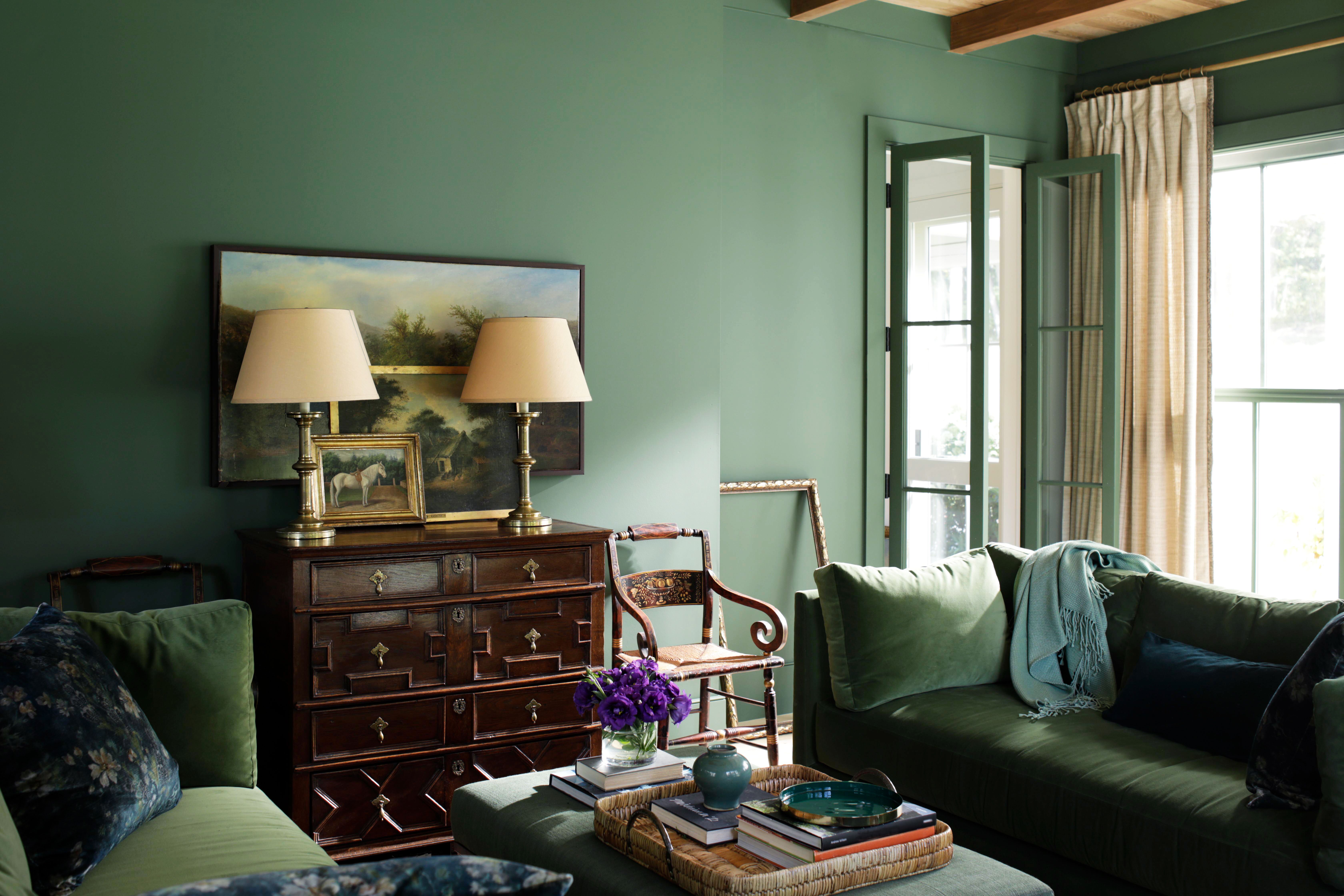
Colors That Go With Forest Green — 5 Shades To Pair With This Calming, Moody and On-Trend Hue

25 green living room ideas that are the perfect spring refresh

10 Sage Green Room Ideas That Ooze Serenity, Sophistication, and Style
12 Colors That Go With Green I'm Seeing Interior Designers Use All the Time Right Now
37 Unexpected Colors That Pair Perfectly With Green, According to Designers
These 10 Colors Are Perfect Complements to Sage Green in Your Home