1/10
An A-List Designer’s Secrets To Picking Perfect Paint Colors
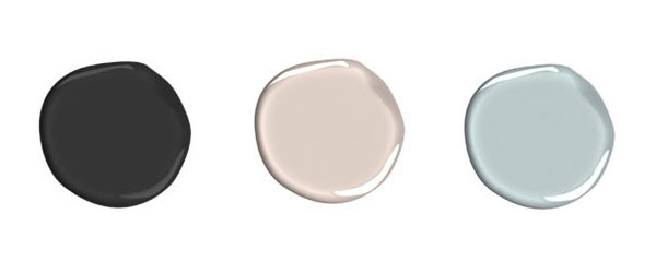
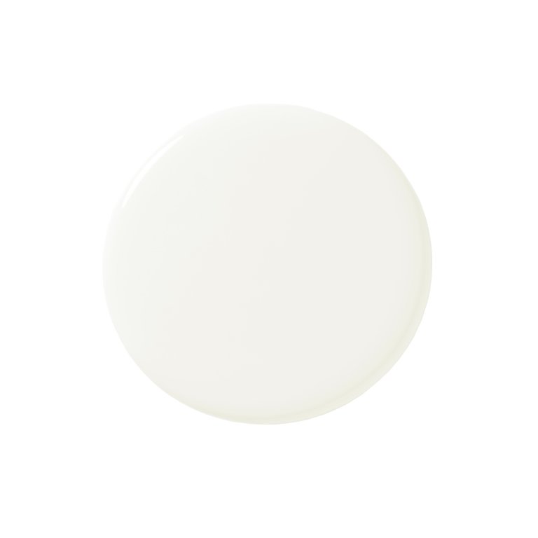
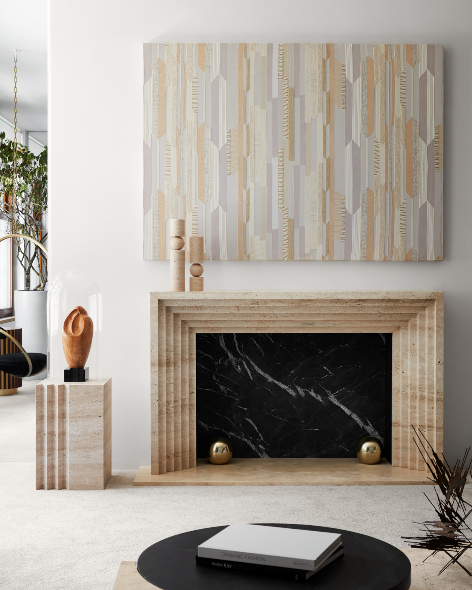
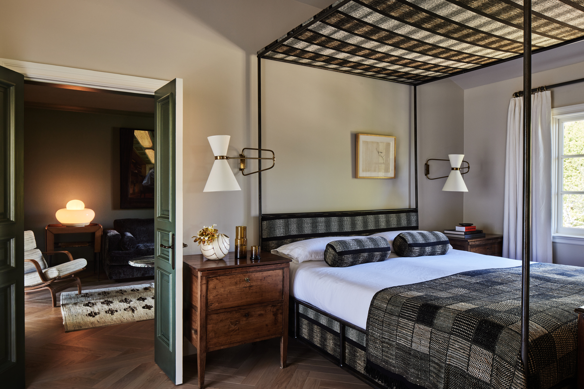
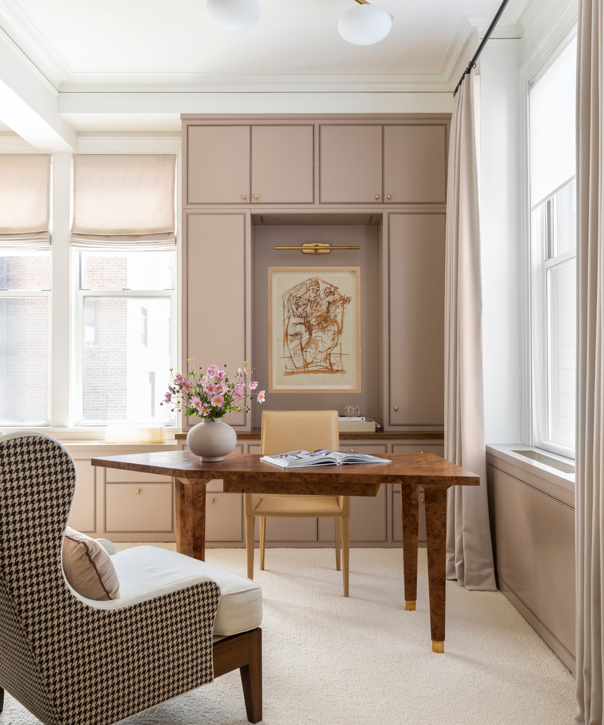
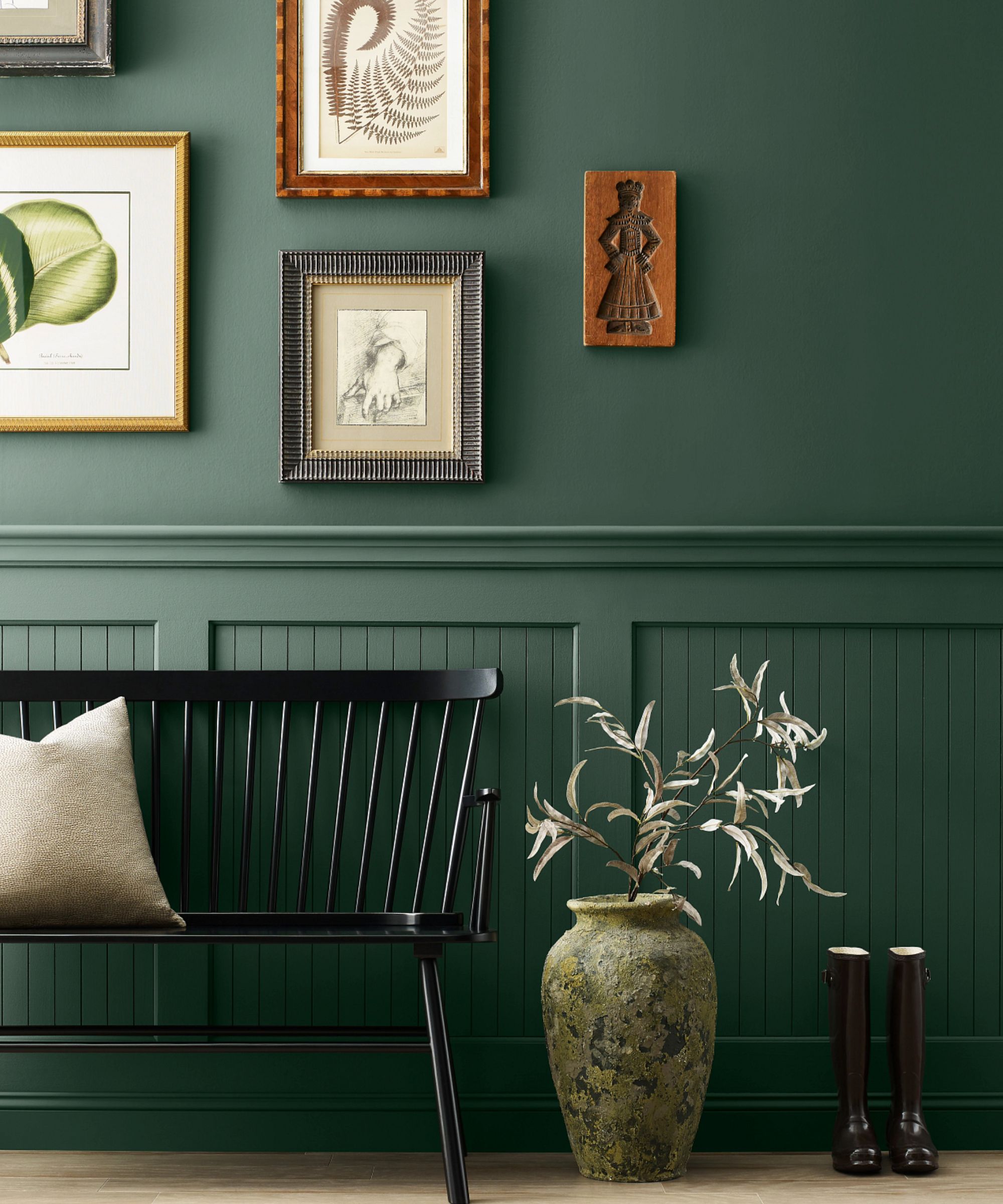
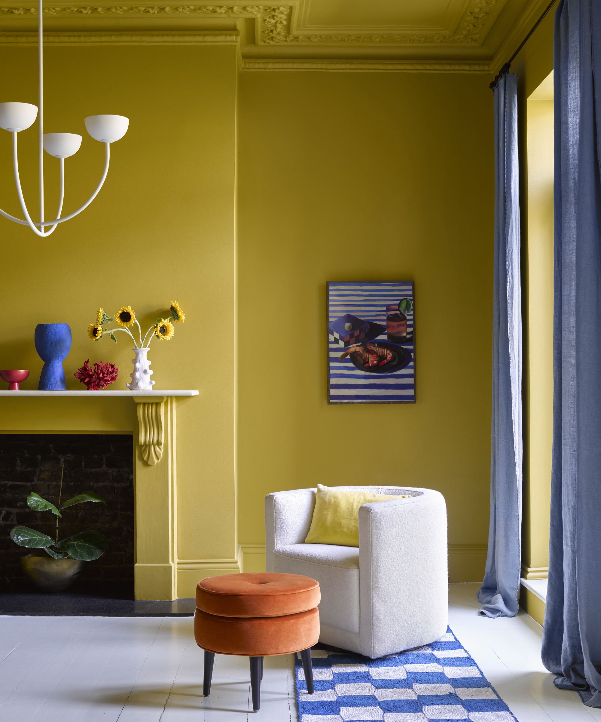
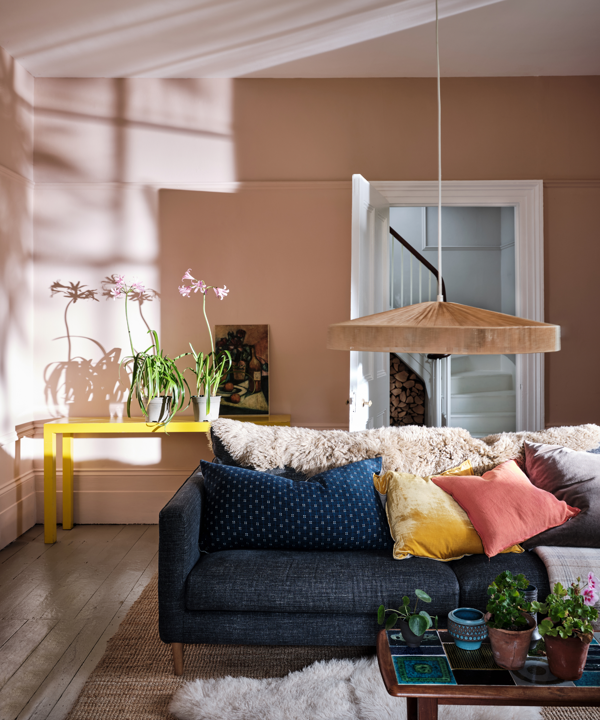
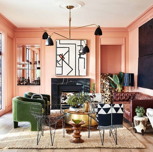
Corey Damen Jenkins, an ELLE Décor A-List designer known for his layered interiors that blend vivid colors and patterns, emphasizes that successfully mixing colors is a complex endeavor, akin to cooking a meal. Jenkins recently curated a vibrant palette for Benjamin Moore, featuring rich emerald, soft pale pink, spicy raspberry, deep noir, warm white, and electric aquamarine.
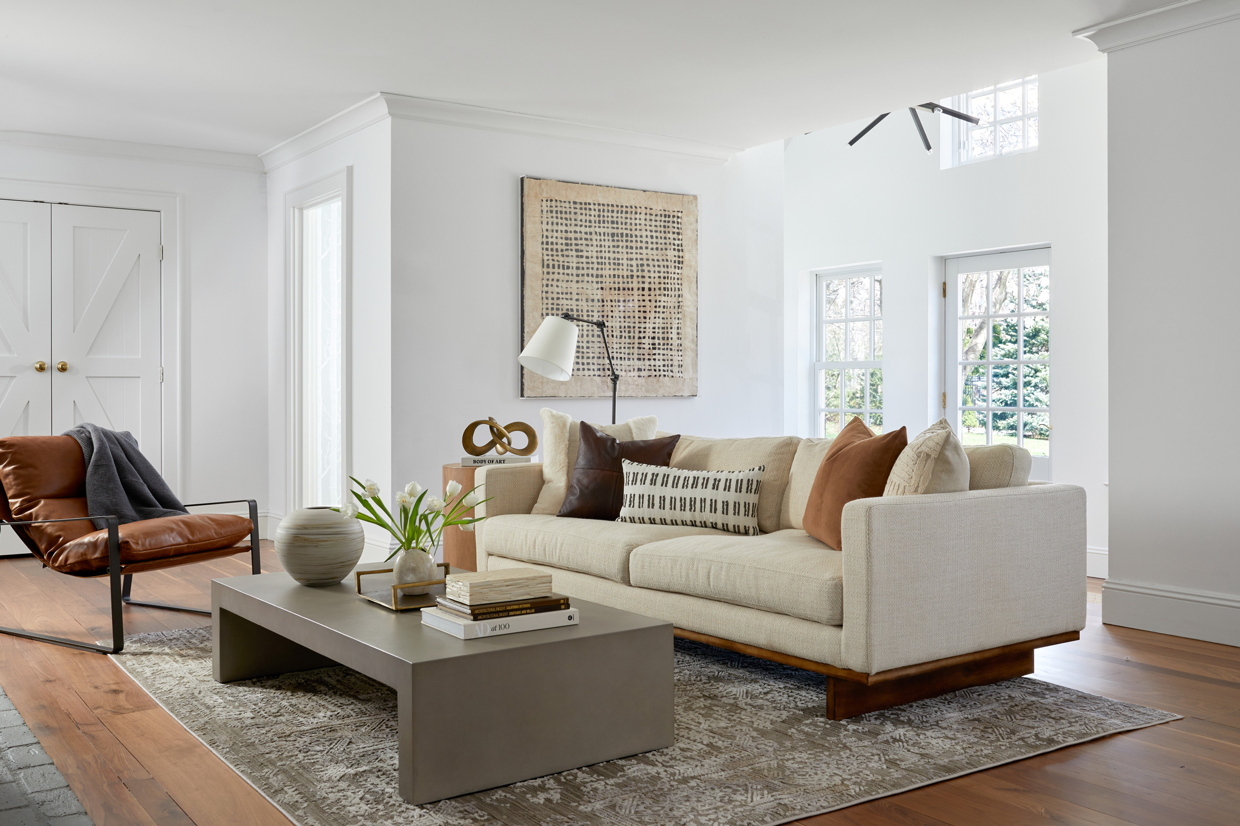
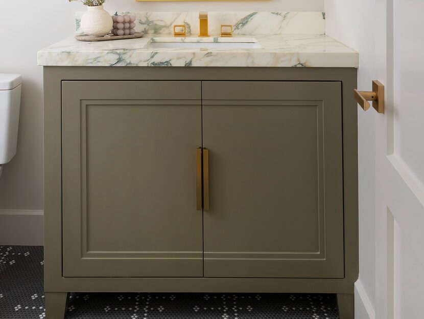
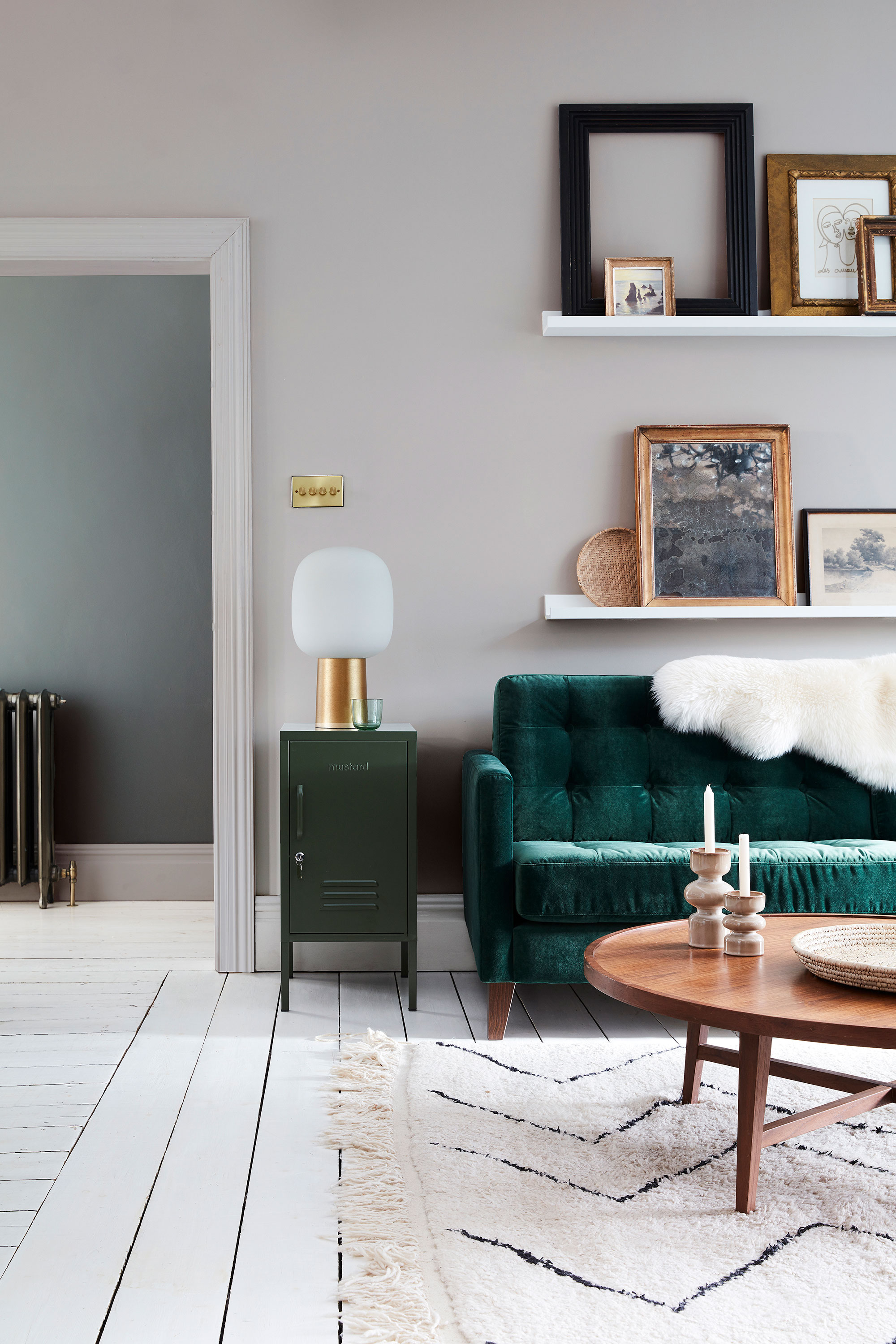
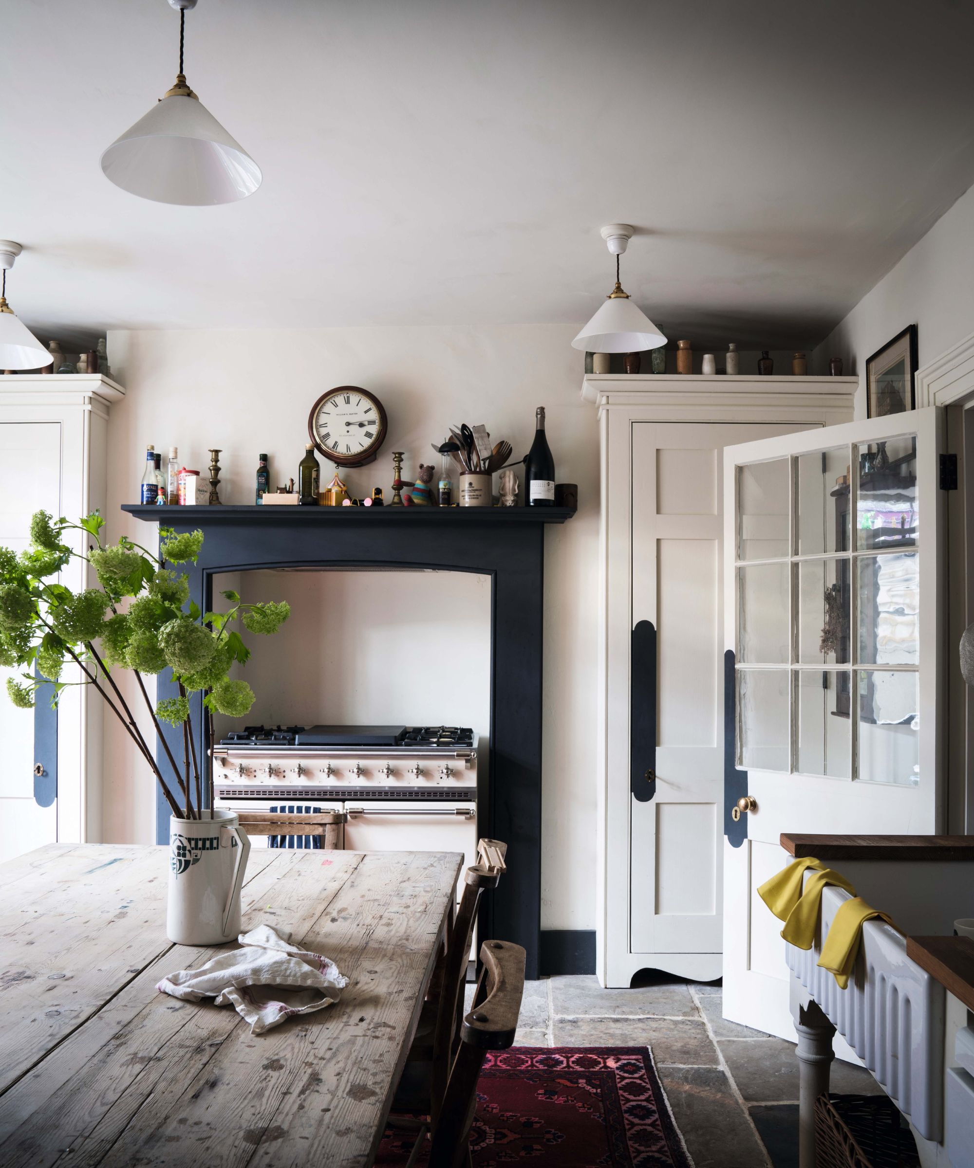
His primary advice for homeowners considering bold paint colors is to select paint colors last in the design process. He argues that there are extensive choices in paint colors, unlike rugs, furnishings, or fabrics for sofas and window treatments. Therefore, it is more effective to invest in significant anchor pieces first and then choose a paint shade that harmonizes with existing elements.
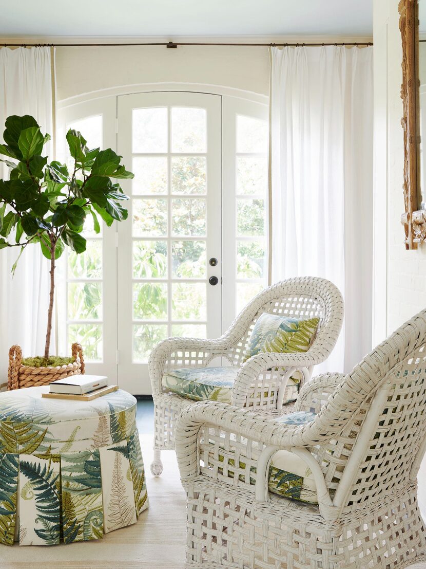
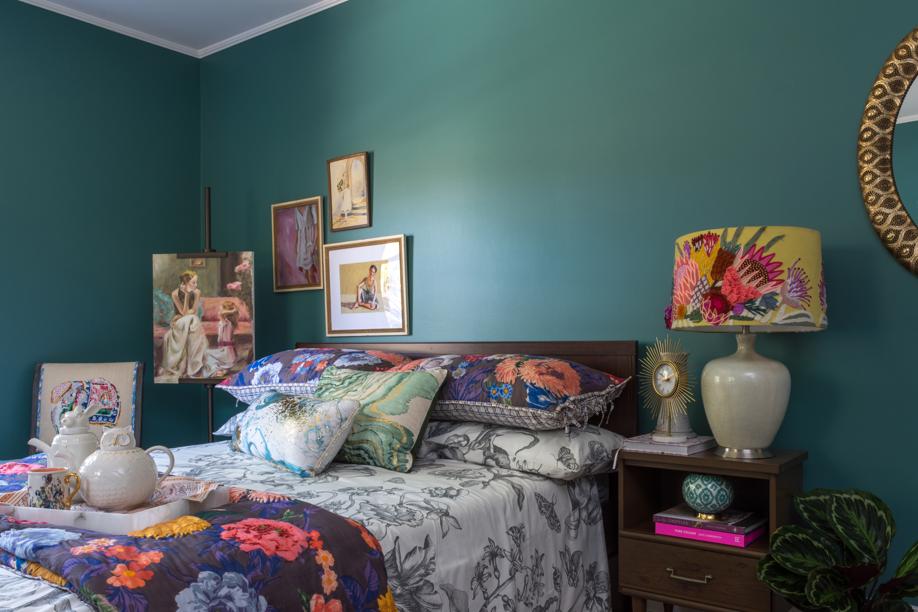
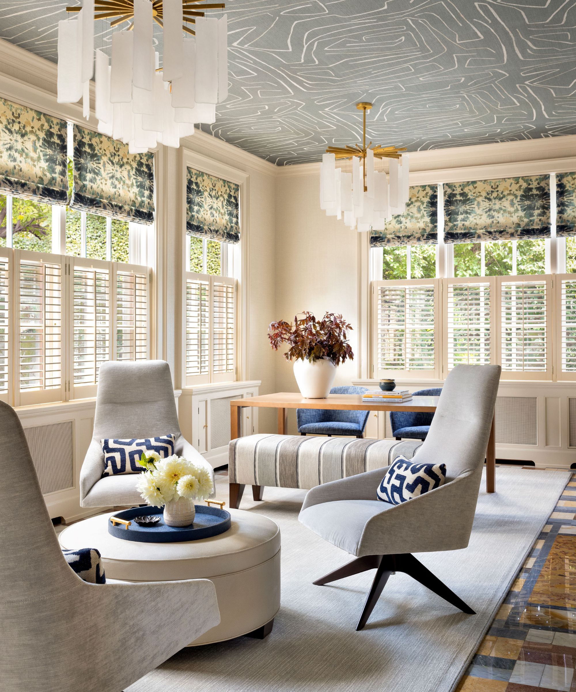
When developing a color scheme, Jenkins recommends identifying a "tie that binds"—a wallcovering, rug, or patterned fabric that encapsulates the various colors intended for the space. Once this central element is established, other hues and finishes can be chosen to complement it. He also suggests looking to one's wardrobe for color inspiration, noting that people are often comfortable with colors they wear and may be more open to incorporating similar shades into their homes. For those hesitant about bold paint, accents and accessories offer a subtle way to introduce vibrant colors.
Nature serves as another valuable source of inspiration for color combinations. Jenkins points to natural pairings found in flowers or bird's wings as evidence that seemingly disparate colors can coexist harmoniously. To ensure a colorful room remains timeless, Jenkins advises studying historical color palettes from ancient civilizations, as certain colors, such as jewel tones, consistently appear throughout history, suggesting a cyclical nature of fashion and design that avoids a completely neutral aesthetic.
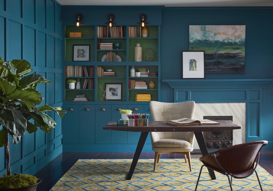
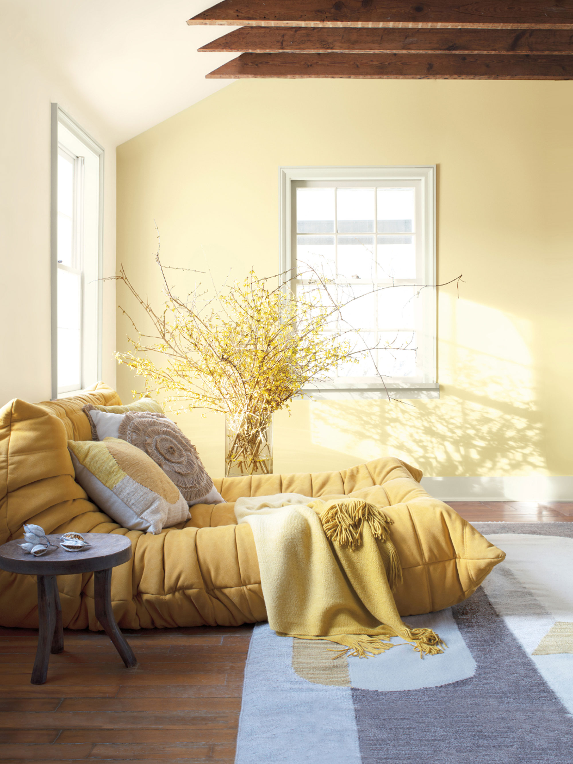

Understanding how natural light interacts with a room is crucial. Jenkins suggests embracing the room's inherent lighting conditions: dark rooms can be made "sexy and smoldering" with rich, deep colors, while well-lit rooms can be amplified with vibrant, joyful hues. He cautions against using bright colors to overcompensate for a lack of natural light, as this can create an overwhelming effect.
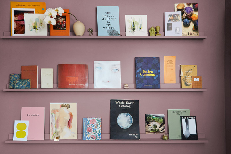
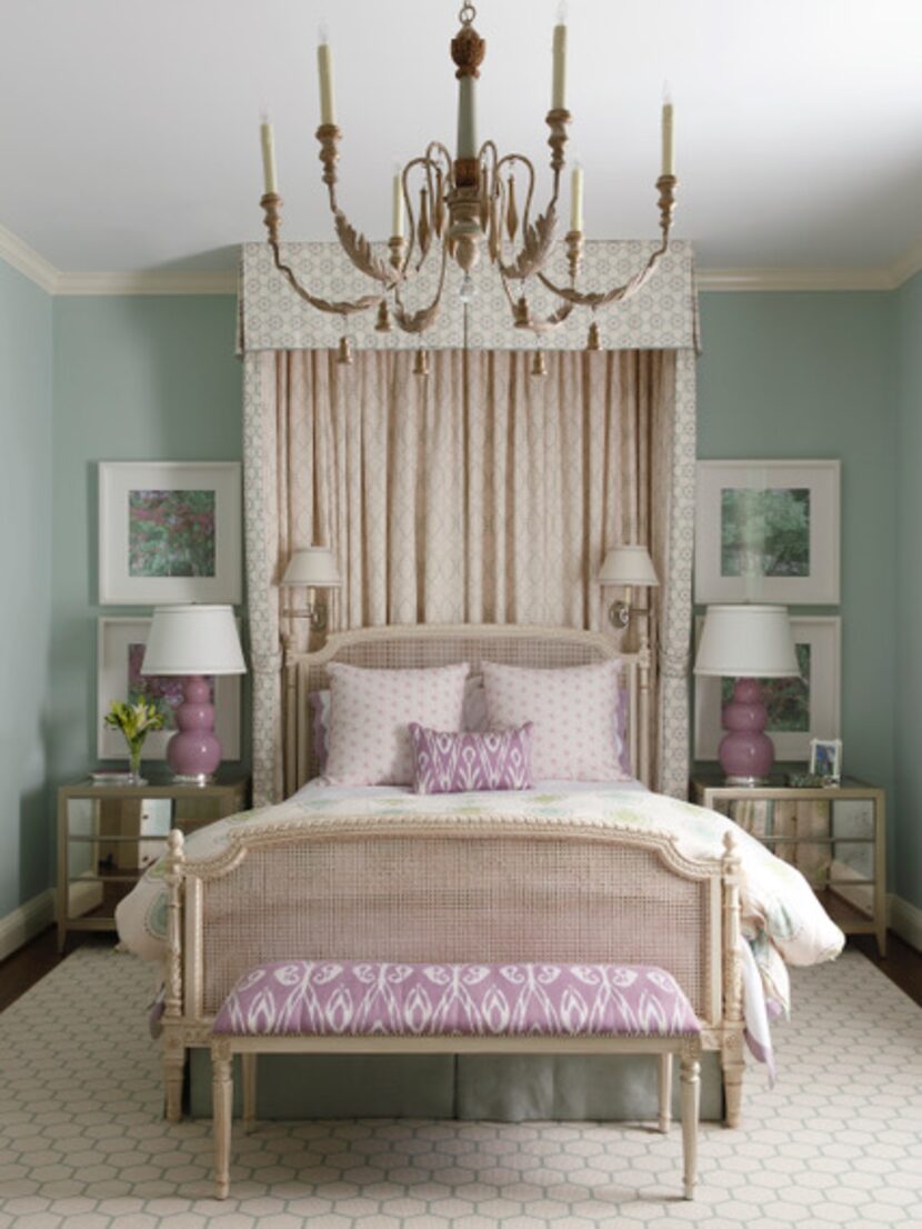
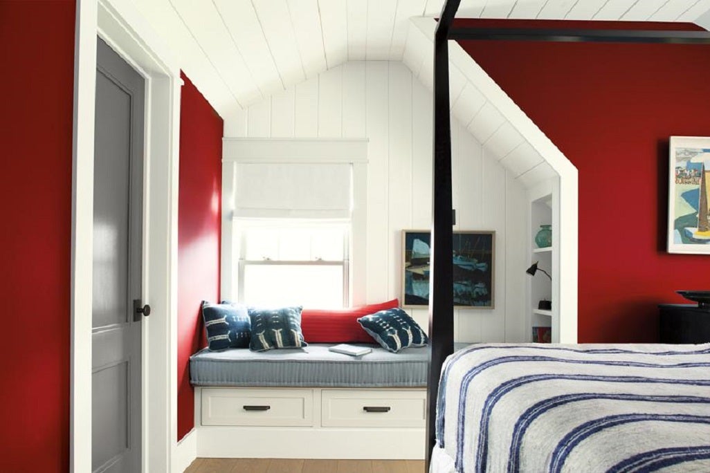
For accent walls, Jenkins stresses the importance of making a deliberate statement rather than simply adding color for color's sake. An accent wall should draw attention to a specific feature, such as a bed in a bedroom. He also recommends framing accent walls with molding to create a more custom and sophisticated look, resembling a mural. Finally, if a homeowner is determined to start with a specific bold paint color, Jenkins advises full commitment. This can involve either matching all furnishings and accessories to the chosen color, creating a monochromatic effect, or using contrasting colors to achieve a color-blocked design. In either approach, a decisive commitment to the chosen palette is essential for a cohesive and impactful result.
#InteriorDesign #PaintColors #HomeDecor #ColorPsychology #DesignTips #BenjaminMoore #CoreyDamenJenkins #ColorPalette #InteriorDesign #PaintColors #HomeDecor #ColorPsychology #DesignTips #BenjaminMoore #CoreyDamenJenkins #ColorPalette
0 comment in total
 No comments yet
You may also like
Designers Share Their Tried-and-True Shades From the Best Interior Paint Brands
Kitchen Color Selection Tips from 5 Designers

The most timeless paint colors according to designers


The man they call 'the paint detective' shares his 10 tips for choosing the right colours for your house

11 Paint Colors That INSTANTLY Make Your Home Look "Expensive," According to Designers

The Paint Color That All This Designer's Followers Ask About | domino

These 5 Simple Questions Help Designers Pick the Perfect Paint Color Every Time
Paint color ideas for every room – experts explain the best choices for different spaces

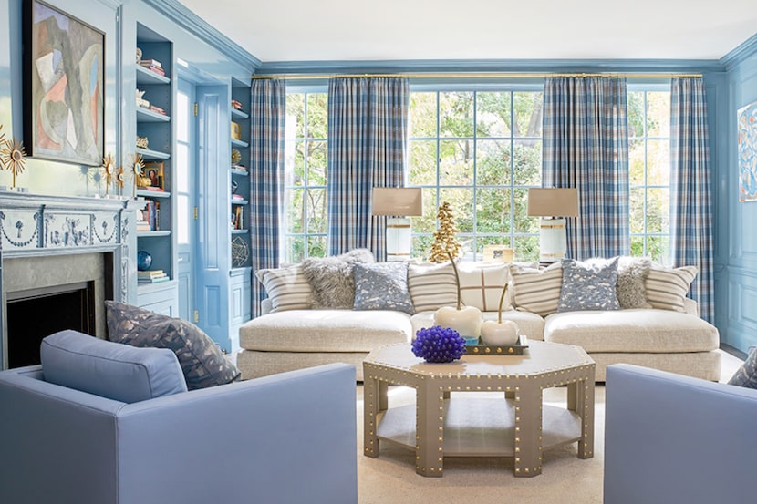
19 go-to paint colors that Dallas designers love
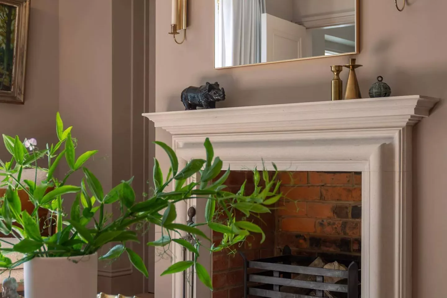
33 Absolutely Perfect Paint Colors Designers Love

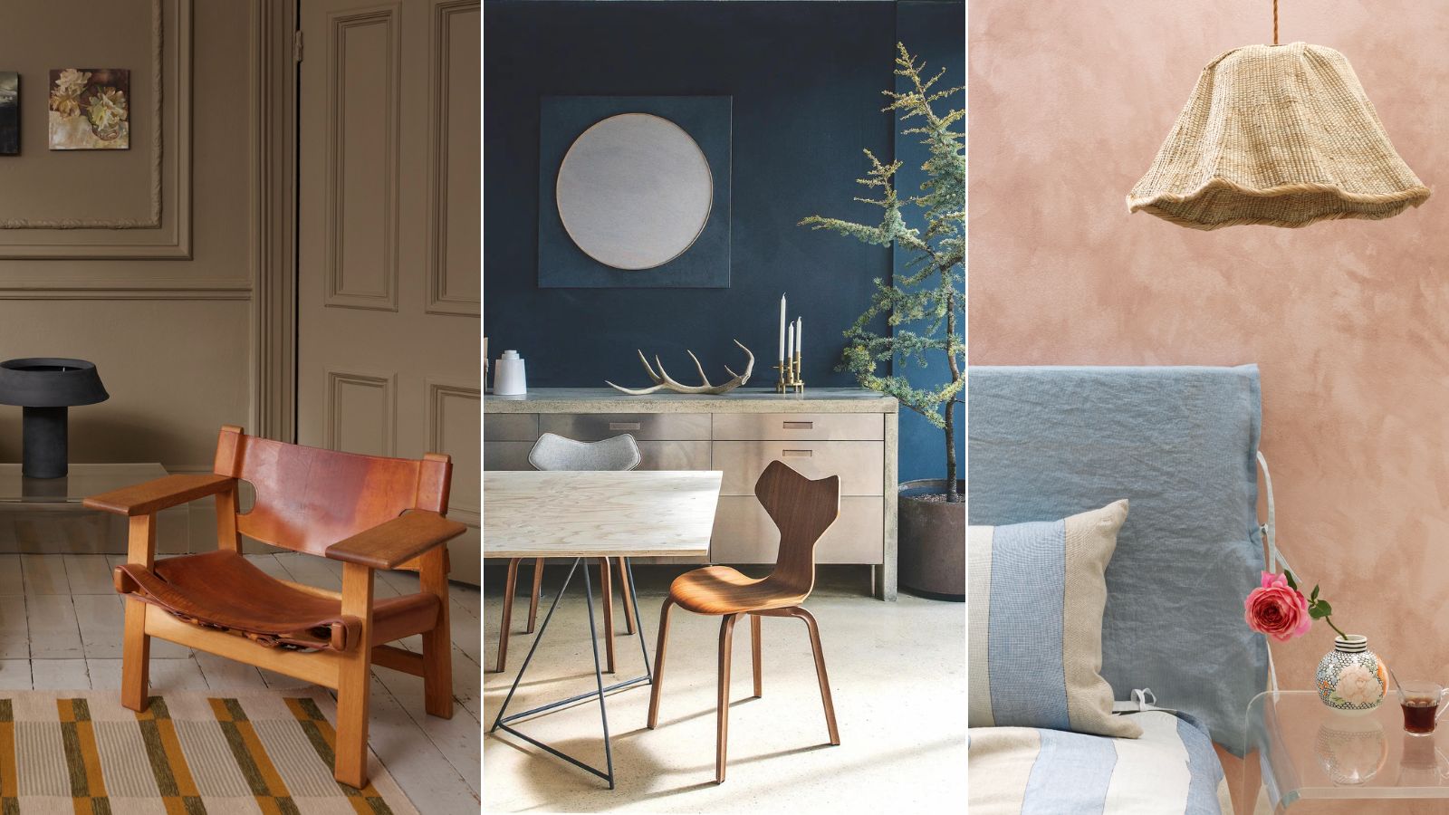
Professional painters reveal the secret to color matching a paint shade from an image alone

Fixer Upper's Joanna Gaines Shares The Perfect Paint Colors For Every Area Of Your House
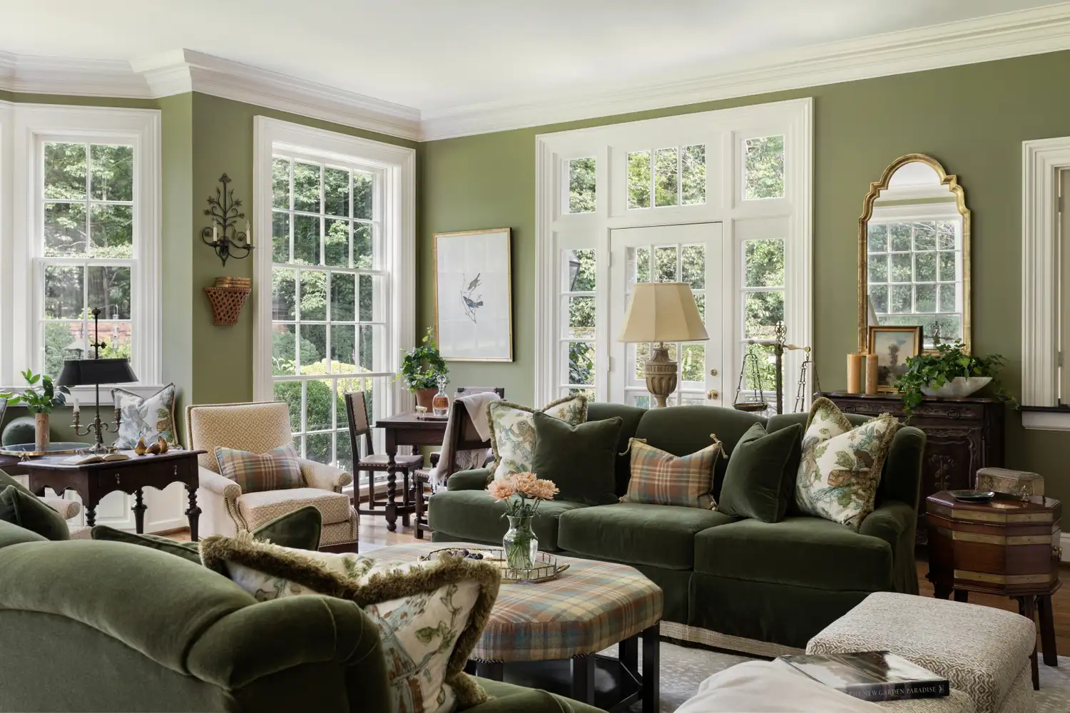
5 Secrets To Picking Paint Colors Like A Designer
These Master Tips Will Help You Avoid Choosing The Wrong Type Of Paint
Tips for adding the hottest paint colors to your decor

What makes a paint color flattering? Experts share their go-to shades for a universally complementary scheme
Britain's best interior designers on the paint colours you just can't go wrong with
9 Neutral Paint Colors Designers Constantly Reach For — "It's My Tried-and-True"
Here's What Colorists Want You to Know About Picking House Paint

to choose paint colors.