The 15 Best Paint Colors for Your Living Room, According to Interior Designers
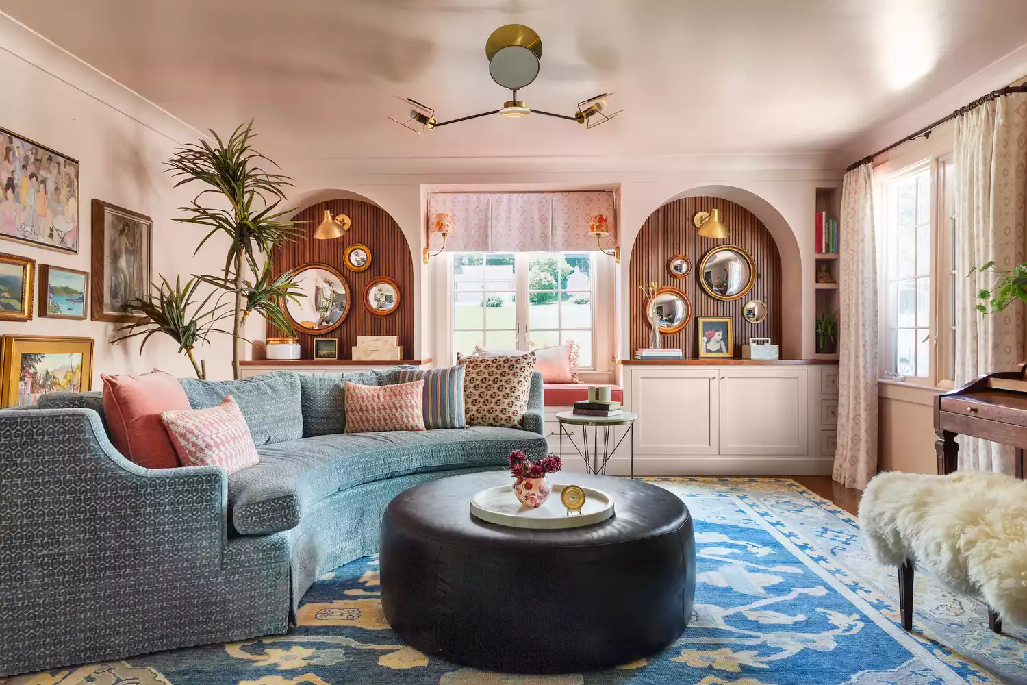
The living room serves multiple functions, from entertaining guests to providing a space for relaxation, making the selection of its paint color a crucial decision. This article compiles recommendations from interior designers to simplify the process of choosing a versatile and appealing hue. It highlights fifteen specific paint colors, ranging from soft neutrals to more distinctive tones, each with unique characteristics and suggested applications.
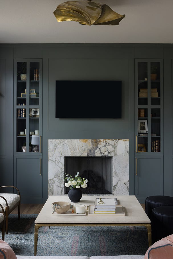
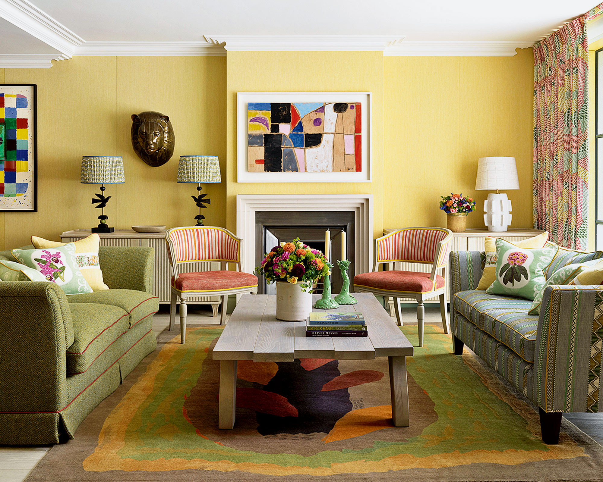
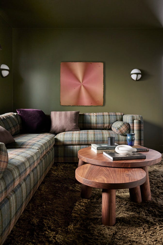
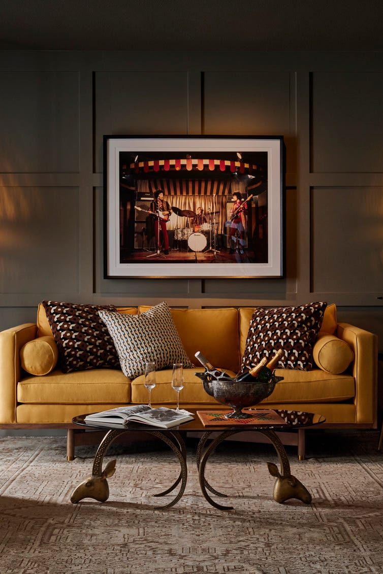
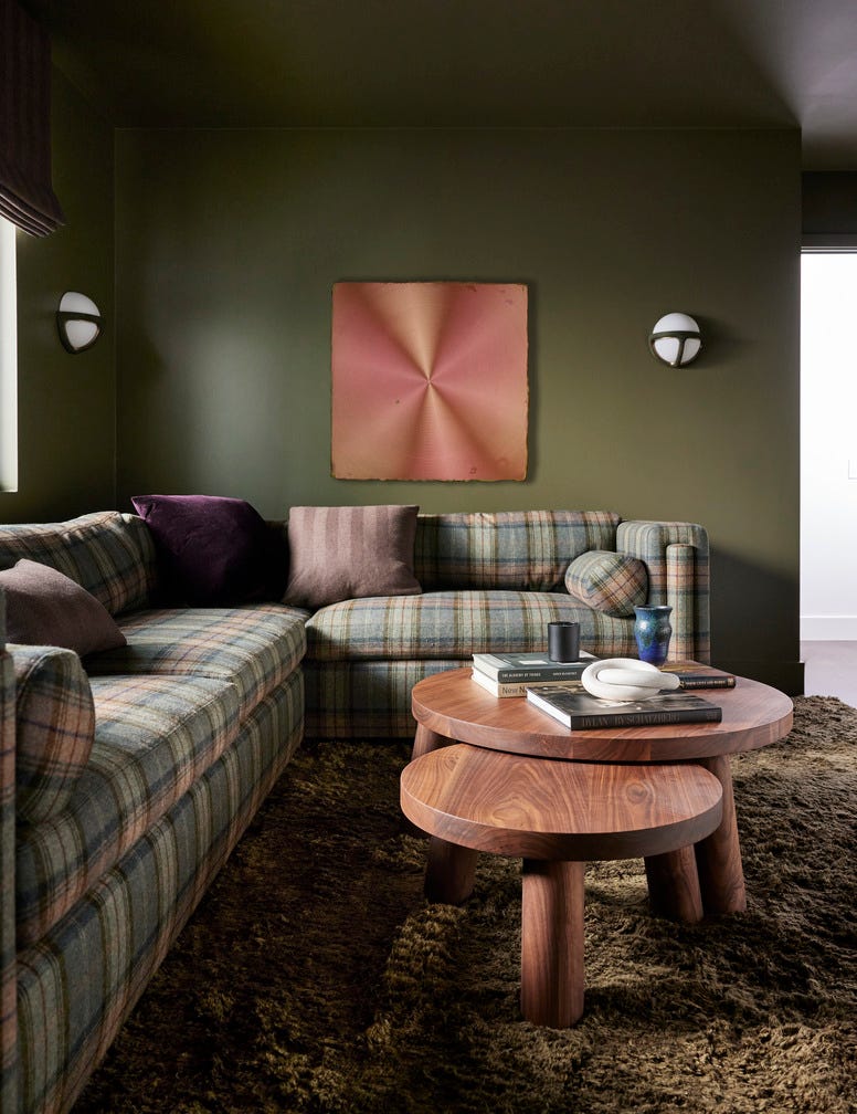
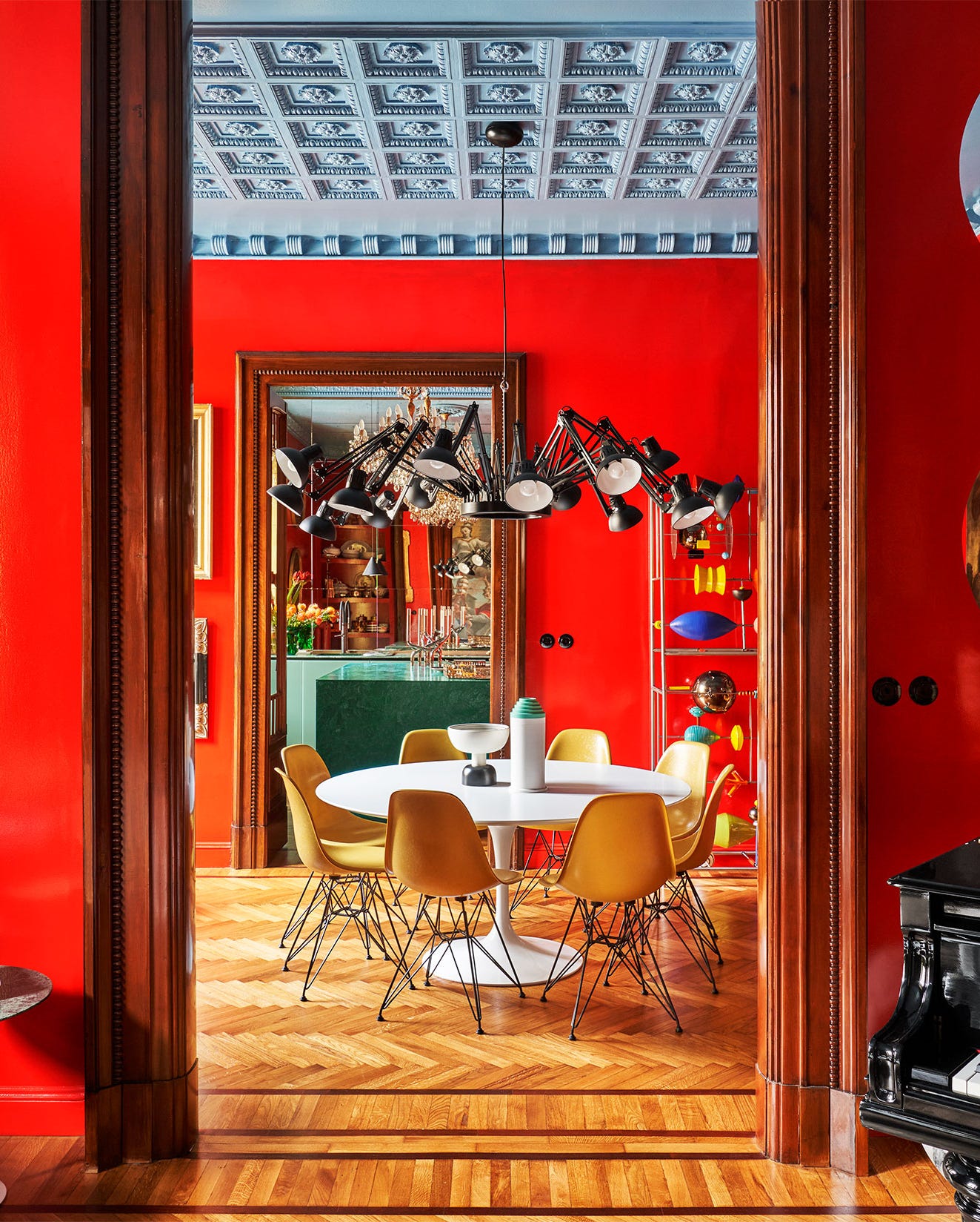
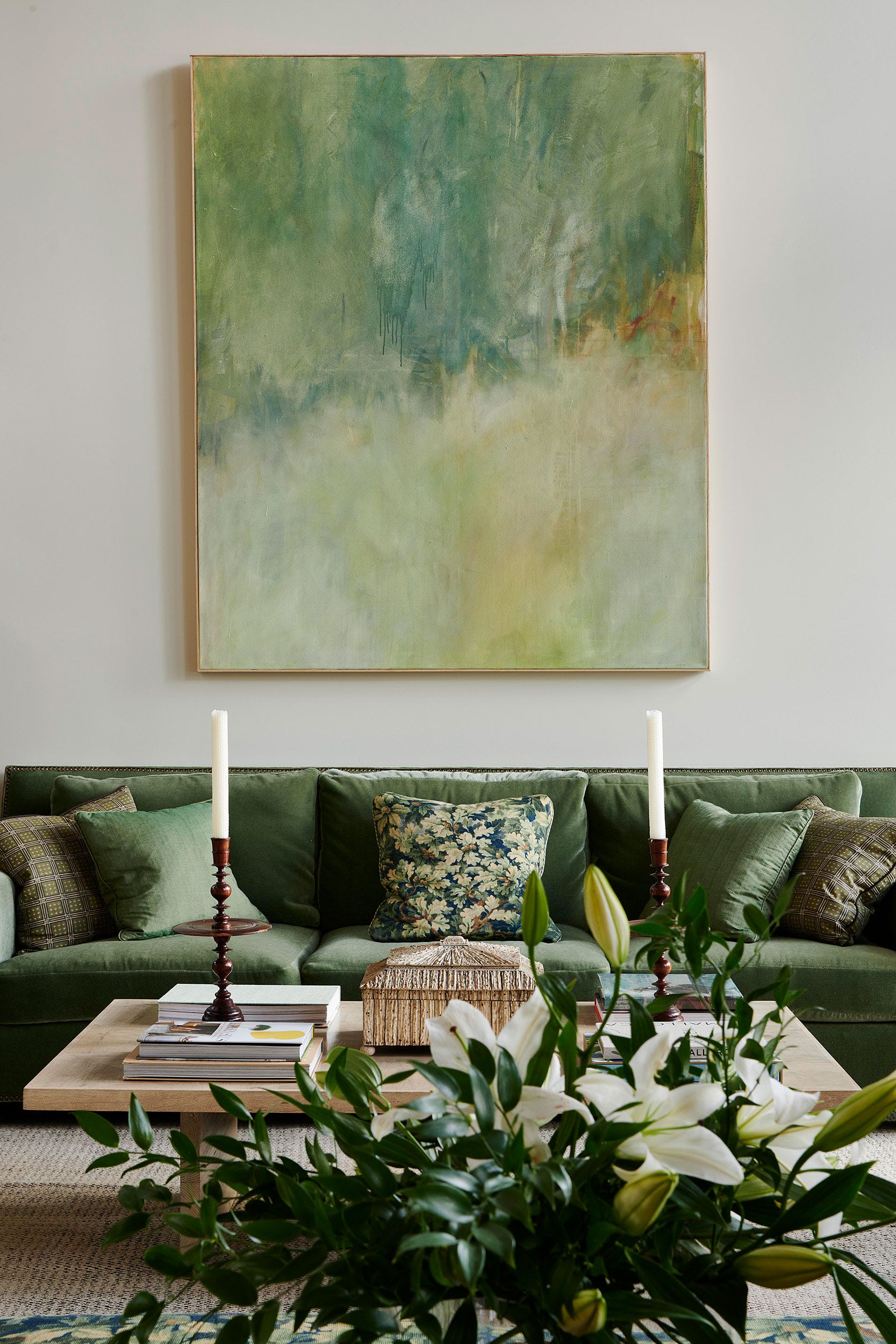
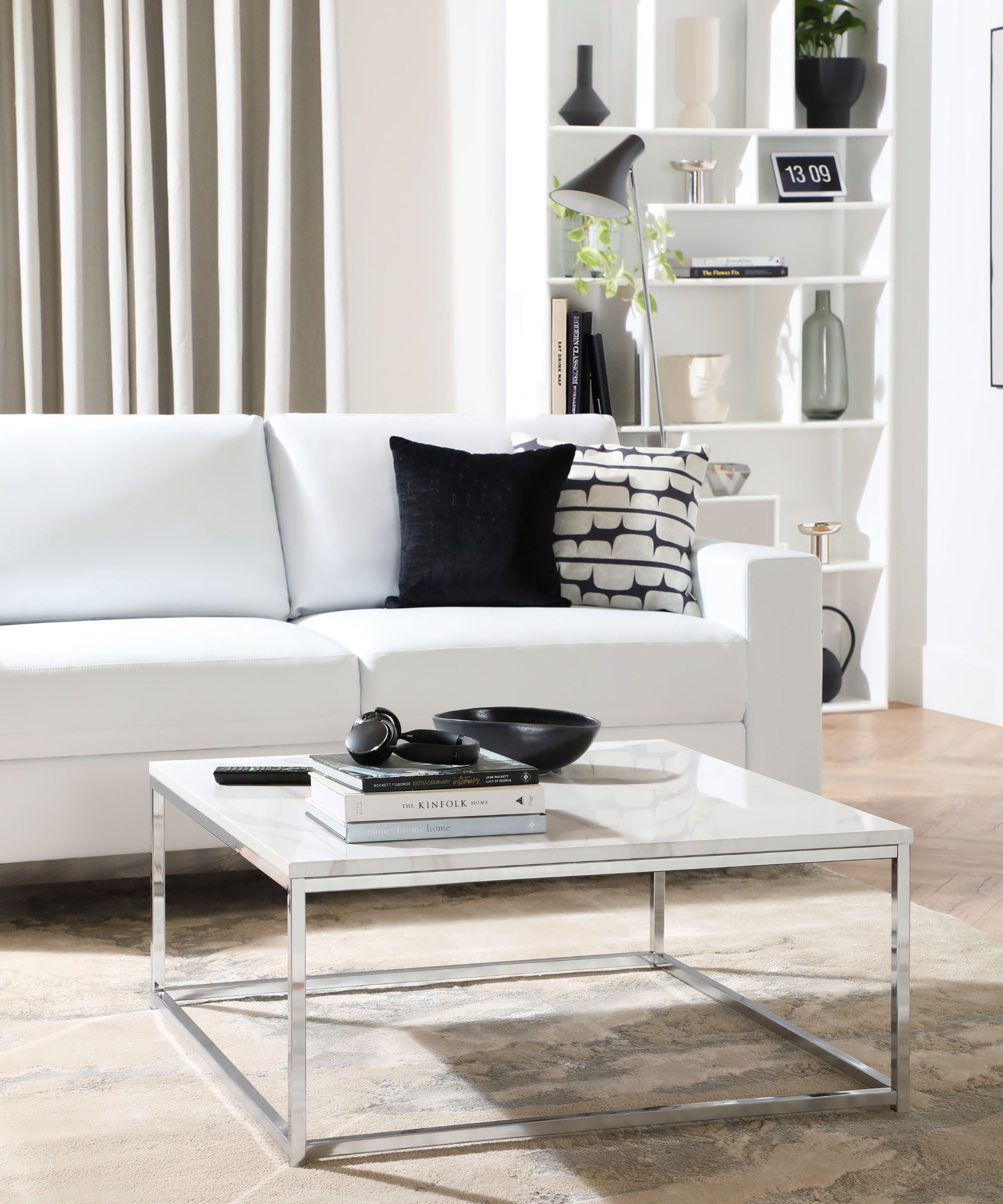
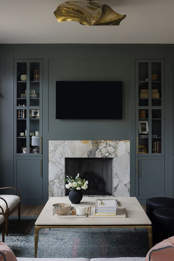
Whitehall by Mylands is presented as a soft white that offers warmth and an airy feel, promoting calm and balance in the living space. For a more pronounced statement without being overwhelming, Green Smoke by Farrow & Ball is suggested, described as cozy yet elegant, transitioning from rich and organic during the day to moody and sophisticated at night. Ballet White by Benjamin Moore is recommended for rooms with ample natural light, serving as a neutral backdrop that allows elegant furnishings and art to stand out. White Dove by Benjamin Moore is another crisp white option, celebrated for freshening spaces, adding sophistication, and effortlessly playing off classical architectural elements while inviting light.
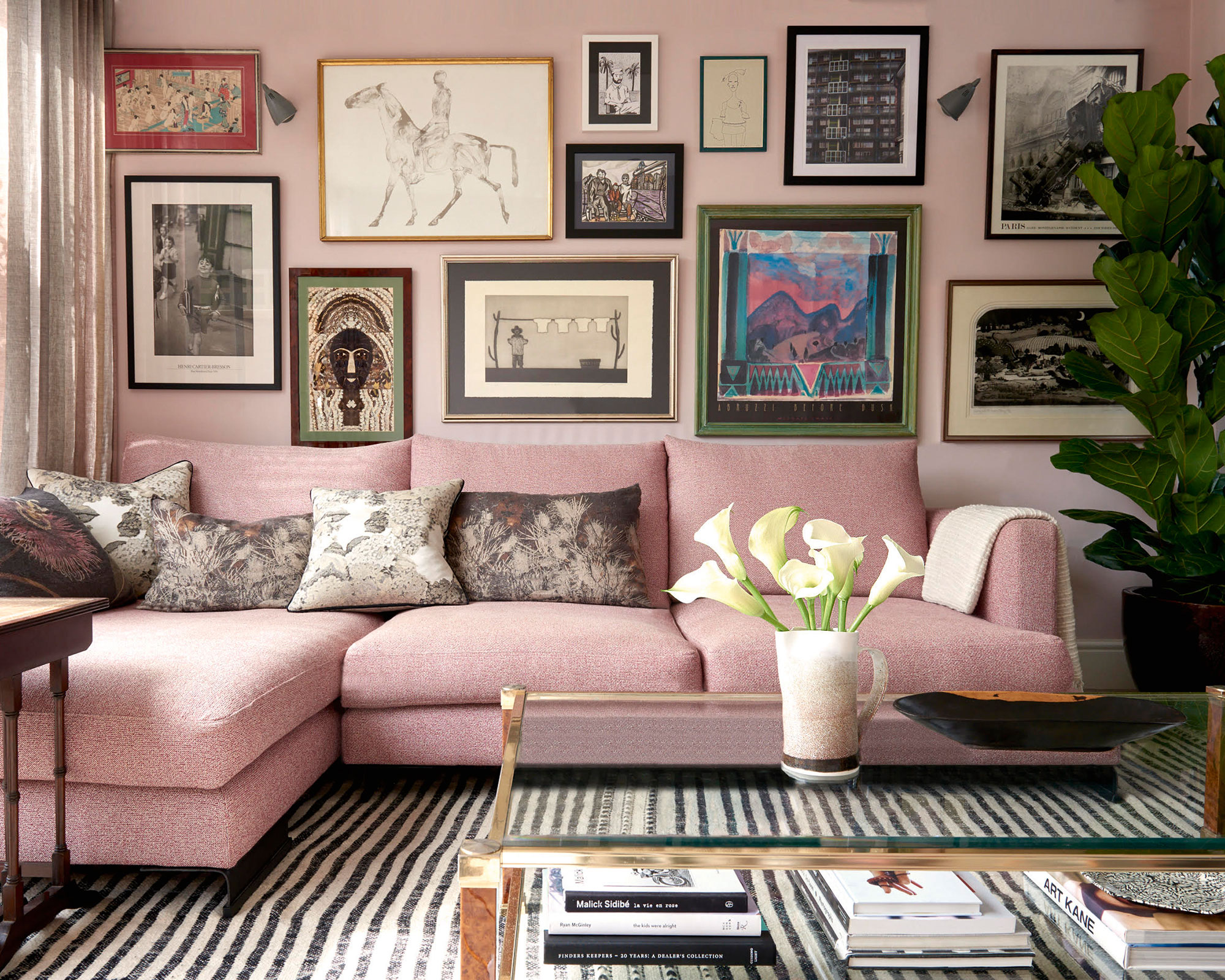
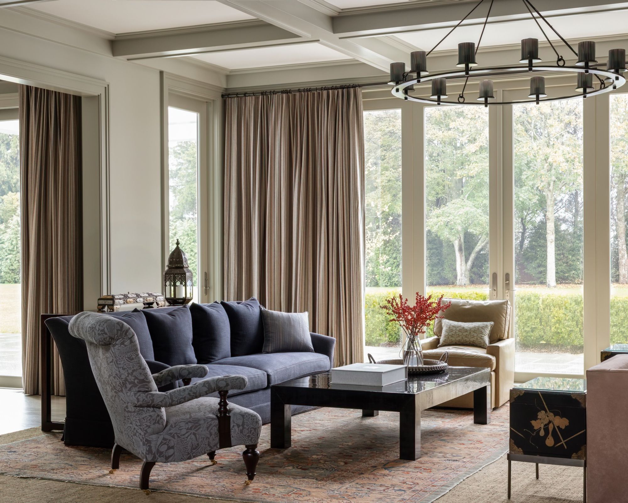
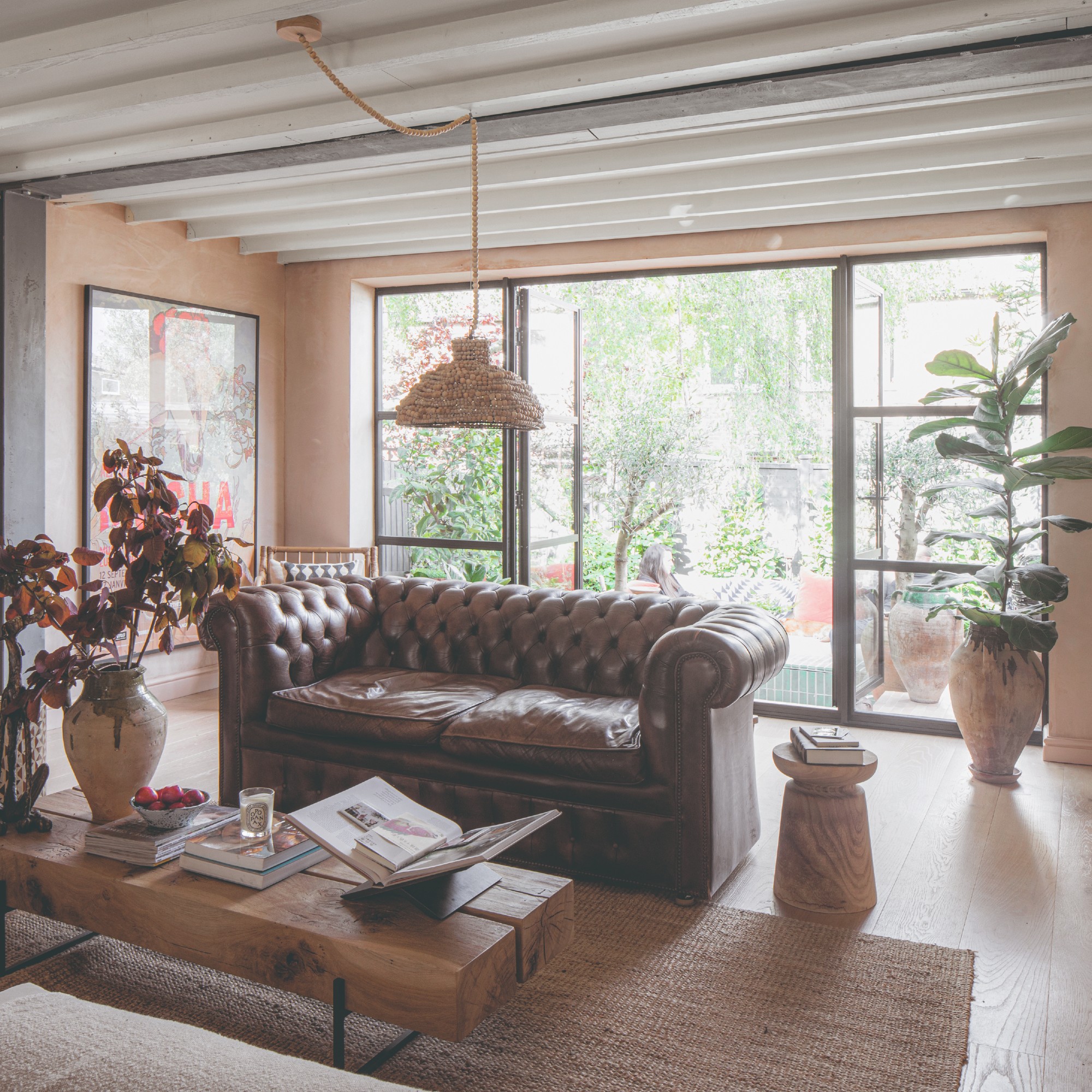
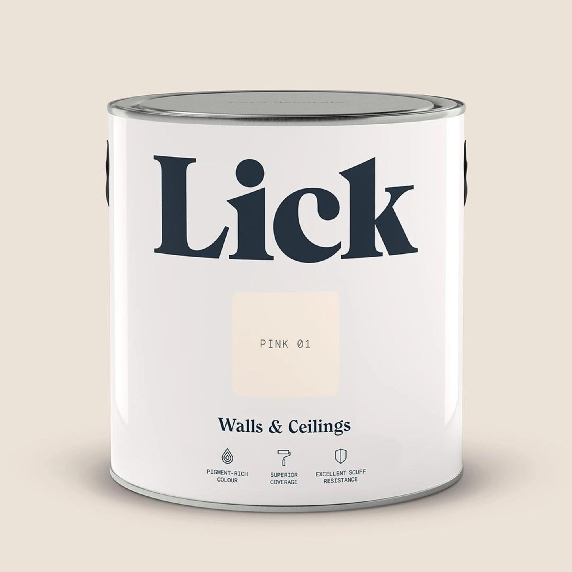
Classic Gray by Benjamin Moore, a greige, is noted for being elegant but not overly formal, creating a serene and inviting atmosphere with its warm undertones. Cotton Balls by Benjamin Moore offers a clean canvas, reflecting natural light beautifully. Wickham Gray by Benjamin Moore, a soft gray with blue undertones, introduces serene and fresh energy, complementing various textures and furniture styles. Setting Plaster by Farrow & Ball provides an alternative to white, offering warmth and nuance with its pale pink hue.
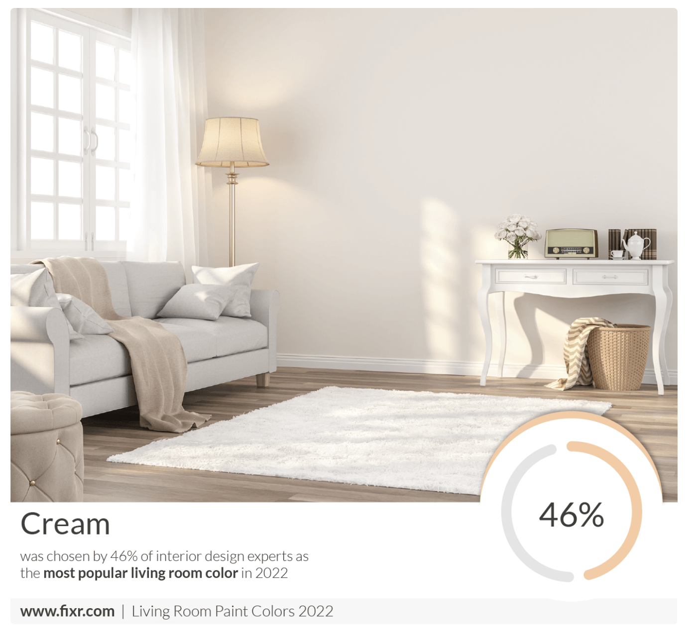
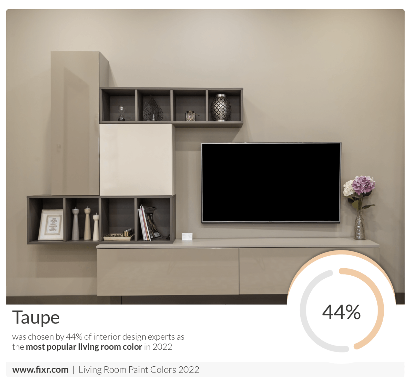
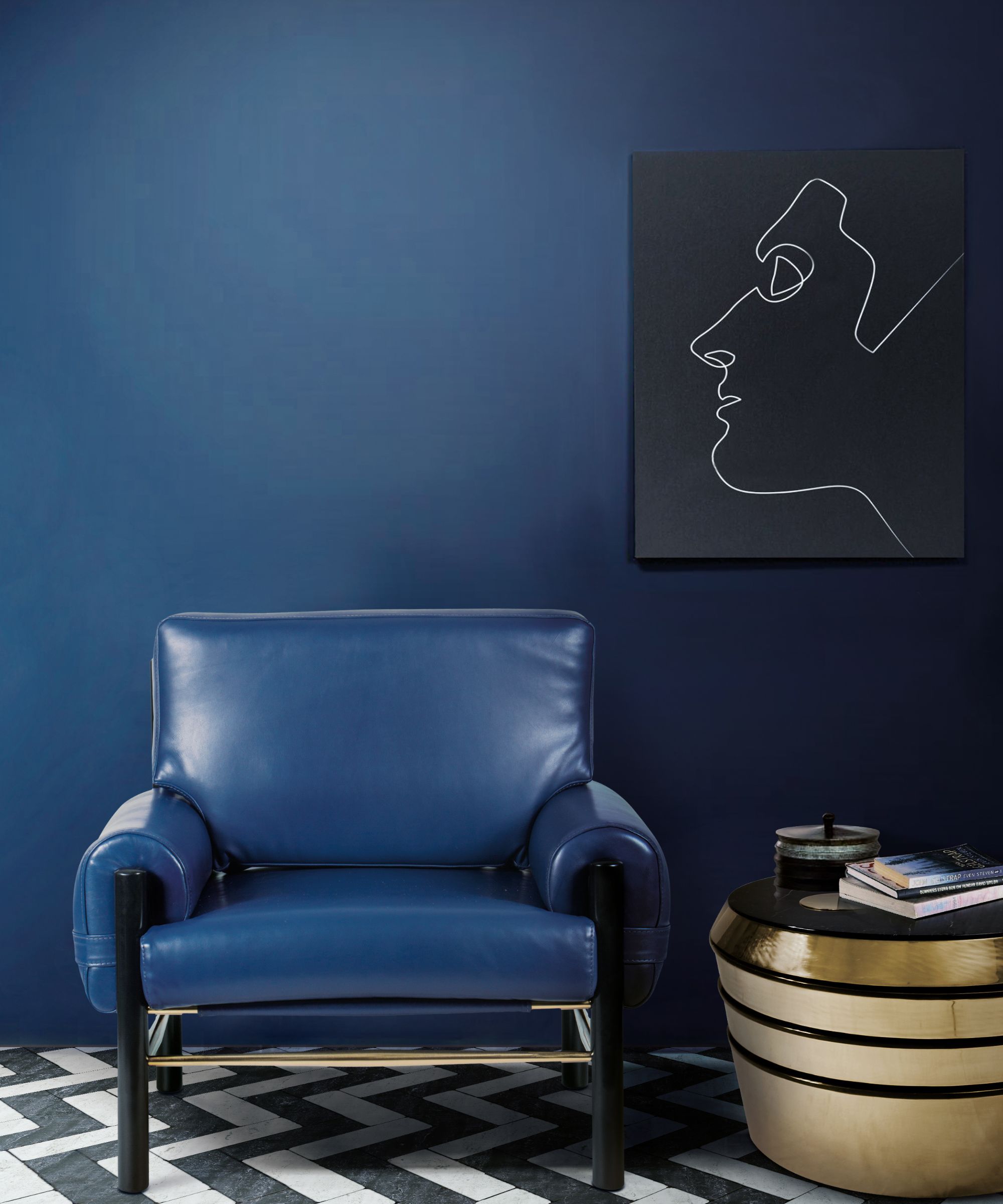
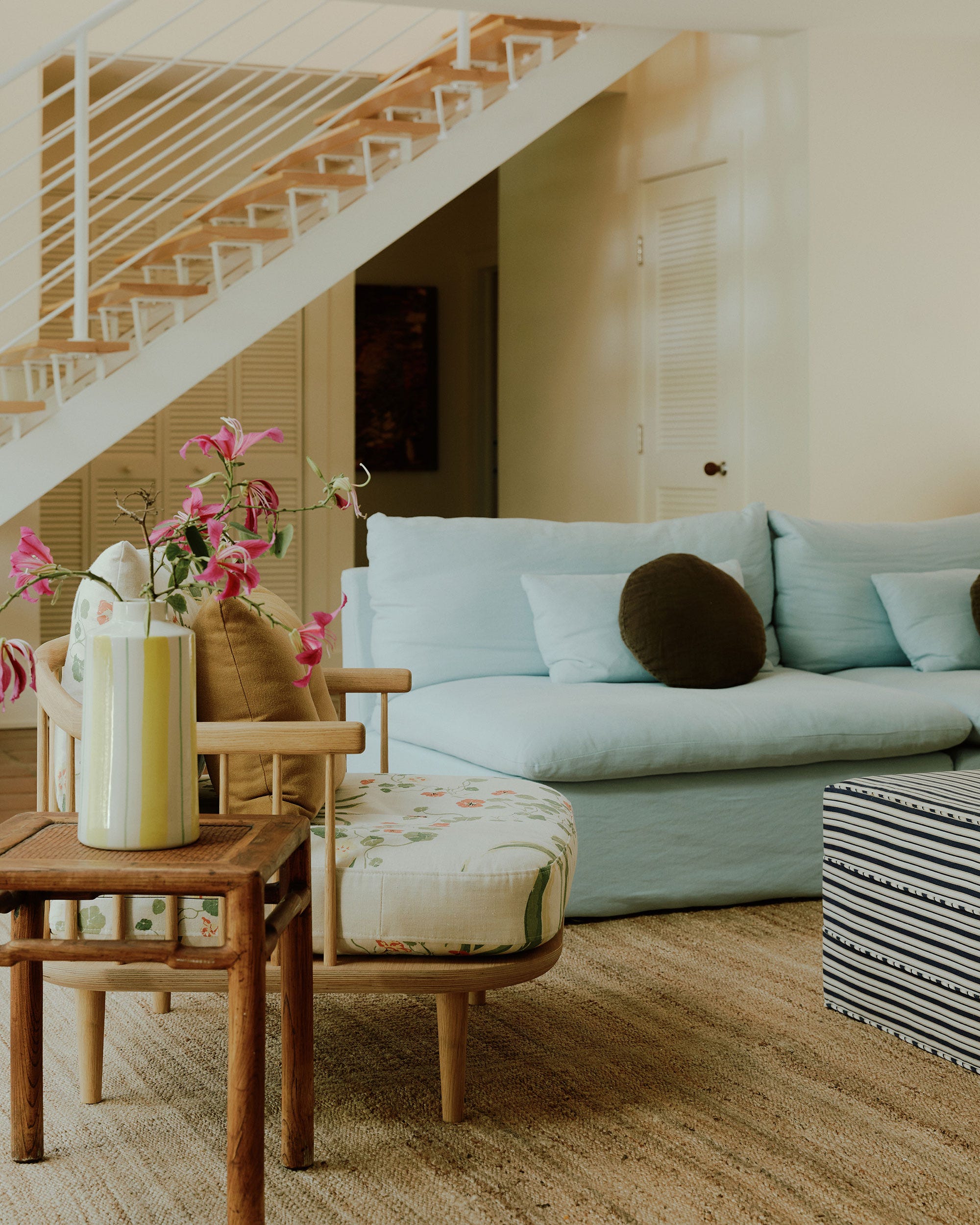
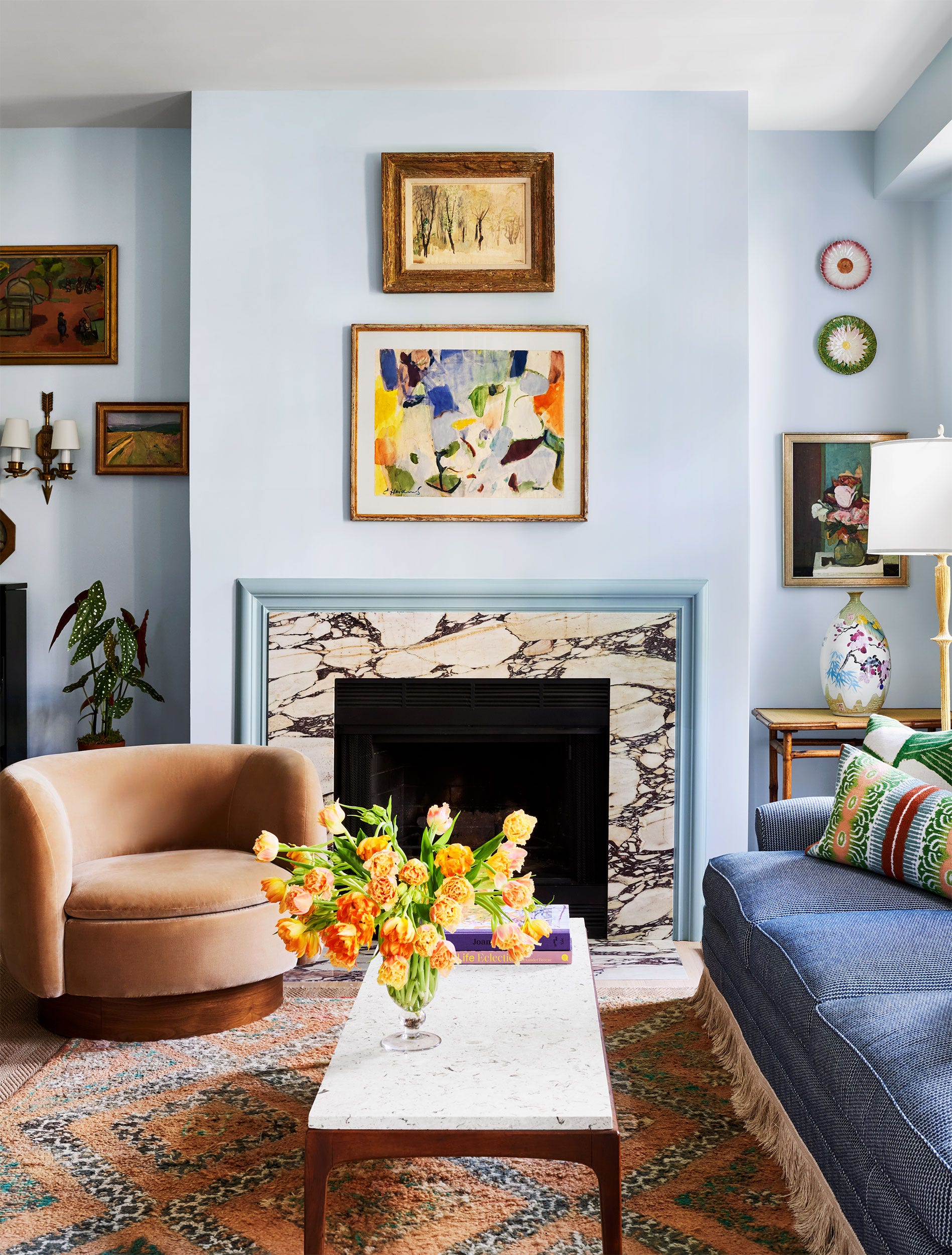
Acadia White by Benjamin Moore is highlighted as a creamy off-white that adds subtle warmth, preventing spaces from feeling stark while maintaining a bright and airy ambiance. For traditional living rooms, Ballroom Blue by Farrow & Ball offers a classical feel, especially when paired with lighter decor, enhancing artwork and antiques. Shadow Beige by Pratt & Lambert is a warm neutral ideal for open-plan living rooms, blending seamlessly between spaces and providing a solid base for earth tones.
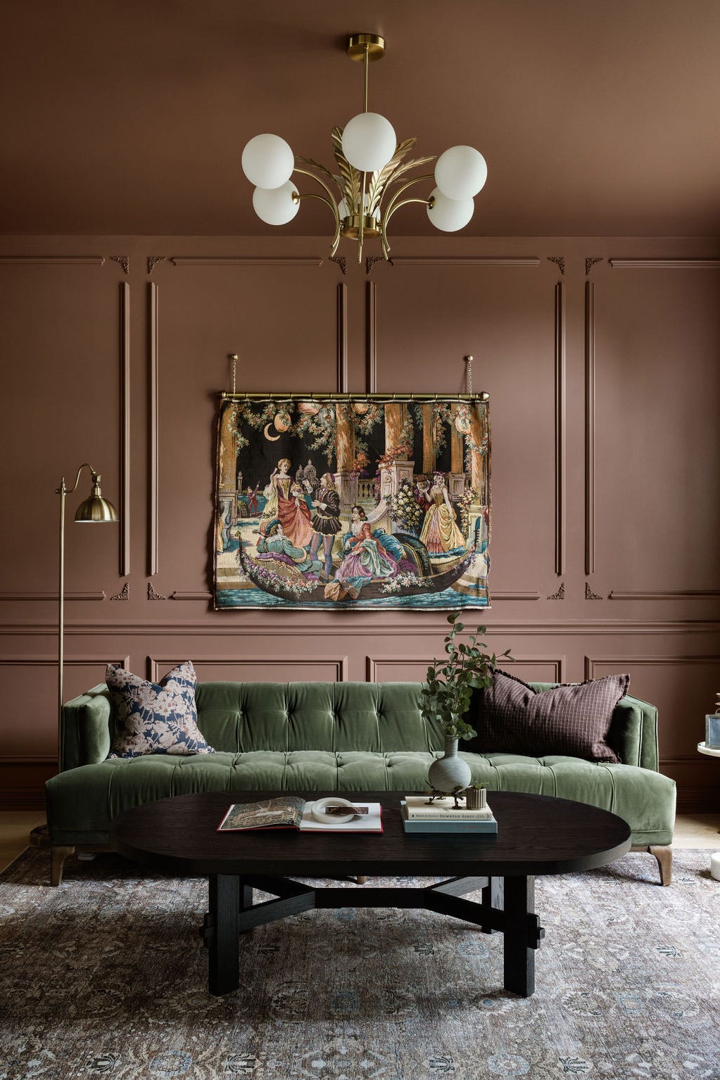
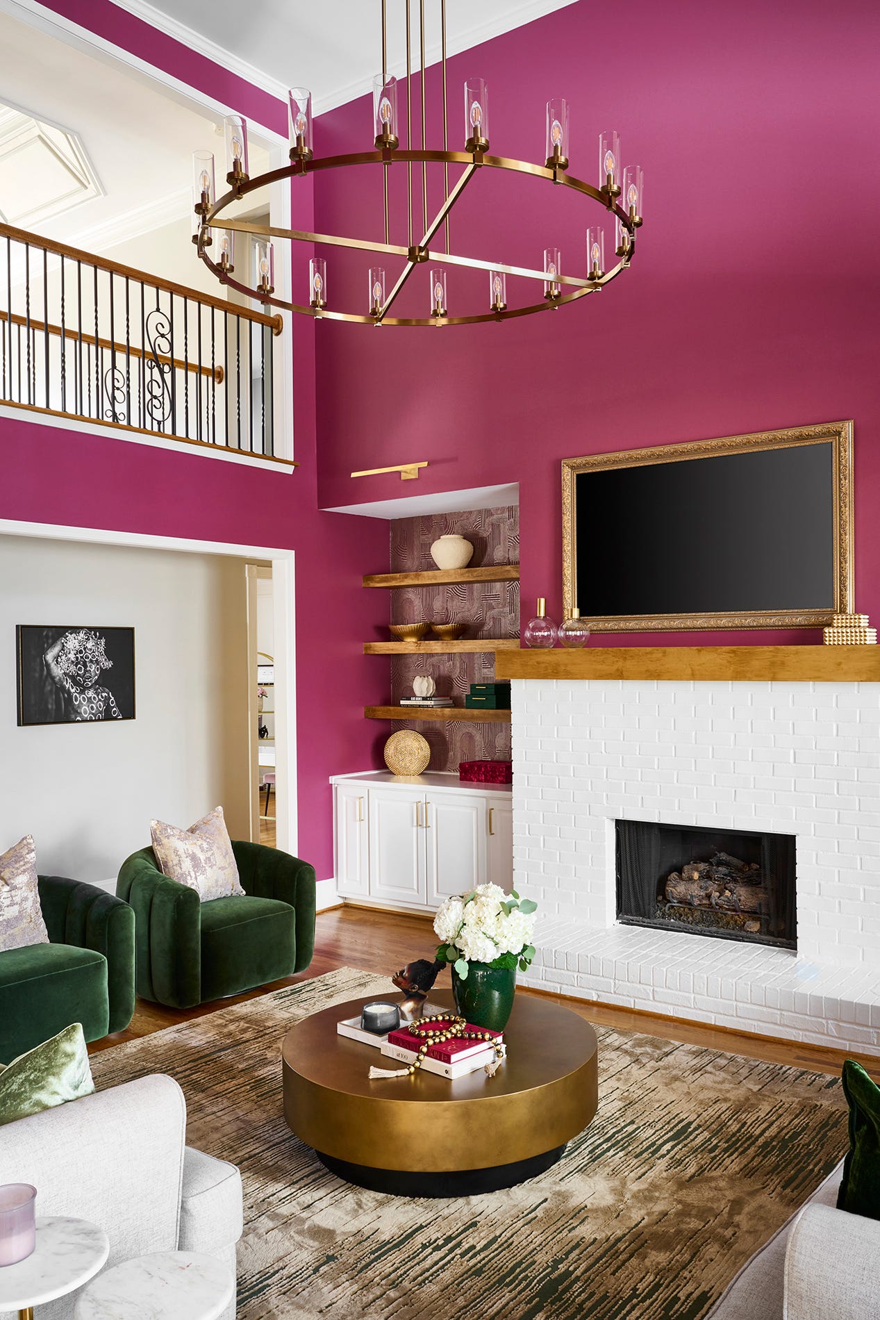
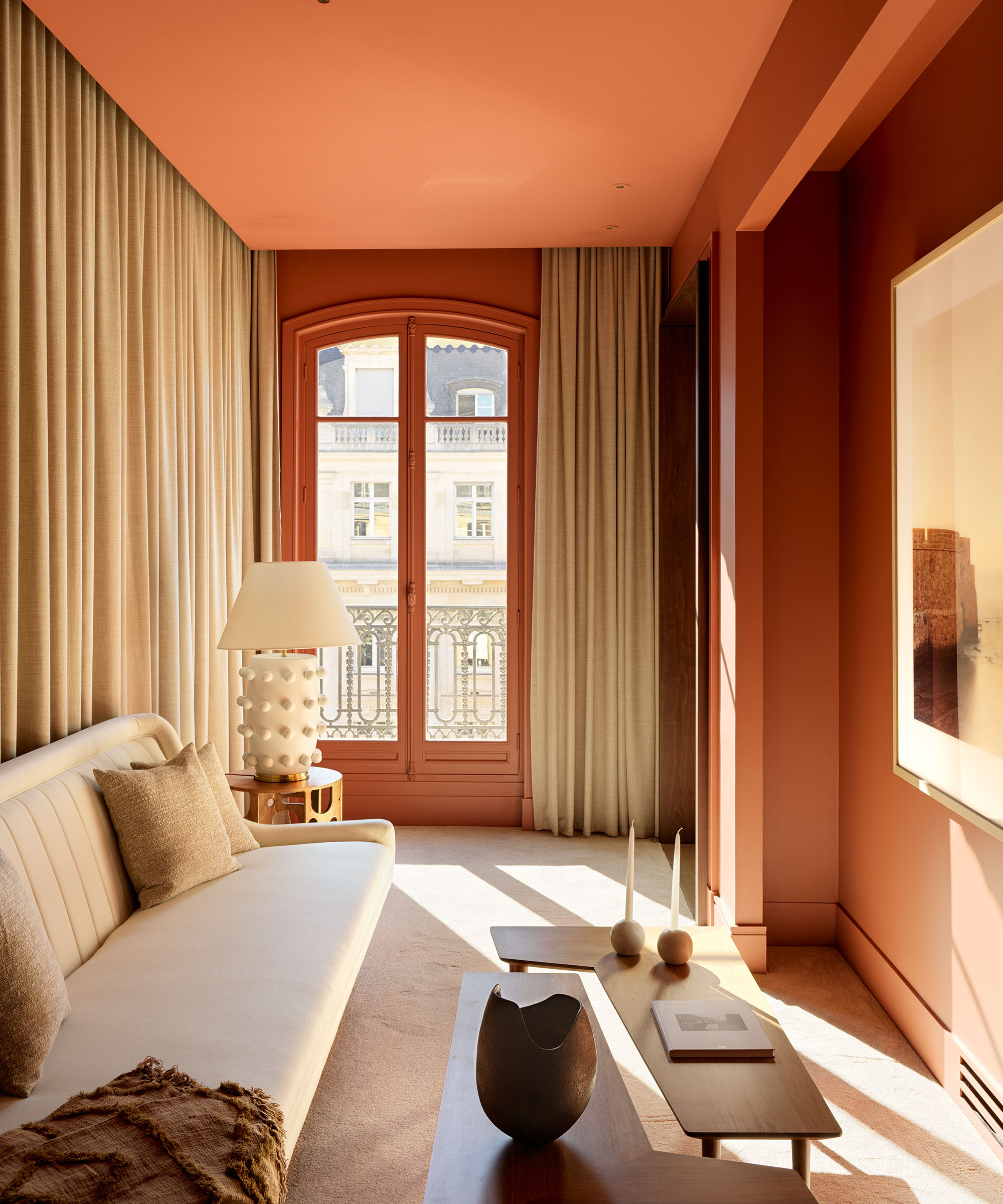
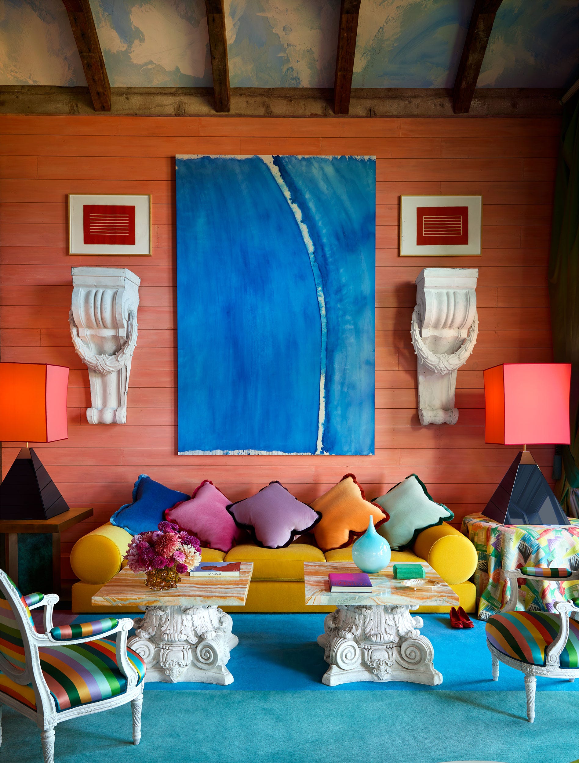
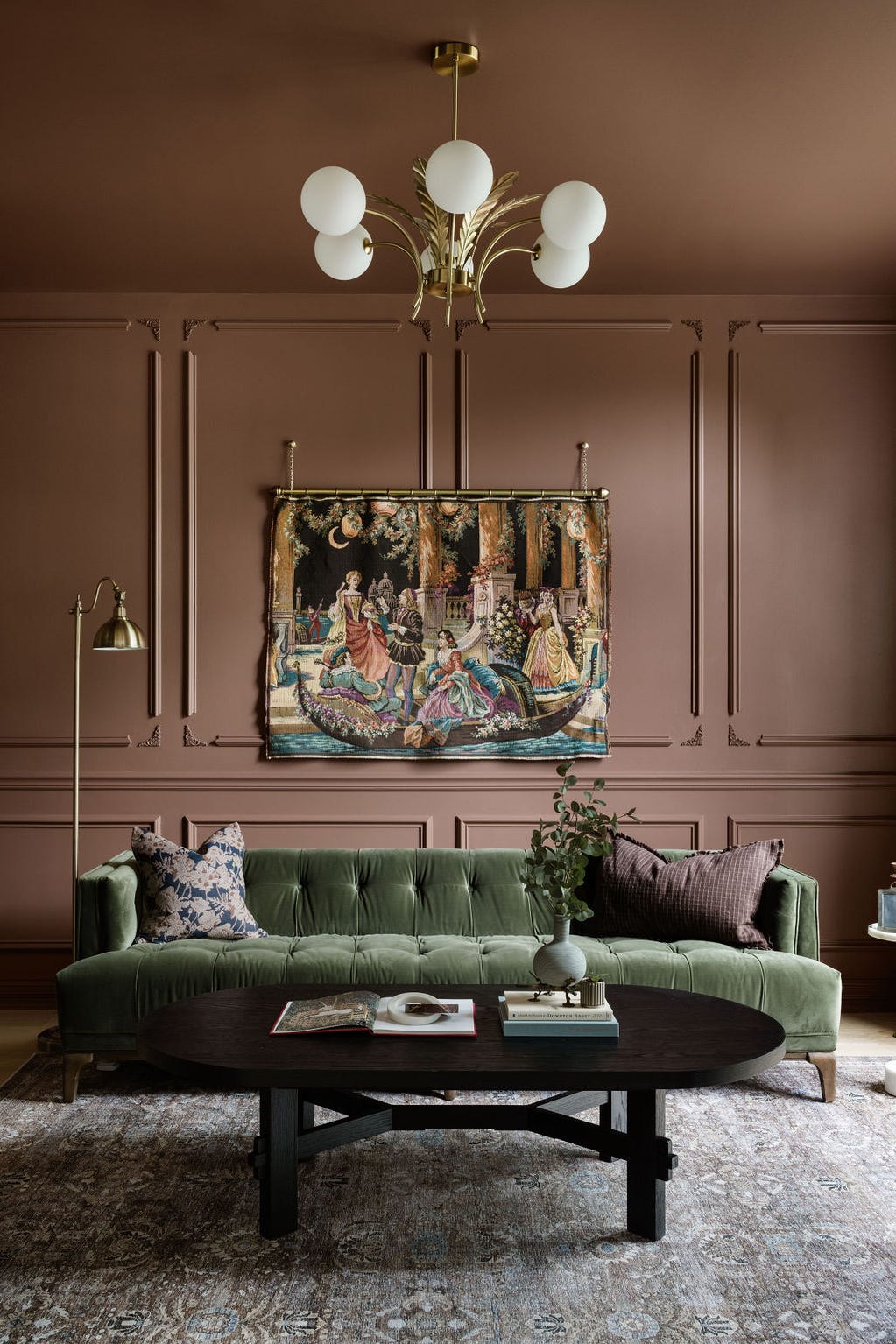
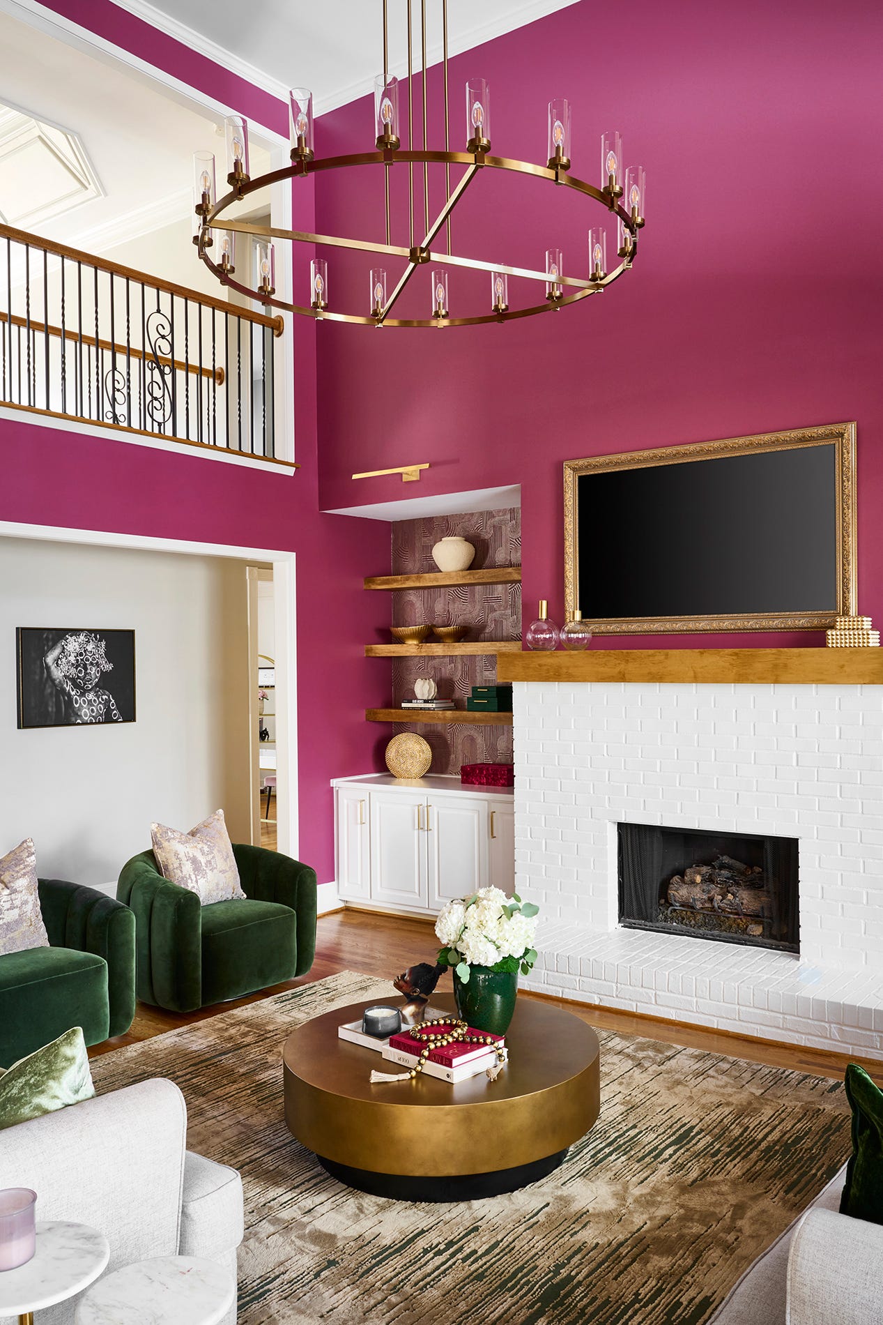
Imperial Gray by Benjamin Moore, with its blue-green undertones, is noted for creating cozy and cheerful spaces. Pewter Plate by Dulux Heritage is suggested for those seeking a bolder, moodier gray, pairing well with accent colors like navy or dusky pink to achieve a sense of quiet luxury. Swiss Coffee by Benjamin Moore is recommended for color drenching, offering a crisp, clean feel with depth. Finally, Cinnamon Slate by Benjamin Moore, the Color of the Year, is presented as a bold yet balanced choice, combining violet, charcoal, and brown for a noticeable but non-distracting presence.
#LivingRoomDesign #InteriorPaintColors #HomeDecor #DesignersChoice #NeutralColors #BoldColors #PaintPalette #HomeImprovement #ArchitecturalDesign #LivingRoomDesign #InteriorPaintColors #HomeDecor #DesignersChoice #NeutralColors #BoldColors #PaintPalette #HomeImprovement #ArchitecturalDesign
0 تعليق إجمالاً
 لا توجد تعليقات بعد
قد تعجبك أيضًا
Listen Up: These Are the Best Paint Colors for Your Living Room

Jewel Tones Are Trending for Living Room Paint Colors, According to Designers

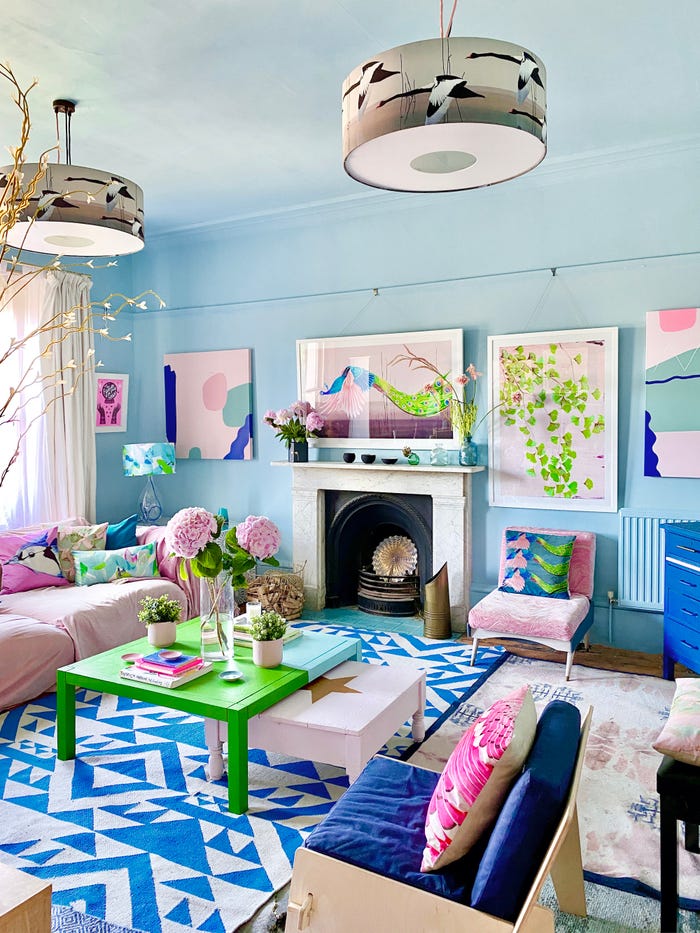
15 ways to add color to your home, according to interior designers
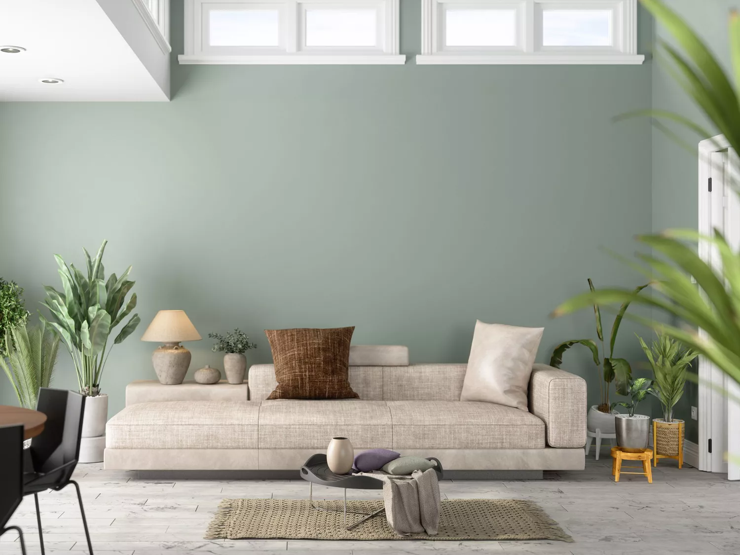
The 8 Best Living Room Paint Colors, According to Design Experts


Experts reveal the best living room paint colours to transform every space

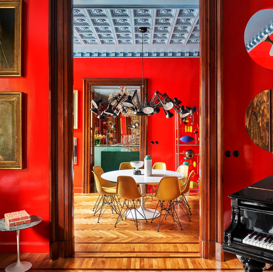
55 Living Room Color Ideas That Will Take Your Space from Drab to Fab

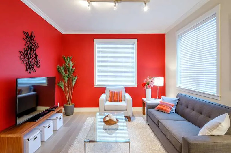
The 3 All-Time Worst Living-Room Paint Colors, According to Designers

These Living Room Paint Colors Are a Total Mindset Shift
5 colors that will make your living room feel happier, according to interior designers
The Best Living Room Paint Colors, According To Designers

10 Timeless Living Room Paint Colors Designers Swear By
‘When your sofa and wall colours are in sync, the space feels intentional’ – experts reveal the 4 best paint and sofa colour combinations
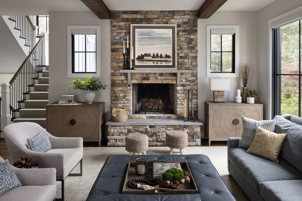
The Best Living Room Paint Colors, According To Designers

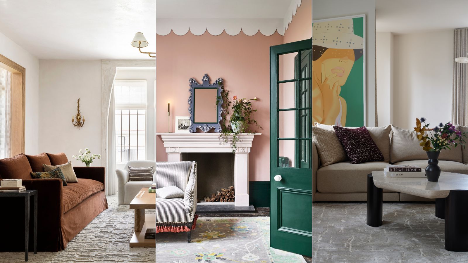
These are interior designers' favorite color combinations for living rooms – from neutral and calming to bold and playful
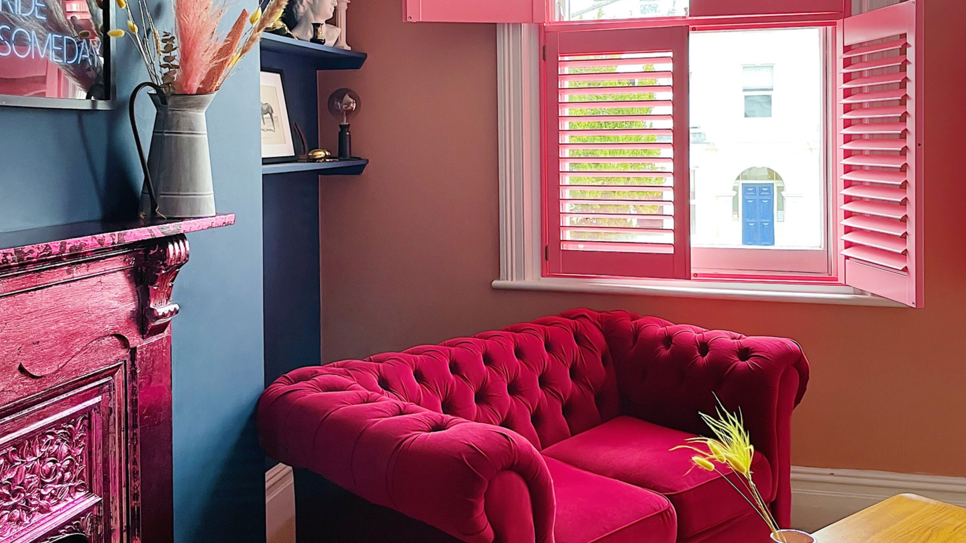
The best paint colors for small living rooms, according to design experts


These Colors Will Be Everywhere in Interiors in 2025
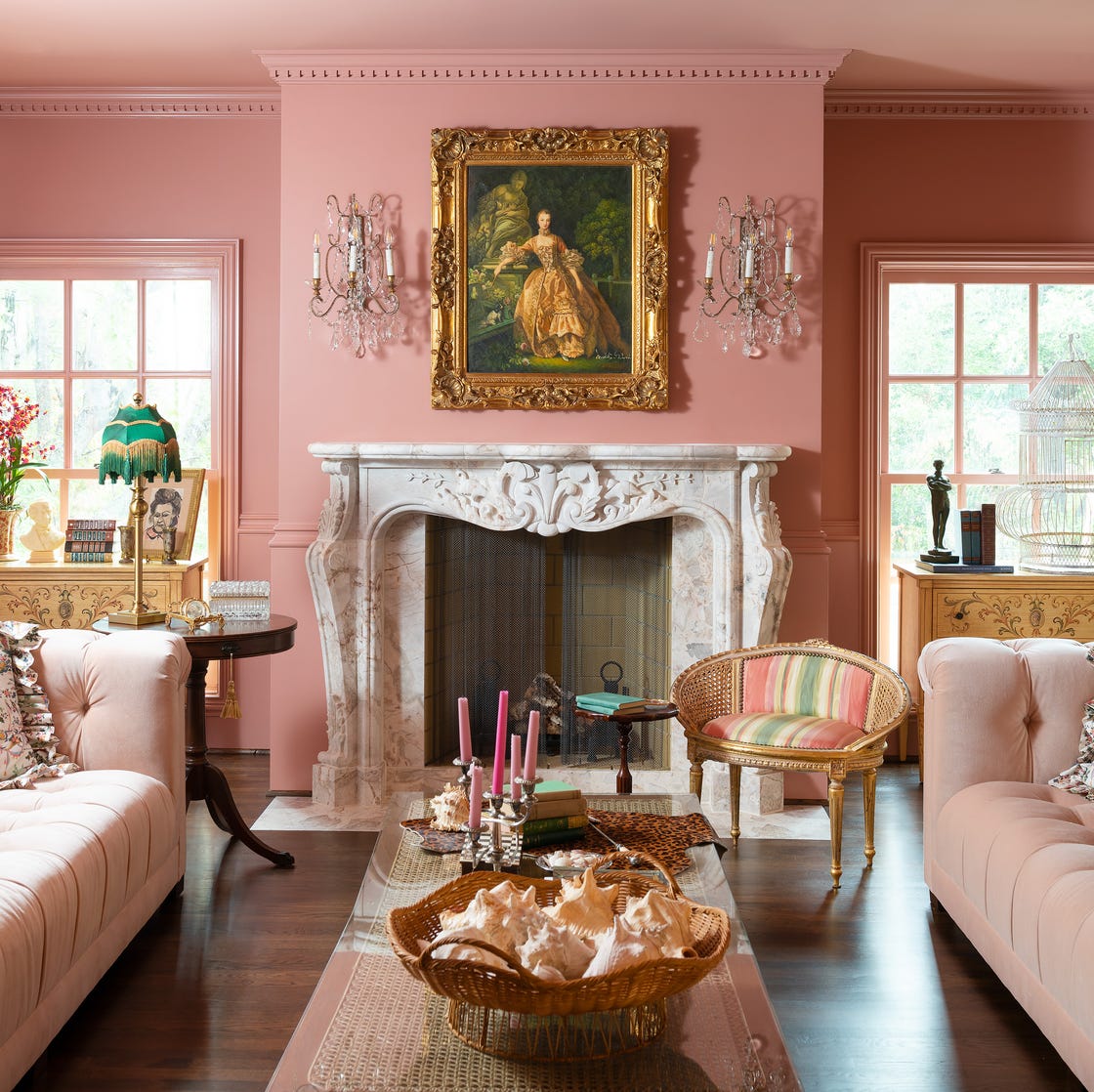
Designer-Approved Living Room Colors That'll Make You Feel Happier
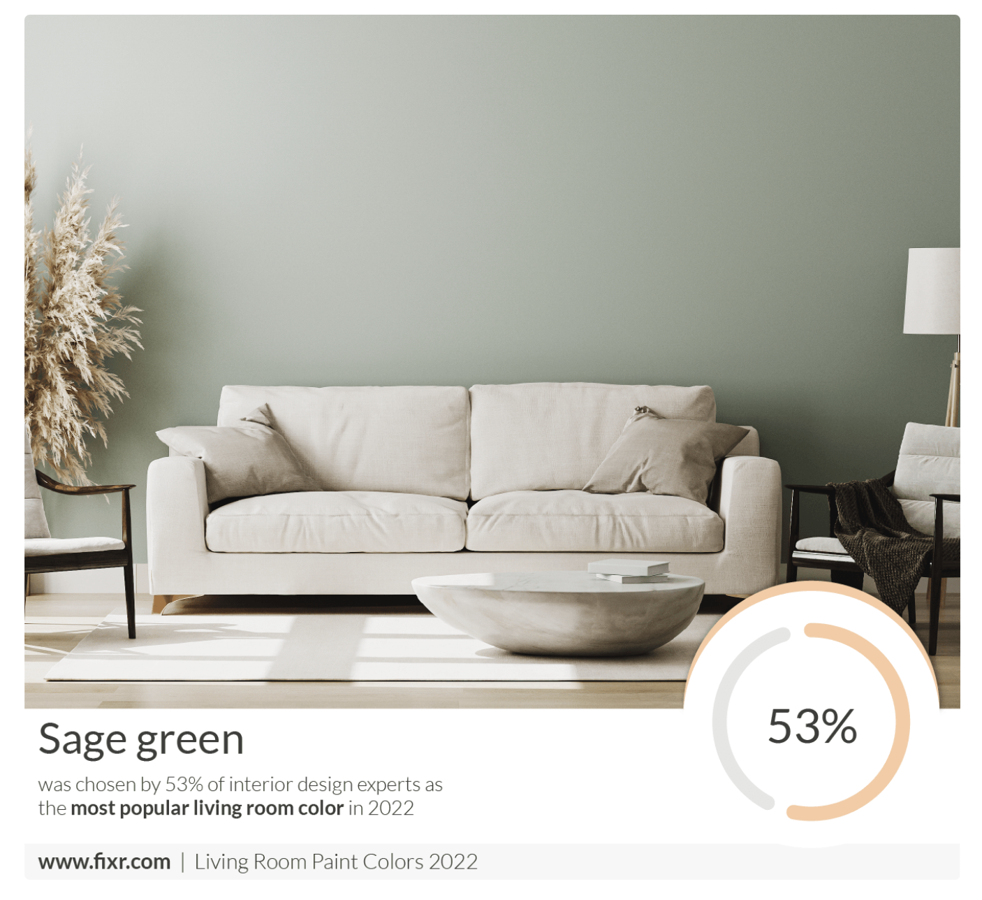
7 Popular Paint Colors for the Living Room
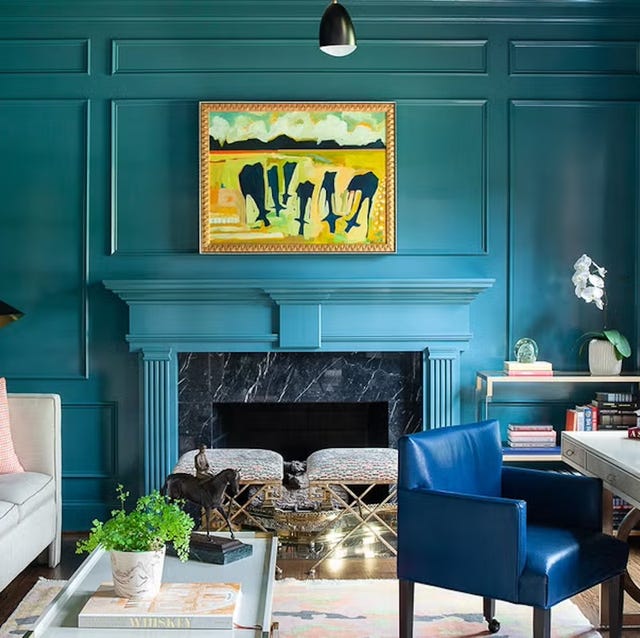
The 60 Most Popular Living Room Paint Colors Right Now
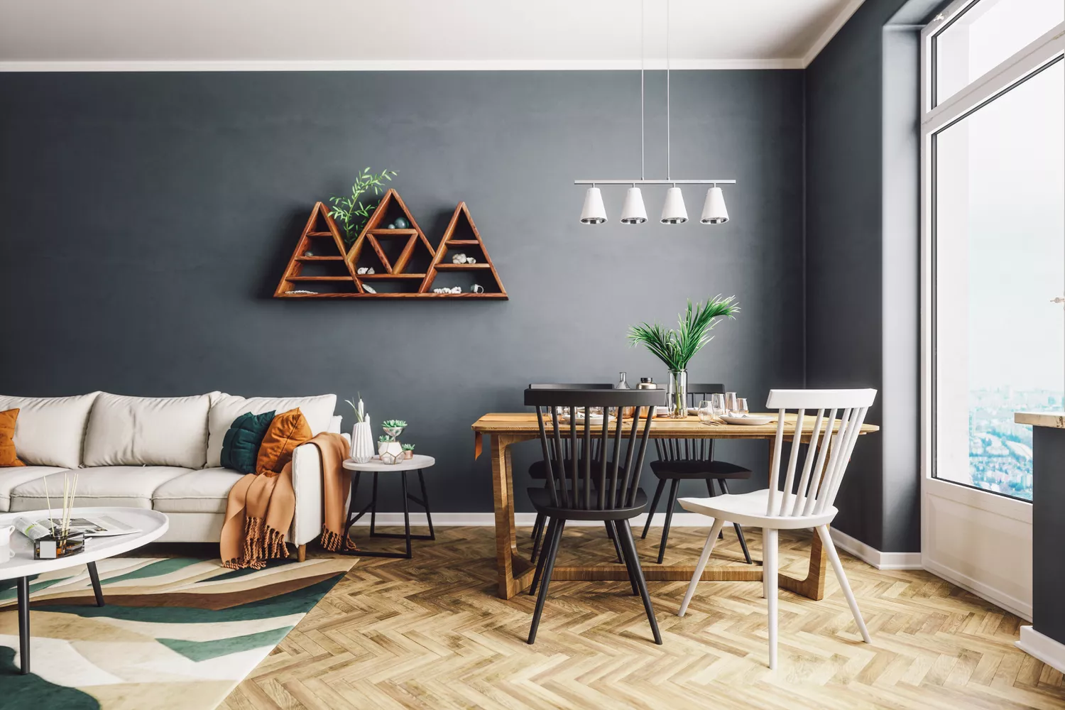
4 Living Room Paint Colors That Are So Outdated, According to Designers