1/16
15 Farrow & Ball paint colors in real homes – from calming blues to warm neutrals
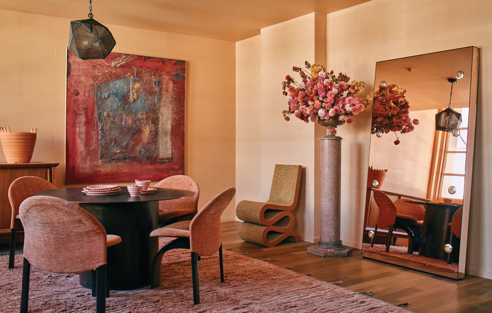
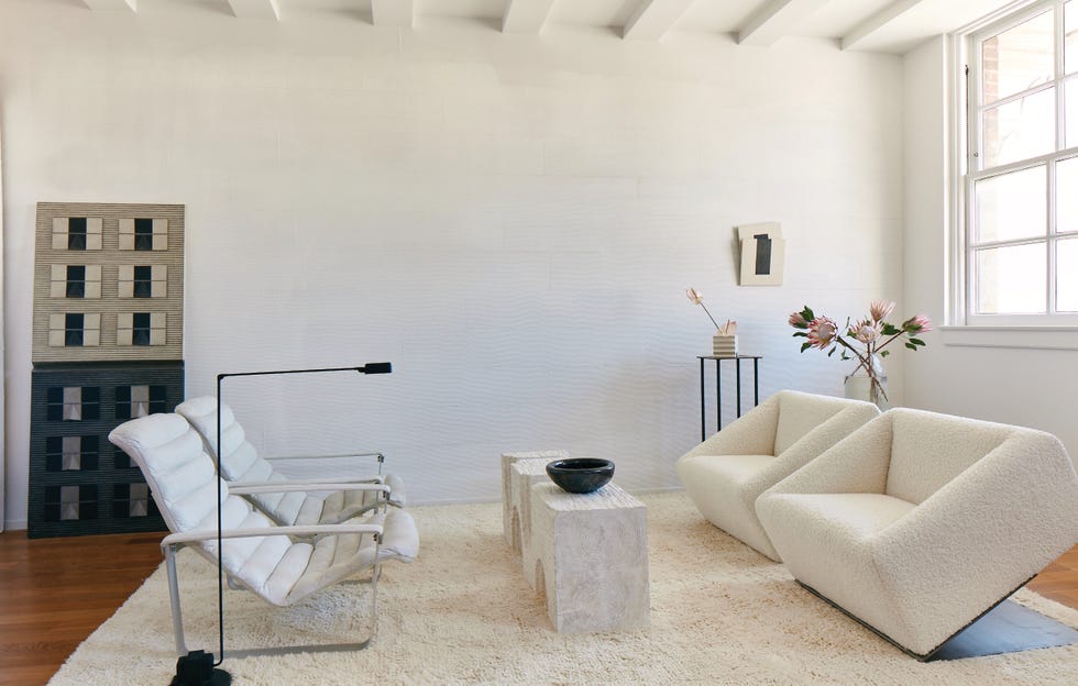
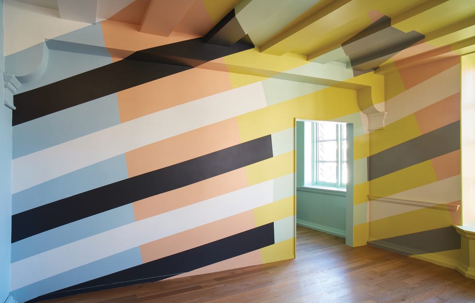
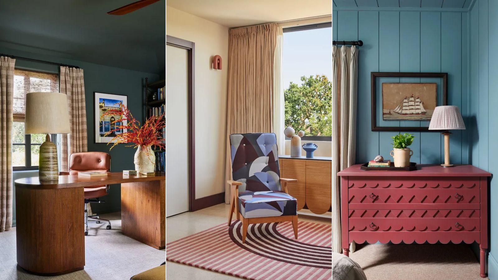
This article explores 15 popular Farrow & Ball paint colors, showcasing their application in real home interiors. Farrow & Ball paints are a favorite among interior designers due to their richly pigmented formulas and wide array of timeless, livable colors that seamlessly integrate into various interior design styles. The selection ranges from nuanced dark shades to off-whites, and from calming blues to earthy greens.
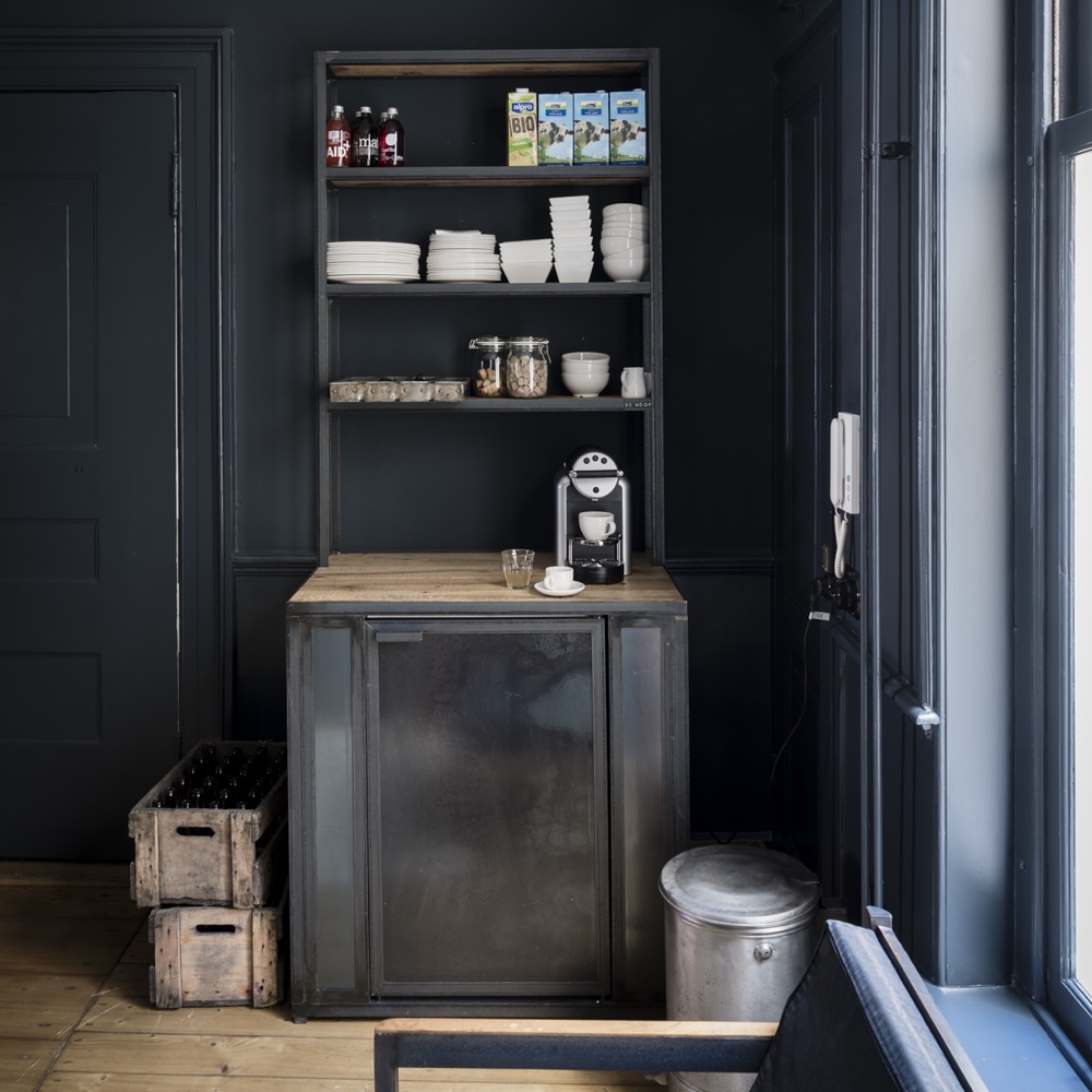
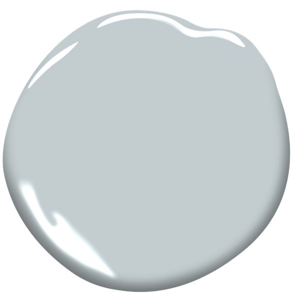
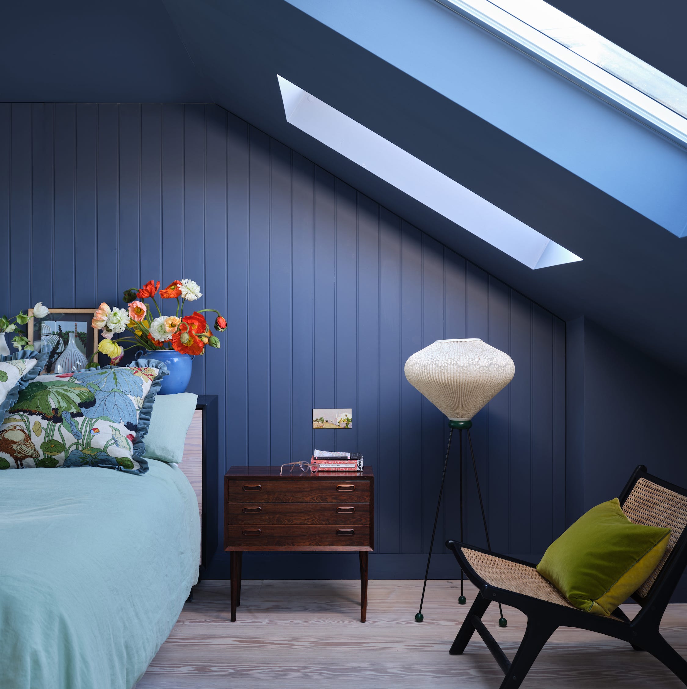
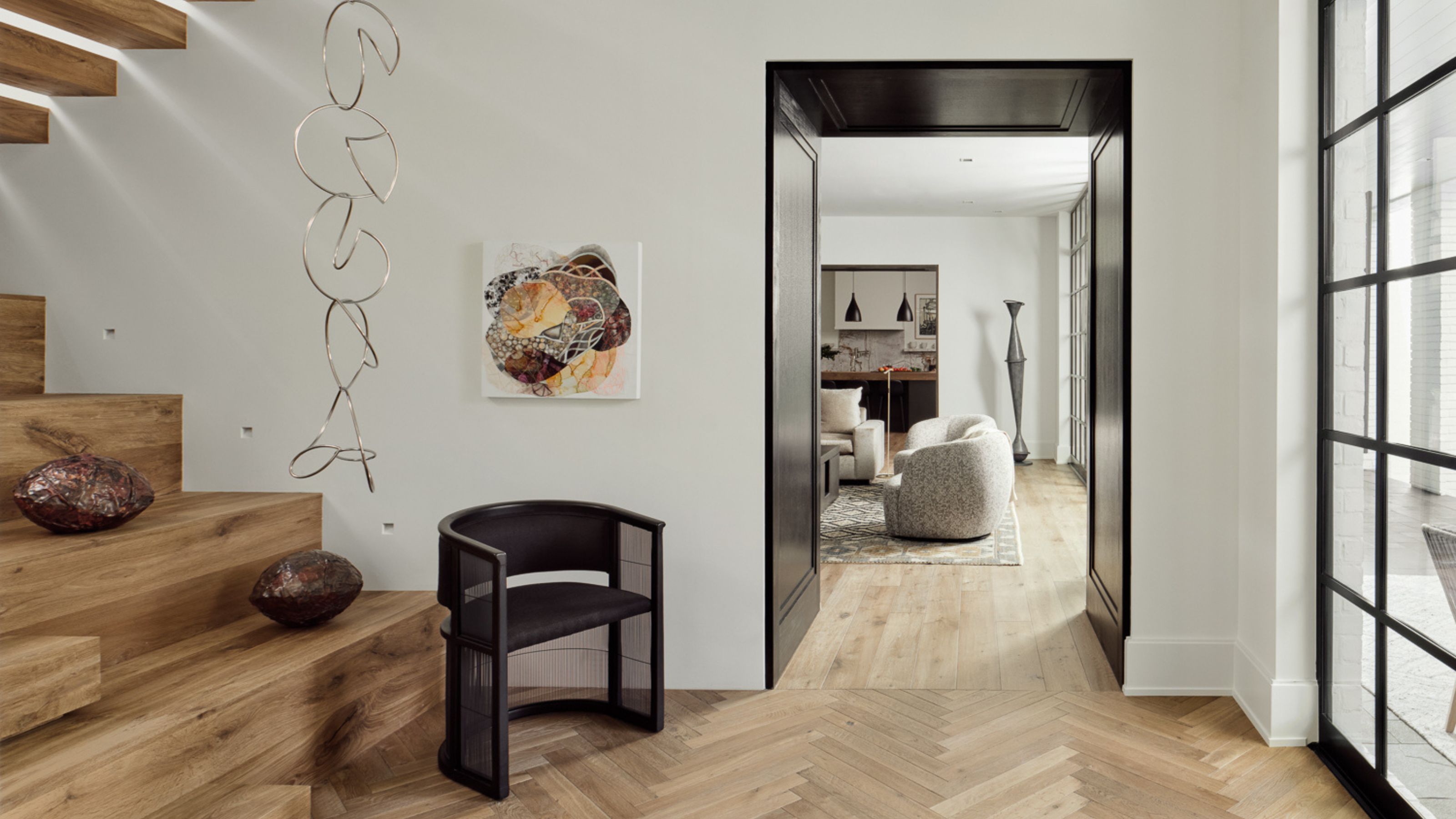
The article begins by featuring "Light Blue," a shade utilized by HÁM Interiors in a living room's shiplap boarding. This powdery, mineral-quality color is chosen to complement coastal surroundings, creating a fresh and uplifting feel on sunny days, and a cozy ambiance in winter. Following this, "Berrington Blue," described as a 'blackened' mid-blue, is presented in a bedroom from the same project, chosen for its deeply calming quality, ideal for a restful sleeping space. The article then shifts to darker hues with "Railings," an off-black with blue undertones, used by interior designer Bethany Adams in an entryway. This color frames an original antique wallpaper in an 1800s mansion, allowing the pictorial paper to stand out dramatically while providing a quietly luxurious backdrop.
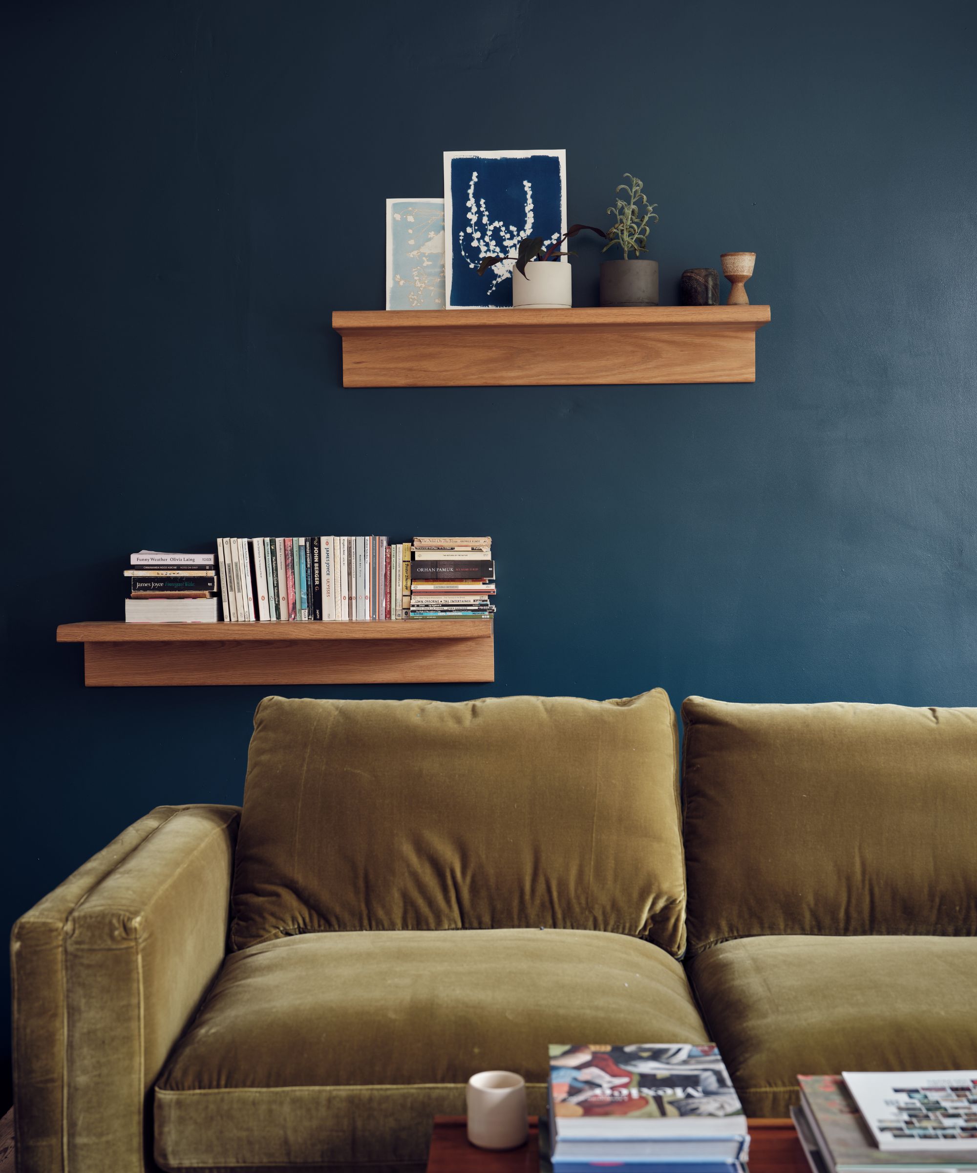
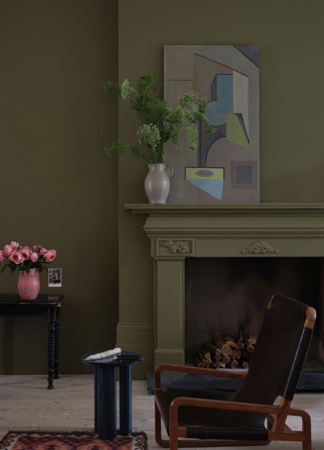
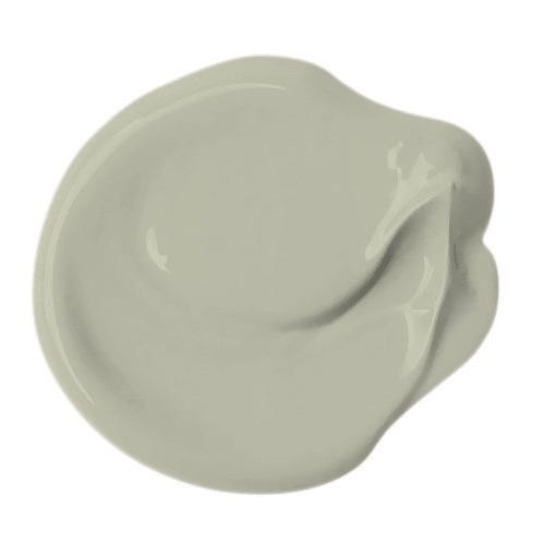
"Vardo," a teal color, is showcased in a living room where Matthew Williamson used it as a focal point on one wall, complemented by "Blue Ground" on other walls for a livable feel. This choice was inspired by a traditional Indian rug, bringing a vibrant, jewel-like quality to the room. "Green Smoke," a popular muted yet deep green, is featured in a home office designed by Natalia Miyar. This color creates a rich and deep backdrop, especially effective when overlooking a lush garden. "Borrowed Light," a pale blue, is highlighted for its ability to create bright and airy interior schemes in a spacious bathroom, acting as a great neutral with soft blue undertones that works well in varying light conditions.
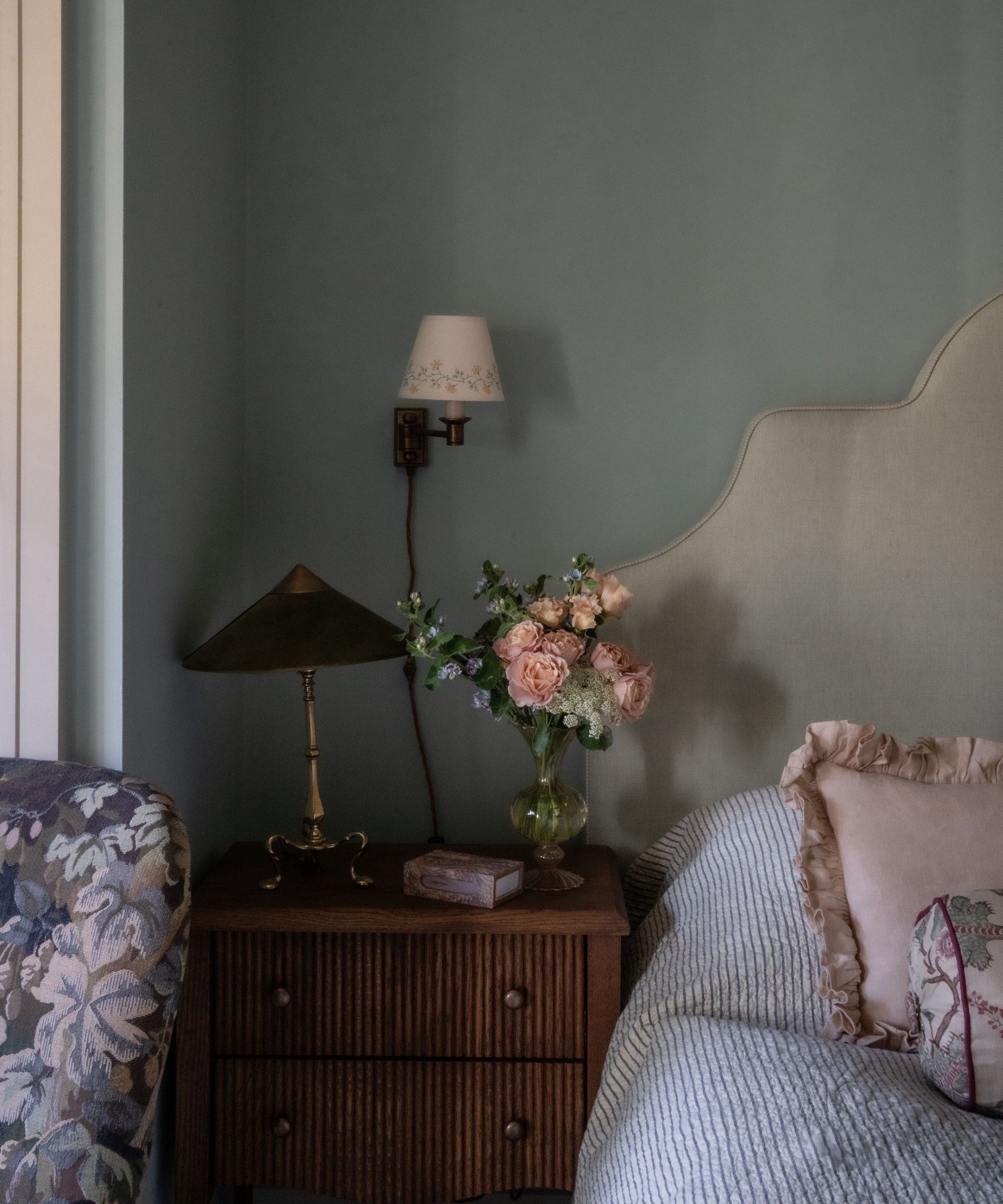
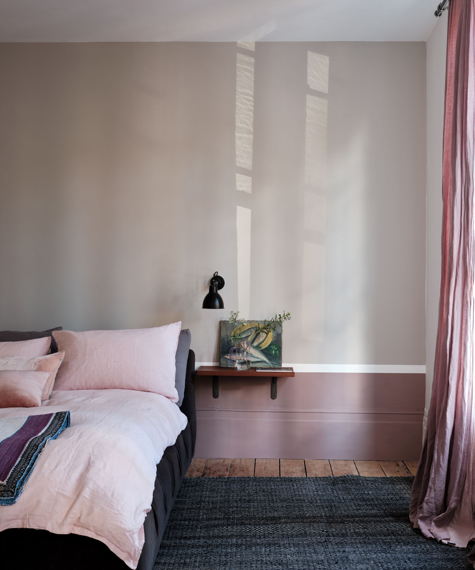
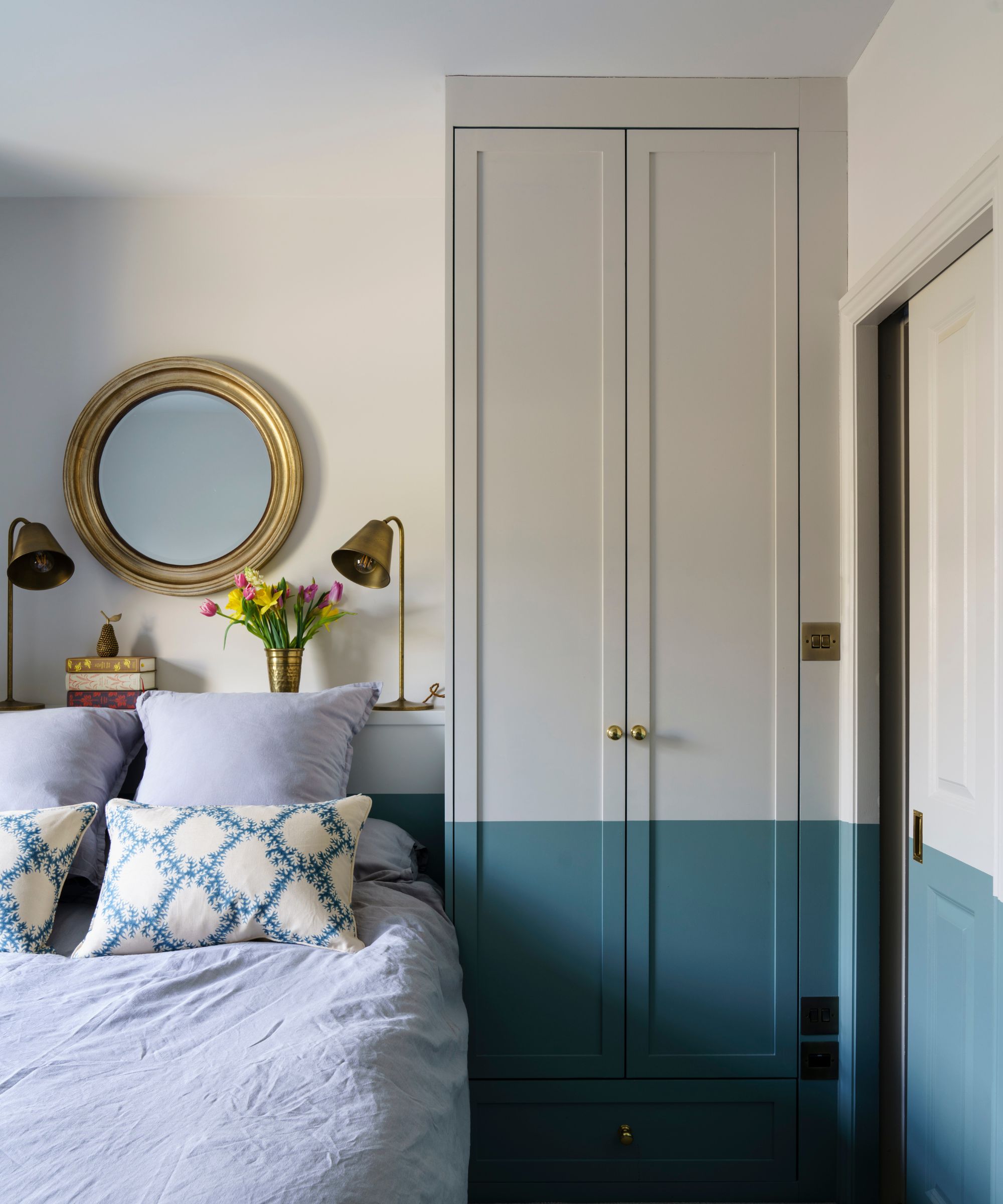
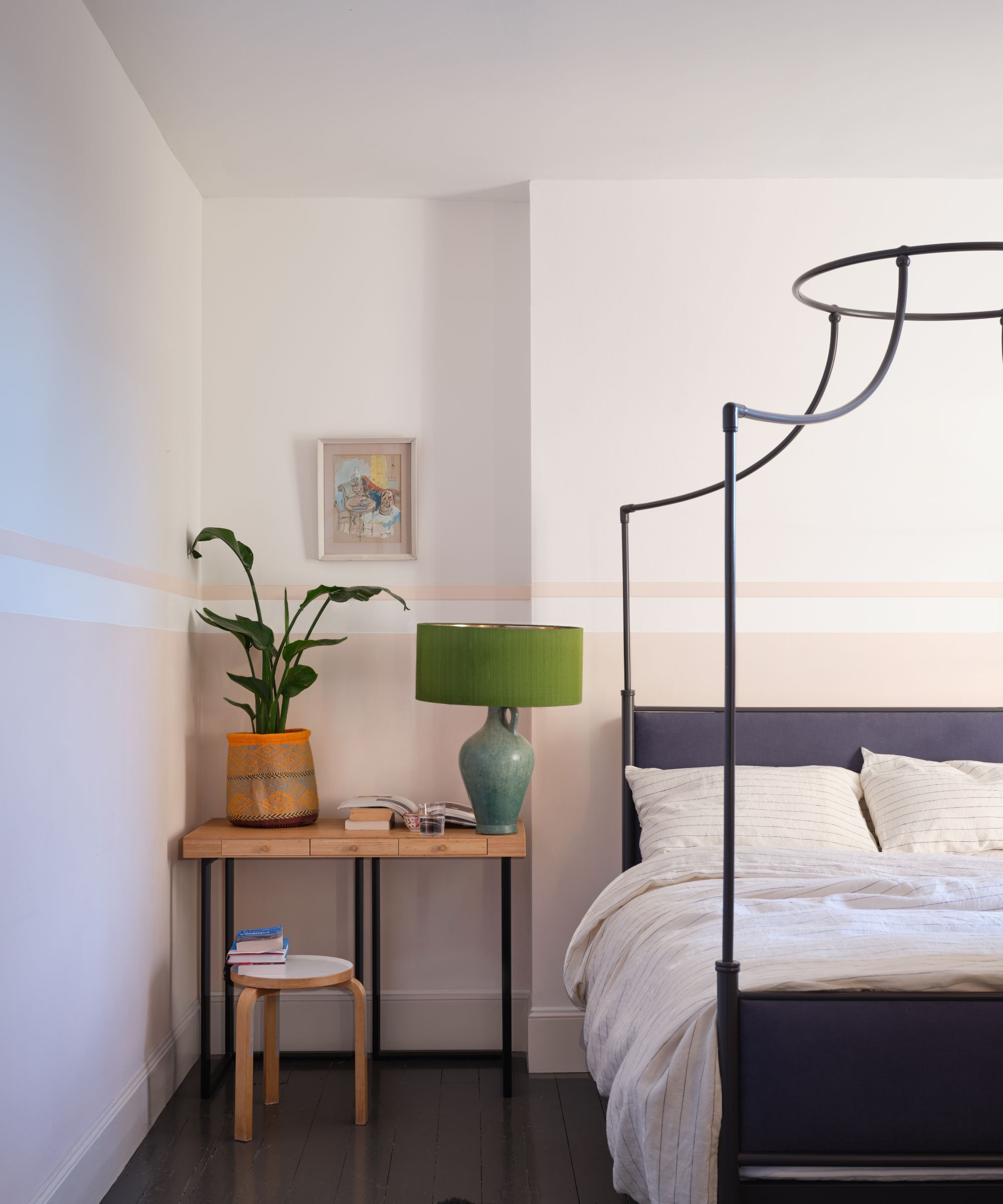
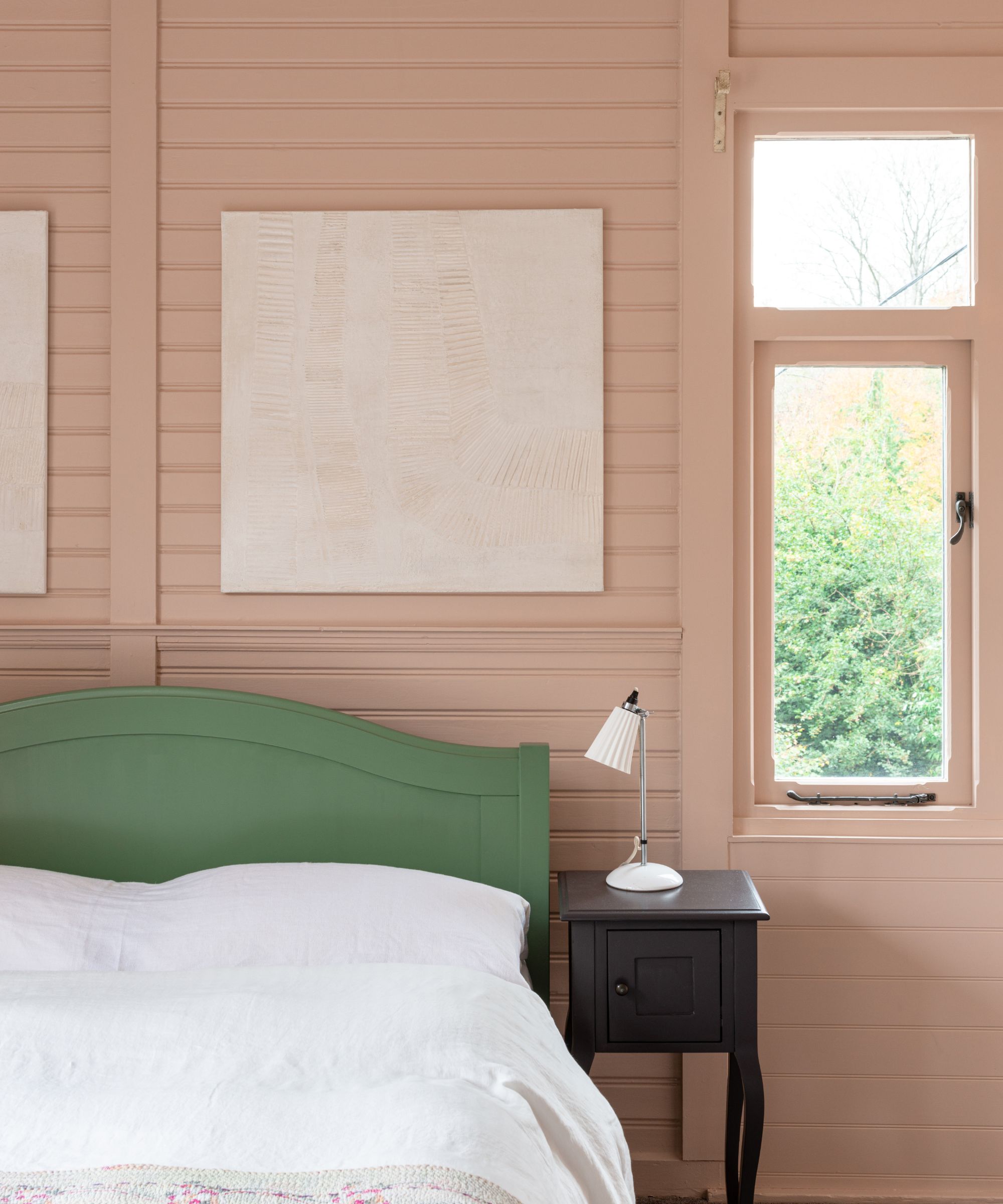
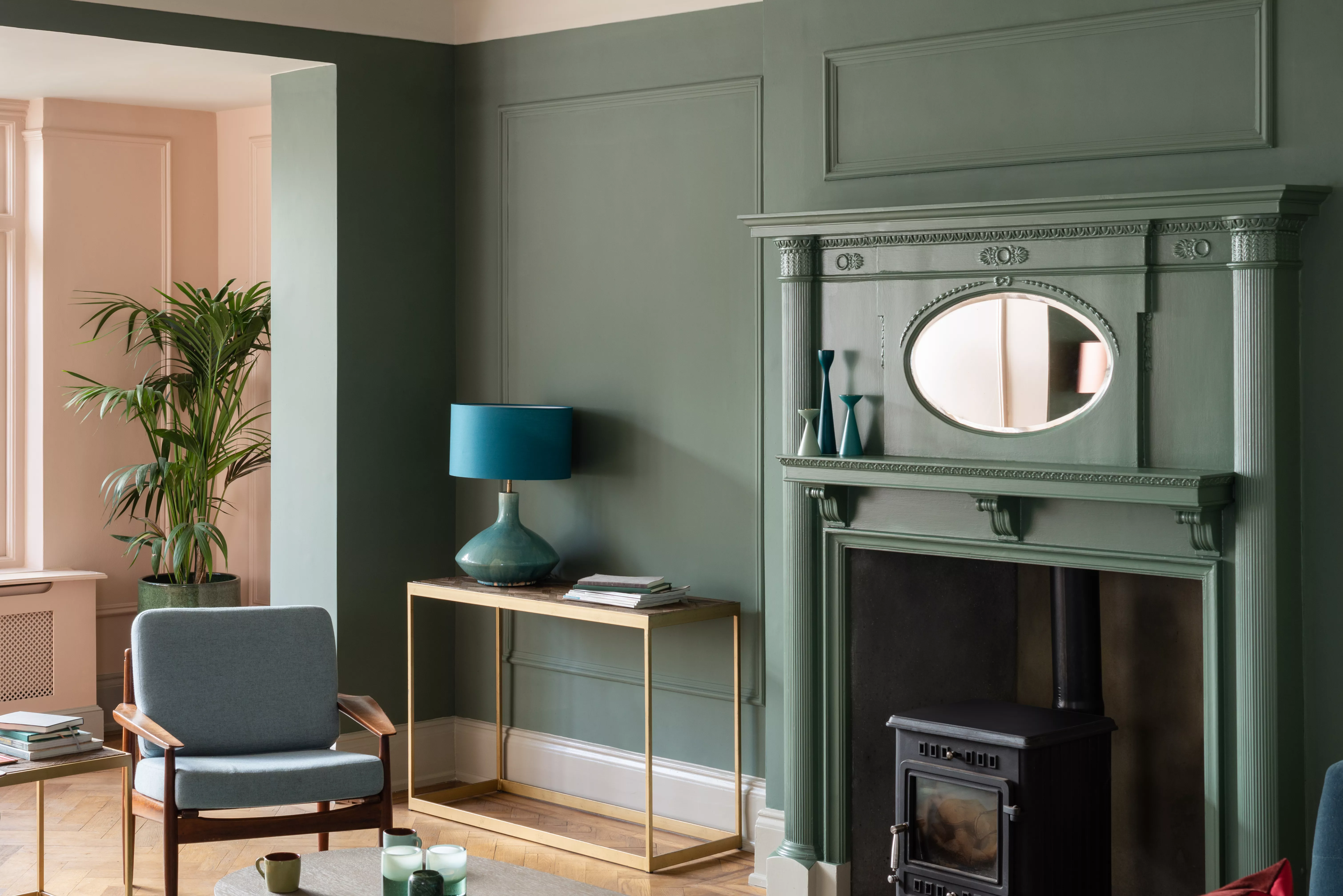
The article then explores the use of "Brinjal," a dark aubergine tone, as an accent color in a neutral bedroom, applied to skirting and architraves to create a sophisticated and cozy space. "Shadow White," a warm white, is chosen by Natalia Miyar for a media room to ensure a cozy and inviting atmosphere rather than a stark one. "De Nimes," a subtle and toned-down blue, is used in a relaxing bedroom, valued for the richness and depth it provides, creating an effortlessly polished finish. "Cromarty," a muted grayish green, is presented as another choice for relaxing bedrooms, creating a calm and serene atmosphere reminiscent of misty waters.
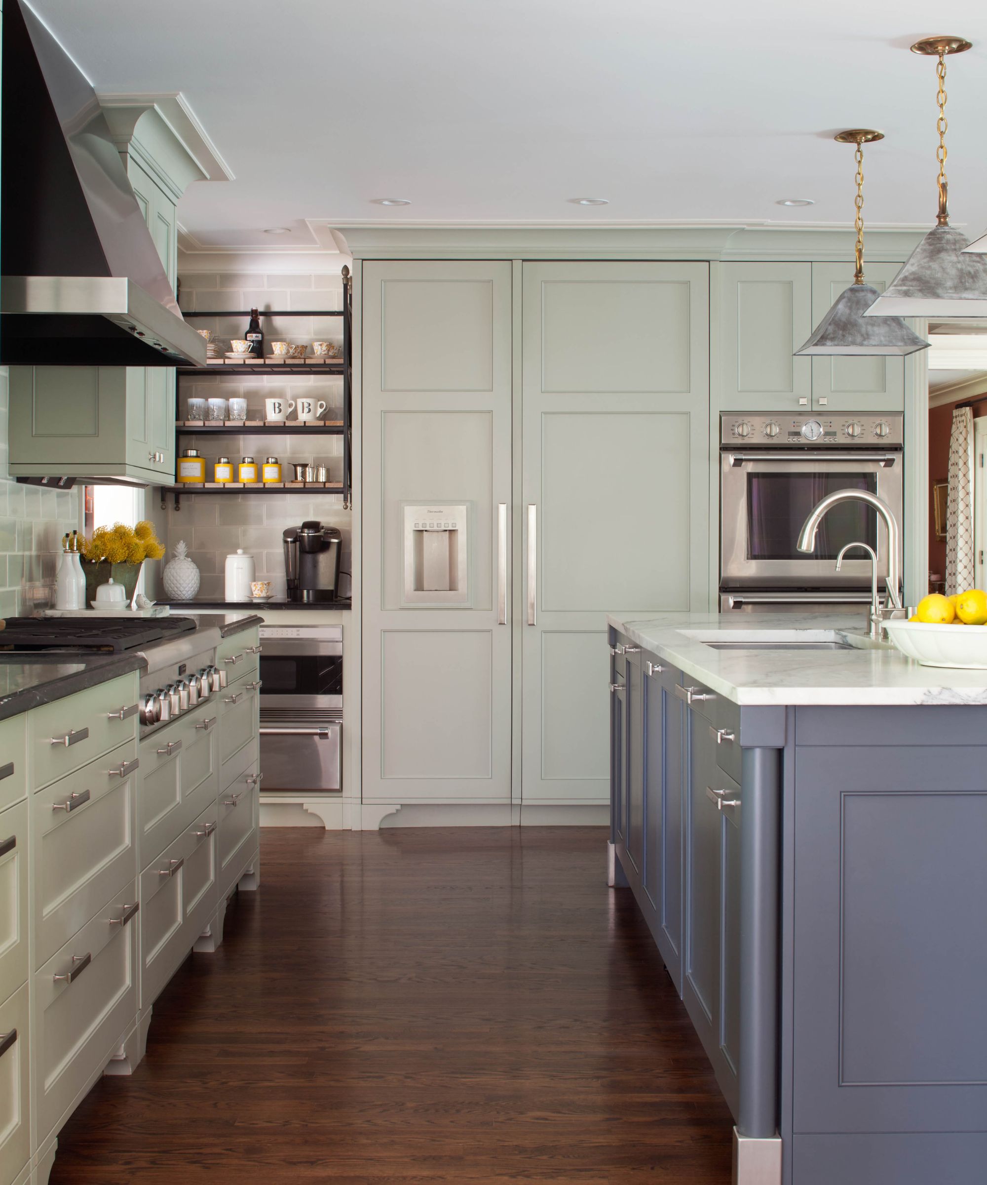
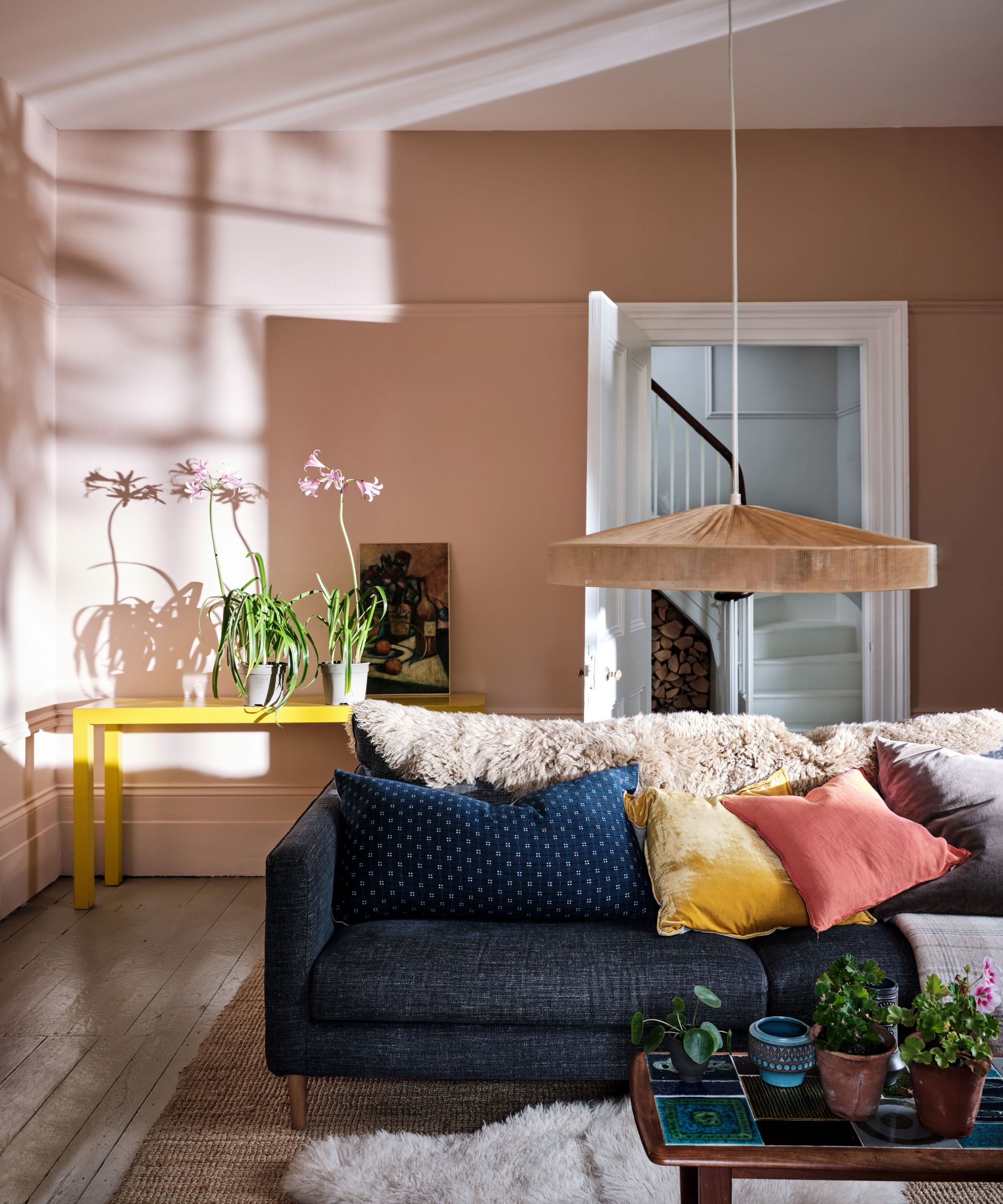
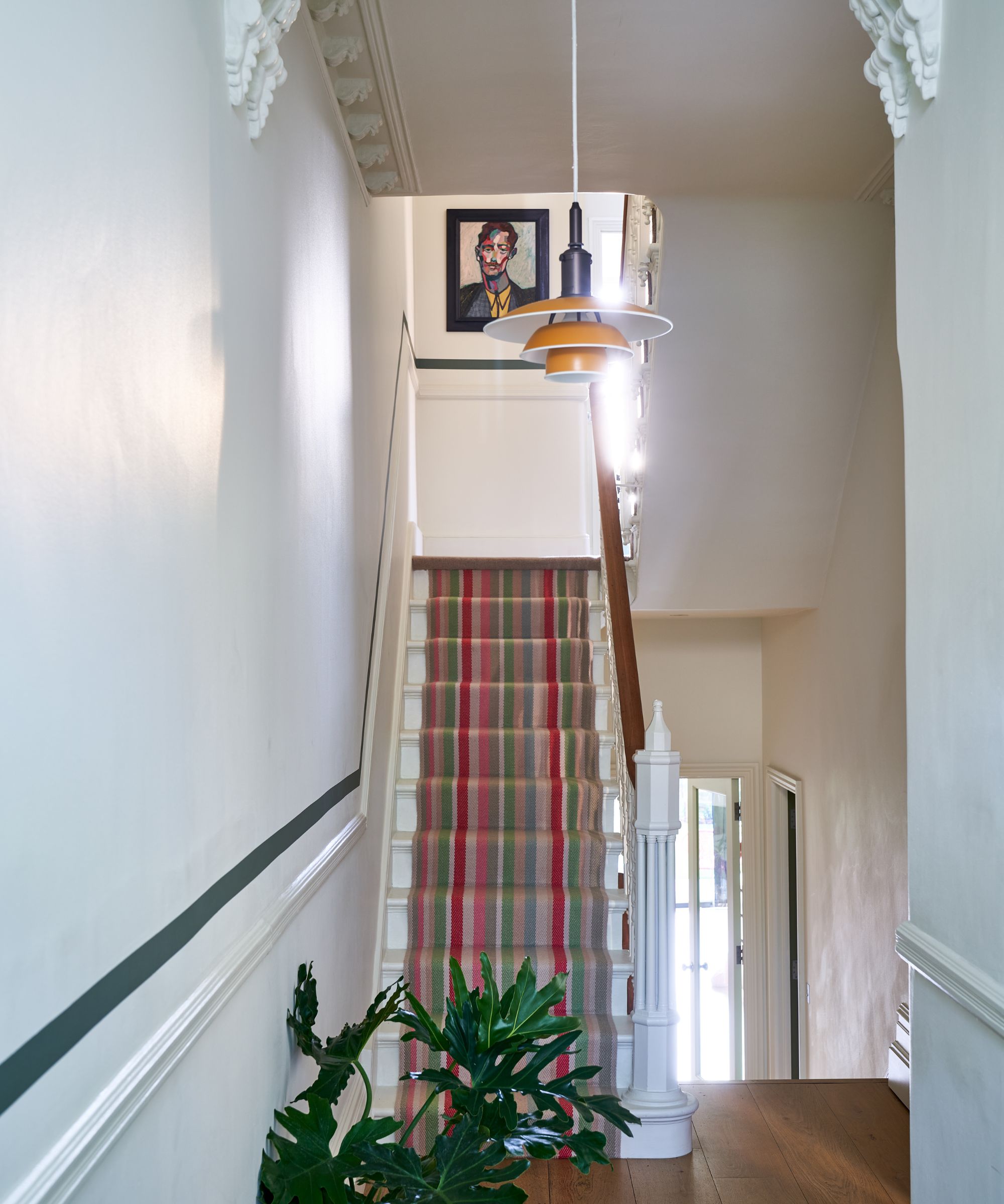
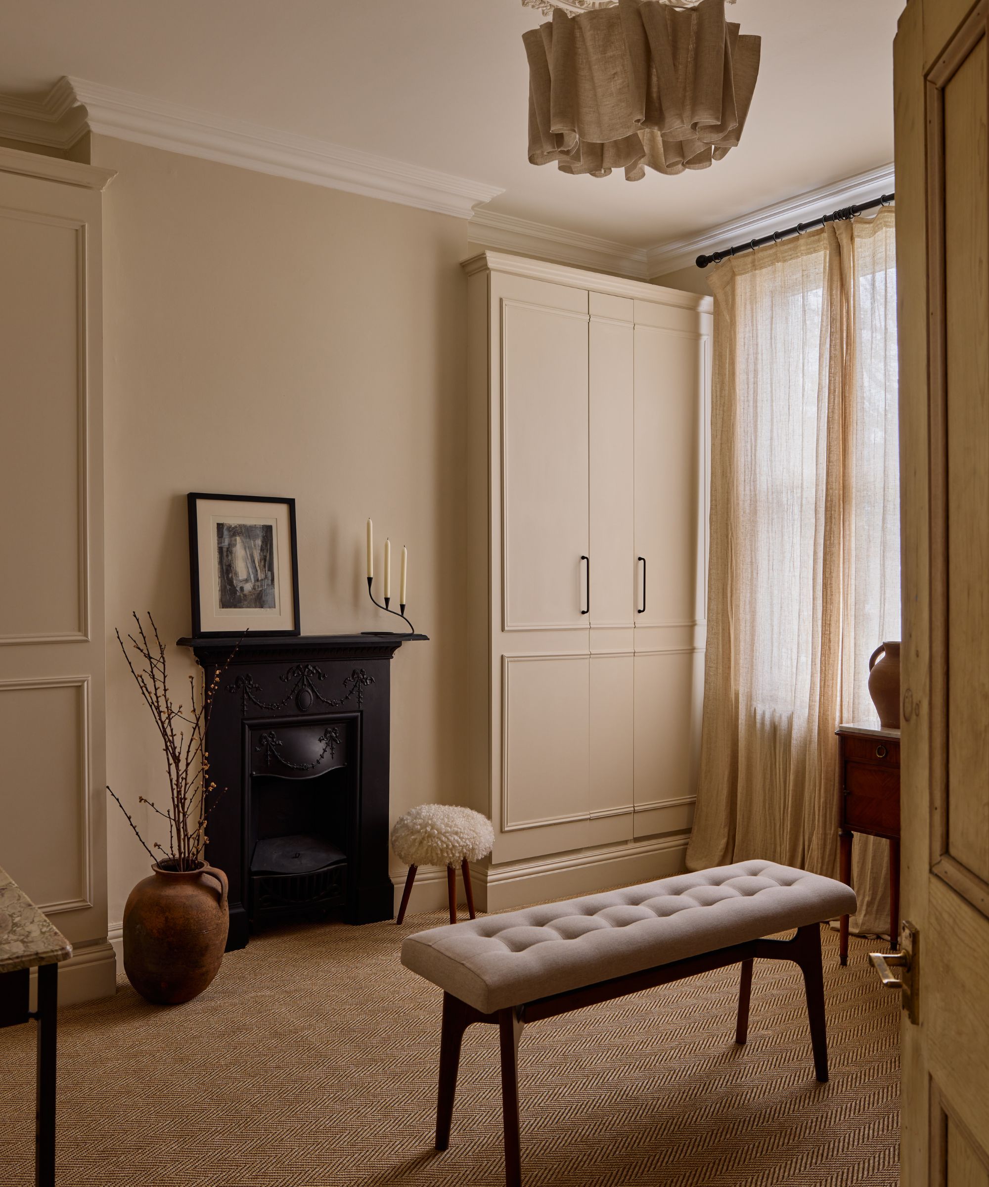
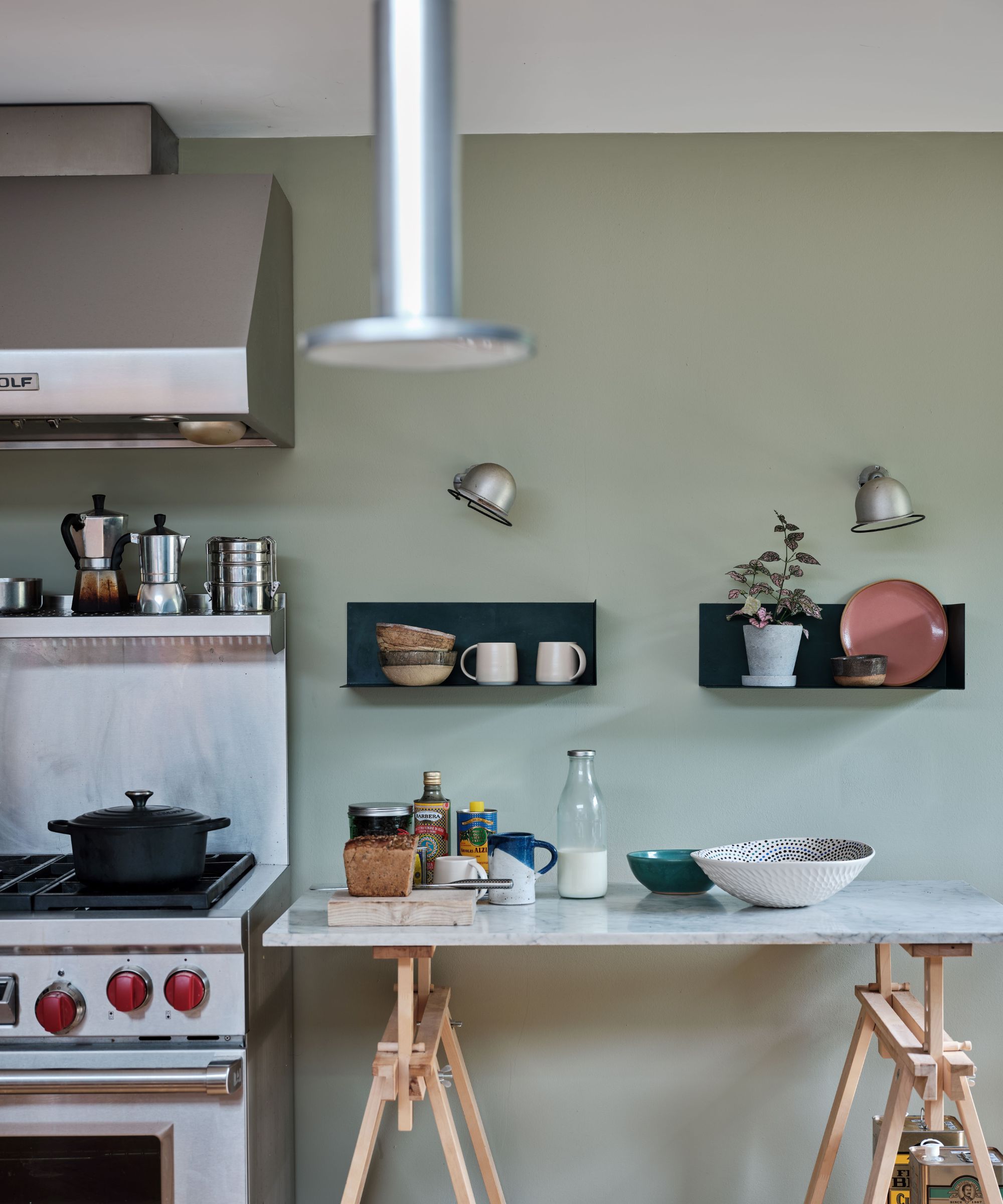
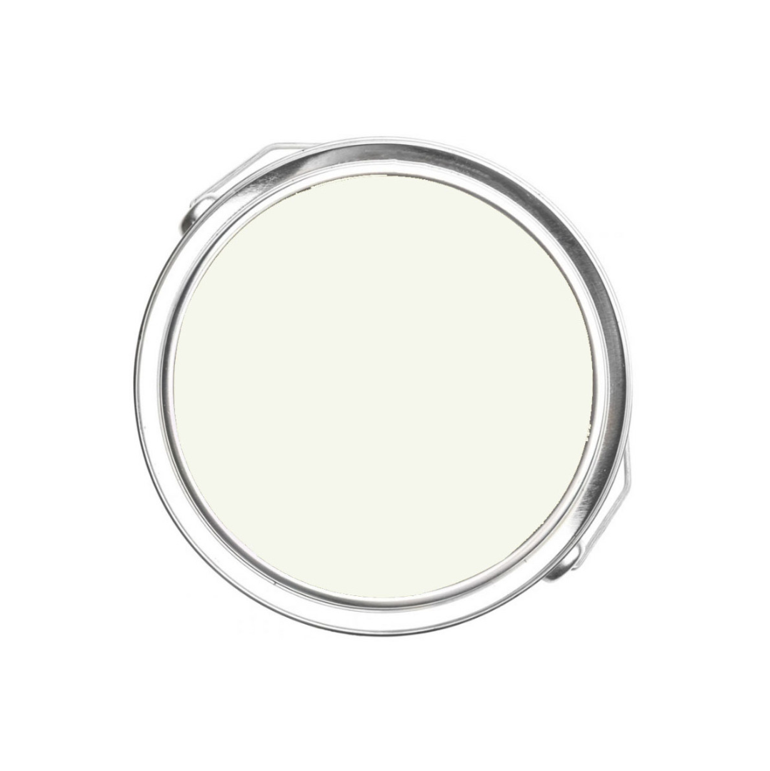
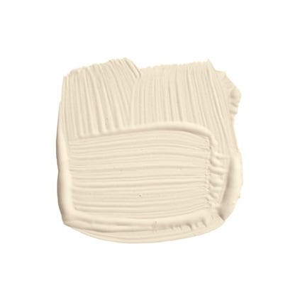
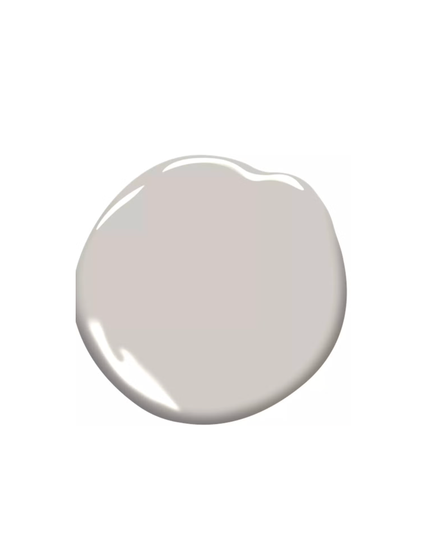
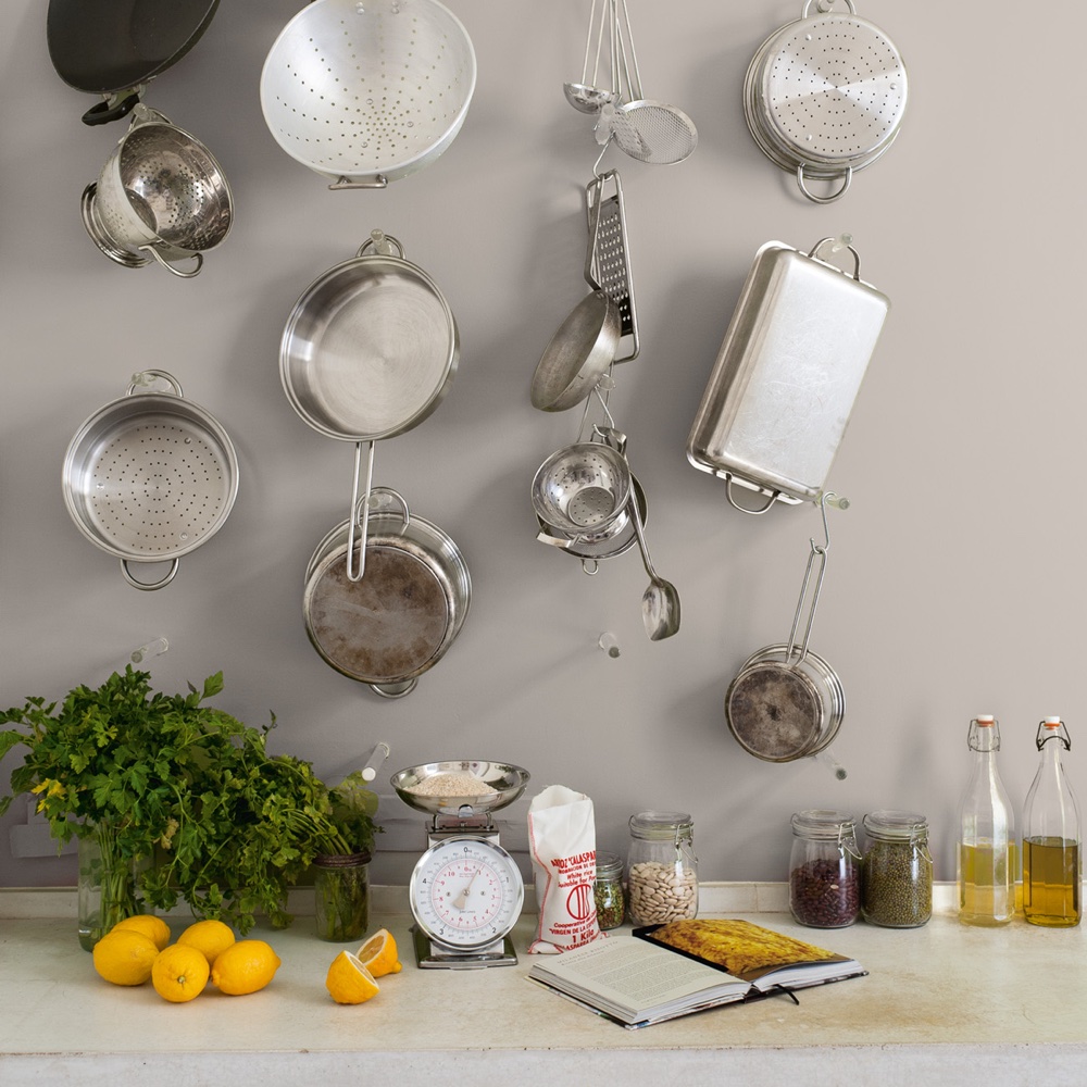
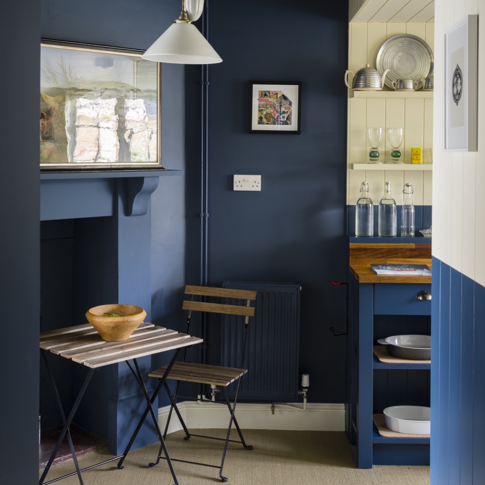
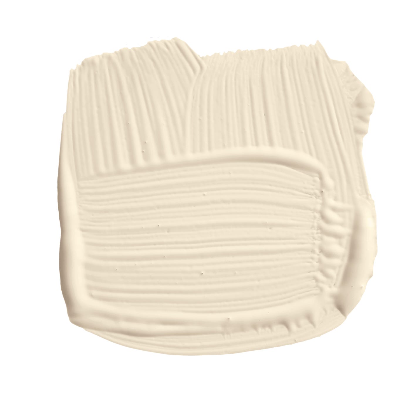
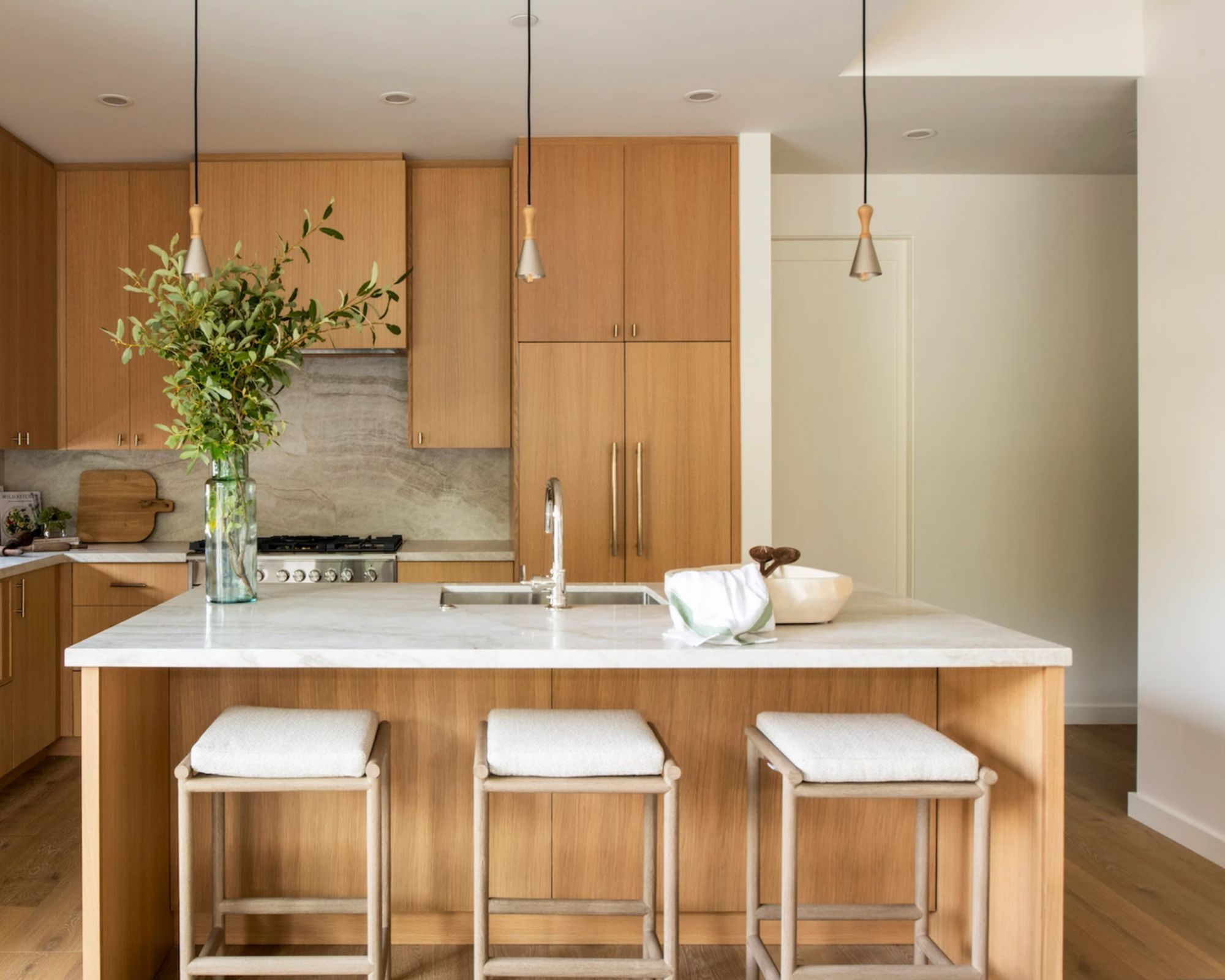
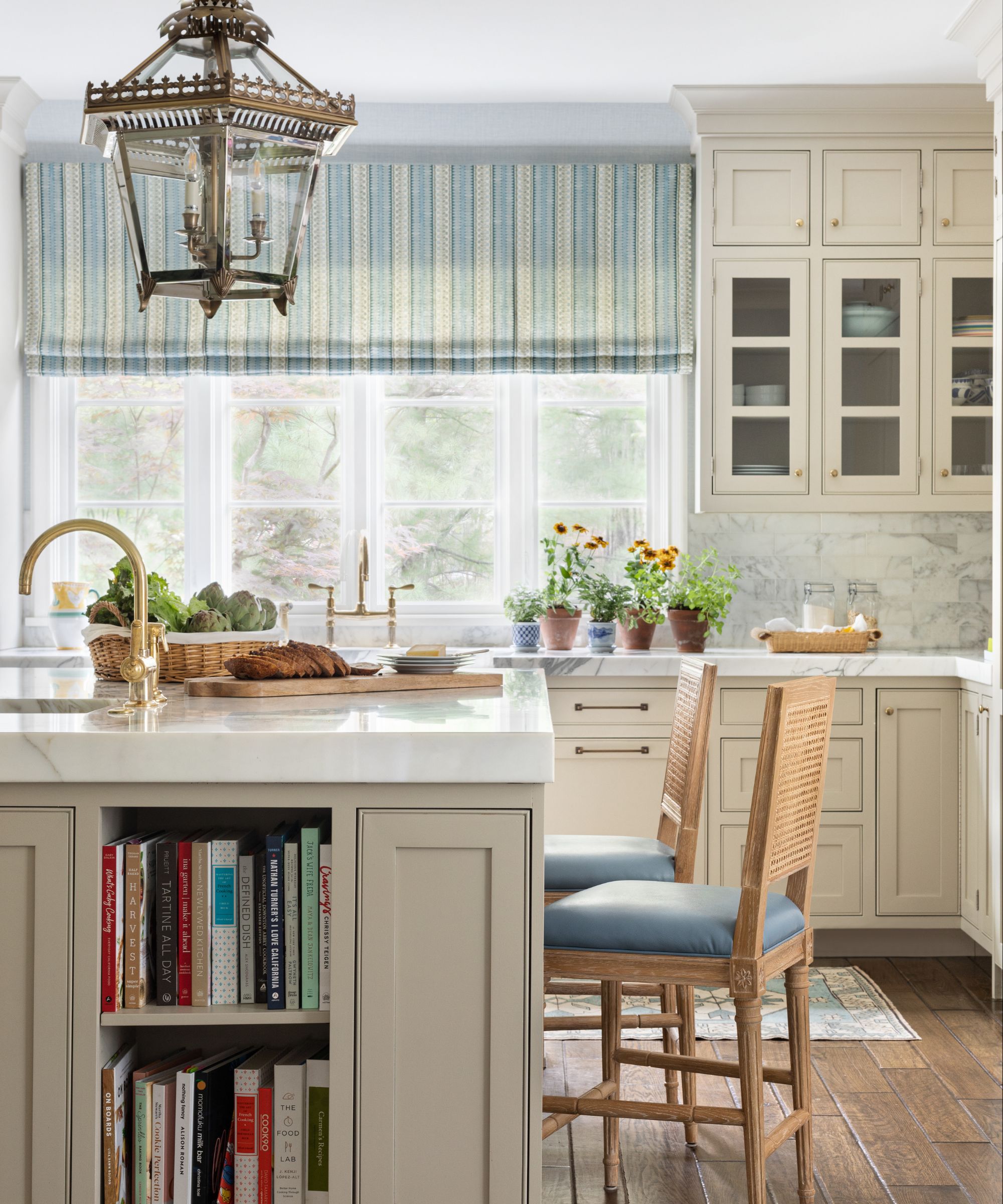
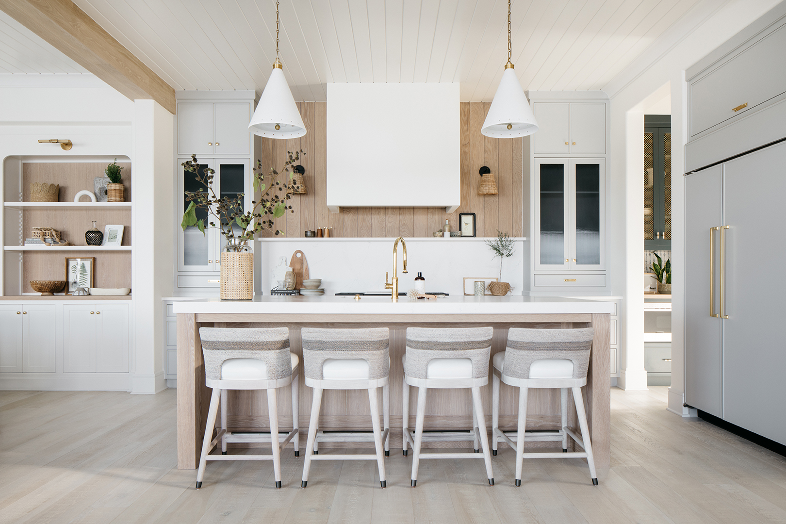
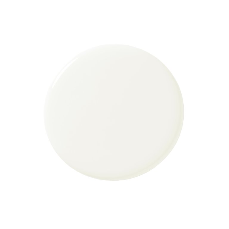
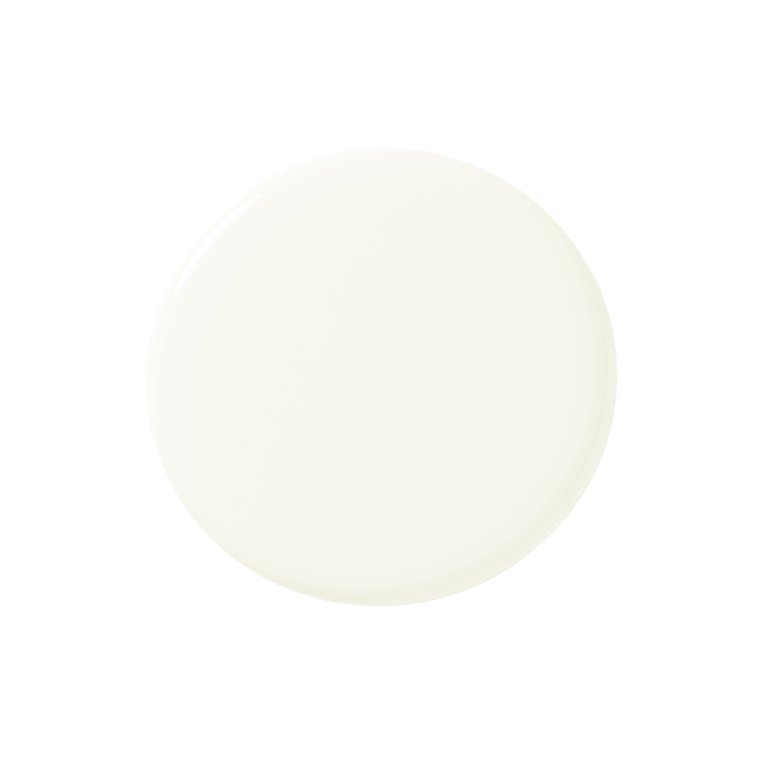
"Elephant's Breath," a warm gray, is discussed for its ability to add warmth to neutral schemes without feeling cold, as demonstrated in a modern living room. "Teresa's Green," an aqua color, is used on trim and cabinets in a traditional bathroom, creating a clean and refreshing interior scheme that can lean towards blue or green depending on the lighting. "Stony Ground," a rich beige with red undertones, is shown in a kitchen, complementing warm metals and turquoise cabinets. Finally, "Oval Room Blue," a dark blue with black tones, is featured on a bathroom vanity unit, creating a restful and aged look that pairs well with various interior design styles, and "School House White," a flattering off-white, is presented as a versatile neutral backdrop in an entryway, accommodating colorful artwork without being stark. These examples collectively demonstrate how Farrow & Ball paints are used to create cozy, welcoming, and liveable spaces.
#FarrowAndBall #PaintColors #InteriorDesign #HomeDecor #ColorSchemes #BedroomDesign #LivingRoomDesign #BathroomDesign #HomeOffice #FarrowAndBall #PaintColors #InteriorDesign #HomeDecor #ColorSchemes #BedroomDesign #LivingRoomDesign #BathroomDesign #HomeOffice
0 تعليق إجمالاً
 لا توجد تعليقات بعد
قد تعجبك أيضًا
Interior designers' favorite Farrow & Ball paint colors
These Are the Neutral Paint Colors Interior Designers ACTUALLY Use

Interior paint colour trends 2025: 10 hues you'll be seeing everywhere this year

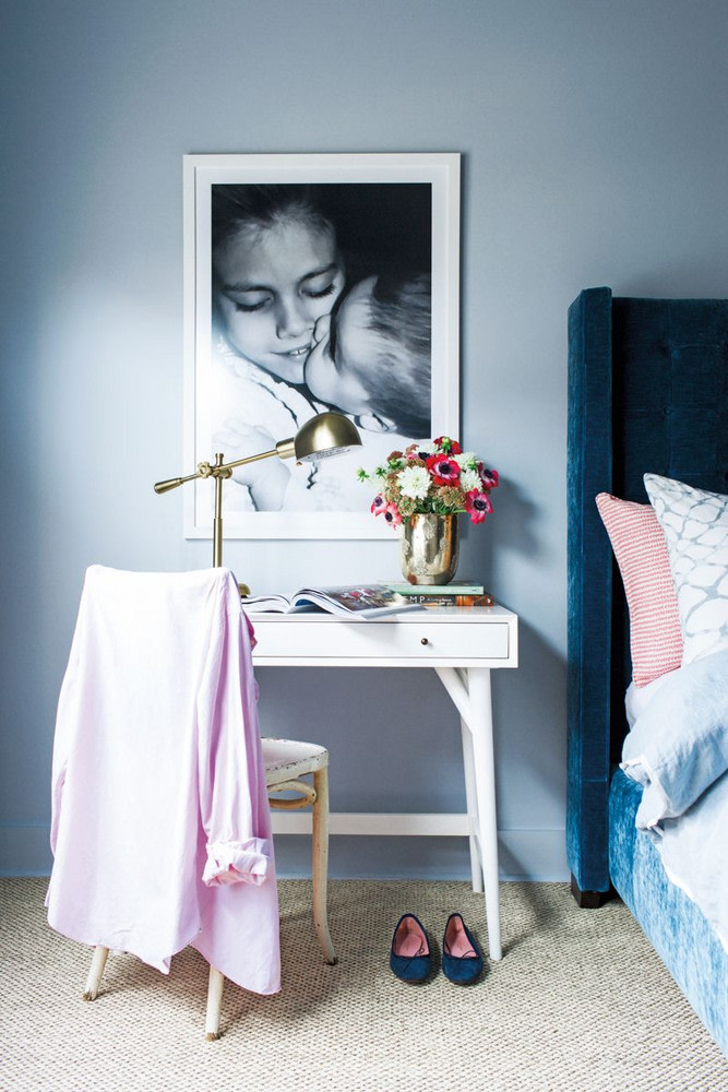
The 18 Most Popular Paint Colors of All Time

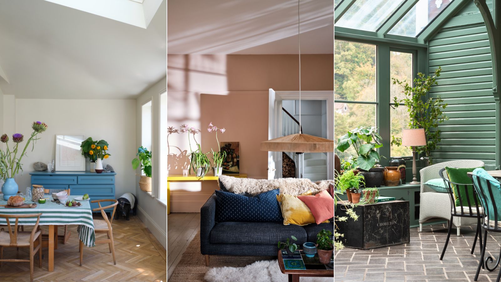
These 10 Farrow & Ball colors are their most popular paints – from earthy neutrals to deep and dark shades
15 Ways to Add Bold Color to Your Home
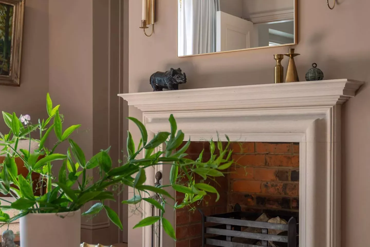
33 Absolutely Perfect Paint Colors Designers Love

These 20 Paint Colors Will Never Go Out of Style, According to Designers

6 calming and cozy paint colors from Farrow & Ball
15 Paint Colors That Will Make Your Home Feel Warm and Cozy


The most timeless paint colors according to designers
10 best warm neutral paints as recommended by interior designers – from beige to muted pink
The 10 Best Farrow & Ball Paint Colors of All Time

First look! Farrow & Ball has just released 11 new colours
9 Neutral Paint Colors Designers Constantly Reach For — "It's My Tried-and-True"

The Paint Color That All This Designer's Followers Ask About | domino

These are Farrow & Ball's current 'most loved' paints – and how to decorate with them throughout the home
The top 54 paint colours of the decade – all the shades we couldn't live without
Kelly Wearstler Shares How to Create a Color Palette for Your Home

12 Calming Colors to Paint Your Walls, According to Interior Designers