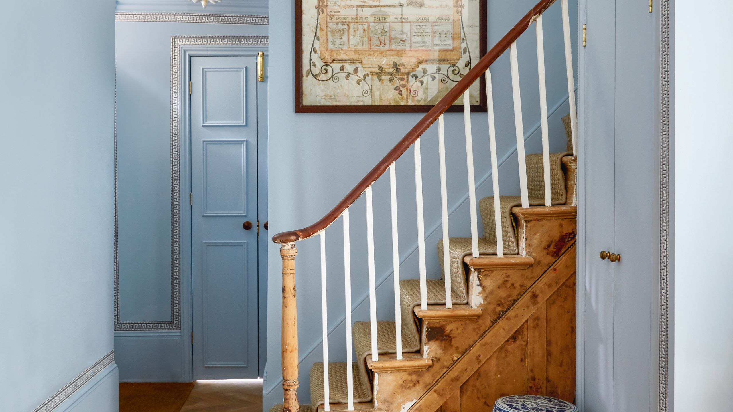
1/5
All the interior designers with paint collaborations (and our favourite shades)
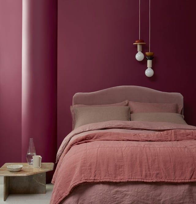
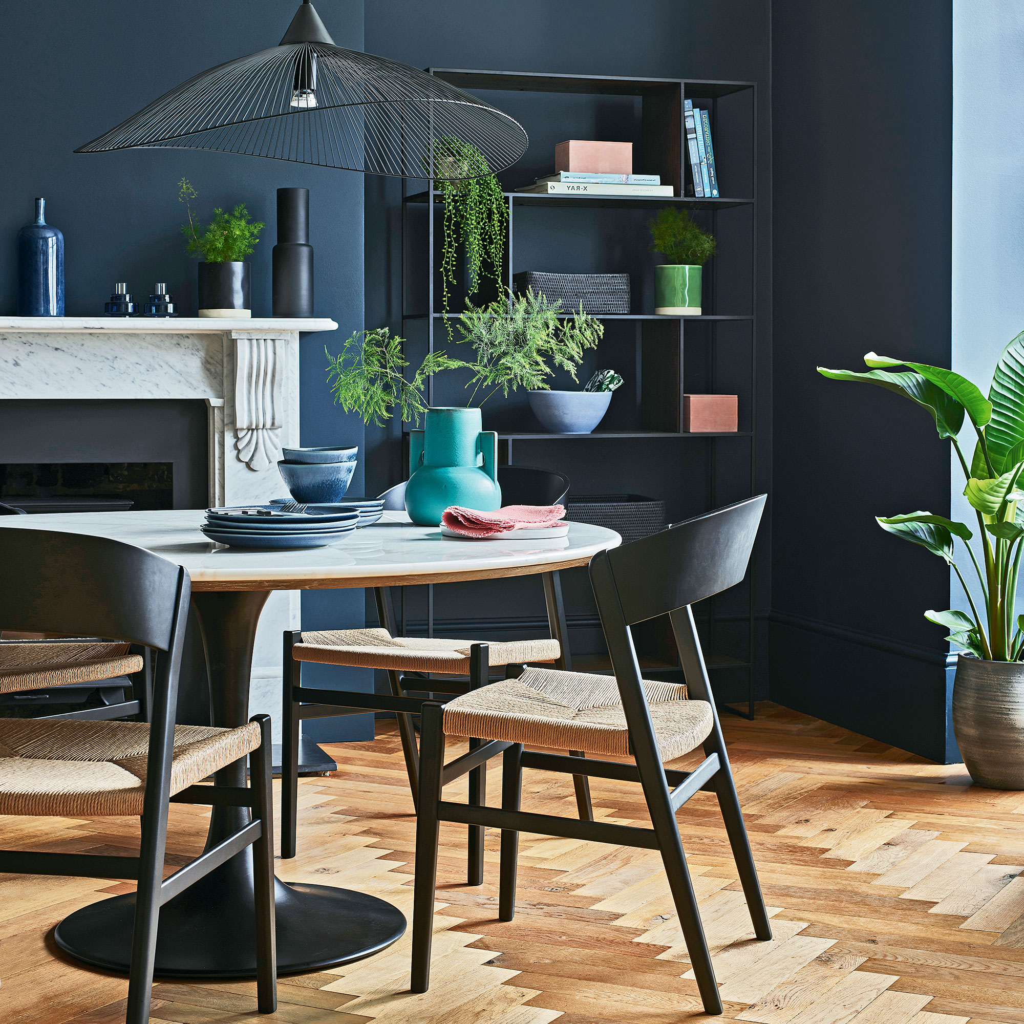
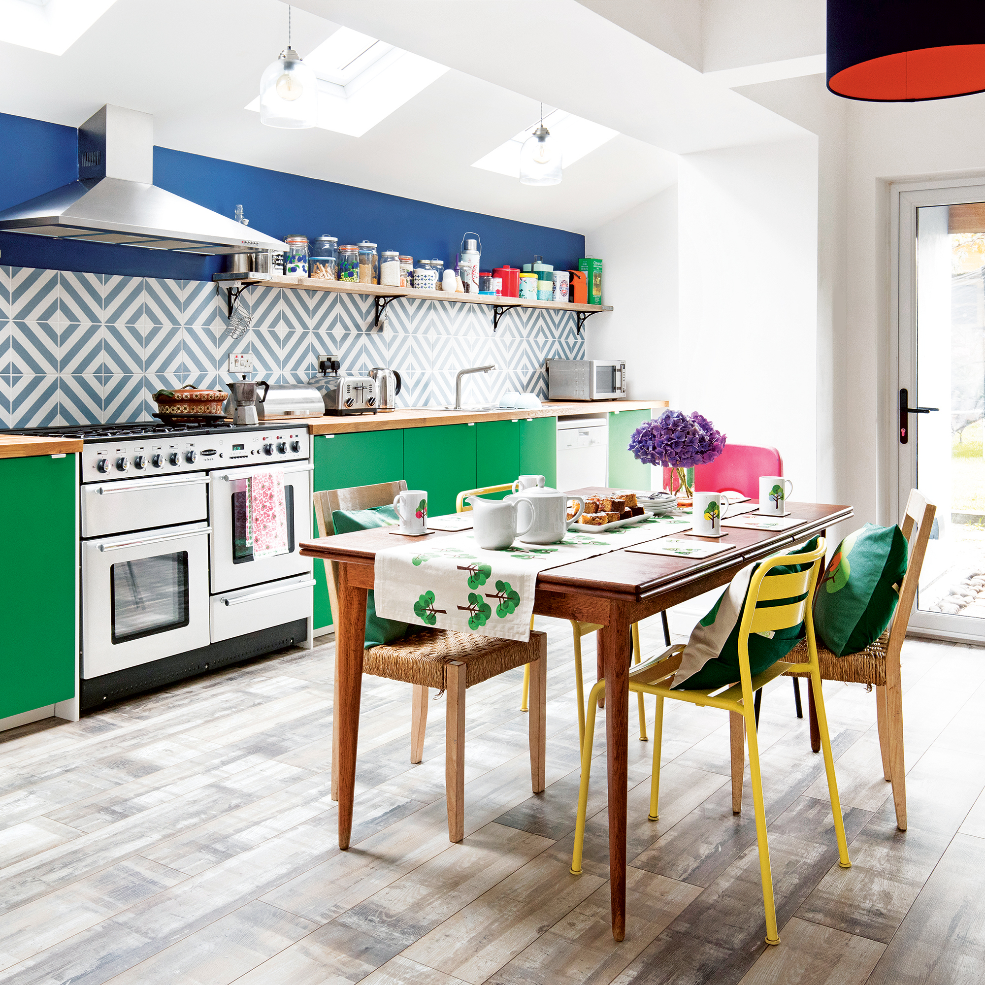
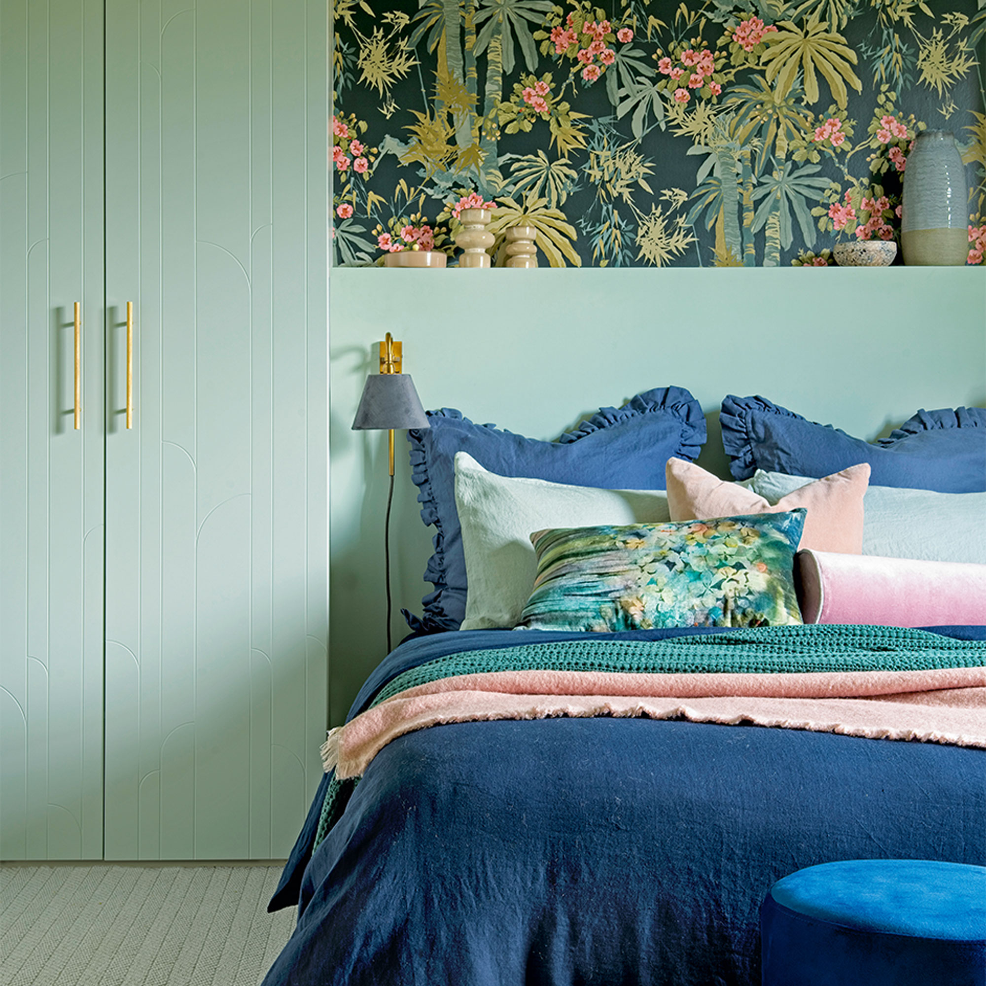
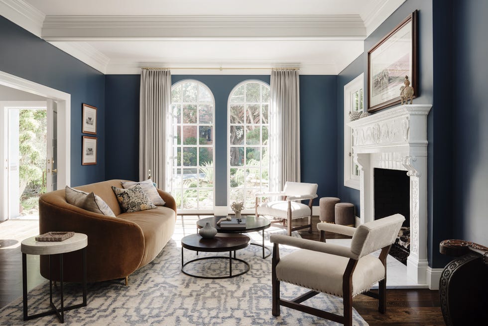
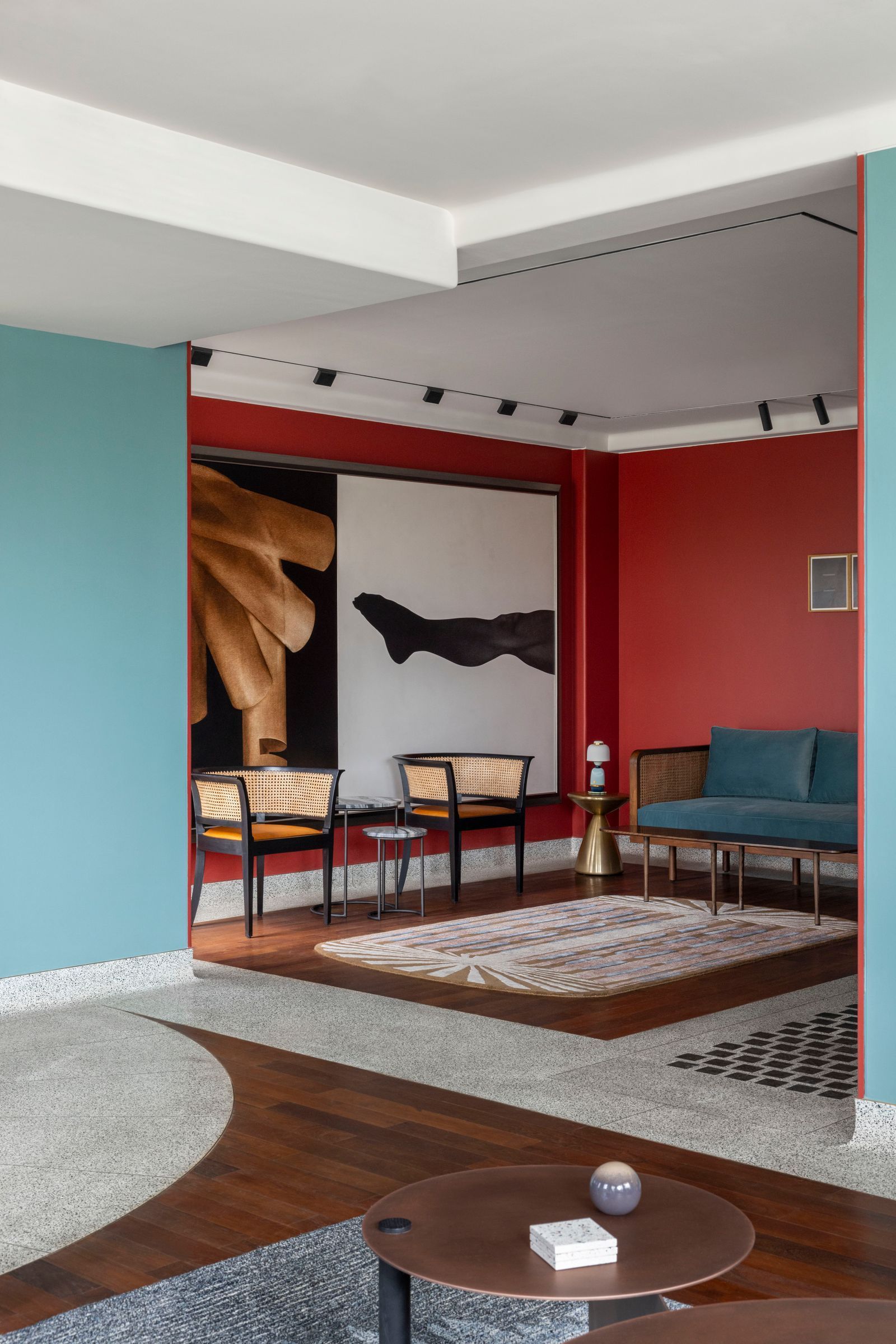
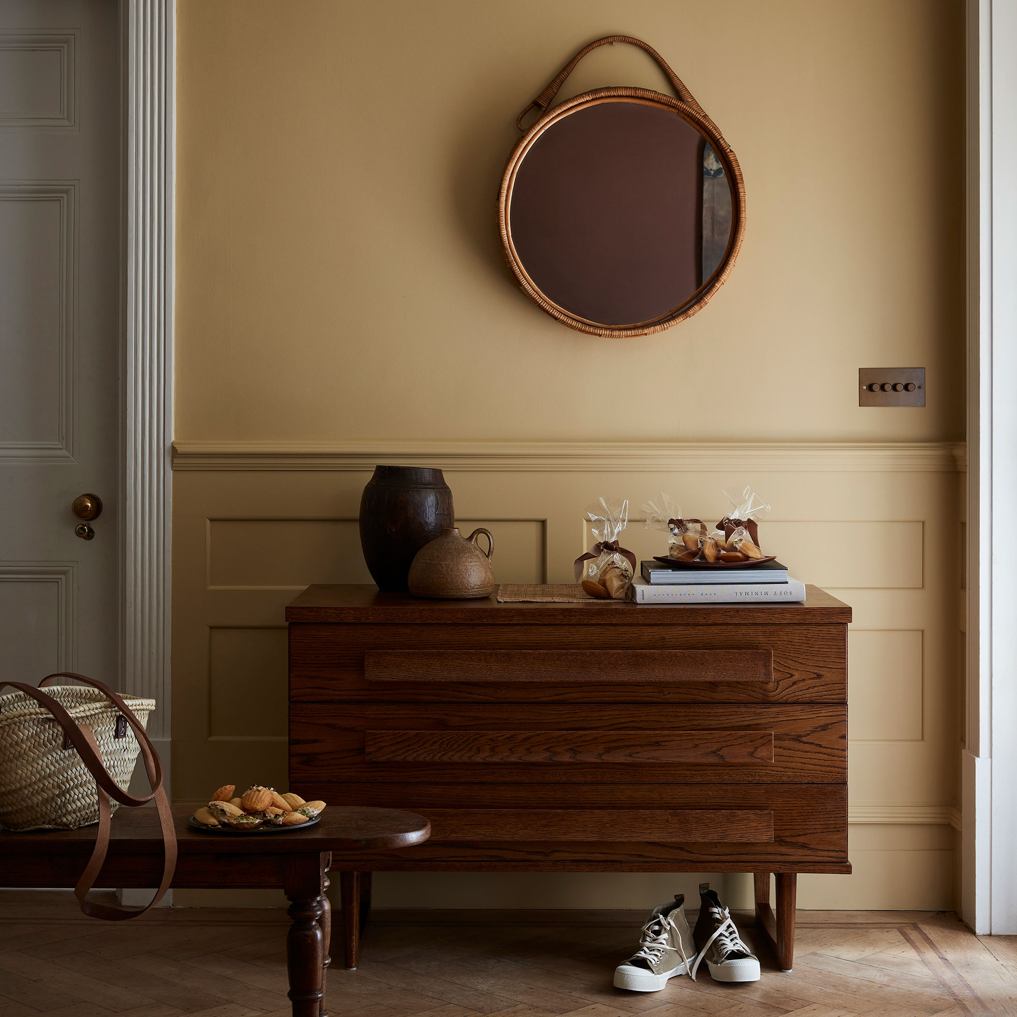
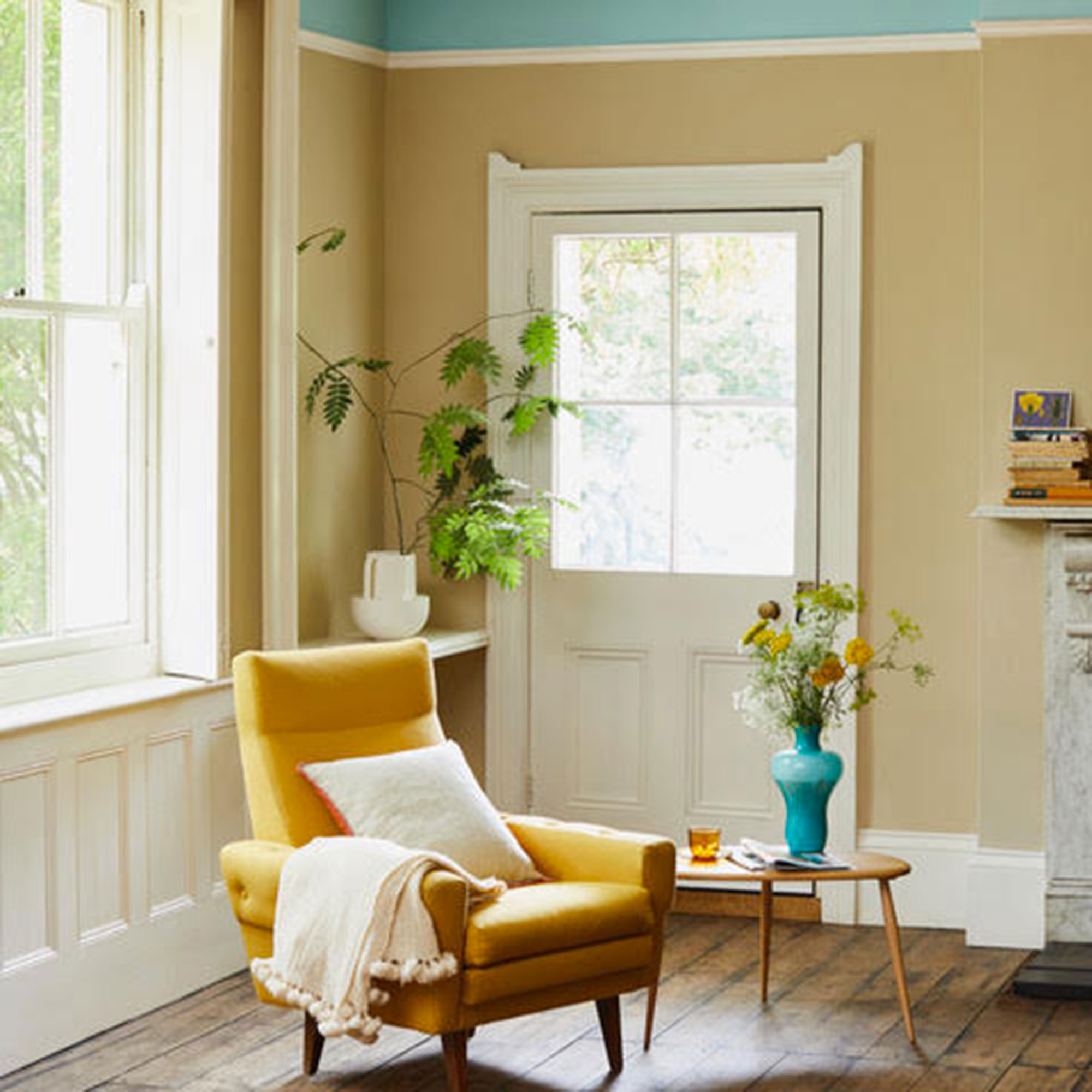
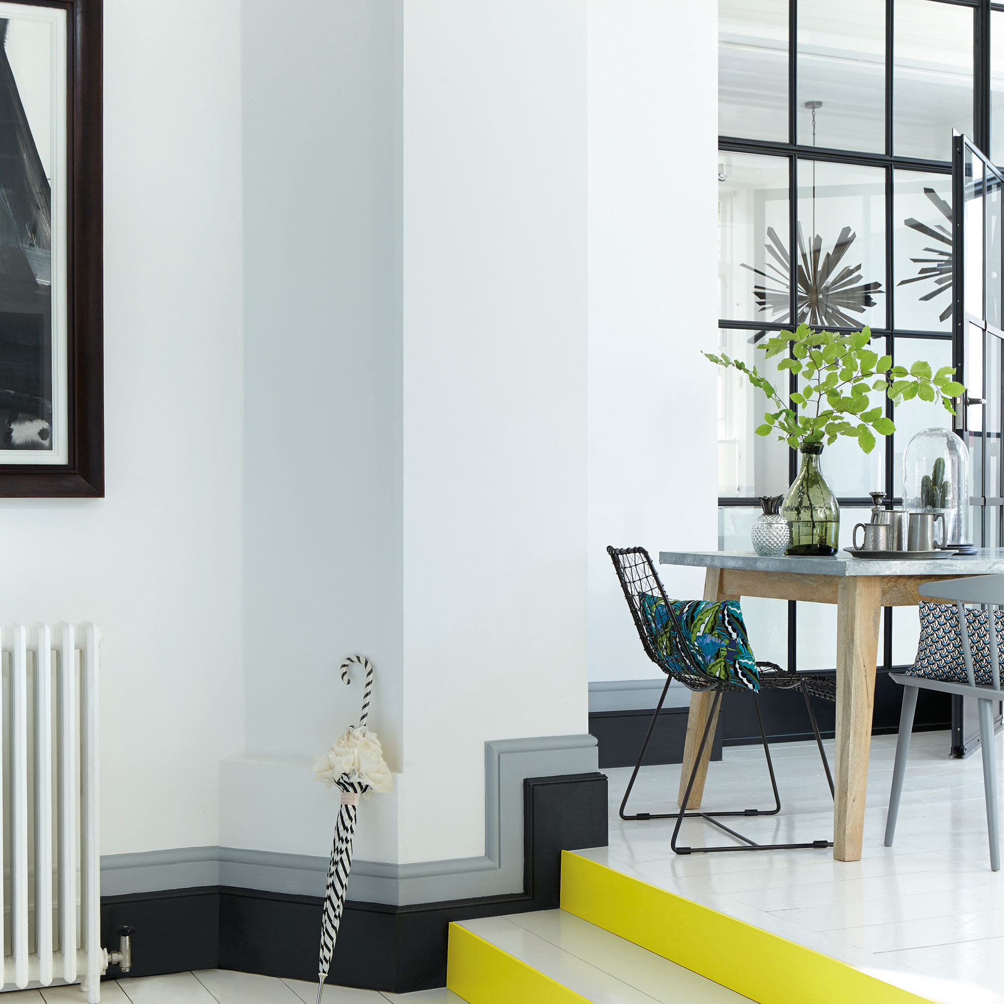
The collaboration between interior designers and paint brands has become a significant trend, offering unique and personalized color palettes to consumers. These partnerships allow designers to infuse their distinct styles and inspirations into accessible paint collections, ranging from small capsule selections to extensive tonal ranges with various finishes. The resulting collections often reflect the designers' individual aesthetics, cultural backgrounds, and creative processes, providing a diverse array of options for home decorators.
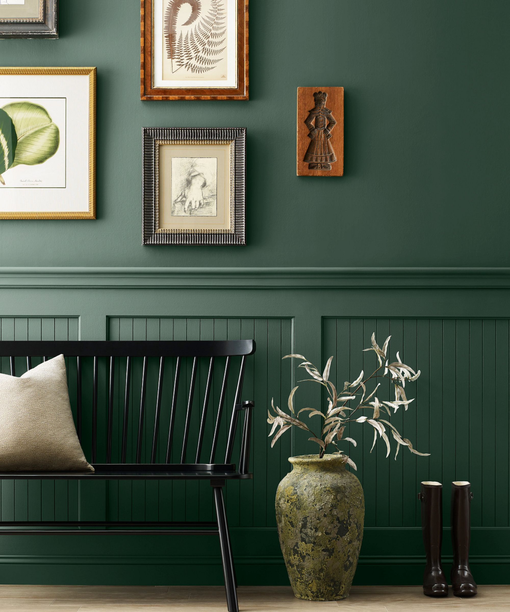
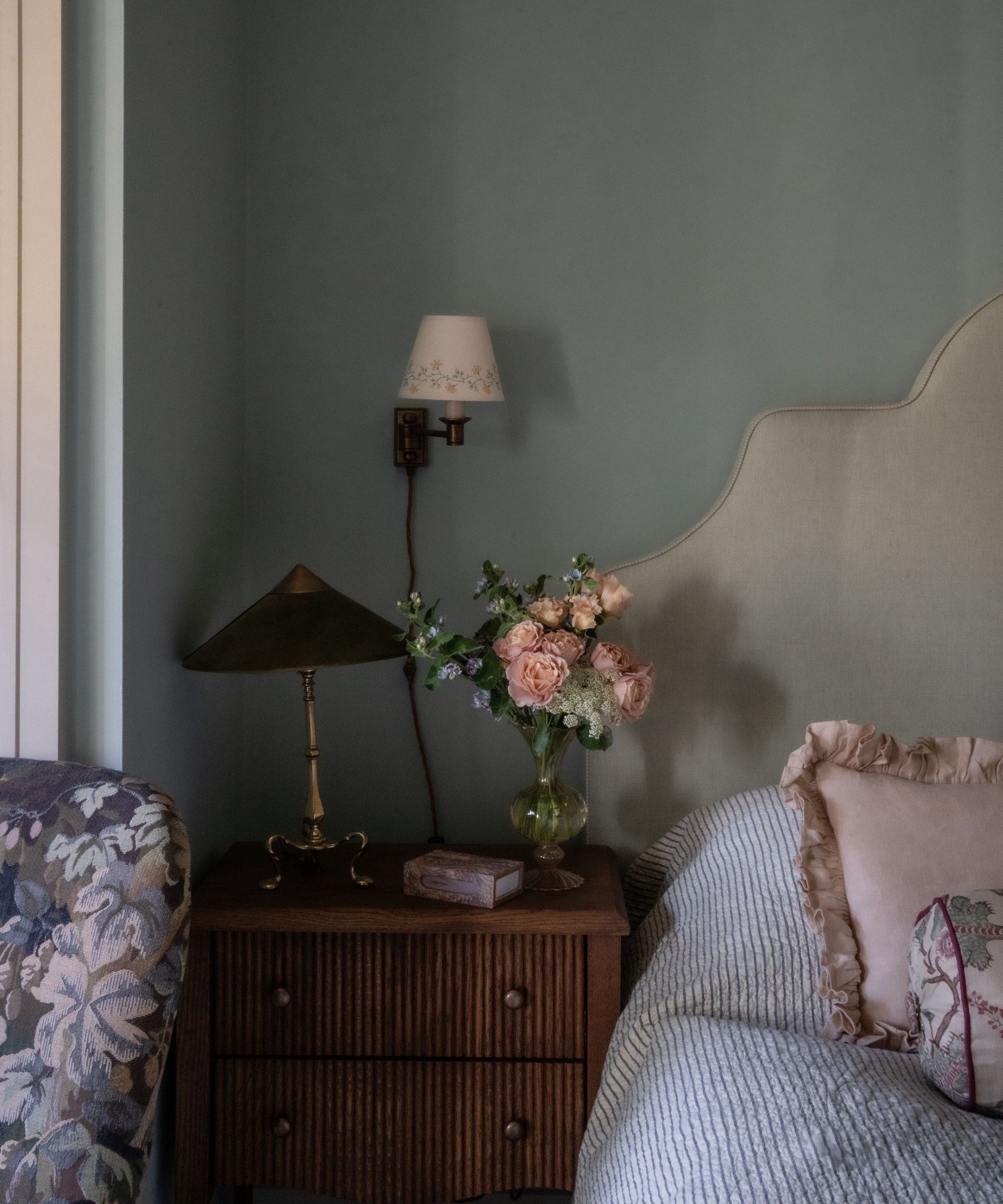
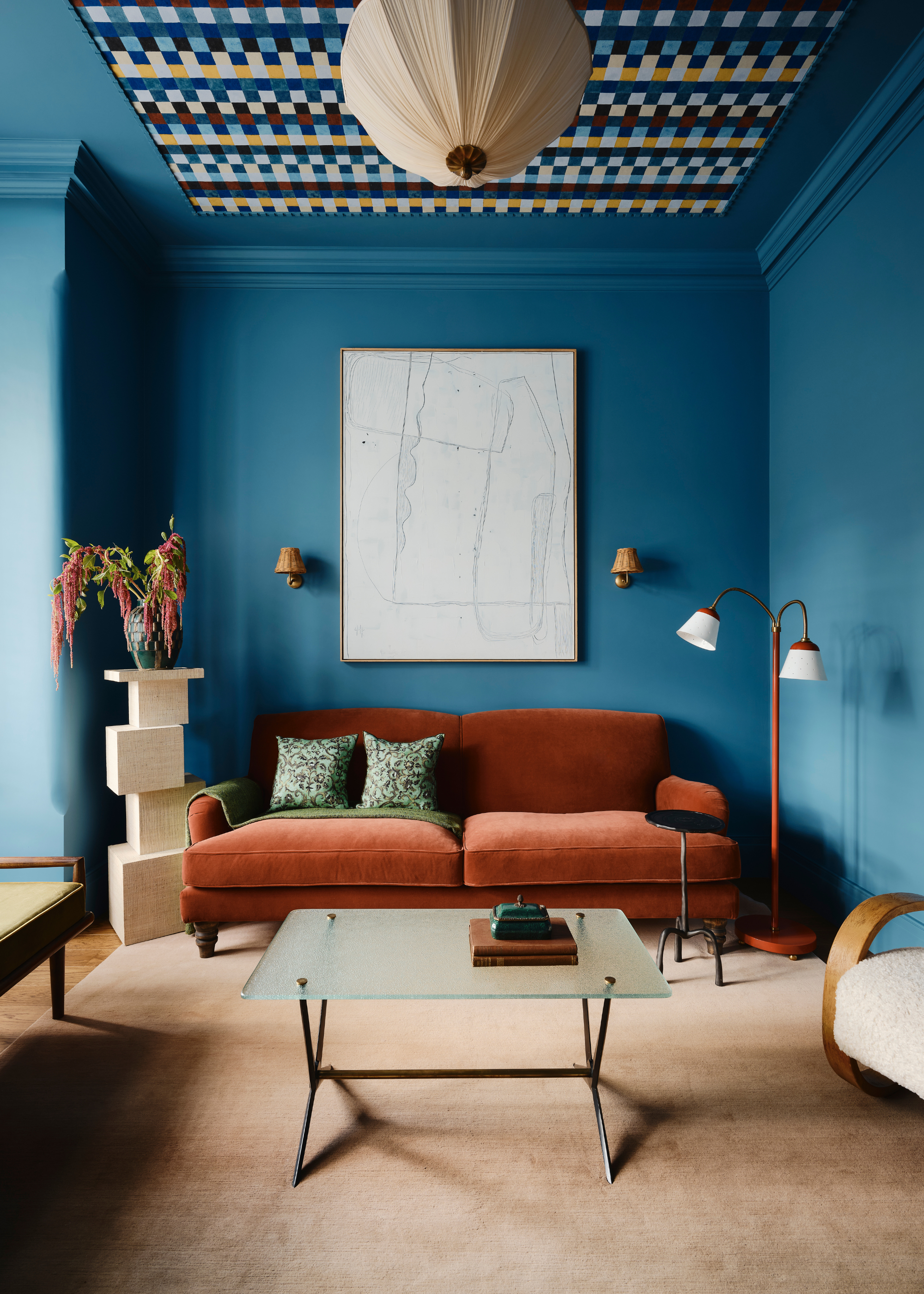
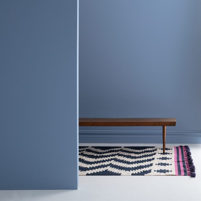
One such collaboration features Beata Heuman and Mylands, where Heuman's Swedish heritage and London experiences are evident in "The Dependables" collection. This range of 24 vivid colors, with names like "Crayfish Party," "Stockholm," "London Brick," and "Pub," aims to be unpretentious and reflective of everyday life. A notable shade from this collection is "Damp Leaf," which exemplifies the collection's thoughtful and lively character.
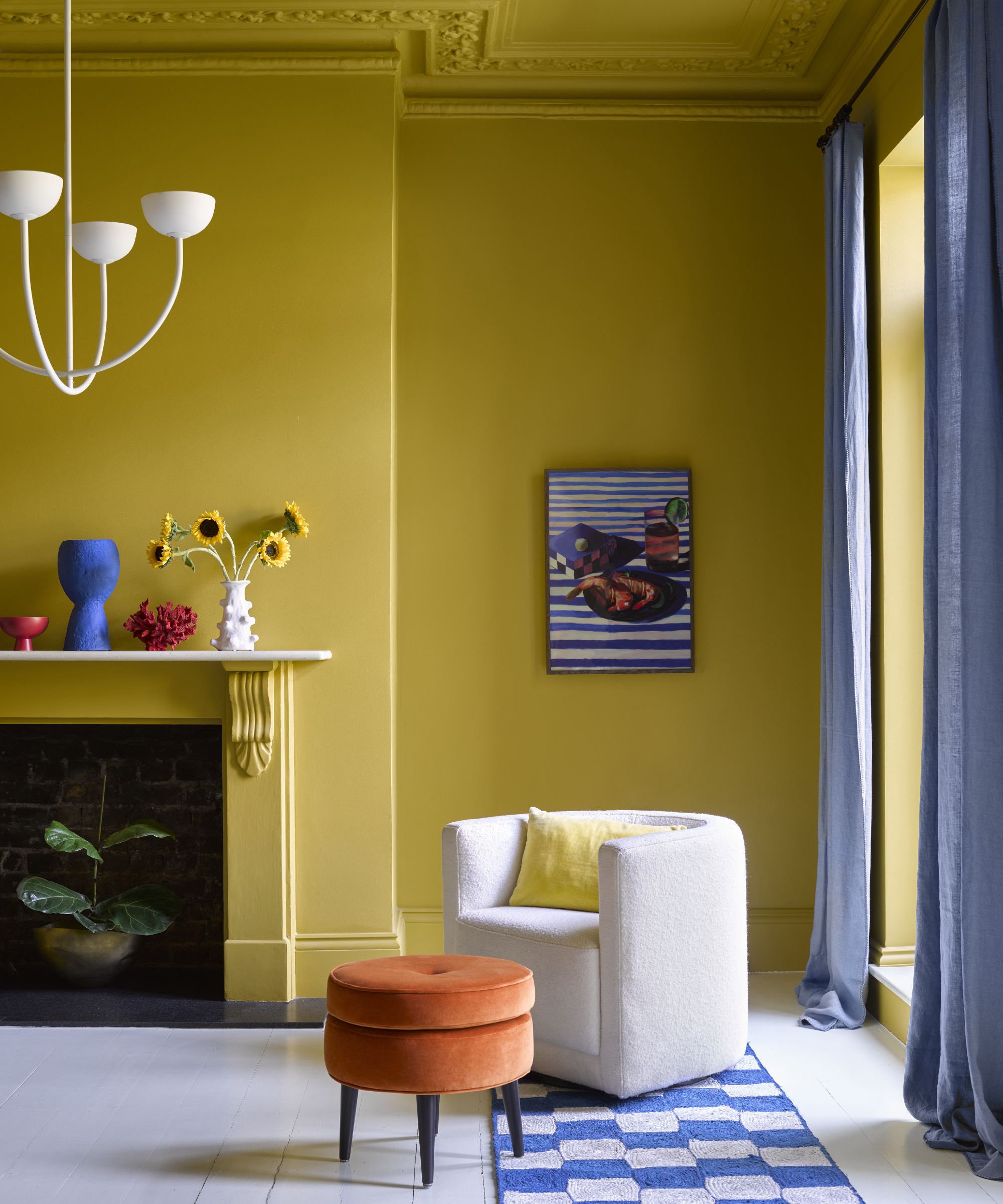
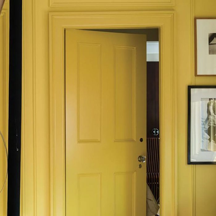
Kelly Wearstler's partnership with Farrow & Ball, a landmark collaboration in Farrow & Ball's 75-year history, draws inspiration from the Californian landscape. Her collection, launched in 2021, captures the essence of California's natural beauty, from the Pacific Coast highway's grittiness to Malibu's hazy mornings, and elements like salty air, citrus trees, and the specific green of ocean waves. "Citrona" stands out as a key color from this collection, embodying the collection's vibrant, sun-drenched spirit.

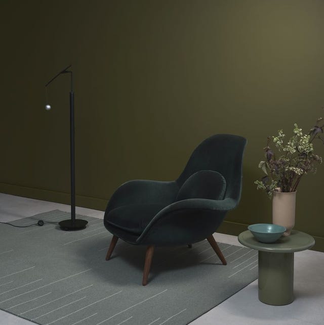
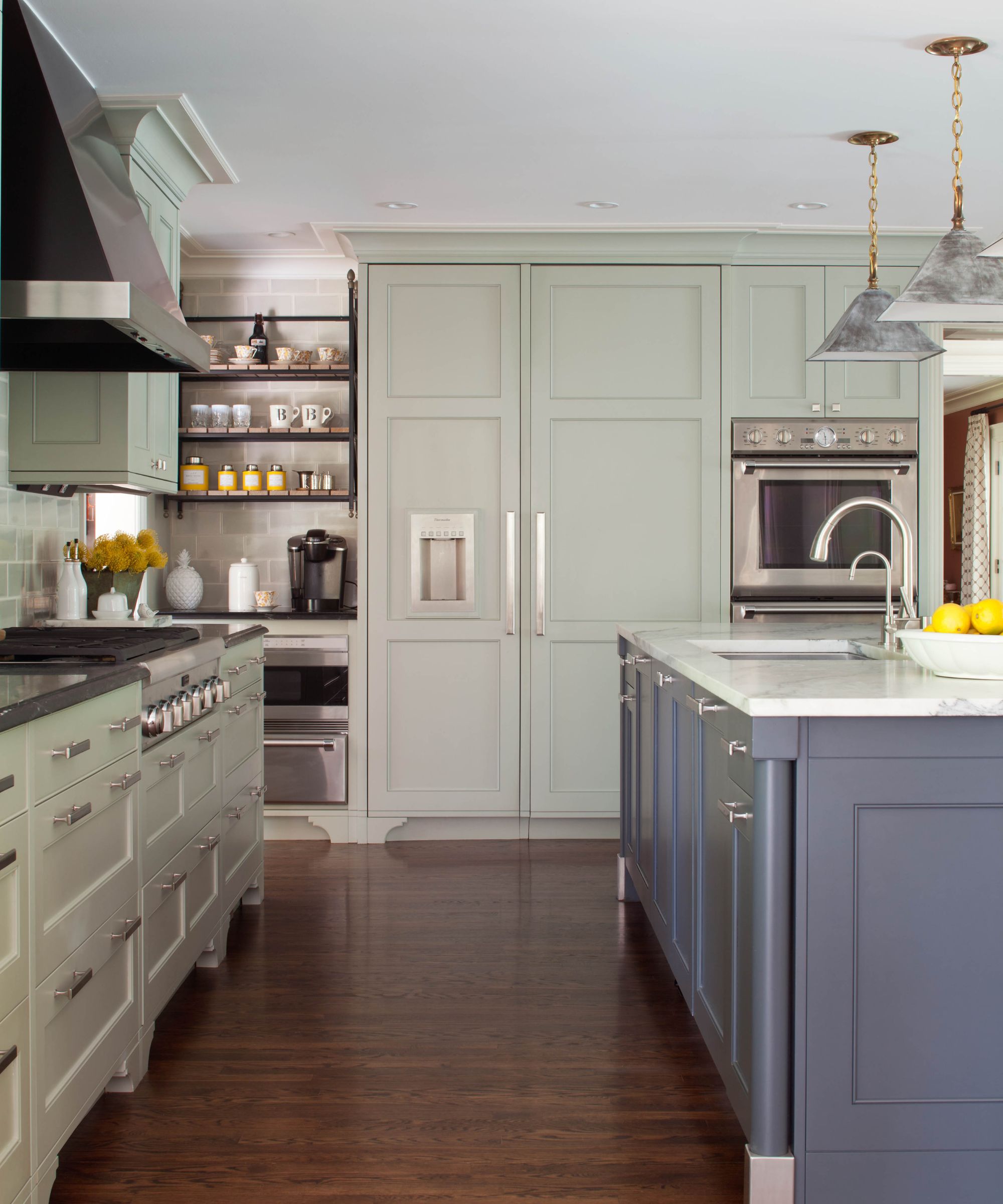
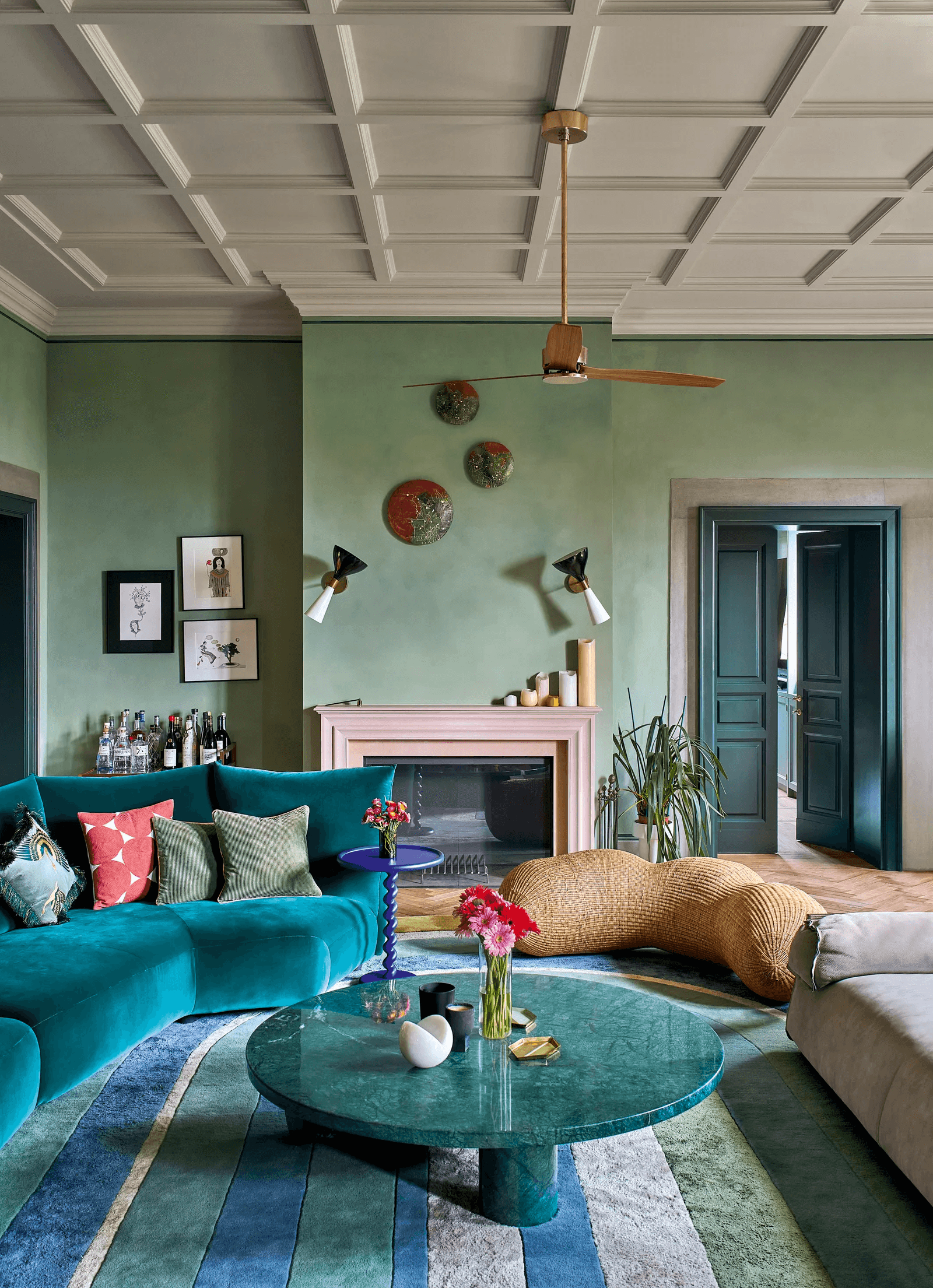
Rose Uniacke's collaboration with Graphenstone showcases her refined taste, offering a broad spectrum of subtle tones alongside stronger, more saturated colors. While known for her minimalist approach, Uniacke's collection demonstrates a nuanced understanding of color, featuring shades such as "Apple Mint," "Sea Mist," and "Dew," alongside clay reds, pine greens, aubergine, and flower-pot orange. The collection, with over 60 non-toxic, mineral-based options, ensures a serene environment, with "Winter Mint" being a particularly favored hue.
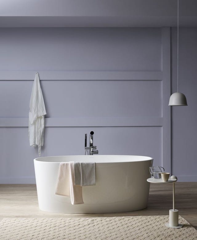
Christopher John Rogers also partnered with Farrow & Ball for his "Carte Blanche" collection, a concise offering of 12 colors and three wallpapers. Rogers' childhood memories from Louisiana, particularly his family's food, served as the primary inspiration. Each color is designed to tell a story, with "Hog Plum" evoking the sweet and sour fruit of Central America and the Southern States, and "Raw Tomatillo" representing a joyful green reminiscent of his grandmother's fried green tomatoes. This collection emphasizes the narrative behind each shade, encouraging a deeper appreciation for color choices.
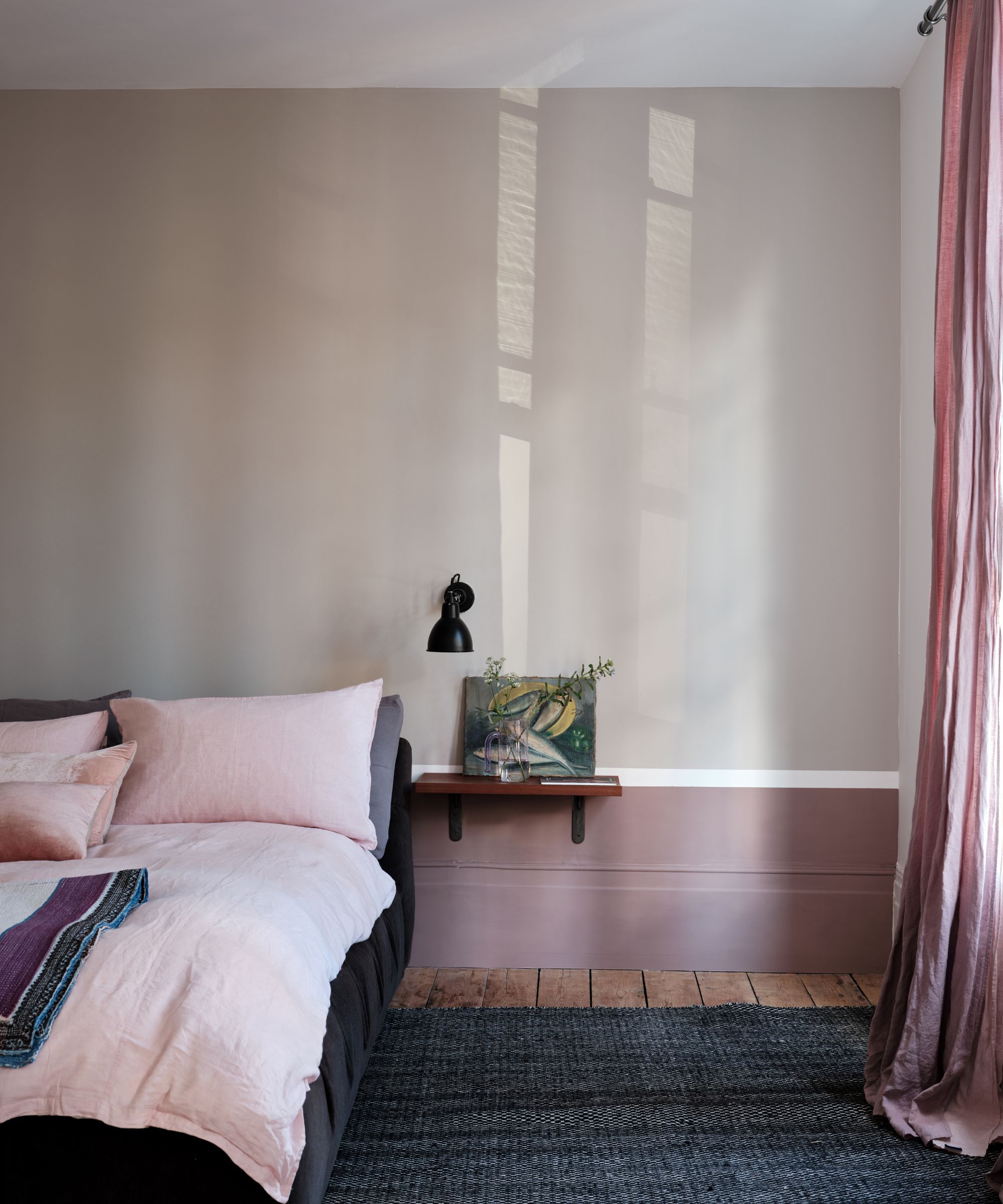
Finally, Rachel Chudley introduced her proprietary line of paints, a unique venture developed through her collaboration with her father-in-law, master colorist Donald Kaufman. Known for his contributions to color theory since 1976 and his work in iconic spaces like Studio 54 and the Obama-era Oval Office, Kaufman's influence is evident in Chudley's bespoke paints. These paints, previously exclusive to her clients, are now available to a wider audience, offering sophisticated and expertly crafted color options that reflect a deep understanding of color and design. These collaborations provide both designers and consumers with opportunities to explore and integrate high-quality, distinctive color palettes into interior spaces.
#InteriorDesign #PaintCollaborations #HomeDecoration #ColorPalettes #BeataHeuman #KellyWearstler #RoseUniacke #ChristopherJohnRogers #RachelChudley #InteriorDesign #PaintCollaborations #HomeDecoration #ColorPalettes #BeataHeuman #KellyWearstler #RoseUniacke #ChristopherJohnRogers #RachelChudley
Toplam 0 yorum
 Henüz yorum yok
Bu da beğenebilirsiniz
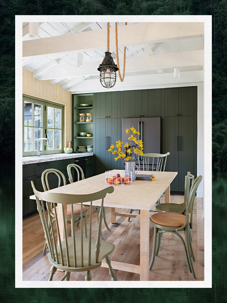
Designers Share Their Tried-and-True Shades From the Best Interior Paint Brands
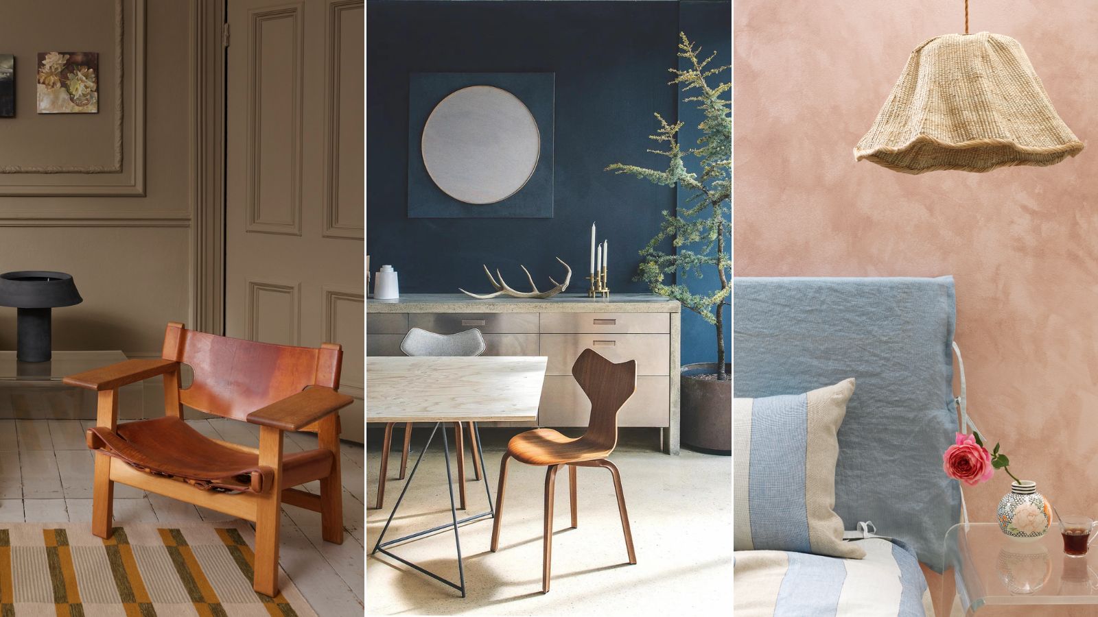
Professional painters reveal the secret to color matching a paint shade from an image alone


11 Paint Colors That INSTANTLY Make Your Home Look "Expensive," According to Designers

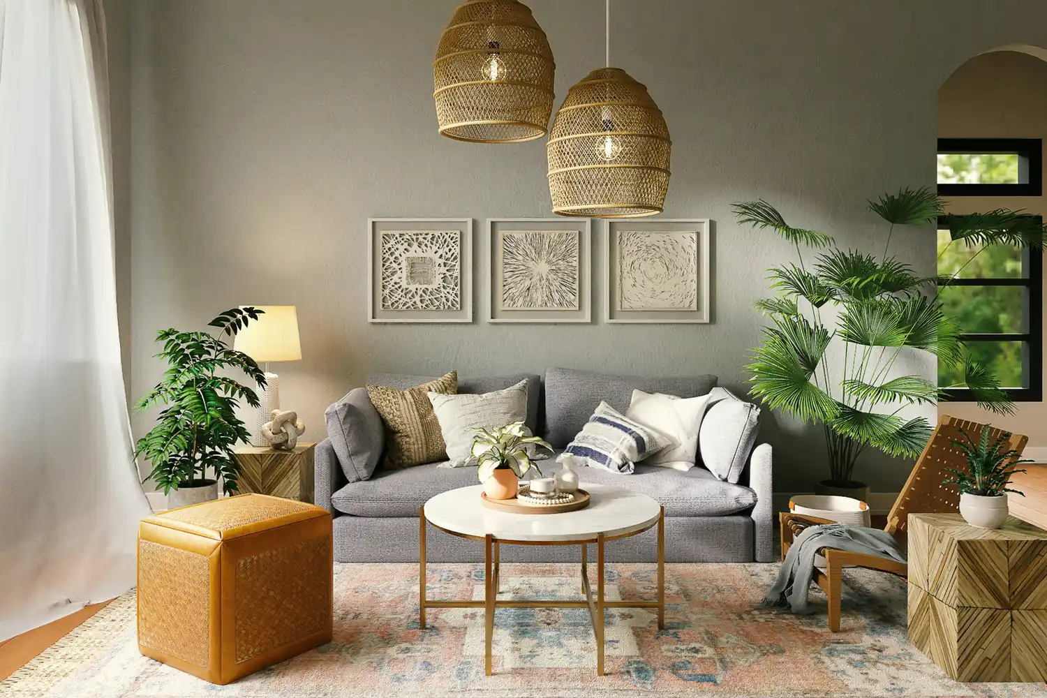
The 5 Most Overused Paint Colors and What to Try Instead, According to Designers


8 Favorite Paint Colors of Local Interior Designers


4 Interior Designers Share the Biggest Paint Color Trends Right Now (and What’s Out!)

33 Absolutely Perfect Paint Colors Designers Love

9 Best Interior Paint Colors

Britain's best interior designers on the paint colours you just can't go wrong with
12 Paint Colors That Interior Designers Are Buzzing About—See the Gorgeous Hues Here
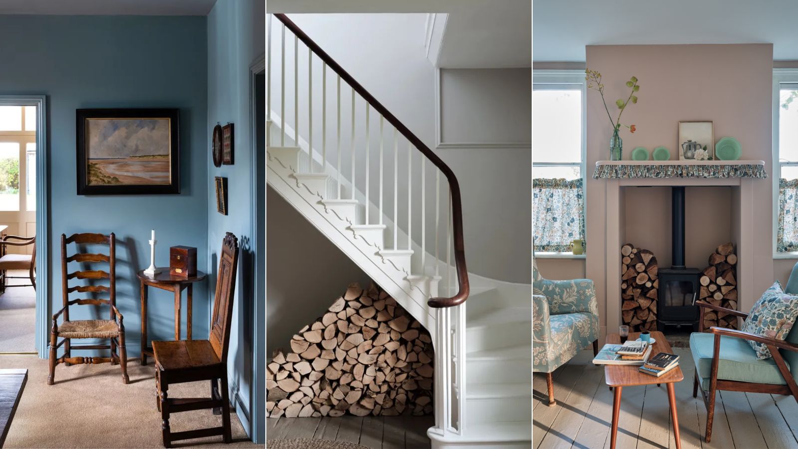
Interior designers' favorite Farrow & Ball paint colors
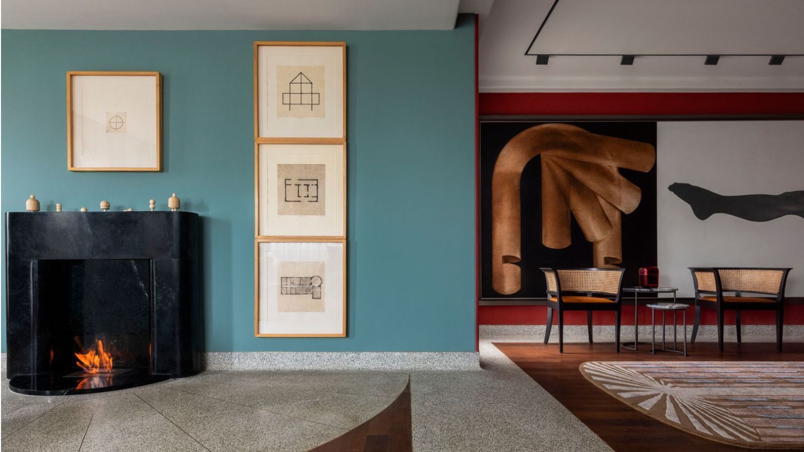
7 colour combination ideas that AD100 designers swear by for home interiors

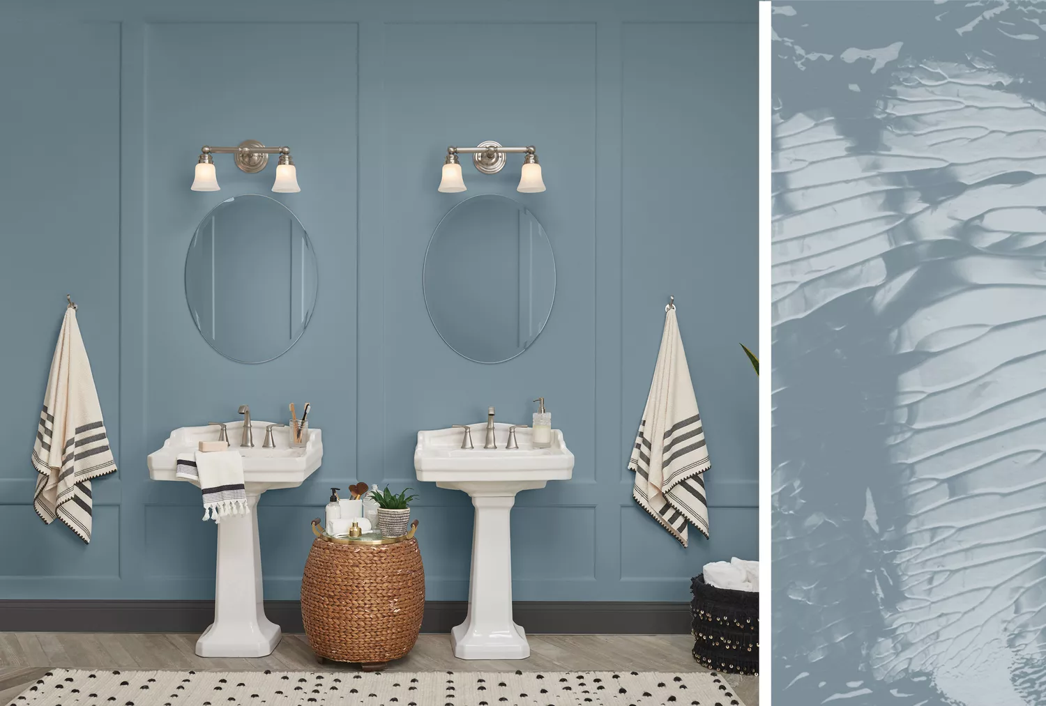
20 Interior Paint Colors Decorating Experts Love
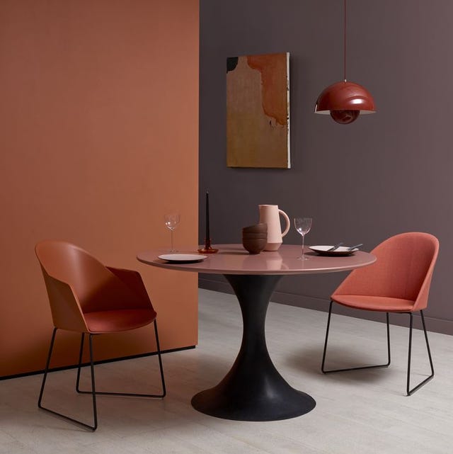
Discover the beautiful new collection of shades created by ELLE Decoration with Crown Paints

Colors That Go With Blue — 16 Pairings Designers Depend on for Bold, Breezy, and Perfectly Balanced Palettes

Should woodwork be lighter or darker than walls? The rules colour experts use to choose the perfect colour
Best paint brands chosen by interior designers – their top picks revealed
6 rooms that demonstrate why blue and green are this year's coolest colour pairing
Lick Paint Will Transform the Mood in Your Home Through Color Psychology
9 Classic Paint Colors Designers Love For Interior Doors