1/11
Primary colours are having a moment - but the secret to styling them is through 'unexpected' touches
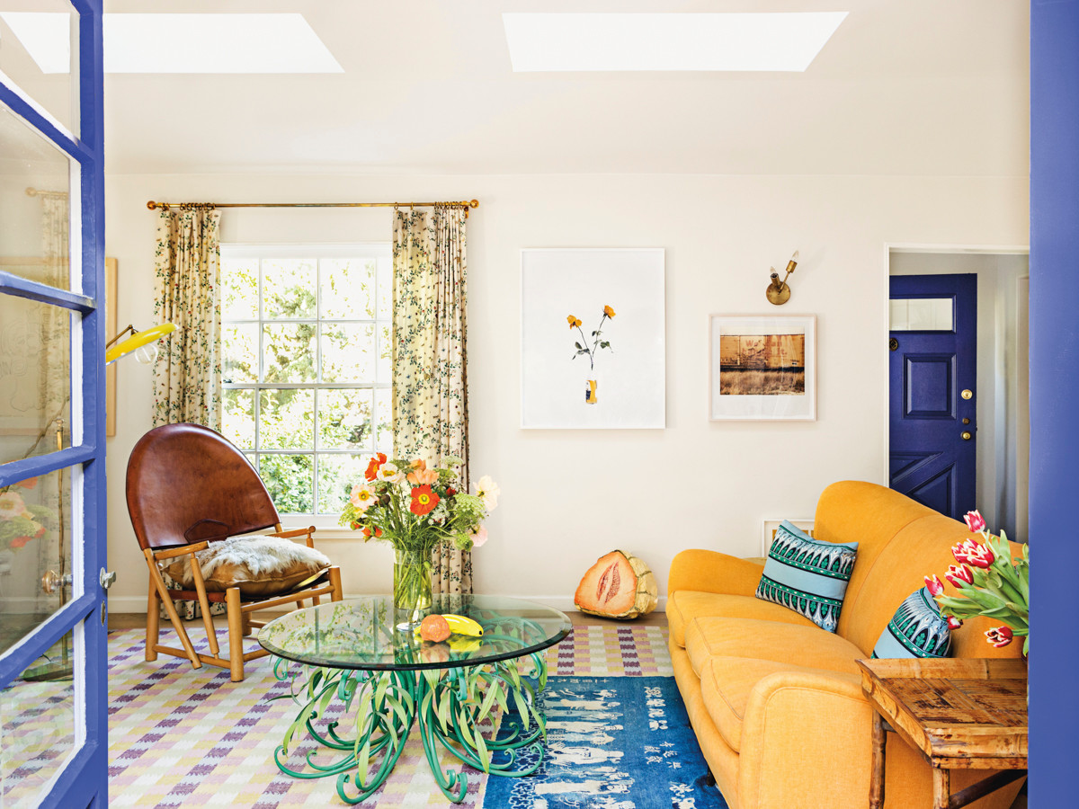
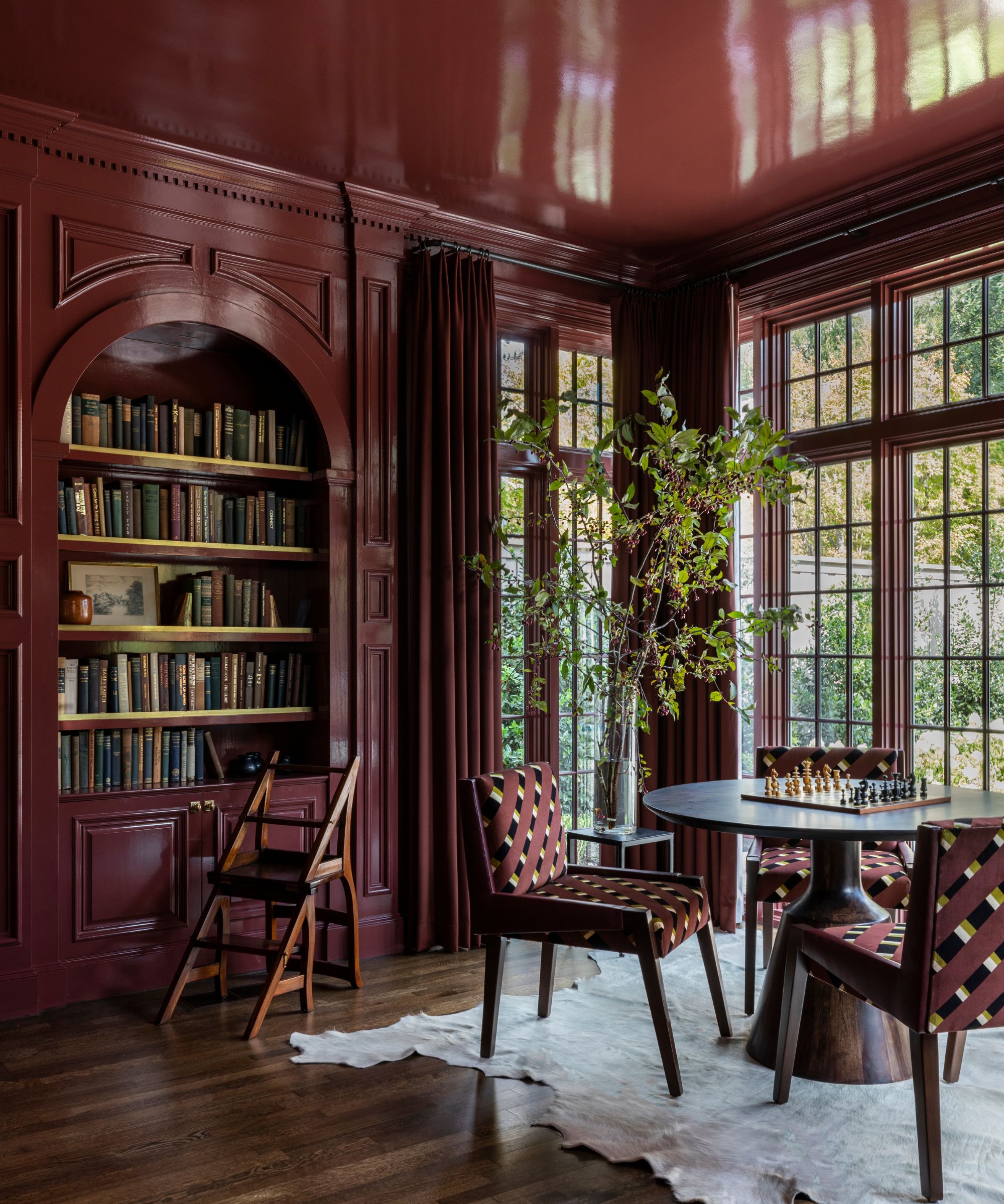
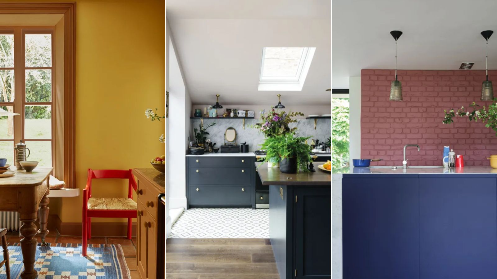
The 'unexpected red theory' has introduced a fresh perspective to interior design, moving away from minimalist beige aesthetics towards a vibrant revival of primary colours. This trend encourages the integration of red, yellow, and blue into home decor, offering a playful yet sophisticated approach to styling. Historically, primary colours were largely relegated to art classes, but their current resurgence suggests a shift towards interiors that embody more character and personality. This article delves into various methods for incorporating these fundamental hues, ensuring they enhance rather than overwhelm a space.
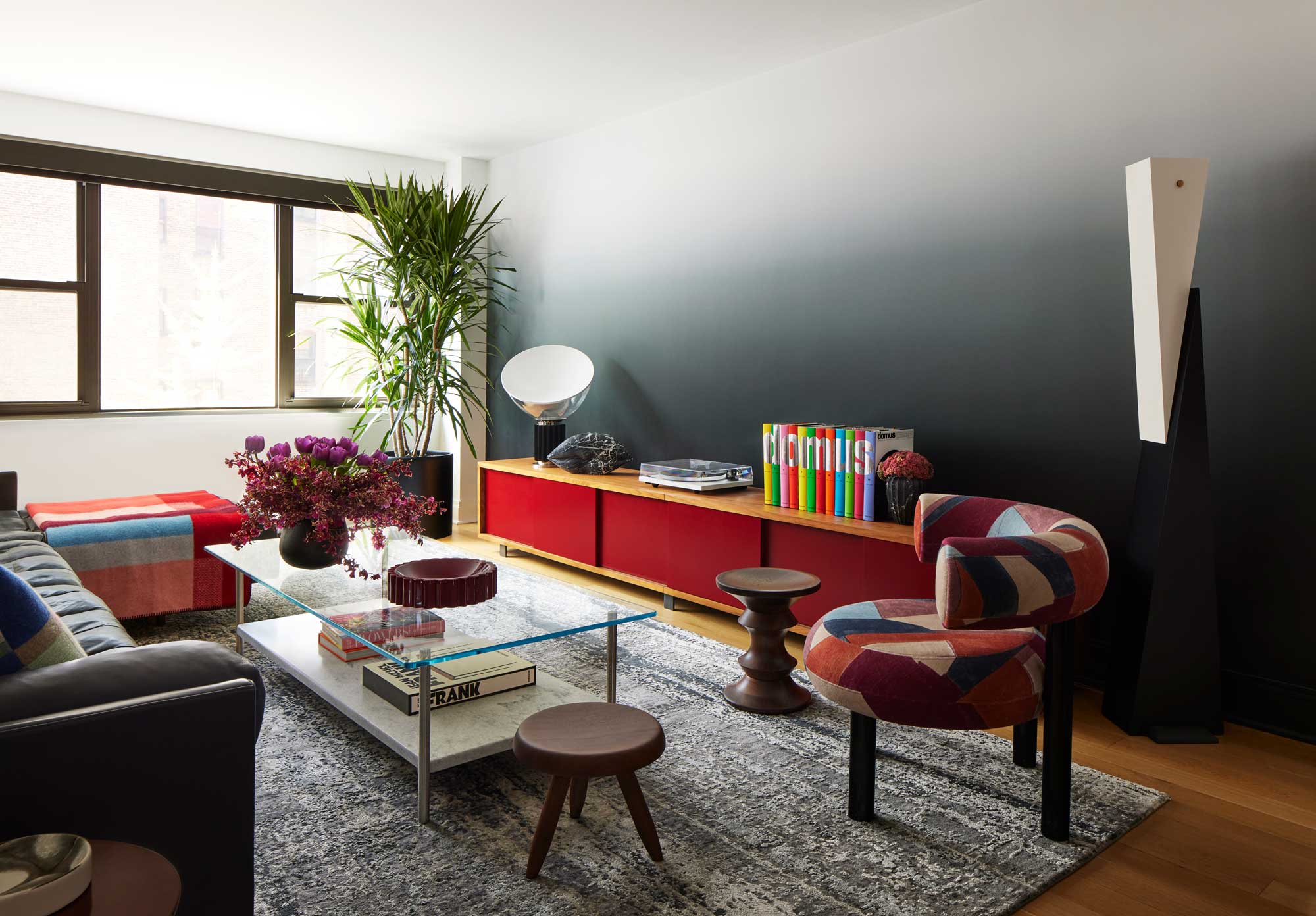
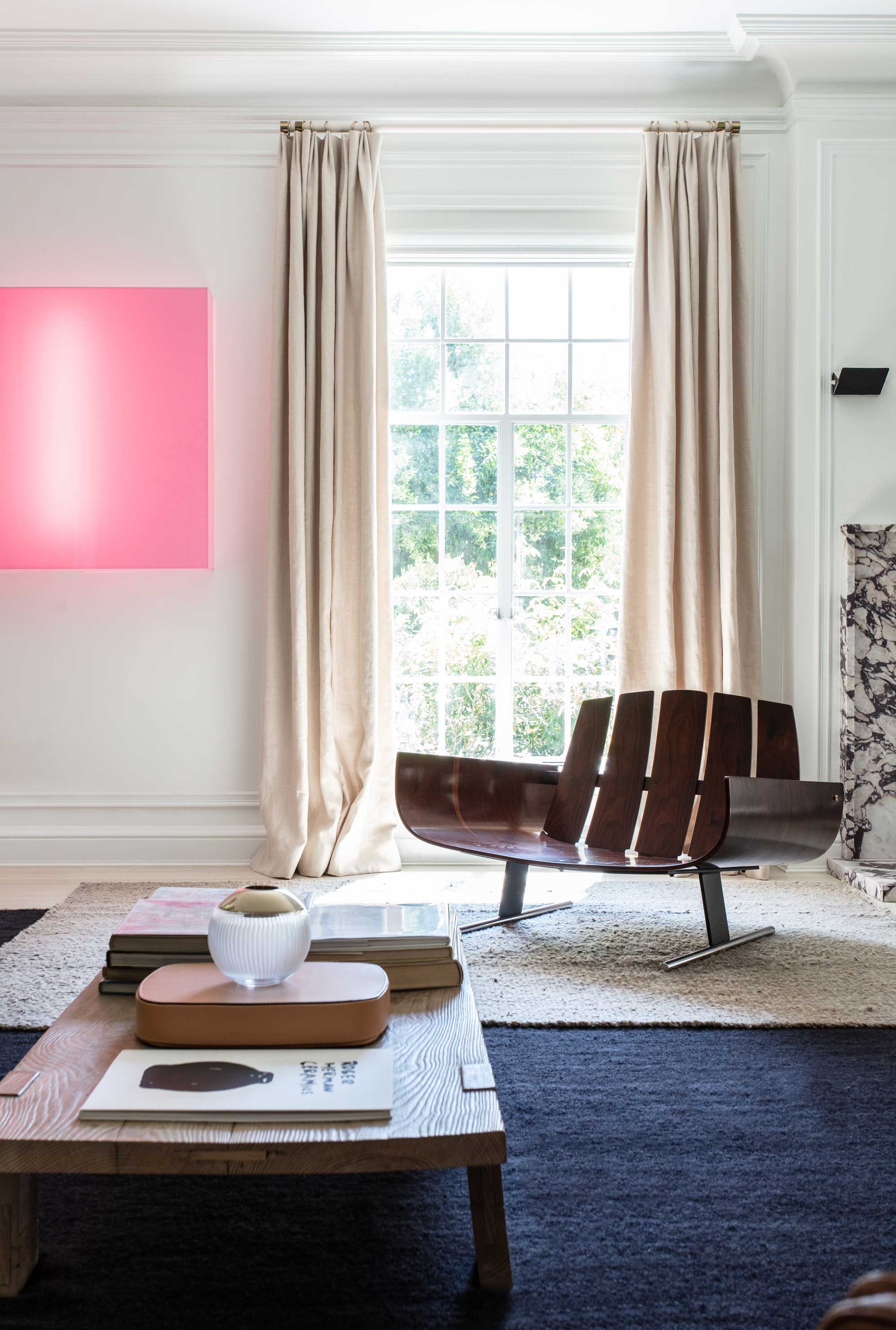
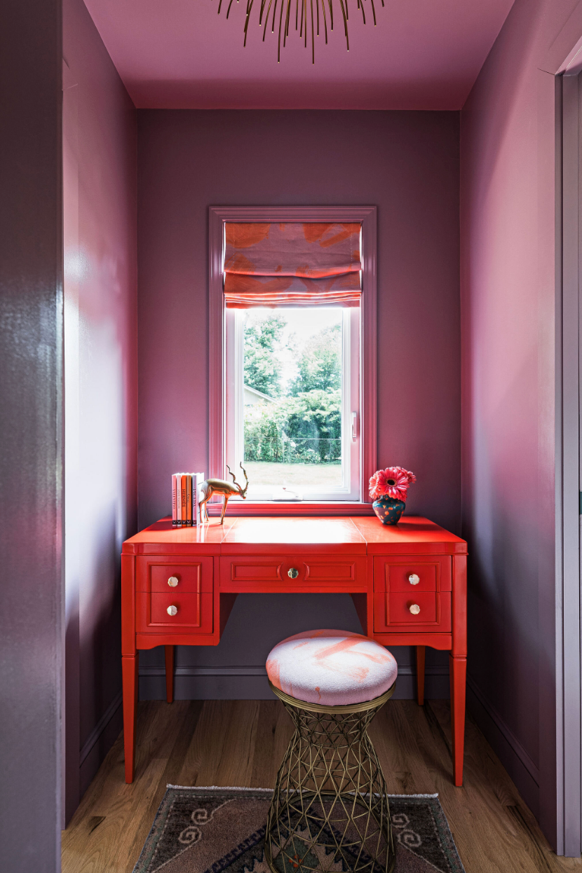
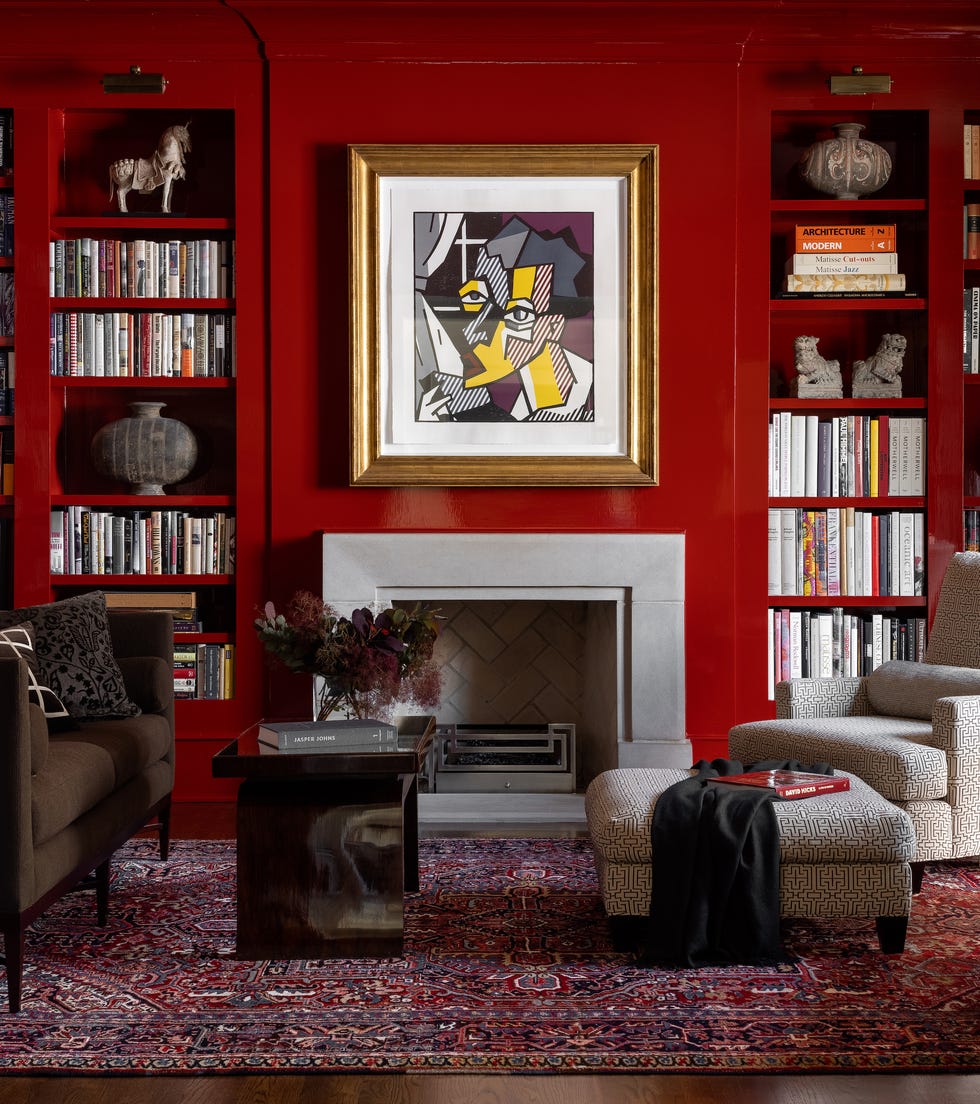
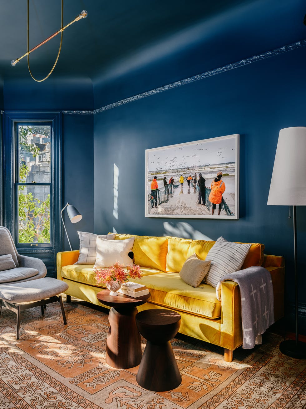
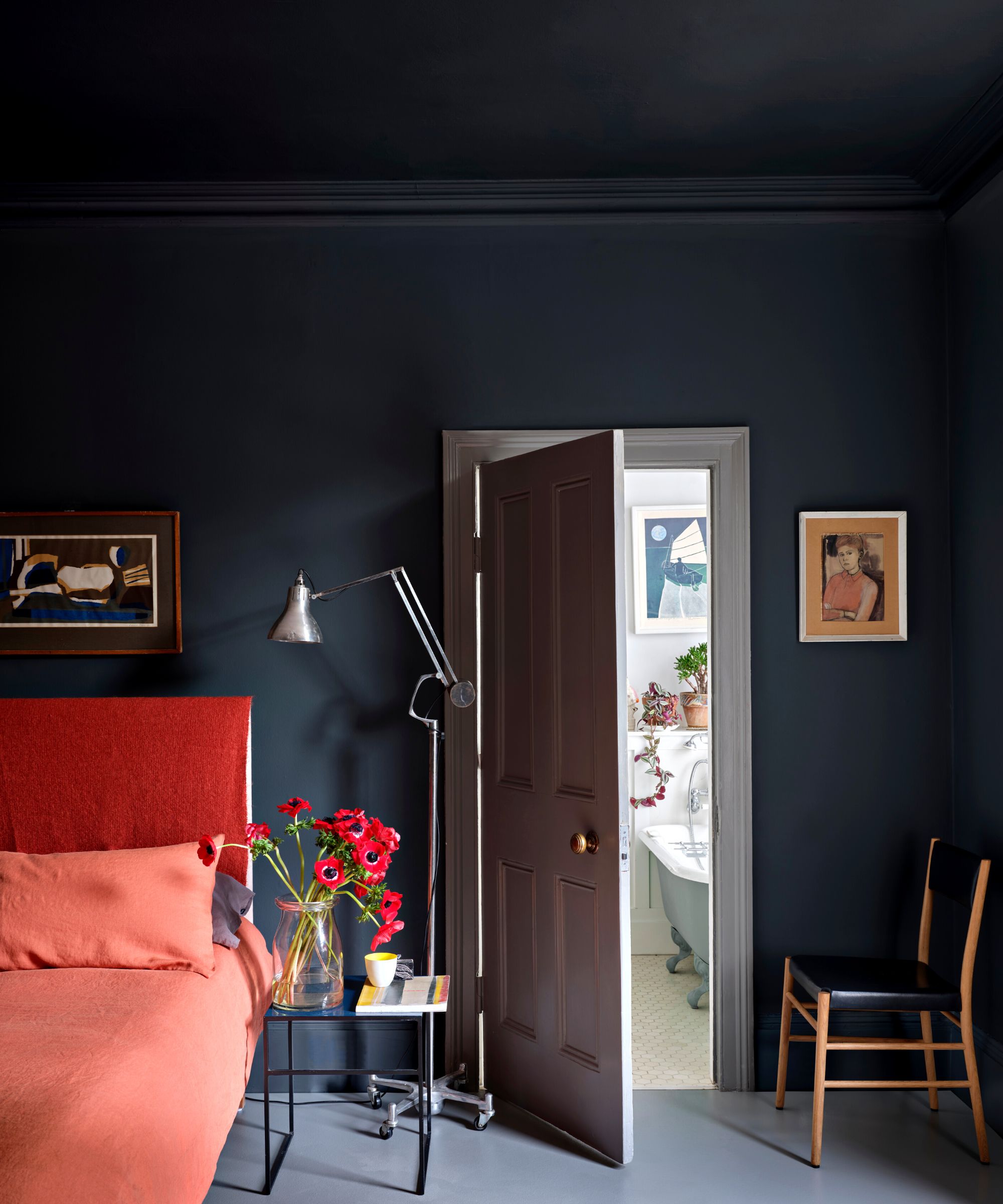
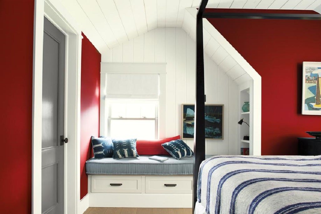
Primary colours, being the foundational elements of the colour wheel, are inherently harmonious, making them easy to combine with each other or with other shades. The 'unexpected red theory' specifically champions the strategic placement of colour 'pops' in unconventional areas. The core idea is that a splash of red, regardless of its size, in an unexpected spot can instantly elevate a room's aesthetic by signaling an intentional design statement. This principle extends beyond red to include all primary colours, suggesting that a burst of yellow on a sofa or a blue accent can similarly complete a look.
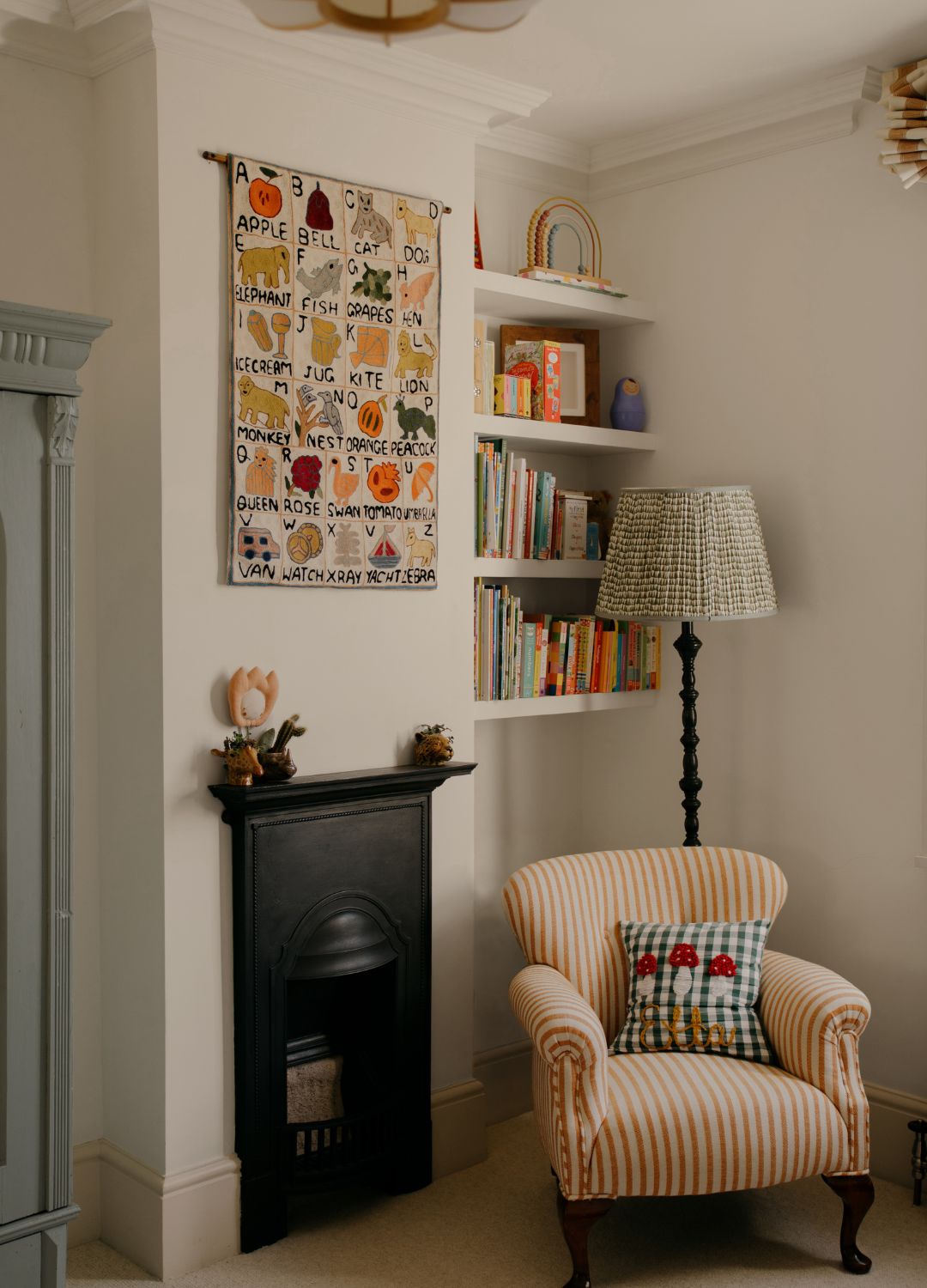
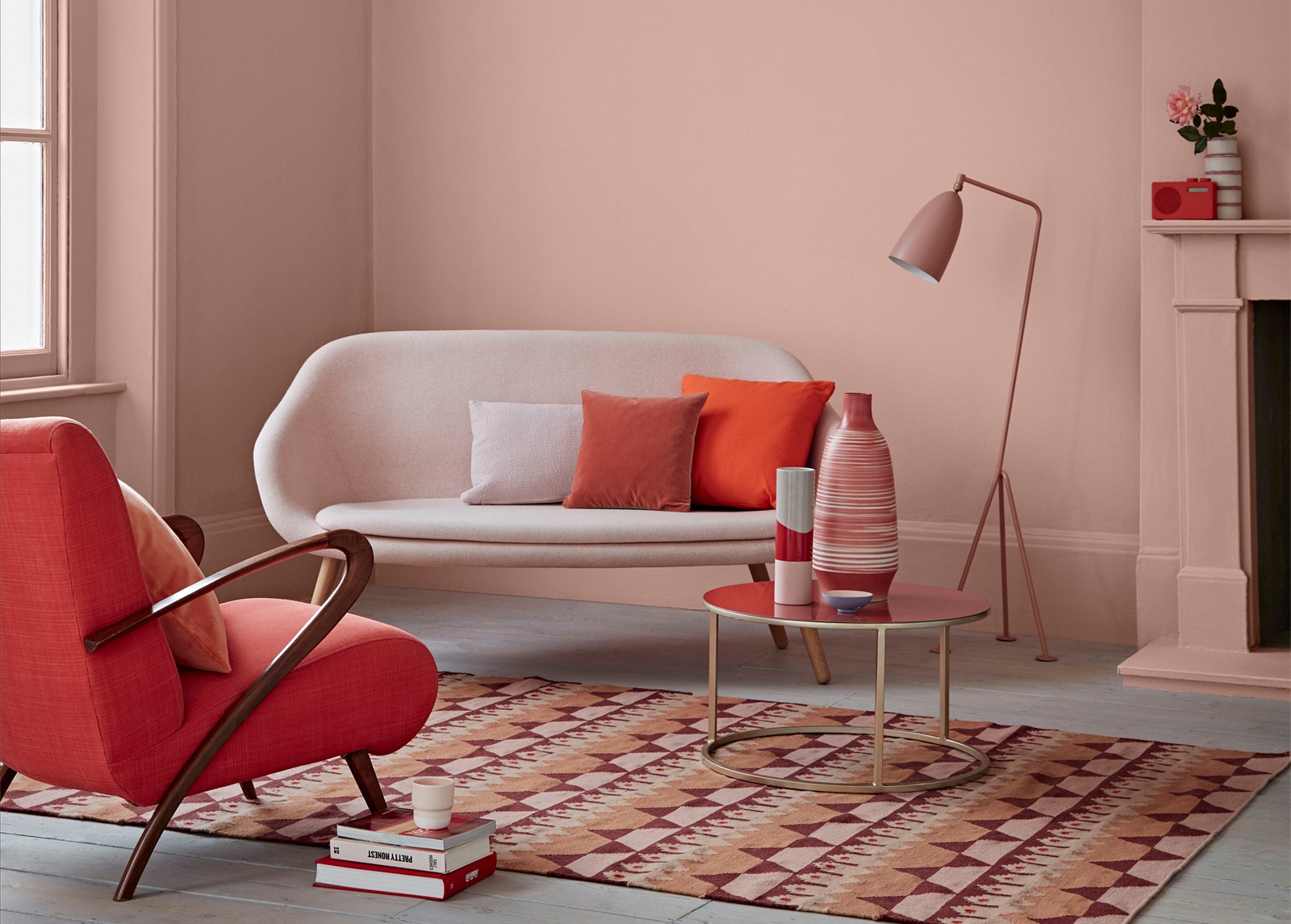
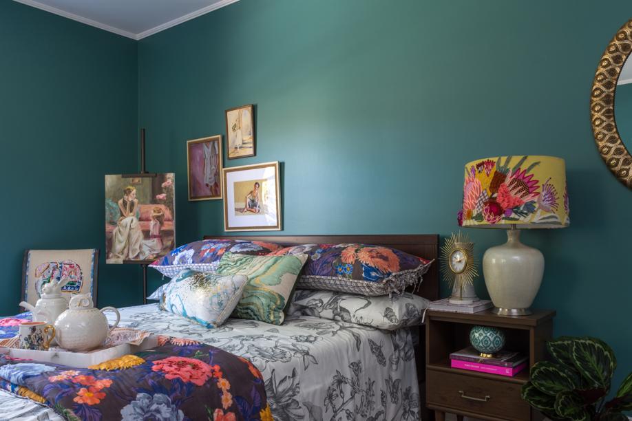
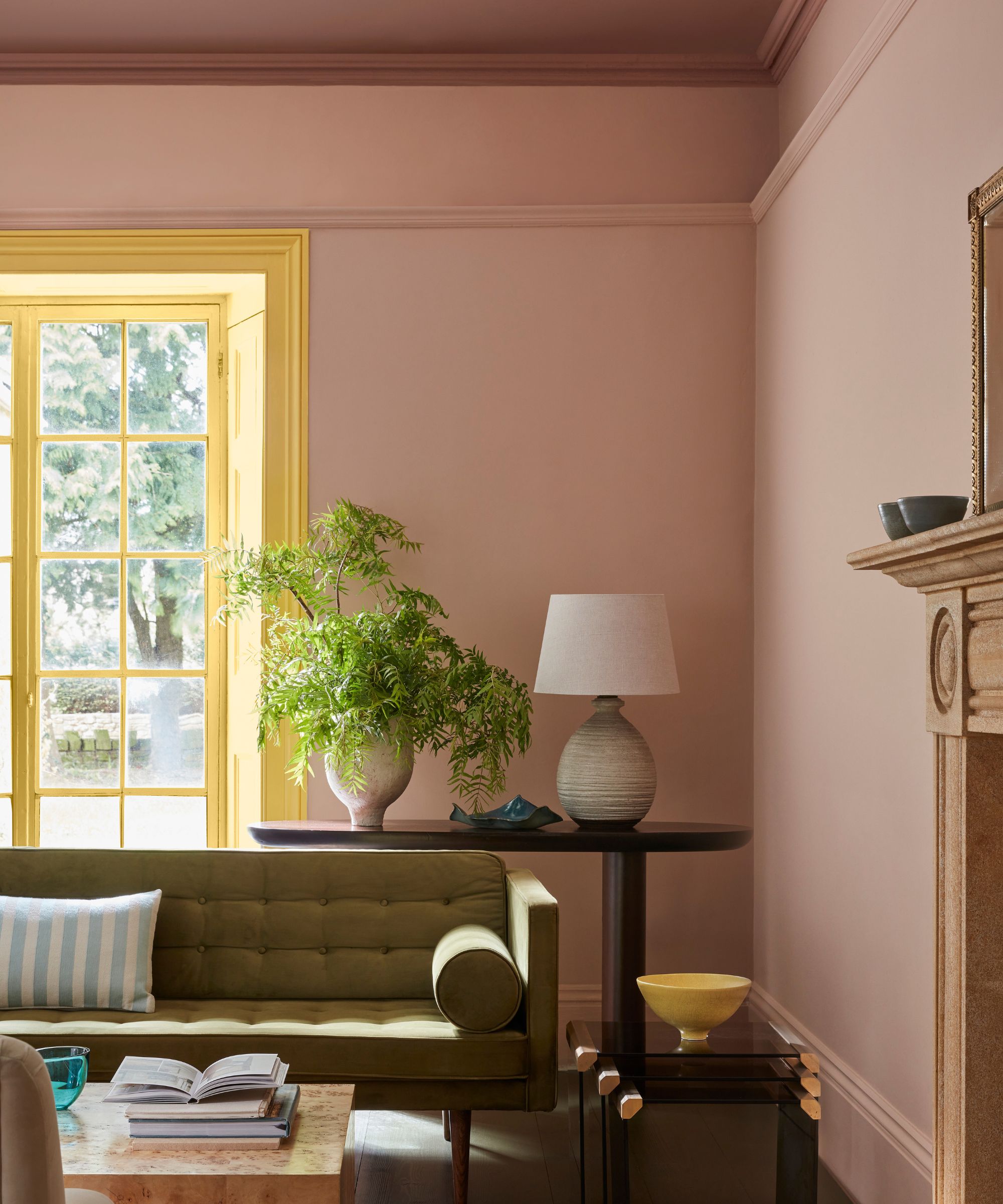
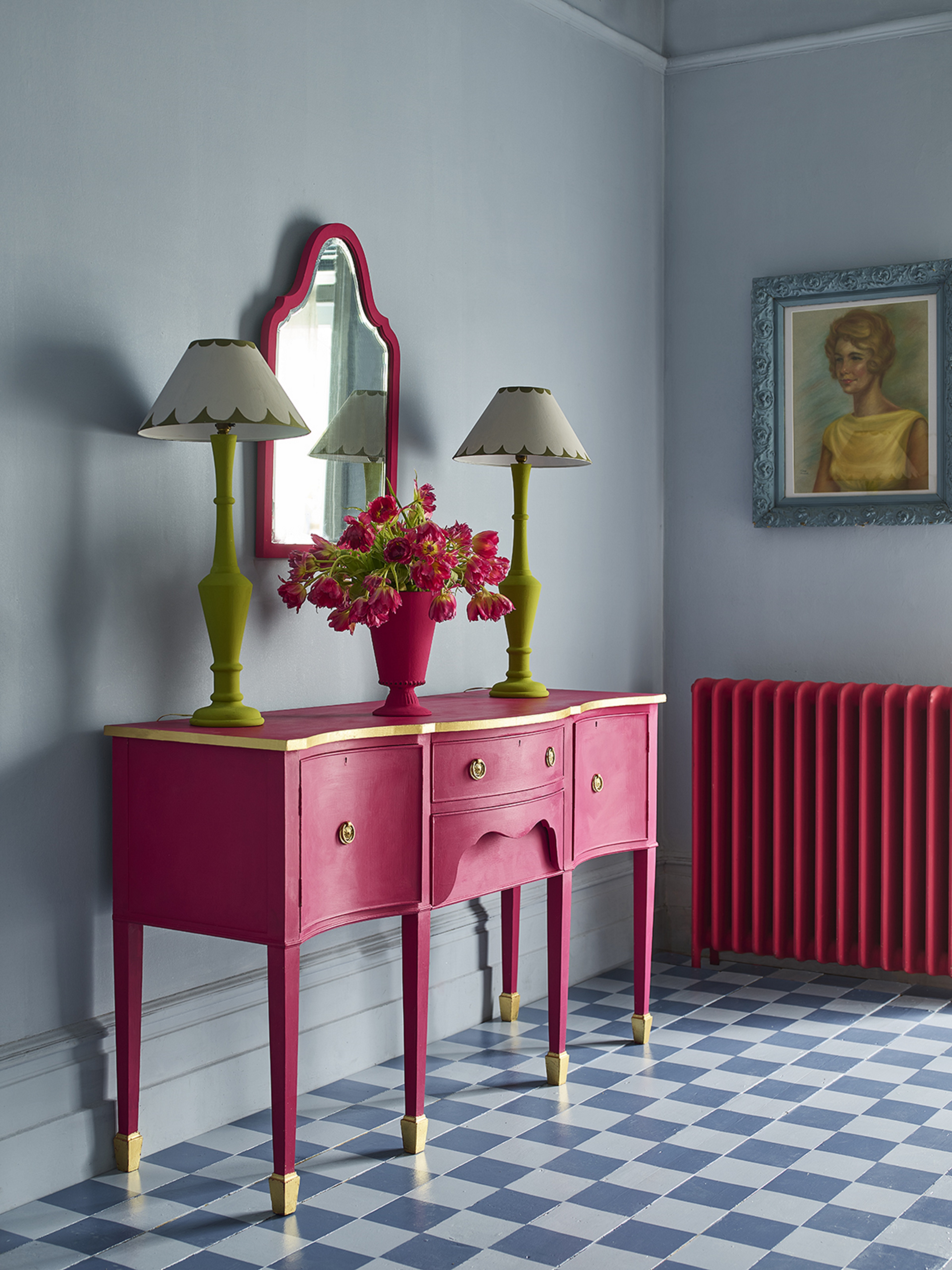
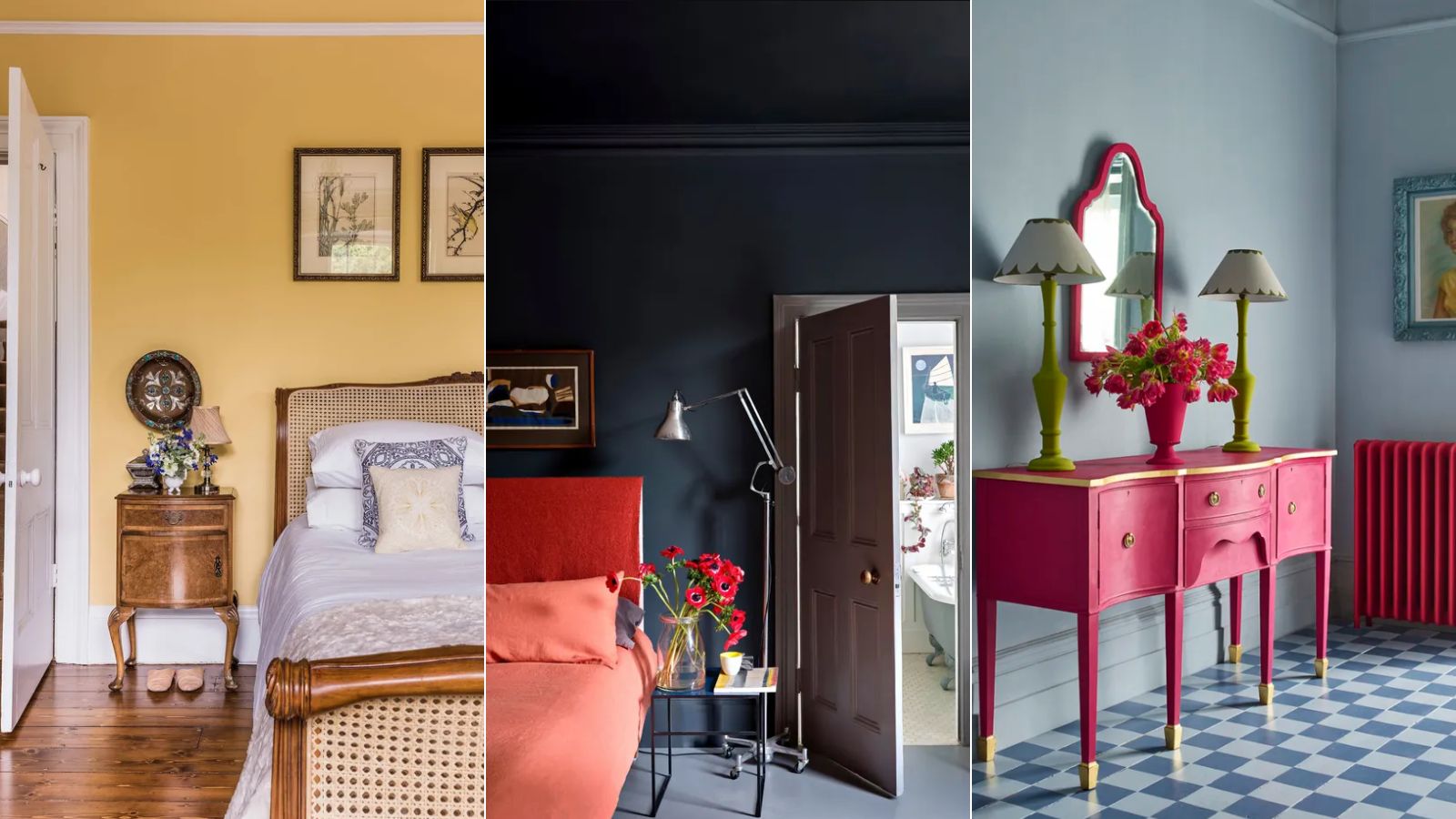
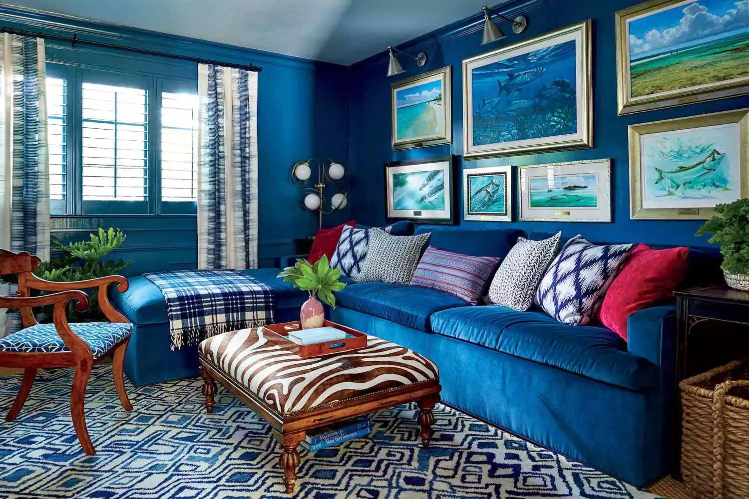
For those hesitant to fully embrace bold colours, starting with accessories is a recommended approach. Incorporating red, yellow, or blue through items like cushions, table lamps, vases, or throws allows for minimal financial commitment and flexibility. These accessories can introduce vibrancy and connect with other elements in the room without requiring significant changes. For instance, a blue velvet sofa can be complemented by red cushions, or a red table lamp can break up a room with an unexpected pop of colour.
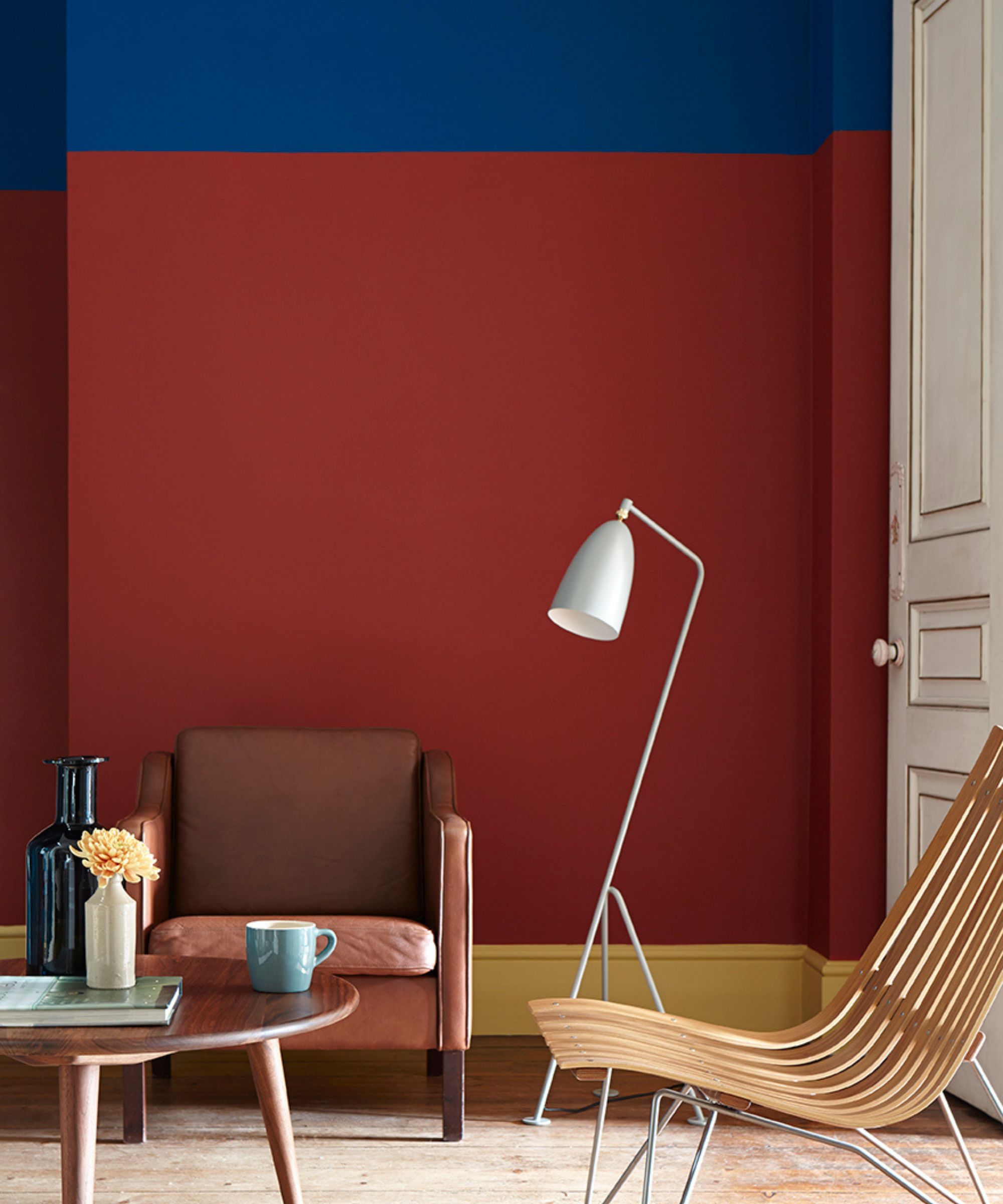
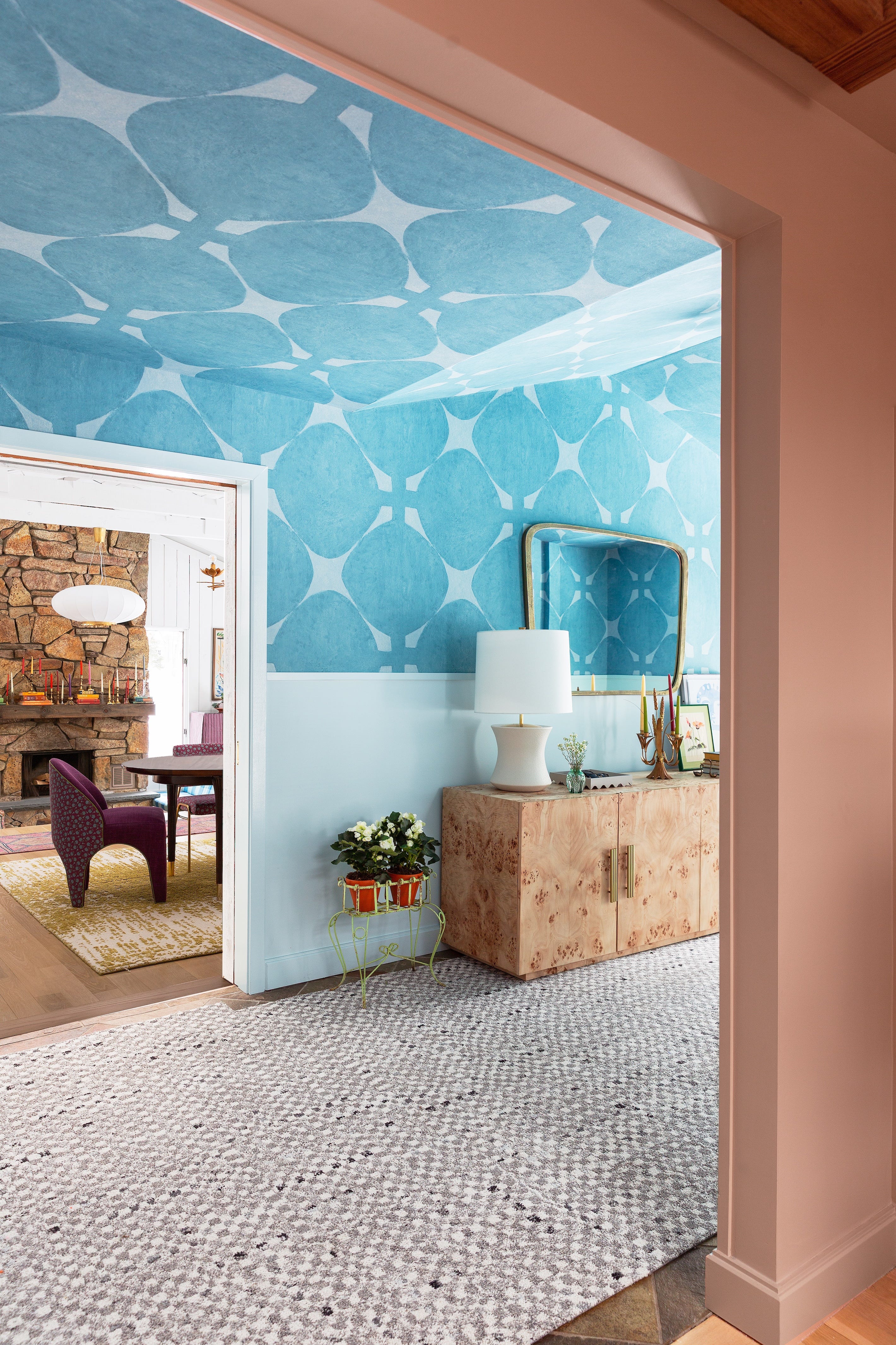
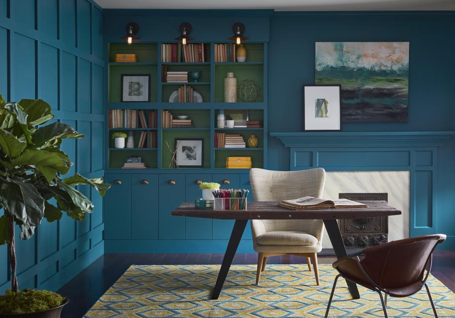
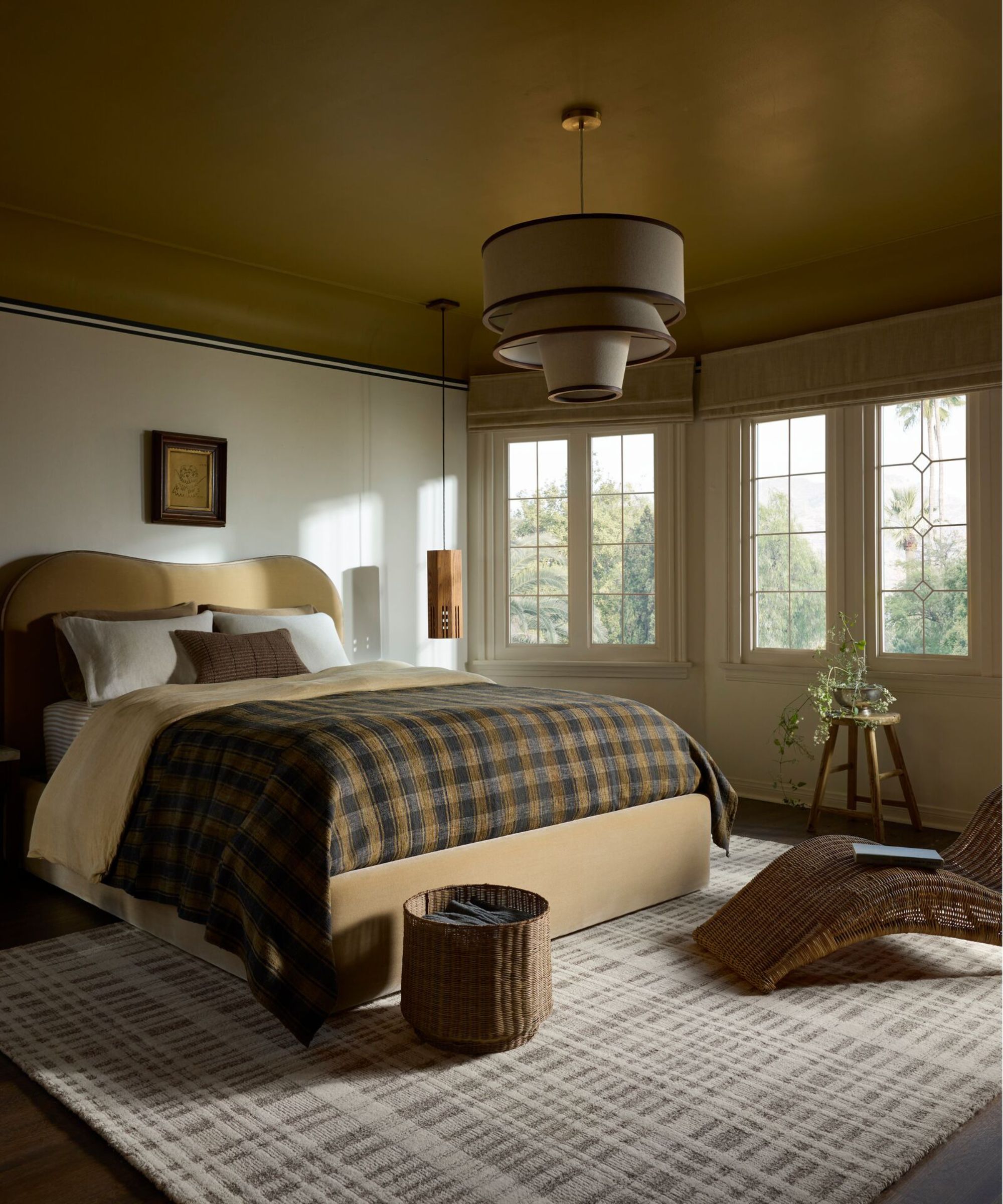
Another innovative way to apply the 'unexpected red theory' is by utilizing the height of a room. This method ensures that primary colours are introduced in surprising places, creating a significant visual impact. Hallways, with their often narrow and long dimensions, provide an excellent canvas for this. Painting walls in a primary colour and then adding contrasting accents, such as a yellow lampshade or a red stair runner, can create a dynamic and engaging space. This strategy allows the colours to work in harmony, with each element contributing to the overall design without competing for dominance.
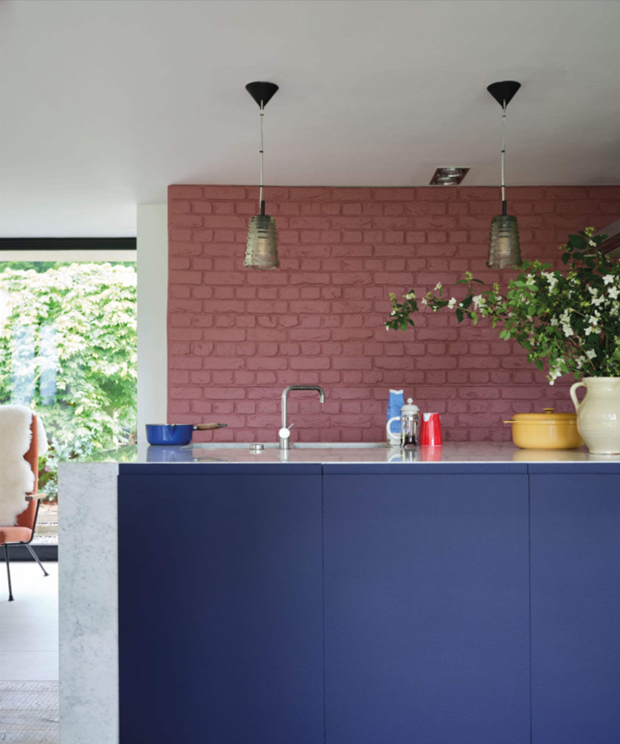
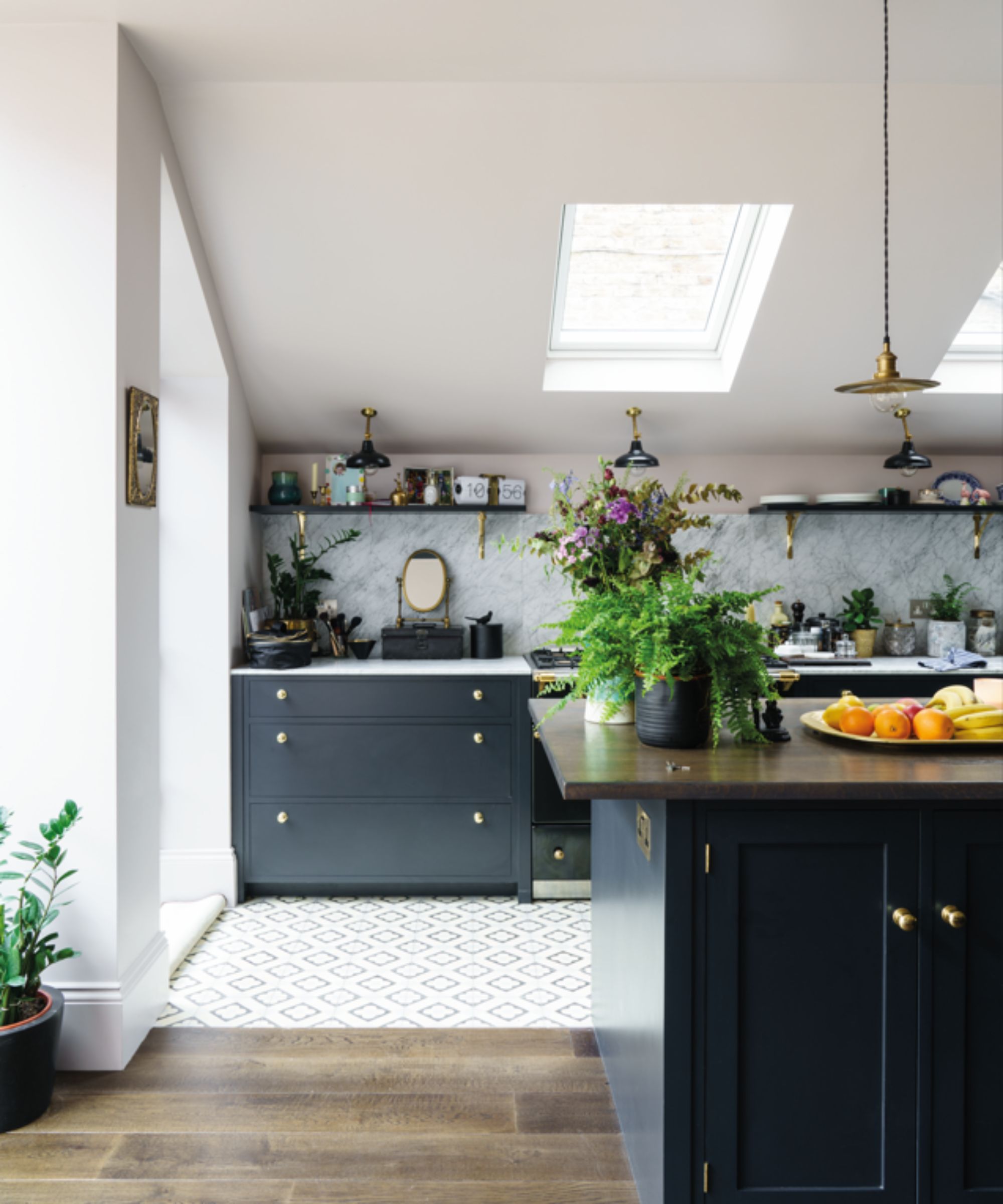
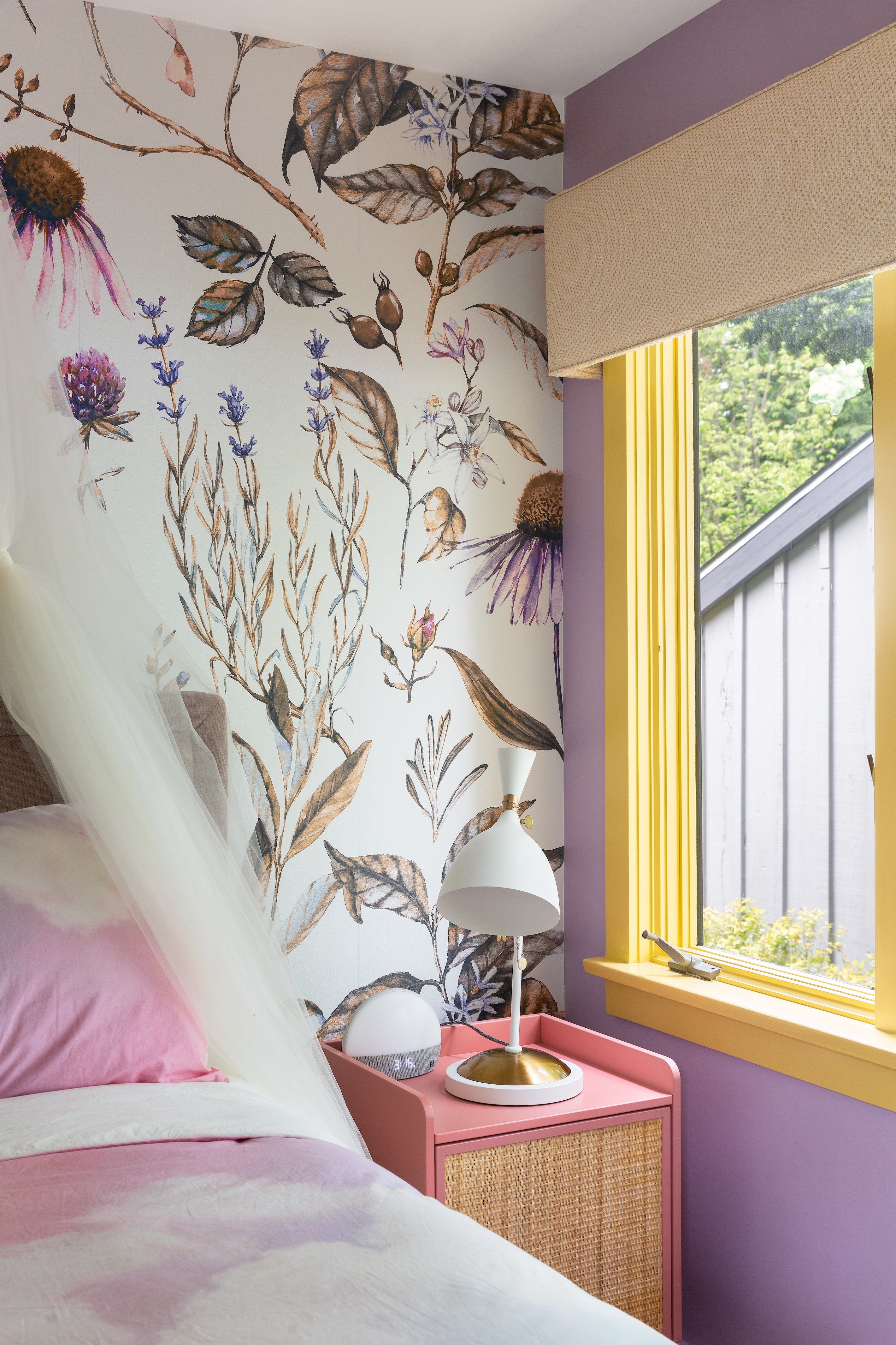
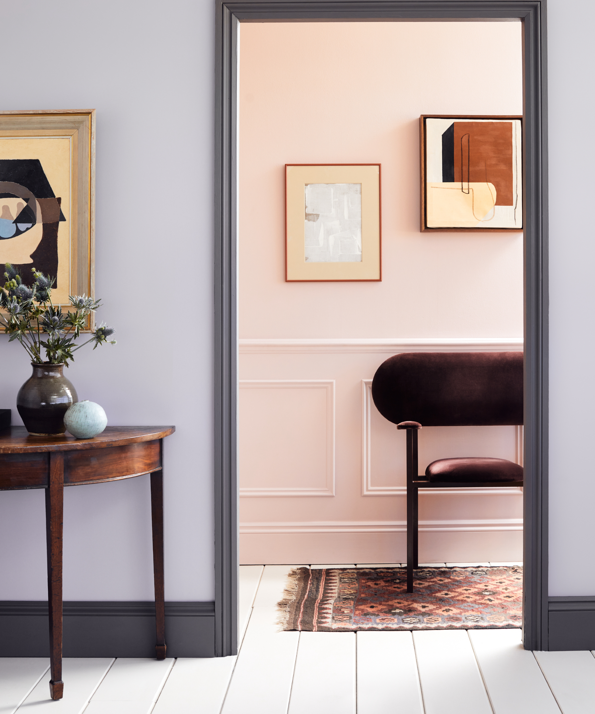
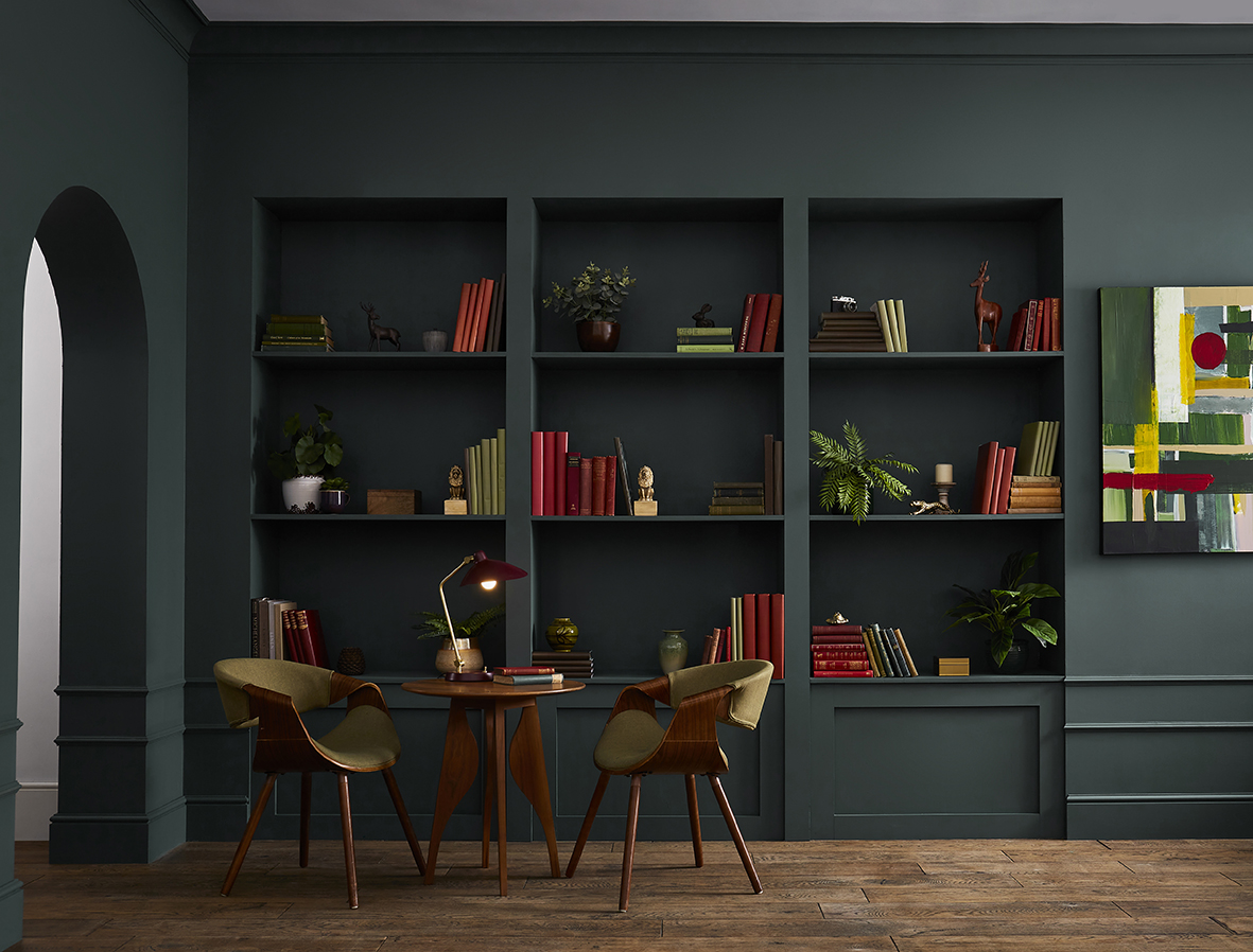
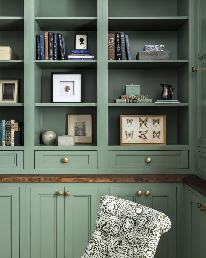
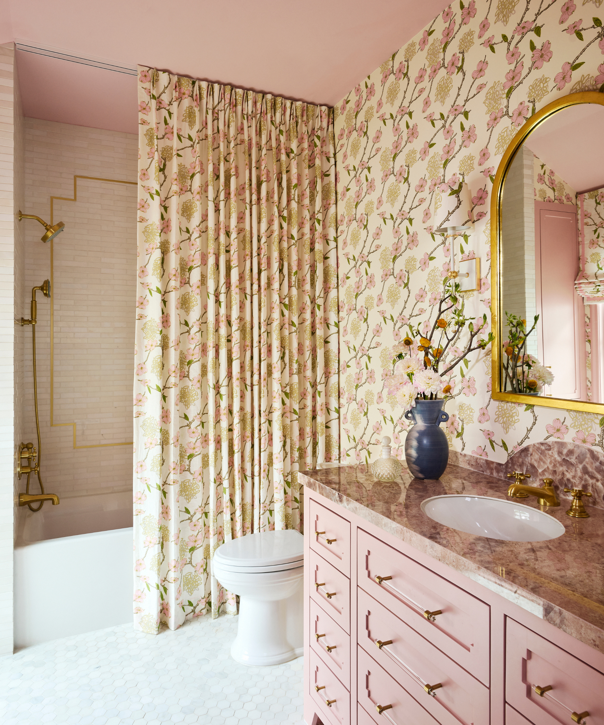
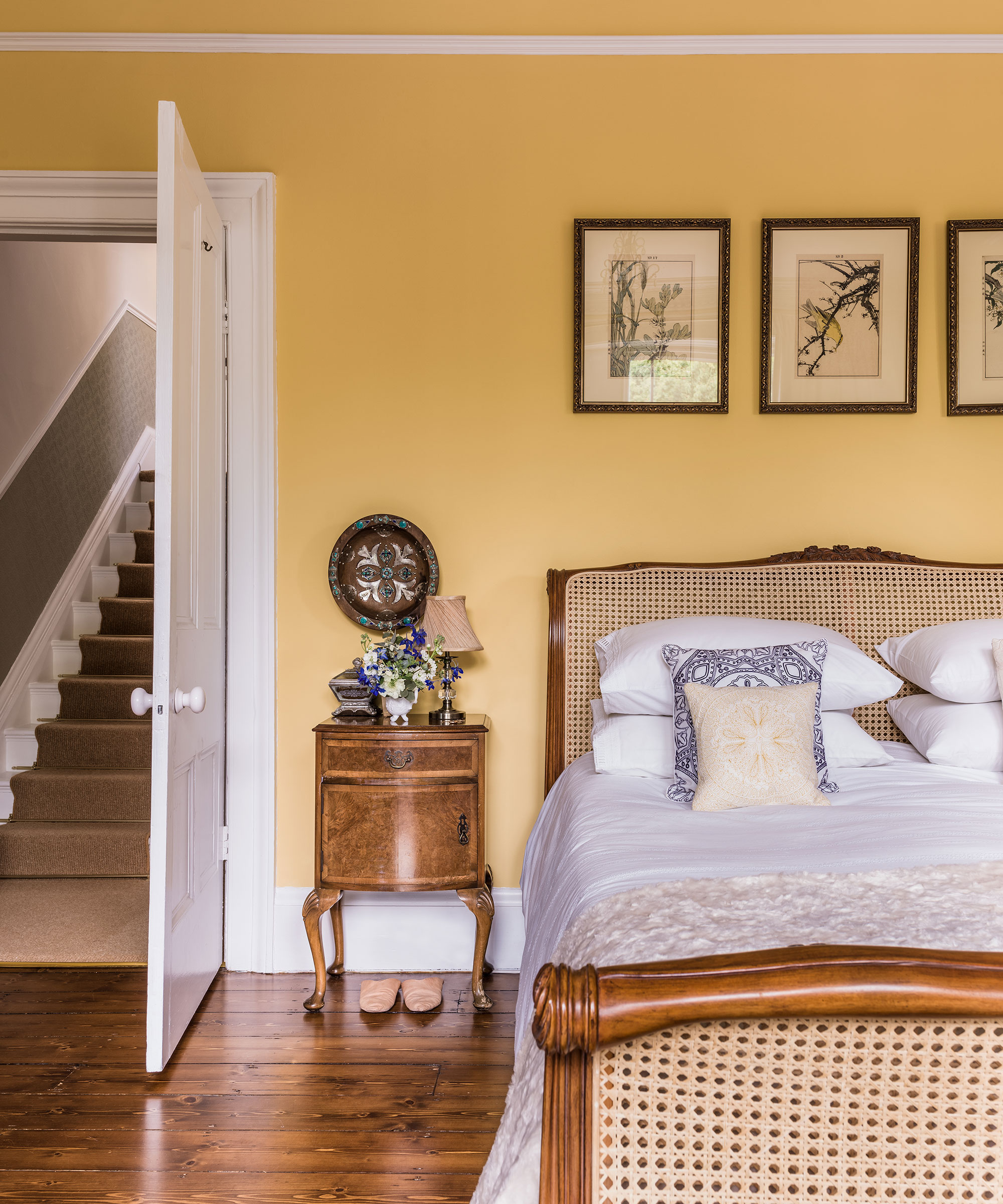
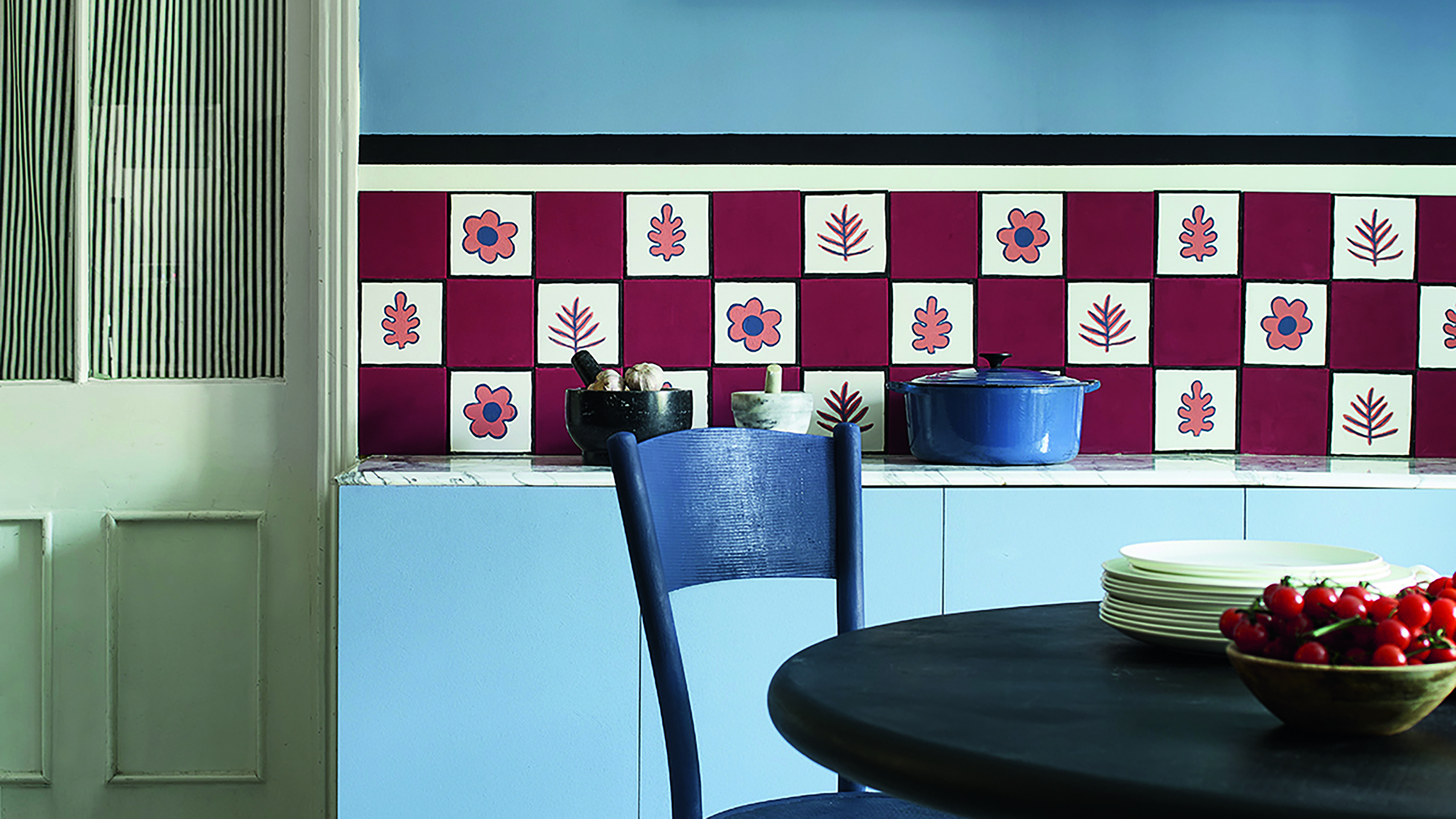
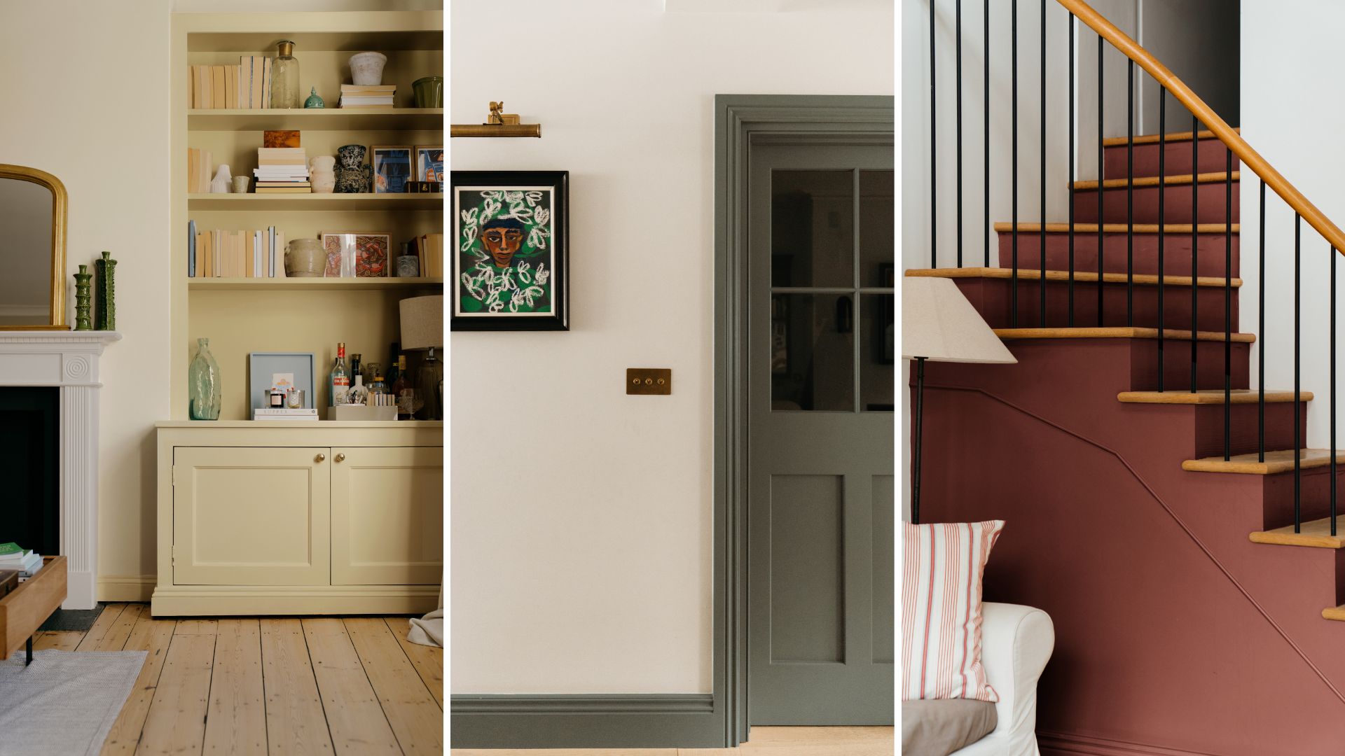
Leveraging paint features in unconventional ways is also highlighted as an effective method. While painting an entire room in a bold primary colour might be daunting, applying these colours to architectural details like architraves can add significant interest and define different zones within a room. This technique allows for the introduction of strong colours in a more controlled and sophisticated manner, separating spaces and adding depth. For those ready to make a grand statement, committing to coloured cabinetry, whether in a kitchen or a bedroom, offers a bold and impactful approach. This can involve repainting existing cabinets for a cost-effective update or integrating new, brightly coloured units. This comprehensive embrace of primary colours in larger elements showcases a confident and maximalist attitude, proving that these fundamental shades can be both stylish and transformative in interior design.
#PrimaryColors #UnexpectedRedTheory #HomeDecor #InteriorDesign #ColourPalette #DecoratingTips #MaximalistDecor #PaintIdeas #HomeAccessories #PrimaryColors #UnexpectedRedTheory #HomeDecor #InteriorDesign #ColourPalette #DecoratingTips #MaximalistDecor #PaintIdeas #HomeAccessories
कुल 0 टिप्पणियाँ
 कोई टिप्पणी नहीं
आपको यह भी पसंद आ सकता है

Designers LOVE Pairing These Unexpected Colors With This One Timeless Hue

This surprising color trend is having a comeback


7 of the most versatile and easy to use paint colors according to designers

12 Jewel-Tone Paint Colors Designers Say Are Always On-Trend
Designers are swapping tonal color schemes for high-contrast hues – here's how to do this daring color trend stylishly
The Color Combo You’re About to See Everywhere
I spent $130 to get my colors professionally analyzed and learned I've been wearing the wrong shades my entire life
Move over color drenching, ‘color capping’ is the chic new tonal technique you’ll be seeing everywhere this fall
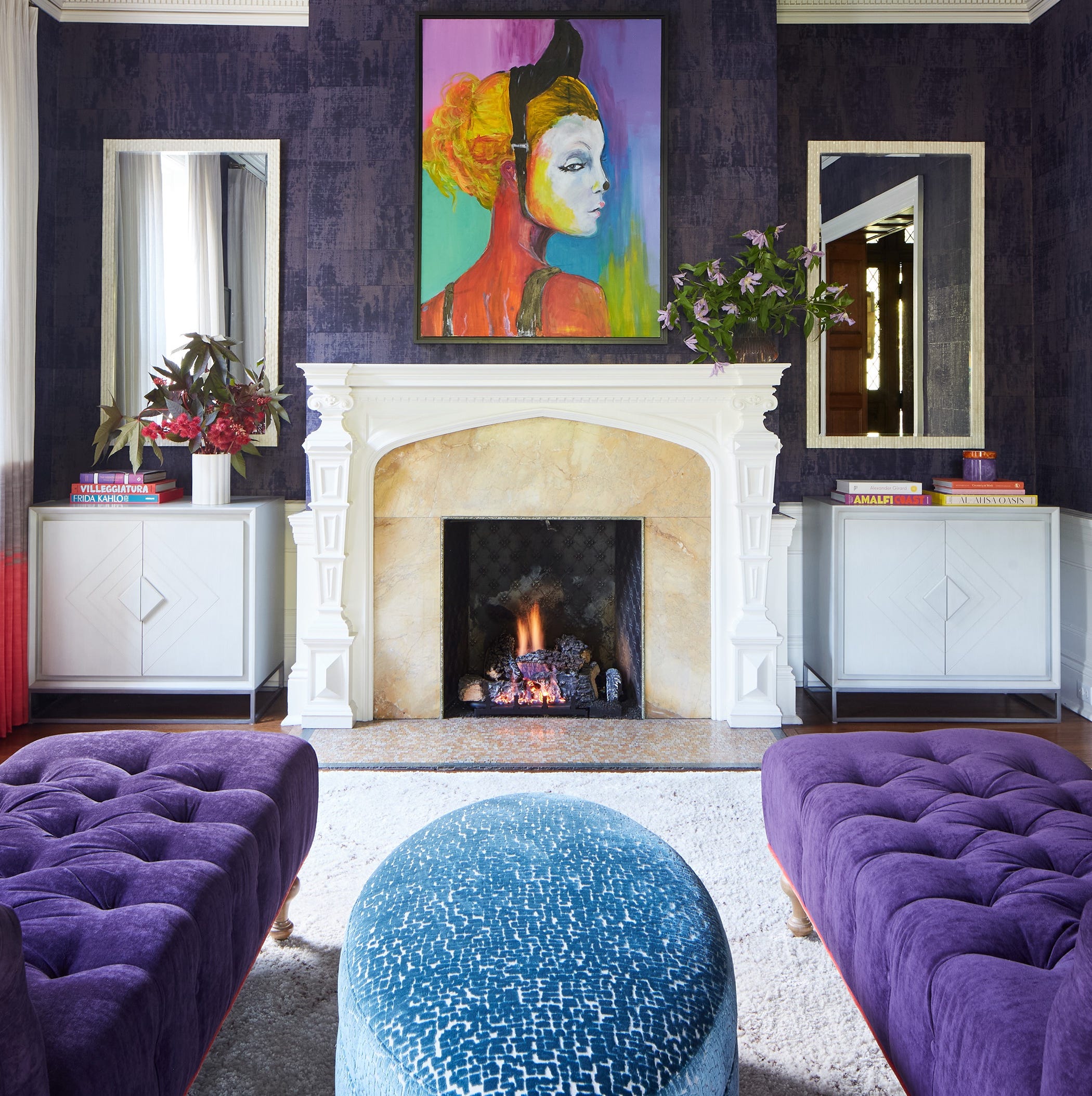
Designers LOVE Pairing These Unexpected Colors With This Sophisticated Hue
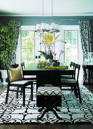
Choose contrasting color schemes for a more powerful effect
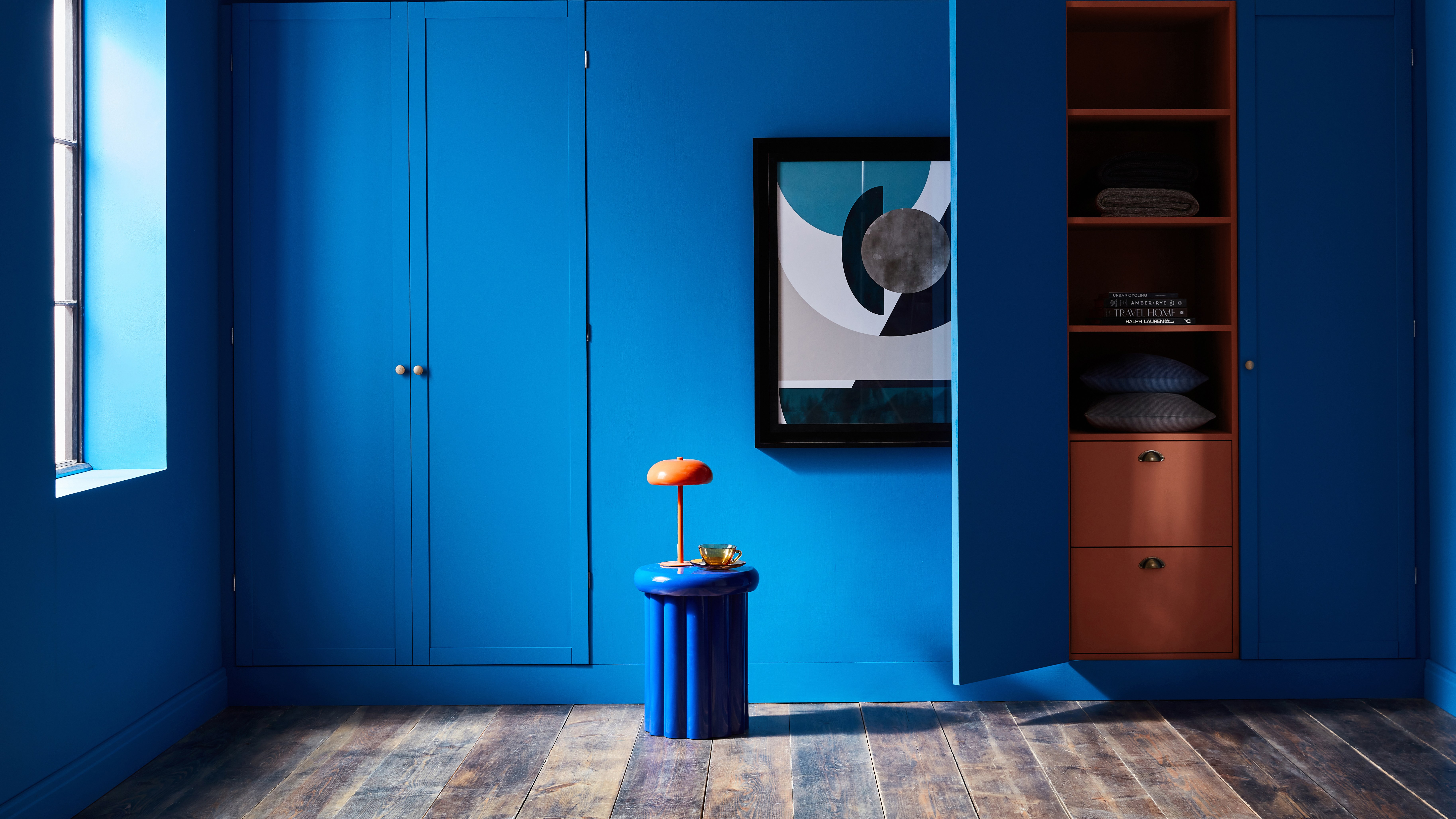
How to transform your rooms with colour drenching
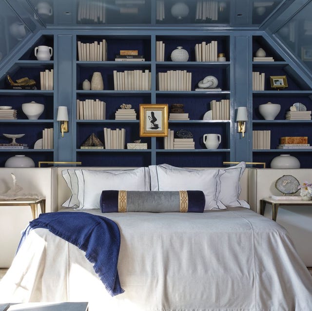
The Color Drenching Paint Trend Isn't Going Anywhere

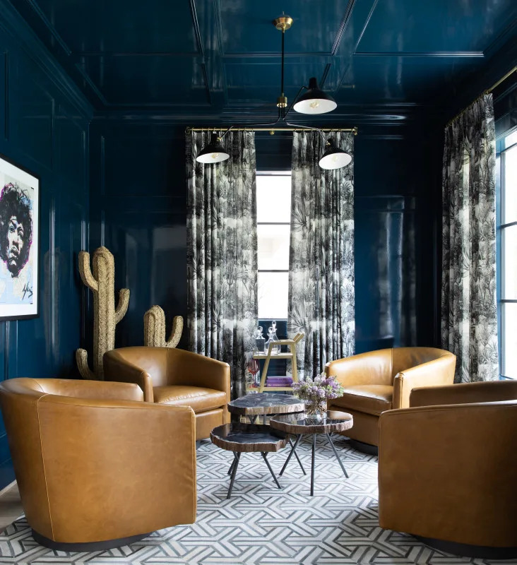
Color Drenching Is the Bold Paint Trend Taking Over—Here’s How to Nail It
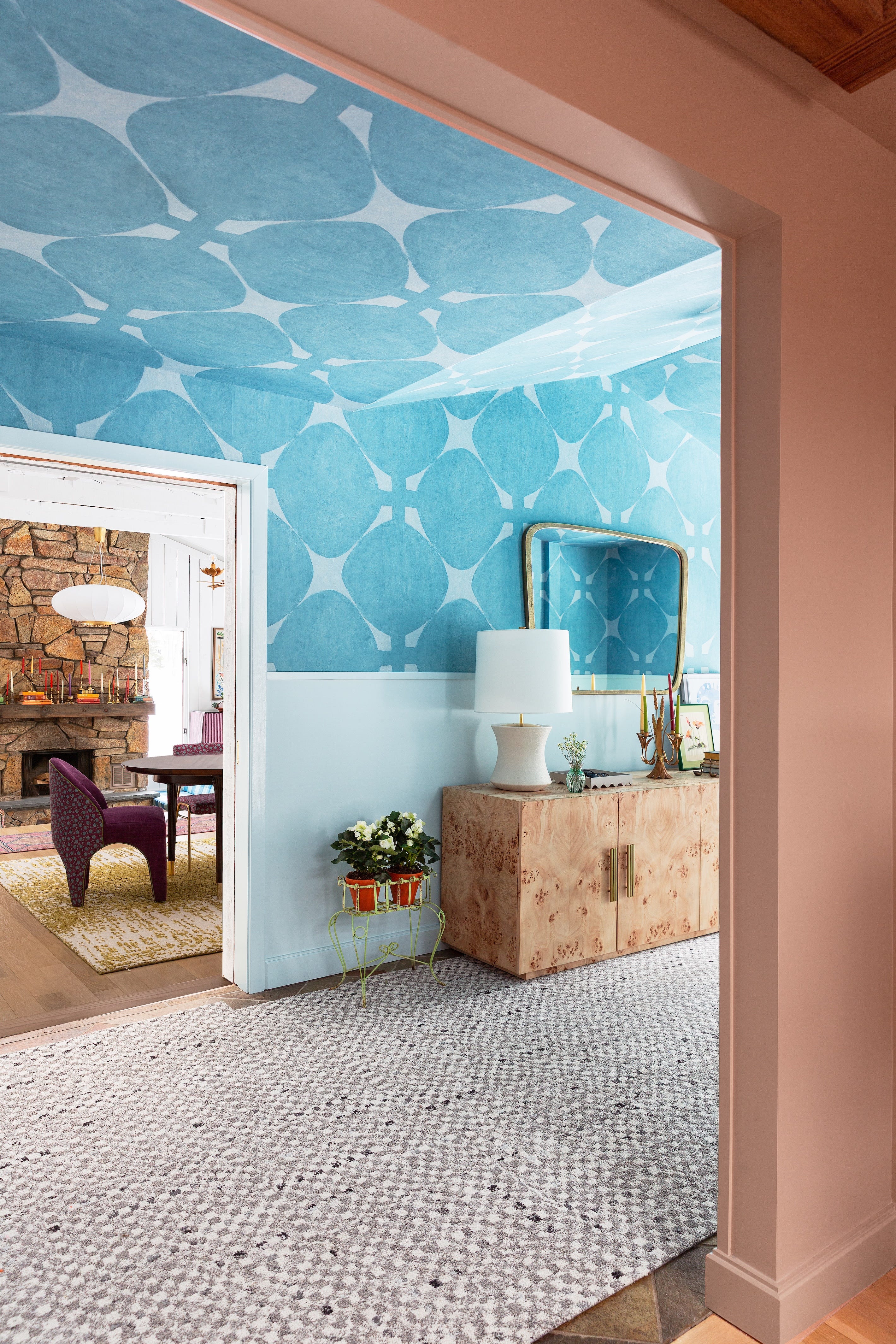
Designers Say These Unusual Paint Color Combos Will Transform Your Home

Deeper, moody colours and precious jewel tones are in style this year
3 'small but impactful' paint updates to try in 2024, according to a color expert
Make choosing paint easy with new 'natural light' colours

This designer-approved color drenching hack will ensure the look never falls flat – the key is in the finish
Tips for adding the hottest paint colors to your decor

6 Paint Color Mistakes To Stop Making, According To Designers