1/10
Color And Contrast Shape Behr’s Commercial Color 2026 Forecast
Behr's 2026 Commercial Color Forecast presents 50 curated shades, reflecting a cultural pull towards duality, encompassing both grounding and escapism, familiarity and innovation. This forecast builds upon the blurred boundaries introduced in the previous year's palette, which explored the intersection of heritage and futurism, and natural and synthetic elements. Erika Woelfel, vice president of color & creative services, highlights the intentional optimism derived from channeling the tension between these dualities.
The 2026 collection translates these hybrid influences into a structured format, organized into five distinct subpalettes: EVOLVEDNeutrals, SOULScape, MYSTICWave, METROChic, and FUSIONDream. Each subpalette offers a unique emotional tone, while maintaining flexibility across various sectors and spatial types. EVOLVEDNeutrals grounds the forecast with pure and toned shades that provide balance and clarity. SOULScape, drawing inspiration from Mediterranean landscapes, exudes a warm and immersive feel. MYSTICWave incorporates aquatic hues to evoke a sense of calm. METROChic is characterized by its tailored and refined aesthetic, capturing the energy of urban environments. FUSIONDream introduces an expressive, generational energy through its blend of pastels and brights.
Woelfel emphasizes the goal of providing designers with versatile neutrals, calming aquatic hues, and expressive accents, enabling the creation of spaces that are both contemporary and comforting. The intention was to offer balance without restricting creativity. This year's forecast is notable for being the first developed in collaboration with Behr’s Designer Council, a group of eight professionals spanning commercial interiors, residential design, product development, and global trend research.
The Designer Council, which includes experts such as Alena Capra, Patti Carpenter, Stephanie Lindsey, John McClain, Mia Johnson, Manuella Moreira, Christopher Kennedy, and Jennifer Sun, provided a practical perspective to the creative process. Their input was crucial in ensuring that the colors would resonate across diverse project types and client needs. The council’s combined expertise informed a palette shaped by practical insight, extensive experience, and evolving design priorities. Their feedback on elements like texture pairings and cultural references helped refine the palette, making it more dimensional, grounded, and adaptable to future trends in commercial design.
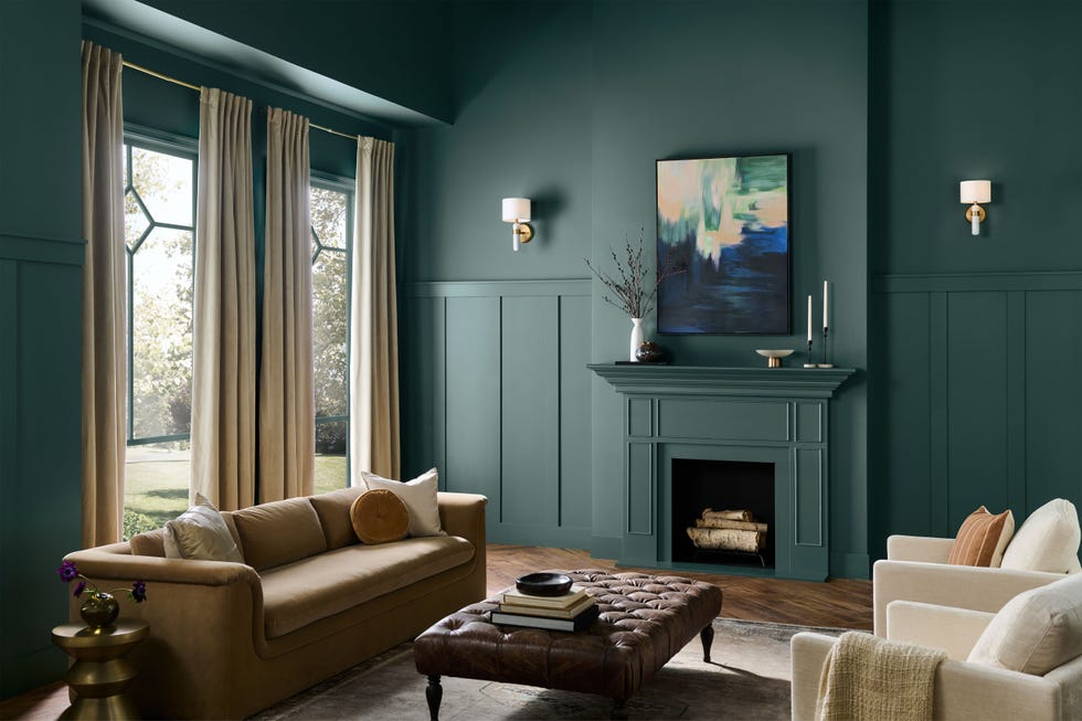
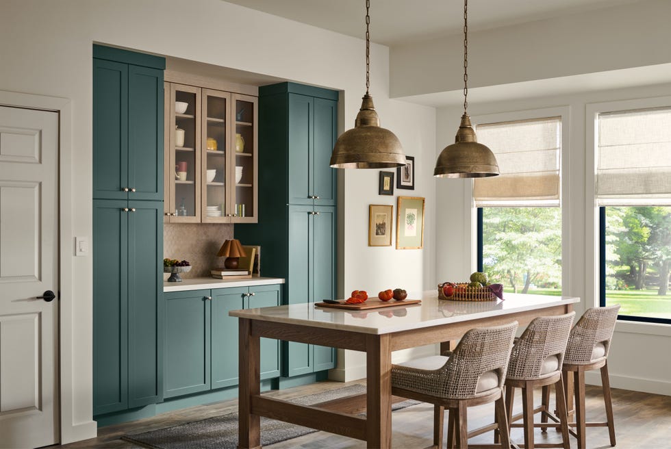
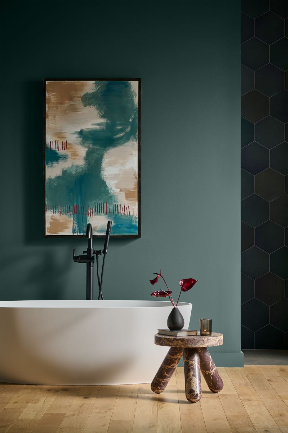
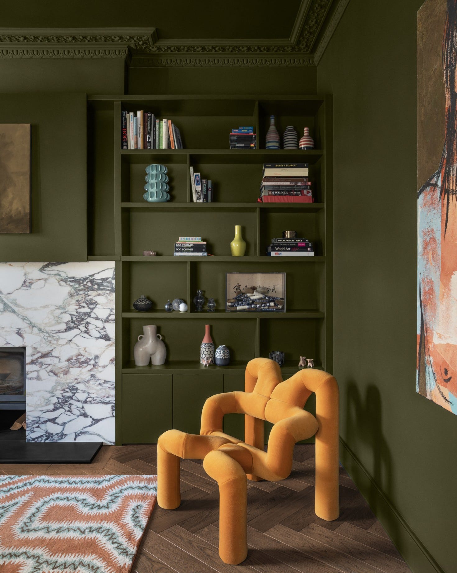
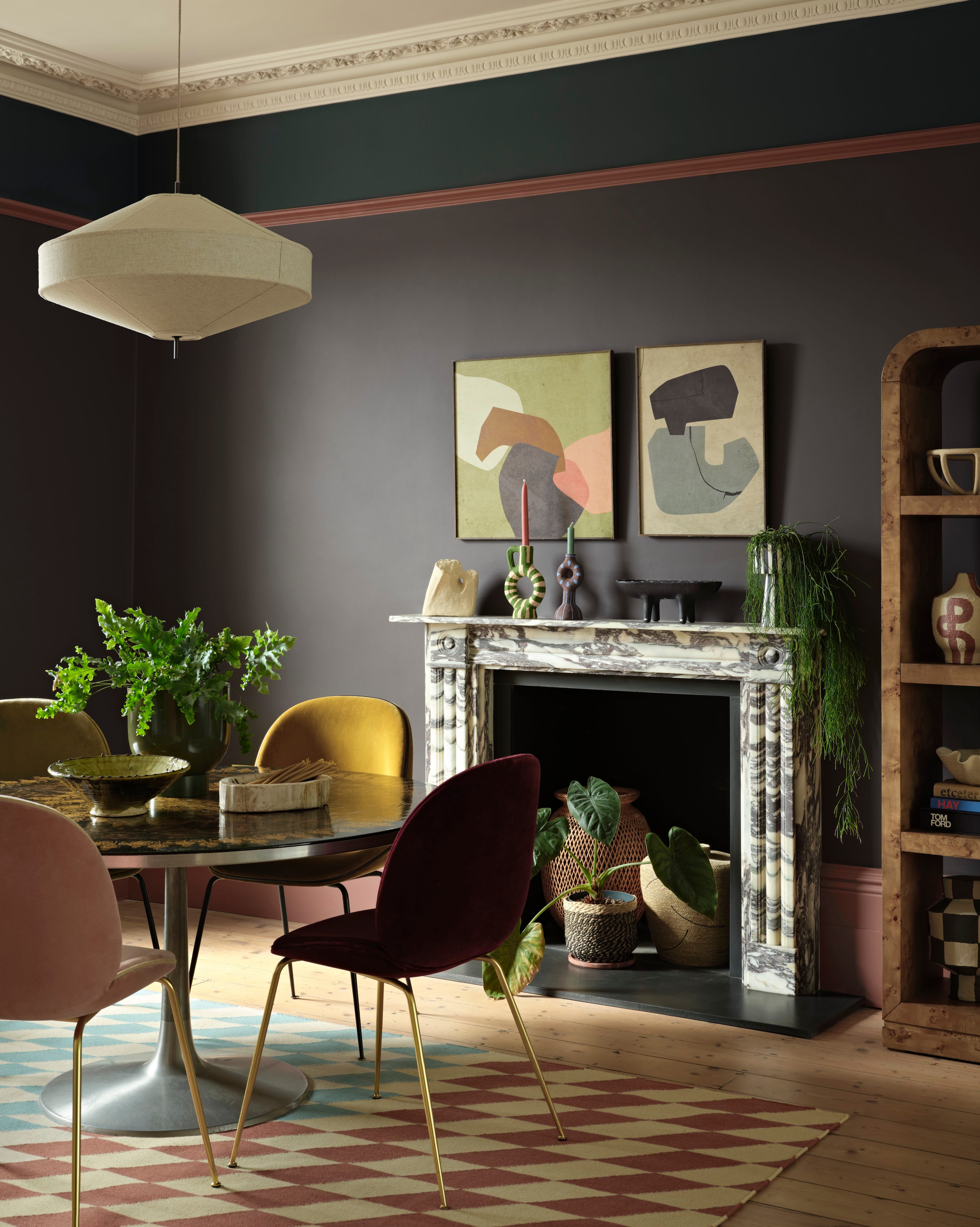
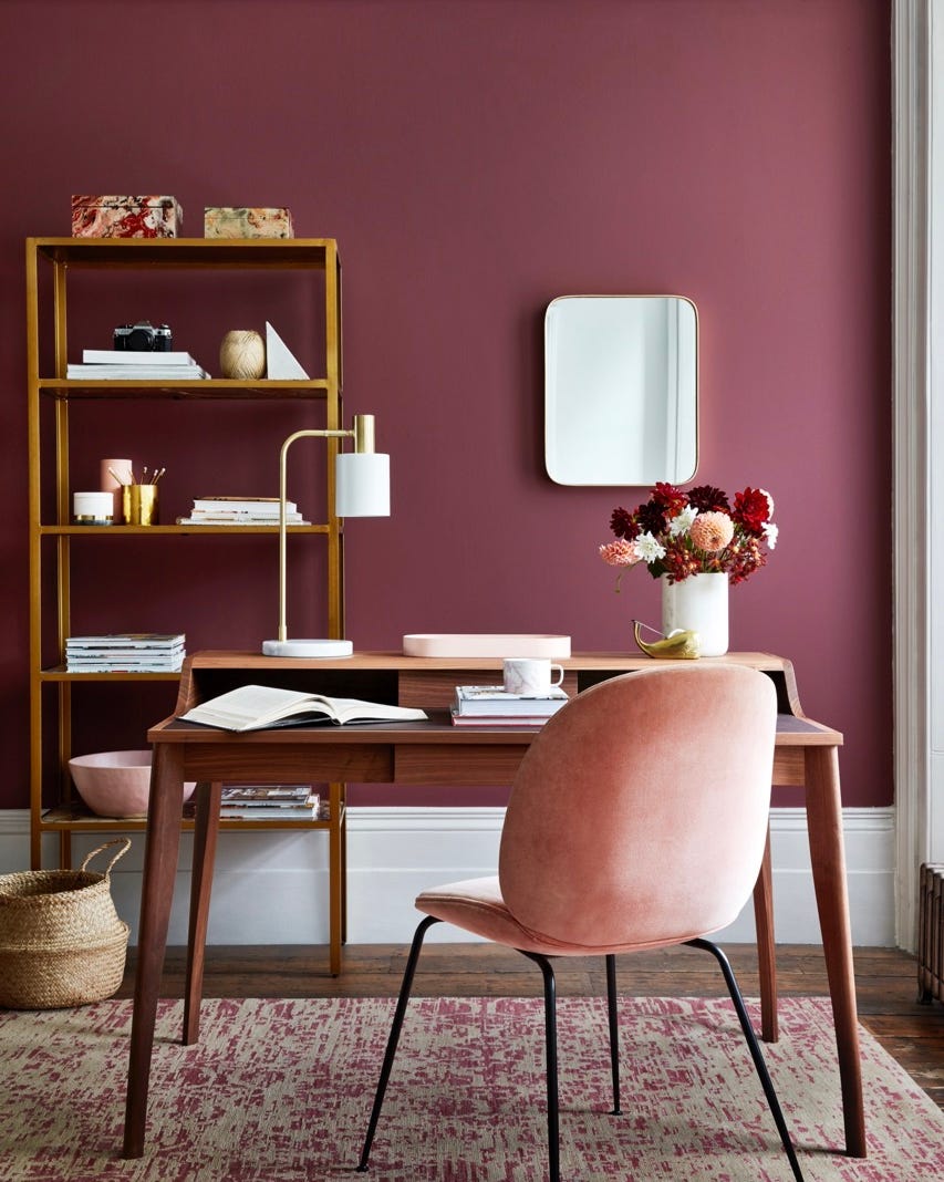
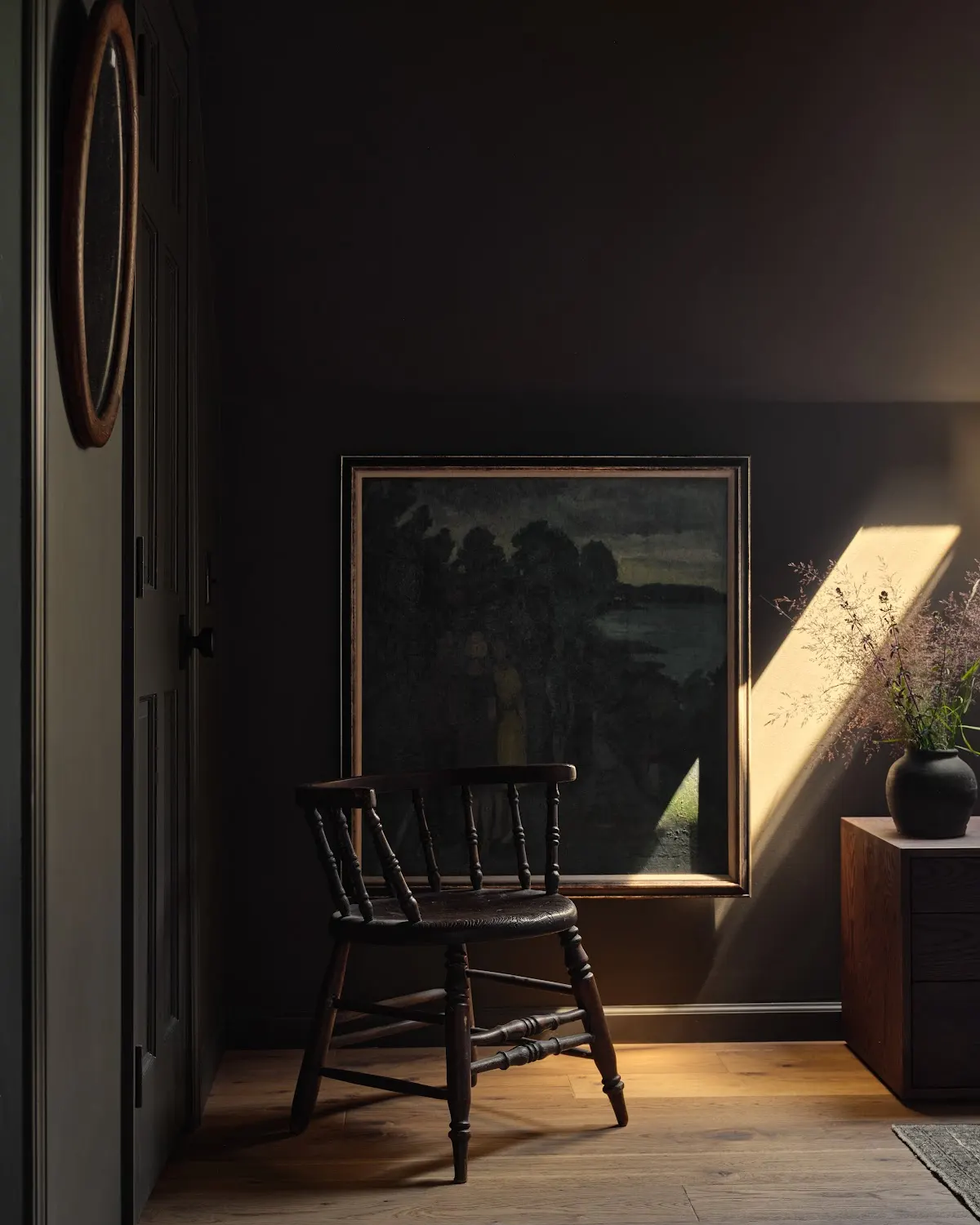
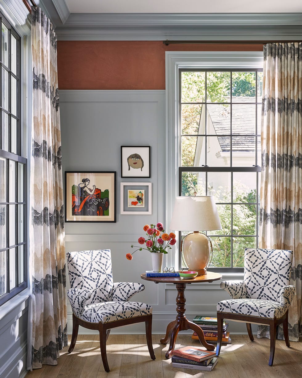
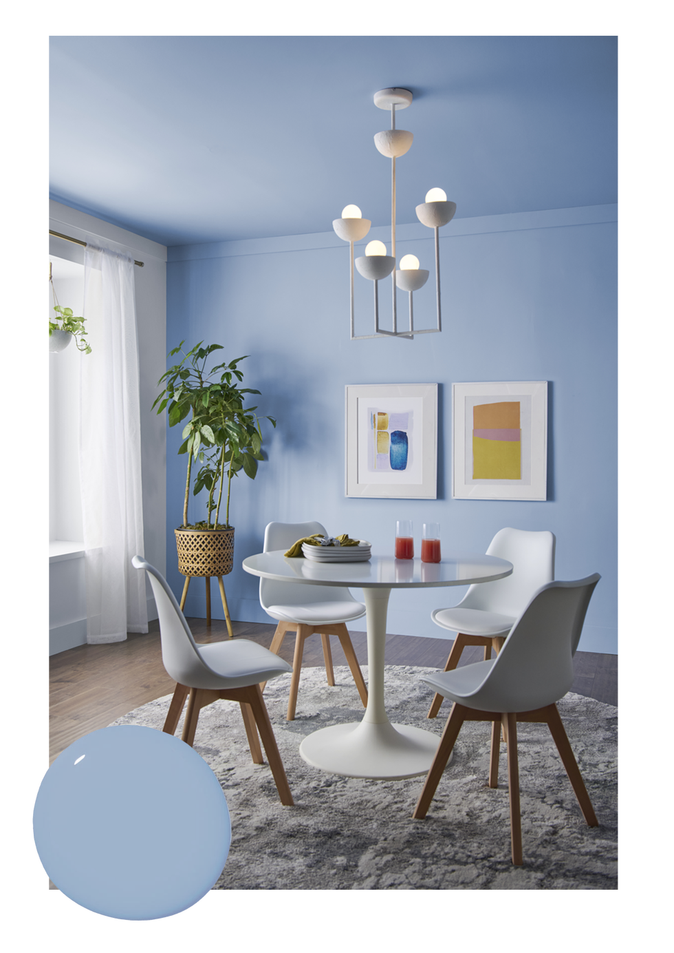
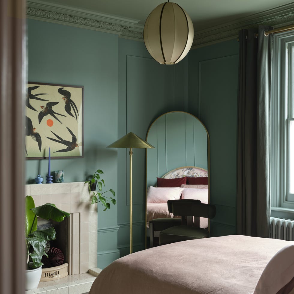
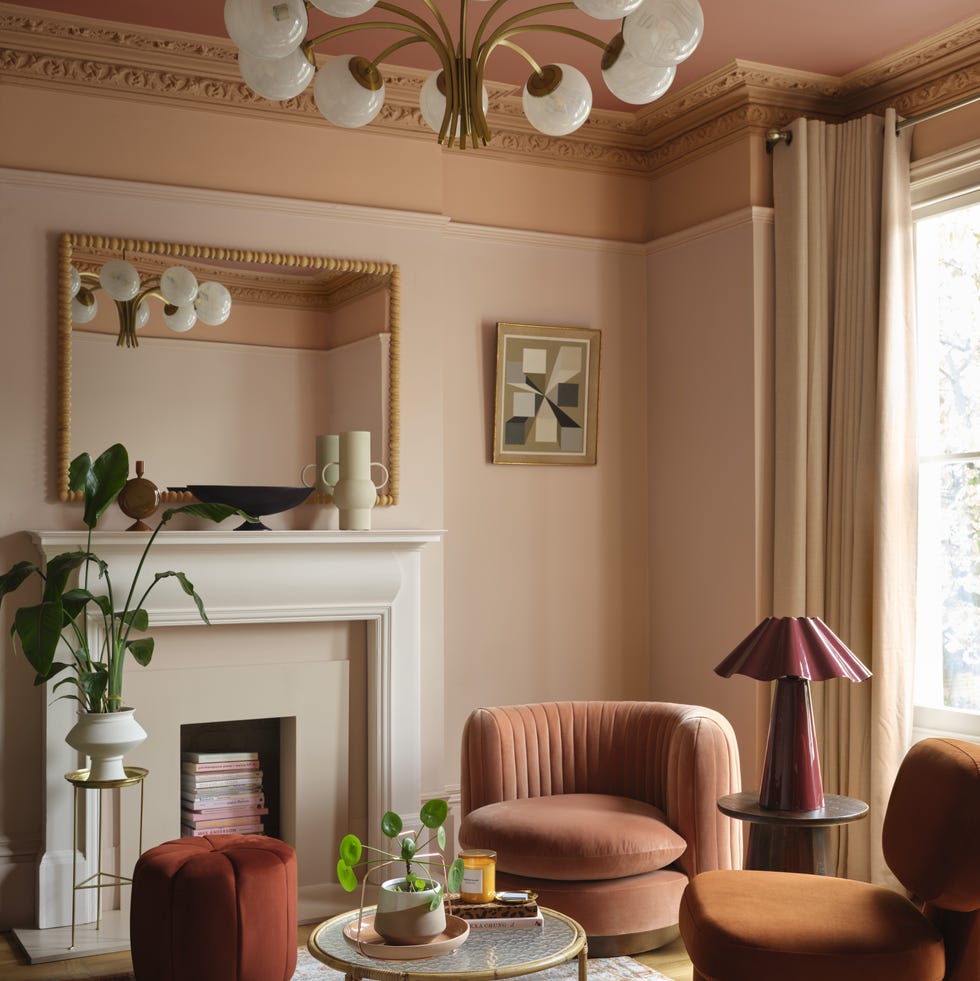
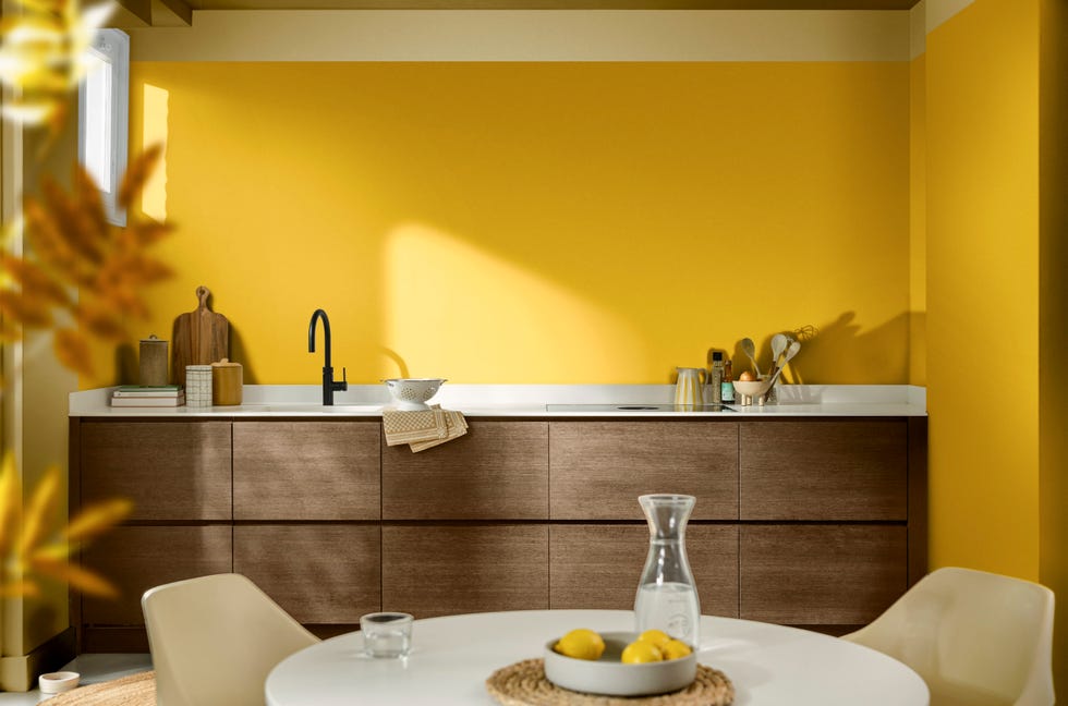
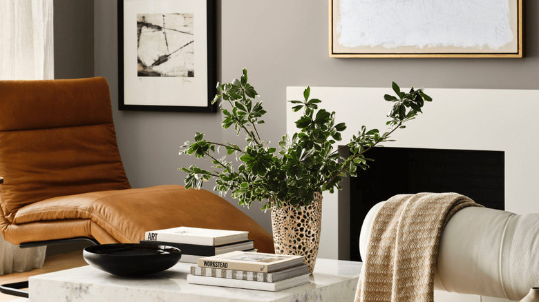
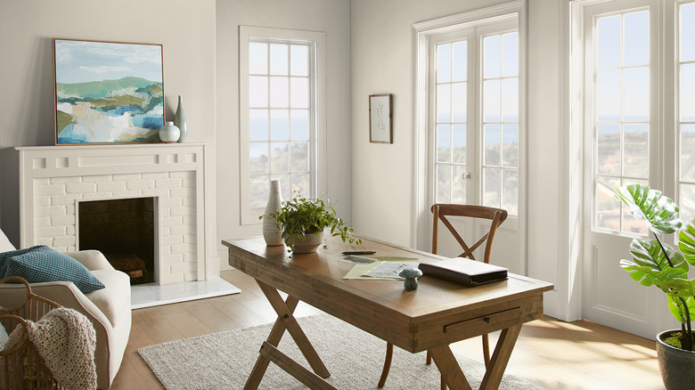
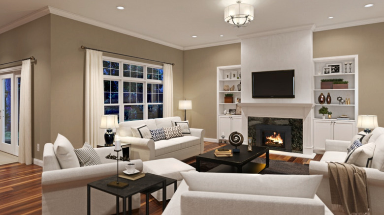
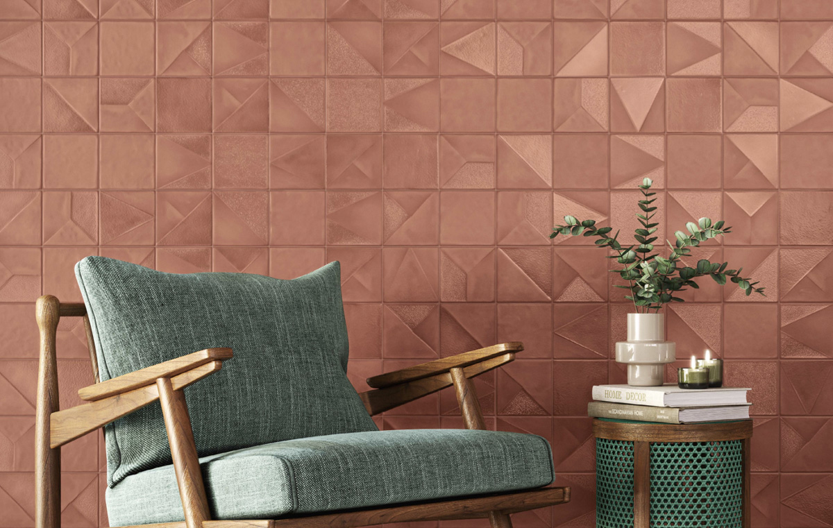
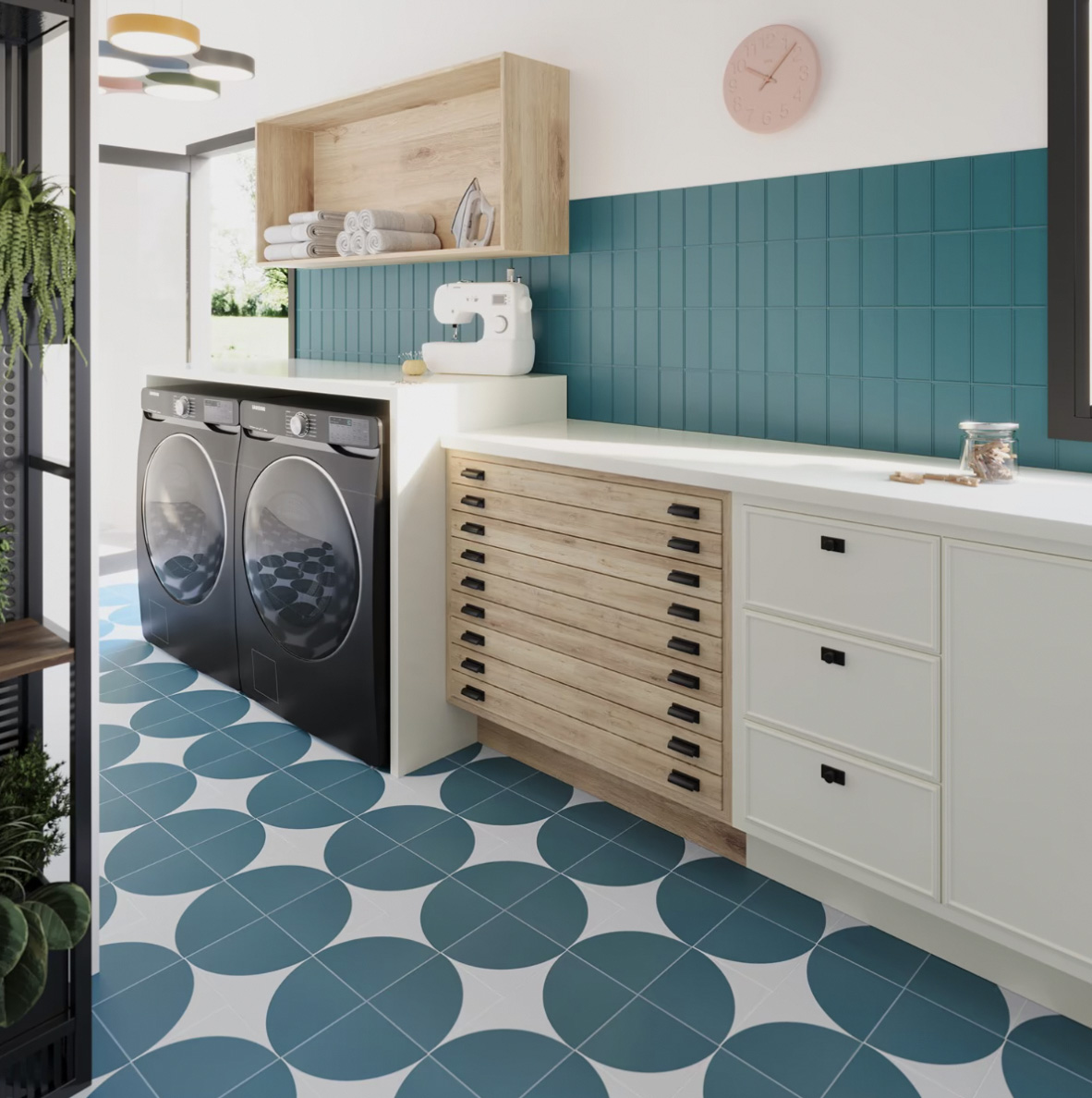
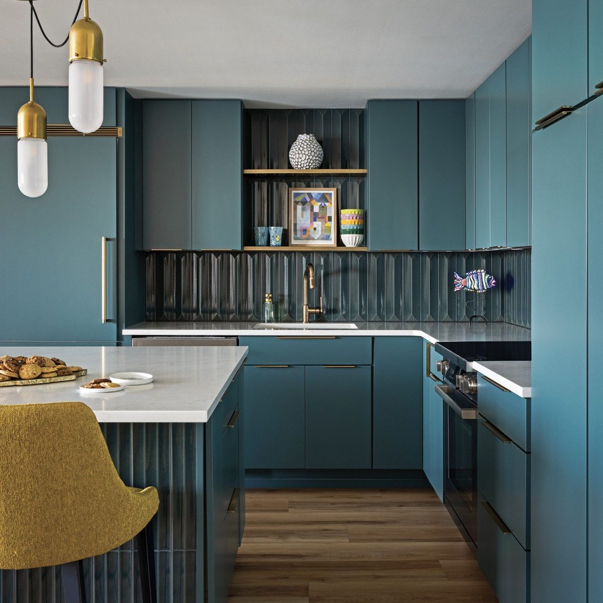
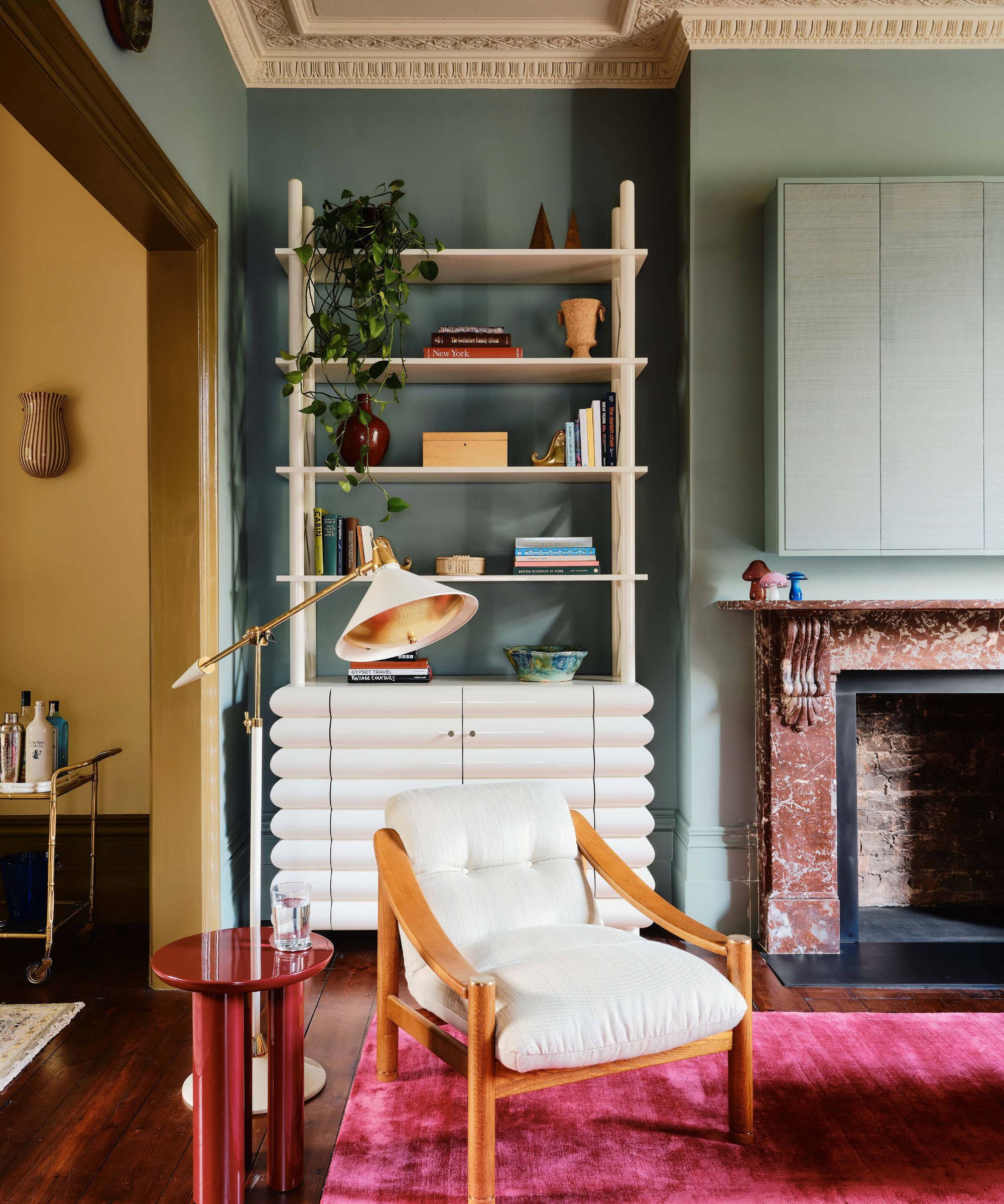
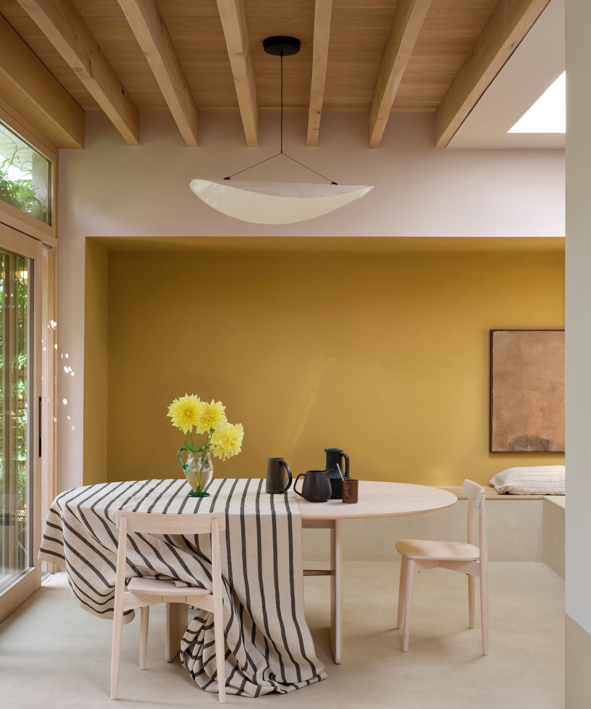
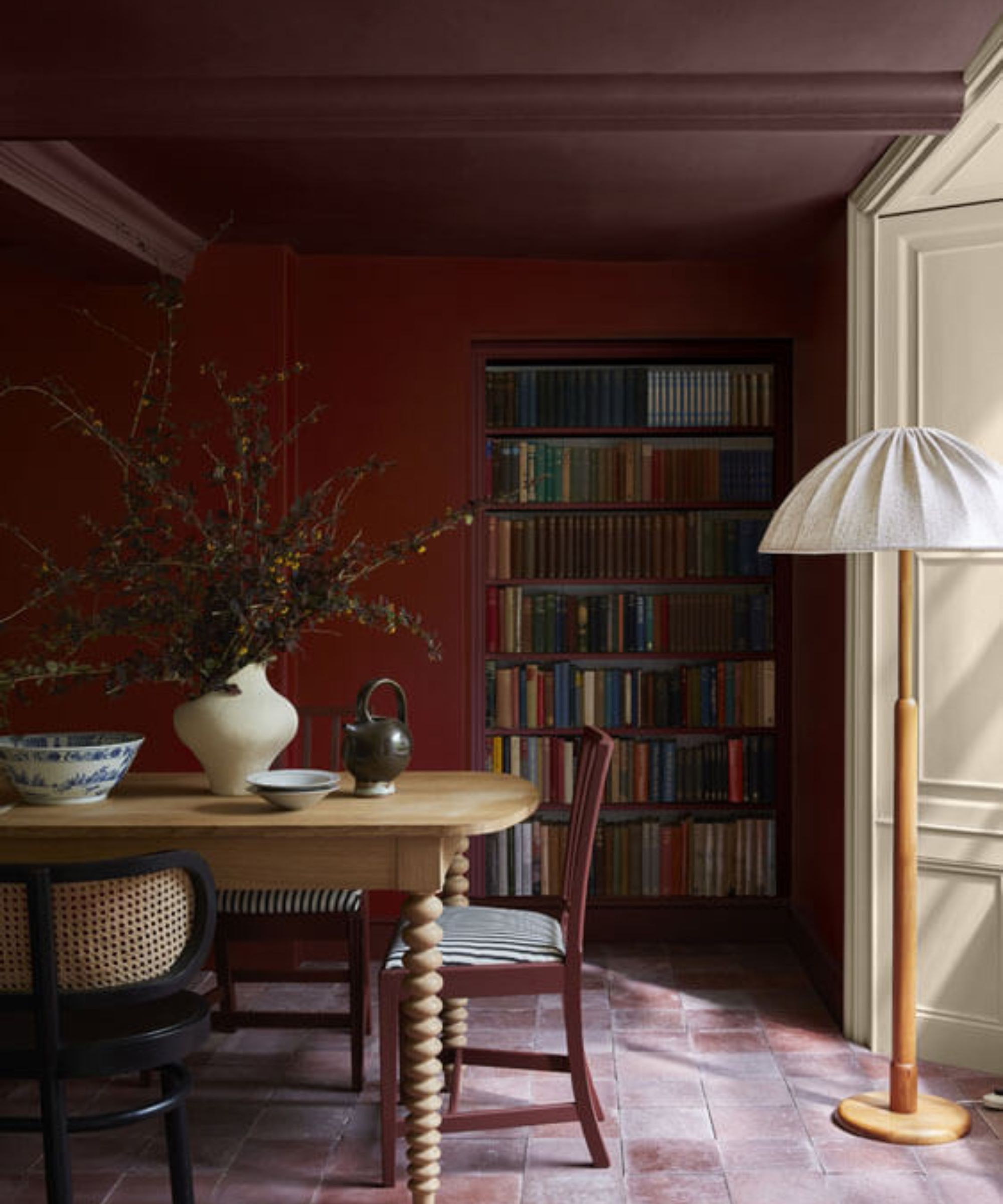
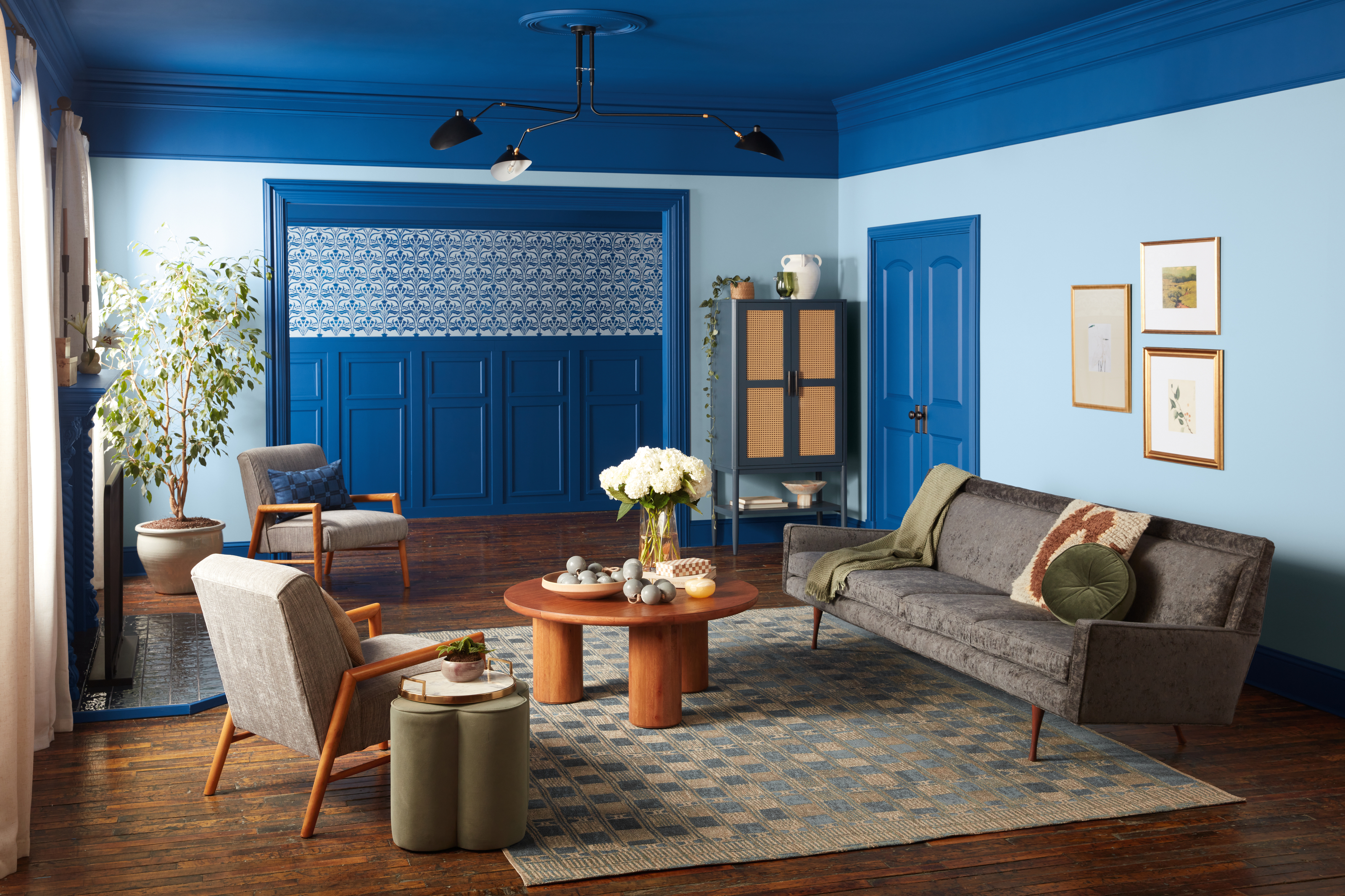
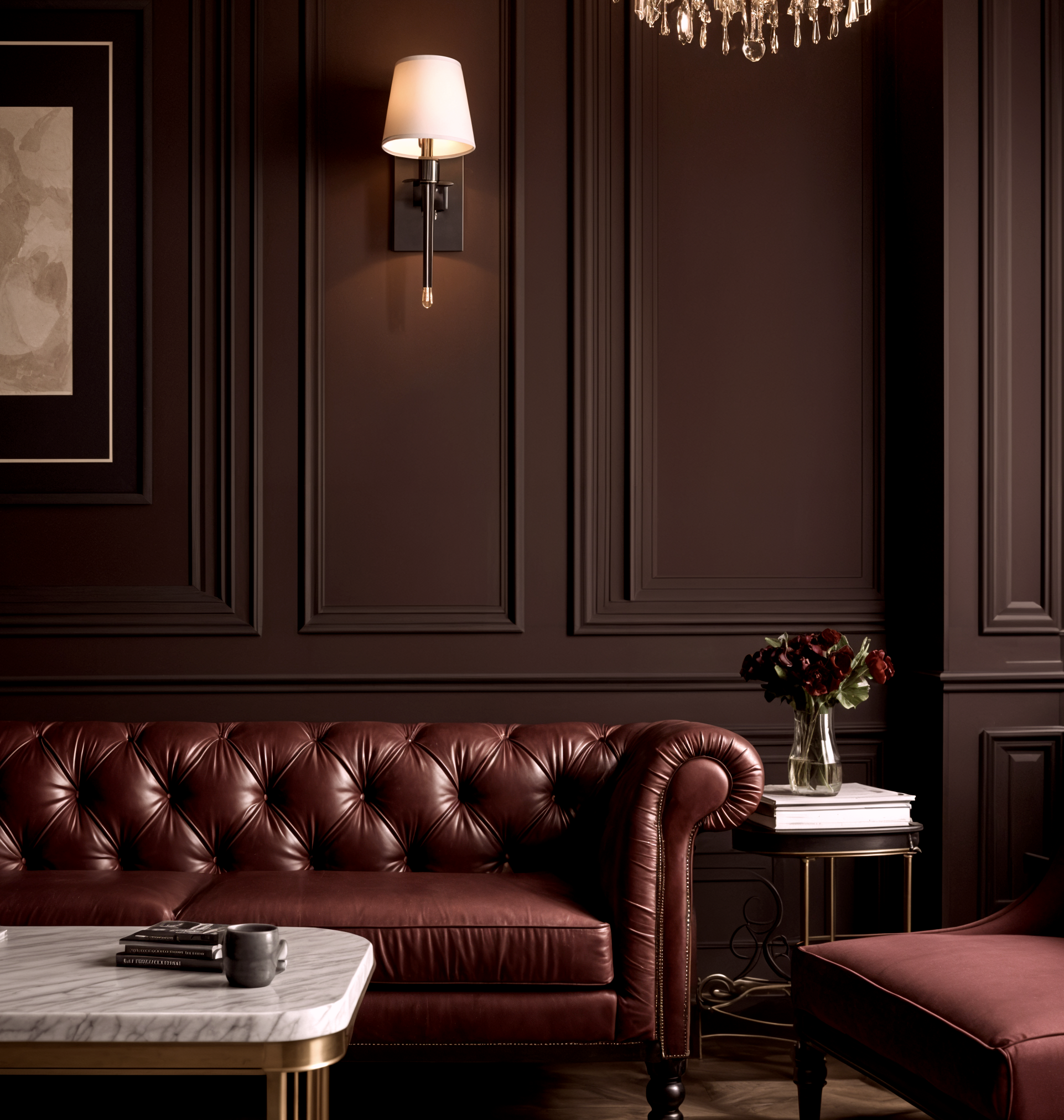
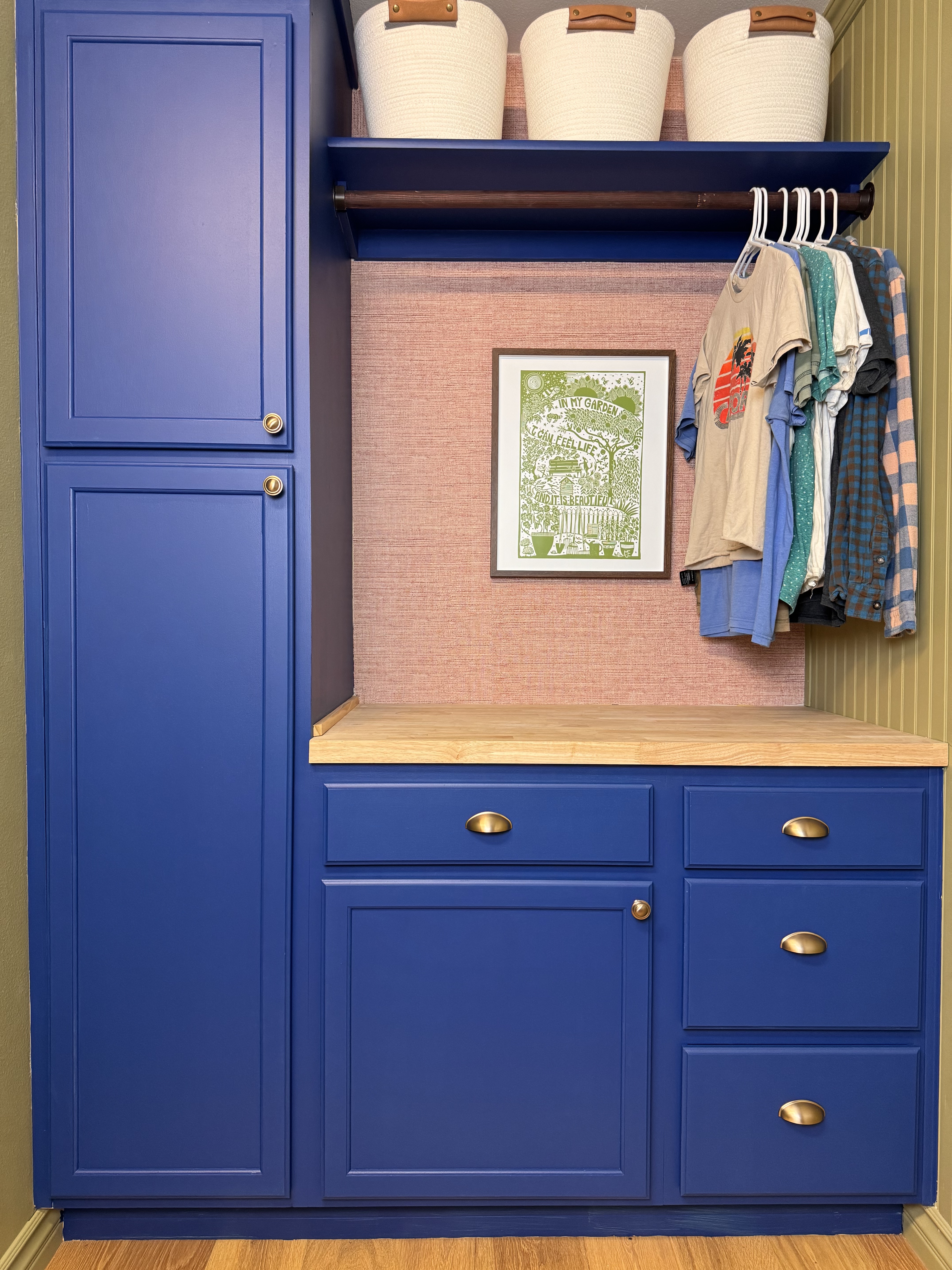
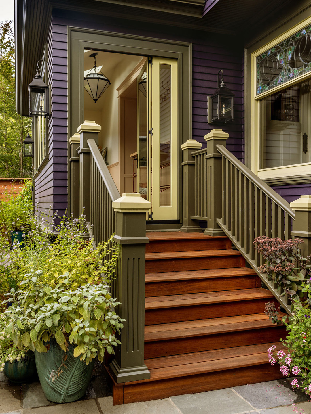
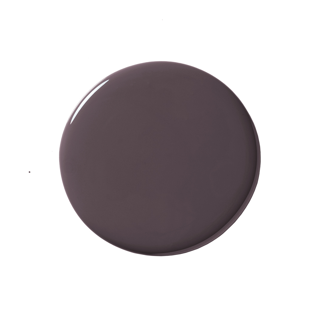
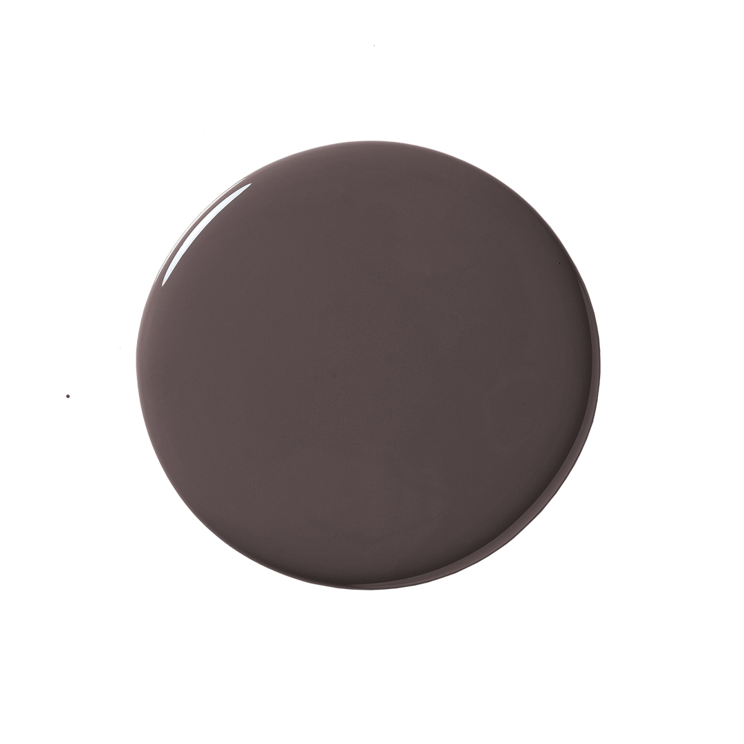
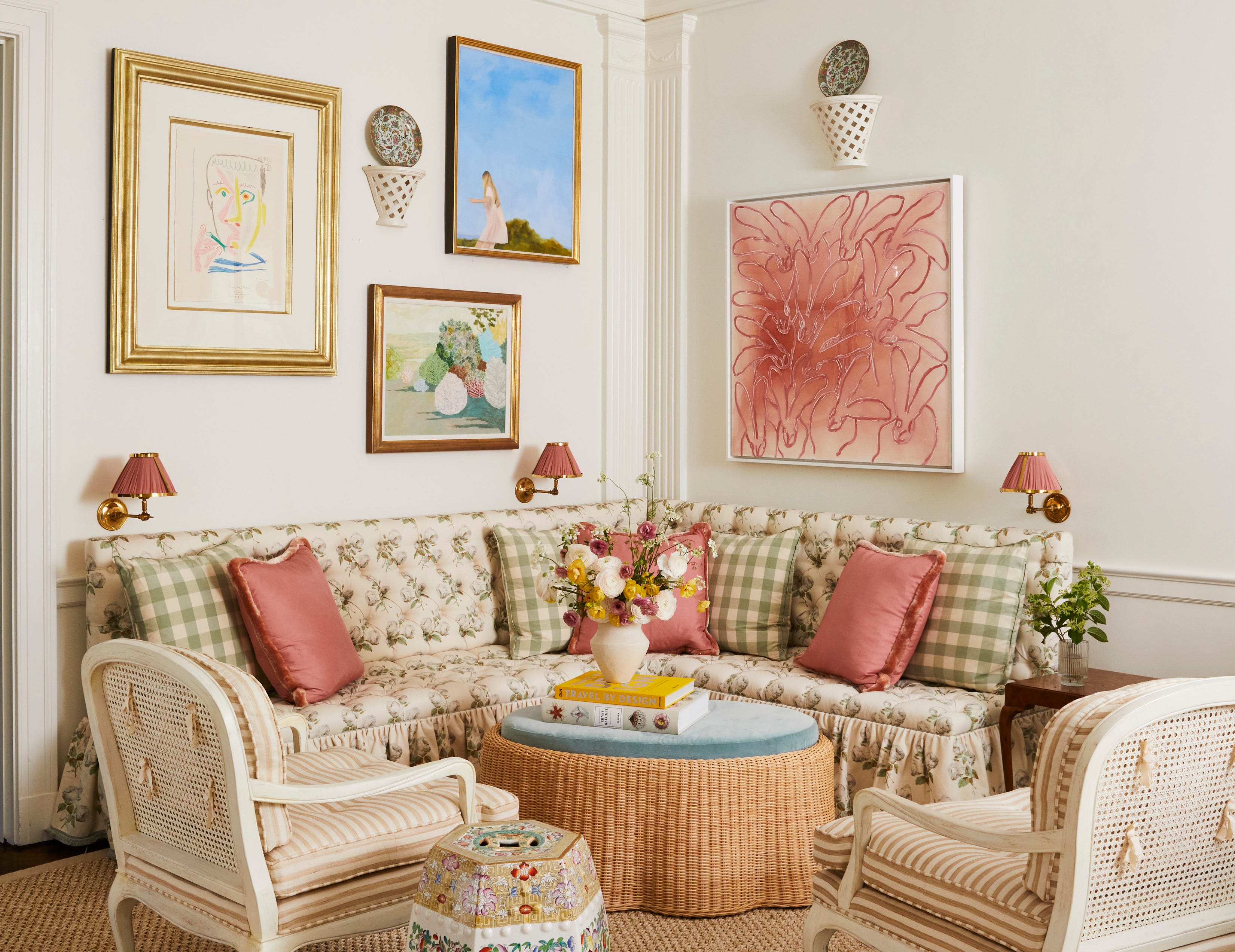
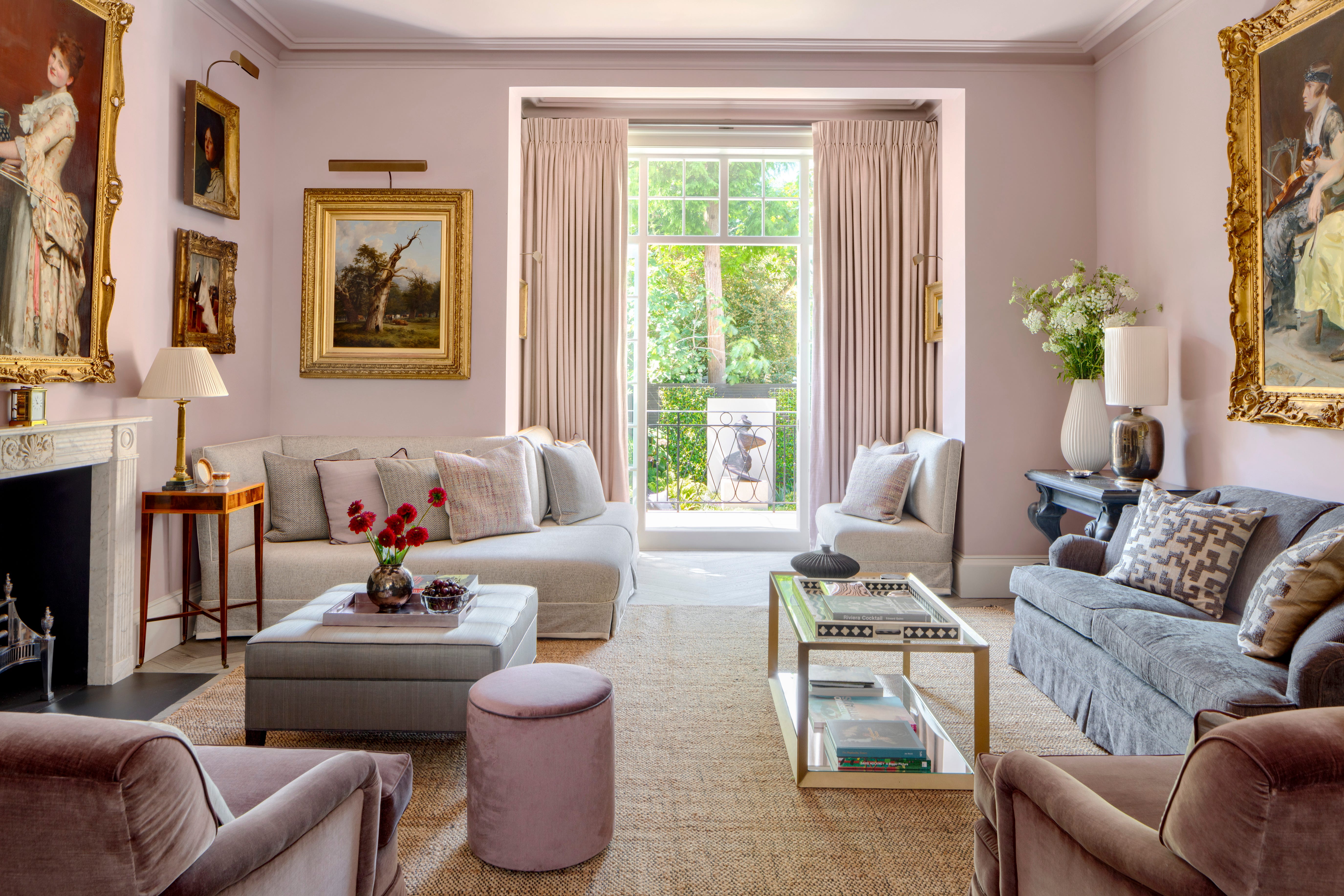
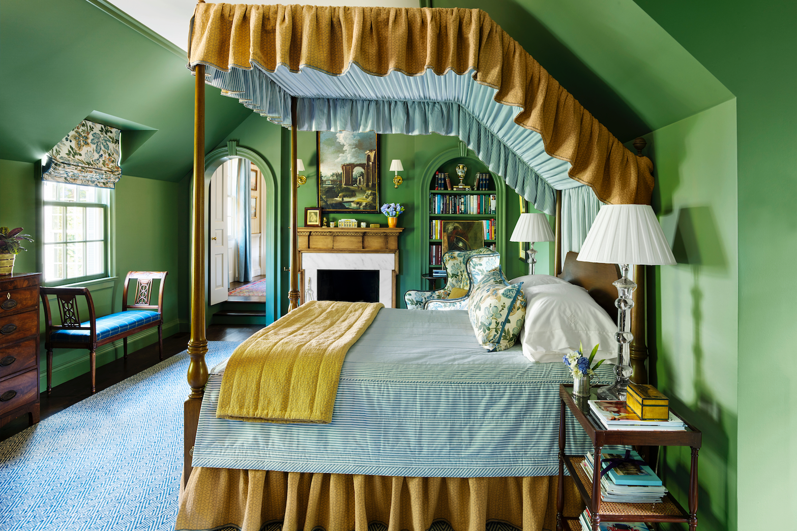
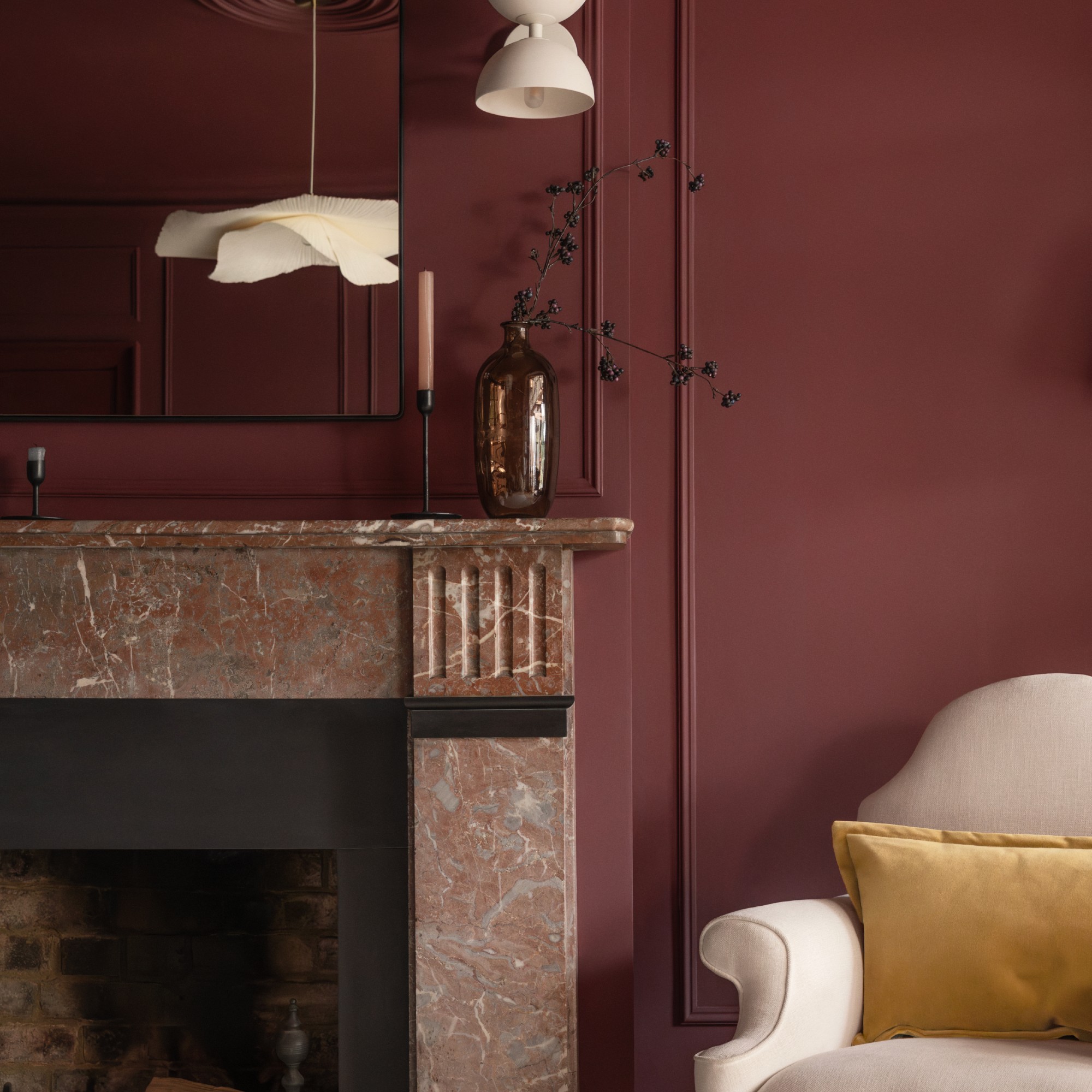
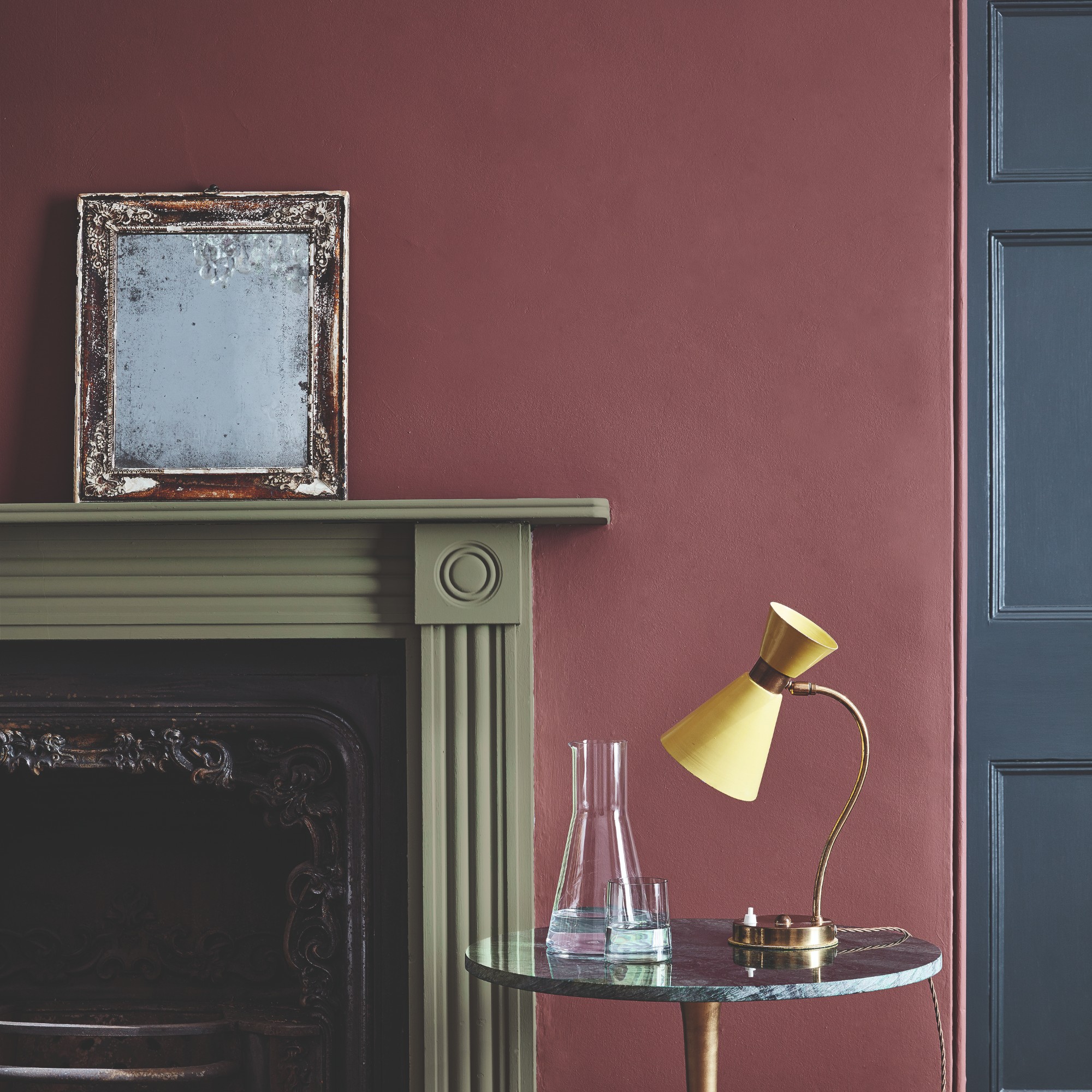
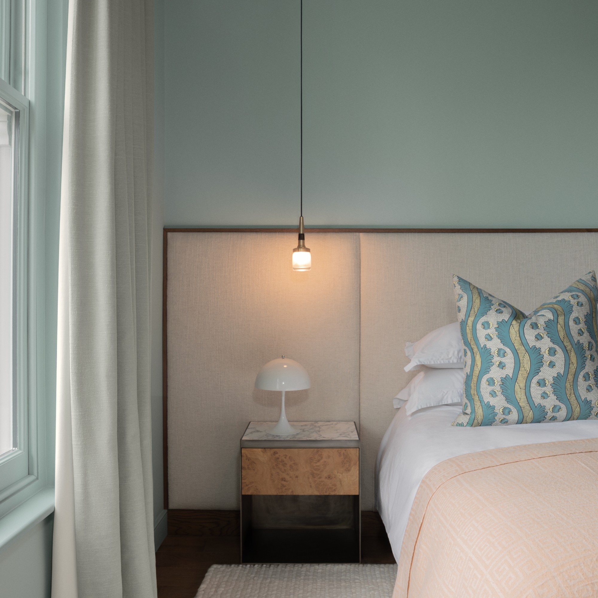
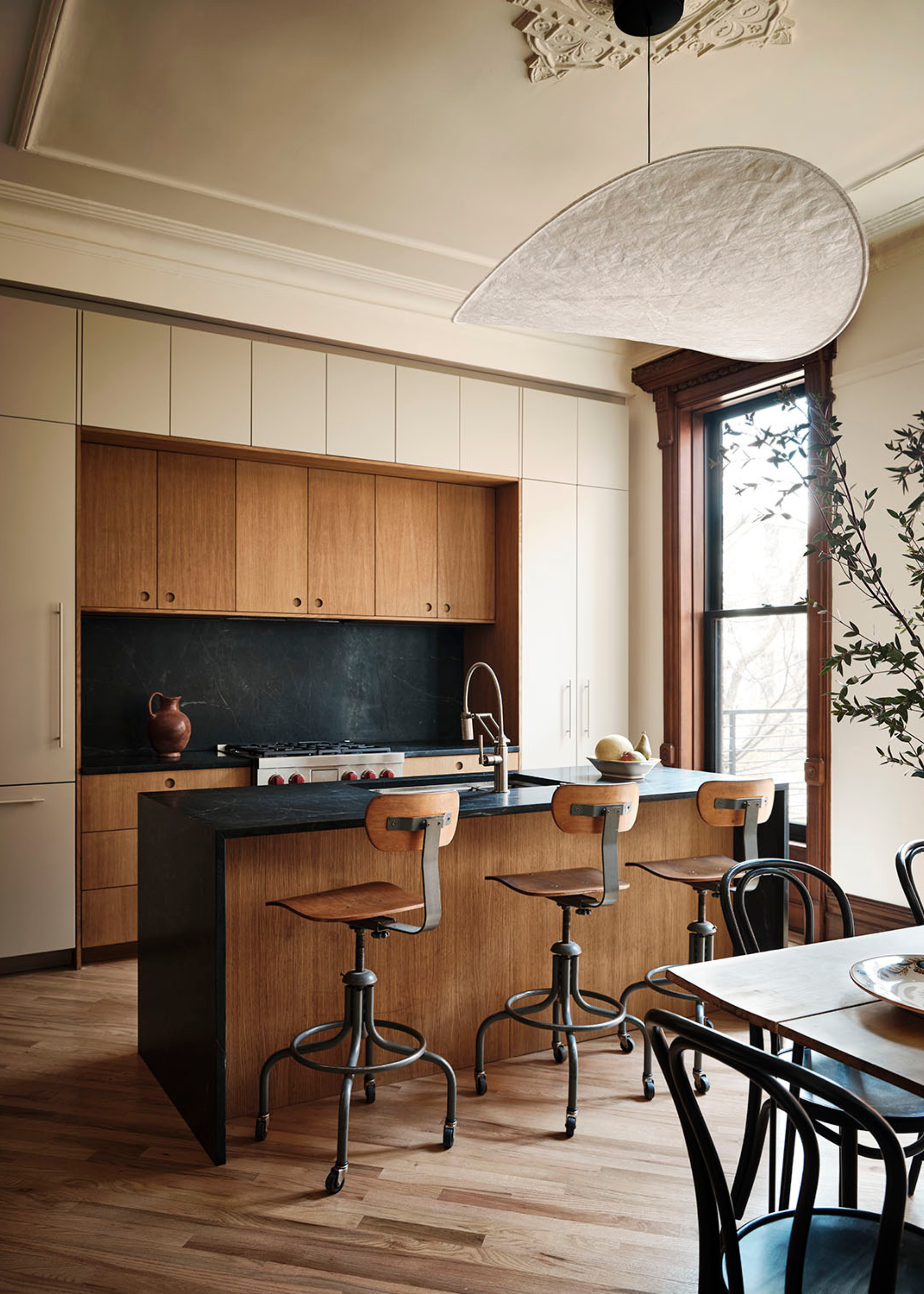
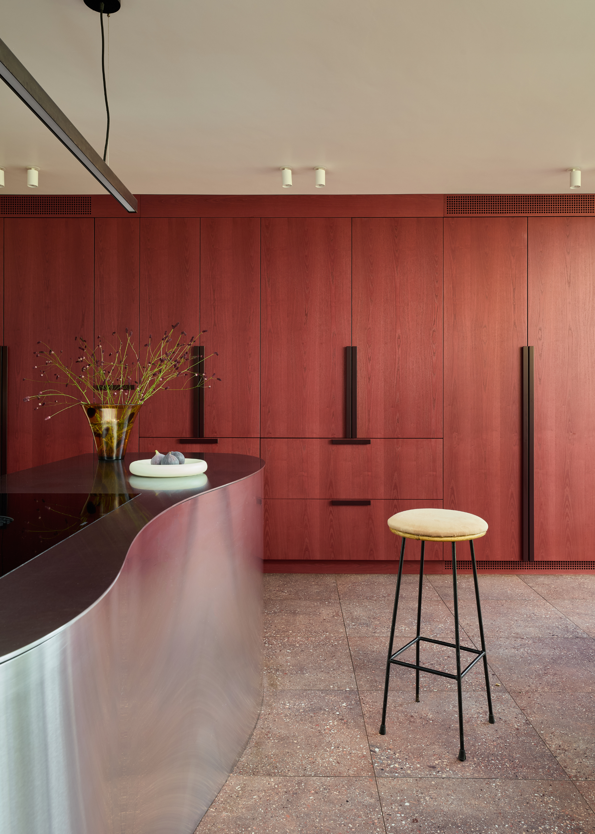
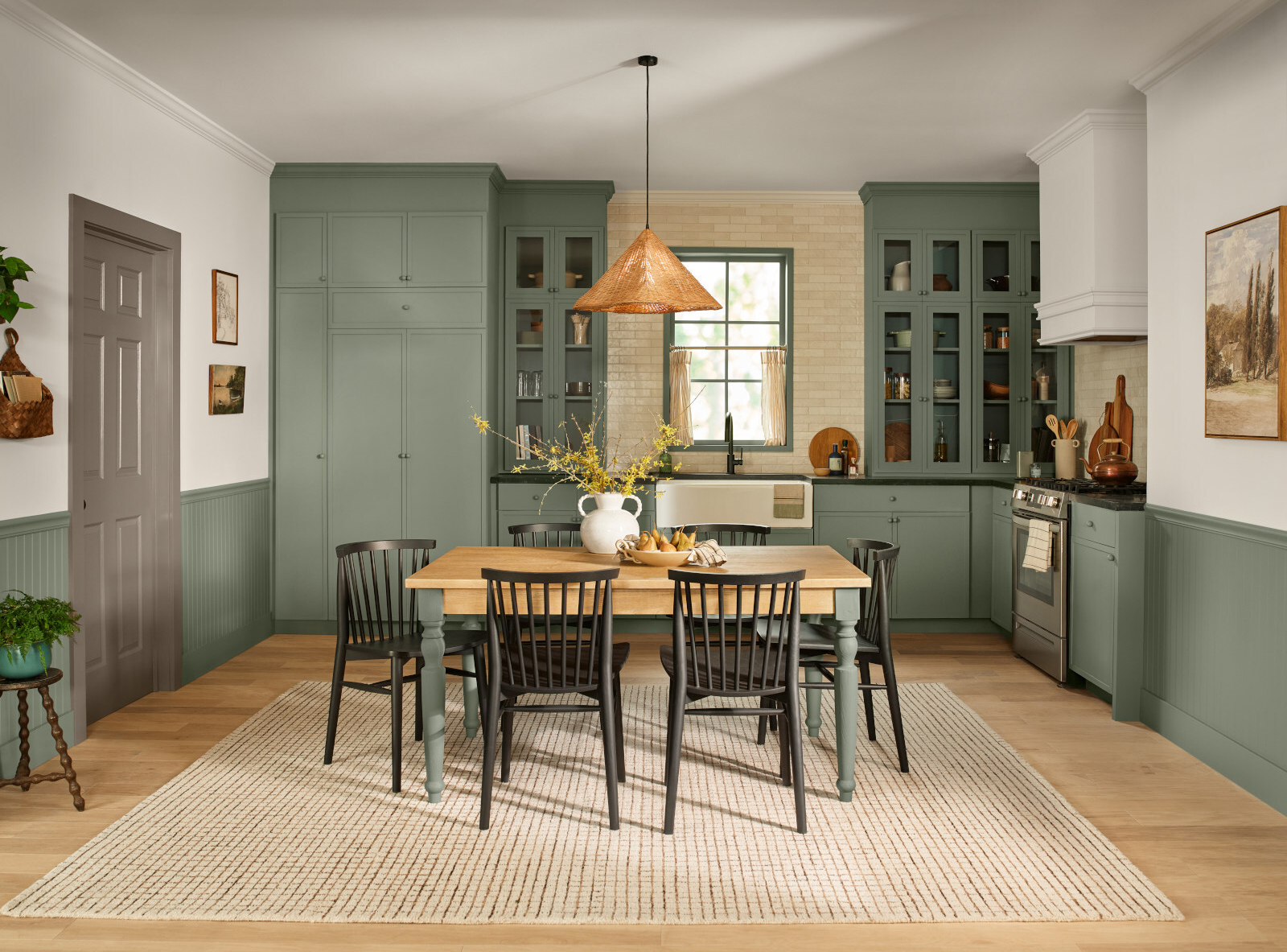
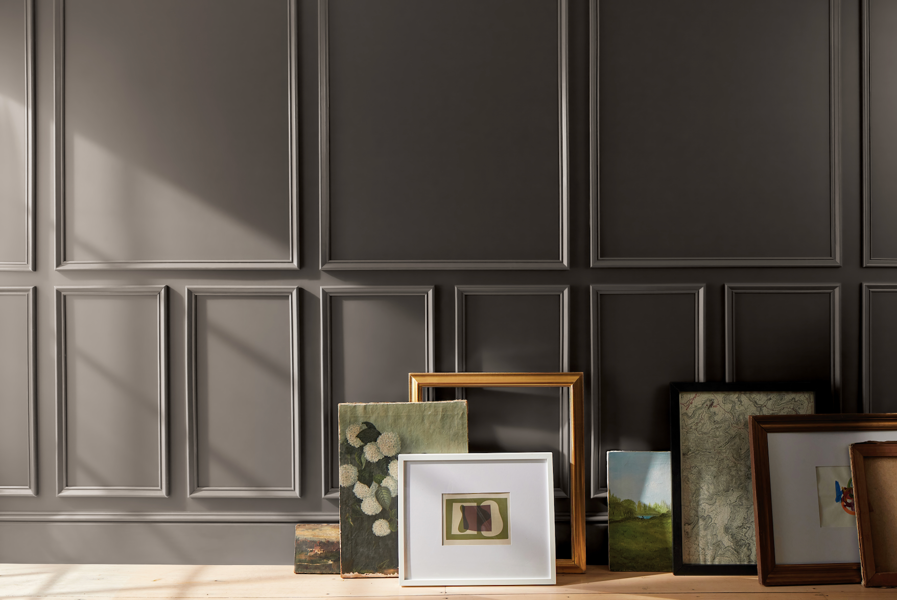
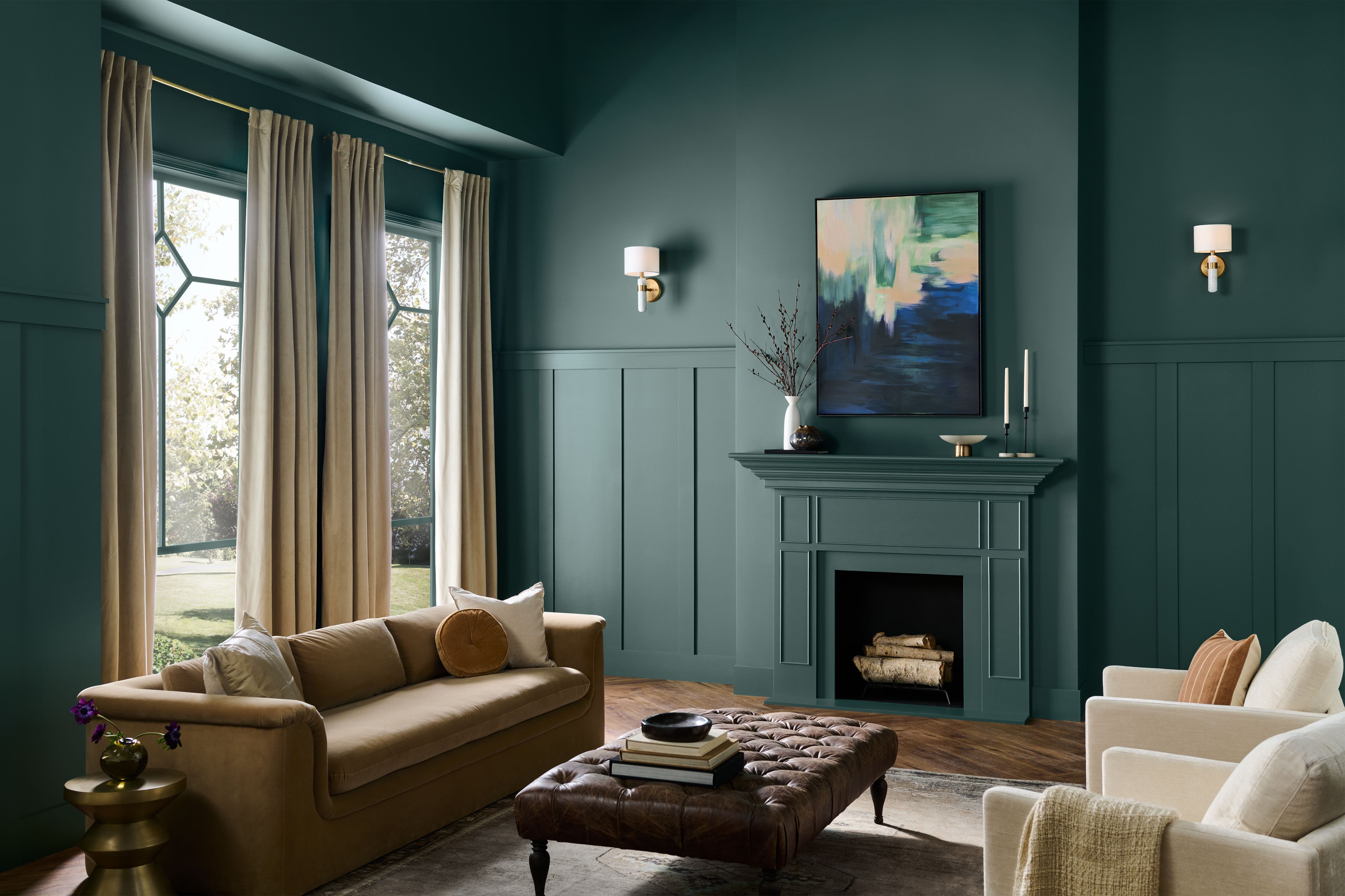
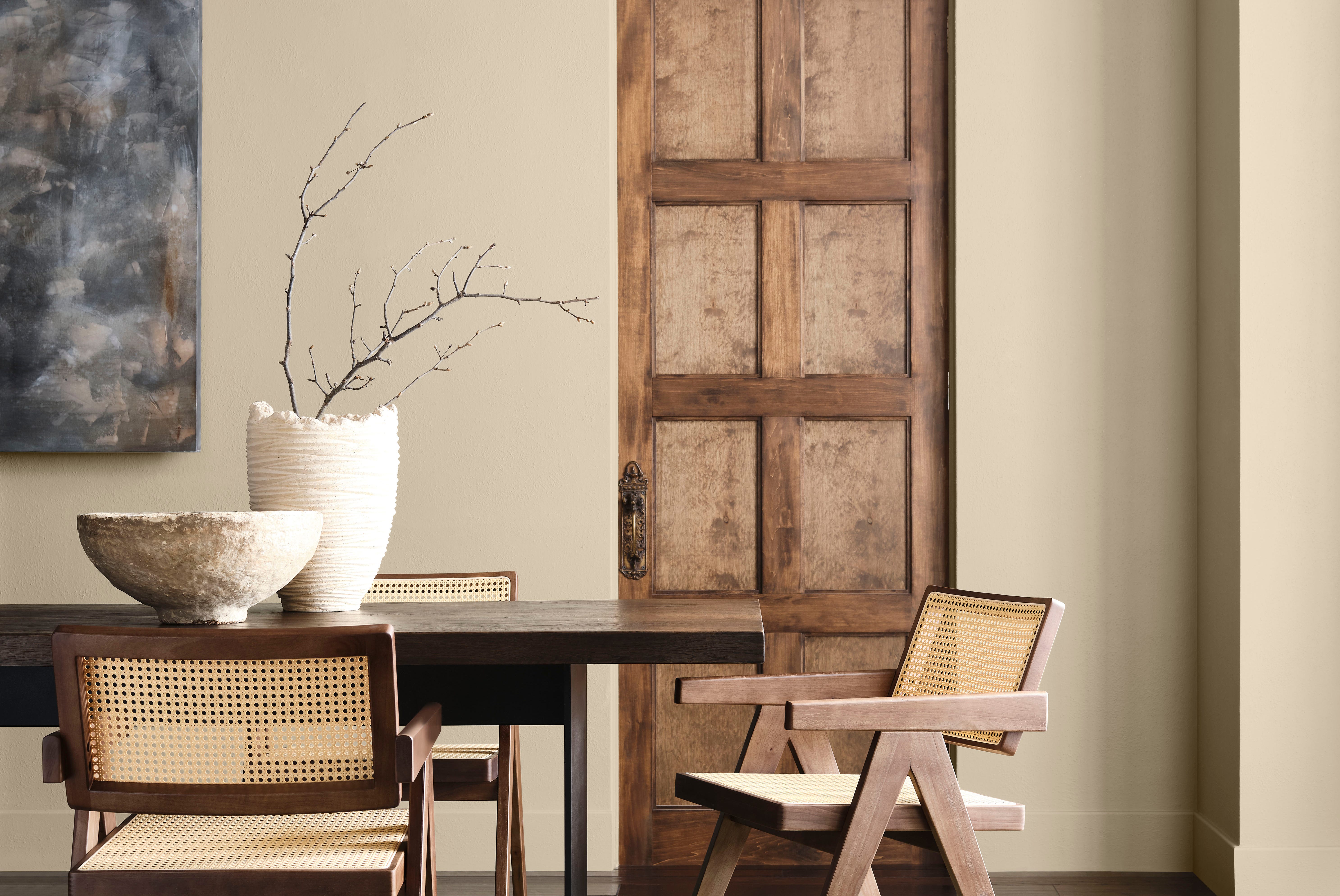
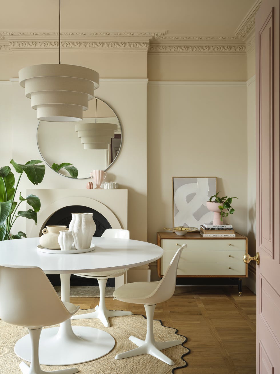
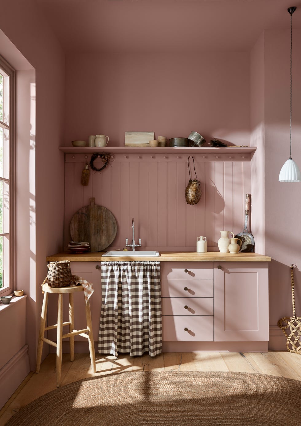
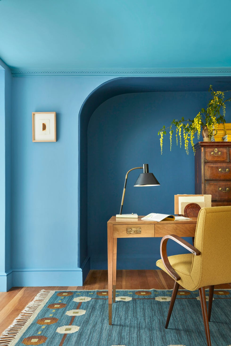
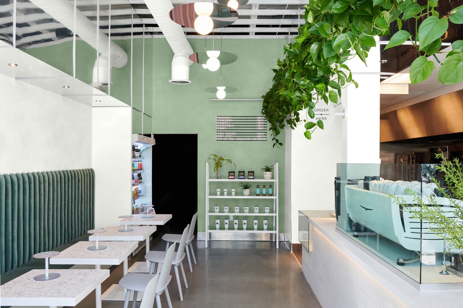
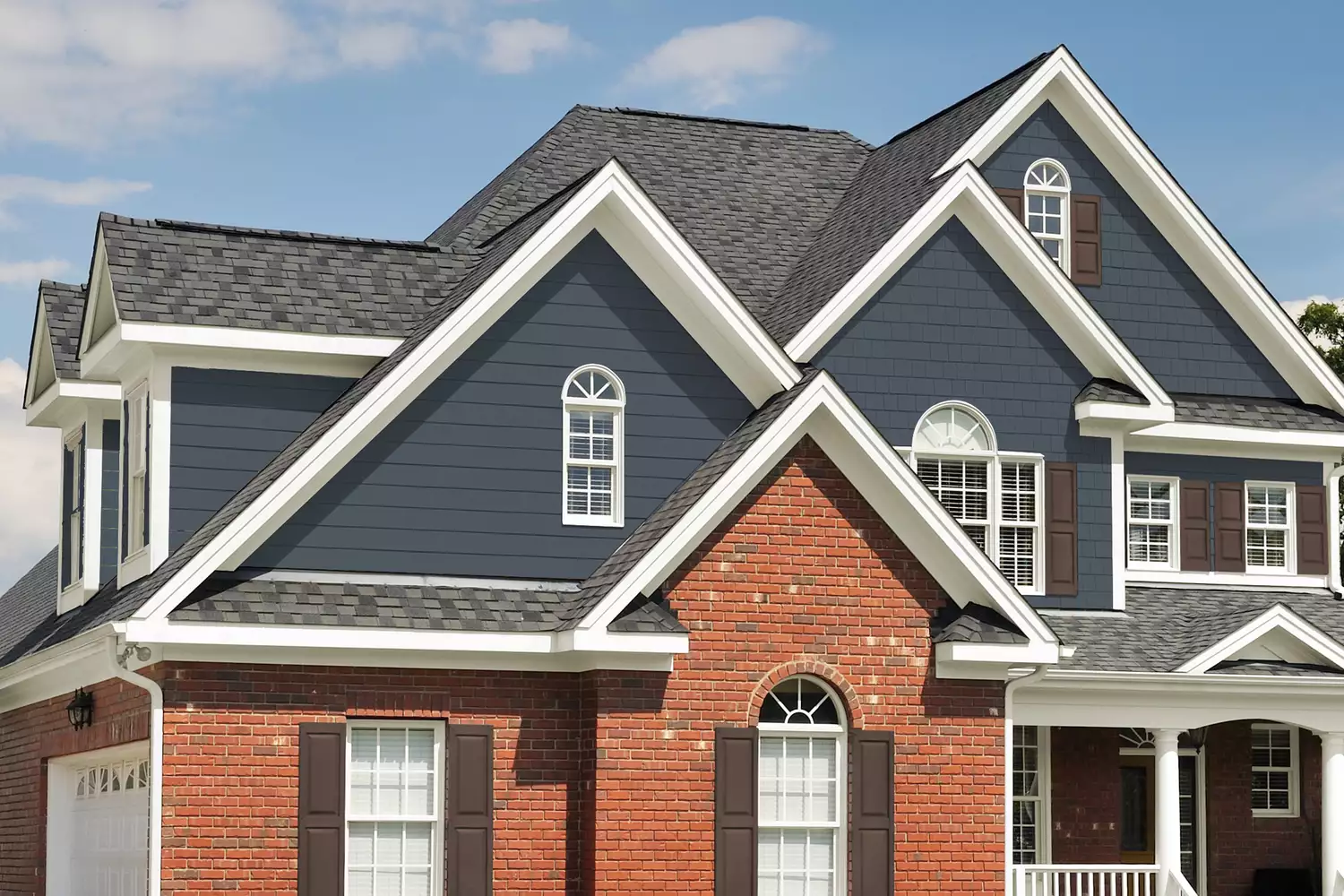
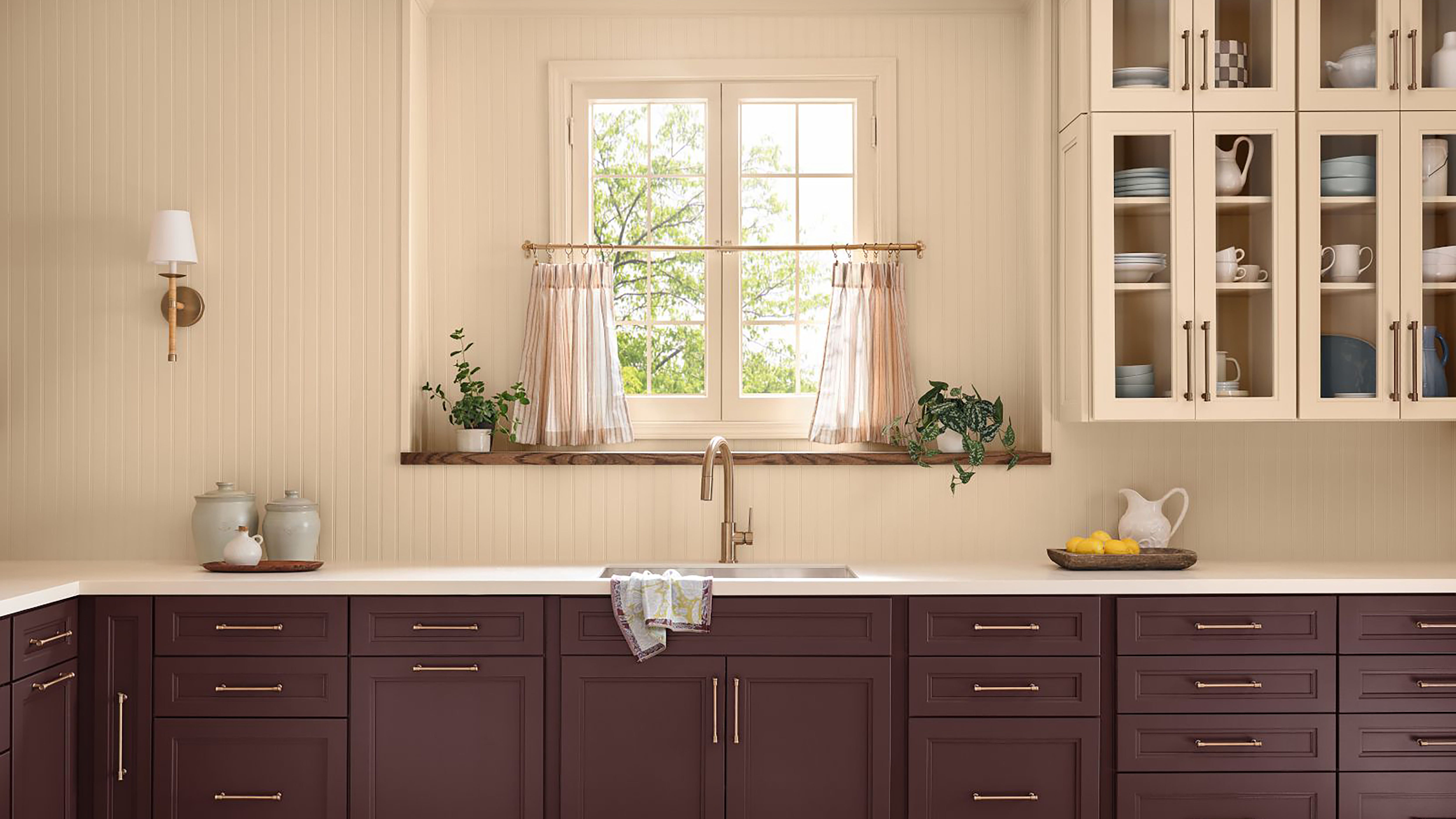
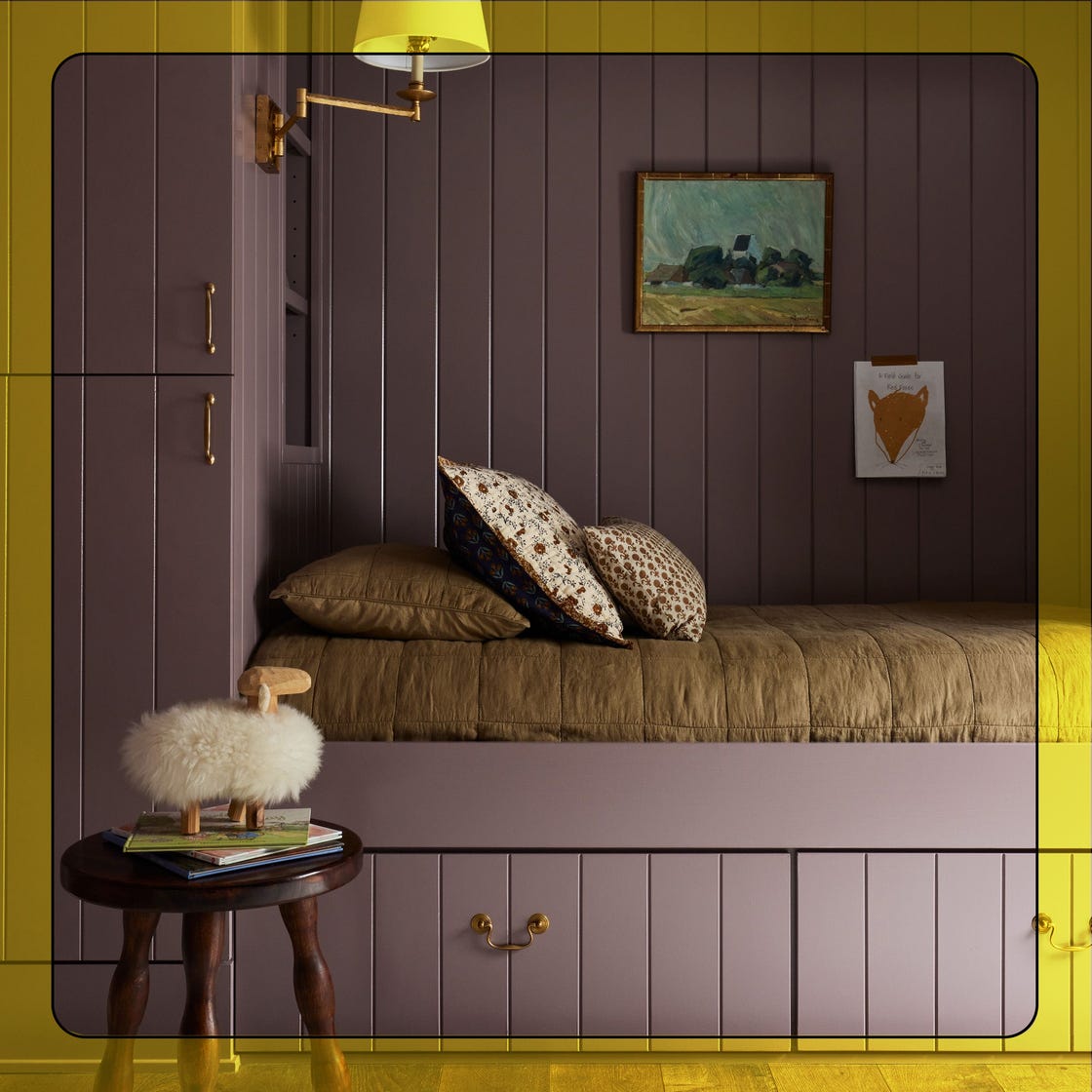
The article includes several illustrative examples of how these palettes can be applied in various commercial and residential settings. For instance, a high-energy mix of Eon, Midnight Blue, Integrity, Inferno, and Radiant Sun showcases the visual impact and contrast central to FUSIONDream. Stonewashed Brown and Blank Canvas establish a grounded palette, reflecting SOULScape’s focus on moody, welcoming tones in a long hallway with an arched entryway. Sculptor Clay and Shoelace ground the exterior of a home in warm, natural tones, demonstrating the anchoring intent of EVOLVEDNeutrals. Eastern Bamboo and Nano White carry SOULScape’s Mediterranean influence through organic contrast and softened warmth in a bedroom. Blank Canvas and Dove from EVOLVEDNeutrals soften a healthcare setting with pared-down contrast and warmth. Ultra Pure White and Azalea Leaf lend a clean, composed feel to a coffee shop interior, shaped by MYSTICWave’s emphasis on comfort and ease. Nano White and Extreme bring precision and edge to an interior, reflecting METROChic’s tailored and urban sensibility. A gradient of Coral Cloud, Beach Foam, Mayan Treasure, and Deep Fire reflects MYSTICWave’s palette of softened warmth and atmospheric depth in an outdoor hallway. Finally, Eon, Sultana, and Coveted Gem introduce a saturated rhythm drawn from the FUSIONDream palette in an office setting, while Ultra Pure White and Fine Wine combine crisp contrast and saturation, aligned with METROChic’s polished tonal structure in a conference room. These examples collectively demonstrate the versatility and thoughtful consideration behind Behr's 2026 Commercial Color Forecast.
#BehrColorForecast #CommercialDesign #InteriorDesignTrends #ColorPalette #DesignDuality #ErikaWoelfel #DesignerCouncil #ArchitecturalColors #SpatialDesign #BehrColorForecast #CommercialDesign #InteriorDesignTrends #ColorPalette #DesignDuality #ErikaWoelfel #DesignerCouncil #ArchitecturalColors #SpatialDesign
Hay 0 comentarios en total
 Aún no hay comentarios
También te puede gustar
Behr's 2026 Color of the Year Is Here—And It’s Moody

These 20 Trendy Paint Colors Will Be Taking Over Walls In 2026
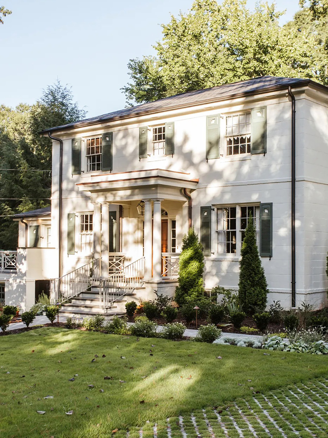
The Moody Shade That Will One-Up White Exteriors in 2026

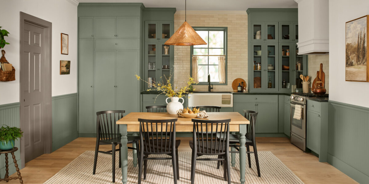
These Will Be the Most Popular Paint Colors in 2026

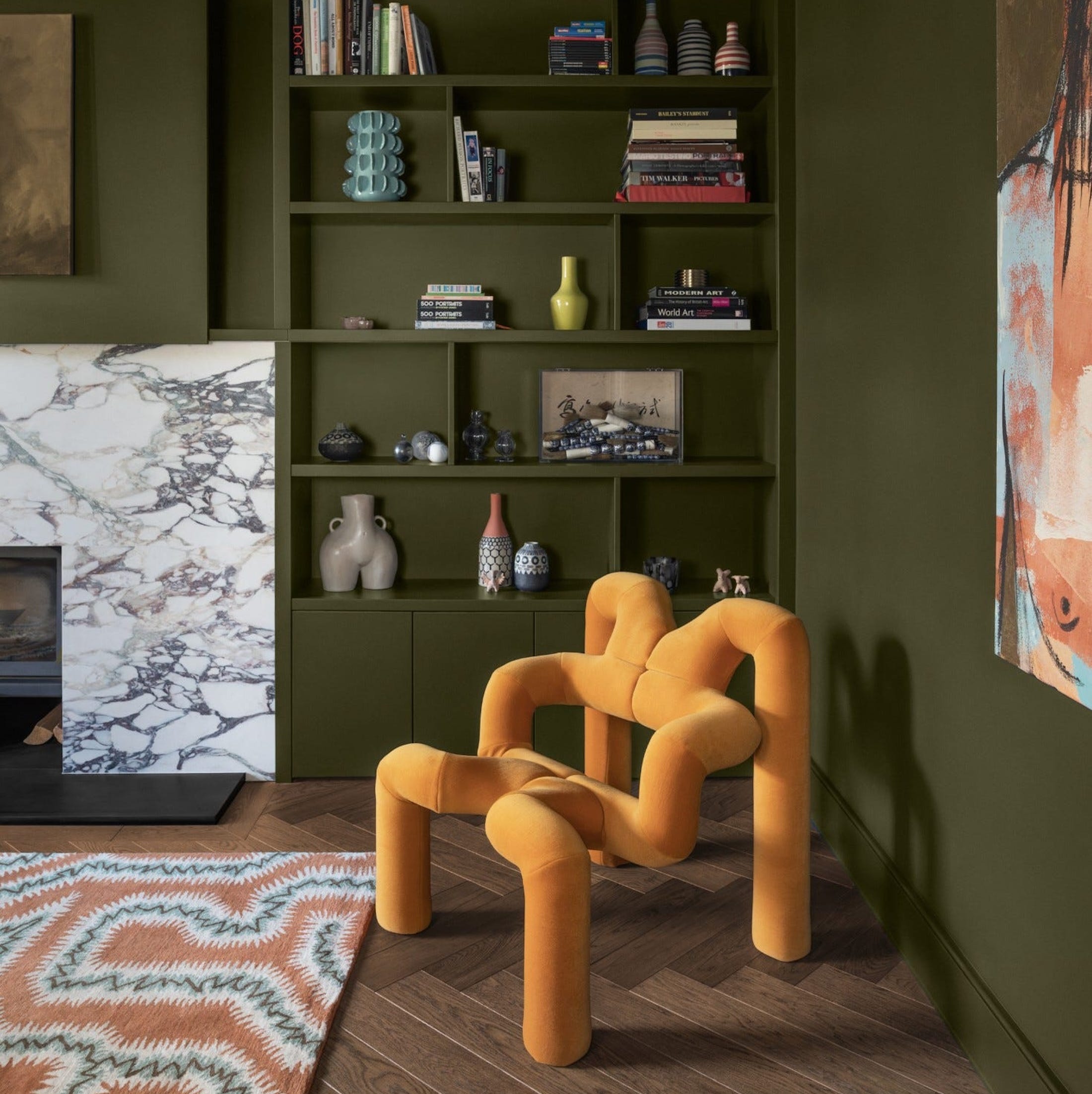
What Paint Colours will Rule 2026? The Experts Make Their Predictions
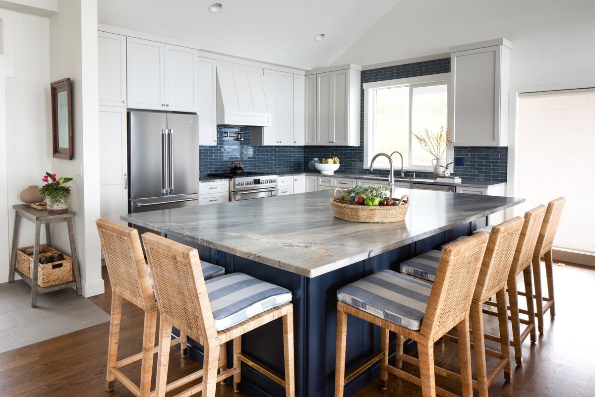
Color Explosion: 2025 Color Trends

Behr Says These Will Be the Top Exterior Paint Color Trends in 2025

Every 2026 Color of the Year That Has Been Announced So Far

What Paint Colors Will Rule 2026? Designers Make Their Predictions
The 2026 paint Colors of the Year Have Been Announced

These 8 Colors Will Rule Interiors in 2026, According to Experts

Designers Predict This Will Be The Biggest Paint Trend Of 2026
Benjamin Moore Just Released Its 2026 Color Forecast—These 8 Paint Shades Will Be Huge Next Year

According to Designers, These Are The Outdated Color Trends for 2026

The colour trends 2026 that will define our homes next year

Unexpected Color Combinations Trend Spring/Summer 2026

Meet 'colour capping', the paint trend set to take over 2026
What is Color Forecasting? Experts Explain How to Map Trends |

The Kitchen Cabinet Colors Experts Predict Will Dominate 2026
Move Over, Color Drenching— Color Capping Will Dominate 2026 Interiors