1/15
The Kitchen Cabinet Colors Experts Predict Will Dominate 2026
The kitchen, often considered the heart of the home, significantly influences the overall ambiance and aesthetic. While all-white kitchens dominated the 2010s and sage green hues characterized the early 2020s, a shift towards diverse color trends for kitchen cabinets is anticipated for 2026. Experts in interior design have identified several key color palettes expected to gain prominence, moving away from previous trends and introducing fresh approaches to kitchen aesthetics.
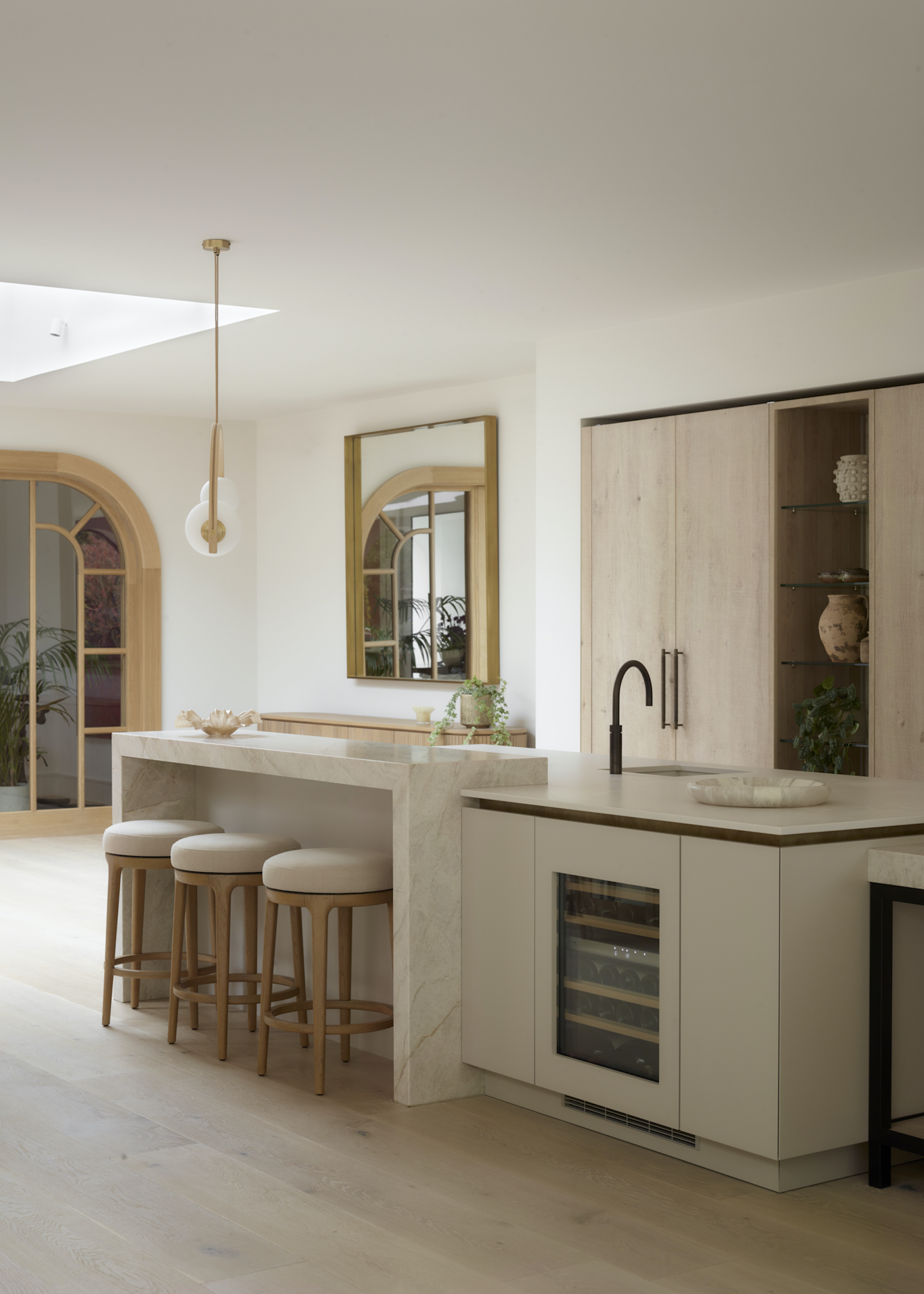
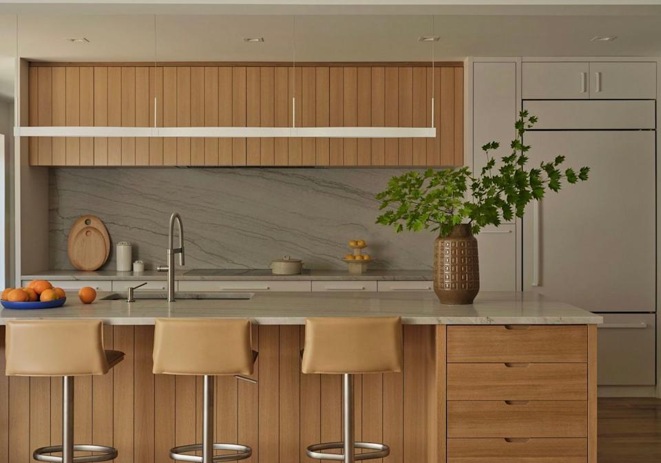
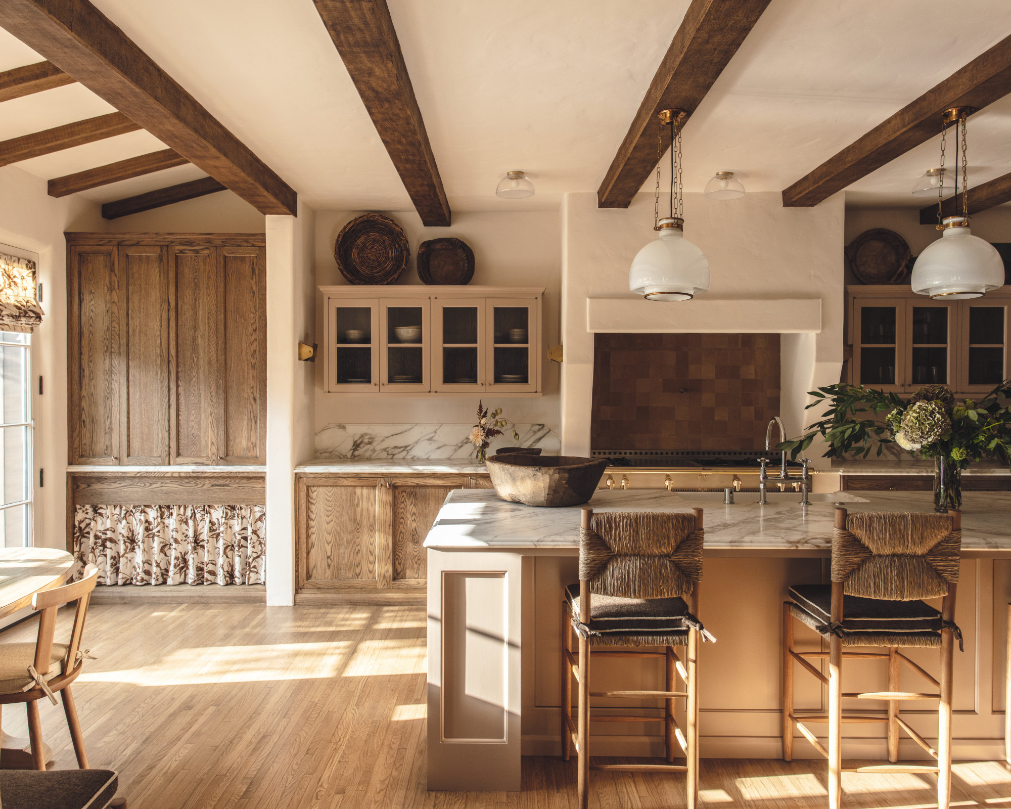

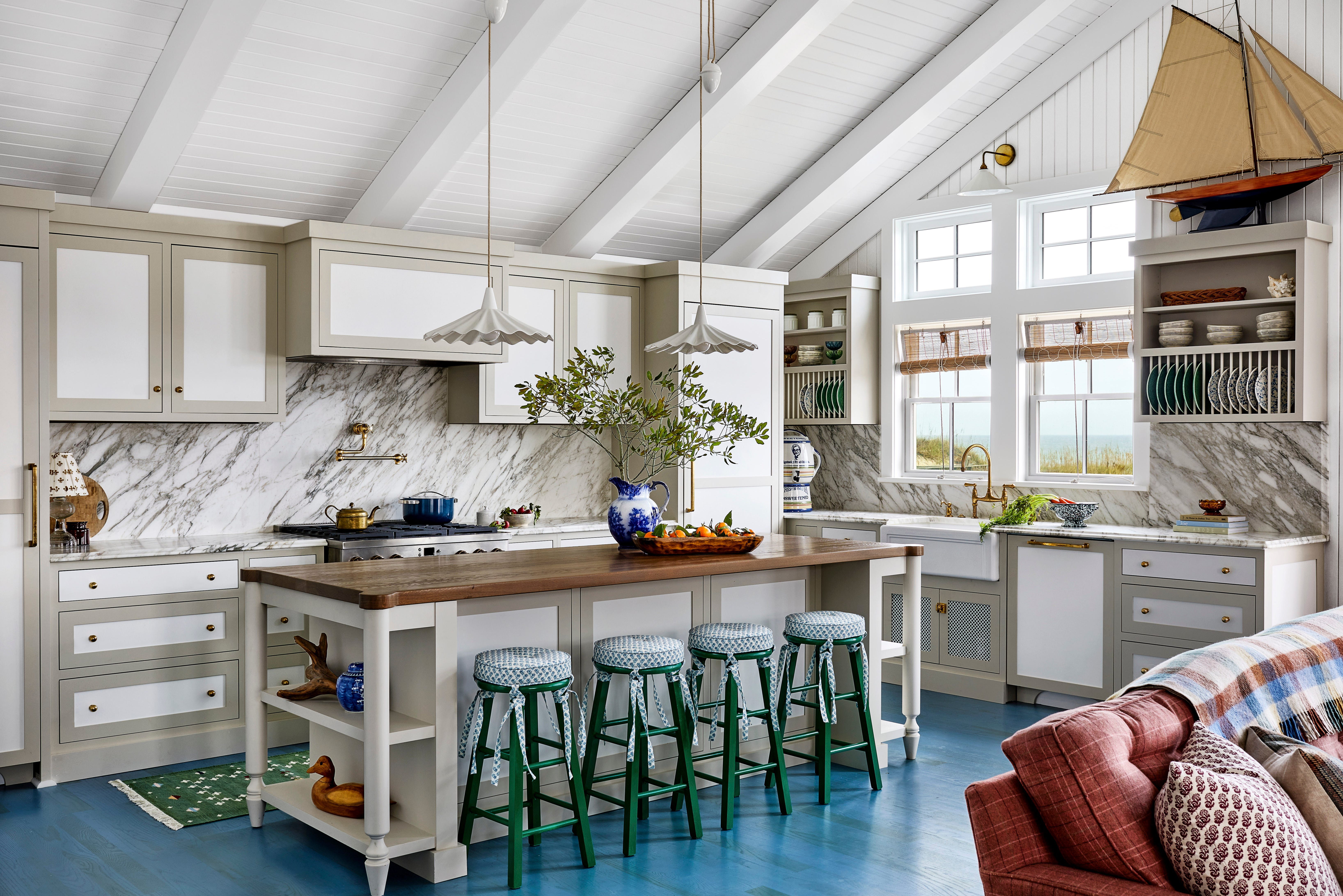
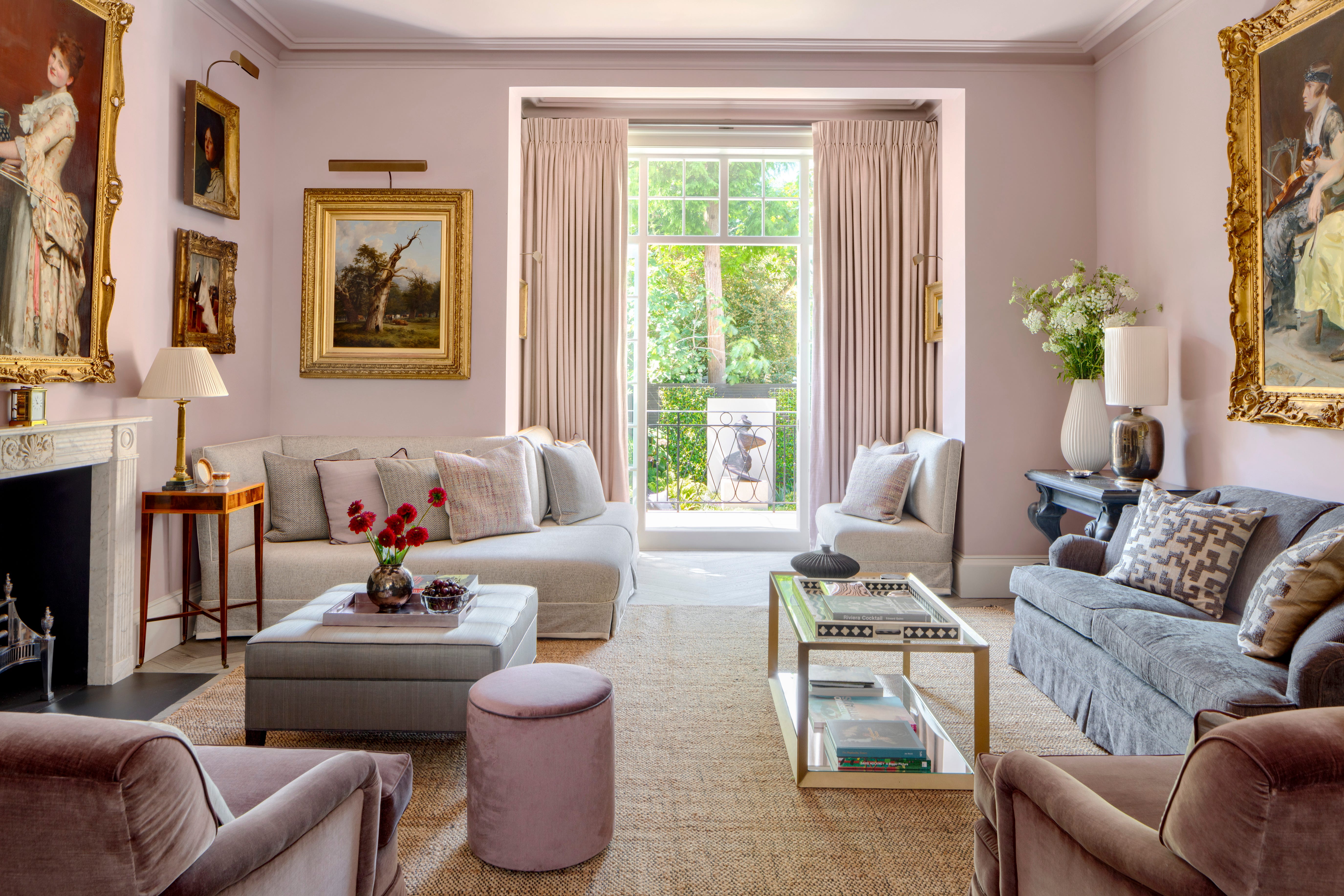
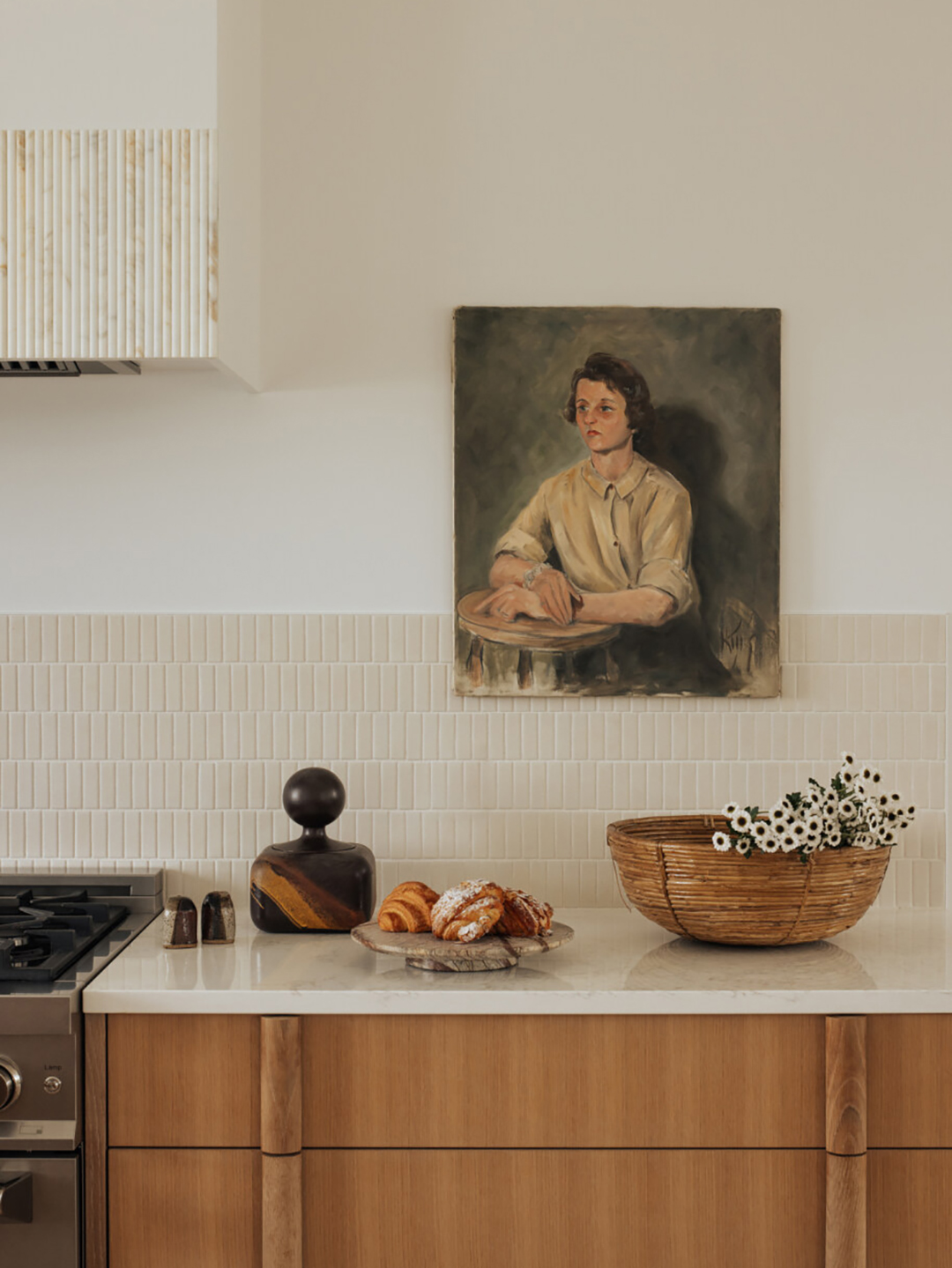
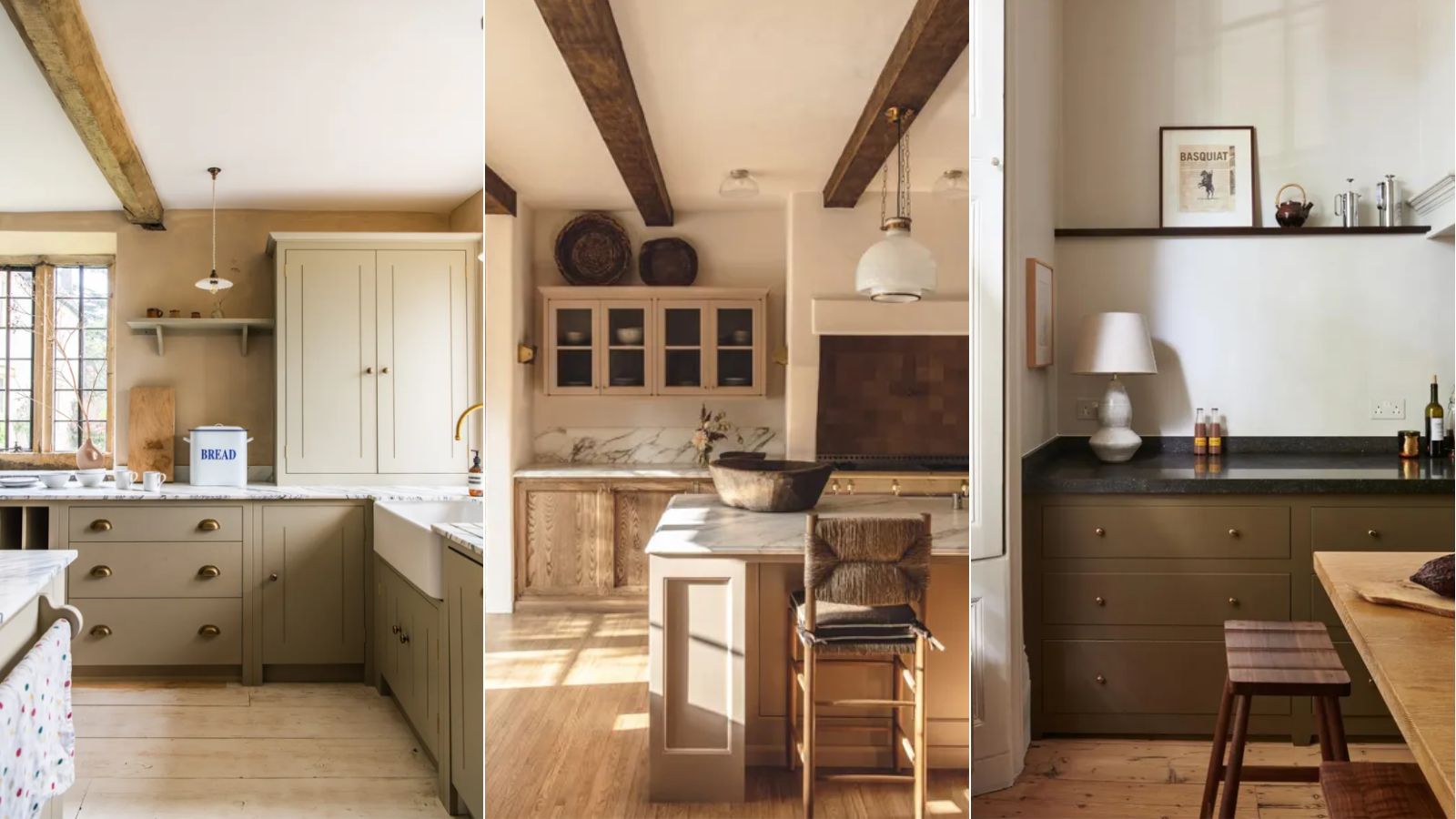
Warm neutrals are predicted to be a significant trend, offering a reassuring and sophisticated direction for kitchen cabinetry. These include warm taupes, moody mushrooms, and greige tones, which contribute to a soft kitchen aesthetic. Designers like Richard Davonport from Davonport and The Brownstone Boys emphasize the versatility of these shades, noting their ability to create a calm backdrop that allows architectural details to shine. They also pair naturally with various materials such as wood, aged brass, and subtly veined quartz, facilitating a gentle, lived-in elegance. One recommended warm neutral is Farrow & Ball's 'Drop Cloth', praised for its soft, grounded quality.
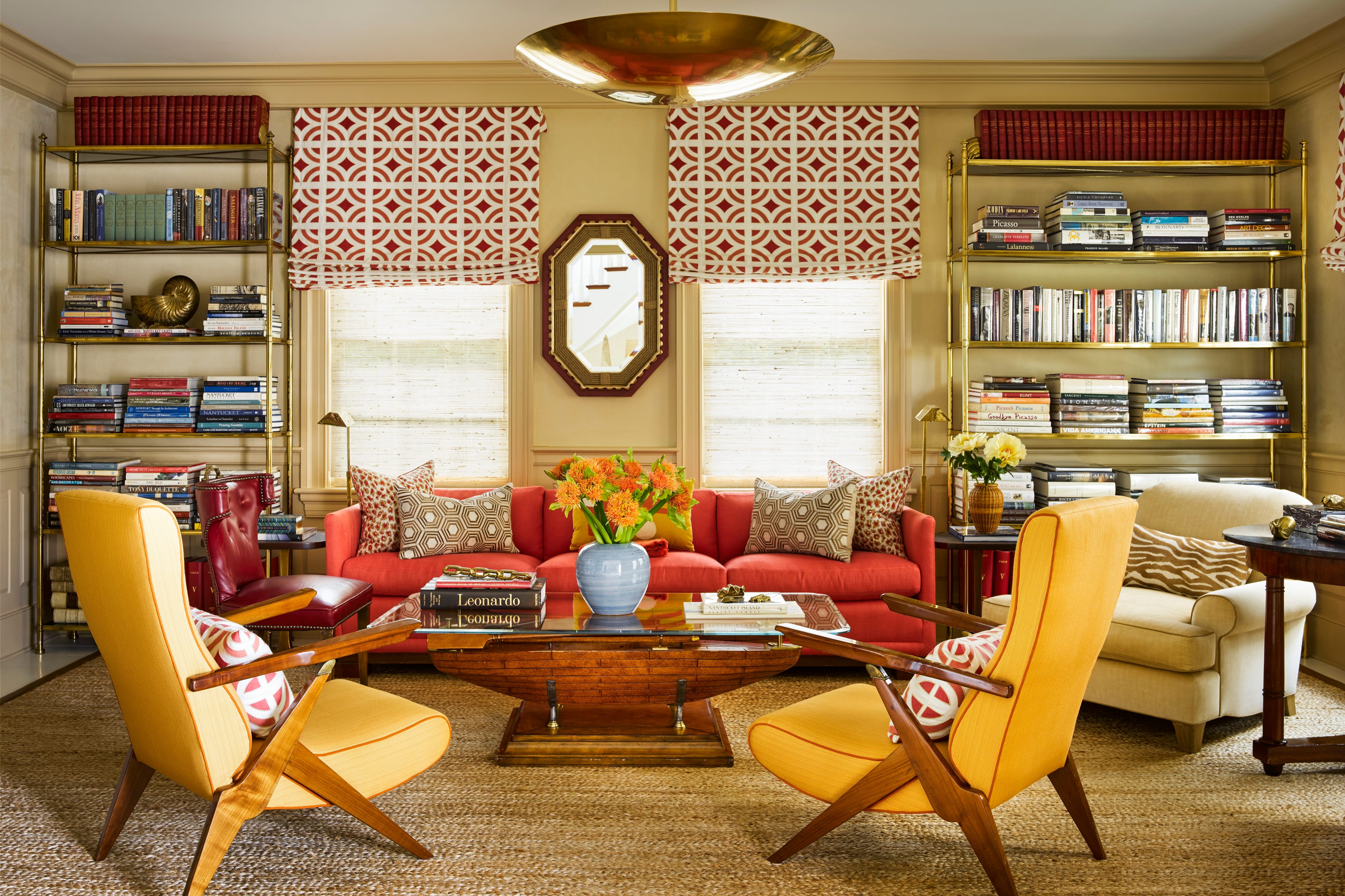
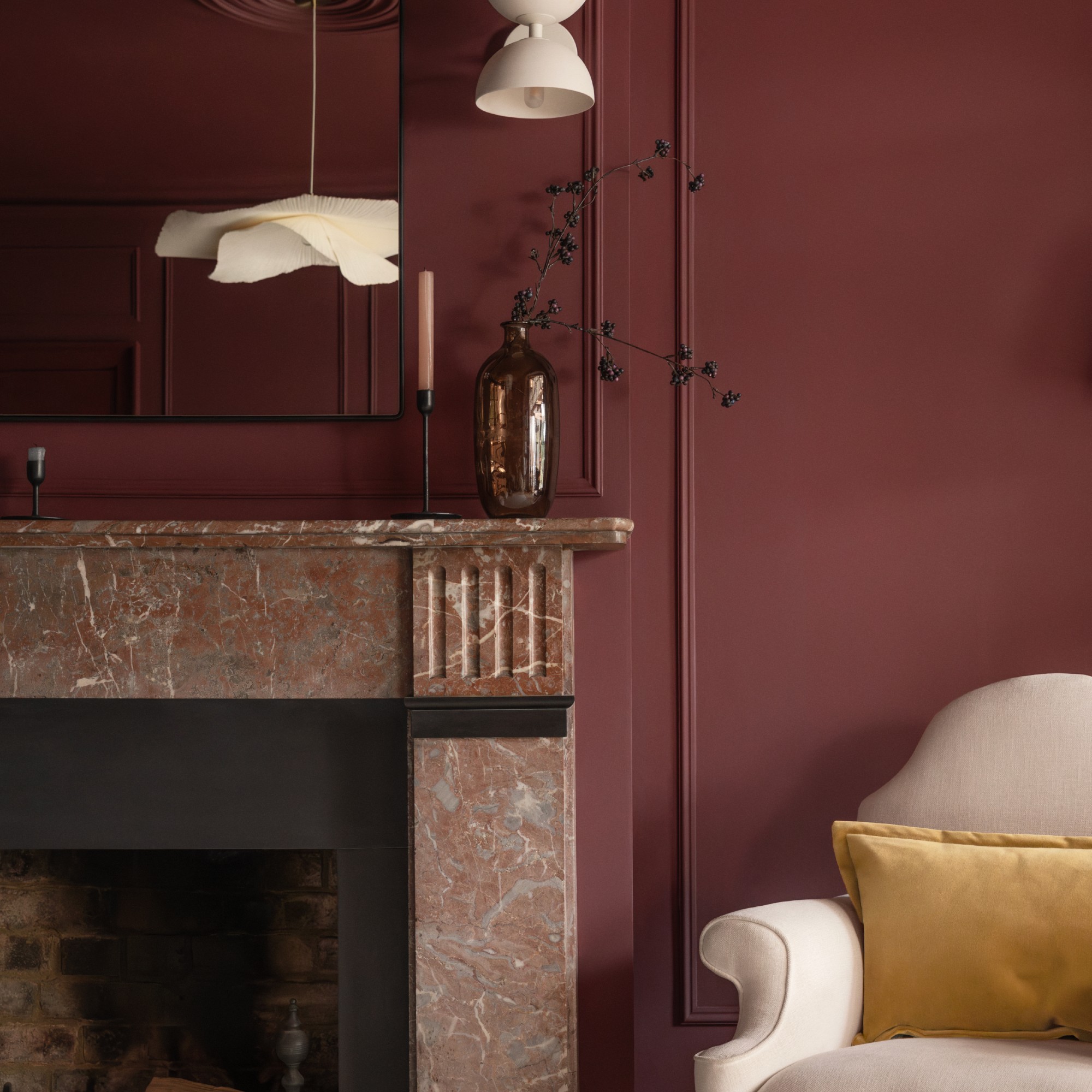
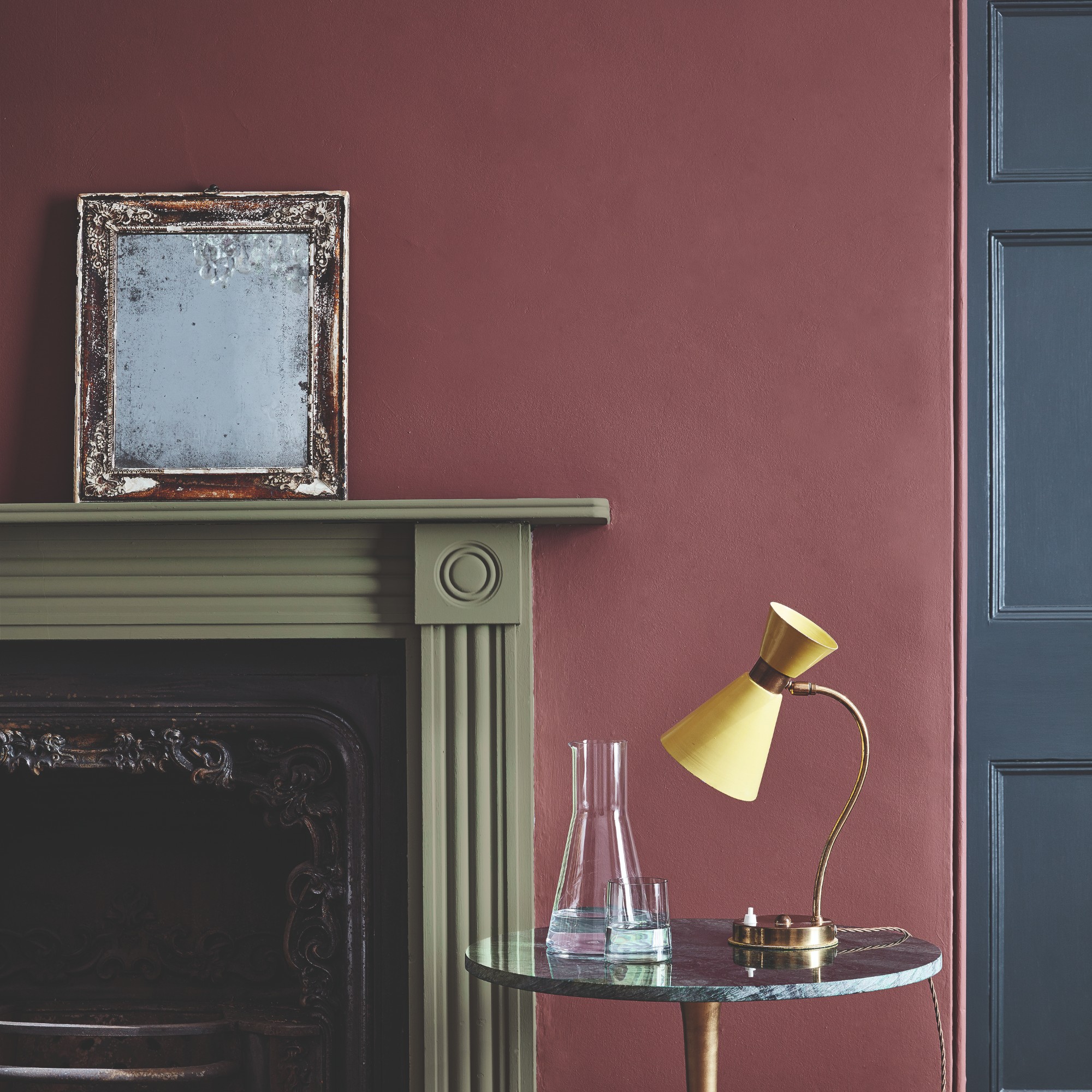
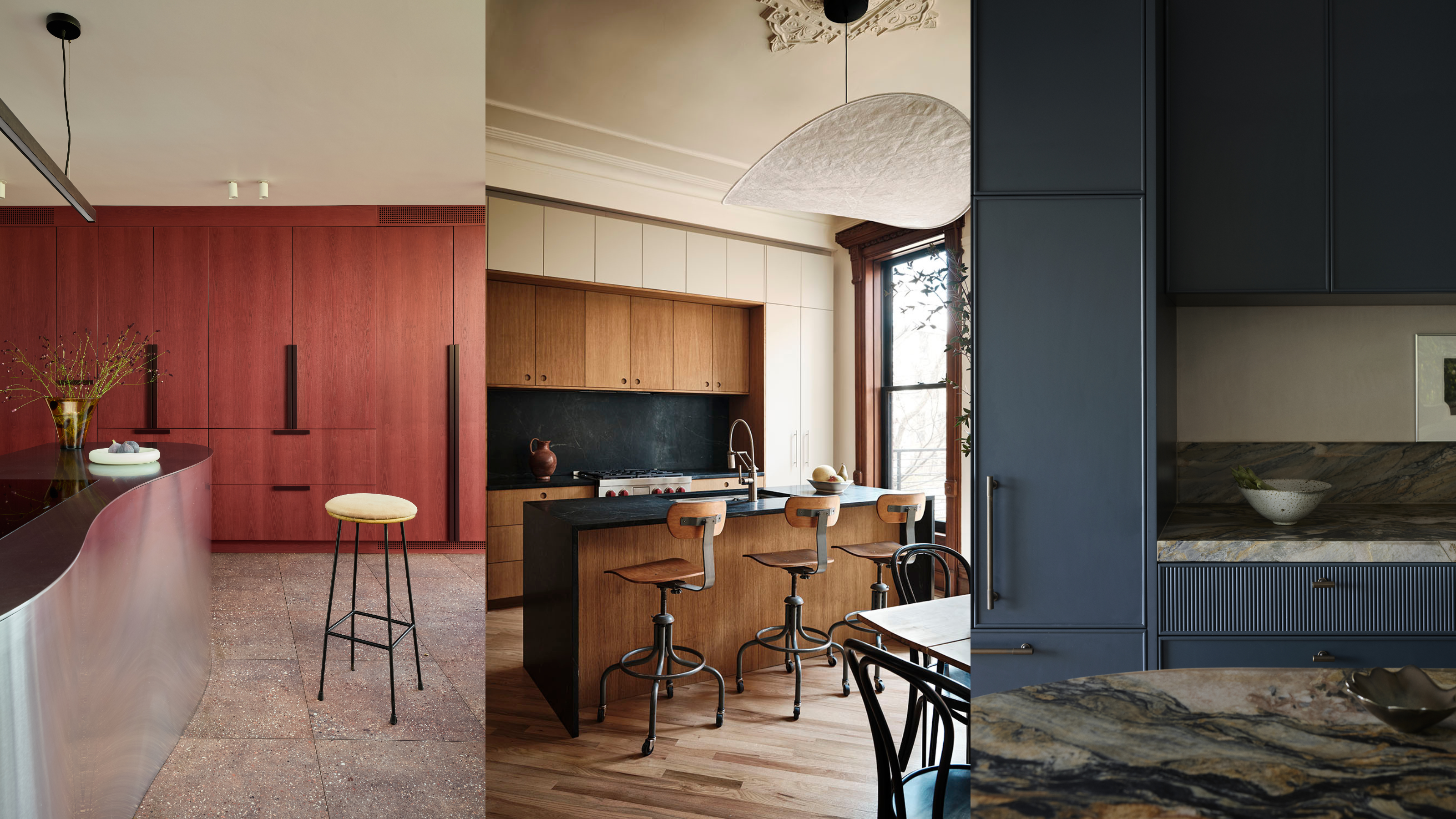
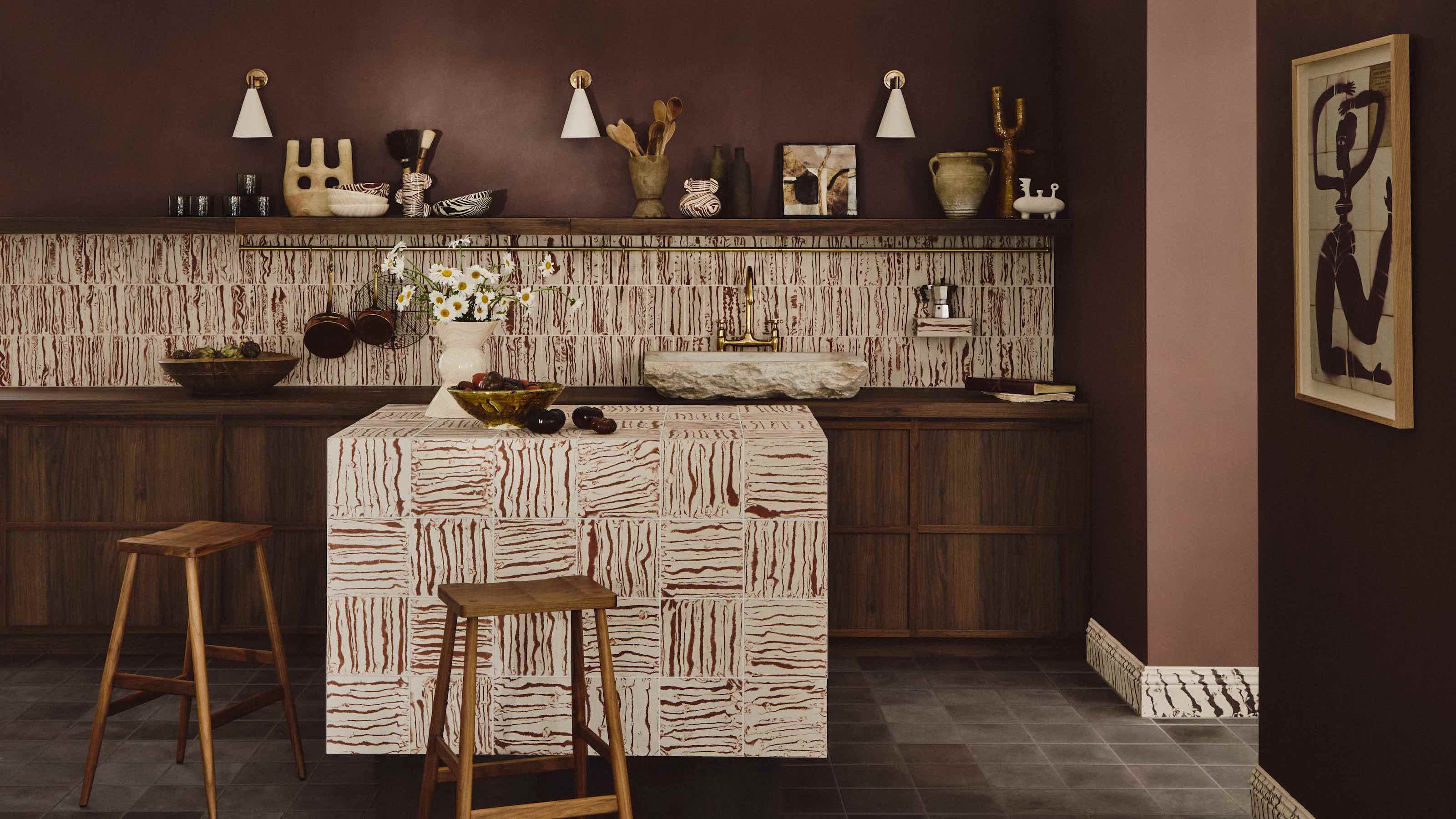
Shades of red, particularly dark, moody burgundy, are also expected to continue their strong presence in 2026. This trend is broadening to encompass a wider spectrum of reds, offering opportunities to infuse personality into the home. Lizzie Spinks, head of design at Makers, highlights red cabinetry's capacity to bring warmth, joy, and sophistication to a space, advocating for bold application. Fiona Ginnett from HØLTE suggests pairing deeper burgundy tones with sapele detailing and stainless-steel worktops for a rich, contemporary feel. Benjamin Moore's 'Caliente' is cited as a vibrant red option.
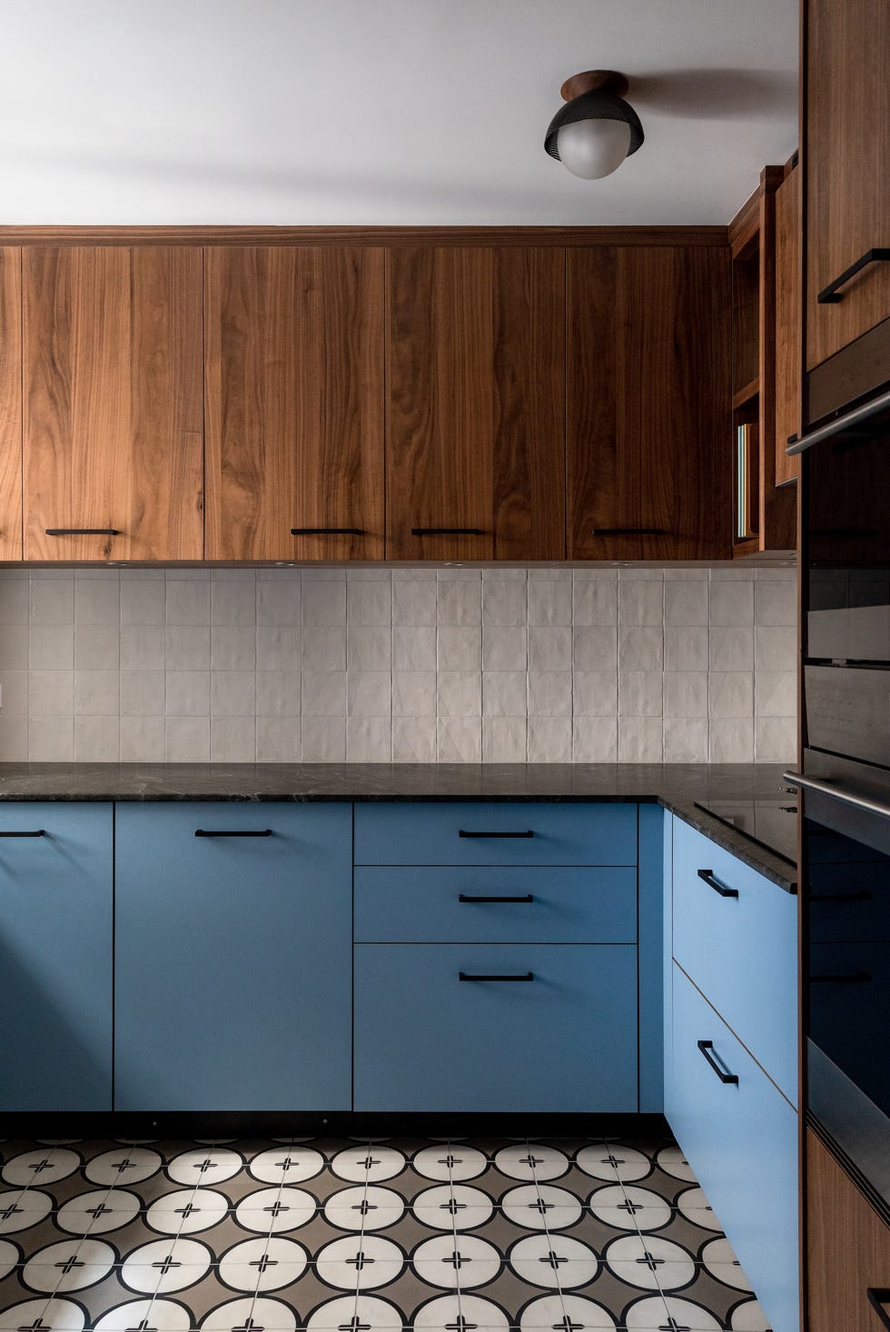
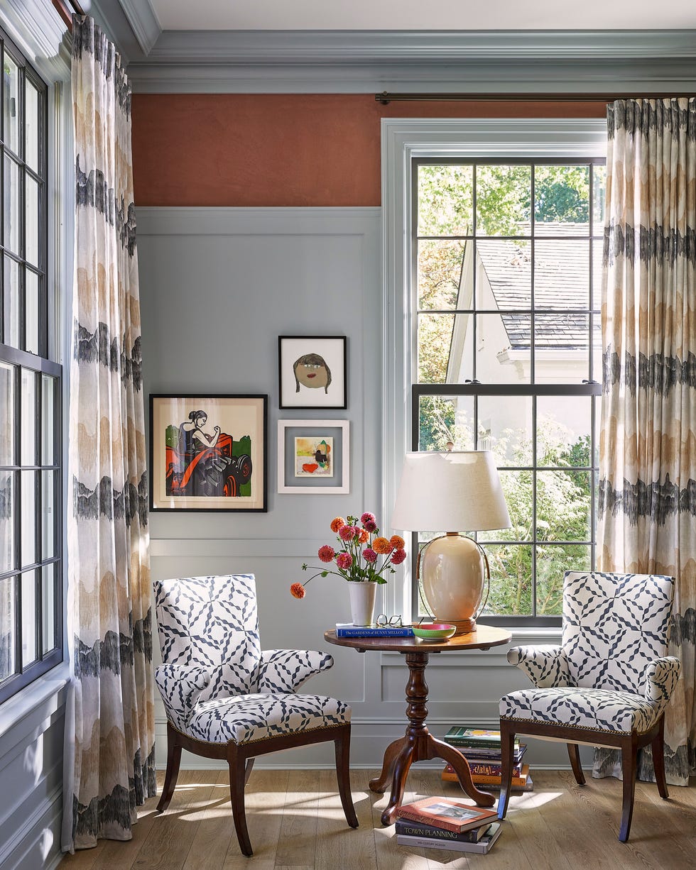
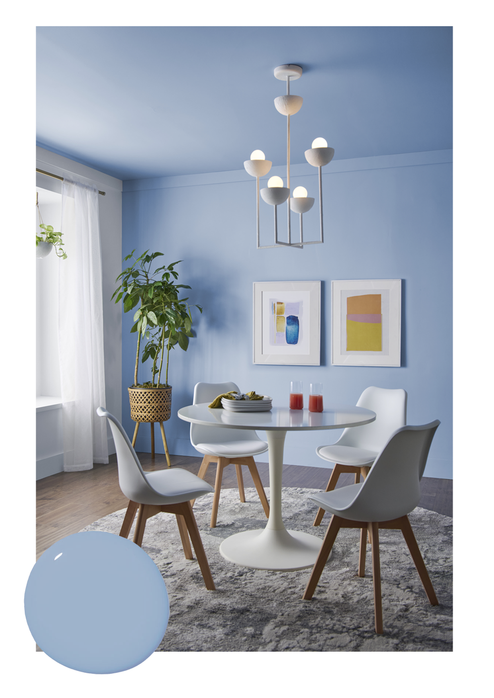
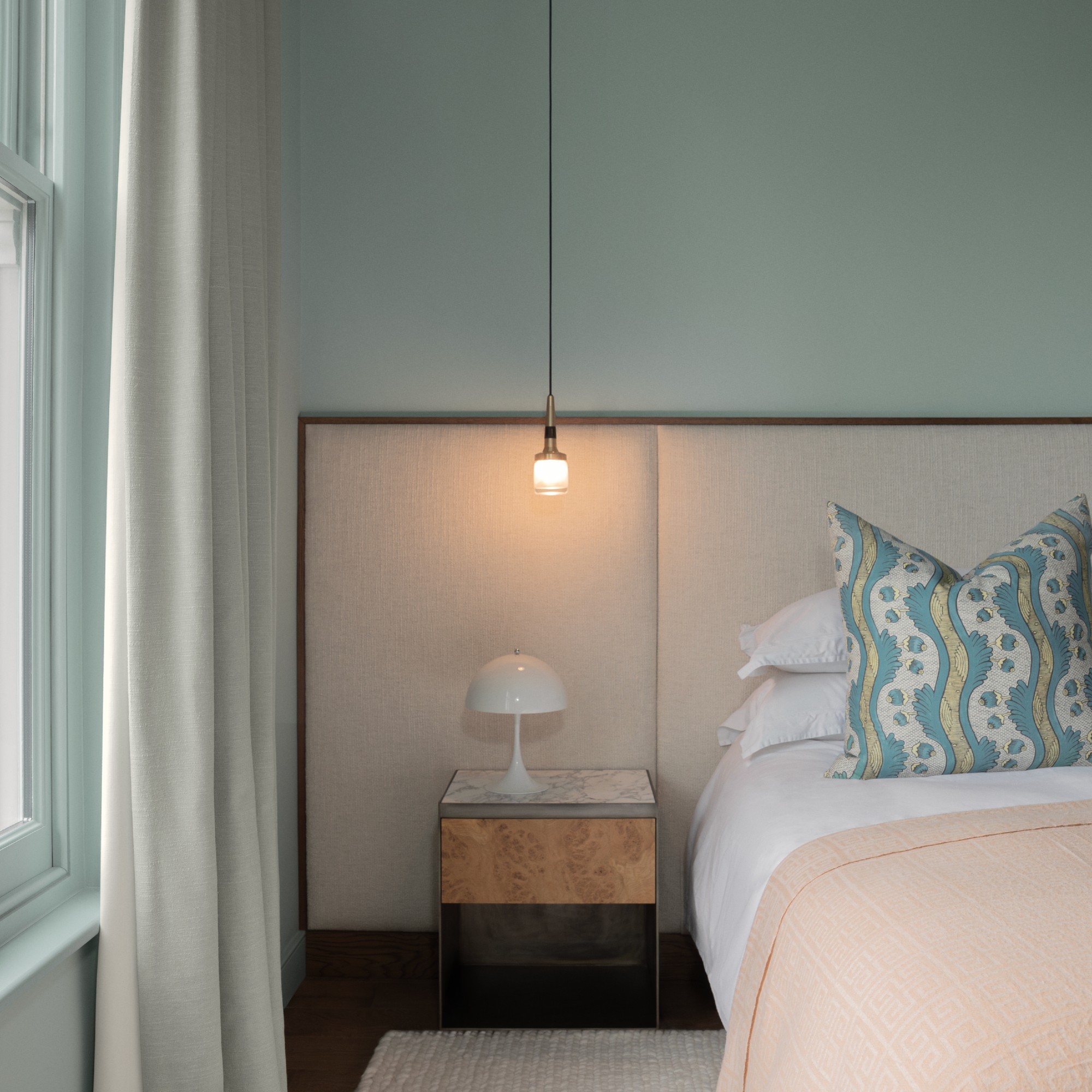
Calming blues are seeing a resurgence, with a remarkable increase in sales, suggesting a move towards cooler, brighter shades. This aligns with Pantone's 'Cloud Dancer' color of the year for 2026, indicating a broader acceptance of blue tones. The trend accommodates various shades, from deep navy for drama and sophistication to softer, chalky blues that evoke calm and freshness. Kitchen designer Tom Howley notes blue's versatility, as it complements natural materials like oak and marble in both classic and contemporary settings. Farrow & Ball's 'De Nimes' is an example of a versatile blue hue.
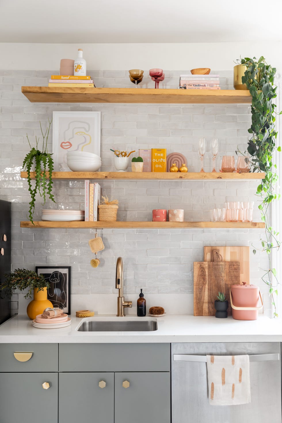
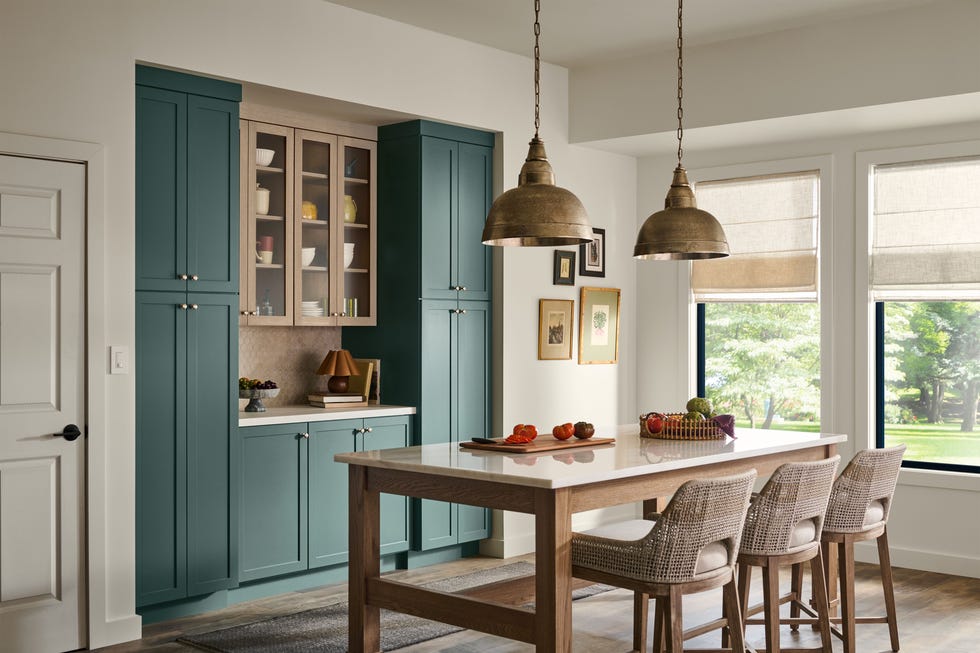
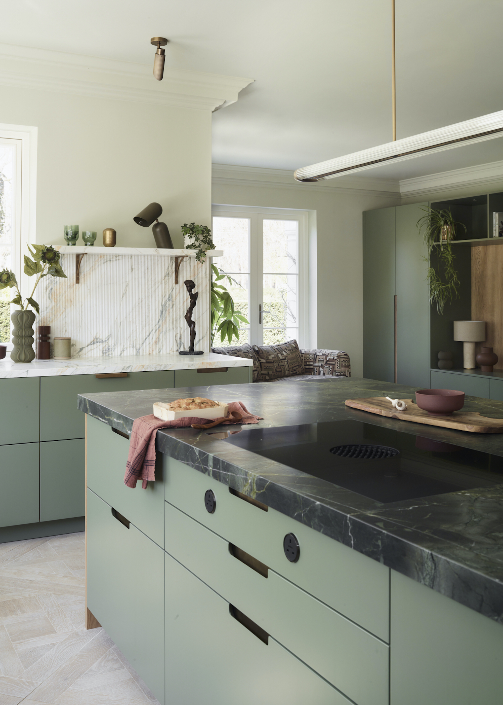
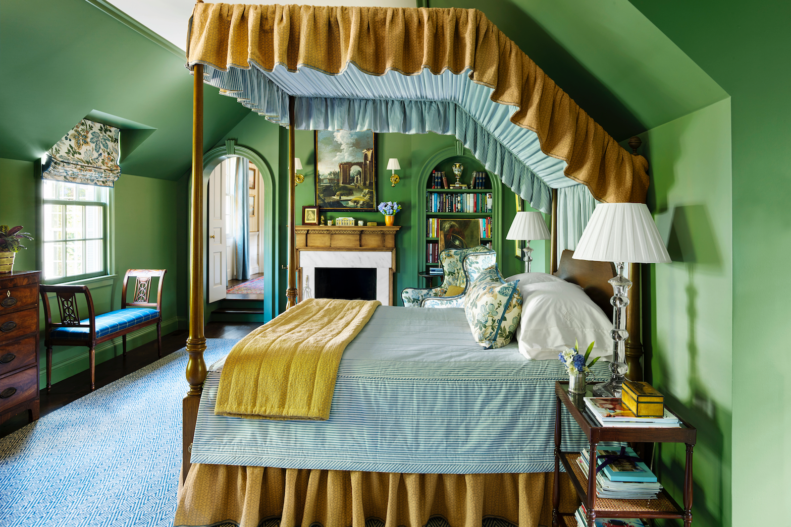
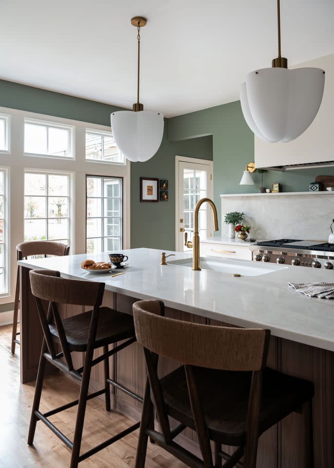
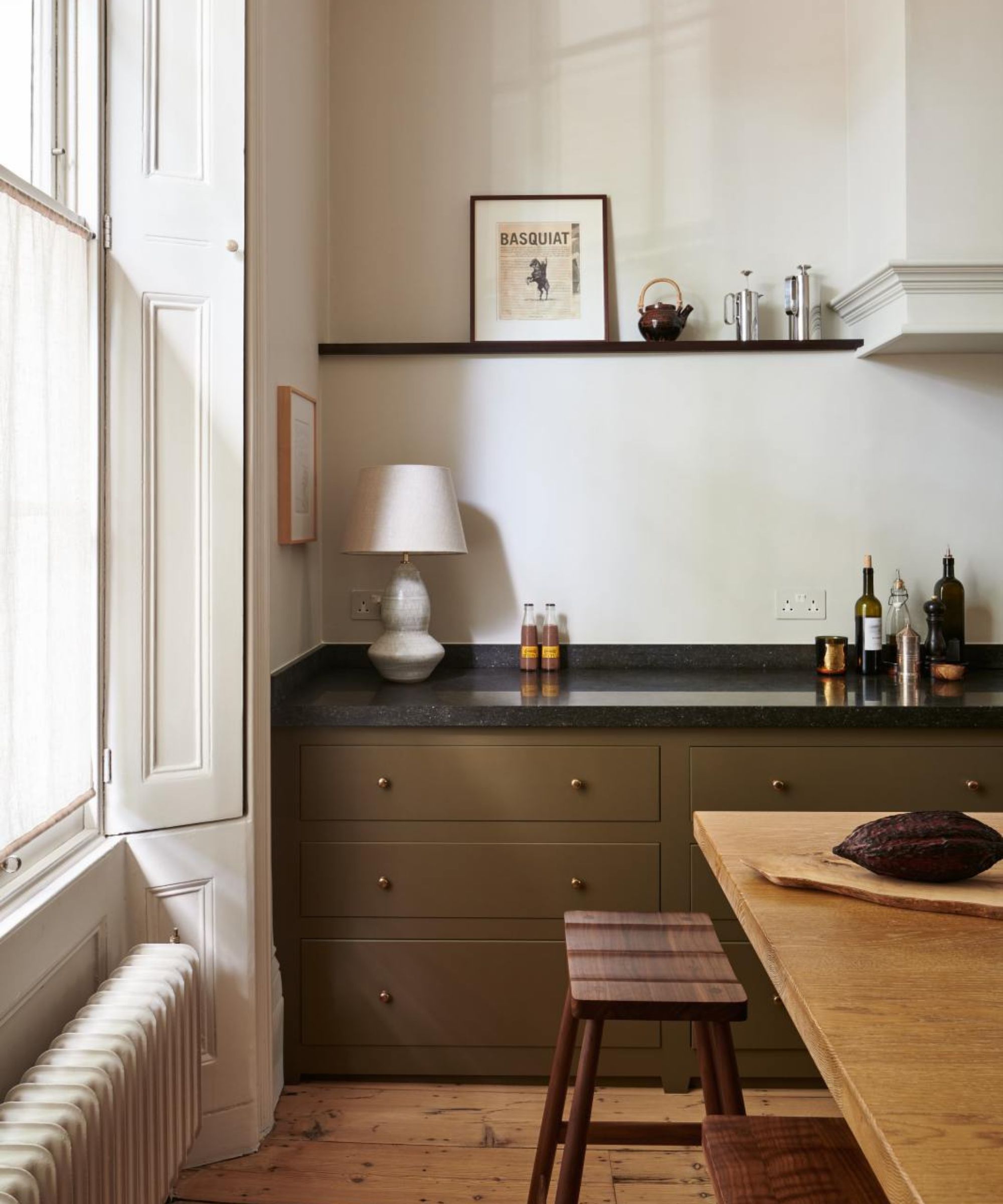
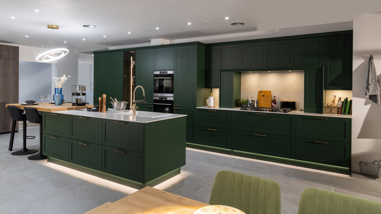
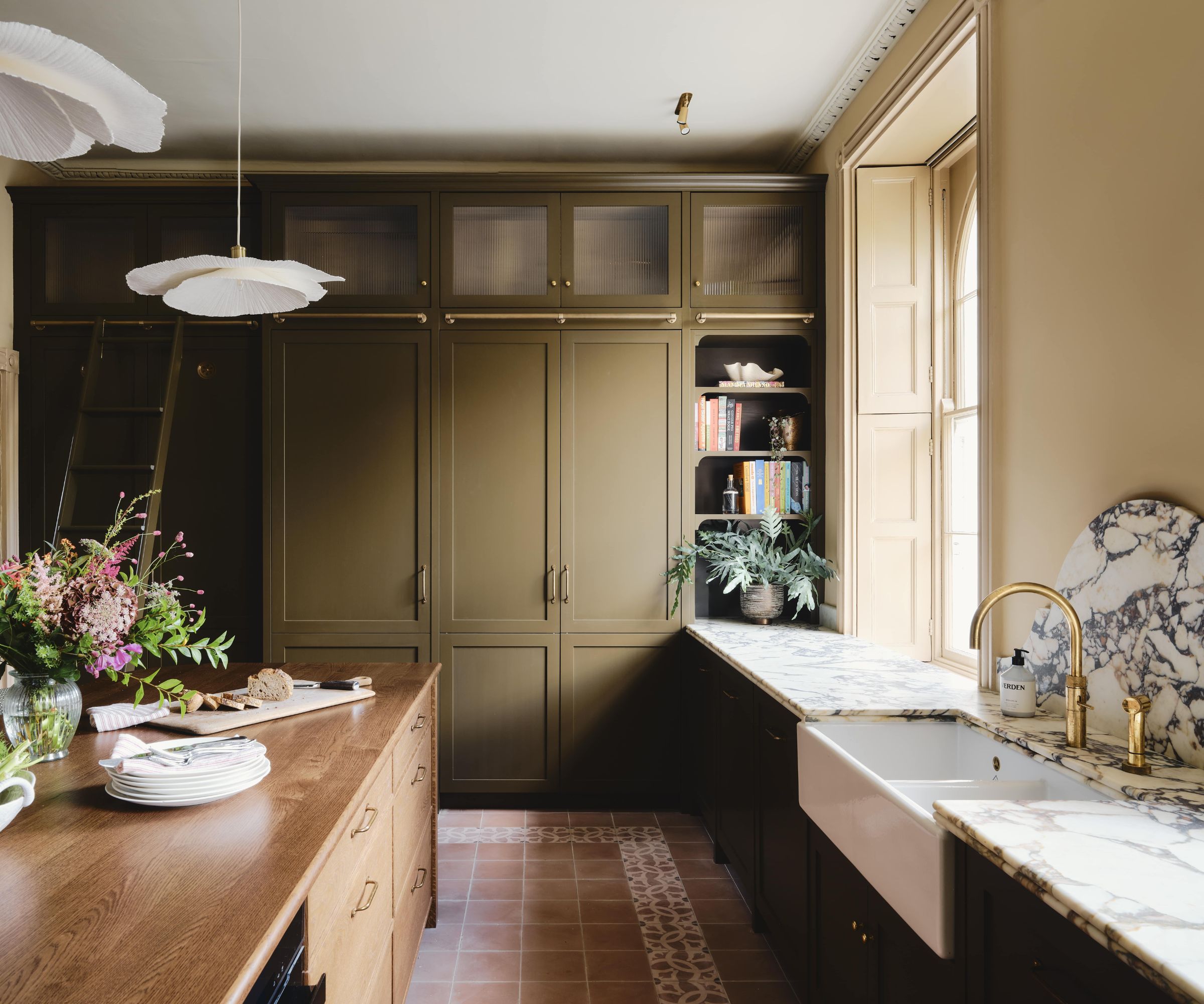
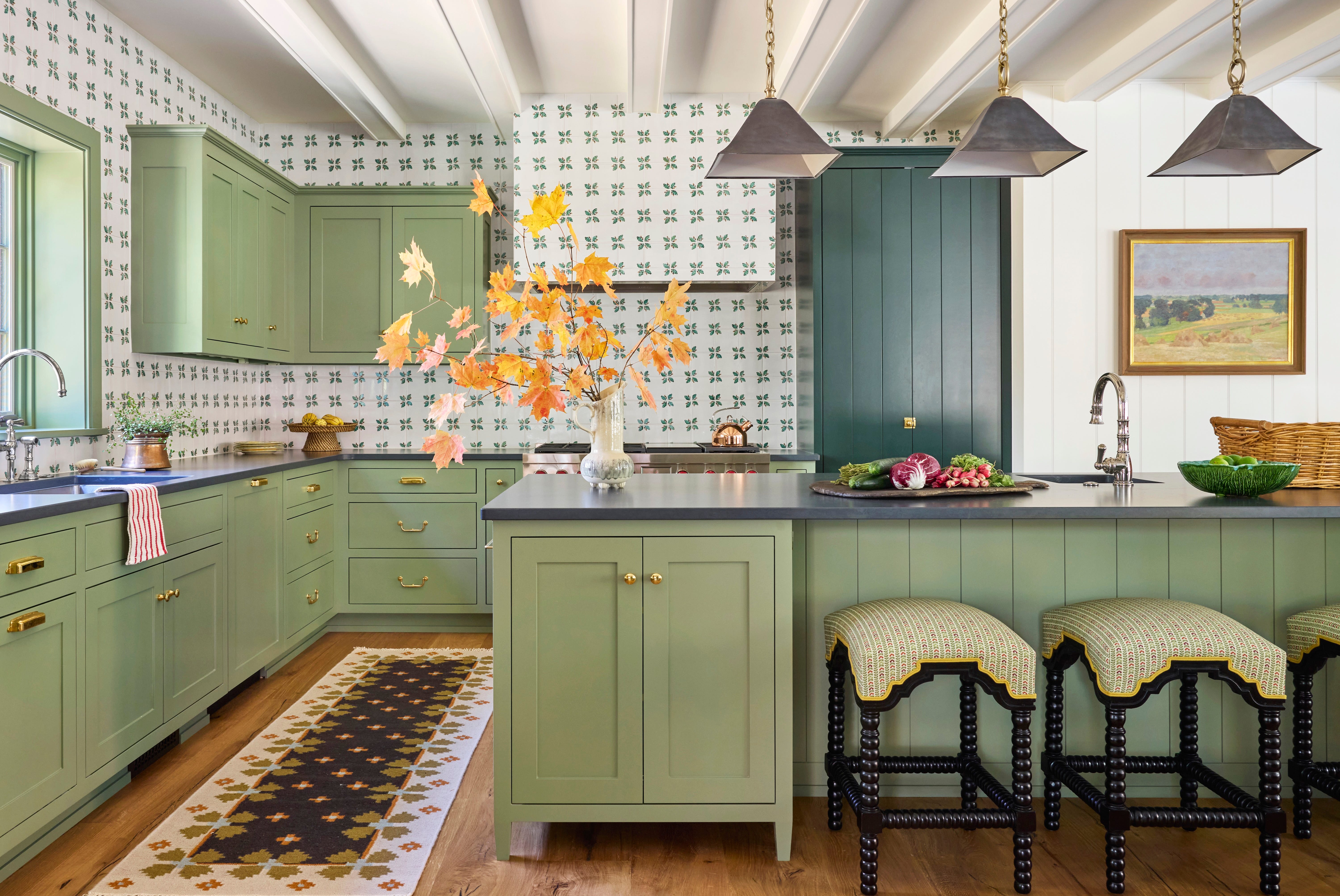
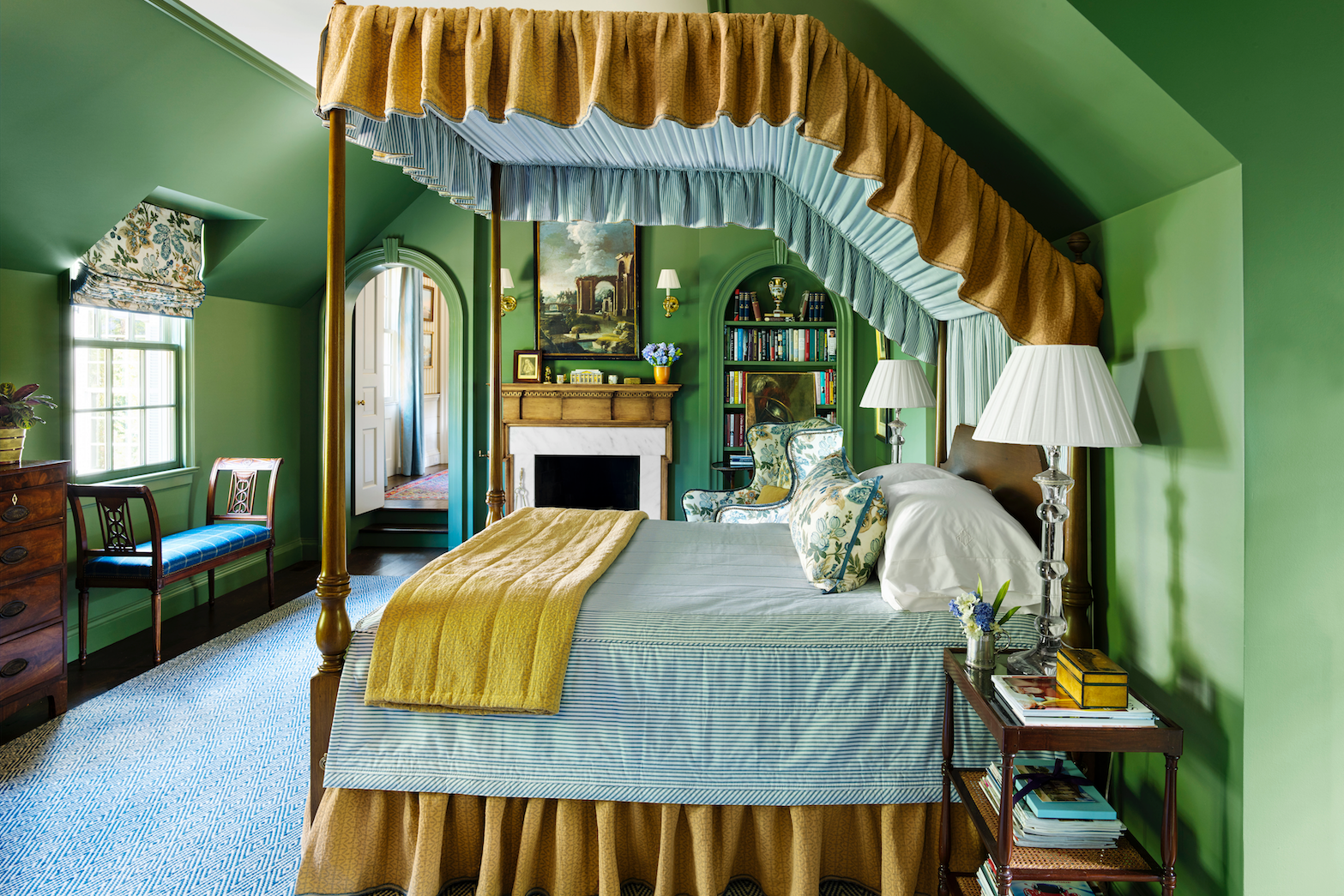
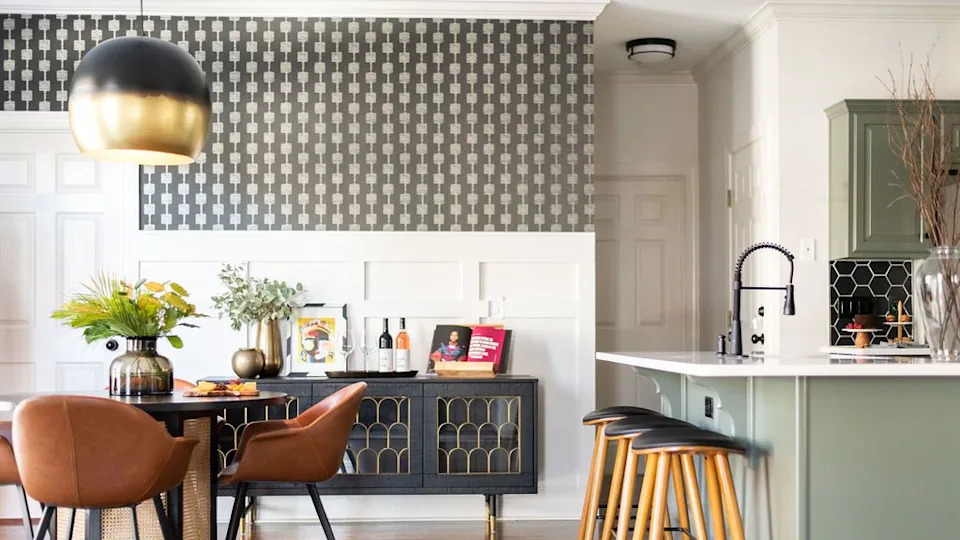
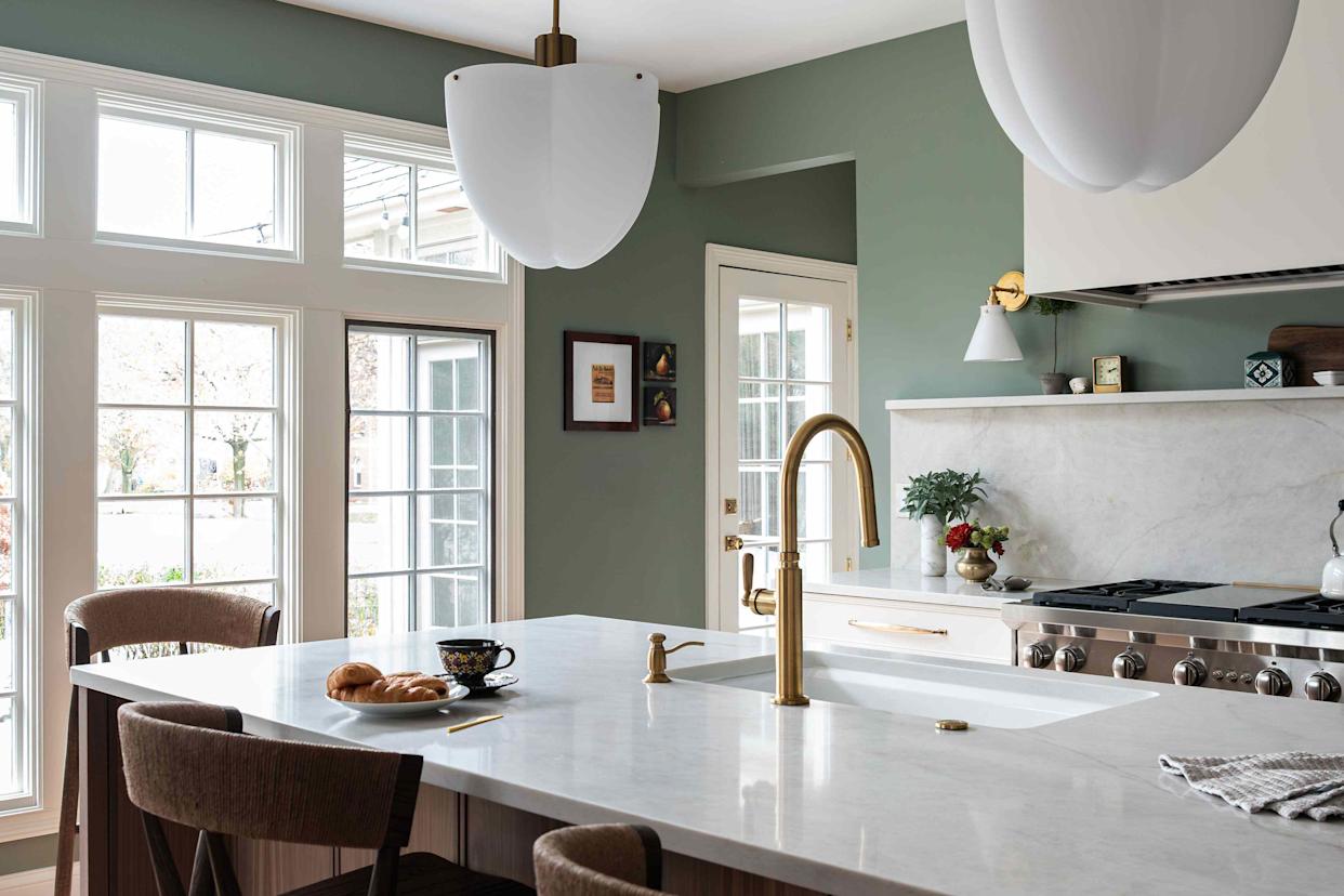
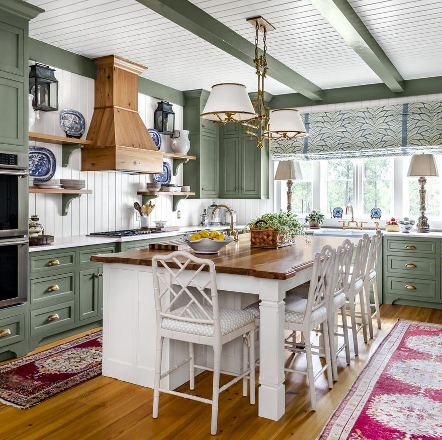
Olive green is re-emerging as a chic and grown-up alternative to the popular sage green. This shade pairs exceptionally well with warm, natural materials, providing a sophisticated feel. Fiona Ginnett recommends styling olive green cabinets with oak accents for warmth and natural softness, and also suggests combining them with terrazzo countertops and terracotta tiles for a grounded, tactile aesthetic. Little Greene's 'Olive Colour™' is presented as a suitable choice.
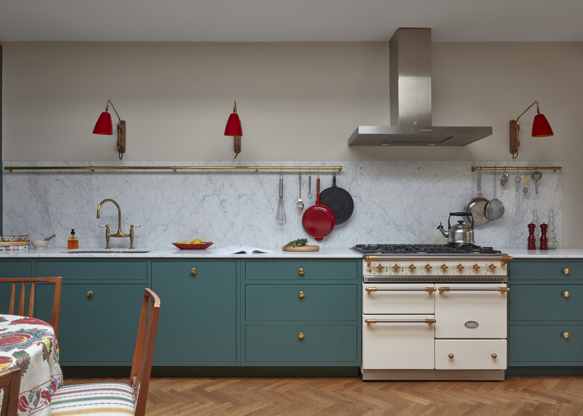
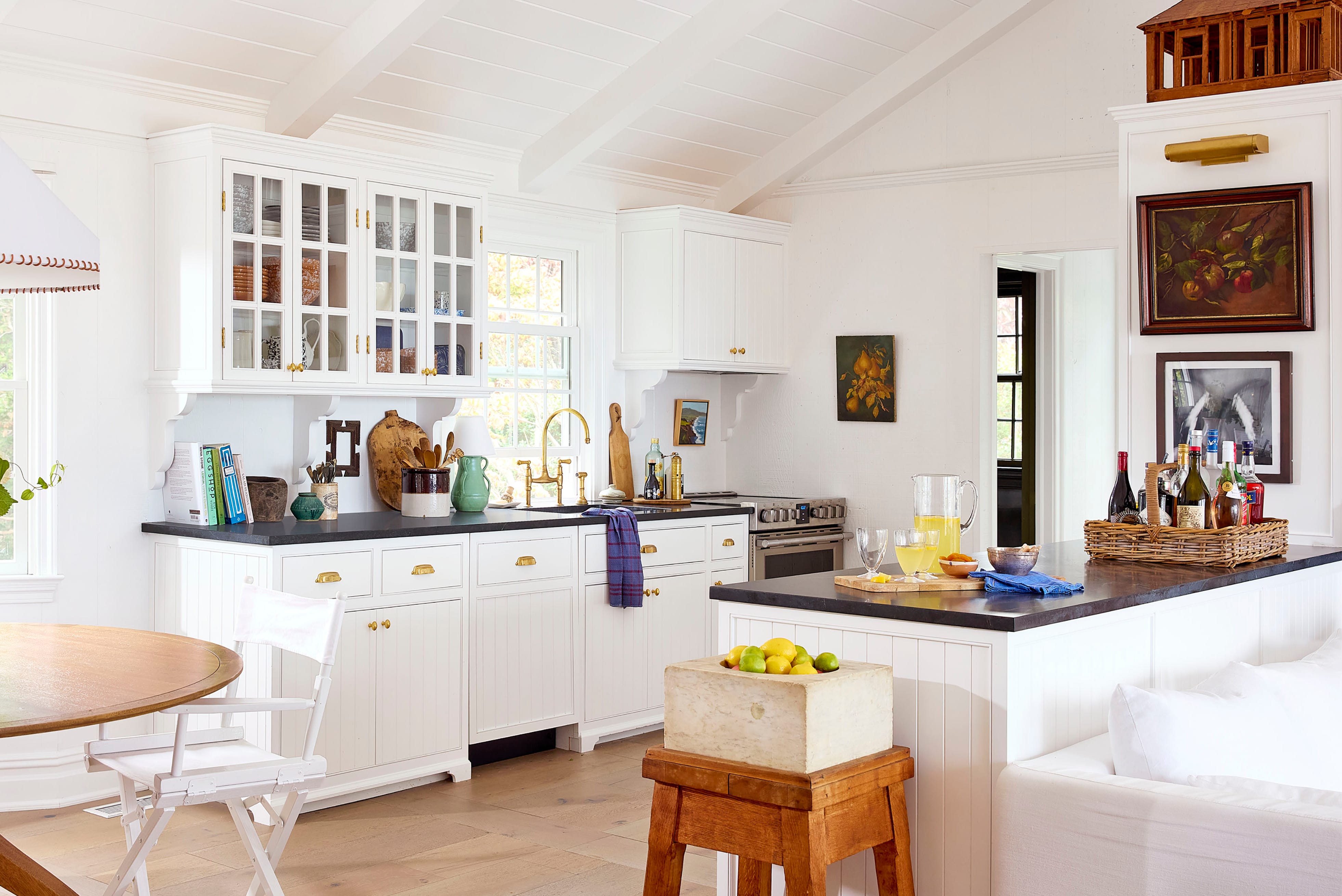
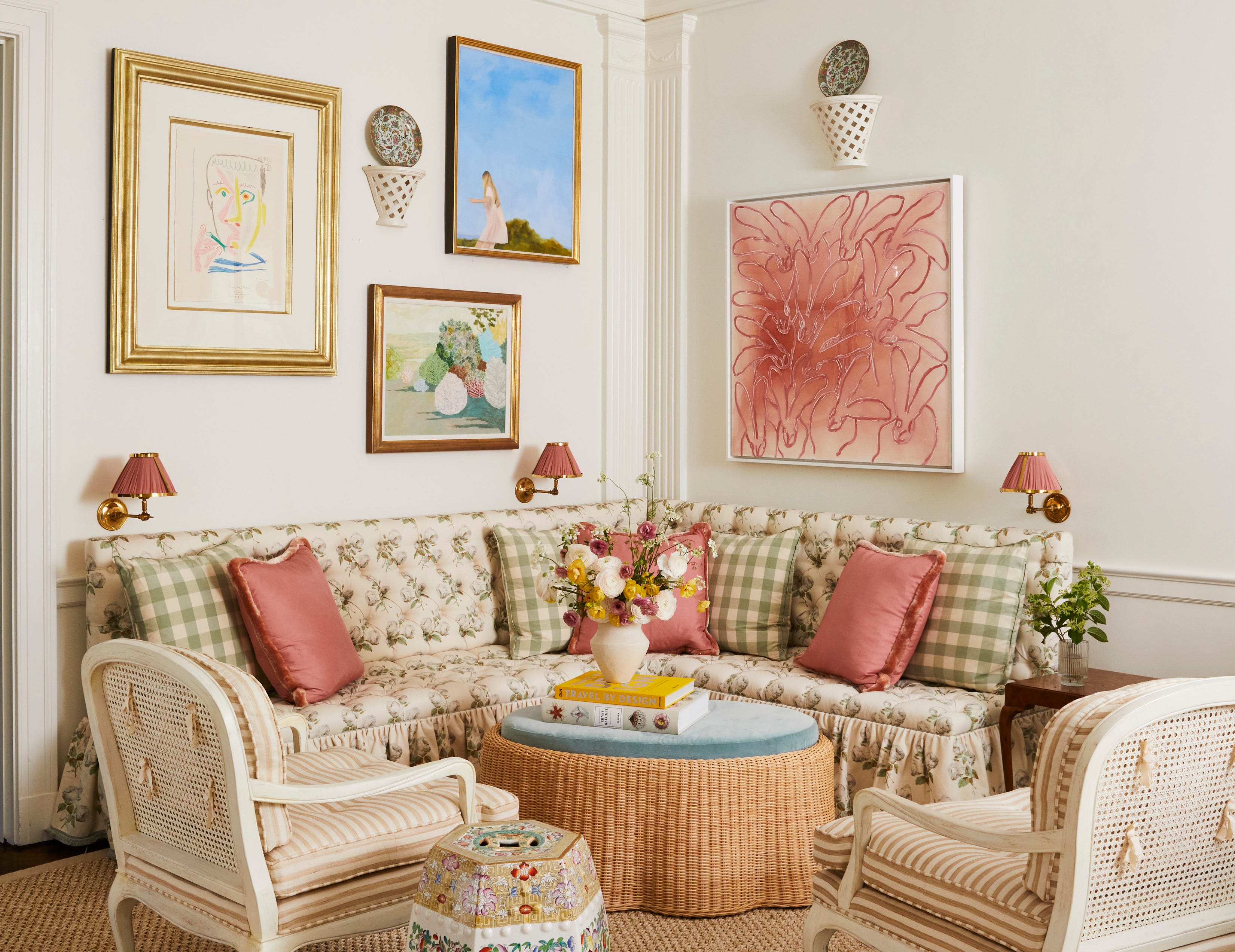
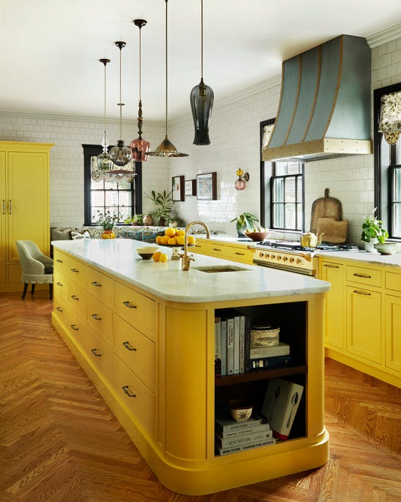
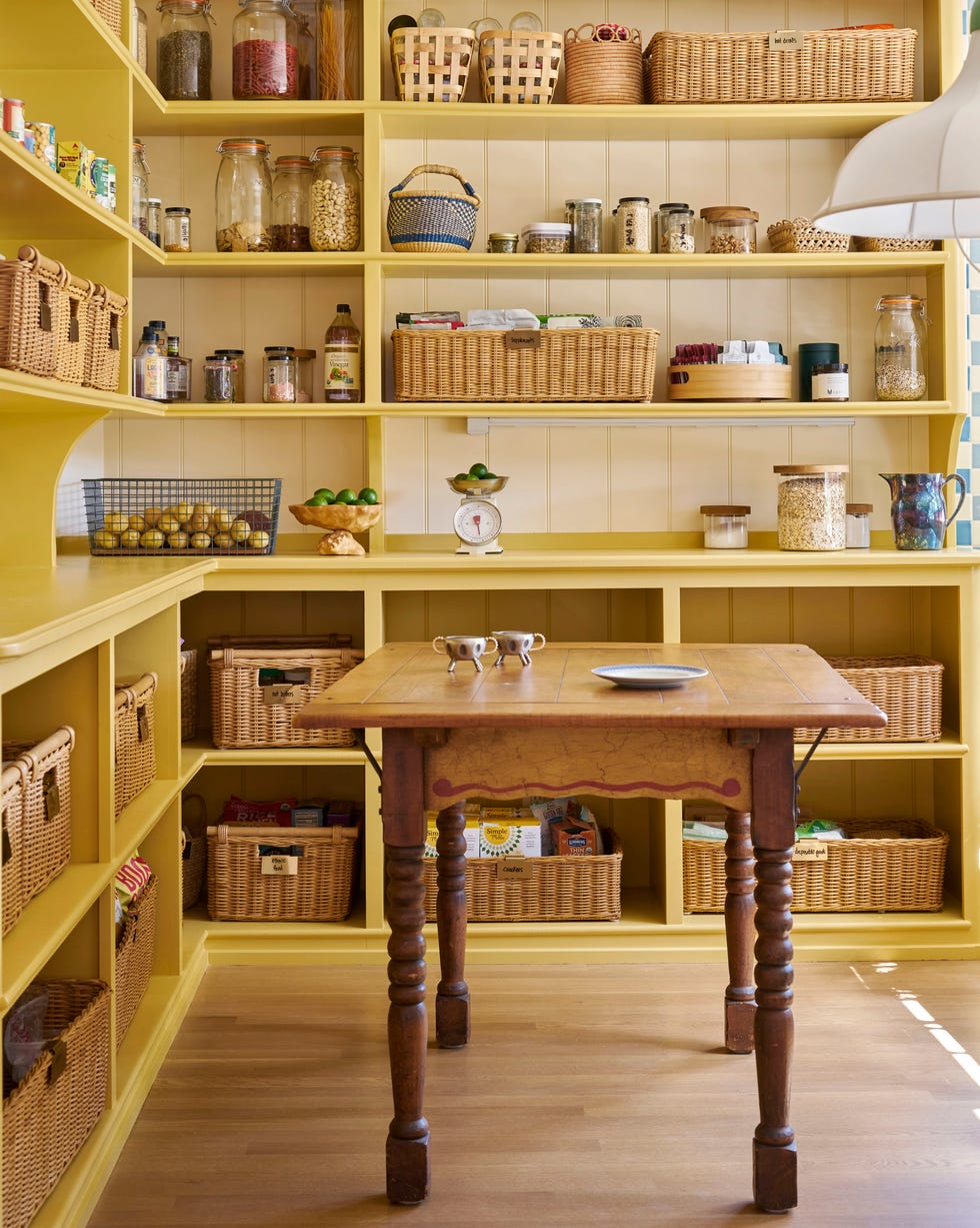
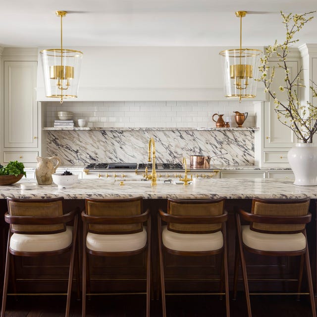
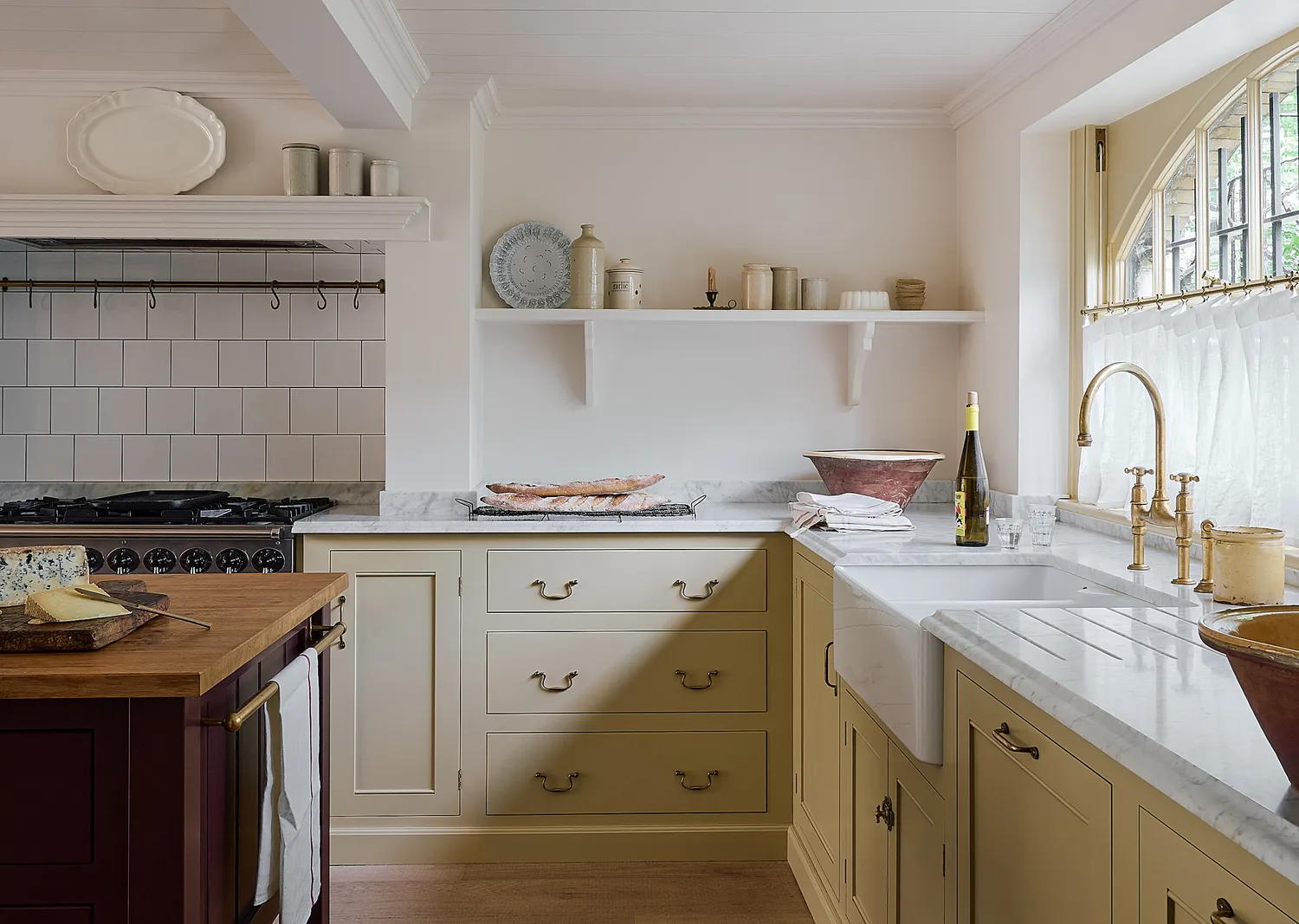
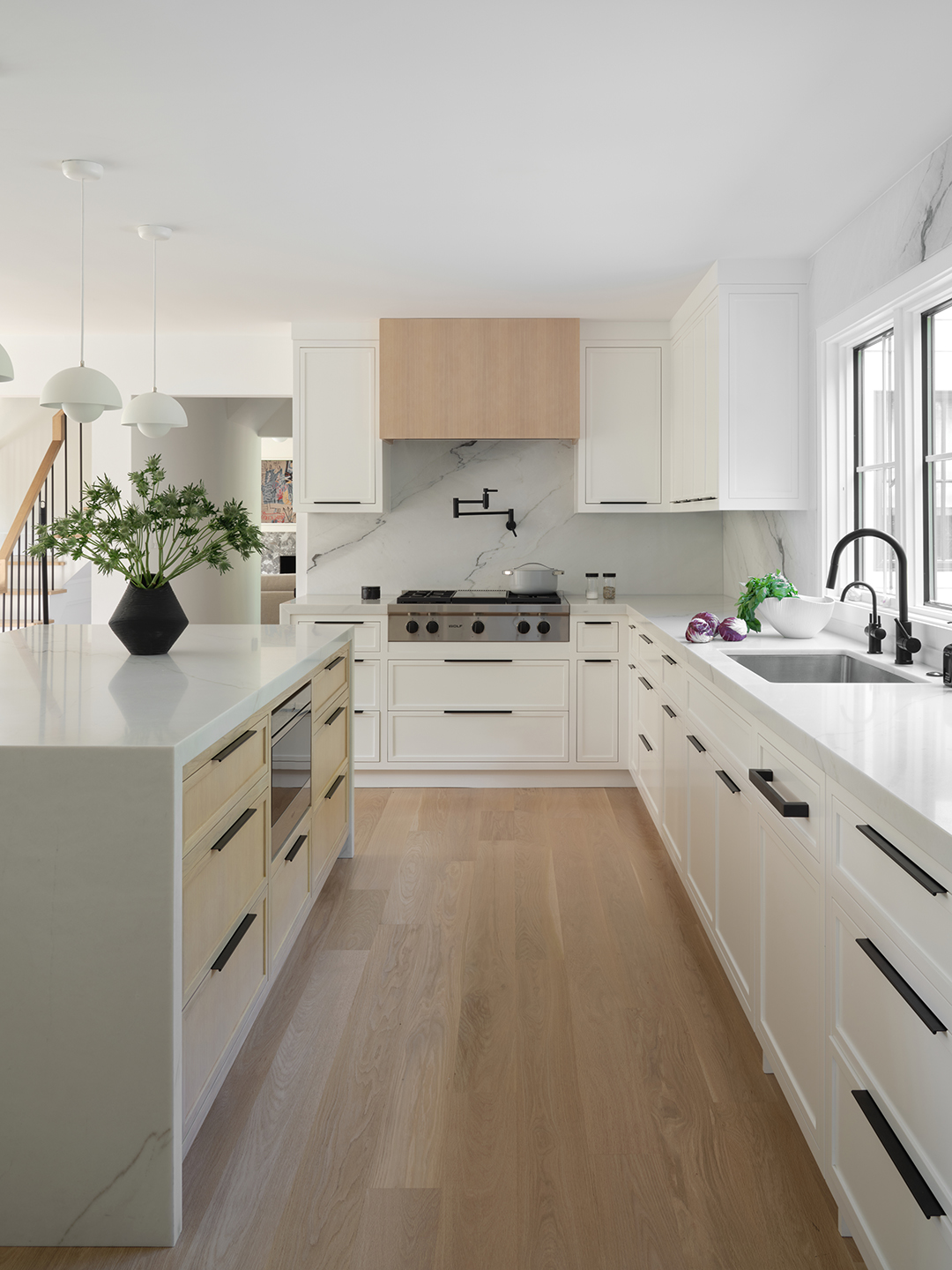
Cream offers a softer, warmer alternative to the all-white kitchen, providing a clean yet welcoming aesthetic. Helen Parker from deVOL describes the trend as rich but pale creams, akin to clotted cream, which can subtly integrate with muted butter yellow tones. To add depth, she suggests pairing cream with authentic, darker shades like mossy green or greeny brown, which harmonize with wooden or honed Carrara marble worktops, creating a warm, light, and airy environment. Graham Brown's 'Natural Cotton' is an example of a cream paint option.
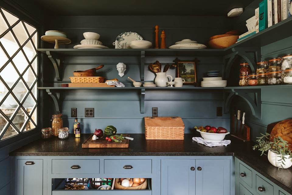
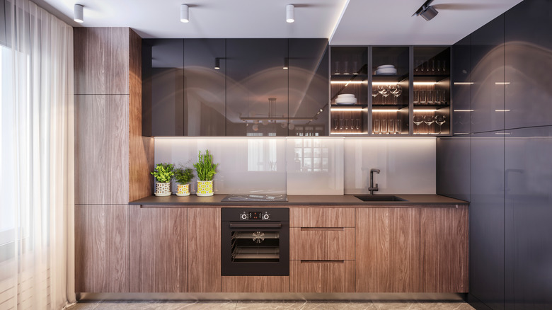
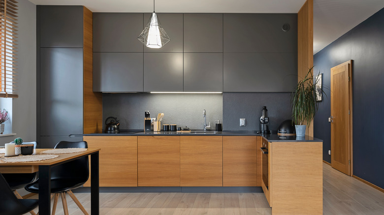
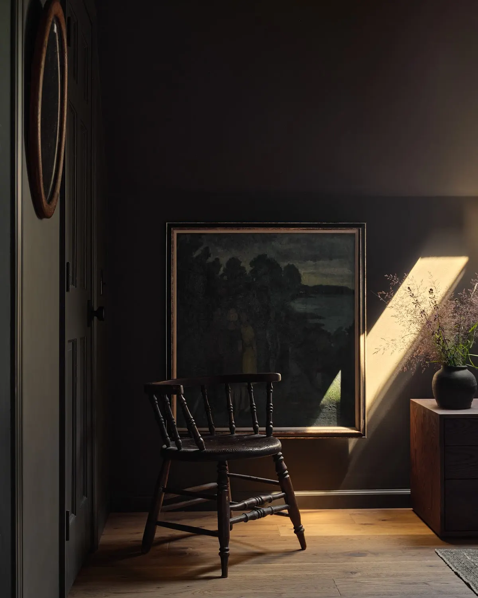
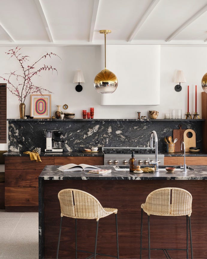
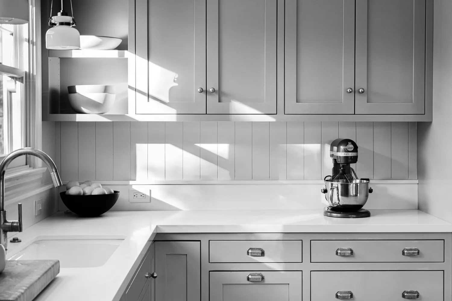
Charcoal grey is positioned as a deep, intense, and powerful option, moving away from lighter 'millennial grey' tones. Allison Lynch, senior designer at Roundhouse, foresees a shift towards graphite-inspired charcoal, which brings depth without heaviness. This color creates a perfect canvas for organic, crafted looks, complementing warm timber details, expressive natural stone, and mixed materials with real texture. Farrow & Ball's 'Railings' exemplifies a deep charcoal.
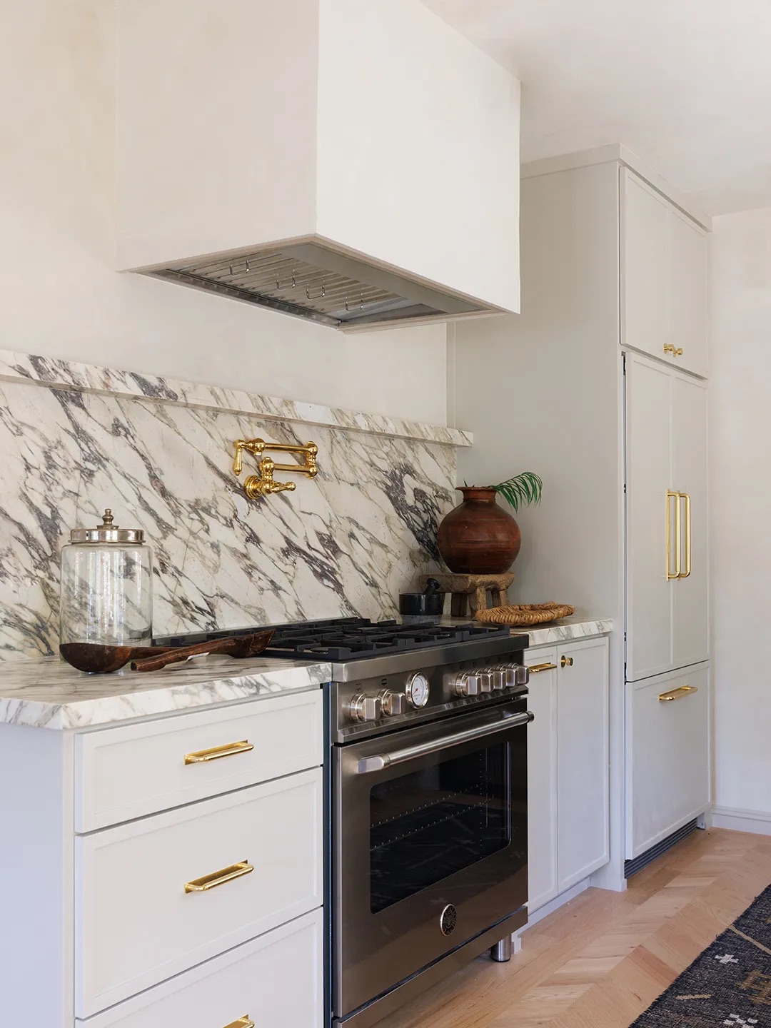
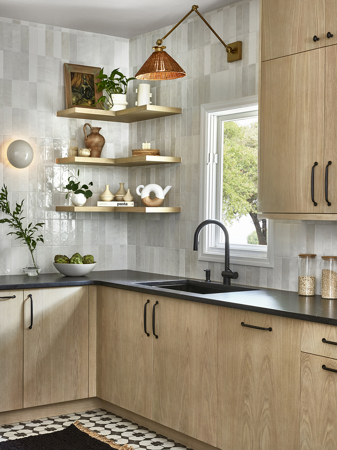
Finally, earthy tones remain a timeless choice for kitchen cabinets, ensuring lasting appeal. Mira Eng-Goetz, lead designer at Jessica Helgerson Interior Design, emphasizes their soft, complex nature, which pairs well with food preparation and the practicalities of a working kitchen. A classic, soft, earthy palette offers extensive design flexibility, integrating seamlessly with various materials and finishes. Farrow & Ball's 'French Gray' is highlighted as a foundational earthy tone for kitchens.
#KitchenCabinetColors #InteriorDesignTrends #KitchenRenovation #WarmNeutrals #RedKitchens #BlueKitchens #OliveGreen #CreamKitchens #CharcoalGrey #KitchenCabinetColors #InteriorDesignTrends #KitchenRenovation #WarmNeutrals #RedKitchens #BlueKitchens #OliveGreen #CreamKitchens #CharcoalGrey
0 comment in total
 No comments yet
You may also like
6 Kitchen Cabinet Colors Design Pros Say Will Be Huge in 2026

6 Kitchen Paint Color Trends That Are Already Taking Over Walls in 2026
The Best Kitchen Cabinet Colors to Try in 2025, According to Designers
The Kitchen Cabinet Color Trend Completely Taking Over 2025

7 Kitchen Color Trends That Are Set to Take Over 2026

What's the next big kitchen cabinet color? Designers predict that this earthy take on neutrals will be huge in 2024

We're Calling It: 6 Kitchen Cabinet Paint Colors That Will Be Huge in 2026

These Kitchen Paint Colors Will Be Everywhere in 2025


These 6 Colors Will Rule Interiors in 2026, According to Experts

The 6 Most Popular Kitchen Cabinet Paint Colors for 2026, According to Designers

What Paint Colors Will Rule 2026? Designers Make Their Predictions
The colour trends 2026 that will define our homes next year

Designers Say These 6 Cabinet Colors Will Be Taking Over Kitchens in 2026

7 Gorgeous Cabinet Trends Set To Take Over Kitchens In 2026
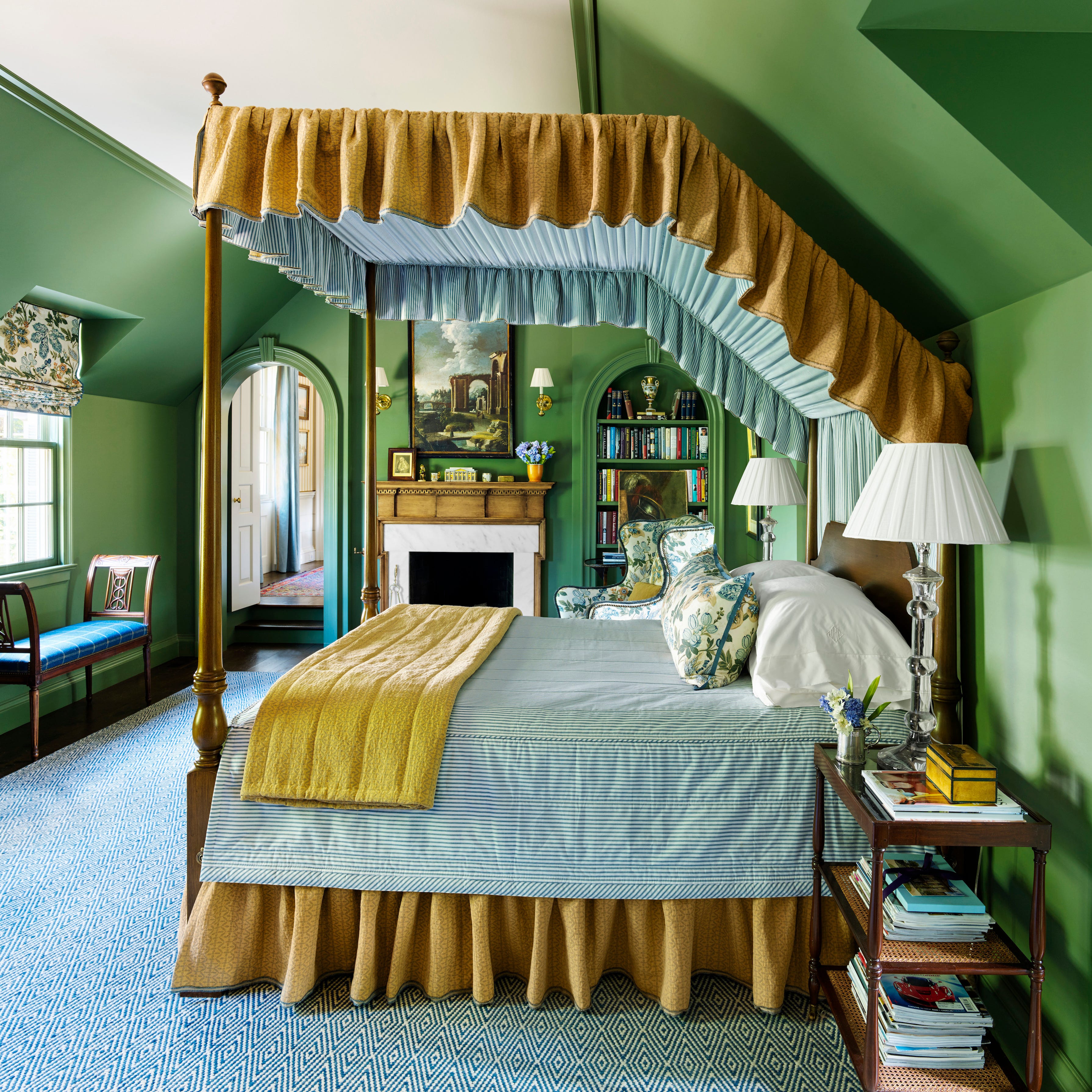
These 8 Colors Will Rule Interiors in 2026, According to Experts

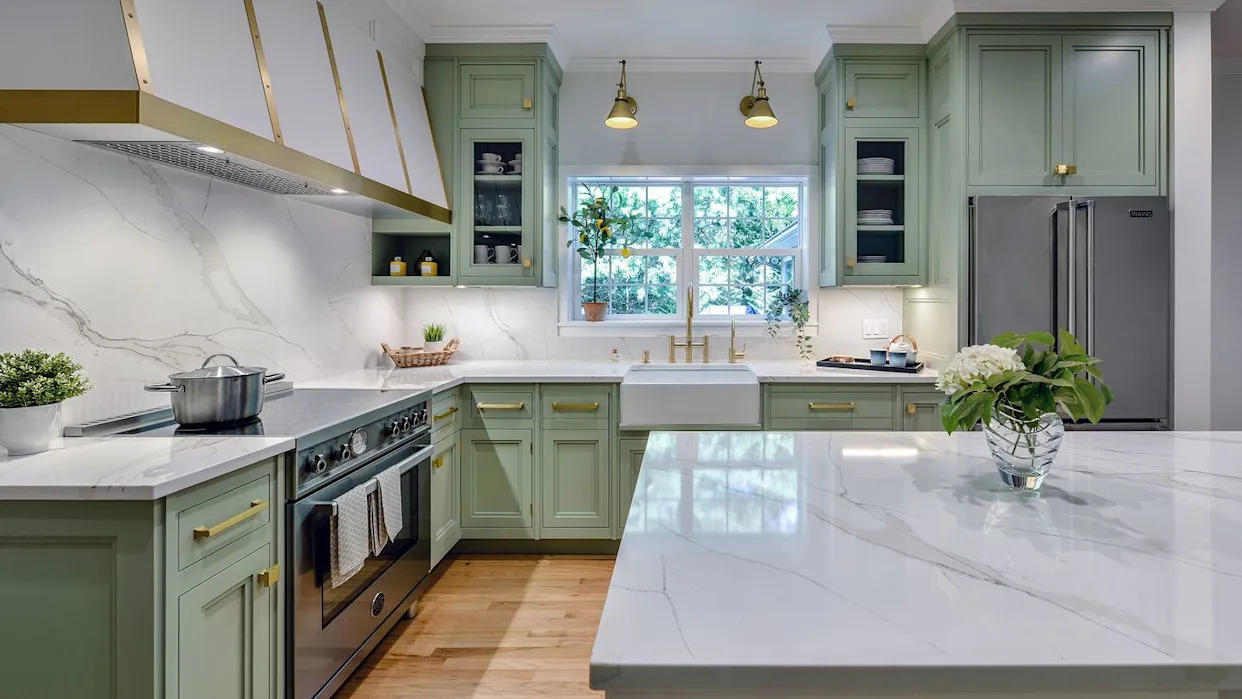
The Kitchen Color You're Going to Be Seeing Everywhere in 2024
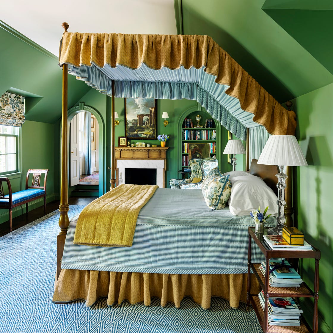
These 7 Colors Will Rule Interiors in 2026, According to Experts

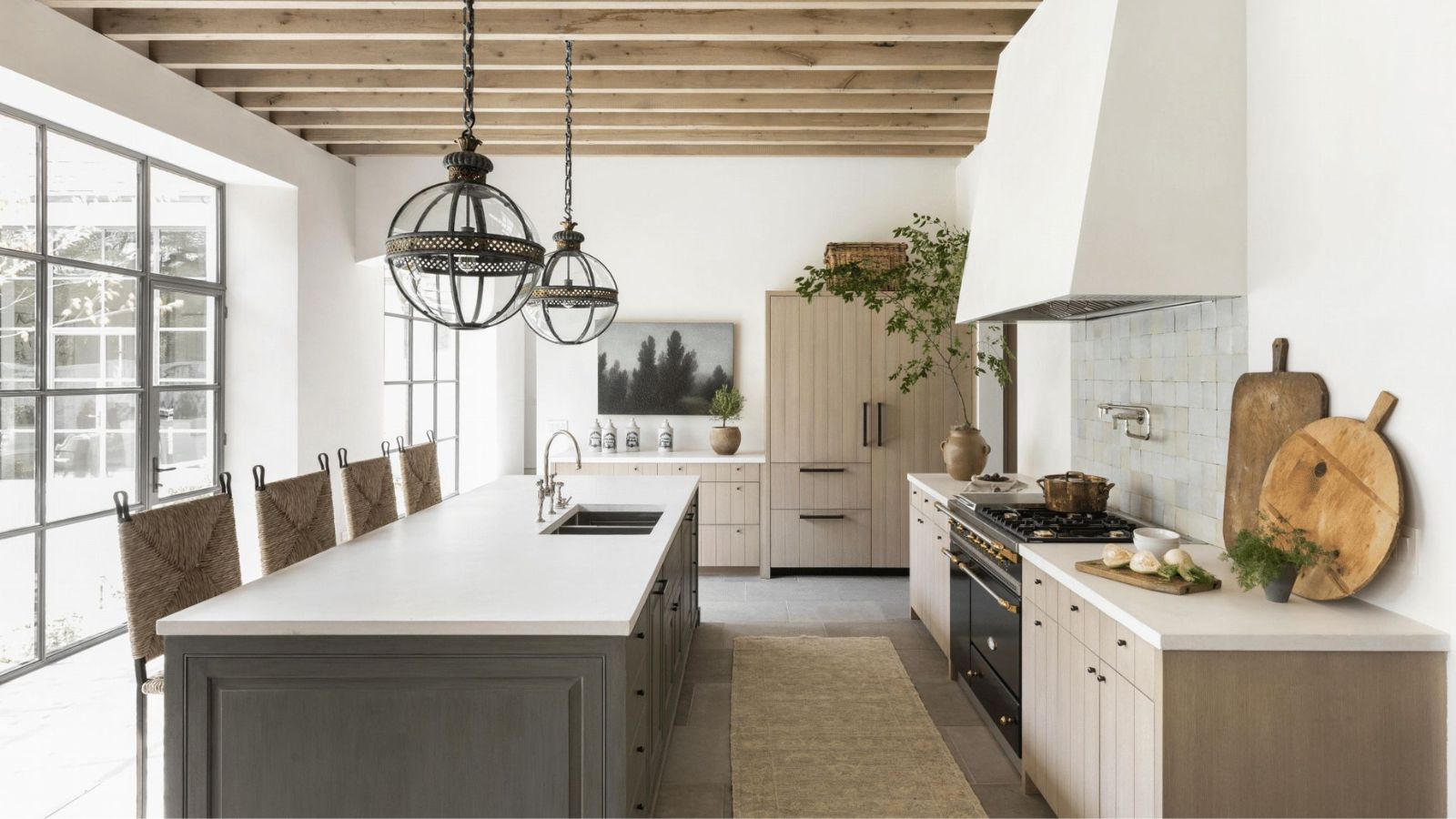
Just In: These 11 Kitchen Color Trends Are Going to be Everywhere in 2026
We Asked 18 Designers: What Kitchen Cabinet Style Will Rule in 2026?

The Kitchen Cabinet Color Trend Completely Taking Over 2025