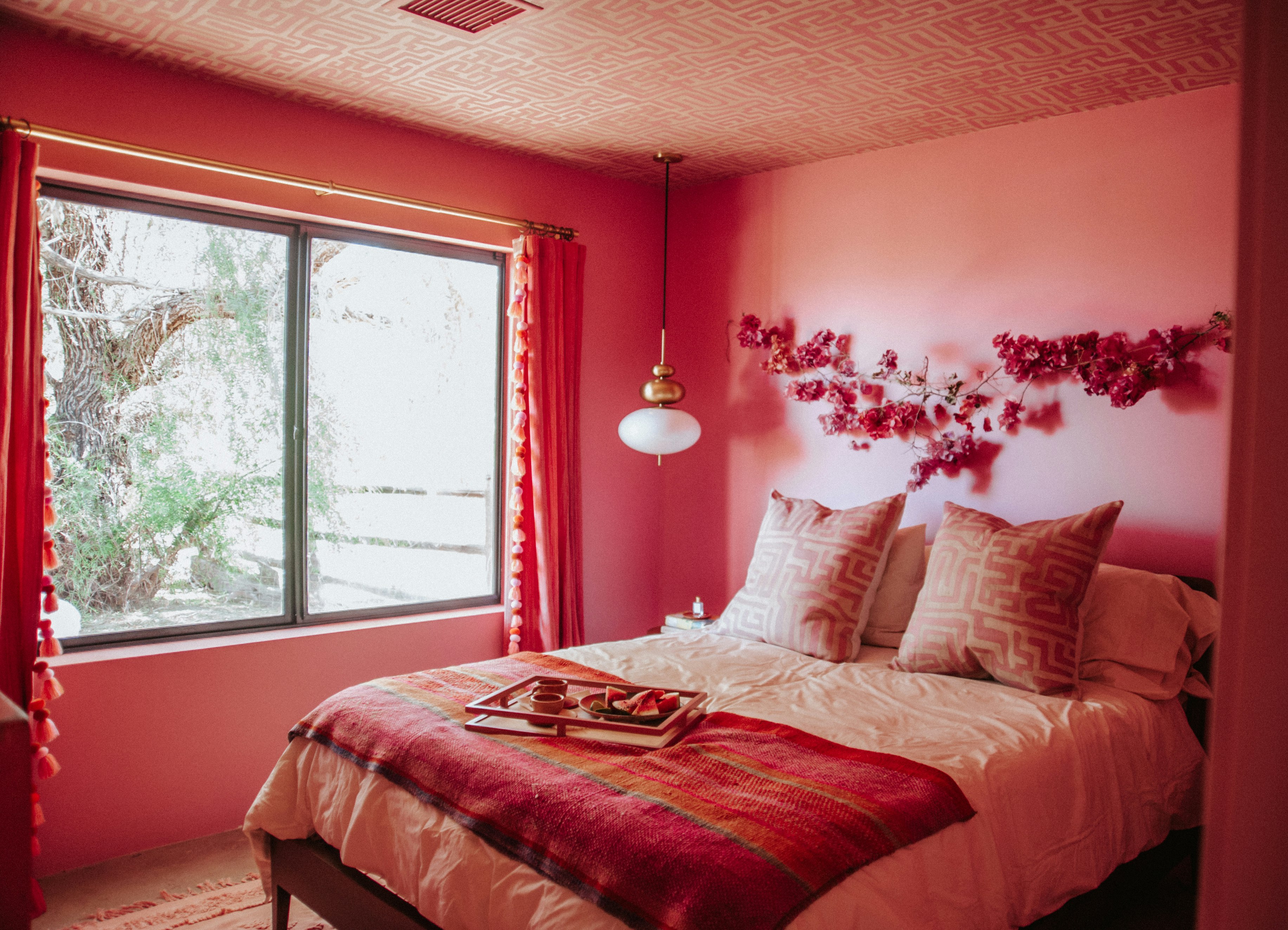
1/6
If Your Monochromic Room Feels Flat, Here’s How to Fix It
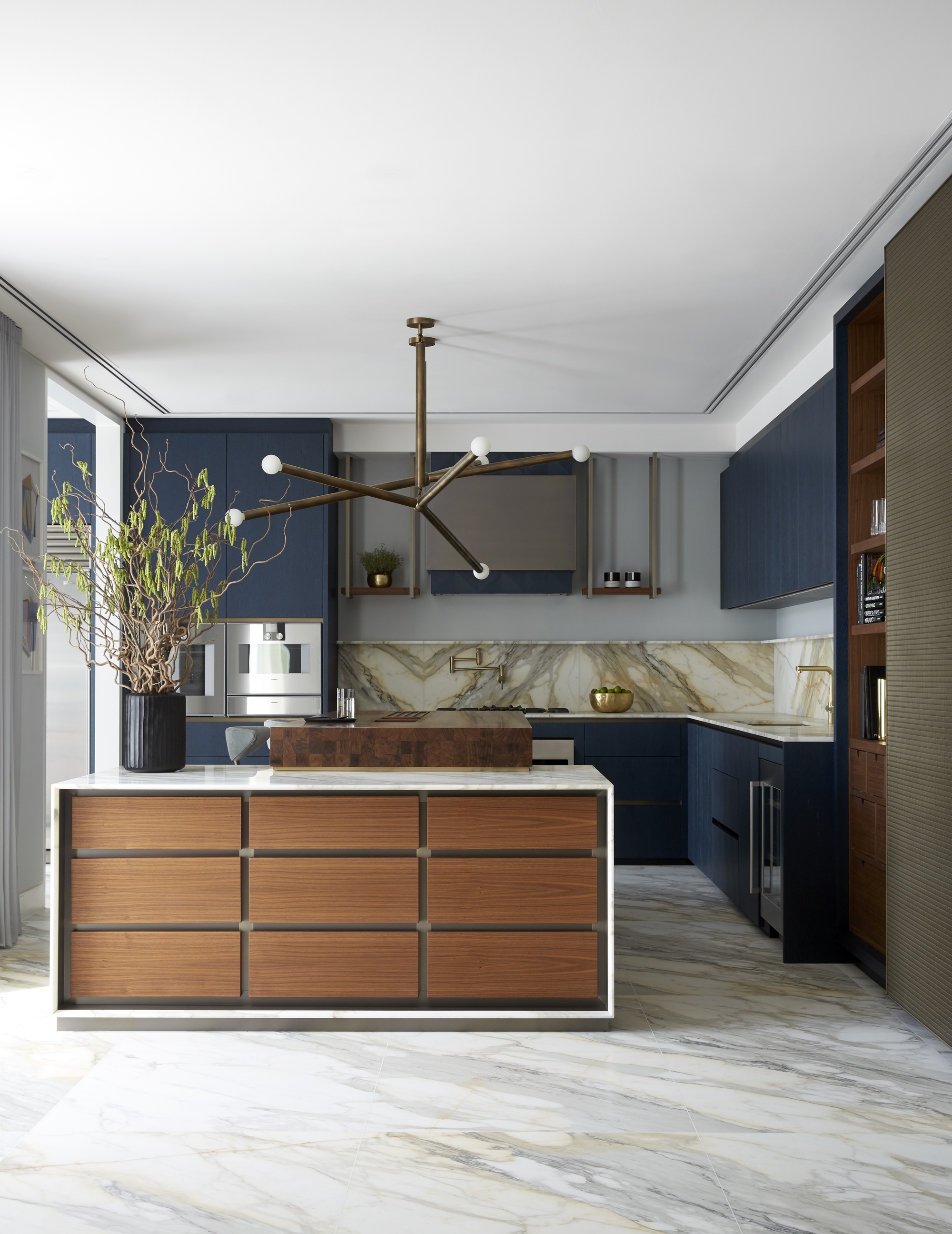
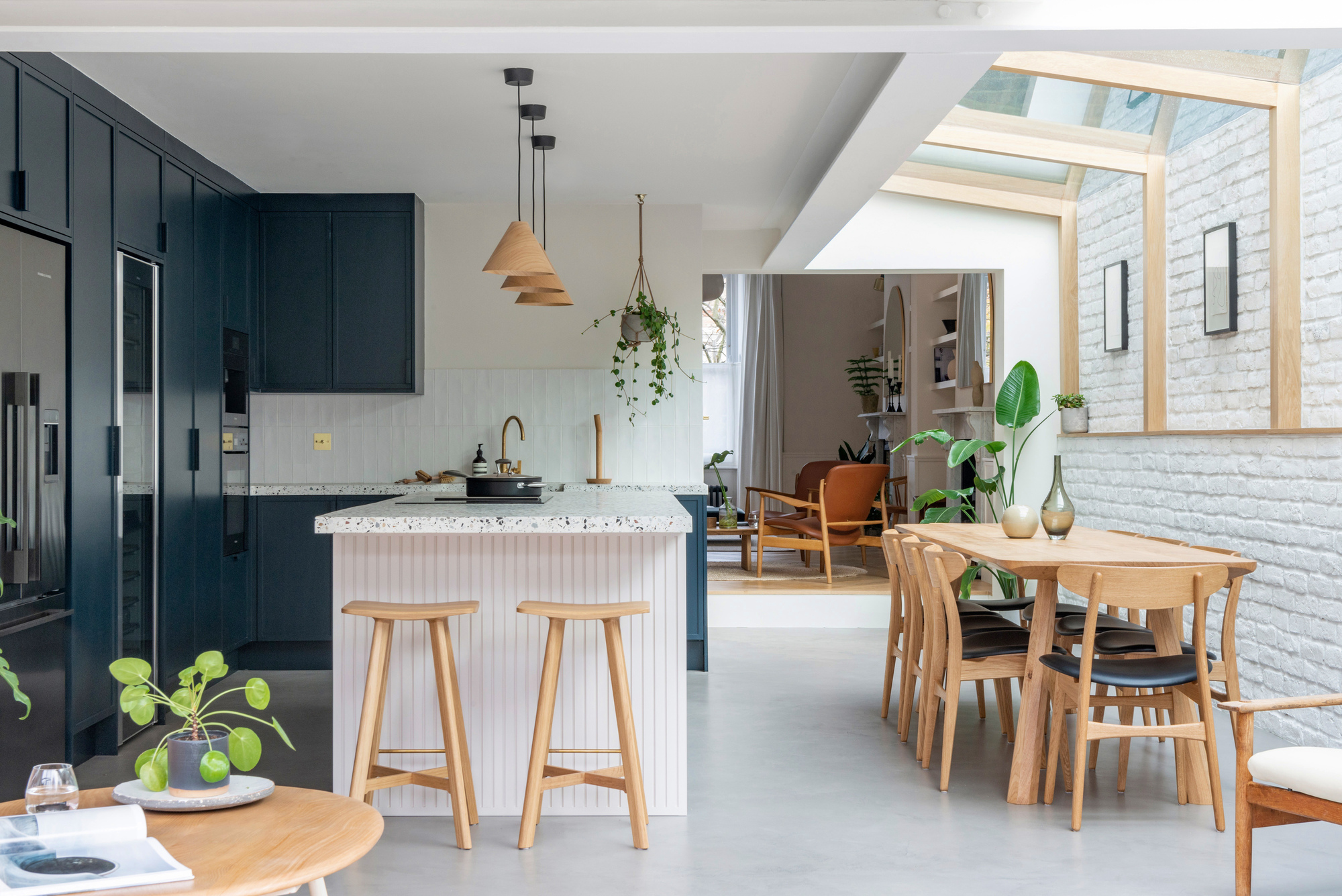
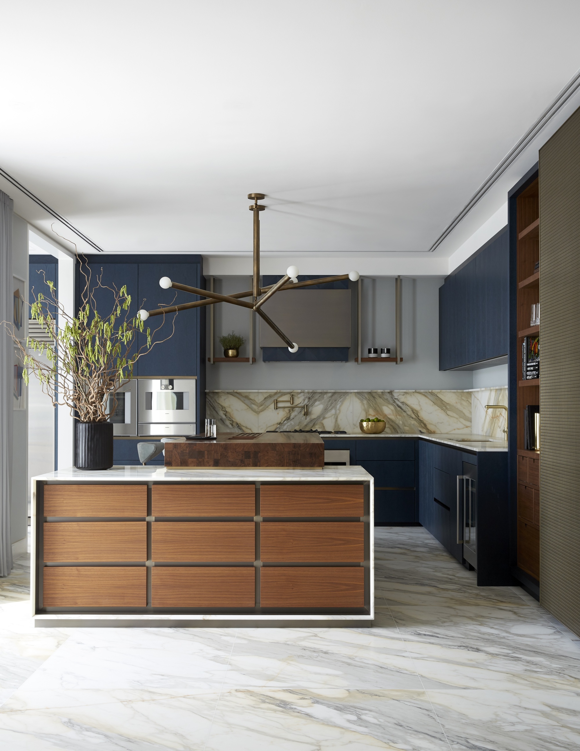
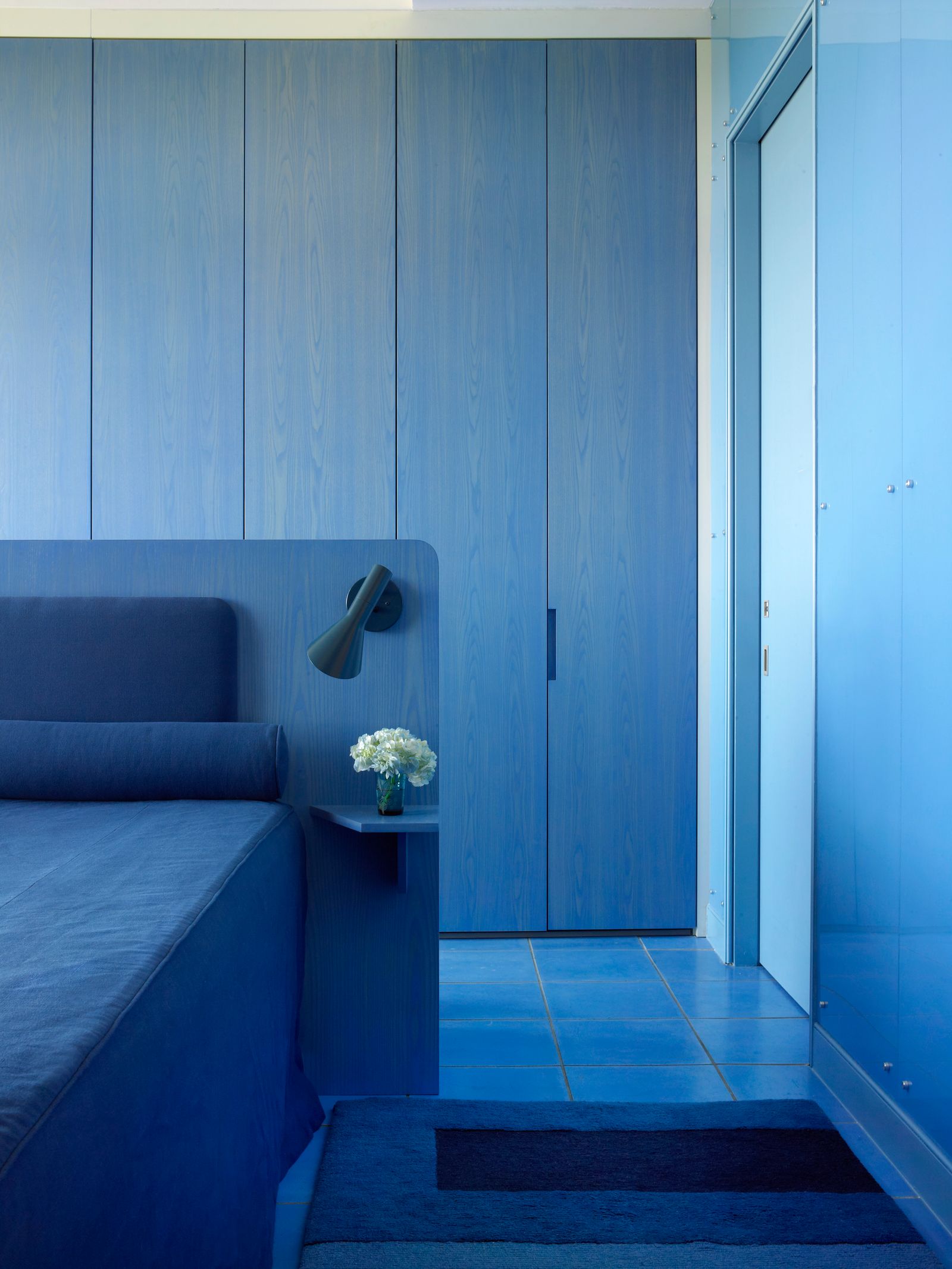
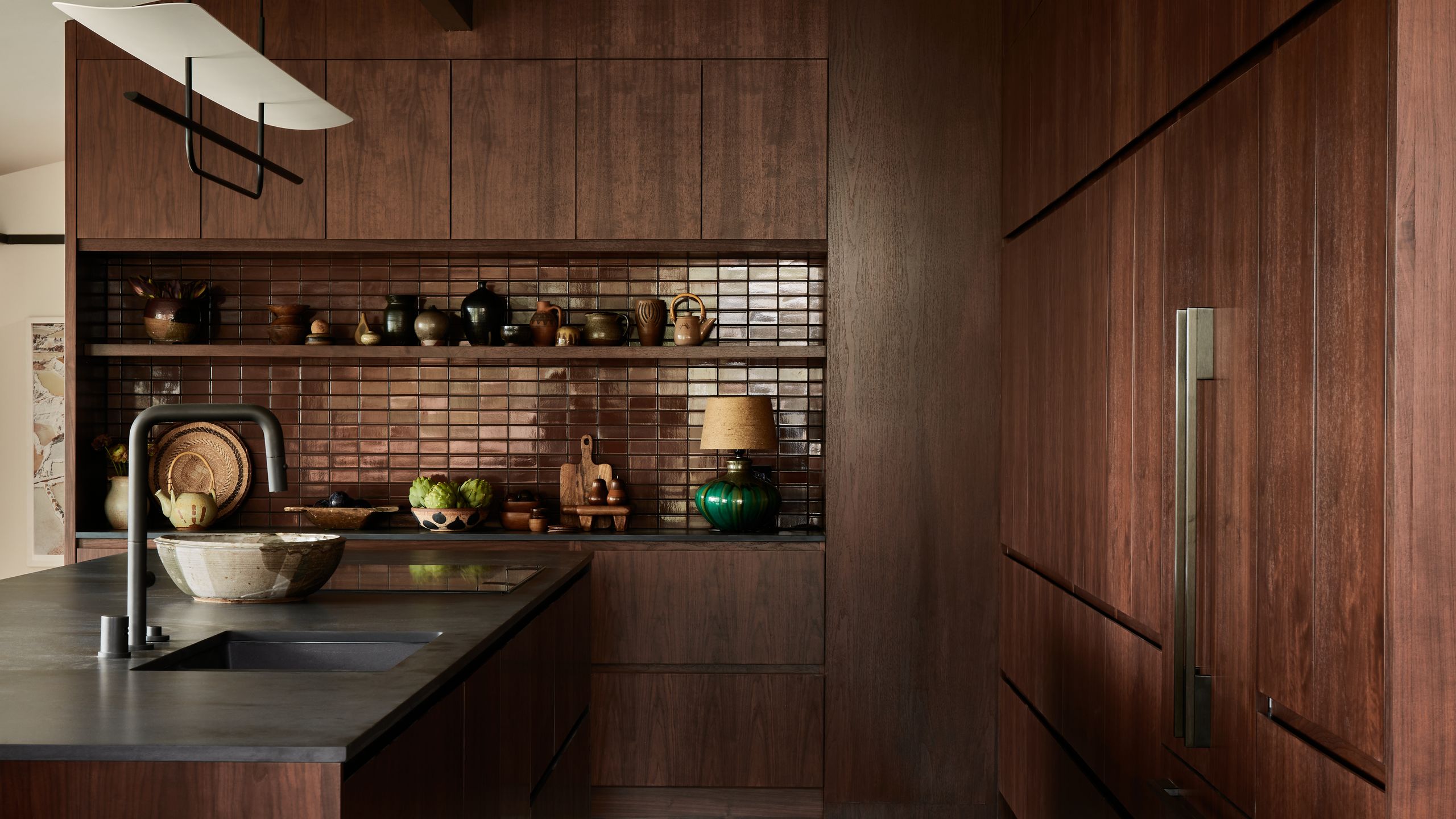
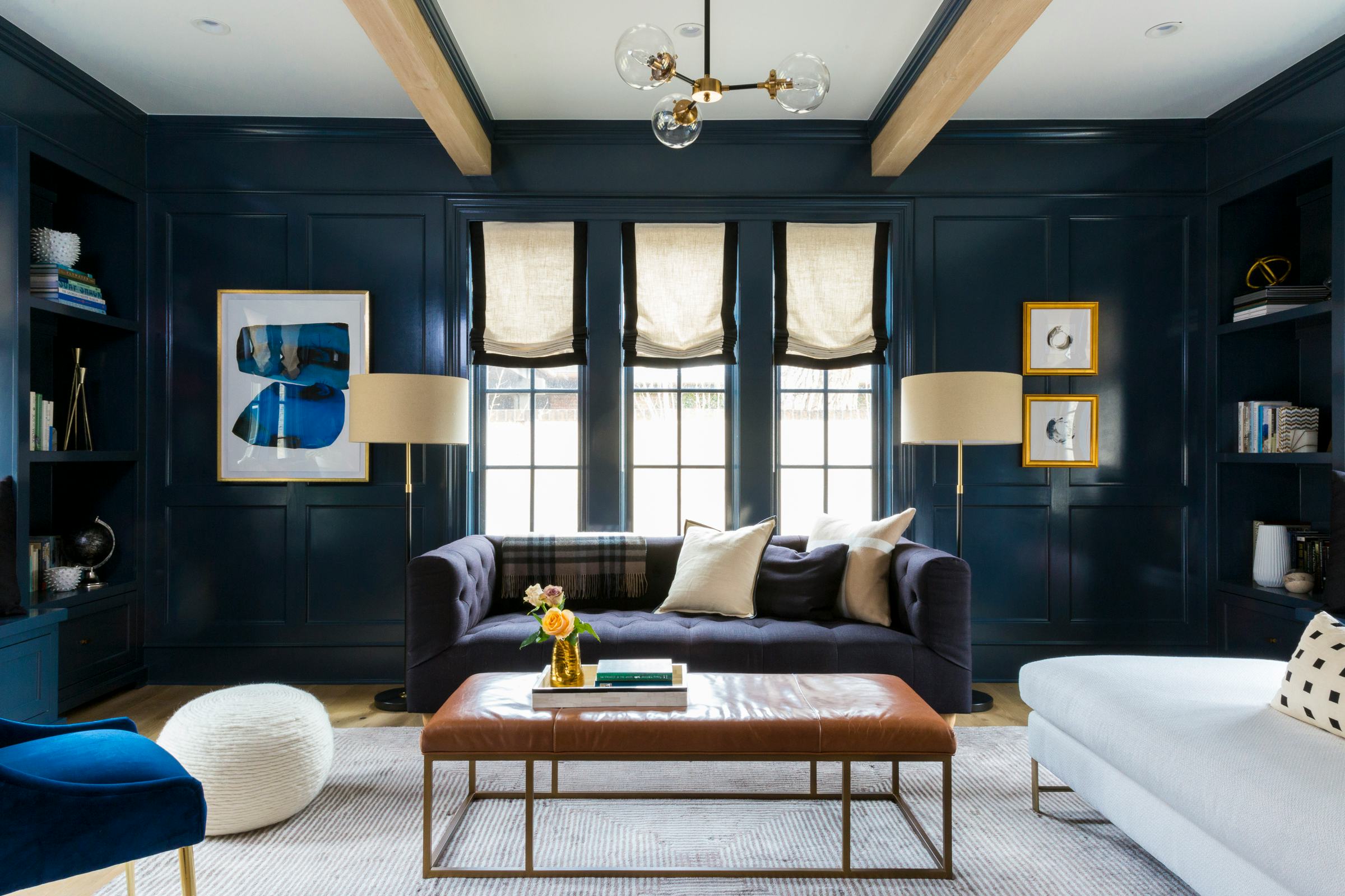
Monochromatic interiors, while currently popular, require more than just a single paint color to achieve a successful and visually impactful design. A common pitfall is the creation of a flat, one-dimensional space that lacks cohesion and visual interest, even when saturated with various shades of a single color. The article emphasizes that a truly monochromatic design does not necessarily mean adhering to a single color, and sometimes, incorporating a different color can enhance the aesthetic. Mastering this look involves understanding nuances beyond simply applying one hue.
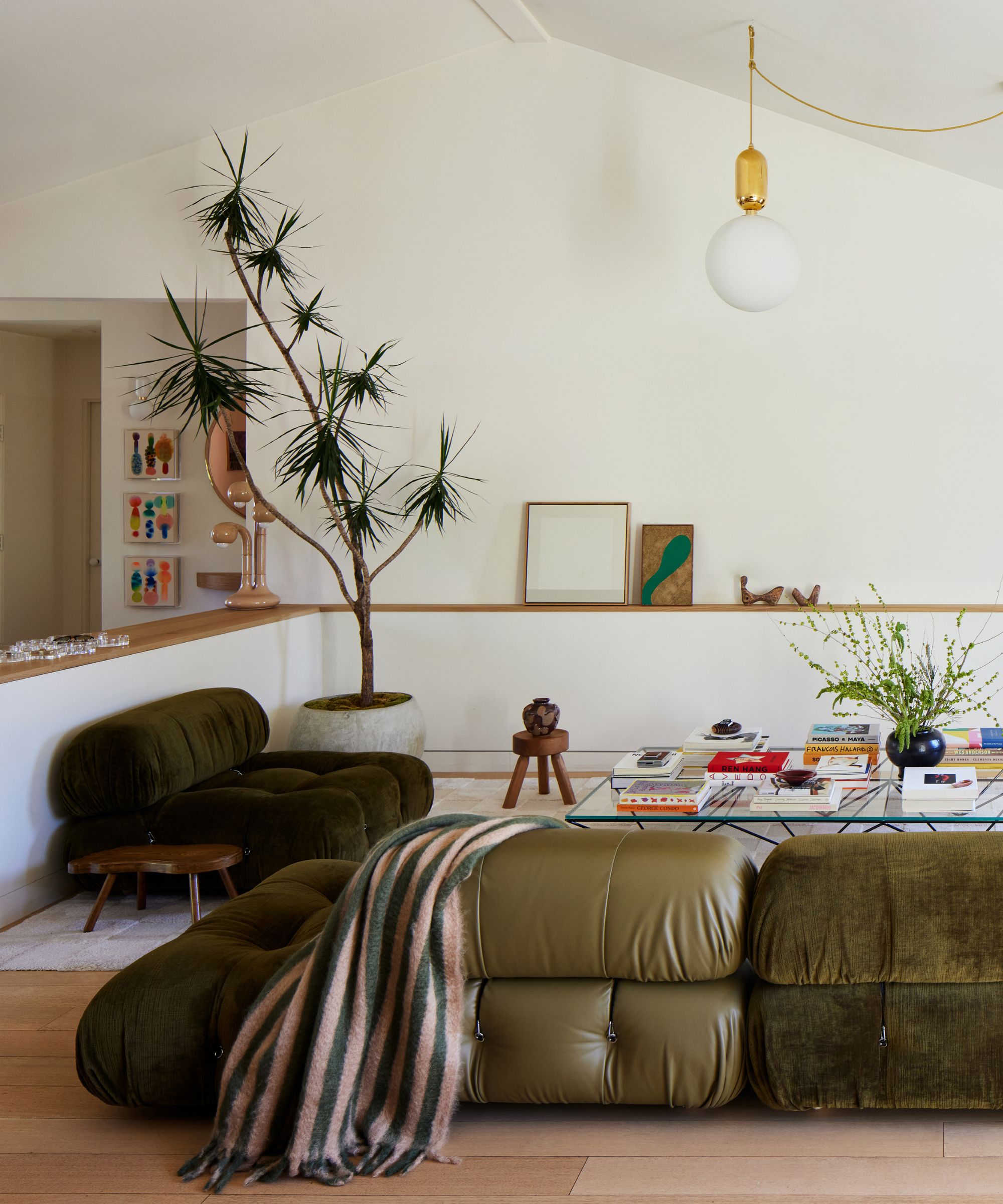
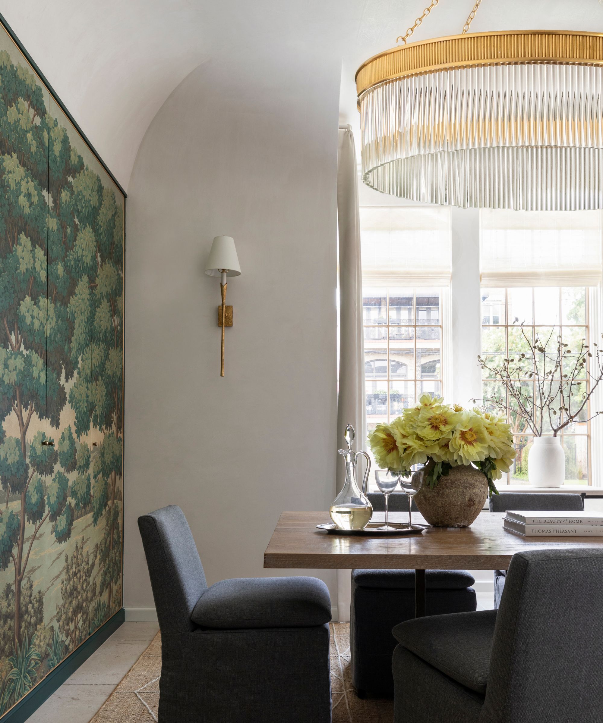

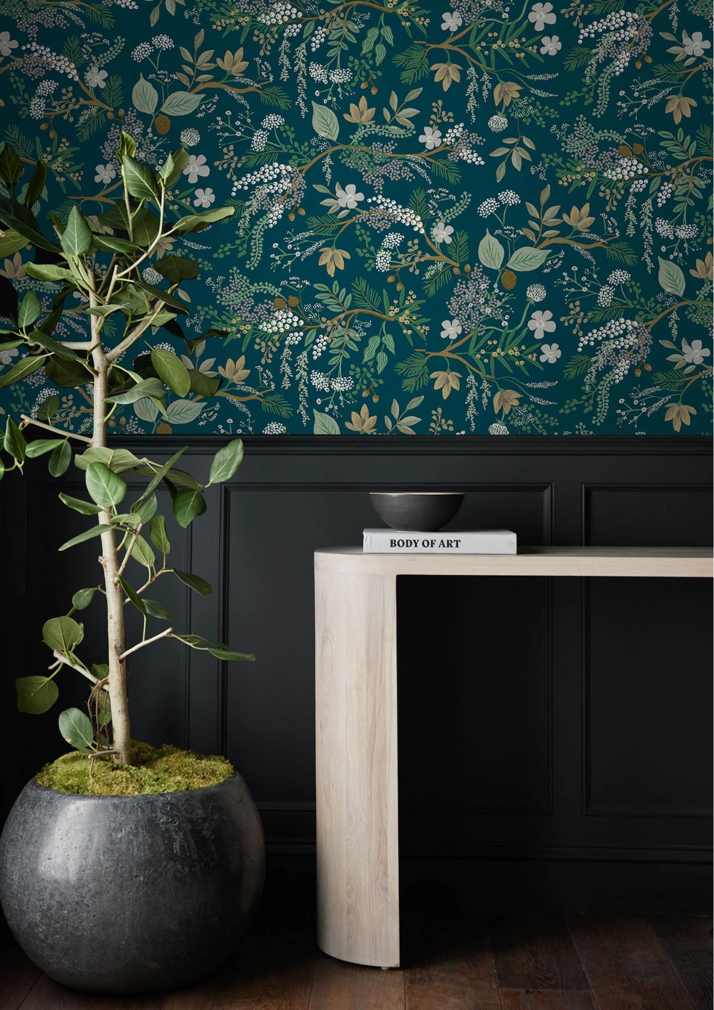
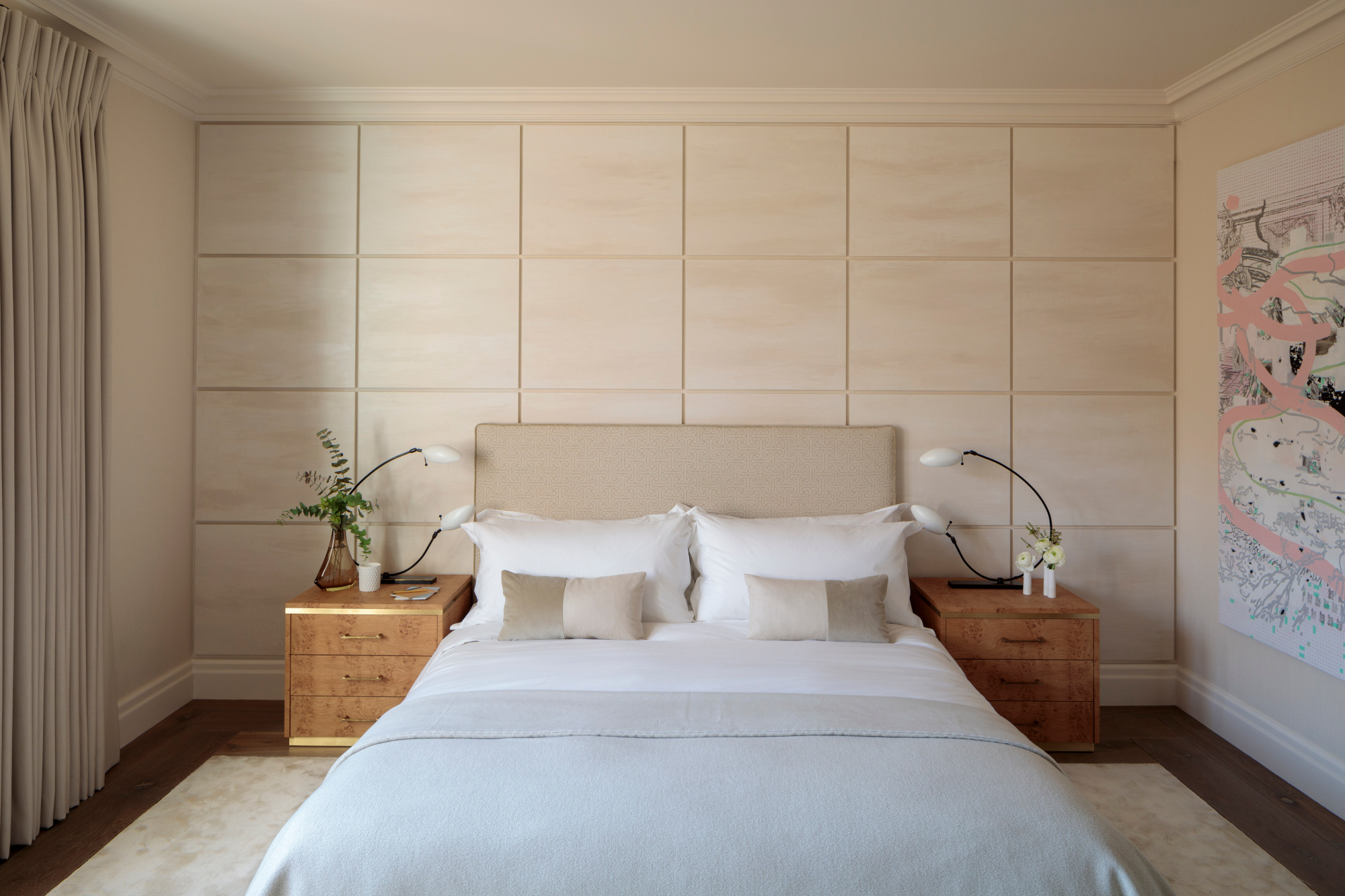
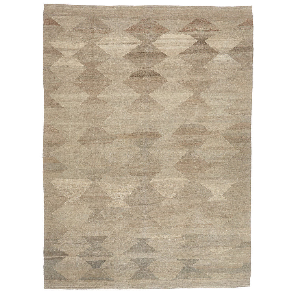
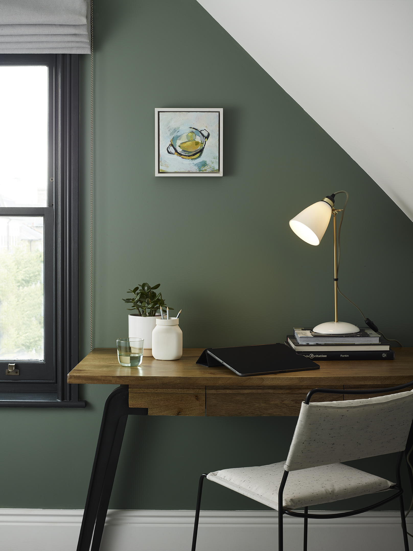
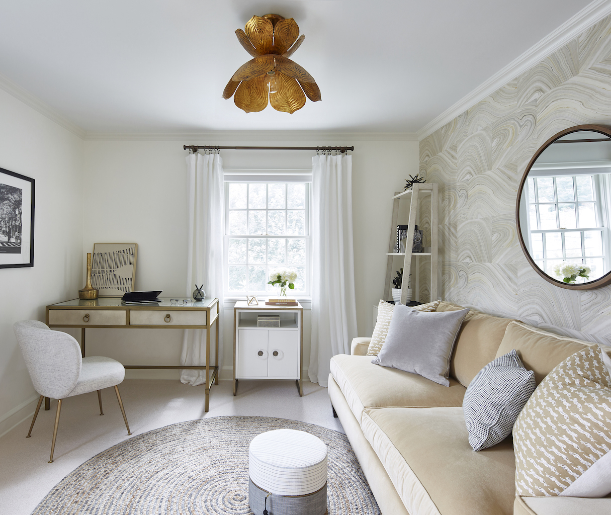
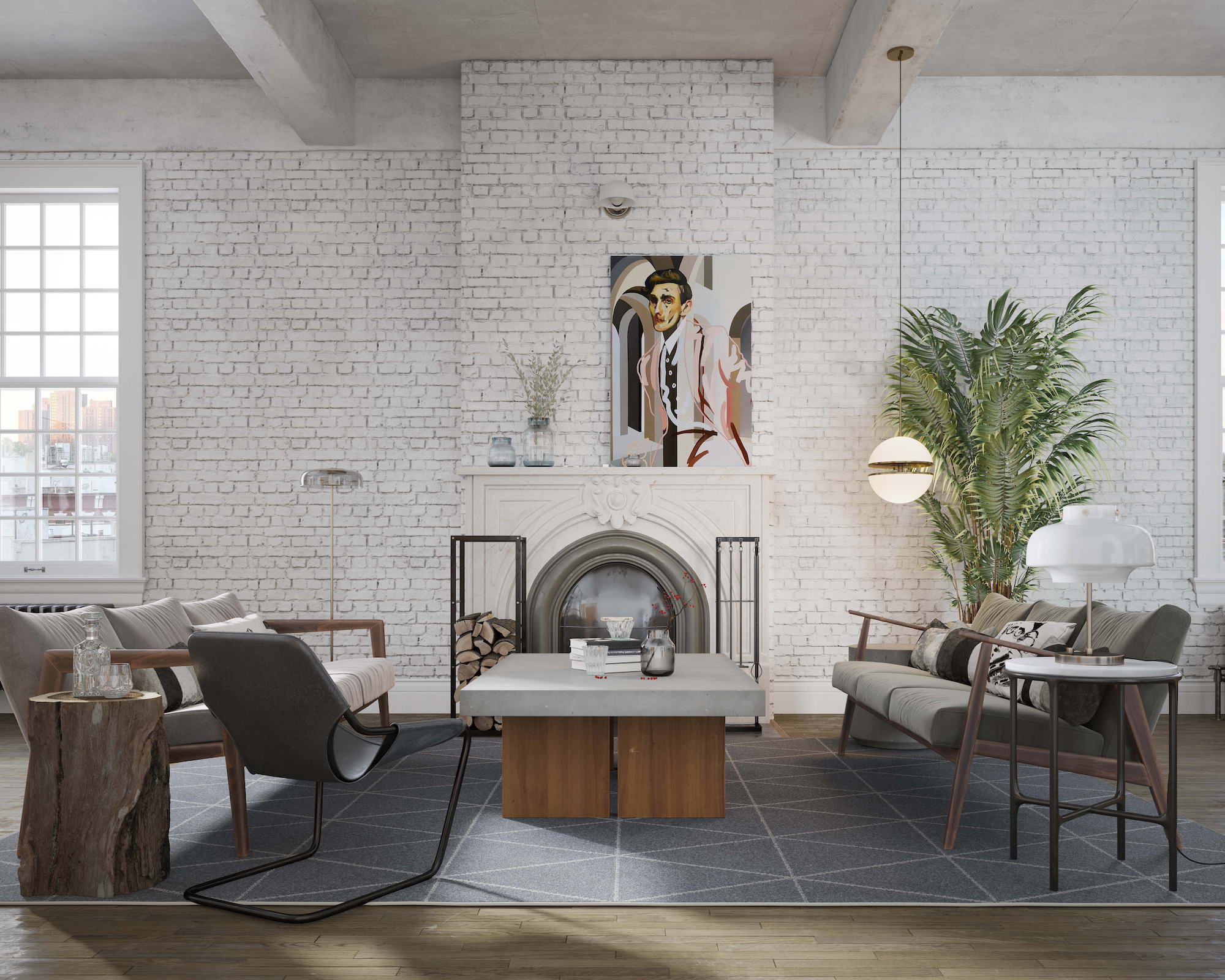
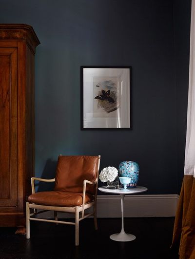
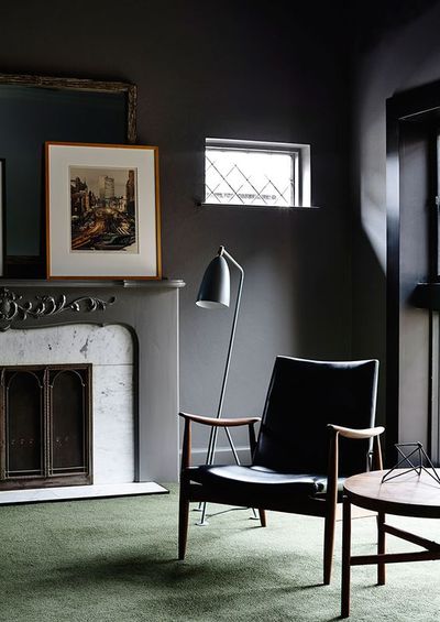
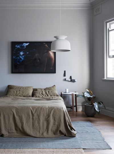
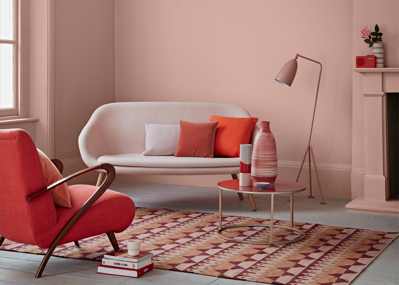
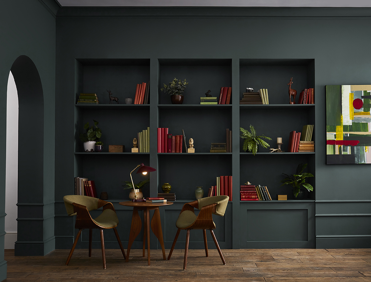
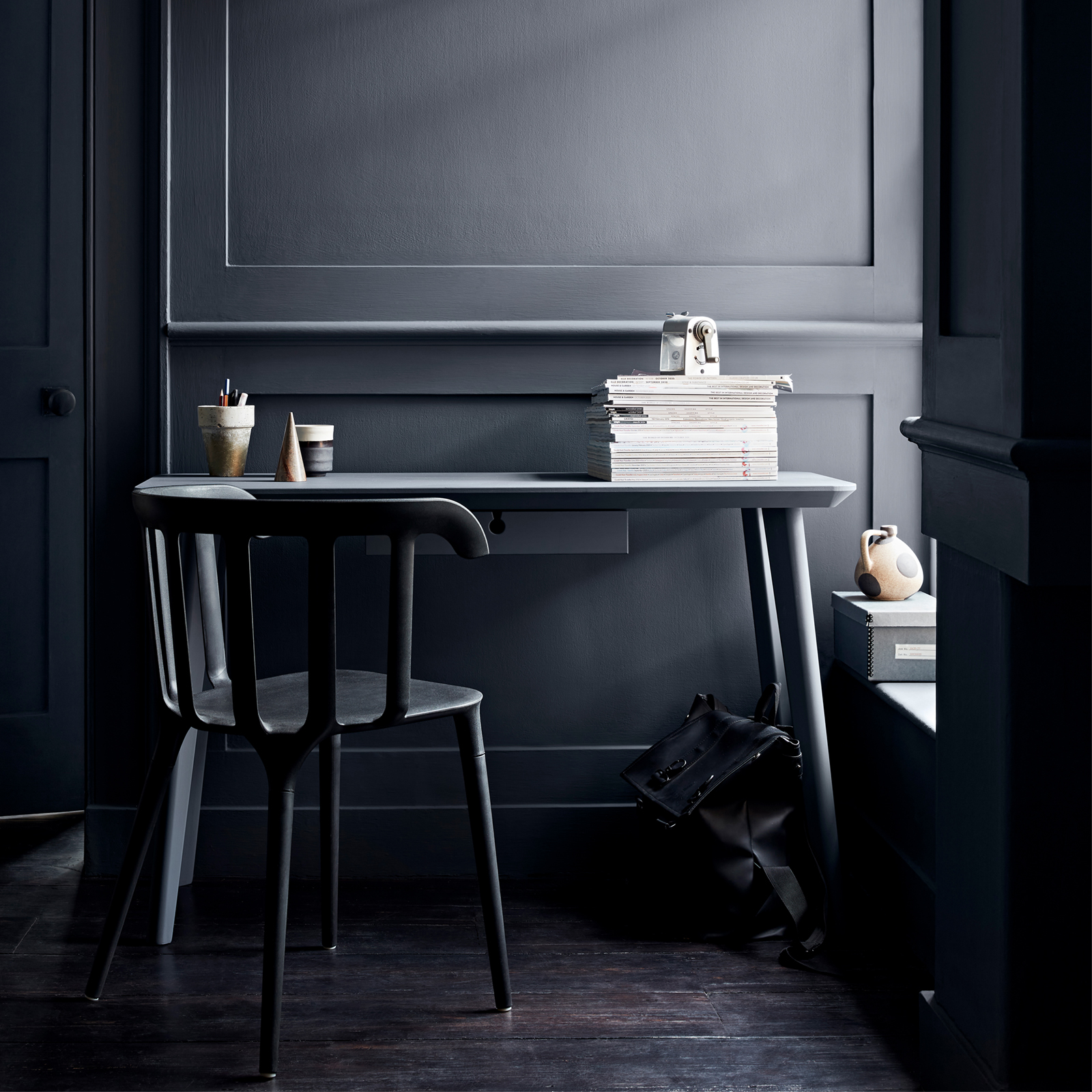
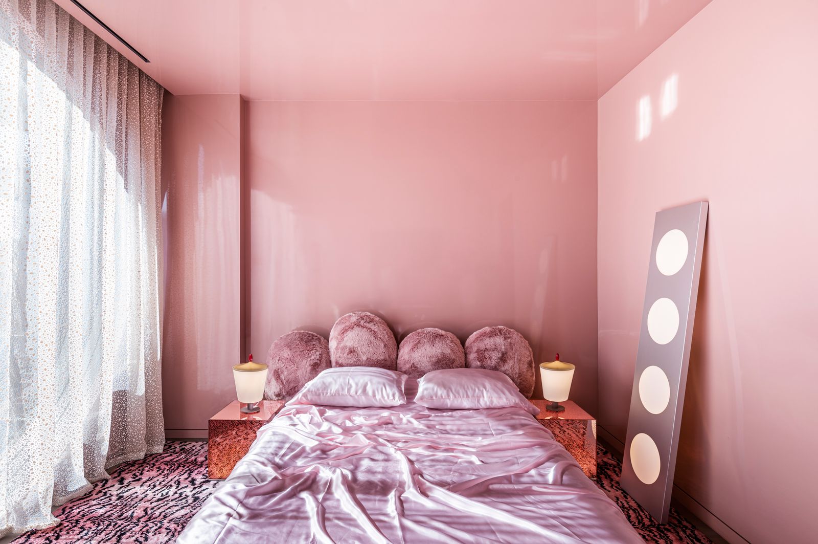
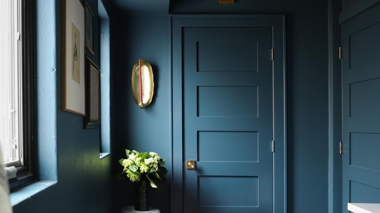
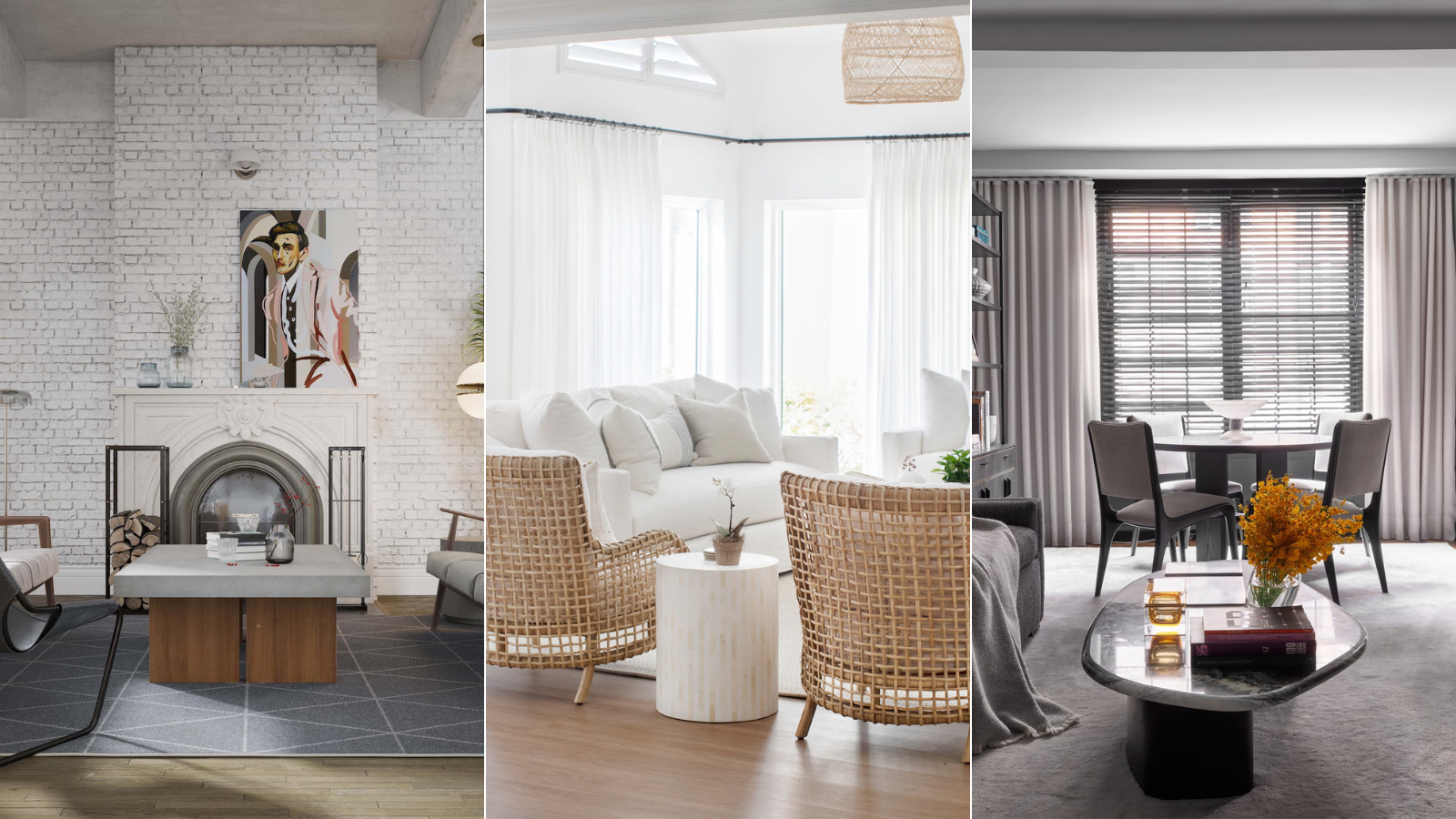
Key to successfully implementing a monochromatic palette is the careful consideration of undertones. Designers suggest beginning with a single anchor element, such as a sofa fabric, rug, or piece of art, and then building the entire palette around it by layering varying tones of that chosen color. Ensuring that all undertones align is crucial; a mismatch can make the entire space feel off. While the trend can be alluring and create a calming atmosphere, its application is best suited for specific rooms. Room size and ceiling height significantly influence the outcome. Small spaces, areas lacking natural light or ample ambient lighting, or rooms with low ceiling heights can feel confined when limited to a single color. Conversely, formal living rooms and bedrooms are ideal candidates for tonal approaches. Deeper tonal ranges, like inky blues or charcoals, can elevate a living room, while soft tonal palettes of ivories, oatmeals, and putties can create a serene and intentional feel in bedrooms.
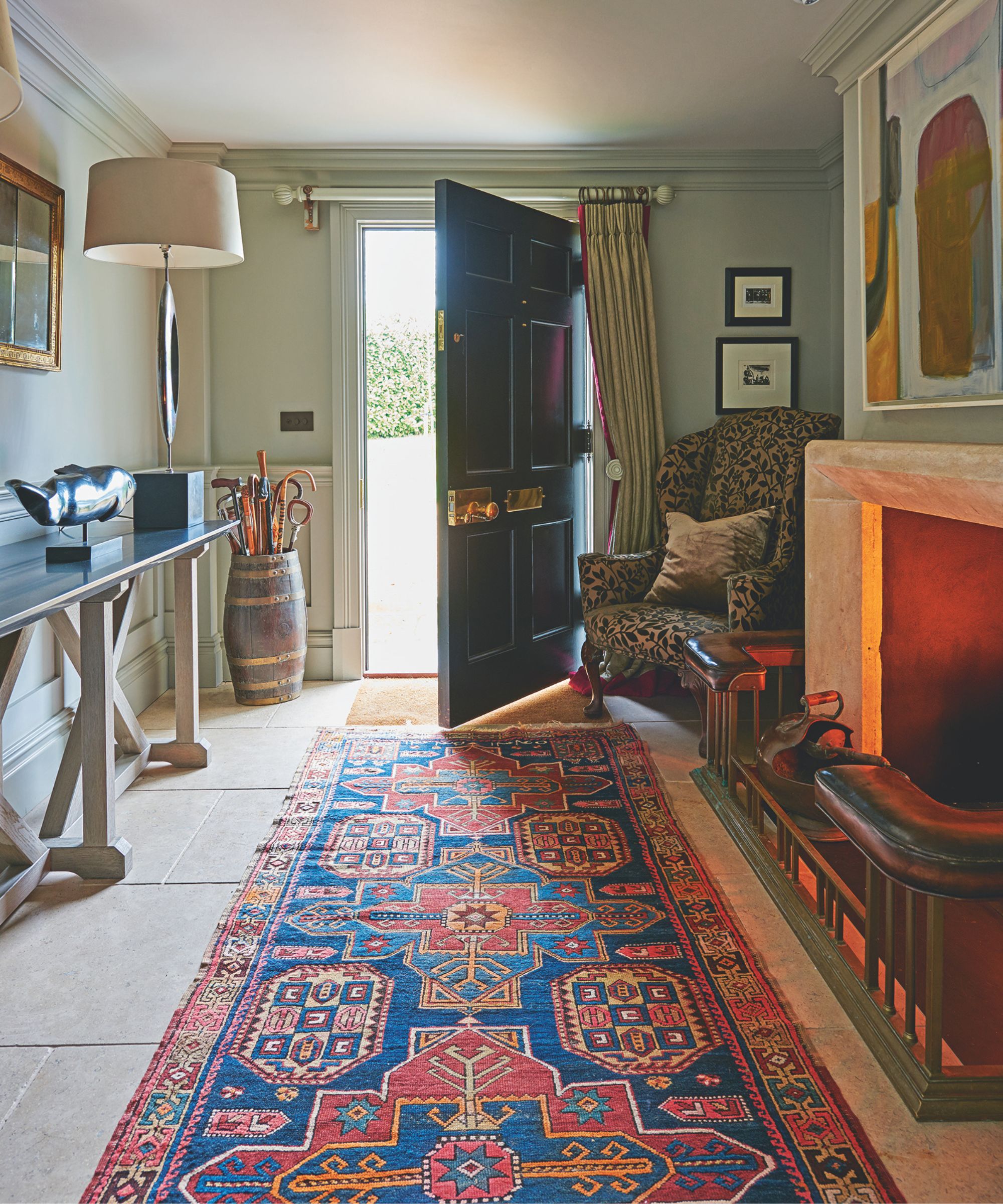
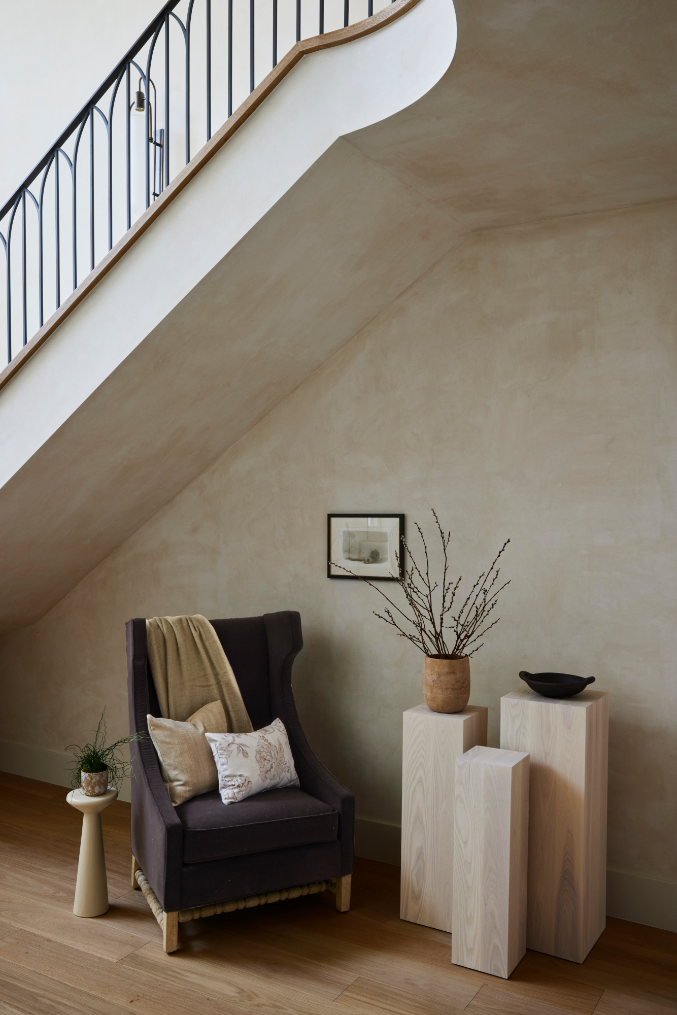
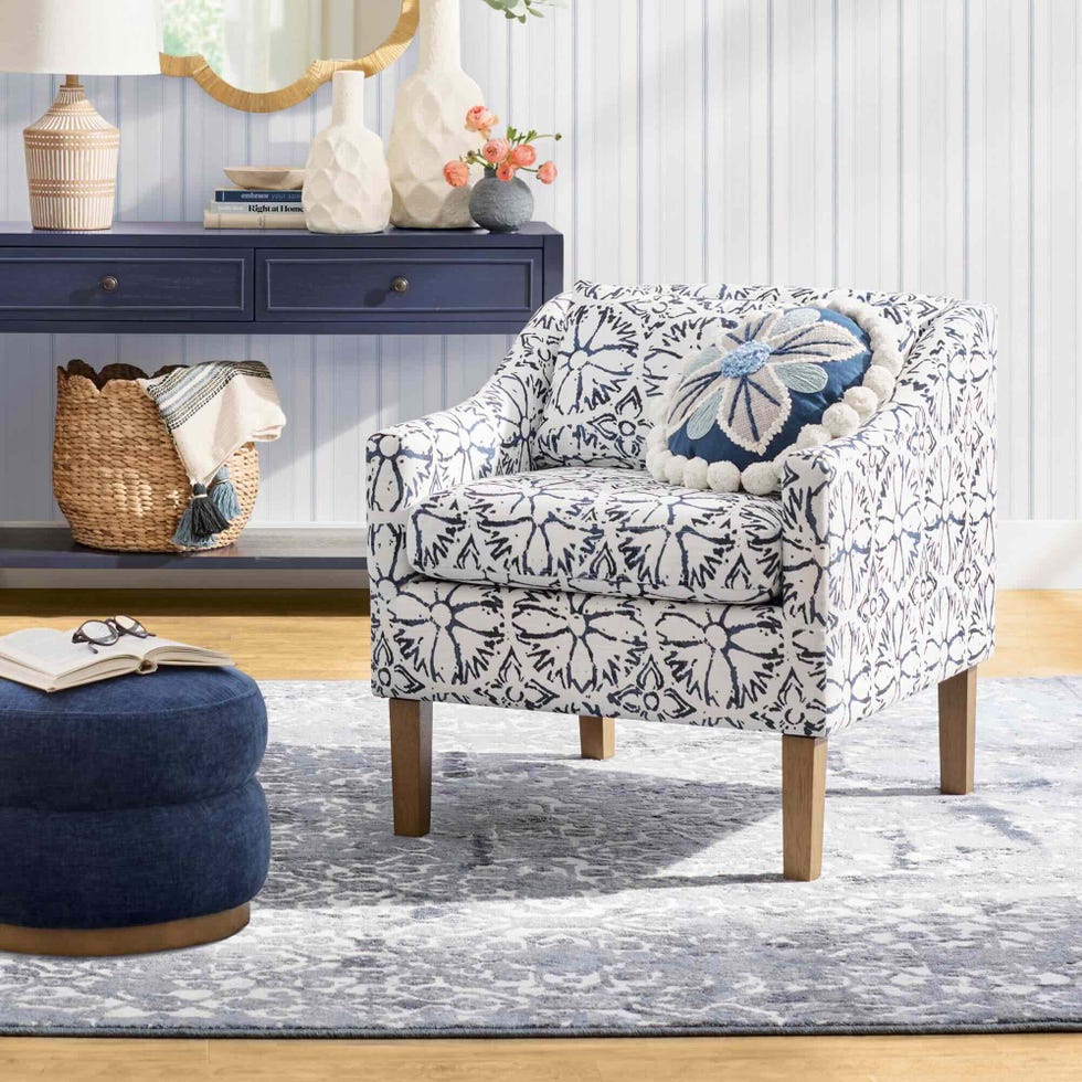
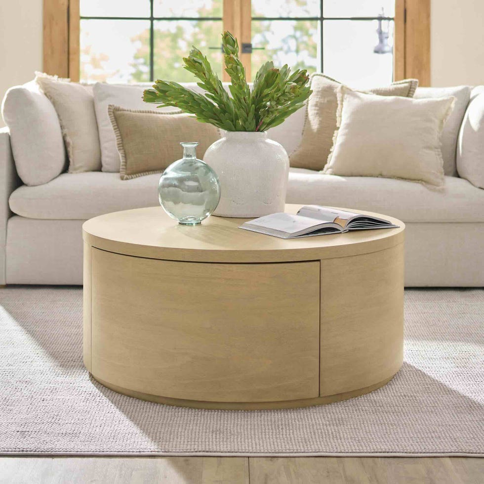
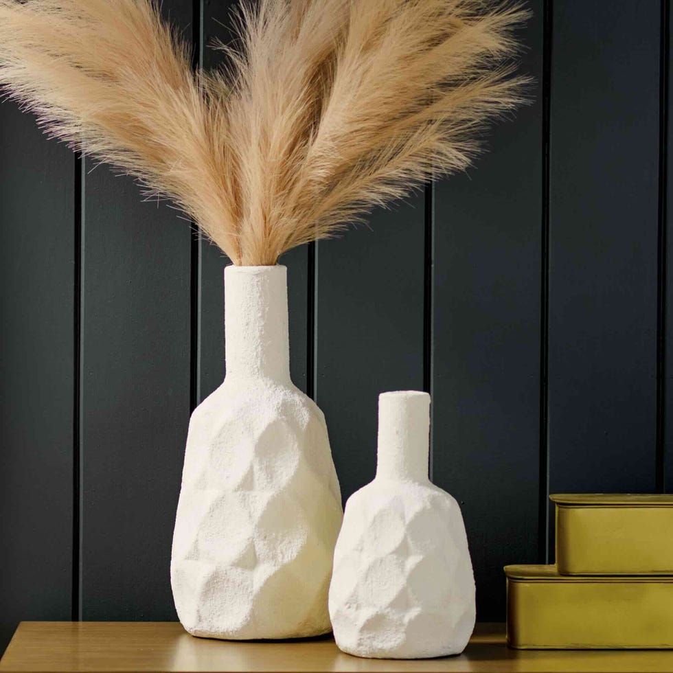
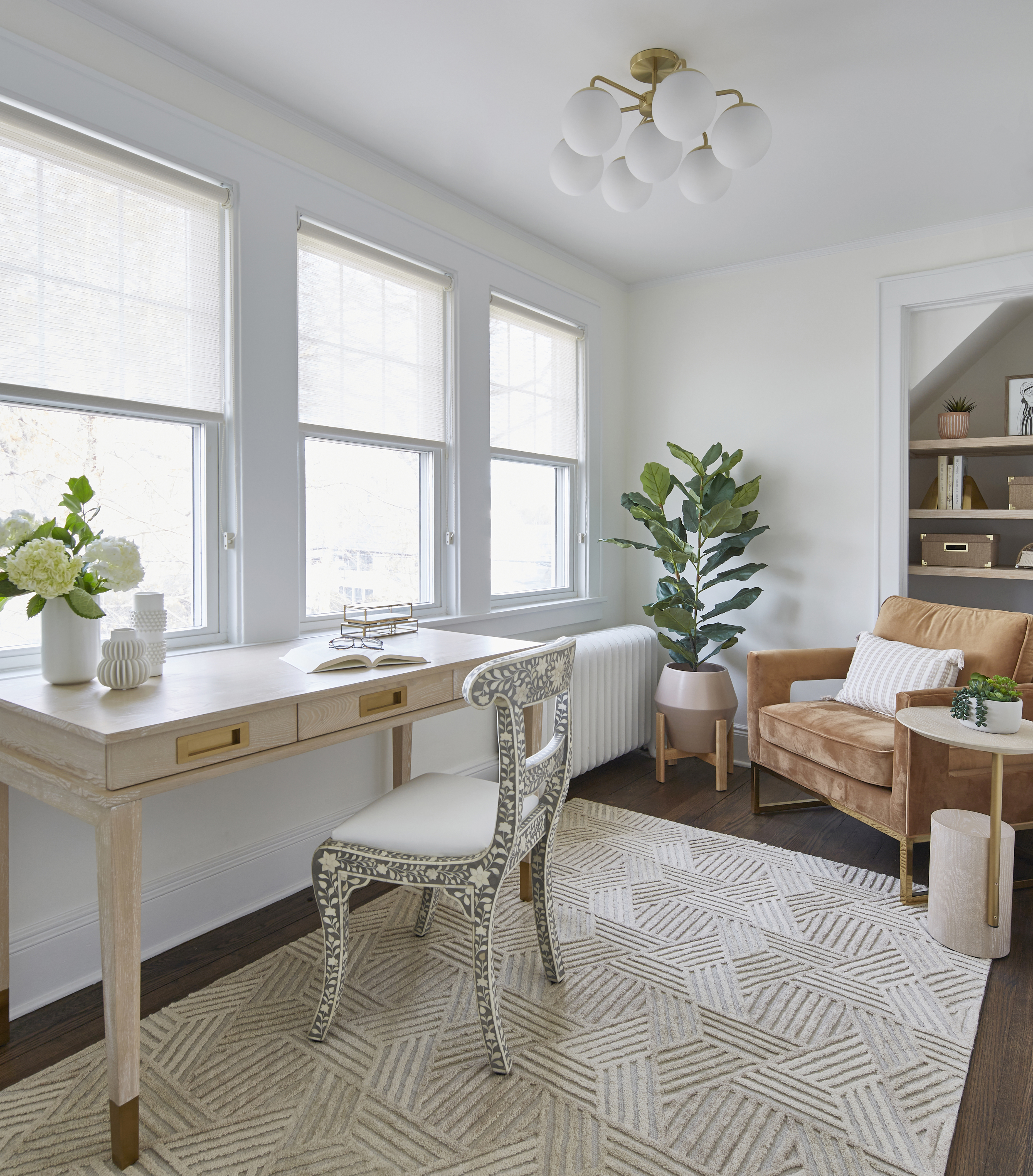
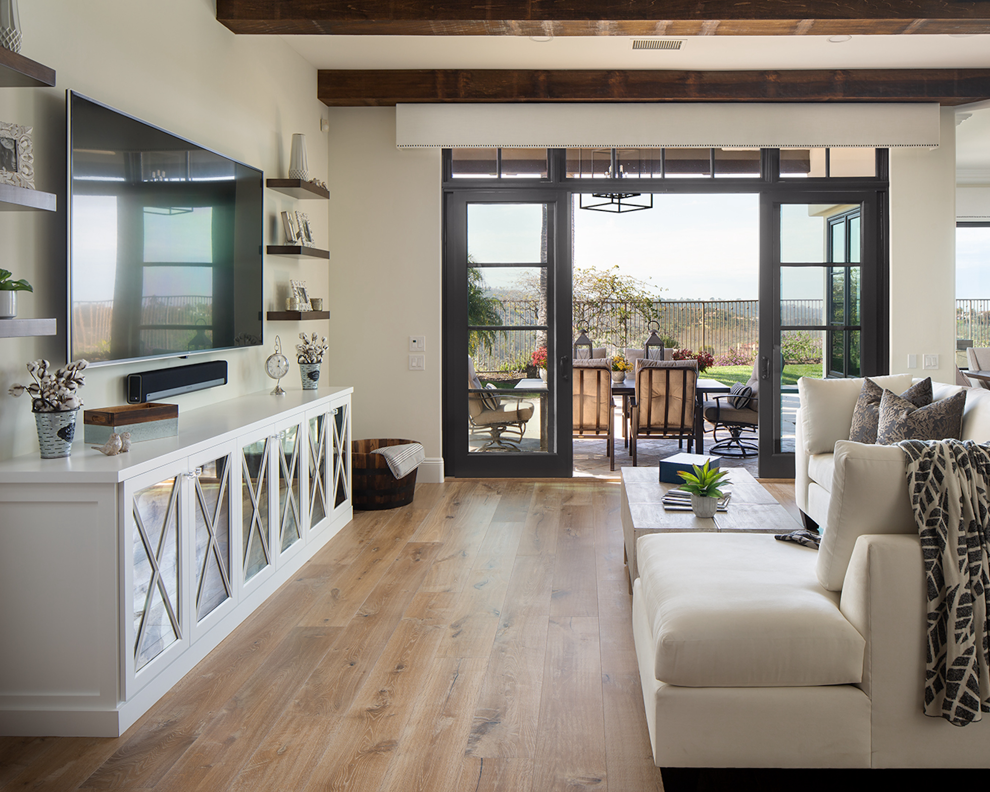
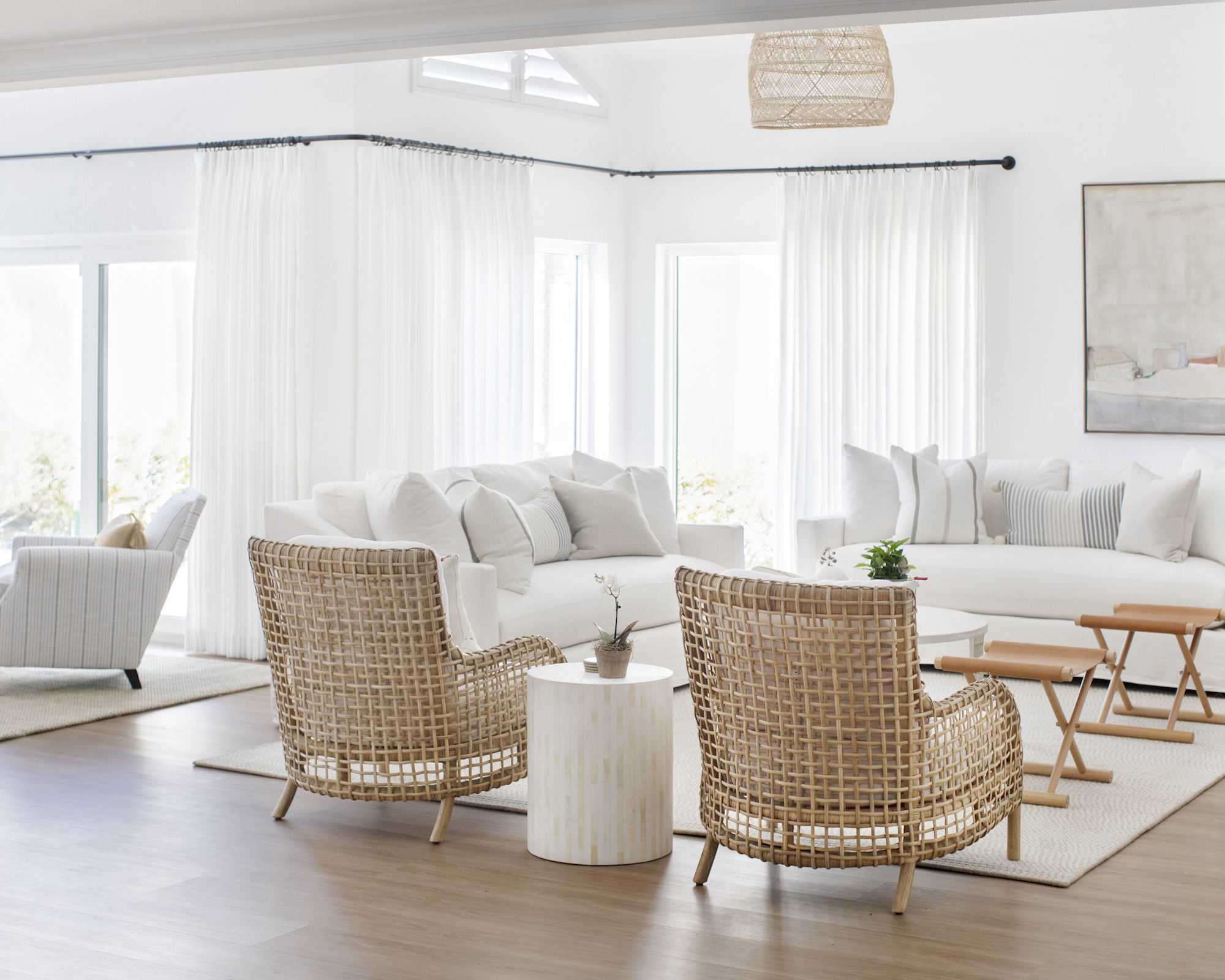
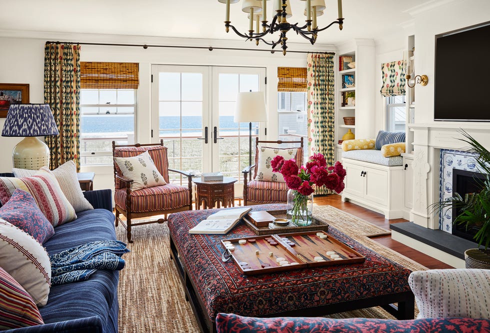
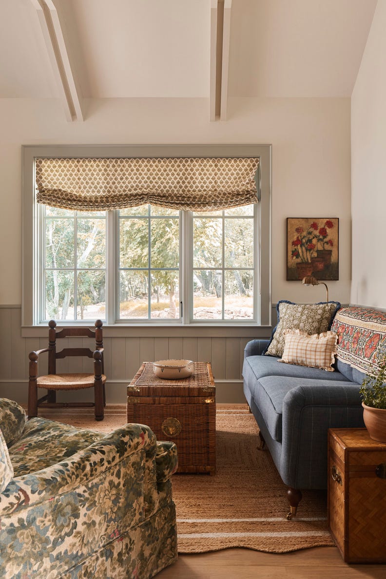
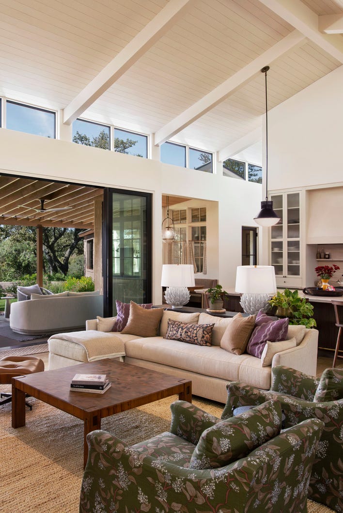
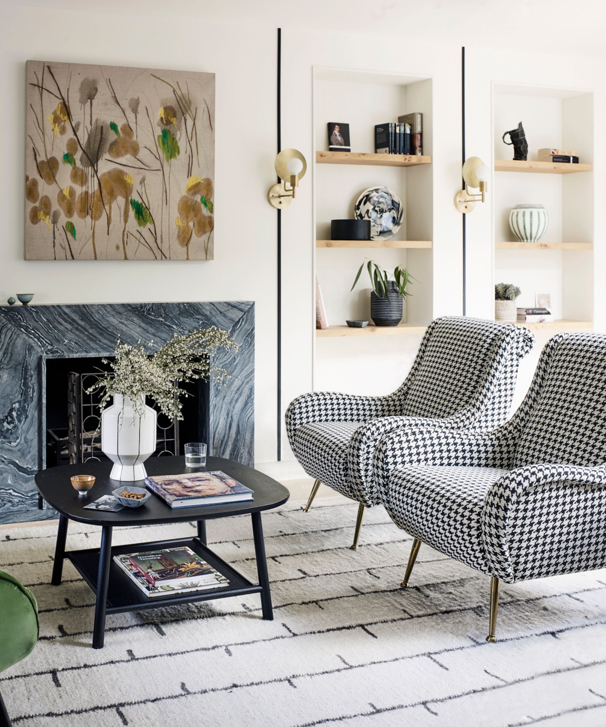
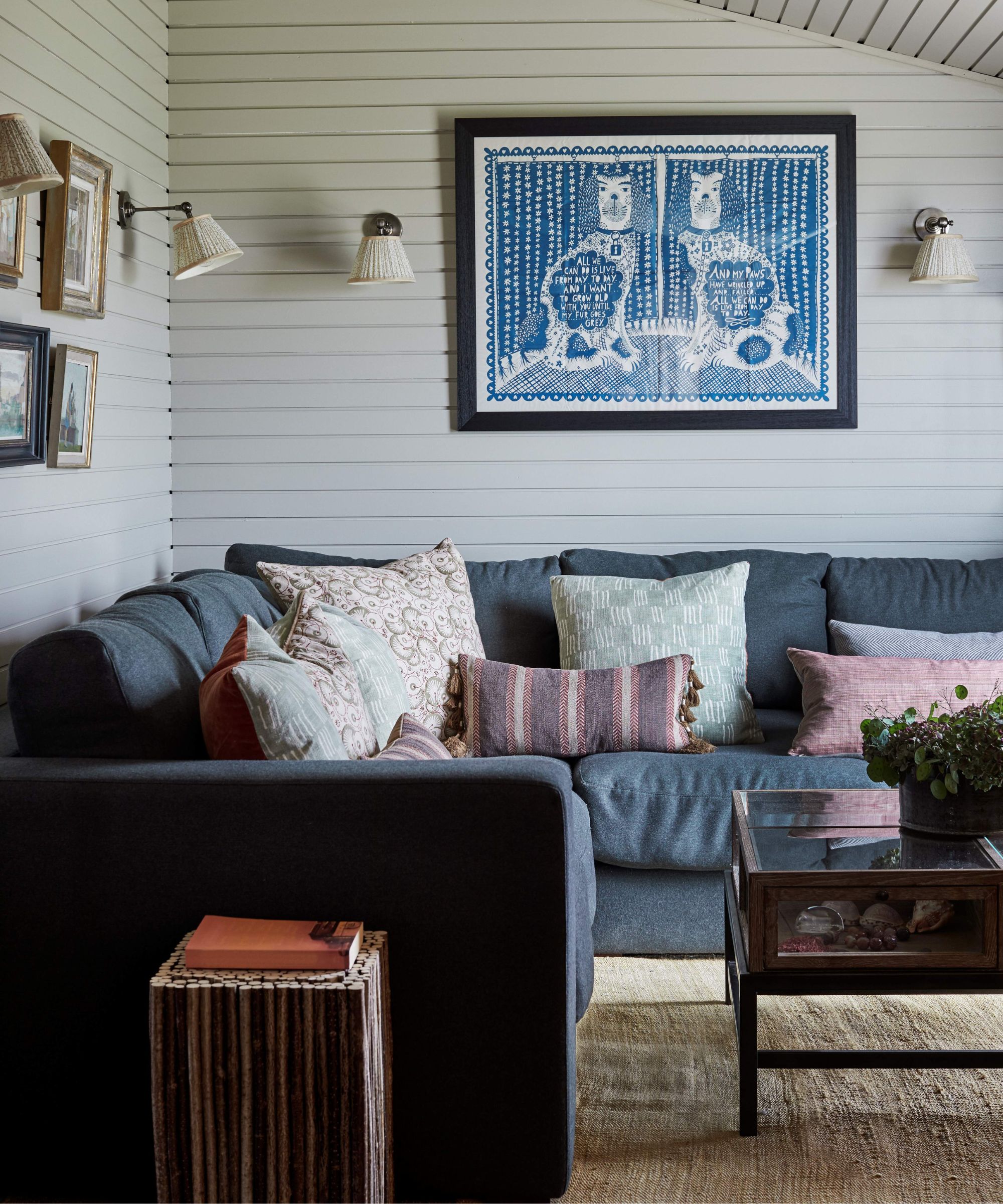
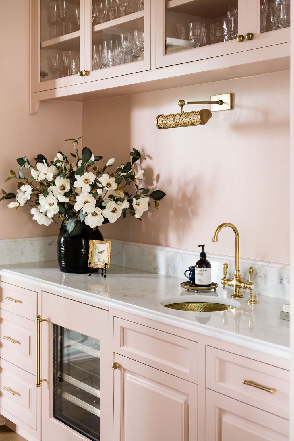
To prevent a monochromatic design from appearing flat, it is essential to introduce multi-dimensionality through tones and textures. Playing within the same color family while paying close attention to warm or cool undertones and allowing depth to emerge through contrast and layering is vital. Confidence in committing to a single hue and then modifying its shade, tone, and intensity is necessary to create interest. Furthermore, texture is paramount; it defines the space and individual design elements. The strategic use of furniture can also create balance and visual interest without disrupting the monochromatic uniformity. Incorporating natural elements, such as metal finishes (preferably a single, committed finish), and furnishings with unique visual interest, like fringe or scalloped edges, can add complexity to the design. Avoiding an overly matchy-matchy approach with materials and fabrics is advised; instead, pairing contrasting textures like boucle and velvet or wicker and leather suede can create an effective, layered aesthetic that feels curated rather than generic.
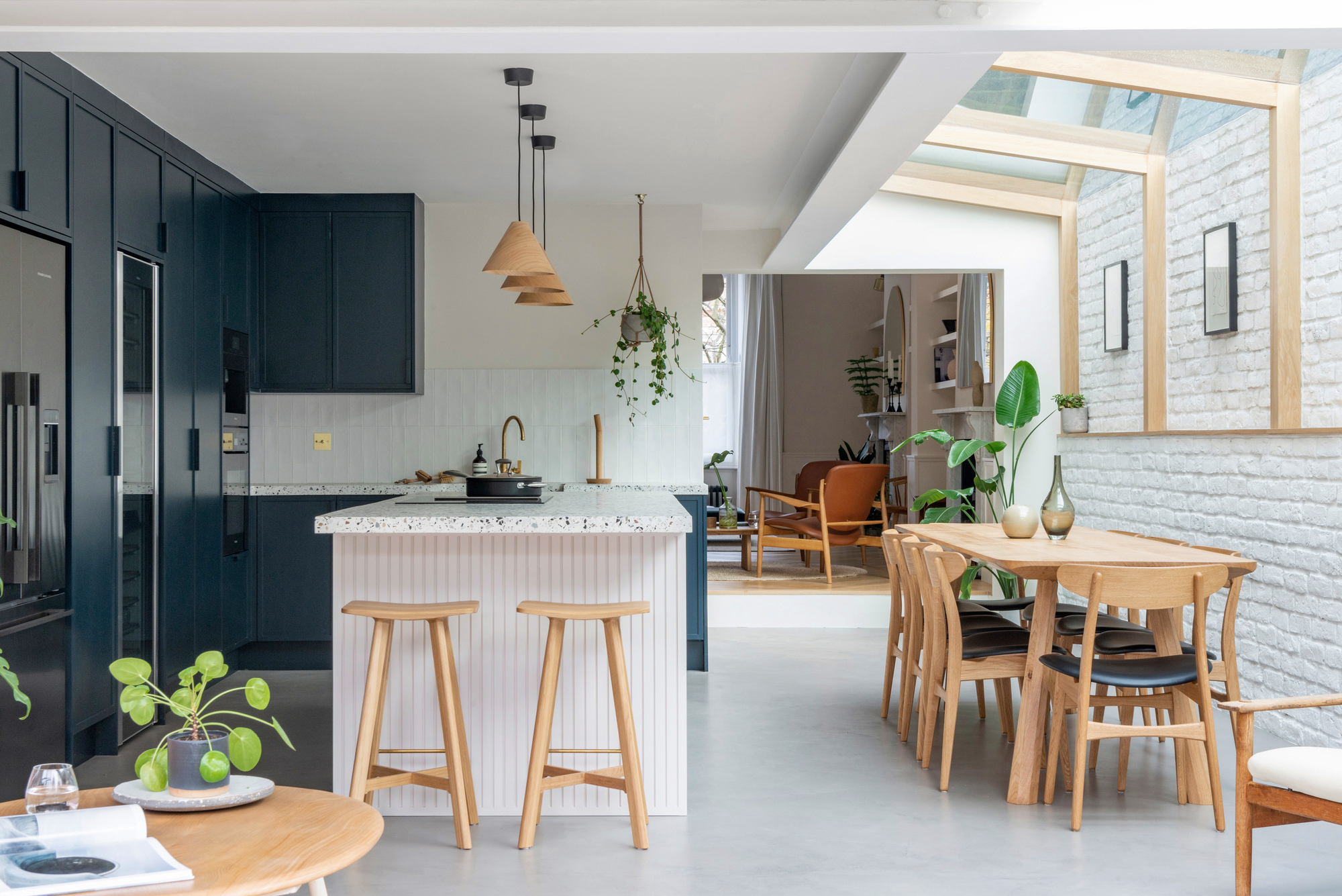
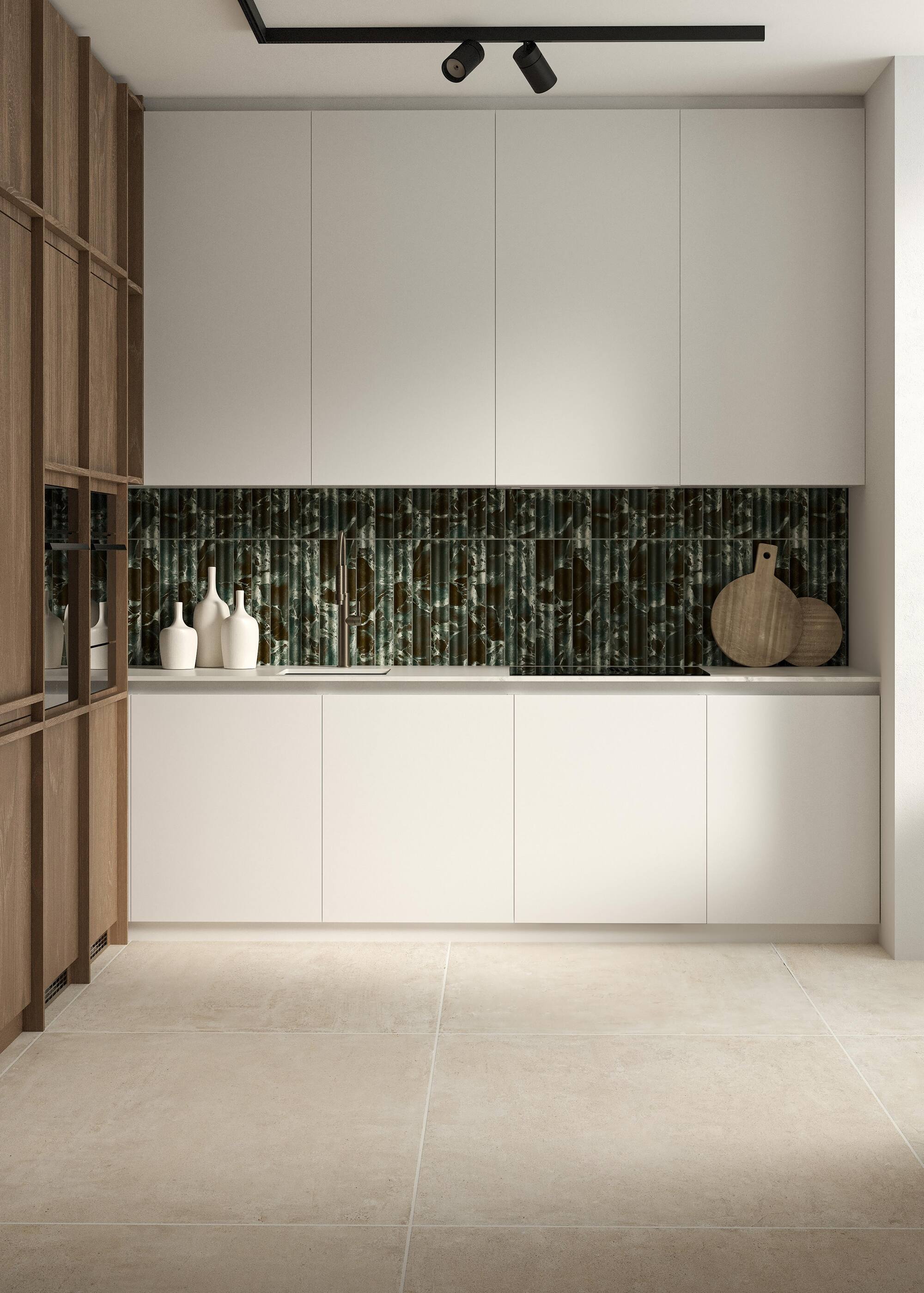

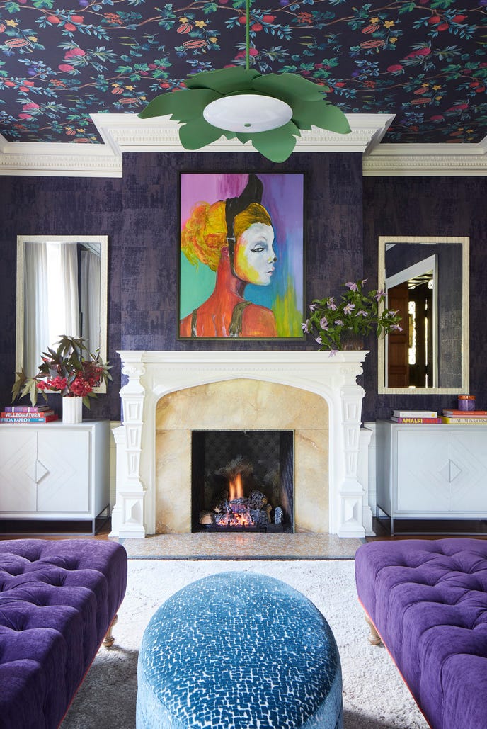
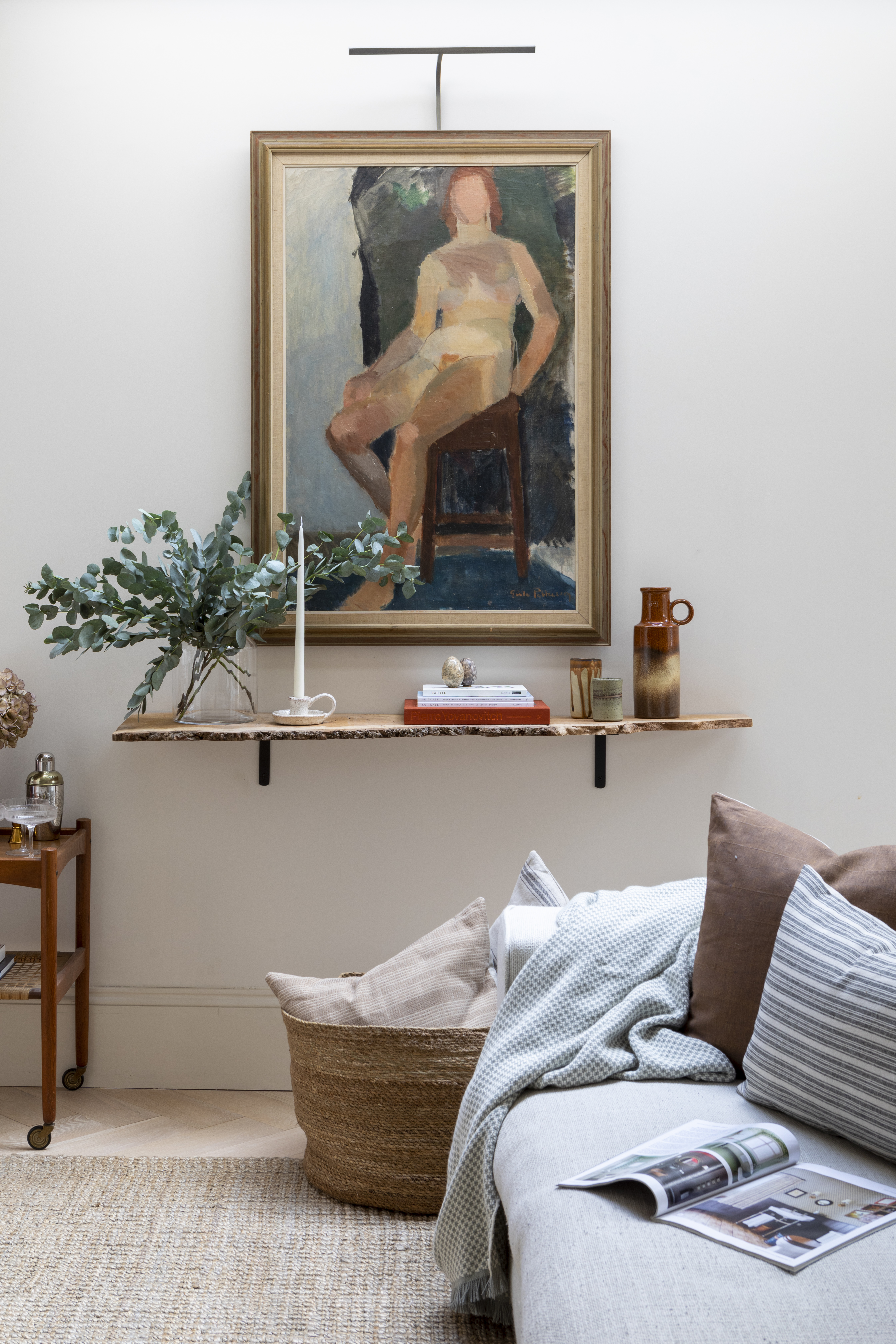
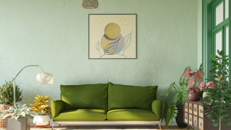
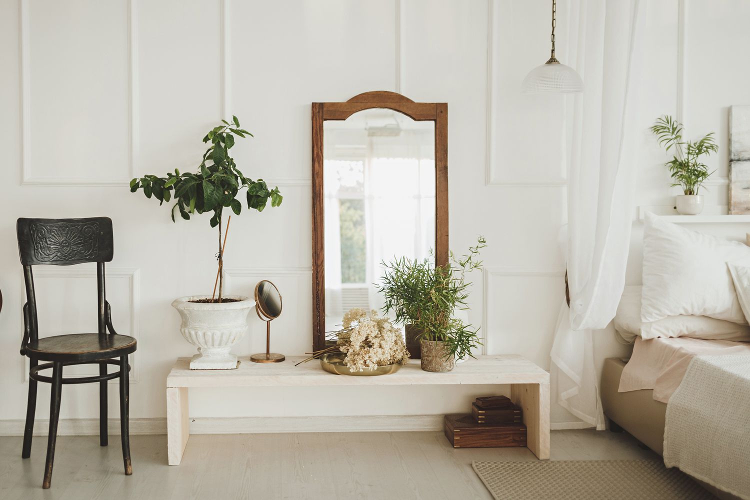
For those hesitant to commit entirely to a single shade, the article clarifies that while a single shade holds the most impact, there is room for other tones. For high impact, complementary colors or punches of black or white can be introduced. For a more subtle effect, analogous colors in similar shades or tones to the original monochromatic color can be woven in. In white or cream interiors, incorporating natural wood finishes adds visual interest without detracting from the peaceful, monochromatic sensibility. Ultimately, achieving a successful monochromatic interior requires careful attention to accents, versatile materials, and textures that break up the single color palette, transforming a one-note space into a full, layered, and multi-dimensional design.
#MonochromaticDesign #InteriorDesign #ColorPalette #HomeDecor #DesignTips #TextureInDesign #SpatialDesign #Undertones #MonochromaticDesign #InteriorDesign #ColorPalette #HomeDecor #DesignTips #TextureInDesign #SpatialDesign #Undertones
0 comment in total
 No comments yet
You may also like
Does your room feel like a boring white box? This interior designer's 5 easy tips will help you transform it into a personality-packed scheme in no time
Refresh Your Living Room the Easy Way

What Flooring Makes a Room Look Bigger?

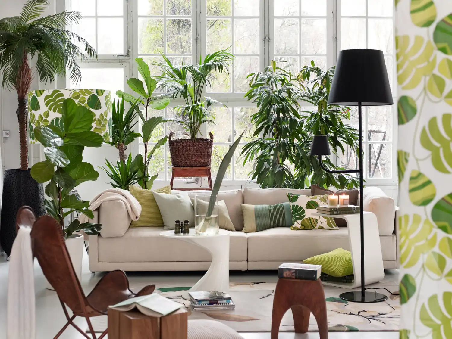
Designers Say This Tiny Tweak Could Save Your Living Room From Looking Tacky (And It's Free)

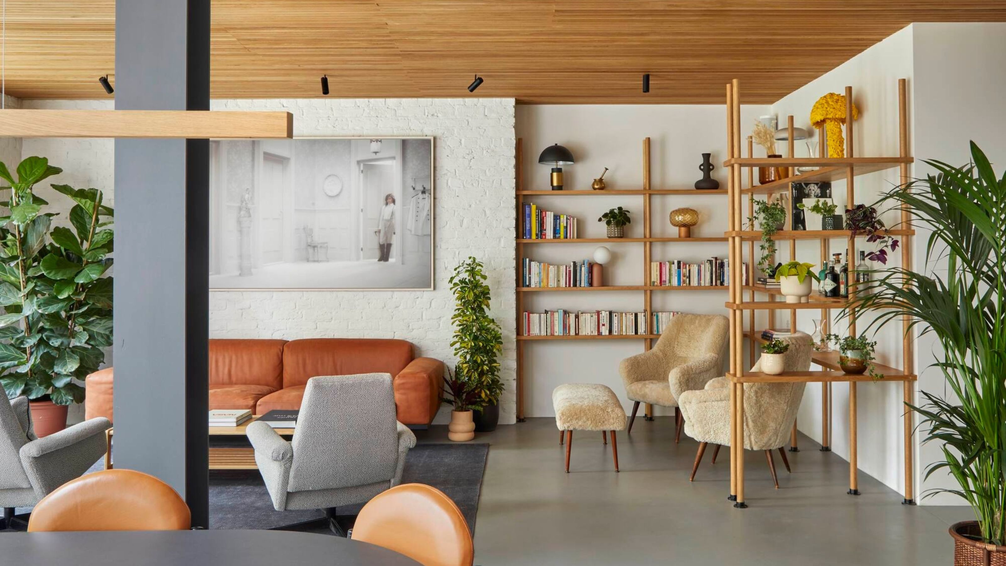
Forget What Color You Paint the Walls, It's the Flooring That Does the 'Quiet' Work in Making Your Room Feel Bigger — Here's How

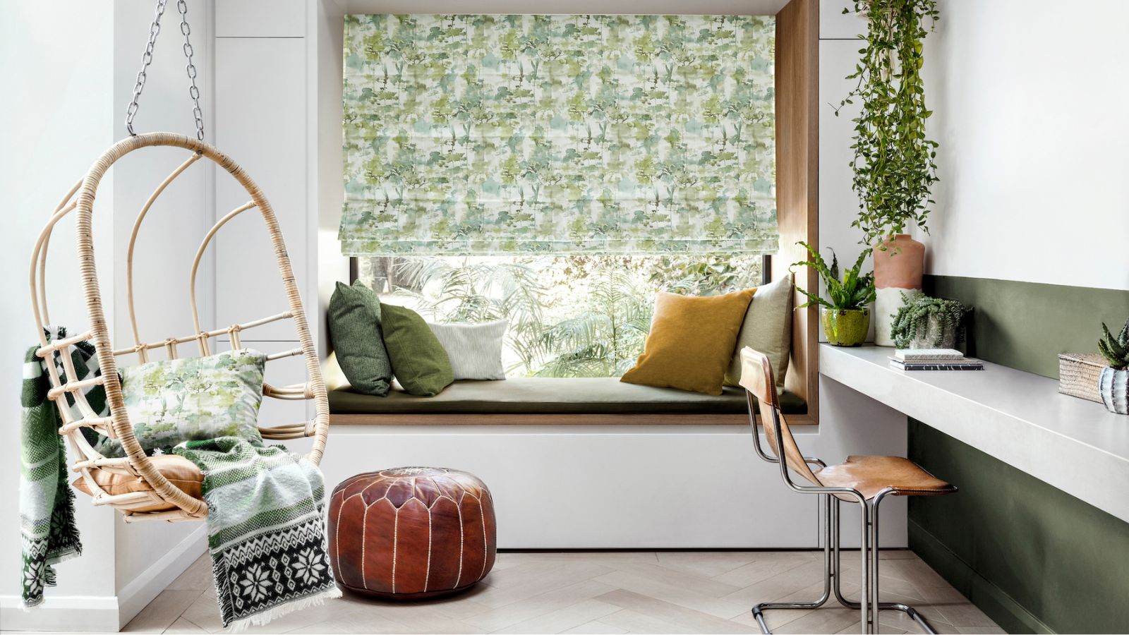
How to elevate your teen's former bedroom into a beautiful home office

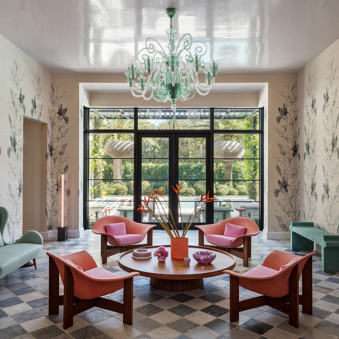
Simple Swaps for an Instant Living Room Refresh

How to warm up a white living room – 5 ways interior designers soften a monochromatic space
‘You’re missing a trick' – 5 ways experts make that empty space in your upstairs hallway look beautiful
5 Things That Make Your Living Room Look Small—and How to Fix Them
Designers Say This One Trick Will Make Your Living Room Look More Luxe
Monochromatic Colors: 9 Ways to Pull Off the Trend Like a Pro

8 Ways to Make a Dark, Gloomy Room Feel Instantly Brighter

Should living room flooring be lighter or darker than the walls? Experts weigh in
How to transform your rooms with colour drenching
12 Tips For Making Small Rooms Appear Larger Using Paint

5 things minimalists do to add texture to a room - 'it makes all the difference'
How to make dark, moody walls work at home

Easy Ways to Transform Your Living Room Into a Space You LOVE
This Color Will Transform Your Living Room Instantly