1/10
Monochromatic Colors: 9 Ways to Pull Off the Trend Like a Pro
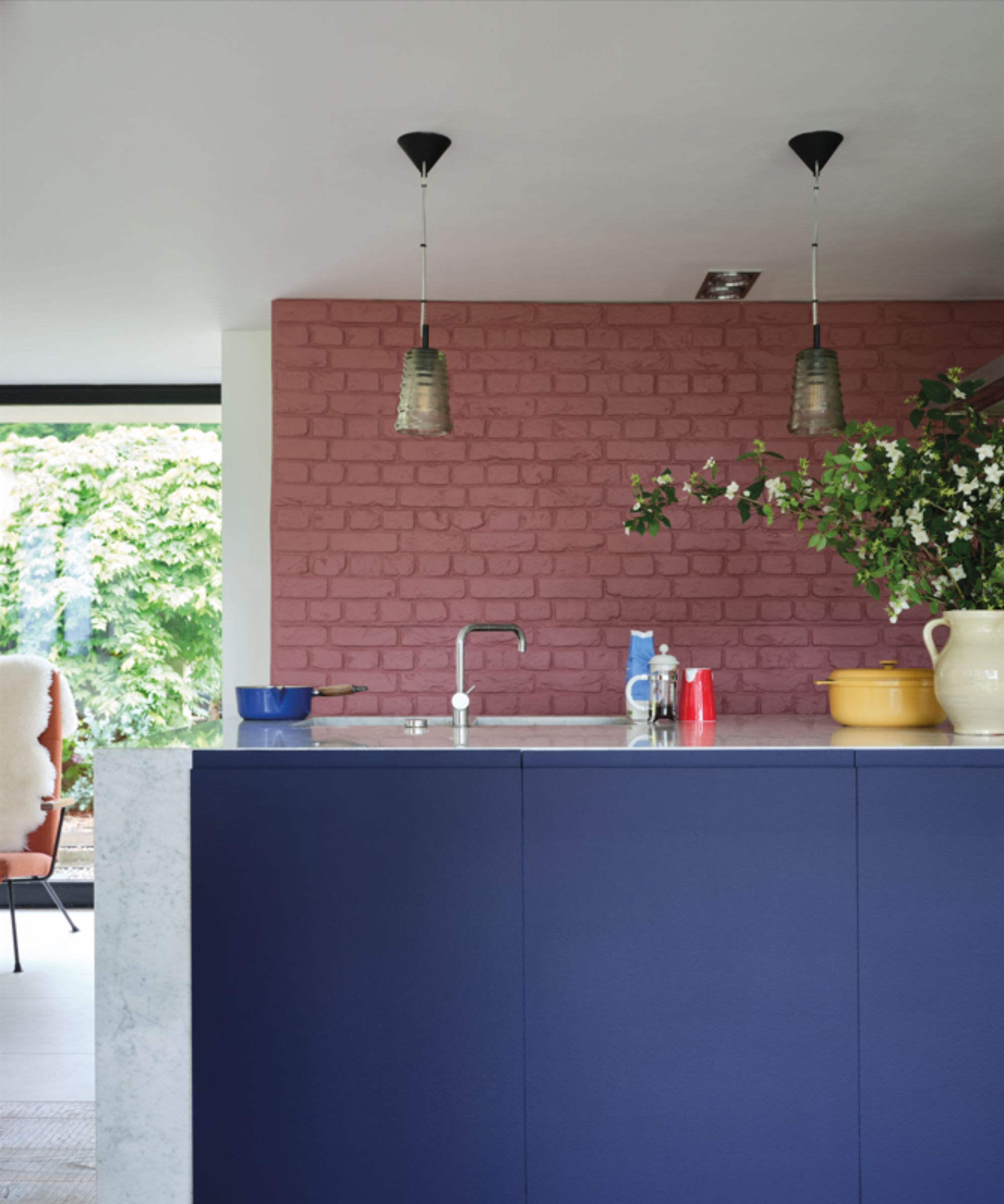
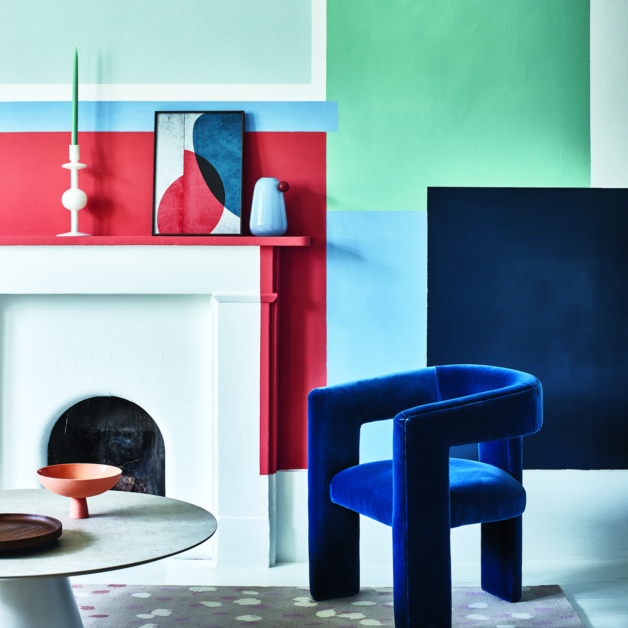
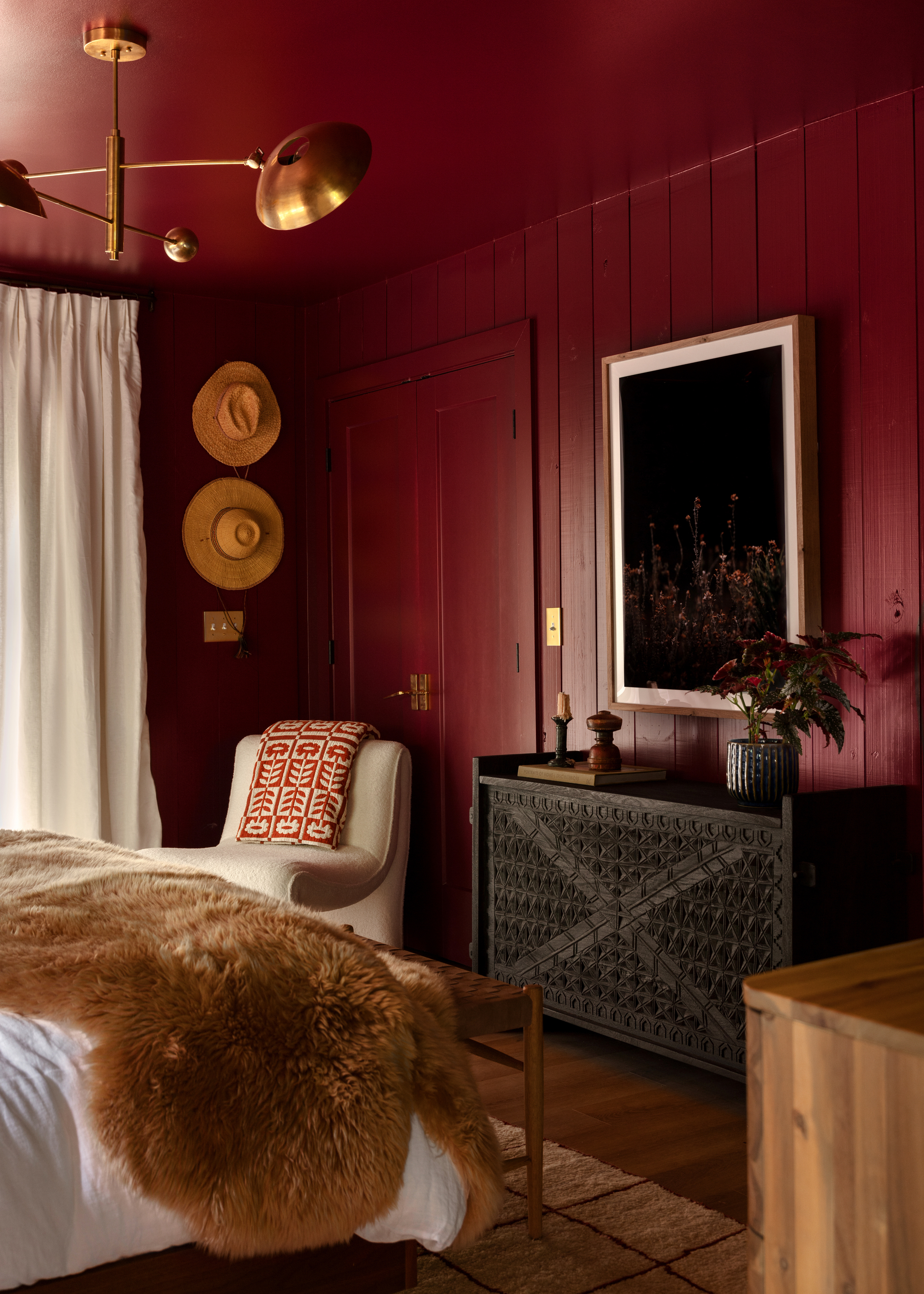
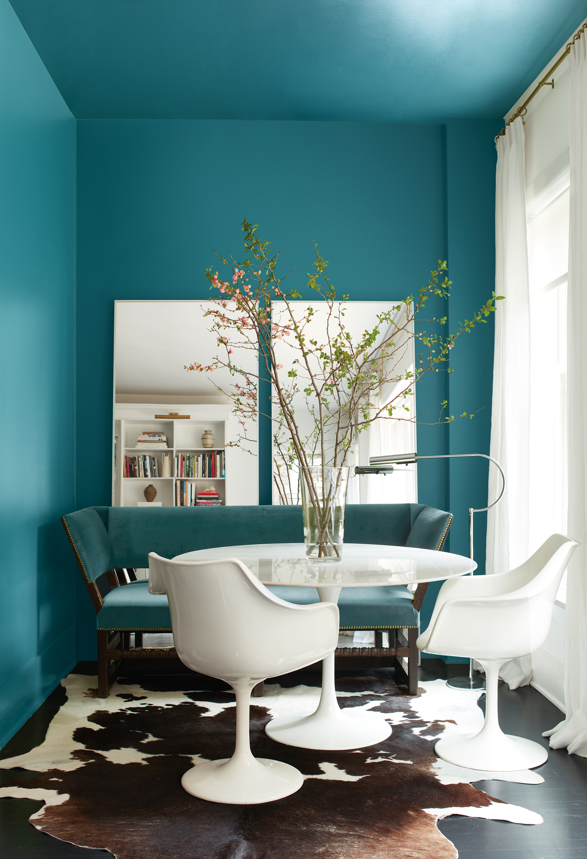
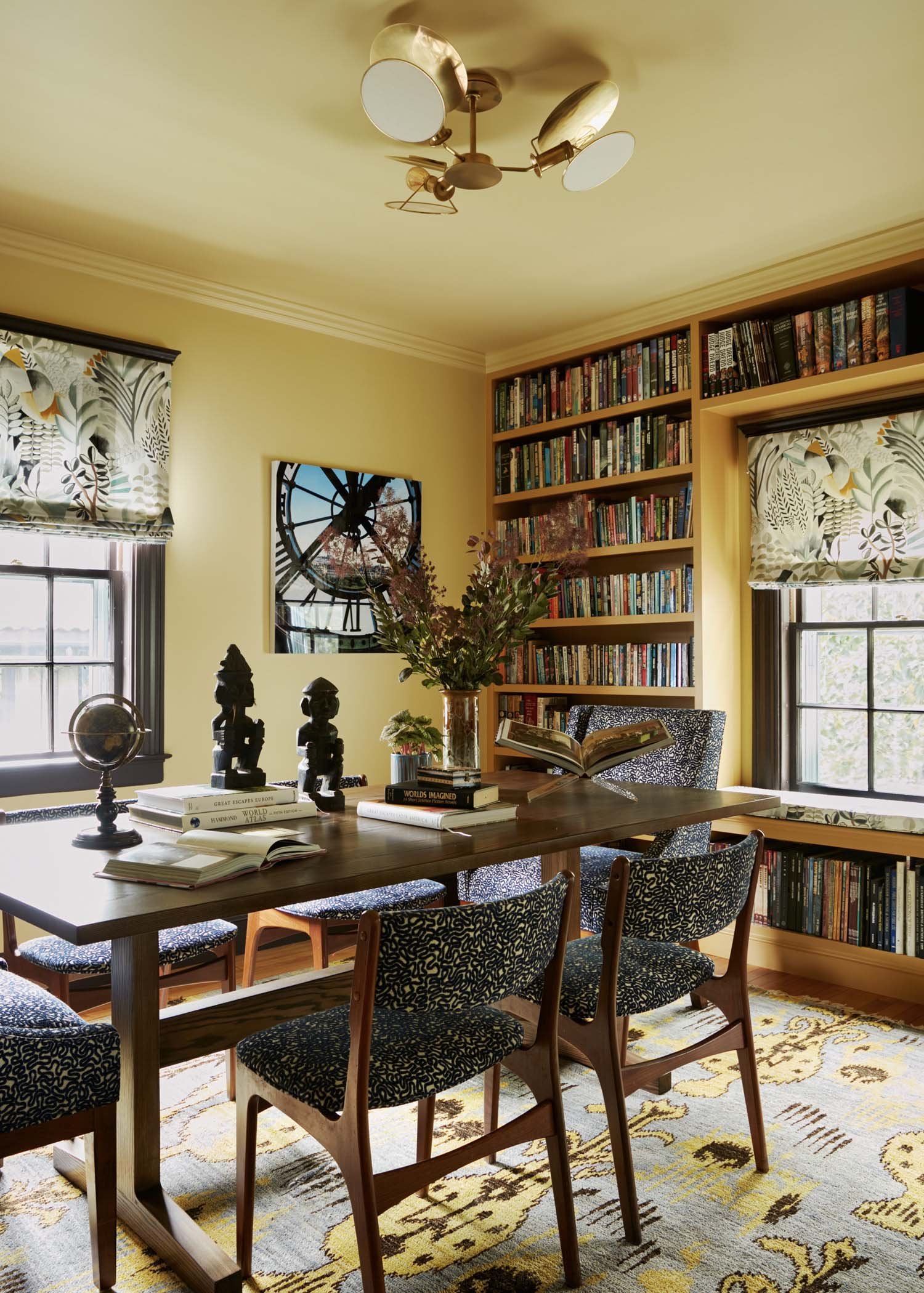
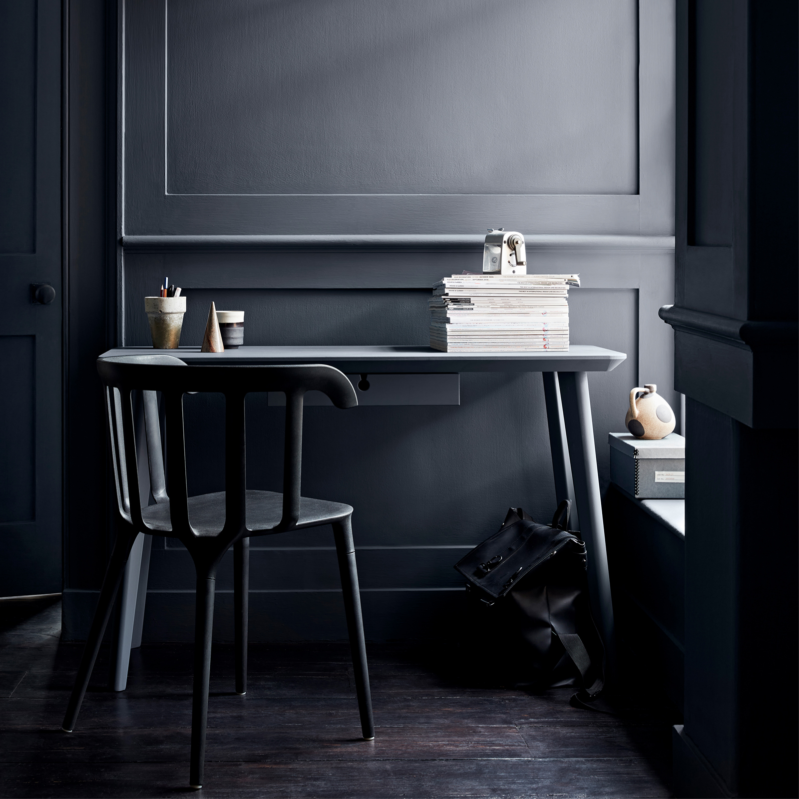
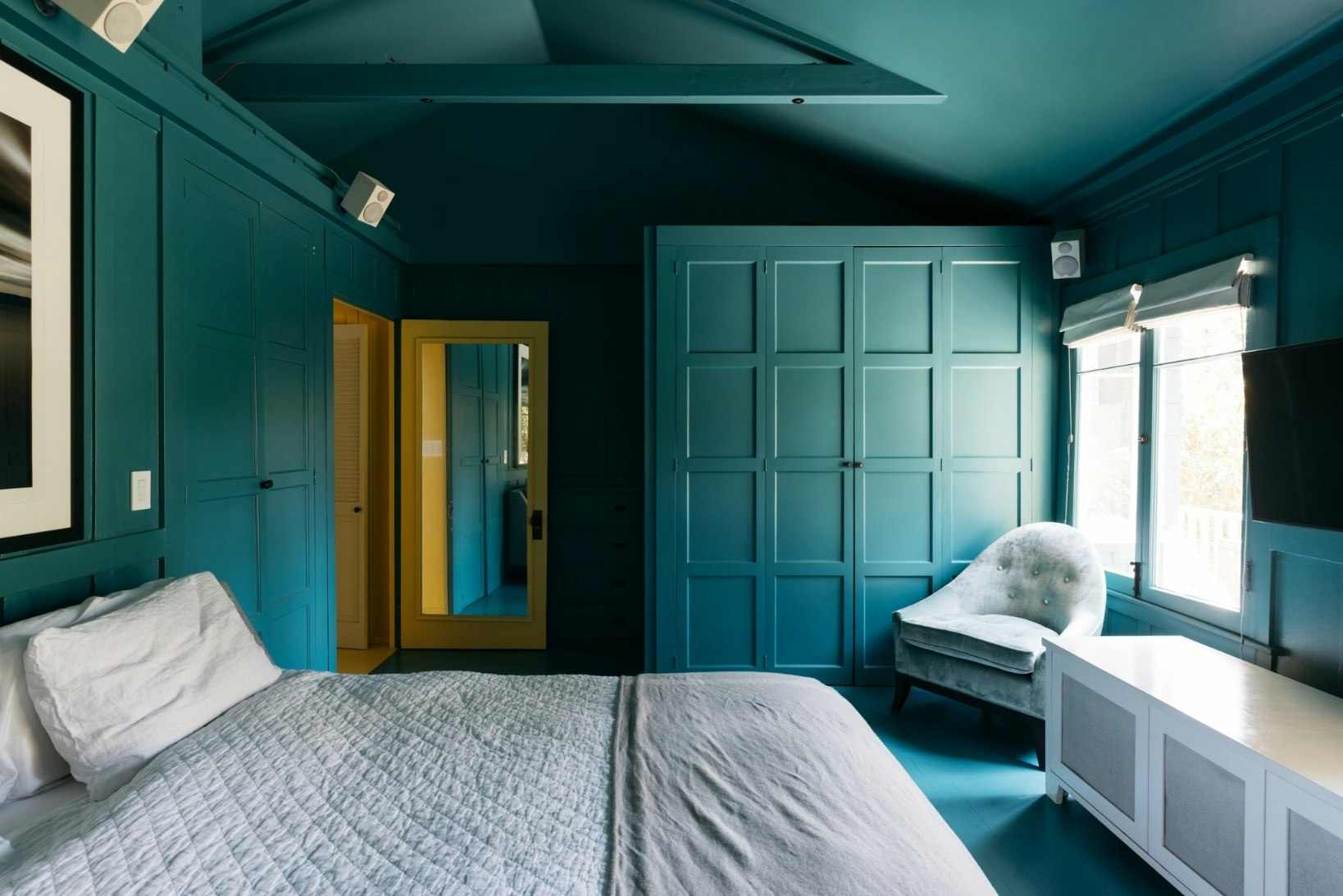
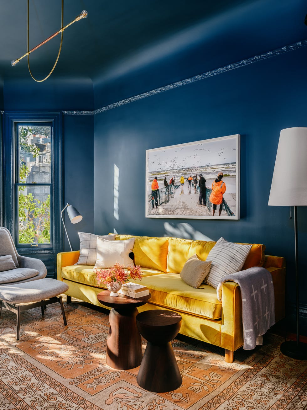
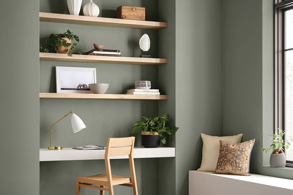
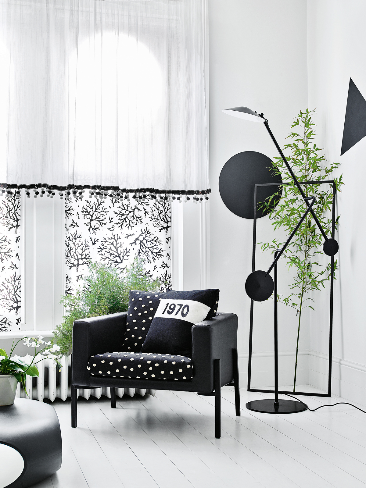
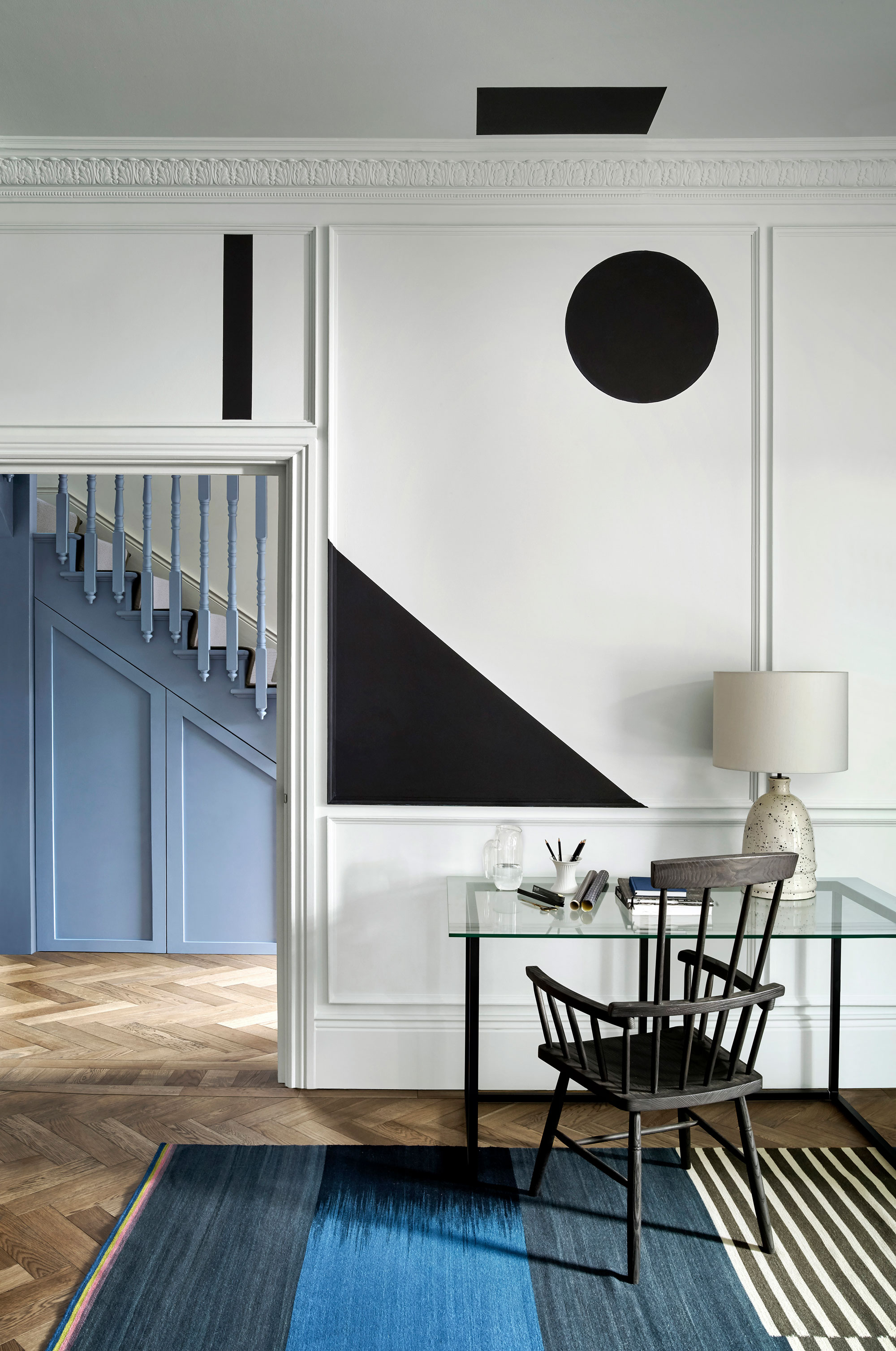
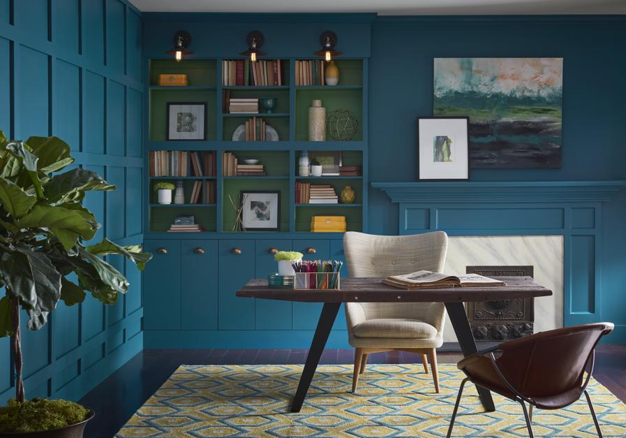
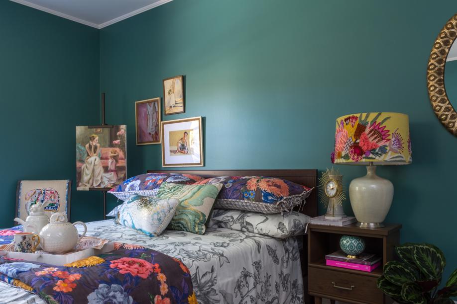
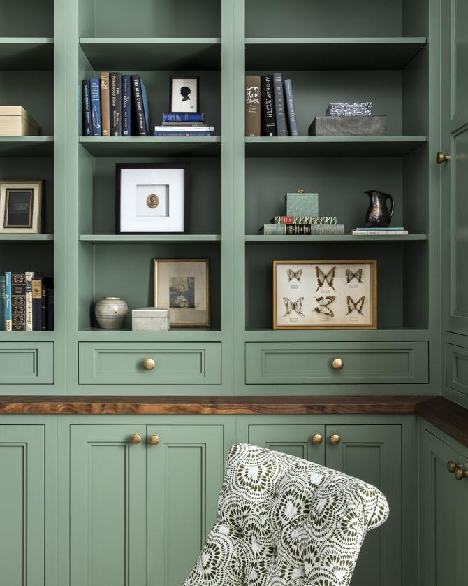
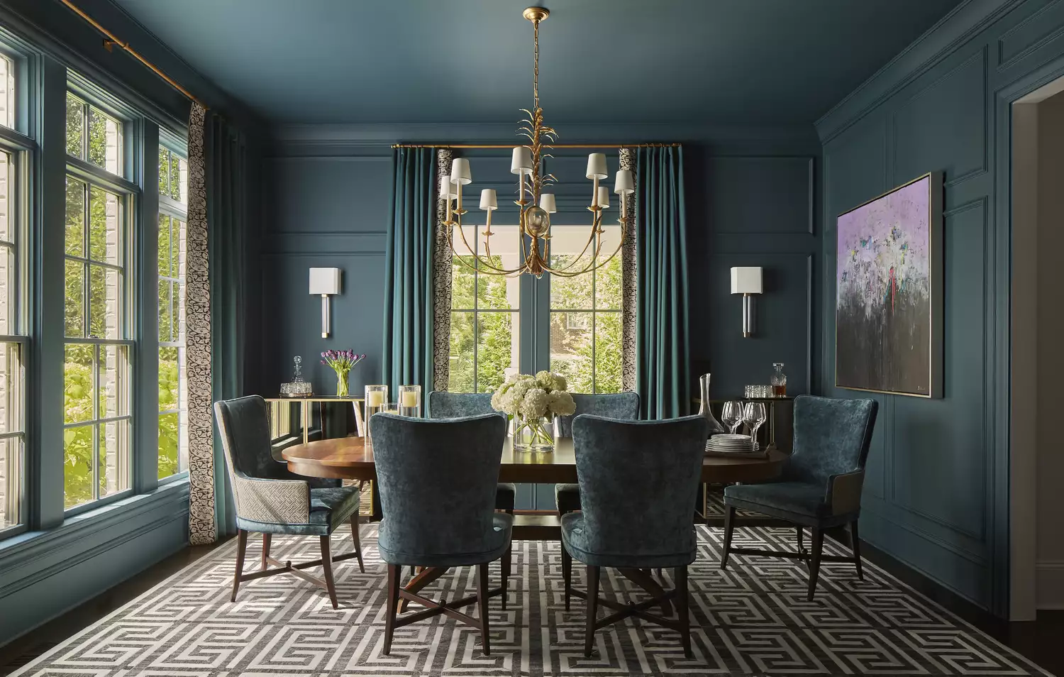
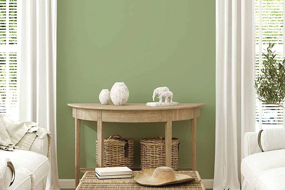
Monochromatic color schemes in interior design create a bold, intentional, and cohesive aesthetic, emphasizing the overall feeling of a space rather than individual elements. This approach involves drenching a room in a single hue, offering a unique color harmony that can be both subtle and impactful. Interior designers recommend using a base color and then varying its shades, tints, and tones to introduce interest and depth, similar to layering in an ombré effect. This method allows for a personalized touch, as highlighted by designer Doug Meyer, who notes that creating a room in a favorite color brings joy.
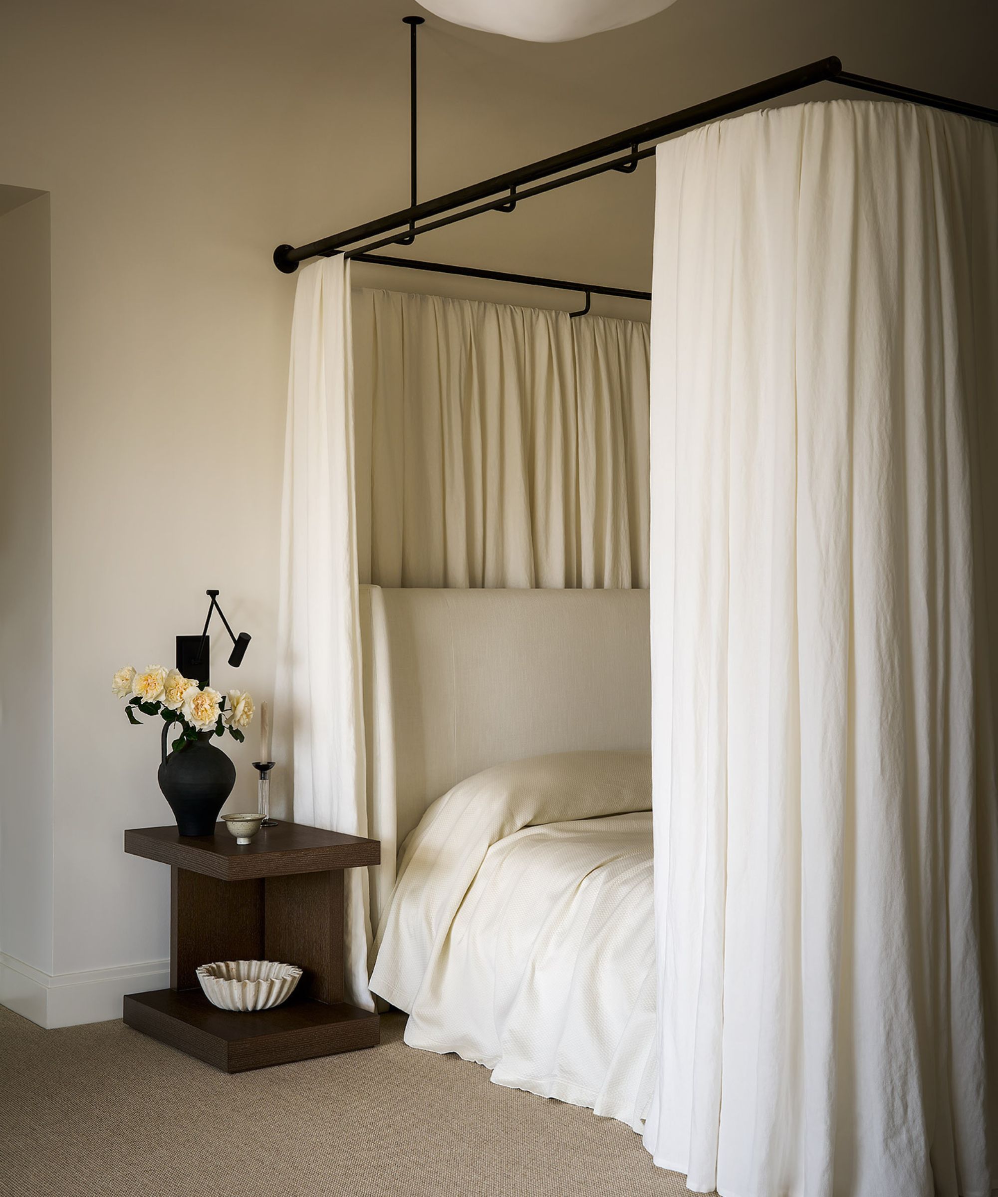
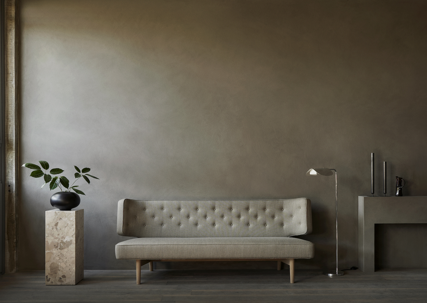
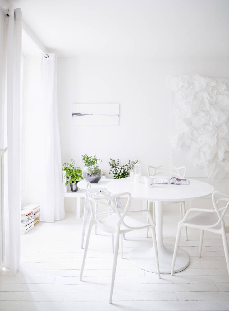
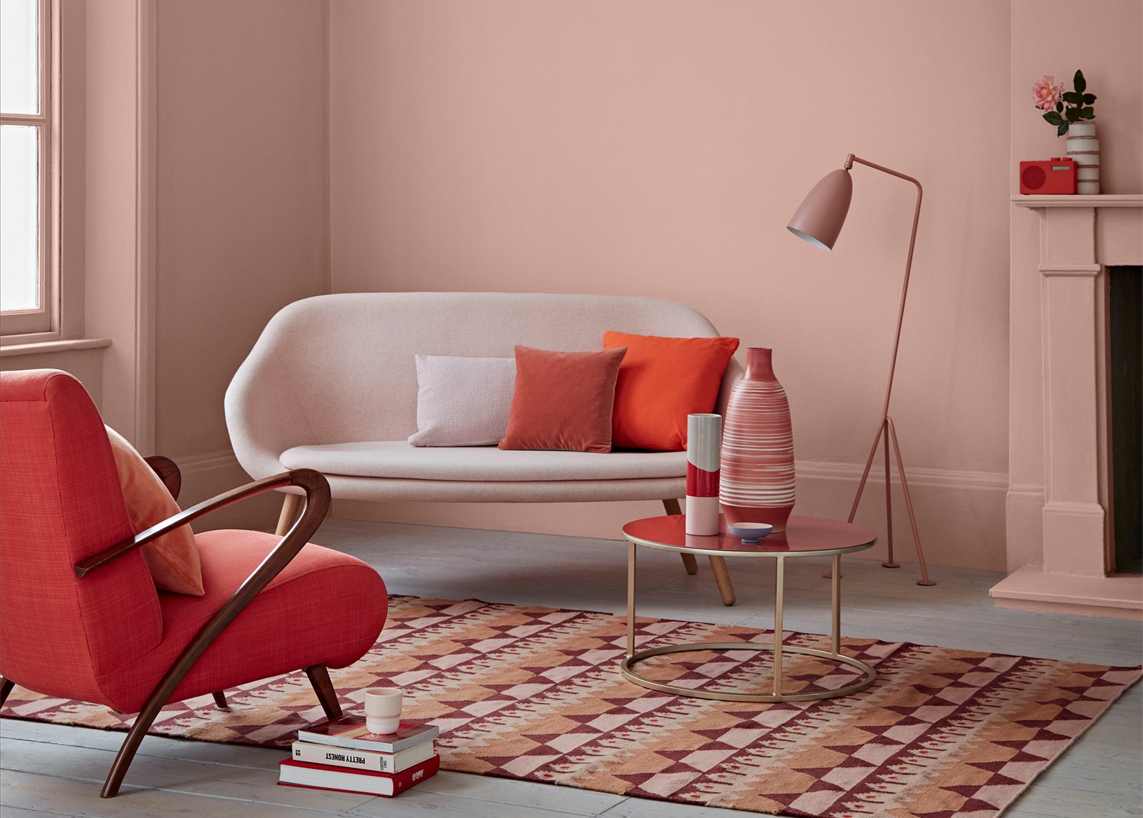
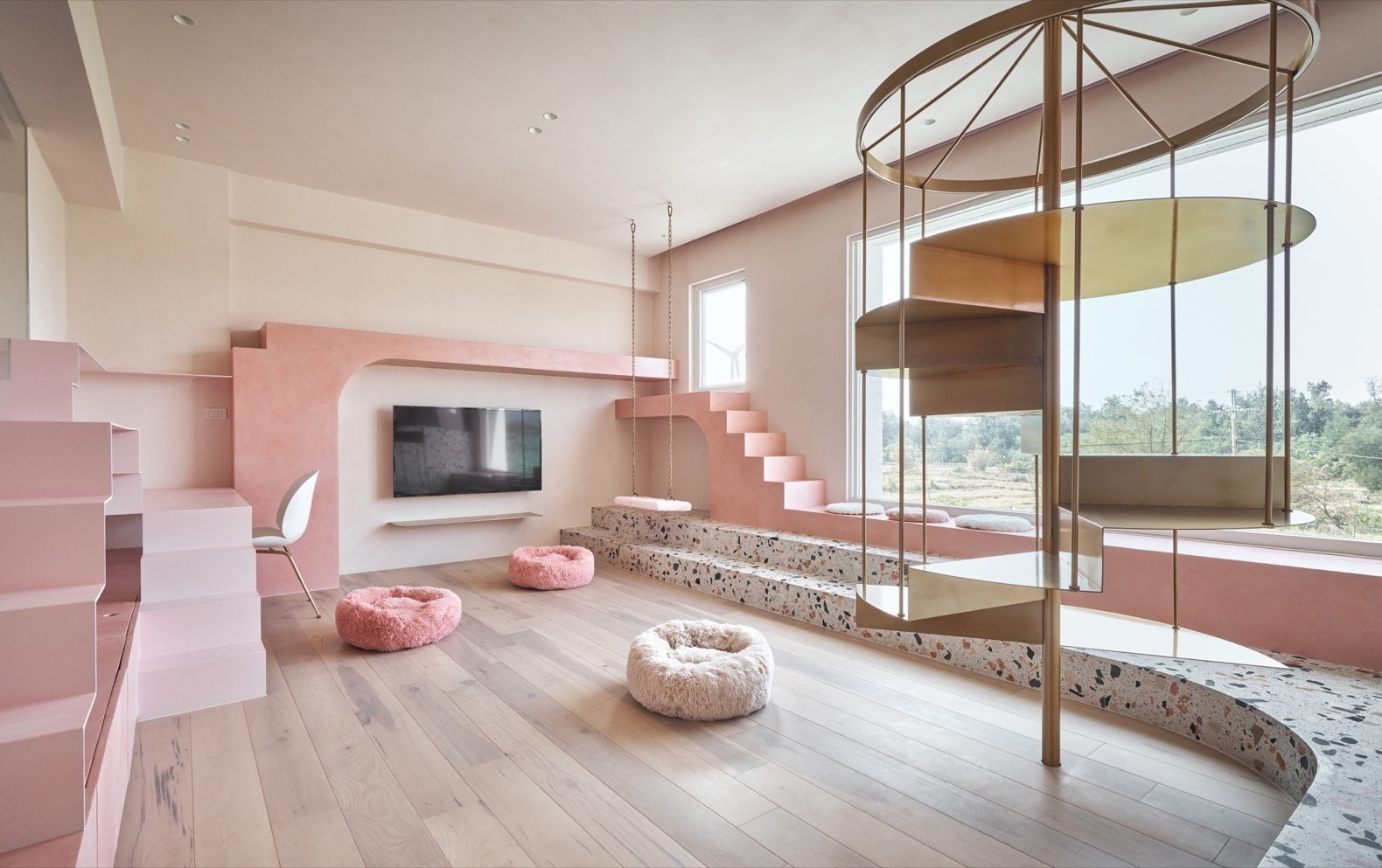
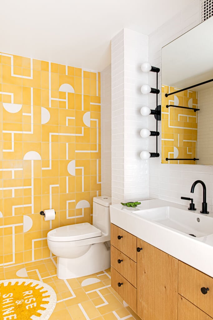
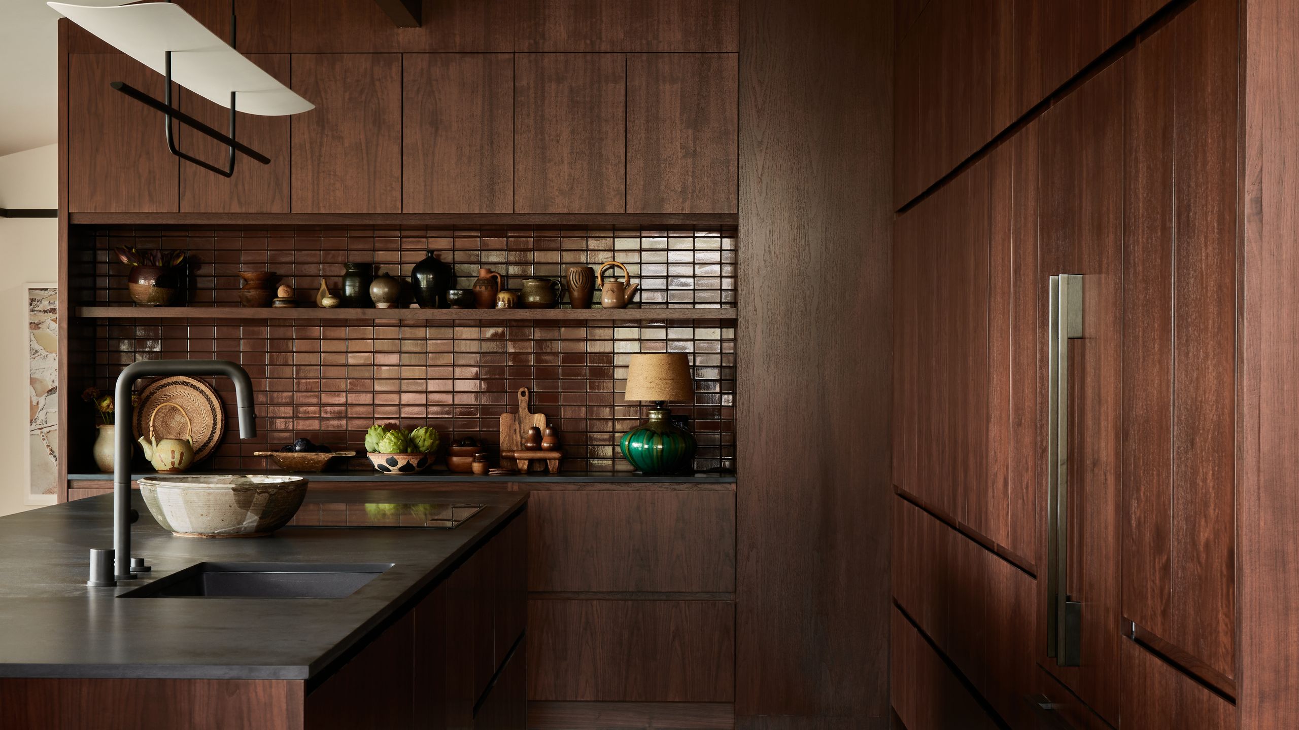
For those new to monochromatic design, starting with smaller spaces like bathrooms or guest bedrooms is advisable. This allows for experimentation without overwhelming the entire home. In compact areas, a single color can paradoxically make the space feel larger by reducing visual clutter. Texture plays a crucial role in preventing monochromatic rooms from appearing flat. Incorporating a variety of materials, from smooth silks to nubby wools and shiny metals, within the same color family adds tactile and visual interest. Walls and floors can serve as foundational elements, with different textures layering upon them to build complexity.
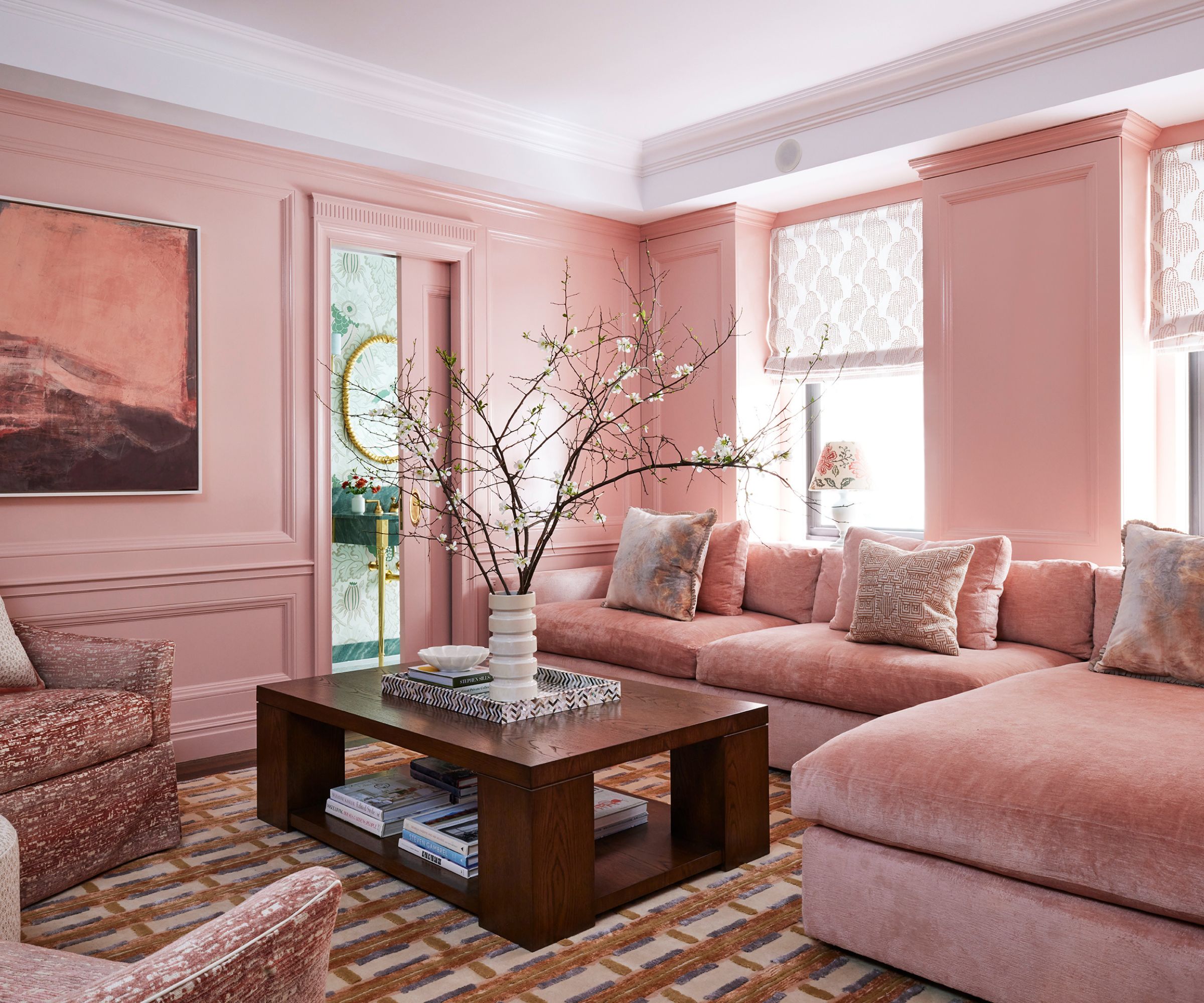
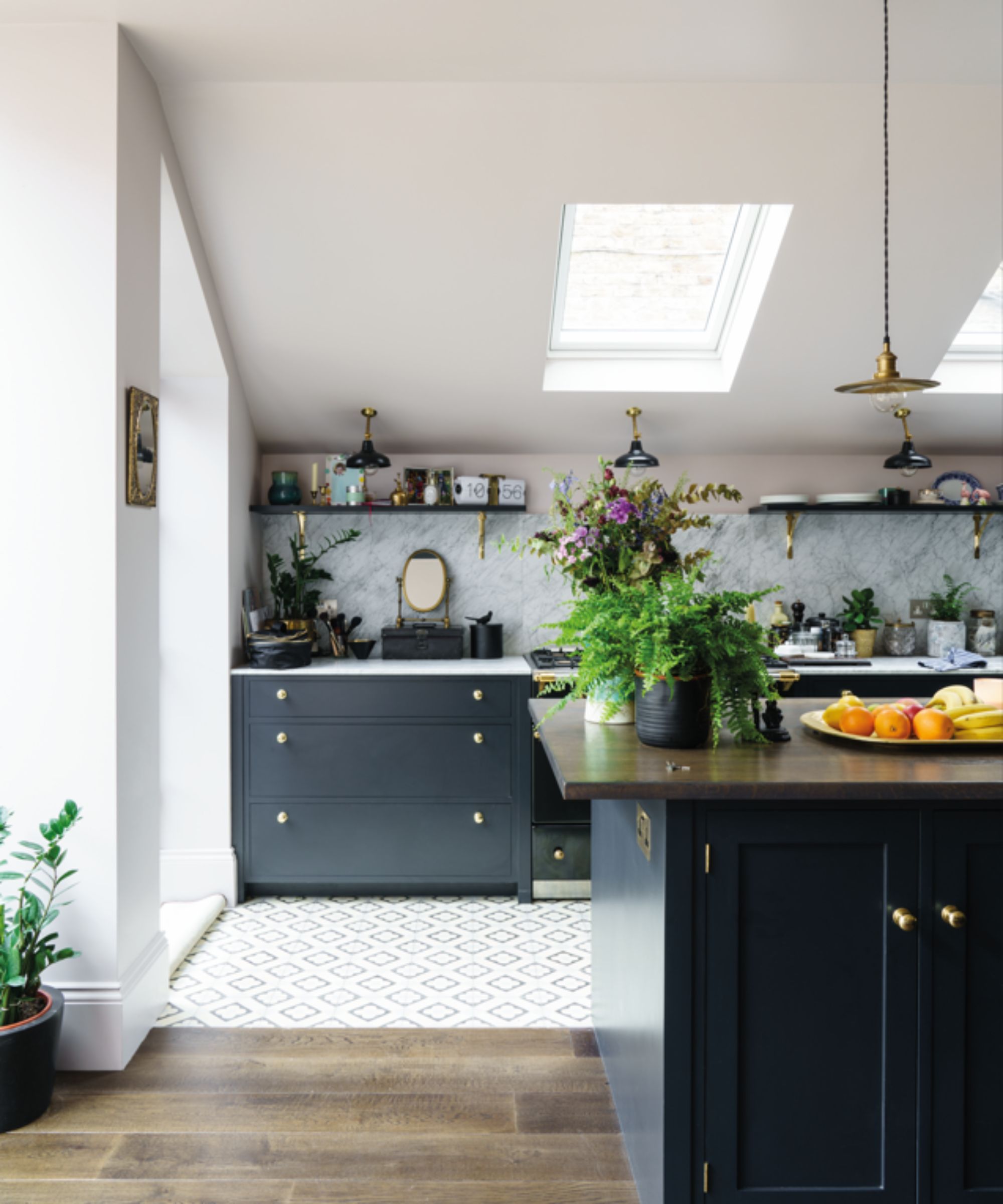
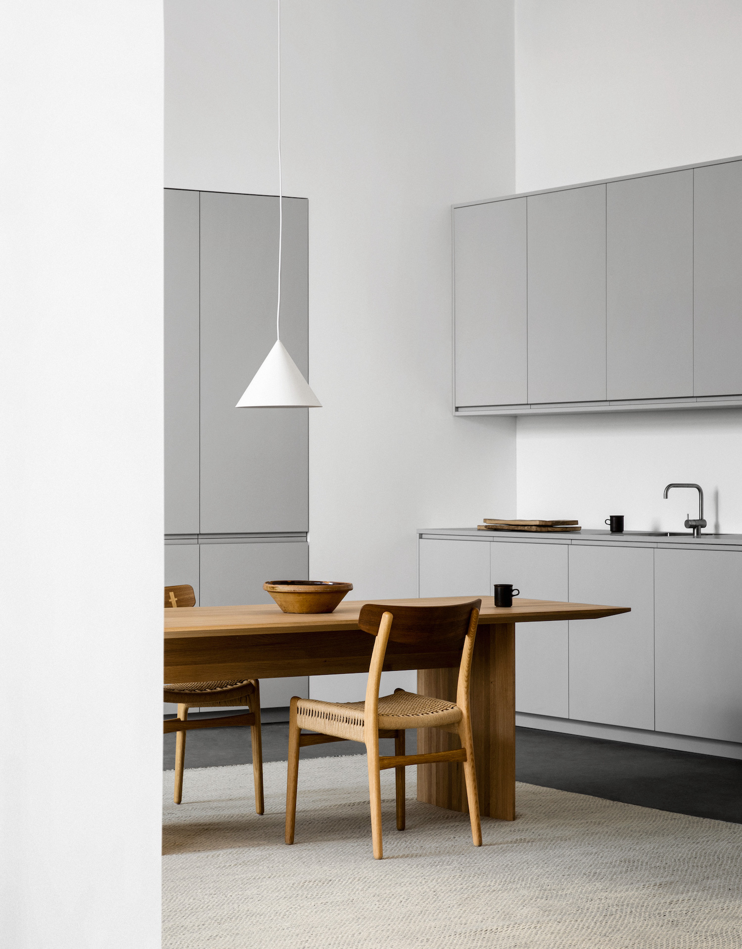
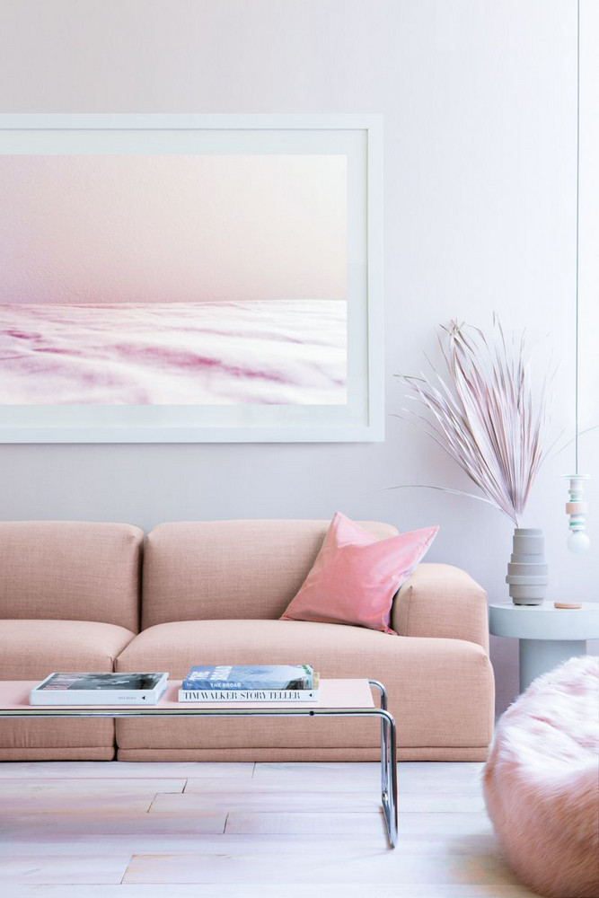
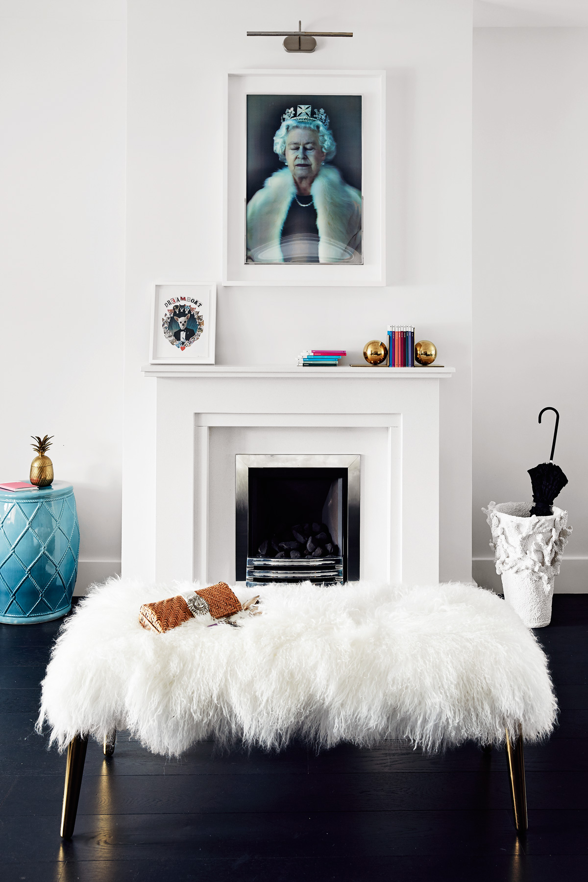
Selecting the right undertones is essential, particularly when working with seemingly neutral colors like white. A pure white kitchen, for instance, can lack warmth; introducing a white with an ivory pigment or warm undertones can prevent it from feeling dull. Similarly, incorporating brass hardware with blush cabinets and walls can create a seamless and warm finish. Leaning into various shades of a chosen color family, rather than sticking to a single precise shade, is another technique. This can involve drawing inspiration from natural materials or even metals, allowing for subtle variations and nuanced interplay with light.
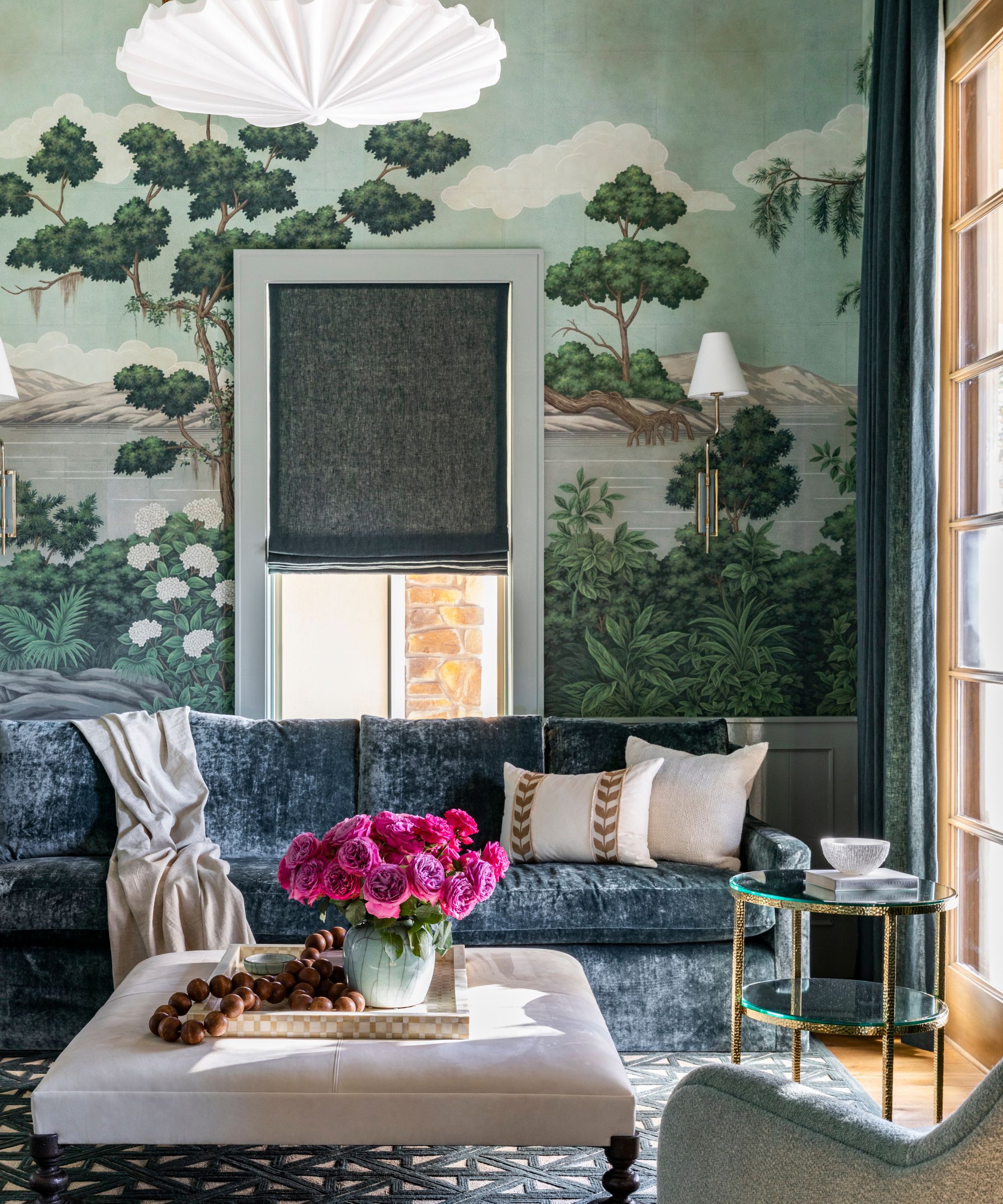
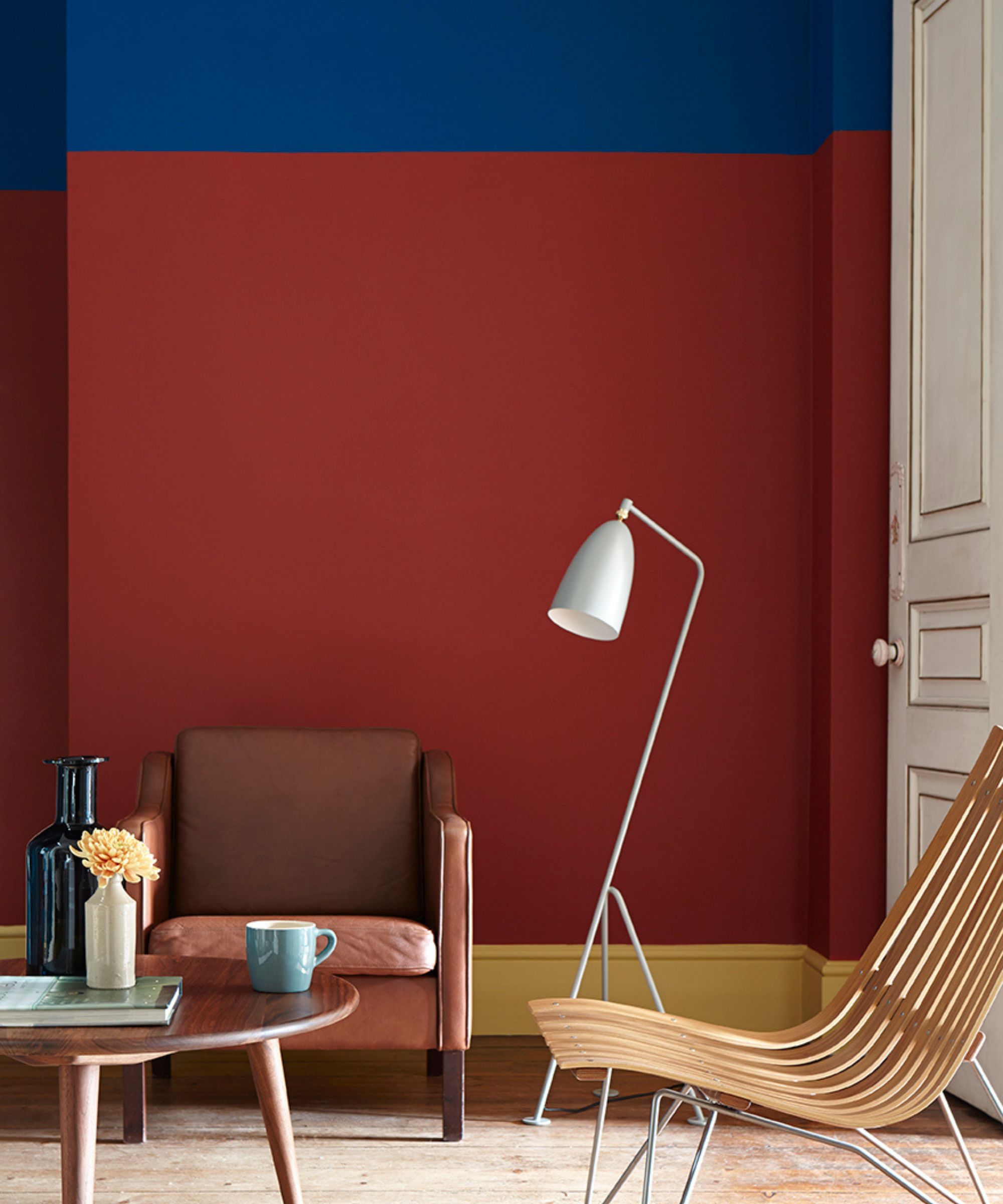
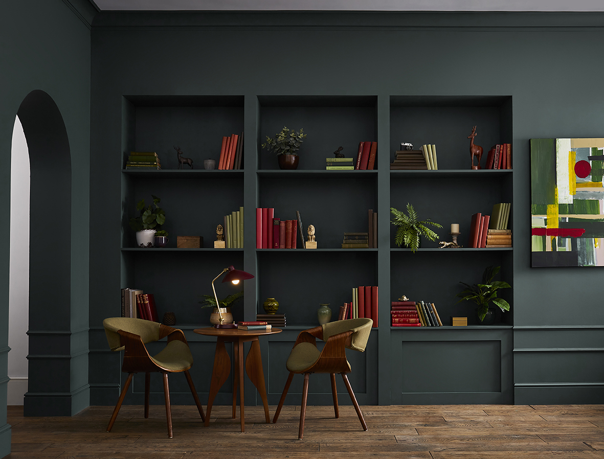
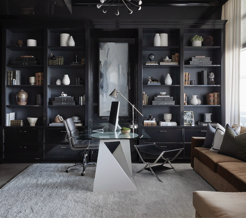
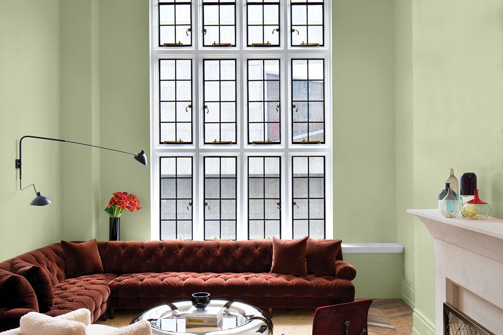
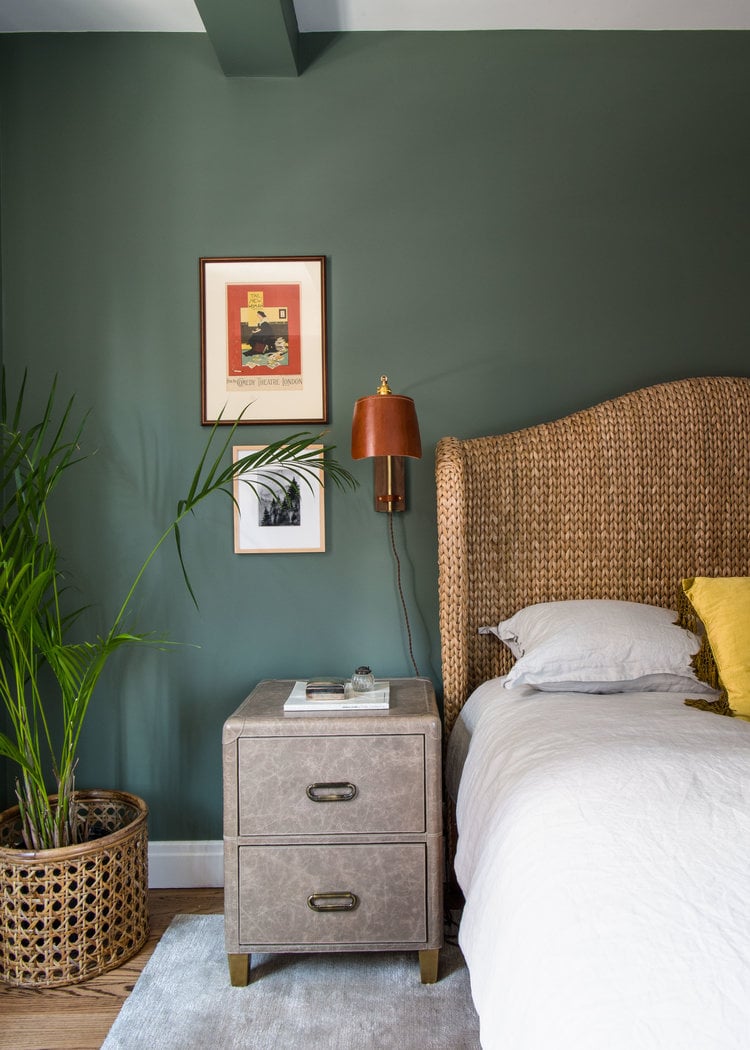
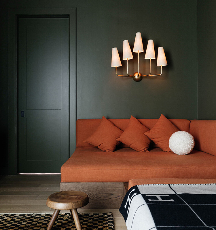
Layering warm colors and natural light can also enhance monochromatic interiors. Different materials, such as velvet, rattan, leather, and wood, when combined, allow light and shadows to create depth and visual movement throughout the room. This approach results in a timeless and soothing aesthetic, less prone to going out of style compared to more complex color combinations. Darker shades can be strategically used as accent colors to ground a space, especially in open-plan layouts. By carefully selecting a main color, designers can dictate other choices, such as trimming beams and windows in a complementary dark shade to tie elements together.
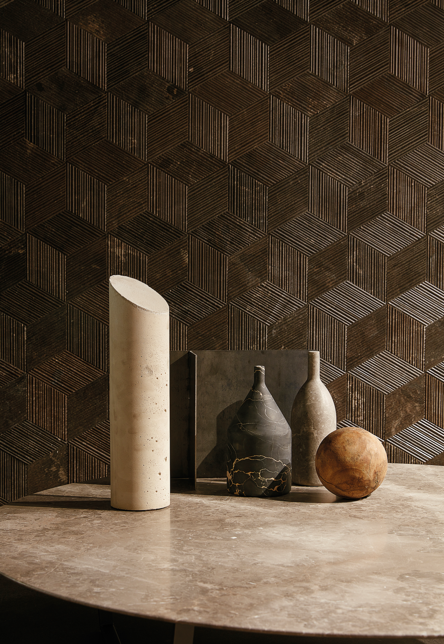
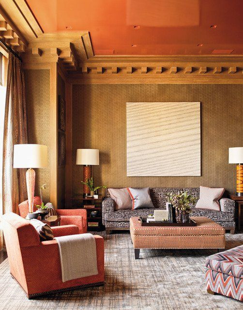
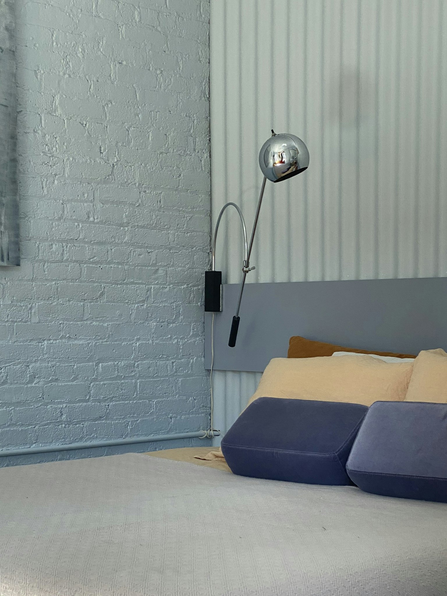
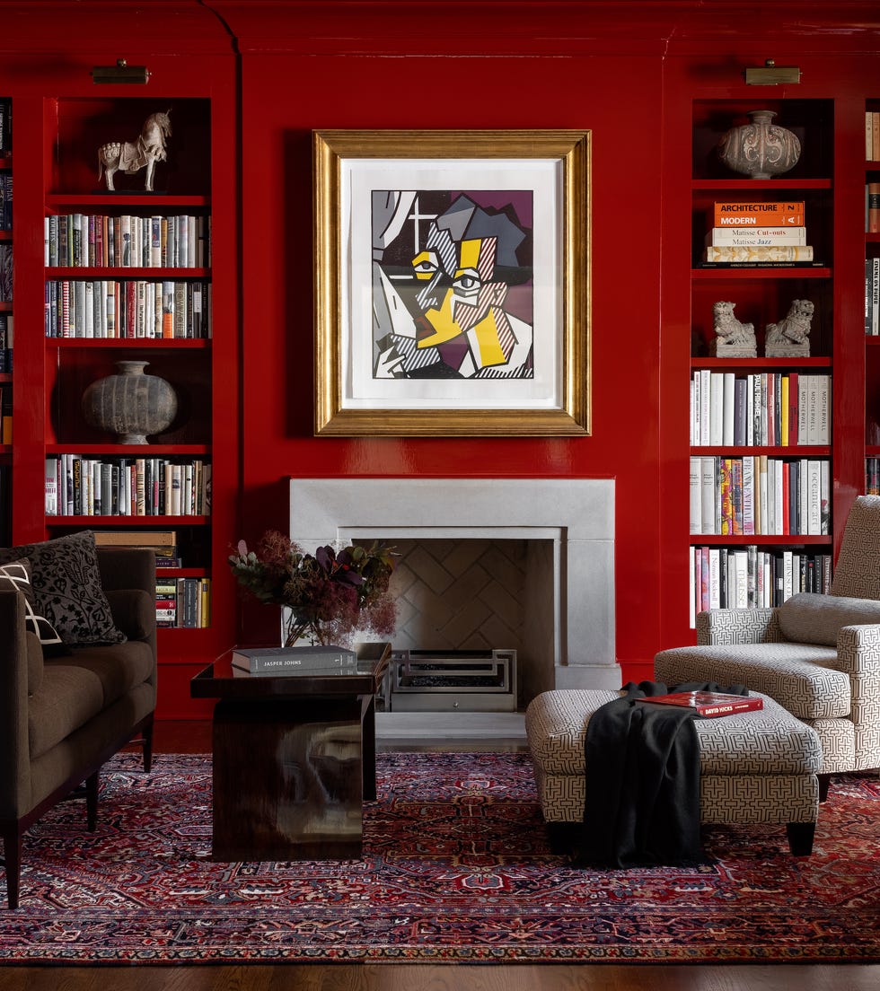
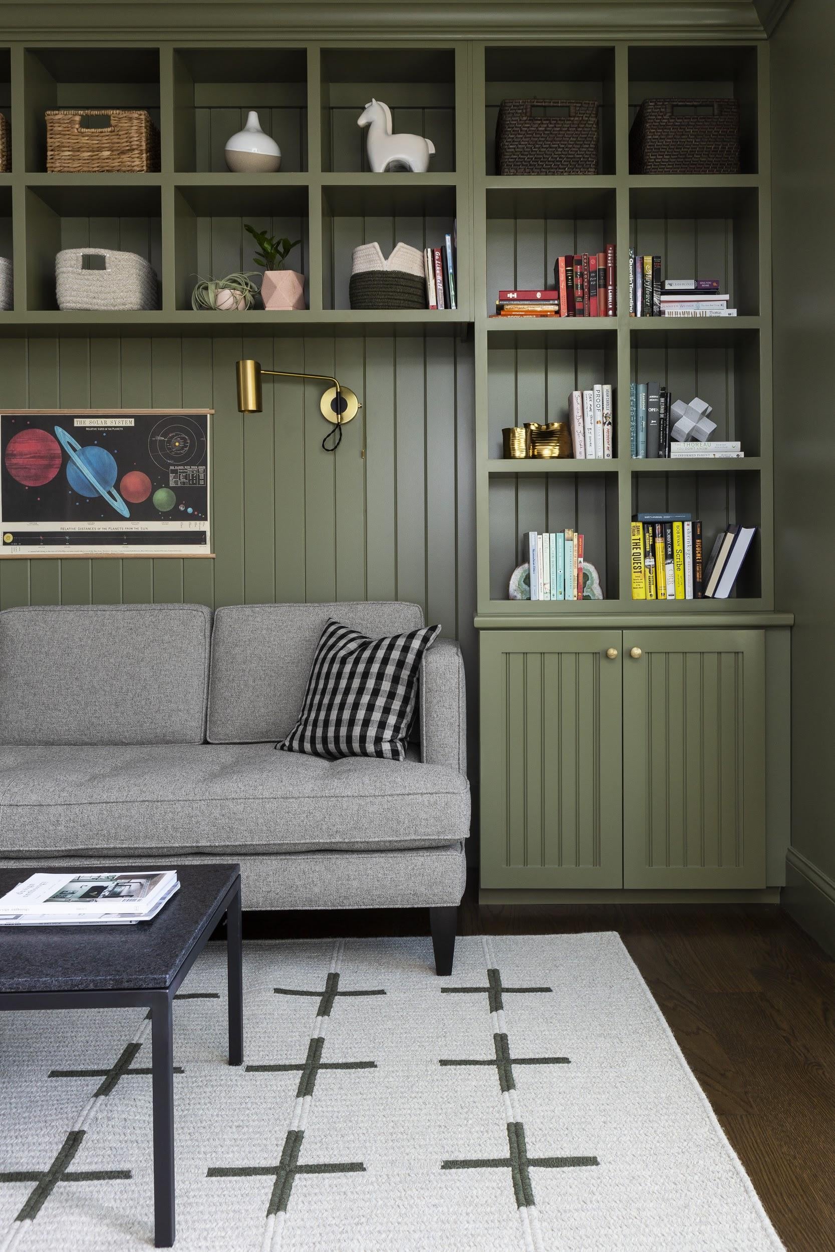
Enhancing color harmony through reflection involves incorporating metallic and reflective elements. High-gloss ceilings or mirrored furniture pieces can bounce light around the room, adding visual interest and layering to the monochromatic scheme. Furthermore, extending the chosen color to walls, trim, and ceilings creates a sense of enveloping dimension. Using wainscoting and dental molding within the same color palette can provide depth and variation while maintaining cohesion. Finally, taking inspiration from natural materials, such as marble, can guide the selection of complementary hues, allowing a room to feel multidimensional and elevated by incorporating the subtle color variations found in nature.
#MonochromaticDesign #InteriorDecorating #ColorSchemes #HomeDesignTips #InteriorStyling #ColorPsychology #DesignInspiration #HomeDecor #AccentColors #MonochromaticDesign #InteriorDecorating #ColorSchemes #HomeDesignTips #InteriorStyling #ColorPsychology #DesignInspiration #HomeDecor #AccentColors
0 comment in total
 No comments yet
You may also like
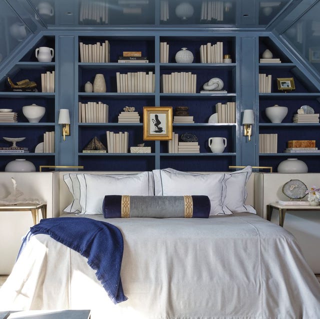
Monochromatic color schemes – 9 single-color rooms that master this trend
A Complete Guide to Color Drenching a Room — The Tone-On-Tone Paint Style Taking Over Our Homes

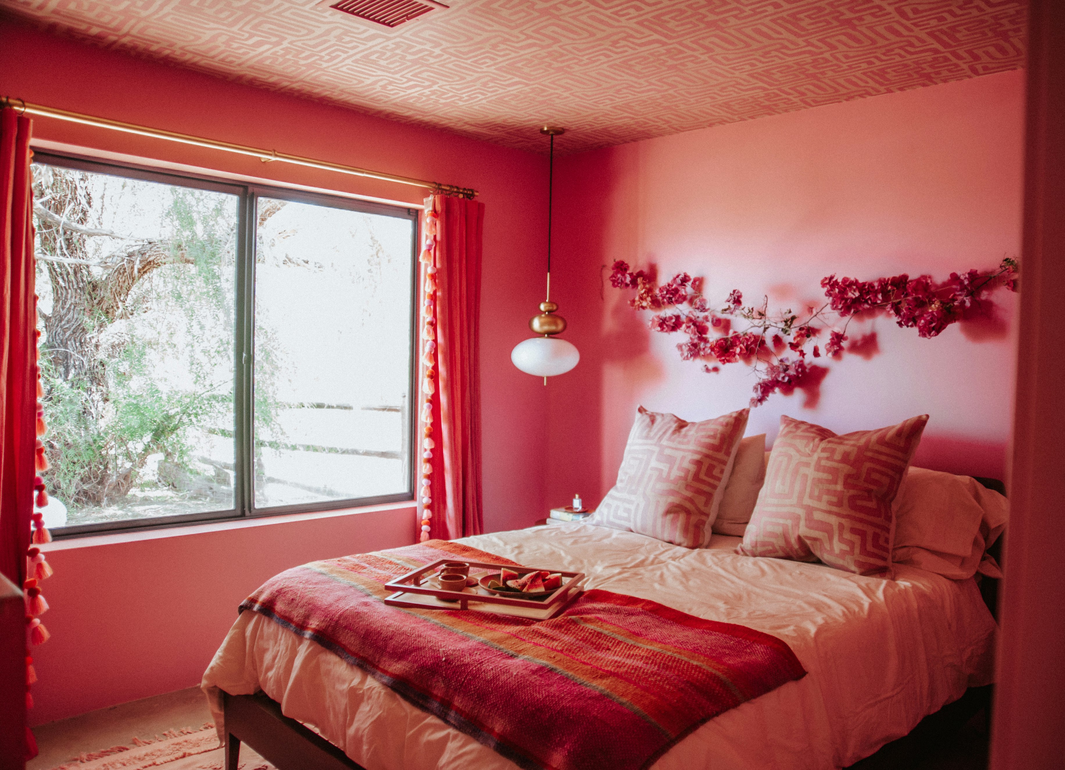
If Your Monochromic Room Feels Flat, Here’s How to Fix It

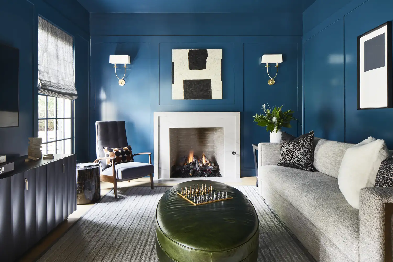
Say Goodbye to Neutrals: Color-Drenching Will Define 2026 Interiors

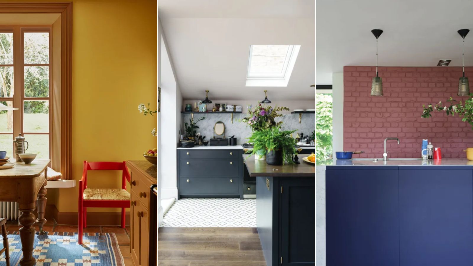
Designers are swapping tonal color schemes for high-contrast hues – here's how to do this daring color trend stylishly

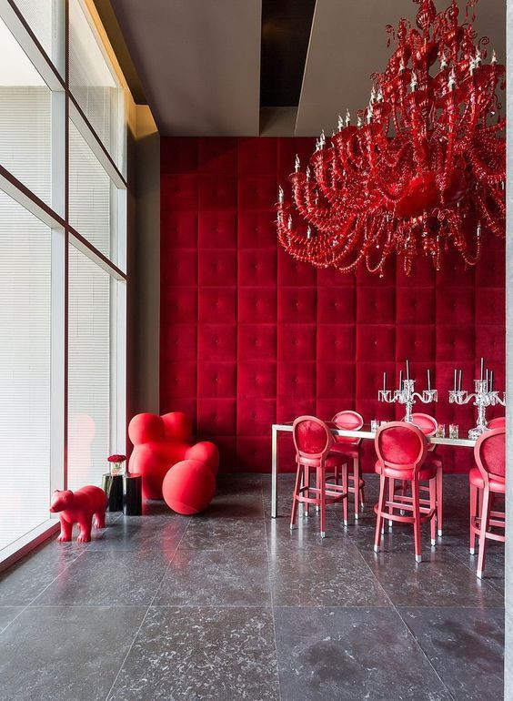
19 one-color rooms that prove it can be done
10 Color Drenching Ideas That Highlight the Beauty of This Paint Trend
We Can’t Get Enough of These 13 Paint Color Trends for 2021
Primary colours are having a moment - but the secret to styling them is through 'unexpected' touches
Tired of Neutrals? Here's How to Add a Little More Color to Your Space
The Color Drenching Paint Trend Isn't Going Anywhere

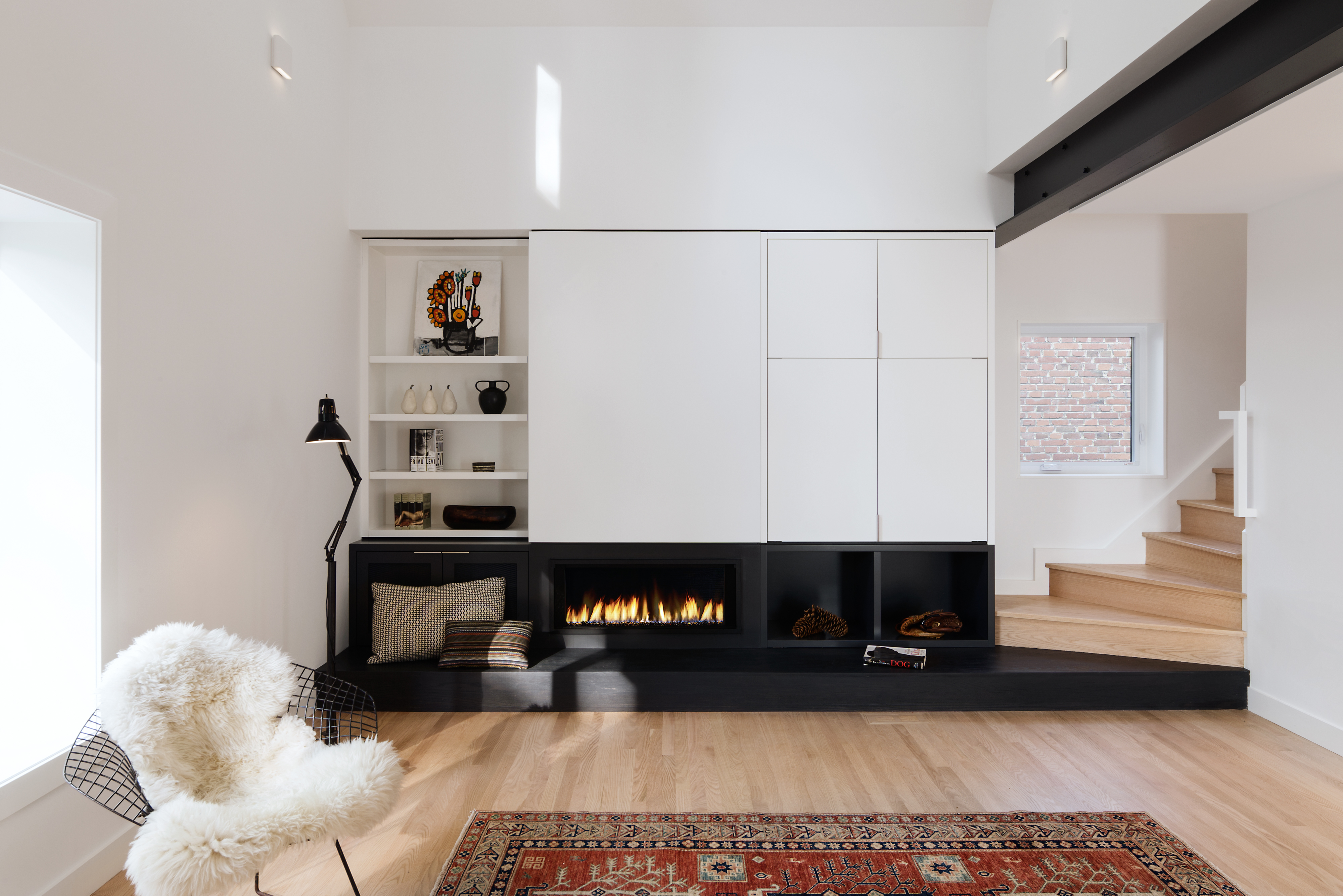
Black and white living room ideas – 10 ways to design a creative monochrome space
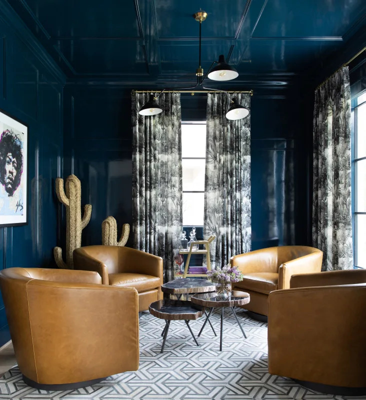
Color Drenching Is the Bold Paint Trend Taking Over—Here’s How to Nail It
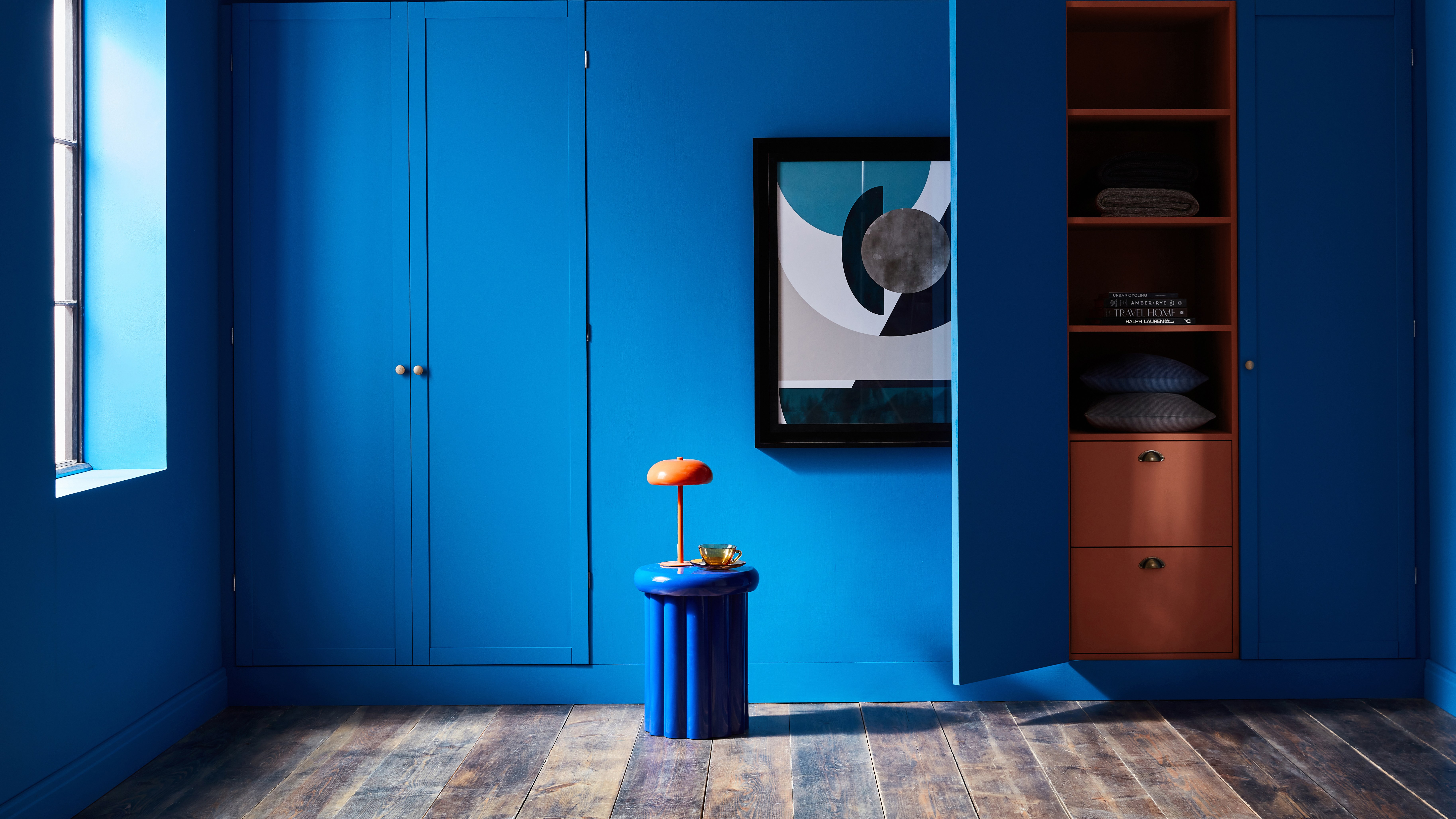
How to transform your rooms with colour drenching
How to Wear This Season's "Boring" Color Trend Without Looking, Well, Boring

Tips for adding the hottest paint colors to your decor

8 tricks to create a minimalist color palette that doesn't feel one-dimensional - elevated and enriching schemes
Bored of Beige? Here's How to Incorporate Colour Into Your Wardrobe This Season
How To Incorporate The Latest Color Trends in Your Home

A Beginner's Guide to Creating a Color Palette You Won't Get Sick Of