1/15
The 5 small entryway color mistakes design experts say are big bloopers
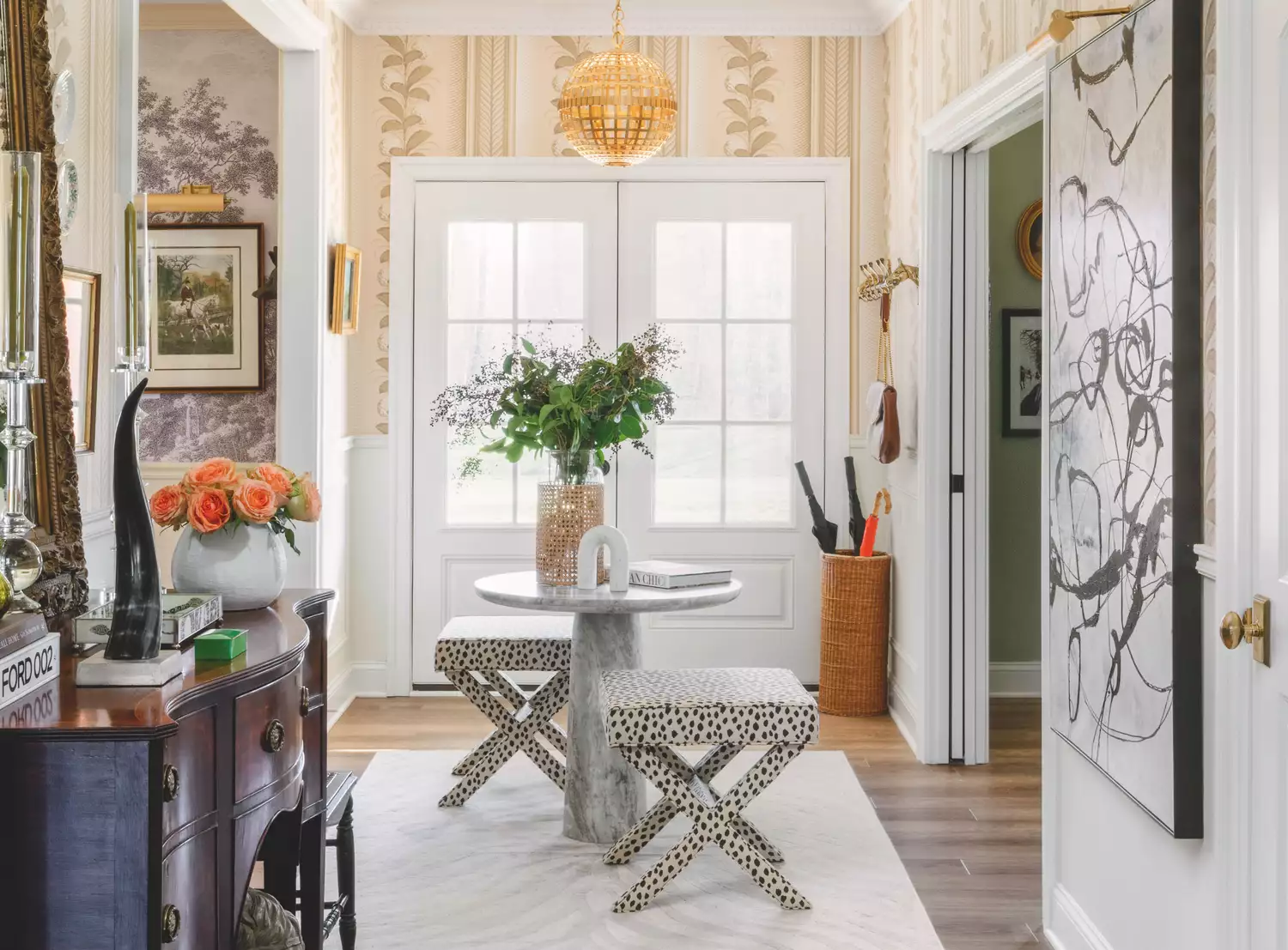
Decorating a small entryway can be challenging, but understanding common color mistakes can significantly ease the process, saving both effort and expense. Design experts have identified five prevalent errors in choosing colors for small entryways and offer solutions to achieve a more cohesive and visually appealing space. These insights are crucial for anyone looking to refresh their entryway, whether following a specific design idea or simply selecting a new paint color.
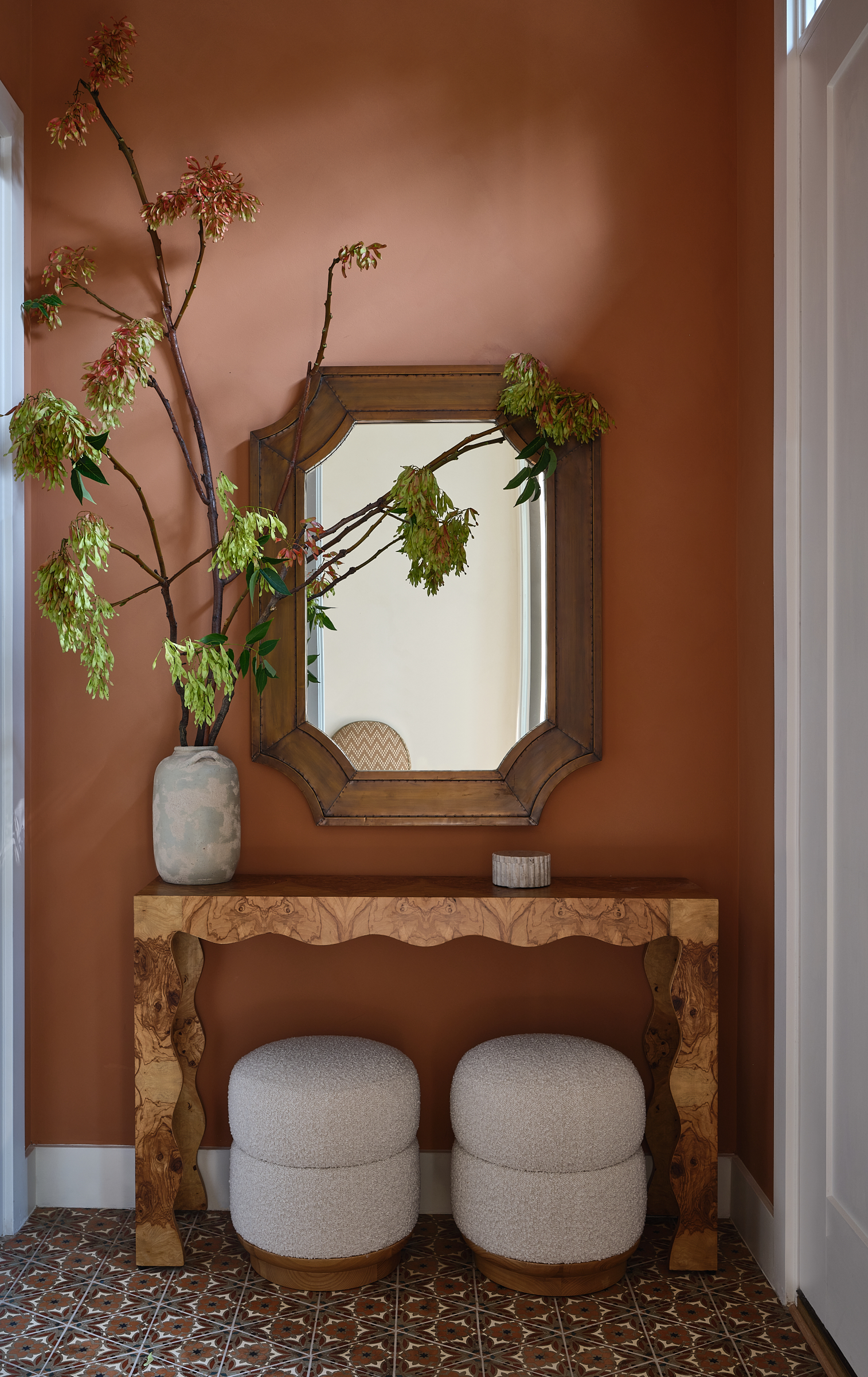
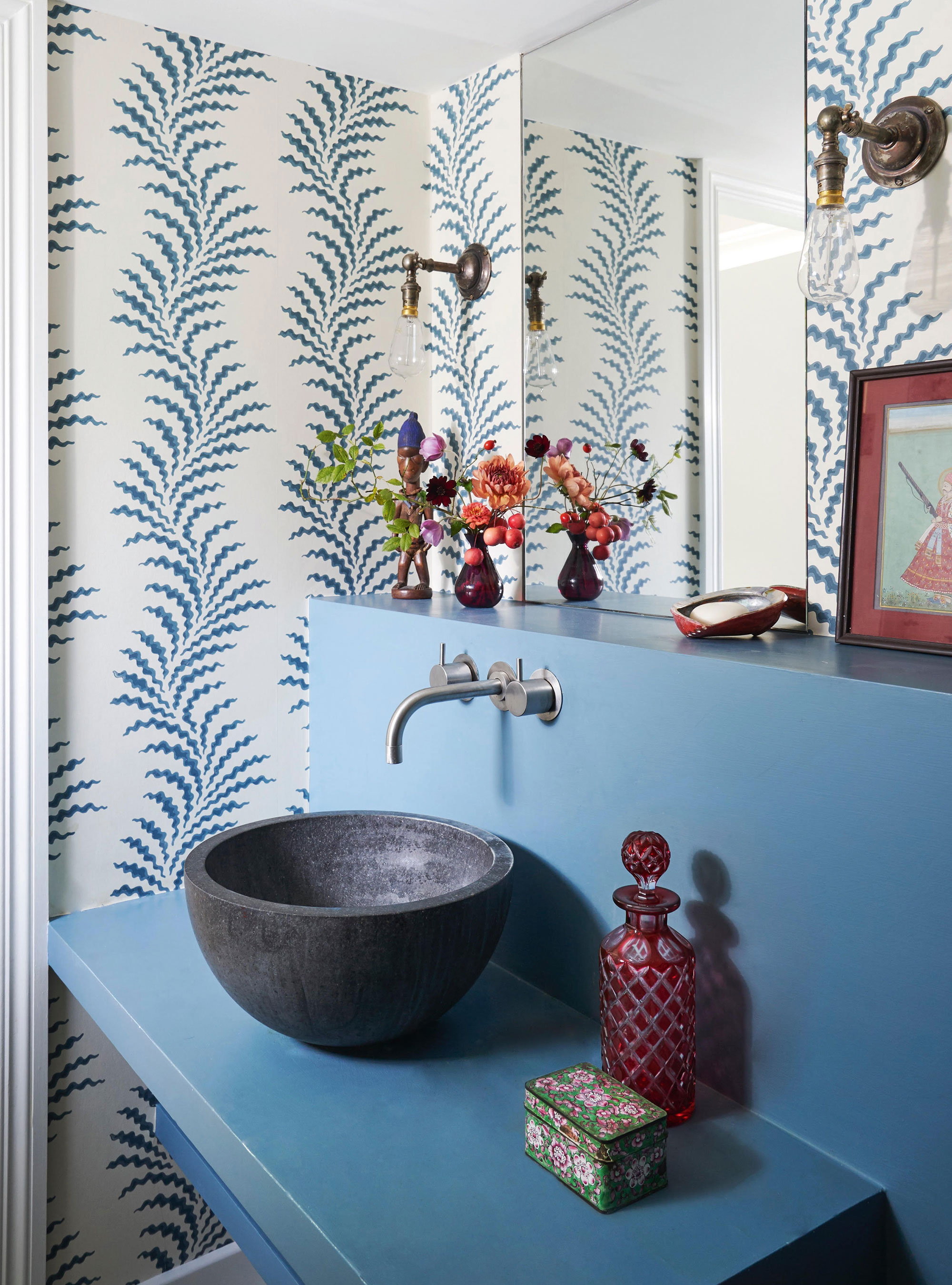
One significant mistake is overlooking the undertones of a chosen color. A paint color that appears appealing in a store or on a sample card can look dramatically different on a wall, primarily due to its underlying warm or cool undertones. For instance, a blue with purple undertones will create a distinct effect compared to a blue with green undertones. Failing to consider these nuances can result in an entryway color that clashes with the overall home aesthetic. To prevent this, it's advisable to test paint samples directly on the wall and observe them under varying lighting conditions throughout the day for at least 24 hours.
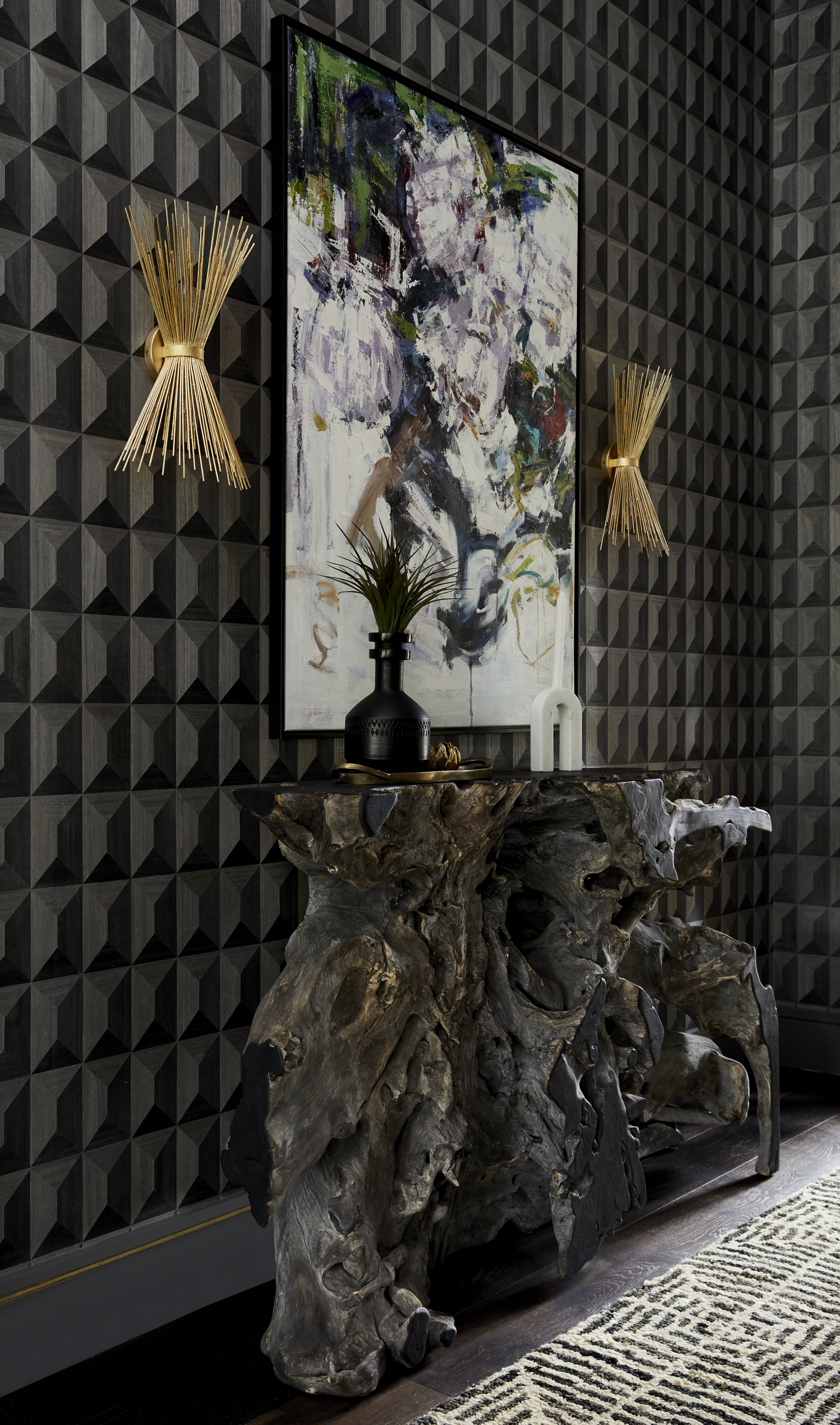
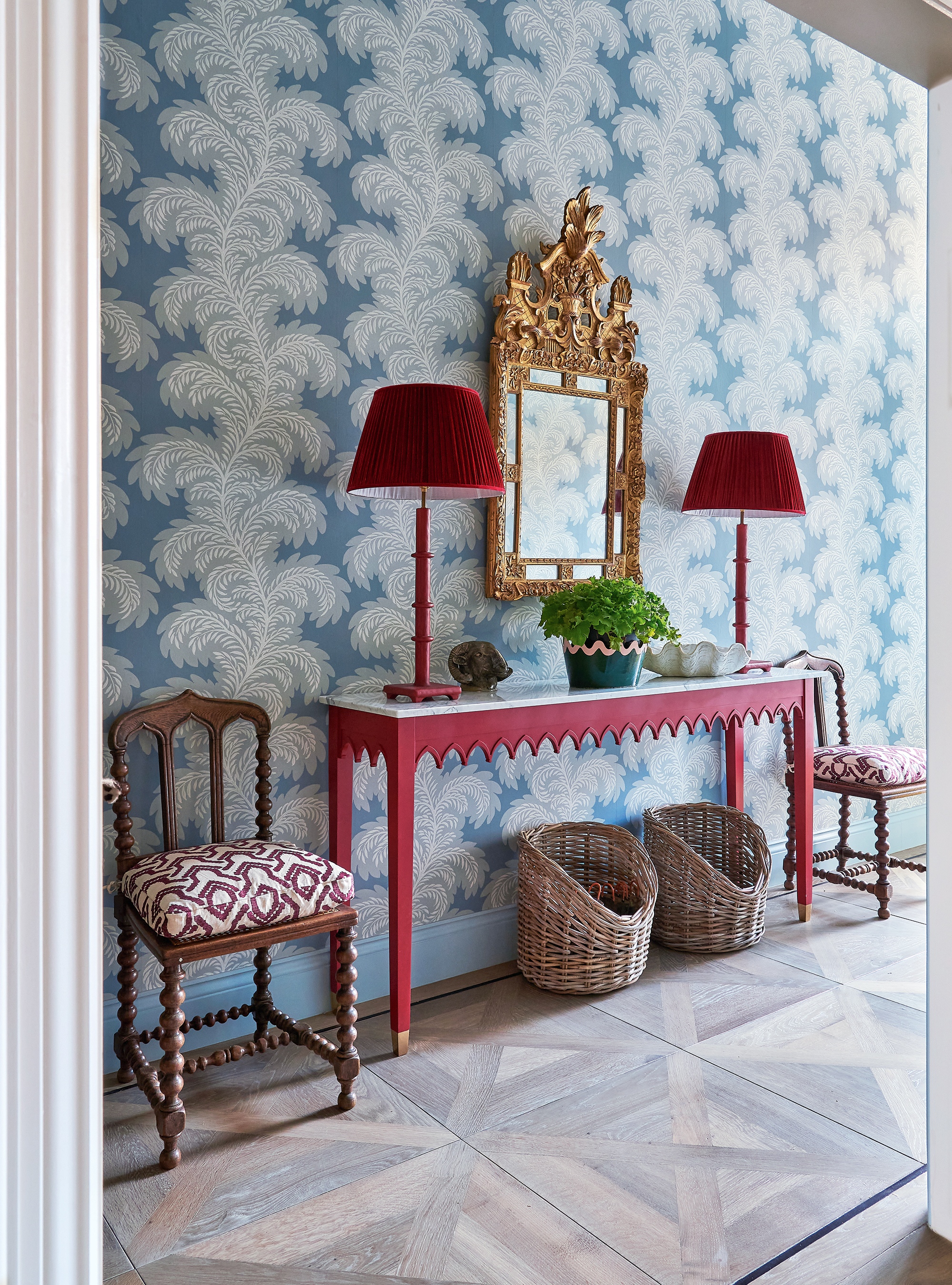
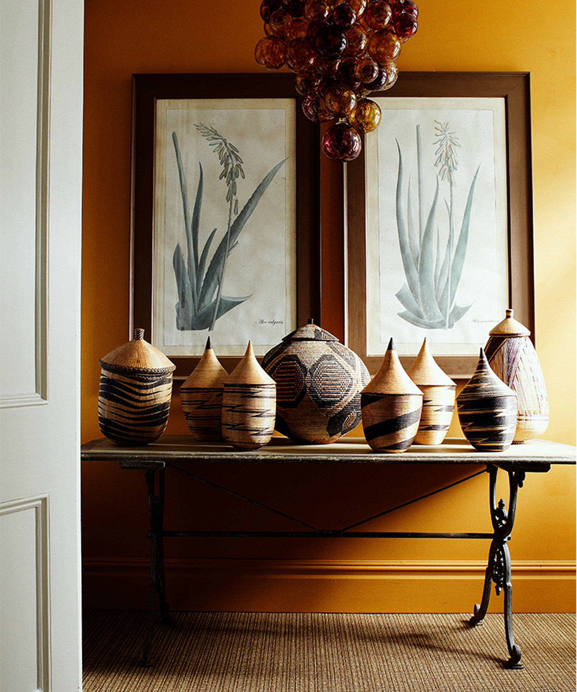
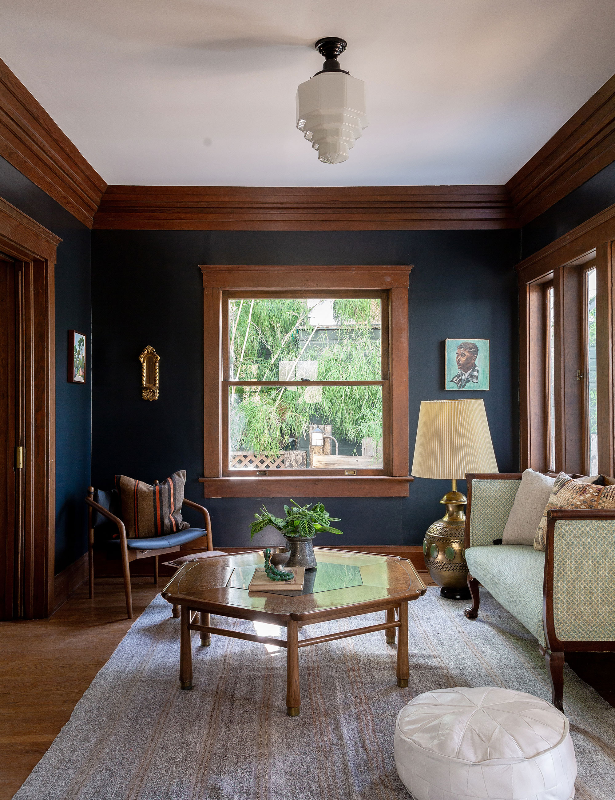
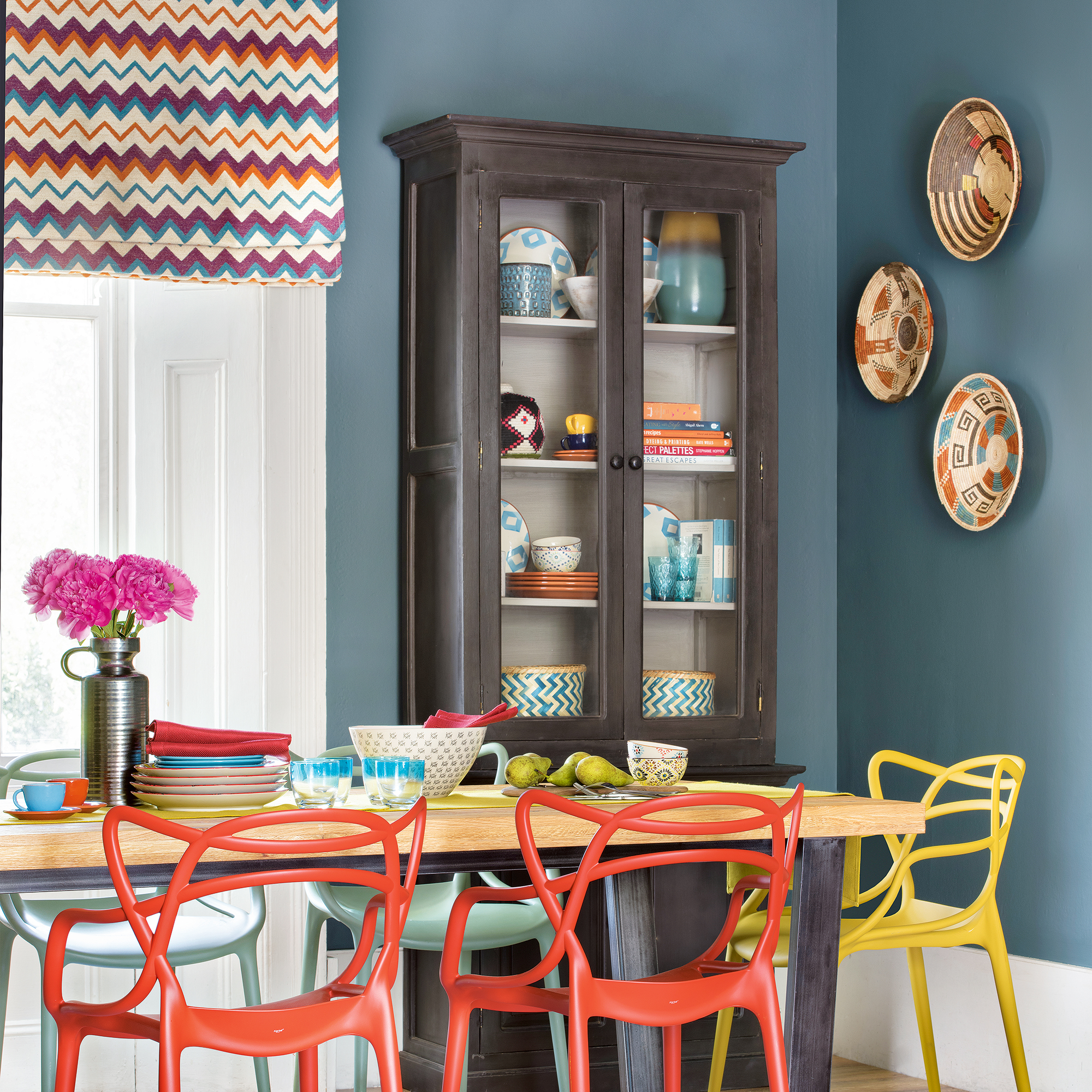
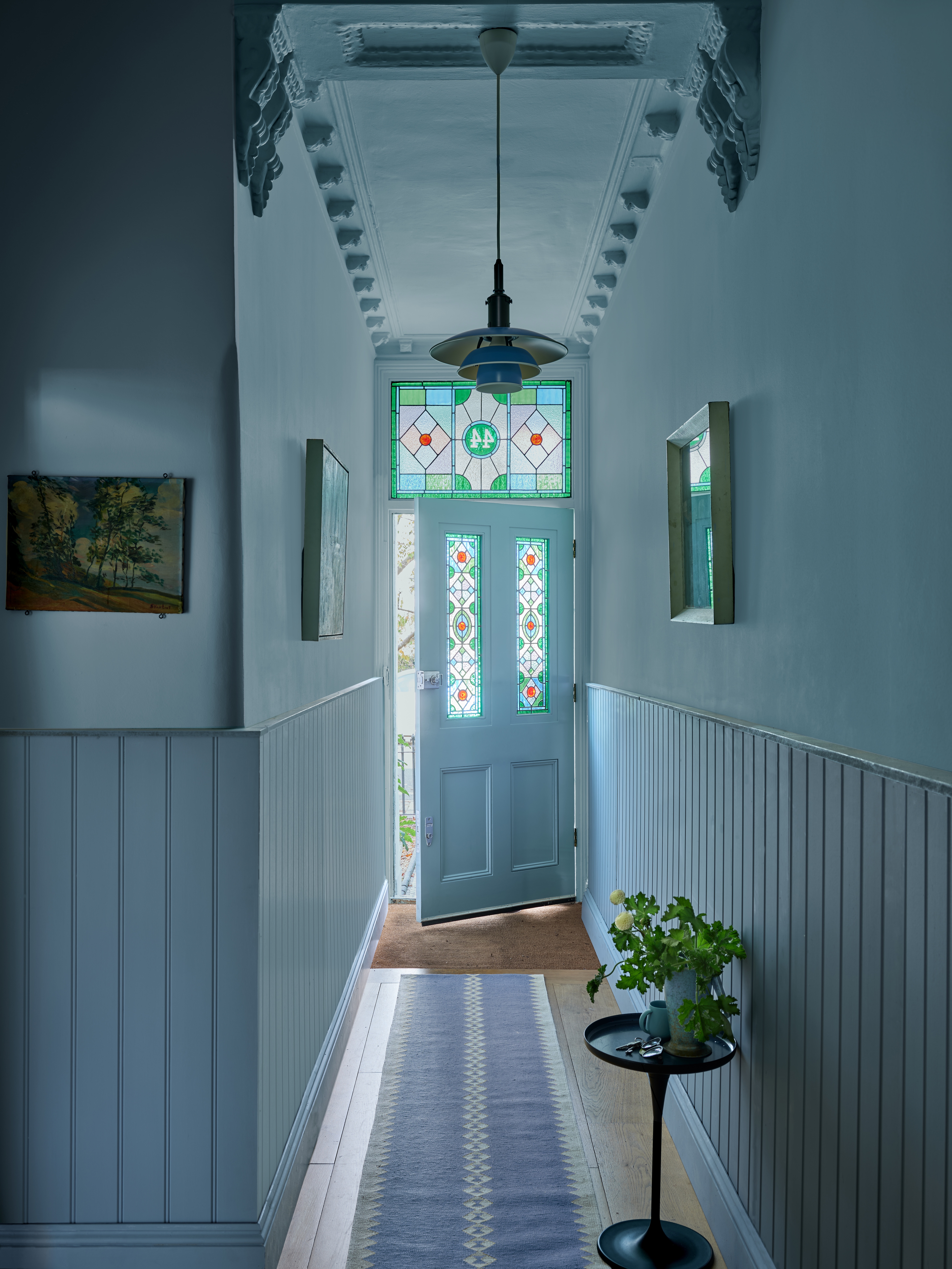
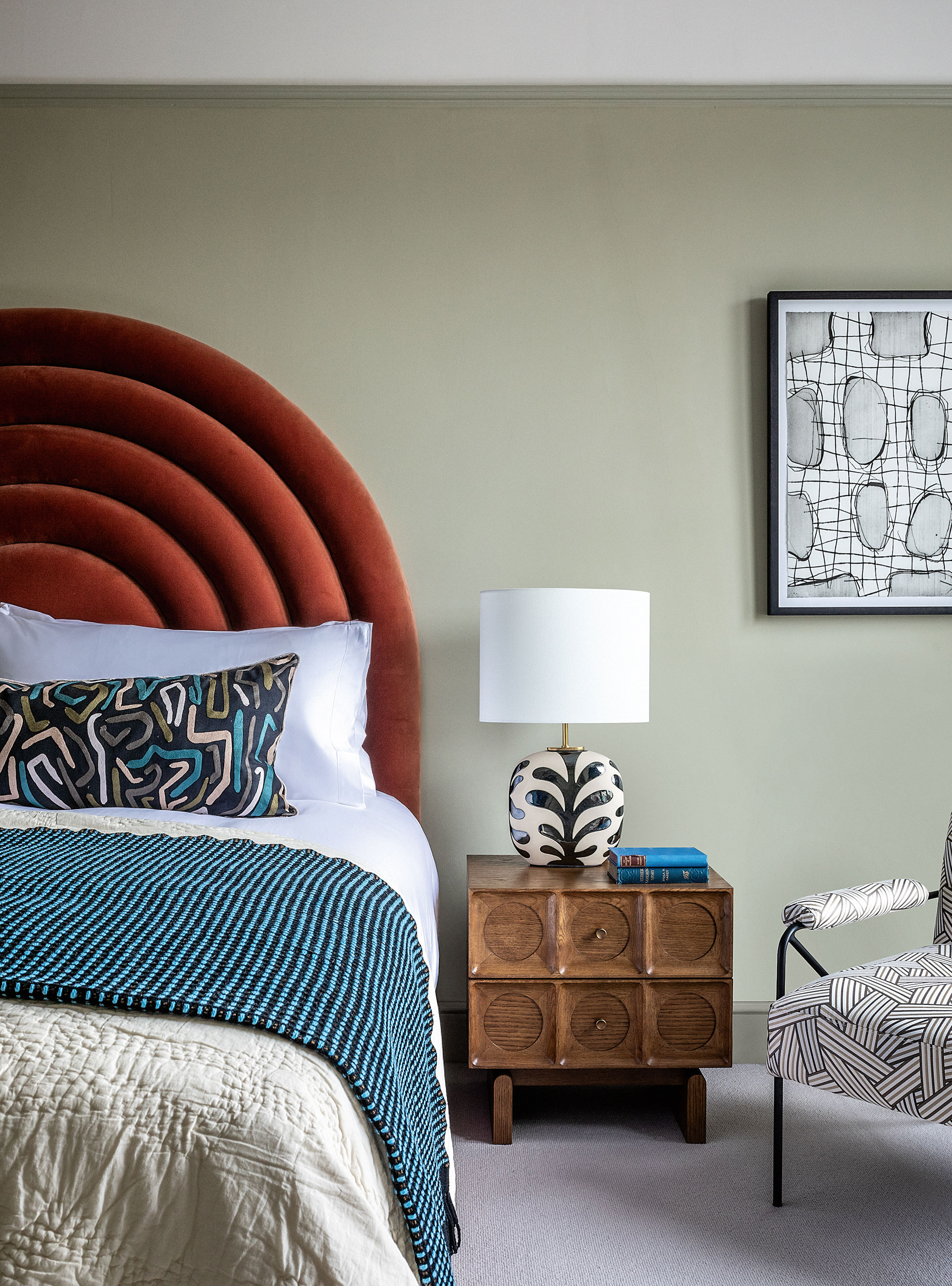
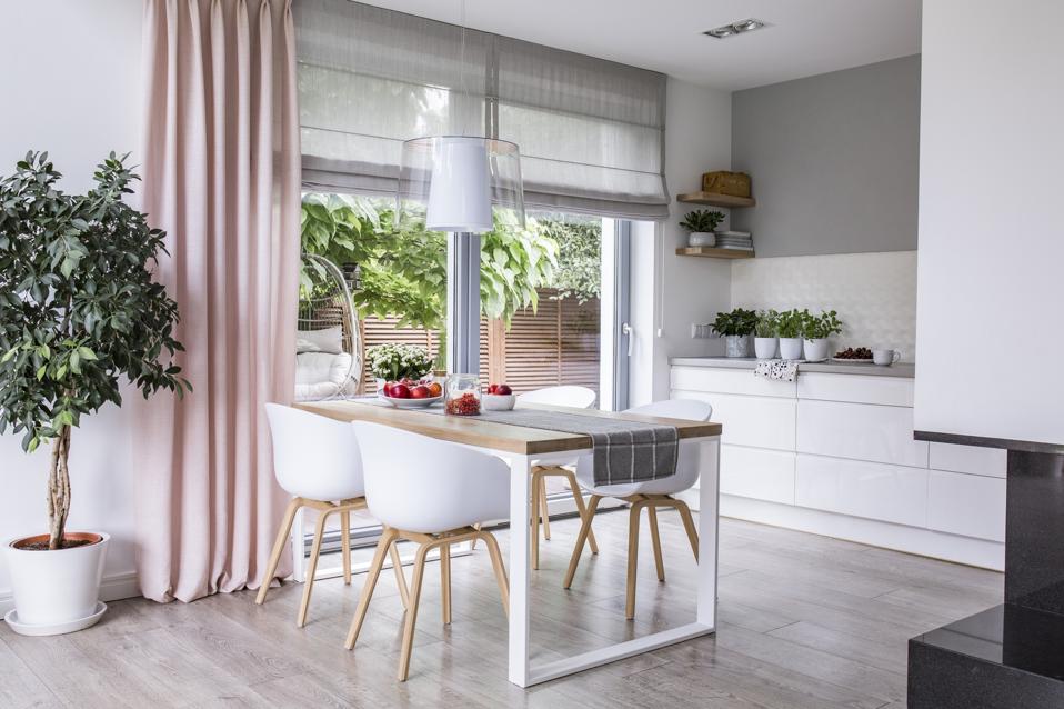
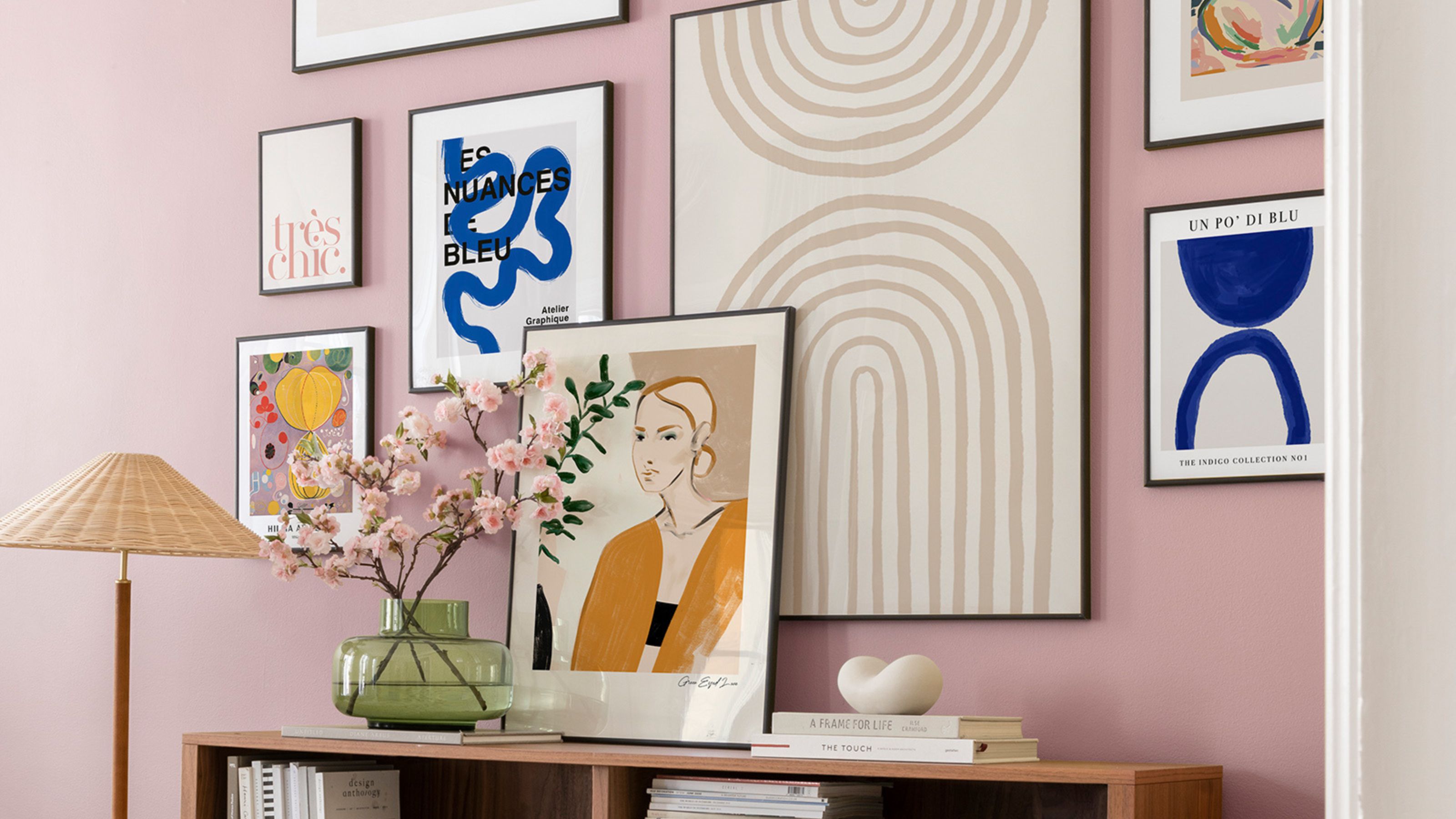
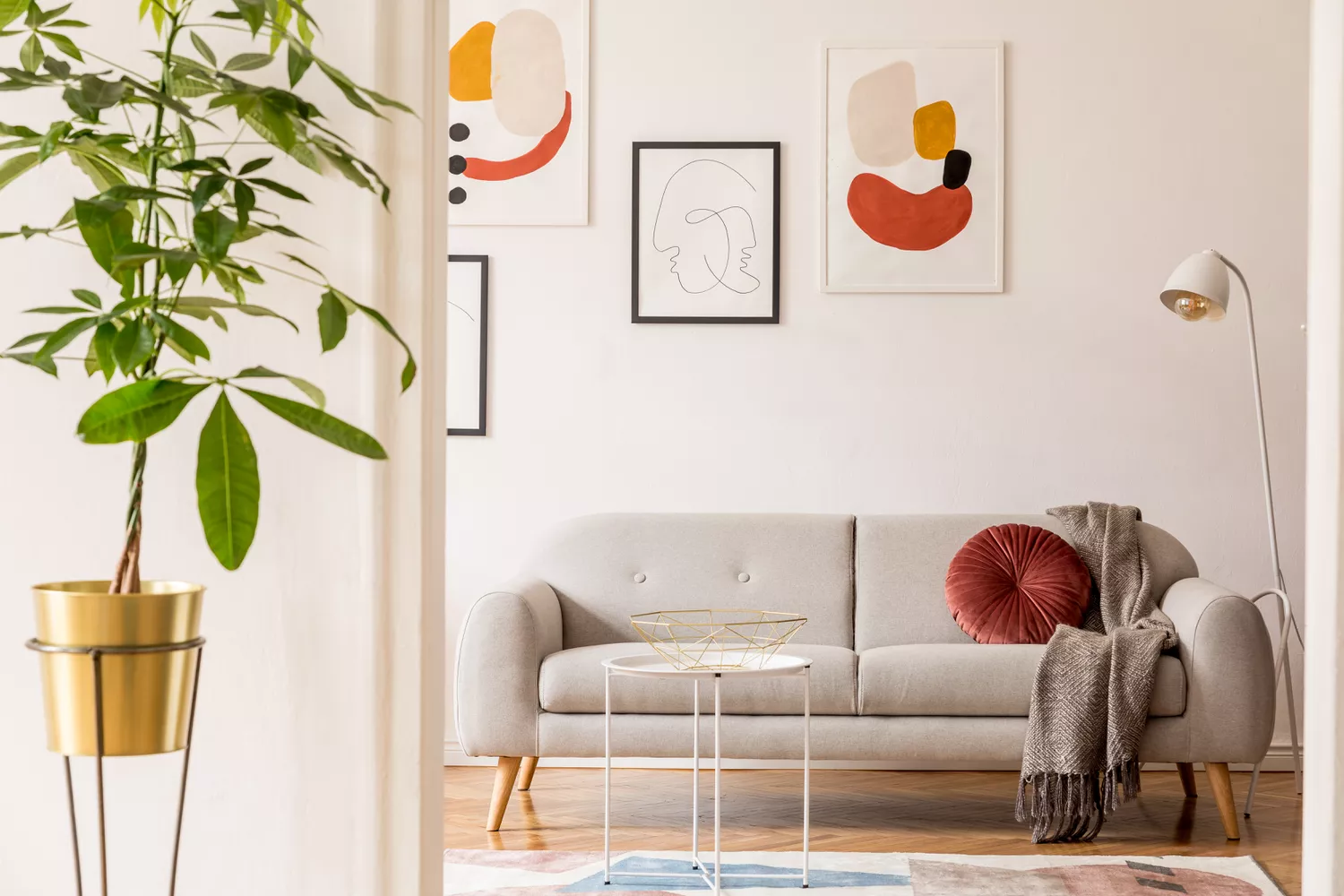
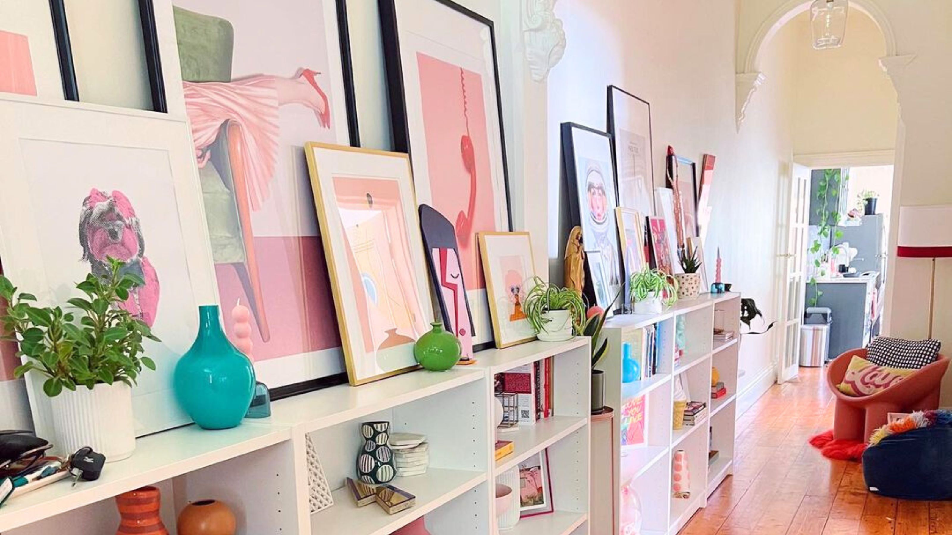
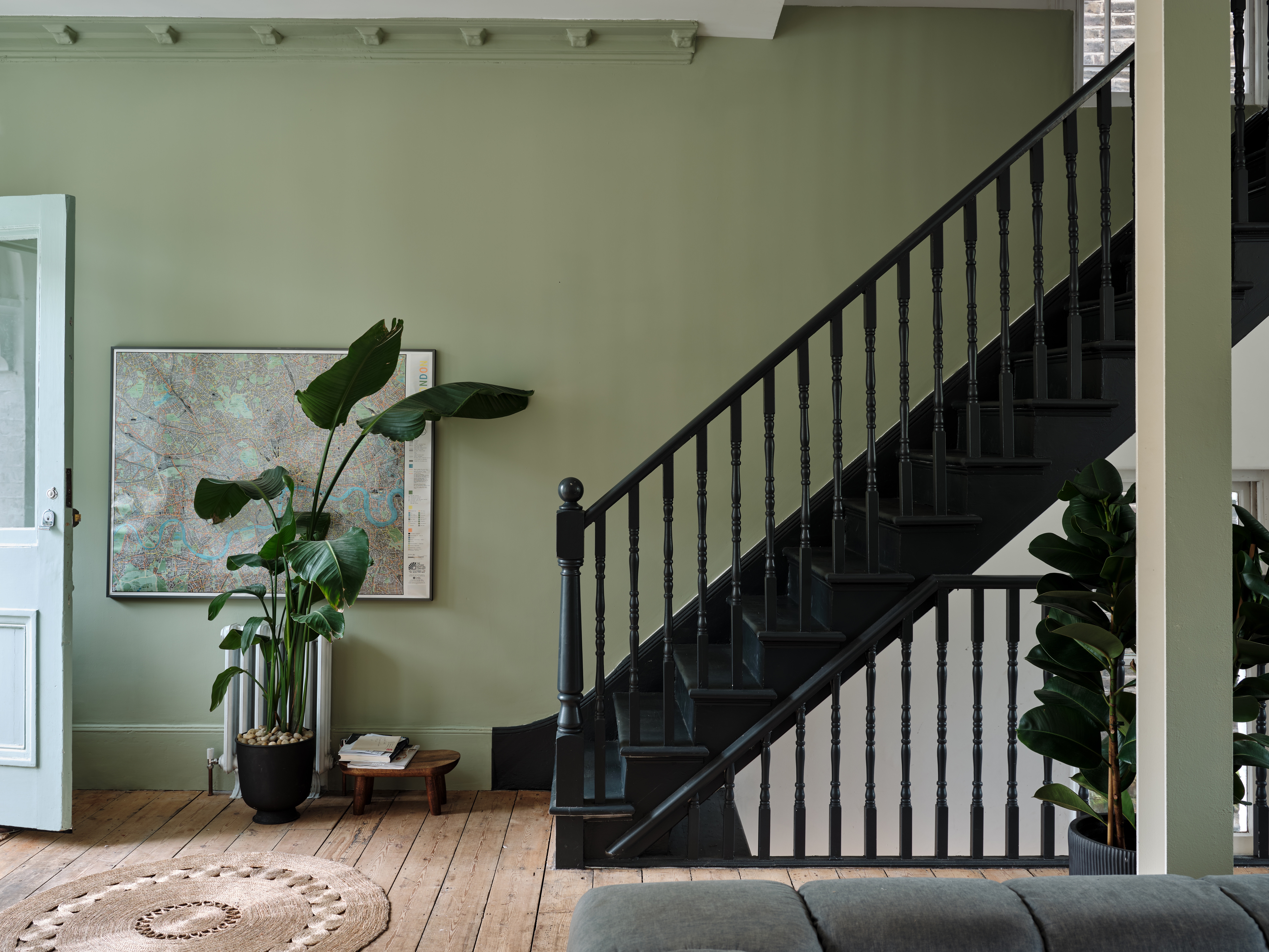
Another error is overdoing color schemes, particularly in small entryways. While trends like maximalism advocate for a rich array of colors, an excessive use of hues in a confined space can lead to a cluttered and disorganized feel. Experts suggest streamlining the color palette to one or two primary colors, with patterns and accents introduced sparingly to maintain harmony. For those wishing to incorporate more color, choosing subdued or pastel tones is recommended, as these are less dominant and can align with popular aesthetics like Danish pastel, which emphasizes soft shades and whimsical patterns.
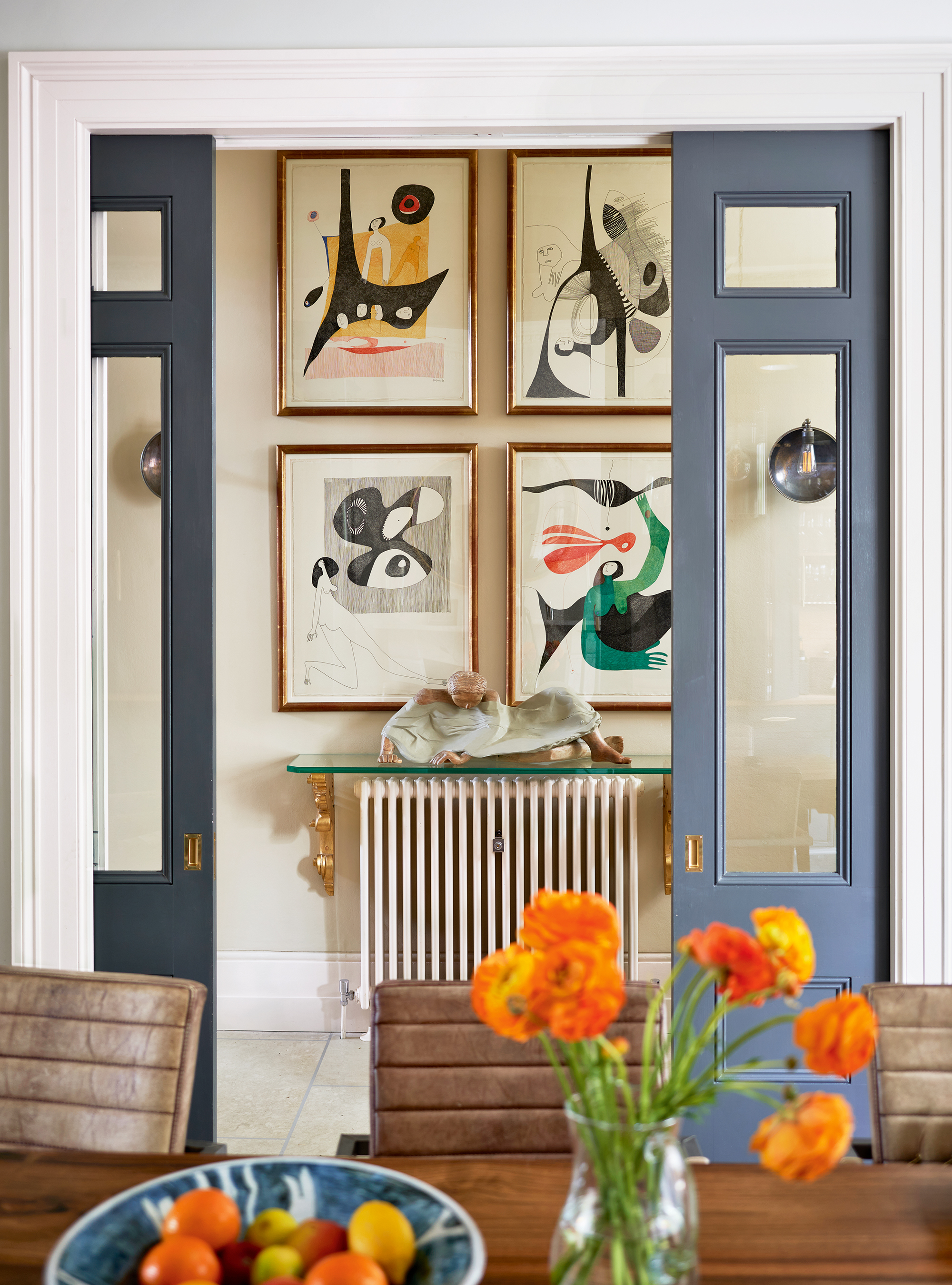
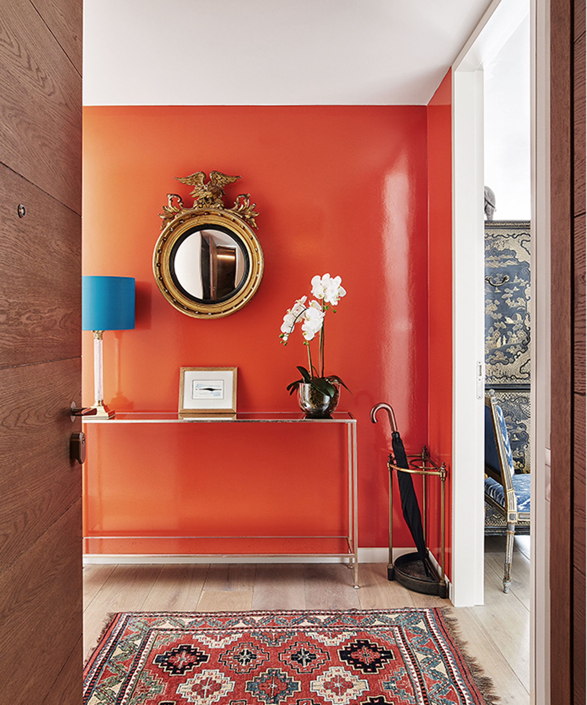
A third common mistake is selecting colors in isolation without considering the existing elements of the home. A paint color or furniture piece might be attractive on its own, but it’s essential to ensure it complements other colors, furniture, and decor within the entryway and adjacent areas. Bringing color and fabric swatches home to compare them against current furnishings and decor before making a purchase can prevent potential clashes and ensure a harmonious transition between spaces.
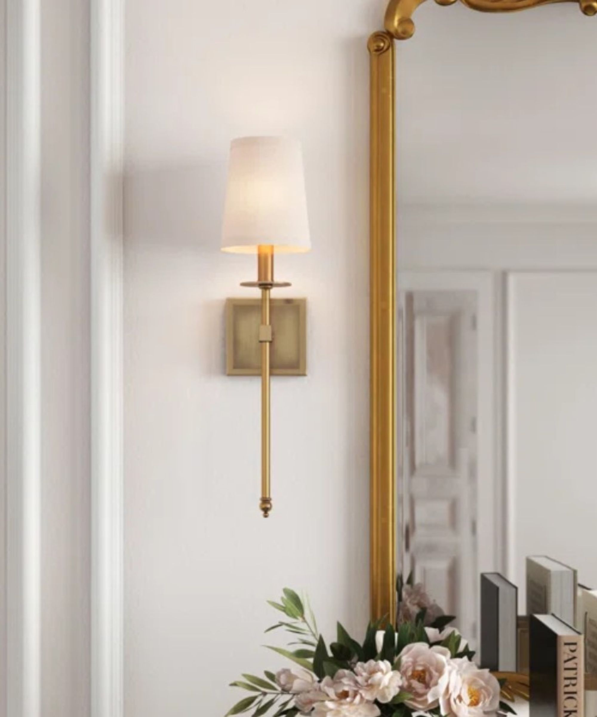
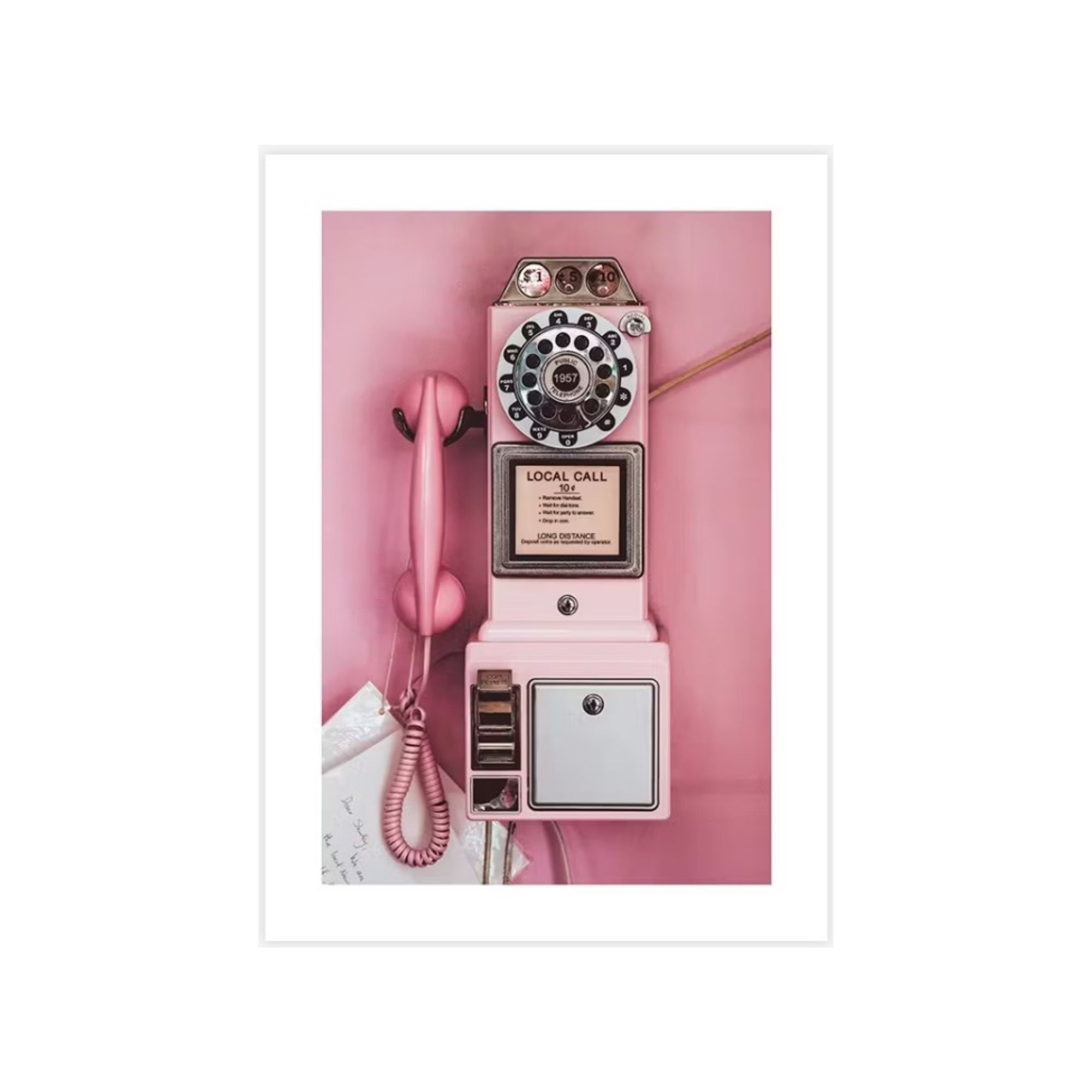
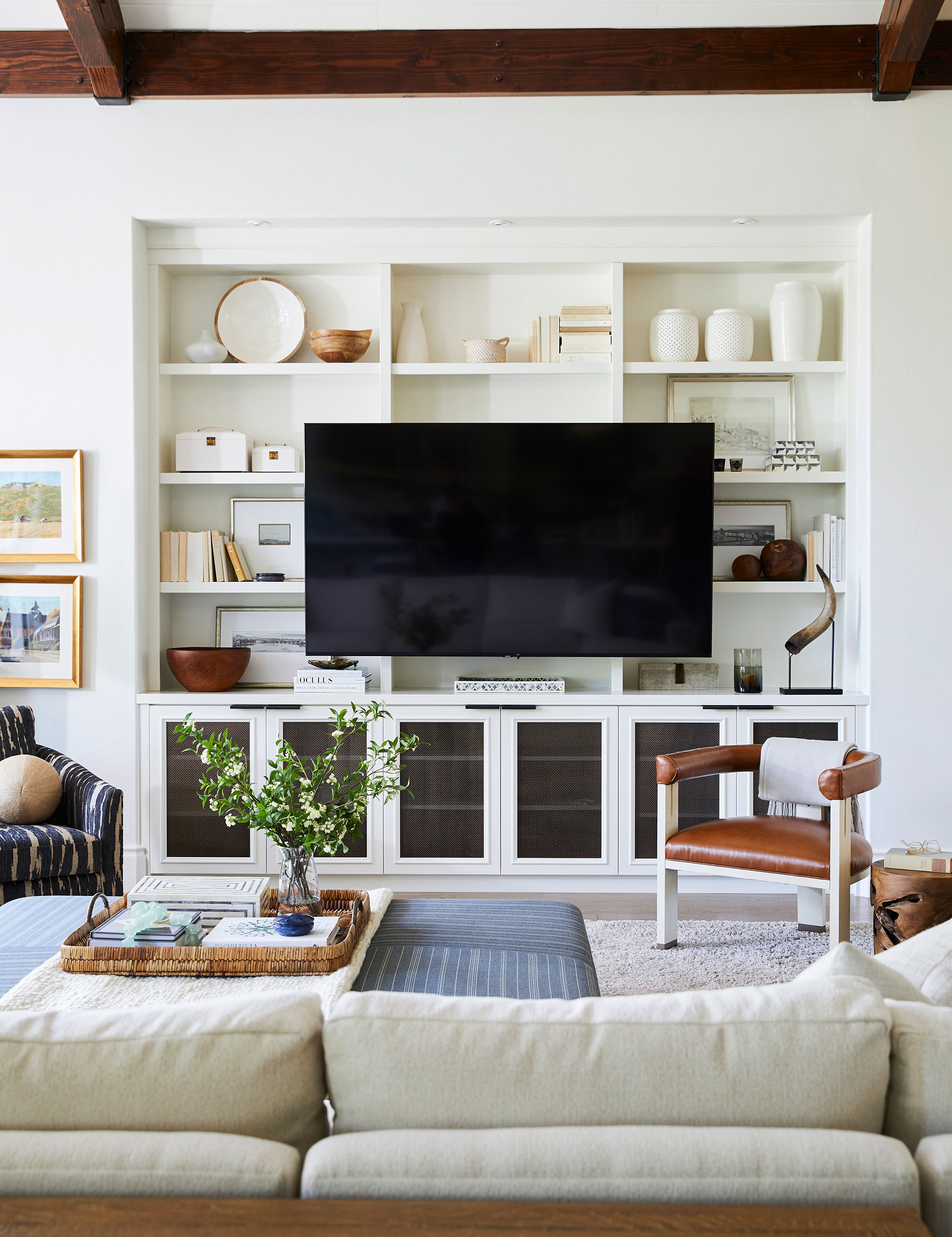
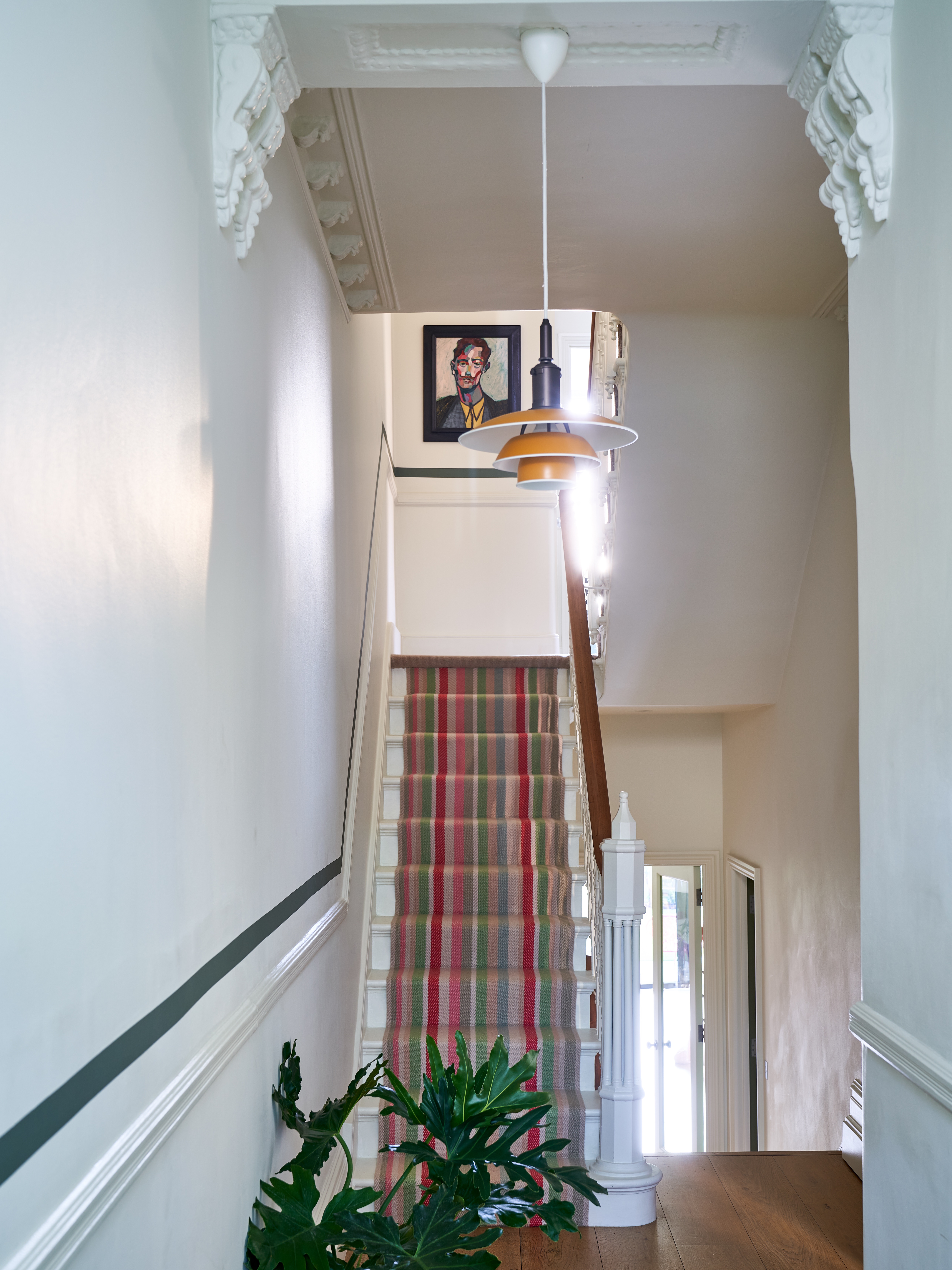
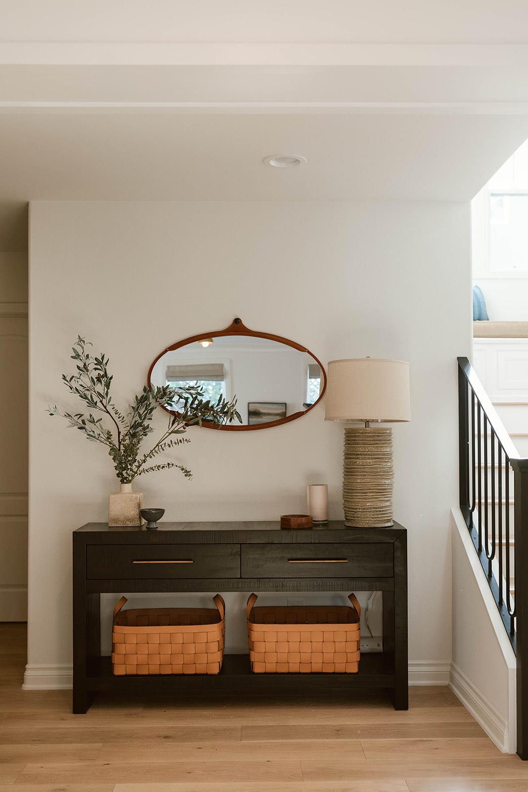
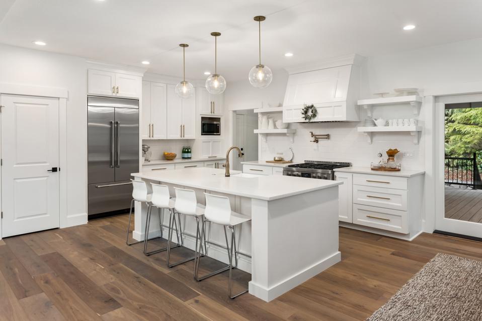
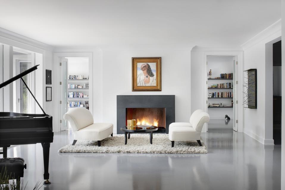
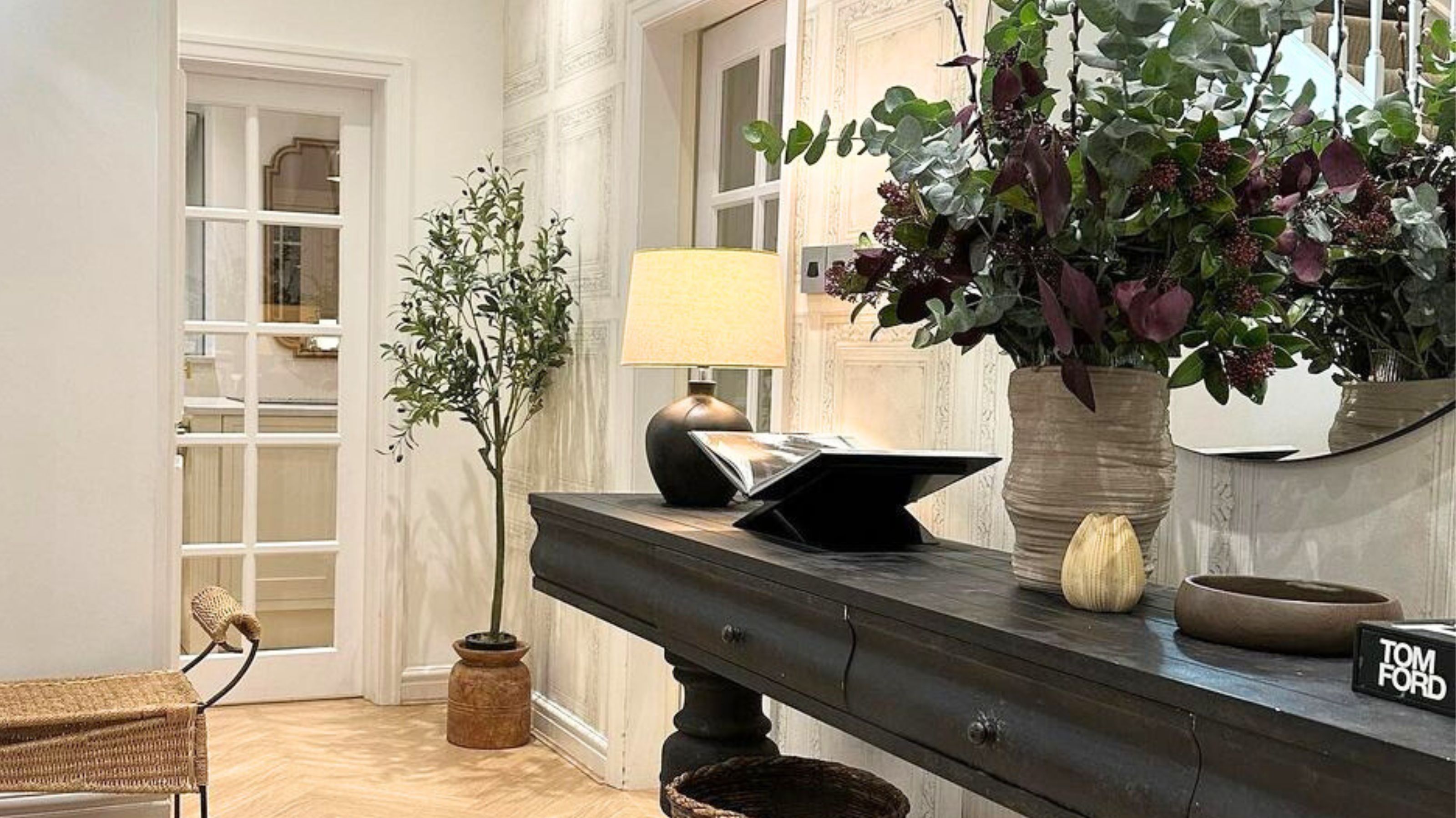
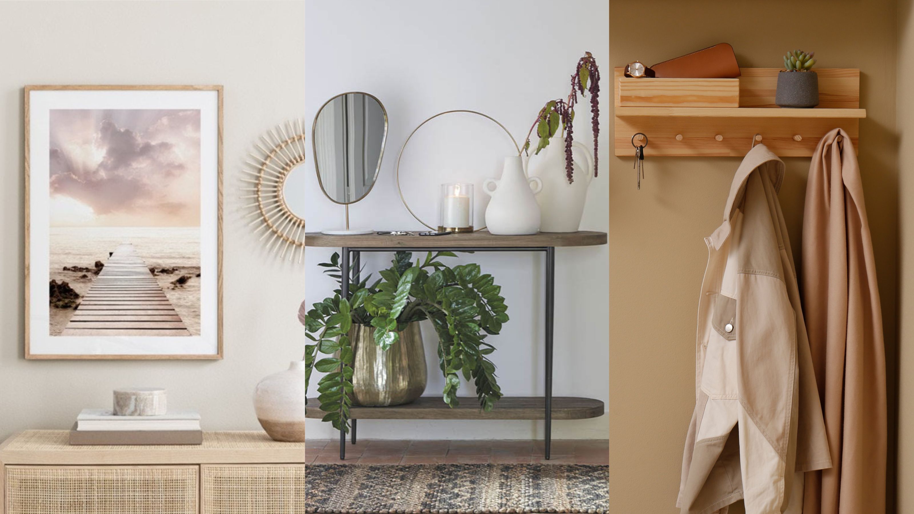
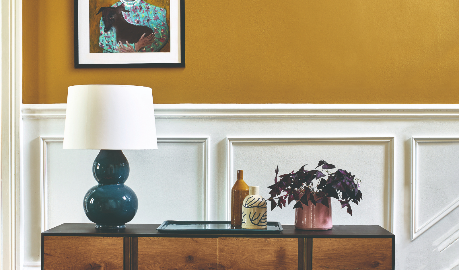
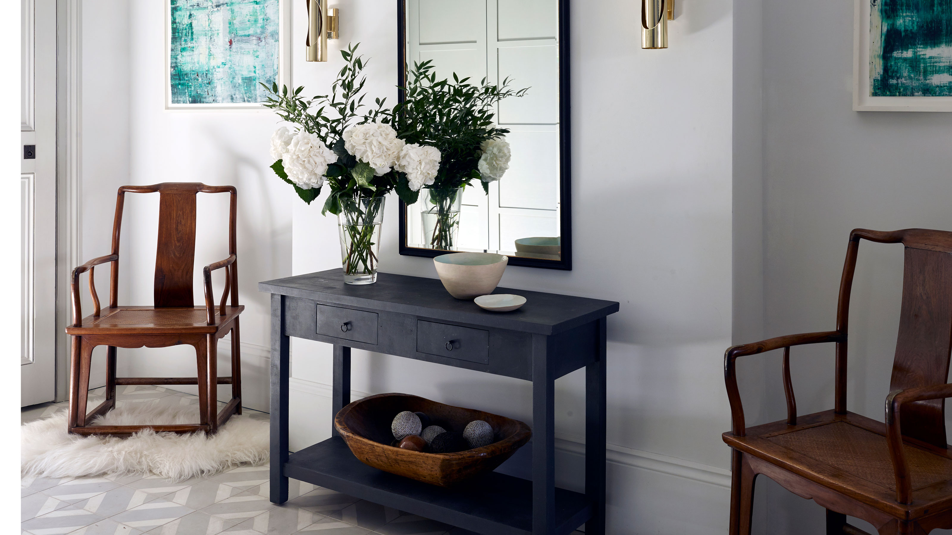
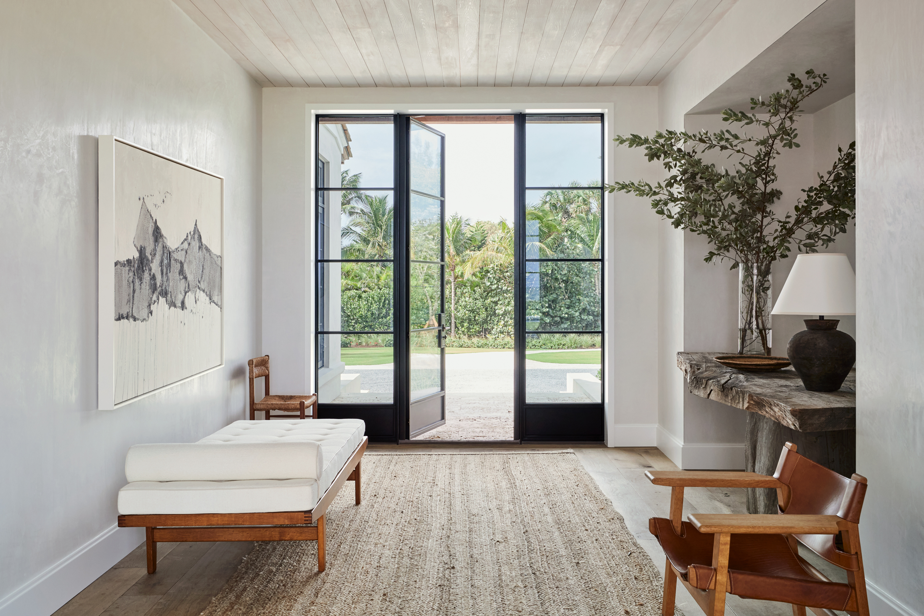
Choosing the wrong neutrals also poses a problem. While neutral colors are often recommended for small entryways due to their light-reflecting properties, which can make a space appear larger and brighter, not all neutrals are created equal. Incorrectly selected neutrals can still clash with furniture, accessories, and decor. Sticking to classic neutral hues such as white, beige, or light gray is generally advised, as these effectively reflect light and contribute to an airy atmosphere, making a small entryway feel more spacious.
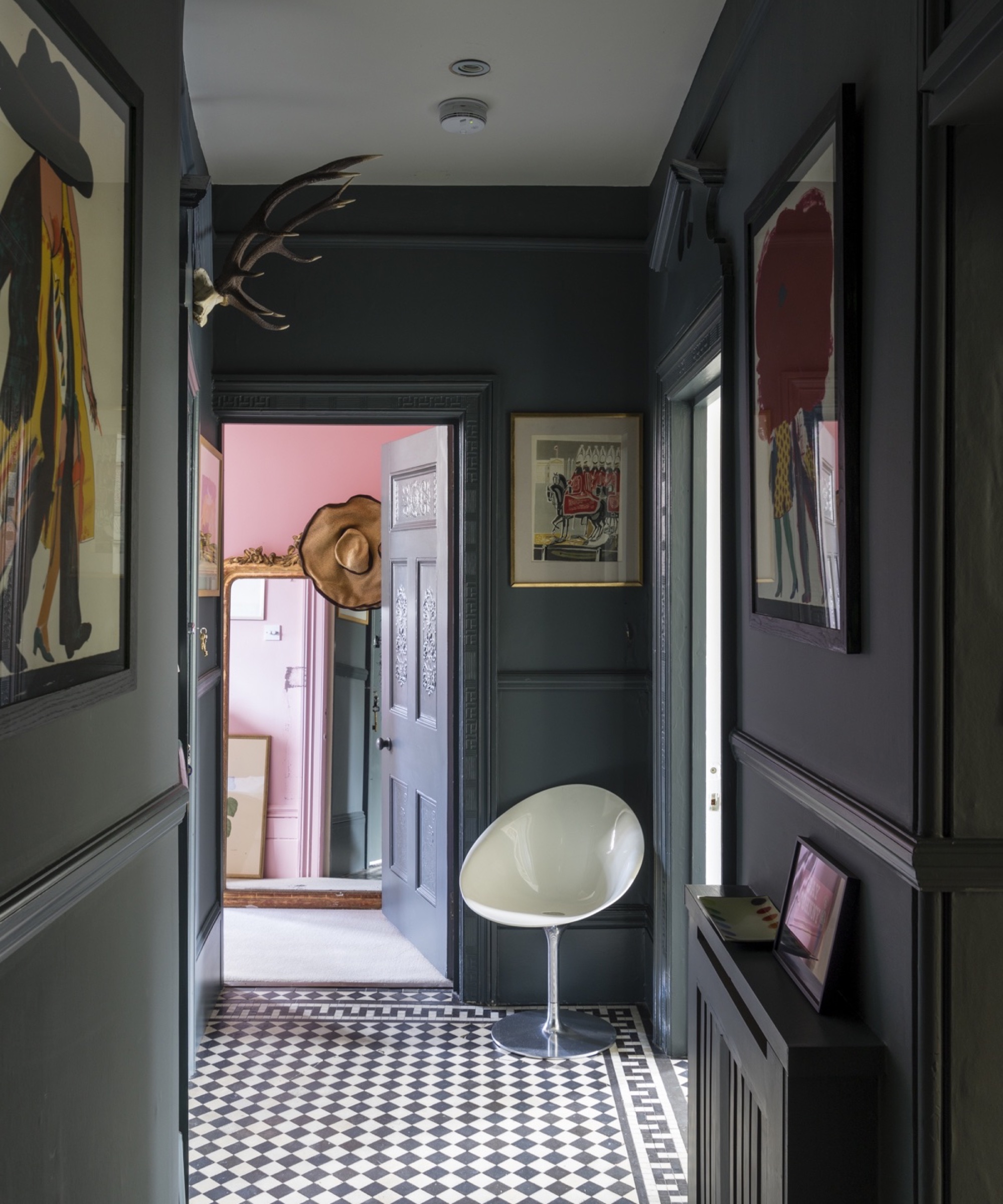
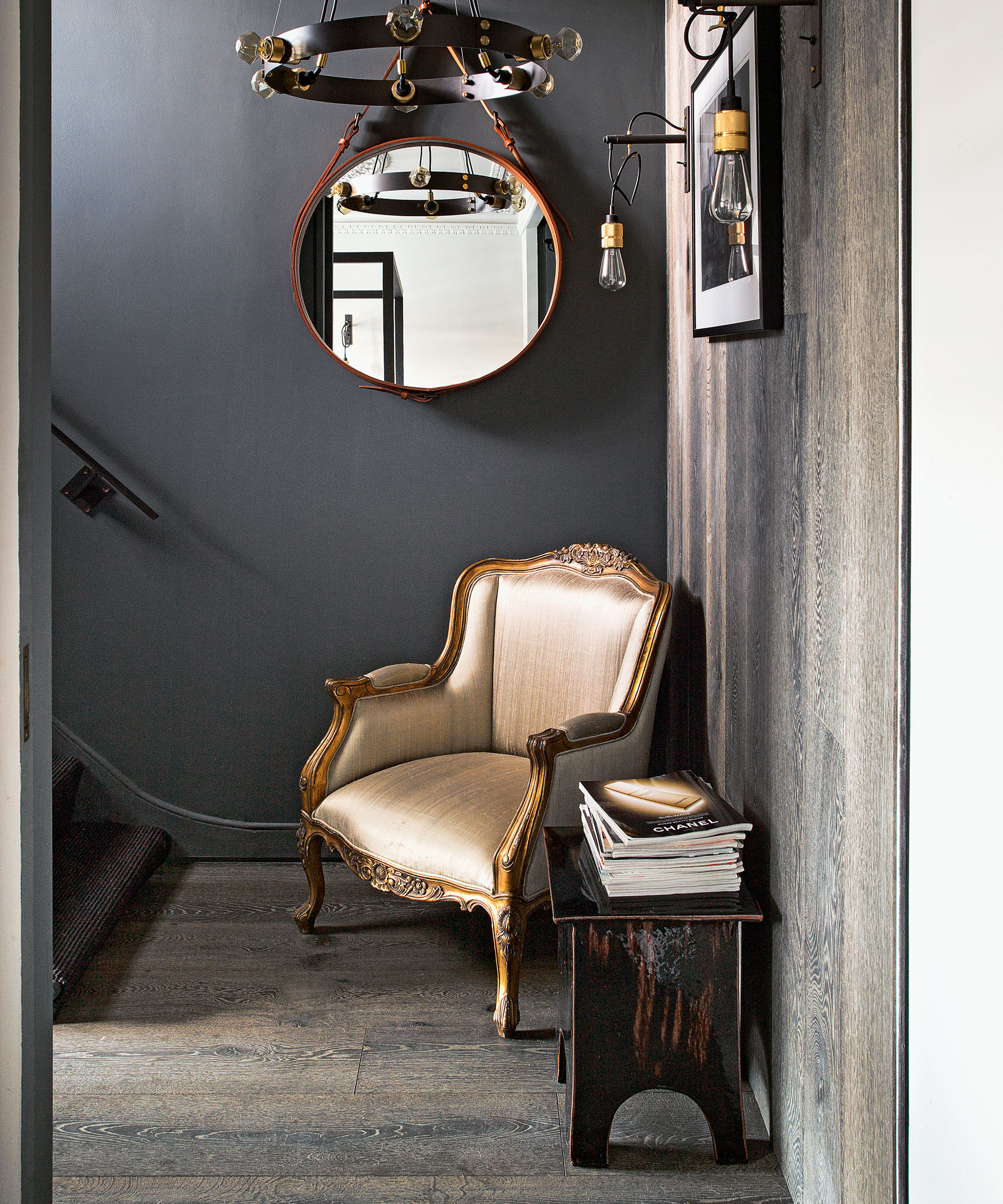
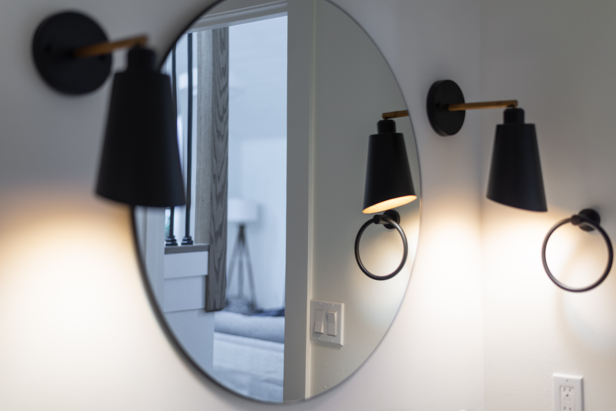
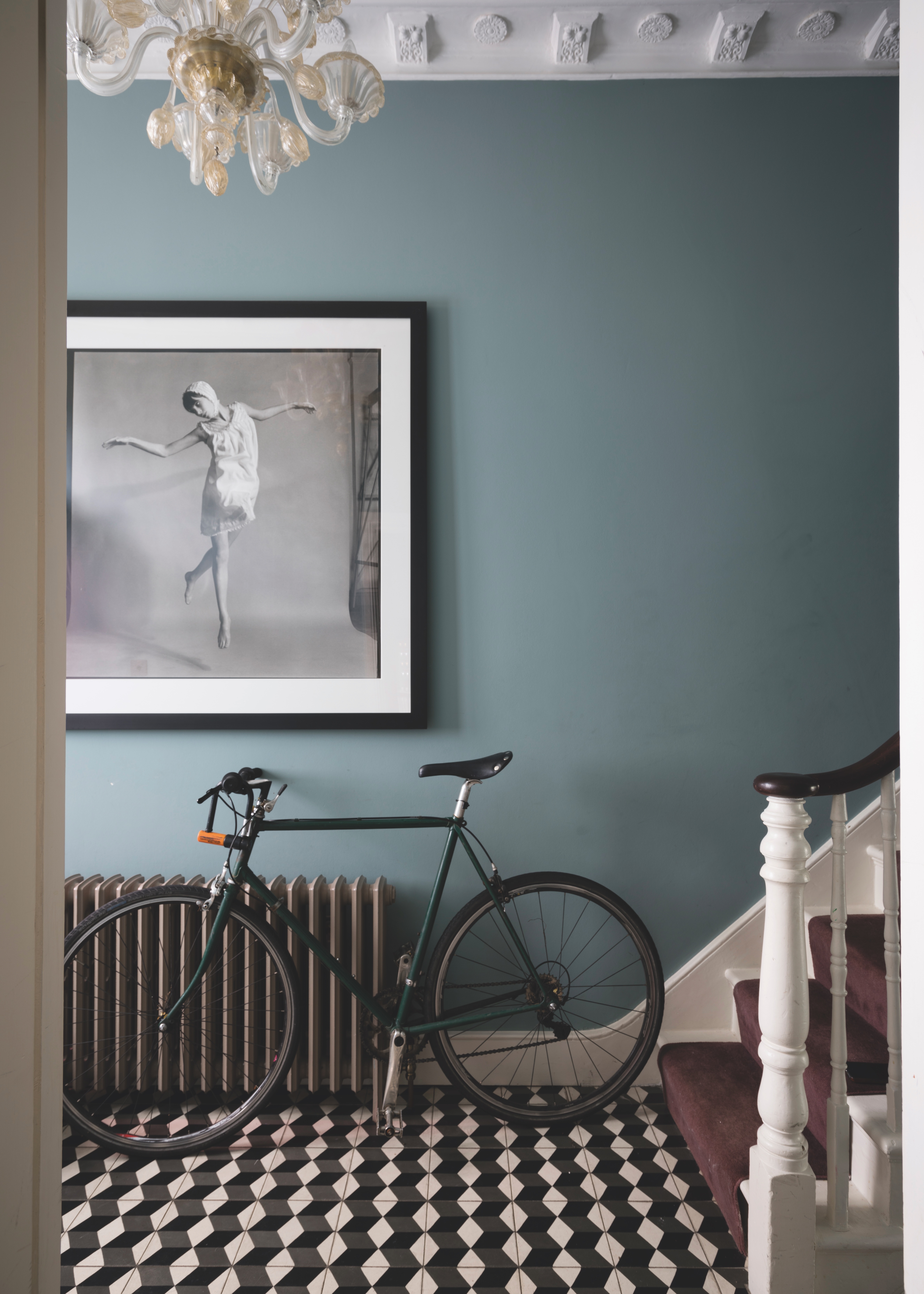
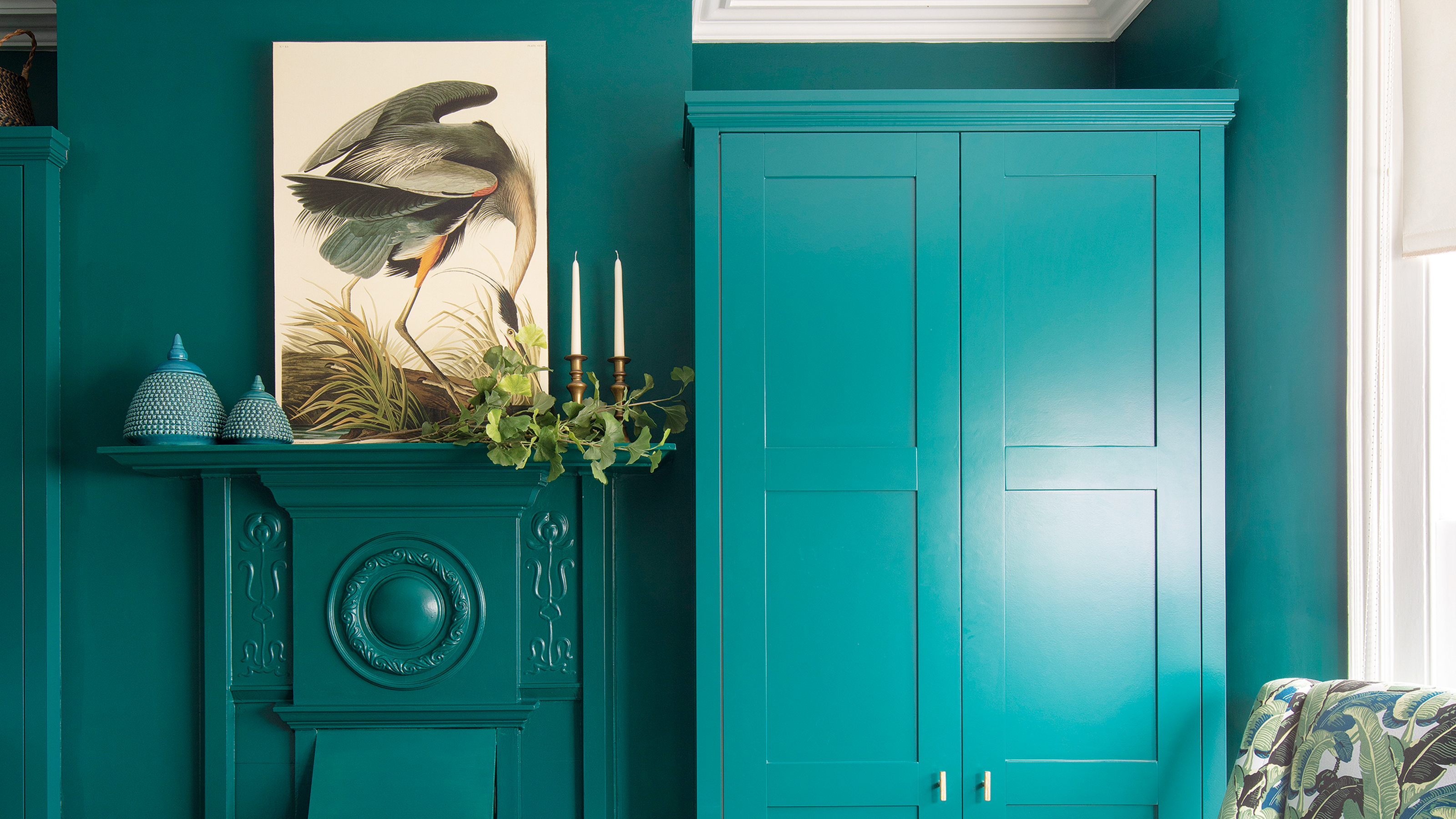
Finally, opting for matte shades in small entryways is a mistake that can detract from the space. Despite the recent popularity of matte finishes in interior design, especially in line with the quiet luxury movement, they are not ideal for entryways. Matte finishes, particularly in darker colors, tend to absorb light, making a small area feel cramped and enclosed. Instead, experts recommend using satin paints and fabrics. These materials offer a similar sophisticated, muted appearance but possess a slight sheen that reflects light, helping to brighten and open up the entryway. Avoiding these key color mistakes ensures that the entryway, as the first impression of a home, effectively reflects the desired aesthetic and functionality.
#SmallEntryway #ColorMistakes #InteriorDesign #PaintColors #HomeDecor #DesignTips #EntrywayDecor #NeutralColors #MatteVsSatin #SmallEntryway #ColorMistakes #InteriorDesign #PaintColors #HomeDecor #DesignTips #EntrywayDecor #NeutralColors #MatteVsSatin
0 comment in total
You may also like
5 small entryway lighting mistakes — experts share what to avoid

Small entryway Feng Shui mistakes — 5 things the pros always avoid
5 small living room mistakes – designers share the worst decorating disasters that we need to stop doing right now

5 Minimalist Decorating Mistakes Designers Always Notice

Don't make these 5 entryway decor mistakes
5 colors you should never paint your entryway – according to interior experts
5 Living Room Red Flags That Guests Immediately Notice, According to Designers
5 colors you should never paint a small room – designers warn us to steer clear of these hues, and what to pick instead
5 Common Entryway Lighting Mistakes Designers Never Fail to Notice — I'll Always Avoid These Now

7 Entryway Mistakes Designers Instantly Notice When They Walk Into Your Home
5 best paint colors for a small entryways - designer-approved palettes
5 small entryway storage mistakes designers want you to stop making
5 Mistakes That Are Making Your Entryway Look Bad, According to a Designer
13 front door colours mistakes you might be making
Interior design experts reveal the colour rules you should be breaking
7 Design Mistakes Interior Designers Always Notice

5 entryway mistakes we all make – and how designers suggest we avoid them
5 entryway Feng Shui mistakes experts always notice as soon as they step foot into a home
6 colors to avoid in an entryway – and the ones designers know make a better first impression
Interior Designers List the Worst Paint Colors for Your Entryway