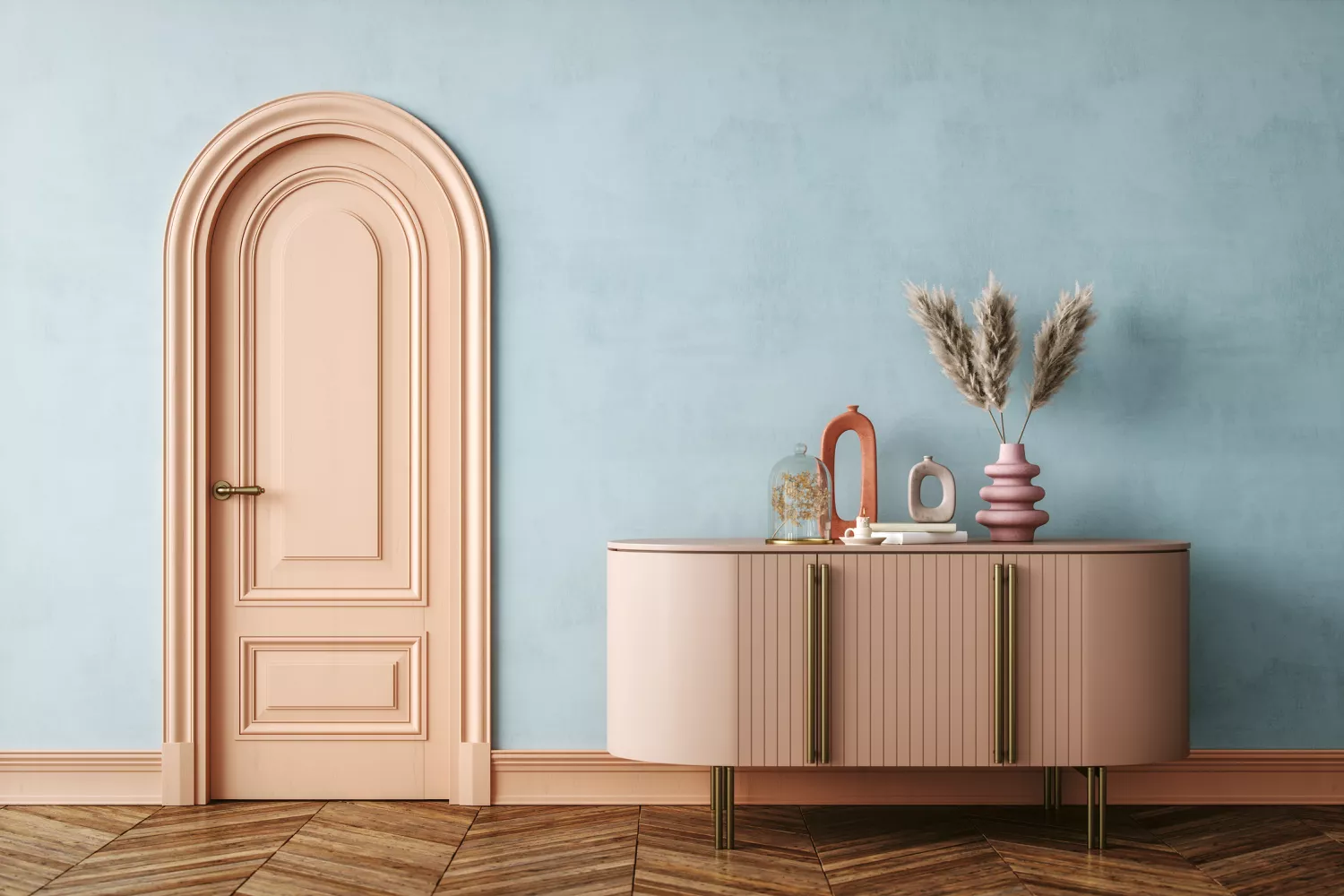
Interior Designers List the Worst Paint Colors for Your Entryway
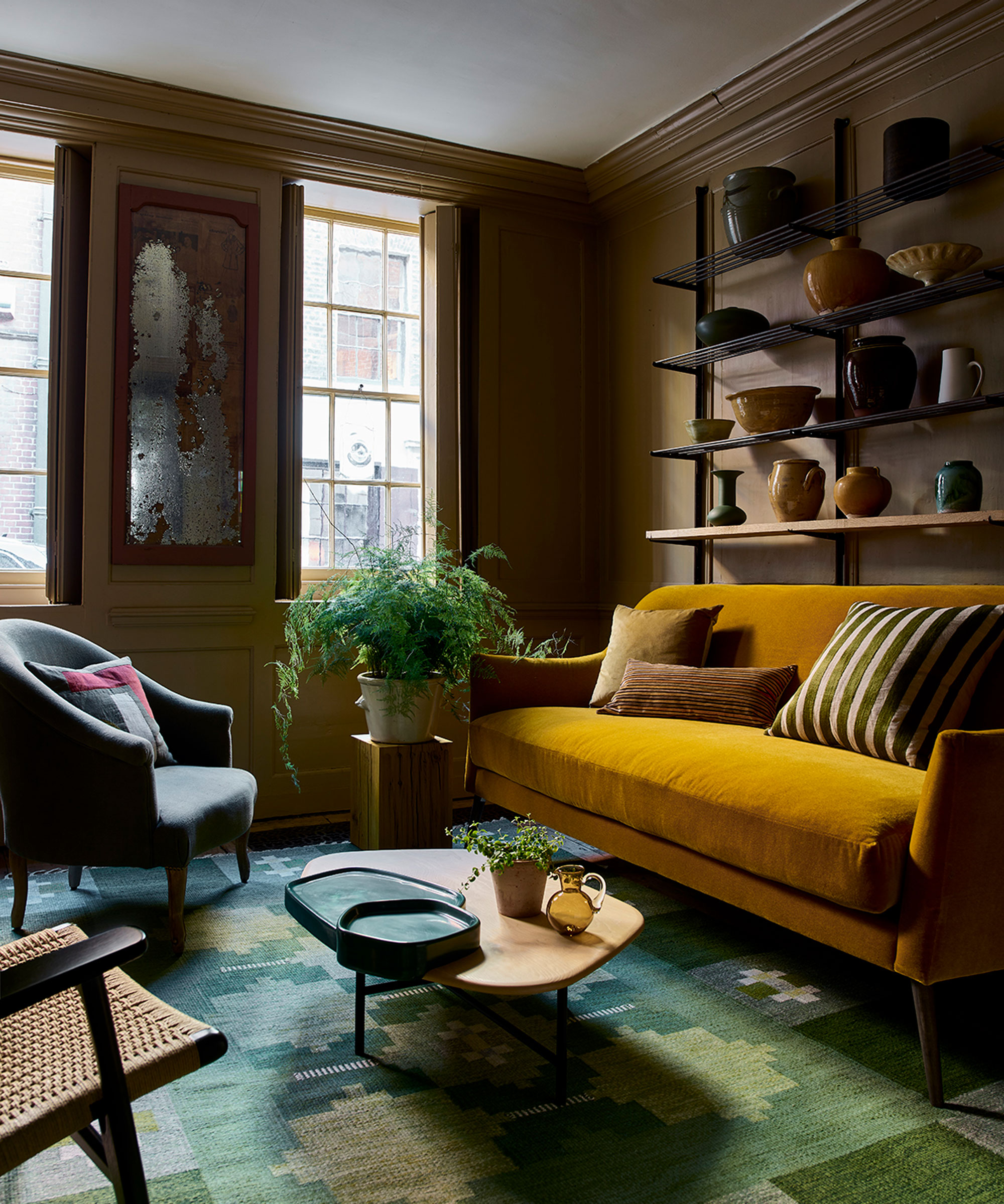
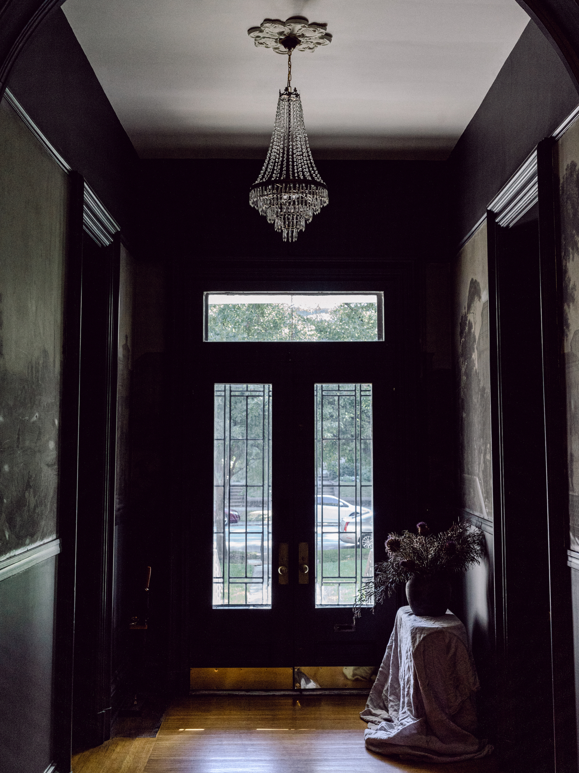
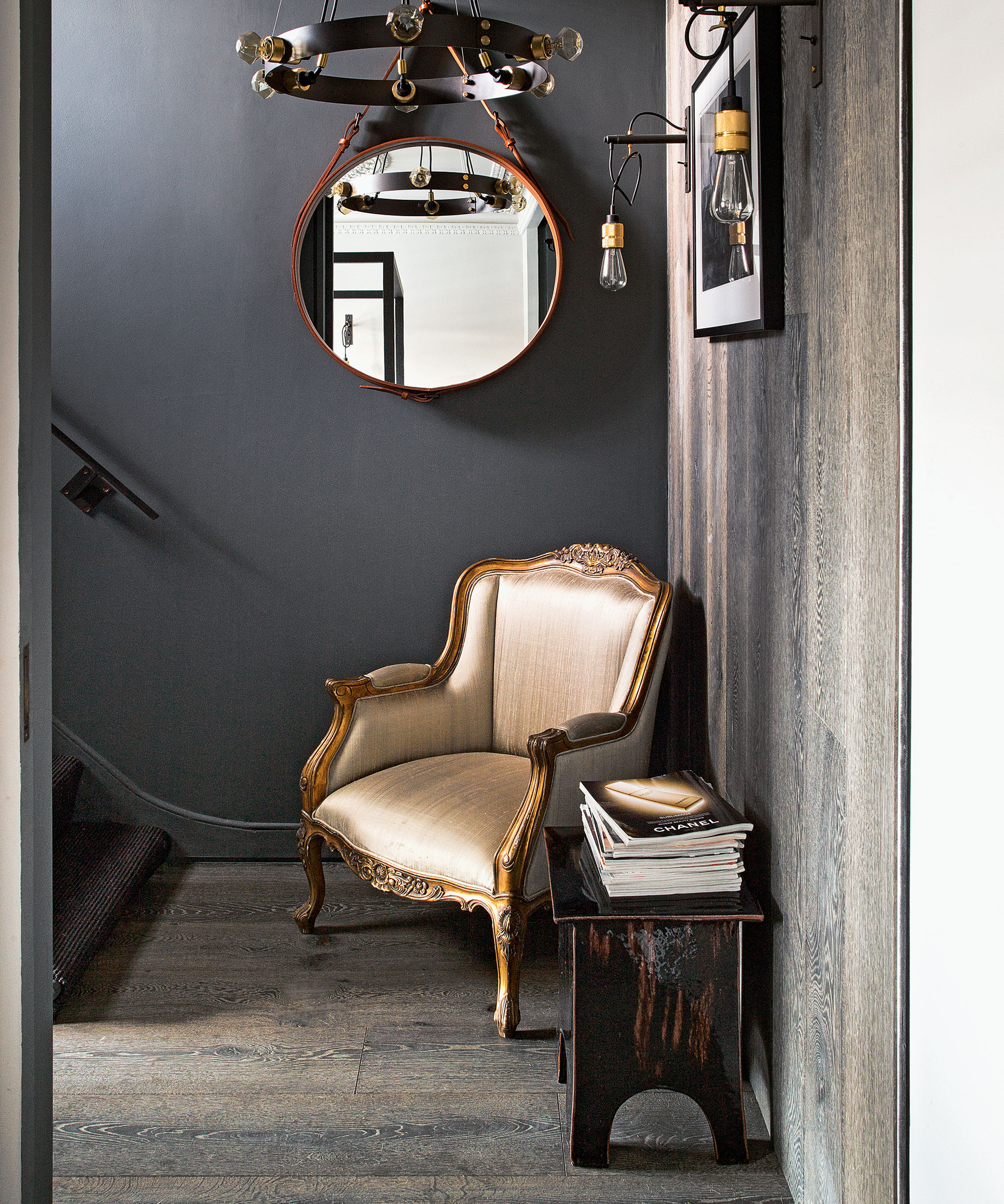
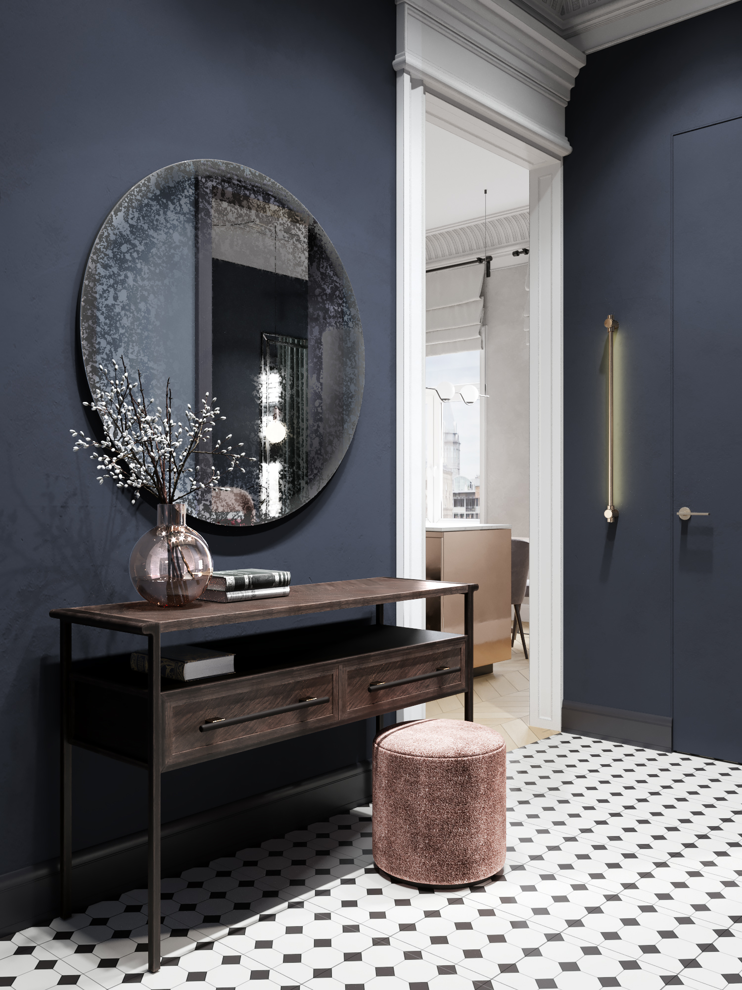
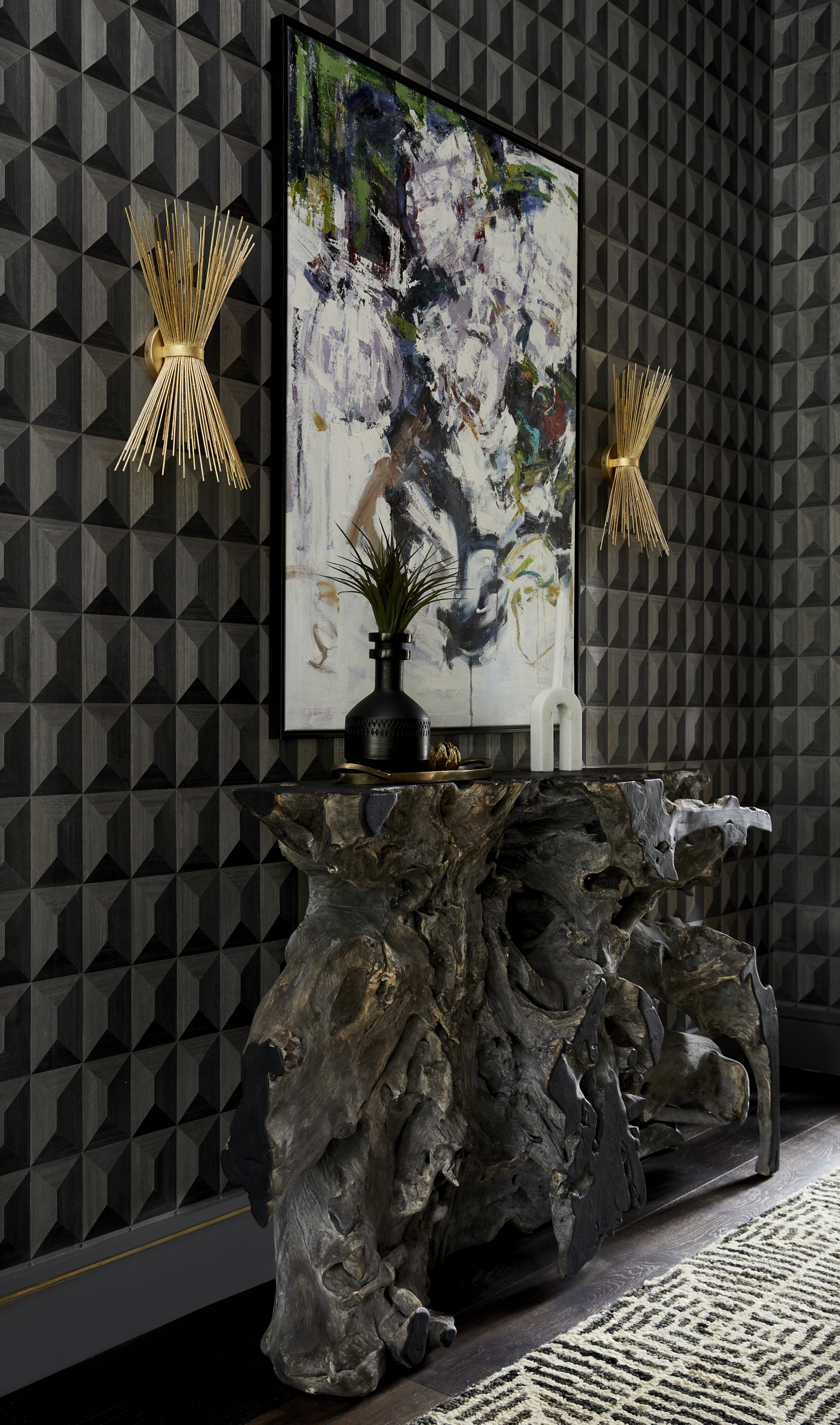
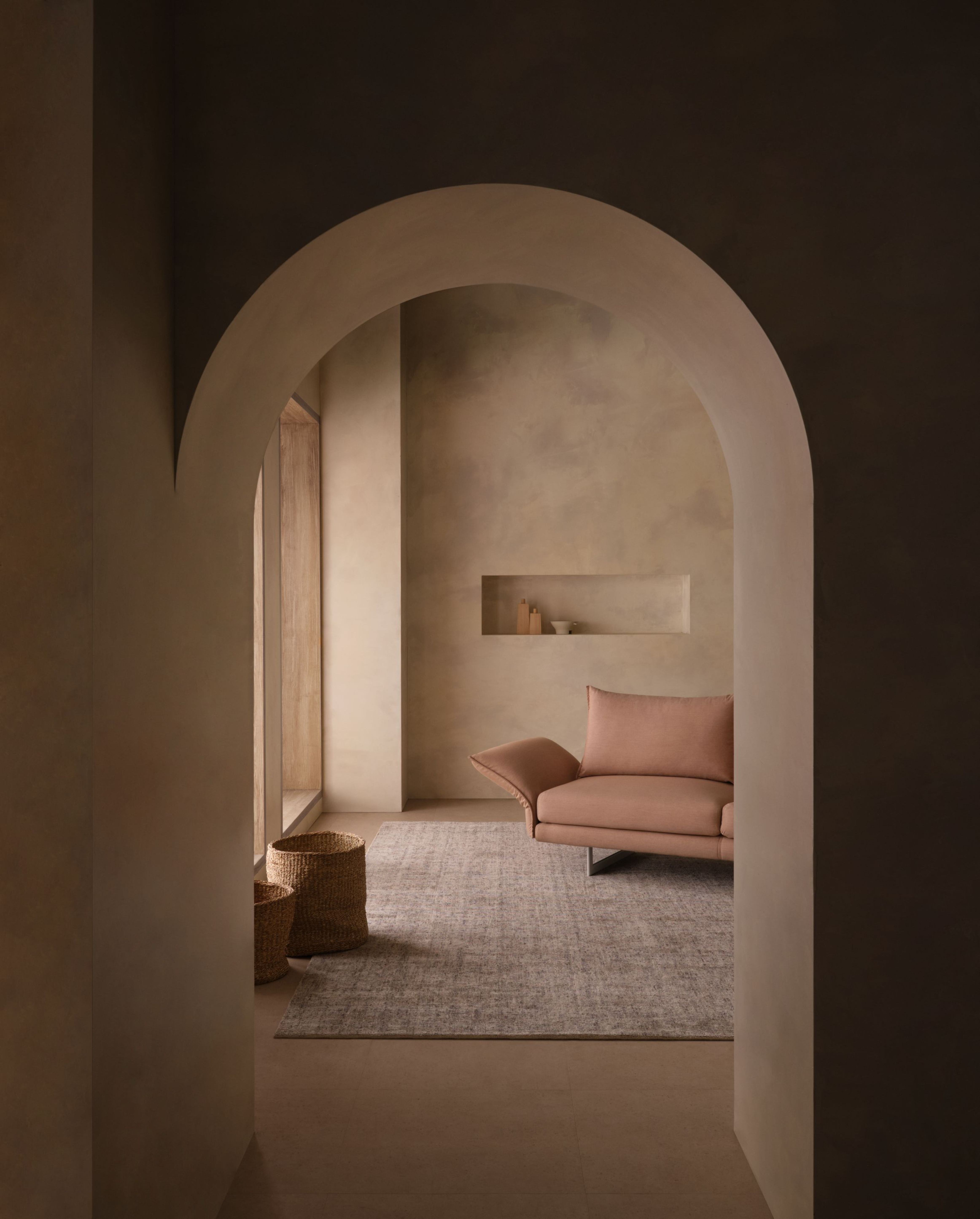
The entryway serves as a crucial first impression of a home, and its paint color significantly influences the atmosphere. Interior designers advise against certain hues to ensure this space is welcoming and inviting. Dark colors like black are generally not recommended for entryways, despite their potential for dramatic flair in other areas. Interior designer Allison Handler emphasizes that an entryway should feel bright and airy. Instead of dark paint, dramatic accents such as ceiling details, artwork, rugs, furniture, or unique light fixtures can achieve a moody aesthetic without making the space feel unwelcoming.

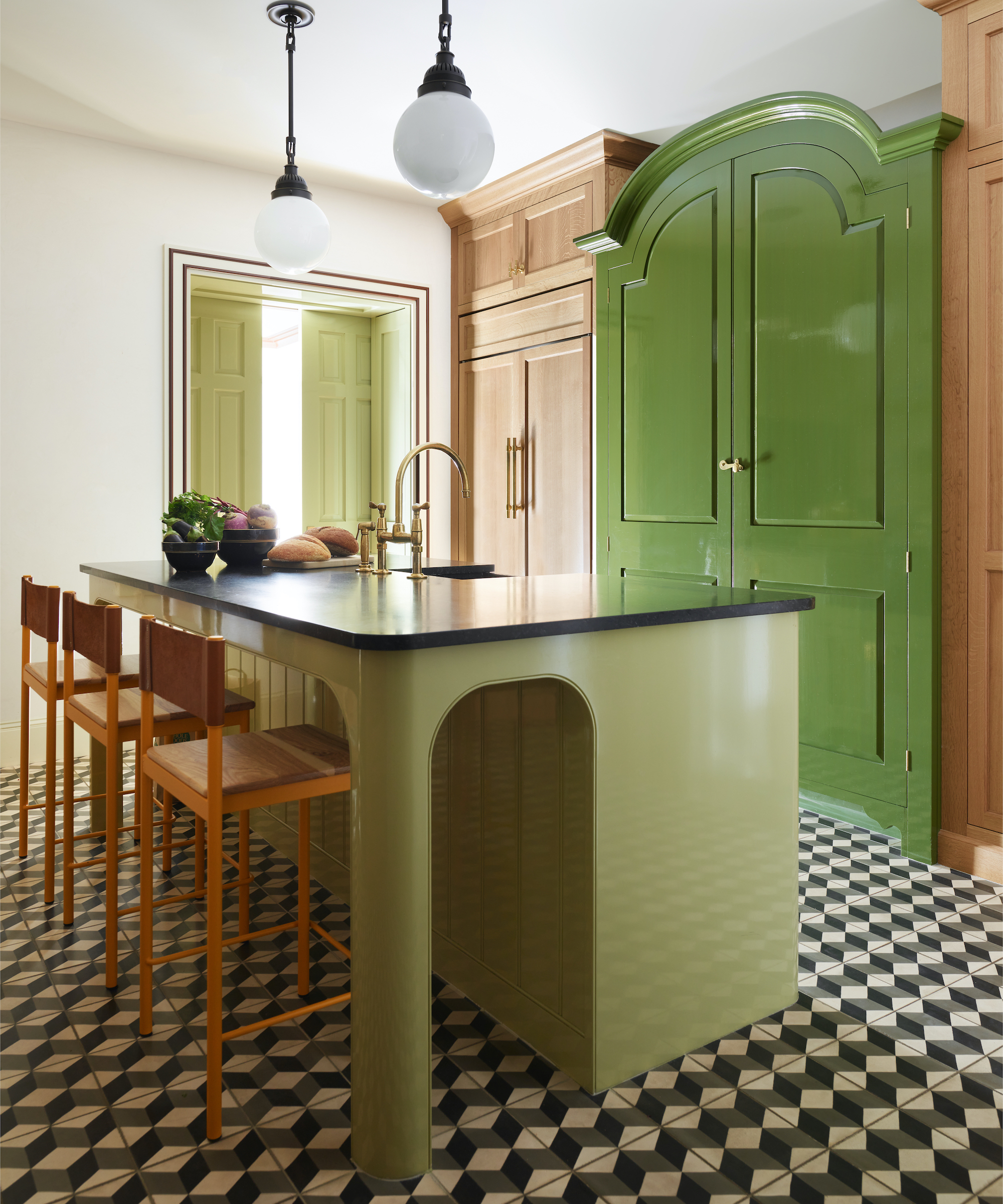
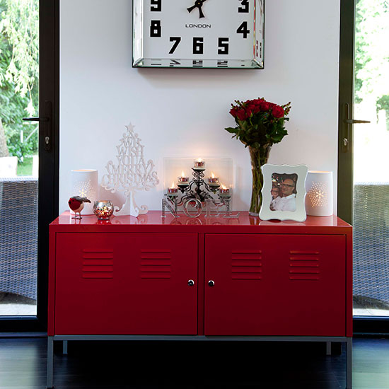
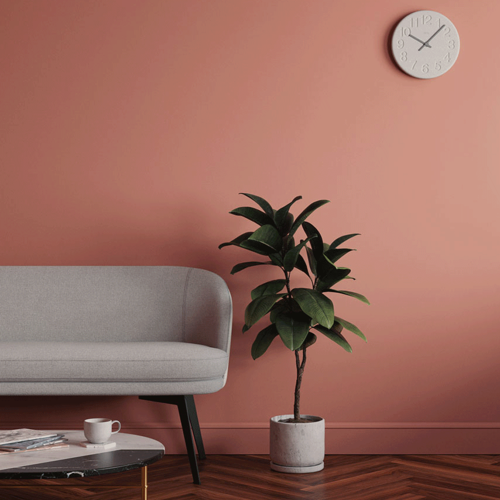
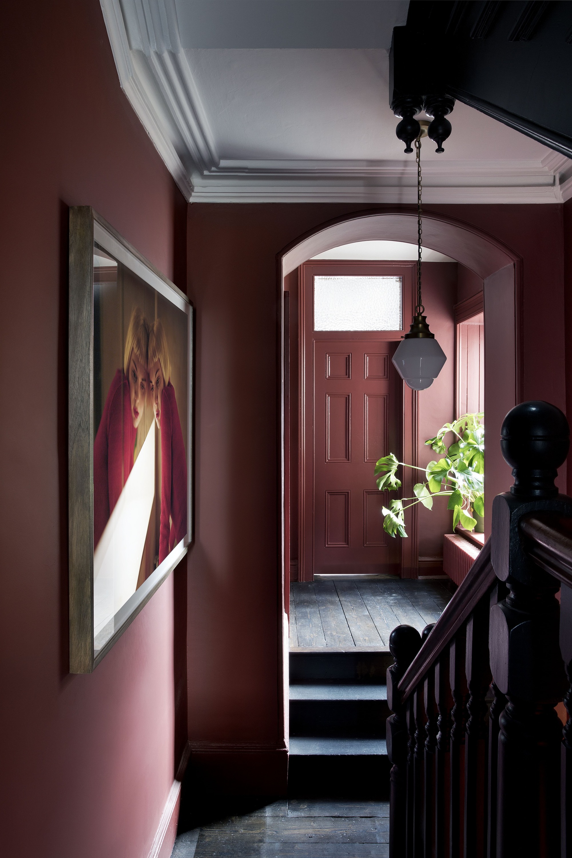
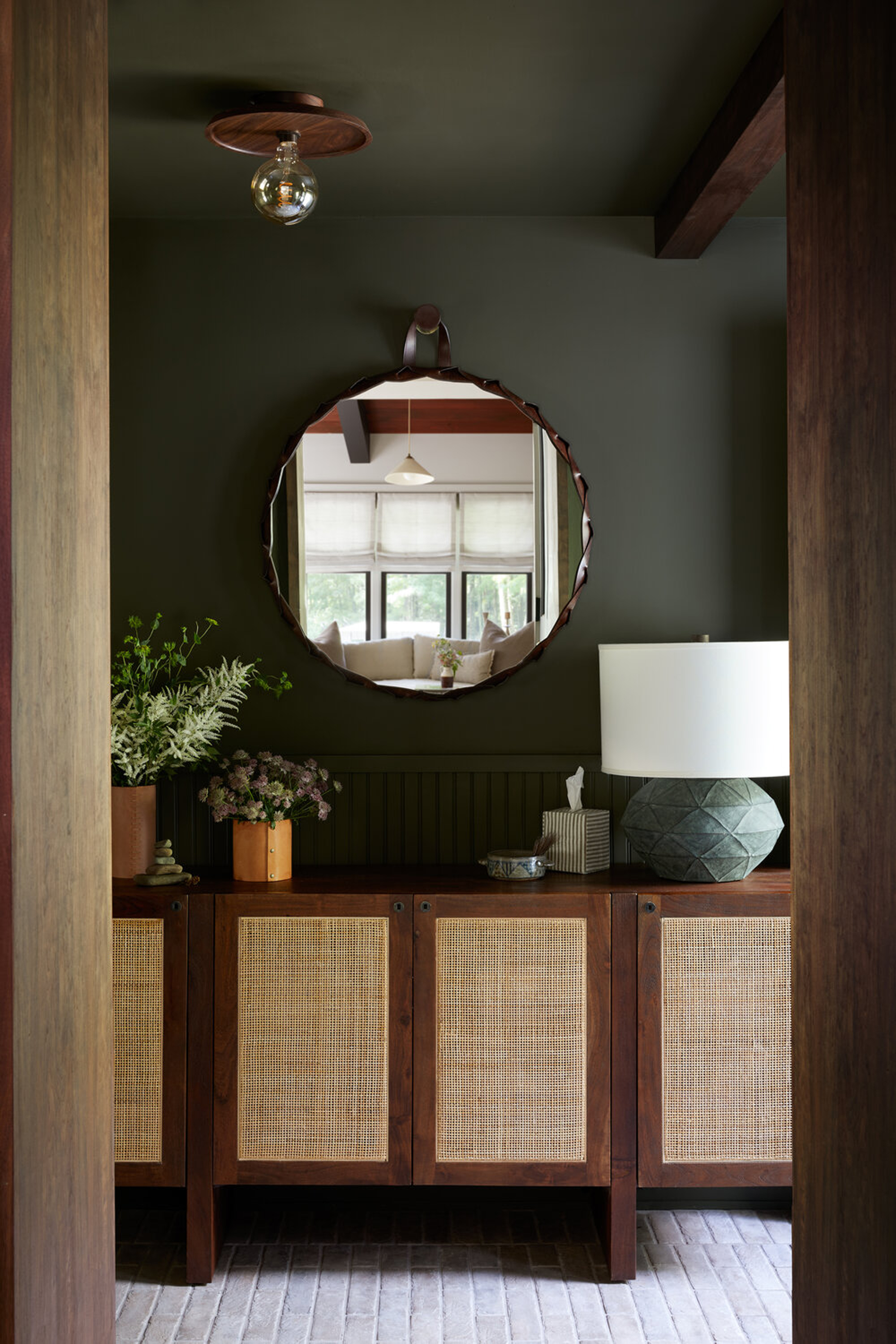
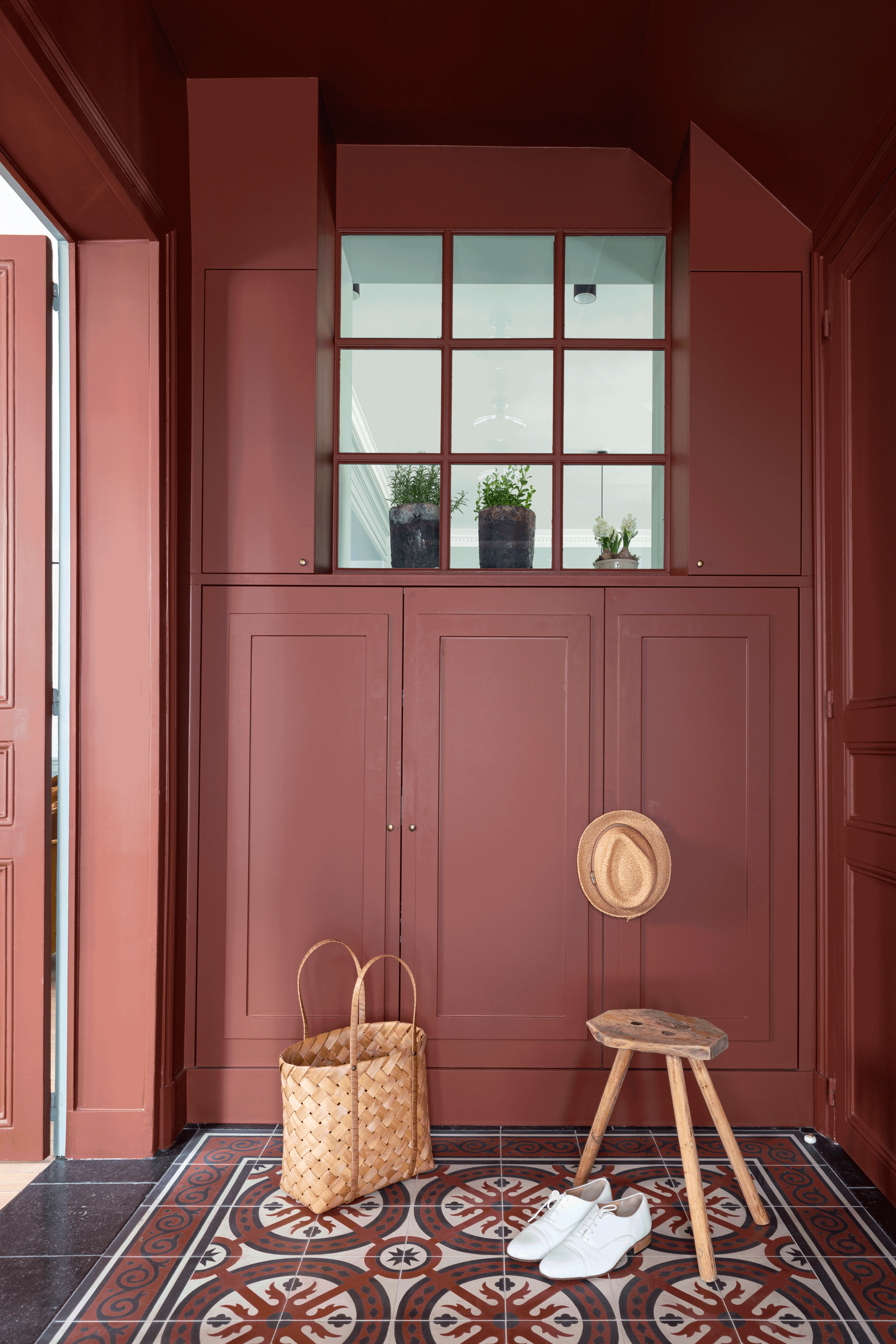
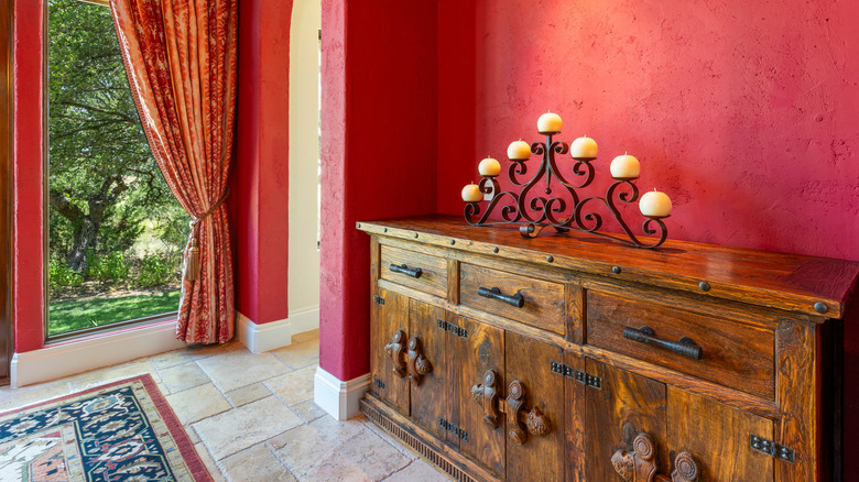
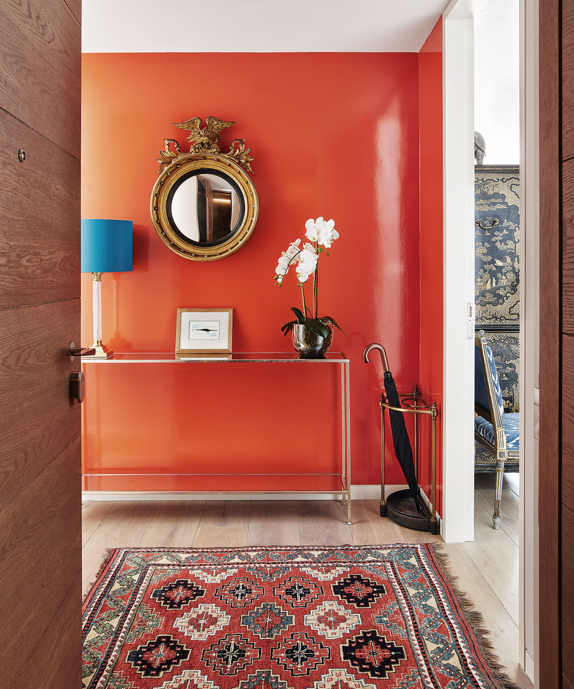
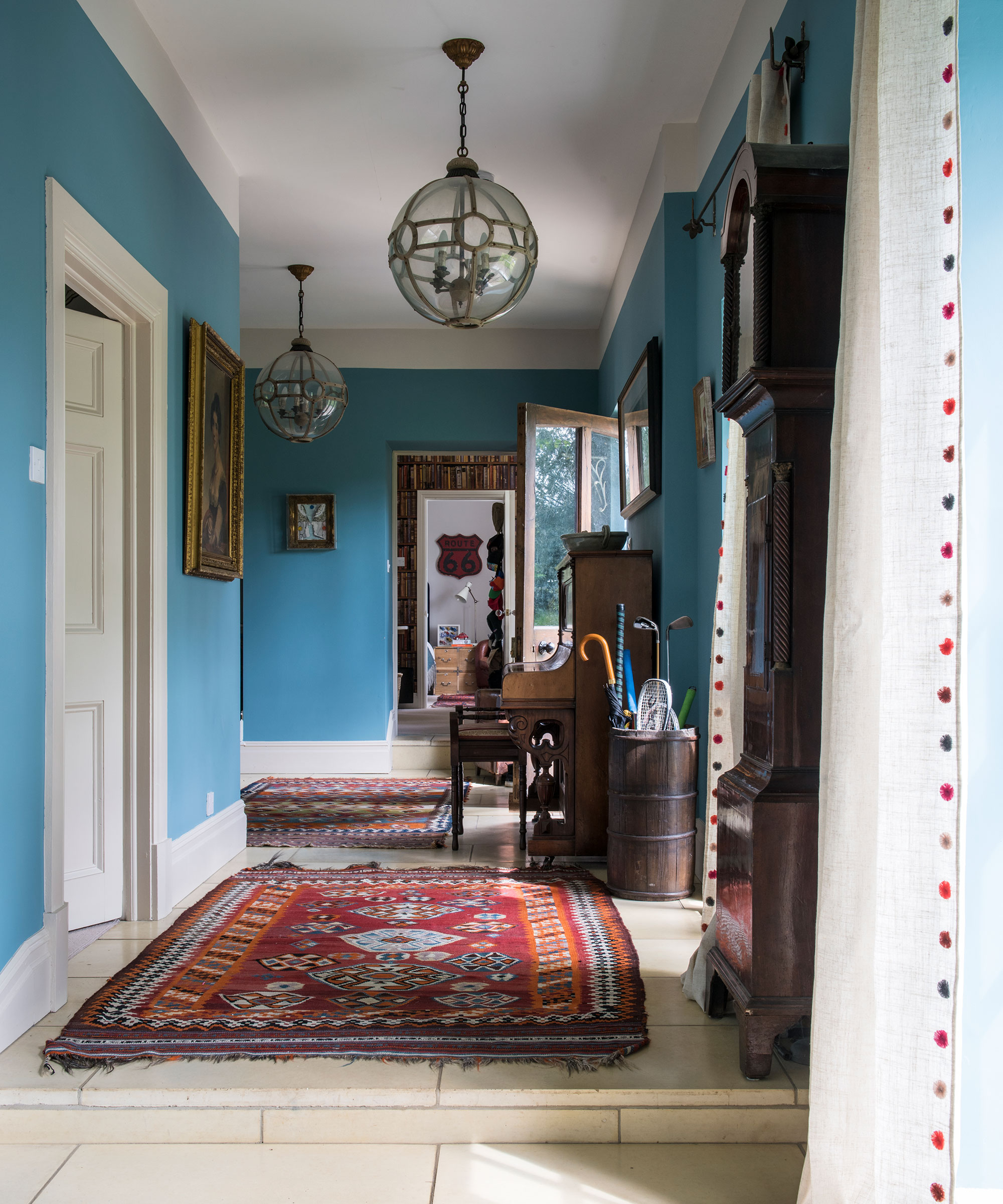
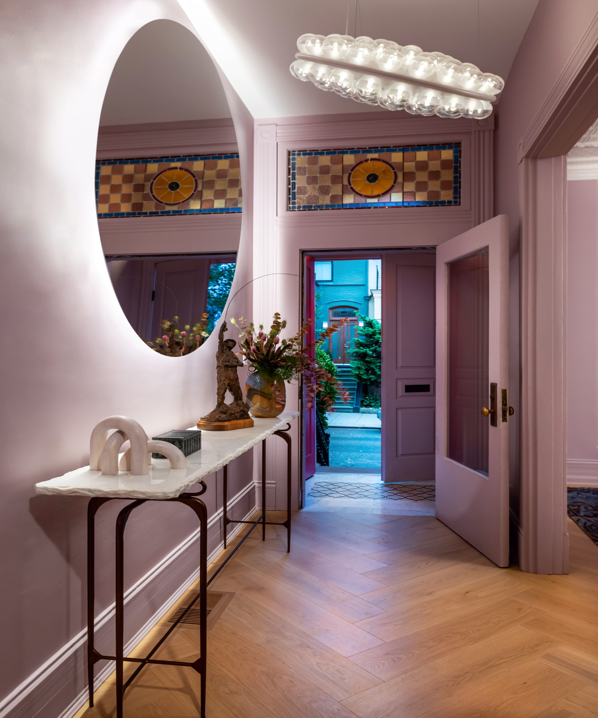
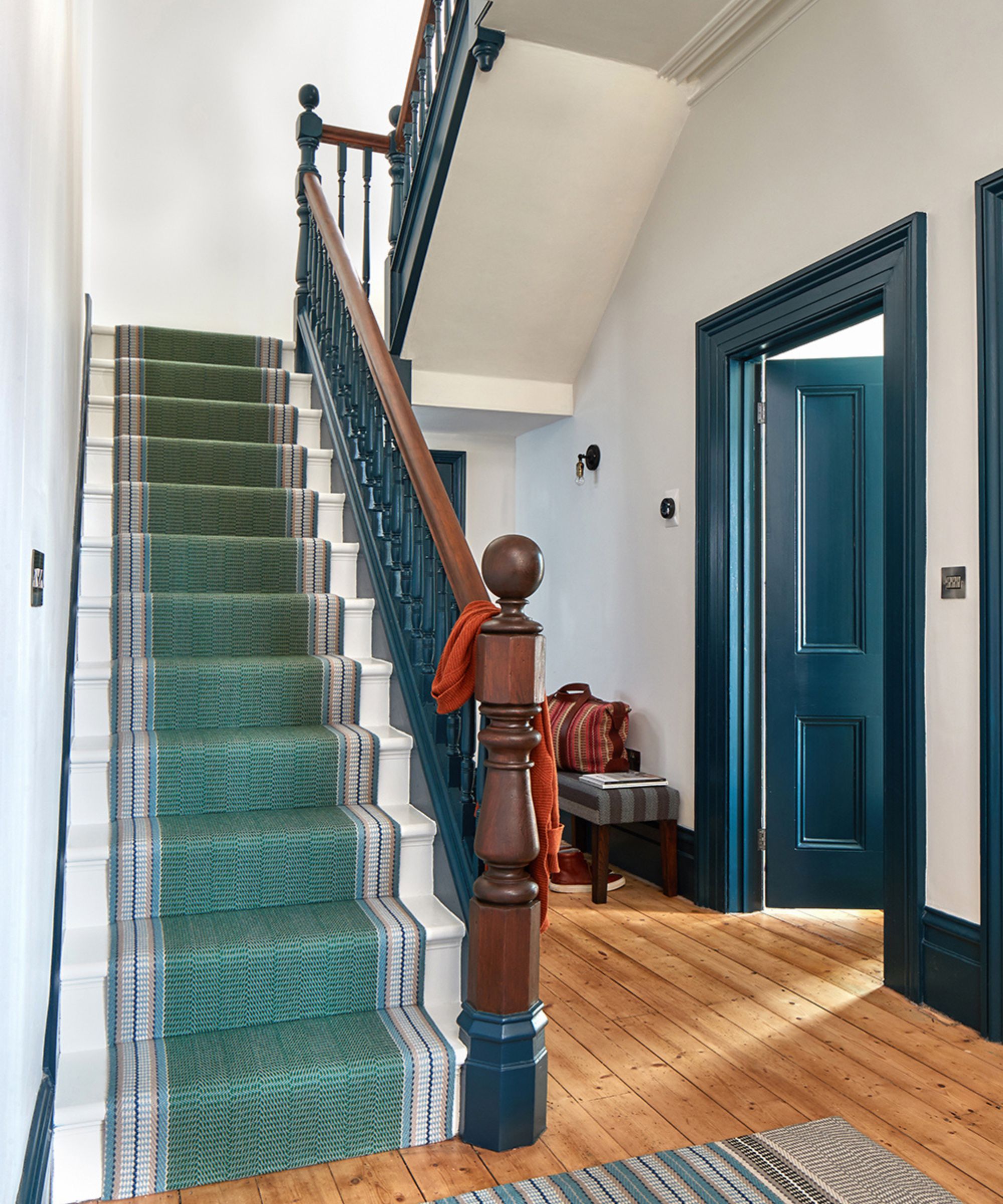
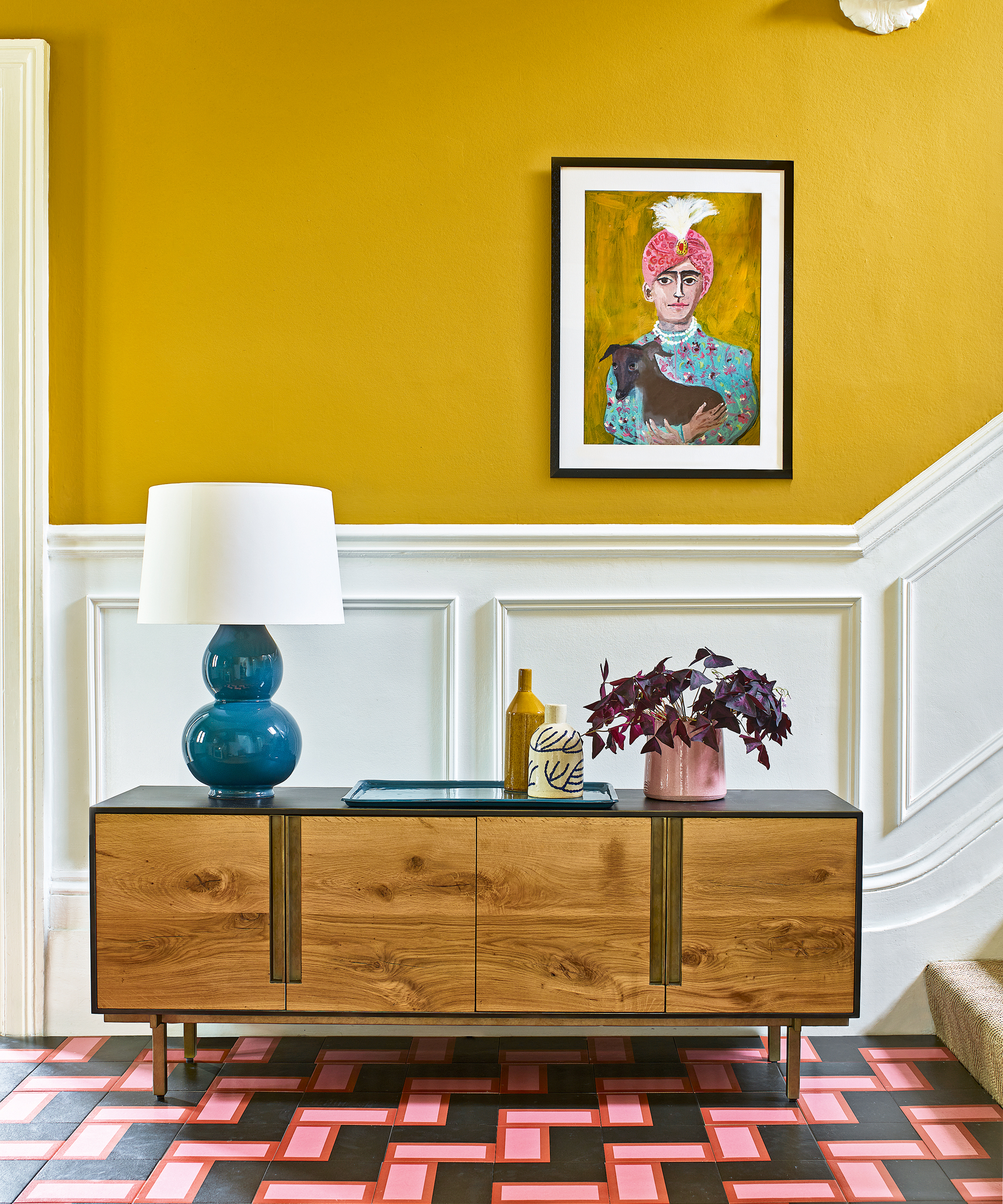
Bright and neon colors are also on the list of colors to avoid. While a small entryway might seem like an ideal place for a vibrant pop of color, many experts, including interior designer Kristyn Harvey, warn that these shades can be jarring and uninviting. The primary goal of an entryway is to make guests feel comfortable, and excessively bright reds, blues, or greens can overwhelm visitors, especially in smaller, transitional spaces. Danielle Chiprut, founder of Danielle Rose Design Co., suggests opting for rich, muted tones like deep olive or soft terracotta instead, which add personality without being overbearing.
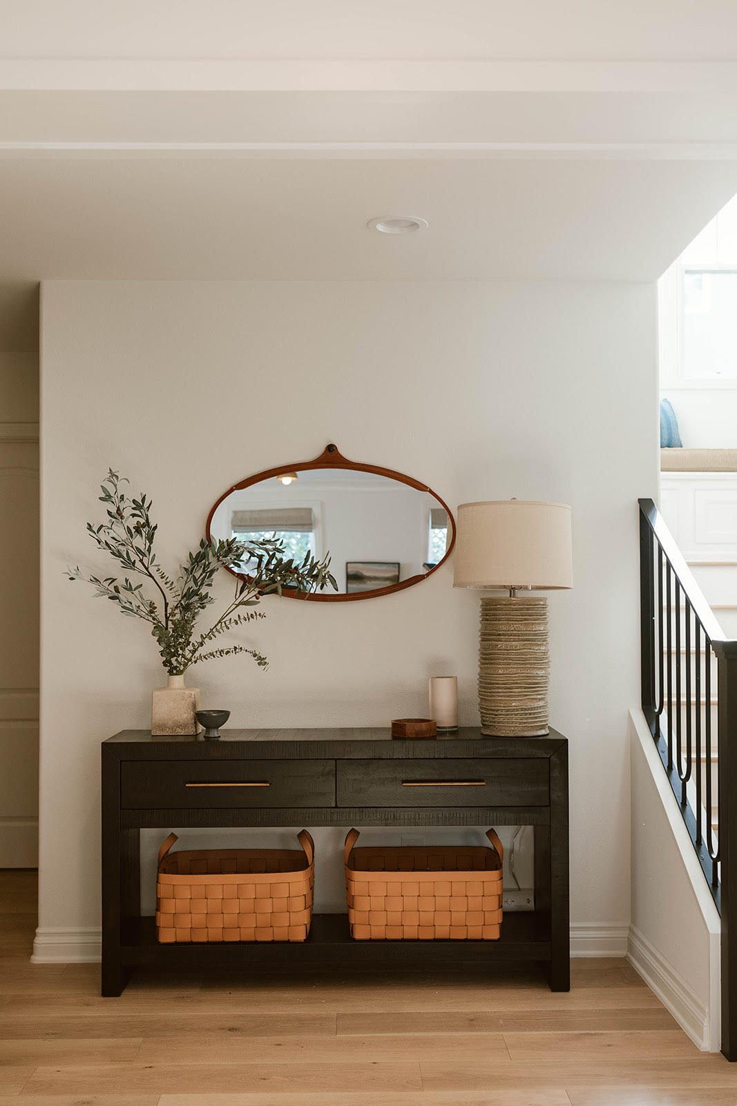
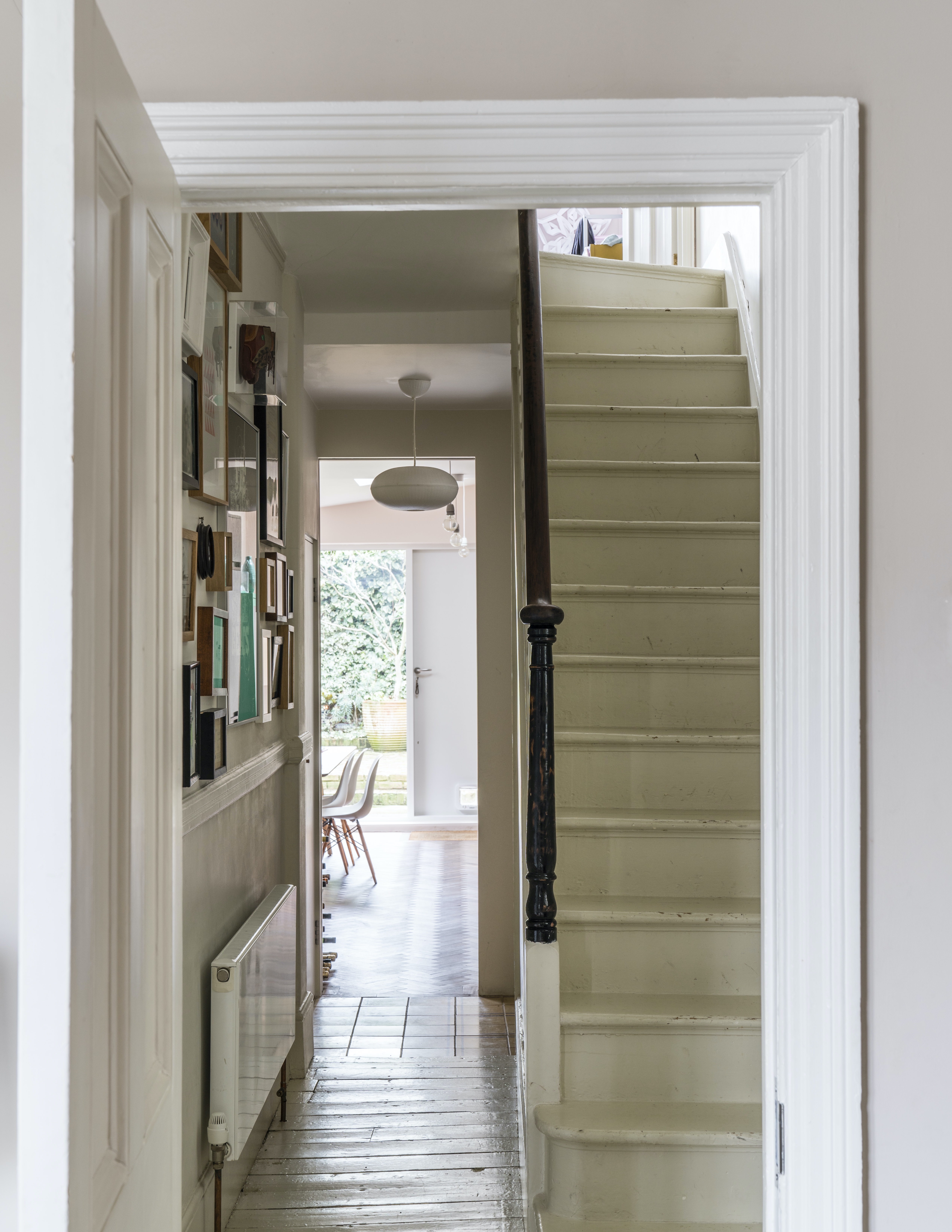
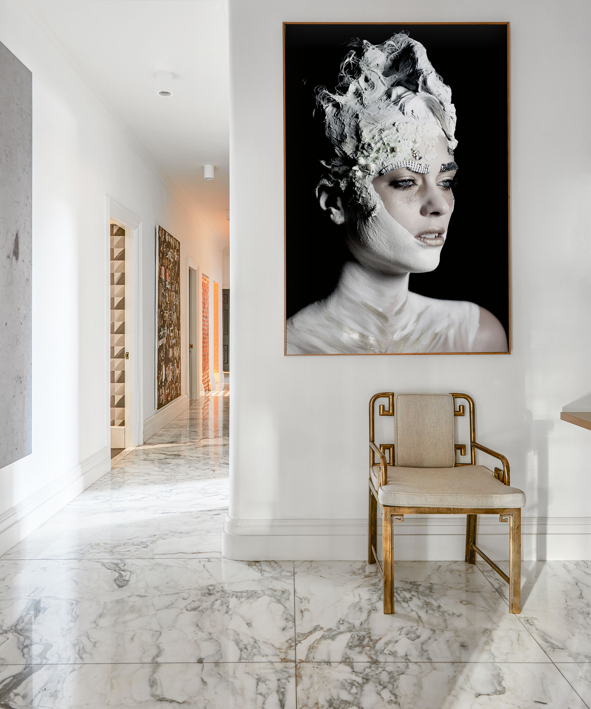
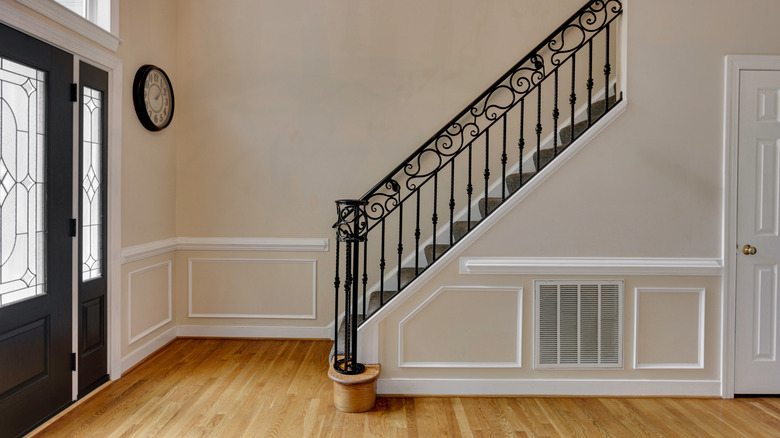
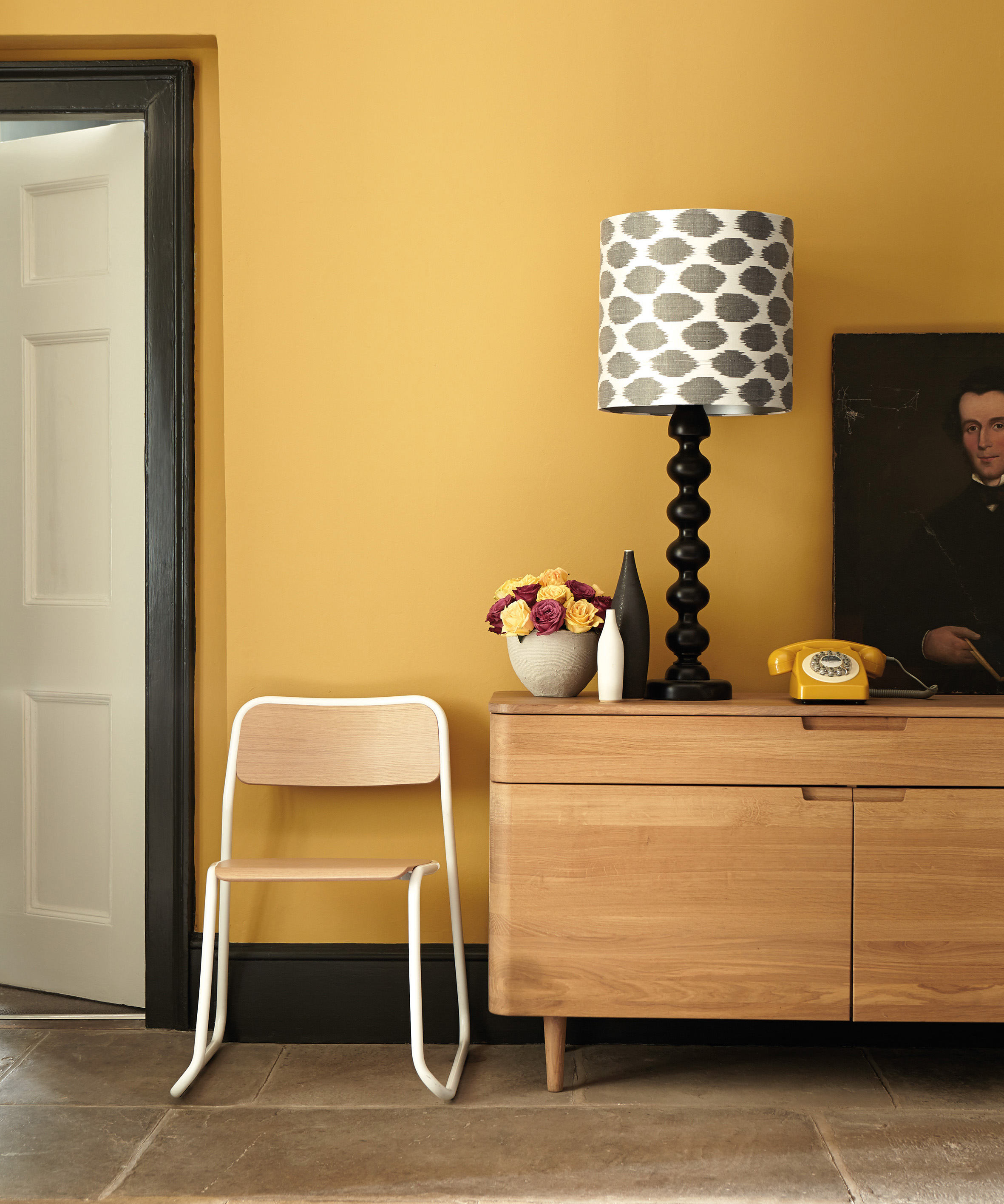
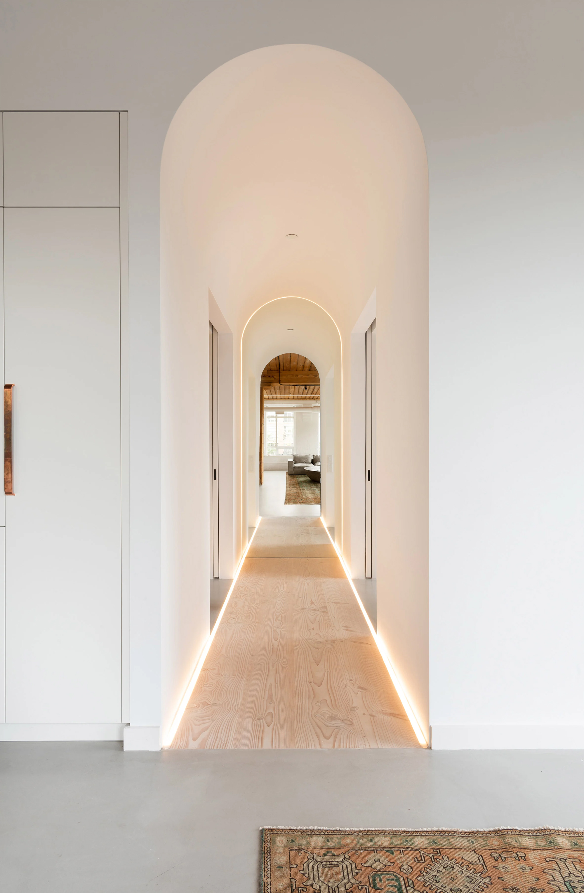
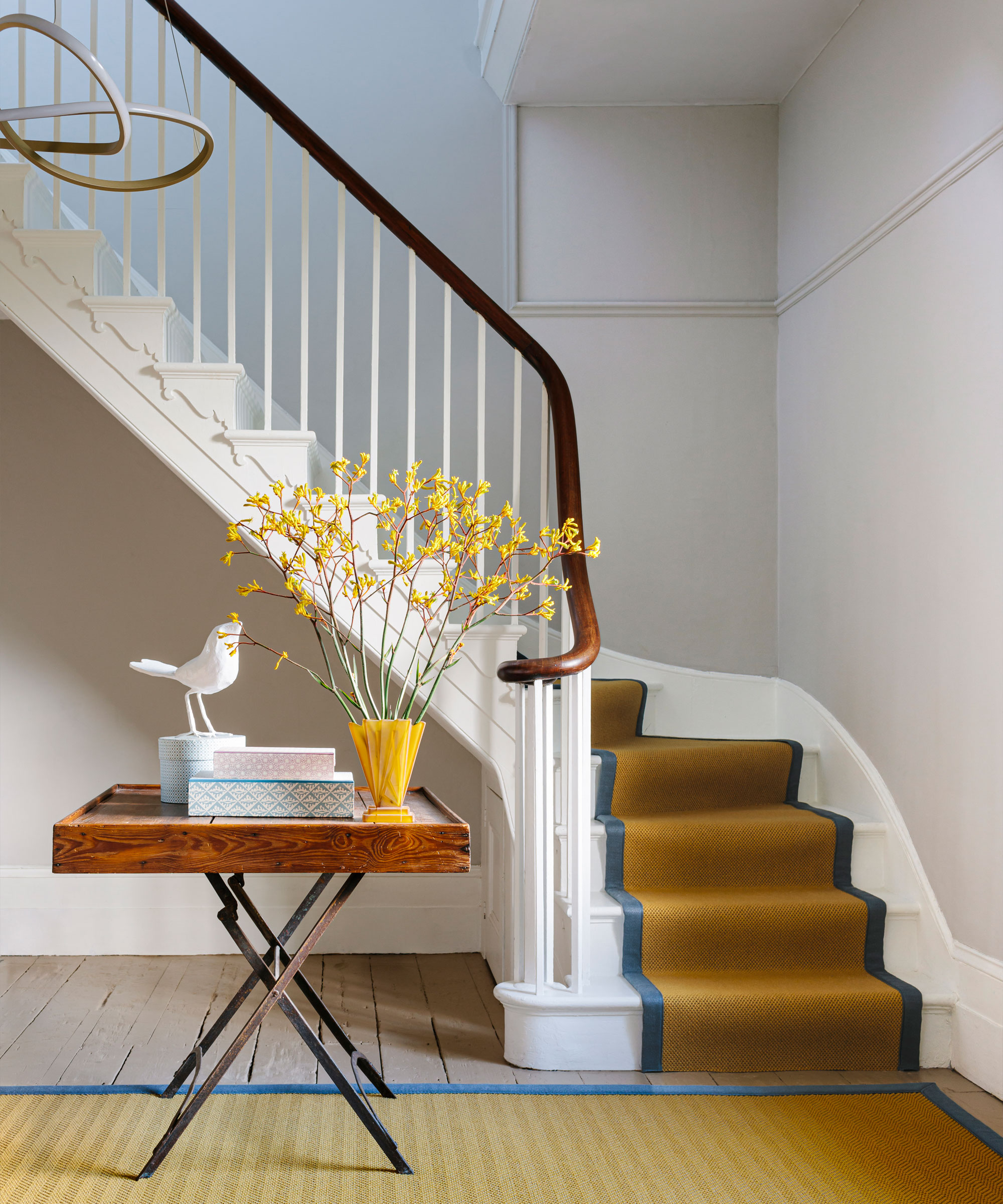
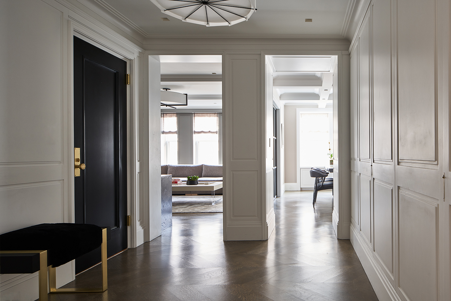
Choosing the right shade of white for an entryway requires careful consideration. Interior designer Megan Gorelick points out that warm whites can be problematic depending on the lighting. Similarly, Shaolin Low, founder and CEO of Studio Shaolin, notes that a pure, stark white can appear cold and lifeless. To combat this, she recommends an off-white with a warm undertone to create a cozier, more homely feel. For those determined to use a classic white, Alexis Vitale of Vitale Design Group suggests incorporating textures through trim, fabrics, and bold accessories and lighting to add warmth and energy.
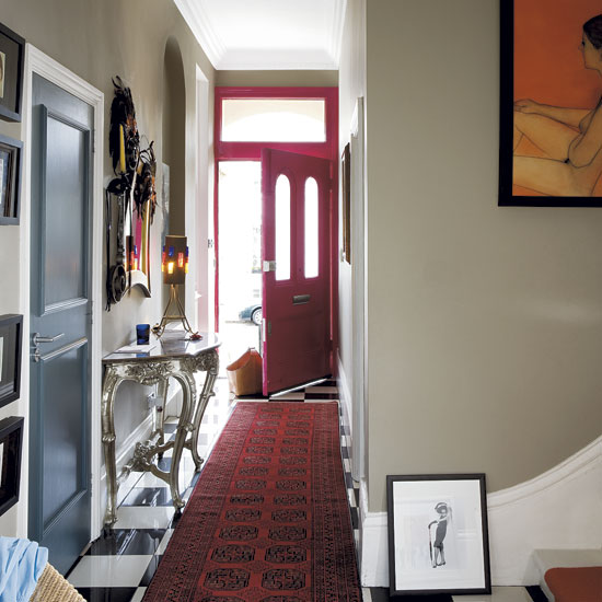
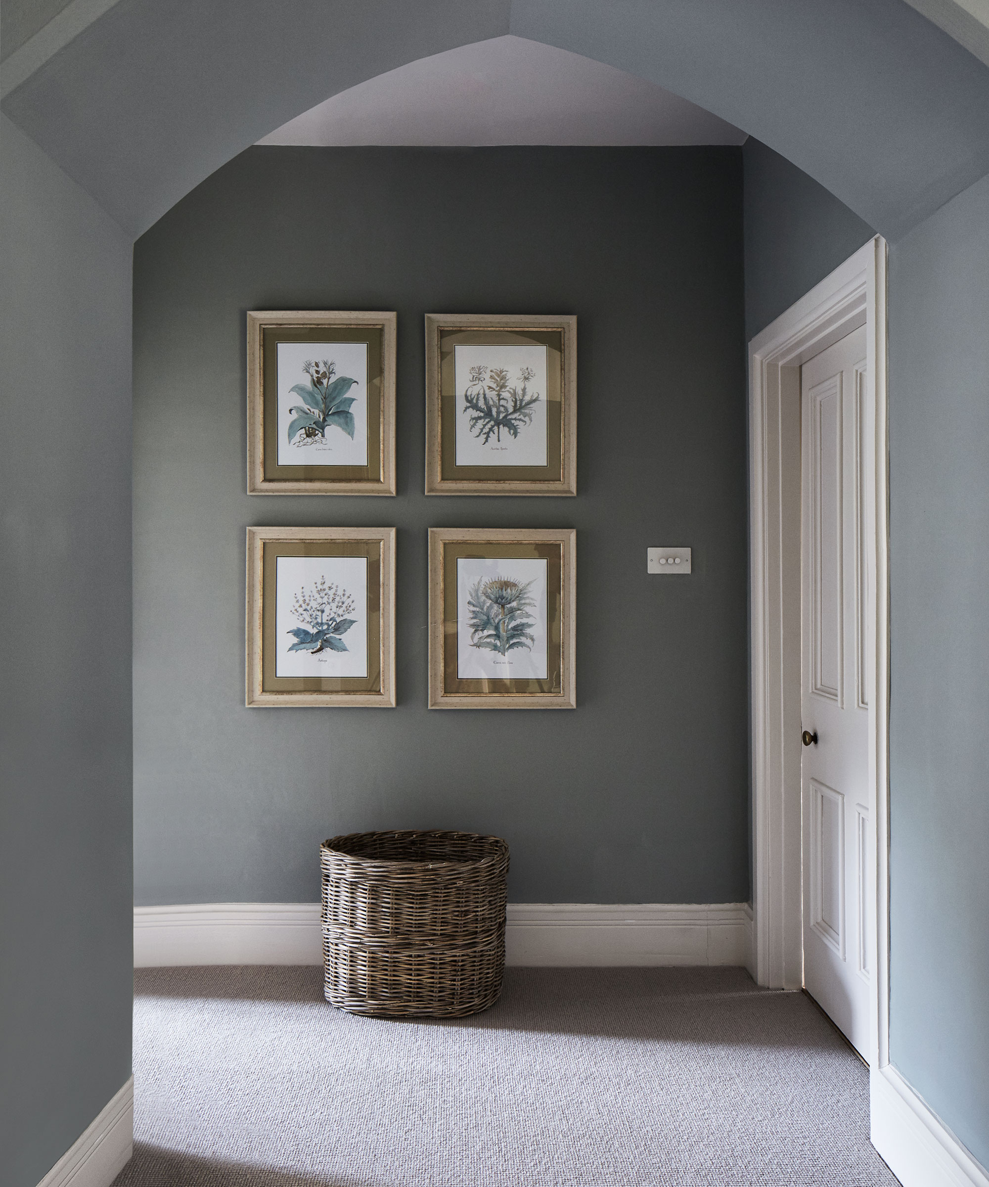
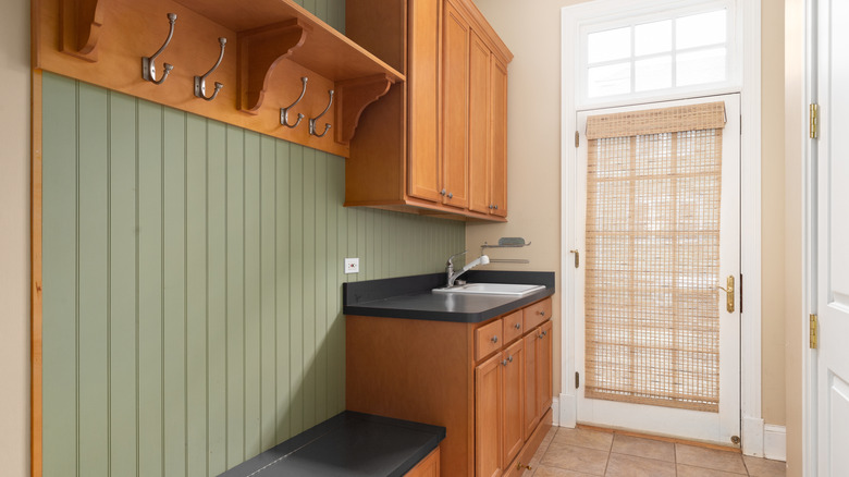
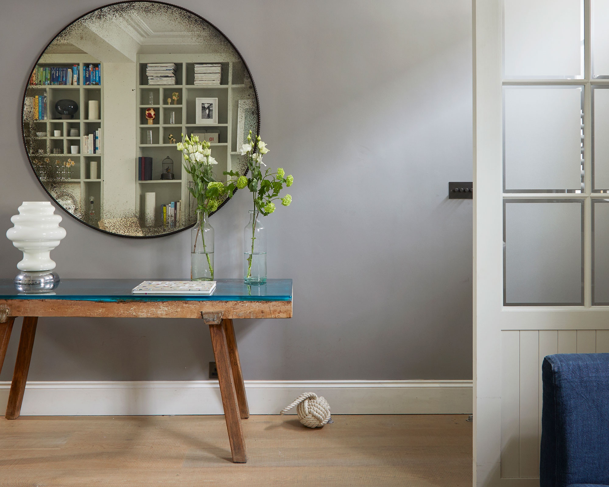
Gray, much like black, can also be a challenging color for an entryway. Dark gray shades can make the space feel small and suffocating, creating an unwelcoming environment, according to Shaolin Low. If a moody atmosphere is not the desired effect, lighter shades are preferred to maintain an open and fresh feel. Conversely, a gray that is too pale can also result in a cold and uninviting impression, as highlighted by Danielle Chiprut. She recommends warmer neutrals, such as creamy beiges or soft taupes, to achieve an approachable and cozy atmosphere.
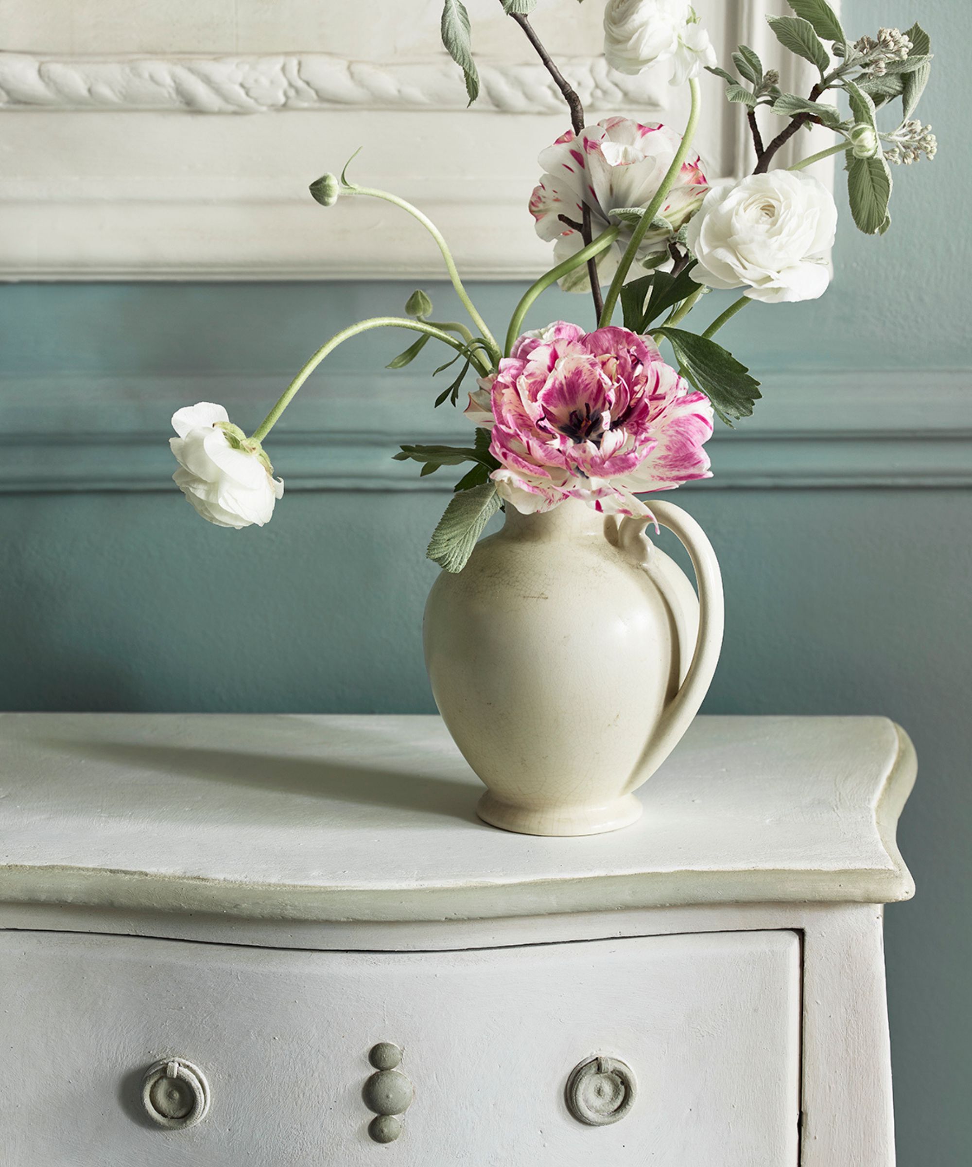
Finally, the article suggests reconsidering paint entirely for entryways and exploring alternative wall coverings like wallpaper or wainscoting. Shaolin Low states that wallpaper is an excellent way to introduce texture and personality, making an immediate statement upon entering. Megan Gorelick frequently uses wainscoting combined with wallpaper in her projects to create multi-dimensional and layered spaces, often drawing on the home's overall color palette to ensure a cohesive design. This approach can offer a more dynamic and inviting first impression than a single paint color, effectively hinting at the design elements found throughout the rest of the house.
#EntrywayDesign #PaintColors #HomeDecor #InteriorDesignTips #FirstImpression #ColorPsychology #HomeRenovation #Wallpaper #NeutralColors #EntrywayDesign #PaintColors #HomeDecor #InteriorDesignTips #FirstImpression #ColorPsychology #HomeRenovation #Wallpaper #NeutralColors
0 comment in total
 No comments yet
You may also like

5 colors you should never paint your entryway – according to interior experts

5 'ugly colors' that I'll be decorating with in 2024 – these undesirable colors will trend this year
The 8 Rules for Dark Entryways — How Designers Perfect the Art of the Moody First Impression

4 Paint Colors Designers Say You Should Never Use In A Hallway

6 colors to avoid in an entryway – and the ones designers know make a better first impression
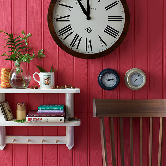
You should never paint your hallway this colour, according to colour psychologists
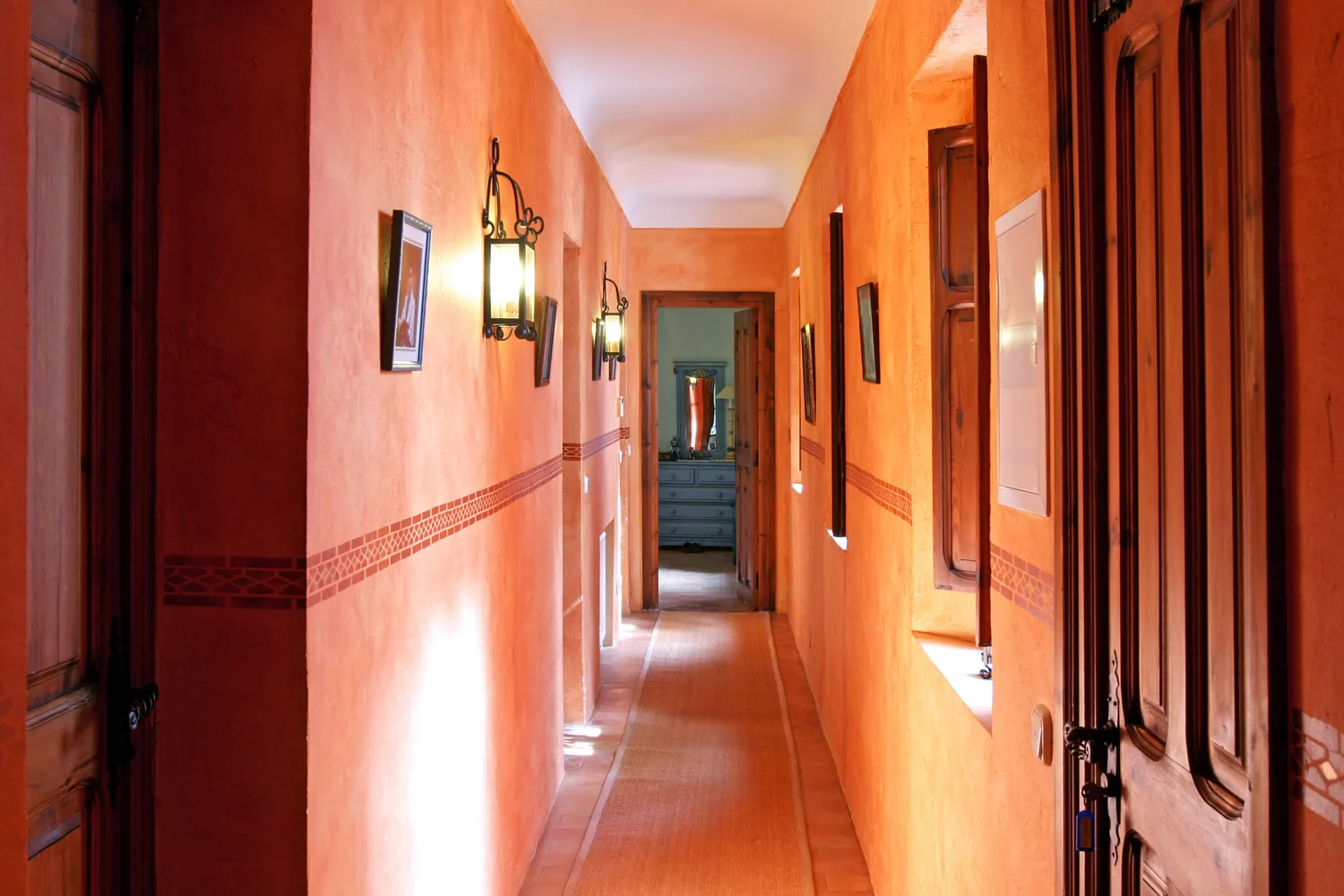
5 Colors You Should Never Paint Your Hallway, According to Designers

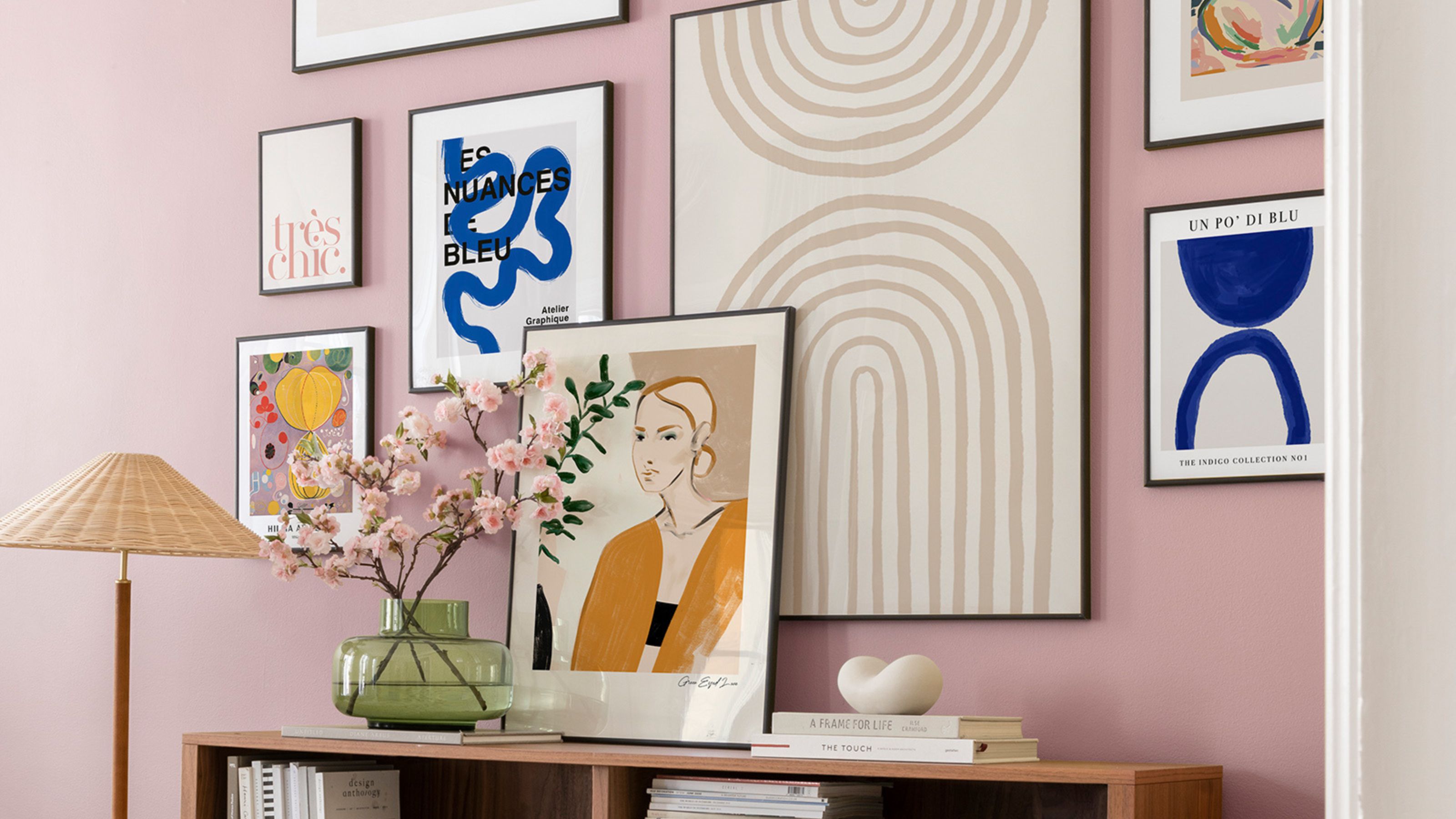
The 5 small entryway color mistakes design experts say are big bloopers


What are the worst colors to paint a room? The shades experts say you should never use
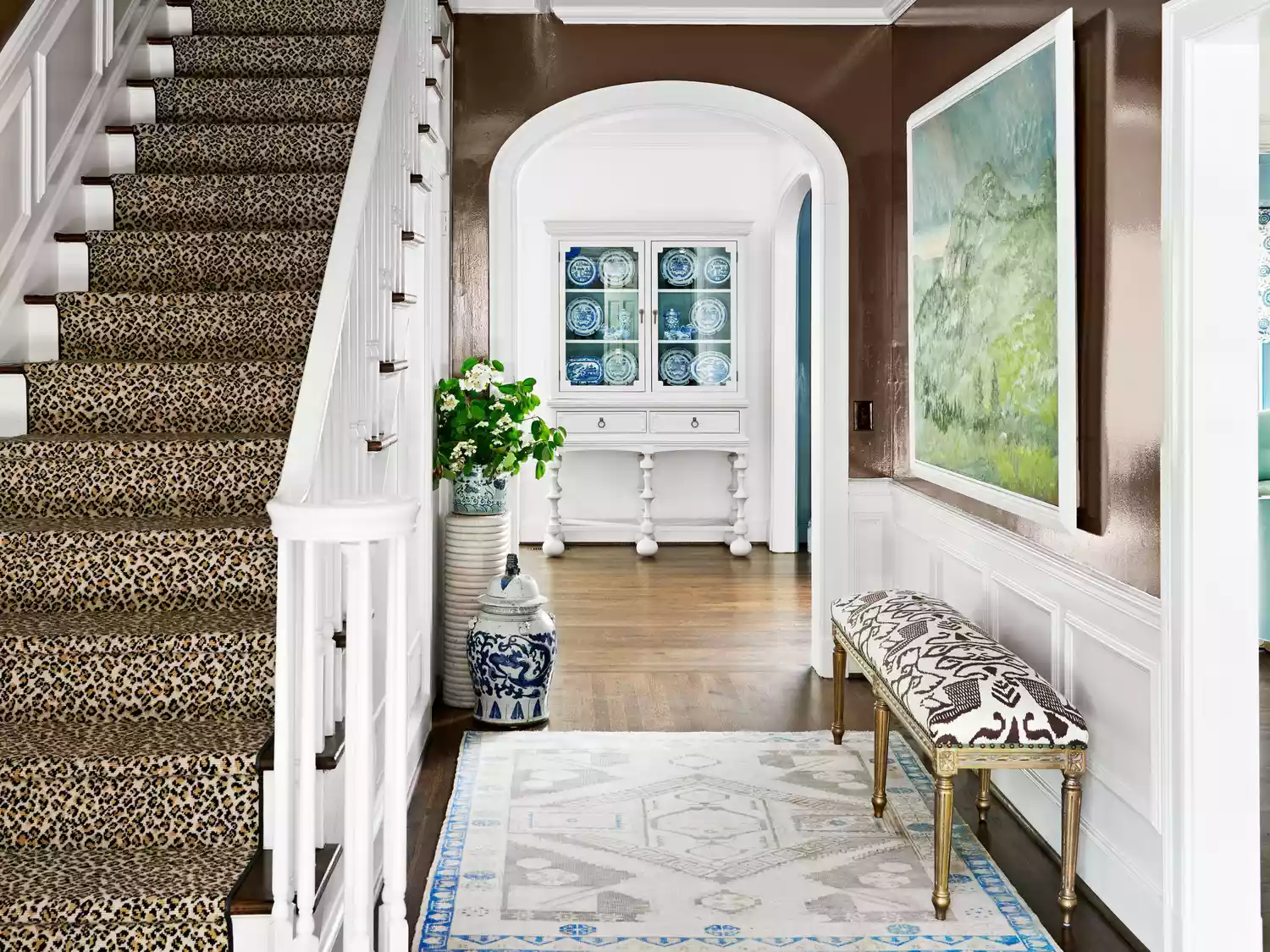
You Should Never Use These Paint Colors In An Entryway, According To Designers
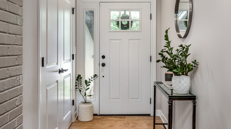
Outdated Entryway Paint Colors To Avoid In 2025 (And What To Try Instead)
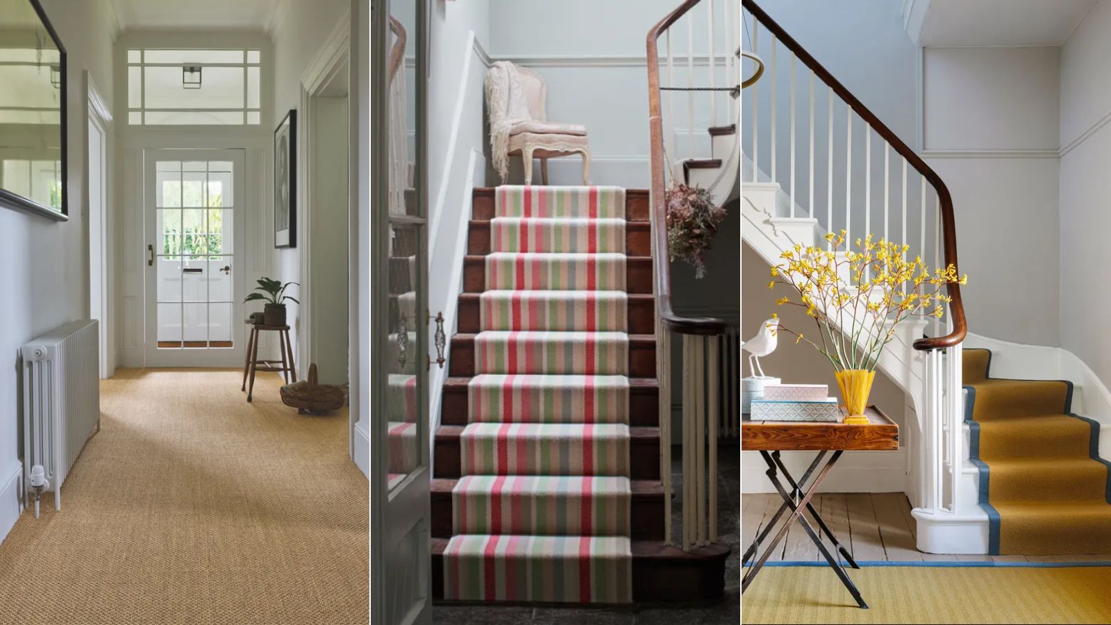
5 best colors for an entryway carpet, according to interior designers
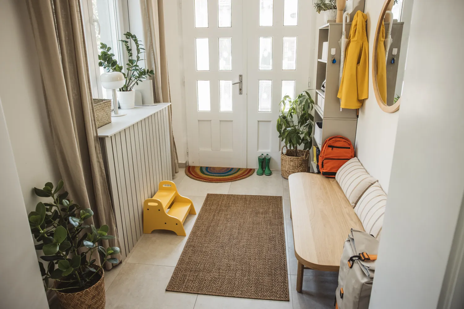
6 Colors You Should Never Paint Your Entryway, According to Color Experts

Dark colors to choose for an expensive-looking entryway - interior designers always go back to these paint shades
The colors you should never paint your hallway – and what really works

5 colors you should never paint a small room – designers warn us to steer clear of these hues, and what to pick instead

Interior design experts reveal the colour rules you should be breaking
You should avoid these 5 entryway colors in 2023 – according to top designers
Should the entryway be the same color as the living room? One of the world's best paint experts decides once and for all
The 10 Worst Paint Colors for Your Home, Experts Say