1/7
6 colors to avoid in an entryway – and the ones designers know make a better first impression
The entryway serves as the first impression of a home, setting the overall tone and welcoming visitors. Therefore, selecting the appropriate color scheme for this space is crucial. The article delves into specific colors that interior designers recommend avoiding in entryways, alongside alternatives that create a more positive and aesthetically pleasing introduction to a home.
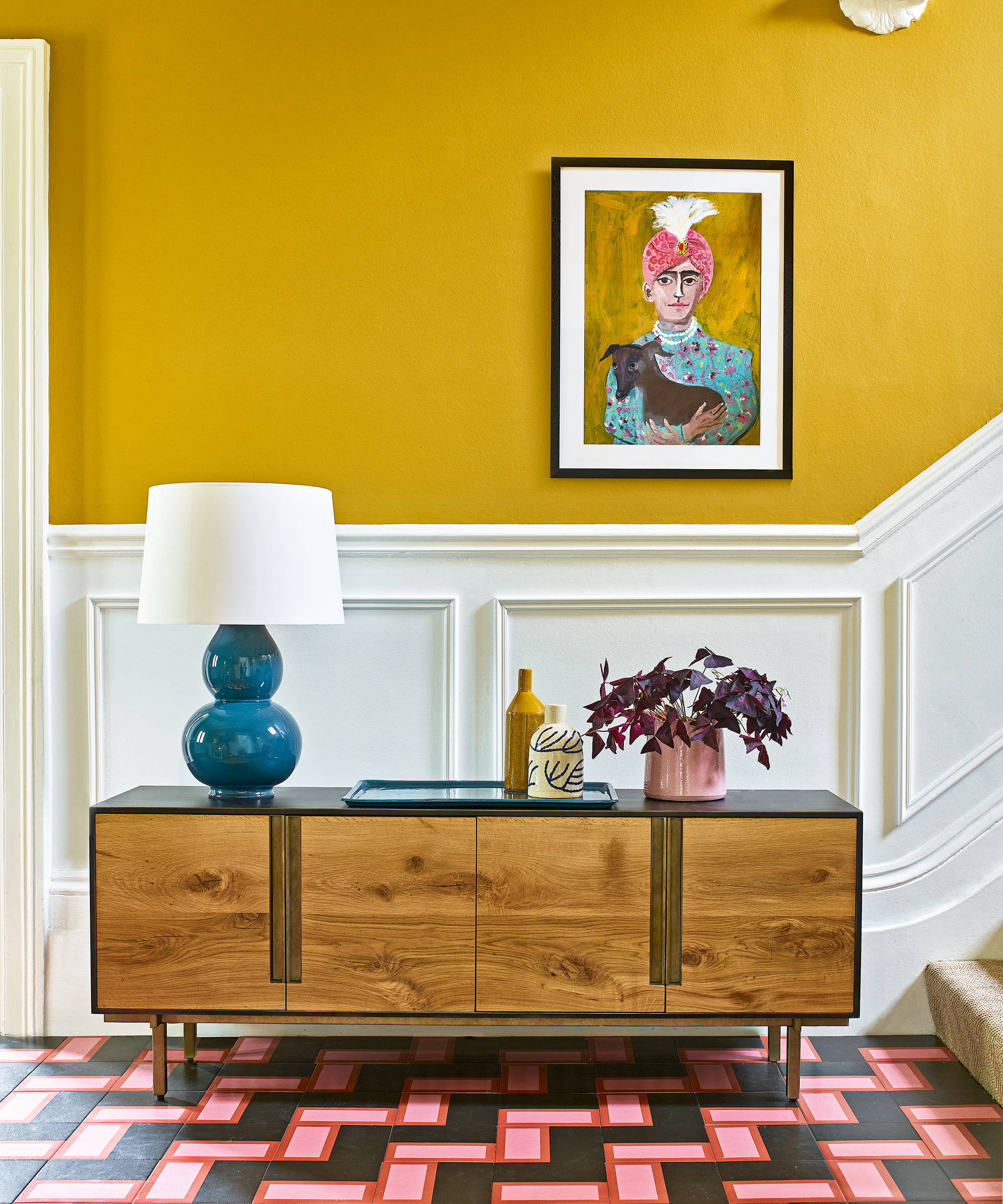
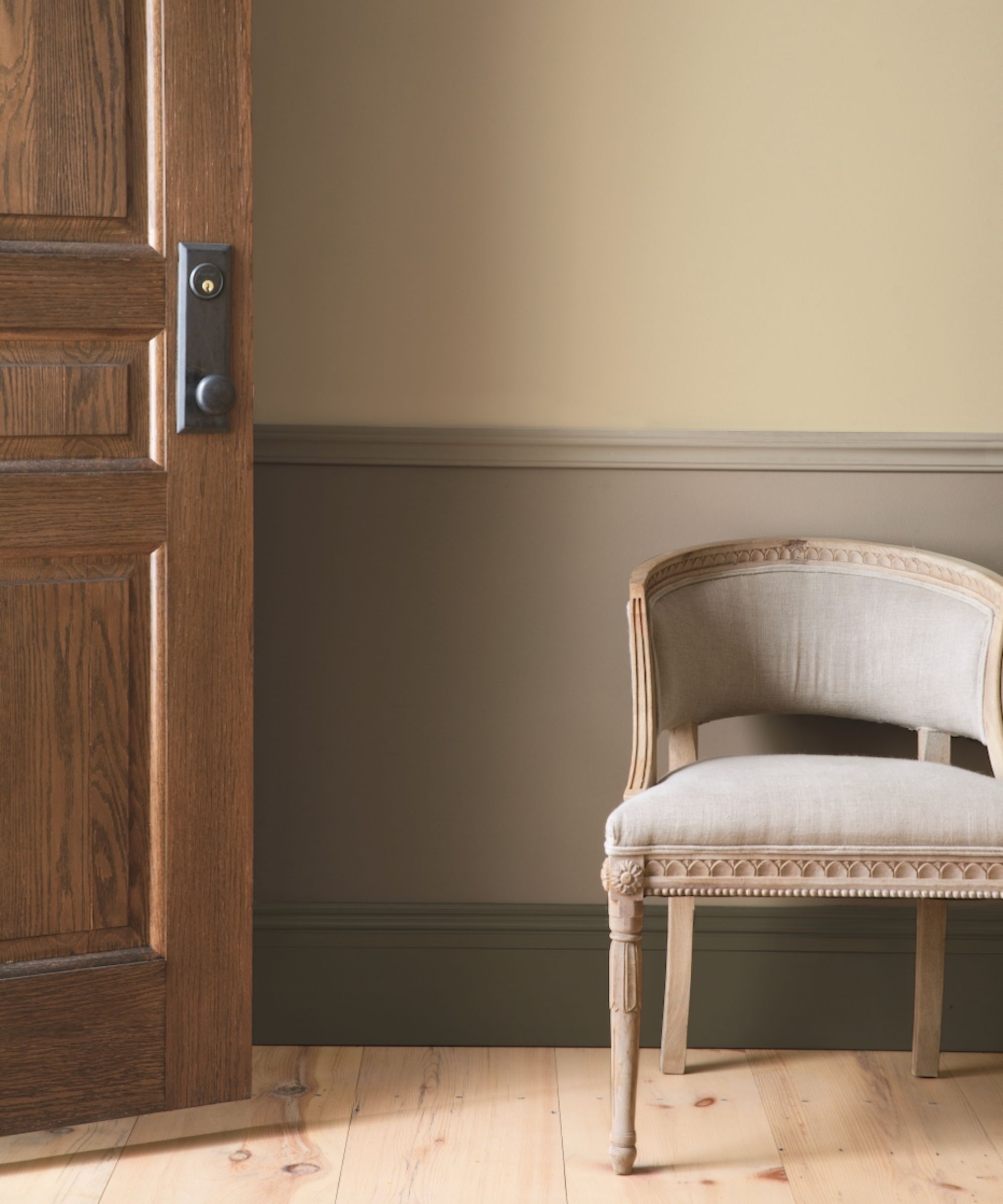
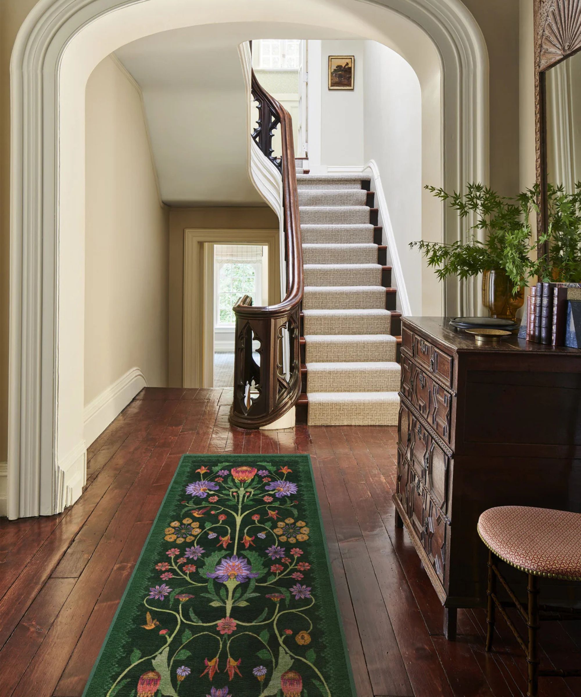
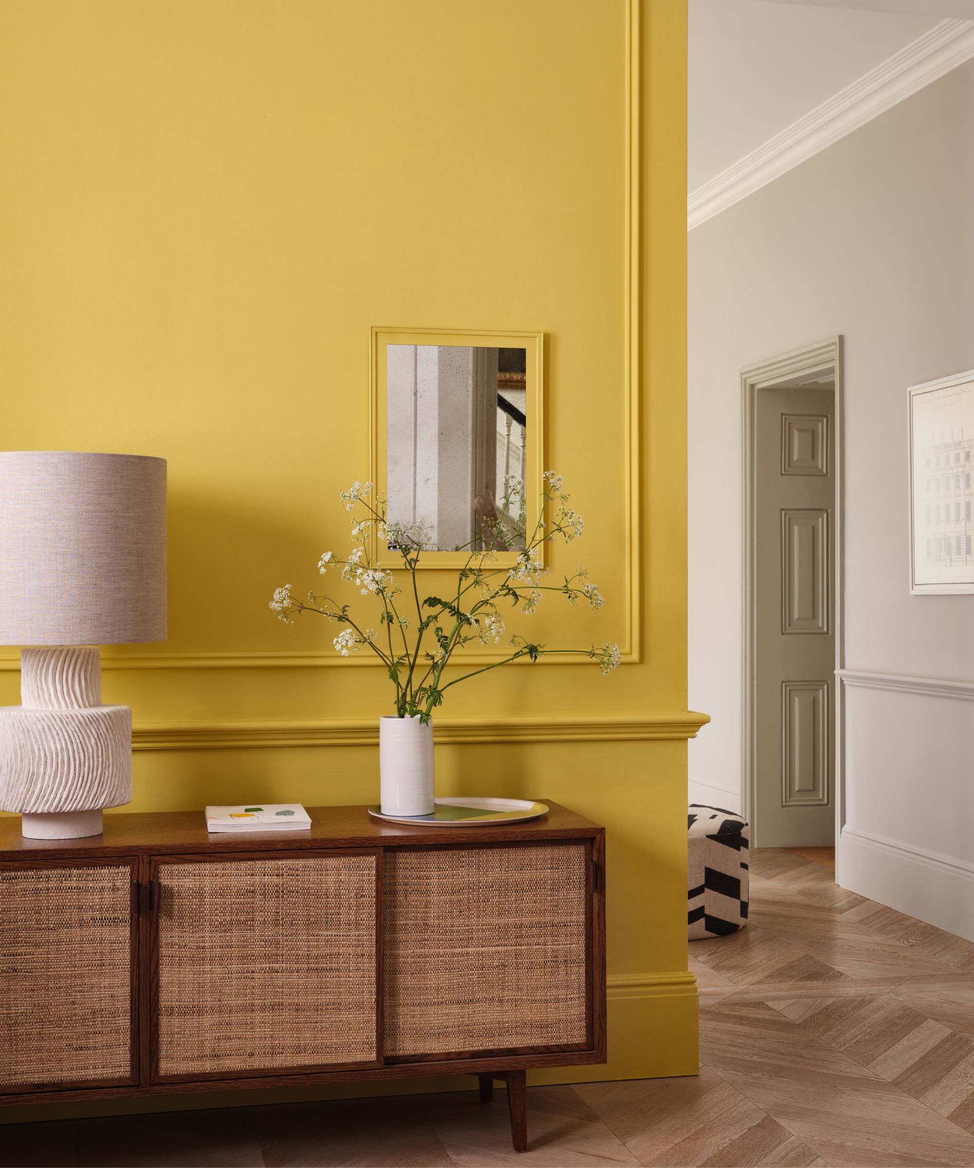
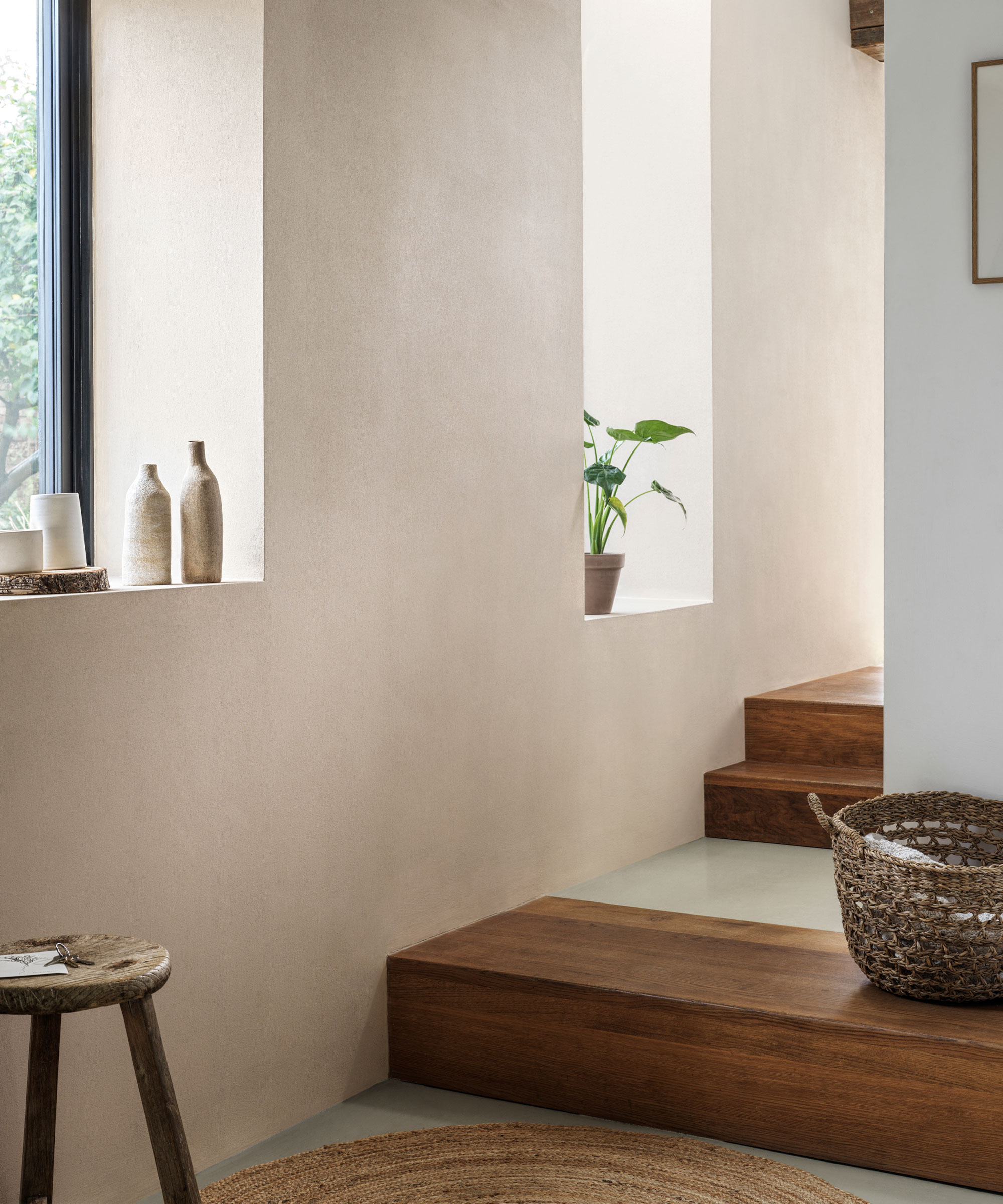
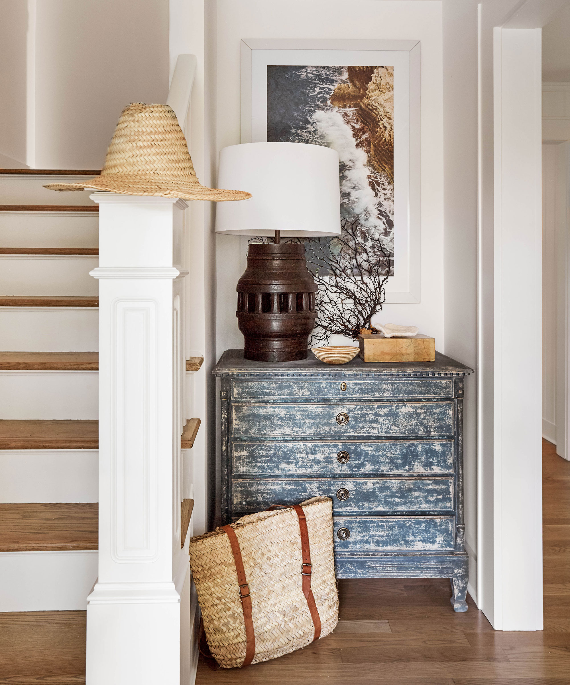
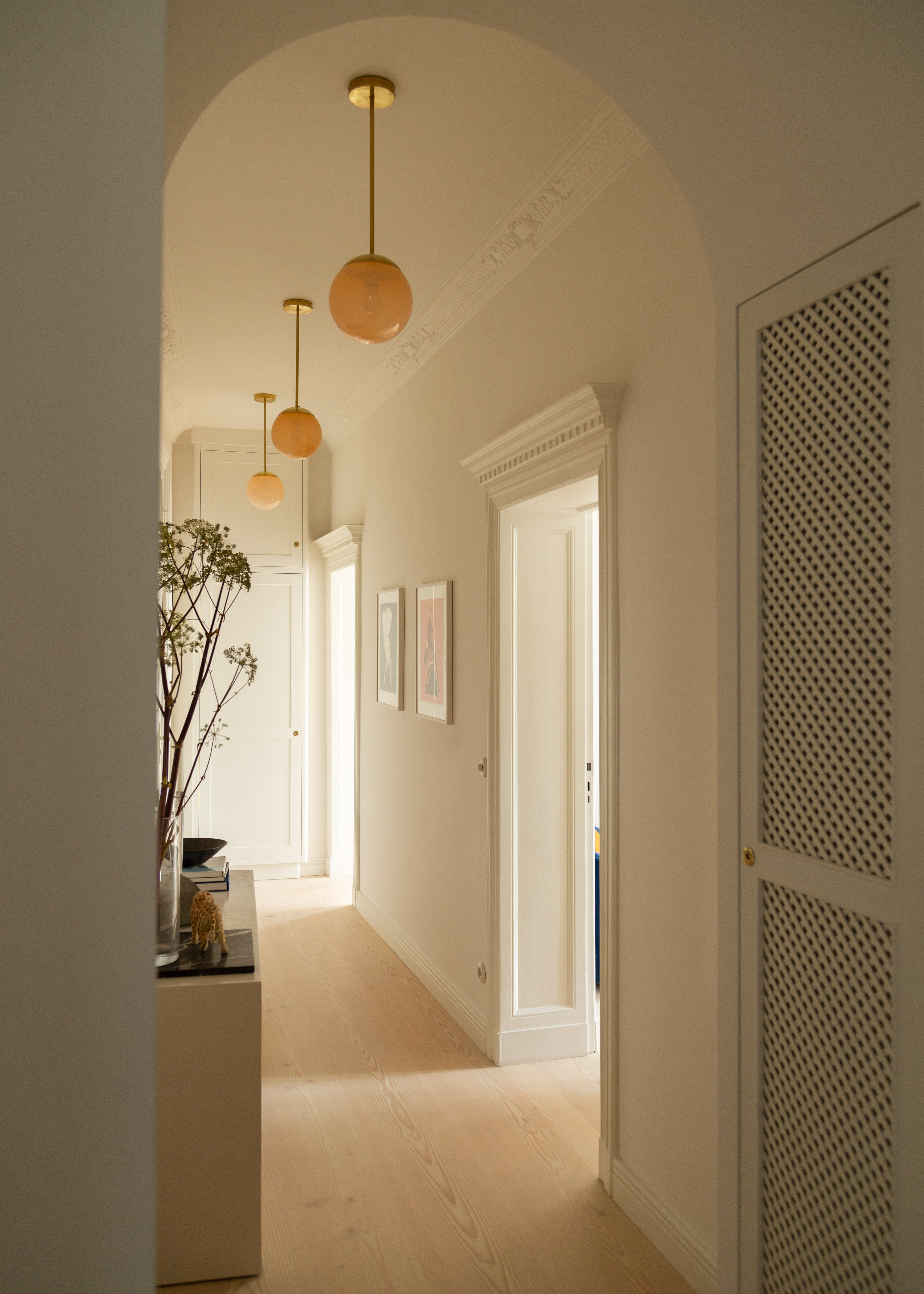
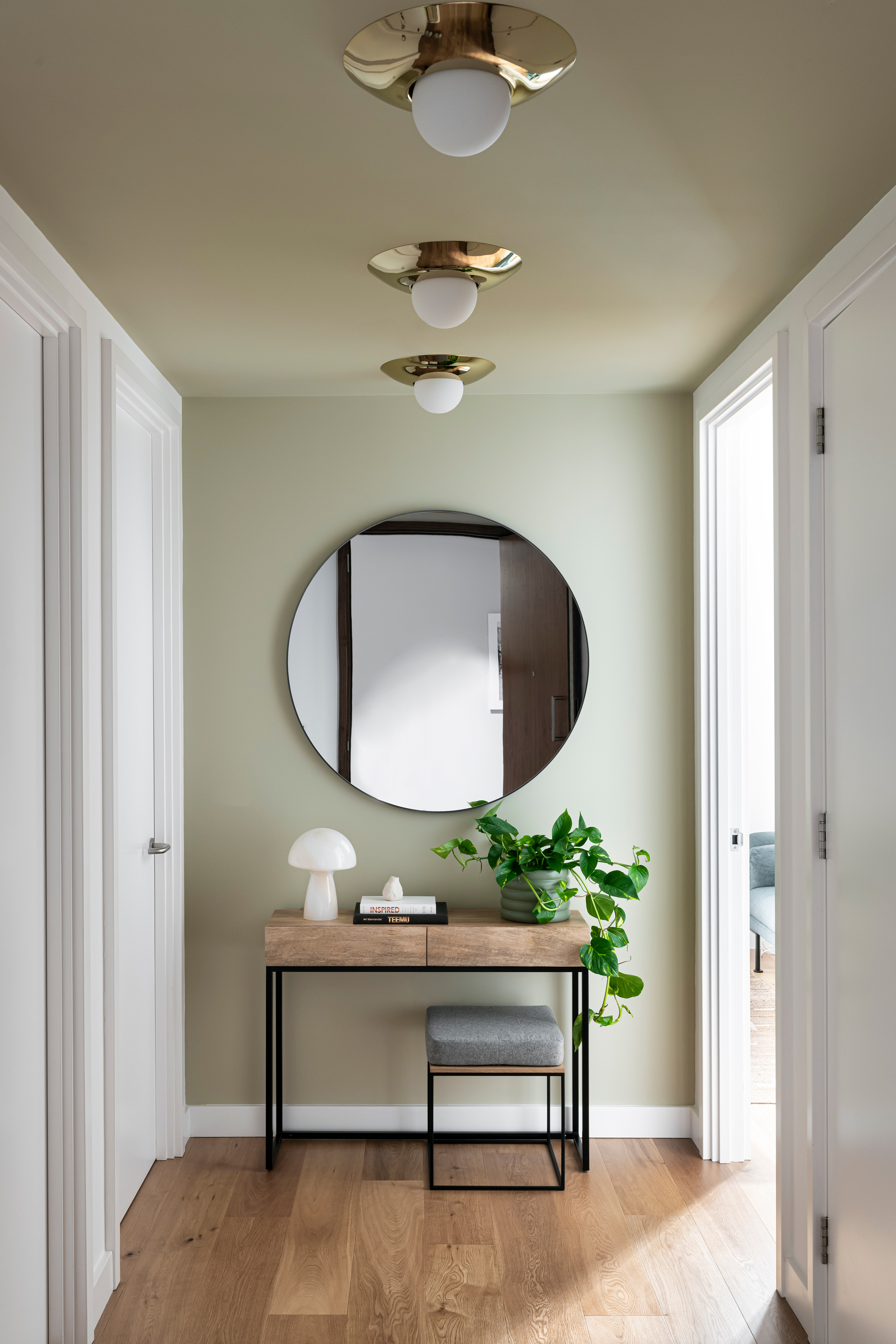
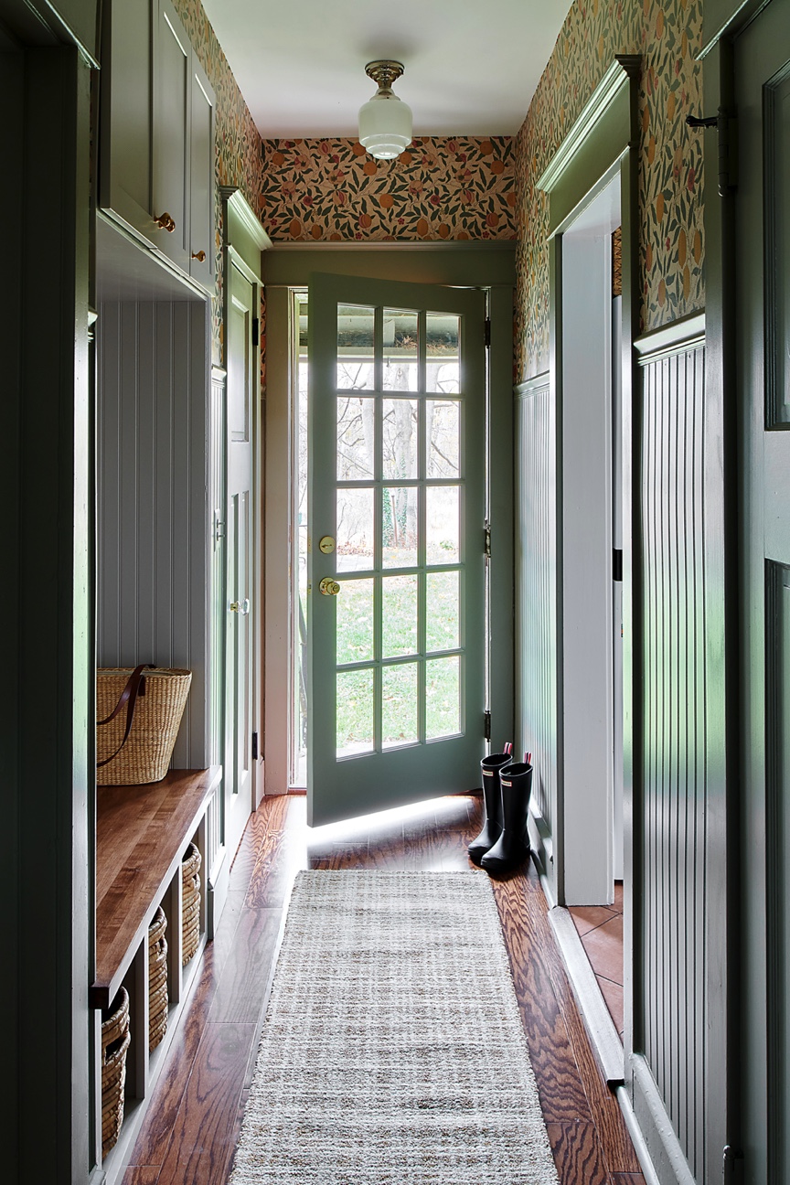
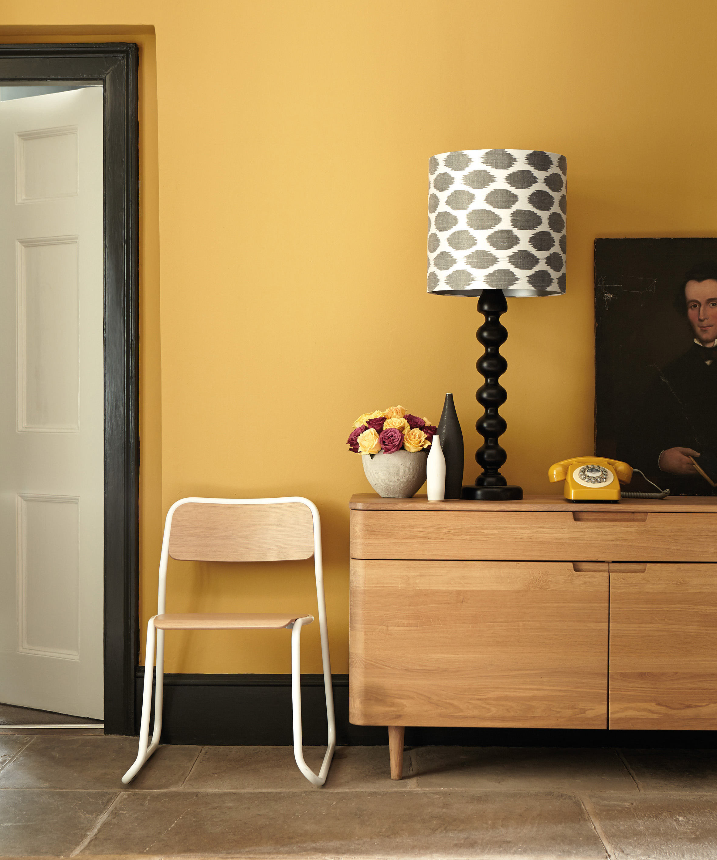
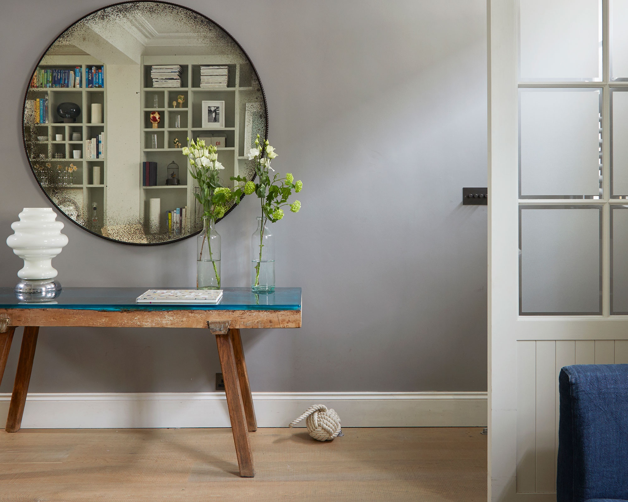
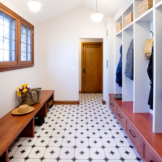
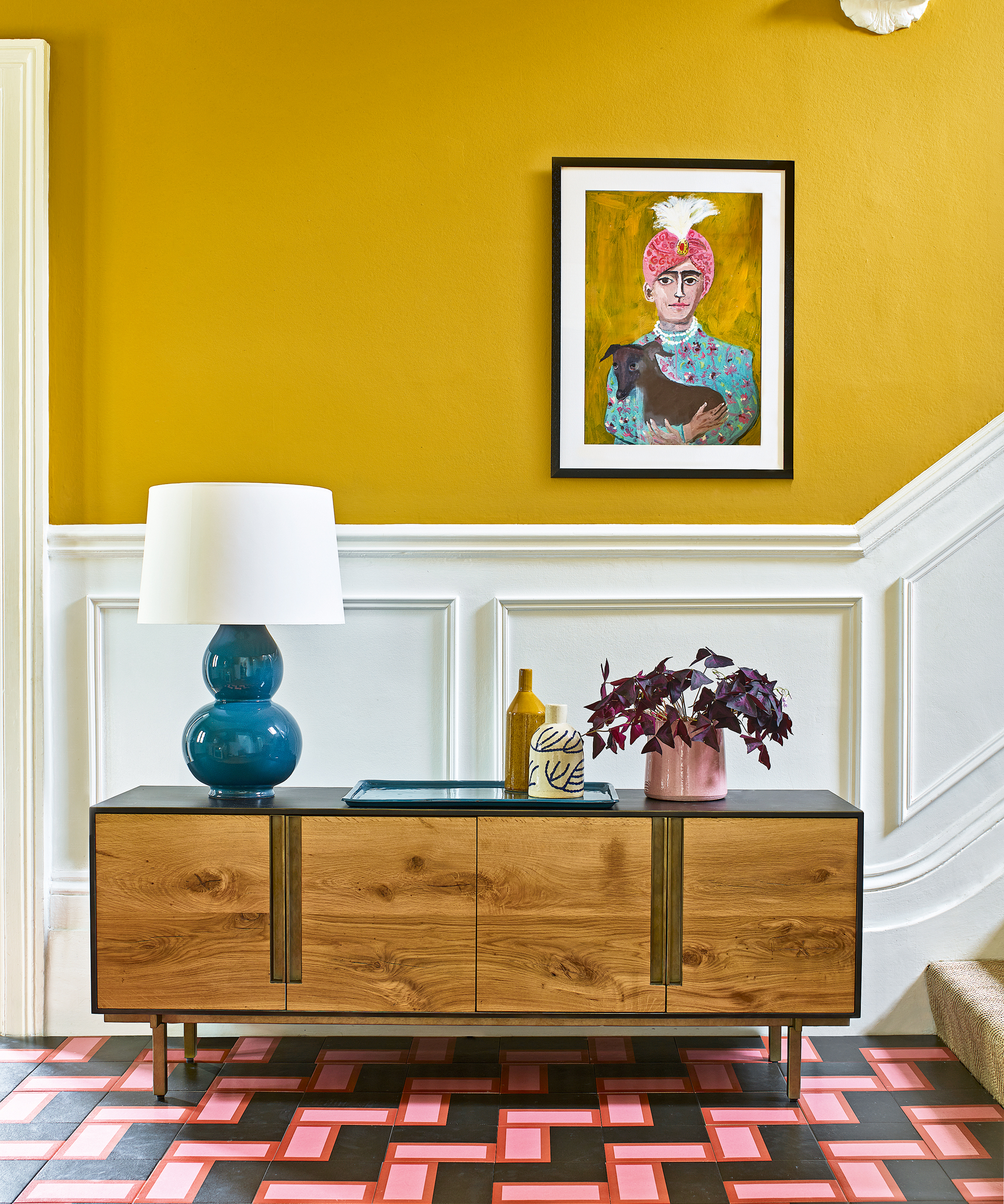
Light yellow is identified as a color to avoid, particularly in entryways that receive ample natural light. Brooke Spreckman, Founder and Principal Designer of Design Hutch, explains that an abundance of light tones can lead to the space appearing washed out or easily showing wear. Instead, she suggests incorporating earthy tones that will age gracefully, recommending a palette that includes neutral woods like oak or walnut, olive green, and warm-toned grays, along with a textured and patterned runner. Greige is proposed as a suitable wall color alternative.
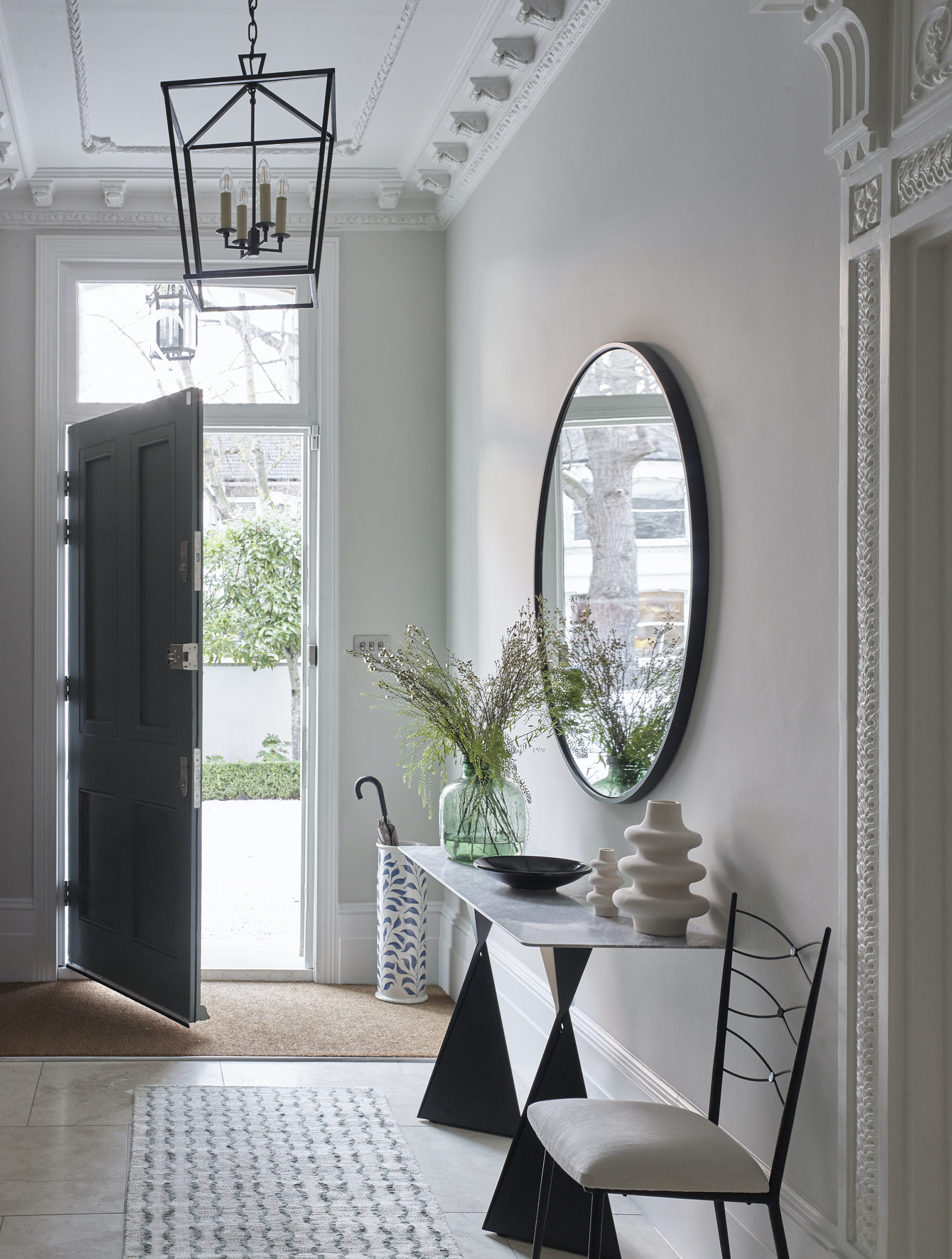
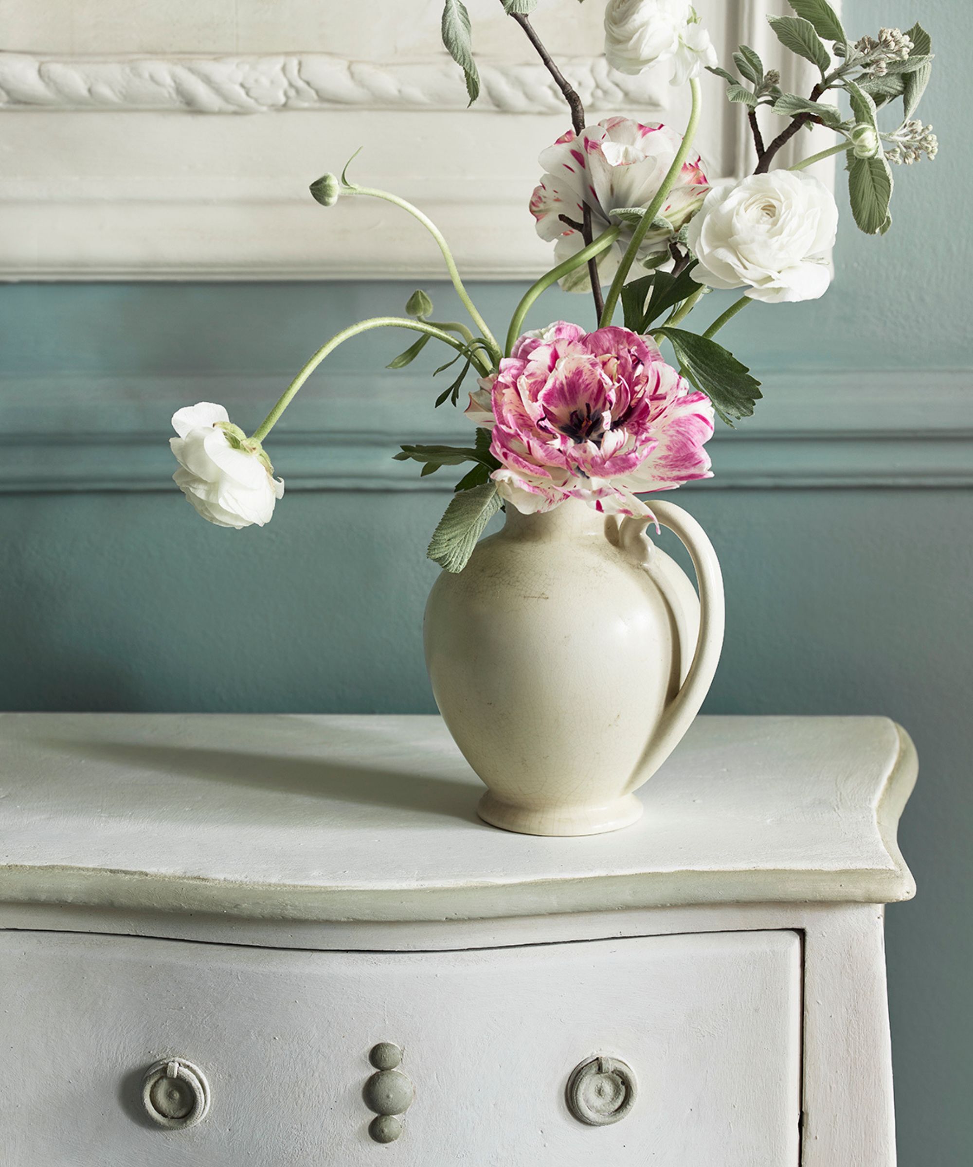
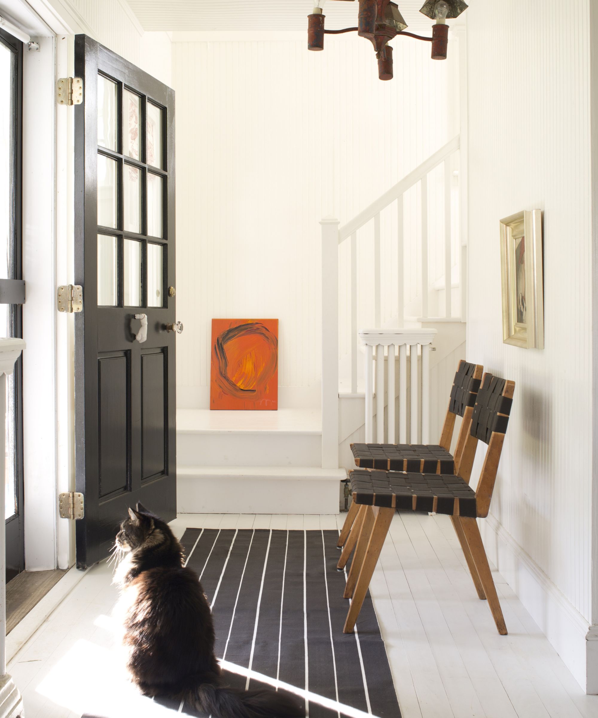
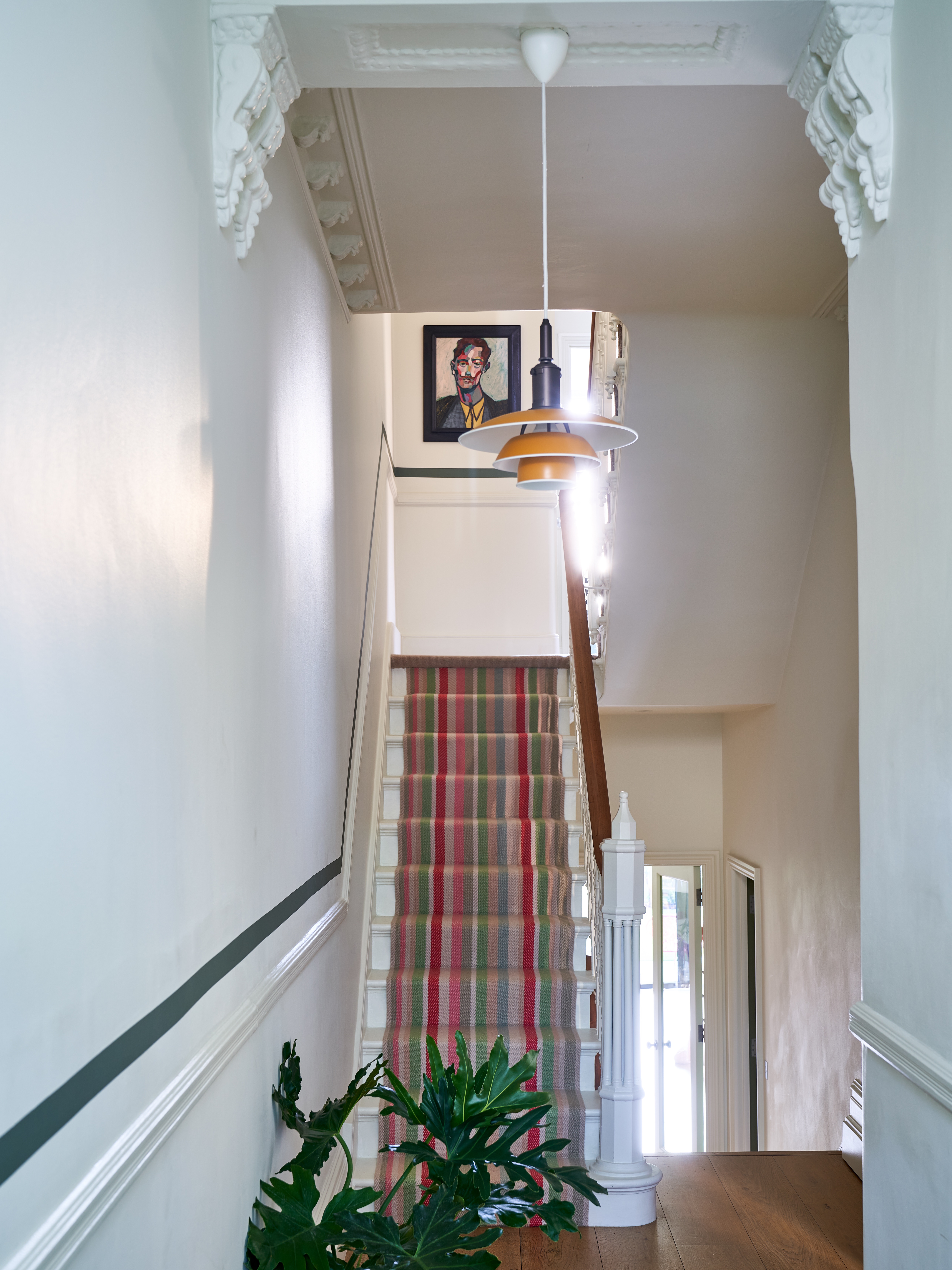
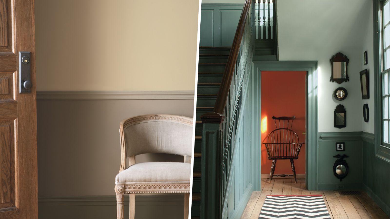
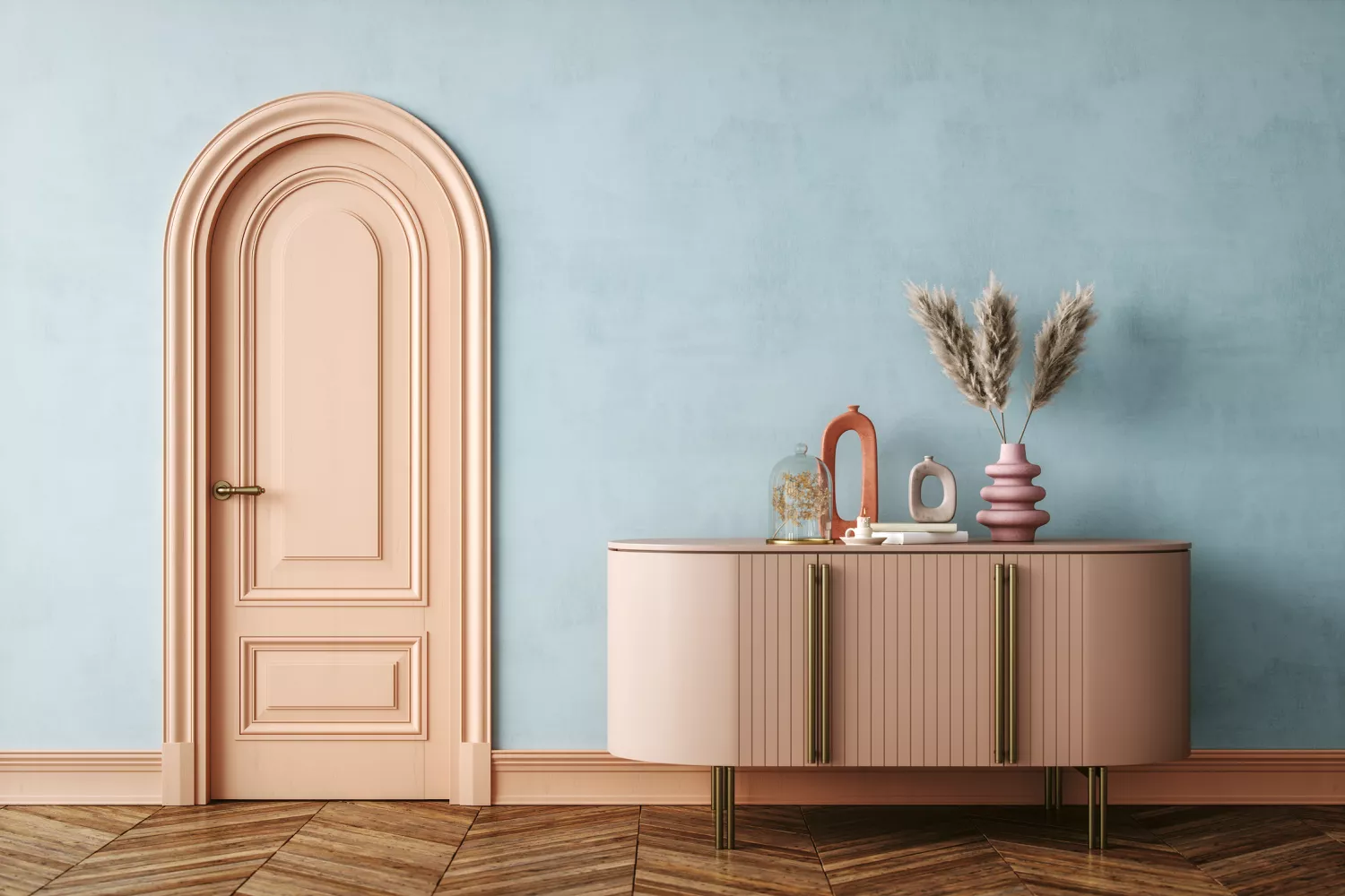
While neutrals are often favored for their ability to create light and open spaces, Joa Studholme, Color Curator for Farrow and Ball, advises against using a very neutral wall color alongside white woodwork, as this combination can feel too ordinary and disrupt the natural flow of the house. She recommends using an accent color, such as a darker tone on the trim, to add dimension and vibrancy to a neutral palette. This approach maintains a sense of space while introducing a decorative element. For instance, a subtle contrast like Farrow and Ball School House White on walls with Drop Cloth on woodwork offers a calm and gentle ambiance, whereas Railings on woodwork creates a more dynamic space.
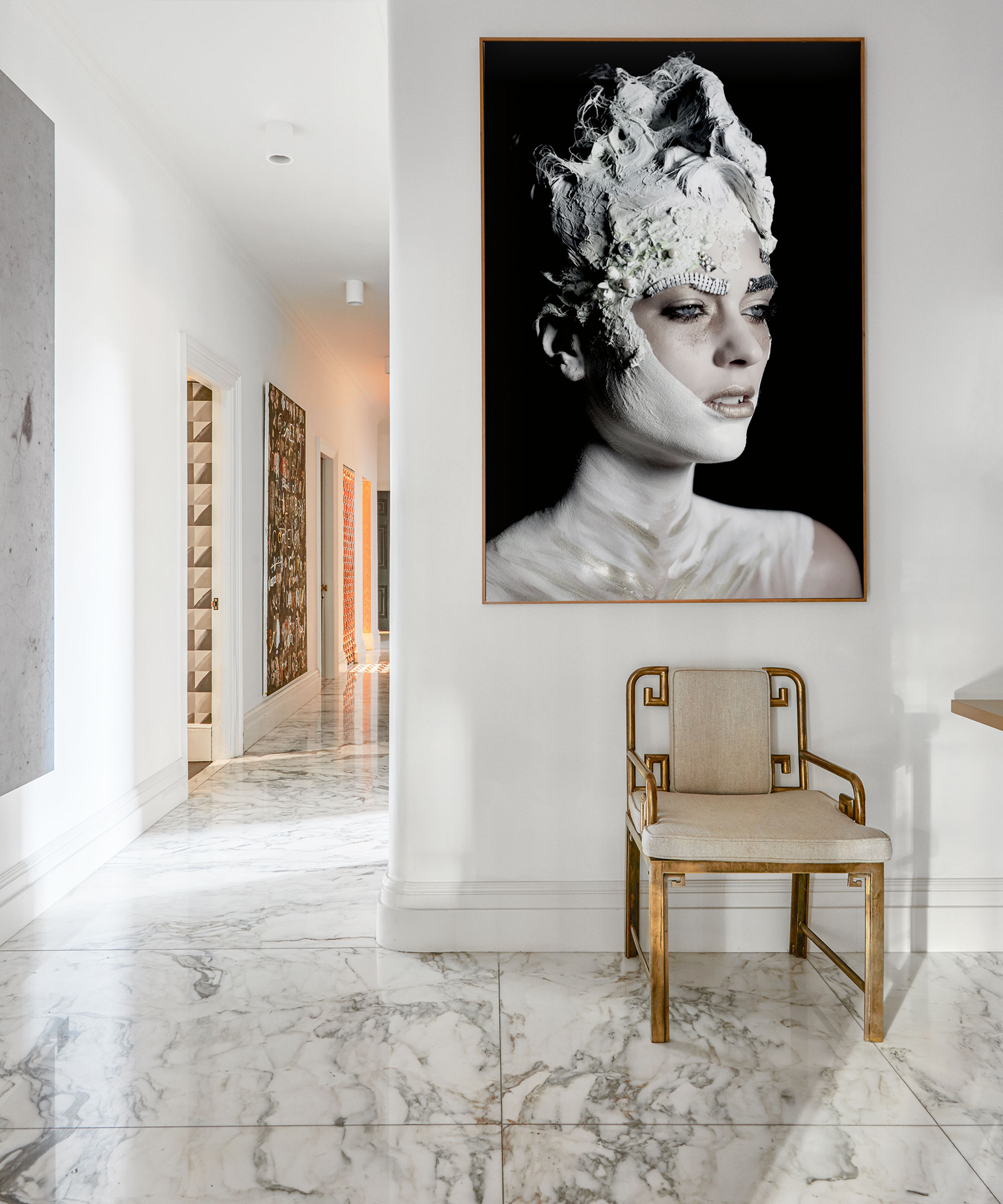
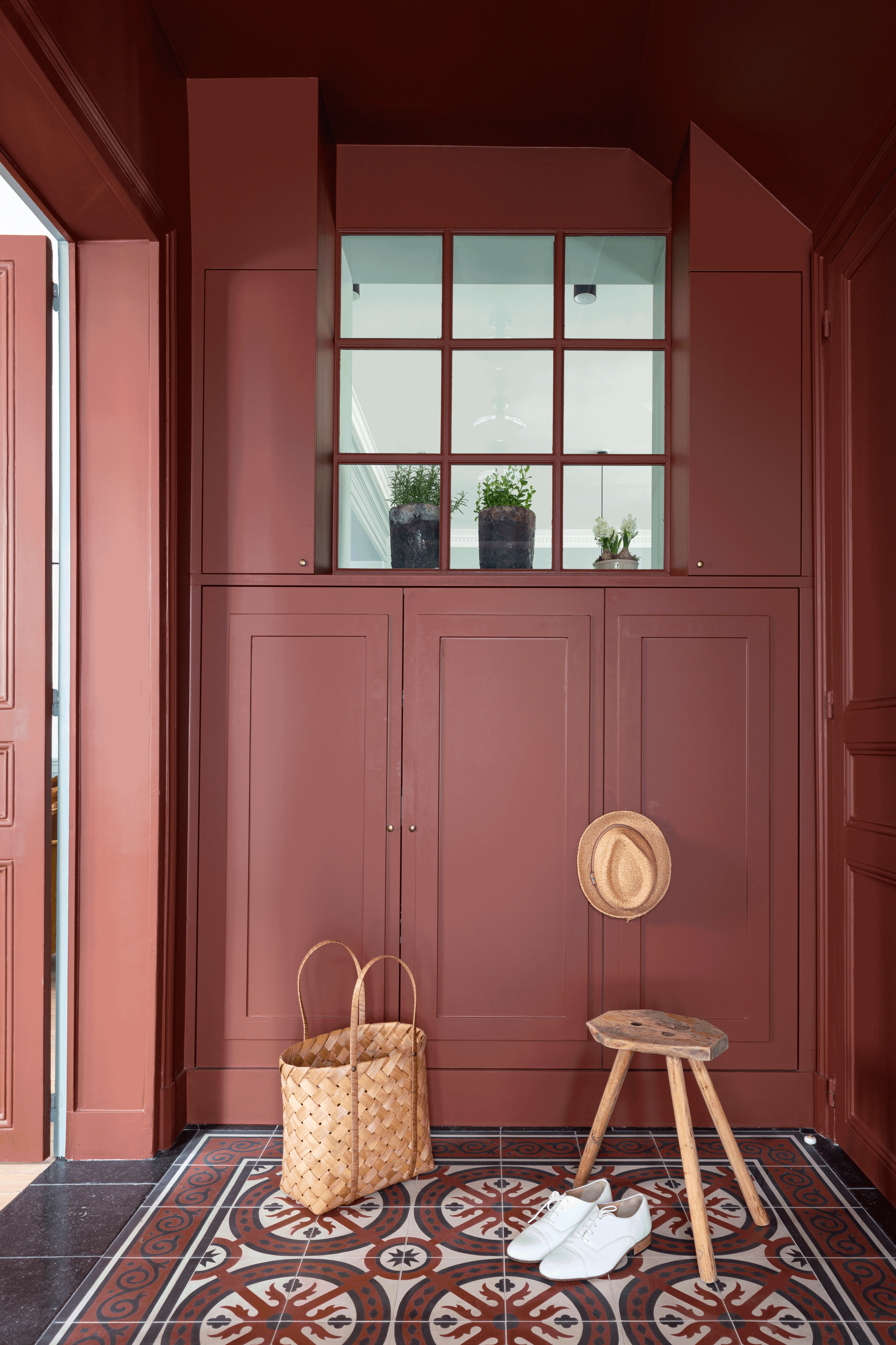
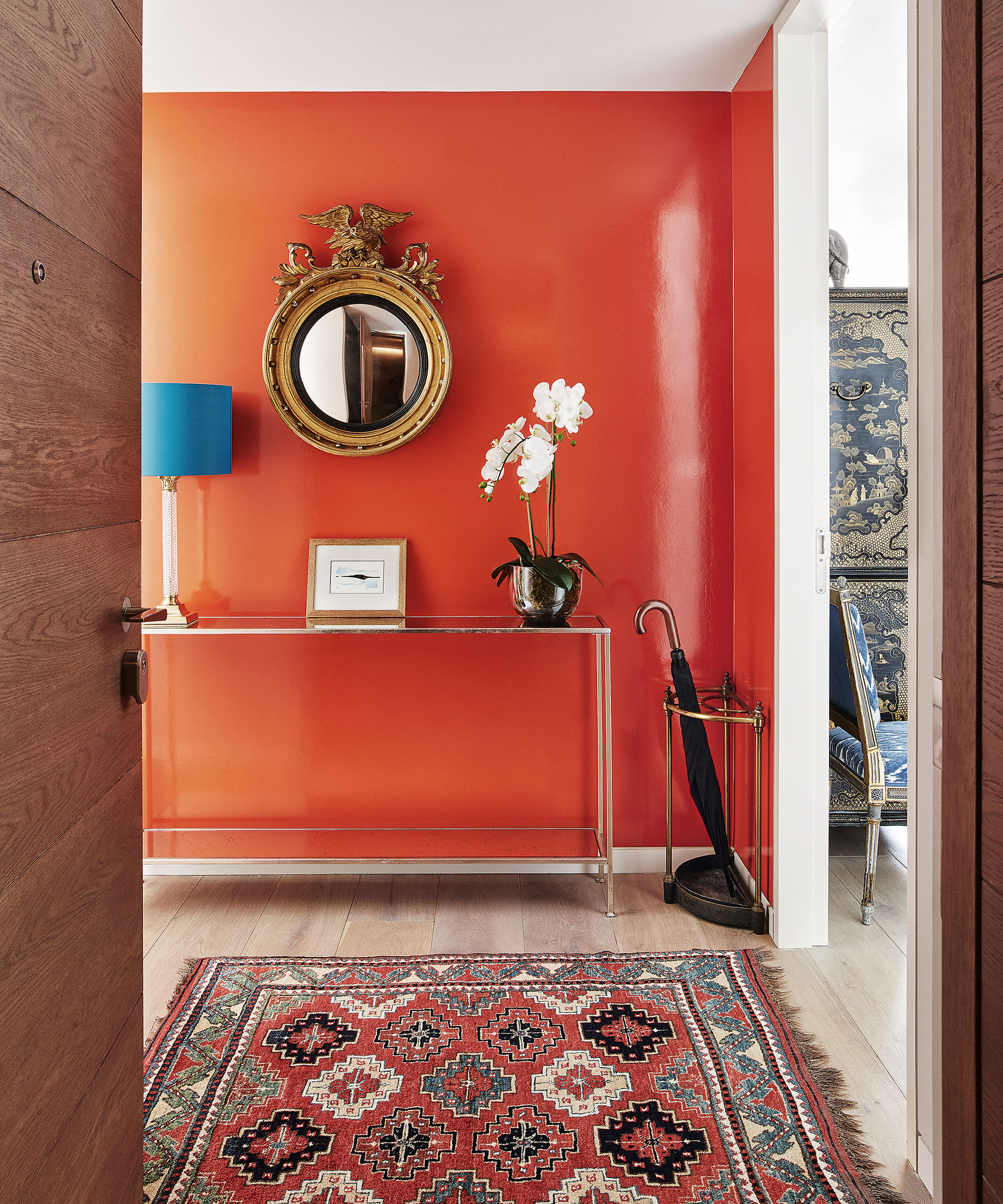
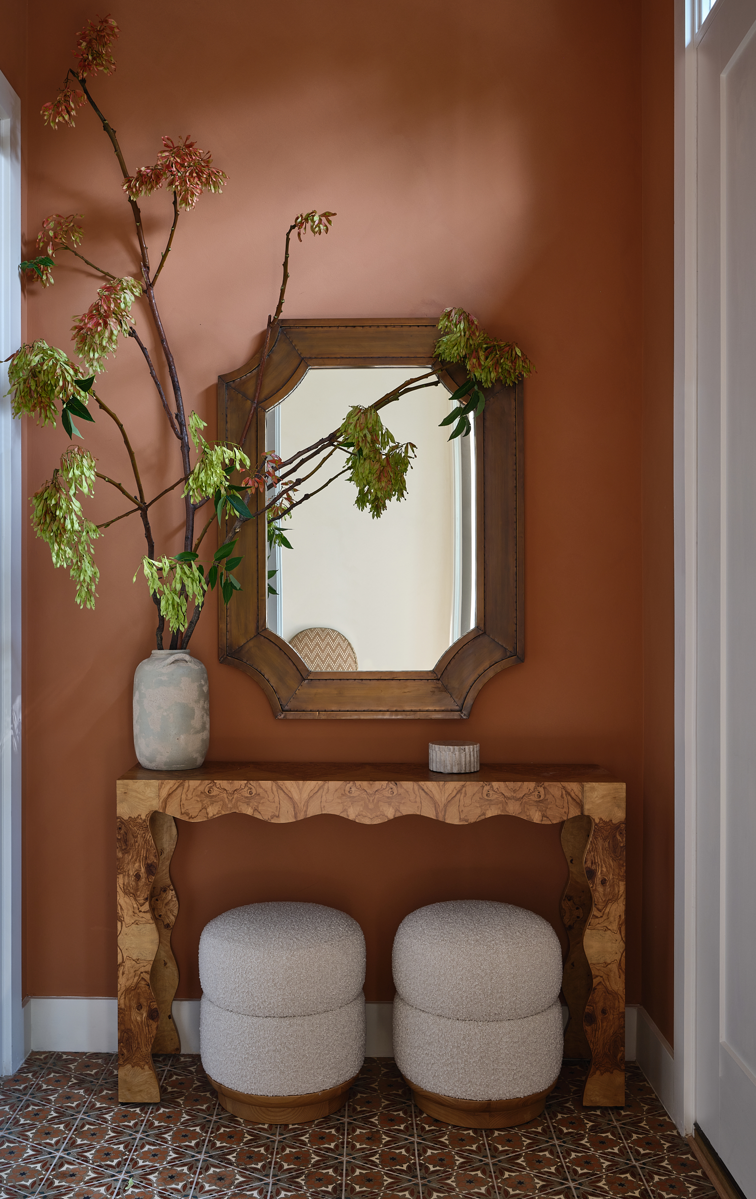
Similarly, a white-on-white theme in an entryway is discouraged. Studholme encourages embracing bold colors, even in dimly lit entryways, to establish a distinct focal point. She argues that a strong, enveloping warm color can firmly establish the entryway as the heart of the home, especially when natural light is limited. Using colors like Farrow and Ball Dead Salmon or Selvedge in a hallway can make adjacent rooms appear larger and brighter by creating a contrast when moving from a darker to a paler space.
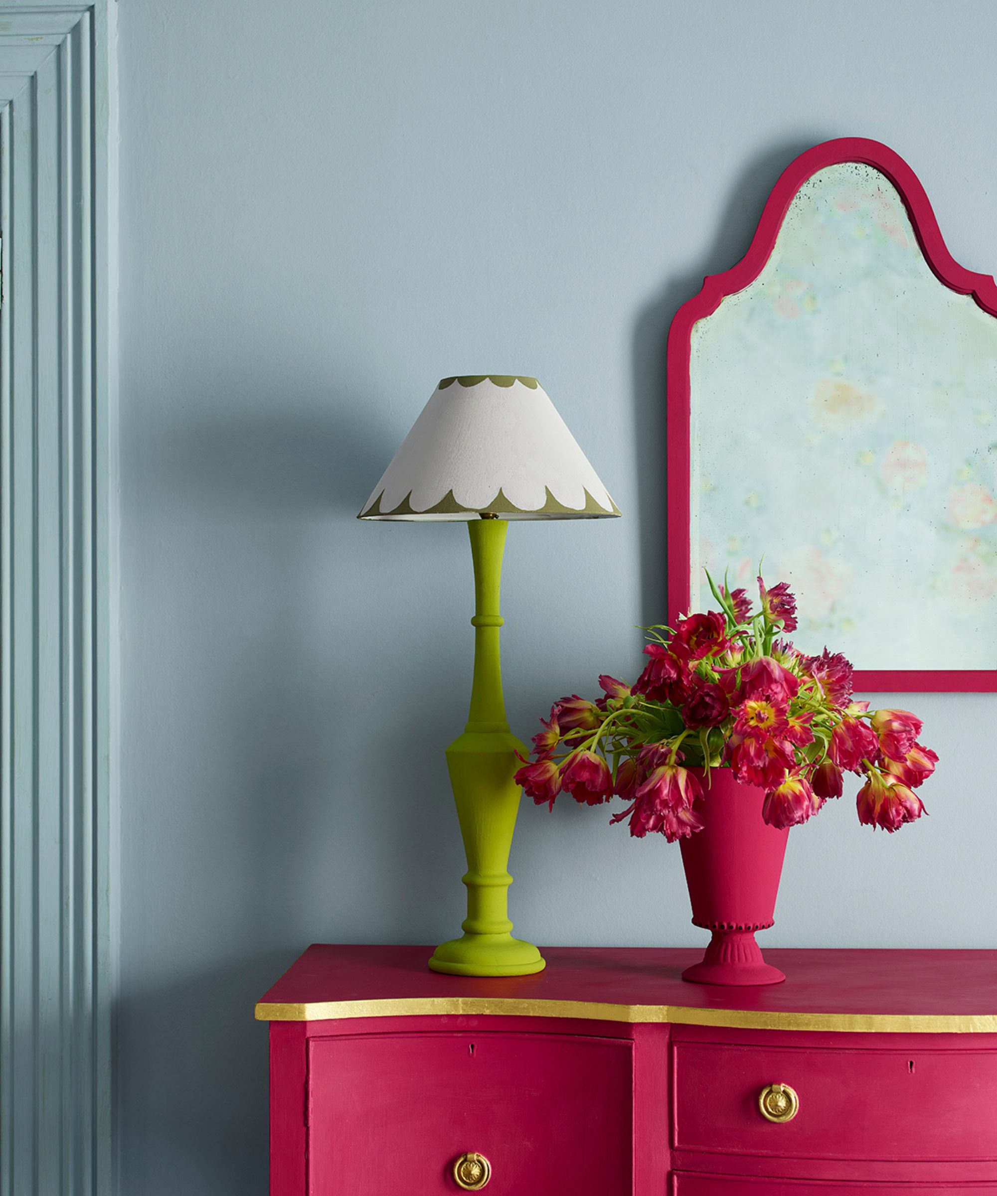
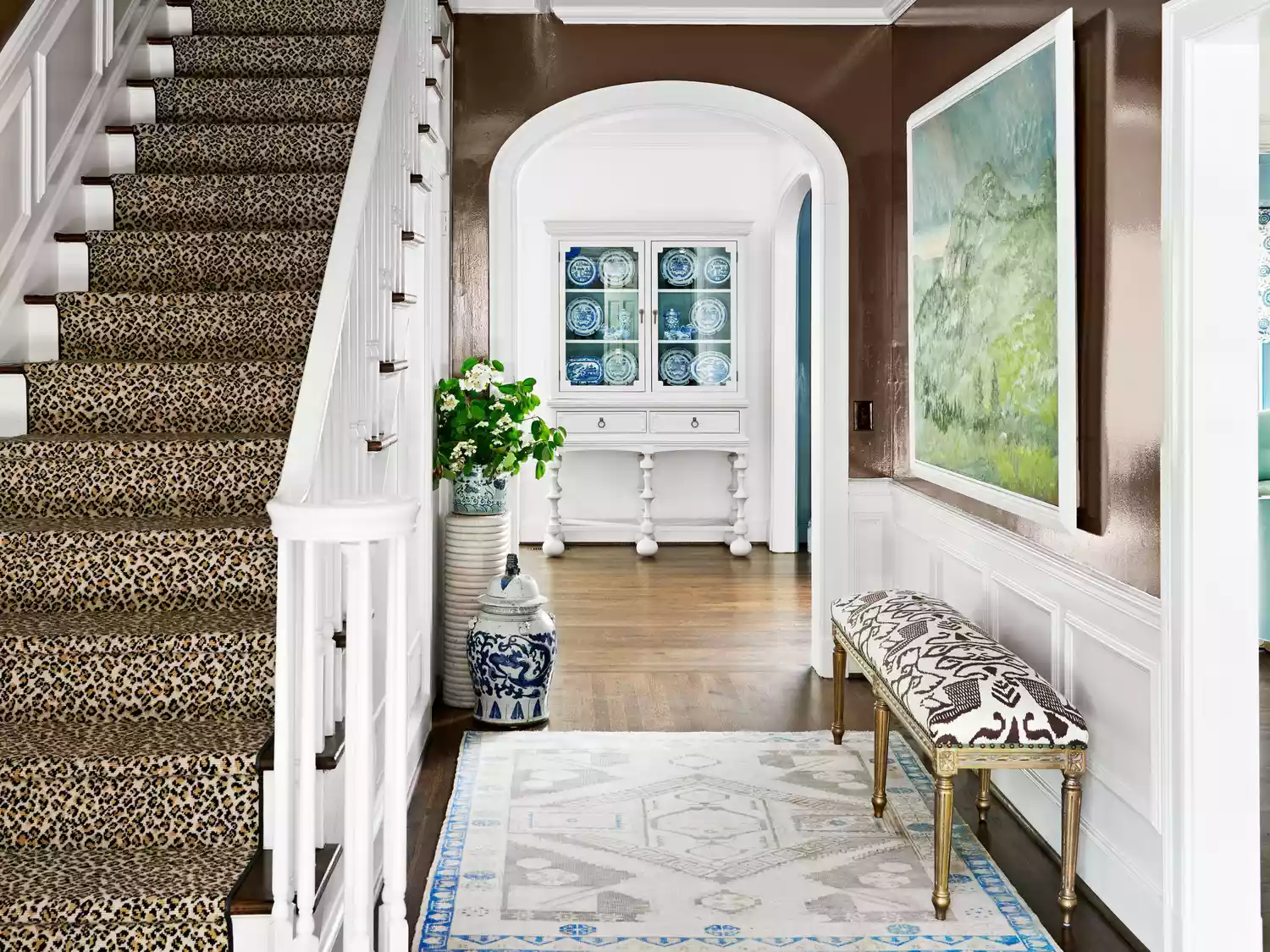
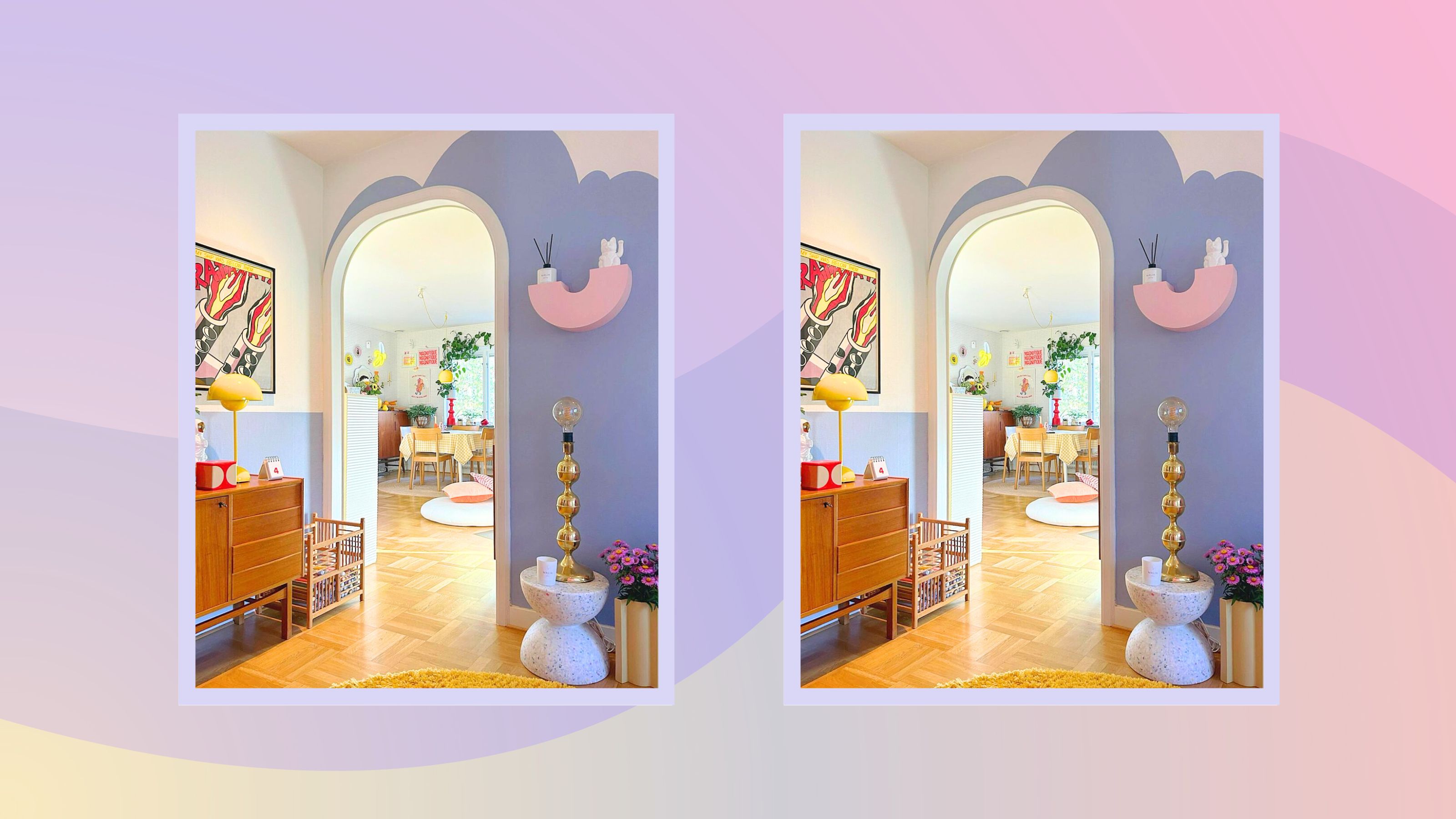
For those venturing into bold color choices, Texas-based designer Jean Liu advises thoughtful selection. She suggests avoiding bright or primary colors, such as a strong red, which can convey unintended impressions. Instead, she recommends choosing warm, moodier hues to create a cozy yet not cavernous entryway.
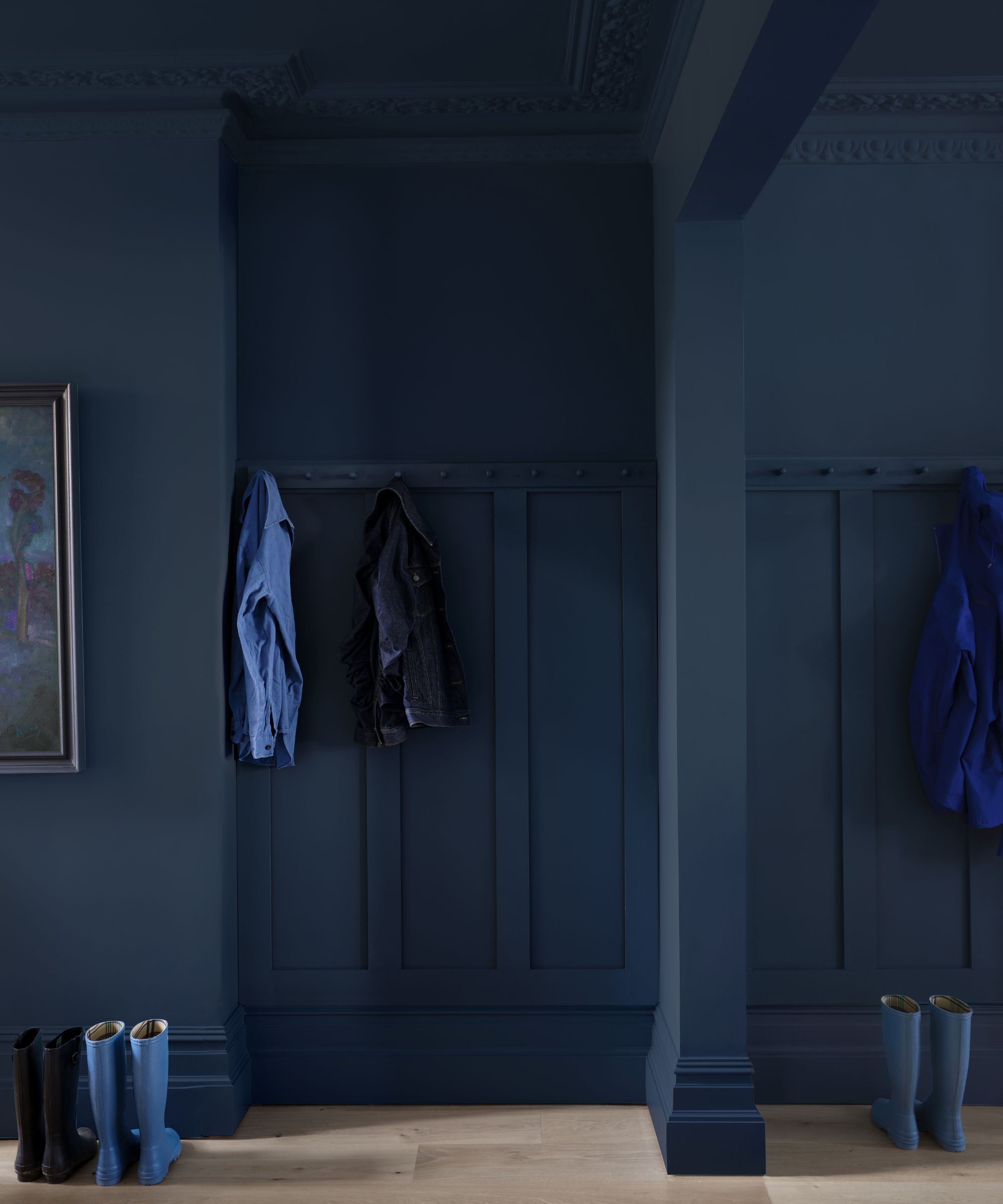

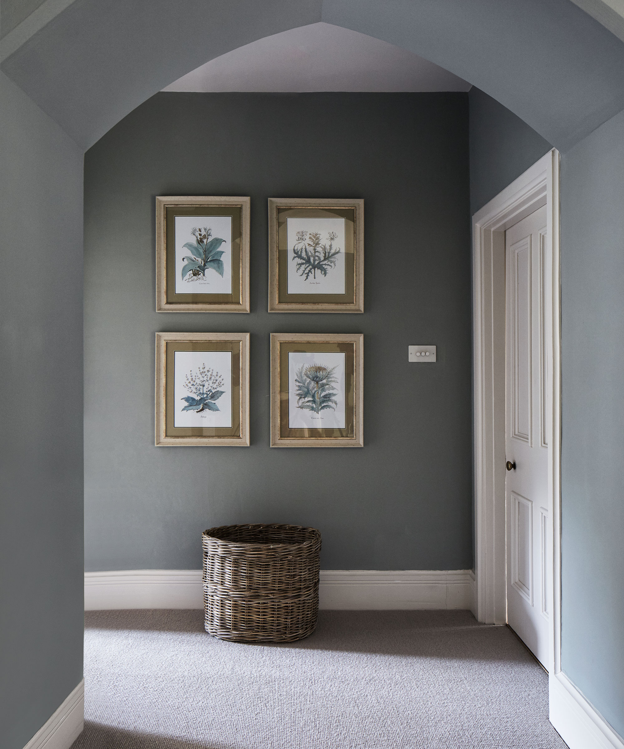
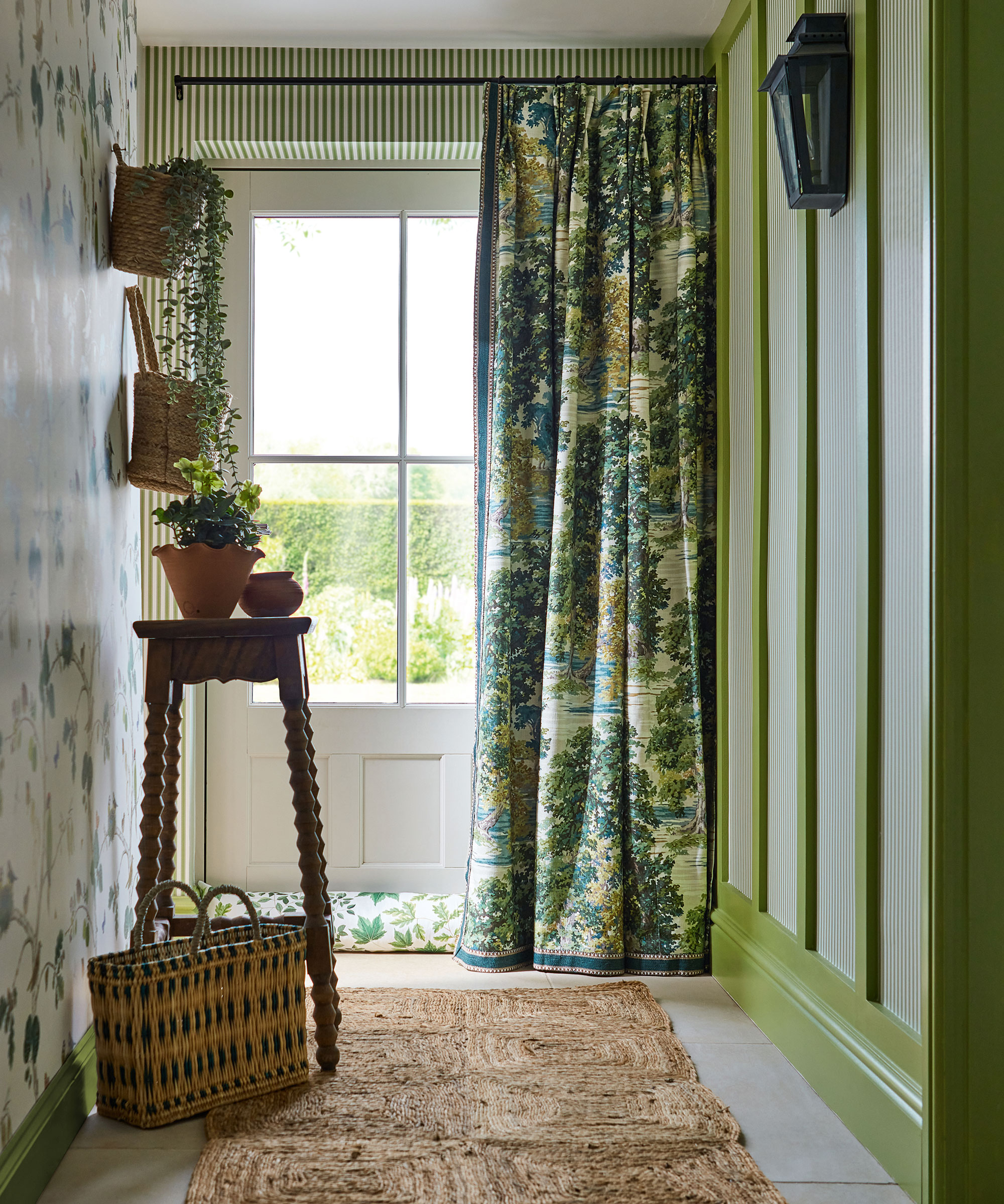
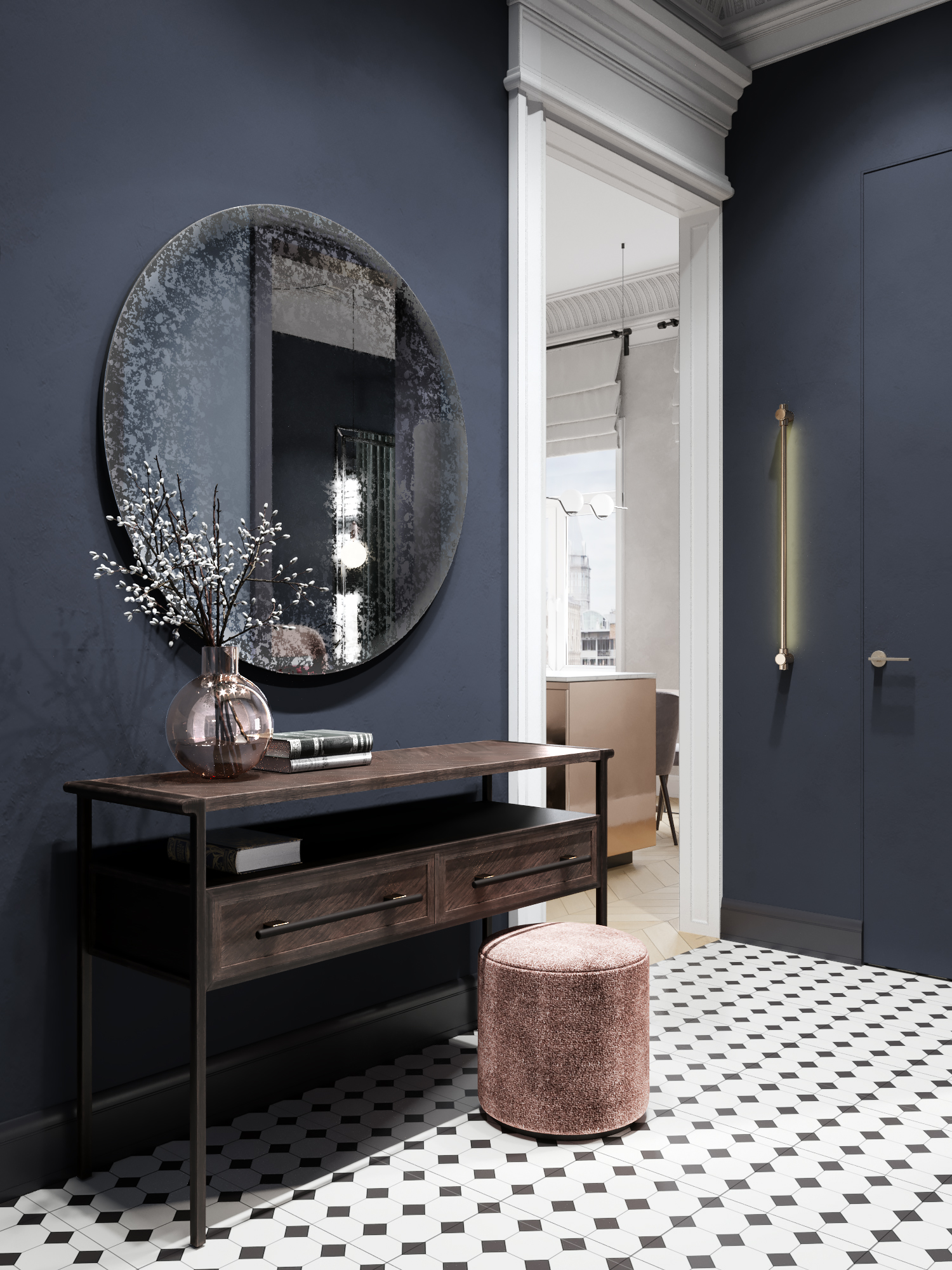
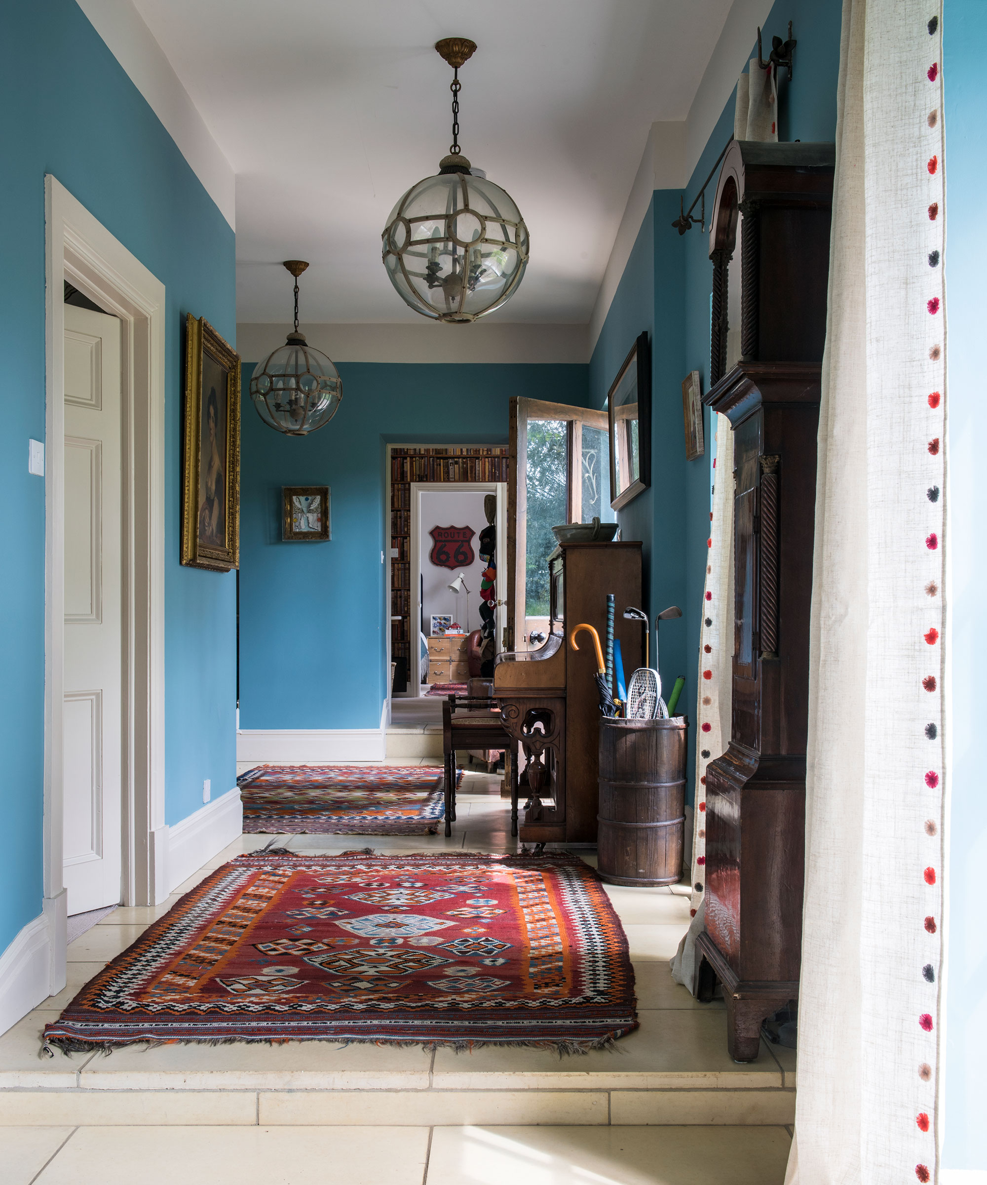
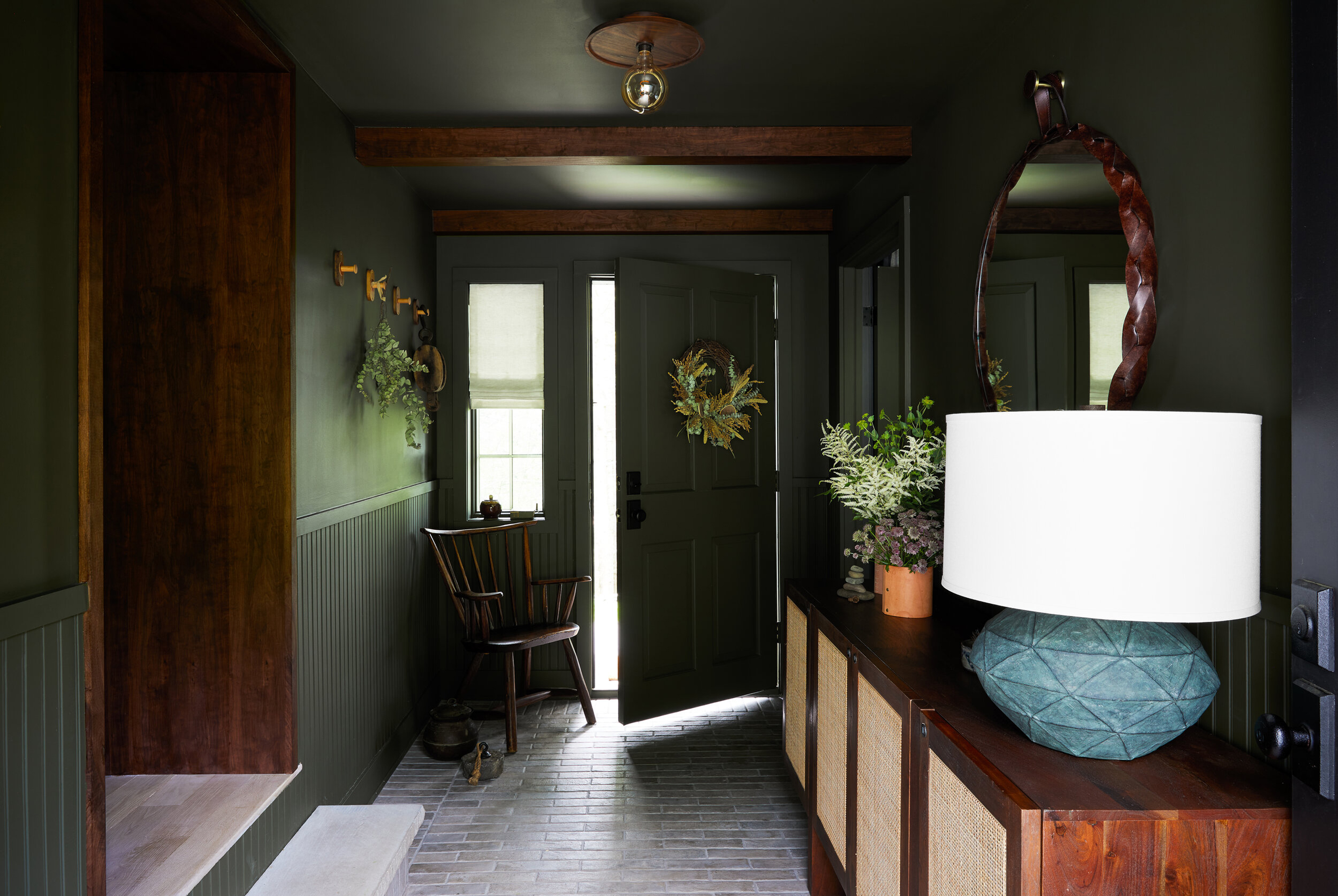

The architectural characteristics of the home also influence color selection. Studholme notes that urban entryways, often lacking natural light, benefit from shades like Farrow and Ball Inchyra Blue. For homes with molding or paneling, she suggests using a stronger color on the lower part and a lighter color on the walls to visually expand the space. She also emphasizes the importance of durable paint finishes for high-traffic entryways.
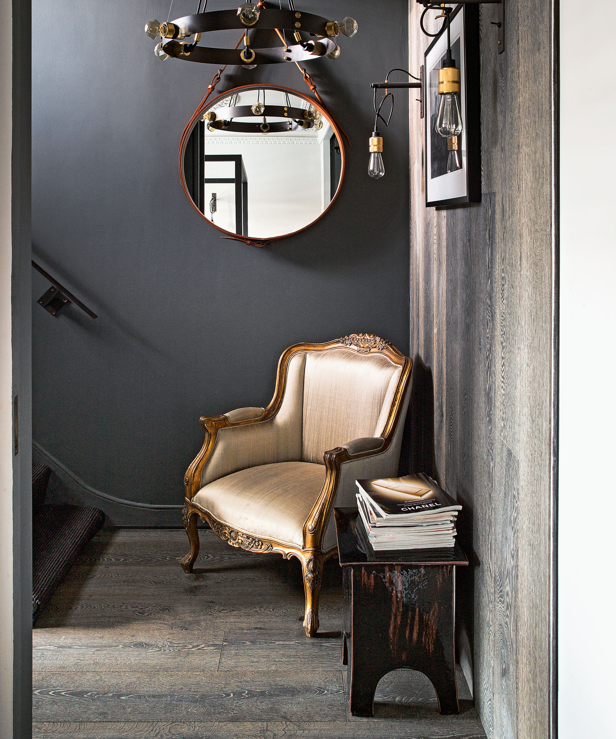
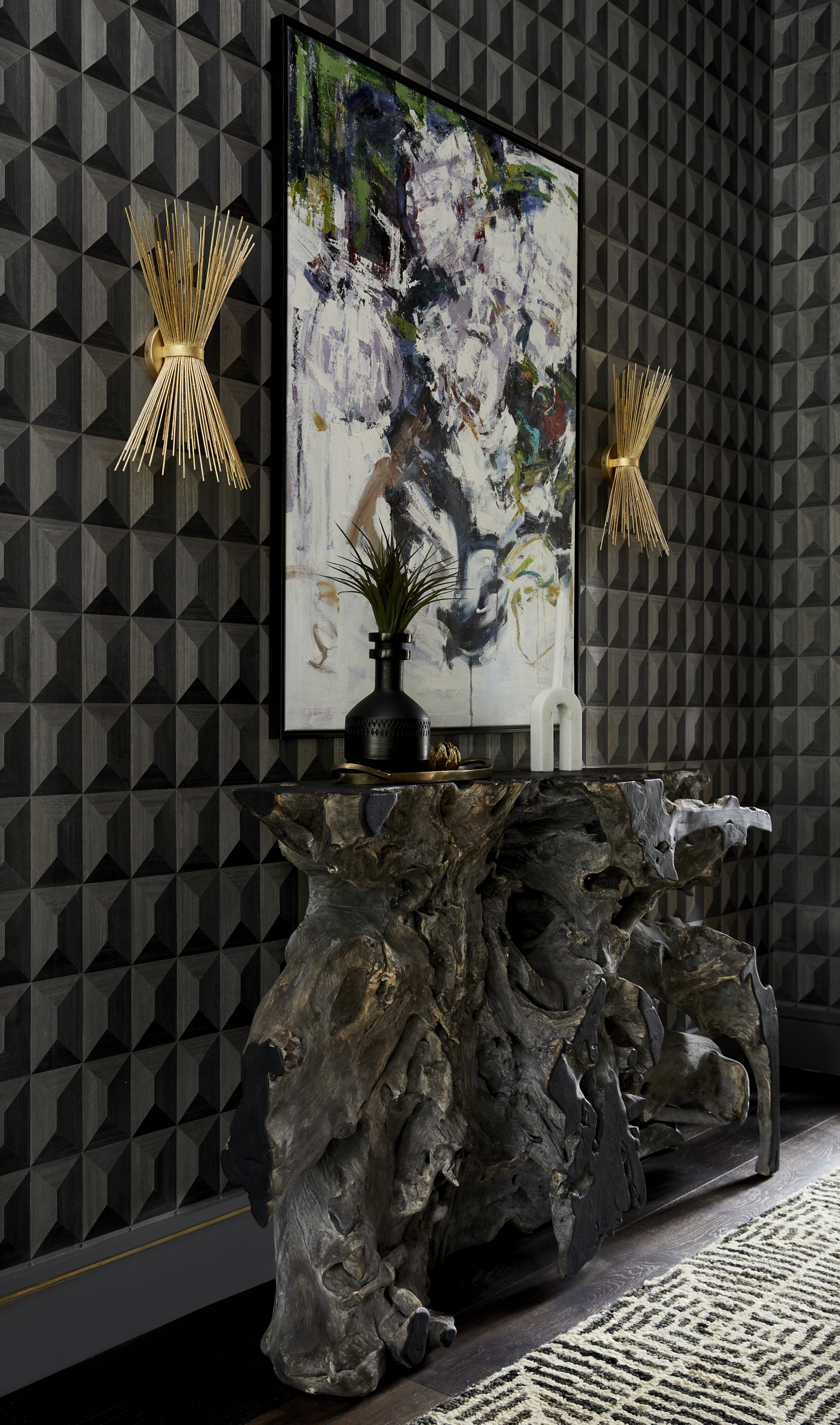
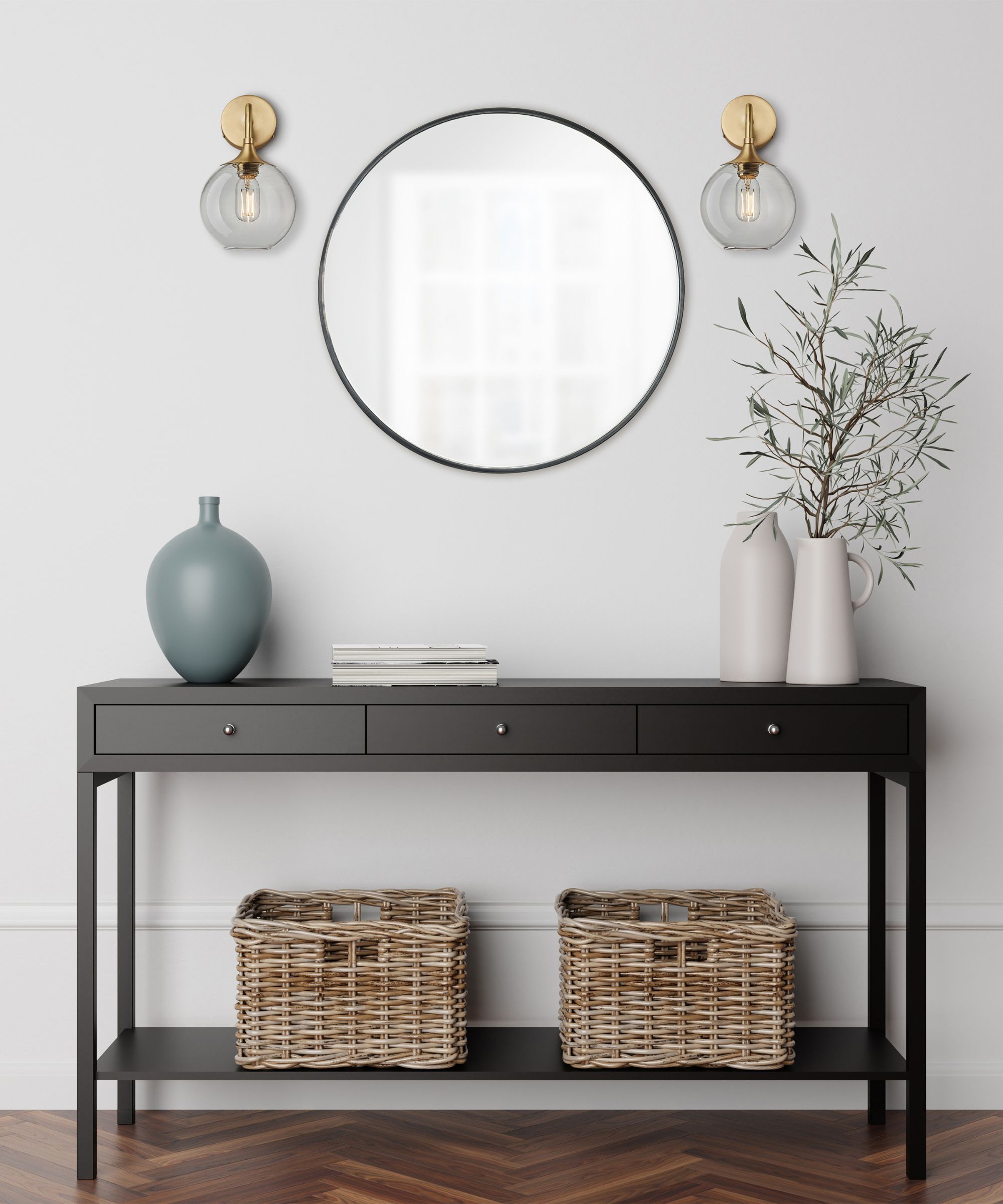
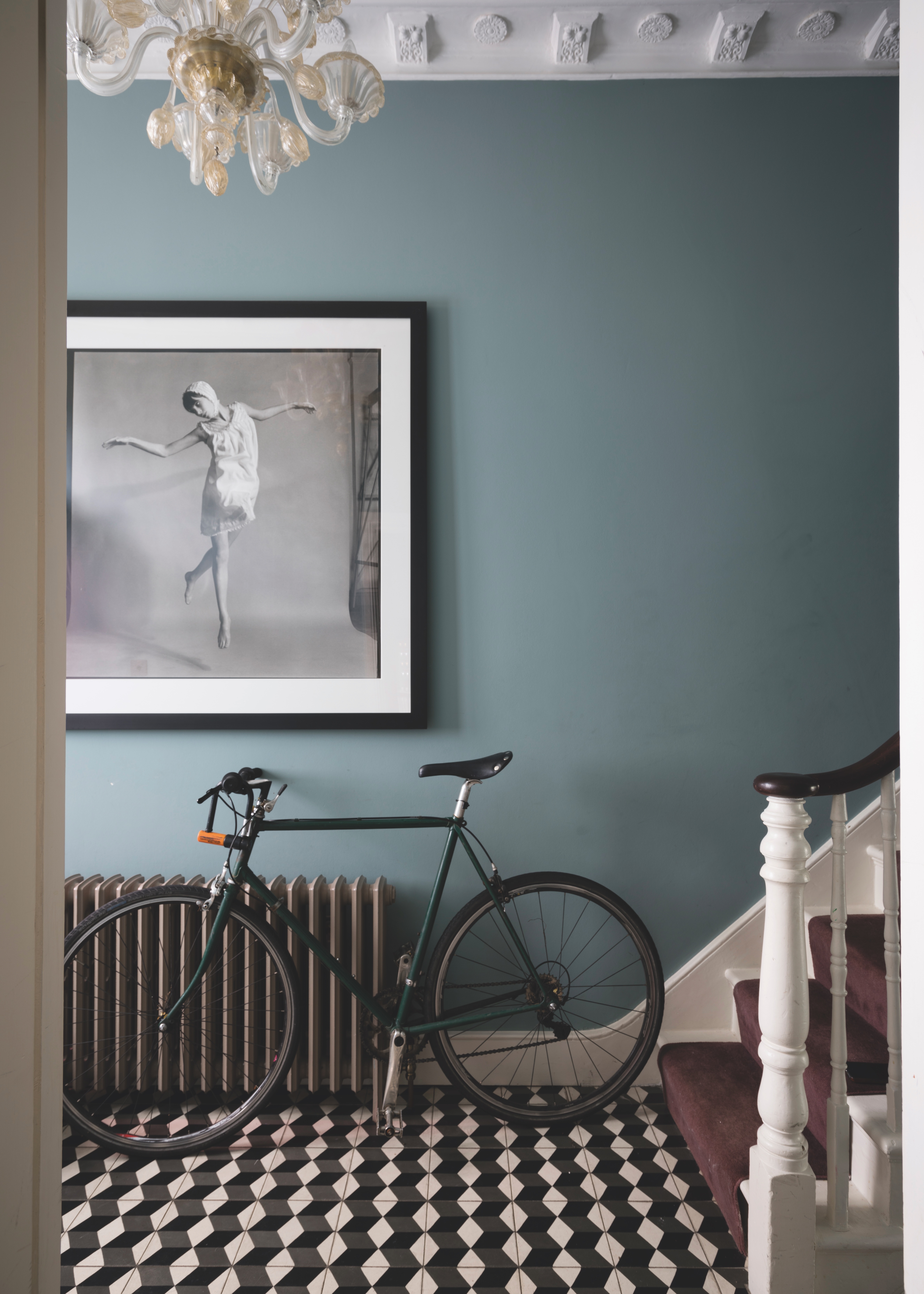

Finally, charcoal grey is advised against in small spaces as it tends to darken them without providing warmth. Spreckman suggests opting for a lighter wall color and integrating ashier grey shades through soft furnishings, complemented by warm wood furniture to mitigate the coolness of grey. It is crucial to observe paint colors throughout the day, as lighting conditions can significantly alter their appearance, ensuring the chosen shade aligns with the desired aesthetic at all times.
#EntrywayDesign #ColorSelection #InteriorDesign #HomeDecor #PaintColors #Greige #AccentColors #Neutrals #EntrywayDesign #ColorSelection #InteriorDesign #HomeDecor #PaintColors #Greige #AccentColors #Neutrals
0 comment in total
 No comments yet
You may also like

5 colors you should never paint your entryway – according to interior experts

What colors brighten up an entryway? 5 shades that will bring light and life to your space
The 5 small entryway color mistakes design experts say are big bloopers

You Should Never Use These Paint Colors In An Entryway, According To Designers
These 6 paint tips will make your entryway feel welcoming, according to the color experts
You should avoid these 5 entryway colors in 2023 – according to top designers
6 Things That Make Your Entryway Look TACKY, According to Designers

The best paint colors for small entryways — 7 shades design experts love

6 Things That Make Your Entryway Look TACKY, According to Designers

Interior Designers List the Worst Paint Colors for Your Entryway
10 best colors for small entryways according to interior designers – shades to elevate your tiny space
The colors you should never paint your hallway – and what really works
6 Colors You Should Never Paint Your Entryway, According to Color Experts

Best colors for small entryways – top designers swear by these 8 on-trend colors for the ultimate impact

Interior design experts reveal the colour rules you should be breaking
5 best paint colors for a small entryways - designer-approved palettes
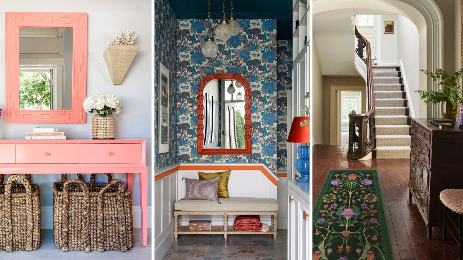
6 things to never put in an entryway, according to interior designers
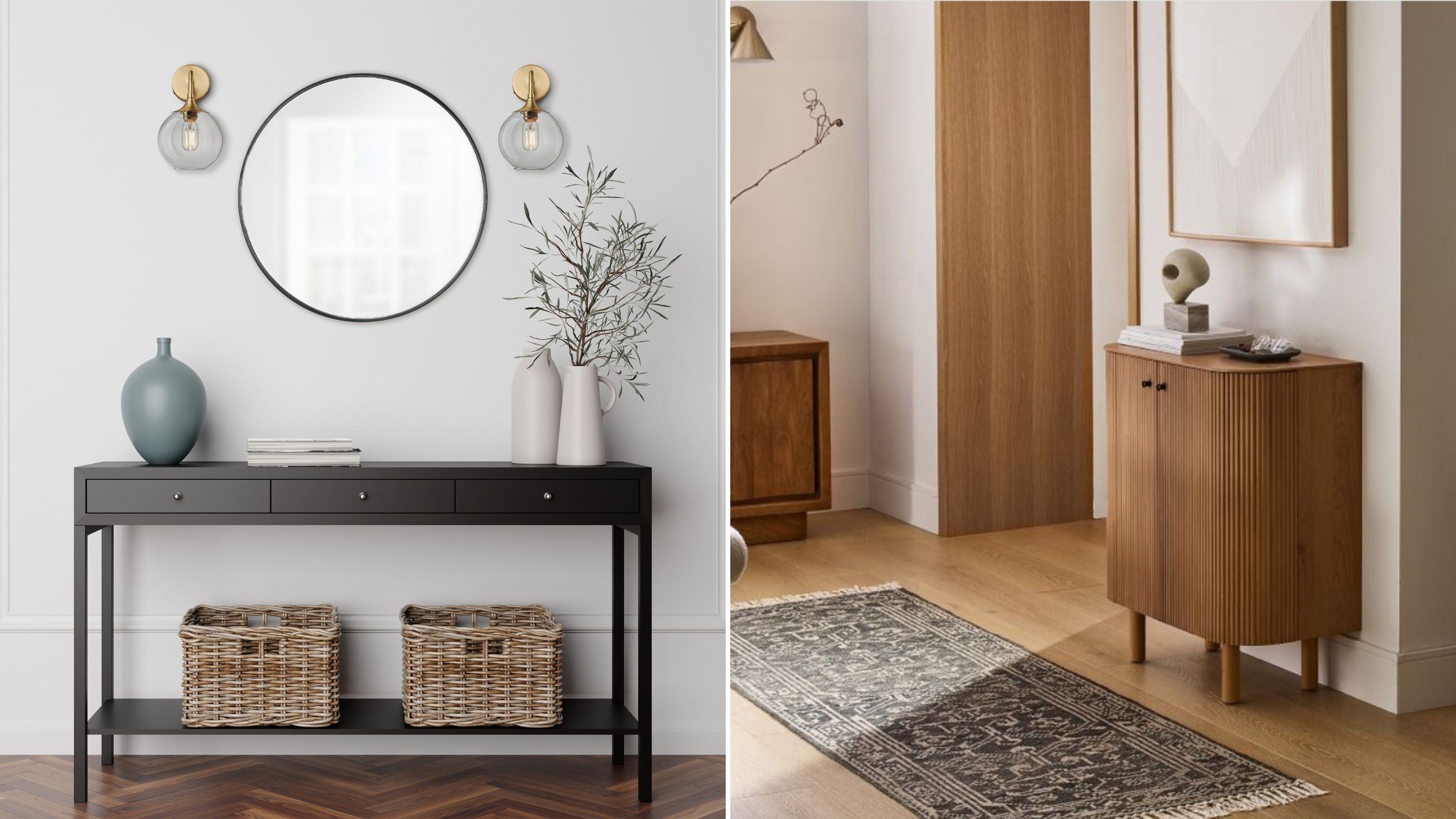
The best colors for small entryways for airy, bright spaces, according to interior designers
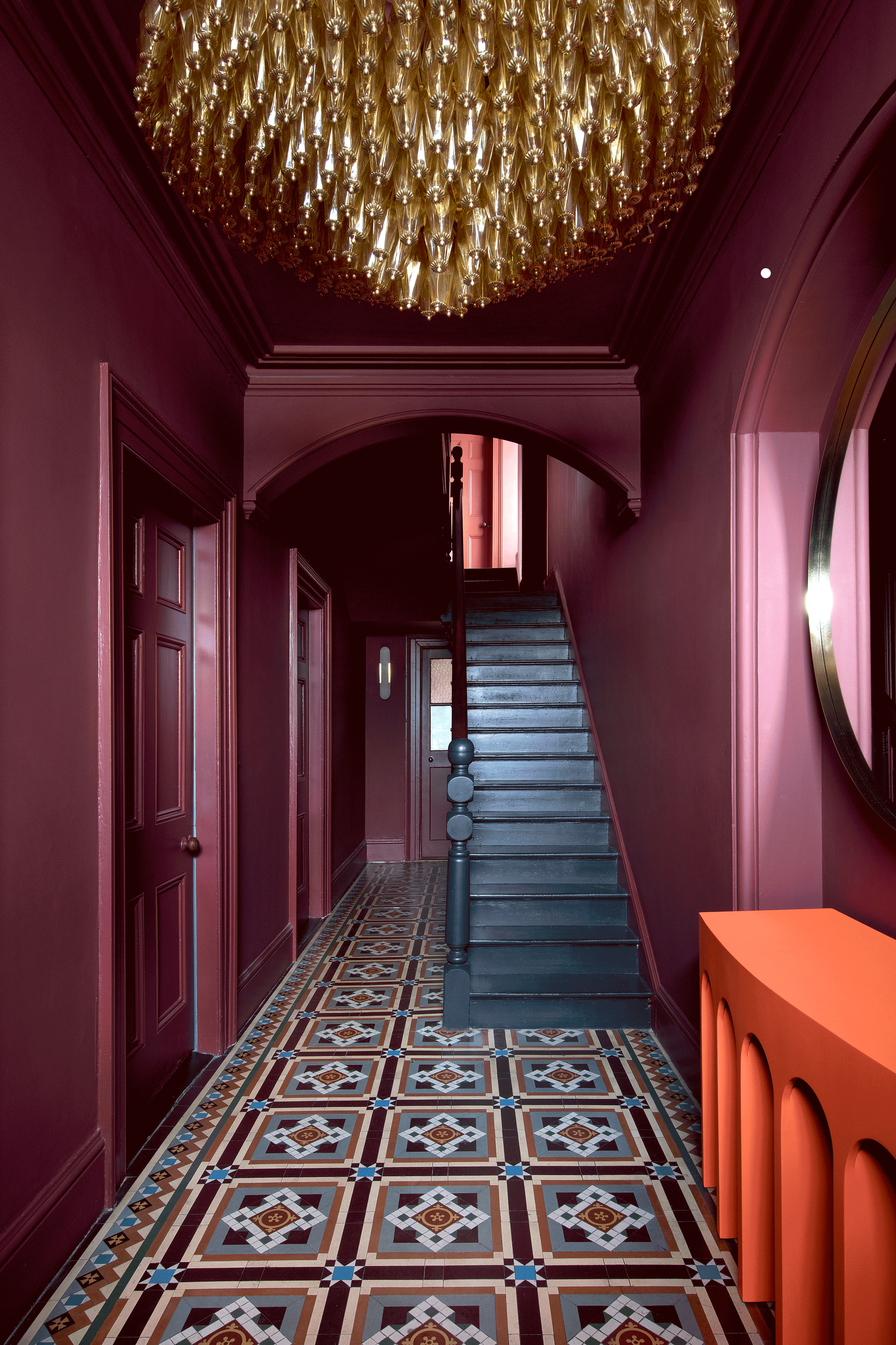
The 8 Rules for Dark Entryways — How Designers Perfect the Art of the Moody First Impression
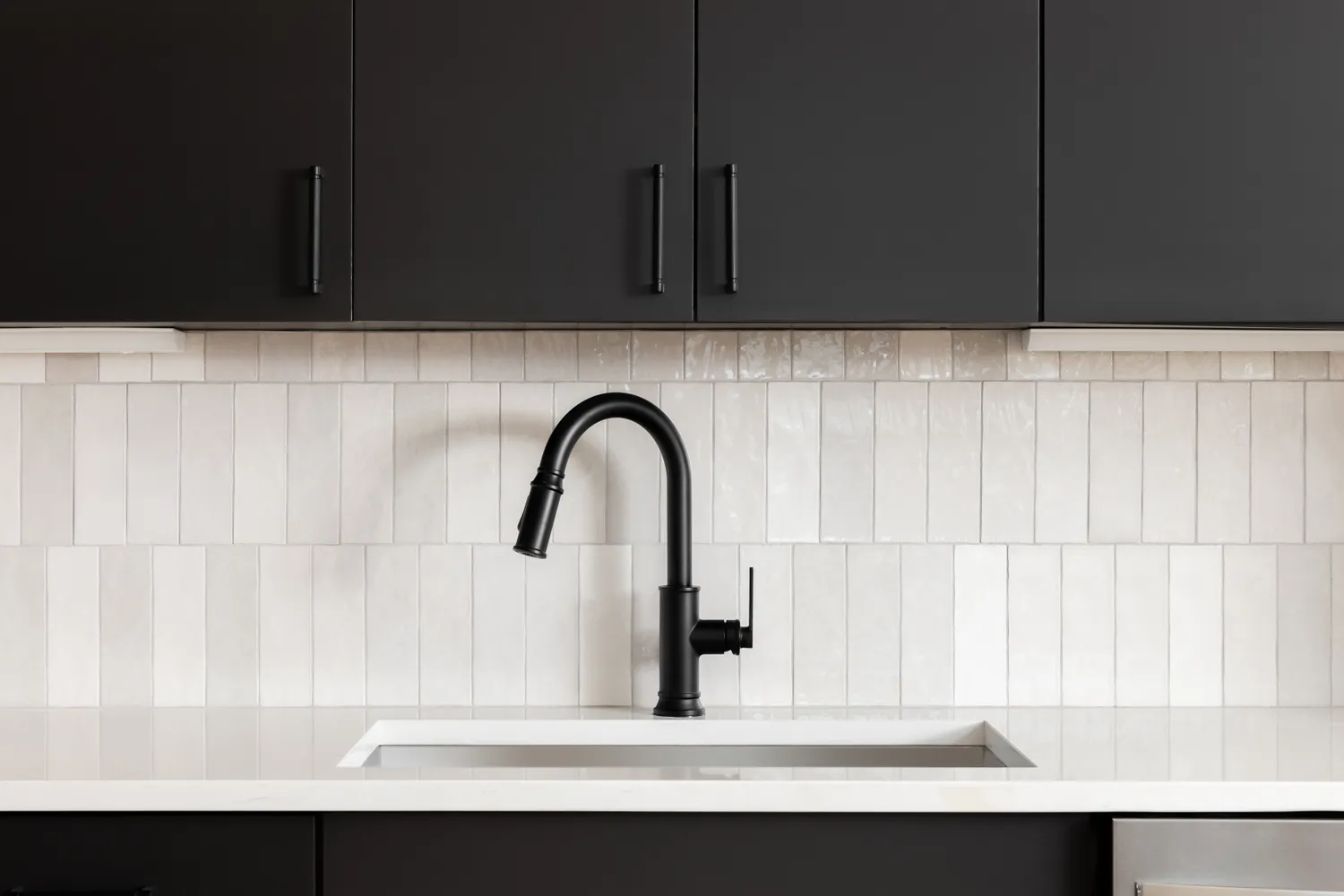
6 Kitchen Cabinet Colors Designers Advise Against—and the Alternatives They Recommend Instead