1/9
Deeper, moody colours and precious jewel tones are in style this year
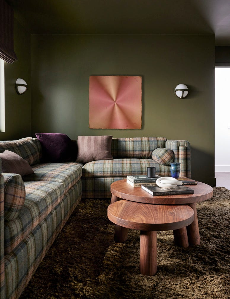
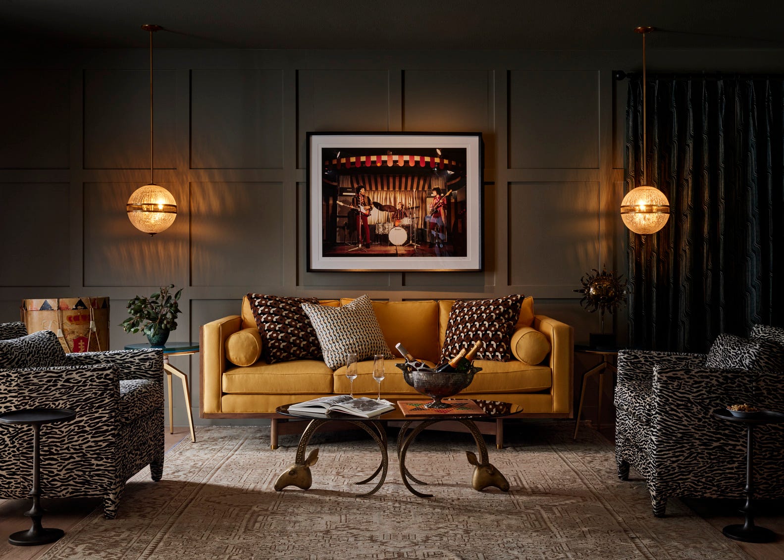
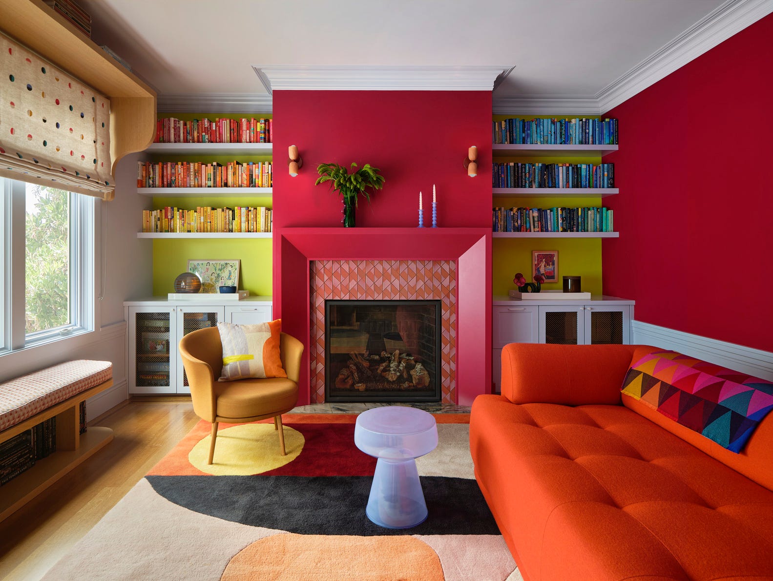
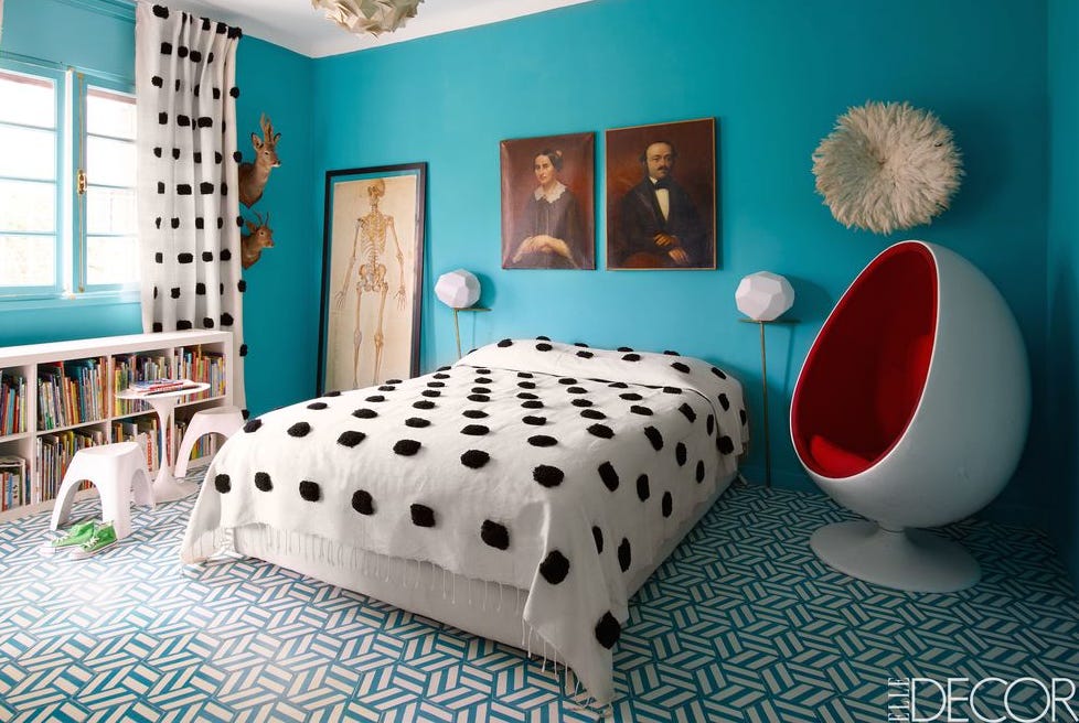
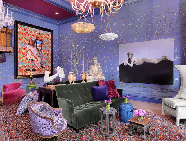
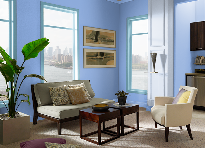
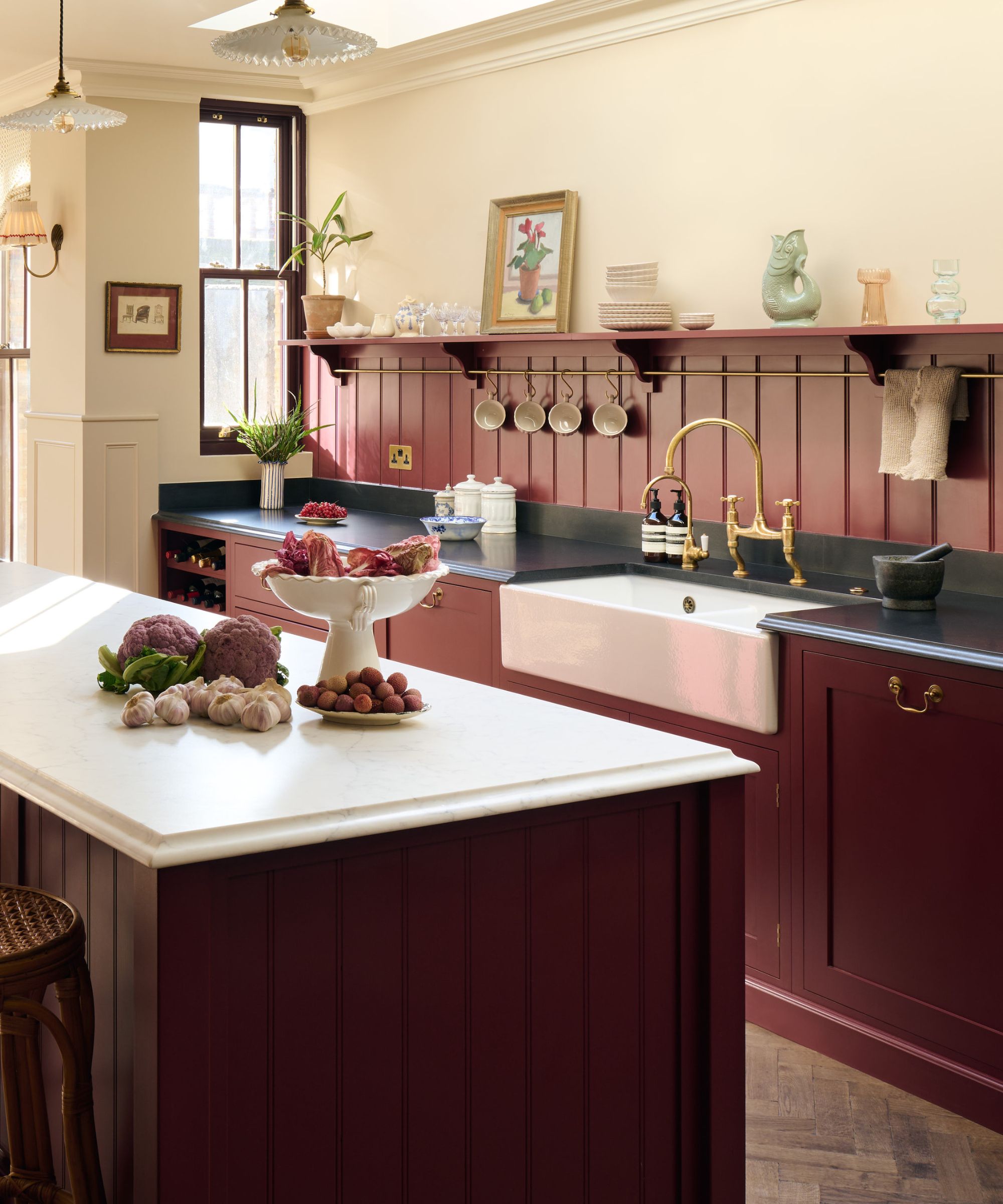
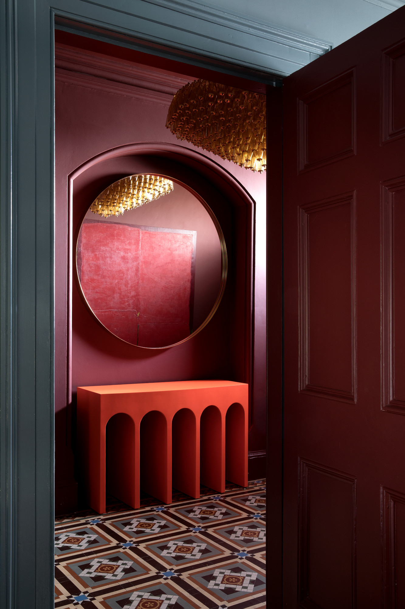
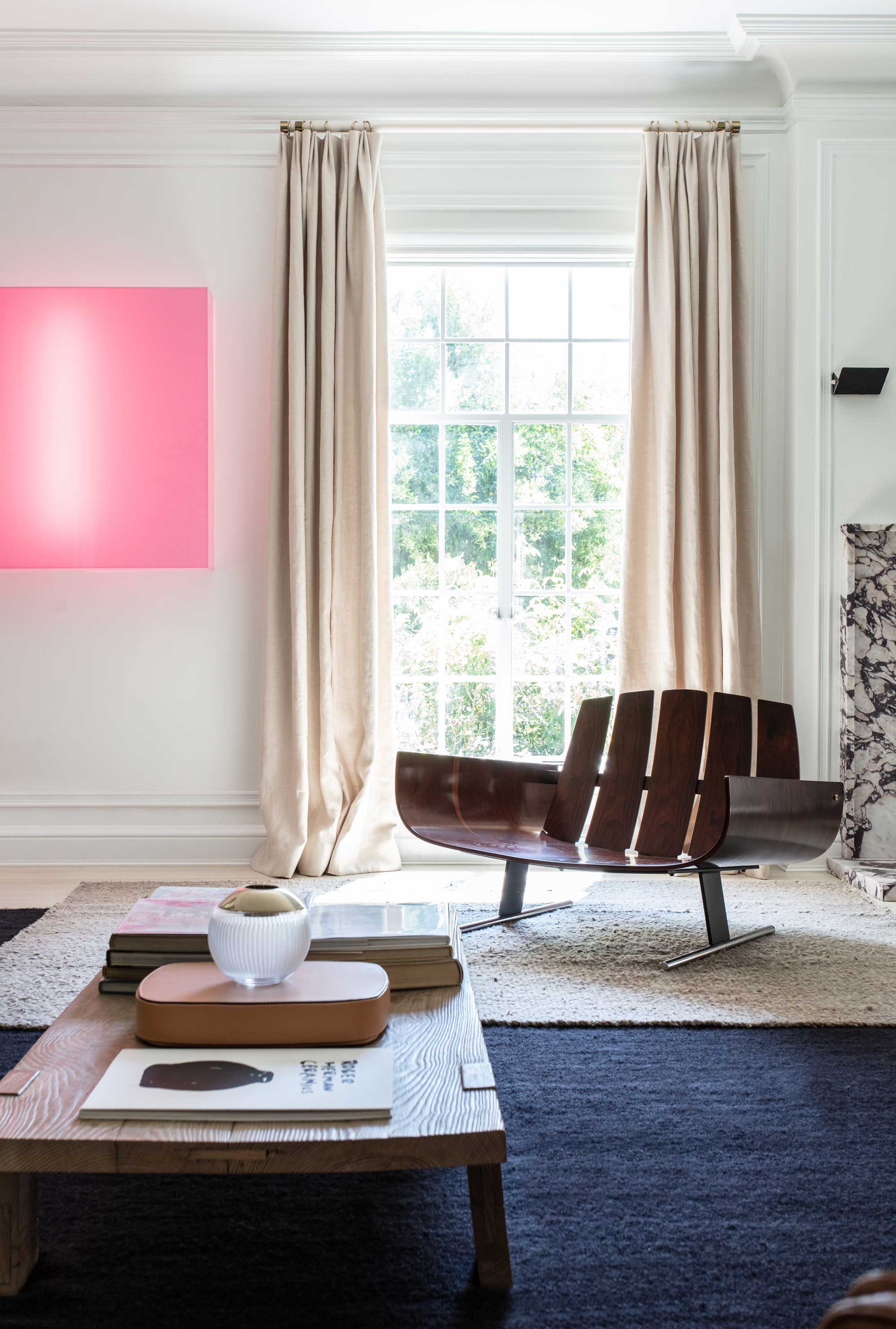
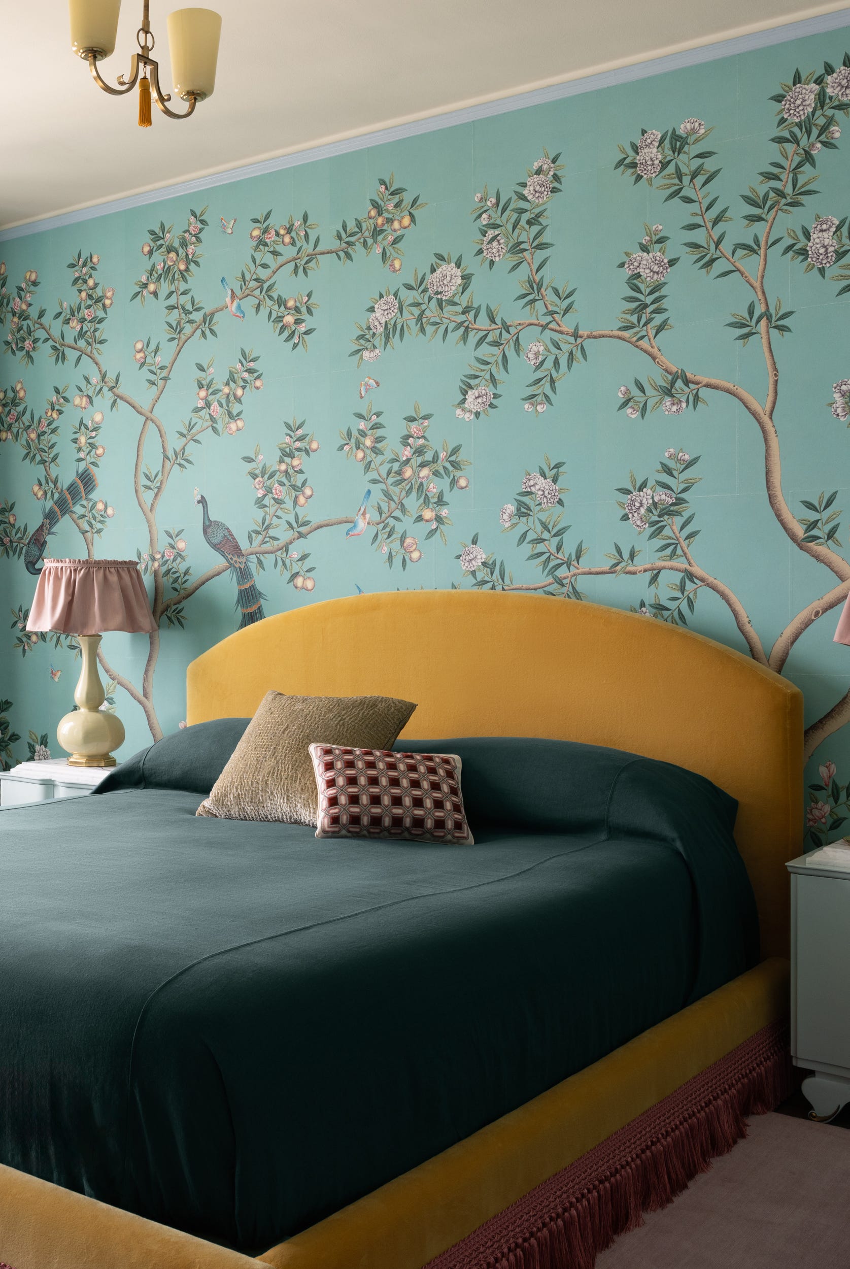
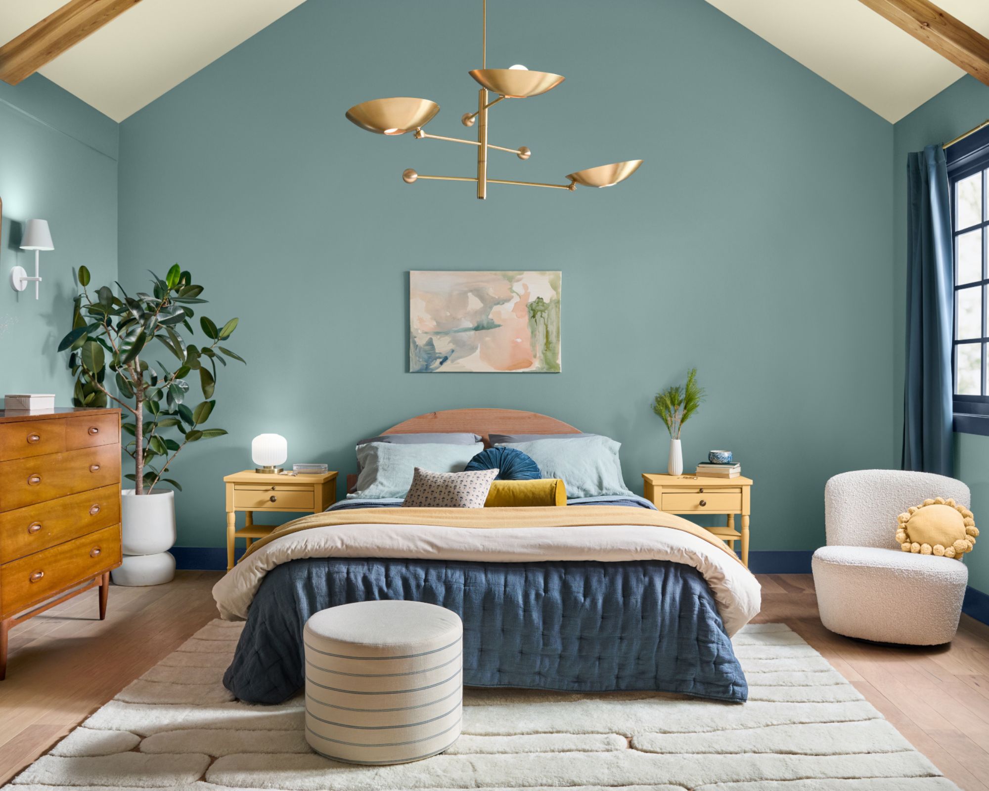
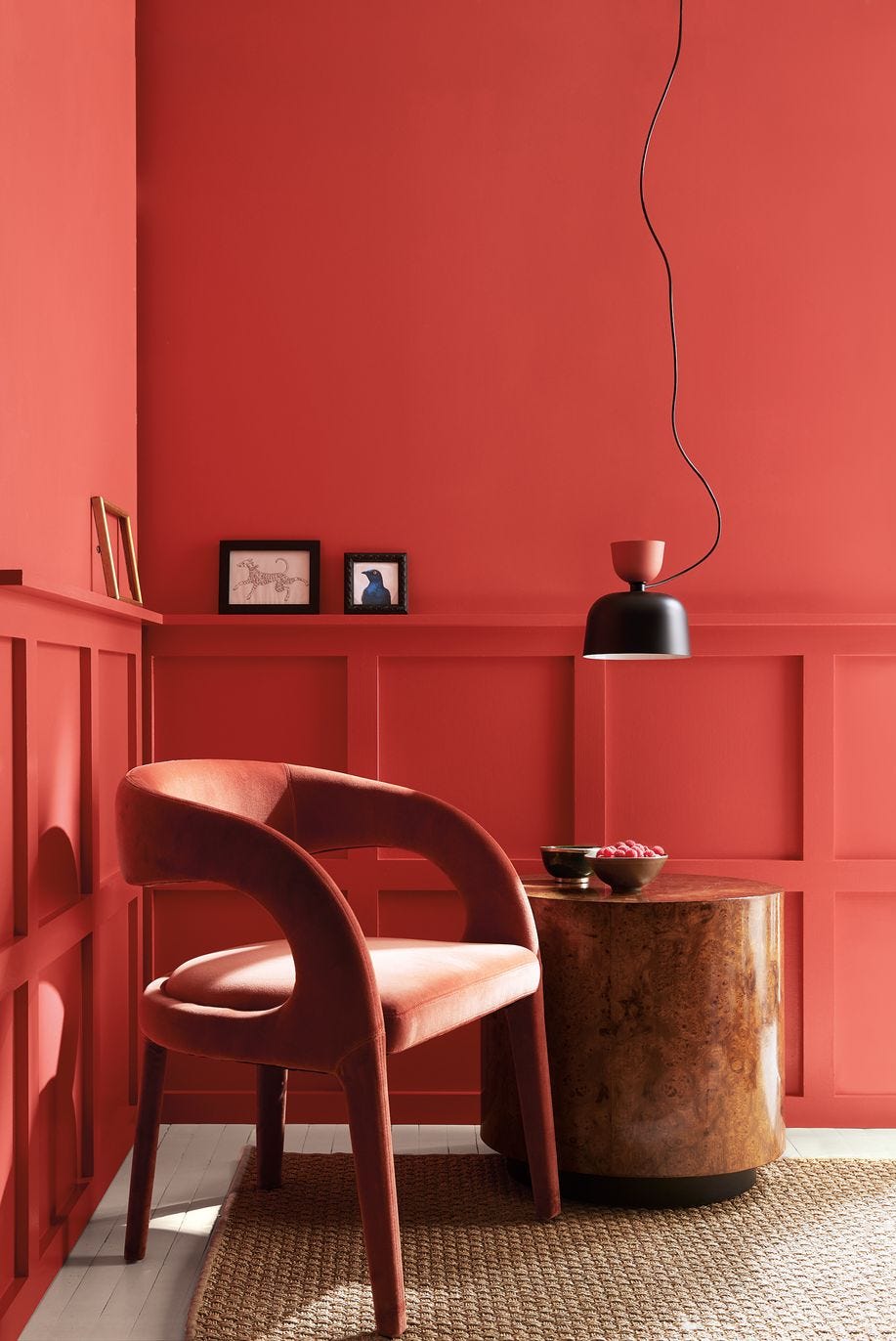
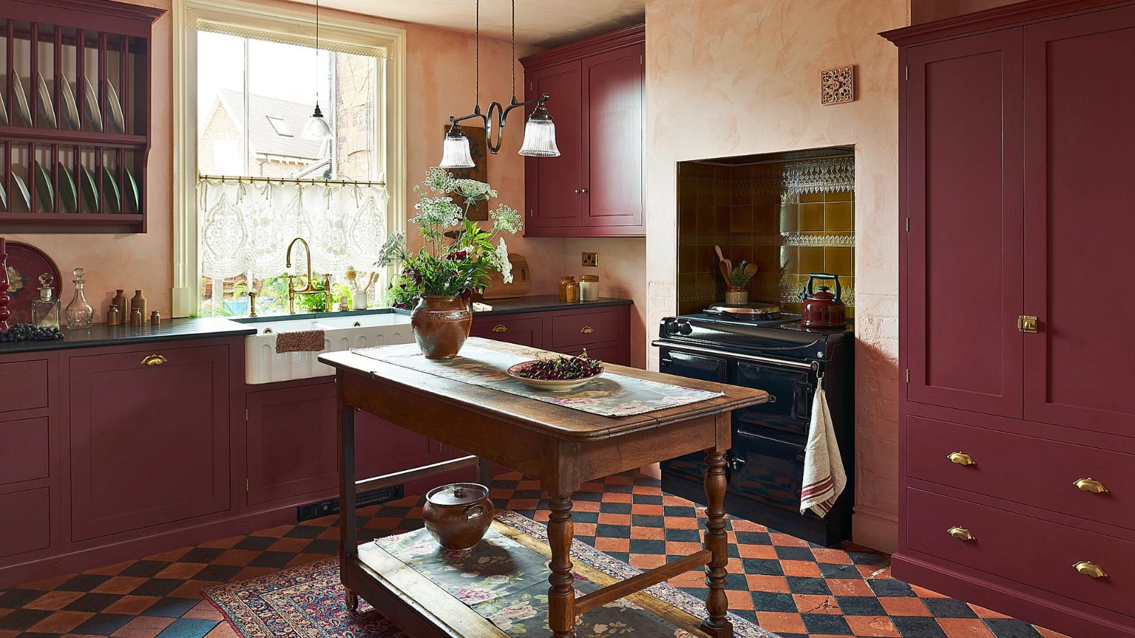
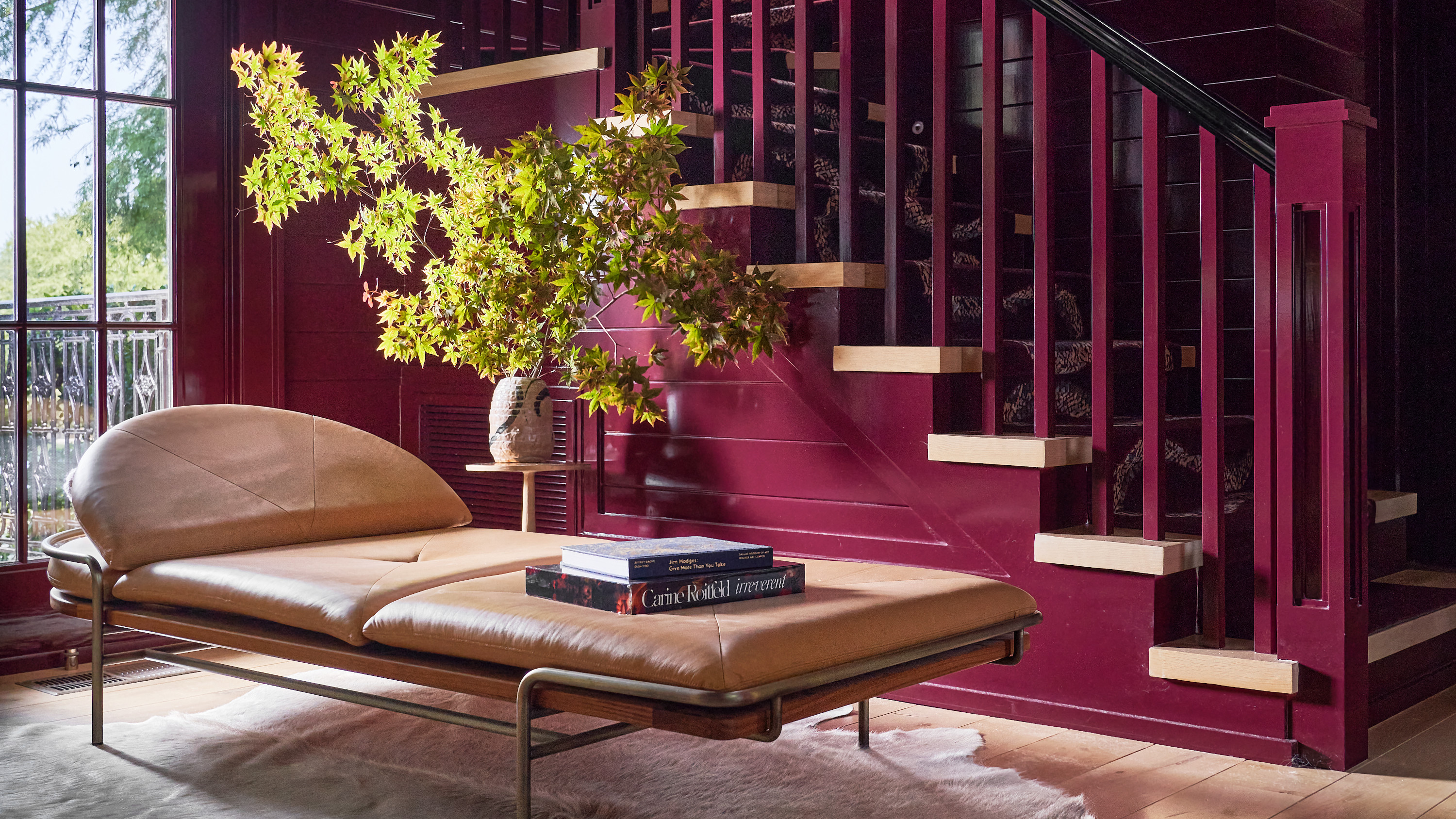
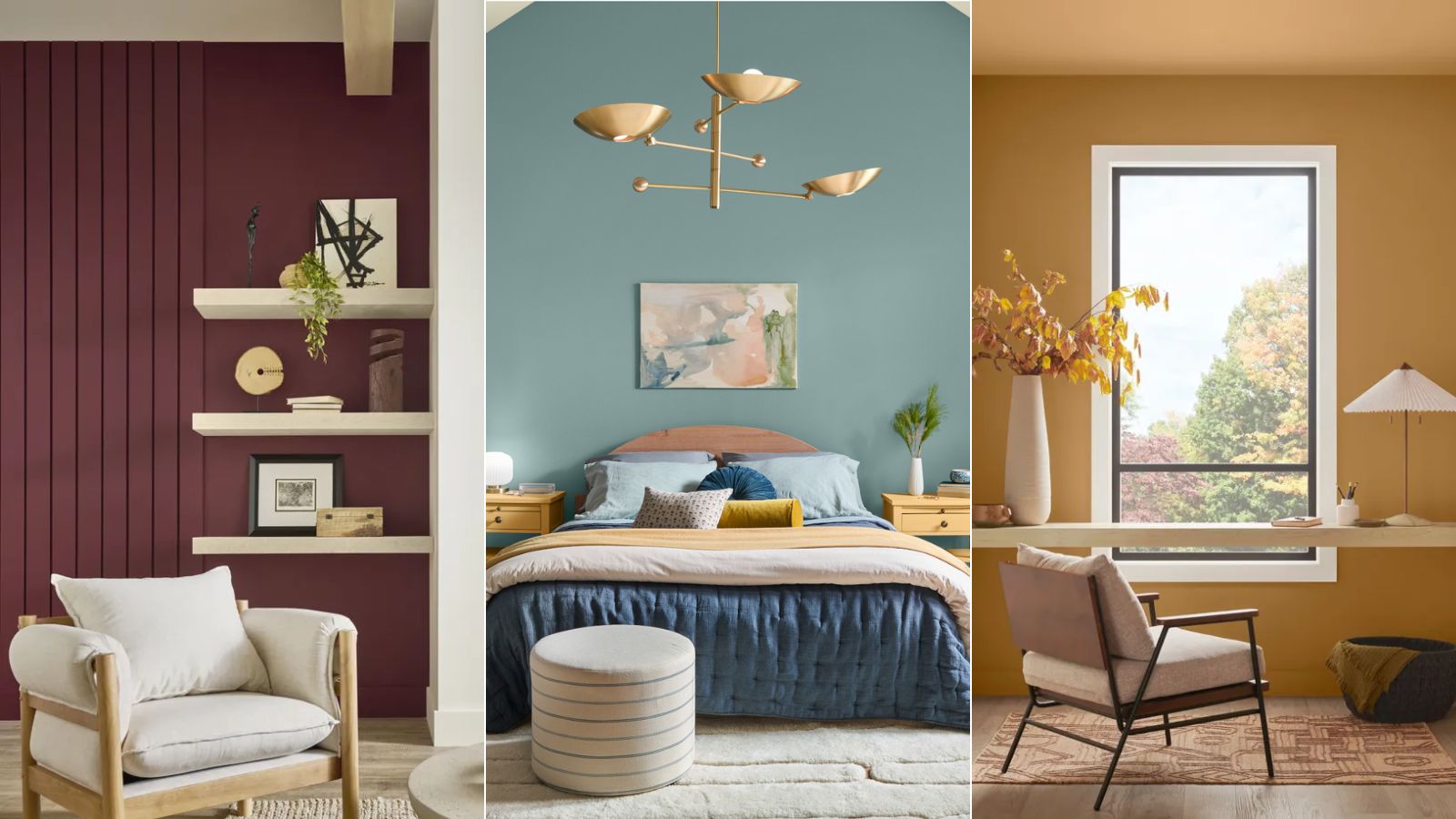
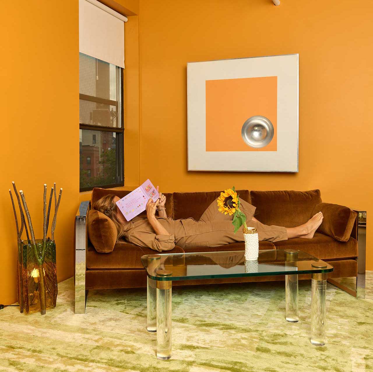
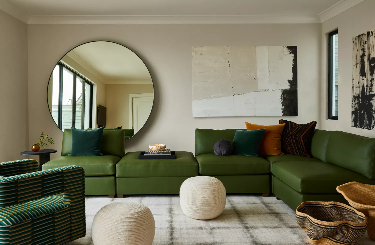
The article explores the growing trend of rich and saturated colors in interior design, marking a significant departure from the minimalist and monochromatic palettes that have dominated since the early 2000s. This shift is characterized by a desire for depth, warmth, and character in living spaces, moving away from neutral grey gradients towards bold colors such as jewel tones, deep greens, blues, reds, and citrus hues. Sophie Alberry-King, an interior designer at City & Country, highlights that this trend allows for greater self-expression and personality in home design. She notes that experimenting with diverse shades and contrasts can enhance the living experience, both mentally and physically, through the psychological impact of vibrant colors. The resurgence in popularity of feature walls and sophisticated, bright accents is presented as a forward-thinking approach to design, diverging from any perception of these bold elements as aggressive or brash.
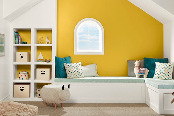
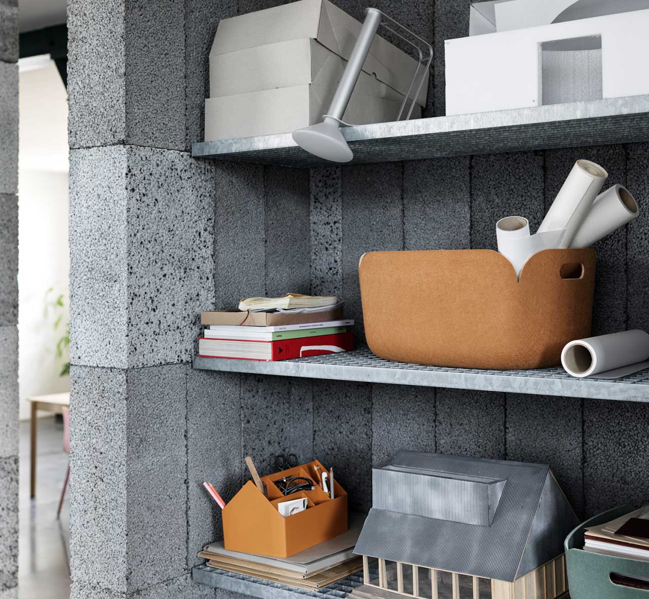
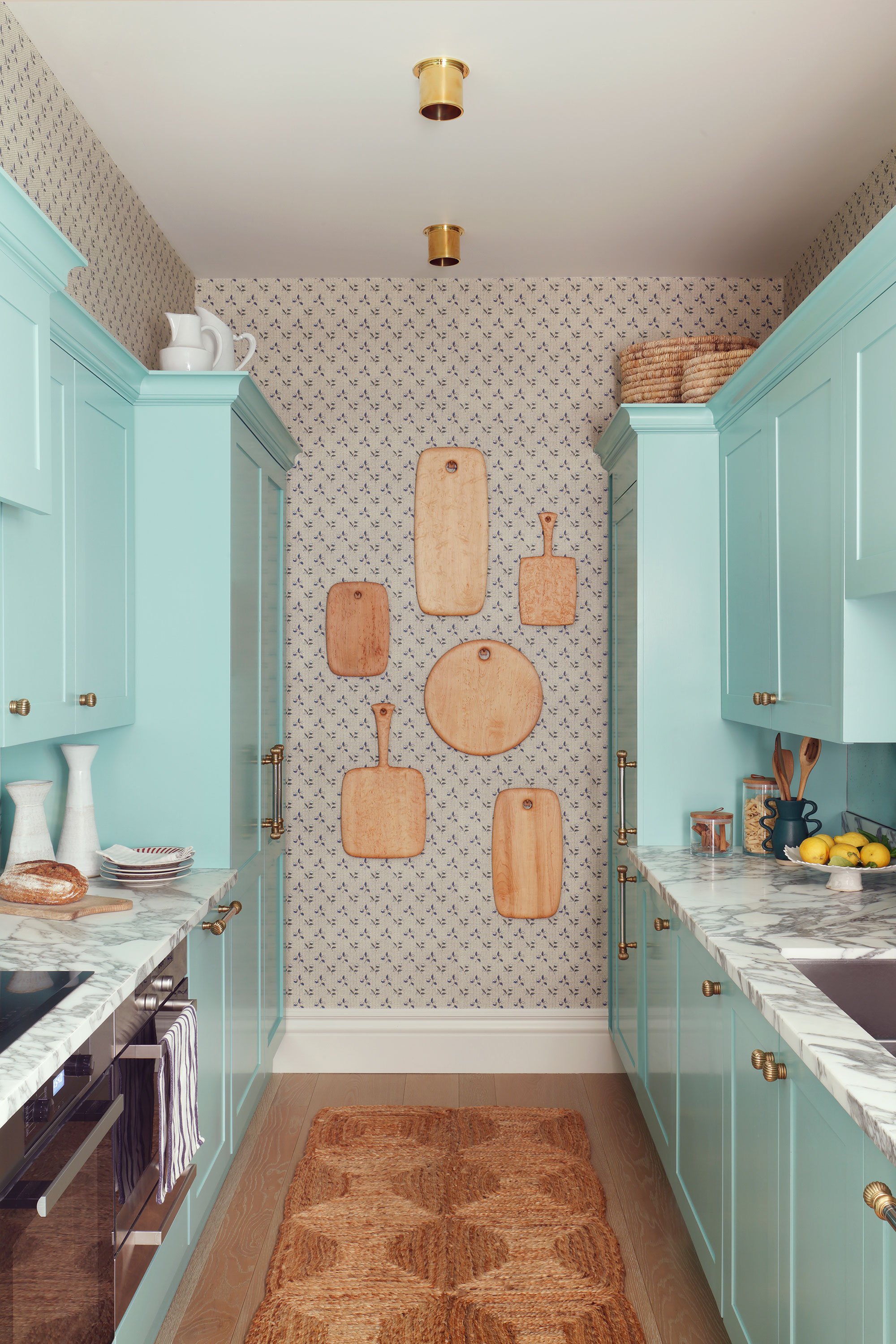
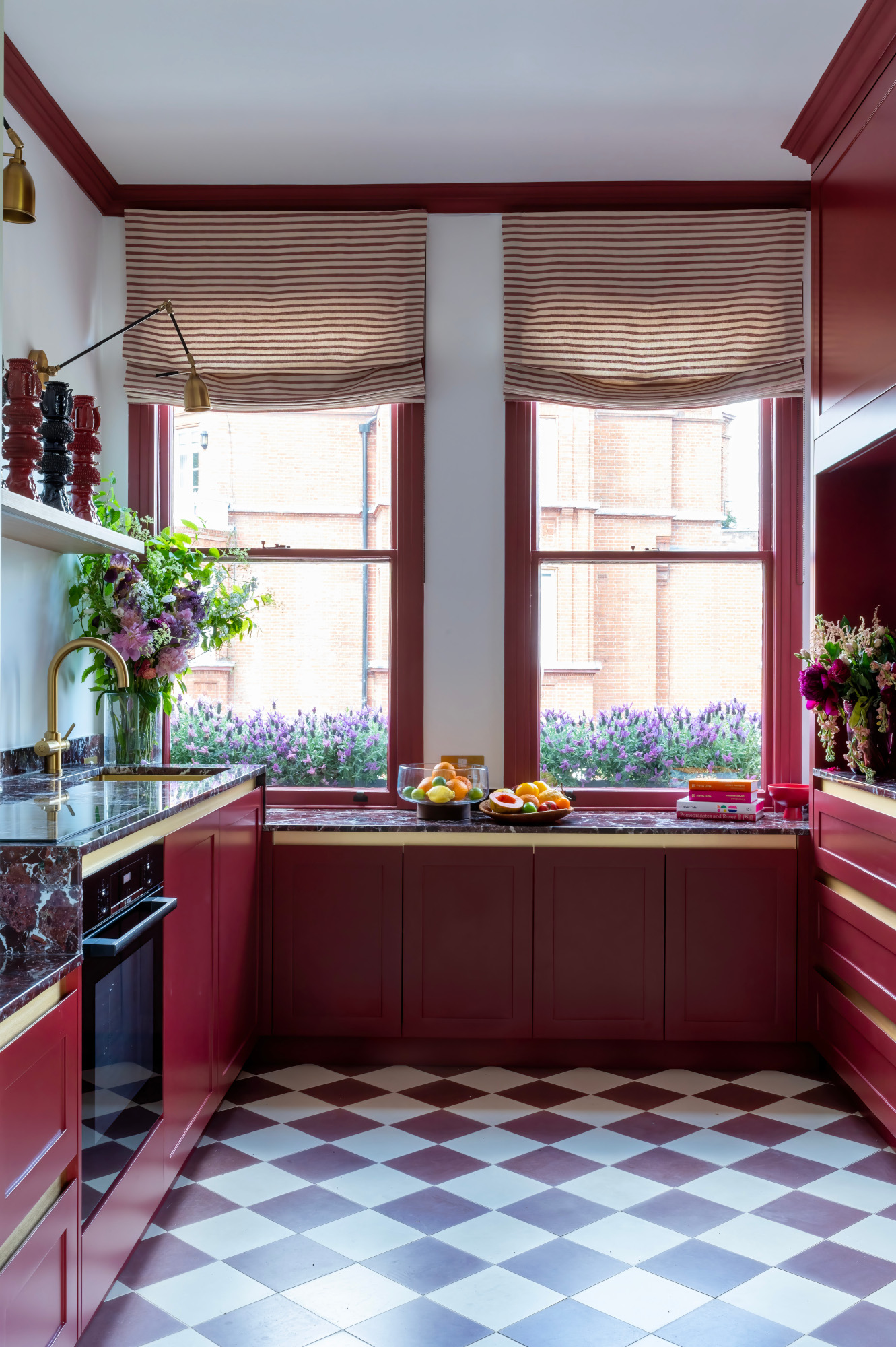
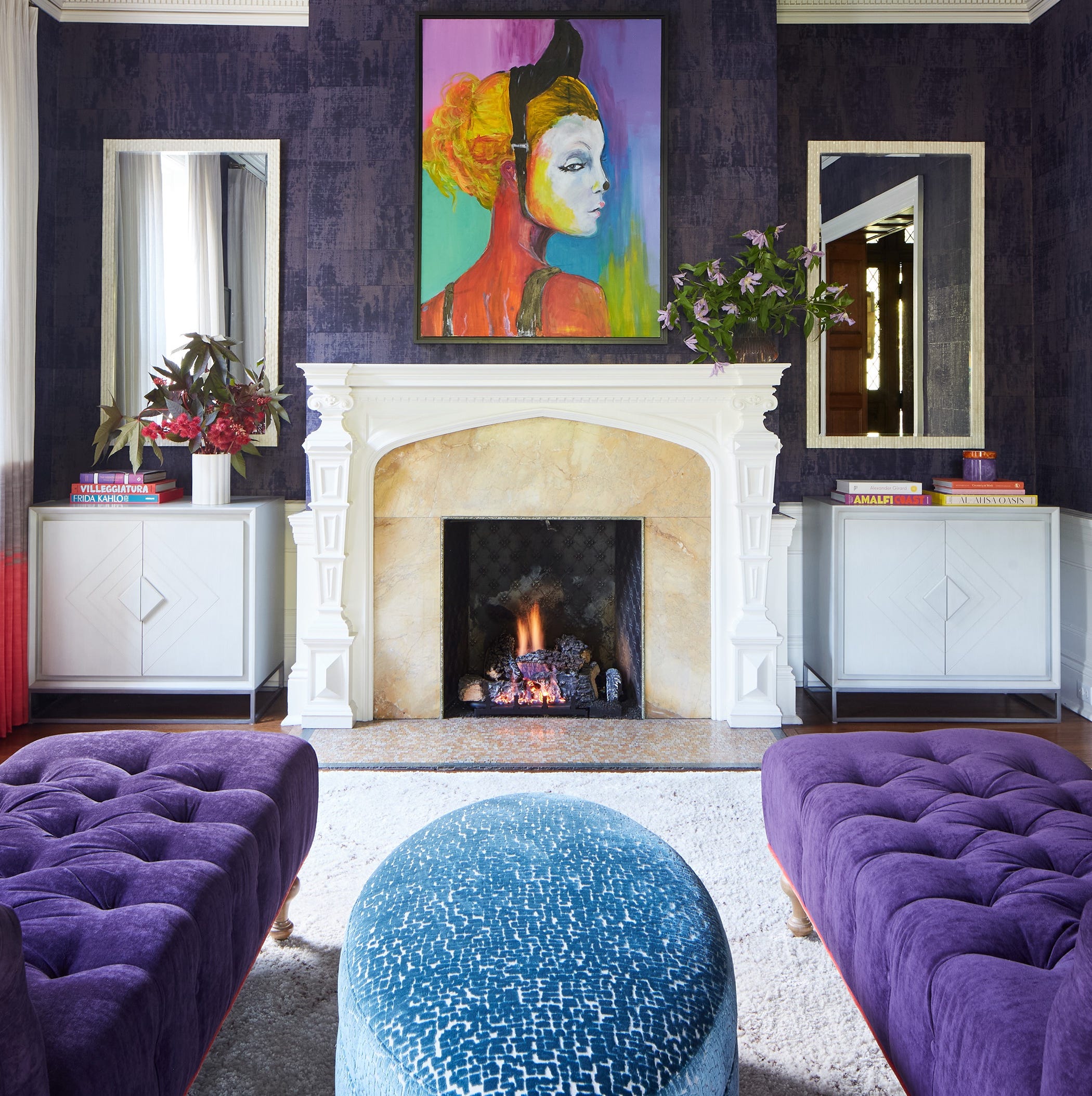
The article emphasizes that the interior design world has observed a definite shift, with highly pigmented, eye-catching shades, ranging from bright to more muted yet rich tones like deeper wine, olive, and mustard variations, becoming increasingly prevalent. The rise of "bold chic" interiors on platforms like TikTok is cited as evidence of this trend, encouraging designers and homeowners to experiment with design conventions. Alberry-King points out the psychological benefits of vibrant colors, suggesting that people are turning to more saturated tones as a form of visual therapy within their homes. For those new to incorporating bold colors, a gradual approach is recommended, starting with smaller applications such as colorful tiles or brightly painted cabinets in bathrooms or entryways, or even introducing colorful dishes and utensils to build up a palette without overwhelming the entire home.
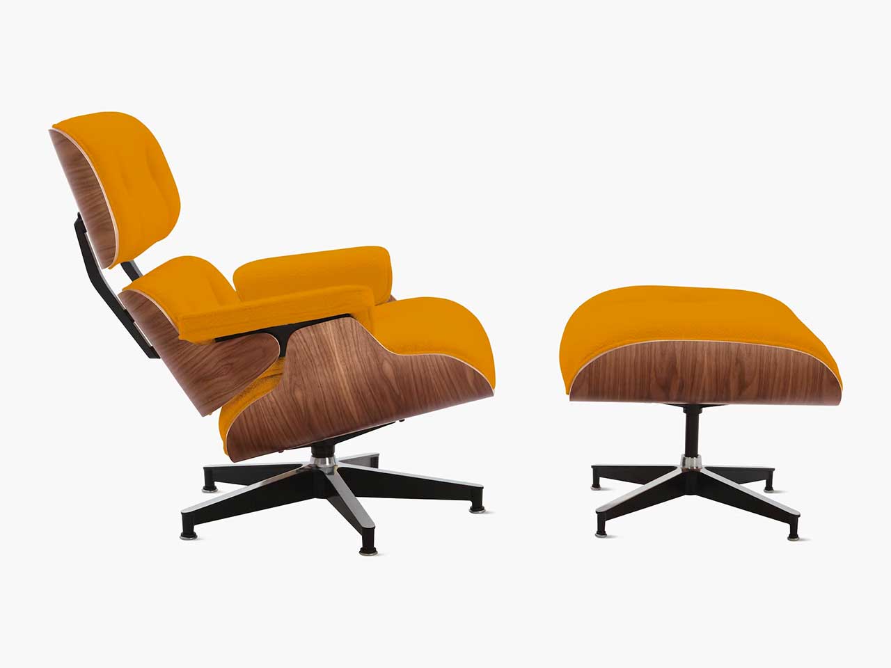
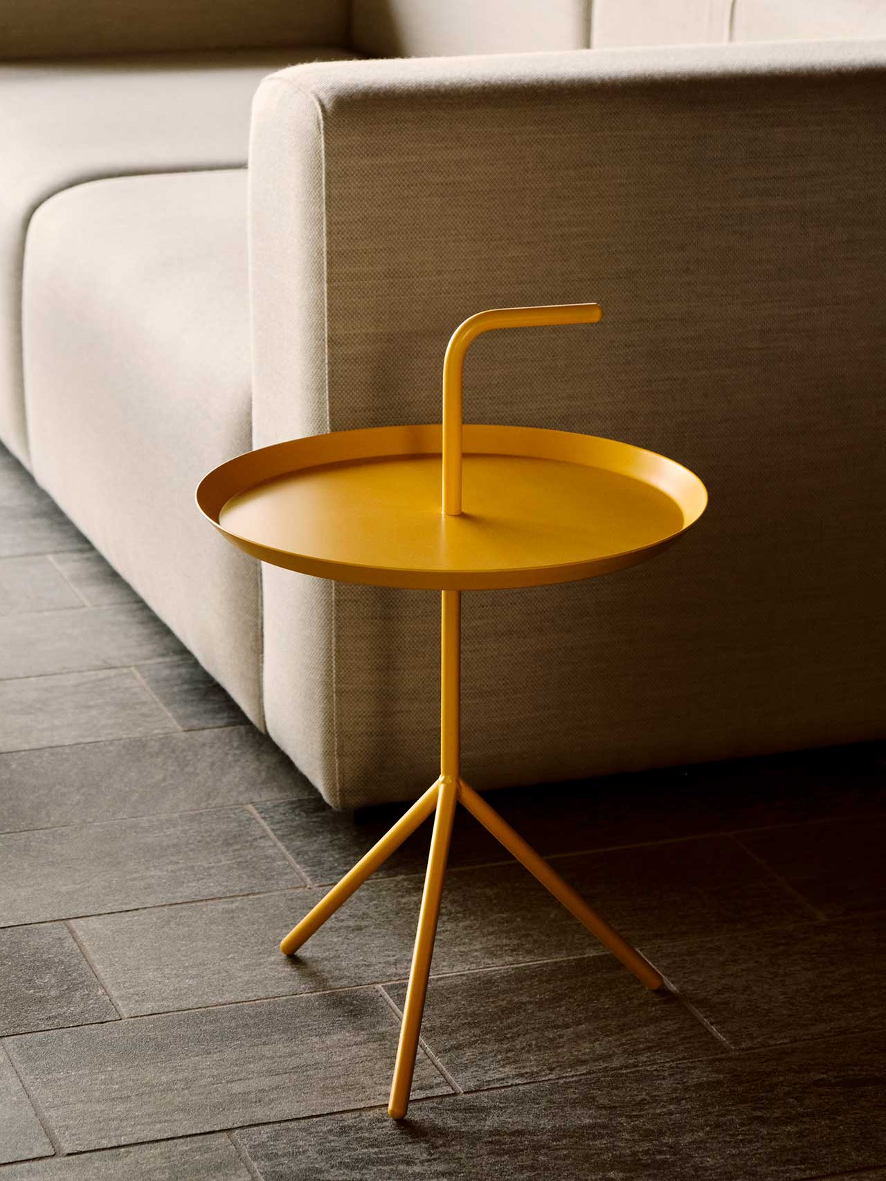
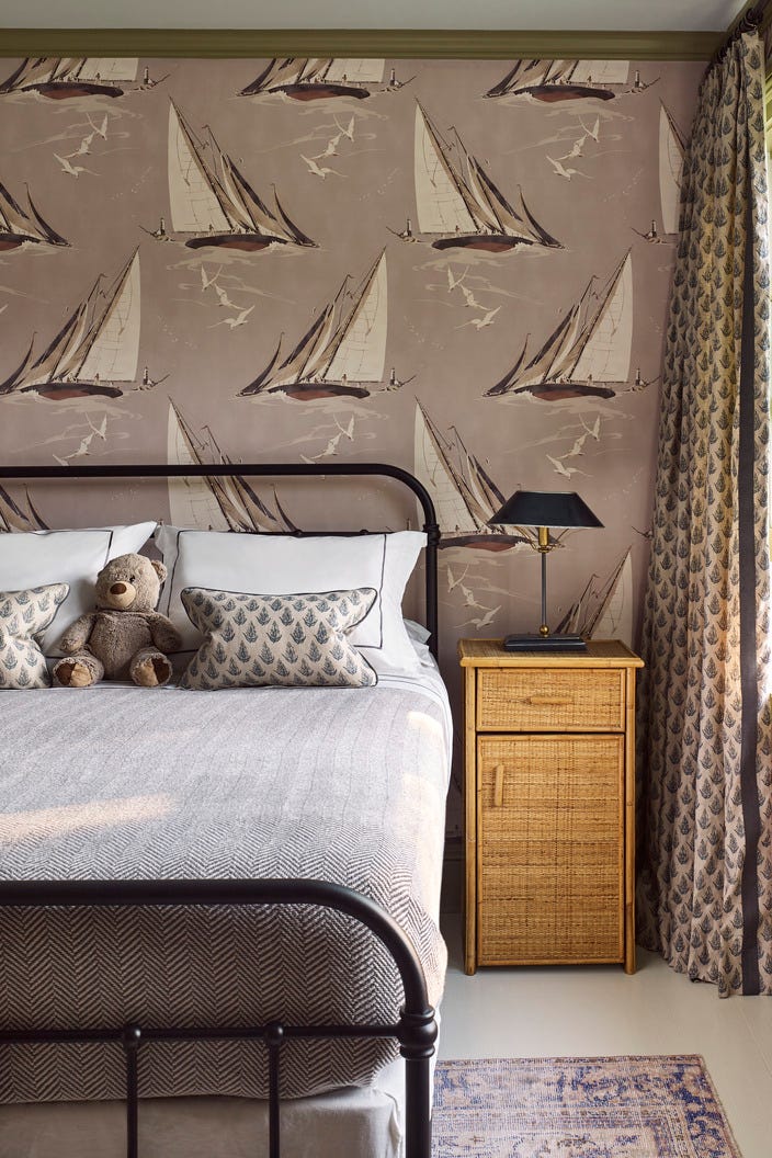
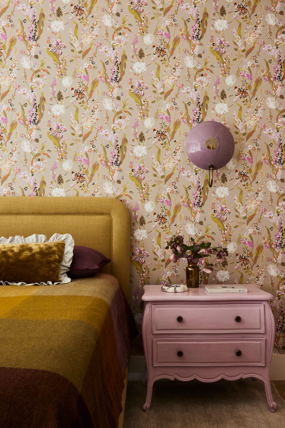
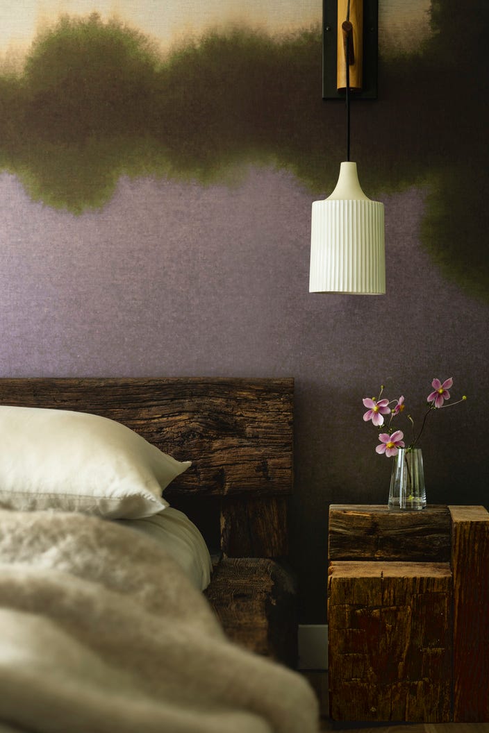
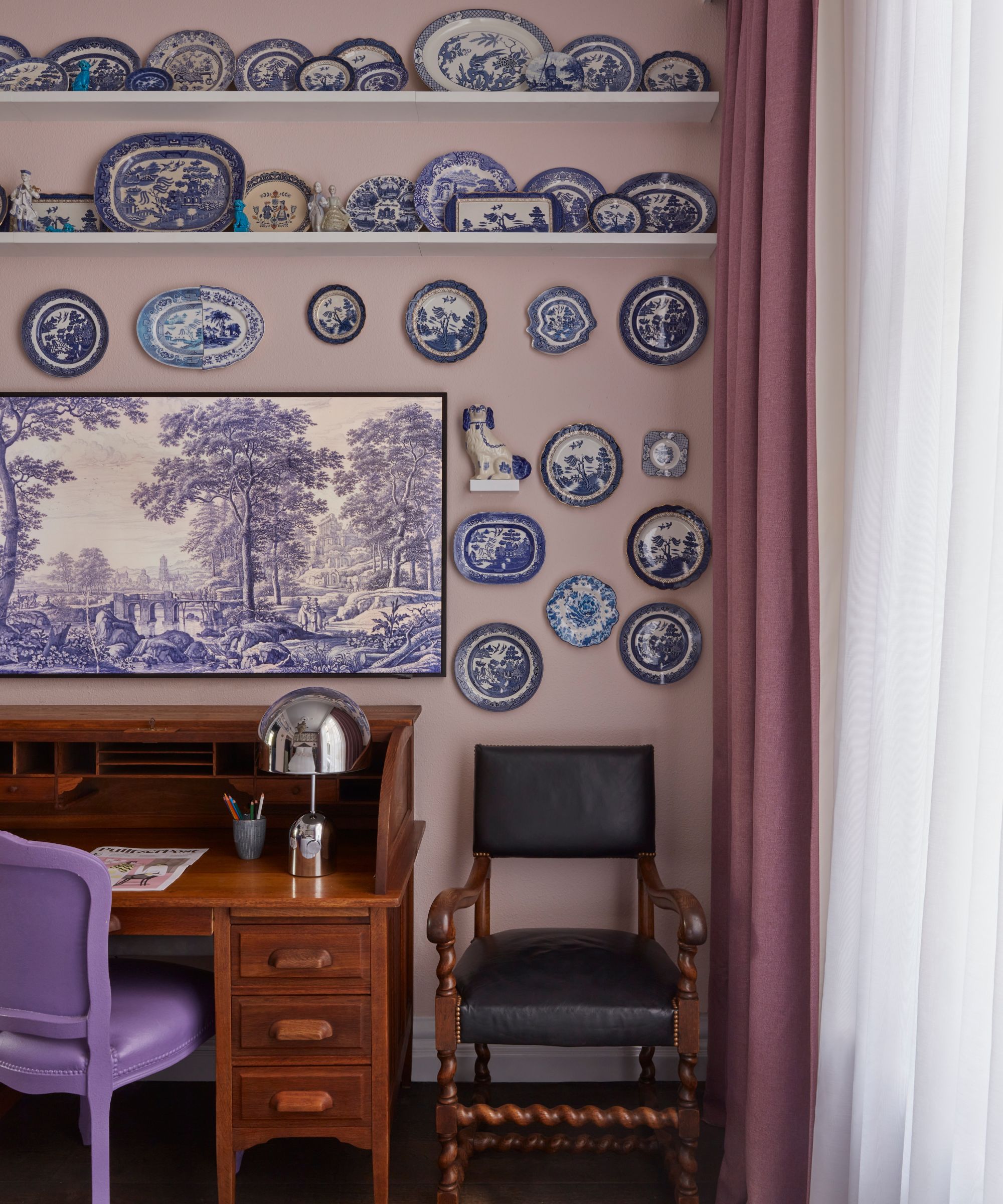
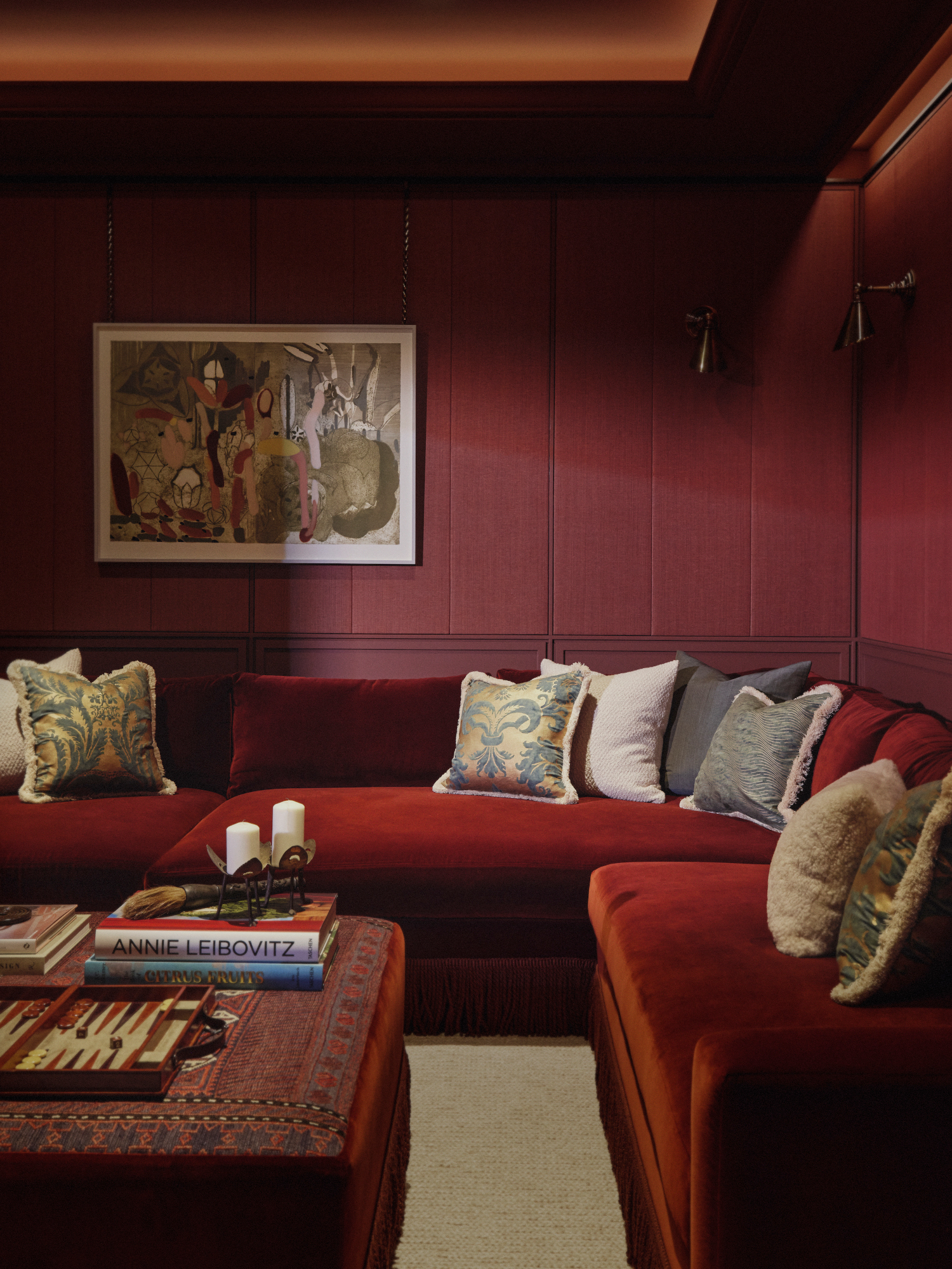
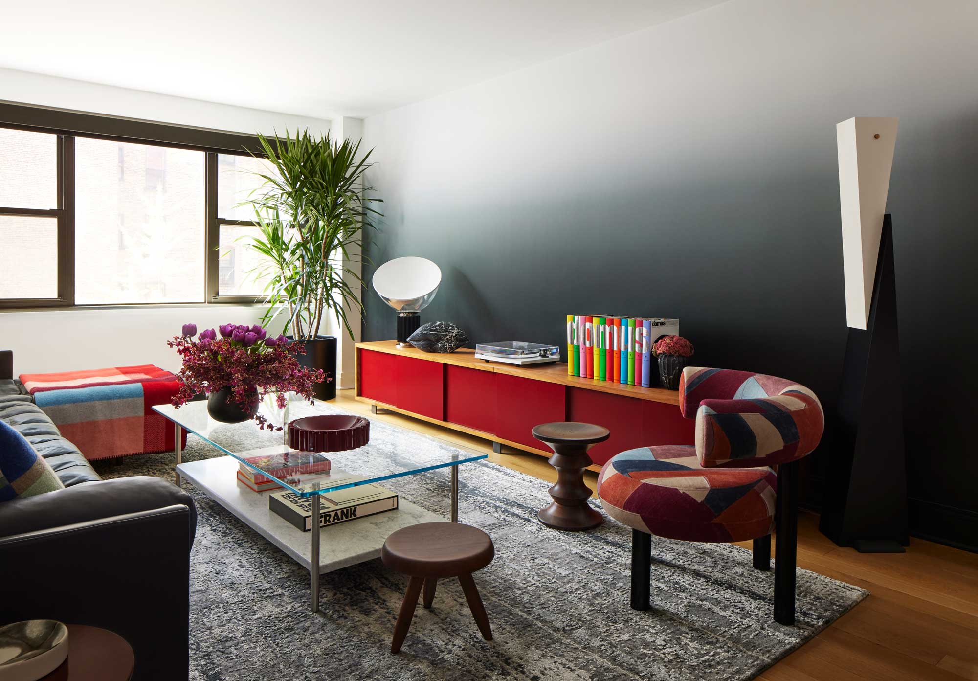
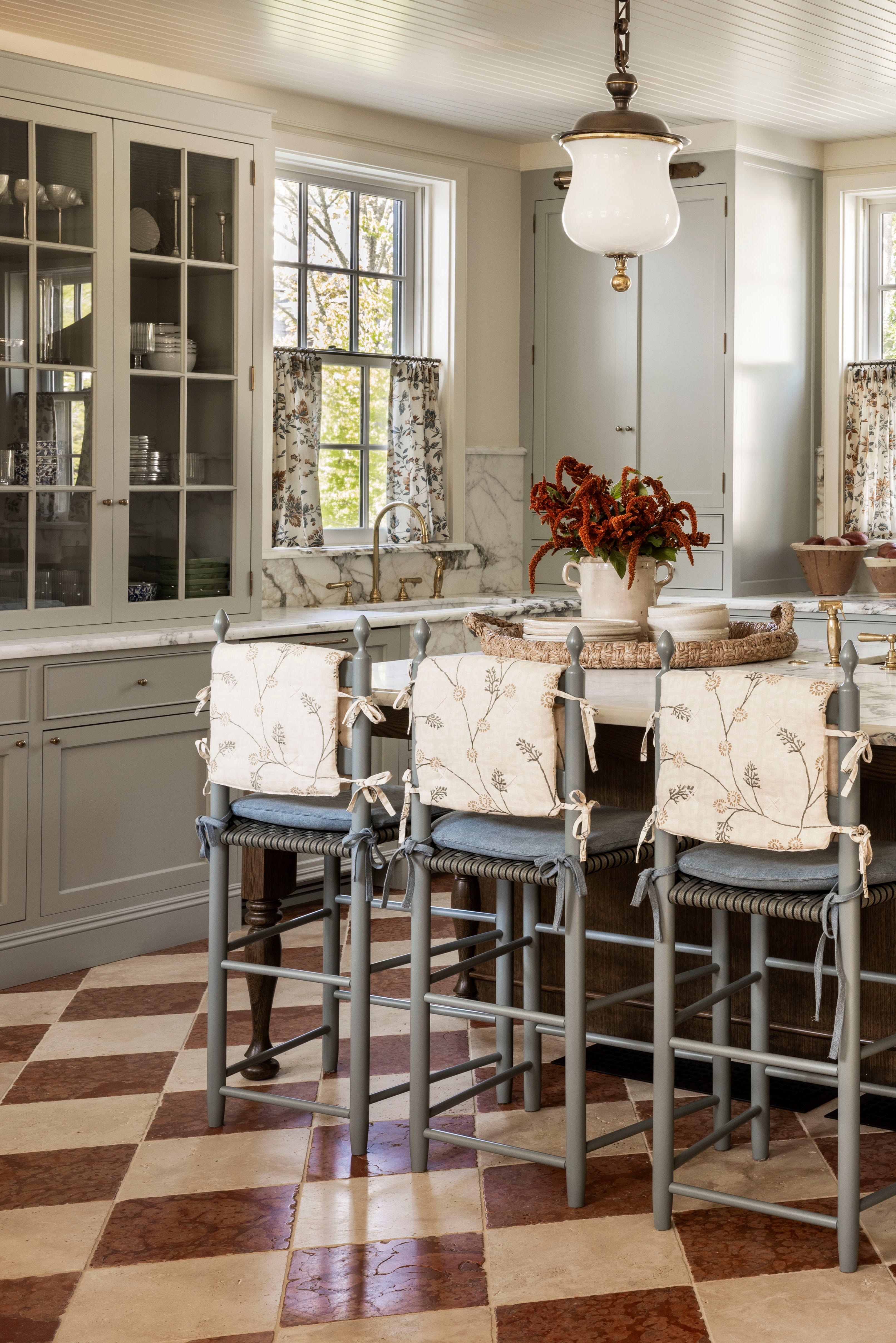
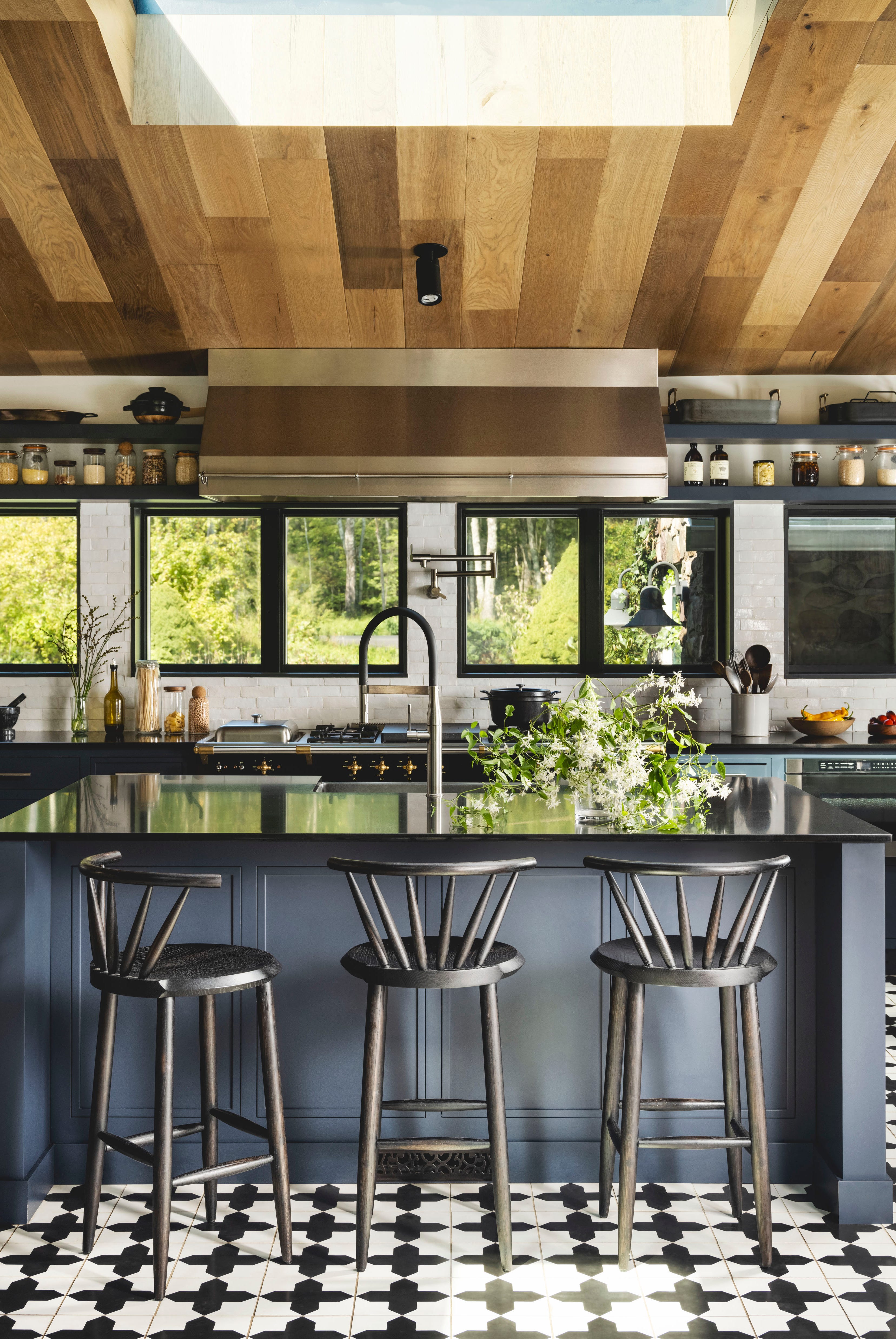
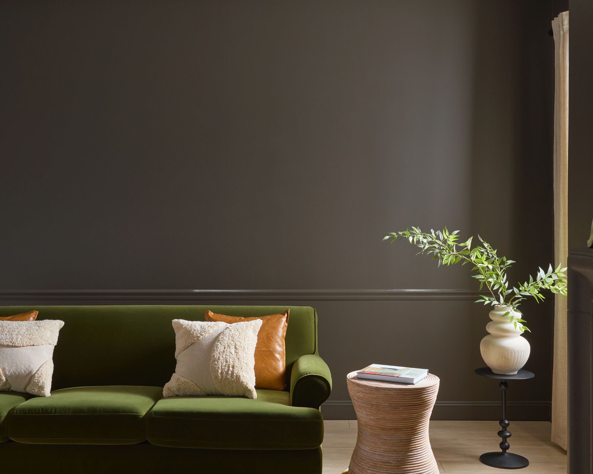
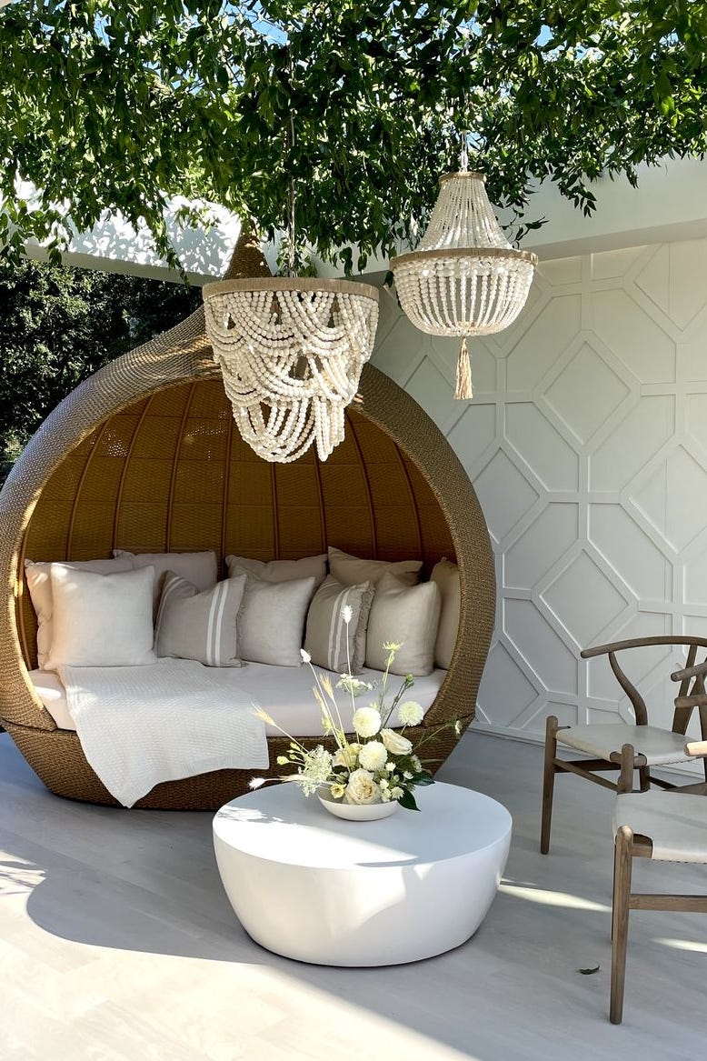
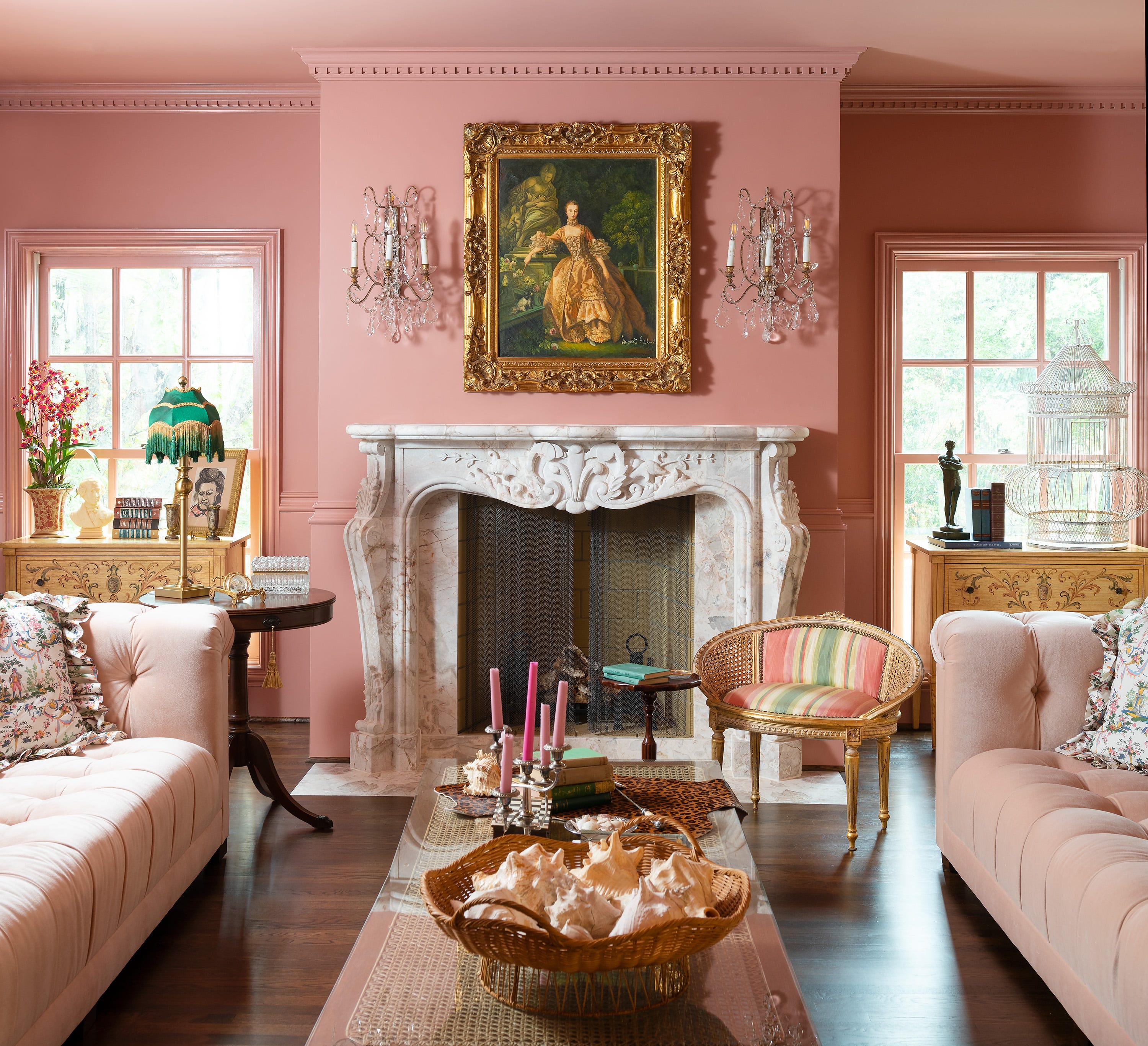
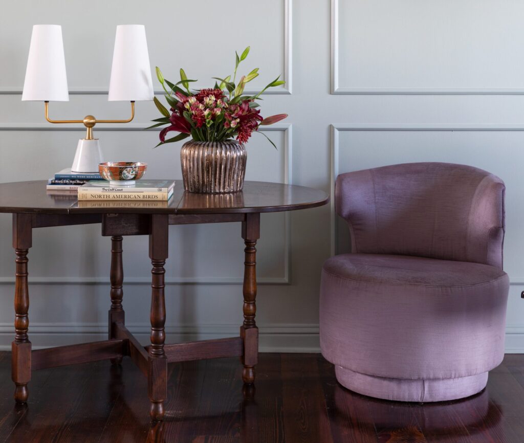
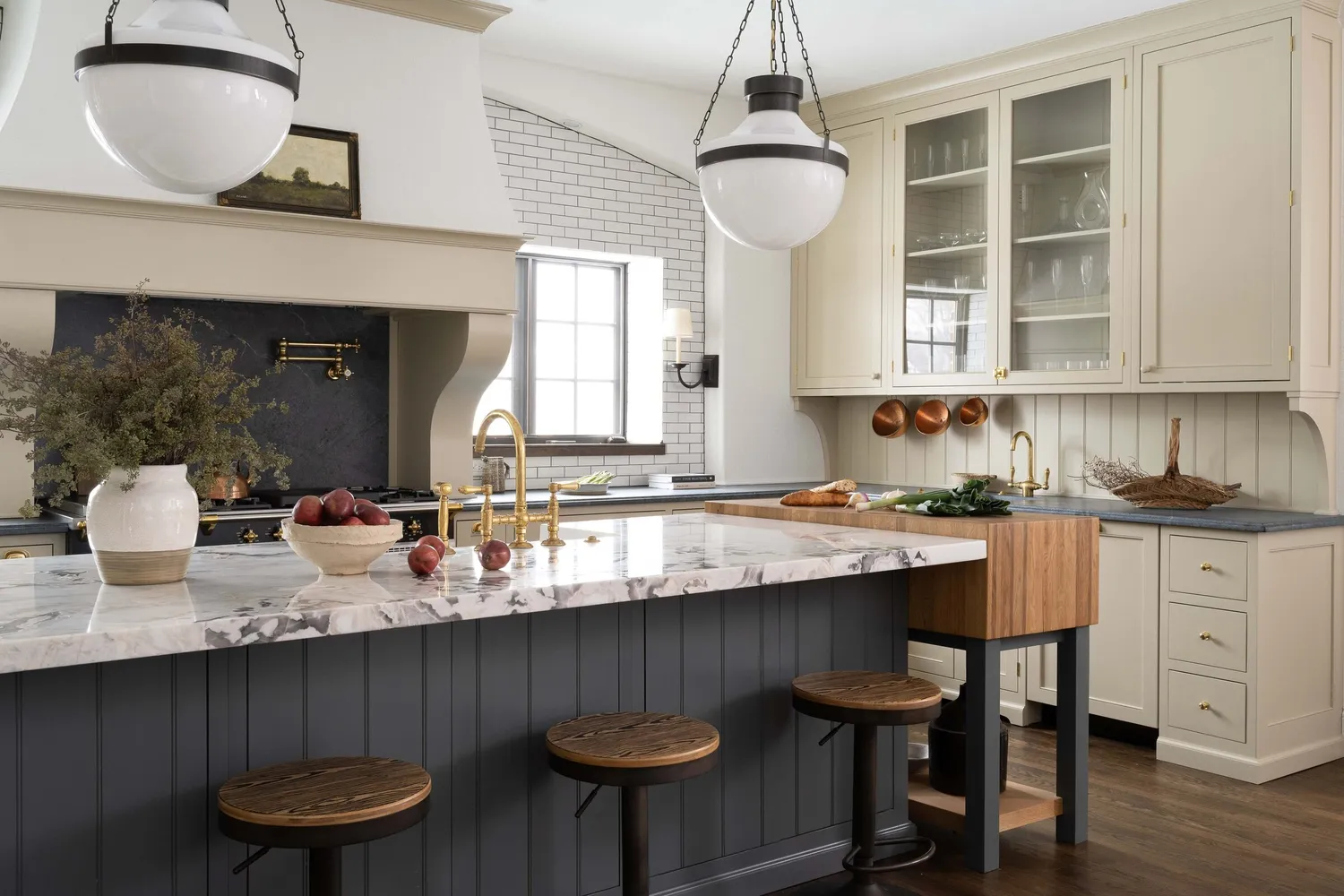
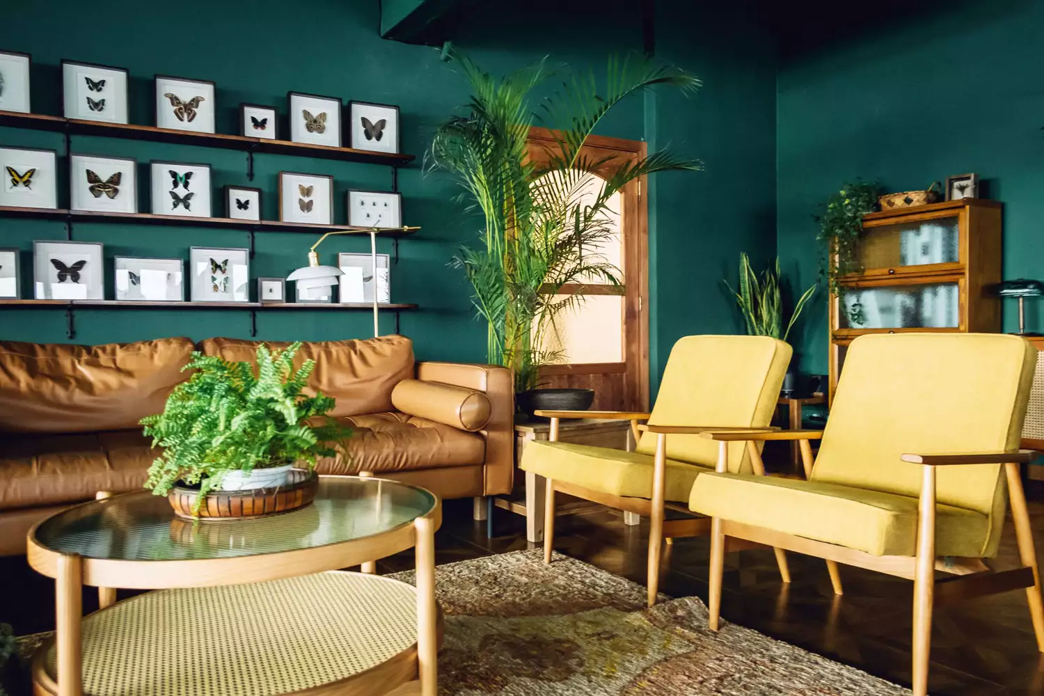
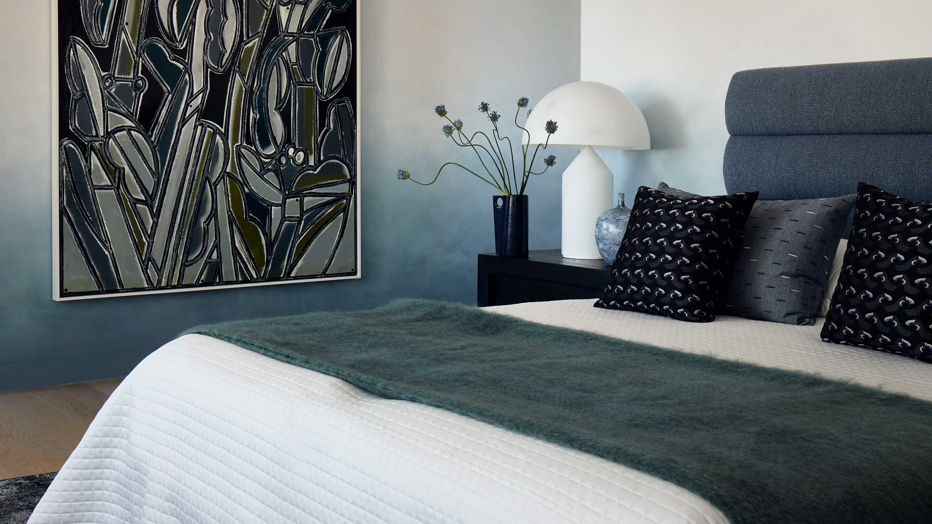
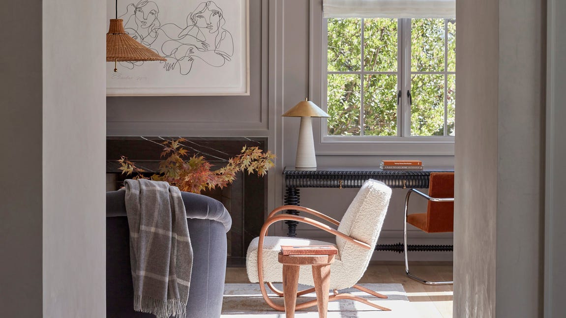
To prevent over-stimulation while using vibrant colors, the article advises strategic application and the maintenance of balance. This involves pairing bold hues with contrasting neutral tones such as wood, creamy whites, and complementary shades on accent walls or trimmings. Statement furniture and curated décor pieces are suggested as effective ways to introduce color incrementally, preventing a room from becoming overpowering. Examples provided include using deep green vases, wine-red hardback books, and royal blue cushions or curtains as accent pieces. City & Country’s in-house design team, for instance, incorporates rich shades through plush armchairs and decorative cushions in show homes, aiming for a timeless aesthetic with pops of color.
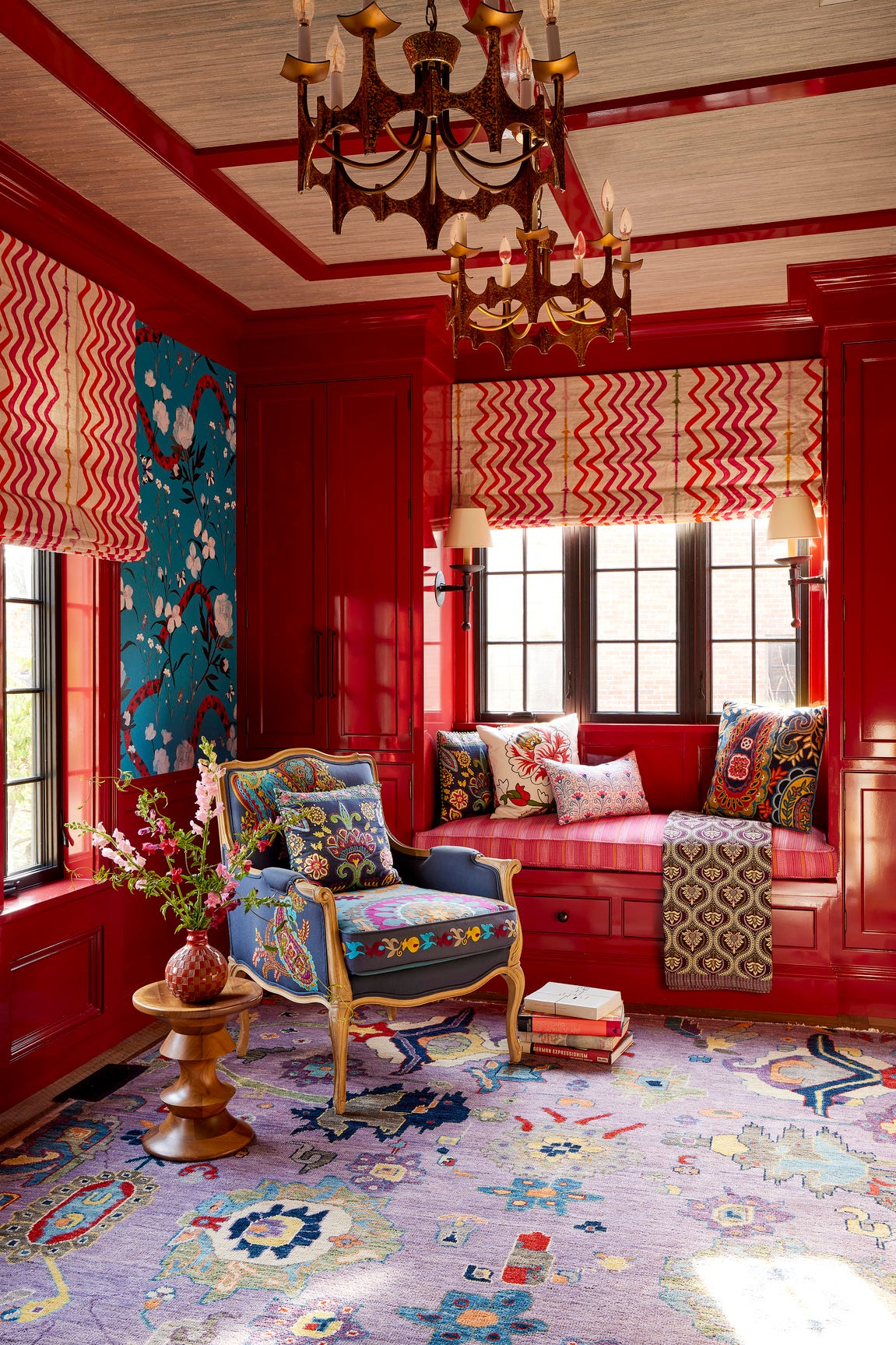
The trend also advocates for layering various textures and patterns alongside bolder colors to add depth and interest. Combining materials like wood, metal, and textured wallpaper can create a visually dynamic yet cohesive space. The article stresses the importance of maintaining a consistent style and theme throughout the home, blending vibrant features with neutral elements to achieve a surprisingly calming balance. Darker shades like rich browns, earthy moss greens, and deep burgundies are noted to complement natural materials such as wood, linen, and boucle, fostering a cozy atmosphere against a neutral backdrop. Color psychology, a long-standing element in interior design, is undergoing a reinvention with the bold and bright colors of 2025. This creates vibrant yet harmonious settings, promoting a new sense of serenity and self-expression through an optimal ratio of color and neutrals. The saturated colors trend is not just a passing fad but a reflection of a societal desire for personalized sanctuaries and vibrant self-expression, pointing towards a future where living spaces are more dynamically and richly colored.
#InteriorDesign #ColorTrends #HomeDecor #SaturatedColors #JewelTones #BoldInteriors #DesignPsychology #AccentPieces #TextureLayering #InteriorDesign #ColorTrends #HomeDecor #SaturatedColors #JewelTones #BoldInteriors #DesignPsychology #AccentPieces #TextureLayering
0 comment in total
You may also like
Jewel Tones Are Trending for Living Room Paint Colors, According to Designers

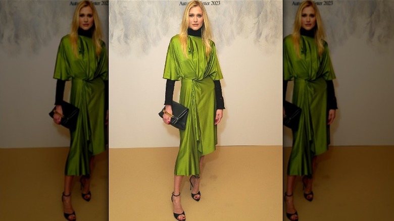
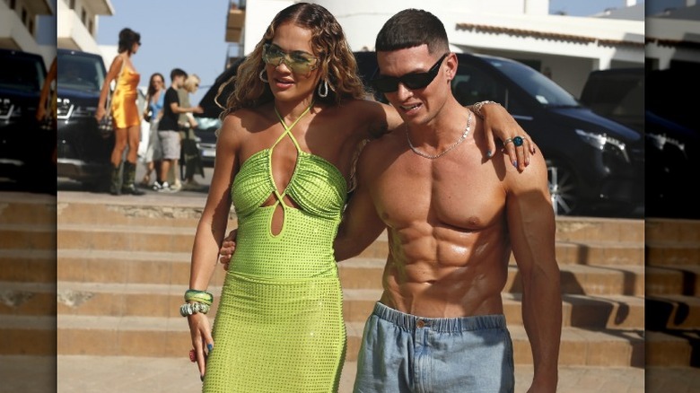
Vibrant Green Is The Color Trend That Comes Celeb Approved

Birth Month Colors: Transform Your Home With Your Birthday Hue

Jewel tones are taking over in the new year: How to incorporate the trend in your home

These Are The Colors Everyone Is Talking About In 2018

The Gray, Cream, and Navy Items I Swear Out-Rich Every Other Color Trend (Yes, Even Black)

7 Trendy Paint Colors for Every Room in 2026, According to Designers

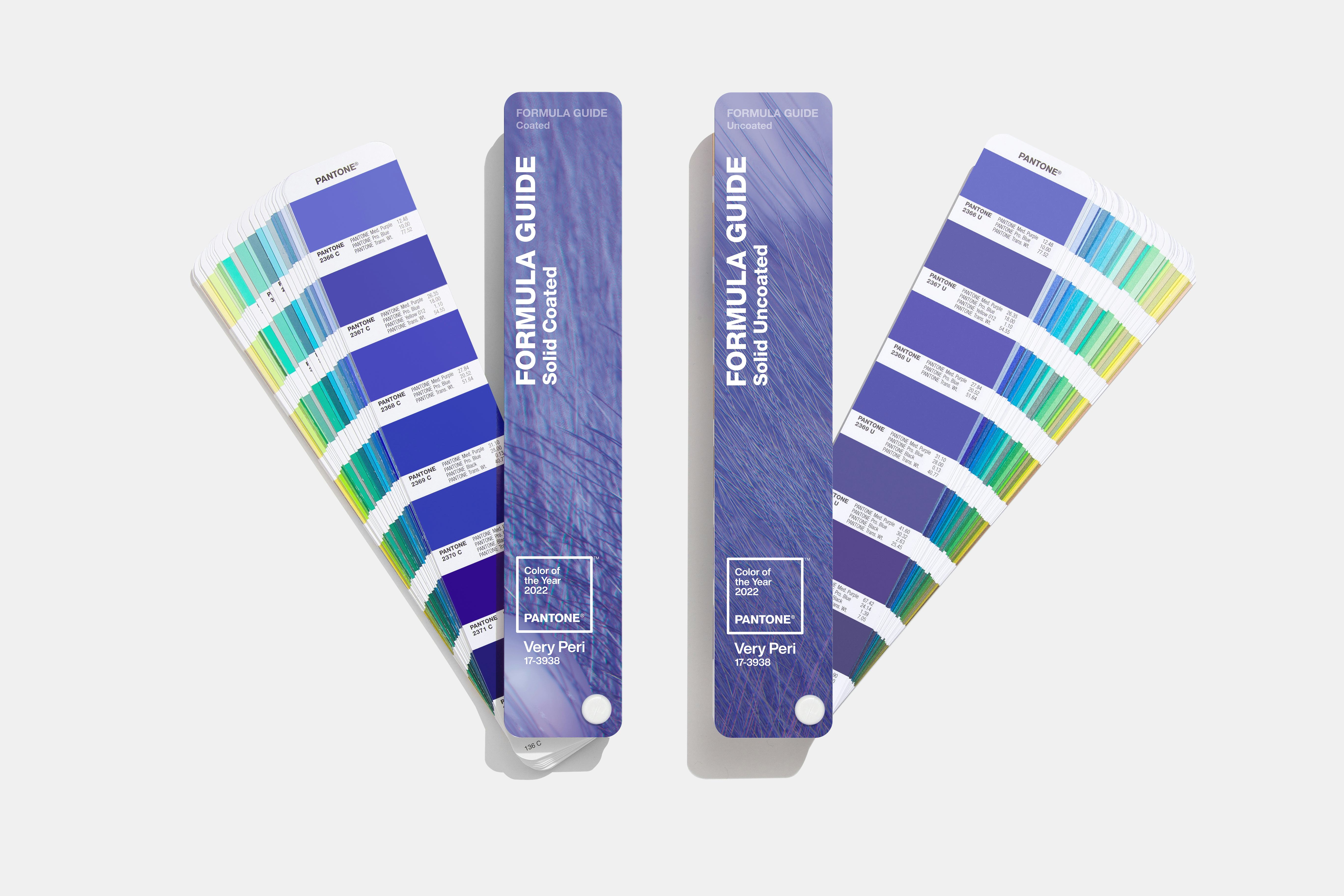
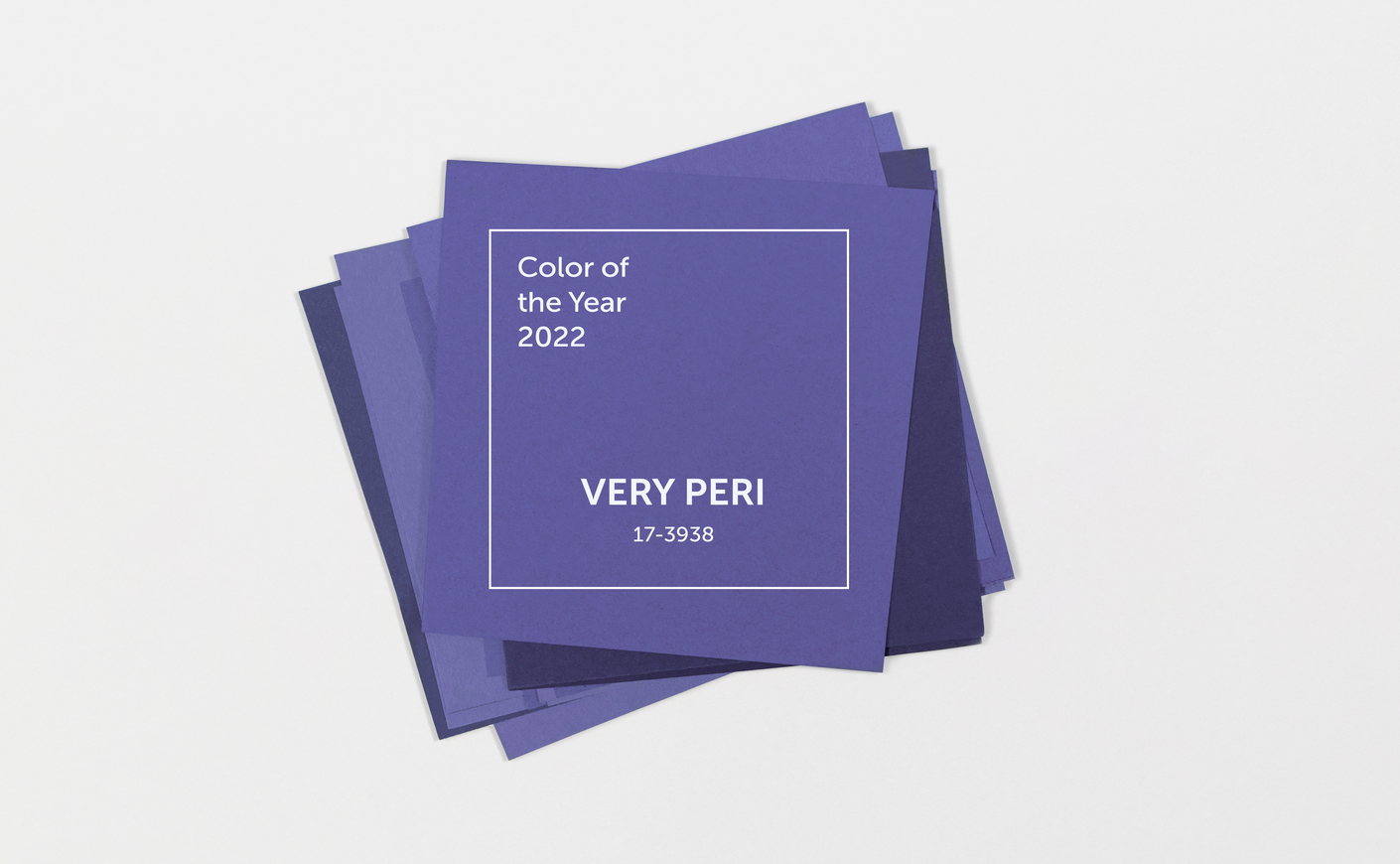
16 Gorgeous Products in Pantone’s Color of the Year: Very Peri
Homes With This Color Inside Are Worth More

Colour analysis in jewellery: how to choose gems to best suit your look

Designers are Calling Burgundy This Year's Big Color Trend

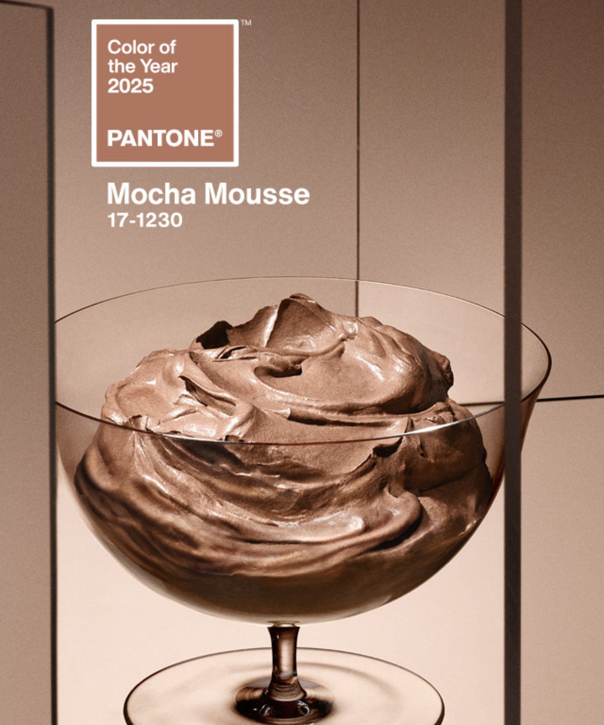
Colors of The Year – get to know every shade revealed by leading paint brands for 2025
12 Jewel-Tone Paint Colors Designers Say Are Always On-Trend
If You Want To Feel More Creative In 2022, Wear This New Color
This surprising color trend is having a comeback
9 Color Trends That Will Take Over in 2023
Backdrop + Coming Soon Reveal Bold Color of the Year
Designers LOVE Pairing These Unexpected Colors With This Sophisticated Hue

Designers LOVE Pairing These Unexpected Colors With This One Timeless Hue
Jewel Tones Are Going to Be Everywhere 2024, According to Sixpenny