1/15
These Are The Colors Everyone Is Talking About In 2018
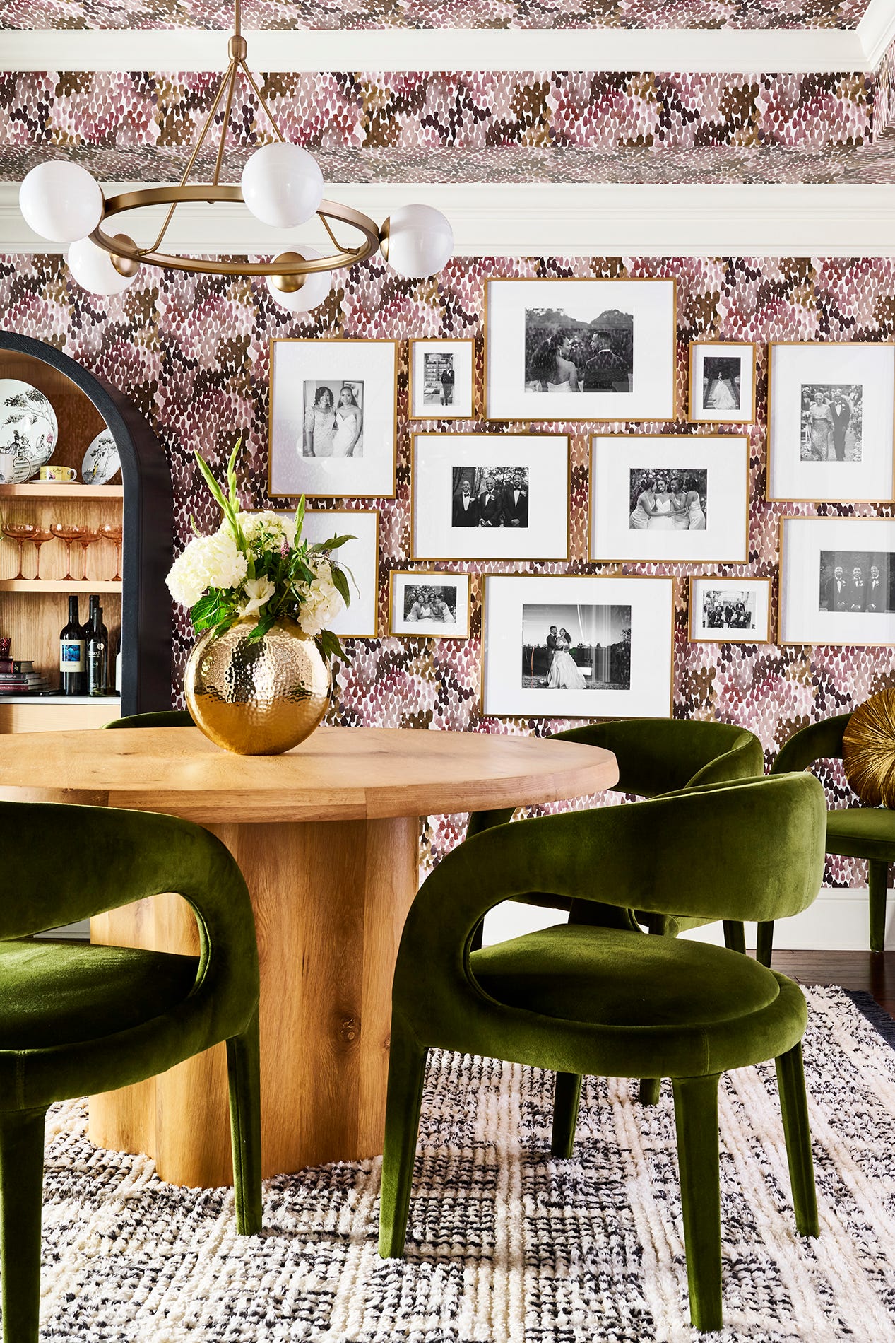
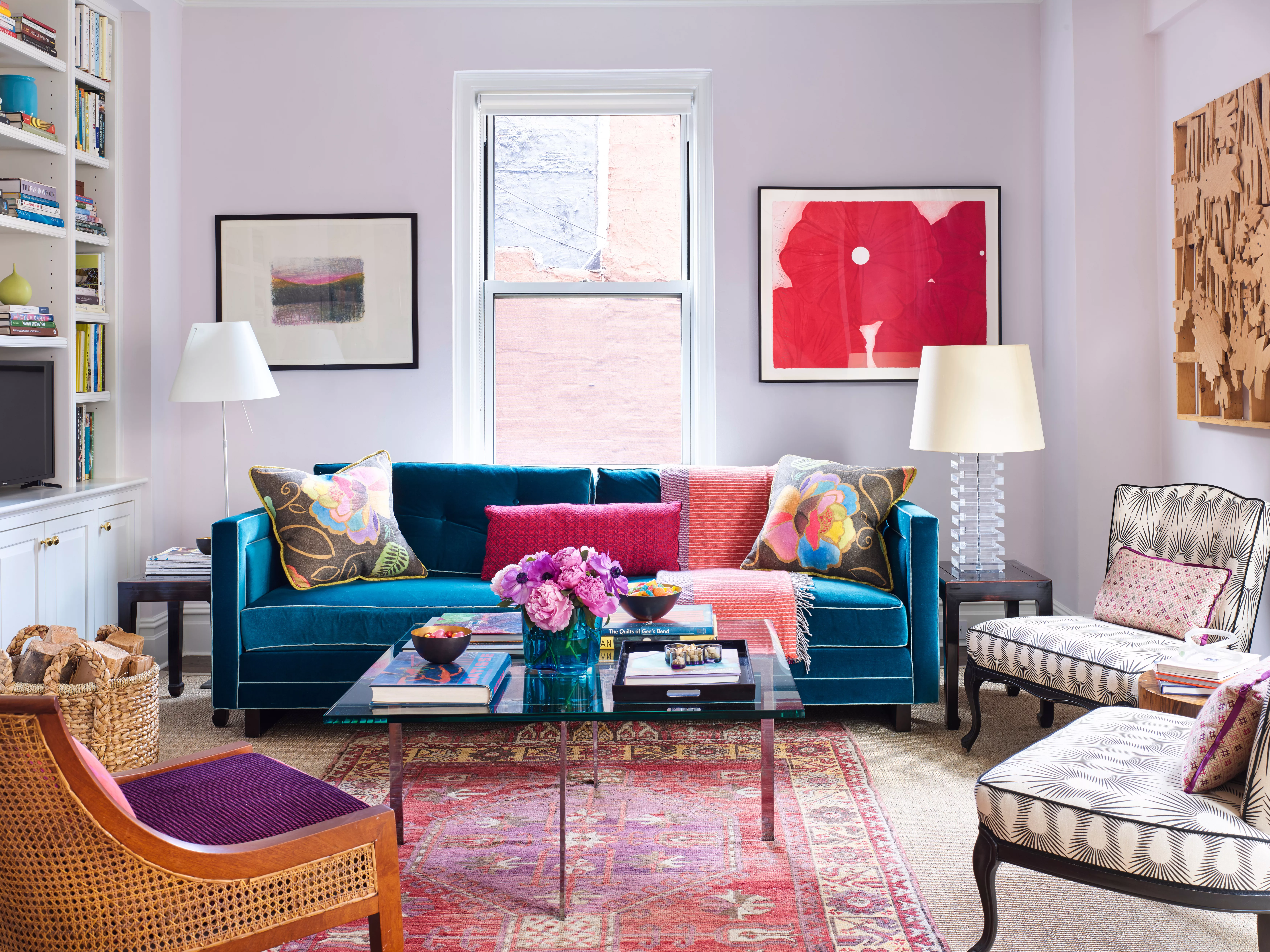
This article details the trending color palettes and individual shades that were popular in 2018, marking a shift from the tropical greens and warm neutrals of the previous year to bolder and more sophisticated options. The overarching theme for 2018's color trends leaned towards fiery reds, metallics, and Ultra Violet, Pantone's color of the year. The article provides a comprehensive guide to incorporating these trends into home decor.
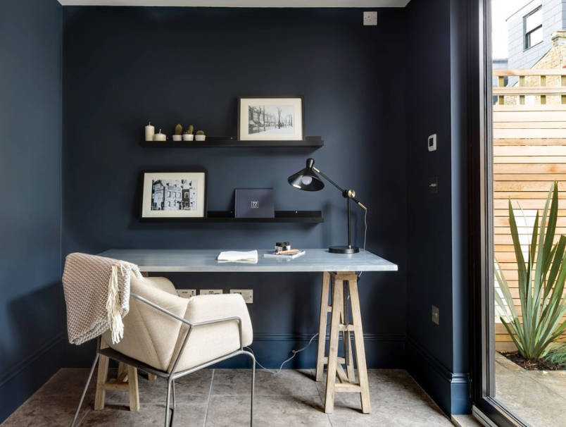
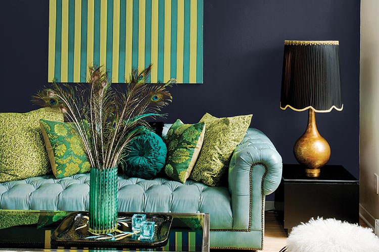
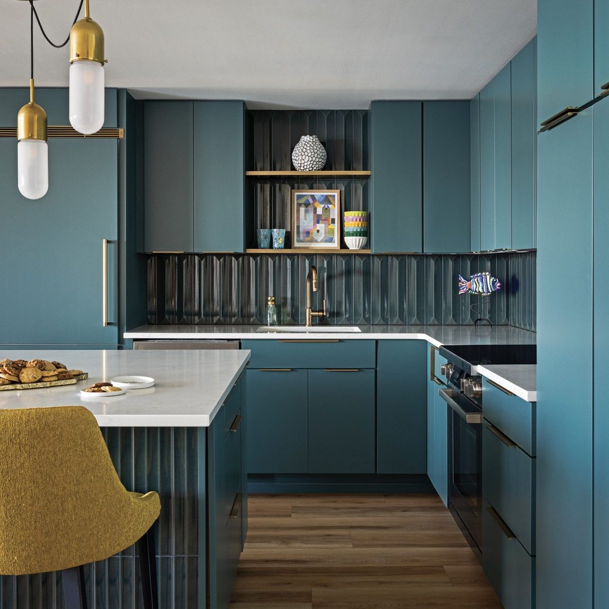
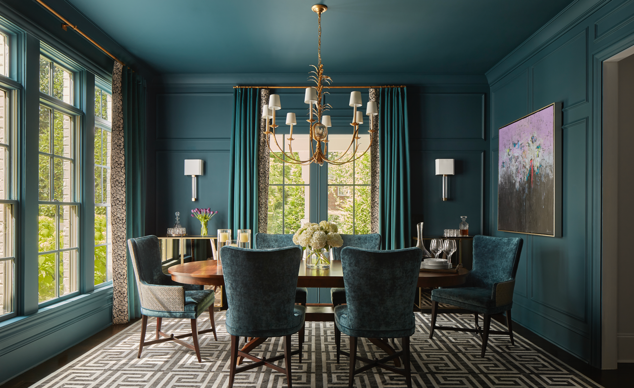
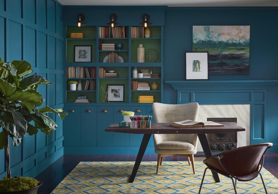
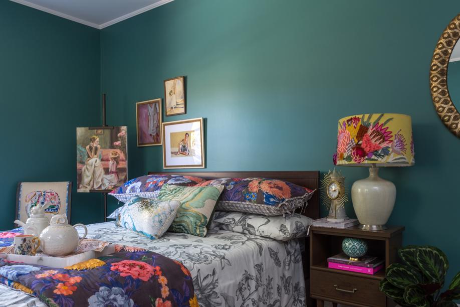
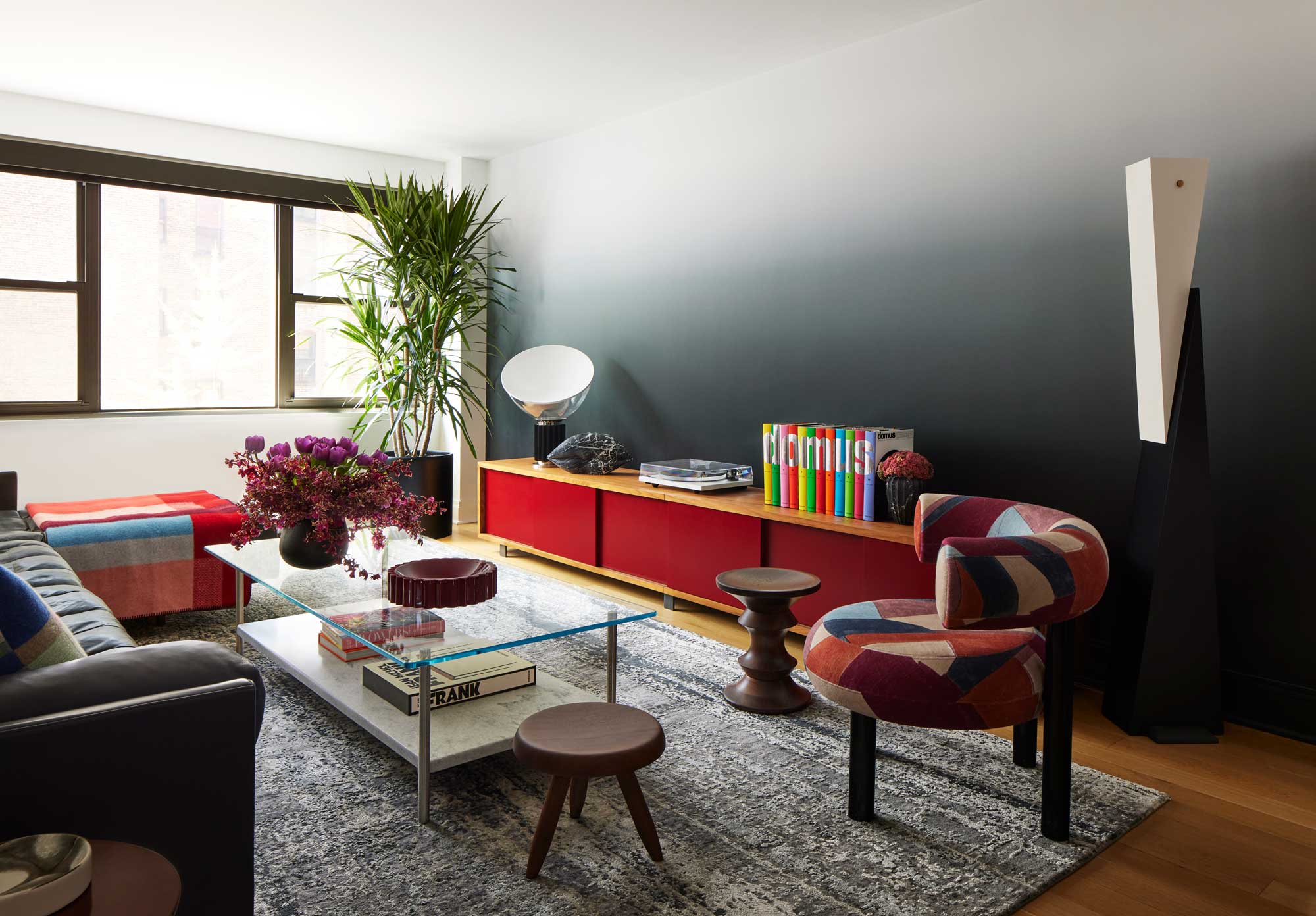
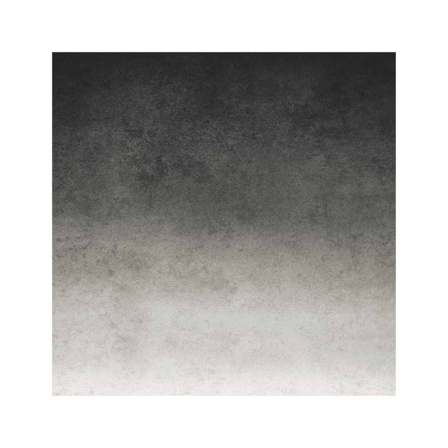
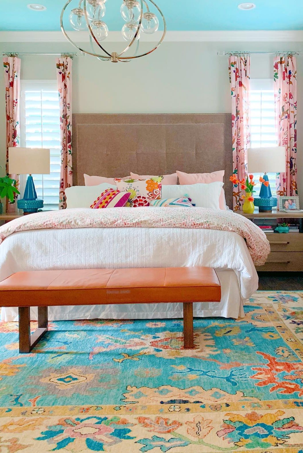
Caviar Black, a deep charcoal-like black, is presented as a versatile shade that pairs effectively with dark grays, offering a sophisticated alternative to traditional black. Statement Turquoise is highlighted as a vibrant and bold color suitable for accent walls or entire spaces, with a suggestion for alternative blue shades for those seeking a less intense option.
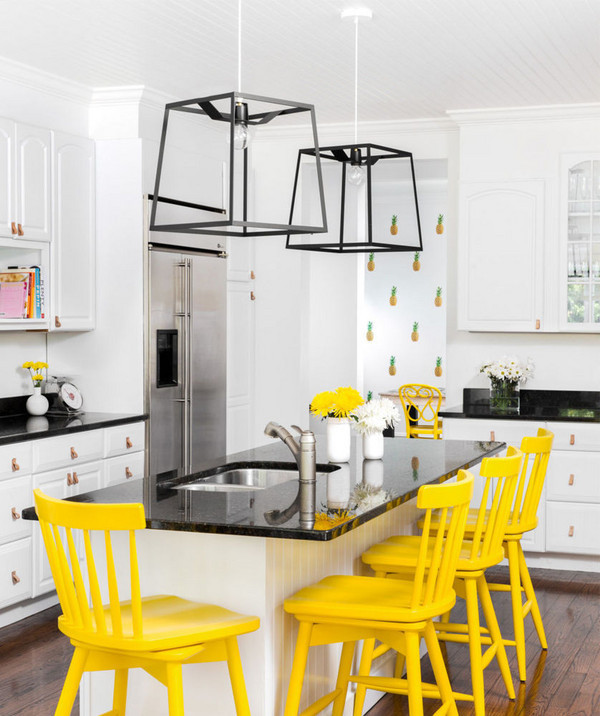
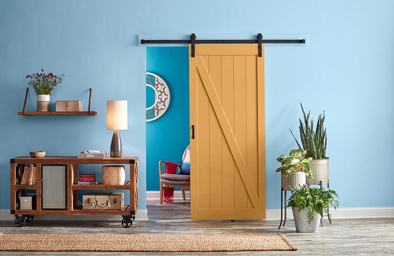
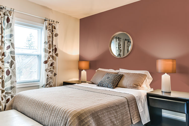
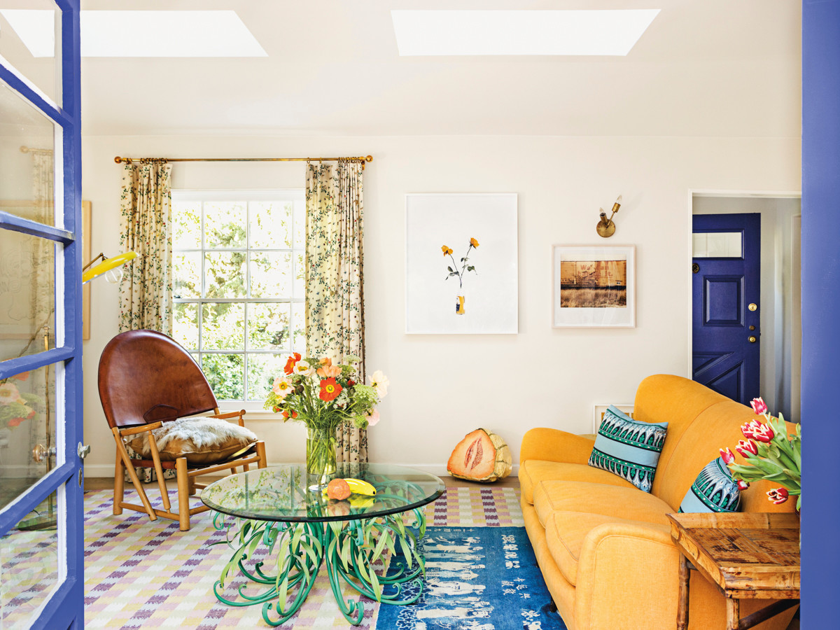
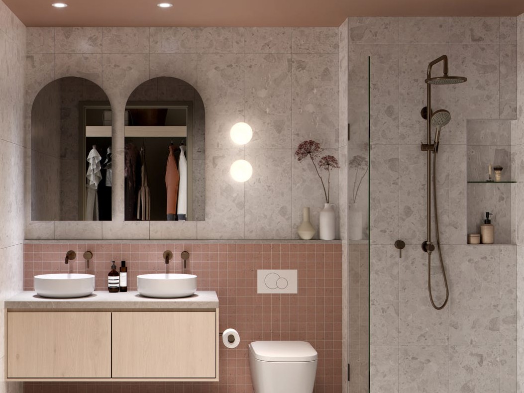
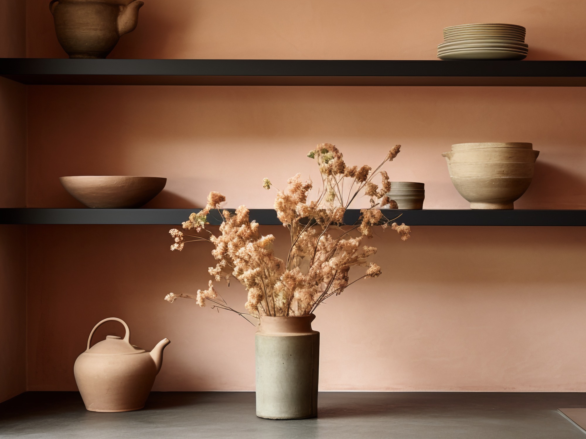
Sunshine Every Day introduces goldenrod yellows as cheerful and cozy, with Valspar’s Golden Ochre being a prime example. These warm yellows are recommended to be complemented by cream and blue accents. Sophisticated Blush, particularly Graham & Brown’s Penelope, redefines neutral styling with its dusty rose hue, combining the simplicity of ecru with the vibrancy of pink.
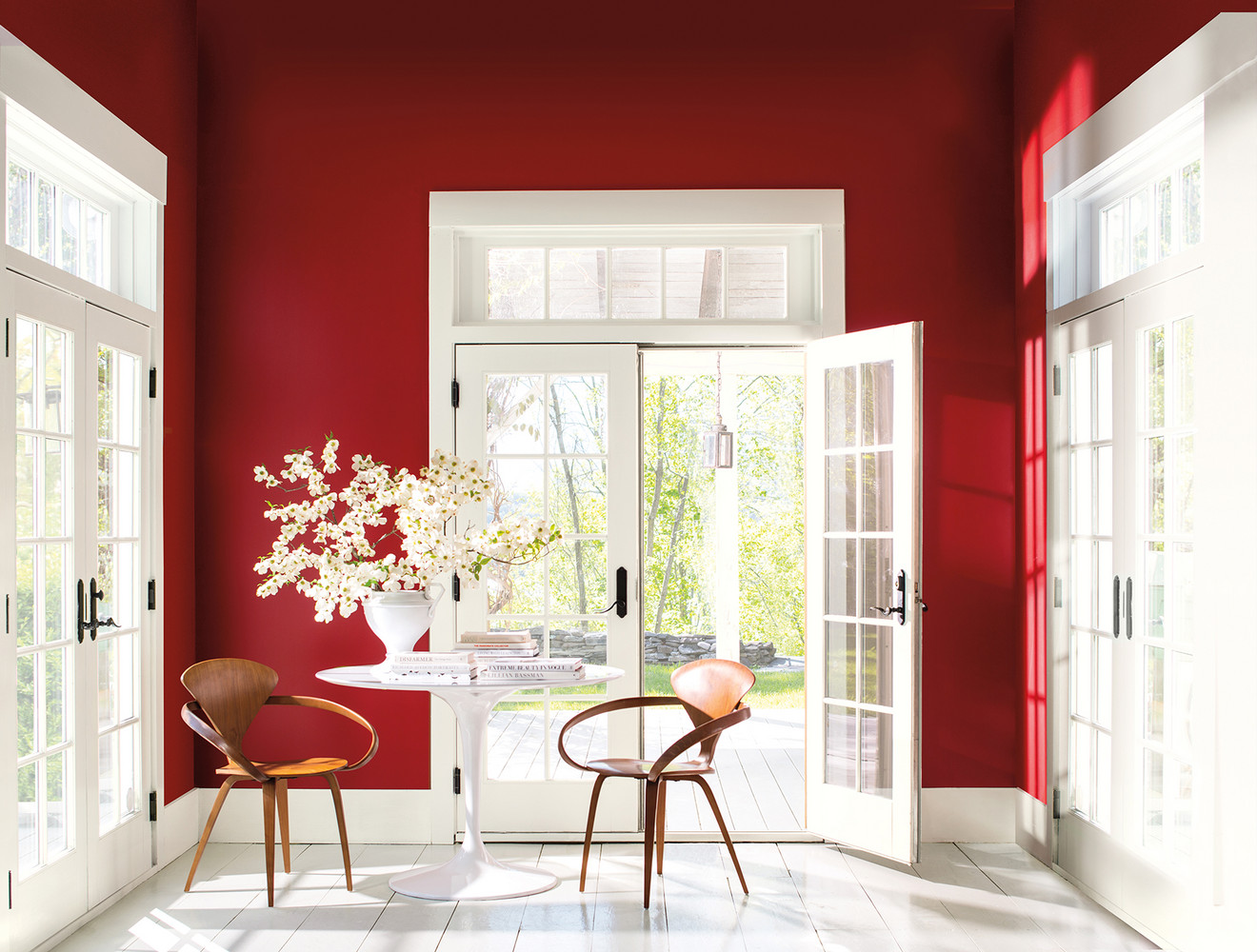
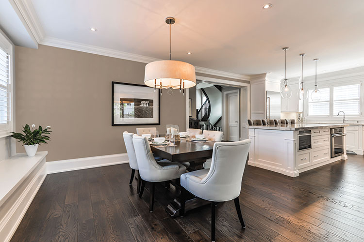
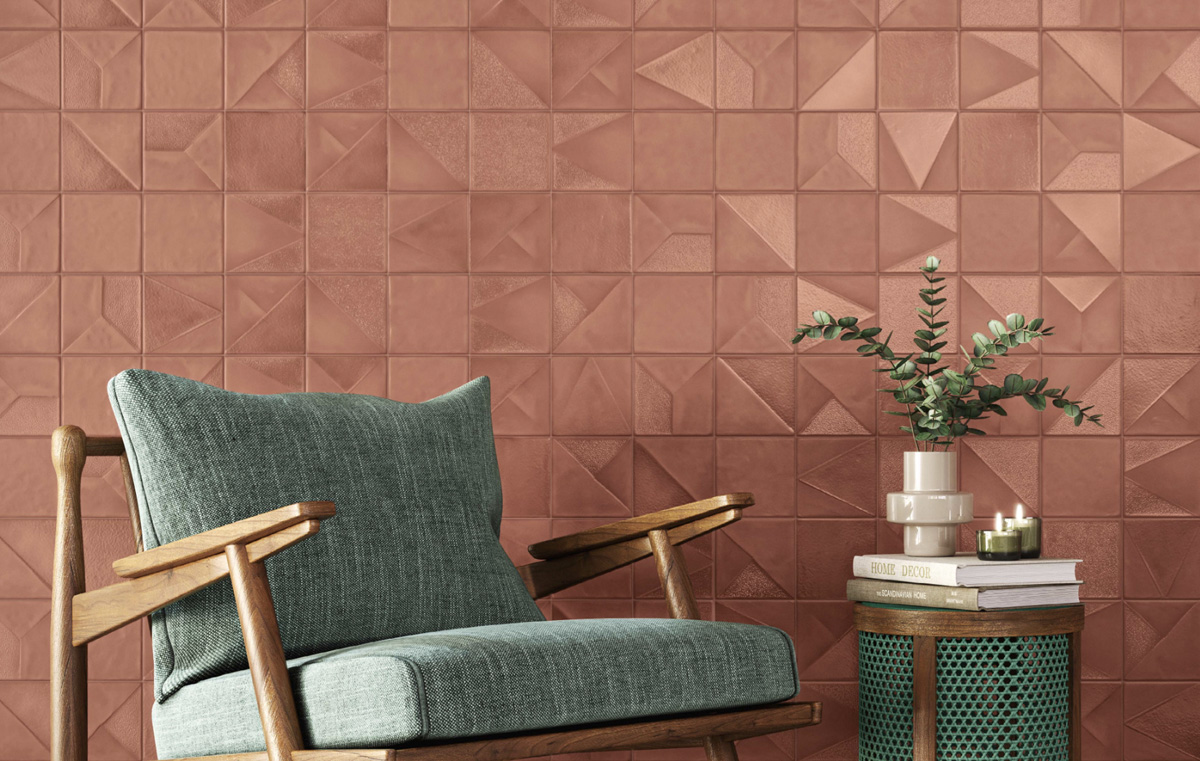
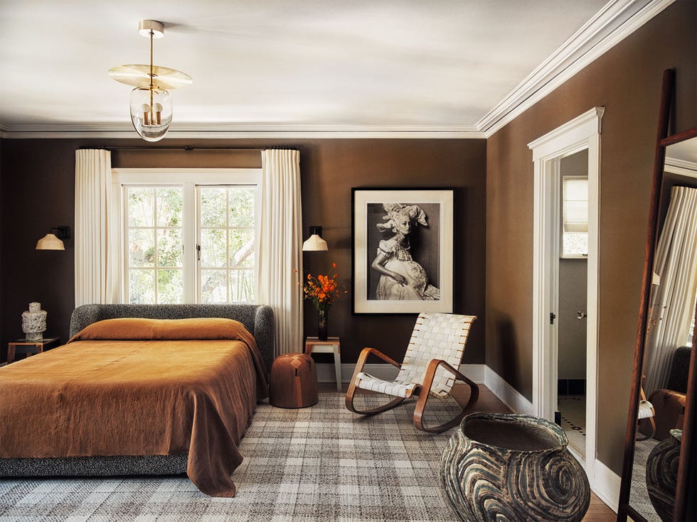
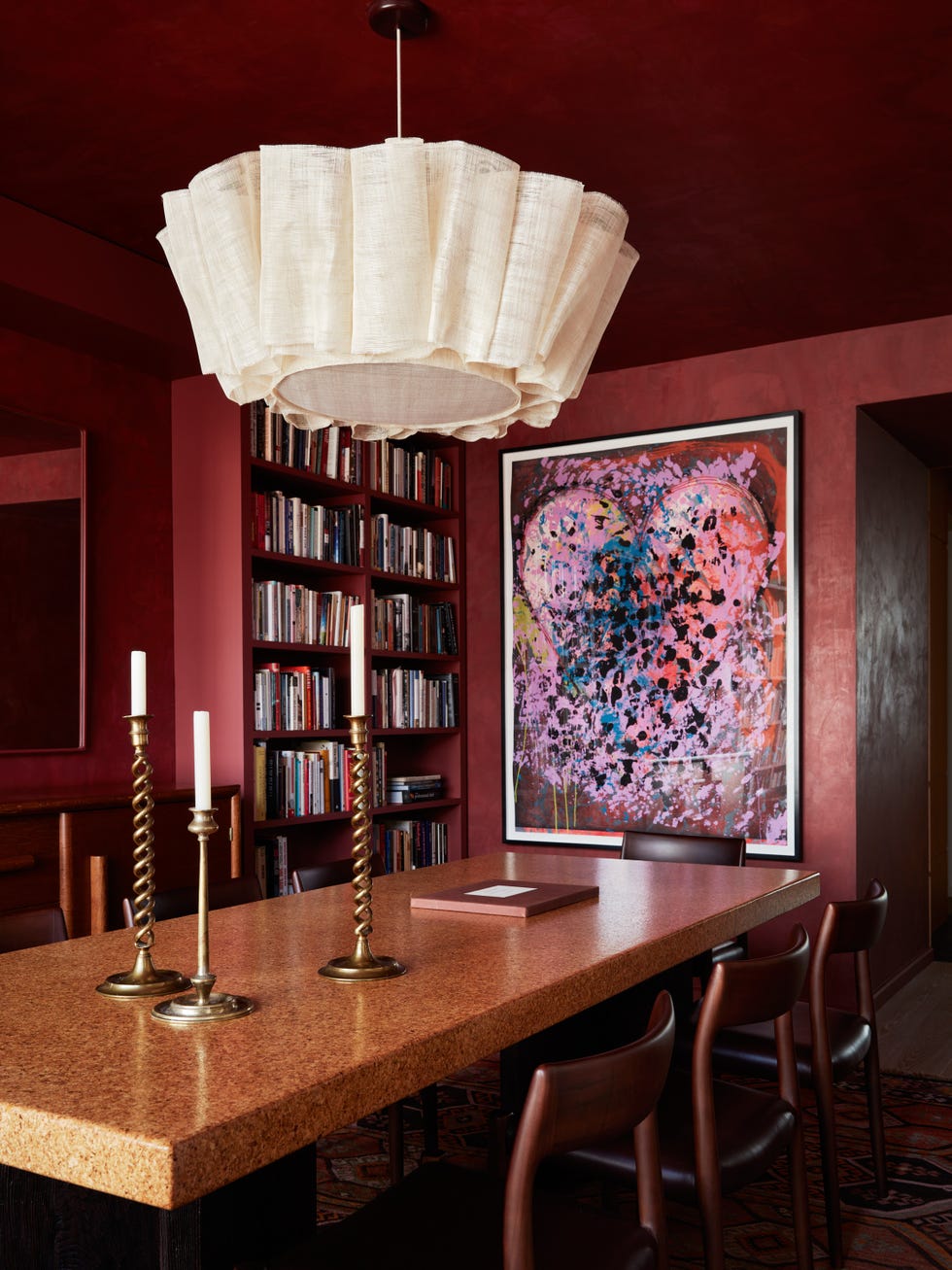
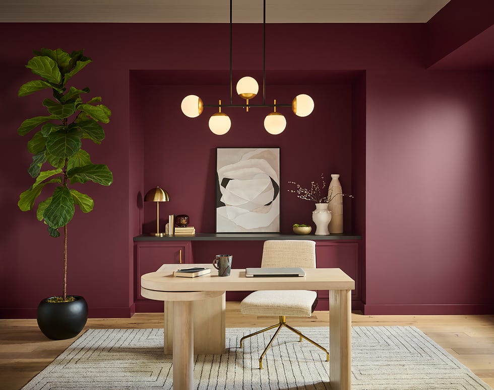
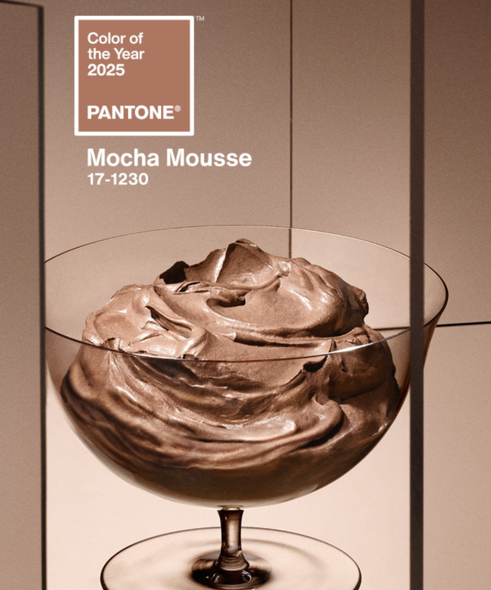
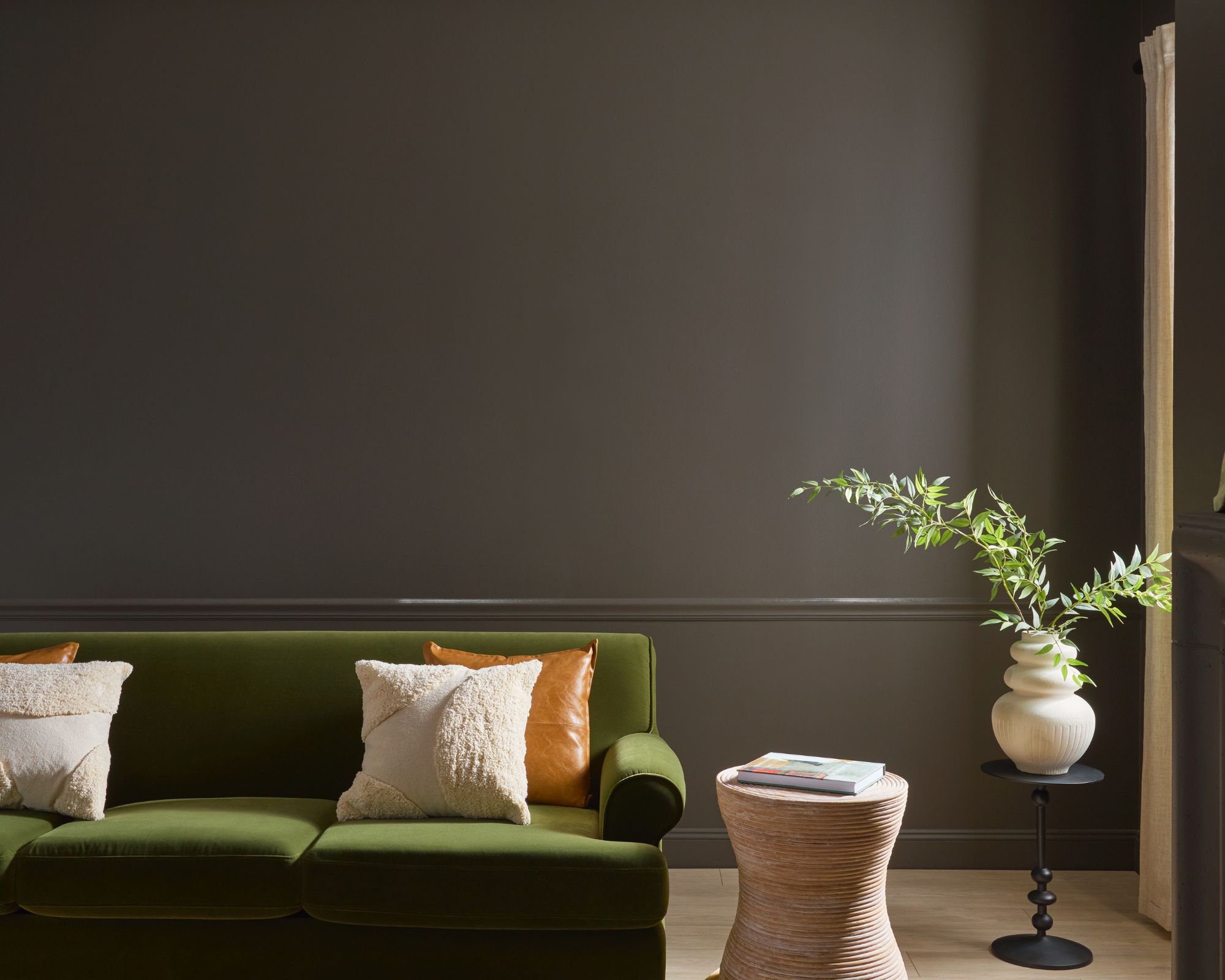
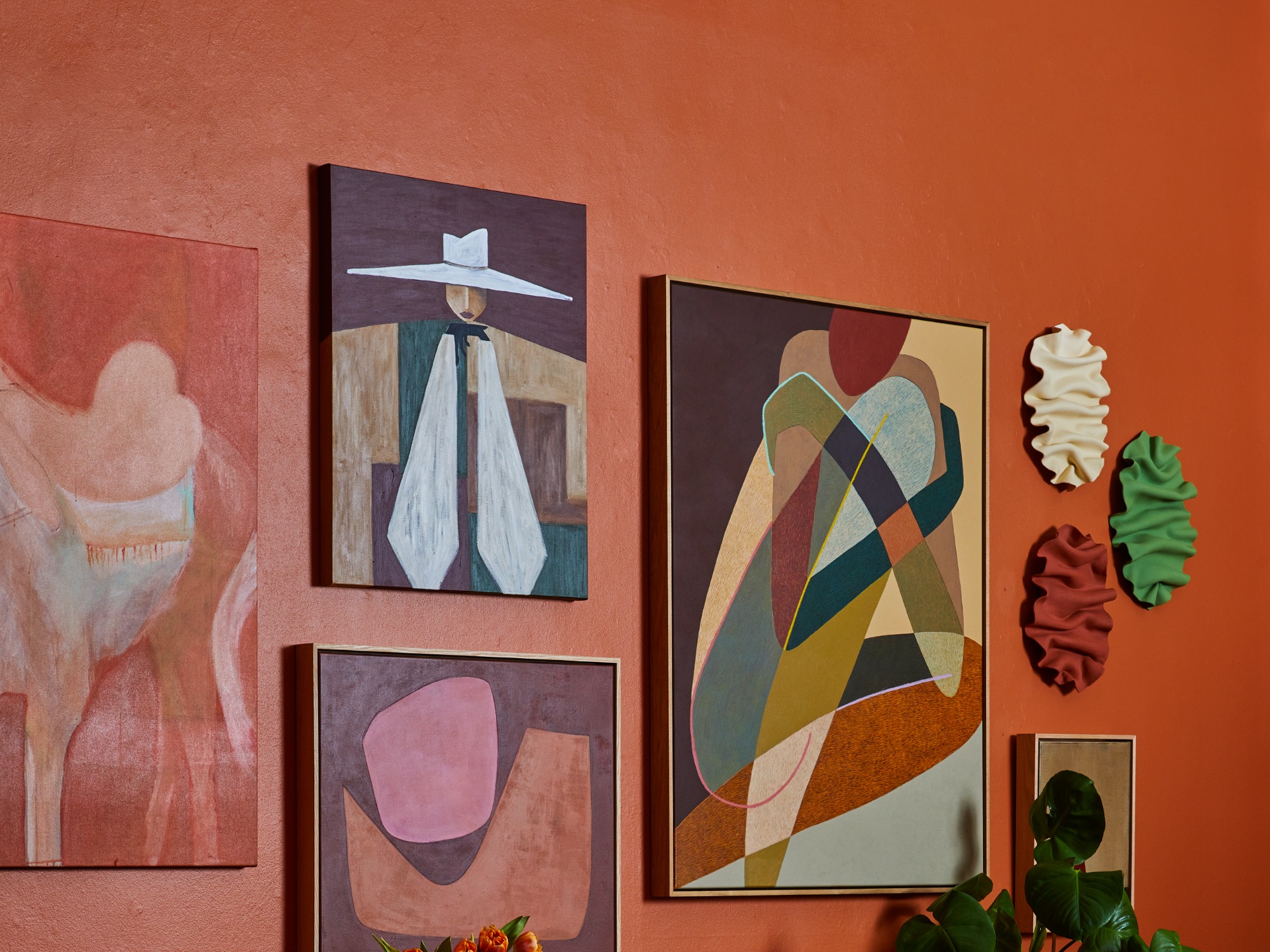
Rich Earth Tones, exemplified by Valspar’s Charcoal Brown, offer a sophisticated and natural feel, best paired with faded red and green accents for a relaxed ambiance. Vibrant, Deep Red, such as Benjamin Moore’s Caliente, is described as an energetic and harmonizing color, particularly effective as an accent wall.
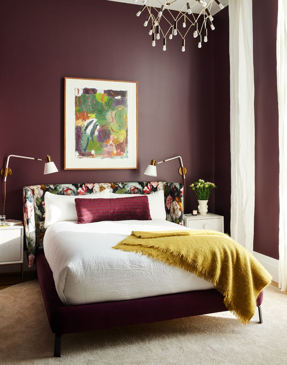
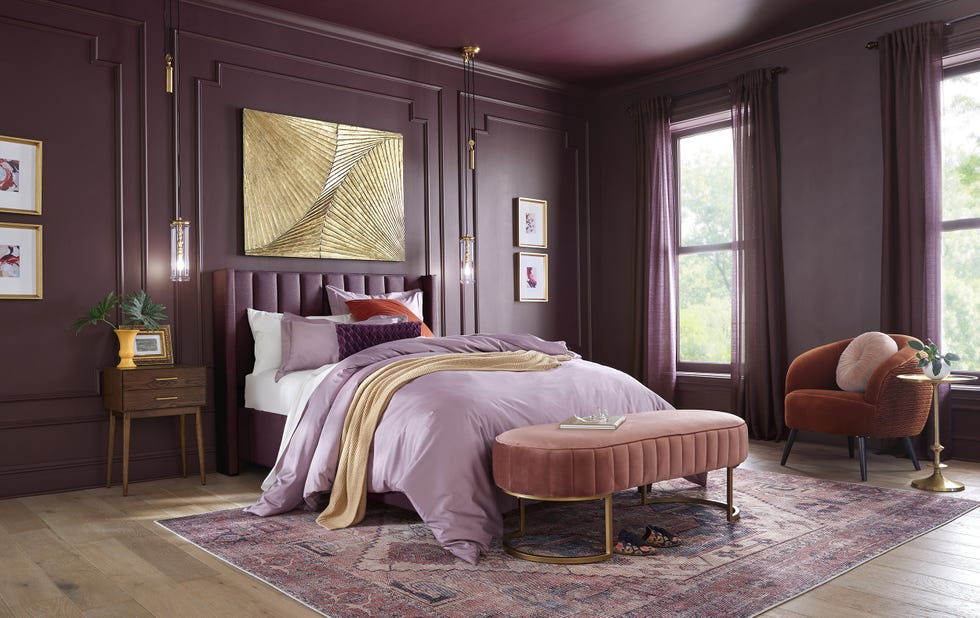
Shades of Purple, with Ultra Violet as the 2018 Color of the Year, are noted for their energy and depth, suitable for both full color schemes and subtle accessory incorporation. Black as a Statement Color is promoted as a new neutral, complementing various themes and palettes, adding drama through elements like black floors or chandeliers.
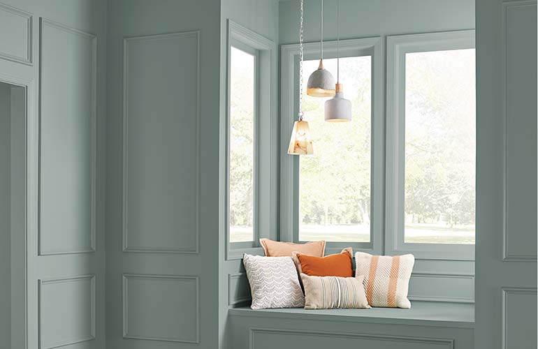
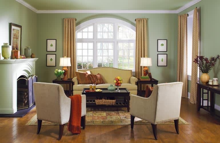
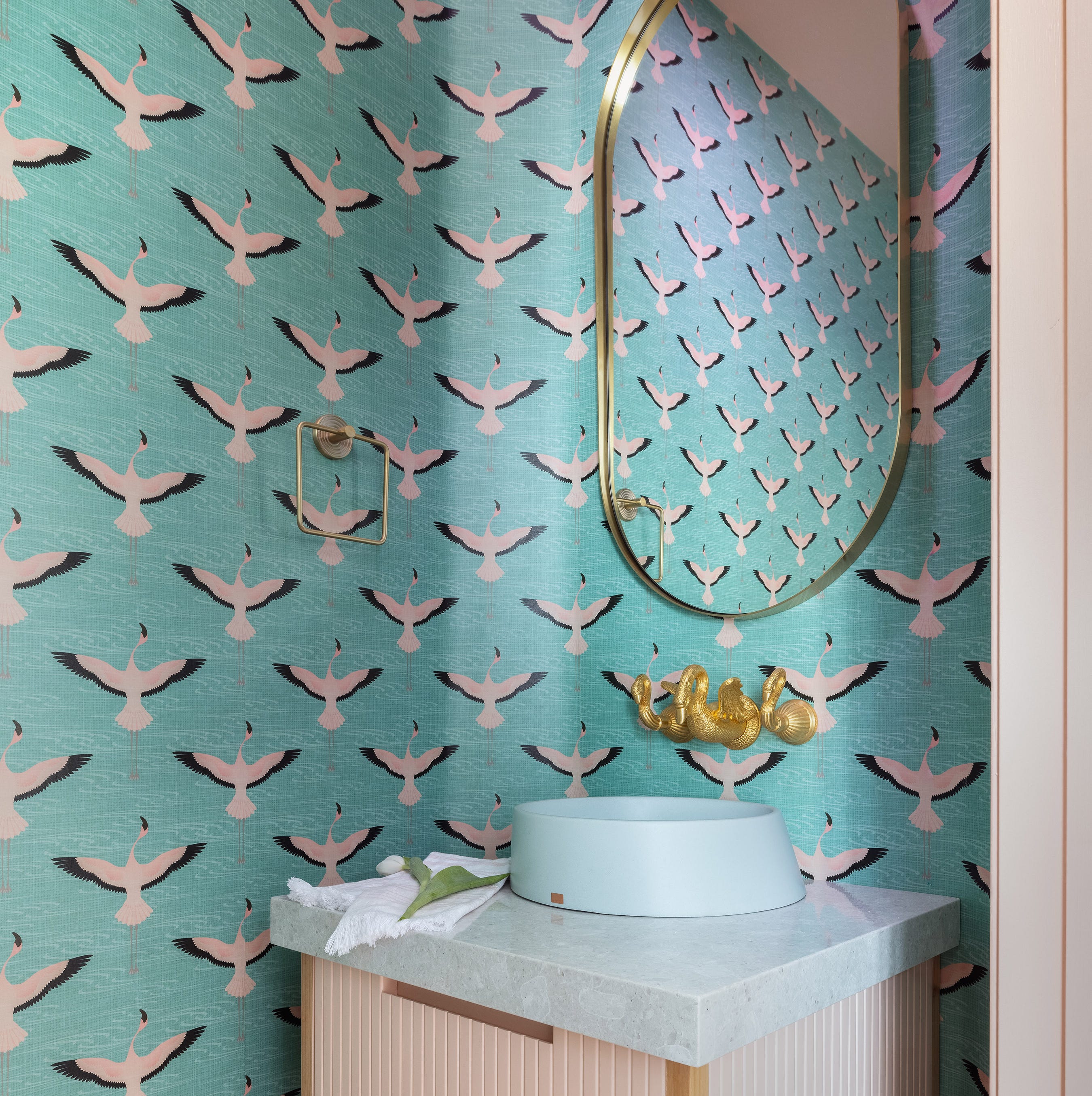
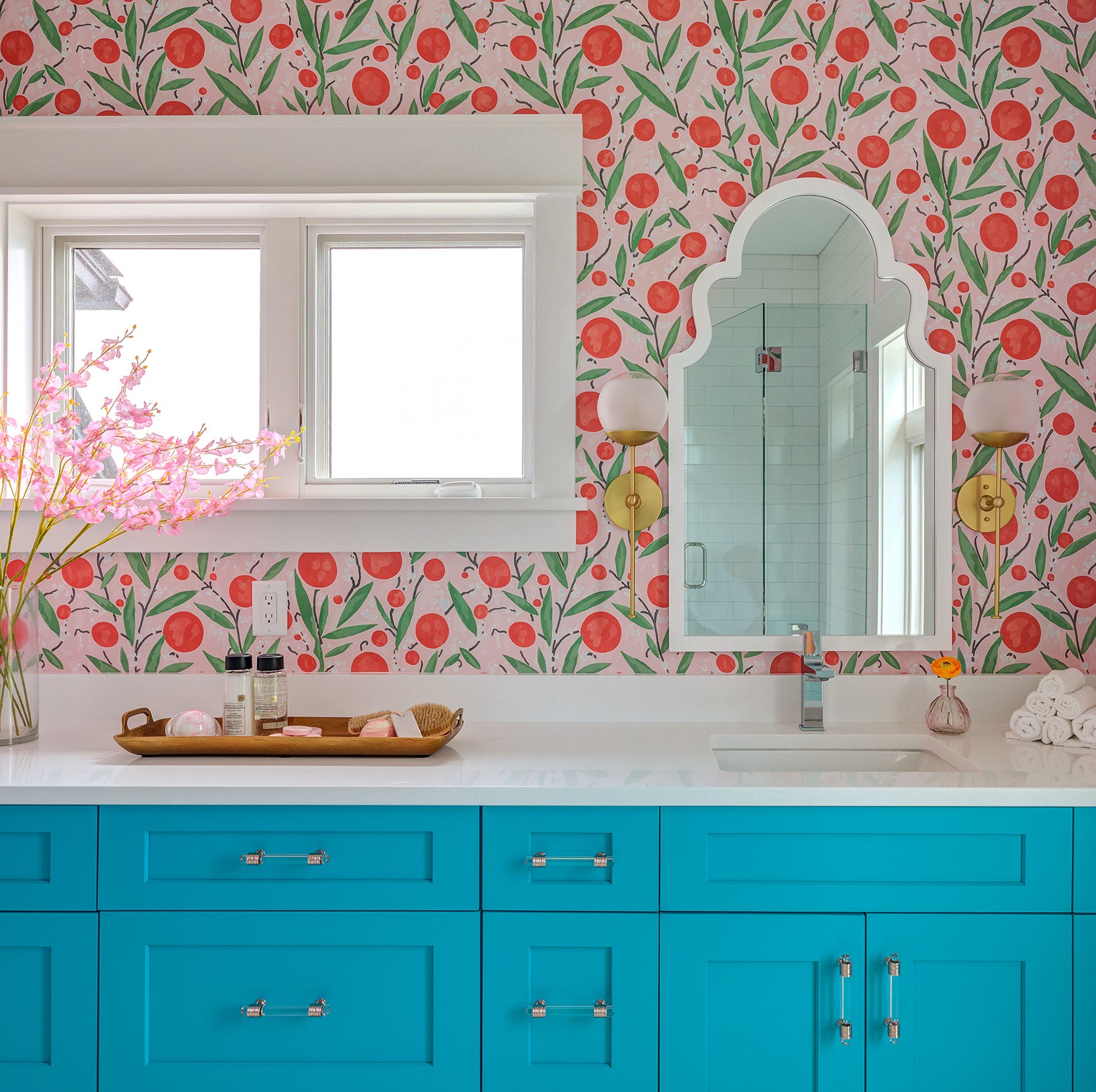
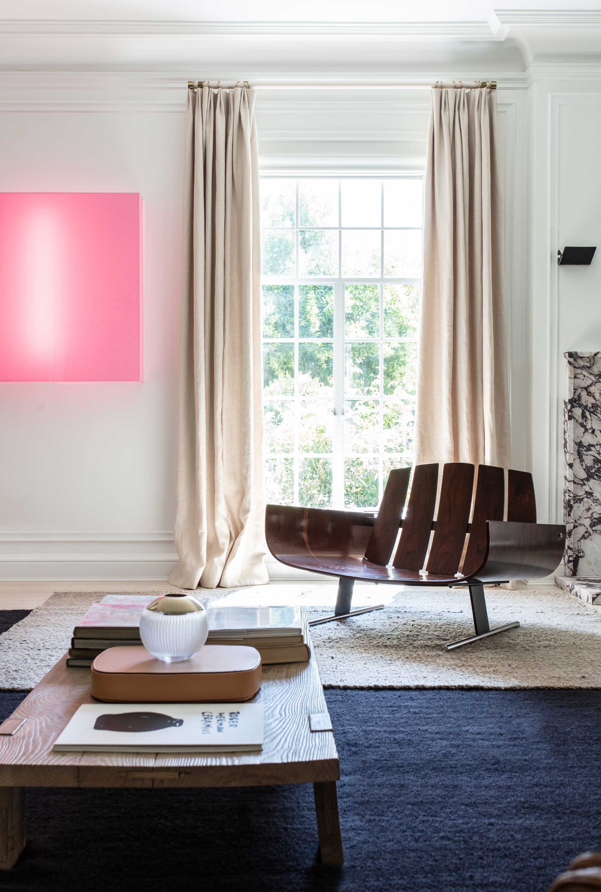
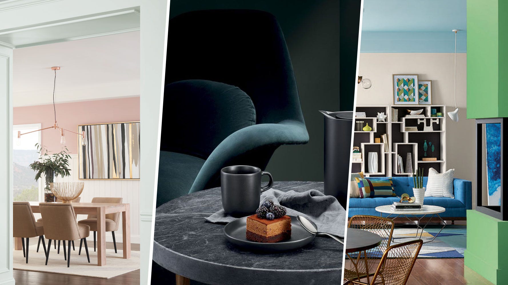
Minimalist Pastels, including mint greens and sandy pinks from Sherwin-Williams, offer a fresh take on modern design, fostering mindful living and a serene environment for disconnection and recharging. Pink as a Power Color signifies a move beyond gendered connotations, with millennial pink evolving into a stronger, more complex hue that enhances mood.
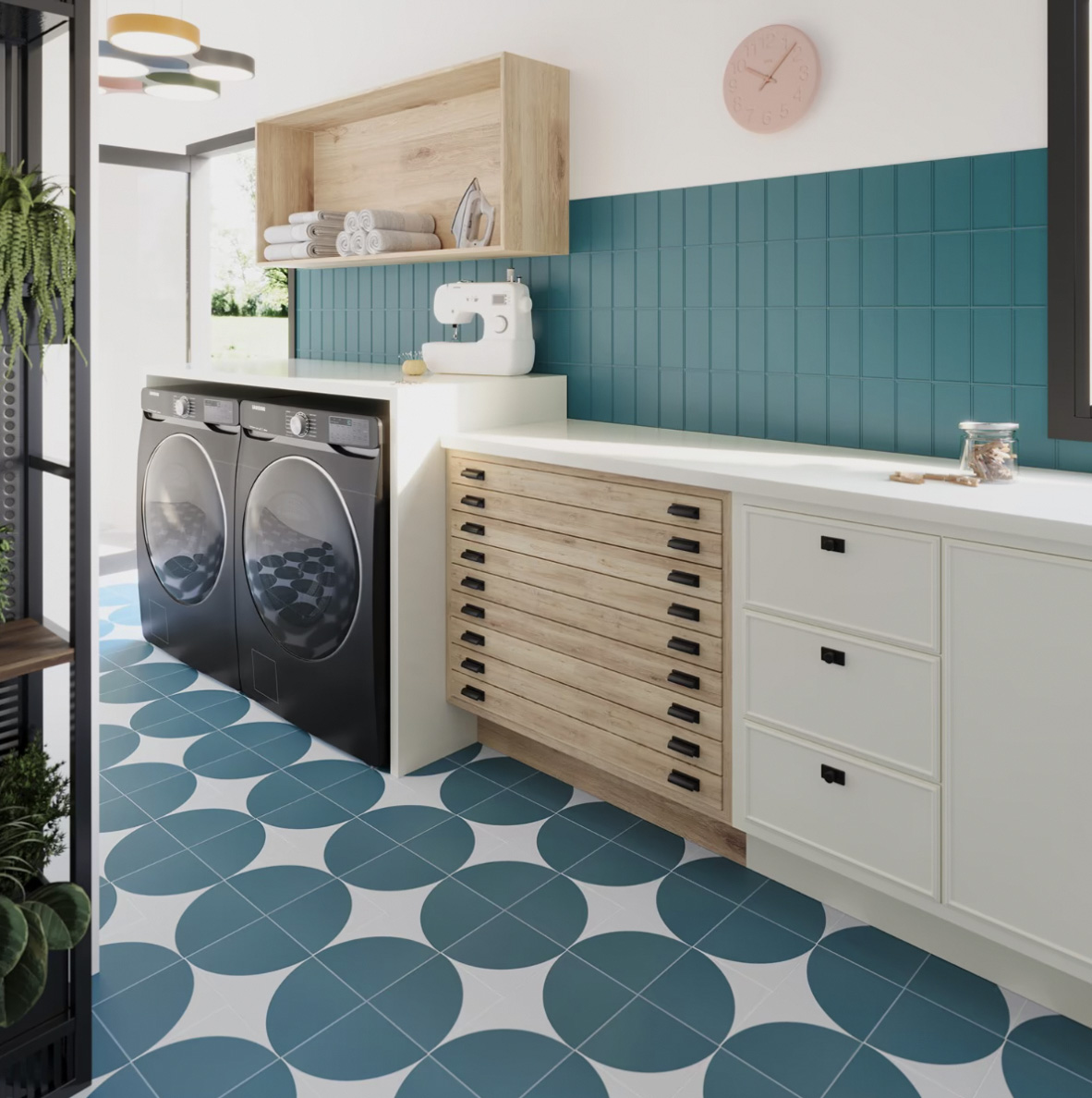
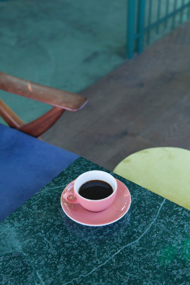
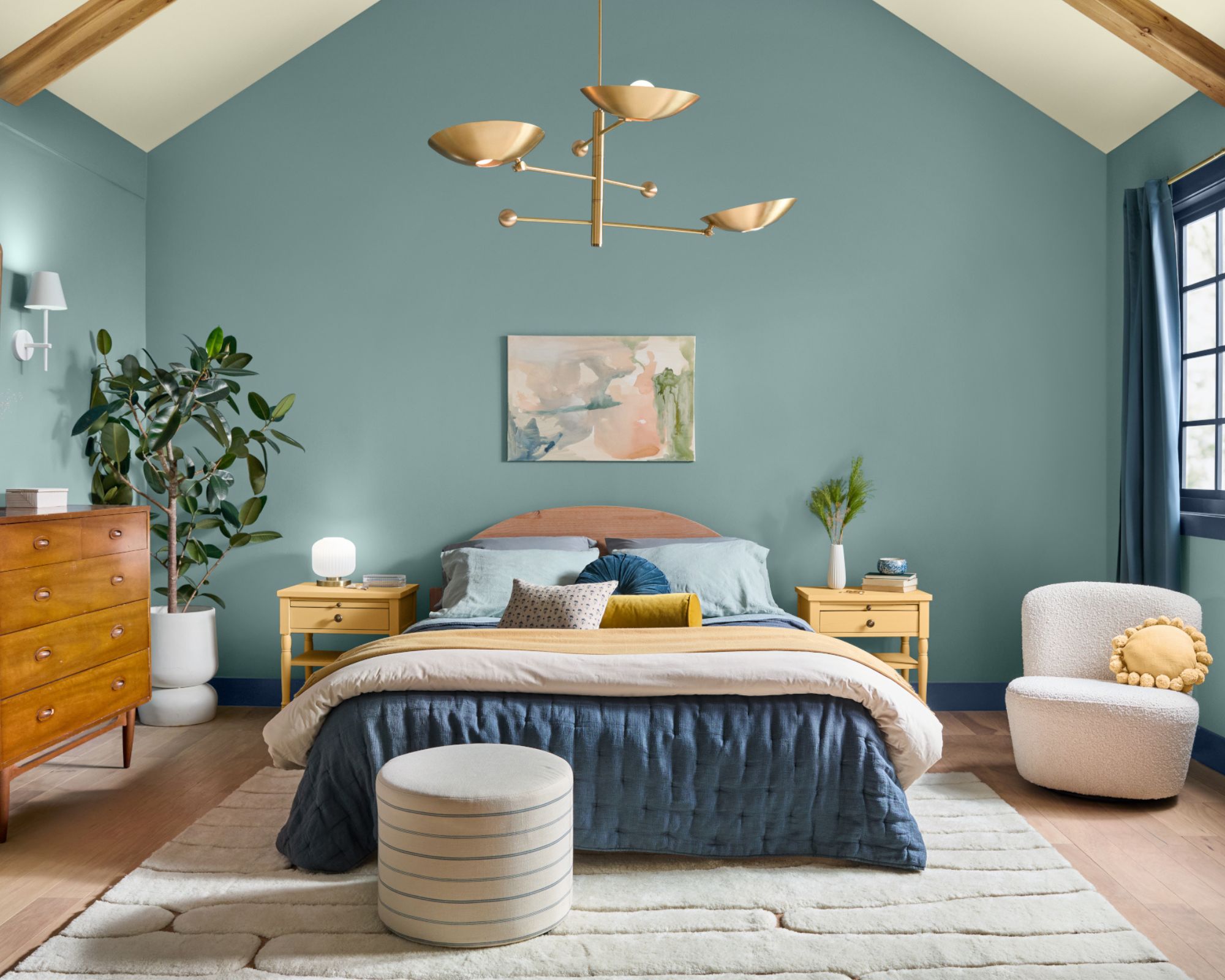
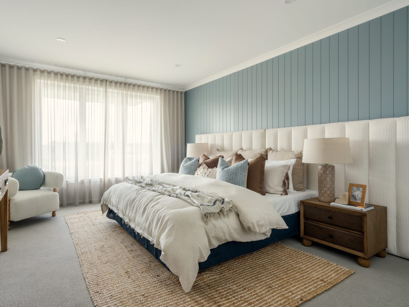
Serene Shades of Blue, like Behr's In The Moment T18-15, are designed to create tech-free sanctuaries, promoting peace and relaxation, and are versatile enough to blend with global, coastal, and modern design styles. Vibrant Yellows and Greens are introduced as playful colors, such as lime popsicle, intended to evoke childlike joy and encourage a less serious approach to design.
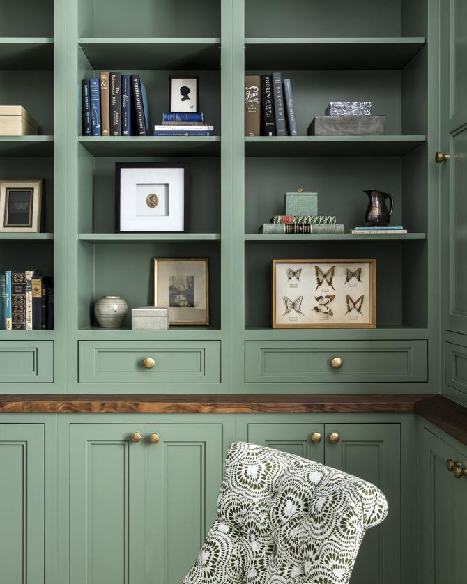
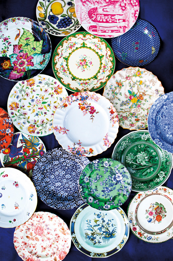
Palettes Inspired by Travel emphasize drawing color inspiration from diverse global connections, moving away from regional stereotypes in design. Sherwin-Williams’ Unity collection, with its striking blue, fuchsia, and creamy yellow, showcases unexpected yet harmonious combinations. Lastly, Metallics as Neutrals signify gold and other metallic shades transitioning from dramatic accents to essential neutral elements in home decor, suggesting that gilded finishes are the new white marble.
#ColorTrends #HomeDecor #InteriorDesign #PantoneColorOfTheYear #PaintColors #MinimalistPalette #MetallicAccents #EarthTones #ColorTrends #HomeDecor #InteriorDesign #PantoneColorOfTheYear #PaintColors #MinimalistPalette #MetallicAccents #EarthTones
0 comment in total
 No comments yet
You may also like
These Are the Colors You’ll Be Painting Your Home in 2018

This Very "Controversial" Color Is About To Be Everywhere Again


4 Interior Designers Share the Biggest Paint Color Trends Right Now (and What’s Out!)

Going Green: Inside This Year’s Color Craze
Hottest Interior Paint Colors of 2018
Tips for adding the hottest paint colors to your decor

The 2025 Colors of the Year Are Here—and They All Have One Thing in Common

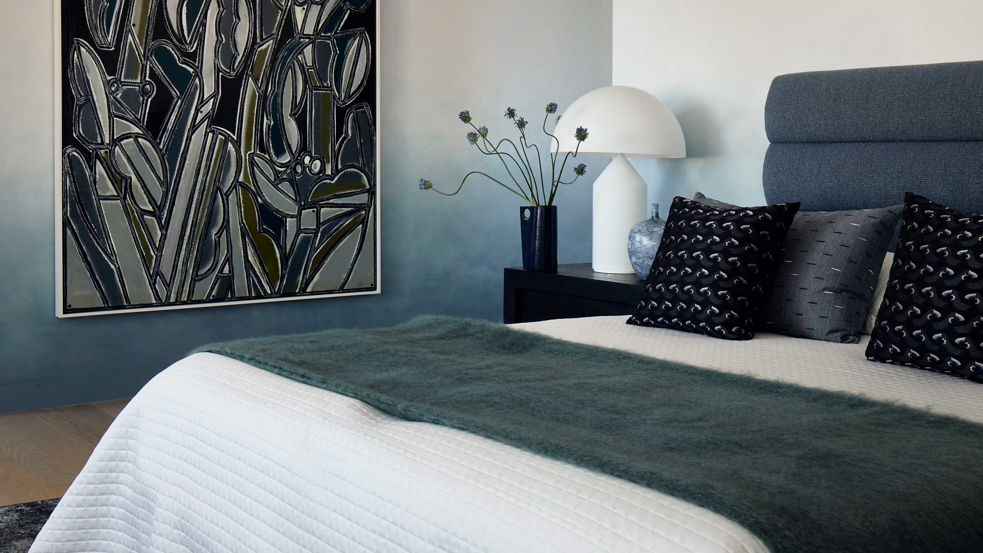
Deeper, moody colours and precious jewel tones are in style this year
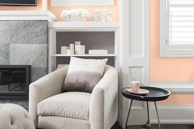
New Year New Paint: Give Your Room a Makeover

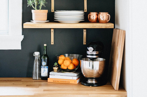
How to Decorate With One of 2018’s Most Popular Colors | domino
This surprising color trend is having a comeback

The Biggest Colour Trends Taking Off in 2025
The 18 Most Popular Paint Colors of All Time
The Color Combo You’re About to See Everywhere
A Guide to Every Color of the Year for 2025 (So Far)
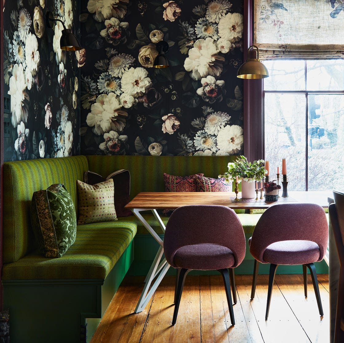
12 Color Schemes That Are Popping Off Right Now, According to Designers
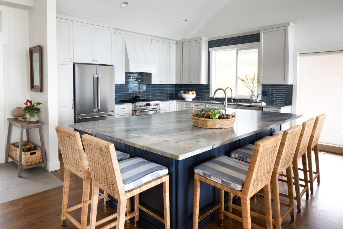
Color Explosion: 2025 Color Trends

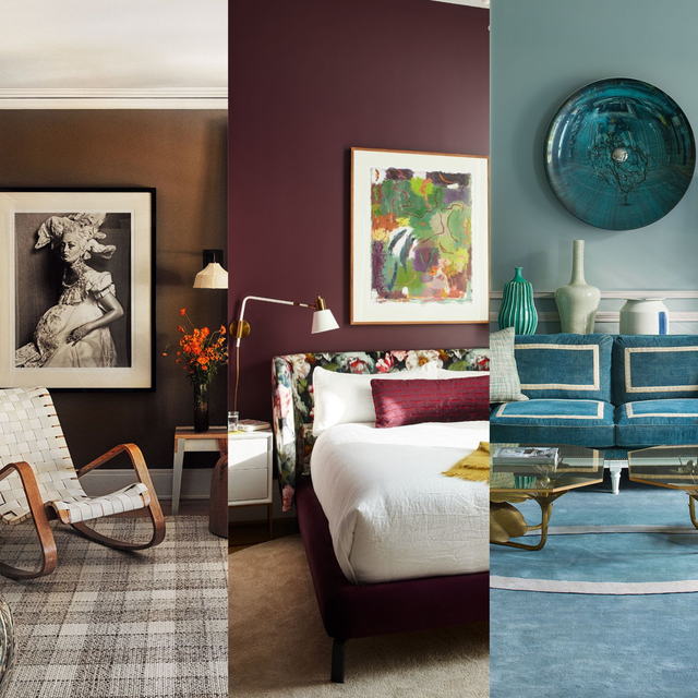
We’re Calling It: These Are the Official Color Trends of 2025
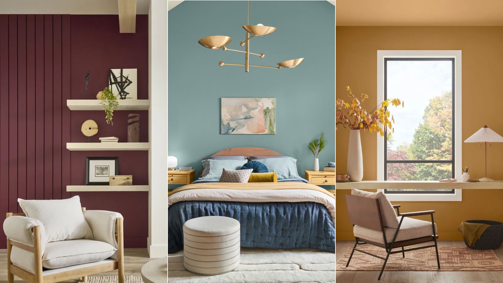
Colors of The Year – get to know every shade revealed by leading paint brands for 2025

Ever Wonder How a Color of the Year Is Selected? Experts Spill the Secrets