1/5
What makes a paint color flattering? Experts share their go-to shades for a universally complementary scheme
Choosing the right paint colors can significantly impact the ambiance of a room and even how individuals perceive themselves within that space. While personal preference in color choice is paramount, some paint colors are considered universally flattering, creating a welcoming and harmonious environment by complementing a variety of skin tones. This concept, often overlooked, suggests that certain shades can cast a more favorable glow on complexions, similar to how clothing colors can flatter an individual.
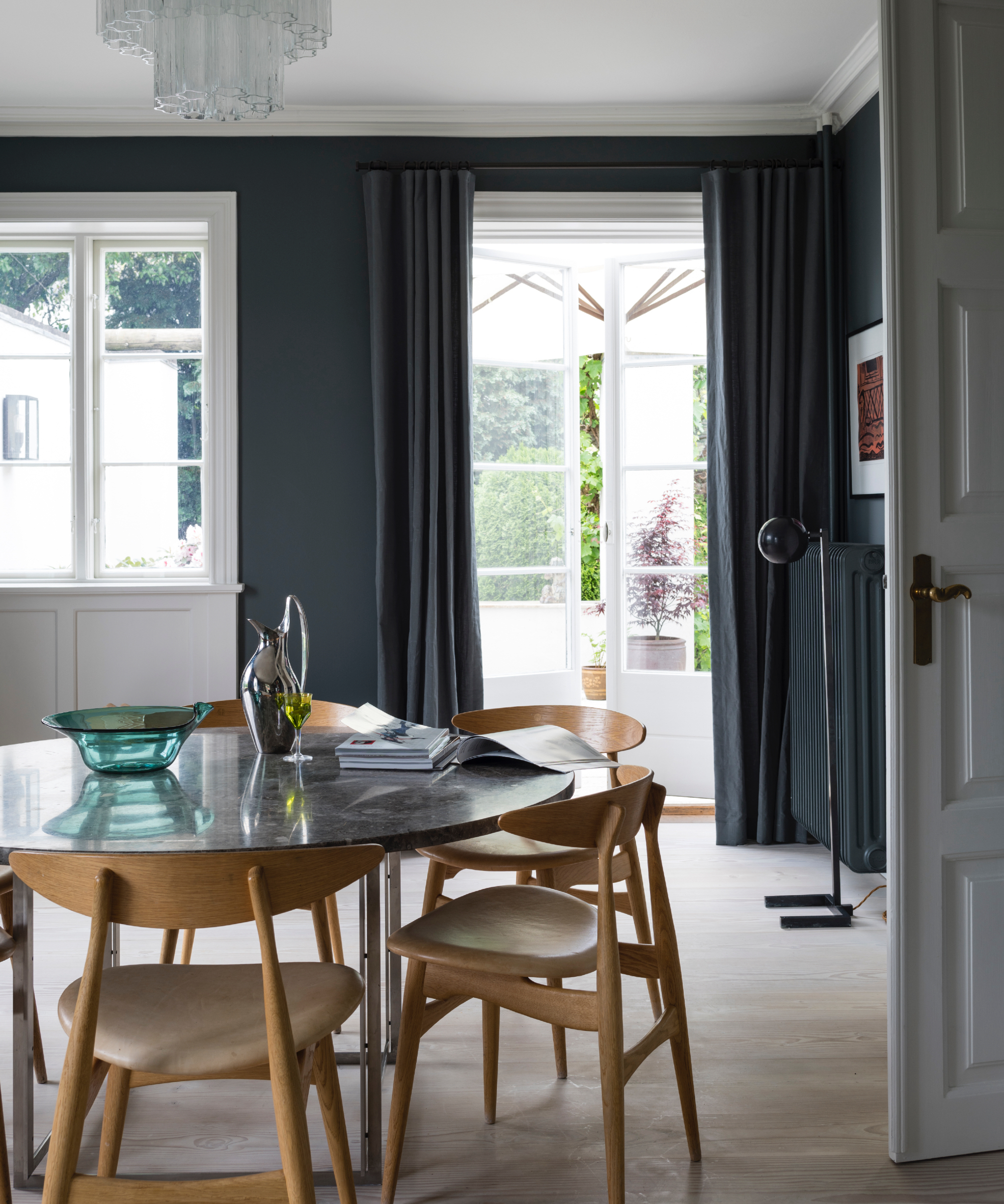
The general consensus among designers and color experts is that slightly warm-toned colors tend to be more flattering. This doesn't mean one should avoid personal favorite colors, but for spaces like bathrooms, dressing rooms, or dining rooms where people prepare themselves or socialize, opting for a flattering paint color can enhance the overall appeal. Flattering colors provide a subtle contrast without being overwhelming, aiming for versatility that complements a wide spectrum of skin tones rather than attempting to match any specific complexion. Such colors are typically soft, natural-toned, and less saturated. The natural and artificial lighting in a space plays a crucial role in how a color appears, emphasizing the importance of testing paint samples in the actual environment at different times of the day.
The emotional connection to a color is also a significant factor. If a 'flattering' paint color doesn't resonate with one's personal style or evoke positive feelings, it may detract from the overall comfort and appeal of the home. The primary goal is to create a space that brings joy and makes inhabitants feel good, as this positive feeling is perceived by guests and ultimately contributes to a flattering atmosphere, regardless of skin tone.
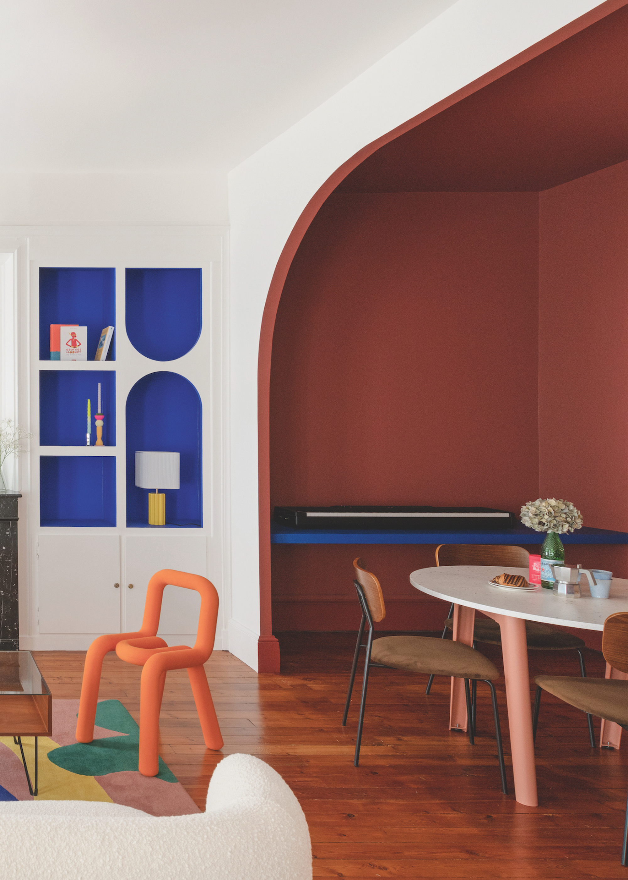
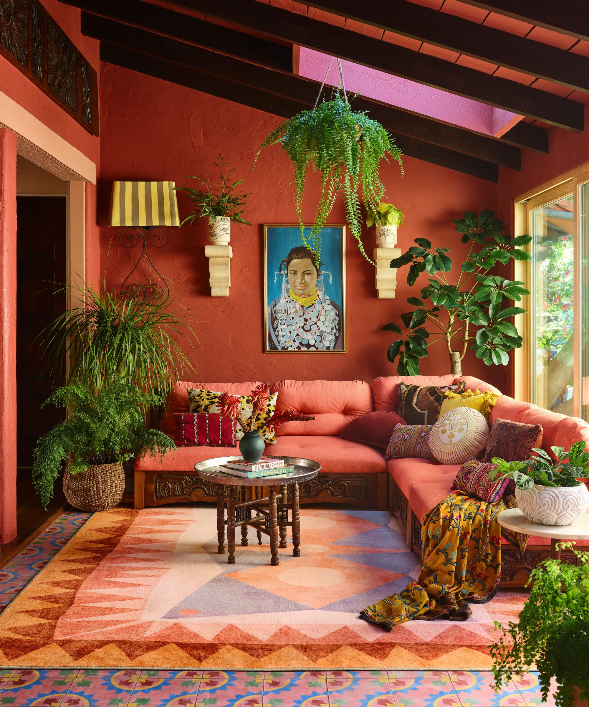
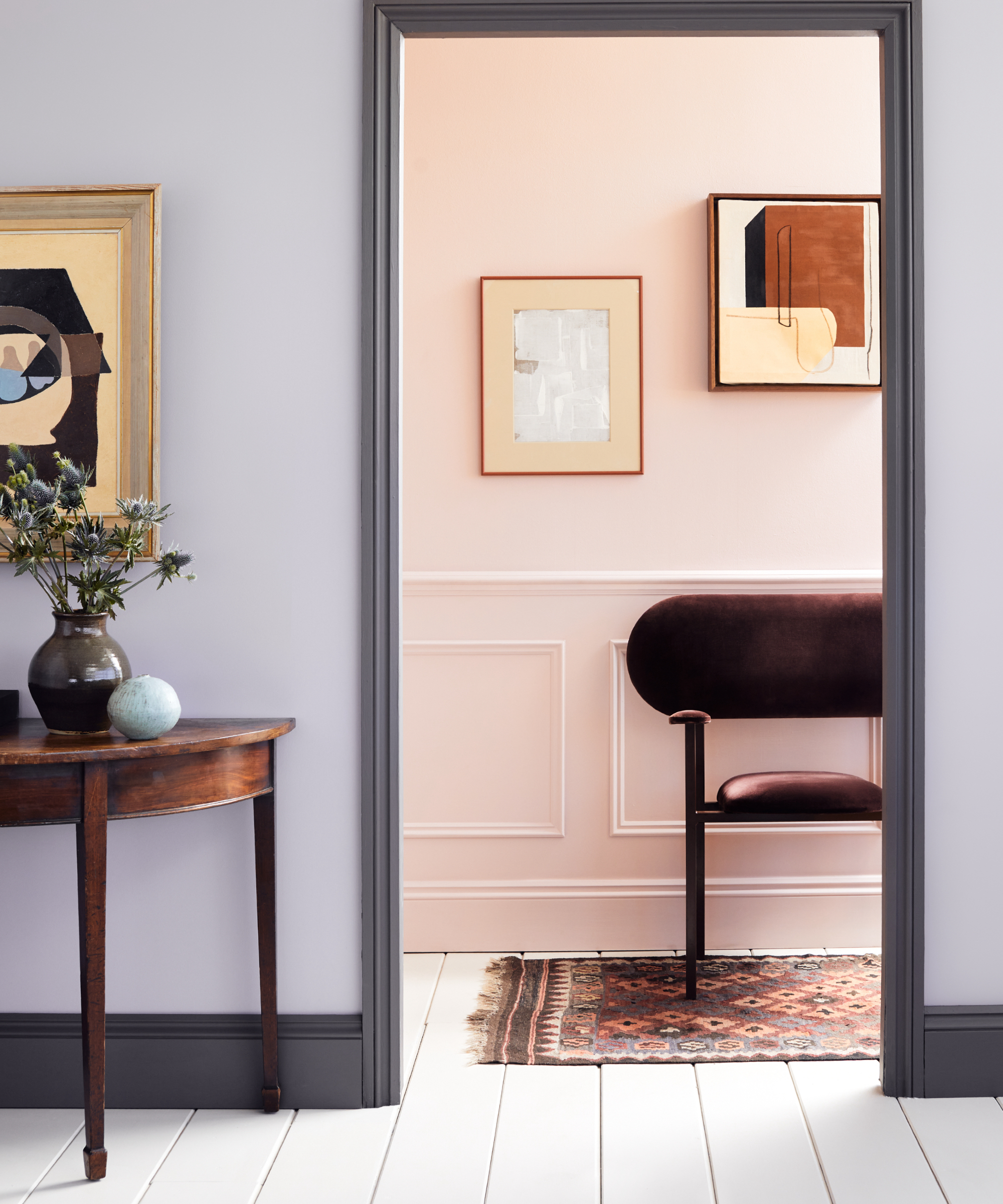
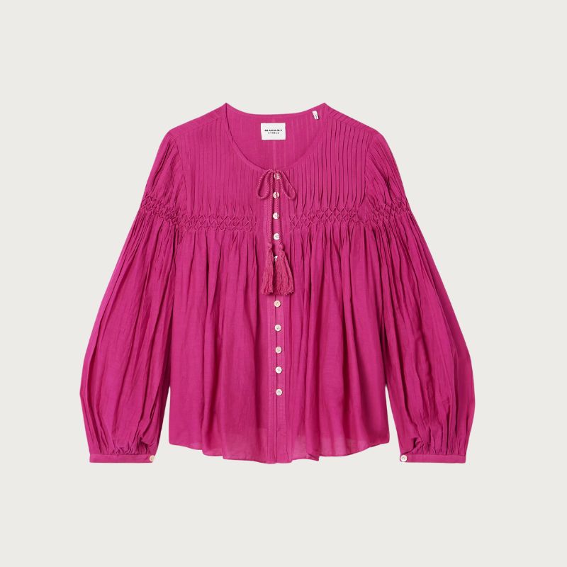
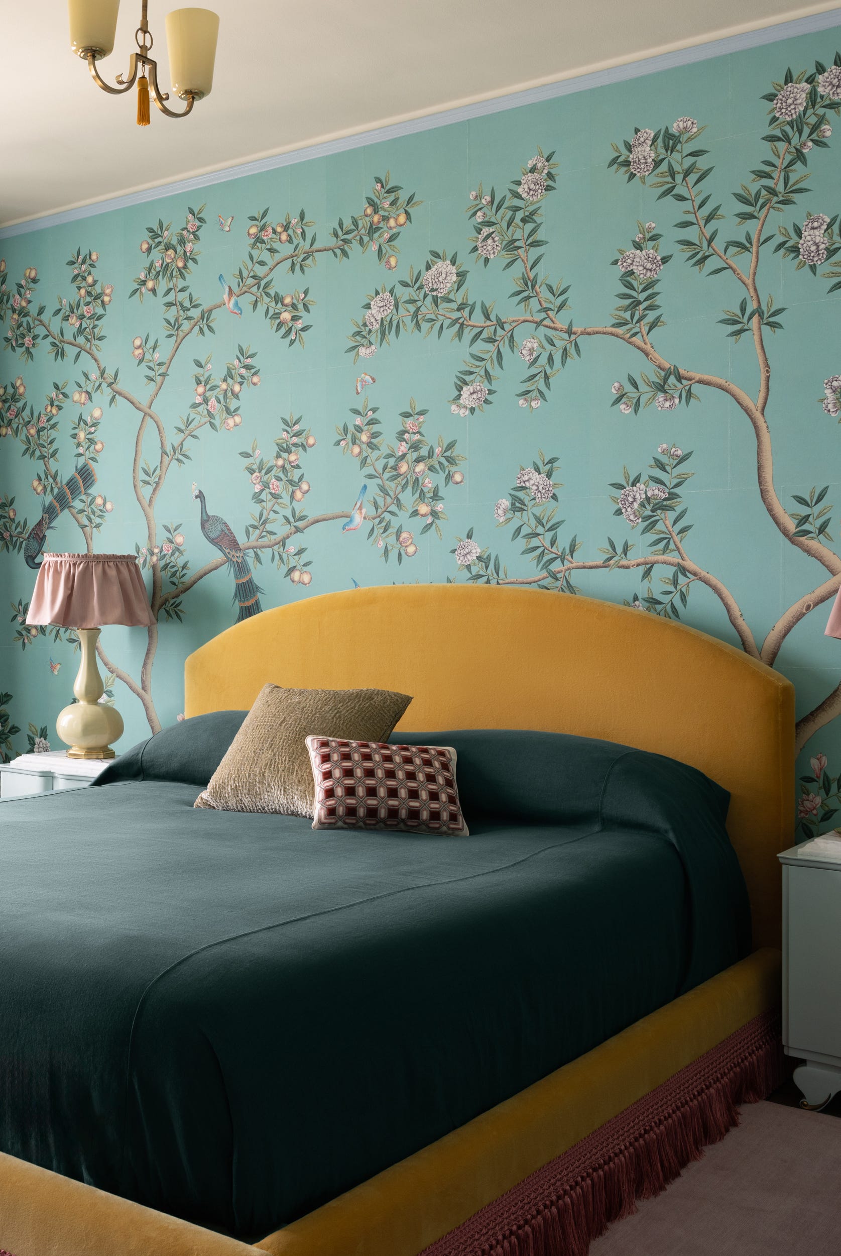
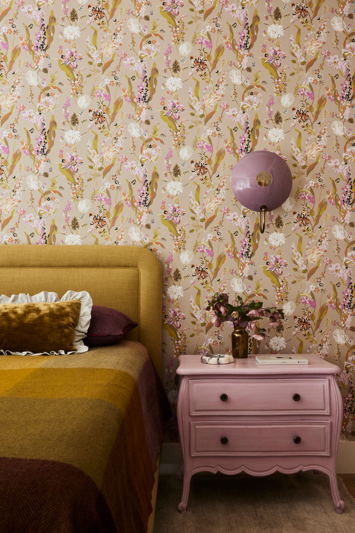
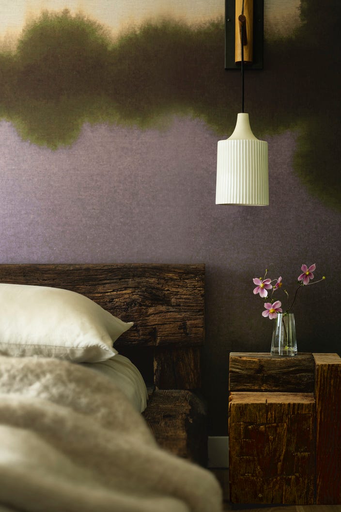
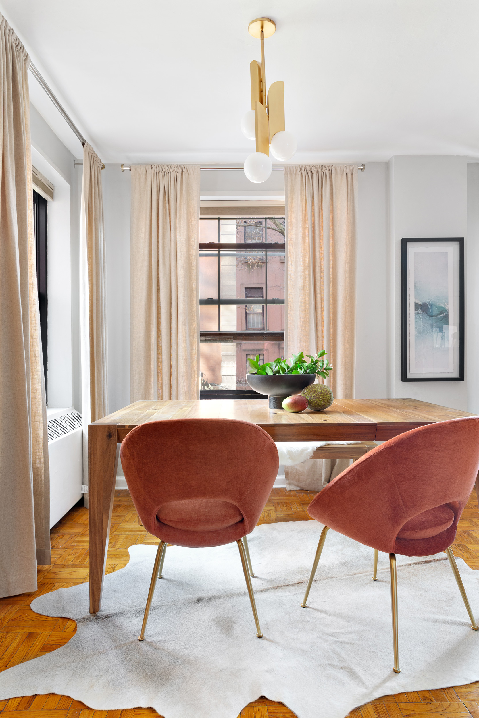
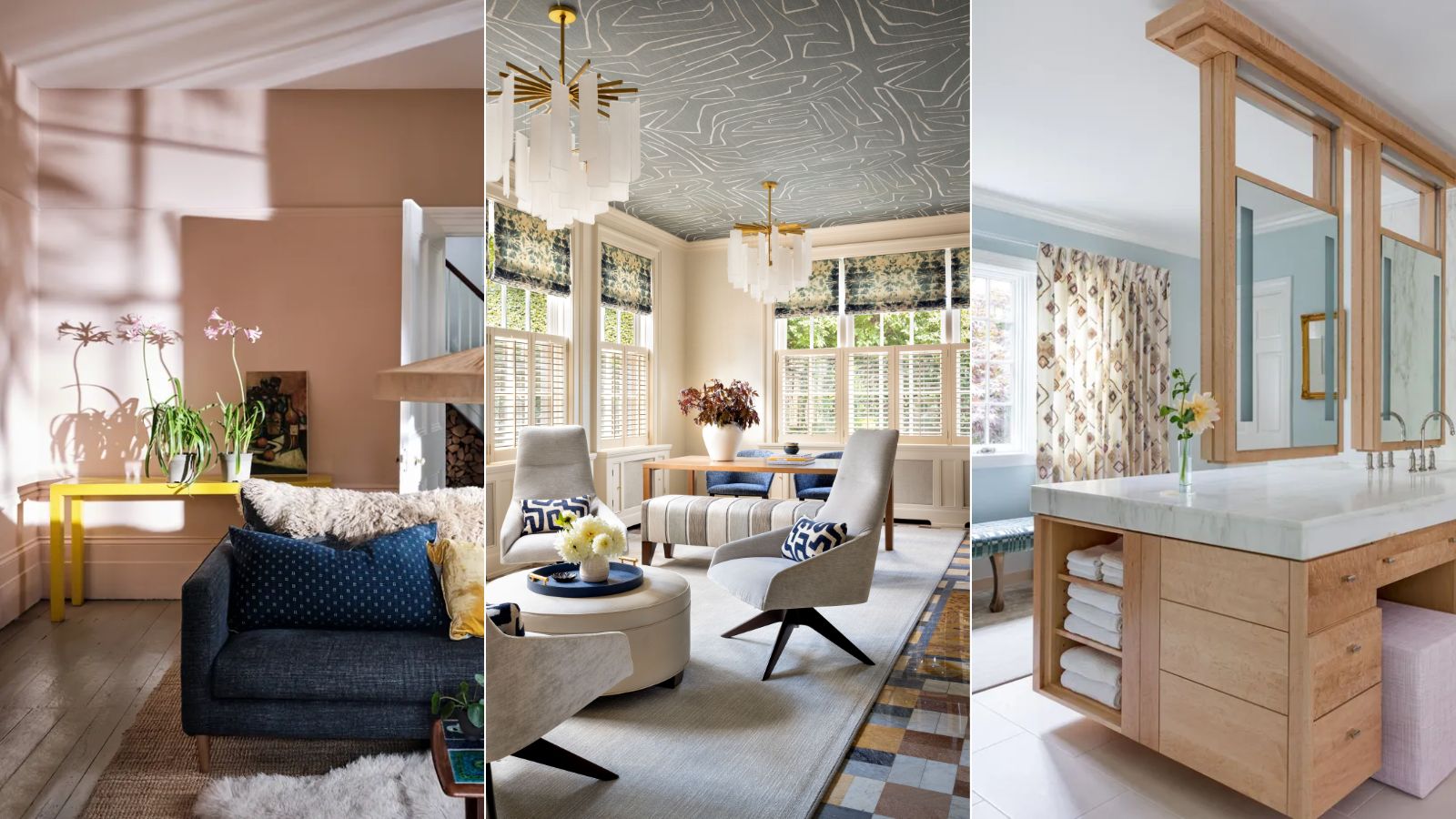
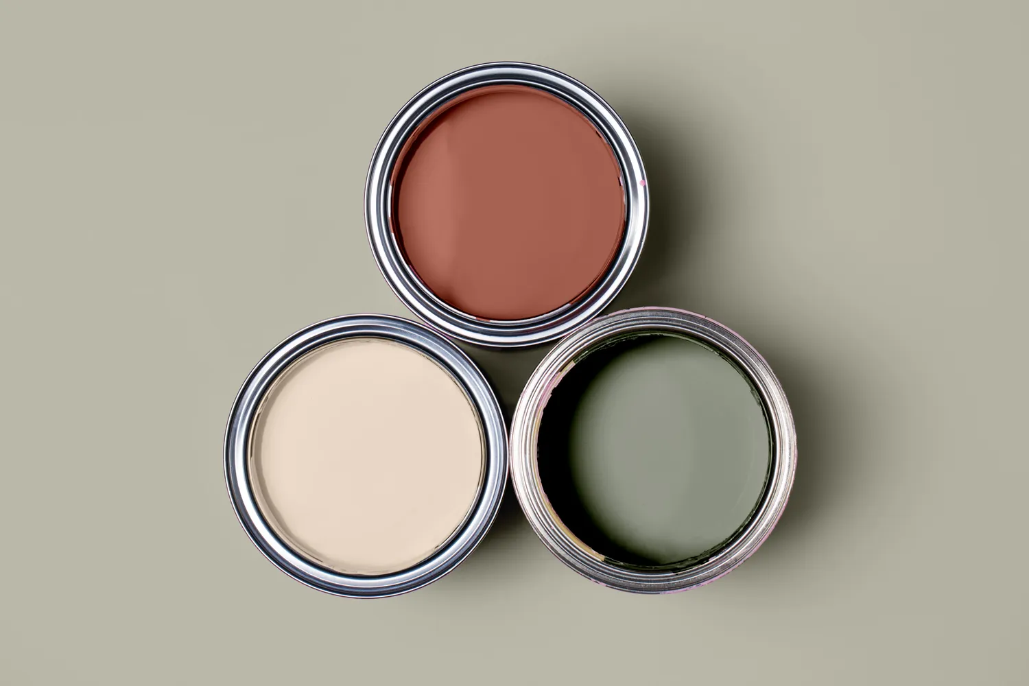
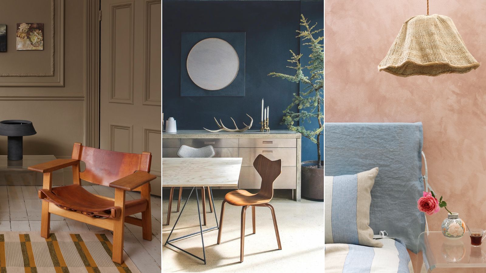
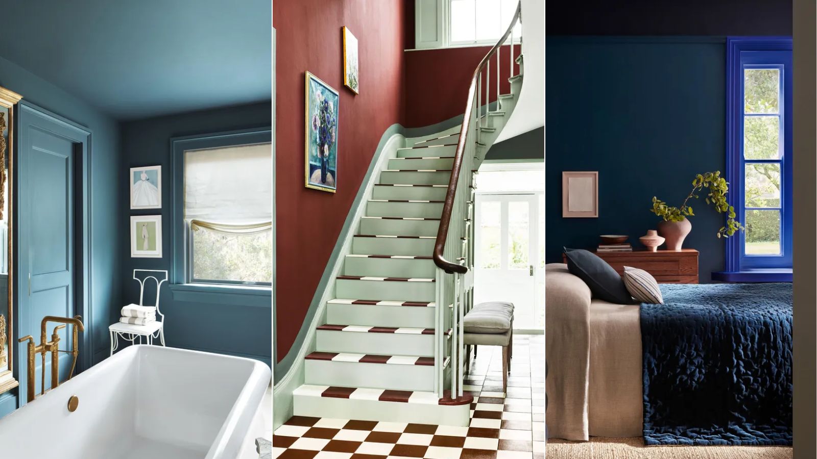
Experts highlight three main color families for their flattering qualities: soft pinks, warm-toned neutrals, and light blues and greens. Soft pinks, especially earthy and dusky rose tones, are celebrated for their ability to cast warmth throughout a room without being overly saccharine. Shades like Farrow & Ball's Dimity, Pink Ground, and Setting Plaster are recommended for their barely-there pinkness and delicate atmosphere, particularly in bathrooms where they can make complexions look more radiant. It's advised to choose pinks without strong blue undertones.
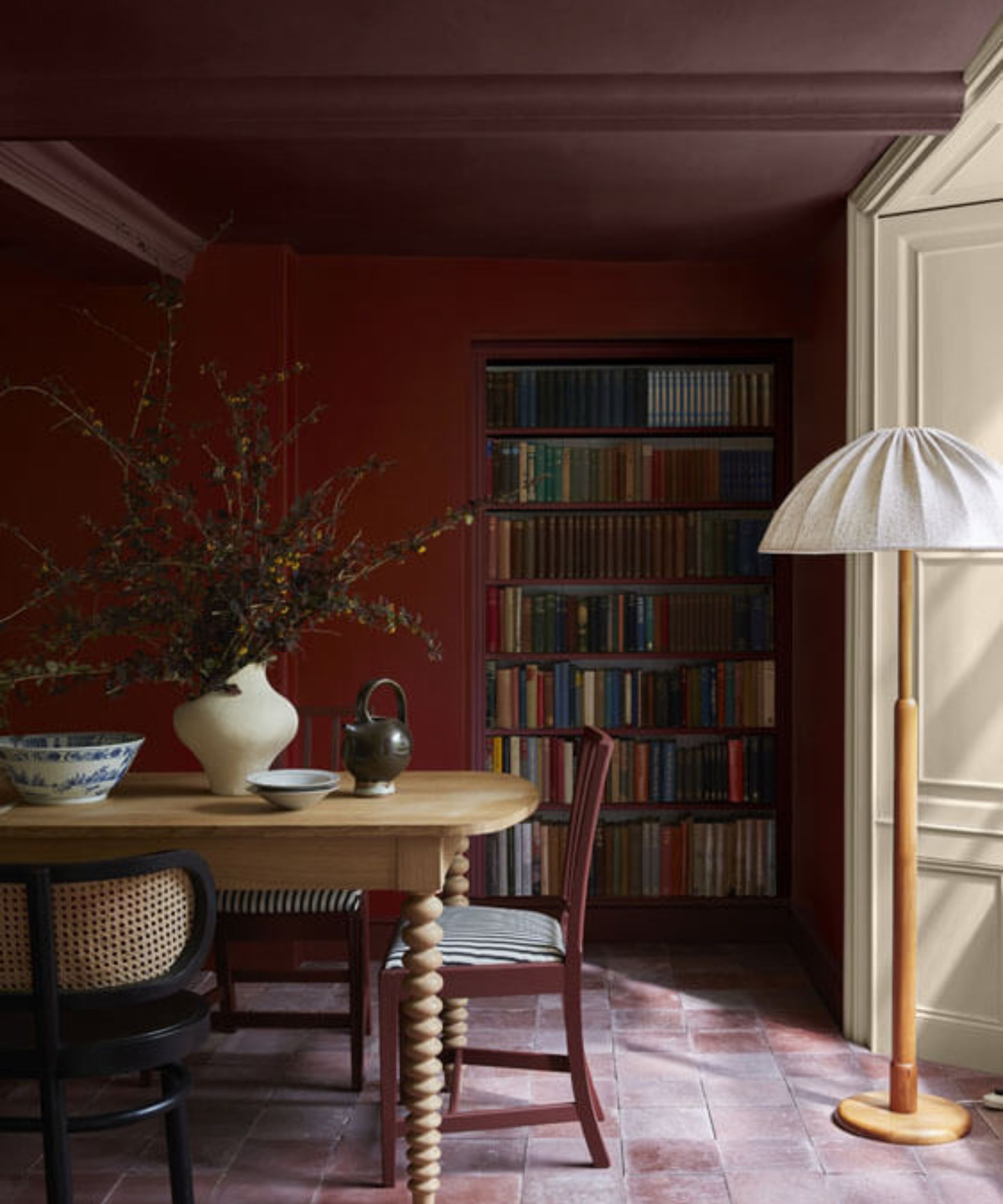
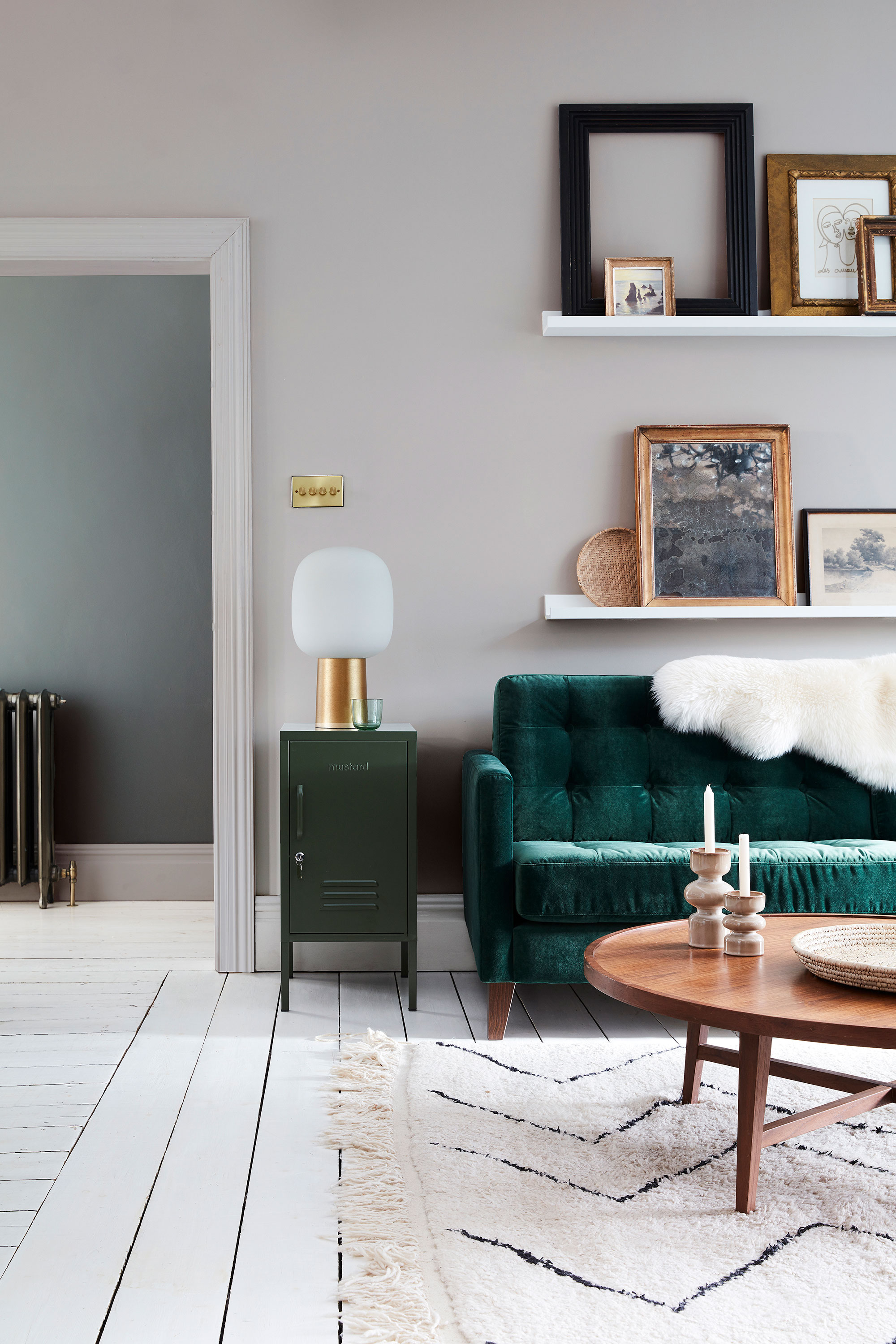
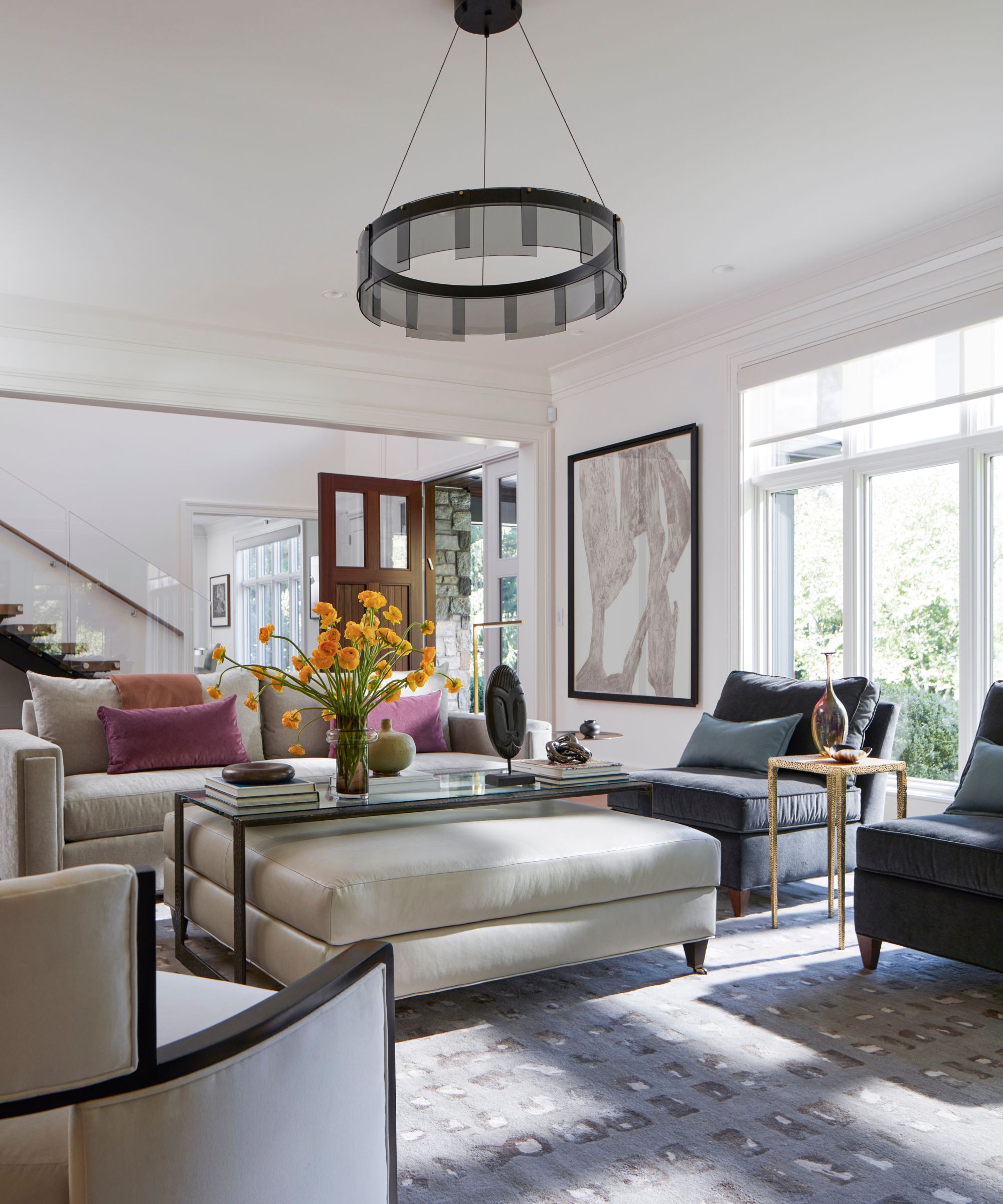
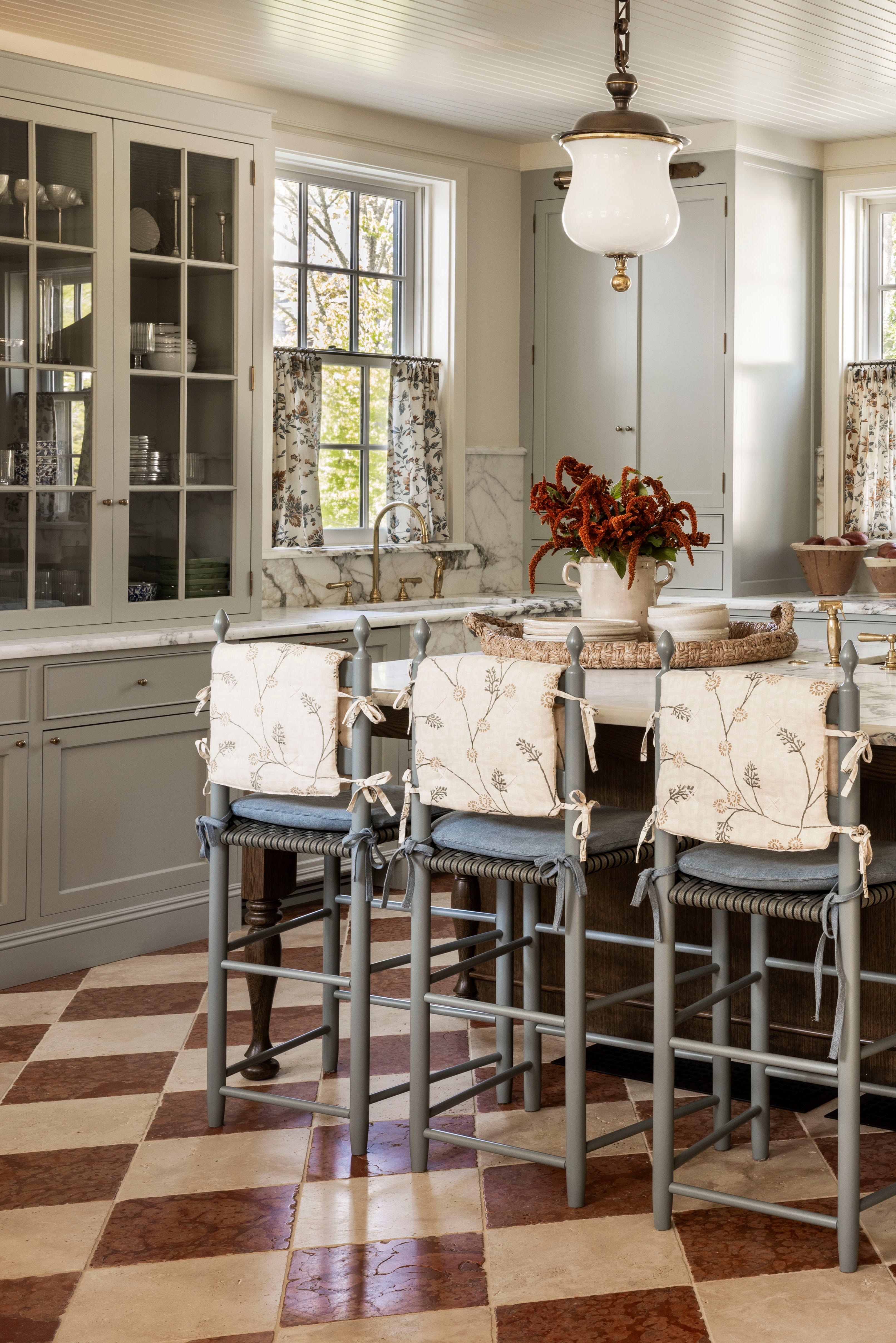
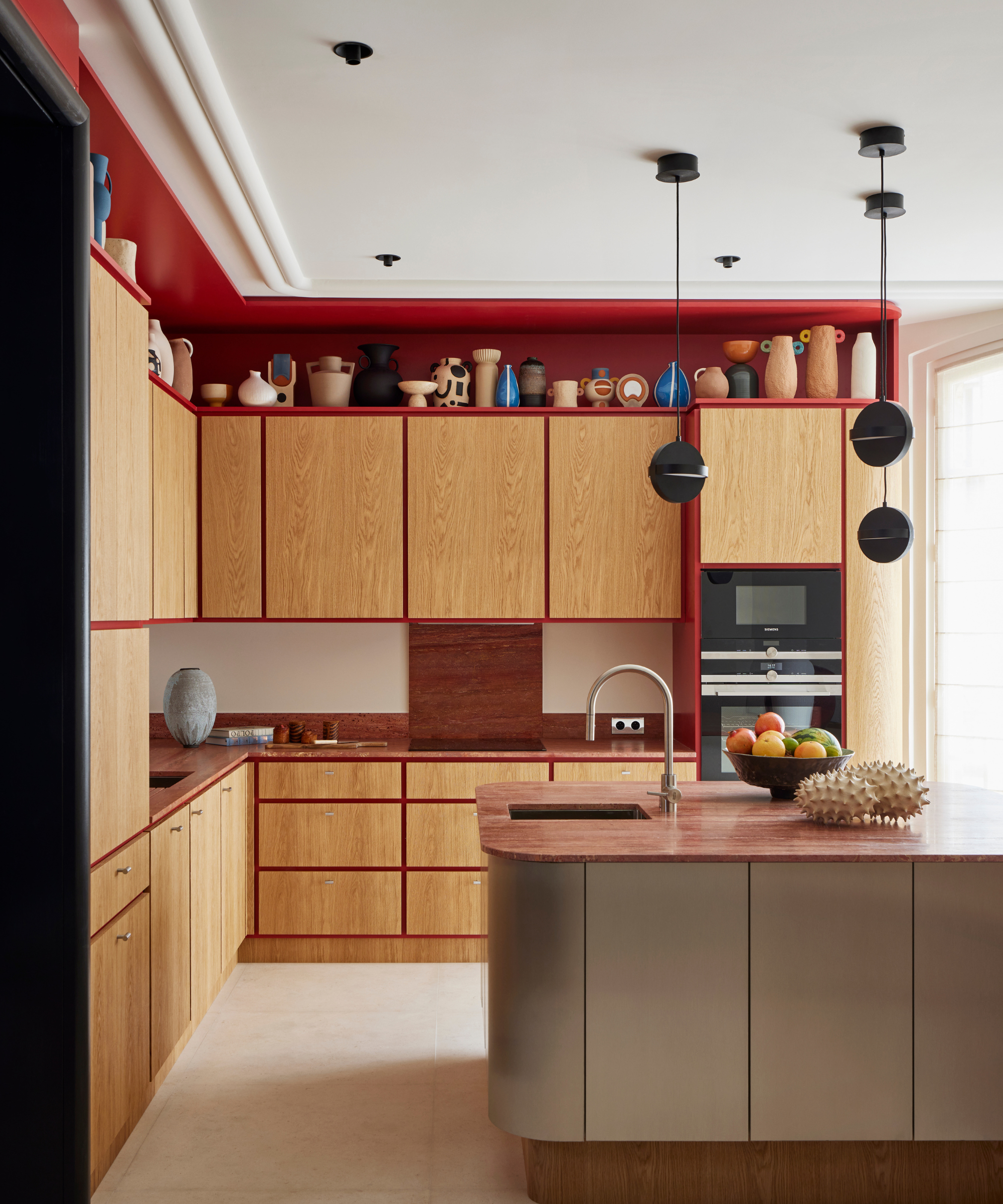
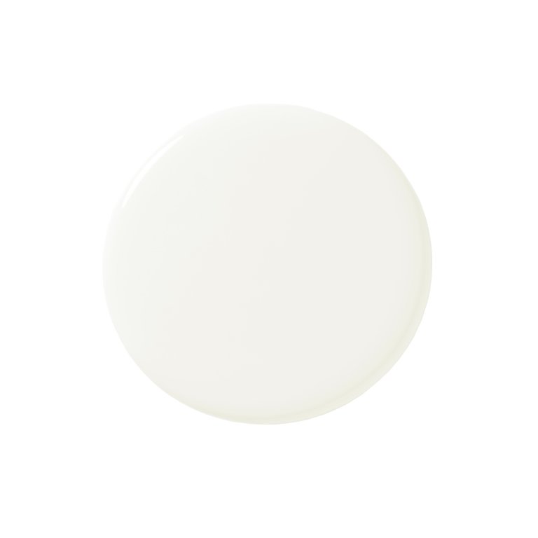
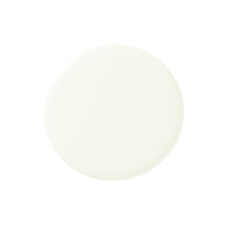
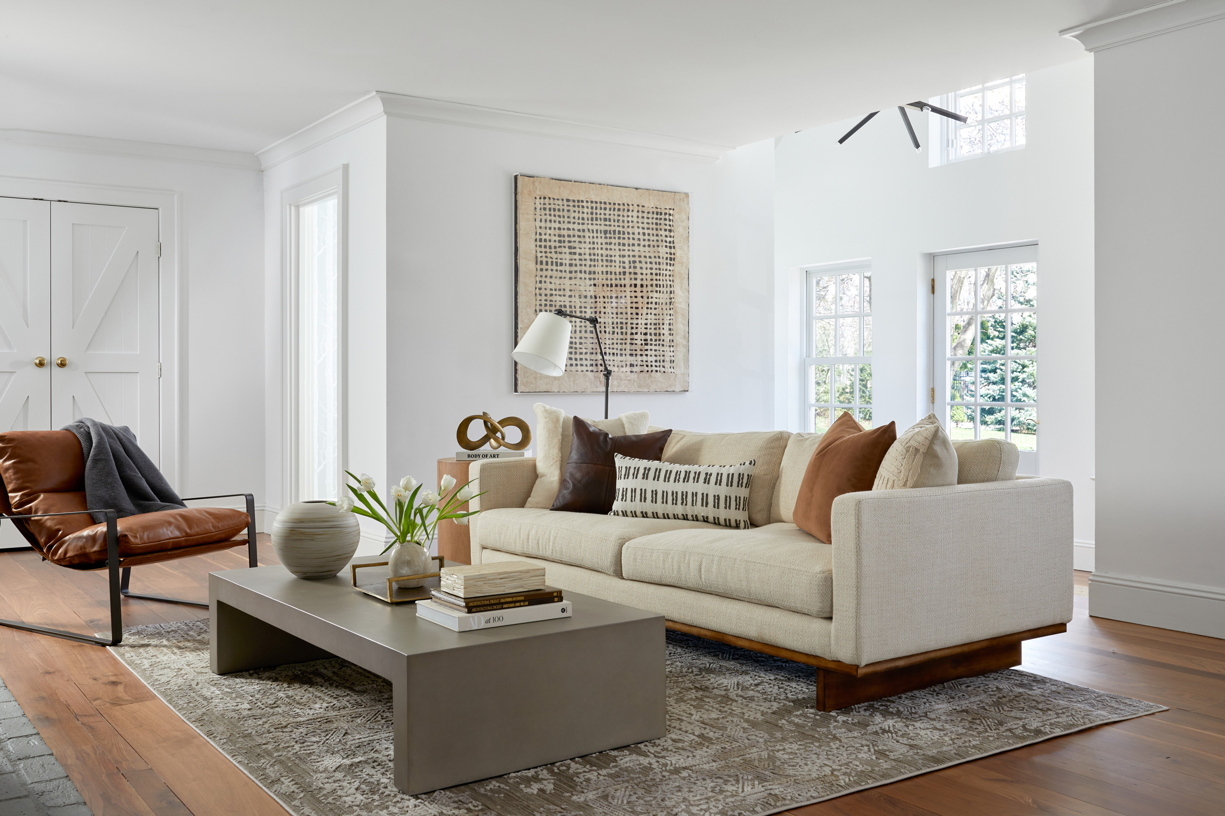
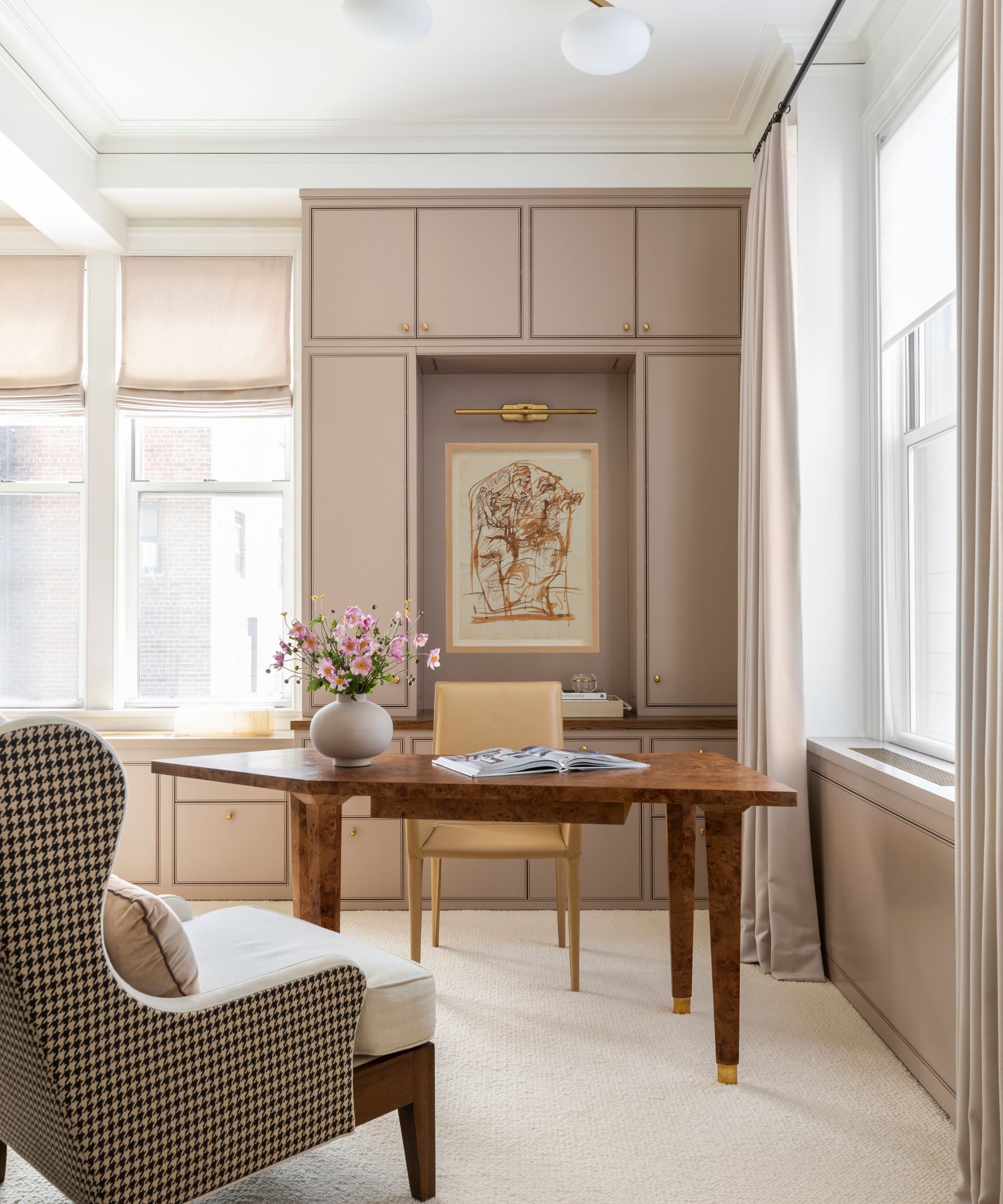
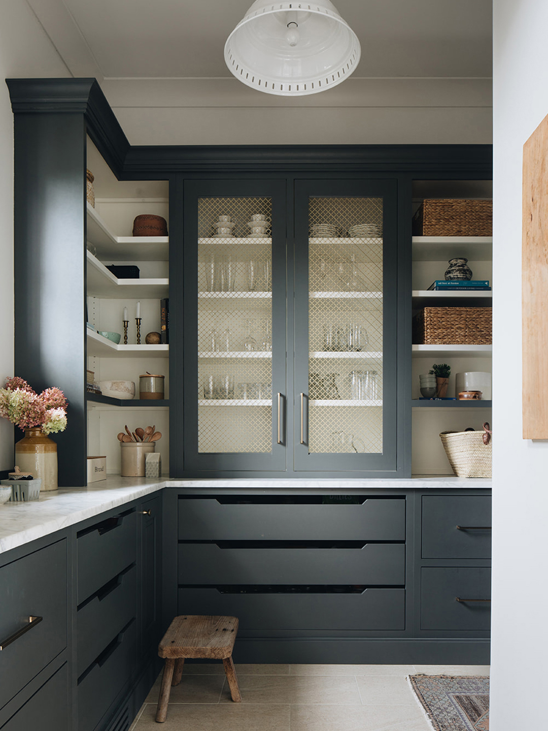
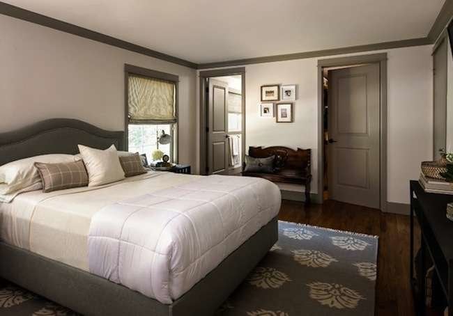
Warm-toned neutrals, encompassing off-whites, beiges, and taupes, serve as excellent backdrops due to their inherent warmth and versatility. These colors are considered safe options that provide a clean canvas without overpowering skin tones. Taupe is specifically noted for its sophisticated blend of brown and gray, making it a timeless and complementary choice. Greige, a mix of gray and beige, also offers a subtle yet flattering backdrop that enhances furnishings and various skin tones. Benjamin Moore's Sail Cloth is cited as an example of a soft, neutral color that complements diverse complexions.
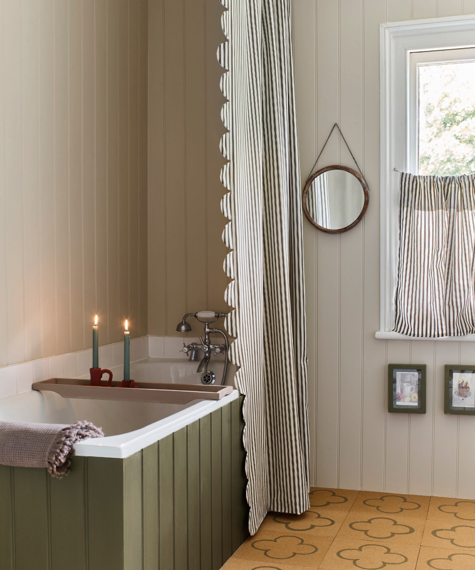
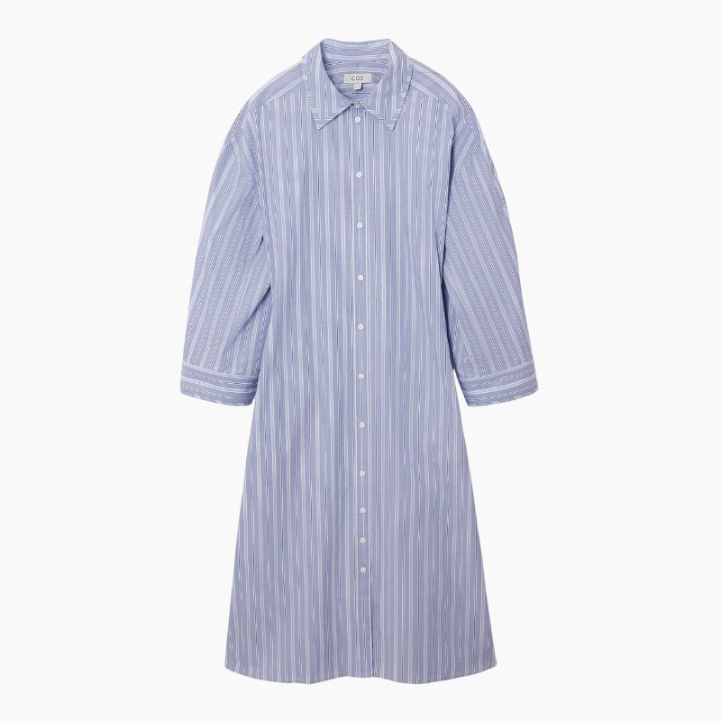
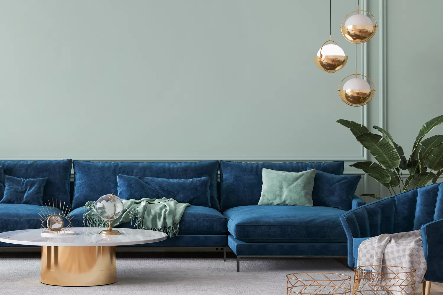
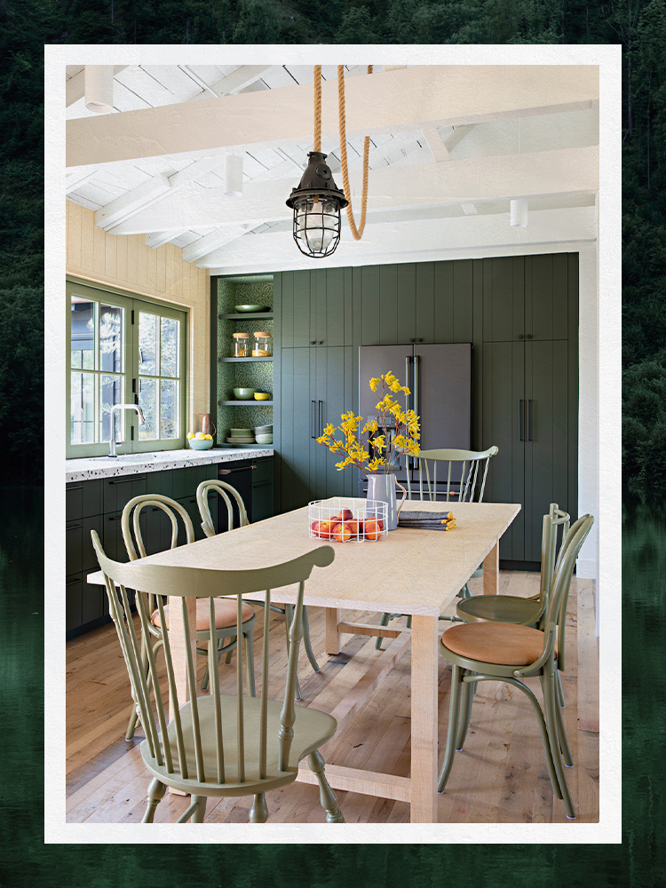
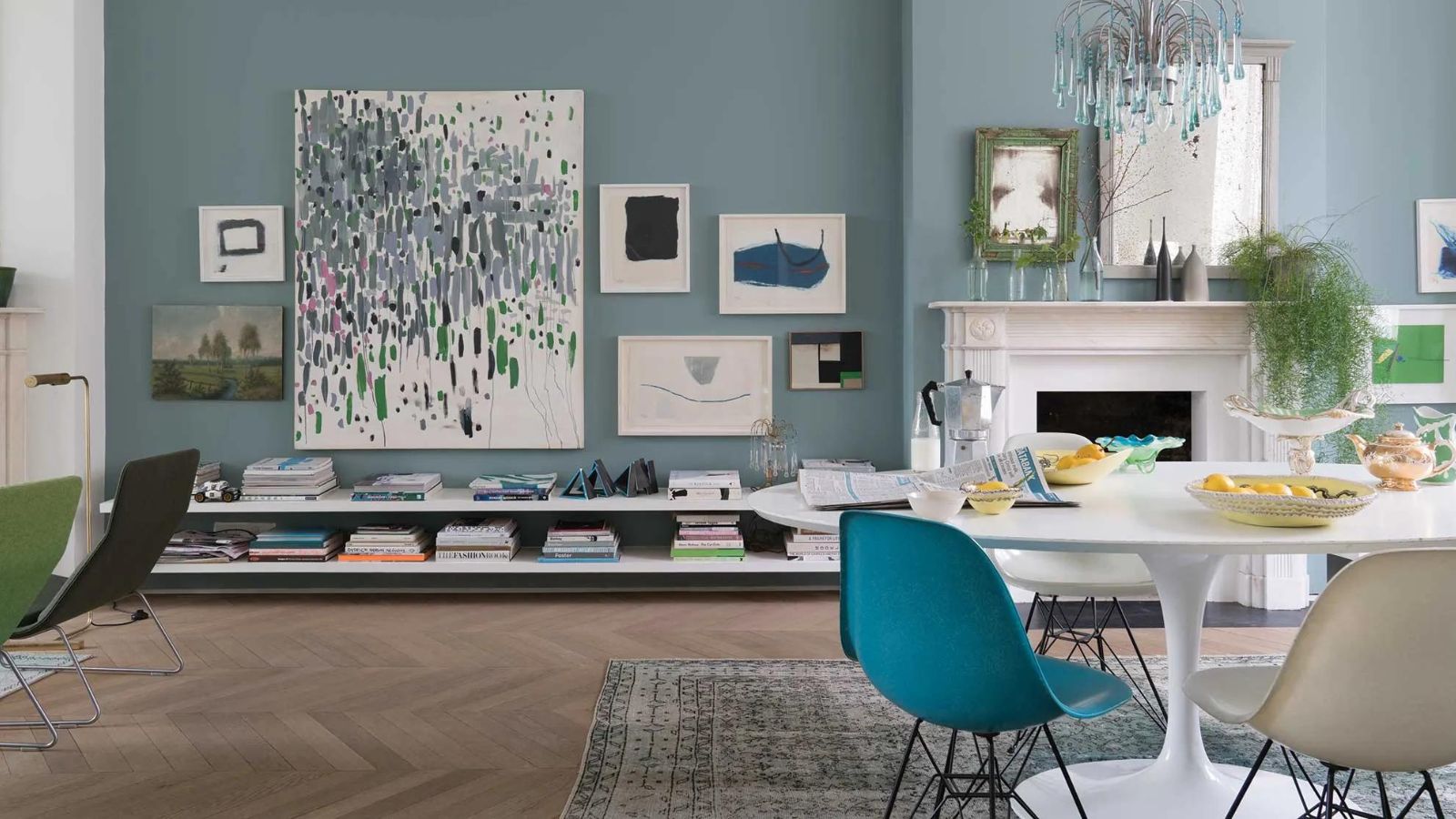
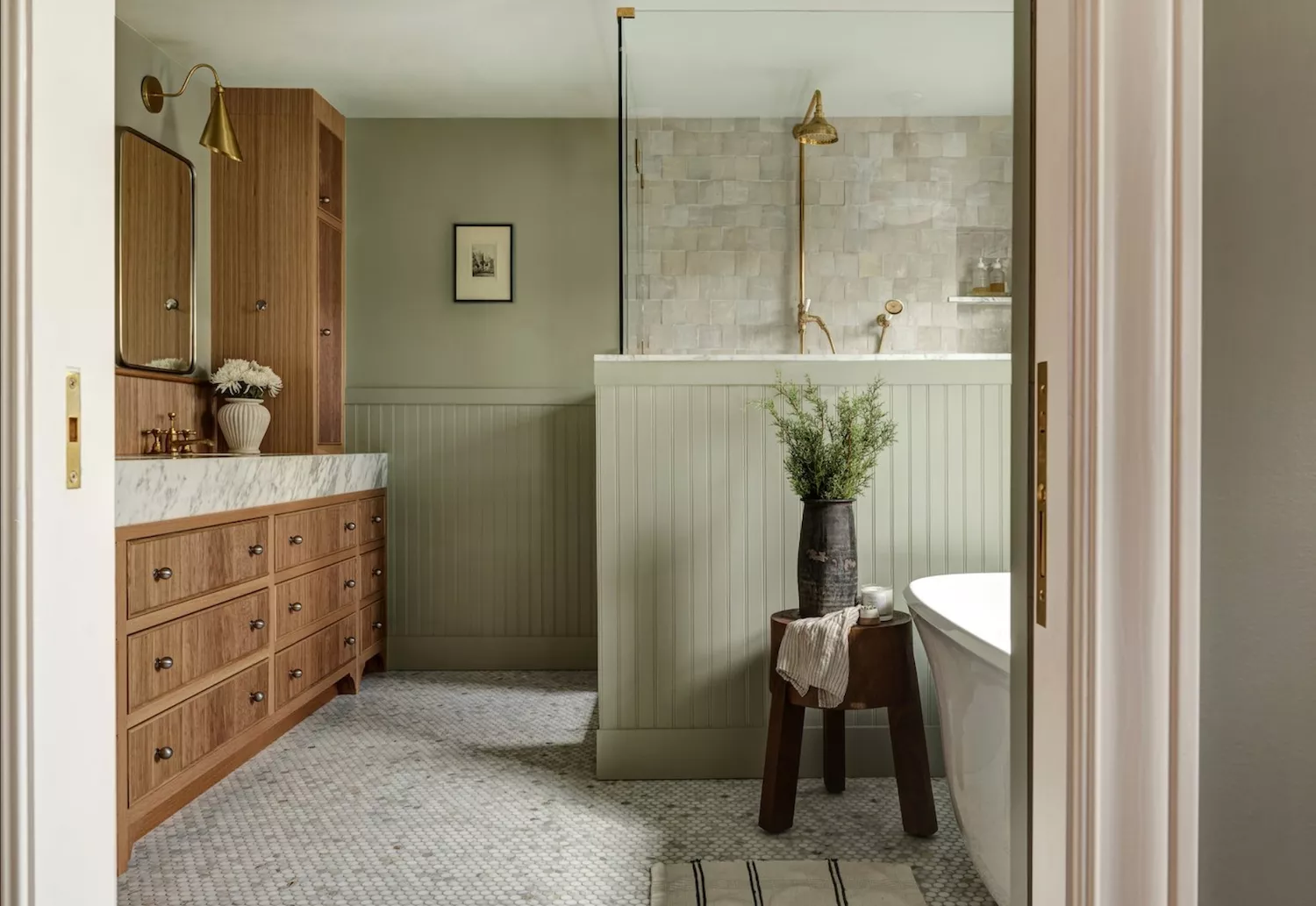
Finally, muted versions of nature-inspired colors, such as powder blue and sage green, are also deemed flattering. These colors possess a natural connection to the human experience, contributing to a calming and serene environment. Light blue, like Farrow & Ball's Borrowed Light, can be both neutral and refreshing, while sage green offers a soothing and earthy feel. Both colors are versatile enough to suit various styles and skin tones. Ultimately, while individual lighting conditions and personal preferences dictate the final choice, these color families provide a reliable starting point for creating a soft, gentle, and flattering color scheme that enhances the warmth and appeal of any room.
#InteriorDesign #PaintColors #HomeDecor #FlatteringShades #ColorPsychology #SoftPinks #WarmNeutrals #LightBluesAndGreens #DesignTips #InteriorDesign #PaintColors #HomeDecor #FlatteringShades #ColorPsychology #SoftPinks #WarmNeutrals #LightBluesAndGreens #DesignTips
0 comment in total
You may also like
An A-List Designer’s Secrets To Picking Perfect Paint Colors

Paint color ideas for every room – experts explain the best choices for different spaces

What Colors Go With Red? 10 Colors That Hold Their Own Alongside This Fiery Hue
The Trick to Finding a Paint Color That Works With Everything You Already Have

Here's How to Coordinate Paint Colors Throughout Your Home, so That It Looks Cohesive, Curated, but Still Creative
The most timeless paint colors according to designers
5 Secrets To Picking Paint Colors Like A Designer
The Paint Color That All This Designer's Followers Ask About | domino

Designer Justina Blakeney Says This Paint Color Flatters Everyone and Is Perfect for Drenching Rooms
7 Color Combos That ALWAYS Look Good Together, According to Designers
Designers LOVE Pairing These Unexpected Colors With This Sophisticated Hue
Designers Share Their Tried-and-True Shades From the Best Interior Paint Brands
5 Timeless Paint Colors That Go With Absolutely Everything, According to Color Experts

Wondering what colour suits me? Our experts reveal the most flattering shades to suit you all year round

If This, Then That: Your Guide to Pairing Paint Colors

Professional painters reveal the secret to color matching a paint shade from an image alone
7 of the most versatile and easy to use paint colors according to designers

Designers LOVE Pairing These Unexpected Colors With This One Timeless Hue
The biggest paint trends of 2025 – 17 stylish ways to decorate with paint, according to designers
Designers Agree: These Are the Most Relaxing Paint Colors for Any Room