The Trick to Finding a Paint Color That Works With Everything You Already Have
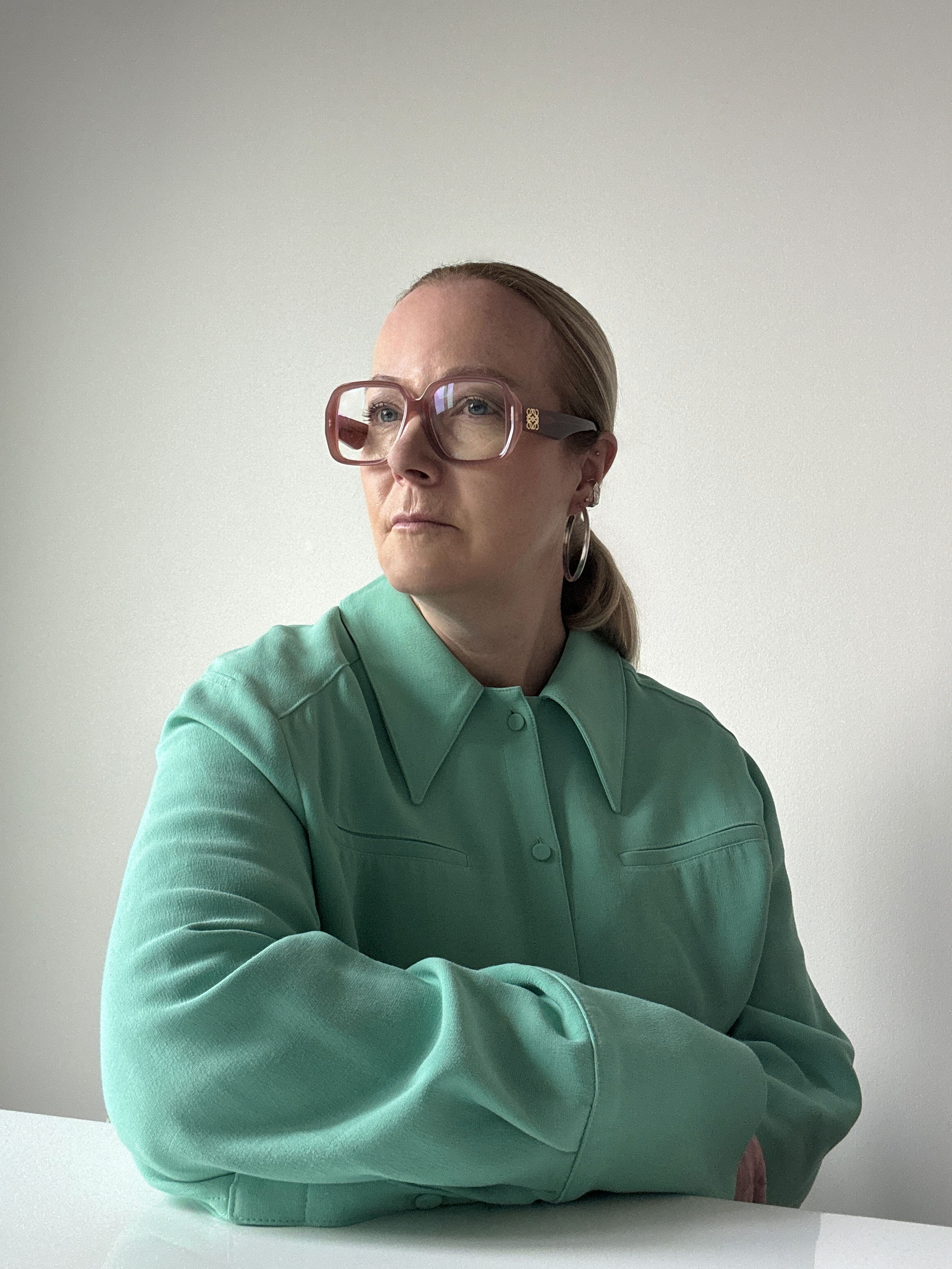
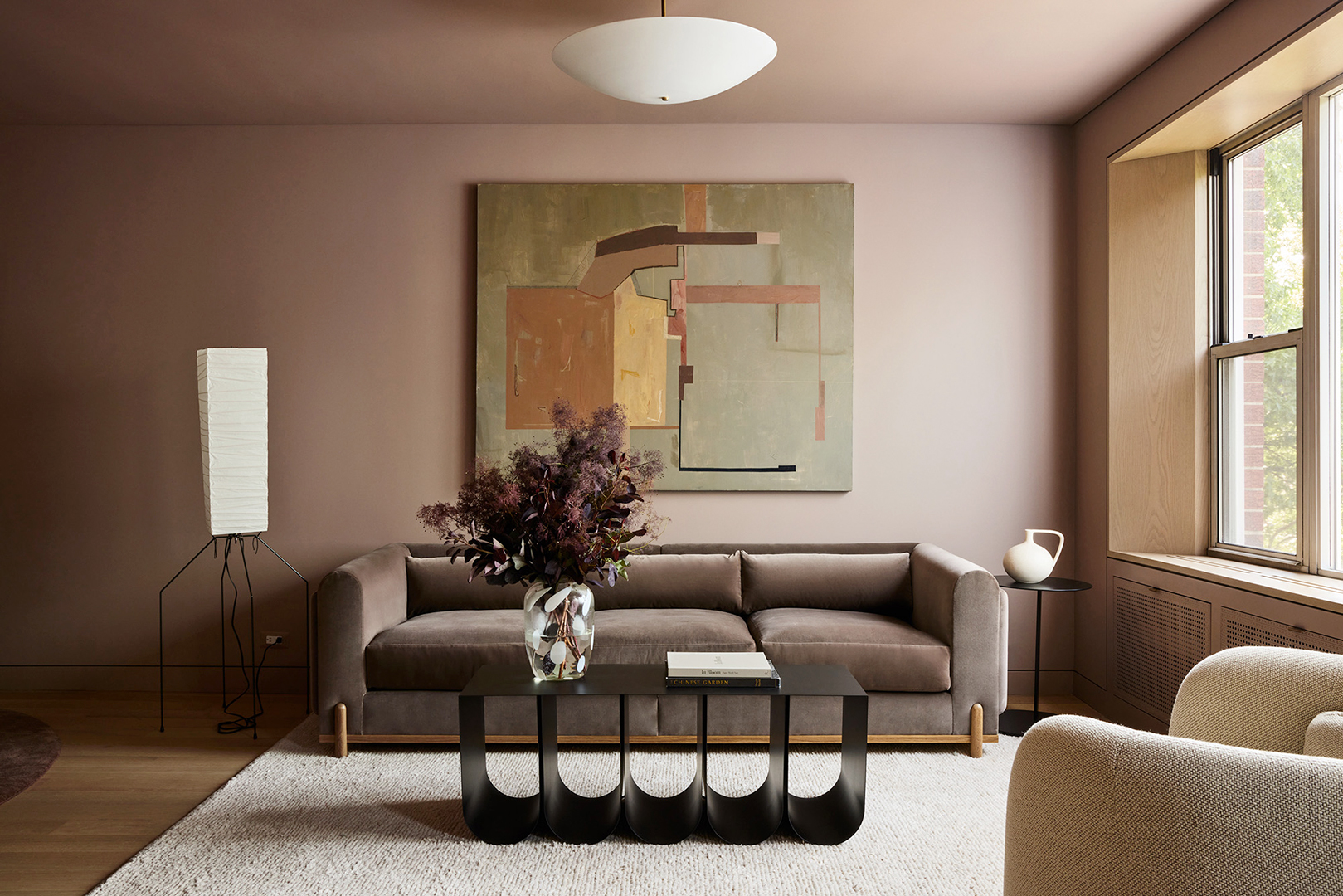
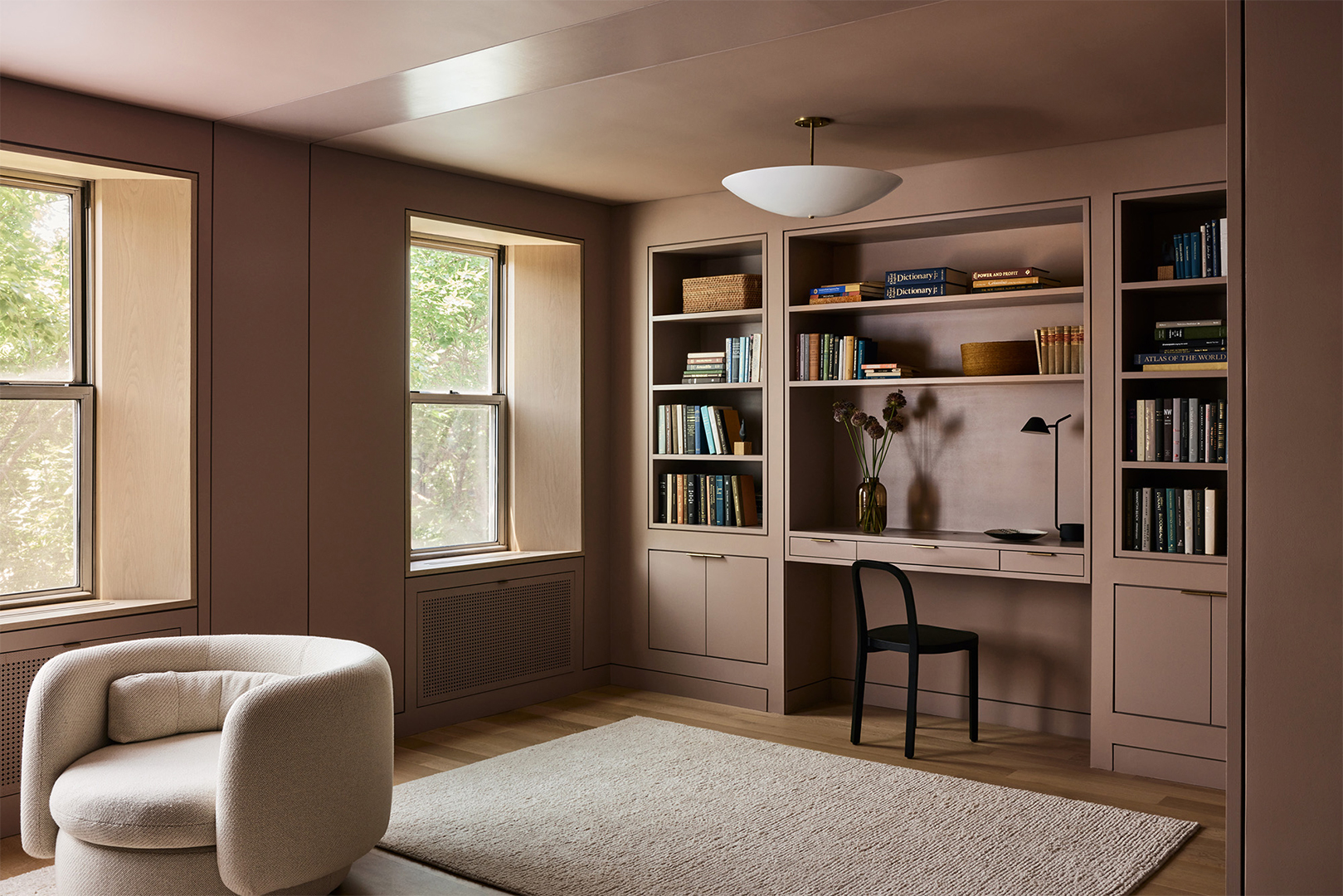
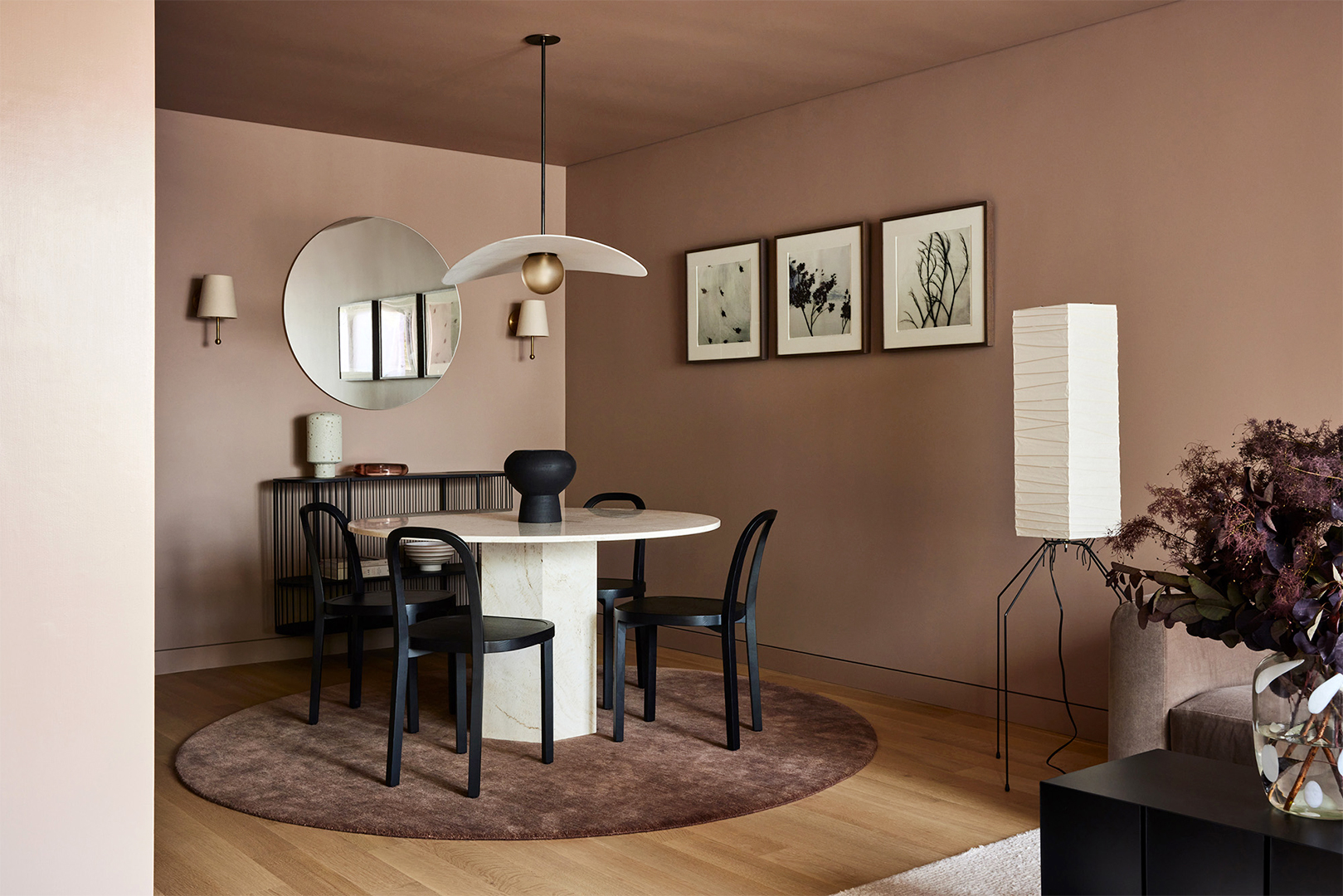
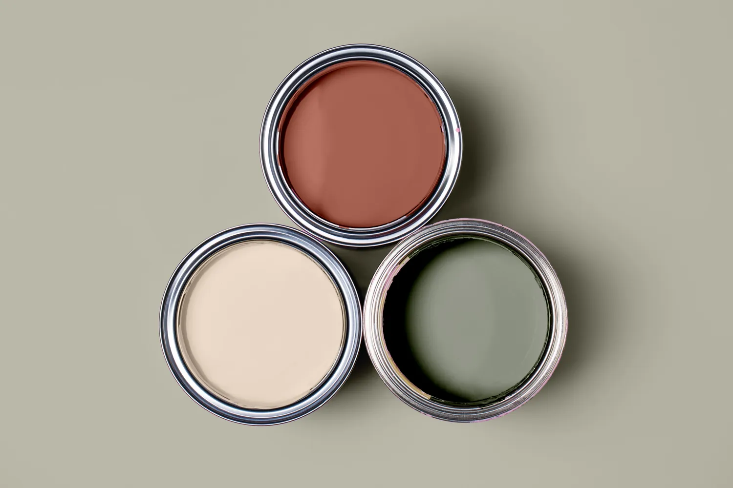
Choosing the right paint color for a room can significantly refresh a space without extensive renovations. This process often involves selecting a color that complements existing elements such as flooring, tiles, furniture, and artwork, rather than decorating in isolation. Architectural color consultant Amy Krane emphasizes the importance of balance, flow, and cohesion between rooms when making paint selections.
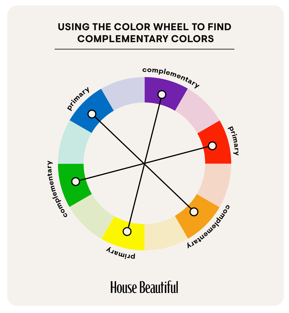
Architectural color is defined by three components: hue, value, and chroma. Hue refers to the color's position on the color wheel (e.g., blue, red, yellow). Value indicates its lightness or darkness, and chroma describes the color's colorfulness or intensity. To achieve visual interest and avoid a monotonous space, it is crucial to choose a paint color that differs from other room details in at least one of these components. A lack of contrast in value, for instance, can lead to a dull environment, whereas varying these elements creates dynamic appeal.
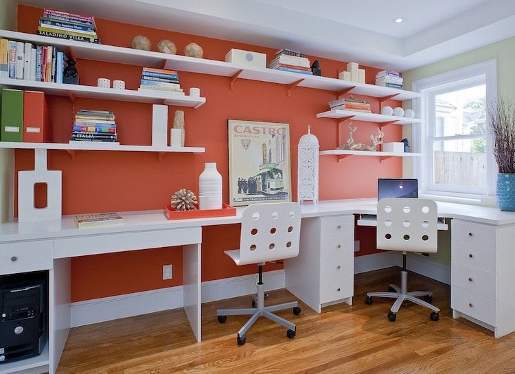
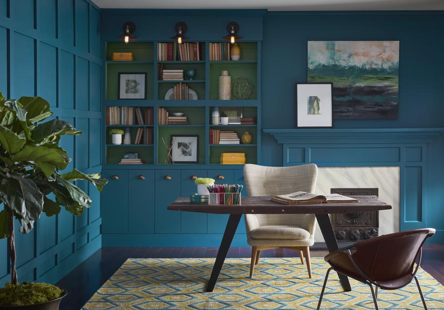
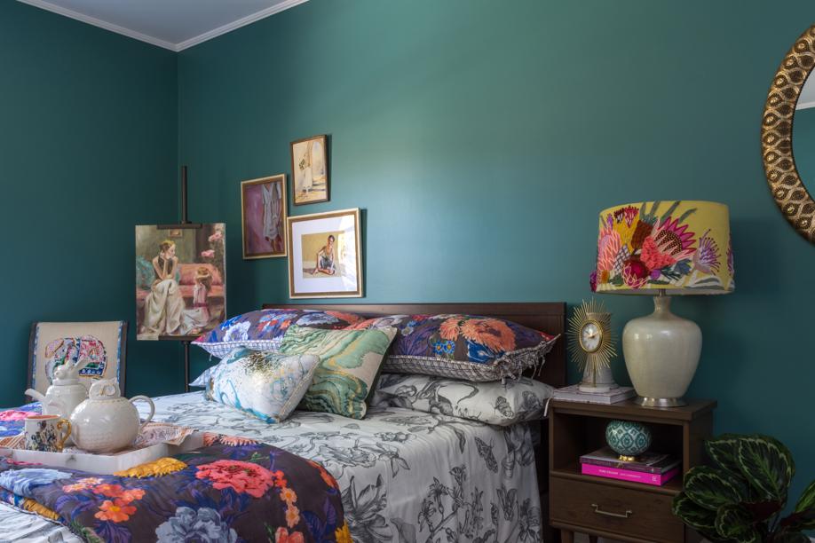
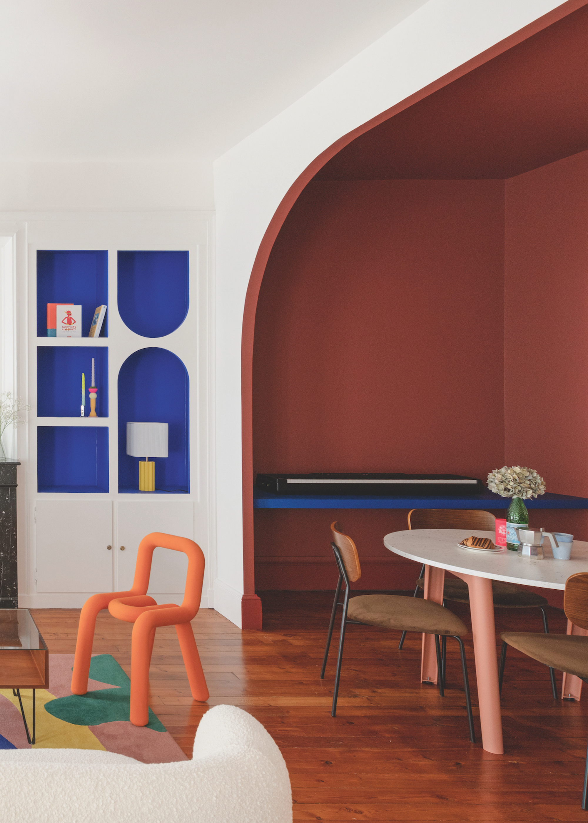
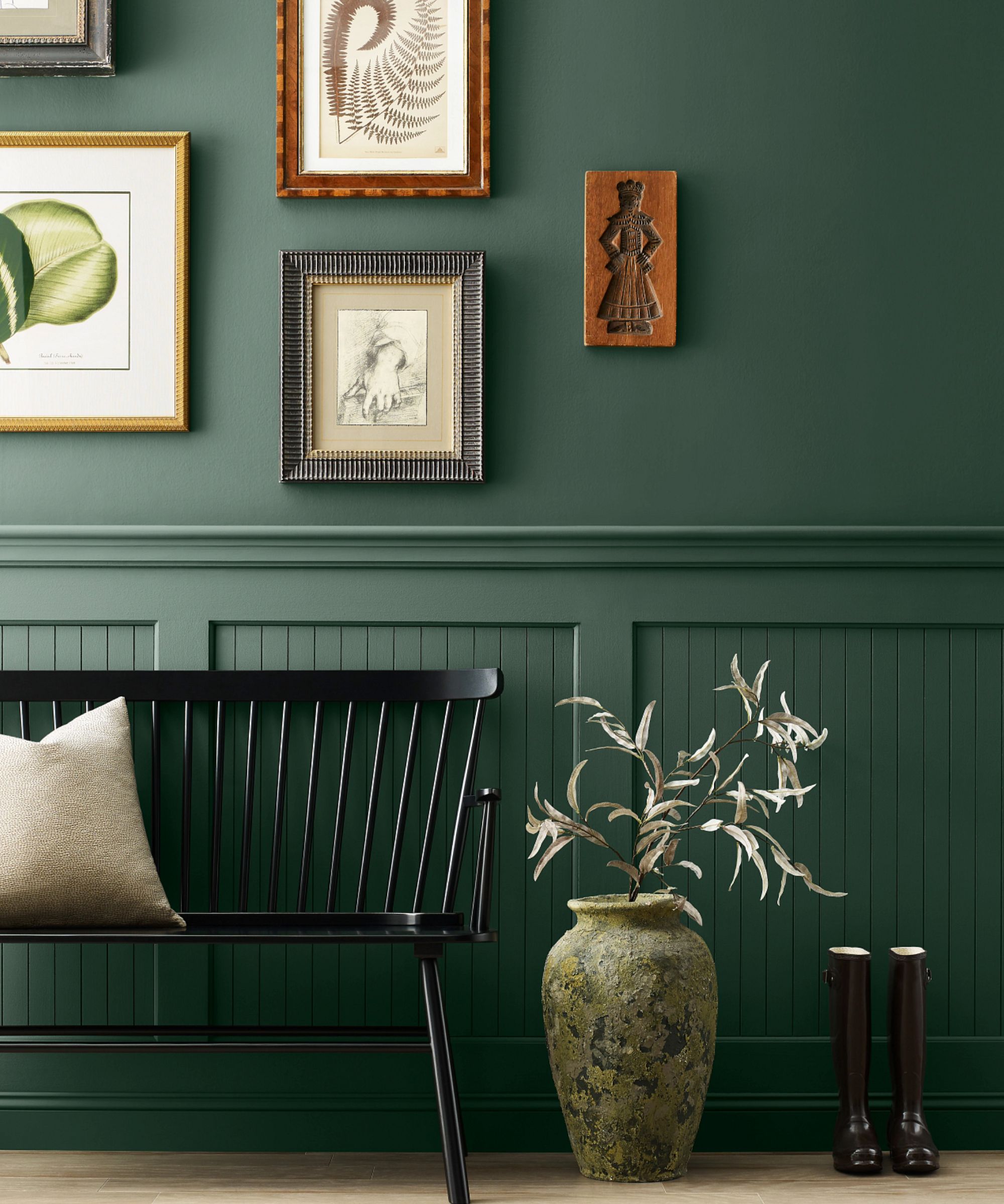
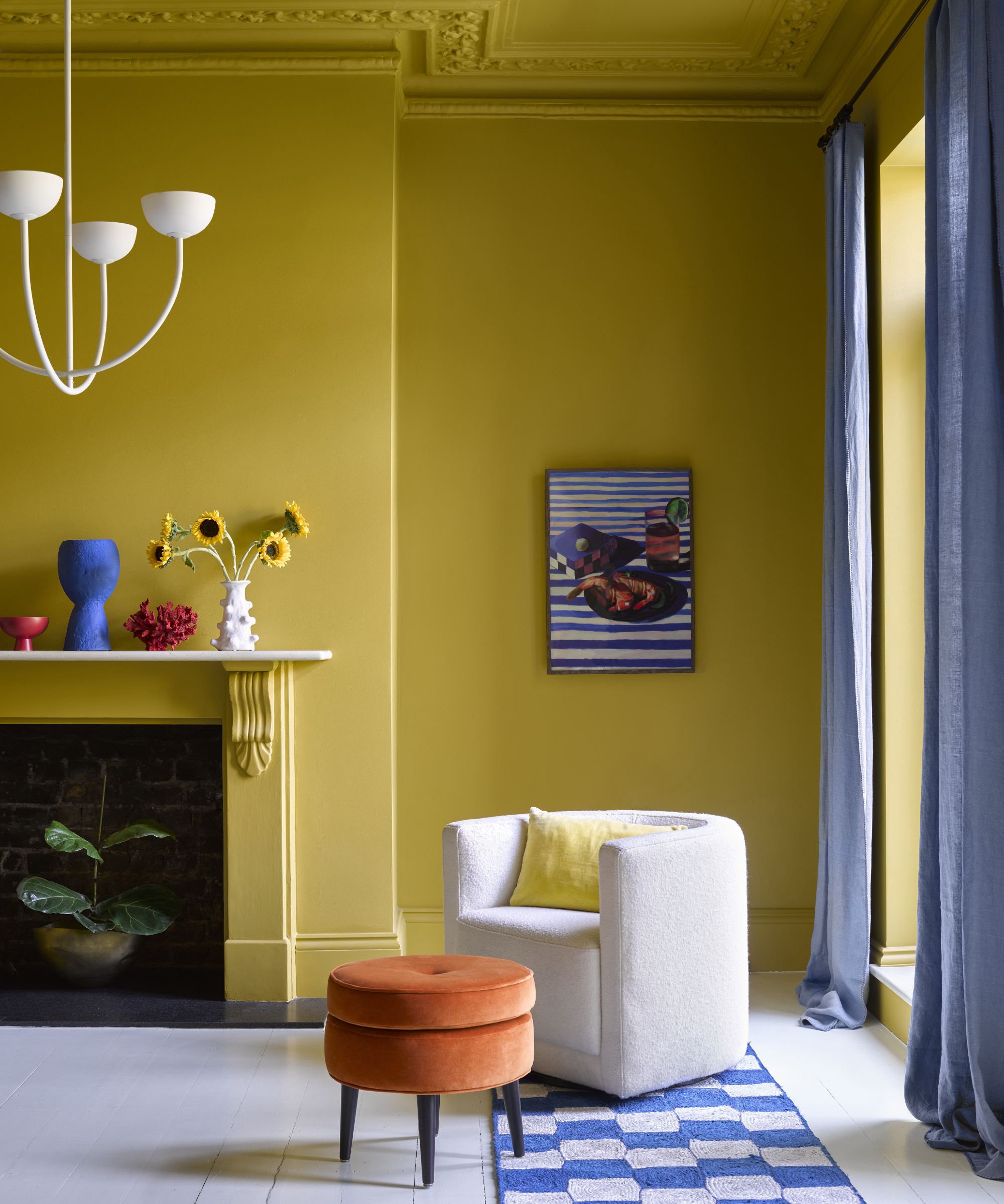
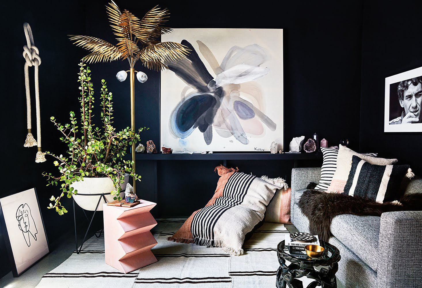
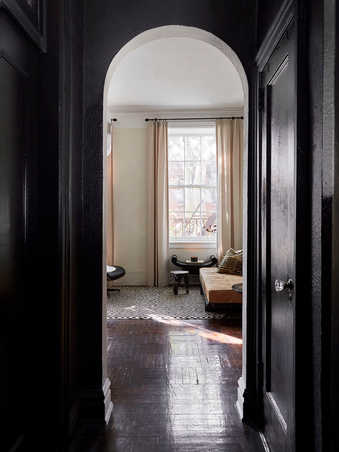
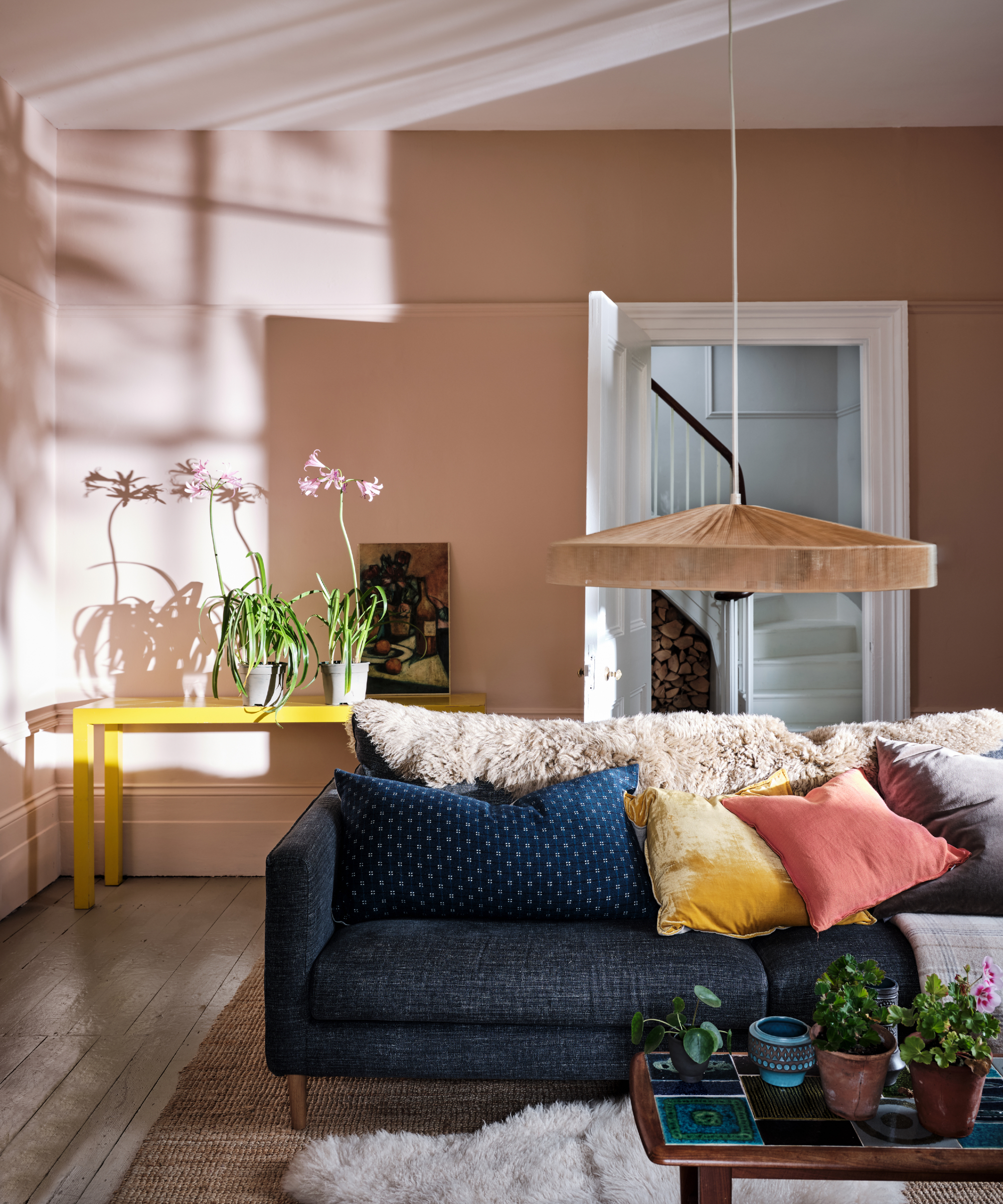
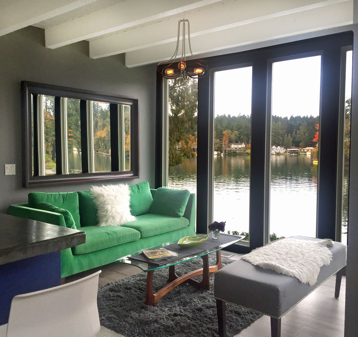
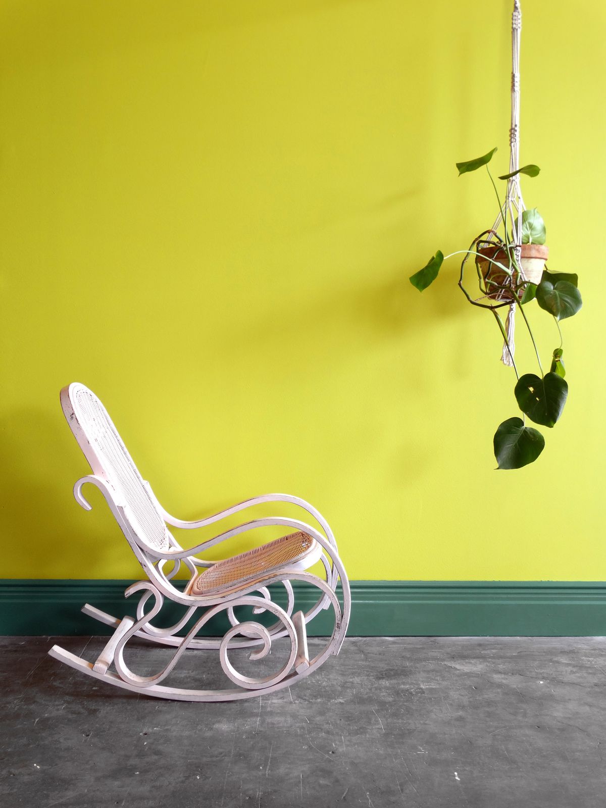
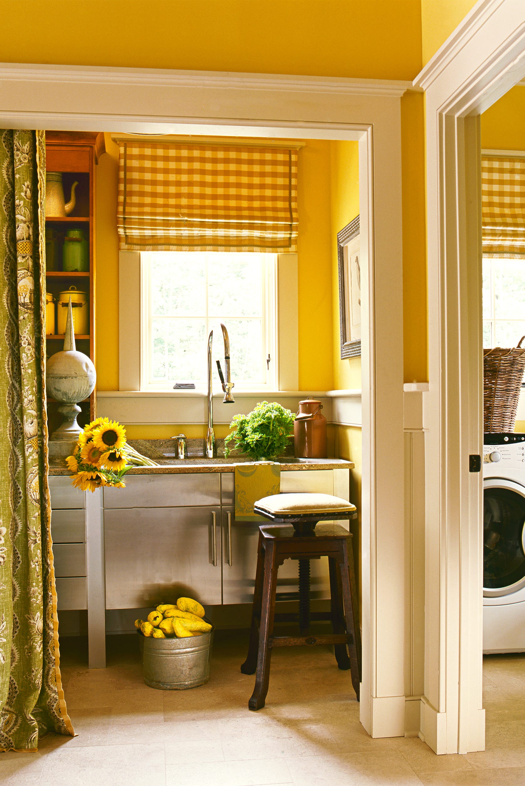
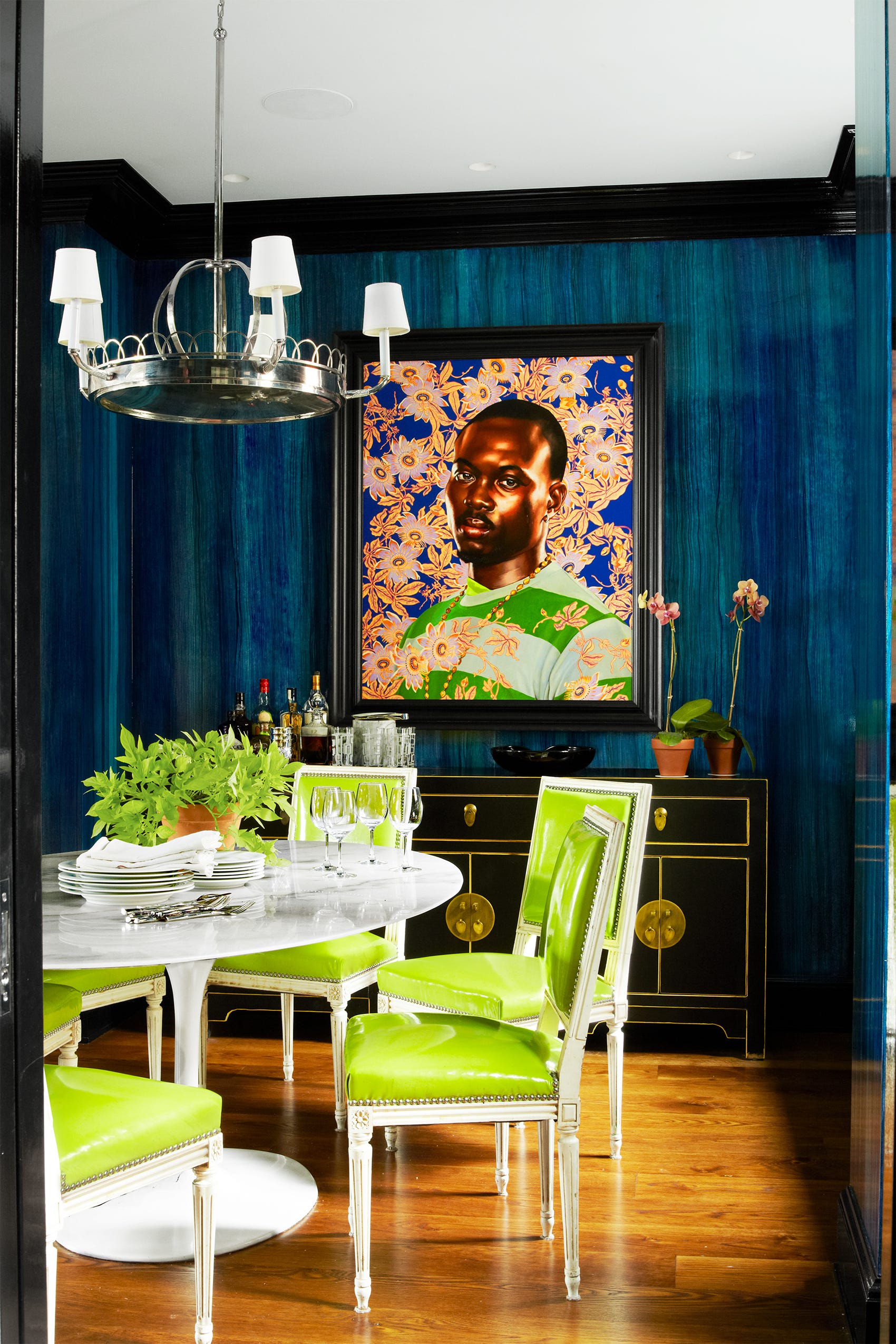
Personal taste is a significant factor in color coordination, as there is no single 'right' approach. Individuals who enjoy bold colors should incorporate them, ensuring that the chosen palette aligns with their personal relationship with color—whether they prefer vibrant contrasts or serene analogous schemes. Even with a preference for dramatic hues, balancing them with subtler shades is essential. The human eye requires a focal point and areas of rest within a room. Highly saturated colors throughout a space can be overwhelming, making it difficult for the eye to settle. A common strategy is to pair boldly colored furnishings with neutral walls, or vice versa, to achieve a harmonious balance.
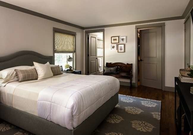
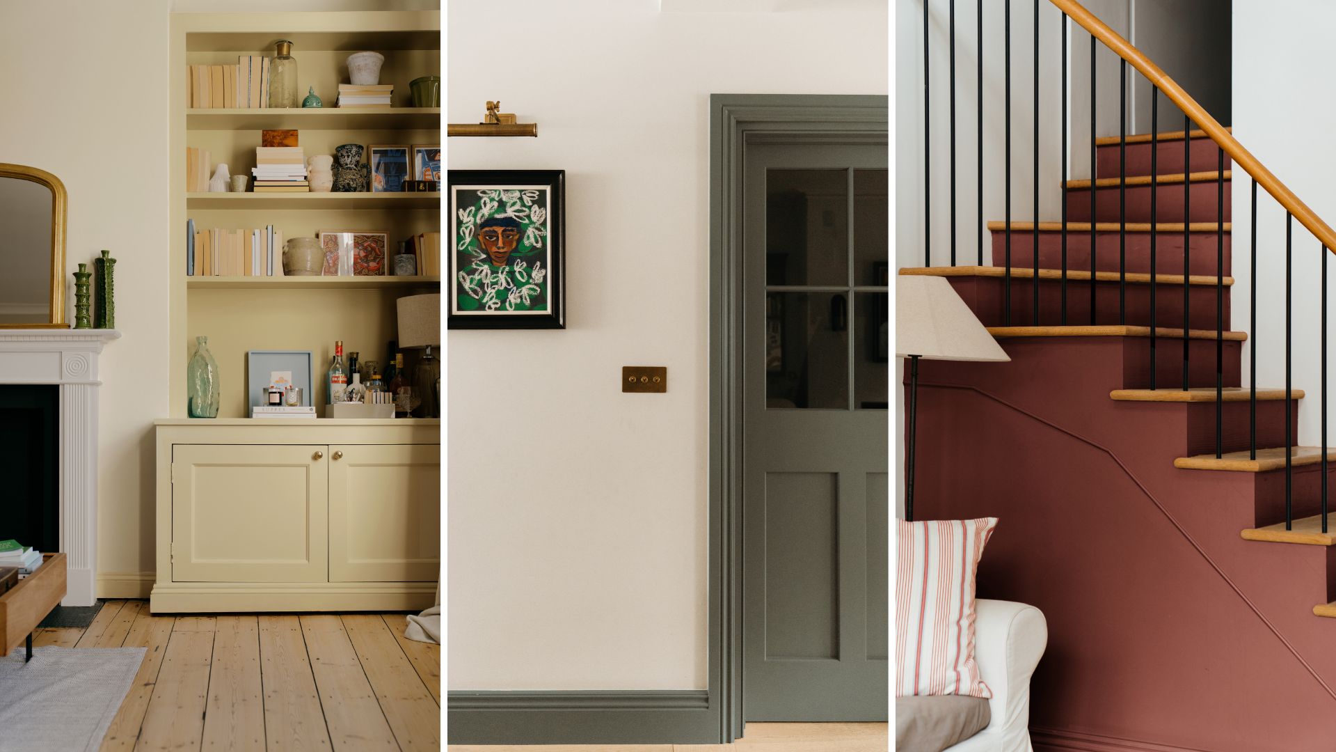
Inspiration for paint colors can often be found within existing room details. For example, a color from a rug can be adapted for wall paint. However, it is important to consider the chromaticity; if the original color from the rug is too saturated for a wall, it can be toned down to a softer, more muted version while retaining the original hue. This method allows for continuity and a cohesive design.
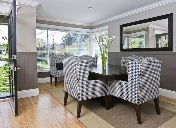
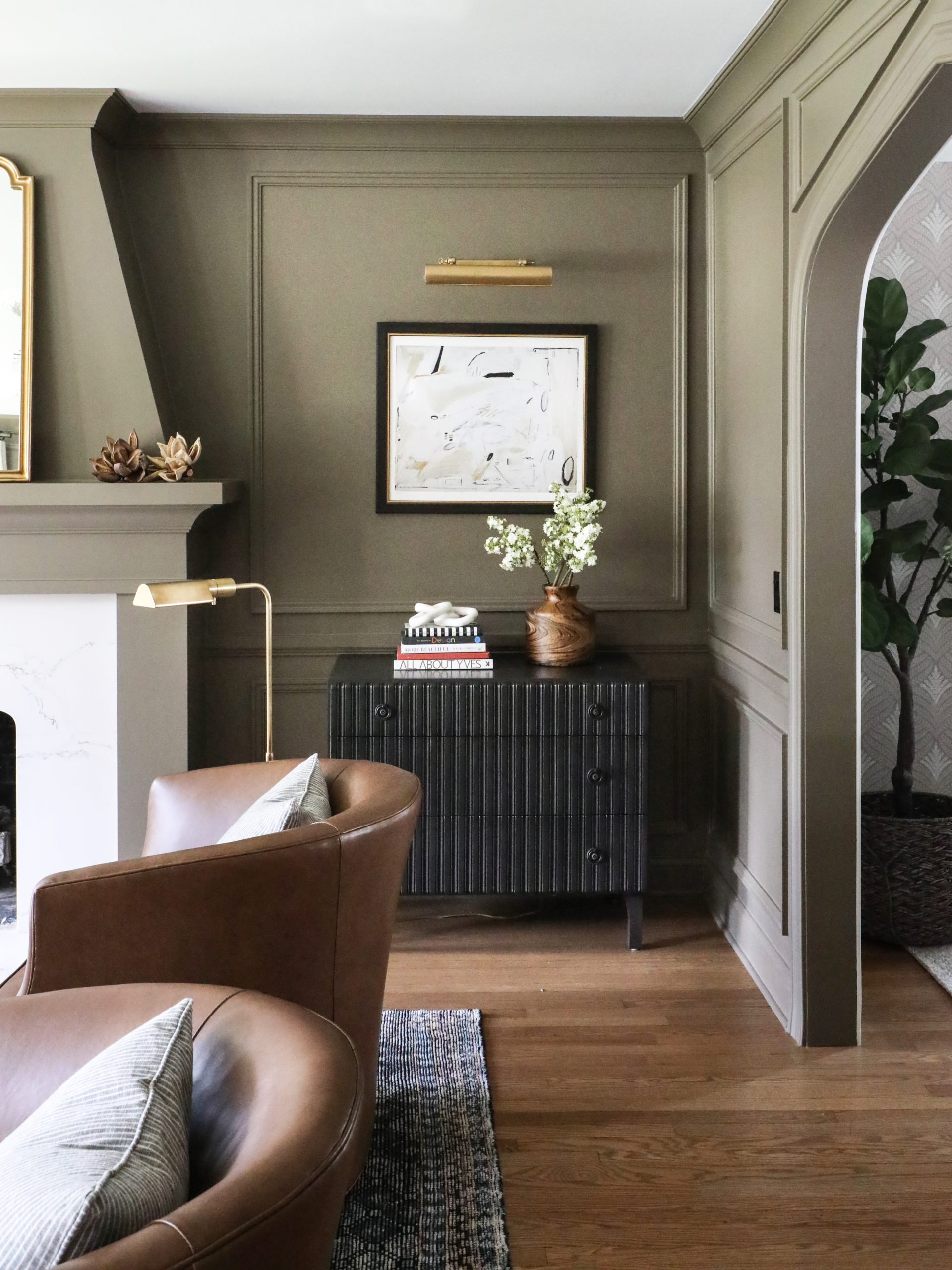
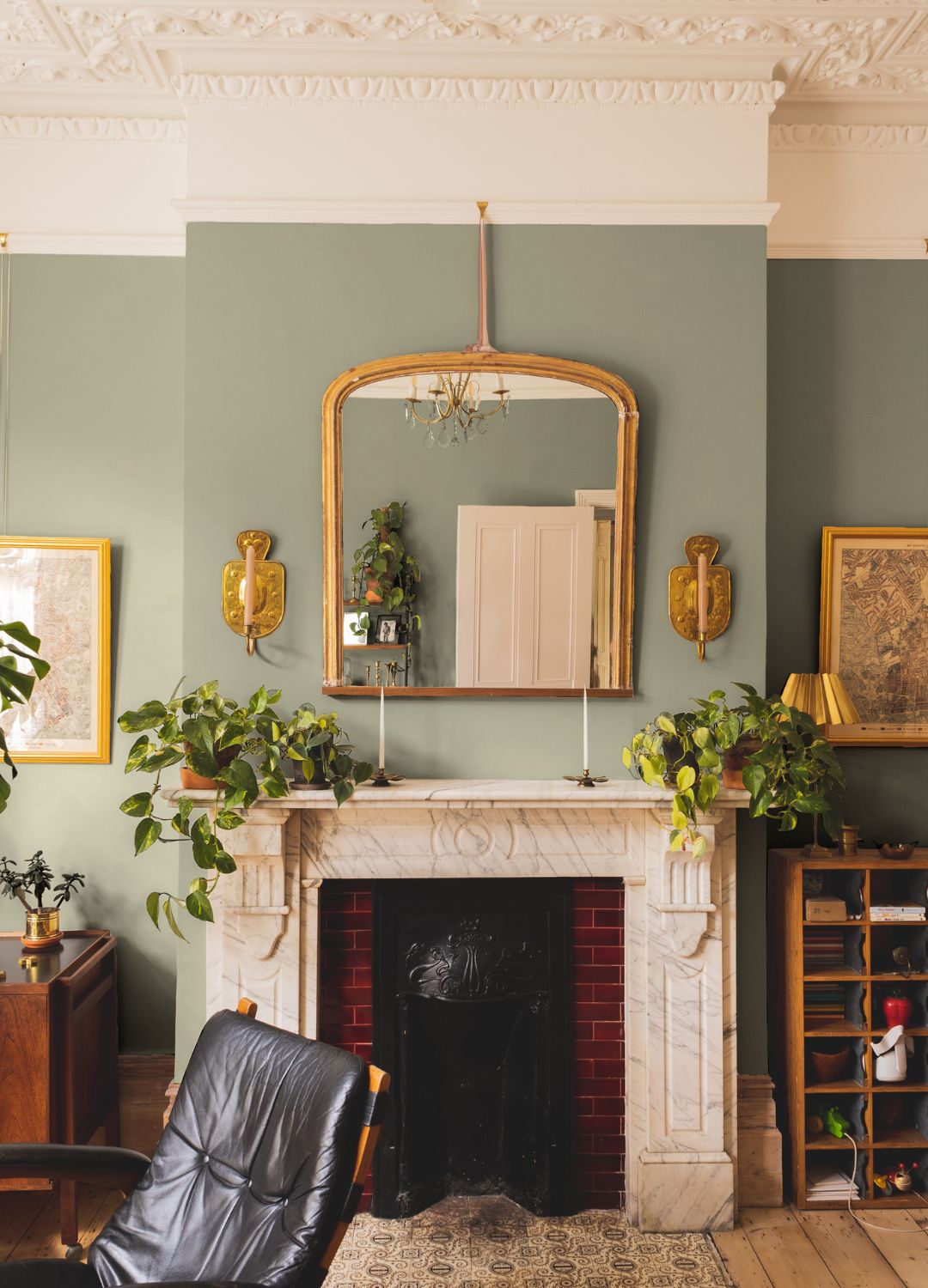
Special care is needed when combining muted or desaturated hues, as these can be particularly challenging to coordinate. Krane notes that clashes are more likely to occur with desaturated colors, such as pink-beige with yellow-beige or blue-gray with brown-gray, because their underlying hues become more apparent when the colorfulness is reduced. The goal is not to perfectly match but to create pleasing combinations.
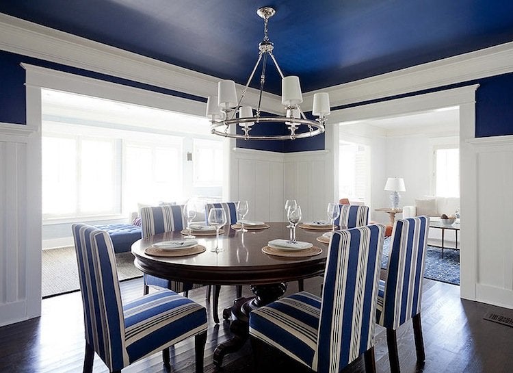
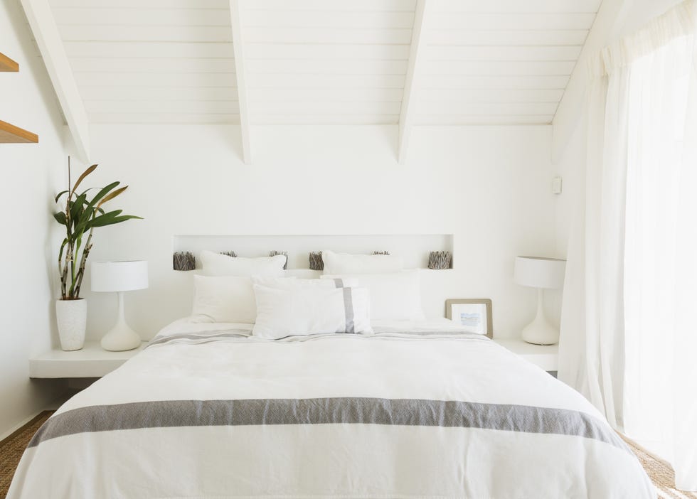
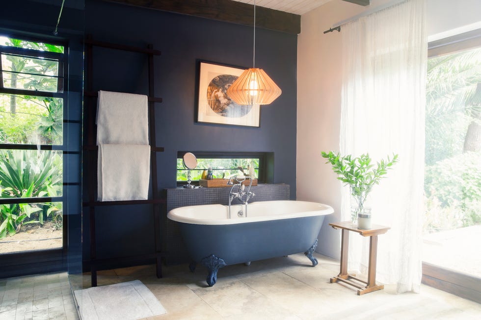
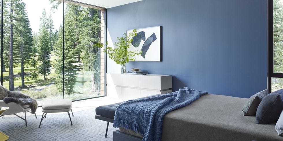
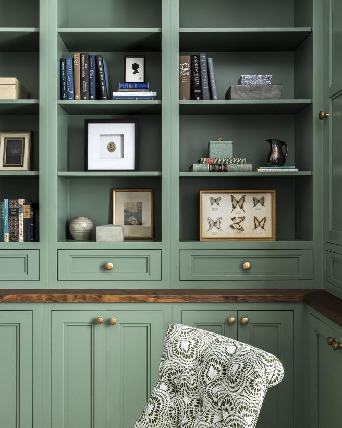
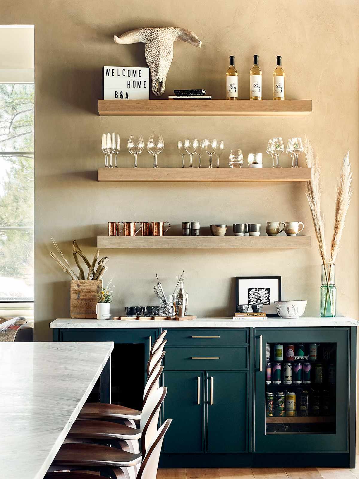
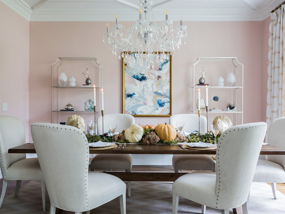

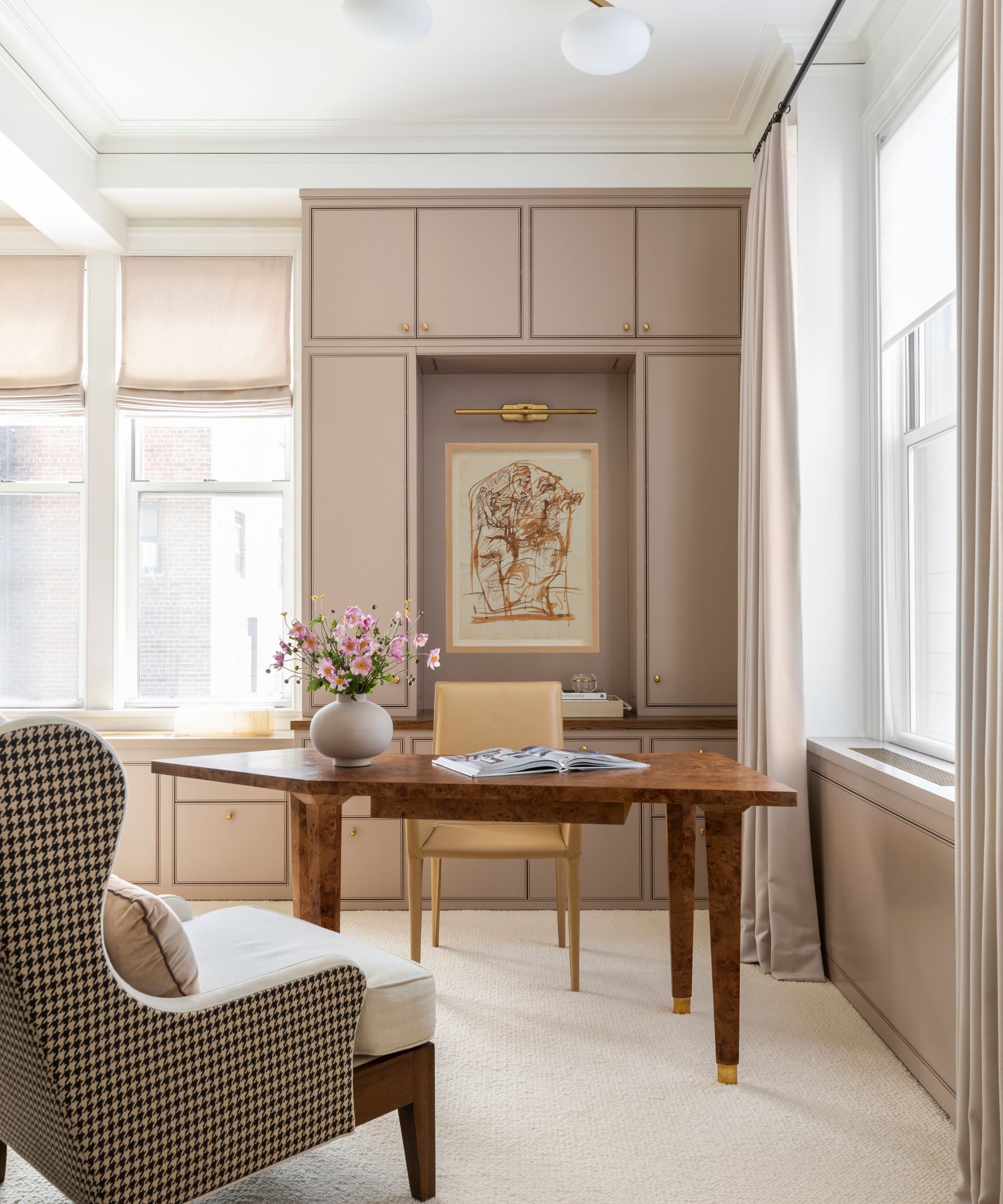
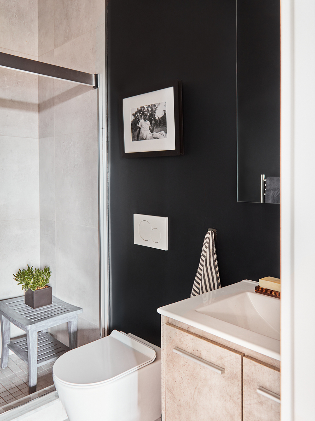
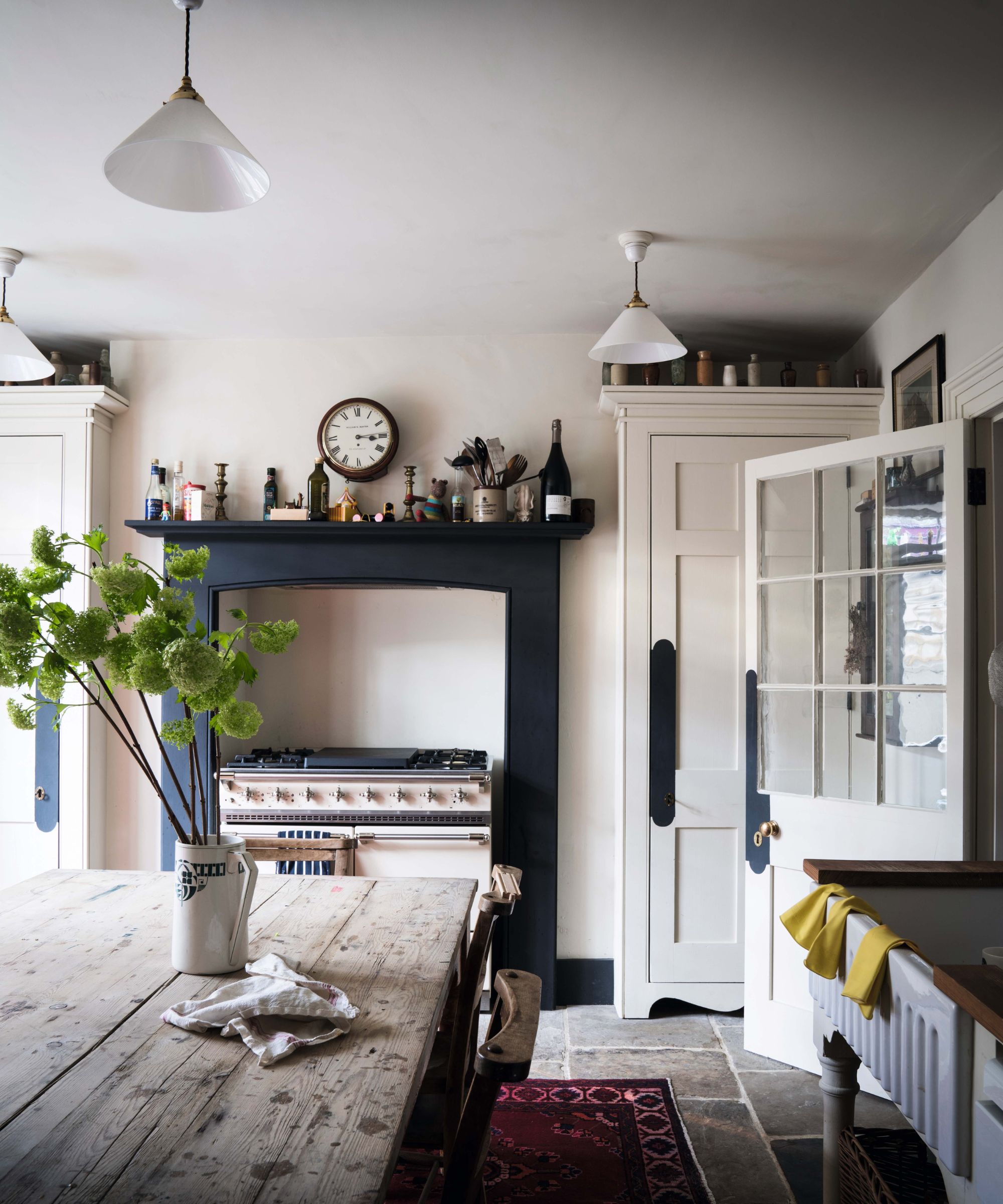
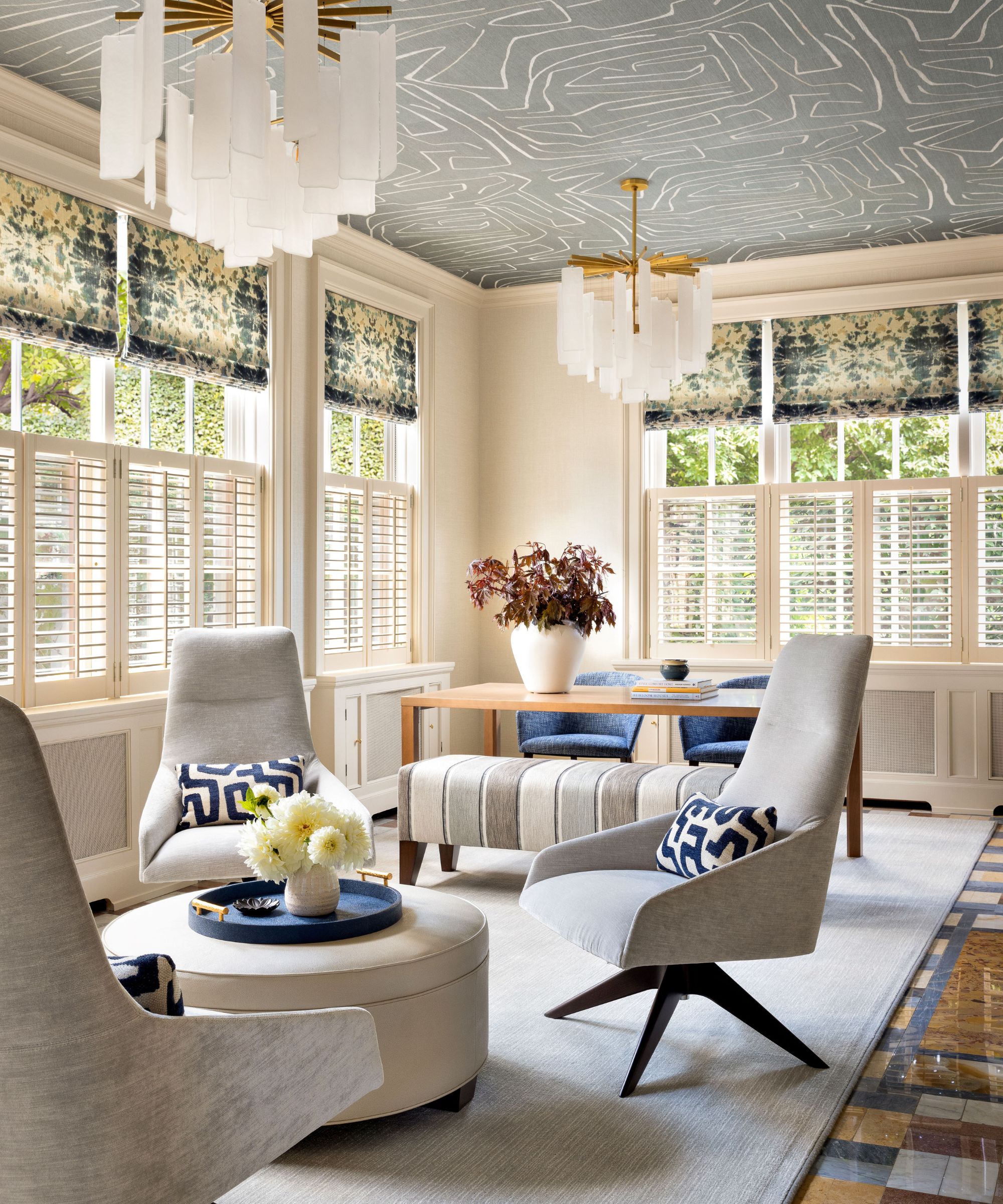
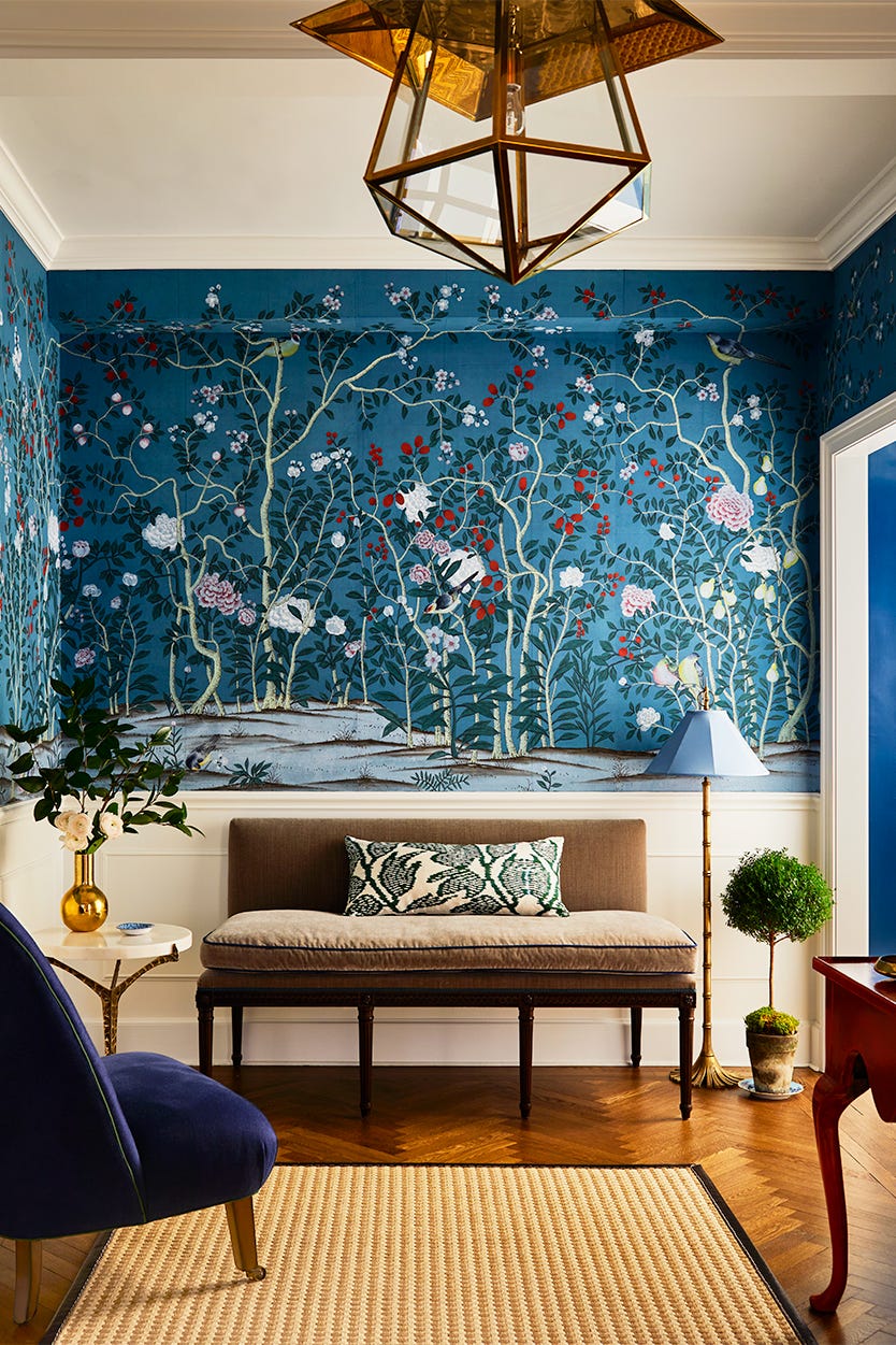
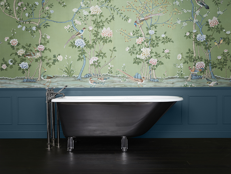
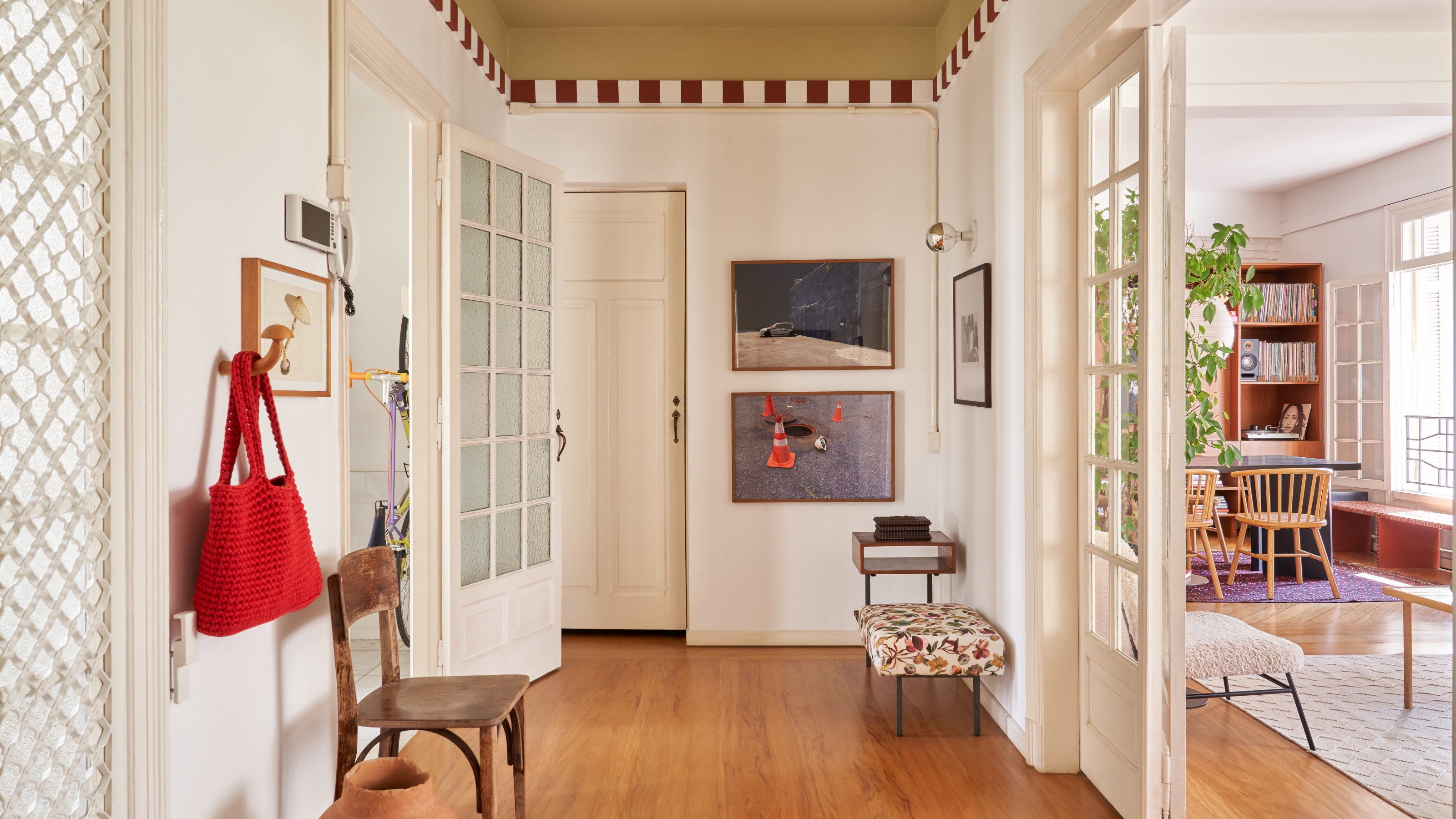
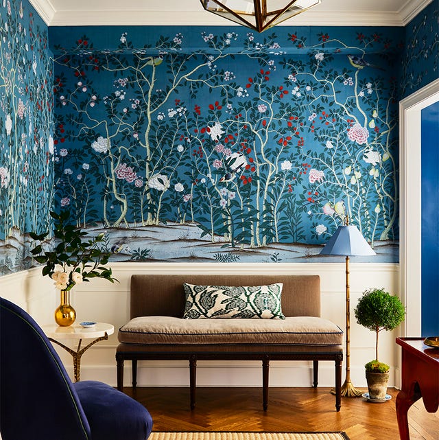
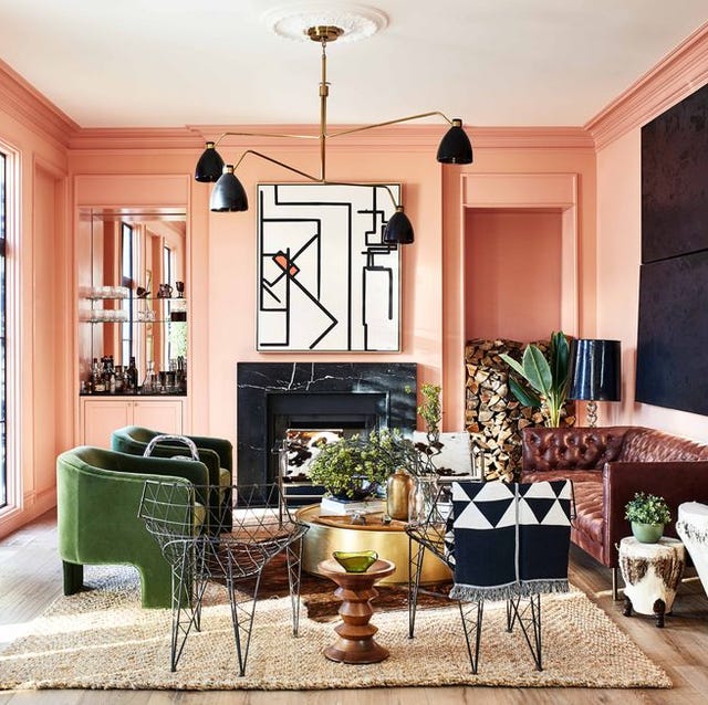
When painting a room that opens into other areas of the home, it is important to consider the color scheme of adjacent spaces to ensure overall coordination and a sense of flow throughout the living environment. Avoiding a 'matchy-matchy' look is also crucial. Instead of using the same color for walls, tiles, and cabinets, a balanced room often incorporates a mix of warm and cool colors. For instance, pairing blue elements with a soft, peachy neutral can introduce warmth that complements the cool tones. If a room's furnishings and hard finishes already feature a variety of colors, opting for a light, neutral, or muted wall color can help unify the space and prevent it from appearing too busy.
#PaintColorSelection #HomeDecorating #InteriorDesign #ColorTheory #RoomCohesion #NeutralColors #BoldHues #ArchitecturalColor #PaintColorSelection #HomeDecorating #InteriorDesign #ColorTheory #RoomCohesion #NeutralColors #BoldHues #ArchitecturalColor
0 comment in total
 No comments yet
You may also like
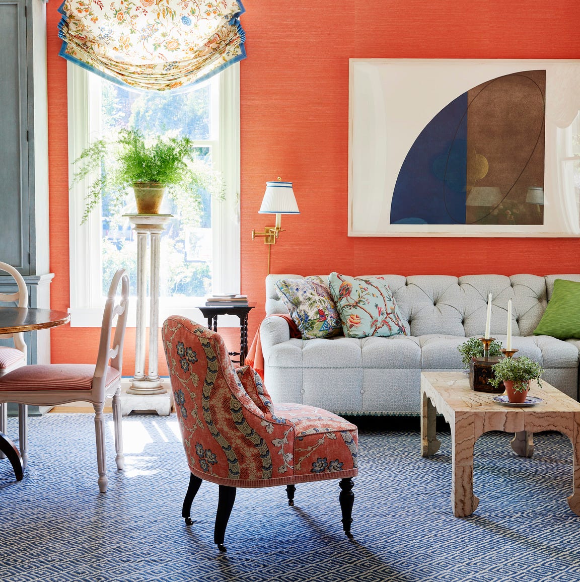
How to Choose Colors That Work Together Every Time

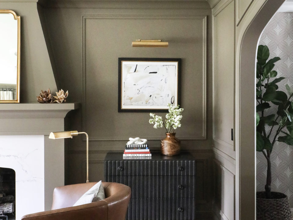
How to Pick the Best Paint Colors for Every Space in Your Home

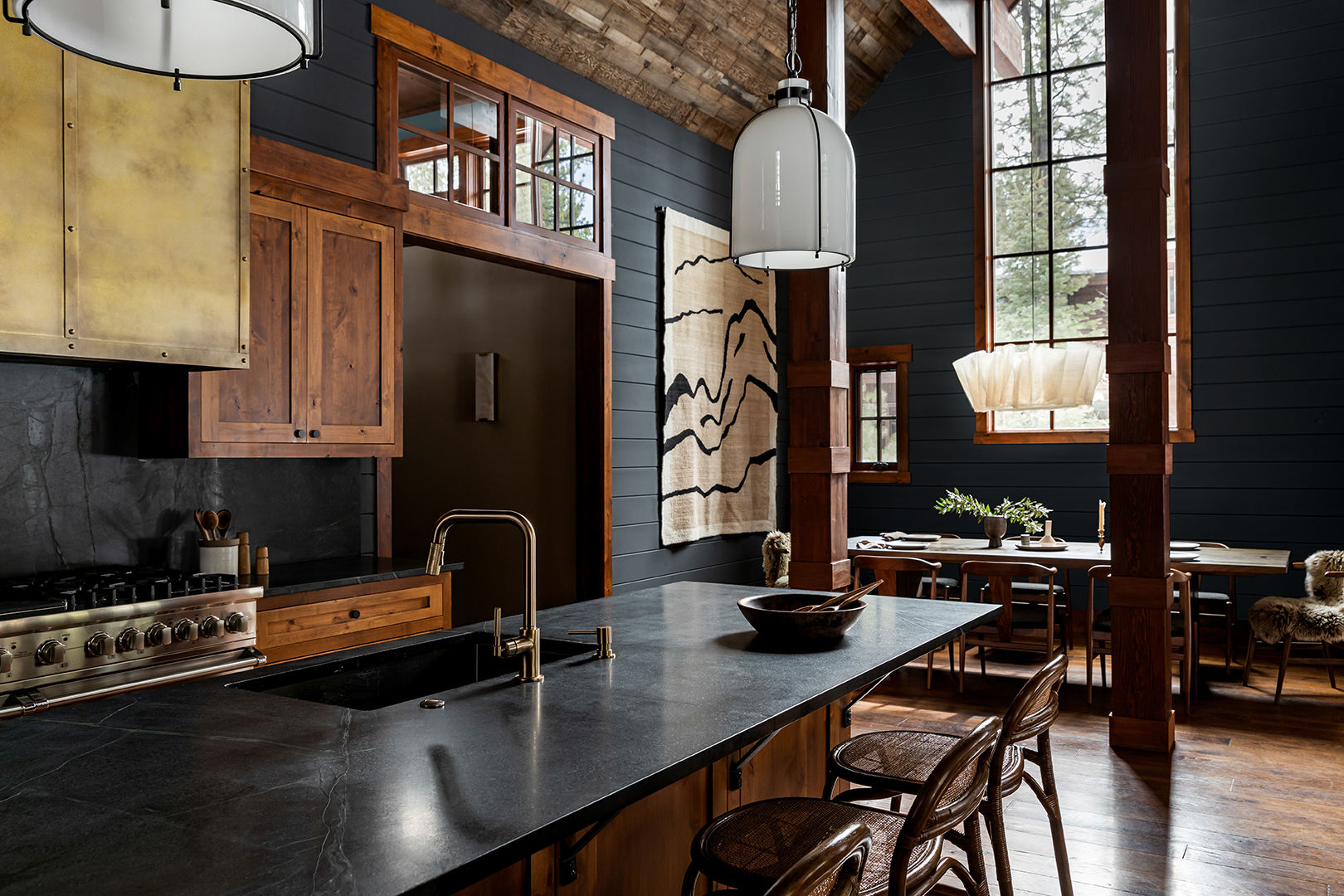
How to Use One of the Trickiest Paint Colors in Your Home

to choose paint colors.
If This, Then That: Your Guide to Pairing Paint Colors

Here's How to Coordinate Paint Colors Throughout Your Home, so That It Looks Cohesive, Curated, but Still Creative

3 Ways to Identify and Match Any Paint Color, According to Experts
35 Unexpected Color Combos We Can't Get Enough Of

These Master Tips Will Help You Avoid Choosing The Wrong Type Of Paint
3 Ways to Identify and Match Any Paint Color, According to Experts

What makes a paint color flattering? Experts share their go-to shades for a universally complementary scheme

How to combine colour, pattern and texture without making a complete mess of things

It’s easier to match paint colors than you think

An A-List Designer’s Secrets To Picking Perfect Paint Colors
How to choose the best paint color for any room in your house
When Your Client Cares About Paint as Much as Furniture, You Go Big With Opposing Colors
Tips for adding the hottest paint colors to your decor

Professional painters reveal the secret to color matching a paint shade from an image alone
Make choosing paint easy with new 'natural light' colours

Matching the right paint with the right surface