13 Off-White Paint Colors That Make Any Room Feel Bigger and Brighter
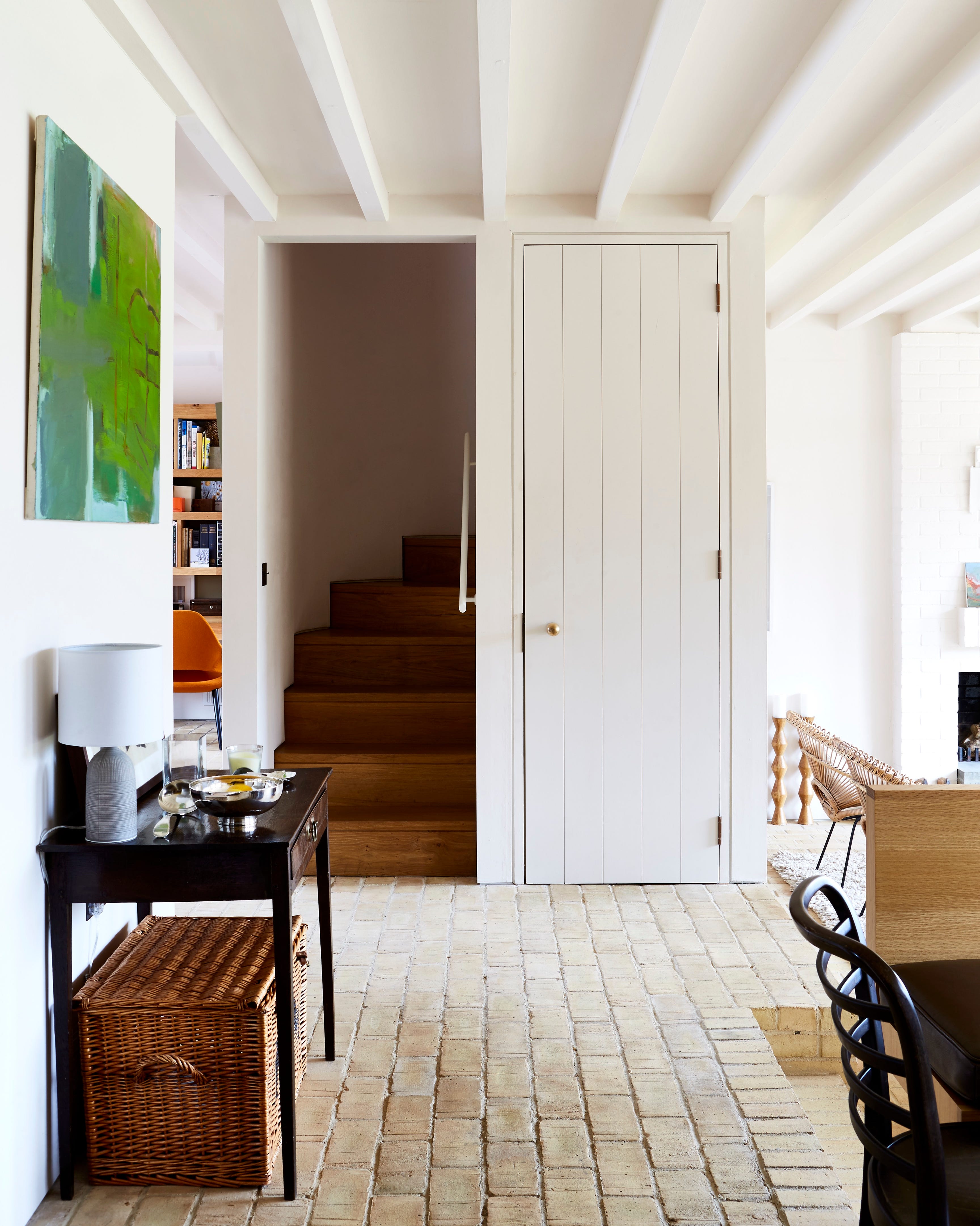
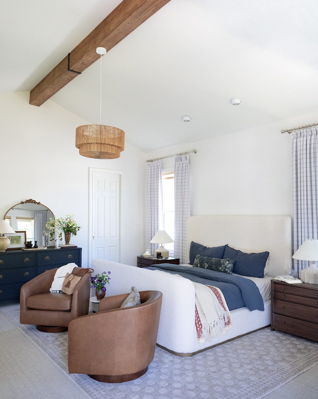
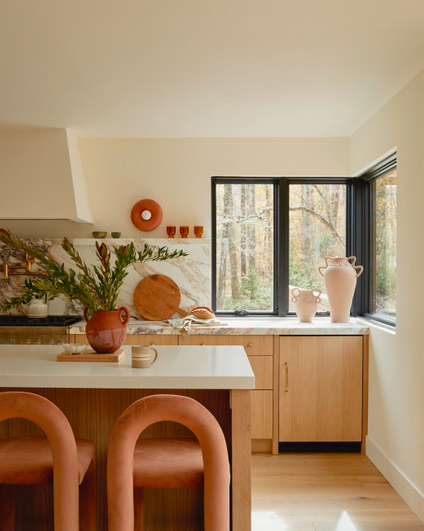
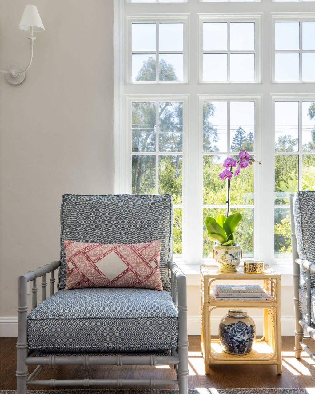
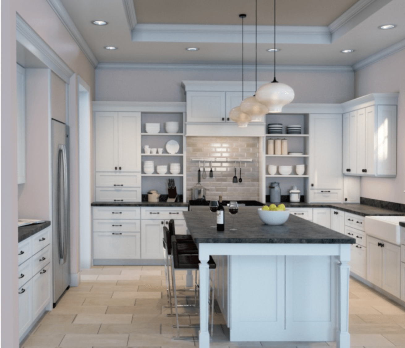
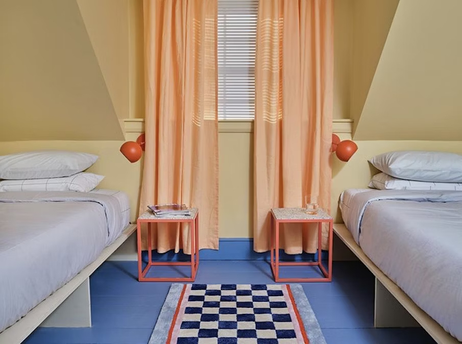
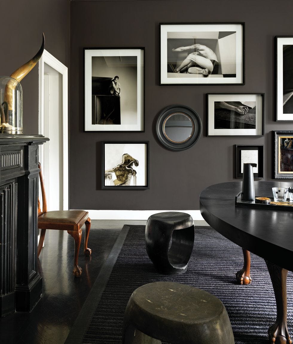
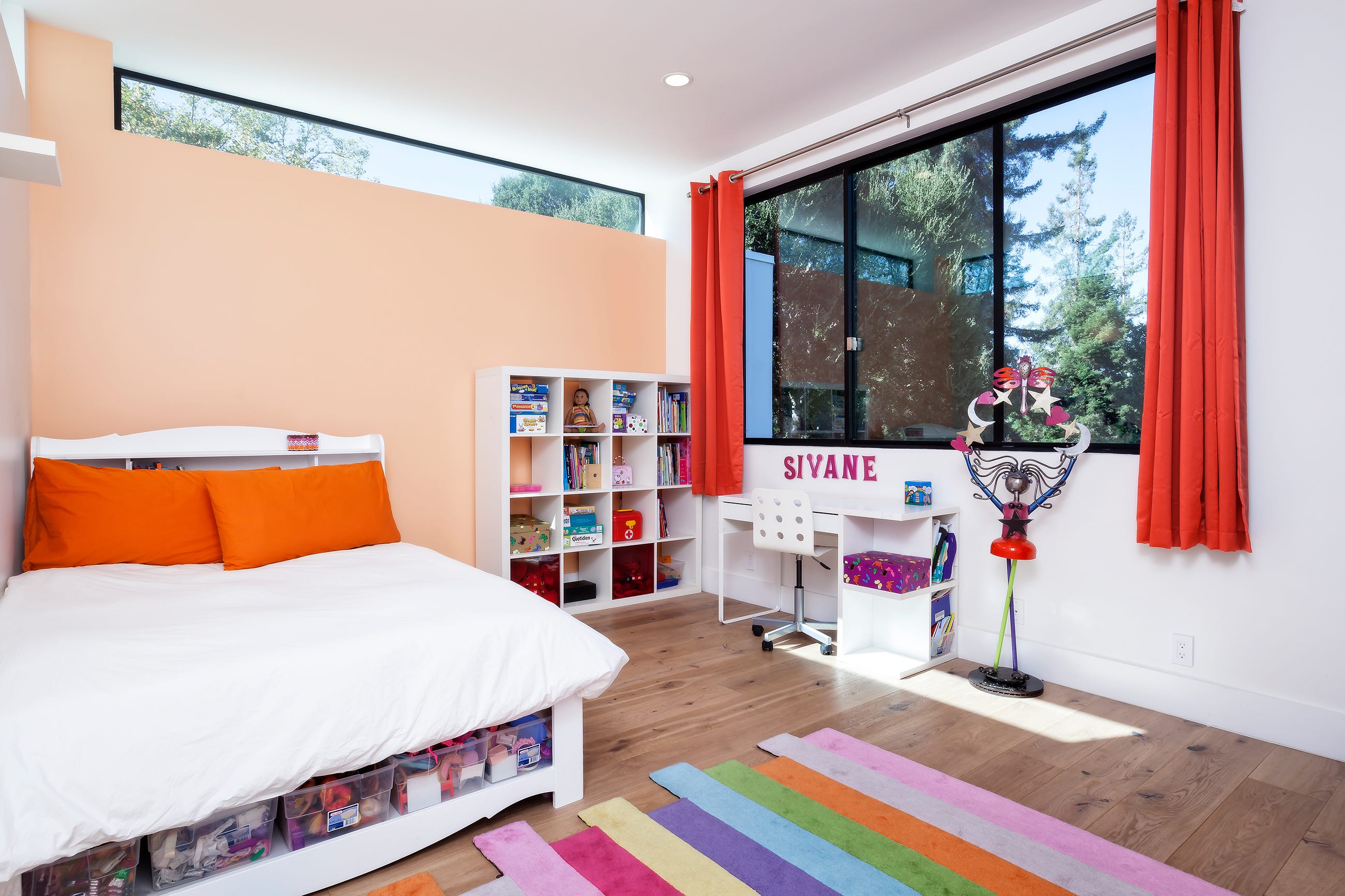
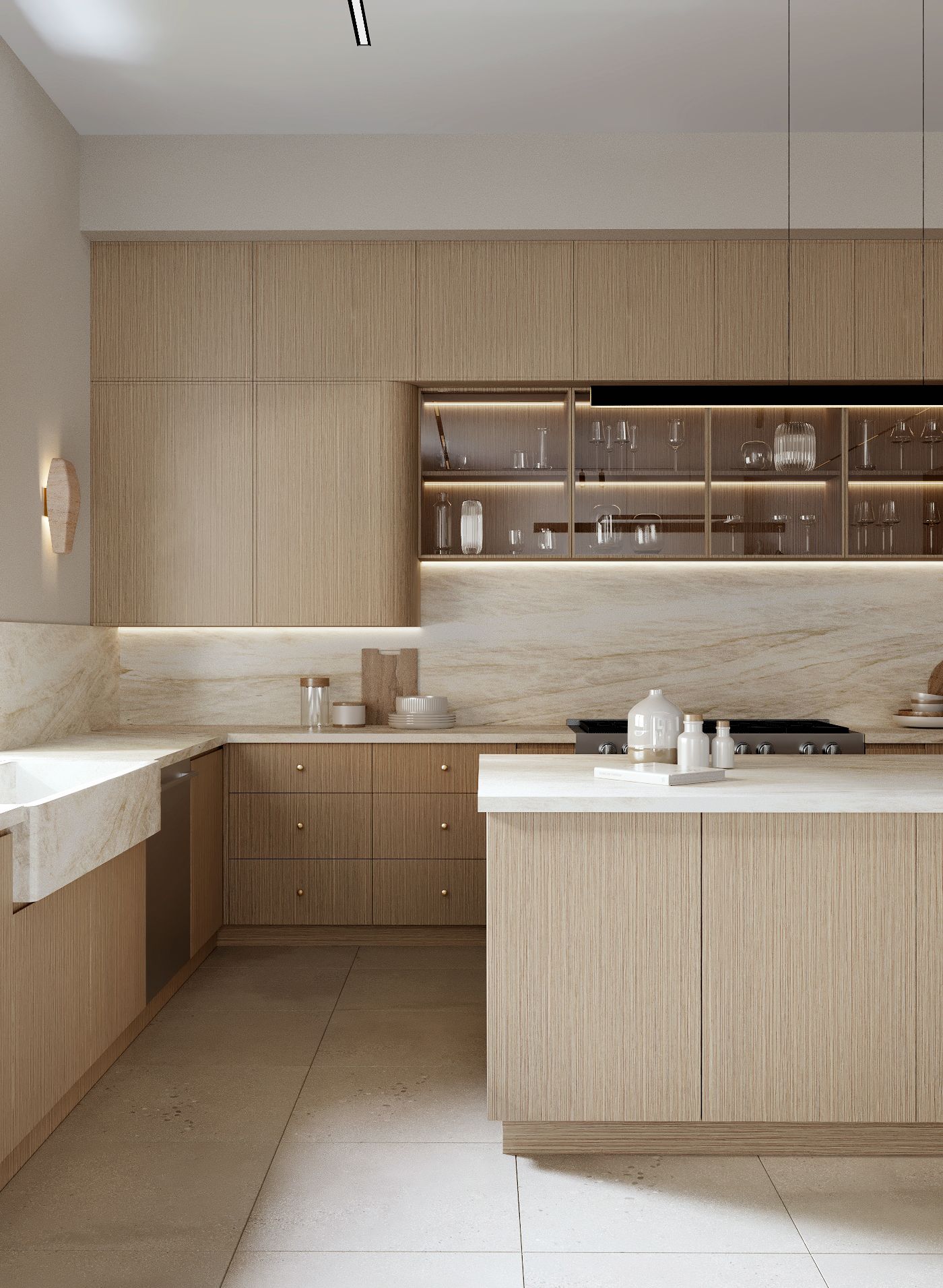
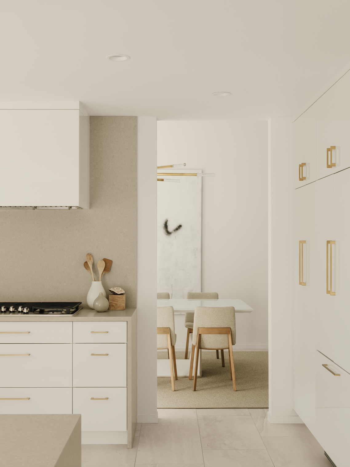
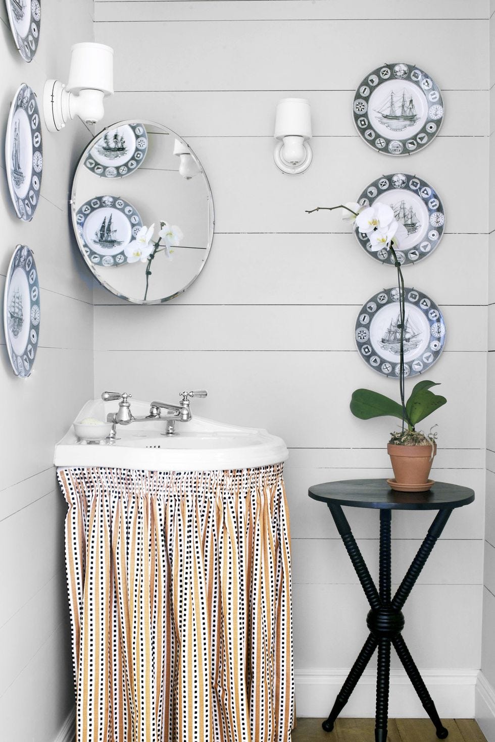
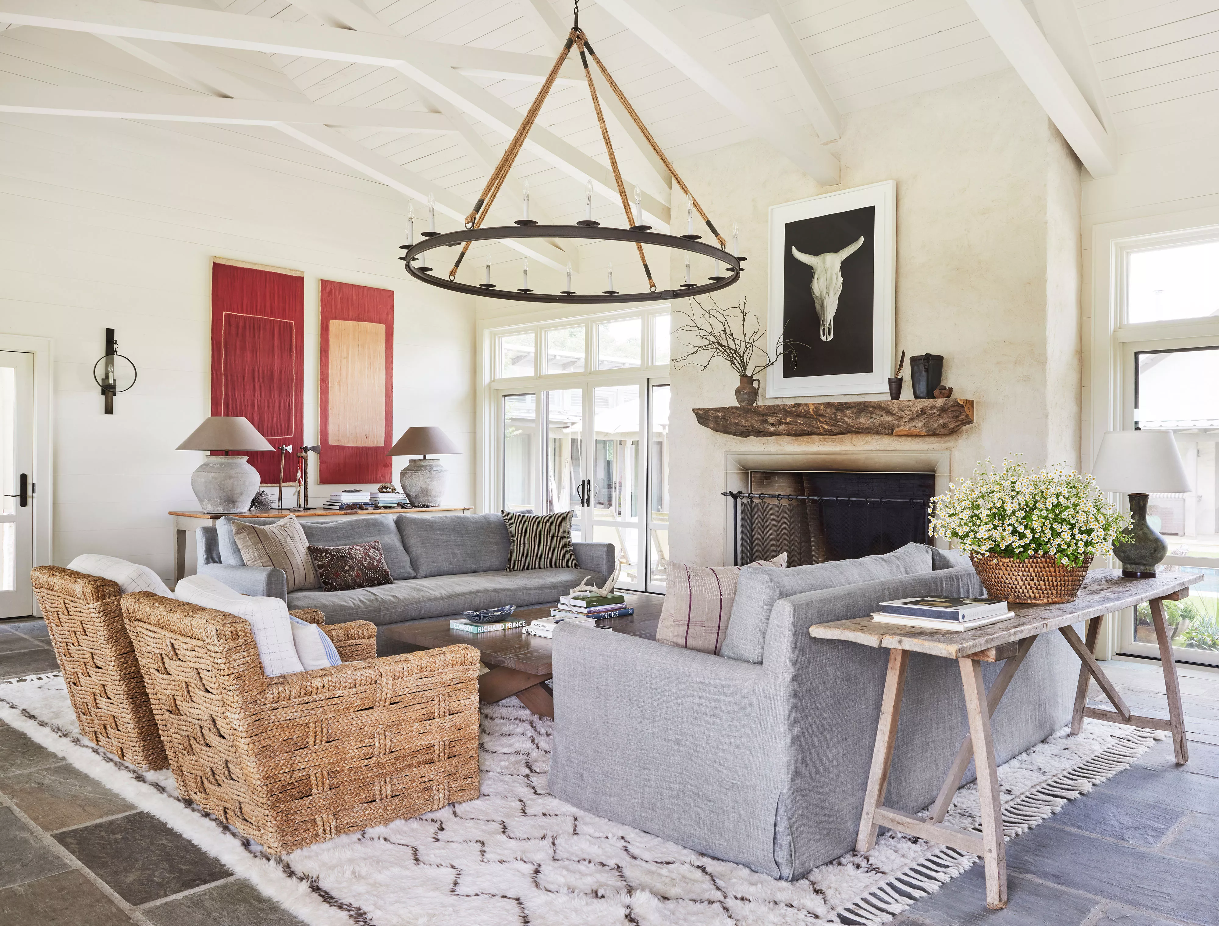
Off-white paint colors offer a versatile solution for home interiors, blending warmth and brightness to create inviting and spacious environments without the starkness often associated with pure white. These shades are adaptable to various decor styles and are frequently recommended by paint industry experts for their timeless appeal and ability to make rooms appear larger and more luminous. The selection of an off-white color involves considering its undertones, which can range from warm hues like taupe or pink to cooler tones such as green and gray.
Among the top recommendations is Alabaster by Sherwin-Williams, celebrated for its balanced brightness and warmth, making it suitable for creating a cozy atmosphere throughout a home. Benjamin Moore's Linen White is another expert-favored option, offering a creamy yet elegant touch that harmonizes with both modern and farmhouse aesthetics. Its versatility allows for sophisticated white-on-white schemes or contrasting pairings with deeper colors.
Behr's Whipped Cream is highlighted for its delicate, airy quality with a subtle green undertone, making it ideal for natural color palettes and effective when paired with blues or colors with golden undertones. Glidden's Focus provides a classic, warm, and creamy off-white that promotes a relaxed ambiance, complementing neutral shades like greige, tan, and gray, and can be accented with deep blue for contrast.
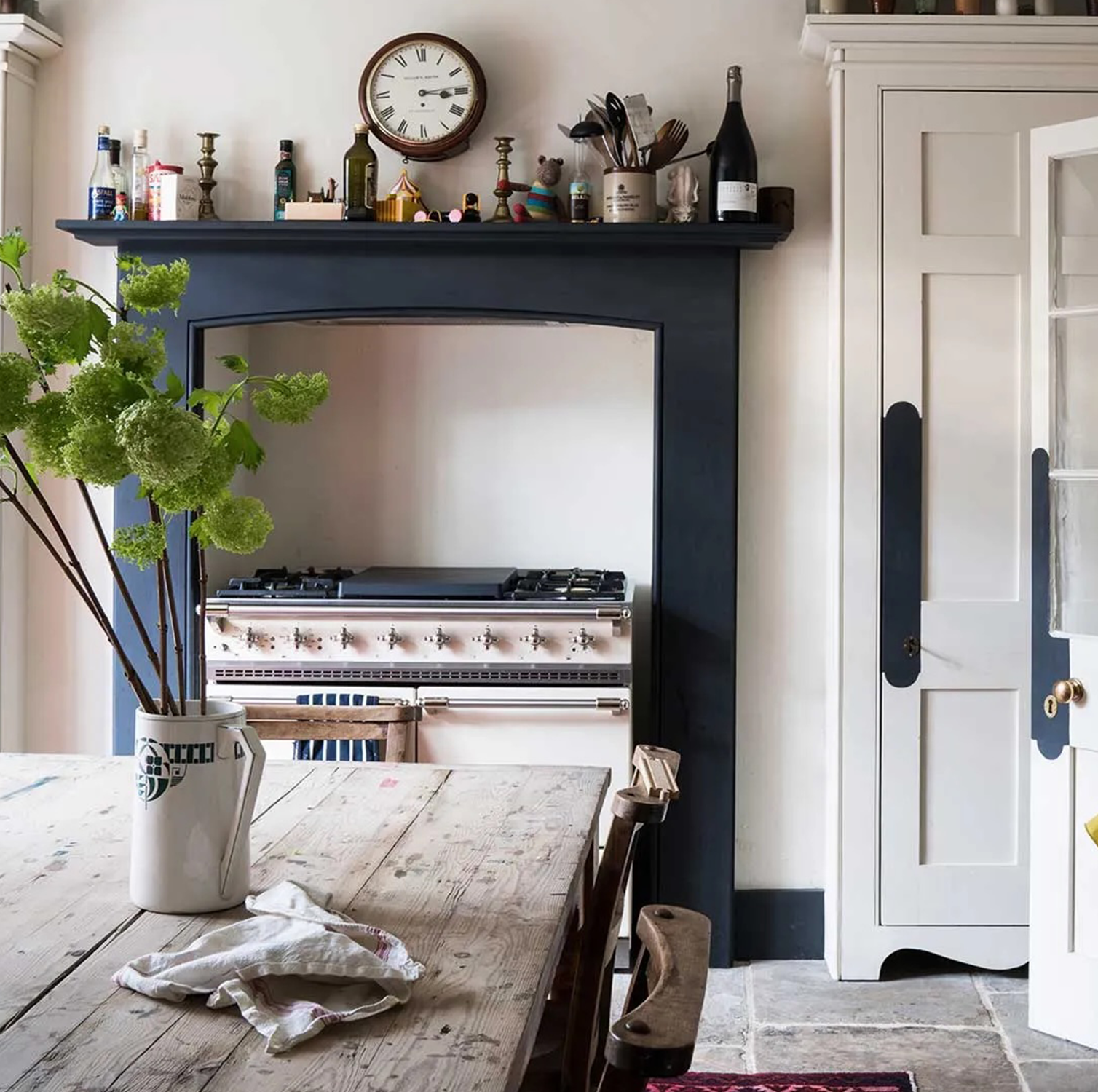
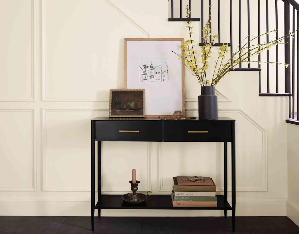
Simplified White by Dutch Boy Paints is recognized for its clean and elegant appearance, suitable for contemporary and traditional settings. Its subtle warmth creates a welcoming feel, especially in open floor plans and kitchens. Natural Linen by HGTV Home by Sherwin-Williams is an off-white that enhances natural light, making smaller spaces feel more expansive, and pairs well with architectural details like picture frame molding. Behr's Blank Canvas is a widely popular choice, known for its creamy undertone that makes spaces feel welcoming rather than stark, and it works seamlessly with both warm and cool color schemes.
Benjamin Moore's Horizon offers a serene off-white with delicate blue and gray undertones, serving as a sophisticated backdrop for various design elements and artwork. Wevet by Farrow & Ball is a translucent, barely-there off-white with minimal gray undertones, providing a clean and modern feel. Ultra White by Dutch Boy Paints is a bright, clean off-white that excels in contemporary spaces, reflecting light to enlarge rooms and contrasting well with bold accent pieces.
Sherwin-Williams' Oyster White presents a soft, calming backdrop with a slight green-beige undertone, suitable for achieving a sophisticated aesthetic, especially when combined with natural finishes or vibrant colors. Dimity by Farrow & Ball is noted for its compelling warm undertones, leaning towards taupe or pink depending on its accompanying colors, and serves as an excellent complementary white for earthy warm tones. Lastly, Glidden's Blank Canvas, distinct from Behr's, features a warmer, beige-leaning undertone that fosters a cozy and welcoming atmosphere, particularly when paired with natural woods and crisp white accents.
#OffWhitePaintColors #InteriorDesign #HomeDecor #PaintExperts #RoomBrightness #SpaciousInteriors #ColorSelection #PaintTrends #OffWhitePaintColors #InteriorDesign #HomeDecor #PaintExperts #RoomBrightness #SpaciousInteriors #ColorSelection #PaintTrends
0 comment in total
 No comments yet
You may also like
These 6 paint colours instantly make small rooms feel bigger
The Brighter, the Better—These Vibrant Paints Will Infuse Your Home With Positivity

These Accent Color Ideas Will Transform Any Room

13 Off-White Paint Colors the Experts Recommend for Any Space

13 Best Off-White Paint Colors, According to Interior Designers

What Colors Make a Room Look Bigger? 5 That Designers Reach for to Make Walls 'Visually Expand'

12 Paint Colors That Will Make Small Rooms Feel Bigger
How to make a room look bigger with paint: 10 expert tips

14 Paint Colors That Can Make a Room Feel Instantly Cozy

12 Paint Colors That Will Make Any Room Look Bigger
"Help, My White Walls Look Blue" — Here's Why It's Happening, and How to Fix This Common Problem
10 kitchen cabinet colors to make a small space look bigger

13 Off-White Paint Colors That Experts Always Recommend to Make Rooms Feel Bigger and Brighter
12 Tips For Making Small Rooms Appear Larger Using Paint

Six things you need to know before painting a room off-white — and five beautiful tints to consider
18 Best Paint Colors to Make Small Bathrooms Feel Bigger

9 rooms that prove color drenching makes small spaces look bigger

The 13 Best Paint Colors for Low-Light Rooms

Beige, Begone: Bring Your Walls to Life With These 14 Beautifully Bold Colors

13 Off-White Paint Colors the Experts Recommend for Any Space