1/14
13 Best Off-White Paint Colors, According to Interior Designers
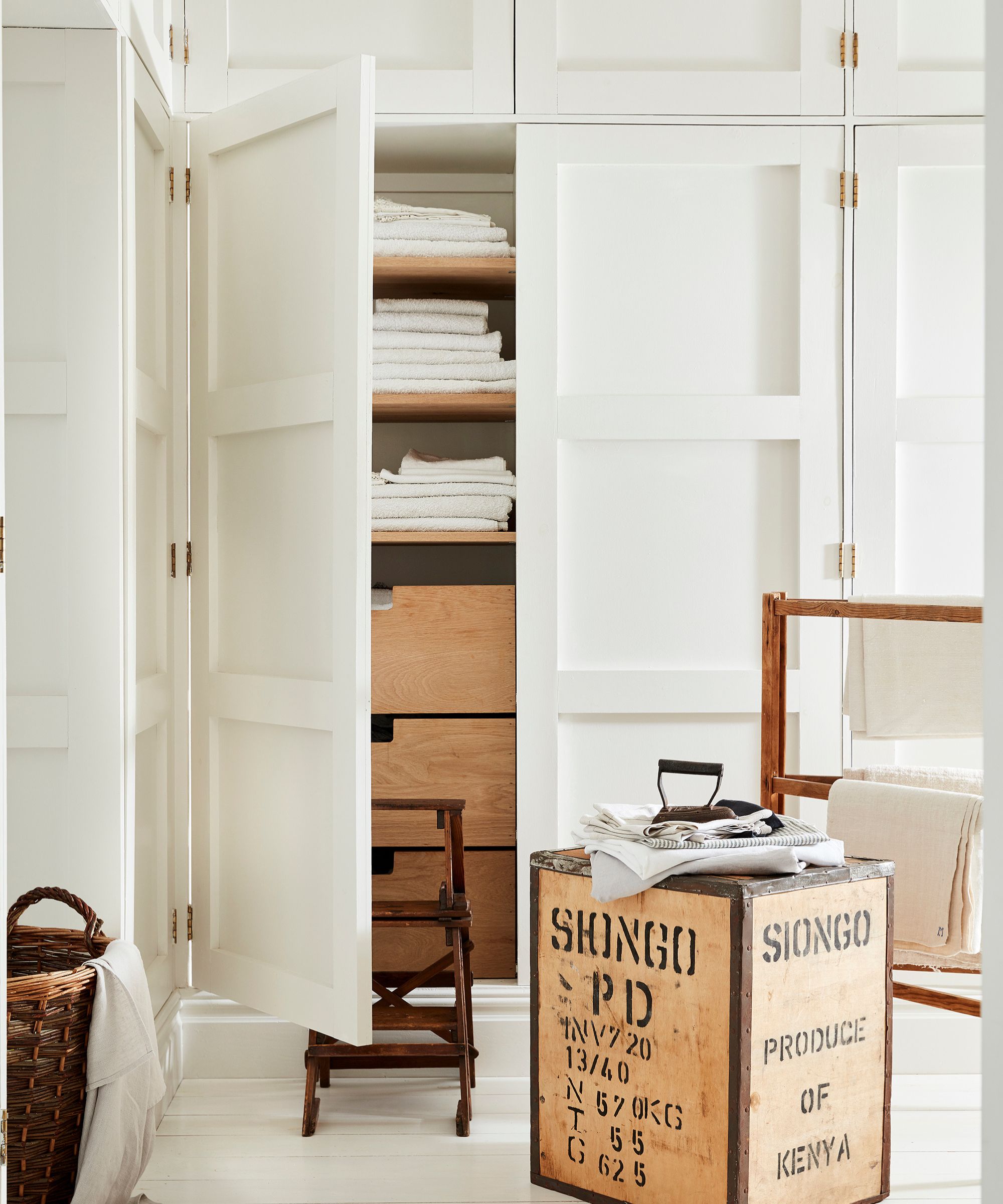
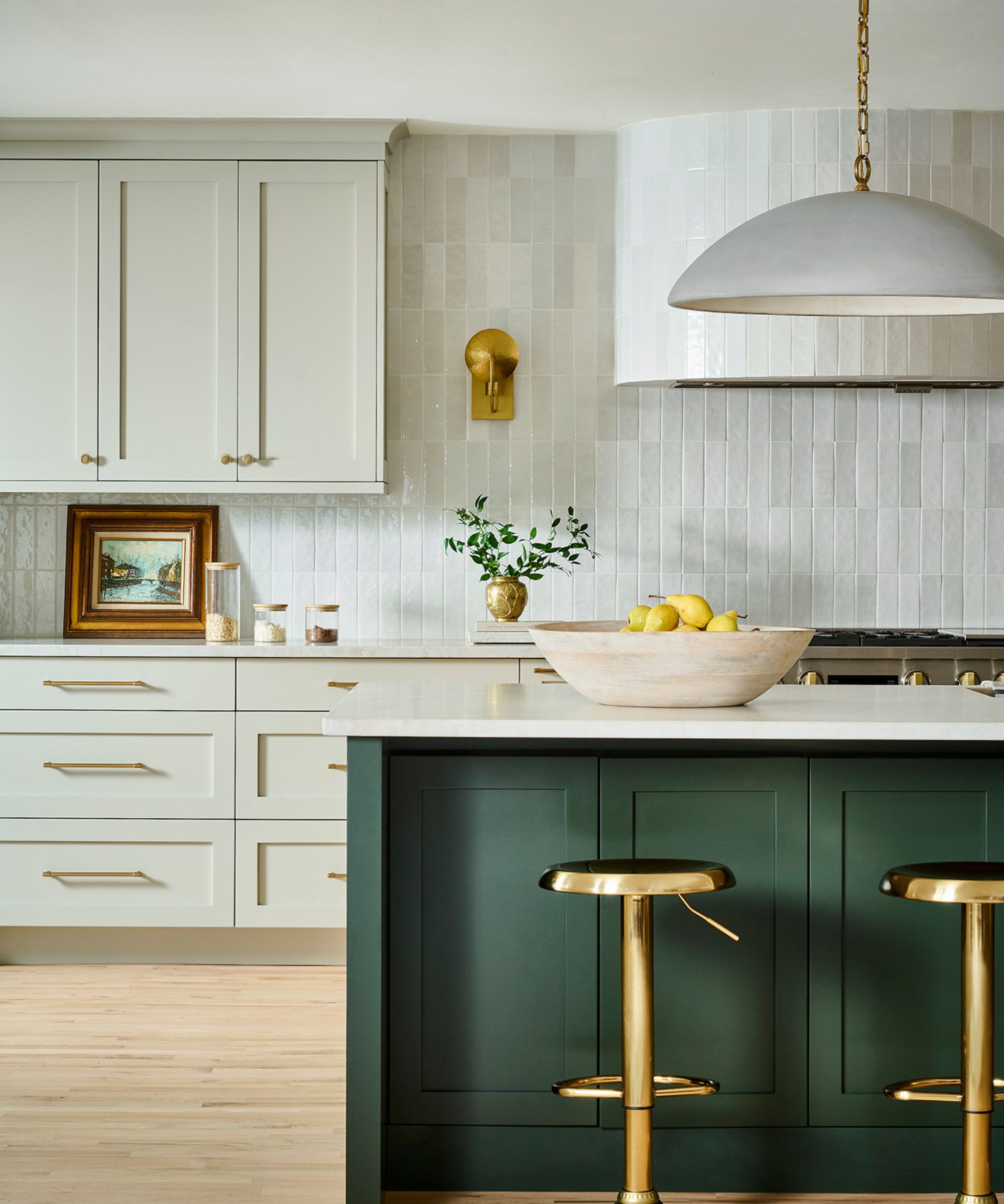
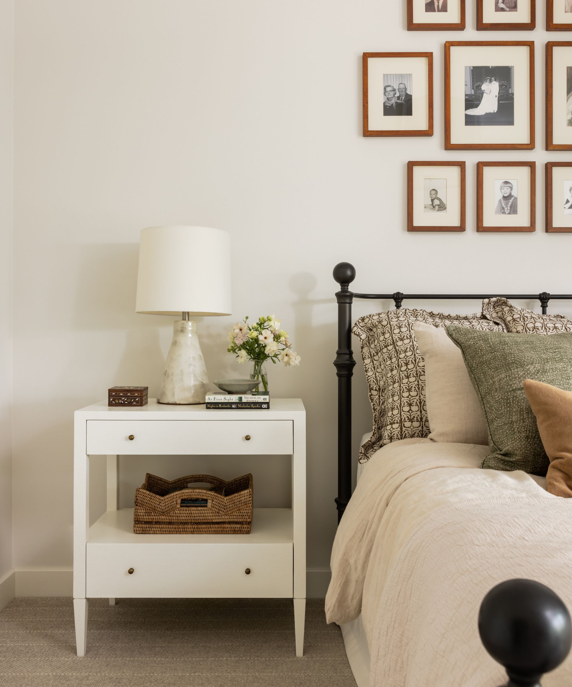
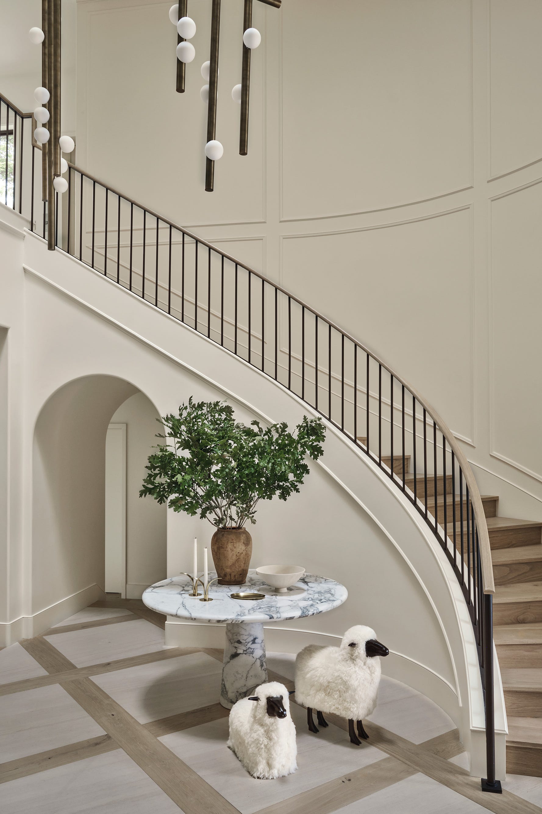
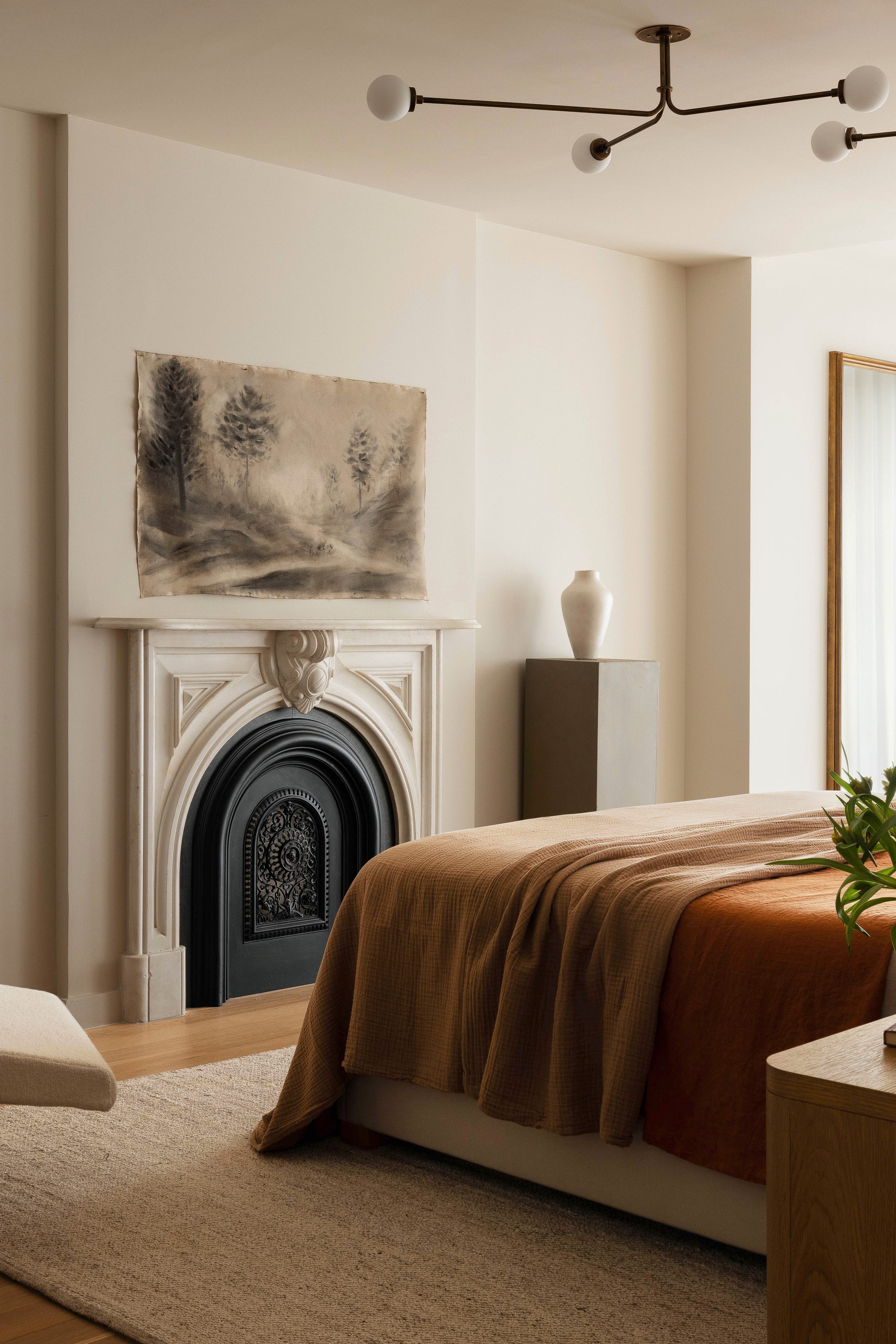
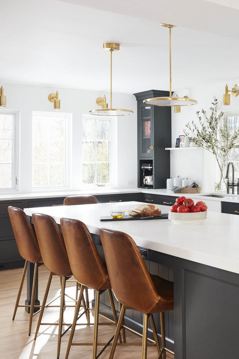
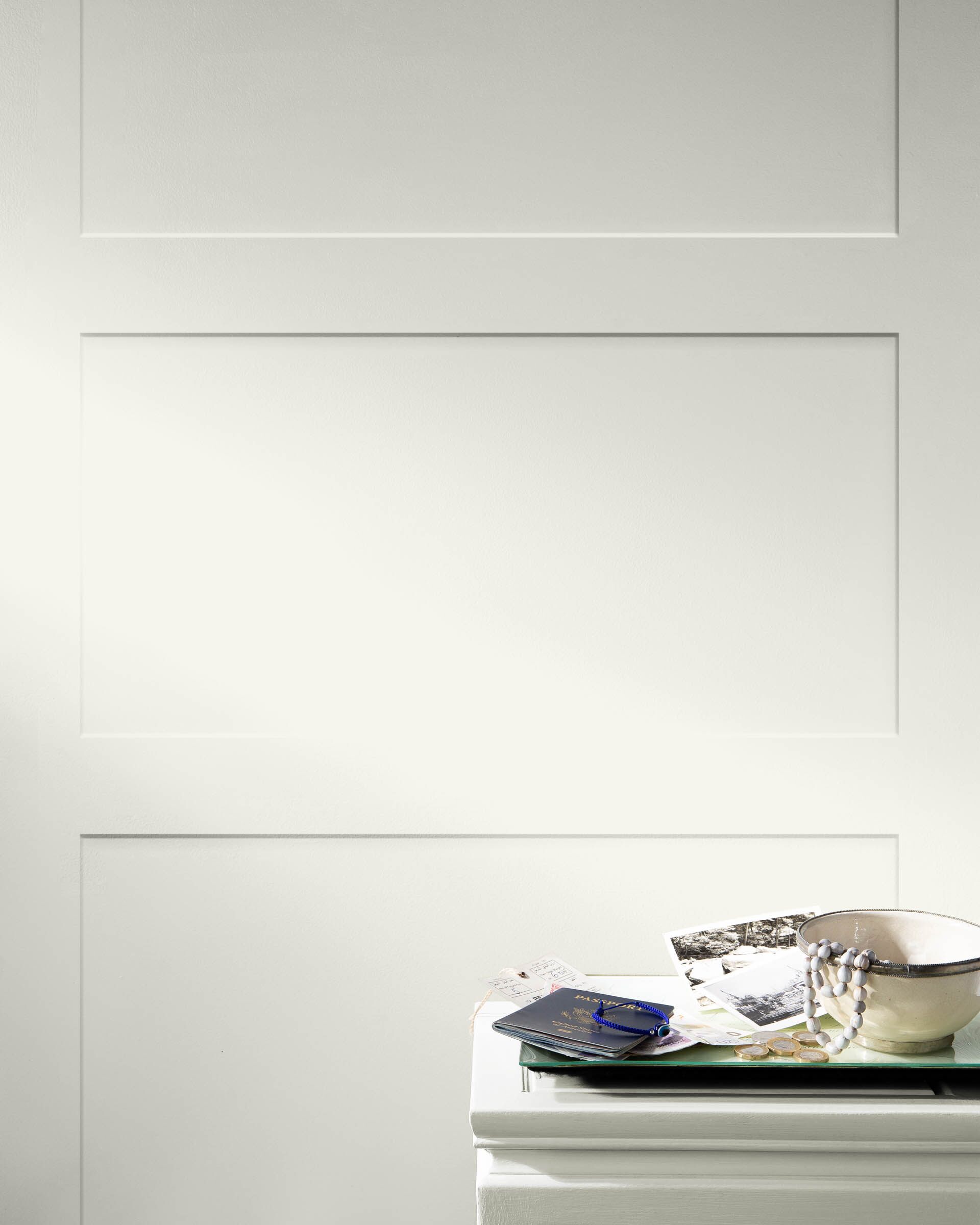
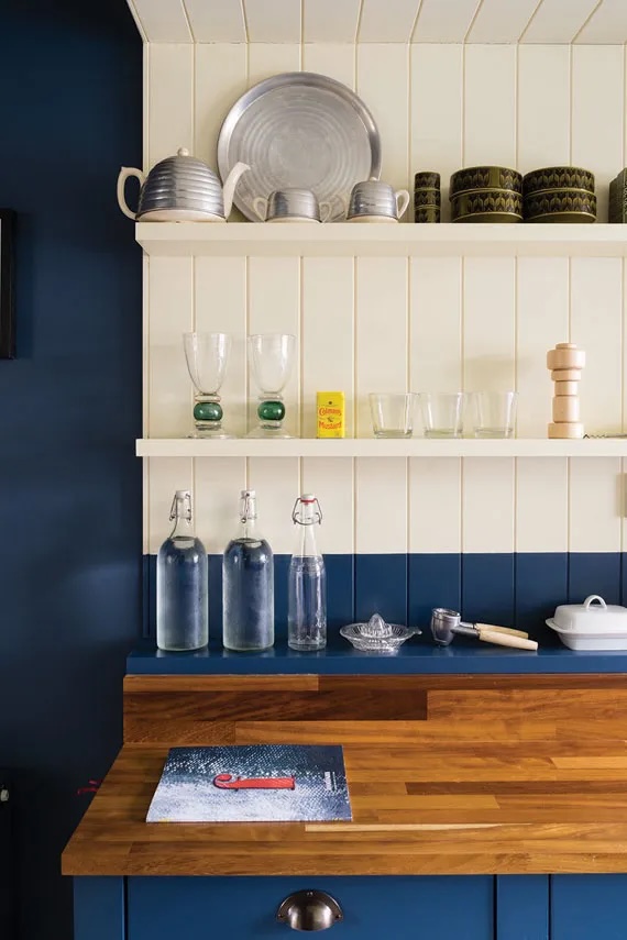
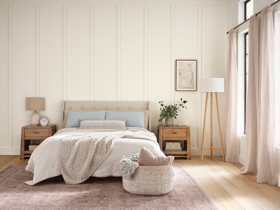
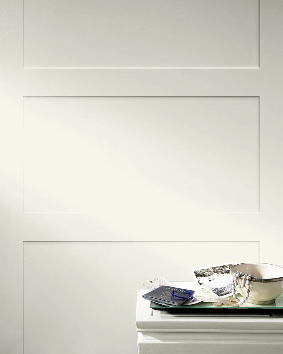
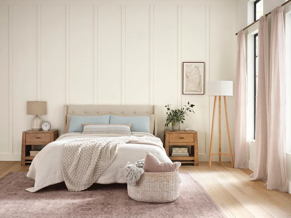
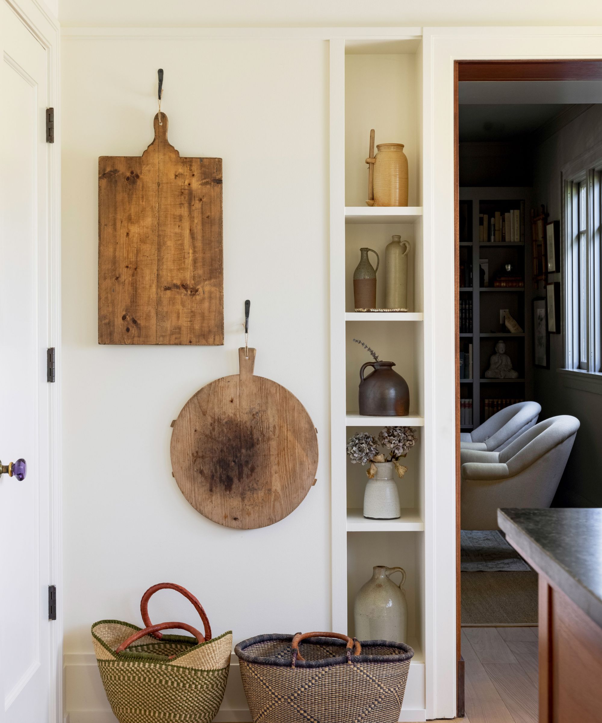
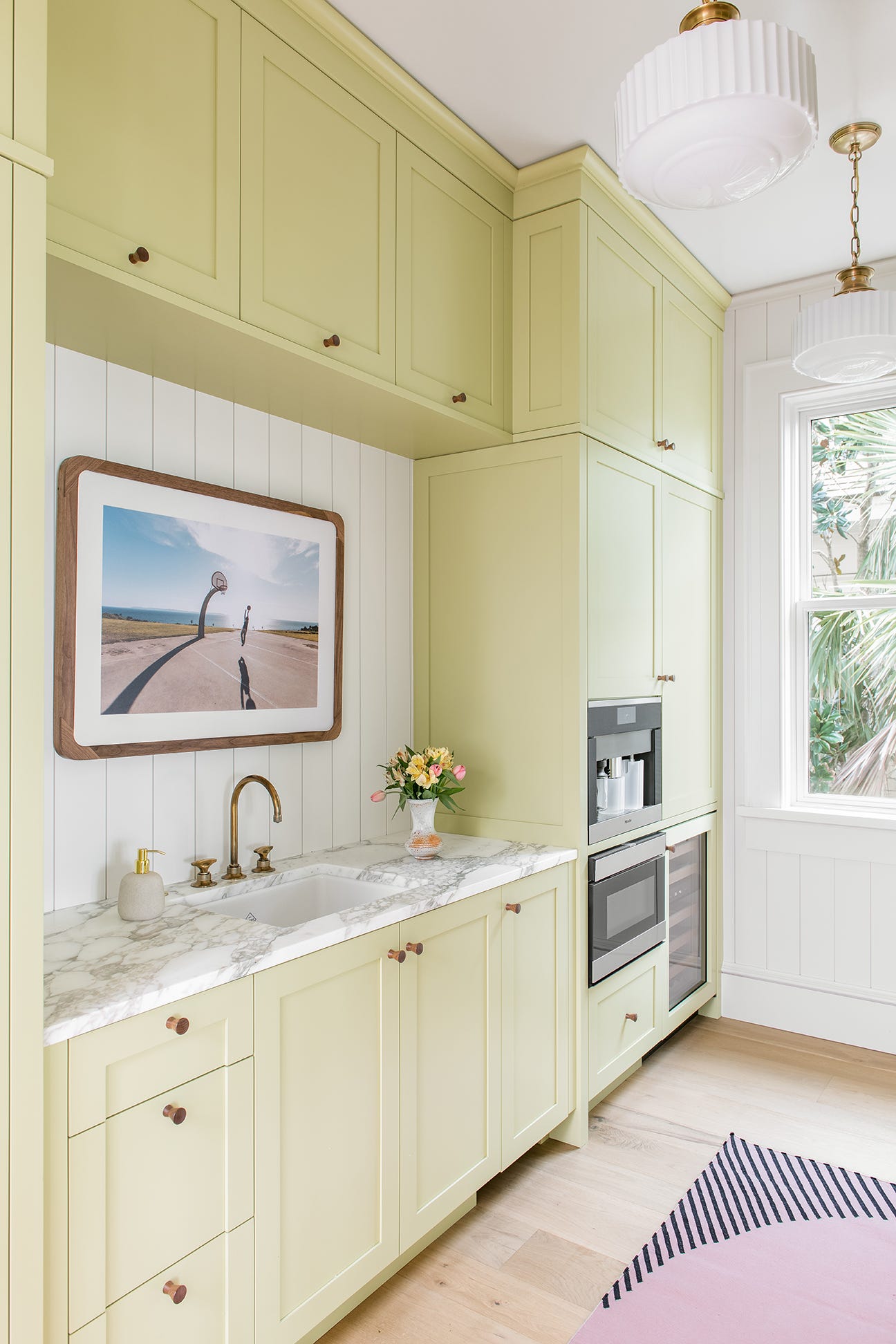
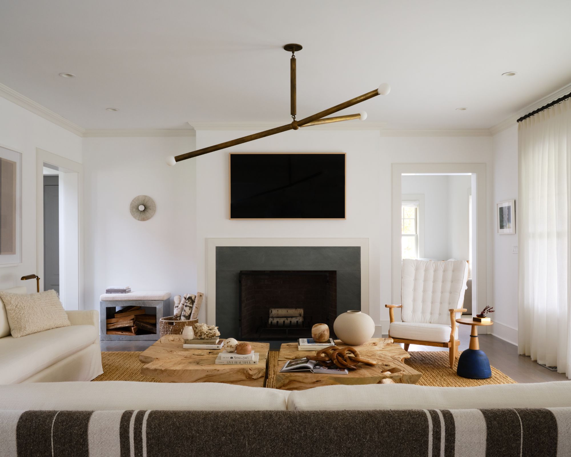
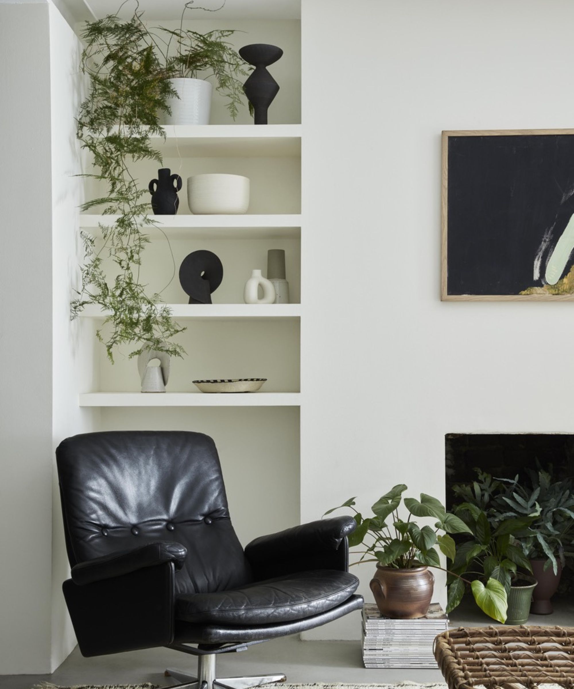
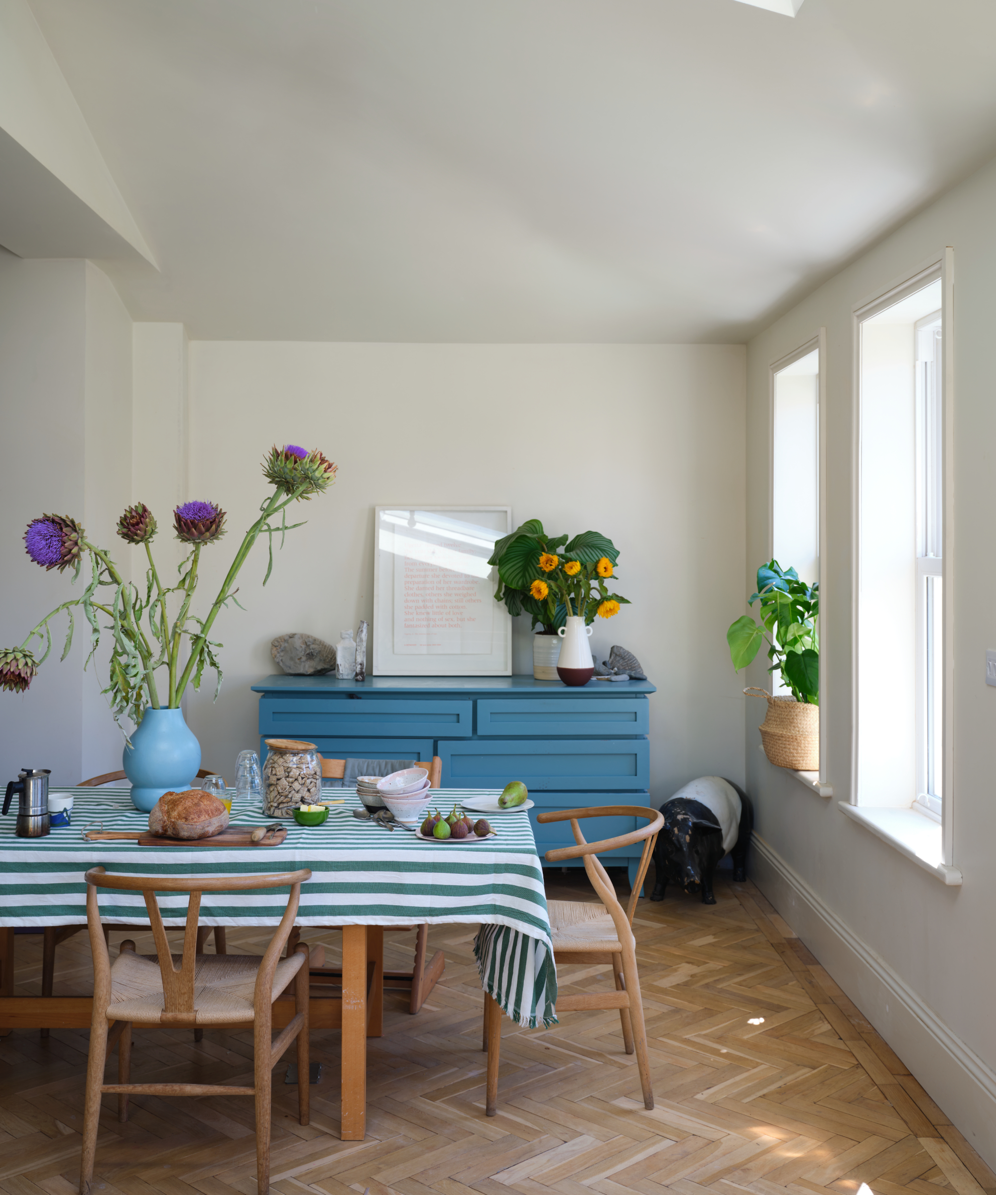
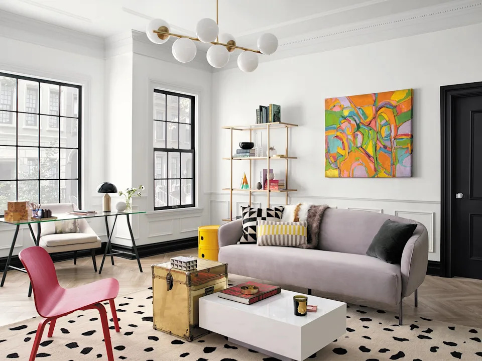
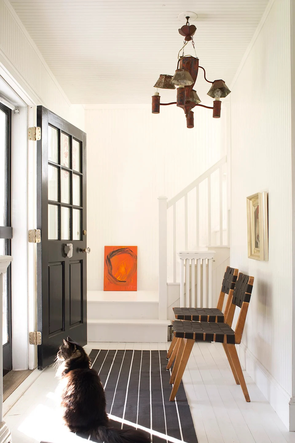
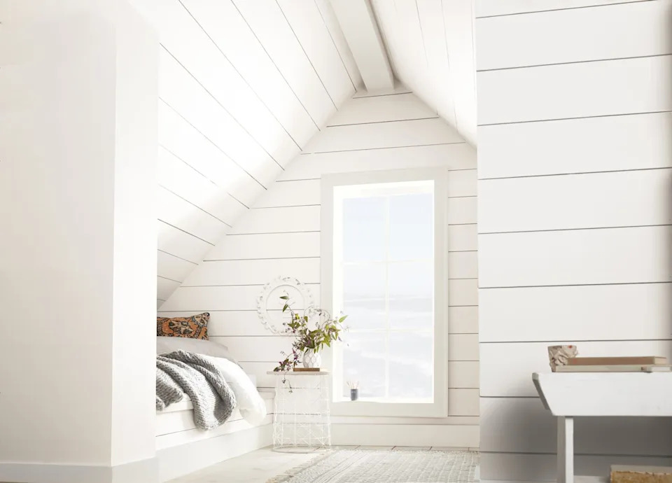
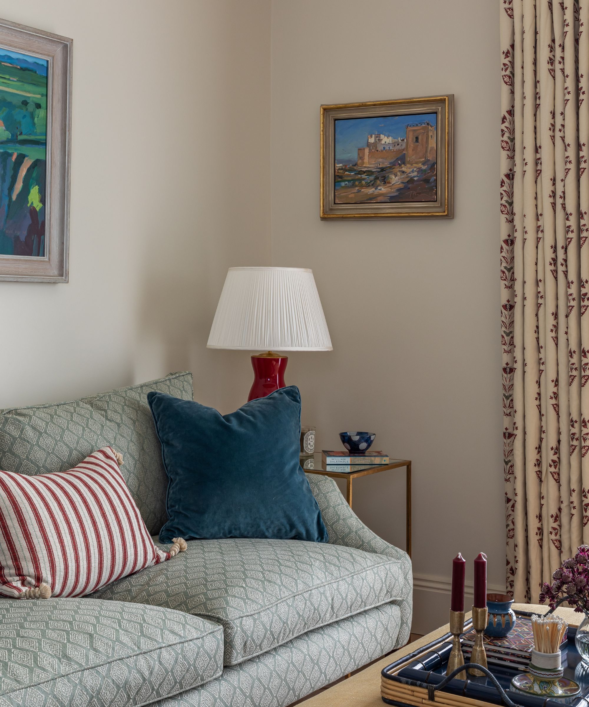
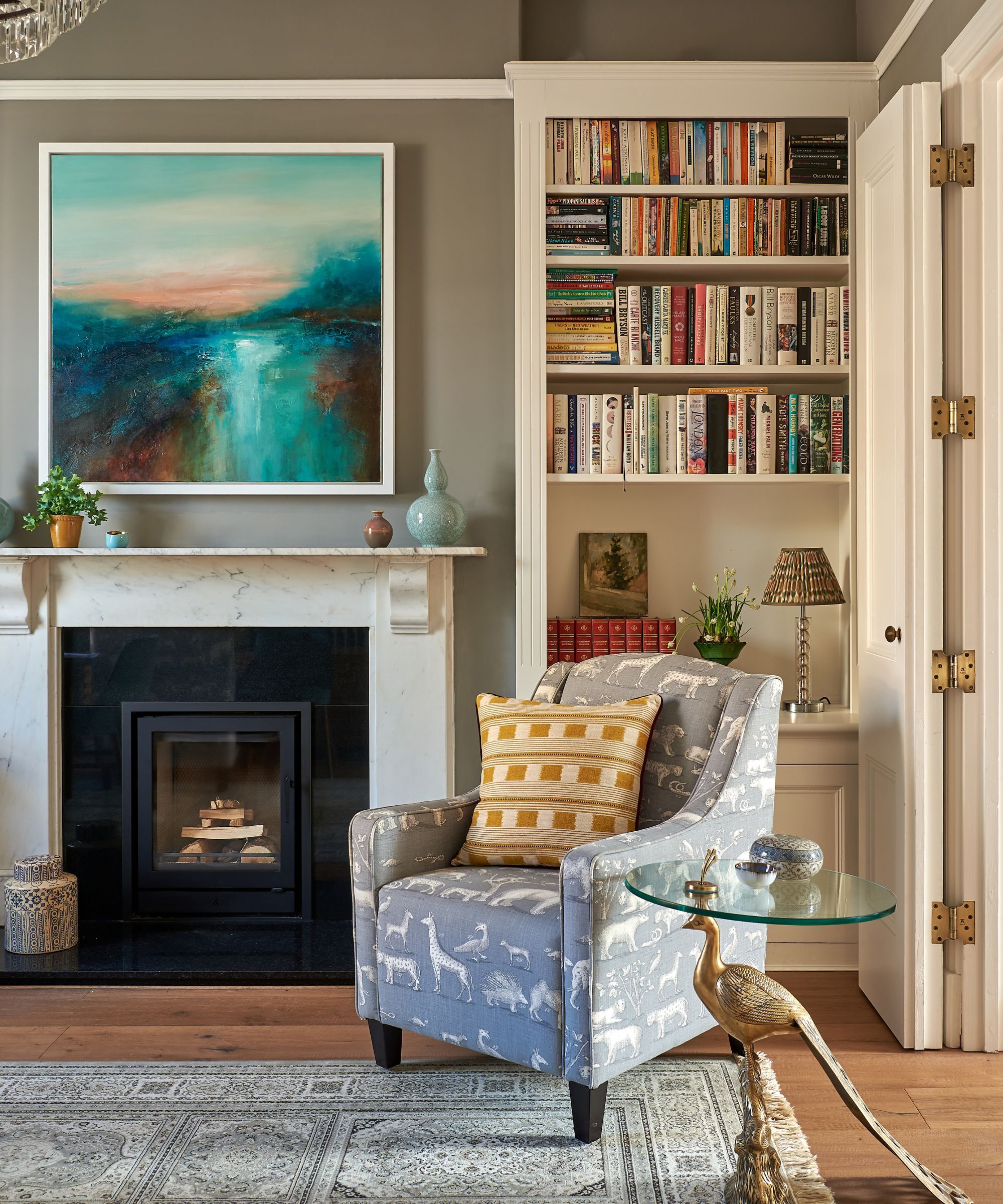
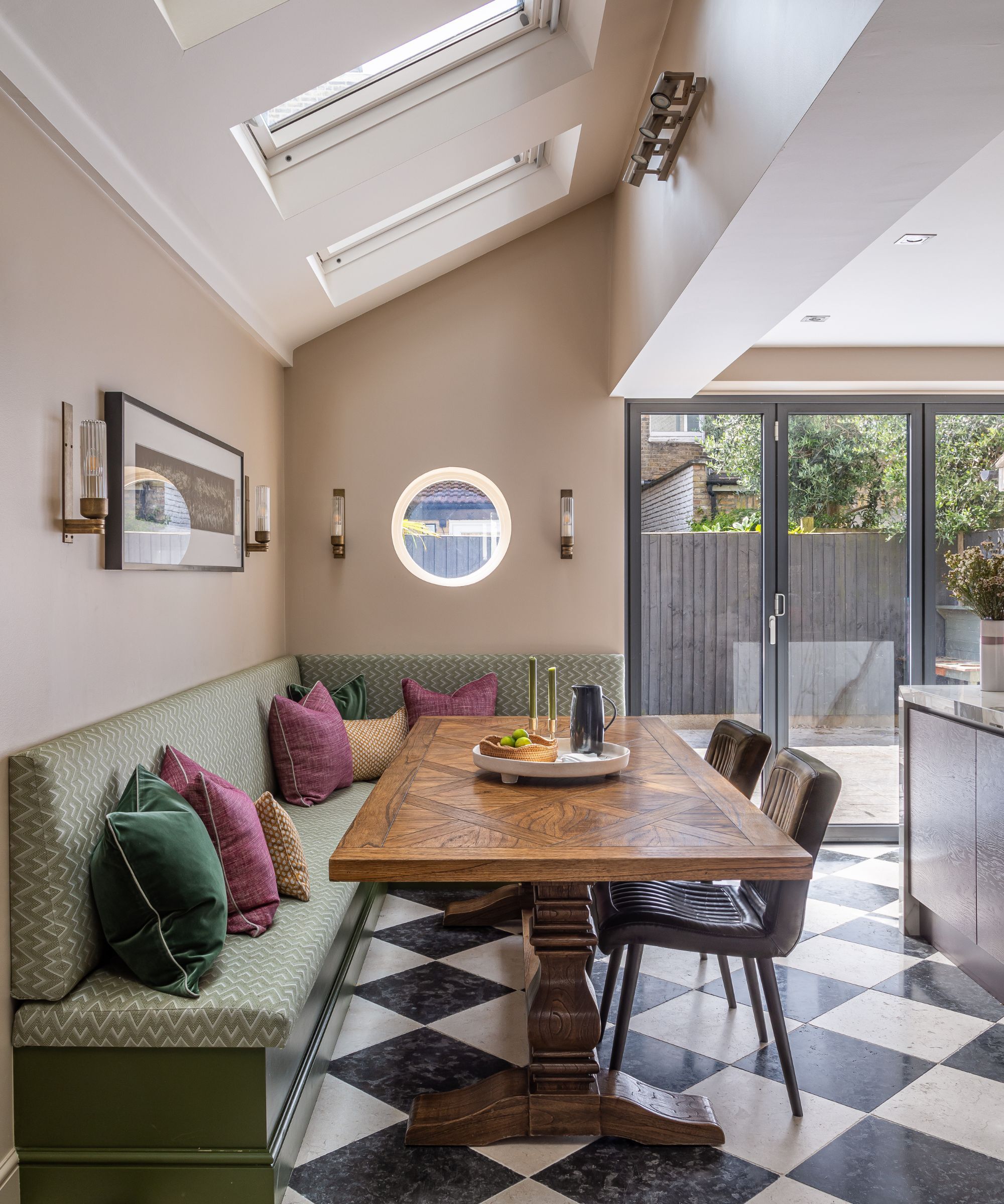
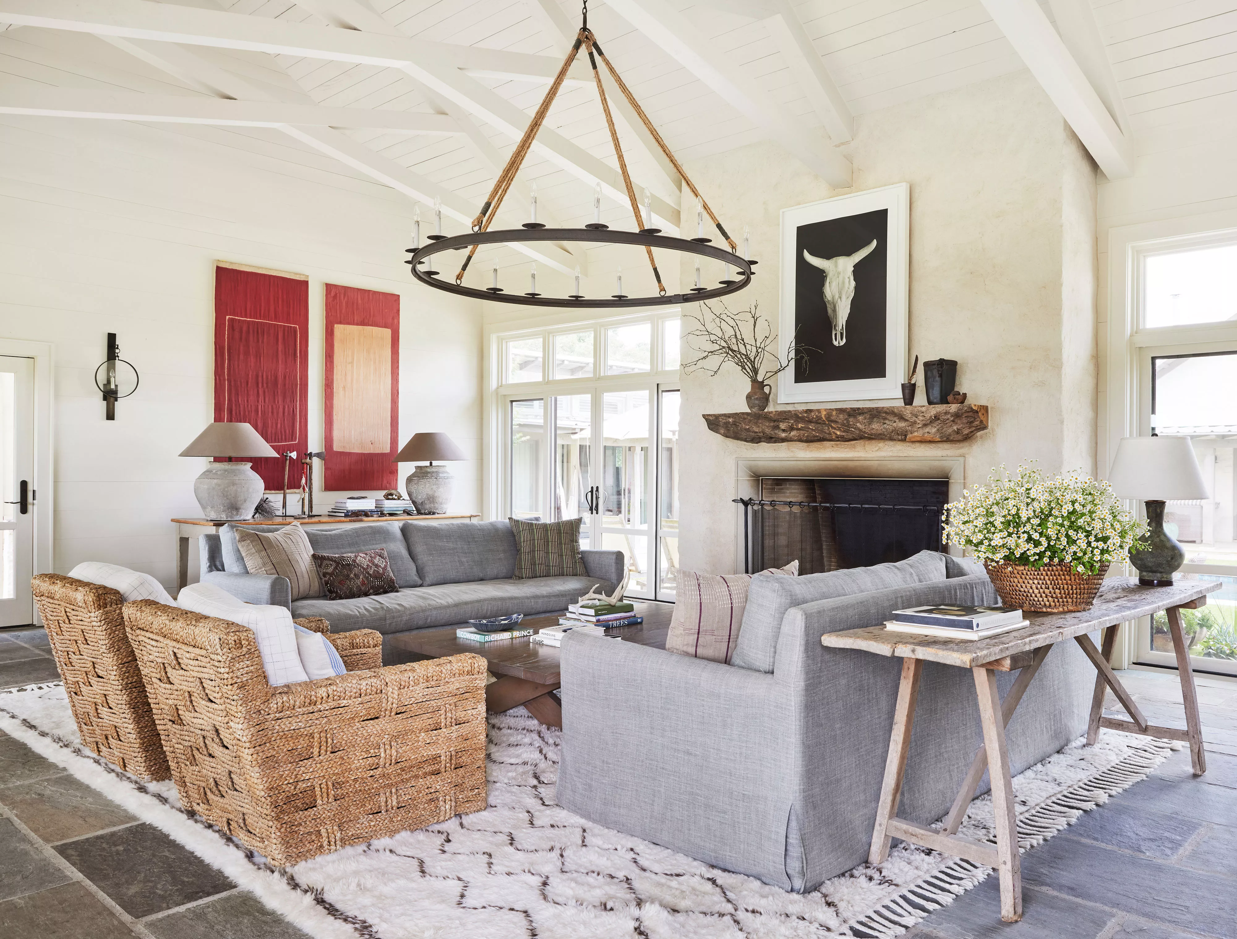
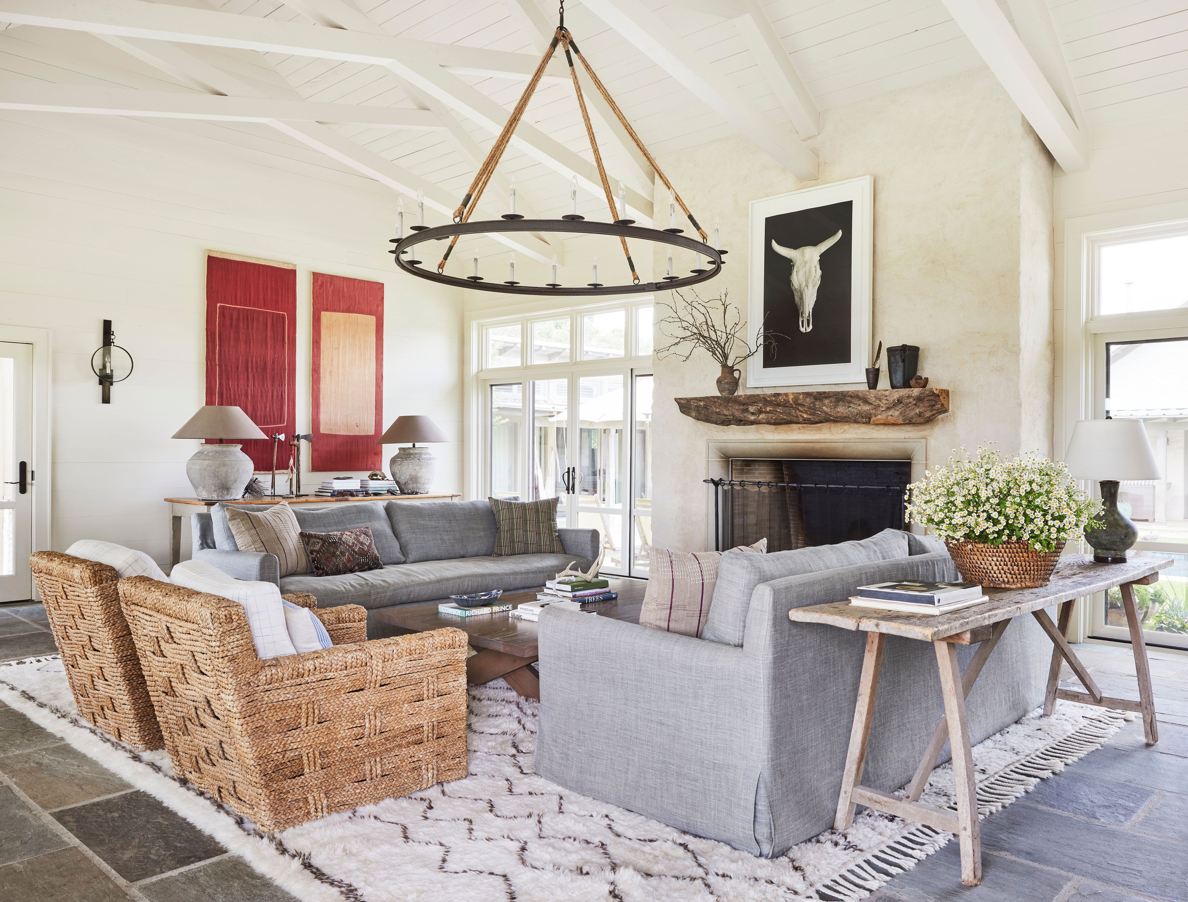
The popularity of off-white paint colors in interior design is explored, highlighting their continued appeal despite a growing trend towards bolder choices. Off-white shades offer a sense of grounding and coziness without making a room feel dark or heavy, providing warmth and approachability. Interior designers frequently recommend off-white as a versatile and forgiving option suitable for various interior design styles and aesthetics.
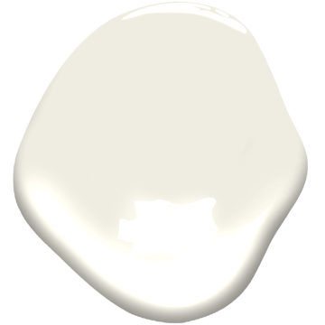
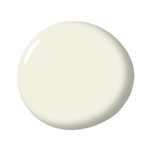
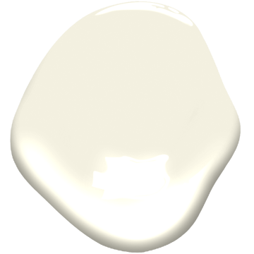
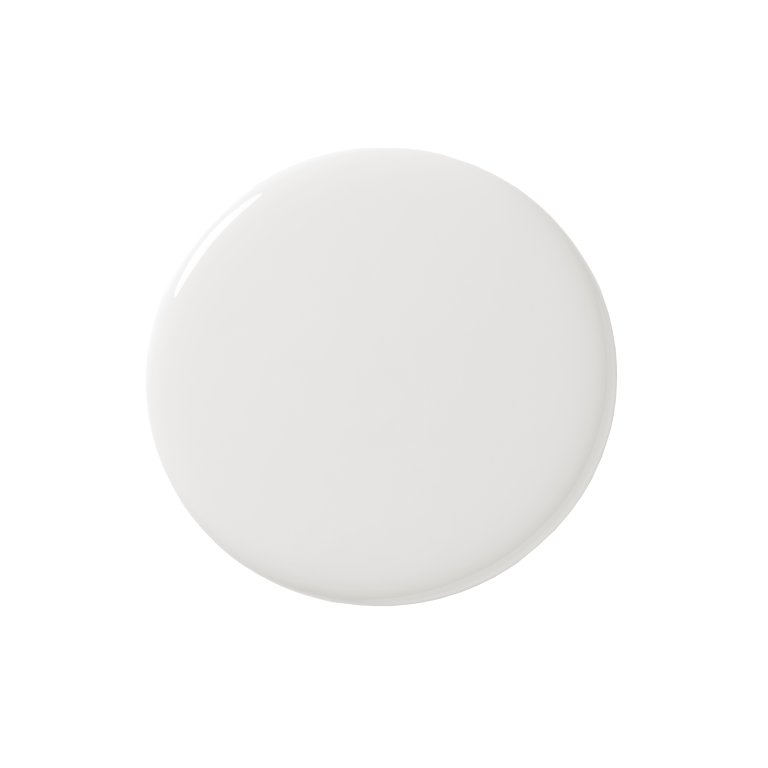
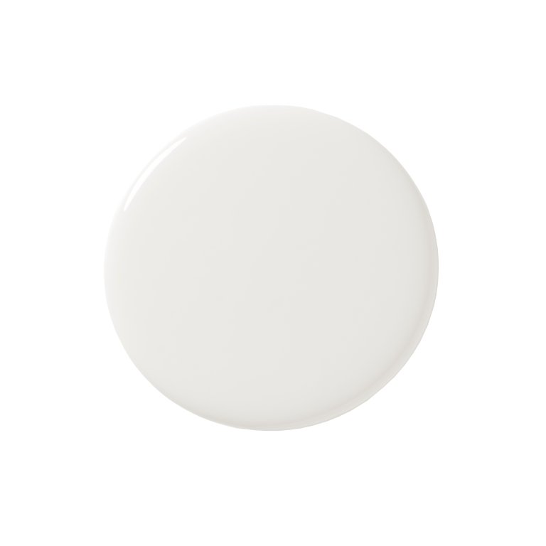
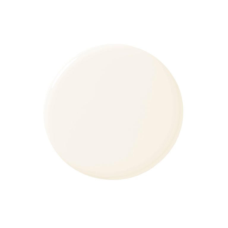
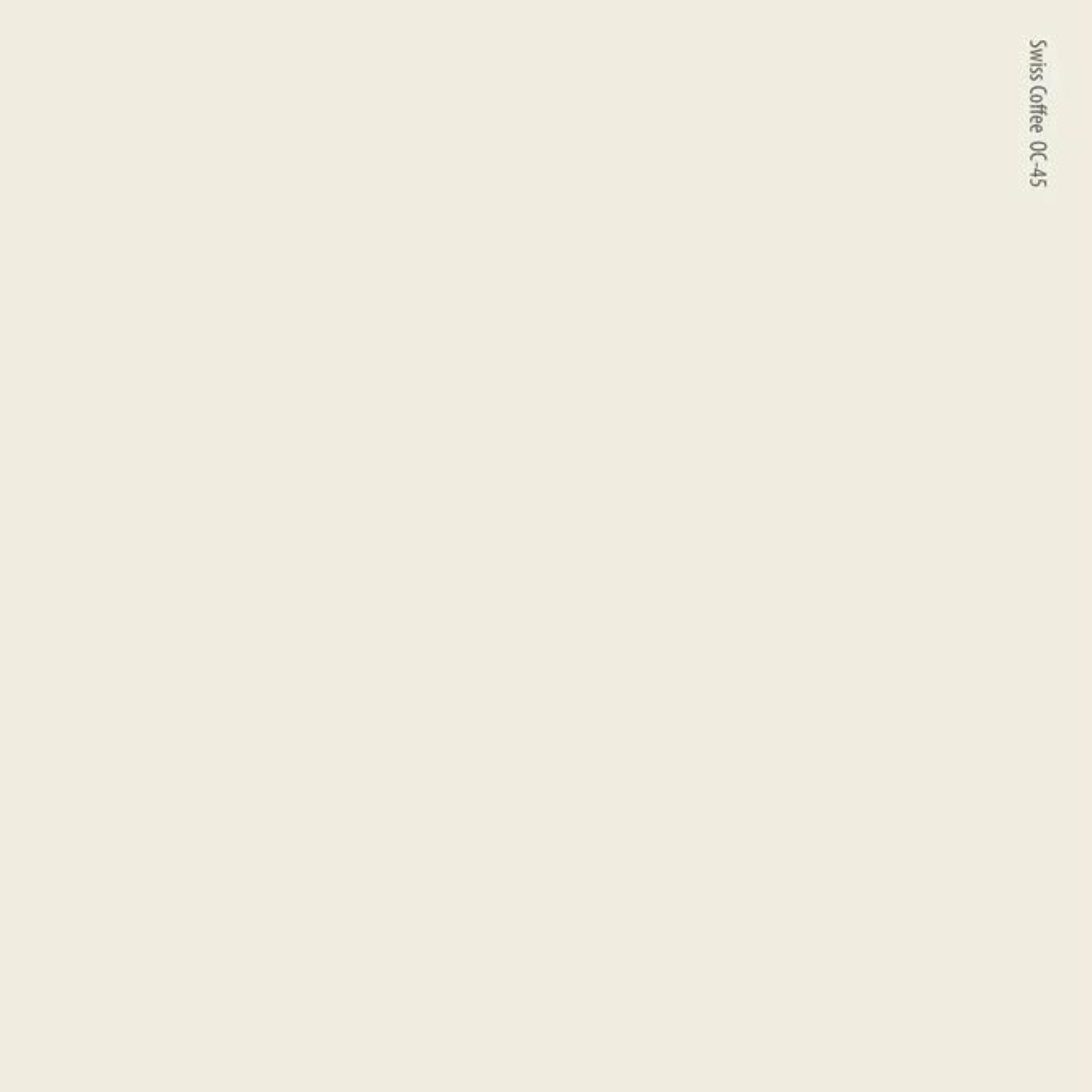
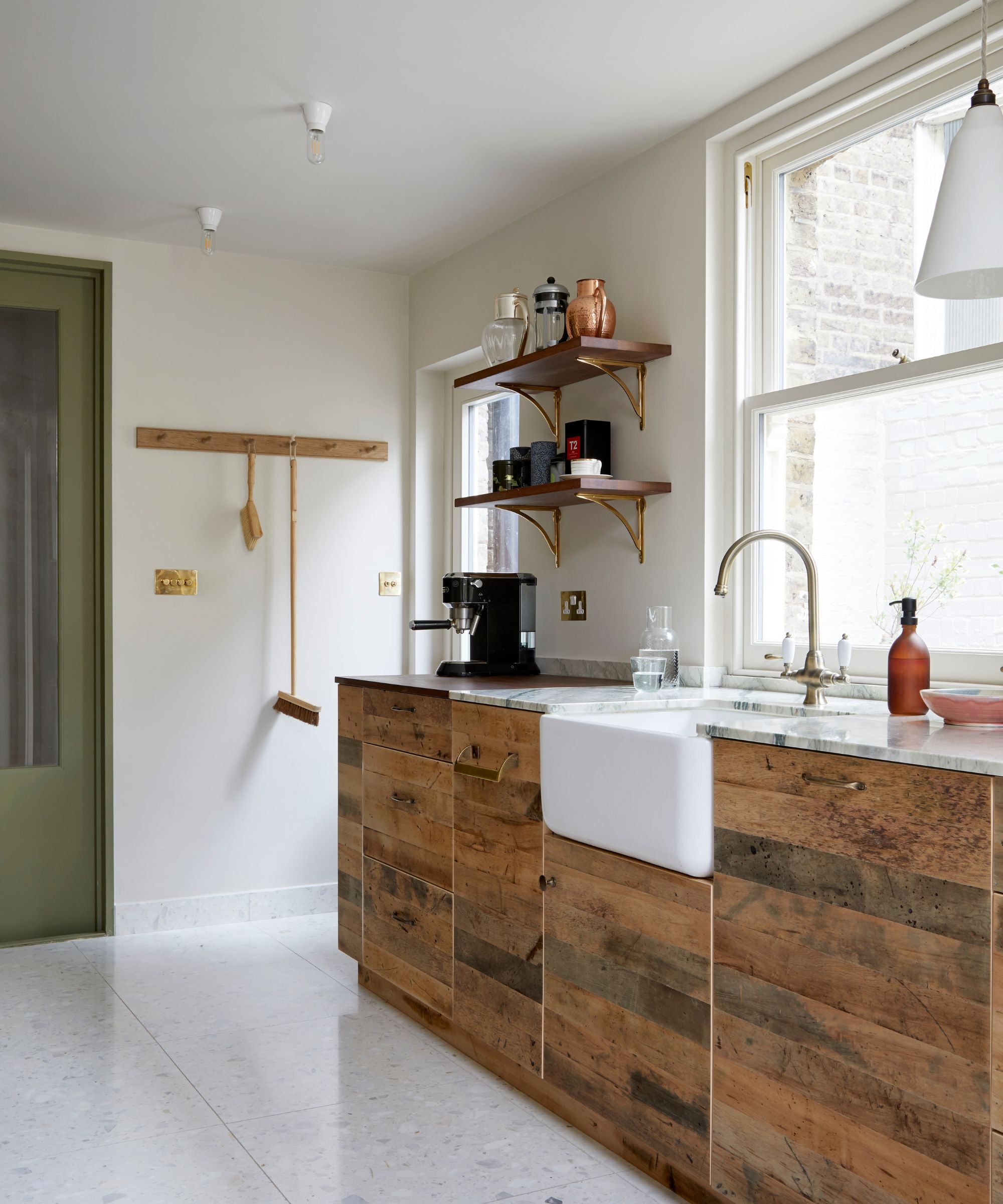
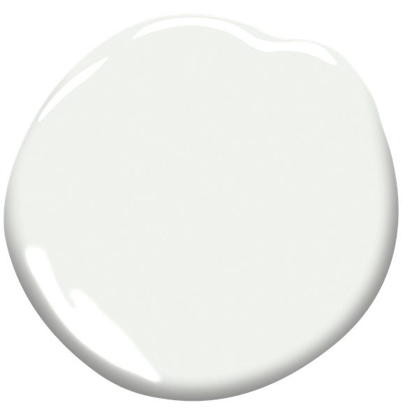
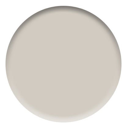
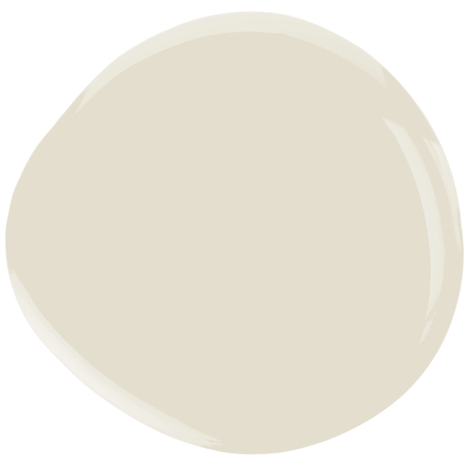
Several specific off-white paint colors are recommended by various designers. 'Swiss Coffee' by Benjamin Moore is praised by Cathryn Erickson of Cathryn Lindsey Design for its warm, soft, and cozy feel that still reads as white. Jamie Lyn Smith of Smith Home Studios favors Farrow & Ball's 'Wimborne White,' noting its perfect complement to natural light and warm wood tones. Ashley Macuga of Collected Interiors observes a shift from crisp whites like Benjamin Moore’s 'Chantilly Lace' to softer hues like Benjamin Moore’s 'Pale Oak.' 'Alabaster' by Sherwin-Williams is Ellie Christopher's choice for its ability to provide warmth without yellow undertones, creating a peaceful and cozy atmosphere.
Alanna Call of CID Design Group recommends Glidden's 'Oyster White' as an excellent foundational color, serving as a quiet anchor that supports layered palettes and creates grounded, calm, and restorative spaces. Mugdha Girish Uma of MGU Design highlights Behr's 'Antique White' for its gorgeous brown and cream undertones, which offer subtle strength and depth, making it ideal for rooms with ample natural light. Yvonne Harty of Harty Interiors suggests Benjamin Moore's 'Calm' for bedrooms and bathrooms, citing its subtle violet undertone that contributes to a peaceful, spa-like ambiance. Ellie Christopher also endorses Farrow & Ball's 'Clunch,' appreciating its earthy, grounded, and classic feel, reminiscent of soft limestone.
Jody Jones of Blue Indigo Designs finds Sherwin-Williams' 'Greek Villa' to be a versatile, creamy white with a perfect amount of beige warmth, making it suitable for walls, trim, or cabinetry without appearing stark or yellow. Alkemis Paint's 'Reverb' is Yvonne Harty's recommendation for its refined and timeless soft off-white, featuring a slight taupe undertone that harmonizes well with natural materials. Glidden's 'Moth Gray' is presented by Alanna Call as a reflection of the move towards warmer neutrals, with its gentle taupe influence making it versatile for various architectural elements. Benjamin Moore's 'Classic Gray,' described as a light greige, is praised by Yvonne Harty as an elegant, timeless backdrop that doesn't overpower a room. Finally, Jody Jones suggests Sherwin-Williams' 'Arrowroote' for a darker off-white with subtle taupe and slight green undertones, bringing drama, earthiness, and tranquility, especially when paired with wood tones and organic textures.
#OffWhitePaintColors #InteriorDesign #HomeDecor #PaintTrends #DesignTips #BenjaminMoore #SherwinWilliams #FarrowBall #Glidden #OffWhitePaintColors #InteriorDesign #HomeDecor #PaintTrends #DesignTips #BenjaminMoore #SherwinWilliams #FarrowBall #Glidden
0 comment in total
 No comments yet
You may also like
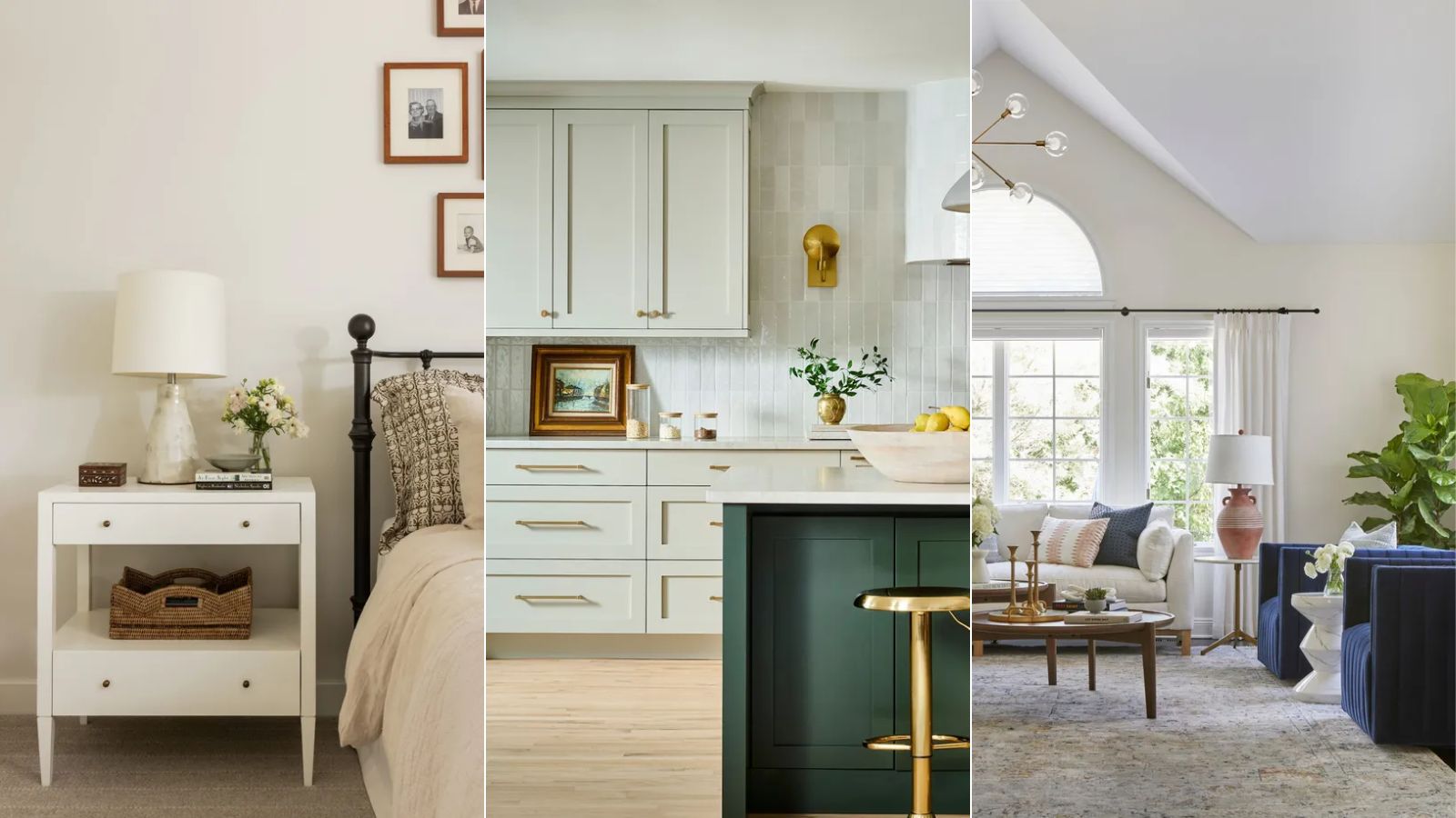
Best off-white paints according to designers

The 40 Best White Paint Colors, According to Designers
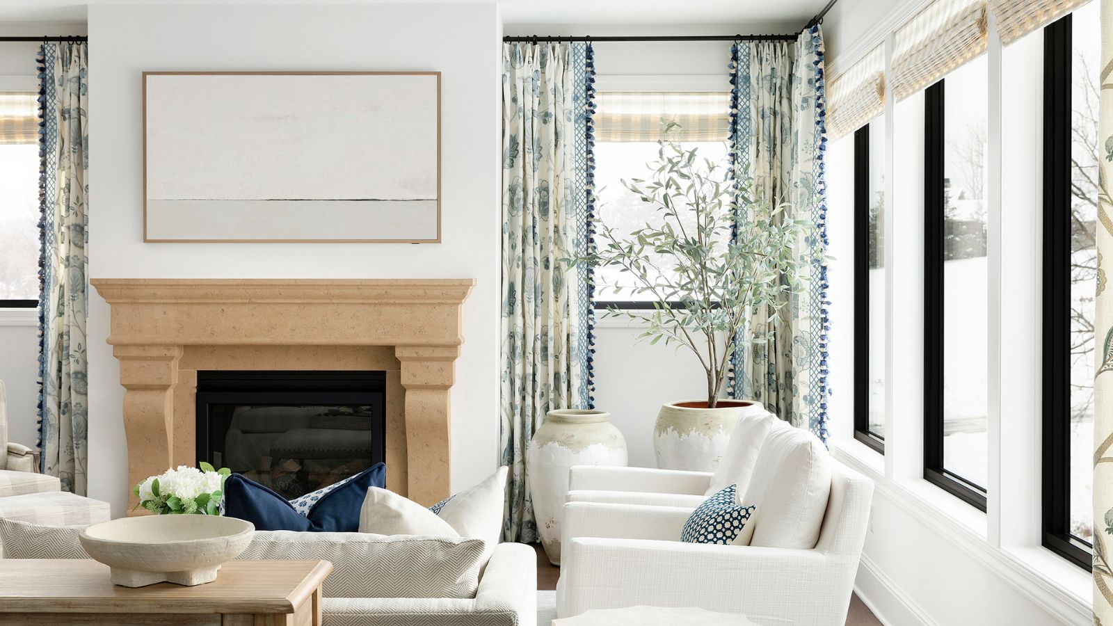
5 best warm white paints, as chosen by interior designers
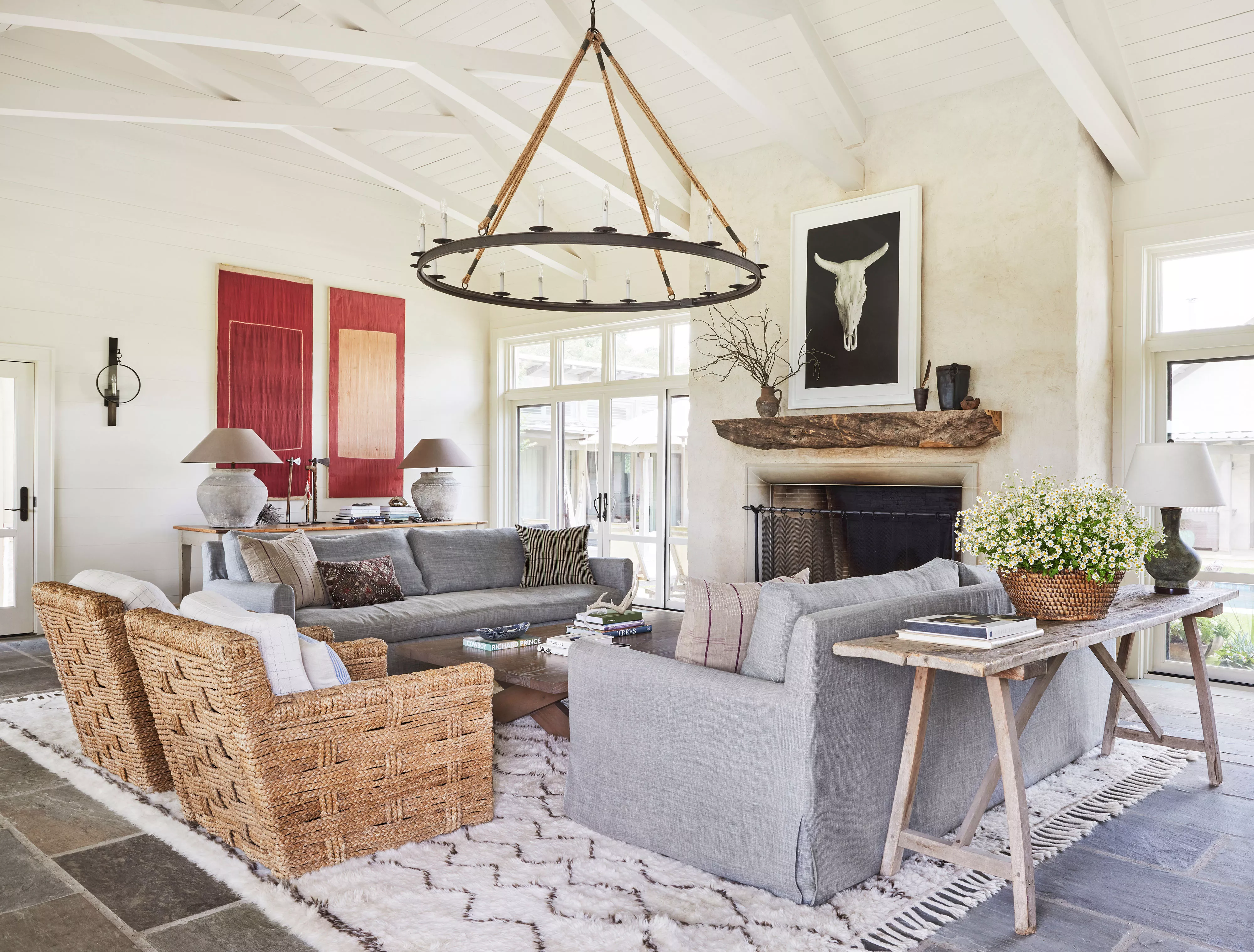
13 Off-White Paint Colors That Make Any Room Feel Bigger and Brighter

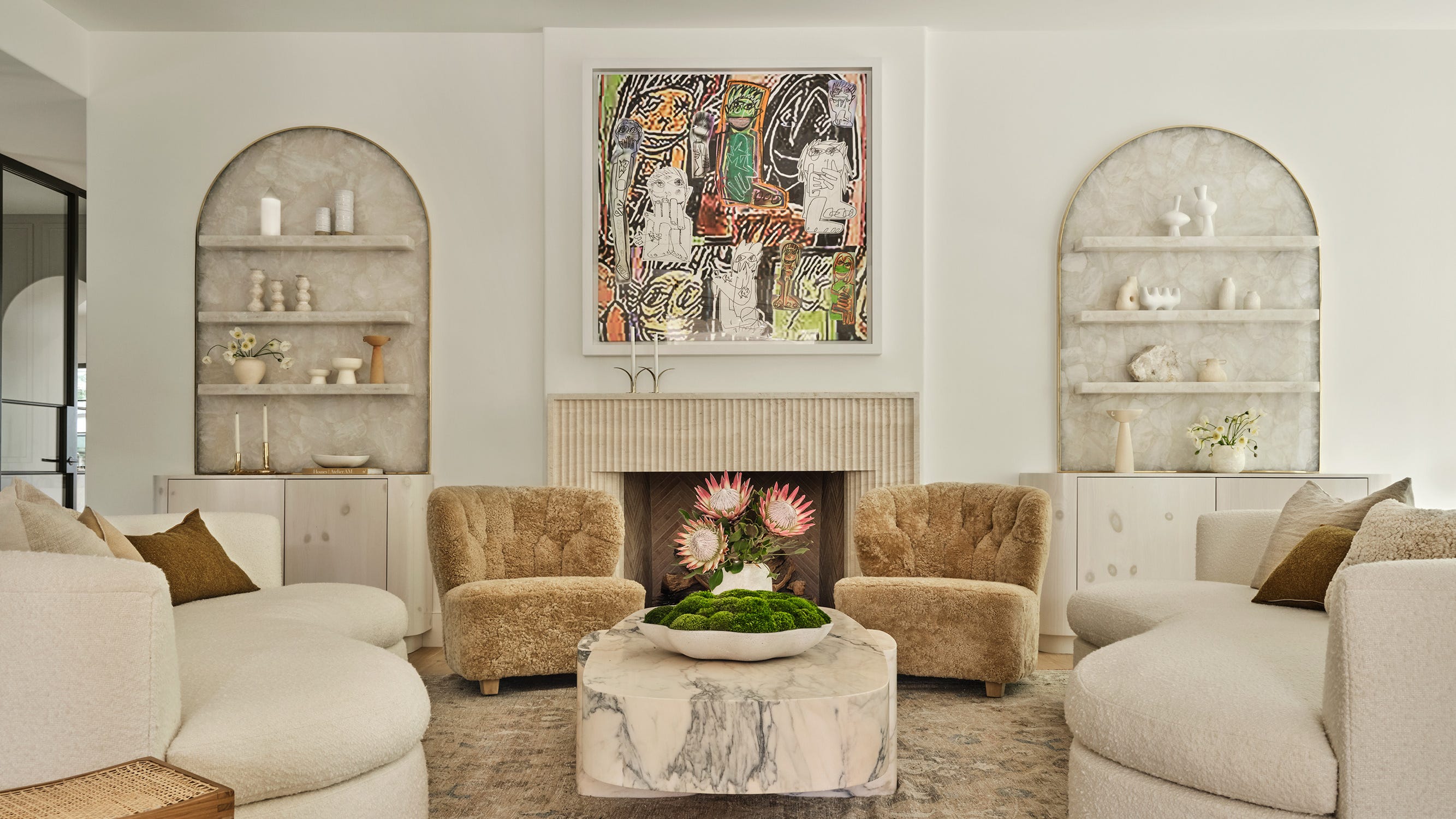
The 13 Best White Paint Colors That Interior Designers Swear By

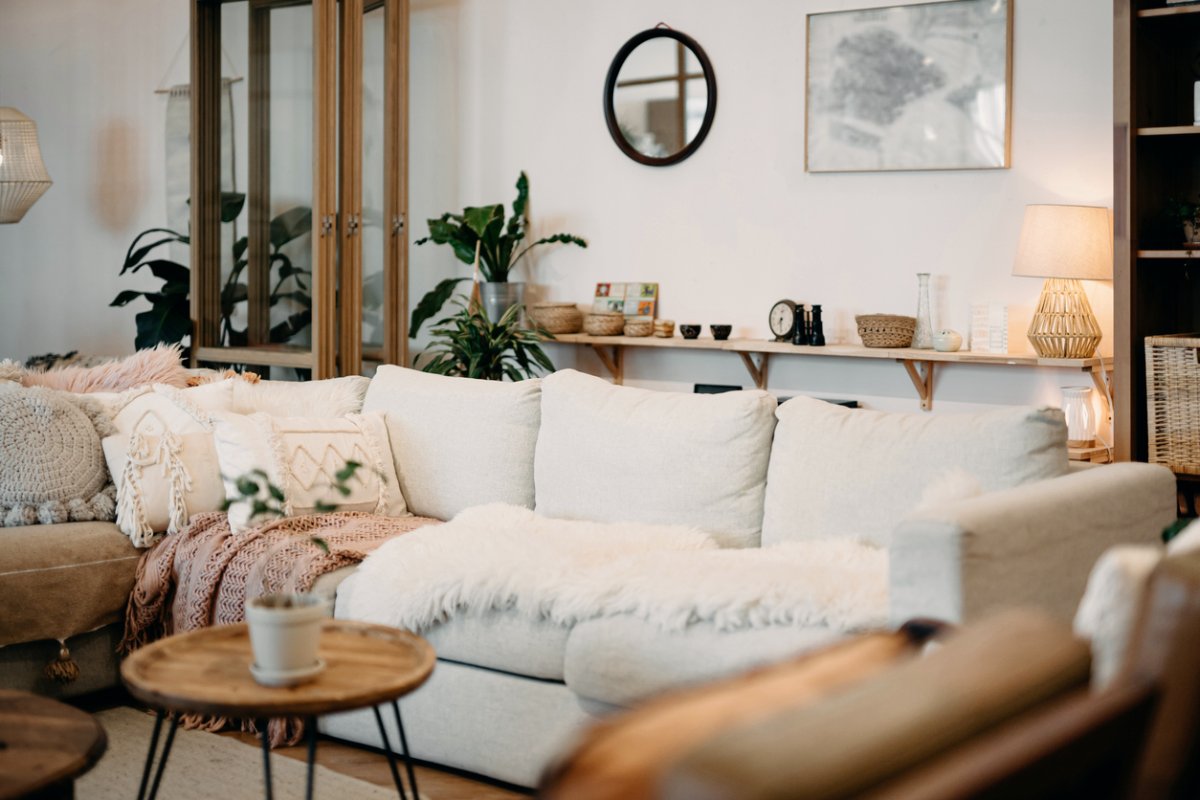
The 11 Best Warm White Paint Colors, According to Designers

13 Off-White Paint Colors That Experts Always Recommend to Make Rooms Feel Bigger and Brighter
The Best White Paint Colors Experts Turn to Again and Again
13 Tried-and-True White Paint Colors Recommended by Pros

13 Off-White Paint Colors the Experts Recommend for Any Space
Ditch the White! Try One of These Designer-Approved Kitchen Colors
14 best beige paints, as chosen by interior designers
13 Off-White Paint Colors the Experts Recommend for Any Space

The 11 Best Warm White Paint Colors, According to Designers
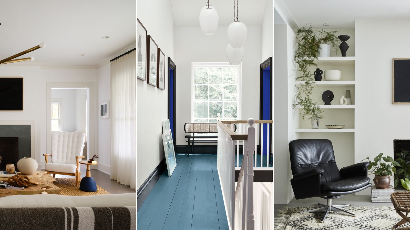
Is white actually out of style? Interior designers weigh in on this classic color for 2025 decorating
9 Best Interior Paint Colors

Best white paint colors: Expert share the top options

Designers’ Favorite White Paints Are Always Changing—We Asked 3 for Their Latest Pick

35 Neutral Paint Colors Interior Designers Can't Get Enough Of

Designers Swear By These 8 Off-White Paint Colors For Every Project