Designers Swear By These 8 Off-White Paint Colors For Every Project
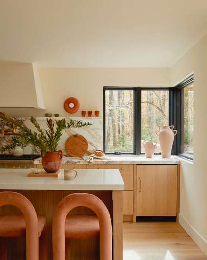
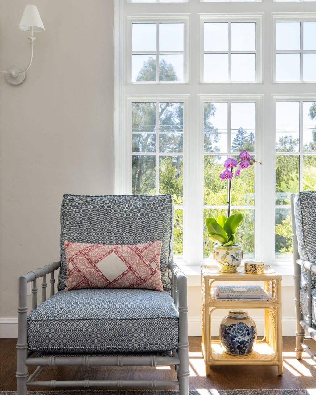
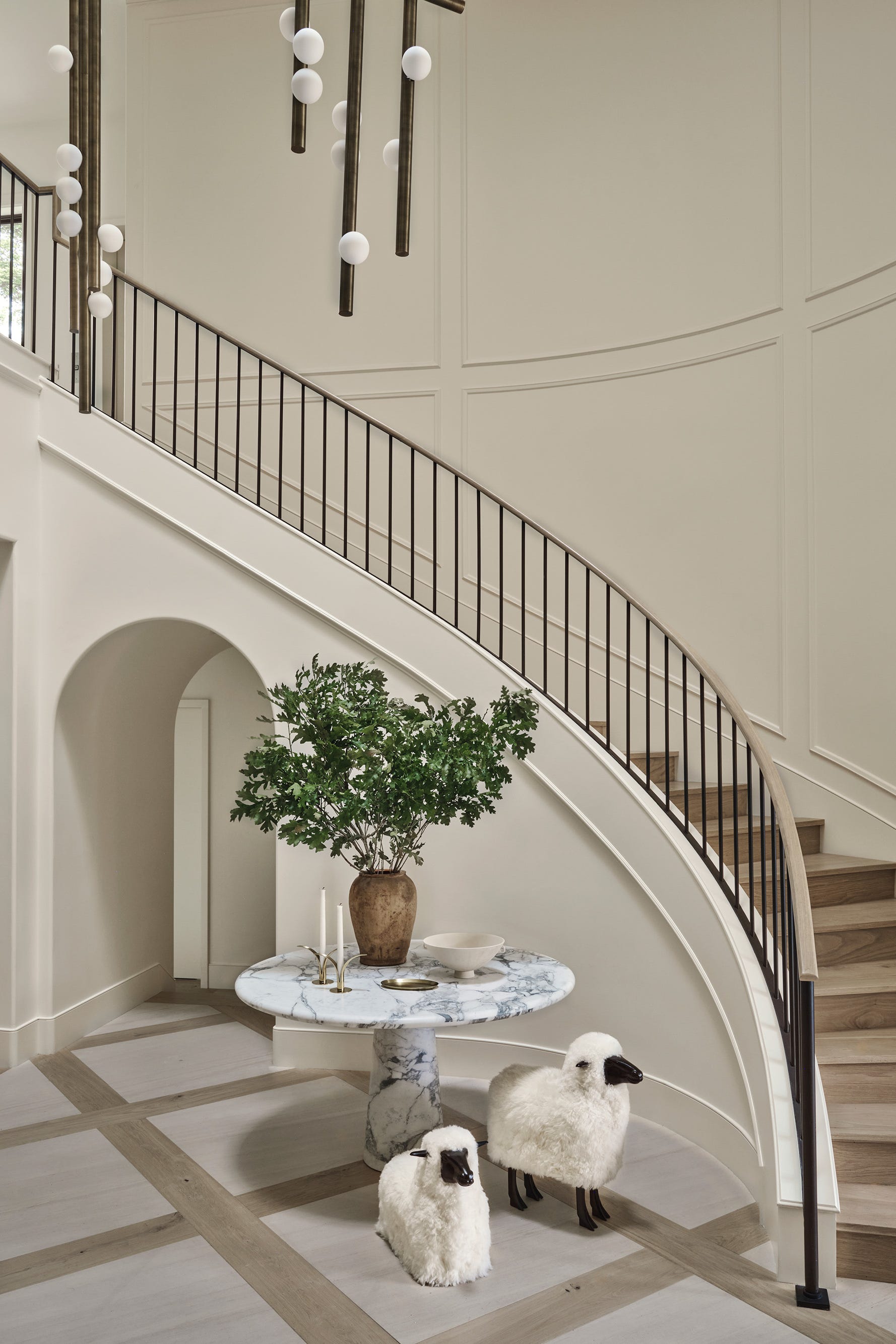
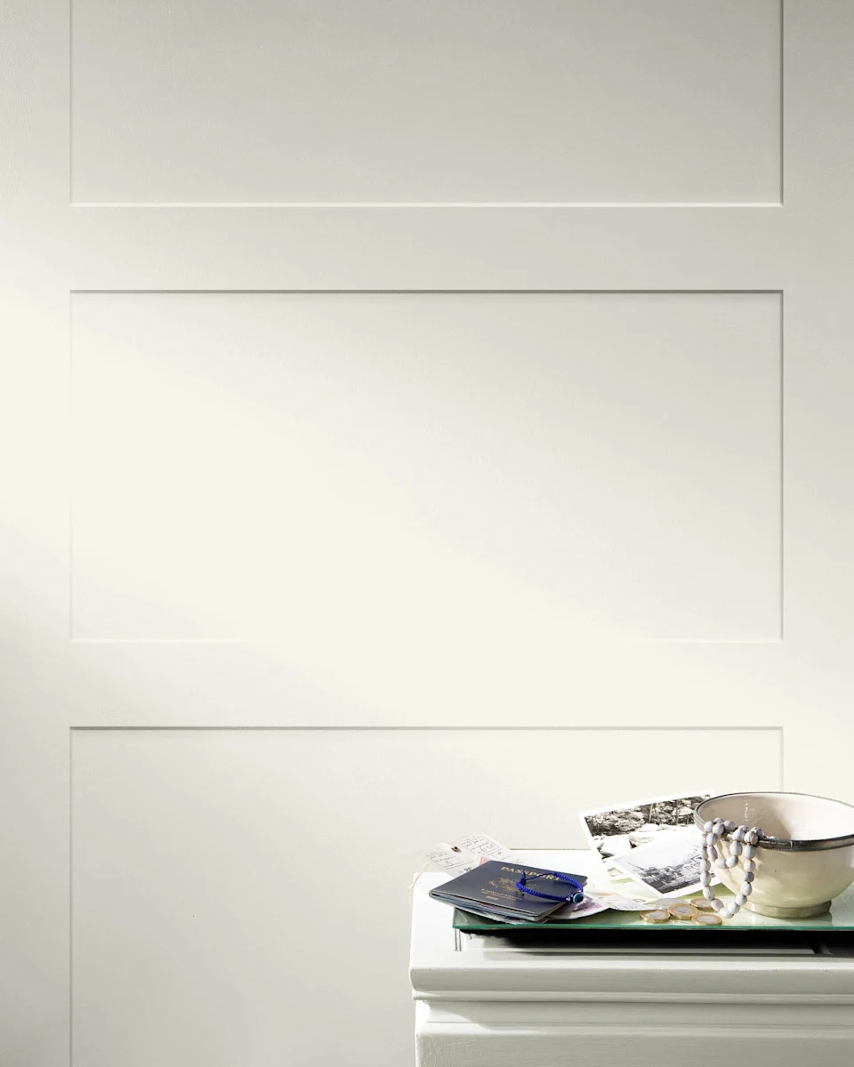
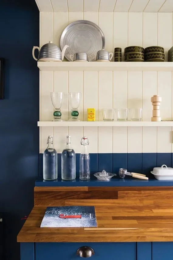
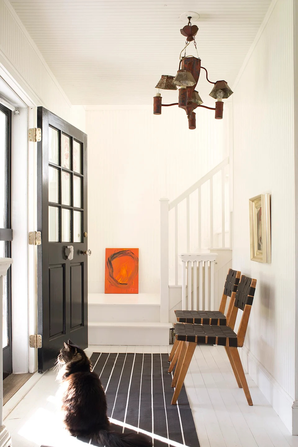
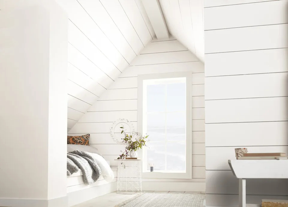
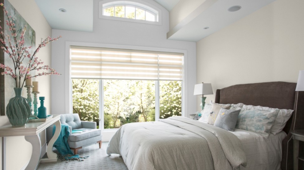
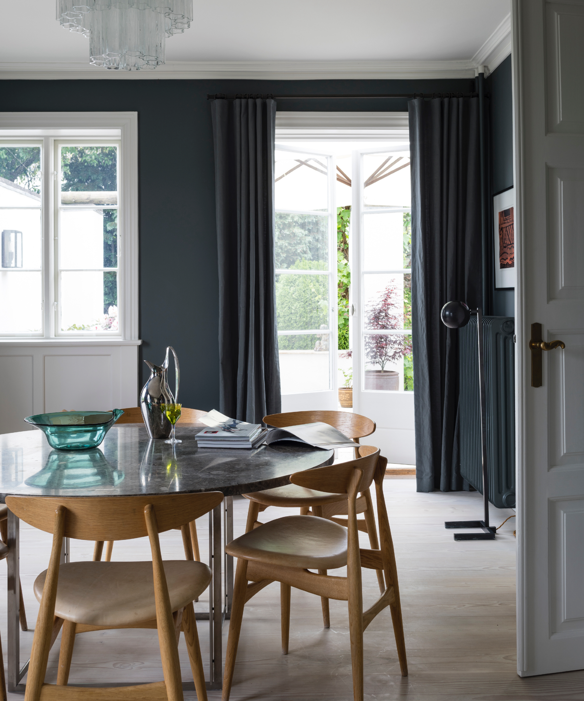
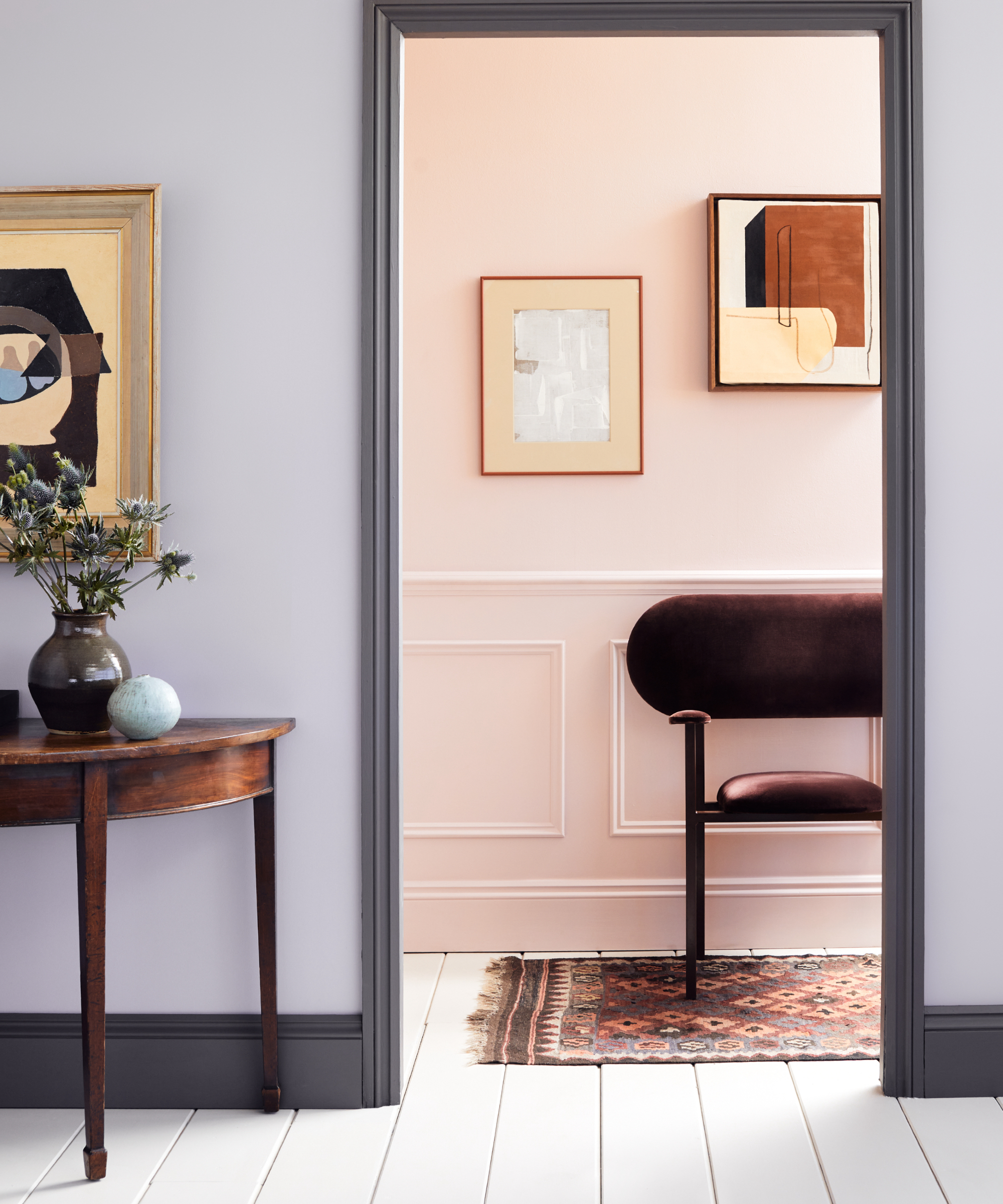
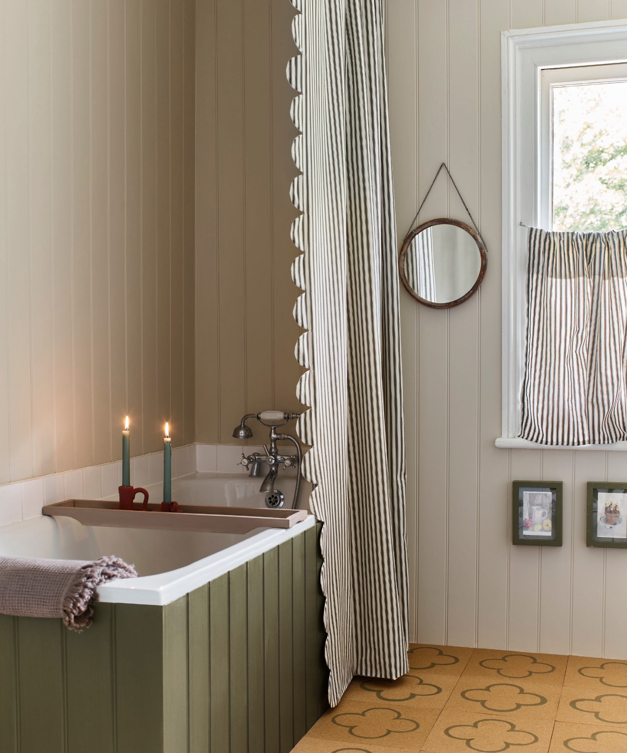
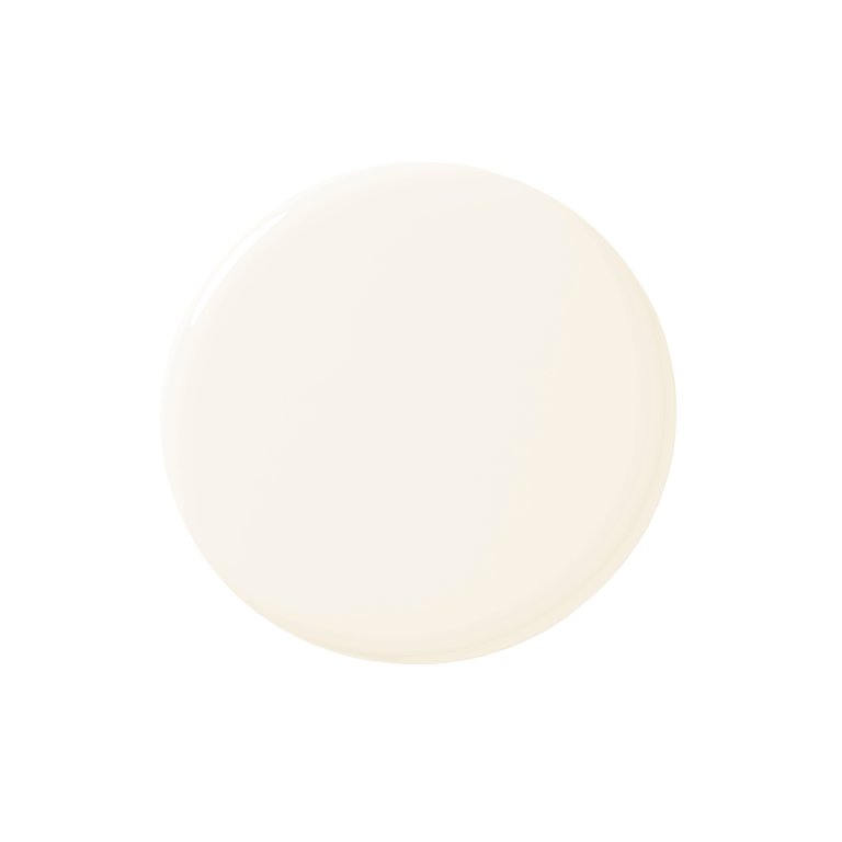
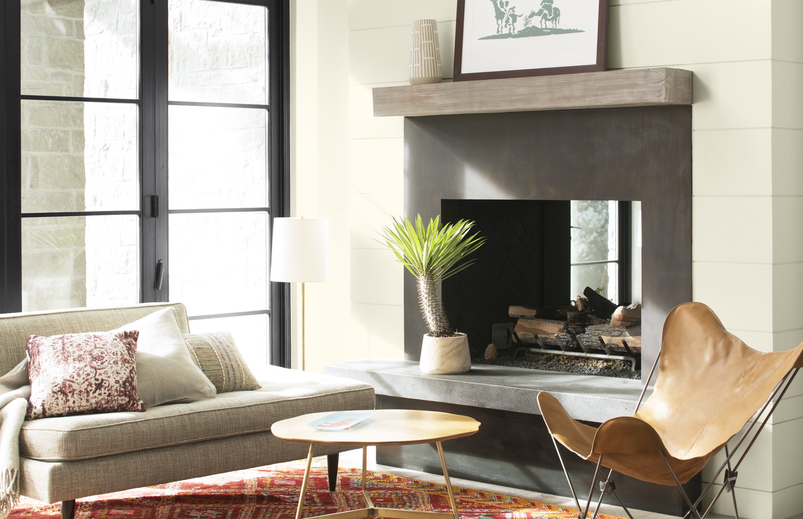
Off-white paint colors are a popular and versatile choice for interior decorating, offering a softer, more inviting alternative to stark white. When selecting an off-white shade, it is crucial to consider the undertones, which can significantly influence how the color appears in a room. Warm undertones, for instance, create a cozy ambiance, while cooler undertones lend a crisp, modern aesthetic. Natural light also plays a vital role in color perception, making it essential to test paint swatches at various times throughout the day and night to ensure the desired effect.
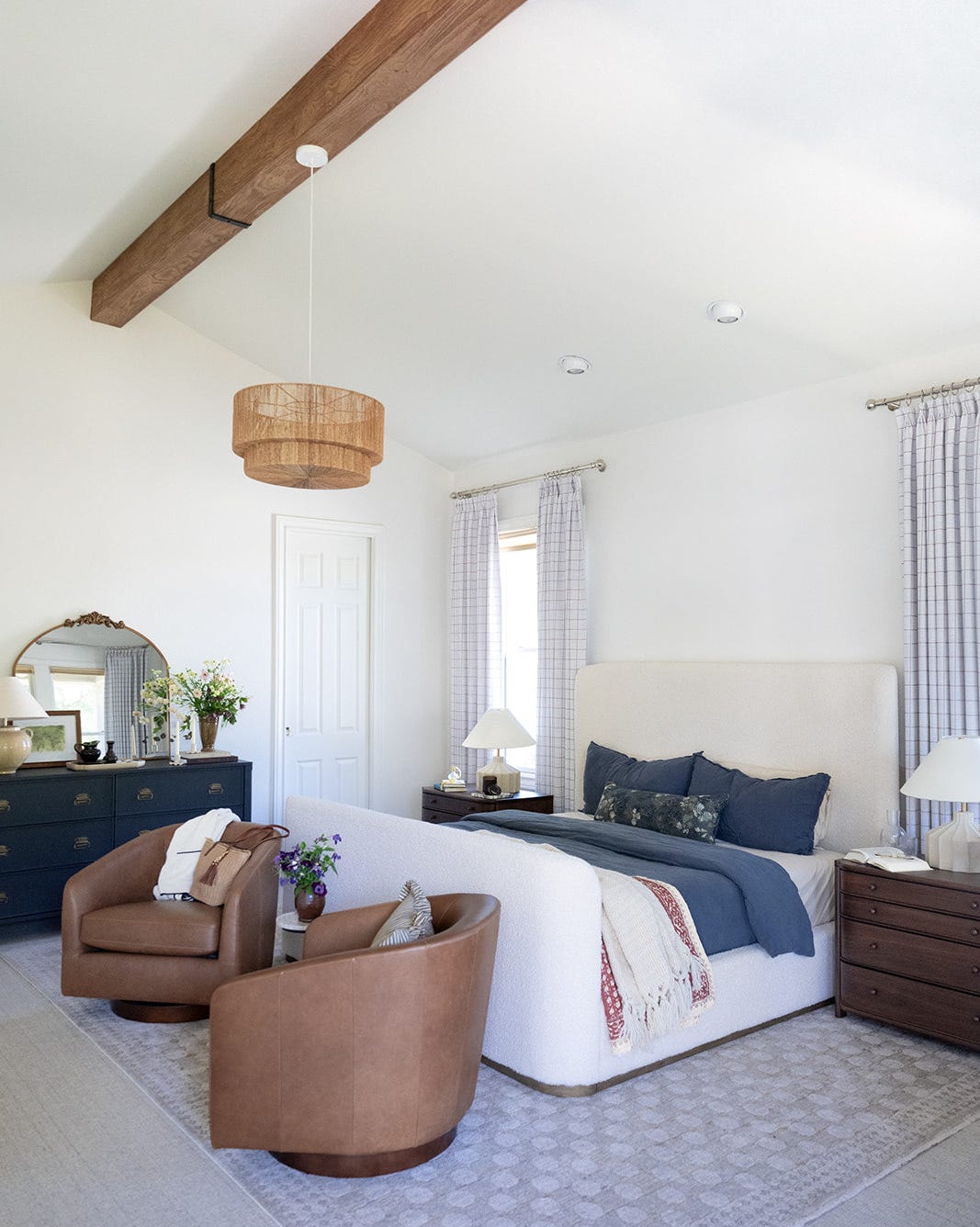
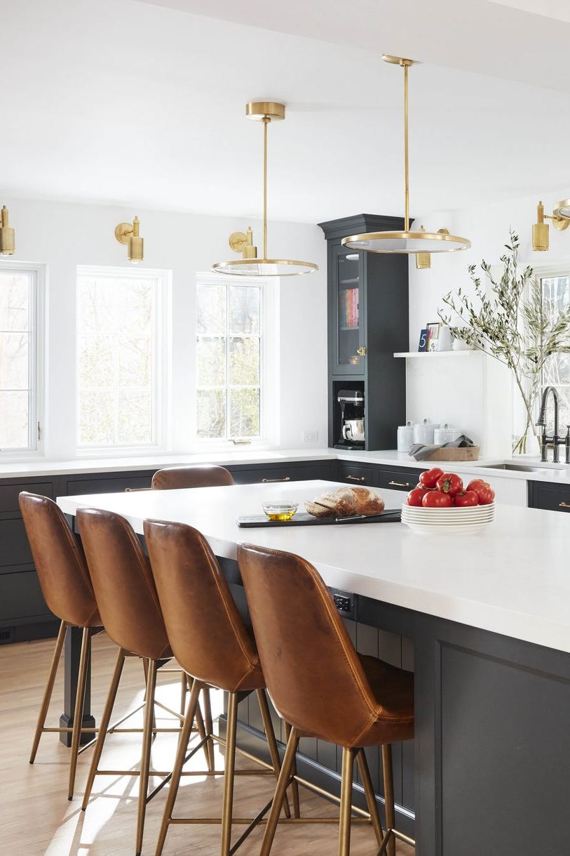
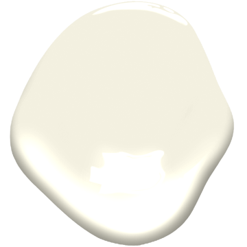
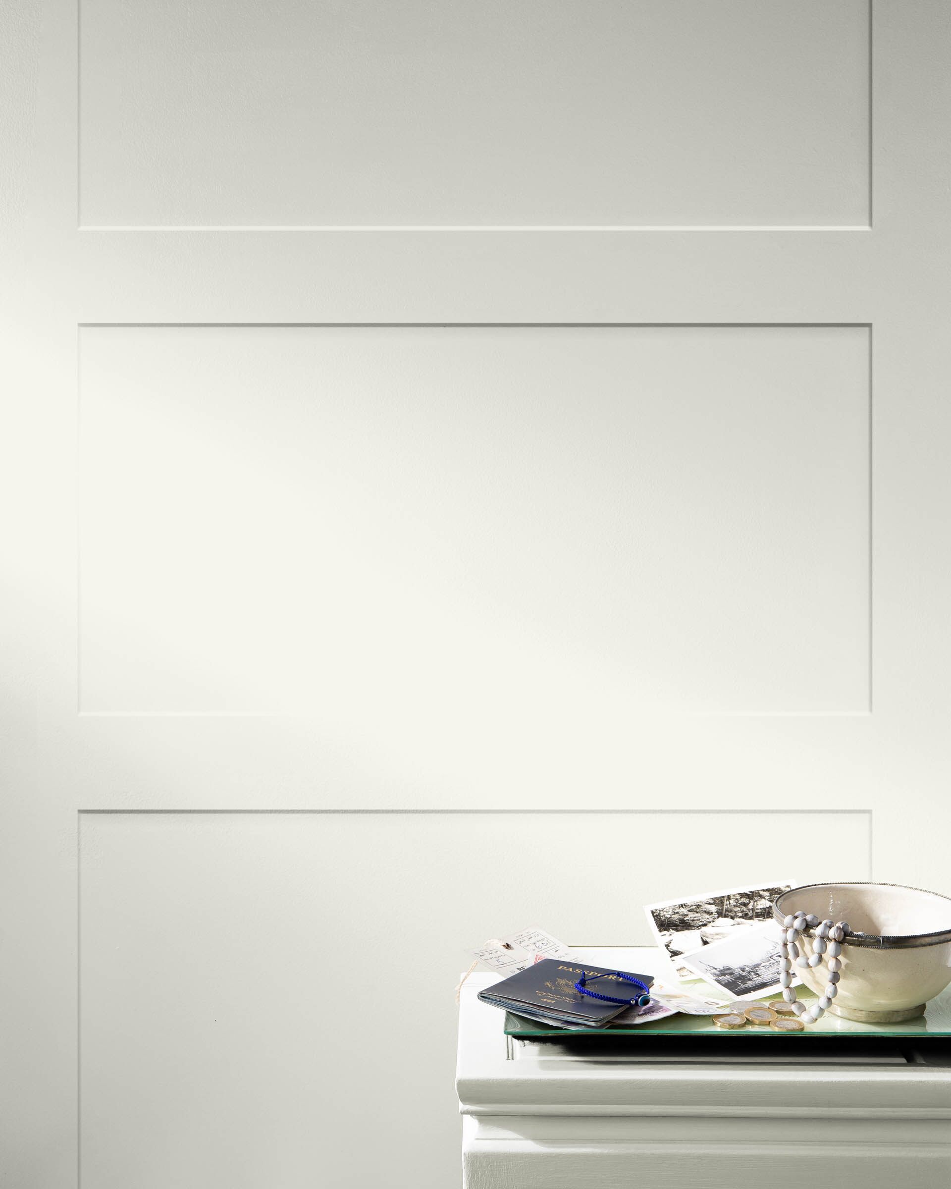
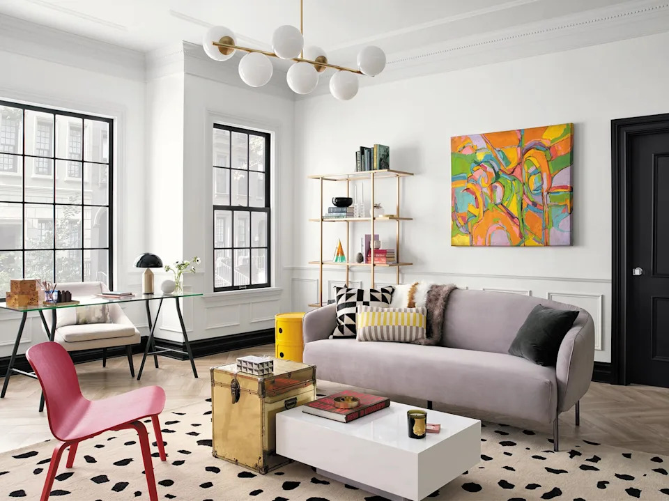
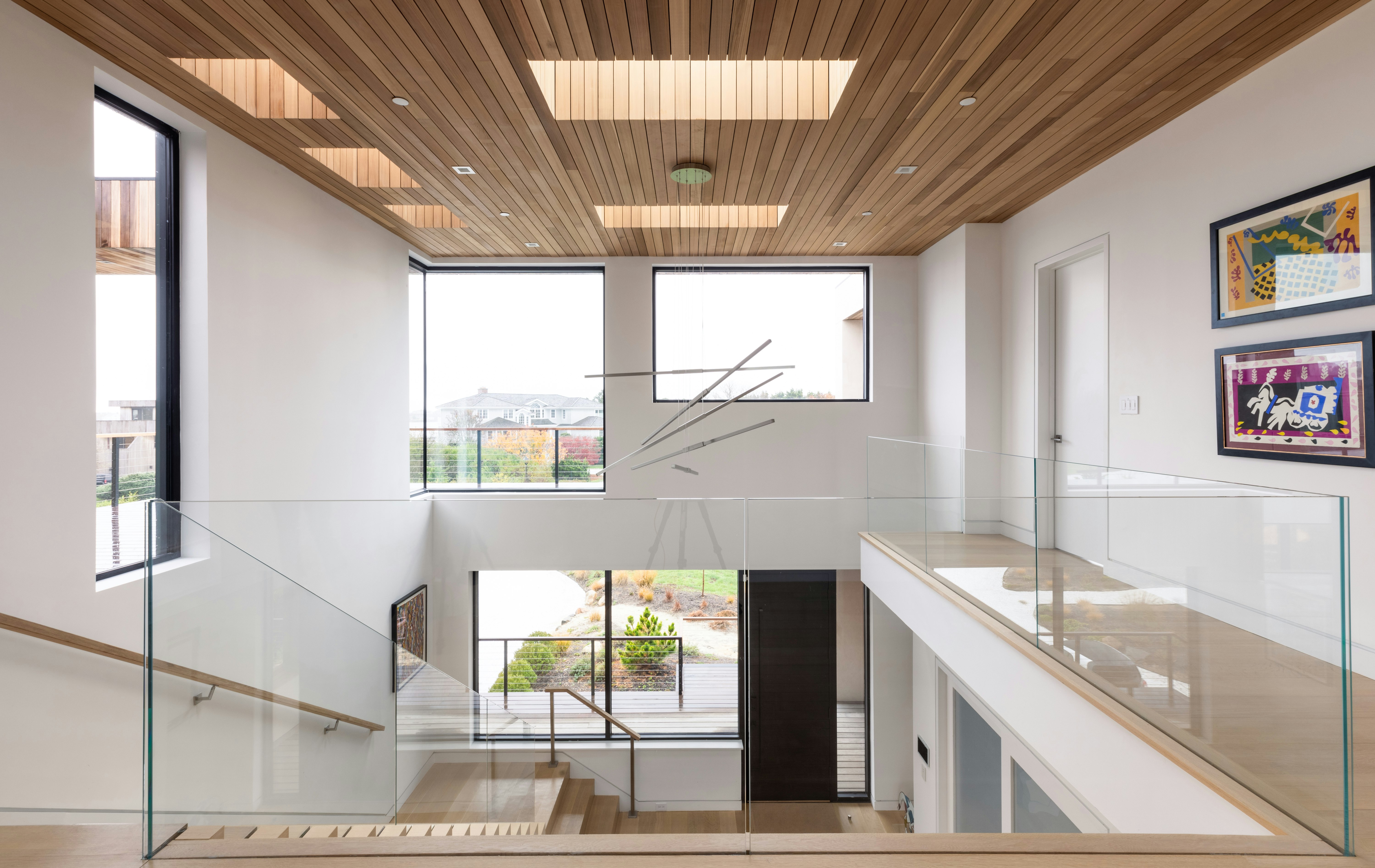
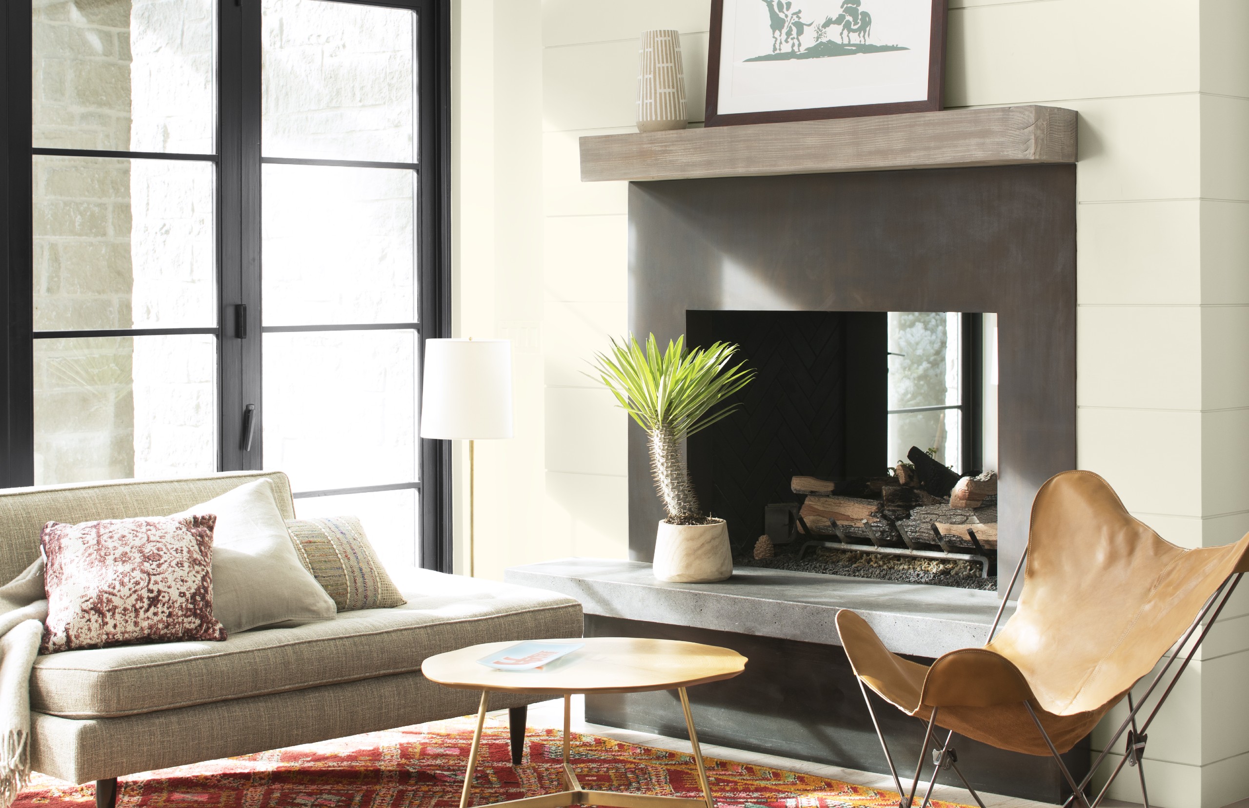
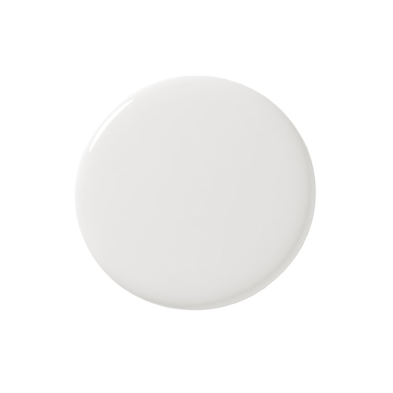
Several designers frequently recommend specific off-white paint colors for their adaptability and aesthetic appeal. Jeremiah Young, creative director at Kibler & Kirch, favors Sherwin-Williams Origami White, noting its less harsh quality compared to grayer or bluer whites, making it an ideal backdrop for diverse color palettes. Young also frequently utilizes Sherwin-Williams Navajo White, acknowledging its slightly yellow hue but highlighting its effectiveness in pairing with warm accents, reducing contrast with black elements, or balancing dramatic colors.
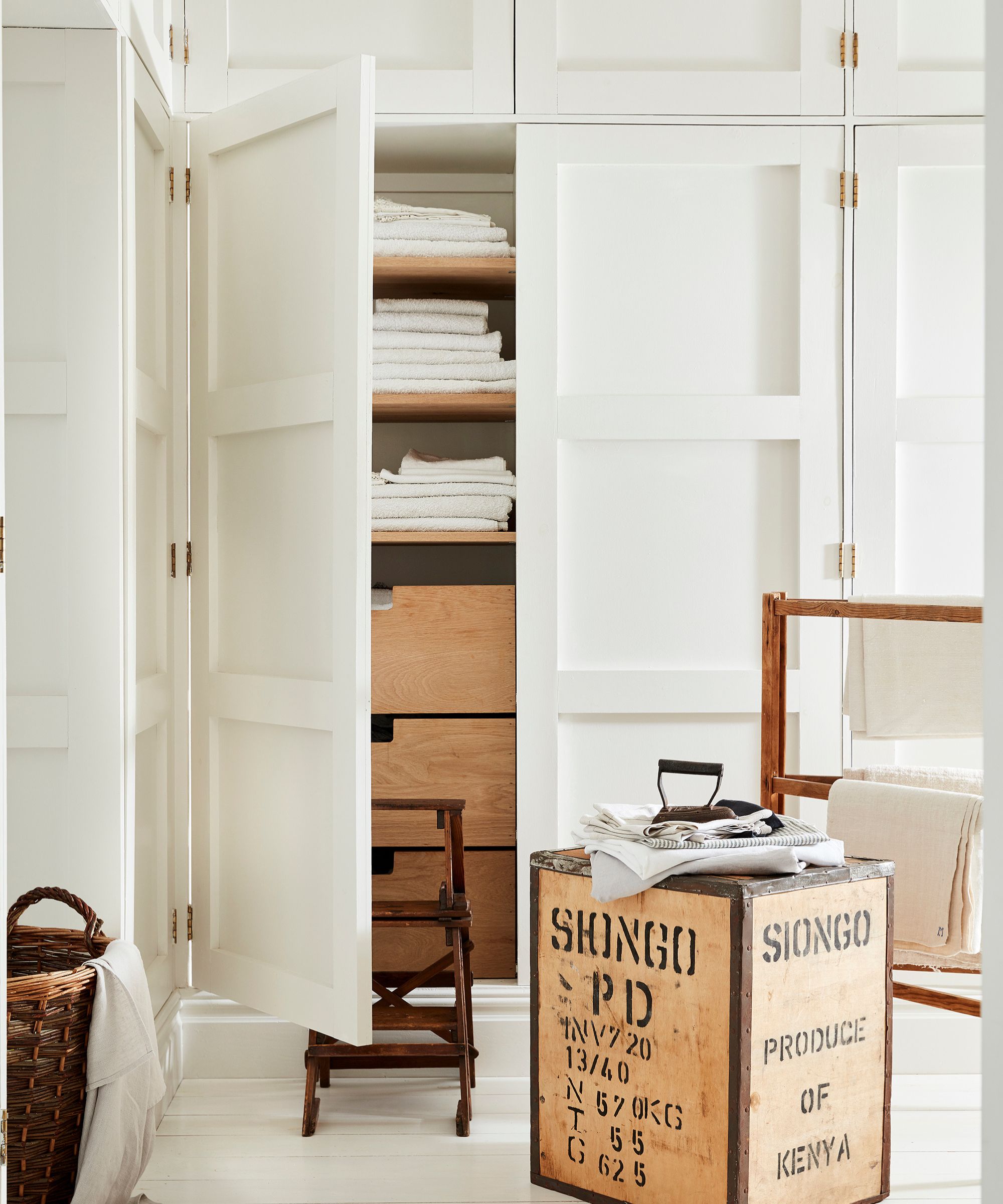
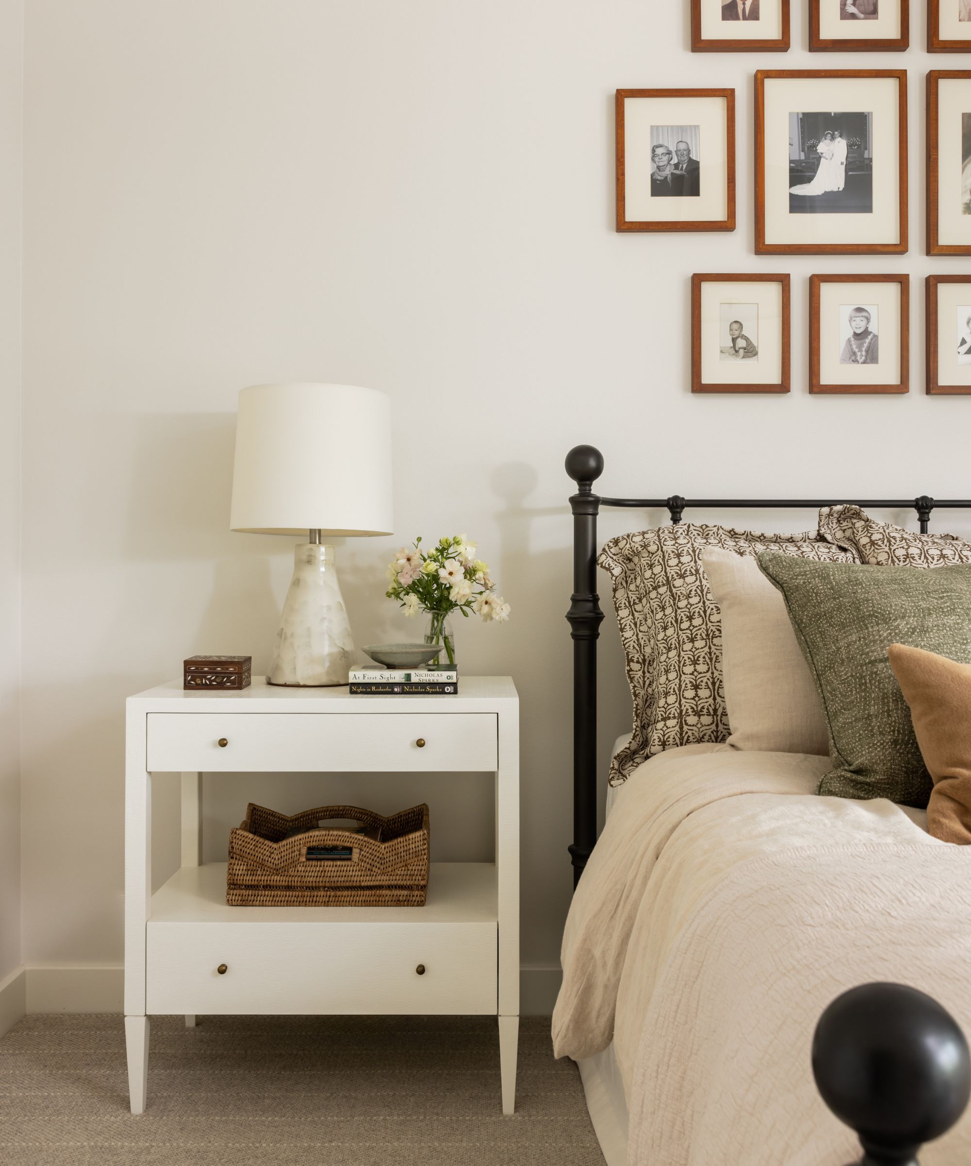
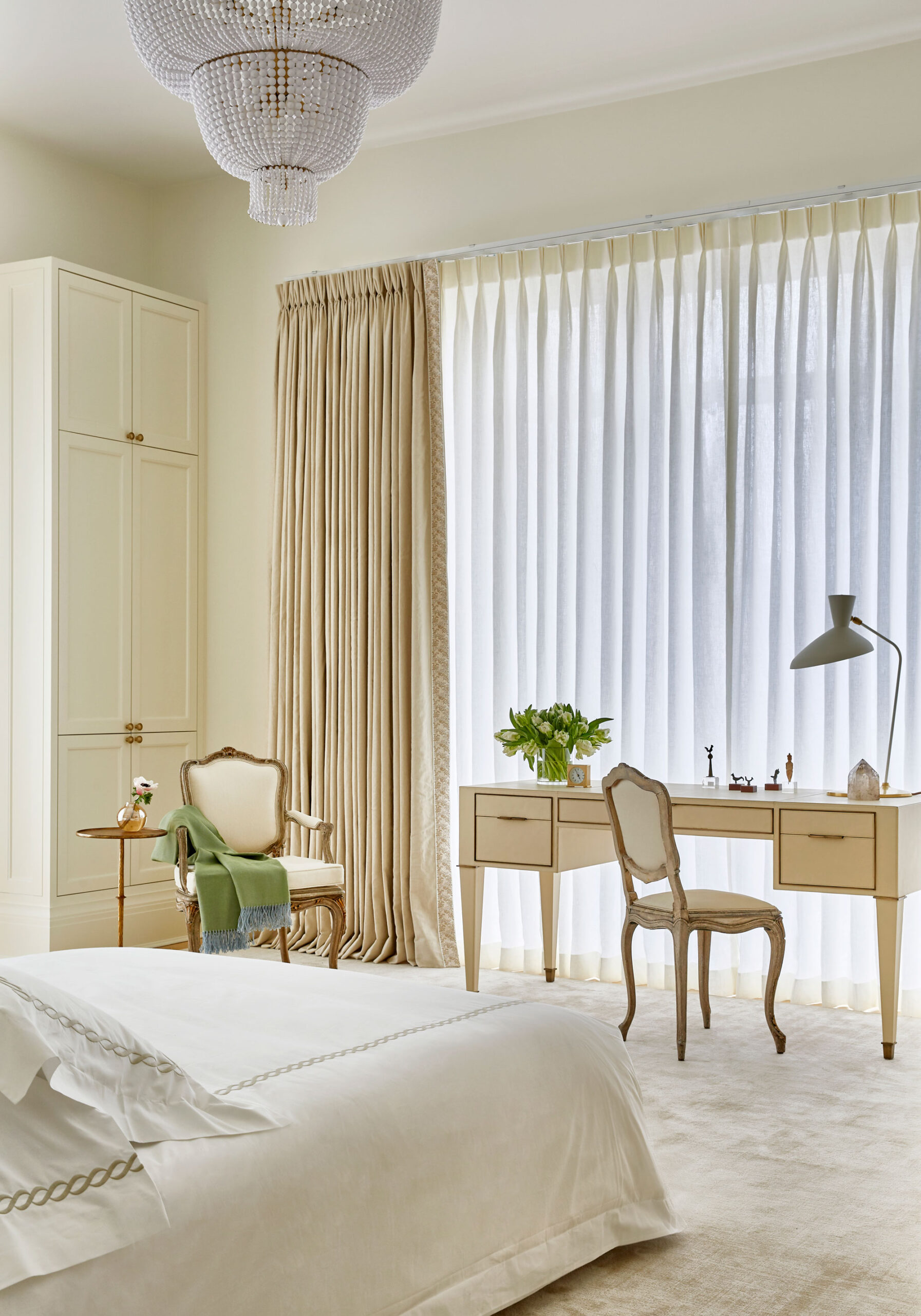
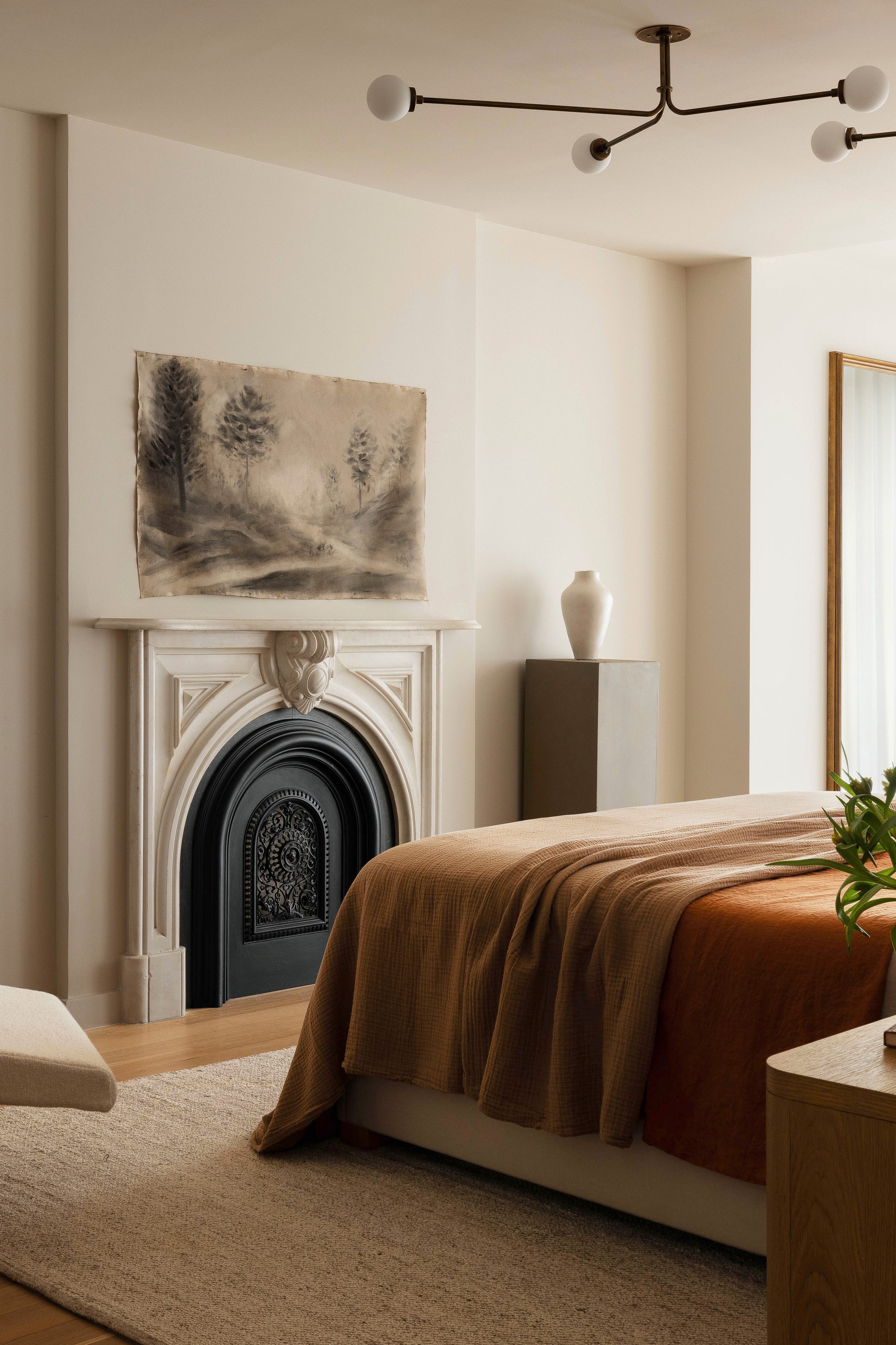
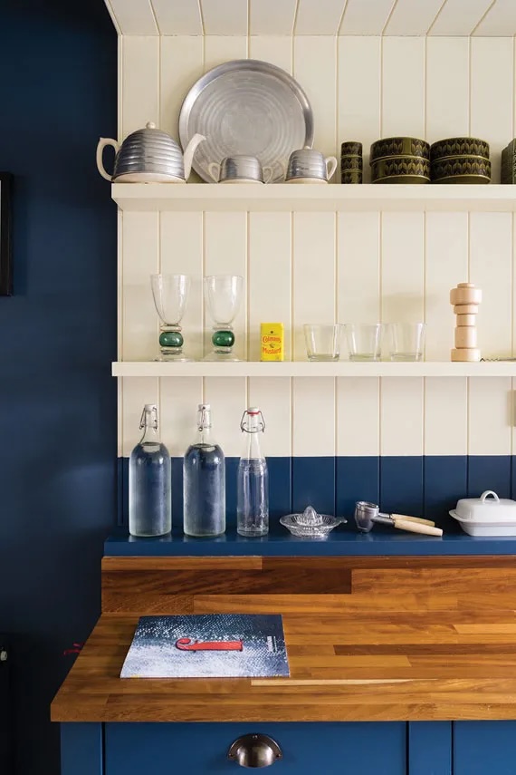
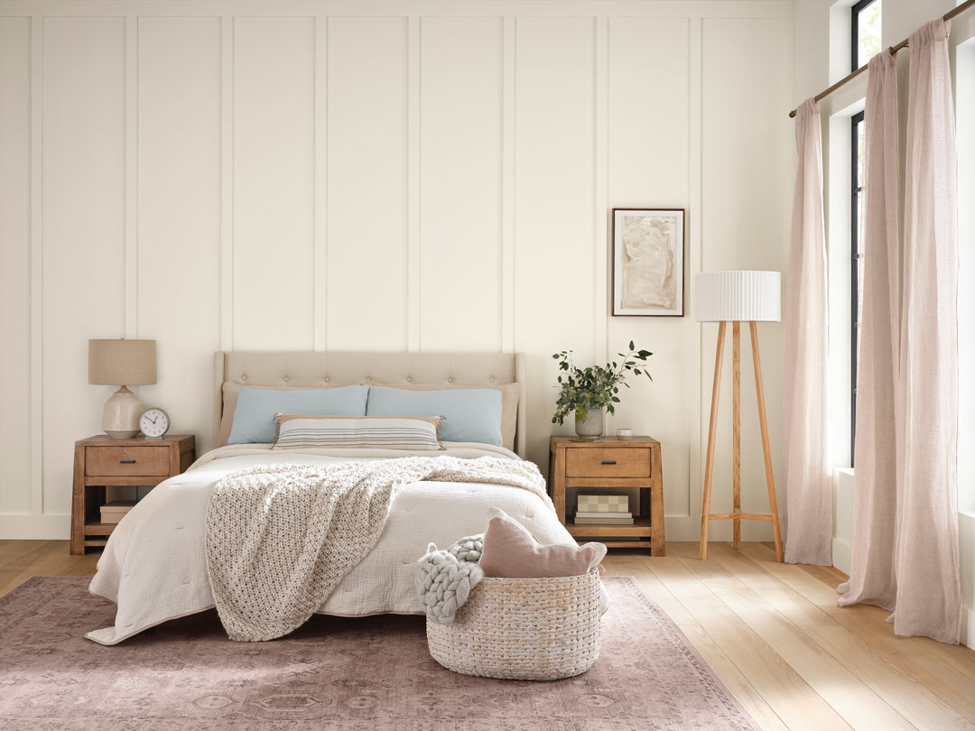
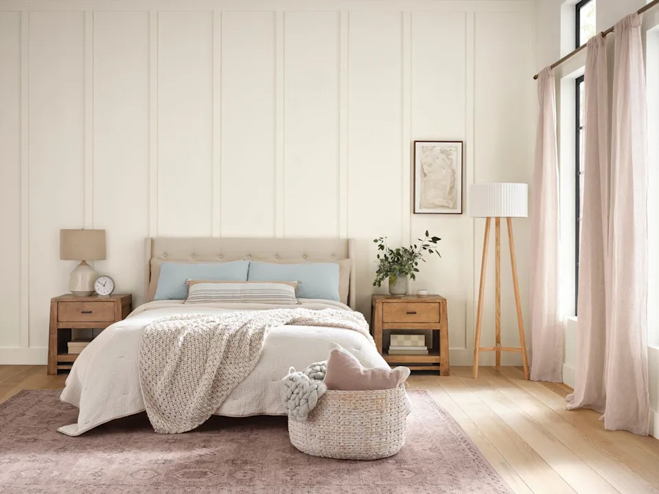
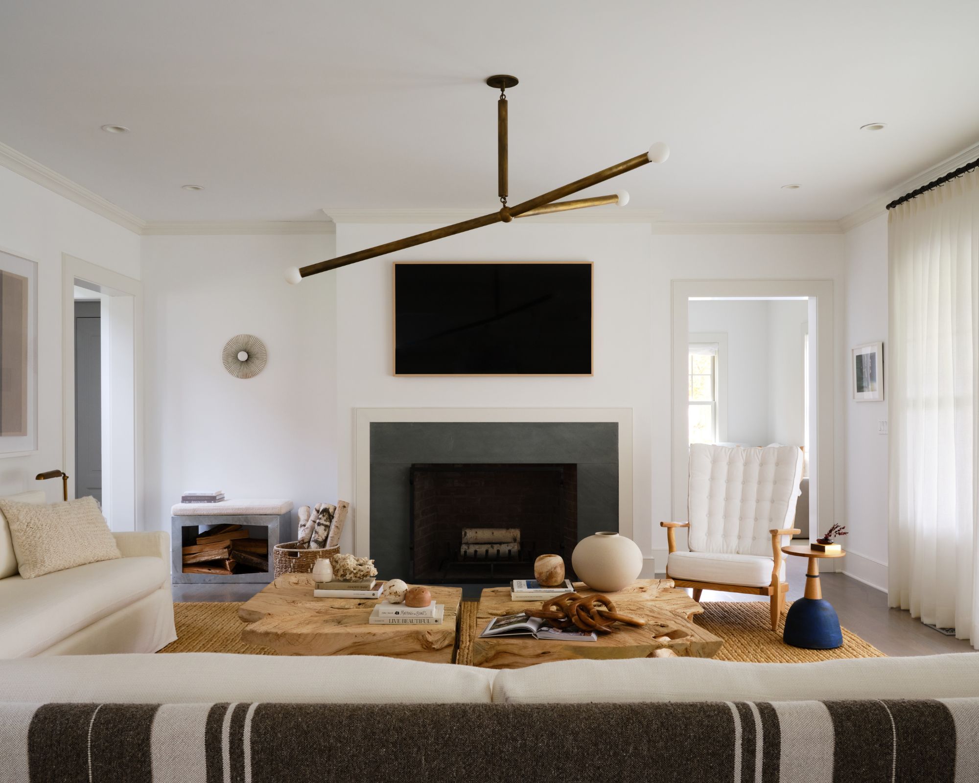
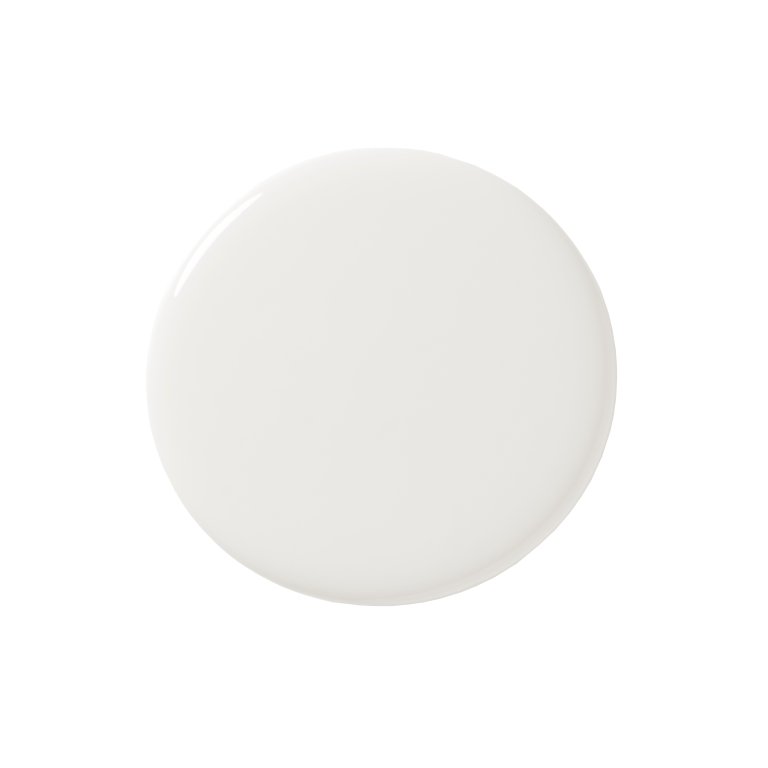
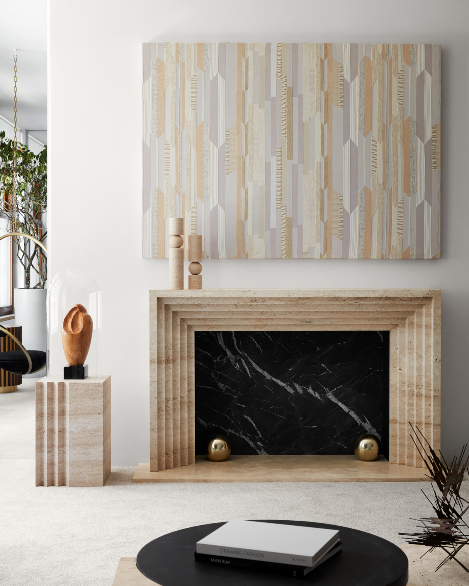
Farrow & Ball paints are also highly regarded for their depth and quality, attributed to the use of natural pigments. Wimborne White from Farrow & Ball is a consistent choice for Young as a whole-home baseline color, particularly for its ability to complement the natural warmth of wood finishes and furniture. Another Farrow & Ball favorite, School House White, is praised by interior designer Rebekah Murphy for its warm, understated quality that adds quiet depth to any room. This shade harmonizes well with oak floors, aged brass, and natural linens, making it suitable for living rooms and bedrooms seeking effortless sophistication and a cozy feel.
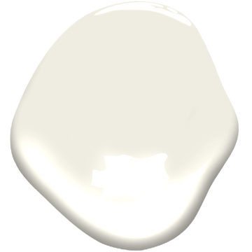
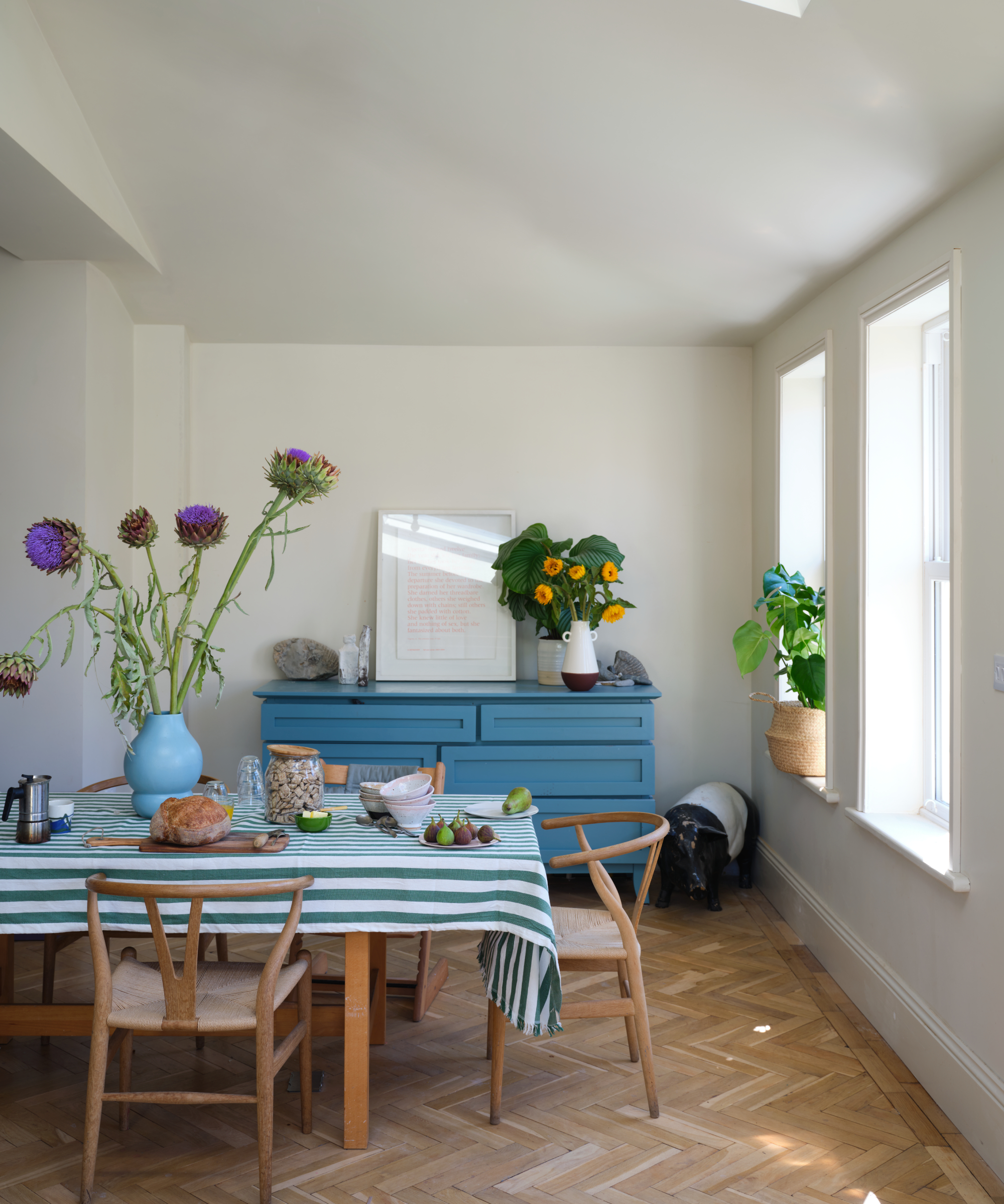
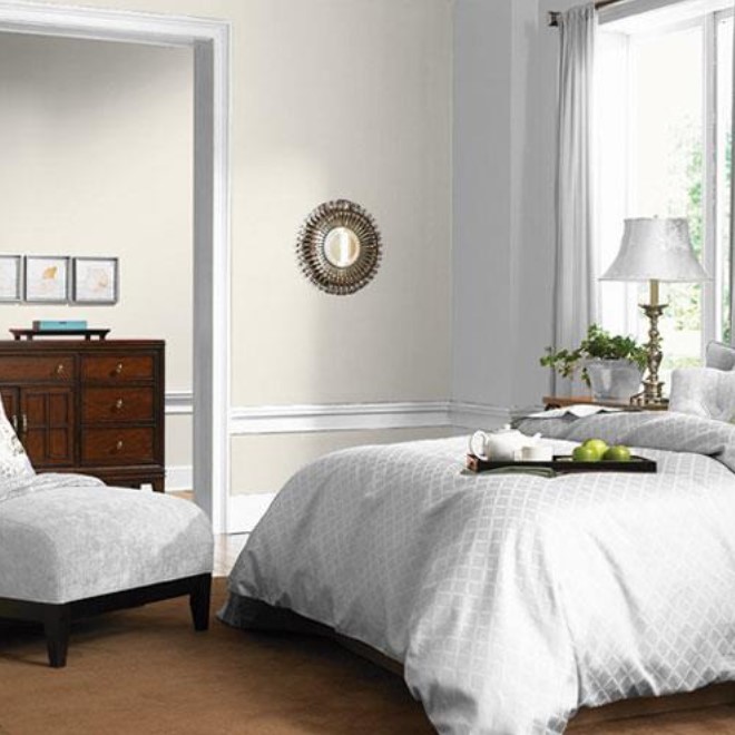
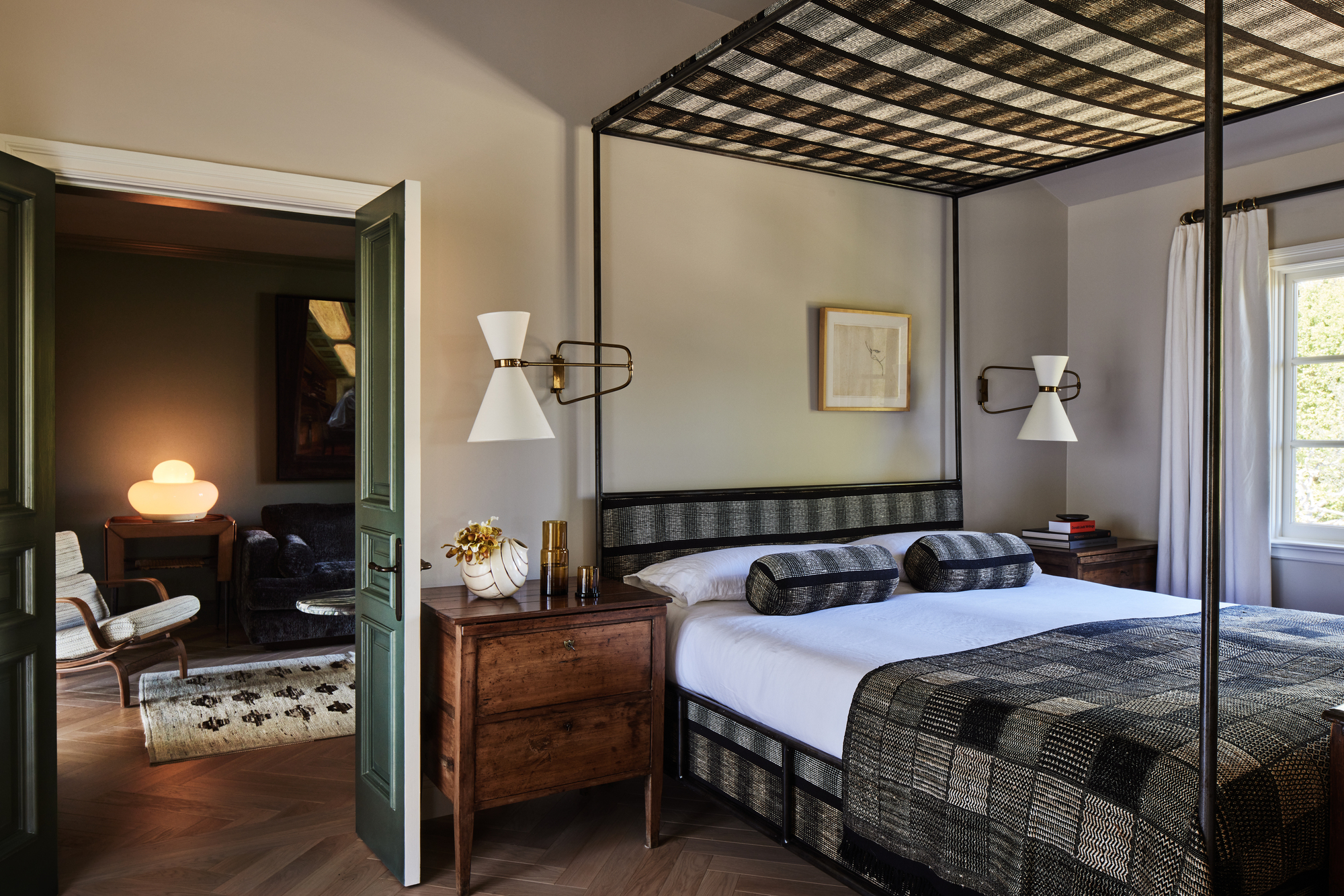
Benjamin Moore Swiss Coffee is another off-white that Murphy recommends, noting its creamy warmth without appearing heavy or outdated. It is particularly effective in traditional homes, pairing beautifully with vintage rugs, natural stone, and unlacquered finishes, making it ideal for dining rooms, hallways, or any space requiring subtle elegance. Farrow & Ball Pointing, which contains red undertones, provides a delicate warmth that avoids yellowing. Murphy suggests it for its soft glow that enhances both natural and artificial light, making it versatile for kitchens, breakfast nooks, or transitional areas, and complementing earthy tones like mushroom, terracotta, or olive.
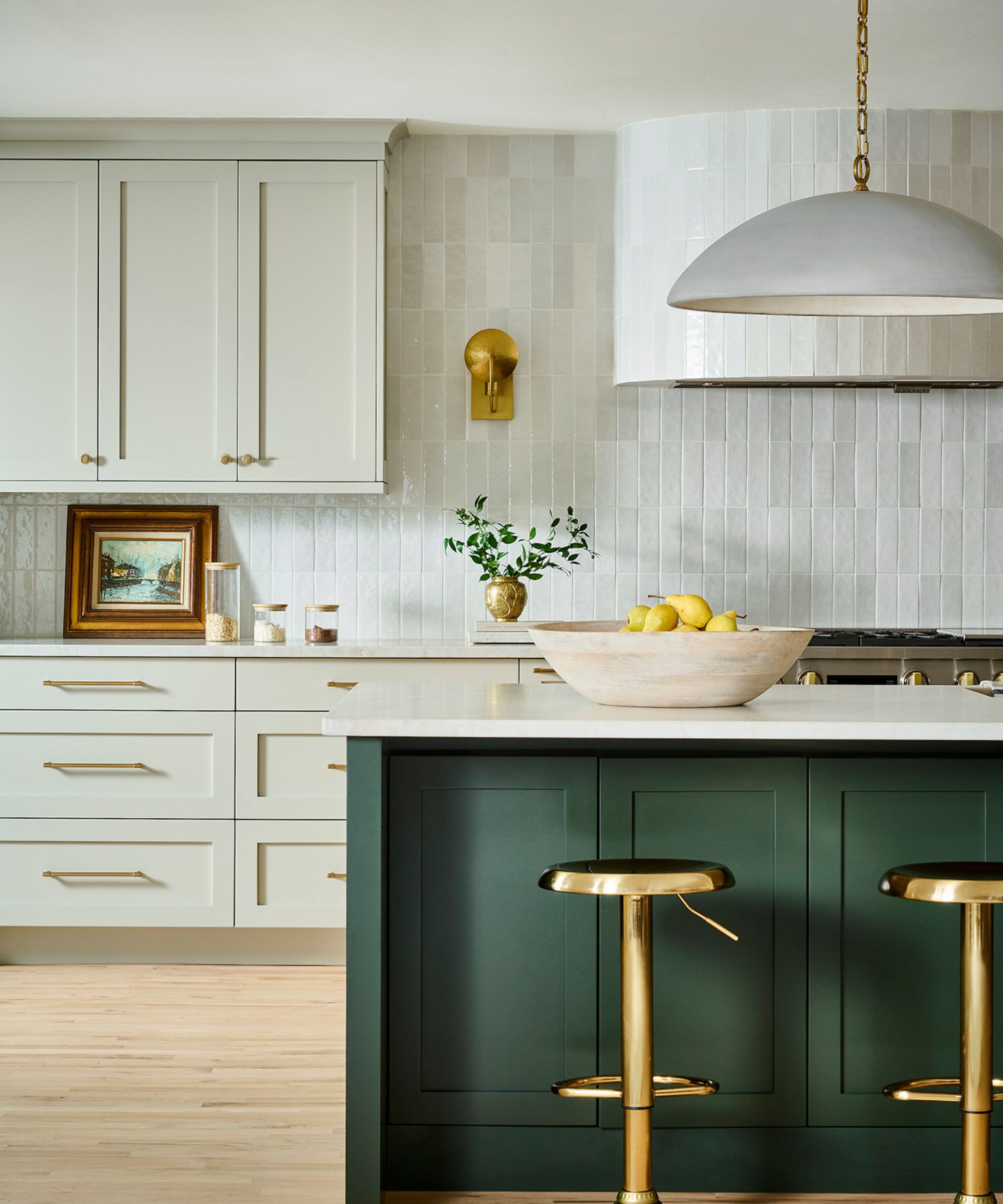
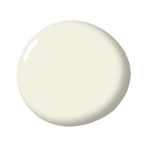
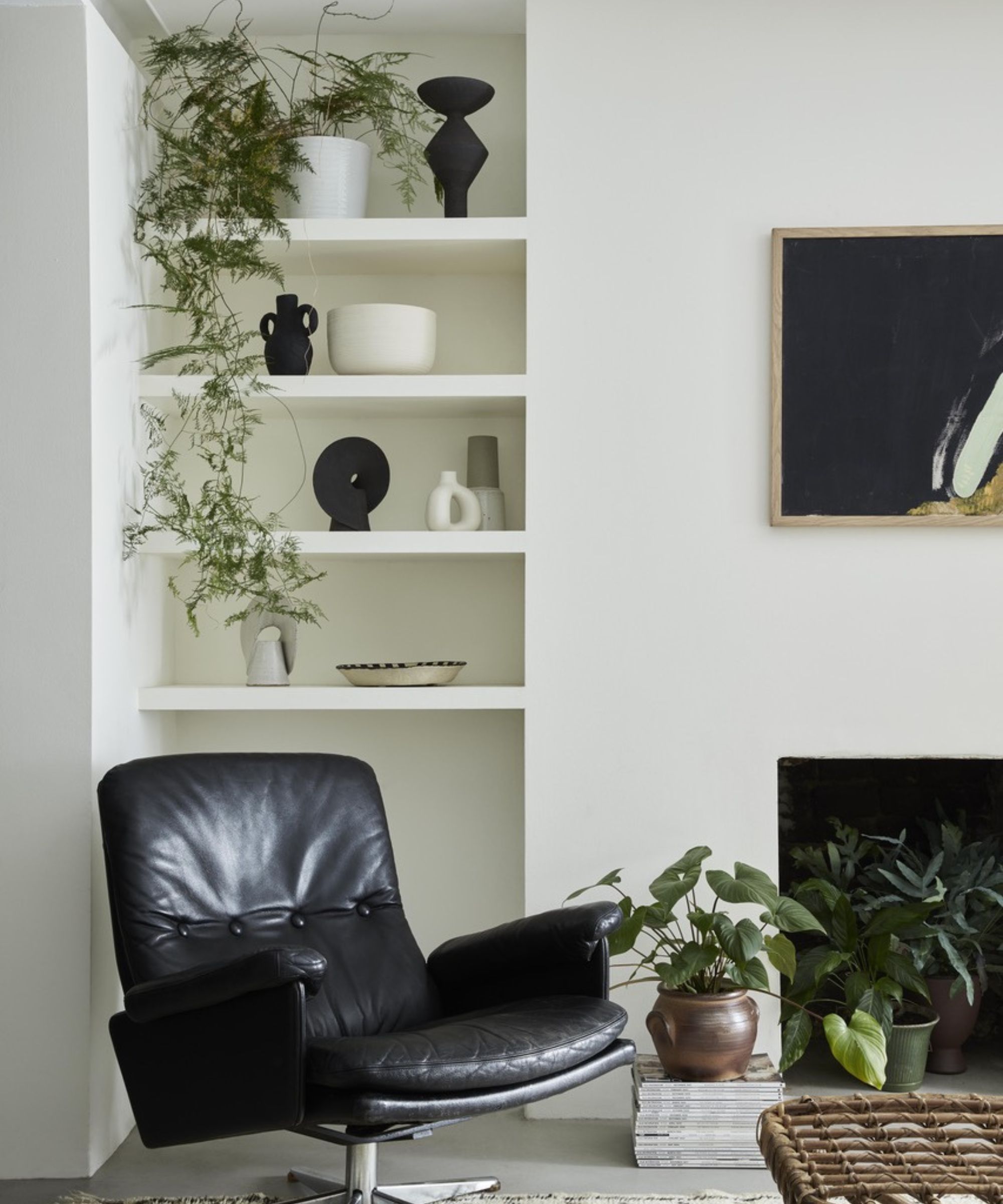
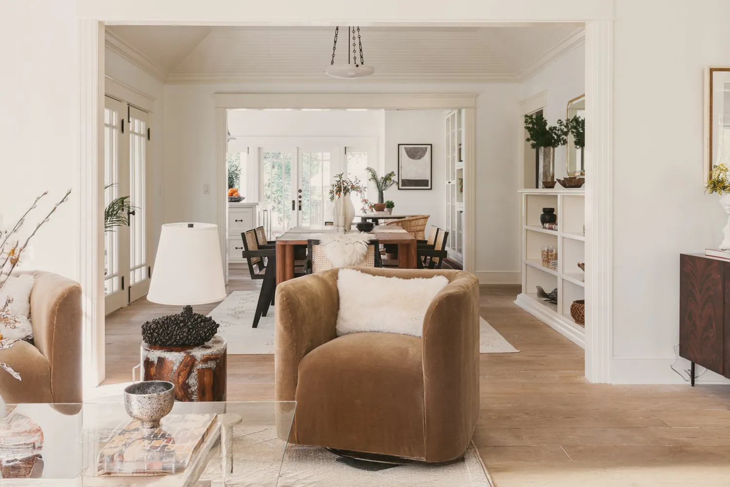
Monique Holland, founder of Holland Custom Designs, points to Benjamin Moore French Canvas as a current off-white trend. This paint features a mix of green, beige, and gray undertones, allowing it to adapt between cool and warm tones depending on the home's style. It is recommended for living rooms, paired with metallics, wood tones, soft whites, and grays. For deeper, warmer off-whites that lean into light greige, Holland suggests Benjamin Moore Natural Cream. This versatile color works with both warm and cool schemes and is increasingly popular for adding depth and warmth to kitchen cabinets, reflecting a broader trend away from crisp, cool-toned white cabinetry towards softer, warmer whites.
#OffWhitePaintColors #InteriorDesign #HomeDecor #PaintUndertones #DesignerRecommendations #SherwinWilliams #FarrowAndBall #BenjaminMoore #NeutralPalette #OffWhitePaintColors #InteriorDesign #HomeDecor #PaintUndertones #DesignerRecommendations #SherwinWilliams #FarrowAndBall #BenjaminMoore #NeutralPalette
0 comment in total
 No comments yet
You may also like
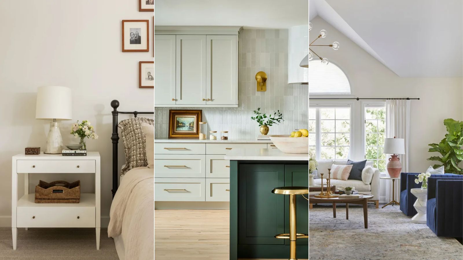
Best off-white paints according to designers

The 40 Best White Paint Colors, According to Designers
13 Tried-and-True White Paint Colors Recommended by Pros

13 Off-White Paint Colors That Experts Always Recommend to Make Rooms Feel Bigger and Brighter

13 Best Off-White Paint Colors, According to Interior Designers

The 11 Best Warm White Paint Colors, According to Designers

13 Off-White Paint Colors That Make Any Room Feel Bigger and Brighter

7 of the most versatile and easy to use paint colors according to designers
The Best Warm White Paint Colors, as Seen in 8 Designers’ Favorite Spaces
13 Off-White Paint Colors the Experts Recommend for Any Space

8 Favorite Paint Colors of Local Interior Designers

Designers’ Favorite White Paints Are Always Changing—We Asked 3 for Their Latest Pick

13 Off-White Paint Colors the Experts Recommend for Any Space

The 11 Best Warm White Paint Colors, According to Designers
Is white actually out of style? Interior designers weigh in on this classic color for 2025 decorating
9 Neutral Paint Colors Designers Constantly Reach For — "It's My Tried-and-True"

The 13 Best White Paint Colors That Interior Designers Swear By

The Best White Paint Colors Experts Turn to Again and Again
Best white paint colors: Expert share the top options

5 Underrated Paint Colors Designers Always Use in Their Projects (and You Should Too)