1/15
14 best beige paints, as chosen by interior designers
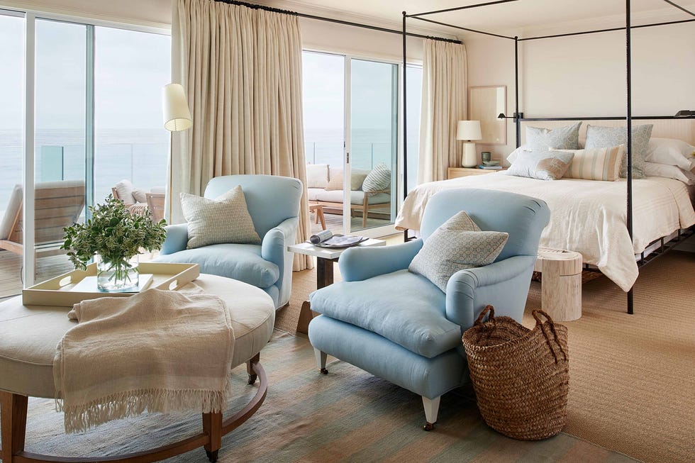
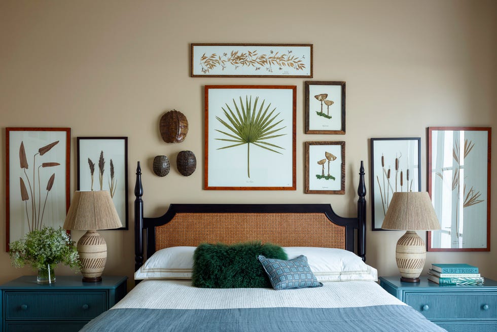
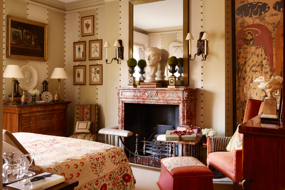
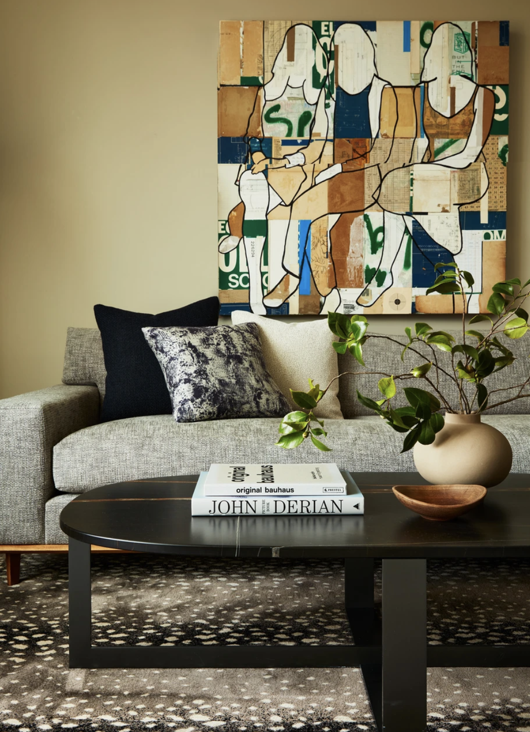
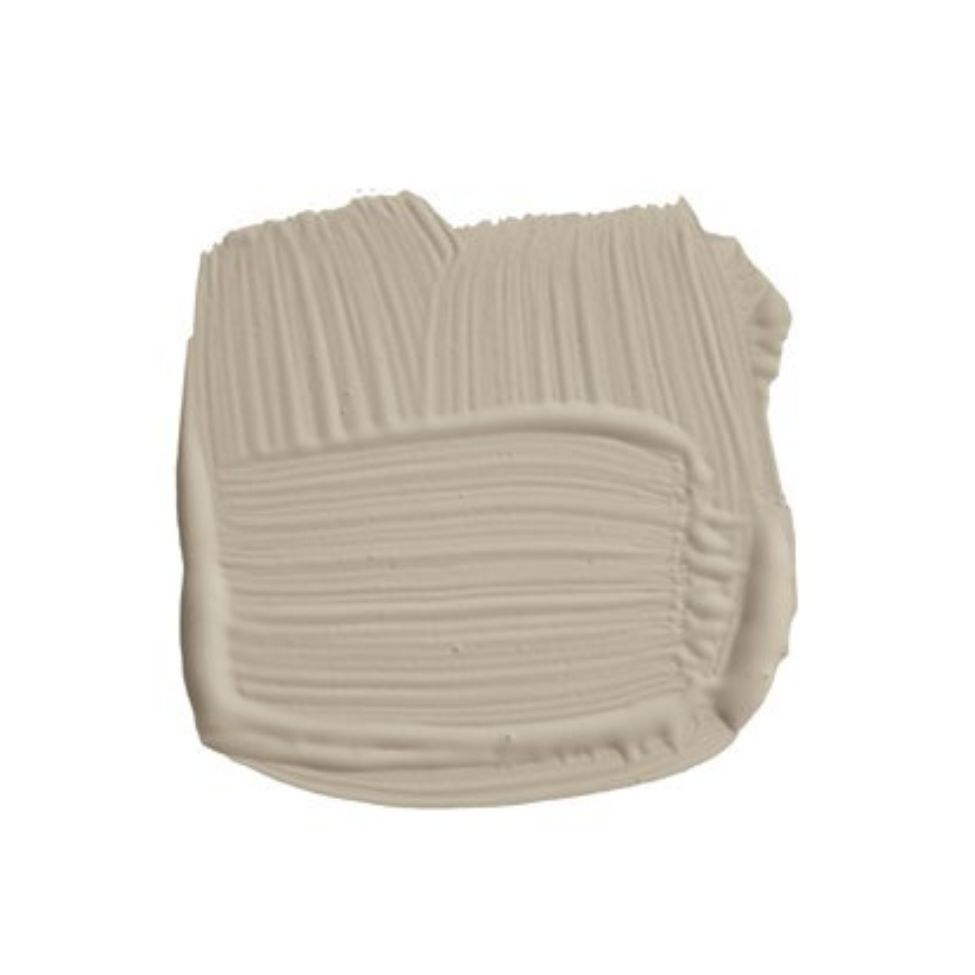
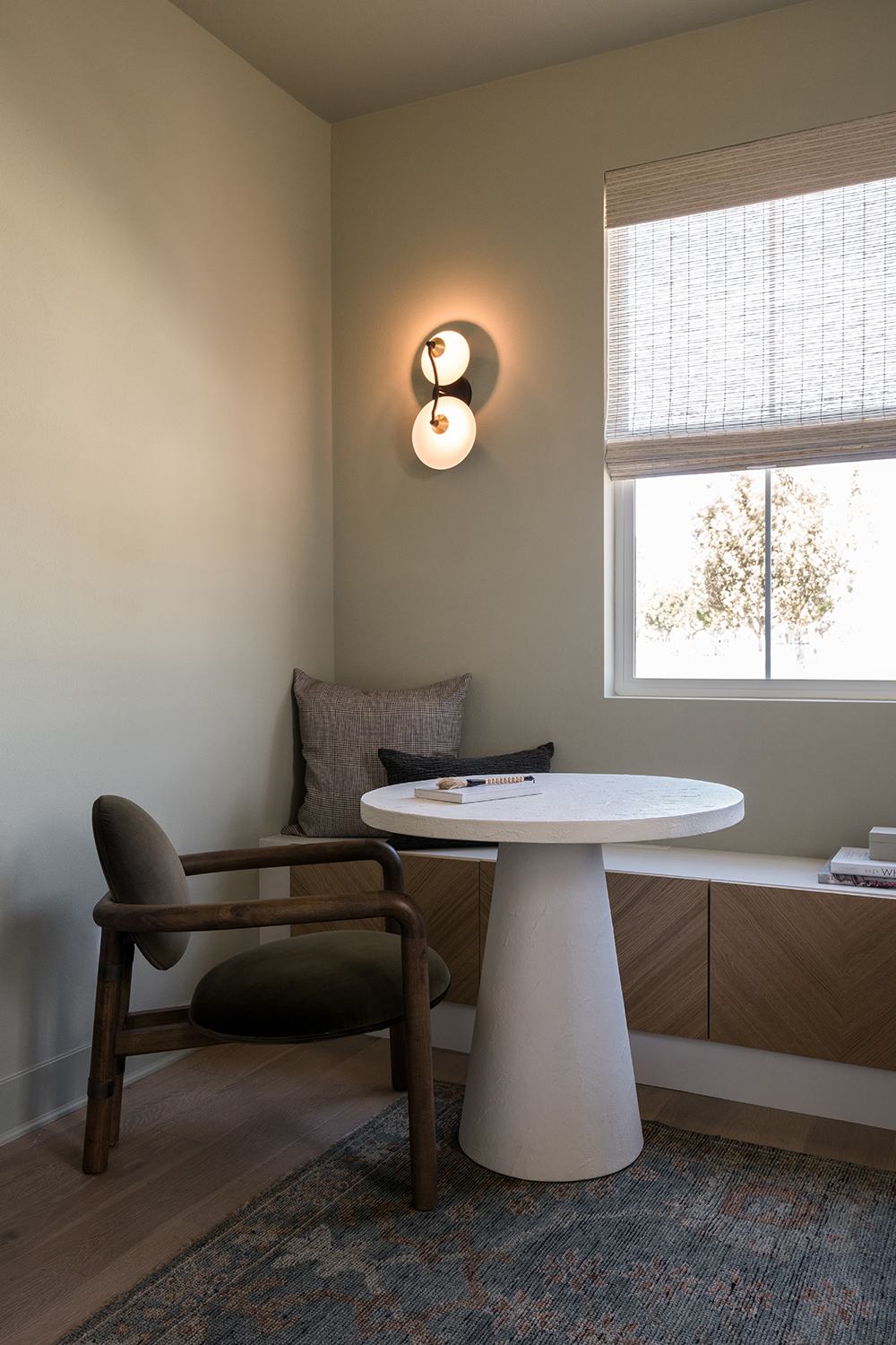
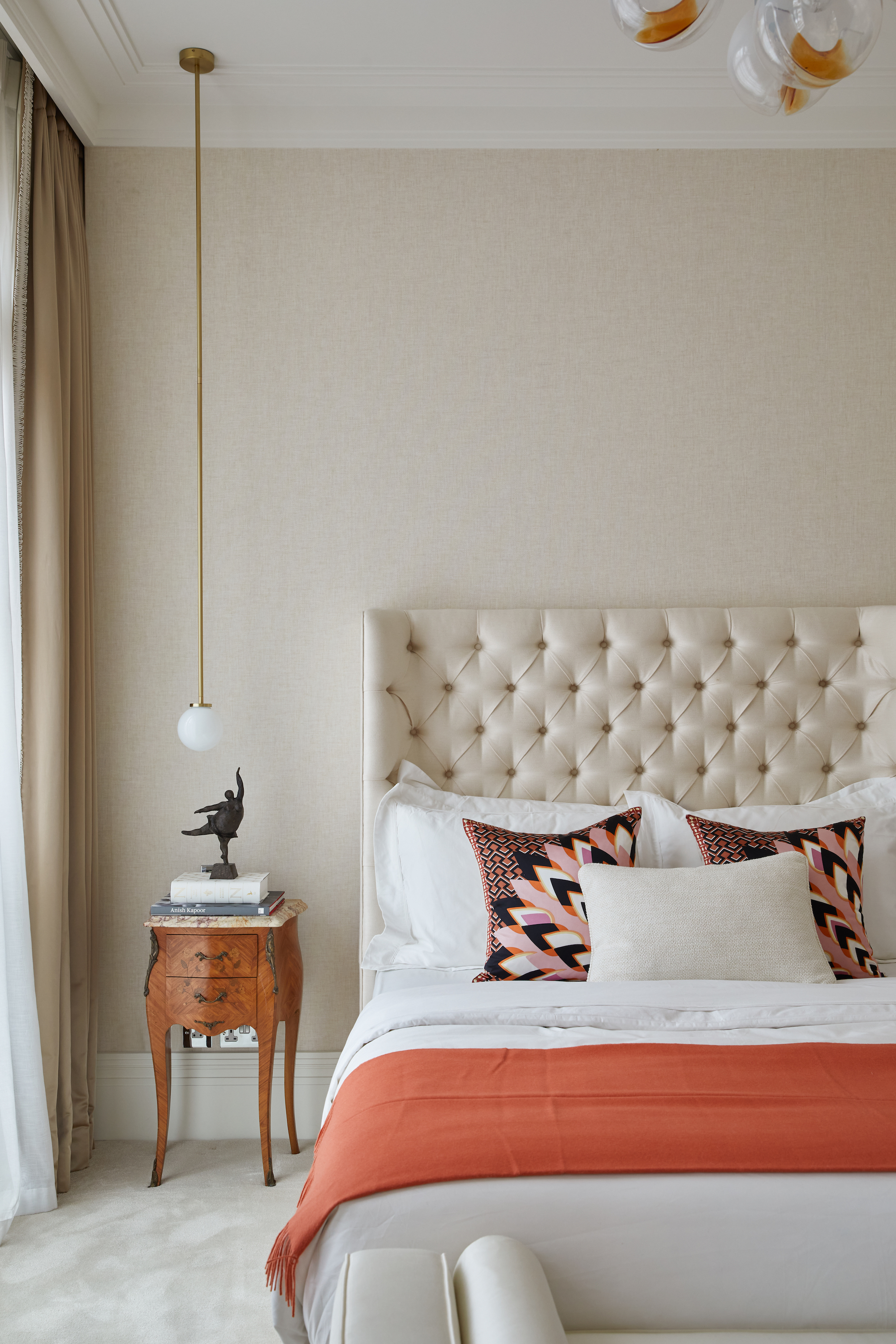
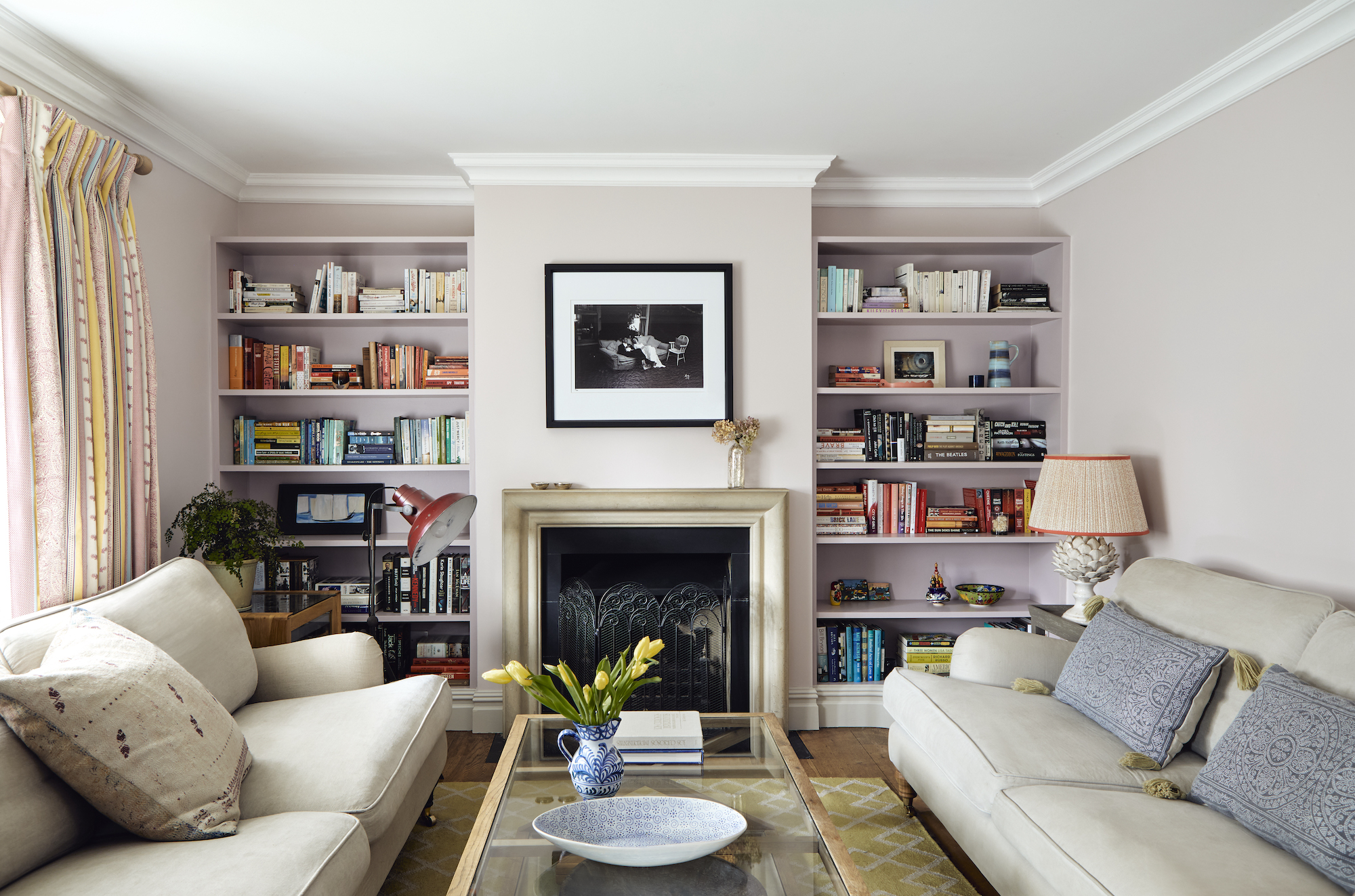
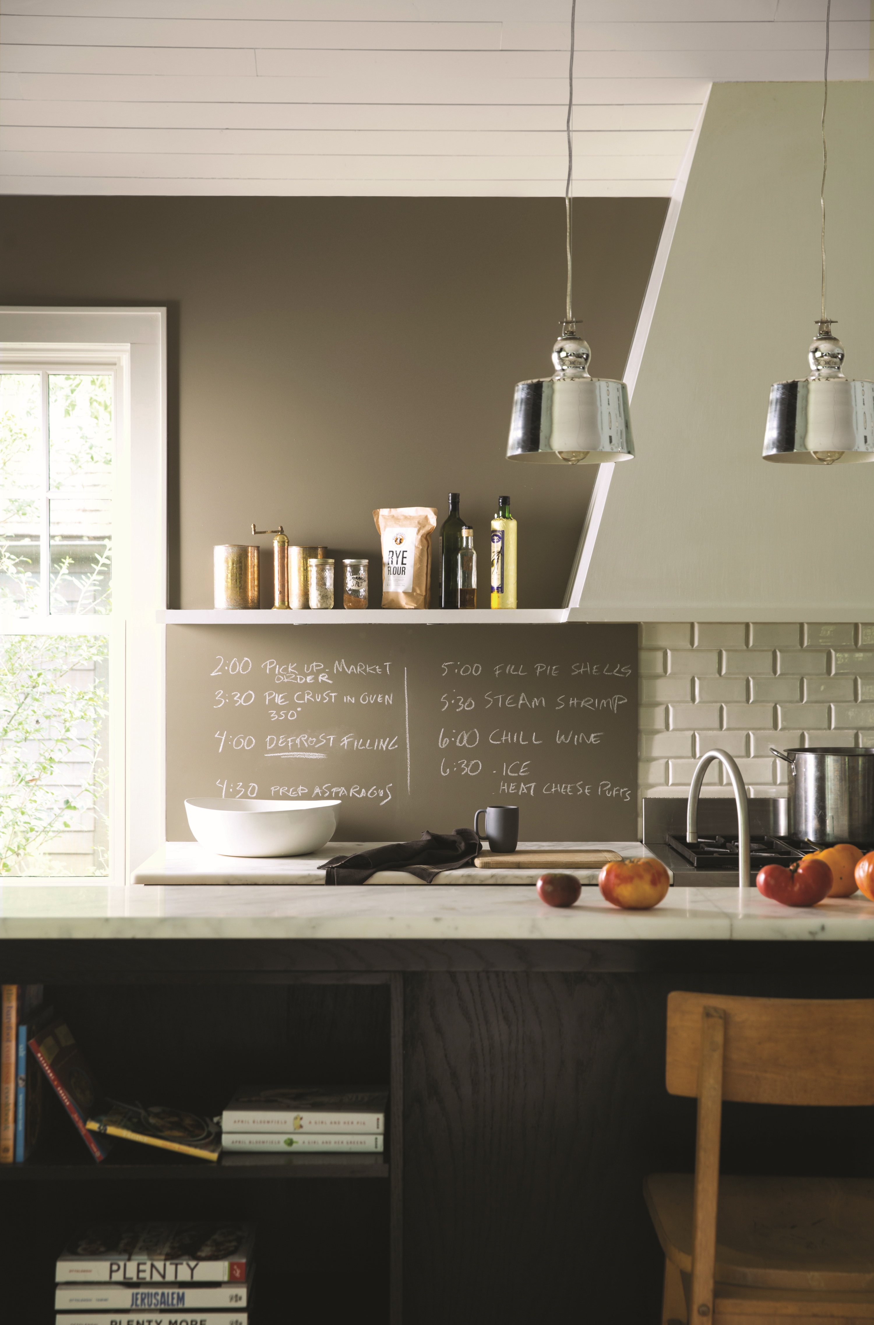
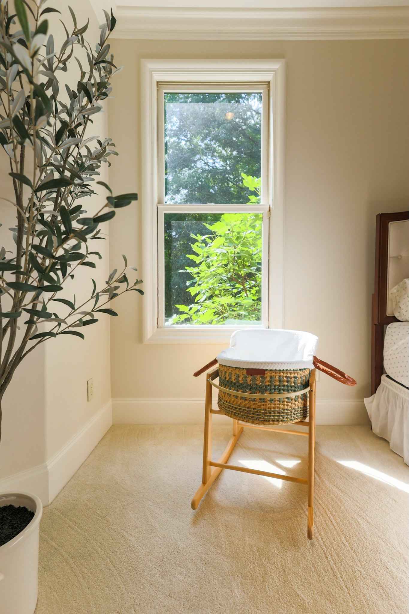
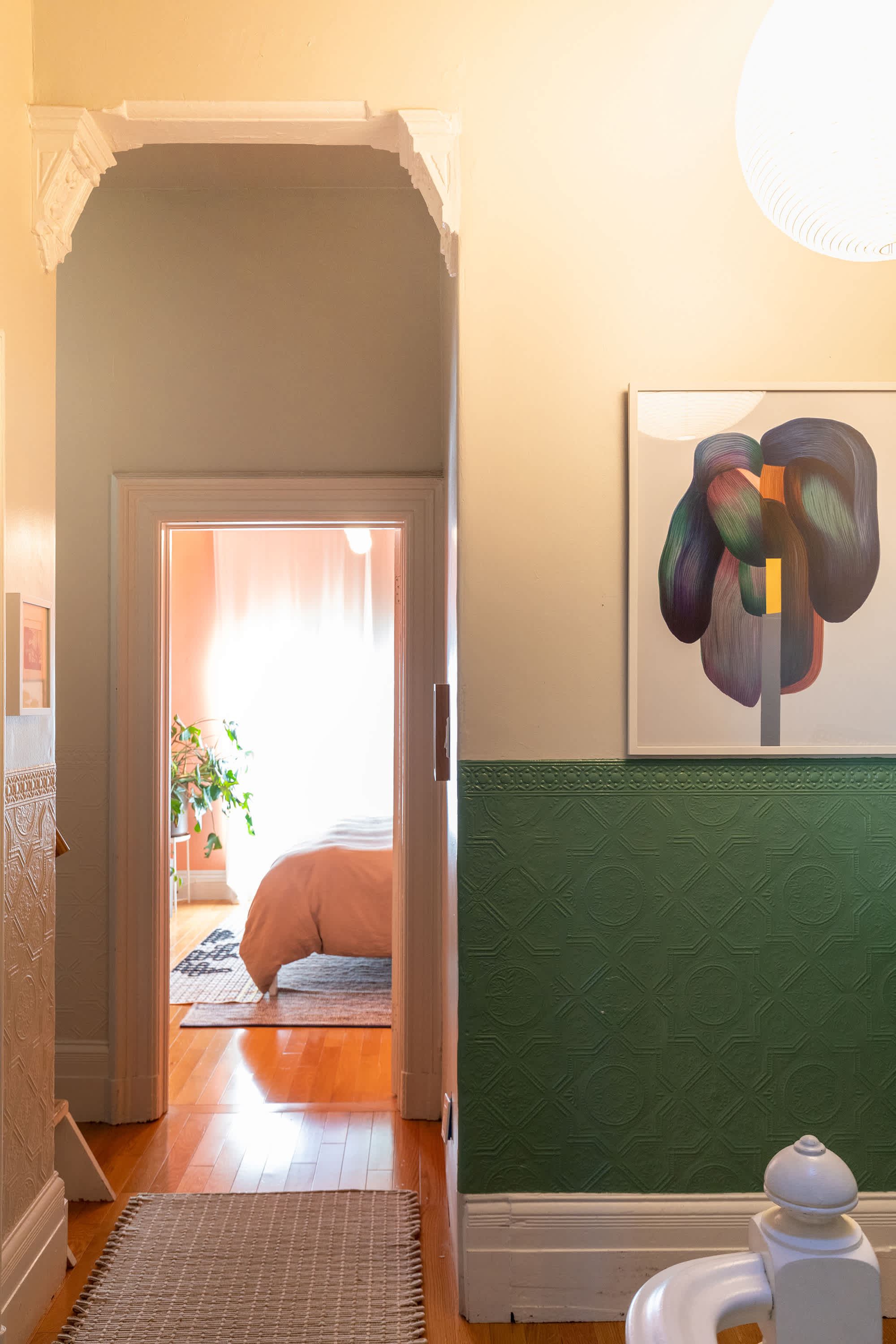
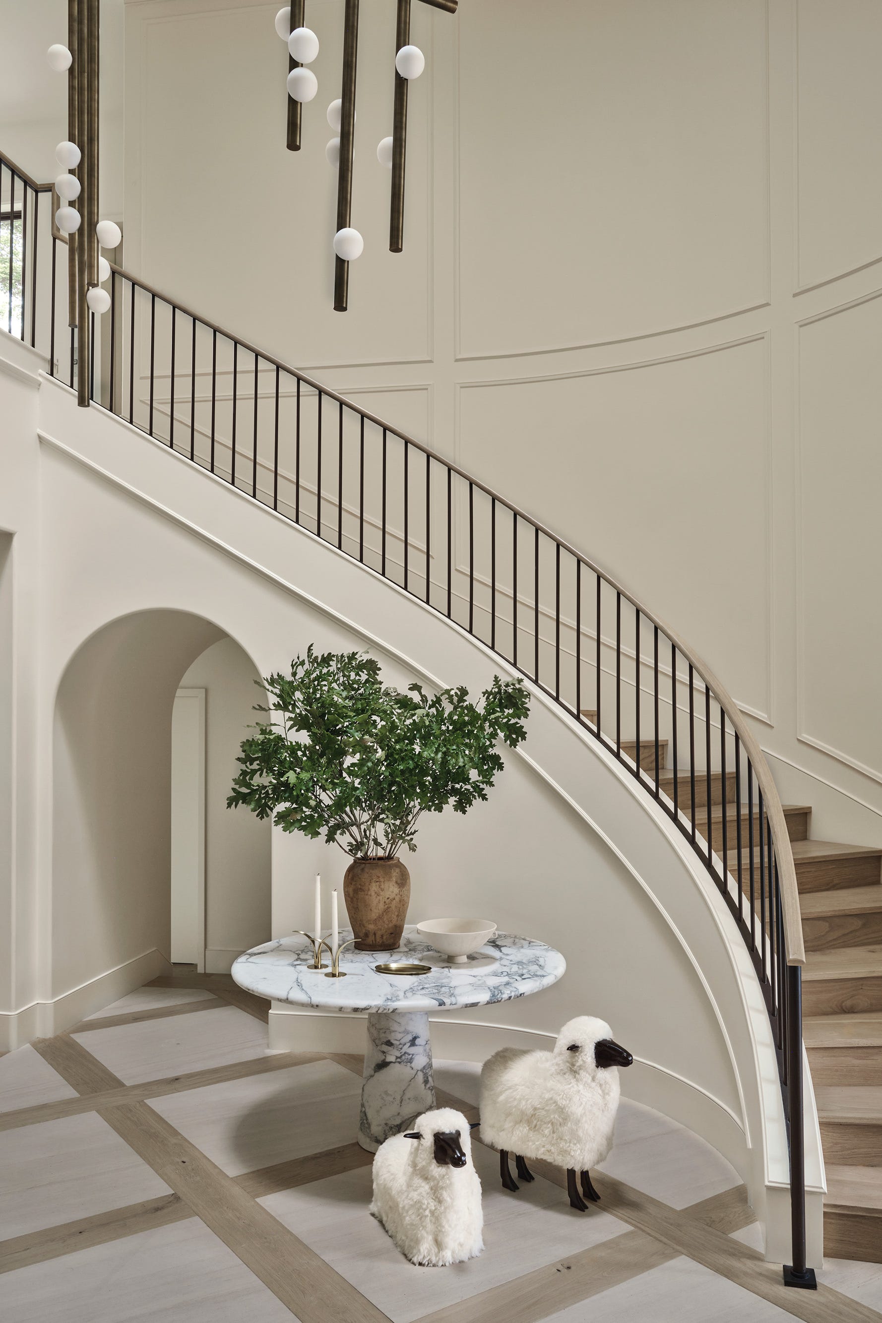
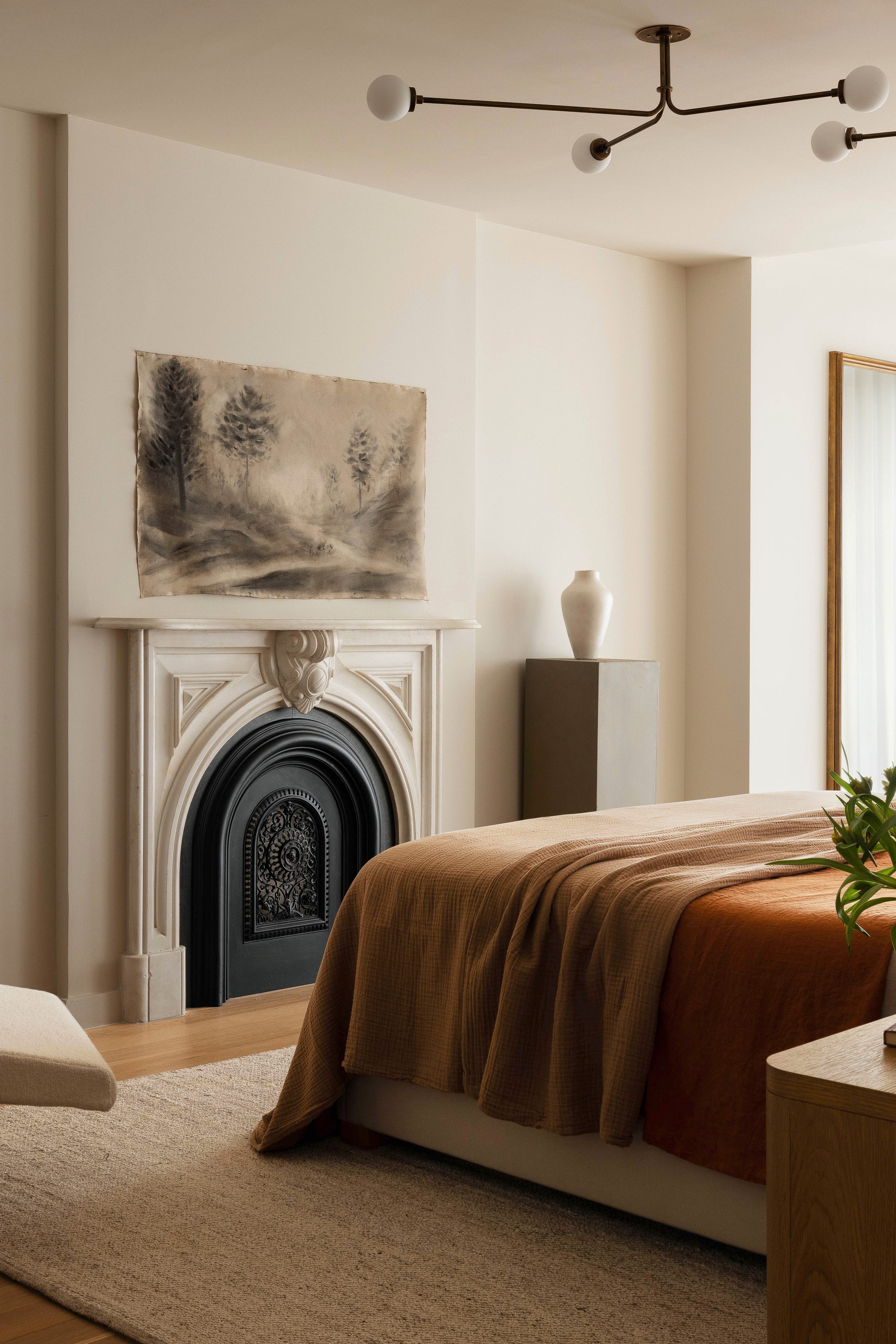
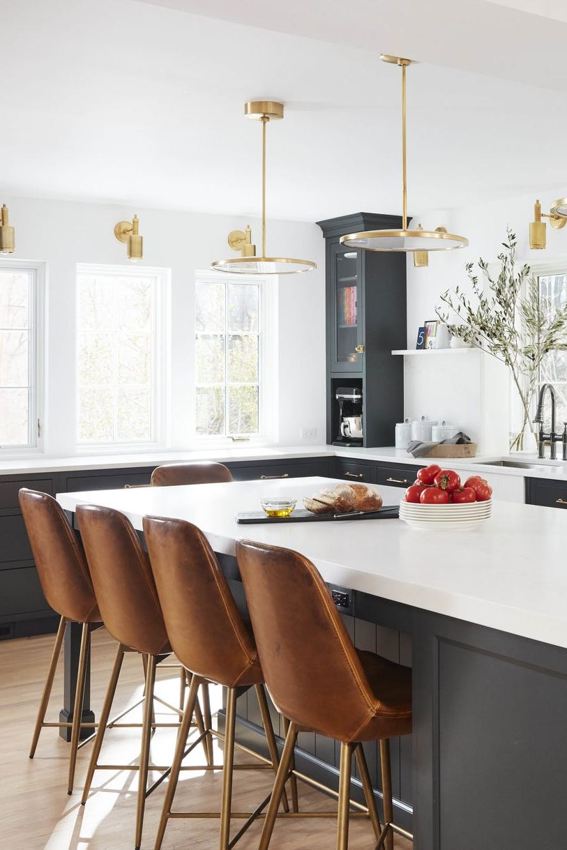
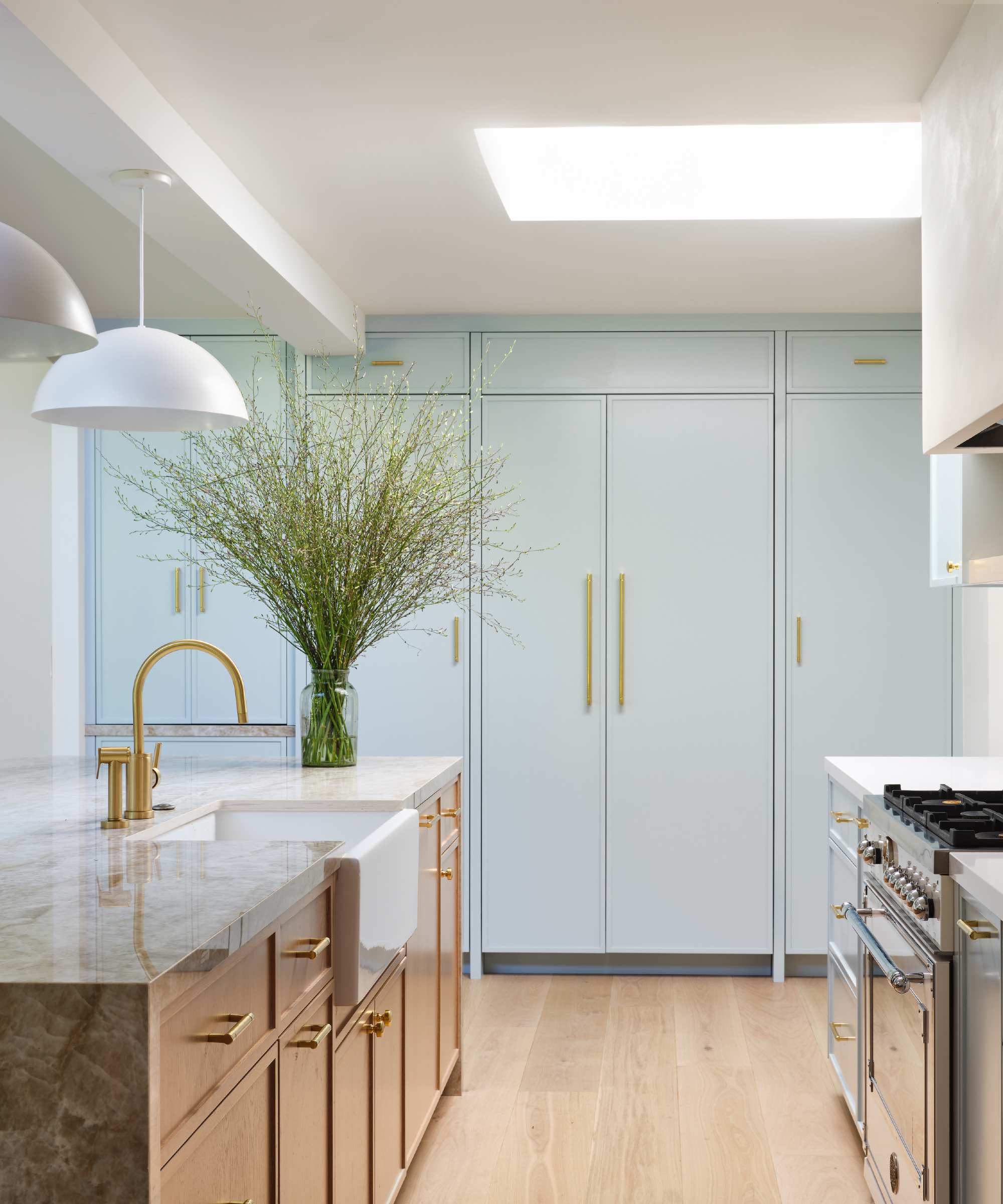
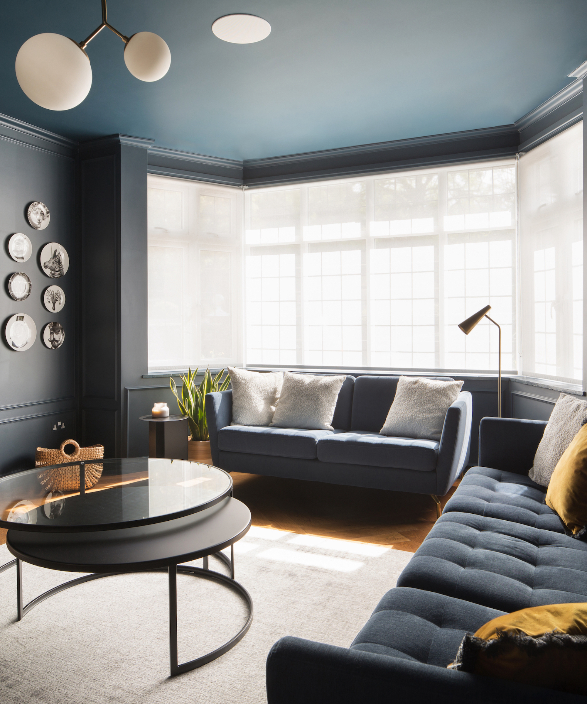
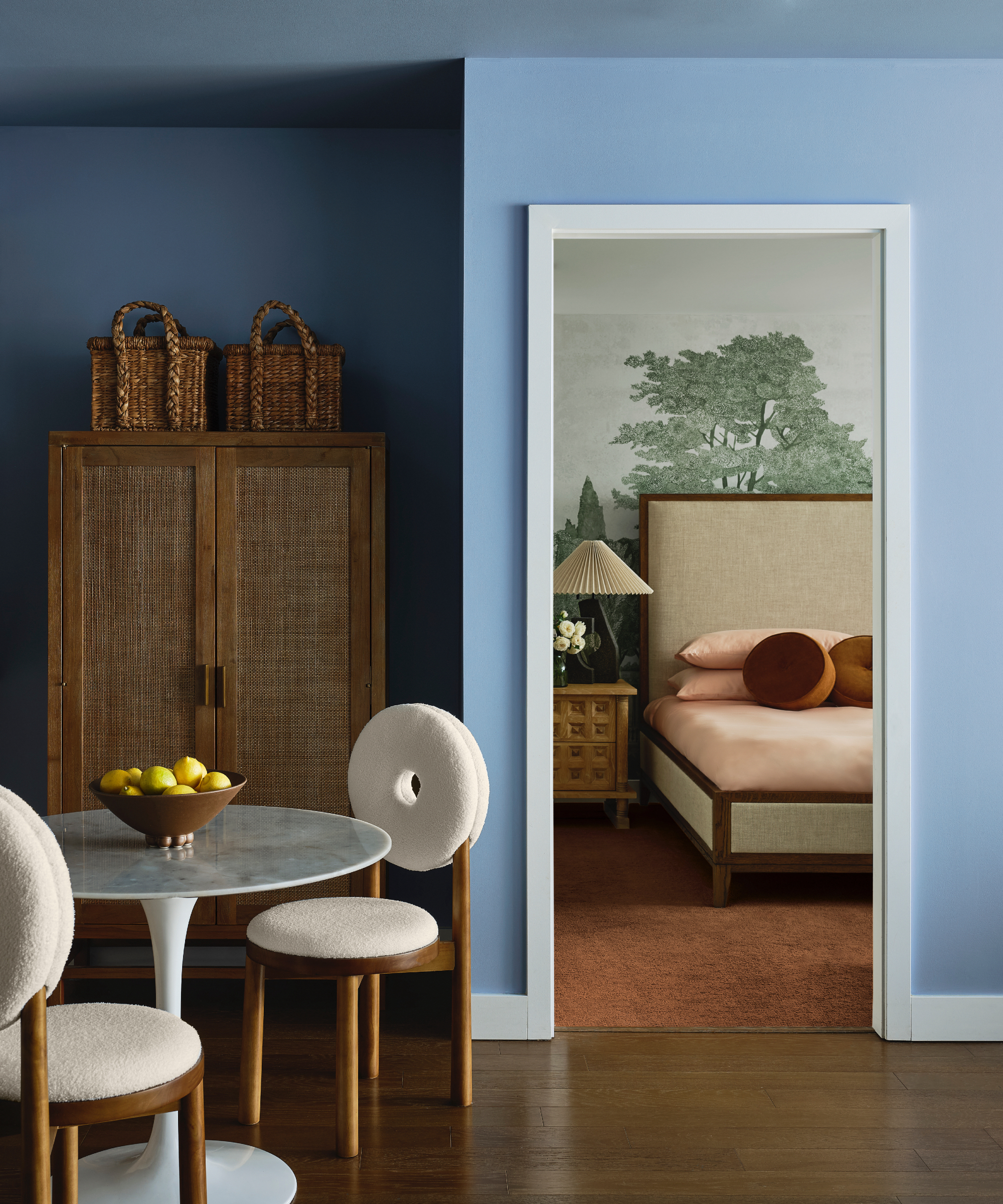
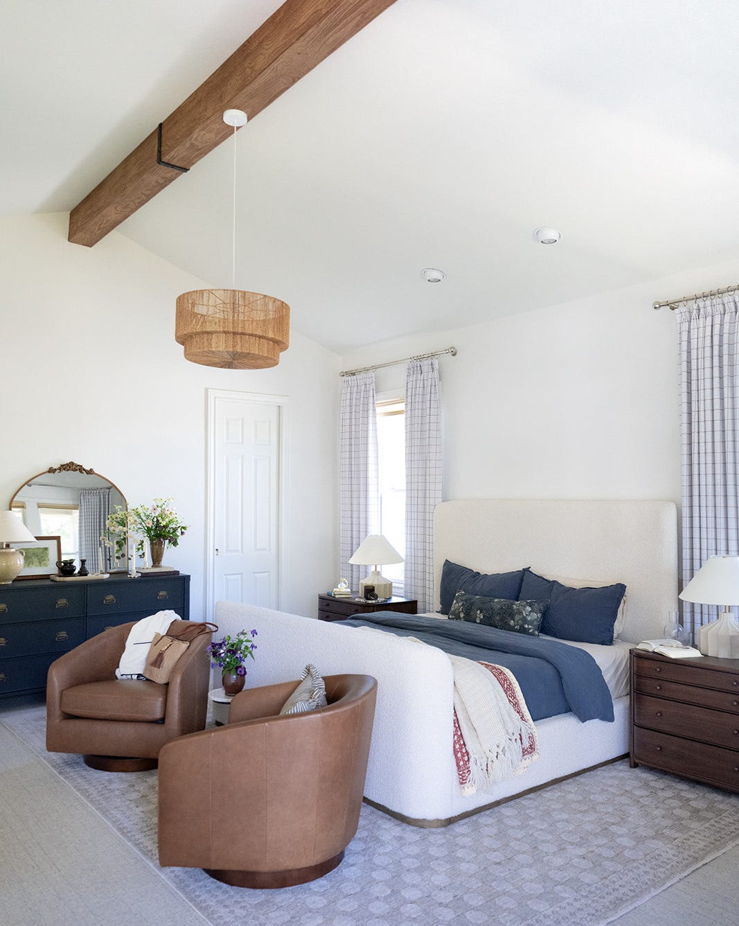
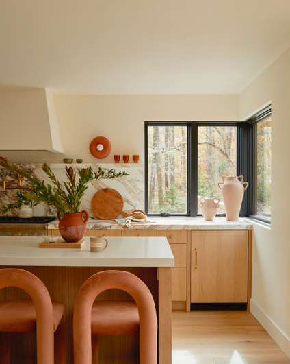
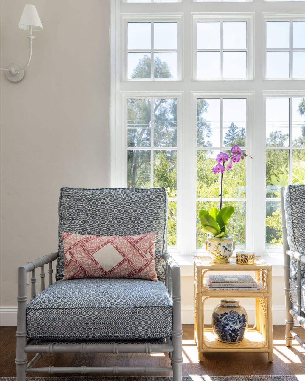
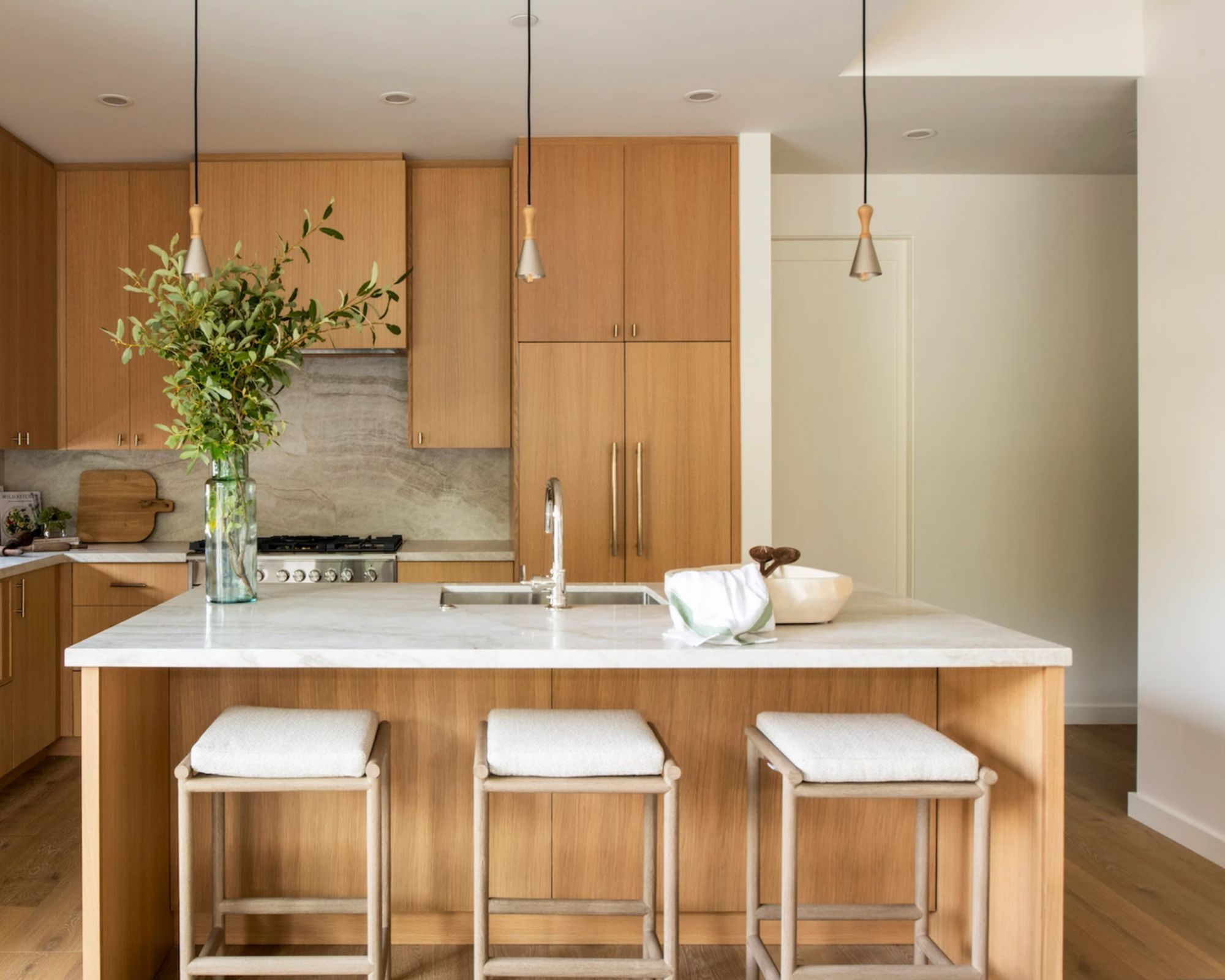
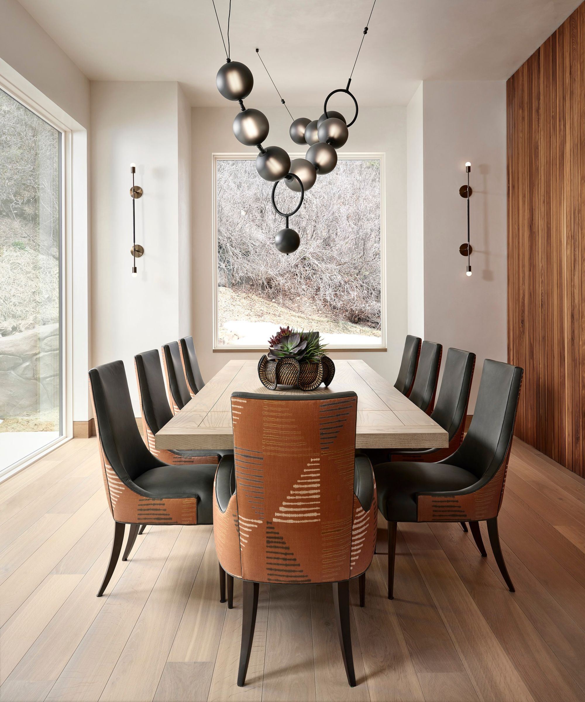
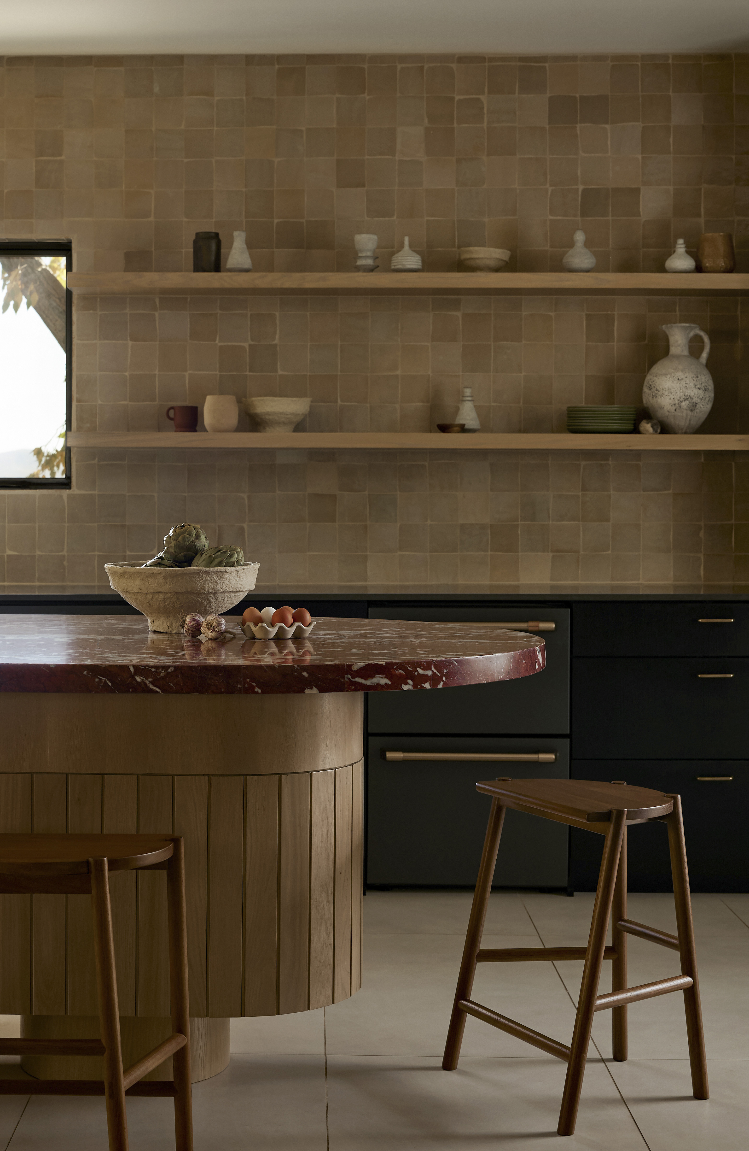
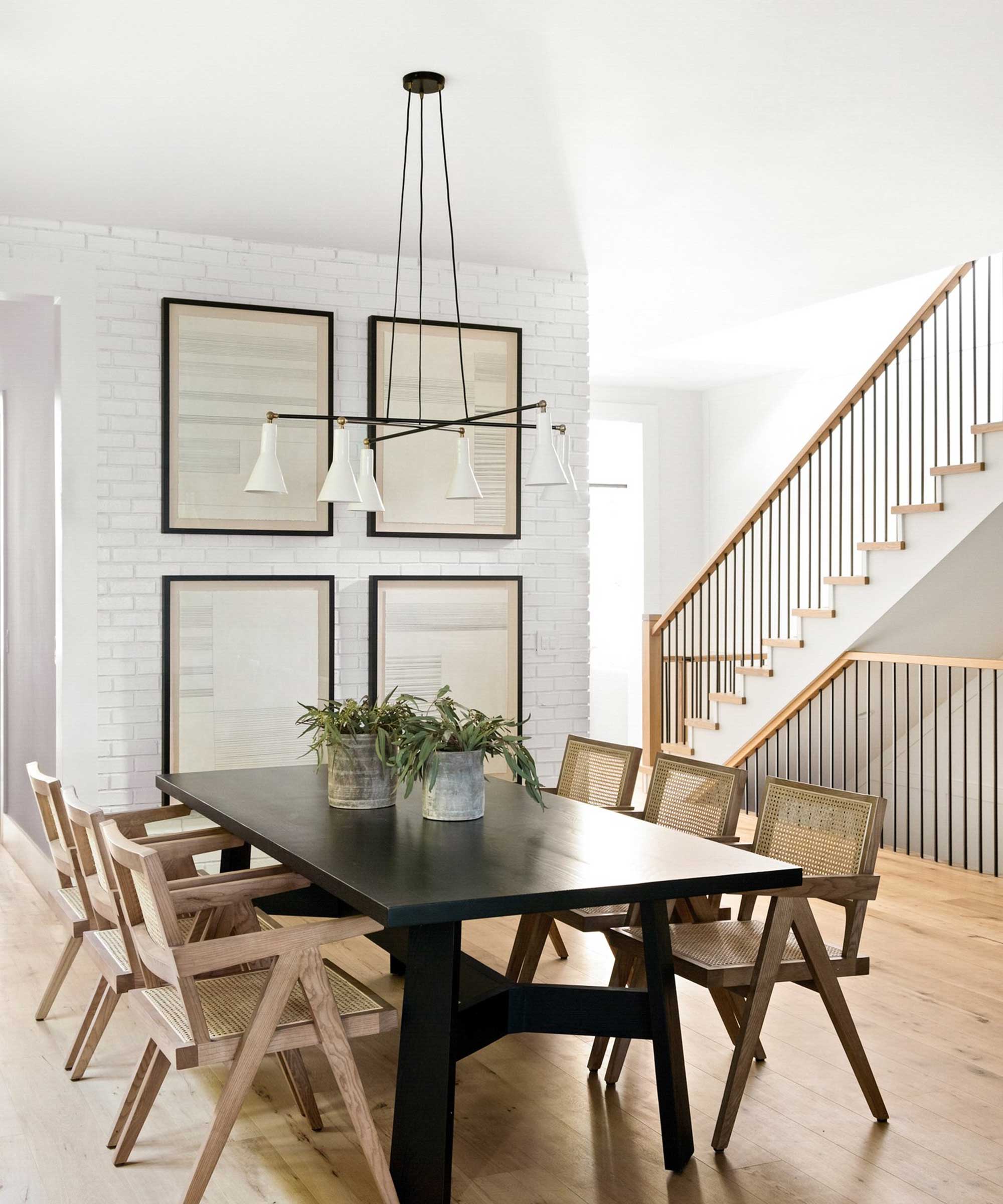
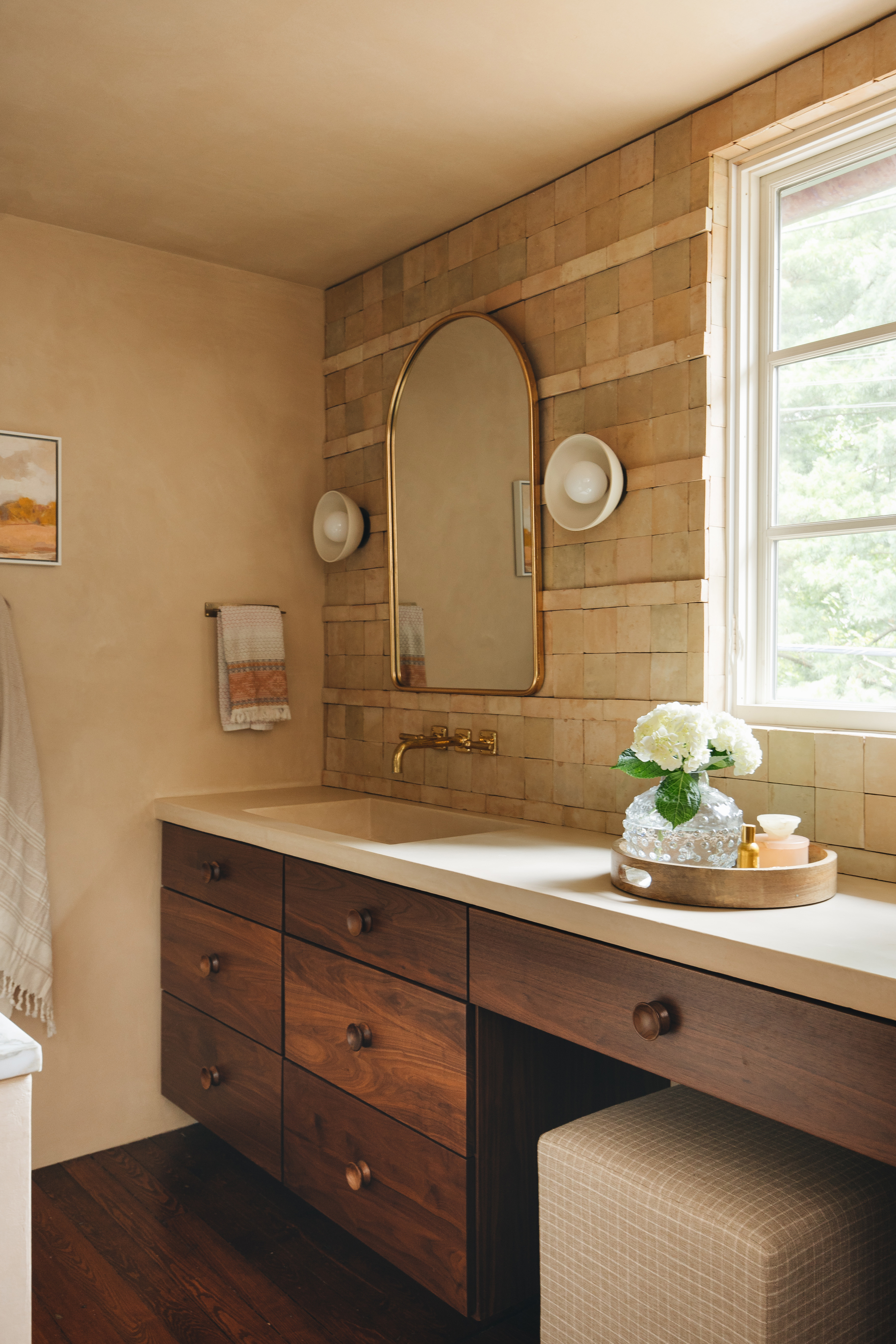
Beige paints are experiencing a significant resurgence in interior design, moving beyond their previous perception as dull and becoming a versatile choice for creating warm, sophisticated spaces. This renewed popularity is driven by their ability to offer warmth, depth, and elegance without being overly attention-grabbing. Unlike transient trends, beige has proven its enduring appeal, consistently ranking high on bestseller lists and forming a cornerstone of contemporary color palettes, balancing coziness with modern aesthetics. Modern beige paints differentiate themselves by avoiding strong yellow undertones and steering clear of excessively cool shades, instead favoring rich, grounded tones that impart a calm yet vibrant feel.
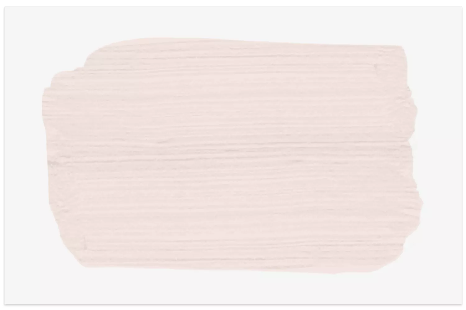
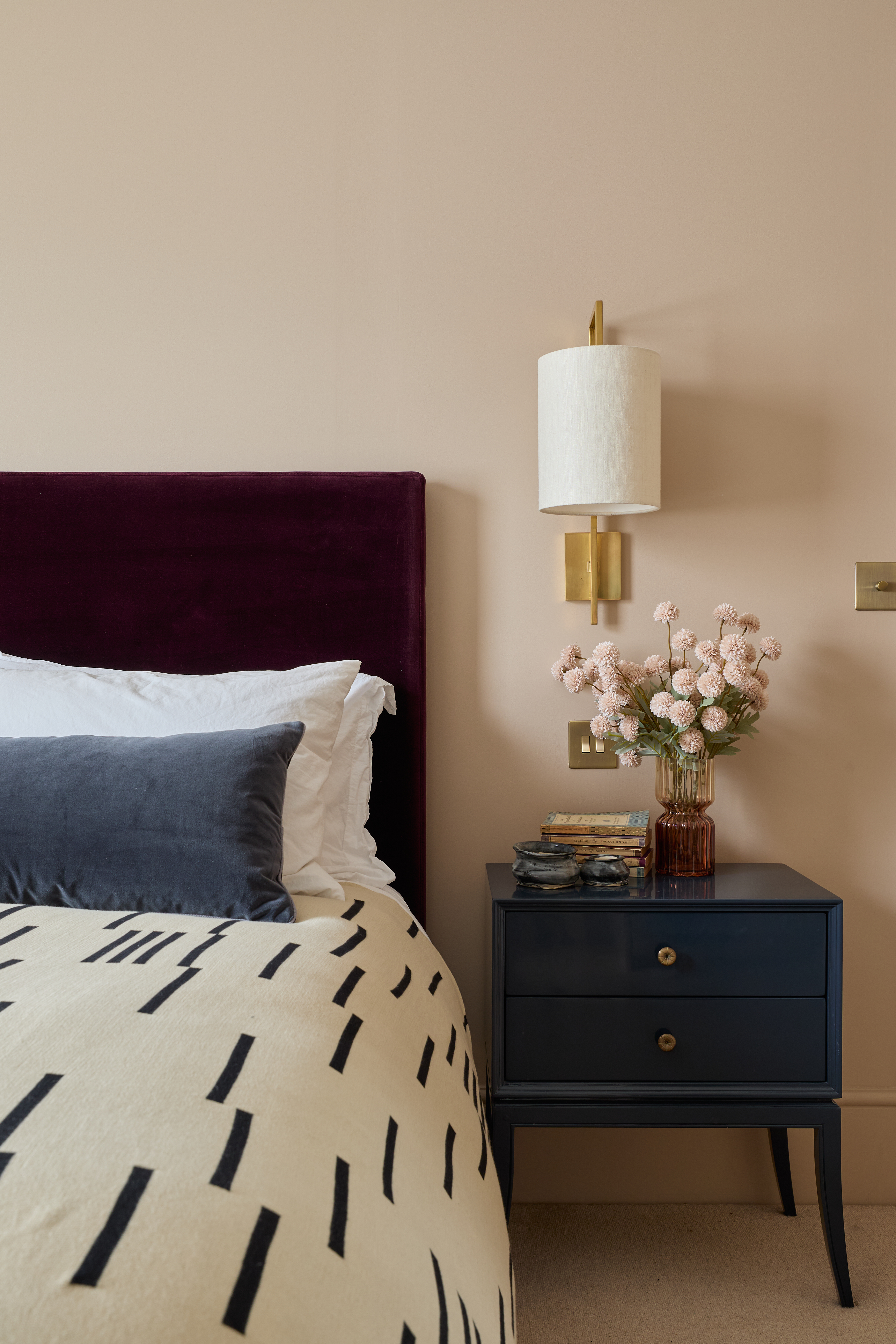
Several interior designers and color specialists recommend specific beige shades for their unique qualities and versatility. Farrow & Ball's Slipper Satin, for instance, is a subtle, pale beige that often appears as a creamy off-white or soft gray in different lighting. It is favored for its gentle nature, allowing other design elements to stand out, and its delicate pink undertone contributes to a calming atmosphere. Another acclaimed shade is Little Greene's Portland Stone, a warm and versatile beige recommended for its suitability across various rooms, from hallways to living spaces. It harmonizes well with colorful furnishings and is available in paler and darker variations, allowing for cohesive tonal schemes. Similarly, Farrow & Ball’s Oxford Stone, inspired by the honey-colored houses of the Cotswolds, offers a darker, richer beige with a comforting, nostalgic quality. It provides depth and complements natural materials, making it ideal for north-facing rooms needing warmth.

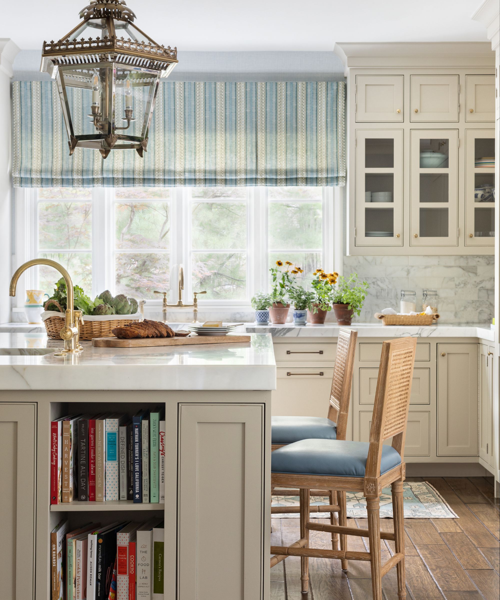
Little Greene's Slaked Lime is another top-selling neutral, celebrated for its adaptability across diverse palettes and rooms, often used for kitchen cabinetry and entryways due to its timeless appeal. Its subtle green undertones contribute to a soft, gentle appearance, making rooms feel larger. Farrow & Ball's Jitney is a brown-based beige, imparting a sun-kissed depth that works well in both contemporary and traditional settings, effortlessly pairing with natural textures like linen and wood. Benjamin Moore’s Adobe Dust offers a rustic, terracotta-inspired beige with warm orange, red, and brown undertones, perfect for creating intimate and informal spaces with earthy appeal. Meanwhile, Benjamin Moore’s White Dove and Pale Oak are preferred for their warm white and taupe qualities, which are seen as fresher alternatives to cooler whites and grays, especially in spaces with limited natural light. White Dove is particularly recommended for foyers and as a clean base color that maintains its integrity from morning to night.
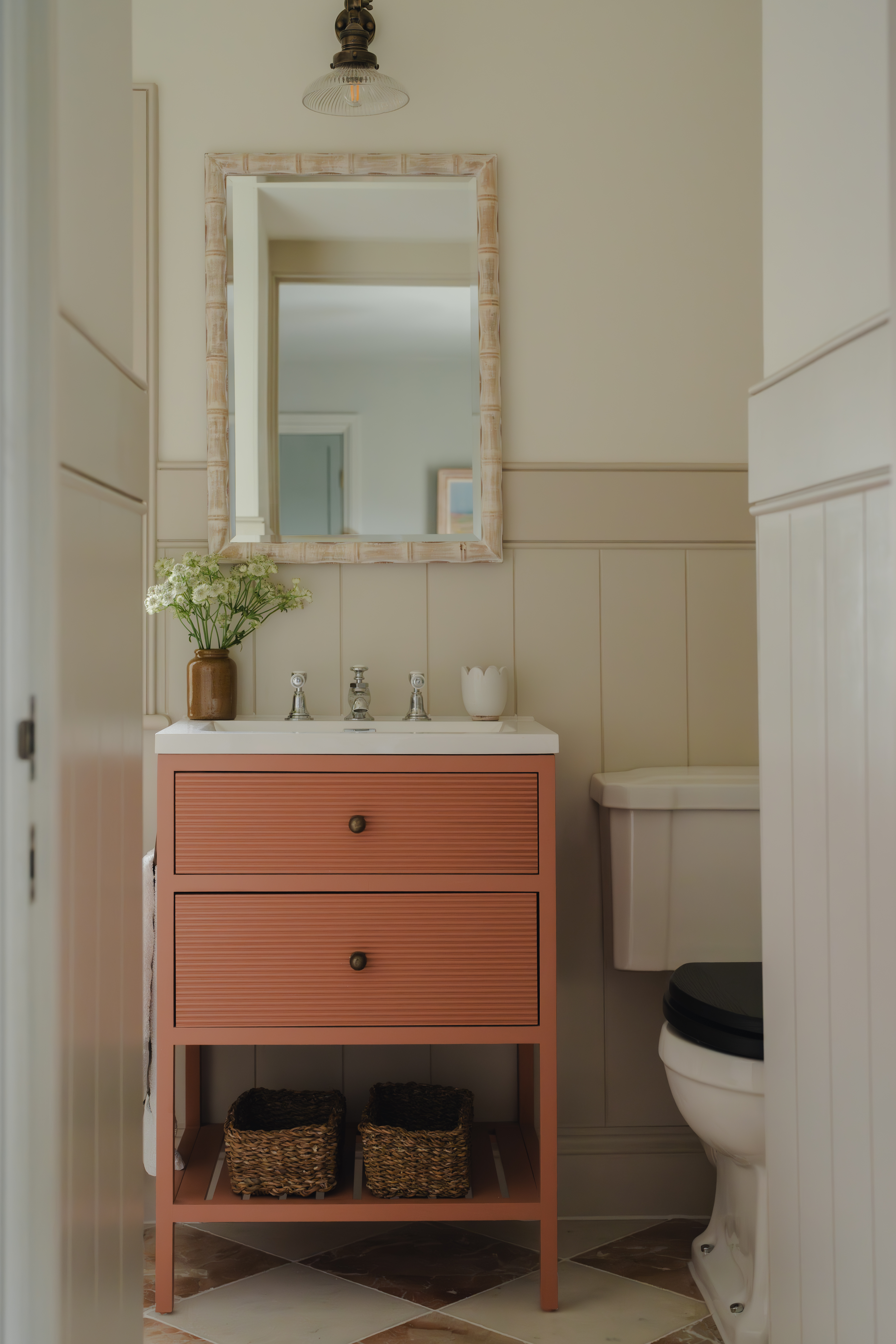
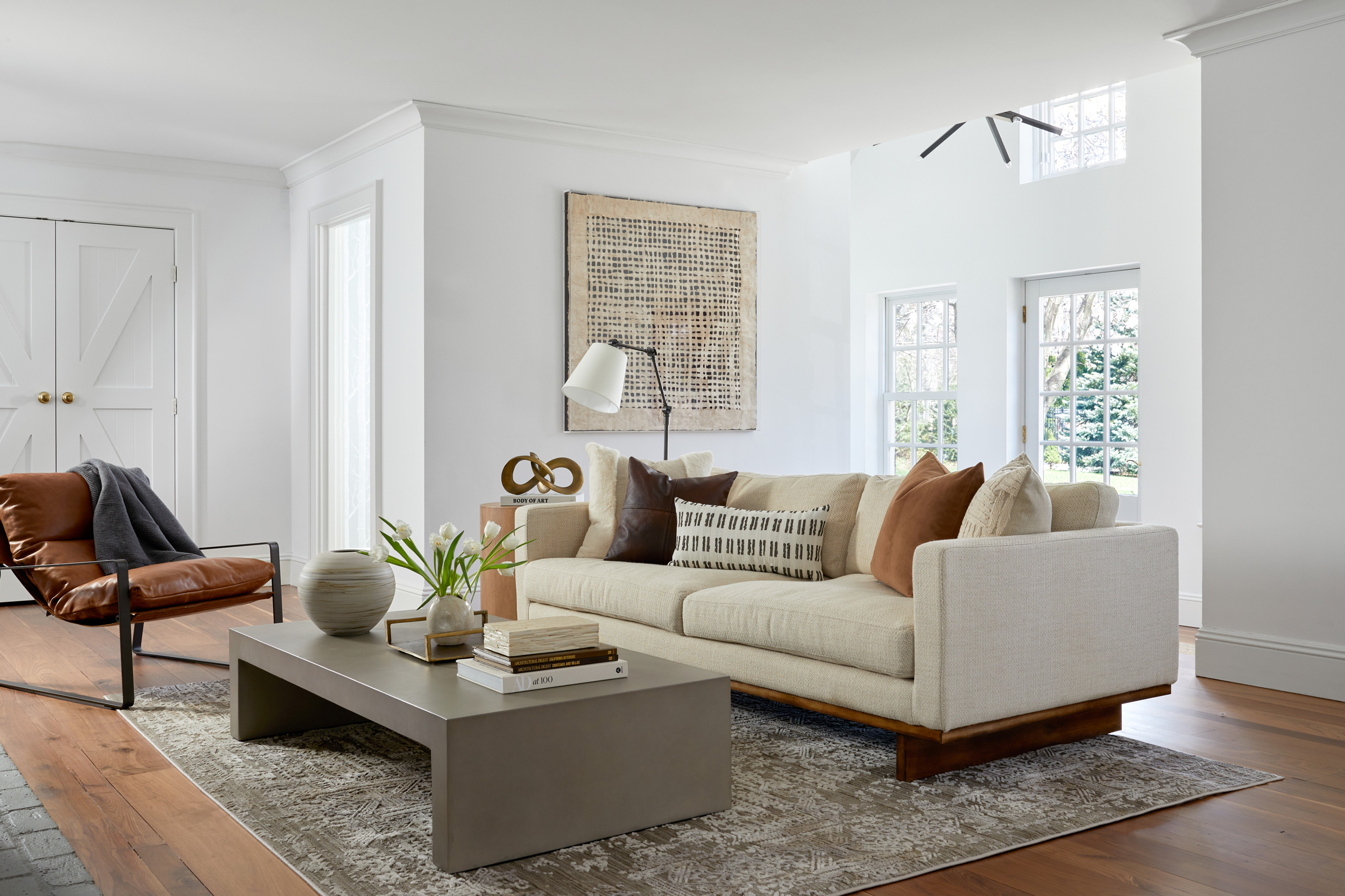
Benjamin Moore's Swiss Coffee is an essential warm white that prevents the clinical feel of pure white, bringing softness to bathrooms and acting as a versatile backdrop for various design elements. Sherwin-Williams' Modern Gray, despite its name, is a warm, adaptable beige that transforms based on its surroundings, appearing soothing when paired with warm wood tones. Farrow & Ball’s Biscuit, an archive color, aligns with a renewed appreciation for buff and biscuit tones, embodying a sophisticated, understated elegance suitable for various rooms. Sherwin-Williams’ Canvas Tan, described as a khaki-tinted white, features olive undertones that give it a fresh yet warm feel, easily complementing diverse design styles and working well with white woodwork. Accessible Beige by Sherwin-Williams is a classic mid-tone beige with warm gray undertones, making it a reliable choice for bedrooms and living rooms, especially those with less natural light. Finally, Benjamin Moore’s Revere Pewter is a classic neutral that bridges warm and cool tones, offering a harmonious and contemporary feel, while Sherwin-Williams’ Drift of Mist, a gray-toned beige, is highly recommended for rooms lacking natural light, providing an inviting yet airy ambiance without becoming too dark.
#InteriorDesign #BeigePaint #PaintColors #HomeDecor #ColorTrends #InteriorDesigners #FarrowAndBall #BenjaminMoore #SherwinWilliams #LittleGreene #InteriorDesign #BeigePaint #PaintColors #HomeDecor #ColorTrends #InteriorDesigners #FarrowAndBall #BenjaminMoore #SherwinWilliams #LittleGreene
0 comment in total
 No comments yet
You may also like
These Are the 10 Colors Interior Designers Would Pair with Beige

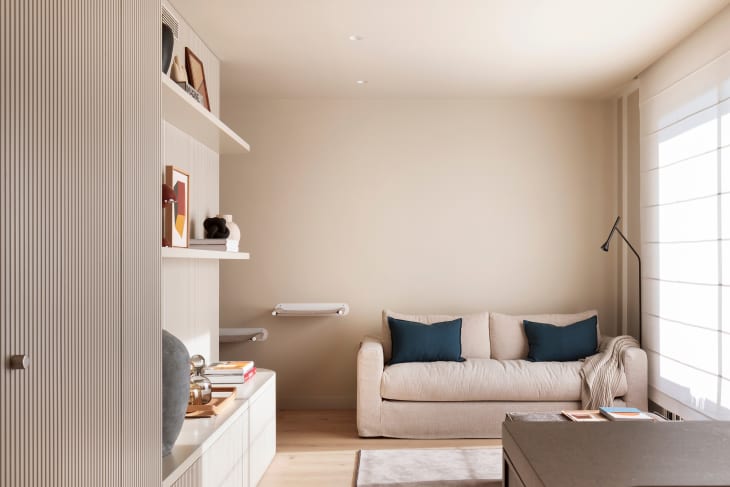
Forget Millennial Pink: When It Comes to Wall Paint, "Boring" Beige is Back
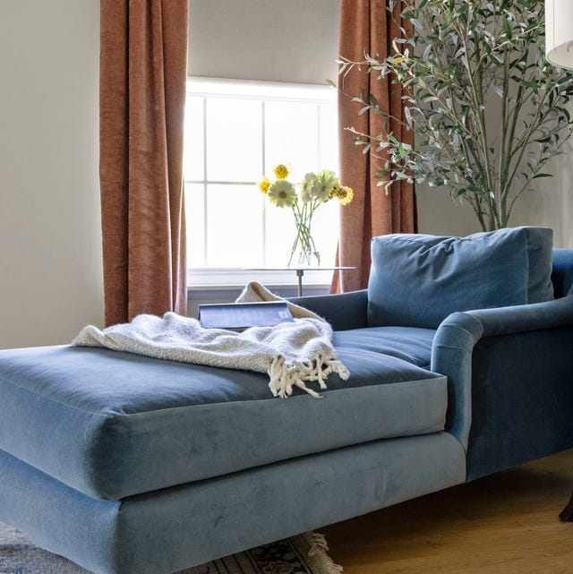
13 Best Off-White Paint Colors, According to Interior Designers

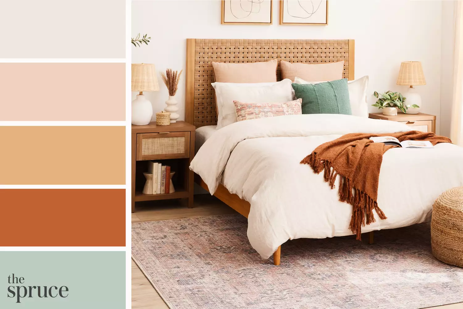
11 Beautiful Colors That Go With Beige

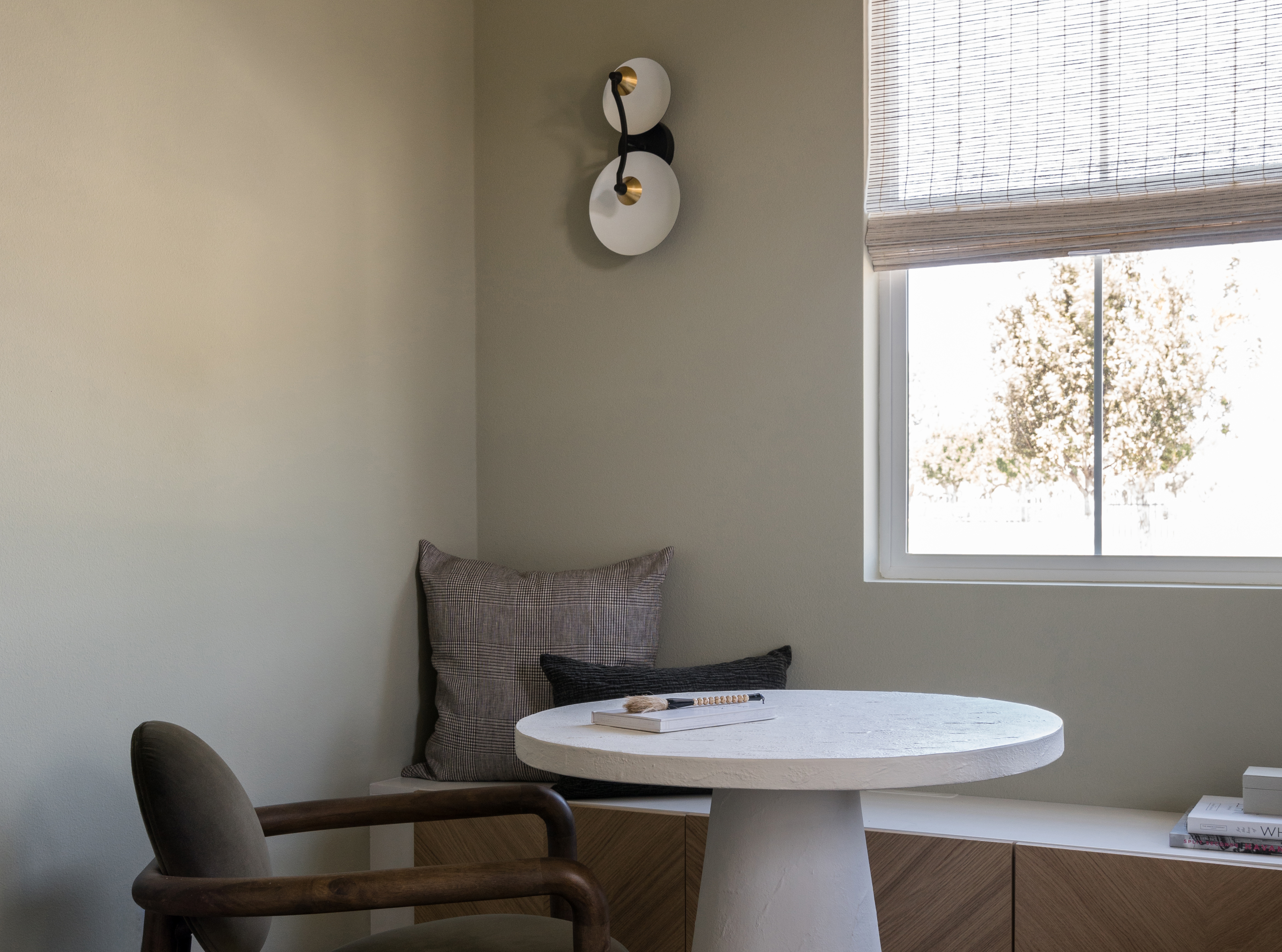
The 8 Best Beige Paints Designers Turn to for Warmly Luxe Schemes – "It Evokes a Sense of Calm"

The 13 Best White Paint Colors That Interior Designers Swear By

The Best Beige Paint Color of All Time
8 Beige Room Ideas That Break the 'Boring' Stereotype
10 accent colors for beige – design experts' favorite color pairings

16 Beige Paint Colors That Never Go out of Style, According to Interior Designers
14 Colors You Should Pair With Beige to Make This Neutral Pop in Your 2025 Decorating Schemes
Britain's best interior designers on the paint colours you just can't go wrong with
11 Best Beige Paint Colors for Interiors

8 Favorite Paint Colors of Local Interior Designers

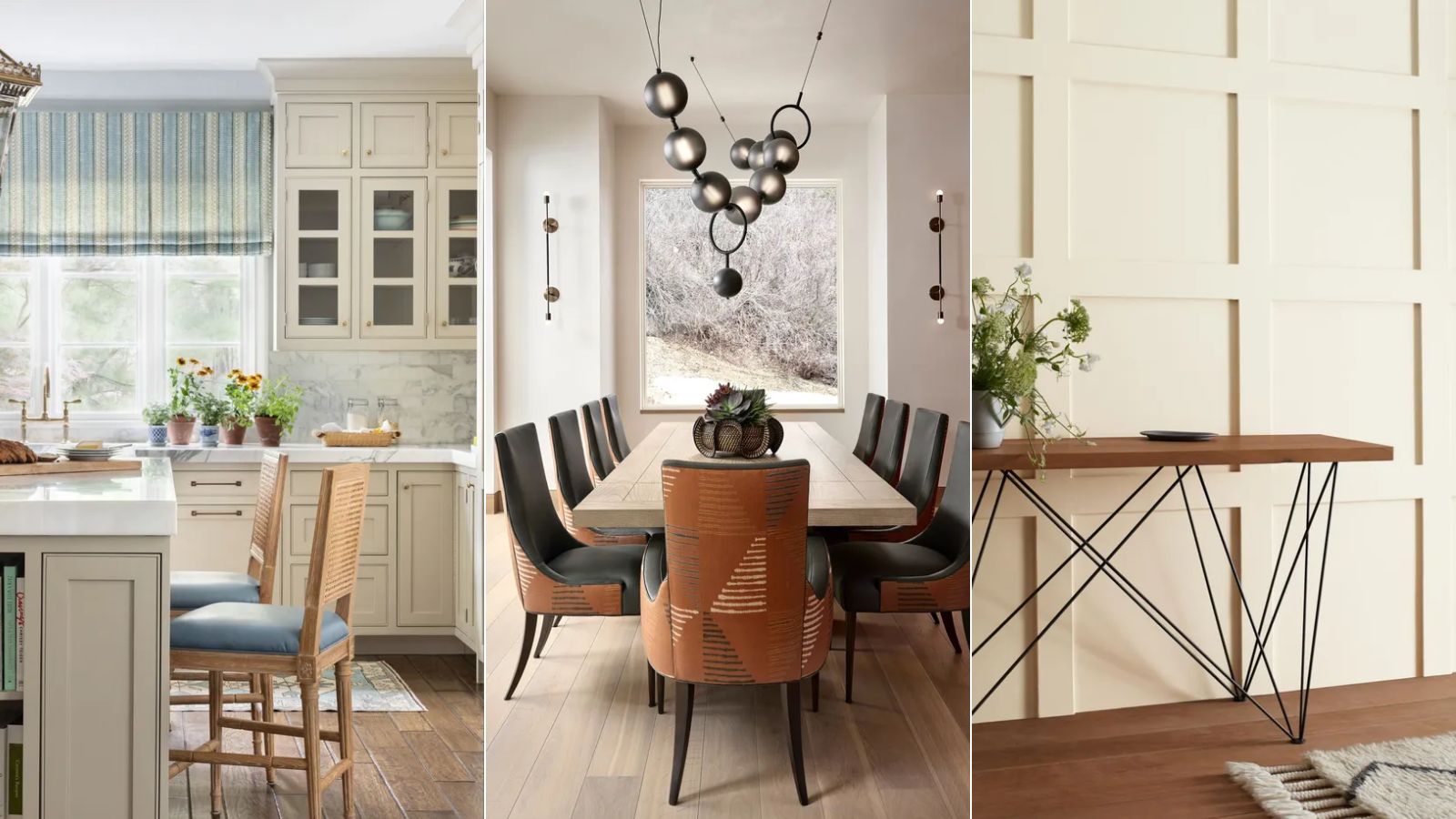
10 best warm neutral paints as recommended by interior designers – from beige to muted pink
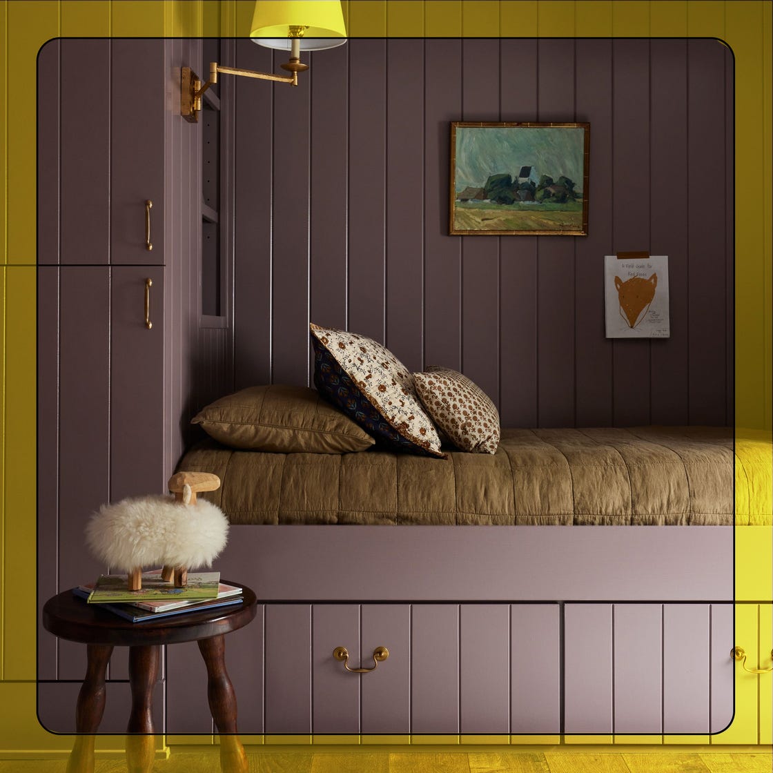
You Should Always Paint Your Home Beige
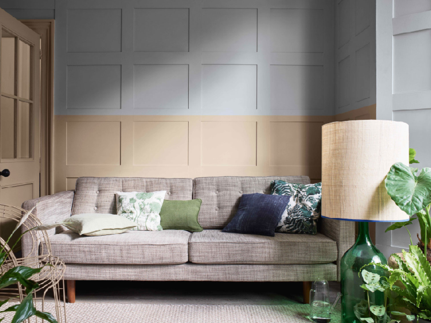
8 beige room ideas – that prove it's beautiful, not boring

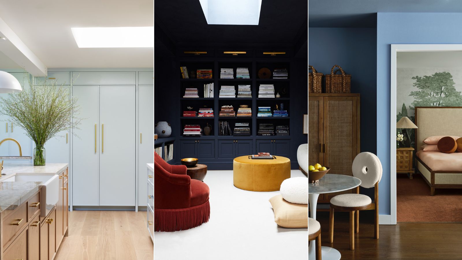
5 best blue paints as chosen by interior designers
Designers Share Their Tried-and-True Shades From the Best Interior Paint Brands
11 Beautiful Colors That Go Well With Beige