1/4
These Are the 10 Colors Interior Designers Would Pair with Beige
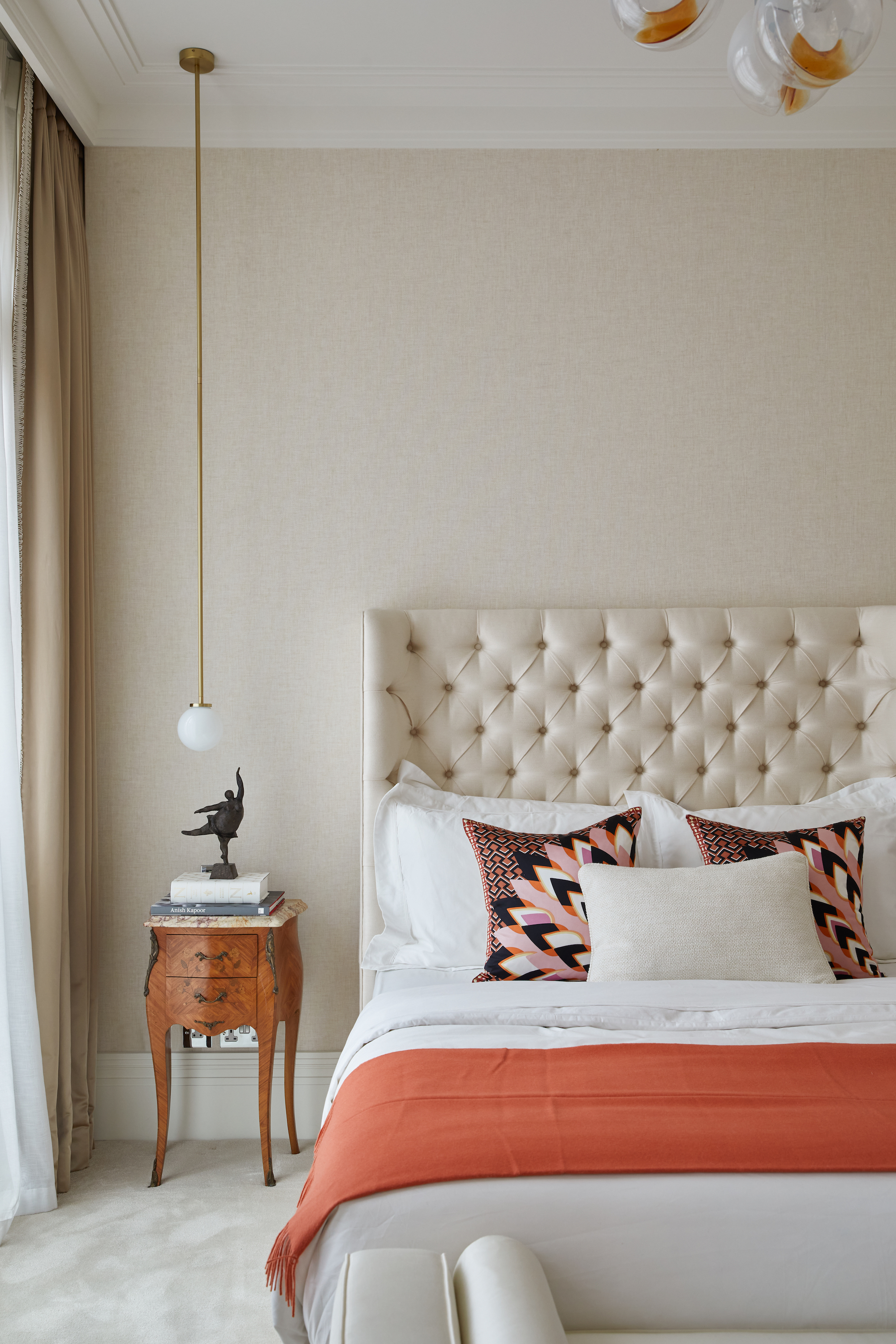
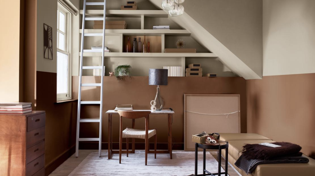
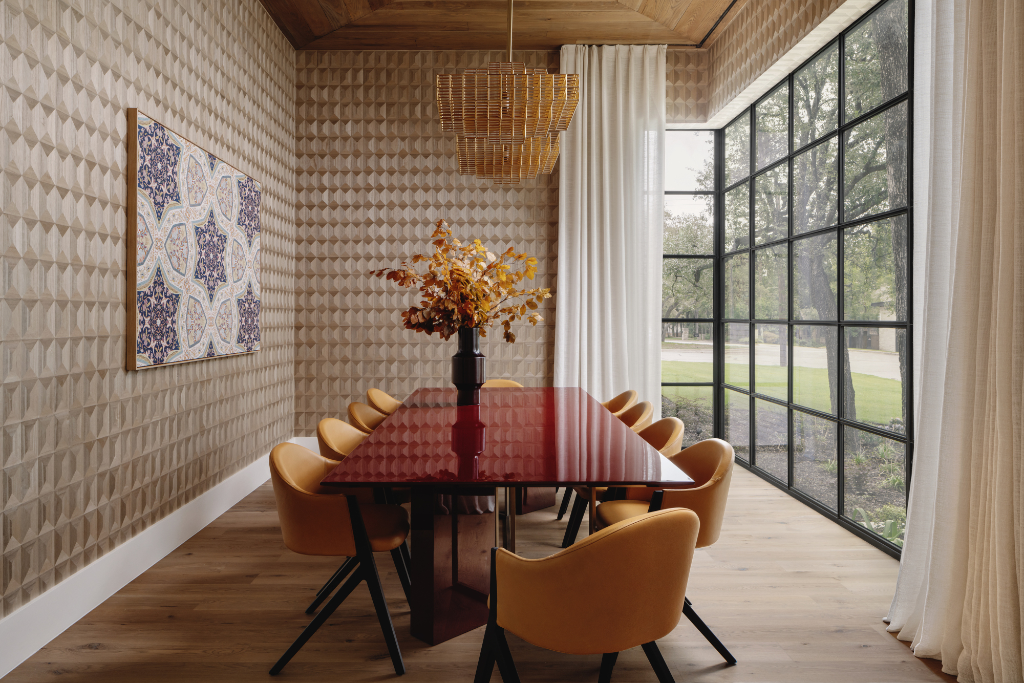
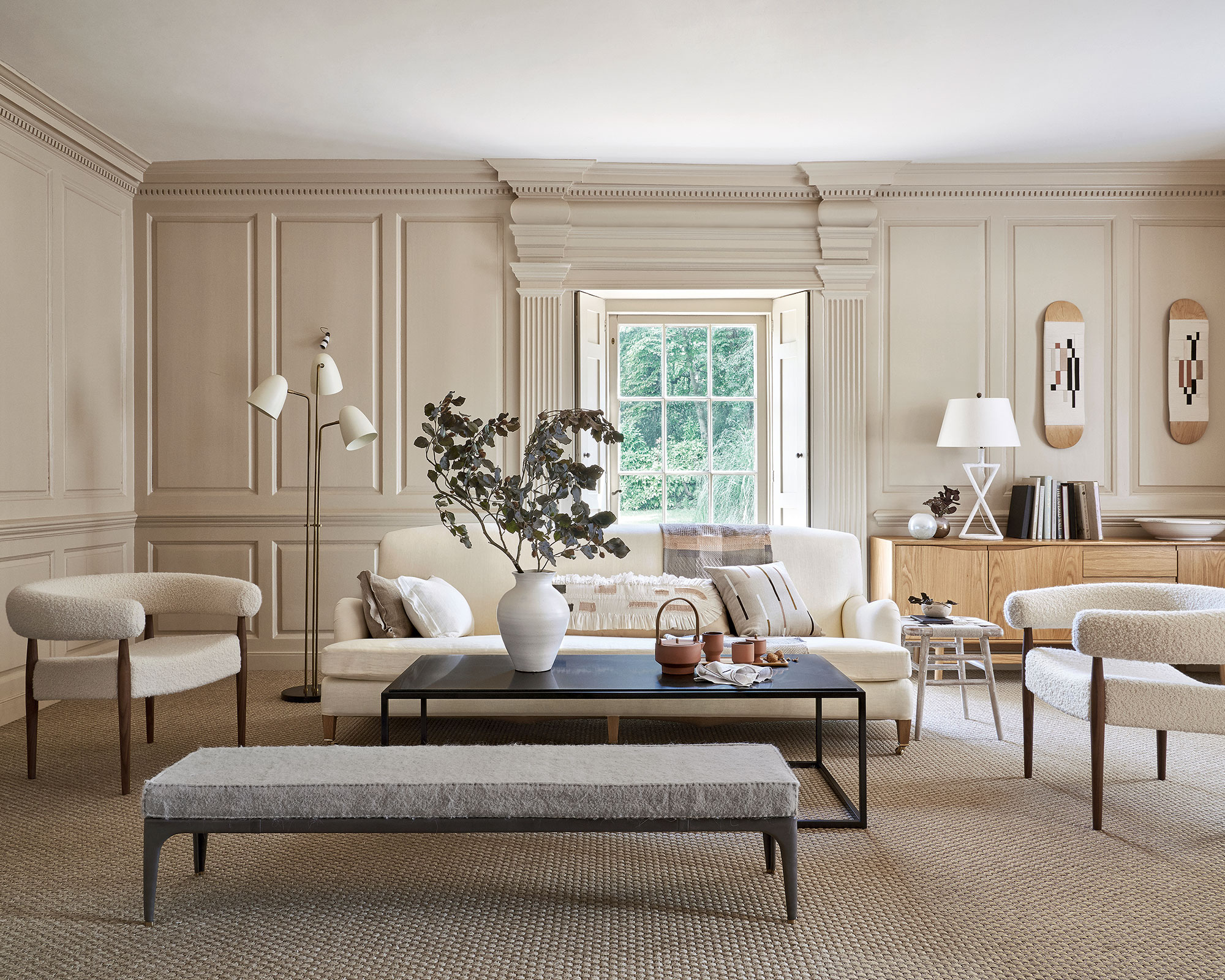
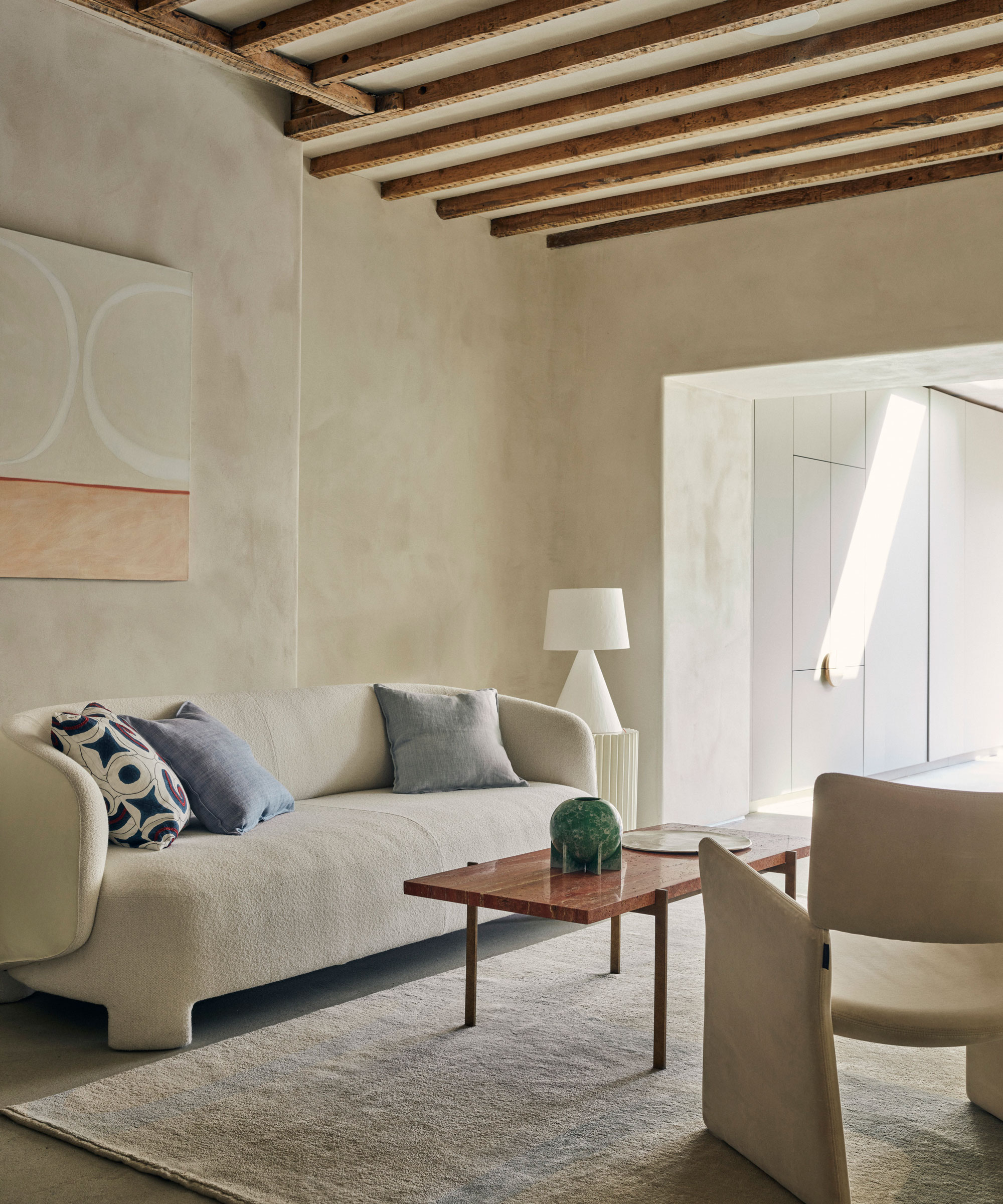
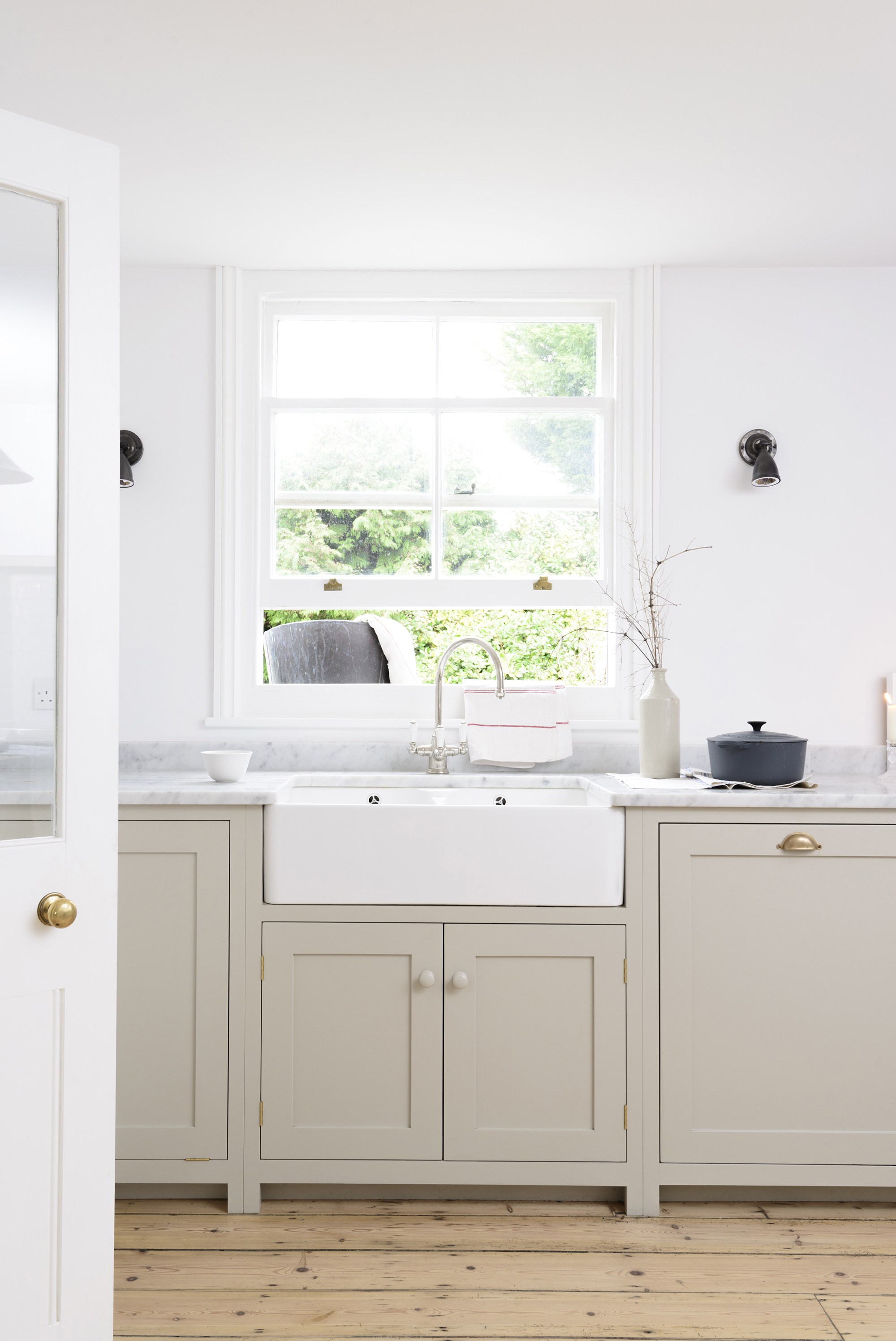
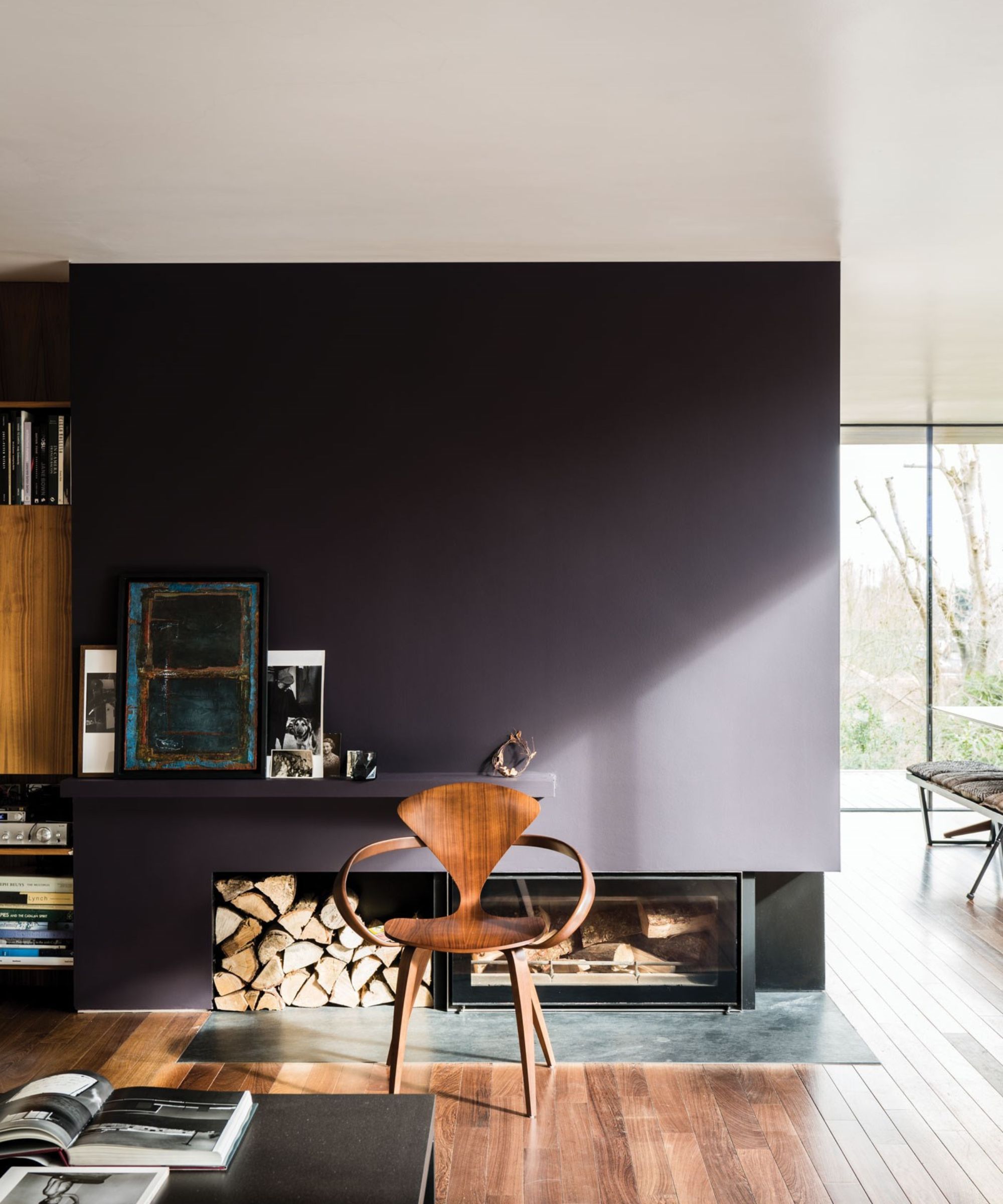
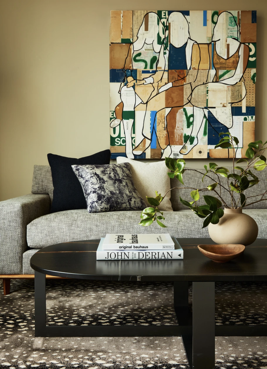
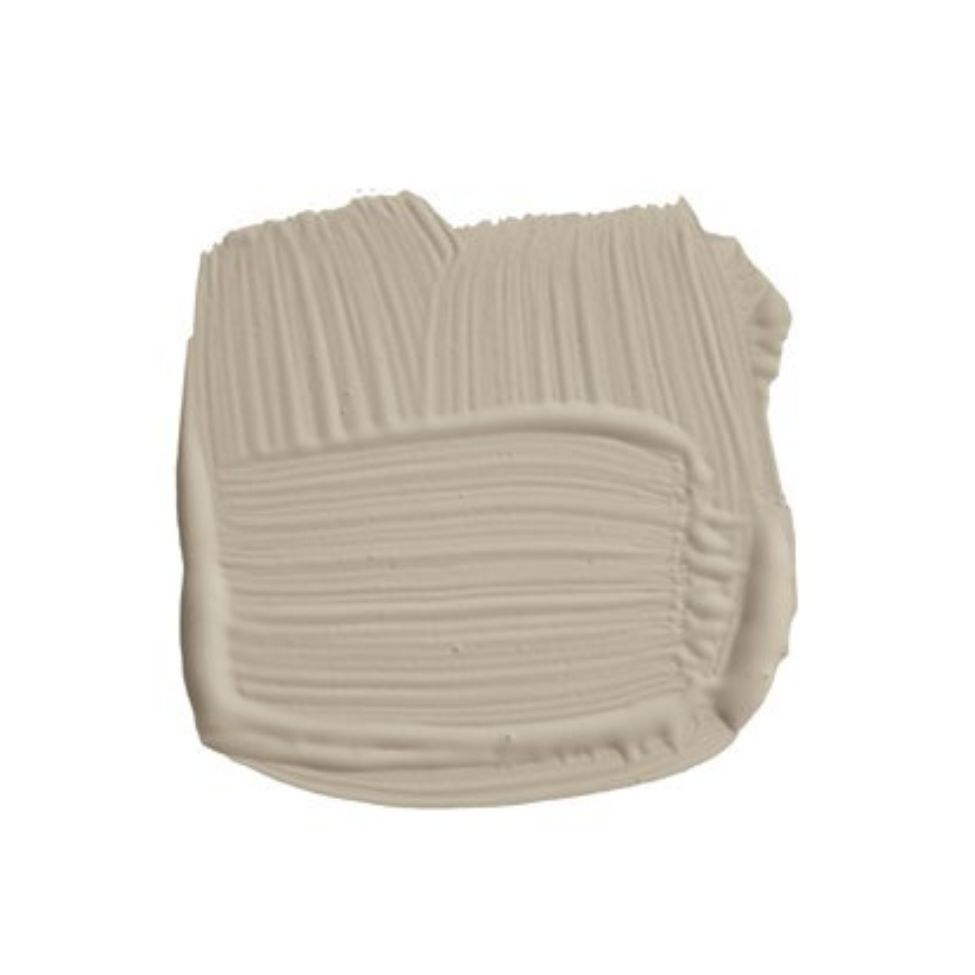
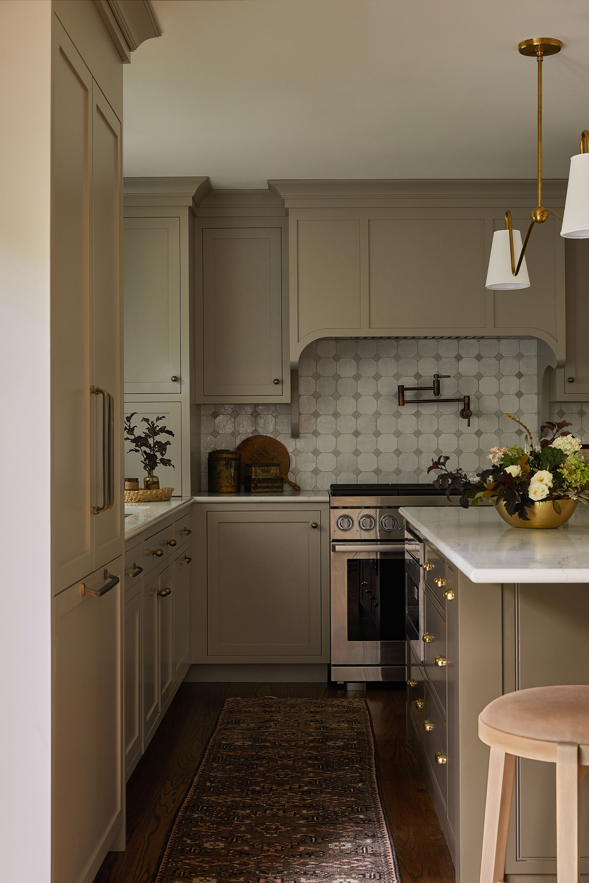
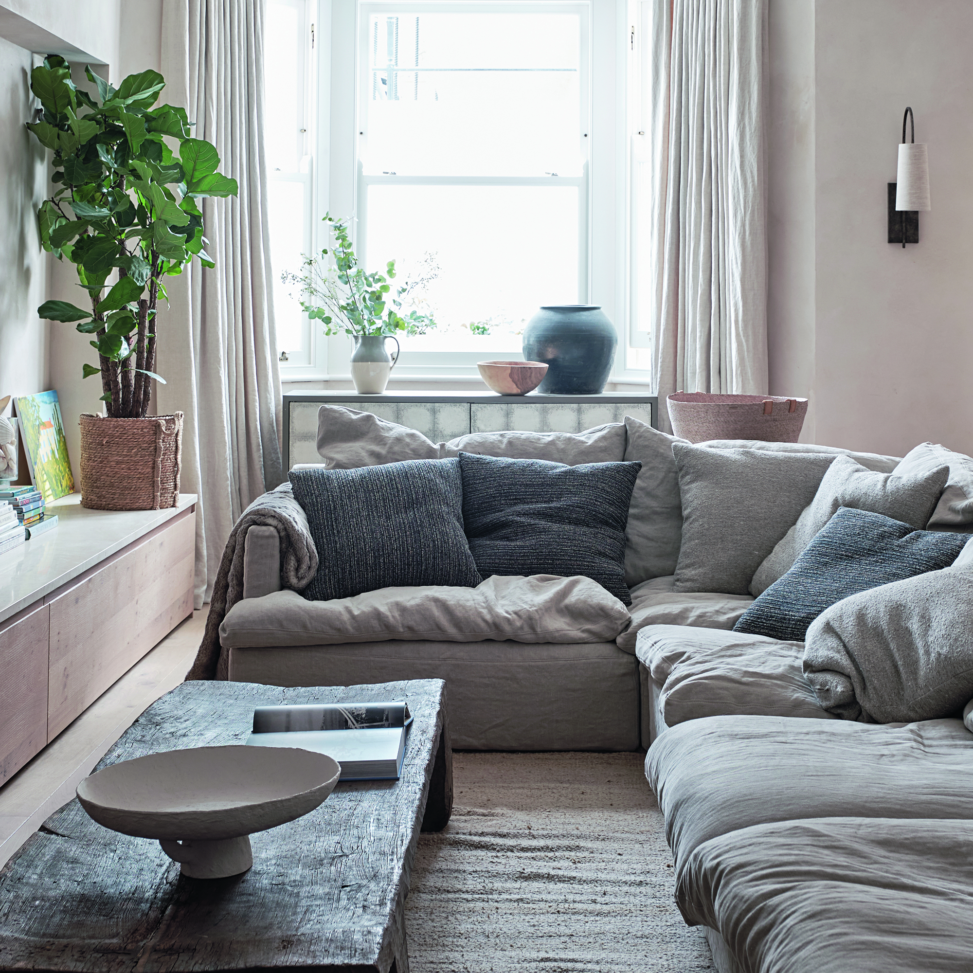
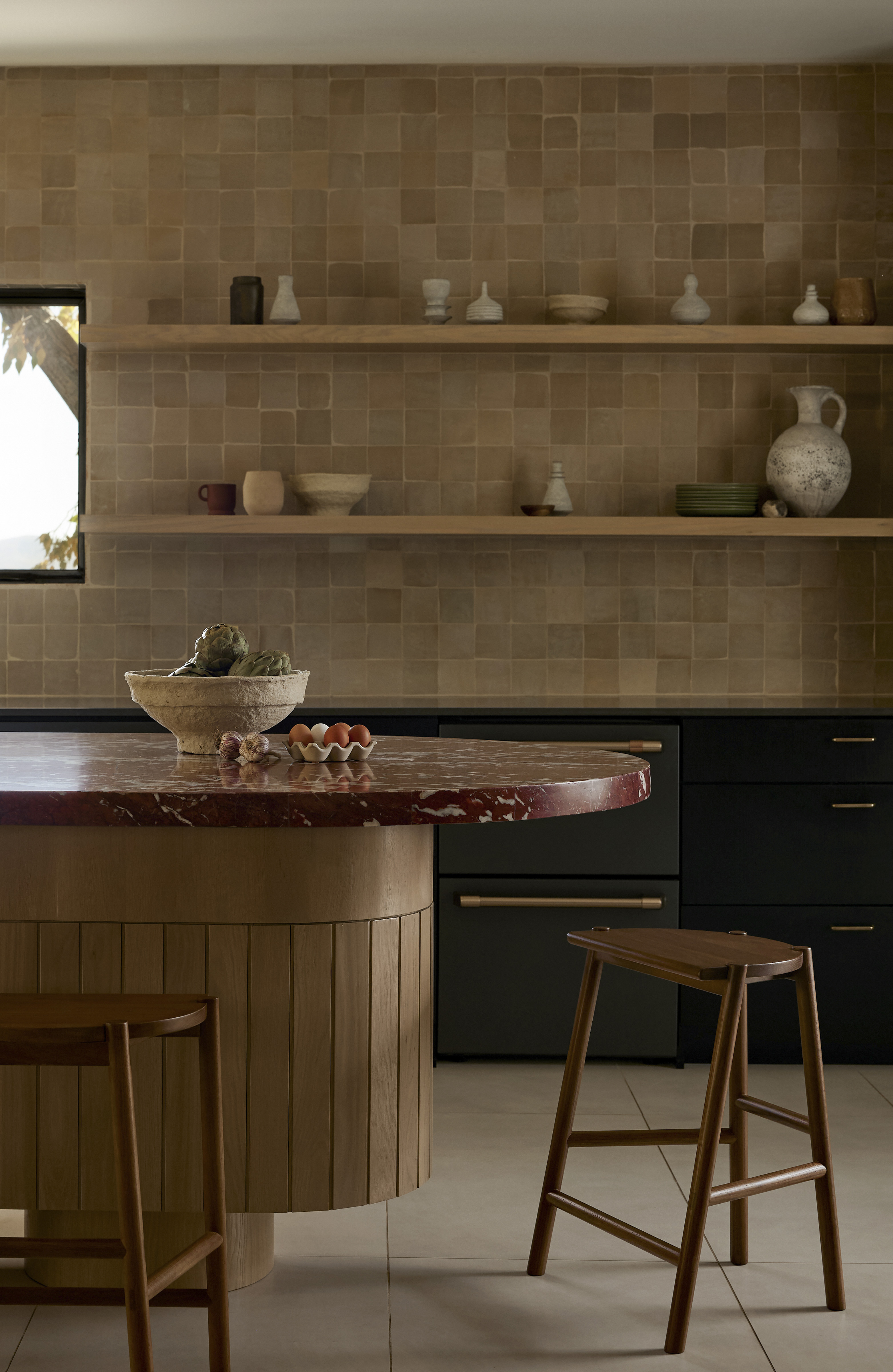
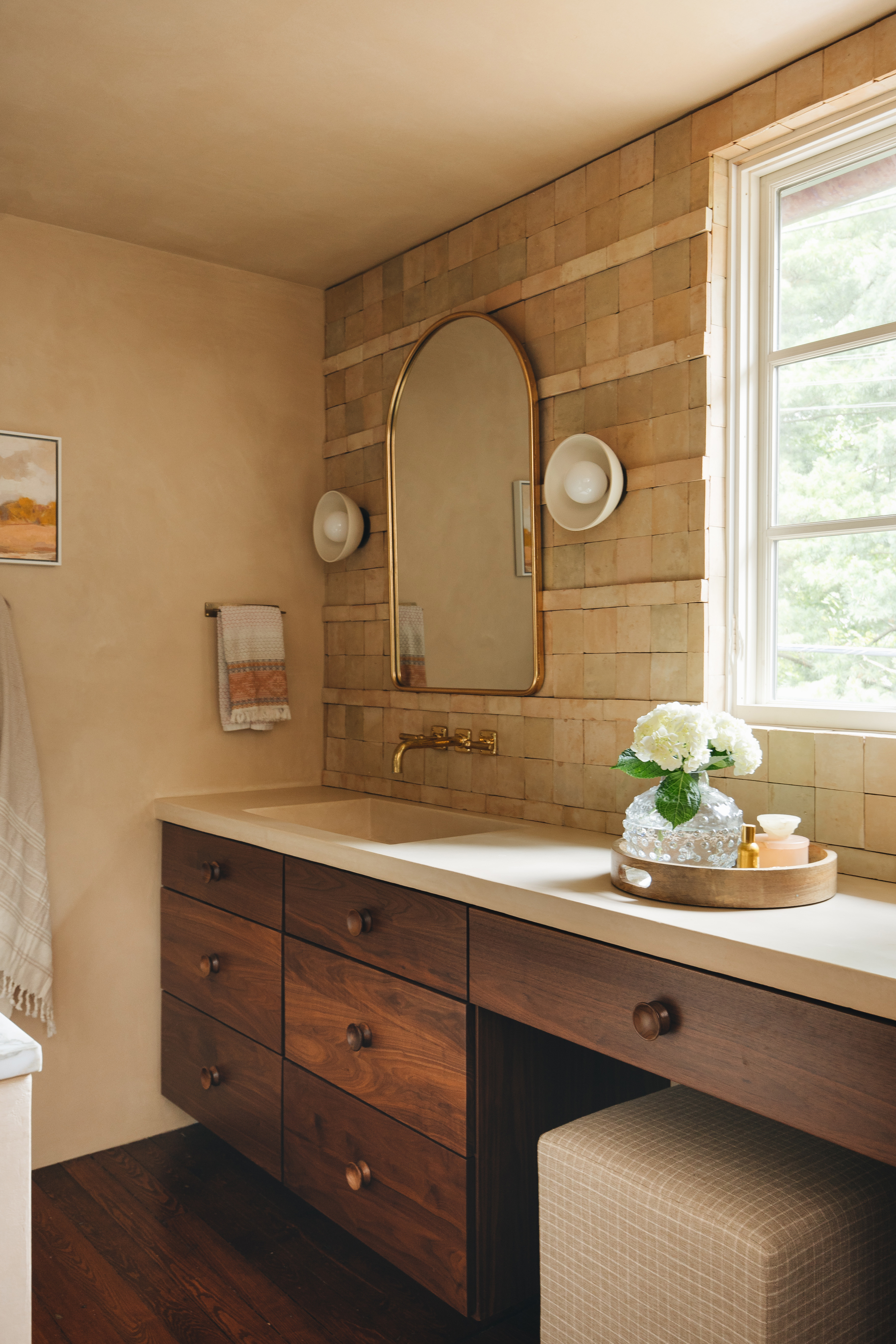
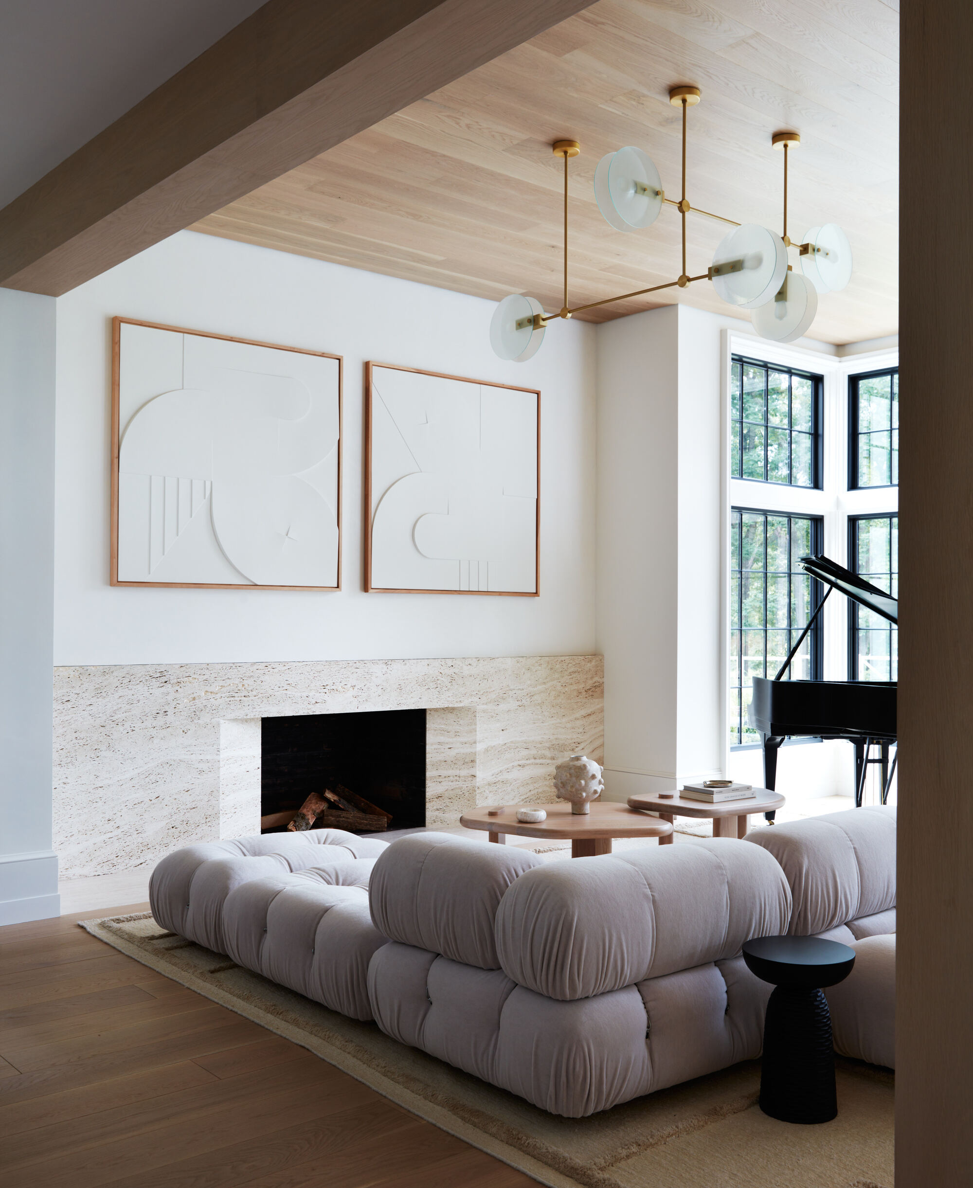
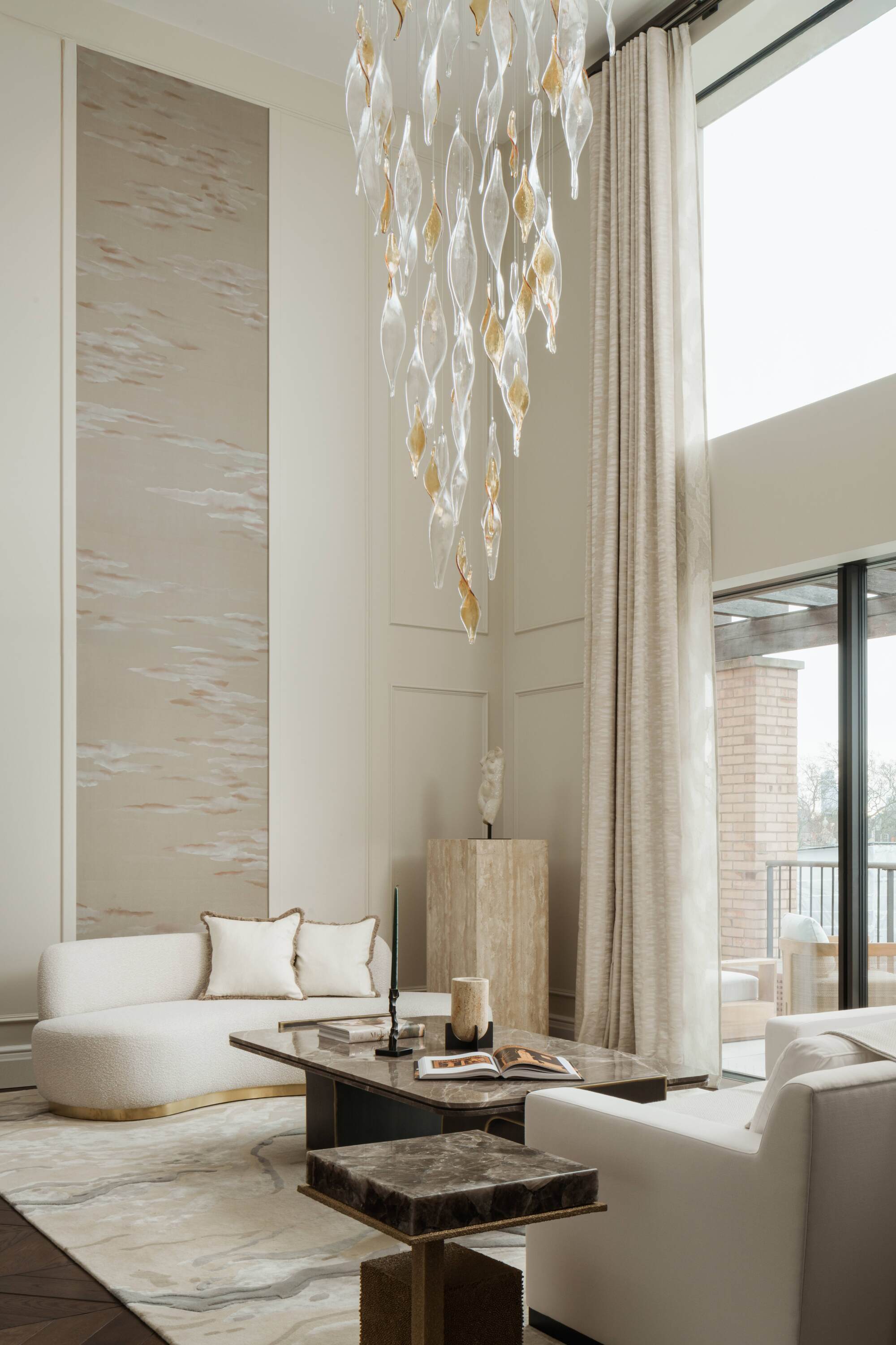
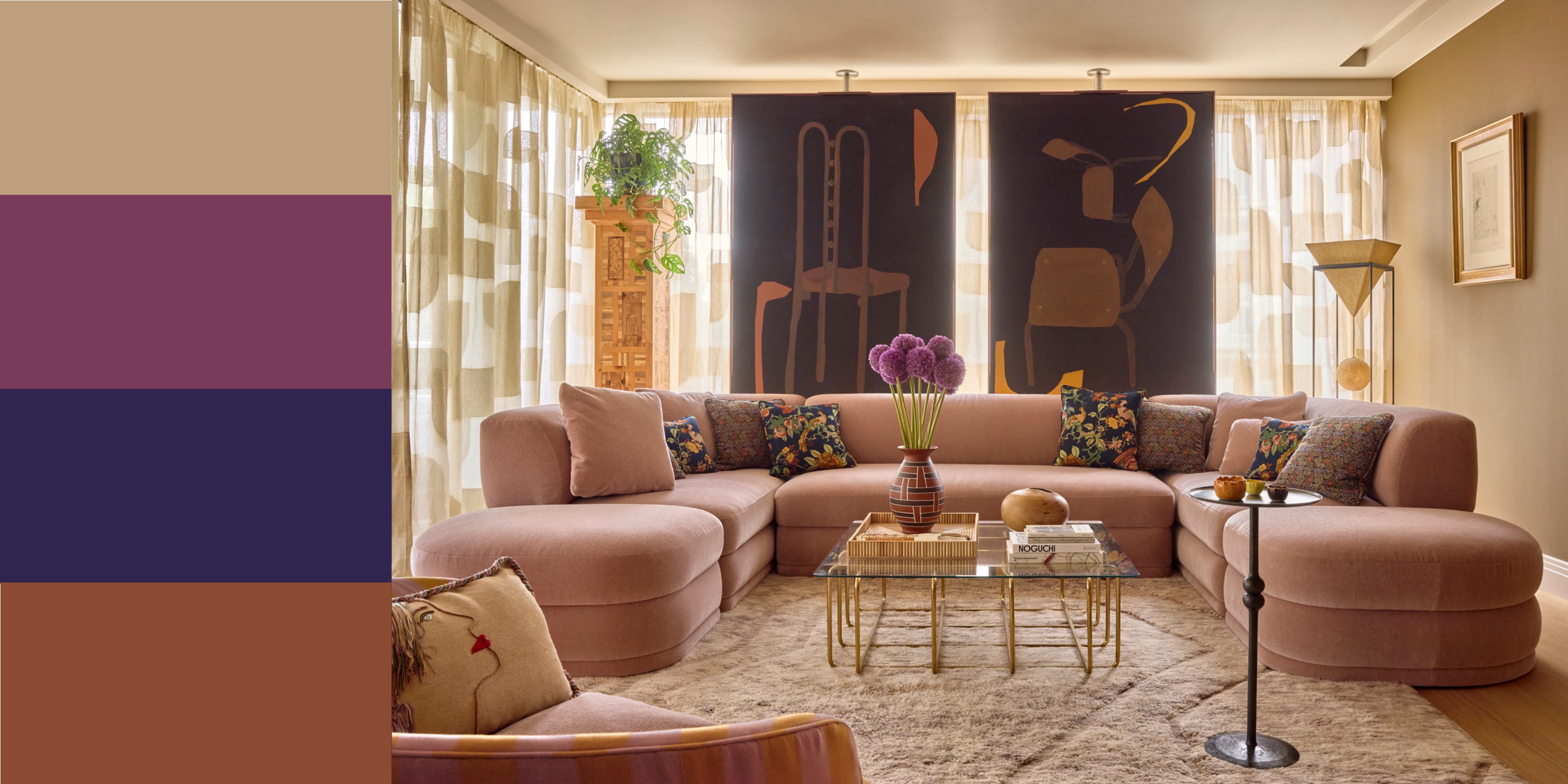
Beige, often dismissed as mundane, is highlighted by interior designers Phillip Thomas and Joy Moyler as a highly versatile and warm neutral. Thomas describes beige as a perfect "blank slate" for interior design, offering flexibility across seasons and complementing almost any color without shifting its tonality, unlike other neutrals like gray. Moyler emphasizes beige's role as an anchor, providing balance and relief when paired with more saturated colors.
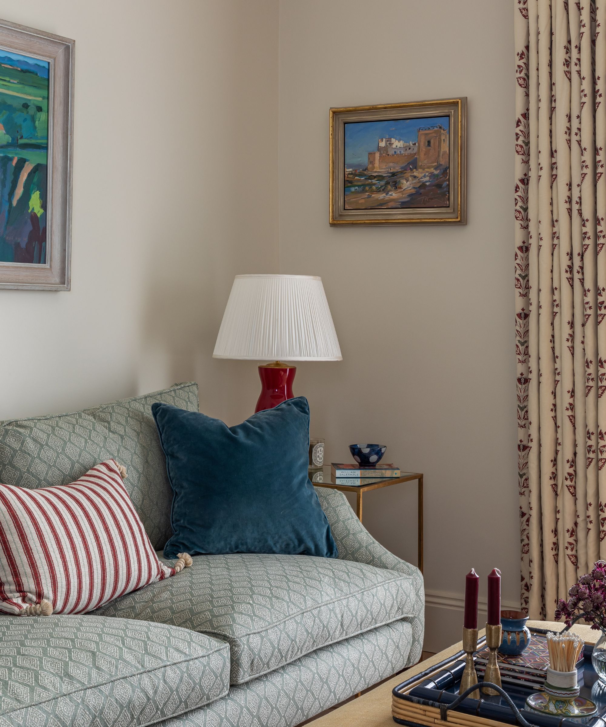
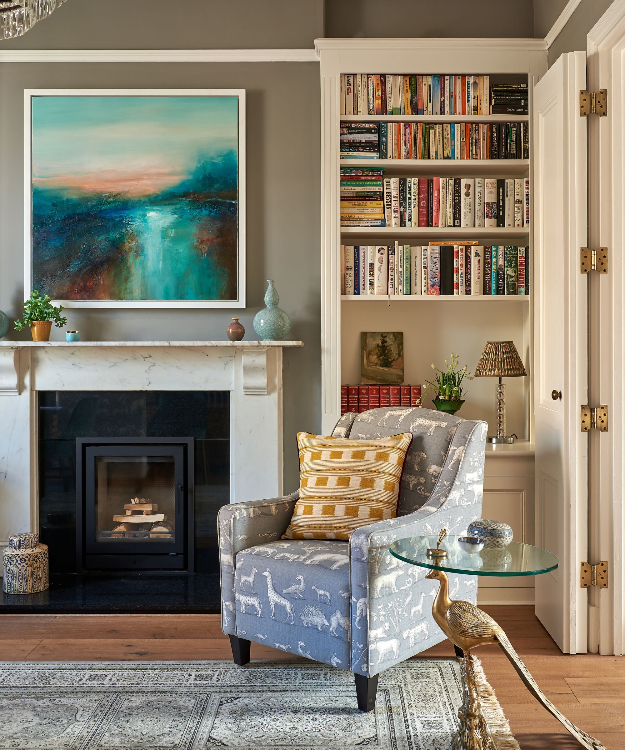
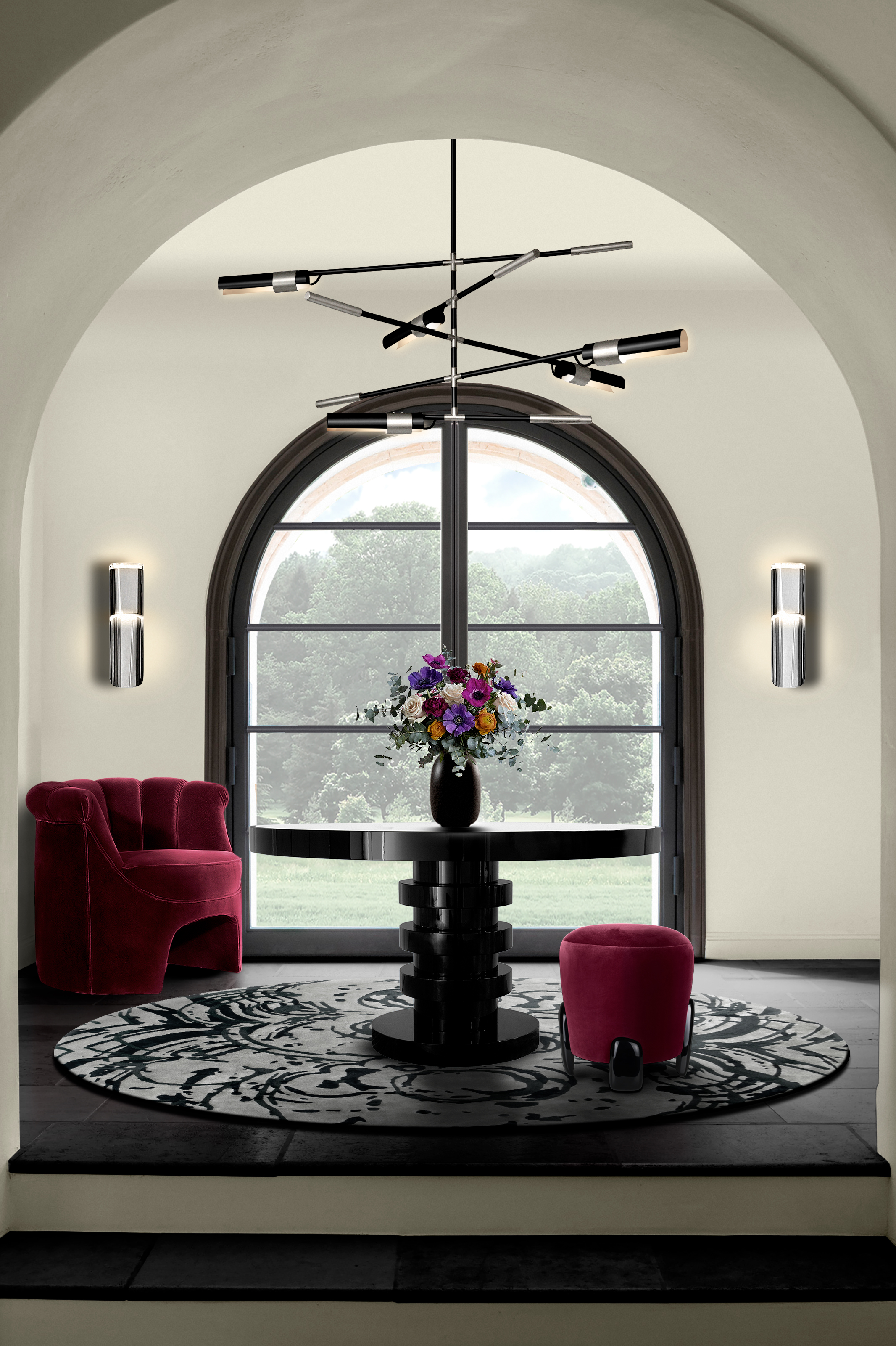
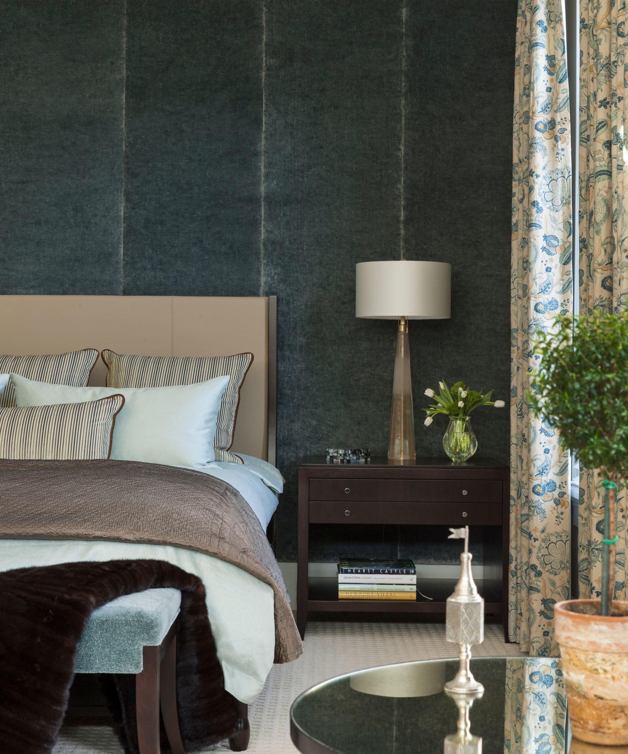
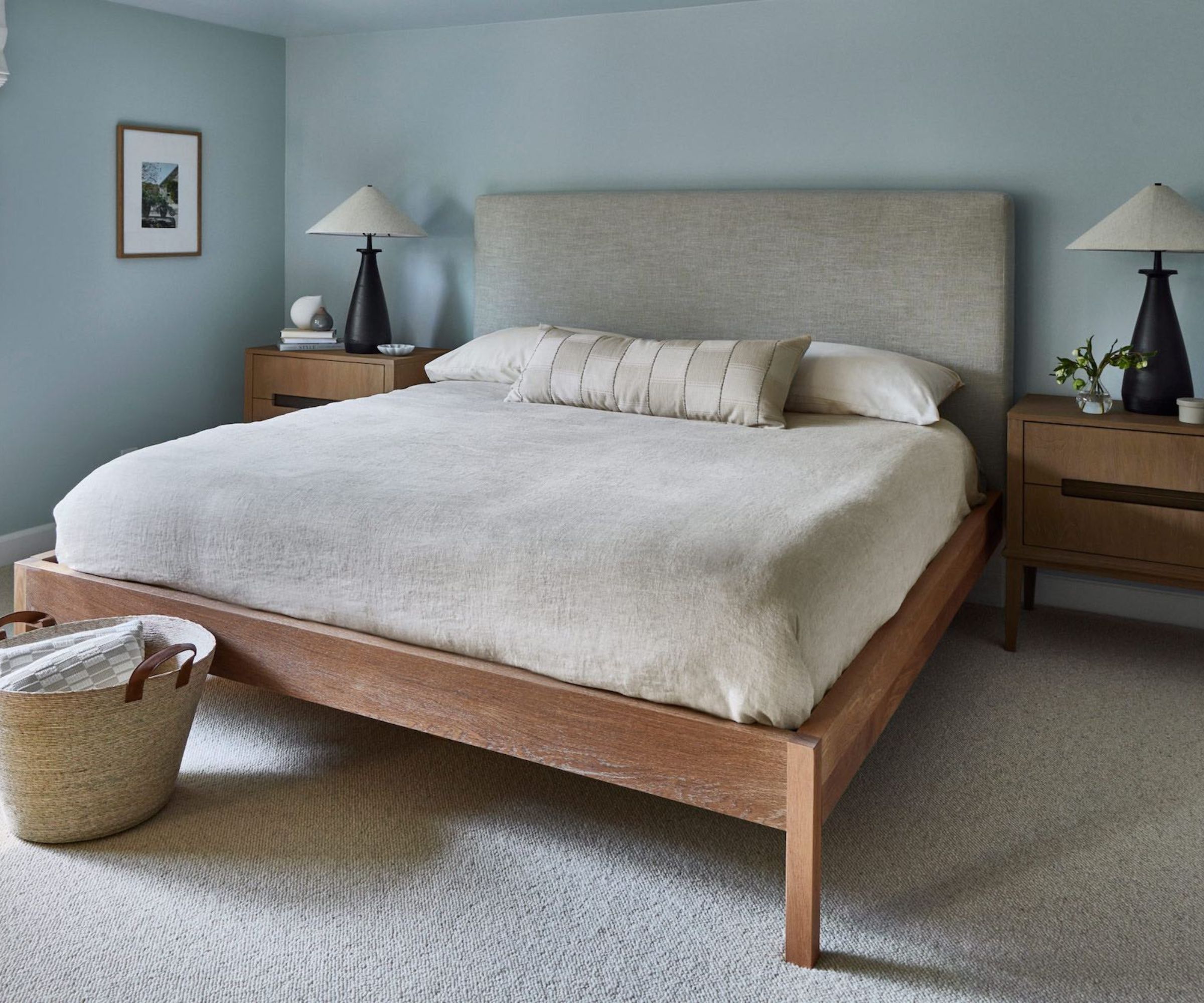
The article provides a comprehensive guide to ten colors that pair effectively with beige, offering specific paint recommendations from leading brands like Benjamin Moore and Farrow & Ball. Dark blue, for instance, is suggested as a classic pairing, evoking natural scenes like the ocean and sand. Stephanie Sabbe recommends Benjamin Moore's Philipsburg Blue, while Moyler points to Farrow & Ball's Stiffkey Blue for a deeper, gray-hinted shade. Light blue, such as Benjamin Moore's Solitude or Harbor Haze, is recommended for creating a calming and soothing effect in a room, maintaining color impact while harmonizing with beige.
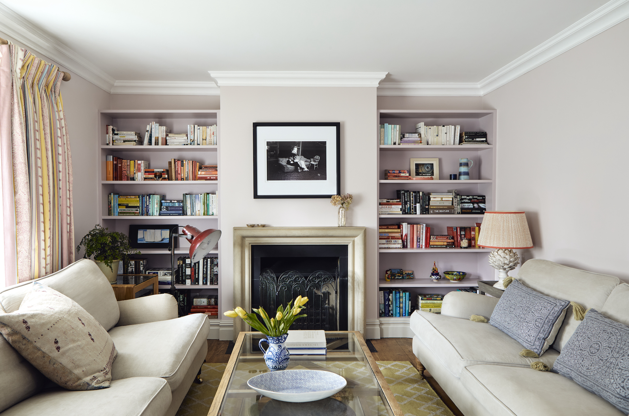
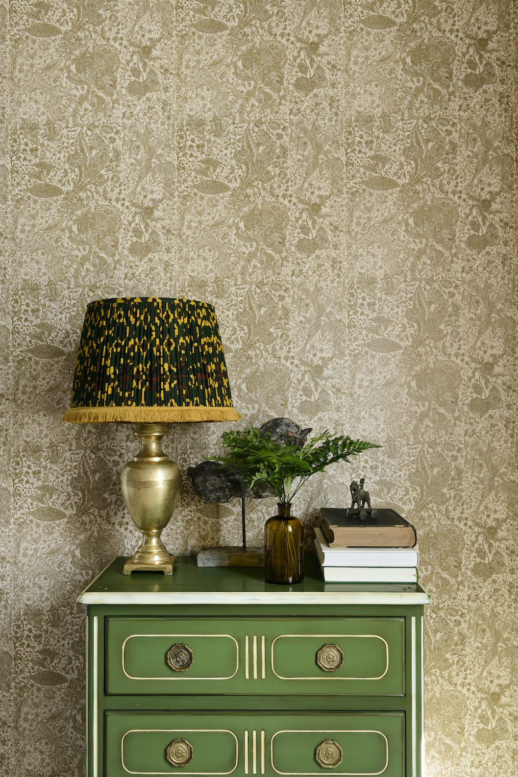
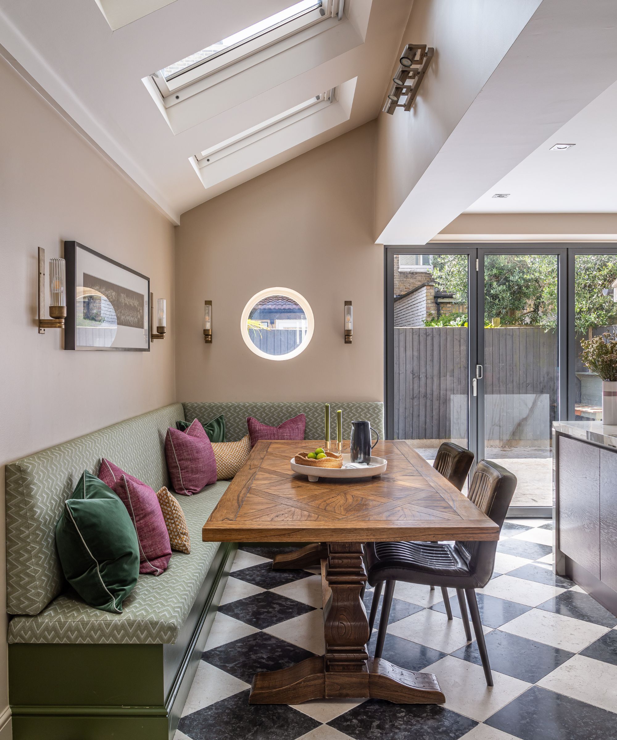
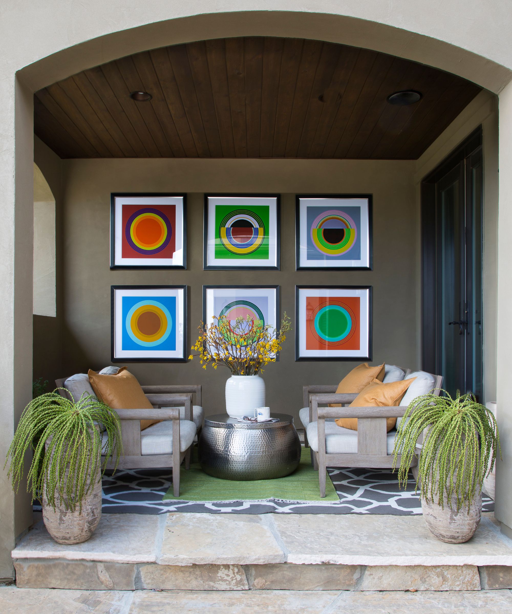
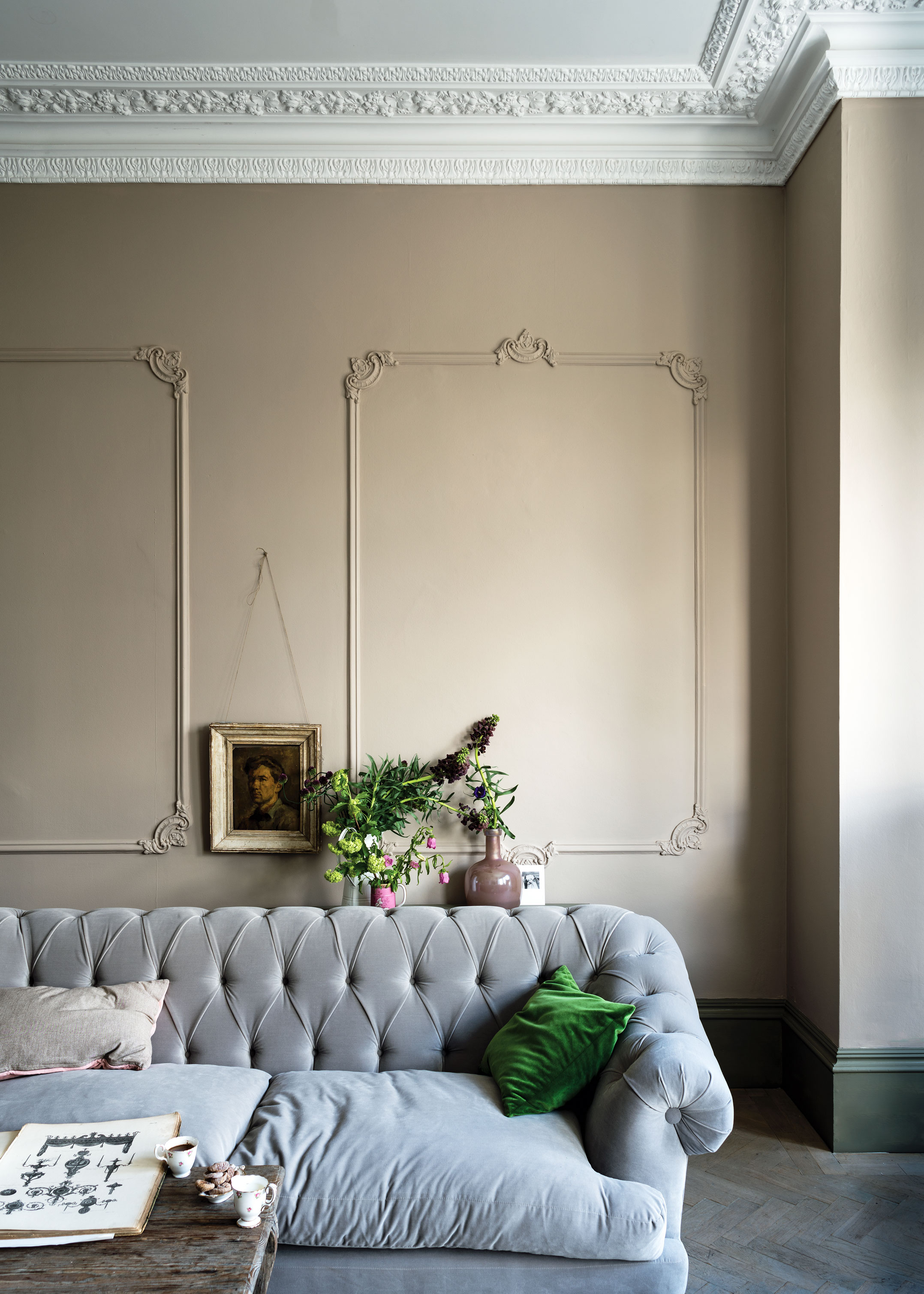
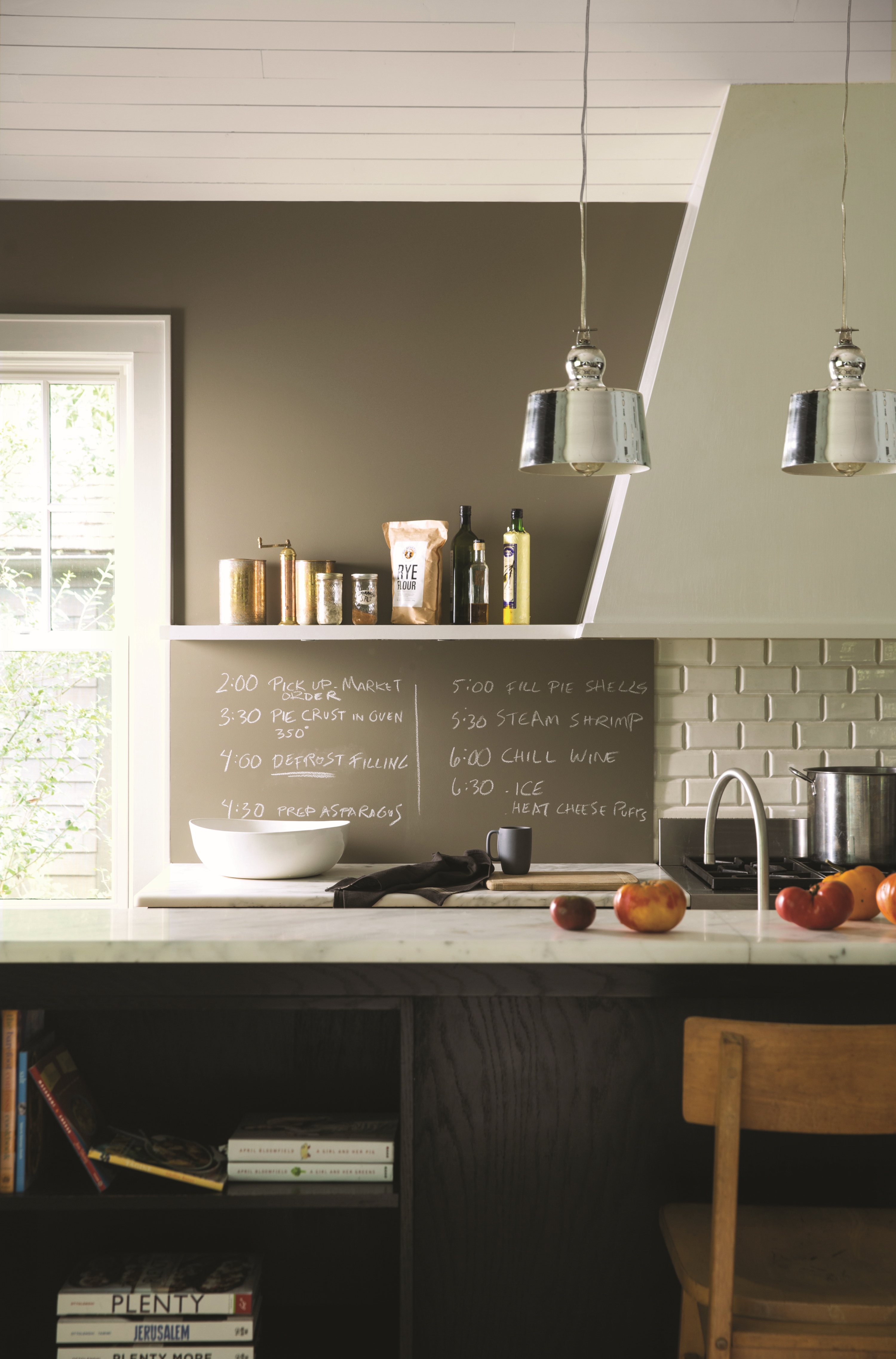

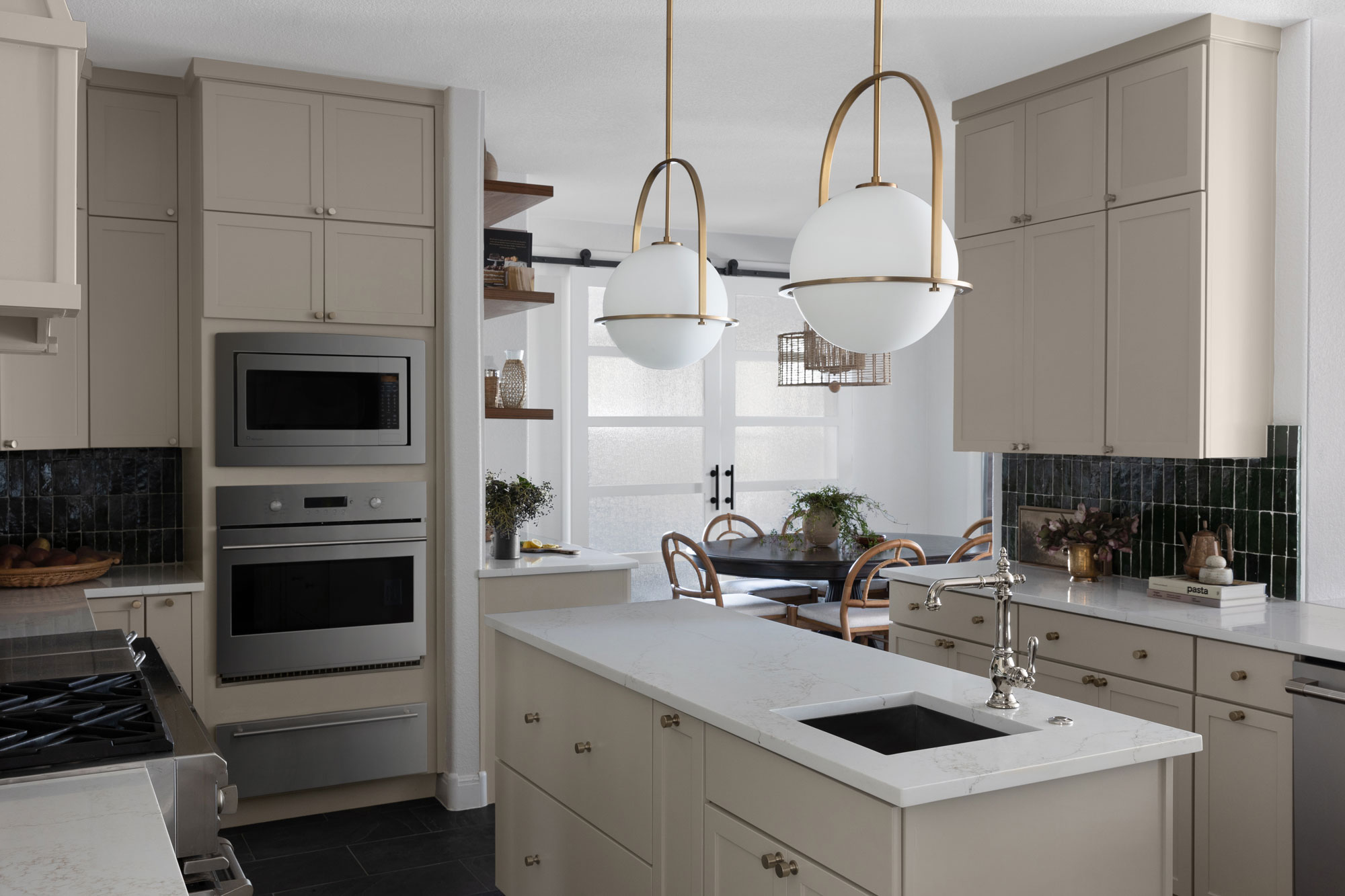
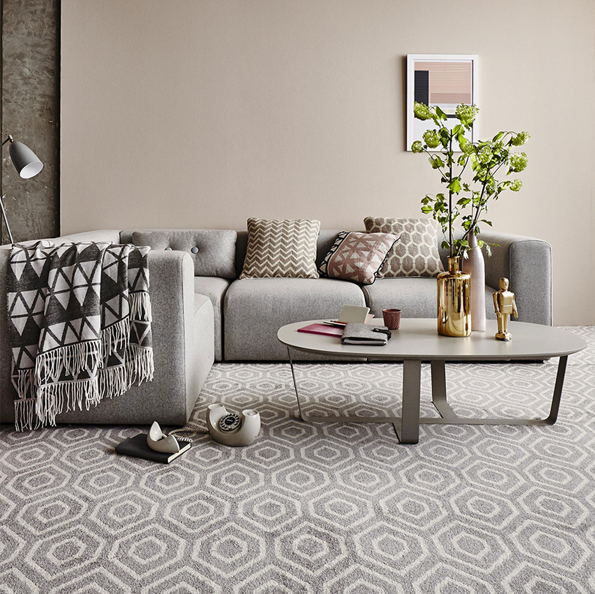
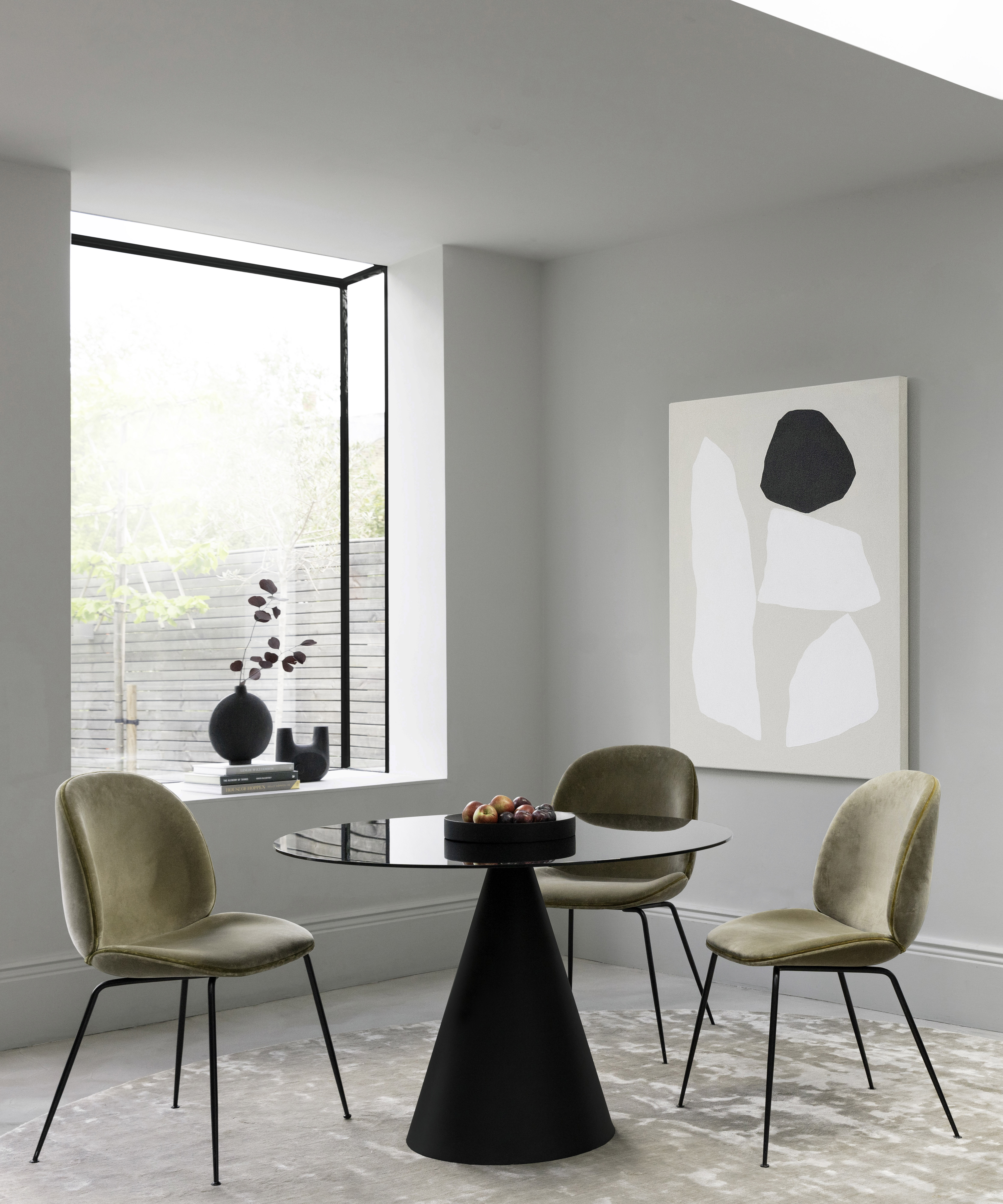
Dark green, particularly rich and saturated tones like Benjamin Moore's Absolute Green, can make beige appear crisper, drawing parallels to a deep forest. For a lighter touch, Sabbe suggests Benjamin Moore's Rosemary Sprig, describing it as a playful yet sophisticated green that complements beige in mature spaces. Gray, when chosen in dark and moody shades like Farrow & Ball's Hopper Head, creates a modern contrast, playing on a 'ying and yang' dynamic with bright beige. Greige, a blend of gray and beige, is another excellent companion, with Thomas recommending Benjamin Moore's Baby Fawn to elevate beige and give it a more sophisticated feel.
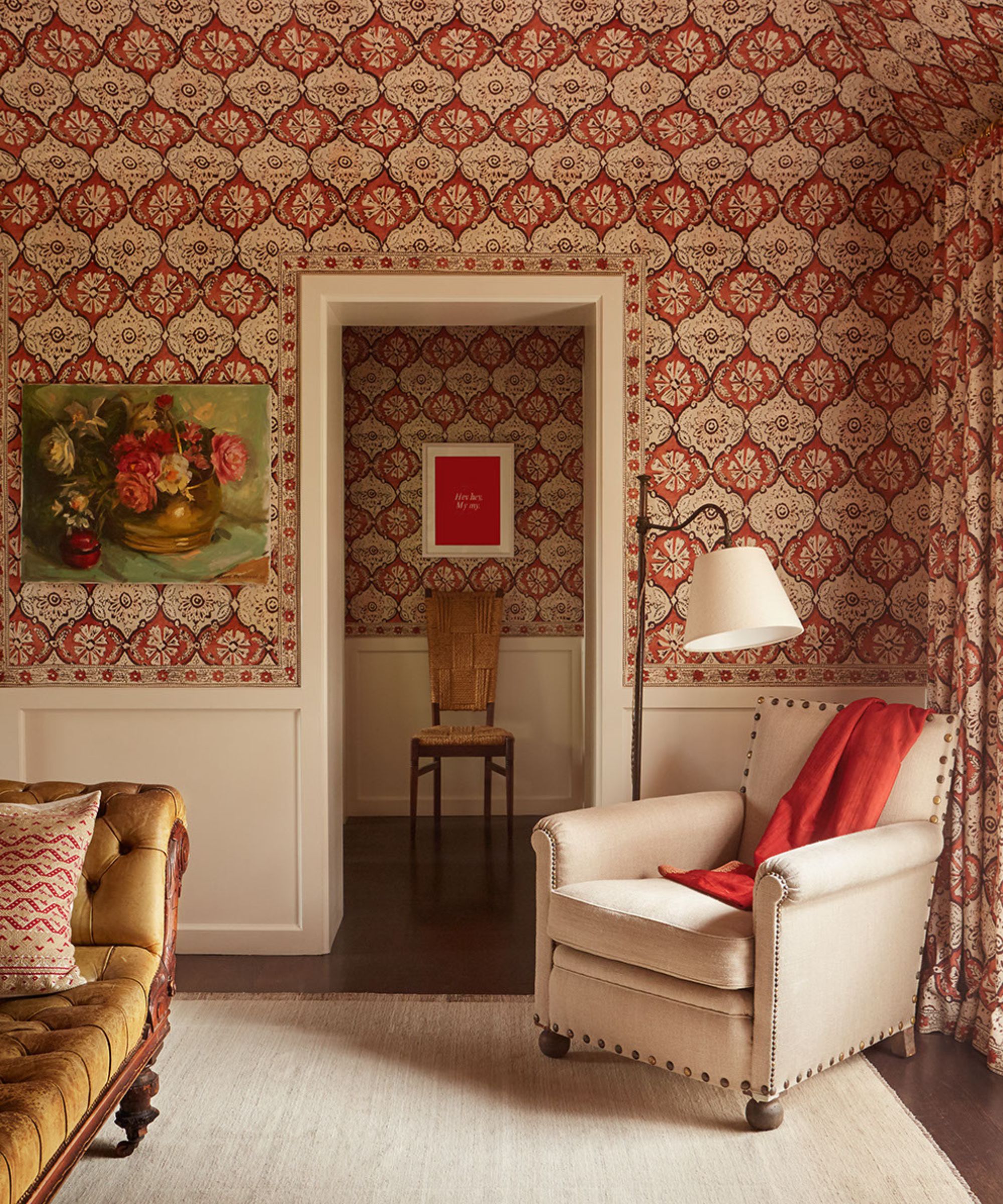
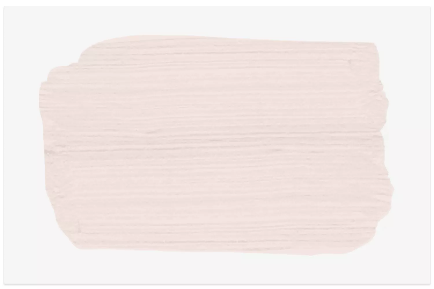
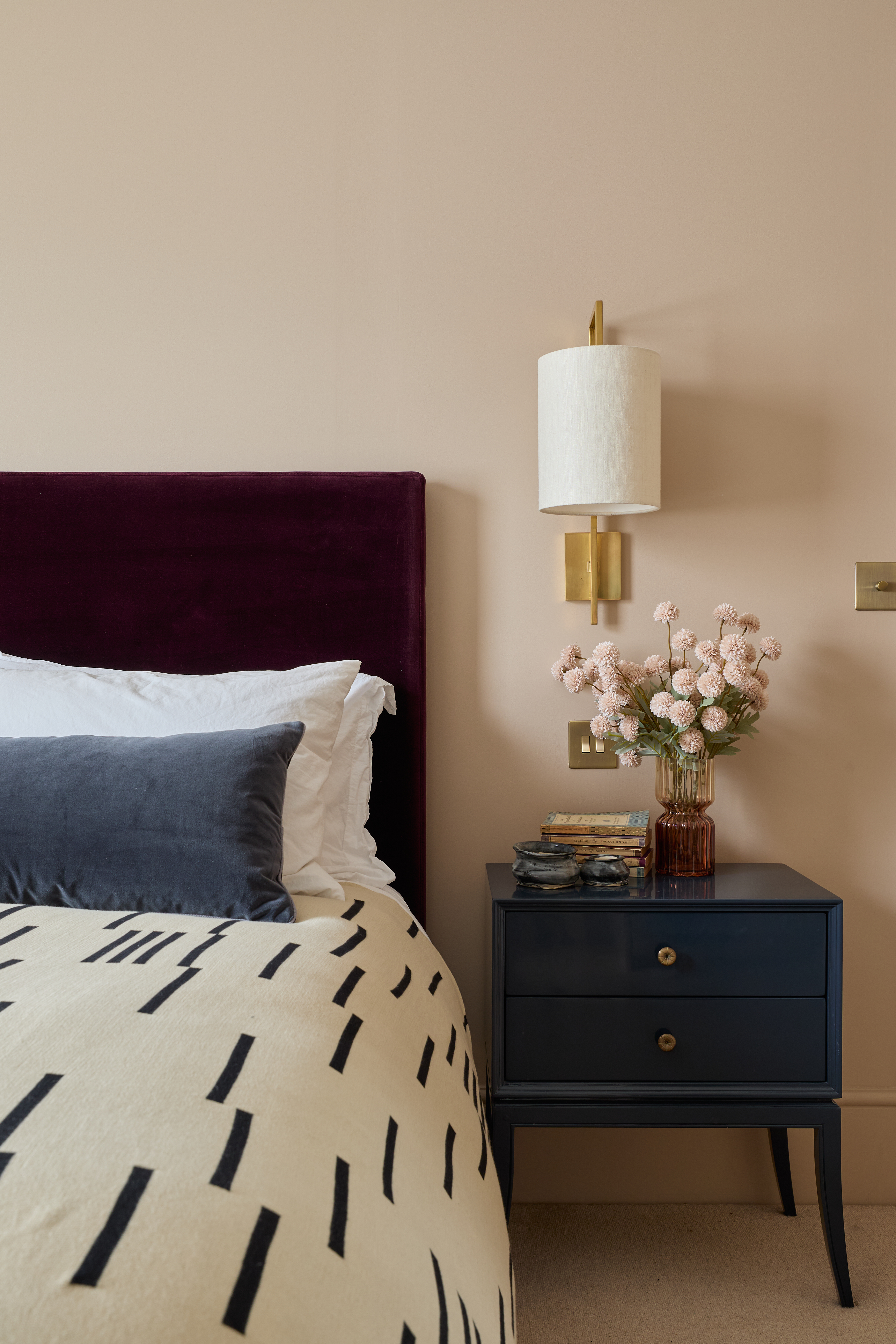
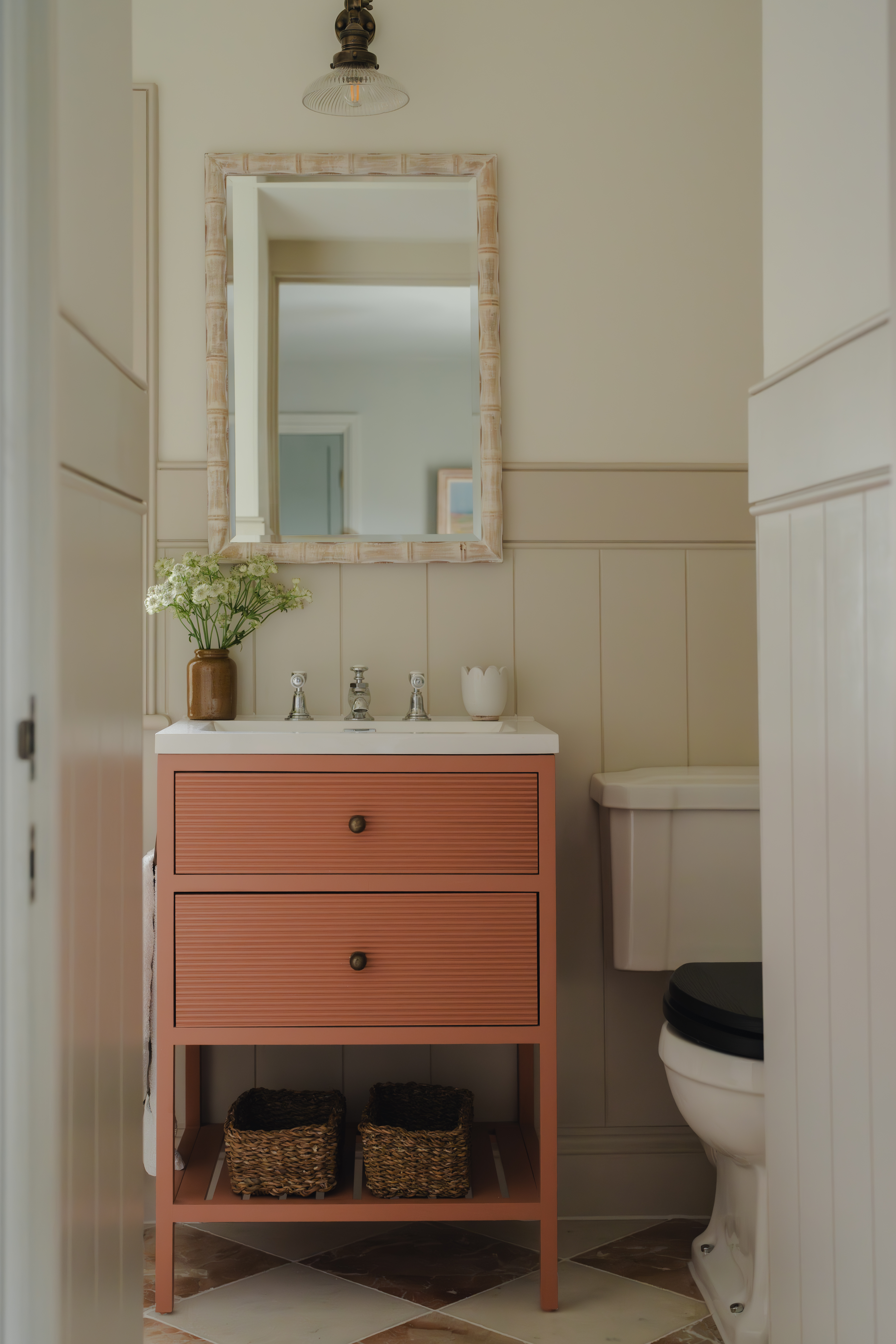
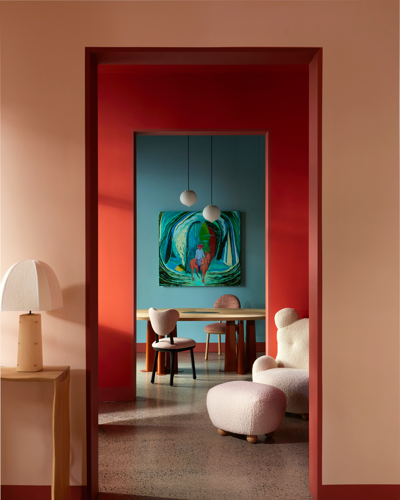
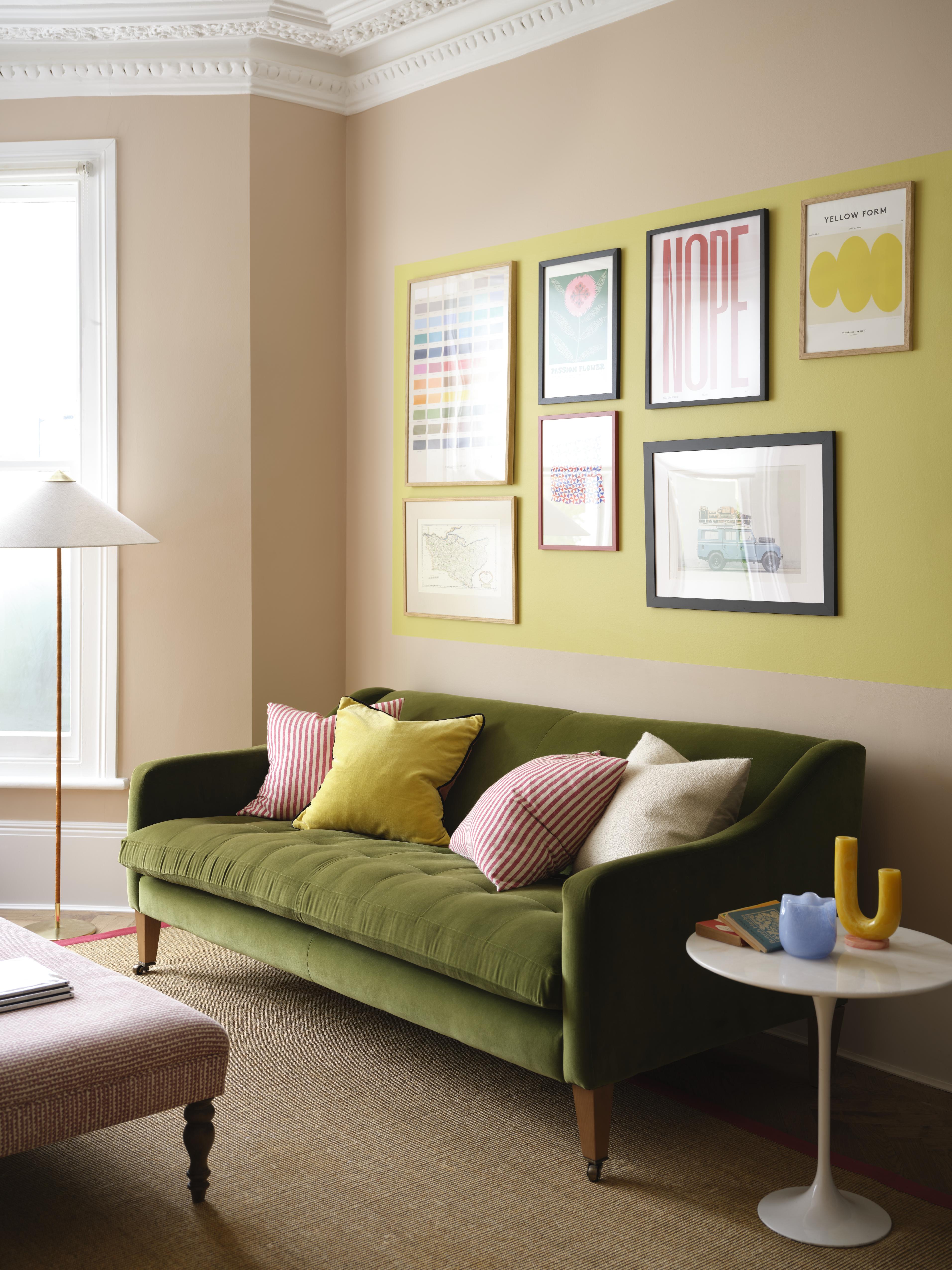
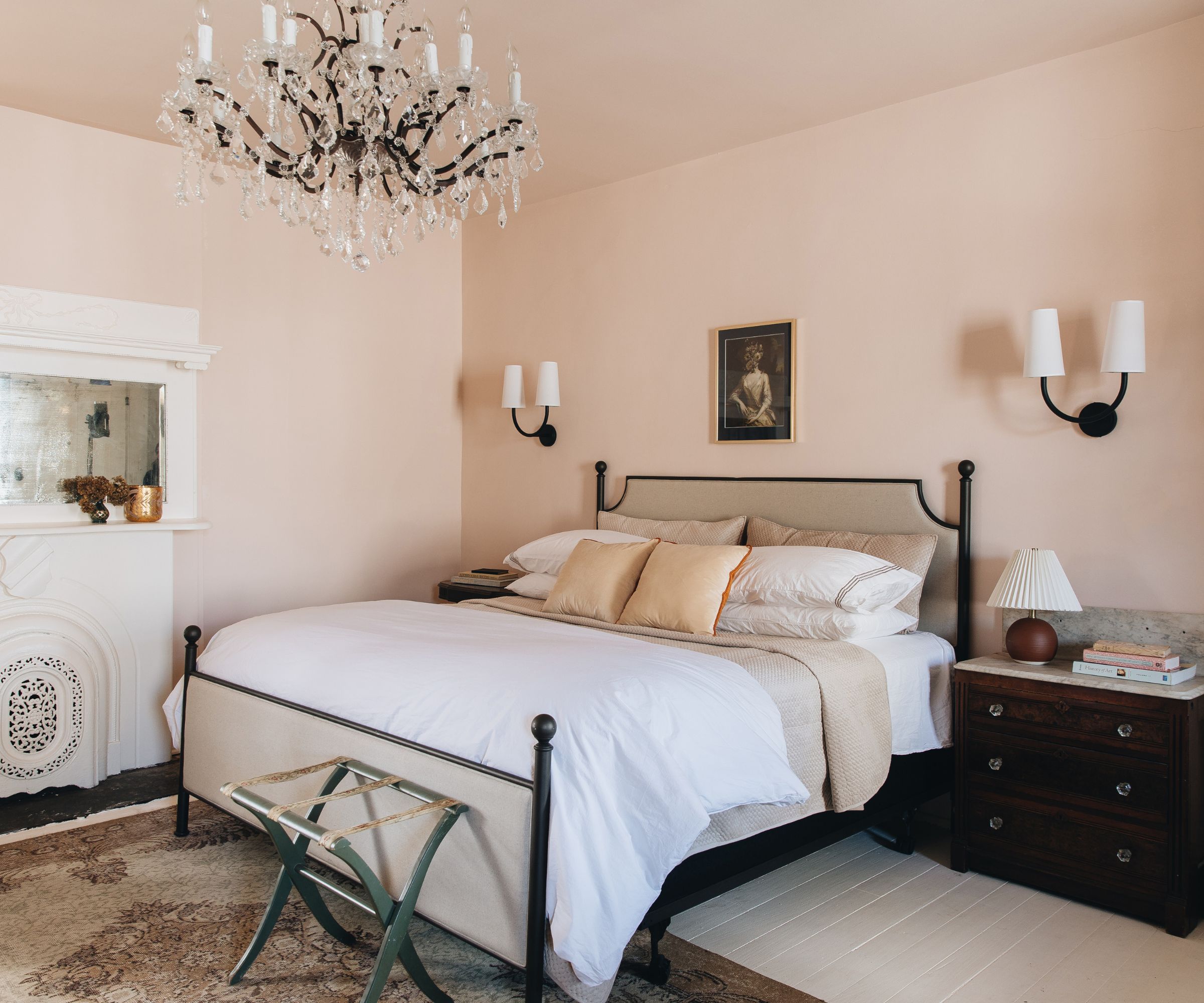
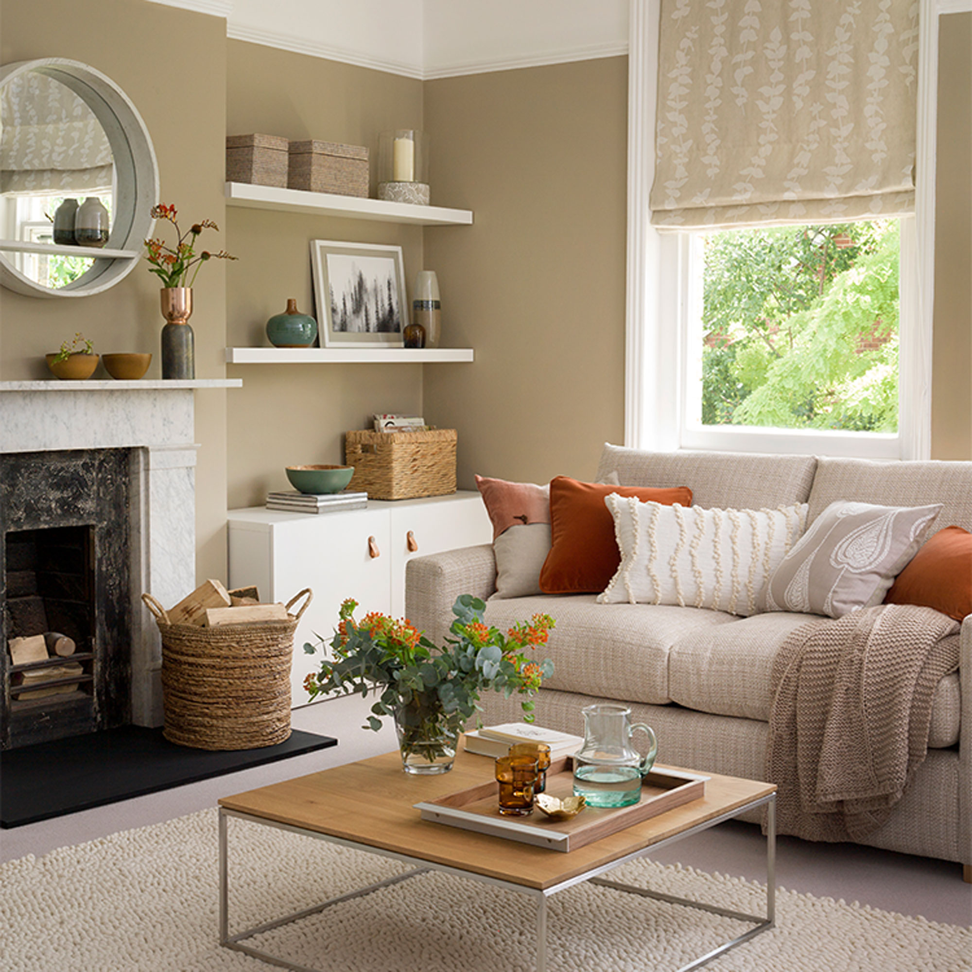
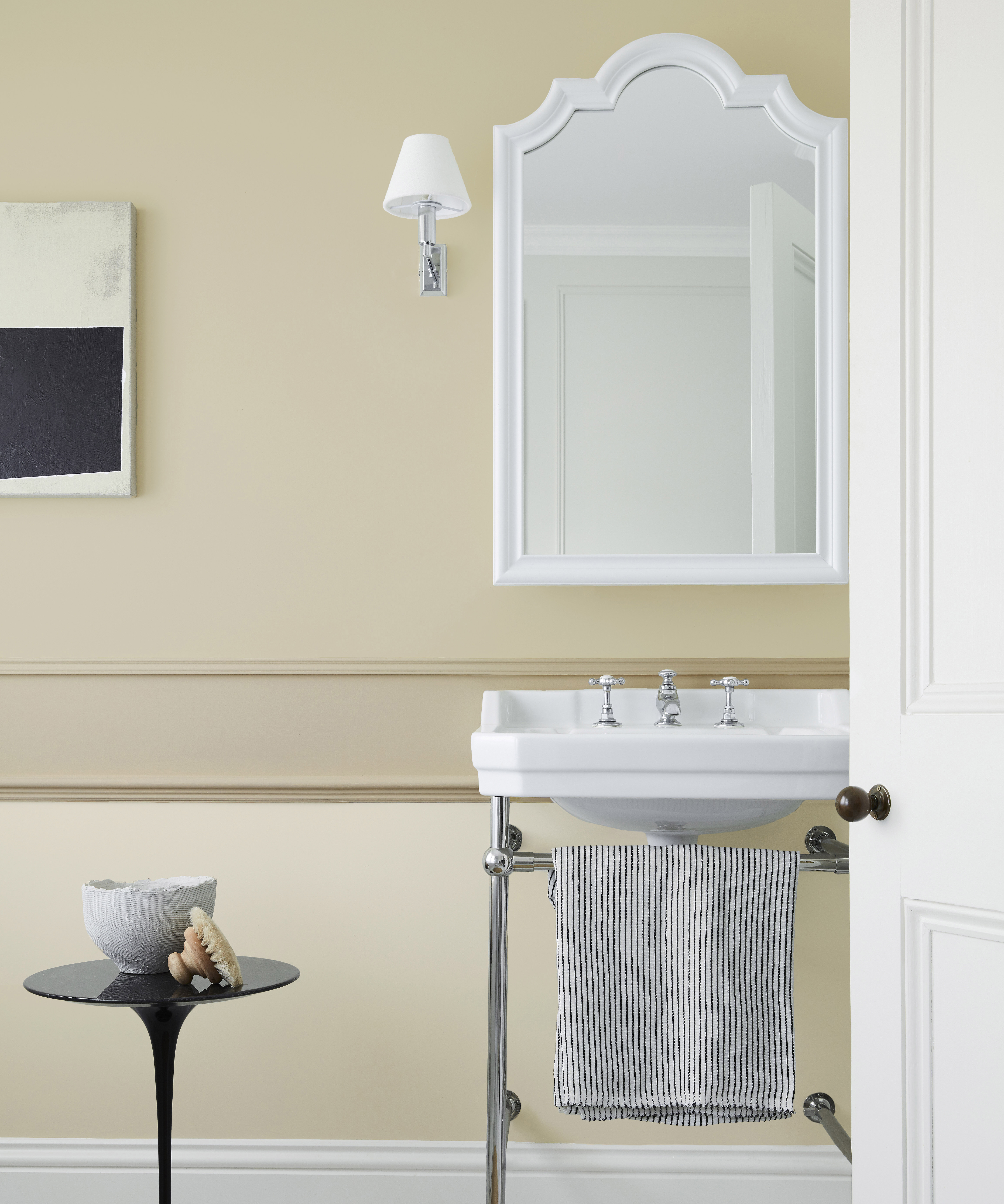
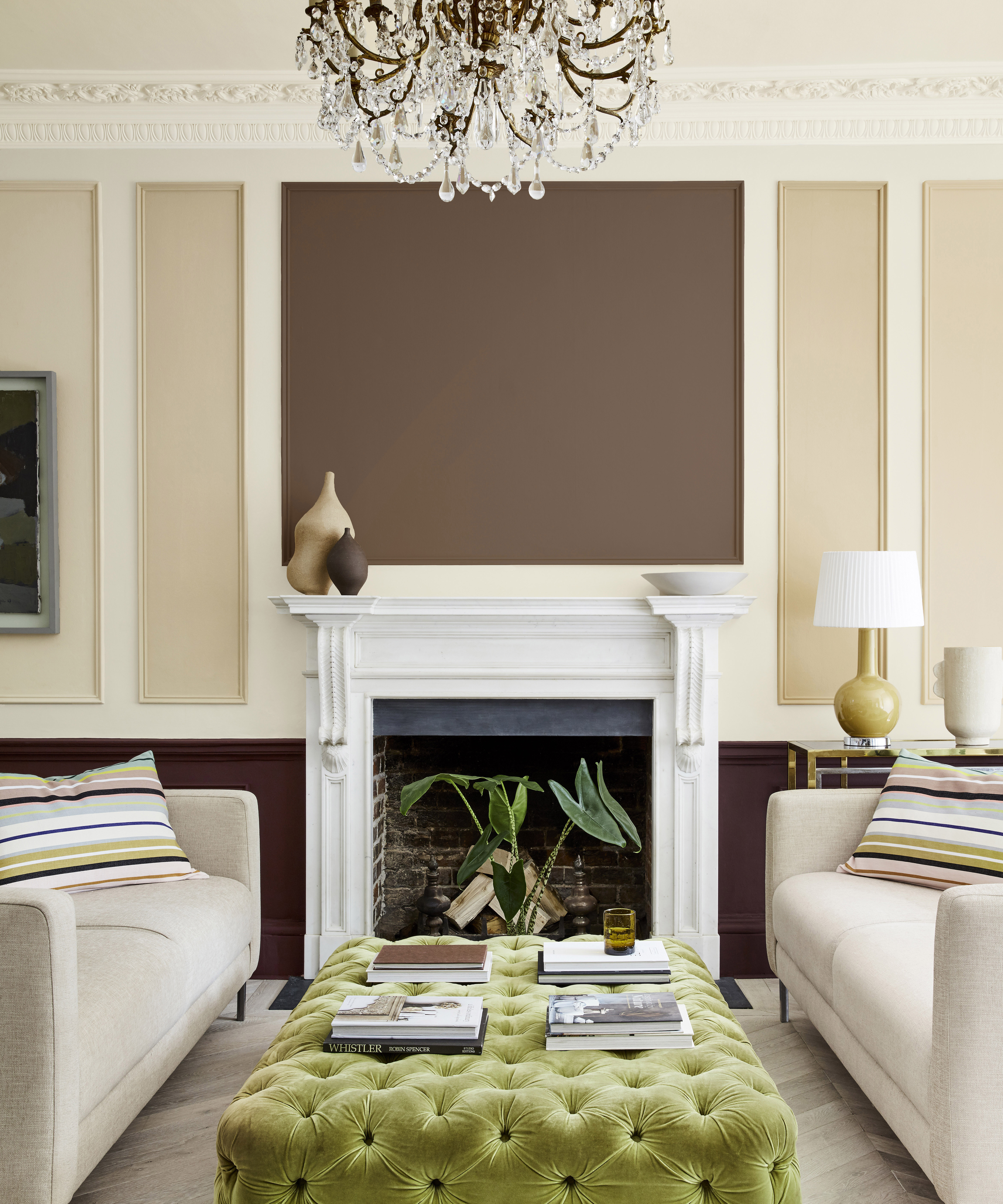
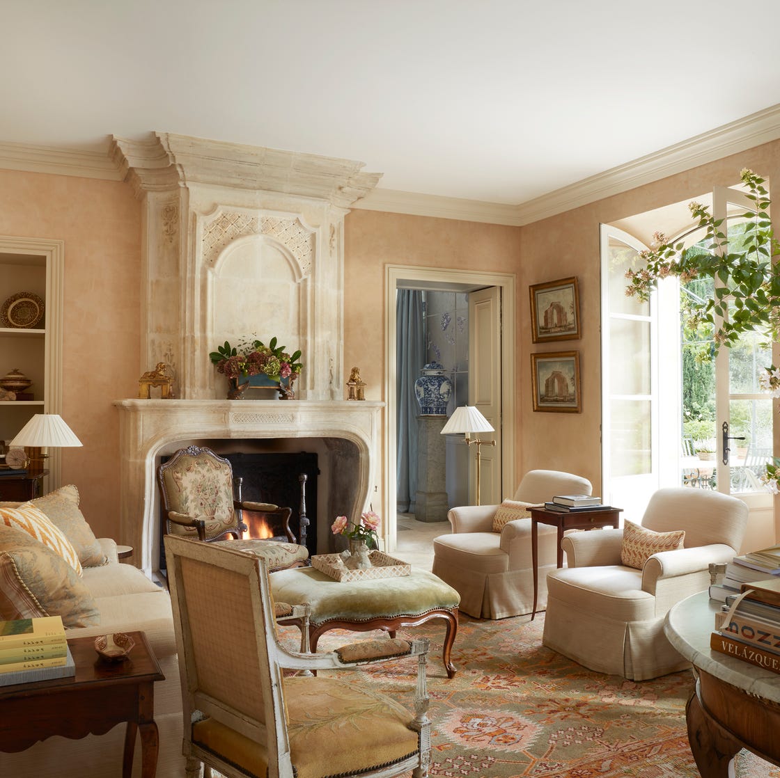
Deep yellows, such as Benjamin Moore's York Harbor Yellow, are noted for making beige tones more reflective and casting a warm, enveloping glow within an interior. Orange-red hues, like Benjamin Moore's Mars Red, cast a soft shadow on beige, enhancing its warmth as the sun sets. For a bolder statement, lime green, specifically Benjamin Moore's Douglas Fir, showcases beige's ability to act as a perfect canvas for vibrant colors. Finally, delicate pinks are recommended, with Thomas favoring Benjamin Moore's Sunlit Coral for its soft, warm light reflection. Moyler also suggests Farrow & Ball's Smoked Trout, describing it as a "masculine pink" that offers a soothing softness without being overly vibrant, further solidifying beige's adaptability and enduring appeal in interior design.
#InteriorDesign #ColorPalettes #BeigeDecor #PaintColors #HomeDecor #DesignTips #NeutralHues #ColorCombinations #PhillipThomas #JoyMoyler #StephanieSabbe #InteriorDesign #ColorPalettes #BeigeDecor #PaintColors #HomeDecor #DesignTips #NeutralHues #ColorCombinations #PhillipThomas #JoyMoyler #StephanieSabbe
0 comment in total
 No comments yet
You may also like
10 accent colors for beige – design experts' favorite color pairings

14 Colors You Should Pair With Beige to Make This Neutral Pop in Your 2025 Decorating Schemes

10 designers on the bedroom colors they always recommend
16 Beige Paint Colors That Never Go out of Style, According to Interior Designers
14 best beige paints, as chosen by interior designers
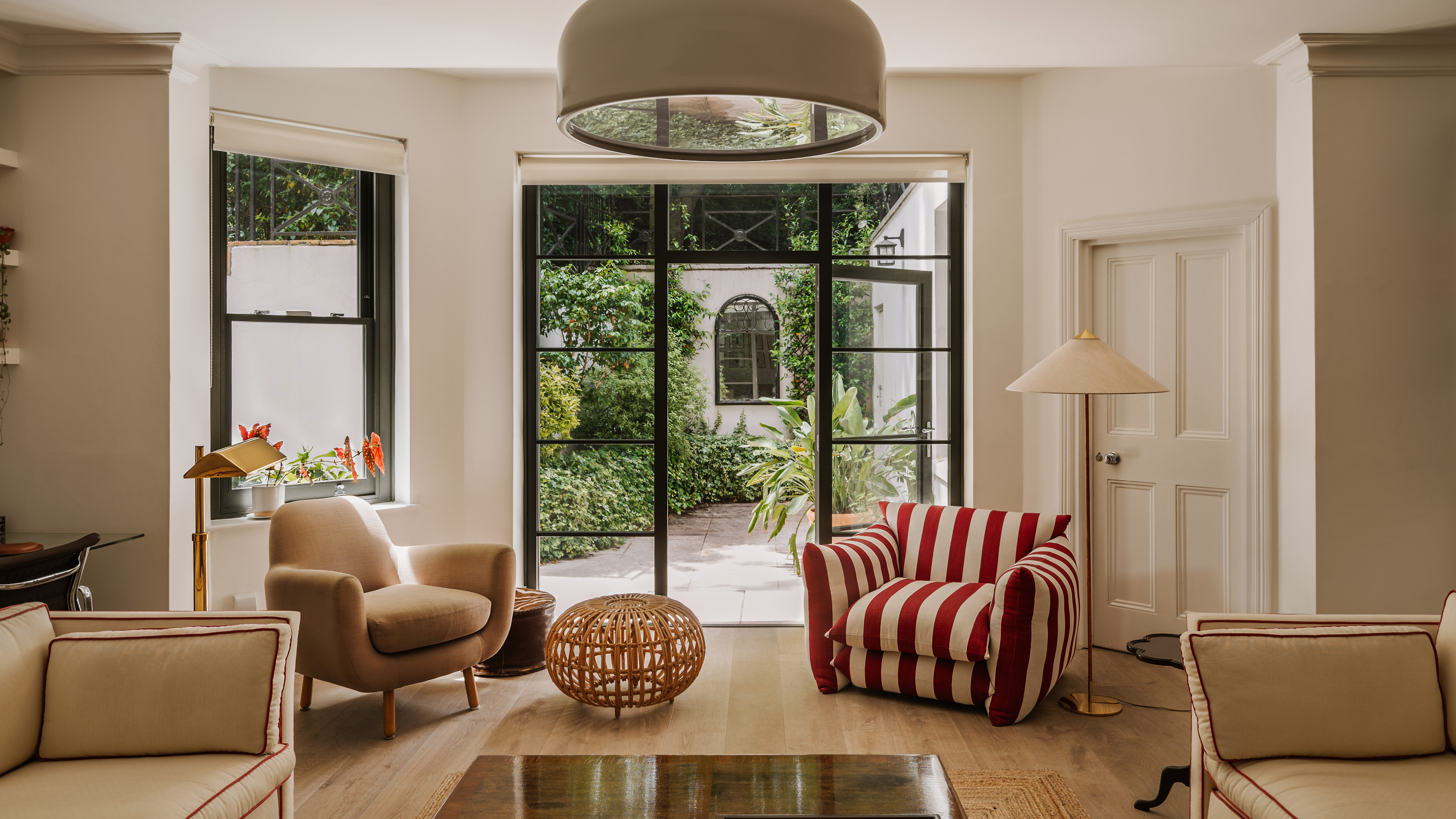
Red and Beige is the New Designer Favorite Combo — Here’s Why (and How to Make it Work)
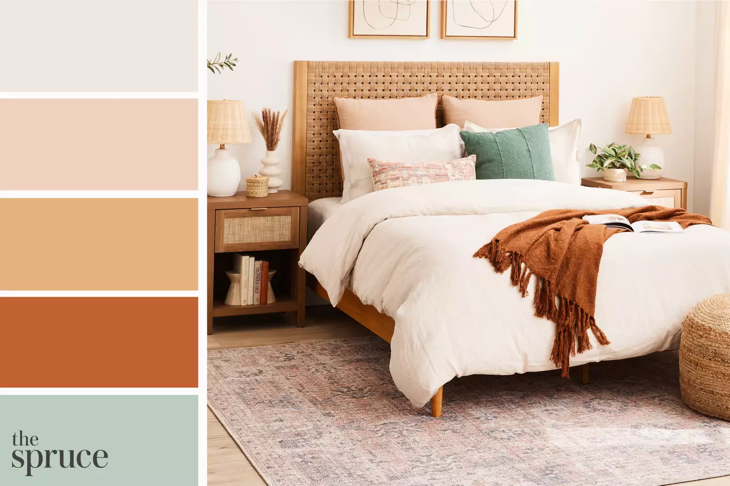
11 Beautiful Colors That Go Well With Beige

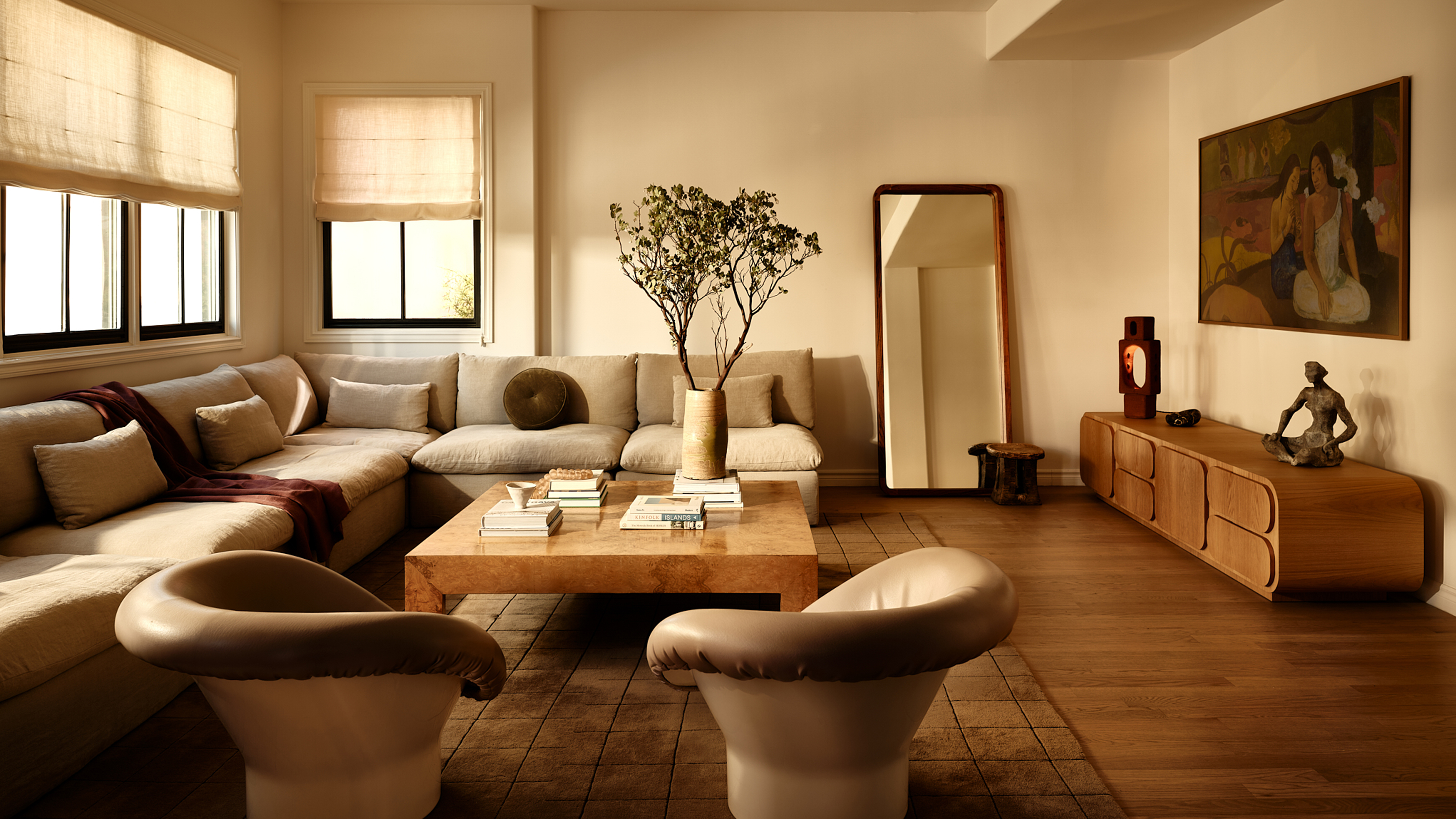
8 Beige Room Ideas That Break the 'Boring' Stereotype
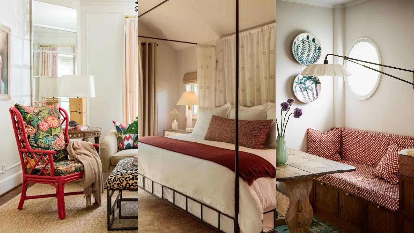
How to pair red and beige – 5 expert ideas for this on trend color combination
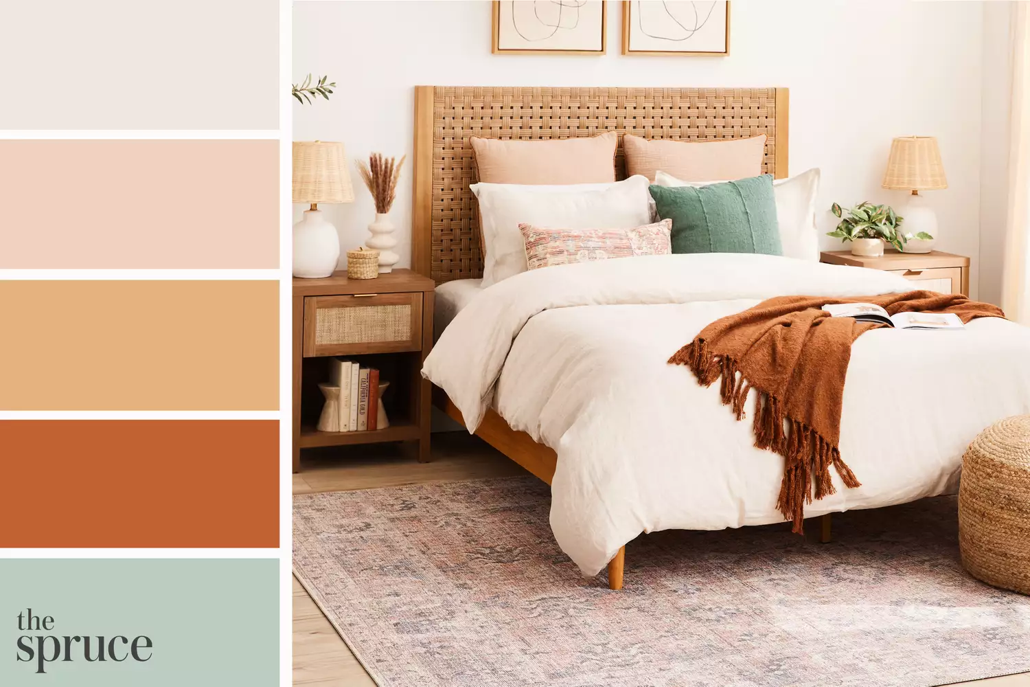
11 Beautiful Colors That Go With Beige
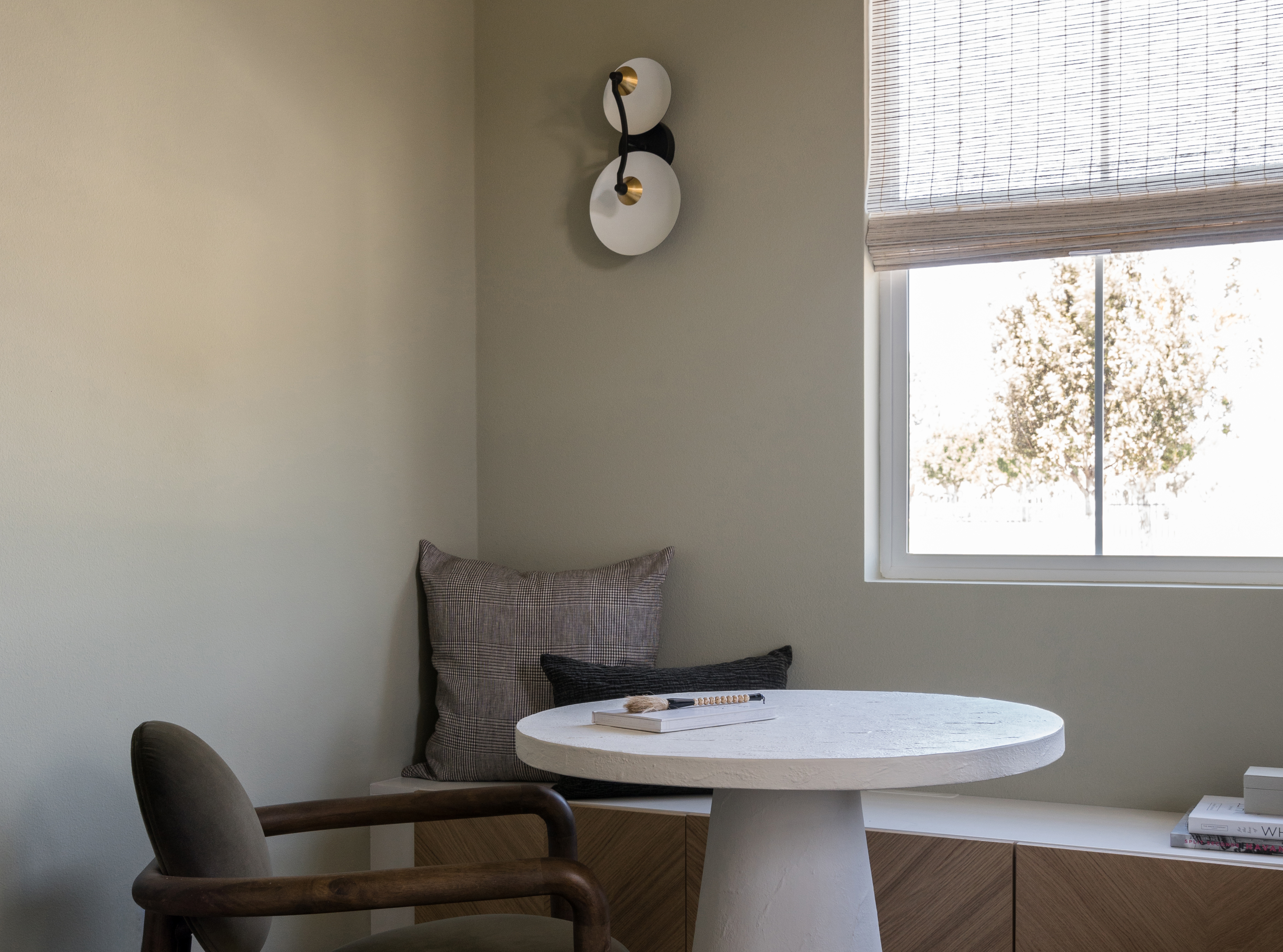
The 8 Best Beige Paints Designers Turn to for Warmly Luxe Schemes – "It Evokes a Sense of Calm"
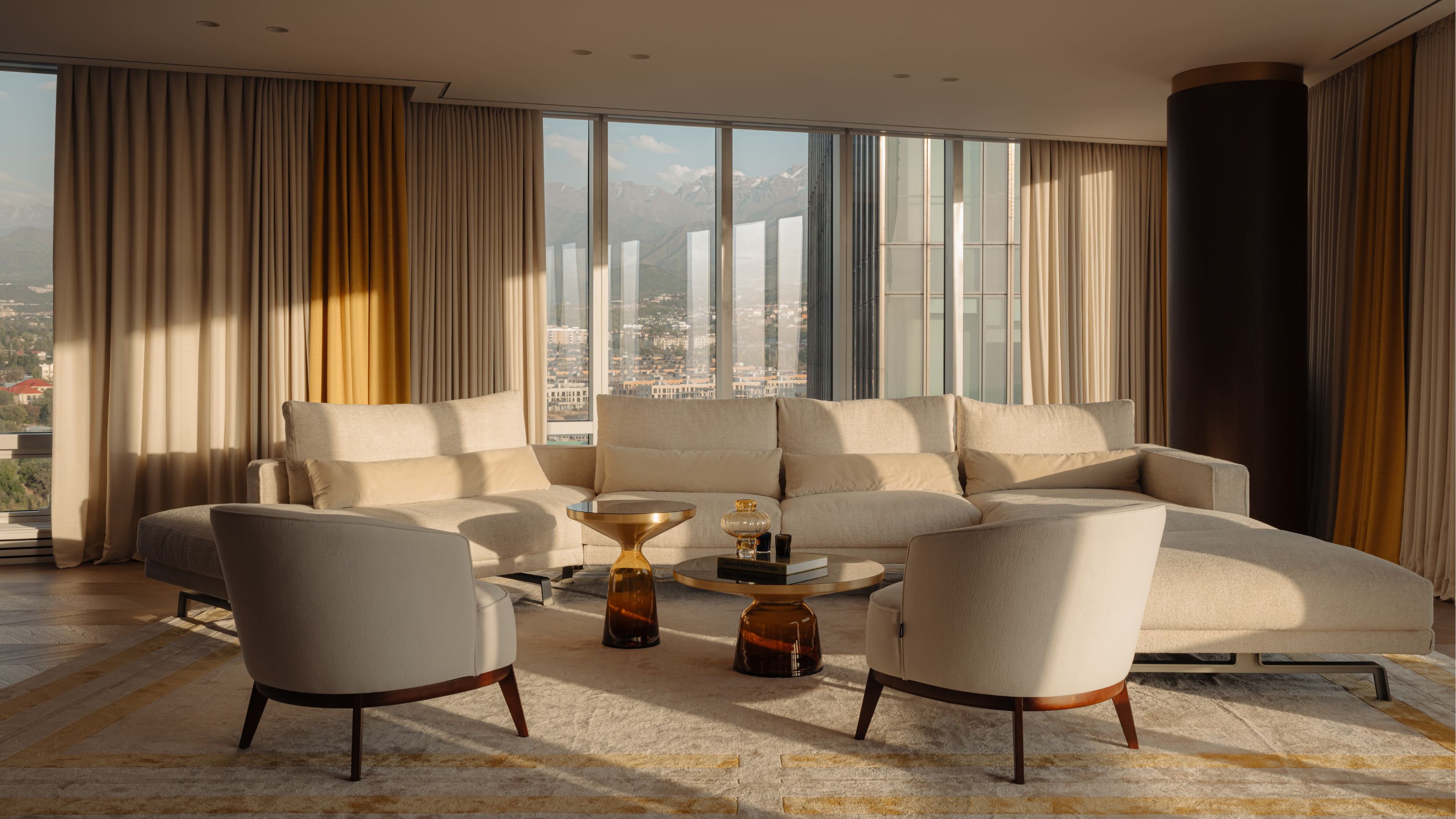
12 Beige Living Room Ideas That Make a Strong Case for the "Boring" Color Being Back in Fashion
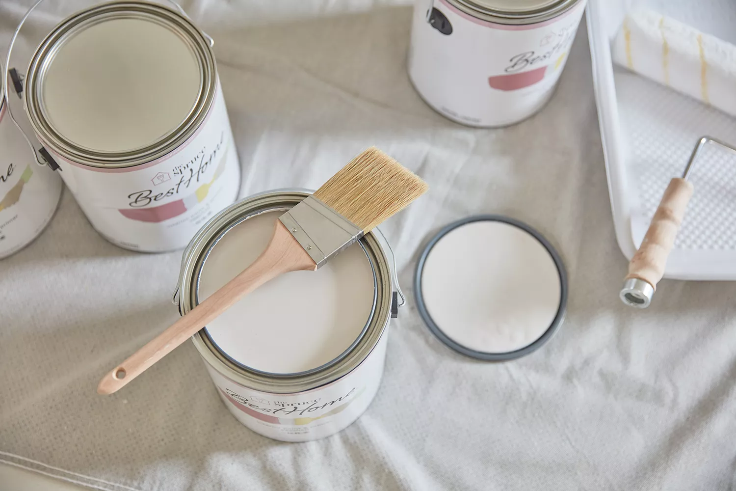
11 Best Beige Paint Colors for Interiors
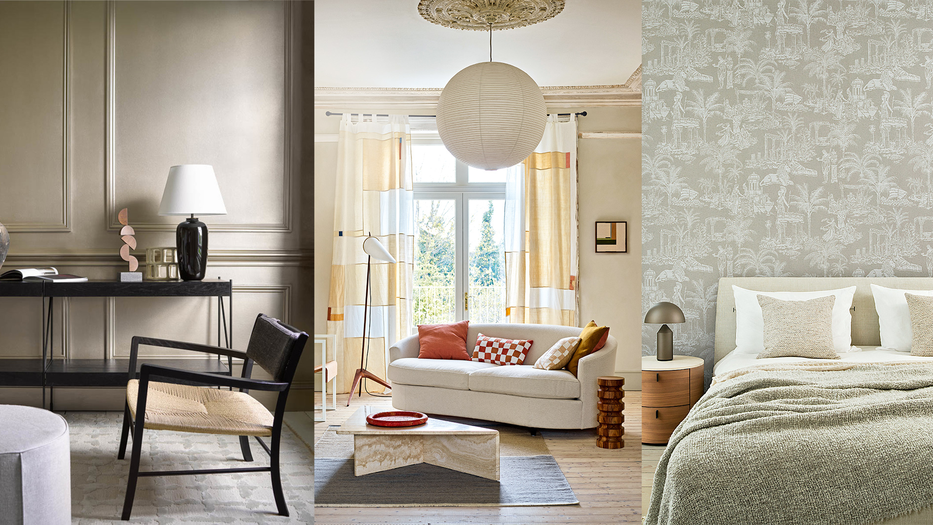
Decorating with beige – 10 ways to embrace this warm neutral shade
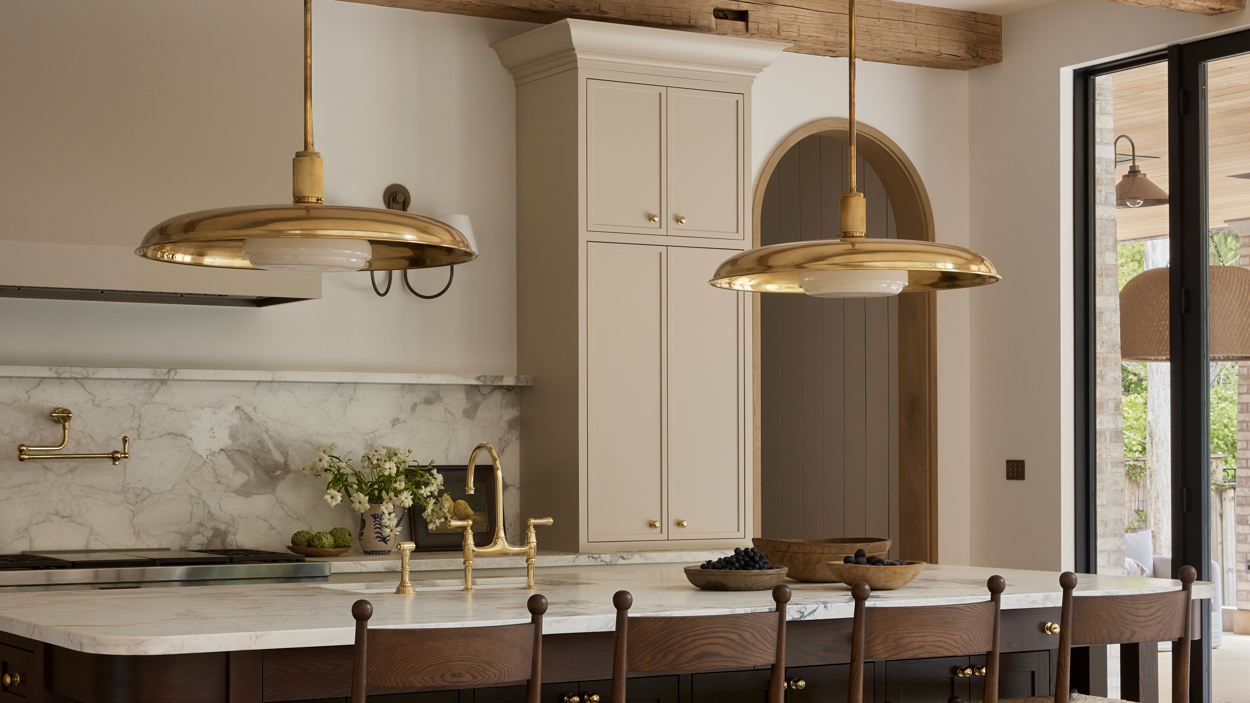
10 Beige Kitchen Ideas That Prove This is Still *the* Color Trend for Cabinets
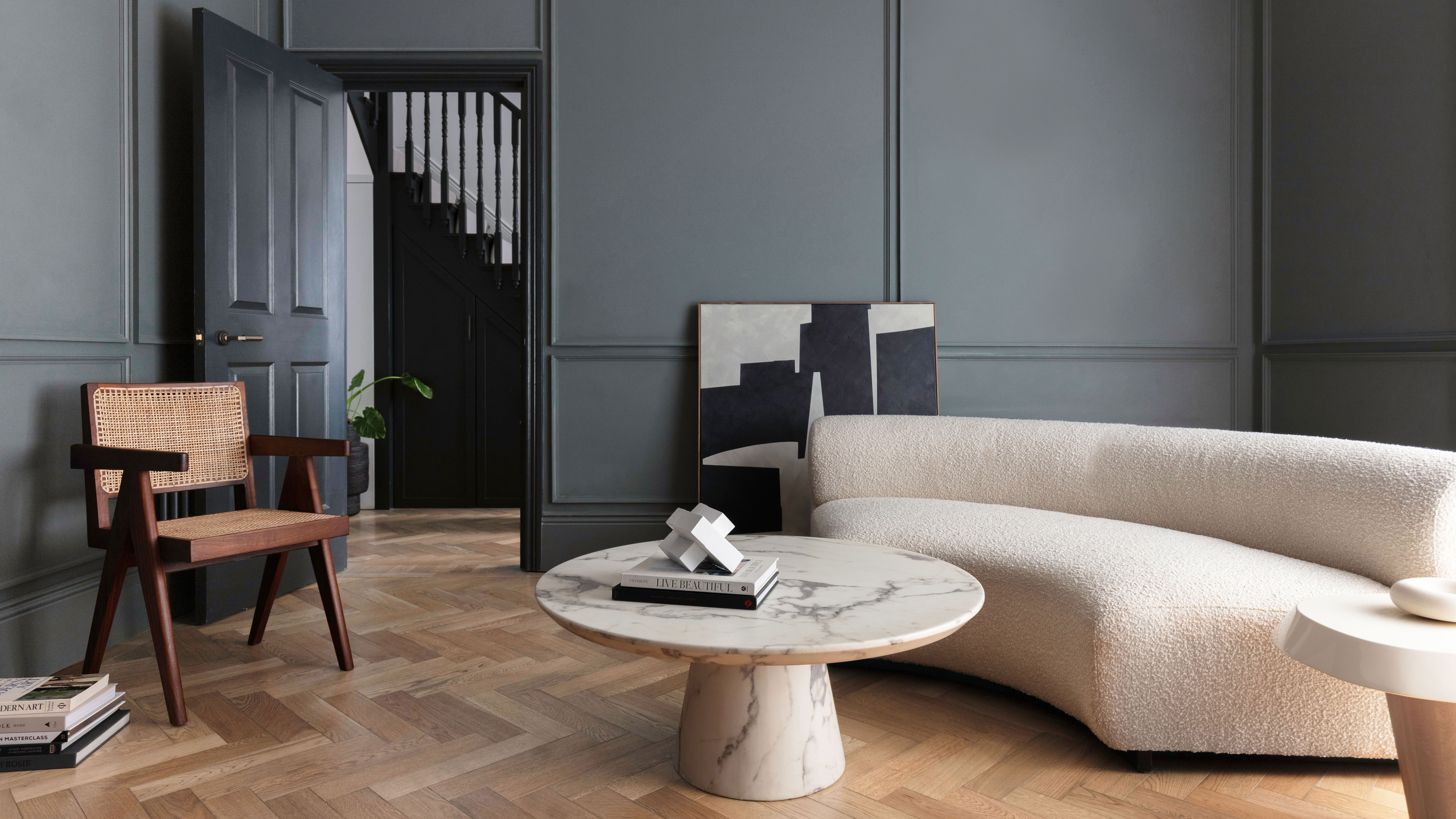
Interior Designer Kelly Hoppen shares her secret to styling a beige color palette
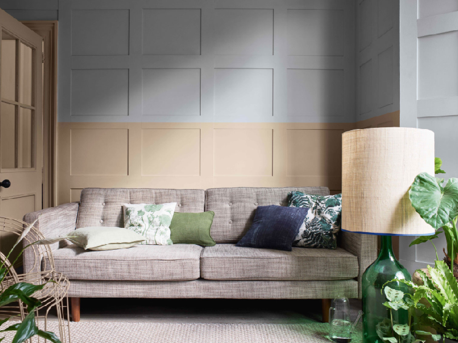
8 beige room ideas – that prove it's beautiful, not boring

Colors to avoid pairing with beige – 5 shades you’ll want to stay clear of
10 beige living room ideas prove that beige is anything but boring
10 Greige Paint Colors Designers Recommend Again And Again