Tired of Neutrals? Here's How to Add a Little More Color to Your Space
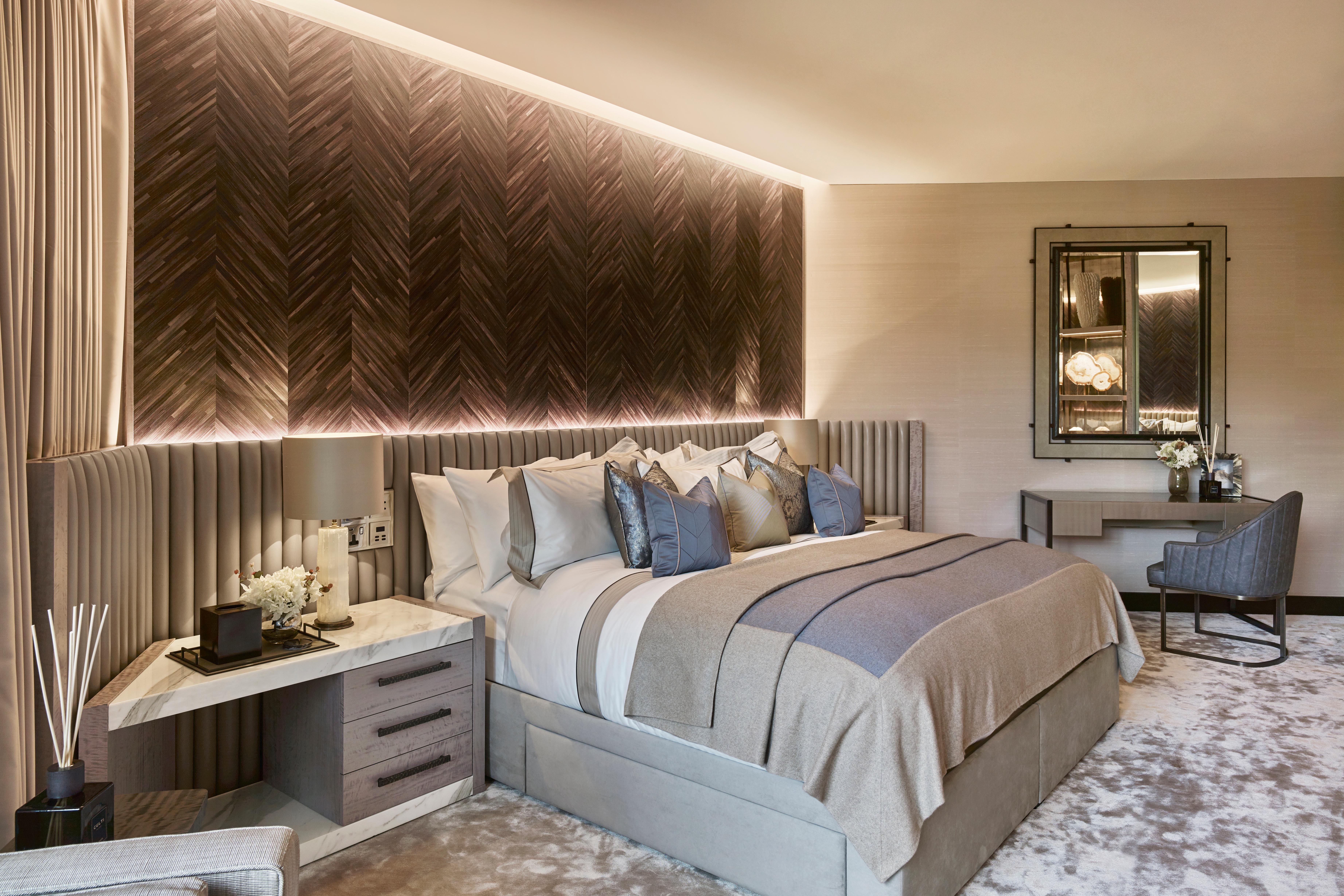
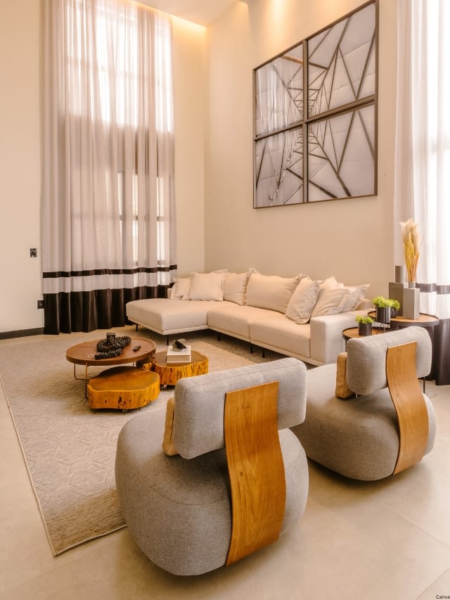
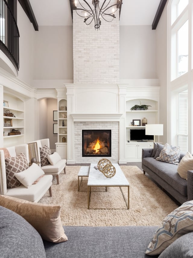
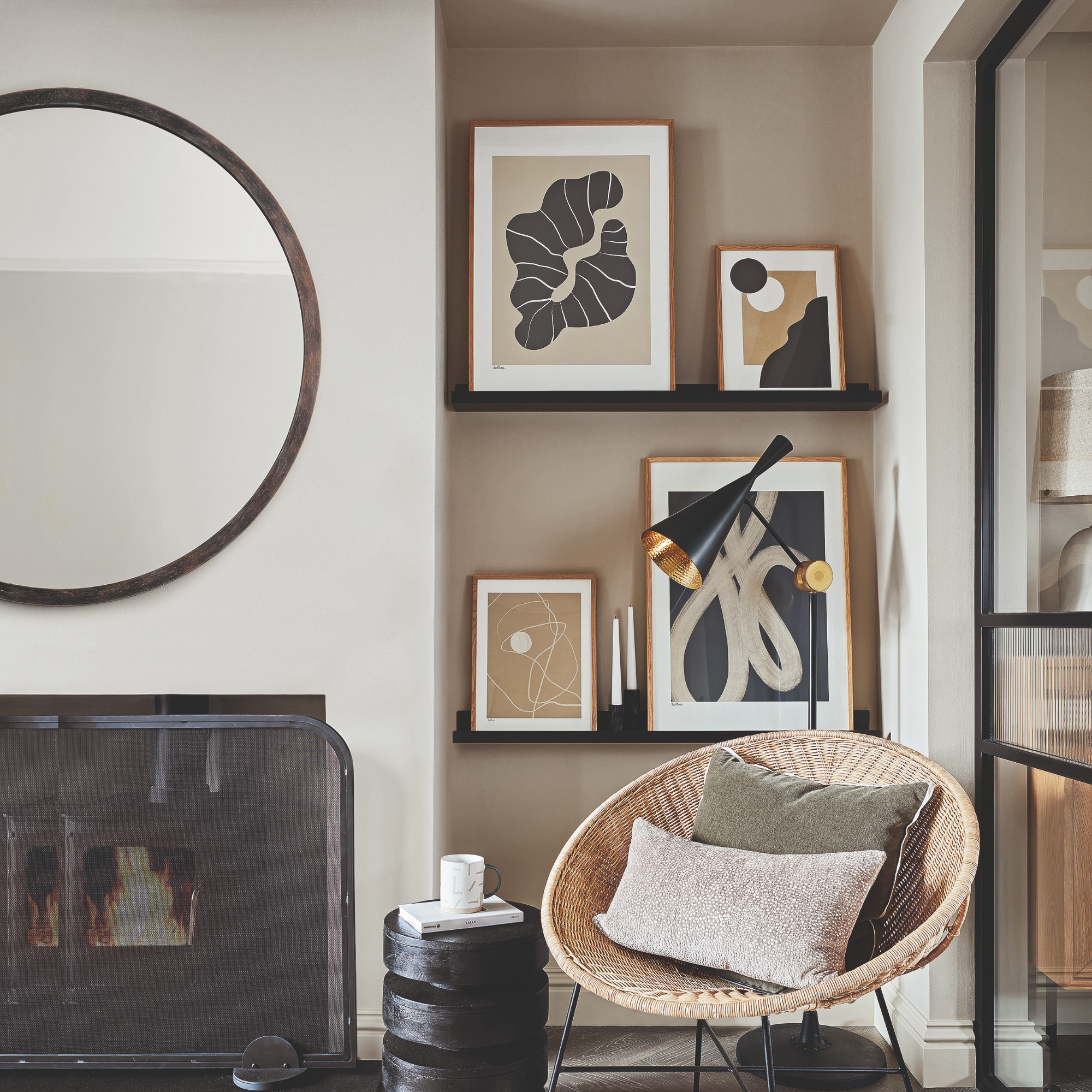
The "sad beige" aesthetic, characterized by neutral shades such as beige, taupe, gray, cream, brown, black, and white, has been a popular trend in home decor, influencing living rooms, bedrooms, and even children's rooms. However, after prolonged exposure to this minimalist style, many individuals develop a desire for more vibrant and diverse color palettes within their living spaces. Integrating bold colors into a neutral room requires careful consideration to ensure a thoughtfully curated appearance rather than a haphazard one. Interior design experts Shay Holland and Samantha Gallacher offer professional insights and strategies for effectively introducing color into a neutral home environment.
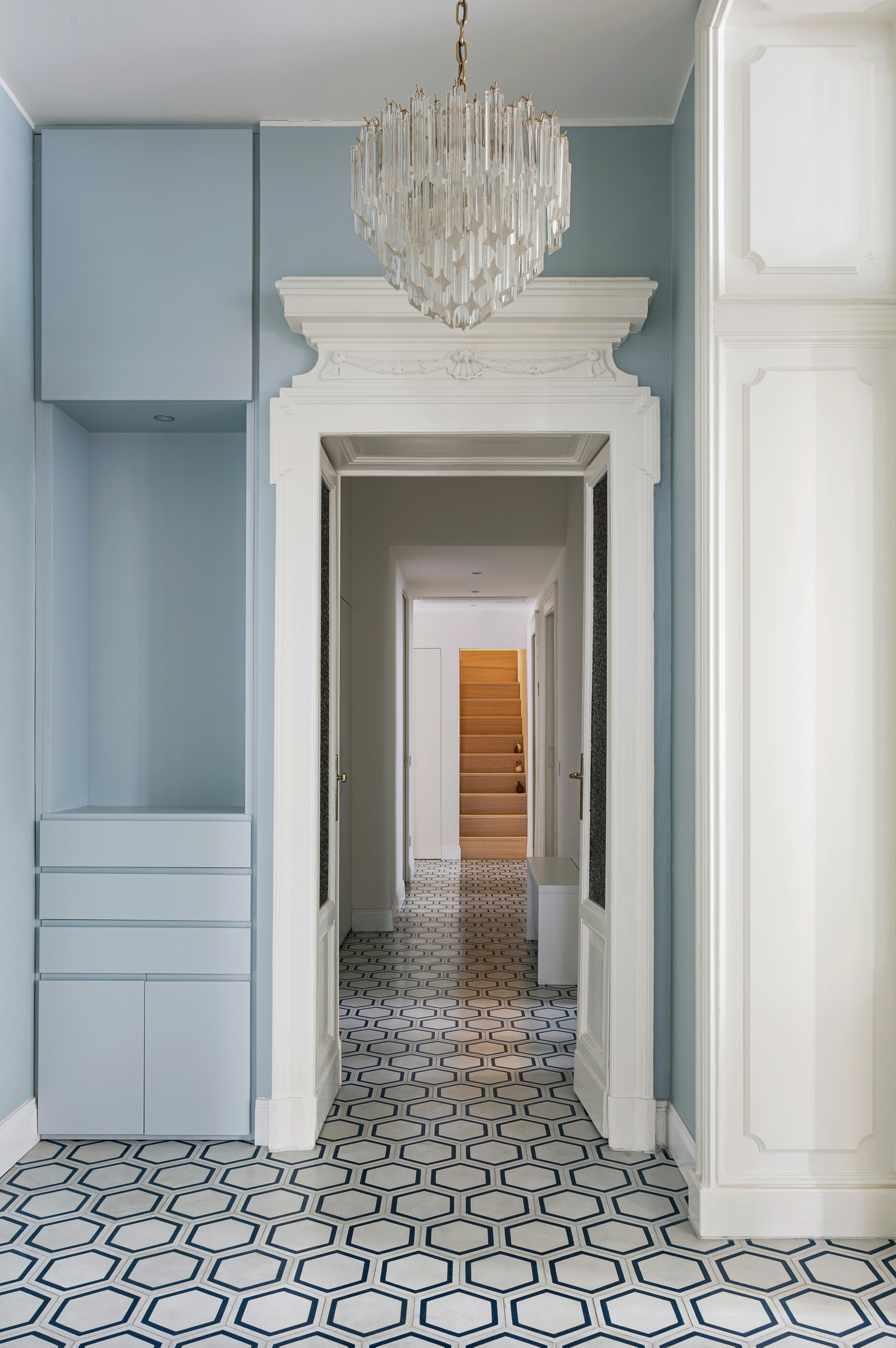
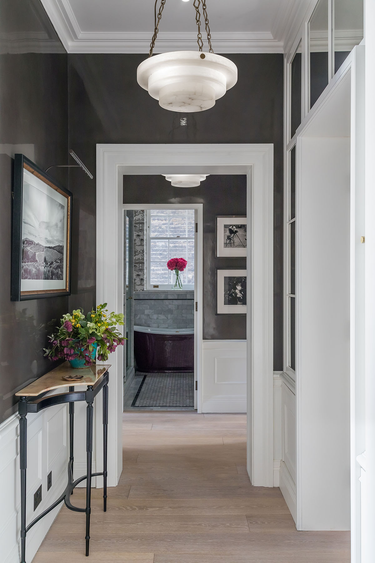
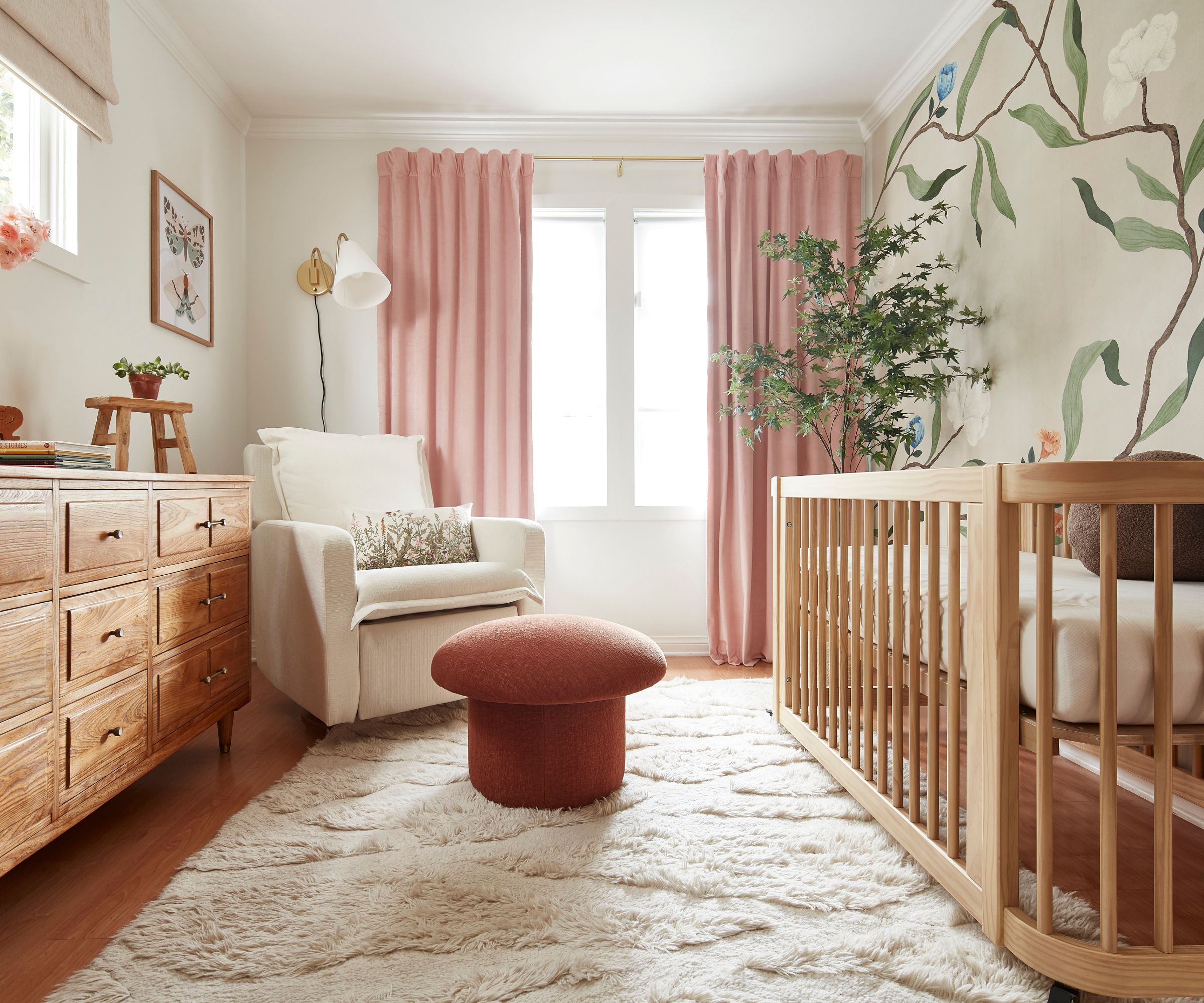
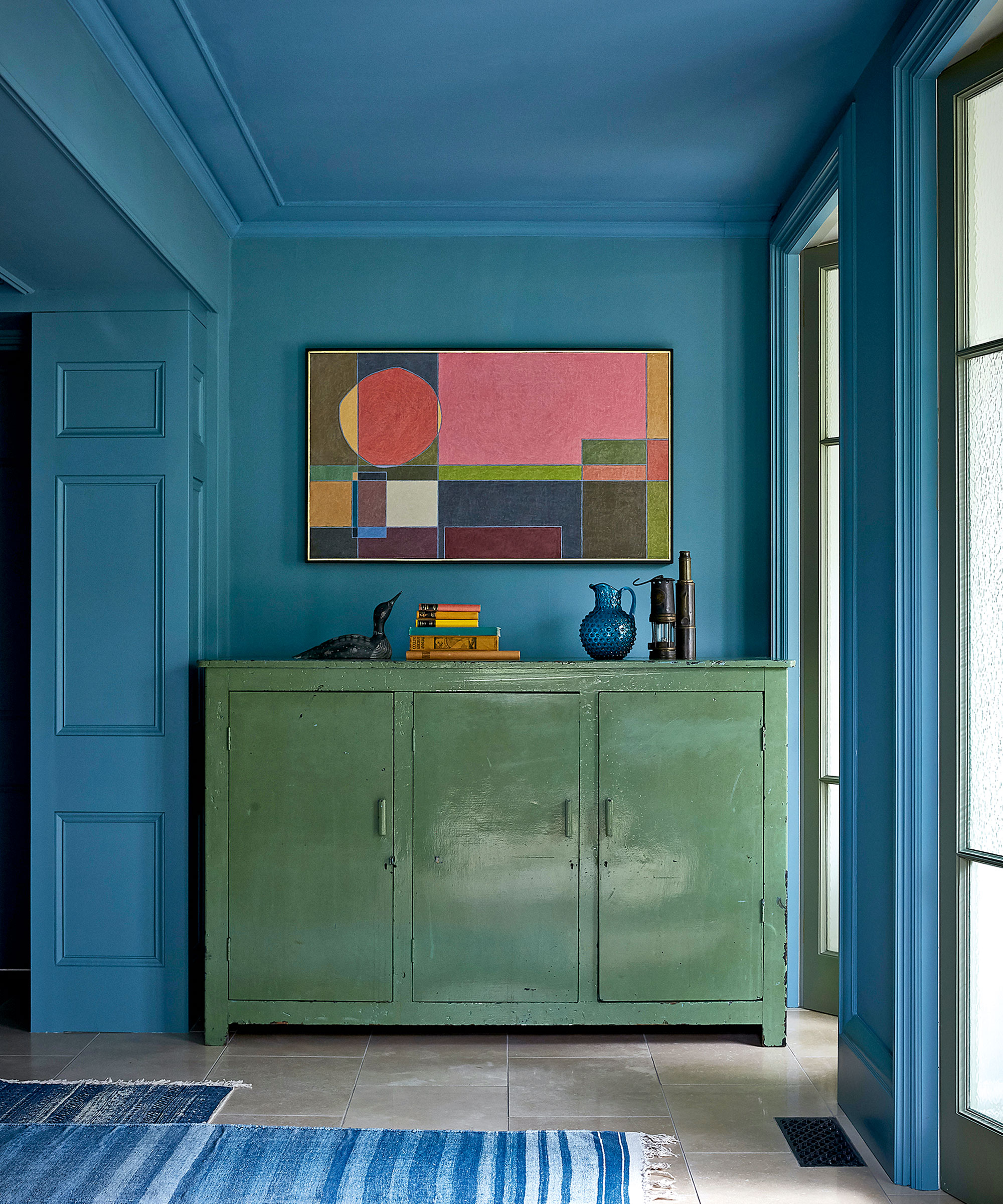
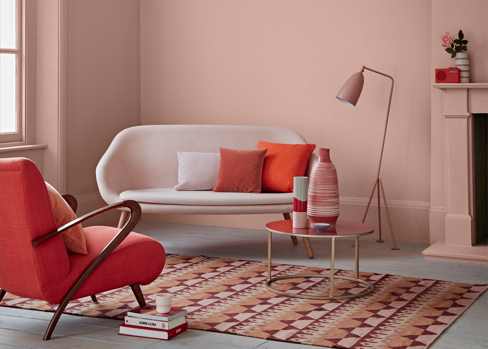
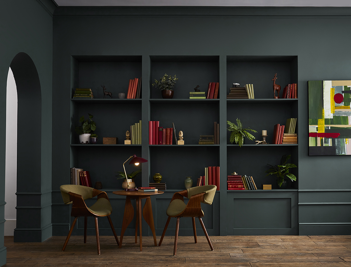
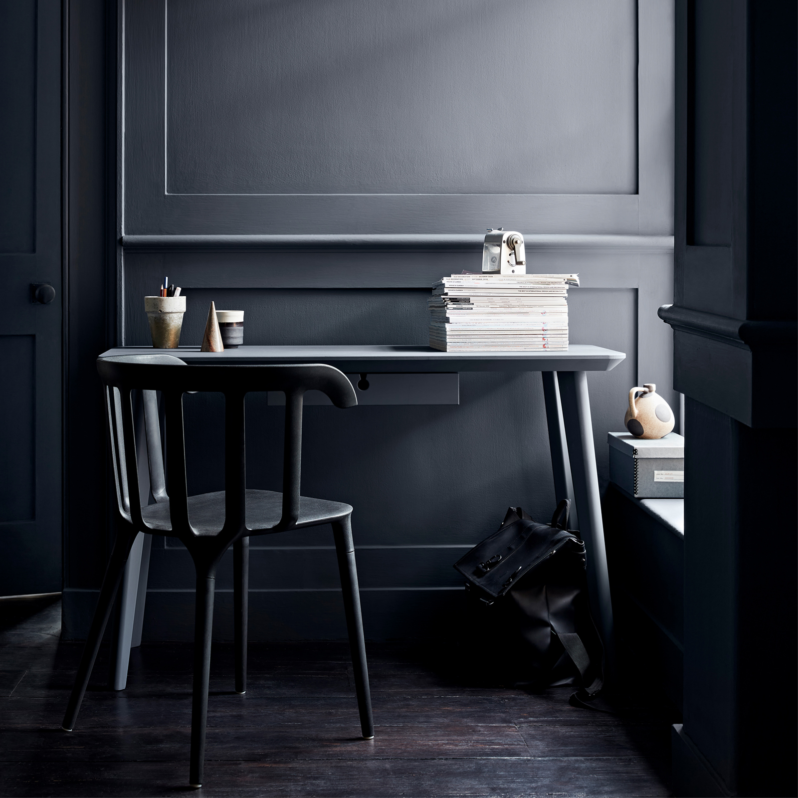
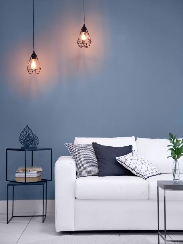
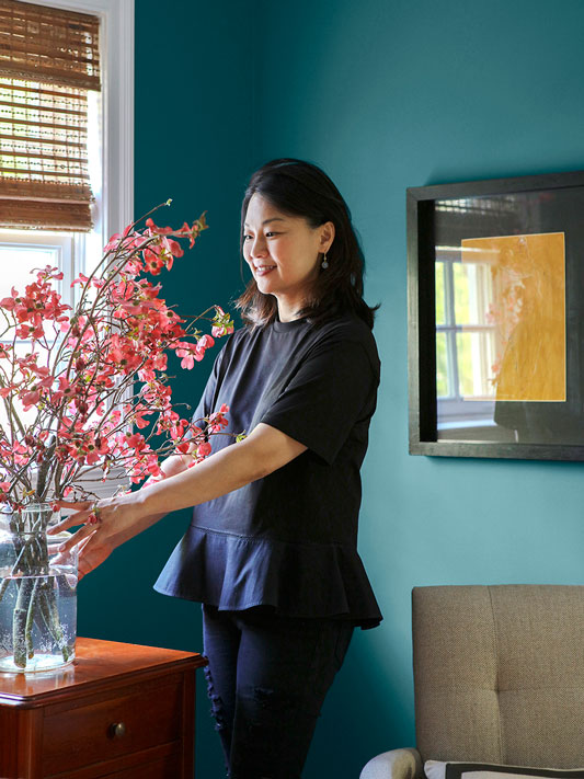
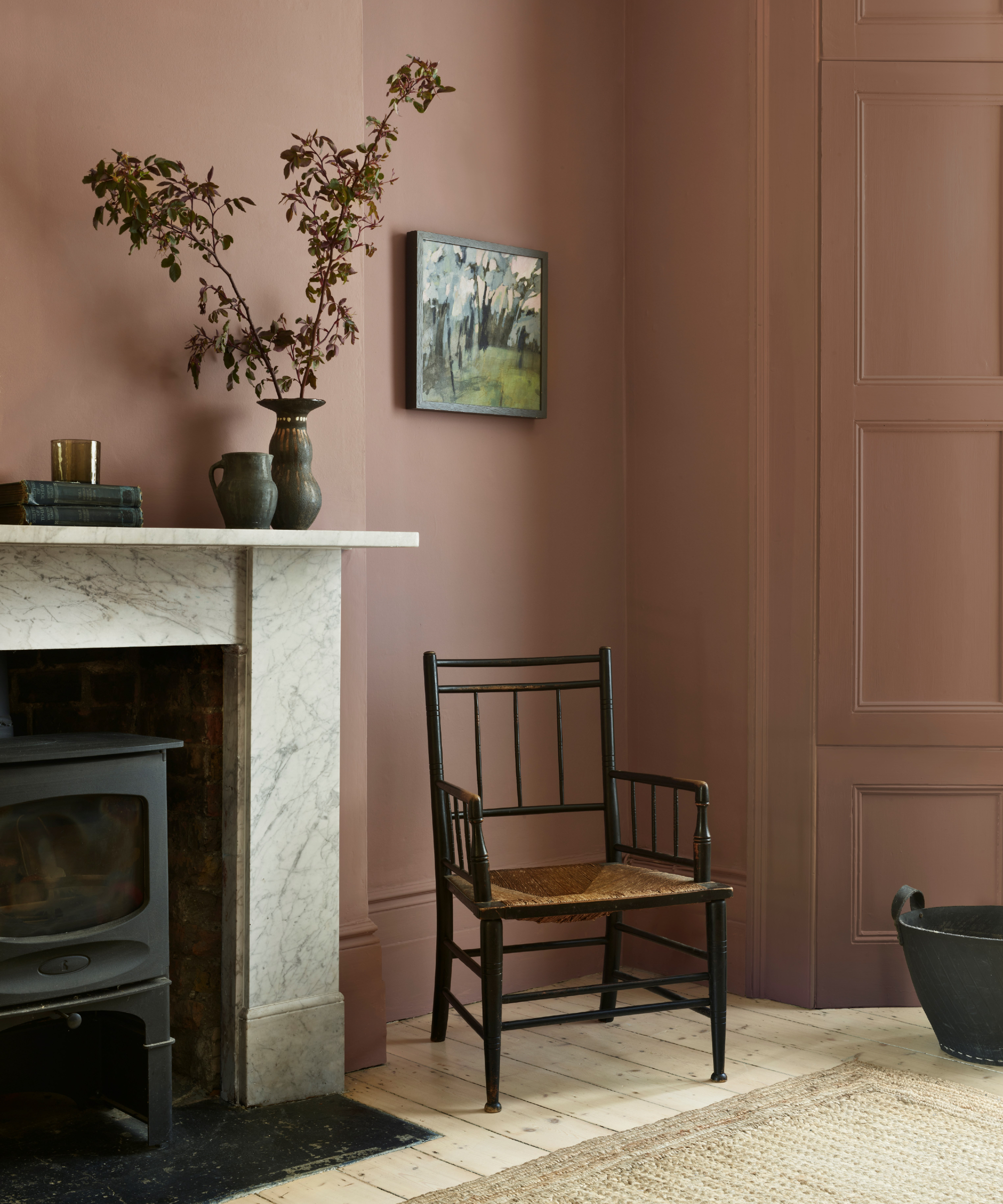
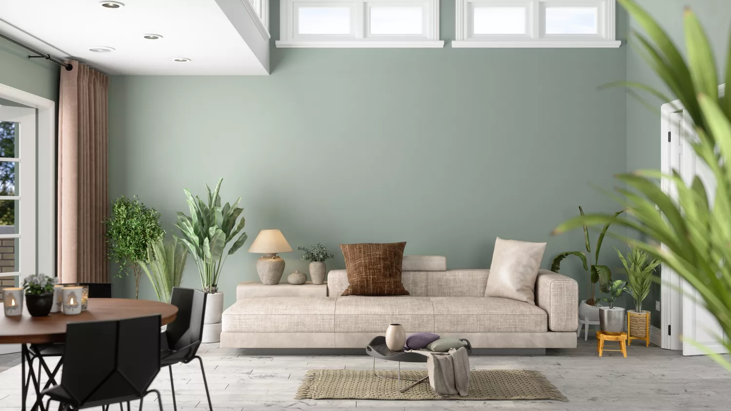
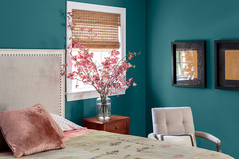
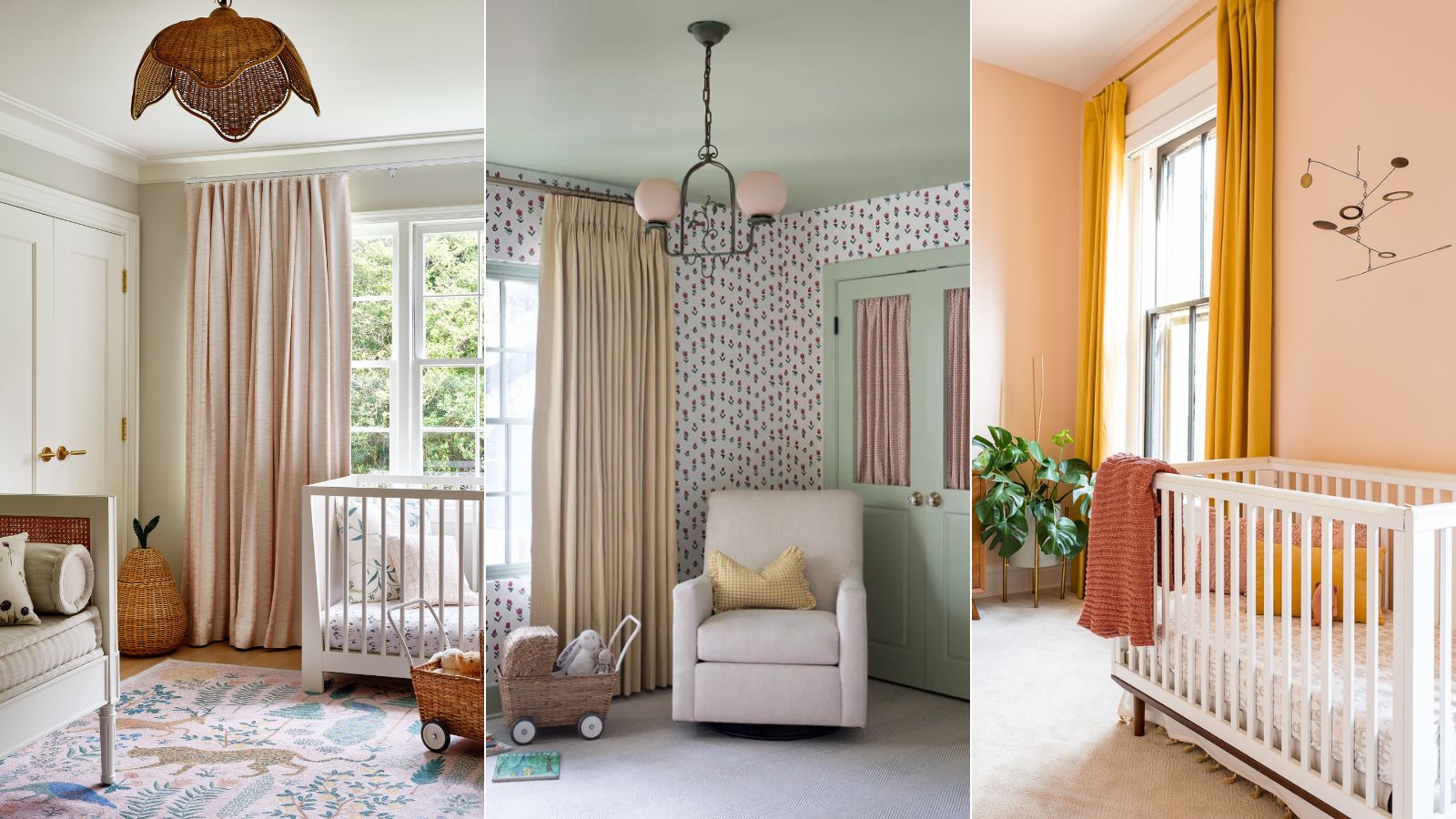
According to Shay Holland, the traditional definition of "neutral" has evolved significantly within the design world. While classic neutrals still hold their place, contemporary design now embraces a broader spectrum of unexpected colors that evoke a sense of calm and restoration. These new neutrals often include desaturated shades of greens, blues, blush, and rust, which are effectively utilized as primary backdrops for walls, furniture, and decorative elements. This expanded understanding of neutrals allows for a more dynamic yet still harmonious aesthetic.
For those uncertain about which colors to incorporate, drawing inspiration from nature is a recommended starting point. Holland suggests reflecting the local landscape in color choices. For example, in Southern California, designers might use moody blues, sand tones, and misty pinks to create a relaxed, beachy vibe that is more nuanced and sophisticated than conventional coastal color schemes. The objective is to achieve a laid-back atmosphere through complex color interactions rather than relying on overused combinations.
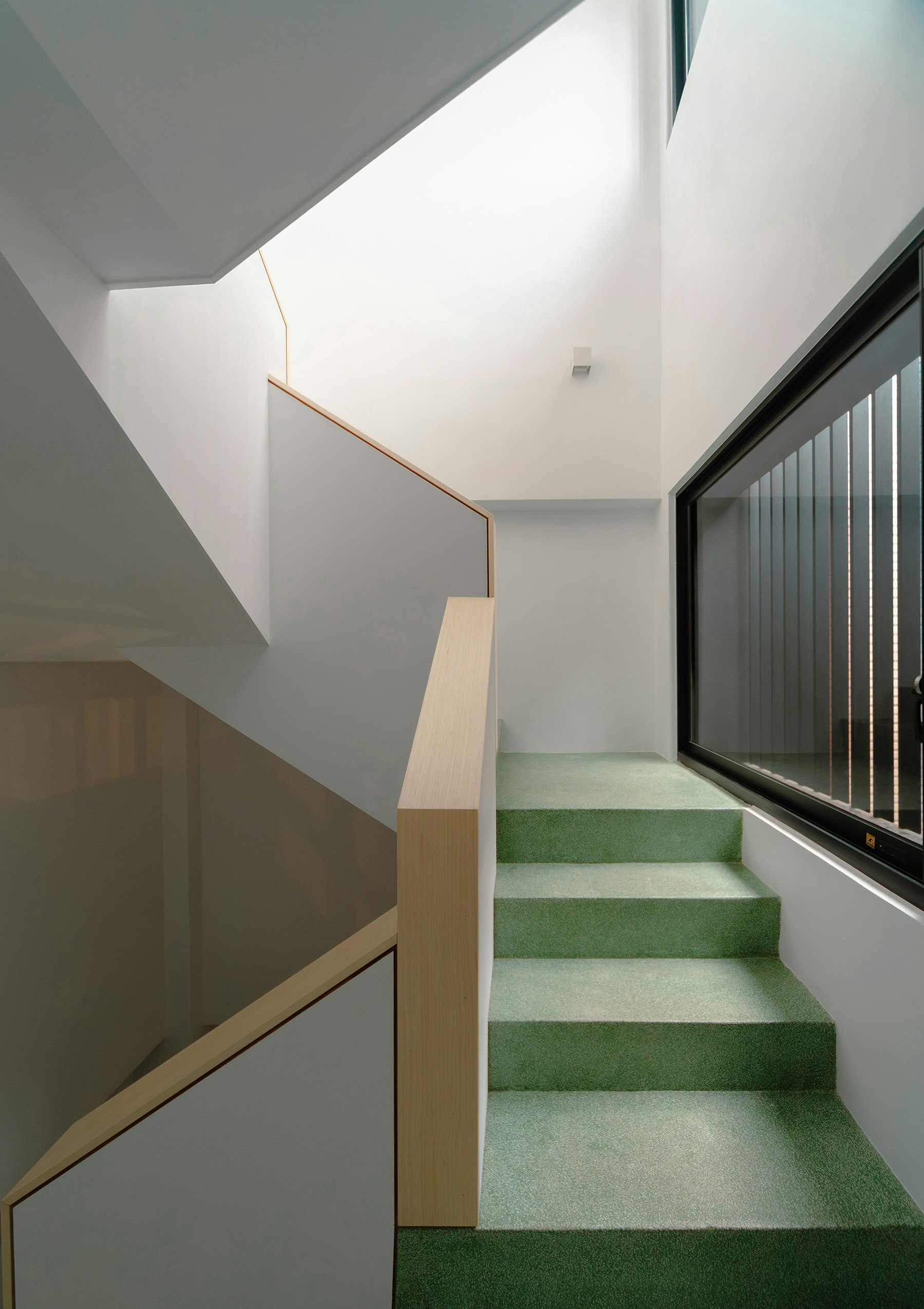
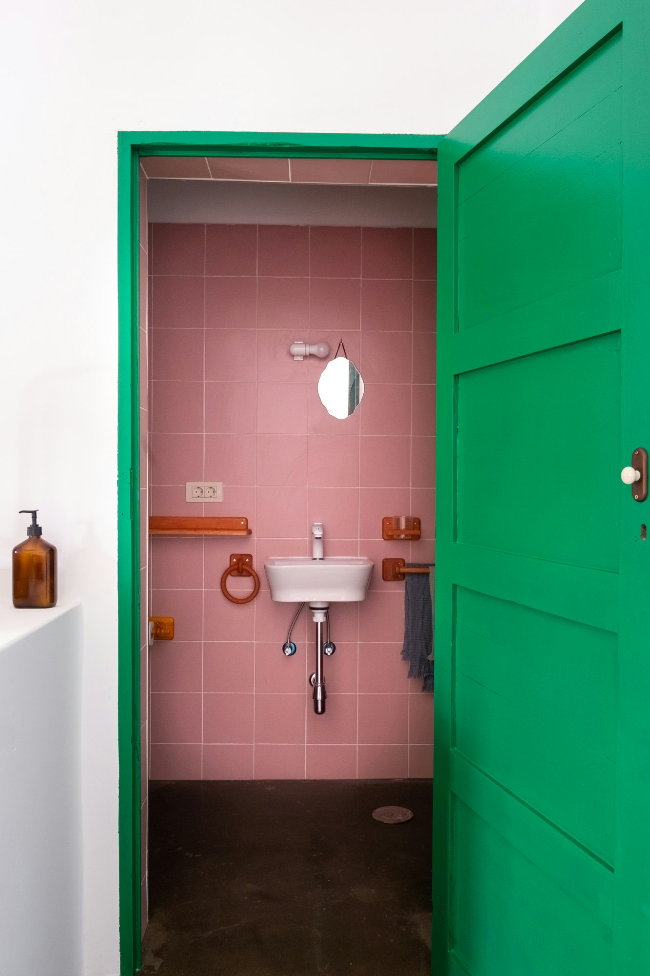
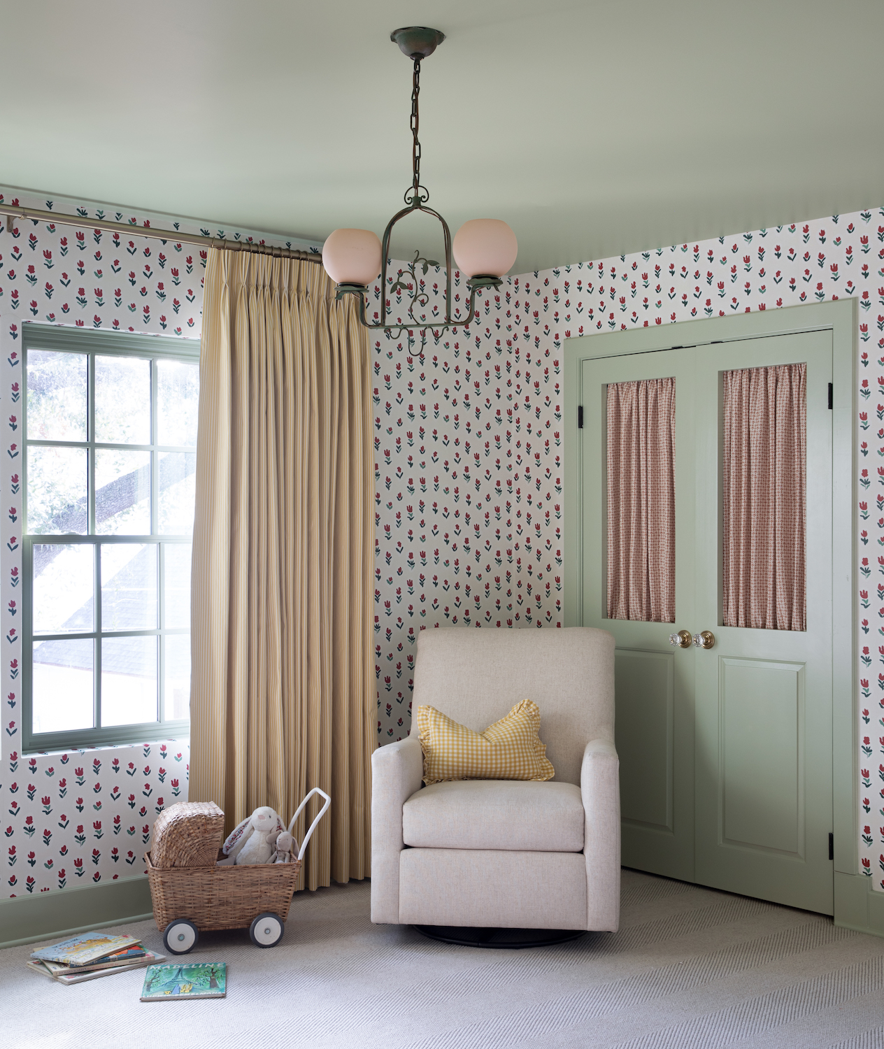
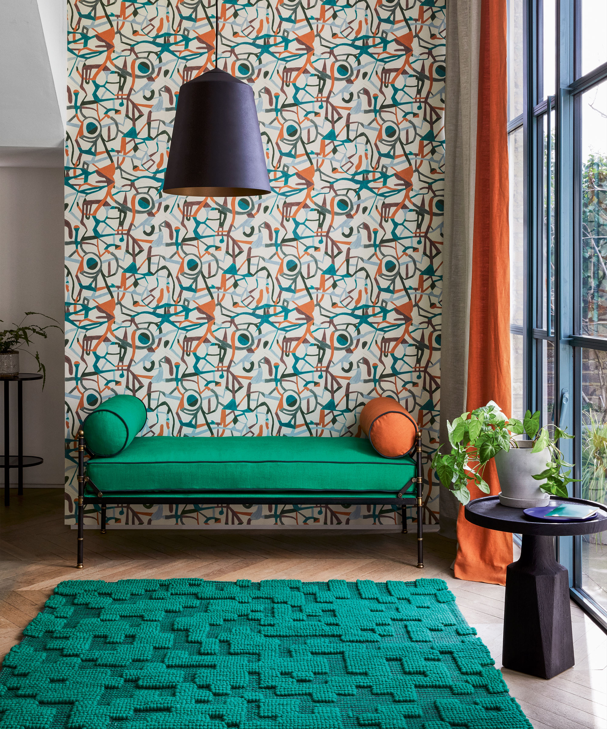
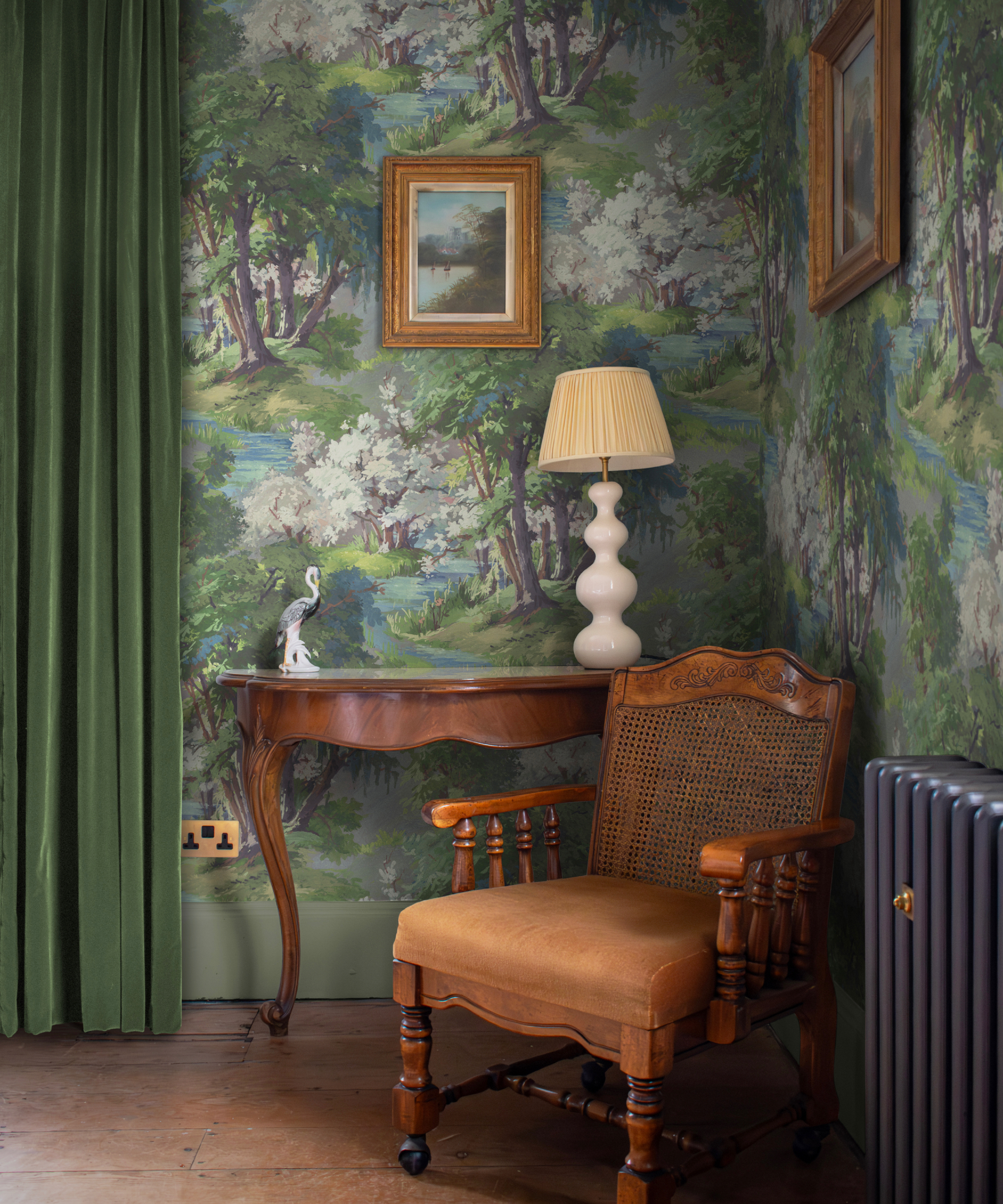
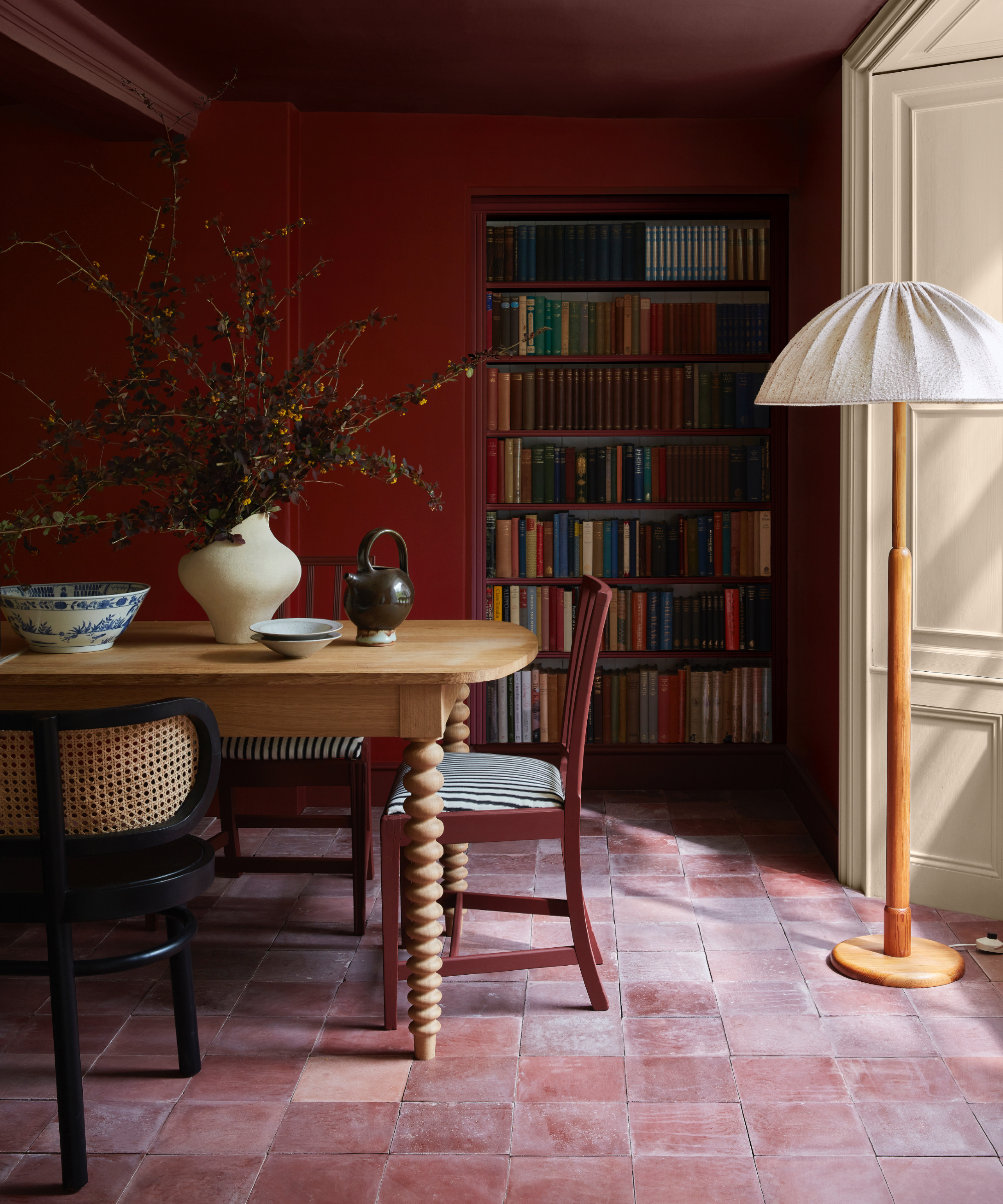
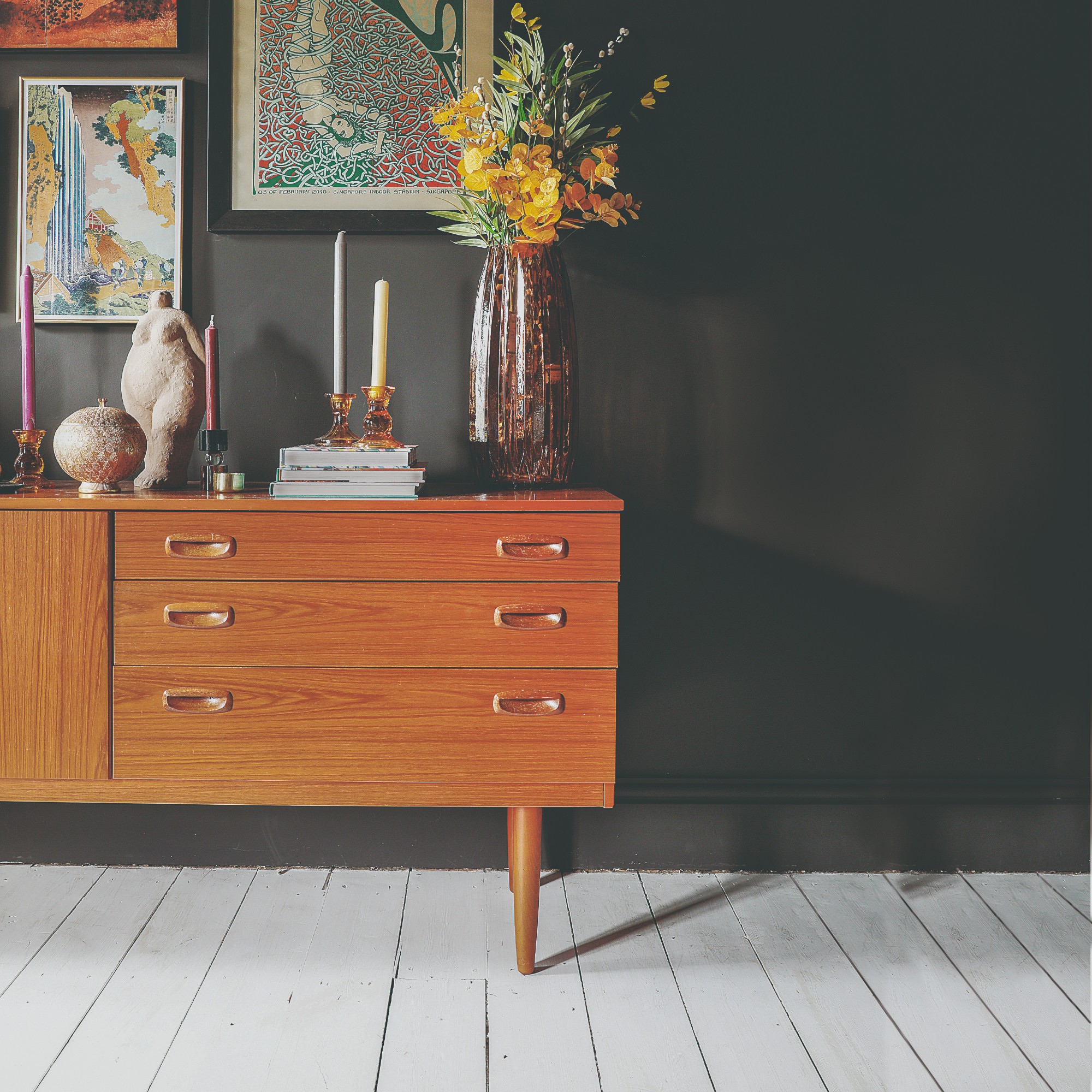
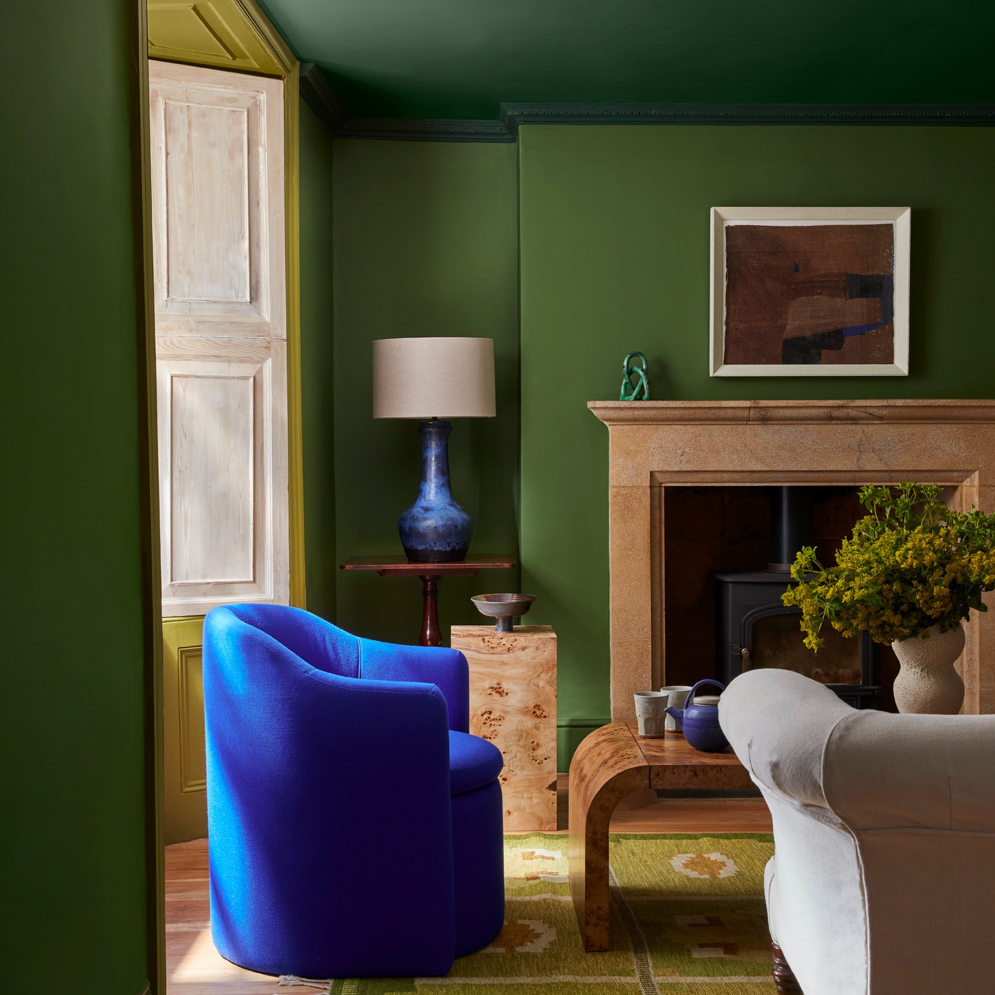
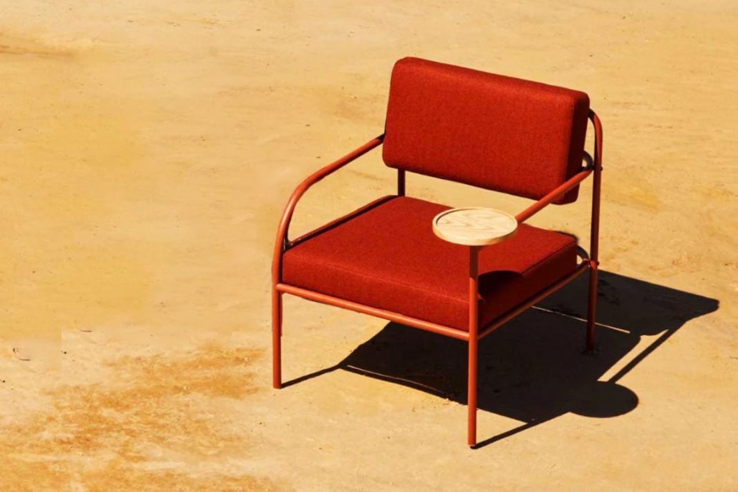
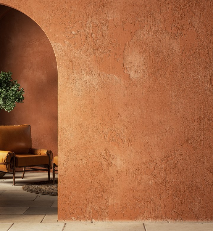
Holland emphasizes that a deep understanding of color theory is not essential for moving beyond beige, white, and gray. The primary goal is to select unifying colors that do not compete for attention. This approach helps maintain a cohesive and aesthetically pleasing environment. Samantha Gallacher specifically recommends green as a versatile color that coordinates well with most neutral palettes. She suggests opting for fresh interpretations of green, such as grayish-green or pale olive, to introduce a natural yet stylish element. Terracotta hues are another viable option, as they evoke the natural warmth of earth's clays while adding a contemporary feel.
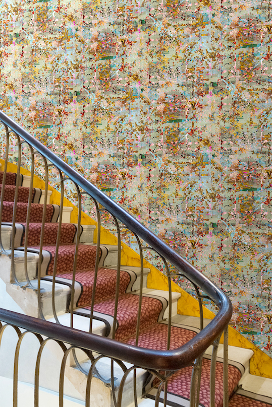
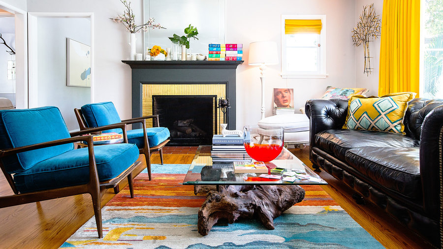
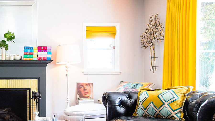
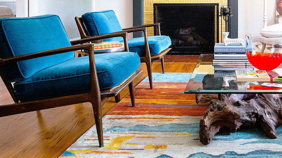
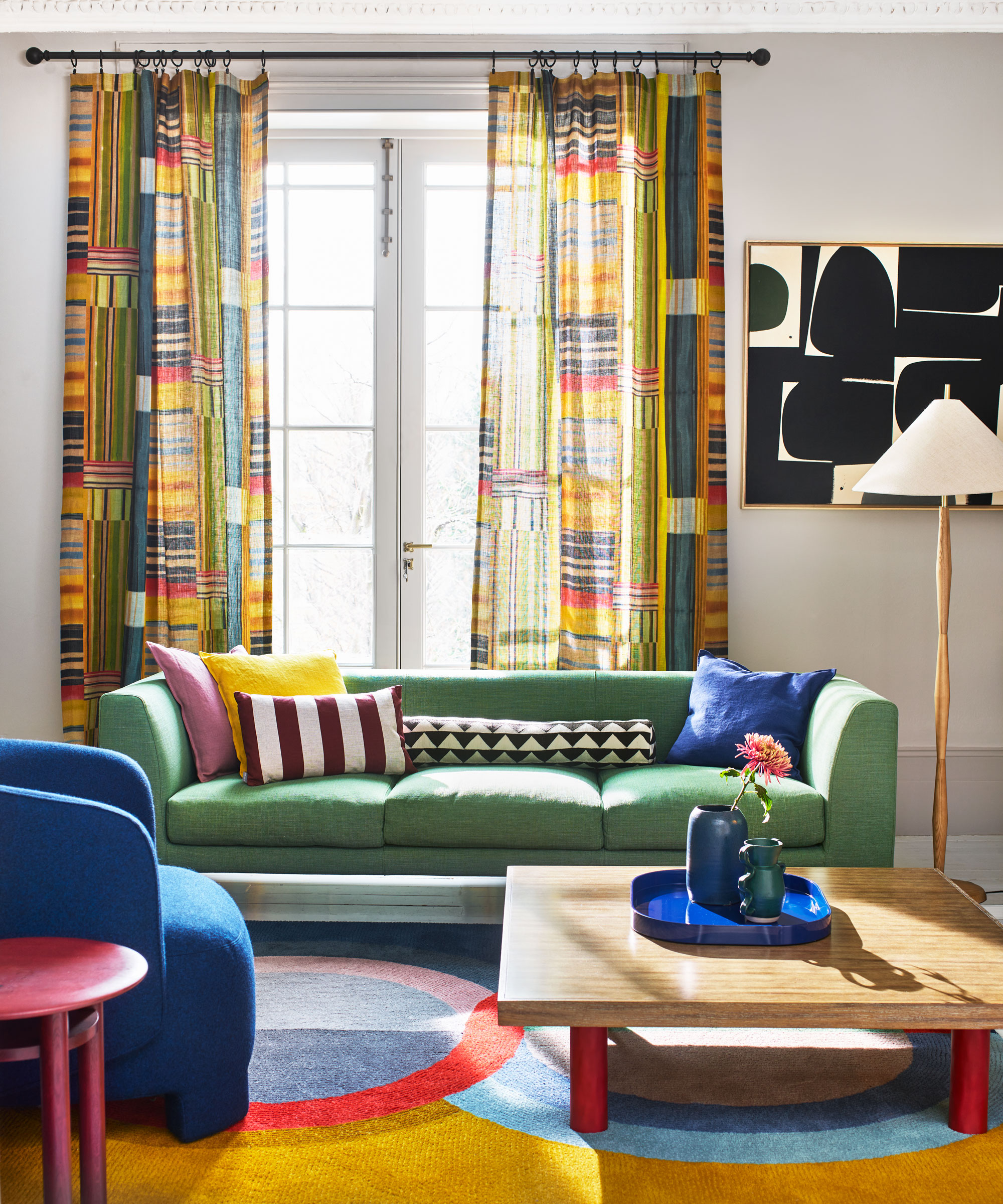
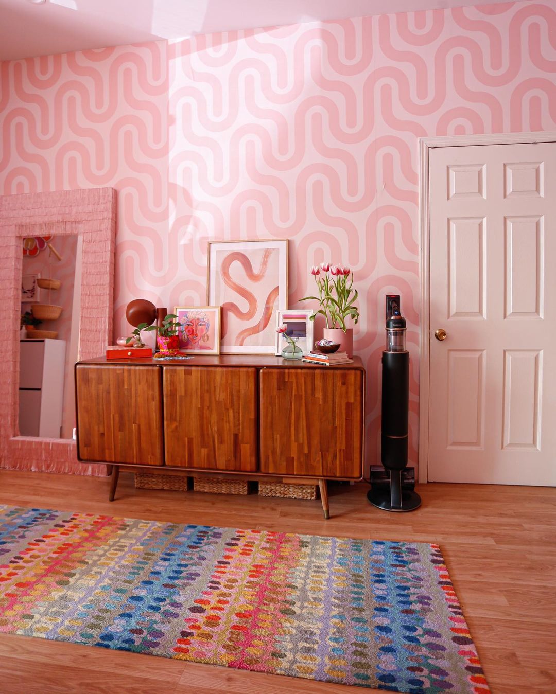
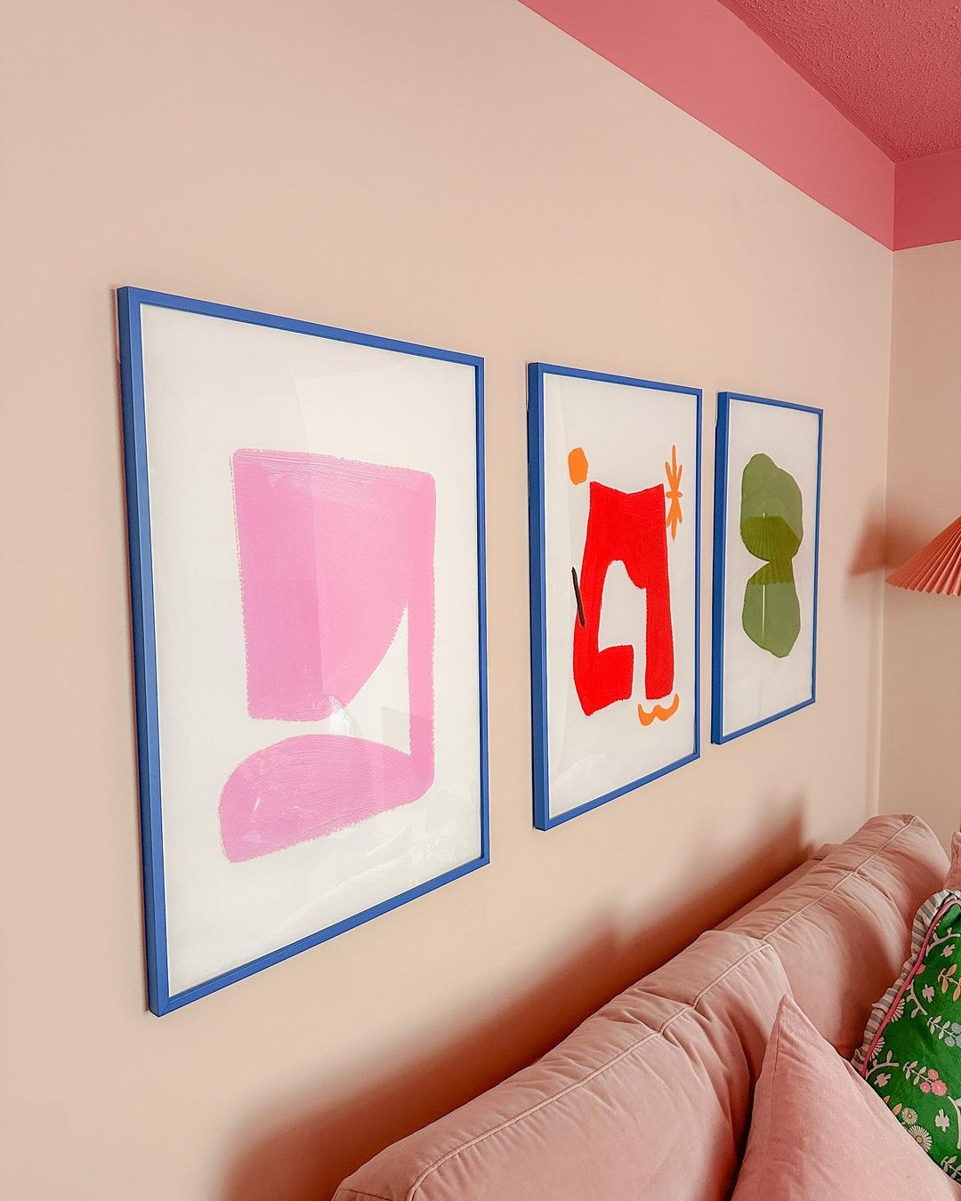
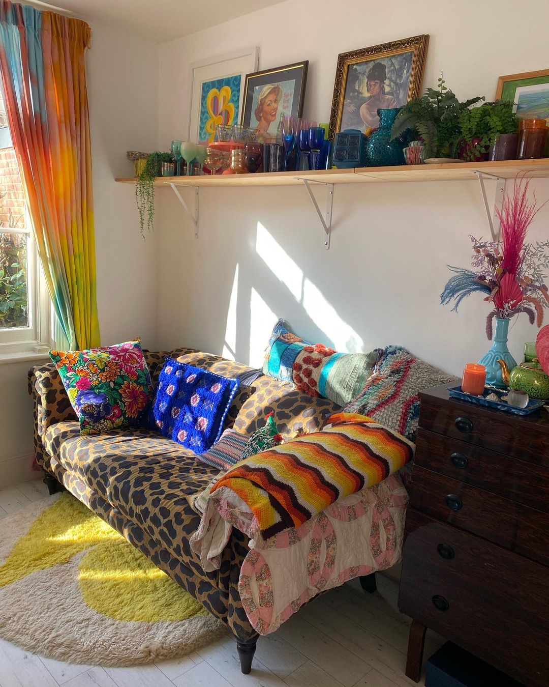
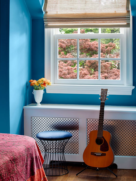
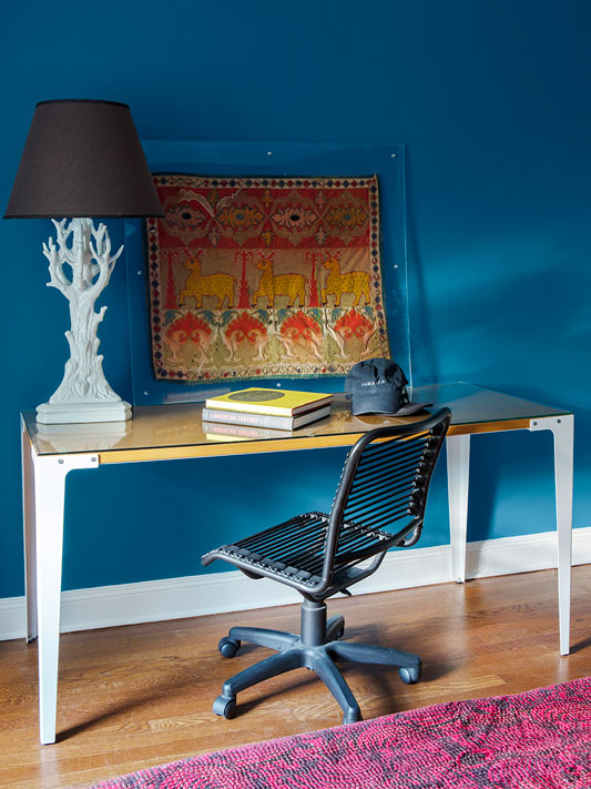
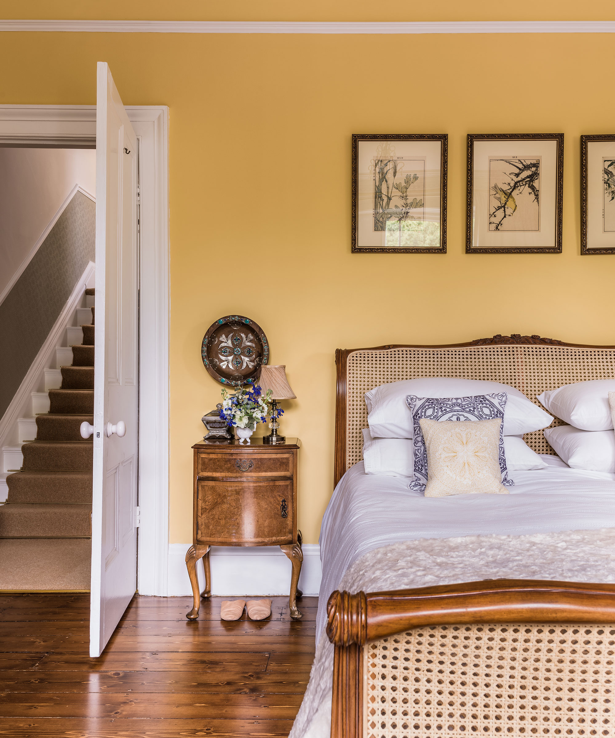
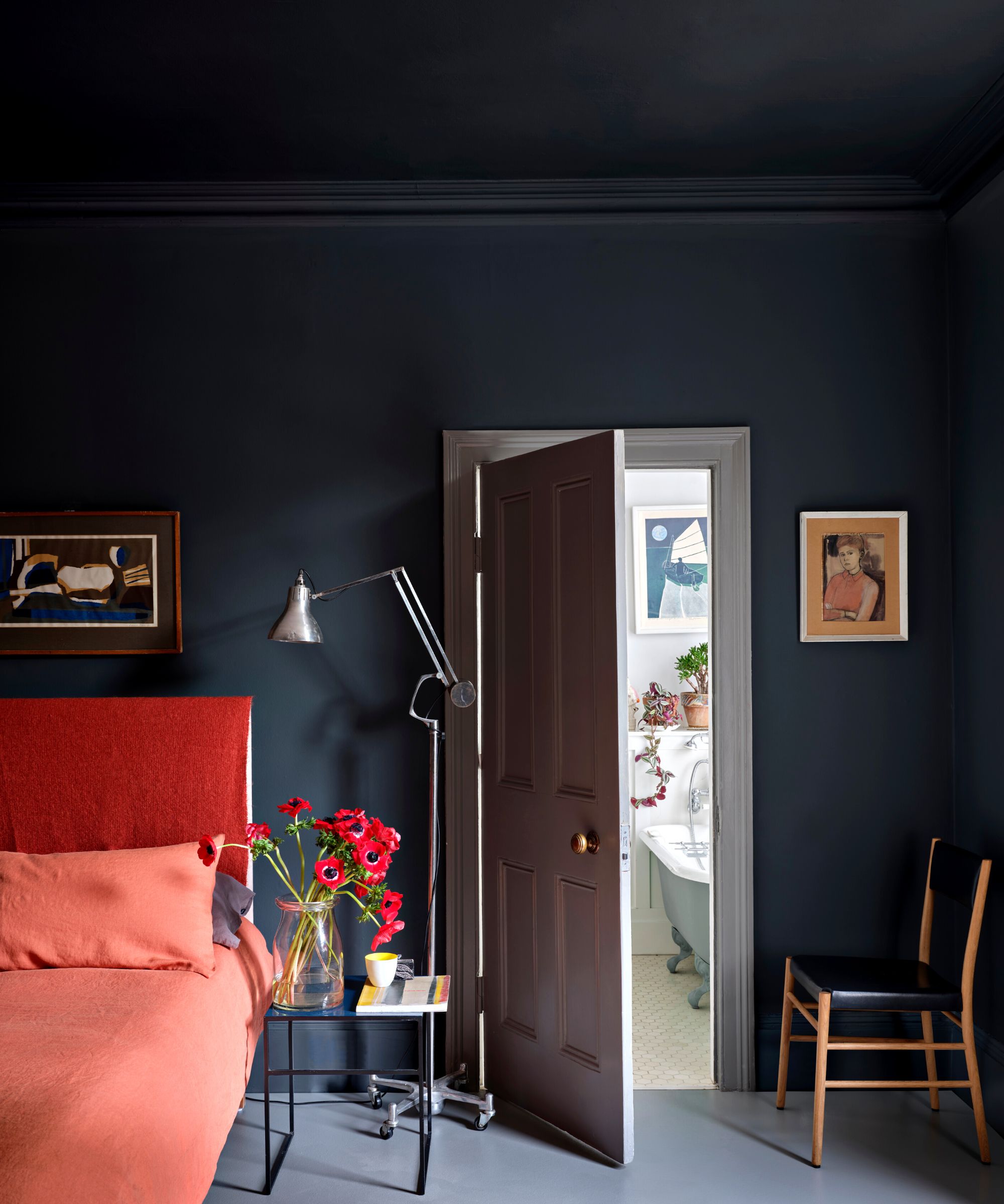
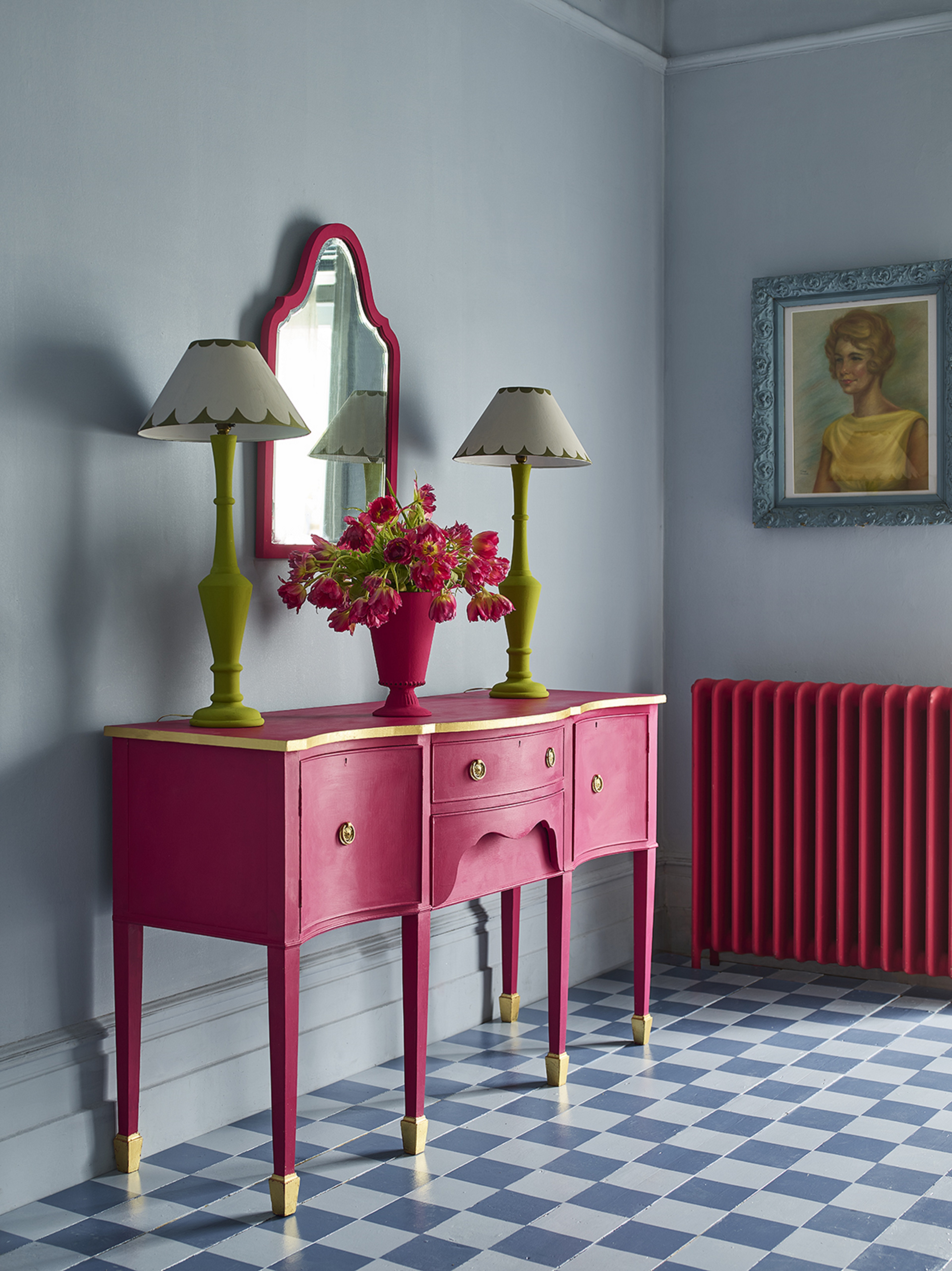
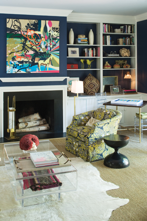
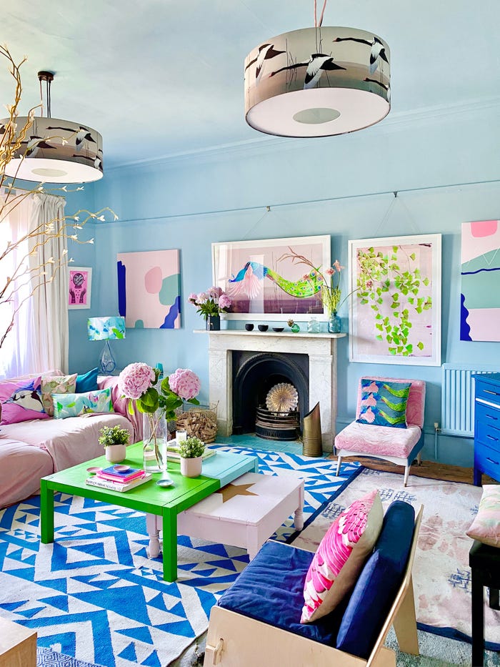
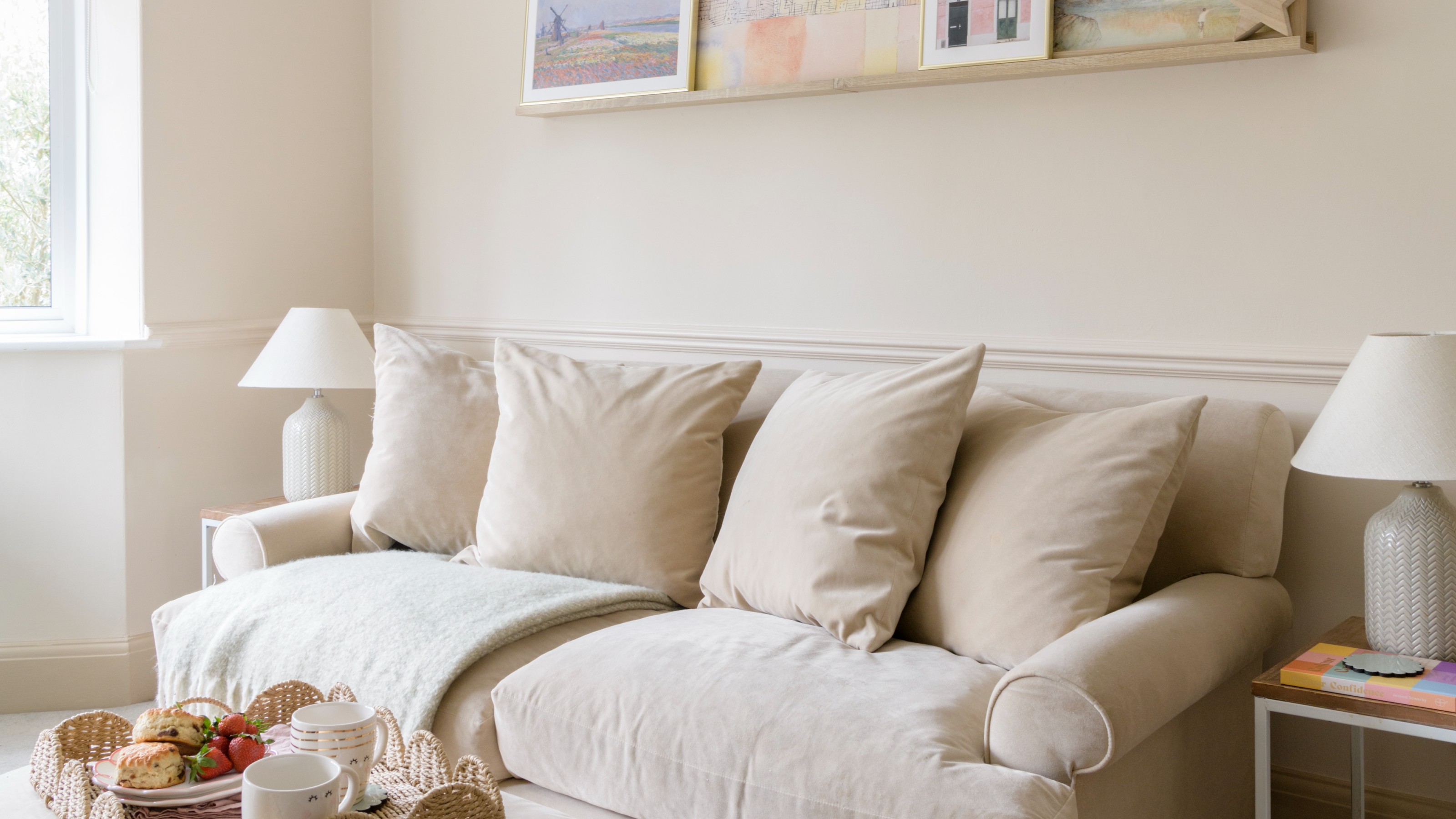
For individuals seeking to add color without undertaking a significant renovation or incurring substantial costs, focusing on small details and accessories is an effective strategy. Neutral furniture and walls can be easily enlivened through colorful decor. Examples include adding a bright, textured throw to a sofa, incorporating vibrant art pieces on walls, or replacing plain white curtains with those in soft blue shades. Another cost-effective method is repainting existing wood furniture instead of purchasing new pieces. These minor adjustments can significantly transform the ambiance of a room, introducing color and visual interest without overwhelming the existing neutral base.
#HomeDecor #ColorTrends #InteriorDesign #NeutralHome #HomeImprovement #DecoratingTips #ColorPalettes #AccentColors #HomeDecor #ColorTrends #InteriorDesign #NeutralHome #HomeImprovement #DecoratingTips #ColorPalettes #AccentColors
0 comment in total
 No comments yet
You may also like
Dress Up Your Space With Contrasting Colors

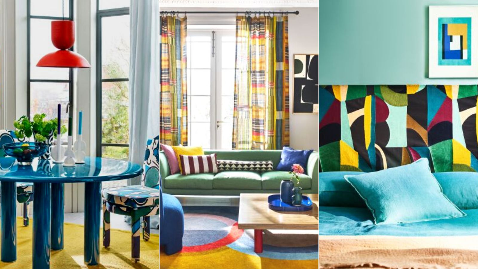
Colorful room ideas – 15 vibrant spaces with daring decor

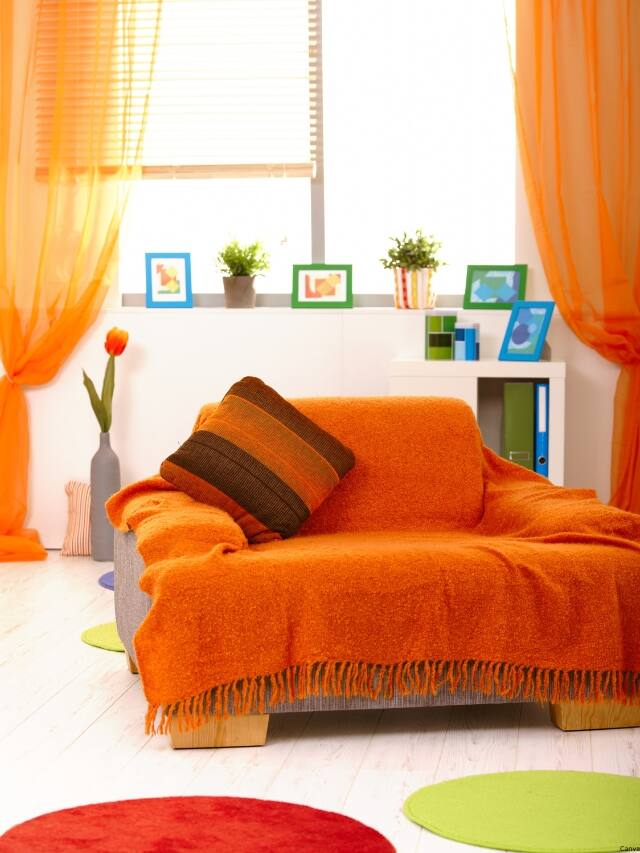
7 colour tricks to transform your mood and living room design

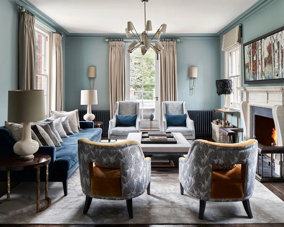
Living room paint ideas – stylish ways with paint
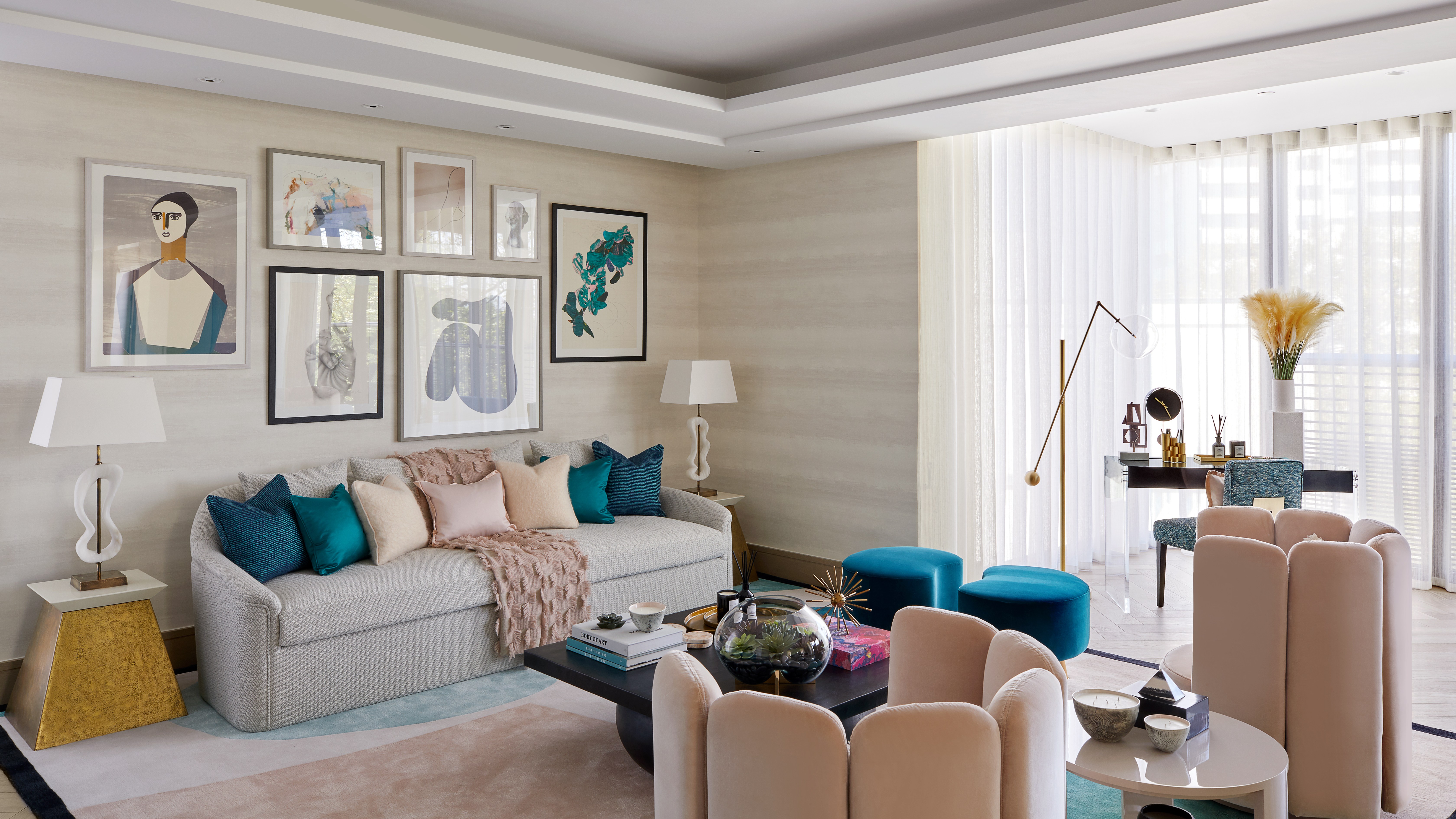
Forget painting your walls grey, it’s time to sparkle

Let the walls talk — colours that shape your space

Tips for Bringing More Color Into Your Home, Straight from Interior Designers

3 'small but impactful' paint updates to try in 2024, according to a color expert

15 Ways to Add Bold Color to Your Home
Take a Leap into Bold Color with These Decorating Ideas

Interior influencers show us how it’s done with these colorful living room ideas

Incorporate Color Drenching Into Your Home Design

COLOR! How to Add to Your Home
15 ways to add color to your home, according to interior designers
Read This Interior Designer's Tips For Modernizing a Space Using Color
Living room paint ideas – 27 easy ways to bring your lounge to life with stylish and creative colours and techniques
Sad beige nurseries are out – here's how to introduce color to your once-neutral space
How to transform your rooms with colour drenching
How to decorate with rich colors – 9 ways to add character with an intriguing scheme
Color Drenching Might Be Everywhere, But My Mom’s Been Doing It Since the ’90s