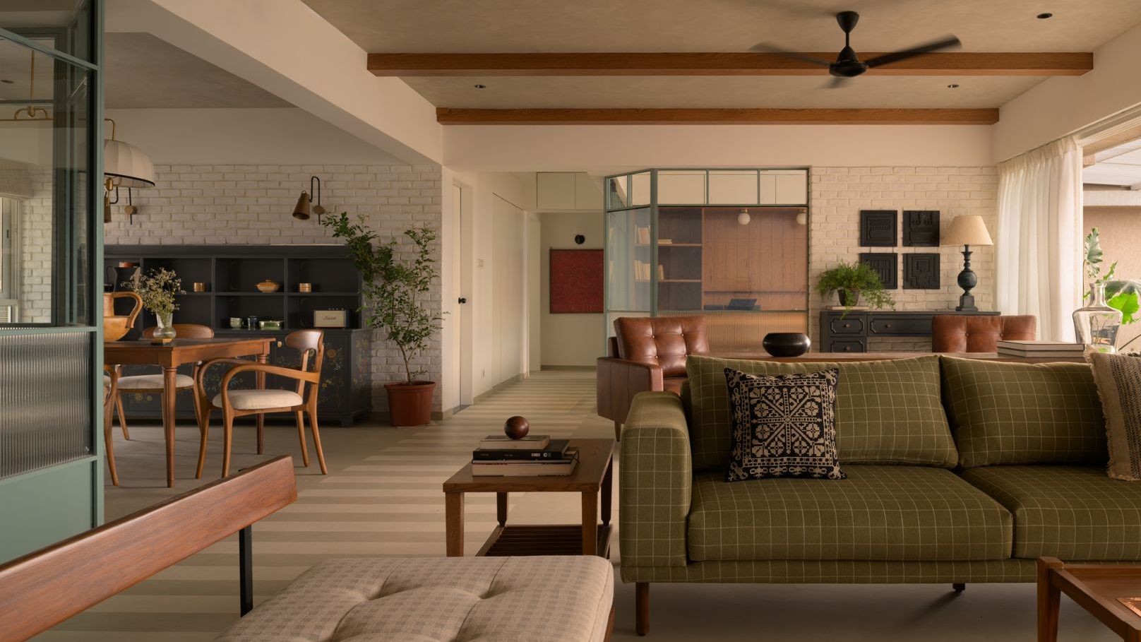
1/4
Are these 7 unlucky colours messing with your home's Vastu?
The ancient Indian architectural science of Vastu Shastra posits that the colors used in a home are more than mere aesthetic choices; they are energetic anchors that can significantly influence daily experiences, blocking or enhancing the natural rhythm of a space. According to Pune-based Vastu expert Namrataa Kripallani, certain “unlucky colors” can actively work against a home's inhabitants, potentially impacting financial stability, sleep quality, and overall peace.
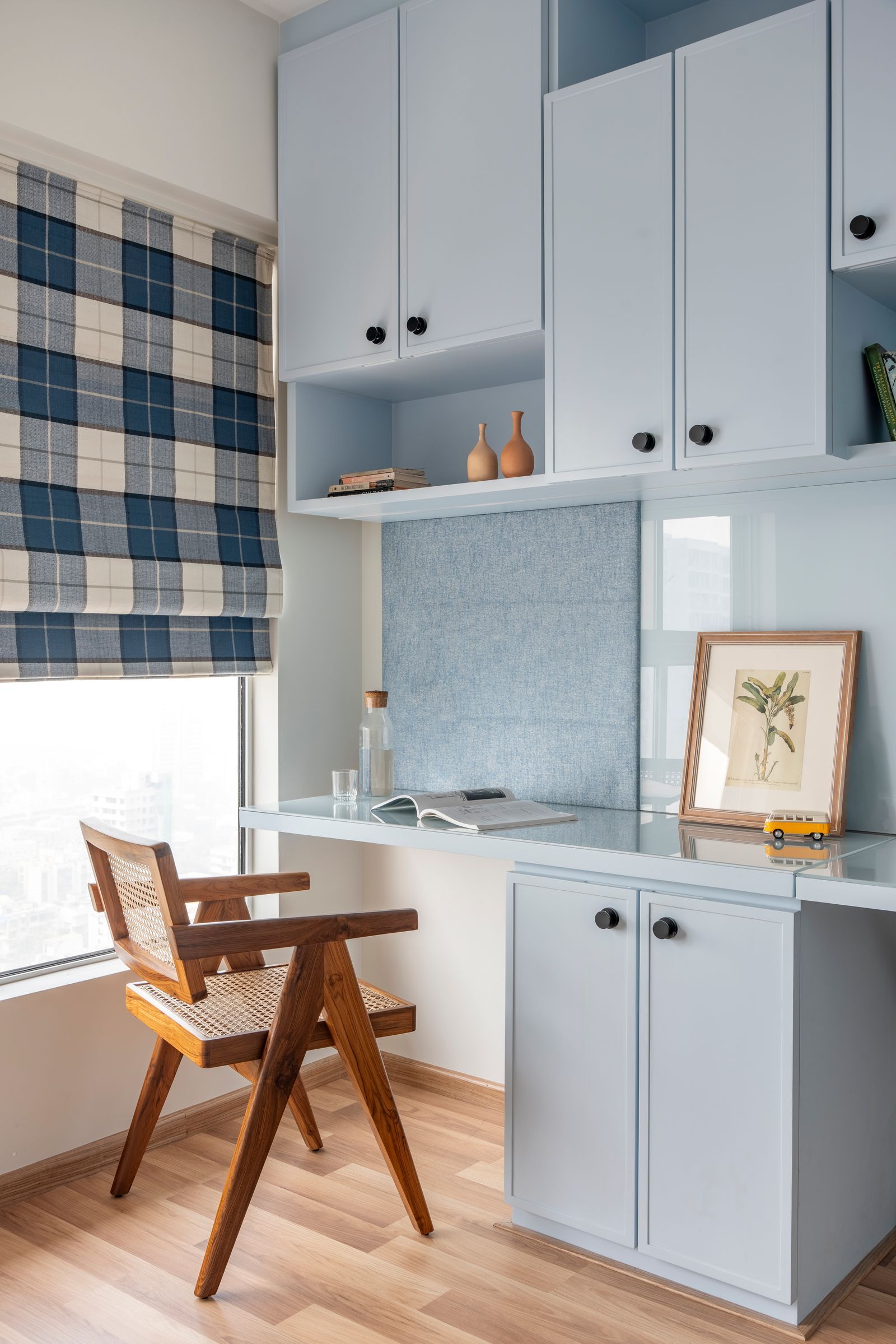
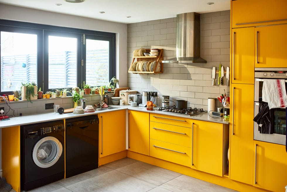
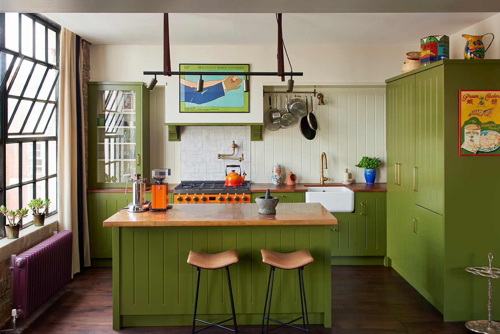
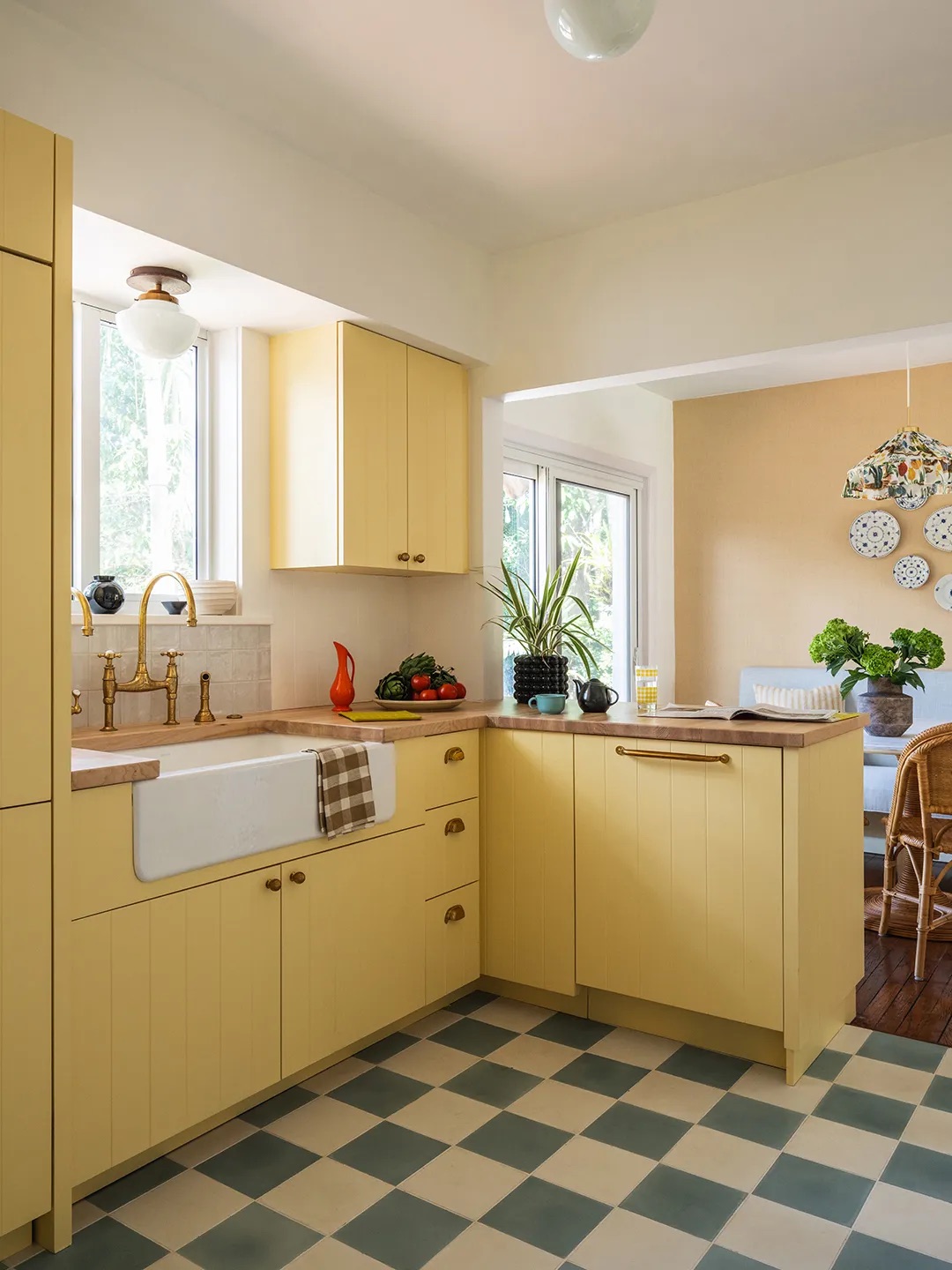
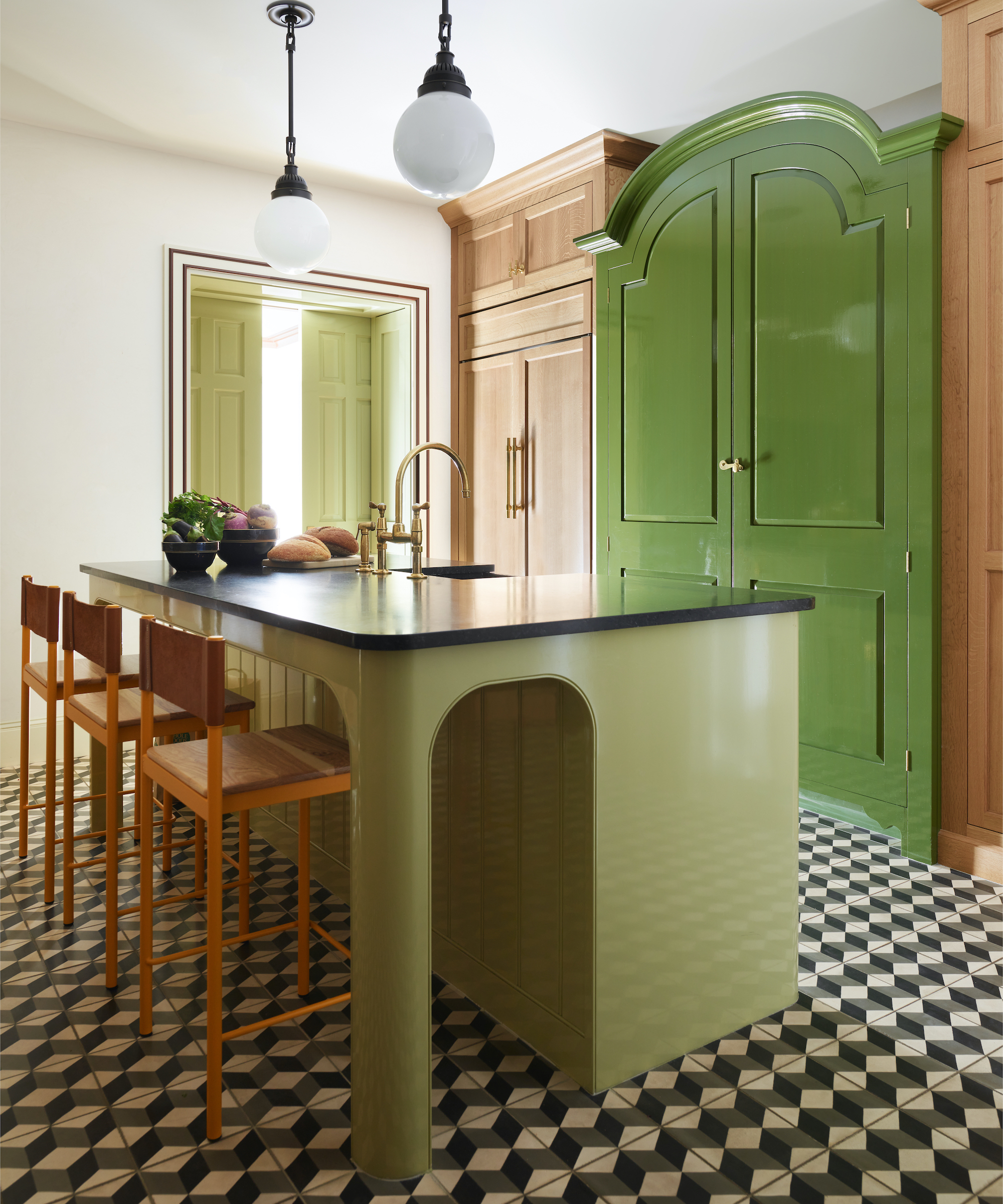
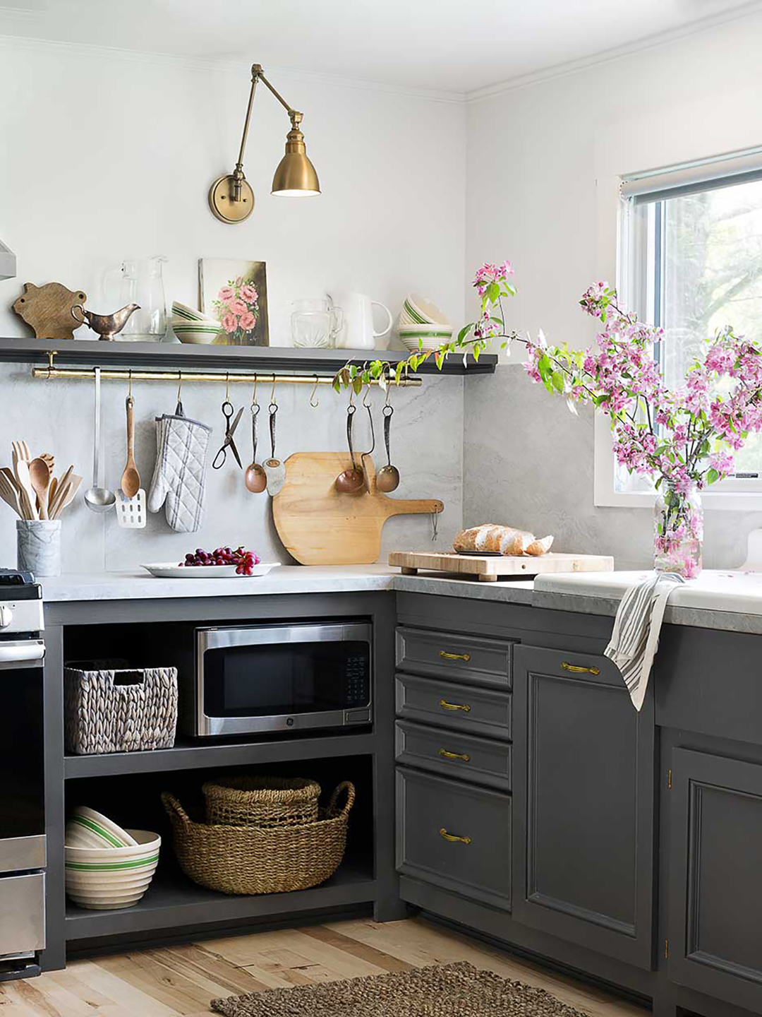
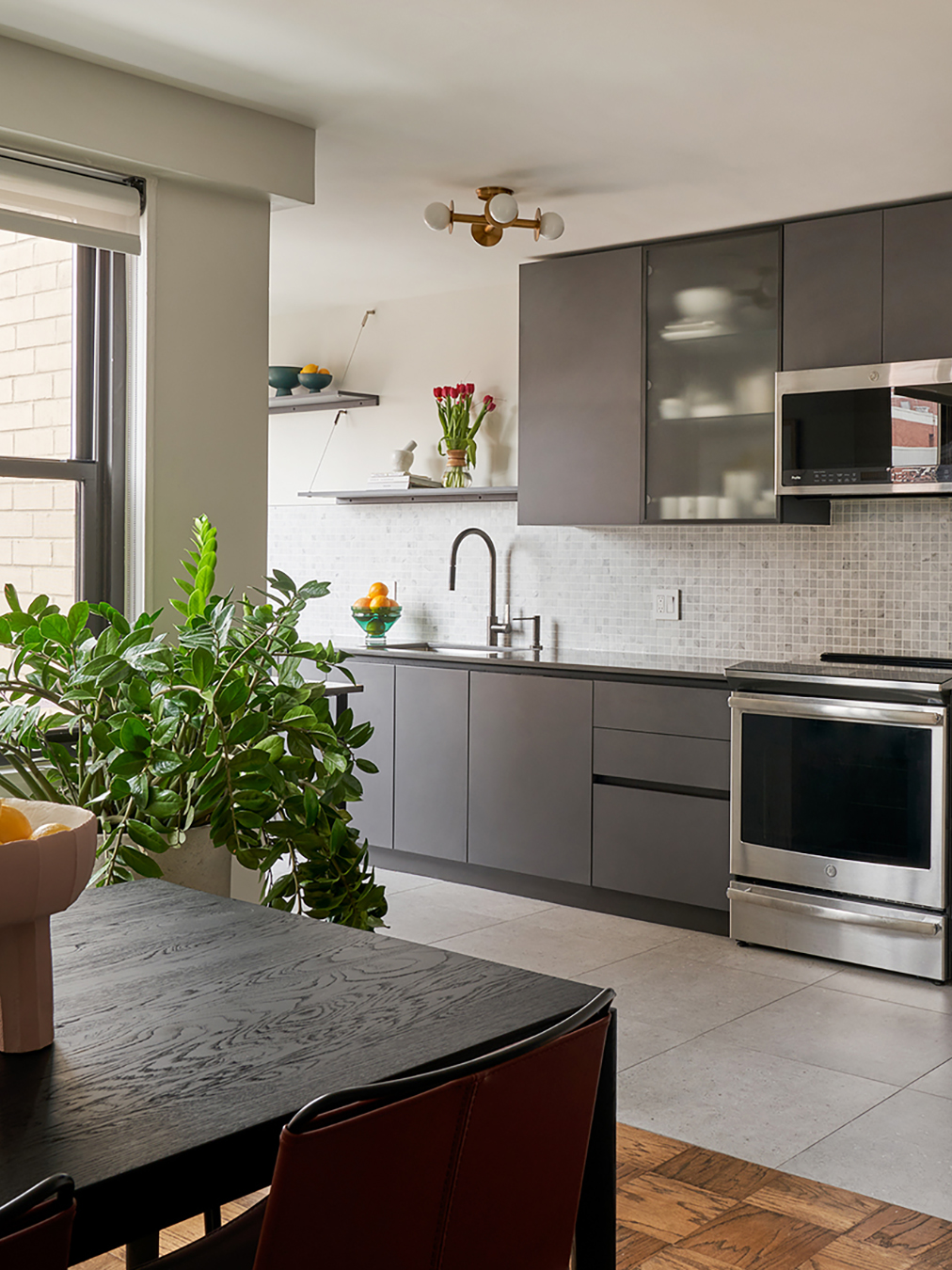
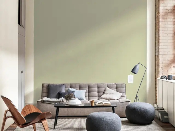
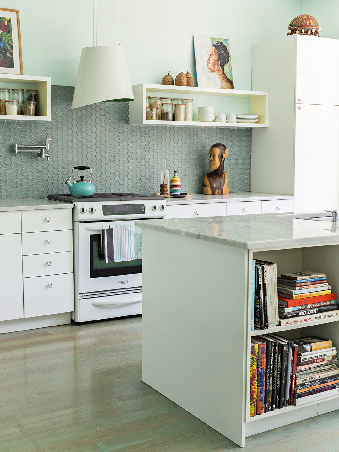
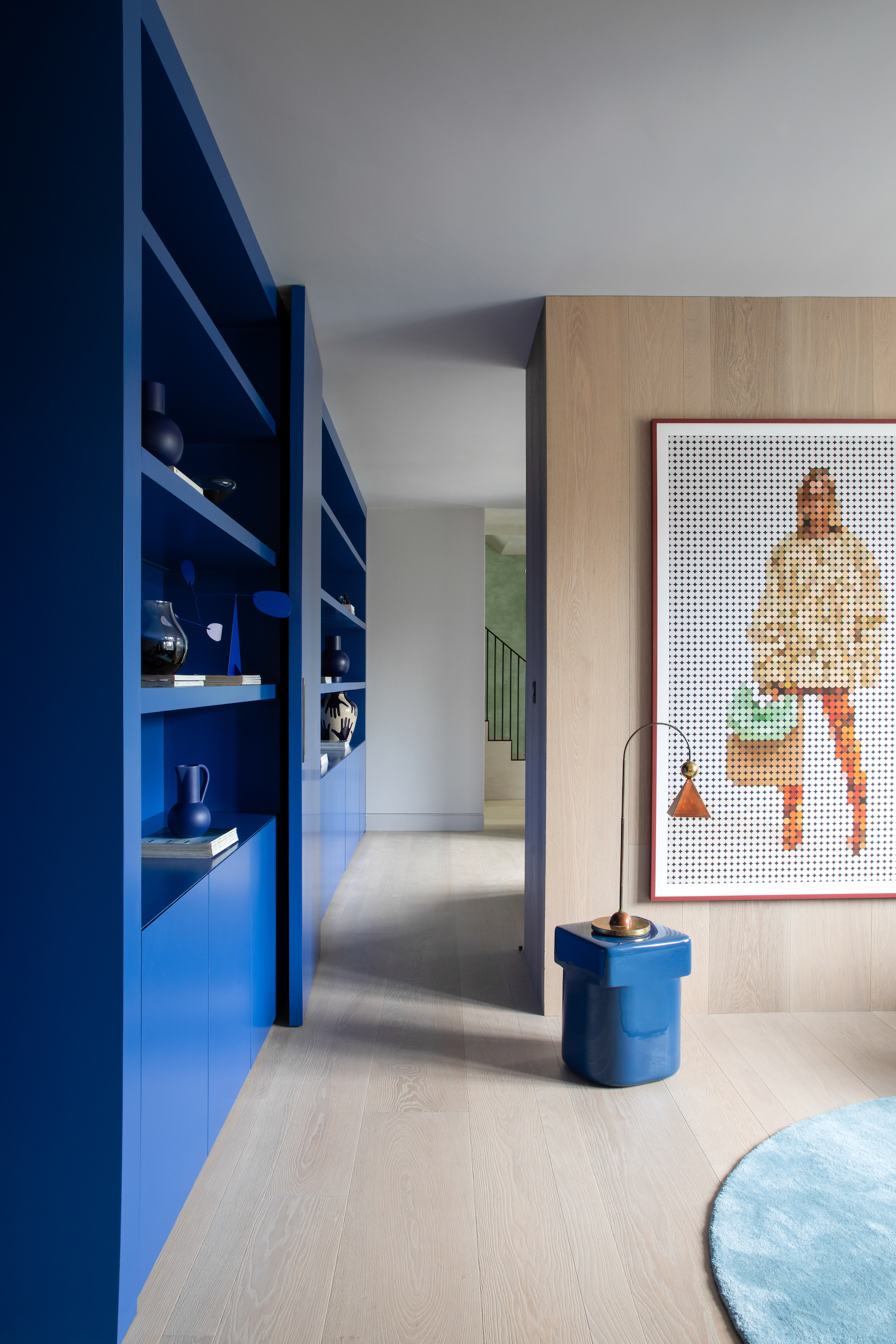
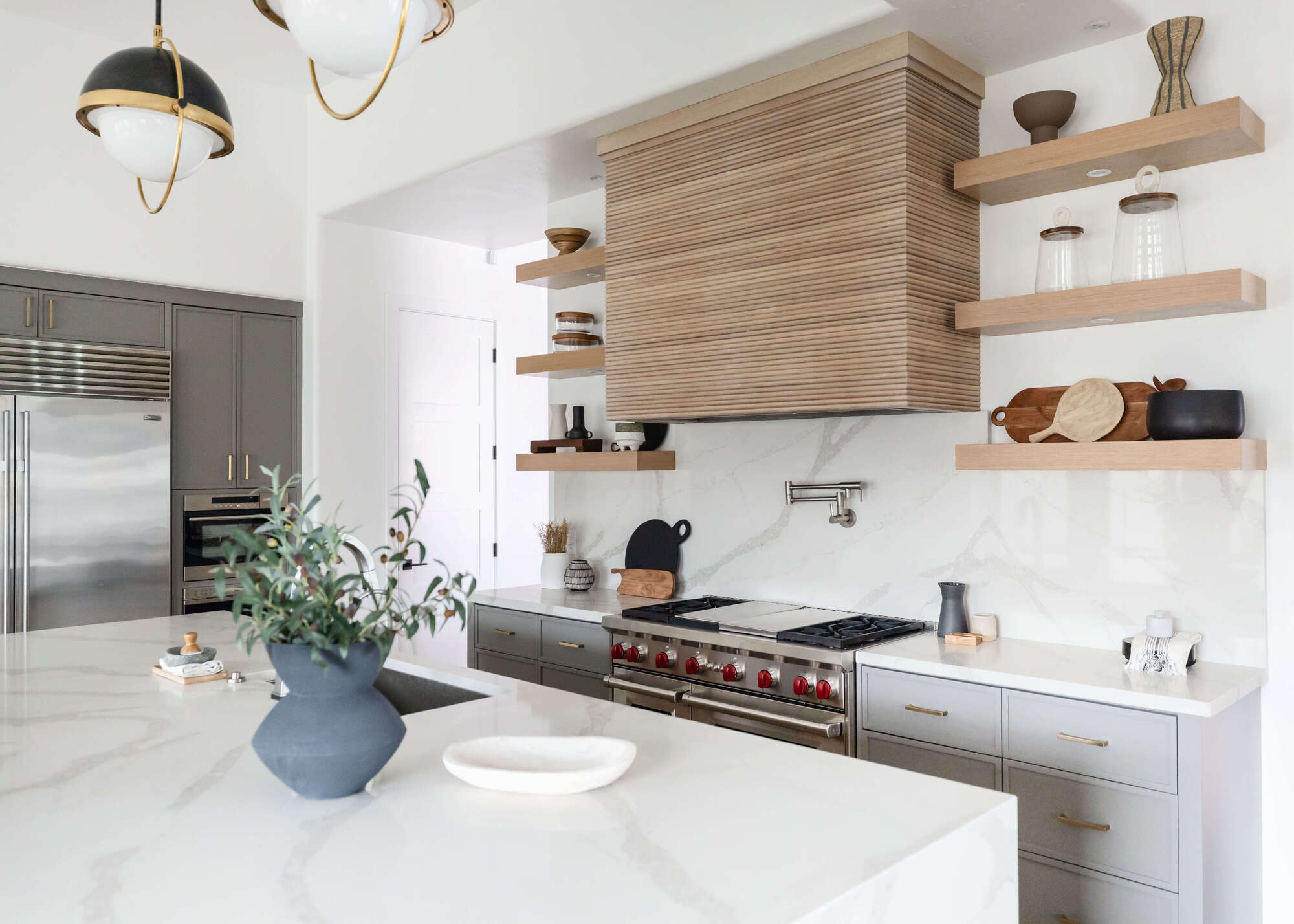
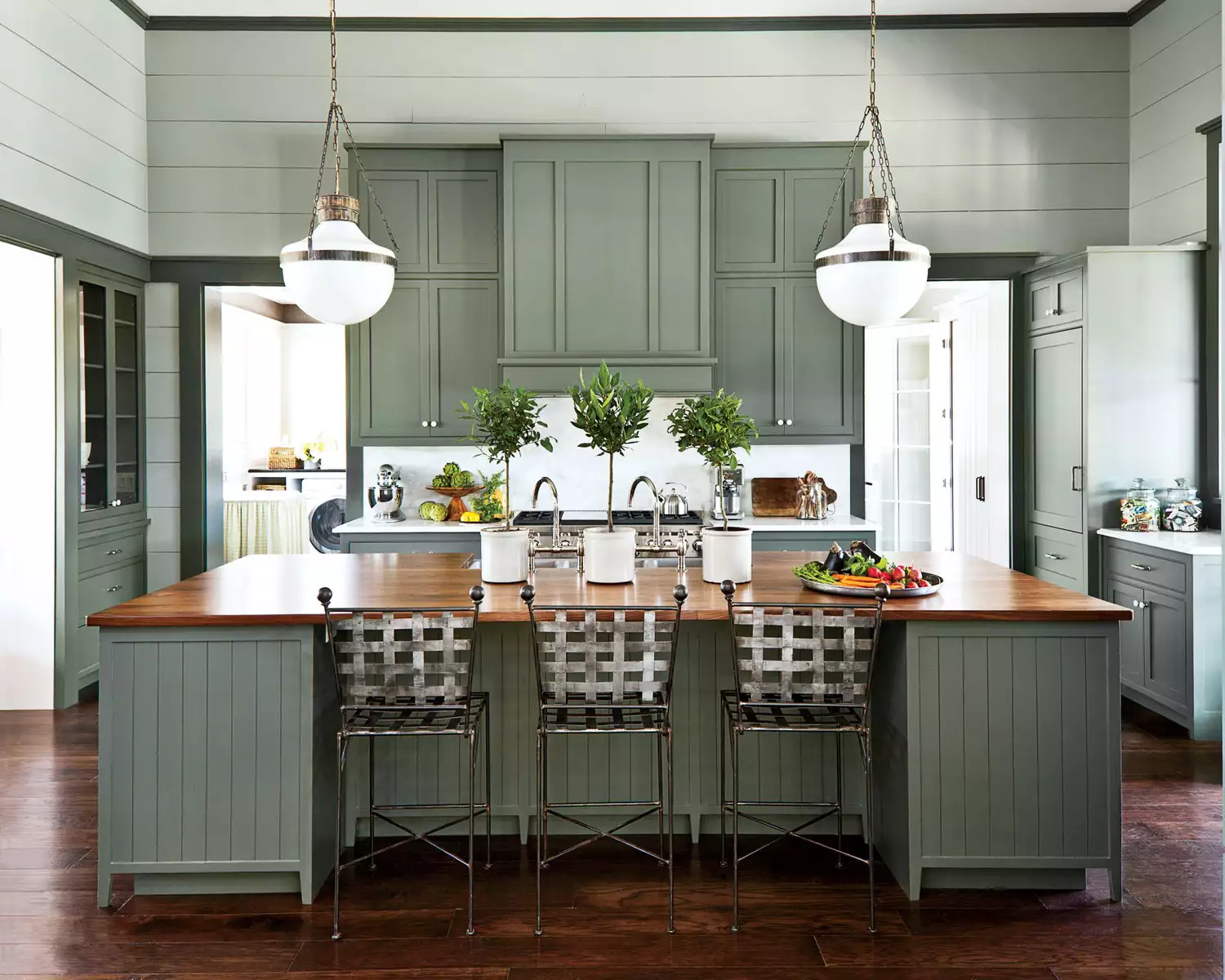
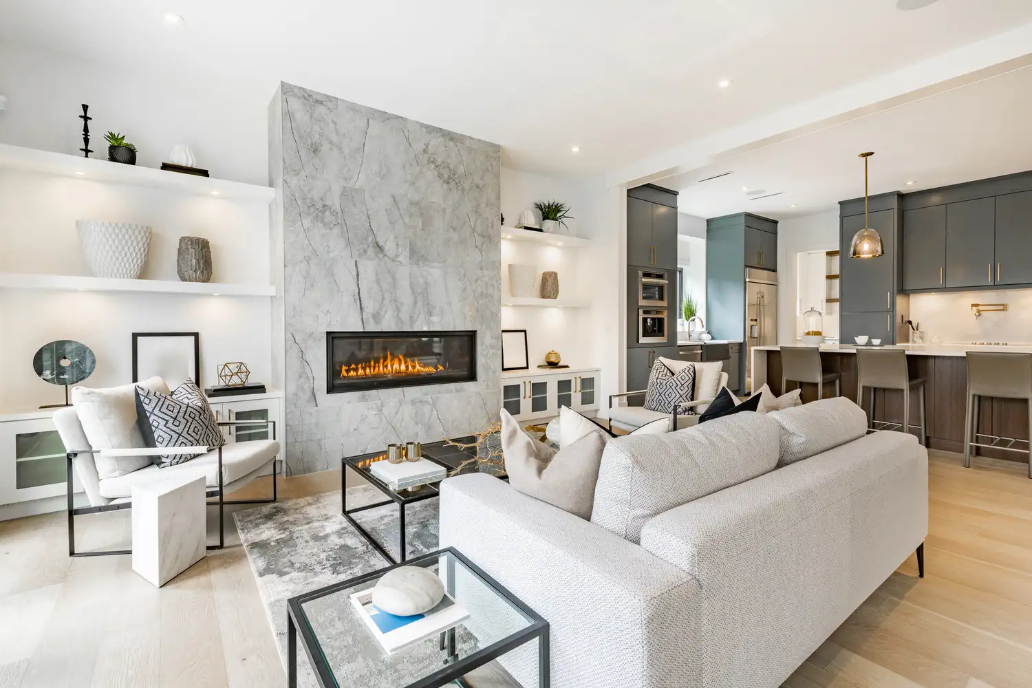
One critical area where color choice is paramount is the kitchen. Vastu principles identify the kitchen as a “fire zone,” embodying Agni, the fire element. Introducing blue, which represents the water element, into this space creates an energetic imbalance. This clash, particularly with darker blue tones, is believed to energetically extinguish drive, hinder digestion, and even stifle ambition. Instead, Kripallani recommends warm tones such as terracotta, pastel olive, mustard, or peach, which are believed to complement and sustain the fire energy, fostering health and productivity.
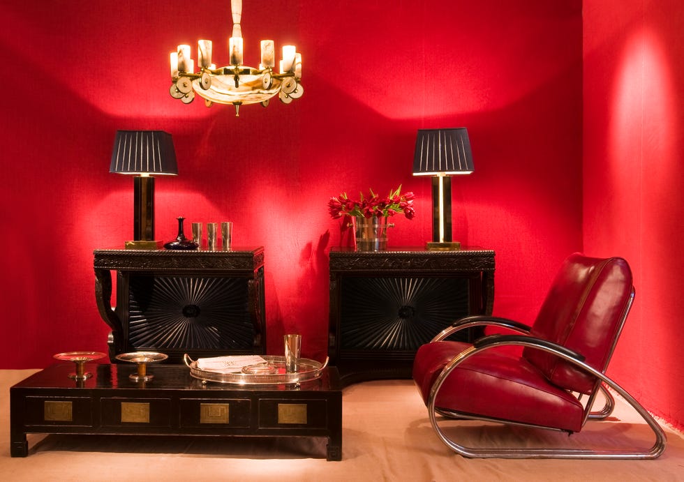
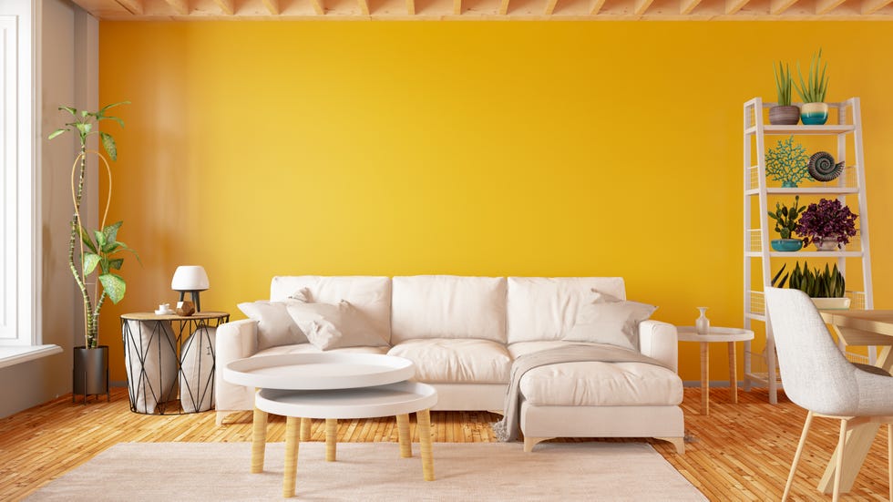
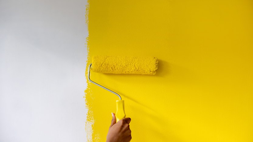
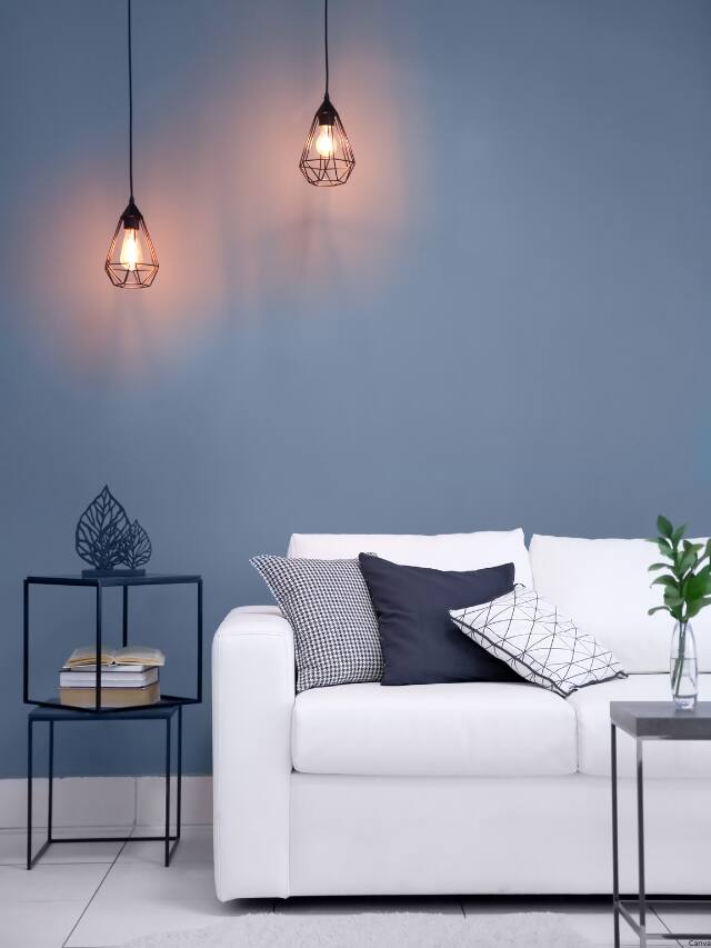
Financial well-being is often linked to the north zone of a home in Vastu. This area governs money, career prospects, and future opportunities, and is associated with the water element, emphasizing fluidity and movement. The use of red or yellow in this zone is considered detrimental, as these colors are associated with earth or fire elements, which can obstruct the natural flow of energy. Yellow in the north is thought to induce confusion, while red may provoke aggression and impulsive decisions. To encourage better financial flow and mental clarity, soft greens, light blues, ivory, or beige are advised, as they are believed to promote expansion, ease, and insight.
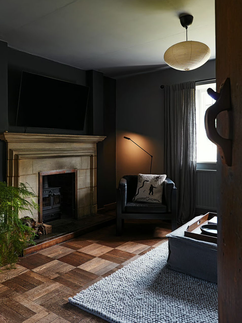
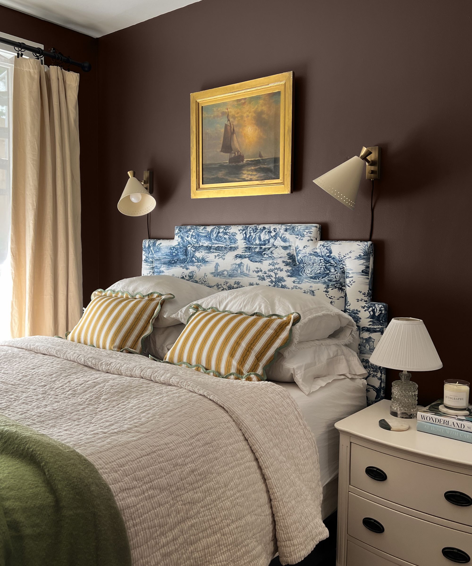
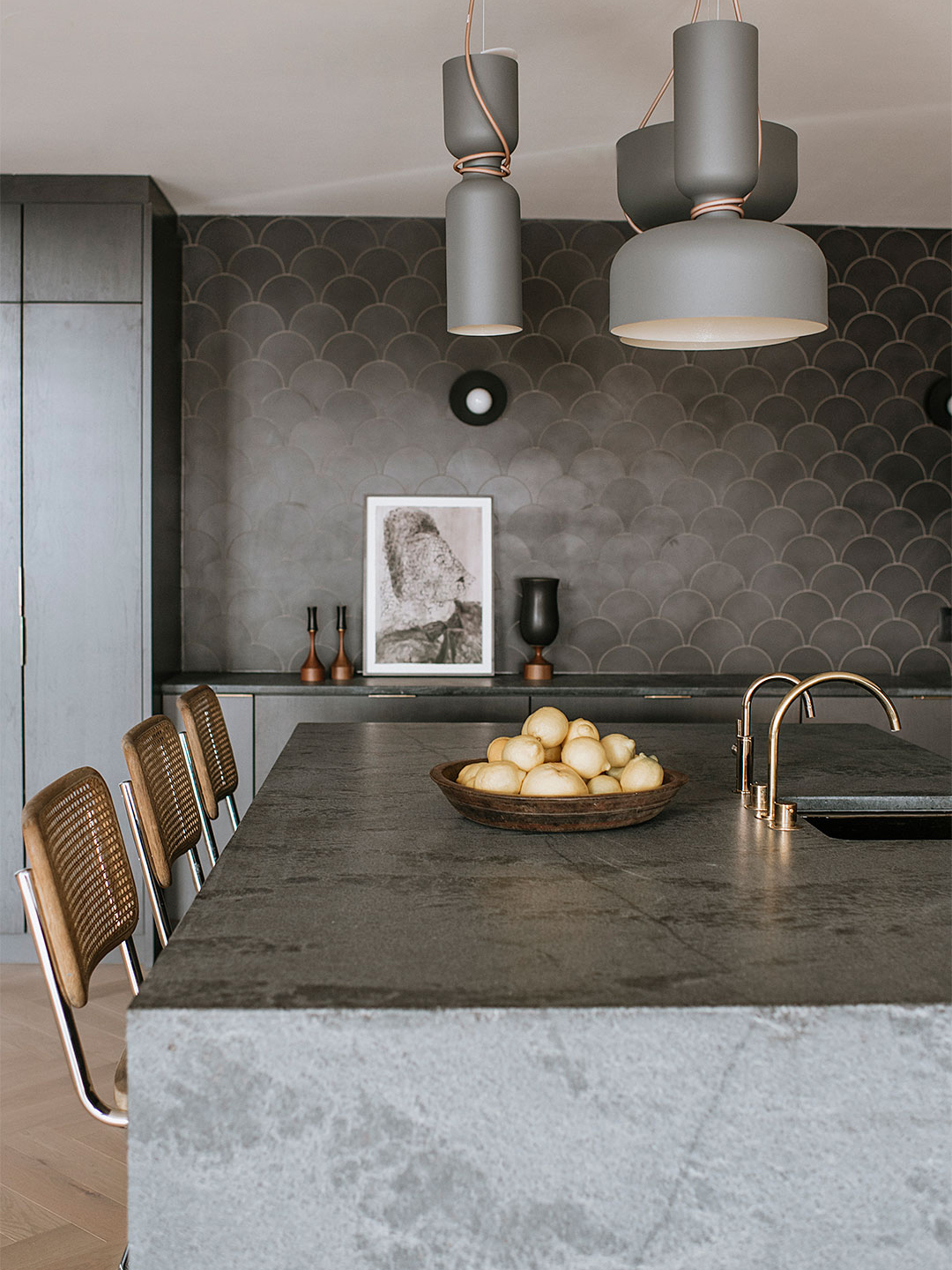
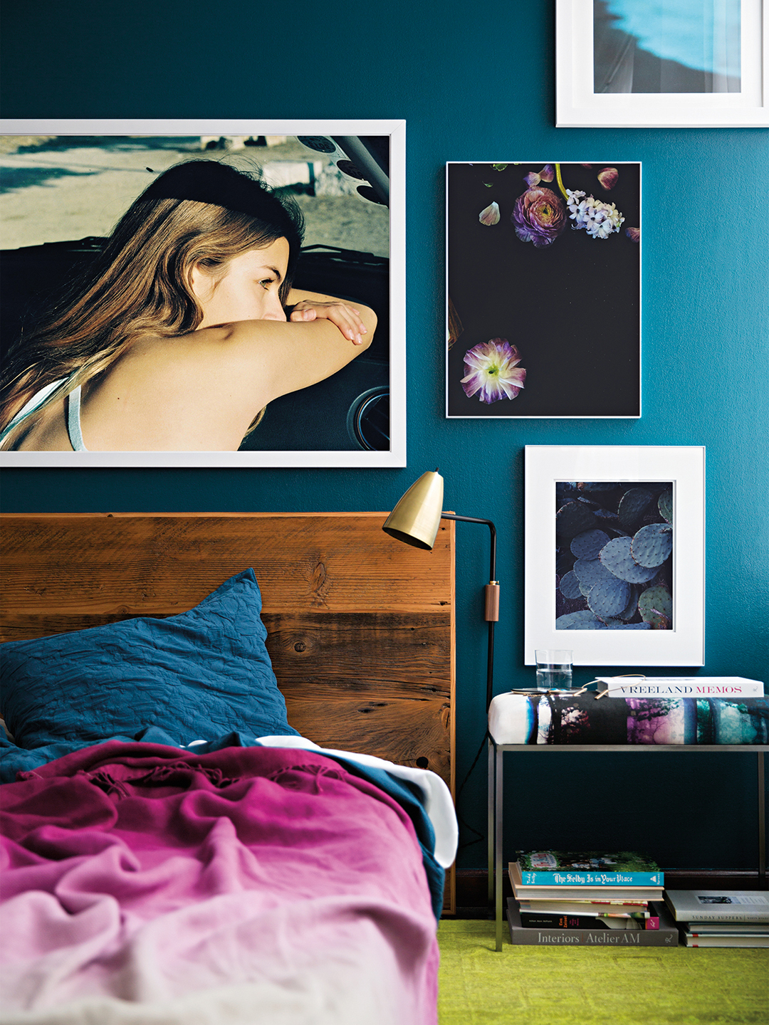
The bedroom, especially the southwest zone, is crucial for stability and relationships. Here, black is identified as an unlucky color. Despite its chic appearance, black is thought to absorb energy, leading to emotional heaviness, feelings of loneliness, or chronic fatigue. Kripallani emphasizes that bedrooms should foster warmth, grounding, and emotional connection, qualities that black is believed to undermine. Preferred colors for this space include skin-toned hues, soft browns, muted yellows, or gentle peach tones, which are said to support bonding and restful sleep.
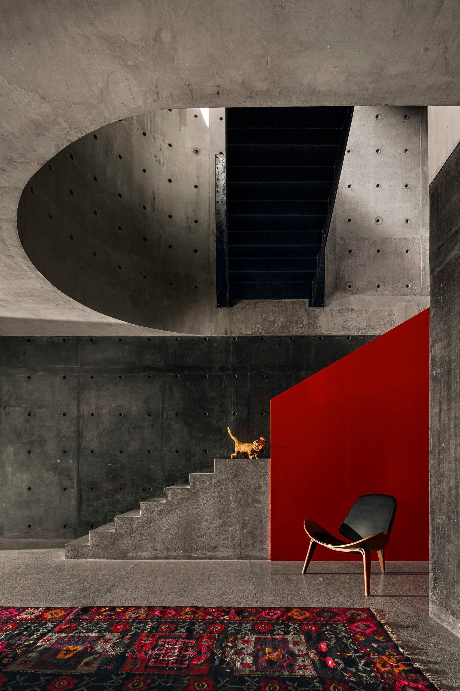
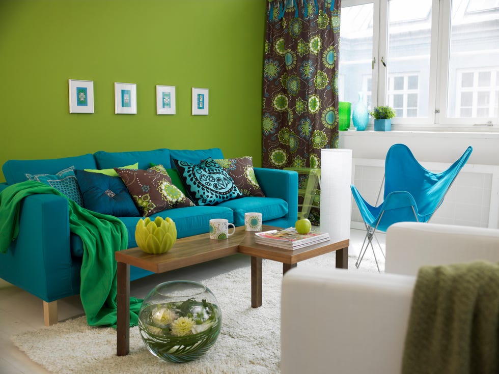
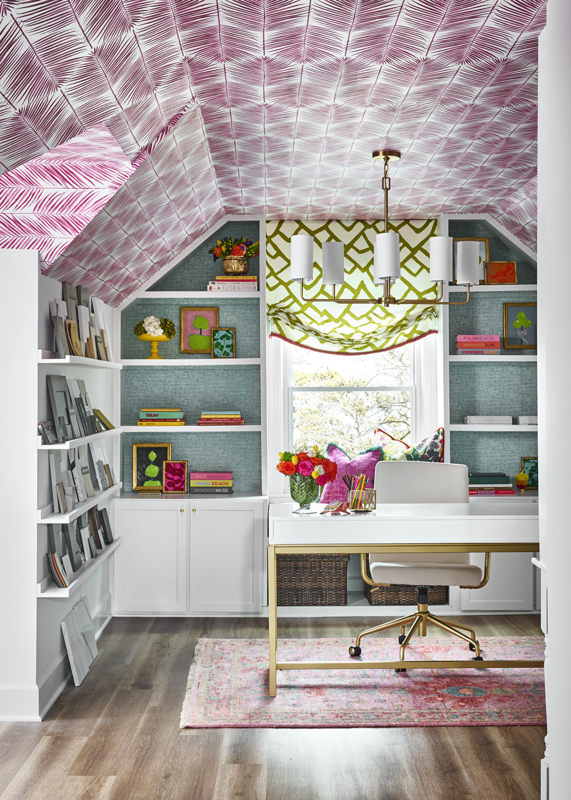
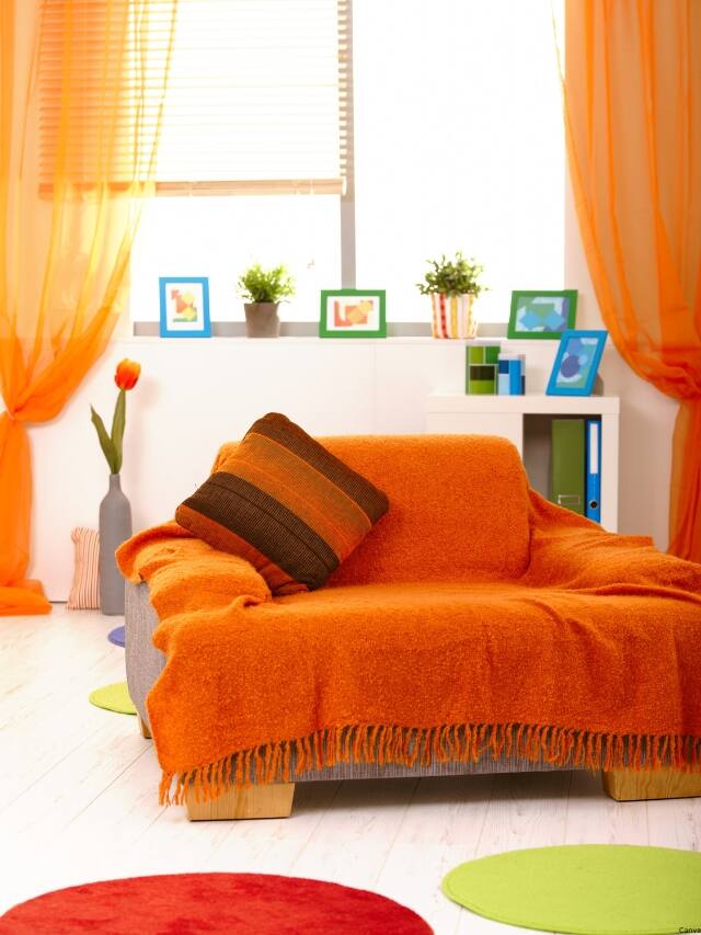
Neon colors, such as bright pinks, greens, and oranges, are universally deemed as energetic chaos in Vastu. These acidic hues are thought to overstimulate the senses and disrupt the nervous system, making it difficult to relax or focus in areas meant for rest, such as bedrooms or pooja rooms. While they might be visually striking, they create an energetic buzz that is counterproductive to tranquility. For vibrancy without sensory overload, softer pastels and warm neutrals are suggested, offering harmony and balance.
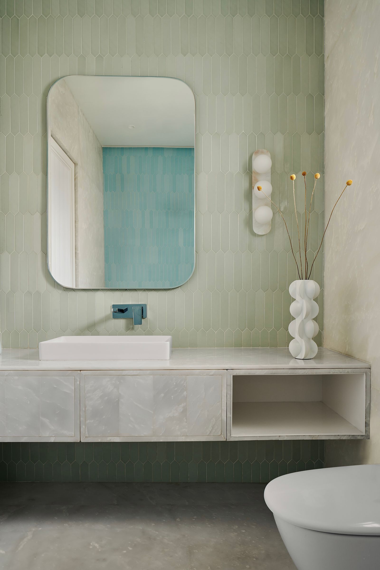
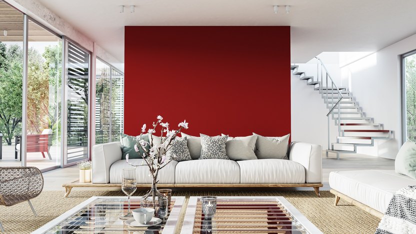
Finally, the pooja room, or the northeast area (Ishaan Kon), is considered ideal for prayer, meditation, and inner reflection, aligning with the water element. Red and orange, being fire energies, are seen as disruptive to the calm and clarity required for spiritual practices in this zone. Instead, tones that evoke water and space, such as whites, pale blues, and mint green, are recommended. These shades are believed to enhance serenity and facilitate a meditative state, promoting mental stillness. The expert summarizes by stating that every color carries a frequency that either enhances or blocks the natural rhythm of a space, urging mindful selection of colors to positively influence life within the home.
#Vastu #ColorPsychology #HomeDesign #InteriorDecor #EnergeticBalance #SpiritualWellness #FengShui #Vastu #ColorPsychology #HomeDesign #InteriorDecor #EnergeticBalance #SpiritualWellness #FengShui
0 تعليق إجمالاً
 لا توجد تعليقات بعد
قد تعجبك أيضًا
Vastu Colours 101: Here's what these 7 lucky colours mean for the Vastu of your home
5 'ugly colors' that I'll be decorating with in 2024 – these undesirable colors will trend this year

This Popular Kitchen Color Can Actually Hurt a Home’s Sale Price

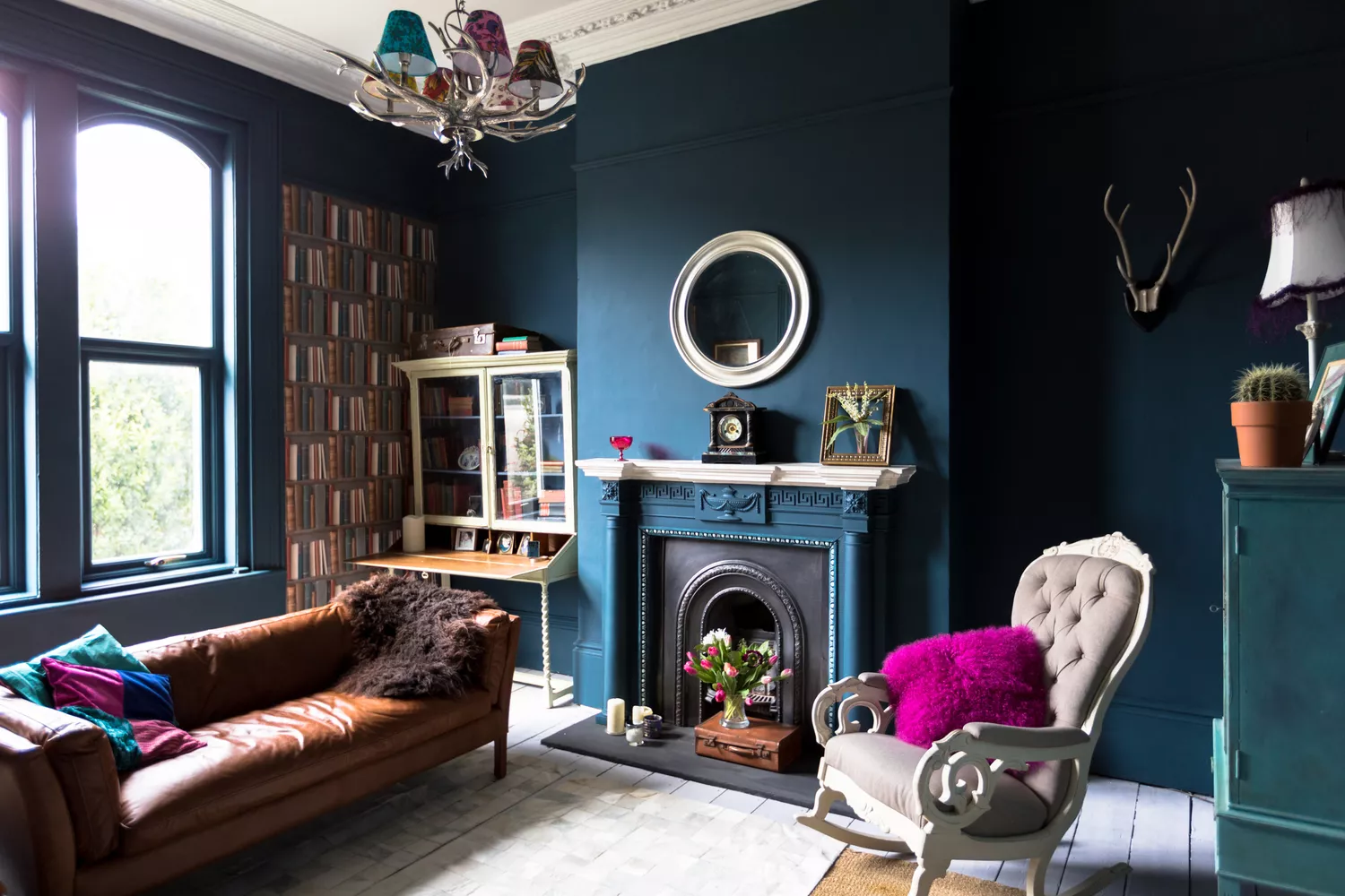
7 Paint Colors Designers Wish They Never Used (and What You Should Use Instead)

These Paint Colors Bring Hostility to Your Home, According to Experts

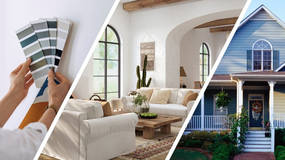
Real Estate Experts Reveal the Paint Colors That Decrease Your Home Value—and Tricks for Finding the Perfect Hue
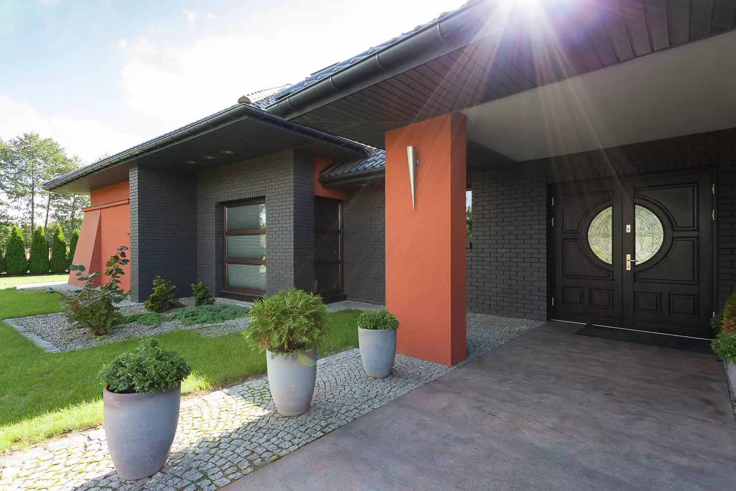
Popular Paint Colors That Are Decreasing Your Home's Value, According to Experts

7 'Unhappy' Colors That Color Psychology Experts Would Never Paint Their Walls

8 Surprising Colors That Will Decrease Your Home's Value, According to Experts

The 10 Worst Paint Colors for Your Home, Experts Say

How paint colour in your home can affect your mood
7 colour tricks to transform your mood and living room design

The Paint Colors That Might Be Making—Or Breaking—Your Home's Value, According To Zillow
Feng Shui consultants say these are the unluckiest items to have in your home

Oh, so It's This Nature-Inspired Color Rule That's the Reason Your Home's Scheme Doesn't Feel Like It's Working
7 Interior Trends That Experts Say Are Bad Feng Shui — Stay Clear of These If You Want Good Vibes at Home
This Cheery Kitchen Color Could Hurt Your Home Value

Feng Shui consultants say these are the unluckiest items to have in your home
This Kitchen Color Might Be Trending, But It Could Hurt Your Resale Value
We Asked Designers Which Paint Colors Homeowners Always Regret—These 5 Came Up the Most