Should You Paint Your Trim And Walls The Same Color?
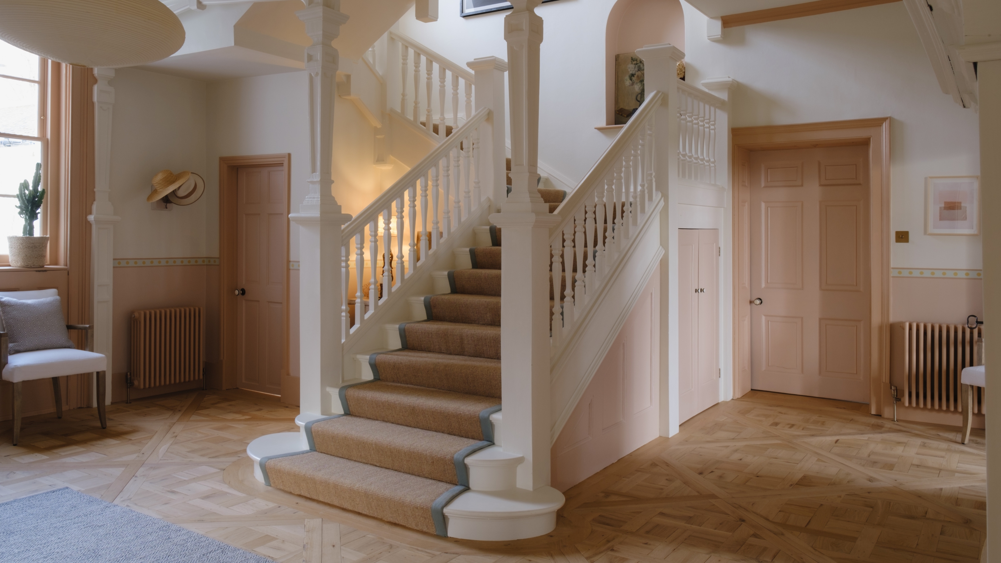
The decision to paint walls and trim the same color, or to use contrasting hues, significantly impacts a room's aesthetic. In 2024, the monochromatic approach, where both walls and adjacent trim, and sometimes even the ceiling, are painted in a single shade, has gained popularity. This trend moves away from the traditional white trim, favoring a unified color scheme. Interior designers Paige Goodloe and Mark Williams and Niki Papadopoulos of Mark Williams Design, both based in Atlanta, Georgia, offer insights into when each painting strategy is most effective.
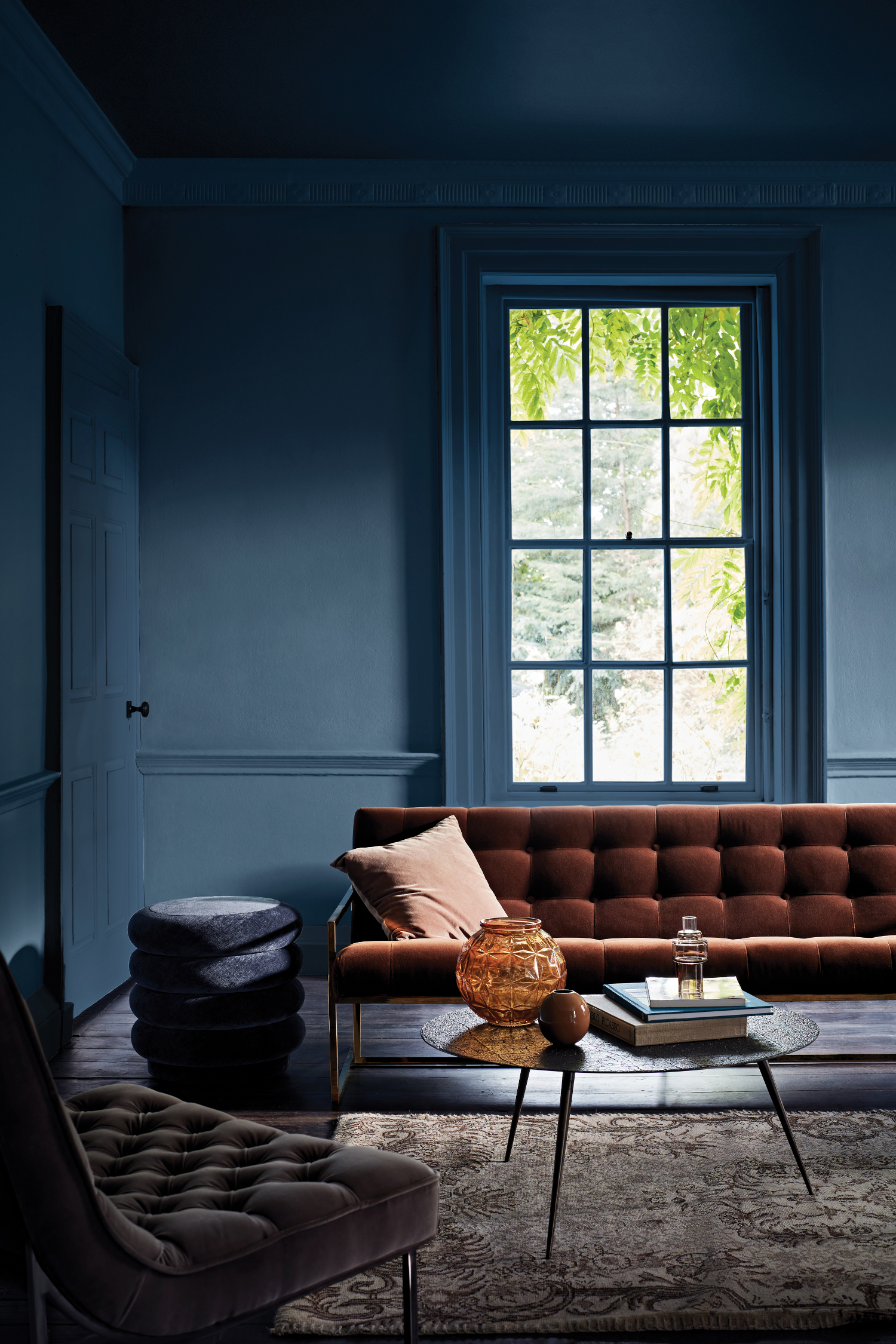
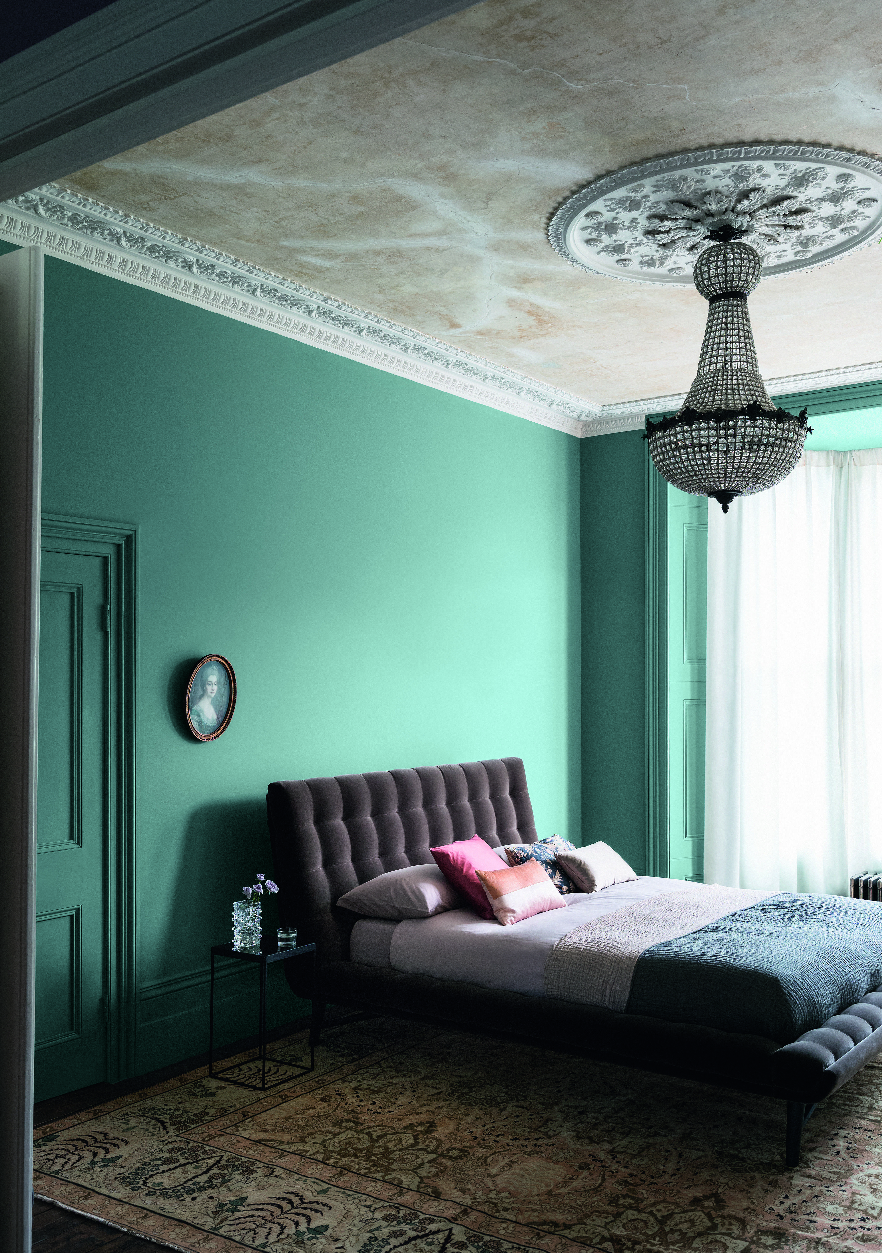
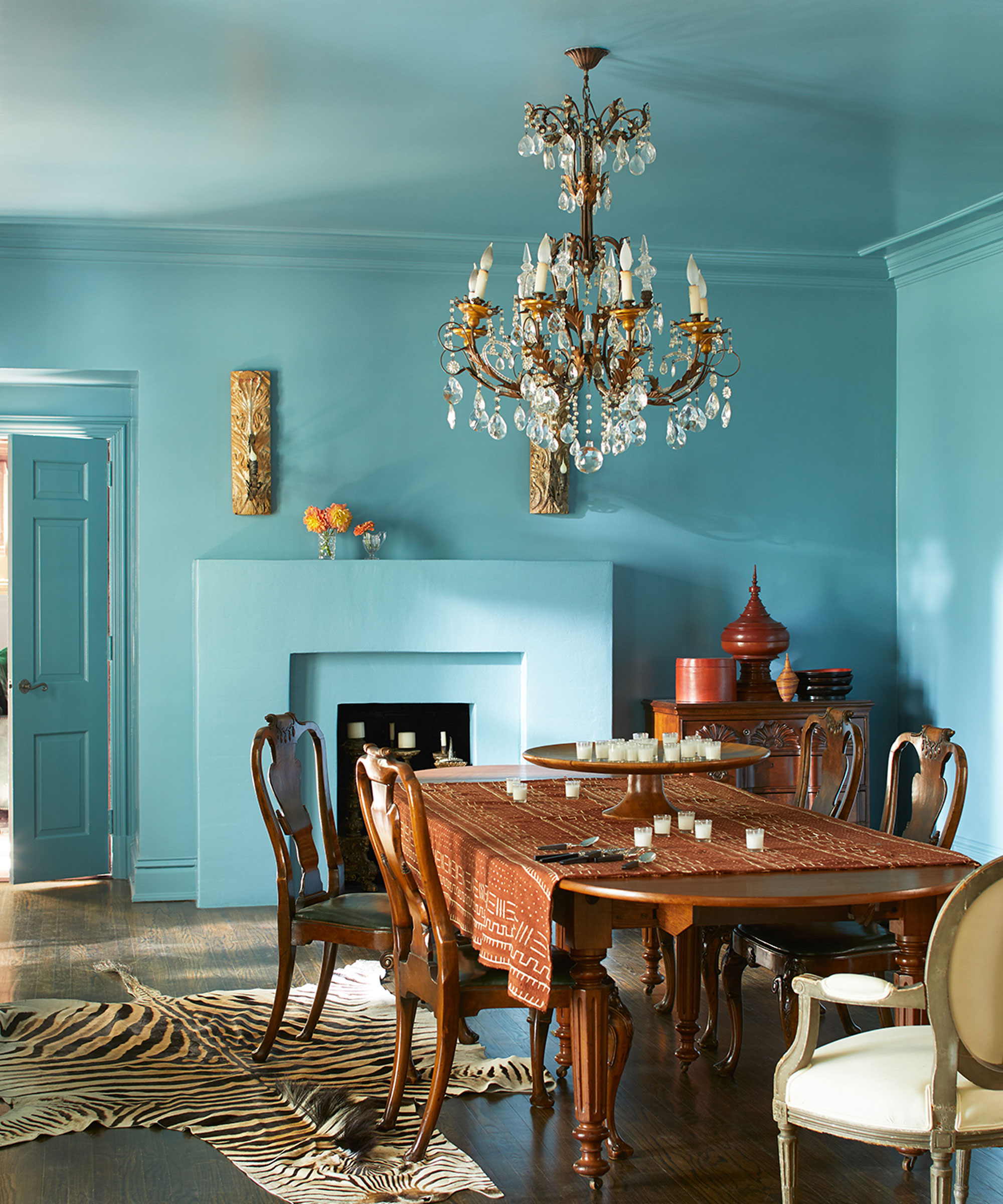
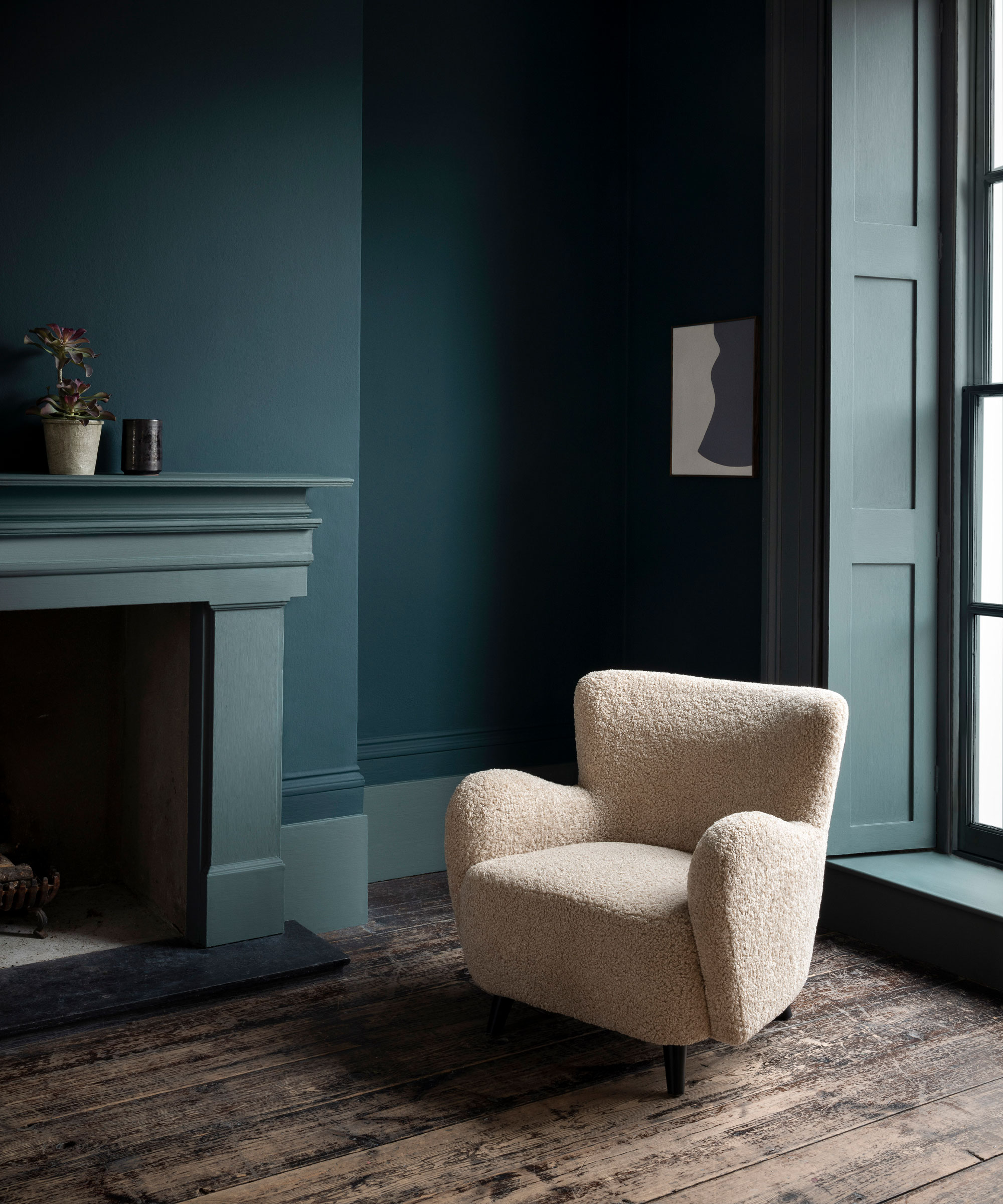
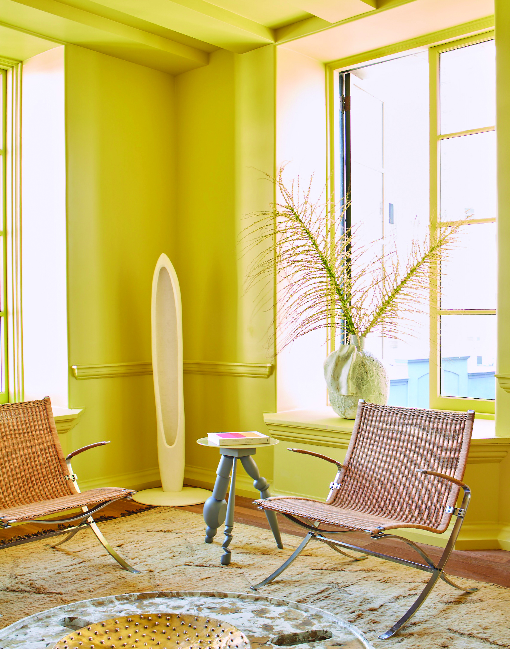
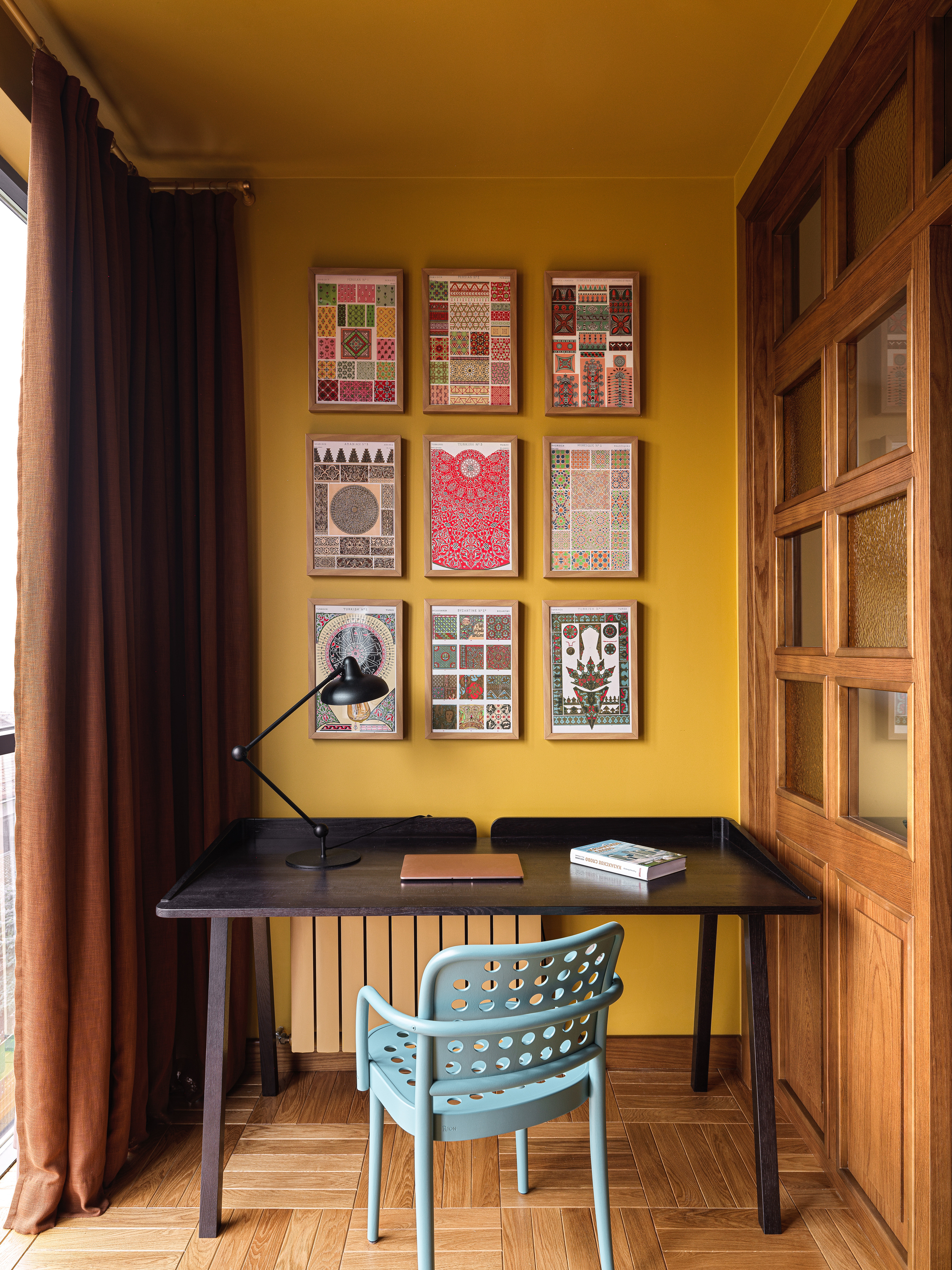
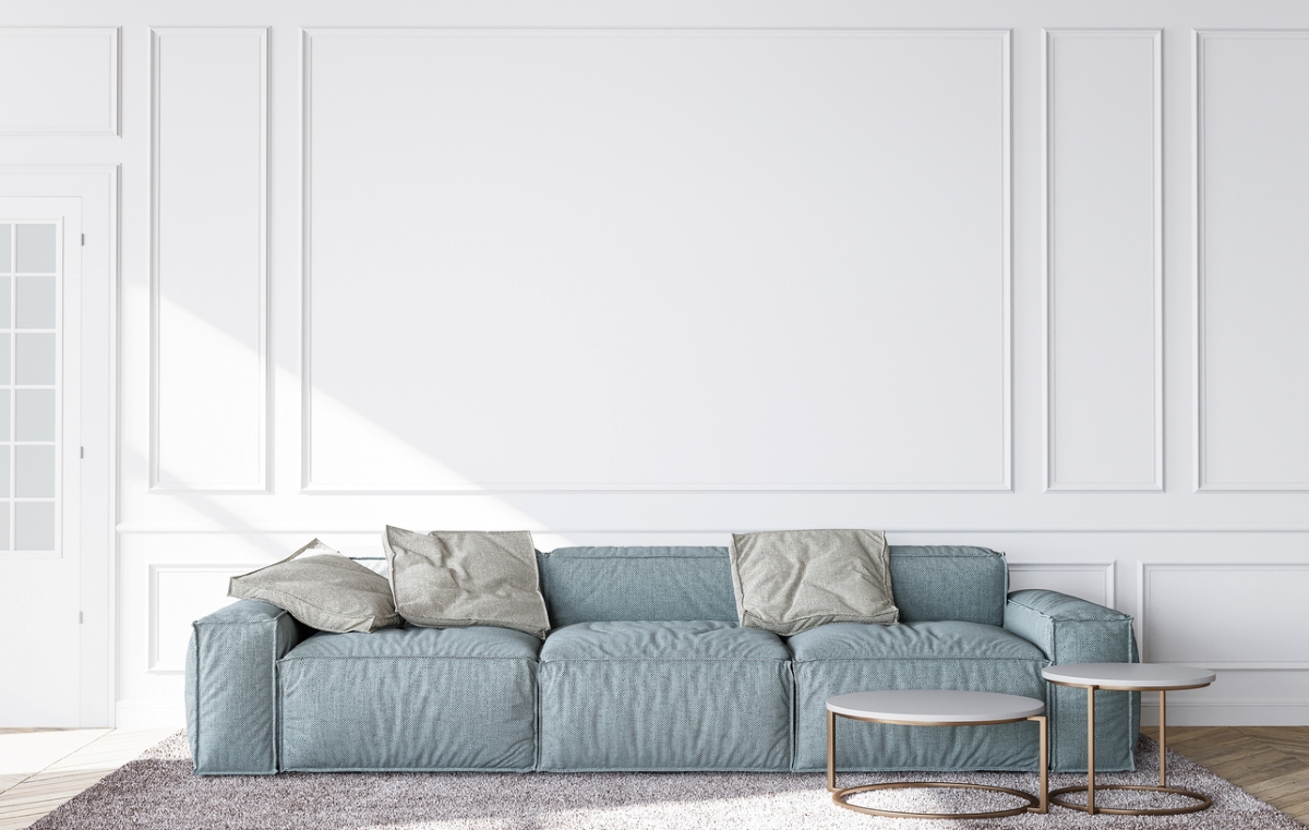
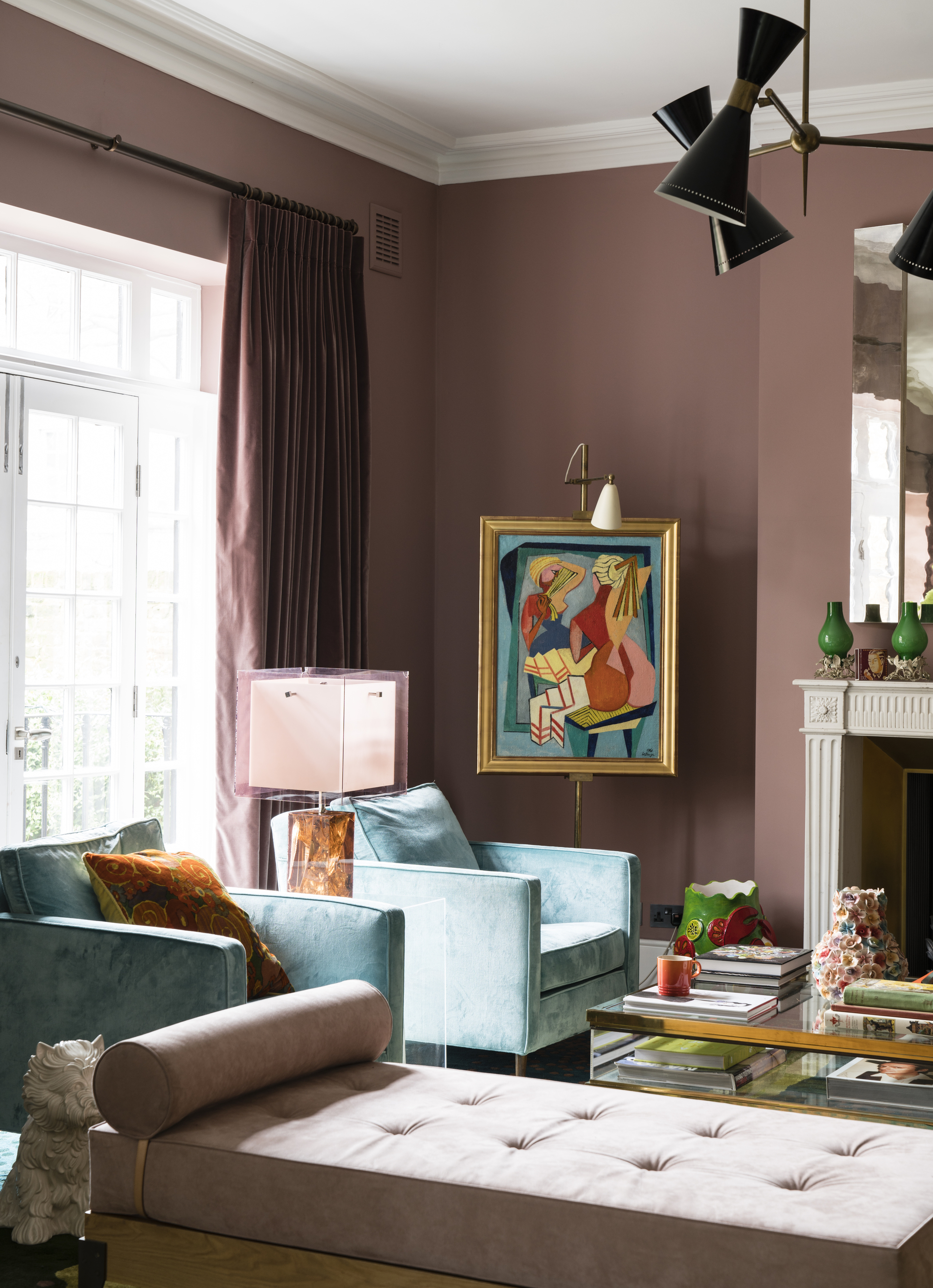
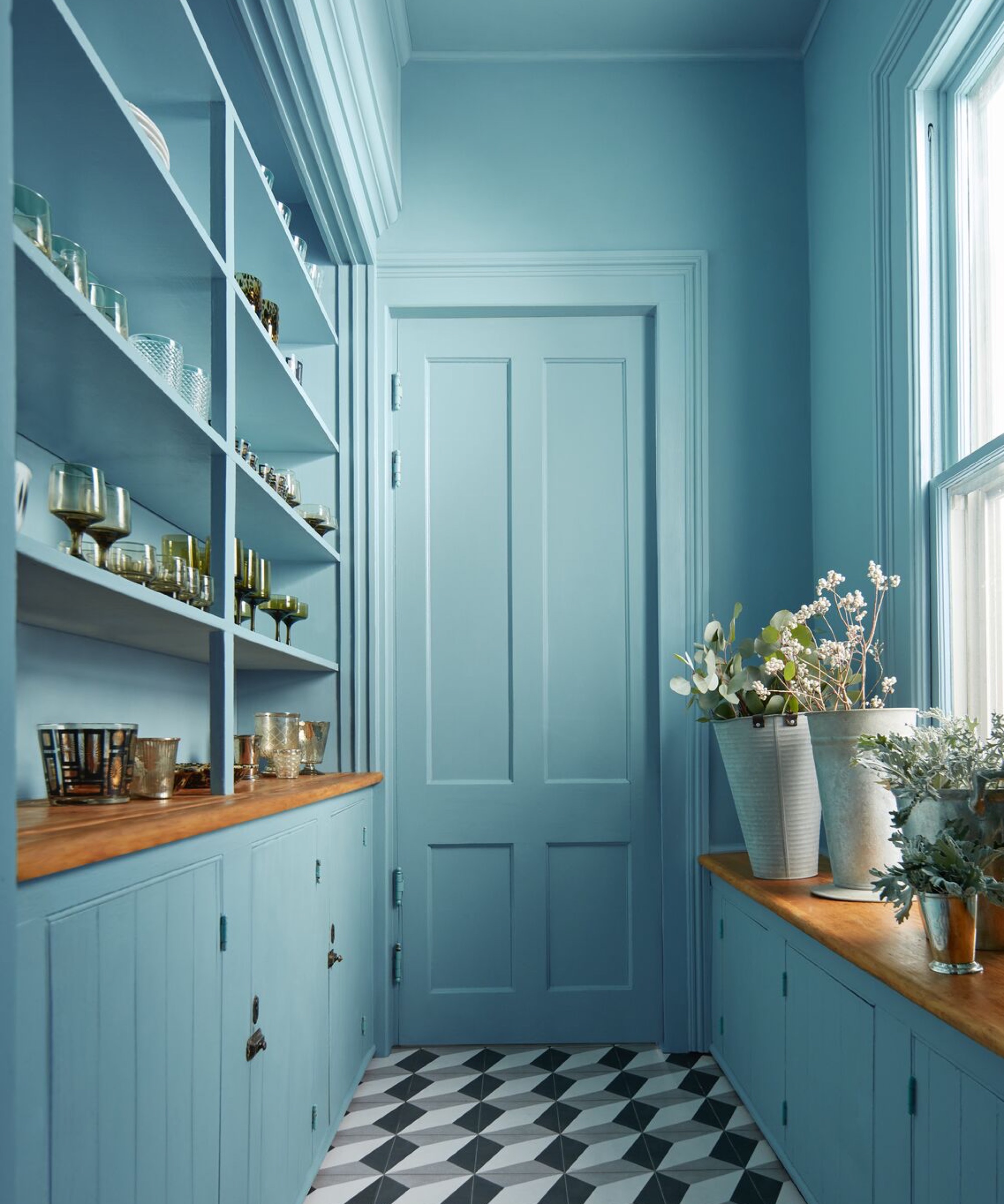
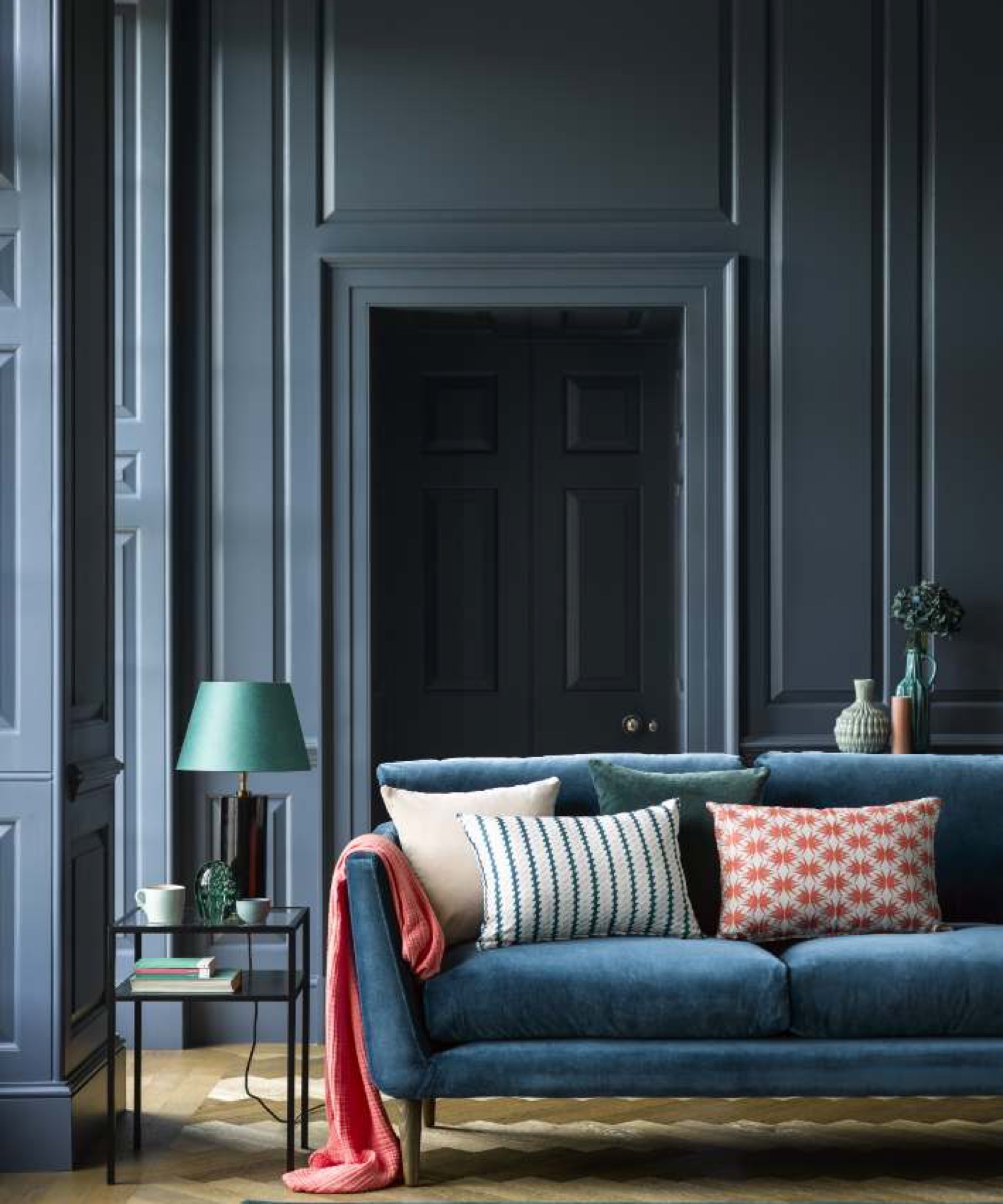
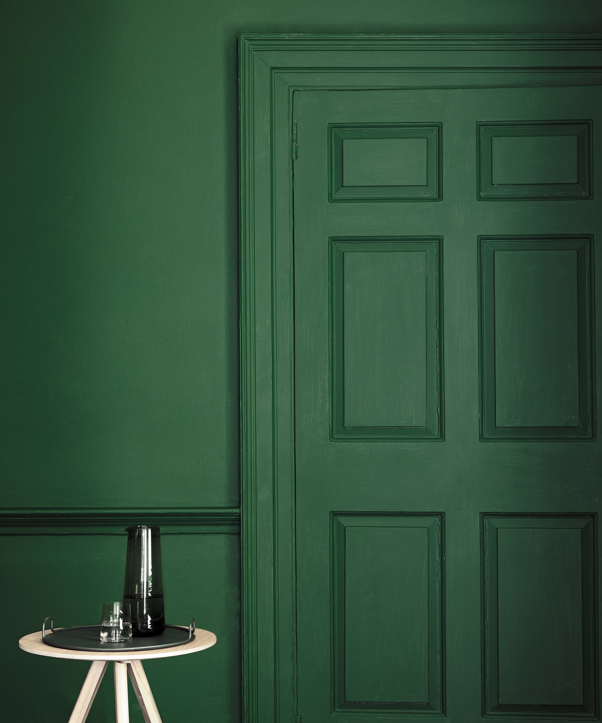
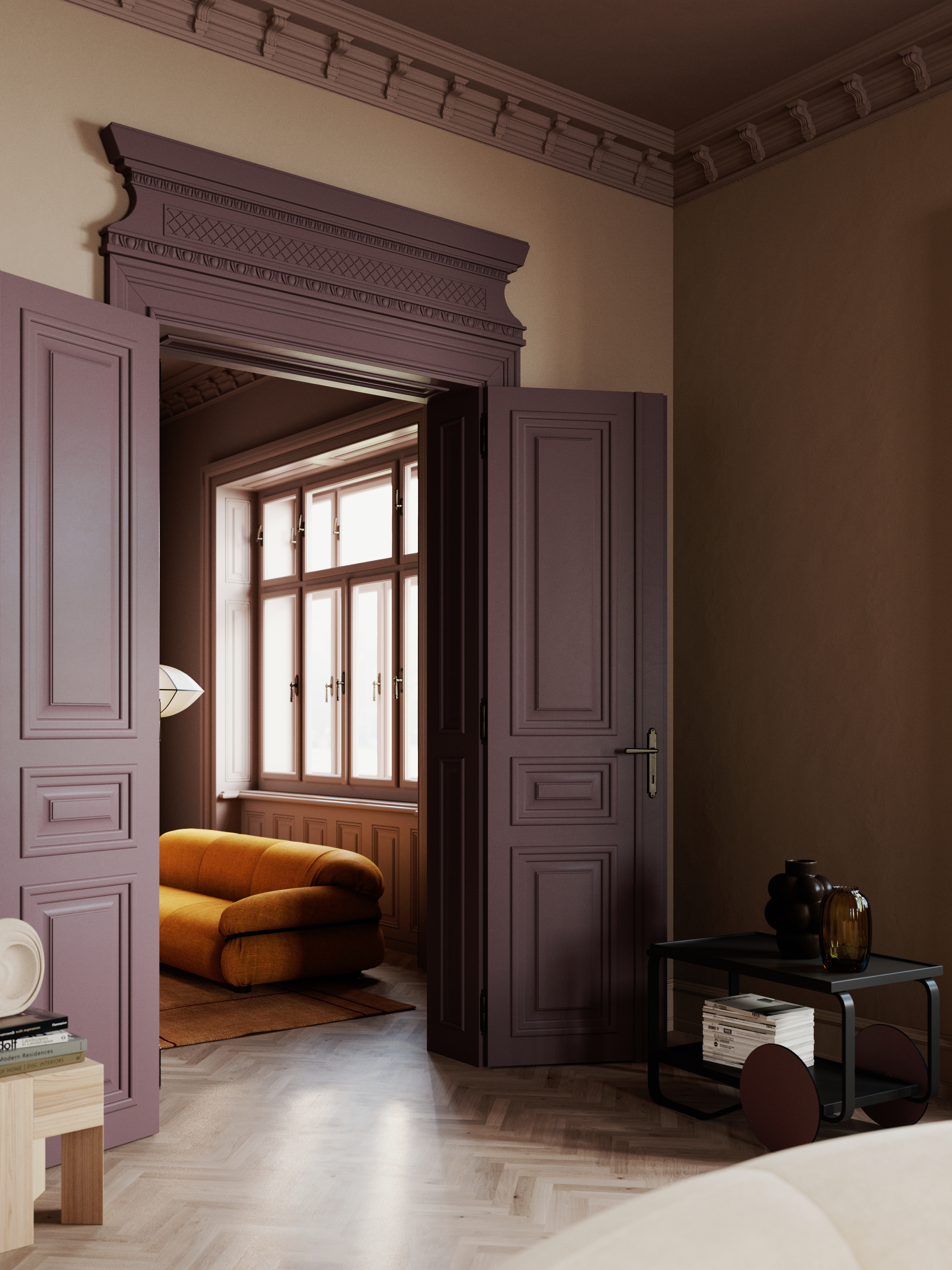
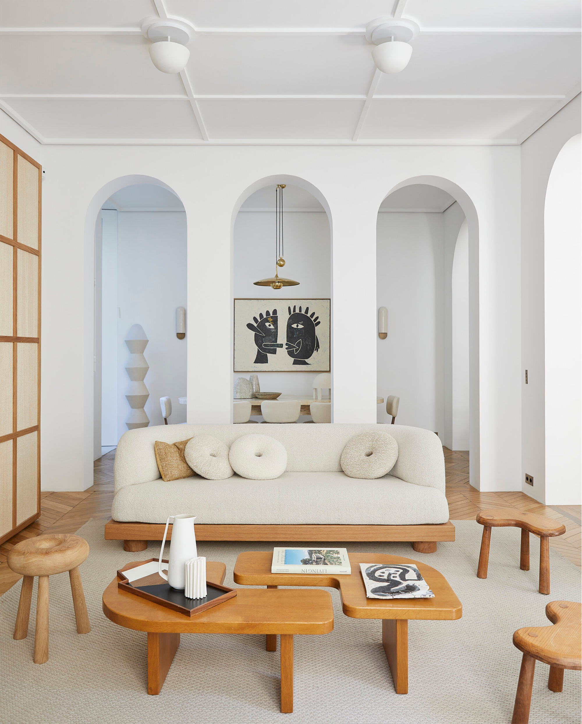
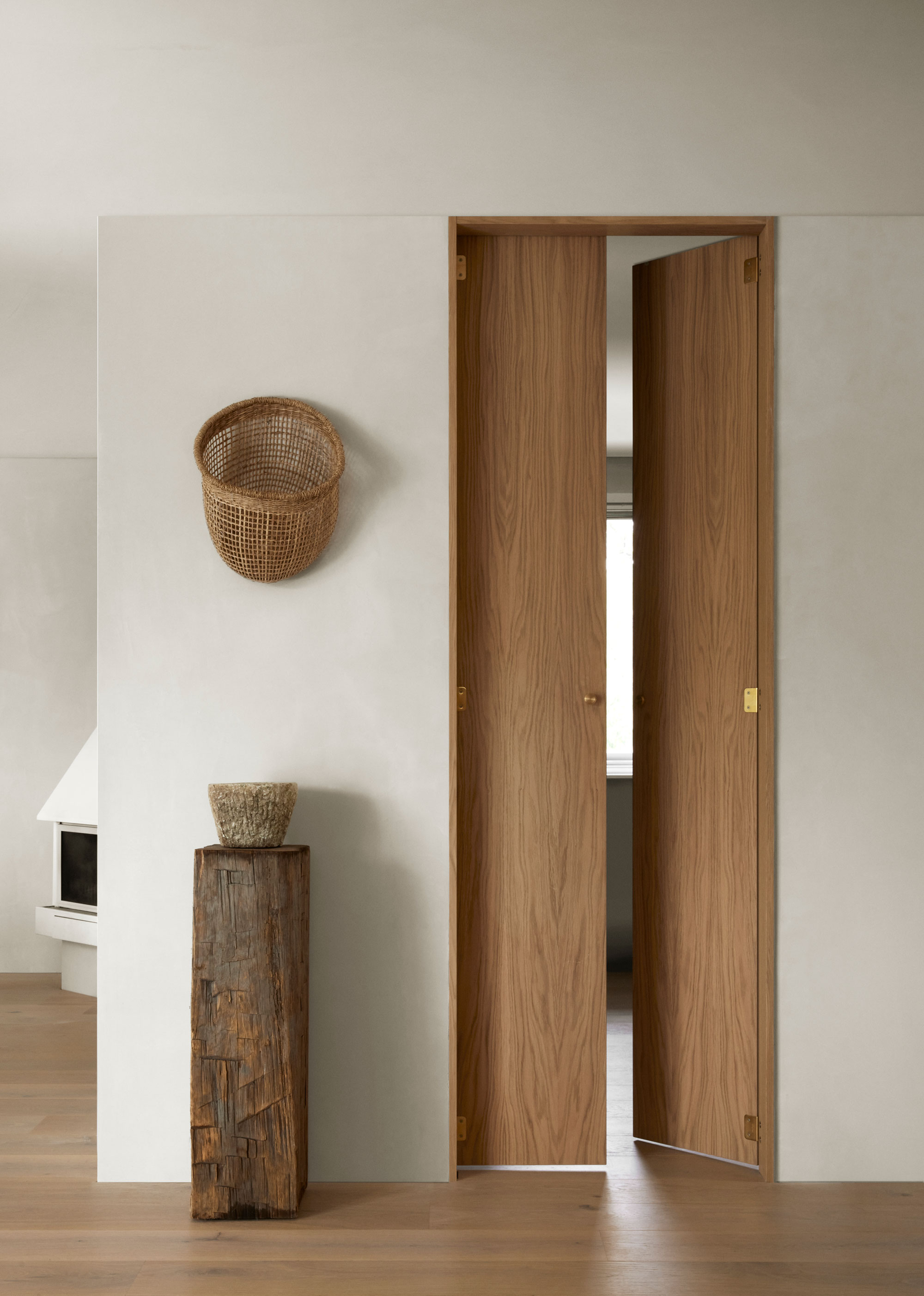
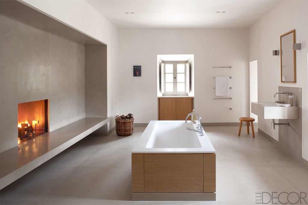
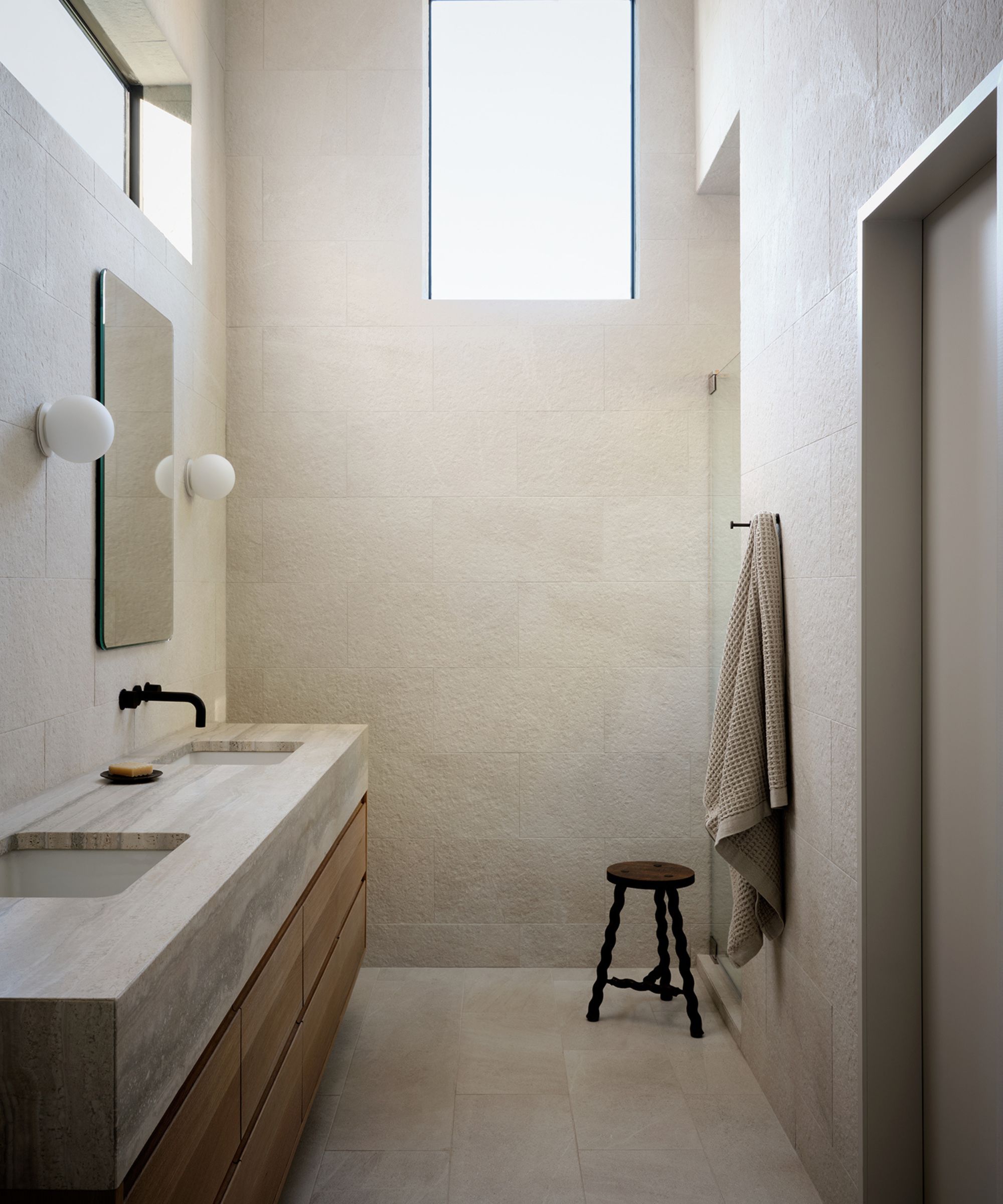
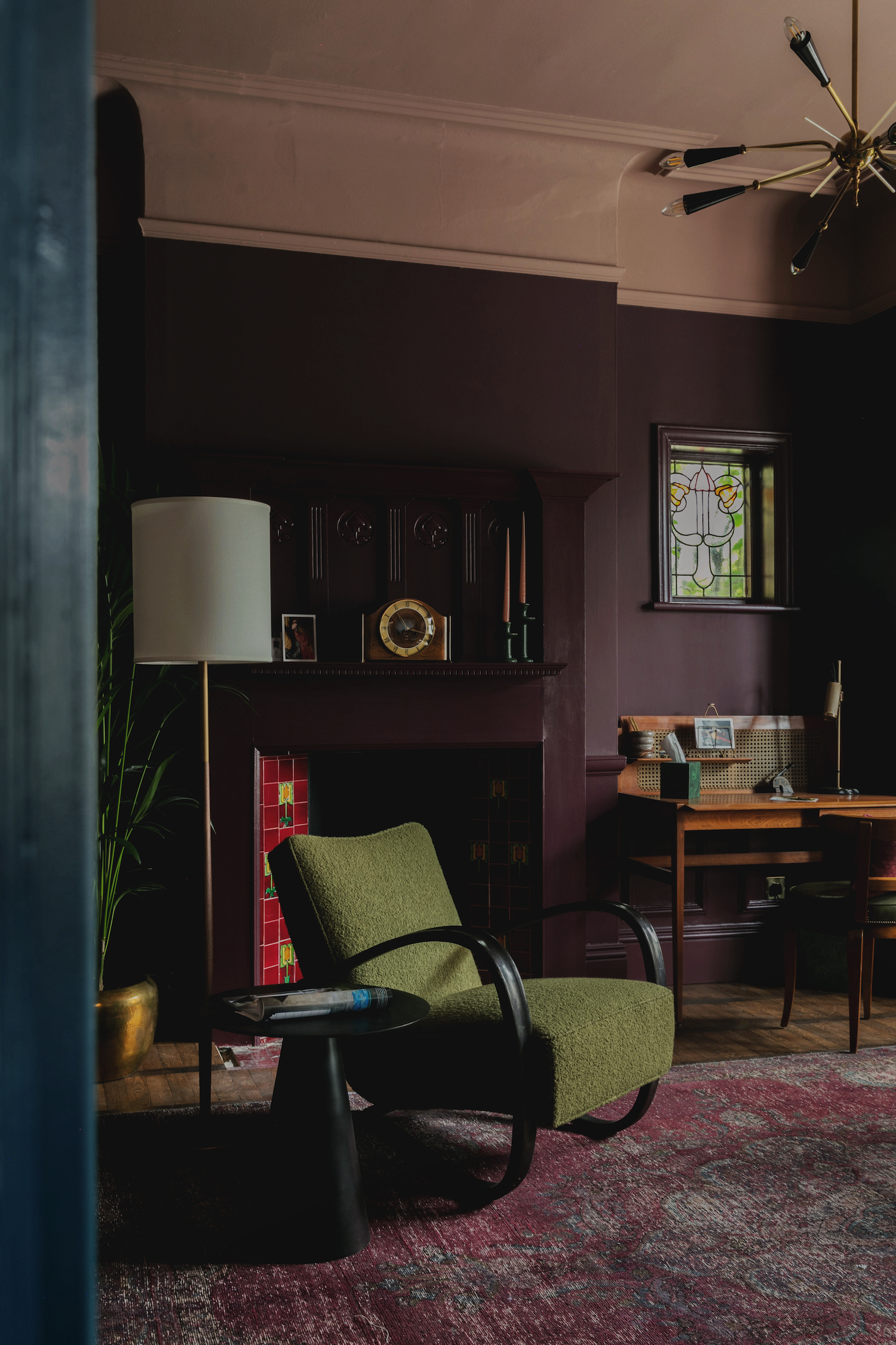
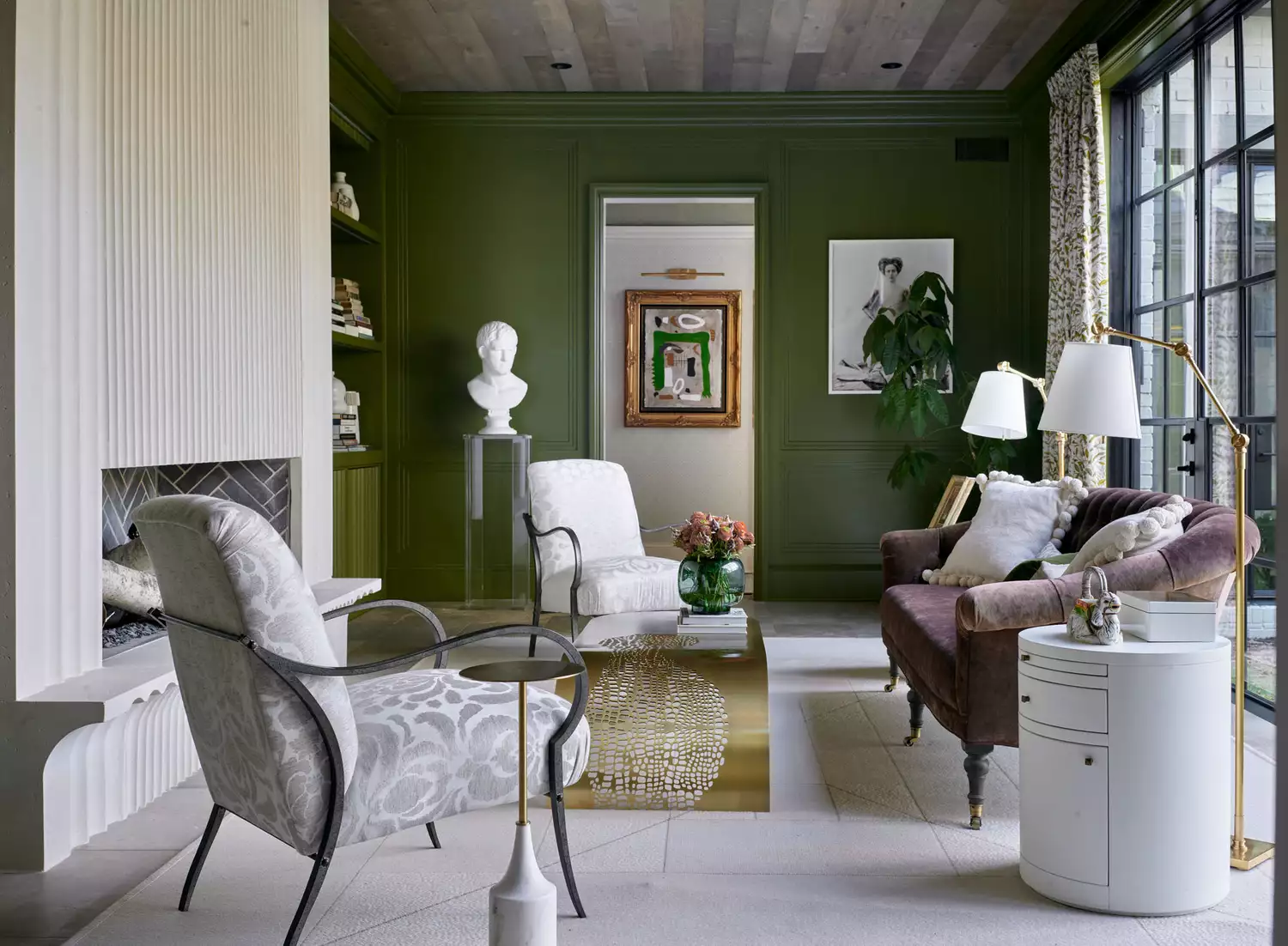
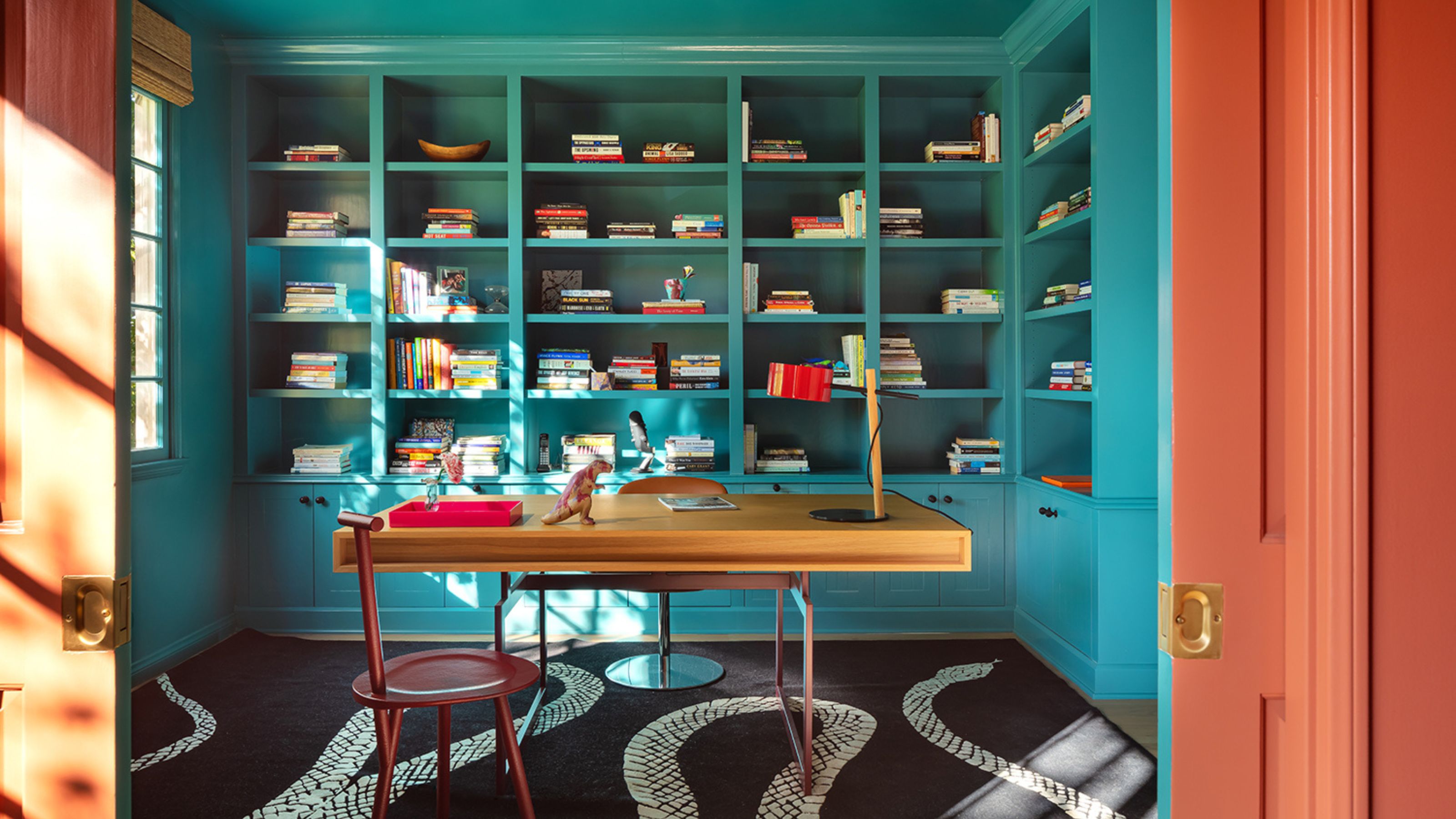
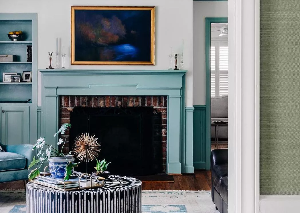
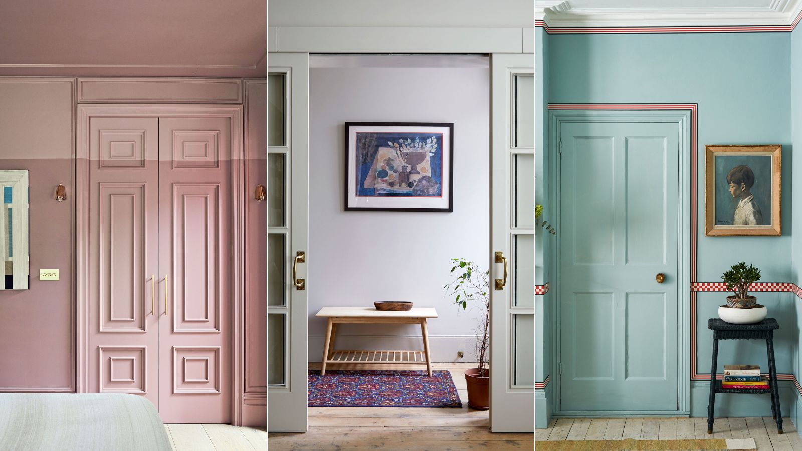
Matching trim and wall colors can create a sense of increased height and elegance in a room. This seamless look is particularly beneficial for smaller spaces, making them appear more expansive and sophisticated. A monochromatic color palette, especially when applied in a high-gloss finish, can be highly impactful in intimate areas like powder rooms, bars, and dining rooms, transforming them into 'jewel boxes.' This unified background also allows furniture and decor to become the focal points, with their colors and textures standing out more prominently against a consistent backdrop. Wall art, too, gains boldness when displayed in such an environment.
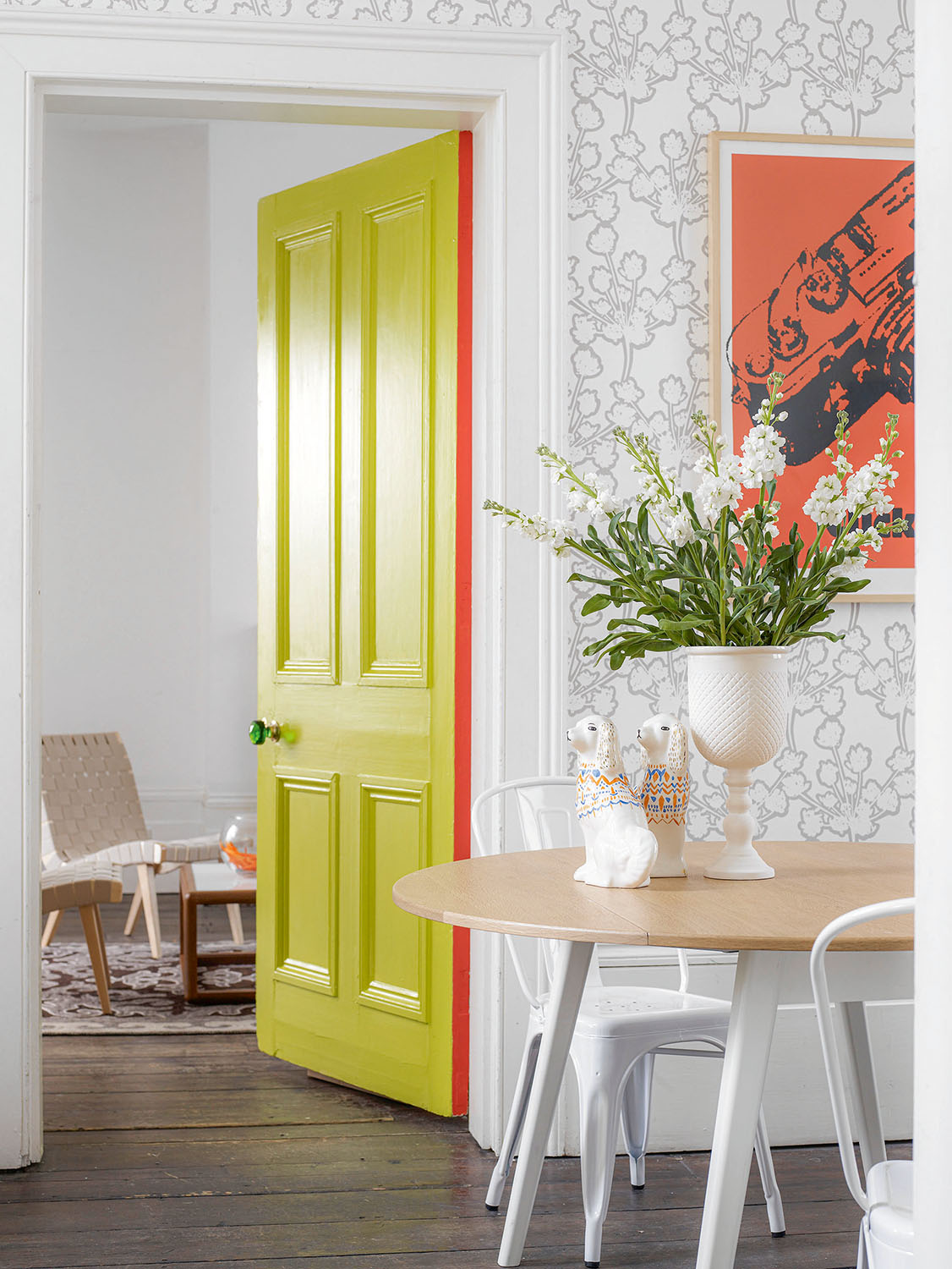
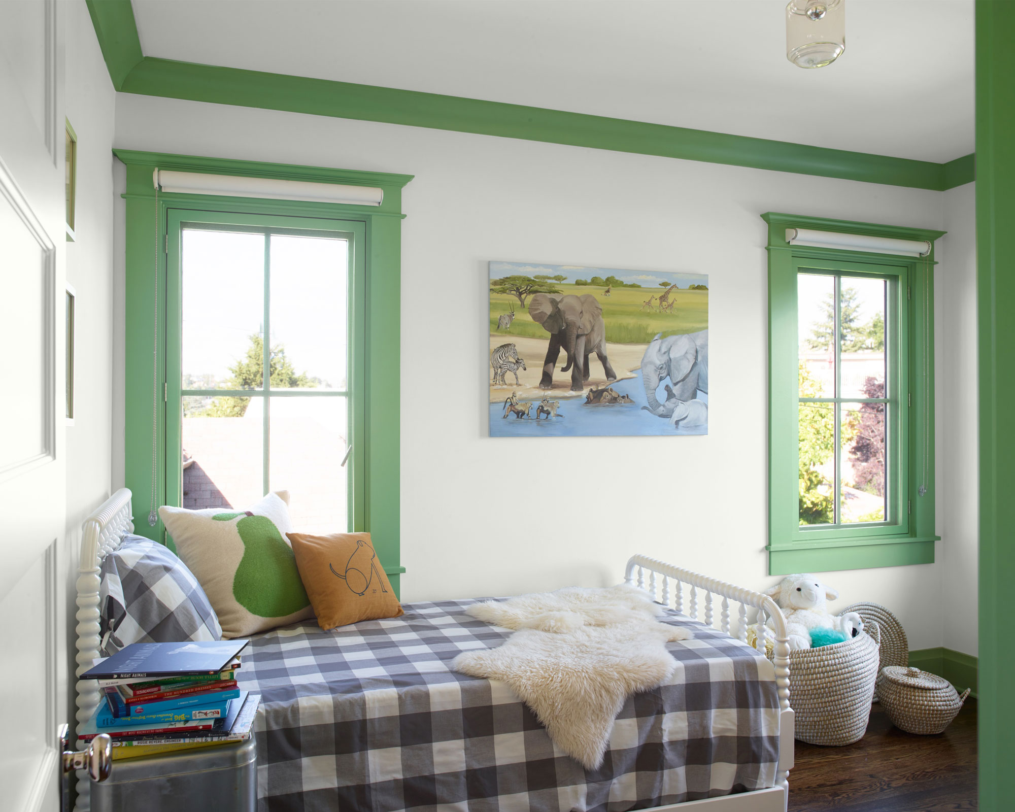
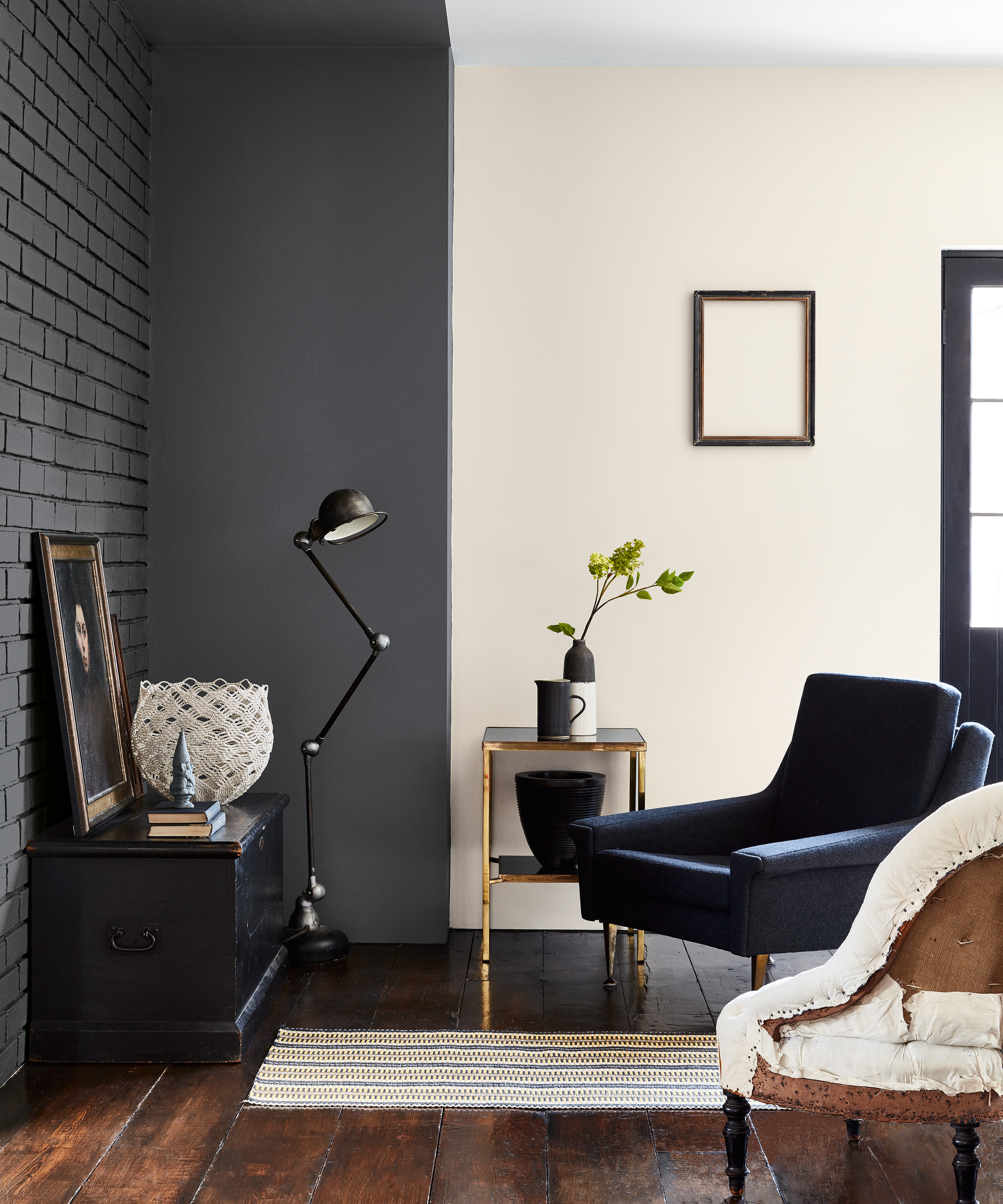
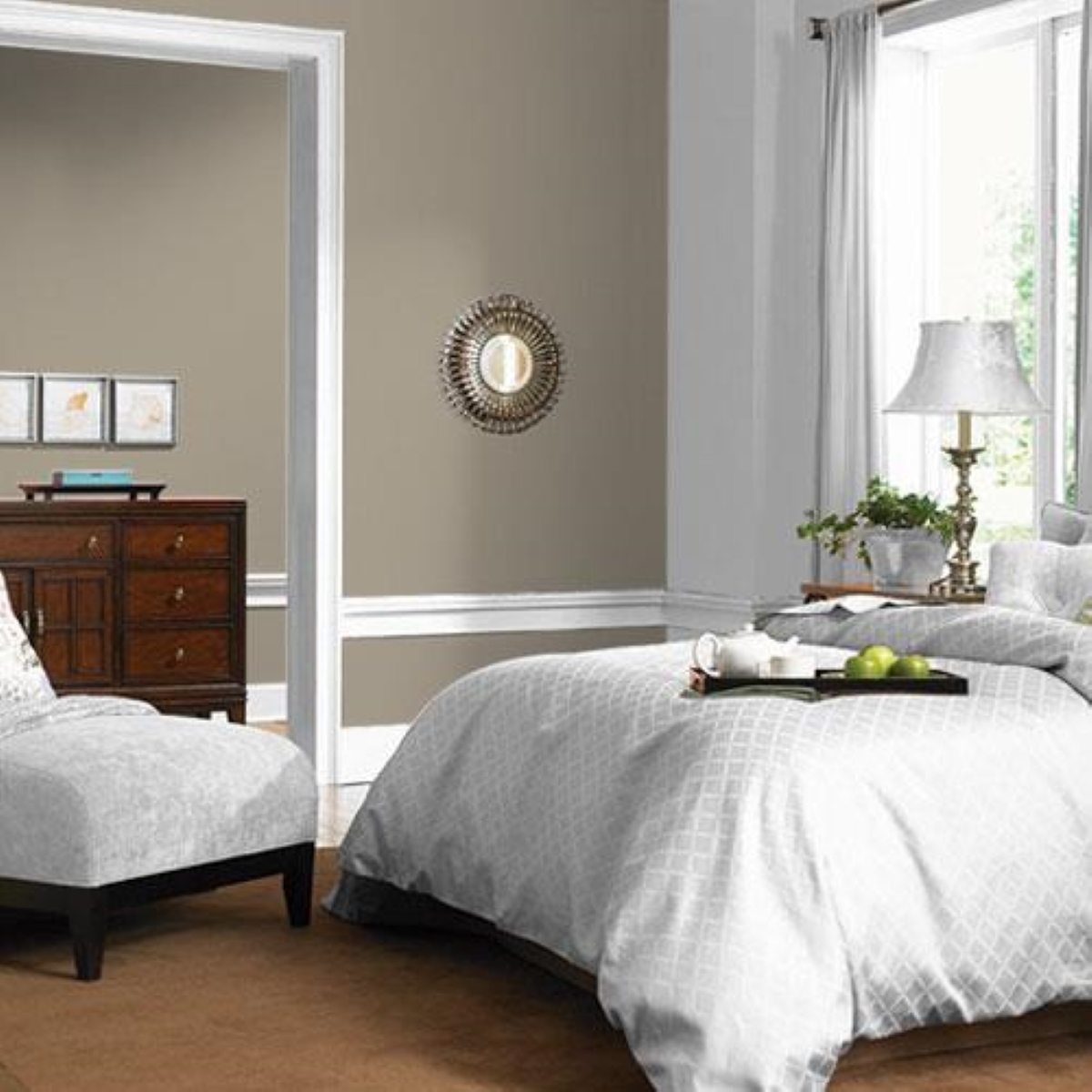
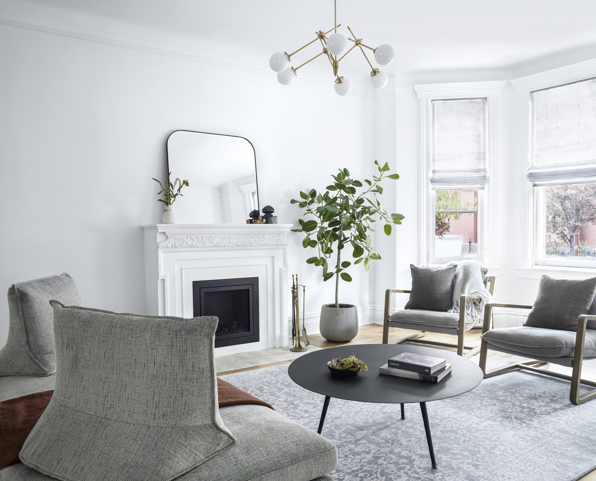
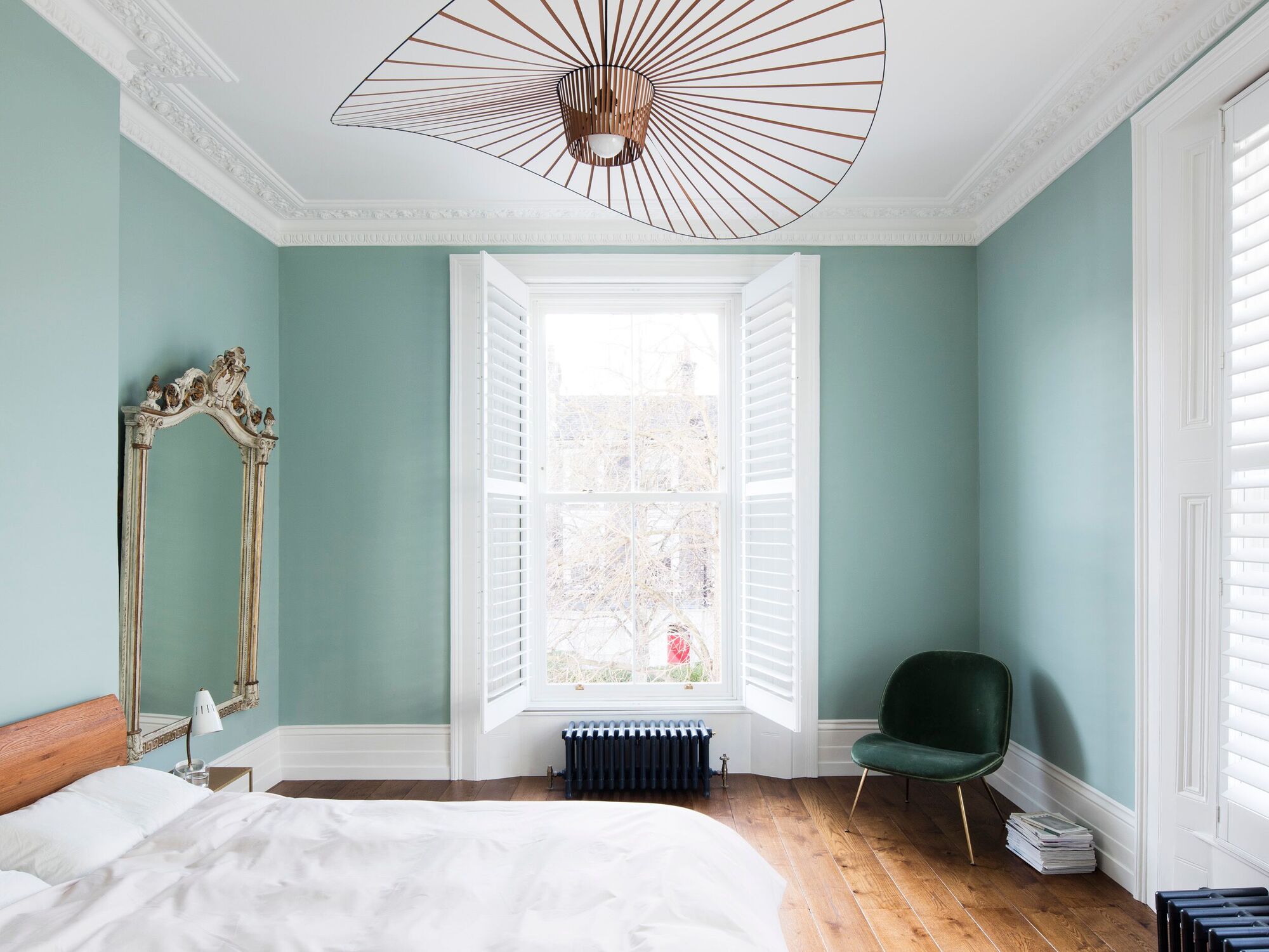
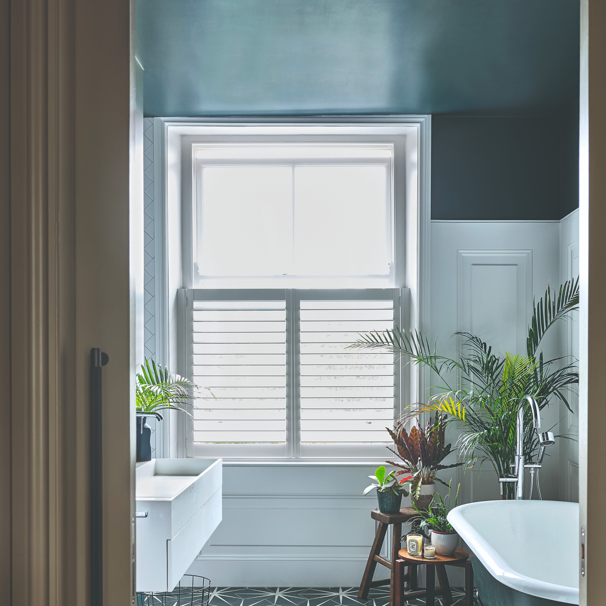
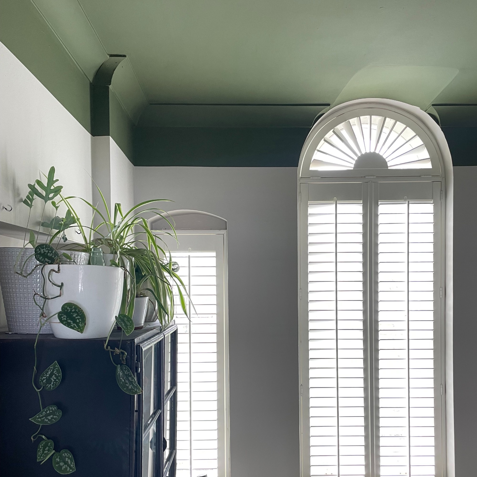
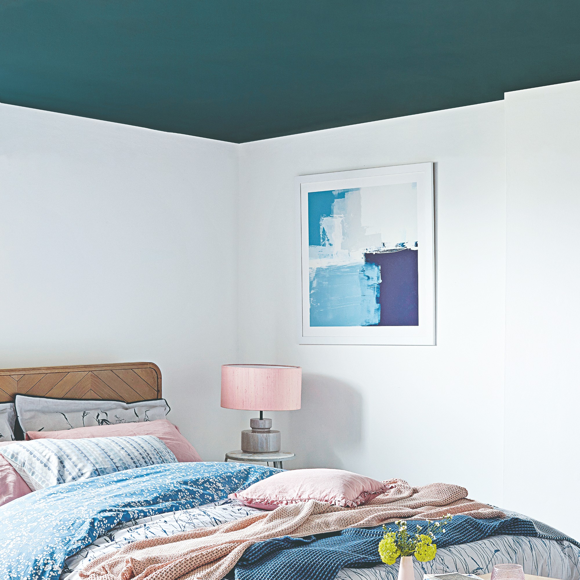
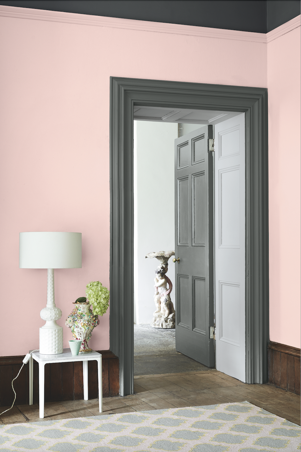
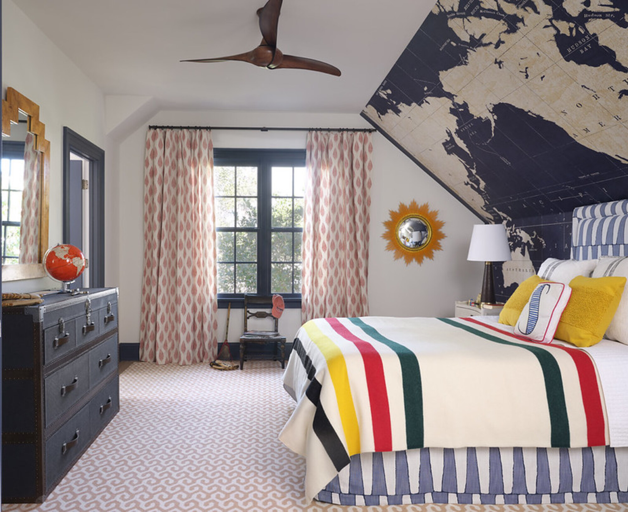
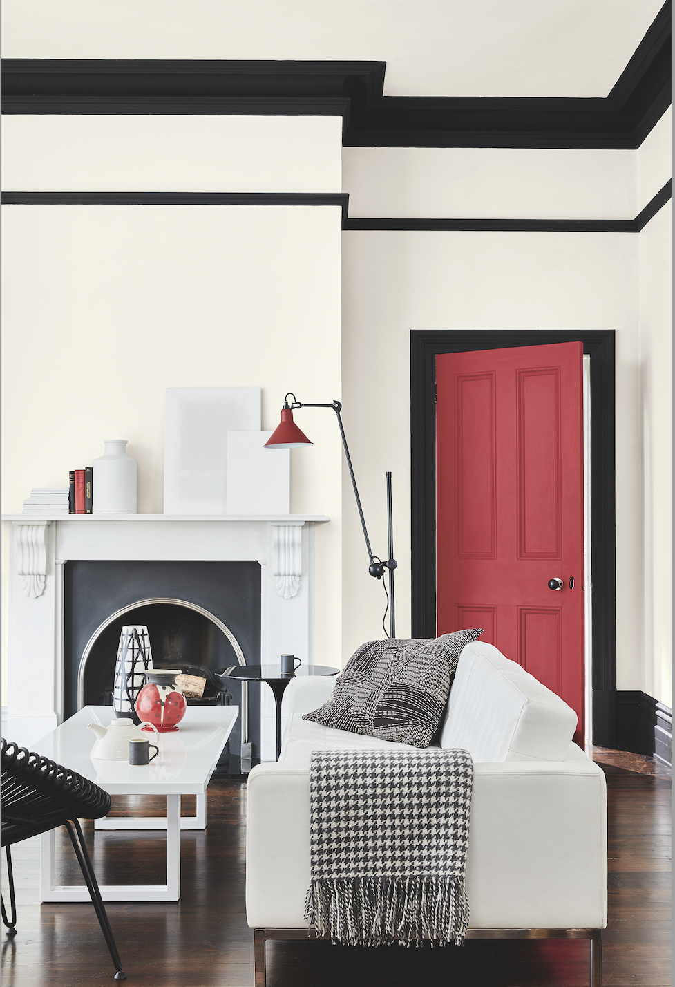
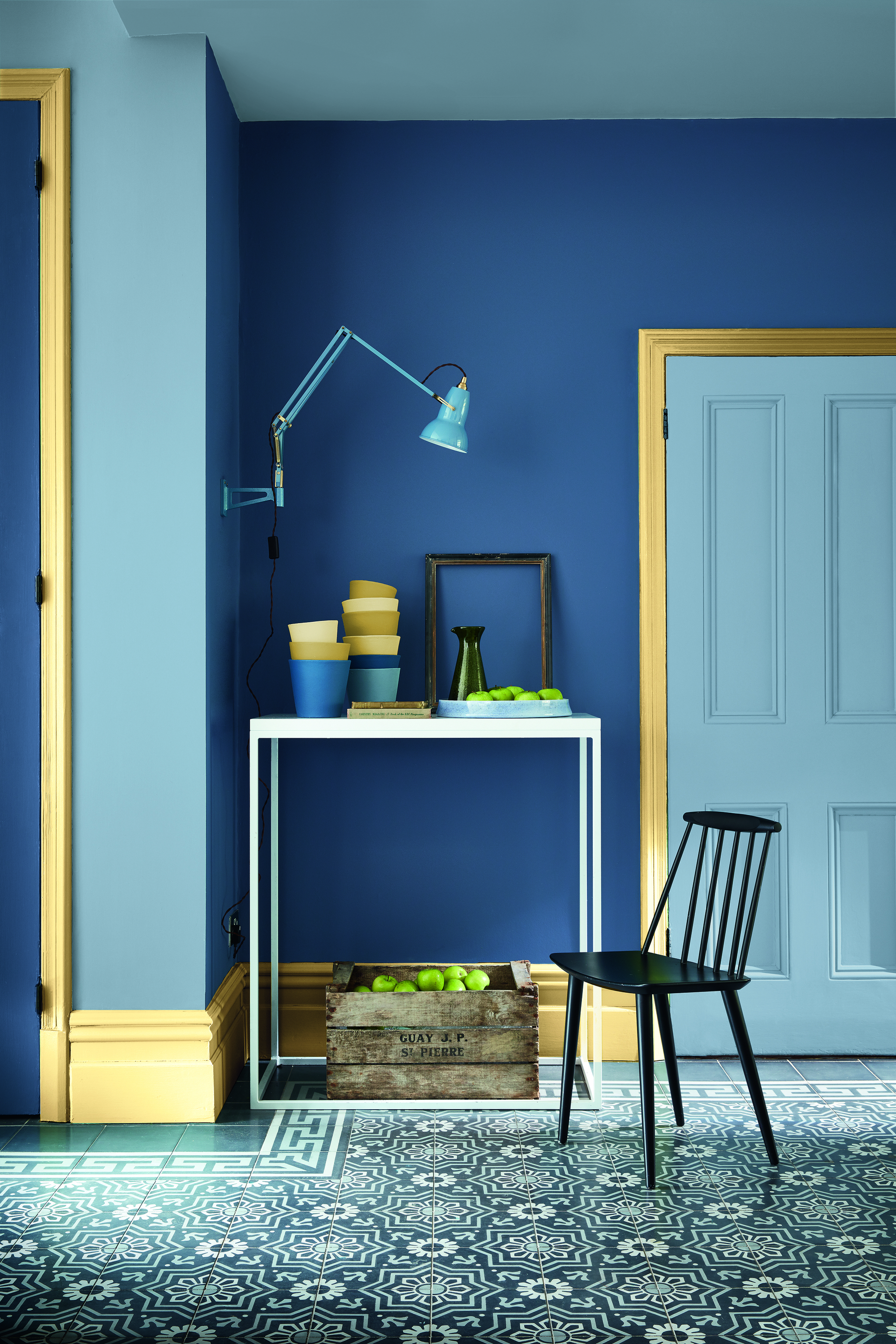
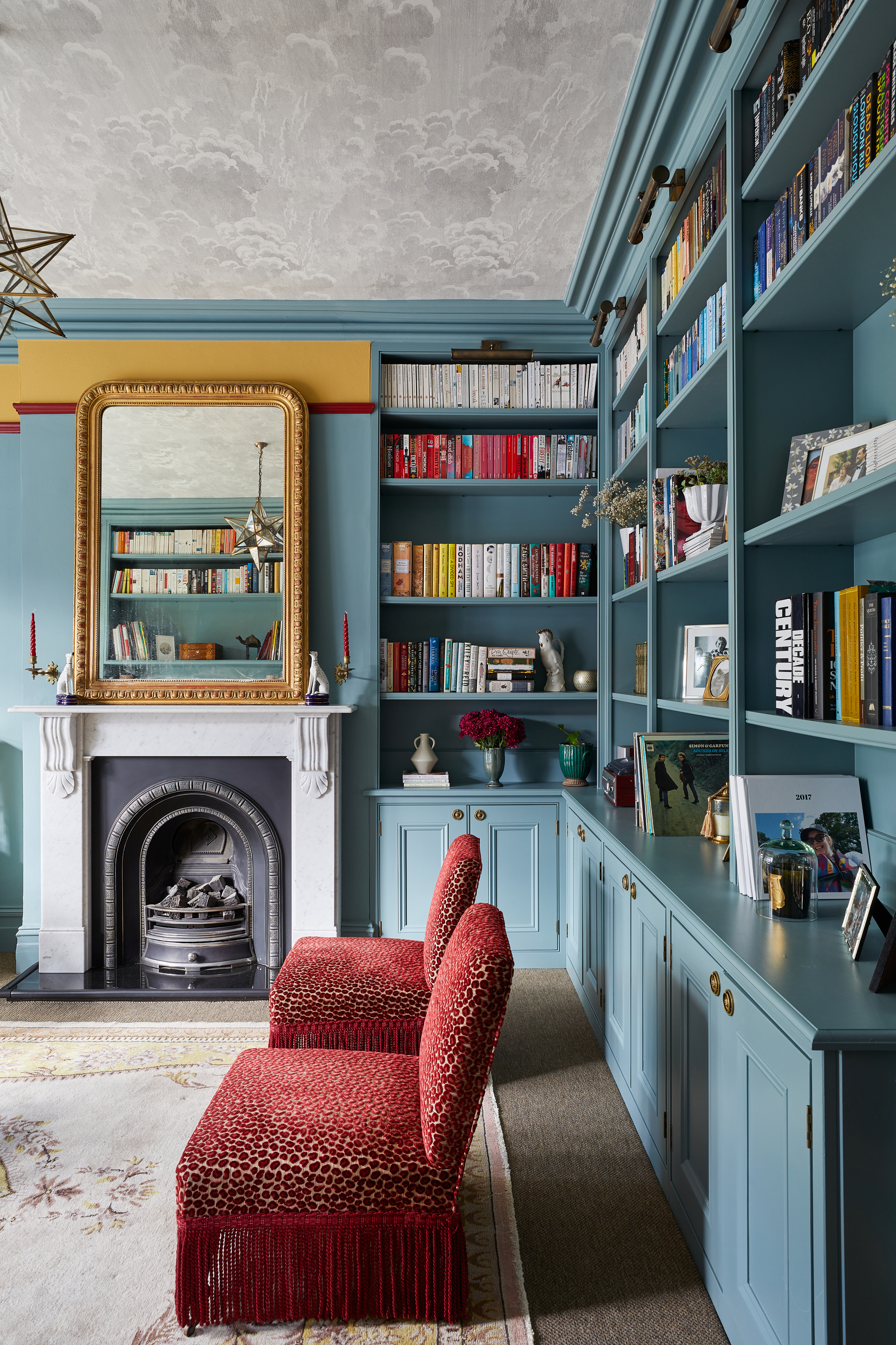
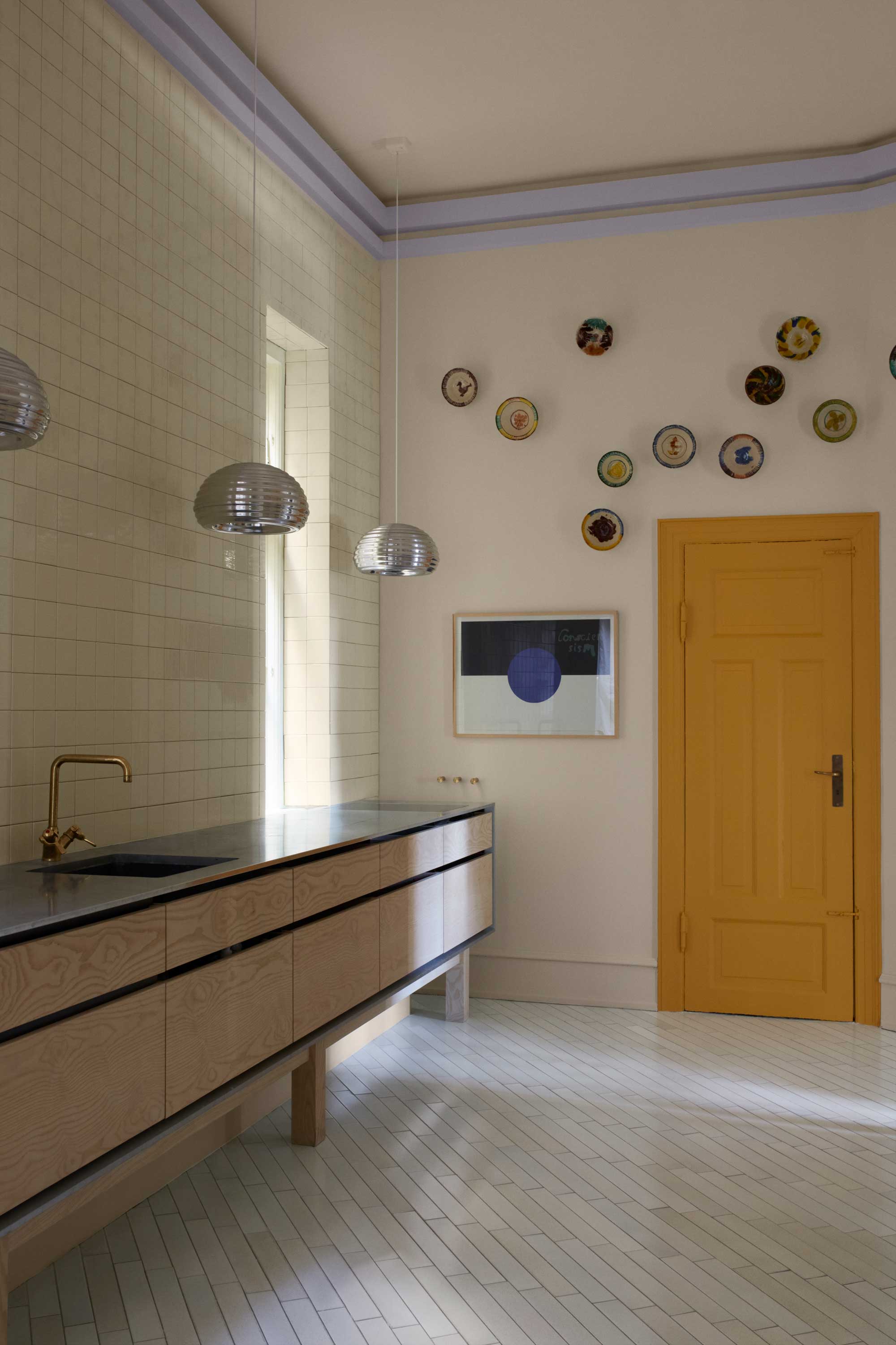
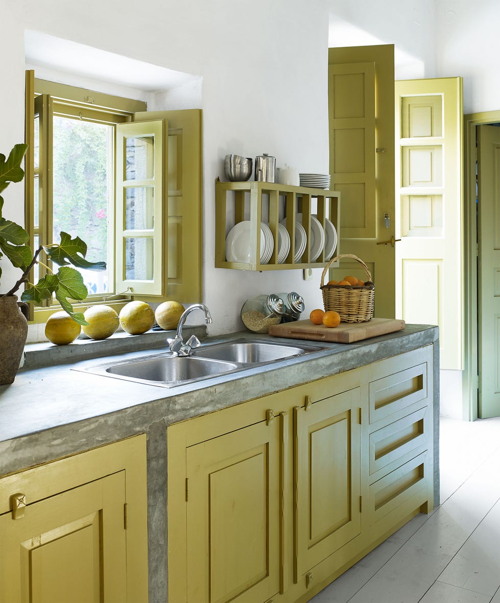
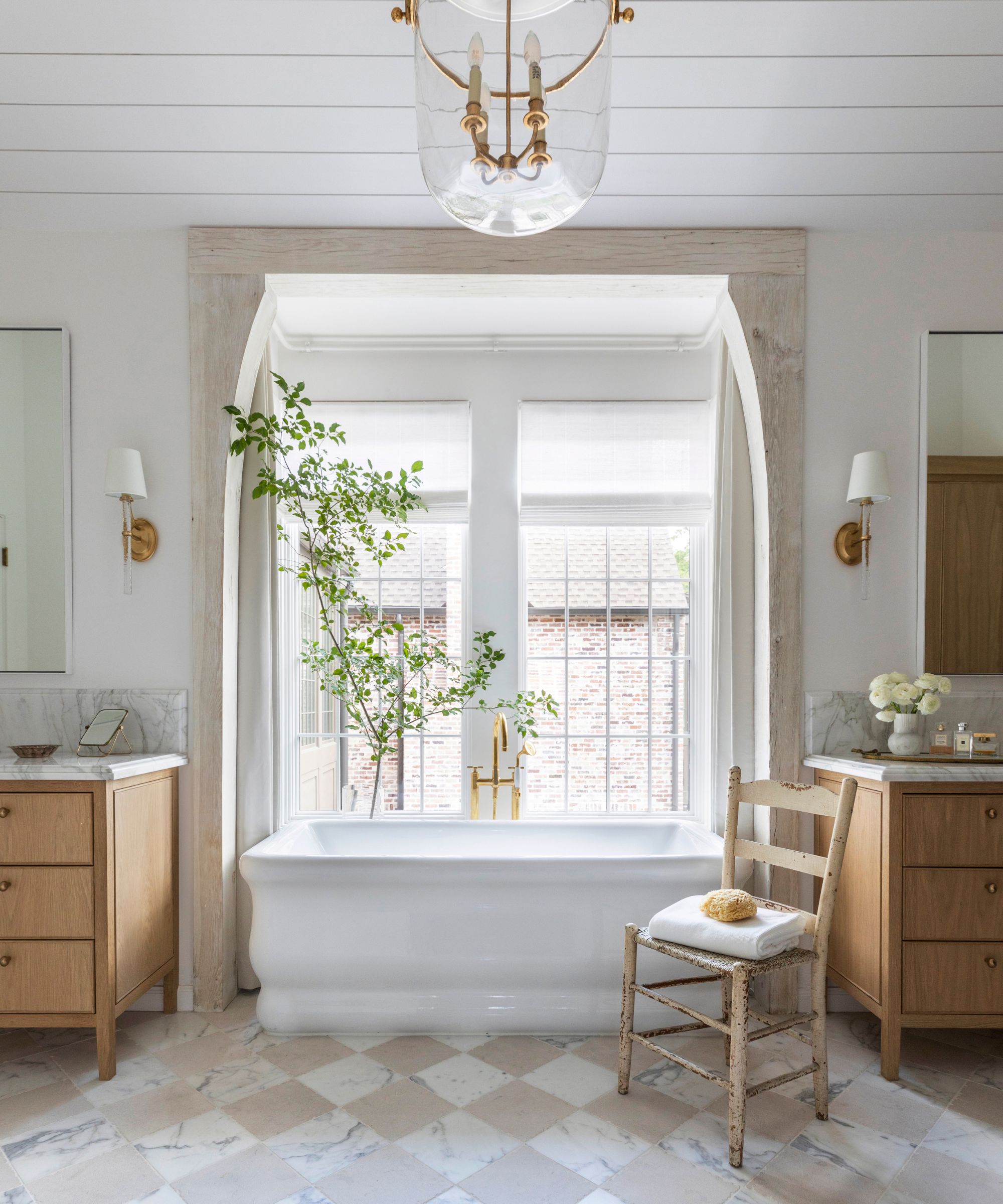
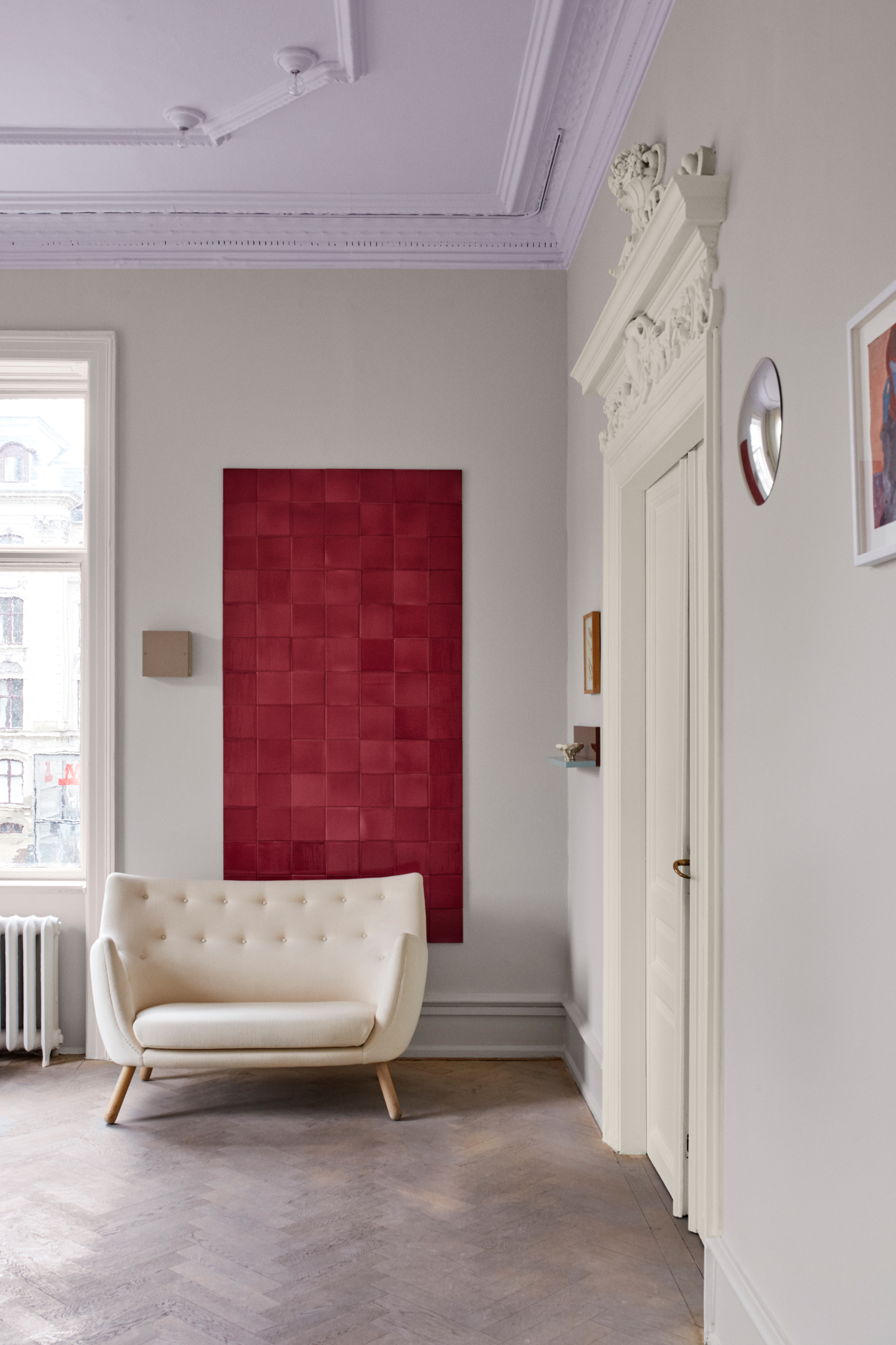
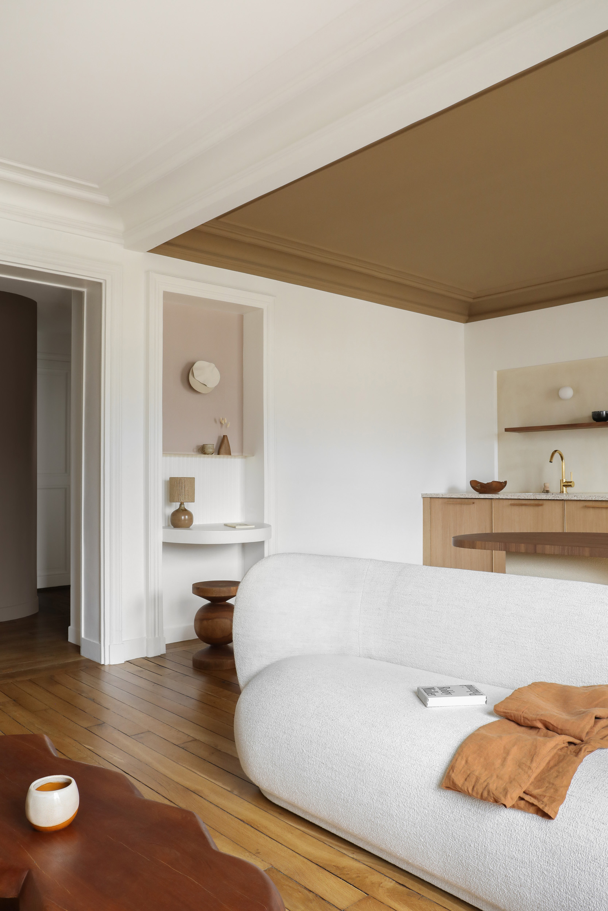
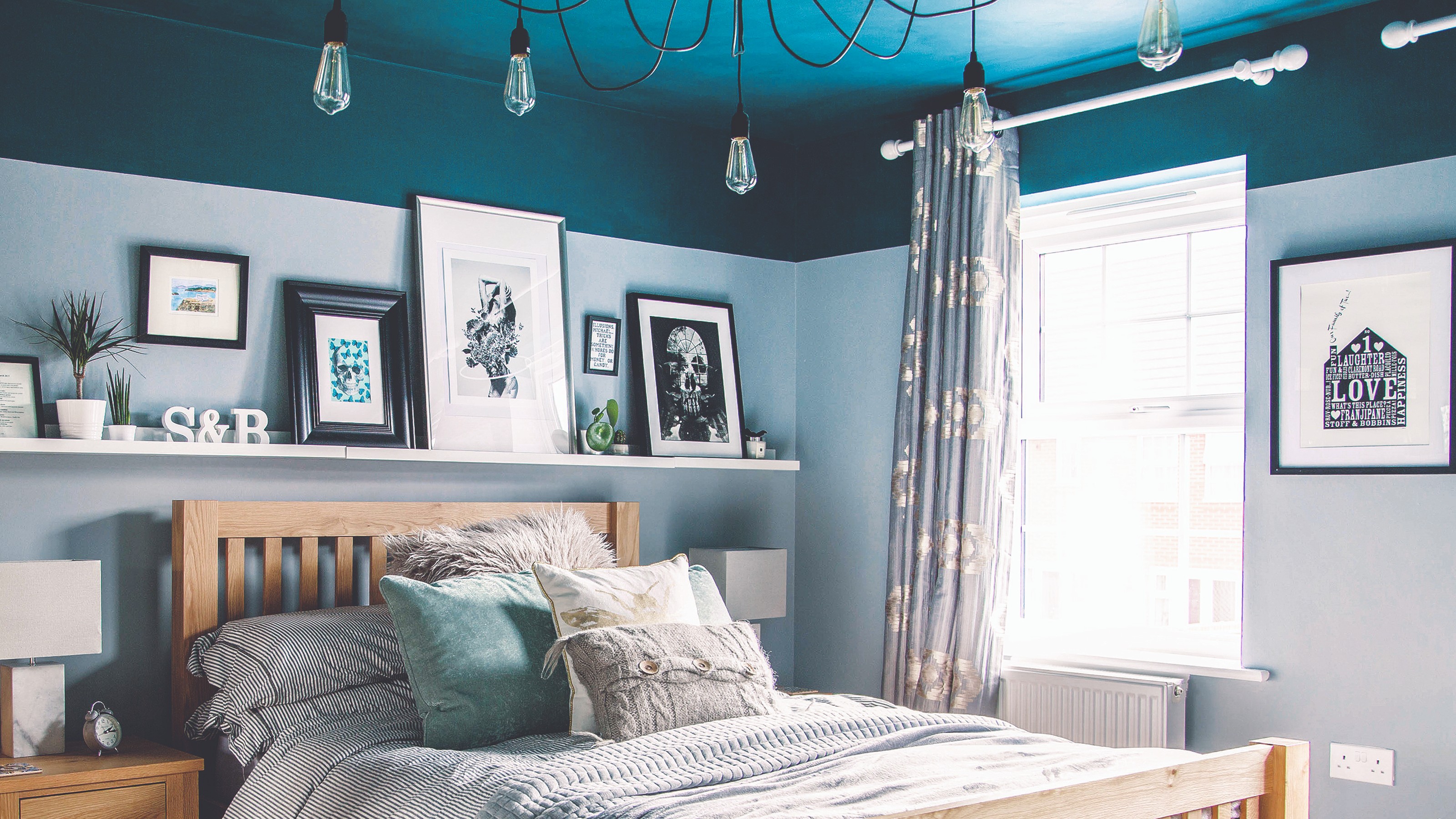
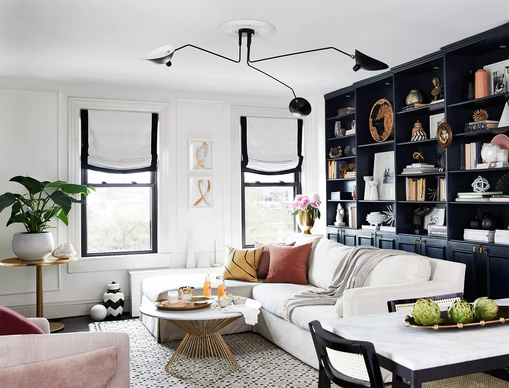
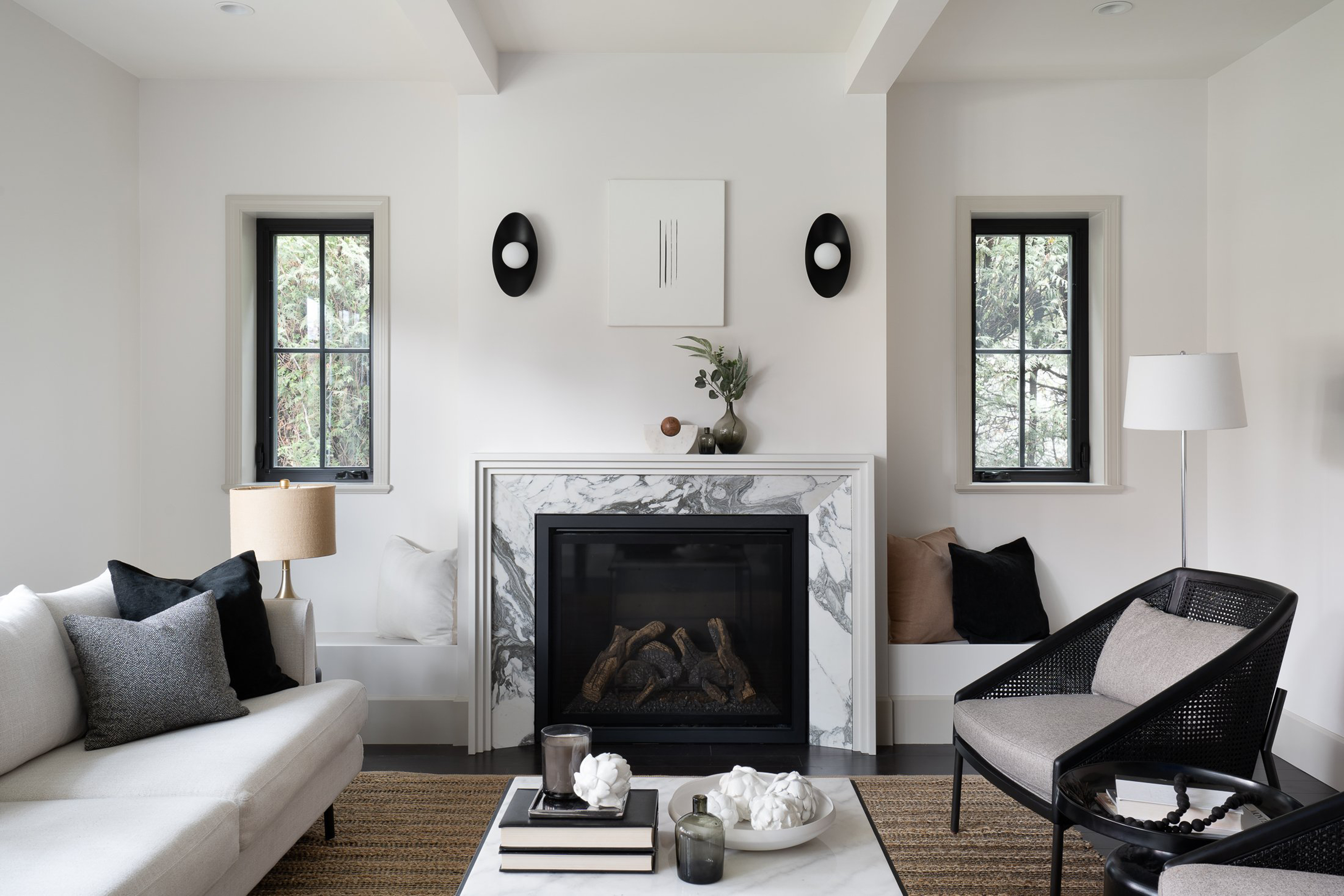
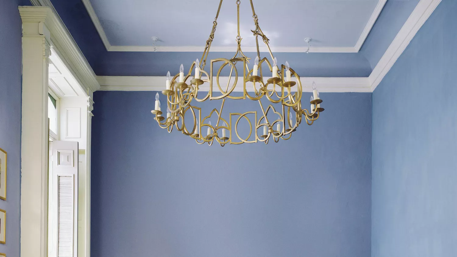
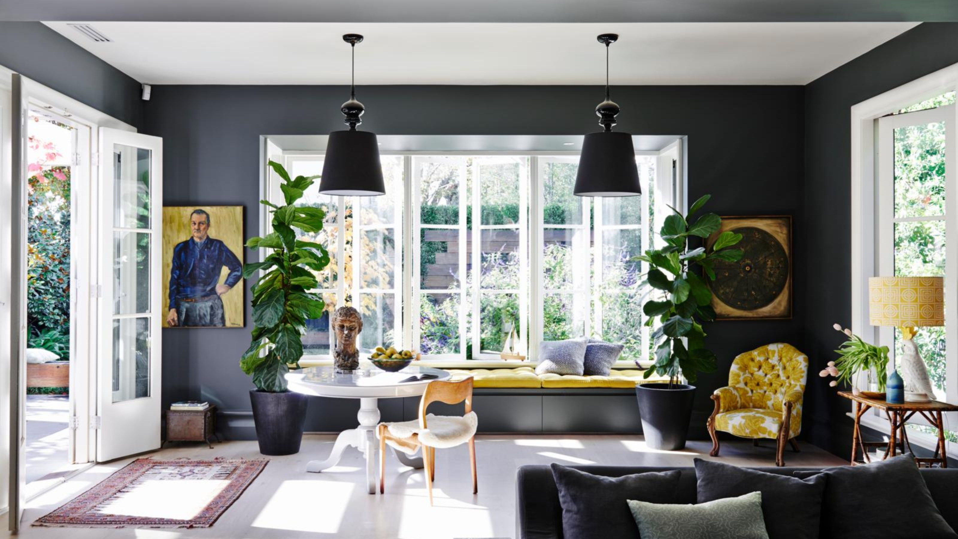
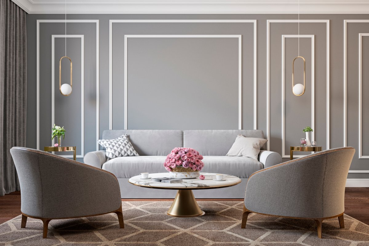
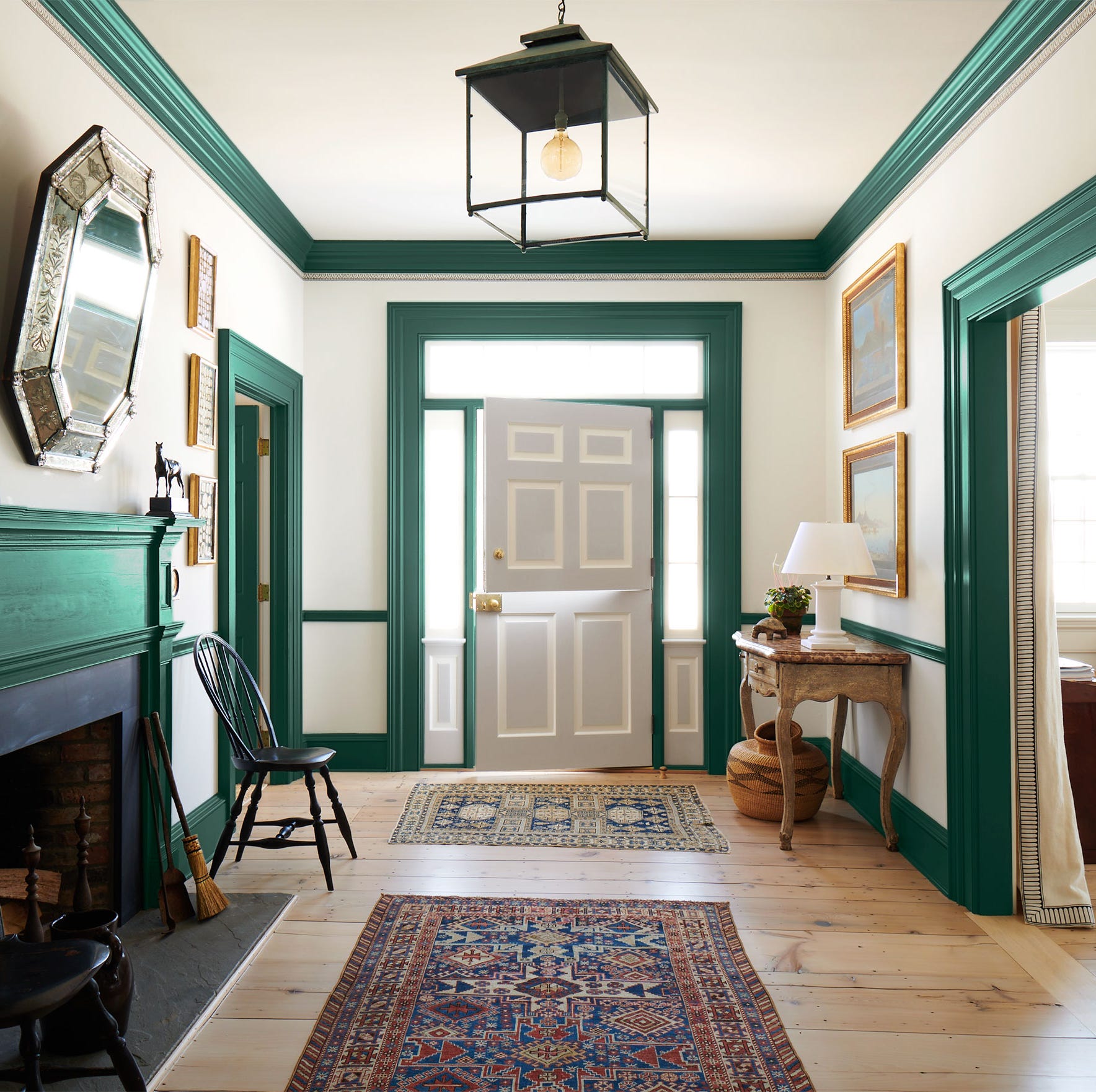
Conversely, employing contrasting colors for trim and walls provides definition and allows for a custom, high-impact statement. While white remains a common choice for trim, designers suggest exploring other options. Painting trim a darker color than the walls is an unexpected yet effective way to add sophistication and depth to a space. This method can also be used strategically to tie a room together; for instance, matching the trim color to an accent hue found in the furnishings creates a cohesive design. For more playful or informal spaces, like children's bedrooms or playrooms, vibrant trim colors can inject a fun and energetic mood.
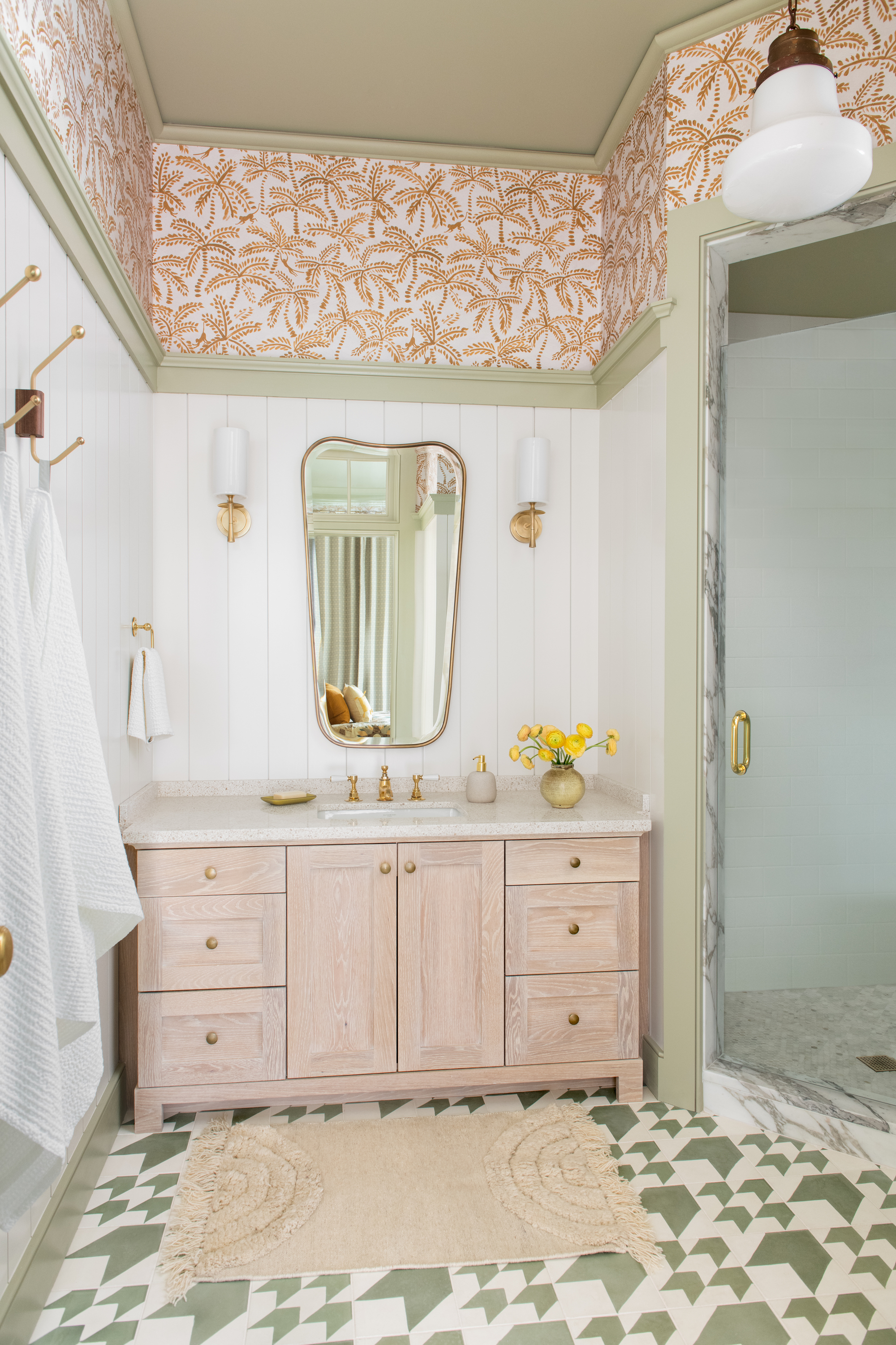
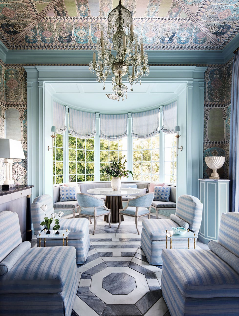
When walls are adorned with wallpaper instead of paint, the trim still plays a crucial role. A neutral or white trim can help ground busy or intricate wallpaper patterns. Alternatively, a bold approach involves selecting a trim color that echoes one of the hues present in the wallpaper, and extending this color to the ceiling, creating a harmonized and intentional design.
#InteriorDesign #HomeDecor #PaintTrends #ColorPalettes #WallTreatment #MonochromaticScheme #AccentColors #RoomDesign #InteriorDesign #HomeDecor #PaintTrends #ColorPalettes #WallTreatment #MonochromaticScheme #AccentColors #RoomDesign
Há 0 comentários no total
 Ainda não há comentários
Você também pode gostar
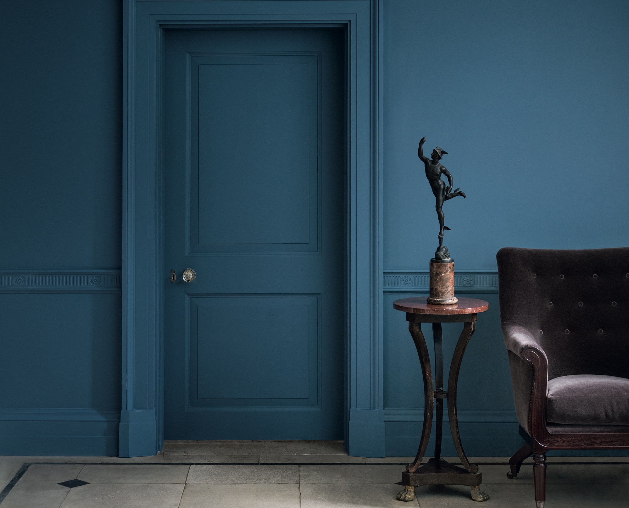
Should doors be painted the same color as walls? Expert advice on when to go all out and when to mix it up

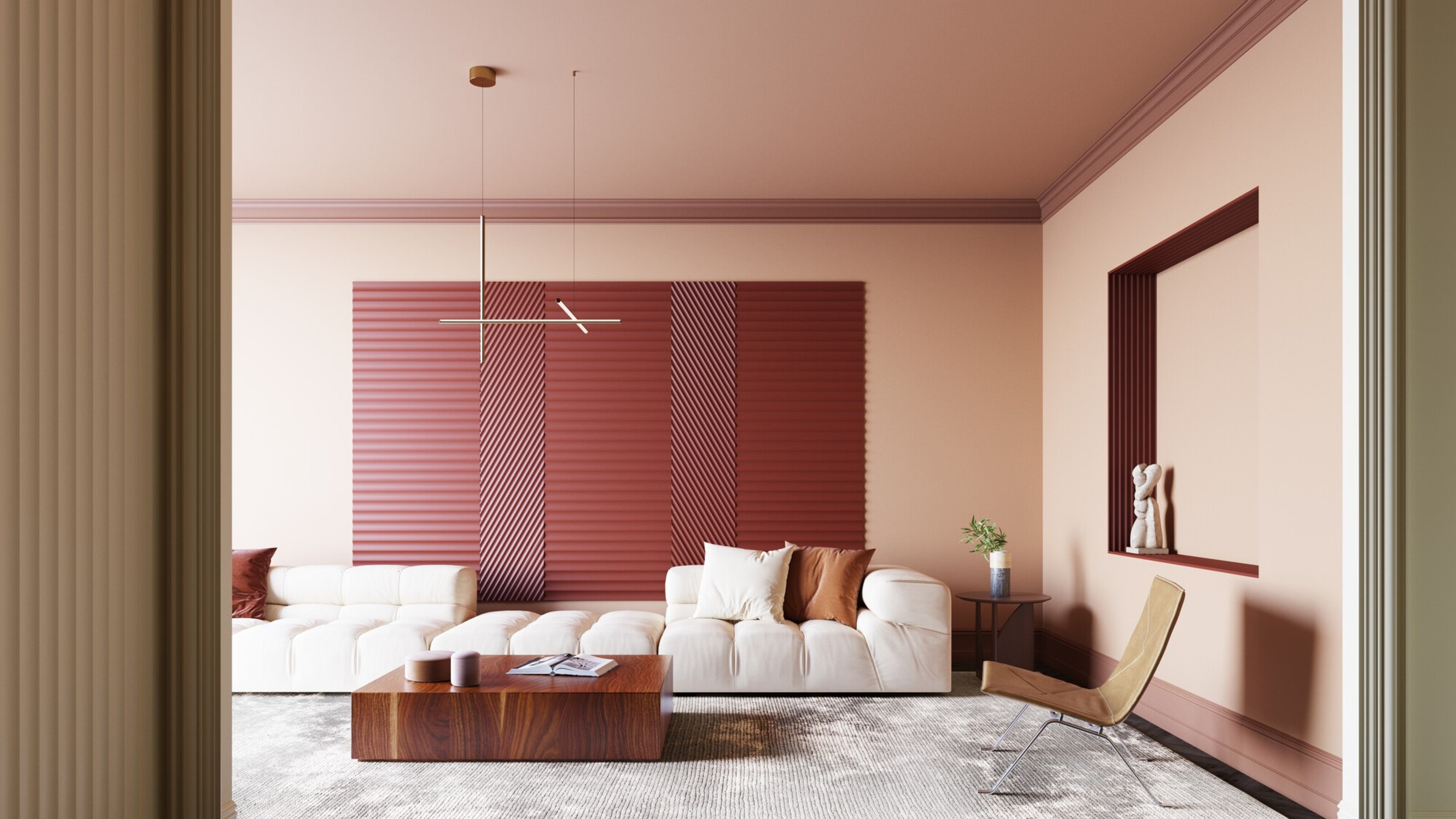
Should I paint my wall trim white? The pros and cons to painting your molding

What are the best trim colors? 7 alternatives to white paint to elevate your room's palette
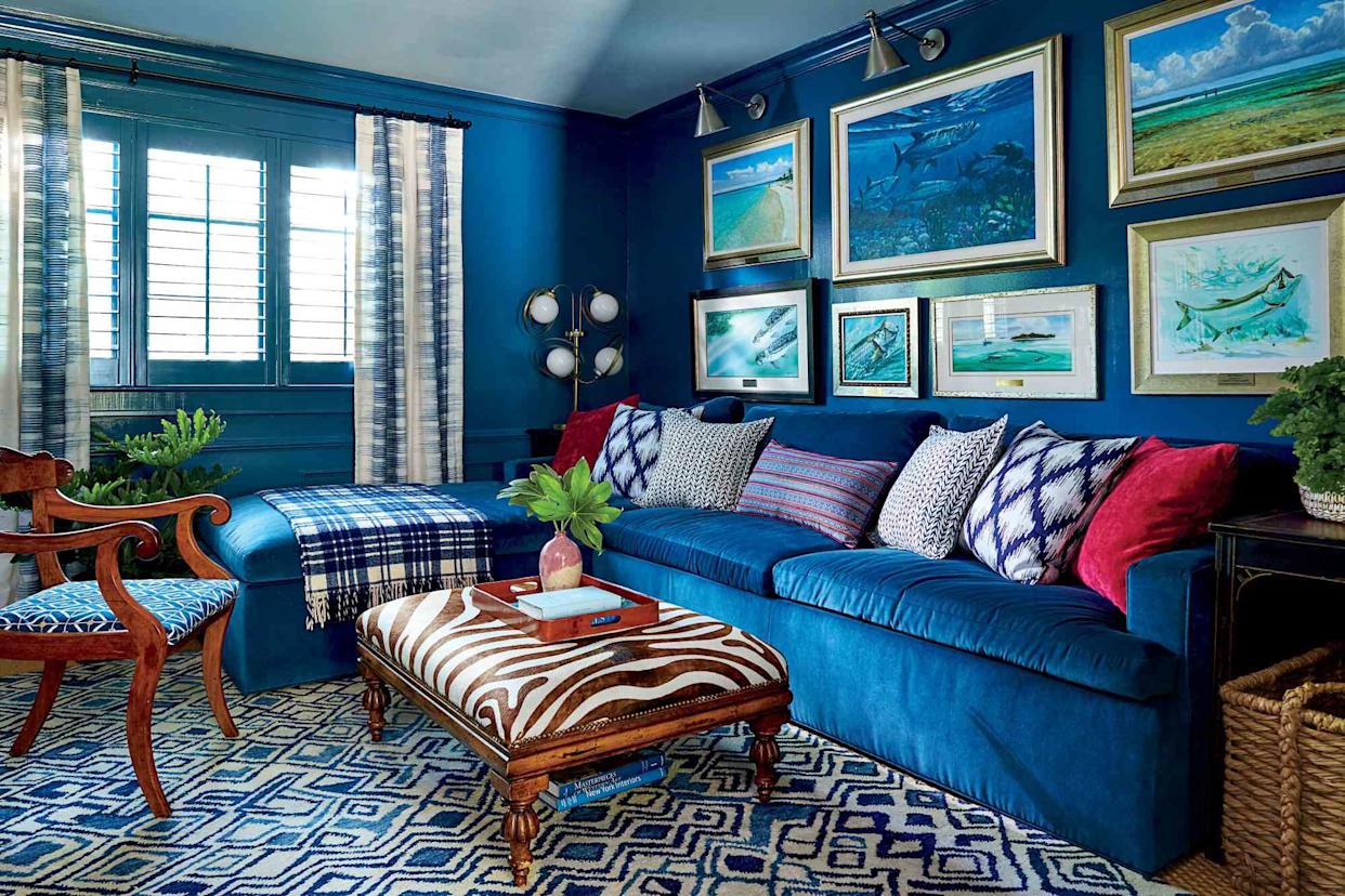
6 Paint Color Mistakes To Stop Making, According To Designers

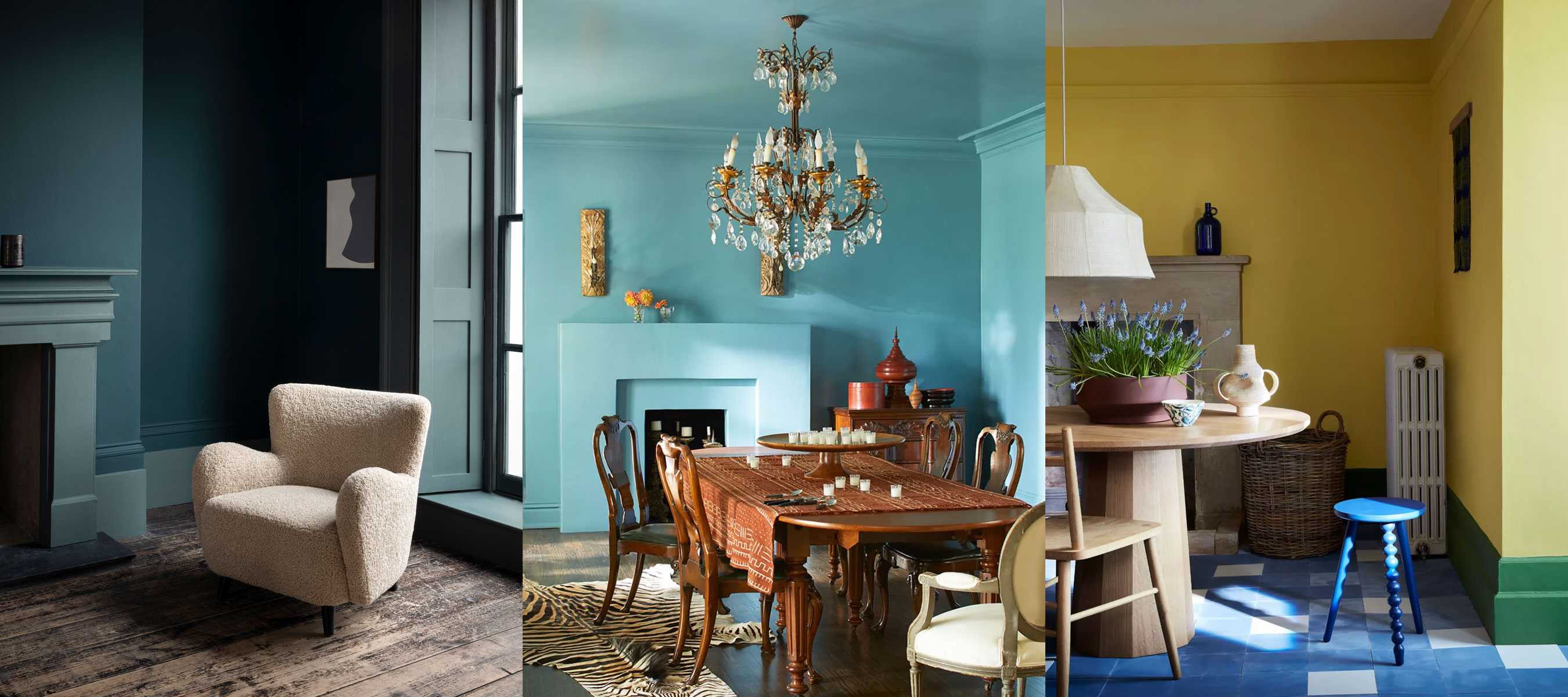
Should your trim match your wall color? Experts reveal 6 color tips that can lead to decorating success

Should you paint your ceiling a different colour to the walls? Experts explain why everyone should consider it
6 Outdated Trim Colors Designers Say to Avoid—and What to Use Instead

Should you choose your bathroom paint color or tiles first?
Should You Paint Ceilings and Walls the Same Color? Experts Give Their Verdict
Should You Paint Trim Darker Than Walls? We Asked Designers If That Trend Will Last

Should an entire house be painted the same color? Interior designers give their verdict
11 Pro Tips for How To Paint Trim

Should You Paint the Ceiling and Walls the Same Color? Interior Designers Share Their Thoughts

Should doors be painted the same color as walls? Yes, and here are 5 expert-approved reasons why
Should Doors and Trim be the Same Color? In 2025, Here's What Designers Are Doing
4 Times Designers Say You Definitely Shouldn't Paint Your Walls and Ceiling in the Same Color
5 Classic Wall and Trim Color Combinations—and 5 for Rule-Breakers Only


8 ideas for light walls with dark trim that capture this paint trend perfectly
Why the Correct Trim Color Can Totally Transform Your Home
Try These Dirt-Hiding Paint Colors in the Messiest Parts of Your House