1/4
Should Doors and Trim be the Same Color? In 2025, Here's What Designers Are Doing
The traditional approach of painting doors and trim in a crisp, bright white is evolving, with designers in 2025 moving towards more intentional and dynamic color strategies. This shift moves away from the sterile and unfinished feel that uniform white can sometimes create, embracing doors and trim as integral elements that sculpt perspective, sharpen color palettes, and provide visual structure to a room. The key to modern interior design is intention, whether choosing to match or contrast these architectural features.
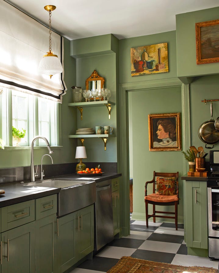
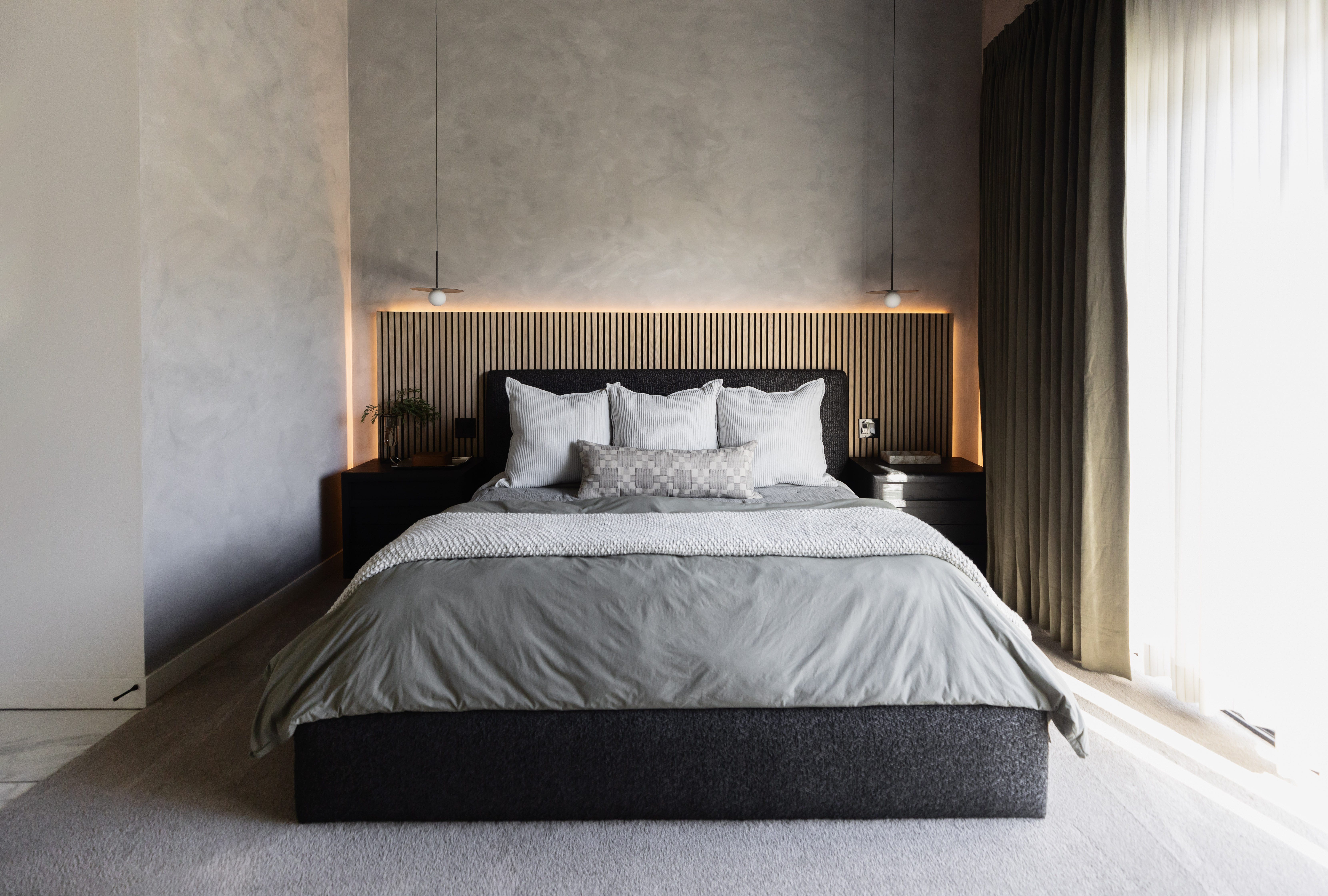
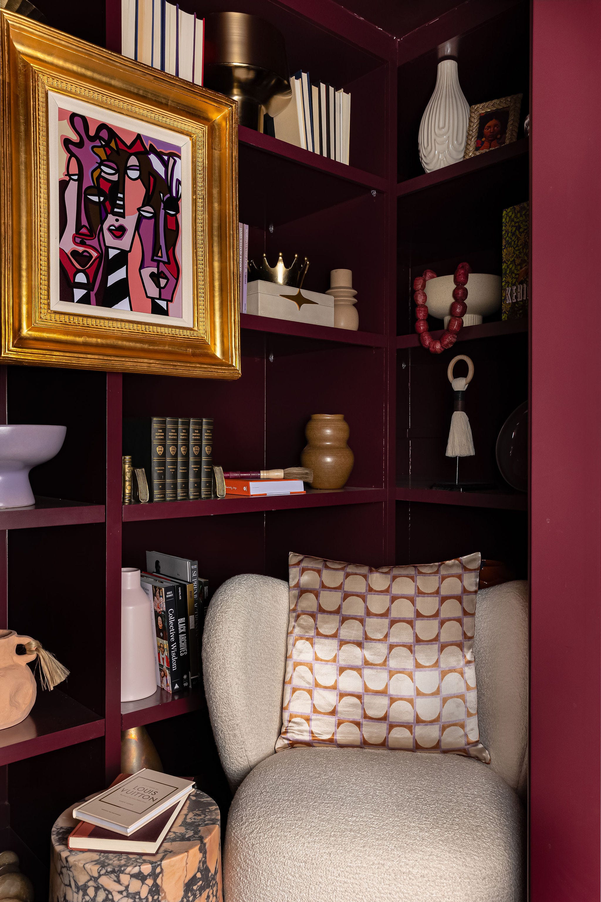
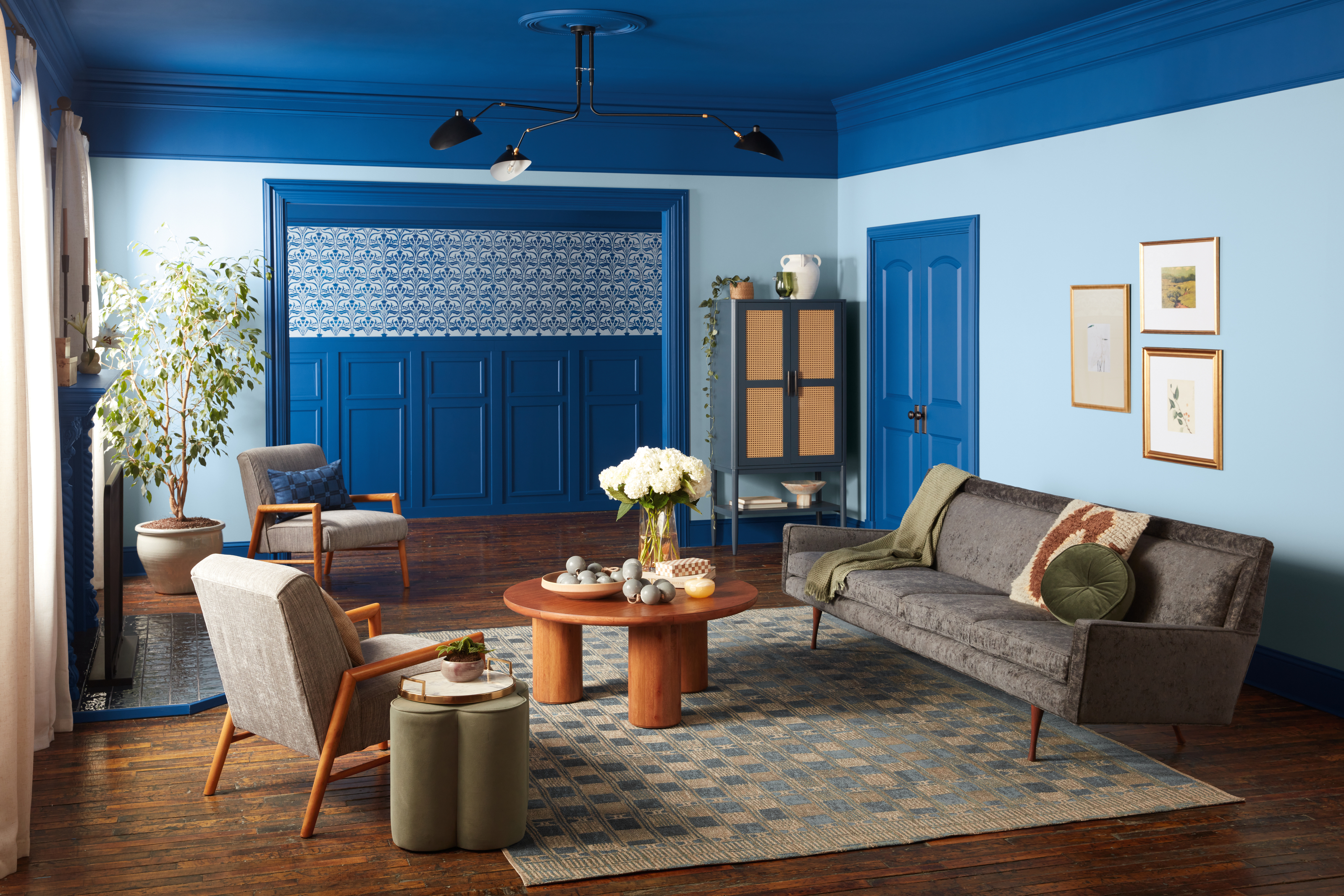
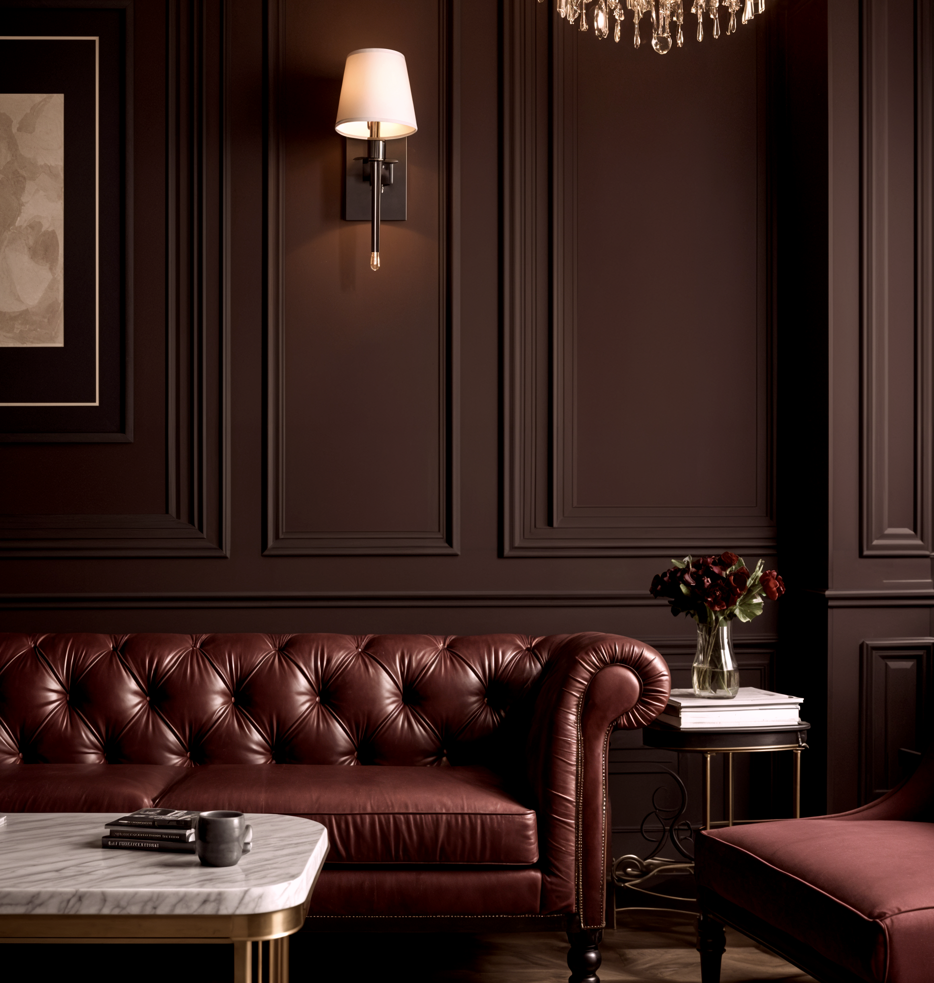
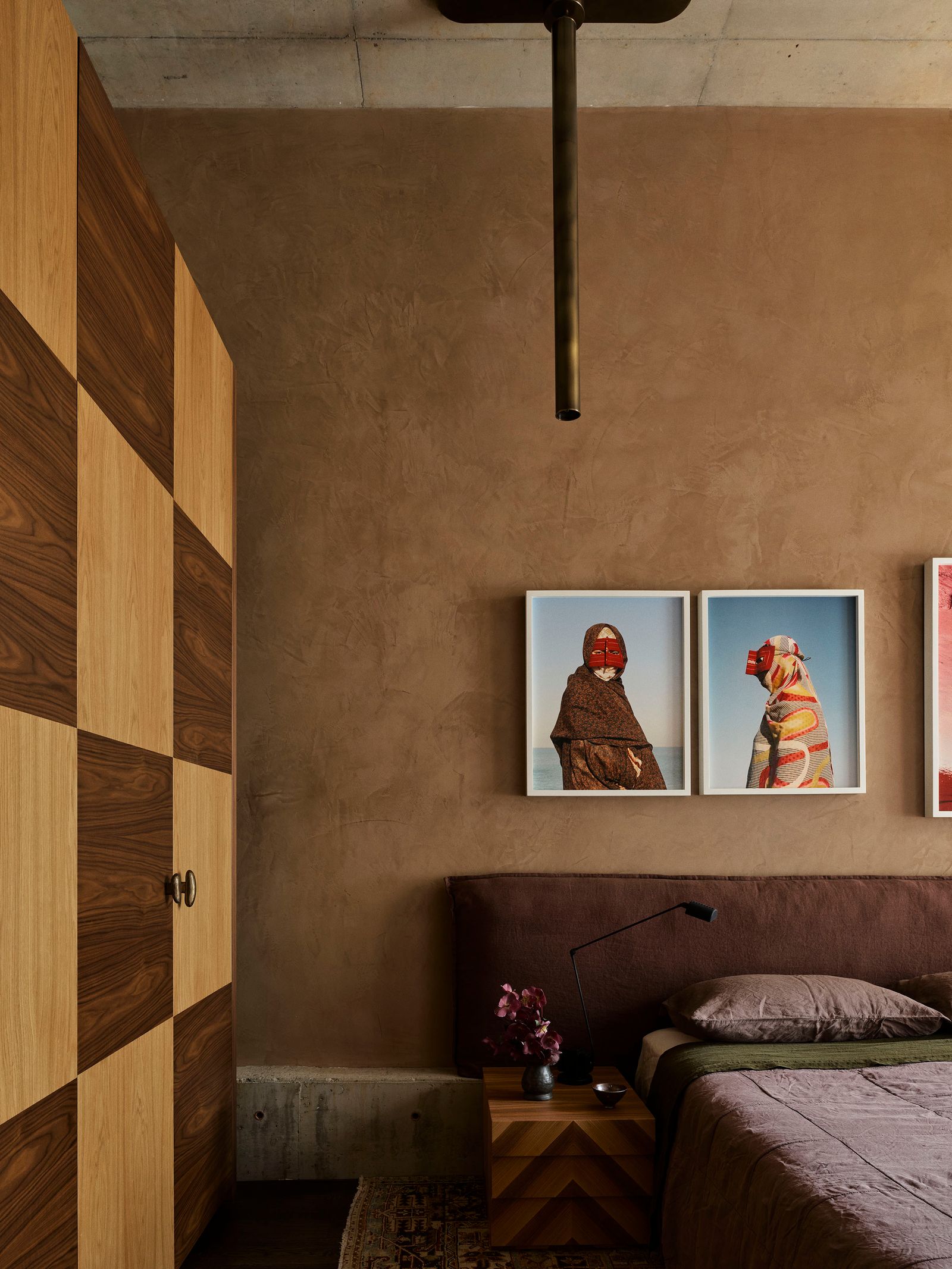
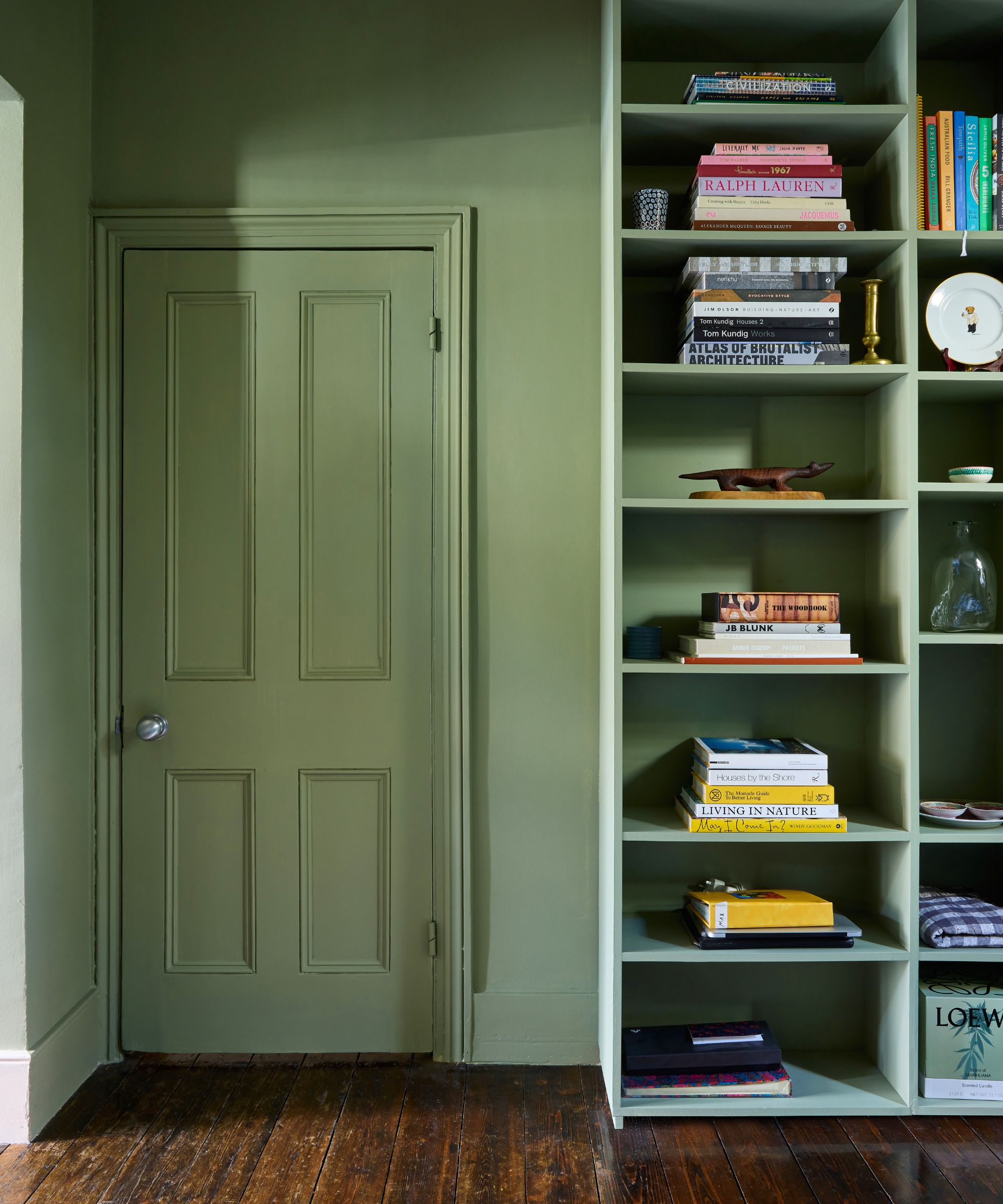
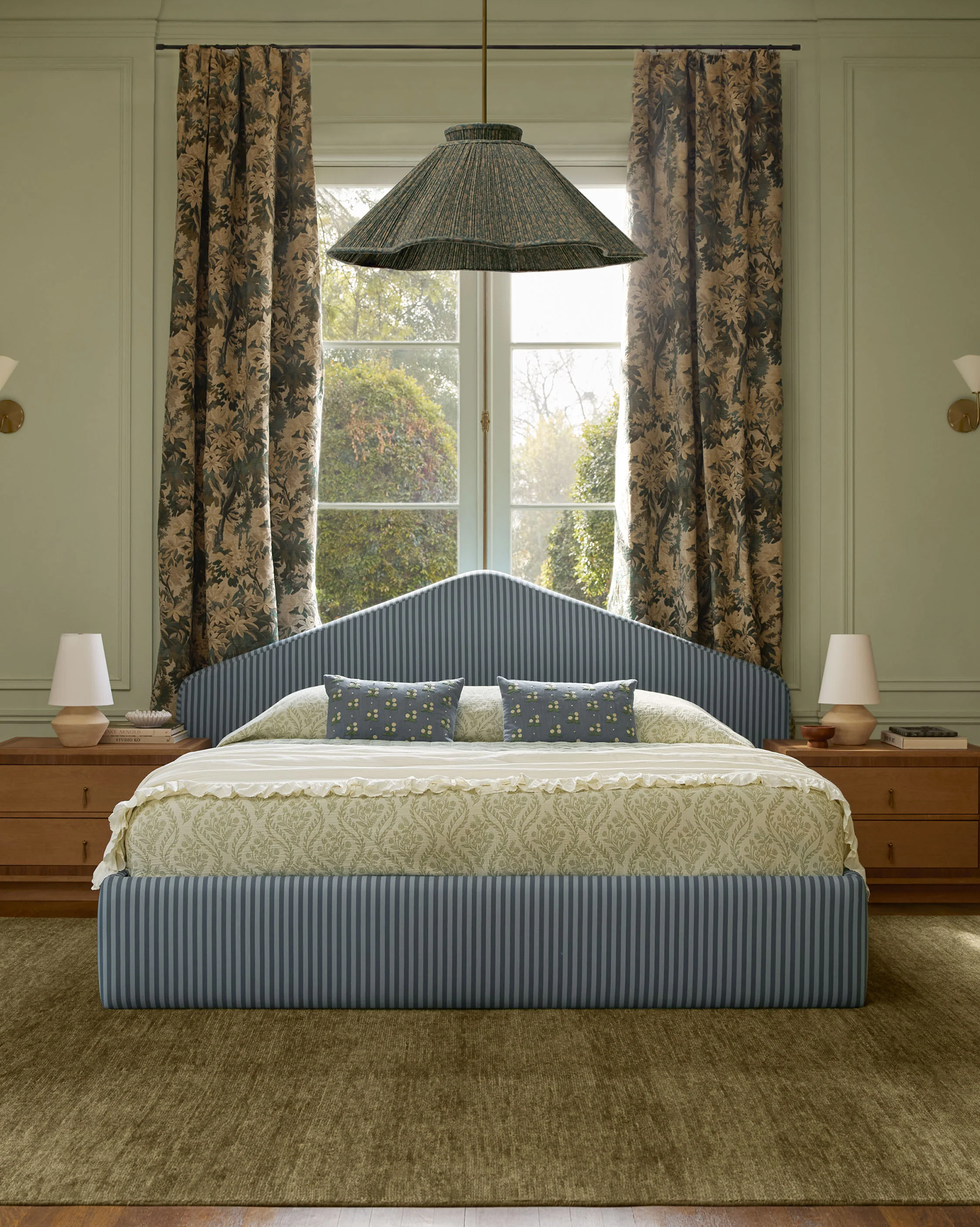
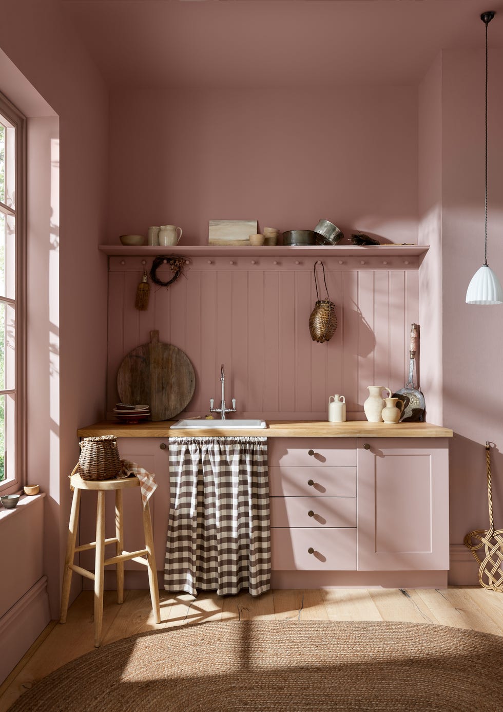
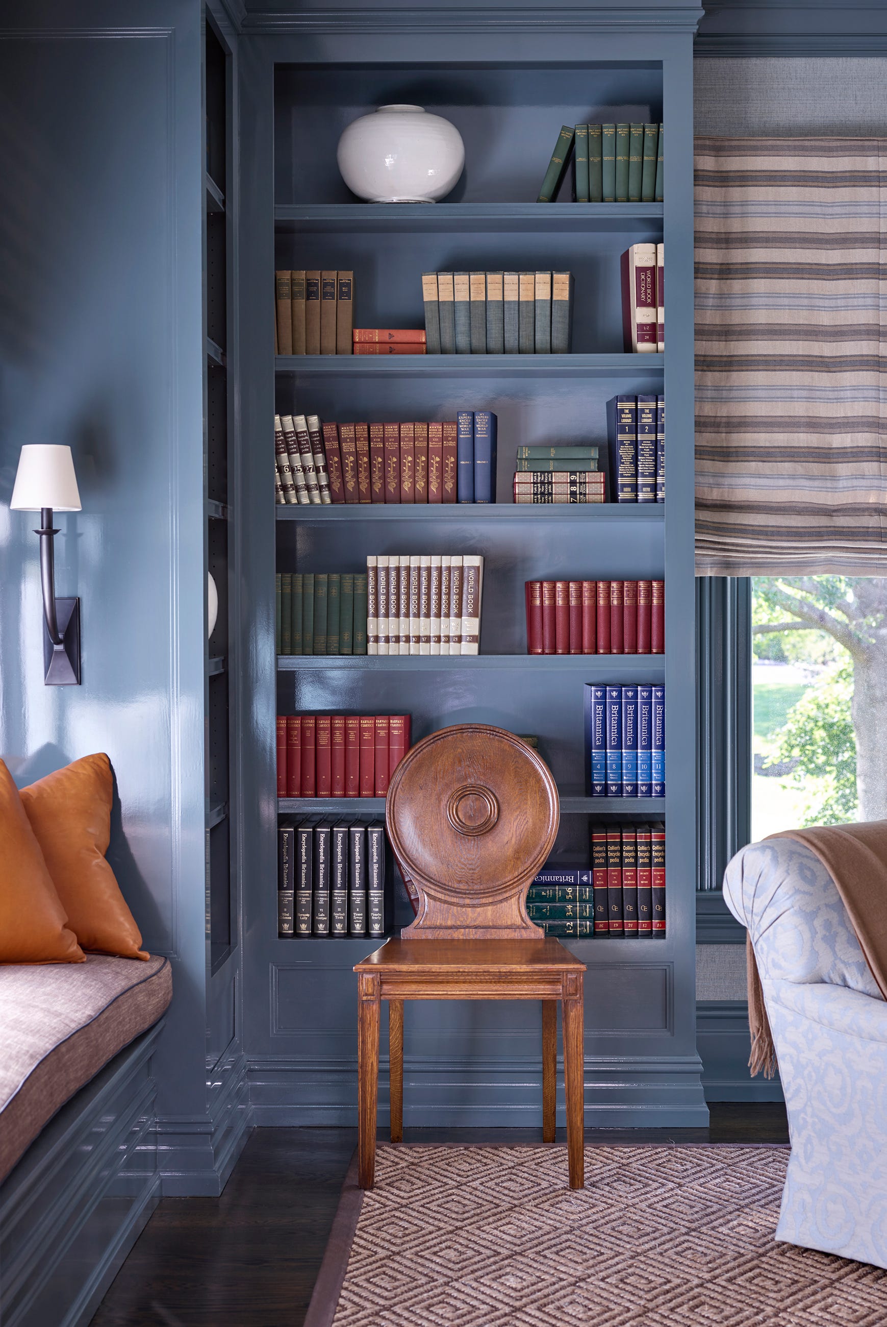
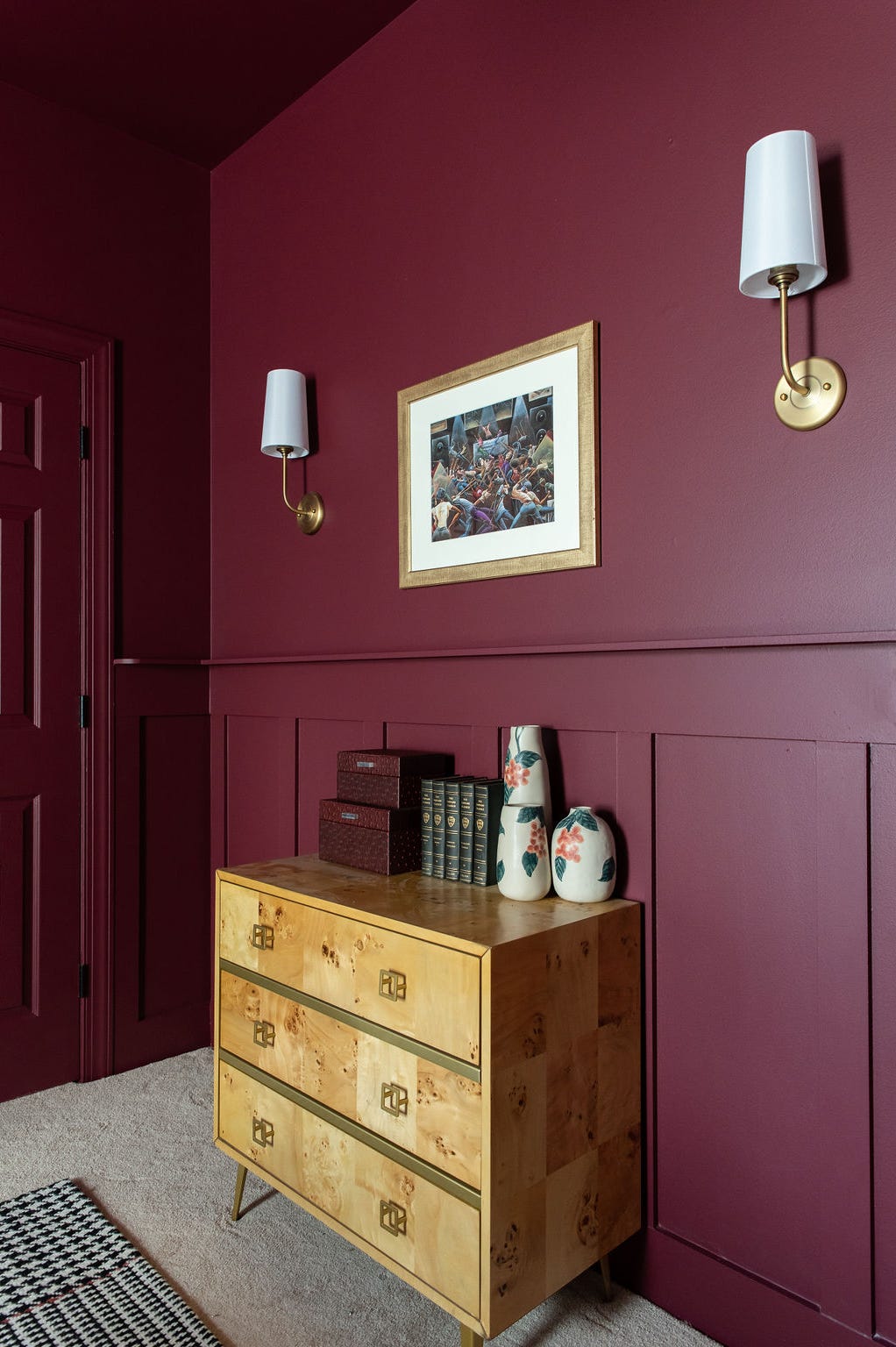

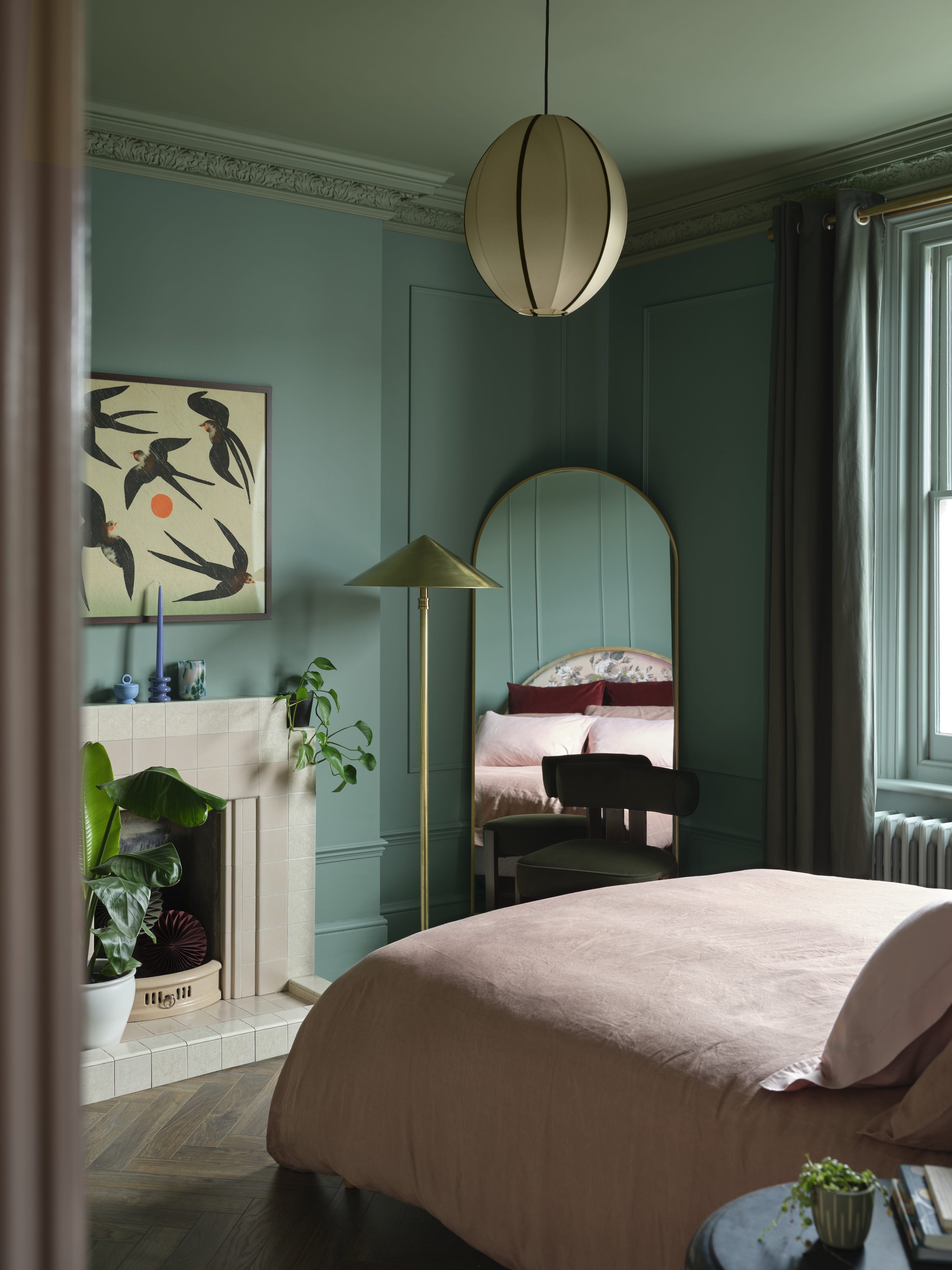
Matching doors and trim can create a cohesive and calm envelope, particularly effective when the architecture itself is strong. This strategy is often seen in color-drenching techniques, where a single color unifies the space and establishes visual harmony. This doesn't mean sacrificing boldness; contemporary colors and trends can still be incorporated within a matching scheme. However, an entirely monochromatic approach can sometimes lead to a flat or forgettable room, as noted by designer Lauren Saab.
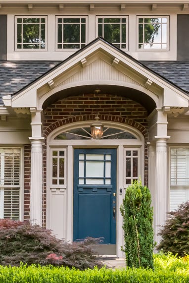
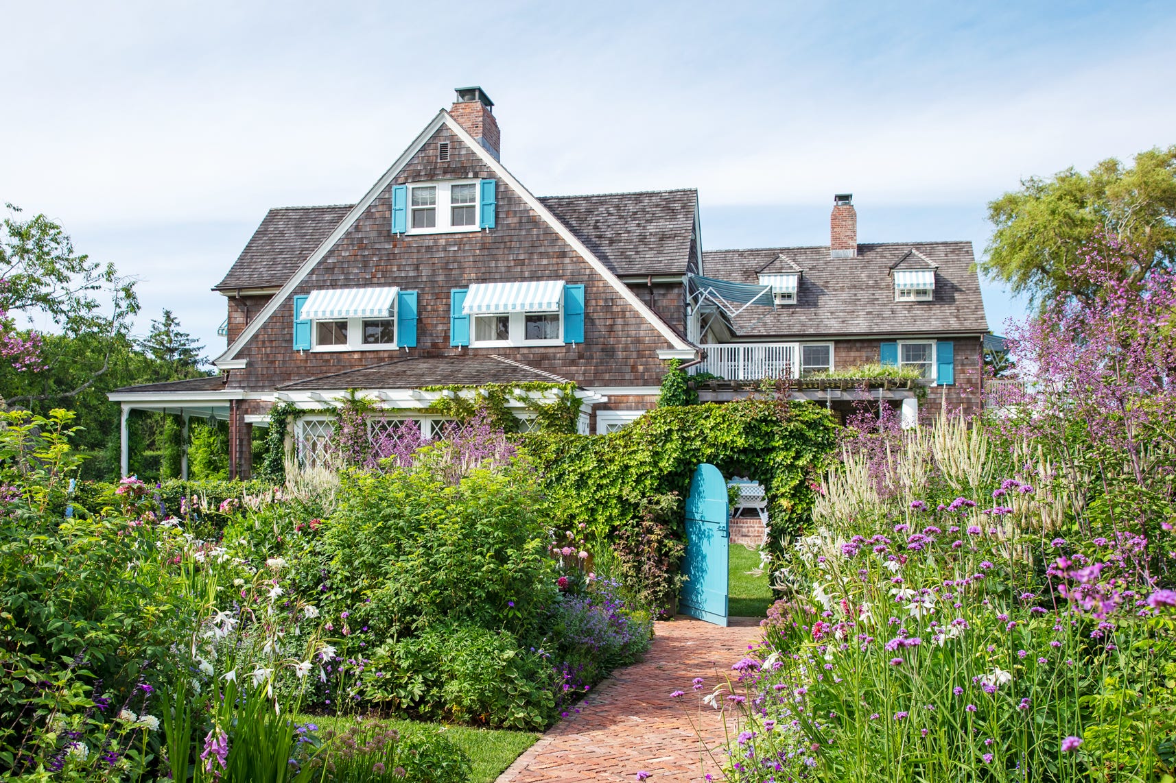
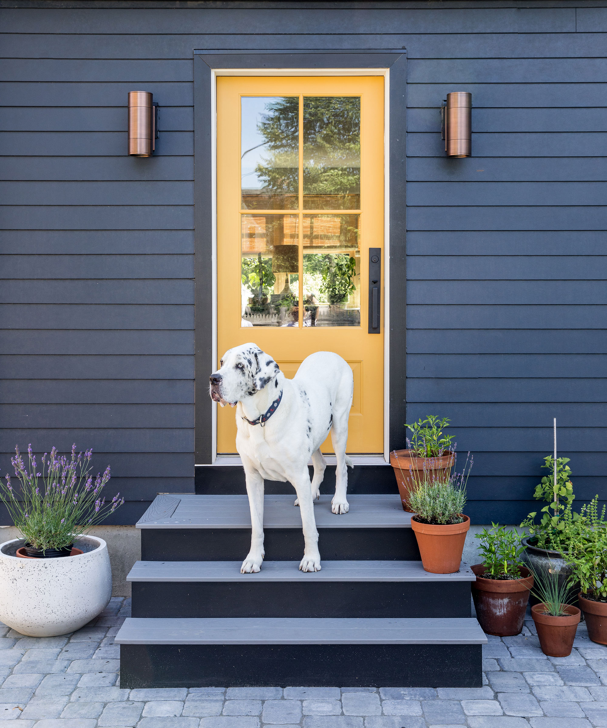
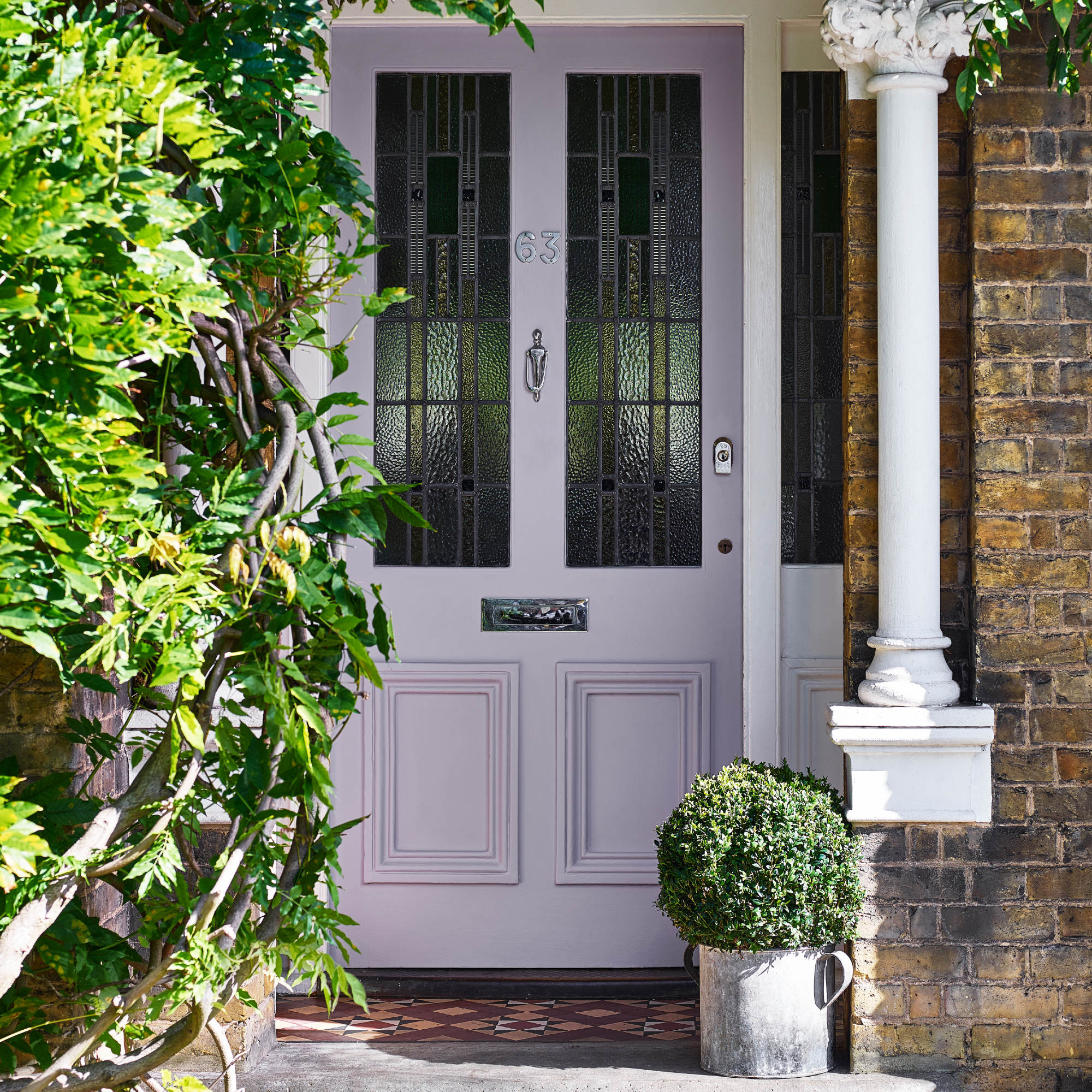
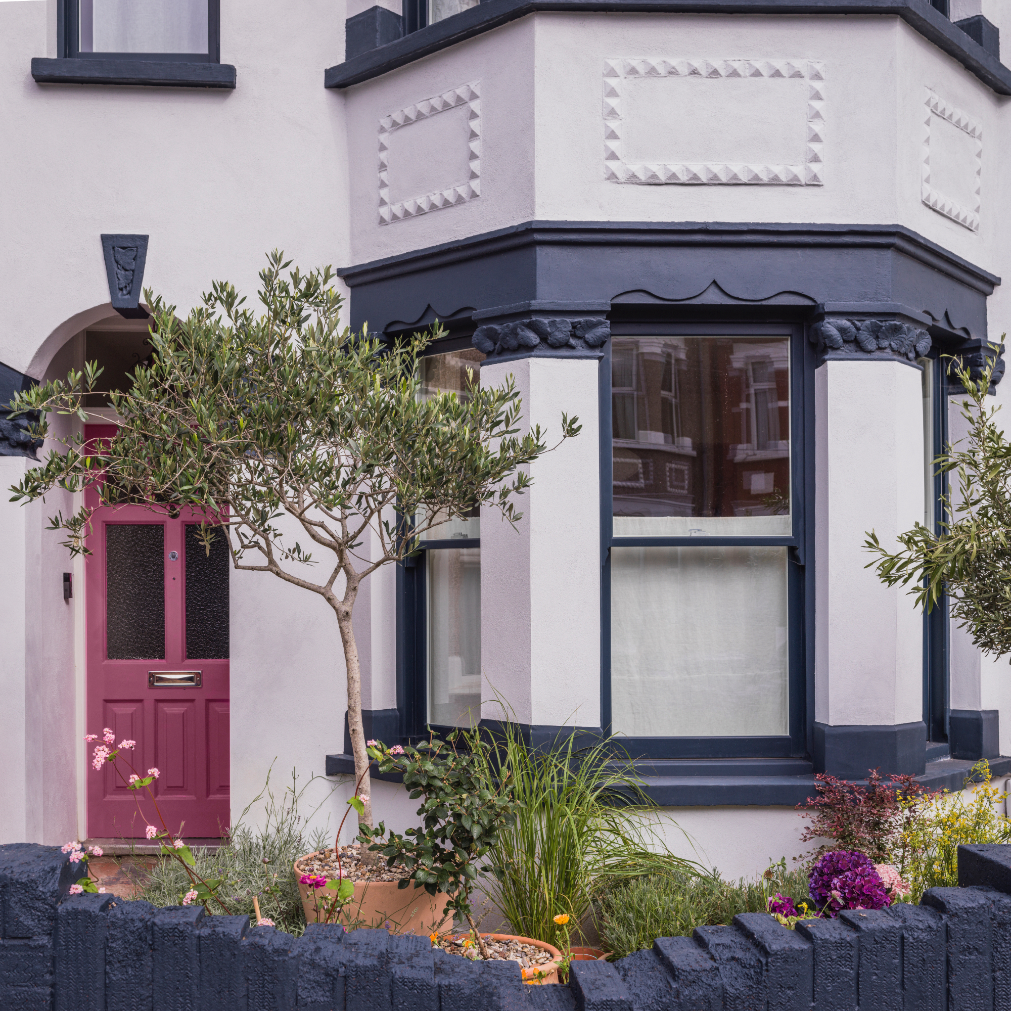
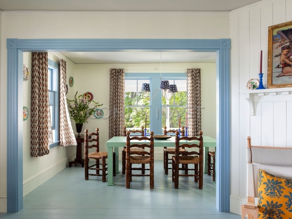
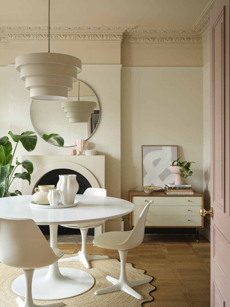
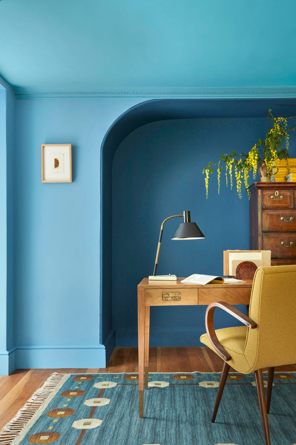
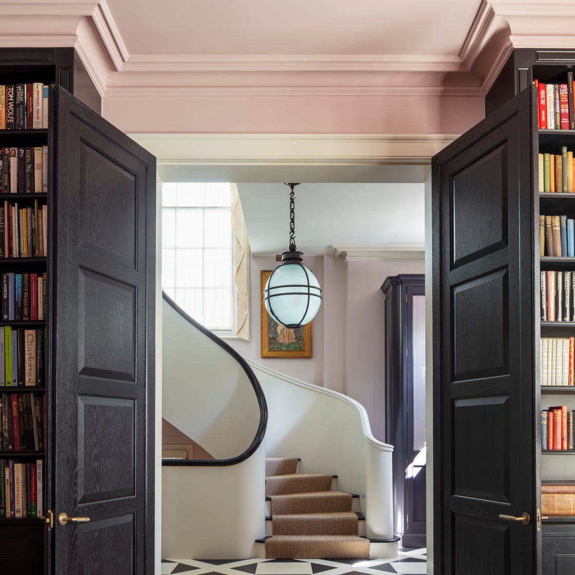
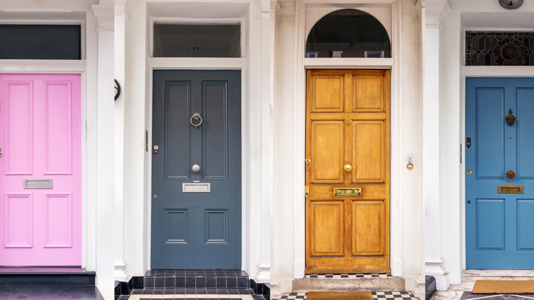
Conversely, contrasting doors and trim can introduce depth and definition. A darker trim can sharpen architectural lines, while a painted door can draw the eye through a space, creating a visual flow. Designers like Peggy Haddad observe a growing trend towards bolder and more playful use of color in architectural details, transforming doors and trim from mere afterthoughts into significant design opportunities. The choice between matching and contrasting ultimately depends on the desired level of architectural presence in the space.
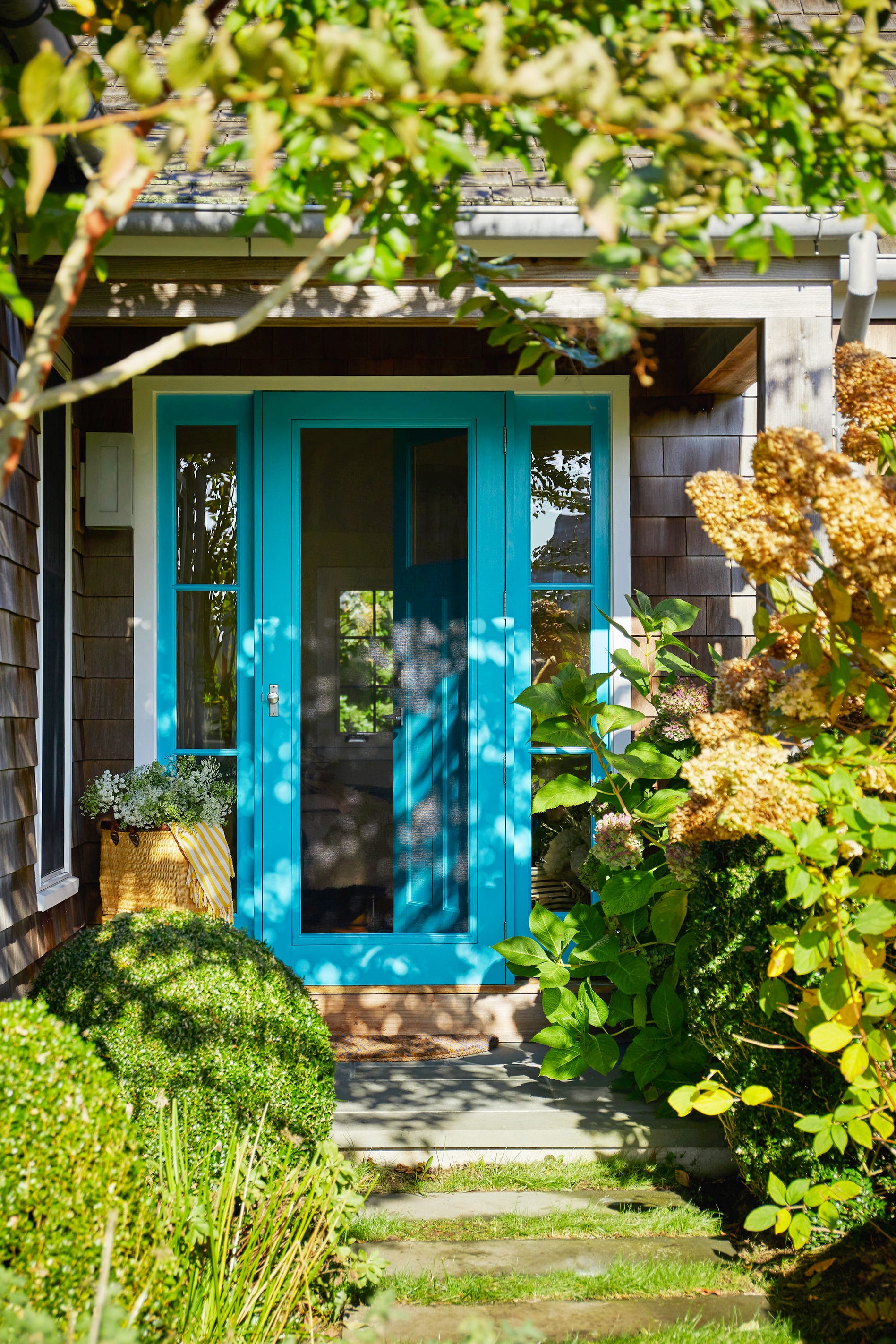
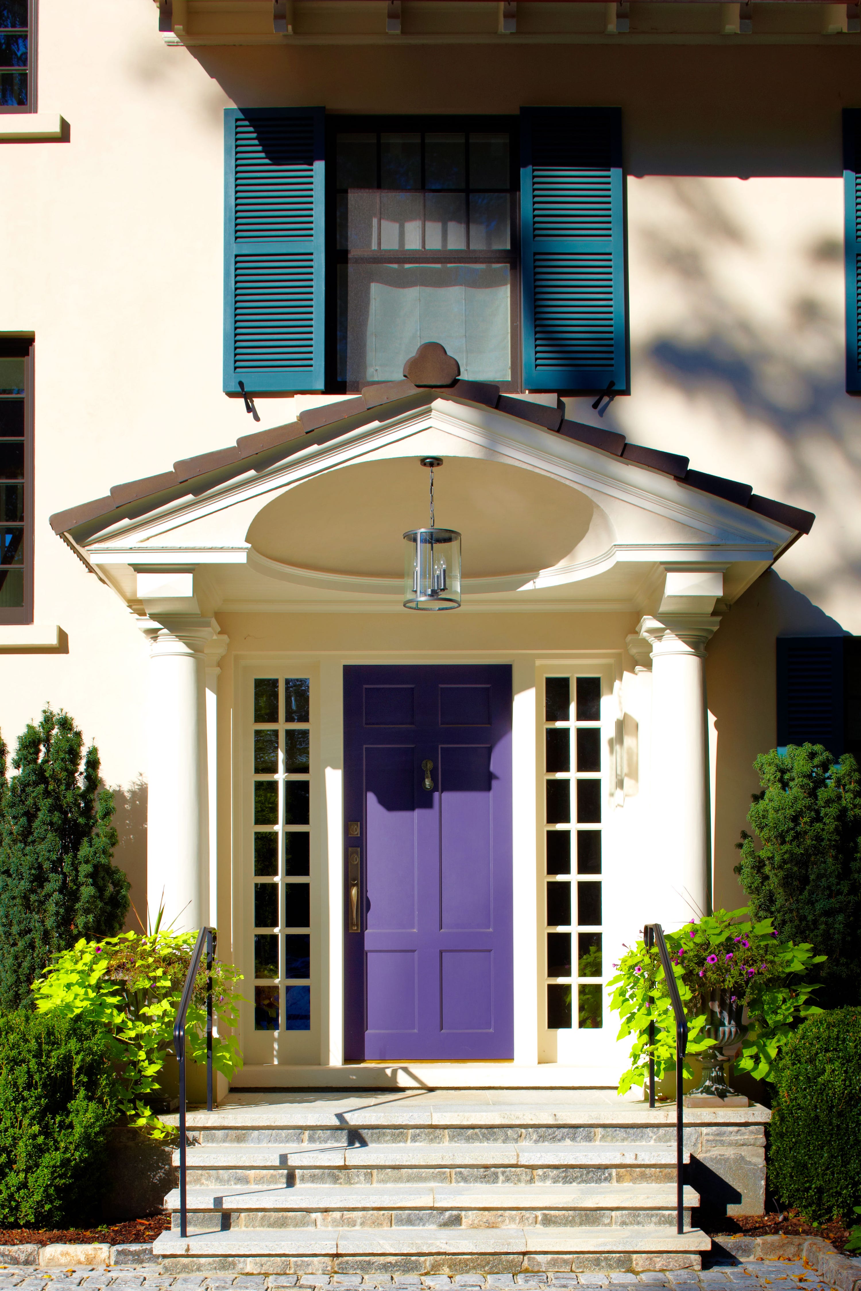
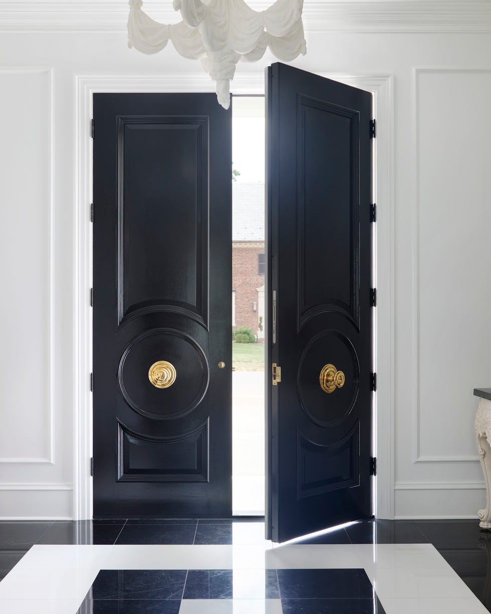
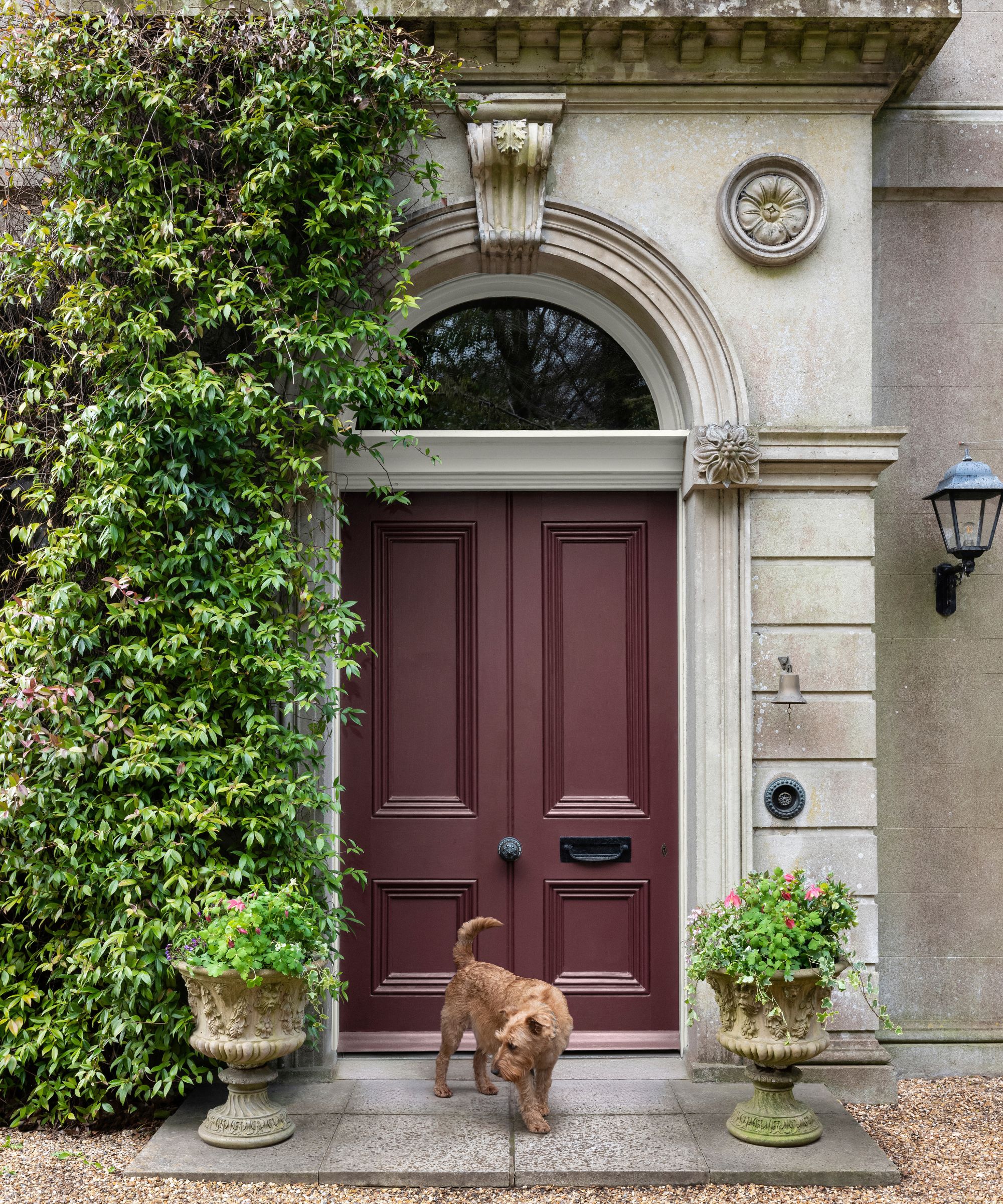
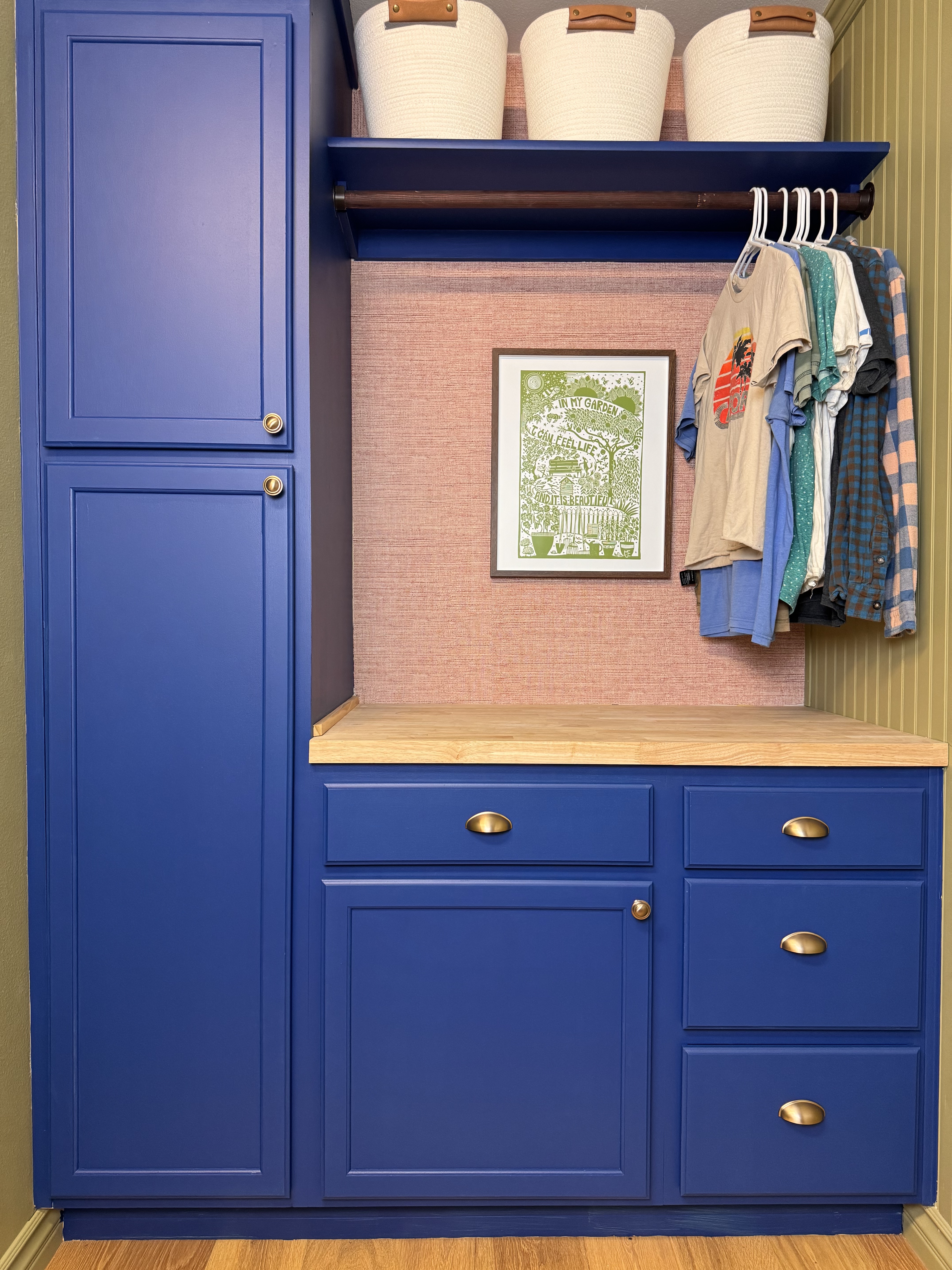
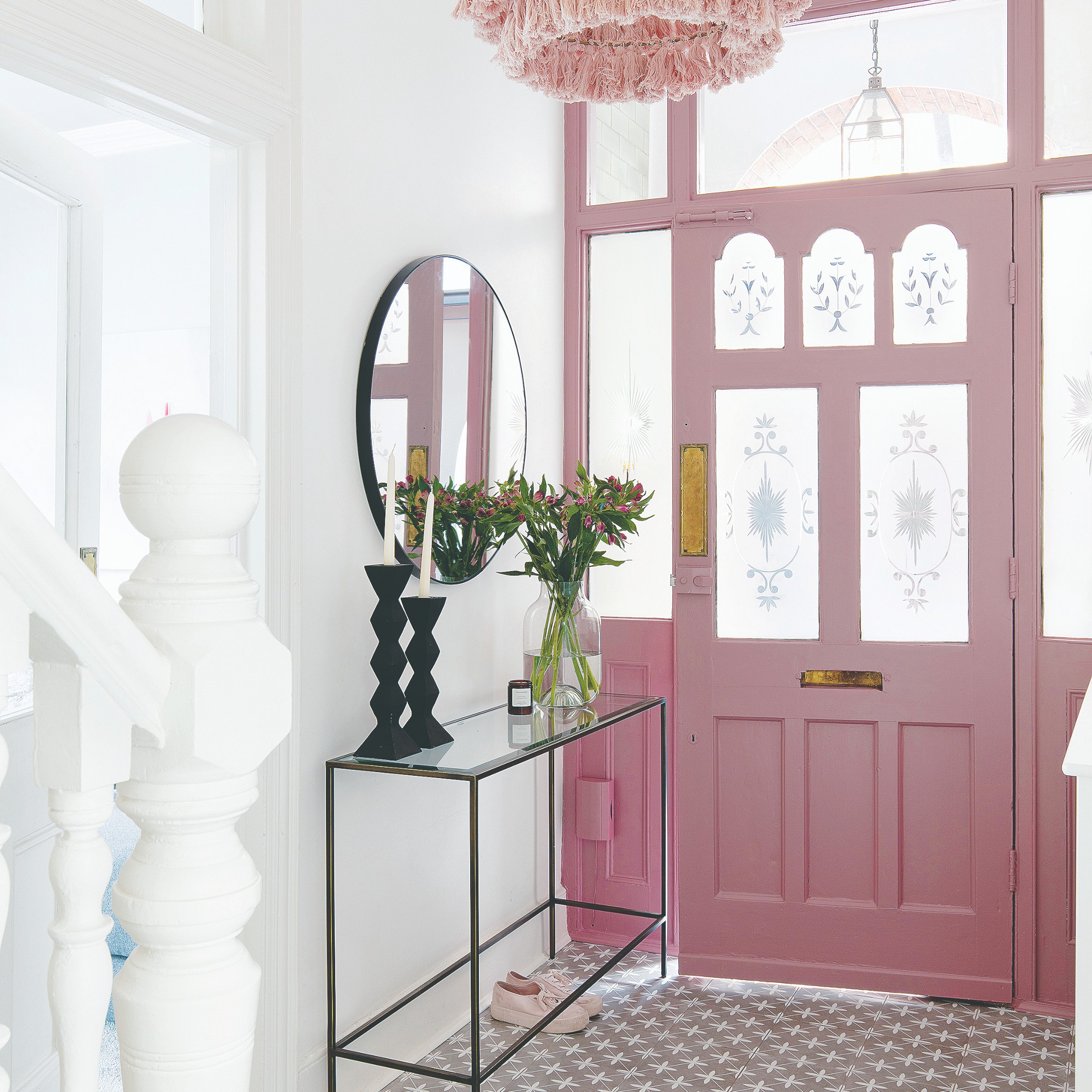
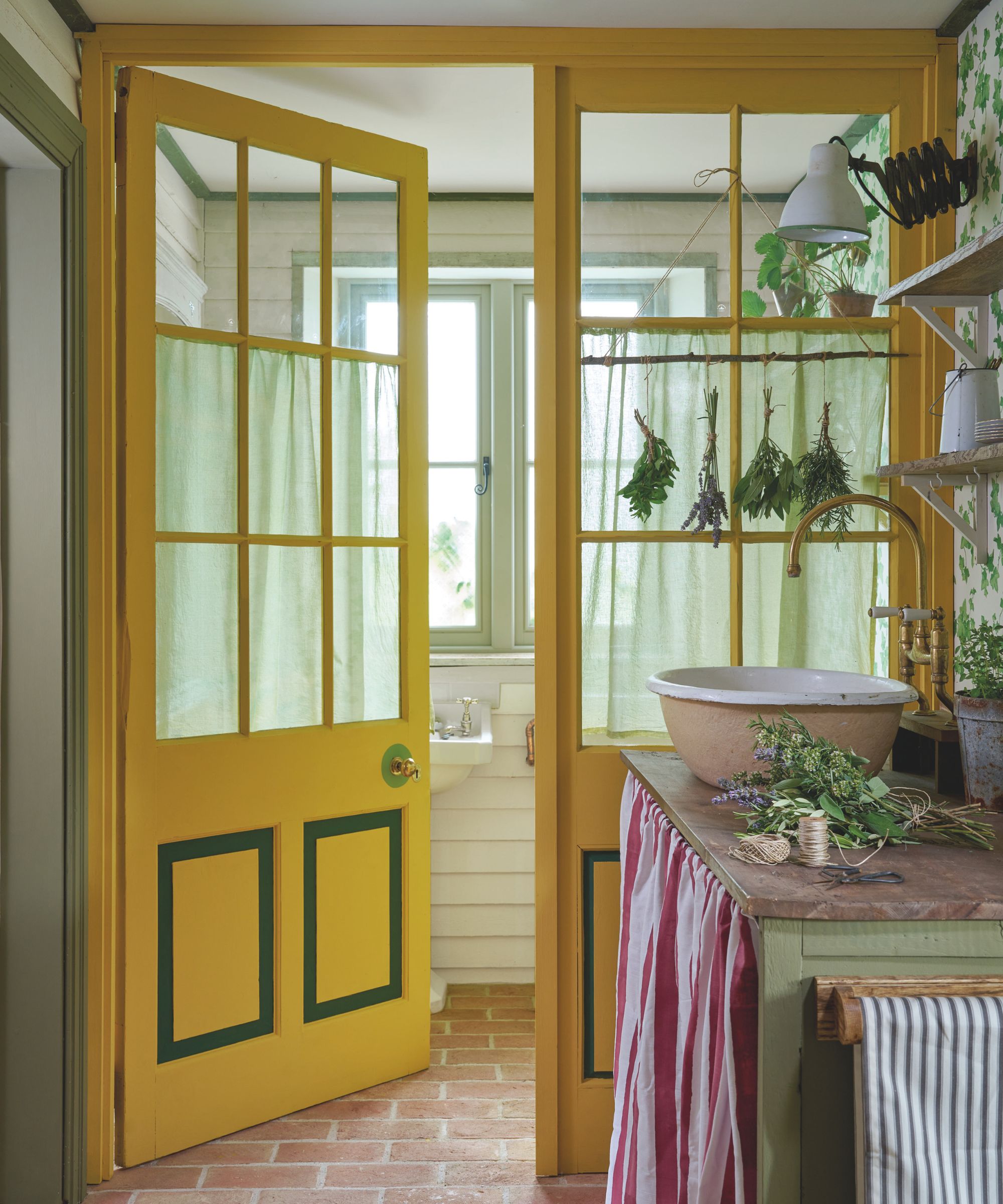
Designers in 2025 are implementing three main approaches. First, bold color statements are being made, where doors and trim are no longer meant to disappear but instead to frame the space and contribute significantly to the overall color scheme. This can involve saturated colors or unique tonal variations, creating a contemporary feel. When both trim and doors are bold, ensuring their materials or tones complement each other can result in a sculptural, immersive environment. The emphasis is on deliberate choices rather than playing it safe.
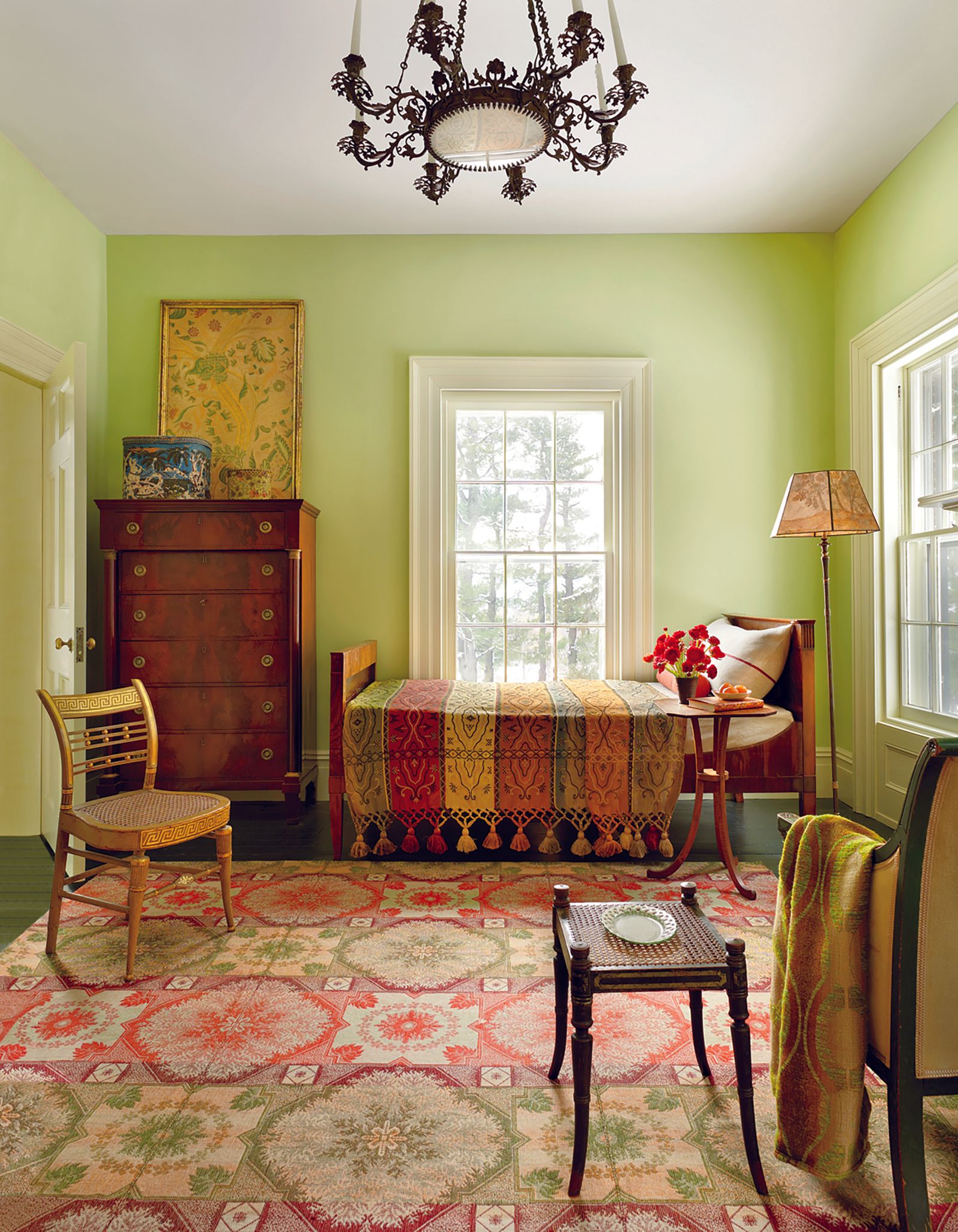
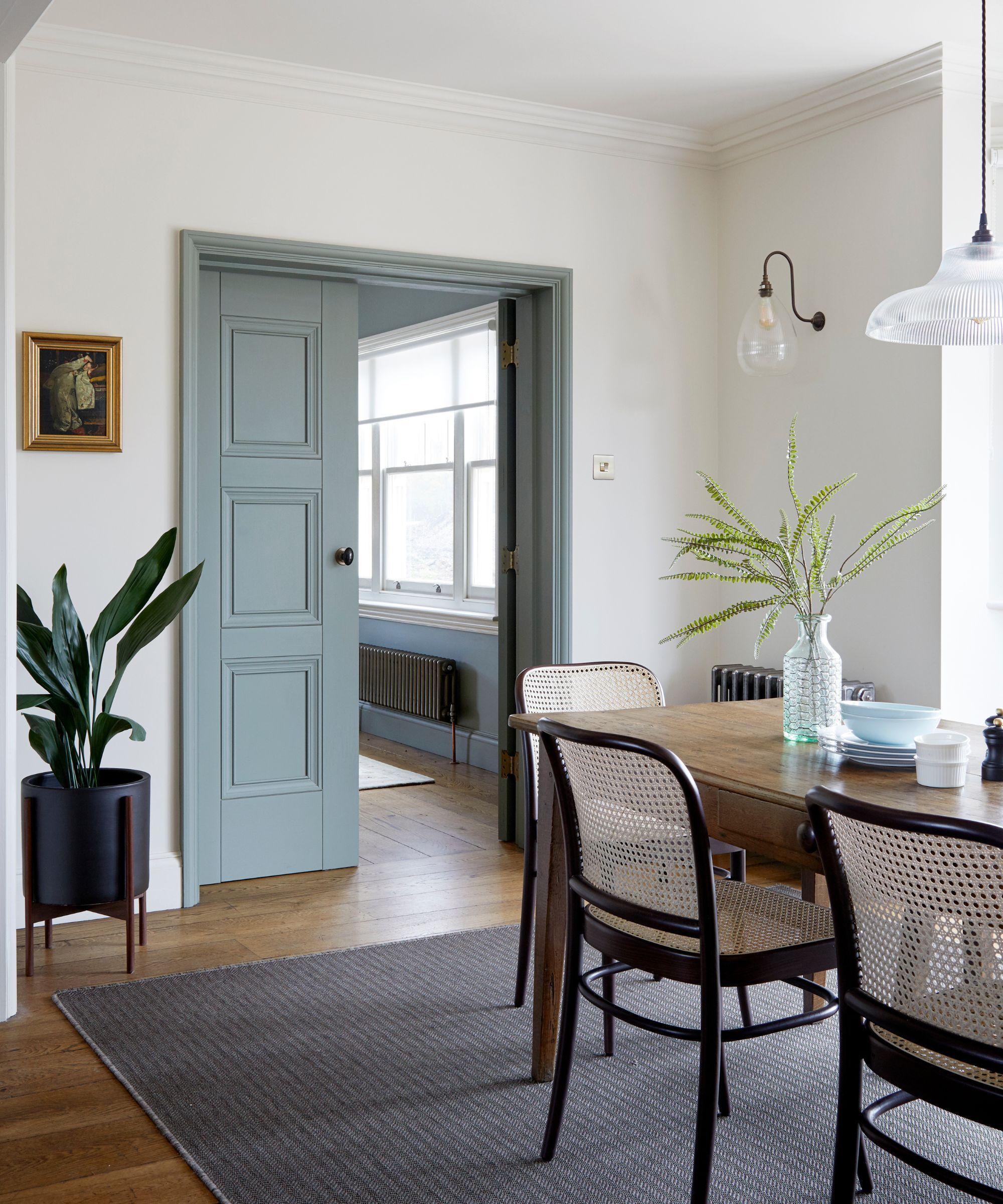
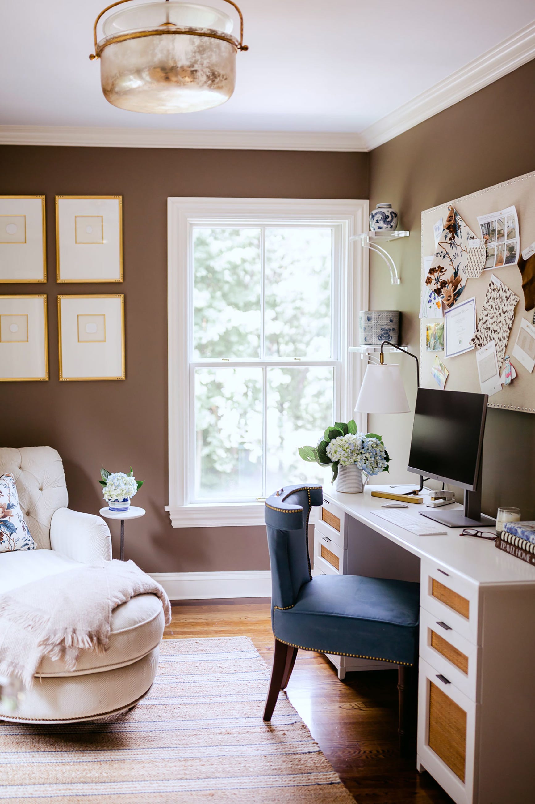
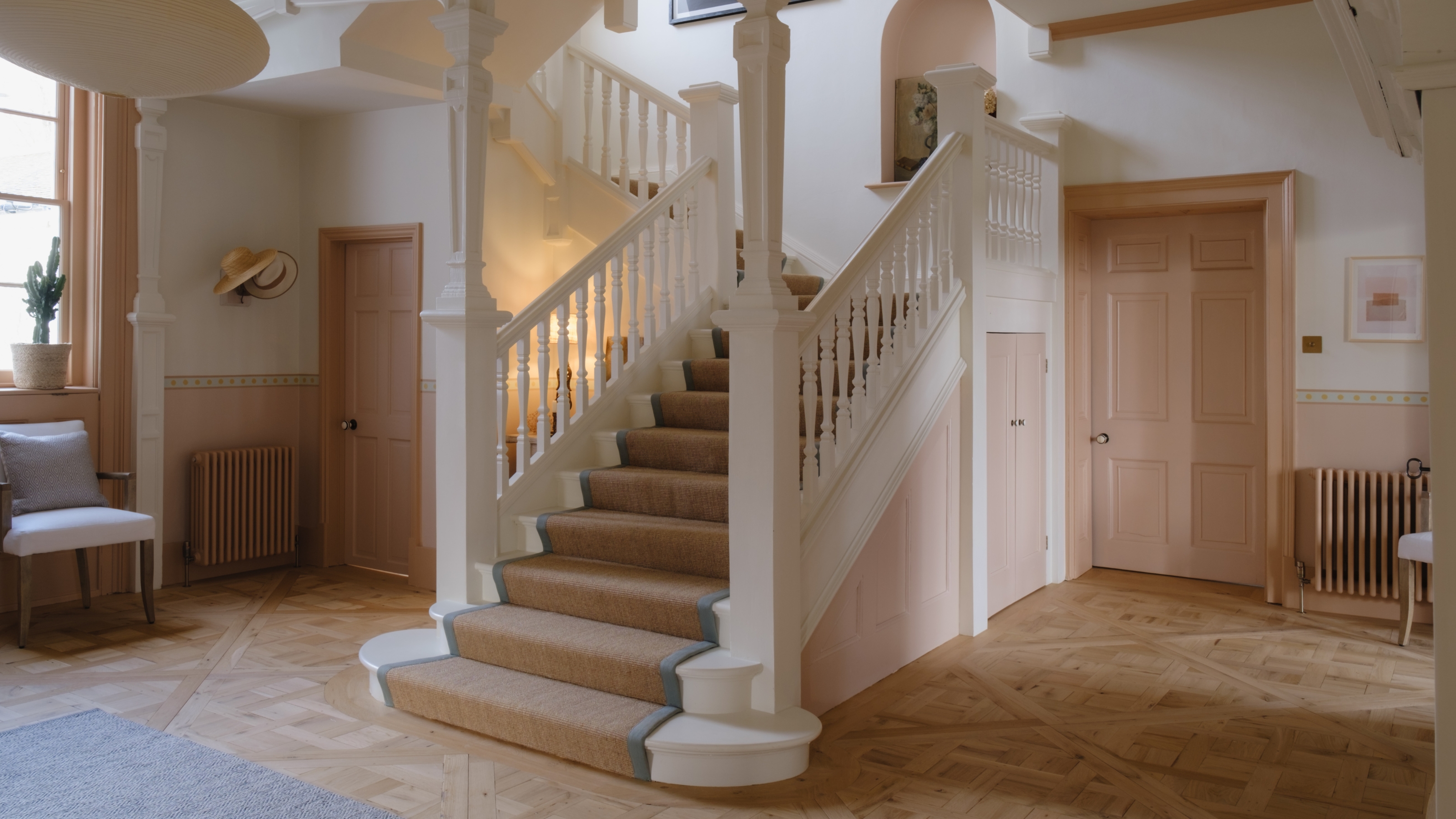
Second, interesting materials and curated contrasts are gaining prominence. White is being replaced by warm putty tones, inky charcoals, or natural wood finishes for trim colors. These choices offer a neutral base but with added flair. For instance, contrasting wood stains between doors and trim, such as a warm wooden door with a darker-stained trim or a charcoal-black next to natural timber, provides a subtle yet stylish aesthetic. Peggy Haddad recounts a project where warm off-white walls and trim were paired with warm gray doors, creating subtle interest while maintaining a soft and classic feel.
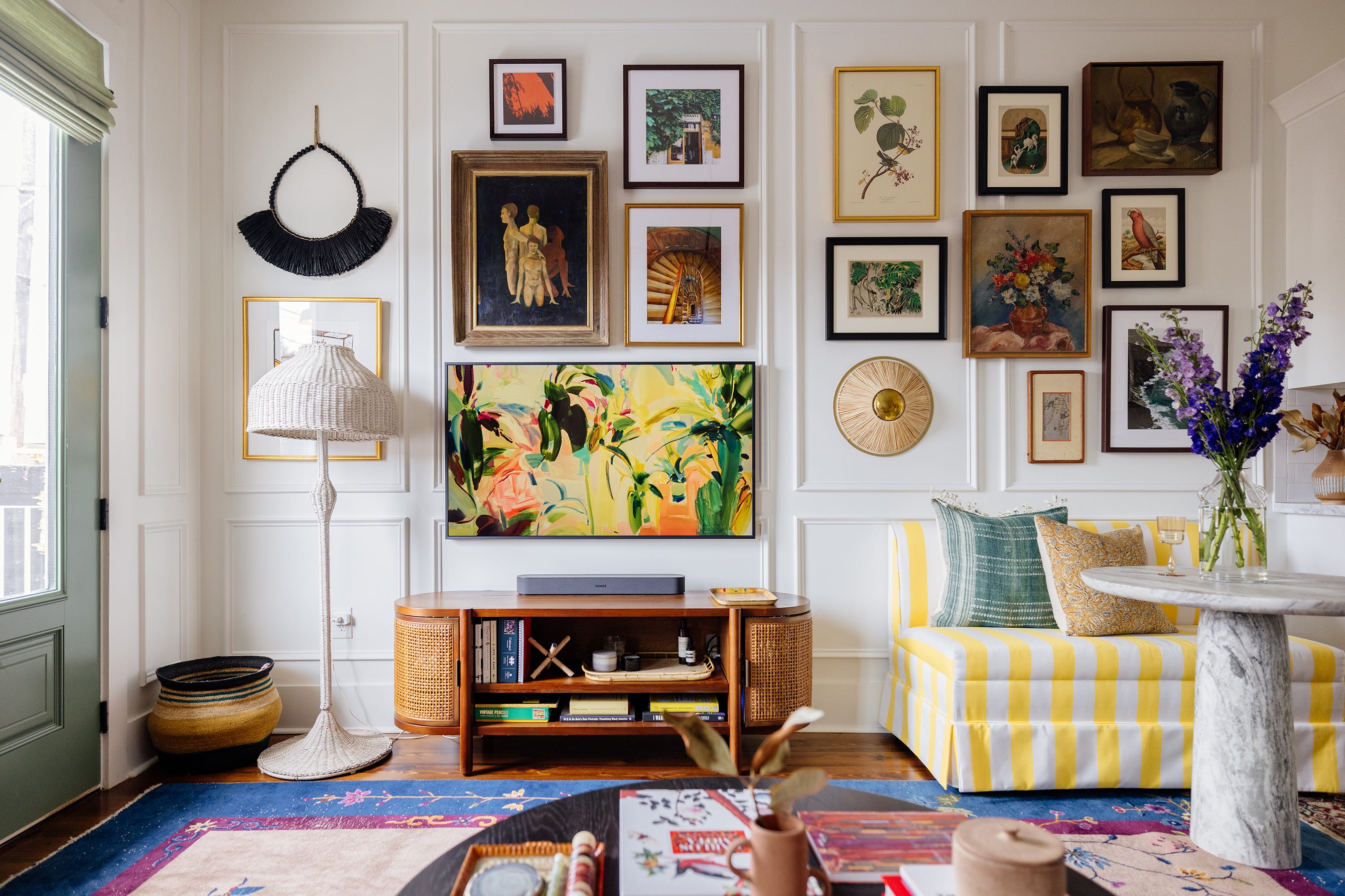
Third, designers are using door and trim colors to highlight specific architectural features. Jo leGleud from Maddux Creative details the technique of using varying hues of the same color for elements like beads or trim on a panel, which enhances depth and interest. In spaces with intricate paneling, contrasting colors can be introduced to carry light or add a playful touch. However, in already busy rooms, matching details might be preferred to allow other elements to be the focal point. Ultimately, whether opting for matching or contrasting colors, the goal is to express personal style and avoid adhering strictly to outdated design 'rules.' This philosophy also extends to considerations like whether ceilings and trim should share the same color.
#InteriorDesign #HomeDecor #ColorTrends #ArchitecturalDetails #DoorColors #TrimColors #ModernInteriors #DesignTips #PaintChoices #InteriorDesign #HomeDecor #ColorTrends #ArchitecturalDetails #DoorColors #TrimColors #ModernInteriors #DesignTips #PaintChoices
0 comment in total
 No comments yet
You may also like
Designers Predict Every Front Door Will Be One of These Colors in 2026


These Colors Will Be Everywhere in Interiors in 2025
What is Color Forecasting? Experts Explain How to Map Trends |
5 Paint Colors That Are Out for 2025, According to Interior Designers

The 5 Best Interior Door Colors to Use in 2025, According to Designers

The Pros Have Spoken: These Interior Design Trends Will Define 2025

5 Paint Colors That Will Take Over in 2025, According to Interior Designers

Ready to Redecorate? 2025’s Top Design Trends Just Dropped

7 Front Door Color Trends That'll Surge in Popularity in 2025, According to Designers
Say Goodbye to Neutrals: Color-Drenching Will Define 2026 Interiors
Designers and property experts have called it - this unique front door colour is set to be huge in 2024
Interiors experts predict this will be the biggest paint trend of 2026

5 Front Door Paint Colors You're Going to See Everywhere in 2025, Designers Say

6 Trendy Front Door Colors That Will Be Replacing Outdated Styles In 2025
These Colors Will Be Everywhere in Interior Design in 2026
The Interior Paint Colors You'll Be Seeing Everywhere in 2024
5 most welcoming front door colors for 2025, say experts


The #1 Paint Color Trend of 2025, According to Designers
The chicest interior door colors you’ll want in your home in 2025 – because white isn't the only option
6 Trendy Front Door Colors That Will Be Replacing Outdated Styles In 2025