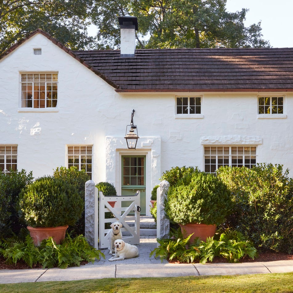
1/6
7 Front Door Color Trends That'll Surge in Popularity in 2025, According to Designers
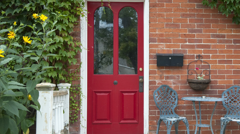
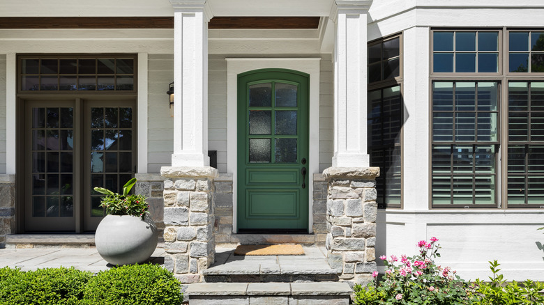
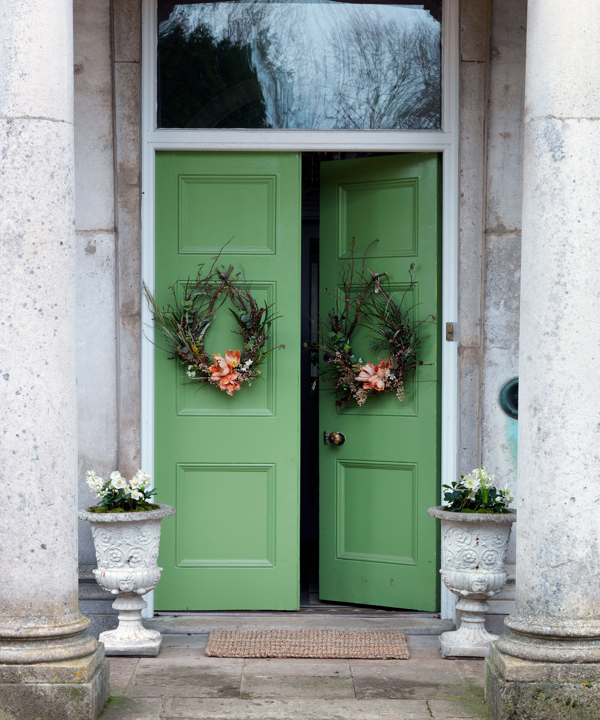
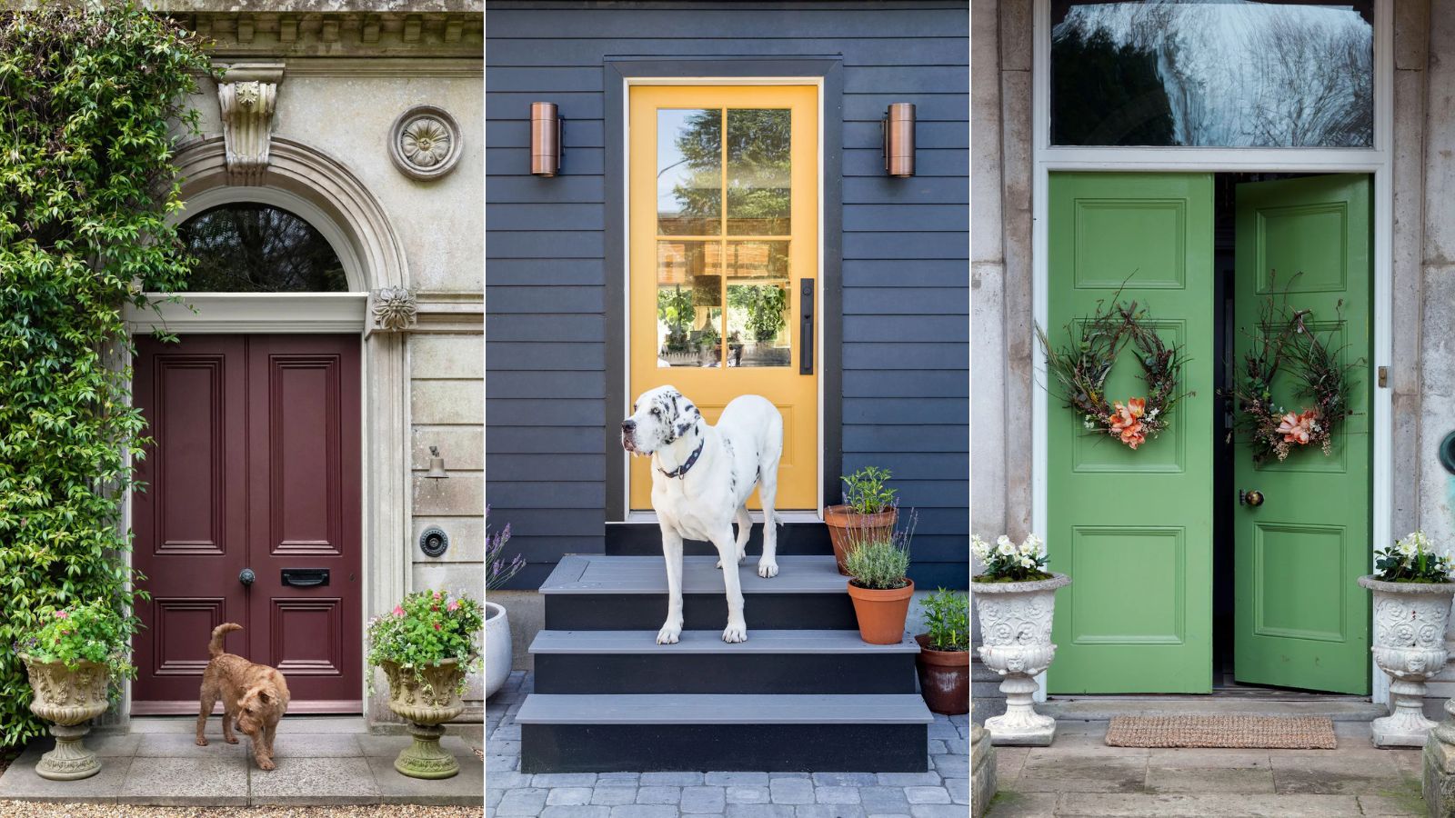
The front door serves as the initial introduction to a home, bridging formality with personal flair. Choosing the right color for this significant element is crucial for creating a lasting first impression. For 2025, a survey of designers reveals exciting new trends, with green, across its diverse shades and saturations, emerging as the top preference for front doors. This popularity contrasts sharply with a declining interest in red, a color traditionally favored for front doors.
Designers emphasize that the ideal front door color should align with both the home's architectural style and the homeowner's individuality. San Francisco-based Suzanne Tucker advises selecting a shade that is both complementary to the architecture and reflective of personal taste, ensuring the door gracefully announces the homeowner's presence. The overall aesthetic should be balanced, allowing the door to make a statement without overpowering the home's design.
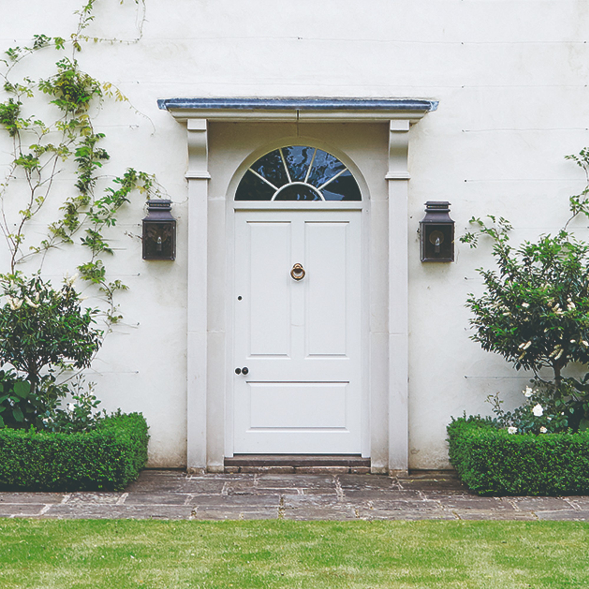
Conversely, certain colors are losing favor. White, for instance, is deemed too uninspired by designers like Charleston-based Eva Bradley, who argues it misses the opportunity to infuse personality and character into a pivotal element of the home. Similarly, Birmingham-based Caroline Gidiere expresses aversion to medium or pale blue doors on white houses unless they are situated near water, highlighting the importance of contextual relevance. New York designer Alex Papachristidis, however, offers a more nuanced view, suggesting that no front door color is inherently unattractive if integrated within the correct design context.
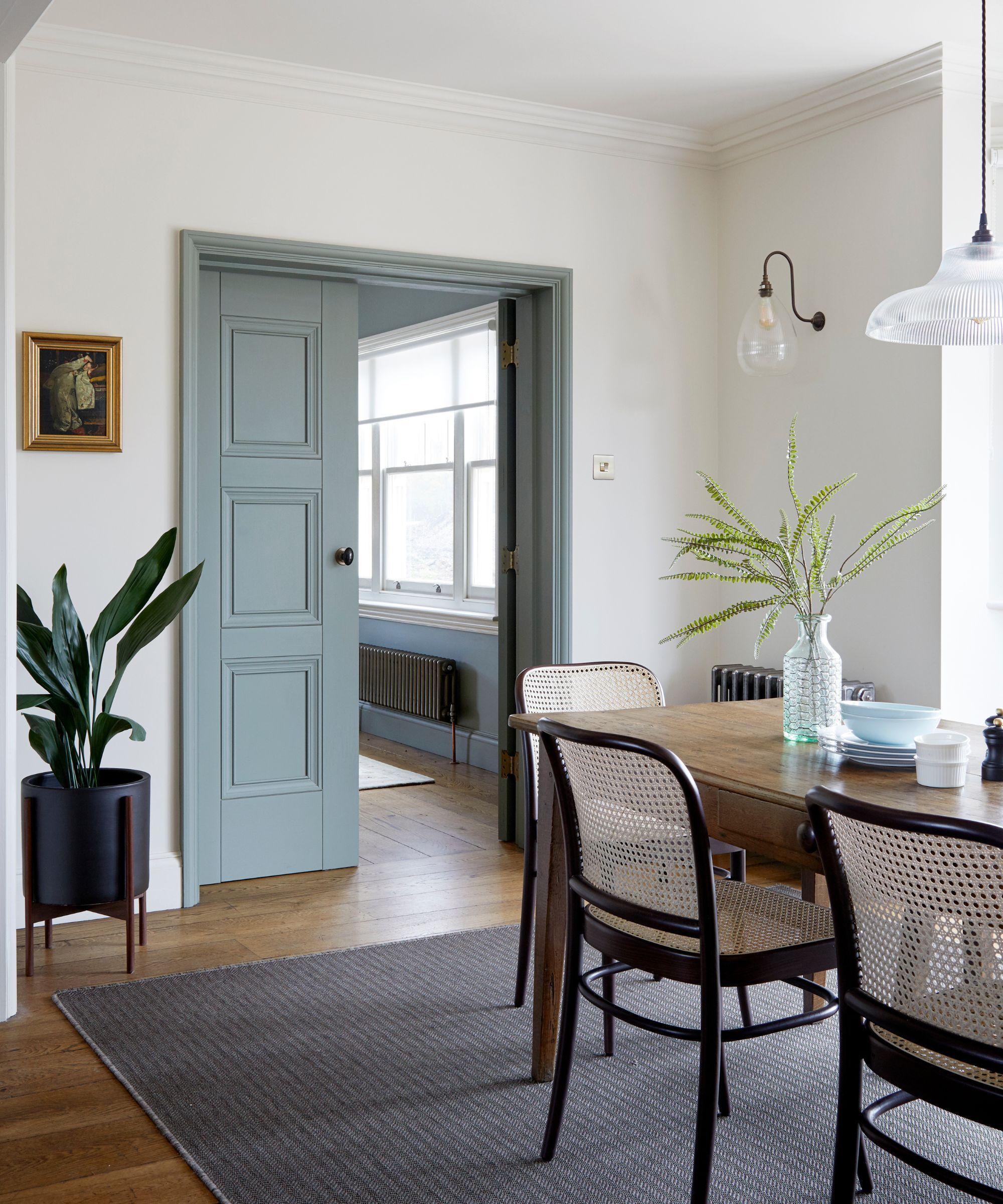
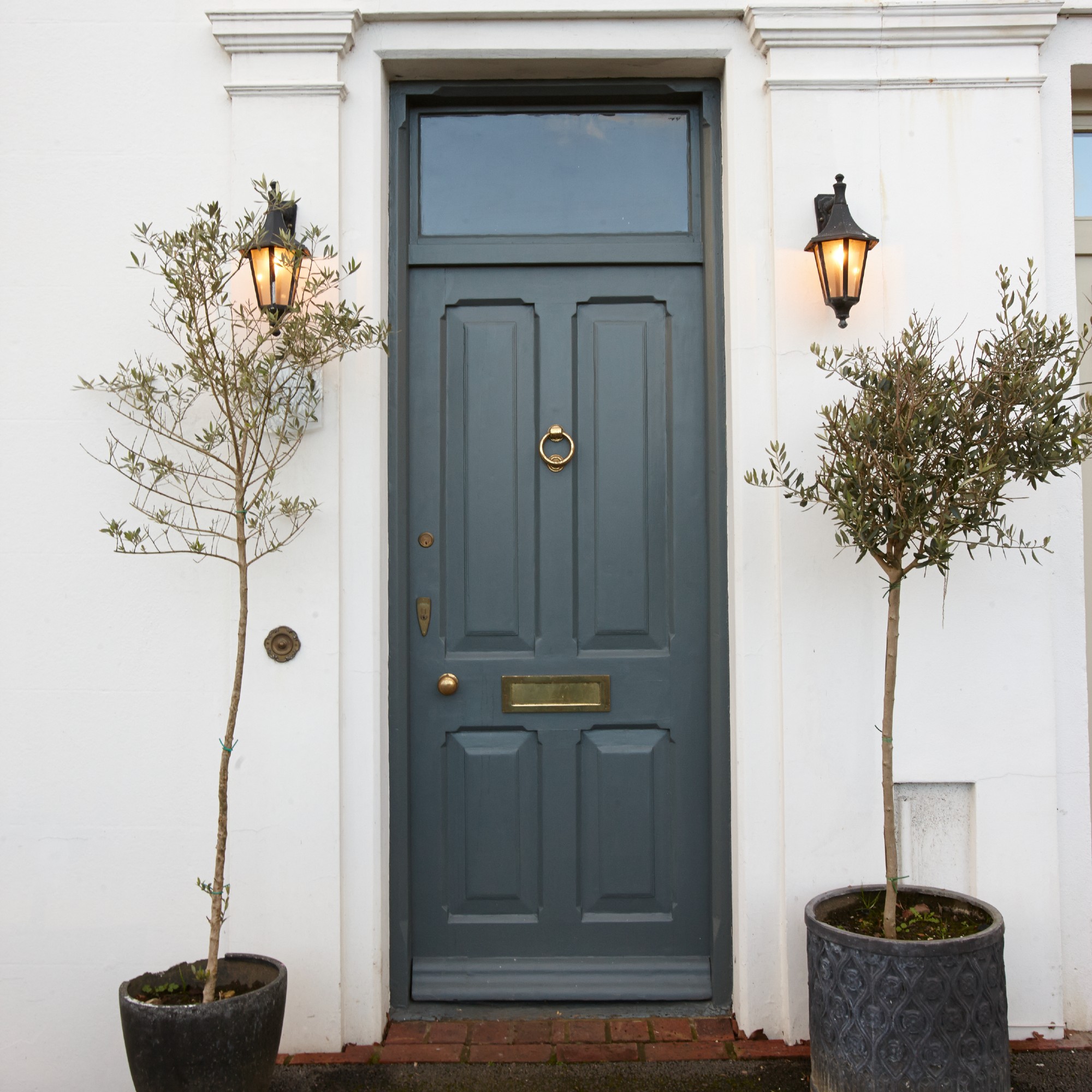
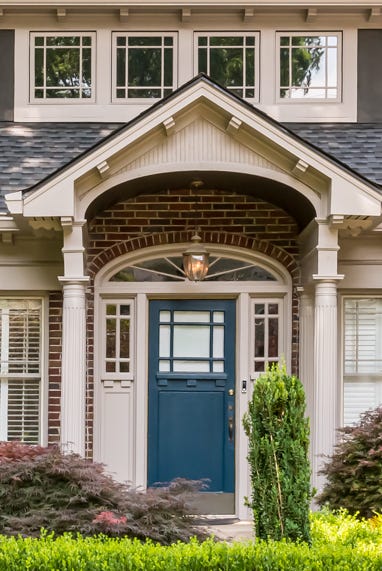
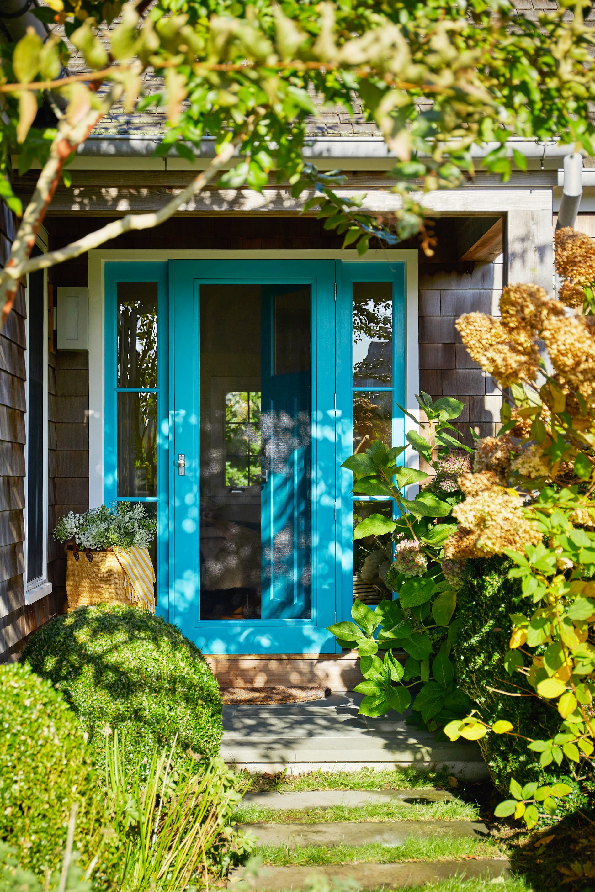
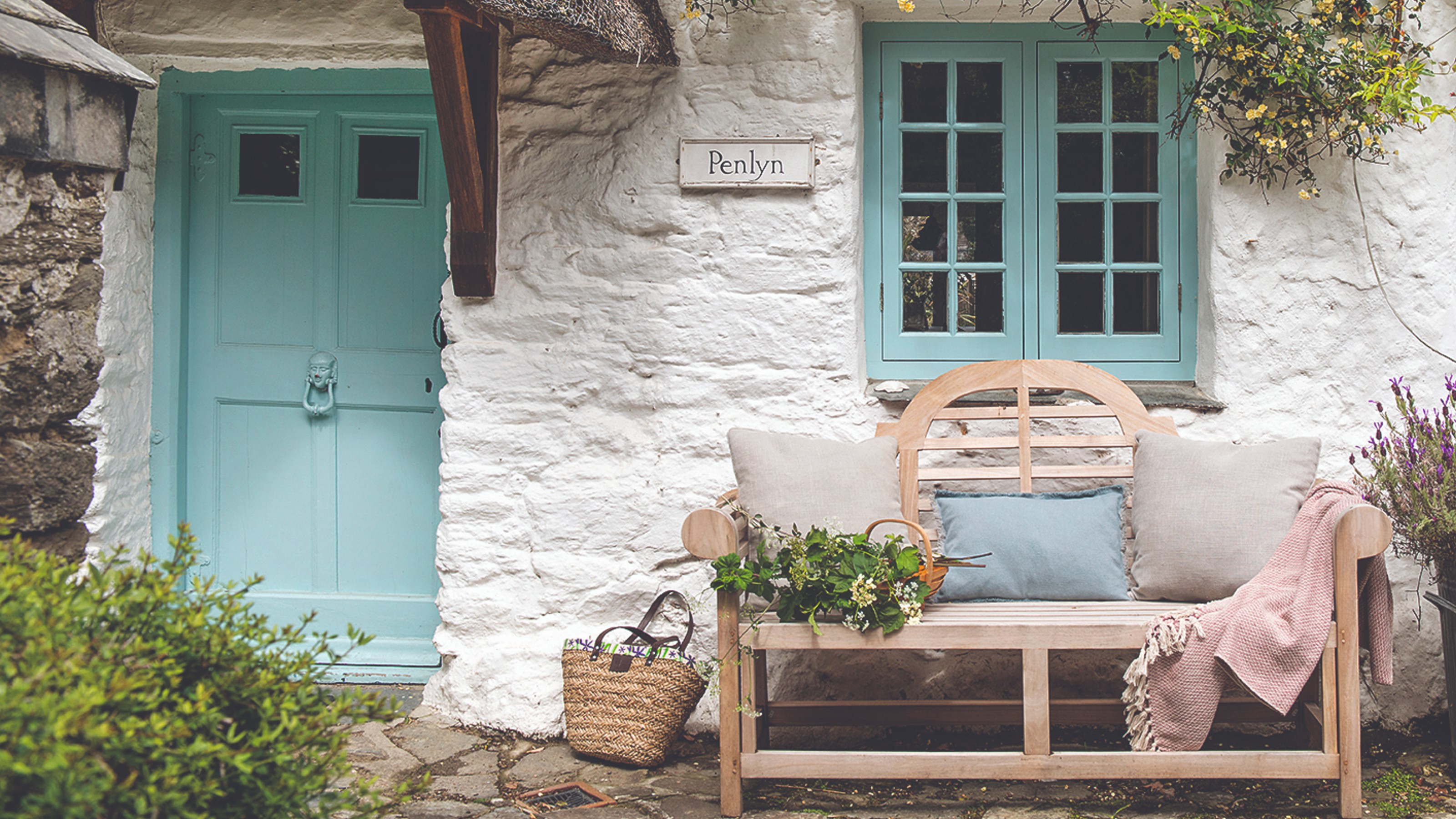
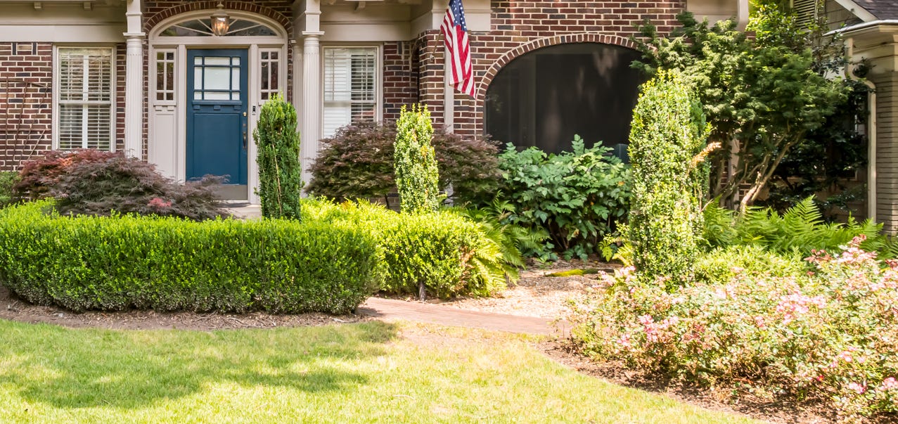
Seven prominent front door color trends are anticipated for 2025. "Nostalgic Blue-Greens" are gaining traction, with designers like Los Angeles's Jeff Andrews favoring shades such as Farrow & Ball's De Nimes for its vintage appeal and ability to complement architectural elements like Spanish tiles. Teal is also cited as a chic blue-green option, while classic black or navy remain steadfast choices when paired with matching shutters.
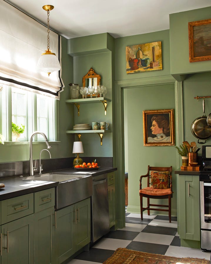
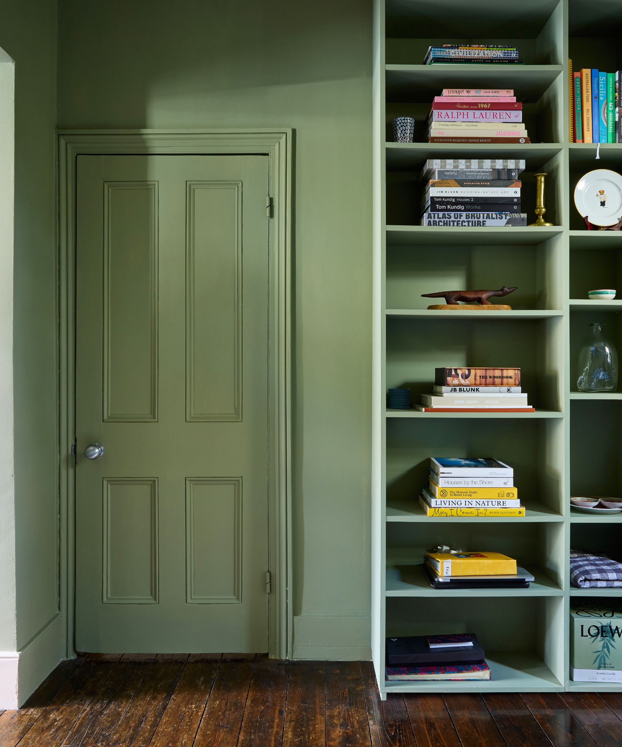
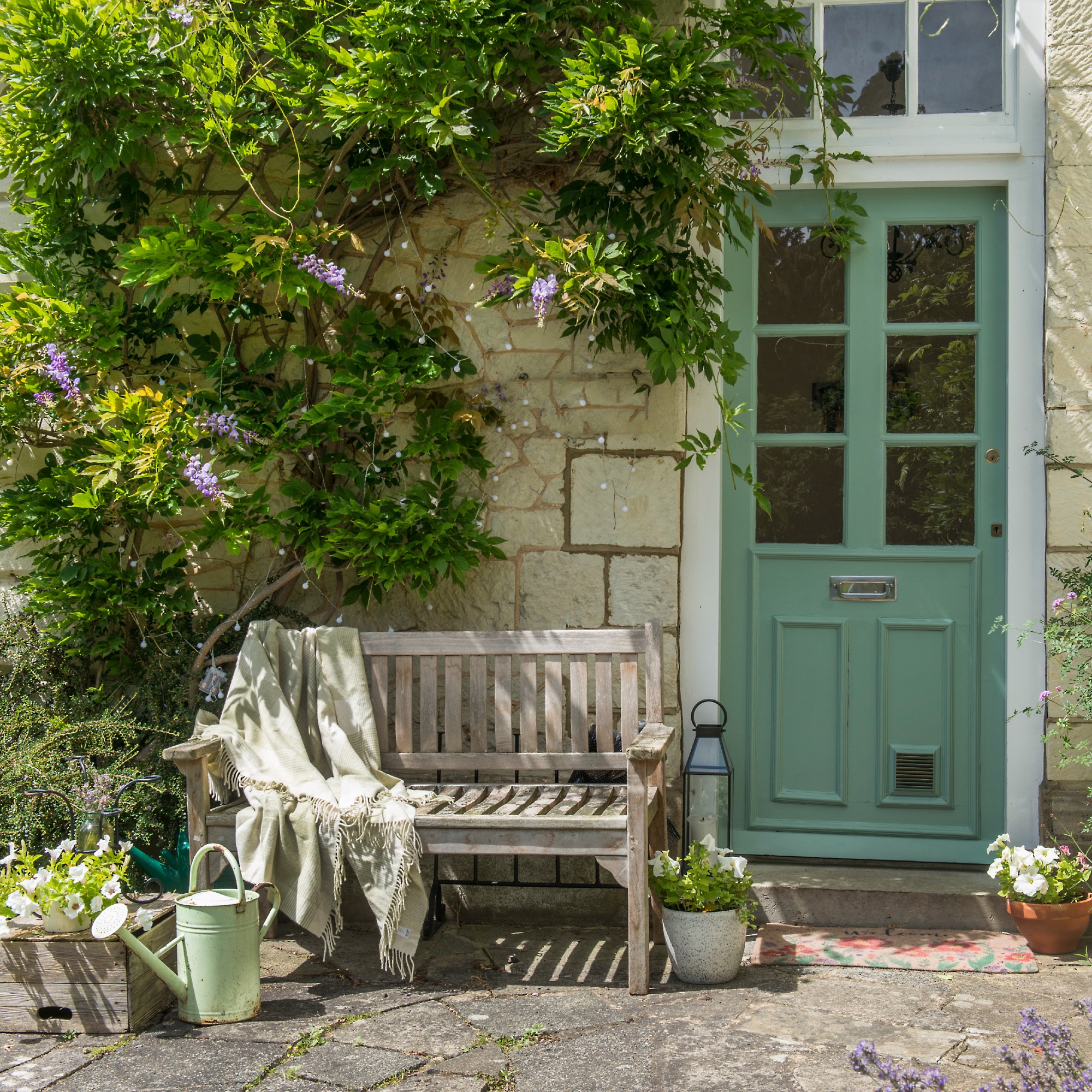
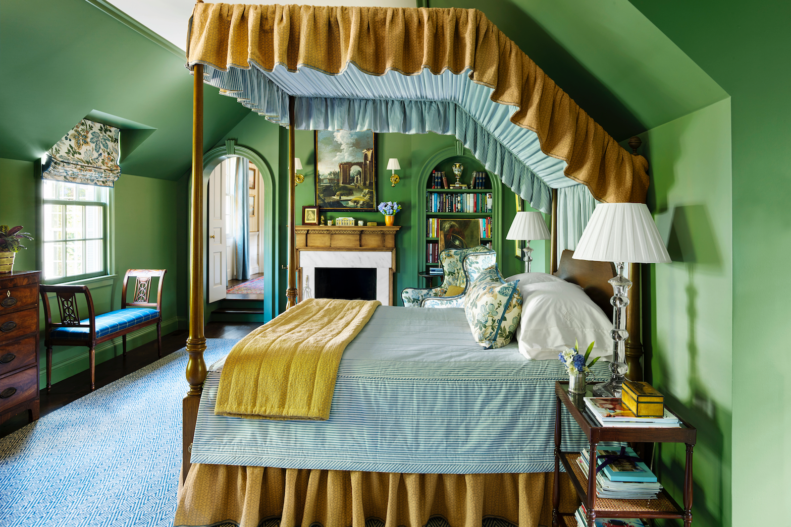
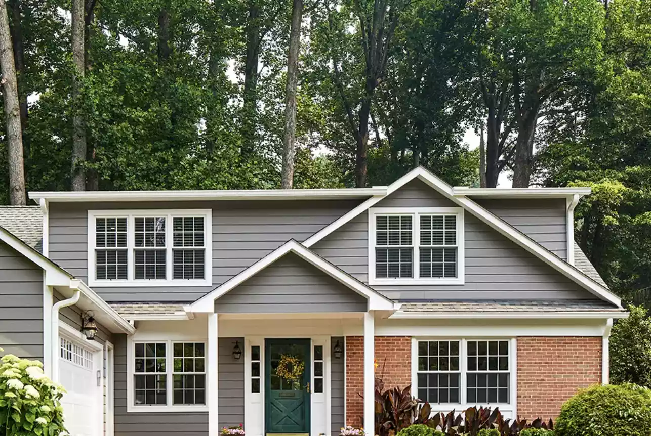
"Sophisticated Dark Greens" are another significant trend. Caroline Gidiere admires Lafayette Green by Benjamin Moore, along with Black Forest Green and Black, for their classic appeal. Tampa designers Tate Casper and Jordan Winston of Oxford Design lean towards nature-inspired, warm dark greens, singling out Benjamin Moore’s Dragon’s Breath for its resemblance to an old garden gate and its striking contrast against white exteriors. Farrow & Ball's Studio Green is also lauded for its strong, appealing hue.
For a more subdued elegance, "Serene Pale Greens" like sage and mint are becoming popular. Suzanne Tucker notes that a pale sage offers quiet sophistication, while Kristen Nix praises Farrow and Ball Mizzle for its versatility with various white shades. Mint green, specifically Farrow and Ball Whirlybird, is expected to rise in popularity, especially when combined with muddy olive shutters to create a sophisticated palette of cool and warm greens.
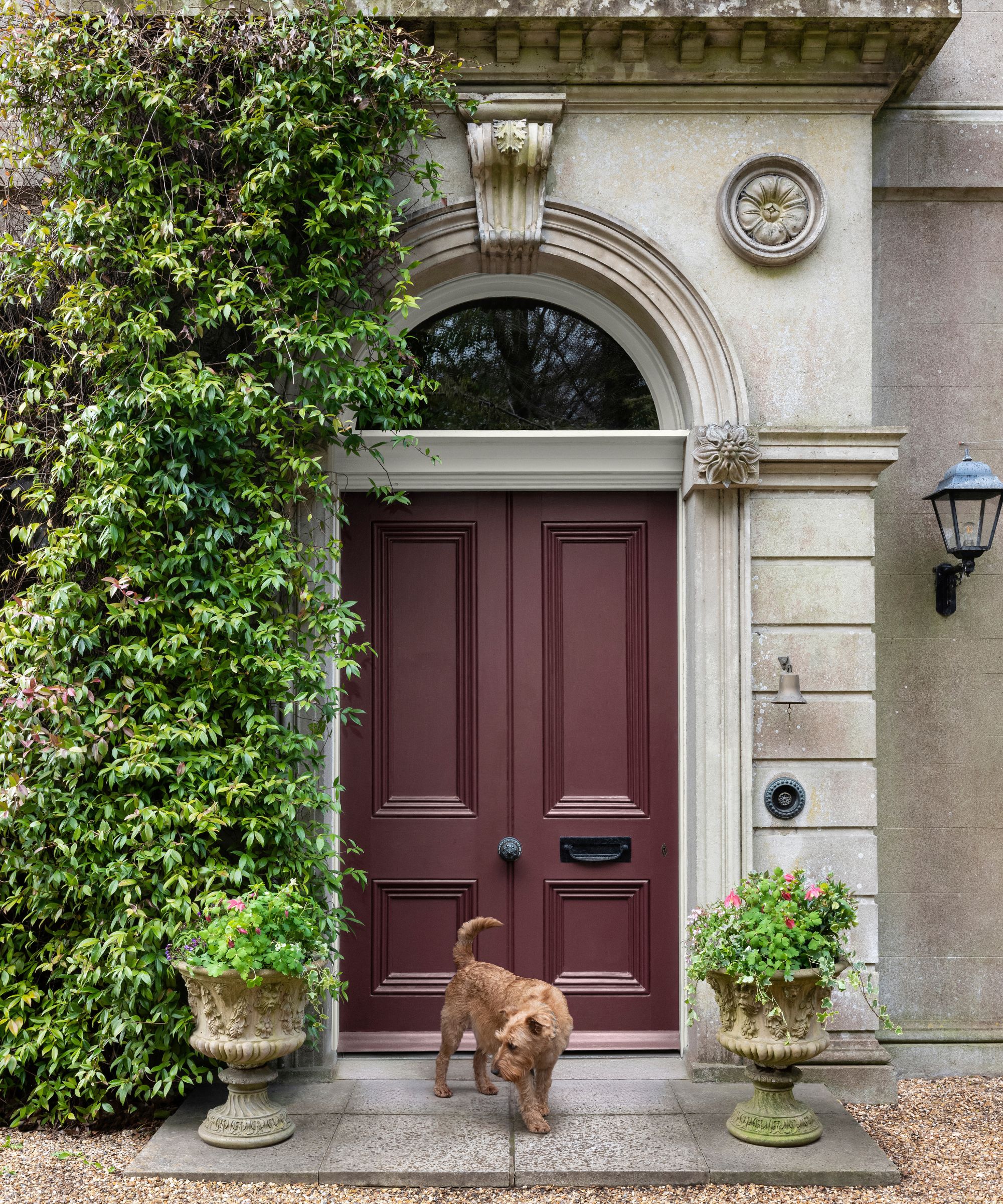
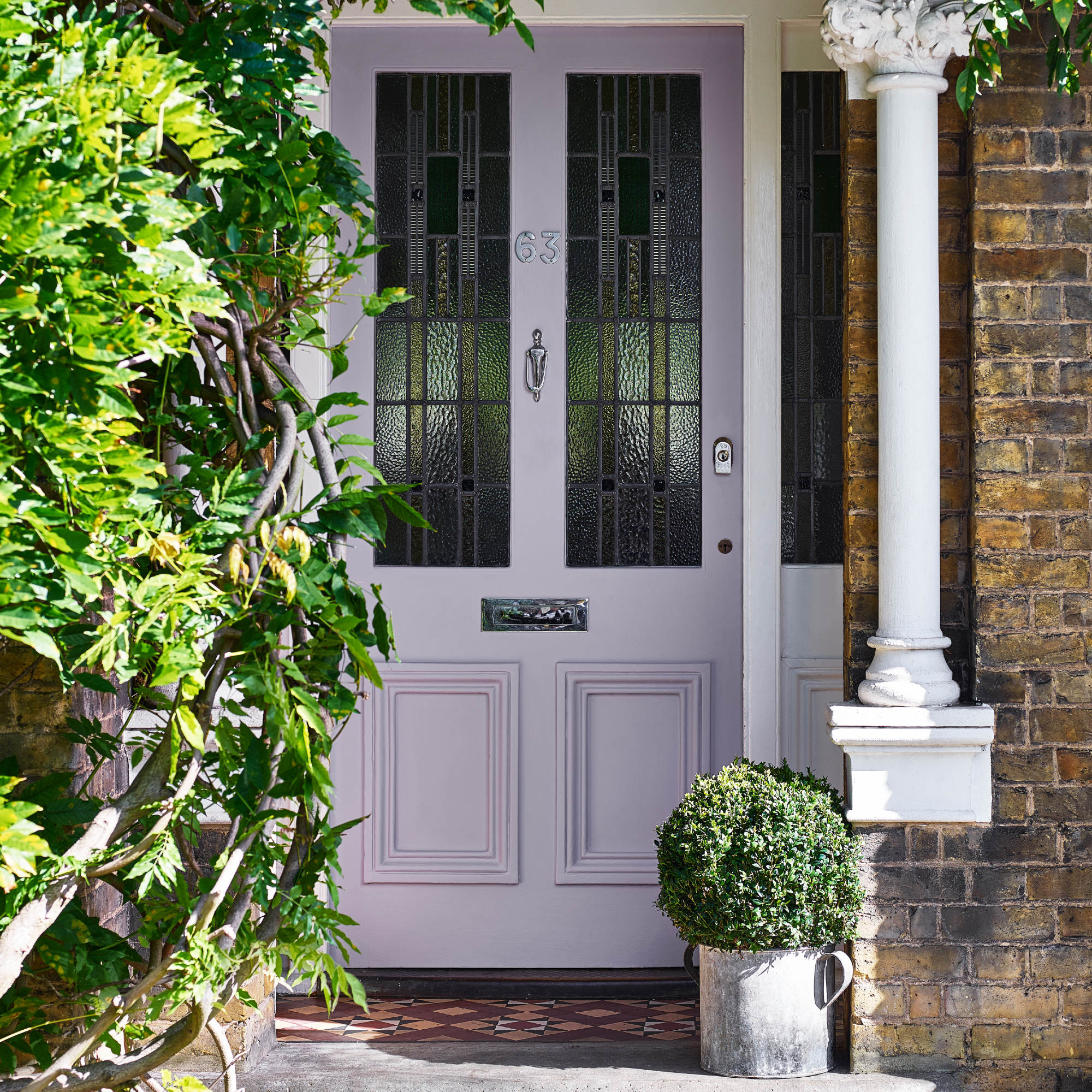
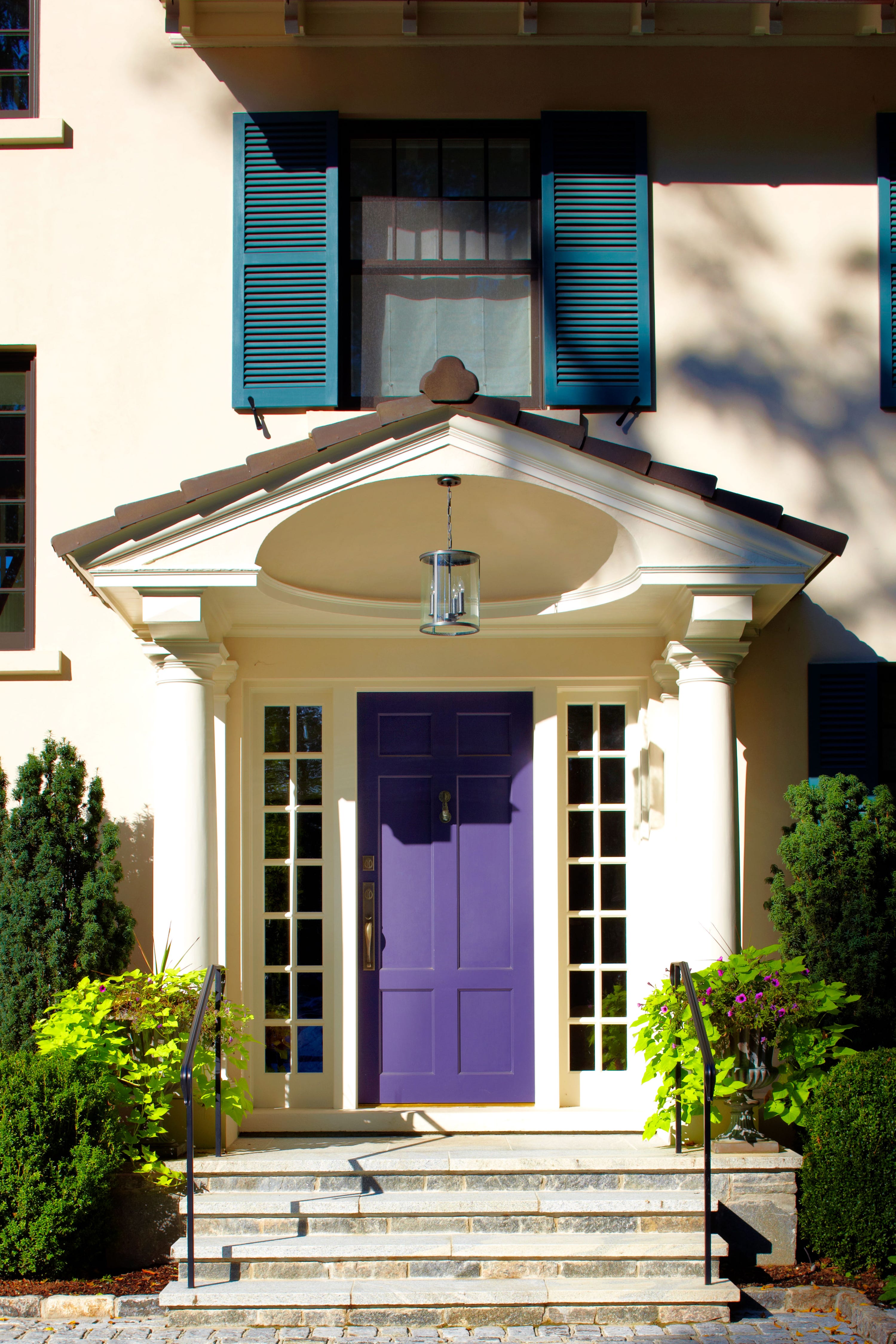
"Dressy Deep Purples" represent a more unexpected but celebrated trend. Charlotte-based Gray Walker is enthusiastic about Farrow & Ball’s Mahogany, a blend of aubergine and dark chocolate, envisioning it as an elegant choice for painted brick homes. Kyle O'Donnell and Christopher Sale of Gramercy Design appreciate how deep purples can reveal a homeowner's personality. Architect Cathy Purple Cherry shares a personal connection to purple, having grown up in a home identifiable by its purple front door.
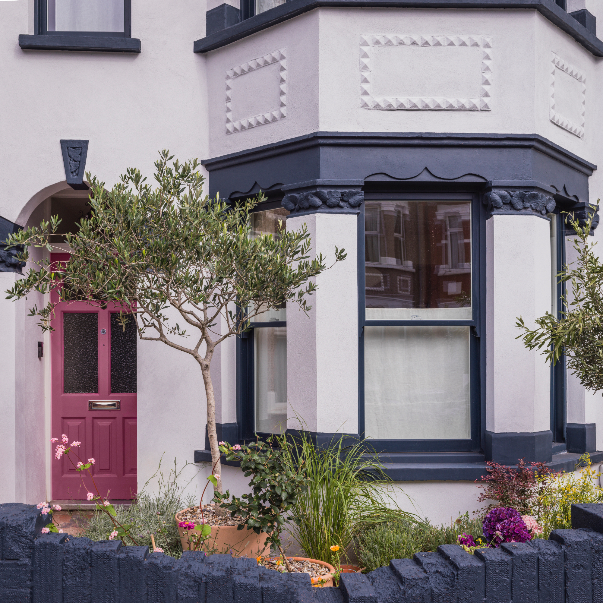
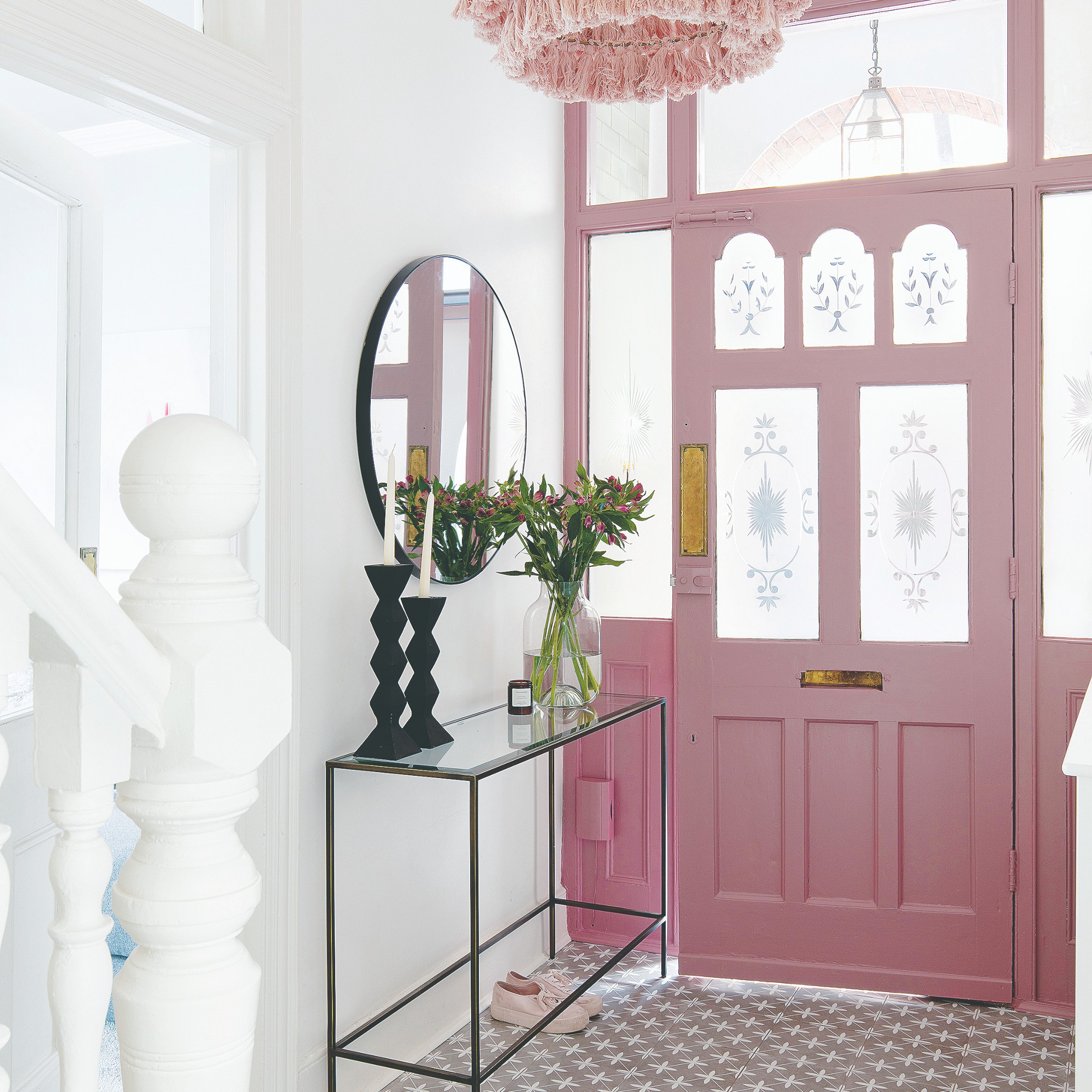
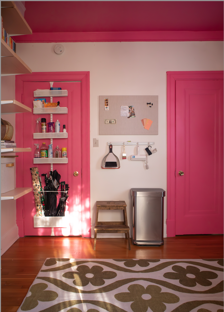
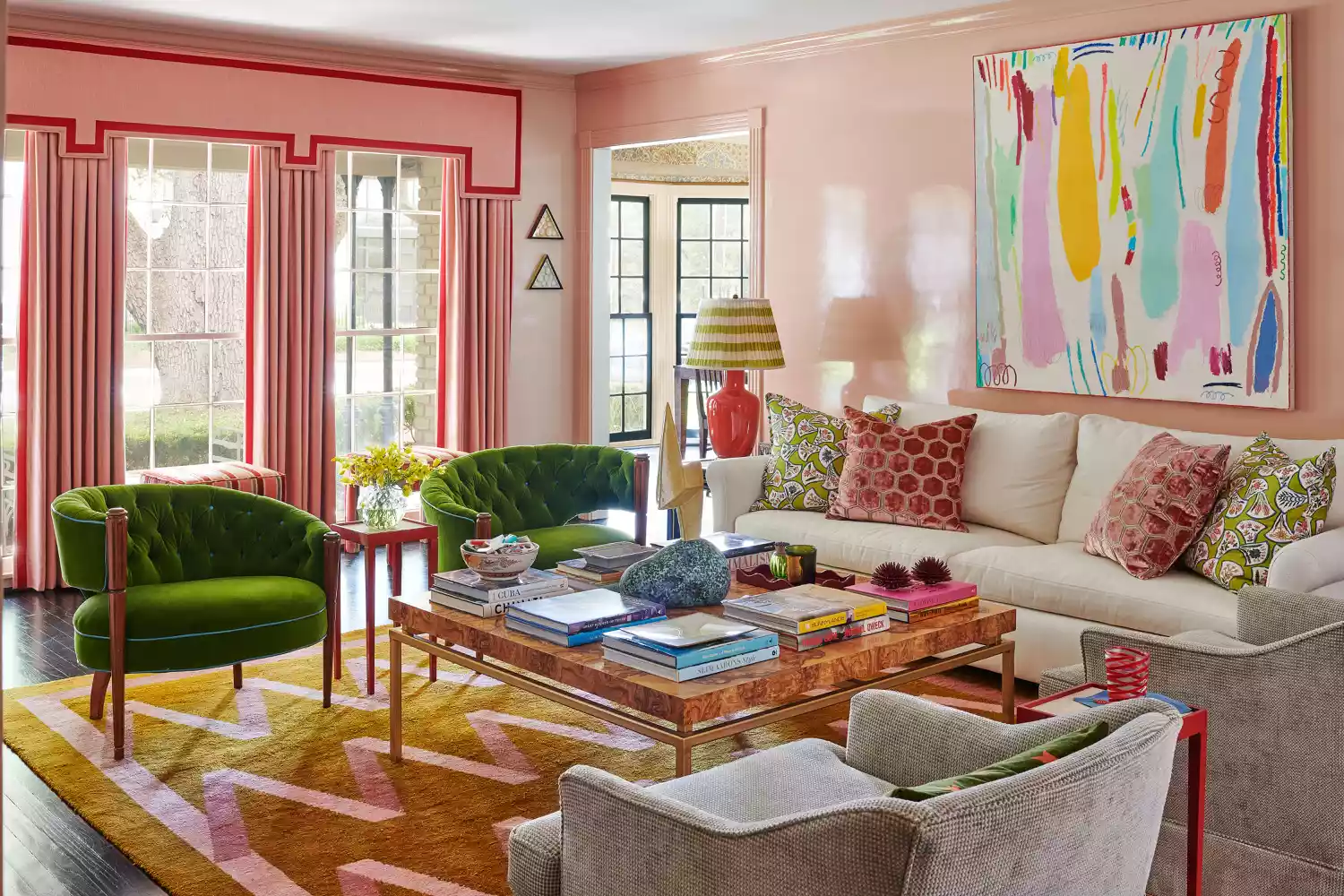
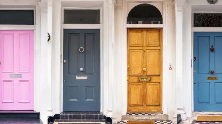
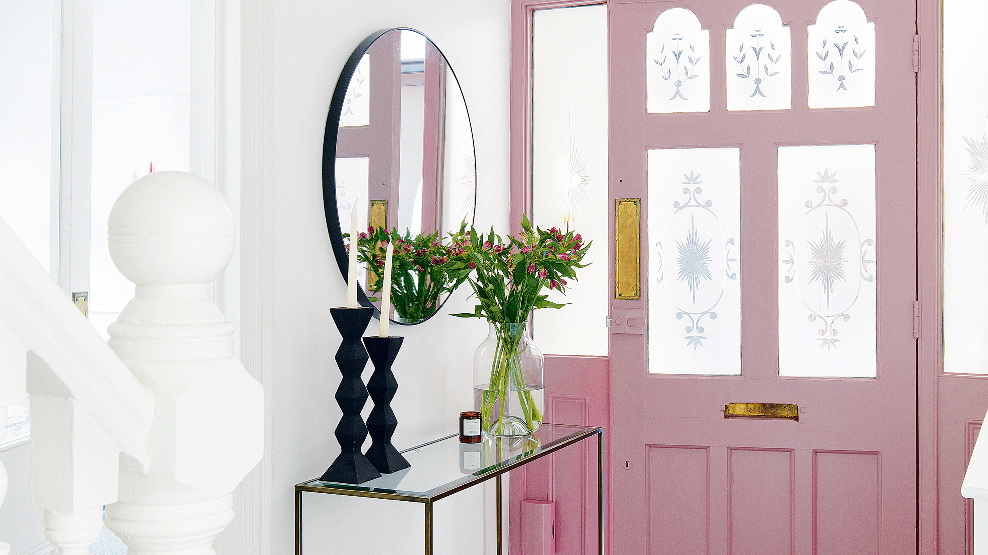
"Cheerful Pinks" are also making an appearance, particularly in environments where vibrancy is embraced. Chicago-based Kelly Hurliman recounted a successful project in Florida where a pink gloss door garnered many compliments, illustrating its capacity to evoke fun and happiness. This trend underscores the importance of a door's color reflecting the local environment and the home's playful character.
Regarding reds, designers are gravitating towards "Quirky Reds," specifically darker and lighter variations rather than traditional bright reds. Atlanta-based Mark Williams of Williams Papadopoulos experiments with shades from oxblood to dark salmon, noting their sensuous and gripping qualities. However, Charlotte-based Gray Walker cautions against improper execution of red, recommending candy apple red for a classic and chic outcome.
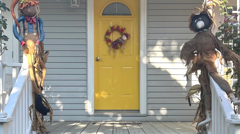
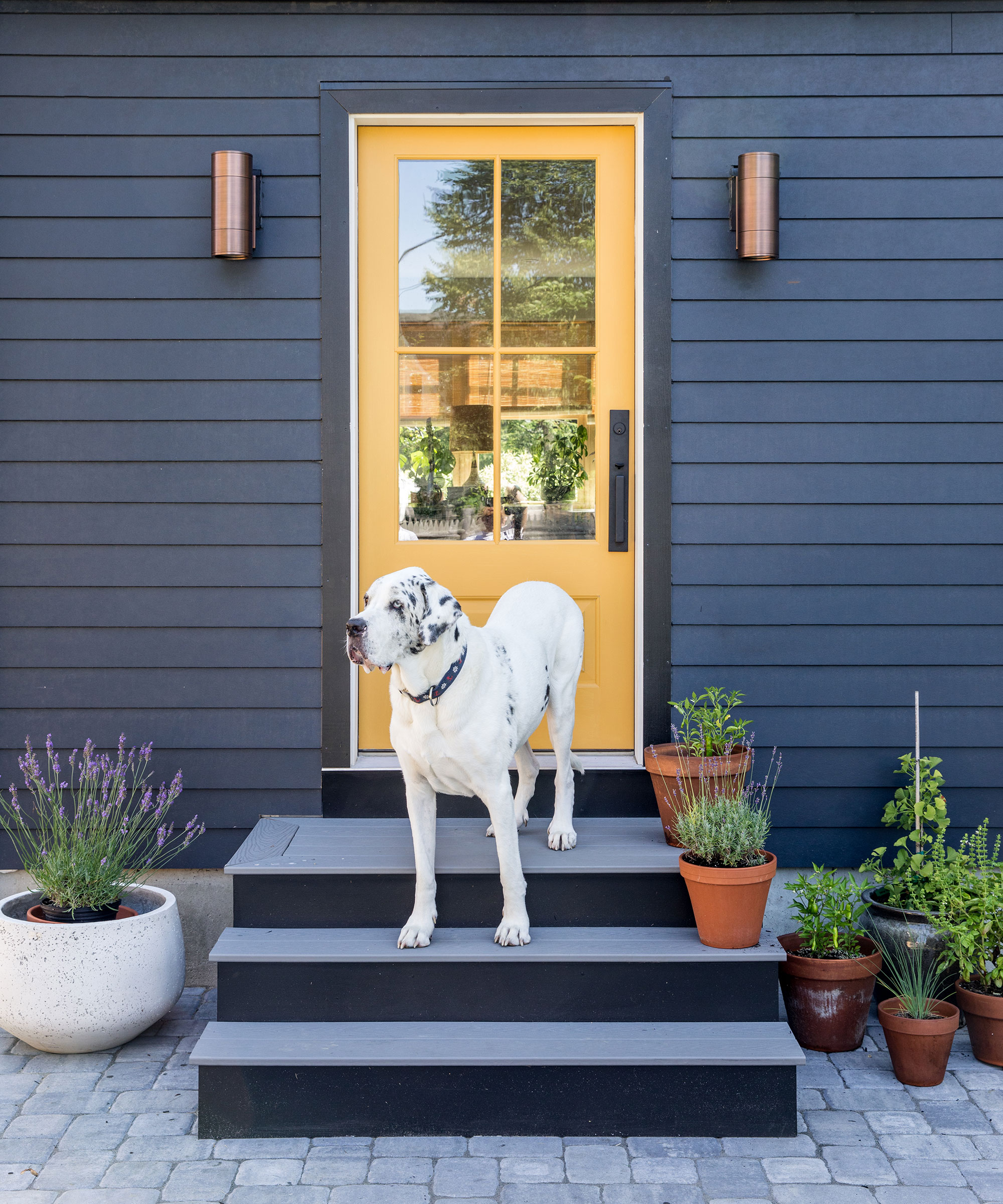
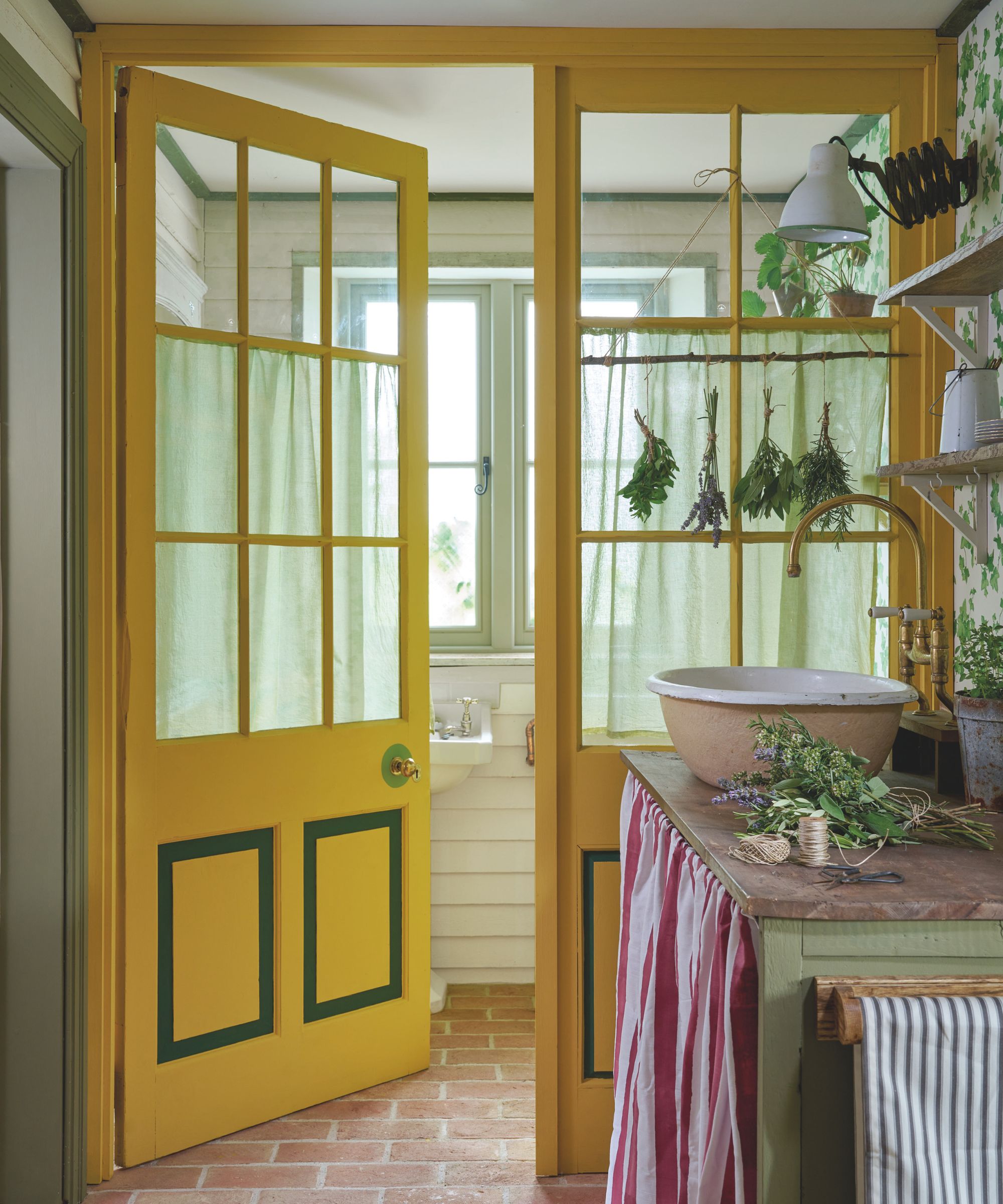
Conversely, "Super Bright Colors," particularly orange and yellow, are generally out of favor for front doors. Alex Papachristidis advises against bright colors altogether, while Suzanne Tucker suggests they are only appropriate within specific contexts, such as mid-century modern homes, where they can appear playful and upbeat. This reflects a broader shift towards more nuanced and architecturally harmonious color choices for front doors in 2025.
#FrontDoorColors #HomeDesign #ColorTrends2025 #InteriorDesign #ExteriorDesign #GreenHues #BlueGreenShades #DeepPurples #CheerfulPinks #FrontDoorColors #HomeDesign #ColorTrends2025 #InteriorDesign #ExteriorDesign #GreenHues #BlueGreenShades #DeepPurples #CheerfulPinks
0 comment in total
 No comments yet
You may also like
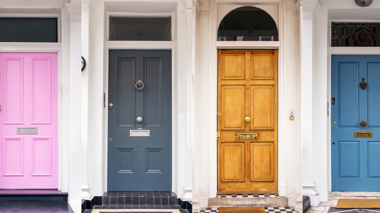
6 Trendy Front Door Colors That Will Be Replacing Outdated Styles In 2025
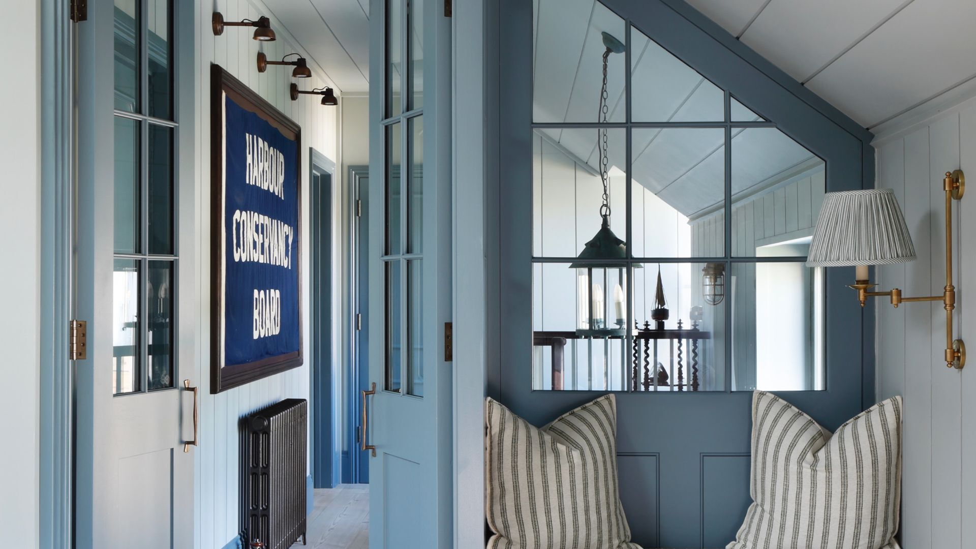
The chicest interior door colors you’ll want in your home in 2025 – because white isn't the only option


These Colors Will Be Everywhere in Interiors in 2025
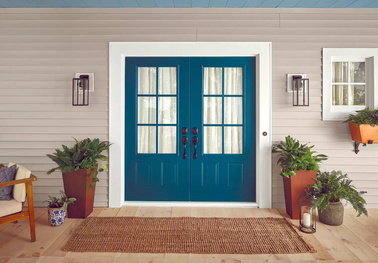
The 4 Most Popular Front Door Colors of 2024, According to Paint Experts

5 most welcoming front door colors for 2025, say experts
Is your front door colour going out of style in 2025?
7 Interior Paint Color Trends You'll See Everywhere In 2025

The #1 Paint Color Trend of 2025, According to Designers

The 5 Best Interior Door Colors to Use in 2025, According to Designers
5 Front Door Paint Colors You're Going to See Everywhere in 2025, Designers Say

Designers Predict These 7 Interior Design Trends Will Be Everywhere in 2025

These 5 Paint Color Trends Will Be Everywhere in 2024, According to Interior Designers
6 Trendy Front Door Colors That Will Be Replacing Outdated Styles In 2025

Designers Predict Every Front Door Will Be One of These Colors in 2026

The Biggest Colour Trends Taking Off in 2025
7 Lighting Trends That Will Elevate Your Home Design In 2025

Designers and property experts have called it - this unique front door colour is set to be huge in 2024
These 7 Colors Will Rule Interiors in 2026, According to Experts
The biggest home decor trends that interior experts say you’ll be championing in your home in 2025
5 Exterior Paint Color Trends You'll See Everywhere in 2025, According to Designers