5 Colors You Should Never Paint Your Hallway, According to Designers
Hallways serve as crucial connectors between rooms, facilitating natural flow throughout a home. While they don't require extravagant decoration, they should also avoid being bland. This article consults design experts Brittny Button and Amanda Bell to outline paint colors and finishes that are best avoided in hallways, offering advice on how to select appropriate shades and styles.
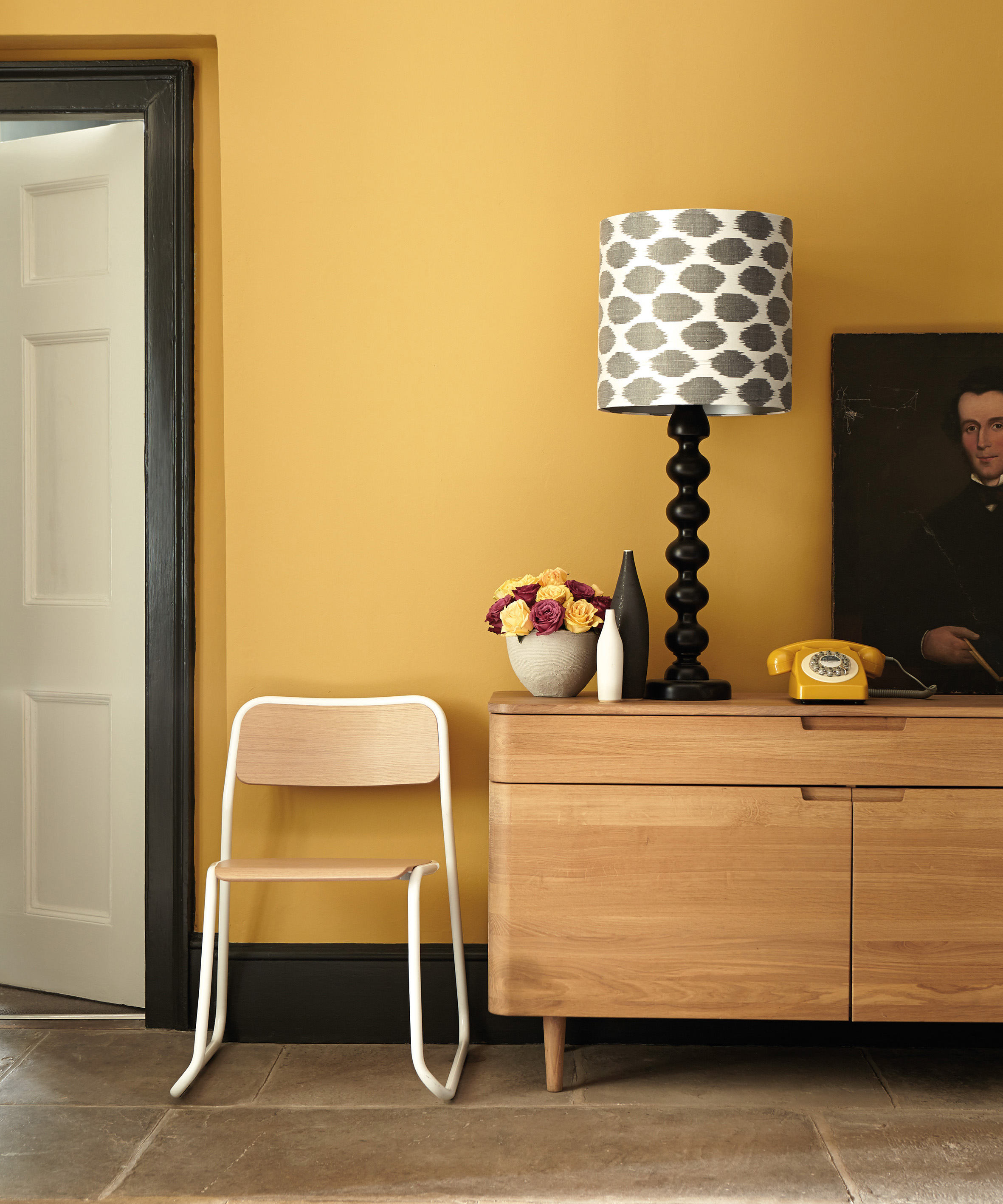
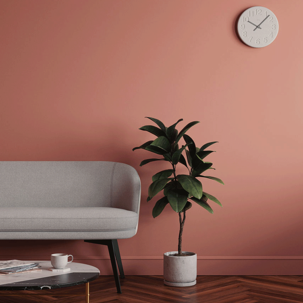
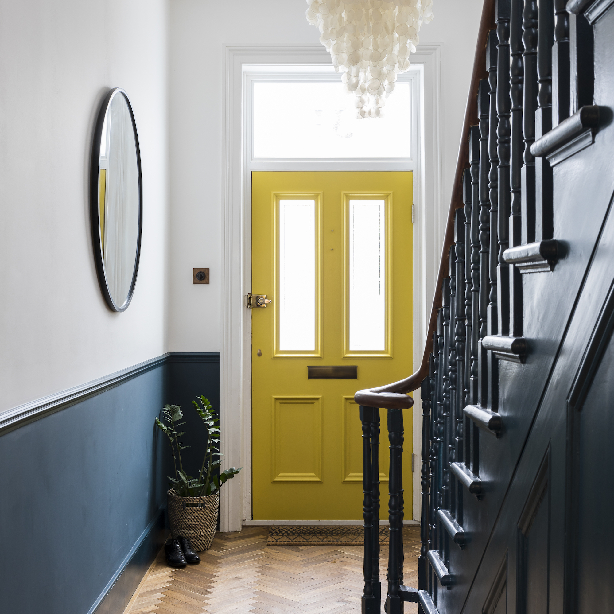
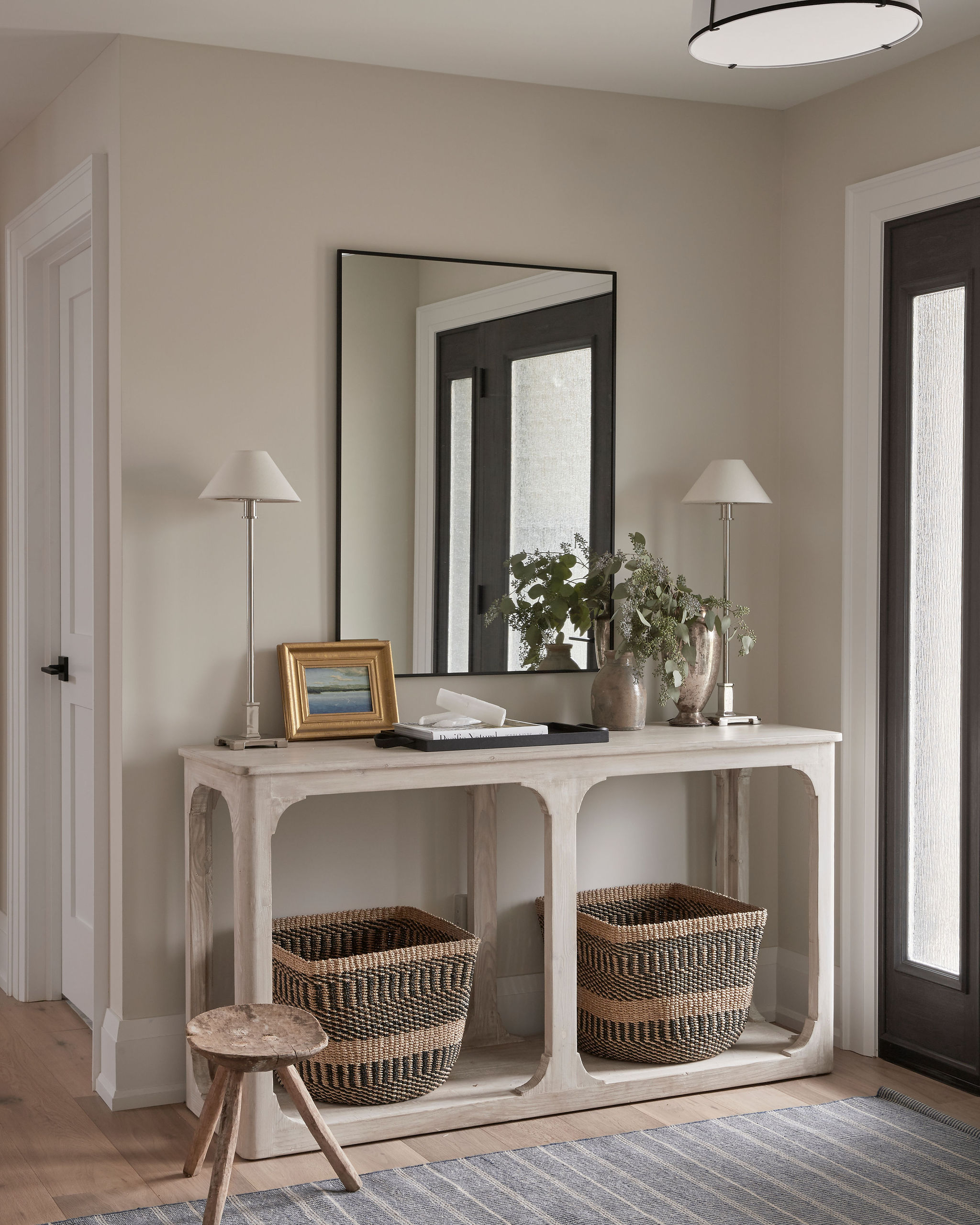
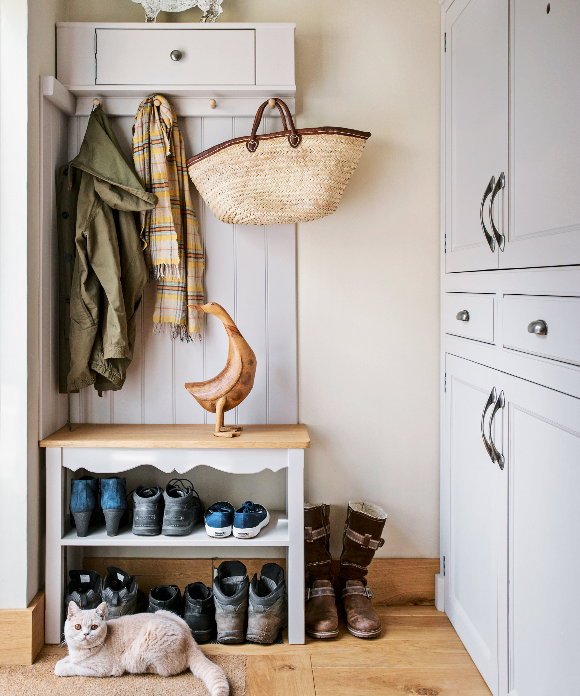
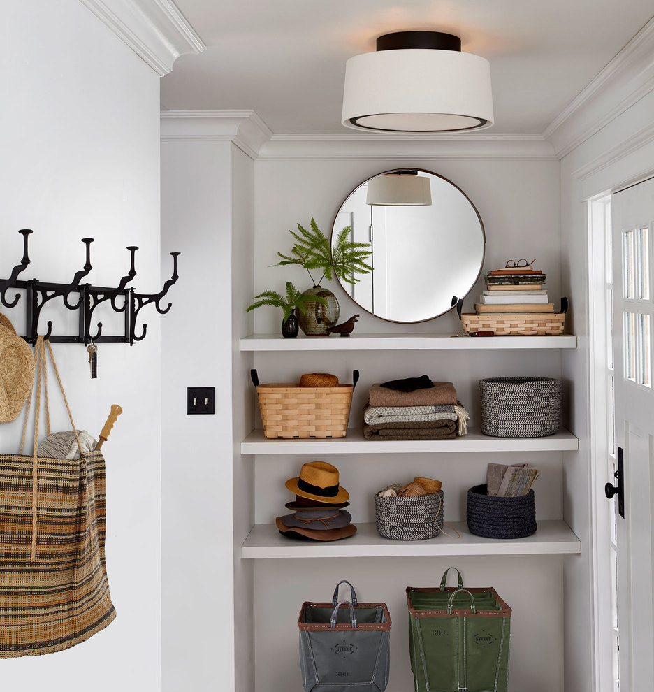
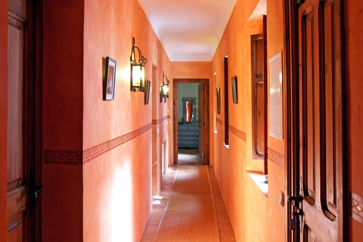
One primary recommendation is to steer clear of non-neutral colors in hallways. Button explains that hallways are shared spaces with adjacent rooms, necessitating a universal appeal. Bell adds that subtle or deep tones are preferable to maintain an inviting atmosphere while allowing for personality expression. Both designers emphasize that hallways often lack natural light, making lighter tones more suitable. Bold paint choices tend to appear tacky rather than intentional when viewed under artificial lighting or in shadow.
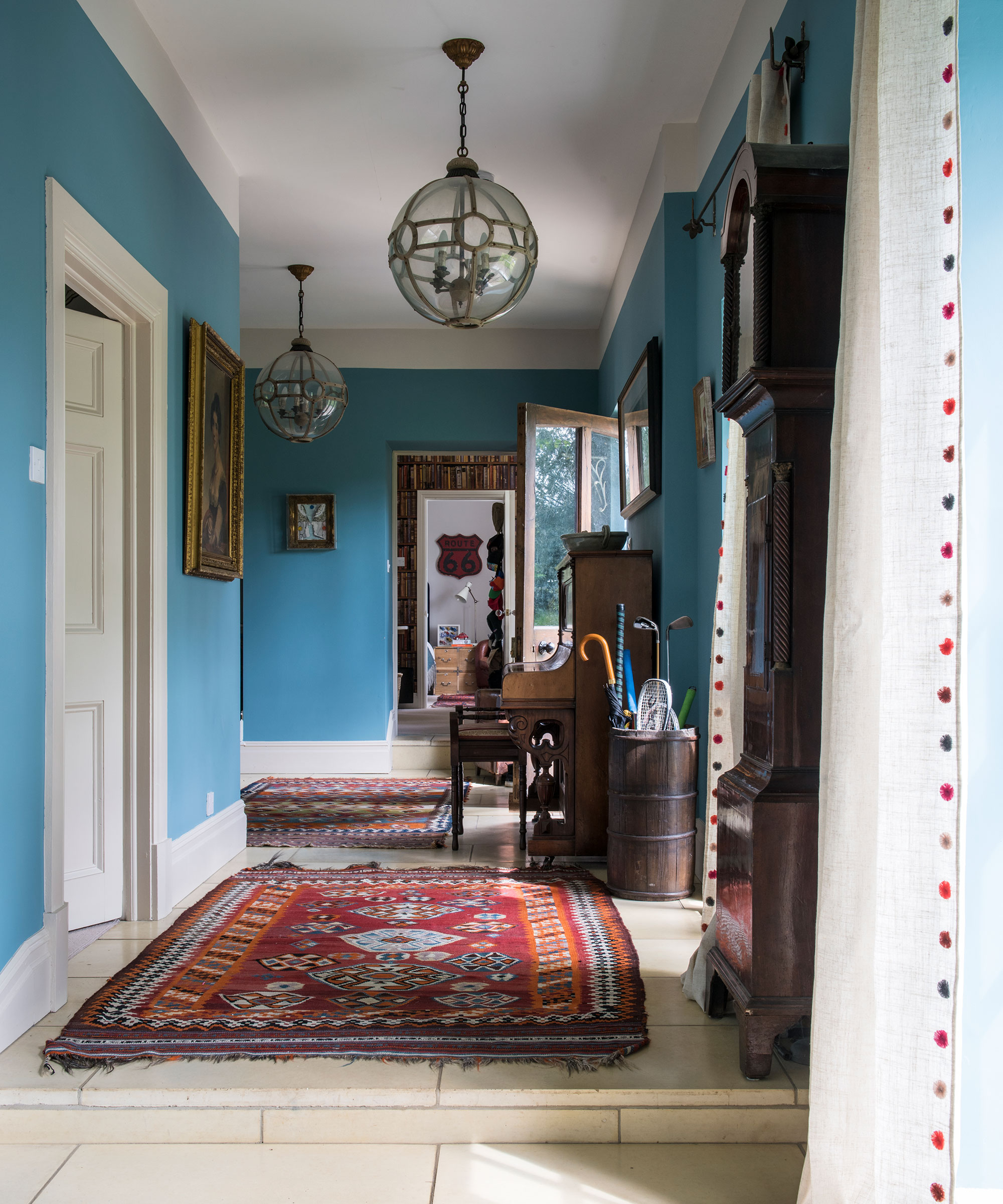
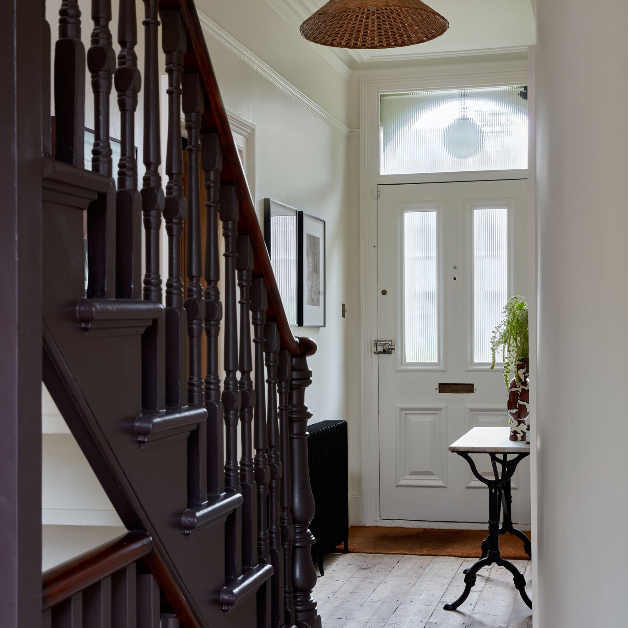
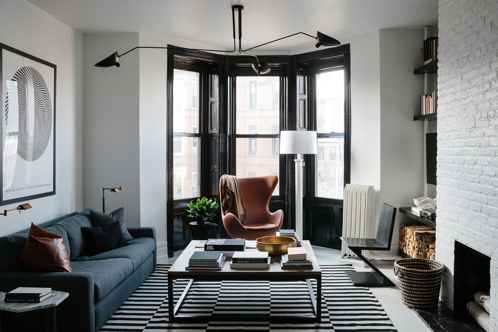
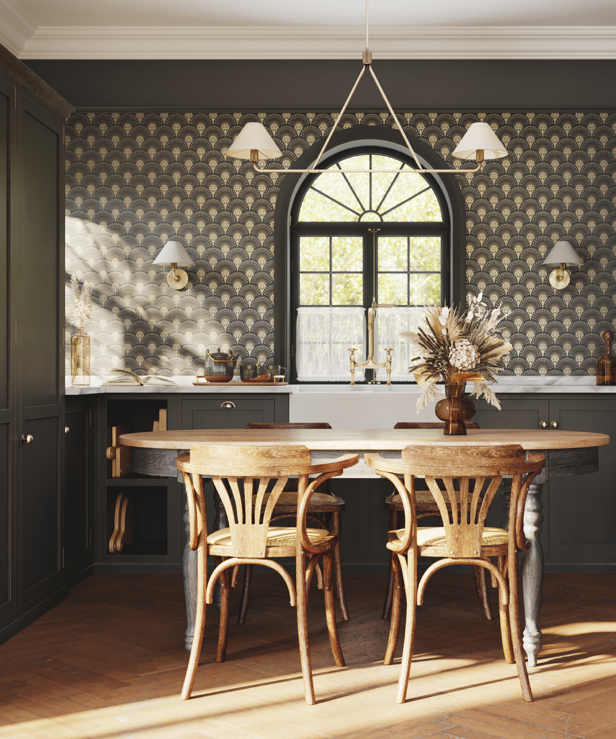
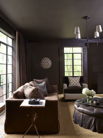
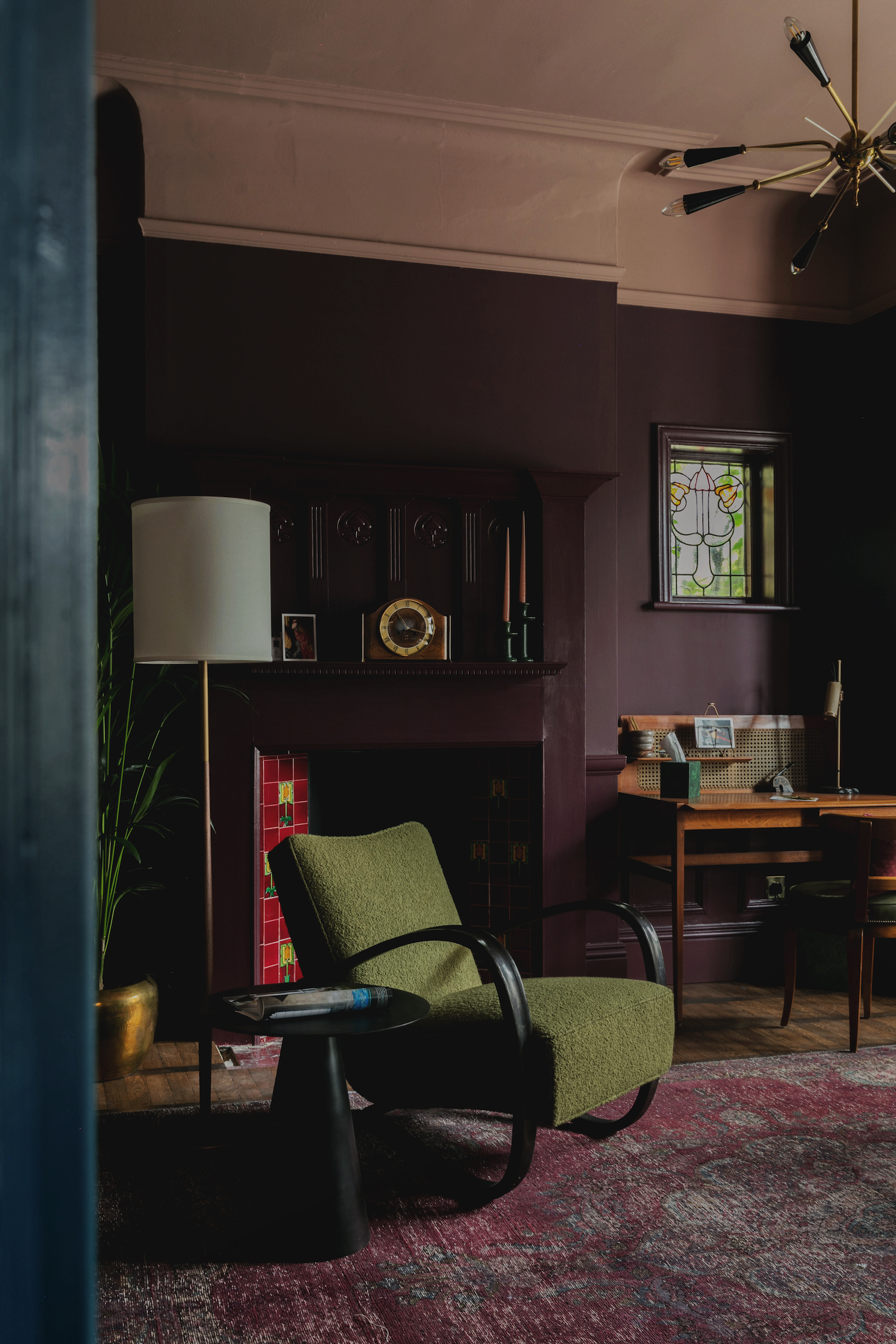
Another point of caution is against using flat, moody hues, especially in small or cramped corridors. While dark, moody colors can work in larger hallways, Button advises against dull, flat paint finishes. Instead, she suggests incorporating elevated faux finishes like limewash or plaster to add textural depth. This approach can be complemented by captivating architectural elements such as arched ceilings or doorways to create visual height and elevate the space. Bell highlights the importance of good lighting to prevent dark palettes from making the space feel flat, suggesting pendants, wall sconces, or strategically placed lamps to draw the eye forward.
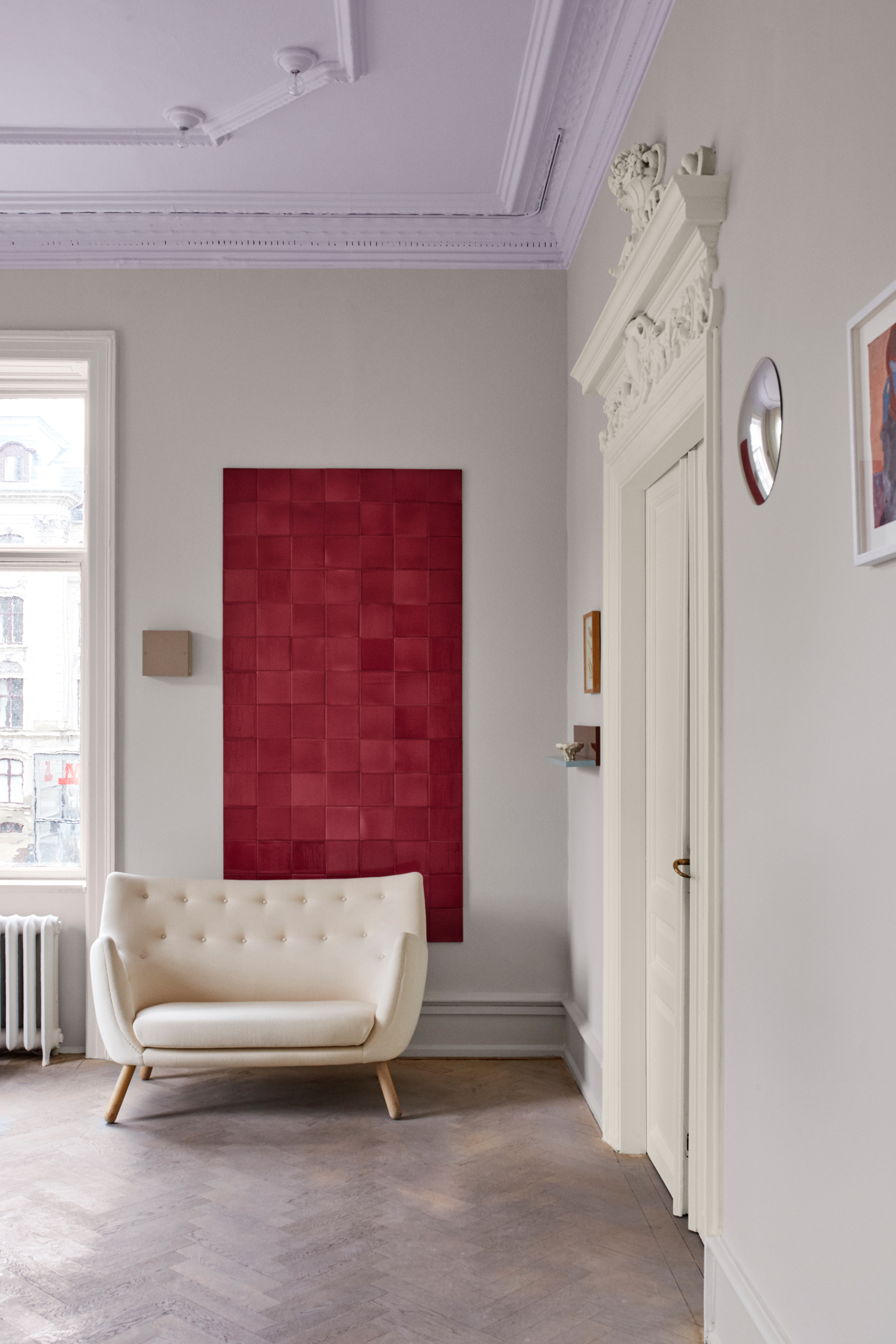
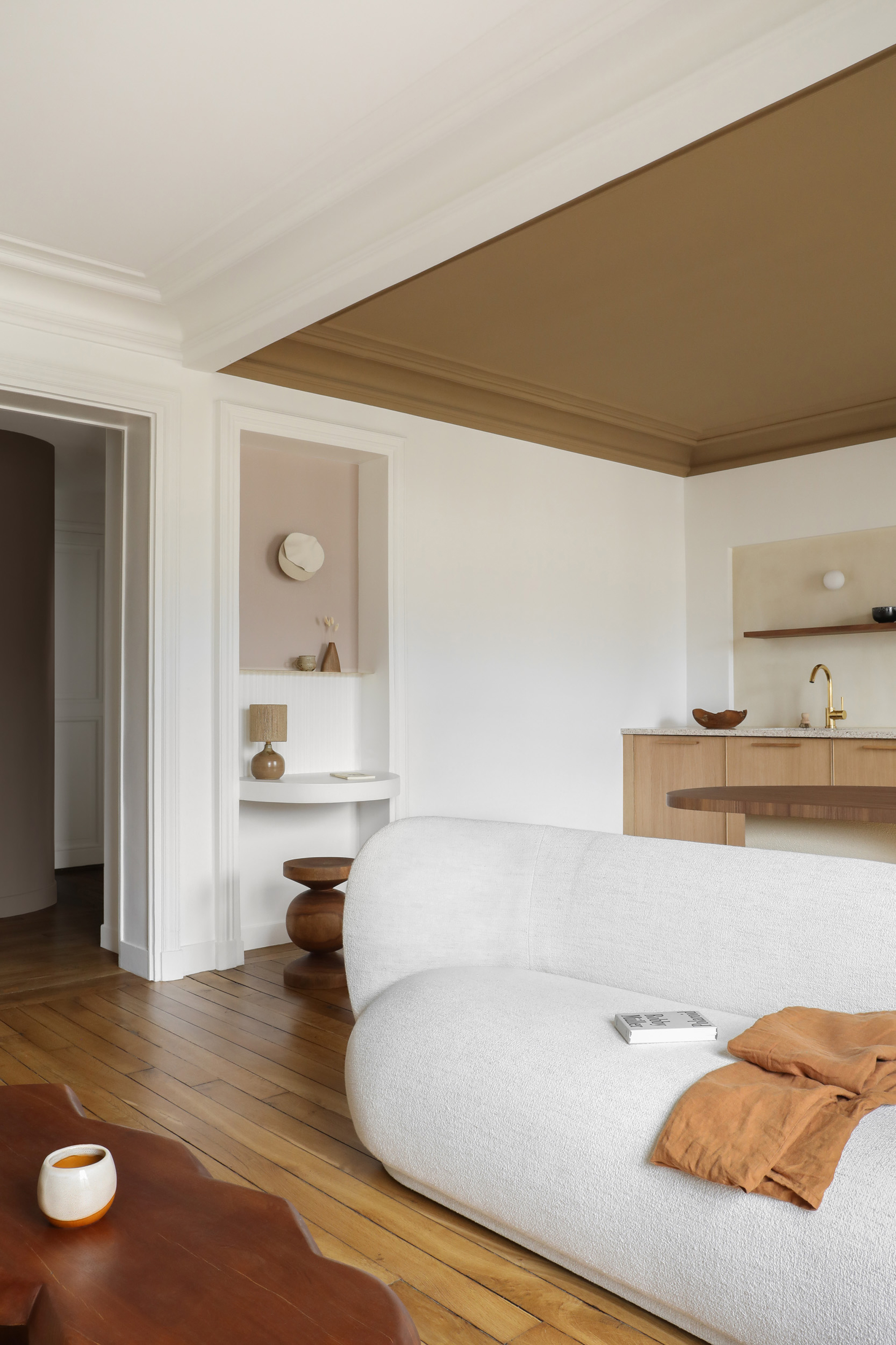
Painting the ceiling the same color as the walls is generally discouraged in standard hallways, particularly when using colored paints. Button explains that this can make the space feel smaller and less visually open. The exception is if the hallway is painted in a light, warm, neutral shade. Light paint colors on the ceiling are said to create visual height and offer a timeless appeal.
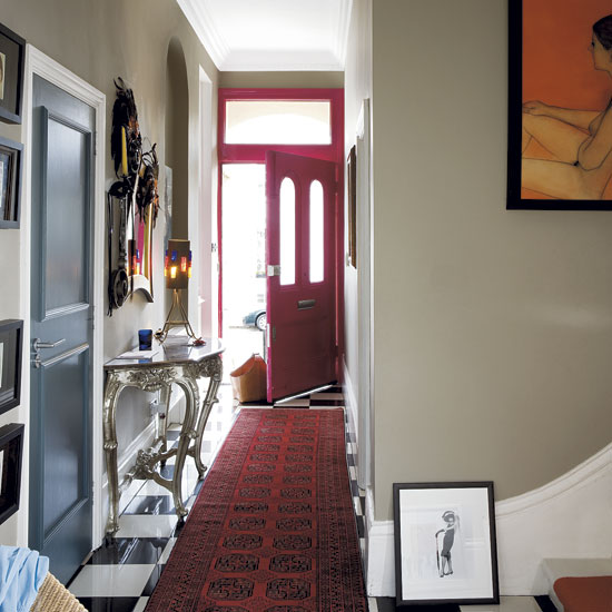
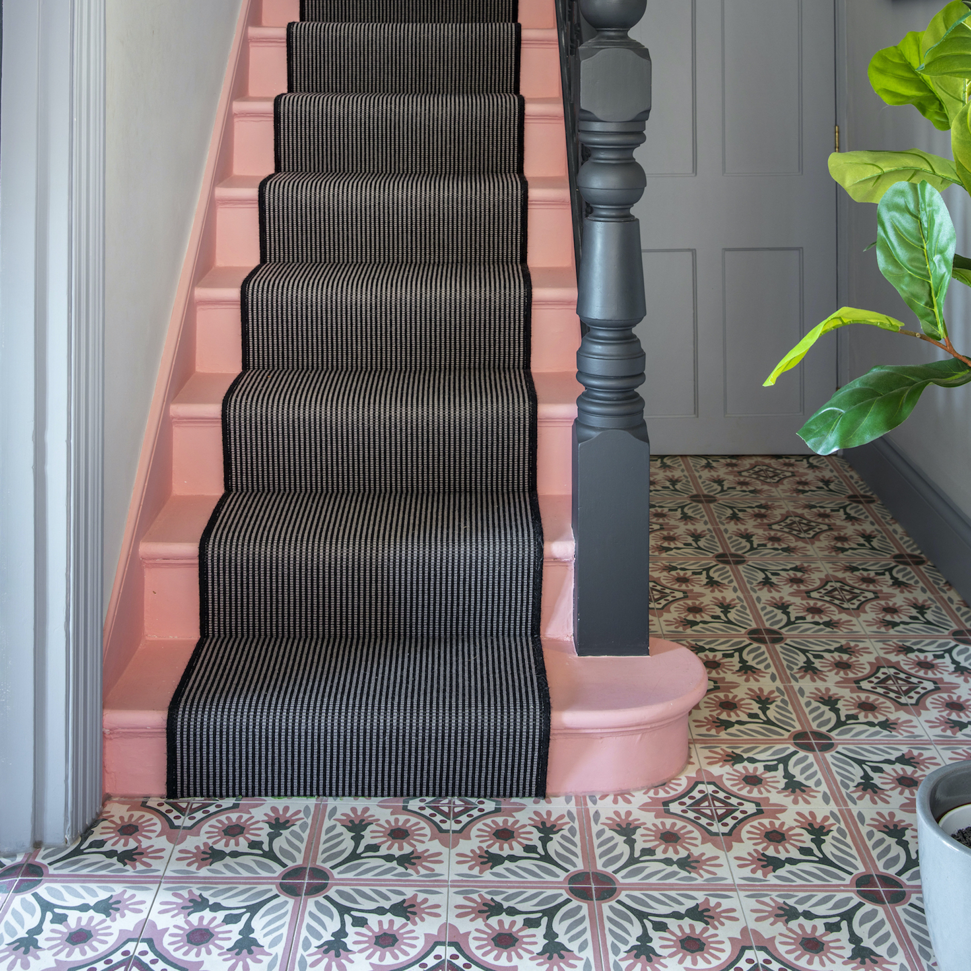
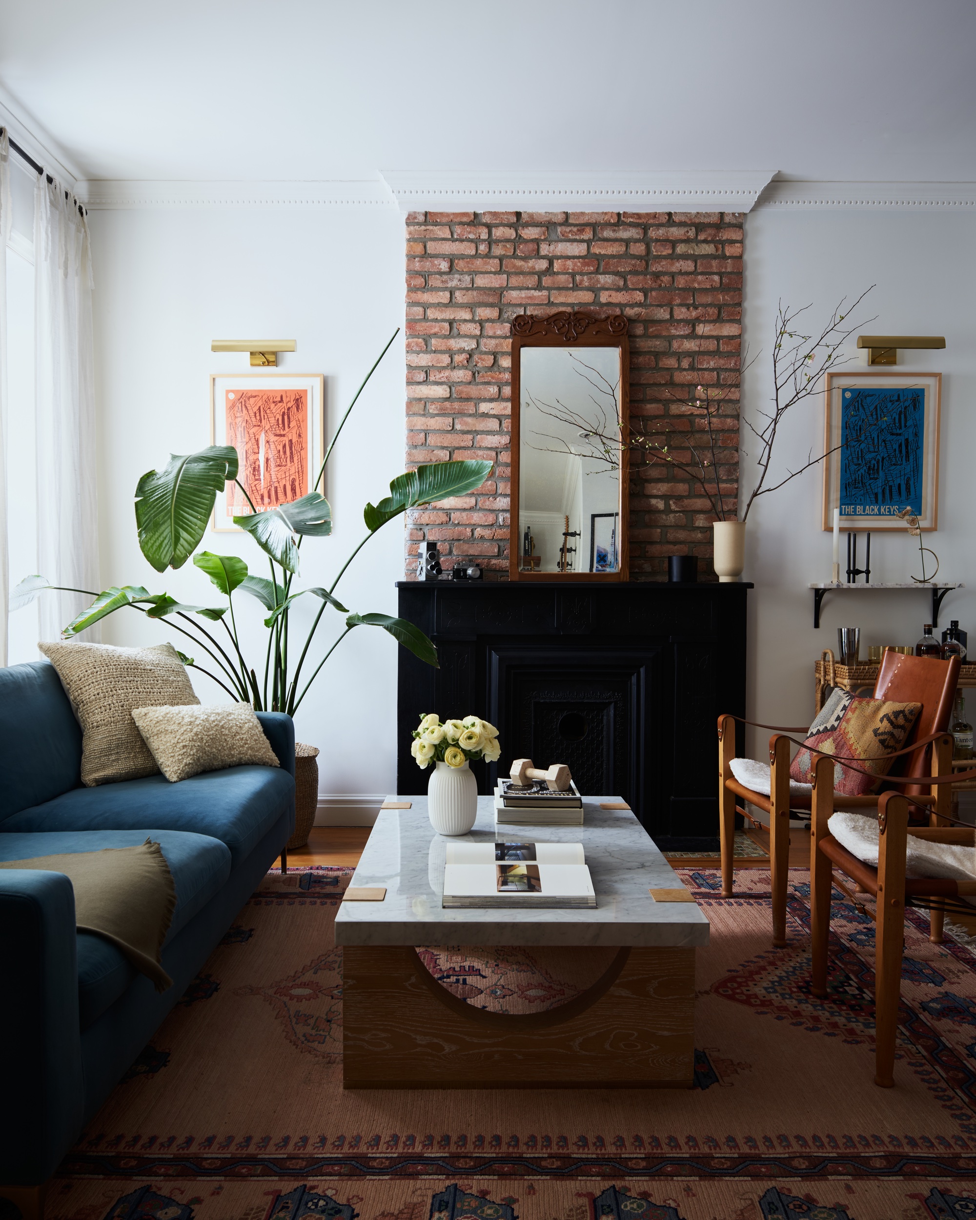
For those considering bold colors, Button suggests reserving such choices for powder rooms, where their quirkiness can be contained rather than being overtly dominant throughout a main thoroughfare. If a homeowner insists on a bright hallway, Button recommends testing the color first by painting four or five poster boards and observing them in the hallway for several days. This practical step can help visualize how the shade truly appears in the living environment, often leading to a reconsideration in favor of neutrals.
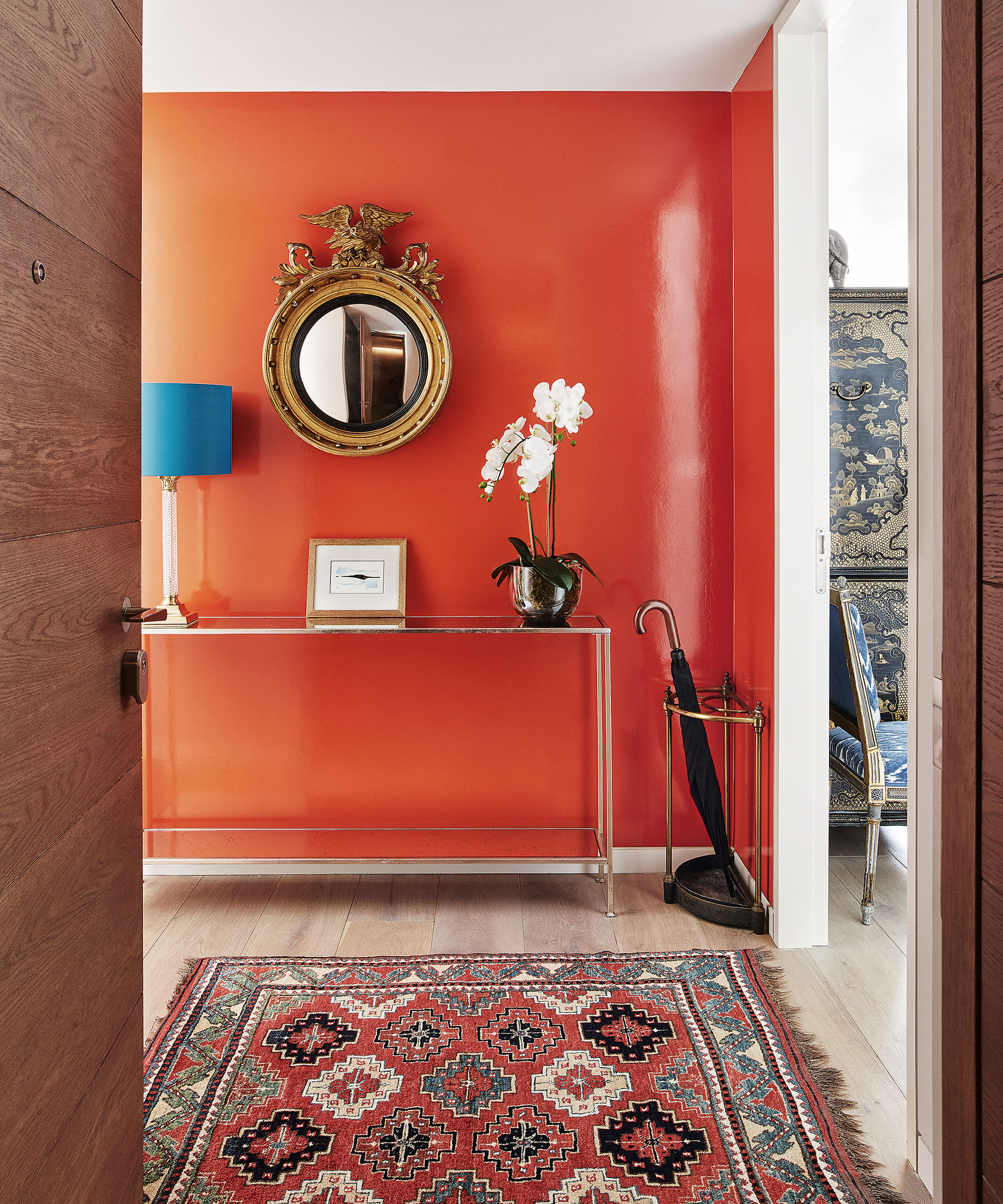
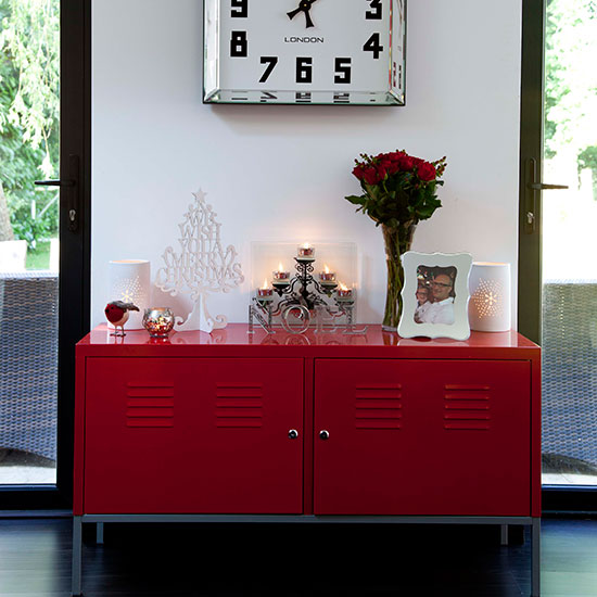
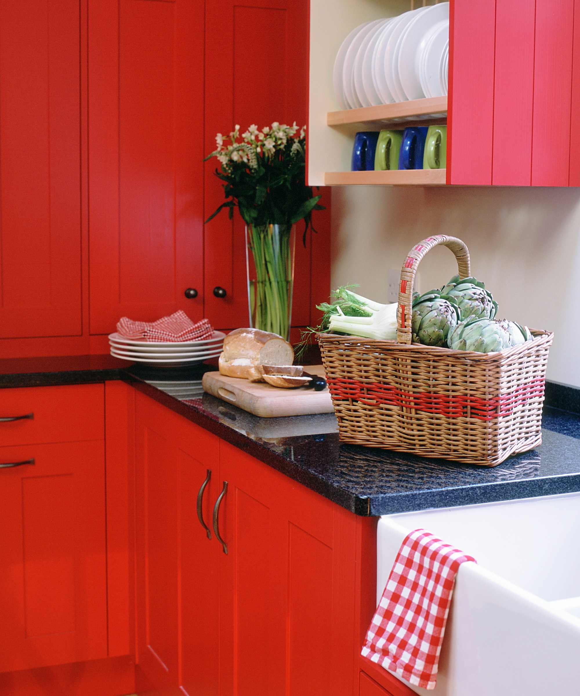
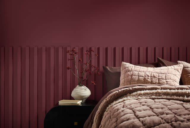
Finally, neon hues like bright red or bold orange are strongly advised against. Hallways are transitional spaces, not areas where people spend extended periods. Button recommends choosing soft and soothing colors that are pleasant to pass through daily. Bell reinforces this, stating that hyper-stimulating colors can overpower the space and disrupt the home's overall flow. The overarching message is to prioritize timeless, light, and neutral palettes to ensure seamless transitions and a cohesive home environment.
#HallwayDesign #PaintColors #InteriorDesign #HomeDecor #DesignTips #NeutralPalette #Lighting #TexturalFinishes #HallwayDesign #PaintColors #InteriorDesign #HomeDecor #DesignTips #NeutralPalette #Lighting #TexturalFinishes
Há 0 comentários no total
 Ainda não há comentários
Você também pode gostar

5 colors you should never paint your entryway – according to interior experts


What are the worst colors to paint a room? The shades experts say you should never use
5 rug colors to avoid – the hues designers think you should veer away from on floors, plus how to make them work

5 Paint Colors You Should Never Use In A Bedroom, According to Designers

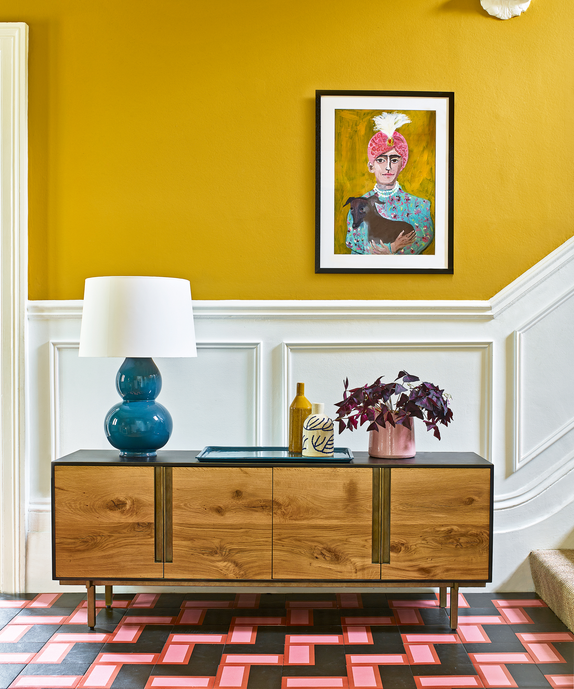
The colors you should never paint your hallway – and what really works

5 colors you should never paint a pantry – designers share the shades they swerve
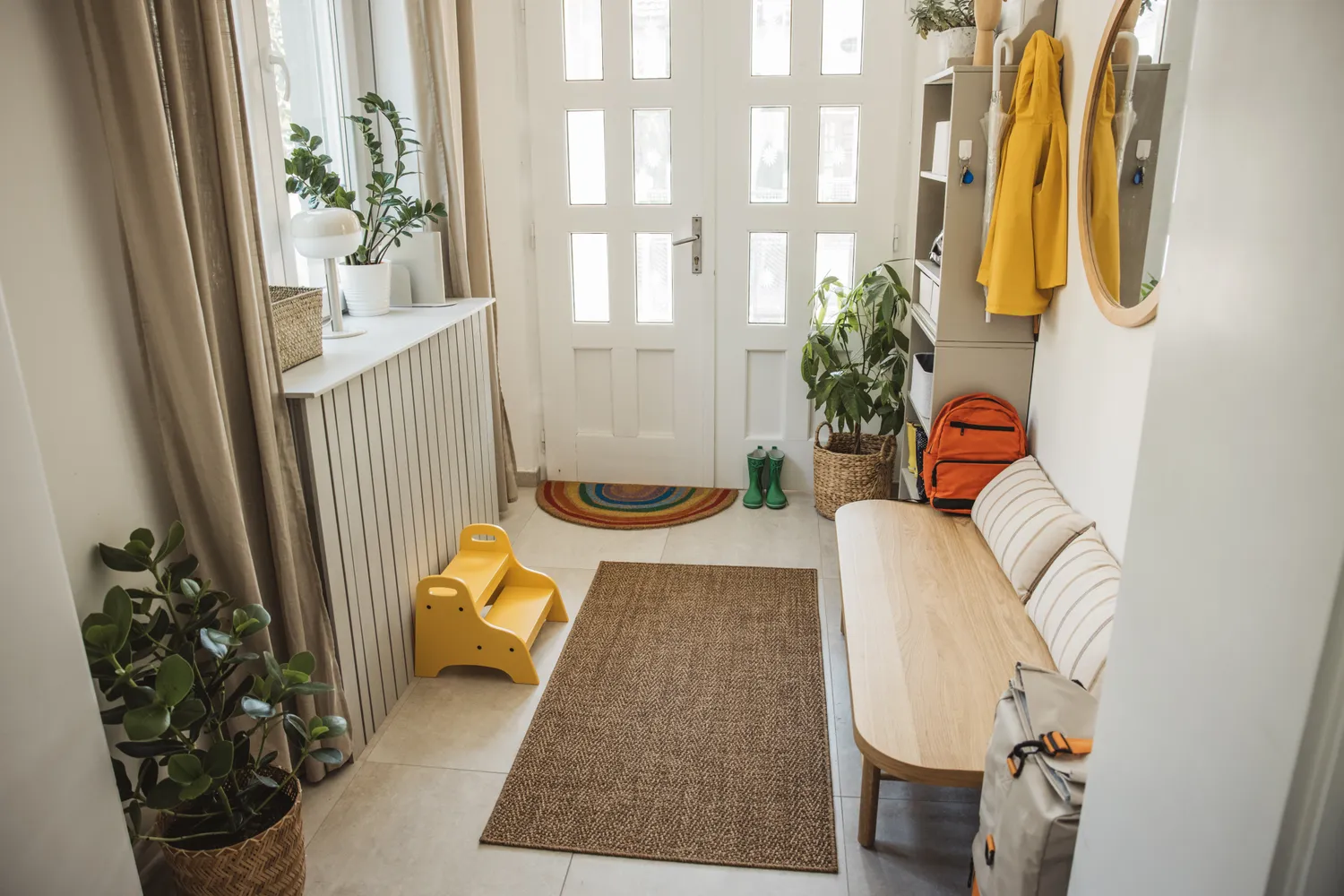
6 Colors You Should Never Paint Your Entryway, According to Color Experts

Interior design experts reveal the colour rules you should be breaking
You should never paint your hallway this colour, according to colour psychologists
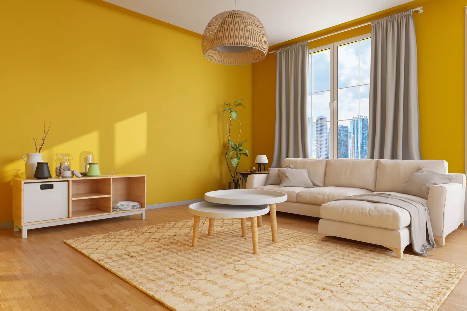
5 Paint Colors to Never Use in Your Living Room, According to Interior Designers
Colors not to paint a mudroom – 5 hues to avoid in this high-traffic space
4 Times Designers Say You Definitely Shouldn't Paint Your Walls and Ceiling in the Same Color
4 Paint Colors Designers Say You Should Never Use In A Hallway
Trust us, these are the colours to avoid when painting a small hallway
8 colors you should never paint kitchen cabinets according to the experts


4 Outdated Colors Designers say you Should Steer Clear of When Decorating a Living Room

5 colors you should never paint a small room – designers warn us to steer clear of these hues, and what to pick instead
5 colors to avoid in a bathroom – according to designers
5 Paint Colors That Experts Say You Shouldn't Use in 2025

5 Paint Colors You Should Never Use in a Bathroom, Designers Warn