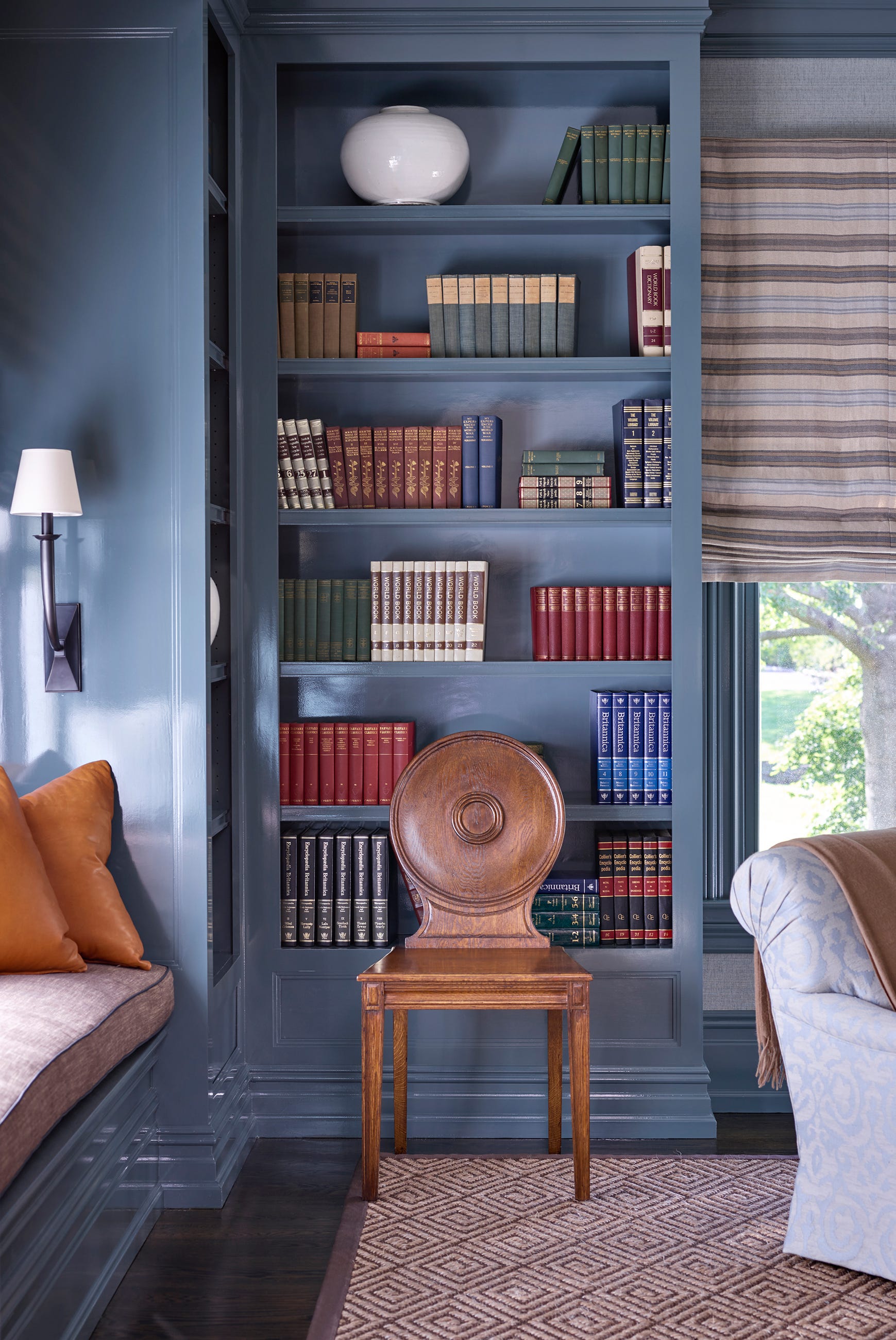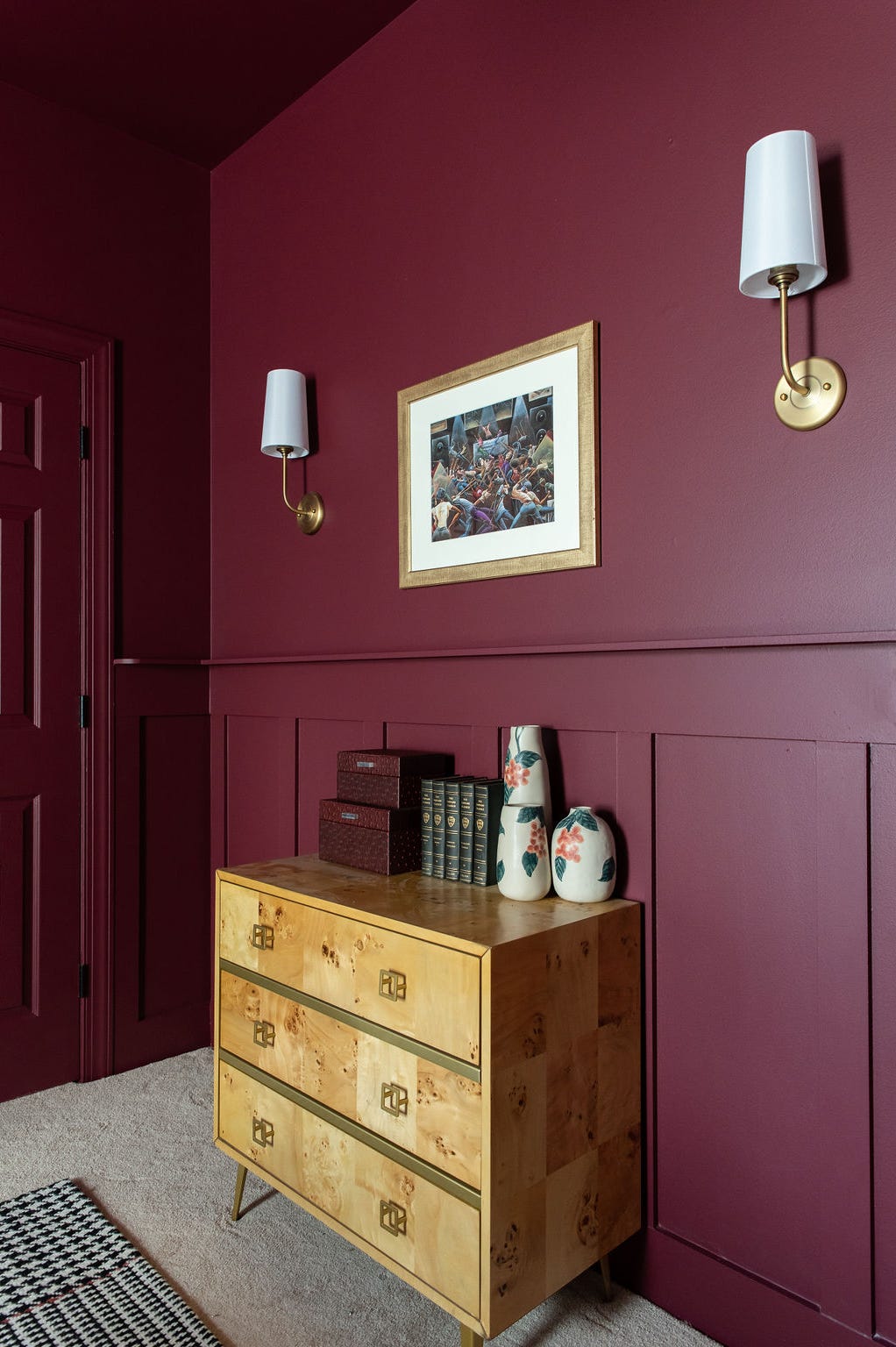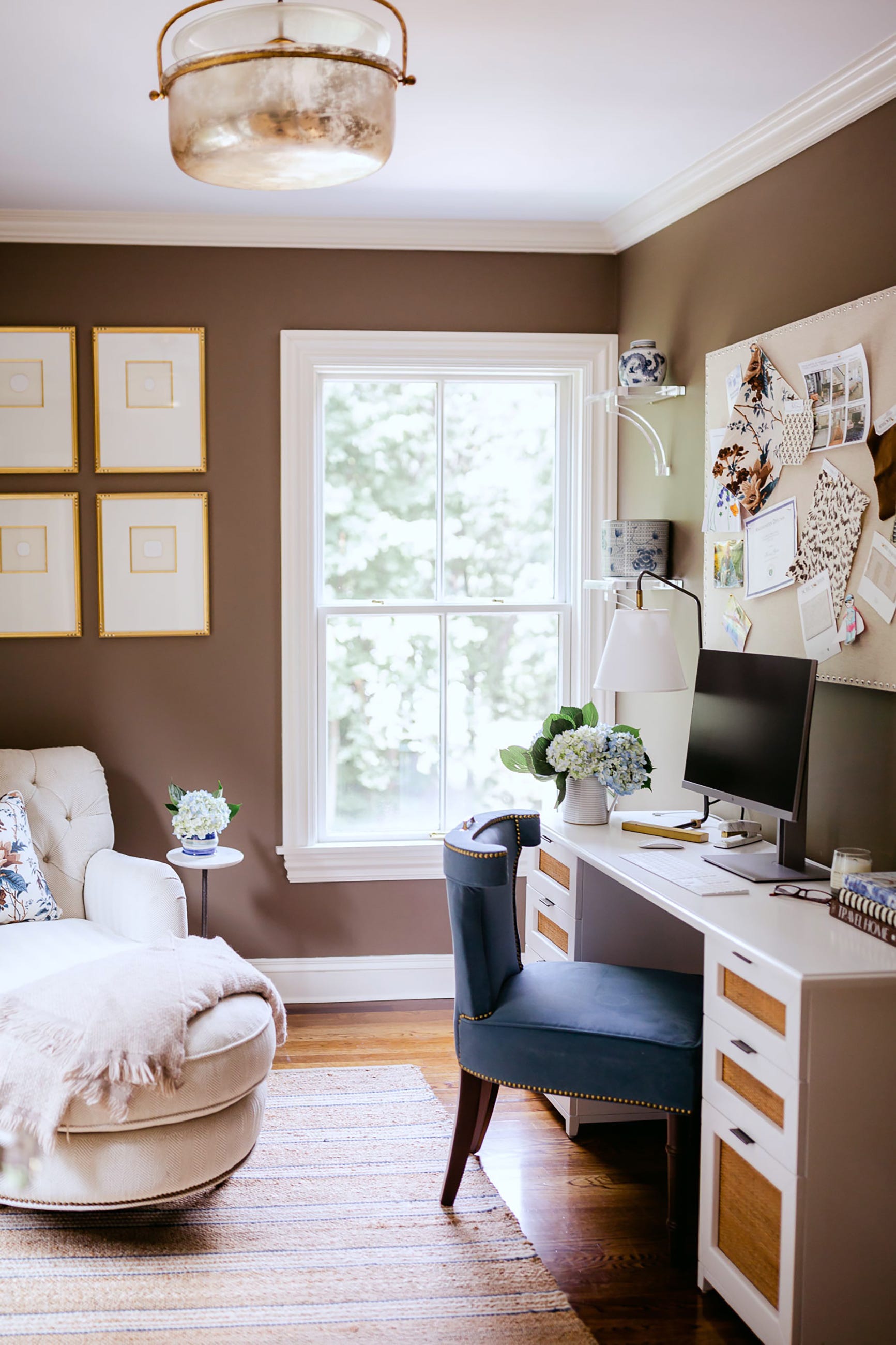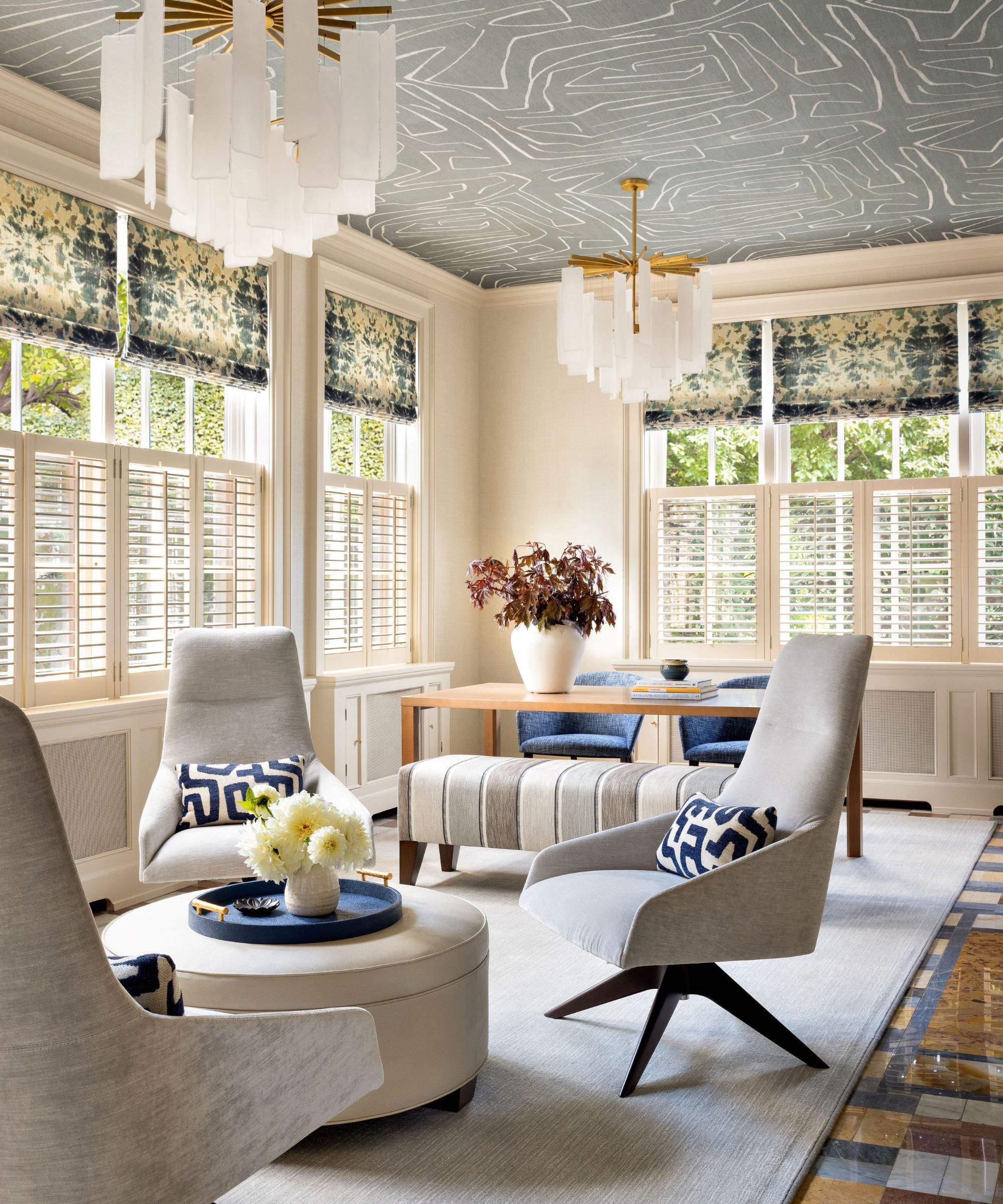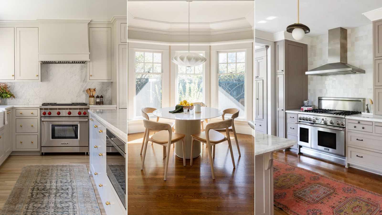
1/8
What are Sherwin-Williams' best-selling paints? And how interior designers put them to use
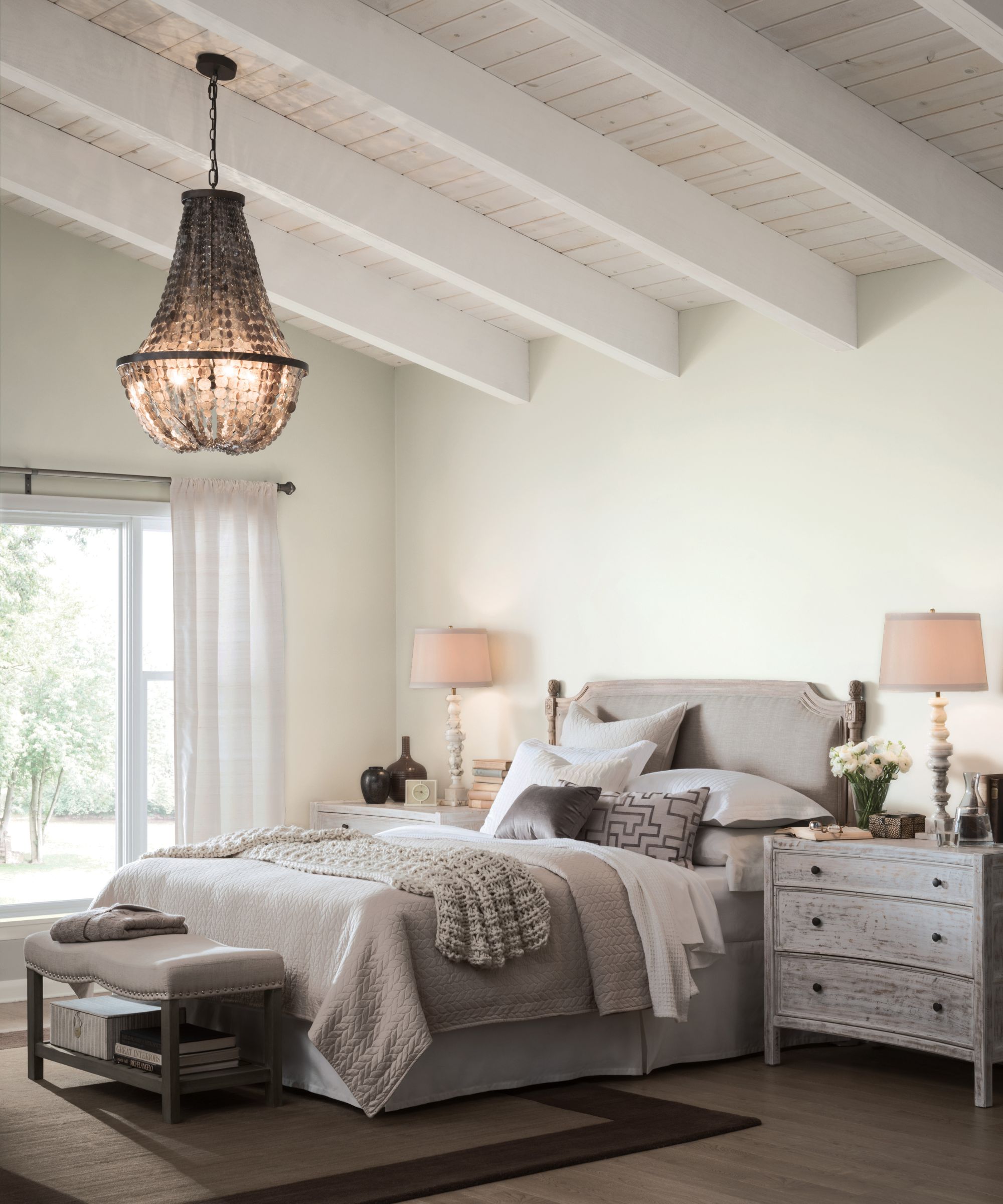
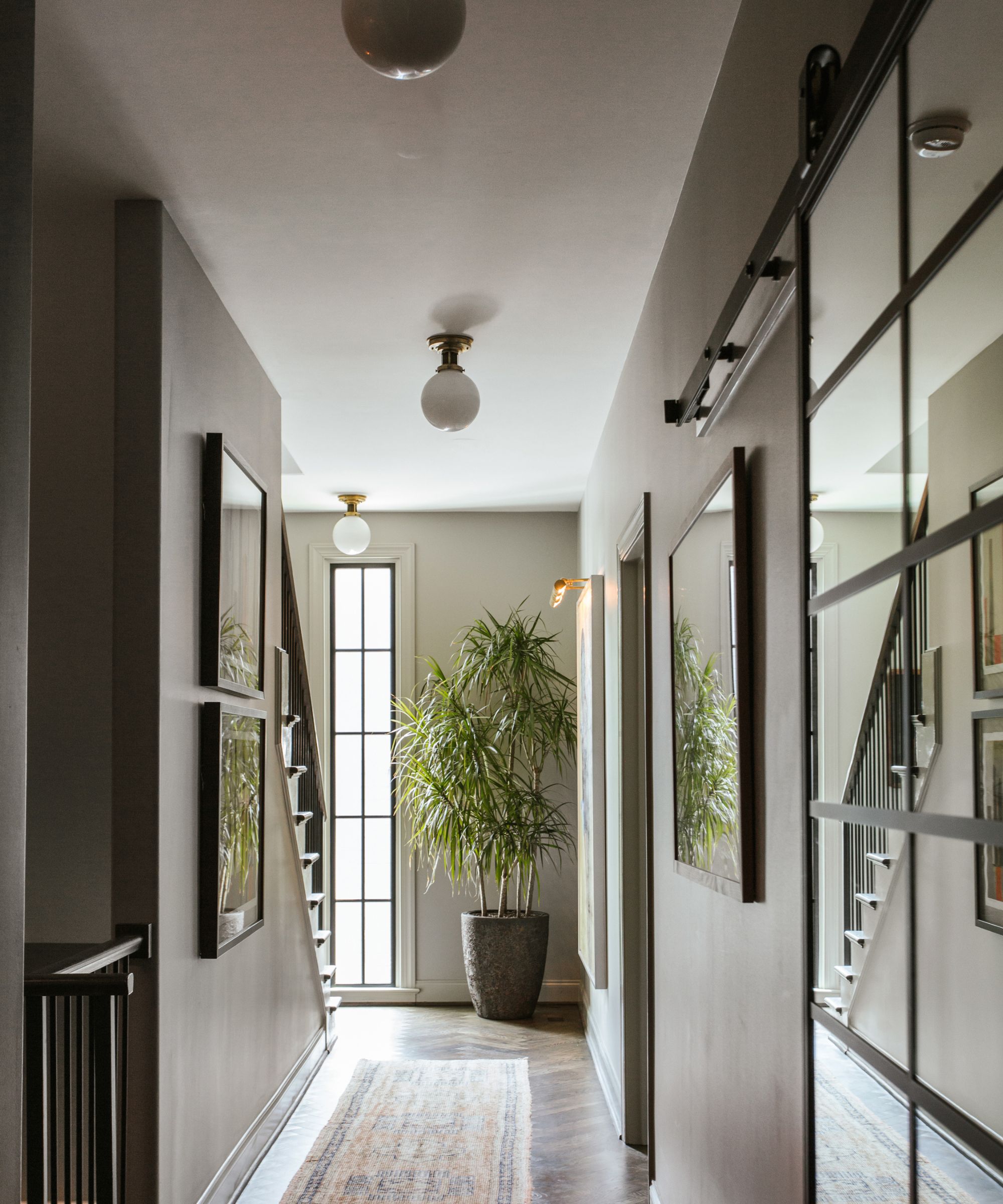
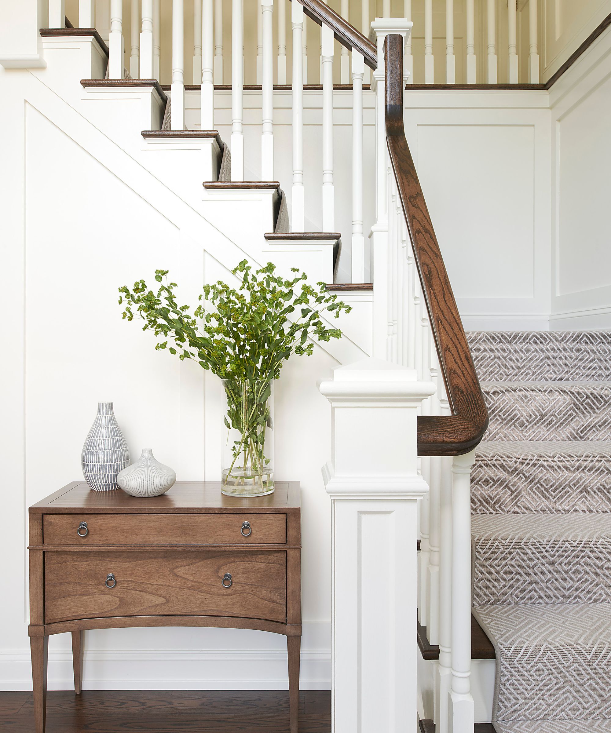
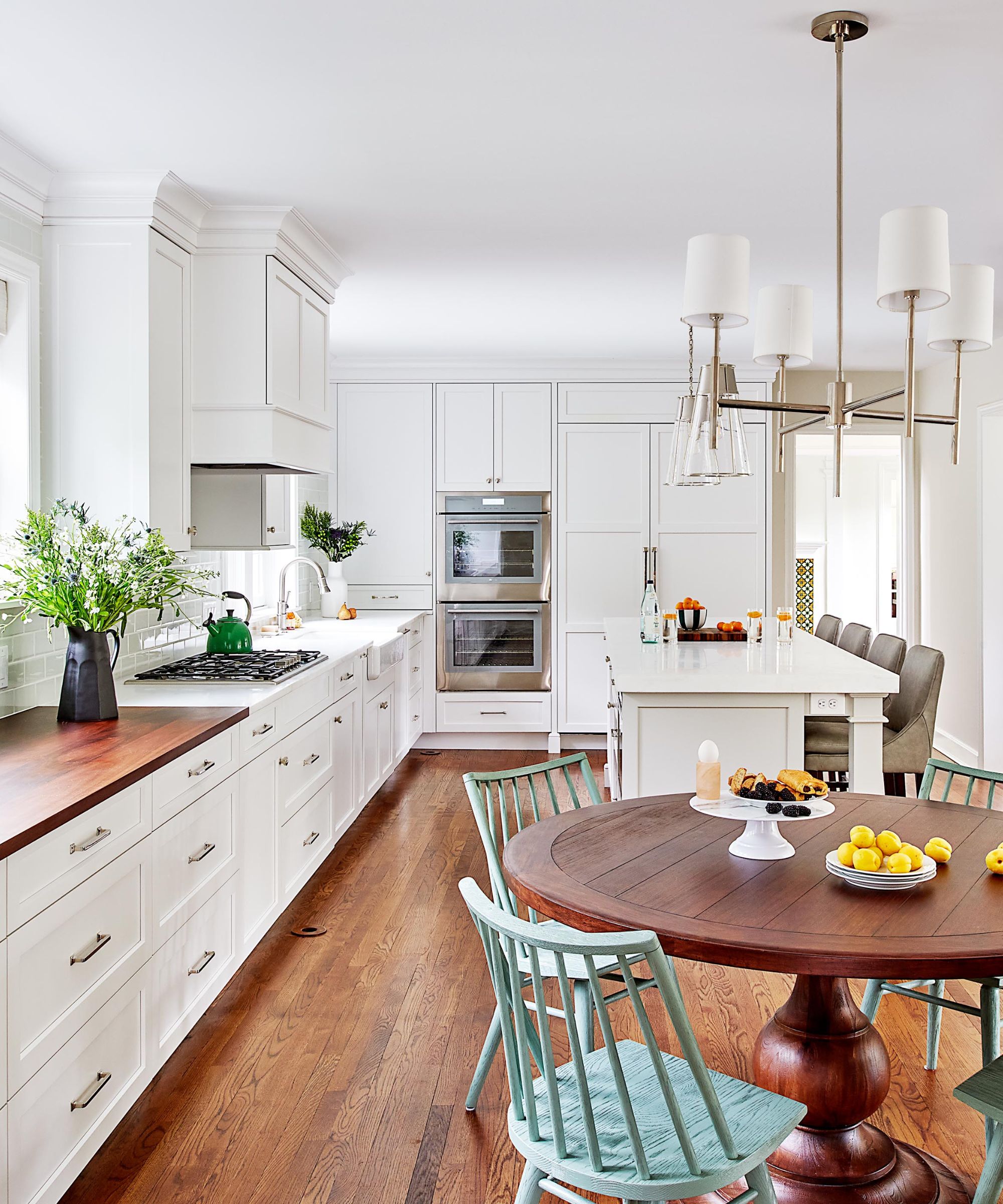
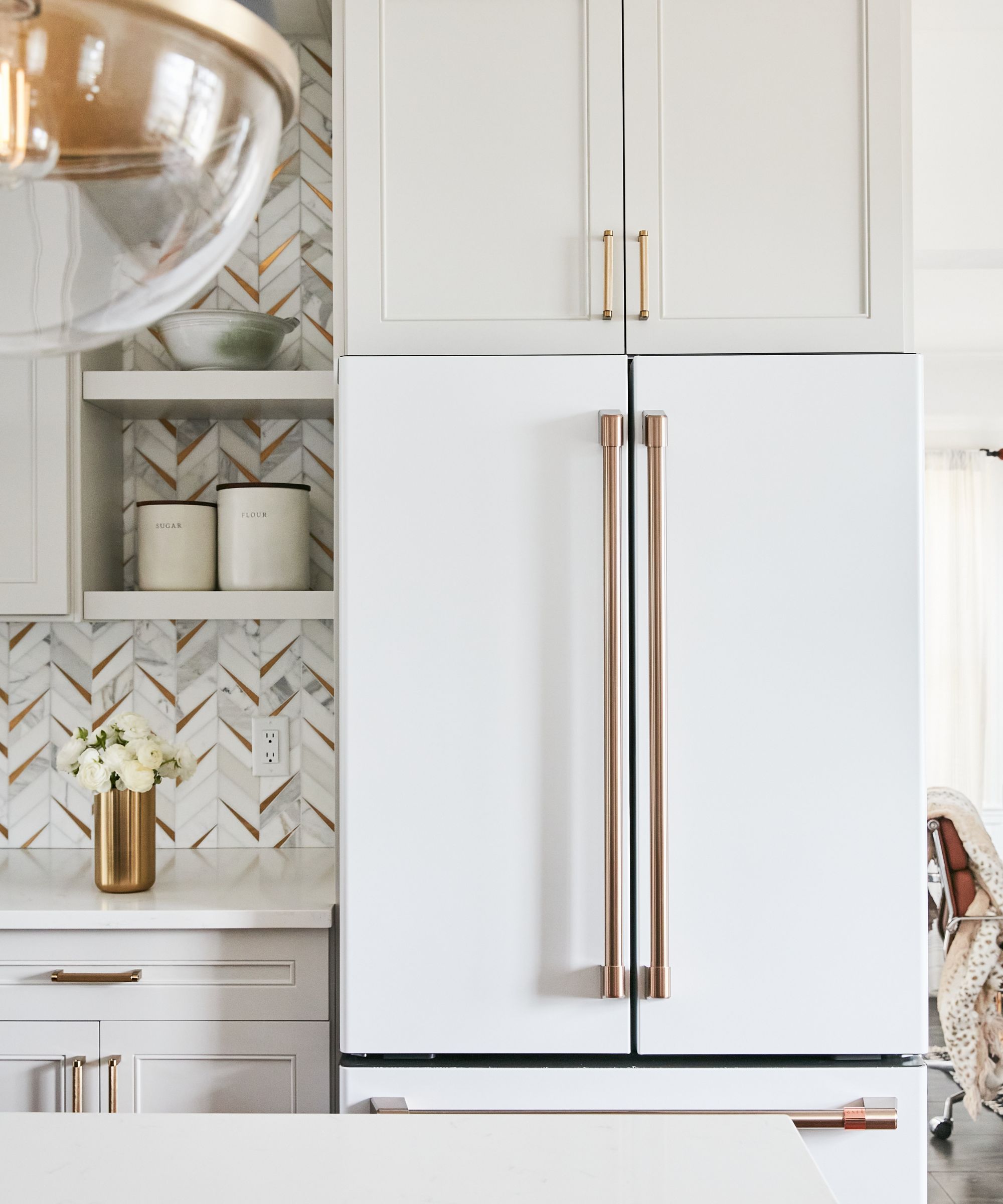
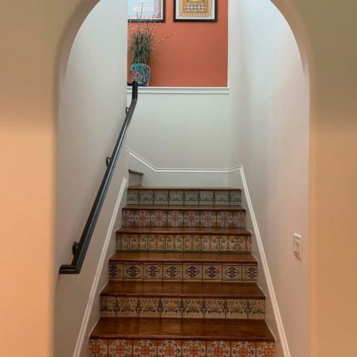
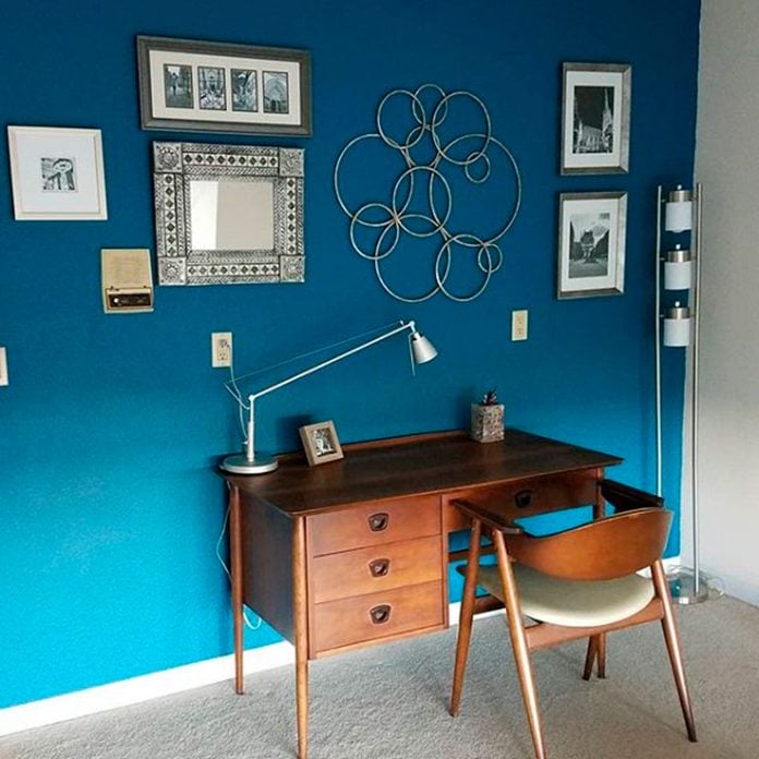
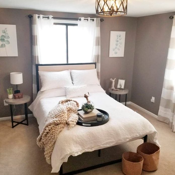
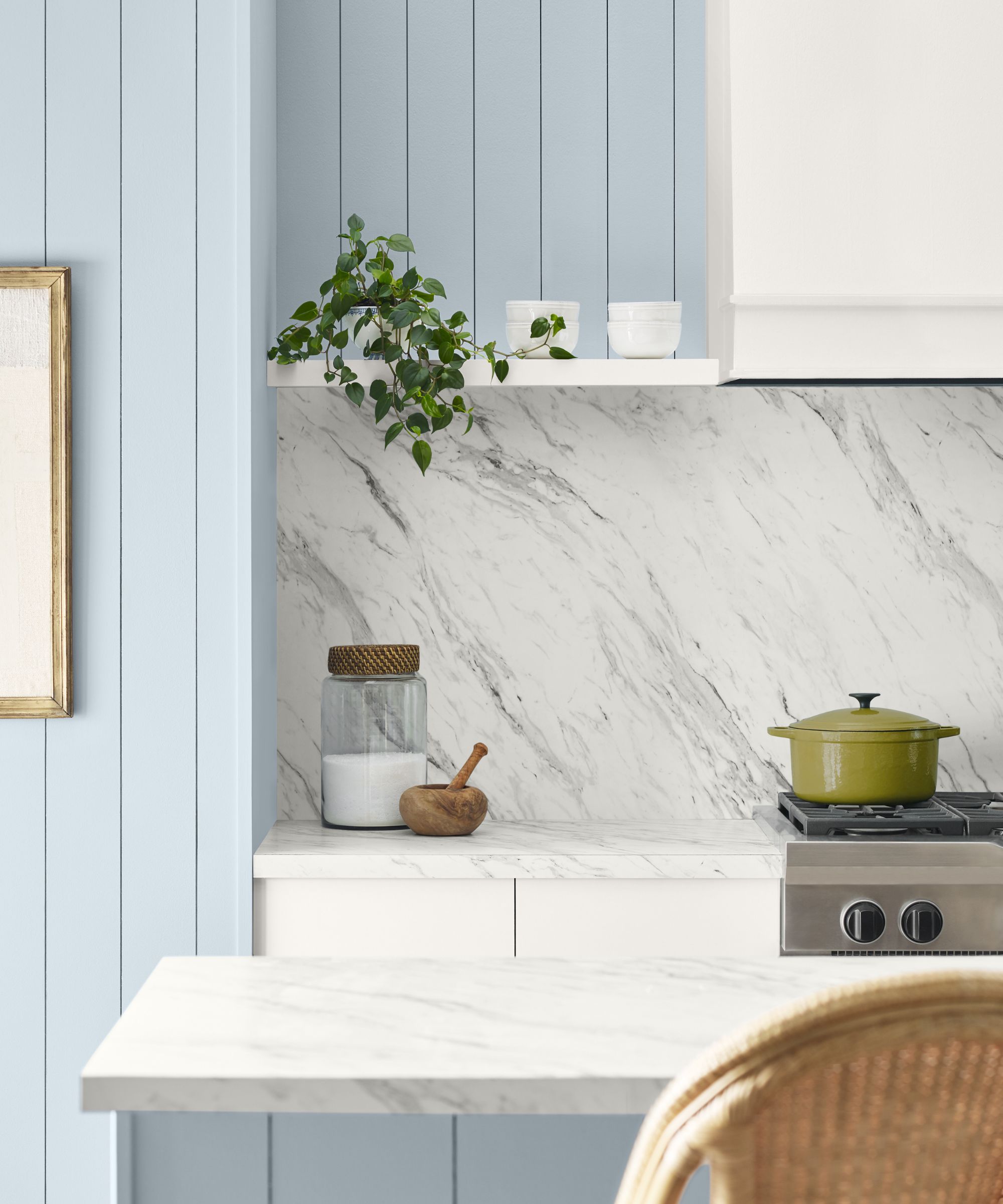
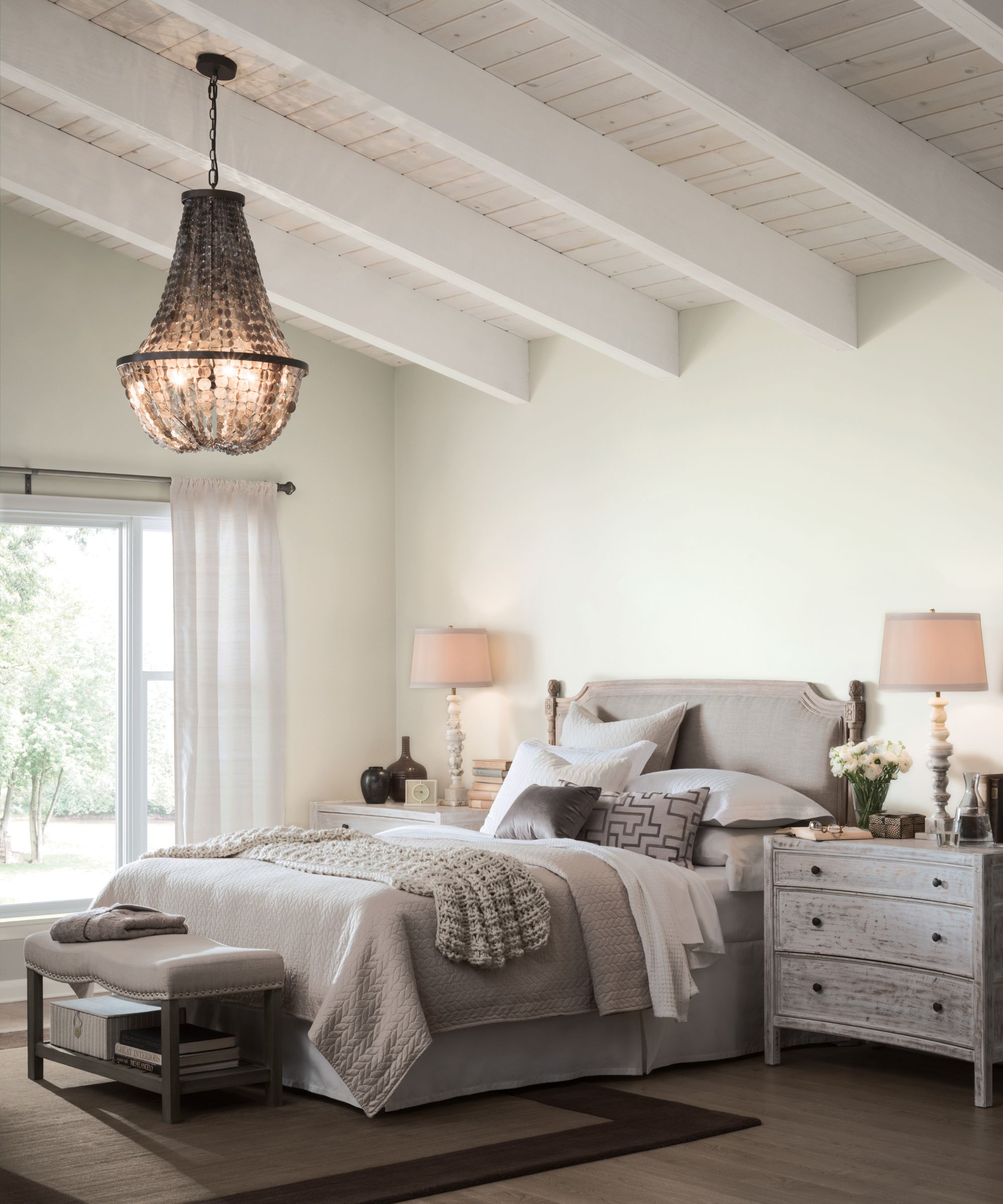
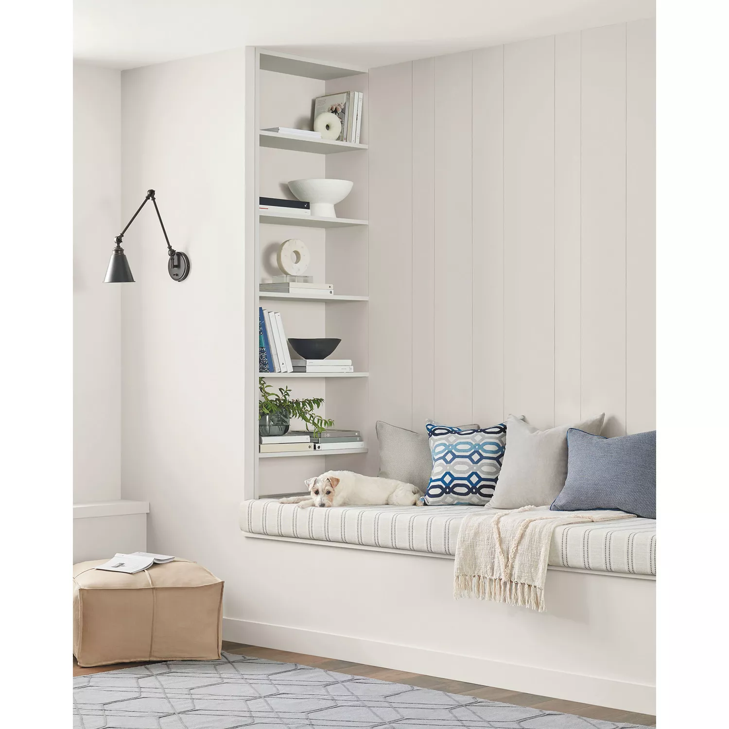
This article explores Sherwin-Williams' best-selling paint colors, focusing on how interior designers incorporate these popular shades into their projects. The list predominantly features neutral paints, including whites, grays, beiges, and greiges, reflecting a broader trend towards timeless and adaptable home interiors, even amidst fluctuating color trends. The author emphasizes that while bold color trends come and go, neutrals consistently remain top sellers, serving as versatile backdrops for various design aesthetics.
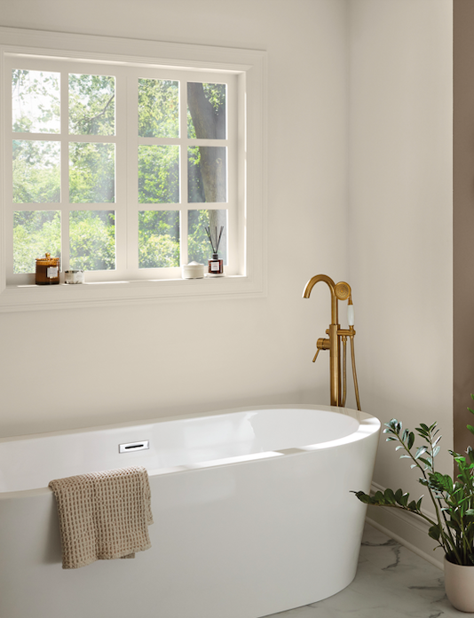
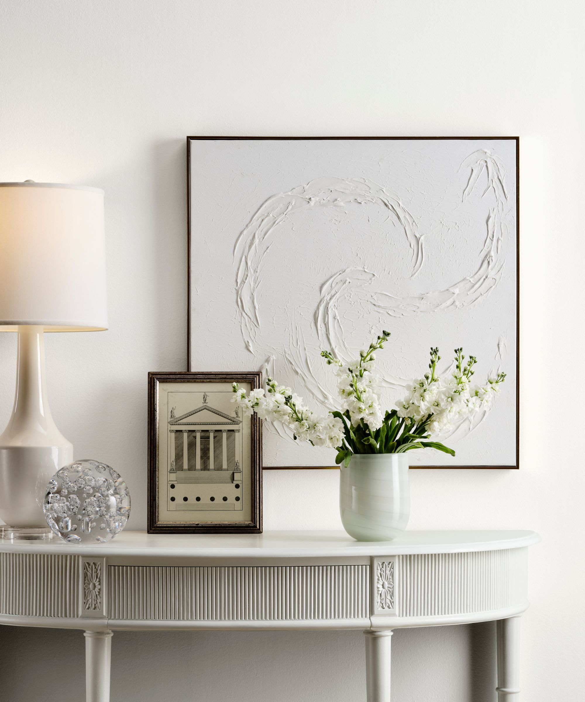
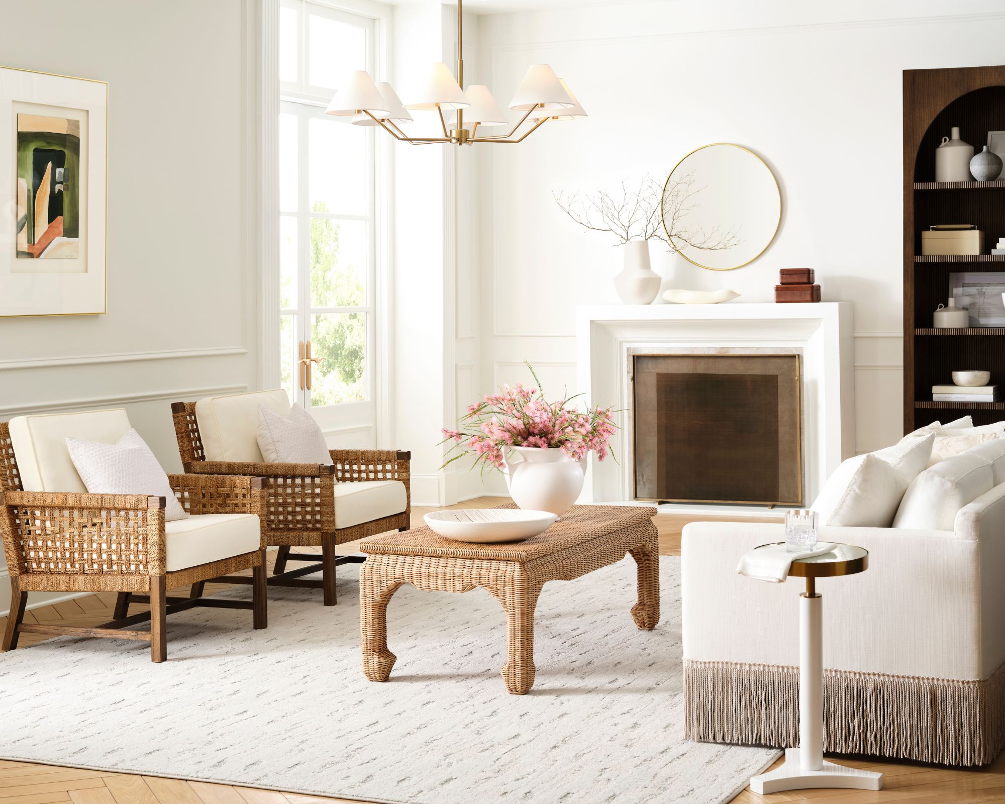
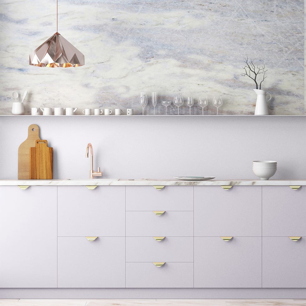
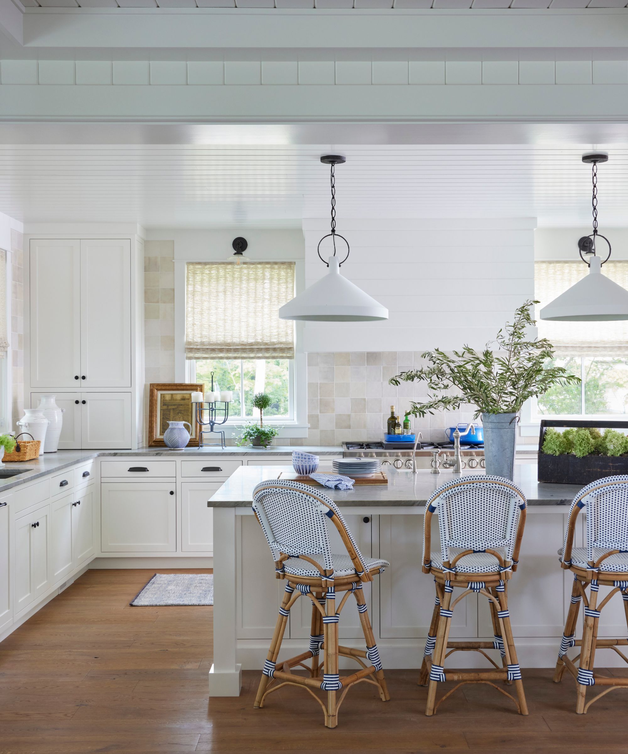
The article highlights seven specific Sherwin-Williams best-selling paints, starting with 'Pure White SW 7005.' This shade is praised for its versatility and slight warmth, preventing it from appearing too stark. Designers utilize it for ceilings, doors, cabinets, and walls in both modern and traditional settings, valuing its clean and bright quality. Mollie Ranize of Dmar Interiors and Shelagh Conway of Triple Heart Design both recommend Pure White for its ability to create a crisp yet inviting atmosphere.
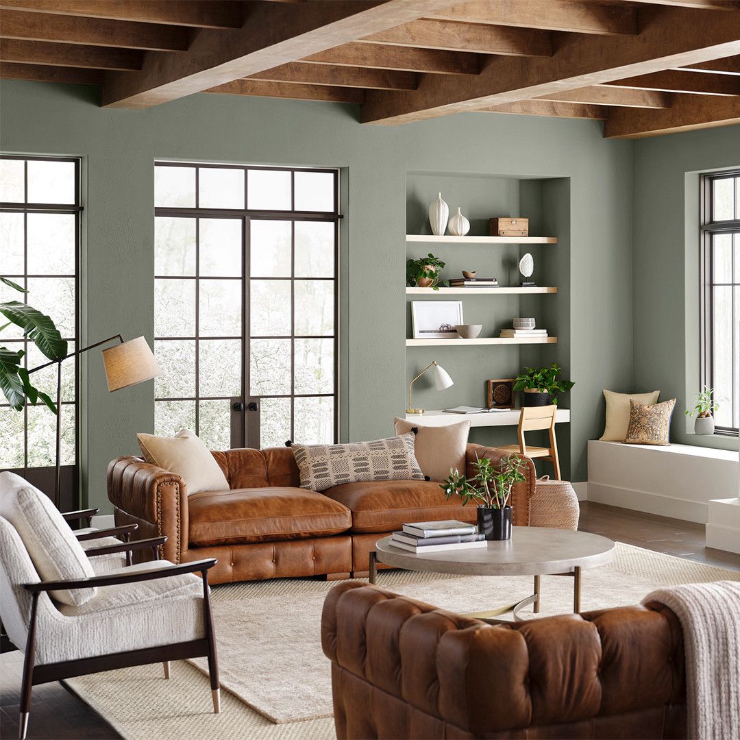
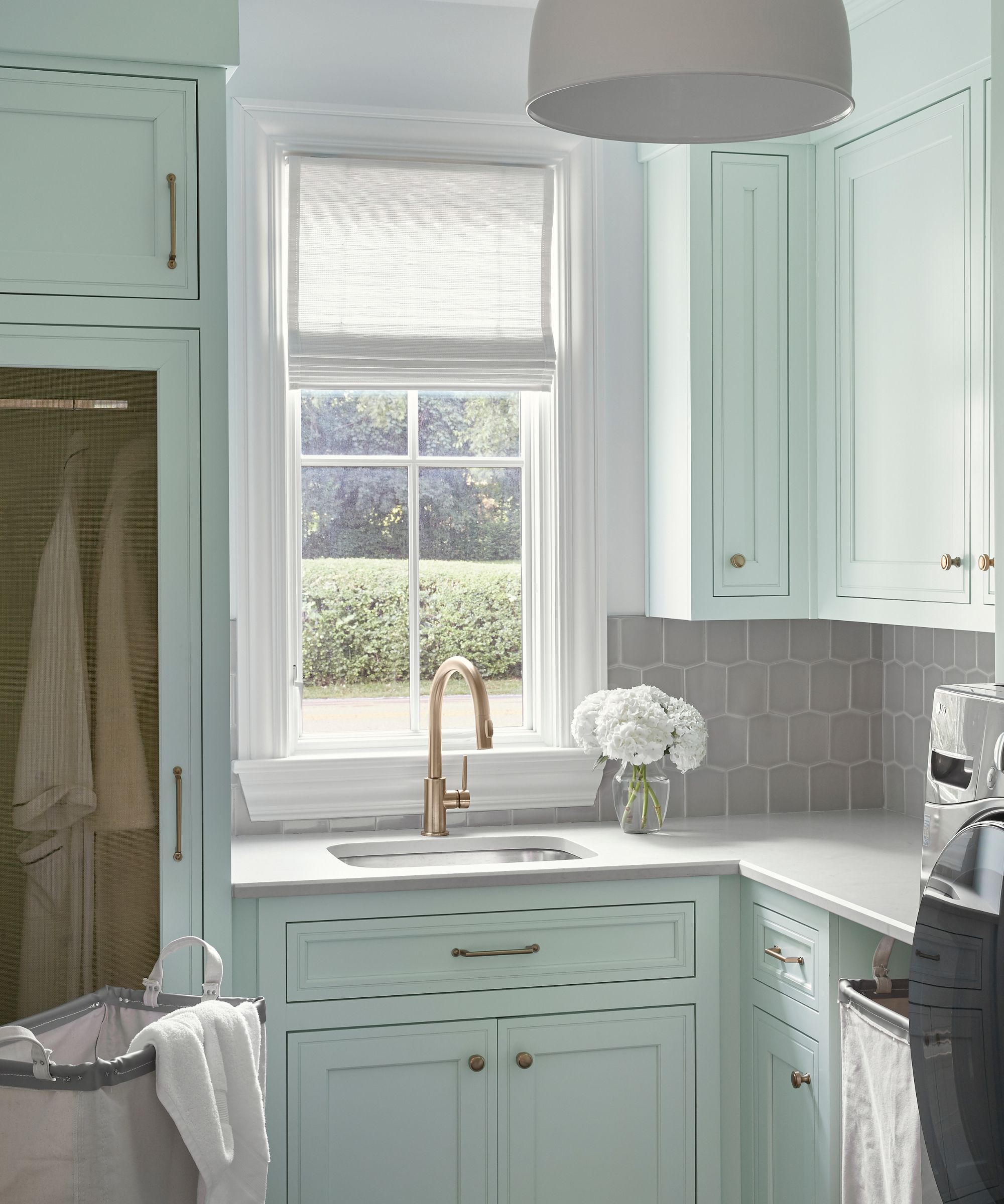
Next, 'Agreeable Gray SW 7029' is discussed as a frequently chosen greige paint. Its appeal lies in its chameleon-like ability to appear creamy or more gray depending on lighting and surrounding colors, making it suitable for various architectural styles. Emily Ruff of Cohesively Curated notes its warm undertones, which differentiate it from cooler grays, and advises evaluating it in the intended space due to its variable appearance. The shade is particularly effective in spaces with abundant natural light.
'Snowbound SW 7004' is presented as a versatile cool white with subtle gray undertones, making it an ideal companion for other gray-influenced colors. Marie Flanigan describes it as a 'pure palette cleanser' that can be easily warmed up with additional finishes, emphasizing its adaptability in white bathrooms and other settings. Its enduring popularity stems from its capacity to balance and refresh warmer tones.
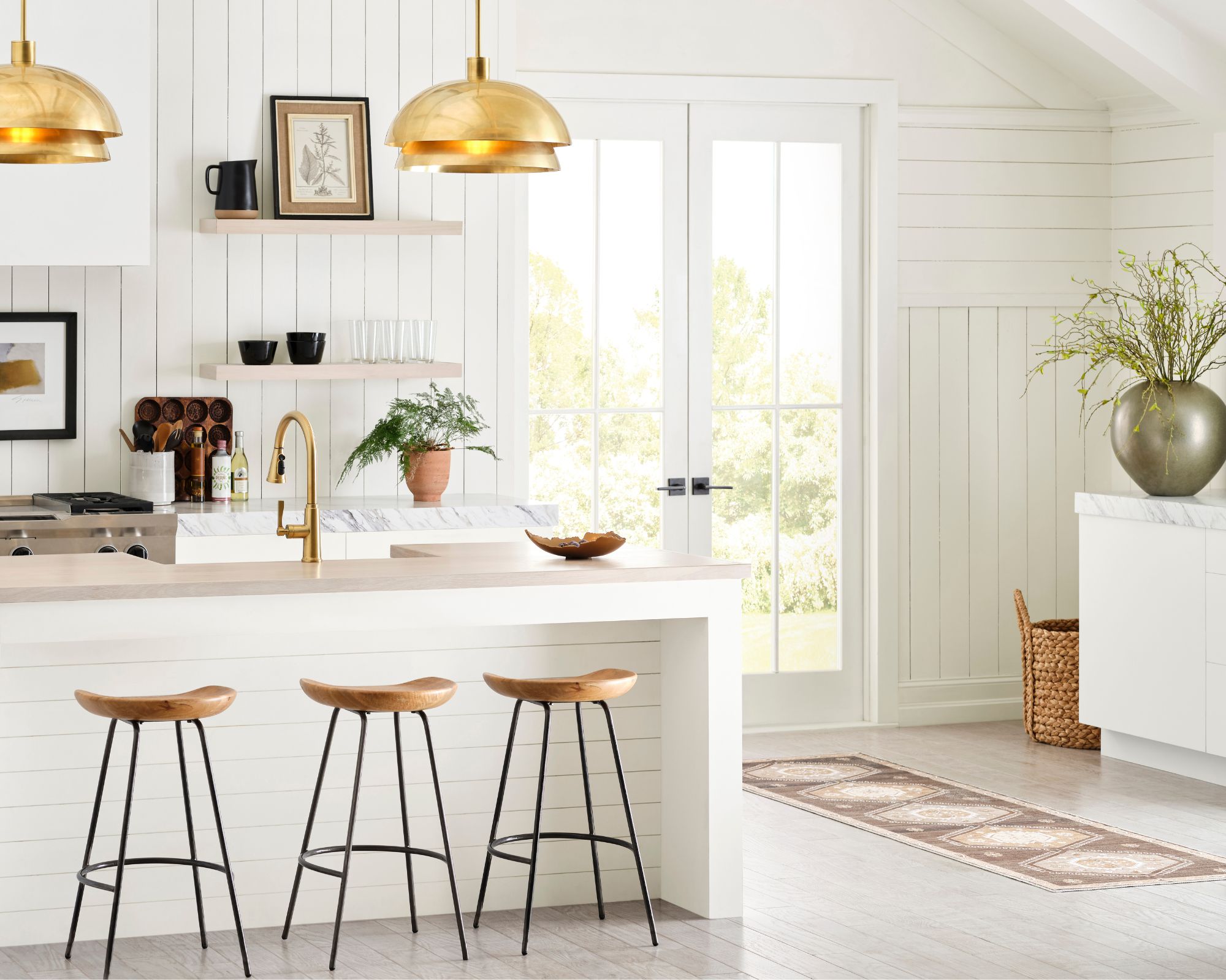
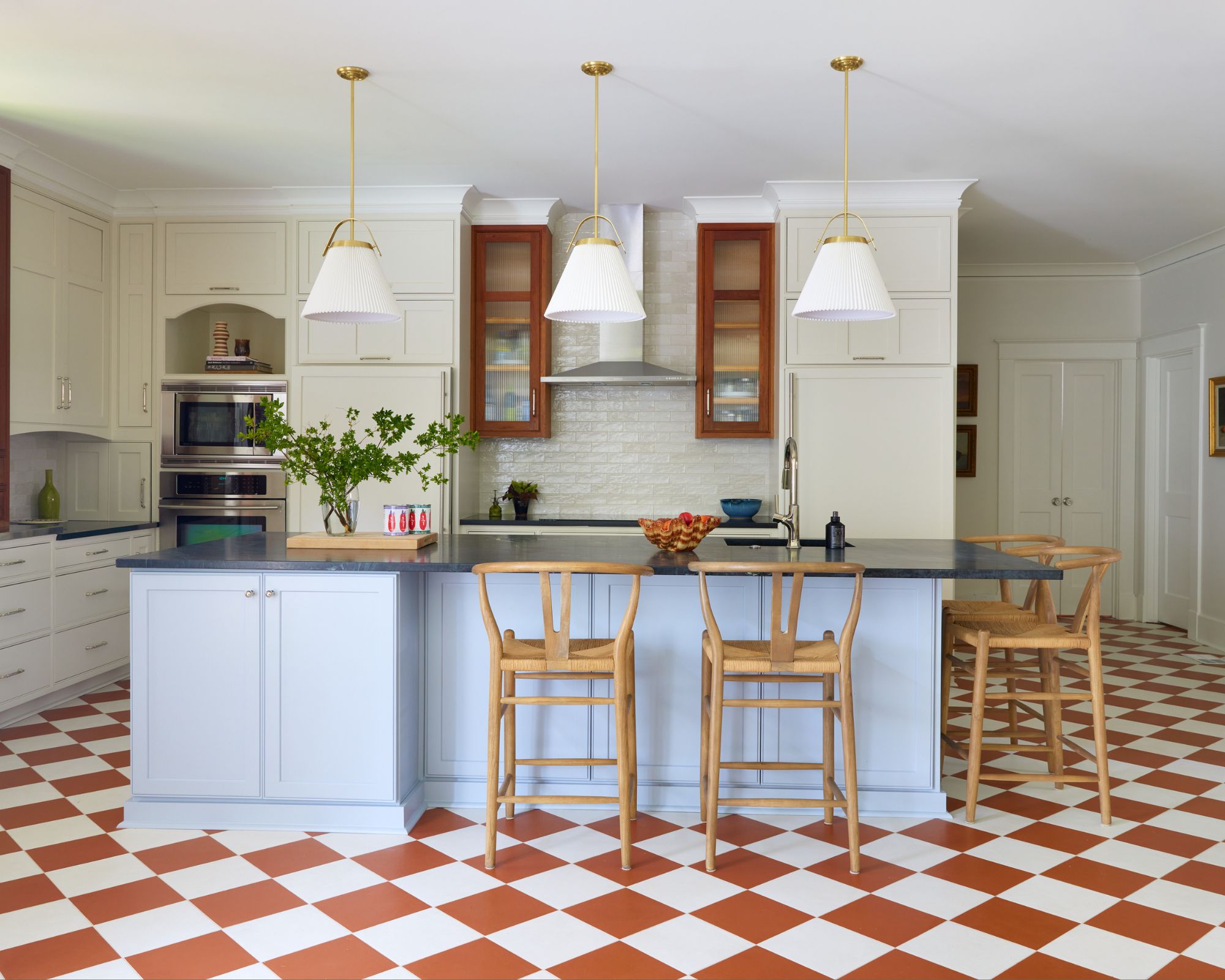
'Alabaster SW 7008' is recognized as a warm, balanced white that borders on cream. It is a favored choice for ceilings, doors, and trim due to its ability to provide brightness without sacrificing coziness. Shelagh Conway praises it as an "all-around PERFECT paint," and Molly Rose of Dmar Interiors utilized it for kitchen cabinetry in a Spanish-style home to maintain a cool coastal vibe while incorporating warmth.
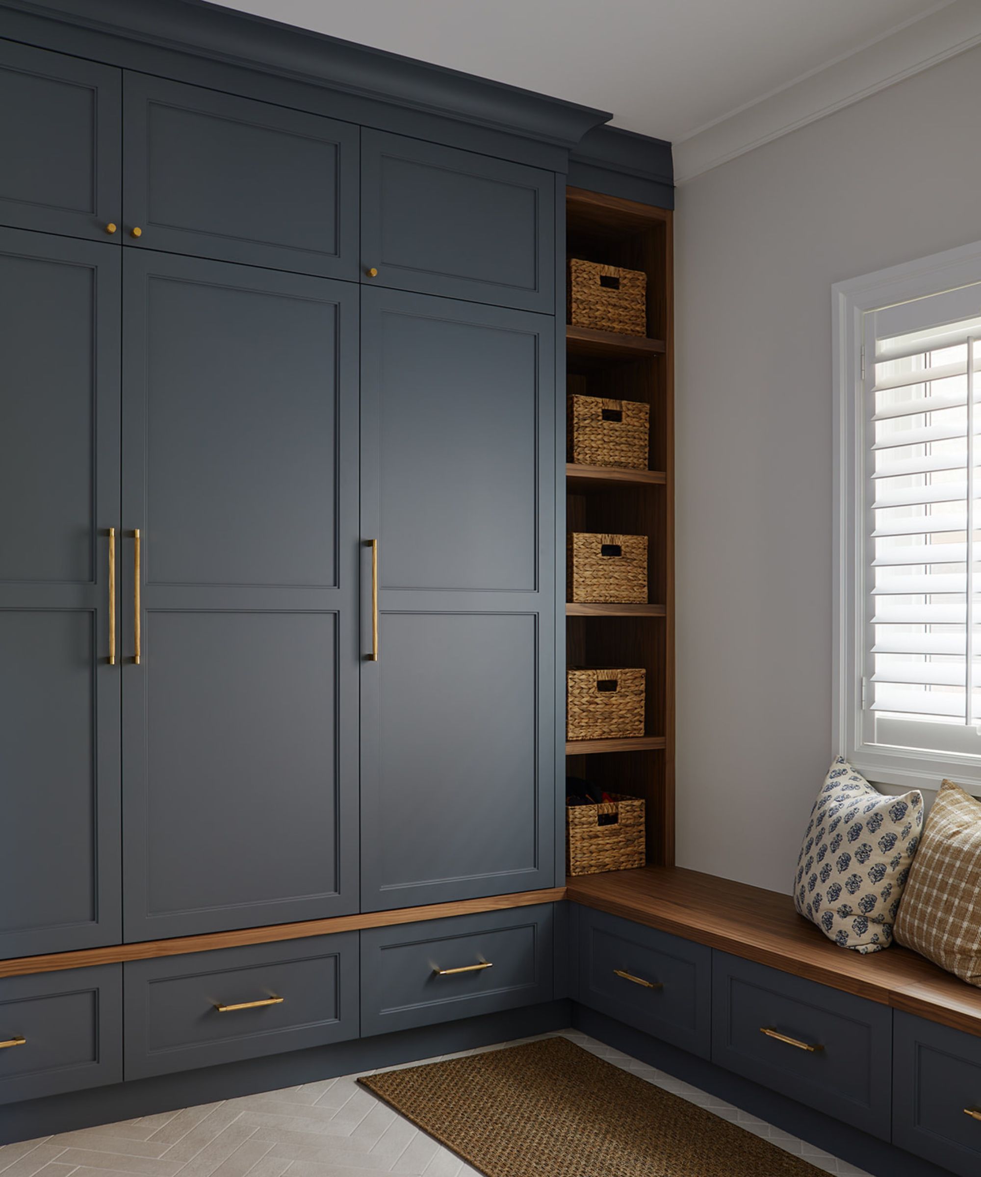
'Accessible Beige SW 7036' is characterized as a greige rather than a pure beige, featuring gray undertones that contribute to a warm and snug feel. This blend of warm and cool tones makes it highly versatile and adaptable to different color palettes, aligning with a significant 2024 color trend of integrating both warm and cool shades. Audrey Scheck highlights it as a classic beige with beautiful, warm gray undertones.
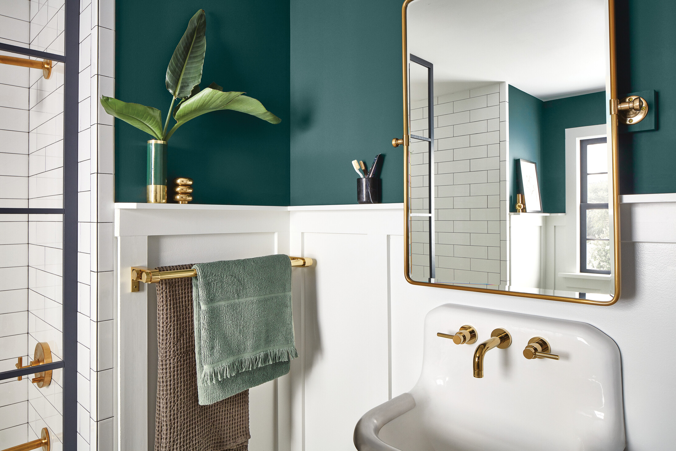
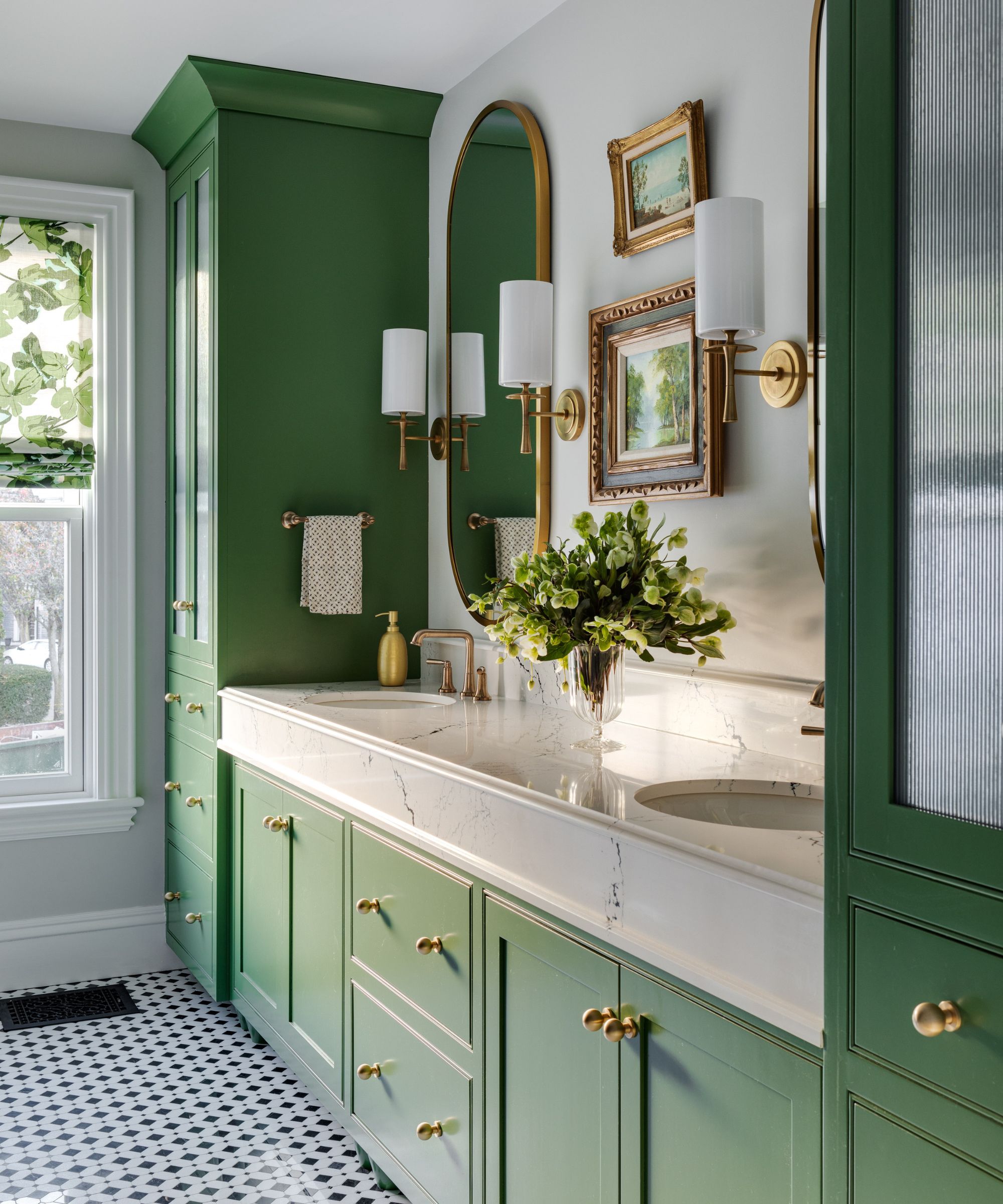
'Greek Villa SW 7551' is described as a sunny white with a hint of yellow, ideal for brightening spaces and making other colors pop when used on trim. Marie Flanigan notes its warmth, which effectively supports saturated colors as a neutral backdrop. Christine Carney of Blackberry Farm Design emphasizes its cheerful quality, recommending it for kitchens and bathrooms where bright light might otherwise appear harsh.
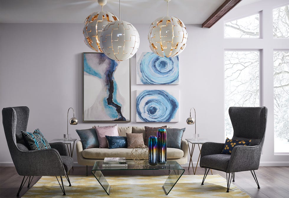
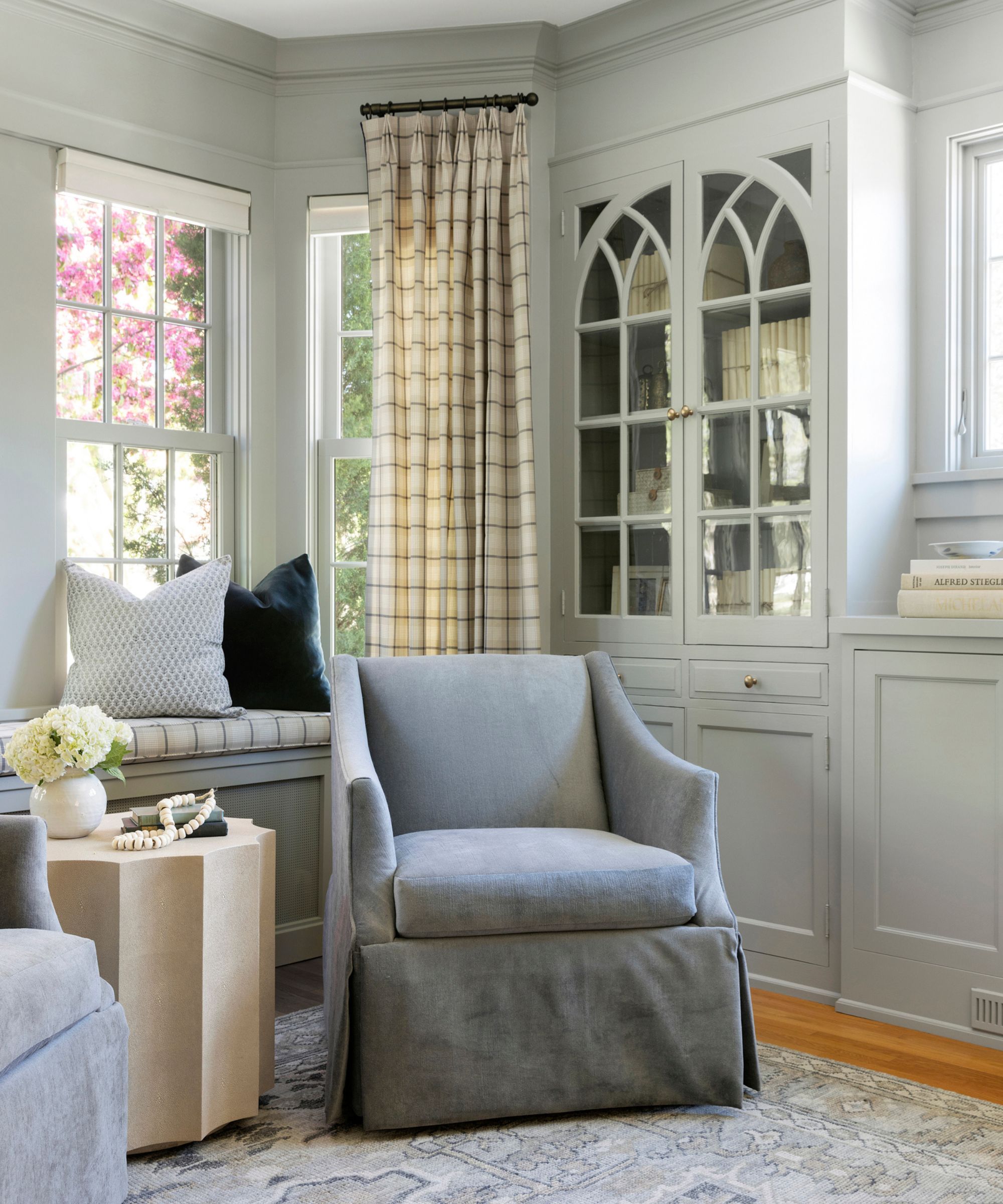
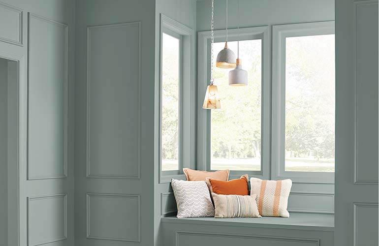
Finally, 'Drifts of Mist SW 9166' is an airy yet inviting gray with warm undertones, offering more versatility than cooler grays. It effectively balances very warm shades, such as orange-toned woods or yellow creams. Mollie Ranize appreciates its light, subtle depth without overpowering surrounding colors, and Shelagh Conway notes its chameleon-like nature, advocating for testing it in the specific space to observe its true appearance. The article concludes by reiterating that the dominance of neutrals in Sherwin-Williams' best-selling list underscores their liveability and adaptability as foundational elements in home decoration.
#SherwinWilliams #PaintColors #InteriorDesign #NeutralPalette #HomeDecor #DesignTrends #ColorSelection #SherwinWilliams #PaintColors #InteriorDesign #NeutralPalette #HomeDecor #DesignTrends #ColorSelection
0 komentarzy łącznie
 Brak komentarzy jeszcze
Możesz również polubić
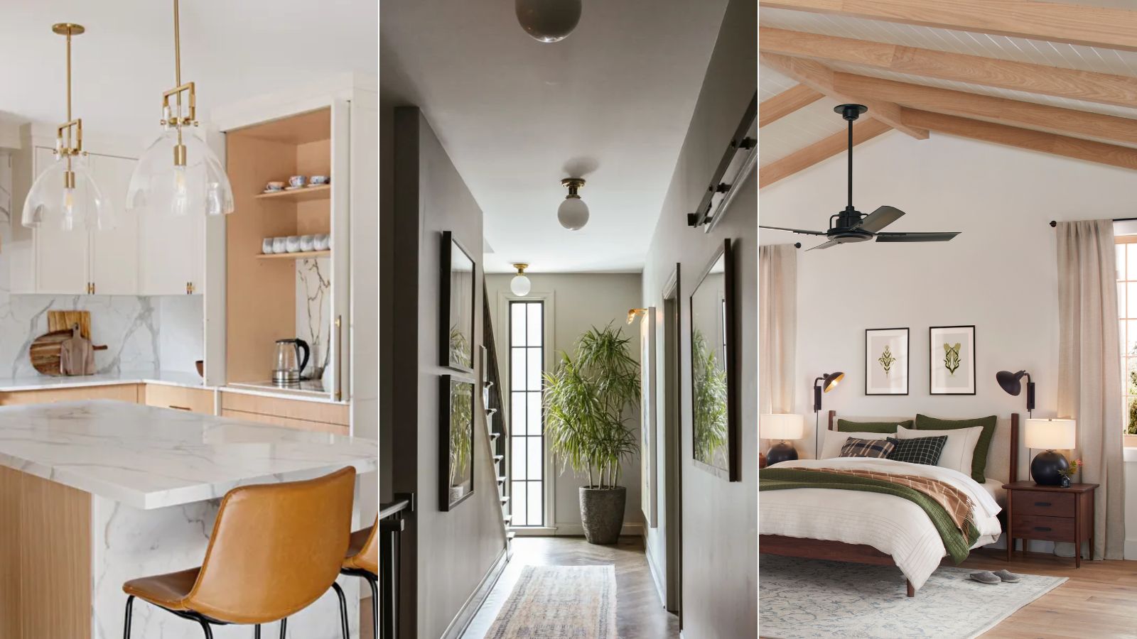
What are the best Sherwin-Williams white paints? 6 favorite shades amongst interior designers

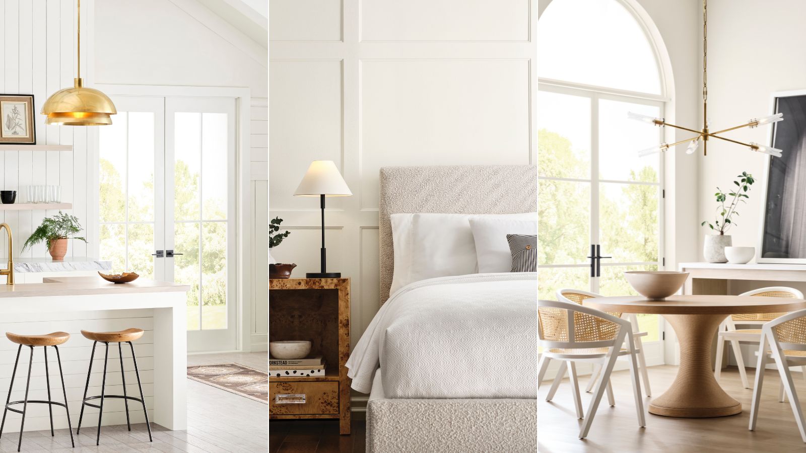
Sherwin-Williams' Designer Color Collection: 5 bright white paints
6 Ways to Decorate with Sherwin Williams' 'Dried Thyme'

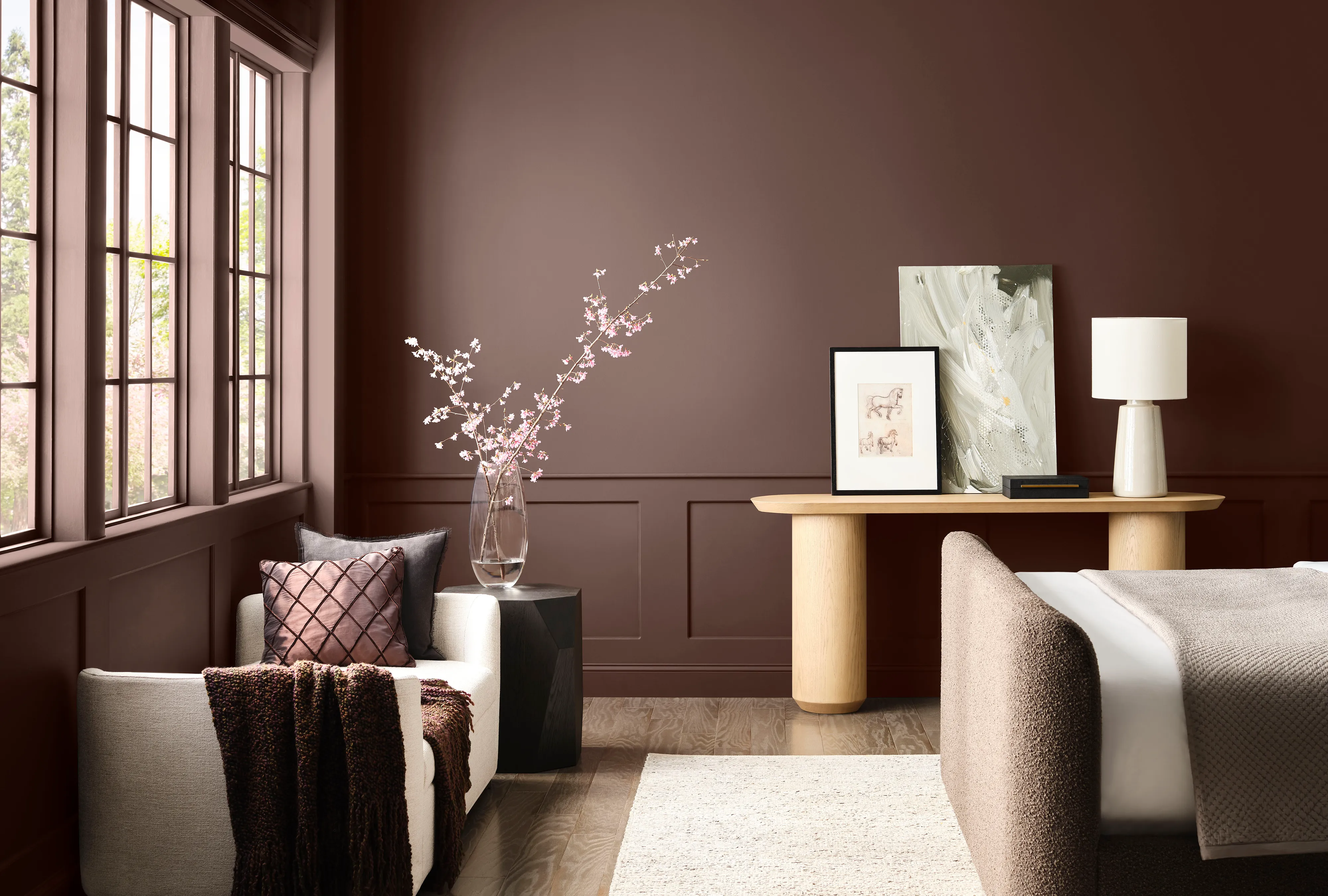
Sherwin-Williams Predicts These 4 Color Palettes Will Dominate Homes in 2026—and One May Surprise You

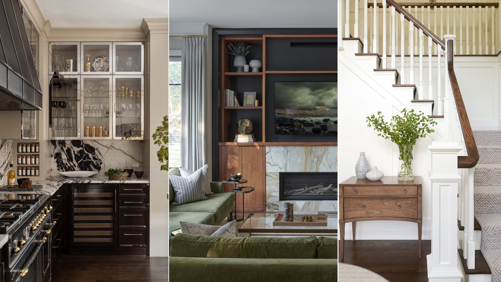
We asked 12 interior designers for their favorite Sherwin-Williams paints – these are the colors that came out on top
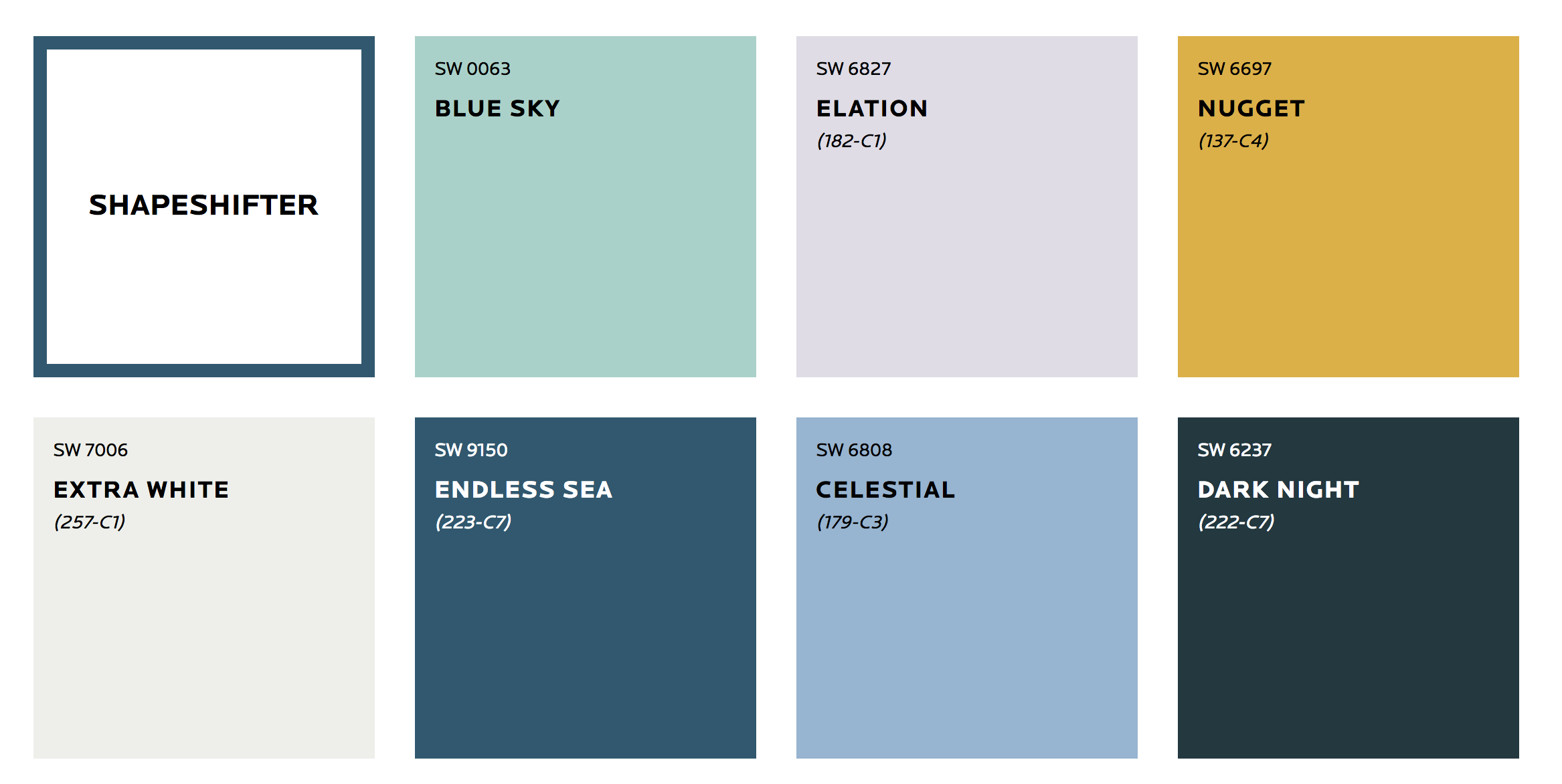
These Are the Colors You'll Be Obsessed With Next Year, Based on Your Personality

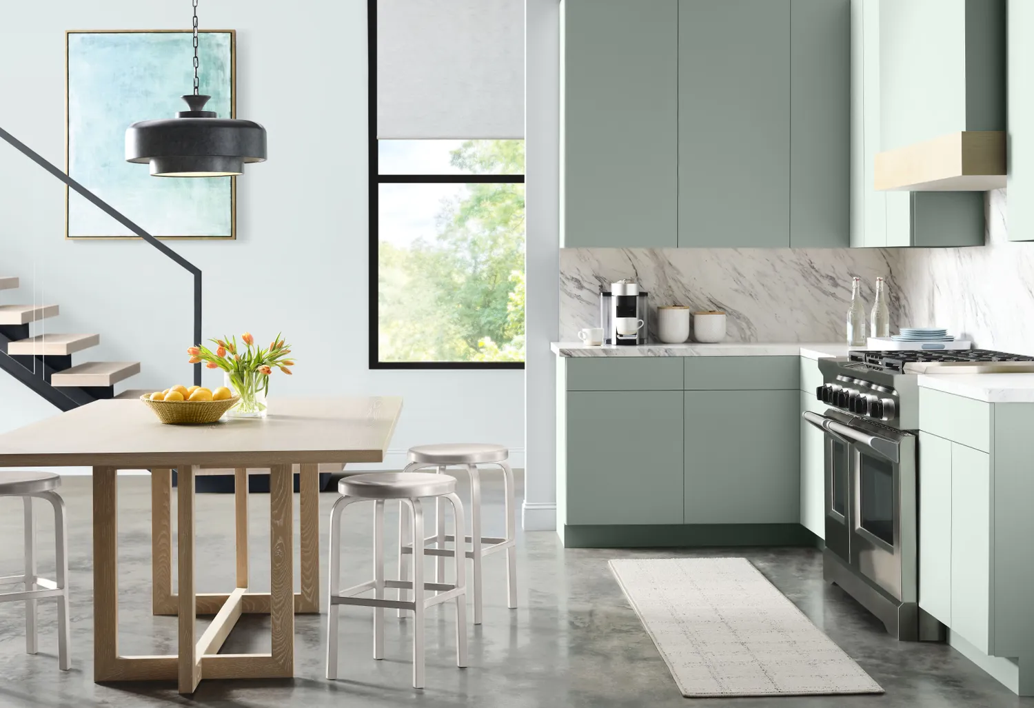
4 Color Palettes That Will Dominate Home Design in 2026 and Beyond, According to Sherwin-Williams

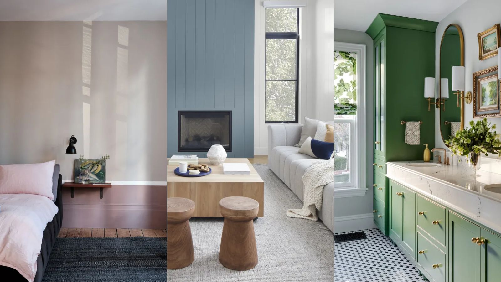
Where are the best places to buy paint? 6 go-to paint brands used and loved by interior designers
The Best Interior Paint | Reviews by Wirecutter
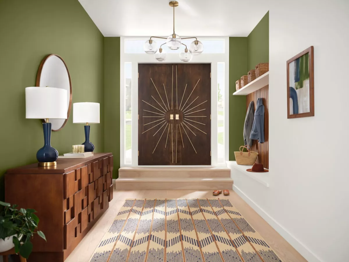
7 Sherwin-Williams Paint Colors Interior Designers Can’t Stop Using
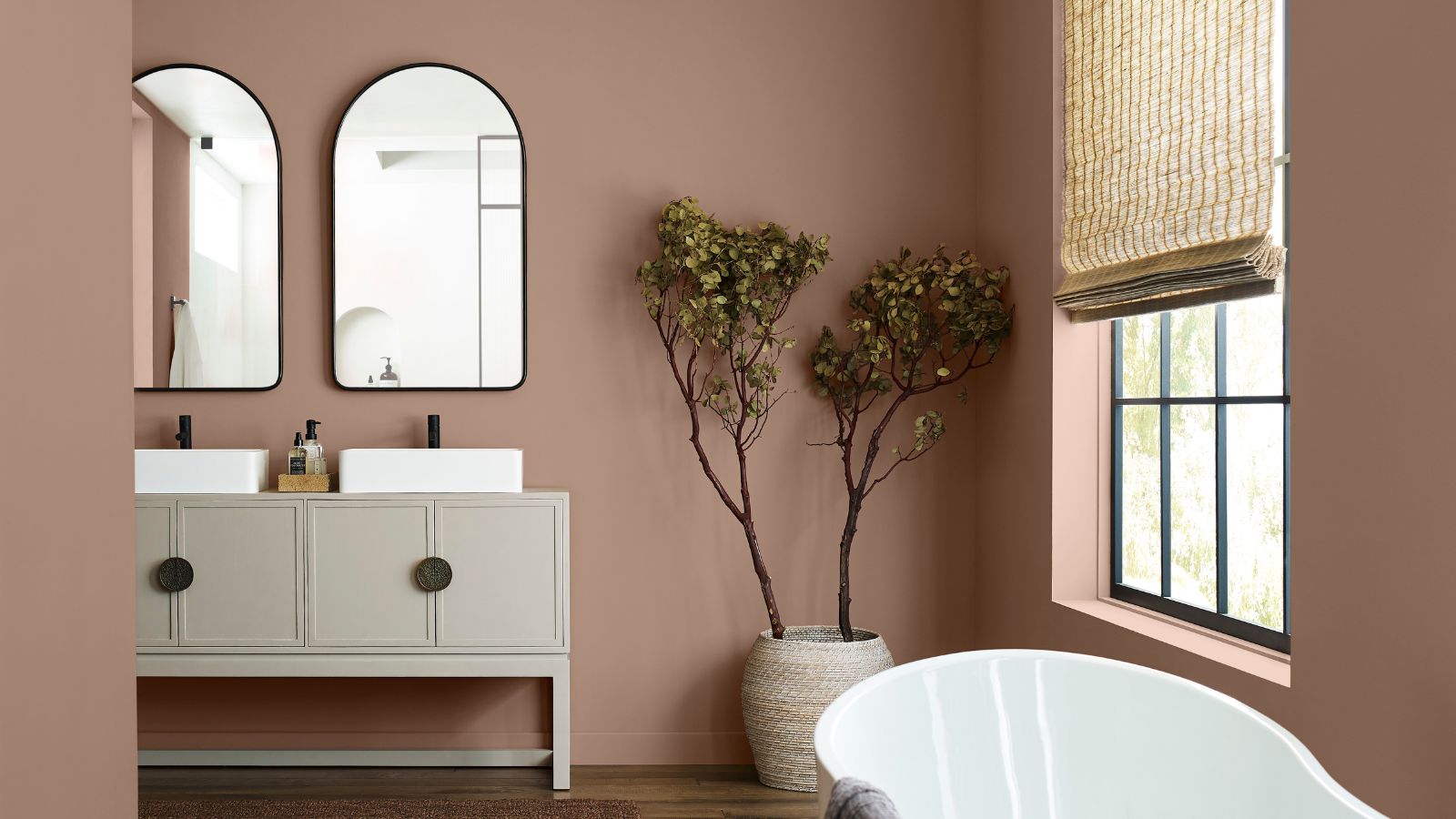
5 of the Most Calming Paint Colors From Sherwin-Williams
What are the best white paints for kitchens? 6 light and airy picks from interior designers
The 15 Best-Selling Sherwin-Williams Paint Colors of All Time
Sherwin-Williams paint colors in real homes – 13 designer-approved shades, from neutrals to bolds
The Best Interior Paints for Every Room of the House, Tested and Approved

Hottest Interior Paint Colors of 2018
The Best Sherwin Williams Paint Colors for a Bathroom — 5 Picks Designers and Experts Love
A Look Back at the Last Decade of Sherwin-Williams’ Color of the Year

The Interior Paint Colors You'll Be Seeing Everywhere in 2024

11 Best Calming Paint Colors From Sherwin-Williams