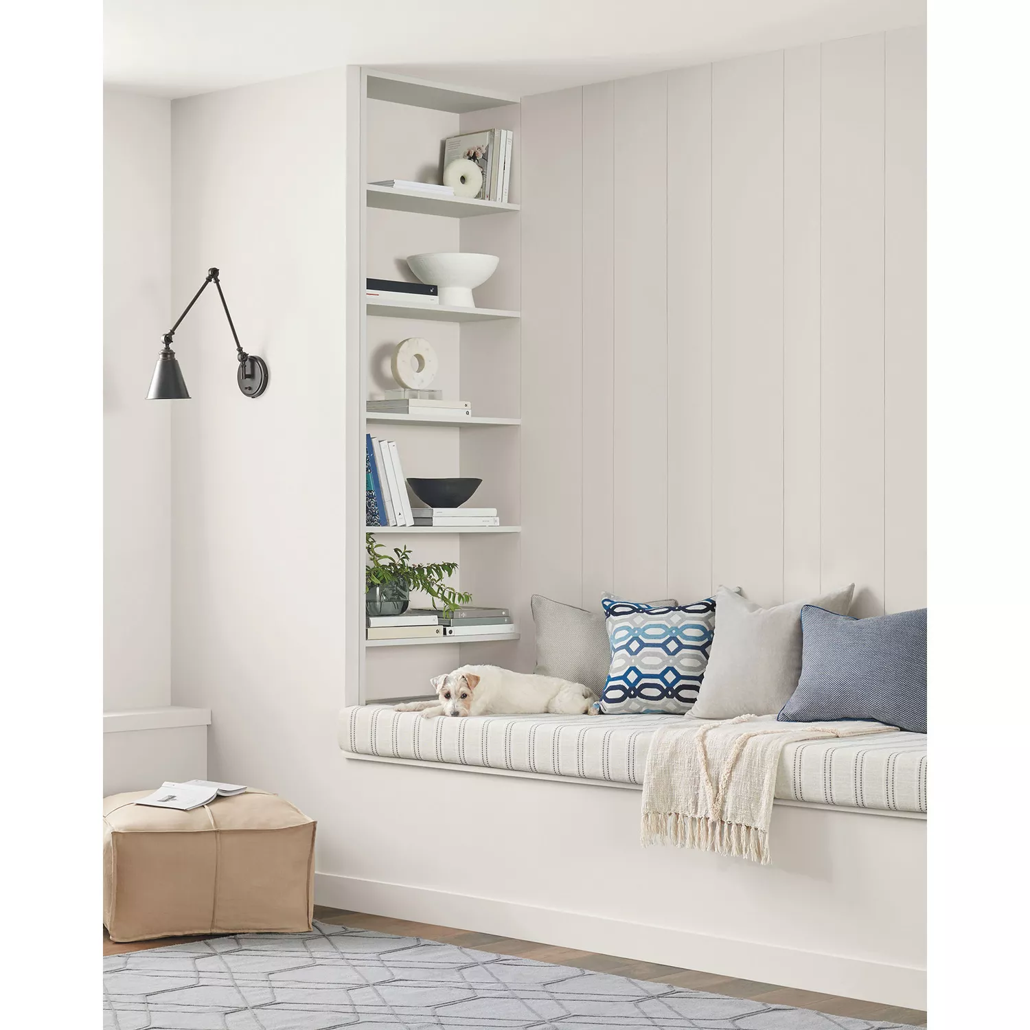
11 Best Calming Paint Colors From Sherwin-Williams
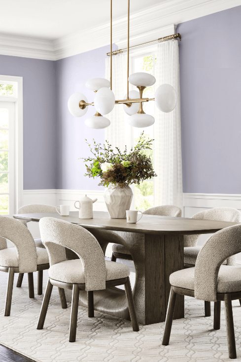
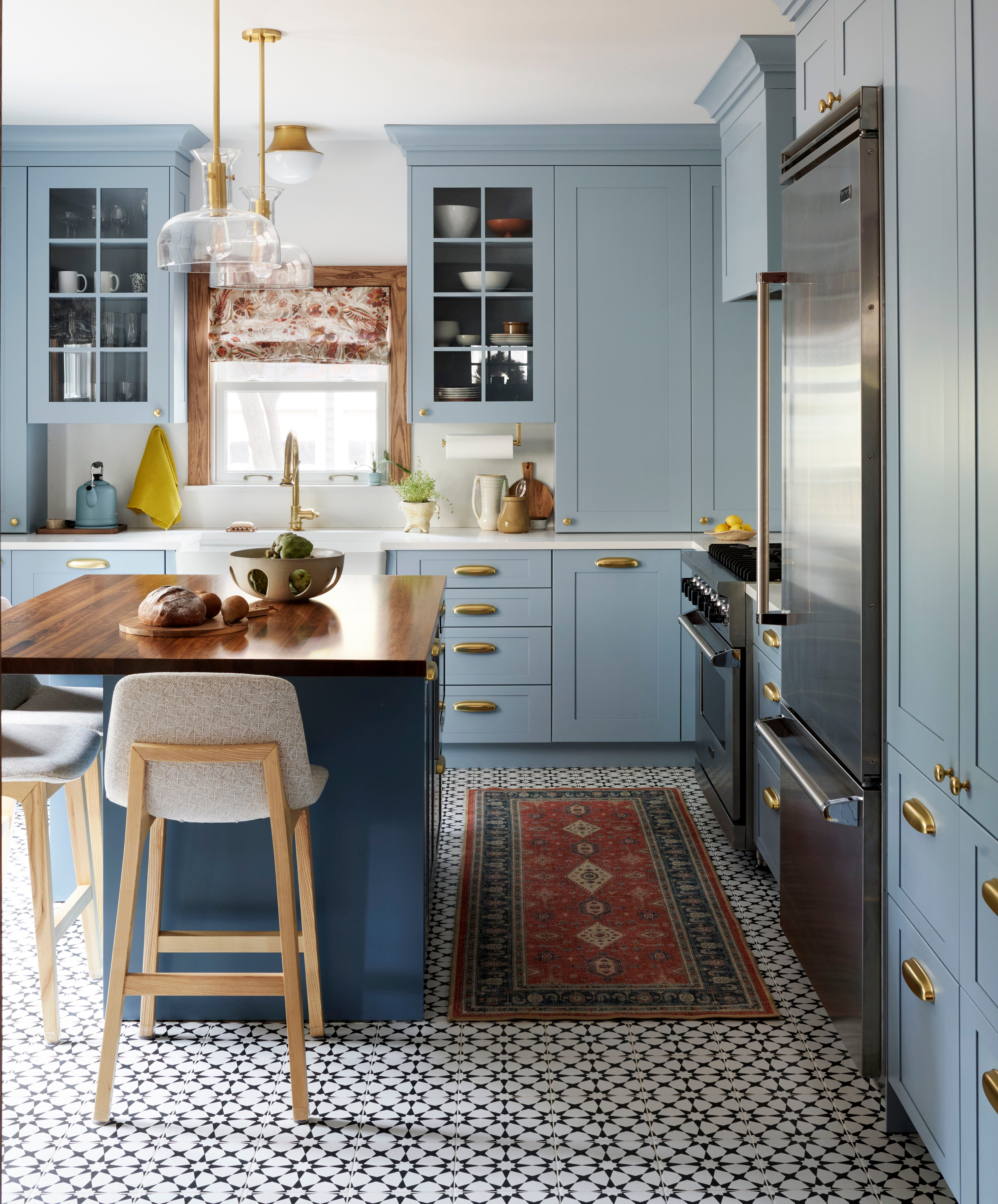
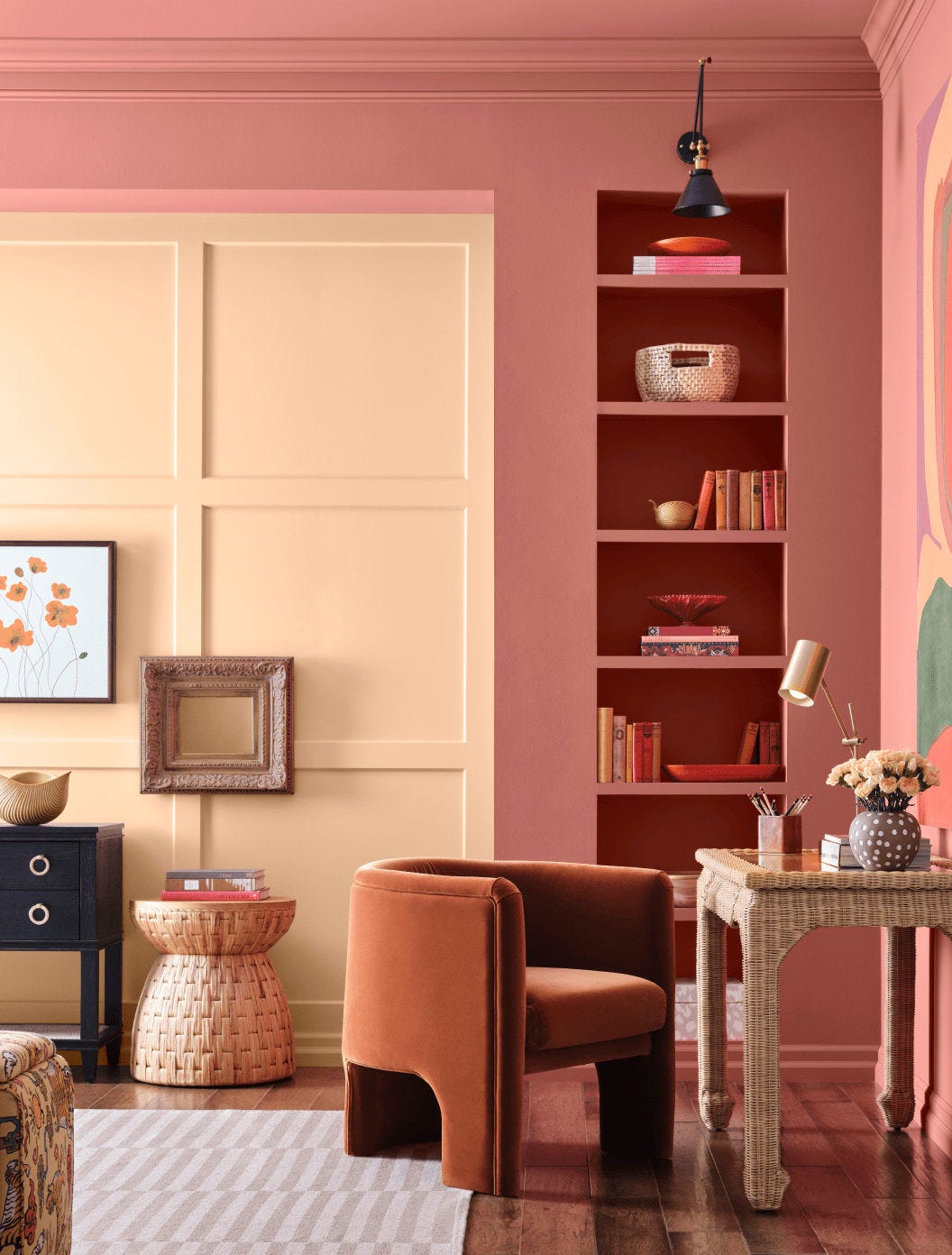
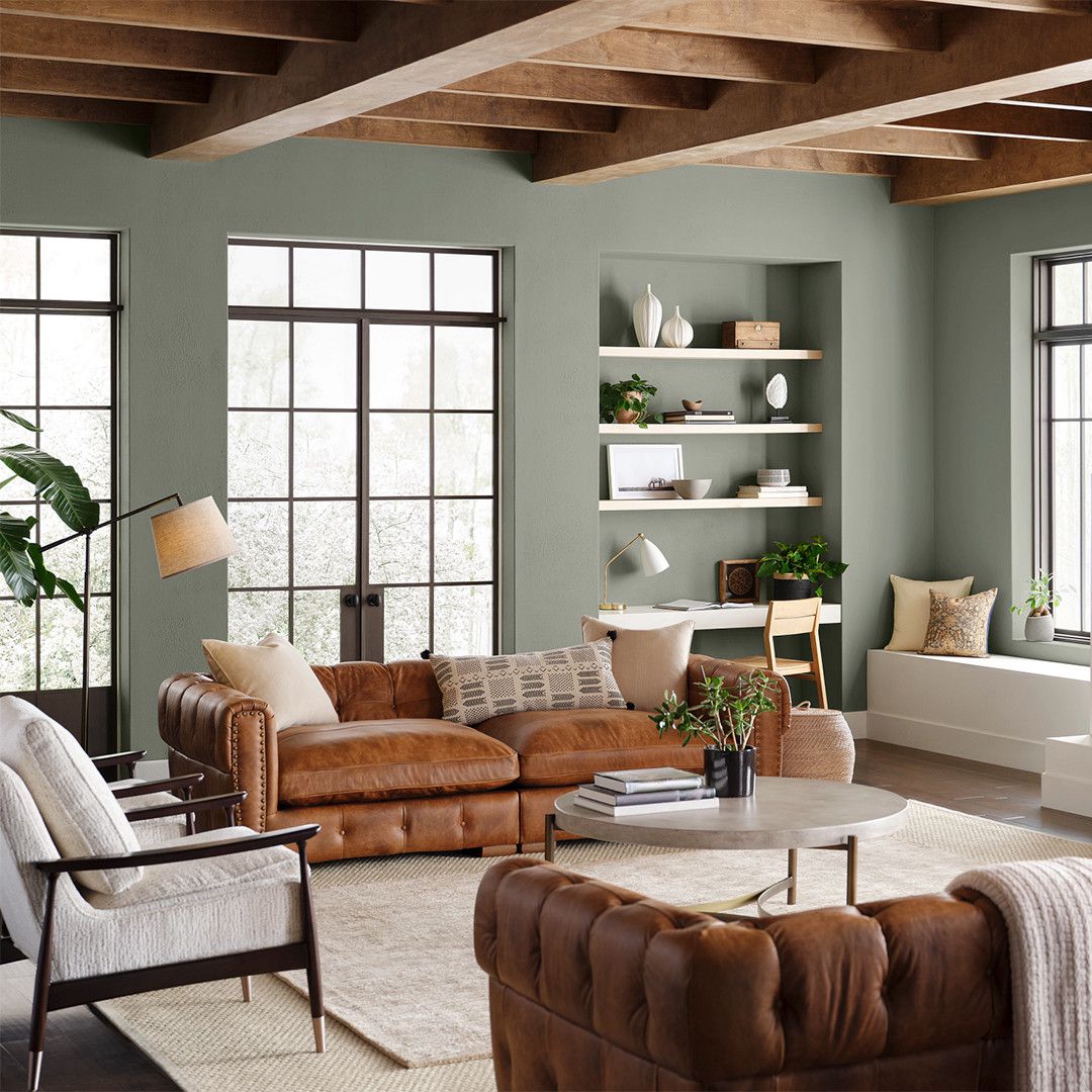
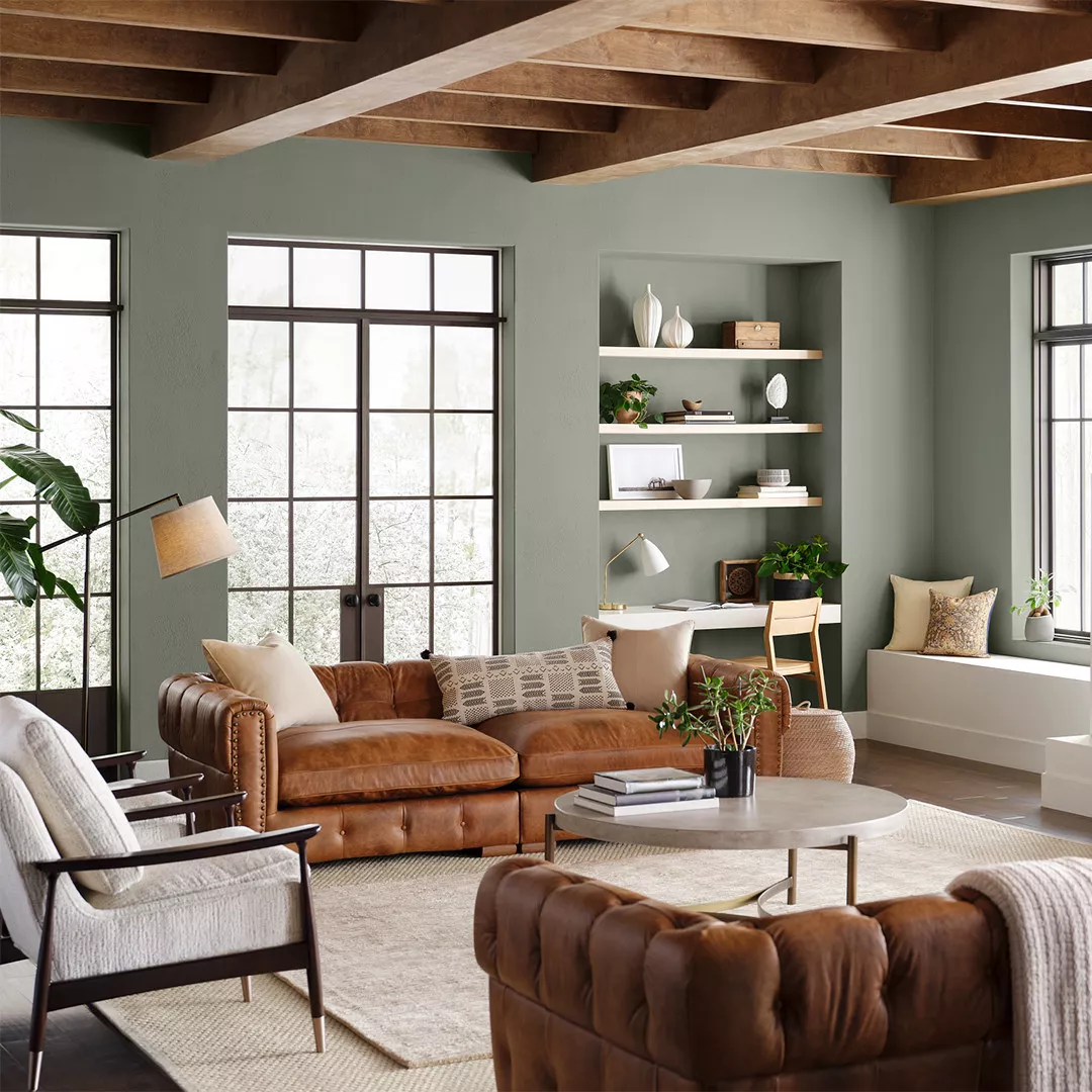
The Sherwin-Williams Living Well collection offers 11 mood-setting paint palettes designed to bring comfort, style, and well-being into the home. With 540 colors available, the collection aims to help individuals create relaxing spaces that contribute to a harmonious living environment. The director of color marketing at Sherwin-Williams, Sue Wadden, highlights that the Living Well collection enables consumers to live more mindfully by providing colors and paints that transform rooms into havens. The collection organizes colors into distinct themes, such as "Balance" for woodland-inspired greens, "Recharge" for coastal shades, and "Unplug" for desert hues, alongside eight other unique schemes, facilitating the selection of colors that align with personal visions of restfulness.
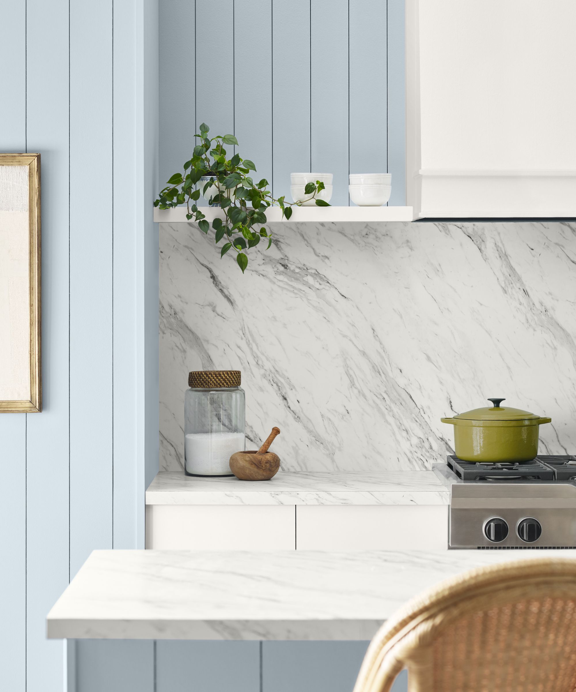
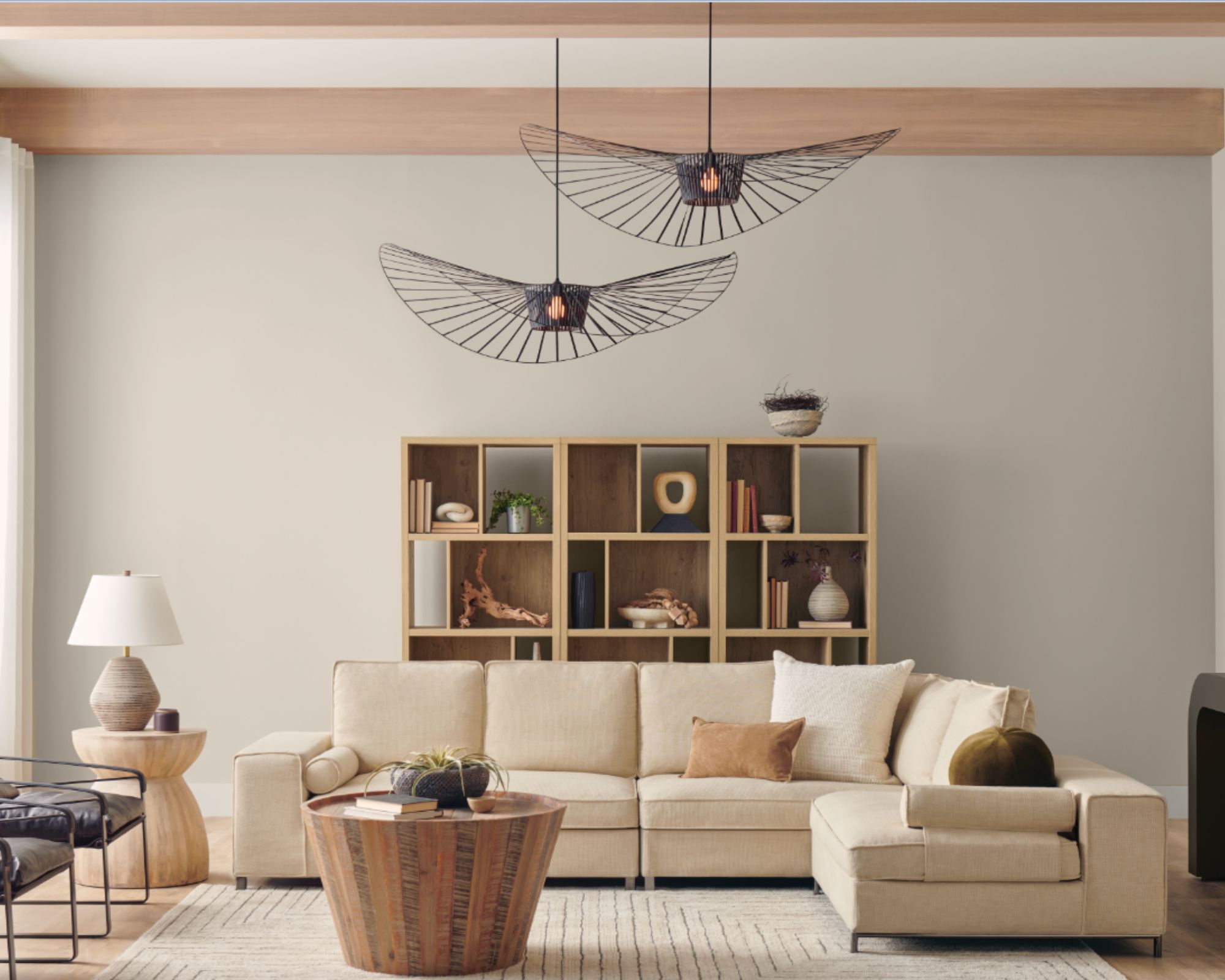
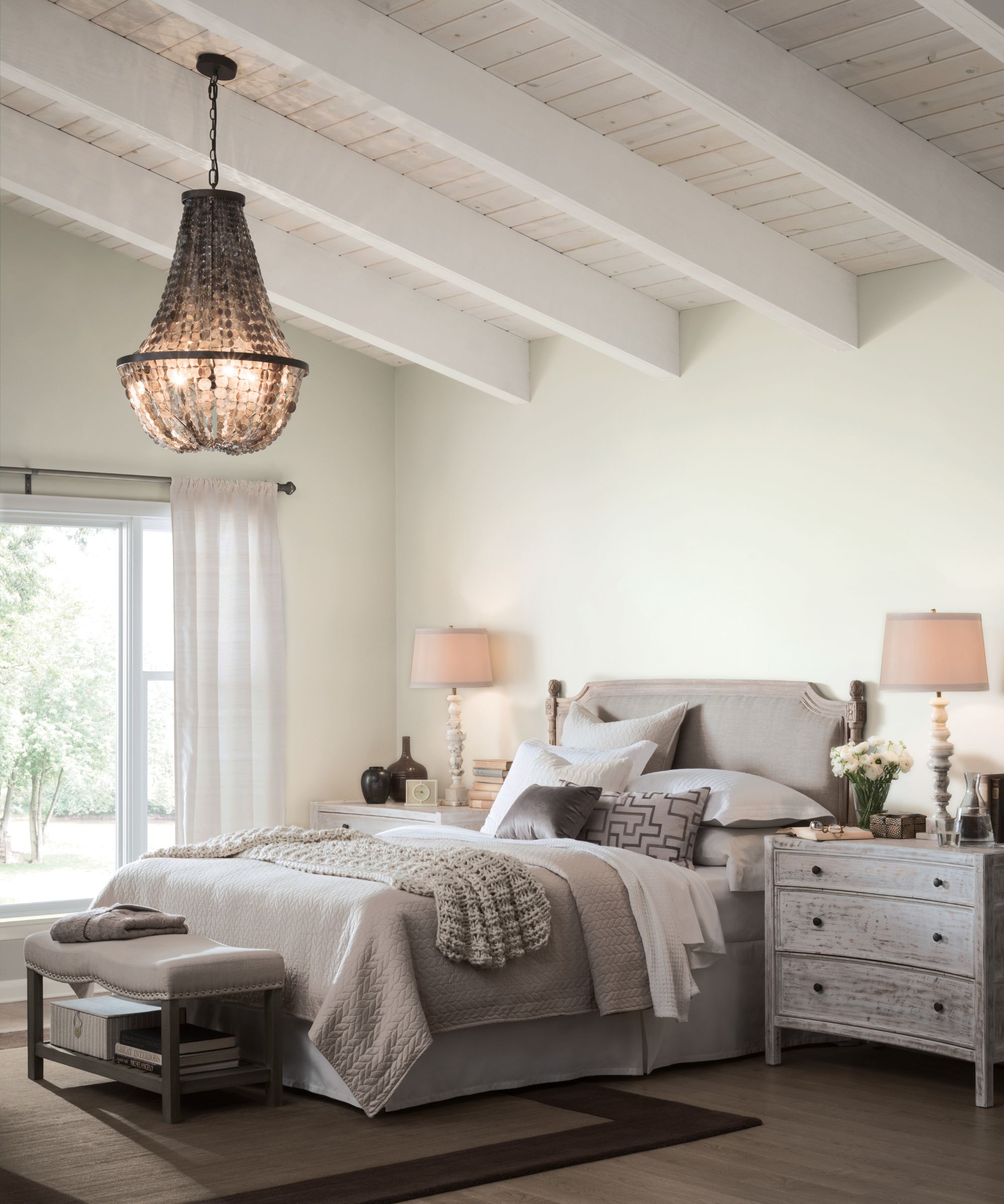
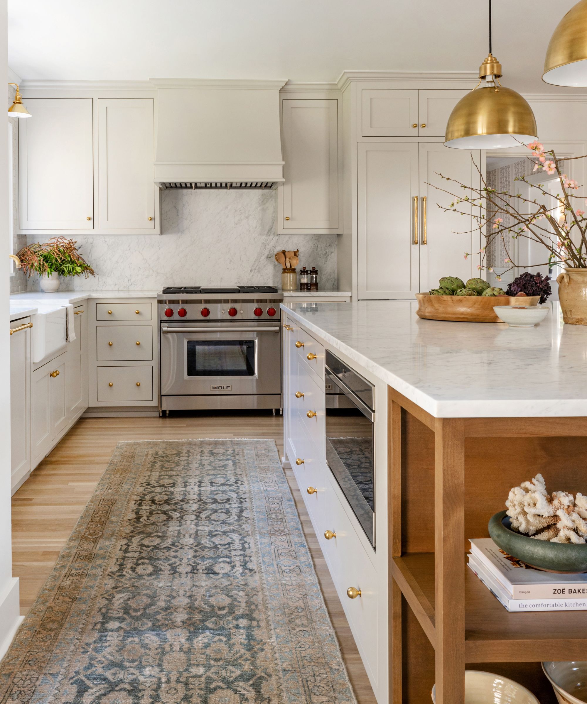
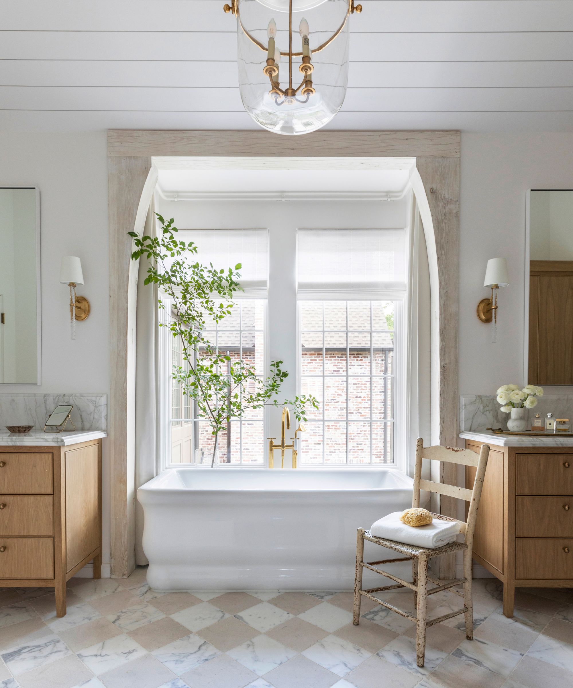
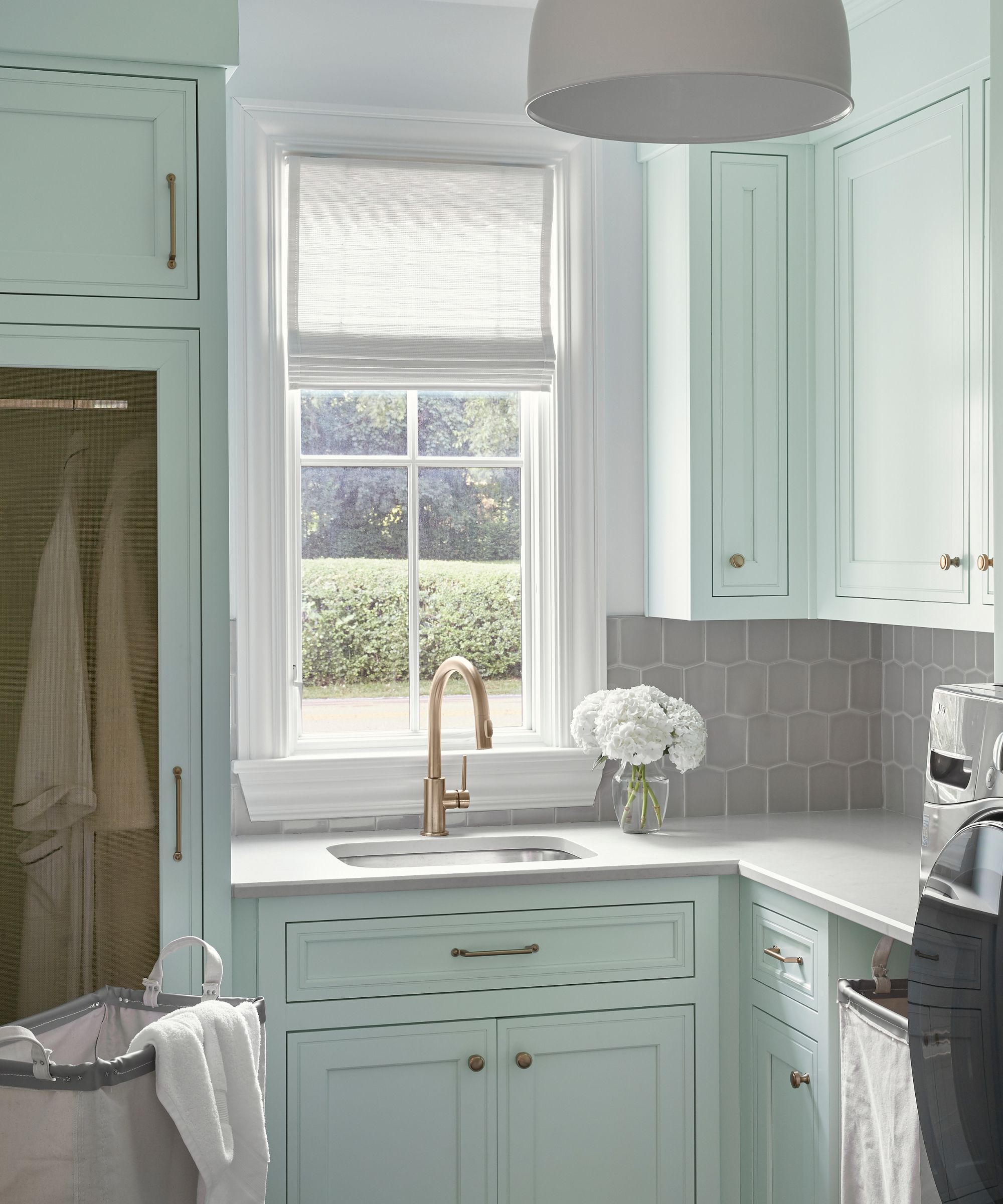
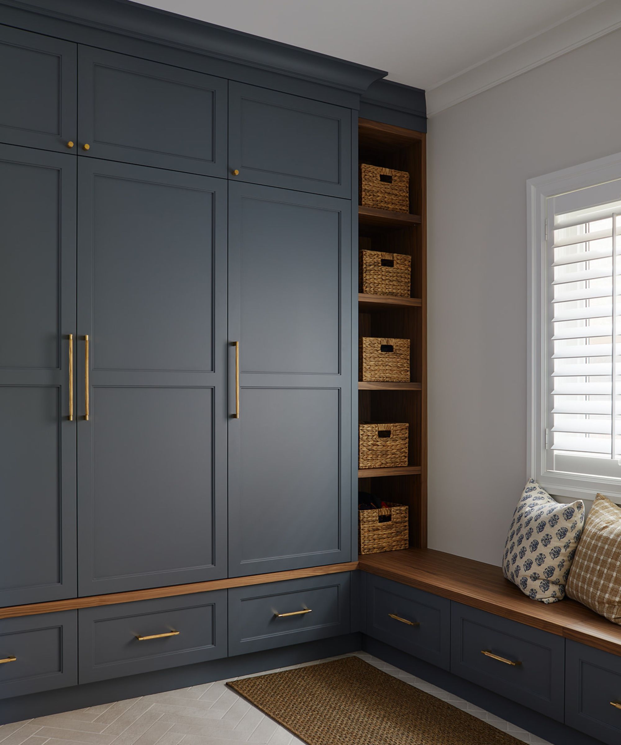
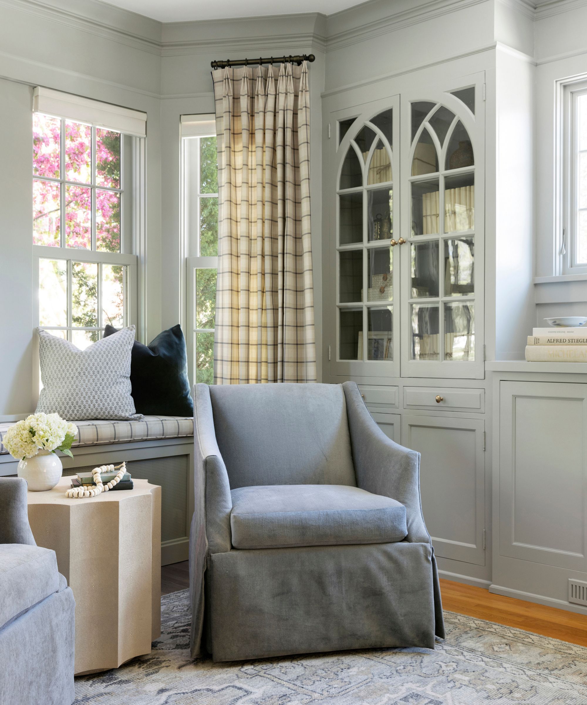
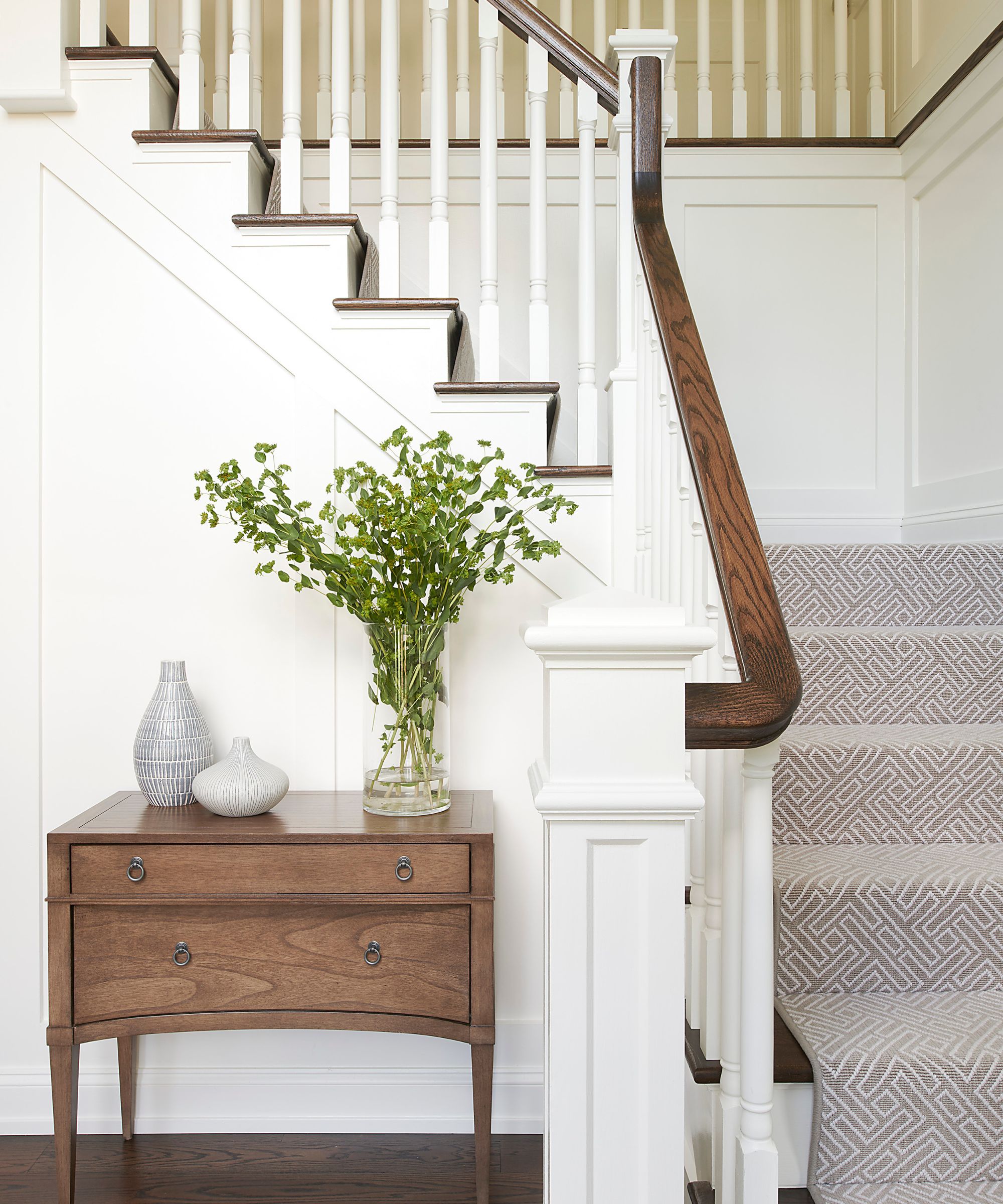
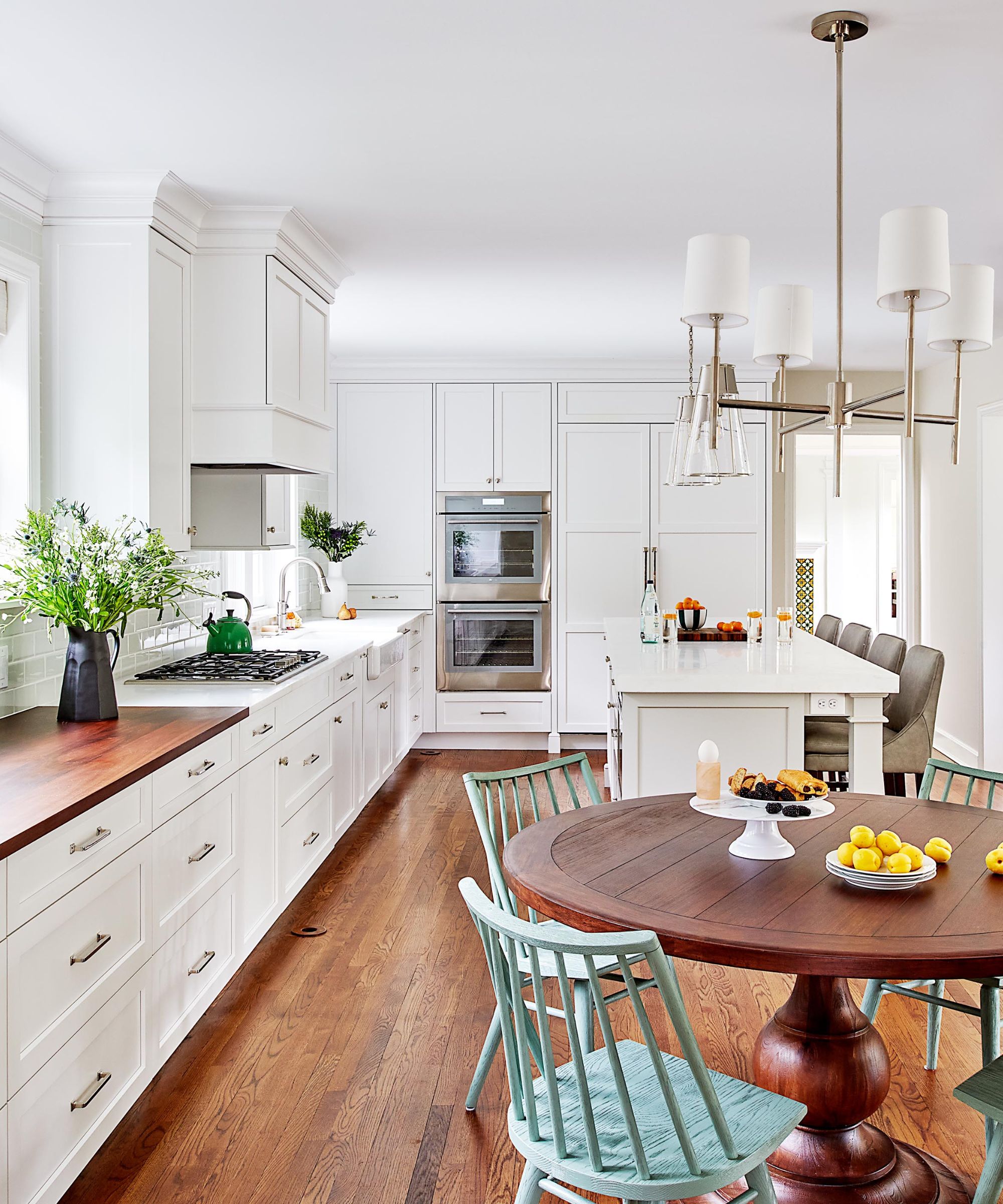
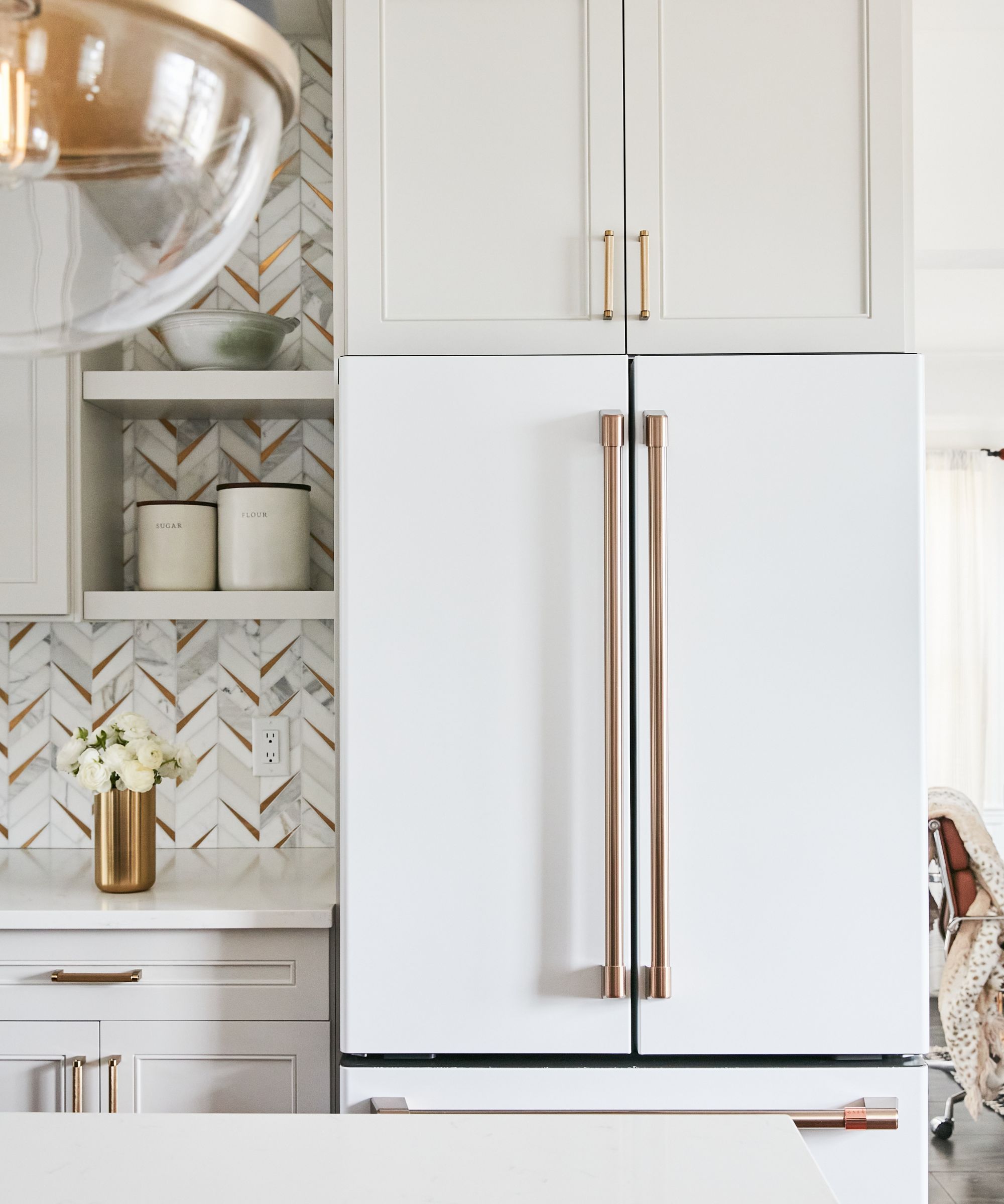
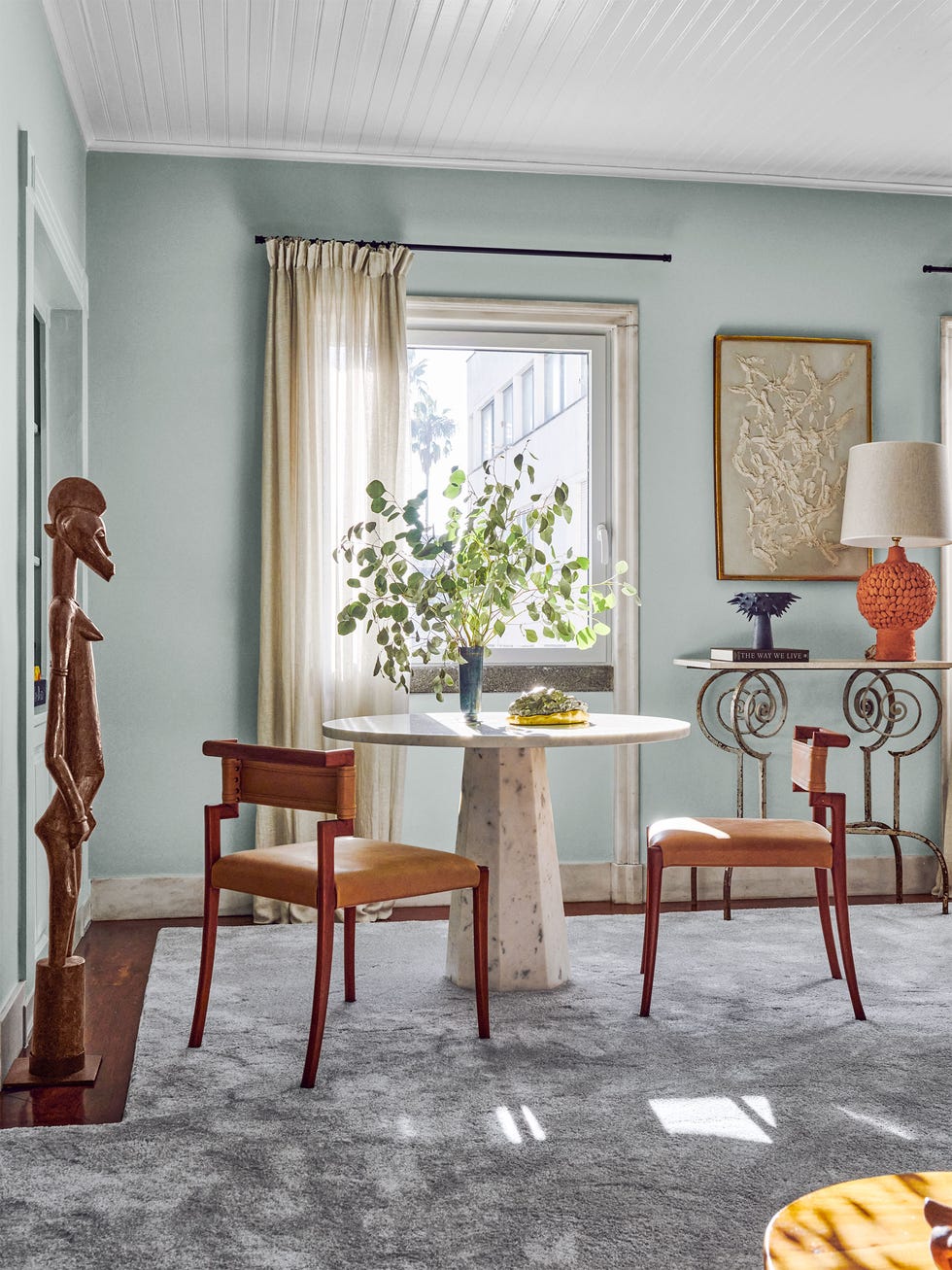
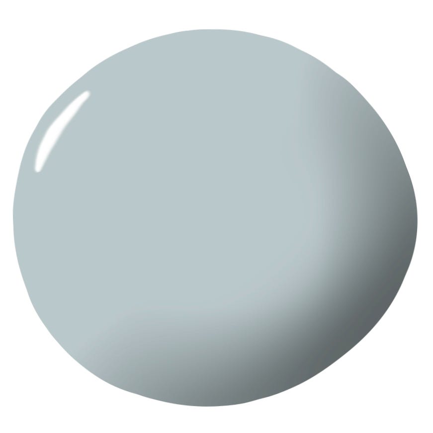
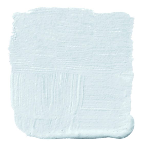
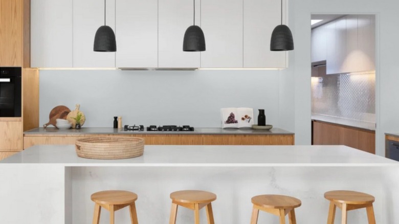
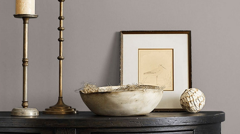
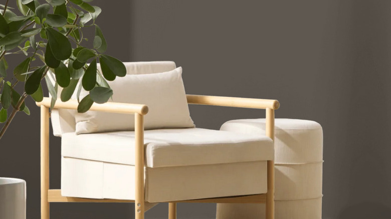
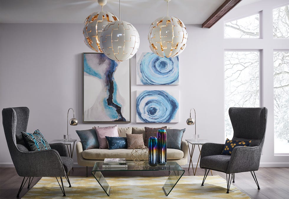
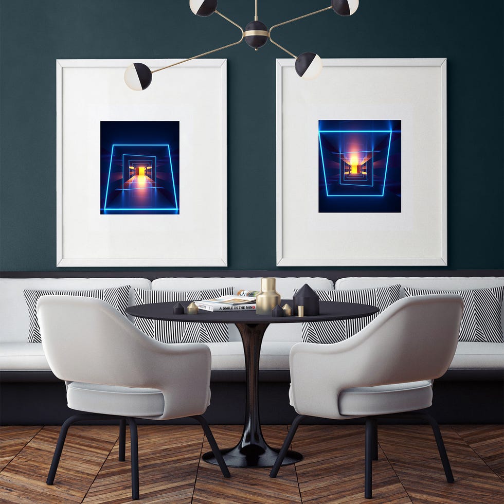
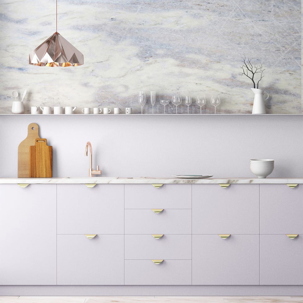
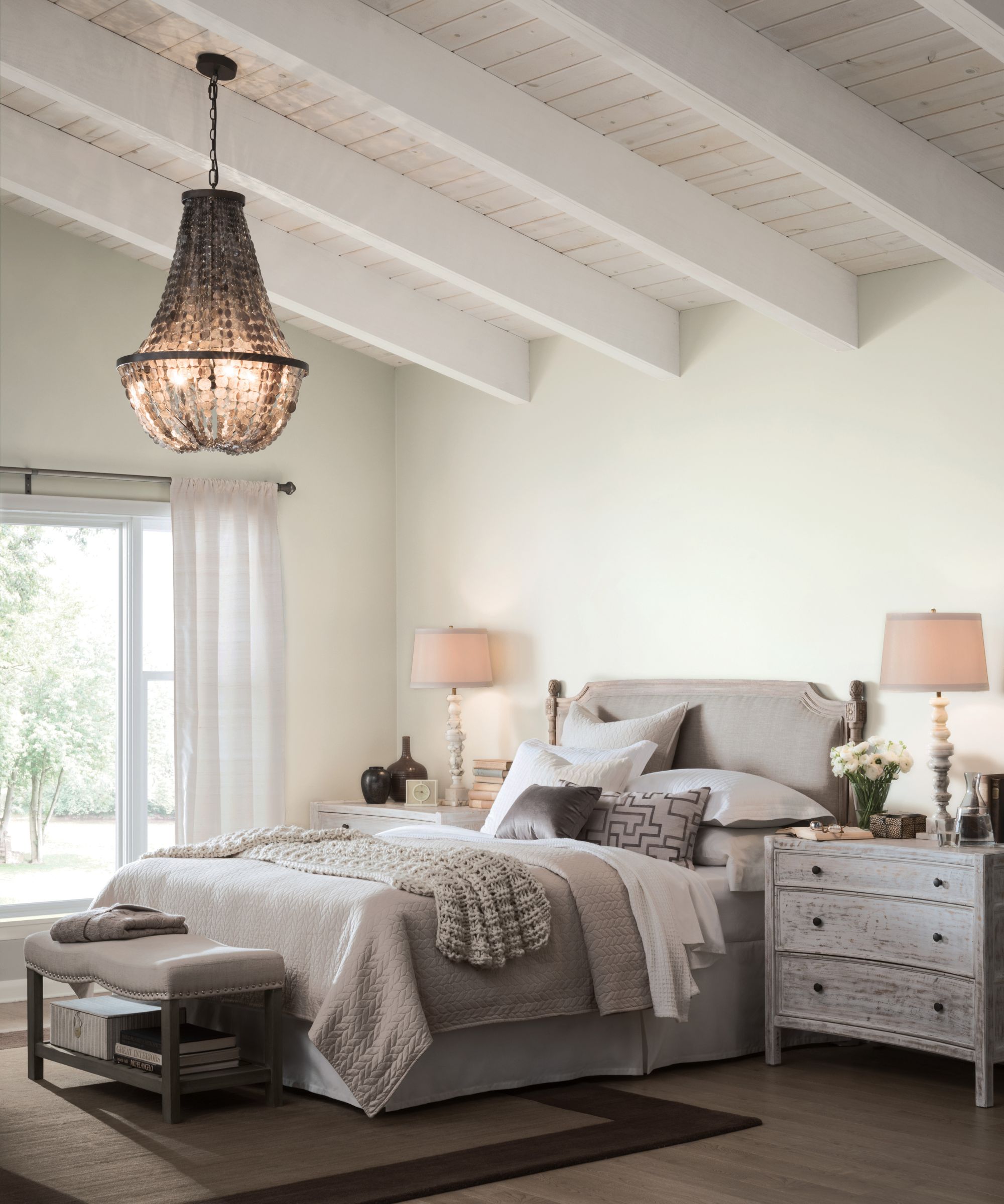
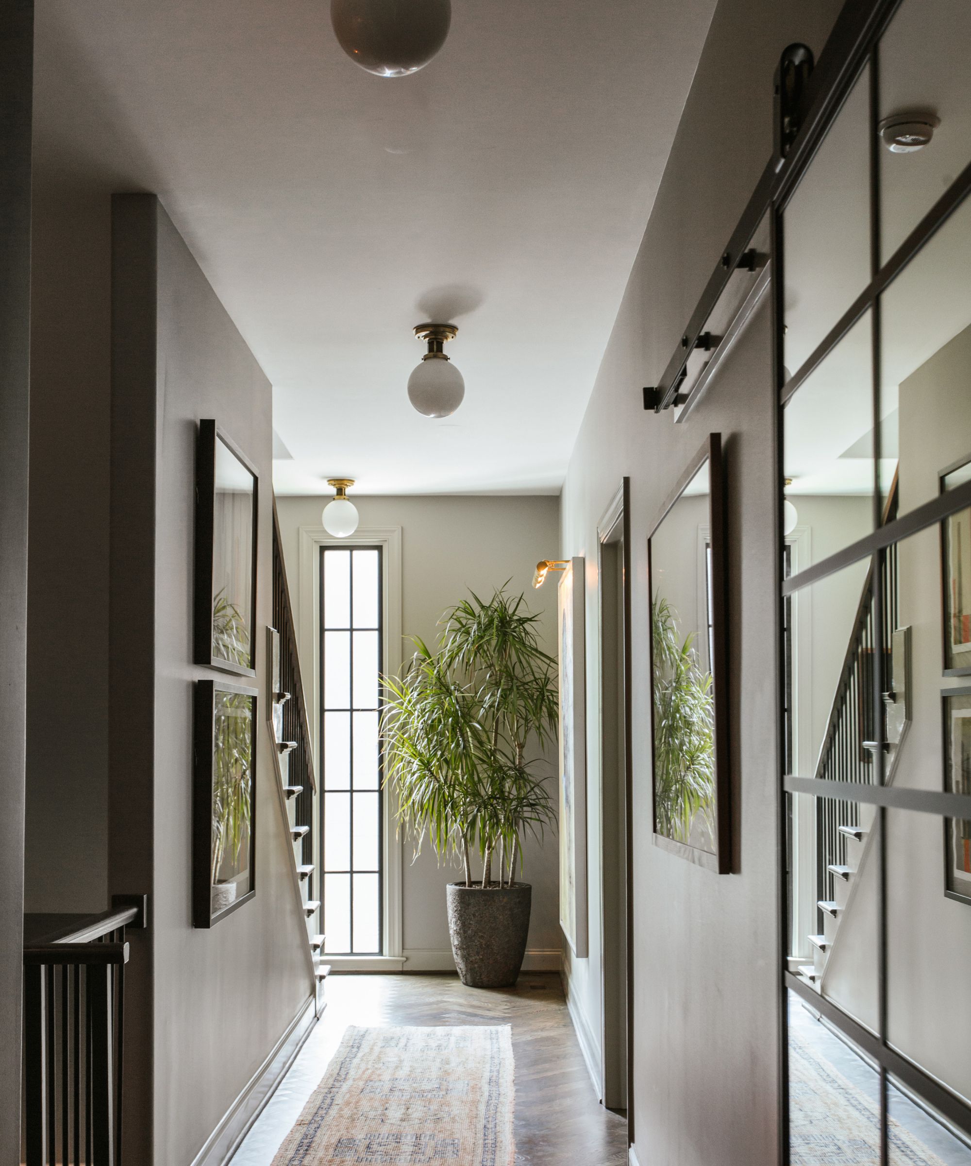
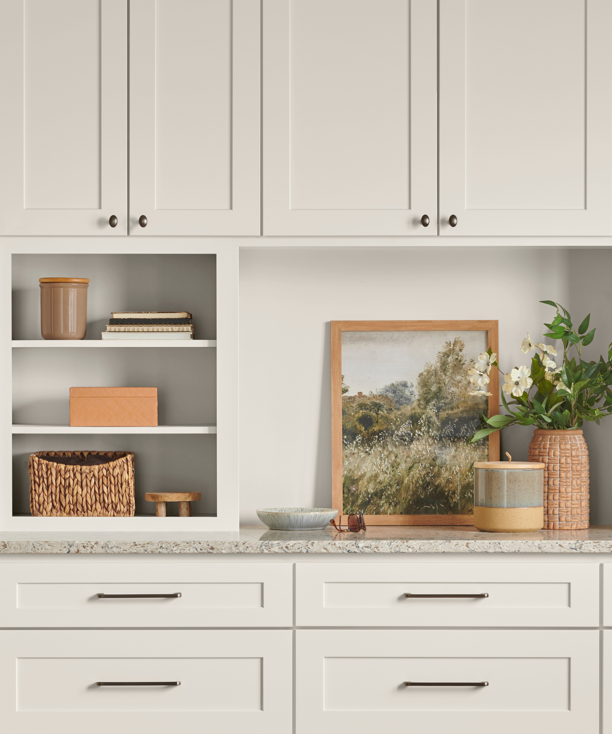
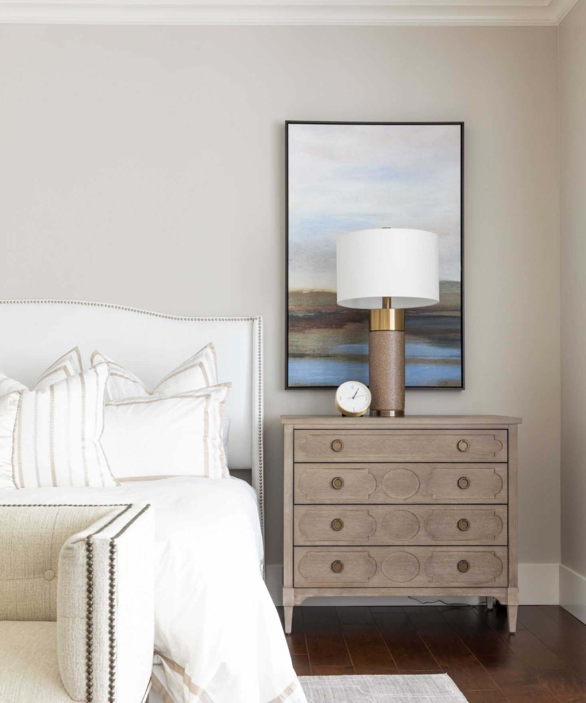
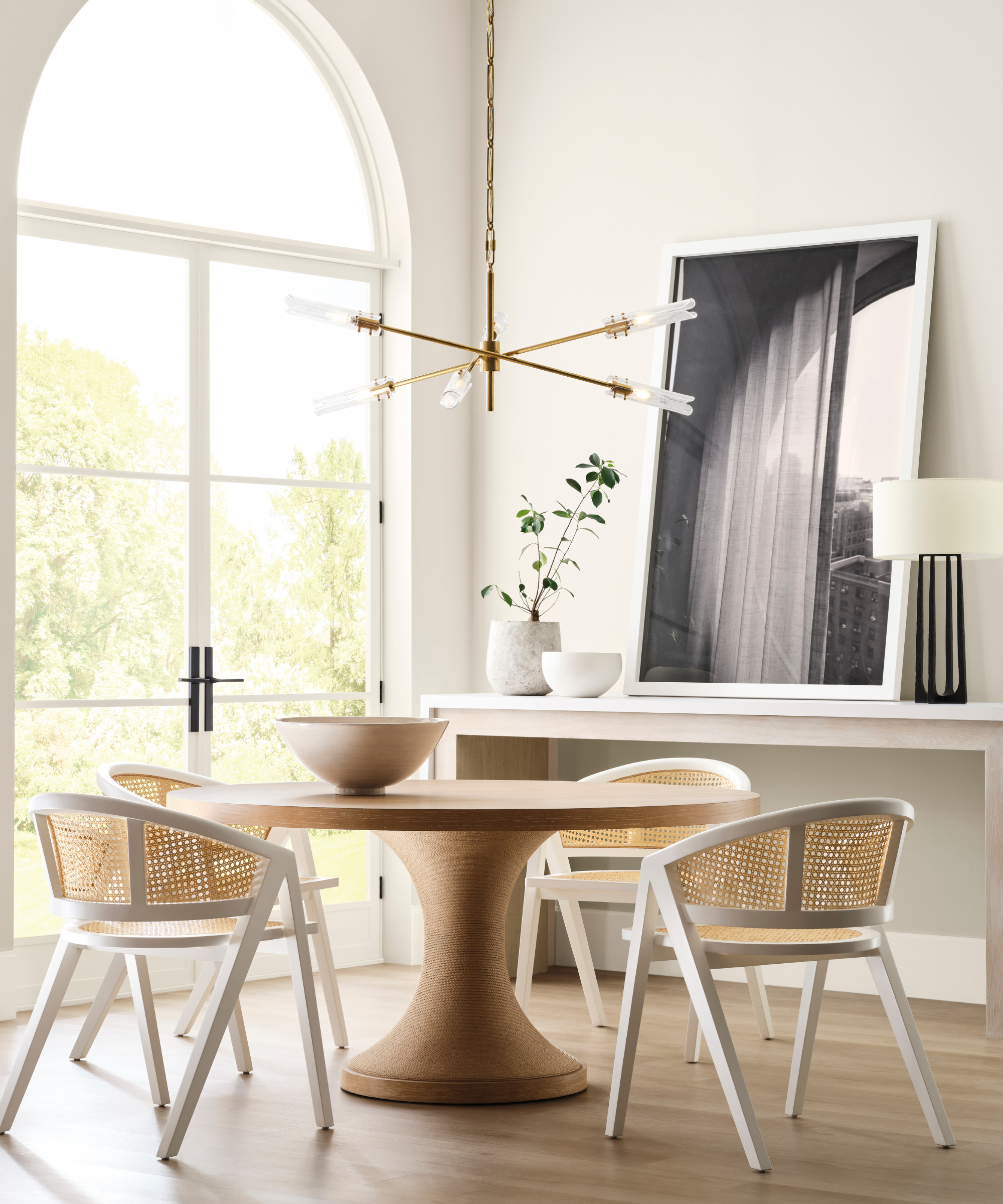
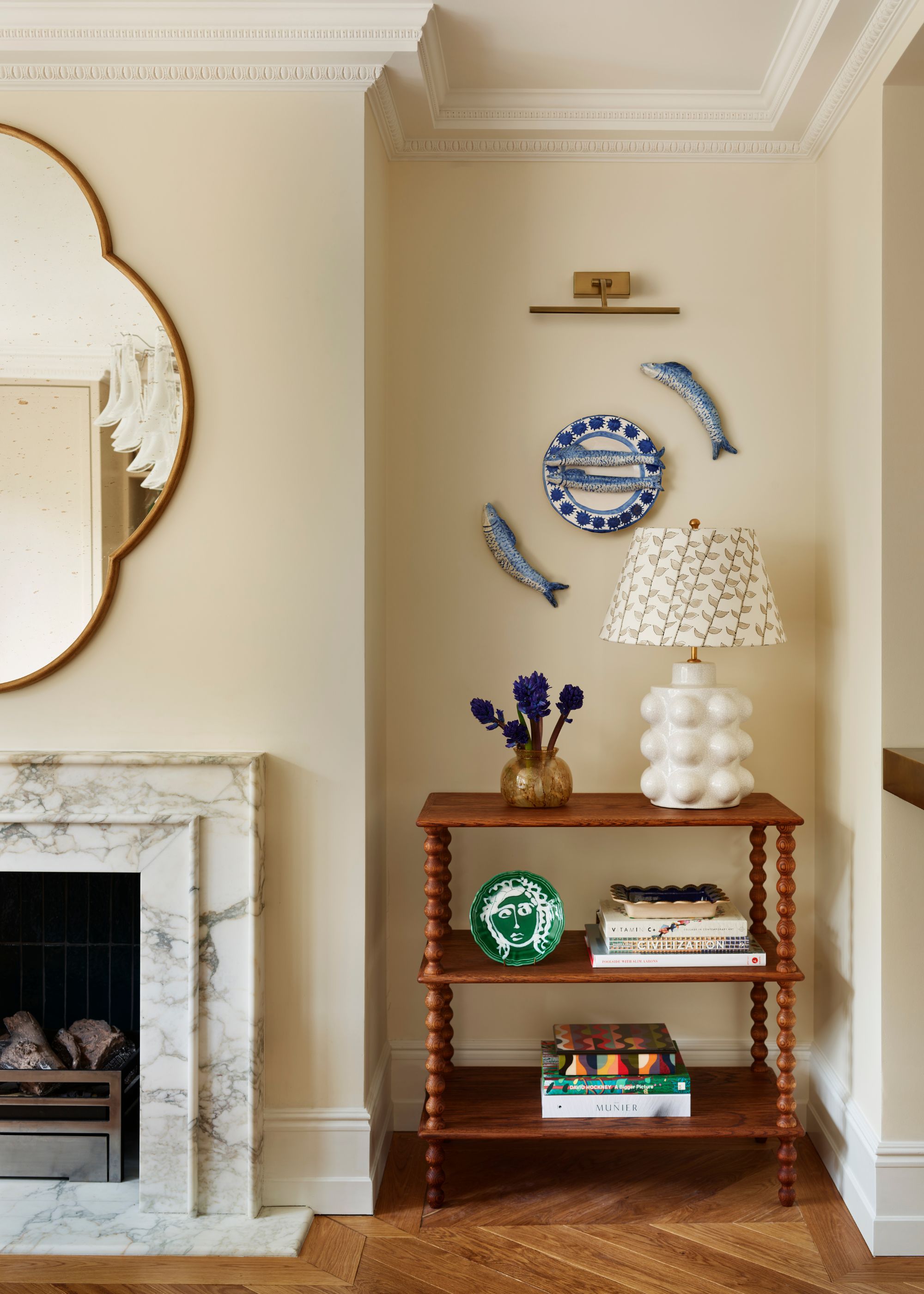
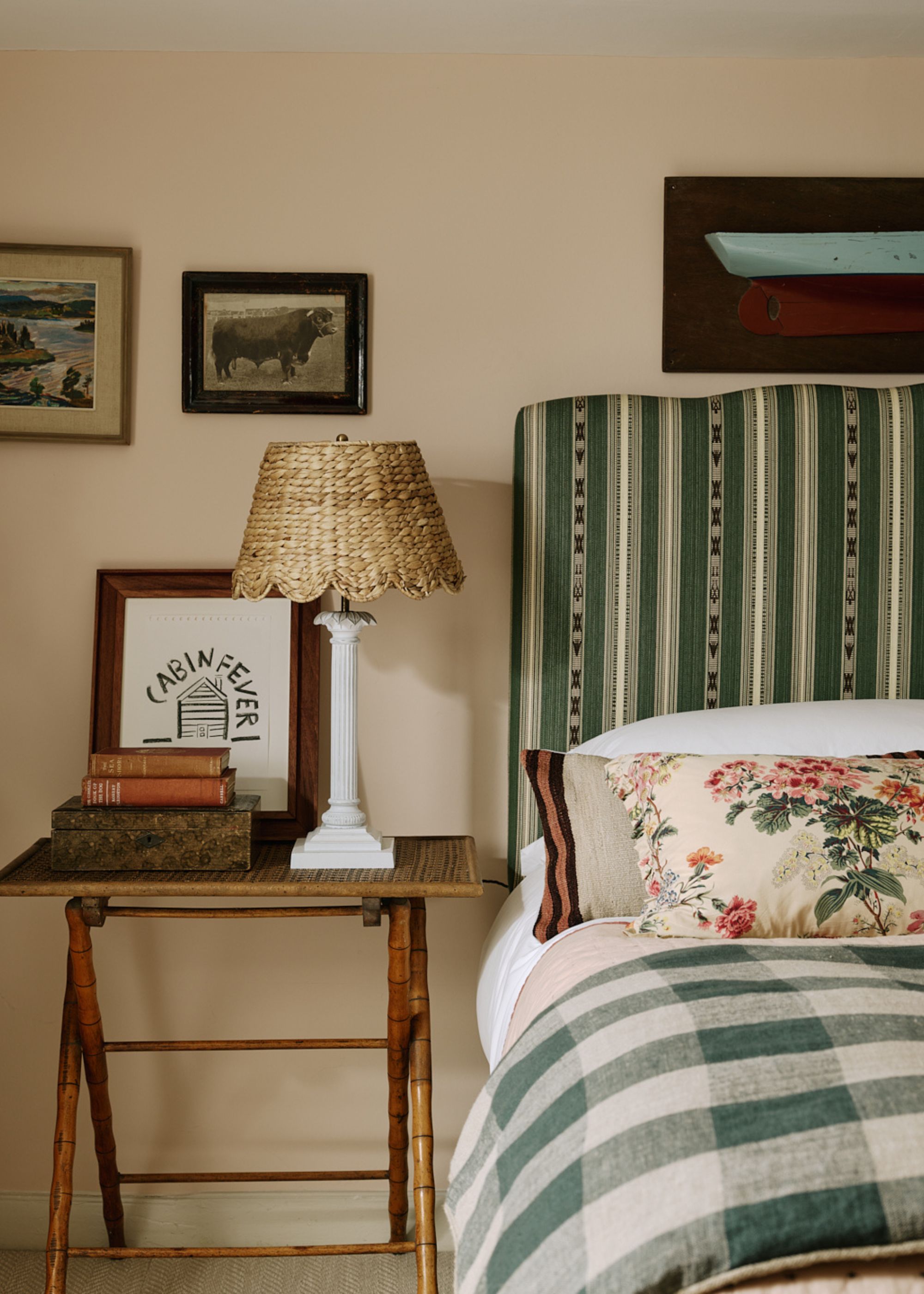
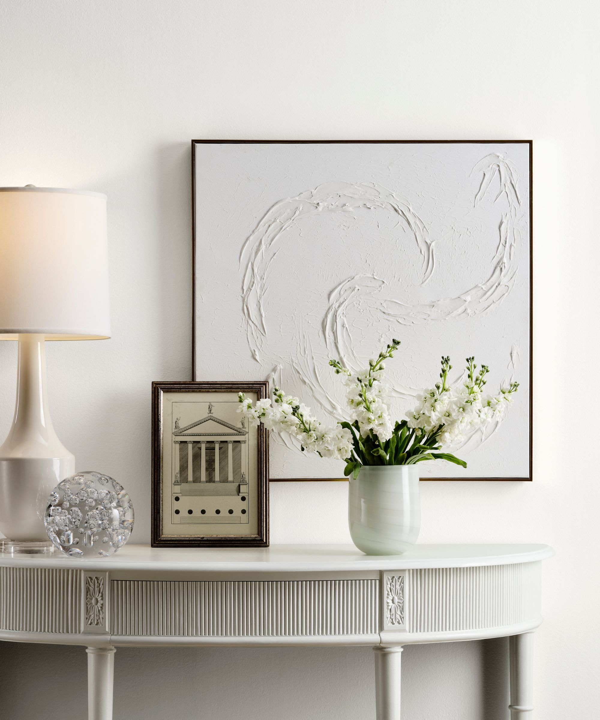
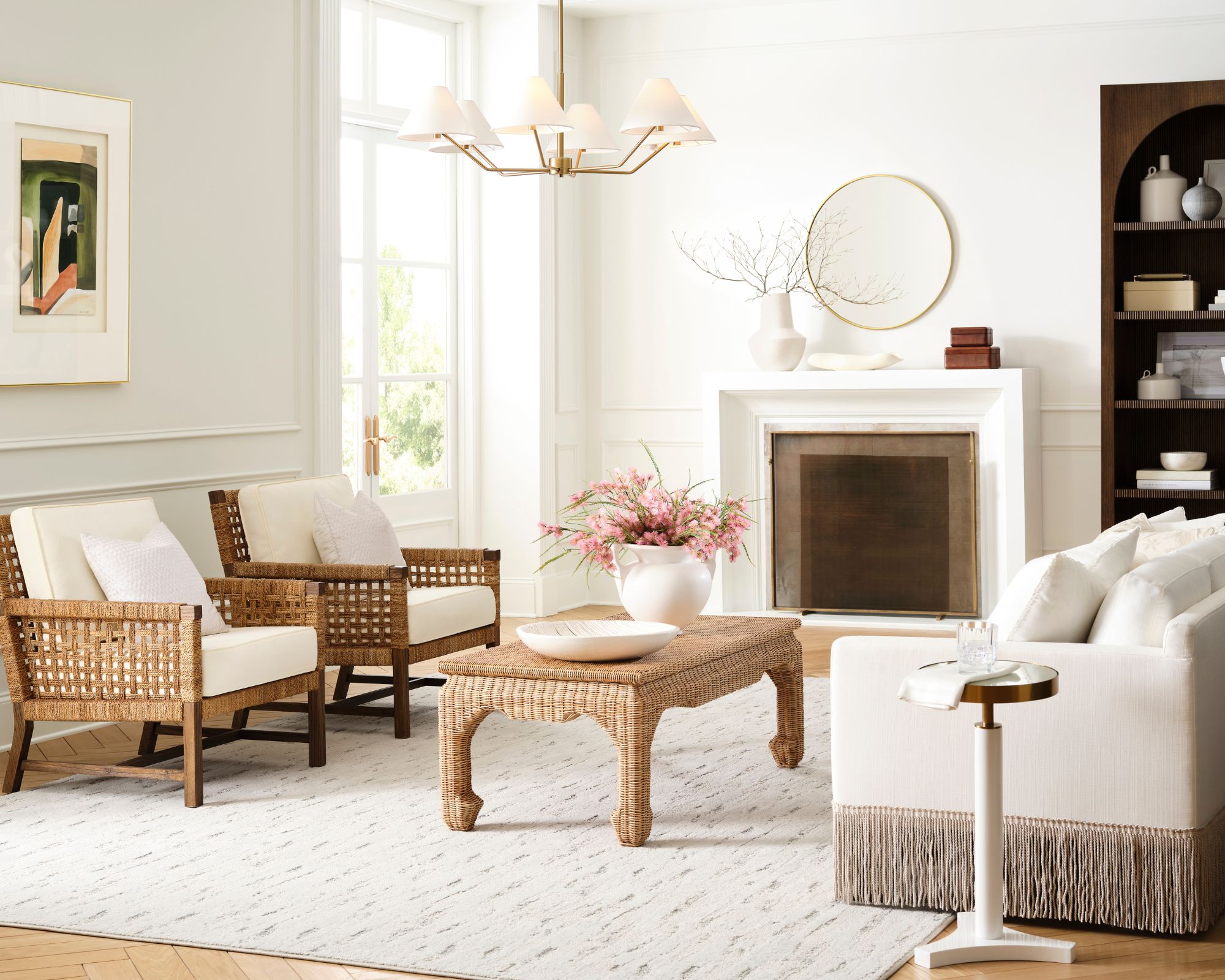
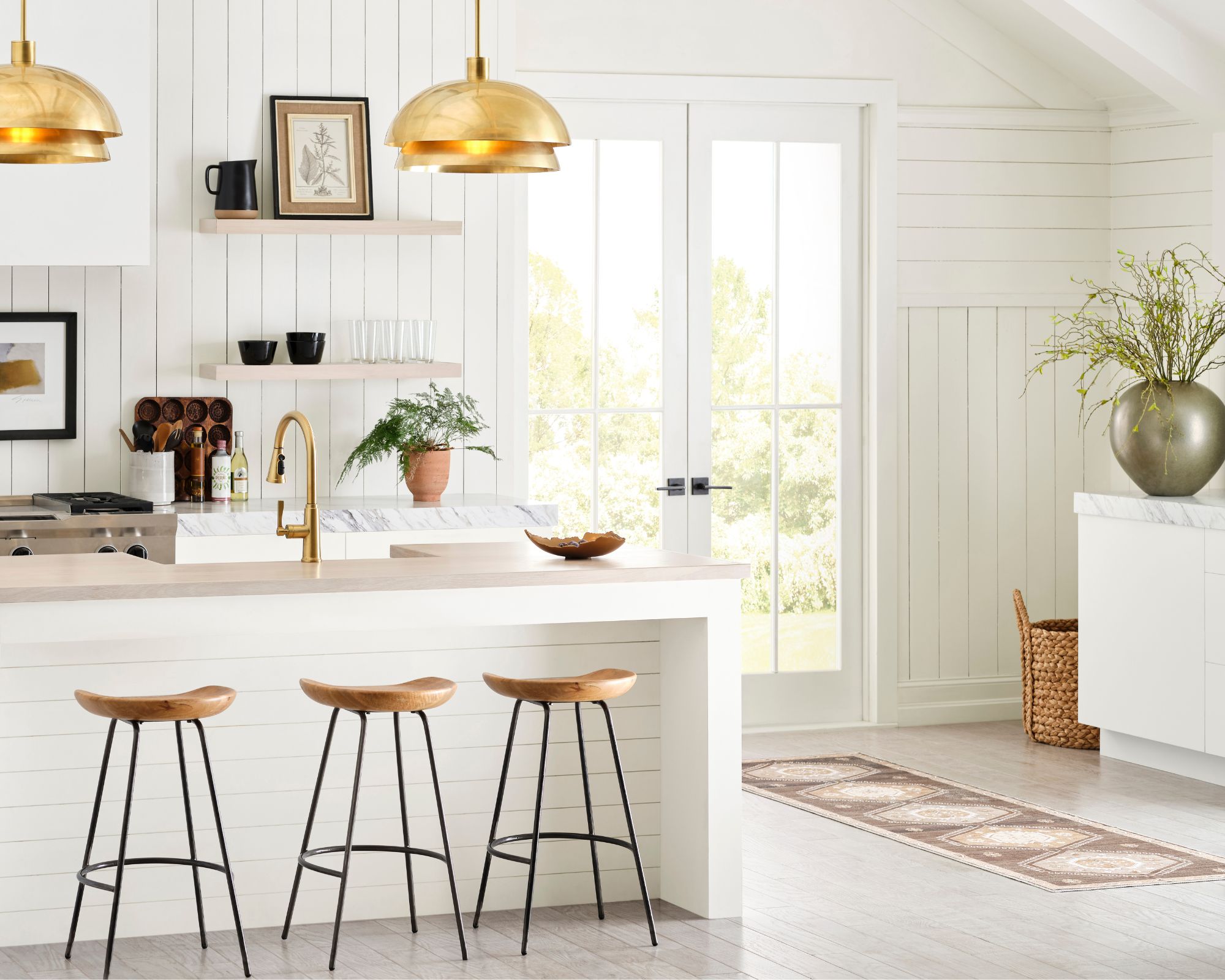
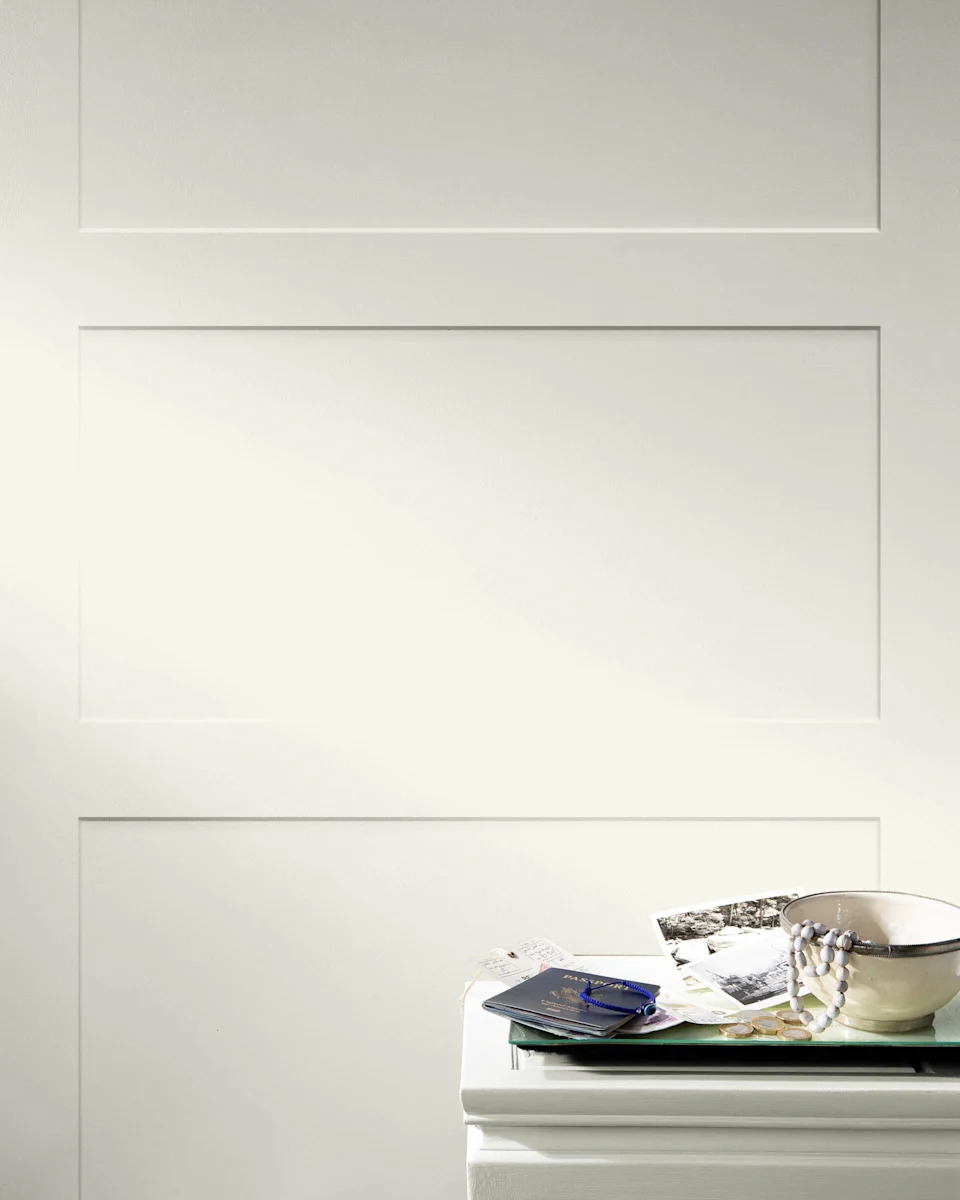
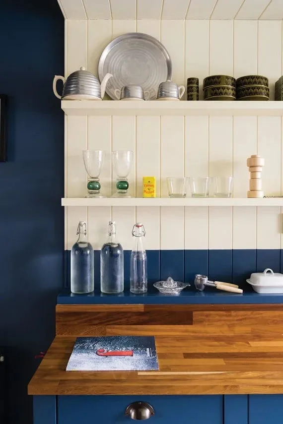
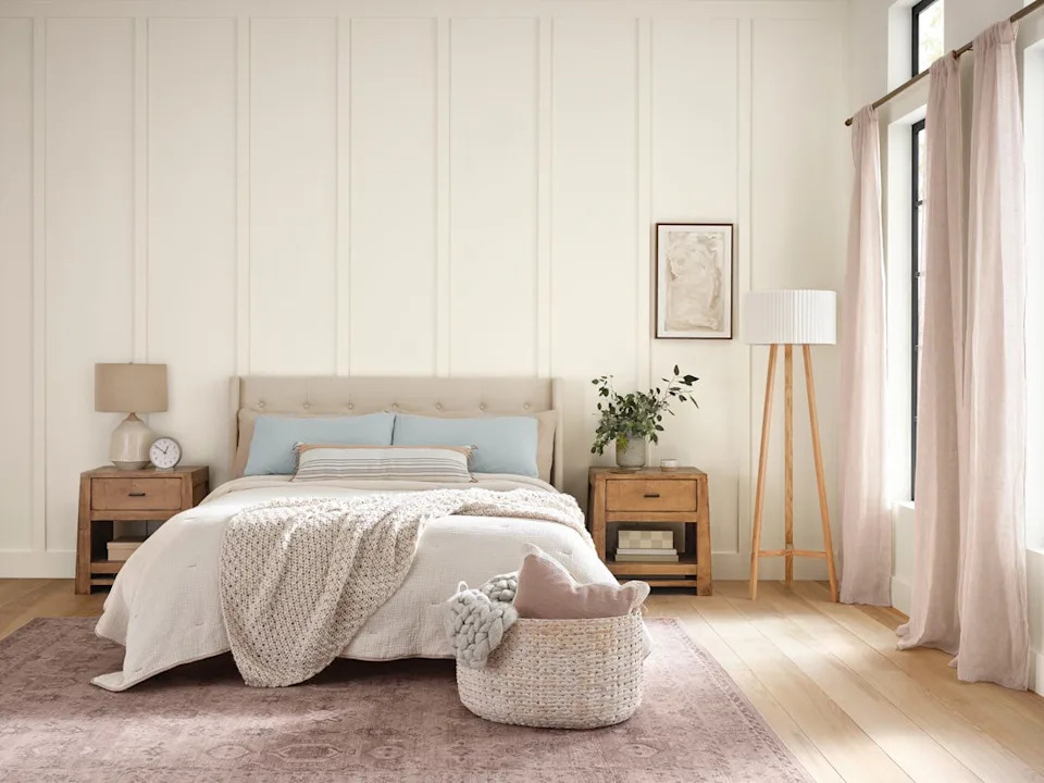
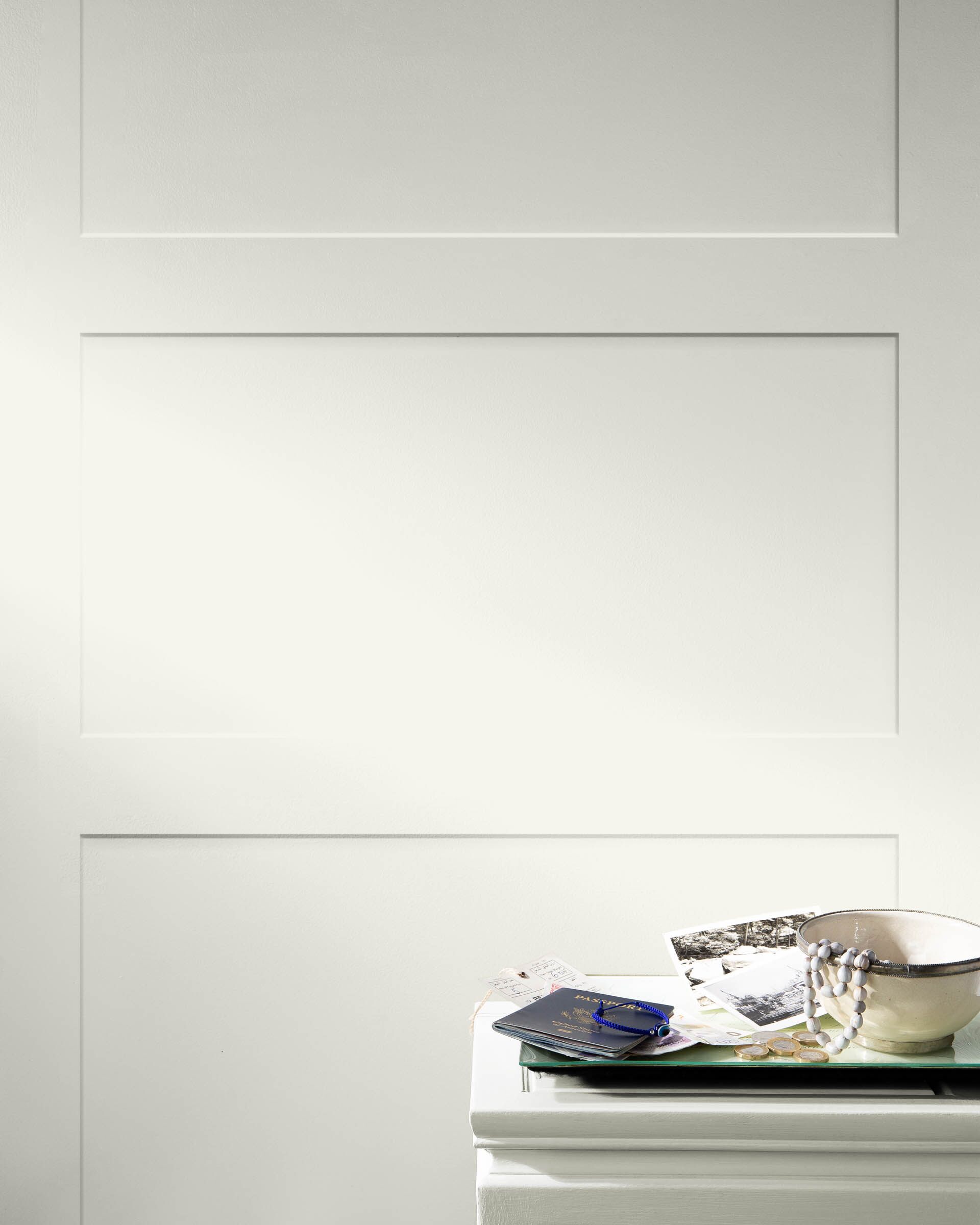
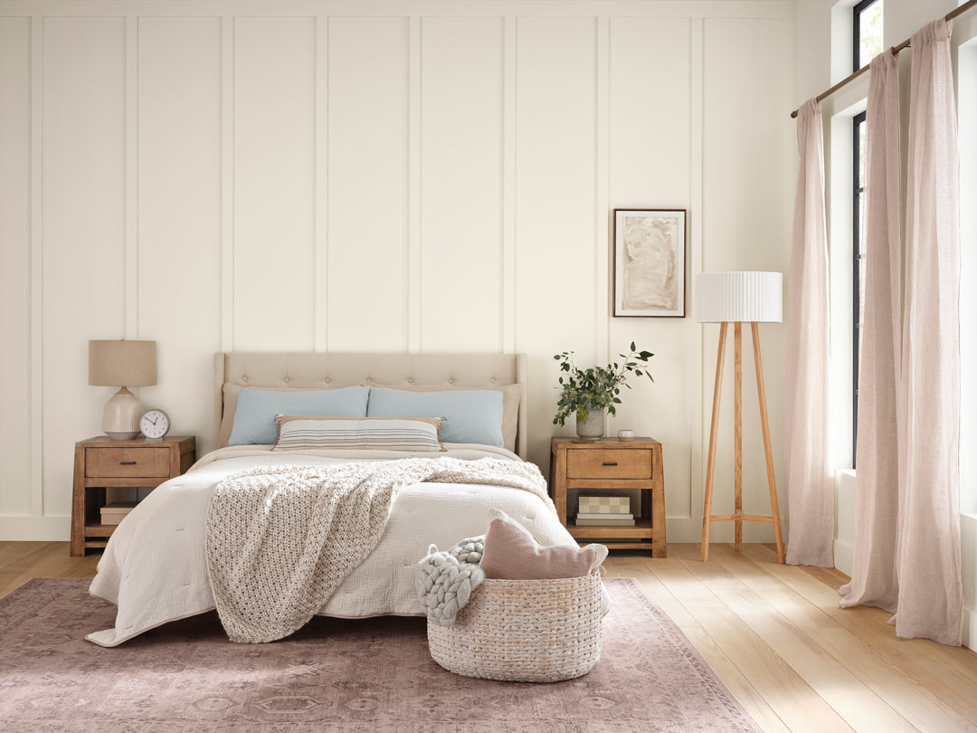
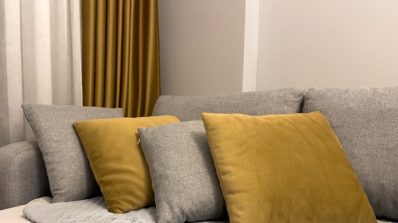
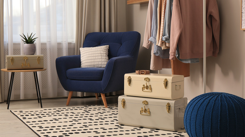
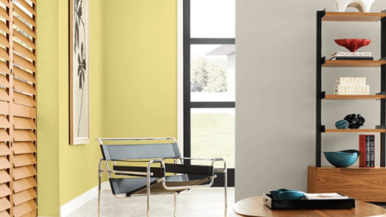
Key colors from various palettes are highlighted for their calming properties. "Balance" includes Dover White (SW 6385), a creamy neutral that complements earthy greens. The "Breathe" palette features Perfect Greige (SW 6073), a well-balanced mix of gray and beige that provides warmth. "Center" offers Heron Plume (SW 6070), a soft, cozy neutral suitable for a peaceful backdrop. For an energetic yet playful feel, the "Create" palette presents Daydream (SW 6541), a blue-gray hue that subtly invigorates spaces when paired with Marshmallow (SW 7001). The "Focus" palette includes Morning Fog (SW 6255), a stylish medium gray designed to promote concentration, ideal for home offices. The "Inspire" palette, influenced by mid-century aesthetics, features Tradewind (SW 6218), a refreshing blue perfect for a clean and crisp look. The "Recharge" palette, aimed at creating a spa-like atmosphere, offers Rainwashed (SW 6211), a misty blue-green that encourages relaxation. For effortless design, the "Reflect" palette suggests Snowbound (SW 7004), a versatile white with a touch of warmth. The "Renew" palette introduces Agreeable Gray (SW 7029), a true neutral greige that fosters coziness and mental rest. From the "Unplug" palette, Practical Beige (SW 6100) evokes the warmth of the desert with its orange and tan hues, complemented by a pop of blue. Finally, the "Unwind" palette features Escape Gray (SW 6185), a color with greenish undertones that brings an outdoorsy calm and serenity.
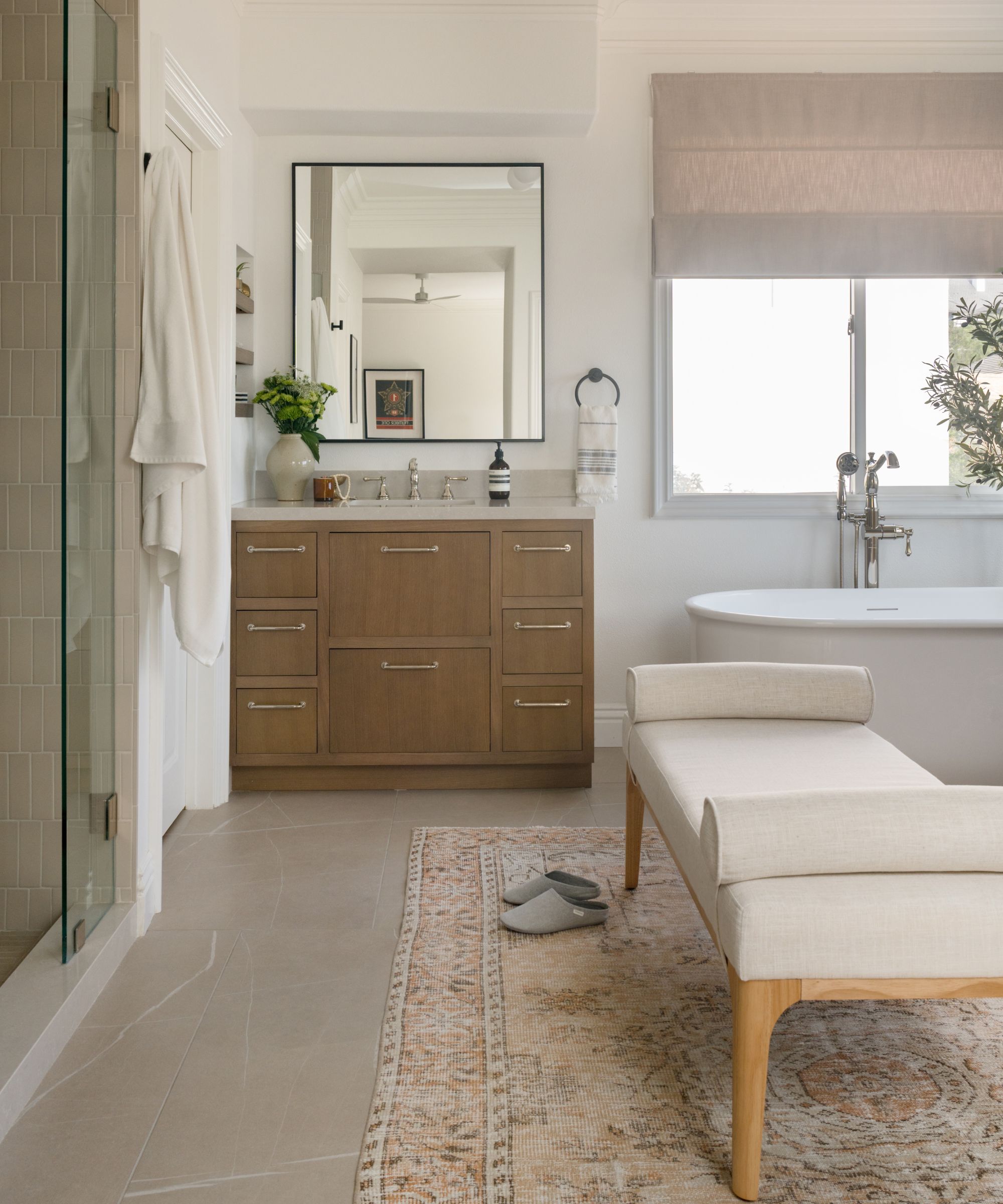
Beyond aesthetics, the Living Well collection integrates two specialized products within Sherwin-Williams' SuperPaint line. These include a paint with air-purifying capabilities and another with sanitizing technology. Rick Watson, director of product information and technical services at Sherwin-Williams, explains that these additions provide functional benefits. The Sanitizing Technology maintains clean walls by eliminating bacteria on coated surfaces for up to four years, making it suitable for high-traffic areas like kitchens and bathrooms. The Air Purifying Technology, with its zero VOC formula, is ideal for bedrooms, improving air quality and combating mold, mildew, and common household odors such as pet and cooking smells. This dual focus on visual appeal and practical benefits ensures that the Living Well collection contributes to both the beauty and health of living spaces.
#SherwinWilliams #CalmingPaintColors #HomeDecor #InteriorDesign #ColorPalettes #LivingWellCollection #PaintTrends #HomeImprovement #WellnessInDesign #SherwinWilliams #CalmingPaintColors #HomeDecor #InteriorDesign #ColorPalettes #LivingWellCollection #PaintTrends #HomeImprovement #WellnessInDesign
0 comment in total
 No comments yet
You may also like
5 of the Most Calming Paint Colors From Sherwin-Williams

20 Calming Paint Colors That Will Change the Way You Live

'It's one of those rare neutrals that feels both effortless and elevated' – how designers use Sherwin-Williams soothing shade Sunbleached
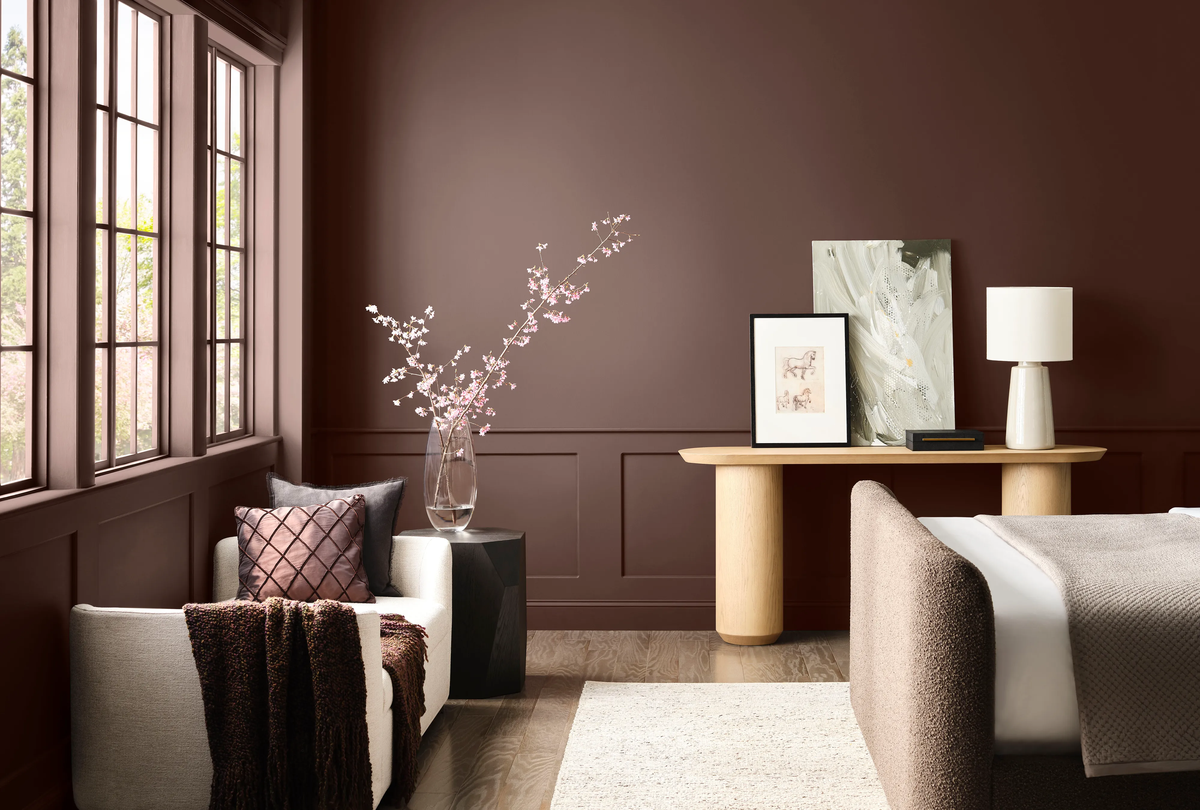
Sherwin-Williams Predicts These 4 Color Palettes Will Dominate Homes in 2026—and One May Surprise You

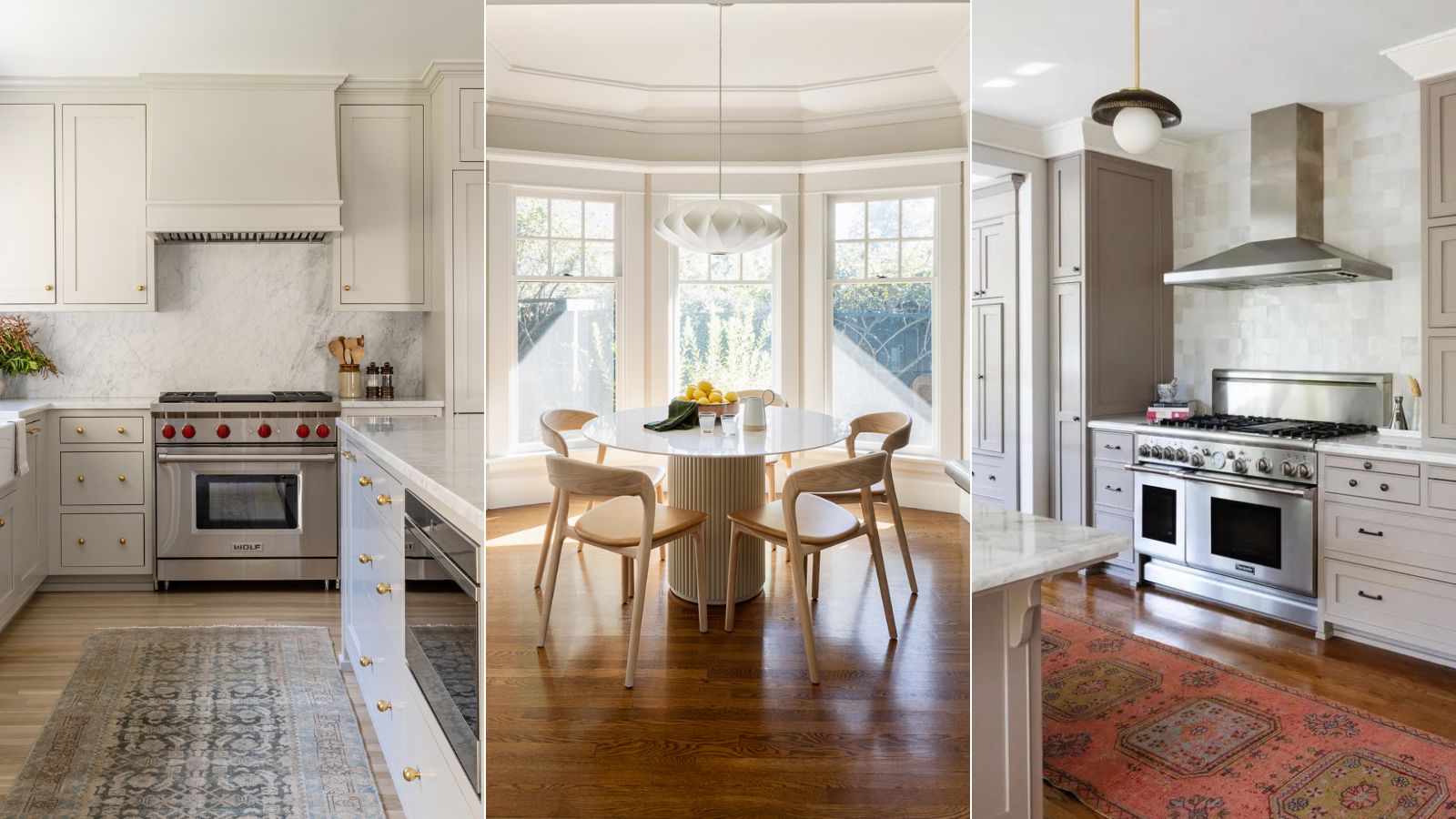
What are Sherwin-Williams' best-selling paints? And how interior designers put them to use
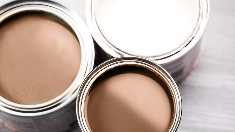
10 Lesser-Known Neutral Paint Shades From Sherwin Williams You Shouldn't Overlook
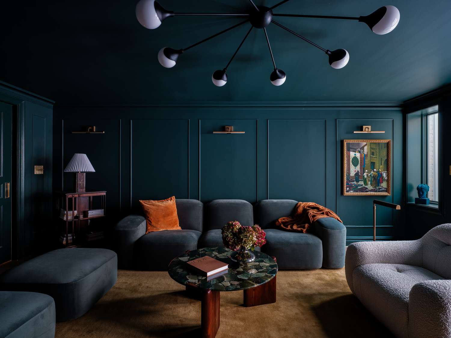
12 Calming Colors to Paint Your Walls, According to Interior Designers

The 11 Best Warm White Paint Colors, According to Designers

Sherwin-Williams paint colors in real homes – 13 designer-approved shades, from neutrals to bolds
If You Can't Find Your New Paint Color in Sherwin-Williams' 2026 Palettes, We'll Be Shocked

13 Calming Paint Colors Designers Use to Make Rooms Feel Soothing — And No, They're Not All Neutrals

20 Coordinating Hues To Pair With Sherwin-Williams' Gorgeous Color Of The Year
8 Calming Colors to Paint Your Living Room—and Make the Space More Relaxing
These Are the Colors You'll Be Obsessed With Next Year, Based on Your Personality
Sherwin-Williams' Designer Color Collection: 5 bright white paints
Sherwin-Williams' 2026 Color Forecast Is Here and It’s Packed With 48 Fresh Hues
We asked 12 interior designers for their favorite Sherwin-Williams paints – these are the colors that came out on top
What are the best Sherwin-Williams white paints? 6 favorite shades amongst interior designers
The 11 Best Warm White Paint Colors, According to Designers
The 15 Best-Selling Sherwin-Williams Paint Colors of All Time