1/2
Designers Swear By These 55 Living Room Paint Colors
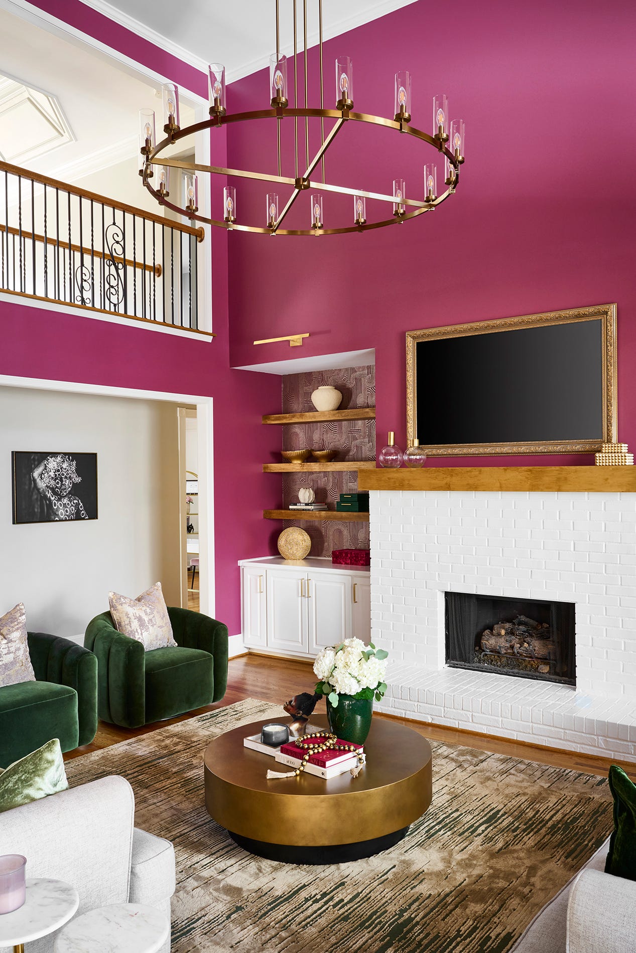
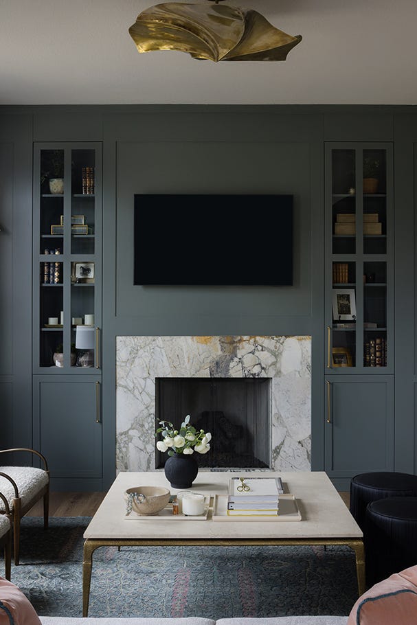
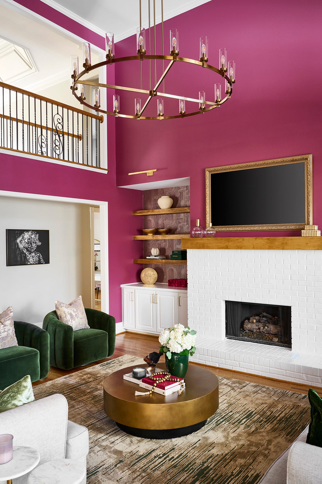
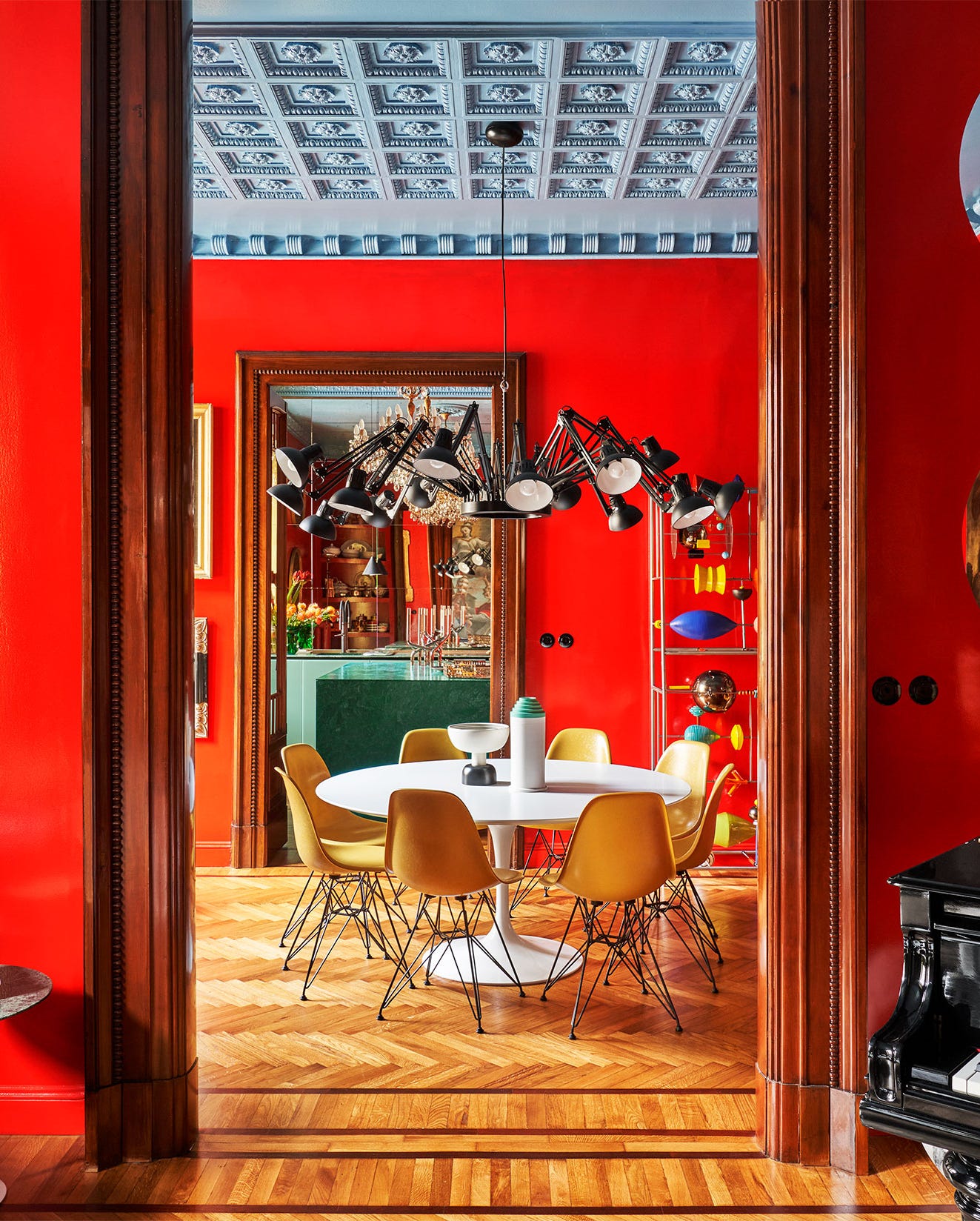
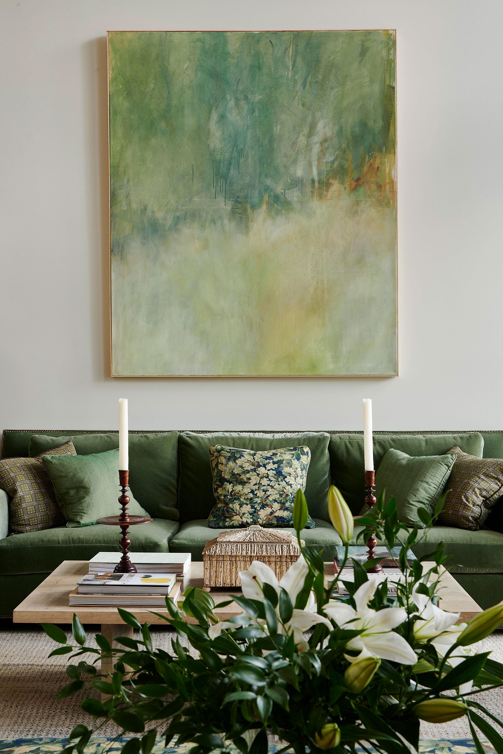
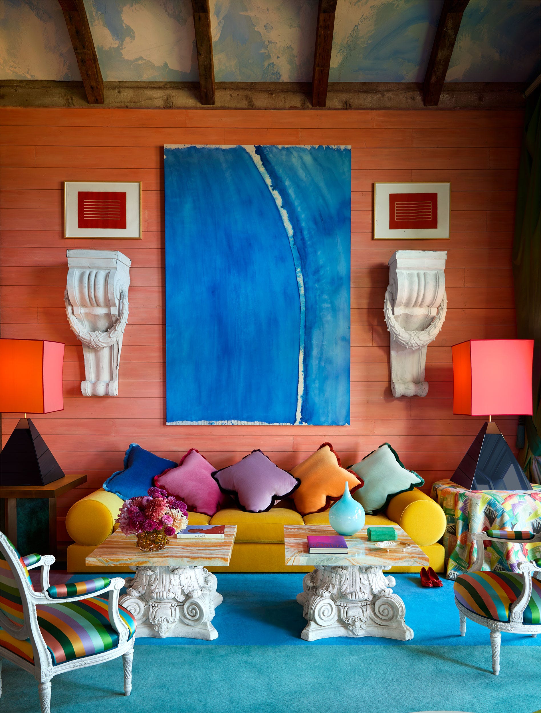
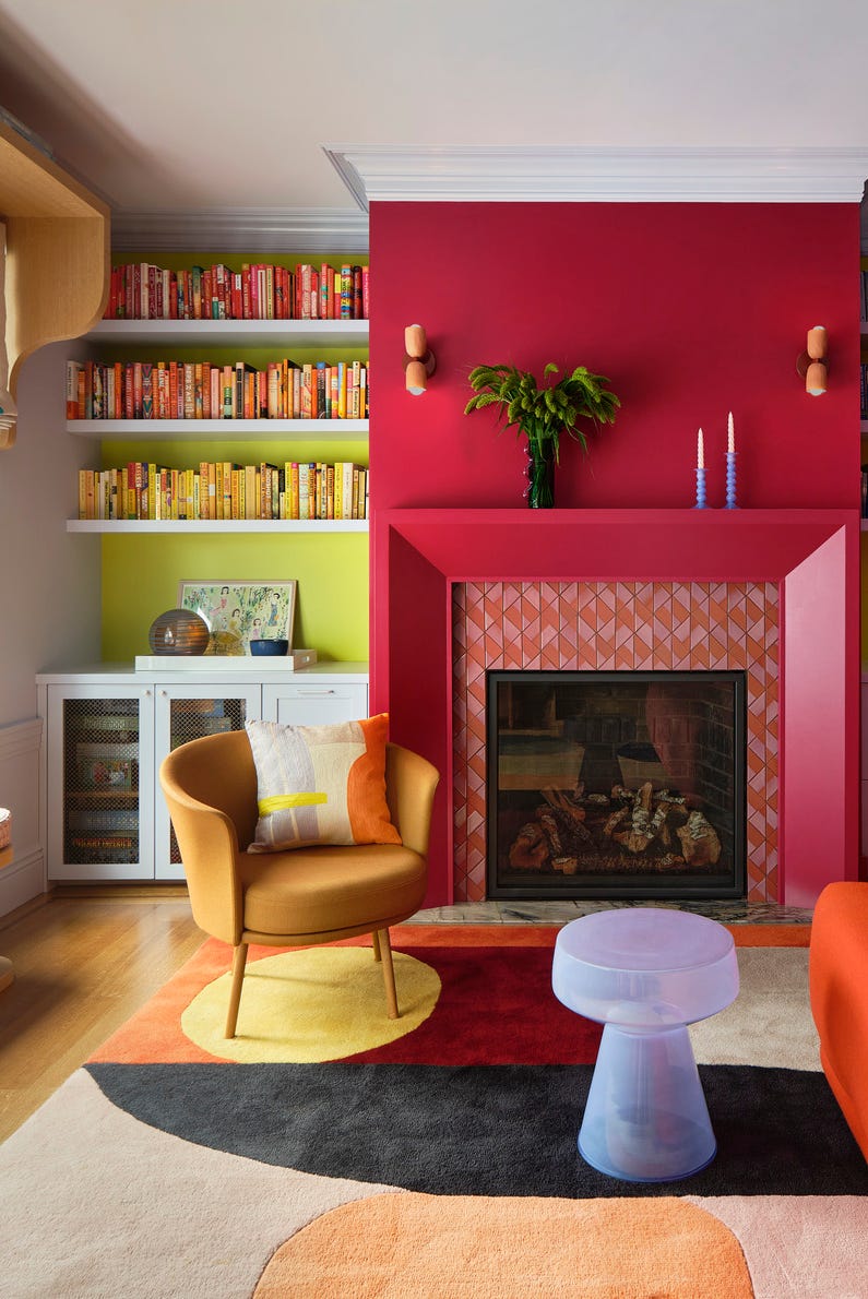
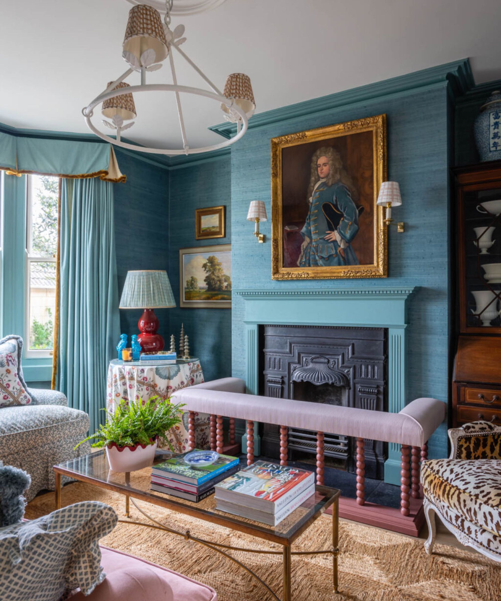
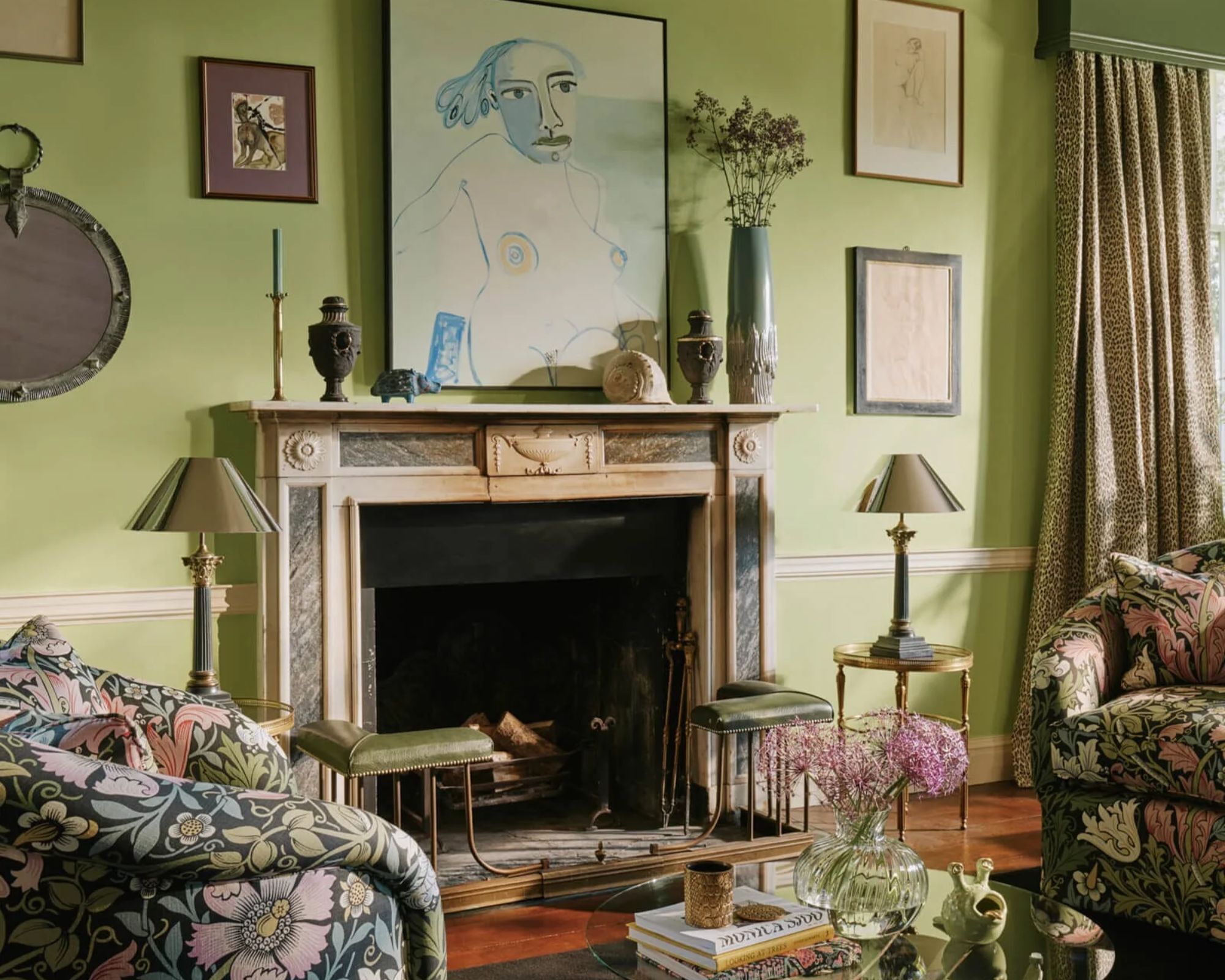
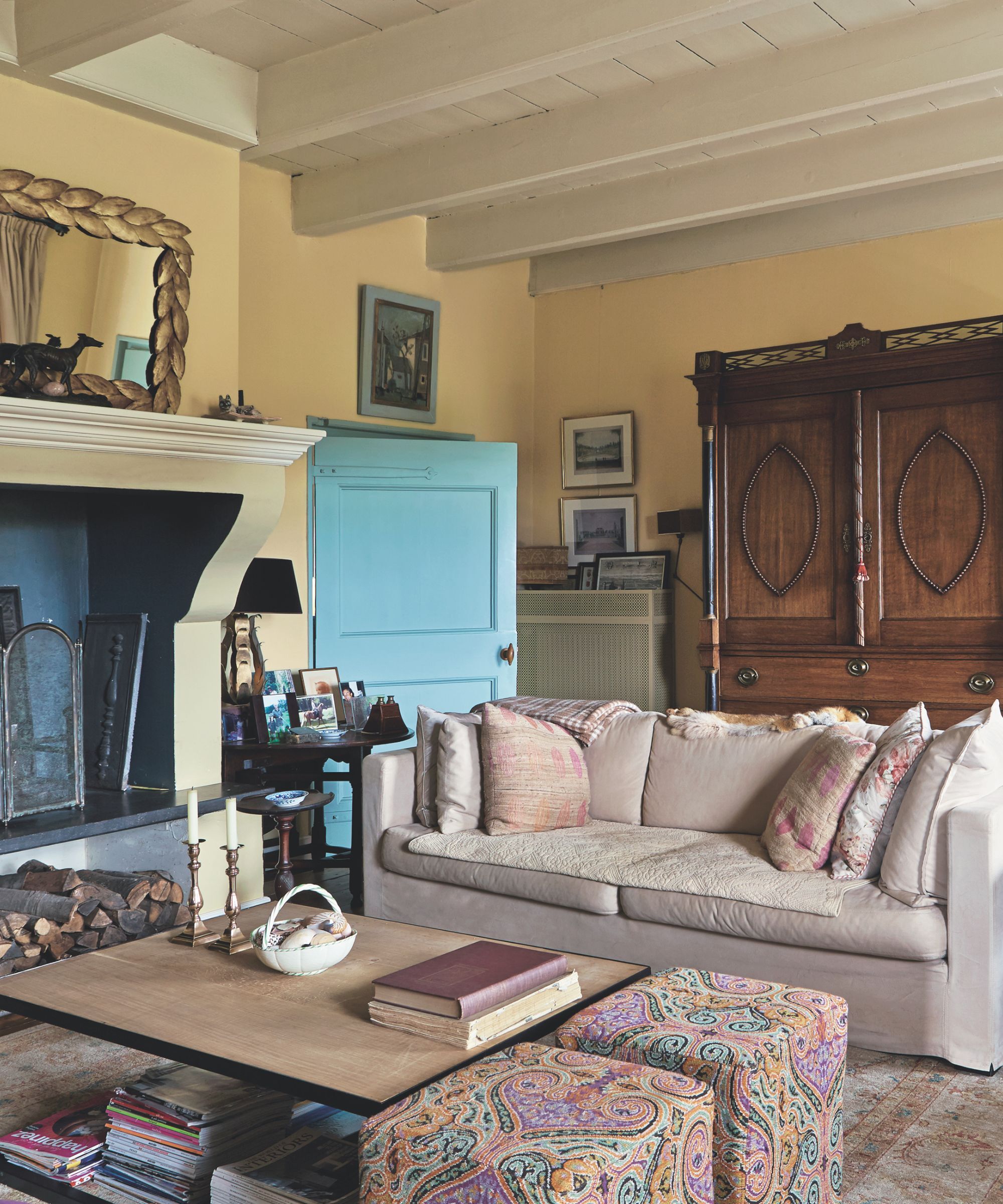
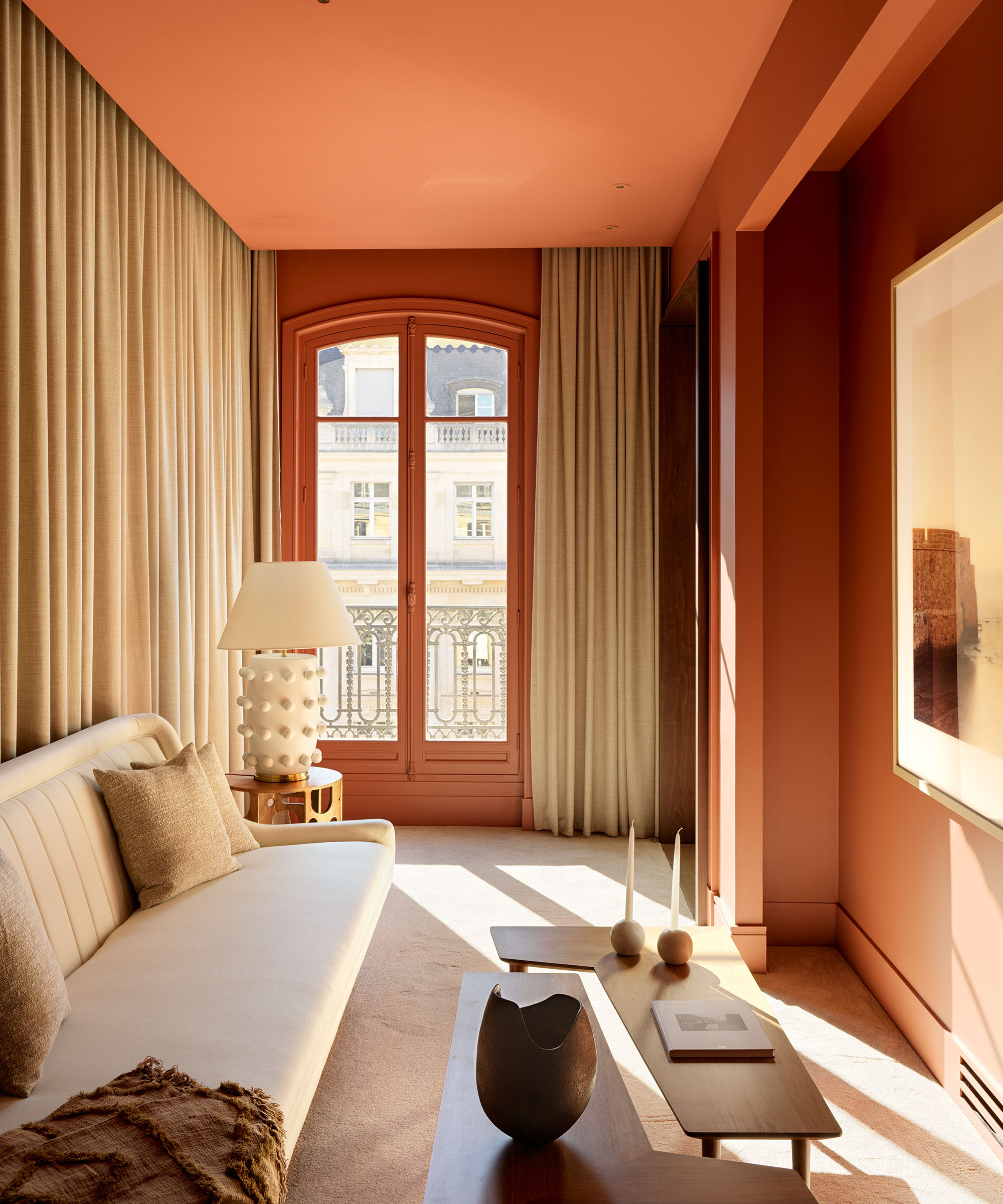
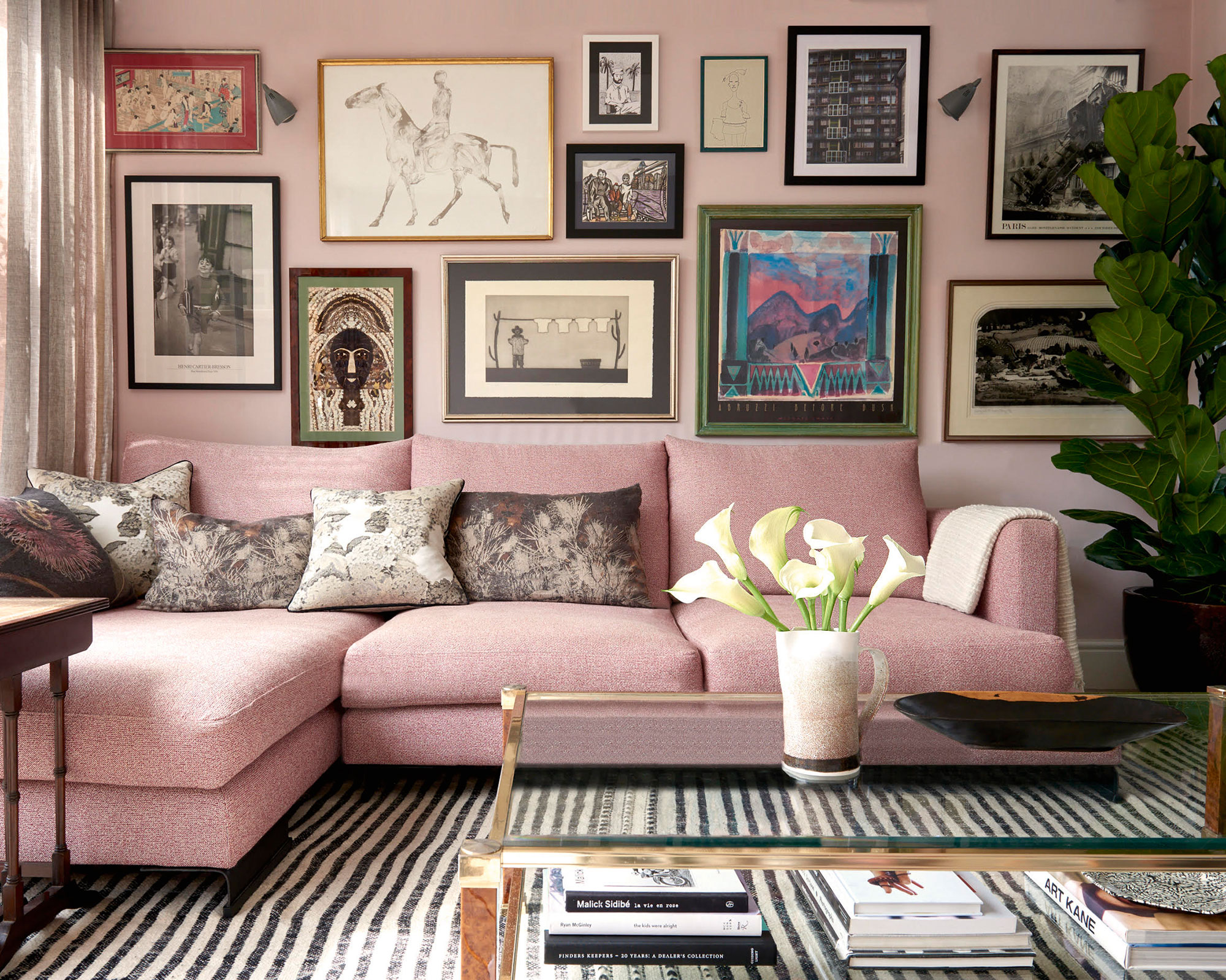
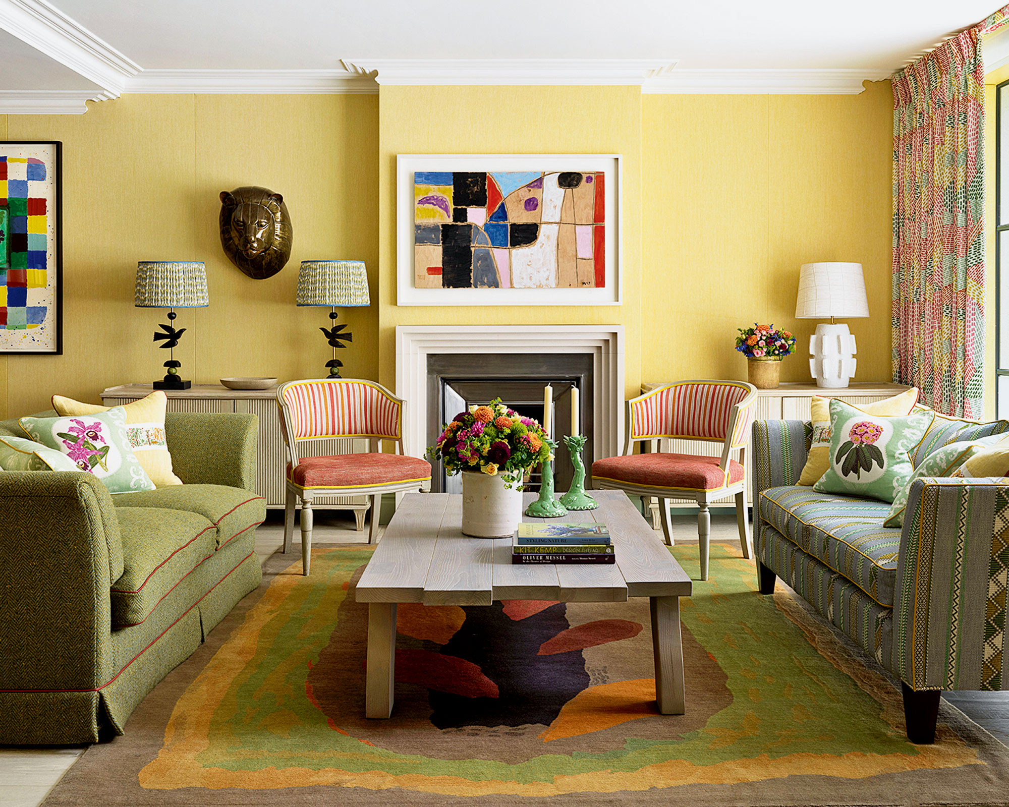
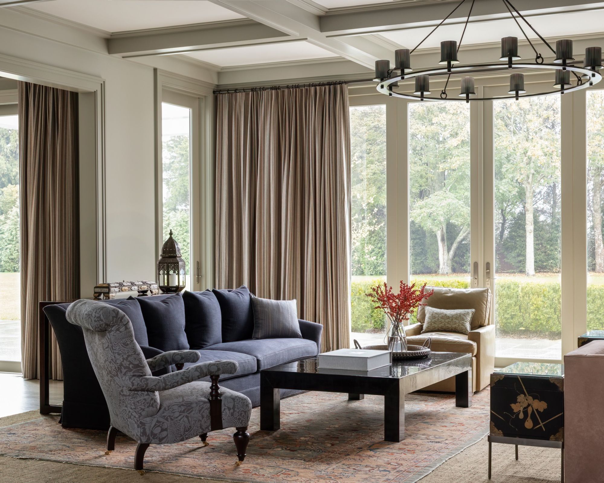
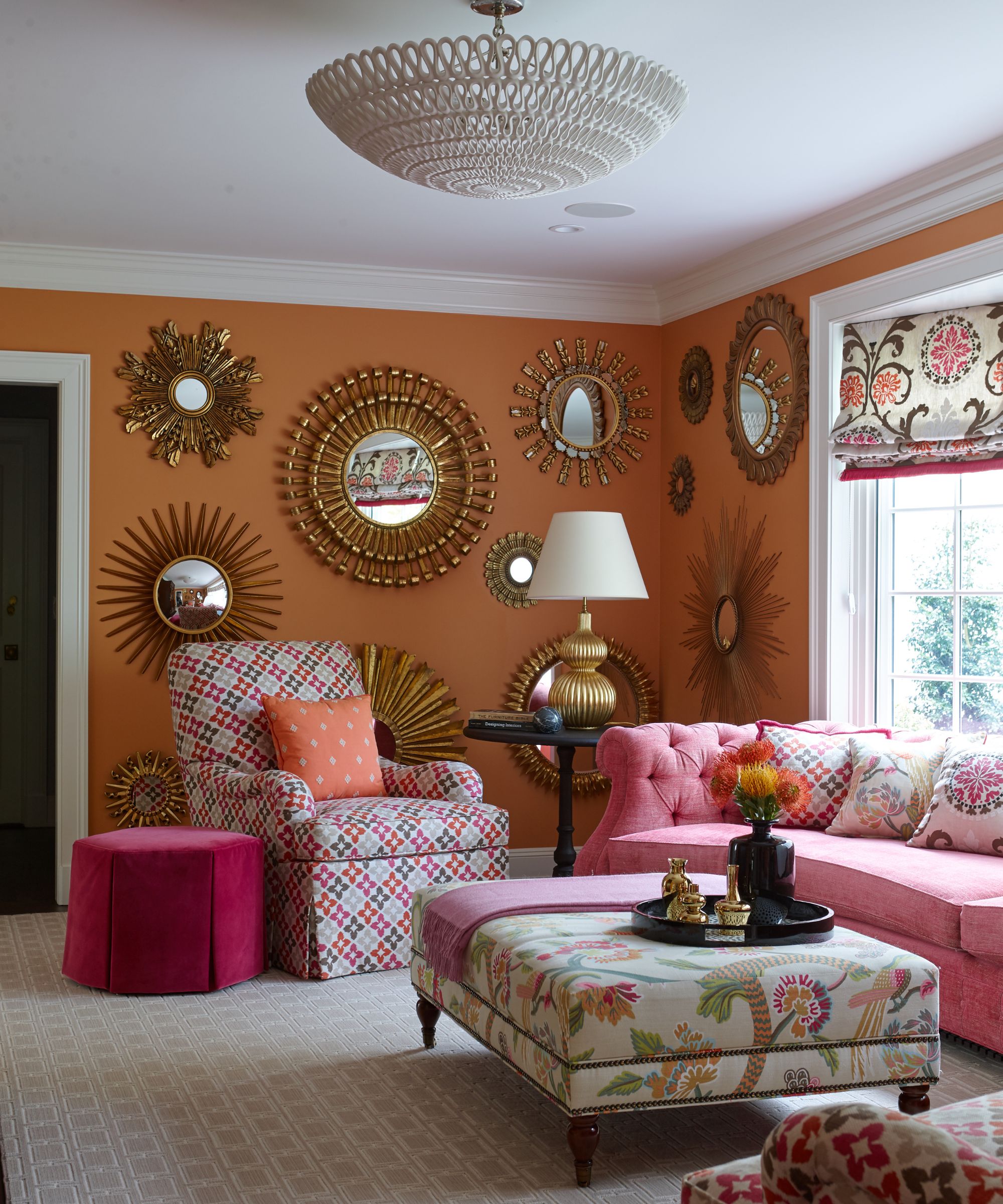
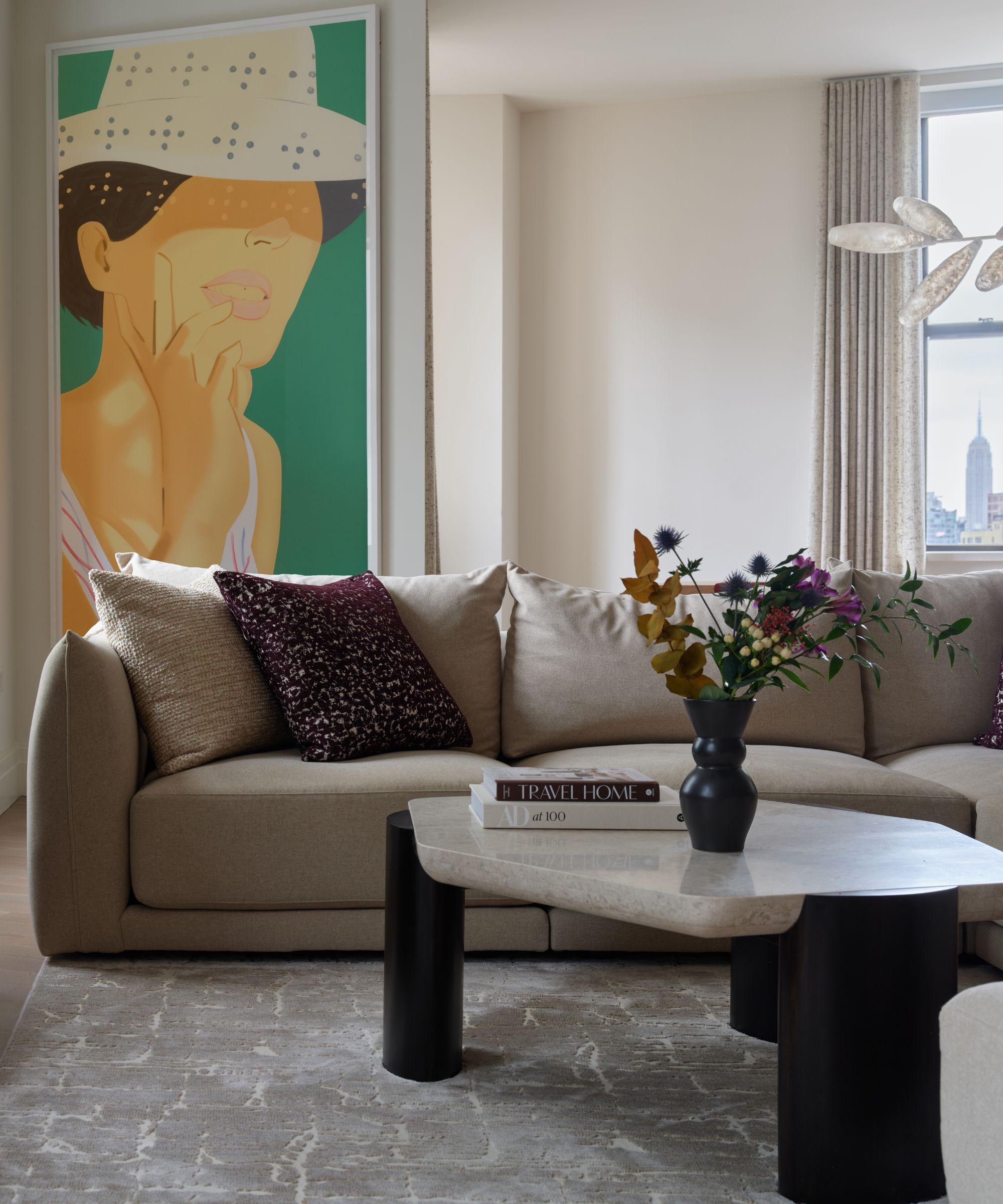
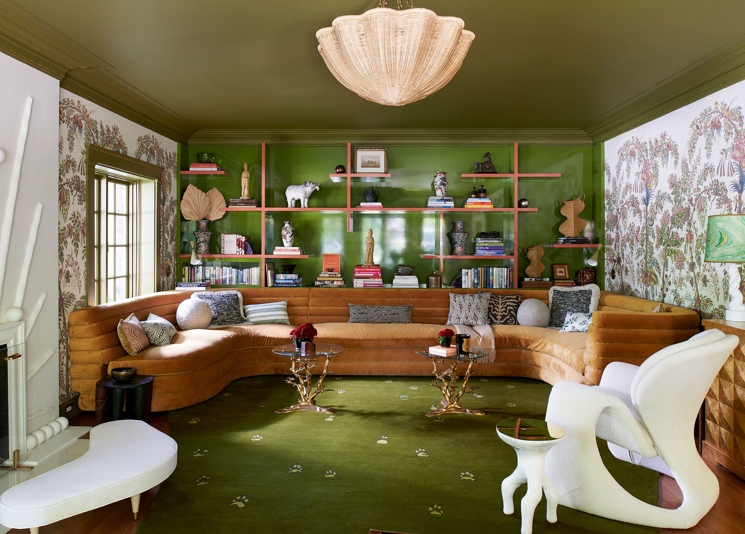
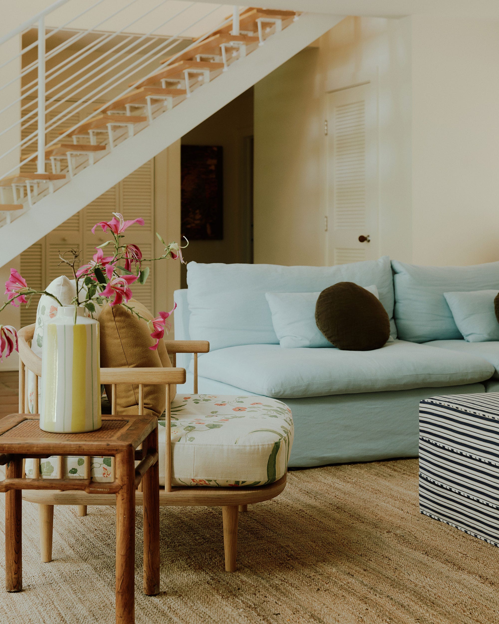
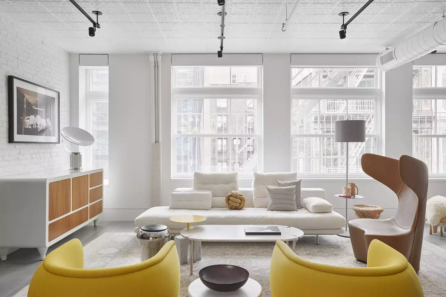
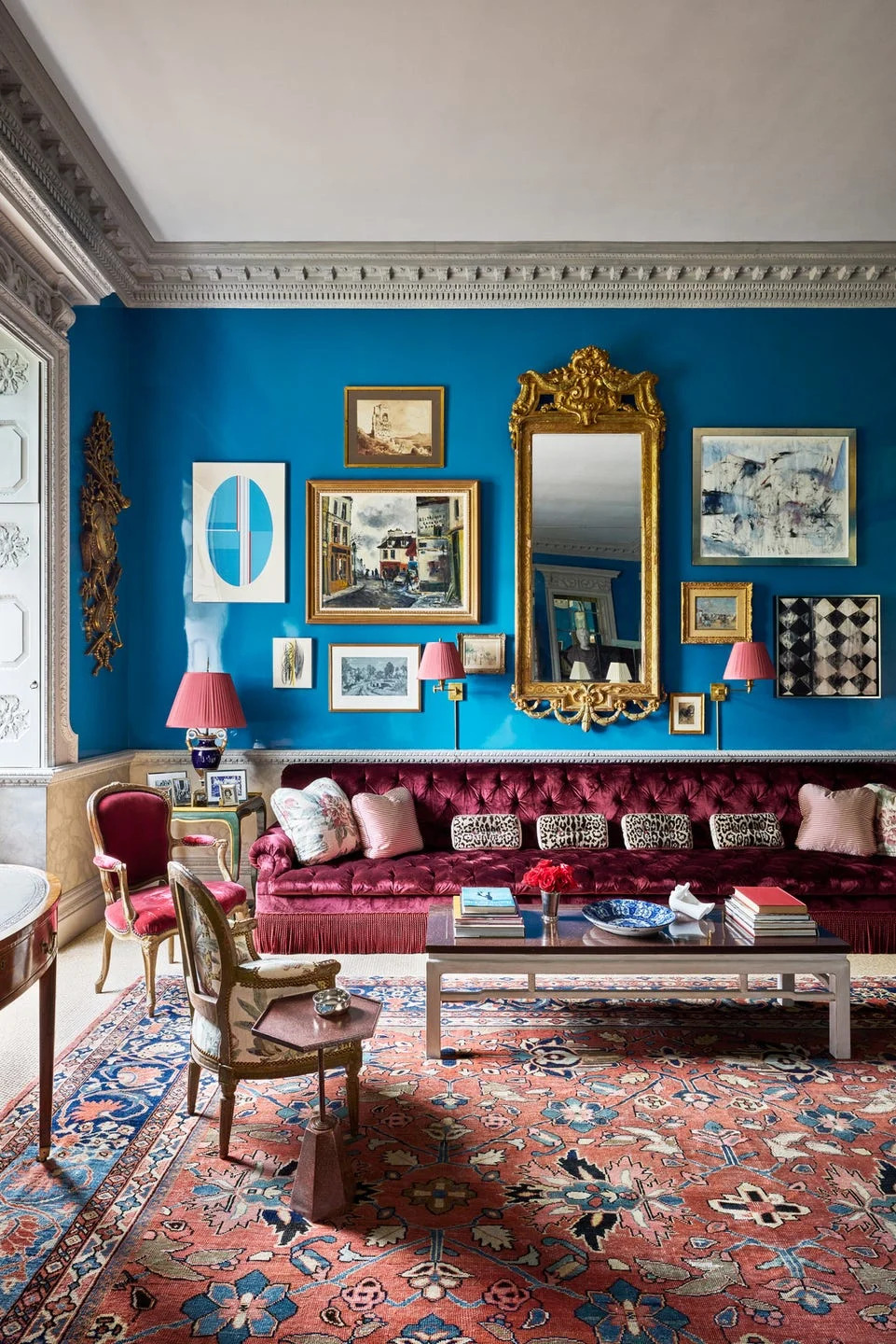
The article showcases a diverse collection of living room paint colors favored by professional designers, ranging from bold, lacquered hues to subtle, easy-going neutrals. The goal is to inspire readers to consider various color palettes for their own living spaces, whether they prefer a large or small room, or a modern or traditional aesthetic. The selection emphasizes both individual room preferences and how different colors can impact the overall ambiance and coordination with existing furnishings and decor.
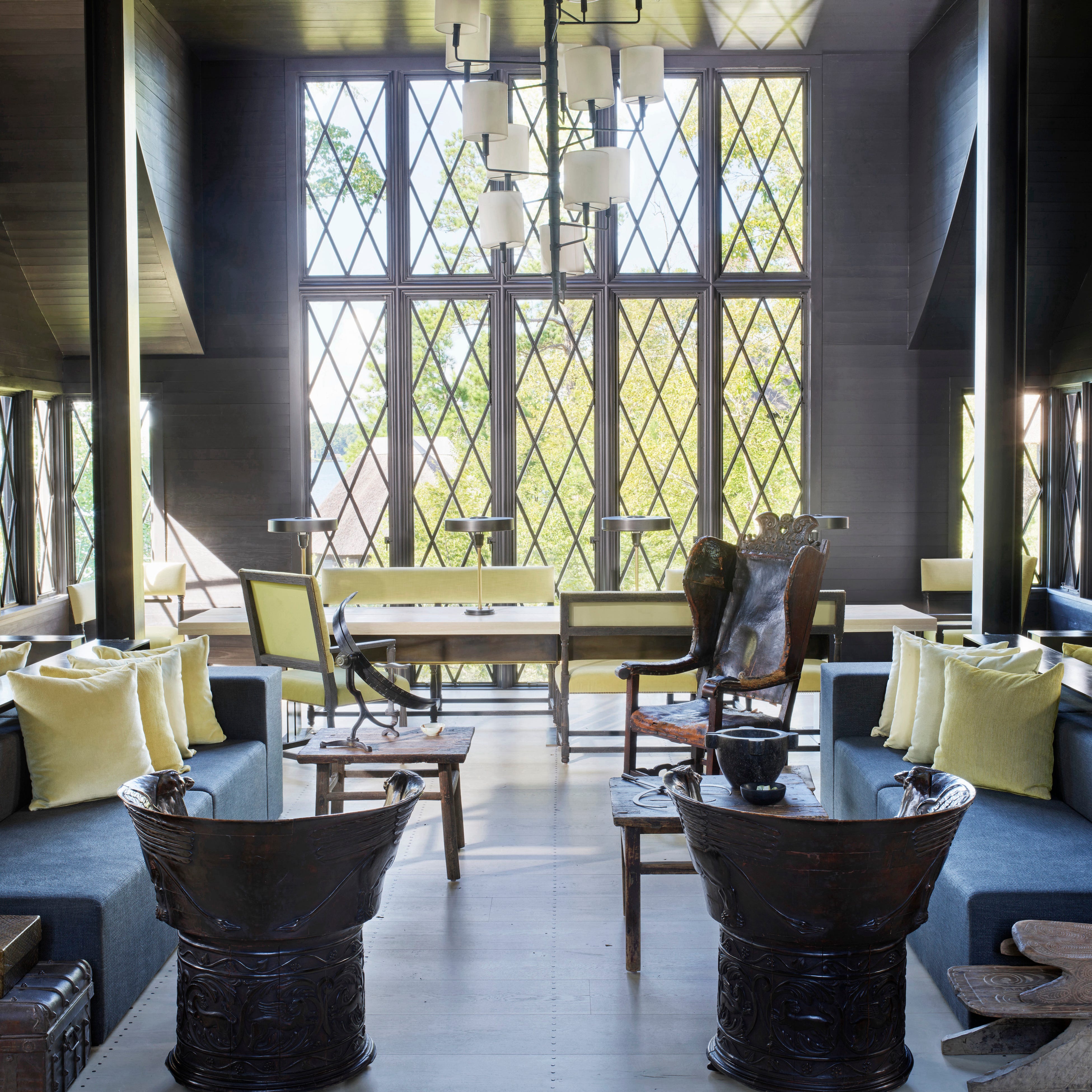
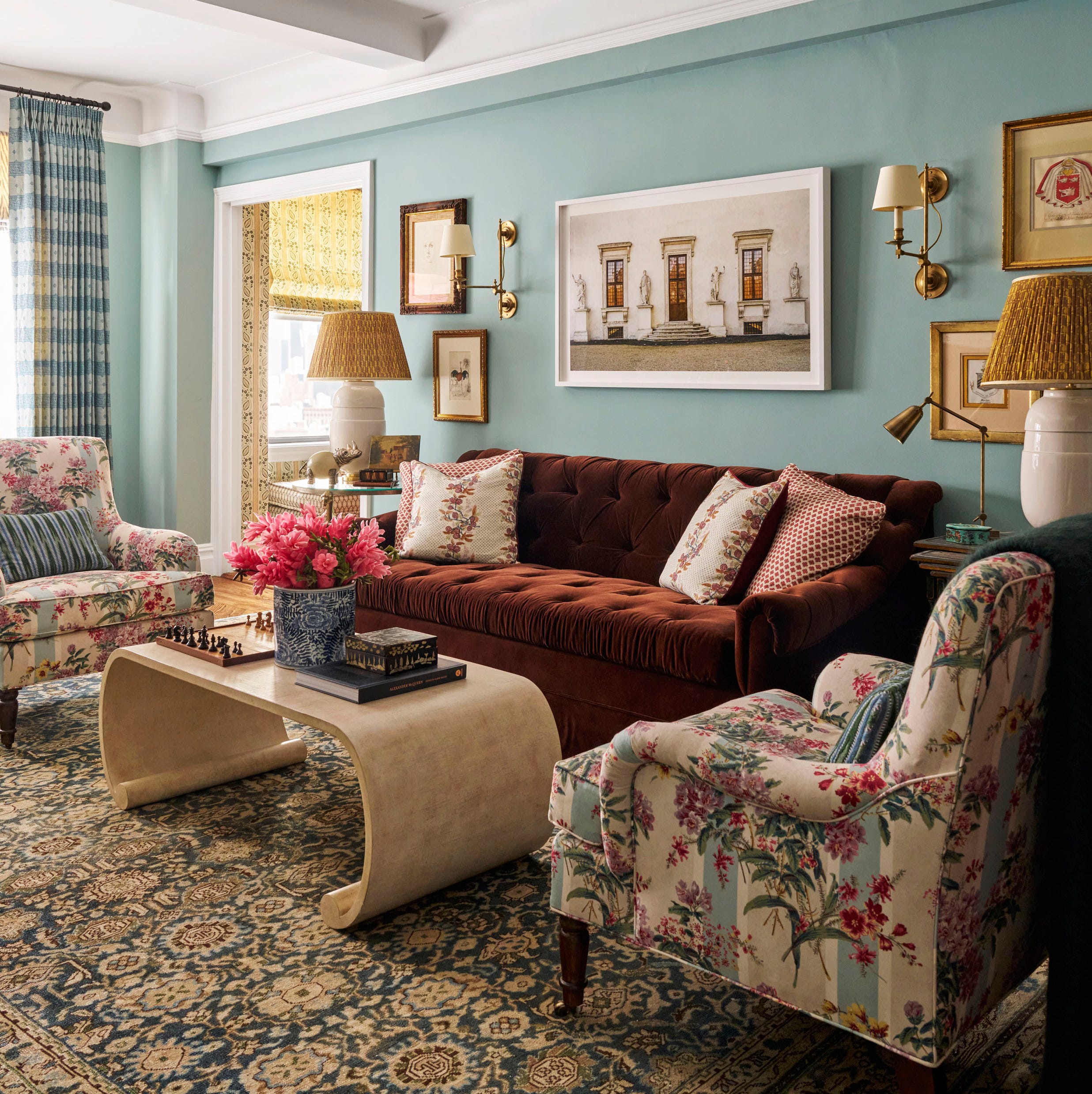
Several examples illustrate how specific colors are used to achieve desired effects. For instance, architect Bobby McAlpine used Sherwin-Williams Black Magic in his Alabama cottage to highlight the lake views, making the room feel connected to the dark water. Designer Meredith Ellis chose Dix Blue from Farrow & Ball for her New York living room to create a cheerful atmosphere, complemented by chintz-covered club chairs and an antique Tabriz rug. Suzanne Kasler's family room features glossy brown walls and Farrow & Ball's Tanner Brown on the ceiling, balancing vibrant floral patterns with rich undertones. Anna Brockway, co-founder of Chairish, infused a bright green paint (NCS 1020-G807 from Fine Paints of Europe) into her New York apartment, inspired by the chartreuse hues outside her window.
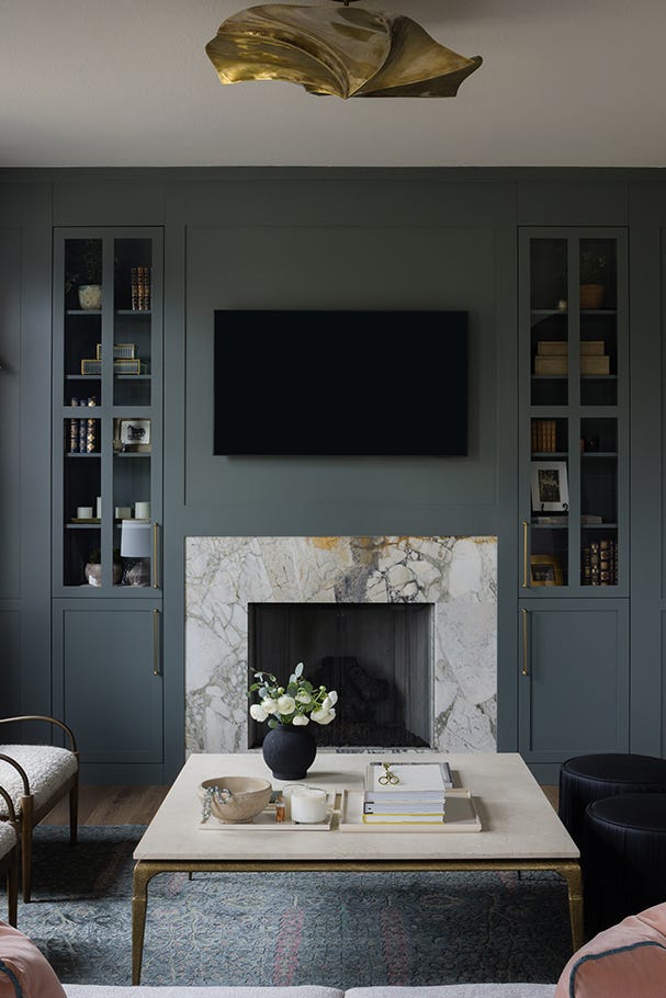
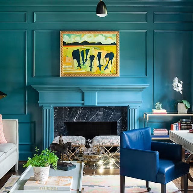
Designers Heather and Matt French utilized Benjamin Moore’s Coat of Arms, a teal shade, to frame a Gracie mural in a Dallas salon, extending the color to various upholstery pieces. Lucy Doswell painted the ceiling of a New York townhouse's family room in a bright white, Benjamin Moore's Swiss Coffee, to reflect garden light indoors. Lizzie Bailey's New York City apartment showcases Benjamin Moore's Bermuda Blue on glazed walls, creating a bold backdrop for a mix of classic and modern pieces. Ashley Whittaker muted the walls with creamy Venetian plaster in a Connecticut estate's 30-foot-long living room, allowing bold prints and colors to dominate the furnishings. Anthony Baratta grounded a Manhattan apartment with a calming blue paint, balancing vibrant upholstered pieces and an American painting.
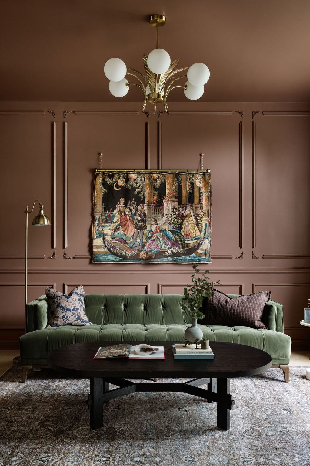
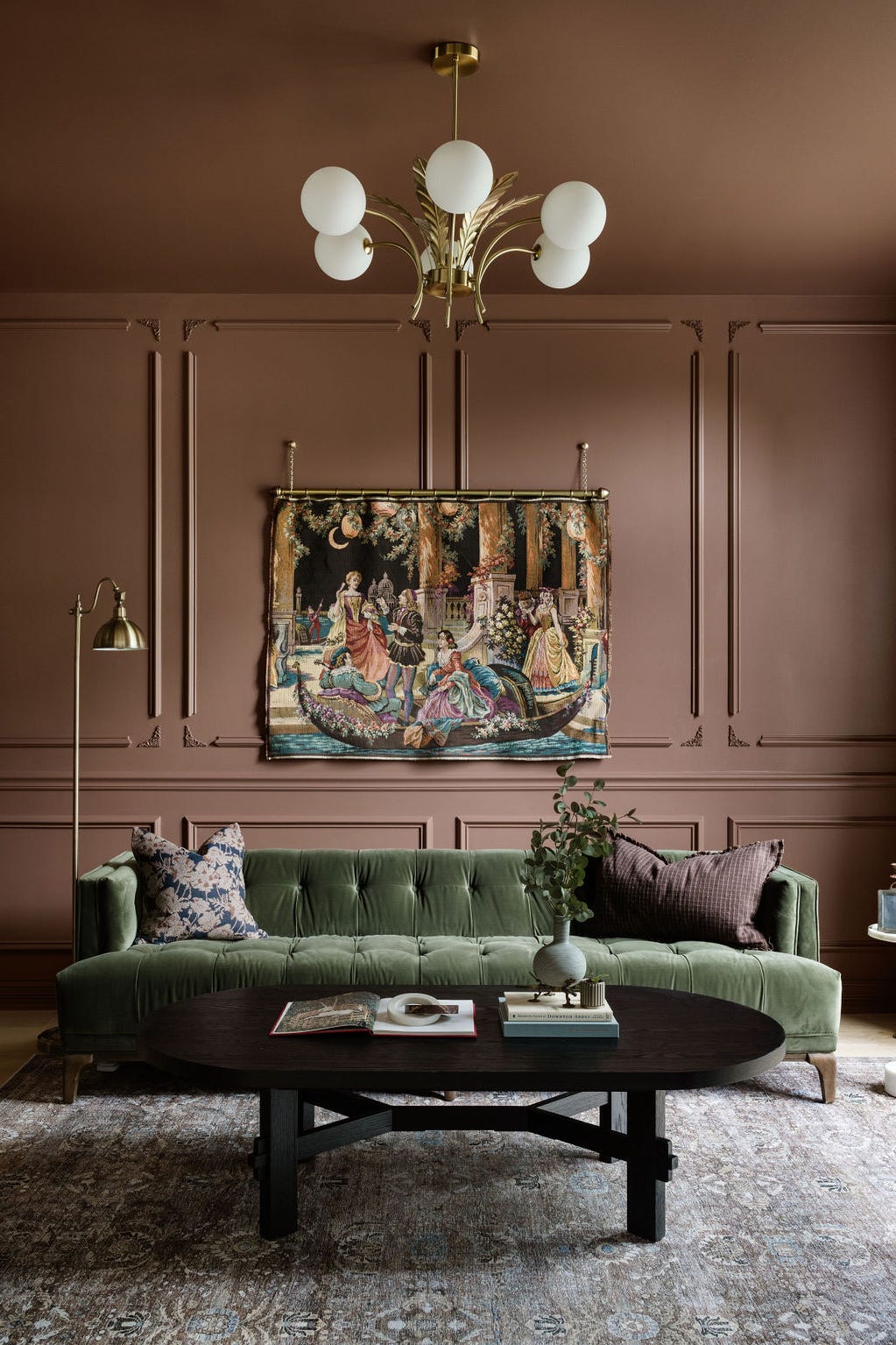
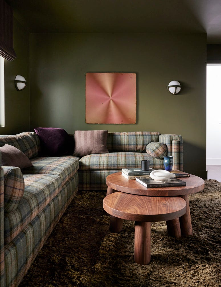
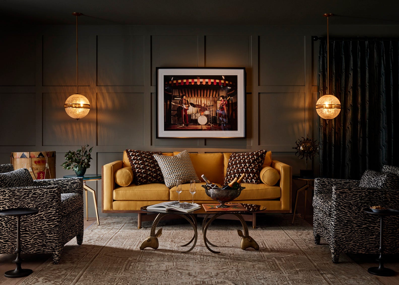
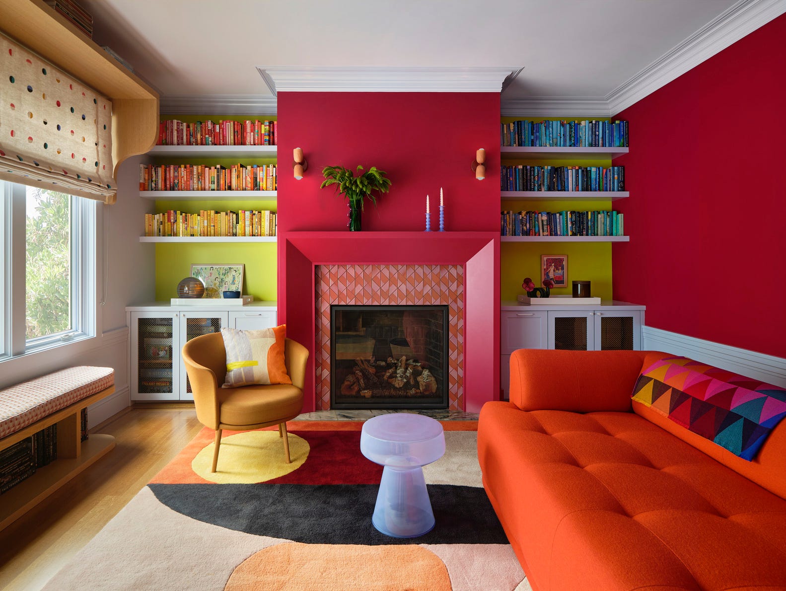
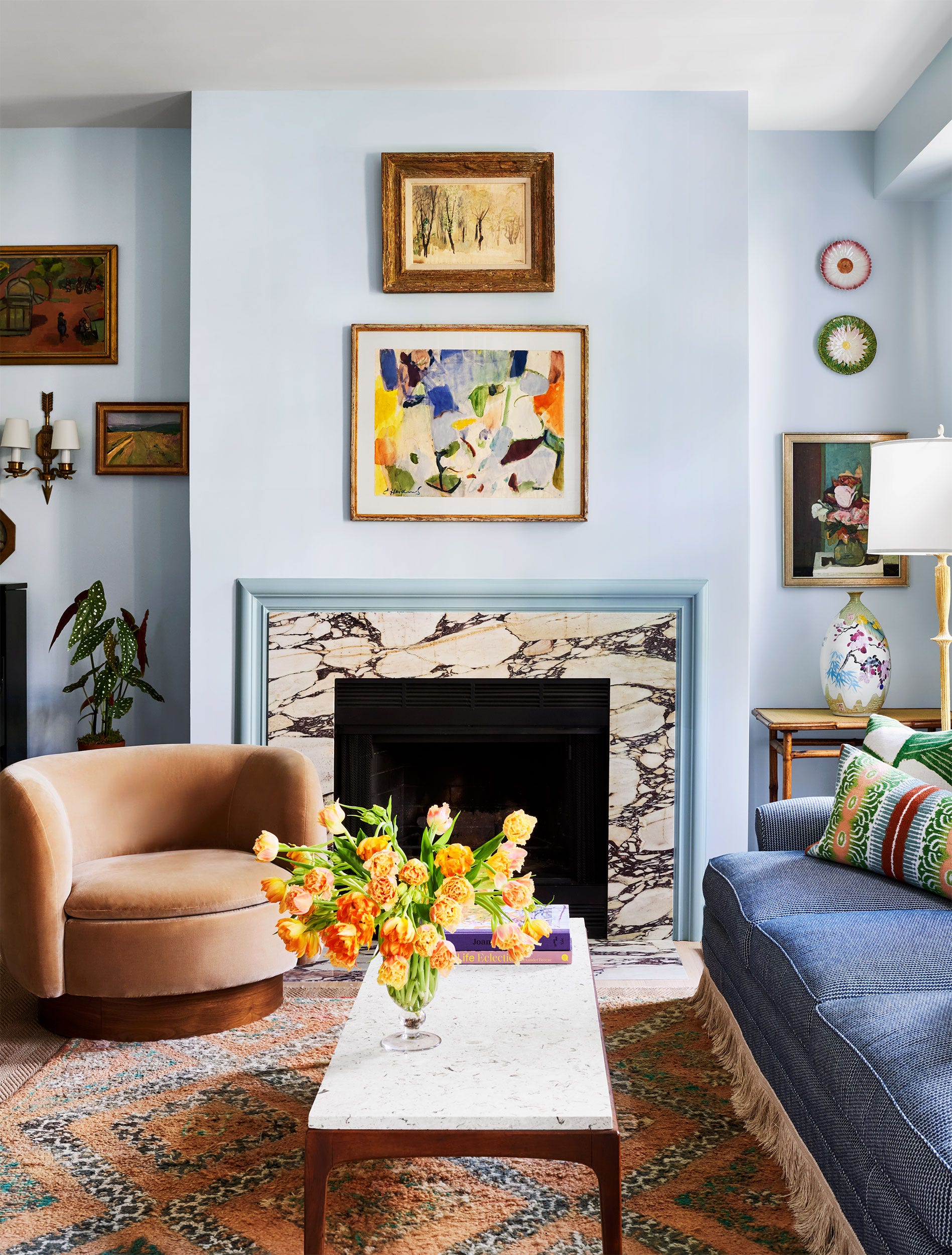
Meg Braff updated her Long Island home's library with Benjamin Moore’s Vienna Green, a chartreuse shade that enhances natural light and original paneling. Ceara Donnelly chose Farrow & Ball's Pelt, a dark raisin shade, for the paneled library walls of her Charleston home, contrasting it with a custom mohair sectional. Viviano Viviano's Dallas family room features Benjamin Moore's Windsor Green walls and leafy garlands to evoke nature's tranquility. Markham Roberts employed rich carmine walls, mimicking Farrow & Ball's Picture Gallery Red, in a New England den to create an energizing space filled with textures and patterns. Miles Redd used Benjamin Moore's Polar Ice, a soft blue, to complement art in a vibrant yellow space.
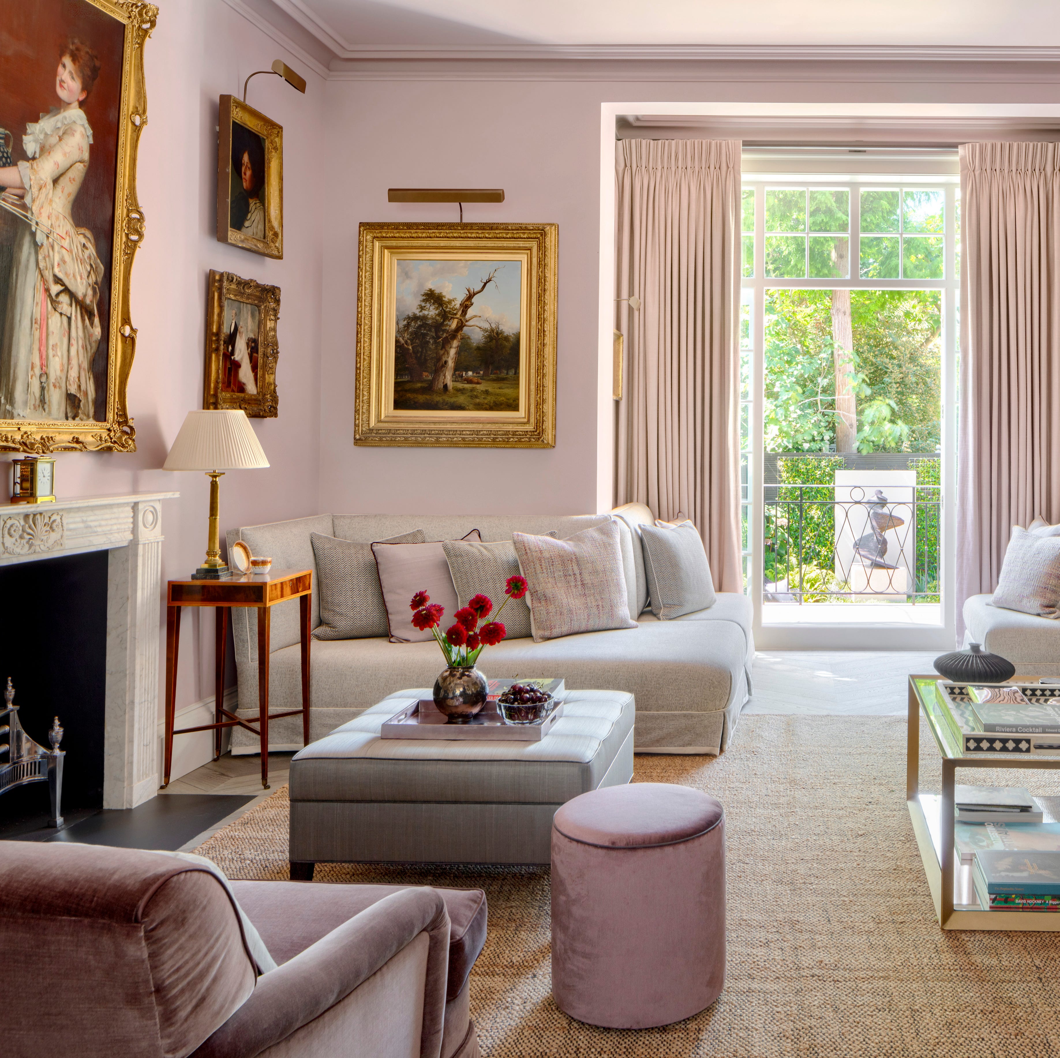
James F. Carter incorporated Benjamin Moore's Glacier White in a Georgian-style home's living room to maximize natural light from French doors. Jean-Louis Deniot brought an 18th-century Parisian apartment's boiserie to life with Benjamin Moore's River Reflection, a smoky gray, providing a classic backdrop for modern furnishings. Mark D. Sikes used a citron paint from Farrow & Ball in an Alabama home's living room, creating a fresh look with feminine chintz. A provincial home's living room features Farrow & Ball's Wimborne White, a warm off-white, to complement antique furniture and richly patterned curtains. Maureen Footer's living room in her apartment is painted in a striking lime green, contrasting with neoclassical furnishings, inspired by her research for "Dior and His Decorators." Mark D. Sikes also utilized Farrow & Ball’s Borrowed Light, a light blue, in a wood-paneled sitting room to make it feel bright and airy. Amanda Nisbet designed a Hamptons getaway with Benjamin Moore's Stonington Gray, a quiet seaside gray, to create a serene atmosphere. Kate Corsden's New England home features Farrow & Ball's Parma Gray, which shifts between lilac and cool blue, complementing Victorian features and exotic decor. Finally, Alden Lovelace painted her Florida home's walls in Benjamin Moore's Ballet White, a creamy gray, reflecting a love for antique furnishings and coastal style. Cathy Kincaid used Farrow & Ball's French Gray for cabinetry in a Manhattan apartment, giving the formal living room a relaxed feel, while Carolyn Malone used Farrow & Ball's Shaded White in an Atlanta home to highlight architectural elements.
#LivingRoomPaint #InteriorDesign #ColorIdeas #HomeDecor #PaintColors #DesignerTips #BenjaminMoore #FarrowAndBall #HomeImprovement #LivingRoomPaint #InteriorDesign #ColorIdeas #HomeDecor #PaintColors #DesignerTips #BenjaminMoore #FarrowAndBall #HomeImprovement
कुल 0 टिप्पणियाँ
 कोई टिप्पणी नहीं
आपको यह भी पसंद आ सकता है
Designers Swear By These 65 Living Room Paint Colors

55 Living Room Color Ideas That Will Take Your Space from Drab to Fab

Designer-Approved Living Room Colors That'll Make You Feel Happier

4 Living Room Paint Colors That Are So Outdated, According to Designers


10 Timeless Living Room Paint Colors Designers Swear By

Experts reveal the best living room paint colours to transform every space

The Best Living Room Paint Colors, According To Designers

These Living Room Paint Colors Are a Total Mindset Shift
The 60 Most Popular Living Room Paint Colors Right Now

The Best Living Room Paint Colors, According To Designers
5 living room paint colors going out of style in 2025
colorful living rooms (no beige allowed)!
The 15 Best Paint Colors for Your Living Room, According to Interior Designers
Jewel Tones Are Trending for Living Room Paint Colors, According to Designers
5 colors that will make your living room feel happier, according to interior designers

11 Paint Colors That INSTANTLY Make Your Home Look "Expensive," According to Designers
Listen Up: These Are the Best Paint Colors for Your Living Room
7 Popular Paint Colors for the Living Room
These are interior designers' favorite color combinations for living rooms – from neutral and calming to bold and playful
51 Living Room Color Schemes That Will Bring Your Space to Life