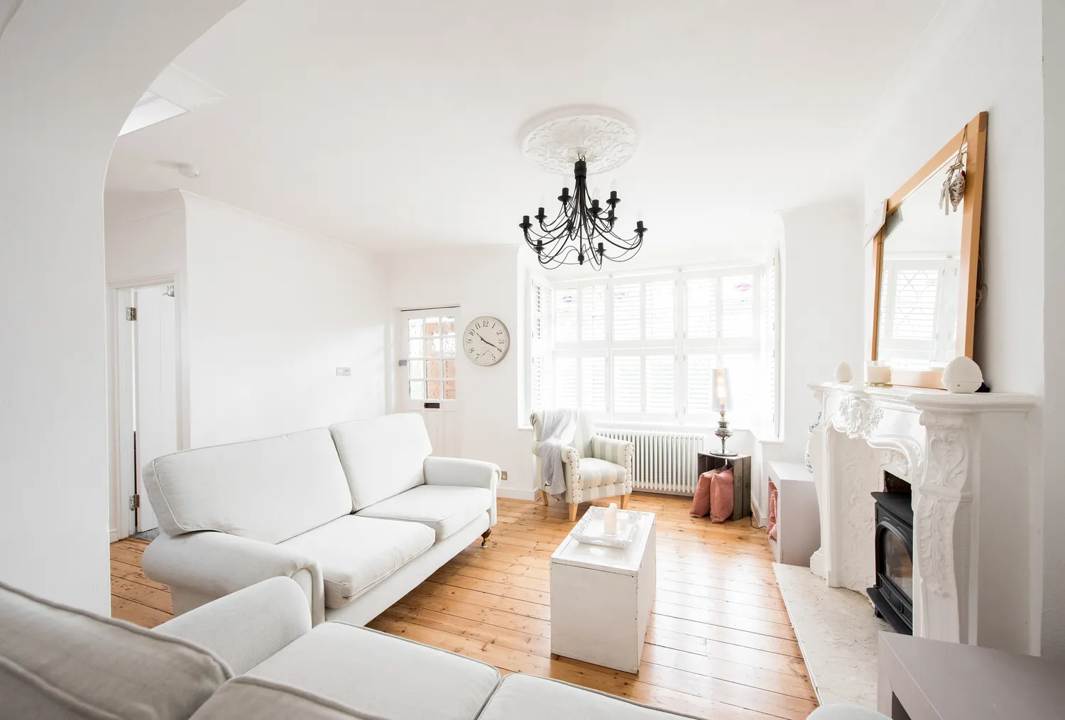
1/2
We Asked Designers Which Living Room Paint Colors People Regret Most—And We're All Guilty
Homeowners often find themselves regretting certain living room paint choices due to factors such as coolness, harshness, or overwhelming vibrancy. While individual preferences vary, a pattern of commonly regretted shades emerges. Three design experts highlight specific colors that tend to disappoint over time.
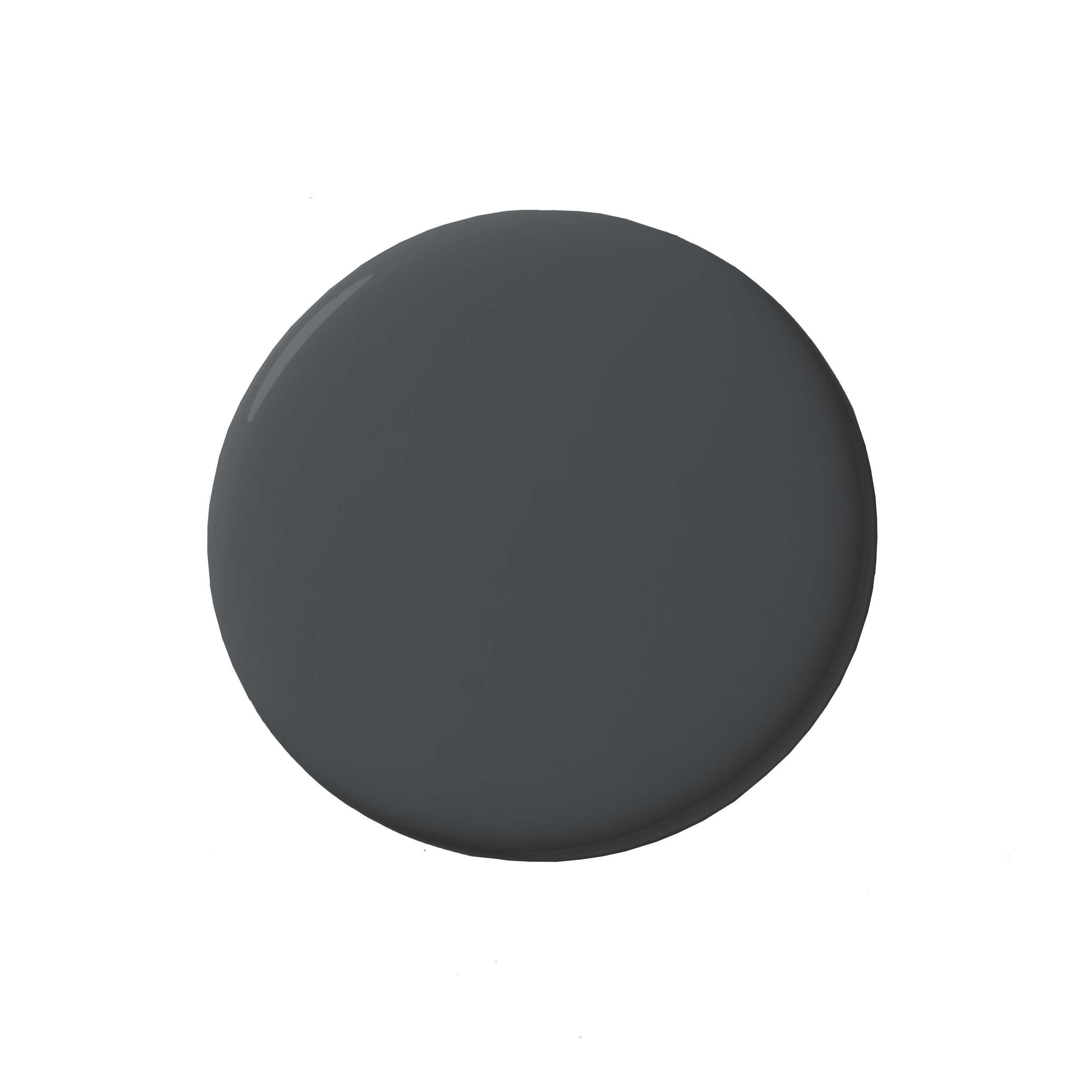
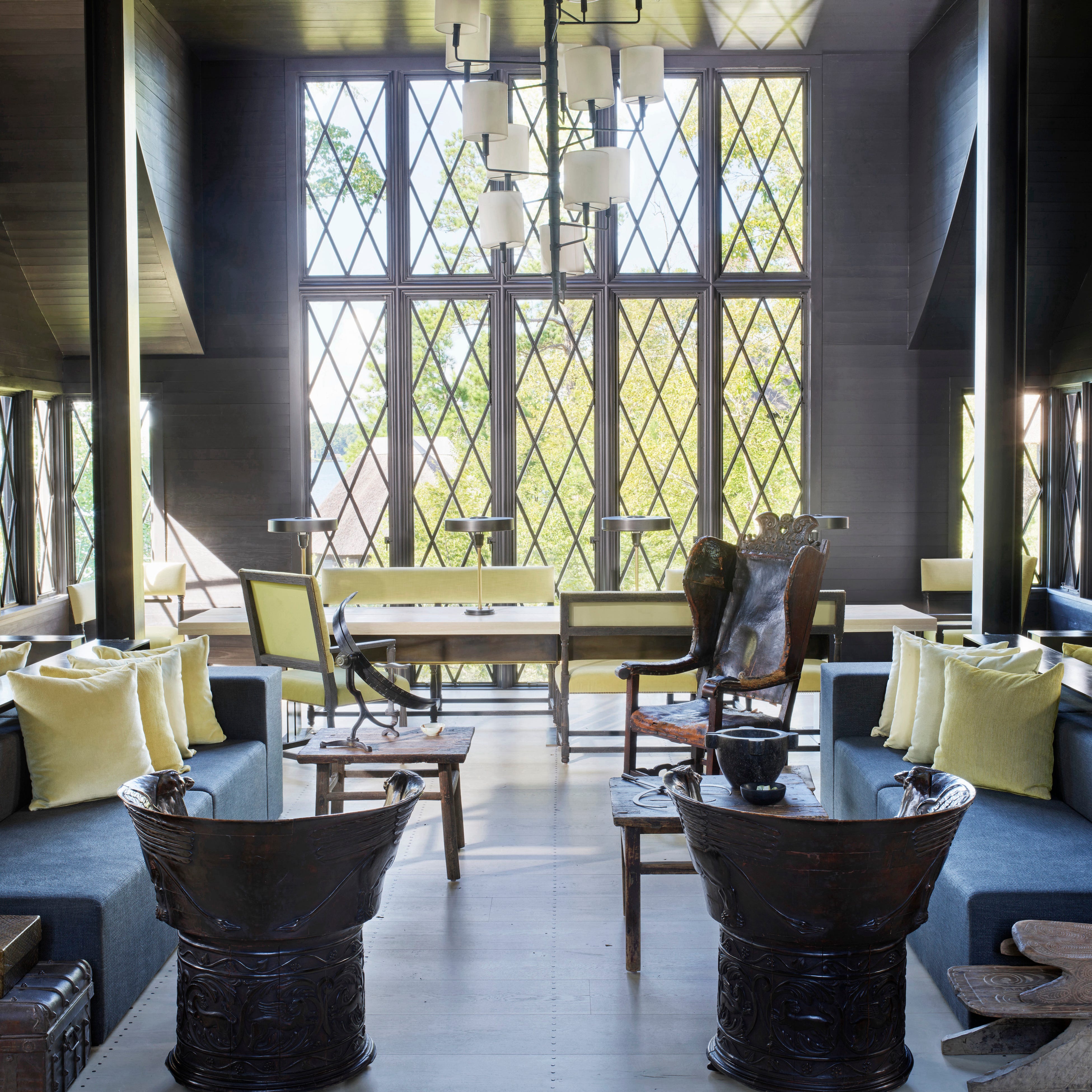
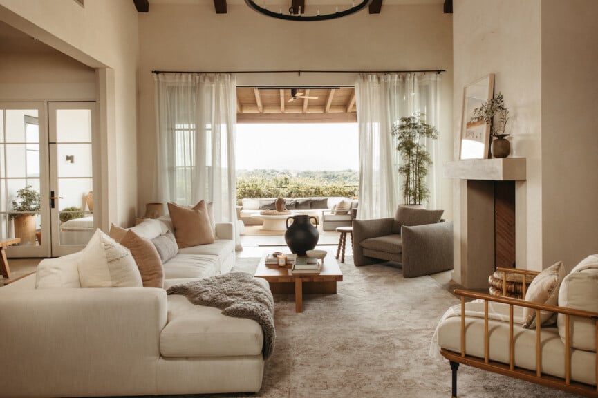
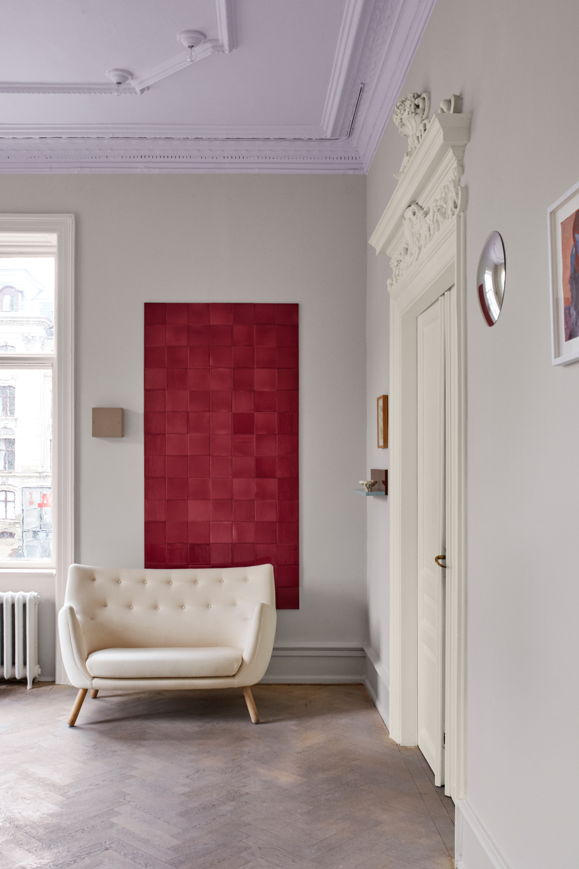
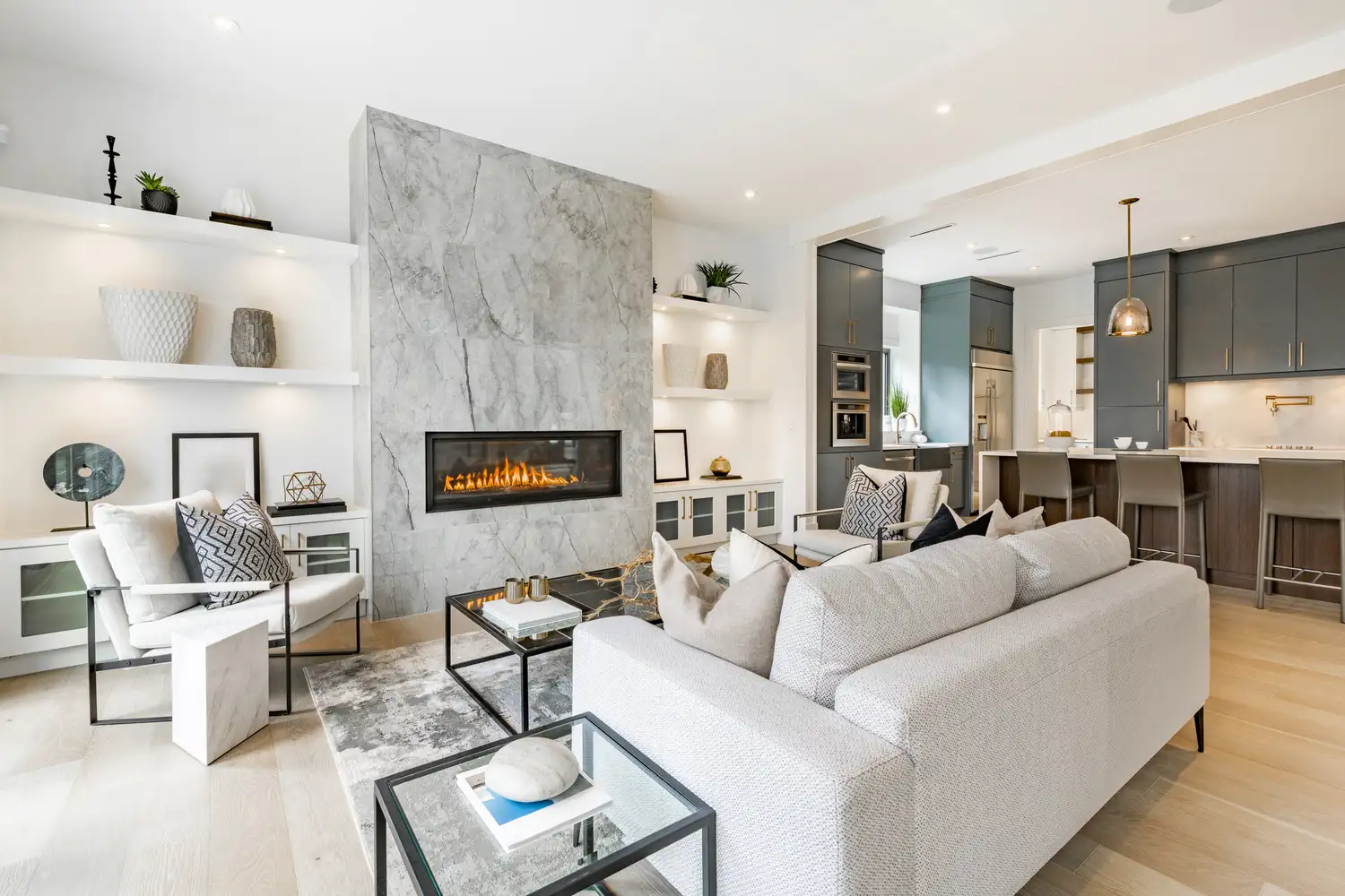
Cool gray is frequently cited as a regrettable choice. Once a popular neutral, its cool undertones can make a living room feel sterile, gloomy, or lifeless, especially when furniture and lighting are introduced. What might appear sleek in curated online images often translates to an uninviting atmosphere in a real home. To avoid this, designers recommend opting for warmer neutrals like greige or taupe, which feature brown and beige undertones, fostering a more welcoming environment.
Bright colors such as reds and oranges, while appealing for their energy, often lead to regret in living rooms. These highly stimulating hues, while suitable for commercial spaces, can subconsciously trigger anxiety and restlessness, hindering relaxation. For those seeking vibrancy without the intensity, a pale to medium yellow with a hint of gray can provide a cozy, balanced, and timeless feel. Alternatively, neutral colors with yellow undertones offer a similar warm ambiance.
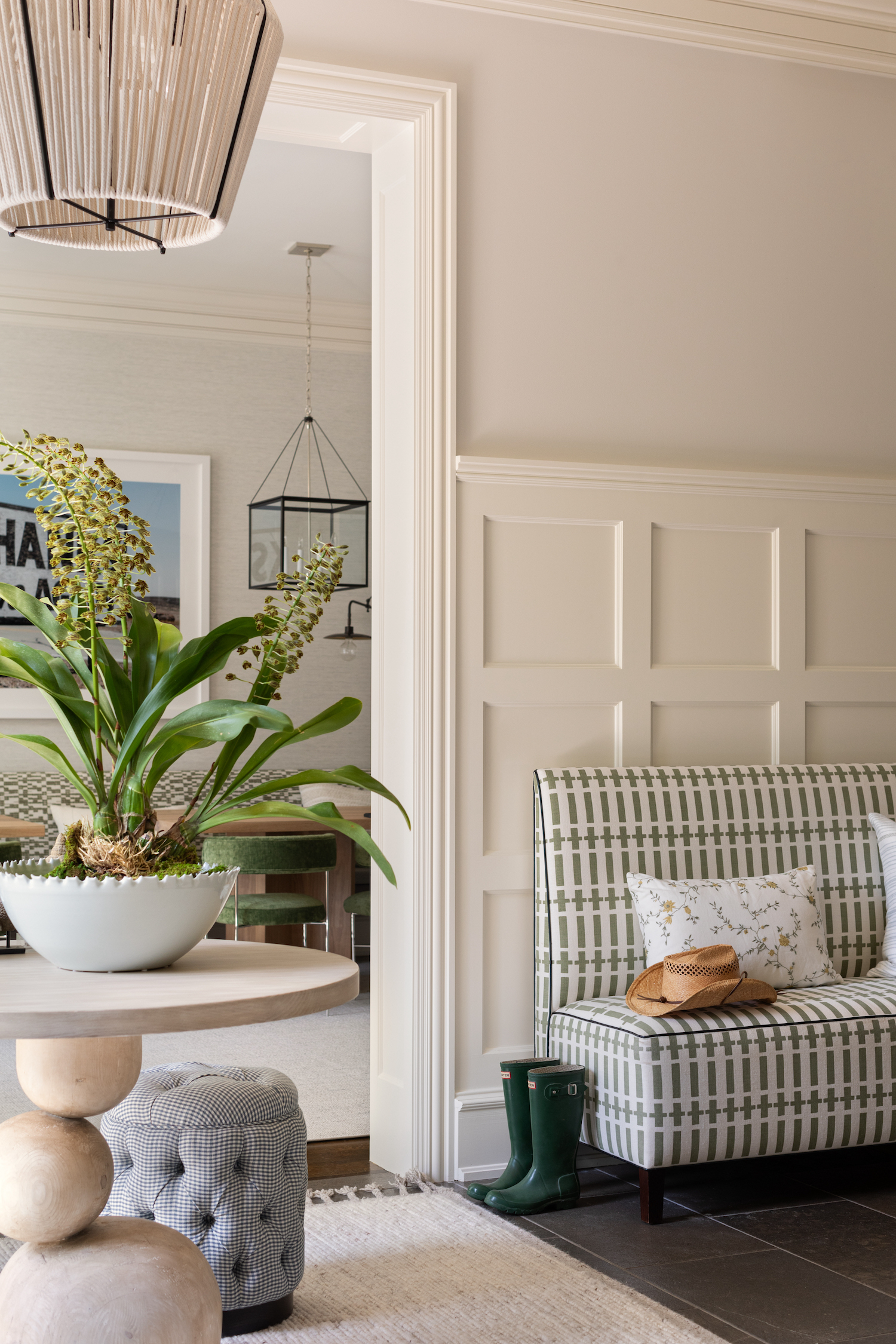
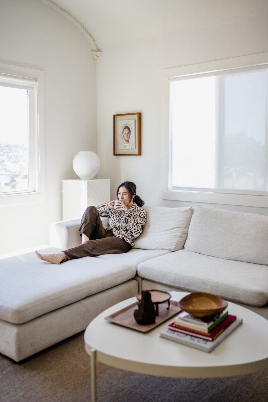
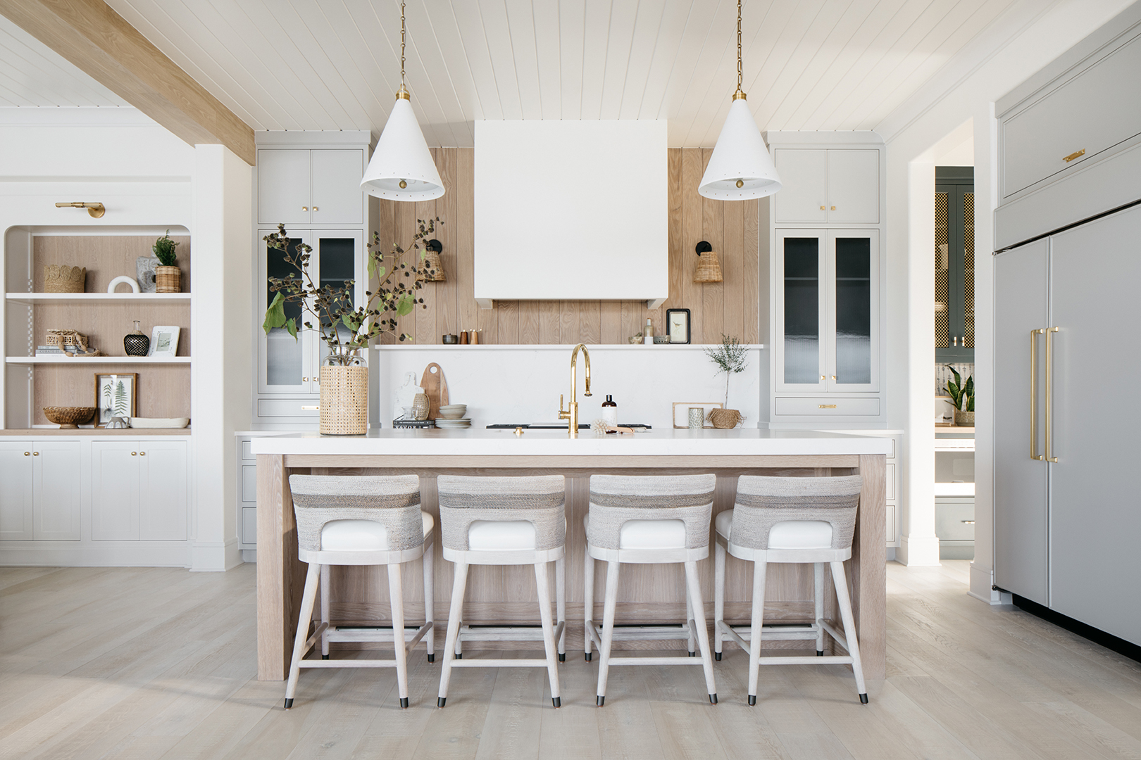
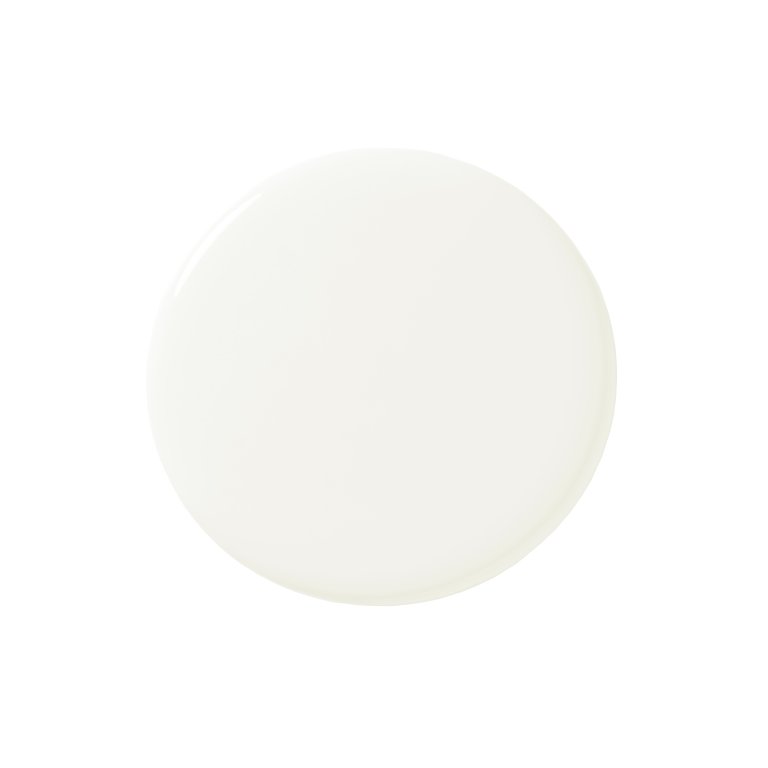
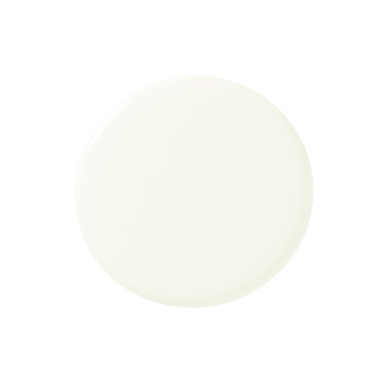
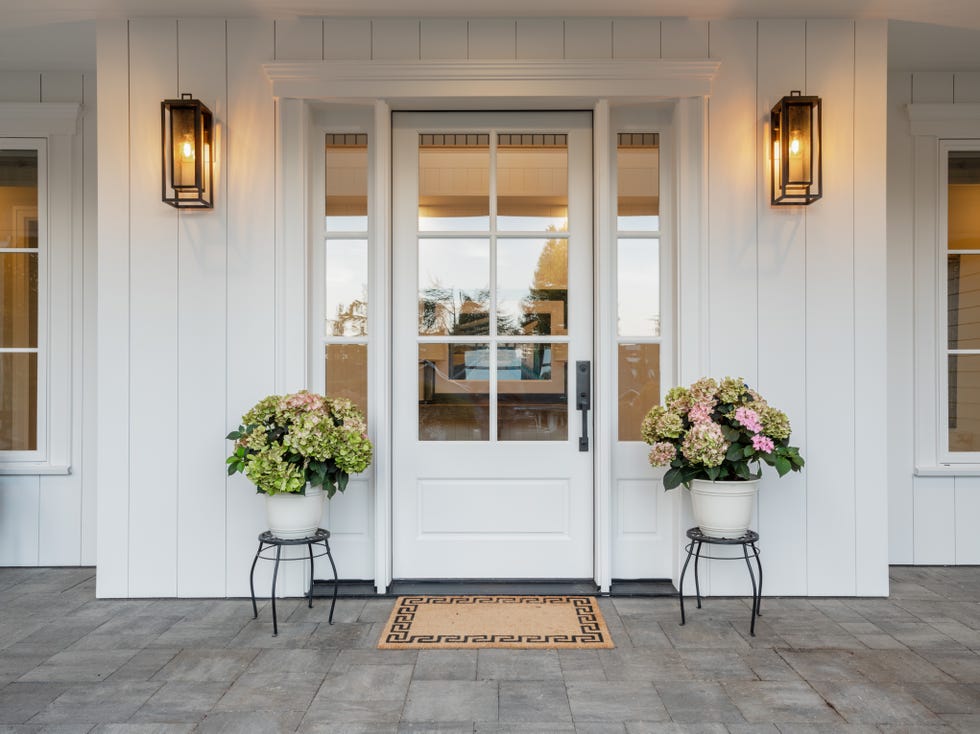
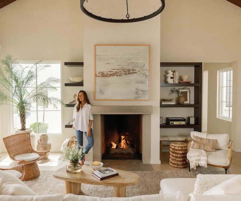
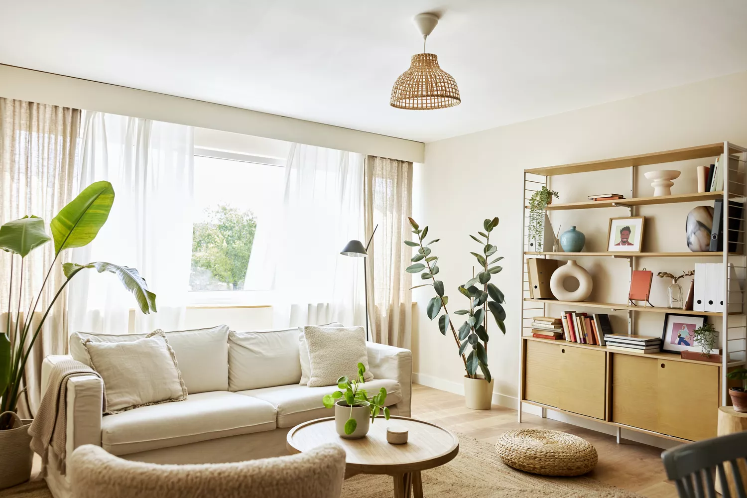
Surprisingly, bright gallery-style white is also a commonly regretted color. Although seemingly a safe and versatile option, a harsh, reflective white can make a living room feel cold and unwelcoming, particularly in spaces with limited natural light. It also tends to highlight imperfections on walls. Instead of sterile white, designers suggest softer whites with creamy undertones, which introduce both freshness and warmth.
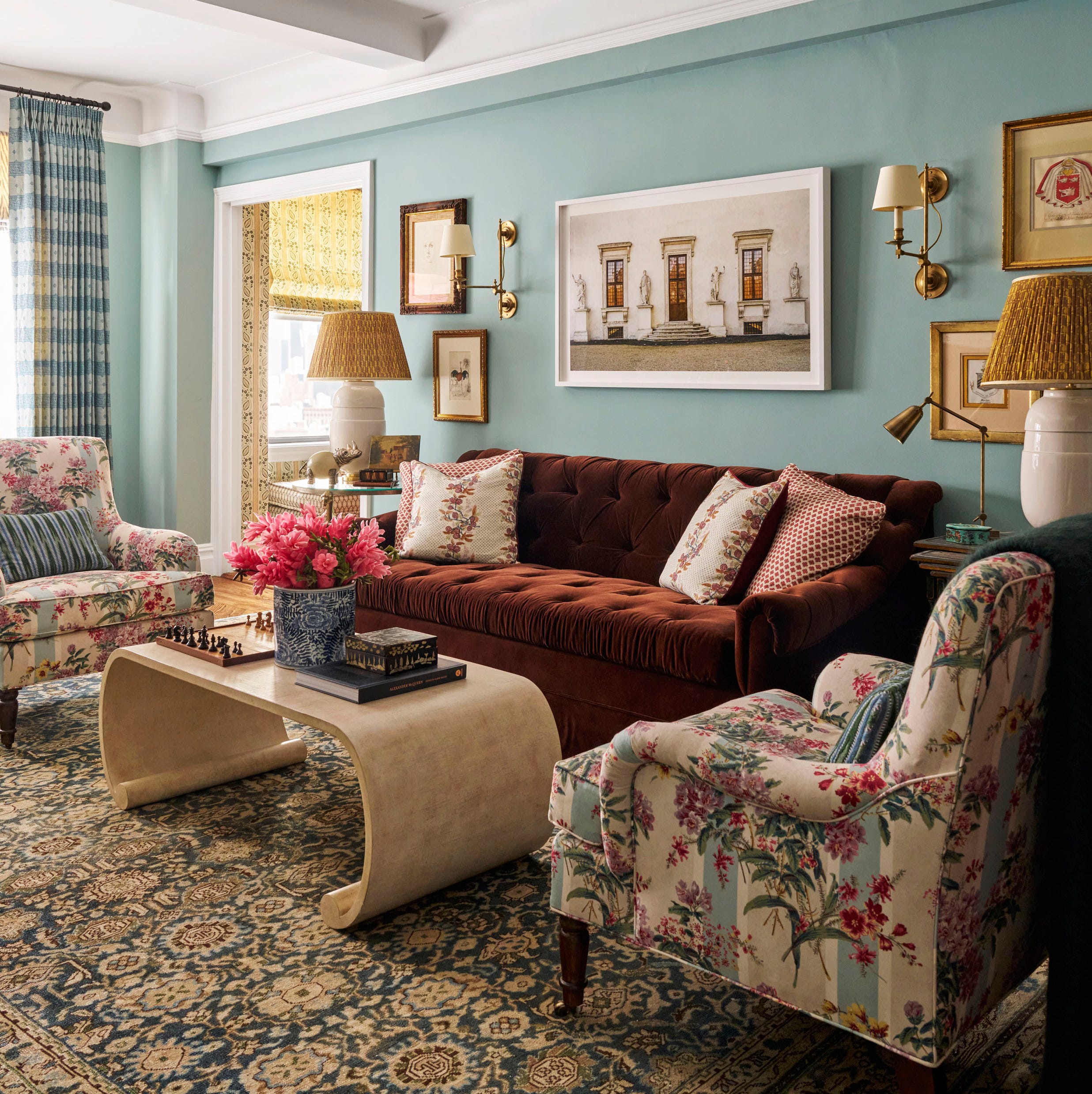
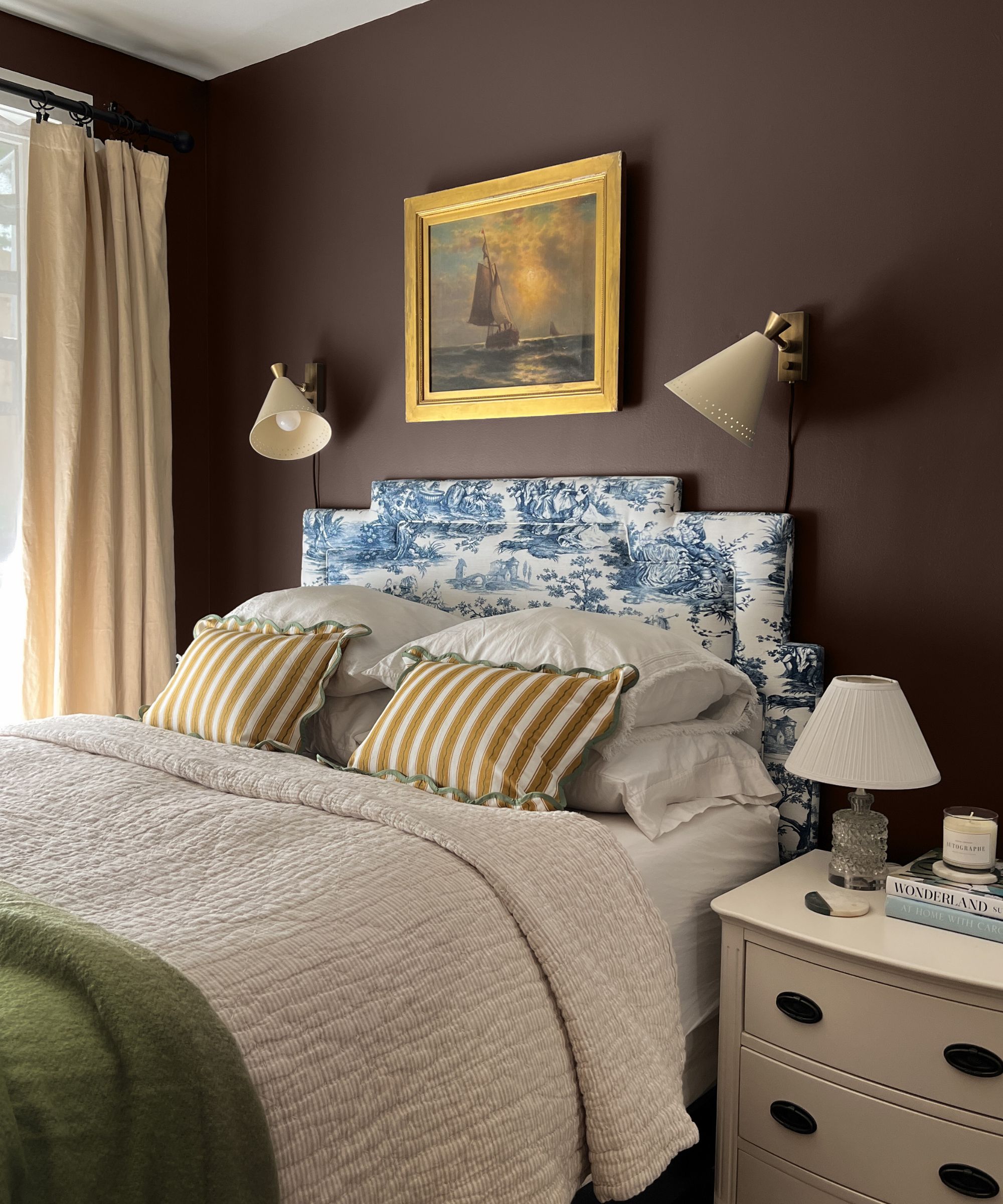
Dusty blue, a cool-toned shade of blue, is another color homeowners often regret. Despite blue's general versatility, dusty blue can quickly appear dated and one-dimensional, contributing to a cold and sterile atmosphere rather than a comforting one. Unlike more timeless blues like navy, dusty blue lacks a certain sharpness and freshness. When considering blues or other neutrals, selecting those with warm or red/orange/yellow undertones is advised to prevent a cool and uninviting aesthetic.
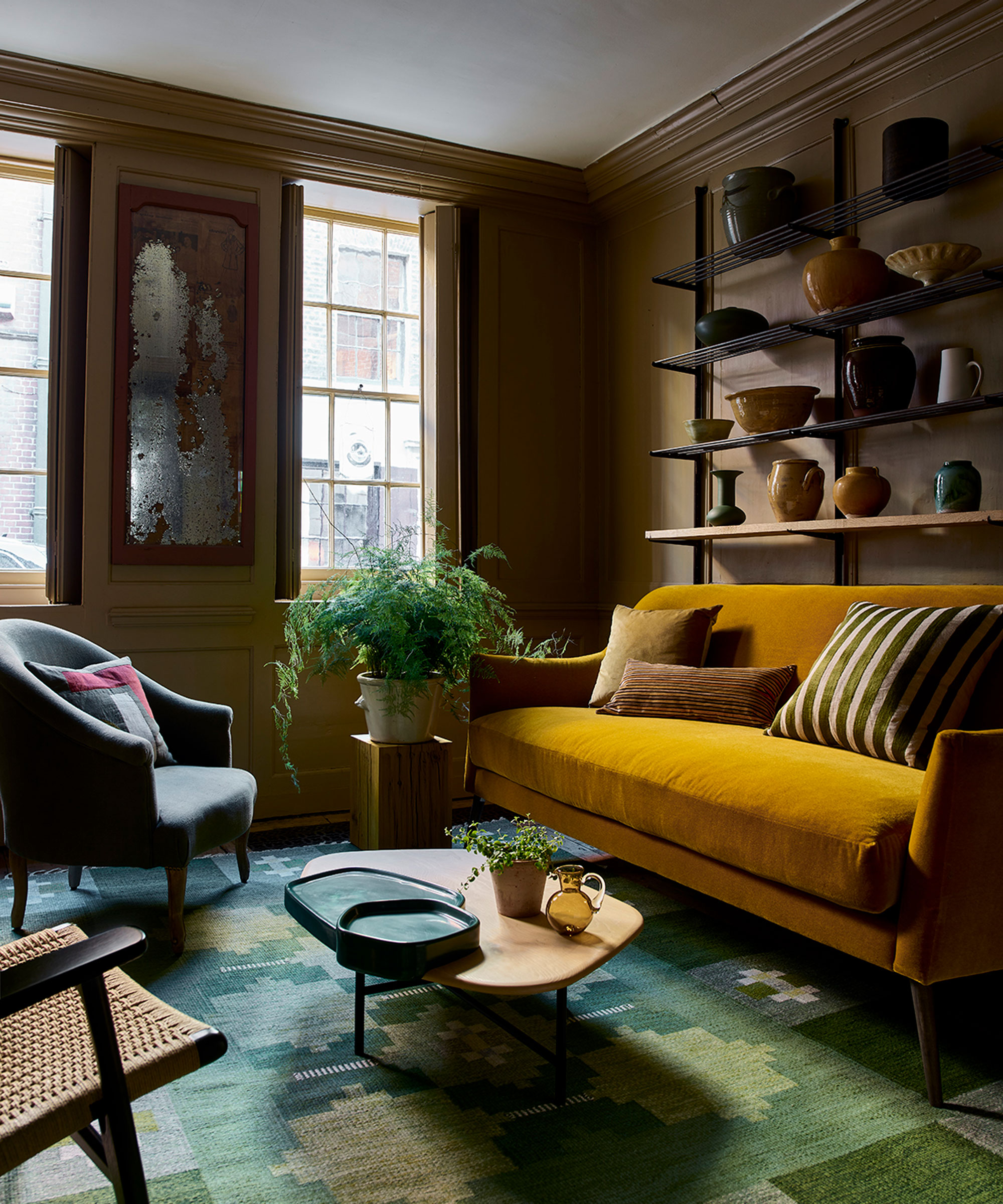
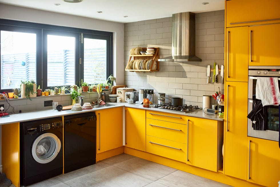
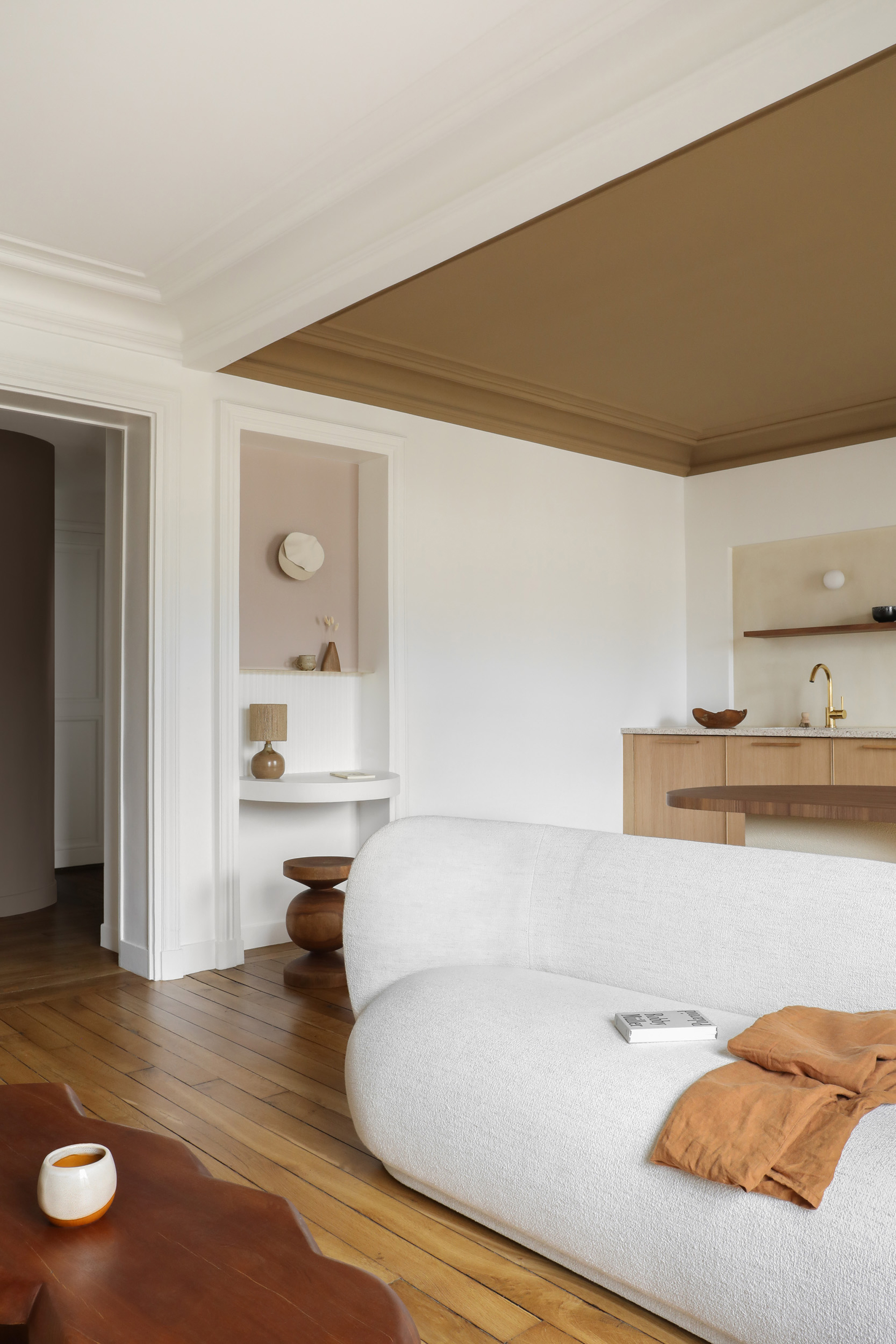
Similarly, bright yellow, much like red and orange, is chosen for its cheerful nature but can become overwhelming when applied to an entire living room. Bold, clear yellows can read as loud and overly intense, reflecting strangely on skin tones and furniture, potentially making occupants appear sickly. To achieve a similar warm ambience without the harshness, softer options such as buttercream, wheat, or muted ochre are recommended, offering warmth without cartoon-like vibrancy.
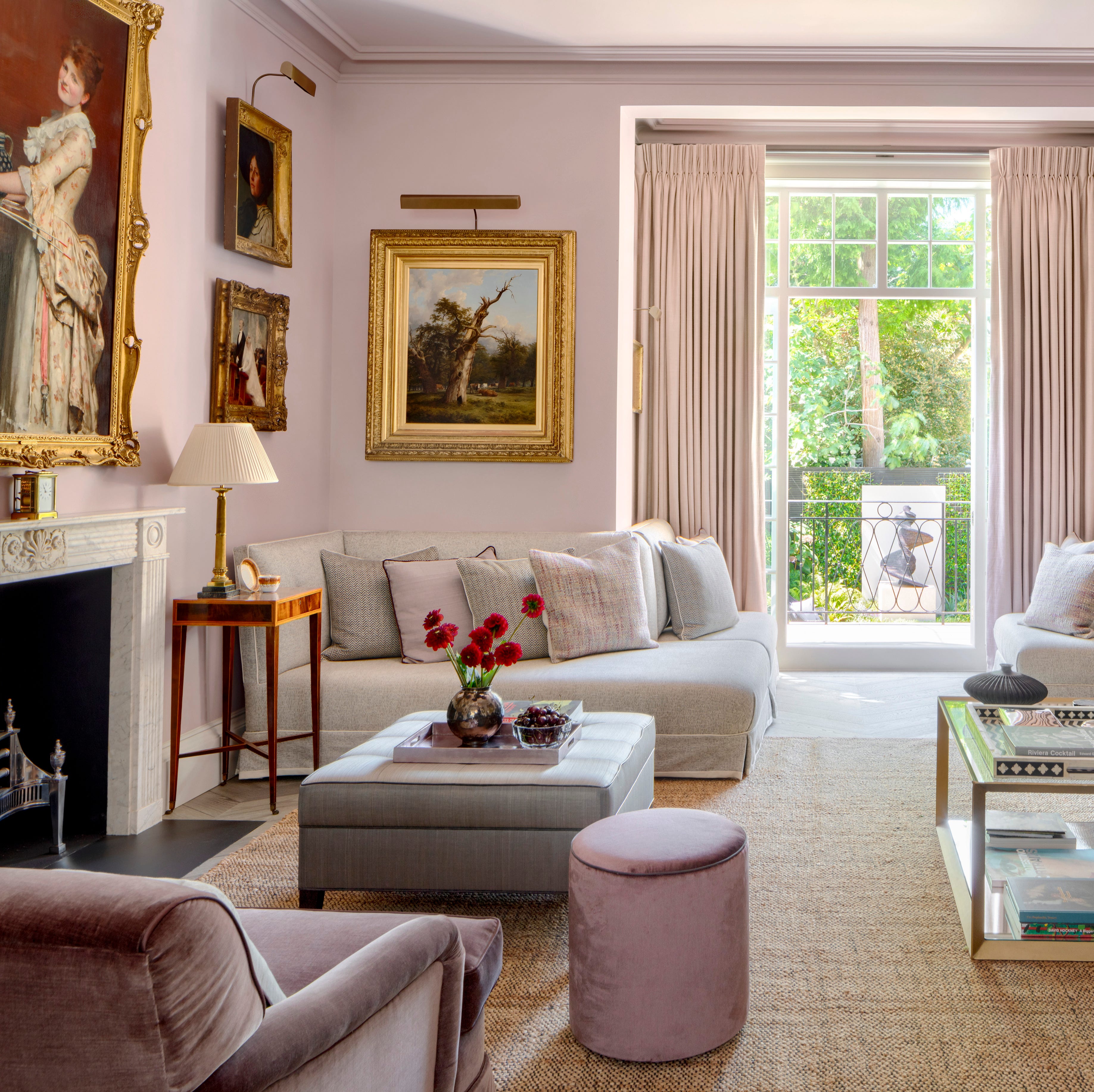
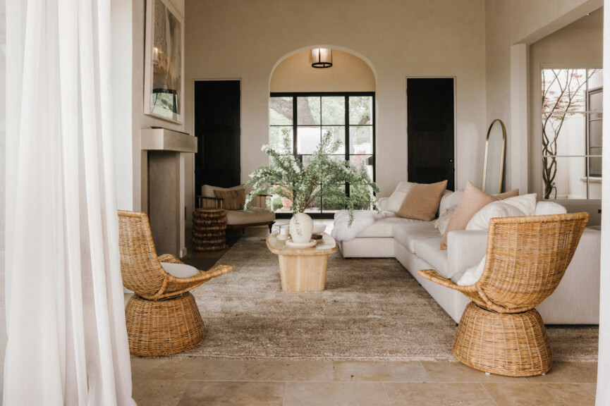
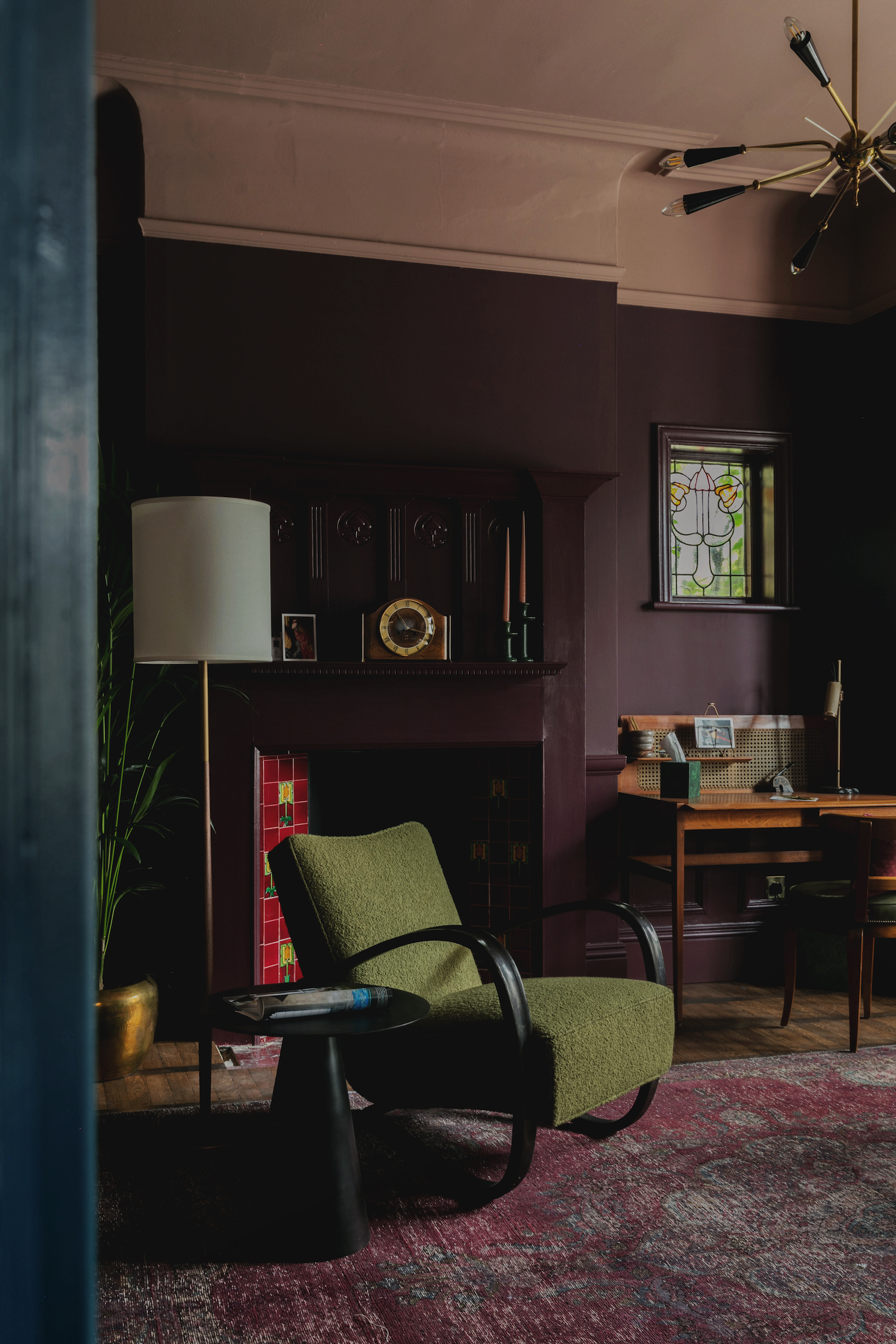
Finally, cool greige, a blend of gray and beige, has also fallen out of favor, particularly shades with cool undertones. Similar to cool gray and dusty blue, these greiges can make a room feel bland, sterile, and cold rather than warm and inviting. To remedy this, designers suggest replacing them with warmer alternatives, citing examples like Vandyke Brown, Smokehouse, Tony Taupe, Taupe Tone, Mushroom, and Universal Khaki from Sherwin-Williams. These choices aim to create a more inviting and less regrettable living space.
#PaintColors #LivingRoomDesign #InteriorDesign #HomeDecor #ColorPsychology #NeutralColors #DesignTrends #HomeImprovement #PaintColors #LivingRoomDesign #InteriorDesign #HomeDecor #ColorPsychology #NeutralColors #DesignTrends #HomeImprovement
Hay 0 comentarios en total
 Aún no hay comentarios
También te puede gustar

Interior design experts reveal the colour rules you should be breaking
Designers Swear By These 65 Living Room Paint Colors


What are the worst colors to paint a room? The shades experts say you should never use

We Asked Designers Which Paint Colors Make a Room Feel Stuffy—And We're Repainting ASAP

We Asked 20 Designers for Their Favorite Paint Colors for Windows

Designers Say This Is the #1 Living Room Mistake Everyone Makes

We Asked Designers Which Paint Colors Homeowners Always Regret—These 5 Came Up the Most
12 Color Schemes That Are Popping Off Right Now, According to Designers

7 'Unhappy' Colors That Color Psychology Experts Would Never Paint Their Walls

We Asked a Designer Which Bathroom Paint Colors People Always Regret—These 4 Came Up the Most
5 Times Interior Designers Used Colorful Tile Grout That Make Me Never Want to Choose White Again
8 Surprising Colors That Will Decrease Your Home's Value, According to Experts
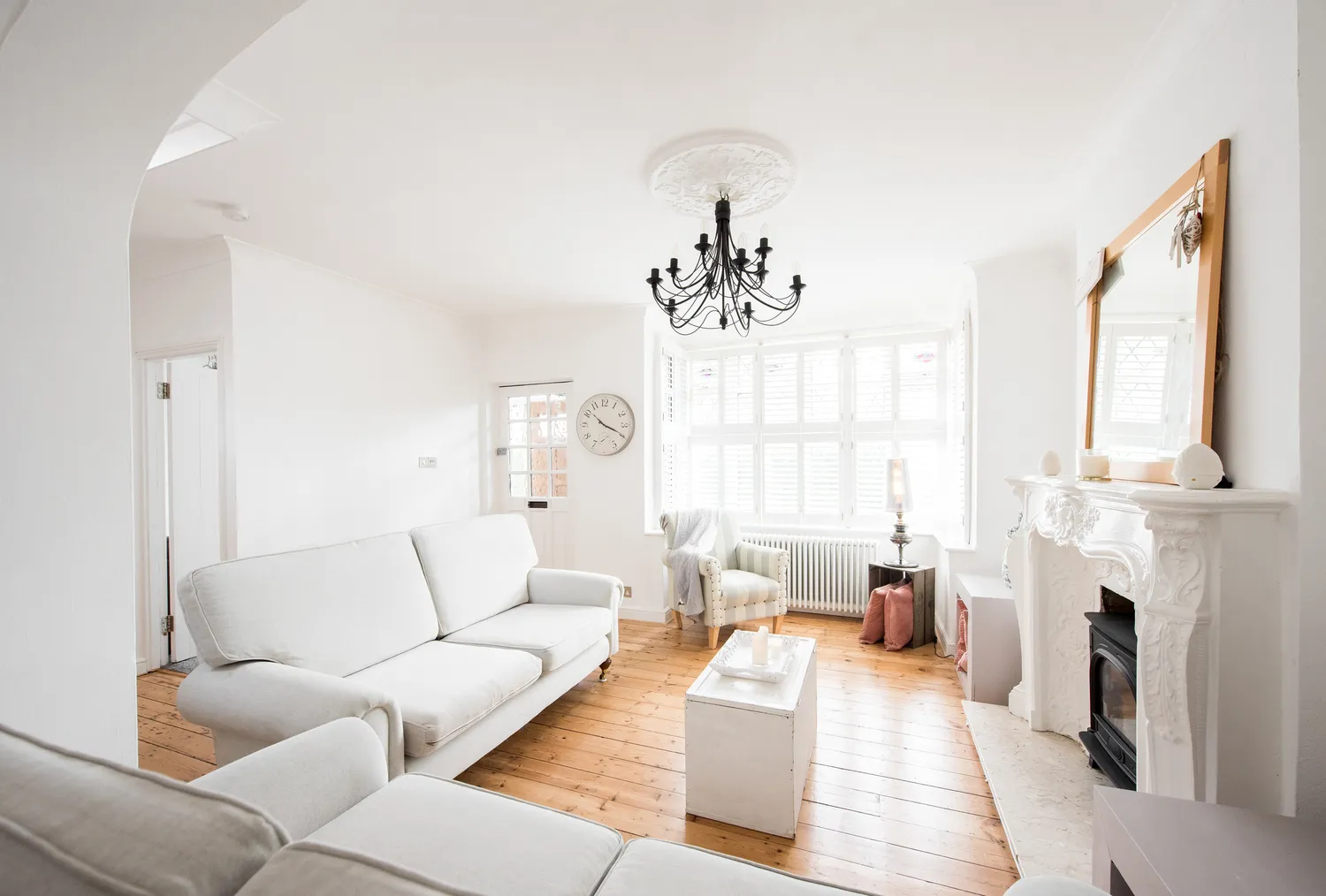
We Asked Designers Which Living Room Paint Colors People Always Regret—These 6 Came Up the Most
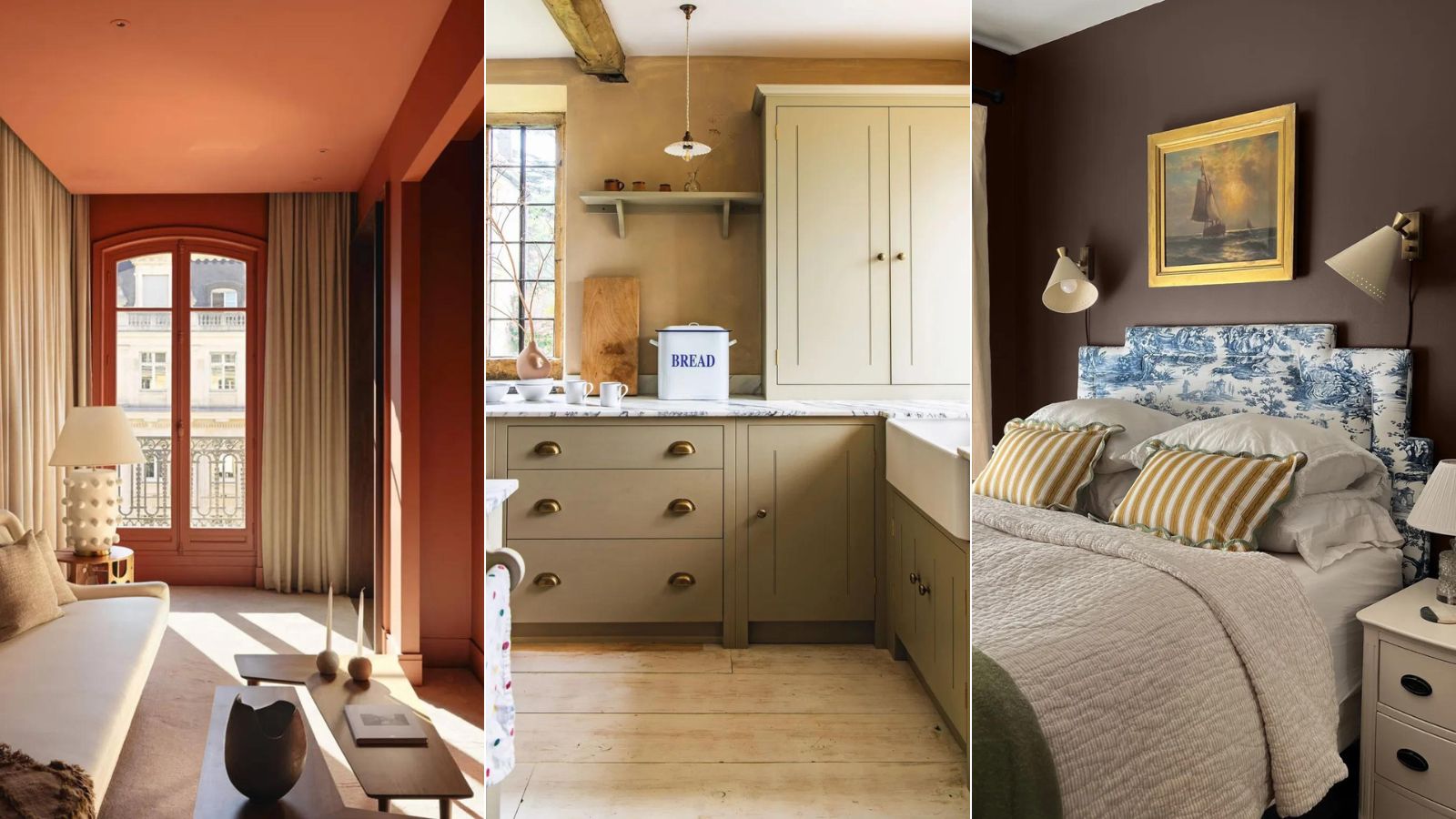
5 'ugly colors' that I'll be decorating with in 2024 – these undesirable colors will trend this year
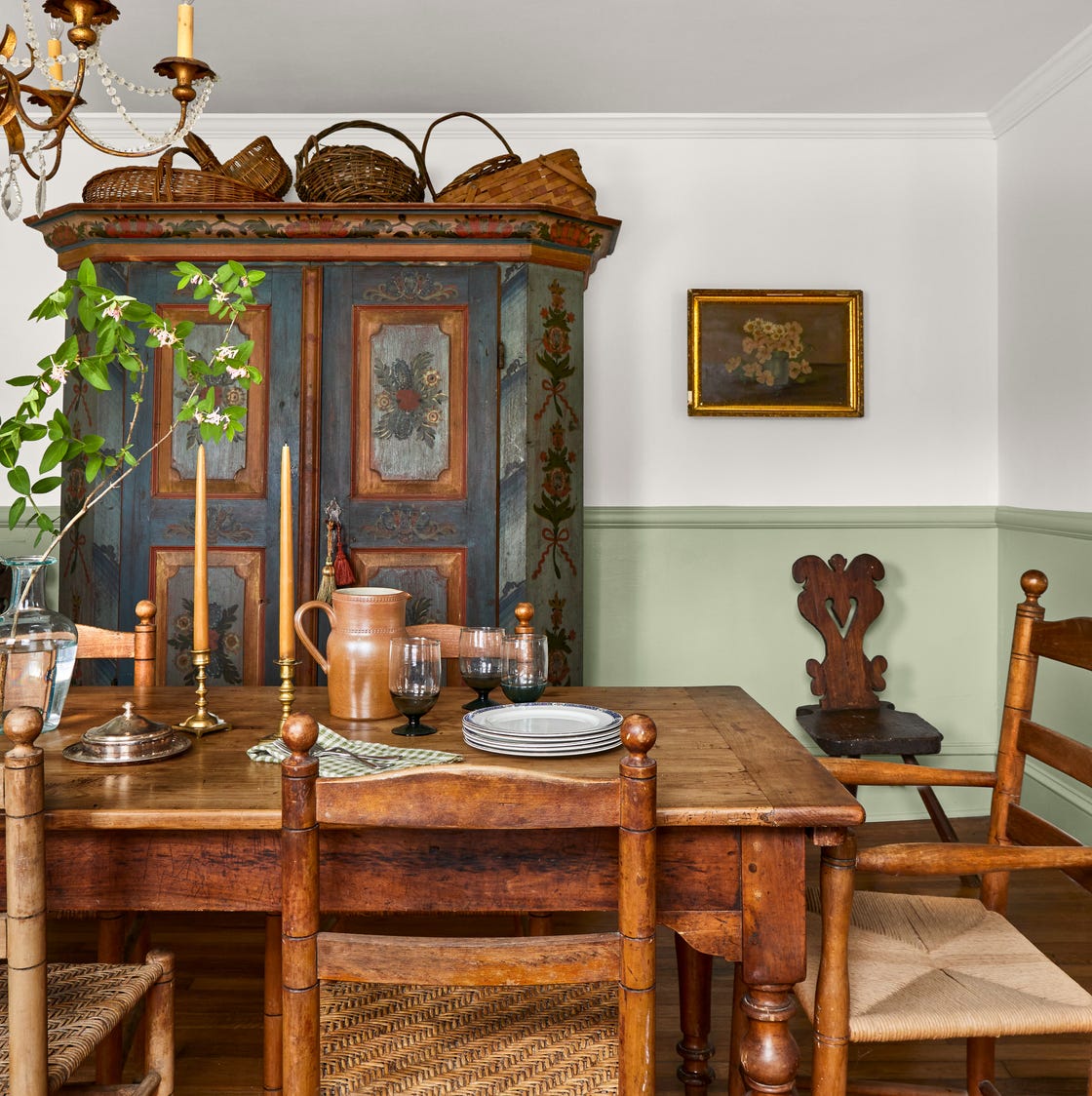
We Asked 6 Interior Designers for the One Antique They Use in Every Home
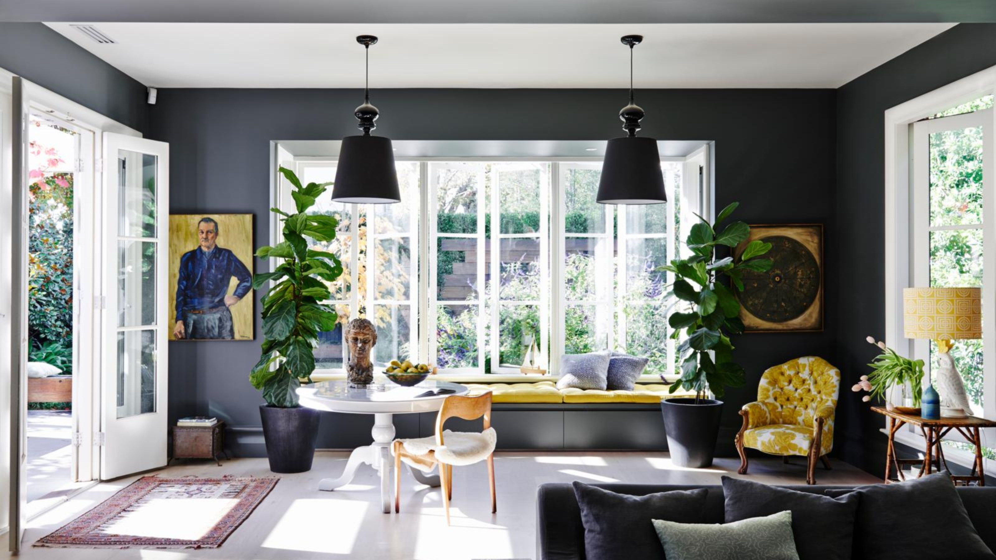
4 Times Designers Say You Definitely Shouldn't Paint Your Walls and Ceiling in the Same Color

4 Interior Designers Share the Biggest Paint Color Trends Right Now (and What’s Out!)
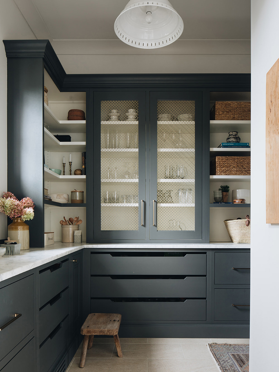
The Paint Color That All This Designer's Followers Ask About | domino


Experts reveal the best living room paint colours to transform every space

We Asked Designers to Pick the Most Timeless Living Room Paint Color—and They Agreed