1/6
What are the worst colors to paint a room? The shades experts say you should never use
Choosing the right paint color for a room is a complex decision, even for seasoned professionals, as it significantly impacts the atmosphere and perception of a space. Many factors influence this choice, including the room's size and shape, the amount and direction of natural light, and the emotional response a color evokes. Interior designers, decorators, and color psychologists highlight certain colors that, when used improperly, can create an undesirable environment.
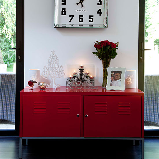
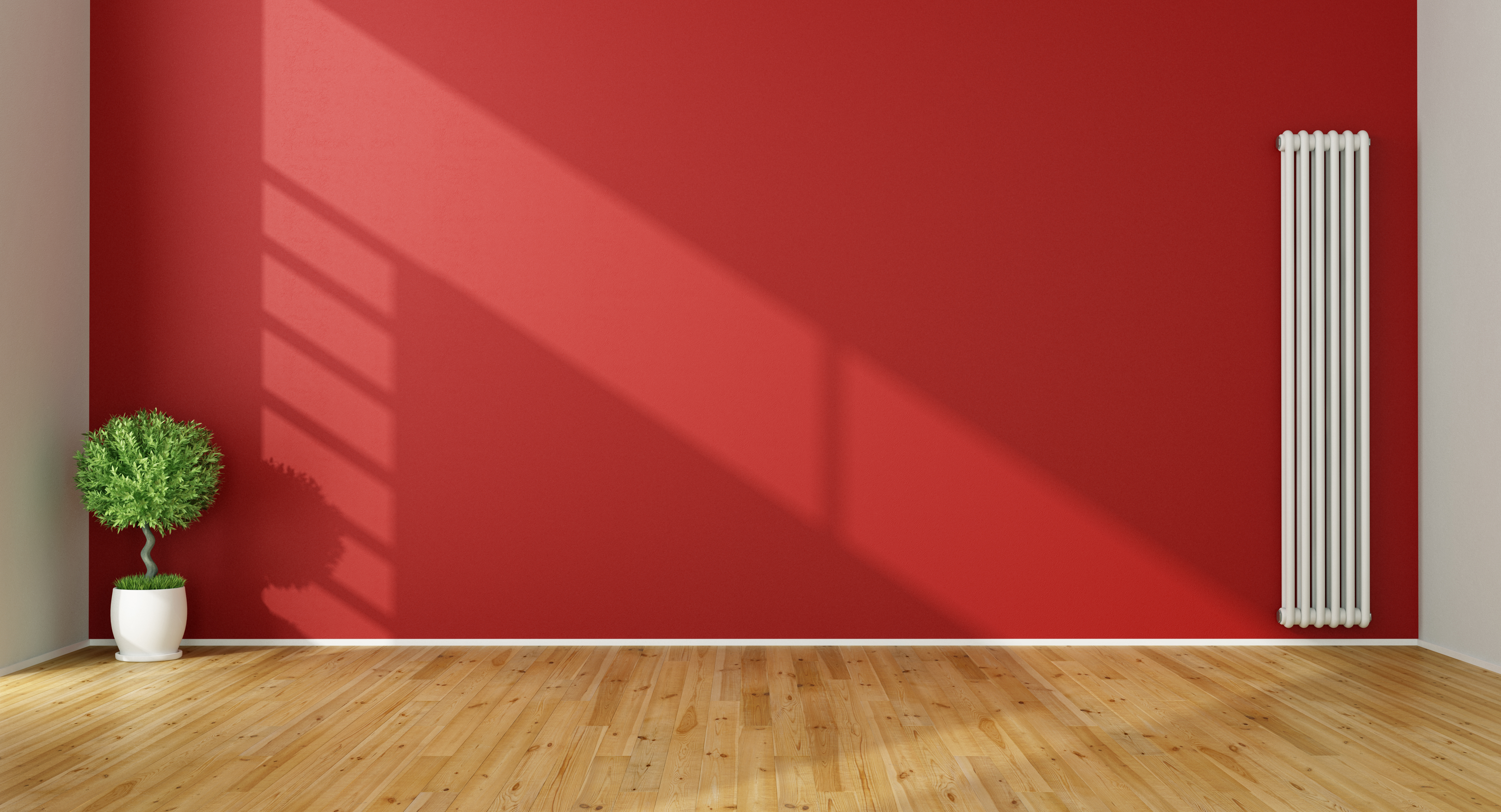
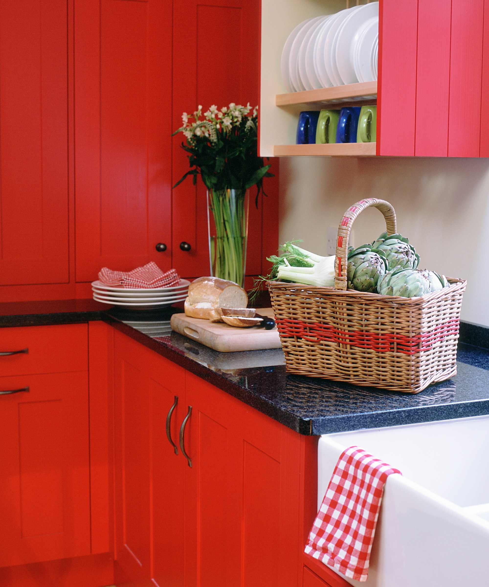
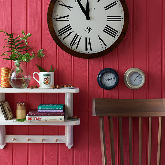
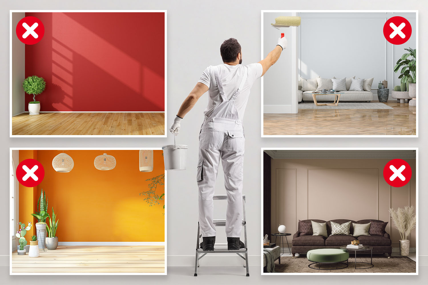
One such color is red, often considered too intense for most spaces and historically linked to stress. Psychologically, red can elevate heart rate, body temperature, and heighten senses, akin to stress responses. Karen Haller, a color psychology specialist, notes that red can even be associated with anger. However, the impact of red is highly personal, and some designers, like Chad Dorsey, find deep, earthy reds soothing in monochromatic applications, particularly in less-frequented, hardworking areas where their intensity can be managed.
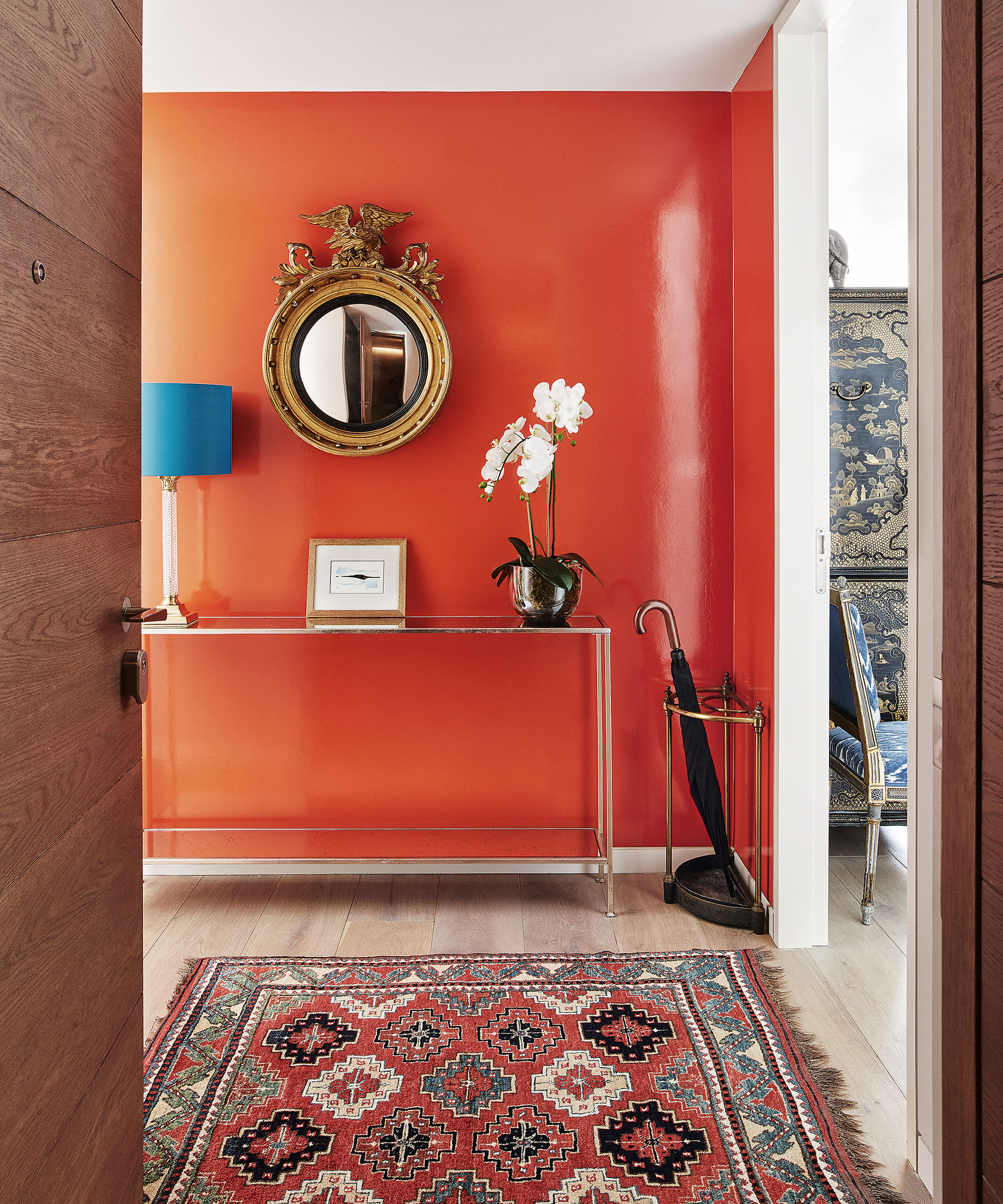
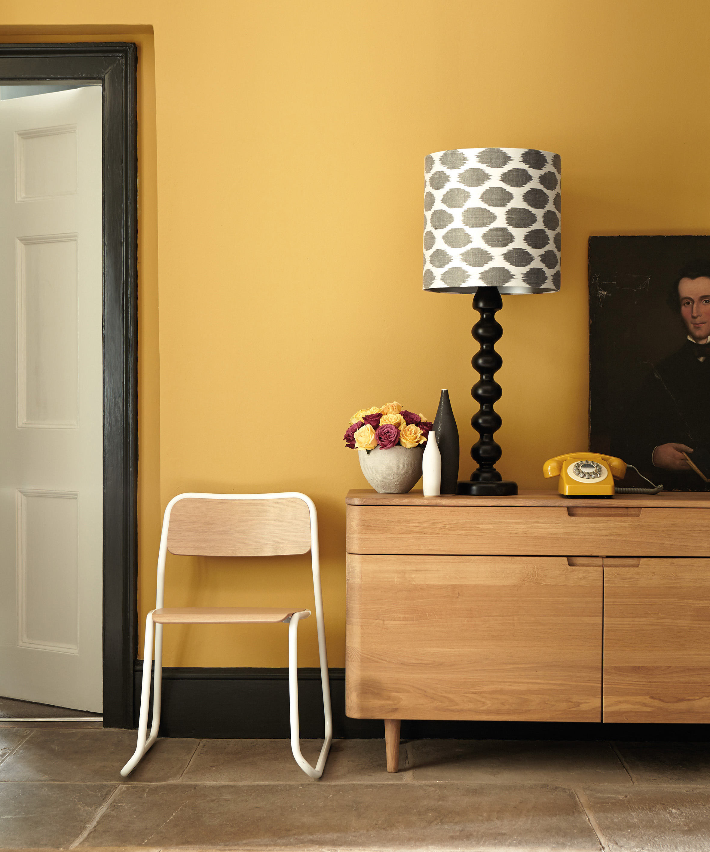
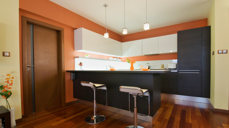
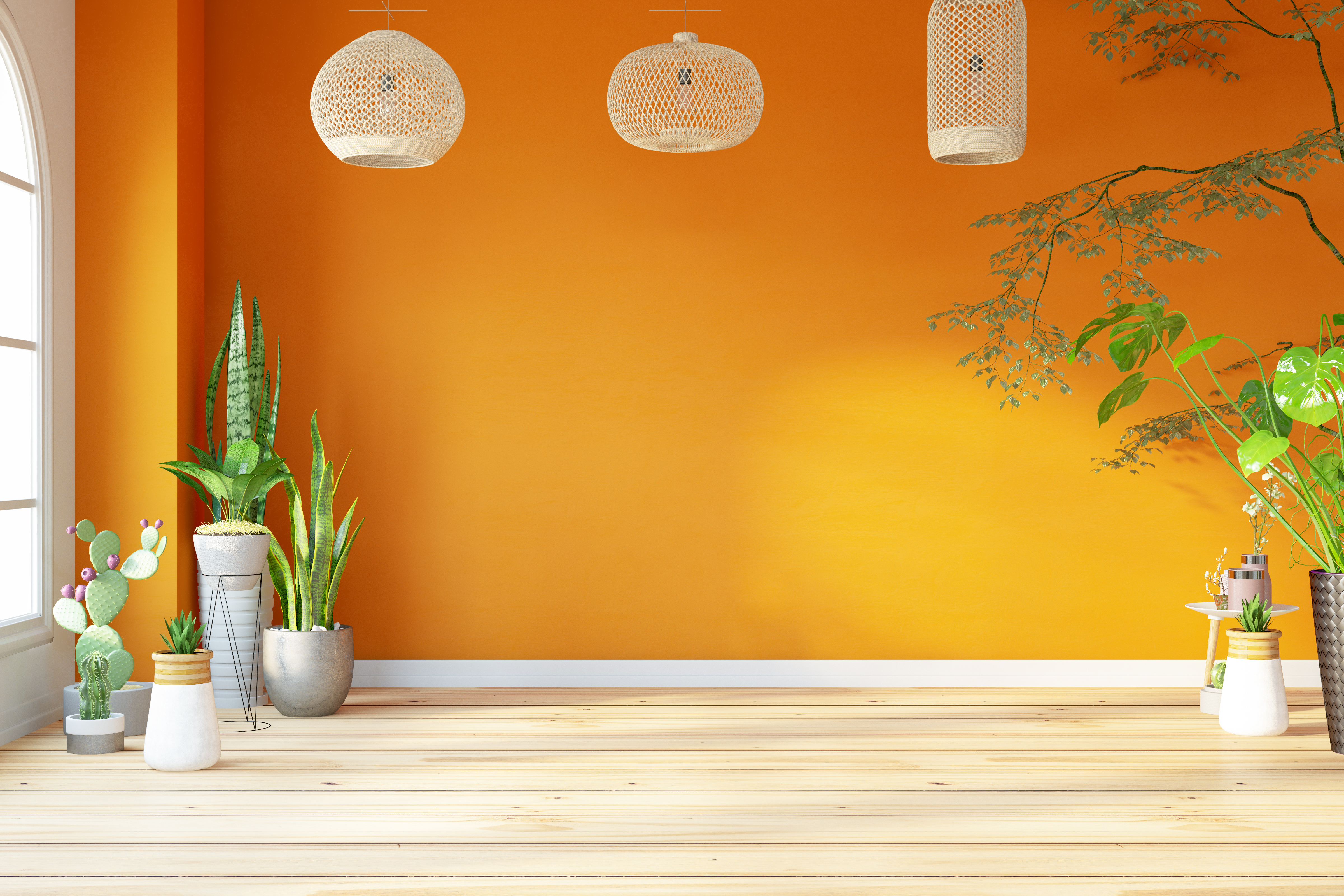
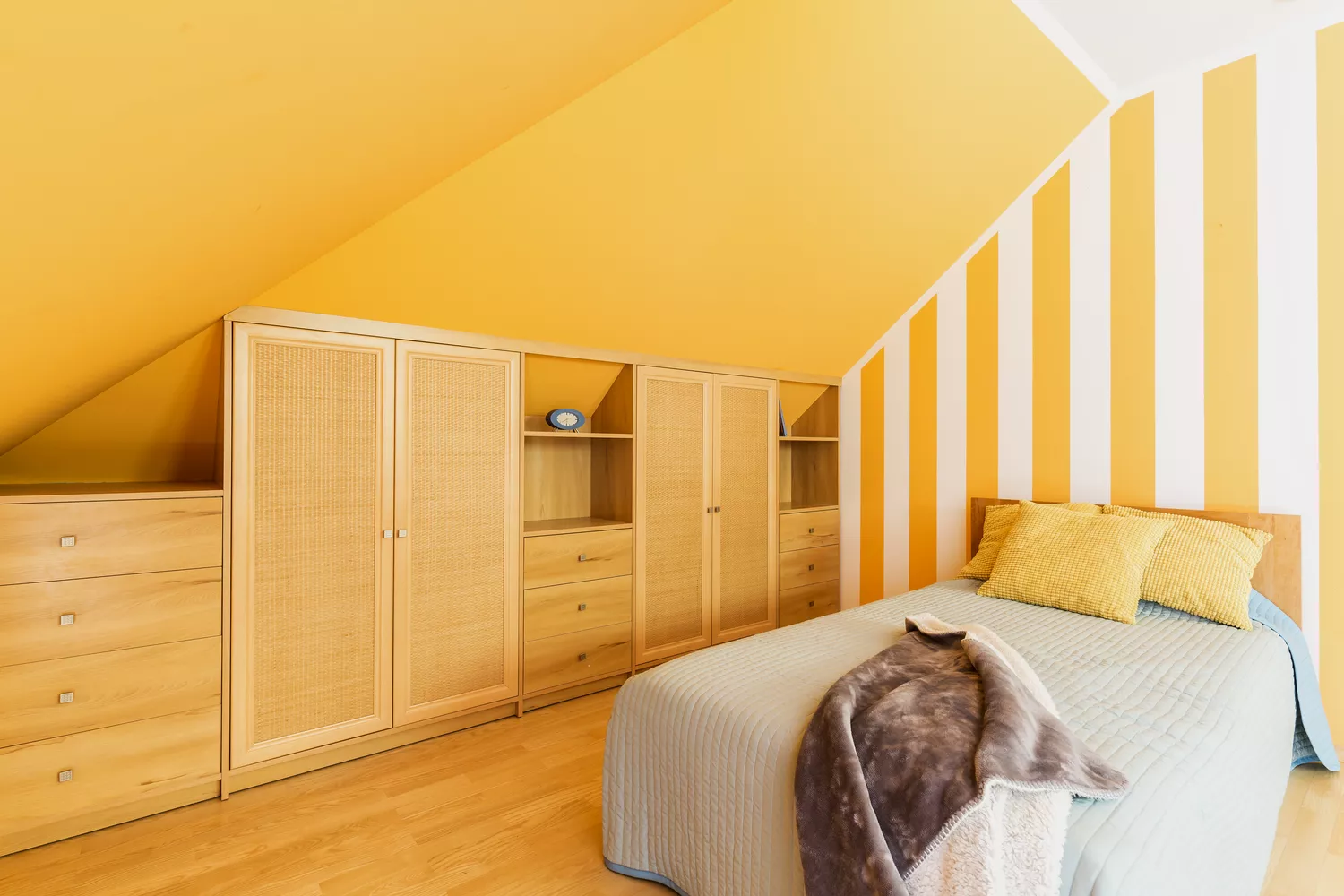
Orange is another color that demands caution due to its stimulating nature. While it can add a playful touch, its overstimulating qualities make it unsuitable for restful areas such as bedrooms, especially children's rooms. Color psychologists suggest that orange can alter physiology and hormone balance, promoting wakefulness and an overactive imagination, making it a poor choice for stress reduction.
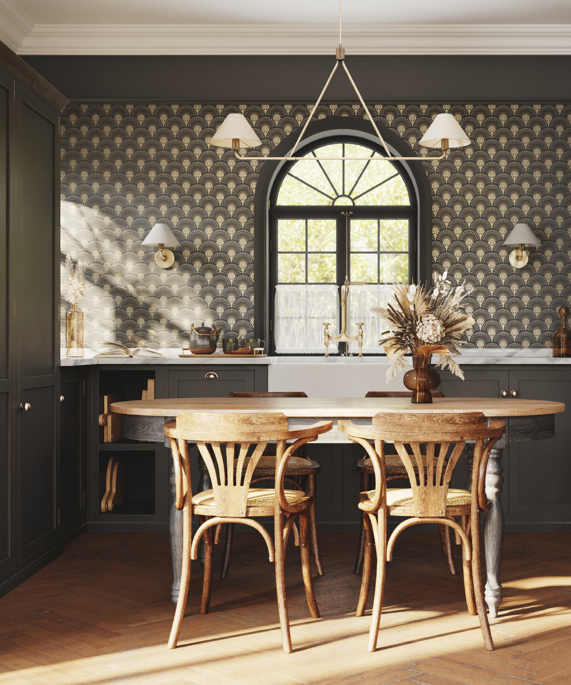
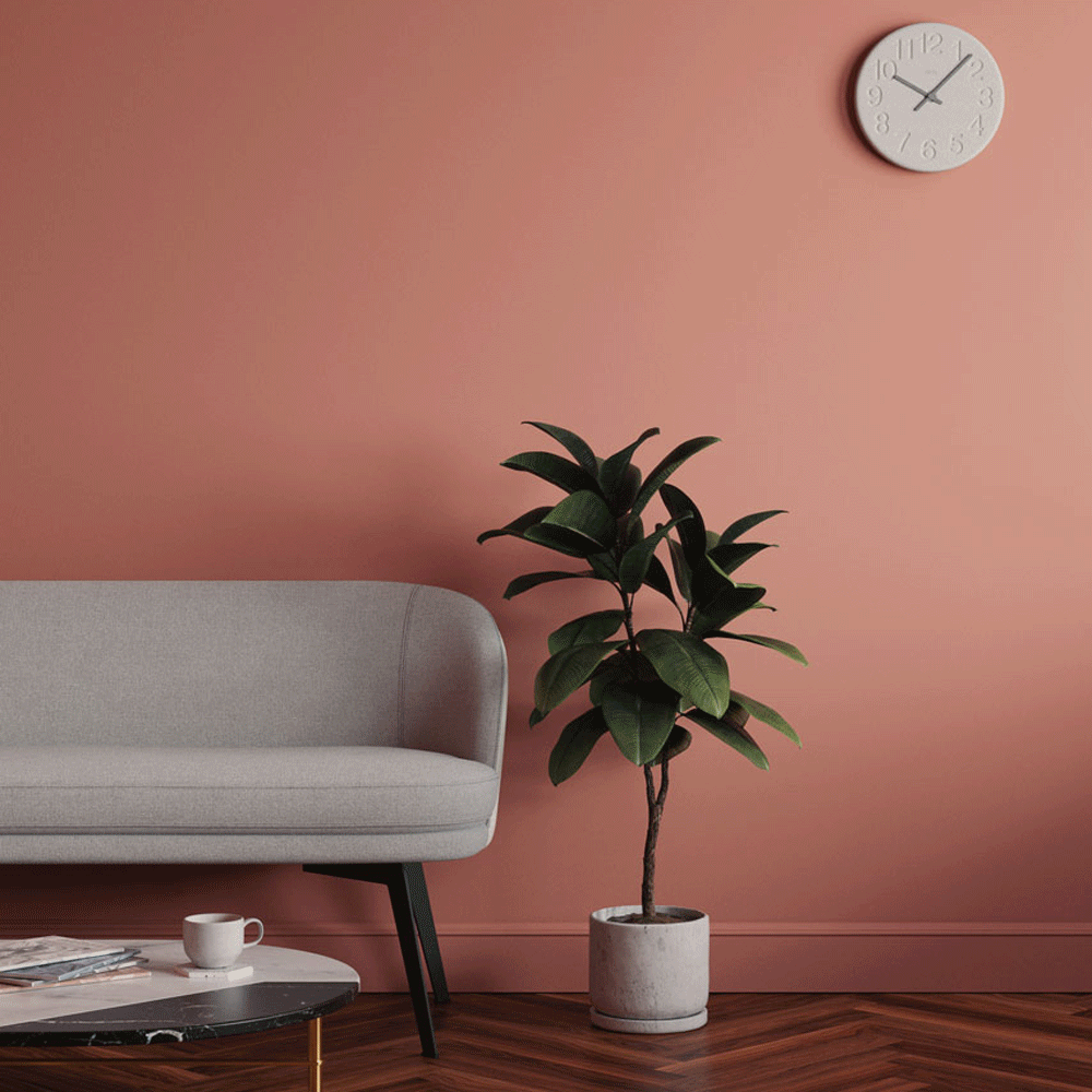
Grey, despite its popularity as a versatile neutral, is often associated with feelings of loneliness, depression, self-doubt, and insecurity within color psychology. It is believed to induce a mind-numbing response. However, its perceived negative effects can be mitigated by careful consideration of tone, placement, and lighting. Charu Gandhi suggests that darker greys or near-blacks can create a cozy, enveloping feel in bedrooms, especially when paired with pops of color and texture through accessories and artwork to prevent the room from feeling somber.
Beyond specific colors, a critical mistake is choosing a paint color that does not resonate personally with the homeowner. A home should be a source of joy, and paint color, a cost-effective revitalization tool, should align with one's positive emotions. Creating a mood board from diverse inspirations like nature, fashion, or travel can help in determining a personal palette. Designers also emphasize the importance of contrast; while analogous colors offer harmony, they may lack vitality, and complementary colors, though high in contrast, require softening with neutrals.
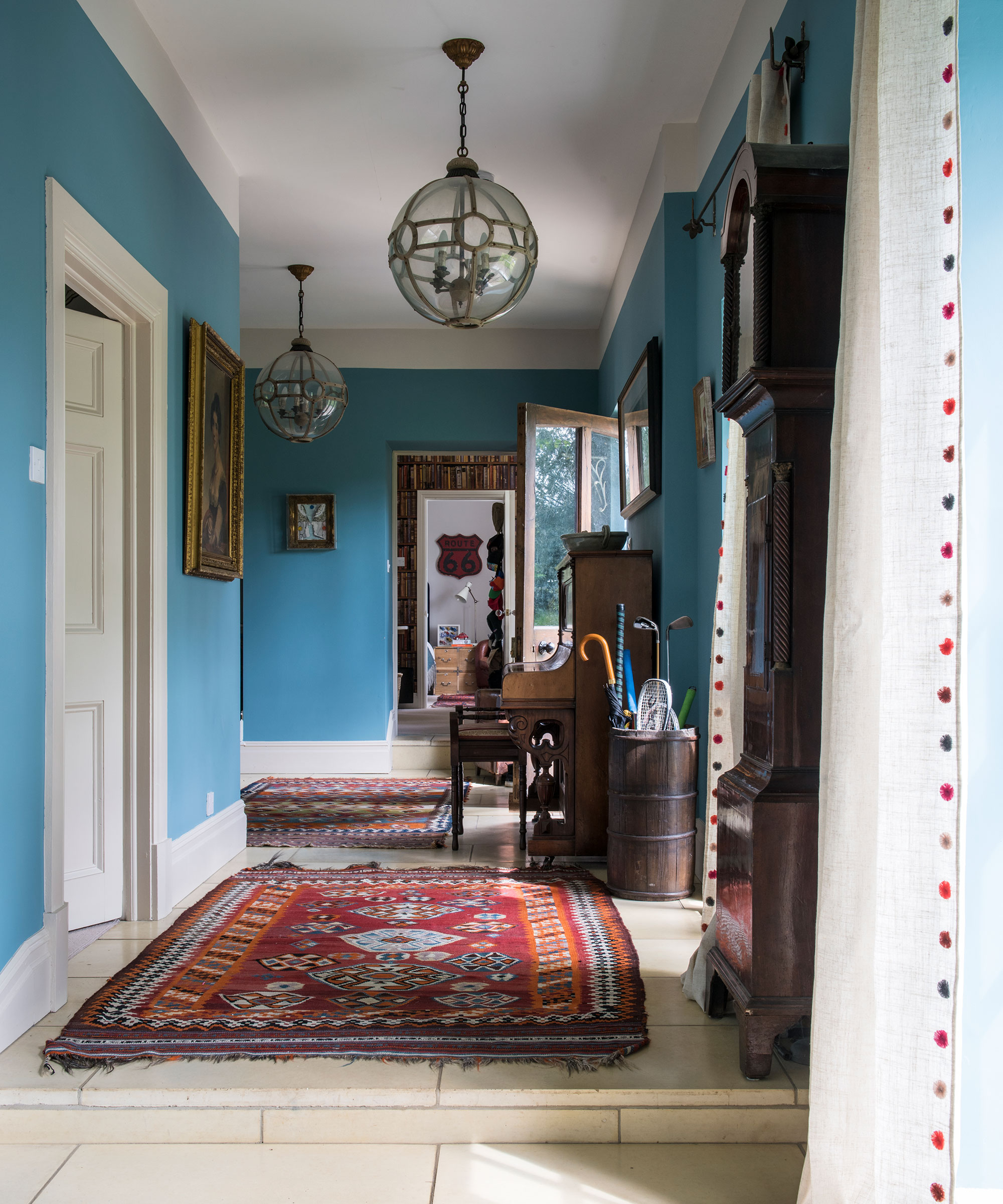
Finally, neglecting the influence of natural light is a common oversight. The aspect of a room and the paint's undertone are crucial. For instance, north-facing rooms often benefit from avoiding green or grey bases, or by being painted dark to create a cozy feel. South-facing rooms are best enhanced with soft, pale tones to maximize light and space. West-facing rooms, with cooler morning light and brighter afternoons, suit warm tones, while east-facing rooms can achieve a calming effect with light blues and greens.
#InteriorDesign #PaintColors #ColorPsychology #HomeDecor #RoomDesign #ColorSelection #LightingImpact #DecoratingTips #InteriorDesign #PaintColors #ColorPsychology #HomeDecor #RoomDesign #ColorSelection #LightingImpact #DecoratingTips
0 Kommentare insgesamt
 Noch keine Kommentare
Das könnte Ihnen auch gefallen

5 colors you should never paint a small room – designers warn us to steer clear of these hues, and what to pick instead
You should never paint your hallway this colour, according to colour psychologists
7 'Unhappy' Colors That Color Psychology Experts Would Never Paint Their Walls

6 Colors You Should Never Paint Your Entryway, According to Color Experts

8 colors you should never paint kitchen cabinets according to the experts


5 colors you should never paint a pantry – designers share the shades they swerve
5 Colors You Should Never Paint Your Hallway, According to Designers

Interior design experts reveal the colour rules you should be breaking

5 colors you should never paint your entryway – according to interior experts
6 Paint Colors You Should Never Use in Your Bedroom, According to Interior Designers
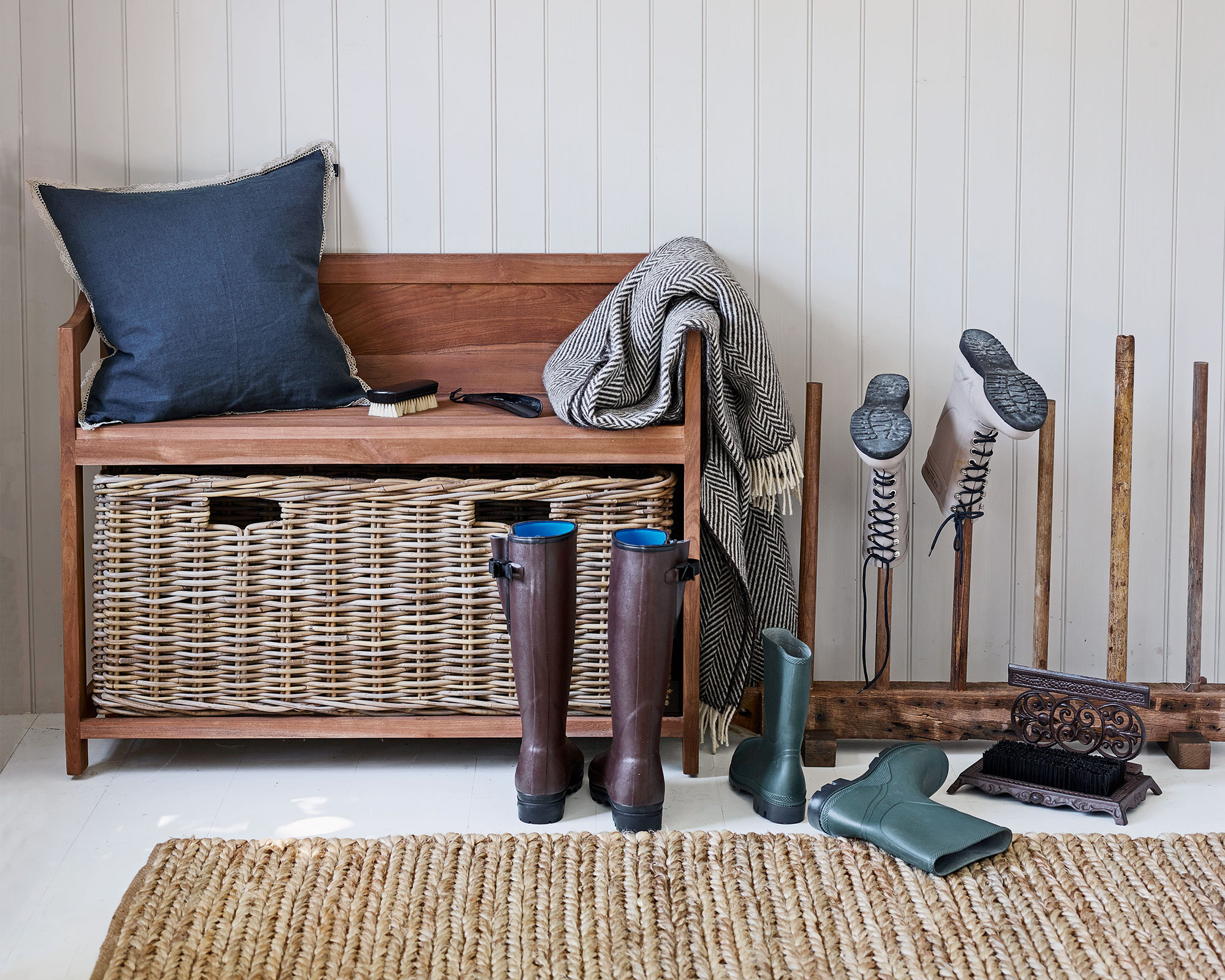
Colors not to paint a mudroom – 5 hues to avoid in this high-traffic space
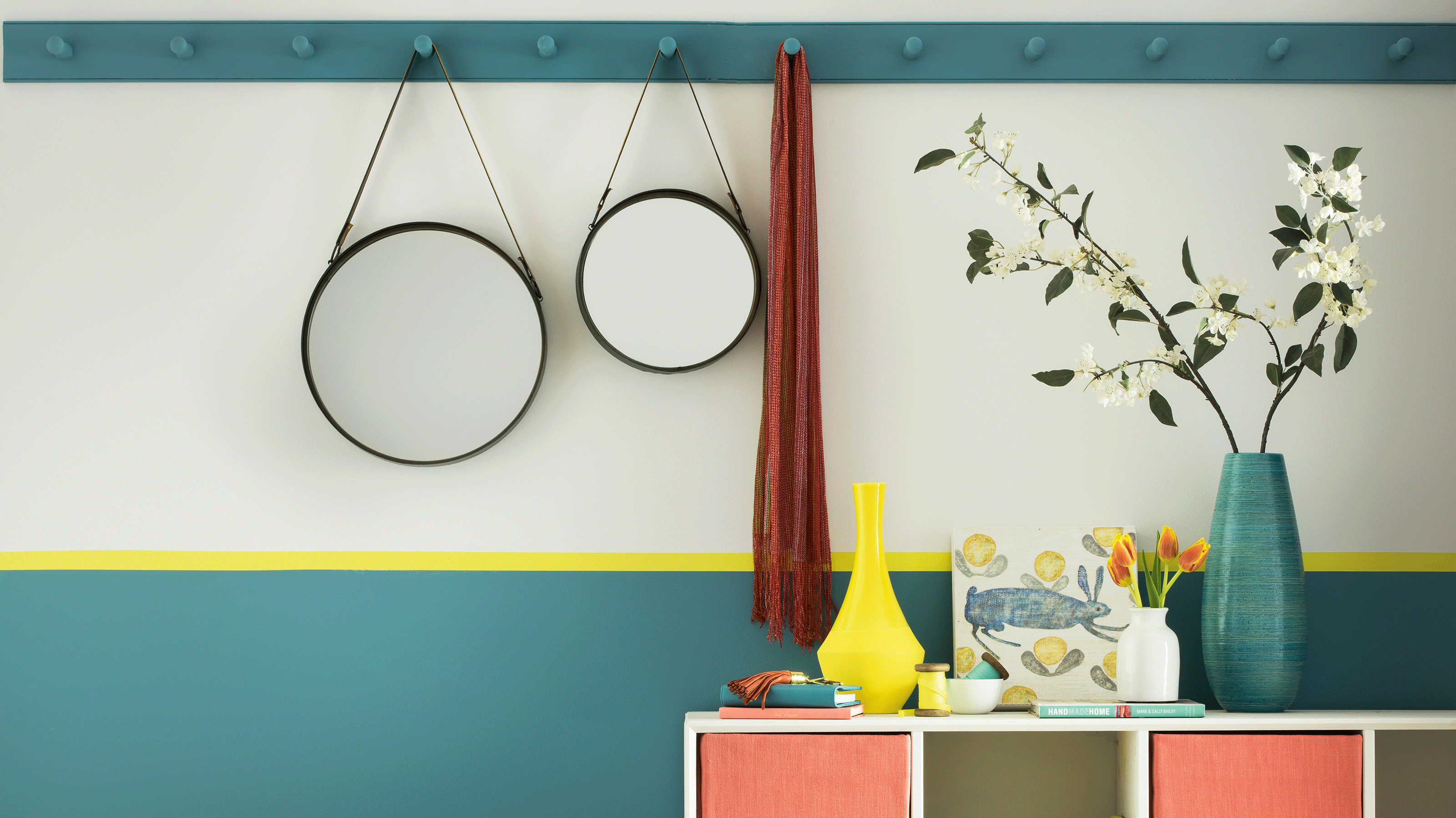
Trust us, these are the colours to avoid when painting a small hallway

The 10 Worst Paint Colors for Your Home, Experts Say

6 Worst Colors To Paint Your Kitchen (And What To Choose Instead)

4 Outdated Colors Designers say you Should Steer Clear of When Decorating a Living Room
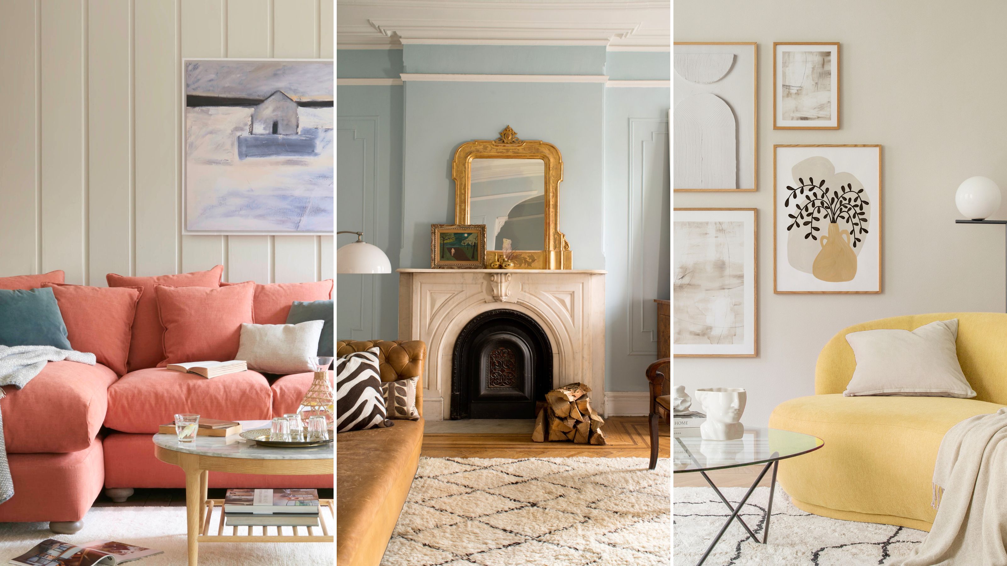
The paint colors to avoid in small living rooms — and what to use instead
The colors you should never paint your hallway – and what really works
I’m an interior designer - the worst paint colours for small rooms, and why bright white walls is not a good idea

The Color to Never Paint Your Kitchen Cabinets, According to a Top L.A. Designer
5 Paint Colors You Should Never Use In A Bedroom, According to Designers