1/21
35 Neutral Paint Colors Interior Designers Can't Get Enough Of
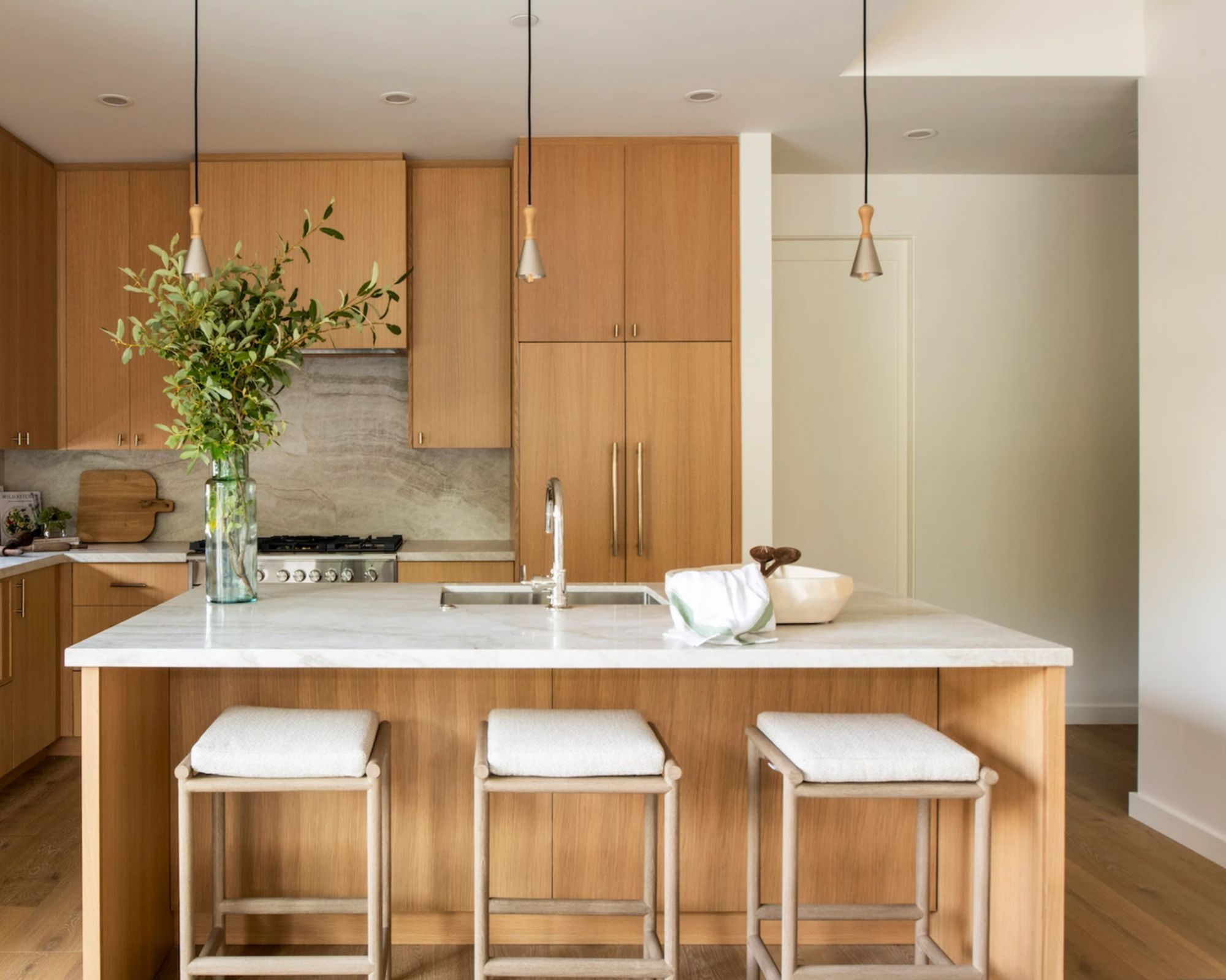
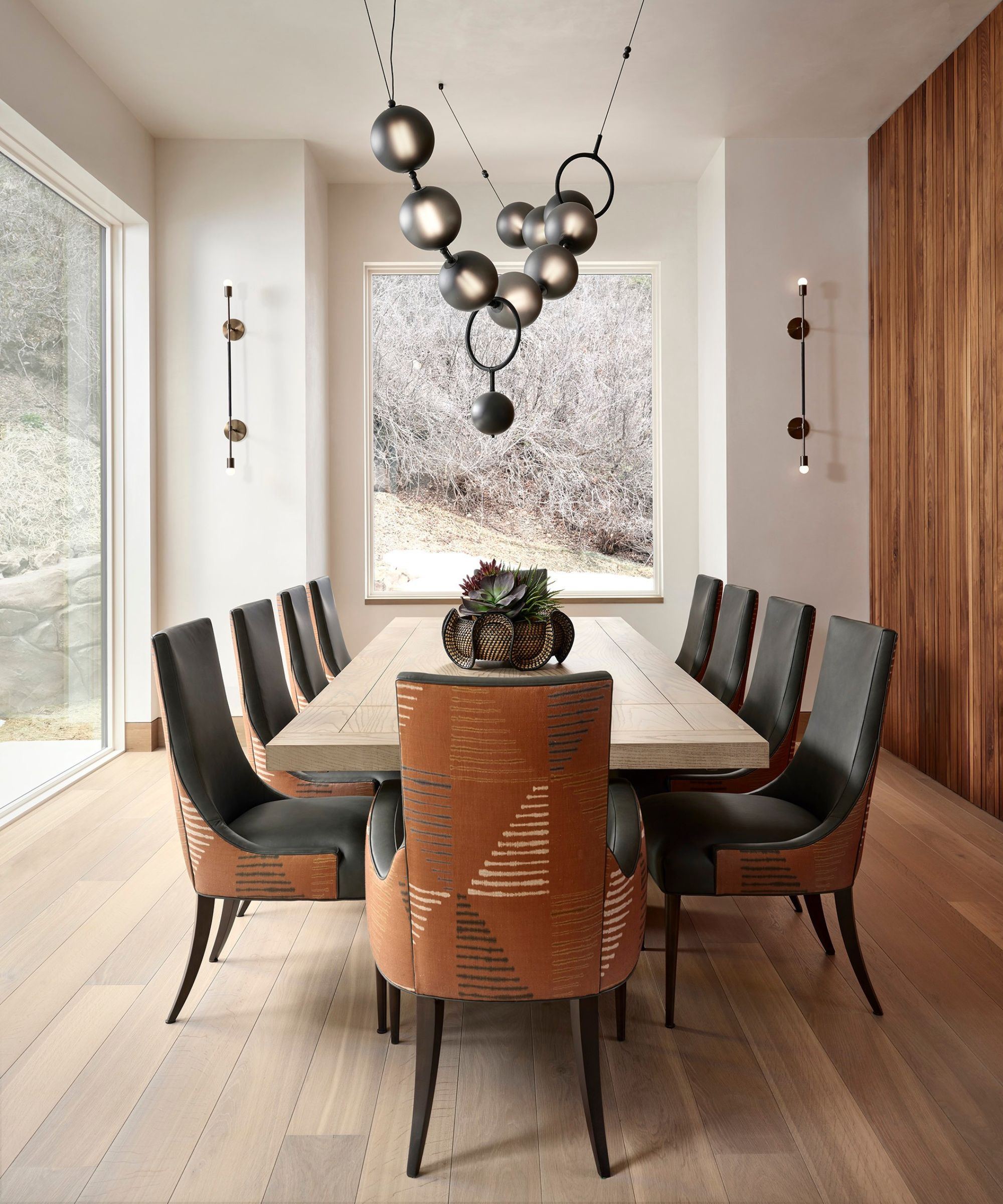
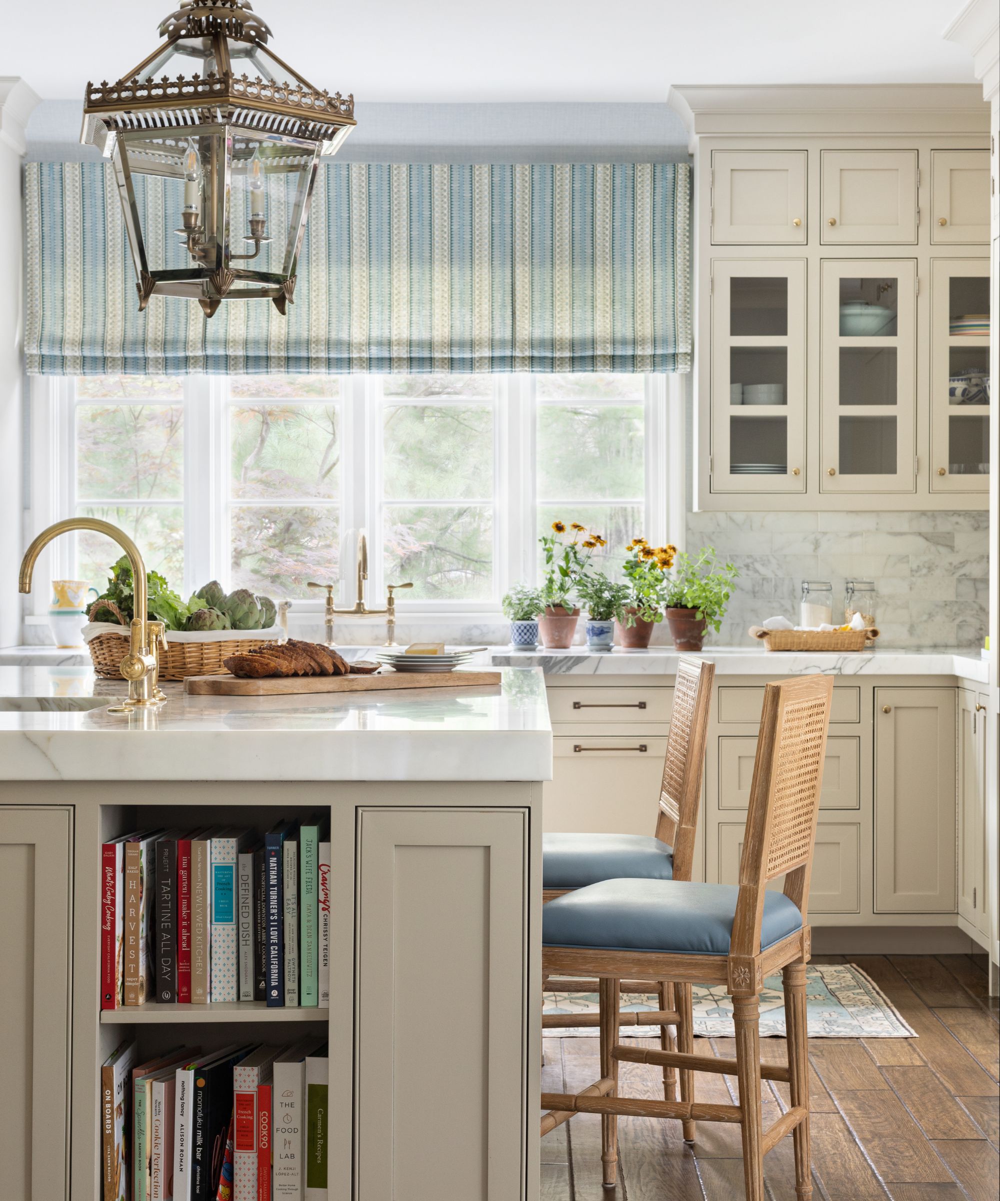
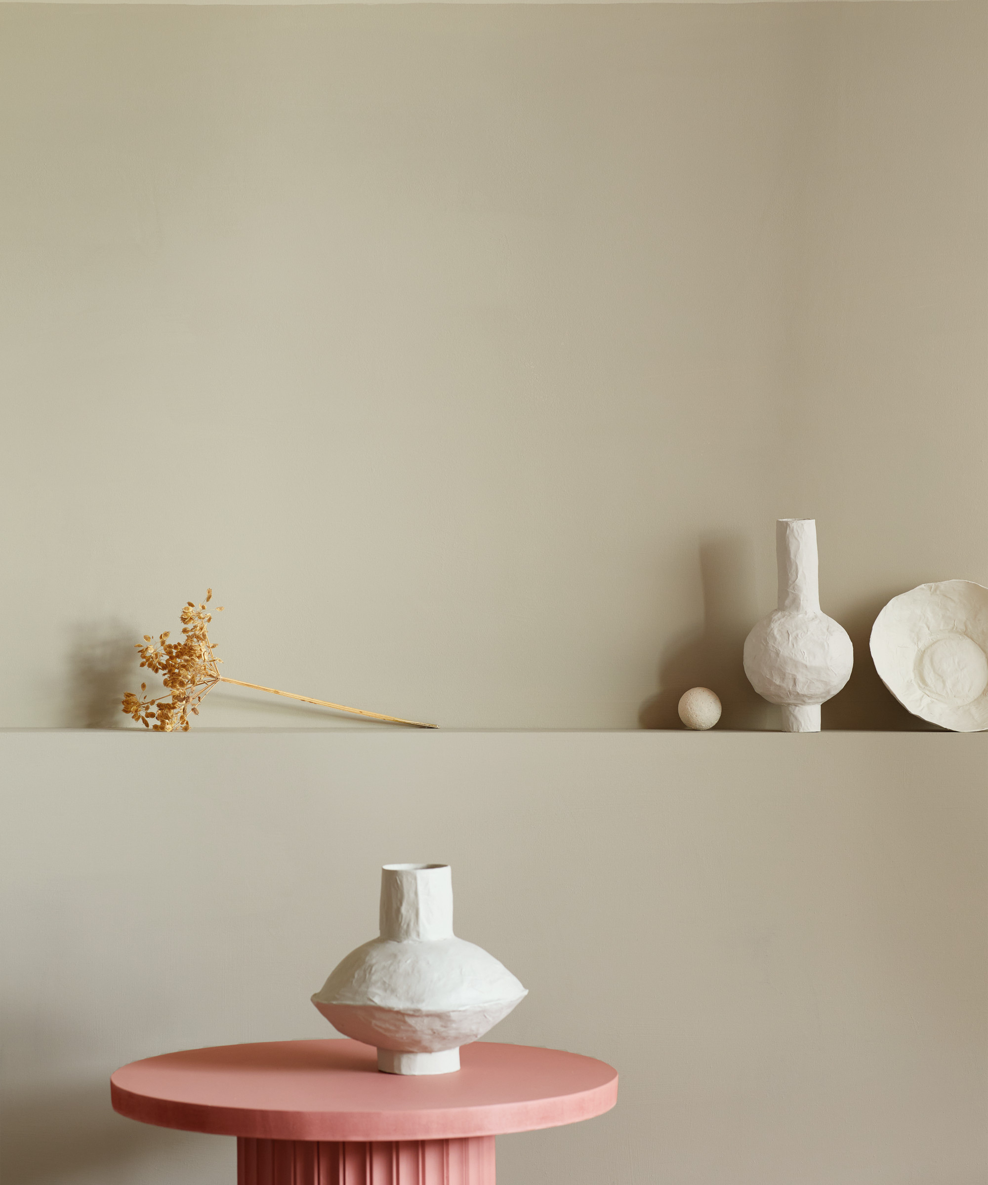
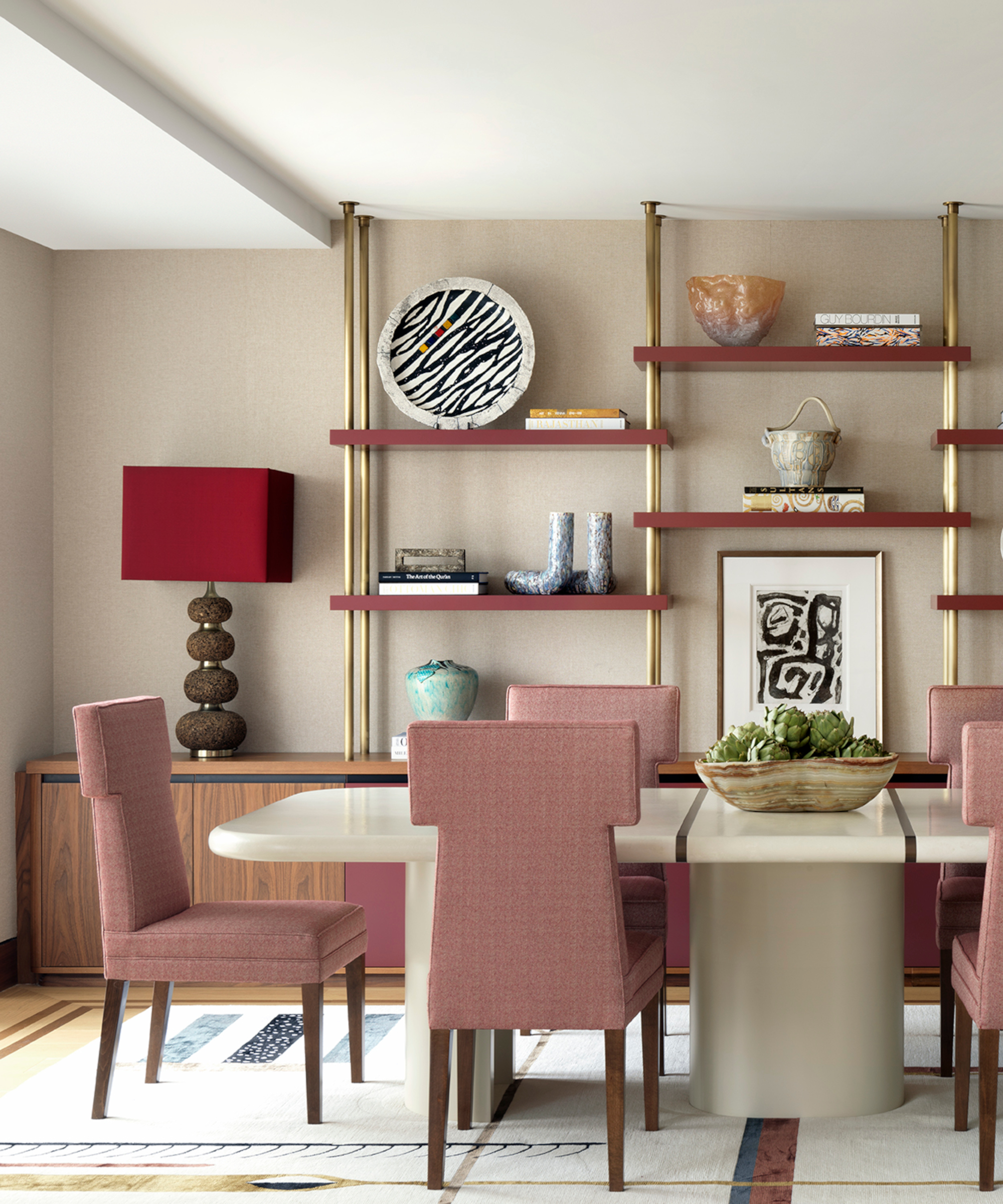
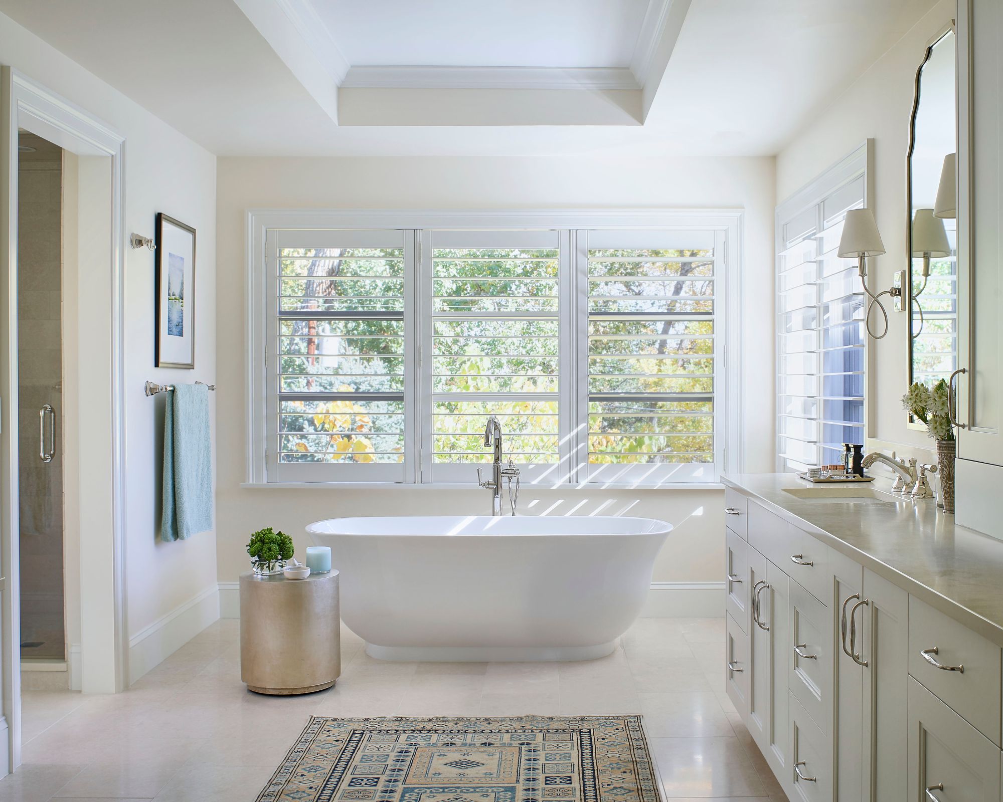
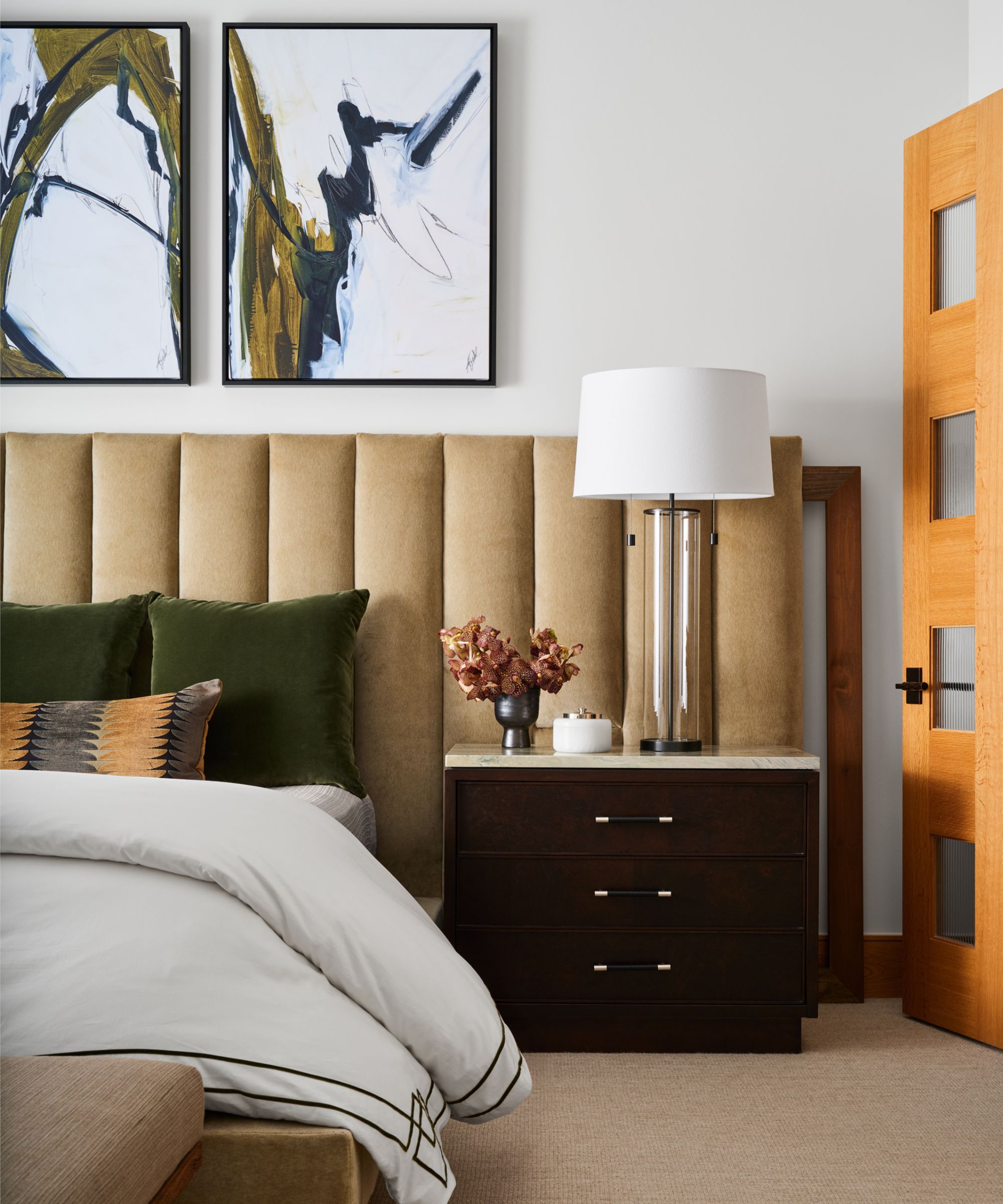
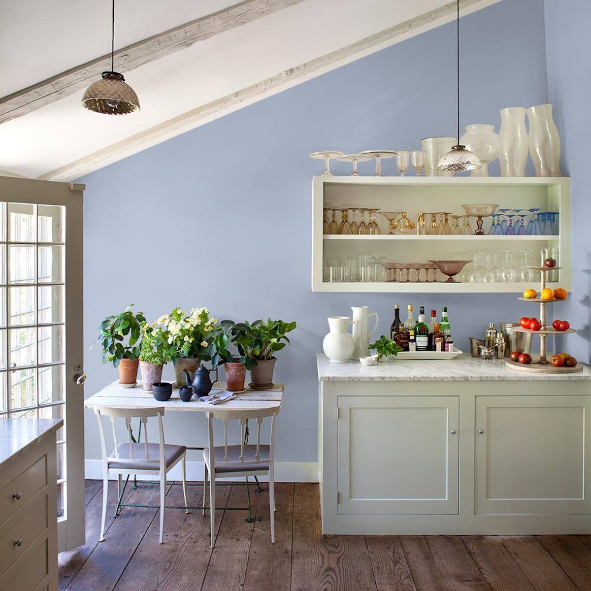
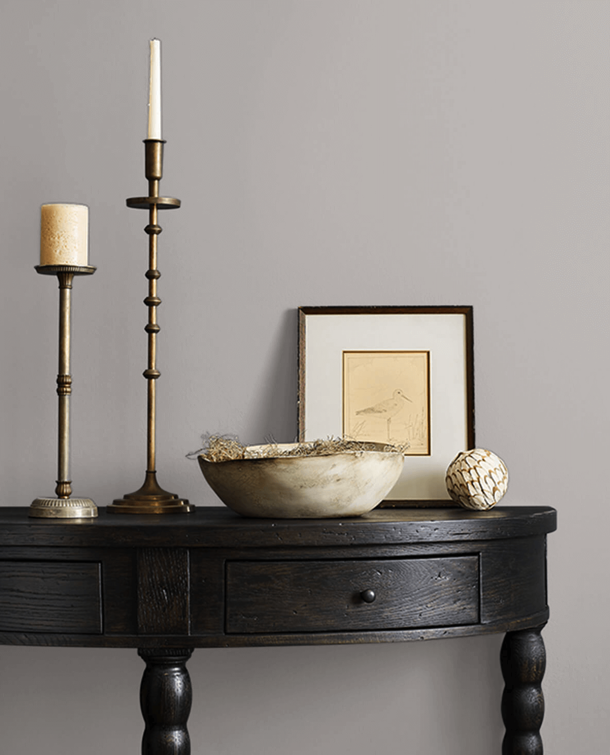
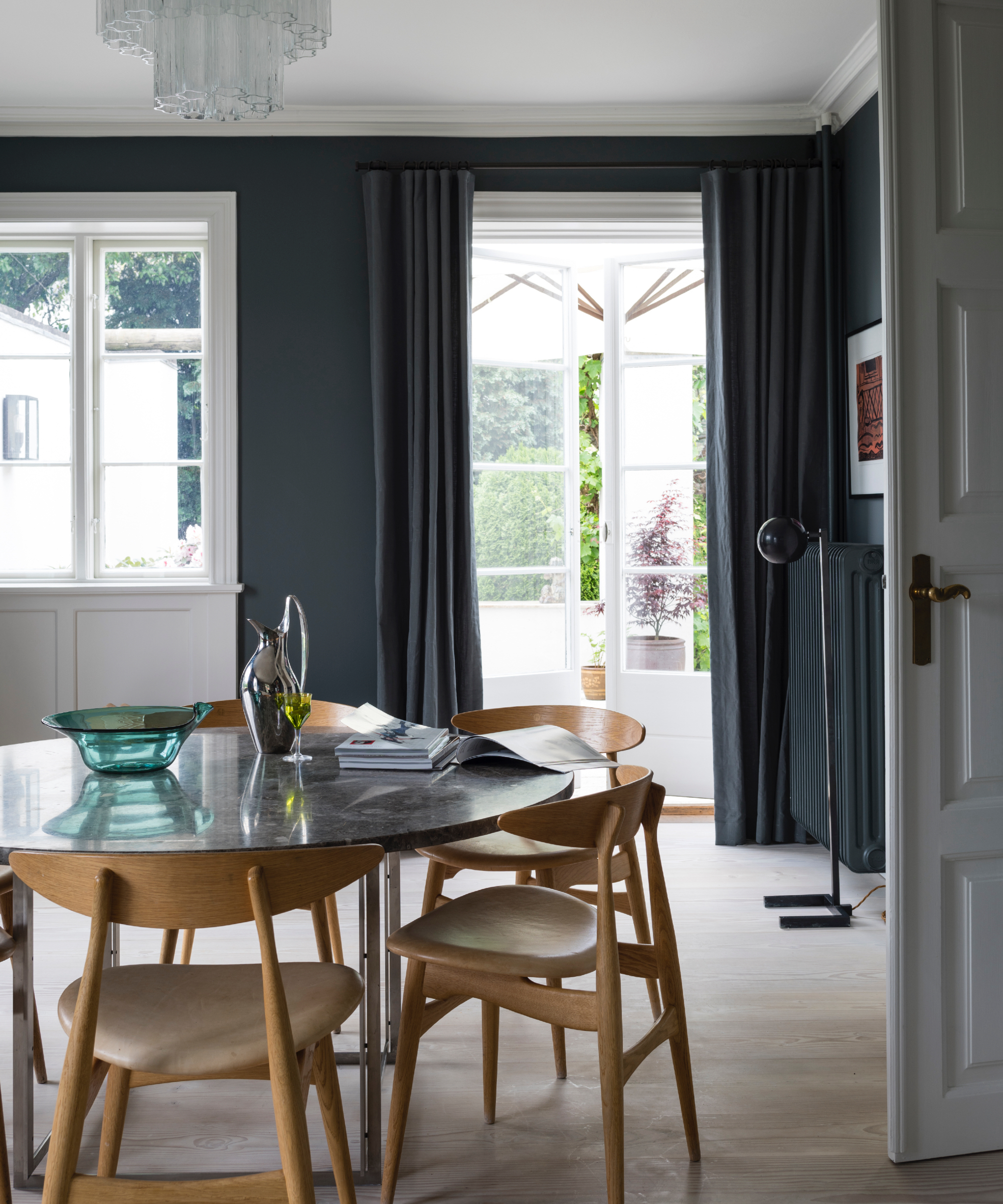
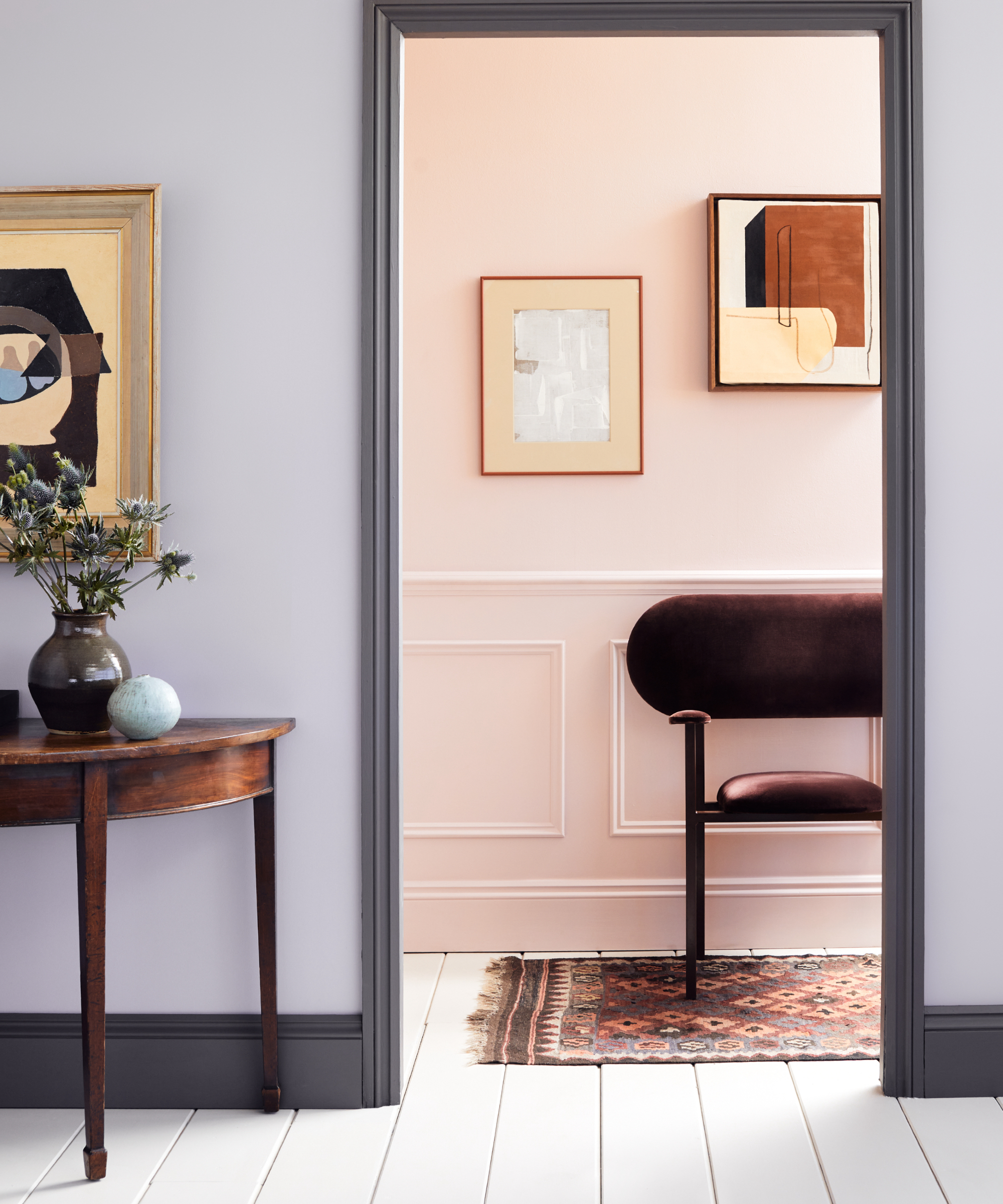
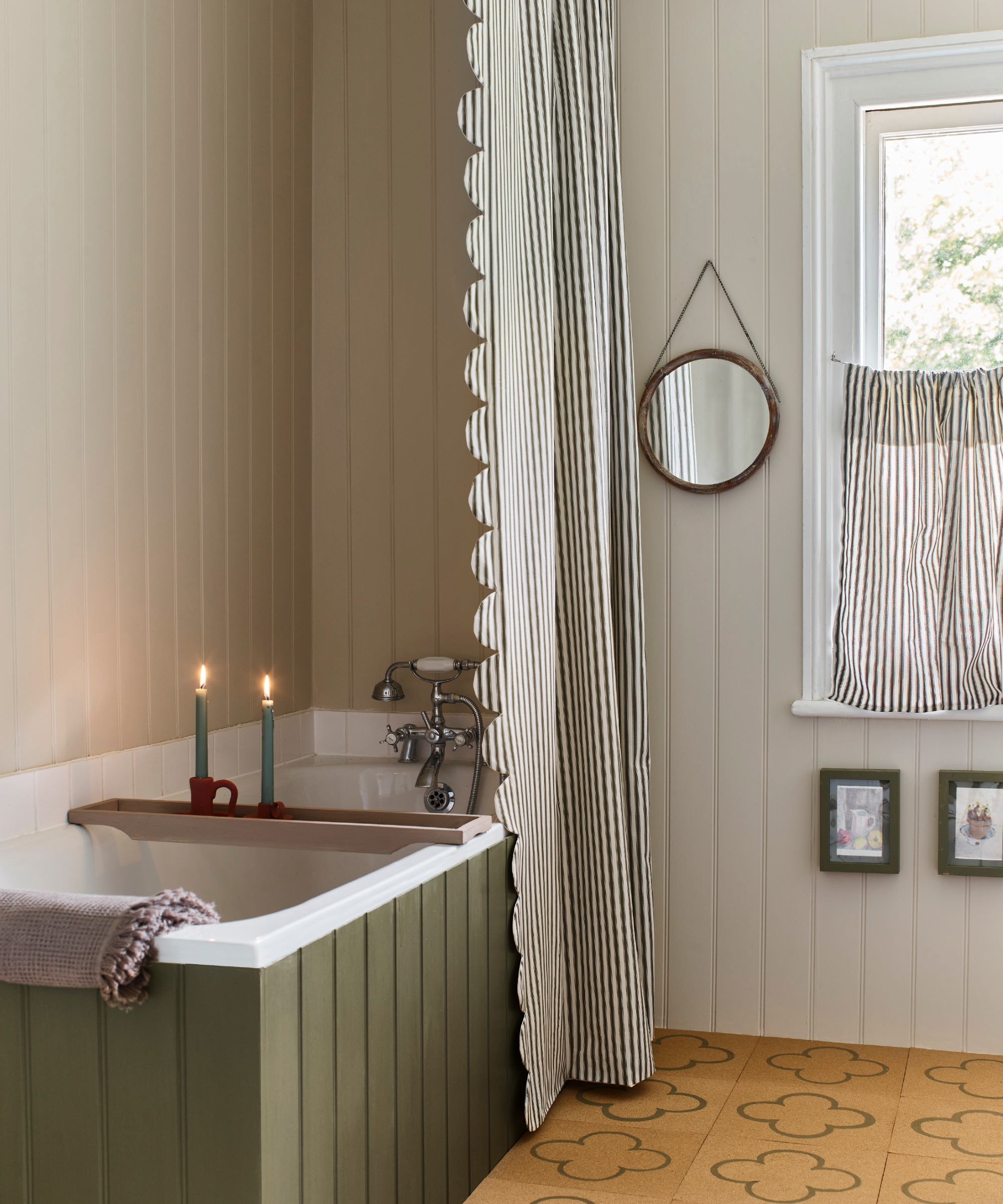
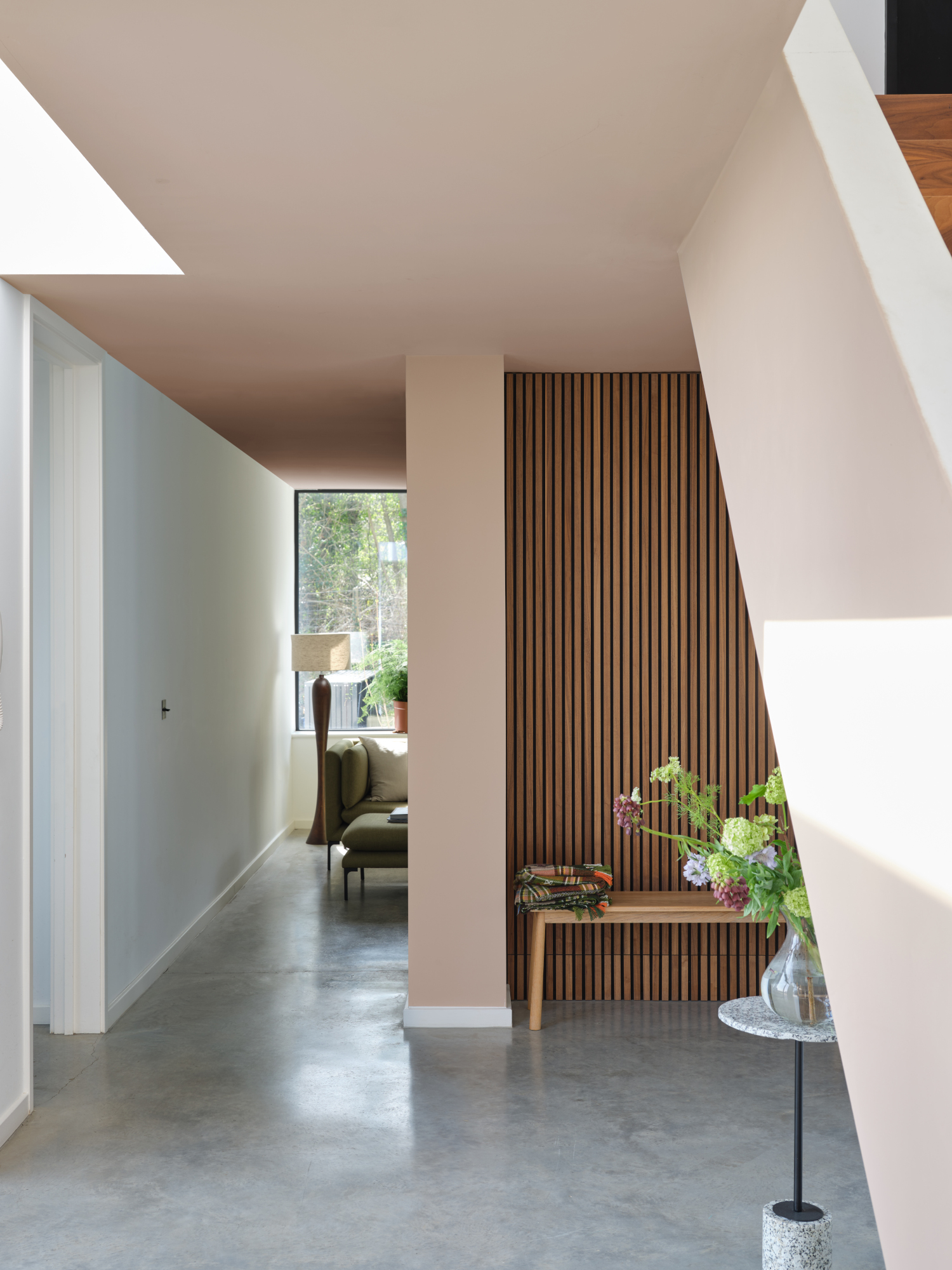
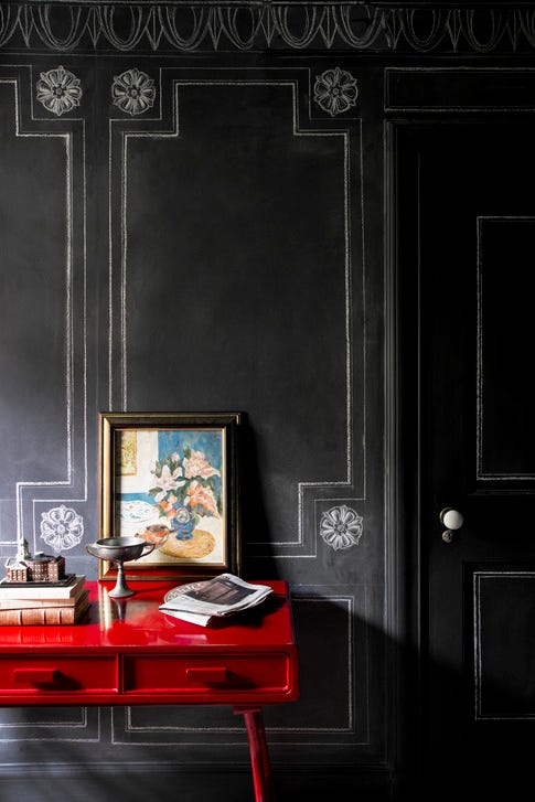
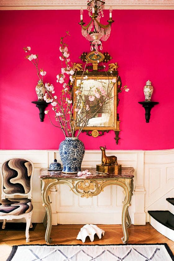
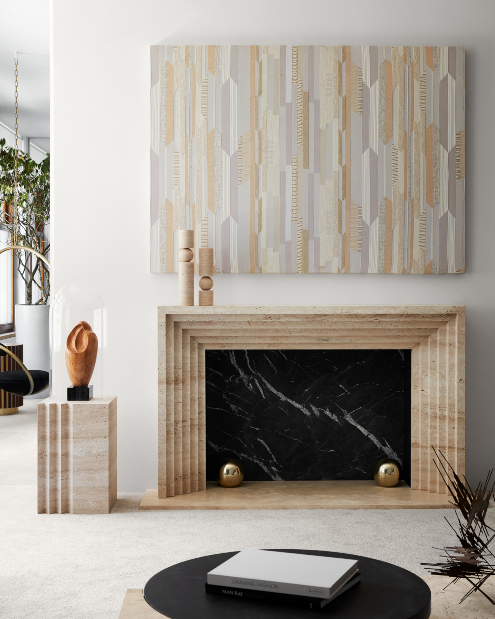
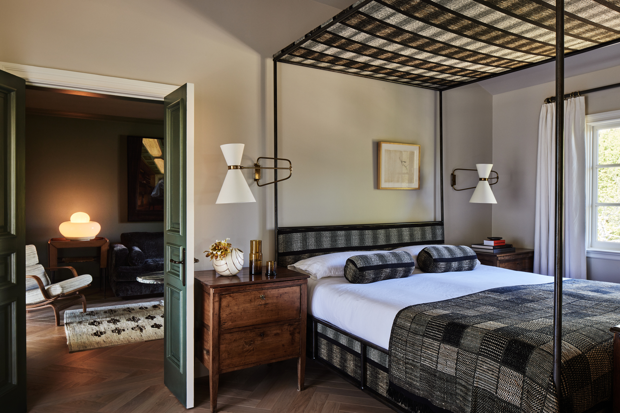
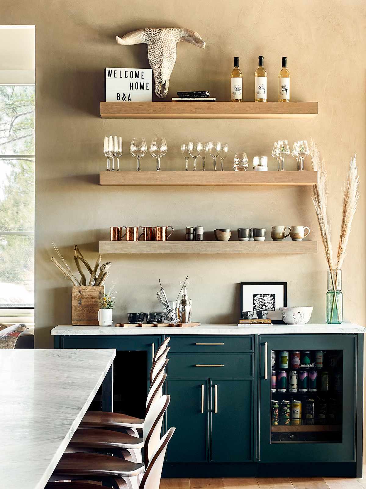
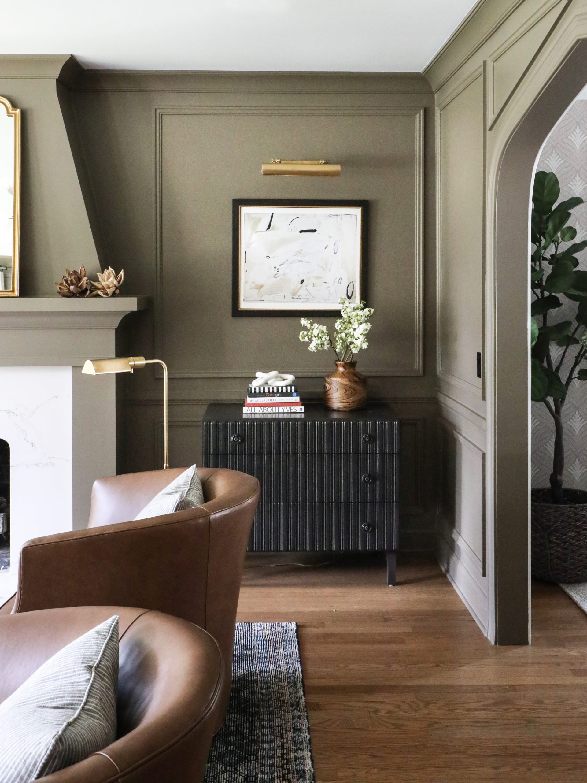
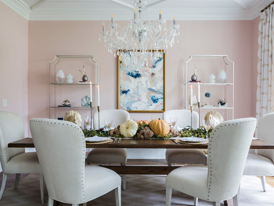
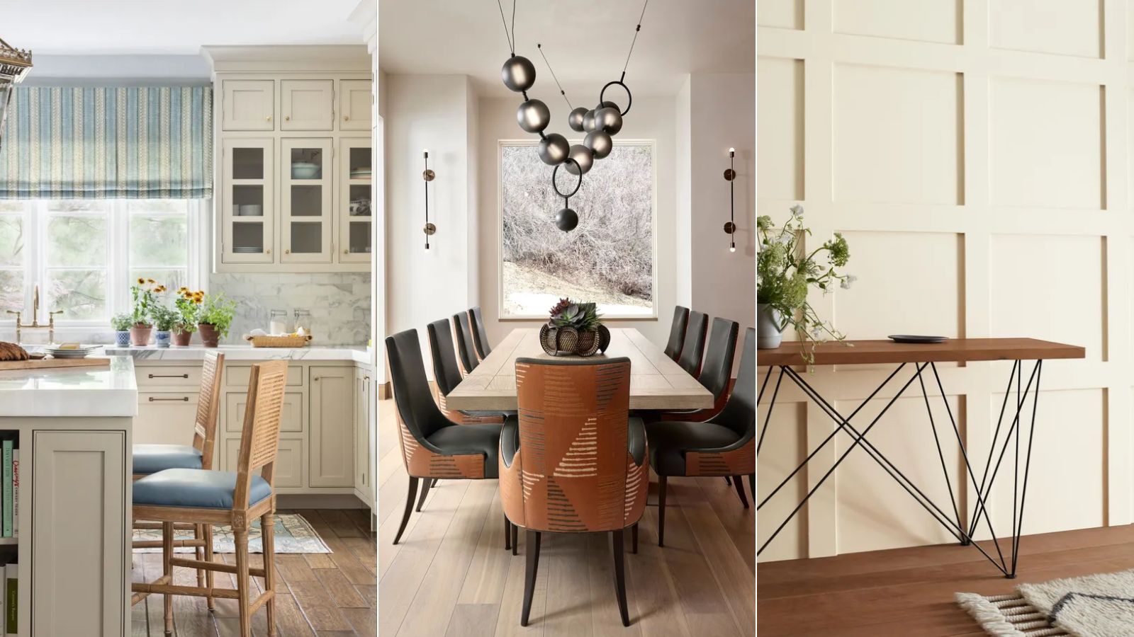
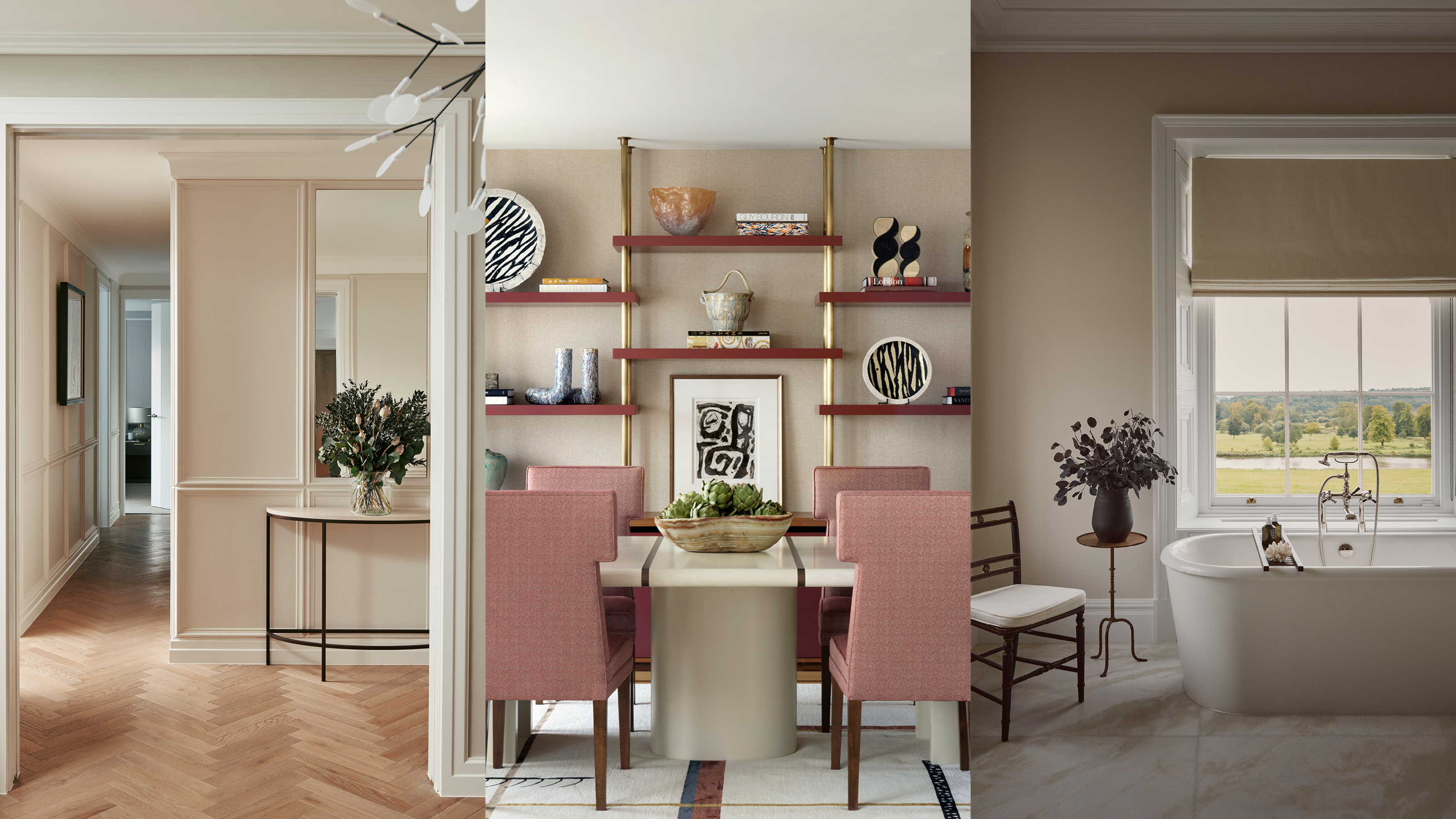
Neutral paint colors are far from boring, offering endless versatility and the ability to complement various interior design styles. Recently, shades beyond traditional whites, beiges, and grays, such as certain blues, yellows, and greens, have gained popularity as effective neutrals. These colors serve as excellent backdrops for diverse patterns and sculptural furniture, enhancing a room's aesthetic appeal.
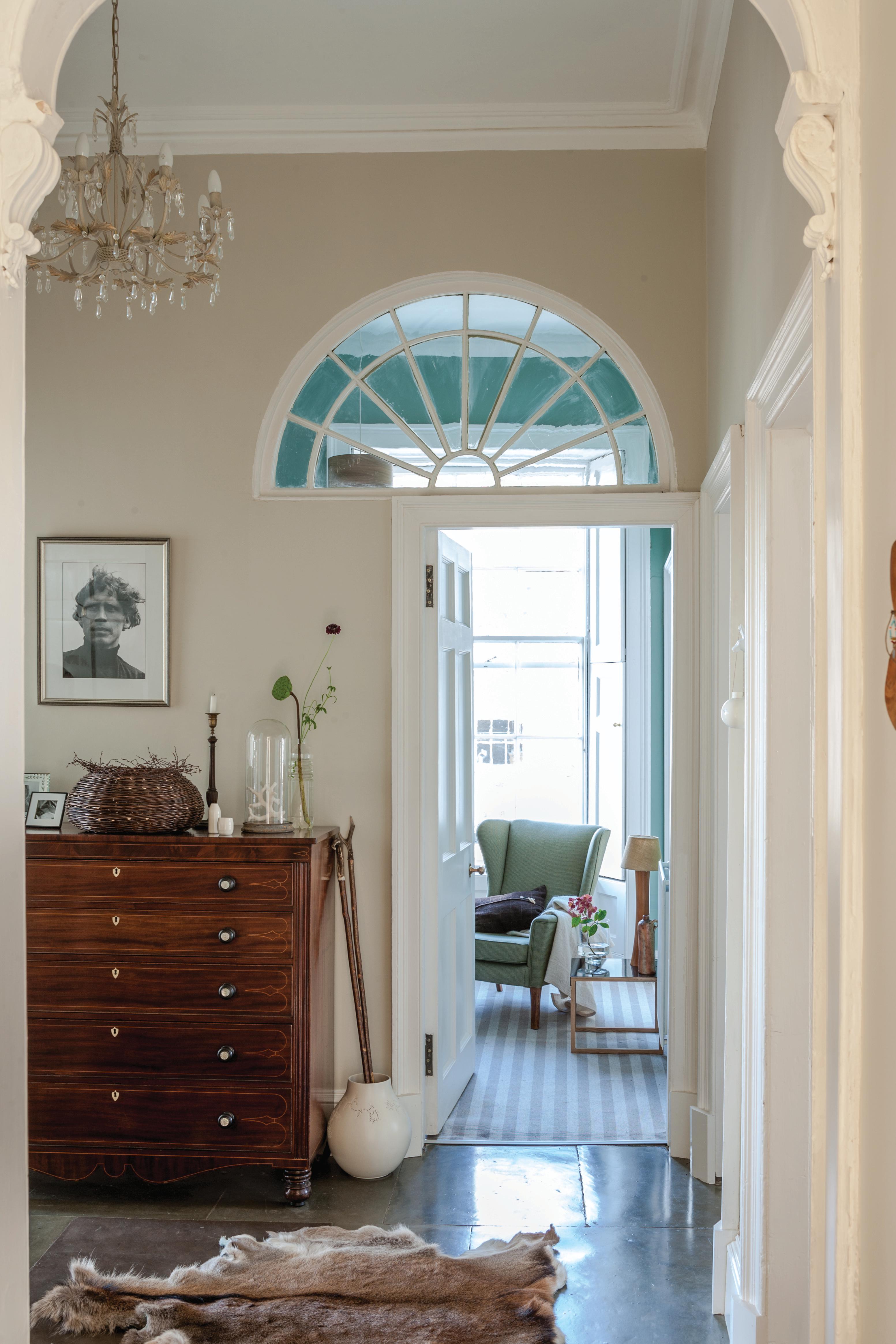
Selecting the right neutral shade is crucial, as an incorrect choice can disrupt a room's atmosphere and flow. Connecticut-based designer Virginia Tupker emphasizes that the chosen neutral should align with the underlying tones of the room's main colors. For instance, if a room predominantly features yellow, blue, gray, or pink, the neutral paint should reflect those undertones.
Several prominent designers have shared their preferred neutral paint colors, including a range of whites, blues, and other hues, along with valuable insights for choosing the best neutral for any home. These selections aim to create inviting, comforting, and calming spaces, whether filled with vibrant elements or subtle tones.
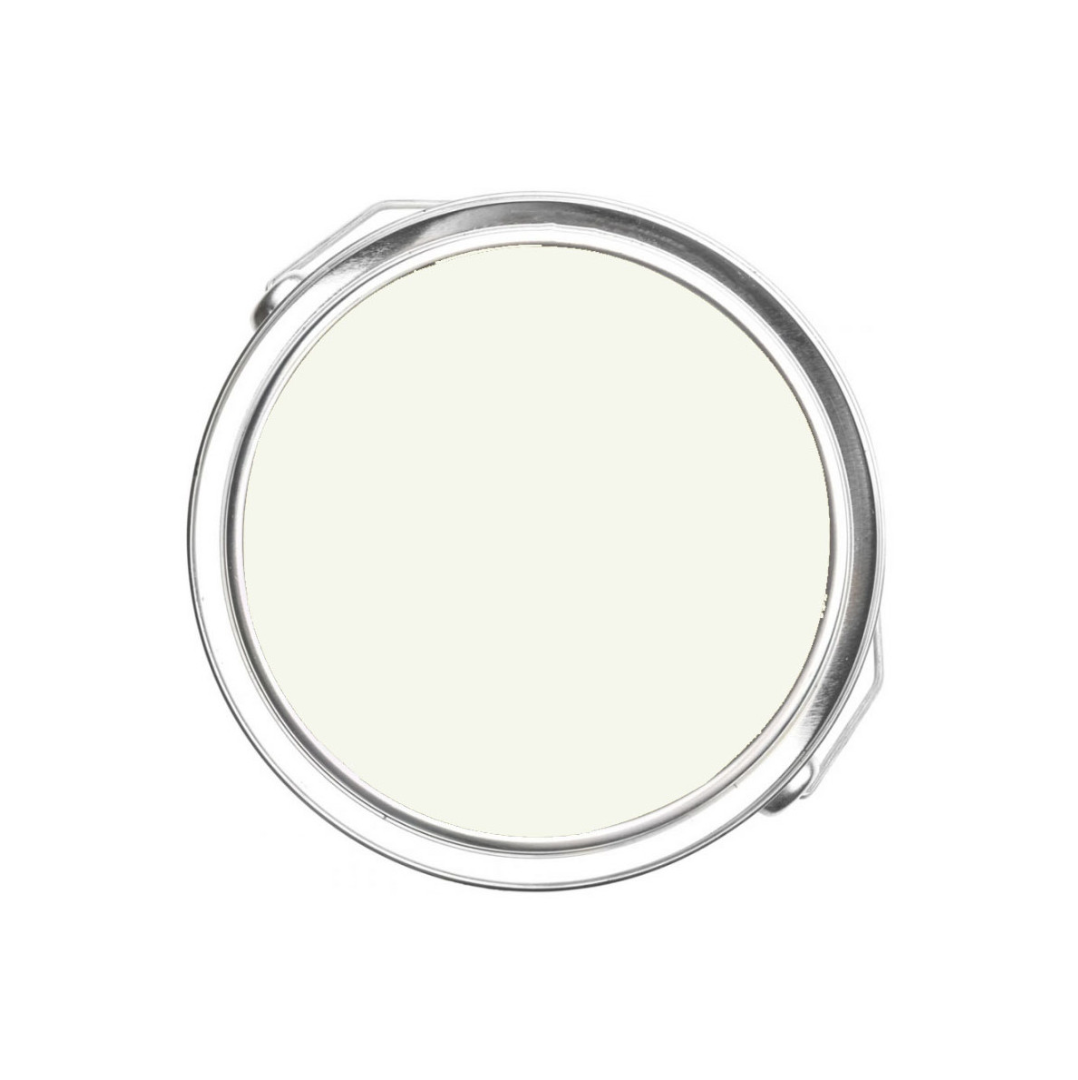
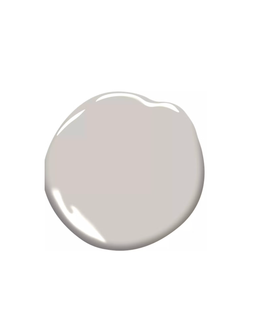
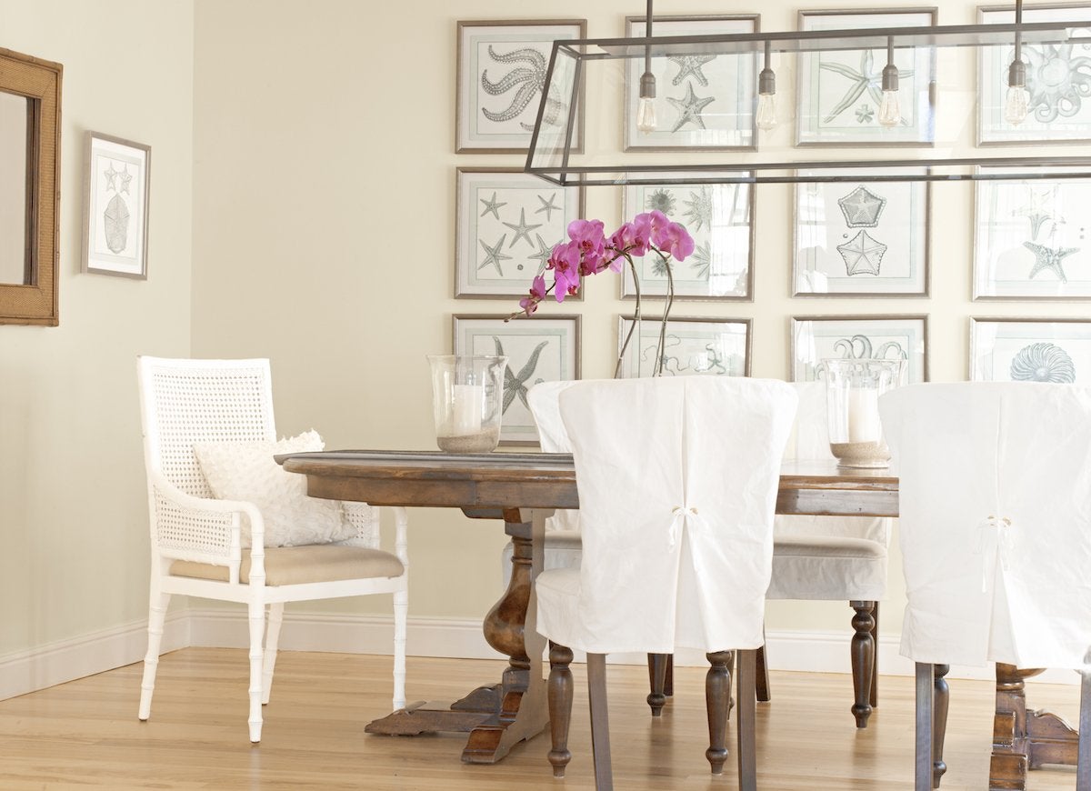
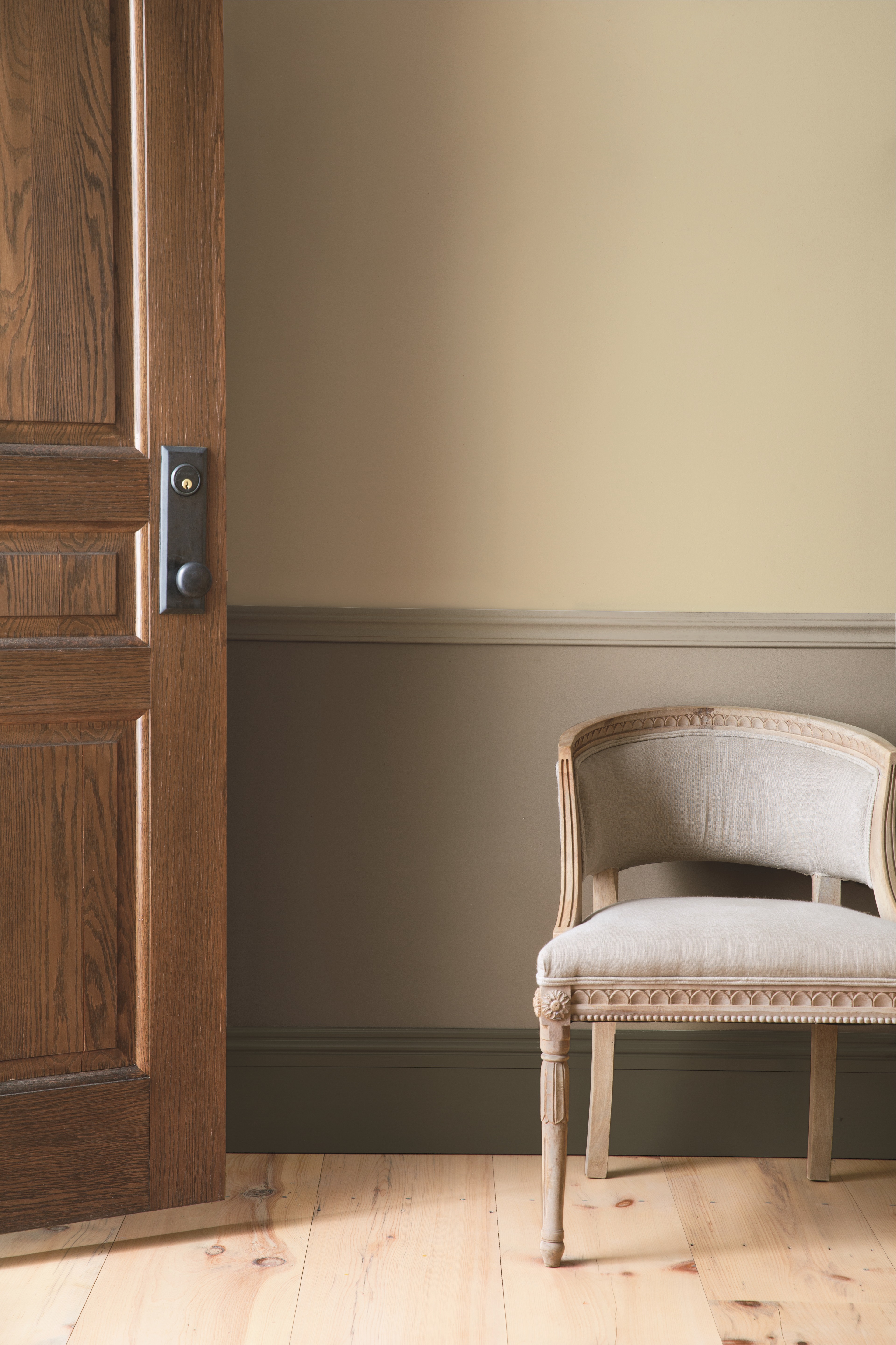
Among the recommended shades is Benjamin Moore's Chantilly Lace, described as a clean, bright white ideal for modern settings and vibrant decor. Sherwin Williams' Agreeable Gray is noted for its compatibility with cooler tones without creating a violet or overly cold impression. Natural Choice by Sherwin Williams offers a warm, creamy white that adds a subtle touch of color and warmth. Benjamin Moore's Grant Beige is praised for its versatility in contemporary, modern, and traditional interiors, especially when contrasted with colors like Decorator's White or Onyx Black.
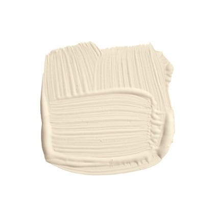
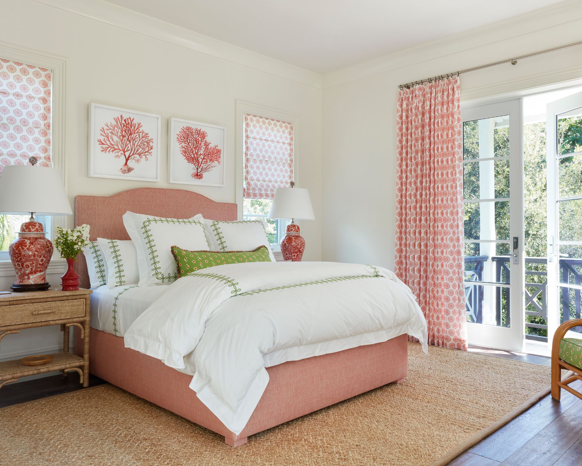
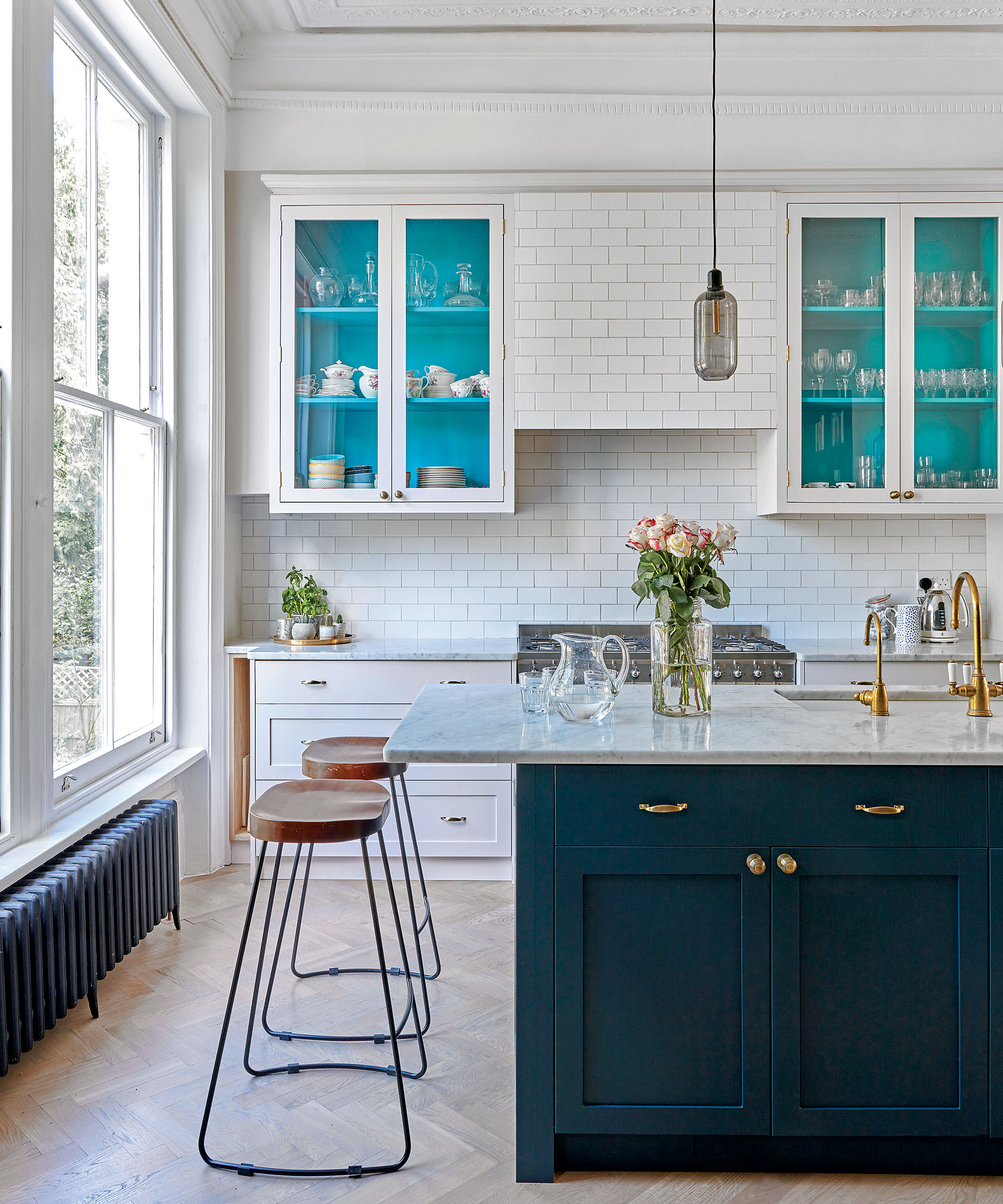
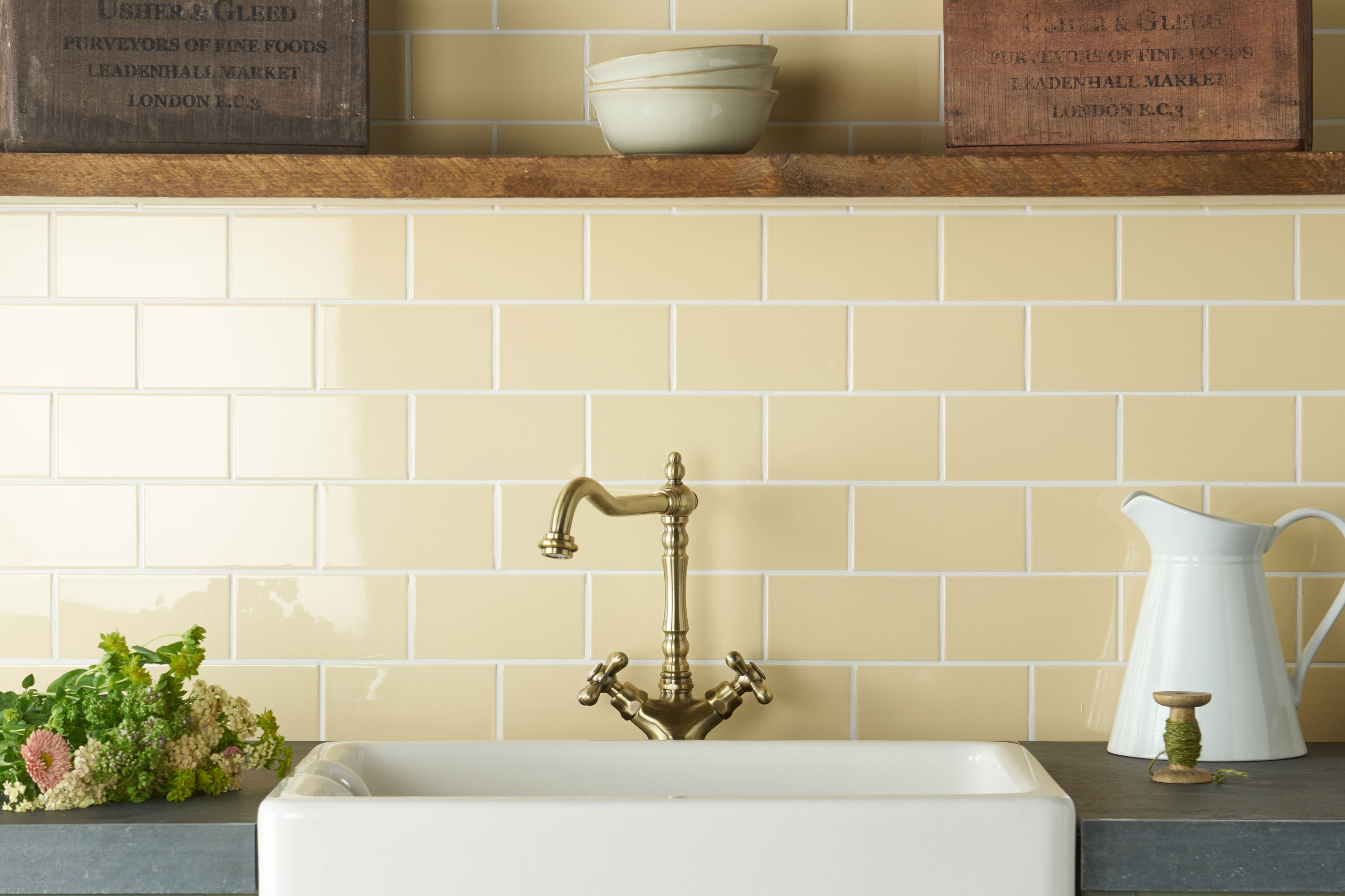
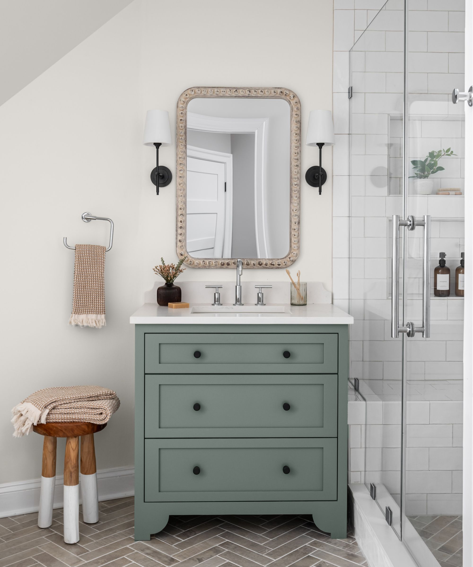
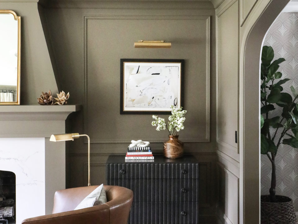
For a sophisticated dark blue, Benjamin Moore's Gentleman's Gray is suggested, providing a chic alternative to navy for spaces like libraries or lounges. Sherwin Williams' Sea Salt is a cool, elegant green that works well as a front door color or a subtle room accent. Benjamin Moore's Irish Mint is an aqua-hued white that cools sunlit rooms, complementing corals and deeper blues. Mascarpone by Benjamin Moore is a creamy white with yellow undertones, suitable for kitchen cabinets or bathrooms where a soft, non-sterile white is desired.
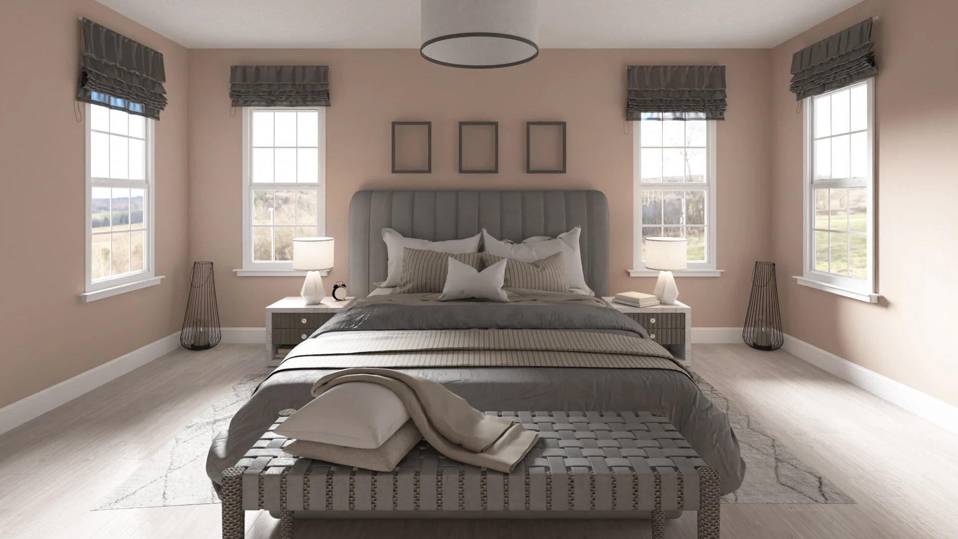
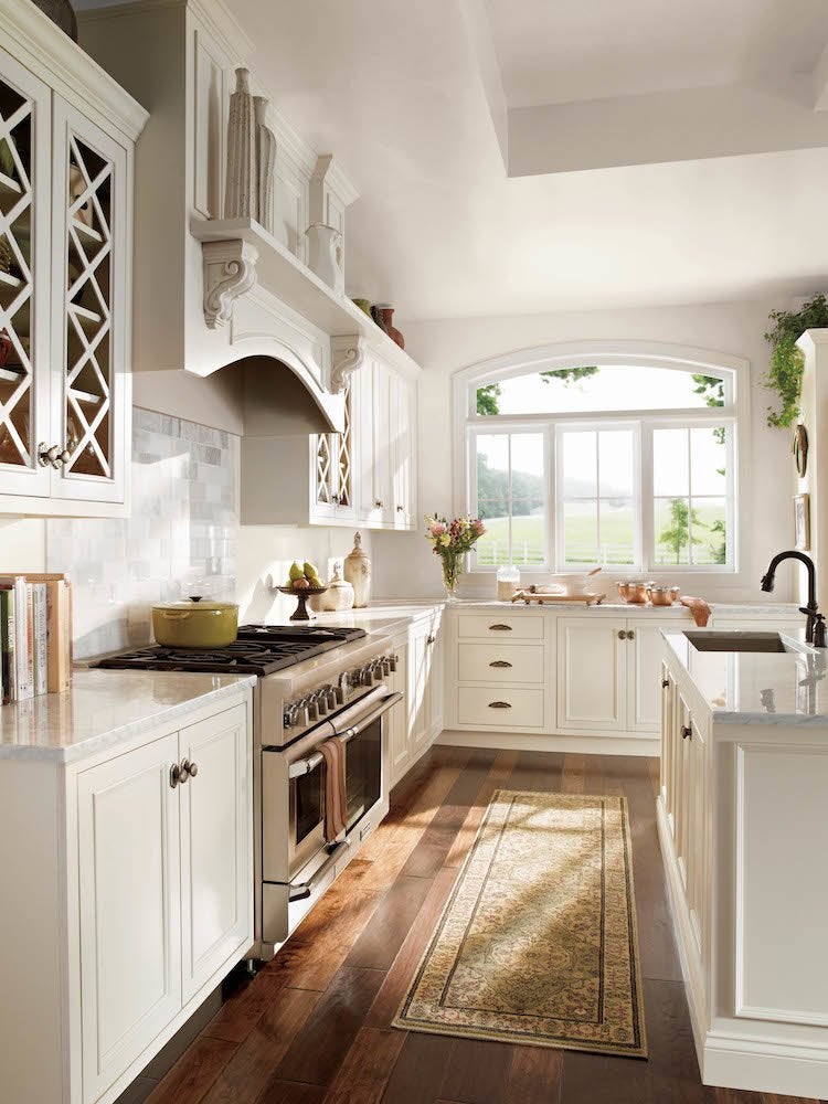
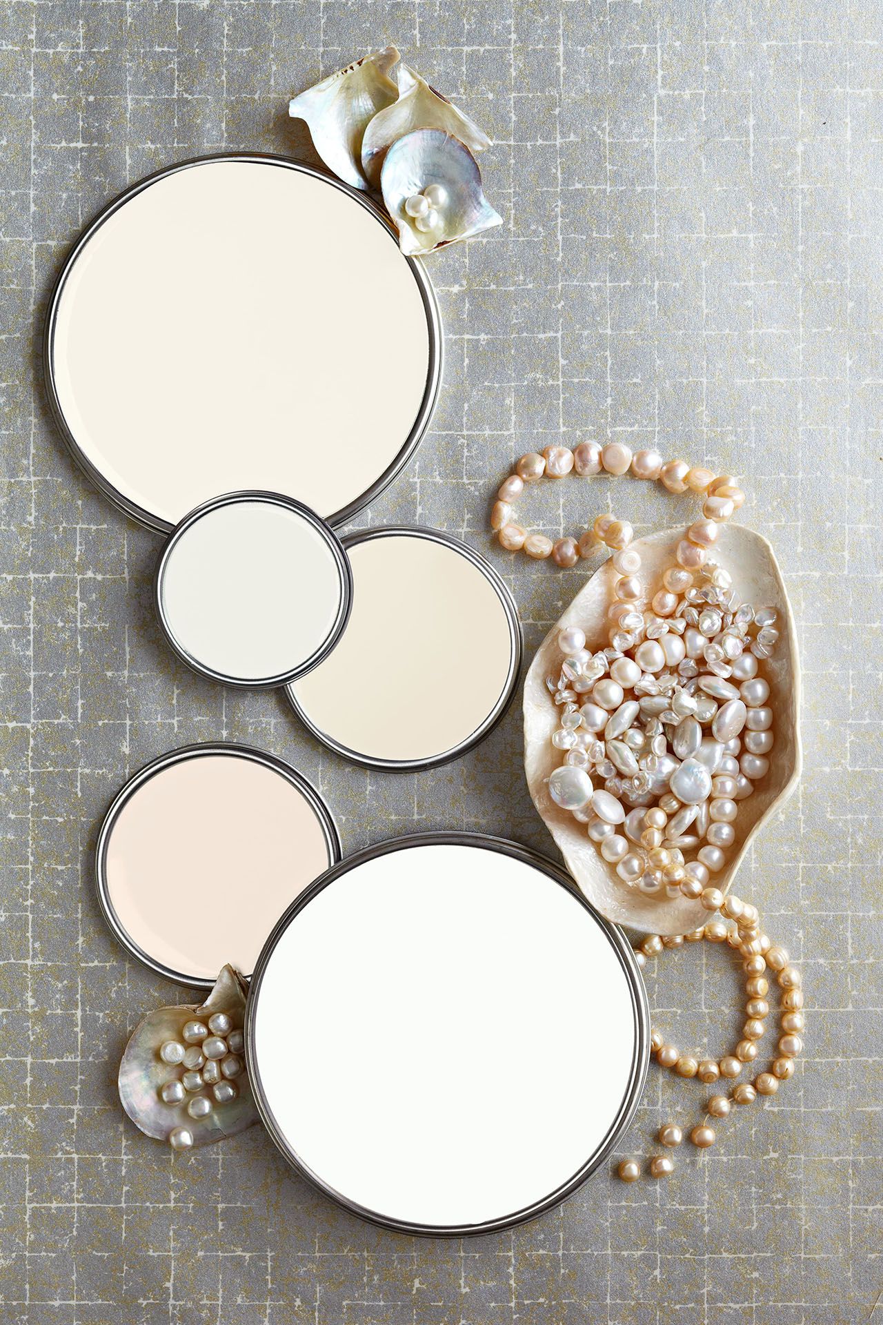
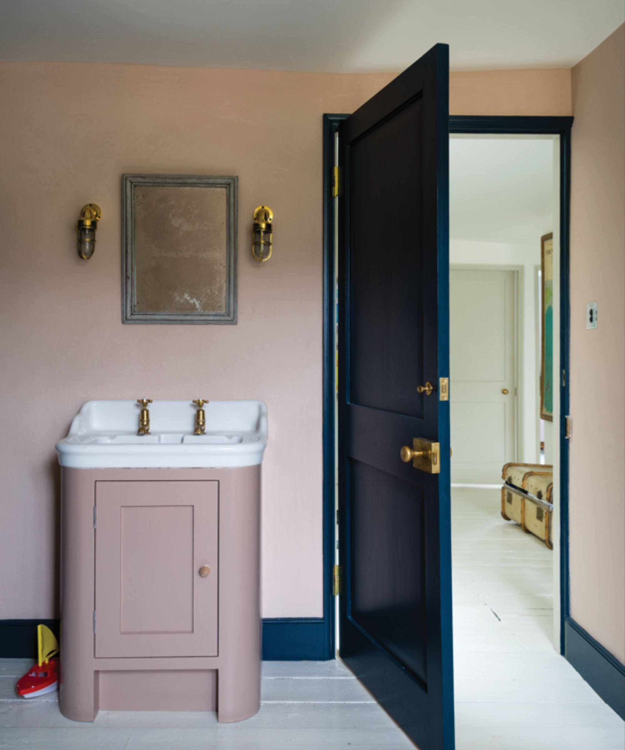
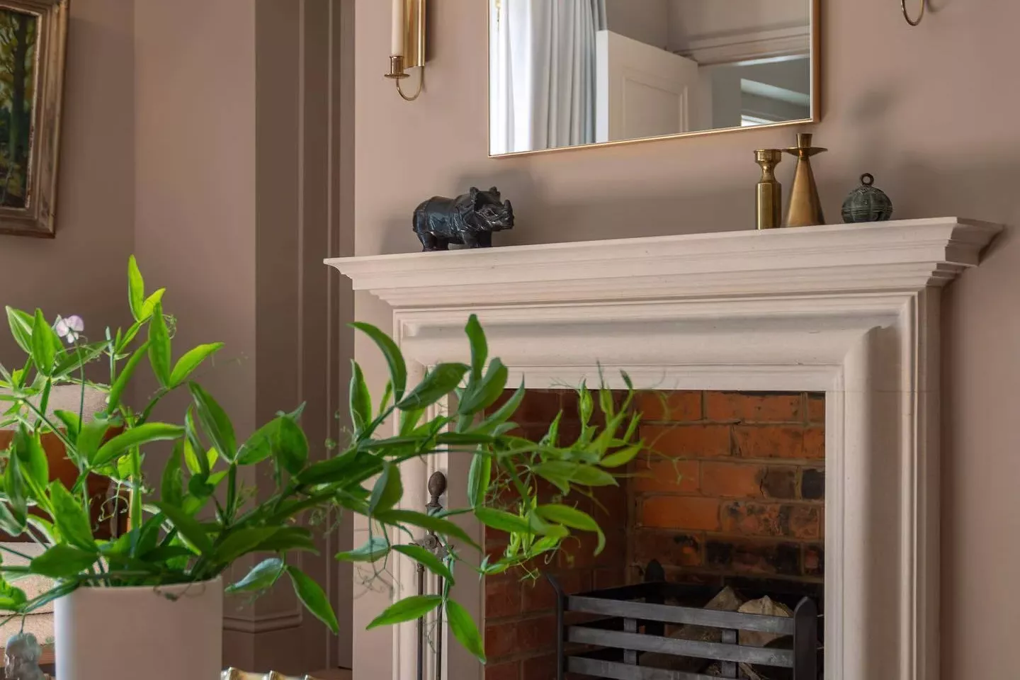
Farrow & Ball's Peignoir, with its subtle hint of champagne, softens a space without being overtly feminine. Sherwin Williams' Repose Gray offers a light gray with warm undertones, while Farrow & Ball's Pointing No. 2003 is considered a perfect warm white. Benjamin Moore's Super White is a versatile white that enhances both warm and cool room colors. Seapearl by Benjamin Moore is a crisp, fresh neutral that maintains clarity in various lighting conditions. Westhighland White by Sherwin Williams is a warm, fresh white suitable for entire homes or trim. Peau de Soie by Benjamin Moore is a blush-tinged neutral that creates a warm, inviting, and feminine ambiance.
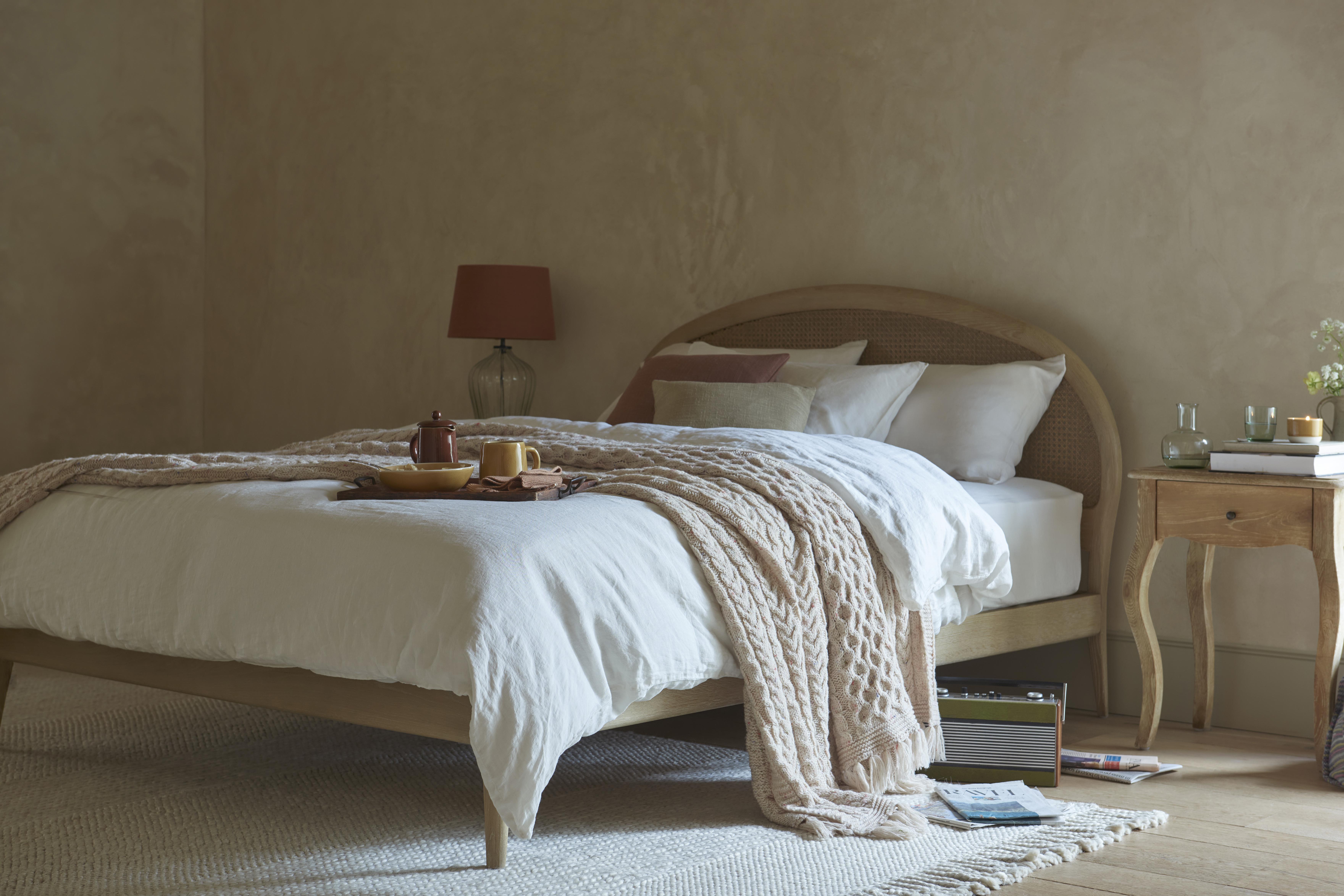
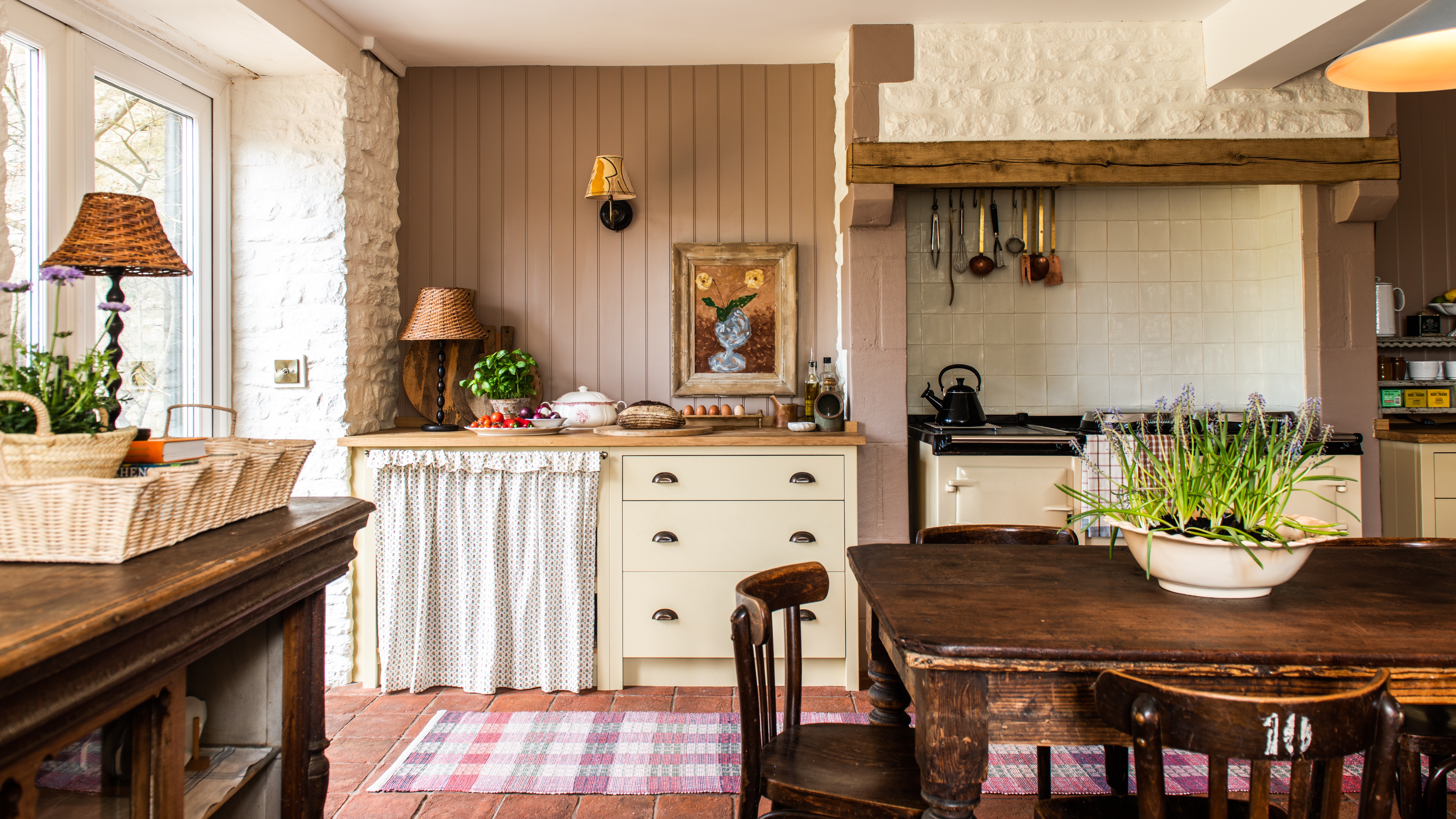
Benjamin Moore's Dune White provides a versatile backdrop that adapts to modern or traditional styles, allowing furnishings and art to stand out. Farrow & Ball's Single Cream, inspired by Parisian limestone facades, offers a warm glow for transitional or traditional interiors. Paisley Pink by Benjamin Moore adds a delicate blush, softening shadows and complementing skin tones. Nimbus by Benjamin Moore is a true 'greige' that adjusts to a room's lighting, making it a creamy backdrop for furnishings. Decorator's White by Benjamin Moore is a go-to neutral for colorful rooms, often paired with Sherwin Williams' Agreeable Gray when other decor elements are vibrant.
#NeutralPaintColors #InteriorDesign #HomeDecor #PaintShades #DesignerTips #ColorPalette #HomeImprovement #BenjaminMoore #SherwinWilliams #NeutralPaintColors #InteriorDesign #HomeDecor #PaintShades #DesignerTips #ColorPalette #HomeImprovement #BenjaminMoore #SherwinWilliams
0 Kommentare insgesamt
 Noch keine Kommentare
Das könnte Ihnen auch gefallen
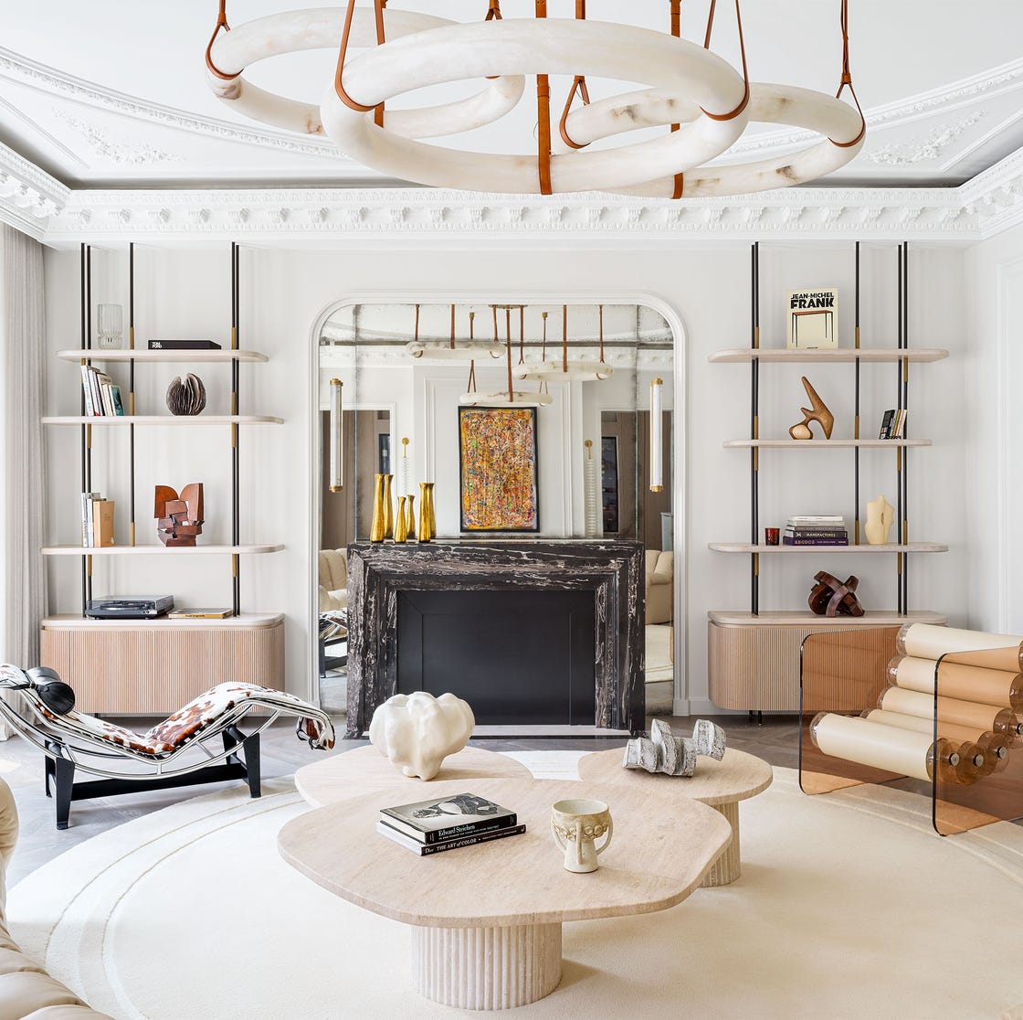
These Are the Neutral Paint Colors Interior Designers ACTUALLY Use

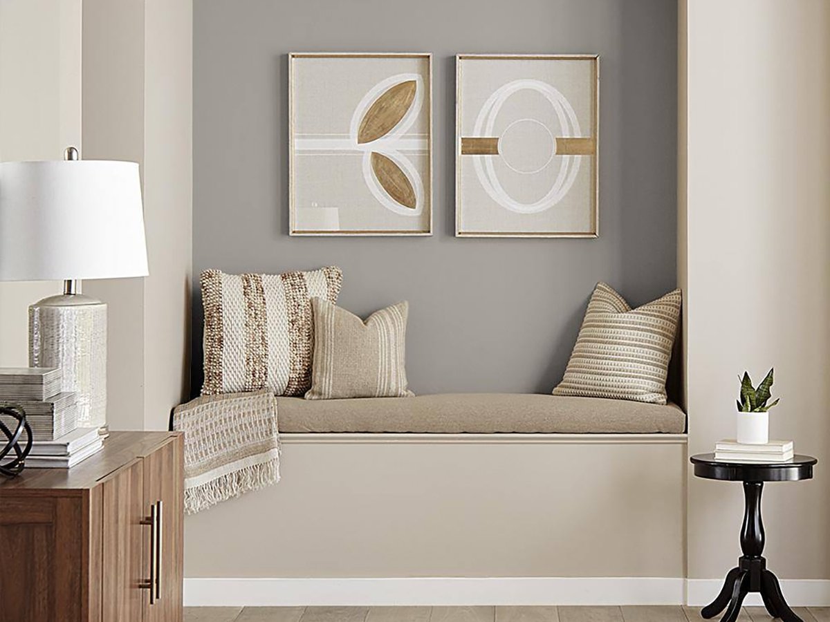
The 20 Best Neutral Paint Colors for Your Home in 2025

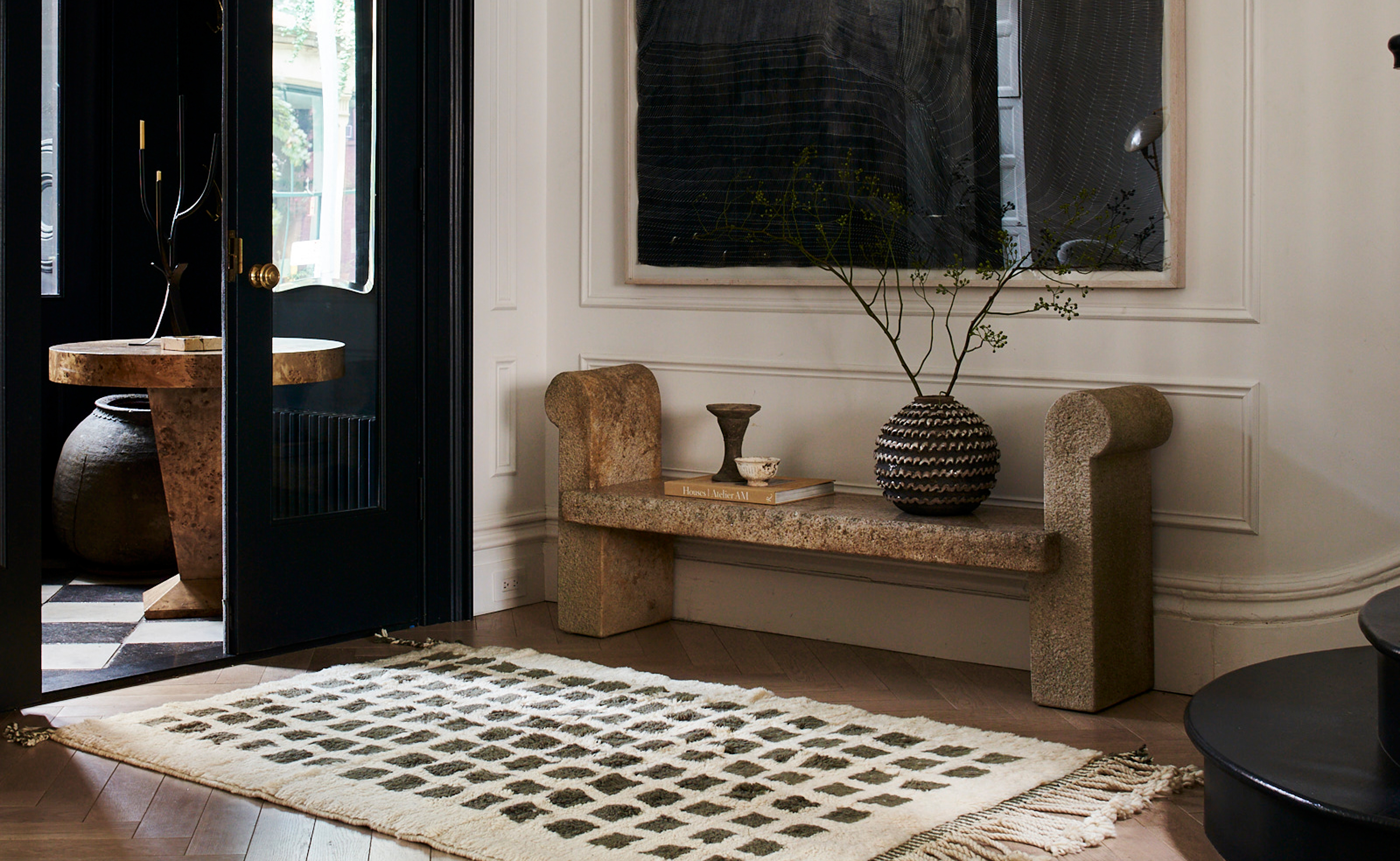
The 3 Best Neutral Entryway Paint Colors to Set the Right Tone for a Sophisticated Home

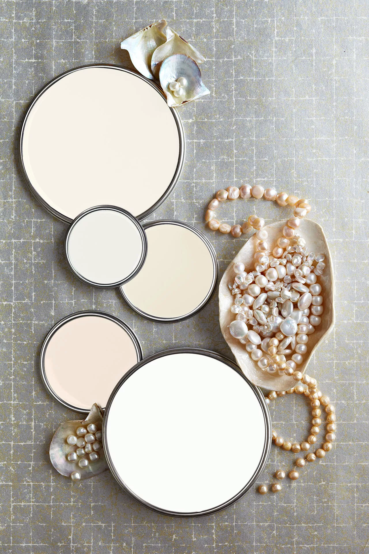
27 Neutral Paint Colors and Tips from Experts On How to Use Them

10 best warm neutral paints as recommended by interior designers – from beige to muted pink
The Most Popular Paint Colors in America

12 Paint Colors That Interior Designers Are Buzzing About—See the Gorgeous Hues Here
9 Neutral Paint Colors Designers Constantly Reach For — "It's My Tried-and-True"
Beige-grey – the timeless paint color perfect for a barely-there backdrop

33 Absolutely Perfect Paint Colors Designers Love

Creamy neutral paint colours are back — just don’t call it magnolia
How to Pick the Best Paint Colors for Every Space in Your Home

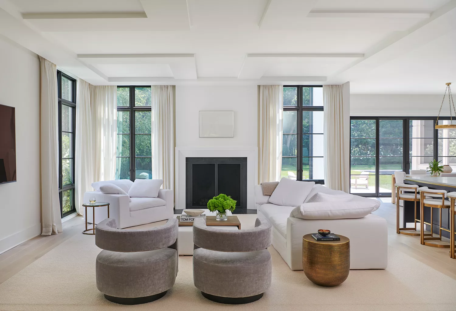
12 Neutral Paint Colors That Will Look Beautiful in Every Room
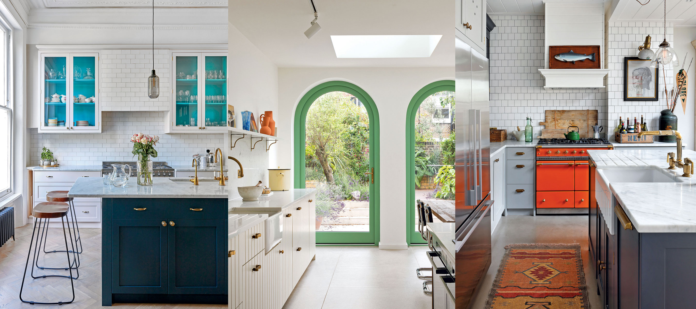
10 creative ways interior designers work color into neutral kitchens
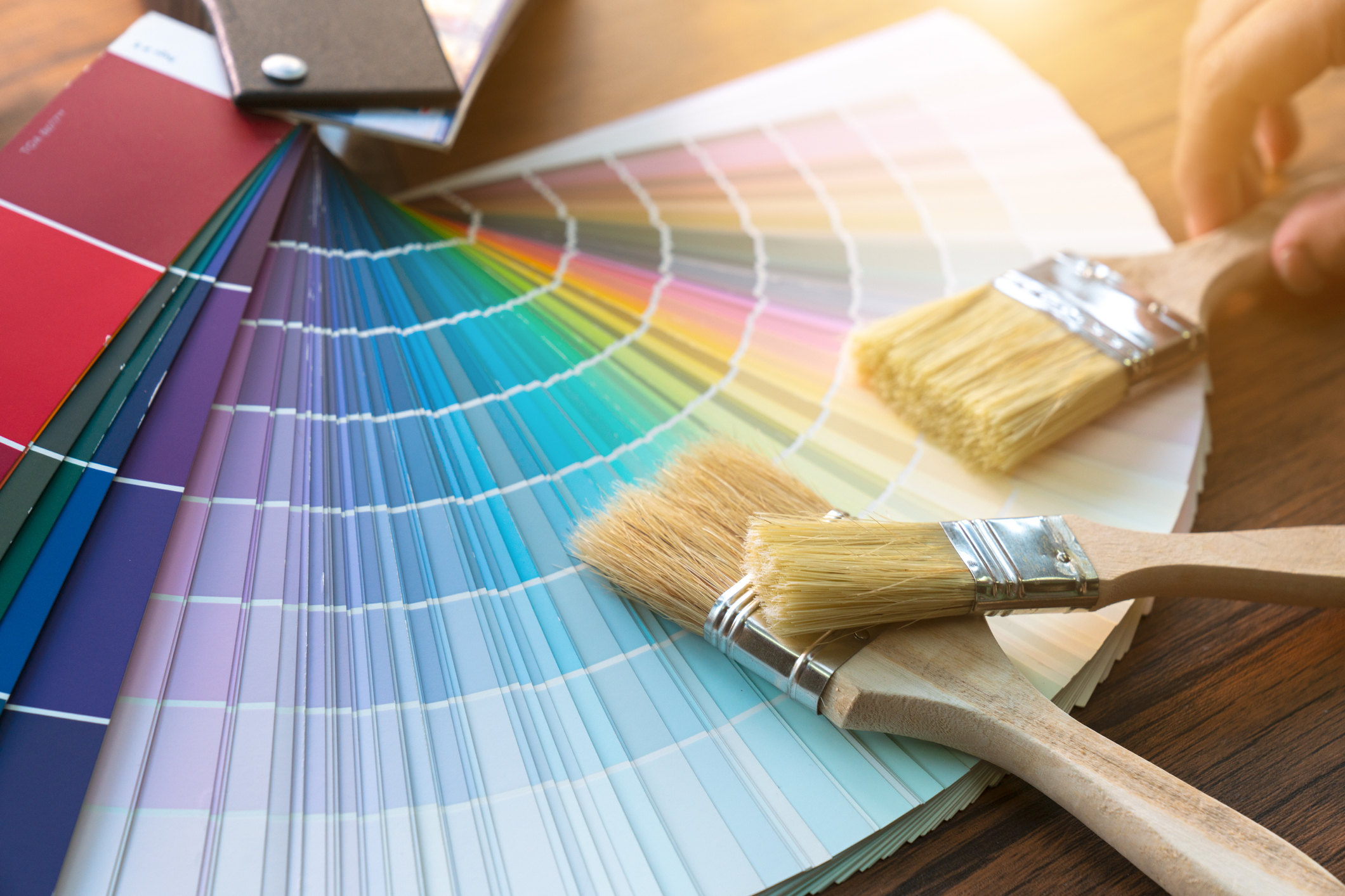
Britain's best interior designers on the paint colours you just can't go wrong with
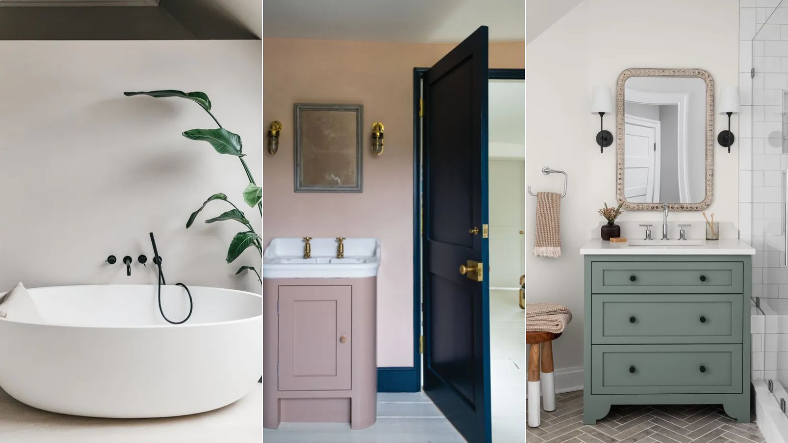
The best neutral paint colors for bathrooms that aren't white – 5 timeless shades designers always turn to
White vs Cream: designers weigh in on these enduring neutrals

7 of the most versatile and easy to use paint colors according to designers
35 Paint Colors to Consider for Every Room in Your House

15 Timeless Paint Colors You’ll Never Tire Of, According To Designers