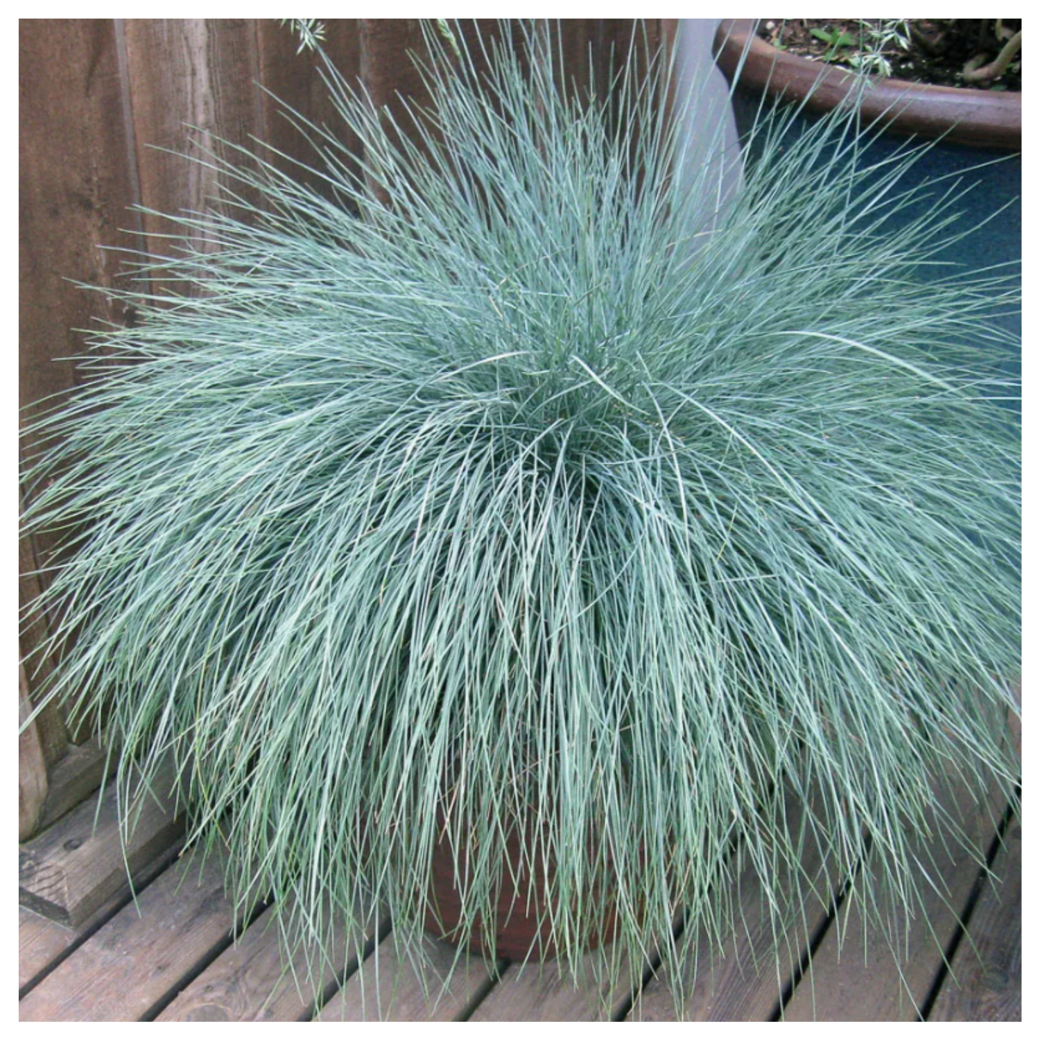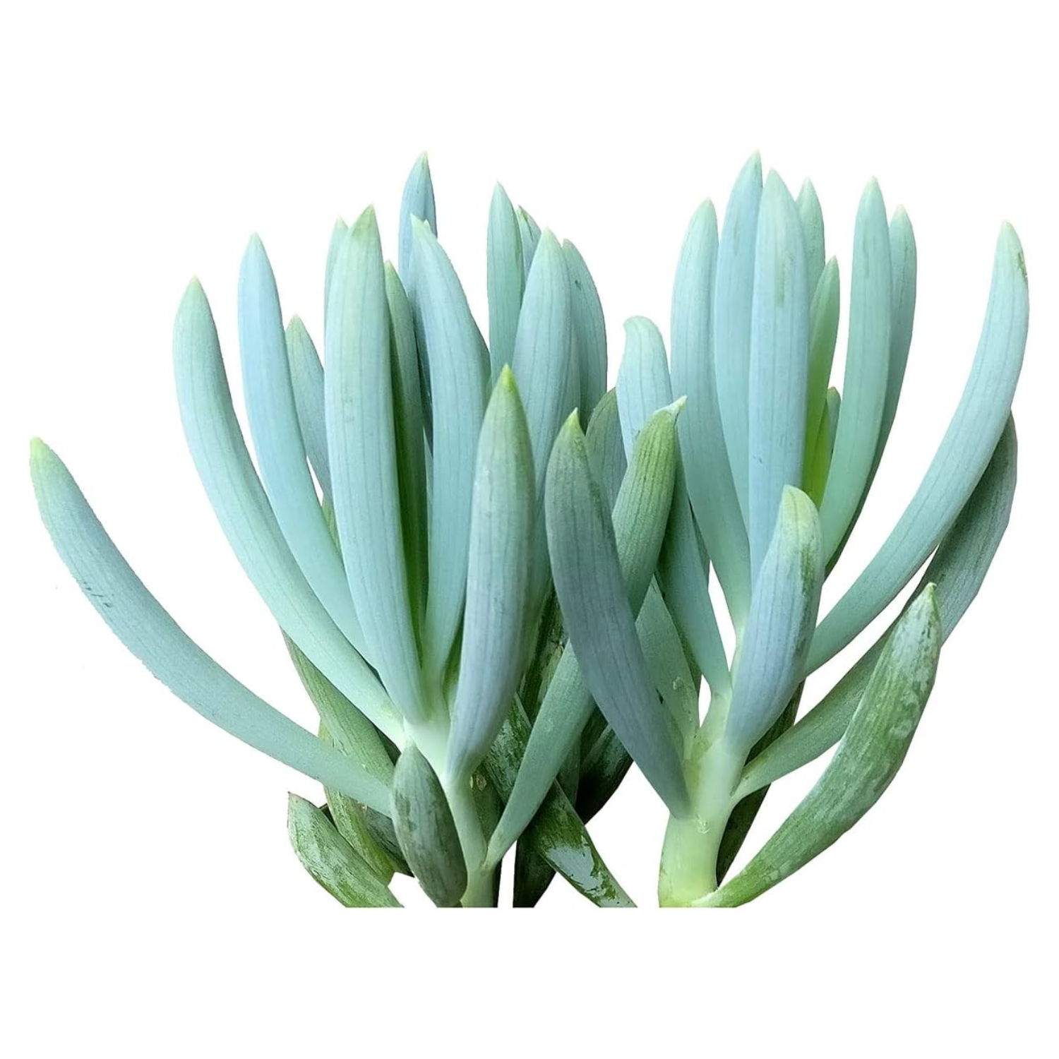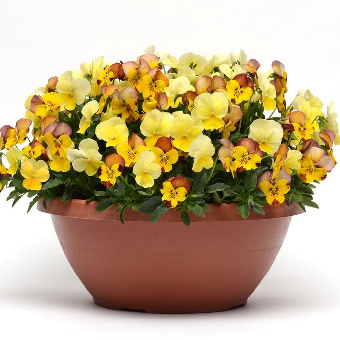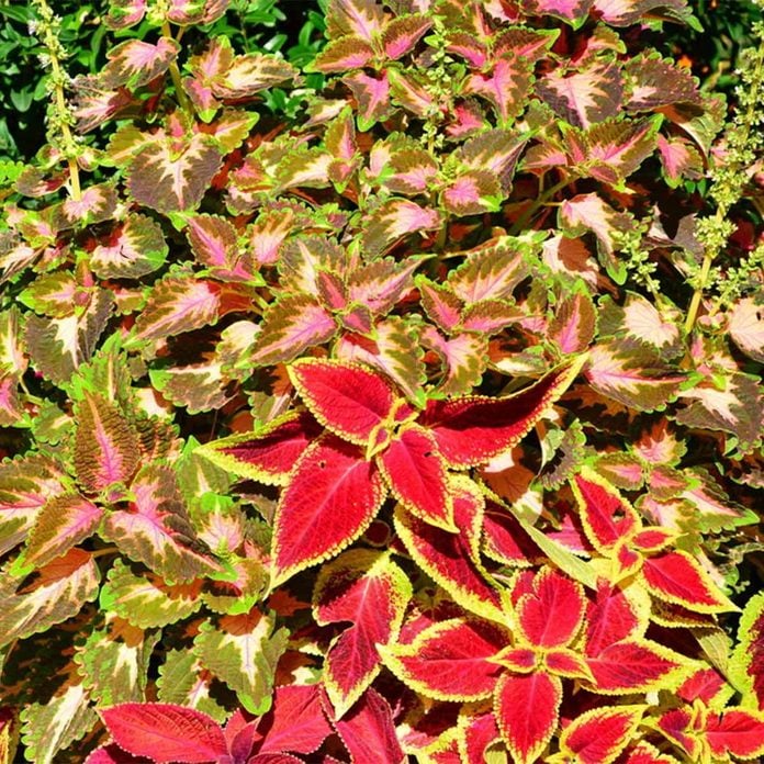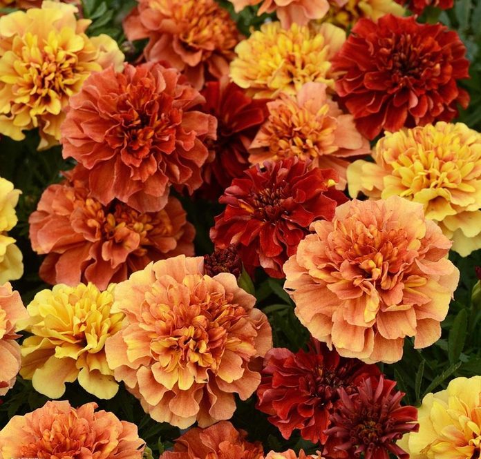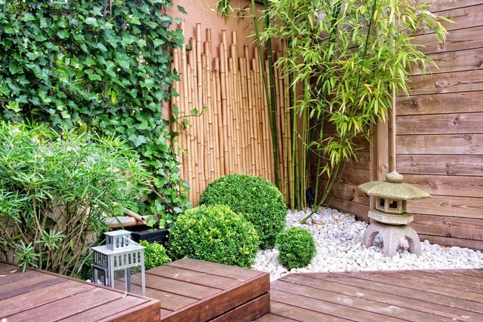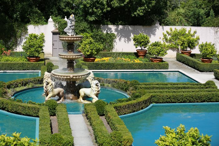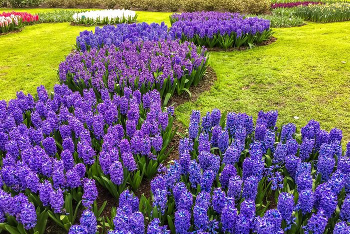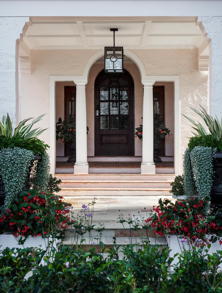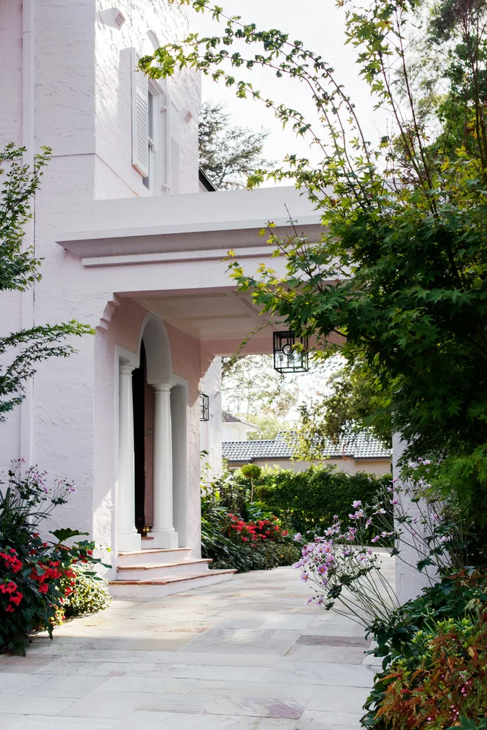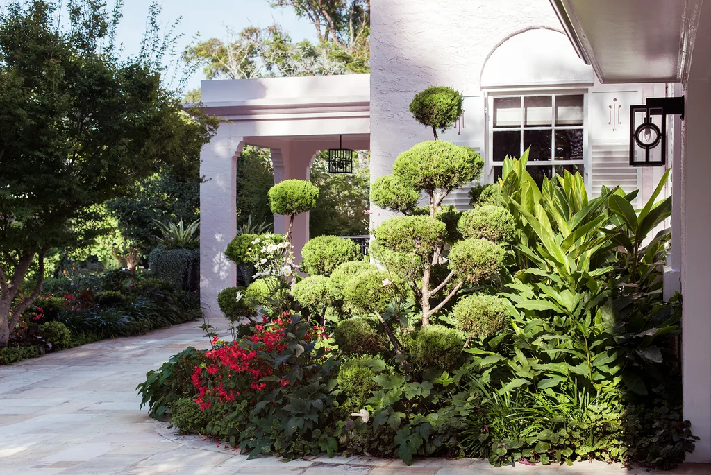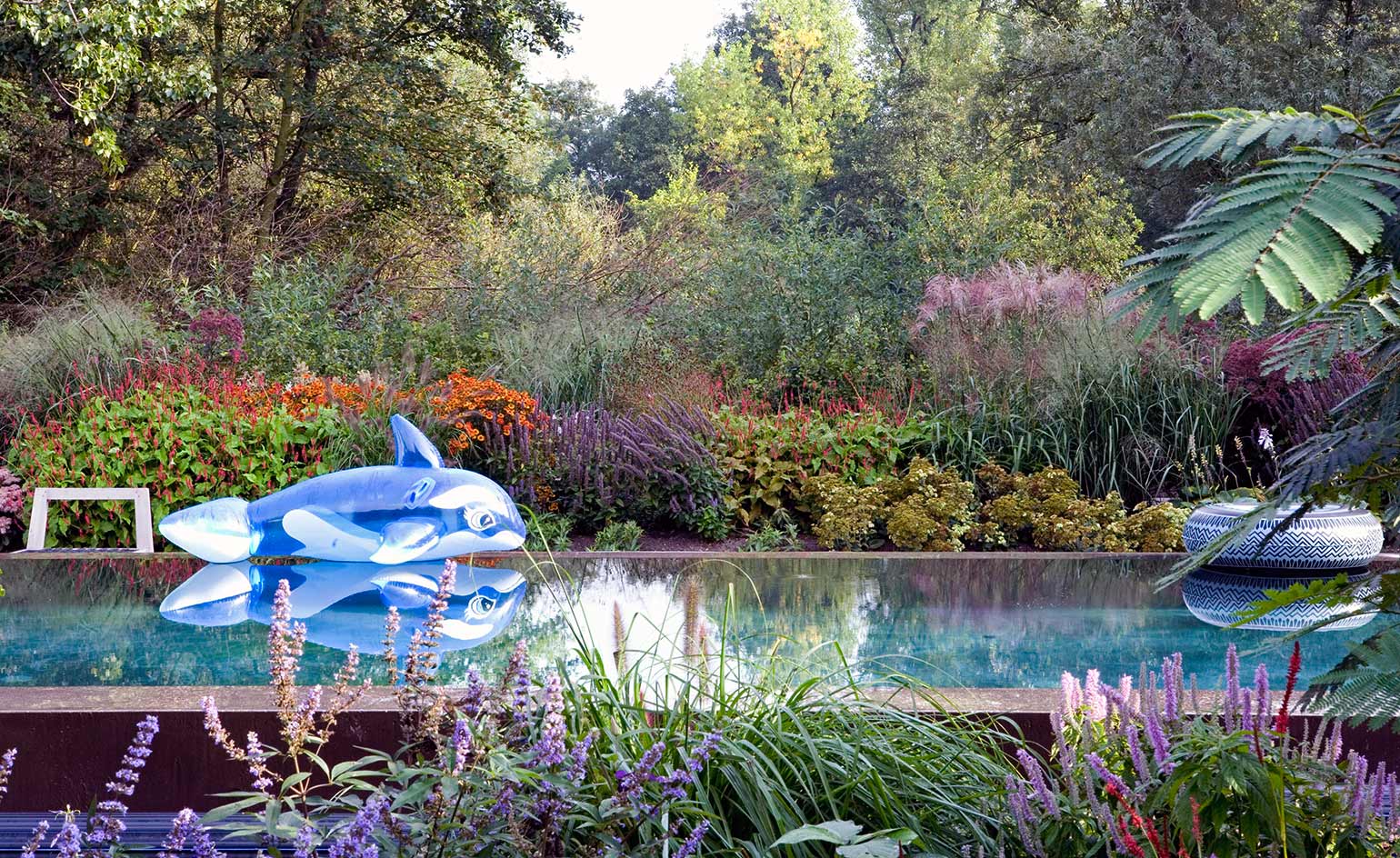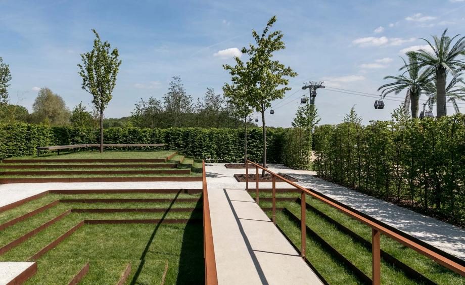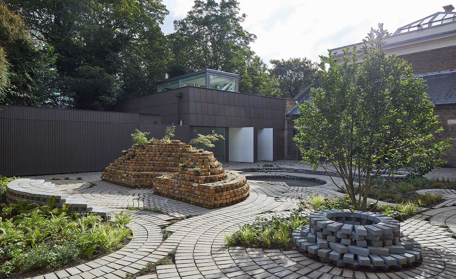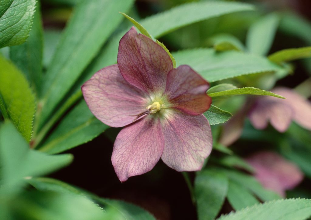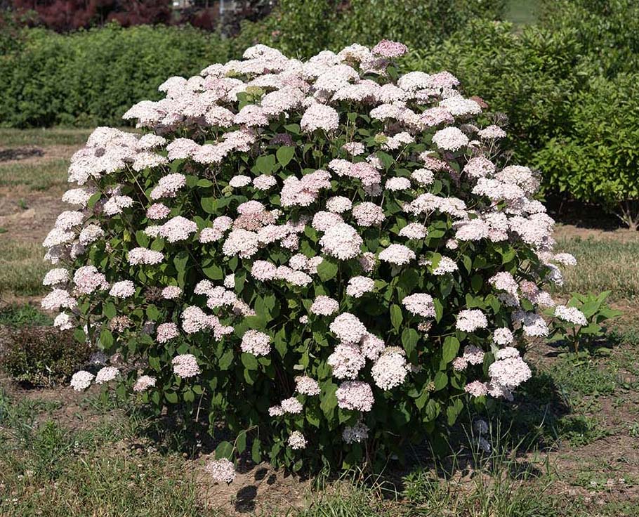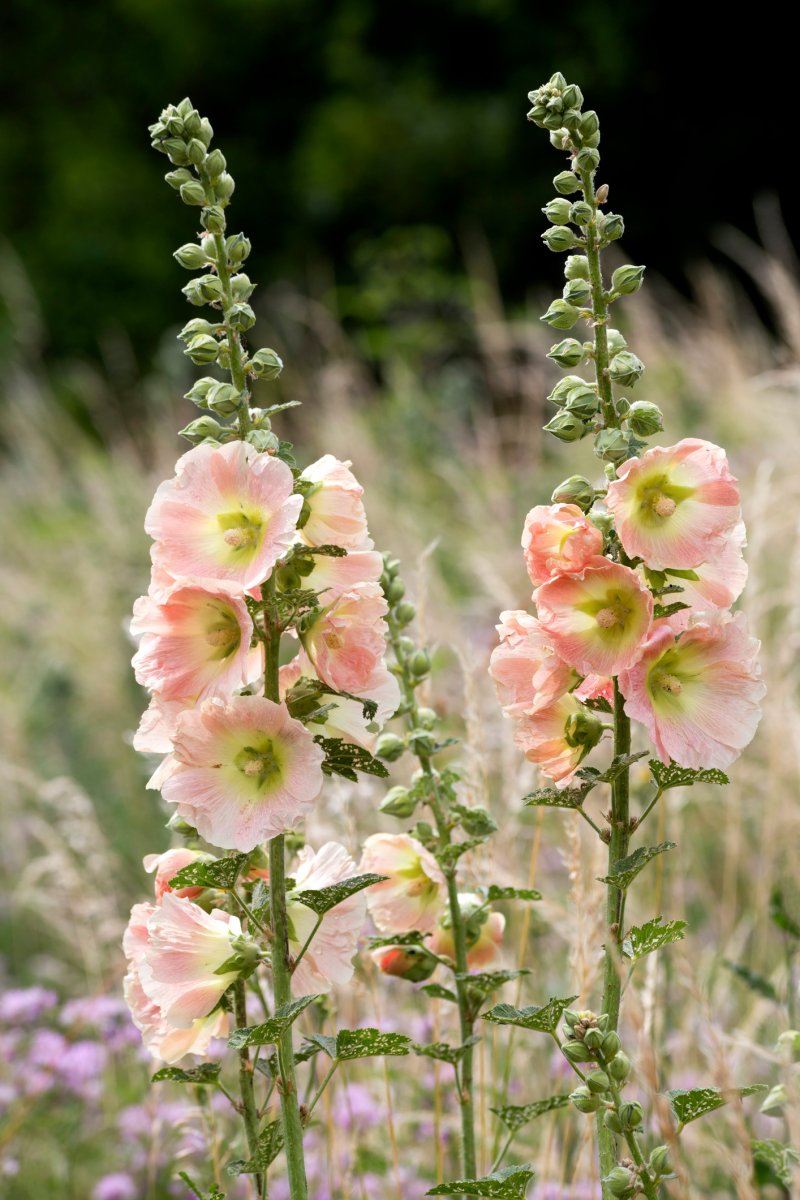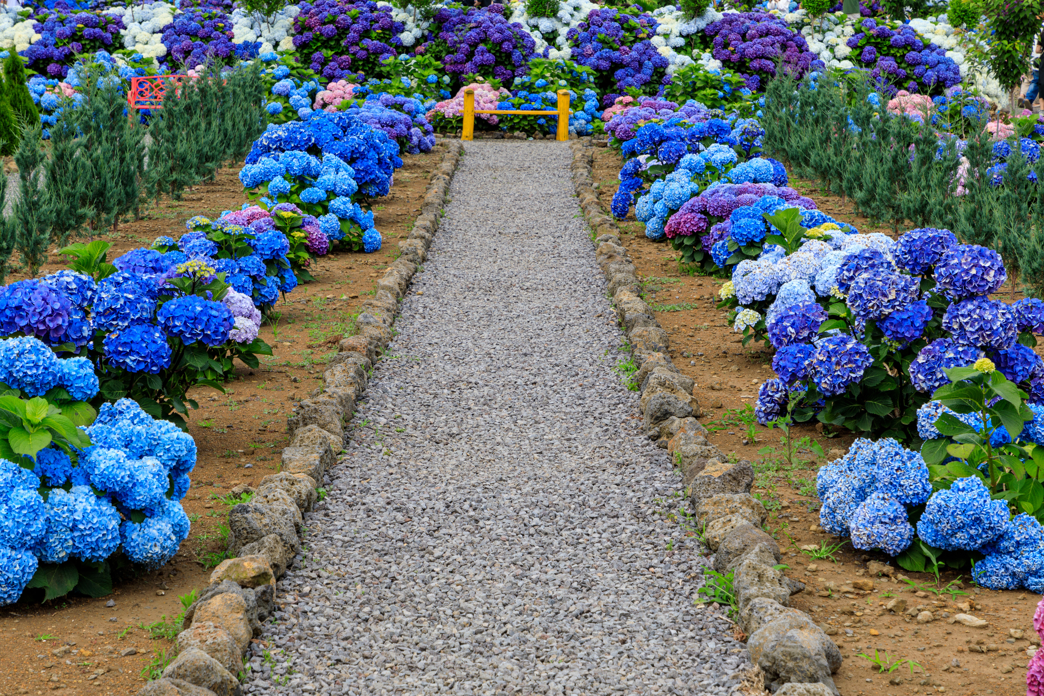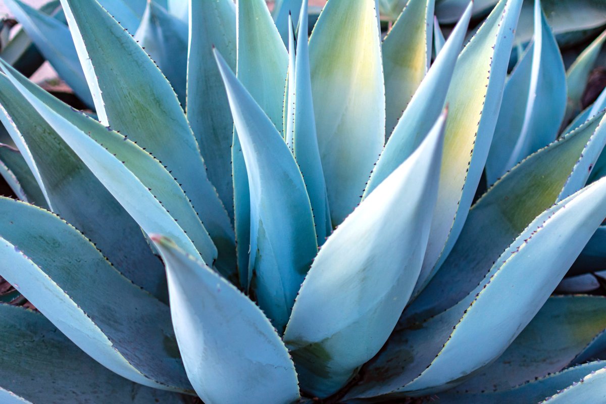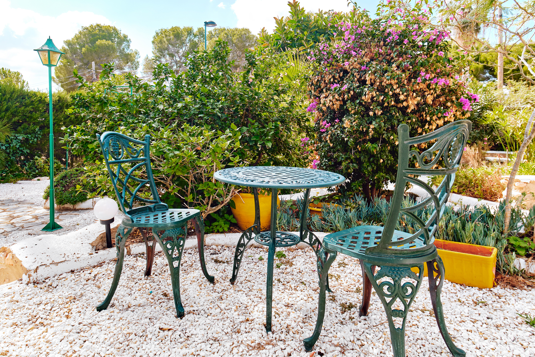
The colours inspired by world famous gardens
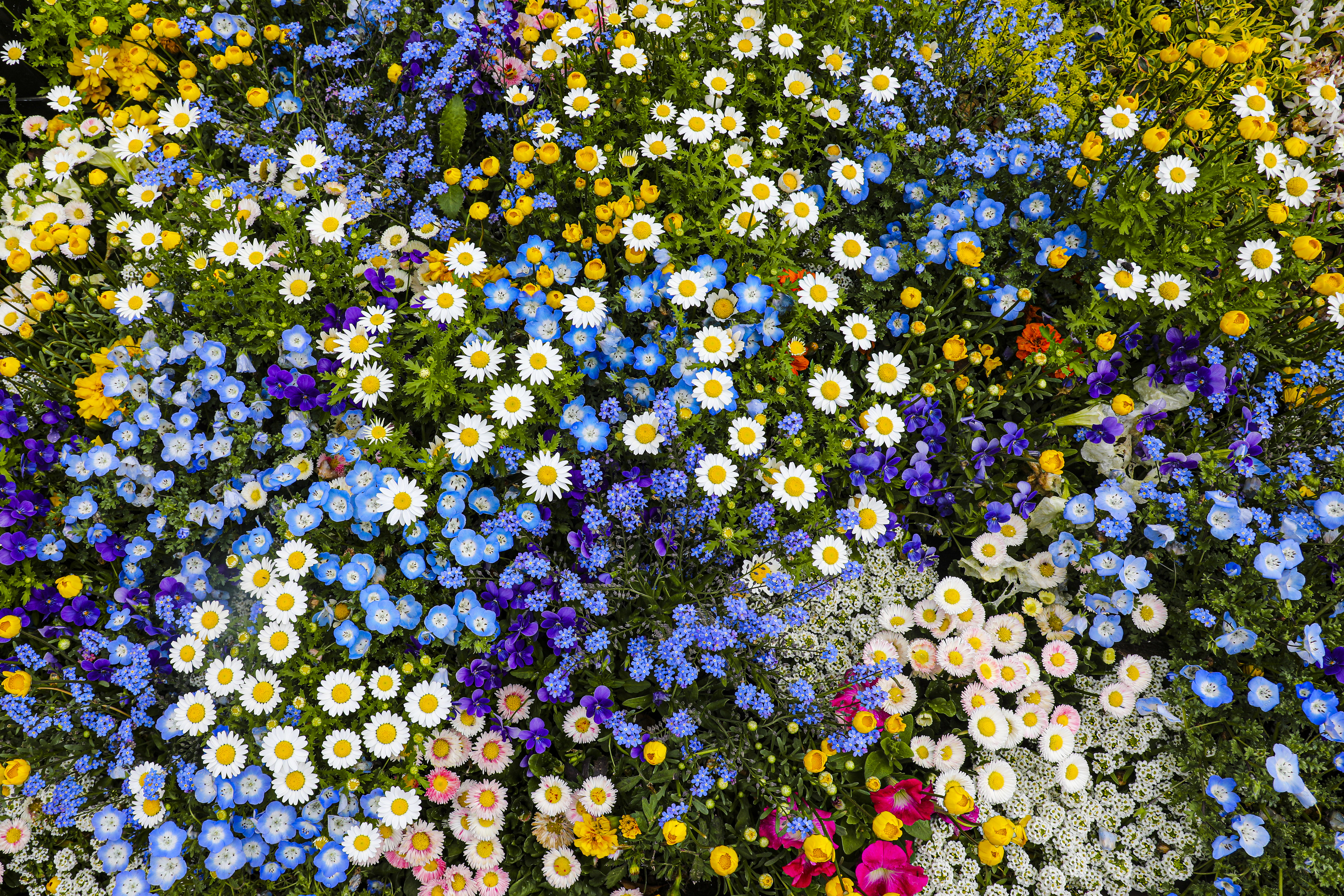
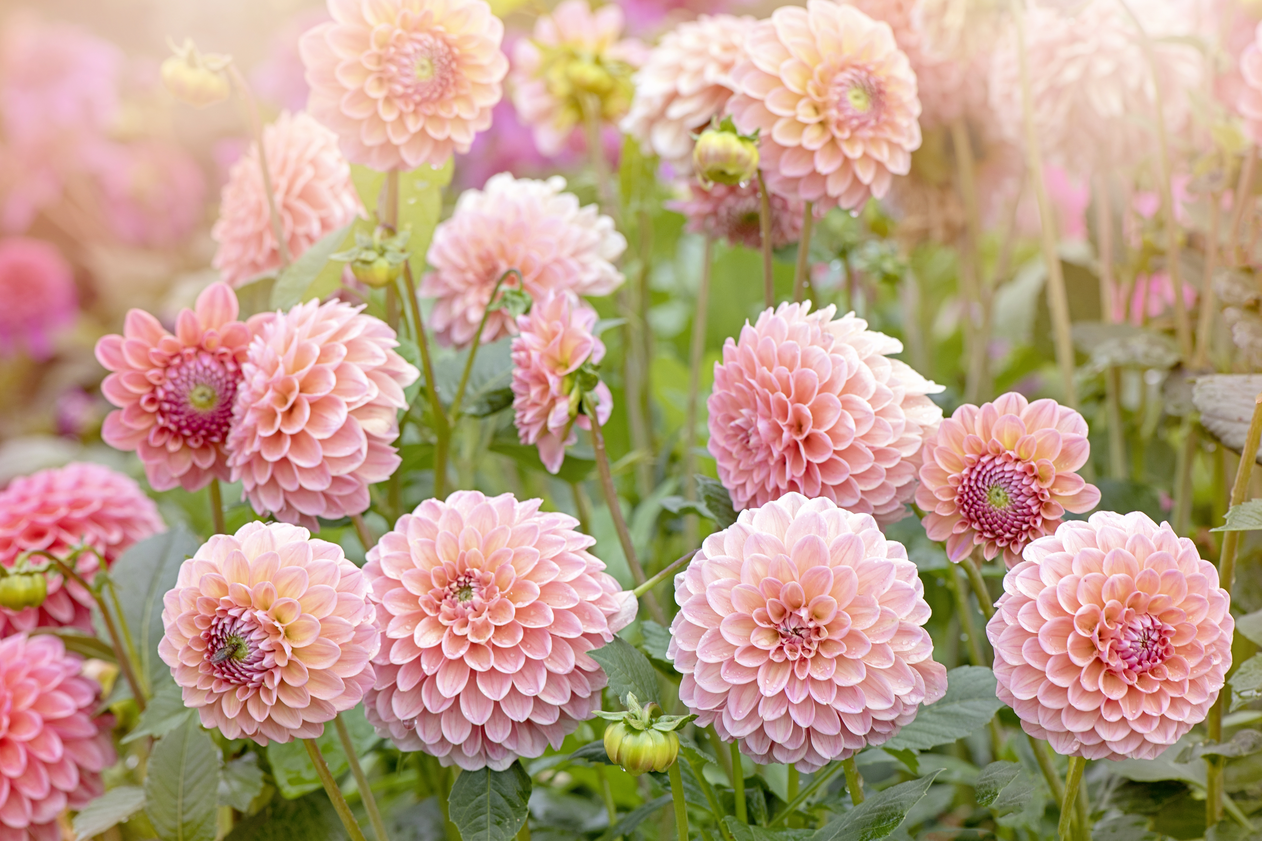
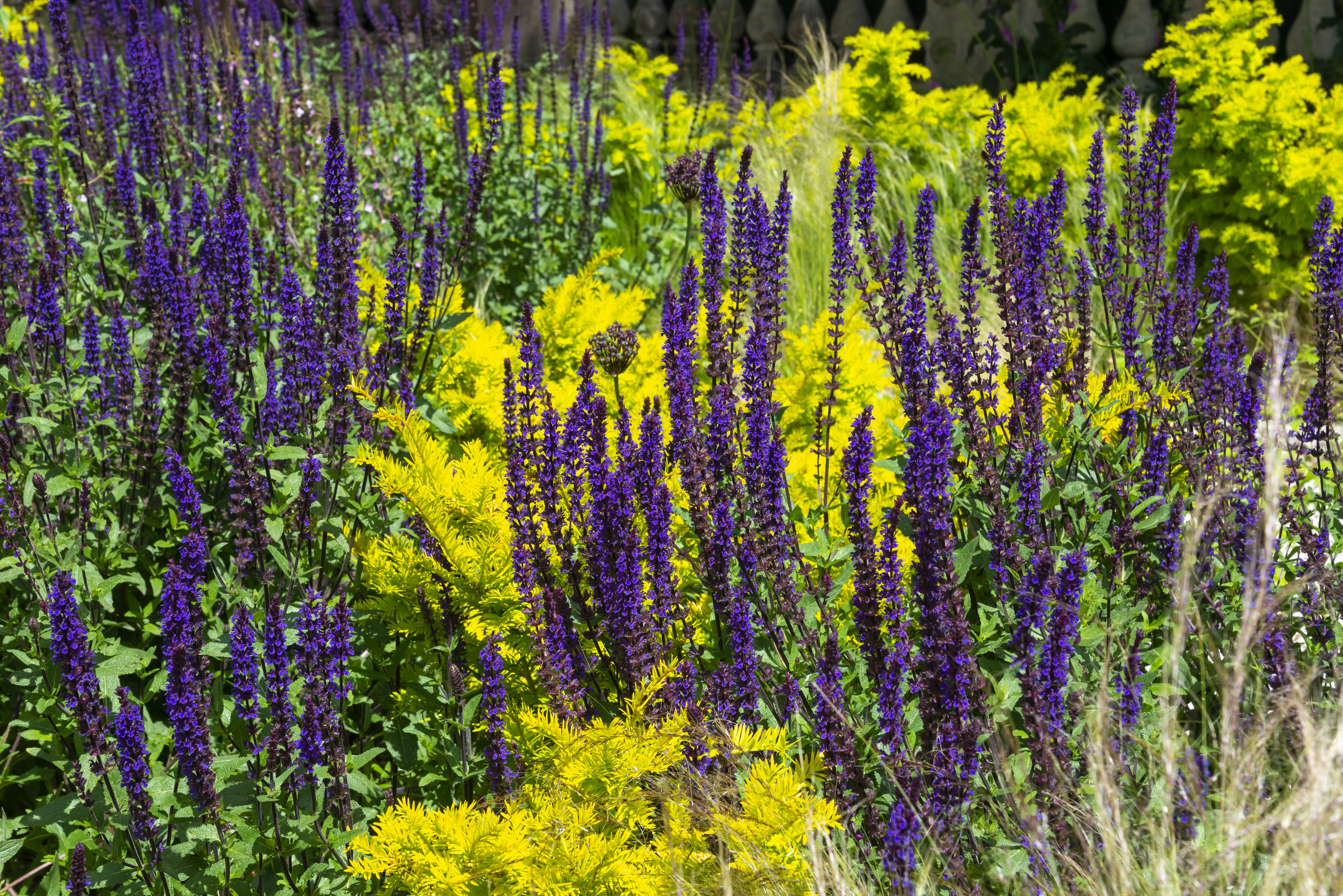
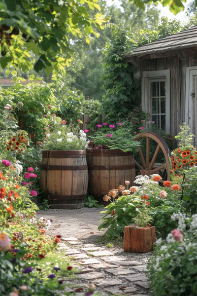
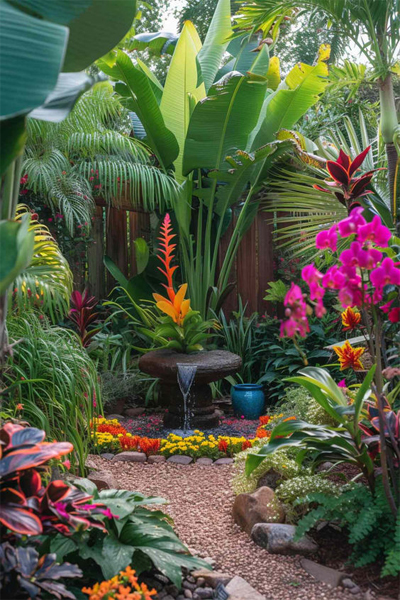
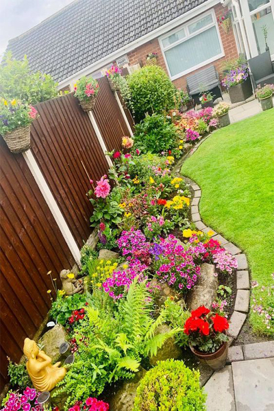
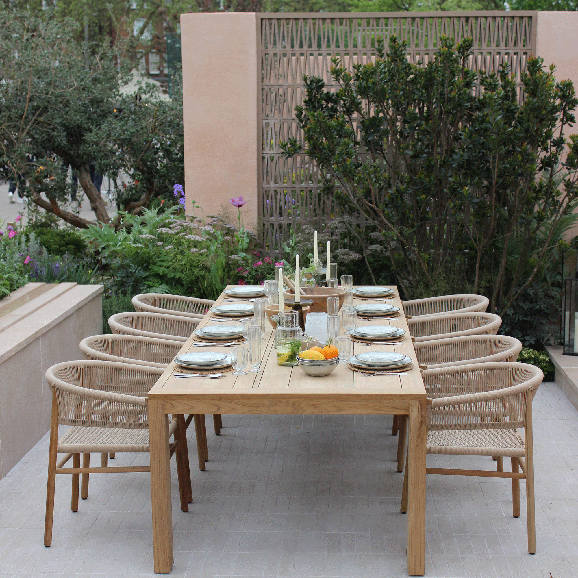
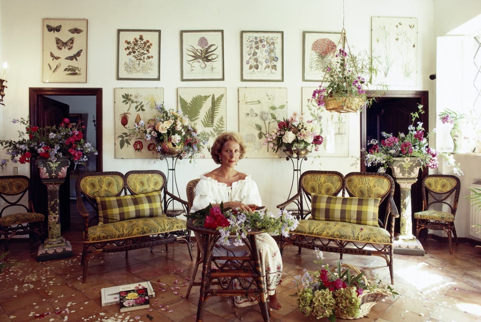
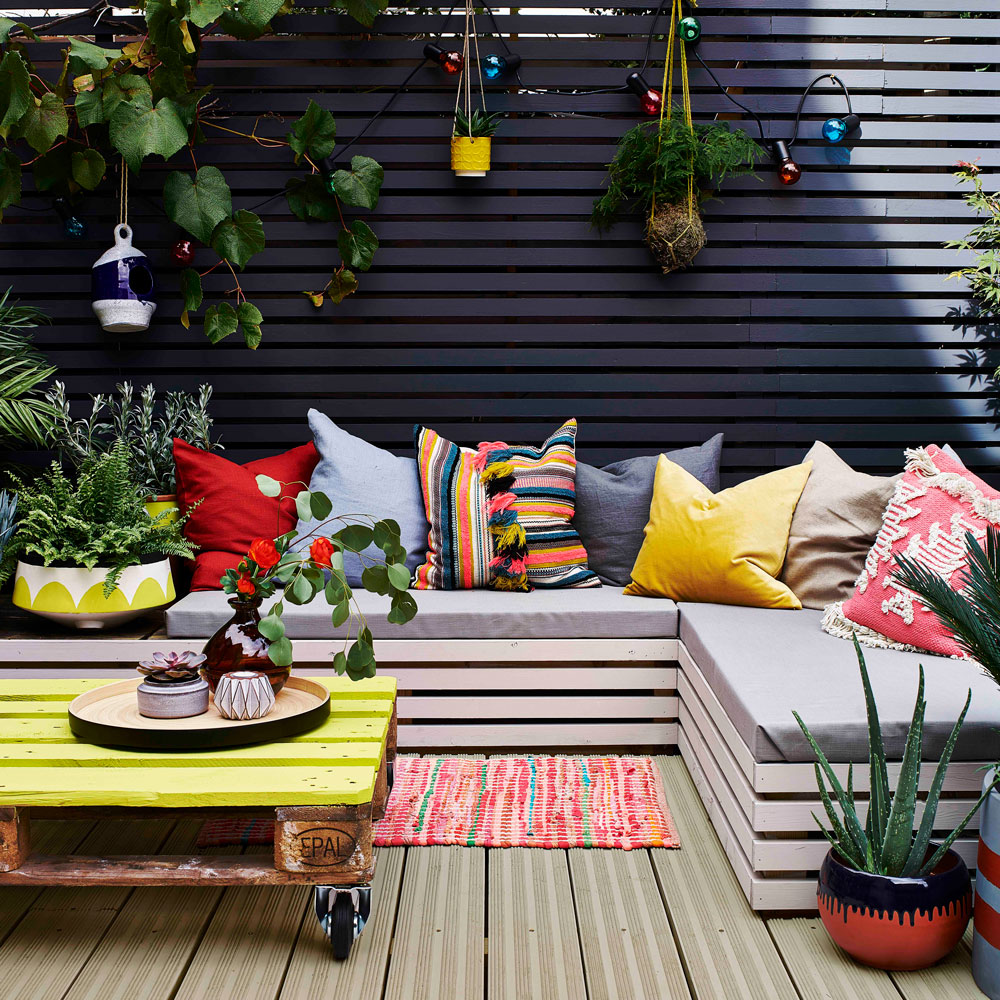
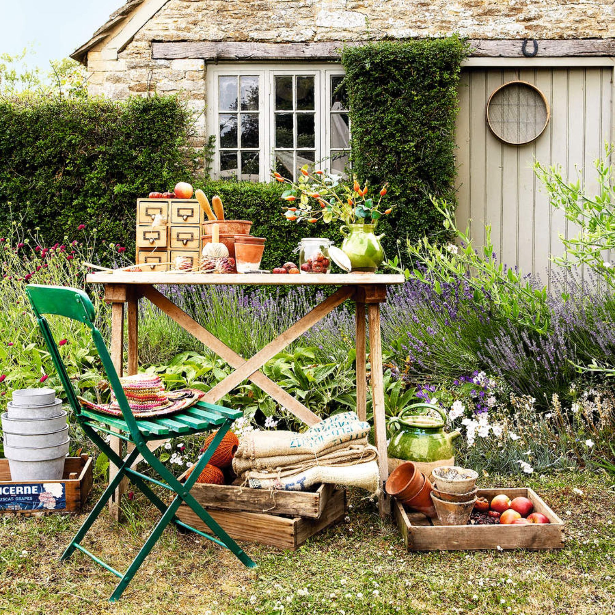
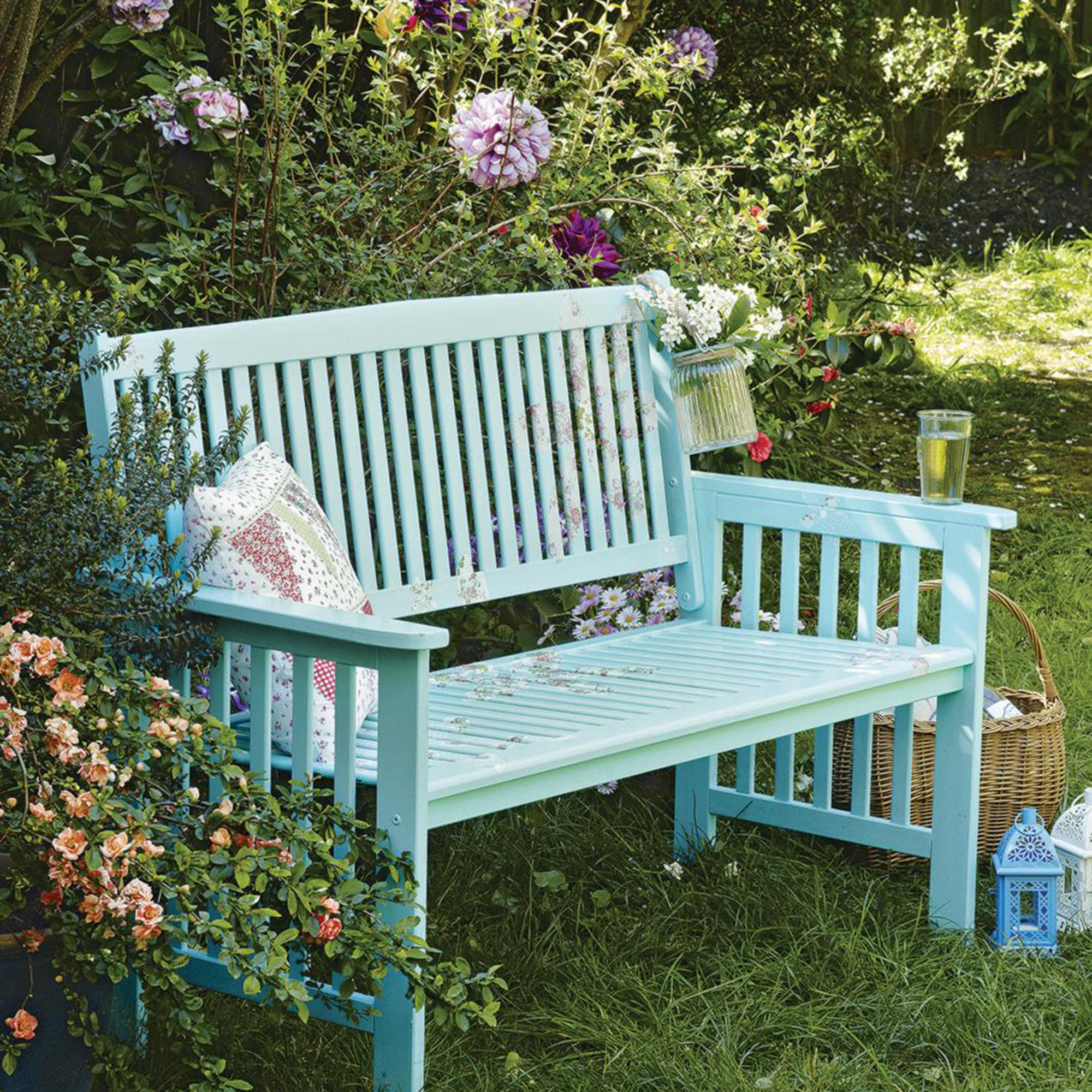
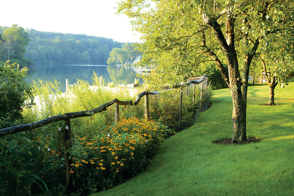
Dulux has unveiled its new 'Garden' colour guide, a collection of shades inspired by the aesthetic diversity of world-renowned gardens. This guide aims to offer specifiers, architects, and designers a refined palette for interior and exterior applications, providing a fresh perspective on integrating natural beauty into built environments. The inspiration for this collection spans various iconic gardens, from the classical formality of French parterres to the wild, untamed beauty of English cottage gardens, and the vibrant, exotic flora of tropical landscapes.
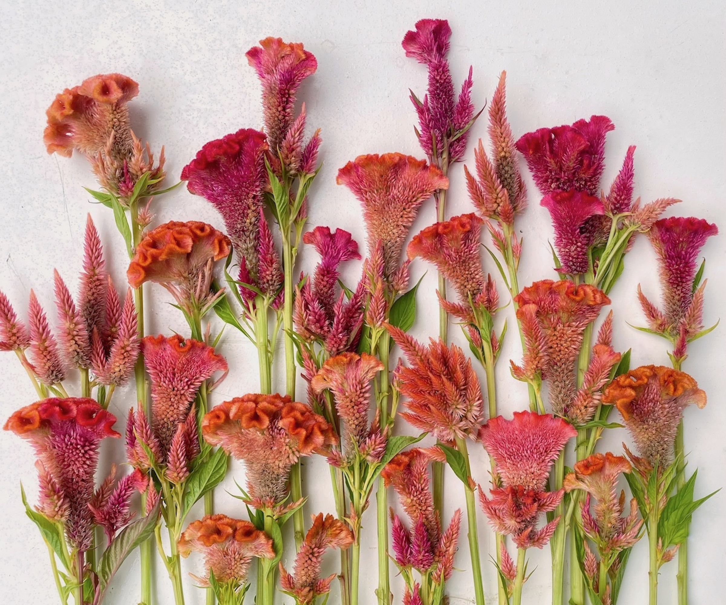
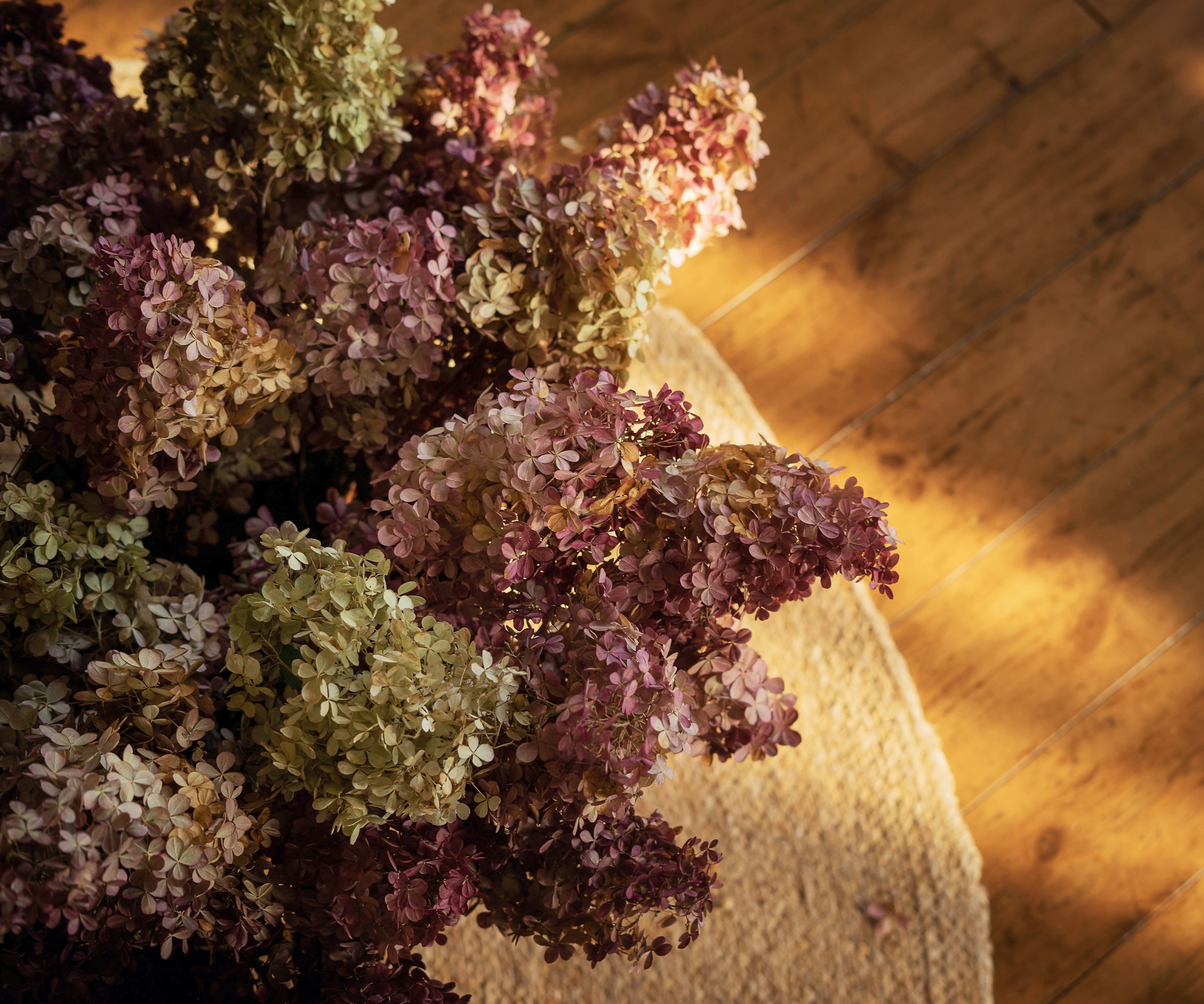
The 'Garden' guide is structured to capture the essence of these diverse horticultural masterpieces, translating their visual and emotional impact into a cohesive colour language. It delves into the specific colour nuances found within these settings, considering the interplay of light, shadow, and the changing seasons. The guide emphasizes the subtle shifts in greens, the earthiness of browns and greys, and the vibrant bursts of floral hues, offering a comprehensive spectrum that reflects the complexity of natural ecosystems.
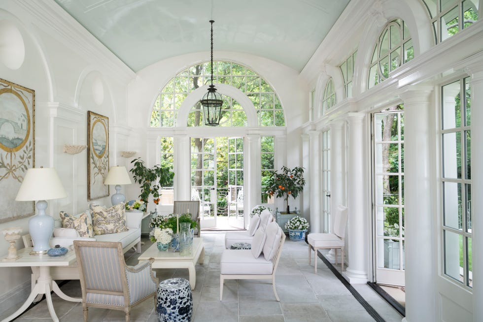
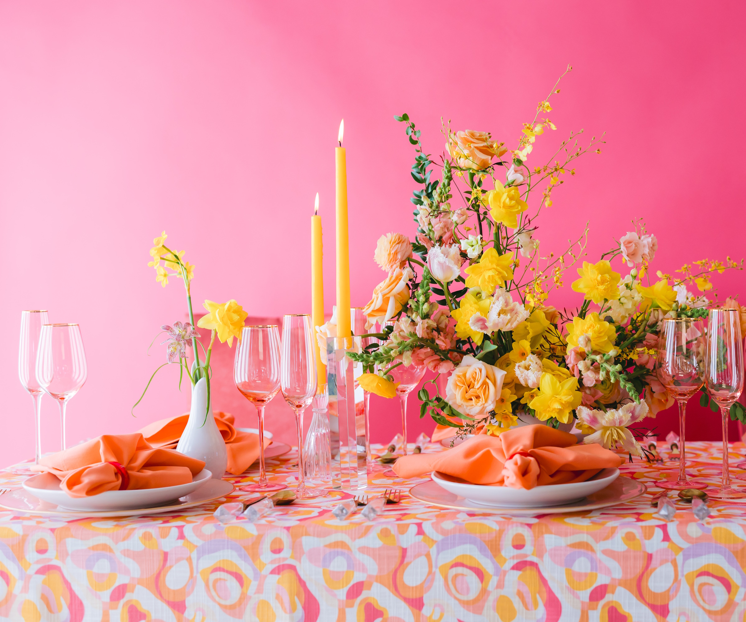
Within the guide, Dulux categorizes colours into distinct themes, each echoing a particular garden style or element. For instance, one theme might focus on the serene and contemplative colours found in Japanese zen gardens, characterized by muted tones, natural wood shades, and soft greys. Another theme could be dedicated to the opulent and bold colours of tropical gardens, featuring lush greens, vibrant blues, and exotic floral accents. The guide also explores the sophisticated pastels and intricate details often seen in French formal gardens, providing a range of delicate and elegant options.
Beyond mere colour swatches, the 'Garden' guide offers practical advice on how to effectively use these palettes in different architectural and design contexts. It provides insights into colour psychology, suggesting how certain combinations can evoke specific moods or enhance the functionality of a space. For example, cooler greens and blues might be recommended for creating tranquil and relaxing environments, while warmer floral tones could be used to inject energy and vibrancy into a room. The guide also considers the impact of natural and artificial lighting on colour perception, offering recommendations for different lighting conditions.
Furthermore, the guide includes examples of successful applications, showcasing how these garden-inspired colours can be integrated into various projects, from residential interiors to commercial spaces and public areas. These case studies illustrate the versatility of the palette, demonstrating how it can be adapted to suit different architectural styles and design preferences. The guide aims to empower designers to create spaces that feel connected to nature, promoting well-being and a sense of harmony. It serves as a valuable resource for those looking to infuse their projects with the timeless beauty and sensory richness of the natural world, fostering an appreciation for colour's ability to transform spaces.
Dulux's 'Garden' colour guide is positioned as an essential tool for design professionals seeking to create harmonious and aesthetically pleasing environments. By drawing inspiration from the world's most beautiful gardens, the guide provides a unique and thoughtful approach to colour selection, encouraging a deeper connection between interior and exterior spaces and the natural world.
#Dulux #ColourGuide #GardenInspired #InteriorDesign #ExteriorDesign #ArchitecturalPalette #NaturalColours #DesignInspiration #ColourPsychology #Dulux #ColourGuide #GardenInspired #InteriorDesign #ExteriorDesign #ArchitecturalPalette #NaturalColours #DesignInspiration #ColourPsychology
0 comment in total
 No comments yet
You may also like
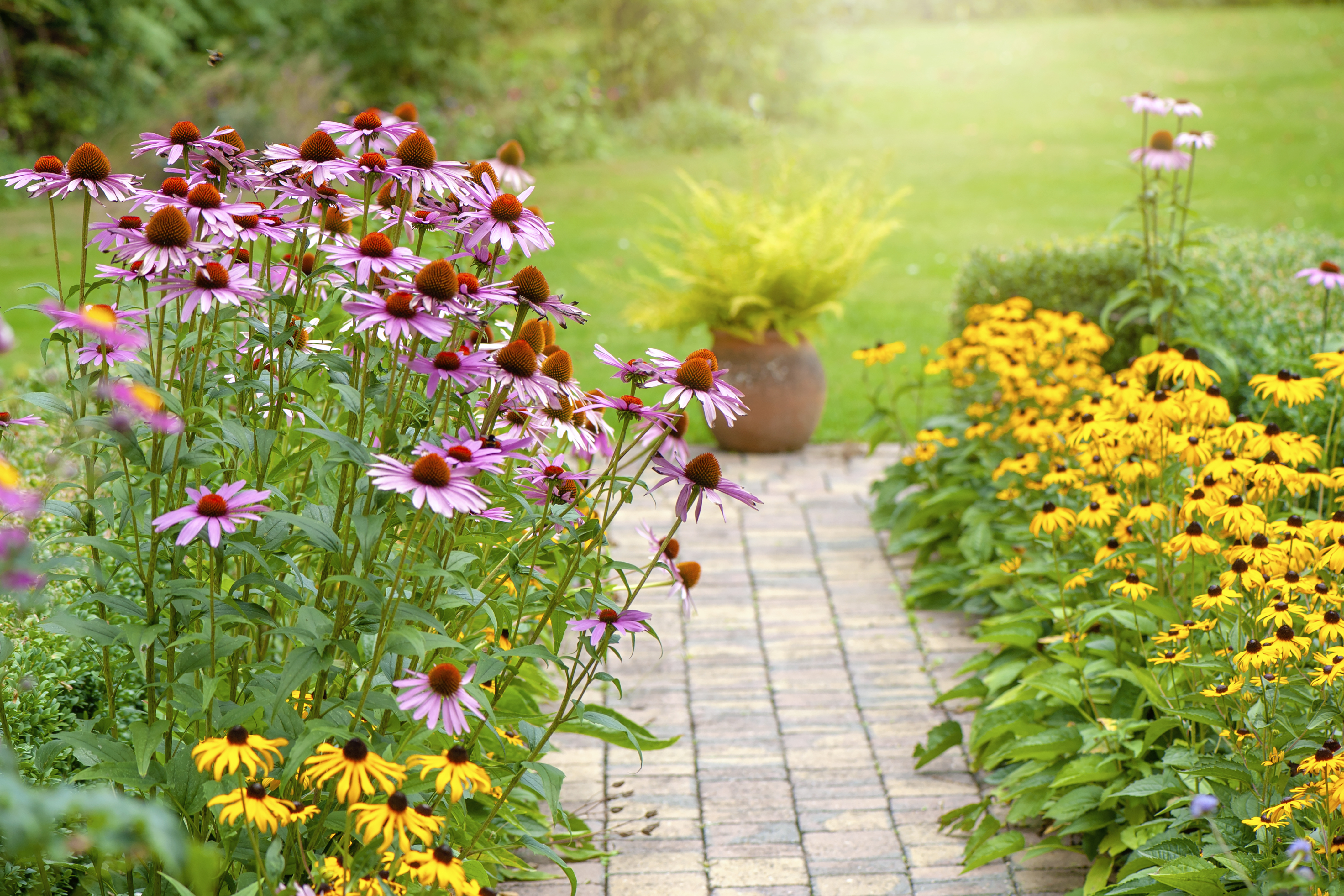
Garden color schemes – these are the palettes landscapers lean on to make planting feel cohesive and considered

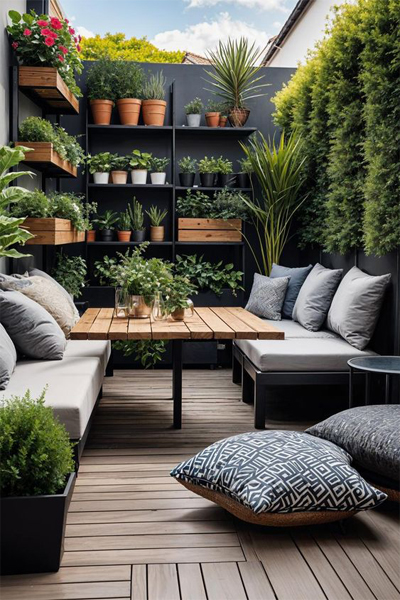
20 Beautiful Garden Design Ideas for Home In 2024
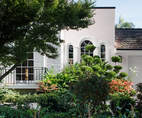
A bold garden design with a hint of nostalgia

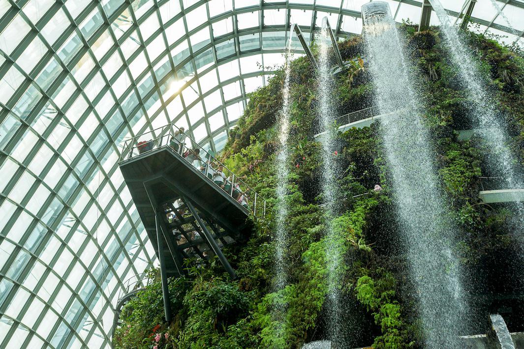
The Most Well-Designed Gardens in the World
Trend Experts Just Revealed 2025's Most Exhilarating Outdoor Color Trend — Here's How to Shop Teal
The colour trend taking over our gardens for summer holiday vibes all year round
The Most Well-Designed Gardens in the World
9 inner-city garden ideas to inspire
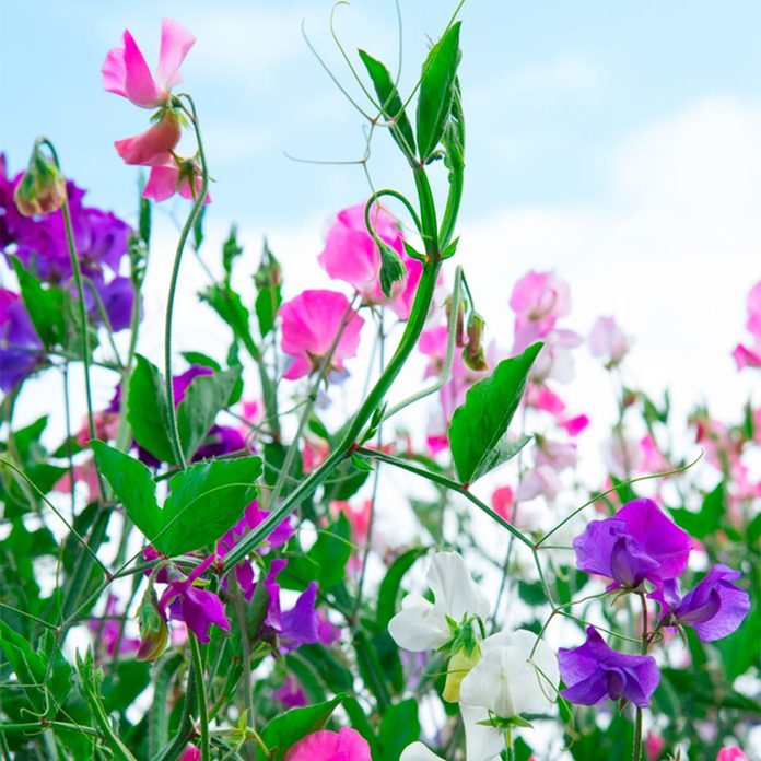
15 Colorful Plants to Brighten Up Your Landscape

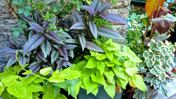
Add color with foliage, not just flowers

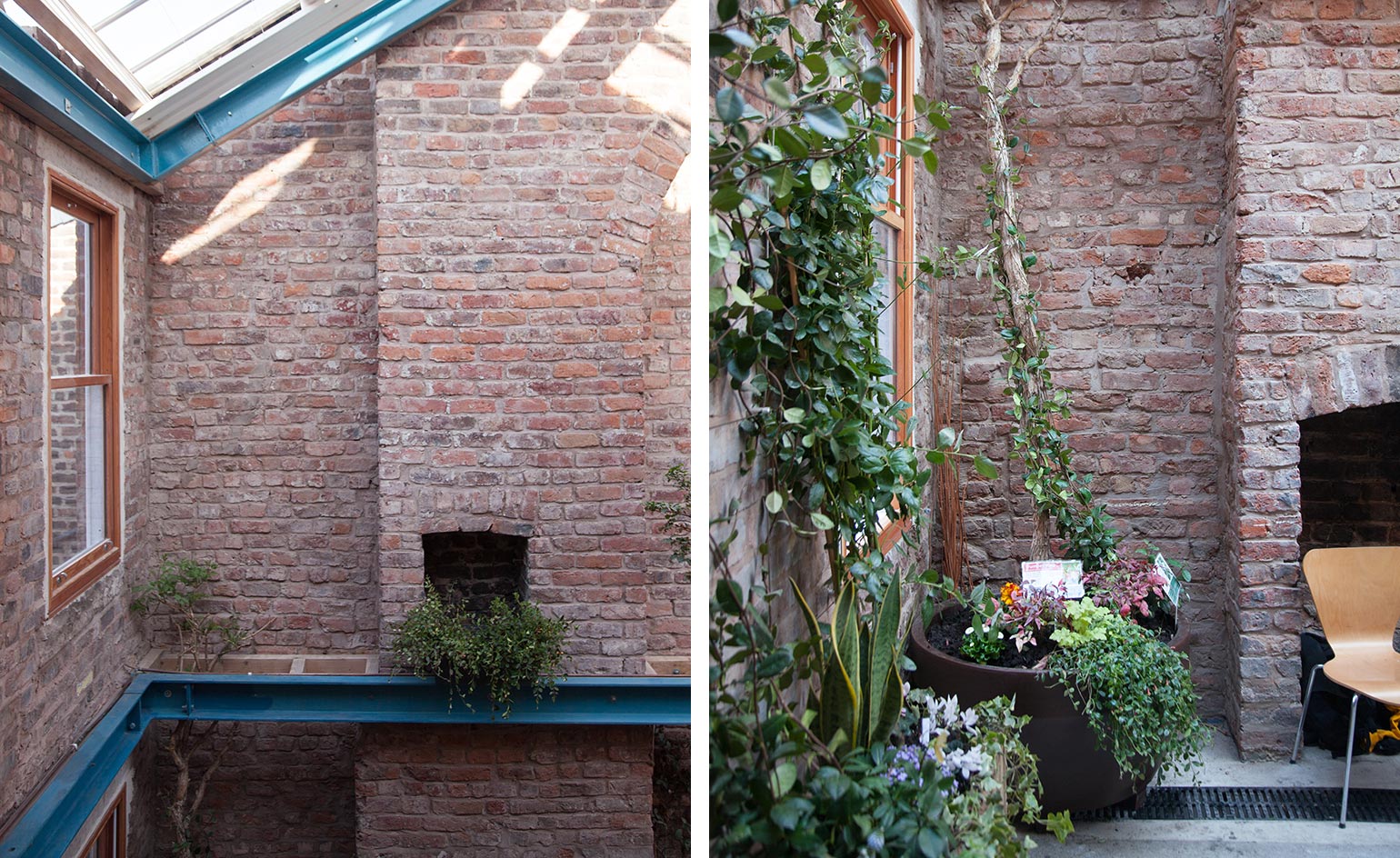
Innovative landscape architecture and garden design around the world

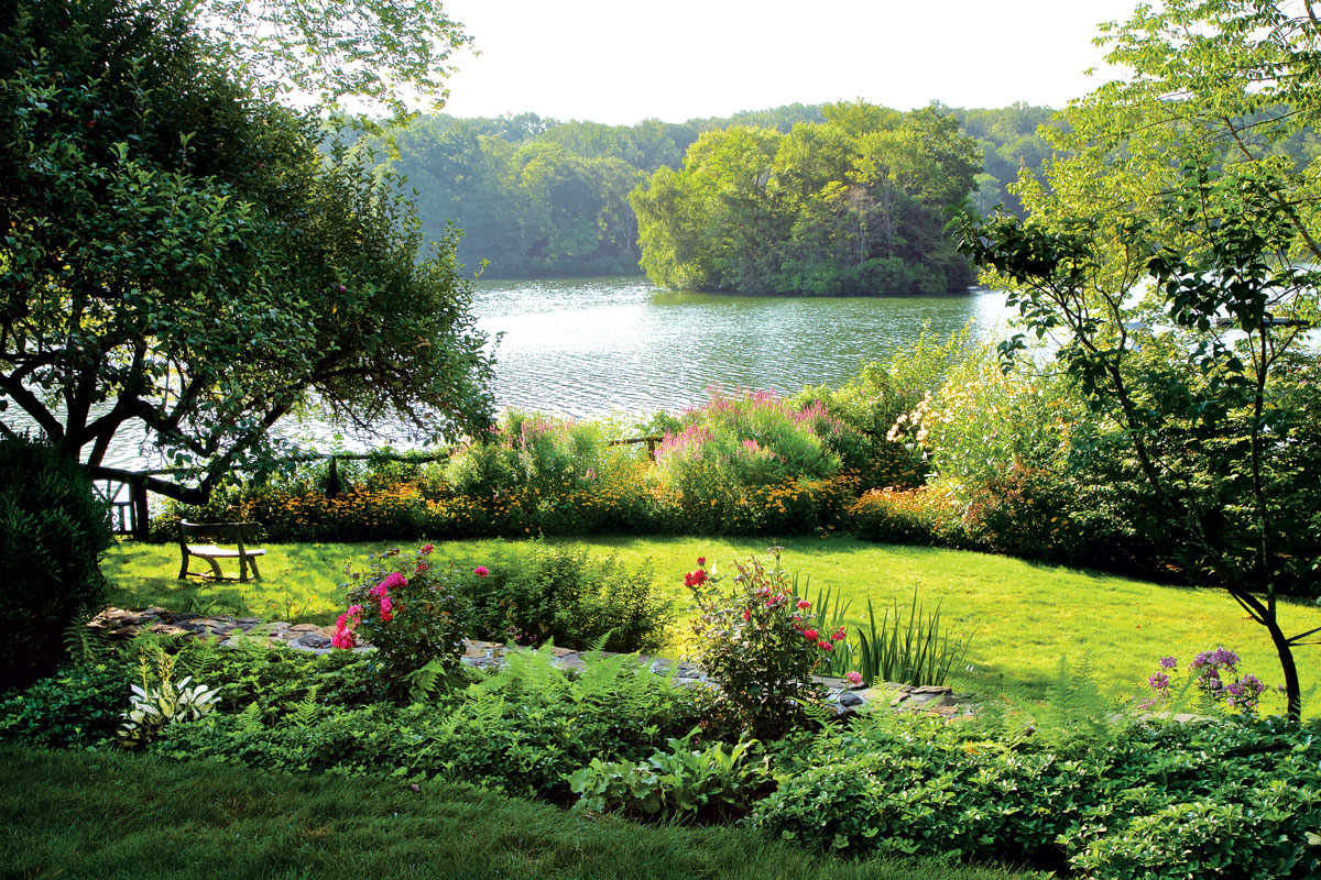
This Immersive Westchester Garden Pleases All of the Senses

Color block gardens

These Dreamy Garden Rooms Are a Soul-Soothing Feast for the Eyes
Add These 6 Plants to Your Landscape to be On Trend in 2026

'A flower grown from seed is the perfect metaphor for our individual creativity' – why 2025 floral trends are about stepping back and letting nature ground us

9 Garden Styles From Around the World To Inspire You
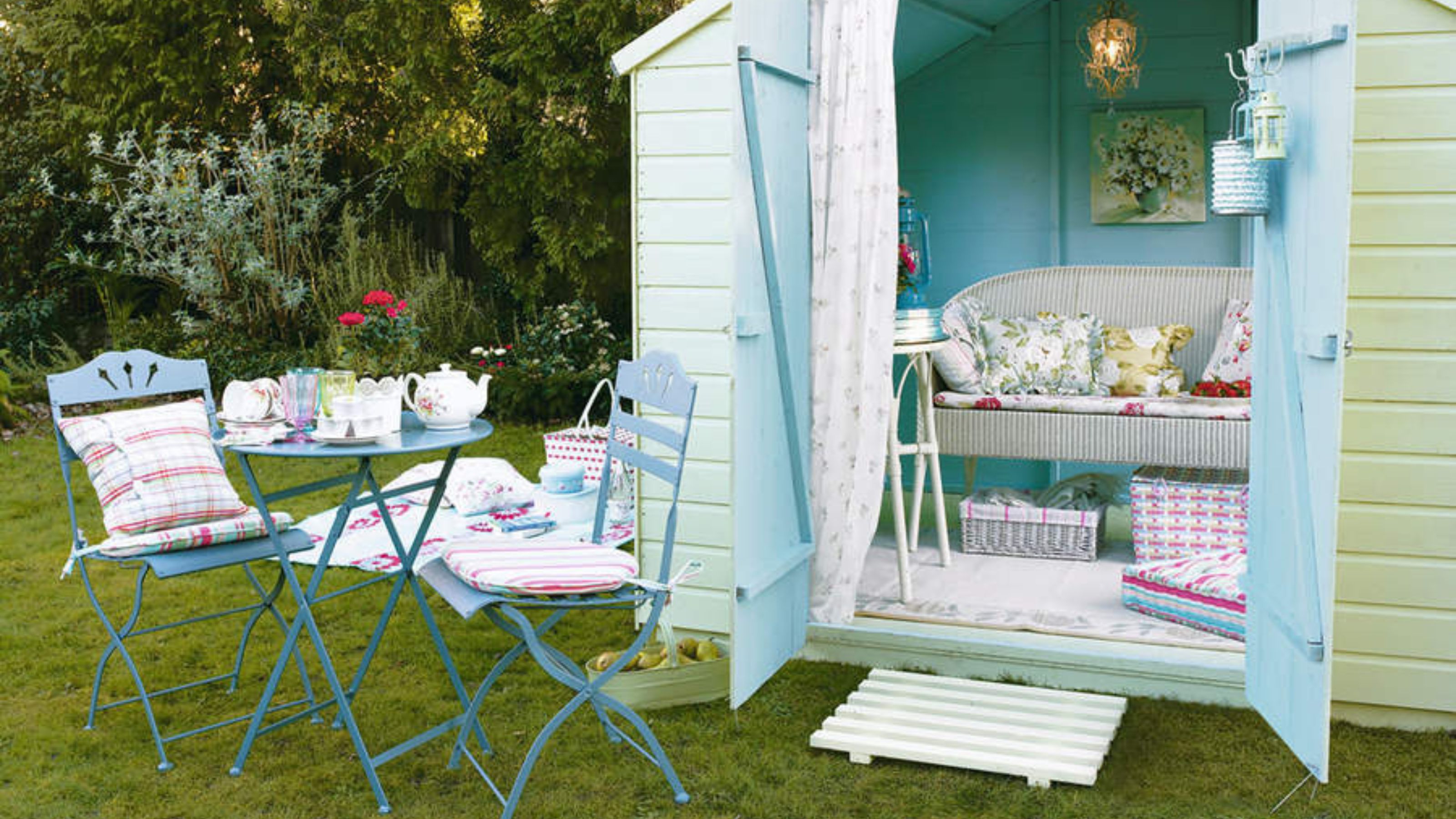
Garden paint ideas - 19 ways to give your outdoor space a splash of colour
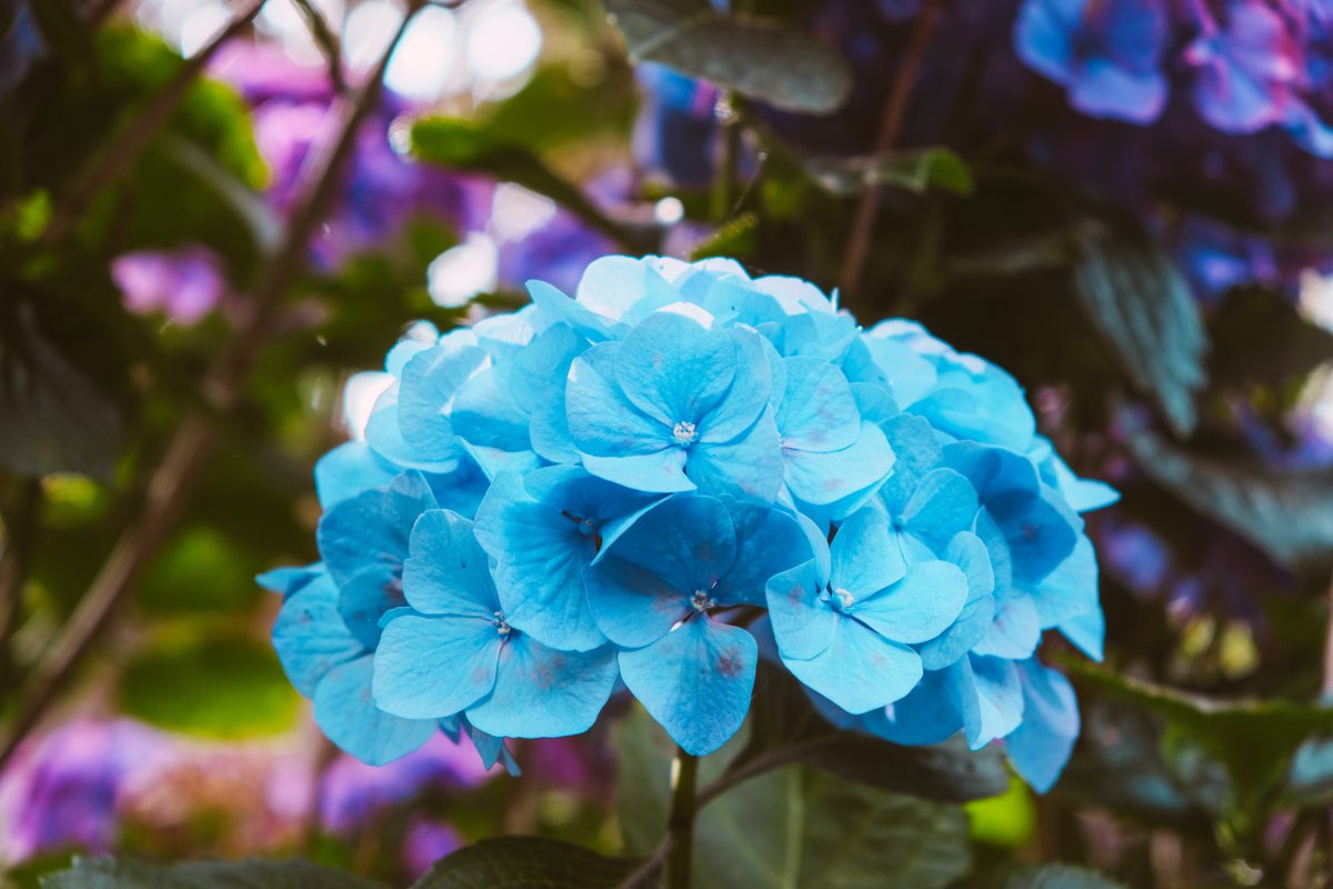
How to Showcase the 2025 Garden Color of the Year in Your Yard

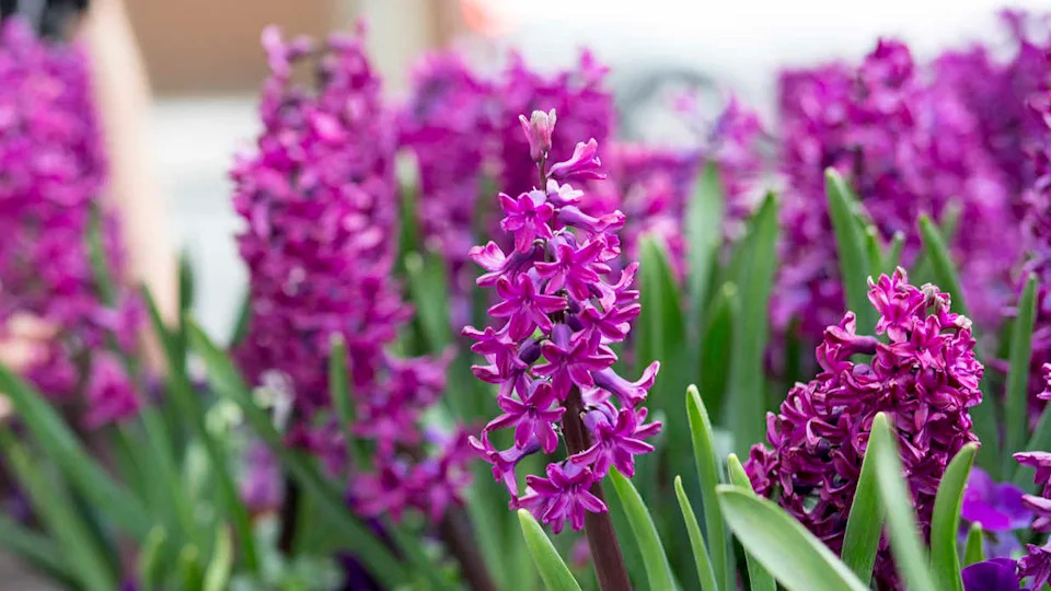
11 Pretty Purple Flowers to Plant in Your Garden