1/6
5 best cream paints, as chosen by interior designers
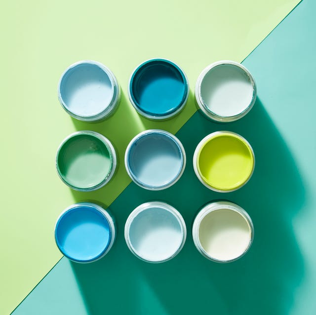
The article explores the top five cream paint colors recommended by interior designers, highlighting the versatility of cream as a neutral shade and addressing the challenge of selecting the perfect hue from a vast array of options. It emphasizes that while cream is a staple in interior design, different undertones can significantly alter the final look, ranging from yellow to white or even subtle pink.
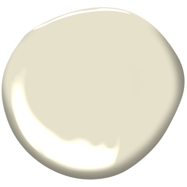
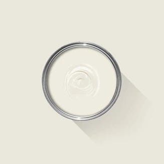
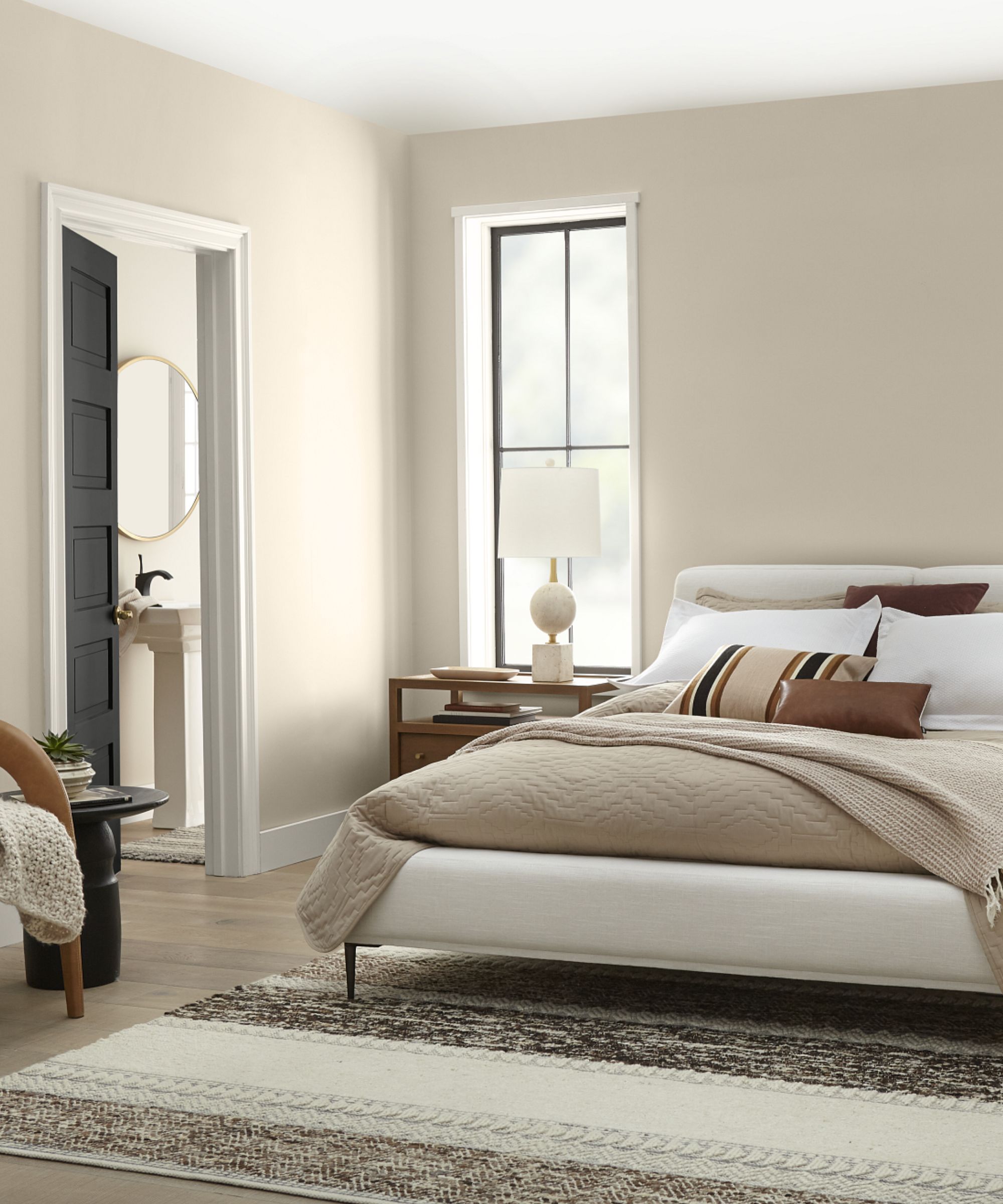
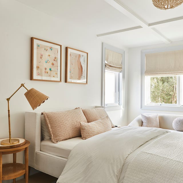
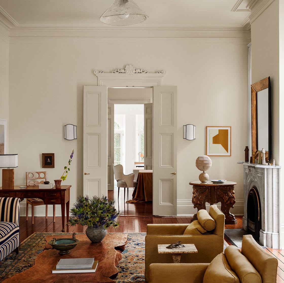
The first recommendation is Harvest Moon by Backdrop, favored for its warm white tone with a subtle creamy undertone. Kristina Khersonsky of Studio Keeta notes that this shade avoids the dated yellow appearance often associated with cream paints, offering warmth without being overly yellow. Natalie Ebel, co-founder of Backdrop, explains that it provides depth and richness and is suitable for various styles, including modern farmhouses, Japandi, and Wabi Sabi.
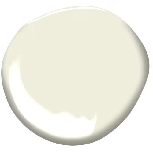
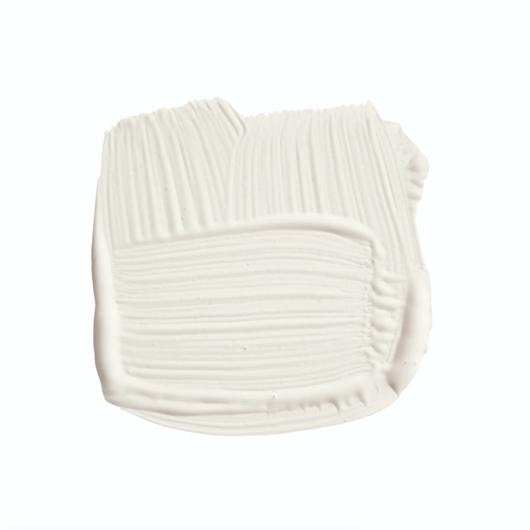
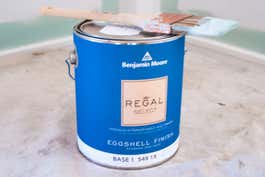
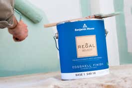
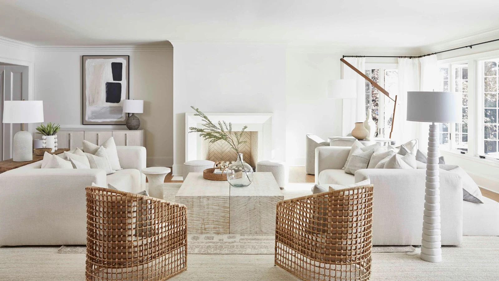
Next, Sherwin-Williams' Alabaster is presented as an excellent choice for adding brightness and sophistication. Luis Carmona of Verde Interior Design praises it for providing a subtle touch of color that prevents a stark white look and performs well in both natural and artificial light. Its warm white hue ensures a comforting ambiance without appearing dated.
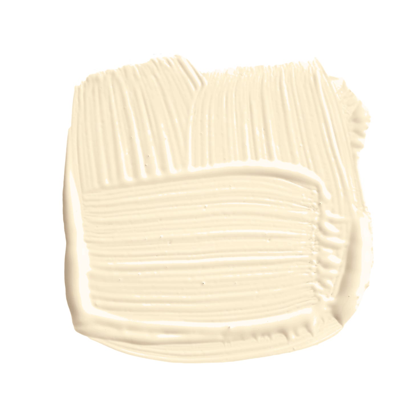
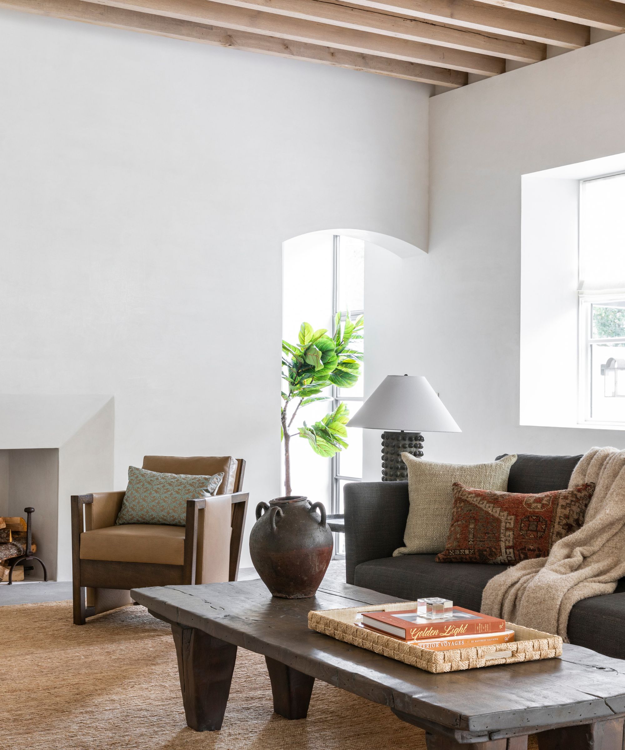
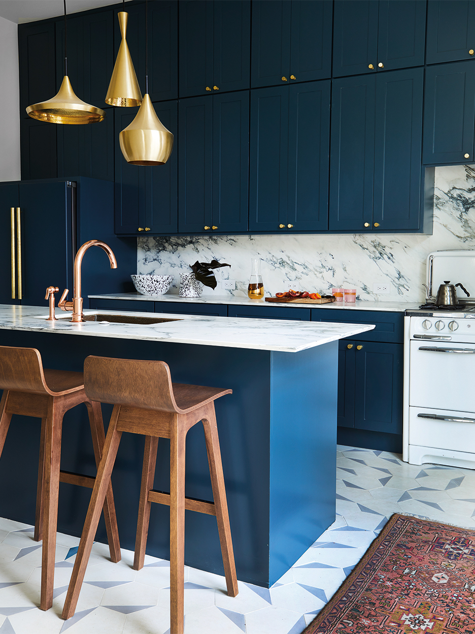
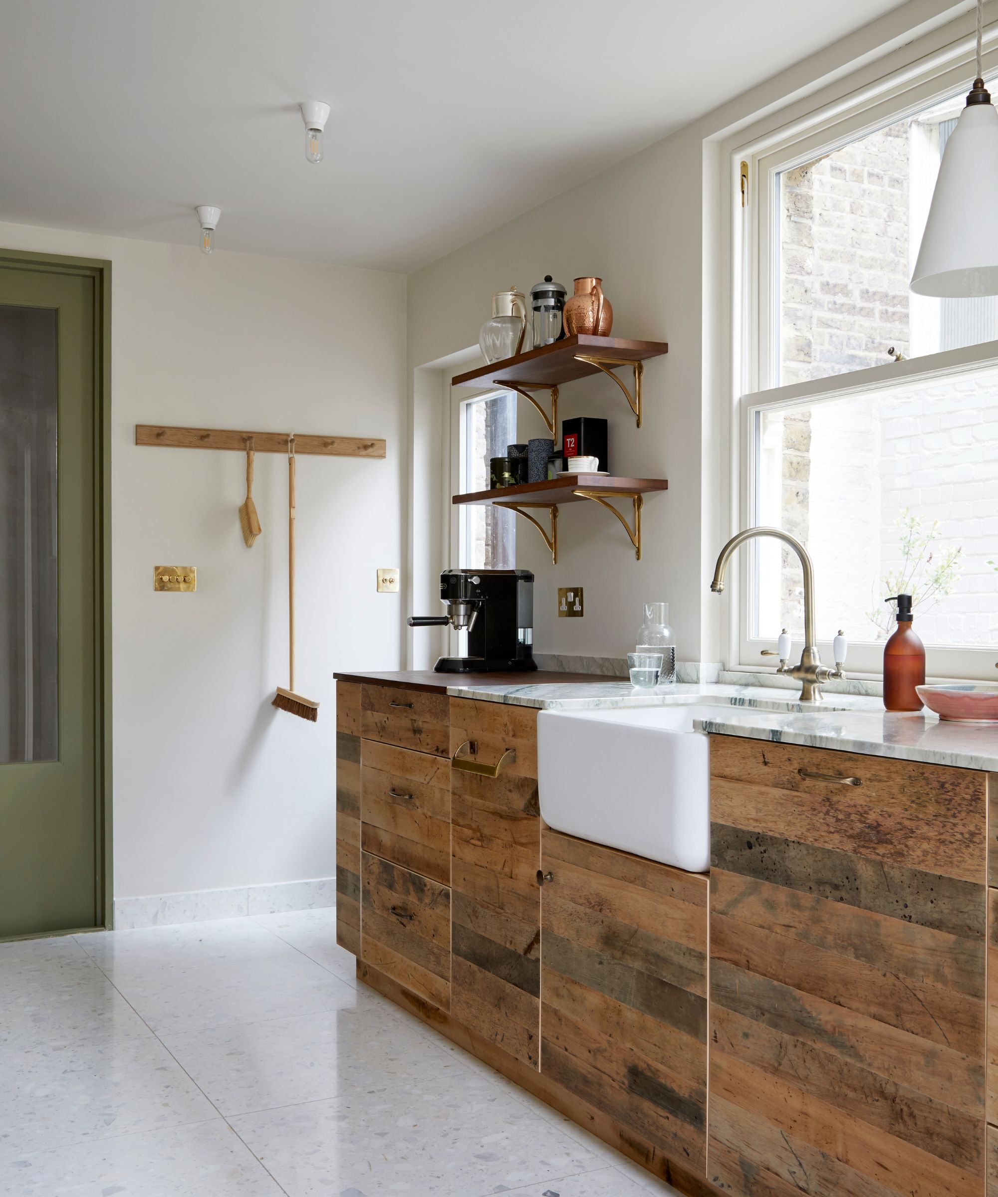
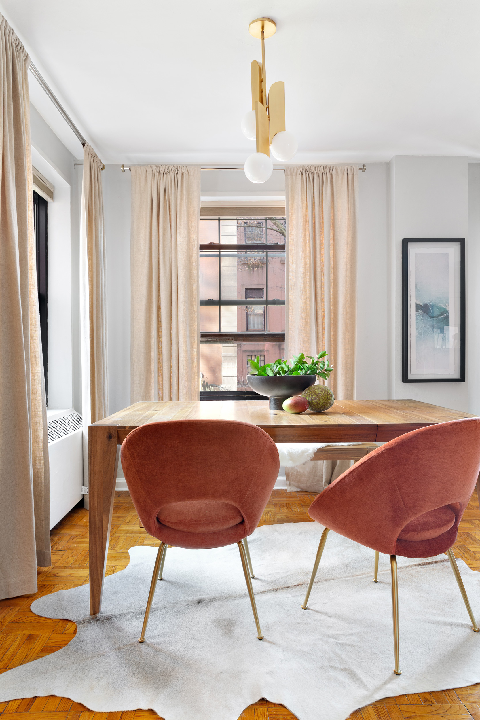
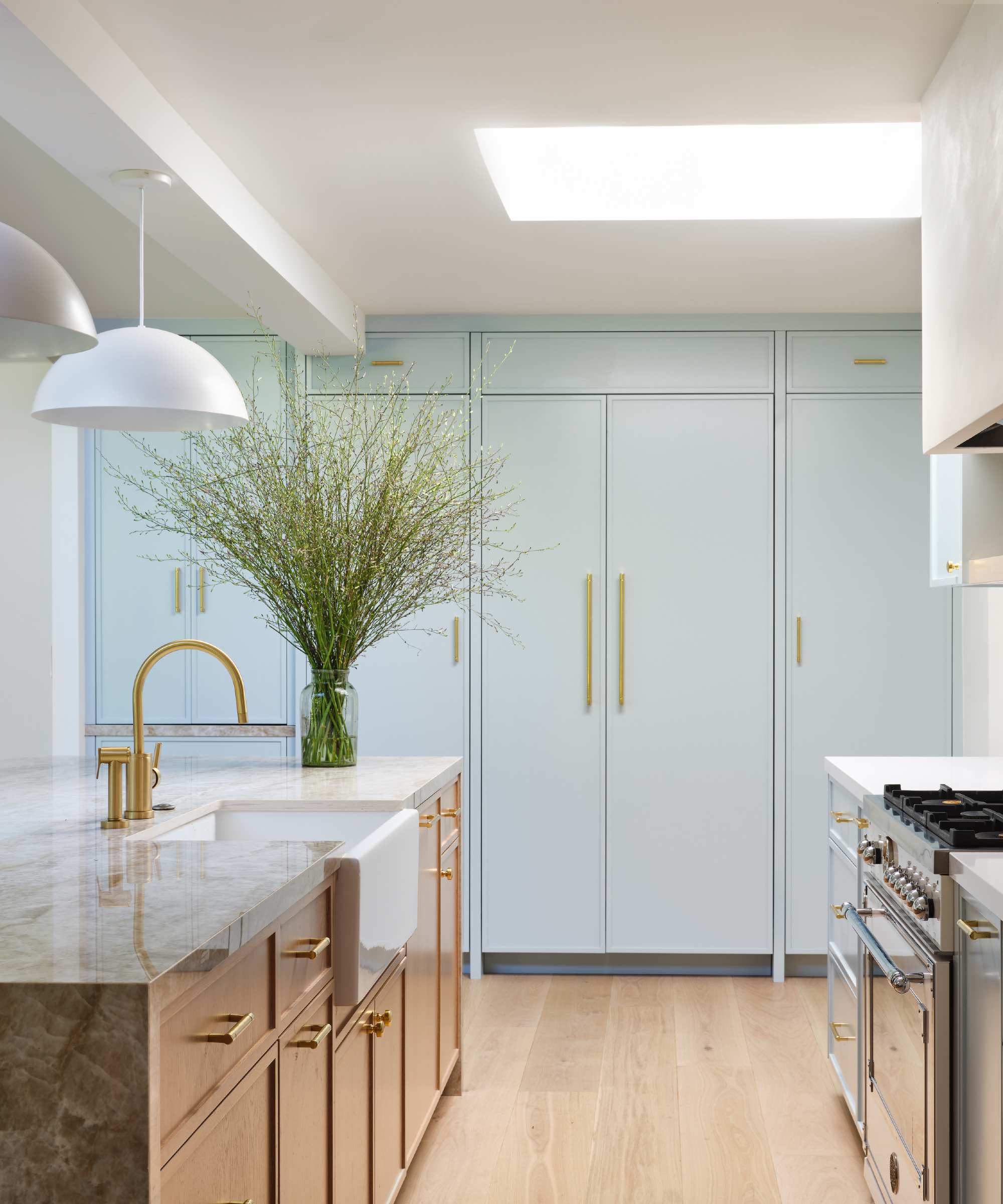
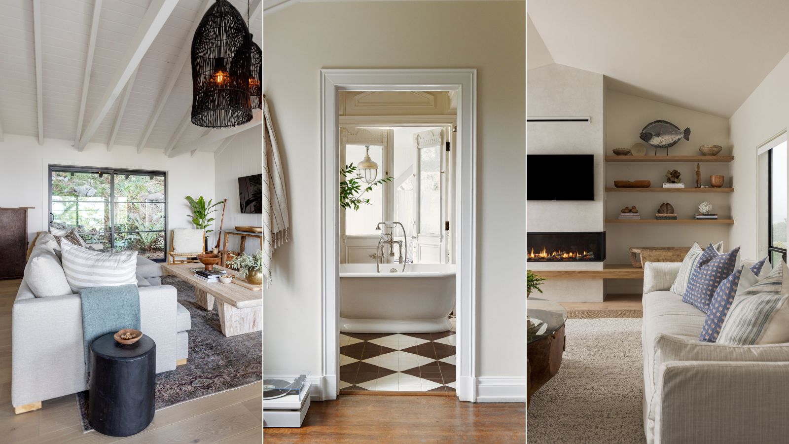
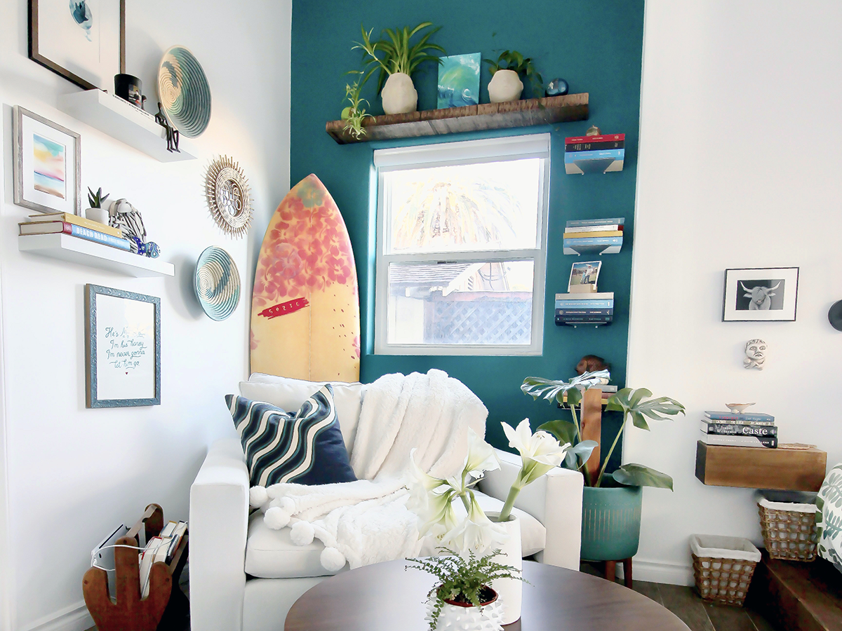
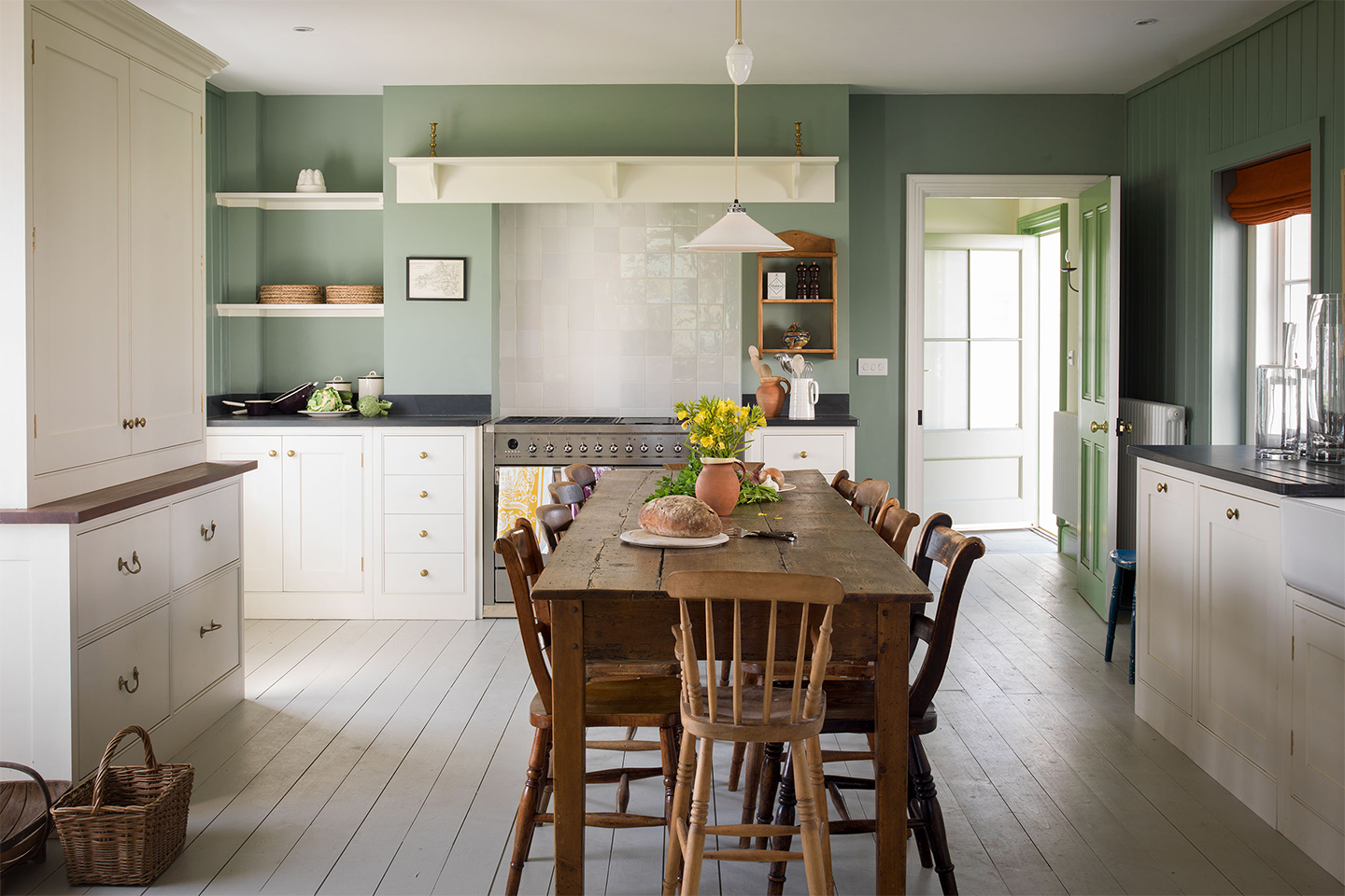
City Loft by Sherwin Williams is highlighted for its warm yellow and red undertones, which Ami McKay of PURE Design utilizes to create a light, soft, and cozy feel with good light-reflective qualities. This particular shade demonstrates how yellow-toned creams, when chosen correctly, can contribute to an airy atmosphere without appearing old-fashioned. An example provided shows its successful application on walls and ceilings, complementing exposed brick, natural wood, and black accents to create a cohesive and warm living space.
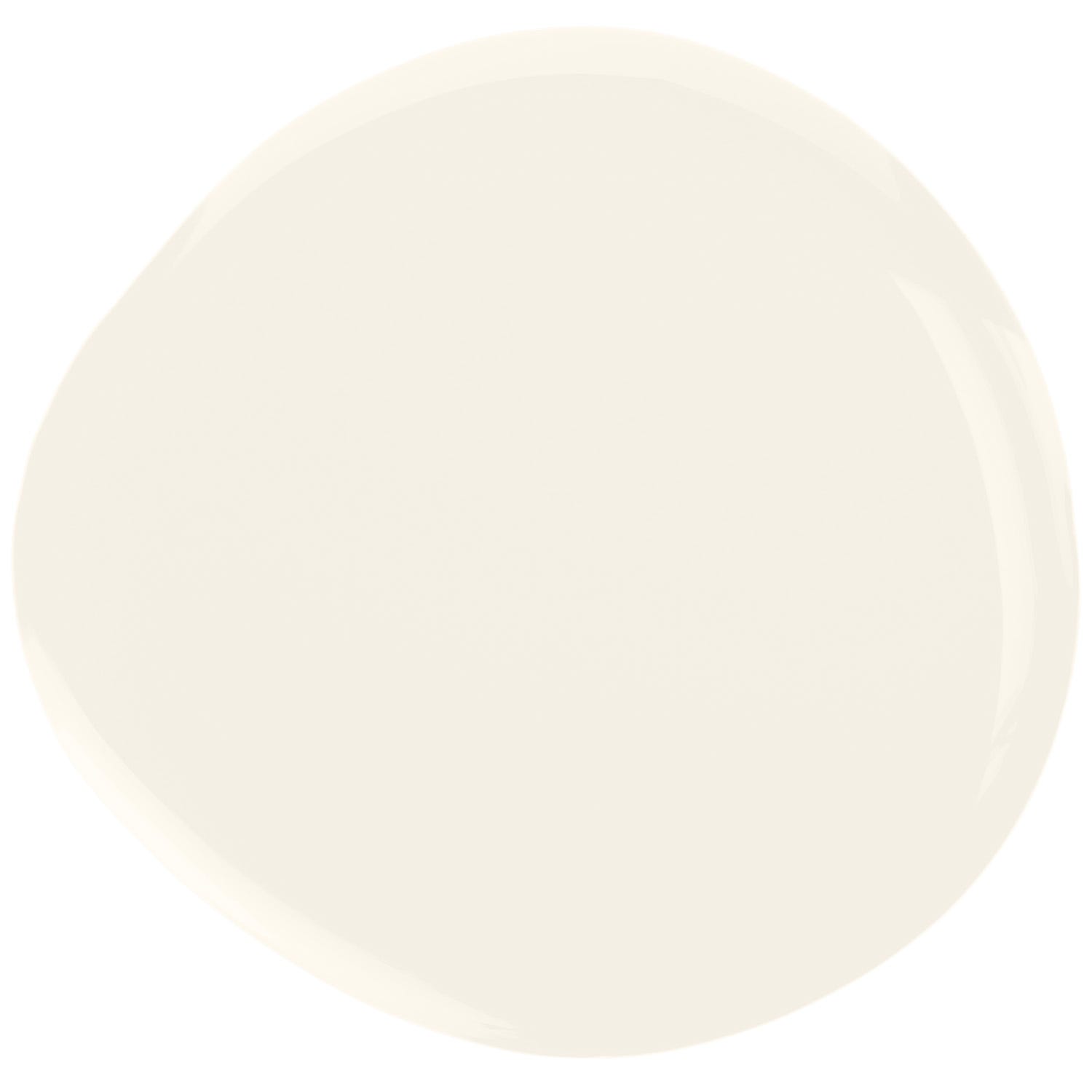
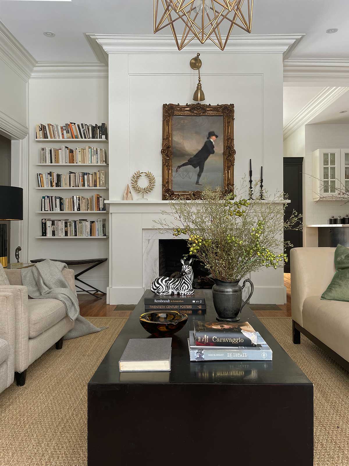
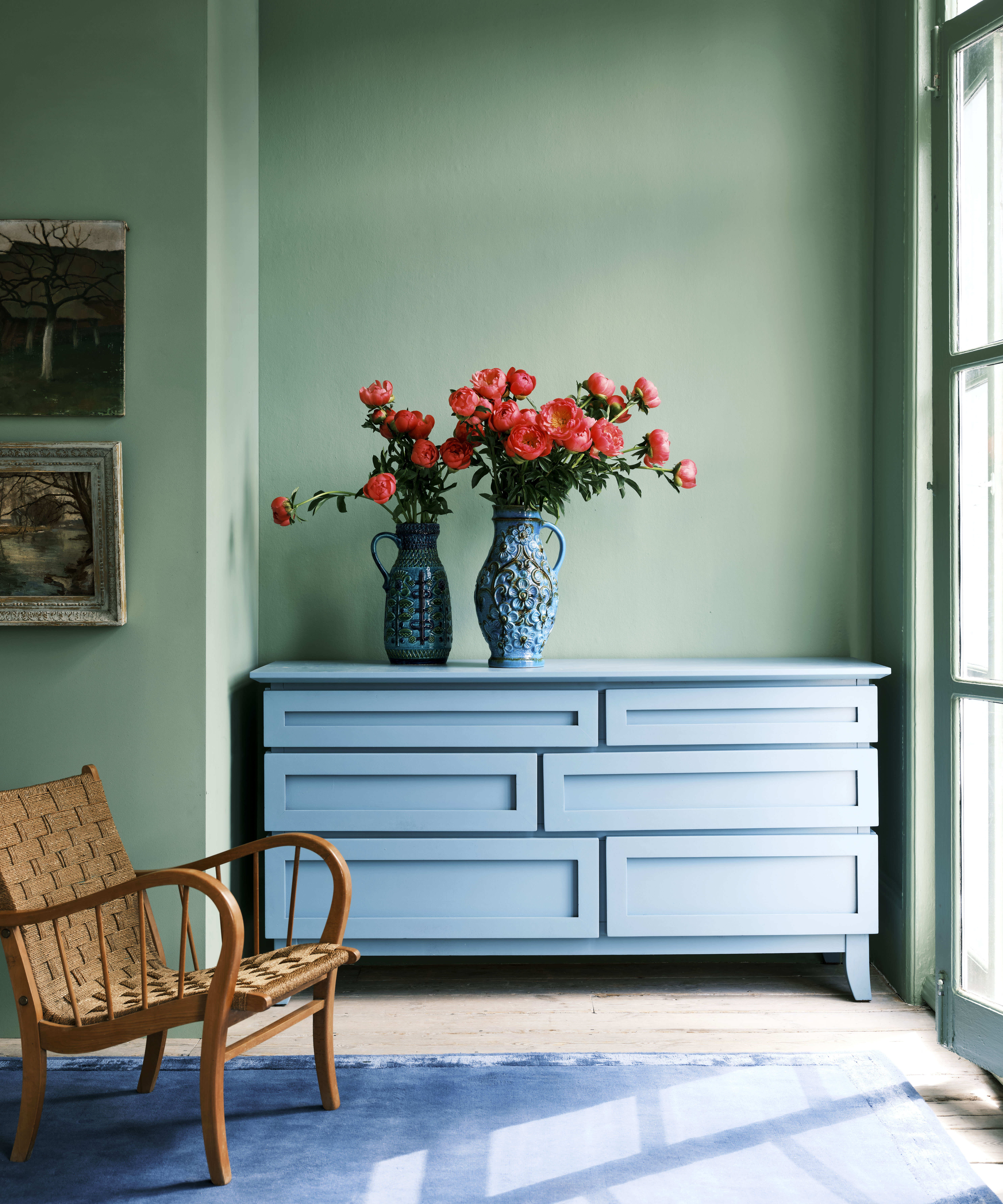
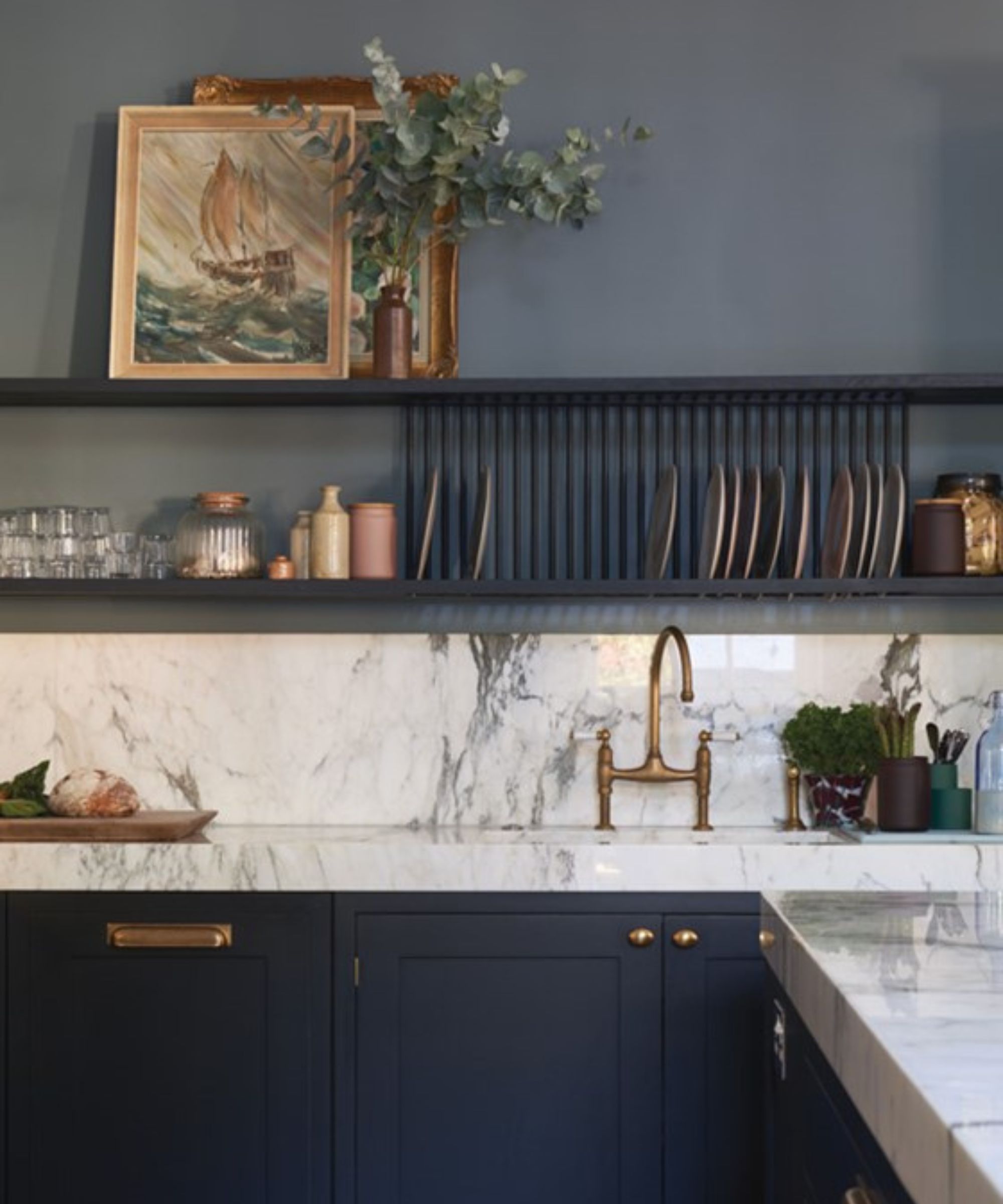
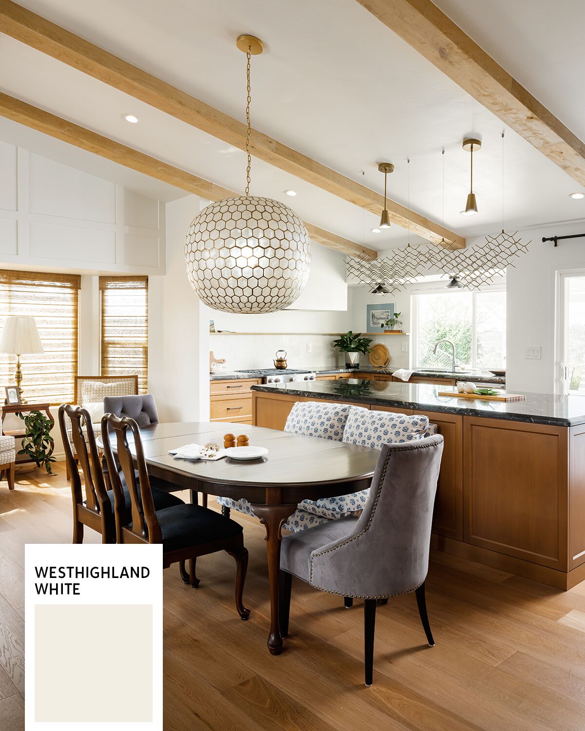
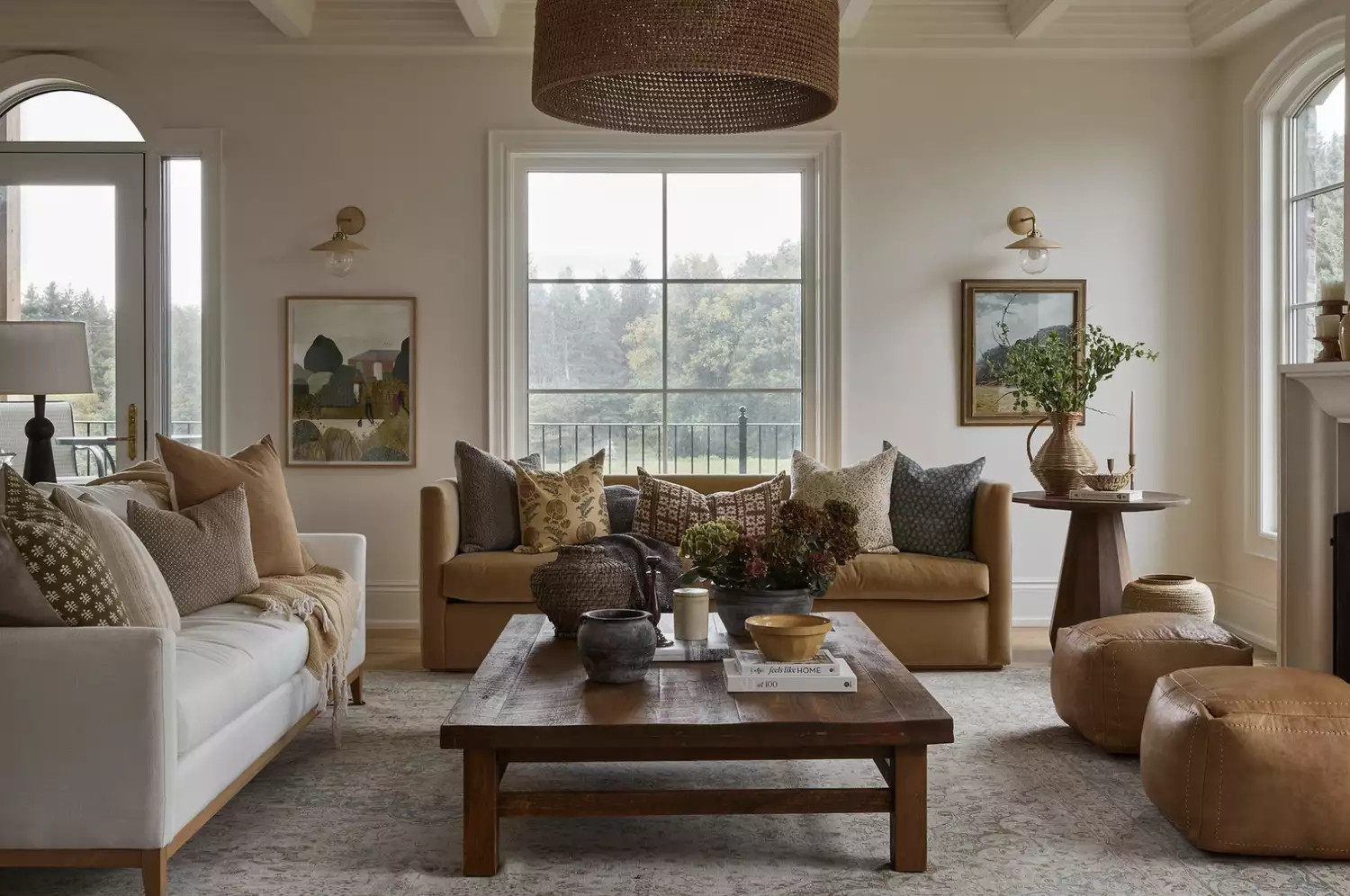
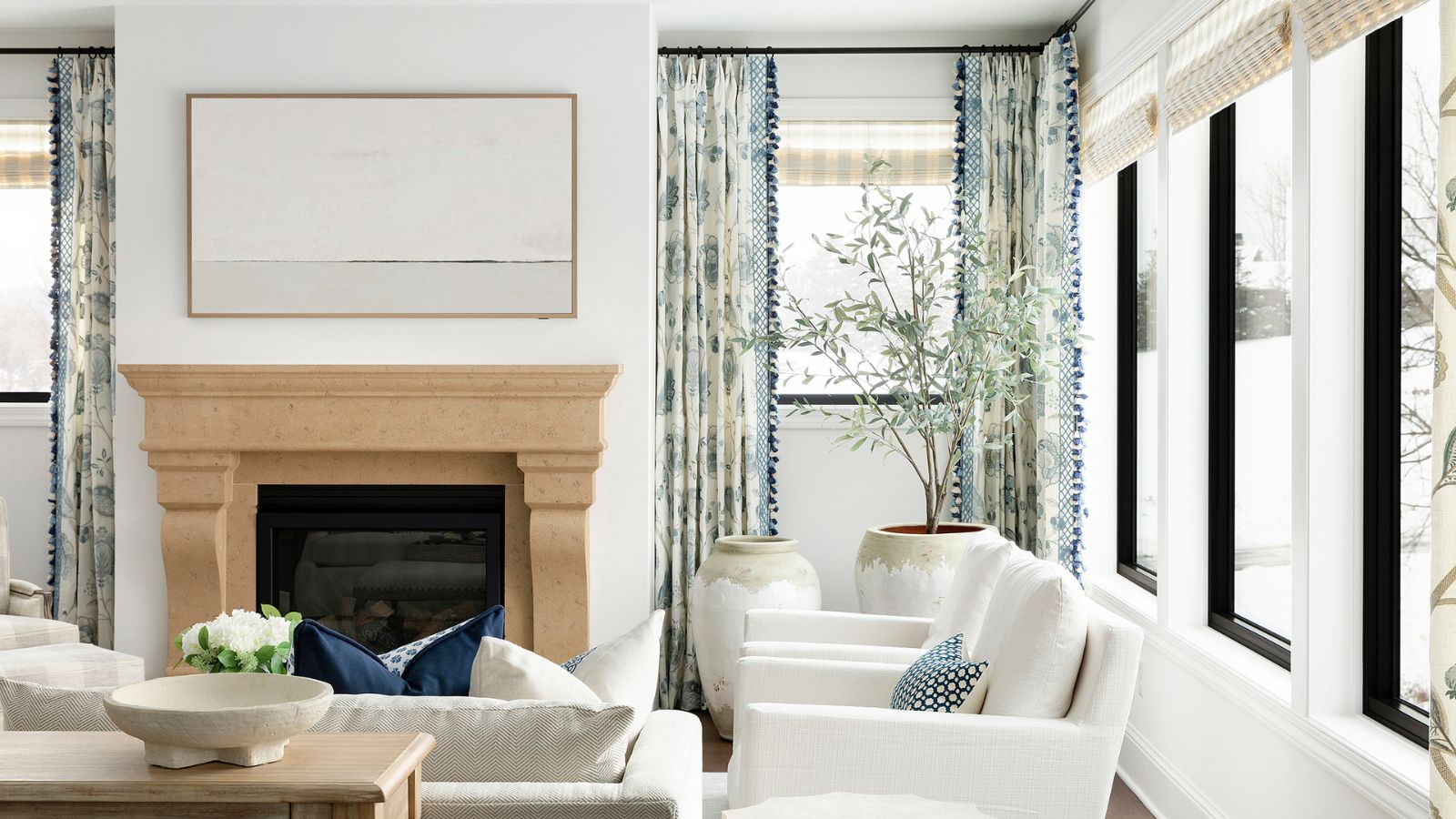
Natural Choice by Sherwin Williams is another warm off-white that creates a calm and inviting atmosphere, according to Tama Bell of Tama Bell Design. It offers a modern yet grounded presence, described as enveloping a room like a cloud. This paint is ideal for contemporary designs when paired with light wood tones and neutral furniture, as exemplified in a Sea Ranch project where it was used extensively on walls, ceilings, doors, and trim to achieve a harmonious look.
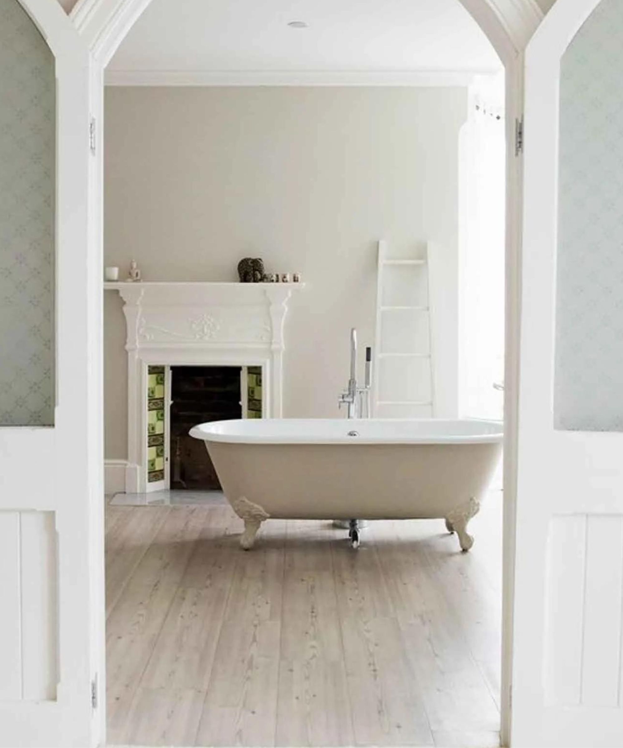
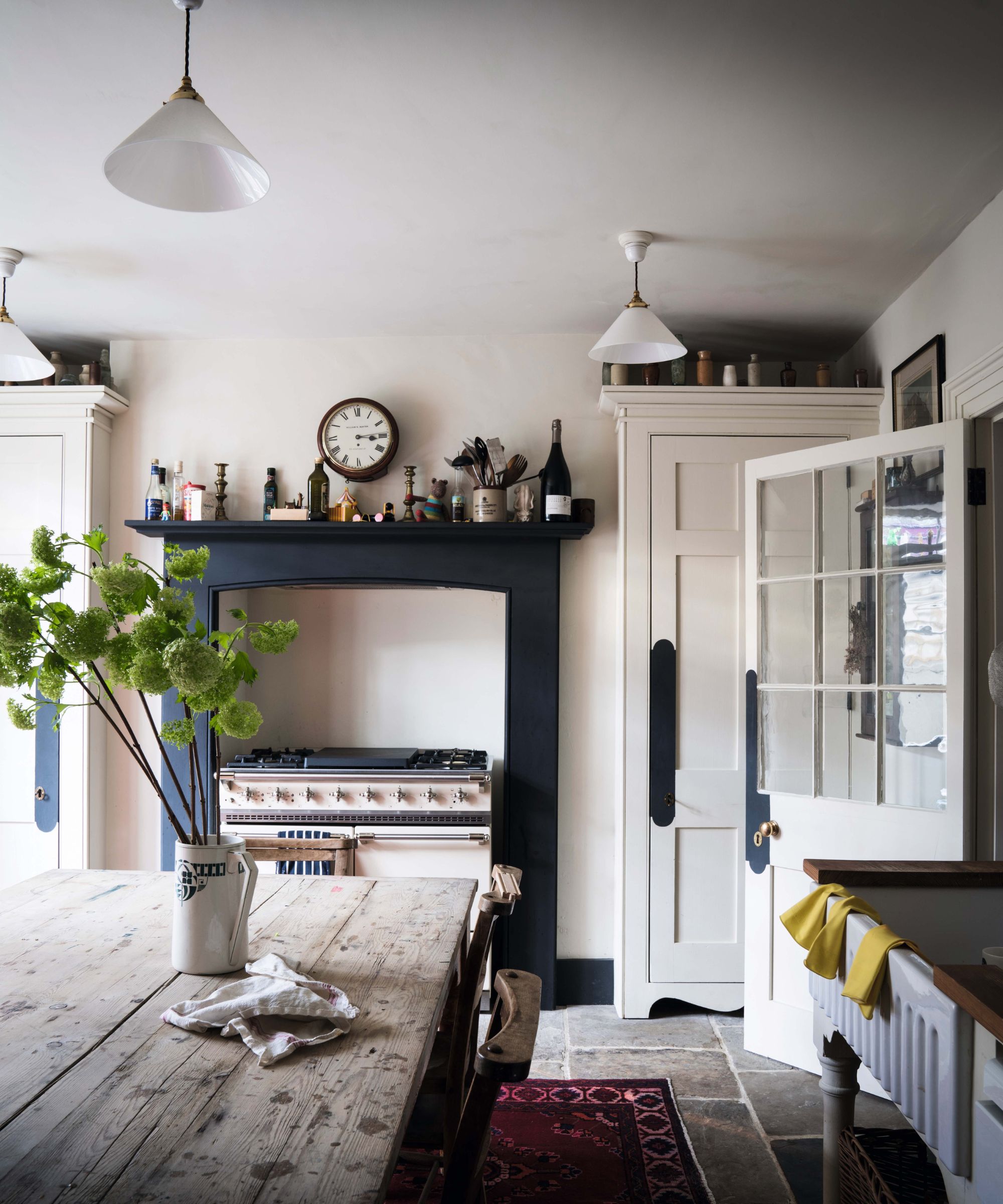
Finally, Shoji White by Sherwin Williams is recommended for traditional interiors due to its warm, natural, and clean aesthetic. Interior designer Leanne Ford describes its ceramic-like quality, which adds depth to any space. The article illustrates its effectiveness in a bathroom setting, where it is paired with brighter white woodwork to emphasize its warm undertones, resulting in a fresh and timeless scheme.
The article concludes by reiterating that interior designers prefer cream paints with warmer, timeless undertones that offer versatility across various interior design styles. It encourages readers to consider these expert-recommended shades for their next home makeover to ensure a sophisticated and enduring aesthetic.
#InteriorDesign #CreamPaint #PaintColors #HomeDecor #InteriorDesigners #SherwinWilliams #BackdropPaint #NeutralColors #DecoratingAdvice #InteriorDesign #CreamPaint #PaintColors #HomeDecor #InteriorDesigners #SherwinWilliams #BackdropPaint #NeutralColors #DecoratingAdvice
0 comment in total
You may also like
Here Are the Best Cream Paint Colors, According to Design Pros


5 Designers Weigh In on the Best Brands of Paint for Kitchen Cabinets

Best paint brands chosen by interior designers – their top picks revealed

23 Versatile Cream Paint Colors That Will Pair with Basically Anything

Interior Designers Share Their Favorite Cream Paint Colors
5 Designers Weigh In on the Best Brands of Paint for Kitchen Cabinets

From the Living Room to the Bedroom, These Cream Paint Colors Work Anywhere


The Best Interior Paint | Reviews by Wirecutter

7 of the best cream wall paint colors, as chosen by designers – 'they look modern, and anything but magnolia'


23 Versatile Cream Paint Colors That Will Pair with Basically Anything

Designers Share Their Tried-and-True Shades From the Best Interior Paint Brands
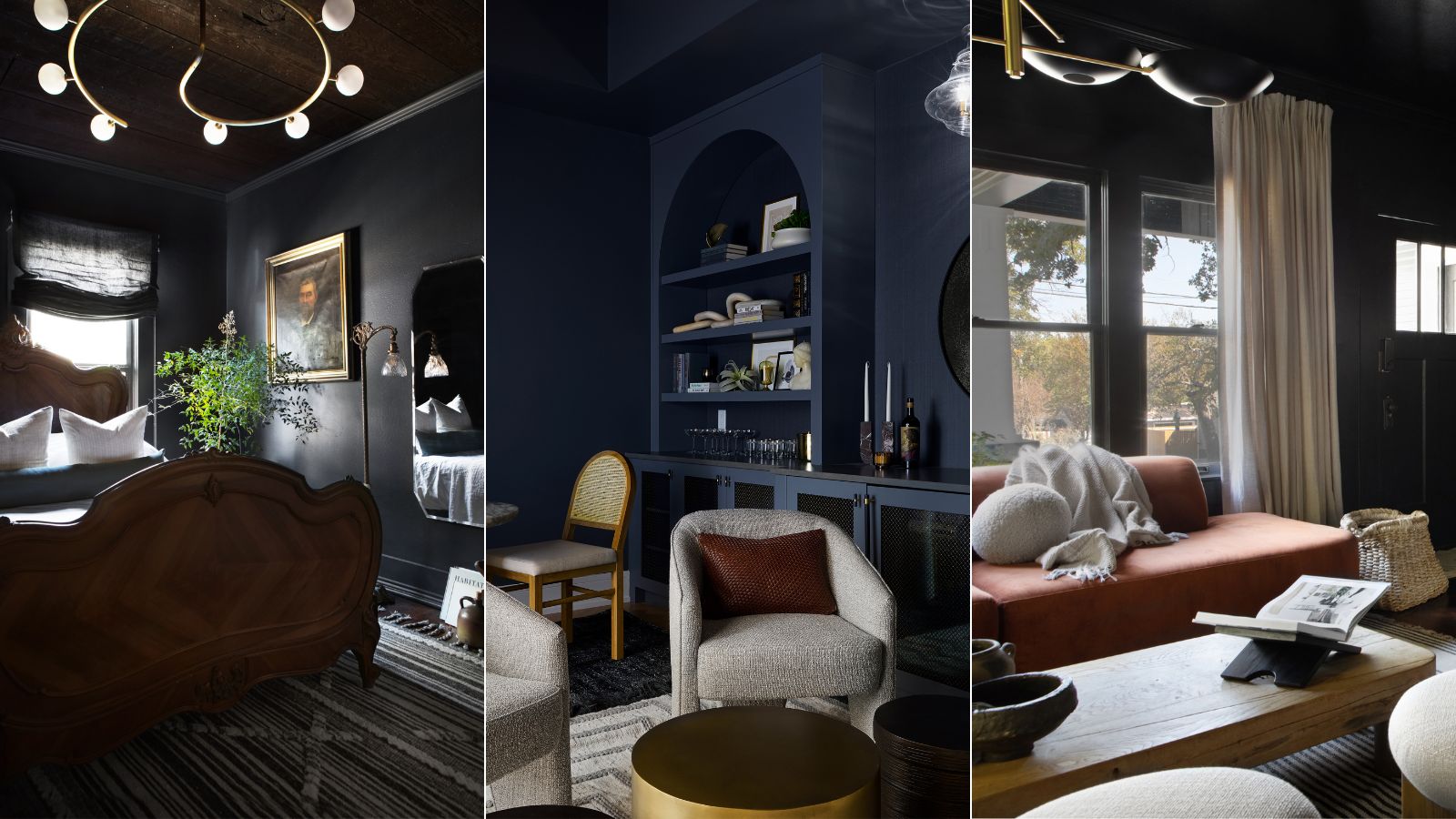
7 best dark paints loved by interior designers
7 of the best cream wall paint colors, as chosen by designers – 'they look modern, and anything but magnolia'
5 best warm white paints, as chosen by interior designers
It’s Official: These are the Best Kitchen Paint Colors, According to Designers
8 Favorite Paint Colors of Local Interior Designers

Is cream paint back on trend? 7 ways interior designers use this once shunned shade
The Best Interior Paints, According to Expert Testing
5 best blue paints as chosen by interior designers
6 Cream-Colored Kitchen Cabinet Paints the Pros Swear By