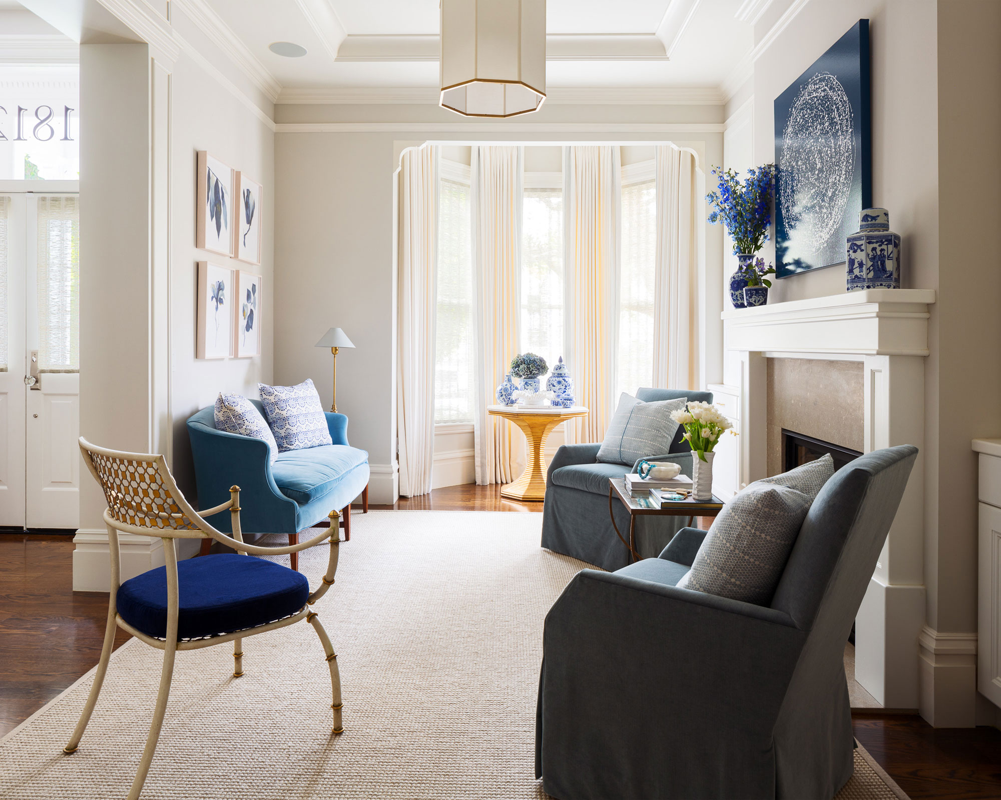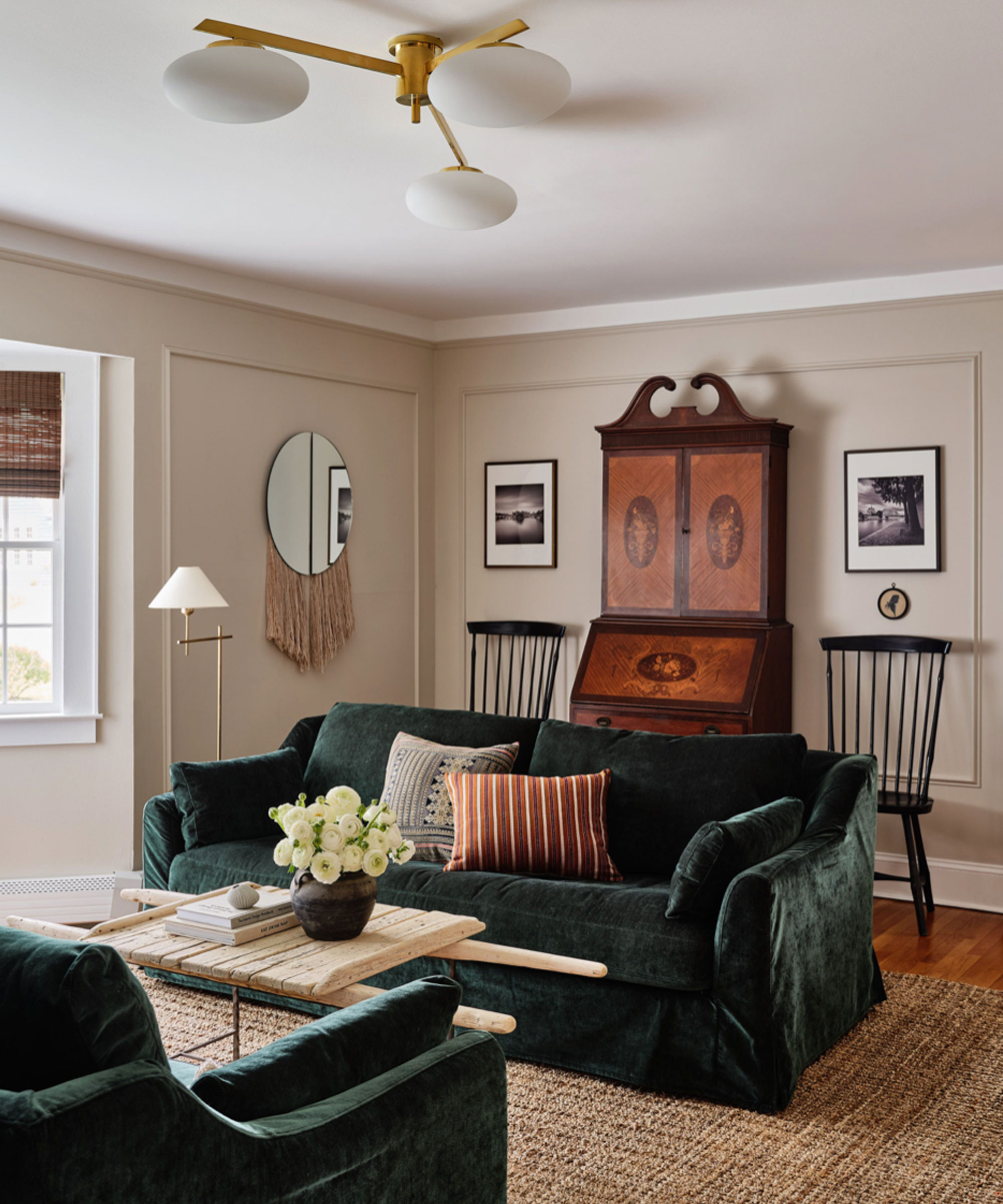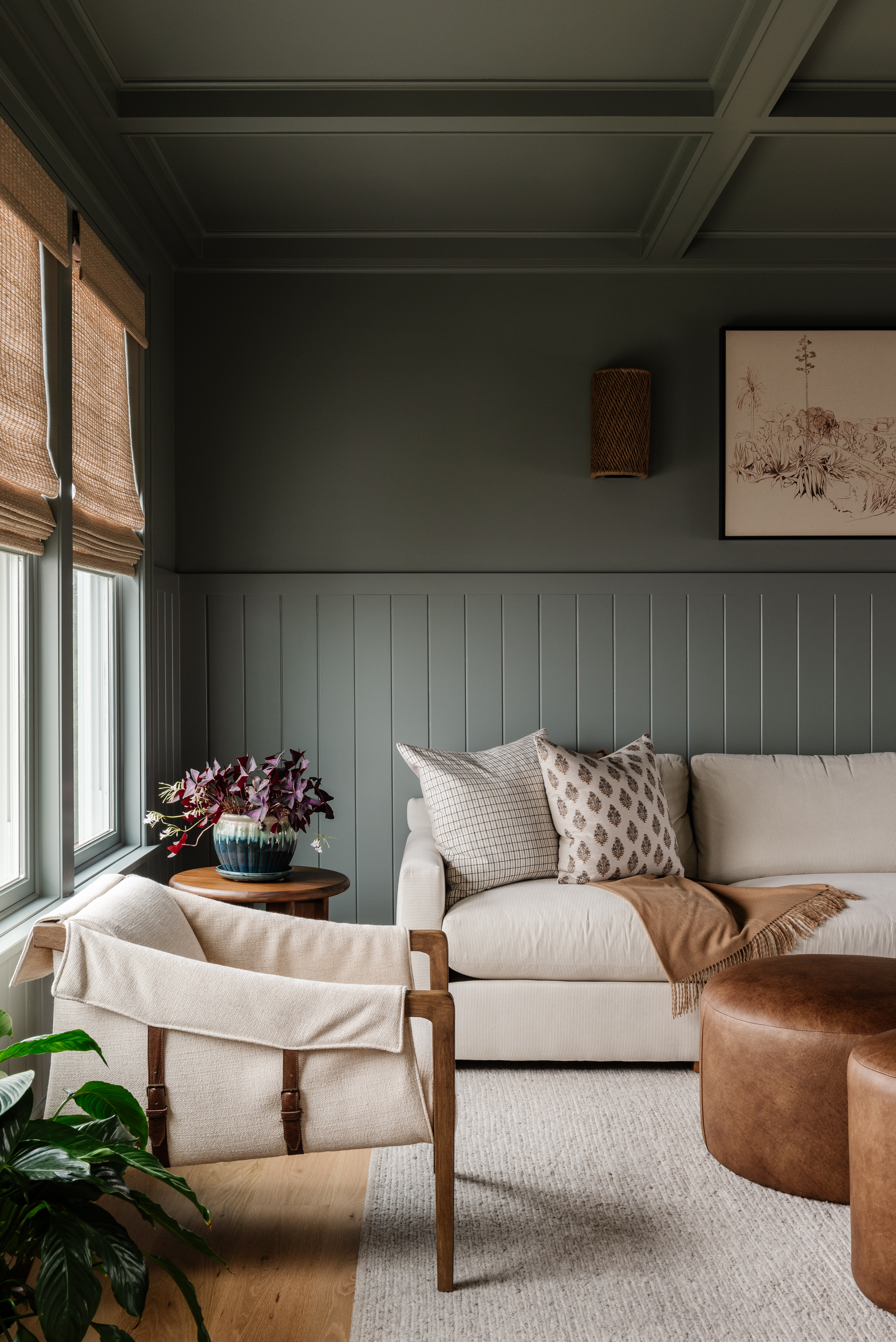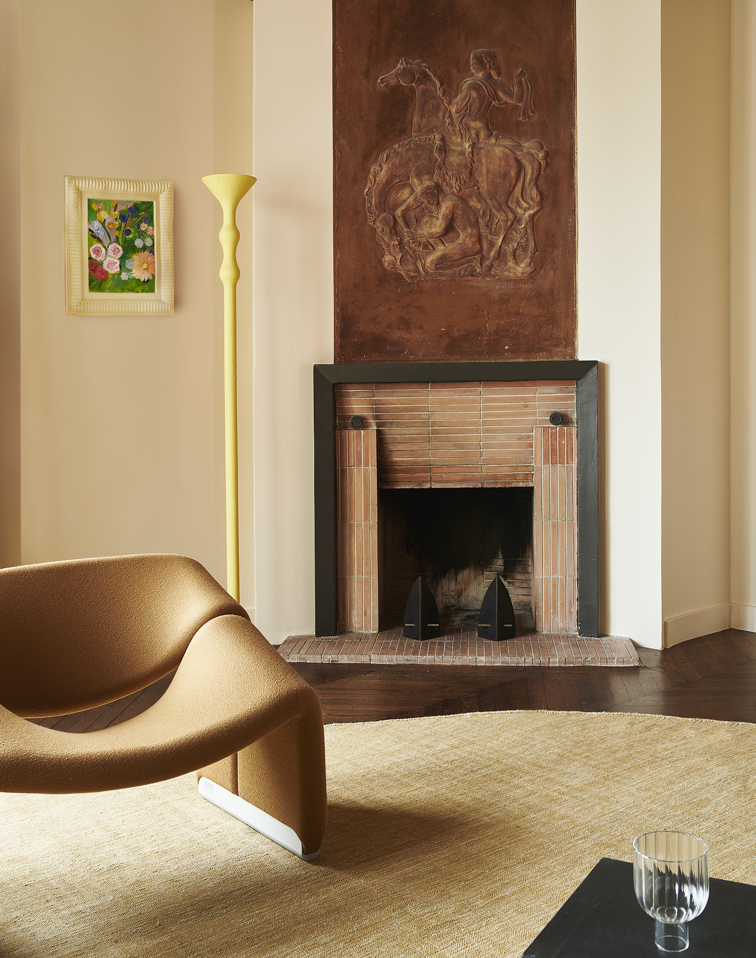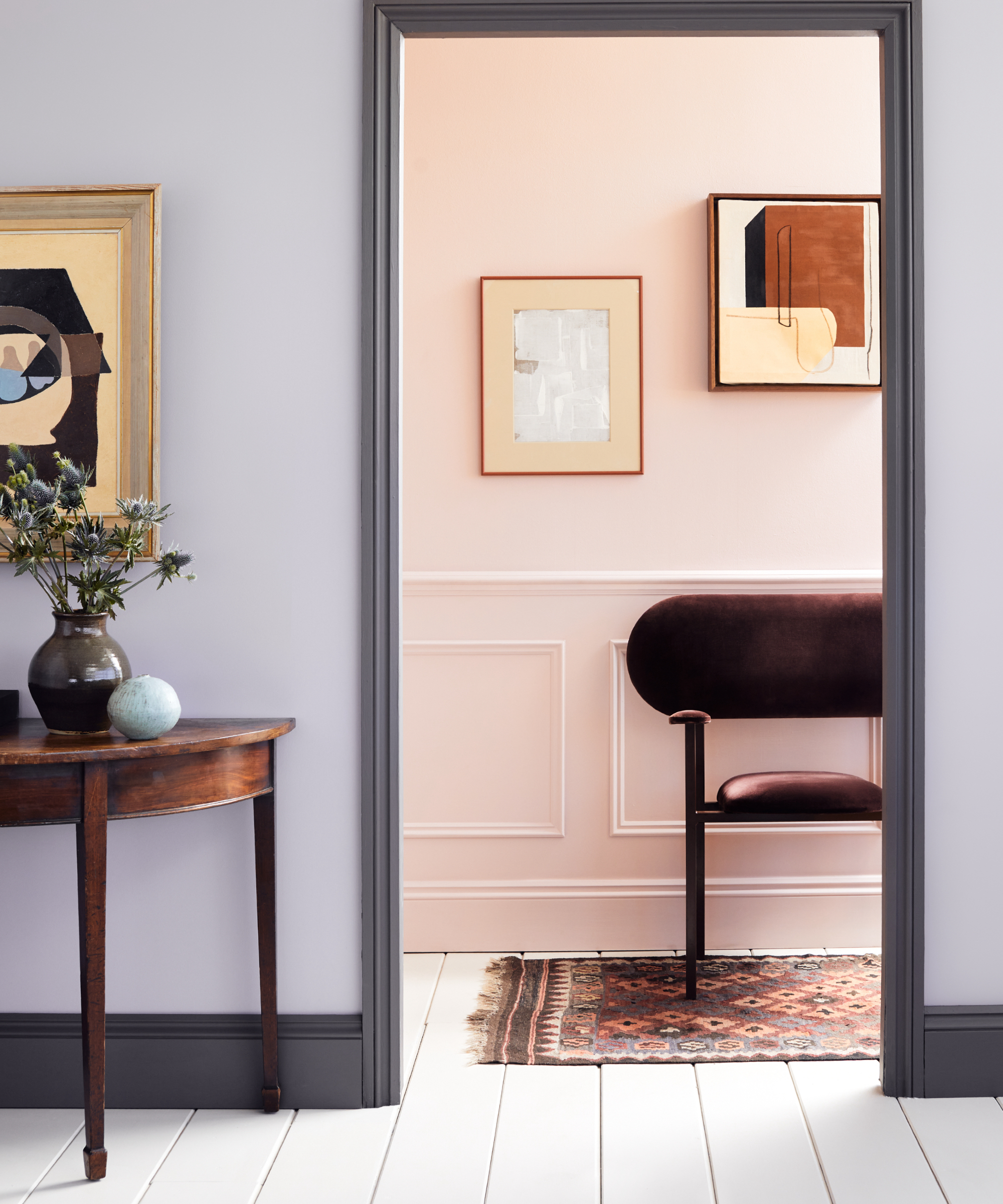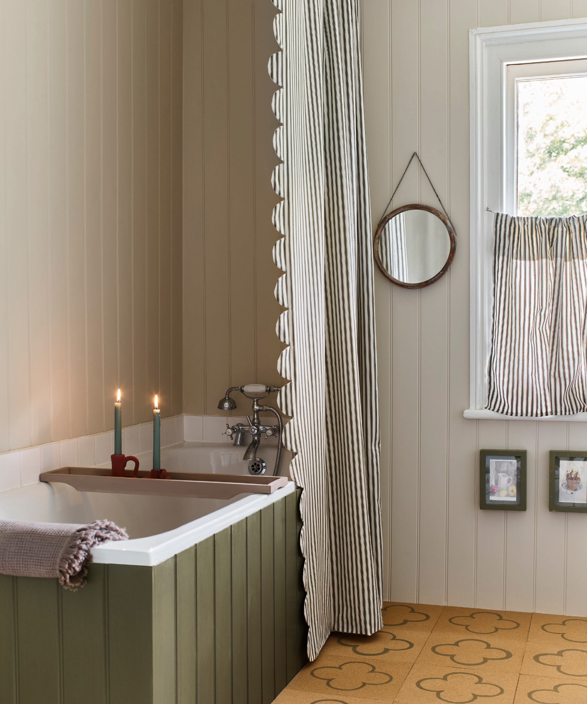
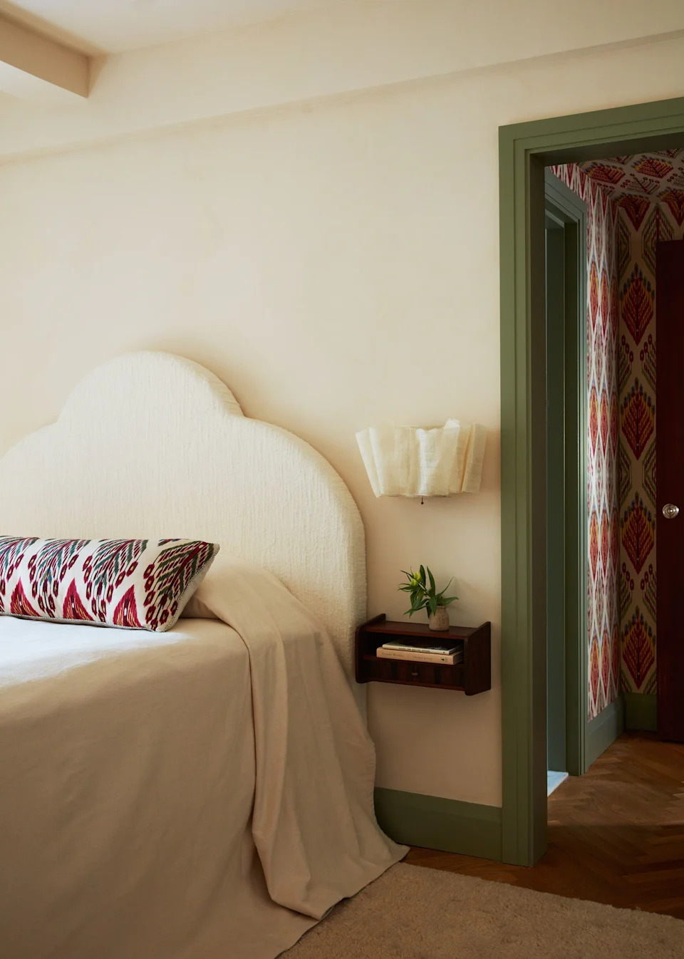
23 Versatile Cream Paint Colors That Will Pair with Basically Anything
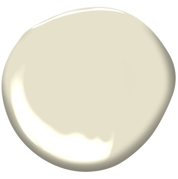
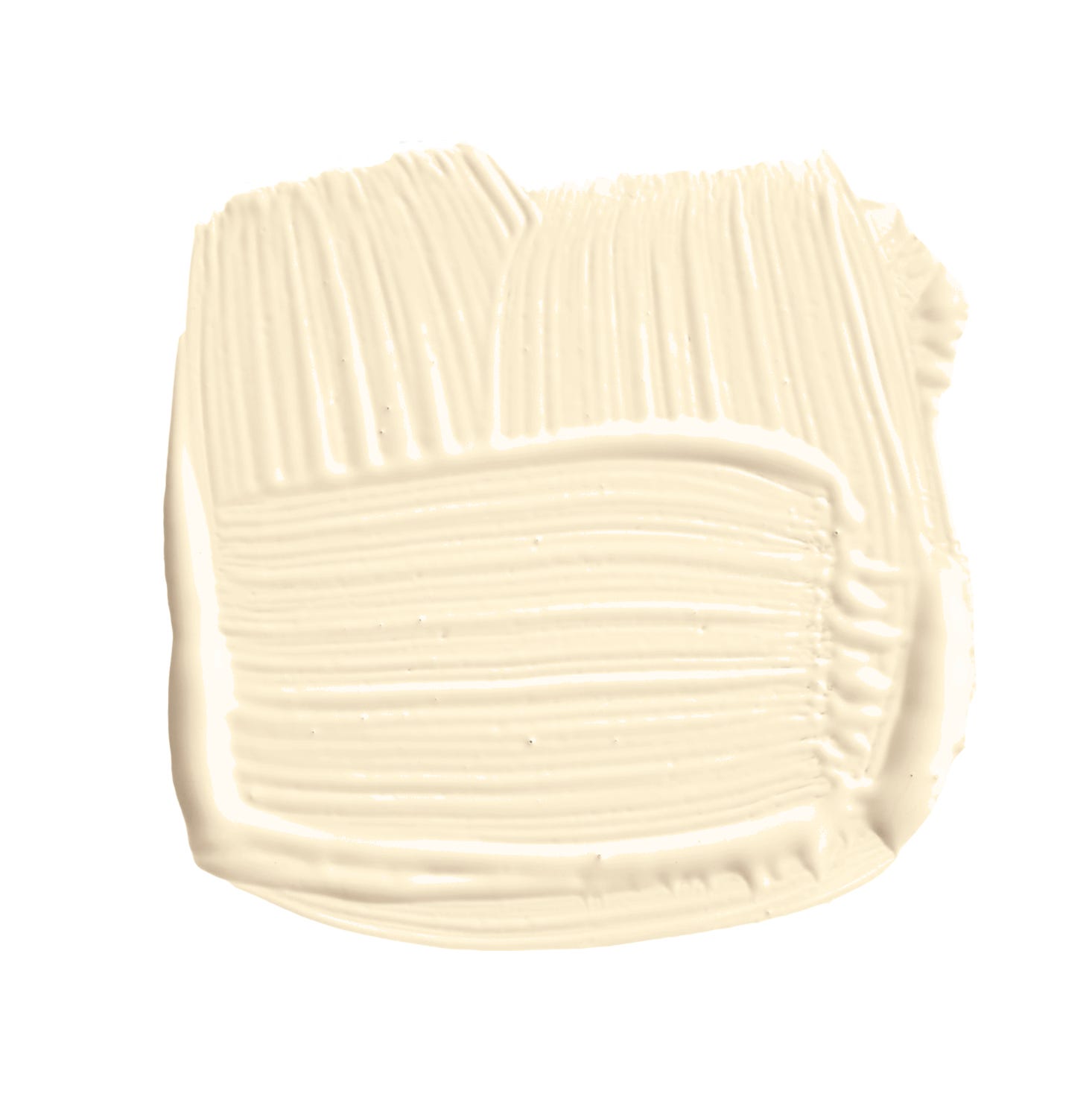
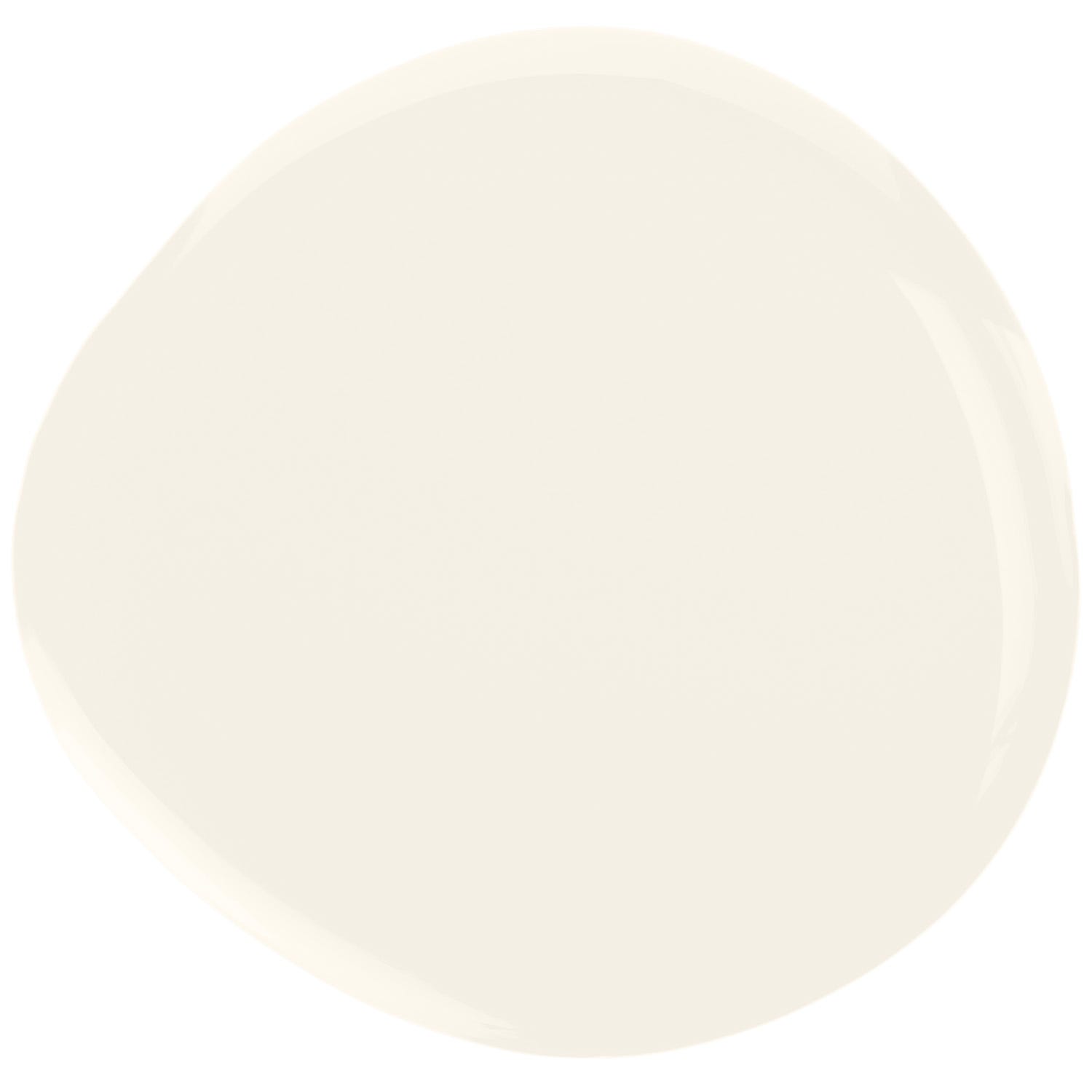
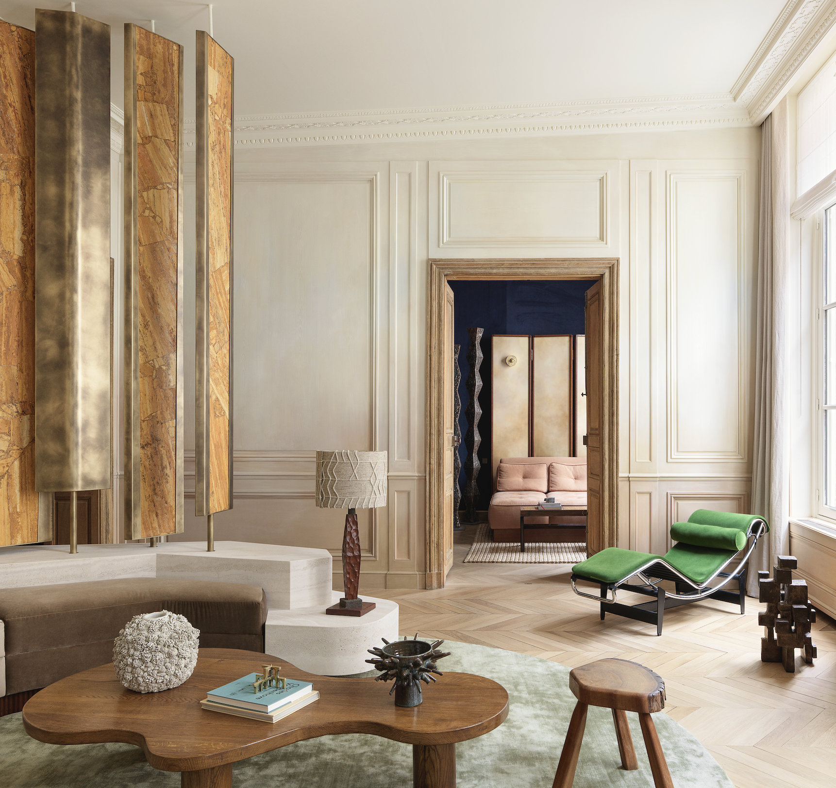
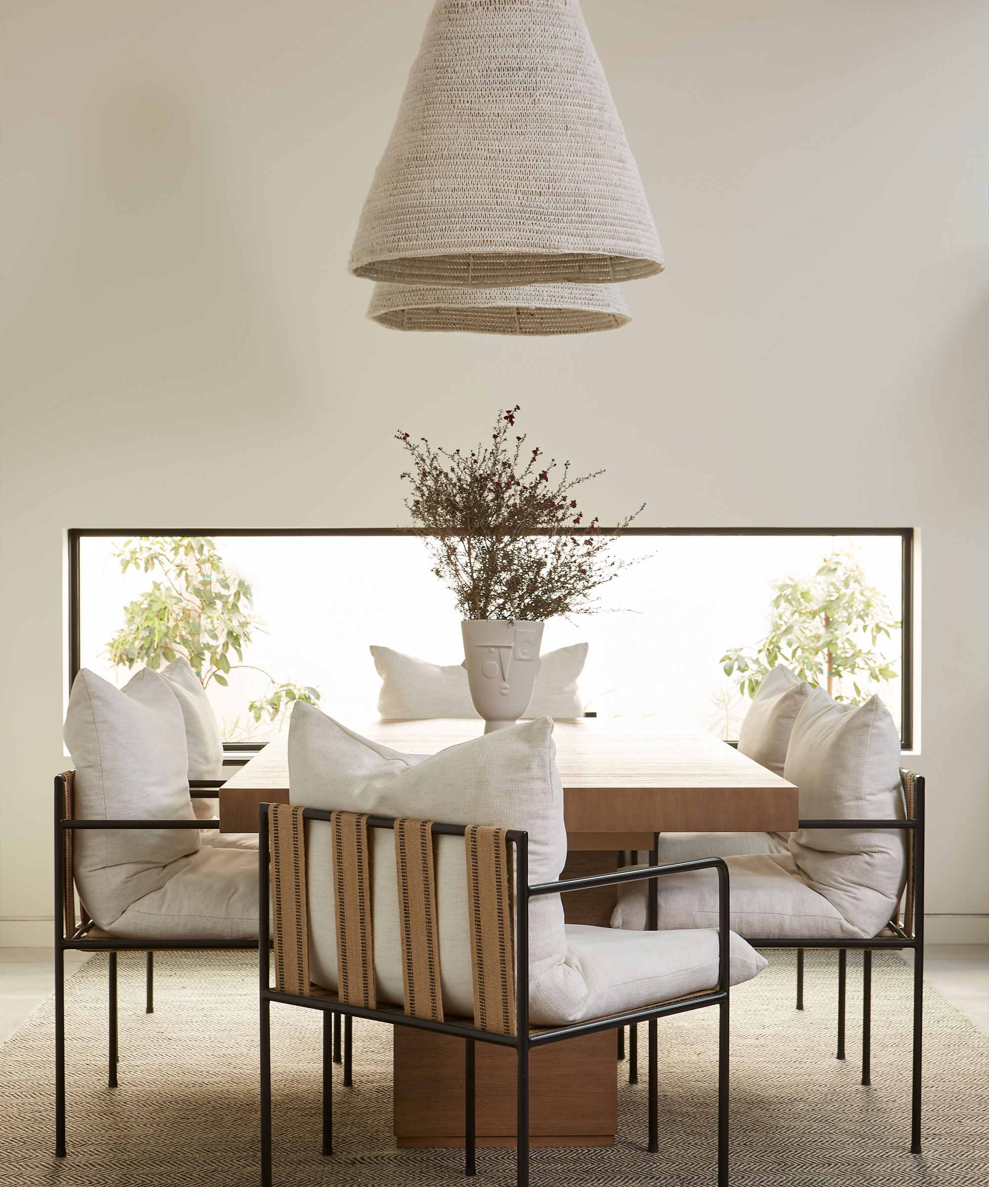
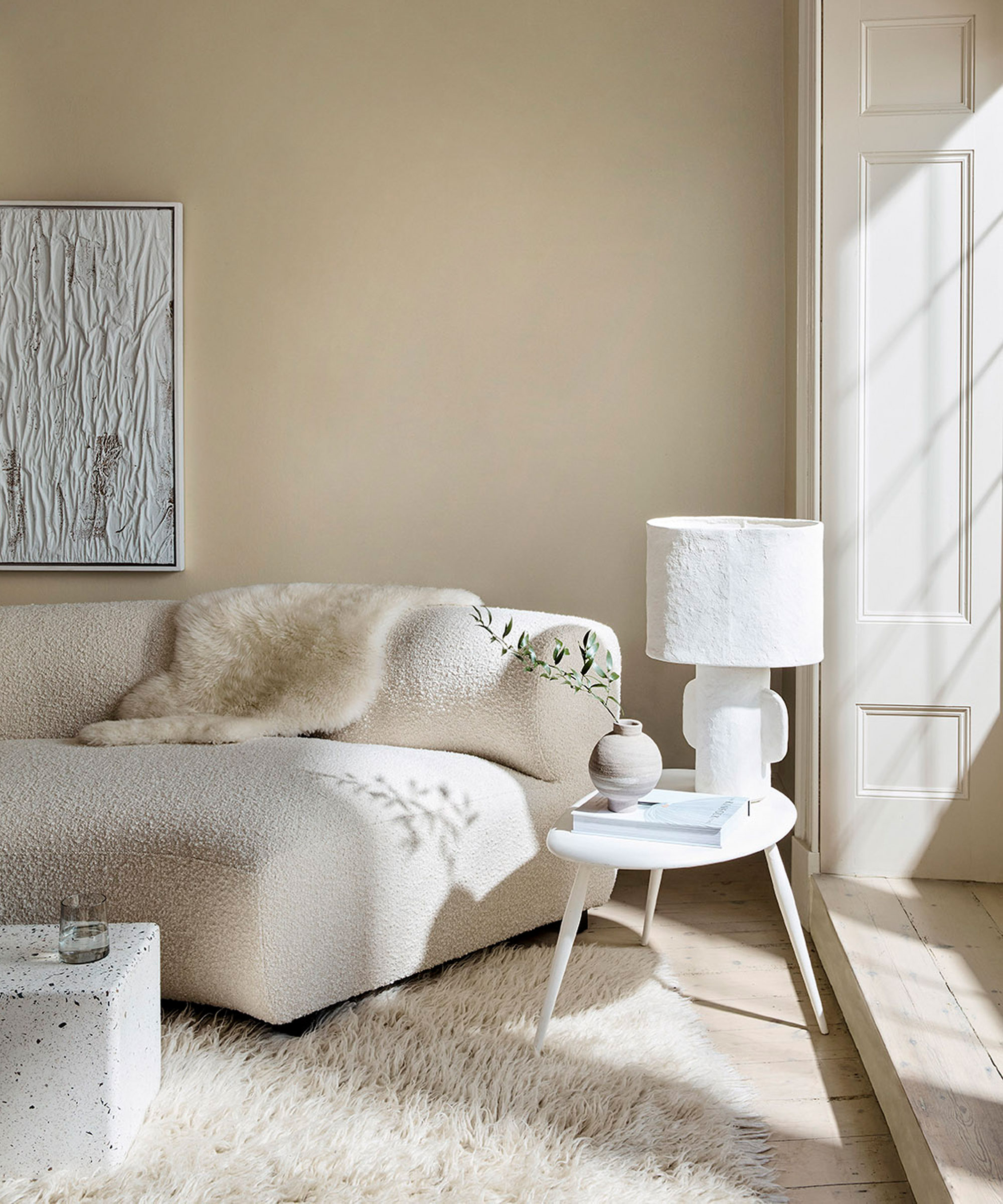
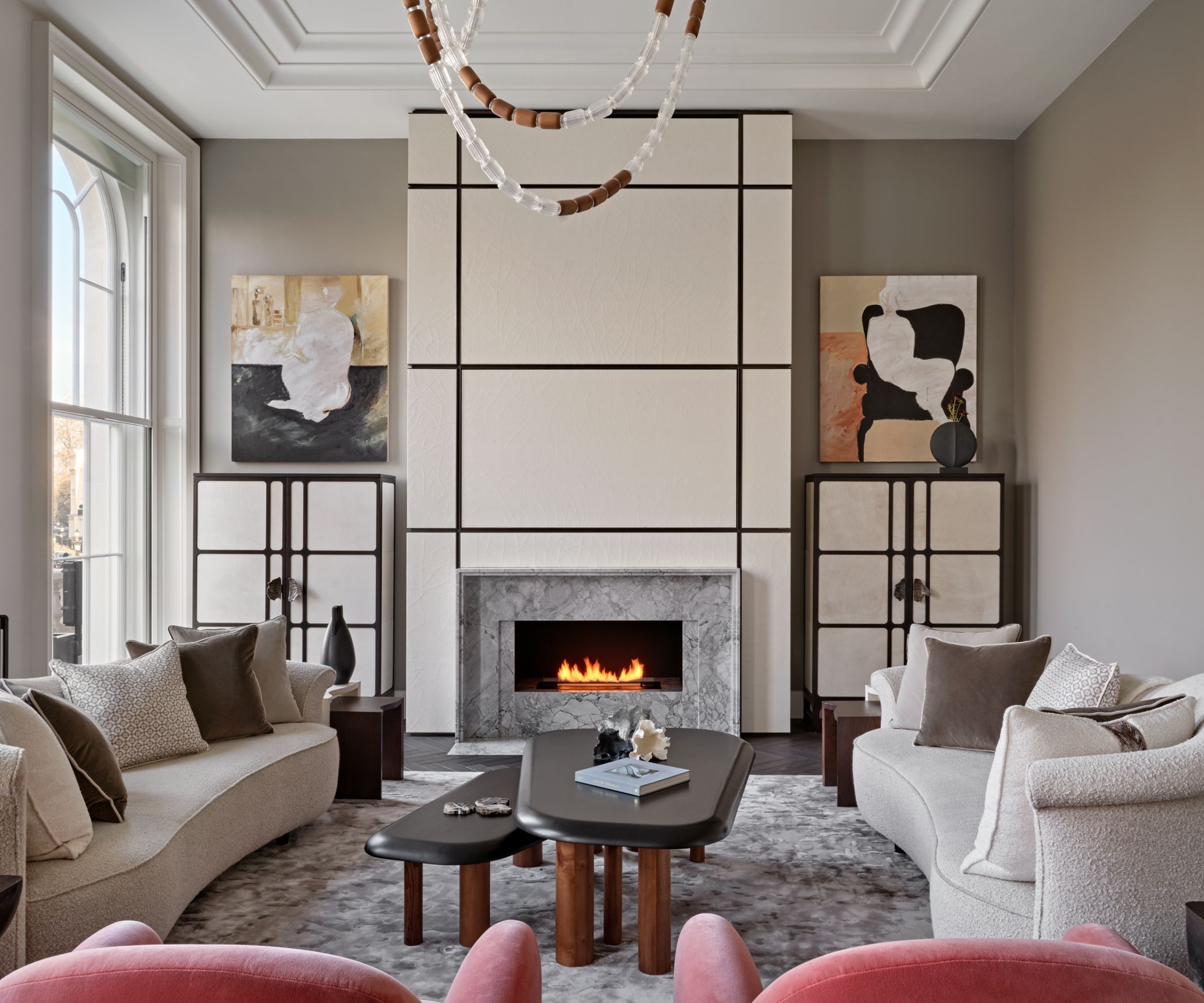
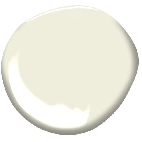
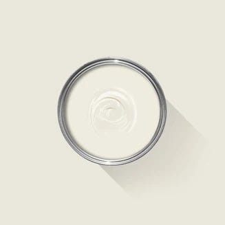
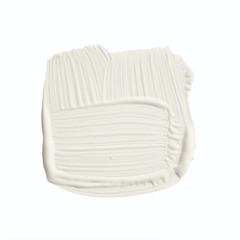
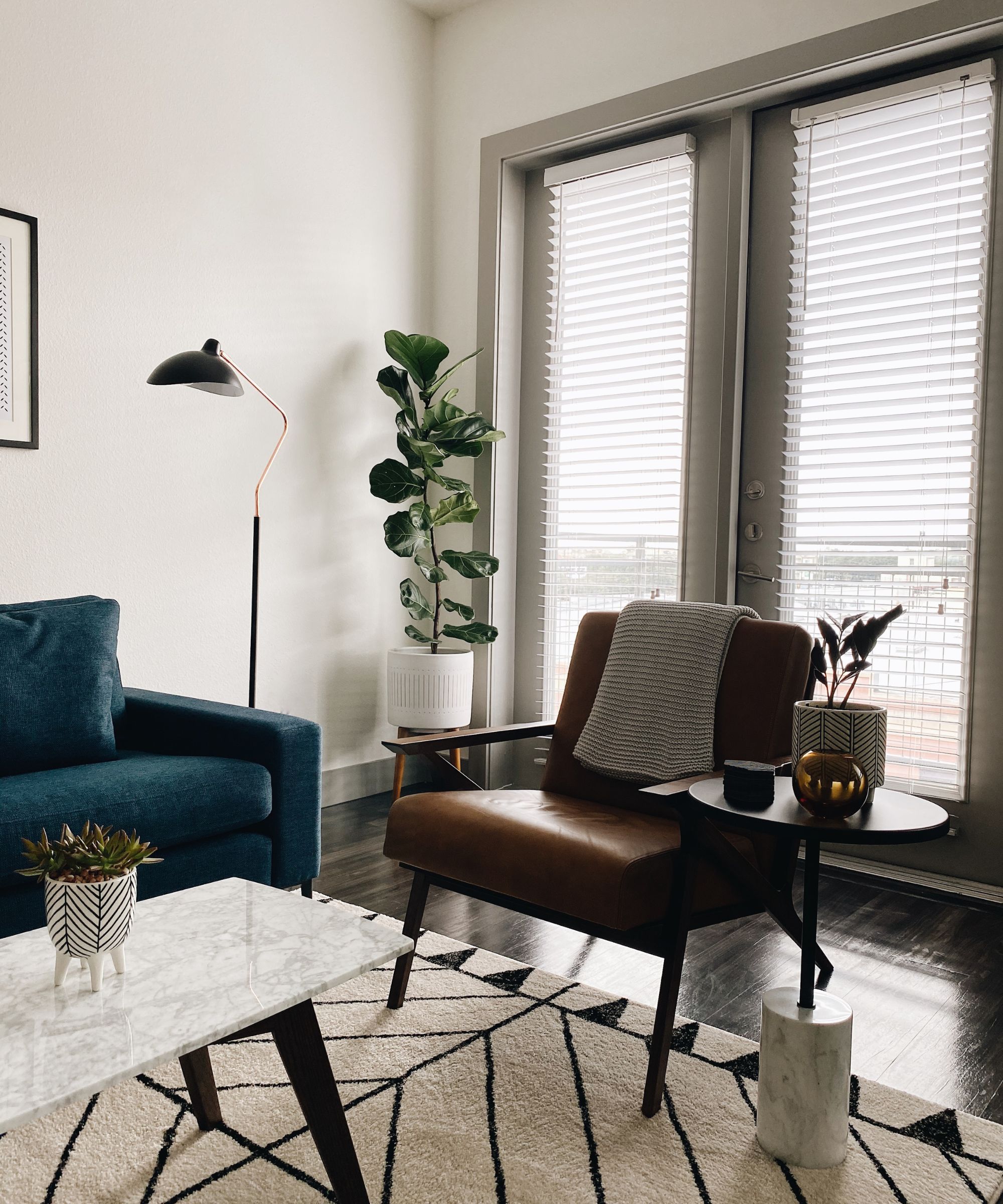
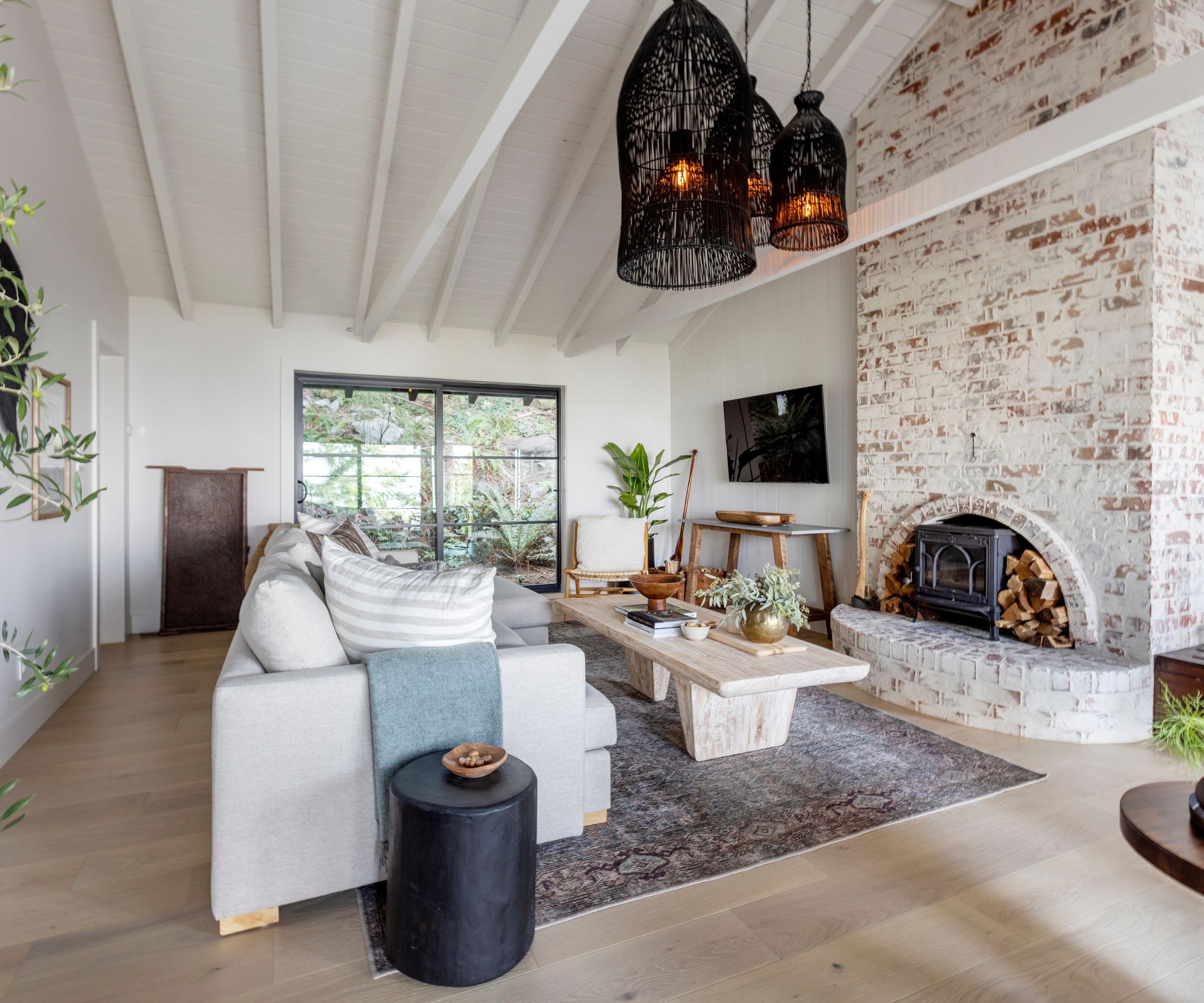
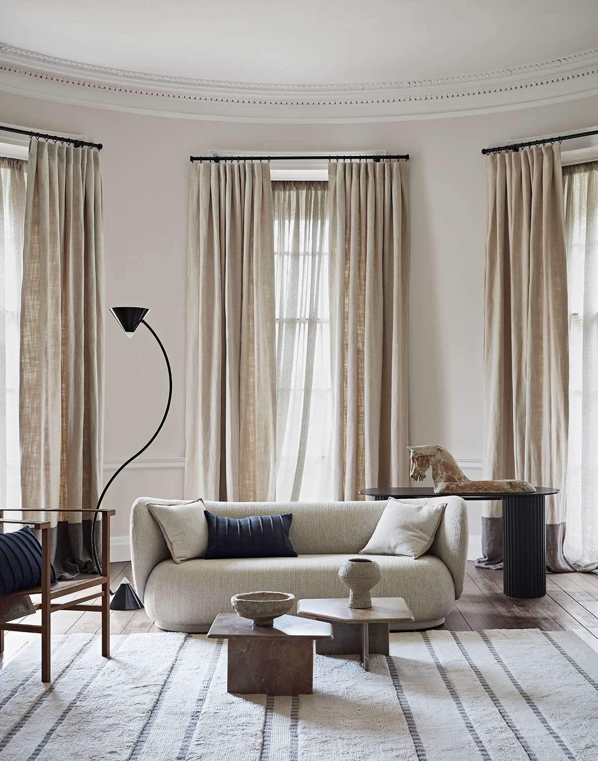
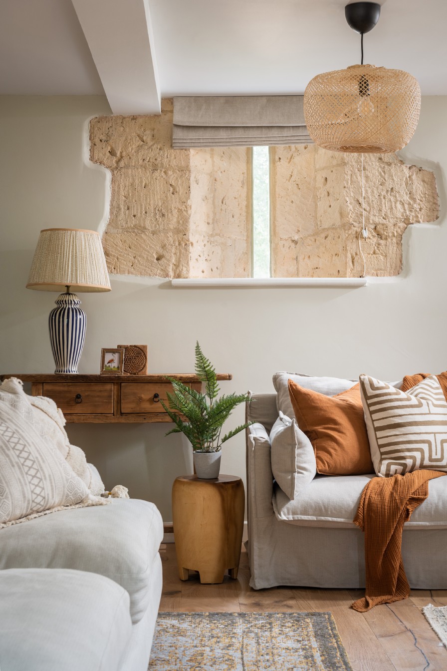
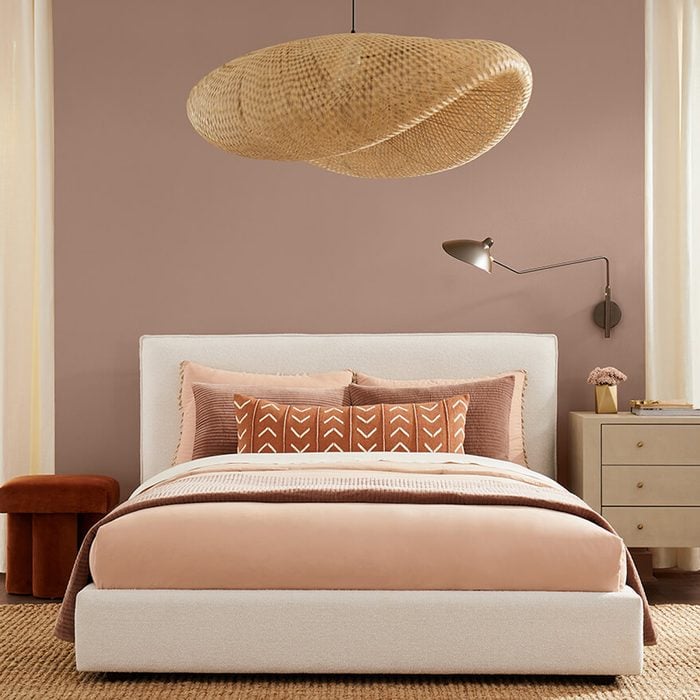
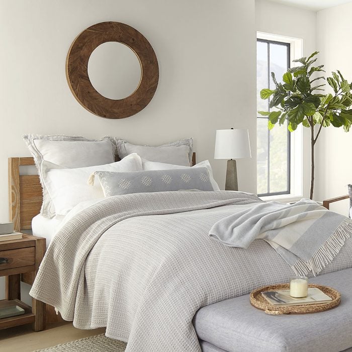
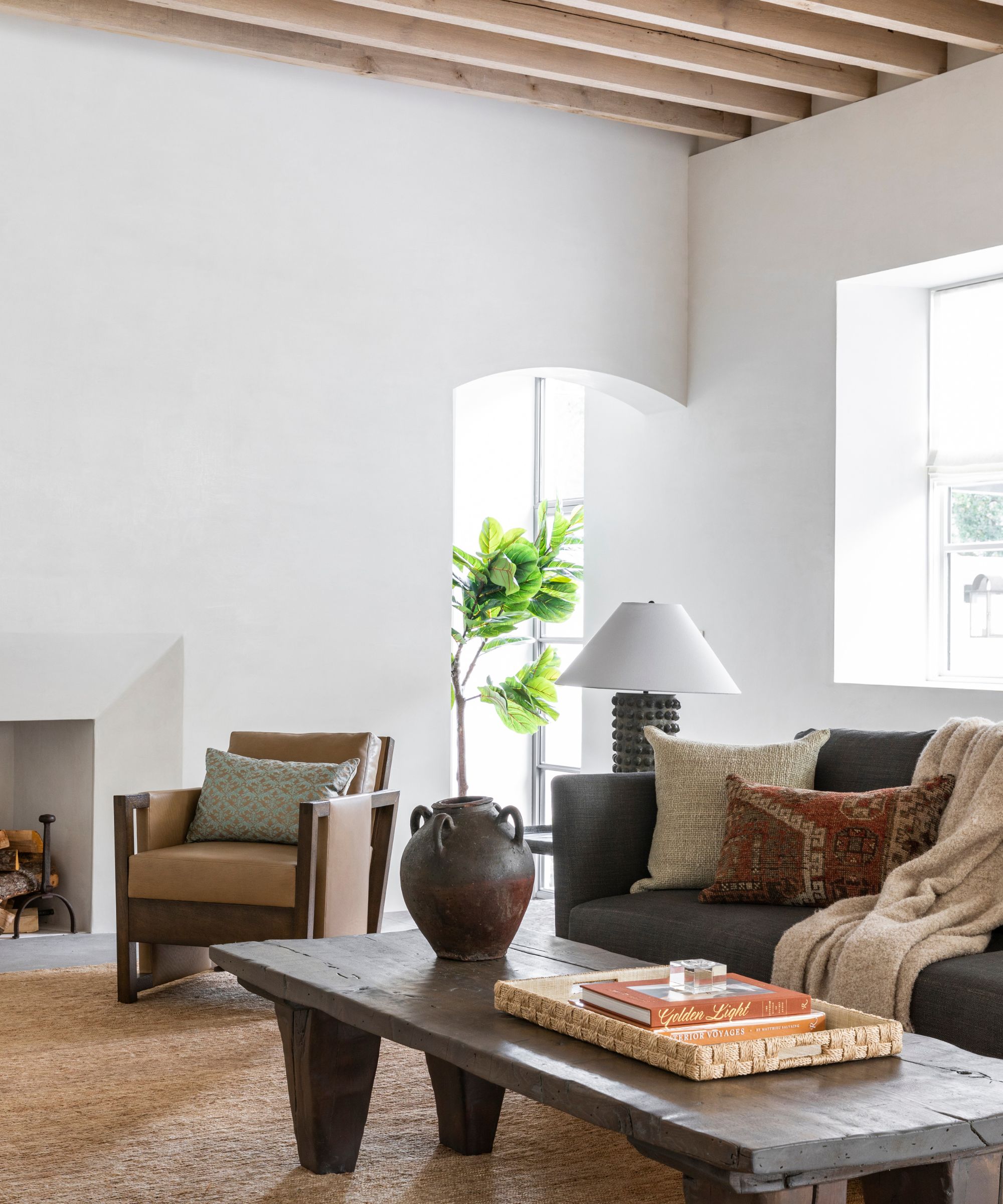
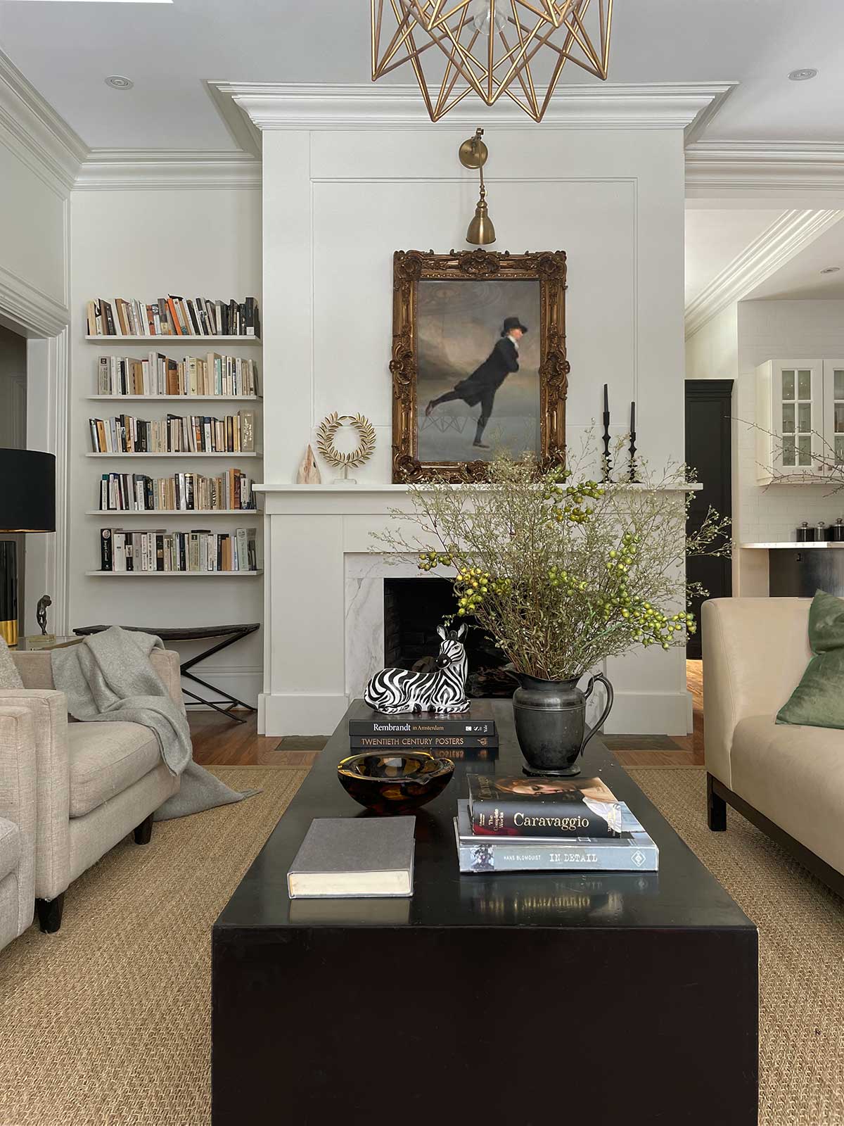
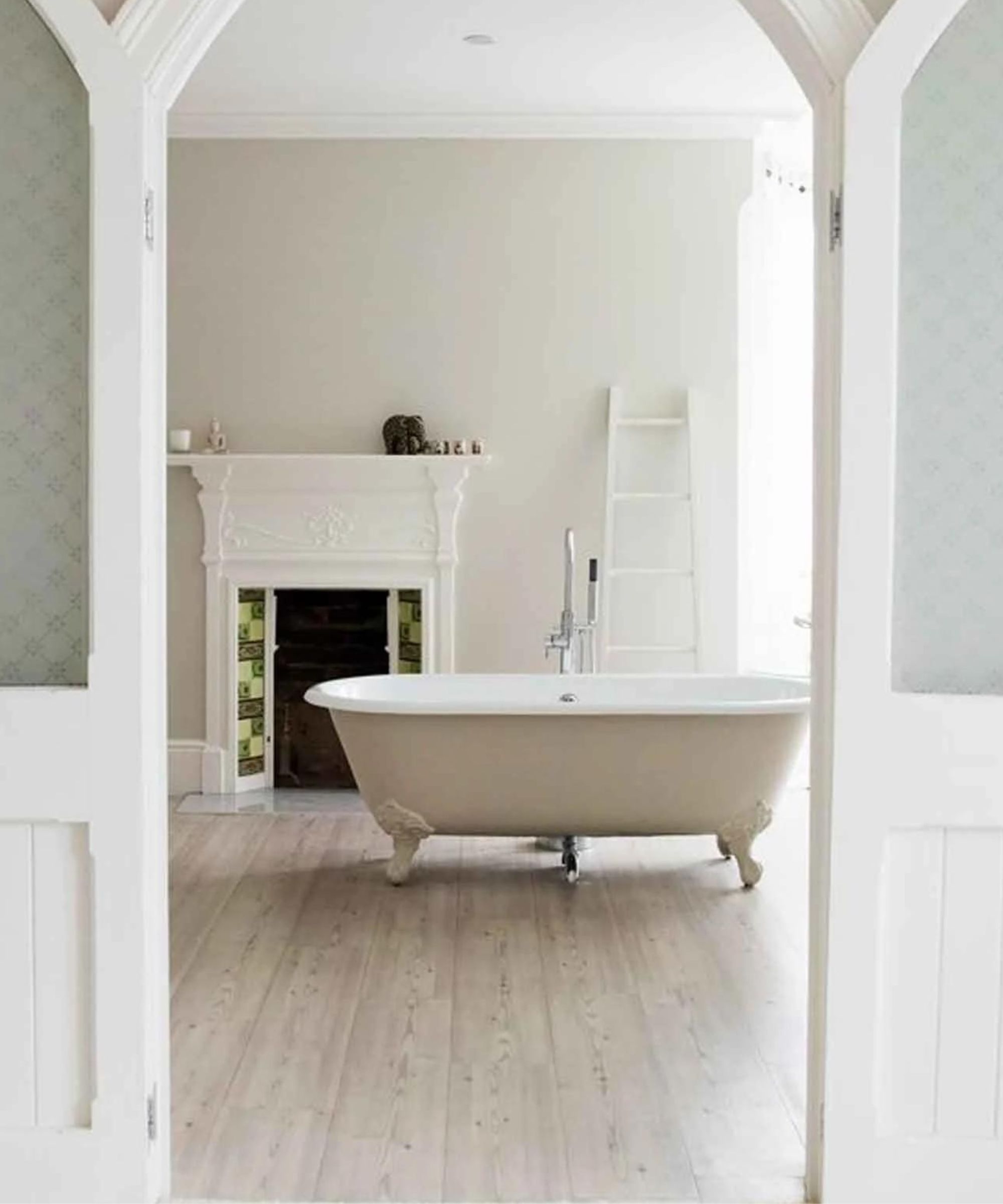
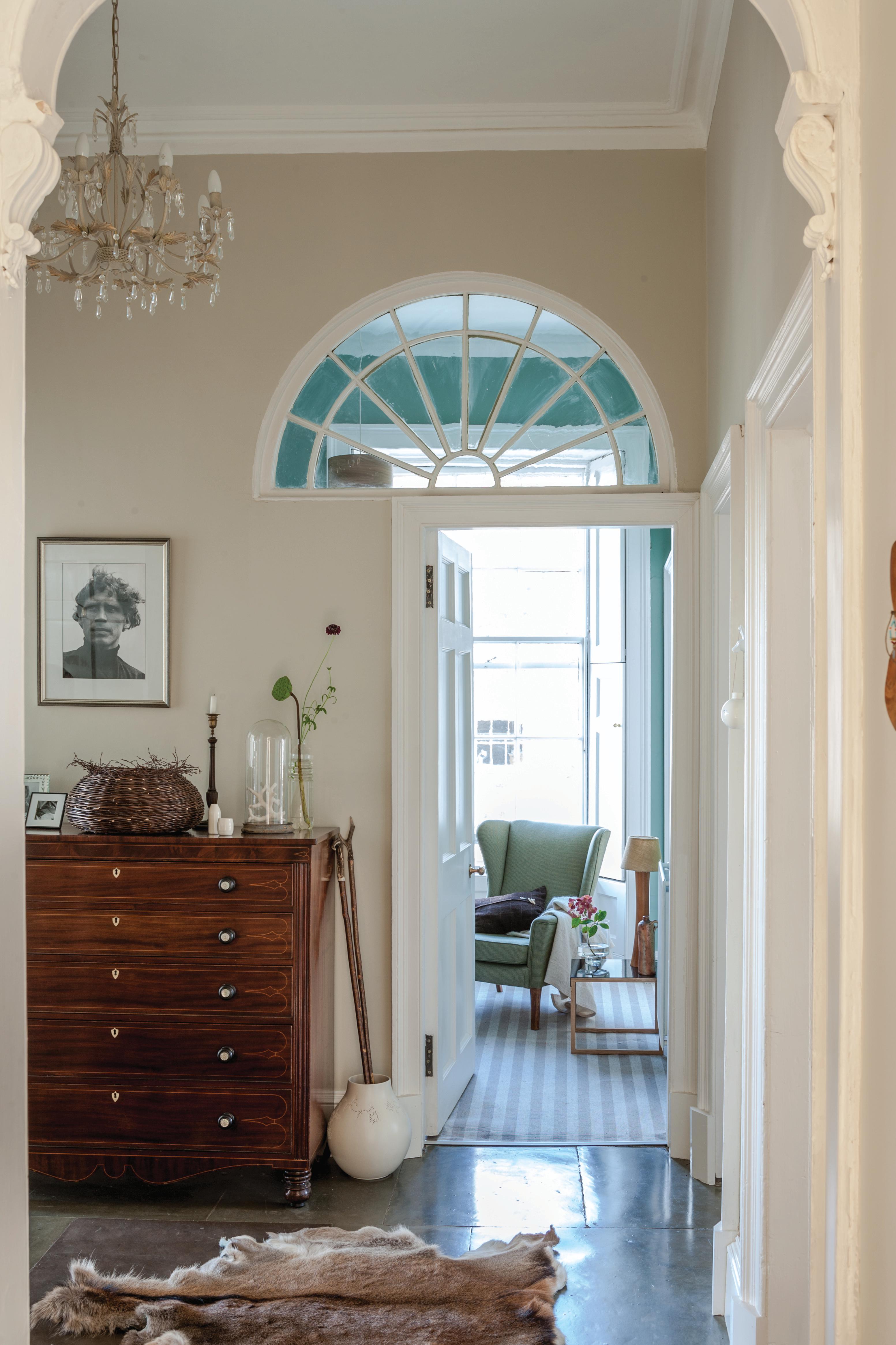
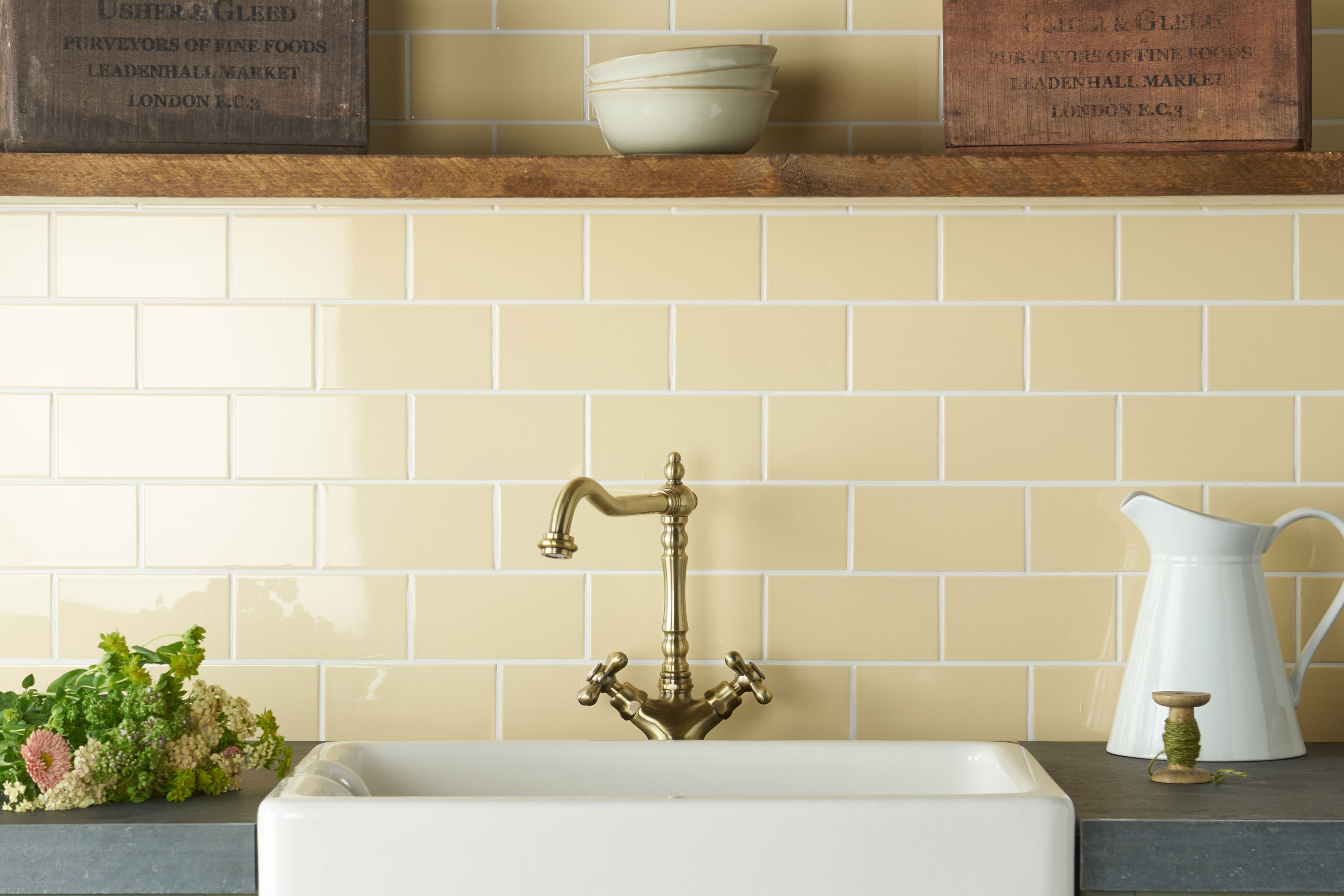
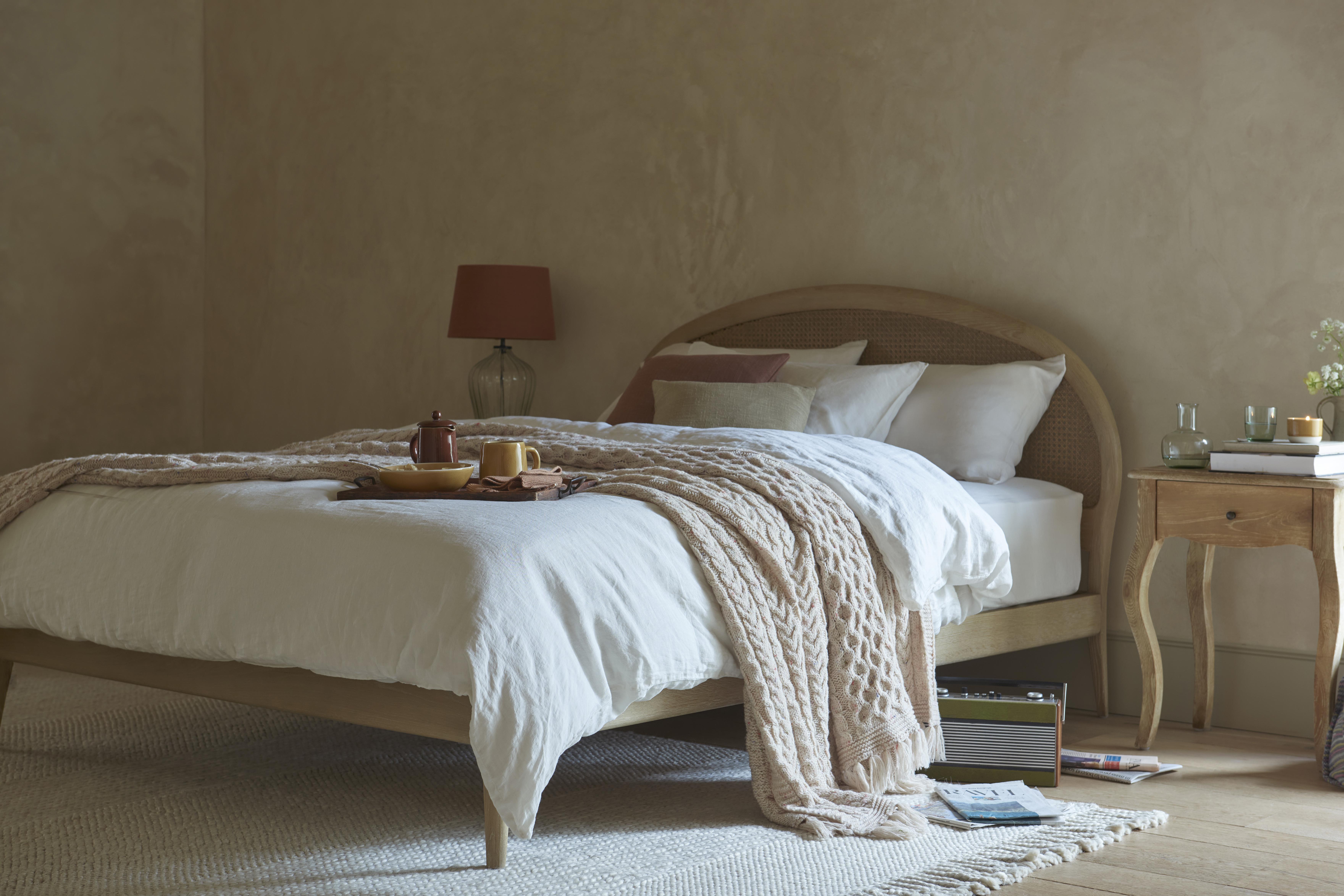
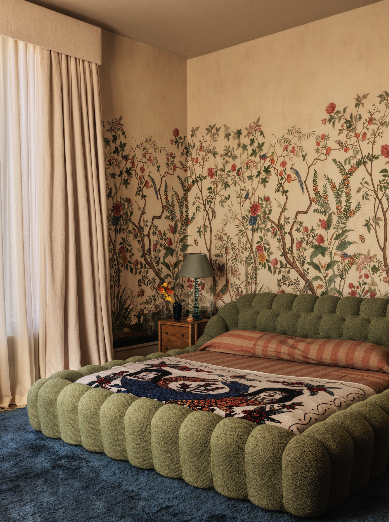
This article explores the versatility of cream paint colors for interior design, featuring insights from top designers on their preferred shades. Cream colors offer a sophisticated alternative to stark white, providing warmth and depth while remaining neutral and adaptable to various decor styles. Designers emphasize the importance of understanding a cream's undertones—be they warm (yellow, peach, pink) or cool (gray, green, purple)—to ensure harmonious pairing with existing furnishings and lighting conditions. For instance, a cream with yellow undertones can create a cozy and inviting atmosphere, ideal for living rooms or bedrooms, especially when natural light is limited. Conversely, creams with gray or cool undertones are suitable for more modern or minimalist aesthetics, reflecting light and offering a crisp, clean feel.
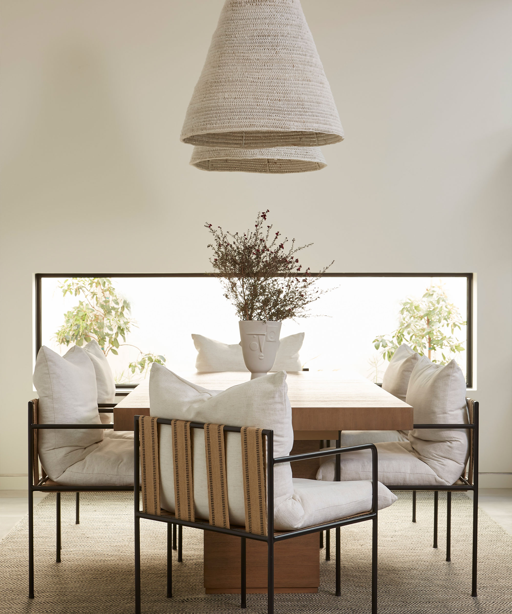
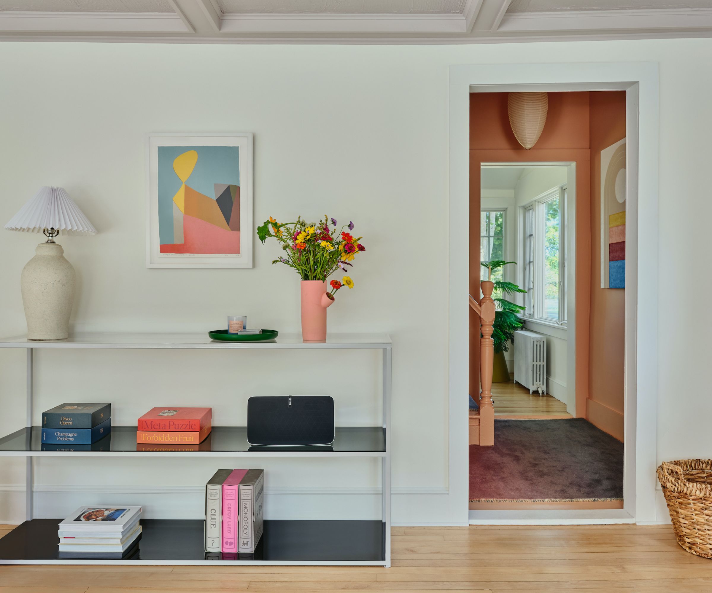
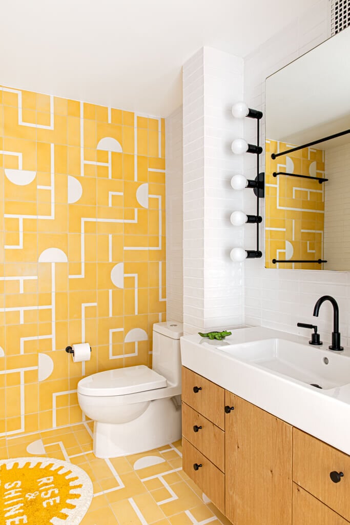
The article highlights that cream paint colors can be effectively used in diverse settings, from serving as a foundational neutral in large, open-concept spaces to providing a serene backdrop in a monochromatic room. When combined with bold hues, a well-chosen cream can soften the overall look and prevent an overpowering effect, allowing brighter colors to pop without visual conflict. In more neutral schemes, different cream shades can add subtle contrast and texture, creating a rich and layered environment. The selection of the right cream is crucial, as the wrong undertone can clash with other elements in a room, leading to an unintended aesthetic.
Several designers share their go-to cream paints, offering specific brand and shade recommendations. These recommendations often come with explanations of why a particular cream works well in certain contexts, such as its ability to shift with different lighting throughout the day or its complementary nature to specific wood tones or fabric textures. The consensus among experts is that cream is a timeless choice that can elevate a space, making it feel more expansive and refined. It acts as a forgiving color, capable of blending seamlessly with both traditional and contemporary design elements, making it a valuable tool in any interior designer's palette.
Ultimately, the article serves as a guide for individuals looking to incorporate cream into their homes, providing both inspiration and practical advice. It underscores that cream is far from a one-dimensional color; its subtle variations in undertone allow for a wide range of moods and styles. By considering these nuances and leveraging expert insights, homeowners can select a cream paint that not only enhances their living space but also provides a versatile foundation for future decor changes, ensuring a timeless and inviting home environment.
#CreamPaintColors #InteriorDesign #HomeDecor #ColorPalette #DesignTips #NeutralShades #VersatileColors #DesignInspiration #CreamPaintColors #InteriorDesign #HomeDecor #ColorPalette #DesignTips #NeutralShades #VersatileColors #DesignInspiration
0 comment in total
 No comments yet
You may also like
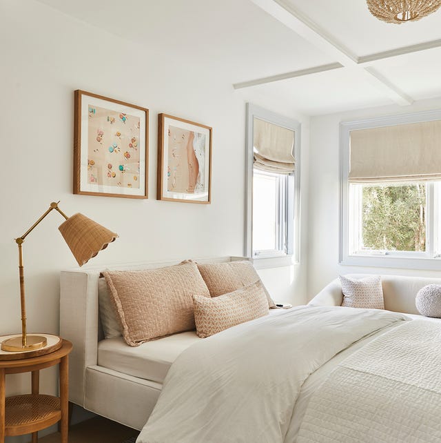
Here Are the Best Cream Paint Colors, According to Design Pros

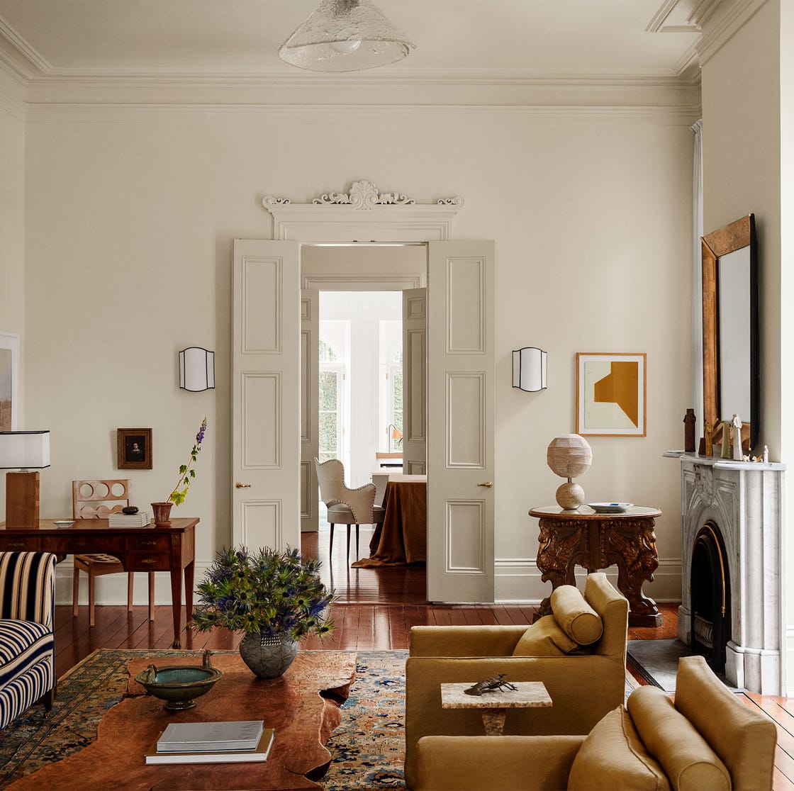
Interior Designers Share Their Favorite Cream Paint Colors

The Best Cream Colored Sweaters To Add To Your Wardrobe Now
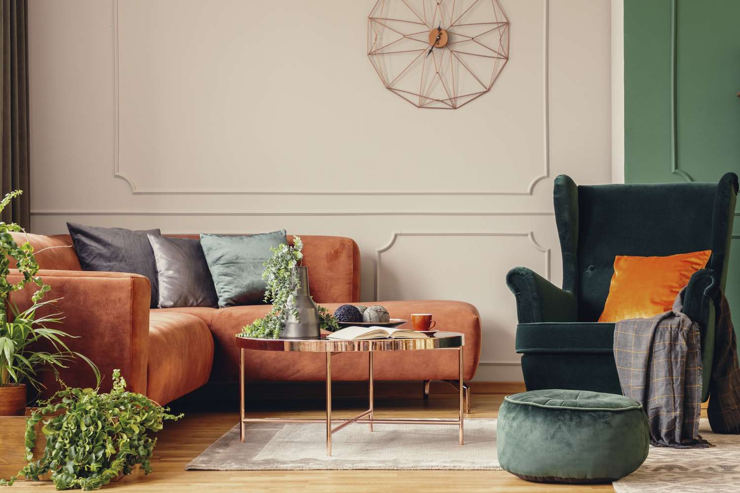
5 Timeless Paint Colors That Go With Absolutely Everything, According to Color Experts

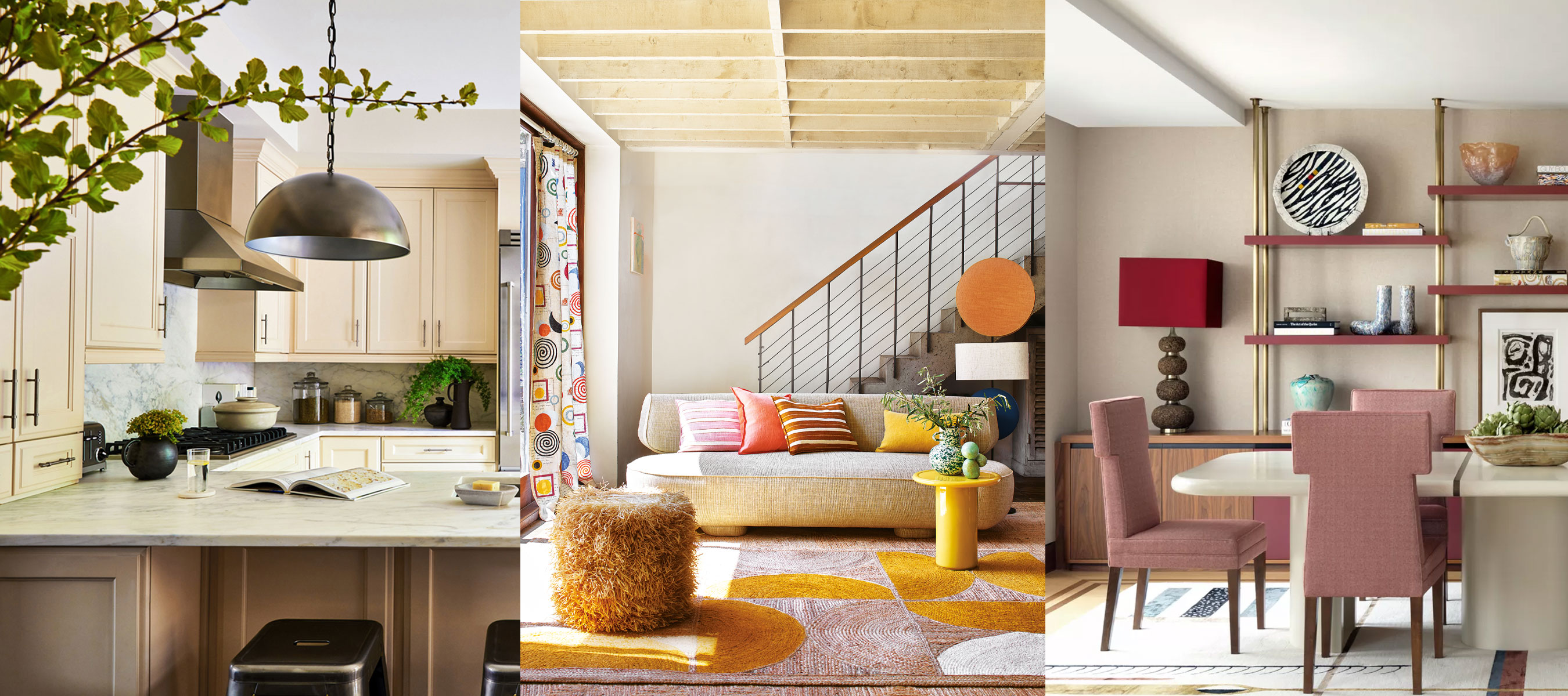
What colors go with cream? 8 complementary colors for this neutral favorite
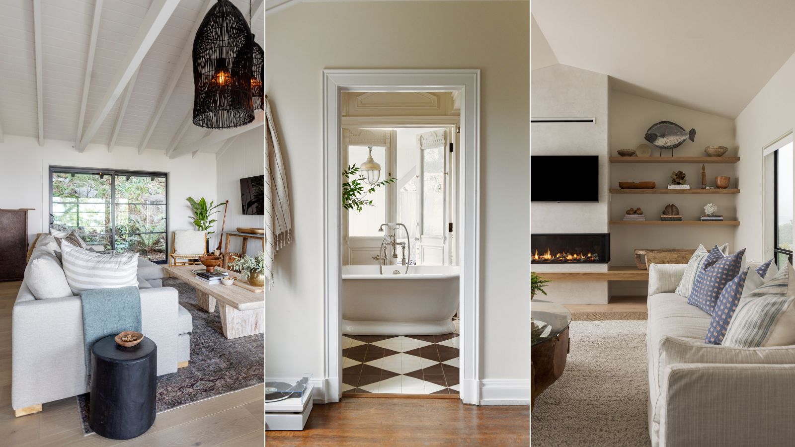
5 best cream paints, as chosen by interior designers
13 Multi-Use Cream Makeup Palettes That MUAs Rave About
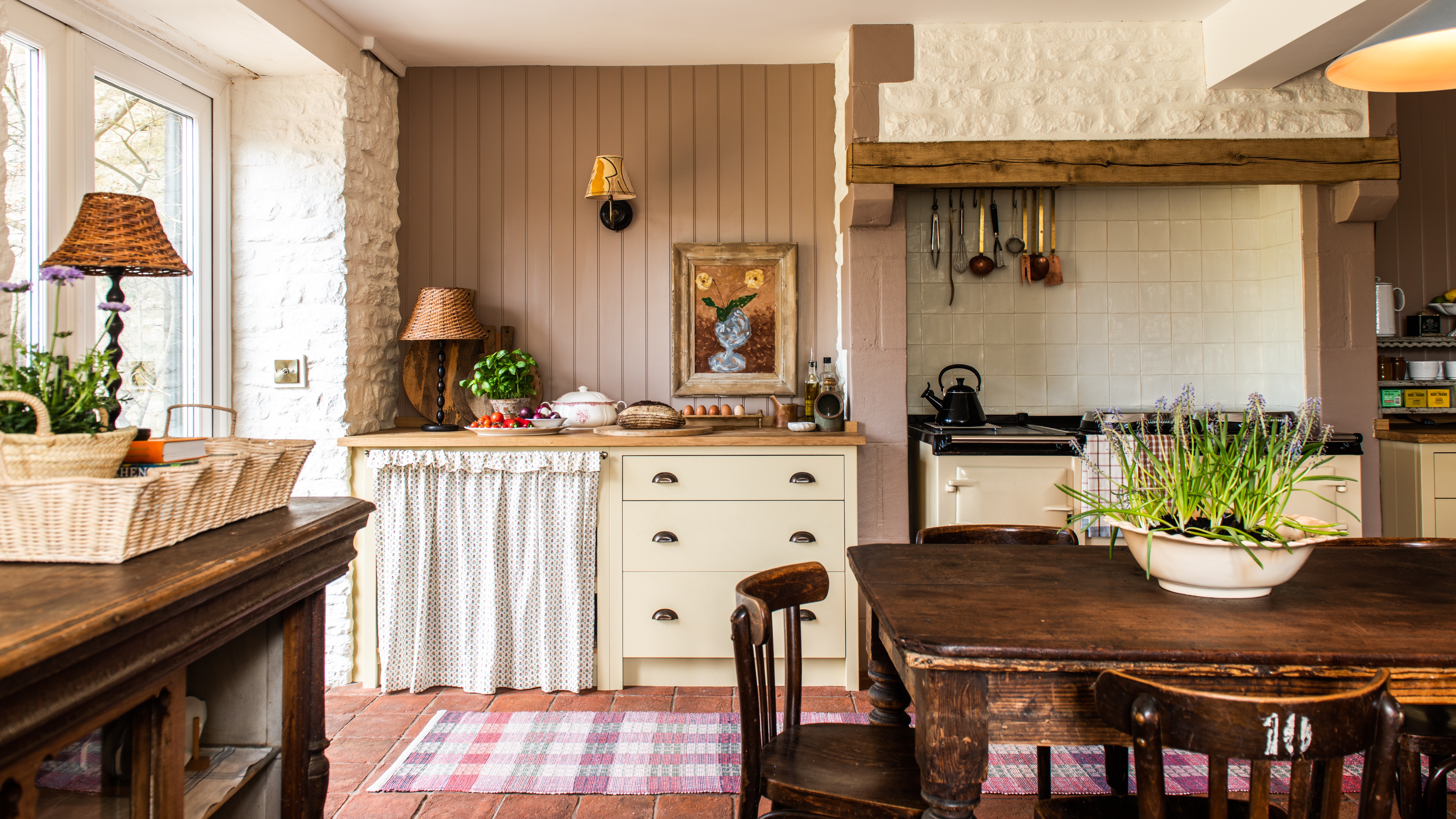
Creamy neutral paint colours are back — just don’t call it magnolia
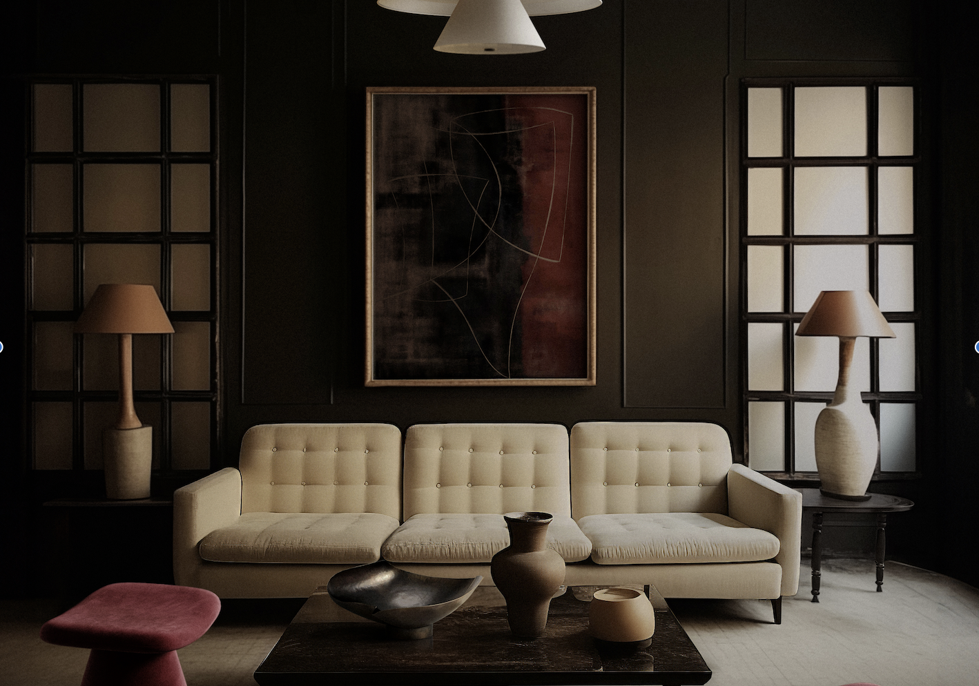
What Colors Go With Cream? 10 Crème de la Crème Pairings That Go Perfectly With the Warm Neutral

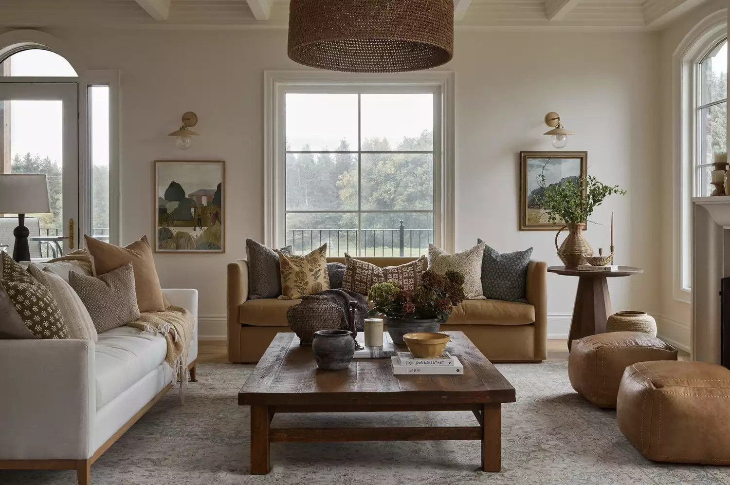
From the Living Room to the Bedroom, These Cream Paint Colors Work Anywhere

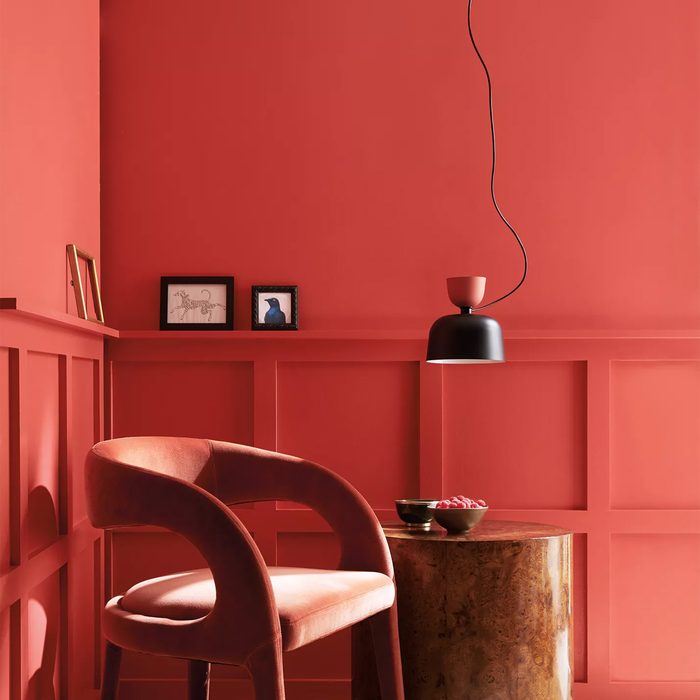
Compare All the Paint Colors of the Year for 2023

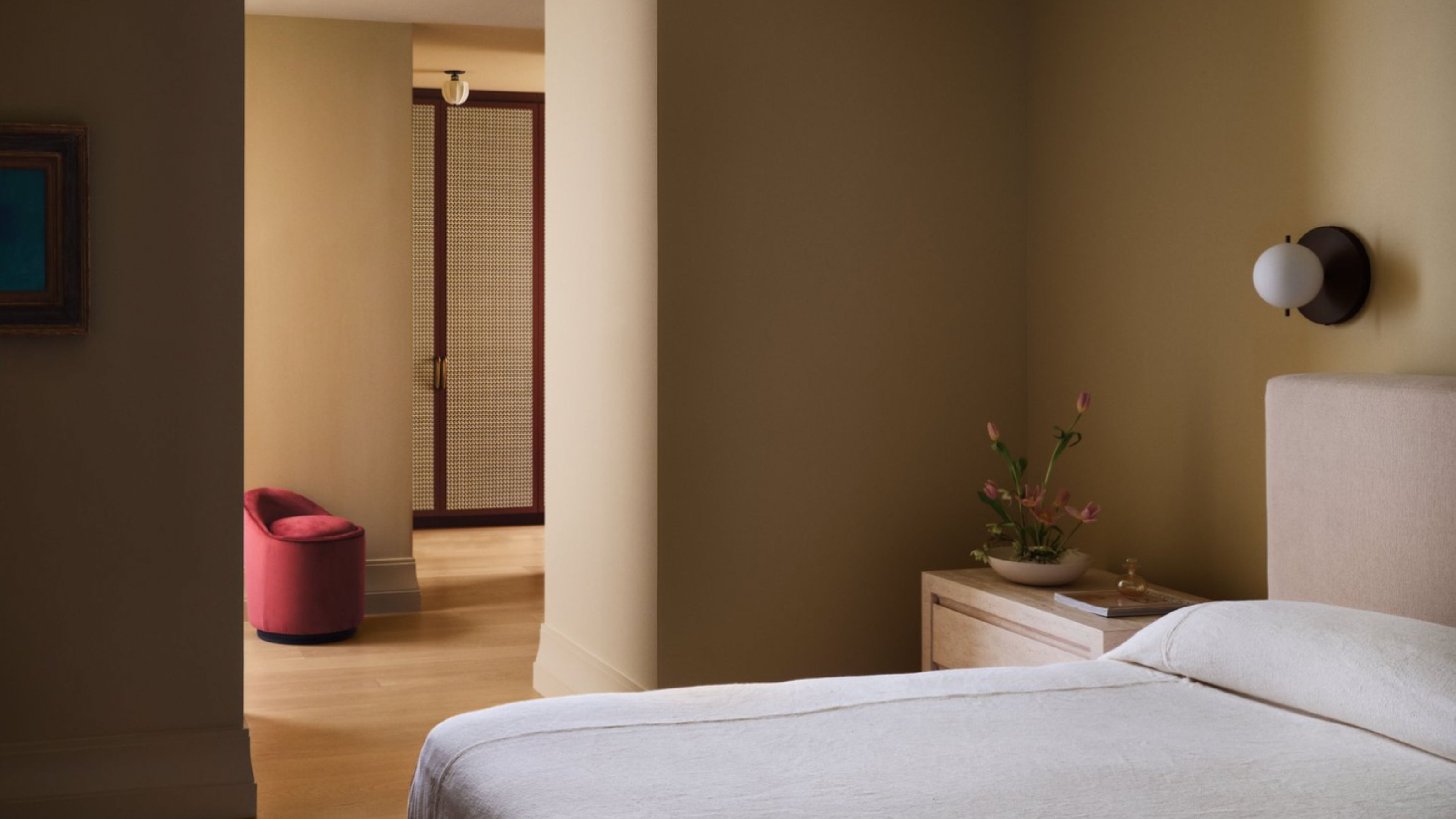
10 Cream Bedroom Ideas That Prove This Velvety Shade is Anything But Boring
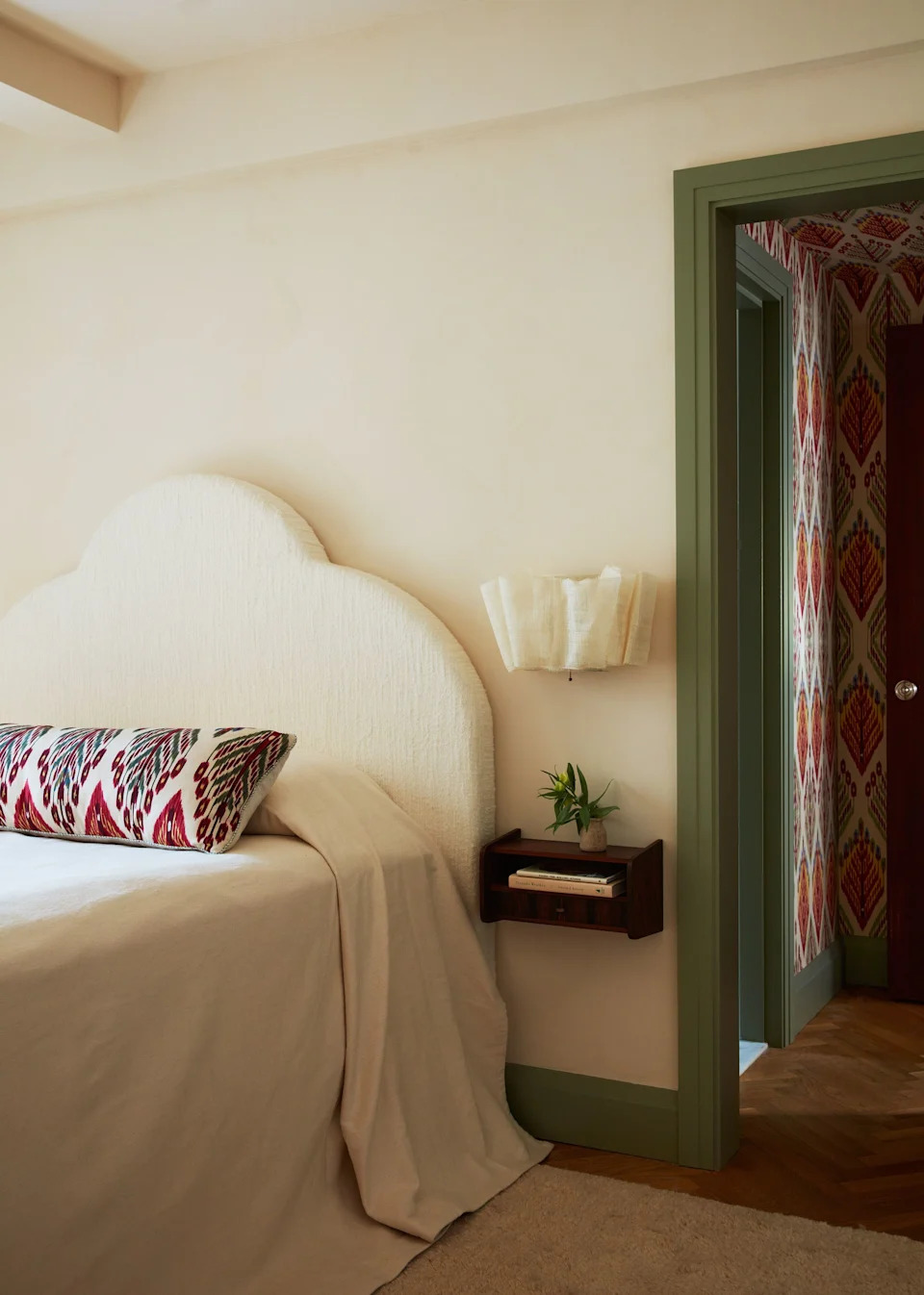
23 Versatile Cream Paint Colors That Will Pair with Basically Anything

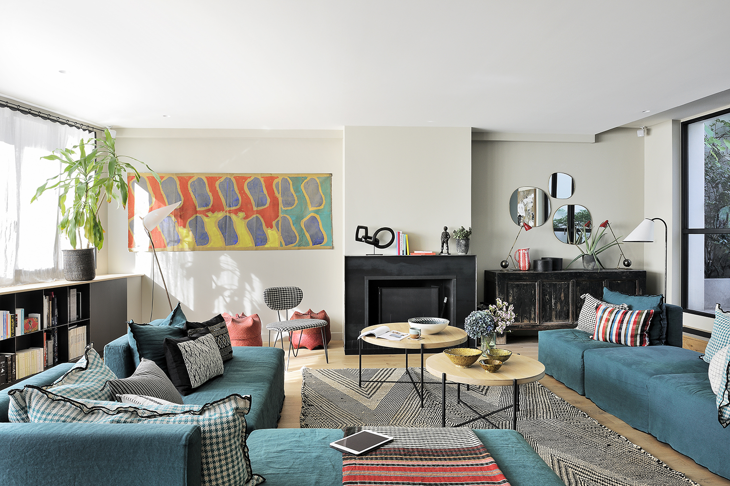
Cream living room ideas – 10 ways to play up this versatile neutral
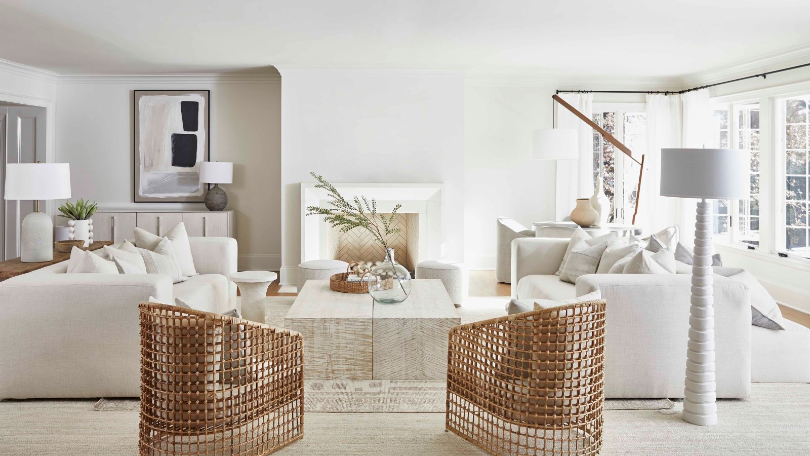
7 of the best cream wall paint colors, as chosen by designers – 'they look modern, and anything but magnolia'

7 of the most versatile and easy to use paint colors according to designers

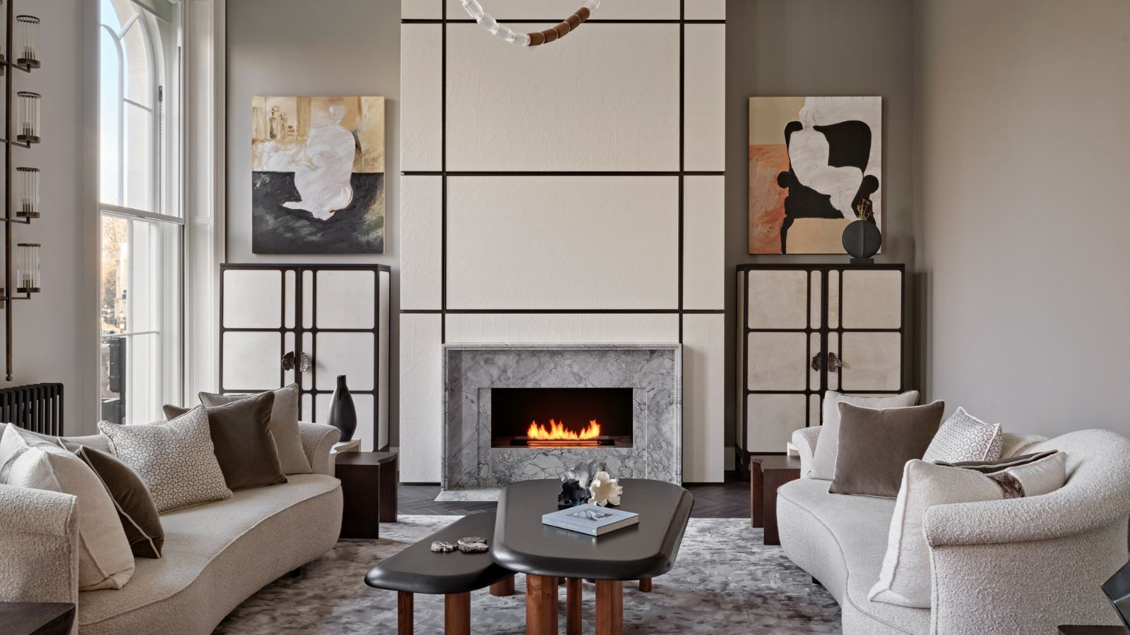
Is cream paint back on trend? 7 ways interior designers use this once shunned shade

The Gray, Cream, and Navy Items I Swear Out-Rich Every Other Color Trend (Yes, Even Black)

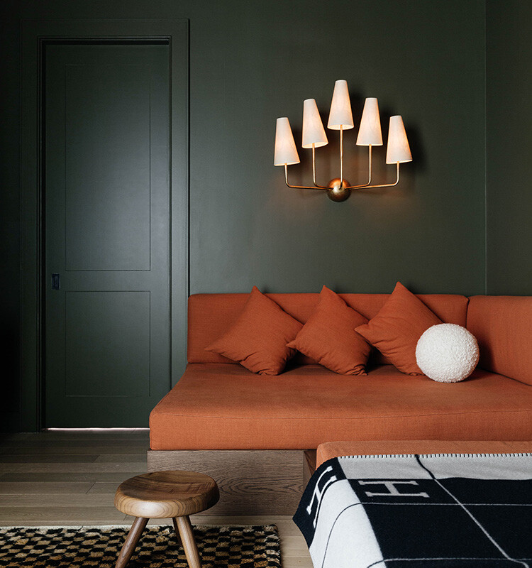
We Can’t Get Enough of These 13 Paint Color Trends for 2021
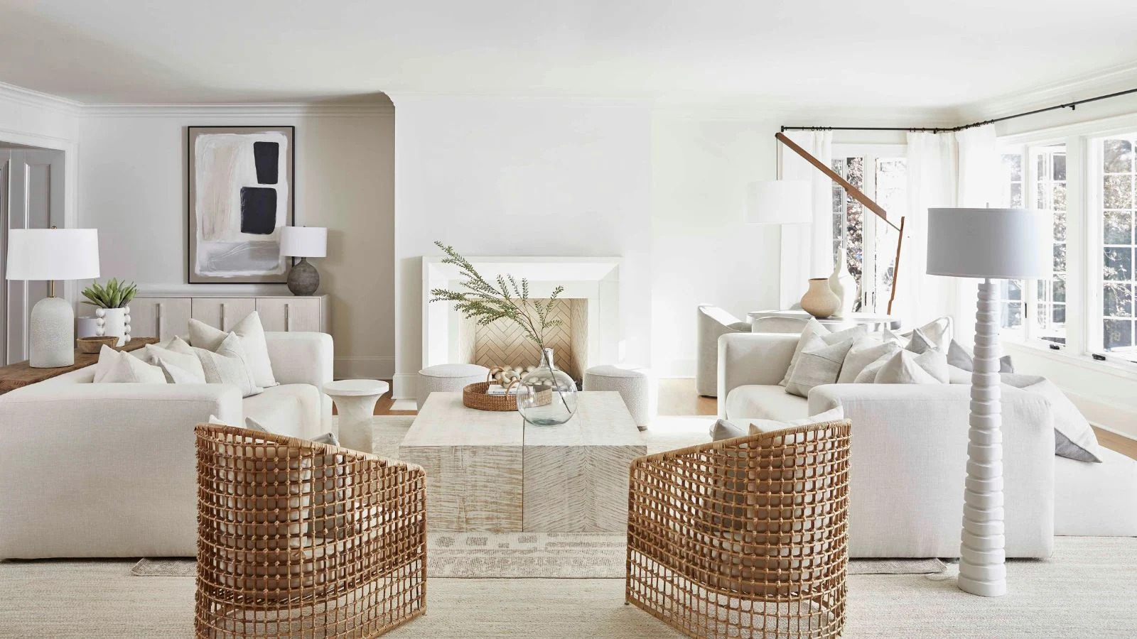
7 of the best cream wall paint colors, as chosen by designers – 'they look modern, and anything but magnolia'