1/9
Is cream paint back on trend? 7 ways interior designers use this once shunned shade
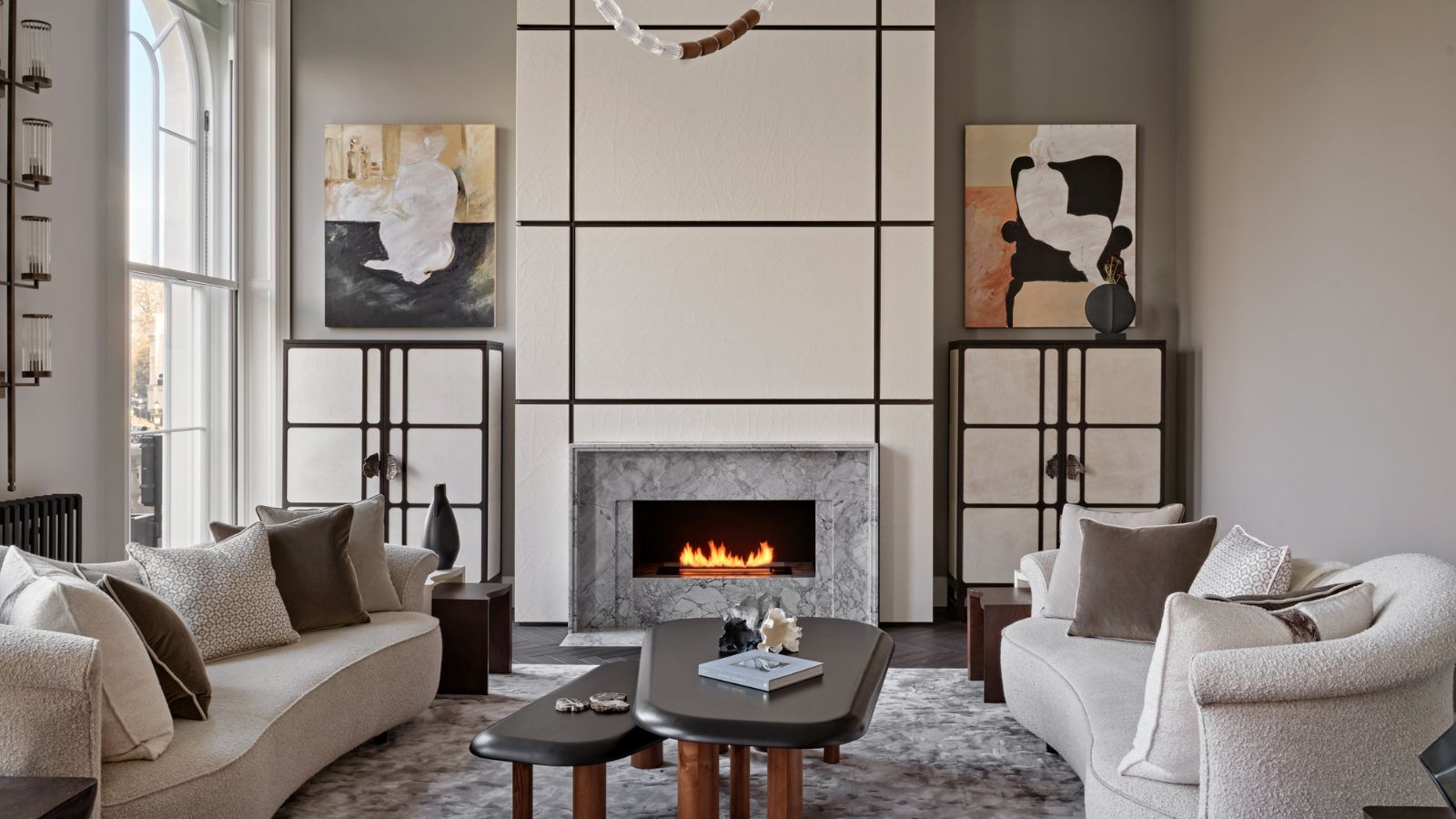
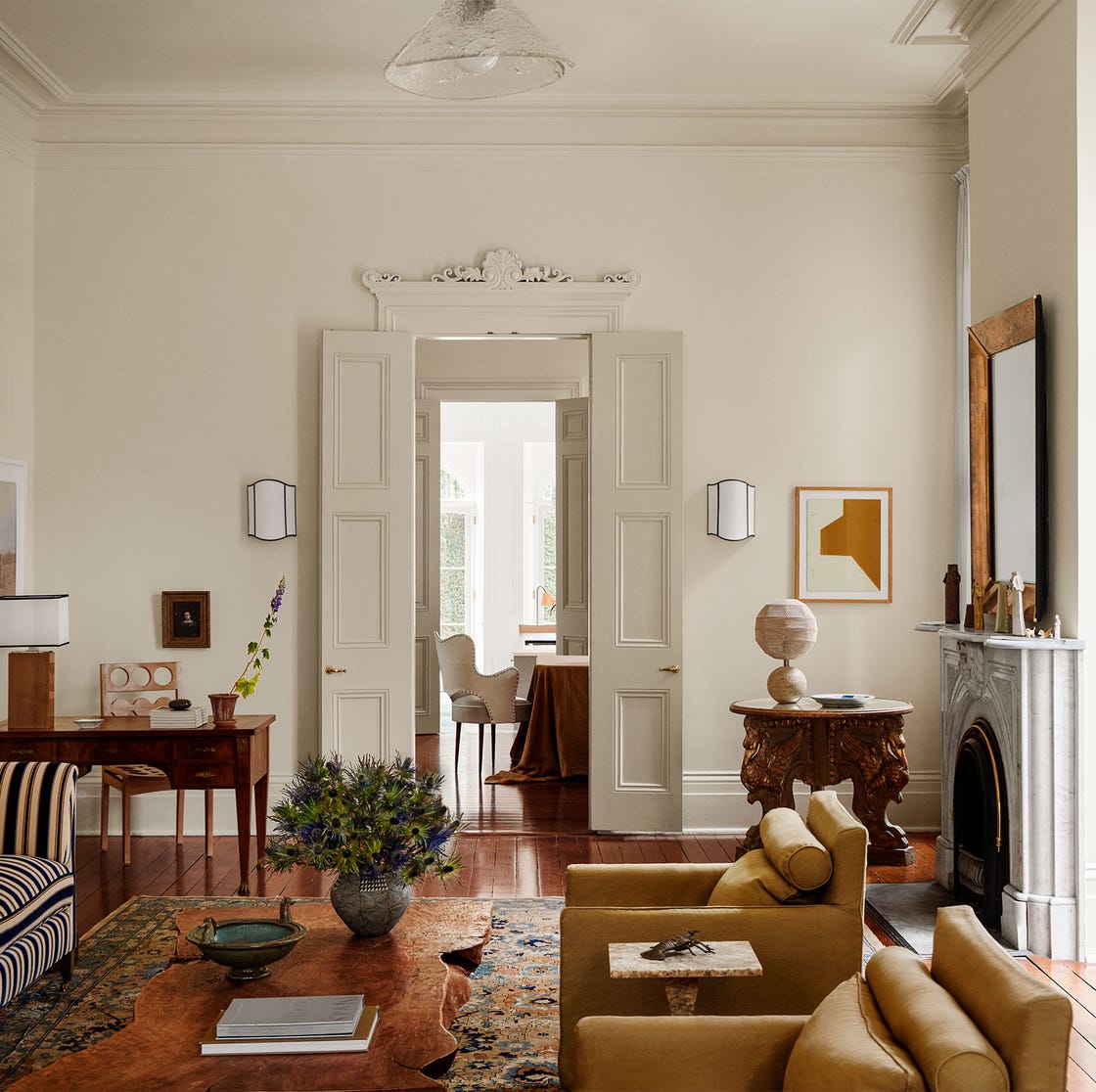
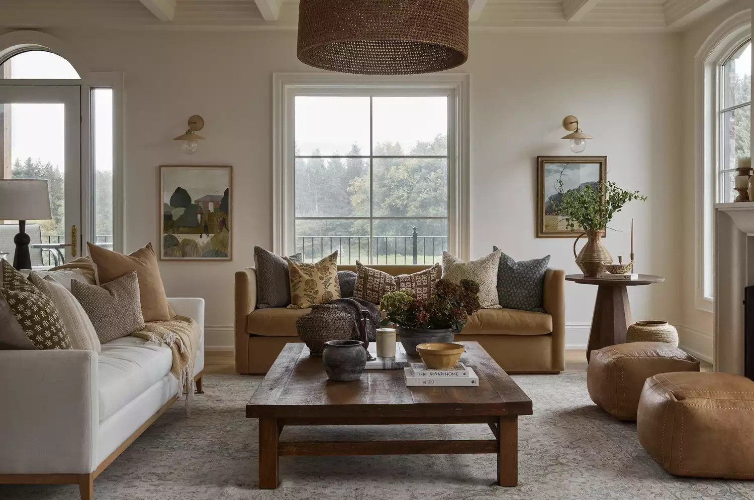
Cream paint has re-emerged as a prominent interior design trend, moving past its previous decline in popularity due to the rise of grey shades and darker hues. Interior design experts confirm that cream is now considered a versatile and timeless choice, offering a softer alternative to stark white and imparting a warmer, more inviting atmosphere to various spaces. Many designers believe cream is not merely a passing fad but a classic, enduring option that provides a luxurious feel to interiors.
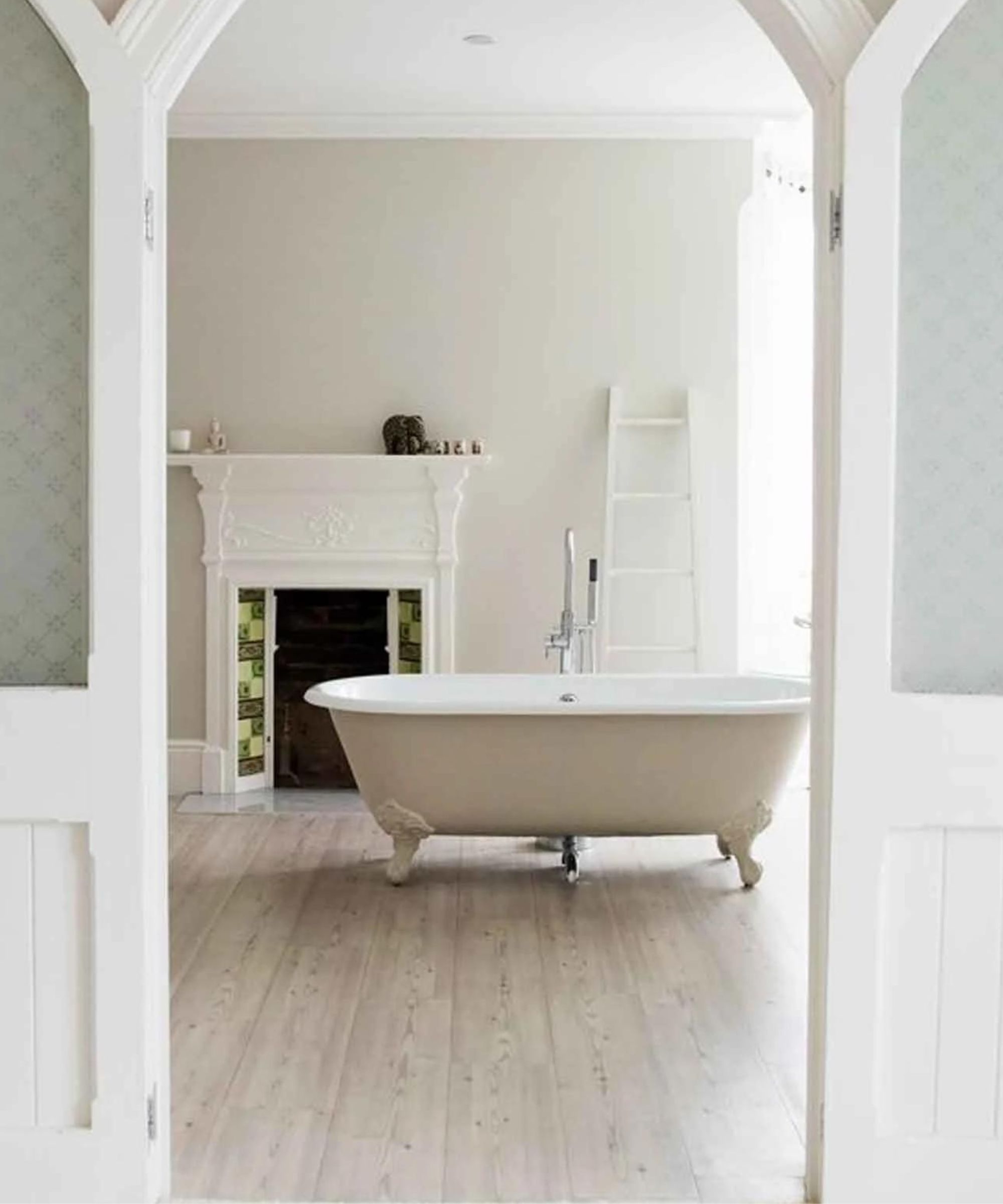
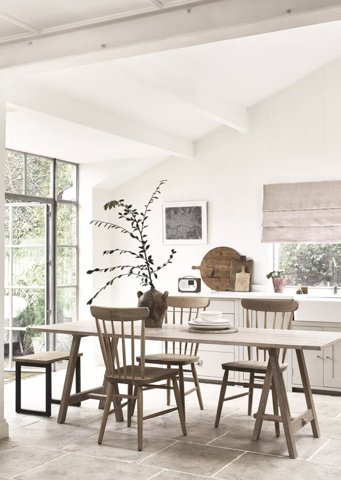
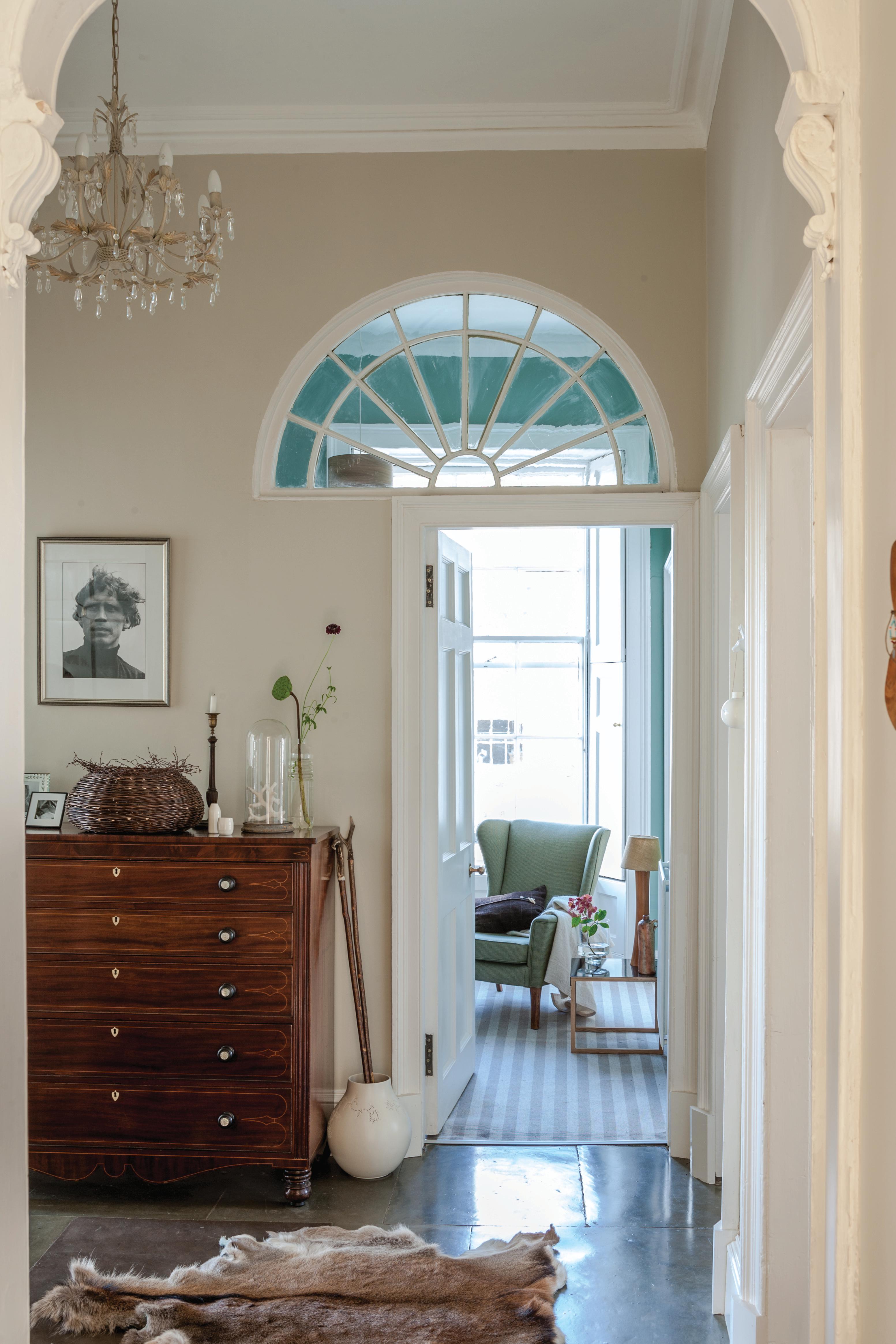
The article outlines seven key ways interior designers utilize cream paint to enhance homes. Firstly, cream paint is effective in brightening spaces, whether they are naturally well-lit or suffer from limited daylight. It can create an illusion of increased light and airiness, making it suitable for both expansive, minimalist settings and smaller, cozier retreats. Designers often recommend using cream as a base color to establish a sense of calm and tranquility in rooms, with one designer suggesting it helps create an “instant Zen feel to calm the nerves and lift the spirits.”
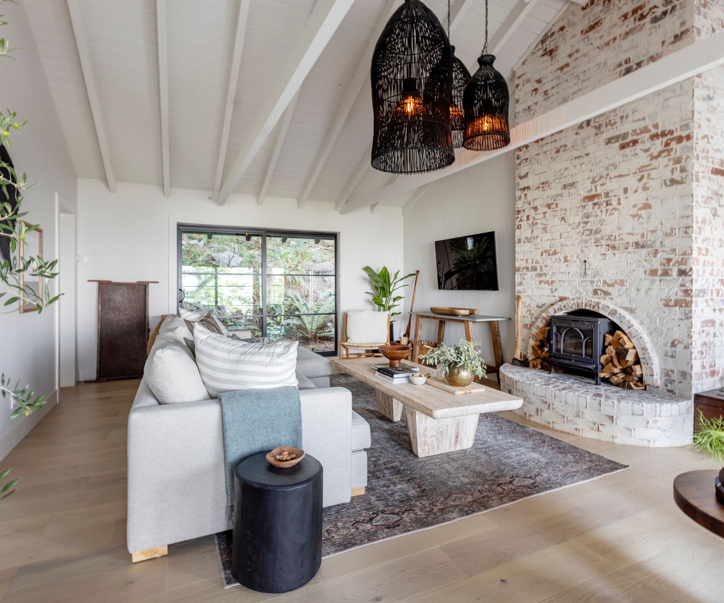
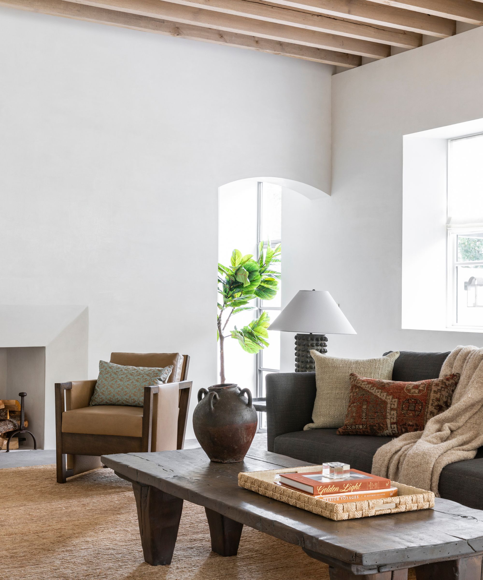
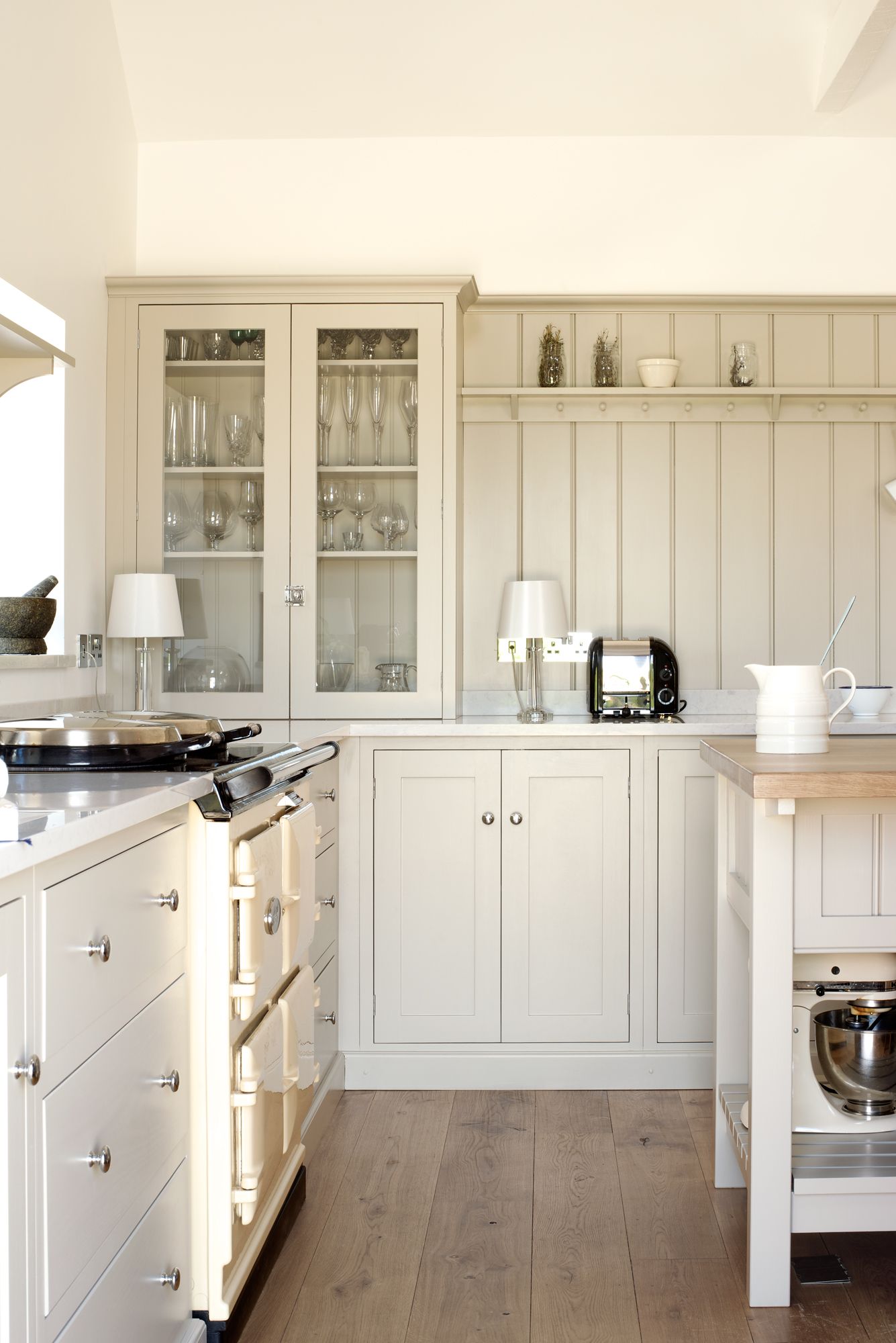
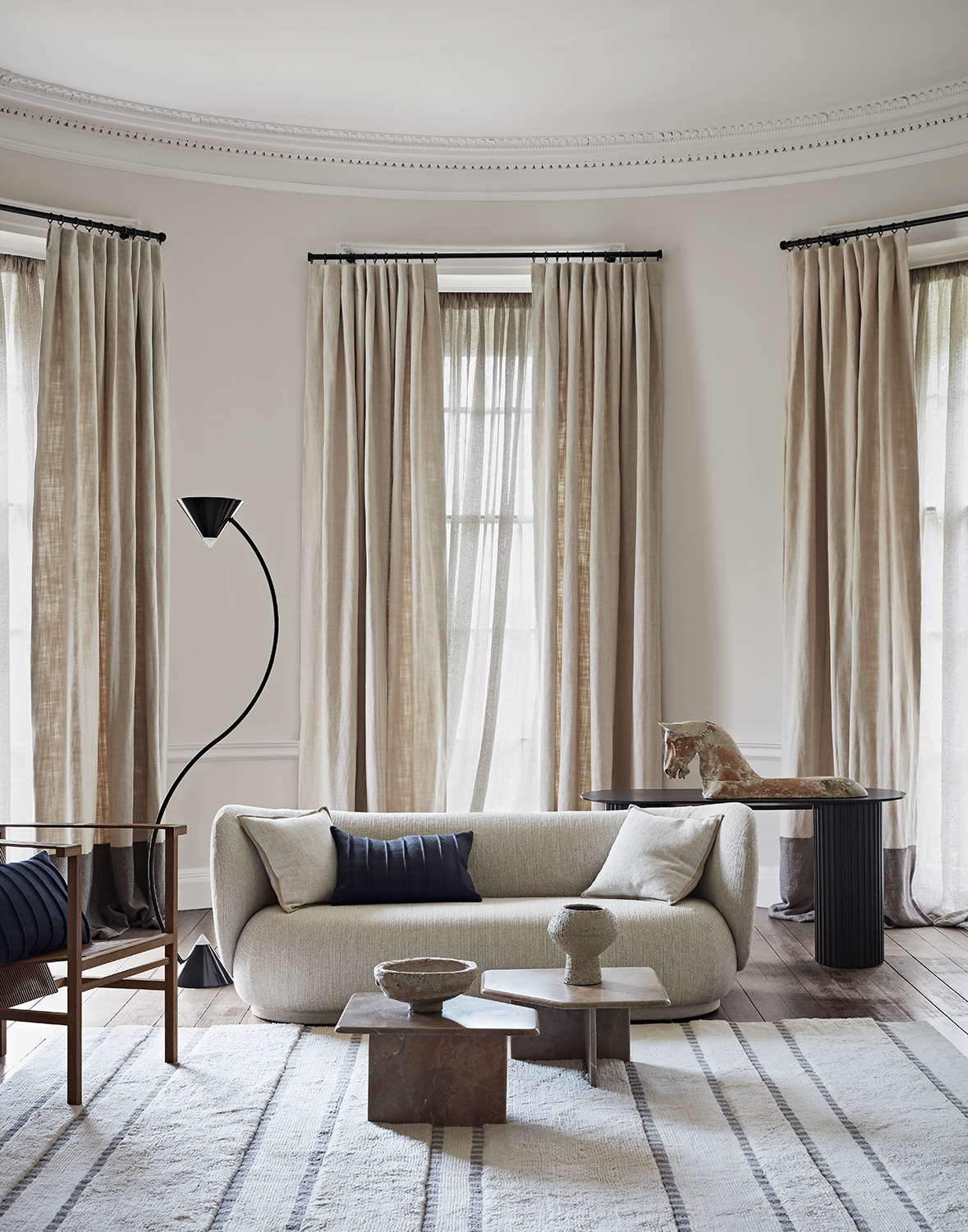
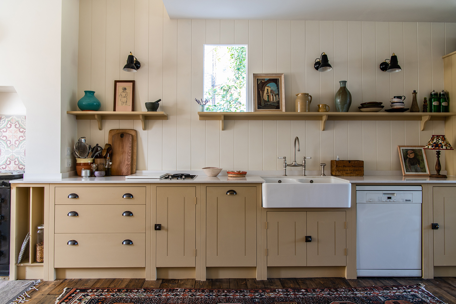
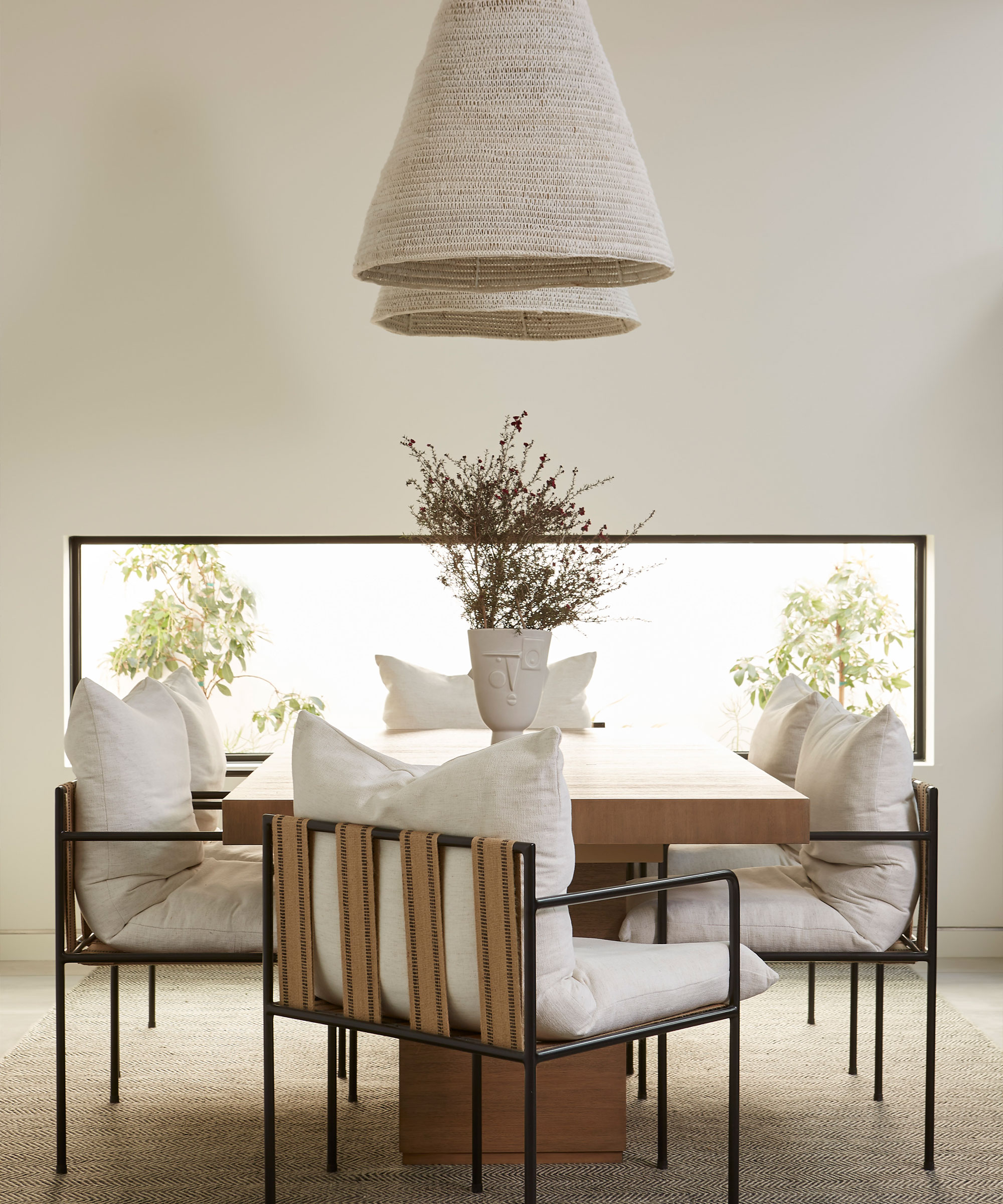
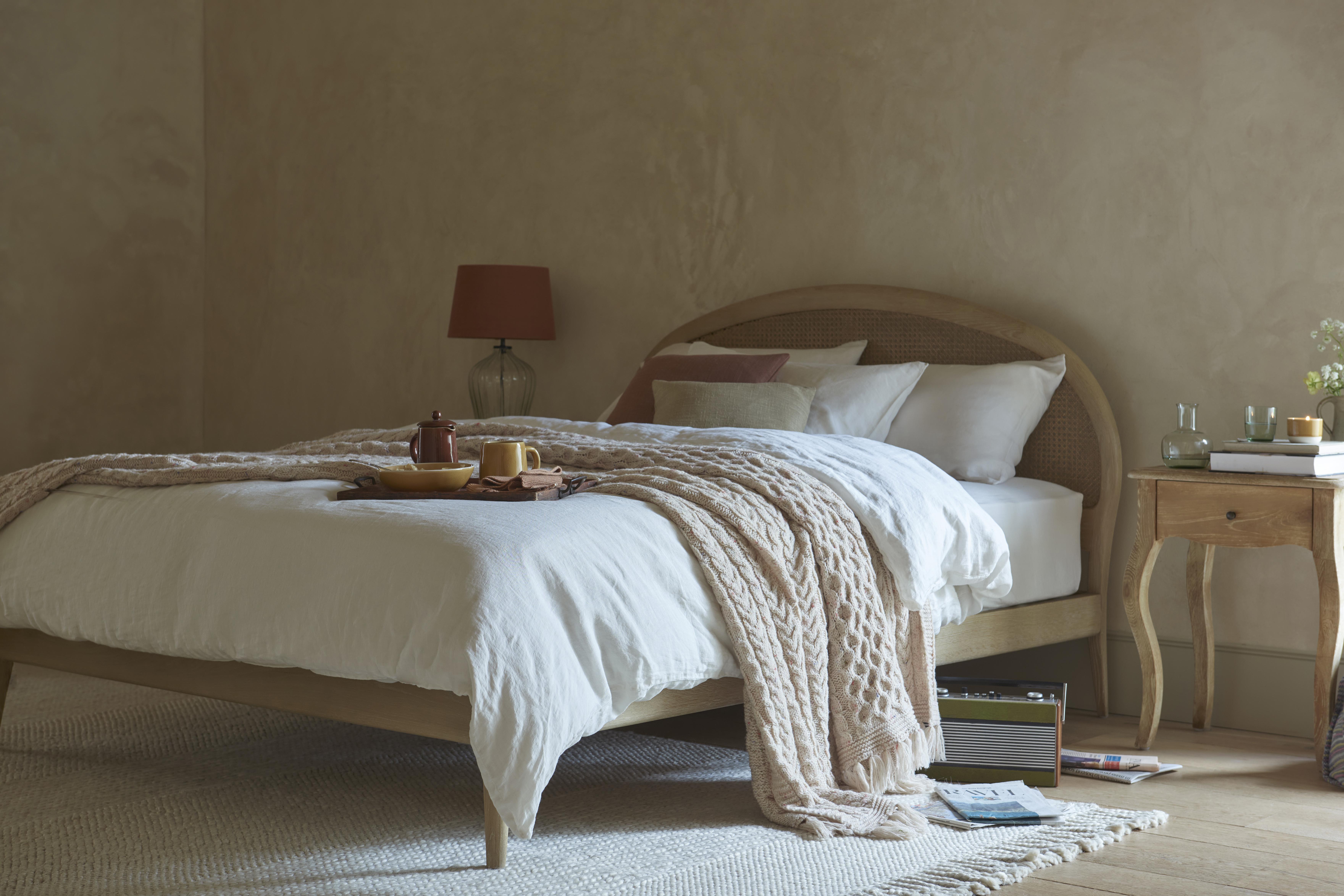
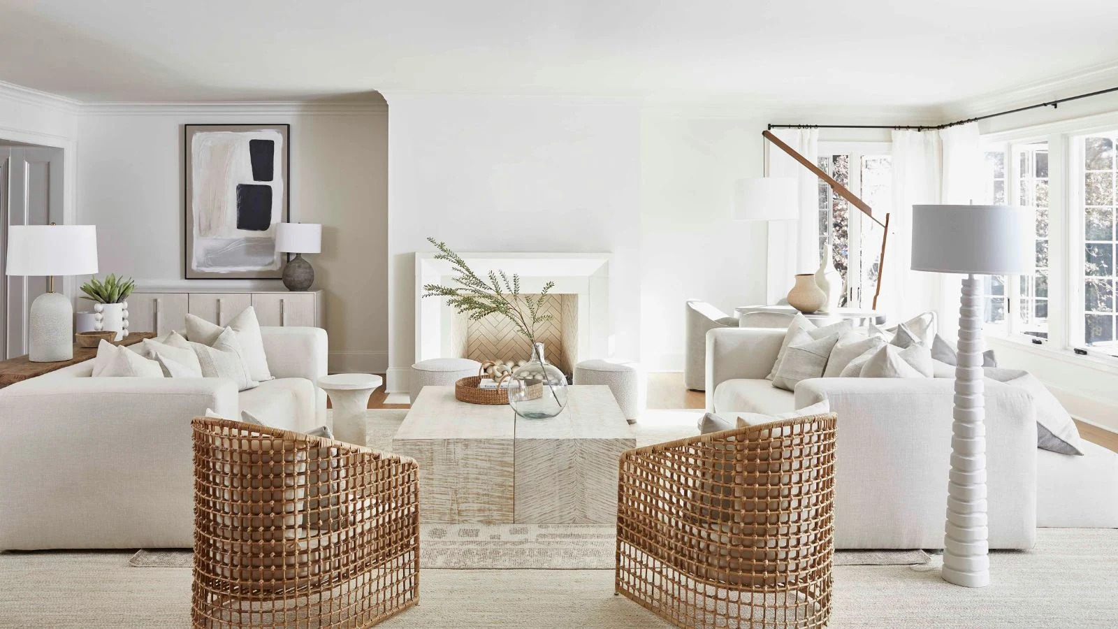
Secondly, cream allows for the creation of calm, layered luxury in all-cream schemes. By incorporating diverse textures in complementary shades of cream and warm white, designers can add depth and interest without introducing additional colors. This approach, often combined with neutral linens, natural weaves, ivory velvets, and soft white wools, fosters a sanctuary-like environment. The crucial aspect is selecting shades with warm undertones to prevent the room from appearing cold.
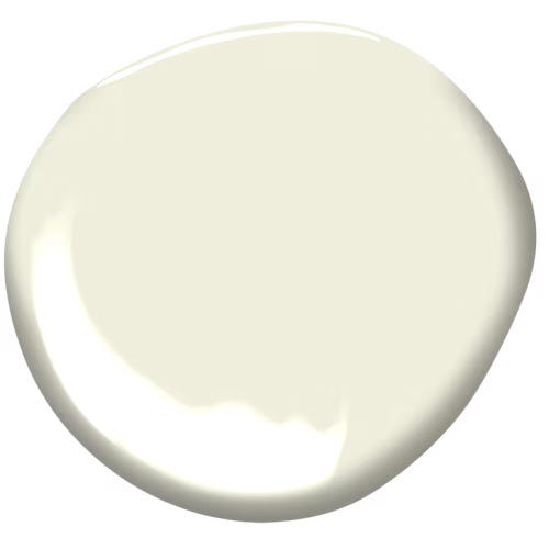
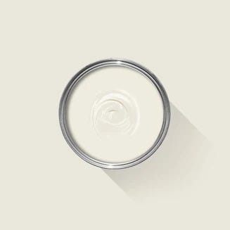
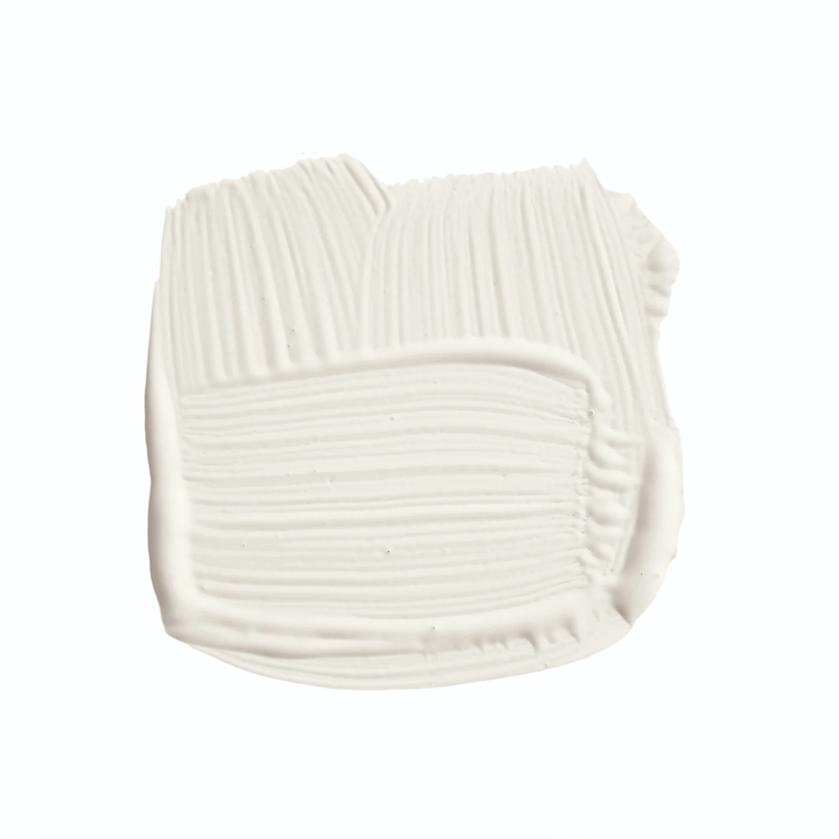
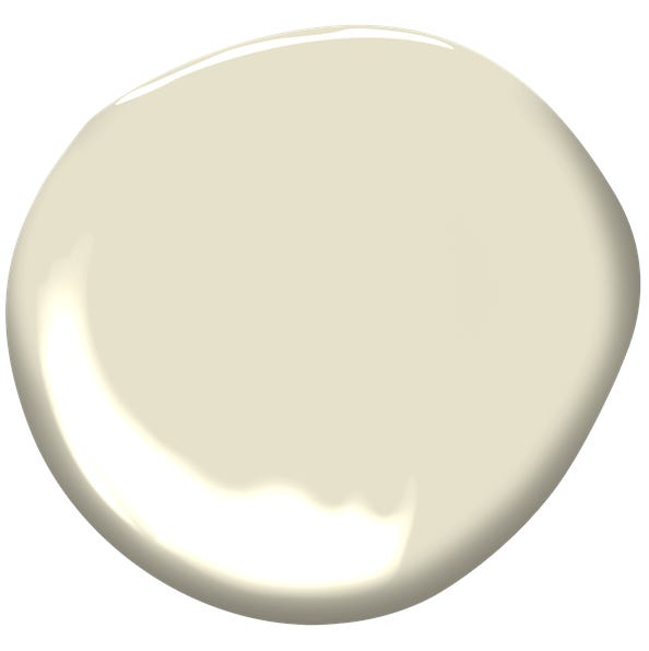
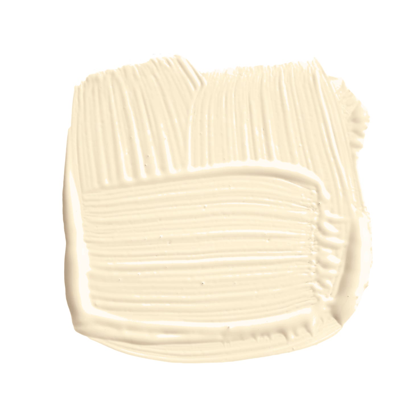
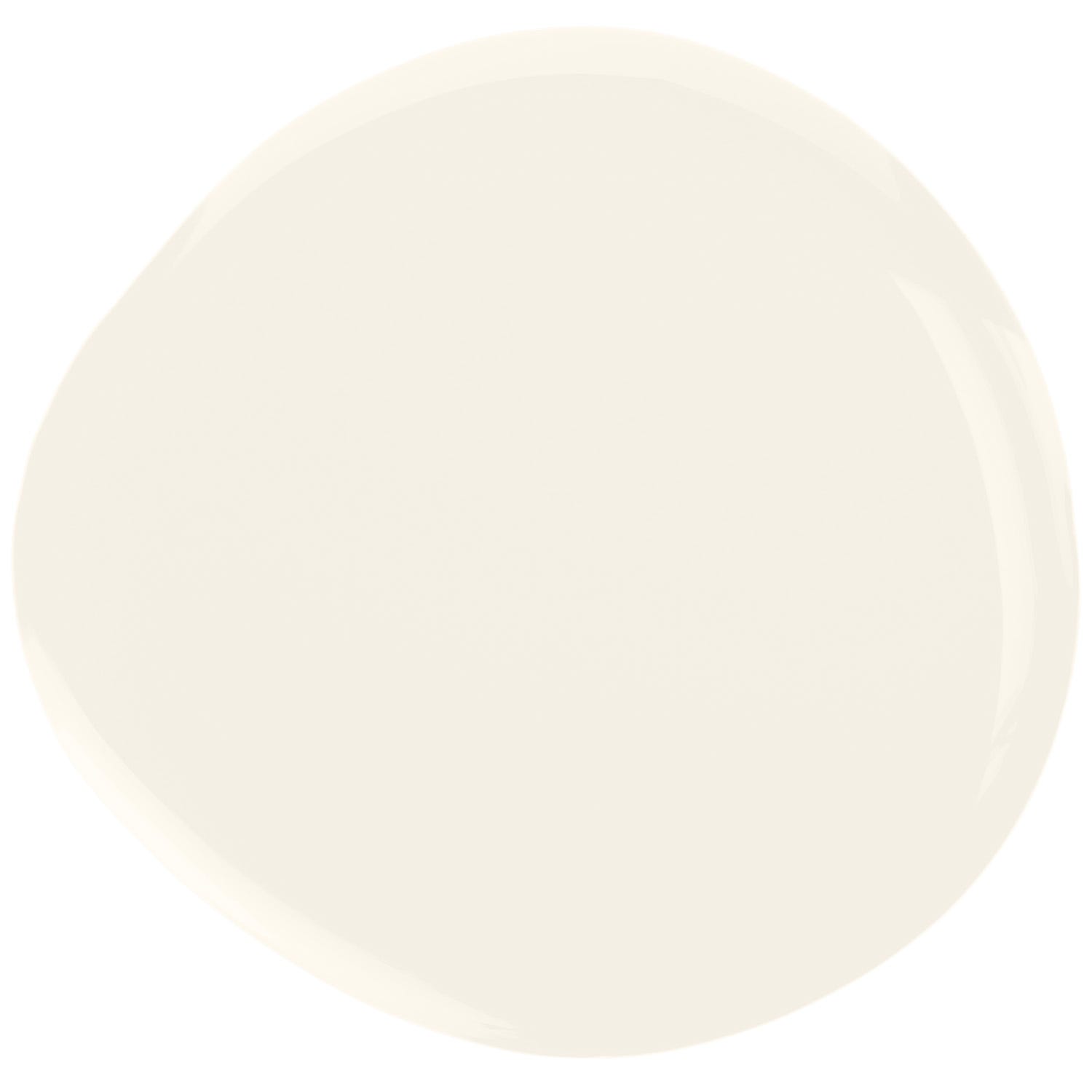
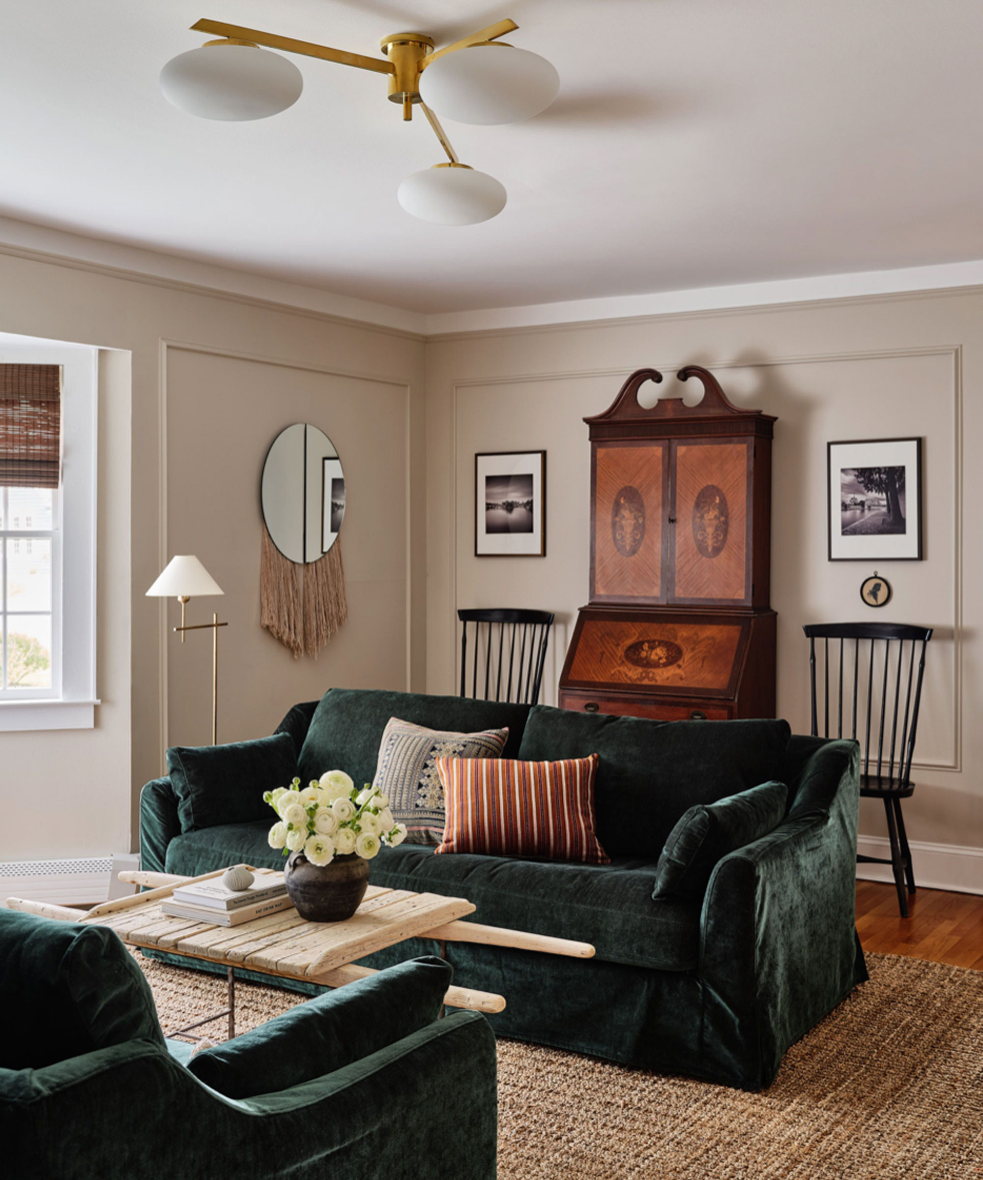
Thirdly, selecting the correct shade of cream is paramount. Designers emphasize that cream paints vary significantly due to their undertones, which can be influenced by natural light. To avoid a sterile white or a dated yellow hue, testing sample paints in situ is crucial, particularly in rooms with varying light conditions, such as north-facing rooms. Recommended shades include Farrow & Ball's 'Pointing' and 'Wimbourne White,' Paint & Paper Library's 'Slate I,' and Little Greene's 'Portland Stone Pale' and 'Linen Wash.' Benjamin Moore's 'White Dove' and 'Pale Oak,' and Sherwin Williams' 'White Snow' are also popular choices.
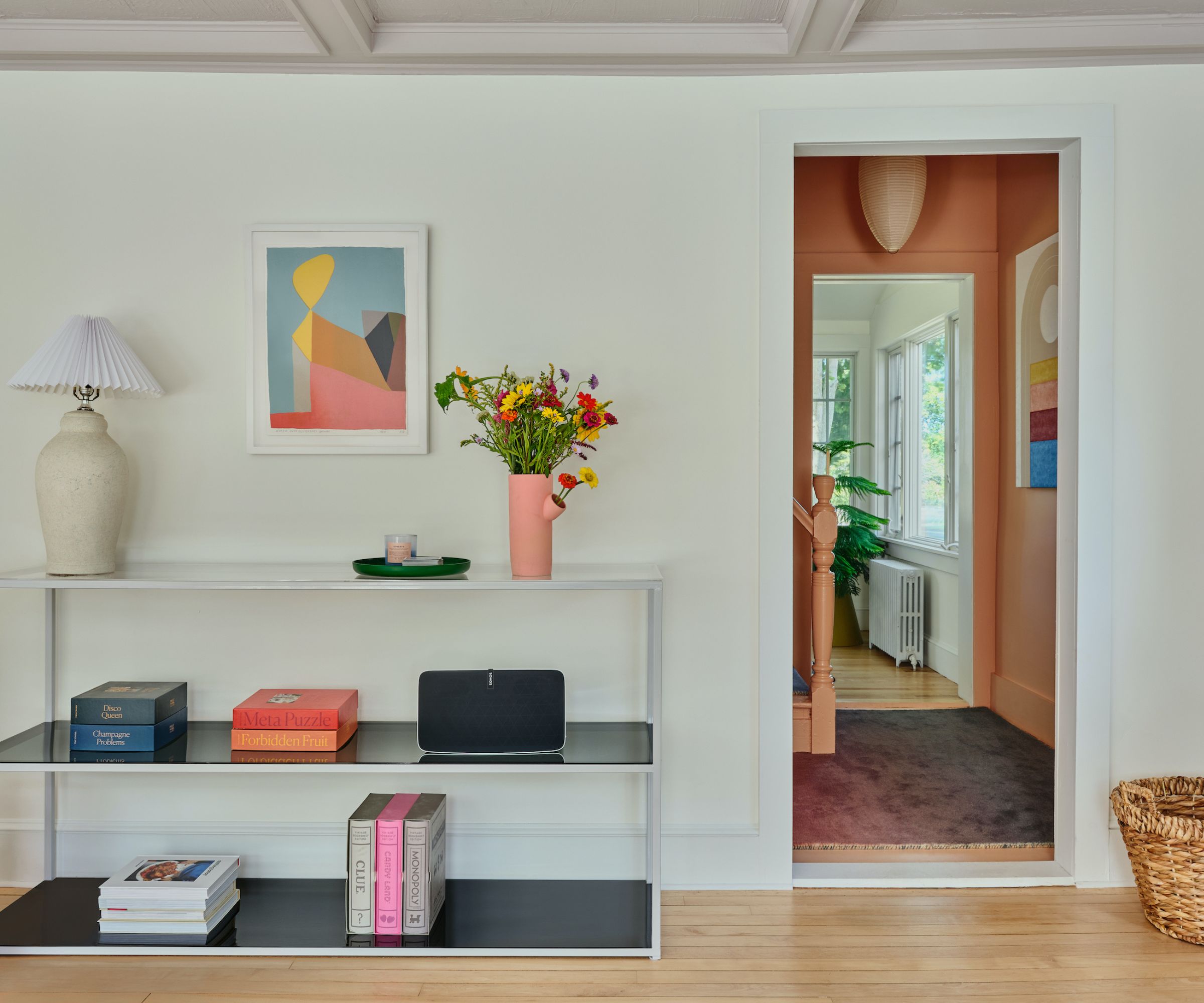
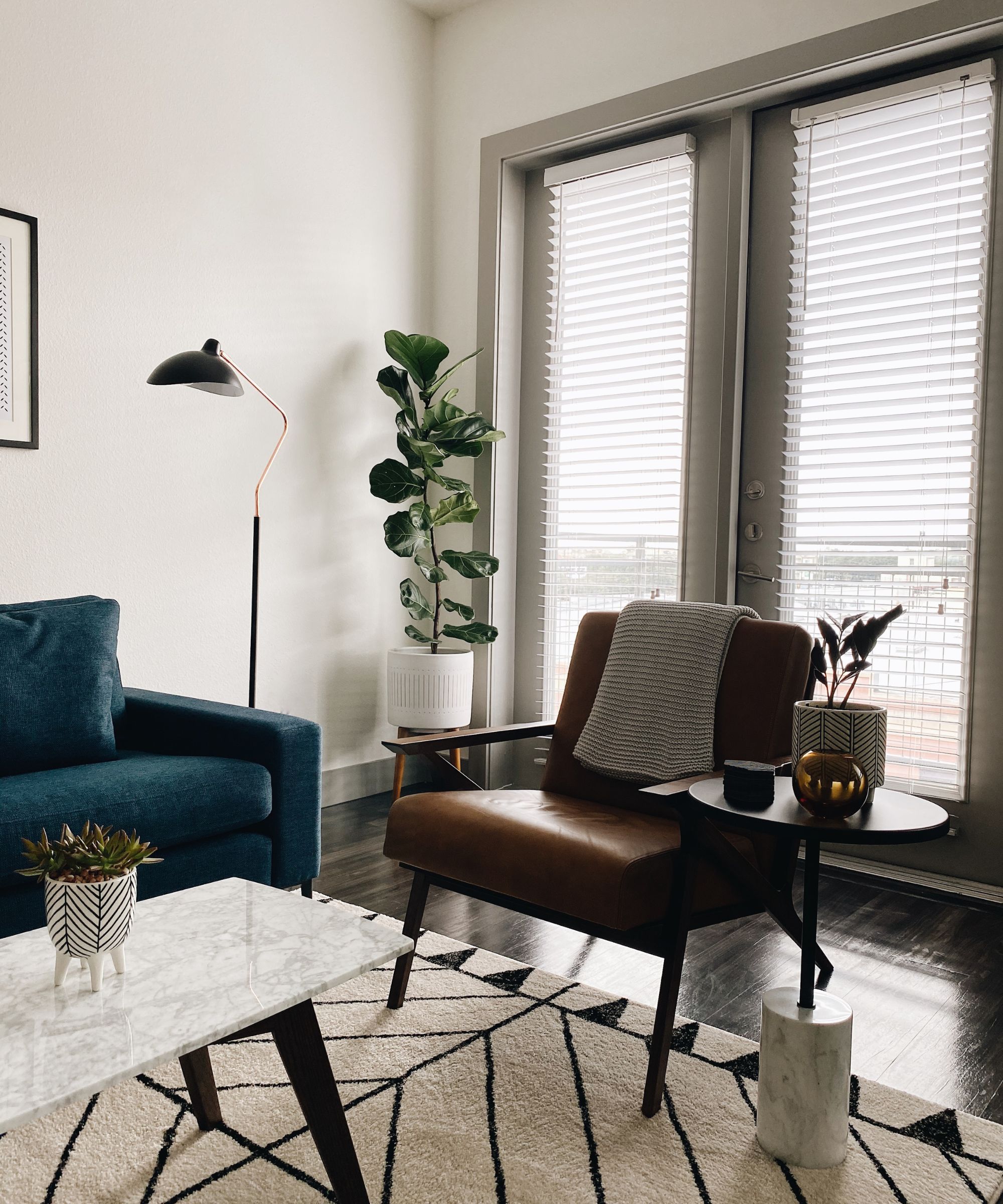
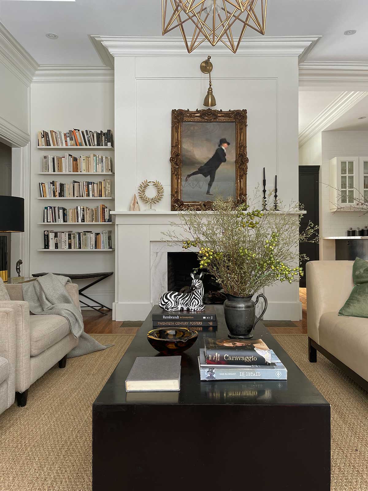
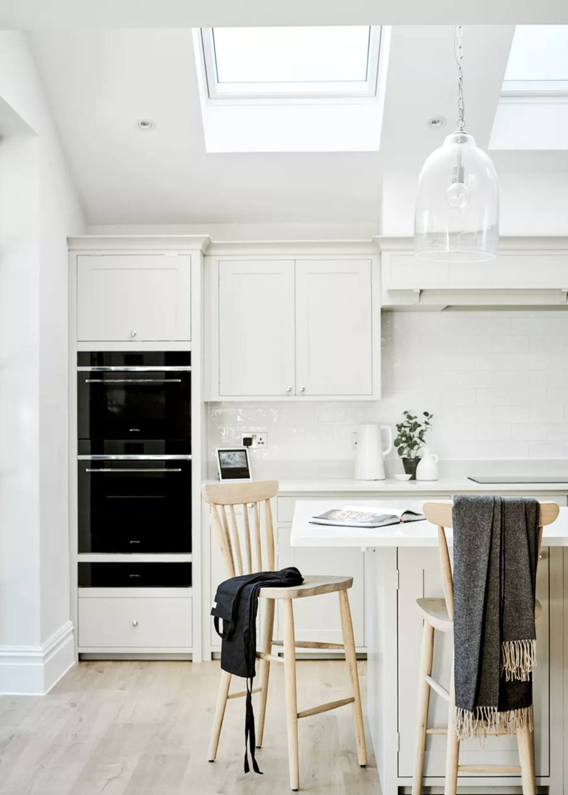
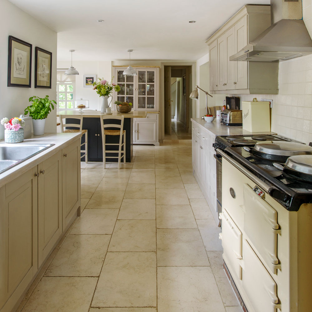
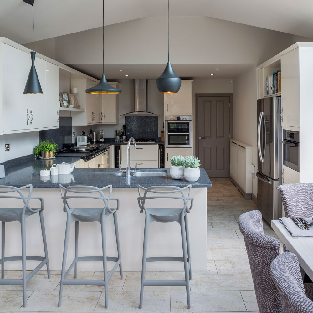
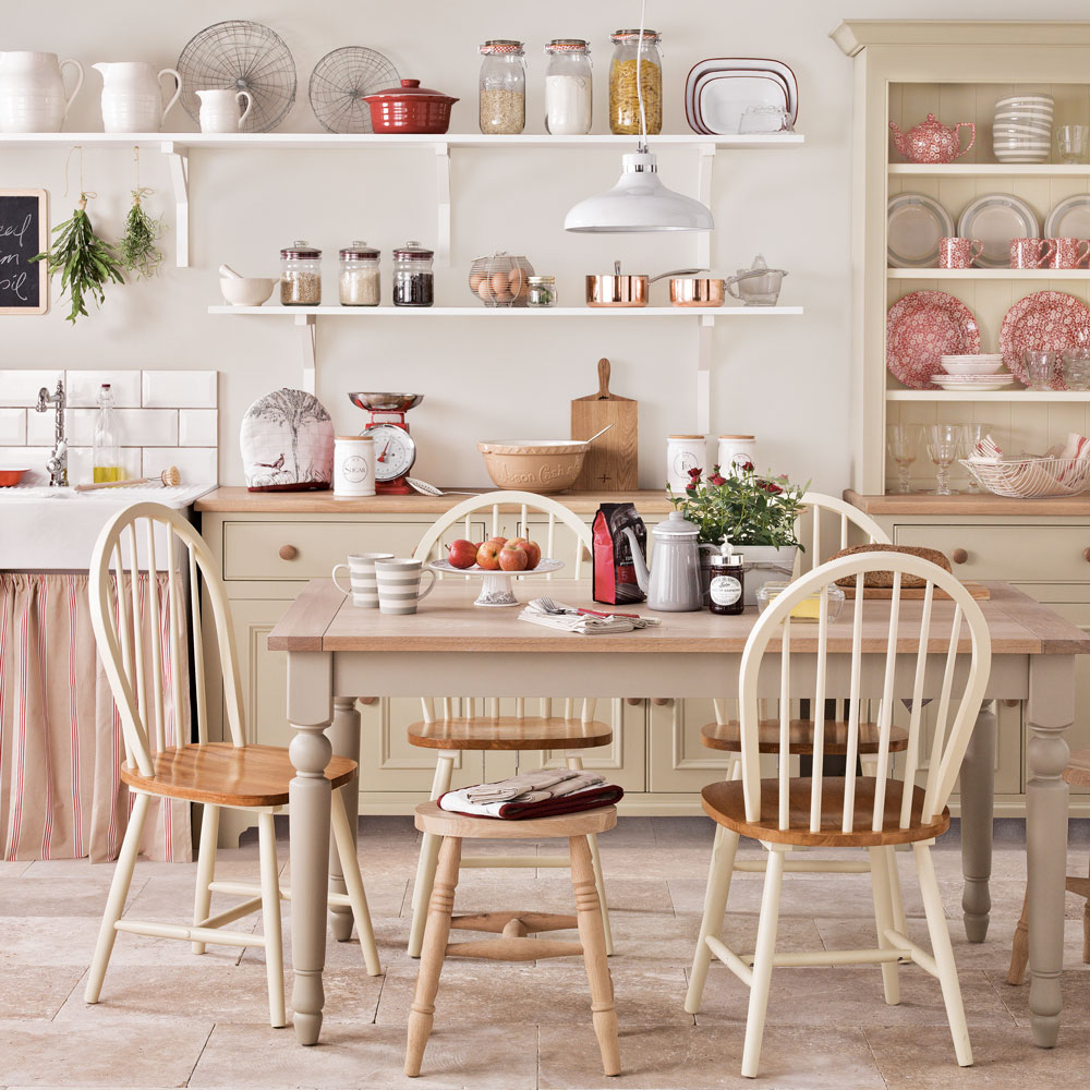
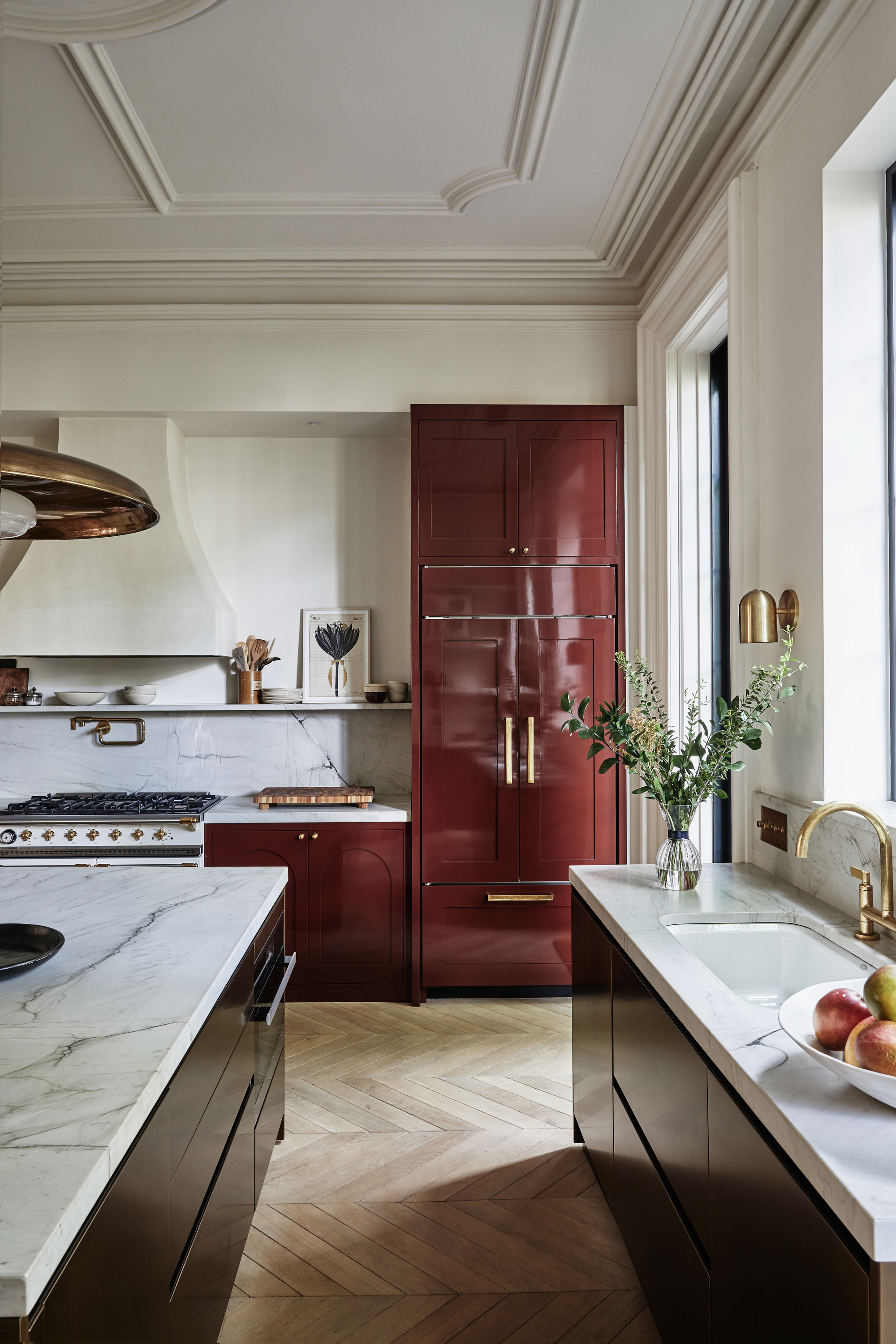
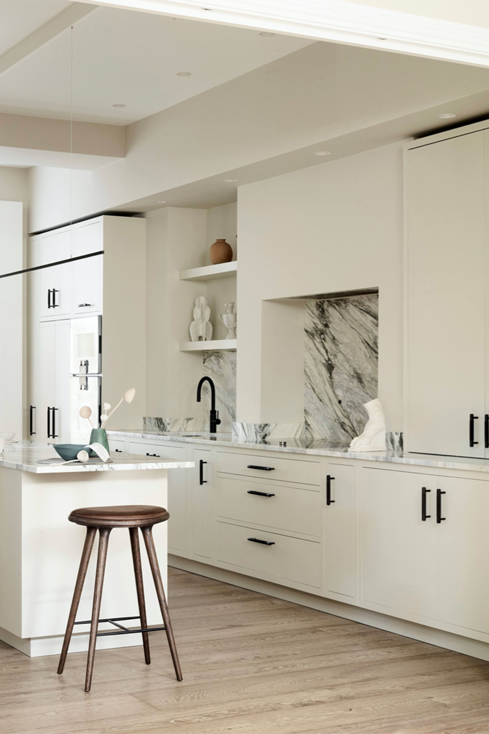
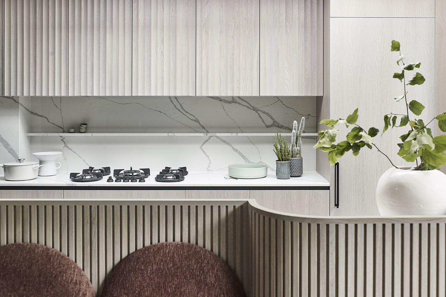
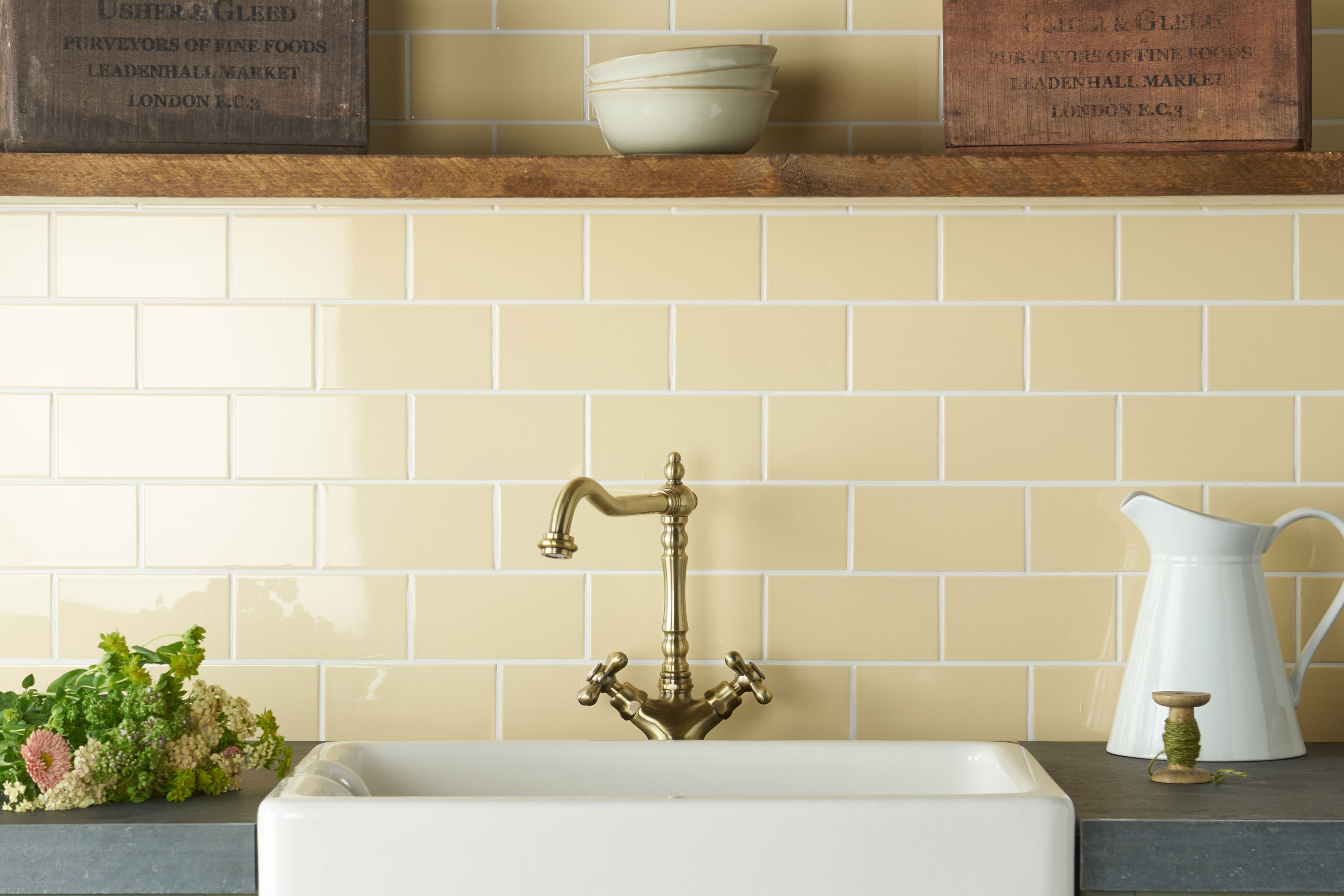
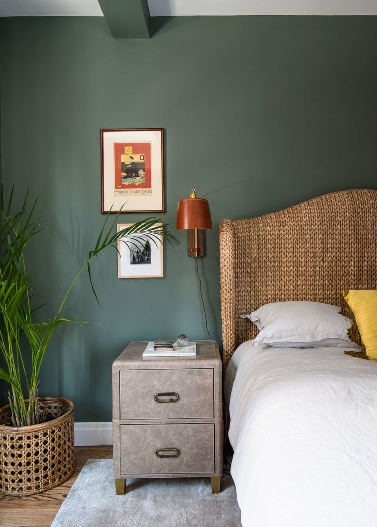
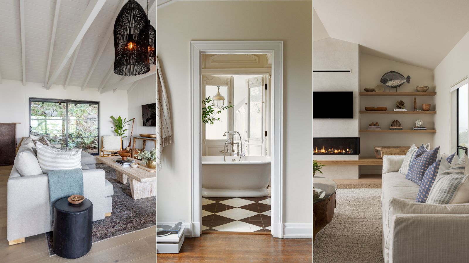
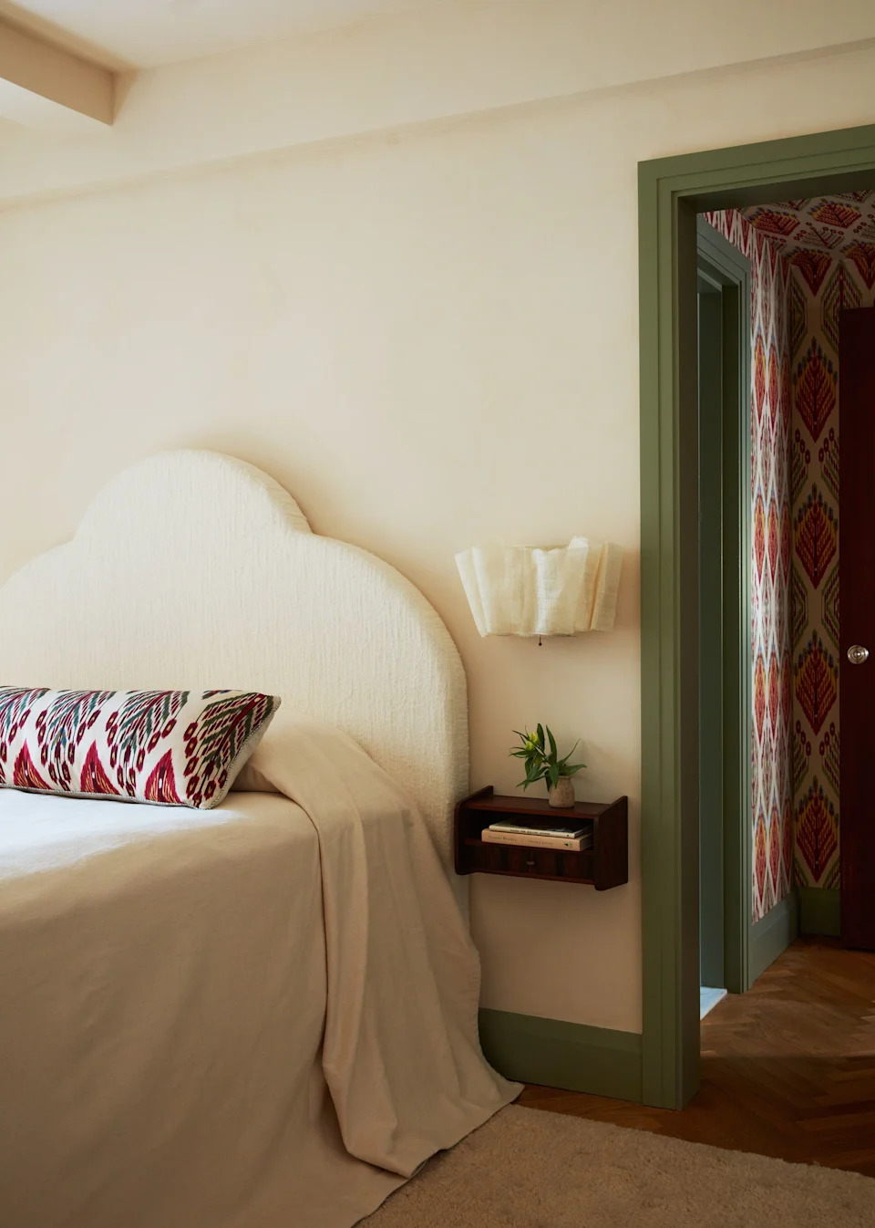
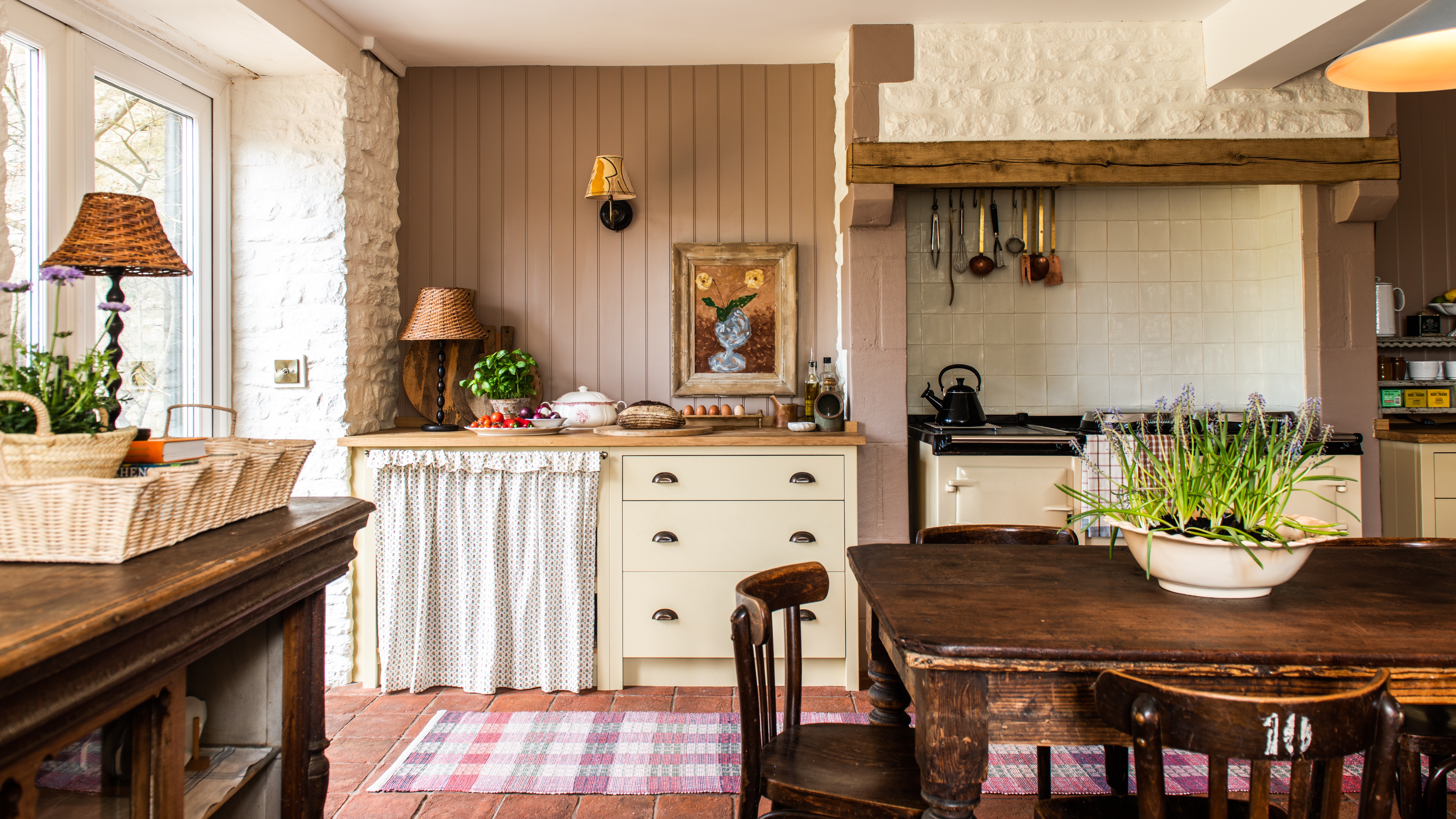
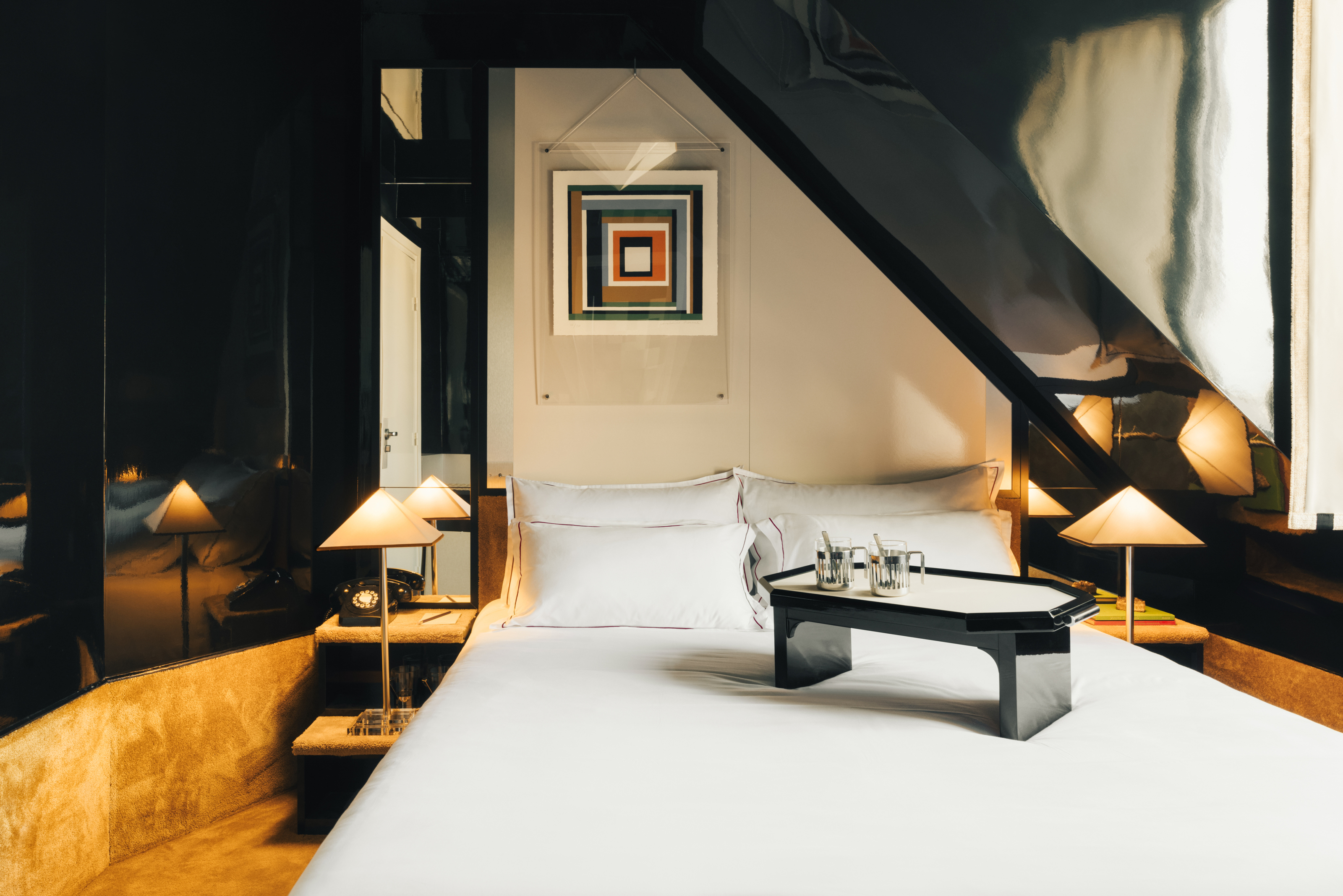
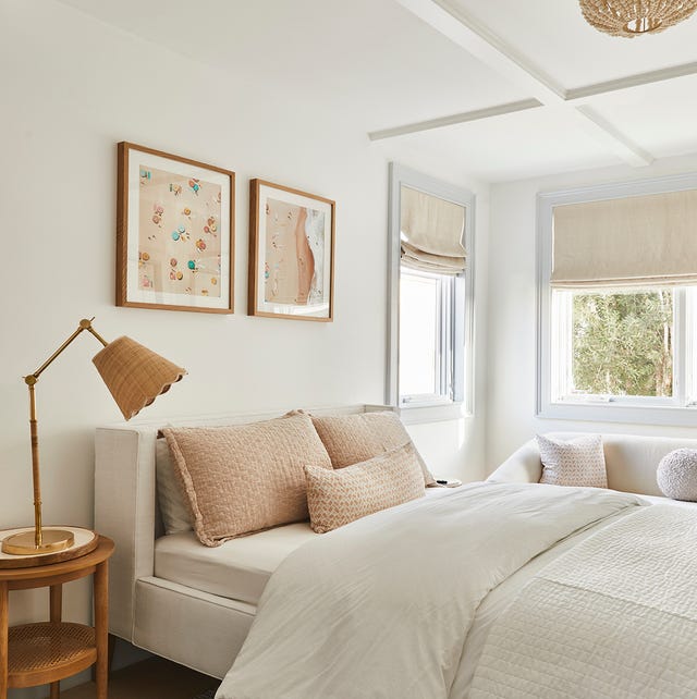
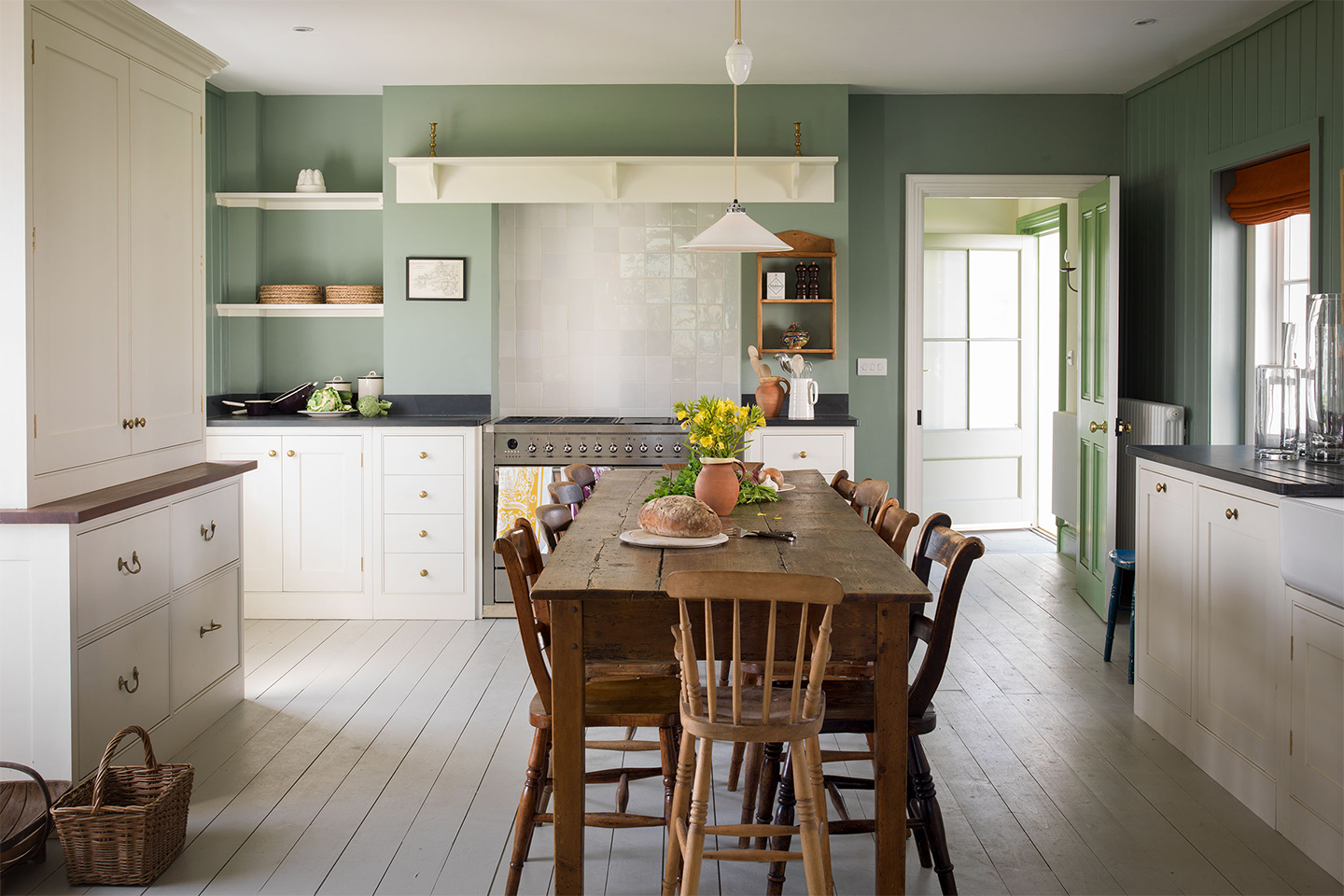
Fourthly, cream paint is deemed suitable for any room, with designers finding it universally appealing. It is particularly effective in bedrooms, creating a relaxing ambiance when chosen with subtle pink or brown undertones. Its versatility extends to living rooms, bathrooms, and kitchens, enhancing a sense of calm and allowing other design elements to take center stage. The type of paint finish, such as semi-gloss for high-traffic areas, also needs to be considered to ensure durability.
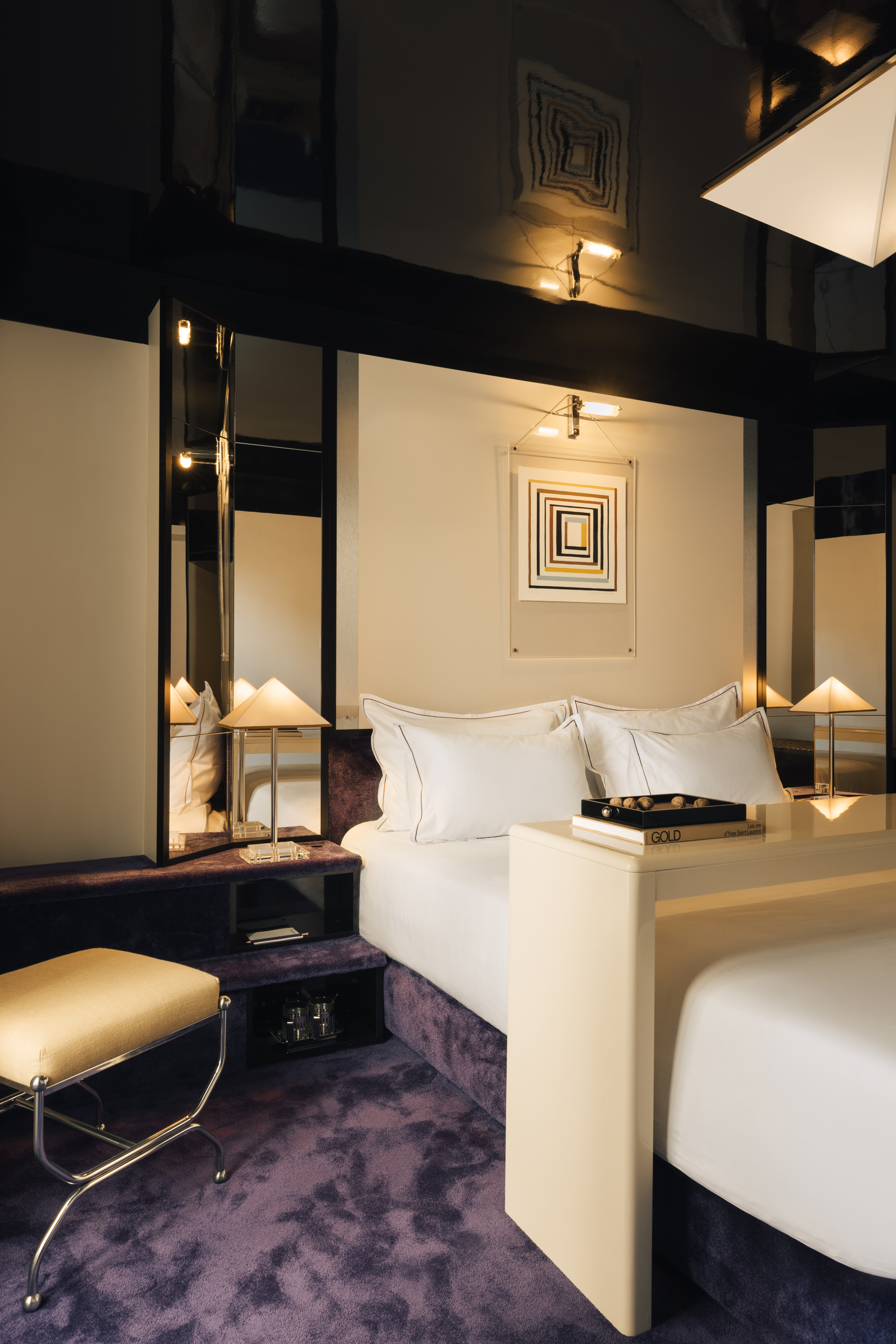
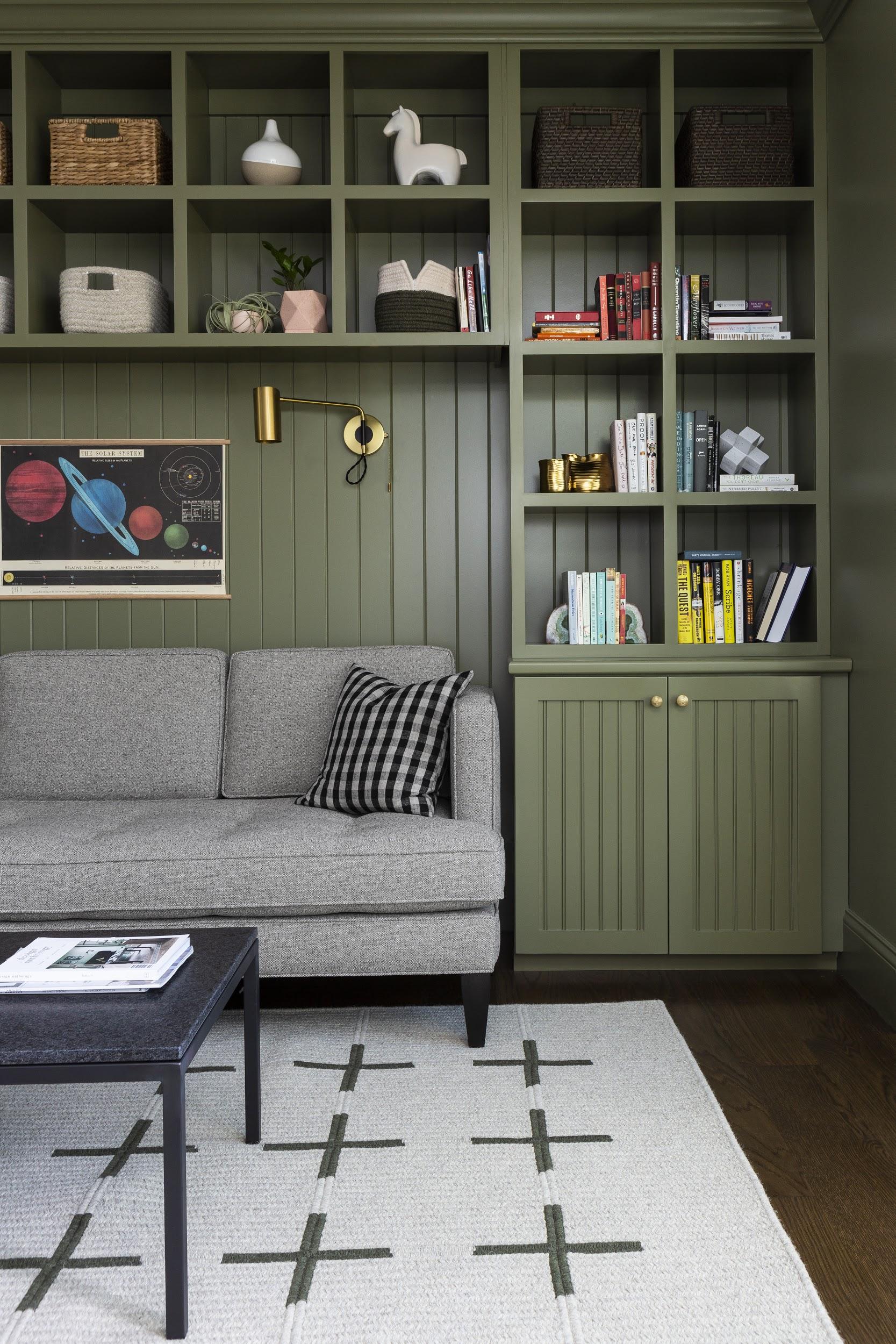
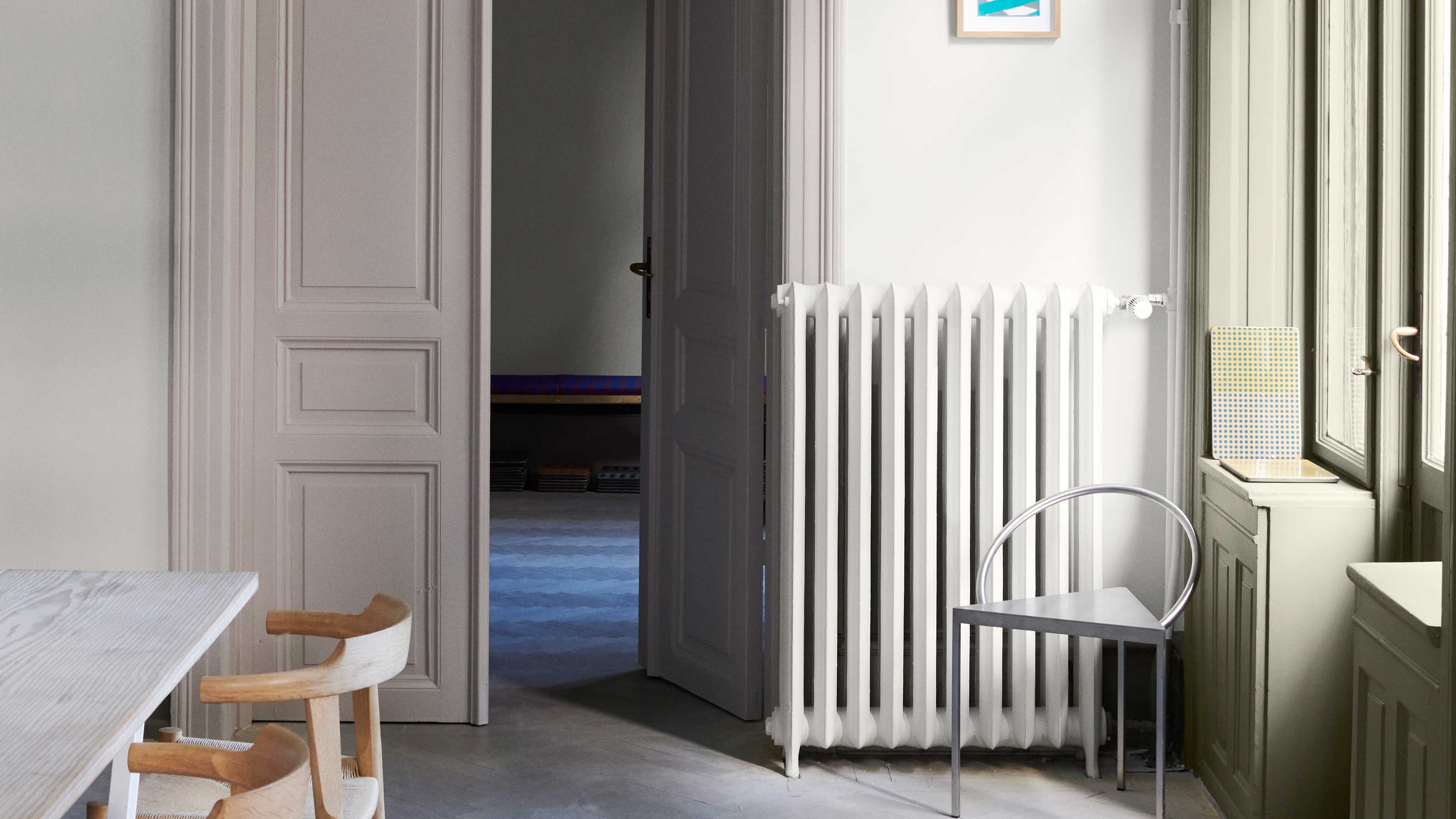
Fifthly, the paint finish is as important as the shade. Designers suggest extending cream paint to trim and moldings for a cohesive look. For an added touch of luxury, lacquered cream rooms are recommended. The choice of finish can highlight architectural details, such as moldings, by preventing them from getting lost in darker colors. For trim, semi-gloss is often preferred, while satin finishes offer a less shiny alternative.
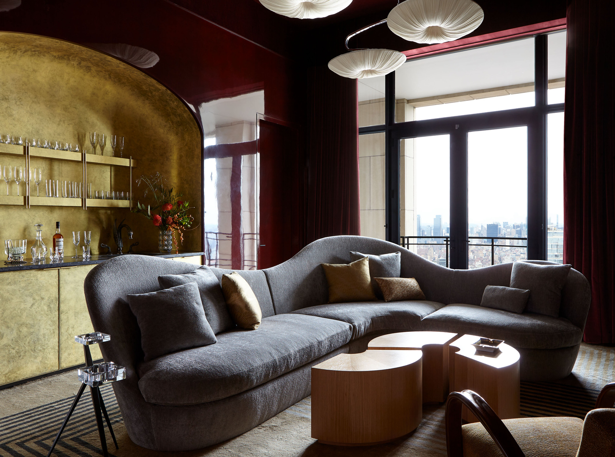
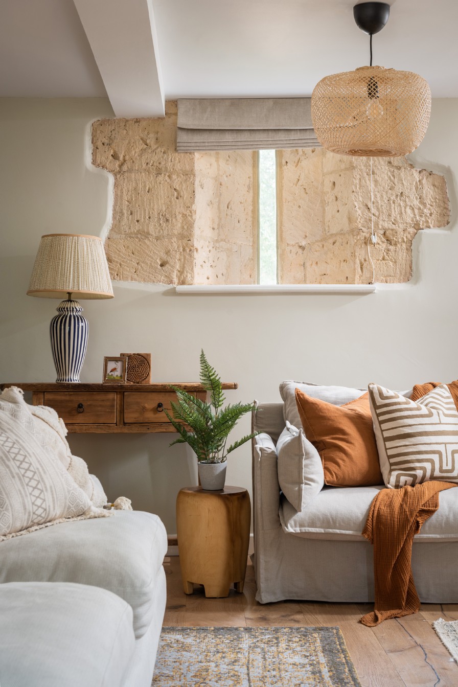
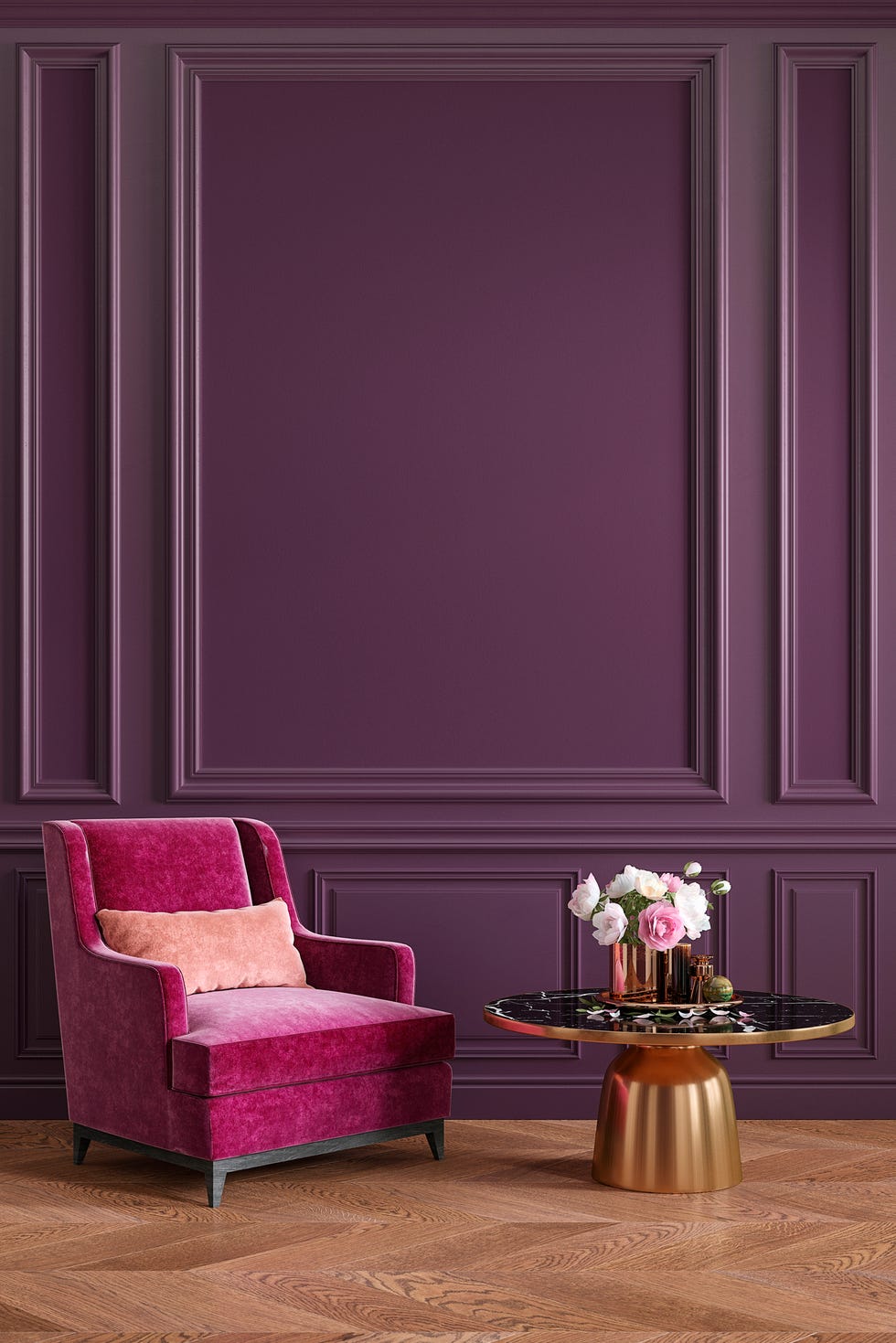
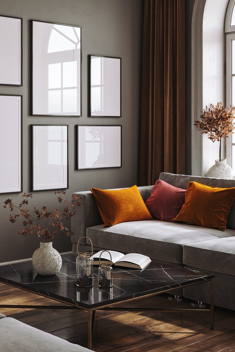
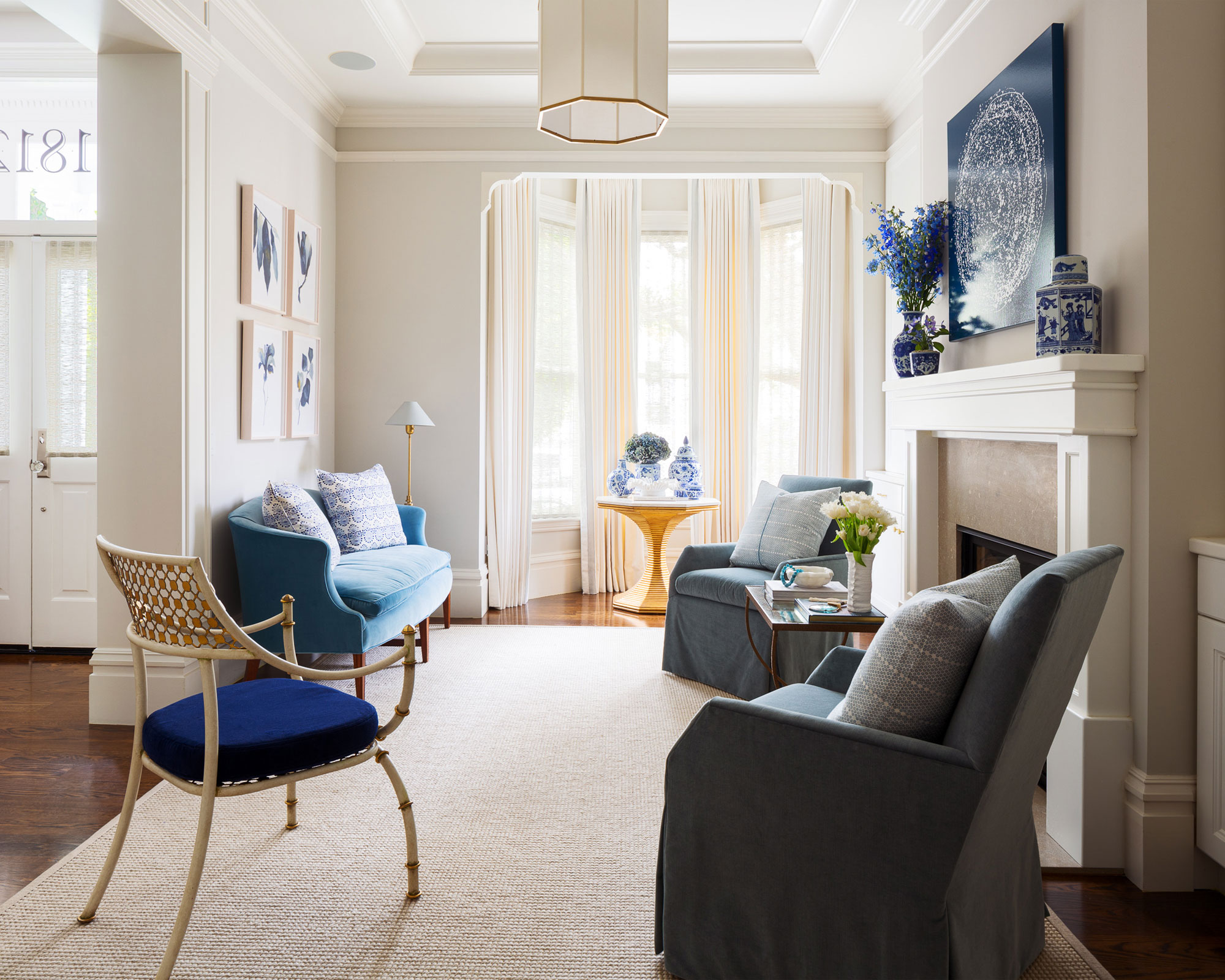
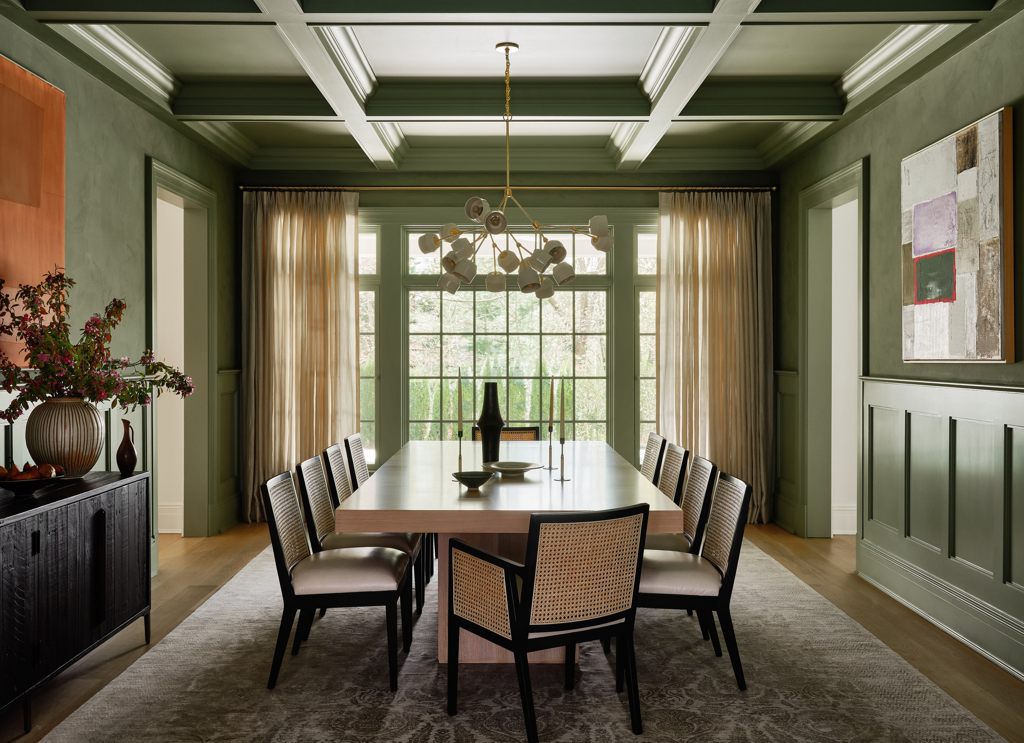
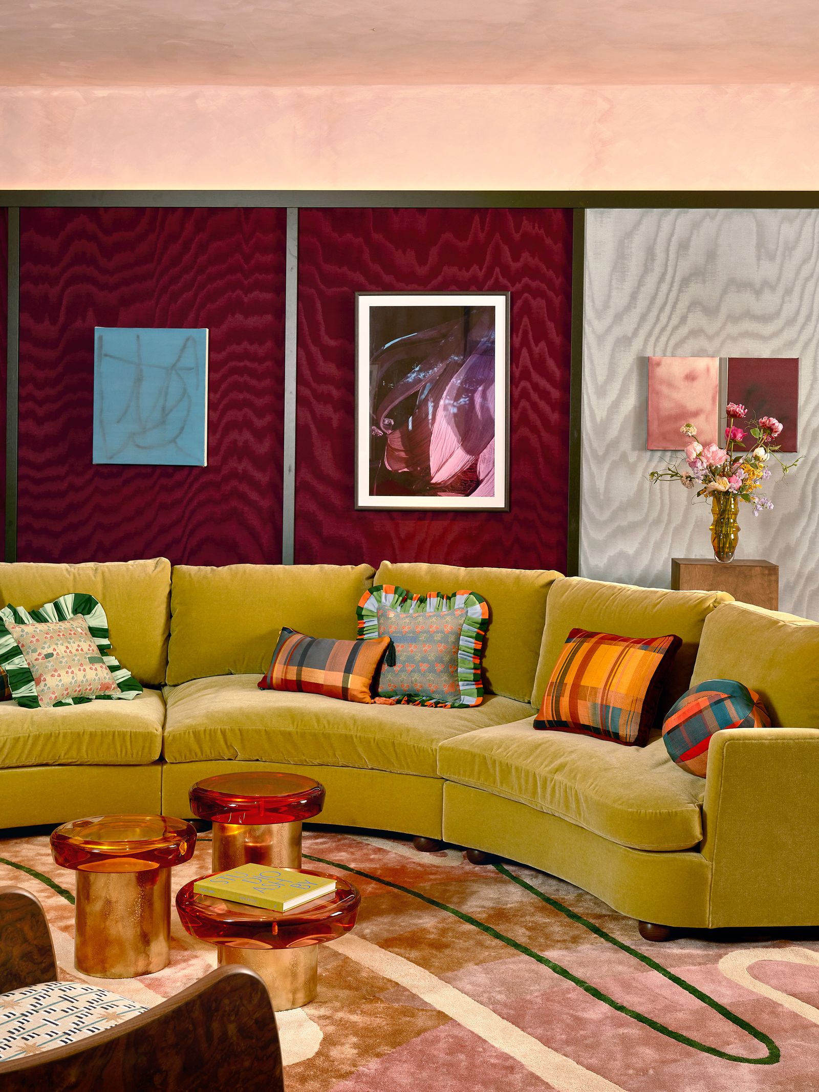
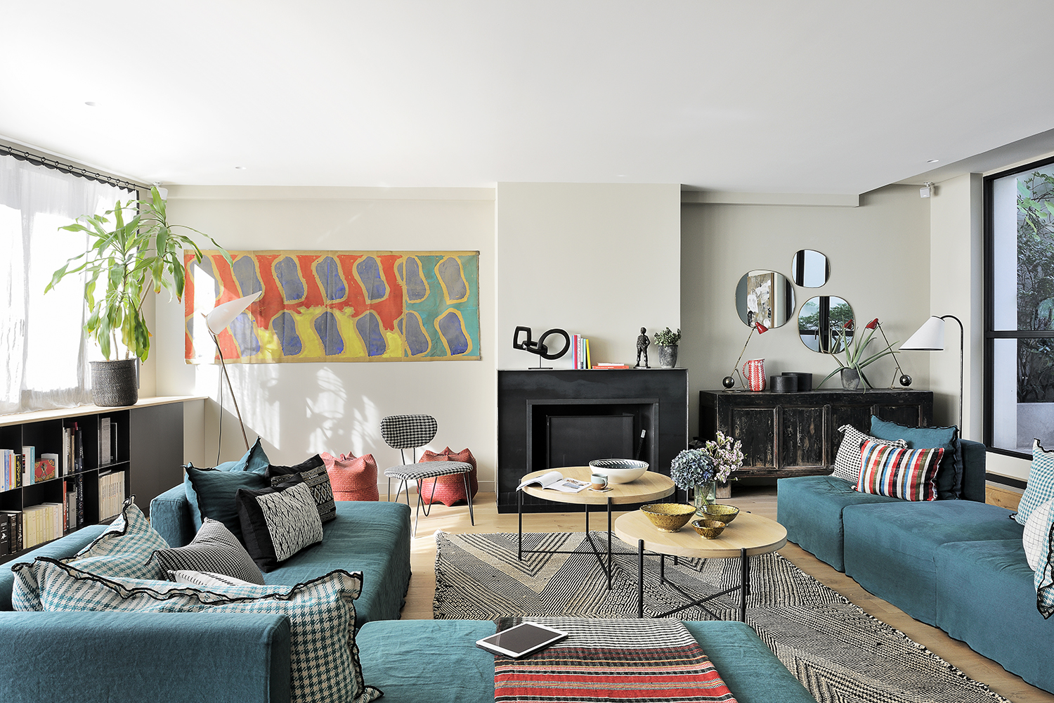
Sixthly, cream paint serves as an ideal backdrop for introducing color through art, rugs, throws, and pillows. Its neutrality allows vibrant accessories, patterned textiles, and deeply colored upholstered furniture to stand out, adding personality and visual interest to a scheme. This method ensures that the core calm created by the cream base remains, while splashes of color provide dynamic accents.
Finally, the article addresses potential downsides of using cream paint. A common mistake is choosing a shade that is too yellow, which can make a space feel dated. It is also advised against pairing cream with stark white, as this can make the white appear cold and grey, and the cream look muddy or excessively yellow. Furthermore, cream paint can show marks and scuffs easily, necessitating the use of wipe-clean paints or reserving it for less-used areas. Despite these considerations, the overarching consensus is that cream paints, especially those leaning towards warm whites, are a timeless and sophisticated choice.
#InteriorDesign #CreamPaint #ColorTrends #HomeDecor #PaintColors #NeutralPalette #DecoratingAdvice #DesignTips #TimelessStyle #InteriorDesign #CreamPaint #ColorTrends #HomeDecor #PaintColors #NeutralPalette #DecoratingAdvice #DesignTips #TimelessStyle
0 comment in total
You may also like
Interior Designers Share Their Favorite Cream Paint Colors

13 cream kitchen ideas that prove beige is back

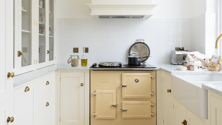
Cream kitchen ideas – light and lovely spaces that prove beige is back

From the Living Room to the Bedroom, These Cream Paint Colors Work Anywhere

5 best cream paints, as chosen by interior designers
Cream kitchen ideas – all beautifully classic and sure to stand the test of time
23 Versatile Cream Paint Colors That Will Pair with Basically Anything

Creamy neutral paint colours are back — just don’t call it magnolia

7 of the best cream wall paint colors, as chosen by designers – 'they look modern, and anything but magnolia'

23 Versatile Cream Paint Colors That Will Pair with Basically Anything

Designers Say These Vintage Paint Colors Are Back

These 13 Paint Color Trends for 2021 Will Give Your Home a Fresh Look

7 of the best cream wall paint colors, as chosen by designers – 'they look modern, and anything but magnolia'
This Outdated Paint Trend is now Predicted to Return — Designers Love its "Fun, Eye-Catching Glamor"
What colors go with cream? 8 complementary colors for this neutral favorite
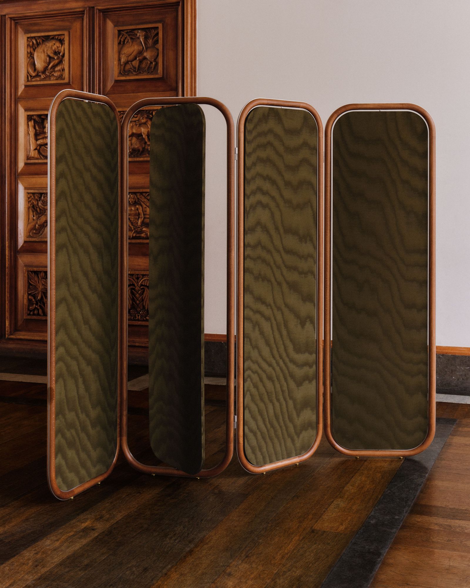
Moiré is coming back in a way – here's how interior designers are using the pattern
Here Are the Best Cream Paint Colors, According to Design Pros
Cream living room ideas – 10 ways to play up this versatile neutral
5 outdated paint trends that interior designers are glad to see the back of – and what they're doing instead
6 Cream-Colored Kitchen Cabinet Paints the Pros Swear By