1/5
Moody Living Rooms Are Trending—Here’s How to Keep Yours From Going Gloomy
Interior design trends frequently evolve, with certain styles gaining prominence each season. A recent Houzz Summer Trends report highlights a notable surge in interest for 'moody living rooms,' with searches for this aesthetic more than doubling compared to the previous year. This trend is further supported by observations from The New York Times, which notes how deep and moody color palettes can foster a calming atmosphere in living spaces. The article aims to guide readers on how to achieve a chic moody living room without it becoming overly dark or somber, presenting four distinct examples that successfully balance this aesthetic.
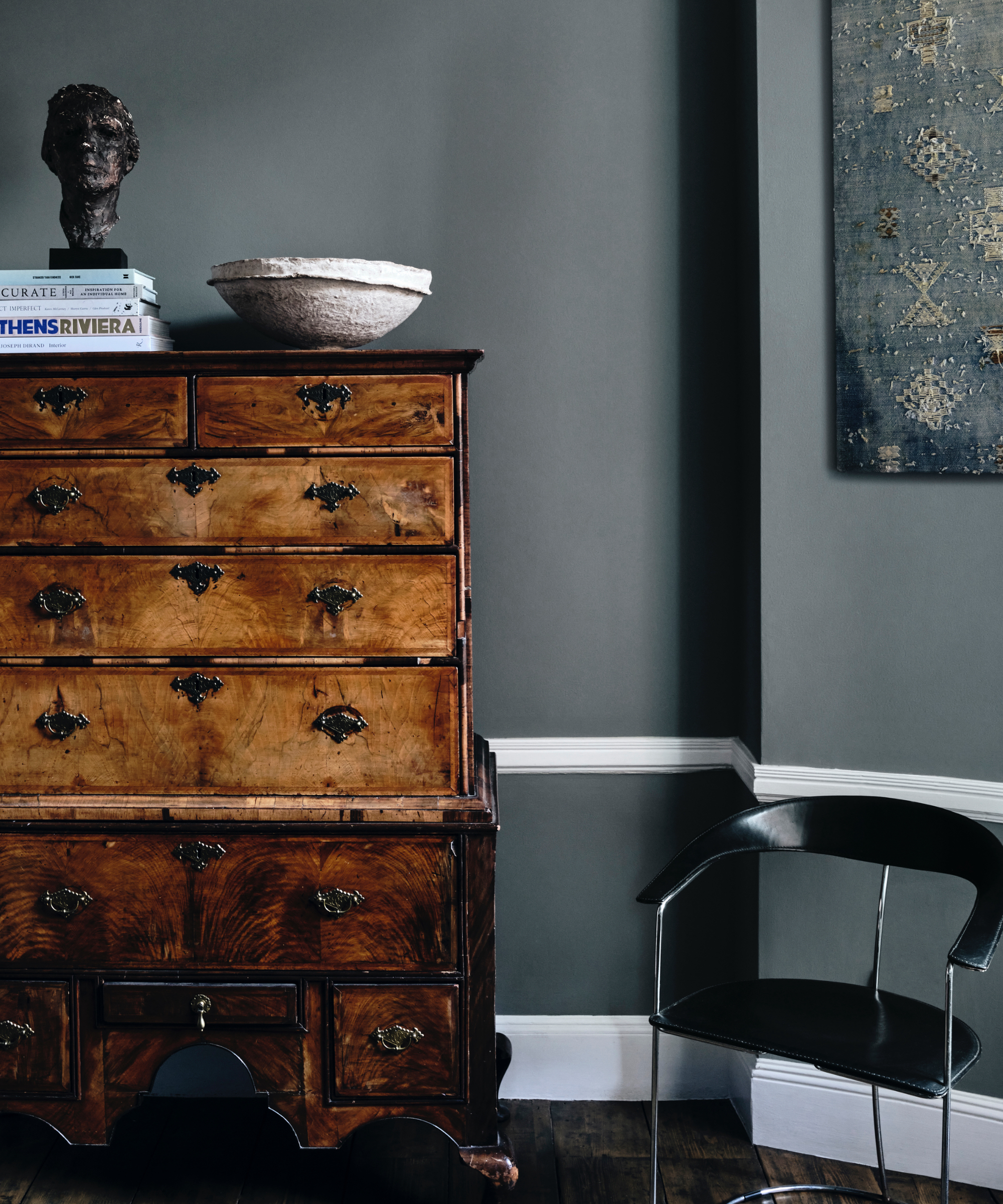
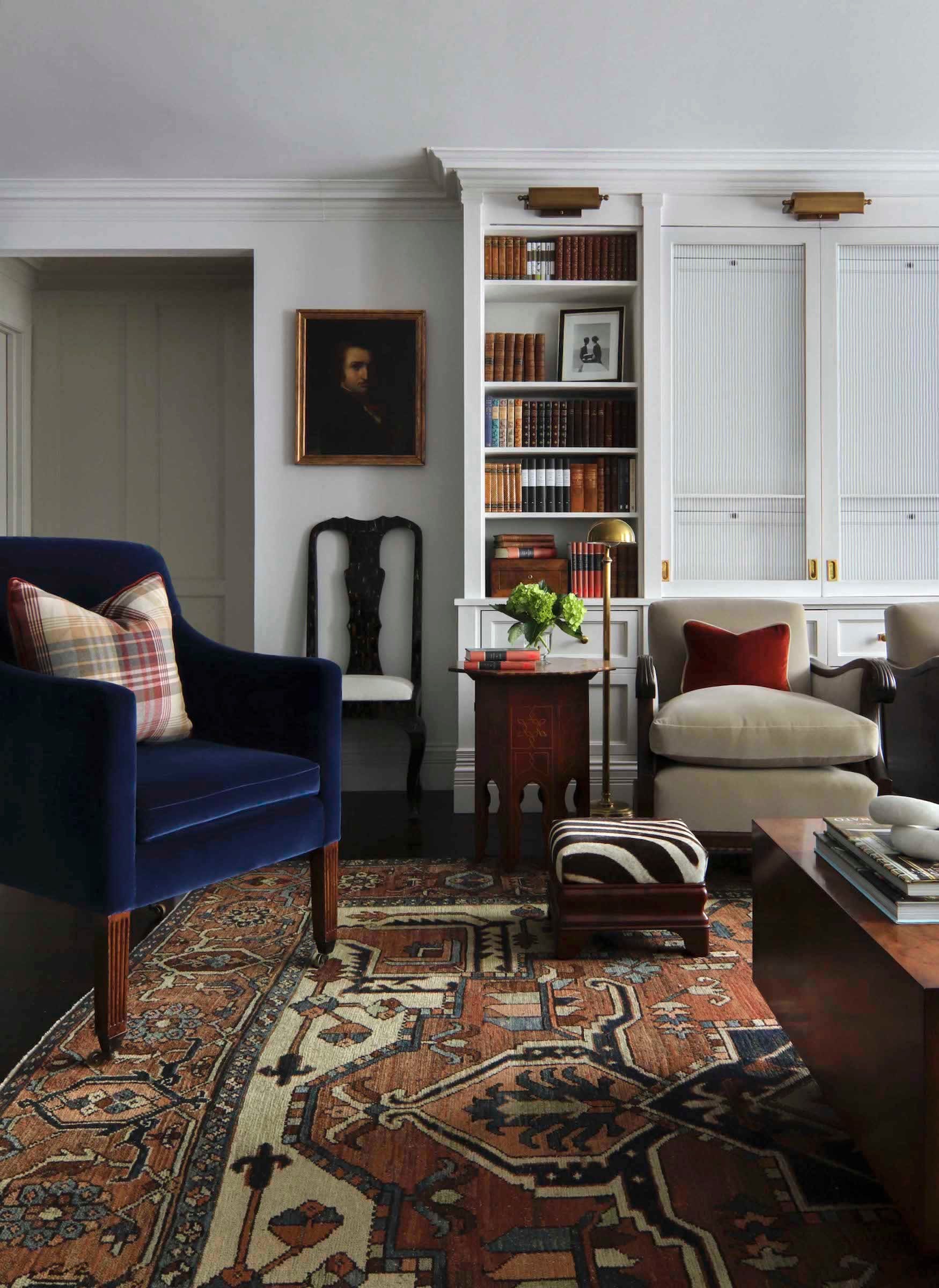
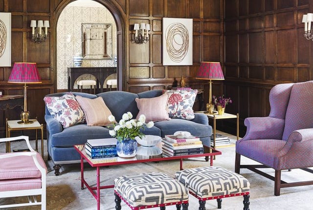
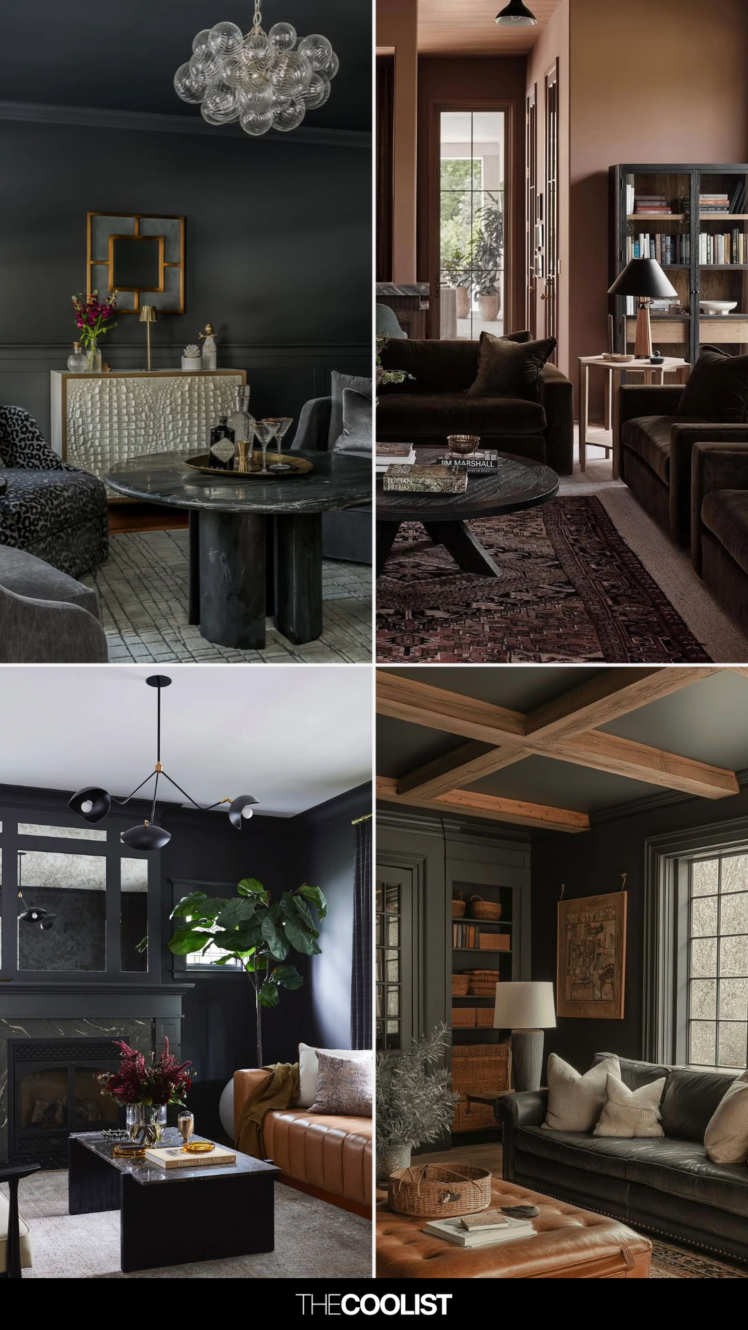
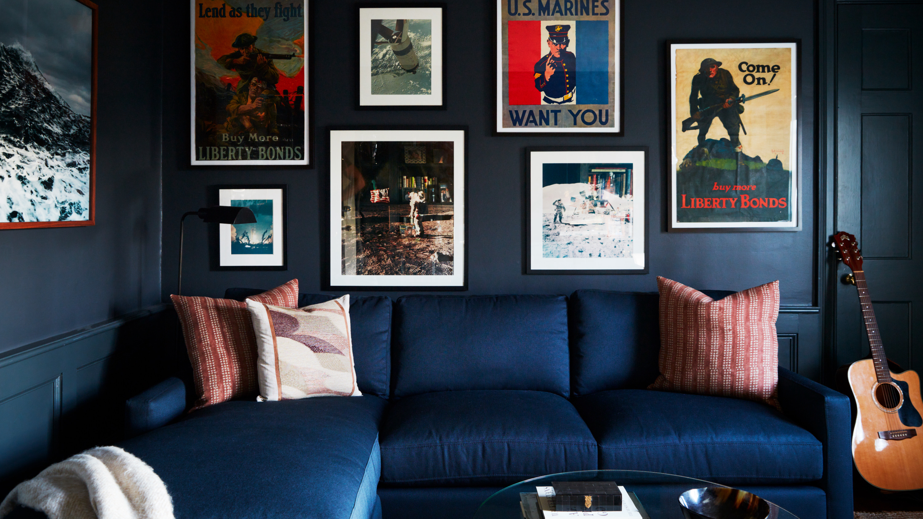
The first approach discussed is embracing a monochrome design. This involves painting walls with a rich, single color, such as the inky blue featured in a London home. In this example, the living room serves as a deliberate contrast to the brighter areas of the house. Couches in the same color family as the walls amplify the moody effect, while rail shelves are utilized to display art and decorative items, adding a personalized narrative to the space.
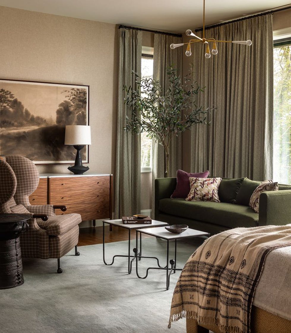
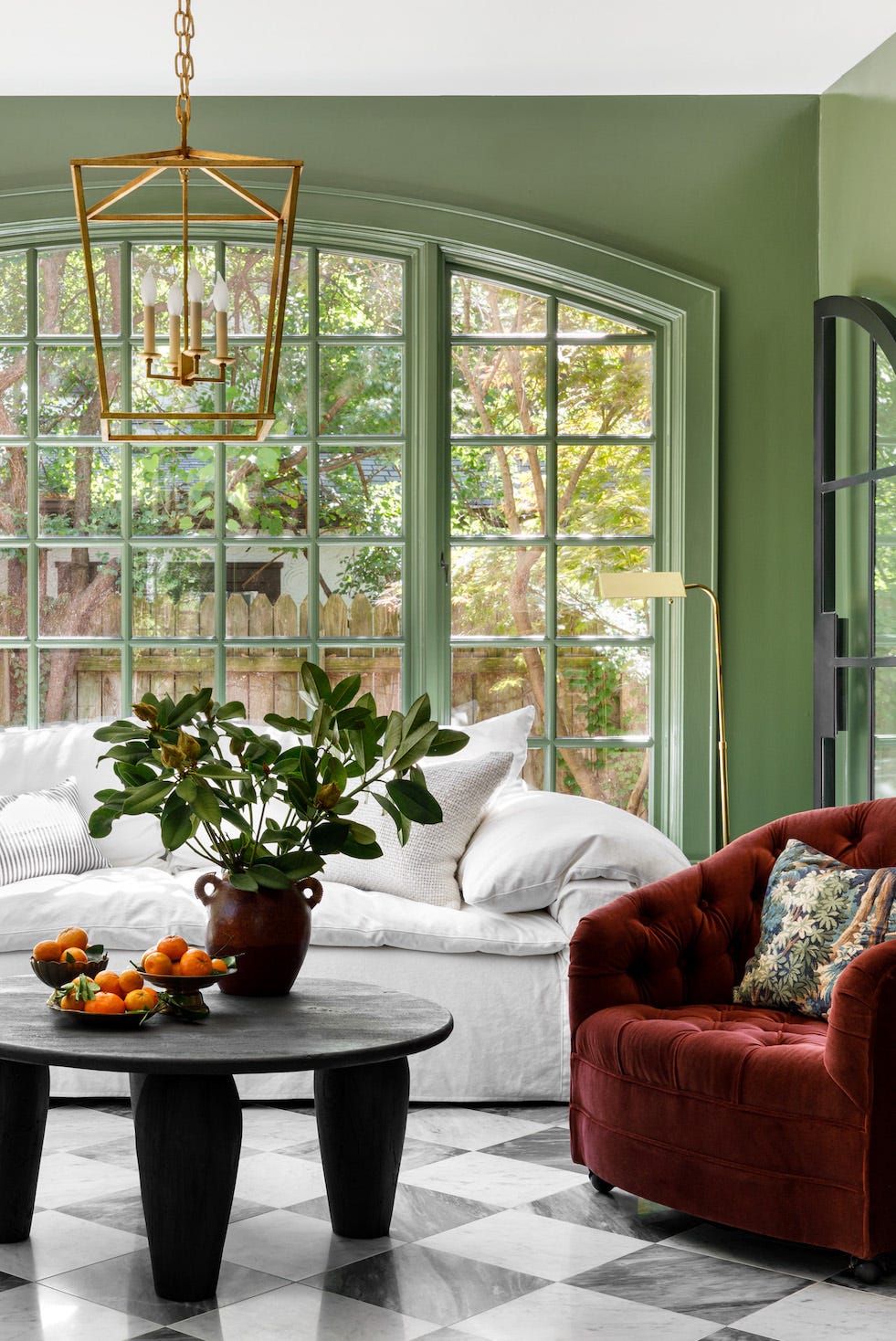
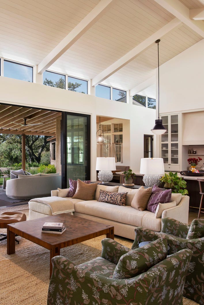
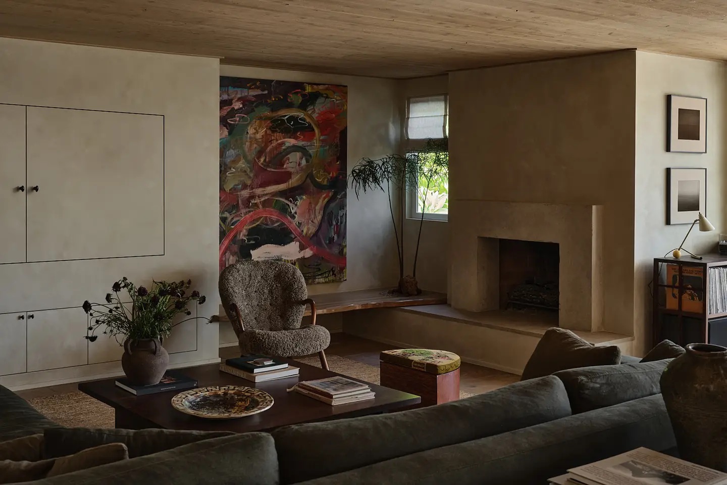
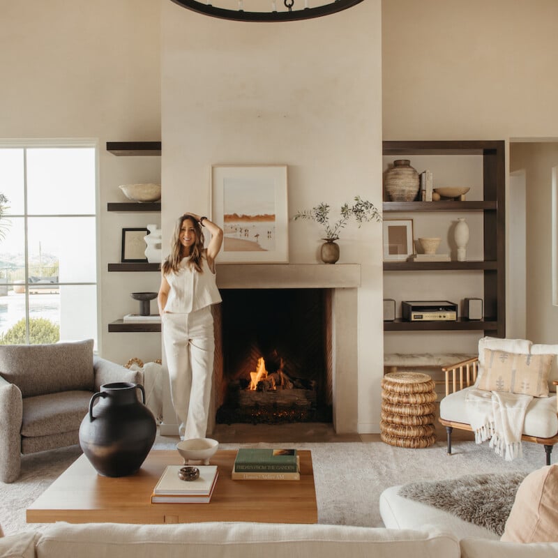
Another method involves incorporating plaster, particularly with its warm texture, to create an intimate ambiance. An L.A. home exemplifies this, where plaster walls contribute significantly to the desired moody feel. The furniture and decor in this space lean towards earthy, darker tones, striking a balance between a lived-in feel and a meditative environment. A notable detail includes a tree integrated into a long, raw-edge bench, and the wavy finish of the seating helps to soften the room's angular elements.
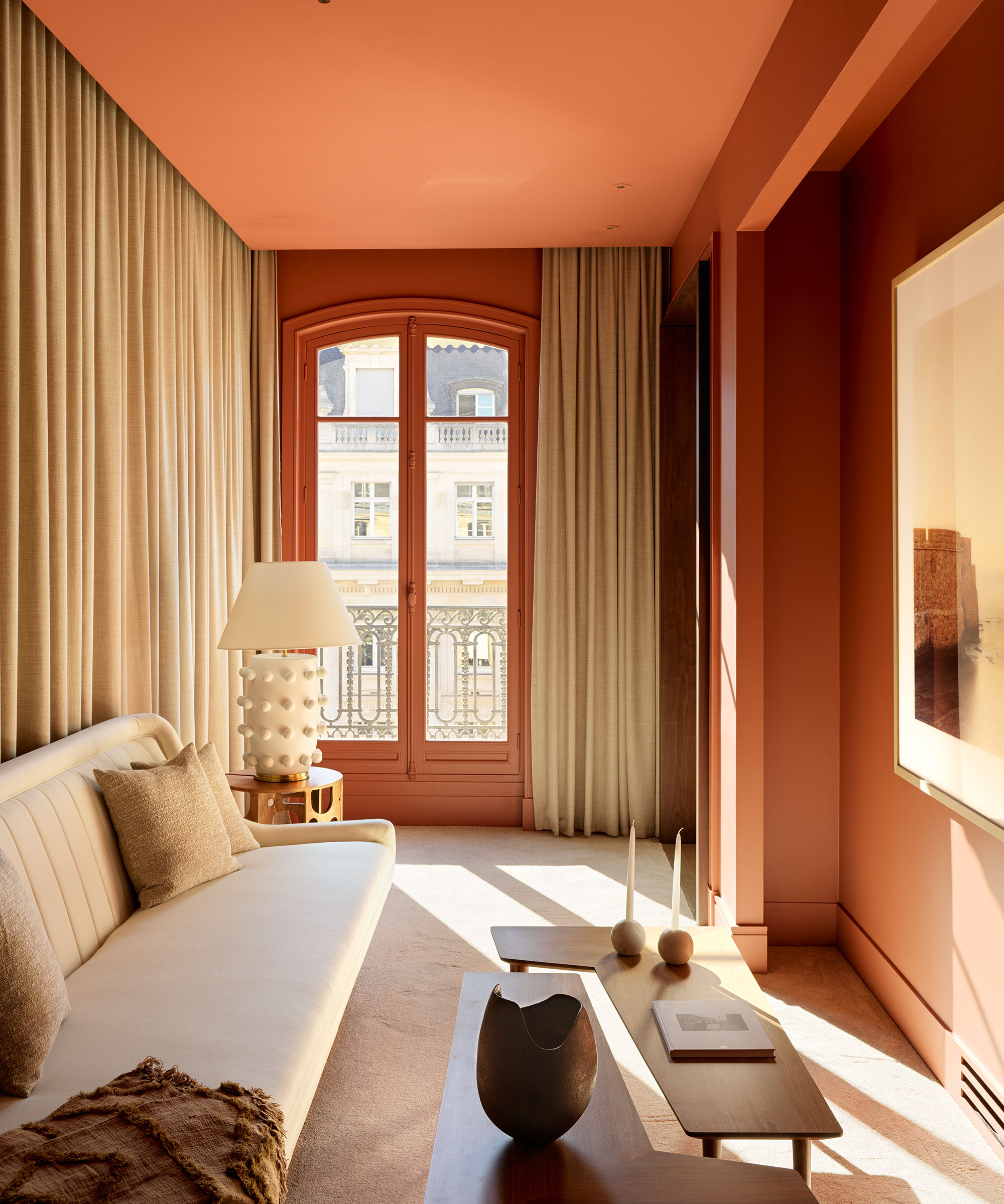
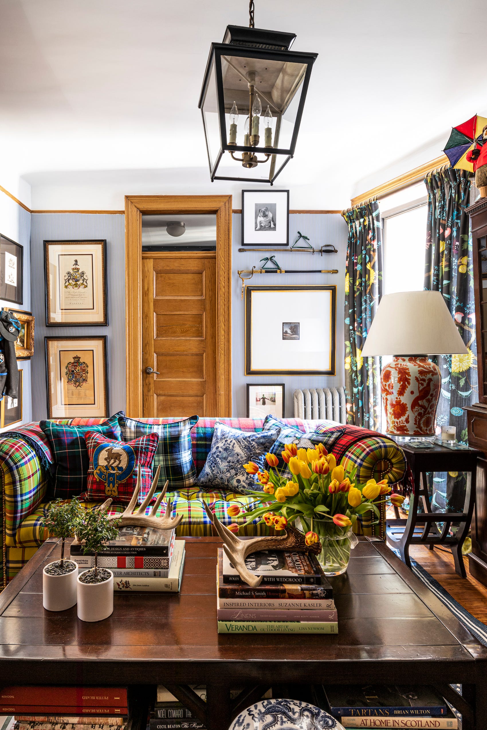
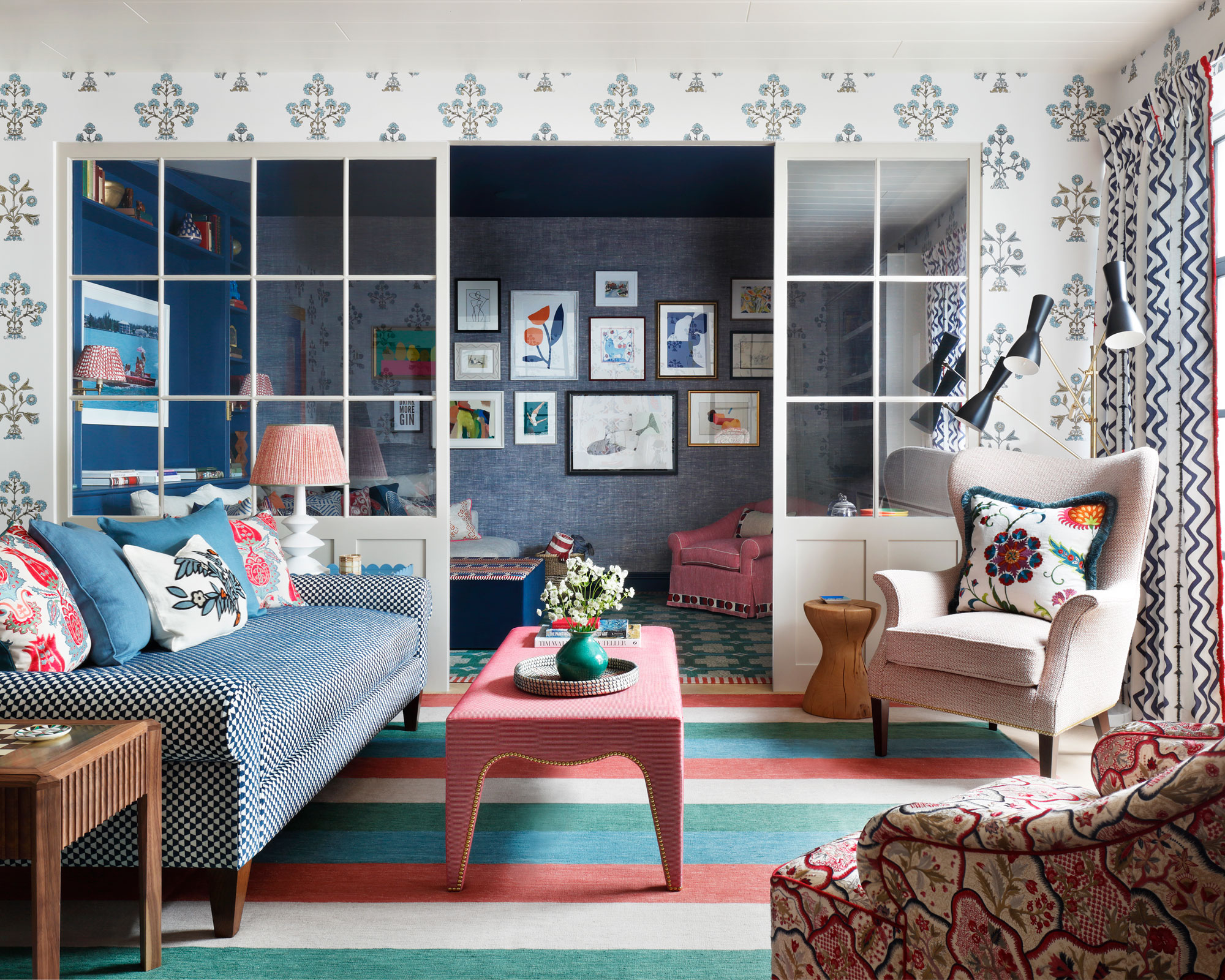
The third suggestion is to channel the charm of an Italian summer, drawing inspiration from specific home designs. Caitlin Cavagnolo and Tyler Randall’s Jersey City apartment is presented as an example, where a large tapestry forms the central element of the living room. To enhance the dramatic effect, the apartment features powder blue doors with a trompe l’oeil technique: a darker hue lining the interior molding creates an illusion of greater depth. Despite the small size of the space, the strategic layering of texture and pattern effectively contributes to the overall moody atmosphere.
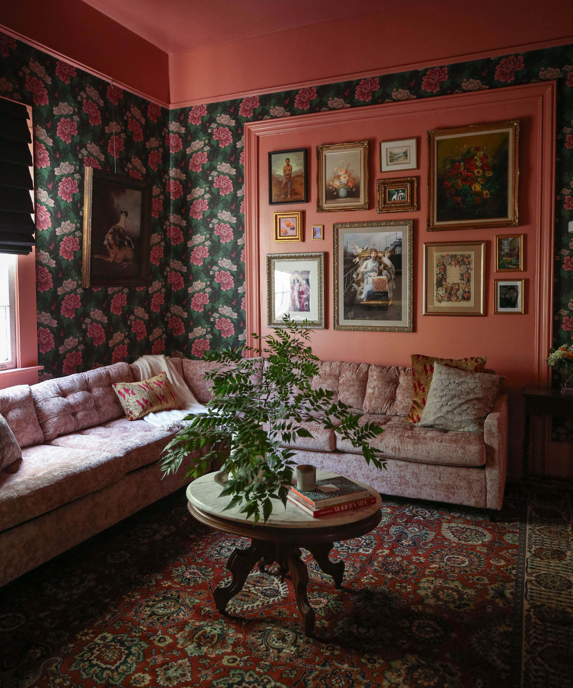
Finally, the article proposes pairing limewash with an unexpected pop of color. Artists Cristina Martinez and Al-baseer Holly’s Seattle home illustrates this concept, with dusty pink limewash walls. The combination of the limewash texture and unconventional color pairings, such as dusty eggplant and deep sage green, produces a dramatic visual impact that is further intensified by the art collection displayed. This color scheme extends to other parts of the home, including a split-color staircase, demonstrating how a cohesive calm and moody aesthetic can be maintained throughout different rooms.
#MoodyLivingRoom #InteriorDesignTrends #HomeDecor #ColorPalette #MonochromeDesign #PlasterWalls #TexturalDesign #Limewash #LivingRoomInspiration #MoodyLivingRoom #InteriorDesignTrends #HomeDecor #ColorPalette #MonochromeDesign #PlasterWalls #TexturalDesign #Limewash #LivingRoomInspiration
0 comment in total
You may also like
9 moody living room ideas for a cozy, cocooning space that you will never want to leave


5 colors that will make your living room feel happier, according to interior designers
7 colour tricks to transform your mood and living room design

8 Living Room Trends to Try in 2023

Your Living Room Needs a Vibe Check—These Are the Coziest Fixes

Designers Share Their Best Tips for Acing Ambience in the Living Room with Lighting
14 Living Room Lighting Ideas to Create the Right Mood

Don't Shed Your Sweats Yet! The Year's 8 Hottest Living Room Design Trends Bring the Cozy, Comfy Vibes
6 ways to create a calm living space, according to the experts

7 Things That Are Making Your Living Room Look Bad, Designers Say—and How to Fix It
How to make a living room lighter – an interior designer's 10 tips for a creating brighter space
5 best happy living room colors for an uplifting space
23 Moody Living Room Ideas That Create a Cozy, Intimate Atmosphere
25 Ways to Make Any Living Room Feel Ten Times Cozier

Nine tips on how to turn a living room Zen

Is your home feeling lifeless? 5 layering hacks to make the interiors warm and inviting | Hindustan Times

10 moody living room ideas to go with any aesthetic


Easy Ways to Transform Your Living Room Into a Space You LOVE
27 best living room accessories to brighten up your mood

Interior Designer Sheri Rose Riskind: 5 Things You Can Do To Help Your Living Space Spark More Joy