1/9
The Color Palettes Currently Inspiring Domino Editors
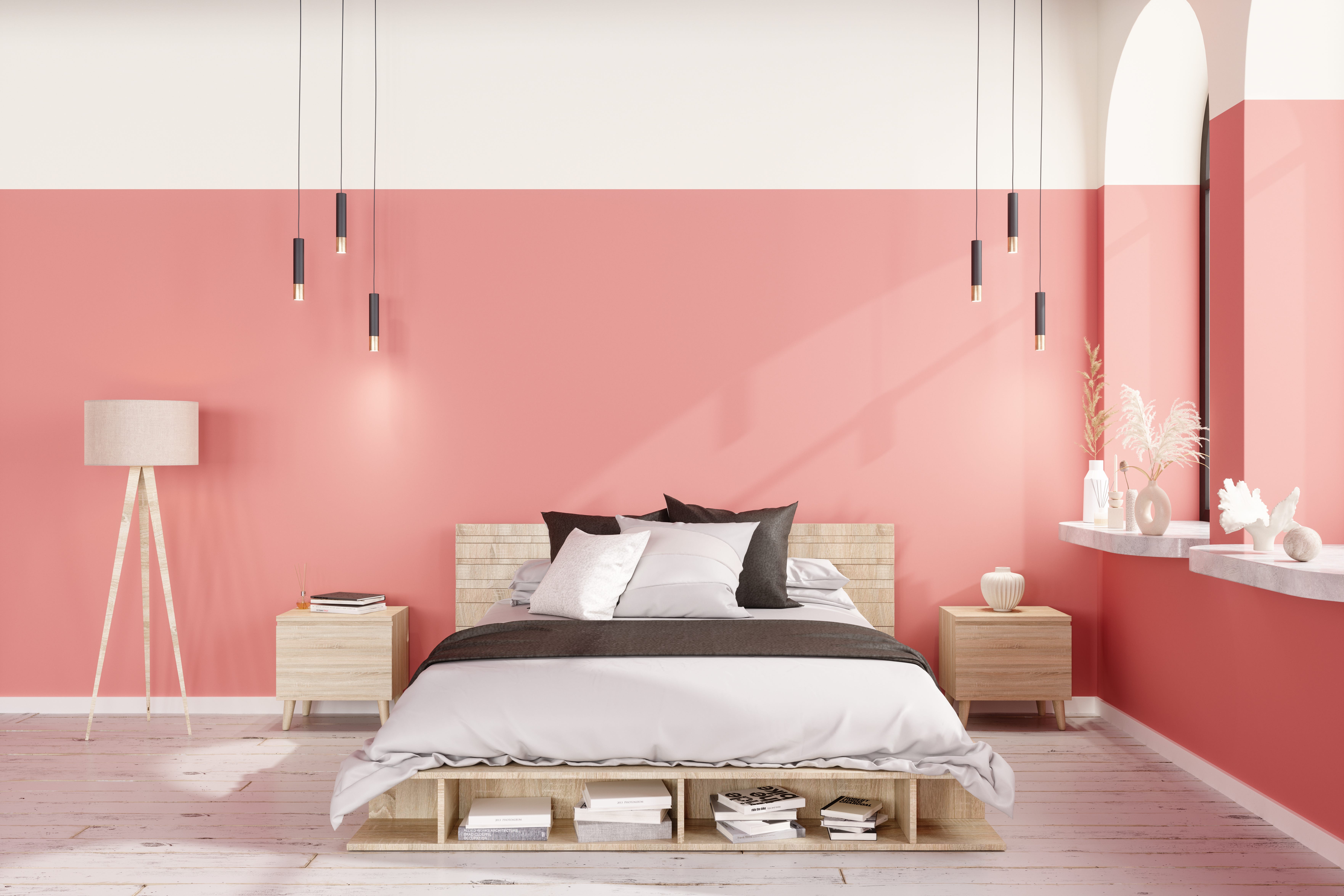
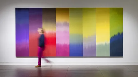
The article explores various color palettes that are currently inspiring the editors at Domino, highlighting diverse aesthetic preferences and sources of inspiration for spring decor. The content suggests that while prominent trends like Pantone's Color of the Year and Millennial Pink exist, there is ample room for individual expression in color choice.
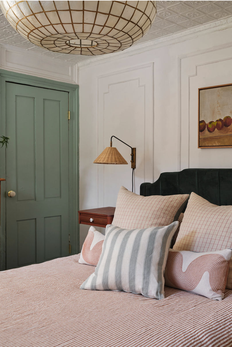
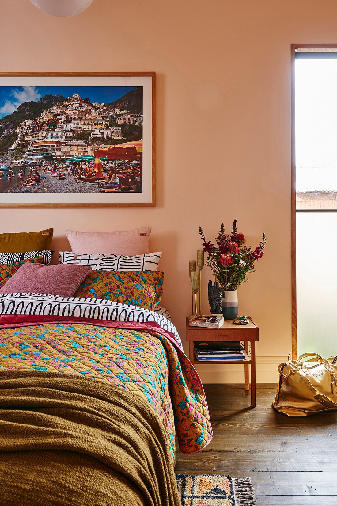
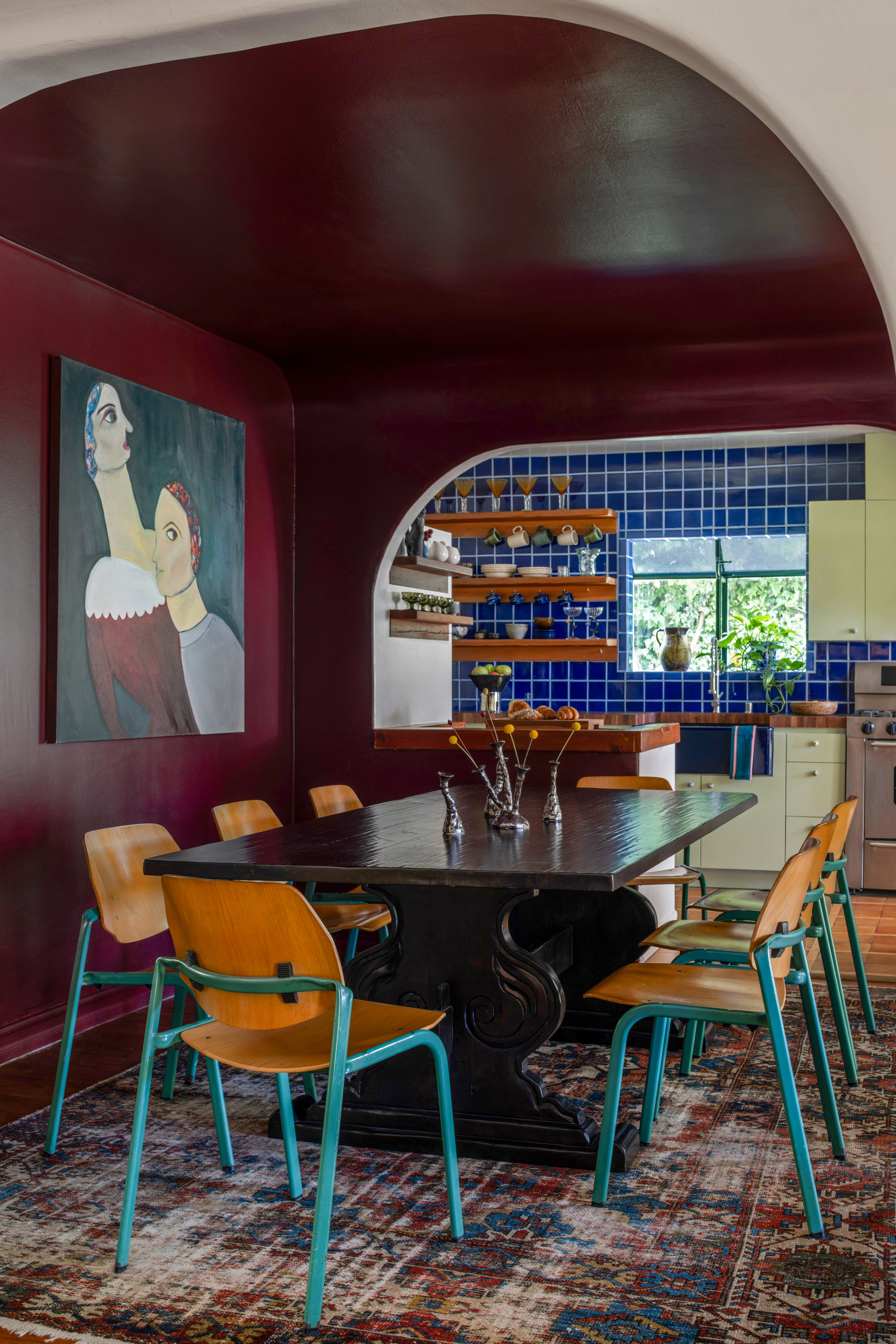
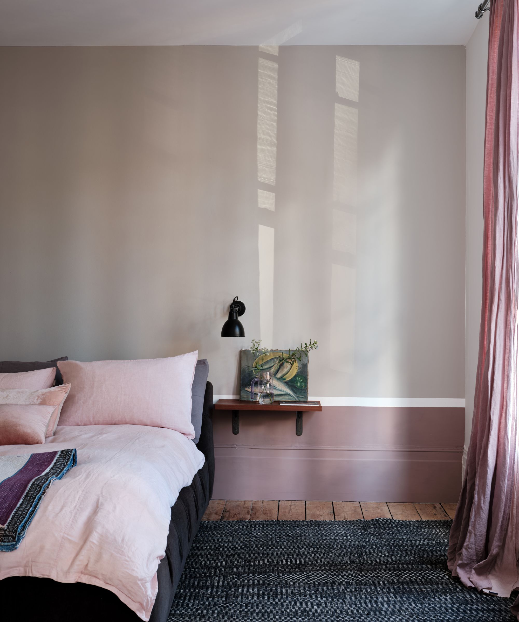
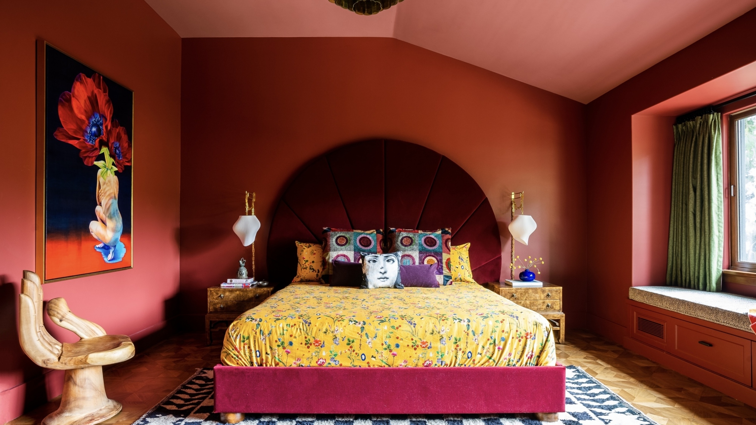
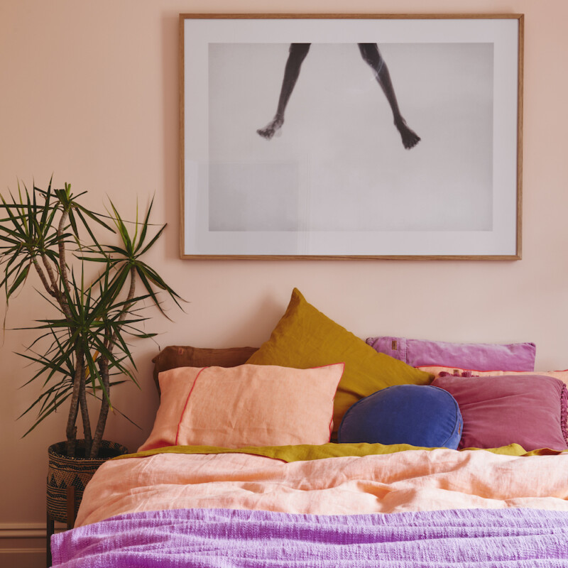
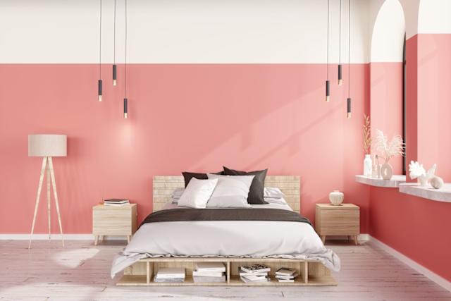
Kate Berry, Style Director, shares her affinity for a peachy-nude and yellow palette, drawing inspiration from artists like Willem de Kooning and Jackson Pollock, noting how these tones shift with seasons and mood. Her personal space incorporates these colors through bedding and sofa pillows, suggesting a blend of art appreciation and home design.
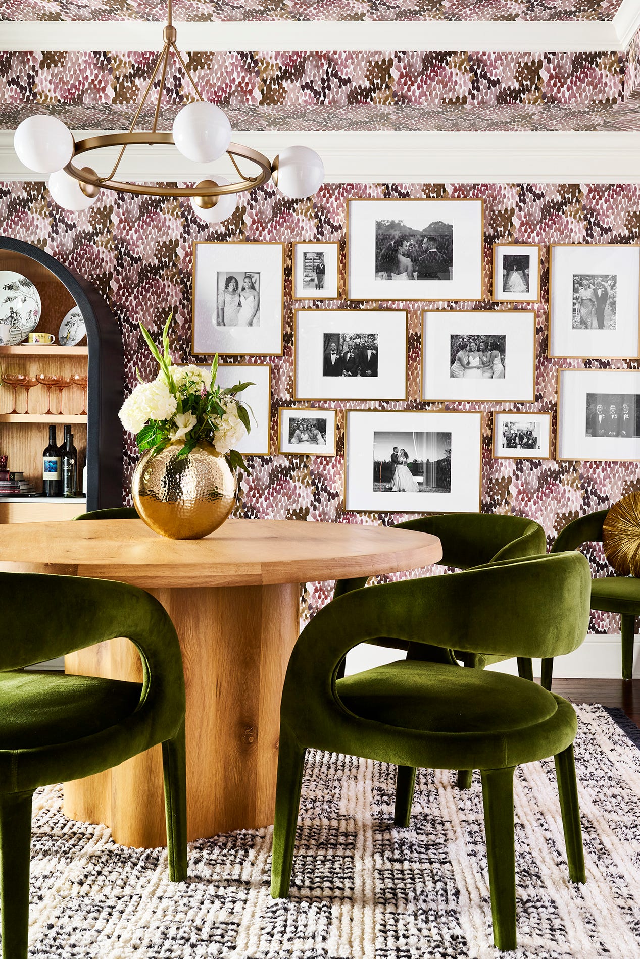
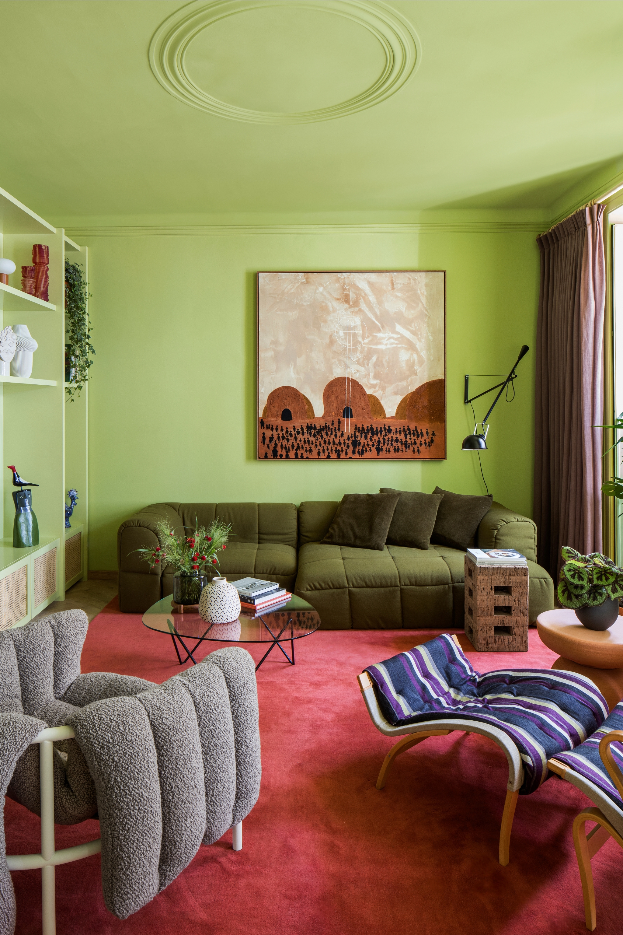
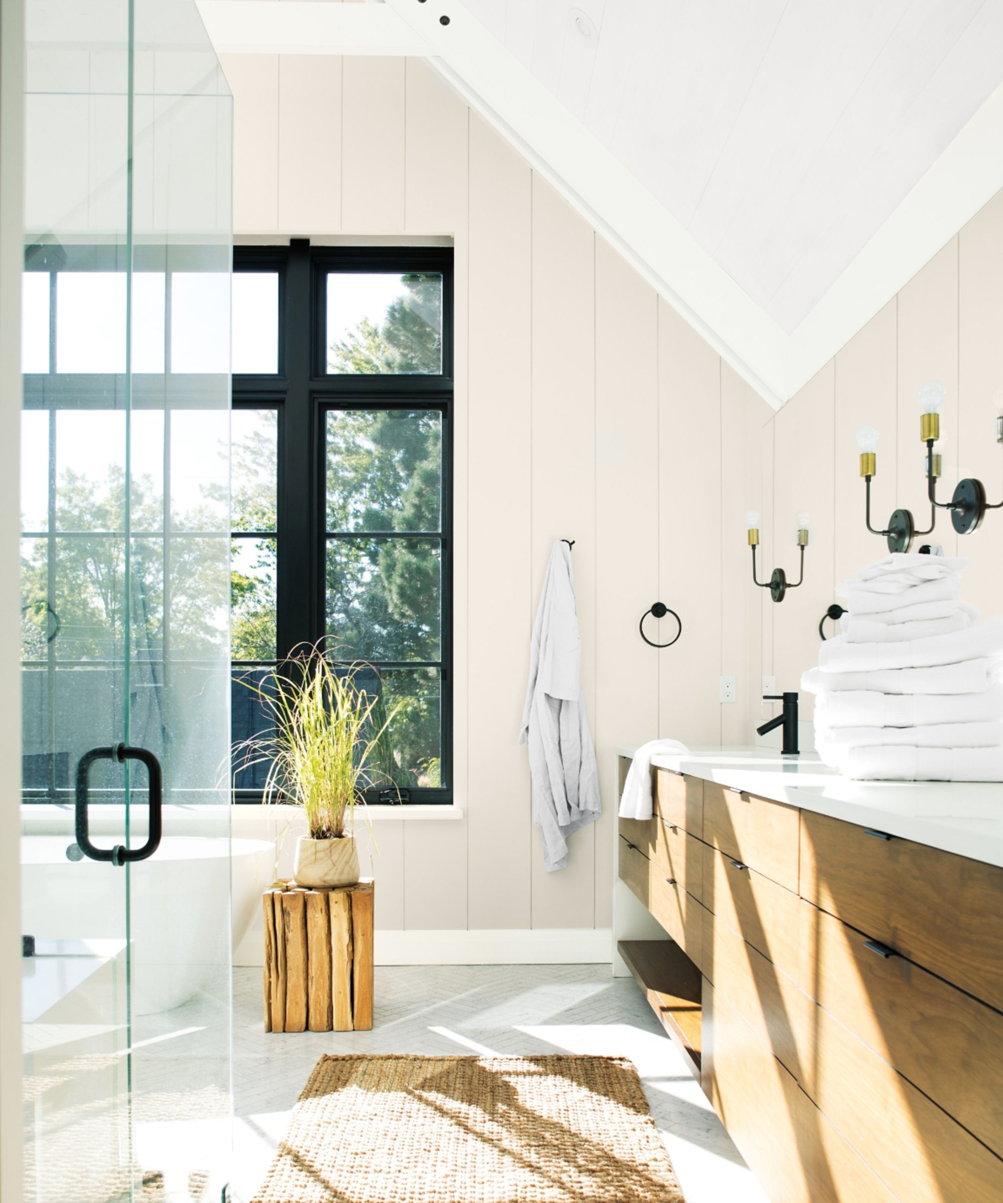
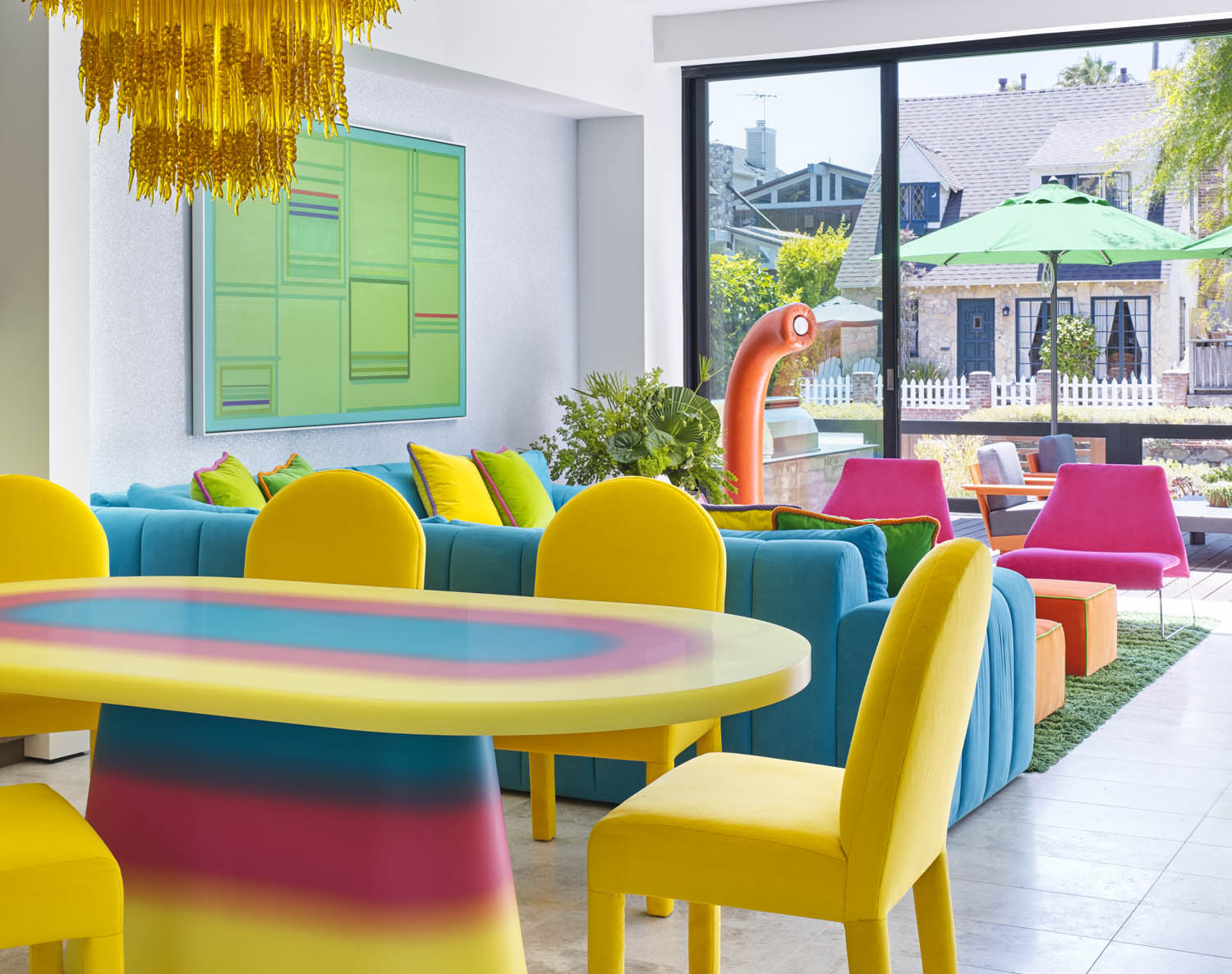
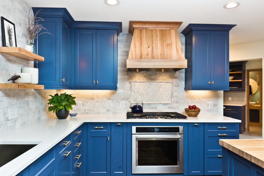
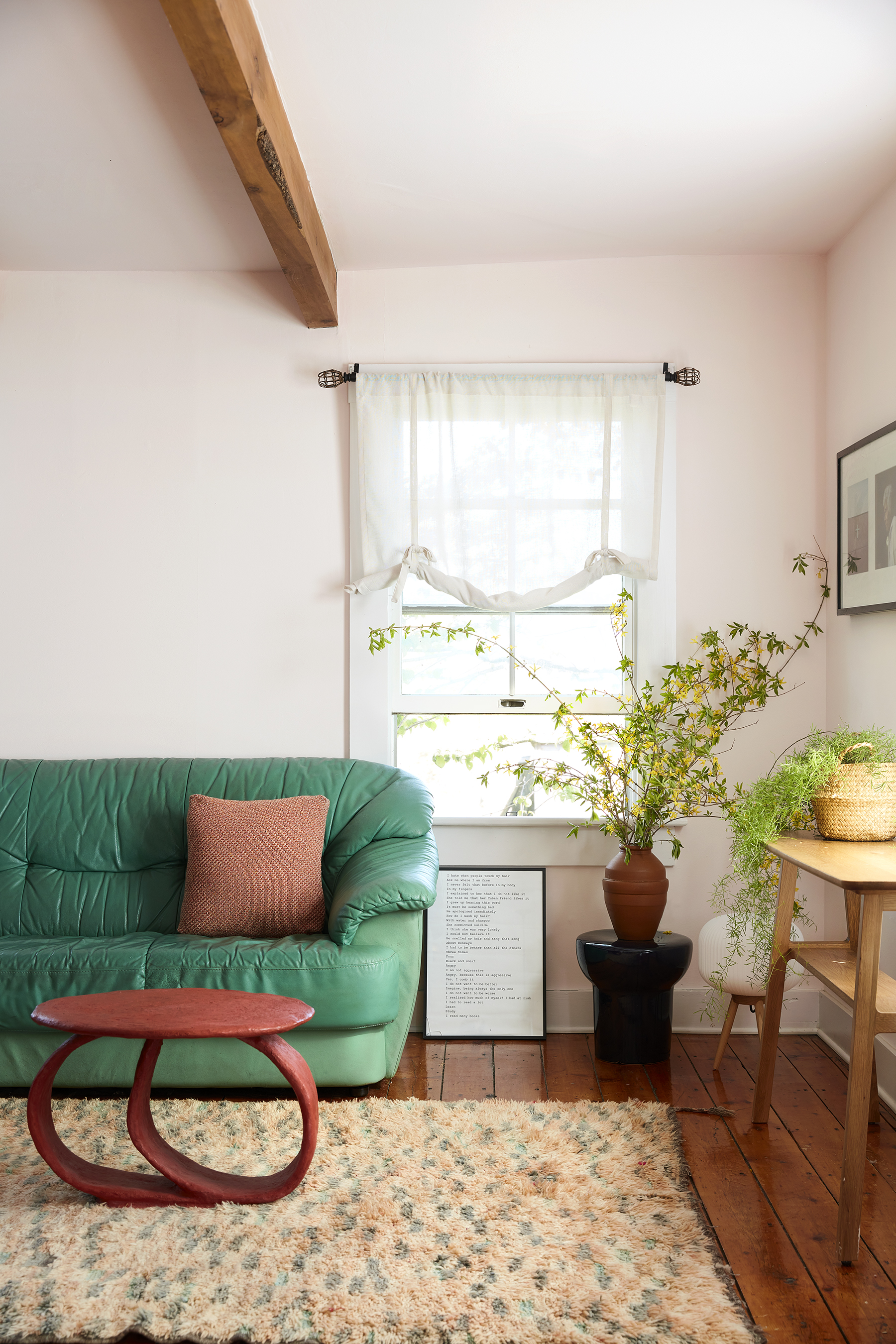
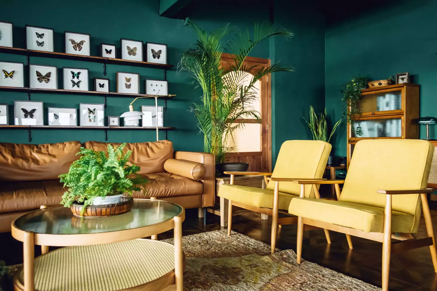
Digital Editor Anna Kocharian focuses on a summer-inspired palette, characterized by an orange chair and textured rattan, evoking a sun-kissed aesthetic. This highlights the influence of natural elements and seasonal changes on color preferences. Digital Photo Editor Lahaina Alcantara is drawn to color schemes that combine subtle neutrals with vibrant pops, such as army green and citron, exemplified by a sculpture from Anthony Caro. She notes that while her personal style leans neutral, bright accents bring a joyful vibration to her surroundings.
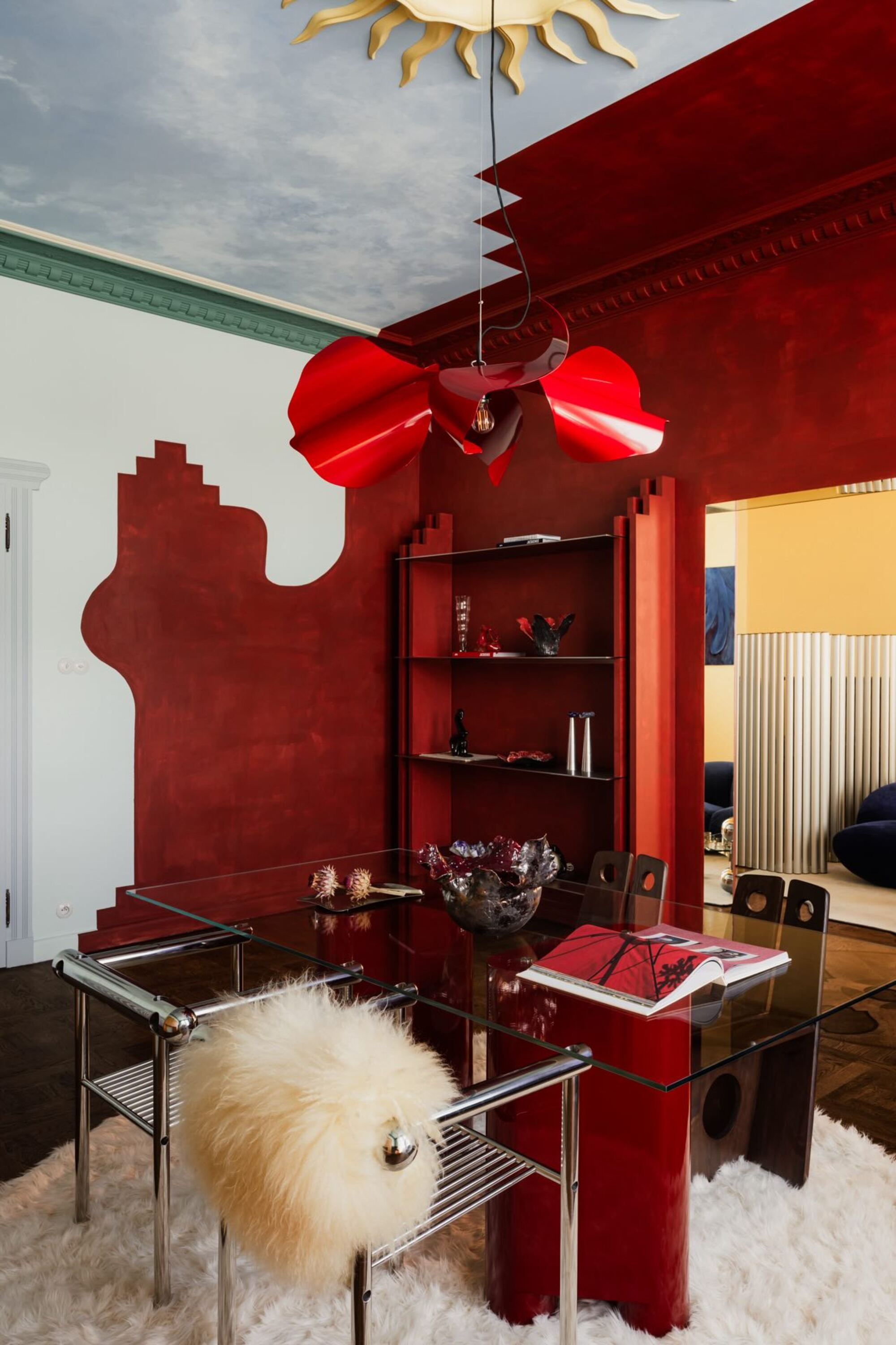
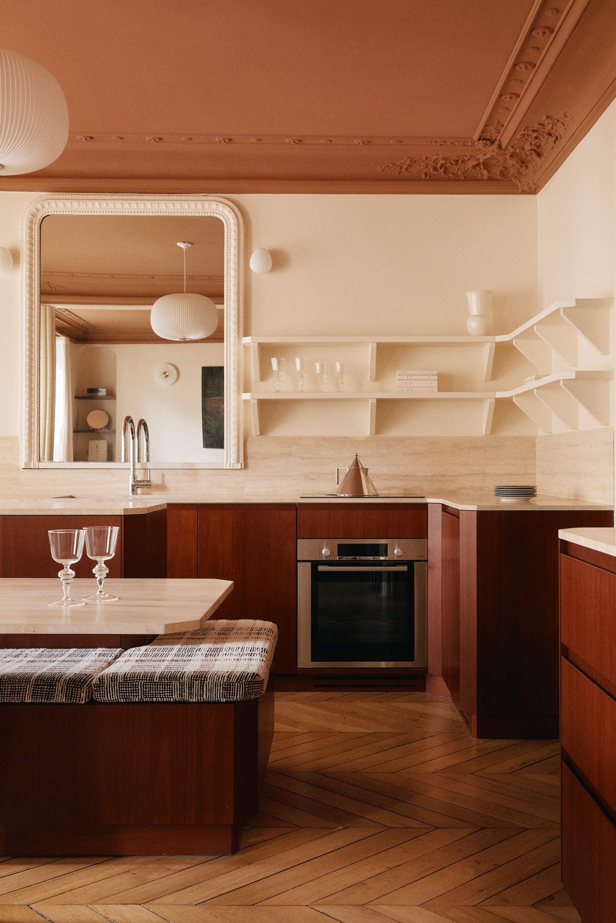
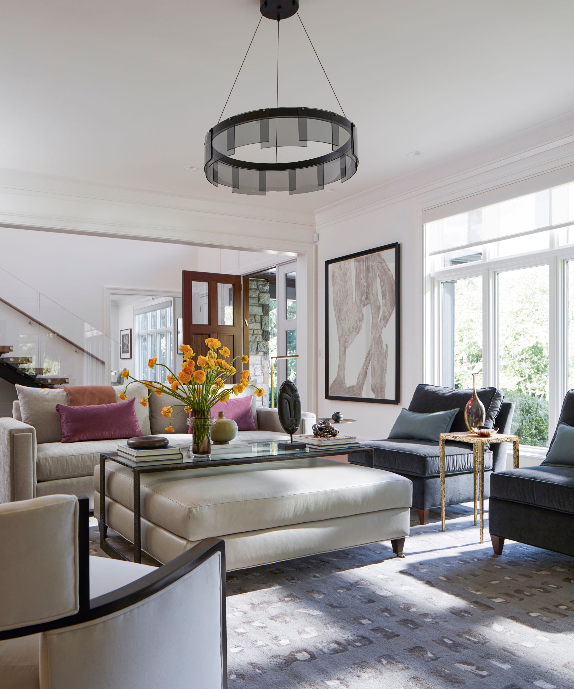
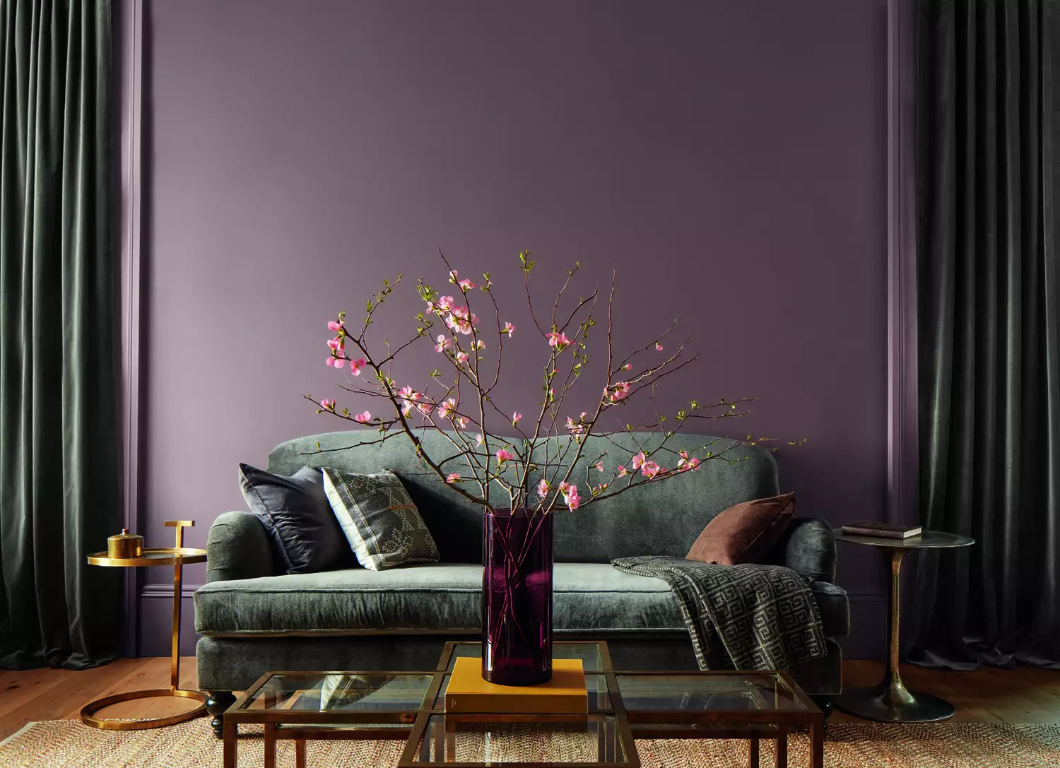
Photo Editor Meghan McNeer finds inspiration during travel, specifically mentioning an unexpected combination of terracotta, mountains, sky, and mint stripes encountered at the Hoover Dam. This experience solidified a strong desert shade color palette for her. Executive Editor Alex Redgrave discusses a craving for electric bolts of color, citing a neon orange chain fence against a backdrop of slate blue and grey in Nova Scotia, which made her appreciate the neutral landscape in a new way.
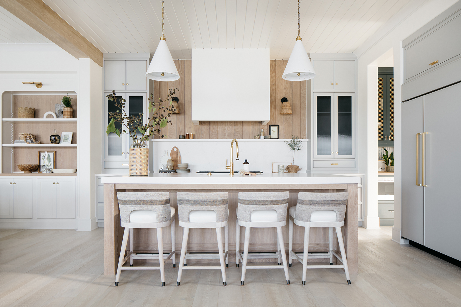
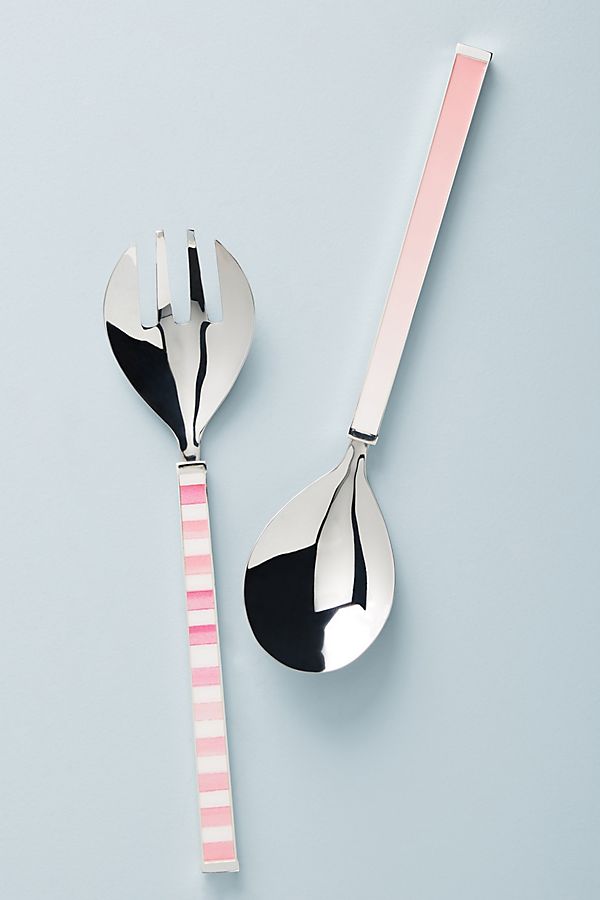
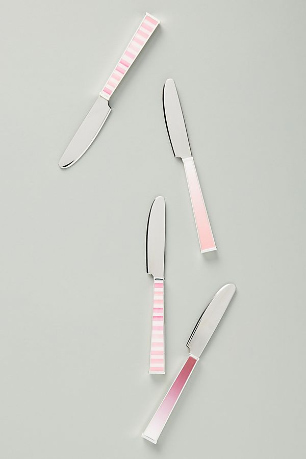
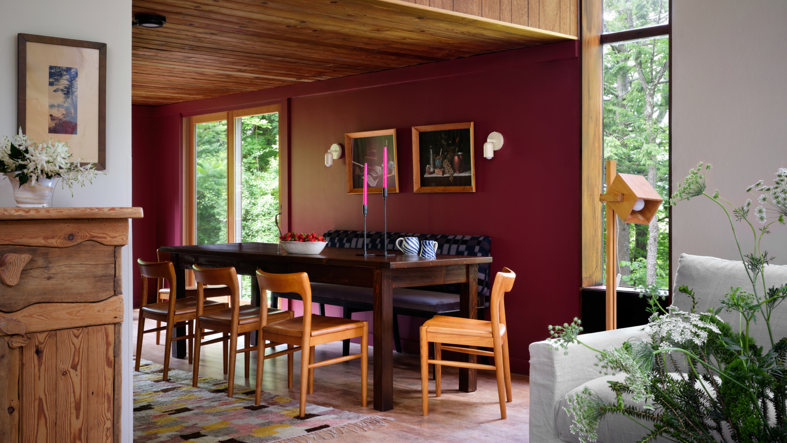
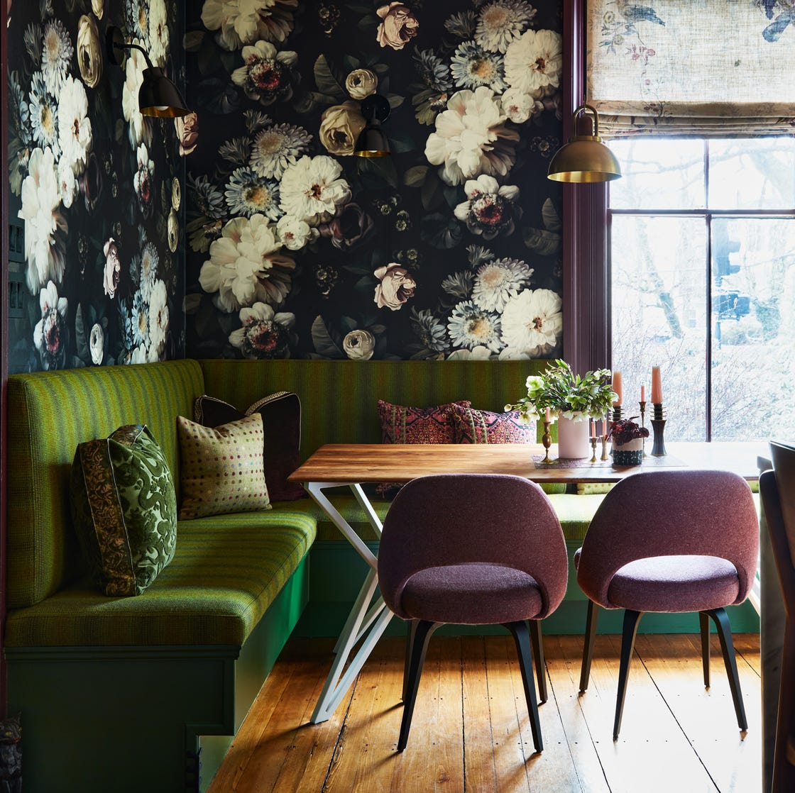
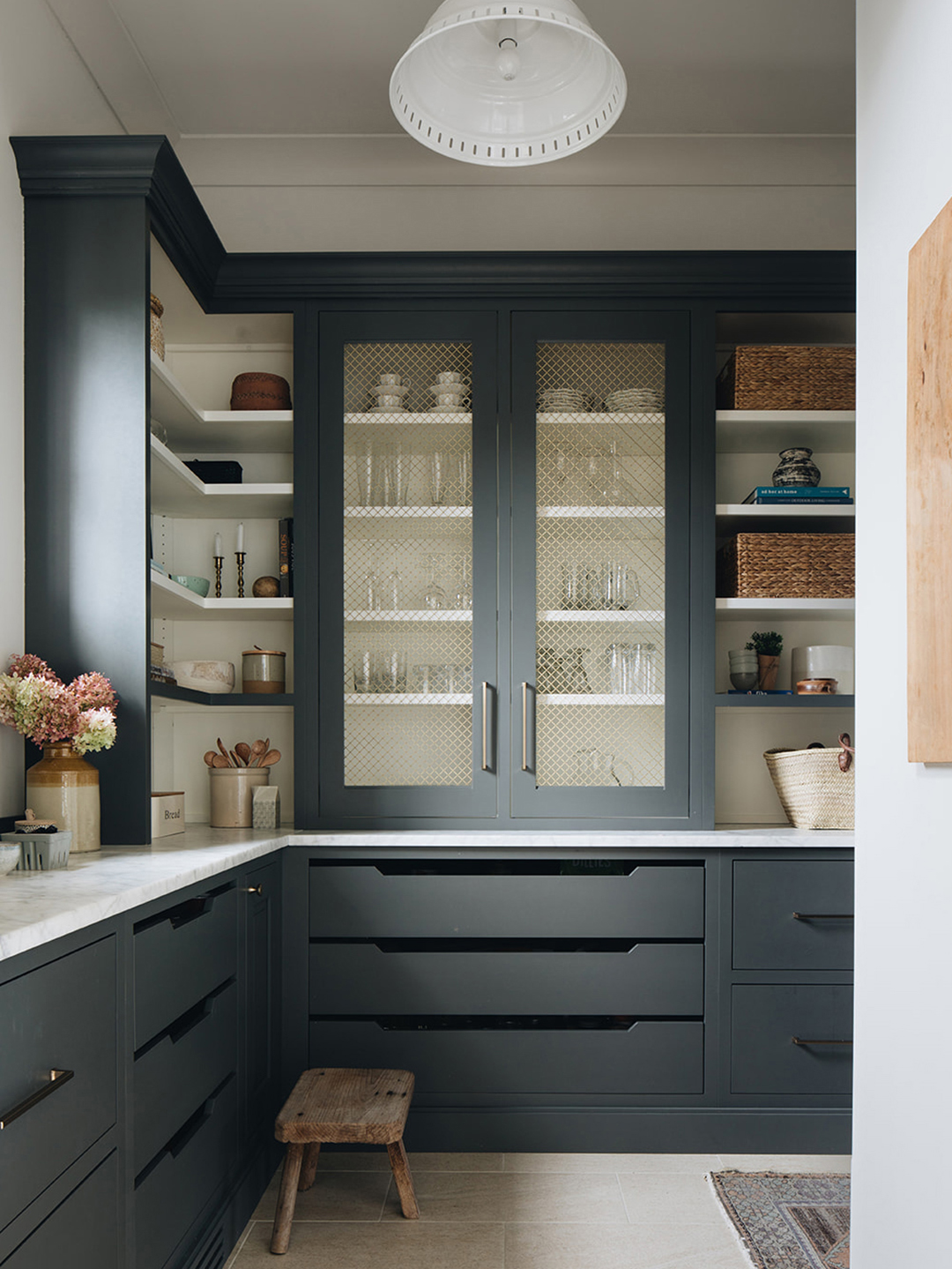
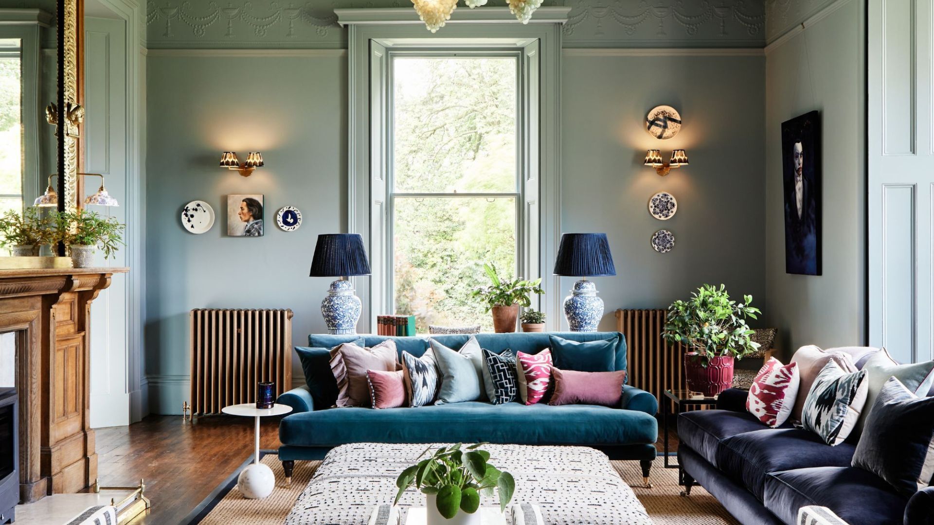
Contributing Editor Natasha Wolff is inspired by Sundays Nail Salon's all-natural color palette, which incorporates woods, rattan, linen, and leather, showcasing how commercial spaces can influence design choices. Associate Social Media Editor Alyssa Clough finds inspiration in fashion labels like Delpozo, whose collections feature unique combinations of reds, pale pinks, mints, periwinkles, and bright whites against bold oranges. She suggests exploring their Instagram for further inspiration.
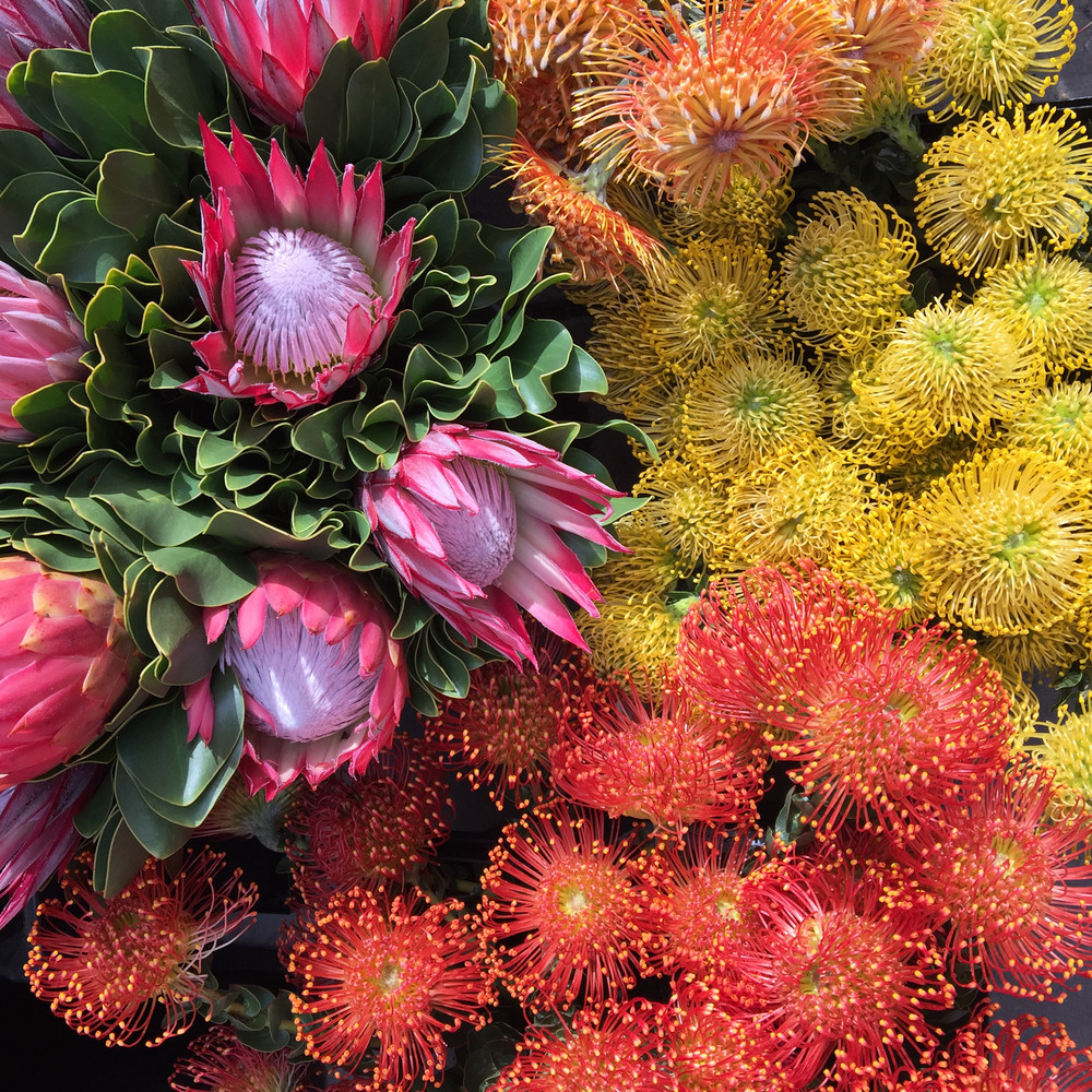
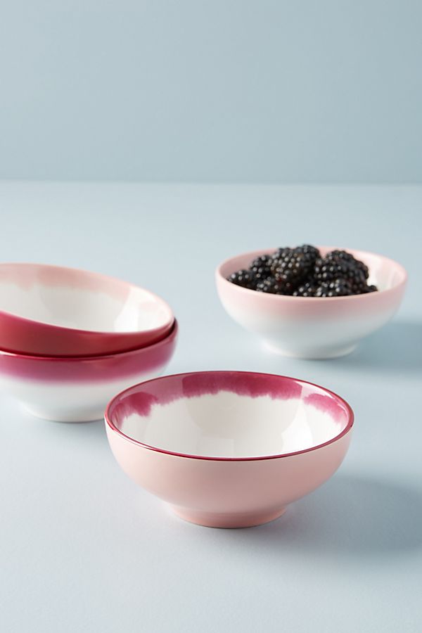
Kristin Limoges highlights a piece by Marco Scozzaro, a collage with summer inspiration from his Digital Deli project, which incorporated a subtle neon pink light, demonstrating how art installations can provide color cues. Finally, Editorial Assistant Lily Sullivan observes the emerging popularity of citron as a "new boo-thing" to millennial pink, noting its appearance in fashion shows and restaurants, suggesting a contemporary pairing of bright colors. These diverse perspectives collectively illustrate how art, nature, travel, fashion, and everyday observations contribute to evolving color trends and personal design choices.
#colorPalettes #designInspiration #homeDecor #springColors #interiorDesignTrends #artInspiredDecor #travelInspiredColors #fashionInfluencedDesign #seasonalColorTrends #colorPalettes #designInspiration #homeDecor #springColors #interiorDesignTrends #artInspiredDecor #travelInspiredColors #fashionInfluencedDesign #seasonalColorTrends
0 comment in total
You may also like
5 Vibrant Color Palettes Designers Are Using to Add Energy and Excitement to Decor

The Color Trend Designers Are Painting Dining Rooms Right Now
OMG — Is Color Blocking Actually Cool Again?
Design Pros All Agree: The Color-Blocking Trend Is One to Try

12 Color Schemes That Are Popping Off Right Now, According to Designers


Top Five Color Inspired Accounts To Follow On Instagram

Designers say the key to kitchen paint colors in 2024 is to go bold

The most timeless paint colors according to designers

The Paint Color That All This Designer's Followers Ask About | domino

12 Paint Colors That Interior Designers Are Buzzing About—See the Gorgeous Hues Here
You Can Now Buy Domino-Designed Dinnerware at Anthropologie
The Cottagecore Shade Style Domino Readers Are Snapping Up Left and Right

12 Jewel-Tone Paint Colors Designers Say Are Always On-Trend

6 Paint Color Duos Designers Can't Get Enough of This Fall

Rich colors and sumptuous textures are on designers' minds
Four designers weigh in on Pantone's Colour of the Year

4 Interior Designers Share the Biggest Paint Color Trends Right Now (and What’s Out!)

What you didn’t know about colour

6 key colors to decorate with in May 2025, according to interior design and color experts in the know
Design Pros All Agree: The Color-Blocking Trend Is One to Try