Fresh coat of paint can create clean slate
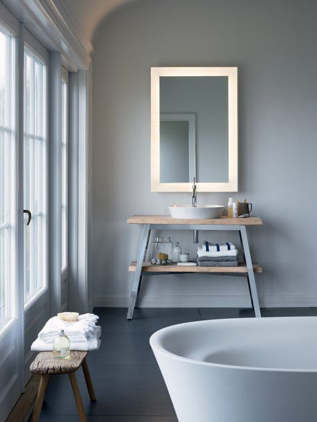
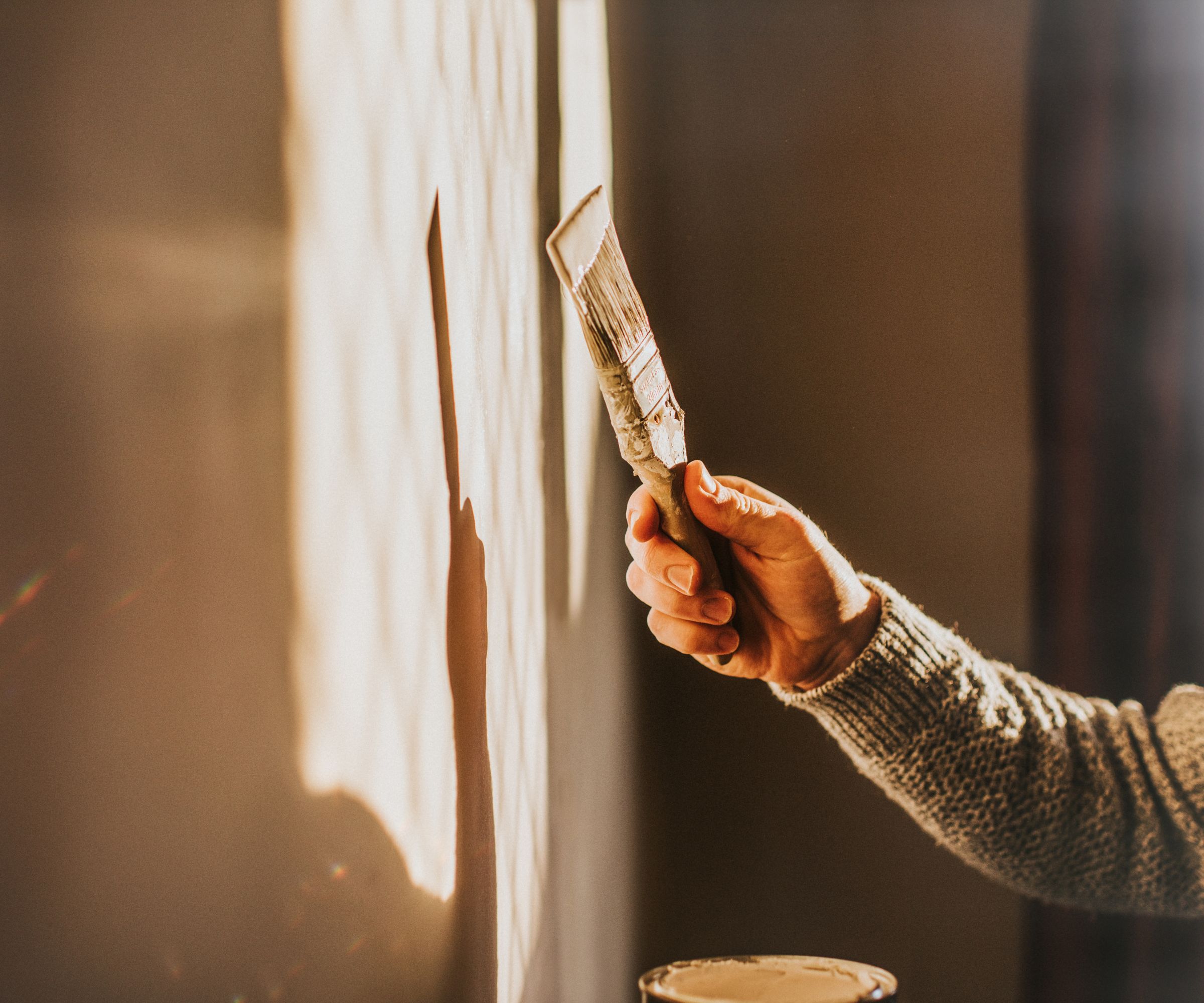
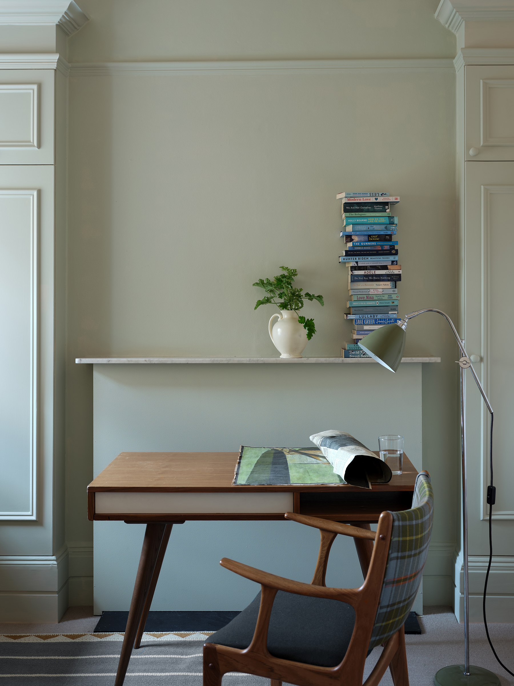
A fresh coat of paint, whether applied inside or outside a home, can significantly impact the aesthetic and perceived value of a property, especially for those looking to revitalize their decor or prepare for the spring home-selling market. The selection of paint colors plays a crucial role in achieving a desired style and appealing to potential buyers. Sue Wadden, director of color marketing for Sherwin-Williams, is tasked with identifying and naming trending colors, predicting future popular palettes for the paint company.
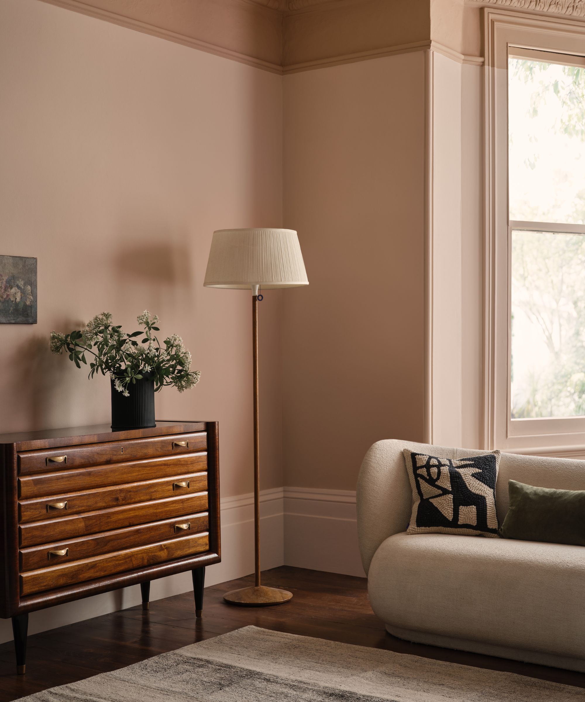
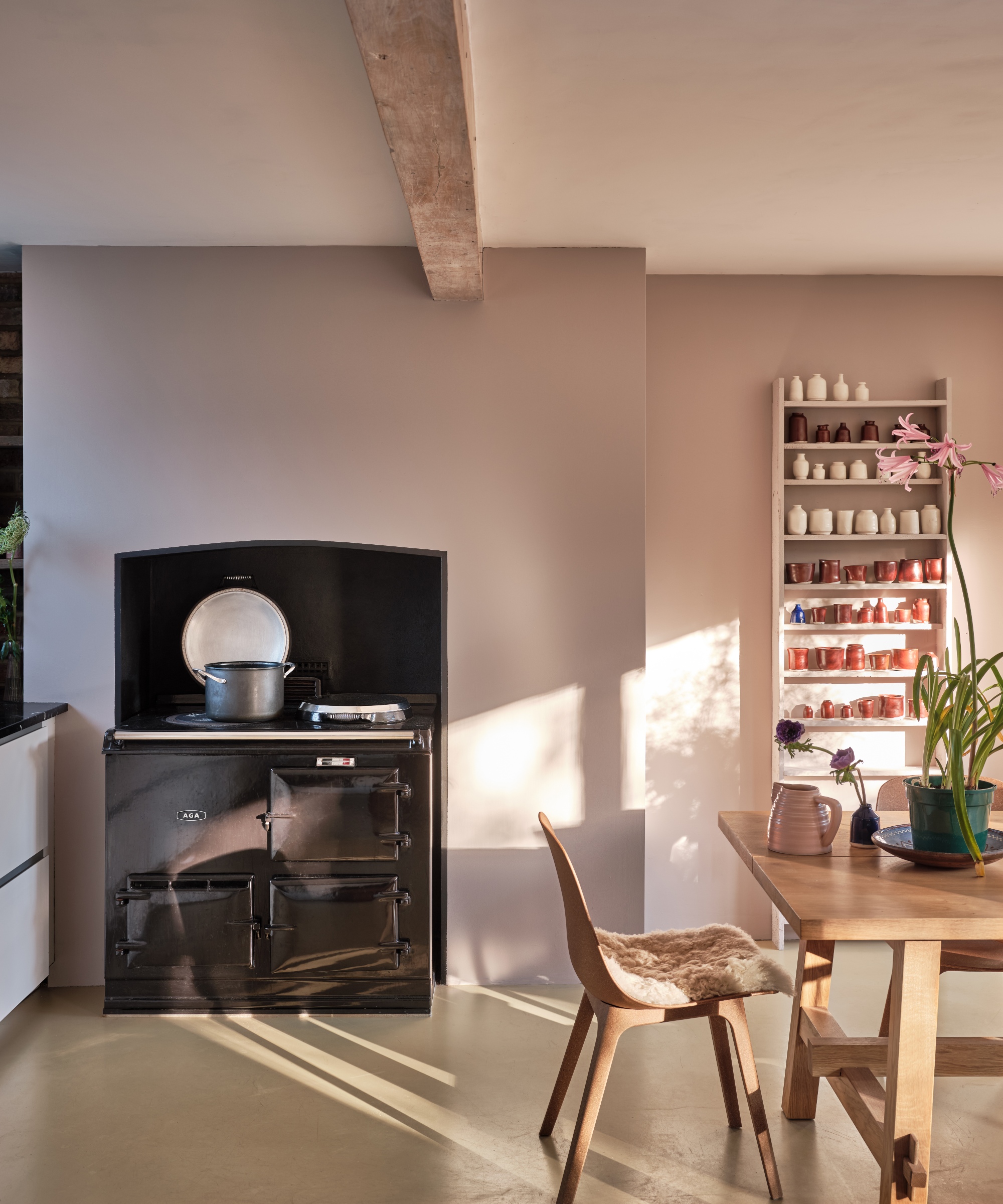
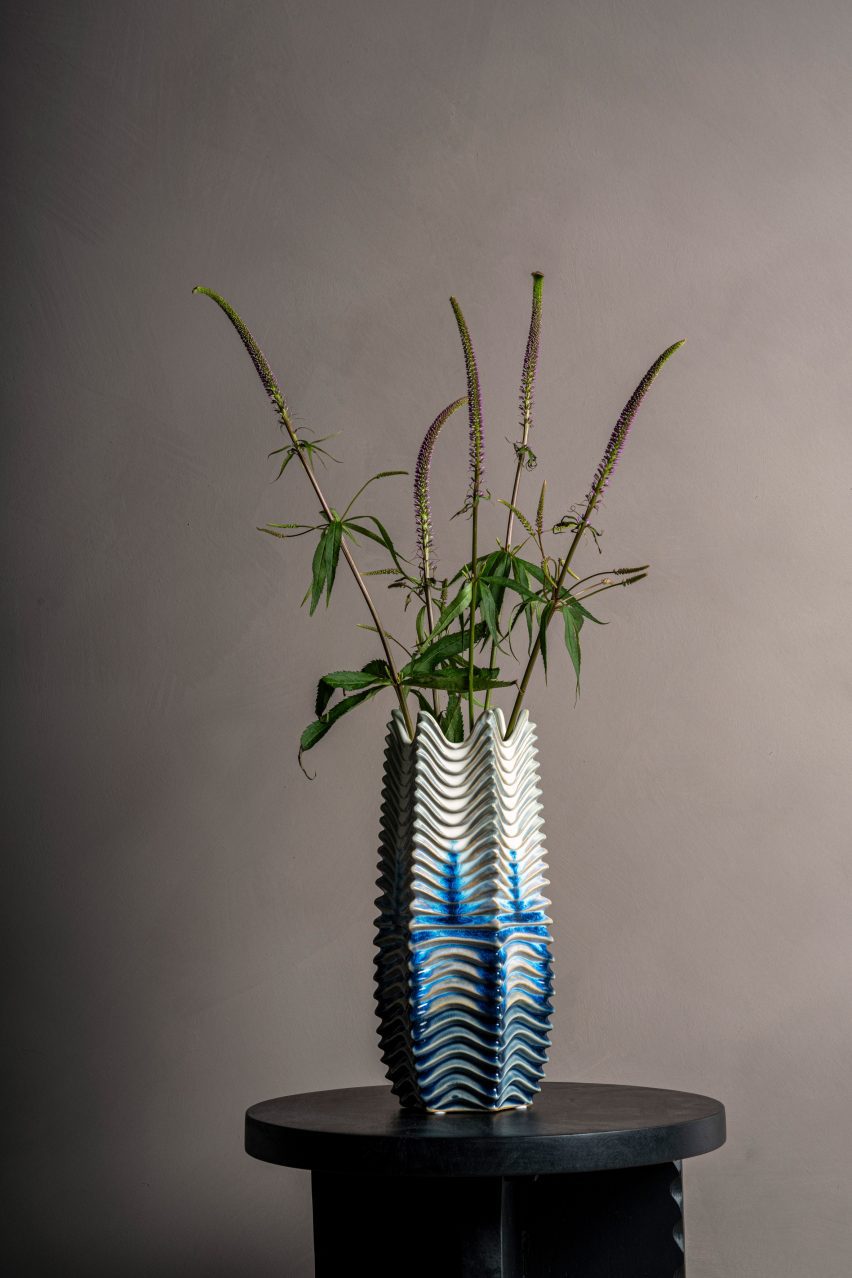
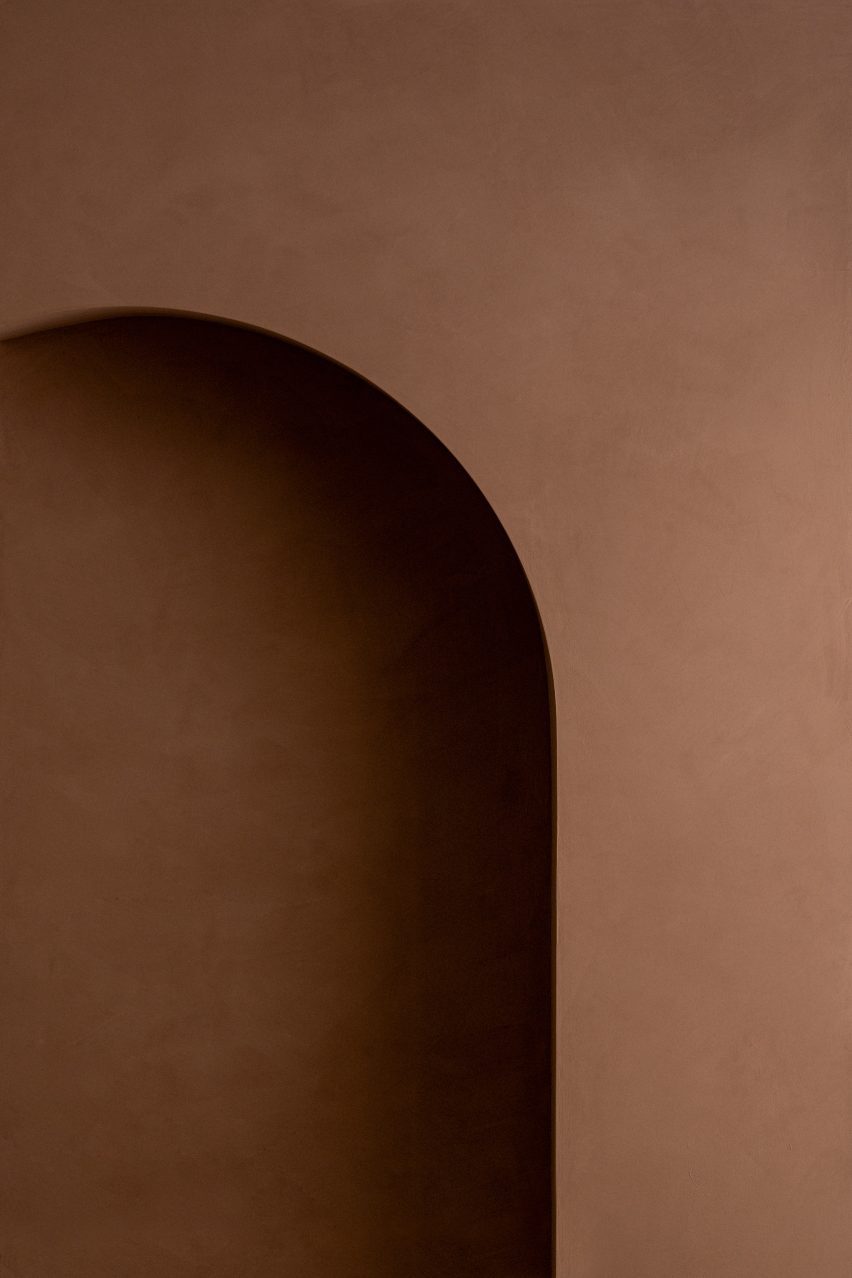
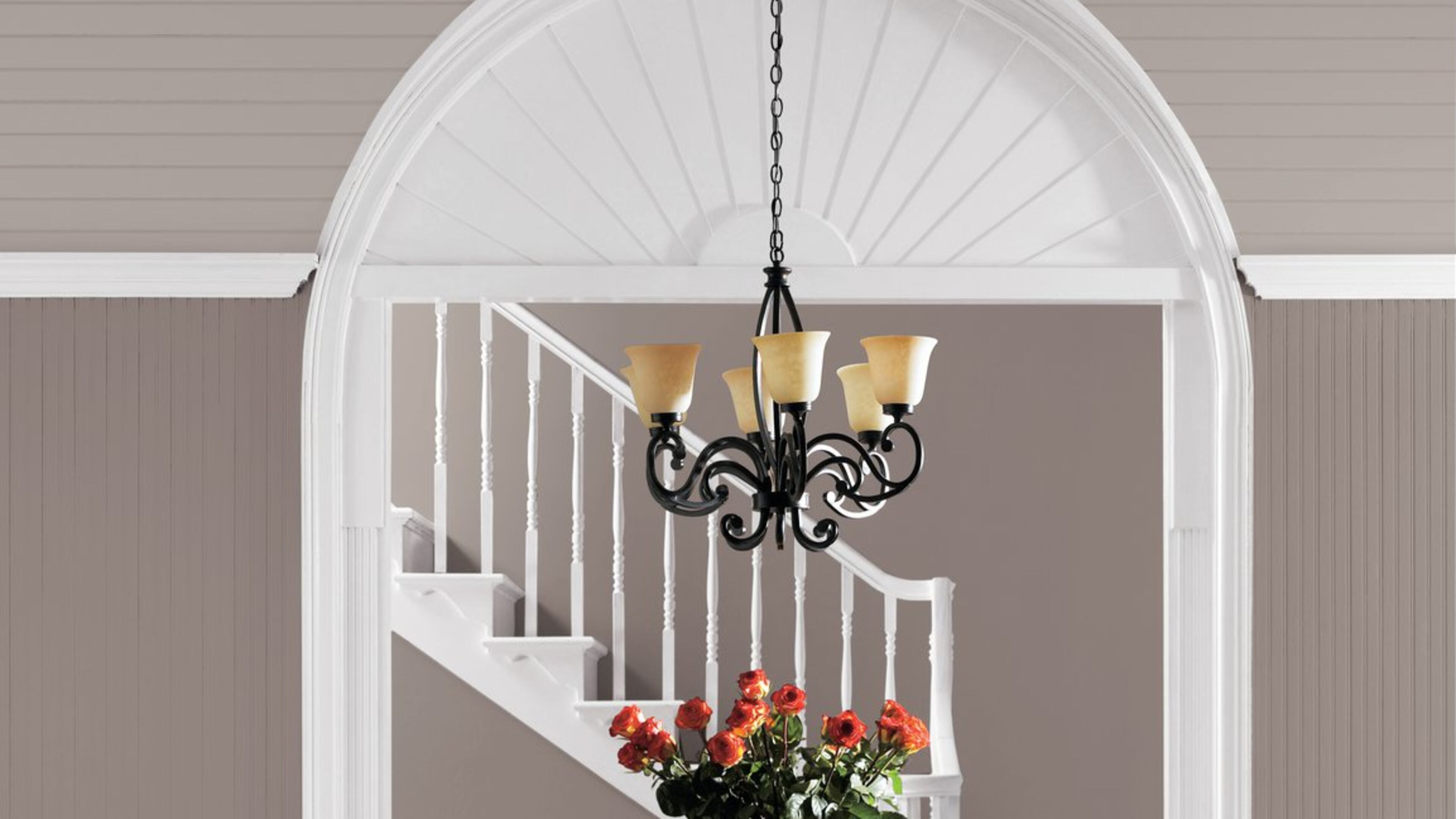
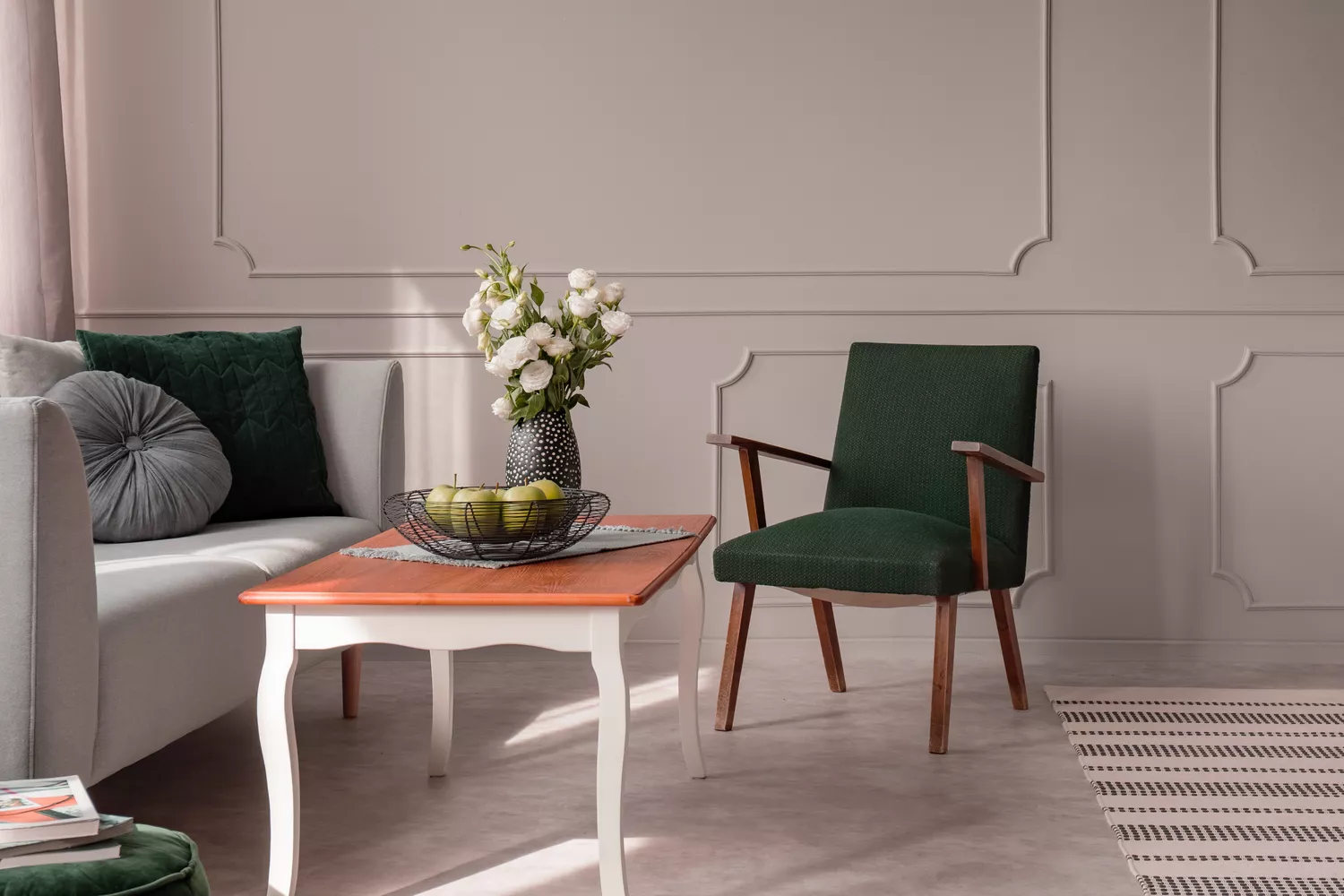
Wadden notes that Sherwin-Williams’ color of the year, “Poised Taupe,” is a soft neutral that signifies a shift from cooler grays to warmer, more versatile hues. This particular taupe, a combination of gray and brown, offers a richer and more character-driven neutral, distinguishing itself from the lighter mushroom-colored neutrals of the past. It is seen as a relevant color for various spaces, including kitchens, baths, and living areas, offering a sophisticated and updated alternative to previously popular grays.
The inspiration for new color trends often comes from a variety of influences, including art, design, education, emerging social patterns, and even politics. Wadden emphasizes that the Sherwin-Williams team observes cultural shifts to forecast what colors will resonate with the public. For instance, the prevalence of industrial grays, often associated with stainless steel and masculine aesthetics in the early 2000s, is now giving way to warmer tones. These warmer colors are being embraced as people seek more comfortable and inviting environments.
Wadden also points out that while cool grays were dominant, a clear shift towards warmer neutrals is evident. The rise of these warmer tones is driven by a desire for a more welcoming ambiance, providing a sense of refuge and peace in a world that can often feel chaotic. Poised Taupe, with its inherent warmth, caters to this need for comfort and a grounding atmosphere, promoting feelings of calm and coziness.
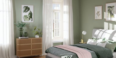
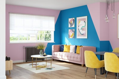
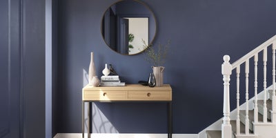
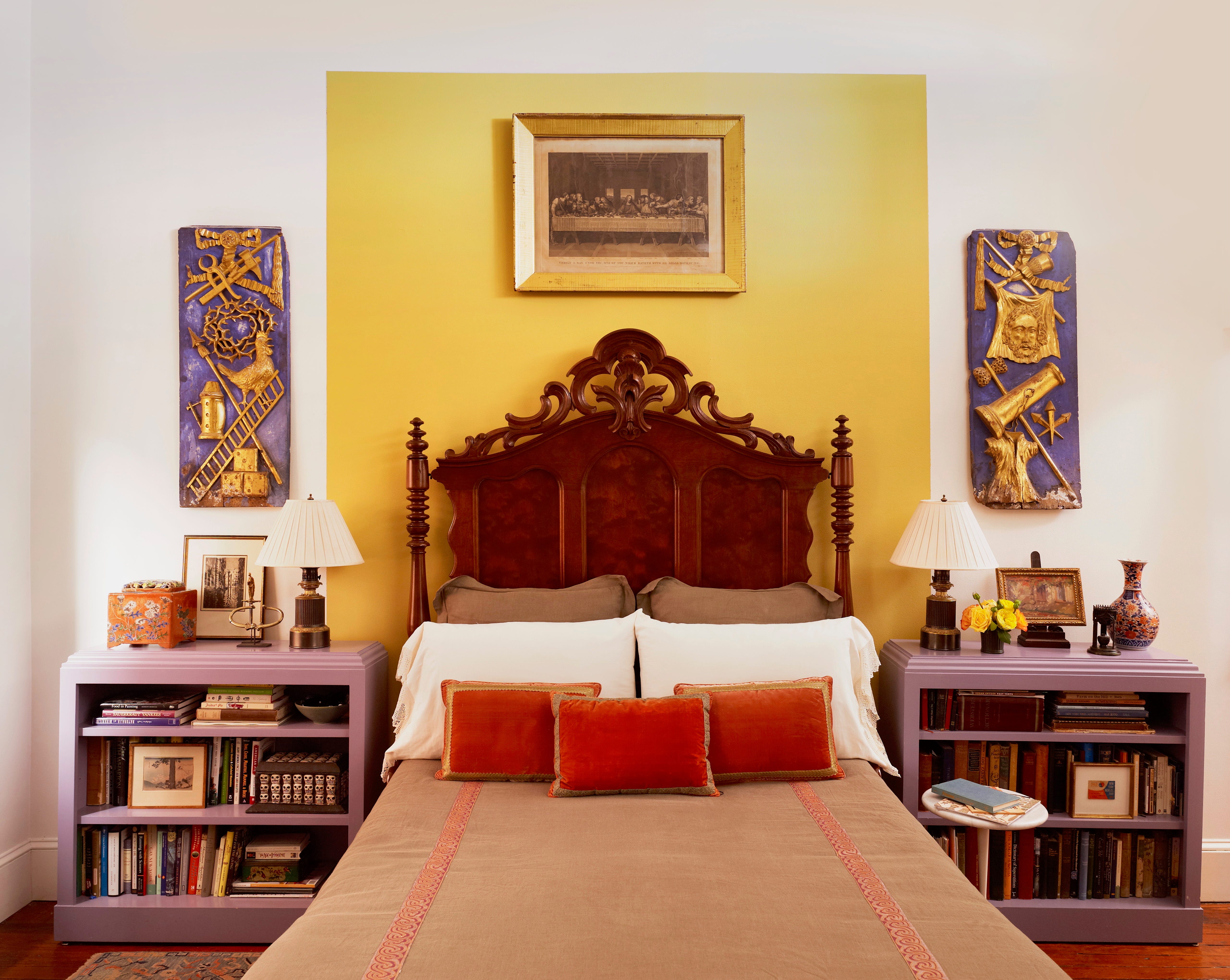
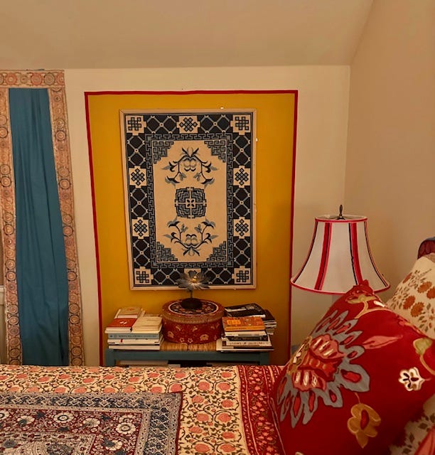
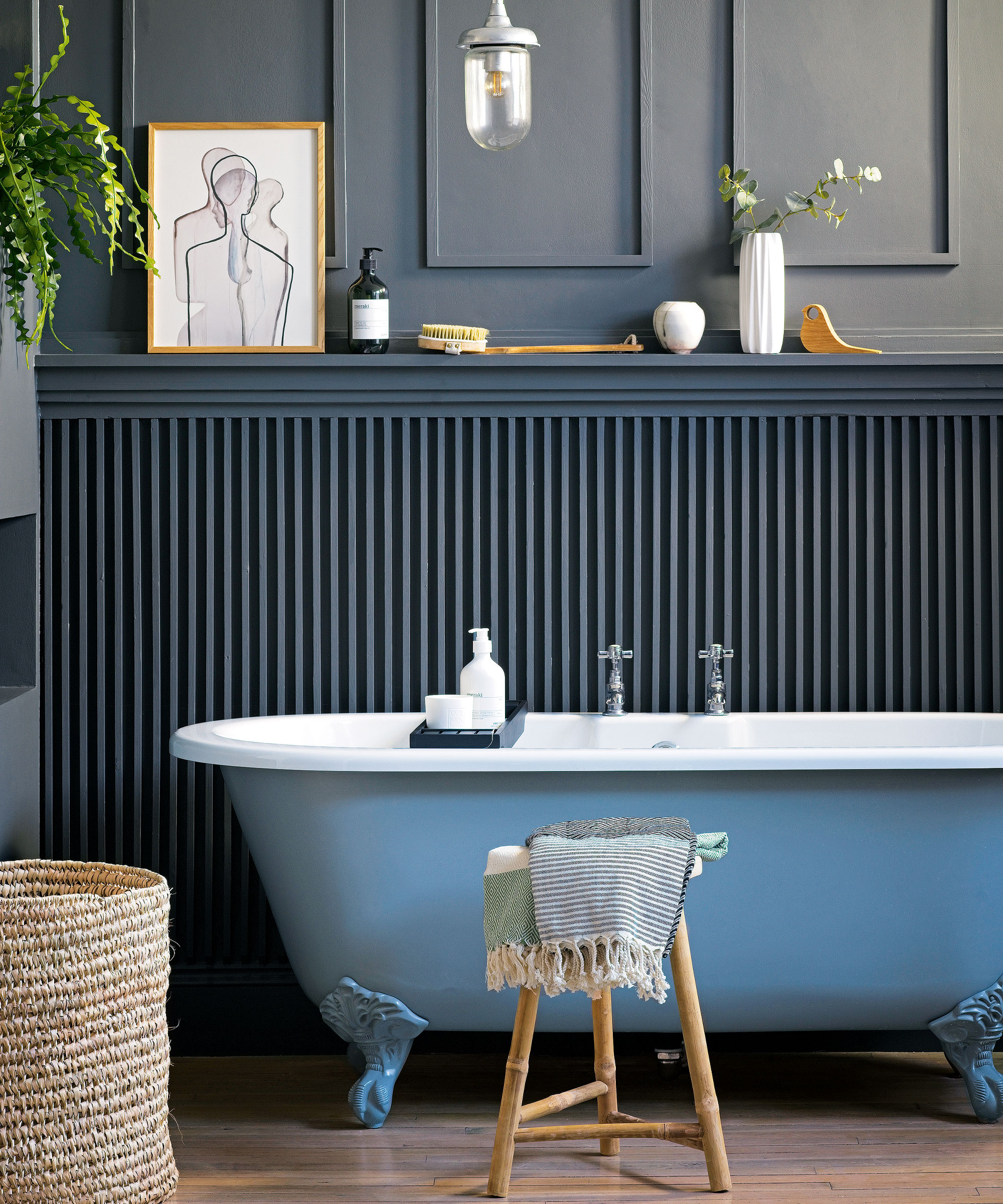
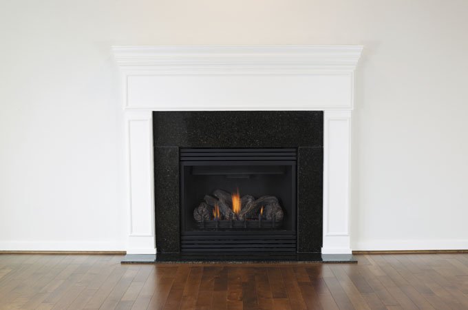
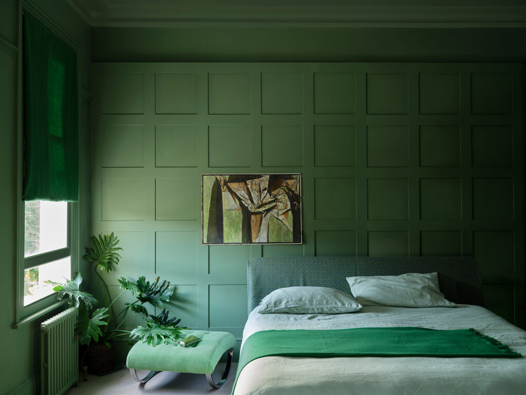
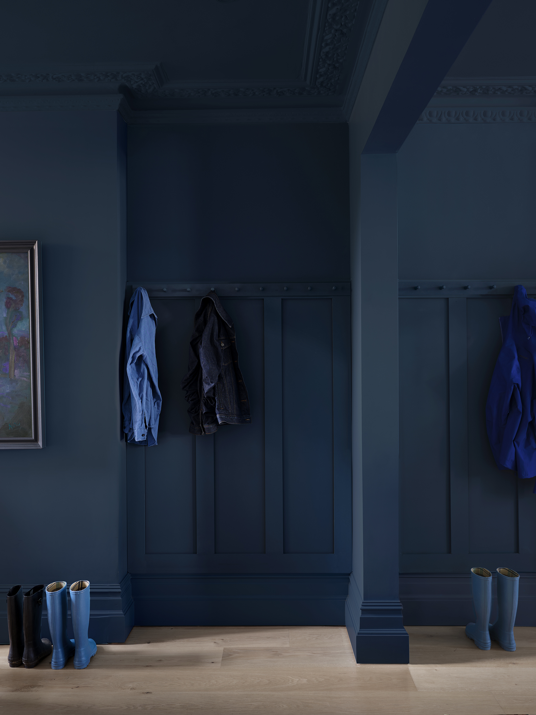
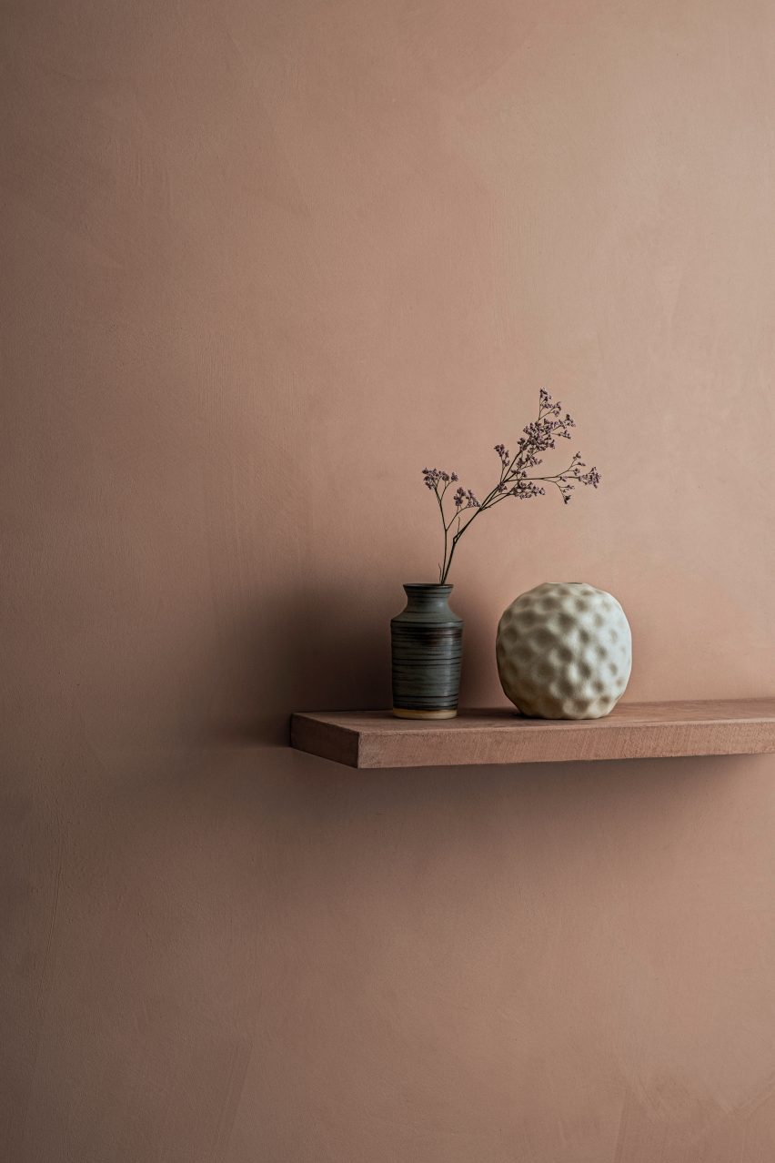
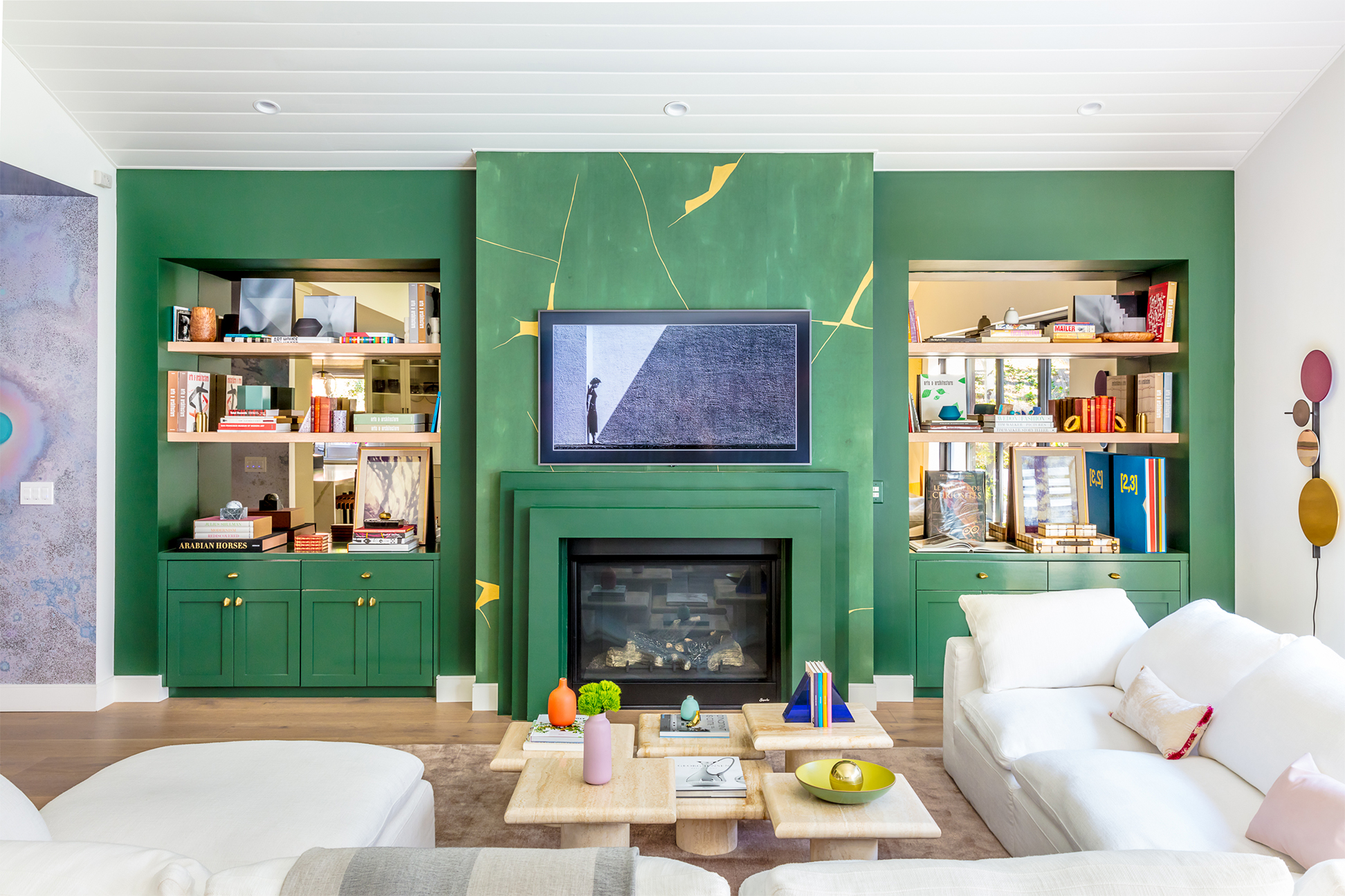
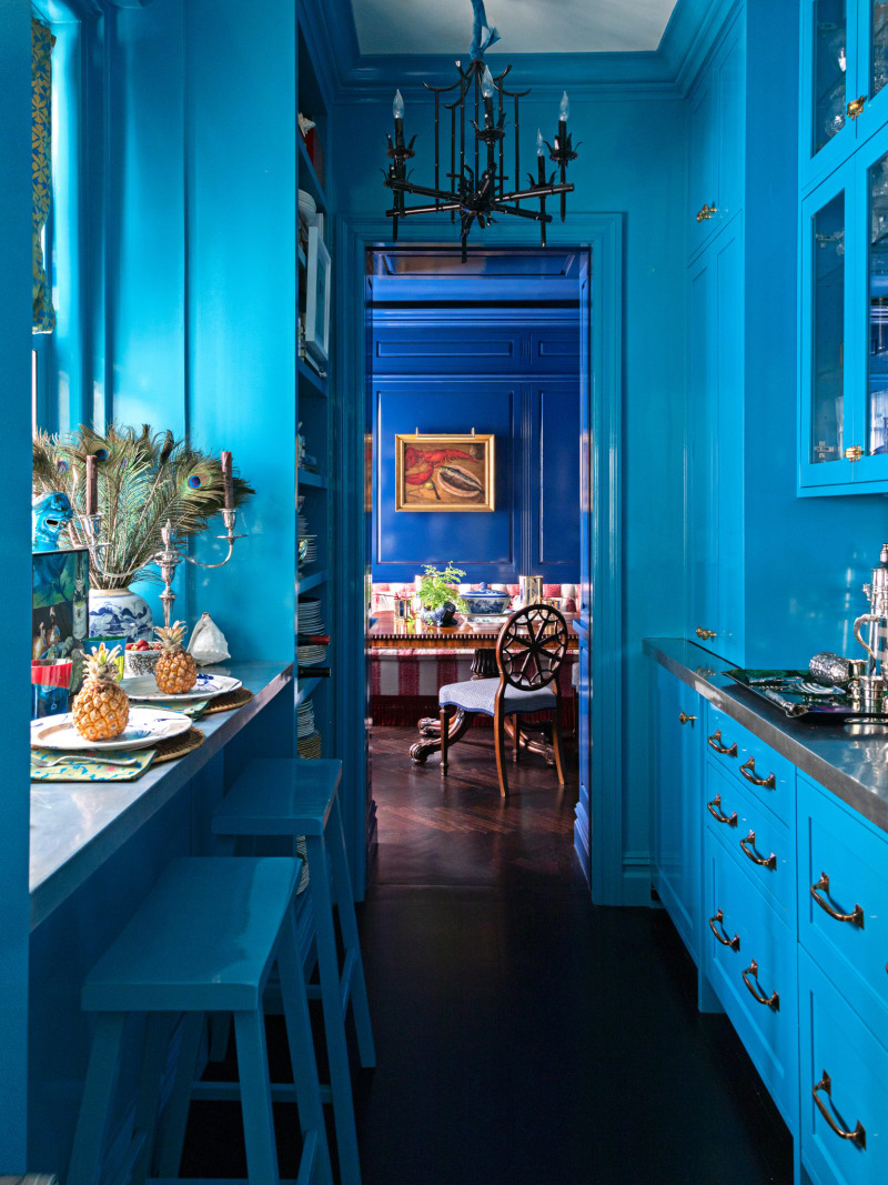
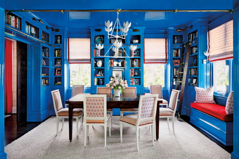
Beyond just the color of the year, other palettes are gaining traction. For example, Wadden observes a resurgence of rich jewel tones, particularly in kitchens. Homeowners are moving away from stained cabinets and embracing painted cabinetry, with navy blues being a popular choice, alongside a growing interest in green and charcoal. White, though still a staple, is seeing competition from these more expressive colors. Similarly, citrus accents and warmer shades like pinks, oranges, and yellows are replacing the more natural, earthy tones and primary colors of the early 2000s, especially for accent walls and surrounding elements like fireplaces. These changes reflect a broader trend towards creating spaces that feel more personalized and emotionally resonant, encouraging a sense of inward focus and peaceful living.
#HomeDesign #PaintTrends #InteriorDesign #ColorMarketing #SherwinWilliams #NeutralColors #HomeRenovation #ColorPsychology #DecorTrends #HomeDesign #PaintTrends #InteriorDesign #ColorMarketing #SherwinWilliams #NeutralColors #HomeRenovation #ColorPsychology #DecorTrends
0 comment in total
 No comments yet
You may also like
How to fix peeling paint in 4 steps – and reasons why your paint is crumbling

How a Coat of Paint Can Change Everything

12 top interior painting tips from experts – for a flawless, fabulous finish
How to strip paint from wood safely

Gallery: Splish splash, clean design takes a bath
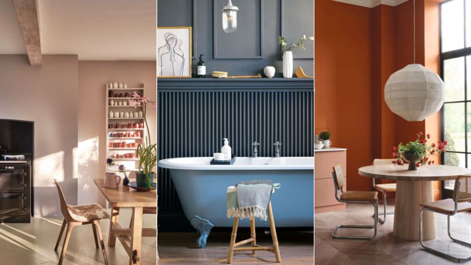
How to prolong the life of your paint job, according to painters and decorators
Paint Maintenance and Touch-Up Tips
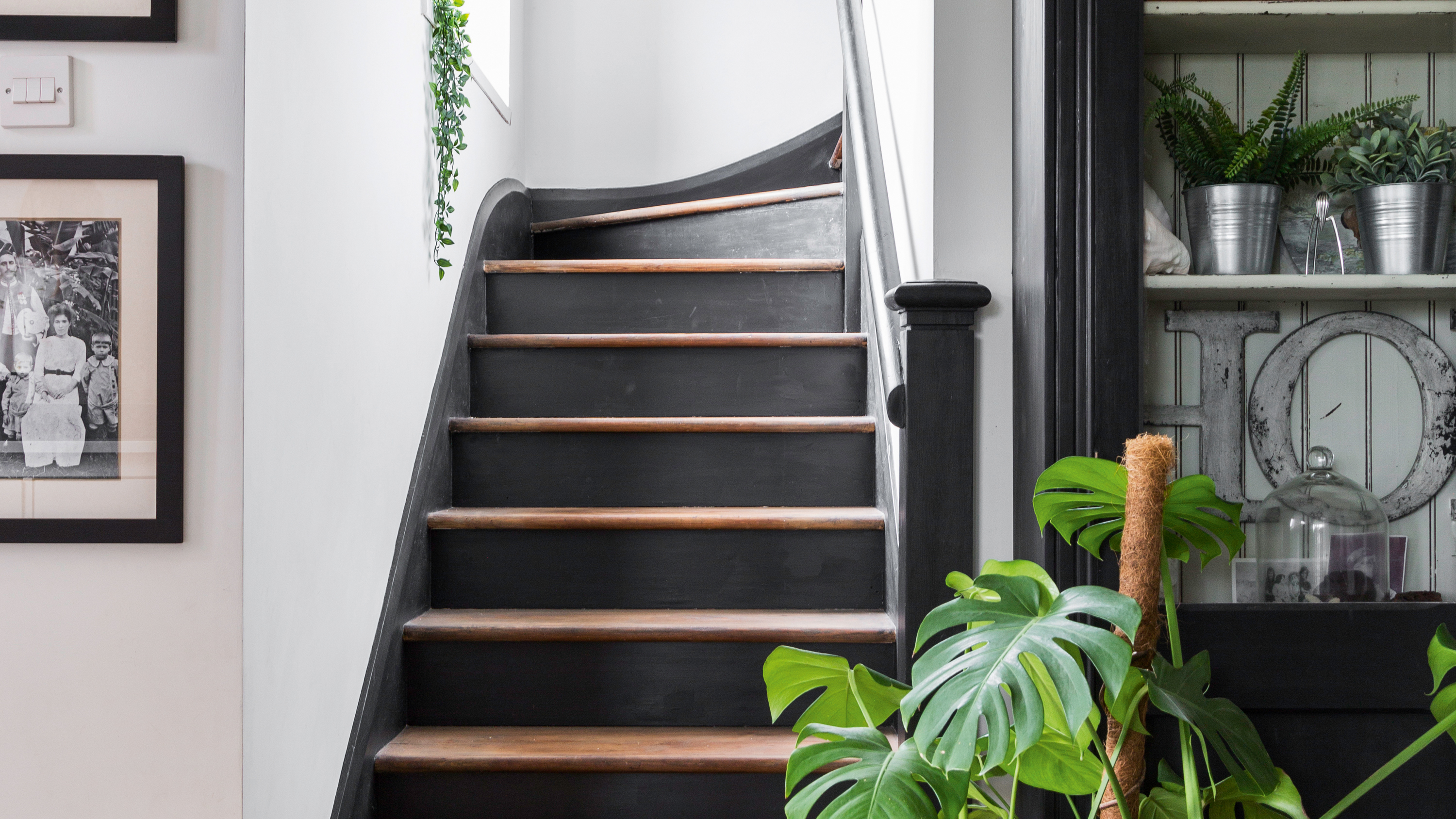
Before and after: a lick of paint makes a huge difference to this hallway makeover

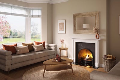
Decorating with paint

Try These Dirt-Hiding Paint Colors in the Messiest Parts of Your House


Finishing Touches
This Once-Fussy Finish Is Getting a Reputation Revamp

The Right Paint Finish Can Actually Help Your Home Look Cleaner—Here's How
20 Essential Painting Tools for Your Next Project, According to Painting Pros

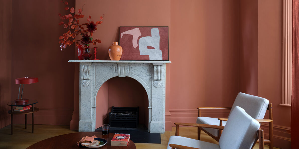
This Game-Changing New Paint Finish Should Only Be Used If You Want to Drench Your Space in Color (and You Absolutely Should)

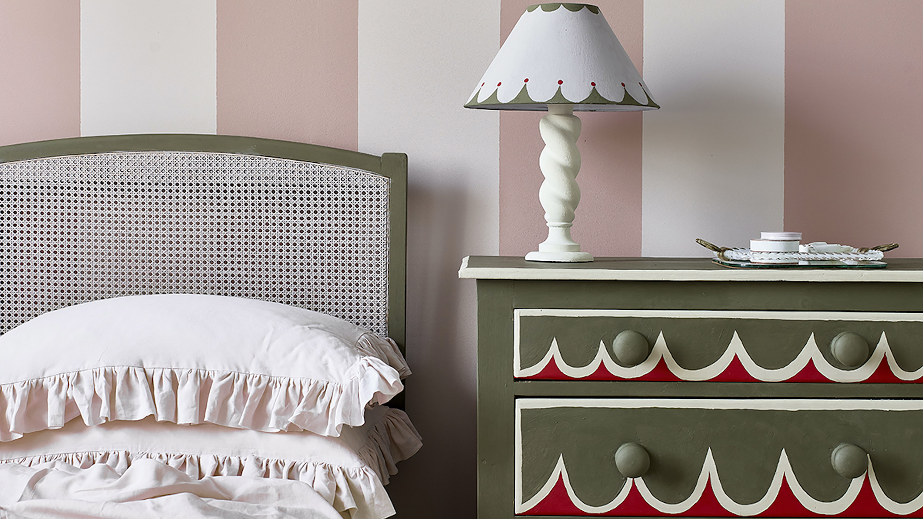
Best paint for furniture – 9 quick and easy paints for upcycling
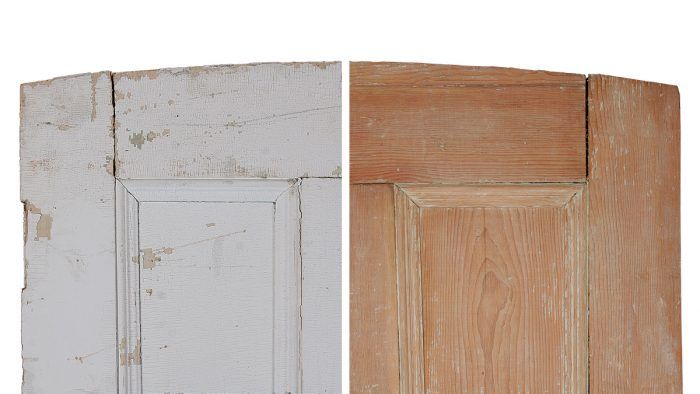
Torture Test: Paint Strippers

35 Cleaning Products To Keep Your Home And Car Looking Fresh All Fall Long
Armourcoat launches Limewash paints for "environmentally conscious" interiors
Transform Plain Concrete Floors with Just a Stencil and Paint