1/14
Benjamin Moore's Trendiest Paint Colors (& Which Ones To Avoid)
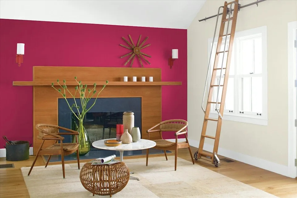
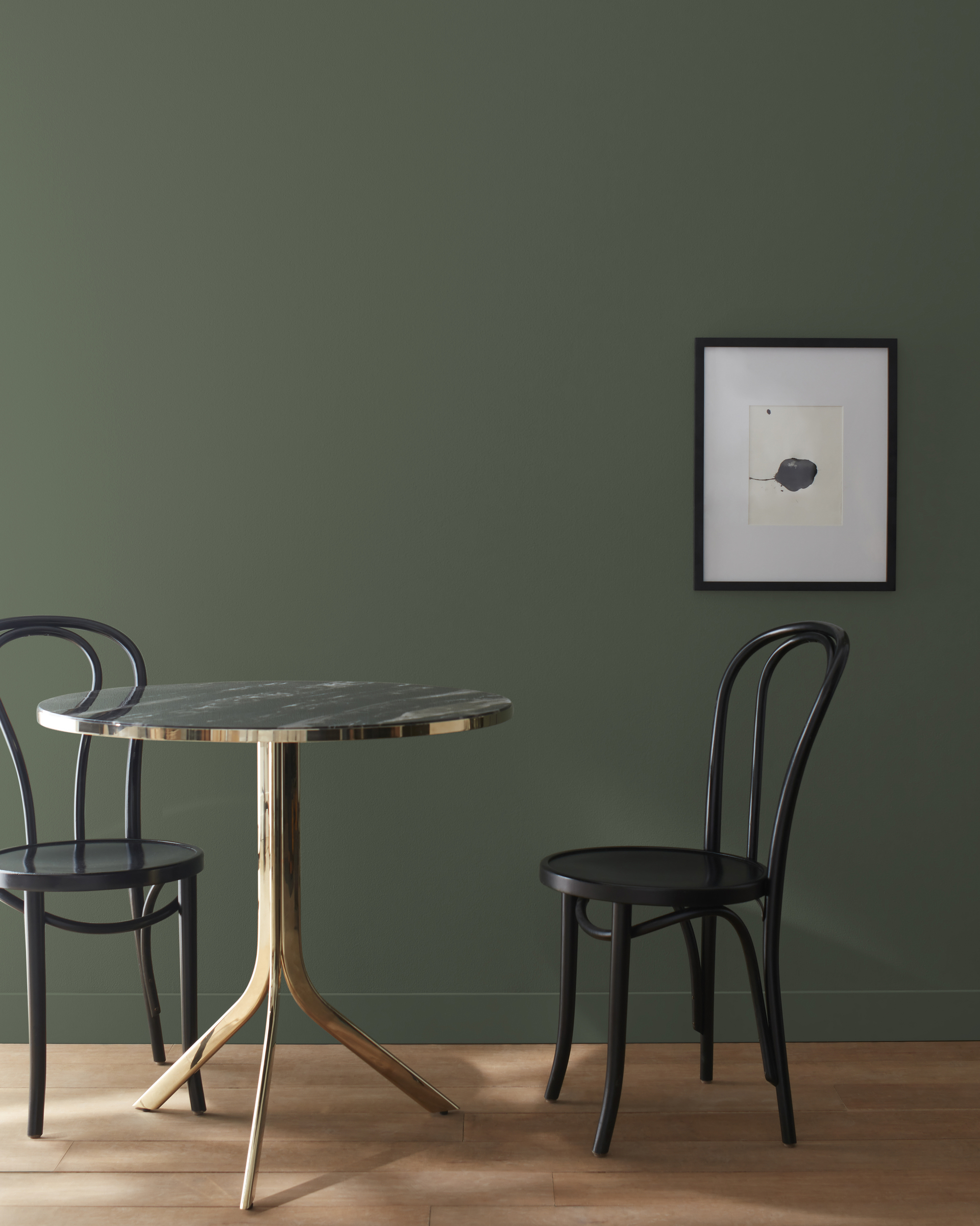
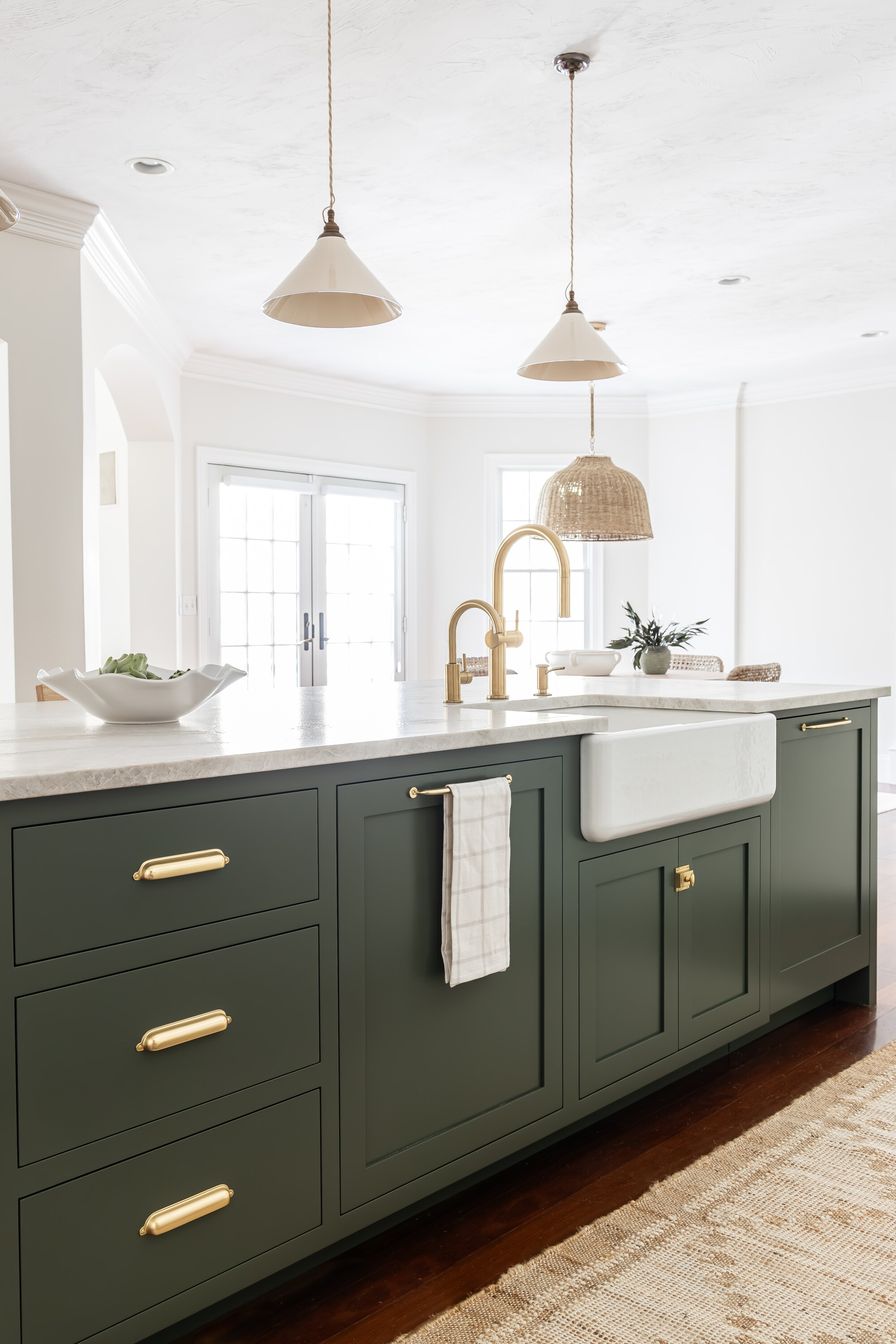
Benjamin Moore has been a premier source for interior and exterior paint since 1883, renowned for its extensive color range and high-quality products. Each year, the company introduces new color trends that significantly influence interior design. Paint is an accessible way to refresh and modernize a home, offering options from subtle hues to bold statement shades. This article, based on exclusive consultations with design professionals Kimberley Pontbriand of Blanc Marine Intérieurs and Beril Yilmaz of By Design and Viz, highlights Benjamin Moore's top trending paint colors and provides advice on how to integrate them effectively, as well as which shades to avoid.
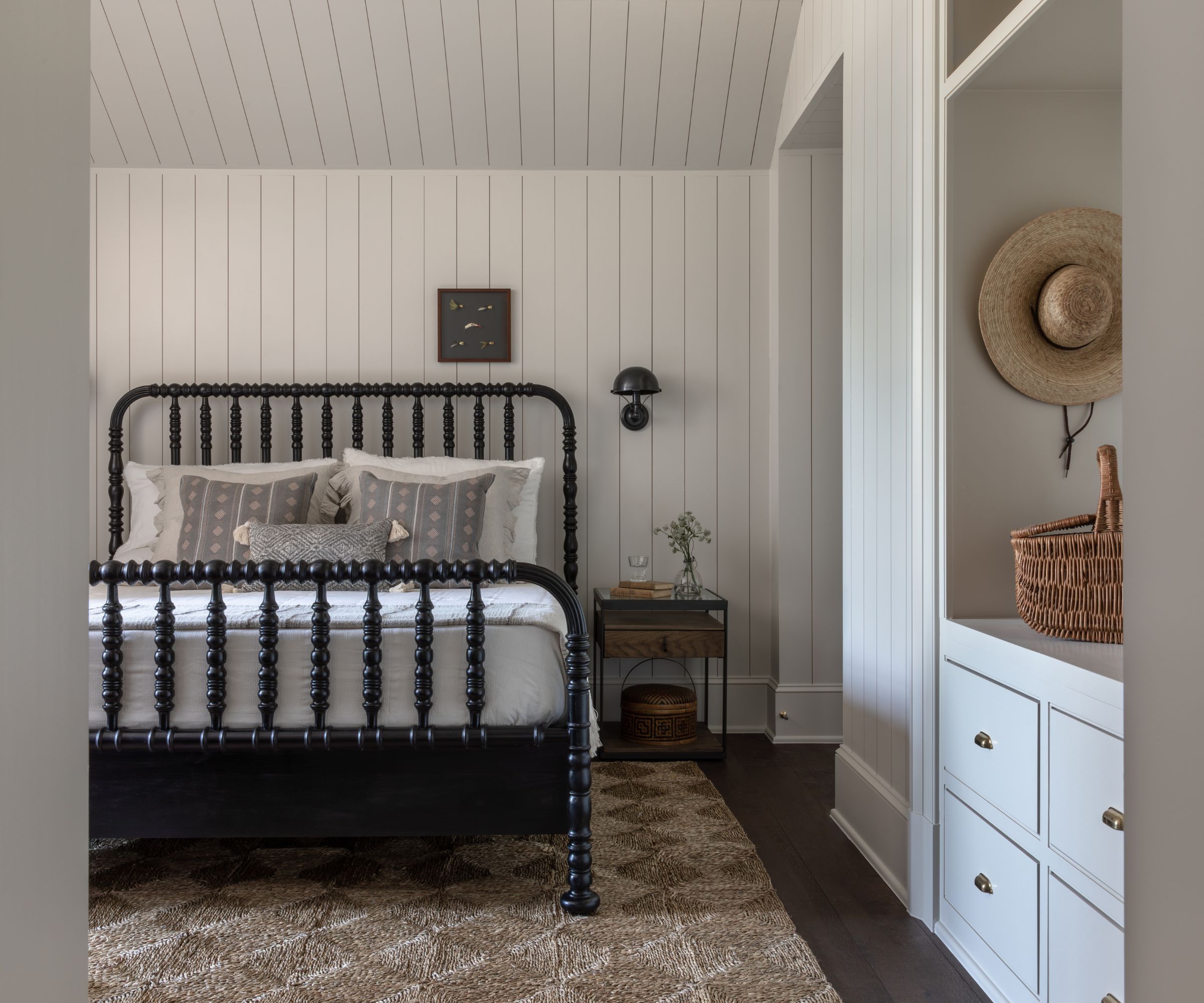
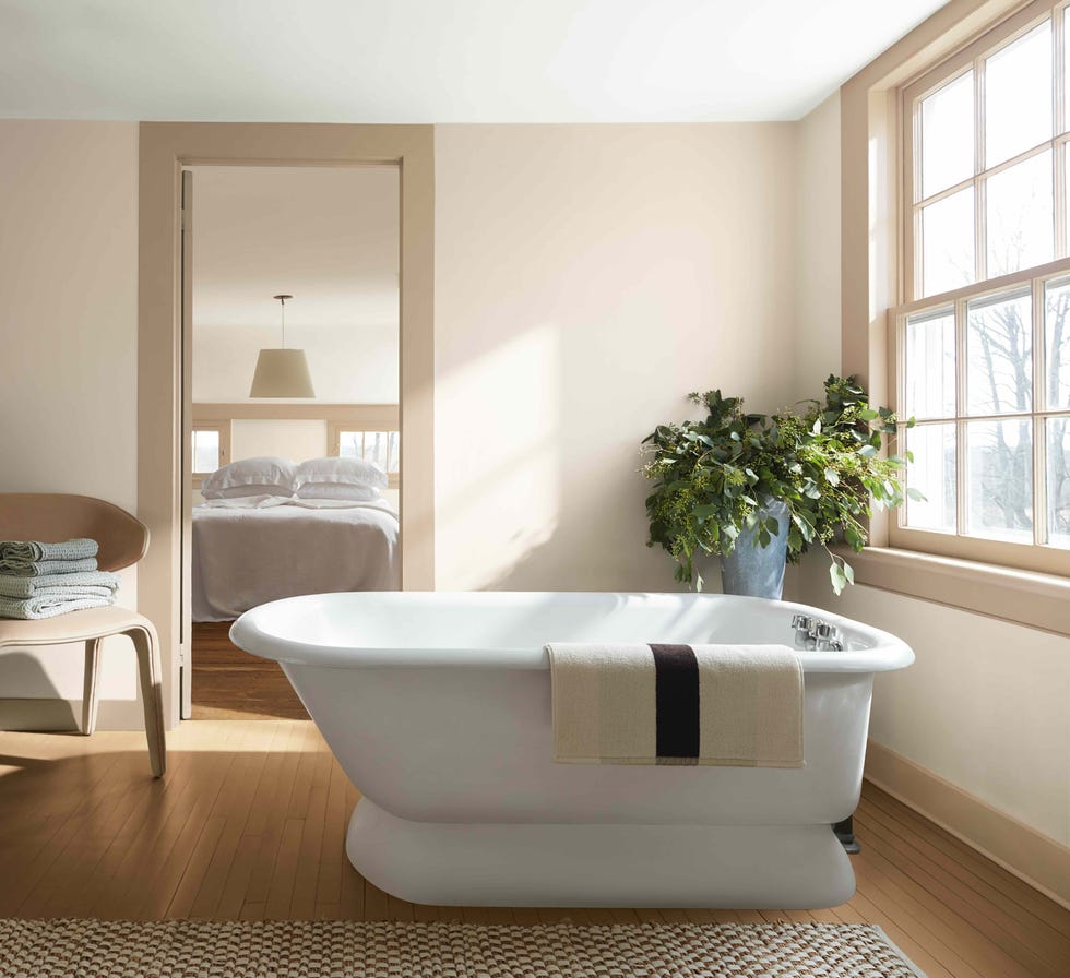
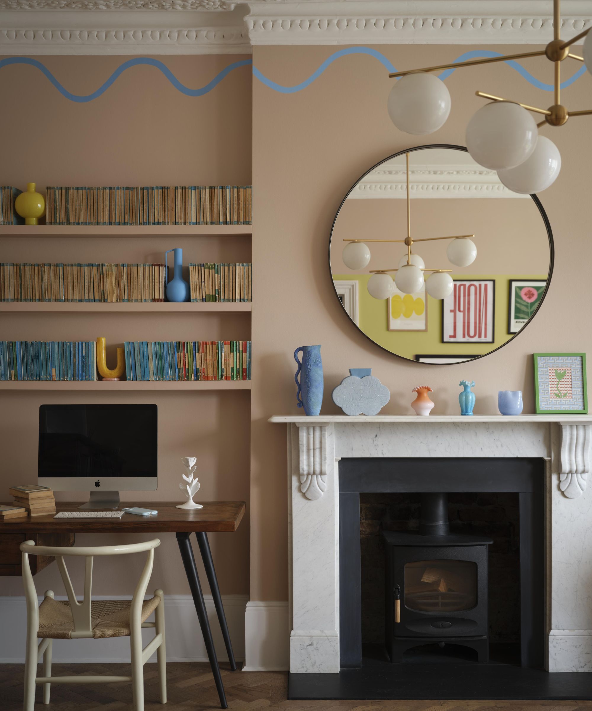
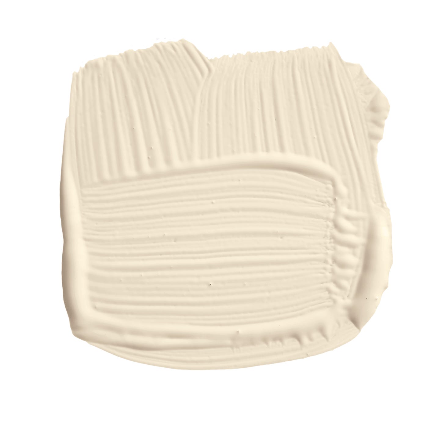
Maritime White is presented as a sophisticated, warm neutral, praised by Pontbriand for its ability to add warmth without overwhelming a space, creating a cozy yet refined atmosphere. Its versatility allows it to complement natural materials, soft textures, and various lighting conditions, making it a foundational color for curated and inviting spaces. Benjamin Moore describes it as an "off-white with muted beige tones," suitable for introducing color to walls without being too bold. Its compatibility with both warm and cool shades, such as Broken Arrow, underscores its adaptability.
Revere Pewter is identified as a balanced greige that bridges warm and cool neutral tones, offering timeless elegance. Pontbriand notes its ability to work in both contemporary and classic interiors, making it ideal for transitional spaces where warm and cool elements coexist. Michelle from The Color Concierge also endorses Revere Pewter, highlighting its earthier, deeper effect compared to Sherwin Williams' Agreeable Gray, due to its green undertones.
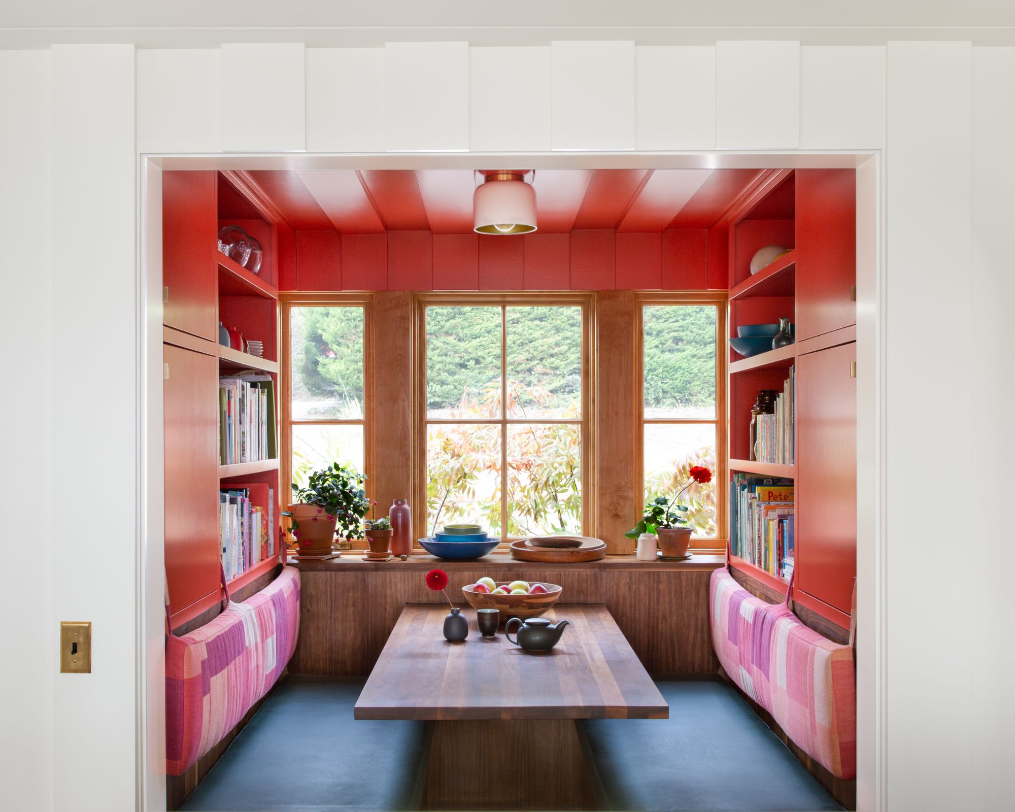
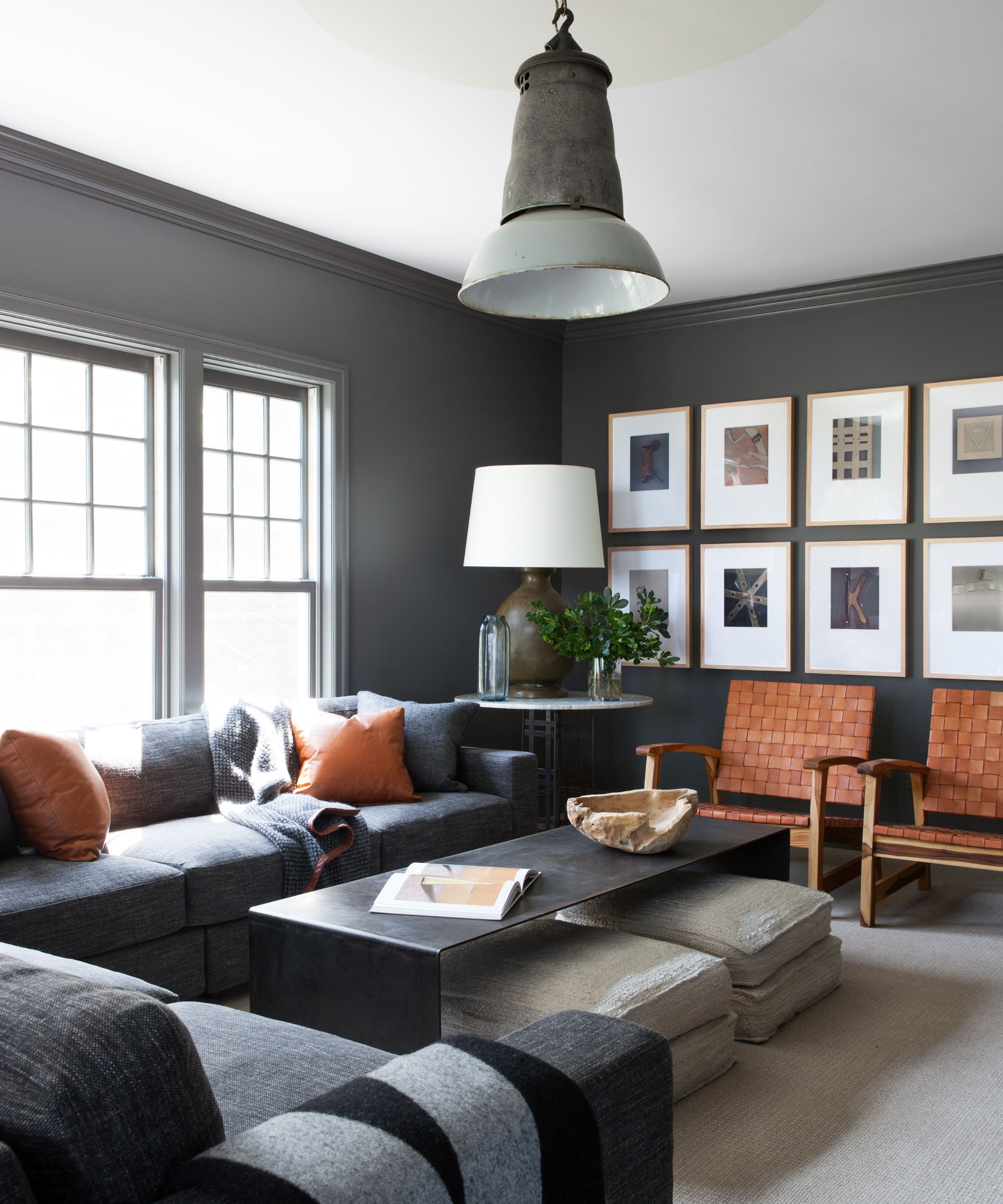
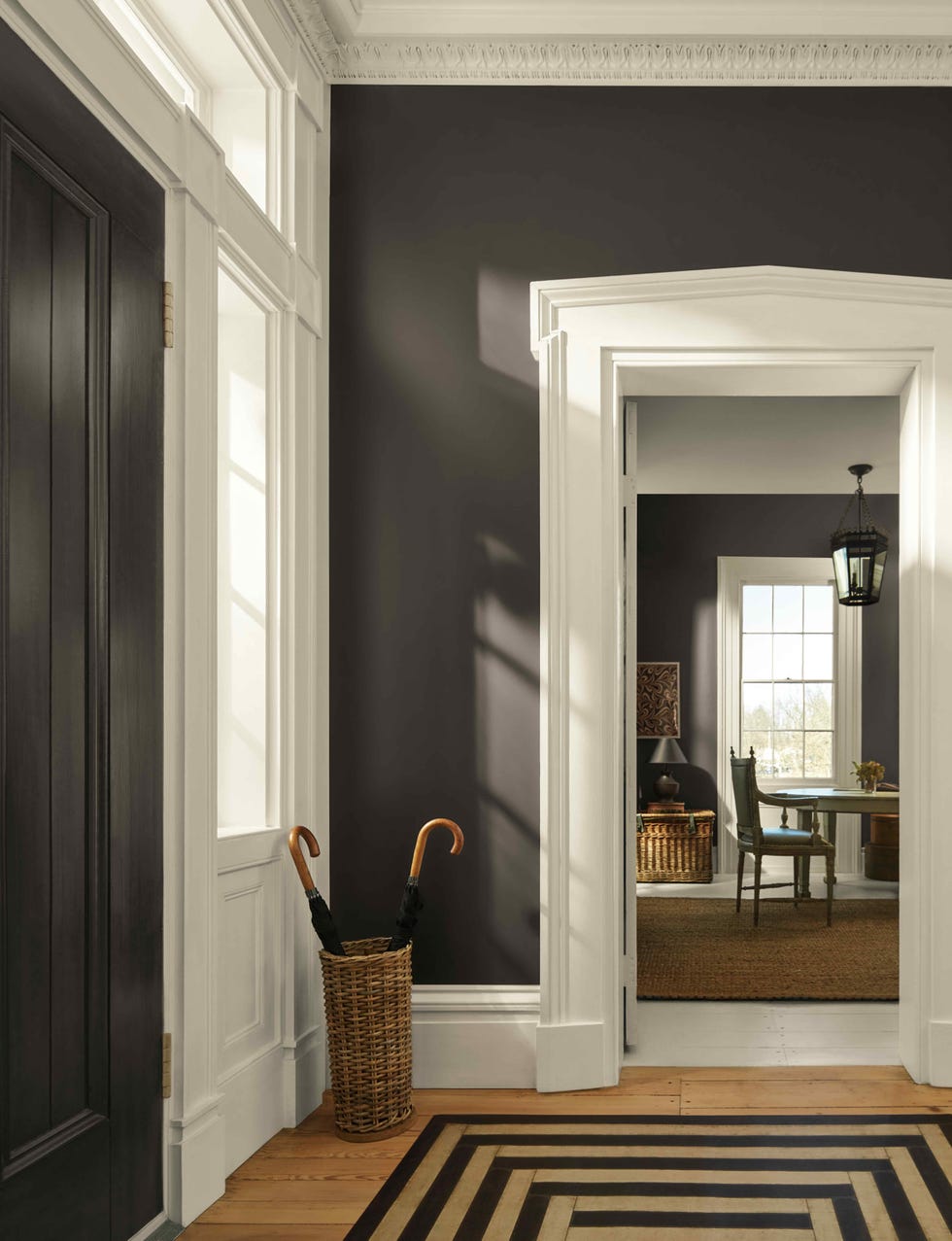
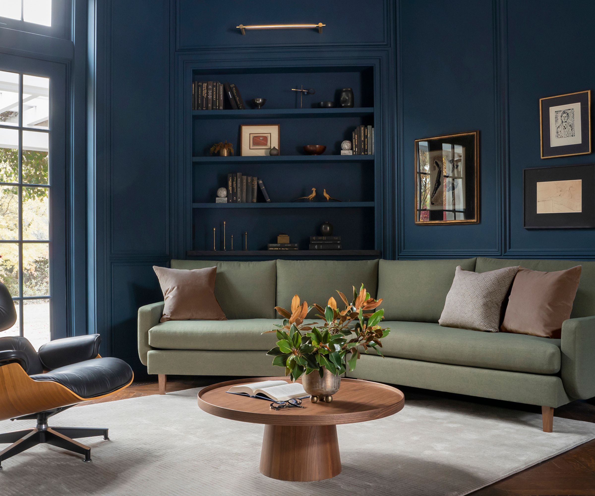
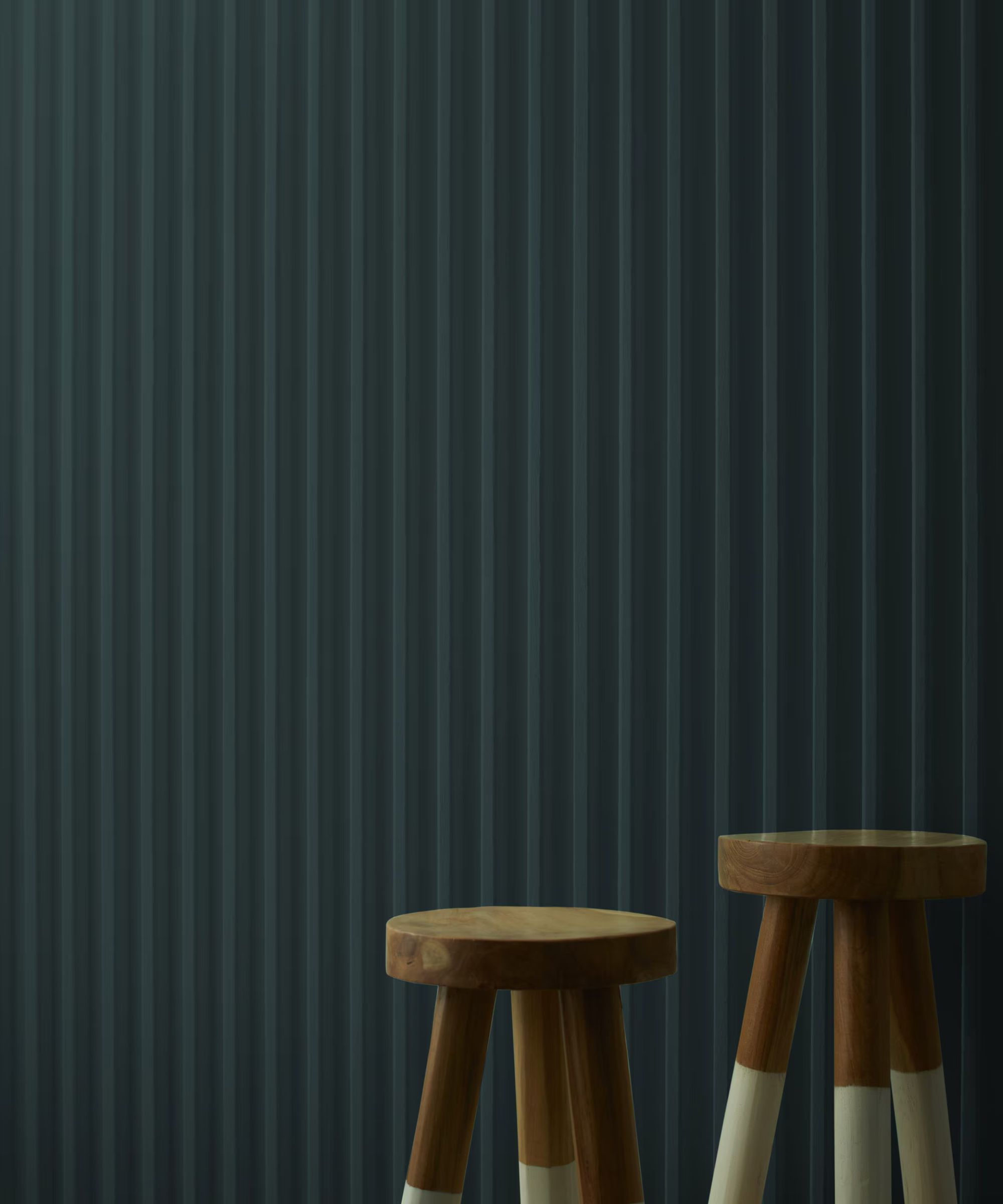
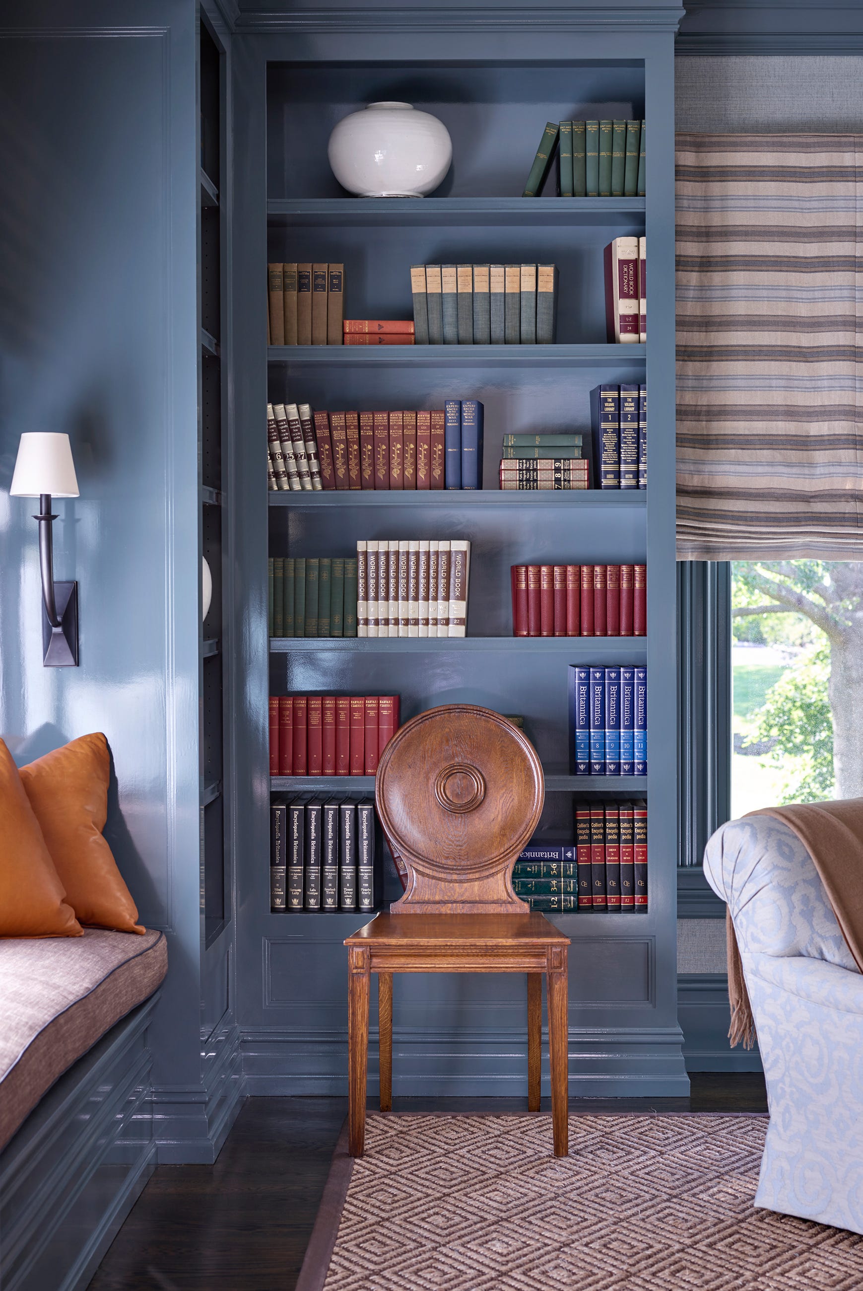
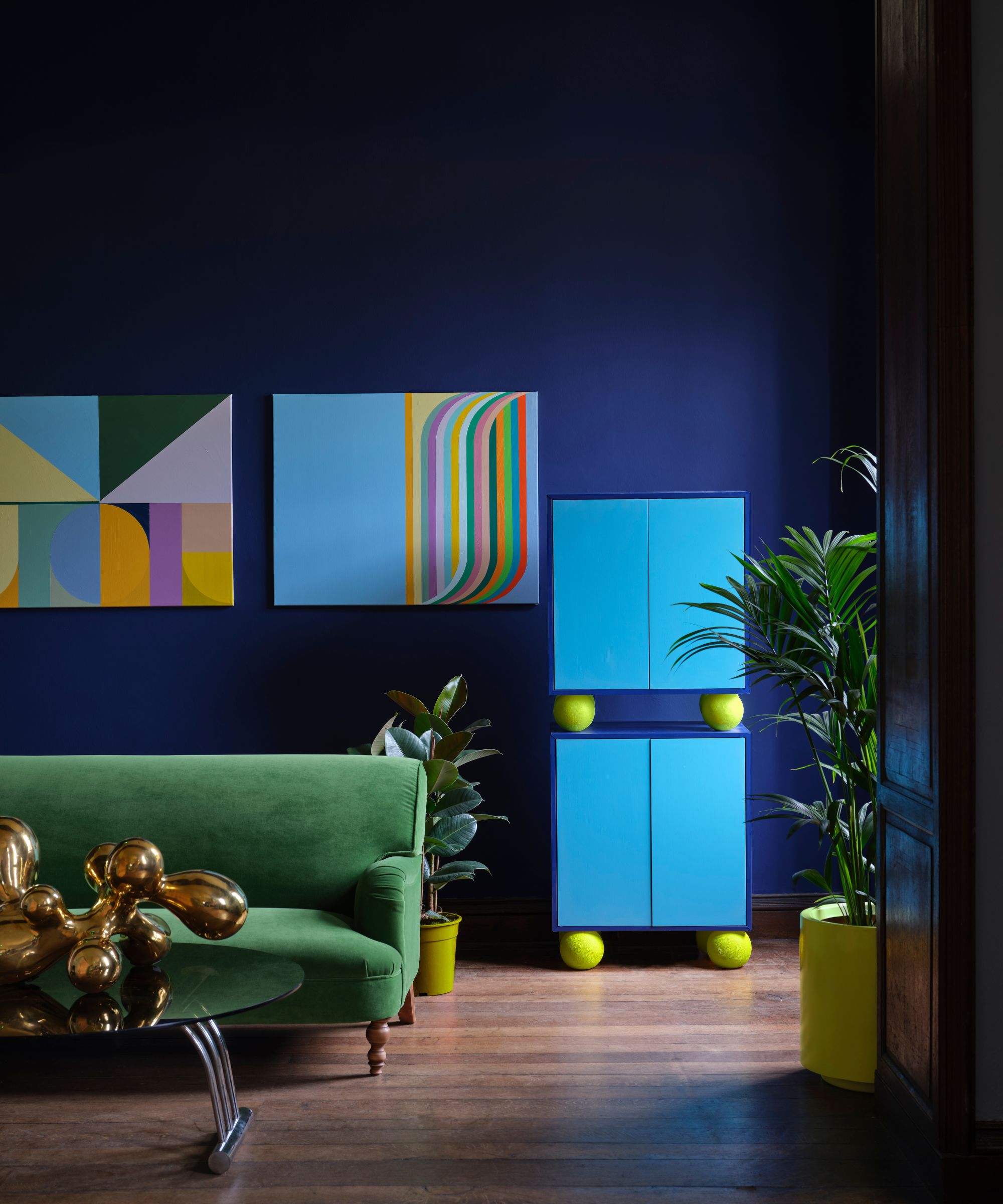
Raccoon Fur, a soft black, is recommended for those seeking a daring yet accessible shade. Pontbriand characterizes it as a "bold near-black that exudes elegance and drama." While some debate the use of black for entire walls, Raccoon Fur's touch of inky blue softens its appearance, making it highly contemporary. It pairs well with light neutrals like White Dove and Silken Pine, and can even be used for exteriors, aligning with the trend of deep blue in home colors.
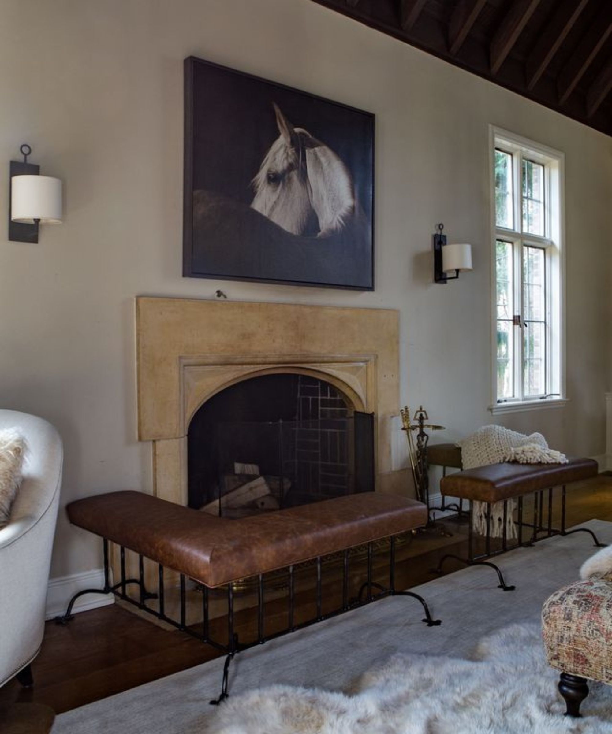
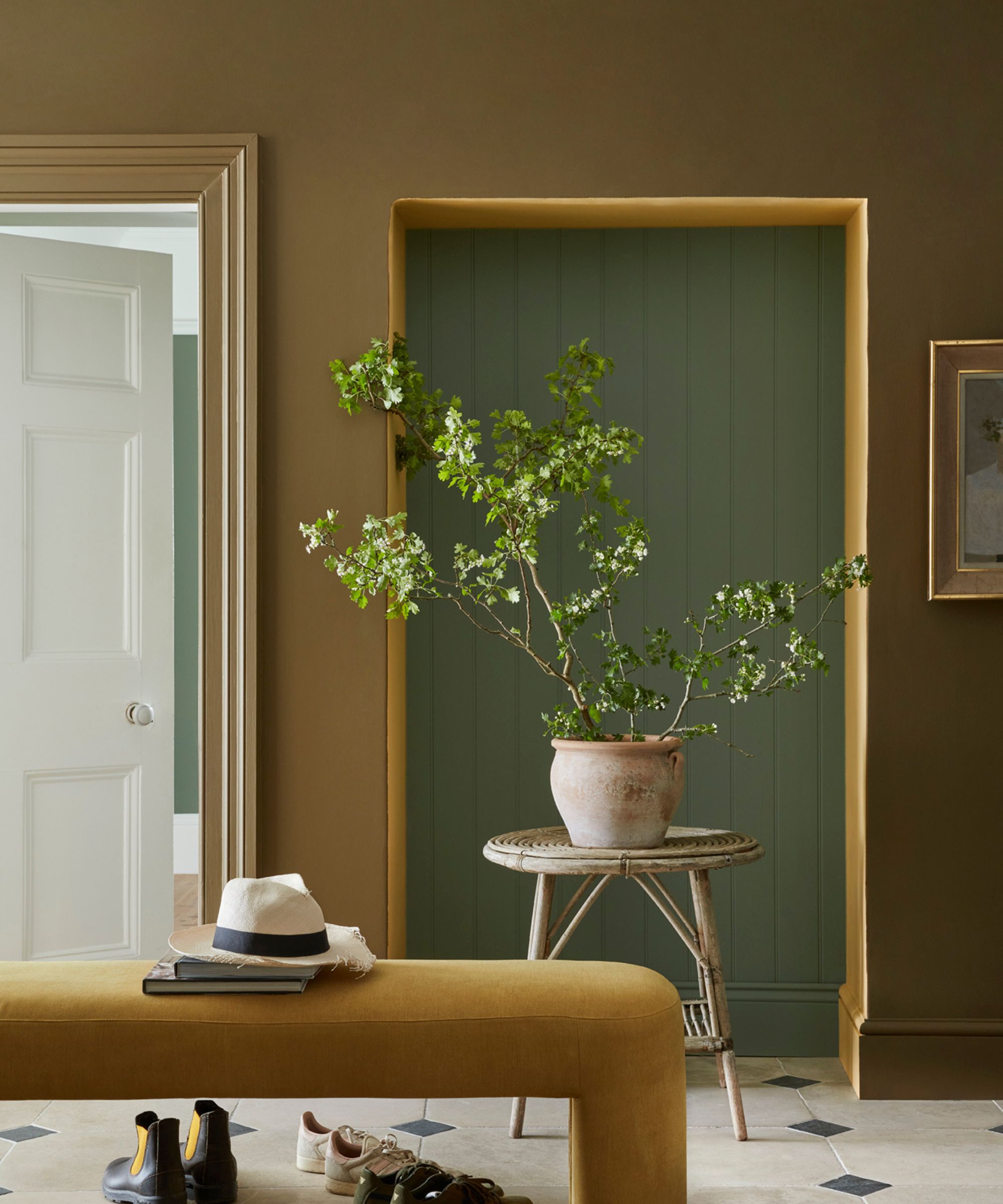
Gettysburgh Gold, a rich golden brown, reflects the 1970s design influence, particularly the resurgence of brown and yellow tones. Pontbriand describes it as a "muted golden hue, perfect for balance and contrast." Despite its trendy nature, Benjamin Moore labels it as "ancestral and opulent," indicating a classic, vintage quality that suits older homes seeking a modern yet respectful update. It is best paired with other warm neutrals for a cohesive look.
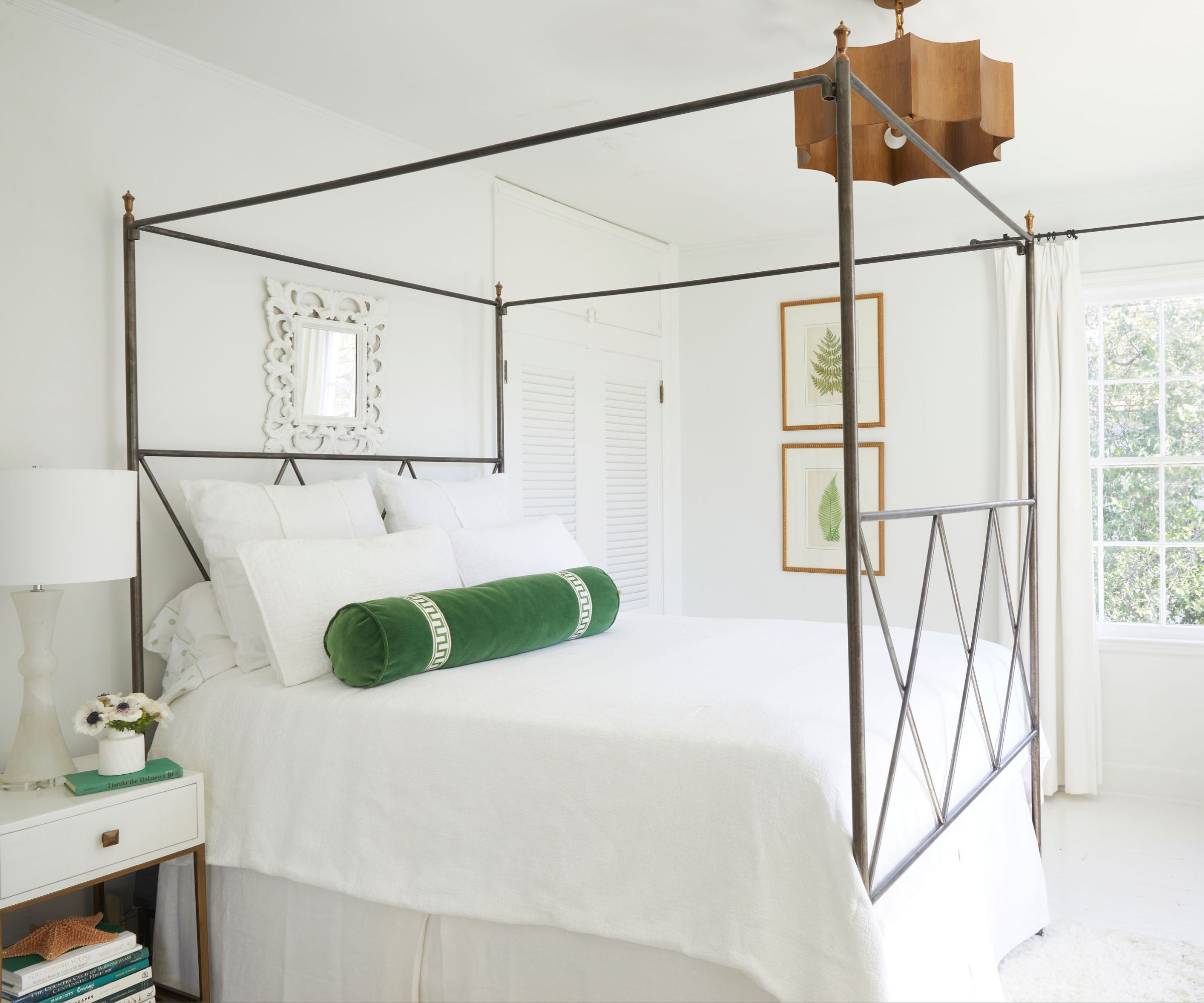
White Dove is championed by Yilmaz as a timeless and trendy warm white that suits any space, mirroring Pontbriand's preference for warm white hues. Benjamin Moore describes it as clean and classic, ideal for a neutral backdrop to bolder decor. It pairs effectively with contrasting shades like Kendall Charcoal and Country Redwood, the latter aligning with the current terra-cotta trend.
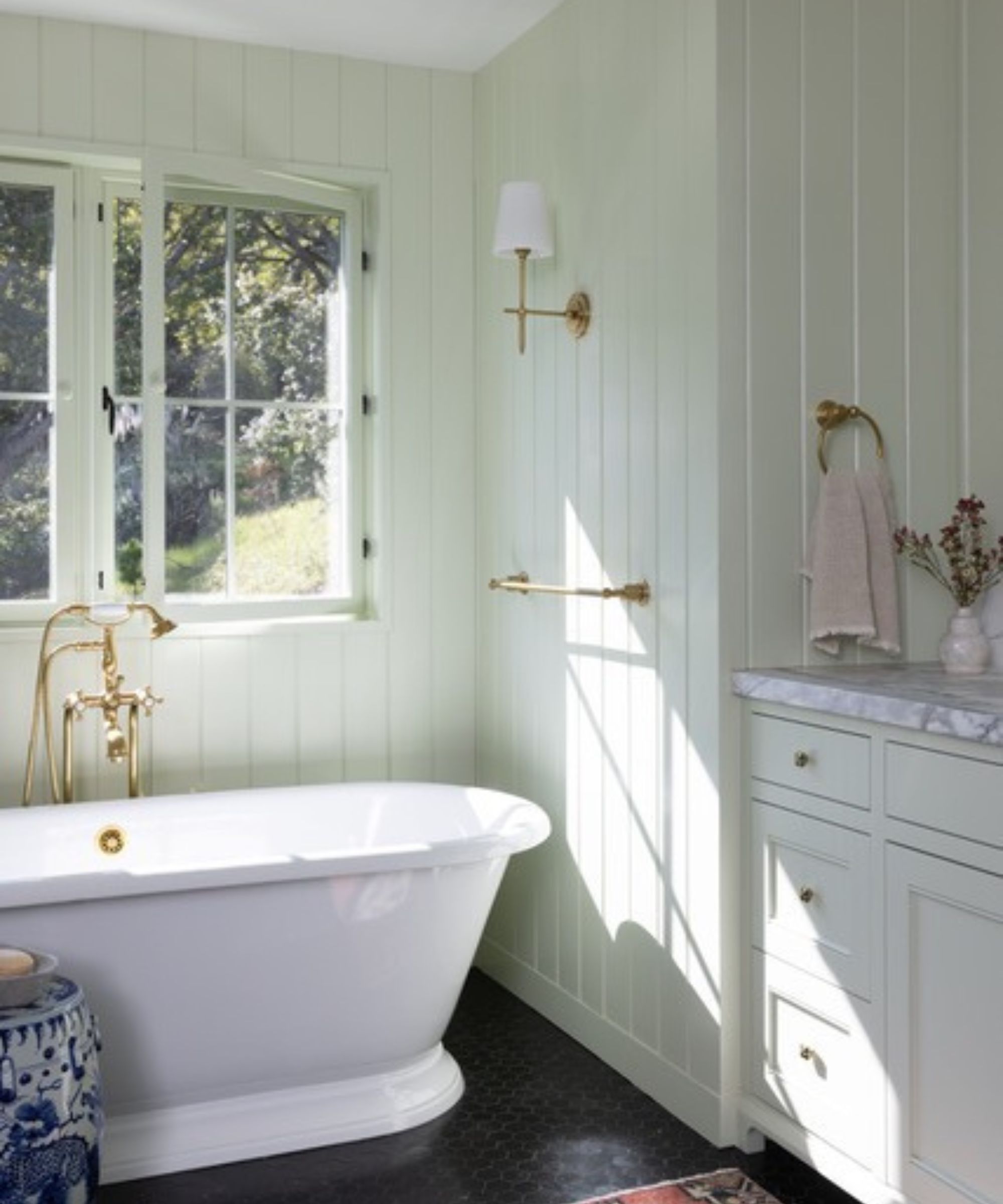
Chantilly Lace is another light neutral praised by Yilmaz as a "crisp, clean neutral that's fresh and modern." Inspired by natural textiles, it offers elegance and gentleness. Its slight blue undertone provides a modern coolness while maintaining a soft, welcoming feel, making it suitable for bathrooms and modern farmhouse aesthetics. It creates striking contrast with natural wood tones and brick.
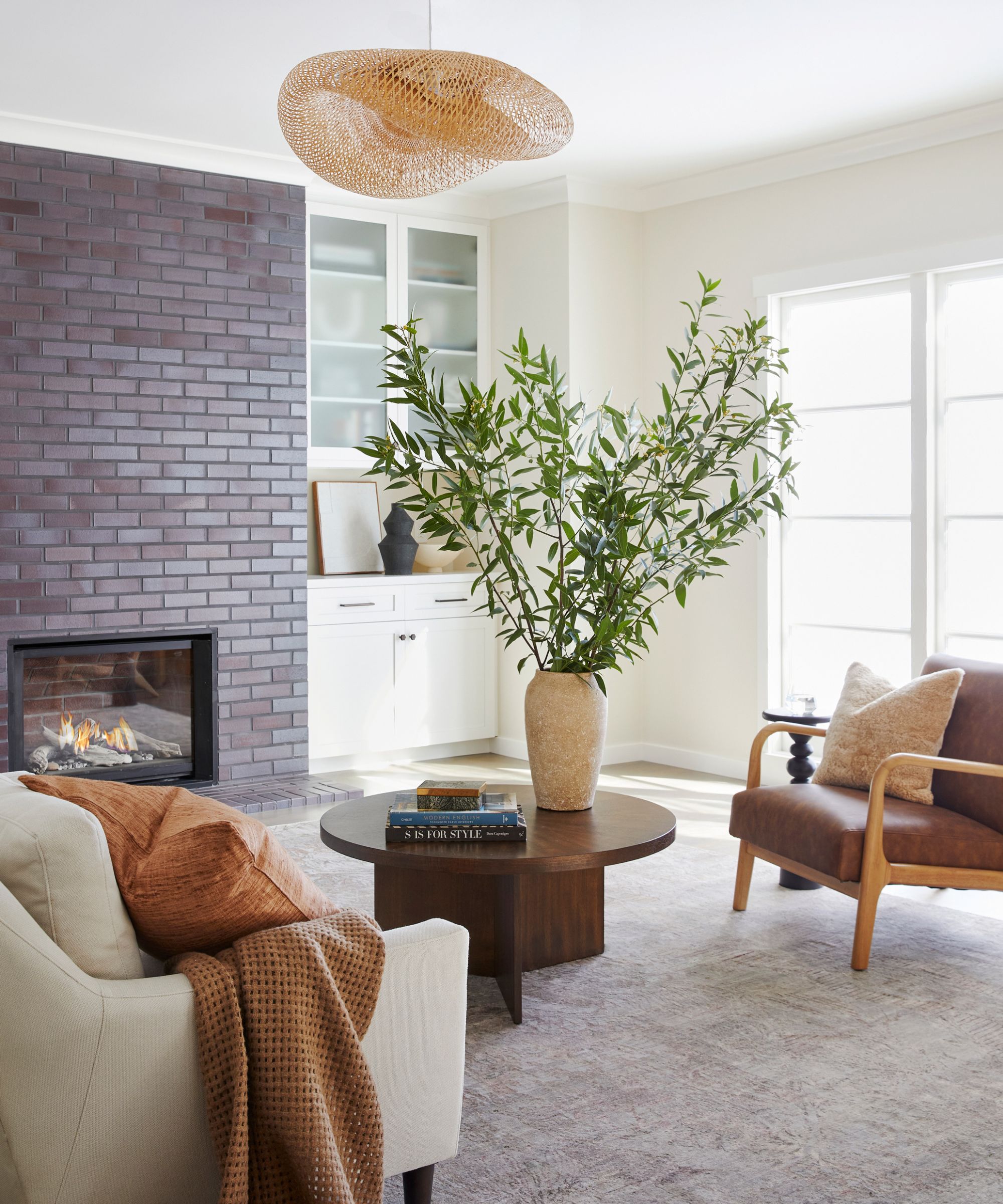
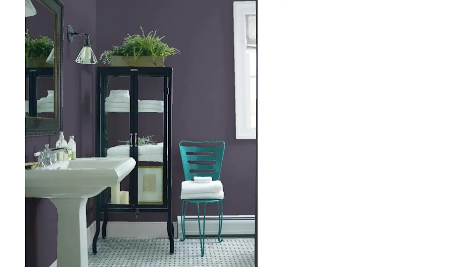
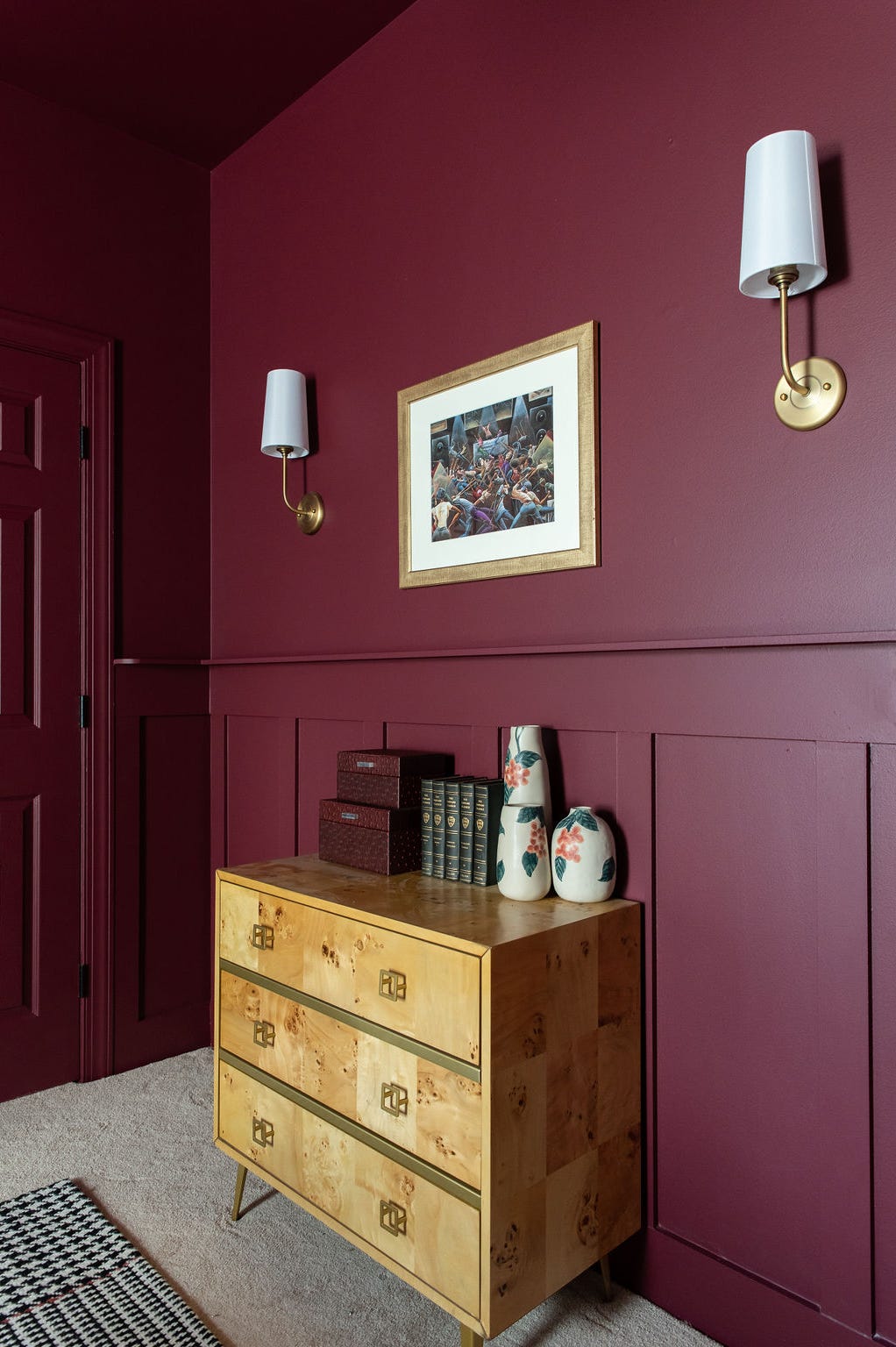
Cinnamon Slate, Benjamin Moore's 2025 Color of the Year, is a plum-brown blend that signifies a shift from cool, minimalist interiors to warm and inviting spaces. Yilmaz explains its popularity stems from homeowners seeking rich, deep tones. Its gentle purple undertones give it a modern twist, and it pairs well with soothing creams like Linen White or Maritime White.
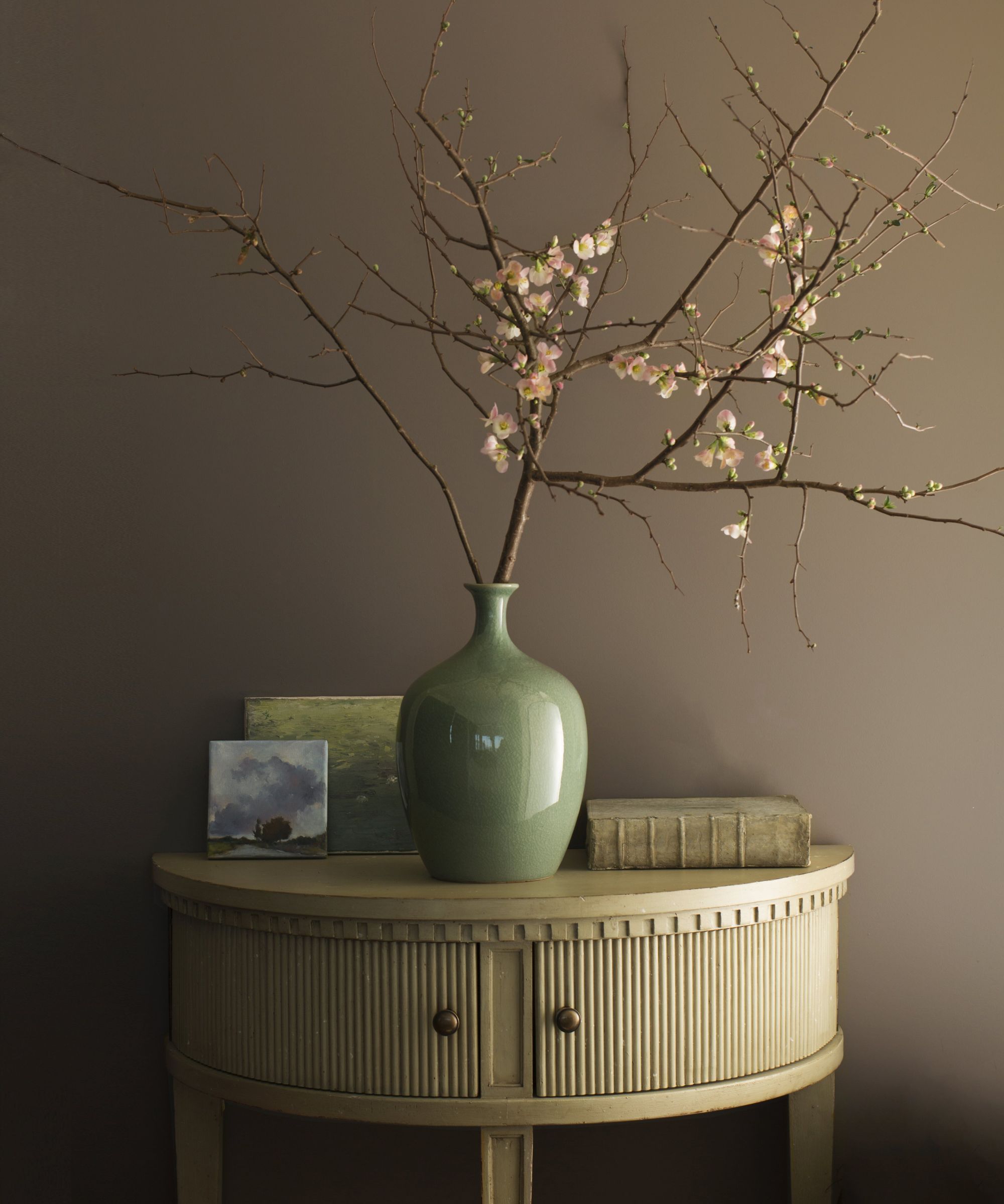
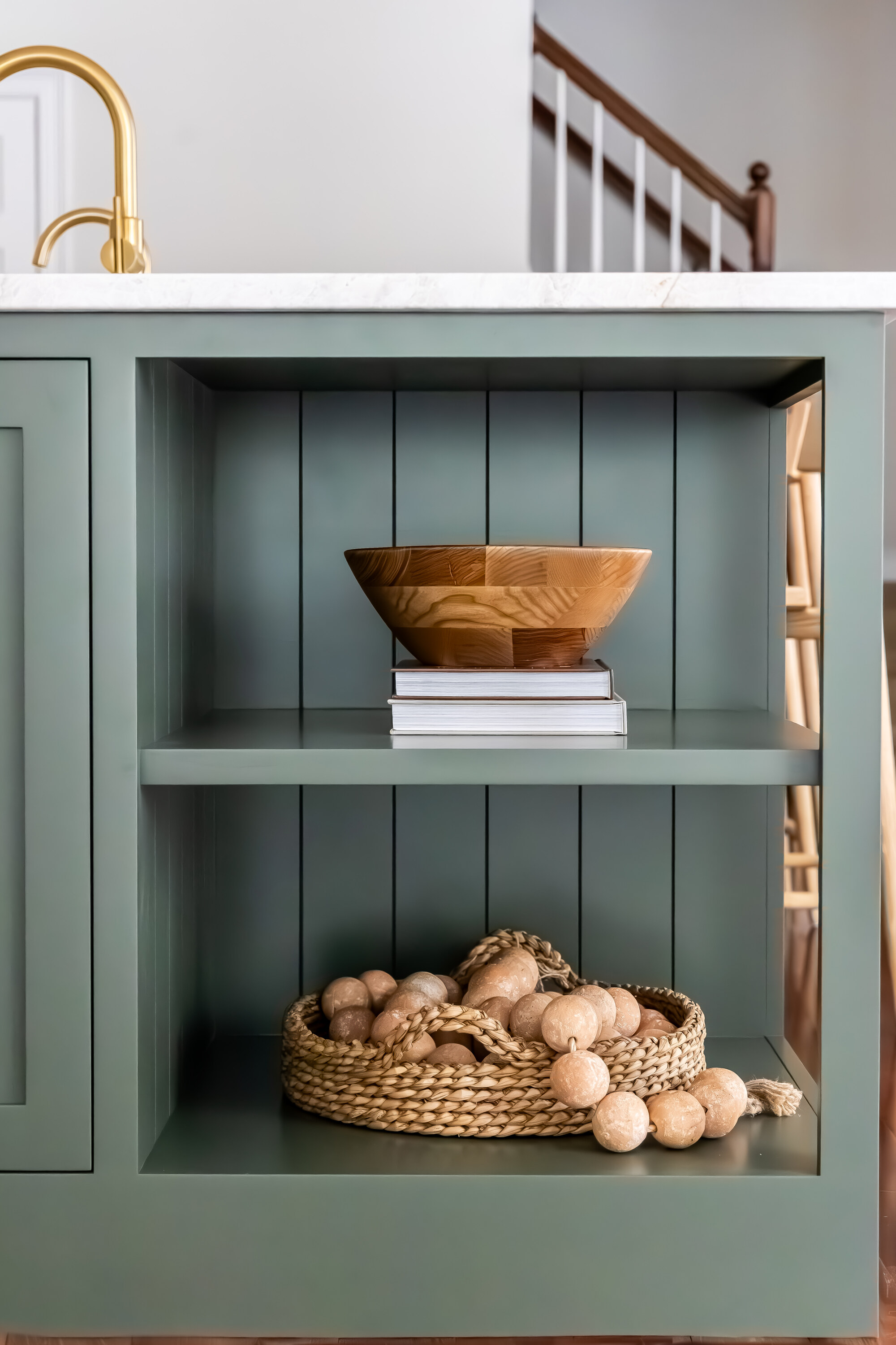
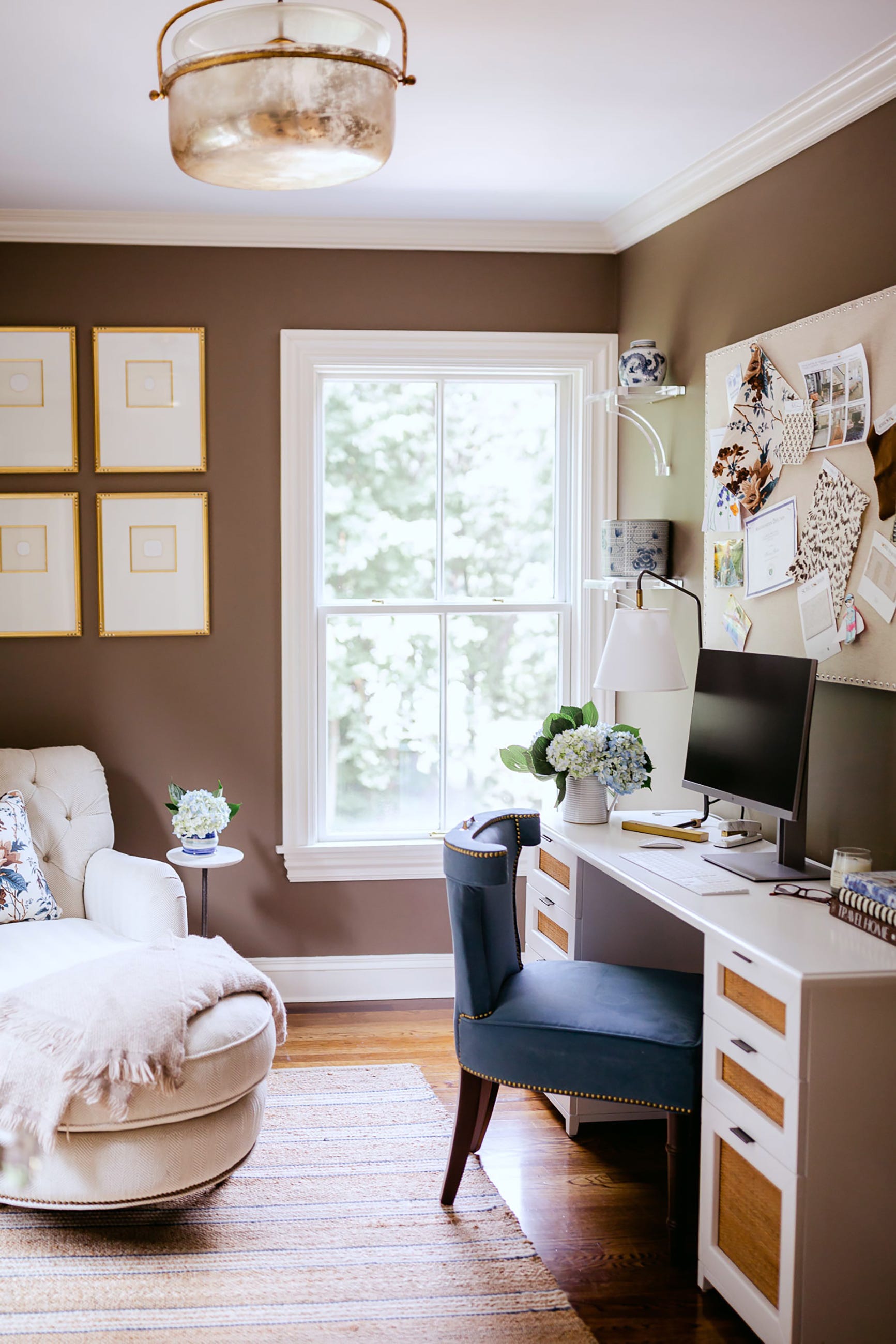
Balboa Mist is a warm taupe that excels in creating cozy spaces, differing from past grays. Yilmaz notes its perfect blend of warm and cool tones, making it an ideal backdrop for the organic modern style. It enhances natural wood, stone, and woven textures. It is a versatile best-seller that appears clean without being cold, complementing blues and greens.
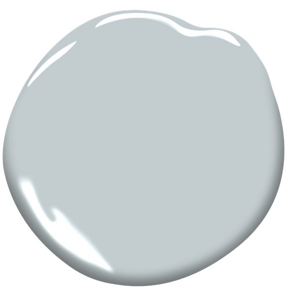
Conversely, the article advises against certain colors. Gray shades with blue undertones, once popular, are now seen as stark and dated, a trend referred to as "millennial gray." While soft black with blue undertones is trendy, gray lacks its drama. Pontbriand suggests avoiding cool grays unless intentionally balancing them with richer hues like Stained Glass or warmer neutrals like Sea Salt or Light Breeze.
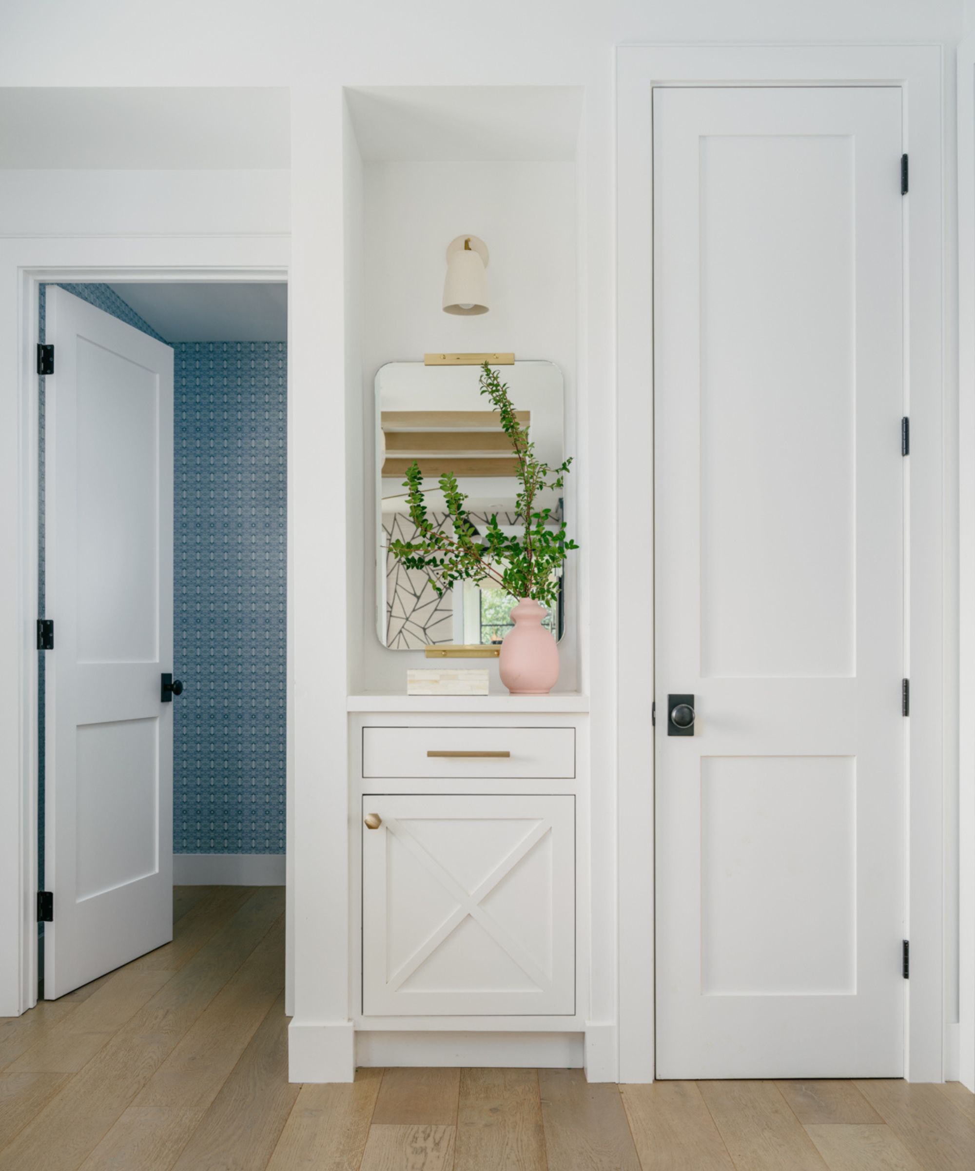
Overly bright whites without warm undertones are also discouraged, as they can appear harsh and sterile. Pontbriand recommends softer whites with a touch of warmth for a more inviting feel, such as Benjamin Moore's Glacier White. Warm-toned whites are particularly beneficial in spaces lacking natural light. It is crucial to test white samples on walls to account for reflected colors and ensure the shade still looks white, avoiding those with too strong of a green, yellow, or pink tint.
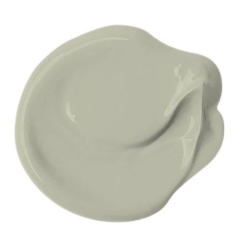
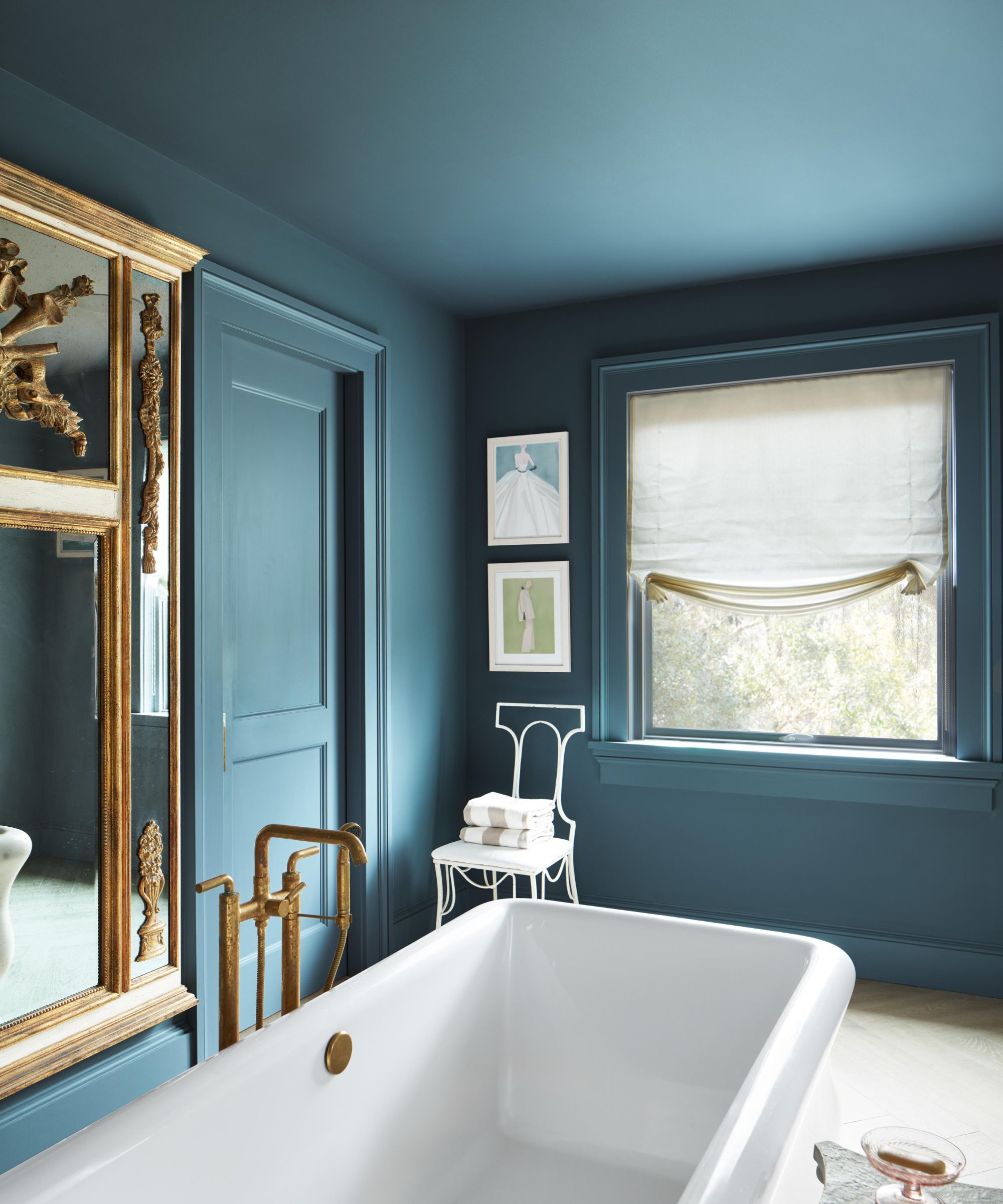
Yellow-toned beige is identified as a dated shade. Pontbriand emphasizes the importance of balance in warm neutrals, advising against "beige tones that lean too yellow." Instead, timeless options like light or medium taupe, such as Smoky Taupe, are preferred. Nuance is key in paint selection, often requiring choosing a shade two levels lighter and less saturated than desired, then complementing with decor. Finally, overused grays like Gray Owl and Stonington Gray have lost their appeal. Yilmaz recommends warmer grays like Classic Gray as an alternative to prevent spaces from feeling cold and flat. Classic Gray, with a high light reflective value, serves as a bright, true neutral option. Similarly, the article warns against the over-saturated Palladian Blue, recommending softer, earthier blues and greens like October Mist as more current alternatives. While Palladian Blue can be made to work with specific pairings like Tweed Coat or White Dove, exploring other serene options is advised for an updated interior.
#BenjaminMoore #PaintColors #InteriorDesign #ColorTrends #HomeImprovement #NeutralColors #WarmTones #CoolTones #DesignTips #BenjaminMoore #PaintColors #InteriorDesign #ColorTrends #HomeImprovement #NeutralColors #WarmTones #CoolTones #DesignTips
0 comment in total
 No comments yet
You may also like
Benjamin Moore paint colors in real homes – 10 favorite shades amongst designers, from neutrals to brights

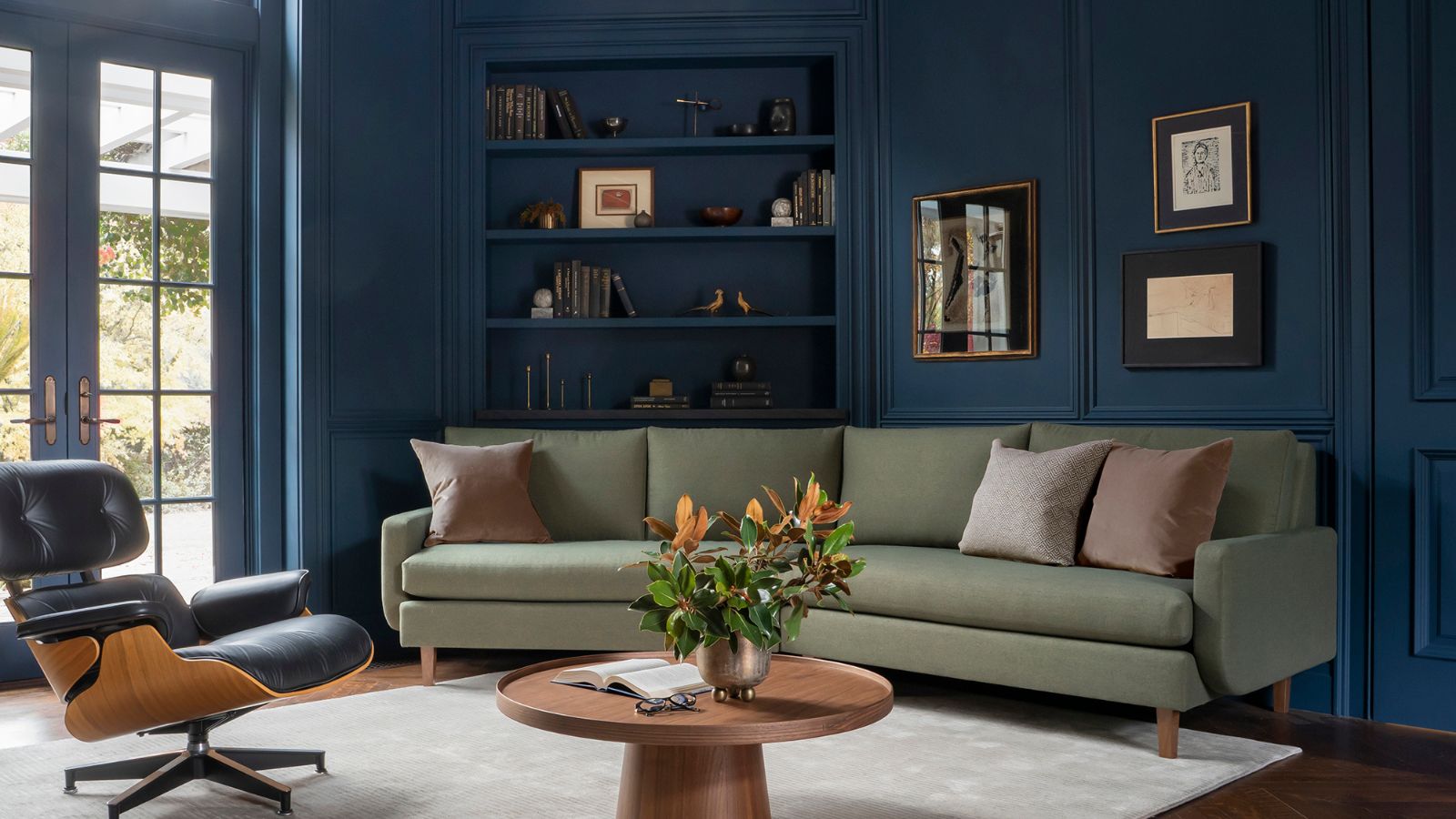
Is Benjamin Moore's Gentleman's Gray the perfect navy blue paint?
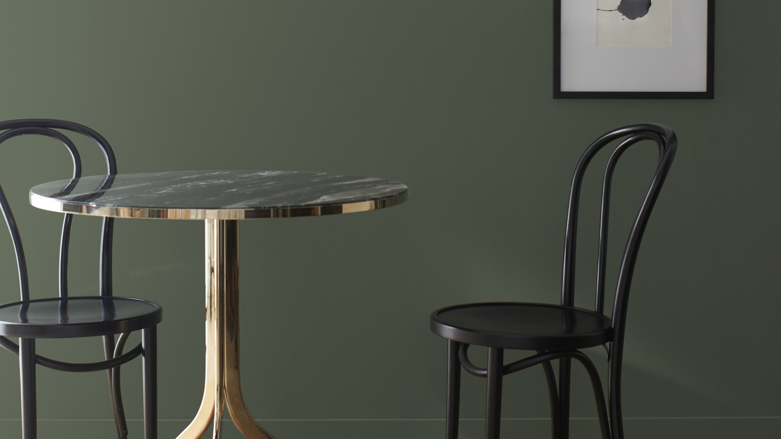
I Think I May Have Just Discovered the Most Timeless Green Paint Color

The 2026 paint Colors of the Year Have Been Announced

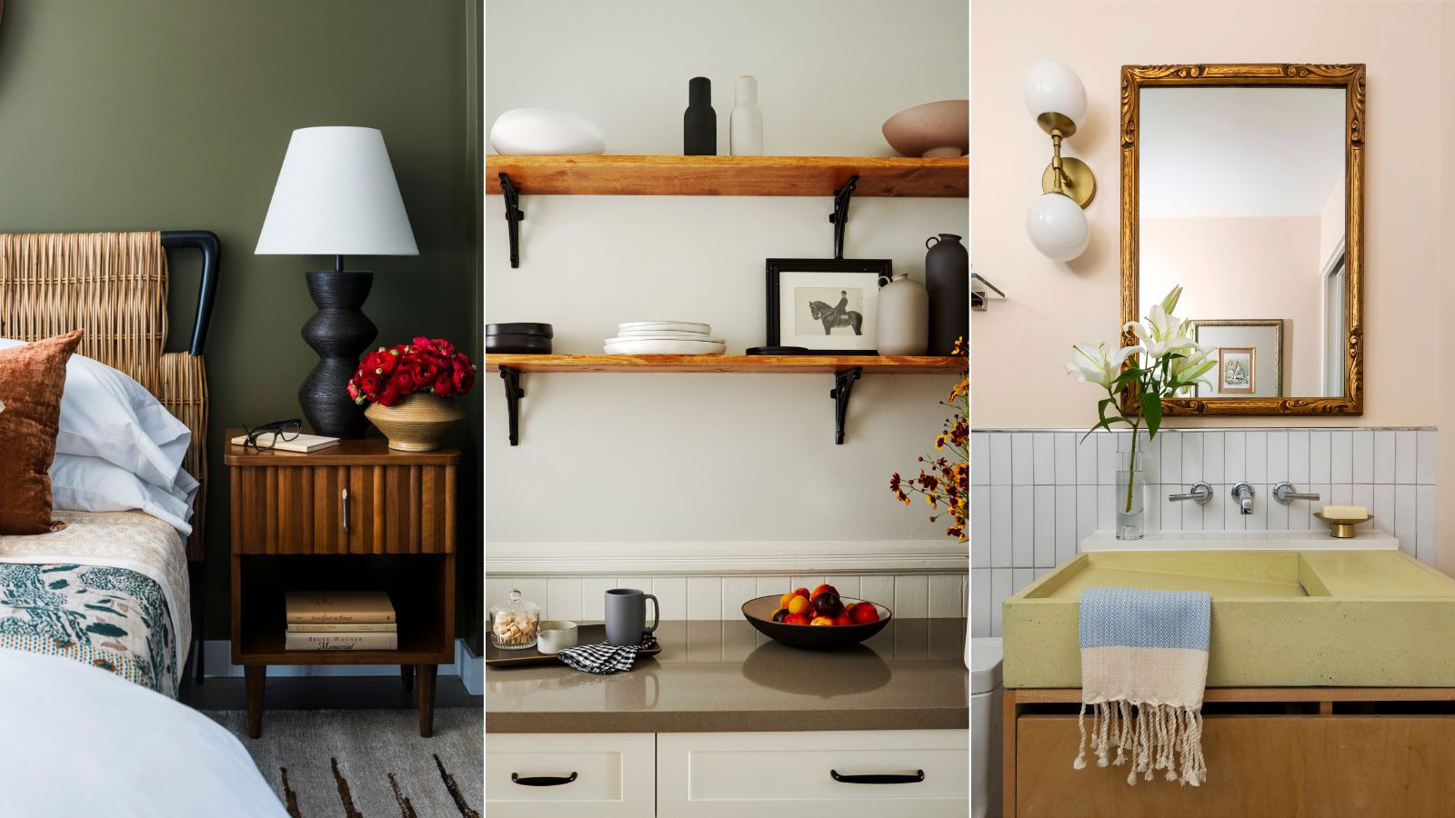
Interior designers share their favorite Benjamin Moore paint colors – and there's something for every style
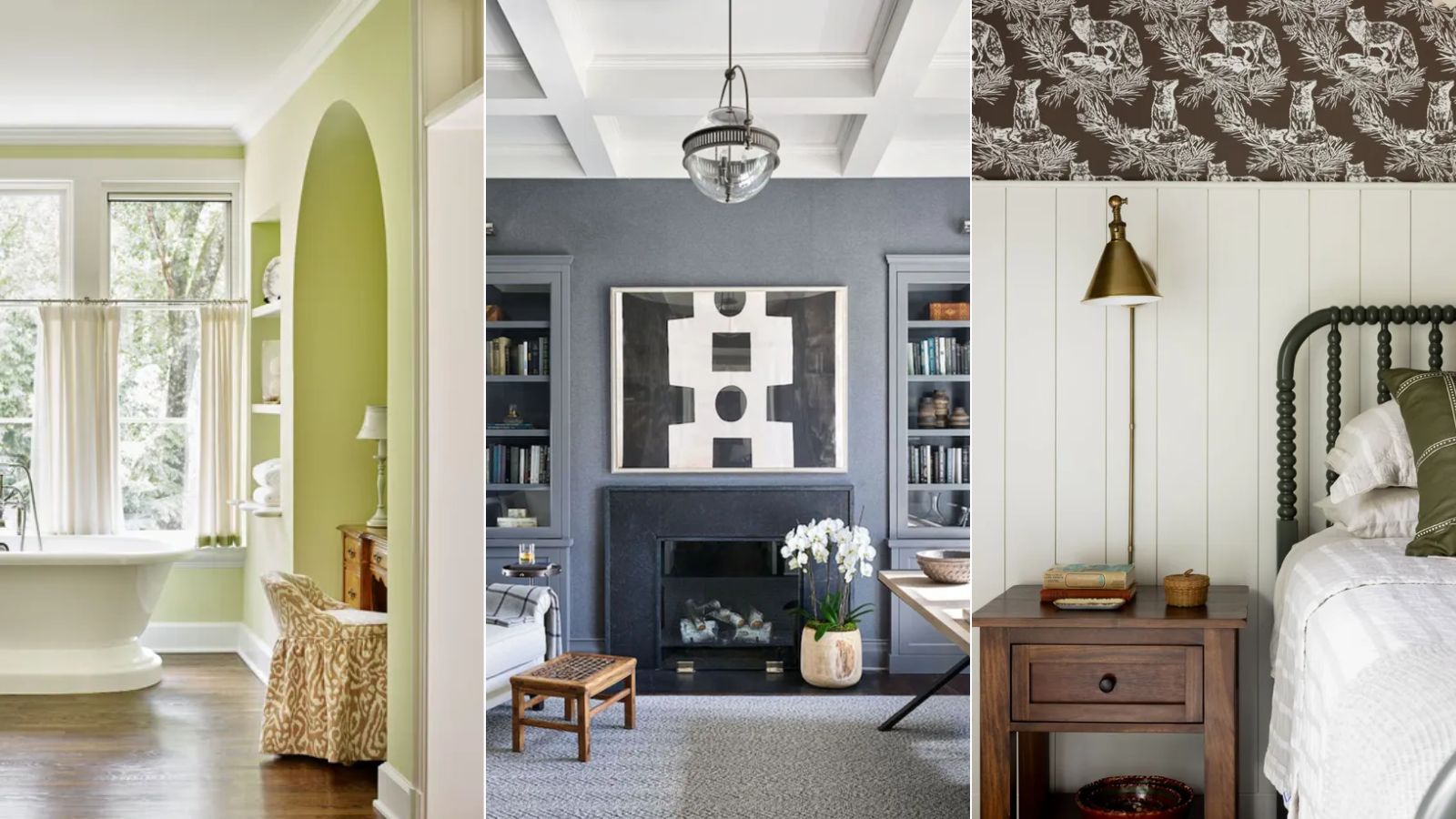
I'm a color editor and I'd never heard of these Benjamin Moore paint colors that interior designers swear by
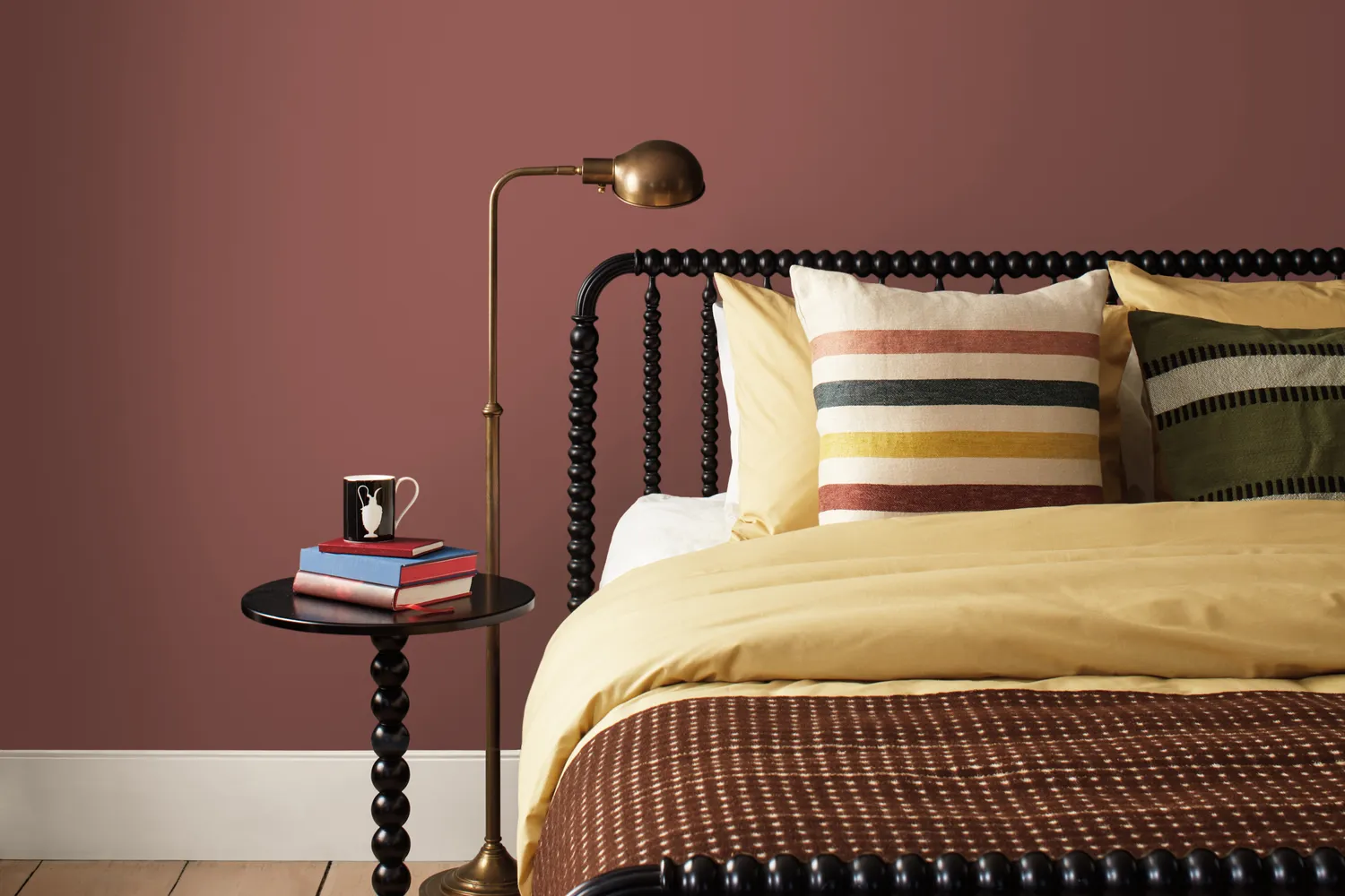
Benjamin Moore Just Released Its 2026 Color Forecast—These 8 Paint Shades Will Be Huge Next Year


An A-List Designer’s Secrets To Picking Perfect Paint Colors

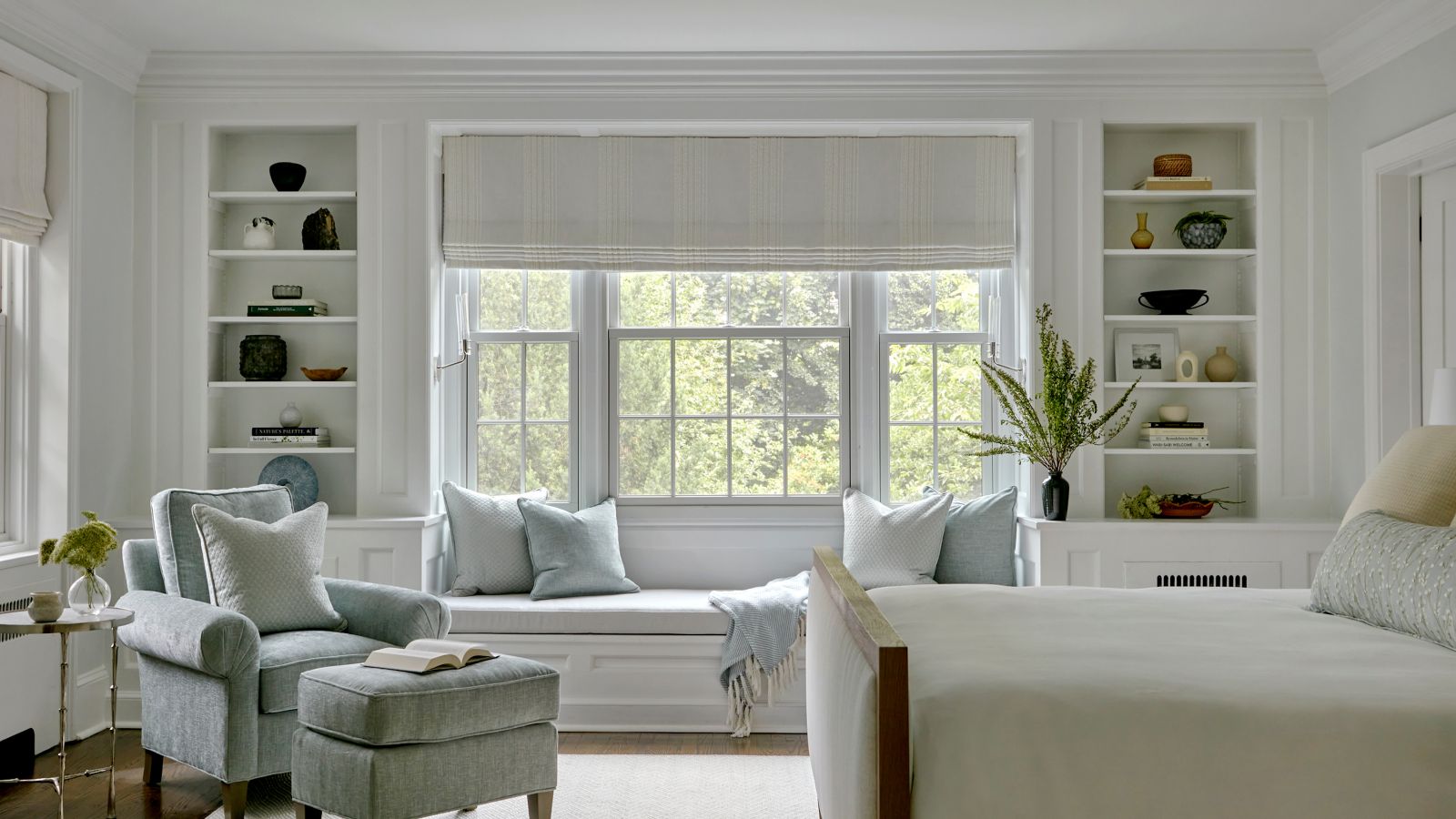
The best Benjamin Moore paint colors to use in bedrooms – 14 stylish shades recommended by interior designers
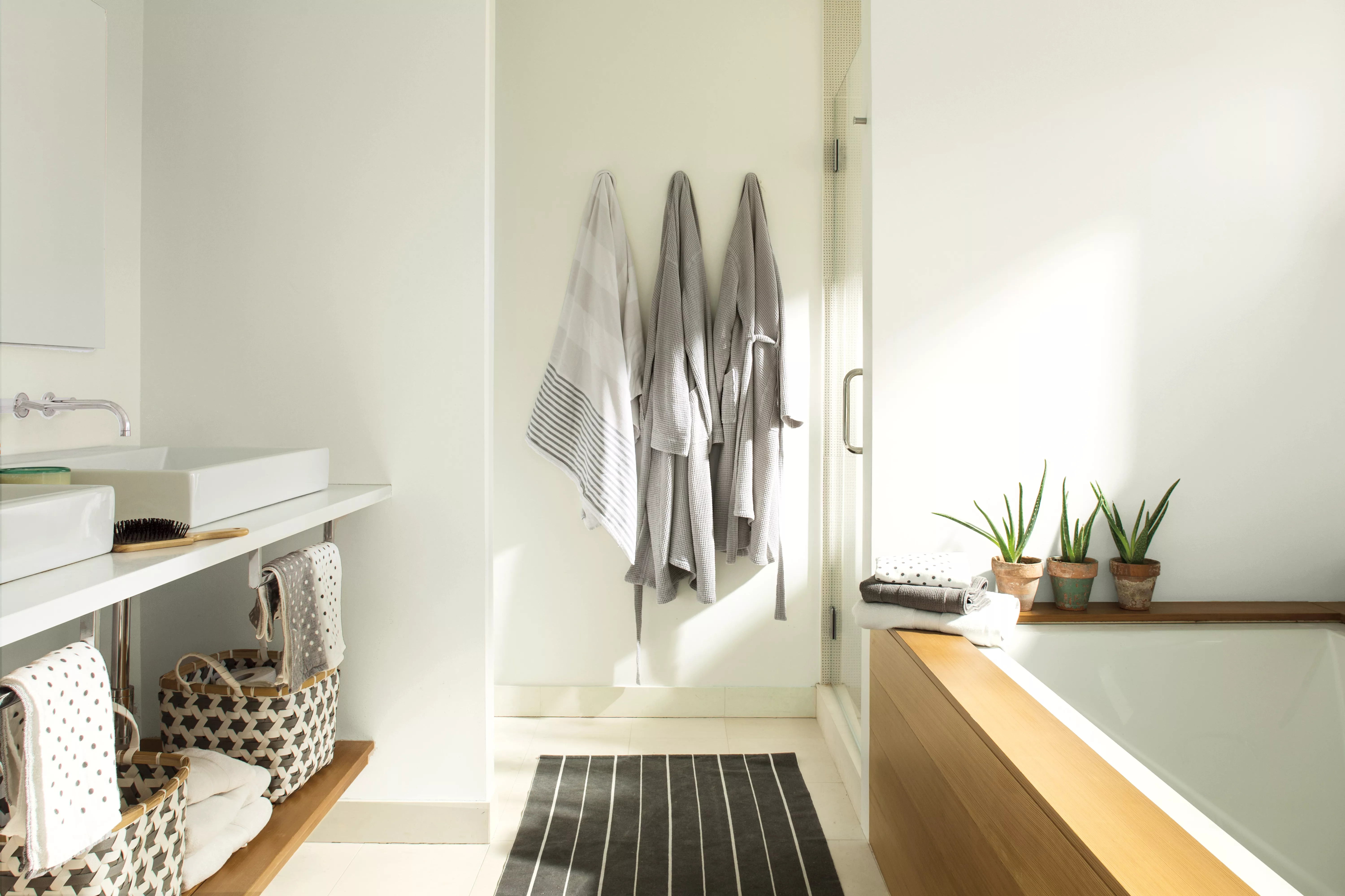
The 12 Best-Selling Benjamin Moore Paint Colors of All Time

These Unusual Paint Colors May Not Be An Obvious Choice, But Designers Can’t Get Enough
These Paint Colors Will Dominate Our Homes in 2022

This Paint Color Has Been Benjamin Moore’s Best Seller for Years—and Designers Swear by It

These 20 Paint Colors Will Never Go Out of Style, According to Designers

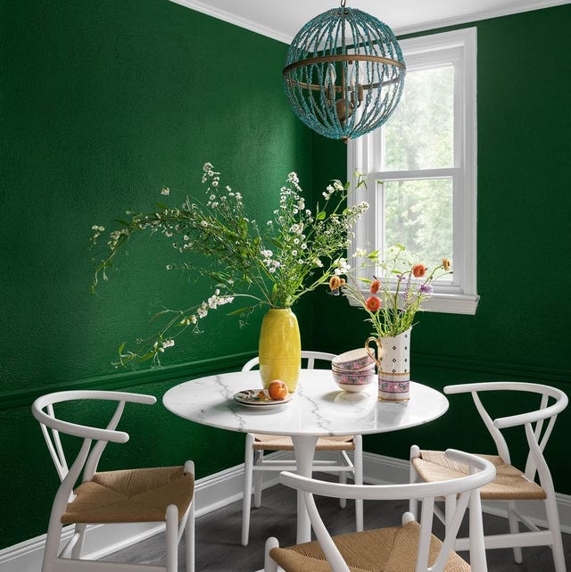
The Interior Paint Colors You'll Be Seeing Everywhere in 2024

We’re Swimming in Benjamin Moore’s 2021 Color of the Year
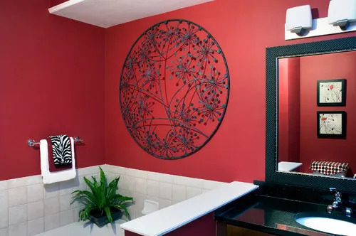
Benjamin Moore's 2026 Color of the Year Is Brown—Here's What to Pair It With in Your Home

Beige, Begone: Bring Your Walls to Life With These 14 Beautifully Bold Colors

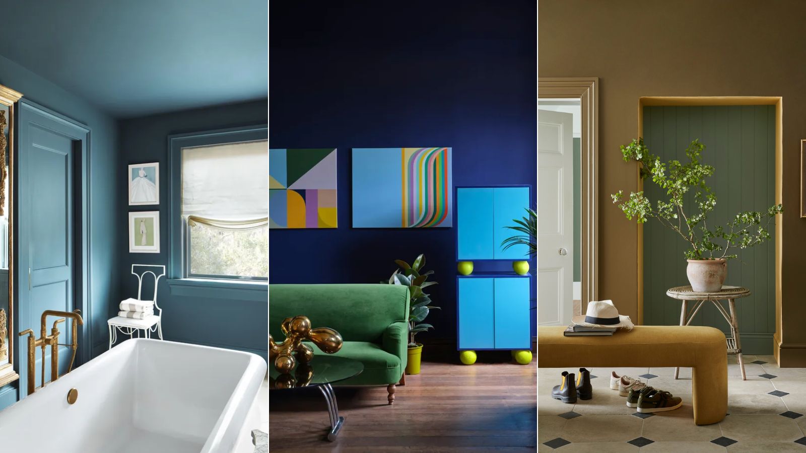
I asked 3 interior designers for their must-try paint colors in 2025 – they are all the perfect 'in-between' shades
12 Vintage Paint Colors That Are Trending Again, According to Color Experts